Category Archives: Uncategorised

Filters

Author:
Category:

Nostalgia Planner Autumn Term 2023

Throughout Year 12 we will explore aspects of the theme Nostalgia. This will include photographing and making imagery from a range of aspects of your life, experiences and environment…as well as finding out how various artists, researchers and even scientists respond to the concept of Nostalgia

Autumn | Part 1 objects, detritus and ephemera

Winter | Part 2 landscape and surroundings

Spring | Part 3 people, community and identity

To start with, we will be looking at how we can photograph a range of objects, surfaces and documents in different ways.

This is a plan for the first half term and will help you to develop some key skills and competencies.

Key creative outcomes…

  • Still-life: Collect at least 5 different objects/ debris (natural/ man-made) that are linked to the theme of Nostalgia and photograph as object in-situ (where you find them) and also create a mini-studio at home using black/white paper or other materials as a backdrop. Bring these objects to class too to photograph in THE STUDIO
  • Shapes & Form: Look for interesting found objects to help you explore line, shape, form, texture, pattern and colour (the formal elements
  • Abstract & close-up: move in closer and look for textures/ patterns/ colourisation/ surfaces/ repetition within the objects.
  • Photo-montage: create a range of outcomes that incorporate aspects of cut-n-paste, juxtapositions, overlays and multi-exposures

Still Life

Still life has captured the imagination of photographers from the early 19th century to the present day. It is a tradition full of lavish, exotic and sometimes dark arrangements, rich with symbolic depth and meaning.

However, before we begin making images of our objects we need to learn about how still-life emerged as an independent genre, in particularly during the early 1600s Dutch and Northern European paintings. Many of the objects depicted in these early works are symbolic of religion and morality reflecting on the increasing urbanization of Dutch and Flemish society, which brought with it an emphasis on the home and personal possessions, commerce and trade. Paintings depicting burnt candles, human skulls, dying flowers, fruits and vegetables, broken chalices, jewelry, crowns, watches, mirrors, bottles, glasses, vases etc are symbolic of the transience and brevity of human life, power, beauty and wealth, as well as of the insignificance of all material things and achievements.

Throughout its long history, still life has taken many forms, from the decorative frescoes of antiquity to the high art of the Renaissance. Traditionally, a still life is a collection of inanimate objects arranged as the subject of a composition. Nowadays, a still life can be anything from your latest Instagram latte art to a vase of tulips styled like a Dutch Golden Age painting. Read here for more details about the different categories within still-life paintings such as Fruits, Flowers, Breakfast pieces, Trompe L’Oeil and Vanitas.

Abraham van Beyeren (Dutch, The Hague 1620/21–1690 Overschie)
Brilliant surfaces of metalwork and glass reflect lush fruits and a lobster in this still life. Heavily laden tables like this one, boasting both foodstuffs and imported luxuries such as the blue-and-white porcelain bowl from China, typify Dutch still life in the second half of the seventeenth century. Such paintings represent a shift away from the reminders of immortality and vanity in earlier still lifes and toward a wholehearted embrace of earthly pleasures.

Still life derives from the Dutch word stilleven, coined in the 17th century when paintings of objects enjoyed immense popularity throughout Europe. The impetus for this term came as artists created compositions of greater complexity, bringing together a wider variety of objects to communicate allegorical meanings.

A New Medium

Still life featured prominently in the experiments of photography inventors Jacques-Louis-Mandé Daguerre and William Henry Fox Talbot, as far back as the 1830s. They did this in part, for practical reasons: the exceptionally long exposure times of their processes precluded the use of living models.

Study this exhibition: ART OF ARRANGEMENT: PHOTOGRAPHY AND THE STILL LIFE TRADITION

READ the following two short essay linked with the exhibition above for more understanding of still life in art and photography—with its roots in the vanitas tradition.

Brian Liddy: ‘ART OF ARRANGEMENT’: ON THE SHORTNESS OF LIFE

Roy Exley: ‘ART OF ARRANGEMENT’: STILL LIFE IN THE STILL-LIFE

Here is a link to an overview of still-life definition.

https://mymodernmet.com/what-is-still-life-painting-definition/

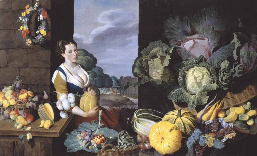
Cookmaid with Still Life of Vegetables and Fruit c.1620-5 Sir Nathaniel Bacon 1585-1627 Purchased with assistance from the Art Fund 1995 http://www.tate.org.uk/art/work/T06995

Lets take a closer look at the painting, Cookmaid with Still Life of Vegetables and Fruit by British painter Sir Nathaniel Bacon.

Listen to curator Tim Batchelor discussing the painting

For further insights into the symbolic meaning of food and objects in still-life paintings

Symbolism and Metaphor – Vanitas

Pieter Claesz, Still Life with a Skull and a Writing Quill, 1628.  Courtesy of the Metropolitan Museum of Art.
Pieter Claesz, Still Life with a Skull and a Writing Quill, 1628. Courtesy of the Metropolitan Museum of Art.

vanitas is a symbolic work of art showing the transience of life, the futility of pleasure, and the certainty of death, often contrasting symbols of wealth and symbols of ephemerality and death.

The term originally comes from the opening lines of the Book of Ecclesiastes in the Bible: ‘Vanity of vanities, saith the Preacher, vanity of vanities, all is vanity.’

Vanitas are closely related to memento mori still lifes which are artworks that remind the viewer of the shortness and fragility of life (memento mori is a Latin phrase meaning ‘remember you must die’) and include symbols such as skulls and extinguished candles. However vanitas still-lifes also include other symbols such as musical instruments, wine and books to remind us explicitly of the vanity (in the sense of worthlessness) of worldly pleasures and goods.

Paulette Tavormina - Vanitas VI, Reliquary, After D.B., 2015
Paulette Tavormina

Inspired by the works of 17th century Old Master still life painters such as Giovanna Garzoni and Maria Sibylla Merian, American photographer Paulette Tavormina creates stunningly lit imagery of fruits and vegetables immersed in dark atmosphere

Mat Collishaw - Last Meal on Death Row, Dobie Gillis Williams, 2012
Mat Collishaw

A perfect example of the old technique getting combined with modern-age ideas is Mat Collishaw’s Last Meal on Death Row series of works. Although they appear as meticulously arranged staged photography still lifes of food, each image is actually based on death row inmates’ last meals before they are executed. Apart from the eerie subject, the pictures deliver a strong drammatic effect through an excellent use of chiaroscuro.

Krista van der Niet

On a much more lighter, even pastel note, we have Dutch photographer Krista van der Niet, whose compositions often include fruits and vegetables mixed with mundane objects such as socks, cloths and aluminum foil, giving it all a contemporary feel. Her photos often carry a dose of satire as well, which references consumerism and popular culture through a clever employment of objects within a carefully composed scenery.

Laura Letinsky
Christophine, 2012
Olivia Parker

Experimenting with the endless possibilities of light, self taught photographer Olivia Parker makes ephemeral constructions. She started off as a painter, but soon turned to photography and quickly mastered the way to incorporate an extensive knowledge of art history and literature and reference the conflicts and celebrations of contemporary life in her work. Over the many years of her artistic career, her style remained fluid, yet consistent

Richard Kuiper

Think paintings by Pieter Claesz or Adriaen Coorte, only in plastic. That’s how one could describe the photographs of Richard Kuiper, whose objects are all made of this everlasting, widely used material, including water bottles, floral arrangements, even the feathers. The artist tries to draw our attention towards the excessive use of plastic in our everyday lives, with the hope we will be able to decrease it before it takes over completely.

What you must do…blog post on still life

  • Define what still life is
  • Show examples of still life painting and photography
  • Include specific artist references and choose one image for analysis using matrix
  • Provide a chronological timeline of still life photography

Then Answer

  • What is Vanitas?
  • What is Memento Mori?
  • What kind of metaphors and symbols are used in still life and why? (Include connections to trade, slavery, colonialism, wealth, status…)

Photo-assignment: Creatively respond to one of the artists above and create a set of images that clearly shows your understanding of…

Light – Shape- Shadow – Composition – Metaphor – Symbolism – Memento Mori

A series of blog posts should now show a combination of still life research and history, image analysis methods, visual experiments, Adobe Lightroom selections and adjustments (screen shots as evidence), Canon Camera Simulator and Camera Handling Skills

Week 4 + 5 Formalism and New Objectivity

There are seven basic elements to photographic art that we must explore over the coming weeks:

  1. Line
  2. Shape
  3. Form
  4. Texture
  5. Color
  6. Size
  7. Depth

Blog Post – design and publish a blog post that introduces, defines and explores the key aspects of formalism / the formal elements / the visual elements

Ensure your blog post has visual references and examples

FORMALISM

Photographers have to impose order, bring structure to what they photograph. It is inevitable. A photograph without structure is like a sentence without grammar—it is incomprehensible, even inconceivable.​

— Stephen Shore

Photographs consist of formal and visual elements and have their own ‘grammar’. These formal and visual elements (such as line, shape, repetition, rhythm, balance etc.) are shared with other works of art. But photographs also have a specific grammar – flatness, frame, time, focus etc. ‘Mistakes’ in photography are often associated with (breaking) the ‘rules’ and expectations of this grammar e.g. out of focus, subject cropped, blur etc. Some photographers enjoy making beautiful images but others are more critical of what beauty means in today’s world.

Let’s us take a close look at photography’s visual language and grammar using Photo Pedagogy’s Threshold Concept #8

Photo Literacy?

What does it mean to be literate in photography? Superficially, it might suggest an ability to ‘read’ a photograph, to analyse its form and meanings. But what about the making of photographs? We would argue that literacy is more than just a command of the mechanics of a particular ‘language’. It also takes into account fluency of expression and sensitivity to material. Words and images are different. A photograph of a particular subject is different to a description of the same subject in words. It is surely possible to see, understand and appreciate a photograph without the need for words. And what about the other possible ‘literacies’ such as emotional and physical literacy?

Most photography courses require some evidence of understanding in the form of words. As the year progresses we would like you to be able to analyse images using these four categories TECHNICAL, VISUAL, CONTEXTUAL, CONCEPTUAL.

PHOTOGRAPHIC IMAGE ANALYSIS

Image analysis is very important in your understanding of photography. Both from learning how an image is composed or structured to the actual content and meaning of an image. You may need to understand or find out its social, historical, or political context. Click on link below for more information

Image Analysis | 2024 Photography Blog (hautlieucreative.co.uk)


EXTRA READING: In photography Formalism was advocated by John Szarkowski (Curator of Photography at Museum on Modern Art, New York) who is his book; The Photographer’s Eye (1966) identified five elements involved in the formalist approach to the analysis of photography, they are: the thing itself, the detail, the frame, time and the vantage point. Read an essay here where this is discussed in more detail:

Creative Examples

Walker Evans

Task 1 “The Beauty of the Common Tool”

Walker Evans

Walker Evans, Beauties of the Common Tool | FOTOFORM
Walker Evans – Beauties of the common tool – 1955

Darren Harvey-Regan

Darren Harvey-Regan
Beauties of the Common Tool, Rephrased II, 2013
Fibre-based handprint, mounted, wooden frame with museum glass

ca. 90 x 70 cm

What you must do…

Walker Evans greatly influenced Darren Harvey-Regan, and both artists paid careful attention to choice of objects, composition, lighting and exposure values.

You must explore the work of both artists (create a blog post that compares and contrasts their work) and develop a range of images in response to their outcomes.

For this, you will need to use the selection of objects you have brought in to class from your own collections, or alternatively use those we have provided for you.

Be experimental with choosing different apertures settings and creative with lighting set-up; key light, reflected light, back light etc. and we will show you various lighting arrangements too.

The New Objectivity – Albert Renger Patszch

  •  a specific attitude to photography and the advantages of the camera as a way of seeing called…
  • The New Objectivity (Neue Sachlichkeit).
  • Research :The types of subjects he preferred to photograph
  • Research : The ways in which he explored the formal elements in his work e.g. form, light, rhythm, line, texture, repetition etc.
  • His famous book ‘The World is Beautiful’
  • Other photographers at the time who were similarly interested in objectivity
  • Contemporary photographers who have been influenced by the idea that ordinary objects and scenes can be photographed to reveal their beauty.

Historical context

There are numerous reasons why some photographers in the 1920s (along with other artists) began to represent the world with “objective, sober eyes”:

  • a response to the chaos of the First World War and a rejection of the culture leading up to it
  • a rejection of the emotional and spiritual concerns of Expressionism and an interest in the rational and political
  • a response to rapid industrialisation in Europe and America
  • a response to the particular qualities of the camera and a move away from painterly effects like soft focus

Karl Blossfeldt

Never formally trained in photography, Blossfeldt made many of his photographs with a camera that he altered to photograph plant surfaces with unprecedented magnification. His pictures achieved notoriety among the artistic avant-garde with the support of gallerist Karl Nierendorf, who mounted a solo show of the pictures paired with African sculptures at his gallery in 1926 and, subsequently, produced the first edition of Blossdeldt’s monograph Urformen der Kunst (Art forms in nature), in 1928. Following the enormous success of the book, Blossfeldt published a second volume of his plant pictures, titled Wundergarten der Natur (The magic garden of nature), in 1932. The clarity, precision, and apparent lack of mediation of his pictures, along with their presentation as analogues for essential forms in art and architecture, won him acclaim from the champions of New Vision photography. His work was a central feature of important exhibitions, including Fotografie der Gegenwart and Film und Foto, both in 1929.

Blossfeldt’s work adheres to the rules of TYPOLOGIES

Anna Atkins

In October 1843, the botanist and photographer Anna Atkins (1799–1871) wrote a letter to a friend. “I have lately taken in hand a rather lengthy performance,” revealed Atkins. “It is the taking photographical impressions of all, that I can procure, of the British algae and confervae, many of which are so minute that accurate drawings of them are very difficult to make.”1 Atkins proceeded to inquire whether a mutual acquaintance, also interested in aquatic plants, would care to receive a copy of her recently completed book, Photographs of British Algae: Cyanotype Impressions.

How English Photographer Anna Atkins Captured the Science of Botany

Atkins learned of photography through its British inventor, William Henry Fox Talbot. Only months after Talbot patented his most successful photographic process, in 1841, Atkins and her father, a respected scientist, decided to replicate the “talbotype” at their home. “My daughter and I,” Atkins’s father wrote to Talbot, “shall set to work in good earnest ’till we completely succeed in practicing your invaluable process.”3 Ultimately, it was a different photographic process—the cyanotype—that captivated Atkins. Developed by her friend and neighbor Sir John Herschel, the cyanotype process produced blue-and-white prints that Atkins prized for their sharp contours and striking colors. Atkins added hundreds of new plates to Photographs of British Algae throughout the 1840s and early 1850s, all the while refining cyanotype chemical solutions and exposure times.

Contemporary Examples of Formalism

Mandy Barker

Sea of Artifacts by Mandy Barker | Photography - Wales Arts Review
Sea of artifacts by Mandy Barker
Gallery: Art by Mandy Barker | Magazine Articles | WWF

Matthew Brown (ex-student)

Here is a selection of images made by Matt Brown last year as part of his Personal Study: Bouley Bay.

Have a look at his blog here for more ideas around his research, artists inspirations and further experimentation.

Here is the link the the online version of his photobook, Bouley Bay – by Matthew Brown

Darren Harvey Regan

Entwining image and object, the work of Darren Harvey-Regan (b. 1974 Exeter) often sees a hybridisation of the conventions of photography and sculpture. As quietly humorous as they are frustrating his works challenge the viewer to distinguish where representation ends and the object begins. “The presentation of photographs in interaction with objects serves to highlight the inherent tensions within representation; between the photograph as an object and the image of the world it contains. In this way, I consider the photograph as being something not only to think about, but to think with.”

01.tif

“As a medium reliant on how the natural world appears to it, can a photograph ever be truly abstract? Yet what process is more abstract than collapsing mass, depth and time into a single surface?” – Harvey-Regan

In geology an ‘erratic’ refers to a rock that differs from its native environment, having been carried and deposited there by a long-vanished glacier. Similarly Darren Harvey-Regan in his latest series executes both the photographic and physical act of lifting something out of its context, playing on overlapping appearances and processes.
The Erratics (Exposures) presents images of natural chalk rock formations eroded by wind and sand. Using an old large format field camera, Harvey-Regan sought out the monolithic chalk forms of Egypt’s Western Desert, a vast natural parallel to the singular studio-bound objects that frequently recur in his practice. 

Both The Erratics (wrest) and (chalk fall in white) use sculptural compositions made by the artist from chalk collected from the rock falls along England’s South Coast. By carving smooth planes and shapes into rough rocks, Harvey-Regan works with and against perception of its natural forms.  In the photographic works – (wrest) – the chalk is shaped towards the two-dimensional image surface of the print, while in the installation (chalk fall in white), the perception of a flattened image surface is created within the three-dimensional forms themselves.

Harvey-Regan uses art historian Wilhelm Worringer’s essay Abstraction and Empathy as both a background for the work and as a means to consider the nature of the photographic medium. For Worringer, ‘empathy’ describes our need to connect to the visible world, identifying with it and representing it. Conversely, ‘abstraction’ is proposed as a means of coping with the overwhelming phenomena of the world by extracting things from their place in space and time whilst distilling them to purified line, form and colour.
Both abstraction and empathy are captured in these works and their photographic process. The forms exposed in their natural surroundings in Erratics (Exposures) remain curiously abstract while tending more towards empathy, while forcefully sculpted objects in Erratics (Wrest) are balanced on the edge of the organic and abstract.
Photobook: The Erratics

Stephen Gill

Week 6+7 Moving towards photomontage

Developing still life ideas…a closer look at Mary-Ellen Bartley

Mary-Ellen Bartley “7 Things again and again”.

https://vimeo.com/421112708

Inspired by minimalist sculpture and painting, these simple but effective still life studies encapsulate the formal elements . Artists such as Giorgio Morandi have a clear influence here…and again there is a strong connection between painting and photography, historically and traditionally.

1. The Stack
2. Using light and paper / tracing paper to create shadows and silhouettes
3. Print out initial images and re- appropriate / cut-n-paste
4. White / monochrome
5. Splicing two images together – use either printouts or Photoshop
6. Conceal and reveal – light and shade

What you must do…

Collect a group of objects that you think combine well. Consider shape and size, colour, texture etc.

Then look carefully at what / how Mary Ellen Bartley groups, lights and photographs her objects. Aim to create a set of images by altering the layout, lighting, focus, composition etc.

Print some of the results off — and then rip, tear, cut-n-paste to create a photo-montage. Re-photograph this and develop the composition into a final outcome.

Create a blog post that introduces Mary Ellen Bartley and her approach.

Creative Developments

A closer look at ….Layering / overlays / multi-exposures and more…

Make do and mend…click here for ideas

Photo-Montage

  • photomontage is a collage constructed from photographs.
  • Historically, the technique has been used to make political statements and gained popularity in the early 20th century (World War 1-World War 2)
  • Artists such as Raoul Haussman , Hannah Hoch, John Heartfield employed cut-n-paste techniques as a form of propaganda…as did Soviet artists like Aleksander Rodchenko and El Lissitsky
  • Photomontage has its roots in Dadaism…which is closely related to Surrrealism

Here are simple definition of photomontage and here is a more comprehensive review of the different historical and contemporary approaches to combining images together to form collages and composites. Read also the Art Story site here which has a good summary of photomontage

Some quotes from artists using photomontage…

The cutting and assemblage of the parts is applied here on a static plane. The effect is that of a real scene, a synopsis of actions, produced by originally unrelated space and time elements juxtaposed and fused into a reality.
Laszlo Moholy-Nagy

[Photomontage] is my way of connecting with the word and I like the idea that I cam invent a reality that, for me, is personally more meaningful than the one that’s literally given to the eye
Jerry Uelsmann

I’ve always made a distinction between collage and photomontage. Montage is about producing something seamless and legible, whereas collage is about interrupting the seam and making something illegible
John Stezaker

The Art Critic 1919-20 Raoul Hausmann 1886-1971 Purchased 1974 http://www.tate.org.uk/art/work/T01918

You’re going to use your images from the studio object shoot and other material you have created recently for this…

Using your OBJECTS photographs to create experimental new images either by hand or using image manipulation software OR both!!!

Cut / Slice / Trim / Slide / Join / Add / Combine / Match /  Mix / Tear / Scrunch / Fold / Stick / Stitch / Sew / Weave / Holes / Burn / Singe / overlap

160 Stitch on photographs ideas | textile art, embroidery art, embroidered  photo
This image has an empty alt attribute; its file name is image-211.png
This image has an empty alt attribute; its file name is image-213.png
This image has an empty alt attribute; its file name is image-215.png
This image has an empty alt attribute; its file name is image-217.png
This image has an empty alt attribute; its file name is image-218.png
This image has an empty alt attribute; its file name is image-219.png
This image has an empty alt attribute; its file name is image-220.png
This image has an empty alt attribute; its file name is image-221.png
This image has an empty alt attribute; its file name is image-222-1024x545.png
This image has an empty alt attribute; its file name is image-223.png
This image has an empty alt attribute; its file name is image-224.png
This image has an empty alt attribute; its file name is image-225.png
This image has an empty alt attribute; its file name is image-227.png
This image has an empty alt attribute; its file name is image-228.png
Stitching Photographs: Various Approaches | Photo art, Embroidered photo,  Art inspiration

Photographers you should look at include:

•John Stezaker •Bobby Neal Adams •Linder Sterling •Johanna Goodman •Max-o-matic •Luis Dourabo •Joe Castro •Bela Borsodi / Kensuoke Koike / Sarah Eisenlohr / Jesse Treece / Jesse Draxler / Joachim Schmidt /

http://www.artnet.com/artists/john-stezaker/

https://www.bobbyneeladams.com/

https://www.tate.org.uk/art/artists/linder-10844

http://www.johannagoodman.com/#/

https://www.belaborsodi.com/

SOME EXAMPLES – CUT N PASTE

The examples below were created using five images. The figure was cut out leaving an interesting negative shape and outlined. Other images could be slid underneath until connections and interesting compositions started to occur.

Hannah Höch, The Artist Who Wanted 'to show the world today as an ant sees  it and tomorrow as the moon sees it' - Flashbak
Hannah Hoch

MORE ON PHOTOMONTAGE FOR YOU HERE

Extension Experiment

How to make a GIF in Photoshop
1. Create layer for each image
2. Window > timeline
3. Select > Create Frame Animation
4. Drop Menu > Make frames from Layers
5. Timeline > select Forever
6. File > Export > Save for Web Legacy > reduce image size to 720 x 720 pixels

This image has an empty alt attribute; its file name is object.giff_.gif

A gif created using just three images.

This image has an empty alt attribute; its file name is heritaget.gif
A gif using 6 images.
Picture

Always follow the 10 Step Process and create multiple blog posts for each unit to ensure you tackle all Assessment Objectives thoroughly :

  1. Mood-board, definition and introduction (AO1)
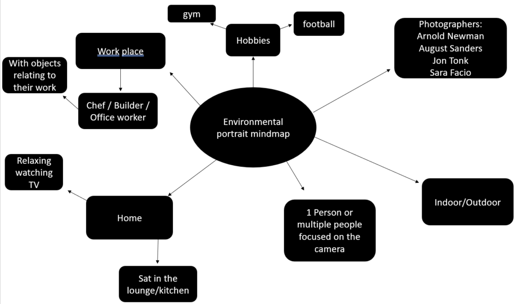
  2. Mind-map of ideas (AO1)
  3. Artist References / Case Studies (must include image analysis) (AO1)
  4. Photo-shoot Action Plan (AO3)
  5. Multiple Photoshoots + contact sheets (AO3)
  6. Image Selection, sub selection, review and refine ideas (AO2)
  7. Image Editing/ manipulation / experimentation (AO2)
  8. Presentation of final outcomes (AO4)
  9. Compare and contrast your work to your artist reference(AO1)
  10. Evaluation and Critique (AO1+AO4)

Final Outcomes for Nostalgia Part 1

You must edit and save / export a range of images for printing to the PRINT FOLDER found here by Thursday 19th October

M:RadioDepartmentsPhotographyStudentsImage TransferYear 12 NOSTALGIA objects Oct 2023

  1. Still Life Photos 1-3 images
  2. Single Object Photos 1-3 images
  3. Optional Extension Ideas
  4. Photomontage Analogue 1-3 images
  5. Photomontage Digital 1-3 images

Remember to include a range of sizes

A3 / A4 / A5 and black and white images too

Image Resolution and Sizing

Final Outcomes for NOSTALGIA Part 1

Remember to include a range of sizes

A3 / A4 / A5 and black and white images too

File Handling and printing...

  • Remember when EXPORTING from Lightroom you must adjust the file size to 1000 pixels on the Short edge for “blog-friendly” images (JPEGS)
  • BUT…for editing and printing when EXPORTING from Lightroom you must adjust the file size to Short edge for “high resolution” images (JPEGS) like this…
This image has an empty alt attribute; its file name is image-484.png
  • A5 Short Edge = 14.8 cm
  • A4 Short Edge = 21.0 cm
  • A3 Short Edge =29.7 cm

This will ensure you have the correct ASPECT RATIO

For a combination of images, or square format images you use the ADOBE PHOTOSHOP NEW DOCUMENT + PRINT PRESETS on to help arrange images on the correct size page (A3, A4, A5)

You can do this using Photoshop too…

Set up the page sizes as templates and import images into each template, then you can see for themselves how well they fit… but remember to add an extra 6mm for bleed (3mm on each side of the page) to the original templates. i.e. A4 = 297mm x 210 but the template size for this would be 303mm x 216mm.

This image has an empty alt attribute; its file name is a-sizes.jpg

Half Term

Week 8

Mounting and framing final images

Mounting and framing final images

Making a Virtual Gallery in Photoshop

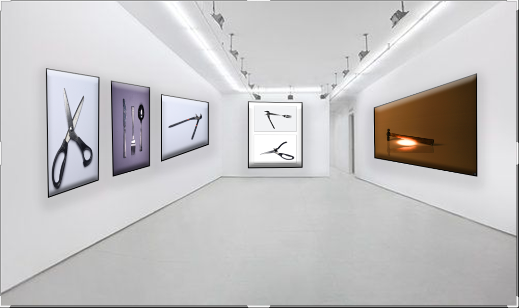
Download an empty gallery file…then insert your images and palce them on the walls. Adjust the persepctive, size and shape using CTRL T (free transform) You can also add things like a drop shadow to make the image look more realistic…

The Photographers' Gallery - Gallery - visitlondon.com
This image has an empty alt attribute; its file name is image-27.png

…or using online software

How I did it:

Step 1: Go to www.artsteps.com

Step 2: Sign in / up.

Step 3: Create.

Step 4: Create your own location or choose a template.

Step 5: Upload your images, put them in your exhibition, name it and give it a description.

Step 6: Present / view your Exhibition.

YOUR FINAL BLOG POST SHOULD CLEARLY SHOW 3-5 POSSIBLE FINAL OUTCOMES , INCLUDING YOUR PRESENTATION METHOD

  1. sequencing of images
  2. grouping of images -grids , triptych, diptych, dioramas, predellas
  3. sculptural / multi-media approaches
  4. framing methods
  5. blog (show examples of frames / borders + process)
  6. clarity of final outcomes—which images are your final outcomes?
  7. coursework round – up and evaluation

ANTHROPOCENE – JAC

Key Dates

  • Friday 24th May = all landscape + Anthropocene images must be added to print folder ready for print order
  • Half Term
  • Friday 14th June = final deadline for Landscape / Anthropocene Project (includes display of work)

FINAL PRINTS

You must edit and save / export a range of images for printing to the PRINT FOLDER found here

M:\Radio\Departments\Photography\Students\Image Transfer\Yr 12 ANTHROPOCENE and landscape 2024

  1. Natural Landscape Photos 1-3 images
  2. Urban + industrial Photos 1-3 images
  3. Anthropocene 1-3 images

Remember to include a range of sizes

A3 / A4 / A5 and black and white images too

Go to bottom of this blogpost to follow instructions on how to size and save images for printing from Lightroom and/or Photoshop.

ANTHROPOCENE

This unit will help you explore further opportunities with your landscape photography. We will spend time looking closely at this and discussing ideas with you…

  • What is Anthropocene?
  • How and why are photographers exploring this concept?
  • Use your skills and knowledge to date to tackle and approach this theme. ie: abstract, portraiture, identity, landscape, studio based photography etc. – YOU DECIDE!

Exhibition Review CLICK HERE

The Anthropocene defines Earth’s most recent geologic time period as being human-influenced, or anthropogenic, based on overwhelming global evidence that atmospheric, geologic, hydrologic, biospheric and other earth system processes are now altered by humans.

The word combines the root “anthropo”, meaning “human” with the root “-cene”, the standard suffix for “epoch” in geologic time.

What are the 4 causes of the Anthropocene?

Signs of the Anthropocene

Agriculture, urbanisation, deforestation and pollution have caused extraordinary changes on Earth.

Consequences of the Anthropocene

These human actions cause, among other consequences, changes in the water cycle, imbalances and destructions in the marine and terrestrial ecosystems, the increase of extreme meteorological phenomena, the acidification of the oceans or the disappearance of the forests.

DISCUSS

Now watch this and discuss / compare the way in which various photographers have responded to this theme…

Blog Posts to make : CHECKLIST

  1. Define “Anthropocene” and explain what it is.

2. Add a mindmap and moodboard of images, ideas and trigger points on your chosen genre ie: portraiture, studio (object or portraiture), abstract, landscape etc. You should aim to include a range of data, statistics, information, maps, documents, policies, pledges etc at this point to show a wide range of research methods and justification…

3. Choose two photographers that you feel explore Anthropocene through your chosen genre of photography that interest you and create a CASE STUDY on both and then compare them using a writing structure to help you. https://hautlieucreative.co.uk/photo22al/2020/08/21/the-formal-elements/

(These photographers should directly influence your final outcomes )

Make sure you describe in detail:

  • Why have you chosen this artist?
  • What interests you about their work?
  • How does the work relate to the theme of Anthropocene?
  • What are you going to do as a response to their work?

4. Organise and carry out your photo-shoots !!! You MUST complete a minimum of 2 PHOTO-SHOOTS (100-200 photos) . Responding to the theme of Anthropocene in your chosen genre.

5. Edit, select and develop your photographs and post contact sheets.

6. Produce a comparative analysis between one of your photographs and an image of one of your chosen photographers – discuss similarities and differences.

This image has an empty alt attribute; its file name is image-14.png

7. Develop your ideas through your images by editing, making decisions, reviewing and refining – selecting your collection of images or image as your final response to Anthropocene.
Your final outcome could be an image, a collection of images, an altered landscape, a small zine, an exhibition in a virtual gallery, a projected image etc.

8. Ensure your write an evaluation that comments on your original intentions (what you set out to do) and how your realised those intentions. Is your outcome successful? Comment on strengths and successes.

Task : Constructed Seascapes

Take a look at these photographic images (click on each image to expand):

GUSTAVE LE GRAY – THE GREAT WAVE, 1857. ALBUMEN PRINT FROM COLLODION-ON-GLASS NEGATIVE.

DAFNA TALMOR – FROM THE CONSTRUCTED LANDSCAPES II SERIES. C-TYPE PRINTS MADE OF COLLAGED COLOUR NEGATIVES

  • Both could be described as landscape pictures. What kinds of landscapes do they describe?
  • What similarities do you notice about these two pictures?
  • What differences do you notice?
  • What words/phrases best describe each of these landscapes?
  • In which of these landscapes would you prefer to live? 

A bit of research…

Read the following descriptions about the making of these images:

Gustave Le Gray – The Great Wave, 1857Dafna Talmor – from Constructed Landscapes II
‘​The Great Wave’, the most dramatic of his seascapes, combines Le Gray’s technical mastery with expressive grandeur […] At the horizon, the clouds are cut off where they meet the sea. This indicates the join between two separate negatives […]Most photographers found it impossible to achieve proper exposure for both landscape and sky in a single picture. This usually meant sacrificing the sky, which was then over-exposed. Le Gray’s innovation was to print some of the seascapes from two separate negatives – one exposed for the sea, the other for the sky – on a single sheet of paper.This ongoing body of work consists of staged landscapes made of collaged and montaged colour negatives shot across different locations, merged and transformed through the act of slicing and splicing […] ‘Constructed Landscapes’ references early Pictorialist processes of combination printing as well as Modernist experiments with film […] the work also engages with contemporary discourses on manipulation, the analogue/digital divide and the effects these have on photography’s status. 
The Great Wave … sunlight breaks through the clouds above the waves at Sète, France, 1856–59
Illustration: Gustave le Gray

Combination printing, creating seascapes by using one negative for the water and one negative for the sky at a time where it was impossible to have at the same time the sky and the sea on a picture due to the too extreme luminosity range. Combination printing was an early experiment of HDR photography where you expose for bright and dark areas of a landscape scene.

Contemporary approaches to views of horizons between sky and sea, see inspiration from Japanese photographer Hiroshi Sugimoto whose monochrome images are minimalist and spiritual in their expression.

If you intend to explore sea landscapes you must do contextual research in relation to the art movement of Romanticism – see below. Technically you must make images exploring diverse quality of light,  expansive views and weather patterns at different times of the day. Make sure to use a tripod, cable release and apply  exposure bracketing and experiment with HDR techniques in post-production. Other techniques such as panoramic images and Hockney ‘joiners’ and Typology studies are also appropriate.

Jersey west coast has unique identity and geography. For many it is place of refuse from work, school and where they go for relaxation, leisure, beach, surfing, walking. If we think about Jersey and an island surrounded by water and with a one of the fastest tidal moments in the world you can look at photographers who has explored the notion of sea or water in interesting ways.

Michael MartenSea Change
Excellent use of diptych and triptych and exploring low vs high tides to see how it changes a landscape scene

Mark PowerThe Shipping Forecats
Intangible and mysterious, familiar yet obscure, the shipping forecast is broadcast four times daily on BBC Radio 4. For those at, or about to put to sea, the forecast may mean the difference between life and death. In The Shipping Forecast, Mark Power documents the 31 sea areas covered by the forecast,

Sea / Coast / Marine Environment
In the Photographic Archive at the Society Jersiaise there are significant works by early Jersey landscape and architectural photographers such as Thomas Sutton

Remains of ruined coastal defence tower, Tour du Sud, La Carrière, St Ouen’s Bay, Jersey. Plate from Souvenir de Jersey, published 1854.

Other photographesr in the Photo-Archive who explored Jersey landscapes, topographical views, town, countryside, build-environments etc . Samuel Poulton,  Ernest Baudoux, Albert Smith , Edwin Dale, AK Lawson, Paul Martin, Godfray, Frith (put in surnames first for searching online catalogue here.

Baudoux, Ernest. View of Victoria College, St Saviour, with boys standing informally outside

Photography and Landscape

Think about creating landscapes that relates to your commentary, possibly Vilde Rolfsen’s work on Plastic Bag Landscapes…

Chris Jordan: Midway: Message from the Gyre
Chris Jordan has been documenting an astonishing and disturbing effect of consumer waste: discarded plastic packaging and toys inside the stomachs of thousands of dead baby albatrosses.

Keith Arnatt (1930–2008) was a British conceptual artist. As well as conceptual art his work is sometimes discussed in relation to land art, minimalism, and photography. He lived and worked in London, Liverpool, Yorkshire and Monmouthshire. Apart from his conceptual works in 1960s and 70s Arnatt developed a set of images from a rubbish tip that developed from landscape based images to still-live of discarded objects.

Miss Grace’s Lane, 1986-87, colour photographs, selection
Keith Arnatt, Pictures from a Rubbish Tip, 1988-89
Keith Arnatt, The Tears of Things, 1990-91

Pictures from a Rubbish Tip 1988–9 is a series of five large colour photographs by the British artist Keith Arnatt featuring close-up shots of rubbish that has been dumped at a local tip. In each photograph, the lens focuses upon select pieces of discarded food – such as bread, chicken bones and vegetables – that lie on clear and pale-coloured plastic bags. These bags both reflect and diffuse the surrounding daylight, highlighting the varying hues of the rubbish so that the scenes appear brightly coloured and partly abstract. Although the types of rubbish shown and their exact position within the compositions varies slightly, each is presented at an apparently fixed distance from the camera and this, as well as the similar lighting effects used across the five works, creates a sense of cohesion in the series.

Arnatt took the photographs in 1988–9 on multiple trips that he made to the Coleford Tip near his home in Tintern, Monmouthshire. He did not use any artificial light when shooting the frames, relying solely on daylight, and the artist employed an extremely shallow depth of field, sharply focusing the lens on the closest part of the featured object. According to the critic Mark Haworth-Booth, Arnatt ‘chose to place this very narrow plane of focus on each object’s nearest edge. This … Arnatt believes, puts the viewer in the position in which he himself was when he first noticed and picked up these half-buried objects’ (Mark Haworth-Booth, Keith Arnatt: XXI Bienal de São Paulo, exhibition catalogue, Bienal de São Paulo, São Paulo 1991, p.1).

According to the photographer David Hurn, Arnatt’s decision to present the rubbish close up and in bright but diffuse lighting is an attempt to conceal the image’s context so that its subject – a piece of rubbish – is initially unidentifiable as such. Hurn has stated that the series is

about looking – about the difference between knowing something and seeing something; the fact that we might know that this is a bit of orange or a cake, but when we see it taken out of context, photographed in a way we don’t normally see, it can look like a Turner.
(Grafik and Hurn 2009, p.10.)

In this way, the discarded, mouldy food items can be seen as objects of beauty when presented in a different setting, especially when using framing techniques, colour and lighting and that enhance the visual appeal of the images. Furthermore, curator Clare Grafik has contended that in their framing and composition, Pictures from a Rubbish Tip reflect ‘Arnatt’s interest in seventeenth-century Dutch painting, particularly the still life genre and the vanitas tradition’ (Grafik and Hurn 2009, p.137). Vanitas paintings depict objects thought to symbolise the transience of life and the futility of earthly goods and pursuits, including books, fine objects and foodstuffs. In a similar way, by focusing on food items that have been discarded en masse, Pictures from a Rubbish Tip presents the wastage and excess that characterise modern consumption, although Arnatt shows these objects in a manner that simultaneously emphasises both their beauty and their decay.

Canned Sunsets, 1990-91, colour photographs, selection

or Yao Lau, who creates contaminated landscapes using landfill sites and mounds of derelict rubble.

…or Alice Weilinga and her adapted images of North Korea and the contrast of the “the dream” versus the reality of working life in an oppressive state

Alice Wielinga
Mishka Henner Coronado Feeders, Dalhart, Texas 2012

Industrial-scale US cattle farms captured by satellite imagery. These images, discovered by Henner while researching satellite photographs of oil fields, look more like post-apocalyptic wastelands than acreage in America’s heartland.

CLICK TO SEE MORE HERE…

John Divola Zuma #28 , 1978

Zed Nelson: The Anthropocene Illusion
In just a few decades, we humans have altered our world. Our planet is crossing a geological boundary: from the Holocene into the Anthropocene. Humans have left the countryside for the city but the desire for contact with nature remains. So, we have become masters of a stage-managed, artificial ‘experience’ of nature. This project examines humankind’s fractured relationship with the natural world, revealing not only a phenomenon of collective self-delusion, but also a craving for a connection to a world we have turned our backs on.

Zed Nelson, Shanghai Wild Animal Park, Shanghai, China

Lucas Foglia: Human Nature
Today, nature both heals us and threatens us. As we spend more time than ever indoors looking at screens, neuroscientists demonstrate that time outside is vital to human health and happiness. Yet, we are vulnerable to the storms, droughts, heat waves, and freezes that result from climate change.

Human Nature is a series of photographic stories about humans and the natural world, at a critical time for both. Each story is set in a different ecosystem: city, forest, farm, desert, ice field, ocean, and volcano. The photographs examine our need for wild places in the context of the Anthropocene.

Robert Clayton – Estate – 1990

Robert Clayton – Estate

CLIMATE CHANGE > ANTHROPOCENE

This image has an empty alt attribute; its file name is 6_unpredented-full-1200x639-1-1024x545.jpg
Diane Burko, “Unprecedented” (2021), mixed media, 8 x 15 feet (all images courtesy the artist)

Diane Burko: Read a review Visualizing Climate Change through Abstract Expressionism of Burko new exhibition Seeing Climate Change. Her work is compared with Abstract Expressionistic painters such as Barnett Newman and Clifford Still and sublime paintings by J.M.W. Turner.

Diane Burko’s images of melting glaciers and dying coral reefs are not just pictorially impressive; they have strong emotional impact. (Carter Ratcliffe)

This image has an empty alt attribute; its file name is 3_REEF-MAP-4-postscript-1200x2541-1-484x1024.jpg
Diane Burko, “Postscript” (2019), mixed media: bleached coral mounted on wood, 50 x 25 inches

As a photographer how would you respond to climate change? Can a study of the environment and landscape of Jersey be an inspiration for a Personal Study?

For comparison, see work by photographers; Stephane Couturier and his series Melting Point or Urban Archaeology

This image has an empty alt attribute; its file name is 14-Melt-Alstom-001-6.jpg
Stephane Couturier, Melting Point
Stephane Couturier: Urban Archaeology
James Casaberes Waters Edge 2020 … constructed landscapes

Other photographers exploring aspects of ANTHROPOCENE


Edward Burtynsky (Oil, Quarries, Water, Mines, Anthropocene), Mitch Epstein (American Power), Vera Lutter (Body of Work)Michael Wolff (Architecture of Density), Philippe Chancel (Fukushima), Robert Adams (Turning Back), Edgar Martins (The Diminishing Present), Gideon Mendel (Drowning WorldScorched Surfaces), Yao Lu (New Mountain and Water), Emily Allchurch (Jersey born artist based in London)

Mitch Epstein

Study latest issue: Photography+ Environment #14 from Photoworks that looks at the role of the photographer in documenting and confronting climate catastrophe. To explore this question, each writer and artist invites us to think about the relationship between photography and climate change, and between the photographer and their environment

Links to inspirational artists and ideas…

https://www.lensculture.com/articles/ingrid-weyland-topographies-of-fragility

https://www.lensculture.com/articles/julie-hamel-altered-negatives

https://www.lensculture.com/articles/william-eggleston-the-outlands

https://www.lensculture.com/solo-exhibition/peter-franck-lost-found-and-seen

https://www.lensculture.com/articles/sara-cuce-memory-of-the-eyes

https://www.lensculture.com/articles/tobias-kruse-deponie-landfill

https://www.lensculture.com/articles/charlotta-hauksdottir-a-sense-of-place

https://www.lensculture.com/articles/ohad-matalon-across-a-dark-land

https://www.lensculture.com/articles/the-most-fantastic-the-most-fantastic-rocks

Some other suggestions for you to look at…

  1. Edward Burtynsky…nature transformed through industry
  2. George Marazakis…humanity’s effect on Earth
  3. Sebastiao Salgado…documentary photographer and photojournalist, respect for nature while also sensitive to the socio-economic conditions that impact human being
  4. J. Henry Fair…uses pictures to tell stories about people and things that affect people.
  5. David Maisel…radically human-altered environments.
  6. Camilo Jose Vergara…documentation of American slums and decaying urban environments.
  7. Andrew Moore…the effect of time on the natural and built landscapes.
  8.  Yves Marchand & Romain Meffre….modern ruins.
  9. Yao Lu… contaminated landscapes – created  from landfills and mounds of derelict rubble.
  10. David T. Hanson… waste land.
  11. Troy Paiva…”Urban Explorer” investigating the ruins of “Lost America”.

Obviously, you can also use past photographers we have looked at throughout the landscape unit, especially industrial and urban landscape photographers. (see below)

  • Alexander Apostol
  • Bernd & Hilla Becher
  • Donovan Wylie
  • Edward Burntsky
  • Frank Breuer
  • Gerry Johansson
  • Joel Sternfeld
  • Josef Schultz
  • Lewis Baltz
  • Noemie Goudal
  • Darren Regan Harvey
  • Keith Arnatt

ABSTRACT Approaches

You may focus on and wish to respond through the genre of abstract photography. Look back to the photographers from your first unit or discover new ones. Below are just some images to help you to engage in the topic.

OBJECT – studio lighting

You can also use your skills to produce an object based project. Looking at how objects might reflect the theme of Anthropocene. ie: single use plastics, disposable objects, waste, rubbish etc.

Barry Rosenthal – collection of discarded plastic objects.

Naomi White – plastic bags.

Sophie Thomas – found, discarded plastics/rubbish.

Steven Gallagher – plastic bag topology photography

Mandy Baker – marine plastic debris

Student response: Nicholas Gallery Waste

Essay: In what way have Mandy Barker and Keith Arnatt explored the concept of Anthropocene in their work?

In the final version, I changed the cover images to what was originally the first pages in the book. I felt that these images were more powerful in portraying my ideas as well as captivating the essence of my project.

I summed the topic of my project in one word being ‘Waste’ as it reflects the three concepts behind my work:

  1. The ‘Waste’ featured in the images
  2. The action behind humans throwing away the things they do not consider important.
  3. The consequences of disposing items to ‘Waste’ away.
  4. The title is written sideways to give a ‘scientific document’ feel.

I repeated the same pattern of images throughout the book, to give an organised aesthetic. The circle images are placed alongside their close-up comparisons to show the detail in the items depicted. I chose to make many of my images full scale, as they all have dark backgrounds. Black is used in a minimalistic style to emphasize the items, as well as being associated with darkness and negativity to reflect the topic of pollution.

Link to Nick’s Blog

Student response: Megan Woolsgrove La Motte

Essay: How do the photographers Chrystel Lebas and Mandy Barker explore issues of the changing environment?

I started my project with the intention of exploring issues of pollution and plastic specifically, taking inspiration from the photographer Mandy Barker and experimented in my first shoot by taking images with string infront of the lens looking at rules of manipulation. I then found the photobook ‘The Meadow’ by photographers Barbara Bosworth and Margot Anne Kelley which is what first interested me in photographing and exploring specific areas, as well as gathering objects and photographing them. I also discovered the photographer Chrystel Lebas and her photobook ‘Field Studies: Walking through Landscapes and Archives’ which is where I read about the changing environment. She compared her modern images to the photography of Edward James Salisbury in the early 20th century and walked in his footsteps, going to the same areas he did to explore how the environment had changed over 100 years. This is where I decided that the concept for my project would be looking at how the natural environment had changed over 90 years at the location La Motte. I found archival images from this area and thought i would build my photobook around them, comparing and contrasting them to my own images. I noticed Lebas’ influences from sublime ideologies by Edmund Burkina his book ‘Enquiry into the Origin of our Ideas of the Sublime and the Beautiful’,with her images being vast and other-worldly, which is an aspect I wanted to reflect in my own work.  From then on, I did an additional five shoots where i went and took landscape images of La Motte and at the same time gathered natural objects that i found on the island and the beach i.e. rocks, seaweed, flowers. I did multiple shoots where I photographed these objects formally with plain background and edited them to reflect the work of early botanists where they used light sensitive paper to create photograms. I did this as i thought it would give my project and photobook a scientific appearance and reflect that of an investigation into a specific area. Towards my final shoots, I walked around La Motte and tried to find man made objects that I could photograph to perhaps represent how the natural landscape had changed.

Link to Megan’s Blog

THINK

What and where are you going to photograph and how you are going to take your images!!

Is it out and about, indoors, setting up your own lighting, collecting objects, photographing people, looking for abstract imagery etc.

Contacting Ronez quarry and gaining access to take photographs? Explore the industrial areas around La Collette – power station, recycling centre? The impact of farming on the land – plastic sheeting, poly tunnels etc, etc. Collecting washed up plastics from the beach. Asking family and friends to photograph them etc.

WHAT do you want to visually comment on?

•Plastics •Open cast mining •Urbanisation (concrete jungle) •Deforestation •Mass Wastage •Non Recycling •Disposable Society (‘throw away’) •Land Erosion •Climate change •Over population •Poverty (social divides) Rich/Poor •Climate change •Ozone layer •Natural Resources (fossil fuels – oil/coal etc) •Industrialisation – POLLUTION air, ocean, light etc.

YOUR POLITICAL STANCE

You may decide that you want to make a statement on the current situation in Jersey. Take images that may evoke discussions to do with over population, the housing crisis, social divides (rich/poor), securing National Park land etc, etc.

Below are helpful links:

Bridging Island Plan

The period during which human activity has been the dominant influence on climate and the environment.

The IMPACT humans have had on the PLANET.

WATCH THIS…

Where in Jersey is it anthropogenic?

  • Open Cast Mining – Quarries: Ronez, St Peters Valley, Sand Quarry St. Ouens
  • Power Stations – La Collette, Bellozane Sewage Treatment
  • Urbanisation – St Helier: Grands Vaux, Le Marais Flats, Le Squez etc.
  • Mass Wastage – La Collette recycling centre
  • Disposable Society – La Collette recycling centre – refrigerator mountains etc
  • Land Erosion – farming industry: poly tunnels, packing sheds, plastic covered fields etc. Old Glass Houses
  • Over Population – poverty/social divides: Social Housing sites. Car Parks, traffic etc.
  • Industrialisation – La Collette area, Bellozane, industrial estates. Desalination Plant, German Fortification (WW2)

Altered Landscapes

Altered landscapes focus on the process of using photoshop, or physically, in order to change the original composition of a landscape photograph. This may include changing the colours of the image, or in general changing the composition of the photo itself. For example cutting and pasting certain elements or adding forms of repetition or echo to the photograph.

Examples of altered landscapes

This image has an empty alt attribute; its file name is Tanja%20Deman%20-%20Dust%20Storm_4_850.jpg
“Dust Storm” – Tanja Deman (2010)

Fernweh series explores the concept of a modernist city through its extreme relations to the landscape. The images are placed on a blurred line between a past which reminds us of a future and a future which looks like a past. Scenes are referring to the modernist ideas and aspiration of a man conquering the natural wild land and subordinating it to the rational order, and the consequences of those aspirations, which switched into the longing for an escape from urban environments.

Noémie Goudal, Soulèvement I, 2018
Noemie Goudal Soulèvement I, 2018

Website here…

Noémie Goudal’s practice is an investigation into photographs and films as dialectical images, wherein close proximities of truth and fiction, real and imagined offer new perspectives into the photographic canvas. The artist questions the potential of the image as a whole, reconstructing its layers and possibilities of extension, through landscapes’ installations. Noémie Goudal is represented by Edel Assanti (London) and the Galerie Les Filles du Calvaire (Paris).

Felicity Hammond - Restore to Factory Settings | LensCulture
Part of “Restore to Factory Settings” series – Felicity Hammond (2014)

Website here…

New Reflected Landscapes and Photo Manipulations by Victoria Siemer |  Colossal
Part of “Geometric Reflections” series- Victoria Siemer (2015-16)
Exhibition: 'Joan Fontcuberta: Landscapes without Memory' at Foam  Fotografiemuseum, Amsterdam | Art Blart
Joan Fontcuberta Orogenesis Derain , 2004

In Landscapes without Memory, an exhibition of forty large-scale works made between 2002 and 2005, Fontcuberta harnesses a piece of landscape-rendering computer software designed for the military, which creates photo-realistic three-dimensional models based on two-dimensional sources.

Fontcuberta uses software called Terragen to create photorealistic visualisations of landscapes, but instead of using cartographic data as this software is designed to use, Fontcuberta has replaced it with canonical images of landscapes taken from the history of art.

Interview with Joan Fontcuberta here…

portfolio » News
Stephen Gill,

Website here…

Gill is a British photographer, who mainly draws inspiration from his immediate surroundings of inner city life in East London and more recently Sweden with an attempt to make work that reflects, responds and describes the times we live in.

His work is often made up of long-term photo studies exploring and responding to the subjects in great depth.

Altered landscapes inspired moodboard

This image has an empty alt attribute; its file name is Altered-Landscape-1024x786.jpg

Creative Techniques to explore…

Joiners

Panoramics

Globes

Tilt-Shift

Kaleidoscopic

Photomontage

Text

Embroidered / stitched / connected / collaged

Acetate + projections

Interference eg Stephen Gill

Investigate relevant sources and produce

your own response to Discarded items.

Some other suggested resources:
The photosculptures of Alina Szapocznikow.
Keith Arnatt’s Pictures From a Rubbish Tip.
​​Peter Fraser’s Everyday Icons and Nazraeli Monograph.
Stephen Gill’s A Series of Disappointments.
Gabriel Orozco’s Asterisms and this great article about his practice.
Peter Coles’ Canivaux series.
The Golden Sack by photographer Rut Blees Luxemburg and writer Michael Salu.
Michael Wolf’s Lost Laundry, and My Favourite Thing – Groups.
Liam Frankland’s Lost and Found photography project.
Alan R. Jones’ Orphaned Objects.
Erik Burg’s Found and The Party’s Over.
Kevin Newark’s Protoplasm series.
Danny Treacy’s Those series.
Matt Russell’s Waste series.
Barry Rosenthal’s Found in Nature series.
Hong Hao’s My Things No. 5 – 5000 pieces of Rubbish

Accessing Archival Imagery

You may need / want to experiment with archival images of Jersey to incorporate into photomontages or other creative processes…

Remember to credit the artist / source

SJ Photographic Archives

Island-wiki

Follow the 10 Step Process and create multiple blog posts for each unit to ensure you tackle all Assessment Objectives thoroughly :

  1. Mood-board, definition and introduction (AO1)
  2. Mind-map of ideas (AO1)
  3. Artist References / Case Studies (must include image analysis) (AO1)
  4. Photo-shoot Action Plan (AO3)
  5. Multiple Photoshoots + contact sheets (AO3)
  6. Image Selection, sub selection, review and refine ideas (AO2)
  7. Image Editing/ manipulation / experimentation (AO2)
  8. Presentation of final outcomes (AO4)
  9. Compare and contrast your work to your artist reference(AO1)
  10. Evaluation and Critique (AO1+AO4)
Picture

Final Outcomes for Anthropocene + Landscapes

You must edit and save / export a range of images for printing to the PRINT FOLDER found here by ….

  1. Natural Landscape Photos 1-3 images
  2. Urban + industrial Photos 1-3 images
  3. Anthropocene 1-3 images

Remember to include a range of sizes

A3 / A4 / A5 and black and white images too

File Handling and printing...

  • Remember when EXPORTING from Lightroom you must adjust the file size to 1000 pixels on the Short edge for “blog-friendly” images (JPEGS)
  • BUT…for editing and printing when EXPORTING from Lightroom you must adjust the file size to Short edge for “high resolution” images (JPEGS) like this…
This image has an empty alt attribute; its file name is image-484.png
  • A5 Short Edge = 14.8 cm
  • A4 Short Edge = 21.0 cm
  • A3 Short Edge =29.7 cm

This will ensure you have the correct ASPECT RATIO

For a combination of images, or square format images you use the ADOBE PHOTOSHOP NEW DOCUMENT + PRINT PRESETS on to help arrange images on the correct size page (A3, A4, A5)

You can do this using Photoshop, Set up the page sizes as templates and import images into each template, then you can see for themselves how well they fit… but remember to add an extra 6mm for bleed (3mm on each side of the page) to the original templates. i.e. A4 = 297mm x 210 but the template size for this would be 303mm x 216mm.

This image has an empty alt attribute; its file name is a-sizes.jpg

Mounting and framing final images

Making a Virtual Gallery in Photoshop

Download an empty gallery file…then insert your images and palce them on the walls. Adjust the persepctive, size and shape using CTRL T (free transform) You can also add things like a drop shadow to make the image look more realistic…

The Photographers' Gallery - Gallery - visitlondon.com
This image has an empty alt attribute; its file name is image-27.png

…or using online software

How I did it:

Step 1: Go to www.artsteps.com

Step 2: Sign in / up.

Step 3: Create.

Step 4: Create your own location or choose a template.

Step 5: Upload your images, put them in your exhibition, name it and give it a description.

Step 6: Present / view your Exhibition.

YOUR FINAL BLOG POST SHOULD CLEARLY SHOW 3-5 POSSIBLE FINAL OUTCOMES , INCLUDING YOUR PRESENTATION METHOD

  1. sequencing of images
  2. grouping of images -grids , triptych, diptych, dioramas, predellas
  3. sculptural / multi-media approaches
  4. framing methods
  5. blog (show examples of frames / borders + process)
  6. clarity of final outcomes—which images are your final outcomes?
  7. coursework round – up and evaluation

CAMERA HANDLING SKILLS JAC

Please refer to this resource to help you navigate your camera’s function and settings. You will learn how to apply these skills learning to various photo-shoots over the next few months…and you should aim to provide evidence of these skills throughout your coursework.

Remember to practice and experiment. Use your eyes and look. The more you look, the more you will see. How you see the world will determine what kind of photographer you will become.

A camera is only a tool, and it is down to you to get the best out of your equipment by becoming confident and comfortable

Canon Camera Simulator

Camera Skills

You must experiment with each of these skill areas as we move through our sequence of photo-shoots. Remember to include / produce a blog post on each that includes evidence of your experiments and successes…

Remember to use What / How / Why / When when describing and explaining what you are experiencing and achieving with each of these…

  1. Using Auto-Focus
  2. Using Manual Focus
  3. White Balance
  4. ISO
  5. Aperture
  6. Focal Length : wide, standard and telephoto lenses
  7. Depth of Field
  8. Show / fast Shutter Speed
  9. Exposure and exposure compensation
  10. Exposure bracketing

Ansel Adams and the visualisation of an image

Exposure Triangle : ISO – Shutter Speed- Aperture

The Exposure Triangle – Action Camera Blog

Depth of Field

Image result for canon camera control dial
Camera function layout
canon
Camera function layout
Ensure you are using technical vocab too…use the helpsheet to guide your literacy

Exposure Bracketing

Many digital cameras include an Auto Exposure Bracketing (AEB) option. When AEB is selected, the camera automatically takes three or more shots, each at a different exposure. Auto Exposure Bracketing is very useful for capturing high contrast scenes for HDR like this…

…by taking the same photograph with a range of different exposure settings

bracketed-exposures

You can use Exposure Compensation to quickly adjust how light or how dark your exposure will be using these controls…

canon

Or set the amount of “bracketing” like this…

g0101331

Then you can create your High Dynamic Range images by using this process in Adobe Photoshop…

photoshop_1

Understanding Composition

  1. The Rule of Thirds
  2. One of the fundamentals of painting and photography, the Rule of Thirds is a technique designed to help artists and photographers build drama and interest in a piece. The rule states that a piece should be divided into nine squares of equal size, with two horizontal lines intersecting two vertical lines.
Image result for rule of thirds photography

2. Fibonacci Curve

Image result for fibonacci spiral photography

3. Triangles / angles / Golden Section

Image result for triangles and angles in photography

Cropping / framing

Image result for cropping photography
Create drama / impact with cropping

20 Composition Techniques That Will Improve Your Photos

Understanding Lenses and Focal Length

Camera lenses & focal length. What are the numbers on a lens?

Perspective and Depth

Image result for linear perspective in photography
Linear Perspective (some examples may include a vanishing point)
Image result for atmospheric perspective in photography
Atmospheric Perspective

Photo Shoot Plan

CAMERA SKILLS

FORMAL ELEMENTS