Category Archives: Uncategorised

Filters

Author:
Category:

Formalism – George Blake

Formalism is the formal and visual elements of a photograph. what these Elements consist of is the line, shape, balance, repetition and rhythm inside a photograph.

Examples:

These images all contain one or more of these elements, either through line, repetition or shape.

The other basic elements to Photography that also make up the visual and formal elements consist of:

Lines – Lines In photography can alternate in their appearances. This can be shown through either straight or curved, vertical or horizontal, Man-made or organic to nature.

Lines can also be orientated in different ways to make a photograph more diverse, Lines often help to connect points in an image and almost every image has them.

Examples:

(oriented lines)

(Lines in nature)

(man-made lines)

Shape – Shapes, formed by lines and shadow, are the visible makeup characteristics of an object within an image. Shapes in a photograph can be made up of familiar or unfamiliar shapes such as a circle or a merge of different ones.

Defined by their value through the following elements Texture, Brightness/Darkness, Pattern can define what becomes a shape in a photograph. Shapes are a key feature in photographs as its one of the first elements you visualise.

examples:

(Familiar – Diamond shape)

(Unfamiliar – newly created shape)

Form – Form is the differentiation from shape as it portrays 3D elements rather than the 2D elements shape portrays. Form is the shape and structure of something in a photograph.

Similar to shape, form can be put into 2 categories of natural and unnatural. Geometric forms are the familiar, such as cubes, pyramids, cylinders. Whilst Organic forms are the unfamiliar, created out an amalgamation of more than one. Form, yet again like shape is almost everywhere in an image.

Examples:

(Geometric – the familiar, the form of the human body)

(Organic – the unfamiliar, shown by the form of this spitfire – shadow helps to define it.)

Texture – By definition, Texture is the visual or tactile surface characteristics and appearances of something. By using what we describe as textures in real life (e.g. rough, smooth, soft, wet) we can do the same for texture.

Similar to form, texture can be shown by 3D appearances, tonality and variations. Texture in photographs can appear in scenic photos such as buildings or trees. Texture can change however there is always factors that leave them up for perception.

Texture is not only limited by objects, but also facial features on people.
(Texture – shown through an old wall)

Colour – Colour in photography are made up of the hue and saturation and brightness of an image. It falls into 3 properties: Hue ( the colour), Value (the balance of white to black) and Saturation (the intensity or purity of a colour).
Colours in photography can be seen through light, made artificially or naturally. Colour is also present in all images other than grayscale photographs. Colour helps set the tone of an image and can visually express the emotions behind the picture.

(Vibrant Hue and Saturation portray this image in a positive light)

(Natural lighting – created through the sun setting)

Size – Size in photography is the physical magnitude or proportionate dimensions of an object. Size varies in a photograph based on how its scoped, this is because size can become an optical illusion in a picture via shot-angle. By seeing something familiar sized (like a person) it can scope to us the size of the scene.
Smaller sized objects (like flowers) can be sized up by photography making the viewer able to pay attention and appreciate the smaller things in life, both figuratively and literally.

(By having a person in the shot, it puts to scope the size of the F-22 Raptor)

(By closely sizing down the shot, things not usually seen are shown in more detail)

Depth – Depth in photography, also made up of shape, space and form, is recreated through the size and depth of the surroundings of the image.

In relation to size, depth is created through the space of photograph. Visual indicators in depth can convey where the viewer must look, this can be shown by blurred areas or certain perspectives on a subject/object in the photograph.

Depth can also depend on the texture of an image, with different gradients of texture creating it.

(depth – long depth of field textures the images surroundings)

(Low depth of field helps create a deeper focus on the subject of the image)

Editing Still Life

I started by looking at how different presets effect the photo. Presets are pre made sets of edits almost like a filter. Using them can be very beneficial as it allows for many edits to be put on one photo very quickly, it also allows for similar lighting and style of editing on a set of images or a singular shot. I used pre made presets as I hadn’t yet tried editing the shot myself, if I had I could have made my edits into a custom preset.

I then wanted to remove the small scuffs and marks from the background. To do this I used the spot heal tool on Lightroom and if something didn’t look right I would then correct it by moving the selection replace patch.

The final edit (as pictured above) doesn’t have a huge contrast in look than the before (the left picture above) but as you start to look at the shot in detail you can notice the small improvements like: there is no longer scuffs distracting and leading the view away from the objects, there is less yellowing on the icing set highlighting the details in the box while keeping the used look, the bottle is a brighter cream colour, truer to real life.

I was then curious as to how a black and white version might look as it is a great way of making photos feel more nostalgic and feel older. I used the black and white option in Lightroom and then compared the original shot and the black and white version. While I like the black and white version I then felt some of the lighting and colouring needed changing. To do this I increased the contrast to add to the definition of objects, I then furthered this by using the sharpening tool as well. By decreasing the highlights and increasing the shadows it allowed for more tone in the image making a successful black and white image.

The next step was to remove all the scuffs on the violin as well as the yellowing sticker on the neck of the violin. I did this by using the spot heal tool to camouflage the replaced part with the actual parts of the photo.

This is the before and after of the finished edit, I noticed the black parts of the background showing though takes away from the overall appearance of the photo as it quite distracting to the eye and takes the focus away from the subject in the photo.

To amend the previously mentioned background showing I used the spot heal tool to attempt to cover up the black sections without cutting the box out of the photo as I think it adds depth and great lines in the shot. However it didn’t quite work as the spot healed background didn’t completely match the rest of the shot making the photo look messy.

Photoshop Editing of the same shot

Although I have already edited this shot in Lightroom I felt photoshop could have a better effect on redoing the background.

I started by selecting the edge of the box and moving it towards the mug. This allows me to remove additional blank space while still keeping the different depths in the photo.

I then chose to crop the image, keeping the edge of the box in so it still added to the photo, drawing the viewers eye into the image with an additional leading line from an object that isn’t in direct, front on view in the shot. I also chose to crop the height and the side of the shot to keep it equal and make the shot feel more personal. This helps tell a story within the photo as it’s not just emphasising the objects as if it was it wouldn’t be over lapping or have some of the object cut out of the frame.

Before
After

My last couple of alterations for this shot included, using the spot heal and clone tools to fill in scuff and remove marks on the image overall particularly on the violin. The editing actually made this photo look complete as before it looked very unfinished. I love how the shadows are only enhanced by editing adding, to the tone of the image. As this is a still life image, I focused on composing a story within the photo, to benefit this during the editing I fixed the background and left little room to be distracted when looking at the photo. Shape plays a big part in this image, making sure I used different shapes, some with smooth curving lines that lead around the image making it feel soft and almost safe like nostalgia does. To harsher more abrupt lines pointing to other elements in the photo. In general there is a smooth appearance to the objects, after editing and removing the scuffs, as our memory tends to manipulate smaller factors and seeing how scuffed something really is can make the photo look unappealing and take away from the image as a whole. Warm colours are focused on as the image as a whole and by using the ‘hue’ slider within photoshop I very slightly warmed the image while keeping the cool toned things like the metal tankard looking realistic. Depth within the image is always important during still life photos, to make sure the image didn’t appear flat I staggered the objects, I also took into consideration the size of each object putting the smaller ones at the front pulling the viewer to the back of the photo.

For this shot I felt it was rather flat as an image on the whole. before editing. To improve this I adjusted the hue to balance the image before then changing the image to black and white.

After making then image black and white I noticed that the bottle on the left had beleneded intot he background, to alter this I used the dodge and burn tool

Before After

For this last shot I chose to turn the shot black and white to add different tonal elements and by also removing some of the blemishes on the sheet of paper used as a background adds a smoothness to the overall look of the final photo. I did this editing in Lightroom as I didn’t feel it needed further editing in photoshop and instead I wanted to look at the colouring and lighting of the shot which Lightroom is great for.

Formalism

Formalism is the visual aspects of a photo, that considers everything, such as light, designs, textures, and the general composition of the photo. A formalist photo will usually be more about the content rather than the context. They usually include still objects, arranged in either a chaotic or simple pattern, and utilise the shadows that the objects cast. This can be done in black and white, as when the colour is removed from the photo, the objects appear more still.

This is a photo by Alexander Rodchenko, an early 1900s photographer from Russia. The photo, which is in black and white, depicts a stack of mechanical objects. This gives the photo a very rigid, still feel, because the objects are metal and have a hard and solid texture. Also, the teeth on the gears form a pattern of lines that is visually appealing, and is the highlight of the shot. The use of lighting to cast deep shadows and to create contrast between the grooves also emphasises the pattern and adds a unique and mesmerising quality to the photo. Also, because of the height of the objects and the downwards angle that the camera is facing, it is easy for the viewers eyes to get lost in the pattern. This is a common trait that appears in other formalist photos too.

This is a photo of the Shuckov Radio Tower, also in Russia. Immediately what strikes the viewer is the pattern that the tower forms. This is also very easy to get lost in and is quite mesmerising too. The photo is also in black and white, which may not have been a choice considering when this photo was taken, but still the lack of colours makes the photo easier to look at and makes it easier to focus on the subject of the photo. The use of the shadows that follow the perimeter of the shot also make it feel like the photo has been taken from a void, a place covered in darkness.

This is another photo from Alexander Rodchenko. It depicts the intricate pattern of lines that appears on a building somewhere in Russia. Once again, this pattern is visually appealing. The picture also feels big, because the building stretches out of frame. However, in this photo, a lamp post is depicted as the subject of the photo. The lamp post juts out in the photo because it is dissimilar to the main line pattern that appears on the building. This brings an interesting quality to the photo, and could be linked to ‘wabi-sabi’, finding beauty in imperfection.

Overview

There are many similar features that are utilised in the photos shown here. All feature a complex, easy to look at, mesmerising pattern that takes up the majority of the shot. All are taken in black and white and even though it is not by choice, it makes the photos feel empty and still, devoid of emotion. There is more focus on what the content of the photo is and how it looks, rather than the context of the photo, where it was taken, what emotions the viewer feels. Each photo gives a high level of stillness, there is no movement. Nothing really is out of place, even when there is an object that doesn’t fit the criteria of the pattern around it. In general, formalism is the expression of still, a moment in time, not the time before or after, but in the moment.

Formalism

The visual Elements/The formal elements :

There are seven basic elements of photographic art: line, shape, form, texture, color, size, and depth. As a photographic artist, your knowledge and awareness of these different elements can be vital to the success of your composition and help convey the meaning of your photograph.

Line, the most fundamental of these, is the topic of this first part of our Elements of a Photograph series.

Line Photography :

Types of Lines

Lines are either straight, curved, or a combination of the two. Lines can be solid, dashed or interrupted, implied, or psychological. They can be vertical, horizontal, or somewhere in-between.

Straight lines often show up in manmade objects. Curved lines can be manmade but are often organic in nature. Solid lines are common in scenes.

Lines in photographs often connect points inside the image. Sometimes lines enter the image from a point beyond the frame or exit the image to a point beyond the frame.

Shapes :

When a line, or more than one line, closes or connects, a shape is formed. This is the topic of this next part of our Elements of a Photograph series.

Definition:

The Merriam-Webster definition of “shape” that we are concerned with as photographic artists is:

  1. the visible makeup characteristic of a particular item or kind of item.
  2. spatial form or contour
  3. a standard or universally recognized spatial form

Characteristics of Shapes

Shapes are two-dimensional. They can be measured by overall height and width. Shapes can be the outline of an object—familiar or unfamiliar.

Sometimes a familiar shape can transform into an unfamiliar or unrecognizable shape based on the viewpoint of the photographer. While the shape of a standard lightbulb is recognizable and constant from the horizontal viewpoint, viewing it from directly overhead or below shows a nondescript circle.

Types of Shapes

There are two basic types of shapes: geometric (or regular) and organic. We all know geometric shapes—circle, square, triangle, dodecahedron, and so on. We are also familiar with organic shapes—the outline of a bird, elephant, flower, tree, etc. Fluids can create organic shapes that cannot be permanently defined—the shape of a cloud or a rain puddle, for instance.

Form :

What separates form from shape? Form takes shape from the two-dimensional and brings it into the three-dimensional. And, speaking of form, it is the next part of our Elements of a Photograph series.

What separates form from shape? Form takes shape from the two-dimensional and brings it into the three-dimensional. And, speaking of form, it is the next part of our Elements of a Photograph series.

Characteristics of Form

Form is three-dimensional. Form has overall height, width, and depth.

Types of Form

Just as with shapes, there are two basic types of form—geometric (or regular) and organic.

Geometric forms are the familiar sphere, cube, cone, cylinder, and so on. We are also, of course, familiar with organic forms—they are the objects that surround us in our three-dimensional world.

Like shapes, forms can be simple or infinitely complex.

And, again, like shapes, forms create positive and negative space. In a photograph, positive space is basically that which is occupied by forms; negative space is what remains.

Texture :

In photography, texture can be felt with both the fingers (the print) and virtually (with the viewer’s eye). Texture is the next part of our Elements of a Photograph series.

Definition:

The Merriam-Webster definition of “texture” that we, as photographic artists, are concerned with is:

the visual or tactile surface characteristics and appearance of something

Characteristics of Texture

Texture in “real life” can be, basically, smooth or rough. We can use other descriptors as well: slimy, wet, hard, soft, bumpy, shiny, etc.

Texture in the photograph is similar to form in that it is revealed by variations in tonality and presented in two dimensions.

Types of Texture

In a photograph, smooth objects might have reflections or specular highlights. Rough objects might have aggressive areas of light and shadow without reflections.

Colour :

We will be adding a splash of colour in this part of our Elements of a Photograph series.

Definition:

The Merriam-Webster definition of “color” that we, as photographic artists, are concerned with is:

 a phenomenon of light (such as red, brown, pink, or gray) or visual perception that enables one to differentiate otherwise identical objects

 the aspect of the appearance of objects and light sources that may be described in terms of hue, lightness, and saturation for objects and hue, brightness, and saturation for light.

also : a specific combination of hue, saturation, and lightness or brightness

 a colour other than and as contrasted with black, white, or grey

Characteristics of Color

Light itself has no perceived color. But, send light through a prism or a drop of water and we can see that it is comprised of a literal rainbow of colors.

Colour has three properties: hue, value, and saturation.

Hue is simply the description of the color (e.g., blue, red, yellow, etc.).

Value is the relative brightness or darkness of a color.

Saturation is the intensity or purity of a colour. The purest colour is a hue with no white, black, or grey added to it.

Types of Color

Separate the different colours of the rainbow and we can see these varied colours elicit different emotional responses—some based on genetic response, others based on cultural programming. Red can mean danger, blue symbolizes calm, yellow is happy, black is mournful, white is innocent, and purple can symbolize wealth.

Size :

Size, the most elusive of these, is the topic of this sixth part of our Elements of a Photograph series.

Definition:

The Merriam-Webster definition of “size” that we, as photographic artists, are concerned about is:

physical magnitude, extent, or bulk : relative or proportionate dimensions.

Characteristics of Size

In the world of two-dimensional art such as drawing and painting, “space” is an art element. In photography, the space is already rendered before the camera, so we look at how both size and depth are reproduced, created, and recognized in the photograph.

Size in a photograph is relative and can be an illusion.

Types of Size

Large, medium, or small. (NOT short, tall, grande, and venti. Please.)

The camera, lens, and print can render large objects small, or small objects large. Even objects familiar to our eyes can be rendered relatively large in a photograph, while things we know to be enormous are rendered small. Thanks to the Apollo astronauts, we can fit our entire planet onto a small photographic print. We can also print a photograph the size of a highway billboard or a single grain of sand. We can even use a 1:1 macro lens to reproduce objects at “life-size.”

Depth :

Depth, one of the most compelling elements, is the topic of this final part in our Elements of a Photograph series.

Definition:

The Merriam-Webster definition of “depth” that we, as photographic artists, are concerned about is:

in the world of two-dimensional art, such as drawing and painting, “space” is an art element. In photography, the space is already rendered before the camera, so we look at how size and depth are reproduced, created, and recognized in the photograph.

Characteristics of Depth

We already discussed depth when adding the concept of depth to shape to create form. Here we will discuss the depth of a scene—relating it to size, and adding the element of space.

Types of Depth

Unless you are photographing perpendicular to a blank and smooth wall, your image will have depth. How well the depth is rendered is dependent on the objects in the frame, your choice of composition, and your perspective in relation to the objects in the frame. Most images have a foreground, middle ground, and background. The stronger the delineation between those successive “grounds,” the stronger the sense of depth in your image.

Final Thoughts

Knowledge of the elements of art is not, by itself, the key to creating better photographs. But a familiarity with how these elements appear in the world that surrounds your camera and lens gives you a higher level of consciousness about what you are framing. That, in turn, can help you adjust your composition and even express your image more deliberately by using the tools that these elements provide.

Introduction to still life

what is still life?

usually still life can be described as an arrangement of objects usually including fruits, flowers and then normally some sort of silverware/glassware.

 still life originally started during the early 1600’s predominately in Dutch and European paintings. 

Something that has majorly effected and impacted still life was colonialism because it meant that they could have new and exotic objects that normally they would not be able to access.

Something you often spot in still life paintings would be skulls, fruit, flowers, hourglasses and candles. You often have skulls because they suggest things such as death similar with hourglasses suggesting time and maybe lack there of. Then fruit and flowers contrast with that because they can suggest things like new life. However certain flowers actually can mean different things for example poppies represent sleep or death and yet daisies represent innocence and rose love and seduction.

Image analysis- Richard Kuiper

In this image you are drawn to the fruit in the middle of the photo as it is the lightest part of the image so the dark objects around it are almost framing it.

When using the rule of thirds you can see that the image is sitting along the top left on the lines.

​I think the composition of the fruit basket makes it look like a very chaotic photo as it is just piled on top on the table with other objects underneath with actually giving the image more levels and depth. 

Image analysis ​


I think the lemons in the image are really bright with vivid colours and because it is the brightest part of the photo, so it stands out compared to the rest and has the darker background and table framing the fruit .Using the rule of thirds you can see that the fruit is centred straight in the middle hitting each line on the graph

Vanitas

Vanitas is a type of still life painting from the 1700’s where they would use symbols and objects to suggest things such as death and fatality.

This style of art would be like a reminder to everyone that you will die and you cant stop that.

Lots of the common objects have certain symbolic meanings for example a mirror can suggest self reflection and an lamp can often suggest the human soul.

In still life artwork there is something very closely related too it called Memento Mori. Its basically an object or symbol used as a reminder its usually depicted/represented by a skull. Its practically used/thought about in every still life piece of work.

The actual phrase translate from Latin to “remember you must die”. The phrase was often used by Catholics on things like graves and tombstones and memorial plaques.

 This was an image analysis did in class where we were looking at both the technical aspects and the visual aspects.

We were focusing on the visual and technical aspects of the image so things like the focus on the camera and how everything is in focus.

We looked at the rule of thirds and how the darker parts of the image would be centring/surrounding the middle.

We also had to look at the image and figure out it we thought it was natural lighting or lighting done with tools like ring lights.

Albert Renger Patszch

Biography

Renger-Patzsch was born in Würzburg and began making photographs by age twelve.[1] After military service in the  Fist World war he studied  chemistry at the Königlich-Sächsisches Polytechnikum in Dresden. In the early 1920s he worked as a press photographer for the Chicago Tribune before becoming a freelancer and, in 1925, publishing a book, Das Chorgestühl von Kappenberg (The Choir Stalls of Cappenberg). He had his first museum exhibition in Lübeck in 1927.

The types of subjects he preferred to photograph:

The types of subjects he preferred to photograph. The ways in which he explored the formal elements in his work e.g. form, light, rhythm, line, texture, repetition etc. Renger-Patzsch work is very abstract and mainly focused on similar patterns being repeated.

Neue Sachlichkeit:The New Objectivity was a movement in German art that arose during the 1920s as a reaction against expressionism. 

The ways in which he explored the formal elements in his work e.g. form, light, rhythm, line, texture, repetition etc.

How does Renger-Patzsch’s work fit with the concerns of artists associated with this movement? The types of subjects he preferred to photograph. The ways in which he explored the formal elements in his work e.g. form, light, rhythm, line, texture, repetition etc. His famous book ‘The World is Beautful’

Historical context

There are numerous reasons why some photographers in the 1920s (along with other artists) began to represent the world with “objective, sober eyes”:

  • a response to the chaos of the First World War and a rejection of the culture leading up to it
  • a rejection of the emotional and spiritual concerns of Expressionism and an interest in the rational and political
  • a response to rapid industrialisation in Europe and America
  • a response to the particular qualities of the camera and a move away from painterly effects like soft focus

Photo Analysis:

Overall I really like this photo as it has a contrasting background and helps the main objects to standout, there are shadows under the object which makes the objects pop out, this is really effective and helps me understand how the artist has looked at the texture, light, lines and patterns of each object, I feel as though the artist has made the photo look quite plain but minimalistic , they could have made the background colourful or even the objects colourful to add different emotions to the photo. This photo makes me feel quite relaxed in the way that I don’t feel rushed or pressured to do anything, almost as though everything round me is still, however the lines in the shadows could also resemble a slight shake in the glass almost a panicked emotion showing and spreading through. I really like how his photo has turned out and would want to try and recrate it one day.

Photography Quiz

Photography Research

Q1: What is the etymology (origin & history) of the word photography? 

The origin of the word Photography means Writing with light

Q2: What year was the first photograph taken on camera?

The first photograph taken on camera was in 1826 and it was taken by Joseph Nicéphore Niépce

Q3: When did the first photograph of a human appear?

The first photograph of a human was taken in 1838, taken by Louis-Jacques-Mandé Daguerre

Q4: Who made the first ‘selfie’

The first selfie was created by Robert Cornelius in 1839

Q5: When did the first colour photograph appear?

The first colour photograph to appear was in 1861 and it was taken by James Clerk Maxwell

Q6: What do we mean by the word genre?

A style or category of art

Q7: What do we mean by the genre of still-life?

An image that shows inanimate objects from the natural or man-made world.

Q8: What was the main purpose of the Pictorialist movement?

To affirm photography as an art form

Q9: : How do we describe the term documentary photography?

Documentary photography capture images that truthfully portray people, places and events.

Q10: What is exposure in photography

To capture bright light.

Q11: What controls exposure on your camera?

The three controls are Aperture, shutter speed, ISO.

Q12: What control on our camera records moving objects?

Shutter controls the moving objects in a photo 

Q13: How do we explain depth of field?

How much of your image is in focus from different distances on a photo

Q14: What factors affect Depth of Field?

Lens aperture, distance from camera to subject, and lens focal length

Q15: What is composition in photography?

The arrangement of visual elements within the frame.

Q16: What is your understanding of aesthetics in art?

Aesthetic qualities refer to the way and artwork looks and feels.

Q17: : What are contextual studies in photography?

To provide historial, cultural and theoterical understanding of images.

Q18: How many images are captured on average every day worldwide?

4.7 billion

Q19: Which portrait is the most reproduced in the world?Queen Elizabeth

Canon simulator photos –

I took a variety of photos on the simulator but changed the aperture and ISO and the shutter speed to gather different types of photos. The last photo was my best one because the shutter speed was so high it captured the moving wheel on the plane perfectly almost making it look like a still life photo.

The other photos show that the quality of the shots were not good because the aperture and ISO were off moving the ‘dial’ the anything but 0. The photos are blurry and the light isn’t captured properly making the quality bad overall.

Formalism

Definition

Formalism photography is where the design, composition and lighting are dominant over the subject matter. Formalism photographs have a structure. These formal and visual elements are; line, shape, form texture, colour, size and depth.

Mood Board

Lines

A straight or curved geometric element that is generated by a moving point and that has extension only along the path of the point.

The orientation of lines

The type and direction of lines in an image present meanings inside the photograph. Vertical or horizontal lines present a sense of stability or a static feel to an image. Horizontal lines can present distance and vertical lines can present height, balance, strength. A level horizon or a vertical building in a photograph can give a sense of calm, but when angling the horizon or building, the photograph presents movement or action. Diagonal lines present a more dynamic scene.

Shape

When a line, or more than one line, closes or connects, a shape is formed.

Characteristics of shapes

Shapes are two-dimensional and can be measured by their height and width. Shapes can also be the outline of an object, which may be familiar or unfamiliar. Sometimes a shape you may find familiar can be changed into an unfamiliar shape by changing the view point of the photograph. For example the shape of a standard lightbulb is recognisable from the horizontal viewpoint, but is not recognisable when viewing it from directly overhead or below, which shows a nondescript circle.

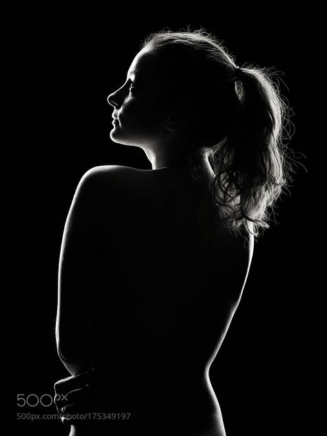
Different shapes, when they intersect and overlap, can combine to create a new shape. Shapes can also surround an area to create another shape. In a photograph a silhouette is the purest form of a shape. Shapes are often visually defined by the intersection, and/or closing/ joining of lines. Shapes can be defined by other shapes surrounding an area, such as the arrow in the logo of a popular shipping company. The area containing a shape is often referred to as positive space, and the outside area is called negative space. However, sometimes the negative space creates a shape of its own.

Types of shapes

There are two basic types of shapes, which are organic or geometric (regular). Geometric shapes consist of circles, squares, triangles etc. and organic shapes consist of things such as an outline of a bird, elephant, flower tree etc. Fluids can also create organic shapes that cannot be permanently defined, such as the shape of a cloud or rain puddle.

Where are shapes in a photograph?

Shapes are everywhere in a photograph, and the physical photograph is a shape. It is usually a square or a rectangle, but can occasionally be a circle or an oval or a random shape. Inside the photograph are shapes captured in the scene by the photographer on their camera. Shapes can be simple or very complex.

Form

Form takes a shape from two-dimensional and makes it three-dimensional and also has height, width and depth. It is the shape and structure of something as distinguished from its materials.

Types of form

Form also has geometric (regular) and organic, just like shape. Geometric forms consist of cones, spheres, cube, cylinder, etc. and organic forms consist of objects that surround us in our three-dimensional world. Forms can be simple or very complex. Forms also create positive and negative space. In a photograph positive space is which is occupied by forms and negative space is what remains.

Where are forms in photographs?

Forms are often everywhere in photographs. A photograph captures all the forms in the view of the lens. Three-dimensional forms are rendered in two dimensions by the photograph. Whether printed or on the screen, the final image does not have depth, so we perceive three- dimensional forms by using shadow. Photographs show form by capturing highlights, through the midtones, and into the core shadow of any object.

Texture

In photography, texture can be felt with both the fingers (the print) and virtually (with the viewer’s eye). Texture is the visual or tactile surface characteristics or appearance of something.

Characteristics of texture

Texture in ‘real life’ can be smooth or rough, but can also be described as slimy, wet, hard, soft, bumpy, shiny etc. However, in photographs it is similar to form as it is revealed in tonality and presented in two dimensions.

Types of texture

In a photograph, smooth objects might have reflections or specular highlights. Rough objects might have aggressive areas of light and shadow without reflections. However, in a photograph we cannot ‘feel’ the texture of whatever the photo is, but if it is familiar we can recognise how it would feel. However, if it is not familiar to the viewer they would not be able to imagine the ‘feel’ of the texture. Patterns can also indicate textures in photos. The physical print has its own texture, which may be glossy versus matte, or even canvas-textured printing papers, for example, which may or may not be aligned with the texture of the objects in the photograph.

Where is texture in photographs?

Texture can be elusive in a photograph, depending on the subject, the lighting, and the forms in the image. A lack of visual texture might mean that the object is smooth, or It could mean that it is too far away from the camera and the texture cannot be resolved. It could also mean that the light is diffused or lit from head-on and the texture is hidden. Form and shadow is what emphasizes texture. Even the tiny shadows of the texture on a plaster wall. A photograph of a full moon does not show much surface texture, but the oblique lighting of a crescent or gibbous moon, viewed through a telephoto lens with sufficient resolution, will show incredible texture on the surface. Despite the texture of the object in the photograph there are factors that will emphasise or obscure how this object is perceived.

Colour

Colour is a phenomenon of light or a visual perception that enables someone to differentiate between identical objects. The appearance of objects and light sources that may be described in terms of hue, lightness, and saturation for objects and hue, brightness, and saturation for light.

Characteristics of colour

Light itself has no perceived colour, but when sent through a prism or a drop of water it is comprised of a literal rainbow of colours. Colour has three properties, which are hue, value, and saturation.

Hue– The description of the colour (e.g., blue, red, yellow, etc.).

Value– The relative brightness or darkness of a colour.

Saturation– The intensity or purity of a colour. The purest colour is a hue with no white, black, or grey added to it.

Types of colour

Many different colours can have very different meanings, based of emotional responses, genetic responses or cultural programming. Red can mean danger, blue symbolizes calm, yellow is happy, black is mournful, white is innocent, and purple can symbolize wealth. Bold and bright colours are known for grabbing our eye. A bold and bright-coloured subject in a photo can be a good thing, but if your subject is not bold and bright, while other things in the frame are, then it can detract from your subject. A solution for bright and bold distractors is to make the photograph black and white. Muted colours might elicit indifference or even melancholic feelings, but muted tones abound in such calm/ happy moments, often make for powerful photographs. Harmonic colours are colours that compliment each other serve to create distinct feelings in photographs, because subjects in the photo can visually connected through their colours.

Where is colour in photographs?

Mainstream coloured photographs did not exist until the 1930s, but now colour can be seen everywhere in photos, unless the photo is in black and white.

Size

Size is physical magnitude, extent, or bulk : relative or proportionate dimensions.

Characteristics of size

Size in a photograph is relative and can be an illusion. When a familiar object appears in the frame of a photograph, we immediately get a feel for the scope of the entire scene. Without a familiar object in the image, we struggle to determine the scale shown in the photograph. However, there are optical illusions and some that are unique to two-dimensional renderings of three-dimensional scenes and some illusions that are enhanced by rendering them in two dimensions.

Types of size

Different types of sizes include small, medium and large. The camera, lens, and print can render large objects small, or small objects large. Even objects familiar to our eyes can be rendered relatively large in a photograph, while things we know to be enormous are rendered small.  We can fit our entire planet onto a small photographic print. We can also print a photograph the size of a highway billboard or a single grain of sand. We can even use a 1:1 macro lens to reproduce objects at ‘life-size.’

Size in photographs

With a casual snapshot, size might not be something one even considers when composing the image. The size of common objects in the photograph gives the scene a sense of scale, but a single object in space might not accomplish this since there is no means for comparison. There are times when another object, maybe sitting atop our subject, serves to confirm the scale in the image, which eliminates the possibility of confusion. If you want to emphasize the size of an object in the photograph in relation to its surroundings, you should get closer to that object. When a three-dimensional scene is rendered in two dimensions, as your view extends out toward the horizon, objects closer to the horizon are farther away than those near the top, bottom, or sides of the image. Overlap is another way to render a scene virtually in three dimensions, and overlap can also give hints to size. When one object is in front of another, and it is smaller than the object behind it, we generally know the relative sizes of the two objects in question, as long as those two objects are close to each other in three-dimensional space.

Depth

Depth is the direct linear measurement from the front to the back.

Characteristics of depth

We already discussed depth when adding the concept of depth to shape to create form. The depth of a scene, which relates to its size, and adding the element of space. We are given a sense of depth due to various visual cues, to which we rarely give much thought or analysis, but these ques can create more compelling photographs, which the viewer will find themselves looking deeper. This perception of three-dimensional space is what our eyes experience whenever they are open, and that is what our eyes try to experience when looking at a photograph.

Types of depth

Unless you are photographing perpendicular to a blank and smooth wall, your image will have depth. How well the depth is rendered is dependent on the objects in the frame, your choice of composition, and your perspective in relation to the objects in the frame. Most images have a foreground, middle ground, and background. The stronger the delineation between those successive ‘grounds,’ the stronger the sense of depth in your image. Including a distant horizon is not required to give a sense of depth to your image. Depth is provided by visual cues.

Visual indicators of depth

Photographs taken of roads/ train tracks show depth, as they show the road or tracks narrowing as they become more distant. This convergence of lines is called linear perspective. This is because as the road/ train gets further from the eye/ camera it appears to converge, which shows depth. Depending on the quality of the surrounding air or atmosphere, distant objects in a photograph will have less clarity and contrast than objects in the foreground. This aerial perspective is indicative of depth in a photograph.  Texture gradient shows depth in a photograph as relatively distinct foreground textures and texture gradients in a photograph smooth out as they recede into the distance. The overlap of objects also show depth as they show which object is closer and which object is further away. Size also helps show depth, because the smaller an object the further away it is/ seems, assuming the viewer is familiar with the object. Where you place objects in the frame can also show depth, because the higher an object is in the frame relative to the horizon (seen or implied), the greater is the perceived distance to that object. This is called upward dislocation.

photography quiz

Q1: What is the etymology (origin & history) of the word photography?

Writing with light.

Capturing light.

Painting with light.

Filming light.

Q2: What year was the first photograph made in camera?

1739 (Joseph Wright)
1839 (Louis-Jacques-Mandé Daguerre)
1826 (Joseph Nicéphore Niépce)
1904 (Salvadore Dali)

Q3: When did the first photograph of a human appear?

1874 (Julia Margeret Cameron)

1838 (Louis-Jacques-Mandé Daguerre)

1856 (Henry Mullins)

1939 (Ropert Capa)

Q4: Who made the first ‘selfie’

Kim Kardashian (2015)

Robert Cornelius (1839)

Cindy Sherman (1980)

Claude Cahun (1927)

Q5: When did the first colour photograph appear?

1907 (Lumière brothers)

1961 (Andy Warhol)

1935 (Kodachrome)

1861 (James Clerk Maxwell)

Q6: What do we mean by the word genre?

A study of an artwork

A depiction in art

A style or category of art

A creative process in art

Q7: What do we mean by the genre of still-life?

In image where a person is sitting still and not moving.

An arrangement of flowers.

A picture of food.

An image that shows inanimate objects from the natural or man-made world.
Q8: What was the main purpose of the Pictorialist movement?

To capture moving objects

To record reality

To affirm photography as an art form

To be scientific

Q9: How do we describe the term documentary photography?

Capture images that truthfully portray people, places and events.

Staging images for maximum effect.

Provide in-depth information about a subject over a long period time.

An interpretation of reality as witnessed by the photographer.


Q10: What is exposure in photography?

To expose hidden elements in our society.

To record fast moving objects.

To capture bright light.

The amount of light that reaches your camera’s sensor.

Q11: What controls exposure on your camera?

Depth of field, composition, distance to subject.

Aperture, focal length, ISO.

Aperture, shutter speed, ISO.

Shutter speed, distance to subject, depth of field.


Q12: What control on our camera records moving objects?

Aperture

White balance

Shutter

ISO


Q13: How do we explain depth of field?

How much of your image is in focus.

To photograph from a high vantage point.

A view across a field.

A deadpan approach to image making.


Q14: What factors affect Depth of Field?

Shutter speed, distance from camera to subject, and sensitivity to light.

Lens aperture, distance from camera to subject, and lens focal length.

Lens focal length shutter speed and lens aperture.

Sensitivity to light, shutter speed and lens focal length.

Q15: What is composition in photography?

Capturing the quality of light.

A piece of music with different instruments.

Staging a portrait with props.

The arrangement of visual elements within the frame.

Q16: What is your understanding of aesthetics in art?

Concerned with the nature of beauty and taste.

It is subjective and in the eye of the beholder.

Aesthetic qualities refer to the way and artwork looks and feels.

Making a critical judgement based on observation and understanding.

Q17: What are contextual studies in photography?

To provide historial, cultural and theoterical understanding of images.

Consider factors outside of the image, as well as inside the frame.

To give an opinion without any research.

To seek a definite answer.


Q18: How many images are captured on average every day worldwide?

1.5 billion

4.7 billion

800 million

6.9 billion

Q19: Which portrait is the most reproduced in the world?

Mona Lisa

Lady Gaga

Ernesto ‘Che’ Guevara

The Queen (Elizabeth II