Category Archives: Uncategorised

Filters

Author:
Category:

Single object photoshoot

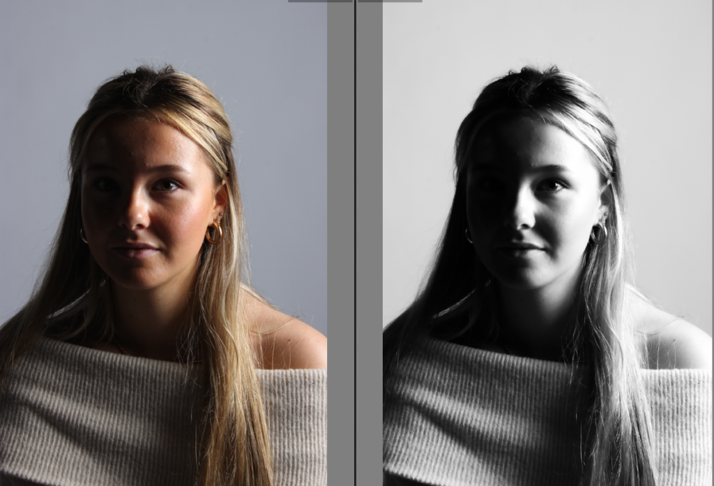
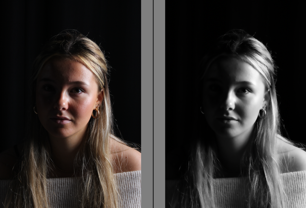
before the photos were edited:

After the photo were edited:

here I went to the studio and too some photos inspired by walker Evans, I have already taken some similar photoshoots that involved more items, and different objects however I made this photoshoot more personally aimed towards still life photography and Walker Evans. I really like hoe some of my photos turned out however most of them had become very blurry and vivid, making it hard to work with and edit them, while others looked not centred enough or had a piece of the background in the photo. This made it difficult to chose a photo to edit. However I found a few and made sure that they were cropped to the right size.
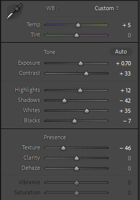
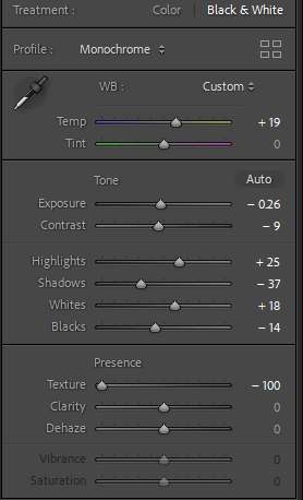
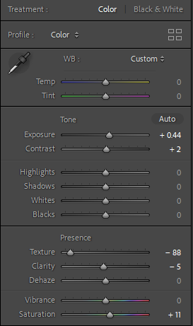
Here I played around with the settings to try and see what looked best, I felt that my photos looked better with a warmer tone then a cold tone as the tools themselves were quite cold they wouldn’t have blended in well together. I made sure that the highlights were quite low as there were already shadows involved in the photo, therefore the tool already has a darkened background adding a white tone to it would make it look unrealistic and fake. I also added the blacks to over 50% because as the background was added to a warm tone, it helped me visualise and focus on the object more.
Photo Analysis:

Overall I am really happy with how this photo has turned out as the photo looks really clear. However the artist I was inspired by, Walker Evans, his photos were quite coldly toned and didn’t show much warmth, so I personally believed that the warmer tone made my photos look more advanced and original to me, although I was trying to copy walkers Evans work I did want to interpret my own ideas into the photo to make it more original to me. If I were to redo this photoshoot I would have liked to try and make them cold toned to see what difference it would have added. Or I would have liked to have used more tools maybe a knife and fork or even a spoon to mix it up a little bit as I had only used 2 different tools it didn’t help me explore and advance my ideas.

Formalism

There are 7 basic elements to photographic art, they are:

1.Line

Lines in photography can be either curved, straight or both. Solid, dashed of part of a line. Vertical or horizontal. In photographs, when the viewer notices straight lines, it is not uncommon for the object to be manmade. however, curved lines would more likely be organic in nature. the direction of lines convey meaning inside the photograph. vertical or horizontal lines are seen to create a sense of stability. Vertical lines usually represent height, whereas horizontal would focus more in distance. Lines are very common in almost every photograph. Lines could be used to make the viewer focus on something the photographer wants them to see, the pathway of the line will lead the viewers eyes.

2. Shape

1 a : the visible makeup characteristic of a particular item or kind of item

1 b (1) : spatial form or contour

1 b (2) : a standard or universally recognized spatial form

Shapes are created by the joining of lines. these lines can usual shapes such as a simple circle or shapes but can also make unrecognisable ones based on the photographers viewpoint. in photographs with shapes it may be important to the photographer to take it from different angles as different angles could be completely different shapes. shapes can be created with things such as the structures of buildings but as well as this, the black space surrounding the structures also has its own space. This shows that shapes are everywhere in photography.

3. Form

unlike shape, form is 3-dimensional and it can be geometric (or regular) and organic. geometric forms are the the familiar shapes we know. organic are objects that surround us in our 3-dimensional world. forms can be complex like shapes. in photography, positive and negative forms of space are created. positive space is what is occupied by forms and negative space is what remains. Forms are everywhere in photography as the photograph captures all the forms in the field of view of the lens.

4. Texture

Texture can be felt with physical touch of the photo print or even just with the viewers eye. basically, texture can be smooth or rough as well as other descriptions. we can make our the feeling if photographs by our own experiences. for example, if someone has never touched gravel/stones then they are not going to be able to easily feel what that photo of a rough gravel path as well as someone who has.

5. Colour

Red, brown, pink or grey can be viewed as a phenomenon of light or visual perception that a person will have top differentiate otherwise identical objects. light has no per4cieved colour but it moments when light is send through water, it will create a rainbow effect of colours (like the sun at a water fountain for example).

The three properties of colour are Hue (description of the colour), Value (relative brightness or darkness of colour) and Saturation (intensity of colour). many colours have meanings, for example, Red can mean anger whereas blue can represent calm. colour can also bring across feelings of happiness. you would get a more brighter and happier feeling if you saw a field with bright yellow flowers rather than a black ands white photo of the flowers.

6. Size

if a familiar object is the main focus of a photo (meaning its the largest aspect of it and most likely what your eye catches first) then you are more likely going to be more interested in that photo rather than one that is difficult to find something you are familiar with. a camera lens can created the illusion of an object being larger than it actually is.

If the object takes up most of the frame then the viewer will assume its the largest aspect of the image. however, the photographer could have simply made that object closer to the lens or only zoomed up on that object.

7. Depth

in a usual photograph, we are given a sense of depth due to the visual cues. an image will always have depth (unless its a black smooth wall). but the amount of depth in your photo depends on the objects in your photograph. in most photos you will find there’s a foreground, middle ground, and background. the stronger the delineation between those three, the stronger the sense of depth is in your image. in a two dimensional photograph, depth is created by the use of linear perspective where we follow the distance of, for example a road, and perceive that its actually getting deeper in the photo.

Formalism

What is formalism?

Formalism describes the critical position that the most important aspect of a work of art is its form – the way it is made and its purely visual aspects – rather than its narrative content or its relationship to the visible world.

Lines

Lines in photography are extremely important. A good arrangement of lines are able to lead the viewers eyes to certain areas of the image. However a poorly arrangement of lines could guide the viewers eyes away from the main subject of the photo.

As you can see this image has lines due to the train tracks which causes your eyes to be led towards the middle of the photo. This also adds depth.

Depth

Depth in photography in simpler terms means how much of your image is in focus. In more complicated terms it is the distance in a photo where the subject appears.

The depth in these photos gives the photos dimension. It also causes your eyes to be drawn to the object that is in focus for example the leaf and the daisies.

Shape

Shape photography is the two-dimensional appearance of objects as your camera captures them. For instance, if you look at an image of a ball, you’ll find its shape as a circle. Likewise, if you look at a picture of a cube-shaped suitcase, you’ll find its shape like a square.

In a photograph, a silhouette is the purest essence of a shape, they have no form, texture, or colour. Due to its stark contrast with its surroundings, a silhouette is also the most visually obvious.

The photo above is an example of a silhouette.

Form

There are two types of form:

Geometric form in photography focuses on the geometric lines, shapes, and patterns that exist in the world. While geometric images are often found in architectural photography, the subject matter can be anything from vast cityscapes to patterns in nature.

Organic photography includes shapes which are full of curves and may not be geometrically perfect. They’re natural and non-uniform. We find organic shapes in nature. For example, you’ll find them in the curve of a tree branch or the shape of a flower petal.

Texture

Texture in “real life” can be, basically, smooth or rough. We can use other descriptors as well such as slimy, wet, hard, soft, bumpy, shiny, etc. Texture in photography is similar to form in that it is revealed by variations in tonality and presented in two dimensions.

In photography things such as patterns can give texture to an image, for example scales. The physical print of a photo also has its own texture such as glossy and matte.

Colour

Color in photography composition is one of the main tools a photographer can use to create mood in their images. How you combine various colours or exclude them from your photographs influences how people might feel when they look at them. This is why understanding colour in photography is so important.

Warm colours:

In photography, the dominant colours are the warm colours, such as red, yellow, and orange. These colours are considered dominant because they reach our eyes before the cooler colours.

Cool colours:

The cooler colours are the receding colours, e.g. blue, green and purple.

Size

Size in photography describes the physical magnitude, extent, or bulk of the contents in the photo. Size in a photograph is relative and can be an illusion. When a familiar object appears in the frame of a photograph for example a car, basketball, streetlamp. We immediately get a feel for the scope of the entire scene. Without a familiar object in the image, we struggle to determine the scale shown in the photograph.

Camera Simulator

My shutter speed for this photo is fast so it makes it look like the propeller is not moving, if I wanted the viewer to know that this way a moving plane then I would decrease t6he speed of the shutter speed. I have a shallow depth of field so the plane/ a few of the marbles are clear to see whereas everything else in blurry. 

In this attempt, my photo is very underexposed which means it does not have enough light. I know that to fix this I should increase my IOS 

(A few other attempts)

Image making, selection and editing…prompts and evidence

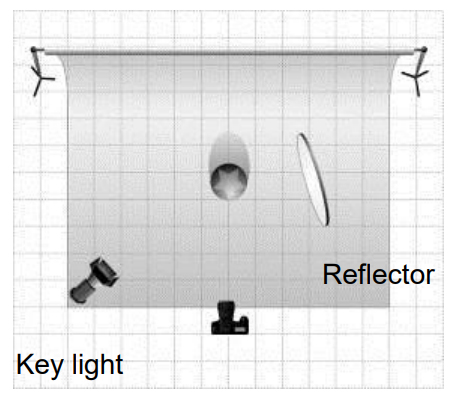
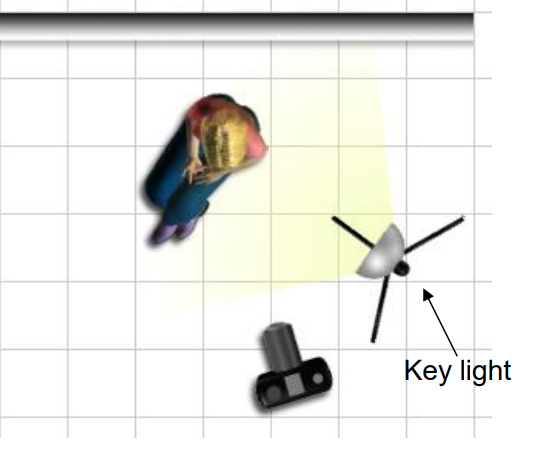
Studio set-up and Lighting arrangements

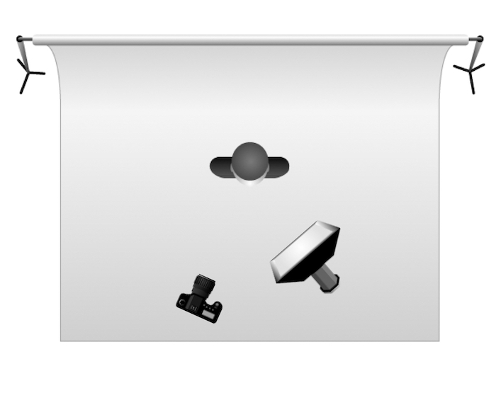
1,2,3 point lighting

Flash setting

Static / continuous lighting

Copy-stand

Infinity Screen

Coloured gels / filters

Camera settings + exposure values

Focal Length

Aperture

Shutter Speed

ISO

White Balance

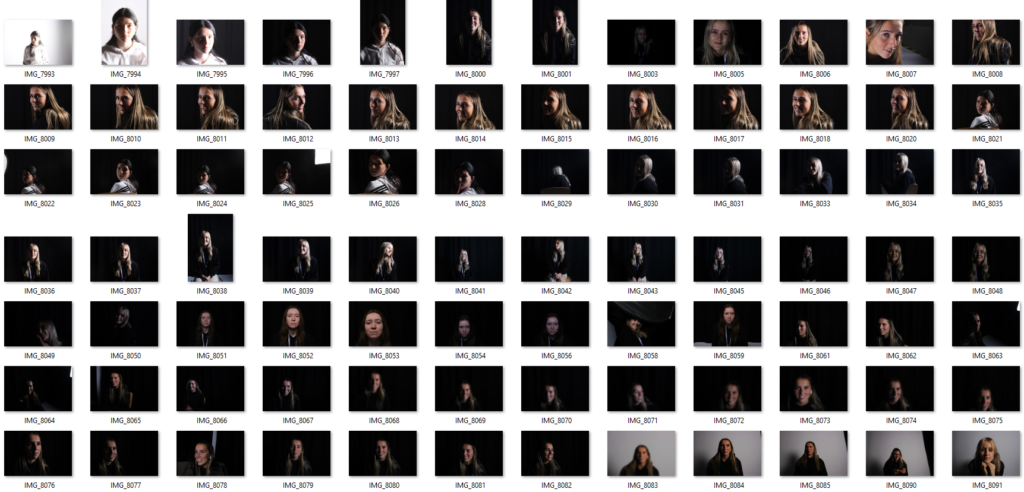
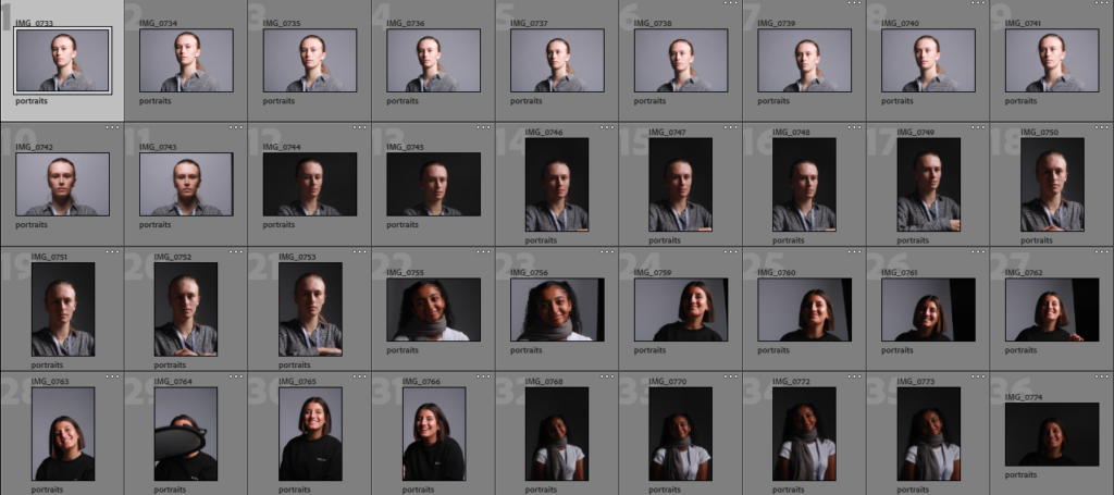
Adobe Lightroom Library Mode Contact Sheet and Selections

P + X (select + discard)

Star Rating

Colour Rating

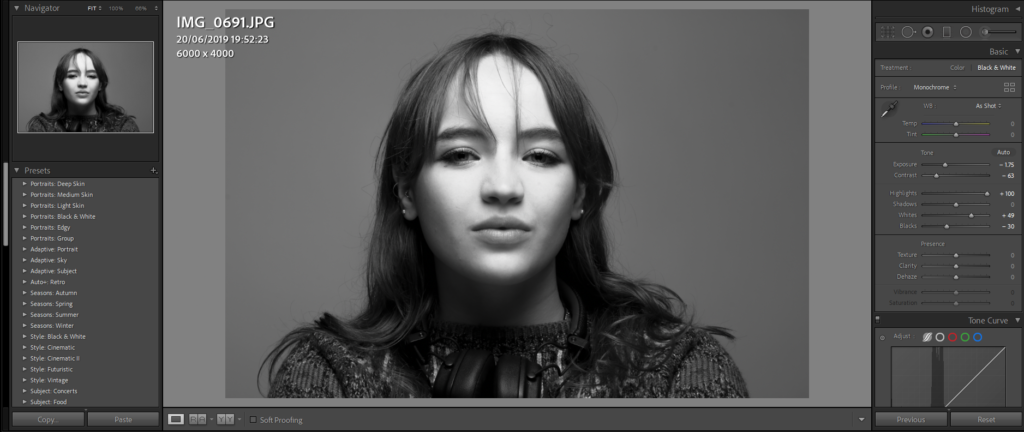
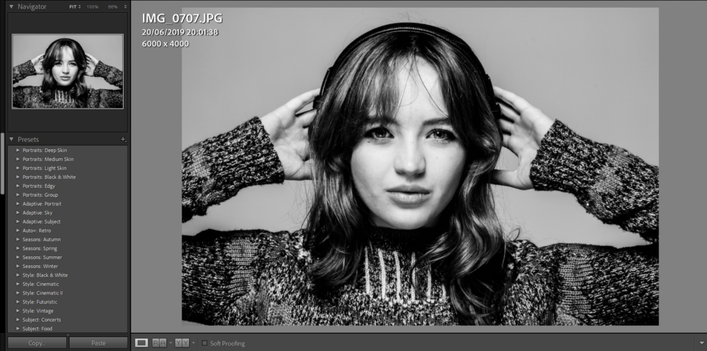
Generic editing / batch editing

Adobe Lightroom Develop Mode Deeper Editing and Image Enhancement

Before and after image comparison

Exposure values (dark – light) over, under, balanced

Colour adjusments

Saturation

Tone

Contrast

Cropping

Pre-sets and filters

Still Life photoshoots –

first photoshoot:

This was the first photoshoot I’ve done and I tried to vary the lighting so they would be somewhat different to each other.

I brought in some objects that reminded me of the theme of nostalgia such as the incense and dream catcher which remind me a lot of my childhood because I always had incense burning in my house and constantly had dreamcatchers above my bed.

second photoshoot :

For my second photoshoot I wanted to focus a lot more on the theme of nostalgia and use the lighting techniques and ideas talked about in lesson.

I took a considerably more photos then the first shoot to give myself more options to edit because with the first shoot I only had 3 photos to choose from. I took some photos using the tripod and some others by hand to get different angles and options.

third and final photoshoot :

This photoshoot I would say is my best one, because it has multiple different colour lighting used from warm light to colder light because I wanted to see what kind of light would look better for the silver box in the photo.

I also had the warm spotlight in the cold lighted photos to give some contrast in the lighting. I also changed the ISO on the camera too, so that I could see what kind of light I needed to produce the most impressive photos.

The Formal Elements

By Yann Lock-Livramento

Line

Line is a key part of photography as it can be used to add depth or as leading lines which help point to the subject of a photo. Or to connect points in an image.

There are many different types of lines such as curved, dashed, zigzagging or straight lines.

Direction is also important as the lines could be horizontal, vertical or diagonal.

Converging lines are two lines that meet at a point to give an image depth and Diverging lines move further away from a point.

Shape

When multiple lines connect together it can create a shape.

shape is photography are usually 2 dimensional.

Shapes can be Geometric or Organic with geometric shapes being basic shapes such as: squares, rectangles and triangles. Organic shapes are more natural and can be outlines of objects like a leaf or an animal.

Shapes are usually defined by lines in a photo but they can defined by areas which are brighter or darker or by different colours in in a photo.

Form

Form is 3 Dimensional compared to Shape which is 2 dimensional.

The different shades of colour on the apples create depth and the shadows gives us the impression that the apples on the left are 3D.

Like with shape there are two types of form Geometric and Organic with geometric being Cubes and Cones or any 3D shape.

Texture

Texture could refer to the texture of the objects in the photo and could be indicated by the pattern of the object.

Texture gives the objects in the photo more detail and can change the way we perceive something in the photo.

You could describe the textures as being: Rough, Soft, Smooth, Bumpy, Dry, Wet, Shiny.

Colour

Colour can be due to the colour of the objects being photographed or the lighting in a photo.

The properties of colour:

  • Hue which is the colour e.g. red
  • Value which is how bright/ dark the colour is
  • Saturation is how intense/pure the colour is

The photo on the left uses saturated pinks, purples and yellows/oranges to make the sunset seem beautiful and vibrant.

Colours can also be harmonic which means they compliment each other (go well together) and can be used to affect the mood of a photo.

Size

Size really does matter when it comes to photography as larger objects can draw the readers attention and smaller objects are good for adding more detail to a photo.

Size is good as it adds scale to a photo so you can determine how big the subject in a photo is. In the image on the left the tree shows that the sand dune is really big as it gives scale.

Size can also be used as an illusion as you can take photos in angles which make objects look bigger or smaller then they actually are.

Distance from an object can also affect how big the object looks in a photo as they closer you are to what your photographing can make the object seem bigger and vice versa. Size can be described as being Big/Large, medium and Small.

Depth

Because photos are 2 Dimensional Depth is what makes objects in photos look 3D

Photos Usually have 3 types of depth: Foreground, Middle ground and Background. Having your objects/ subject in any of these grounds will give it a sense of depth

Converging and Diverging lines give the image a linear perspective which is also a good way to give the illusion of depth to an image.

Analysing using the formal elements

I analysed a photo using the formal elements to apply my knowledge and try it out.