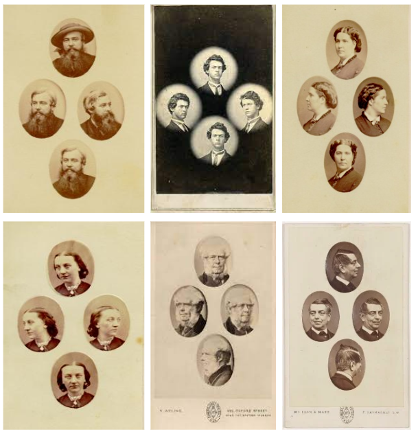
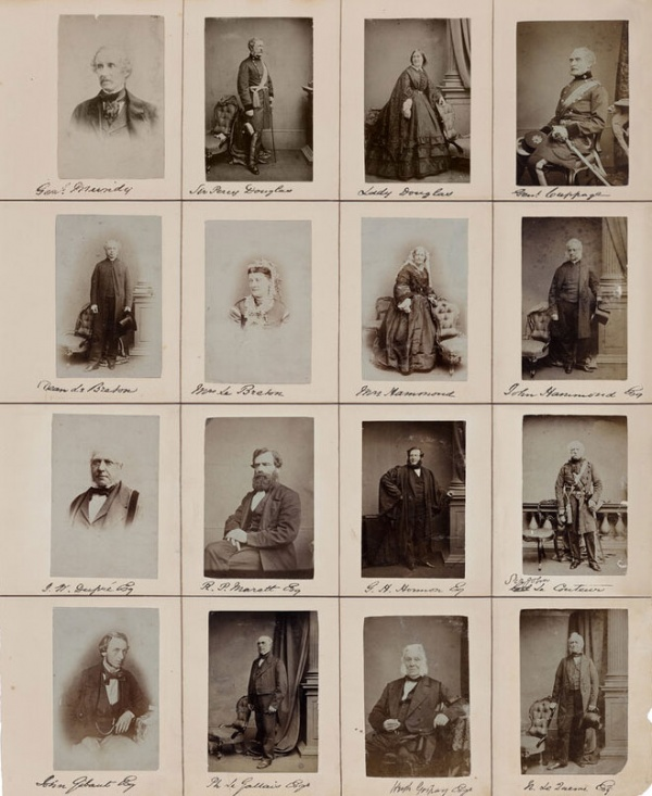
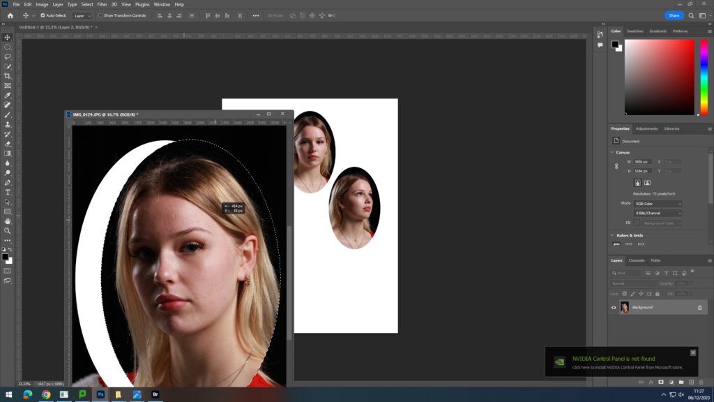
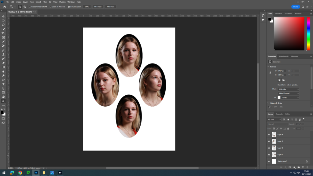
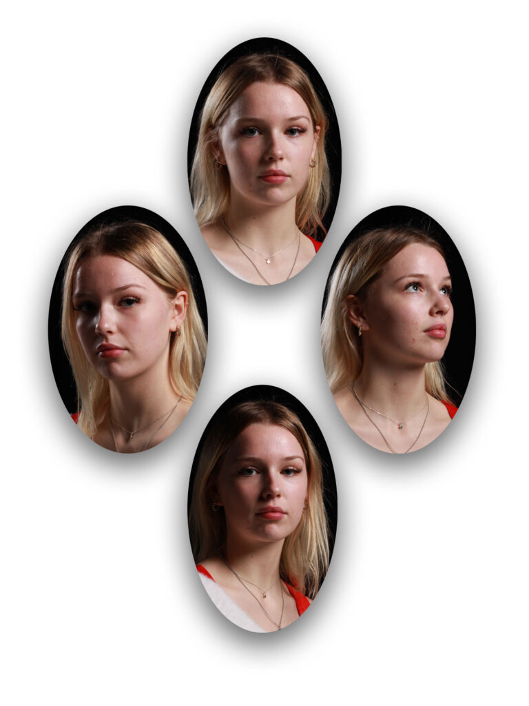
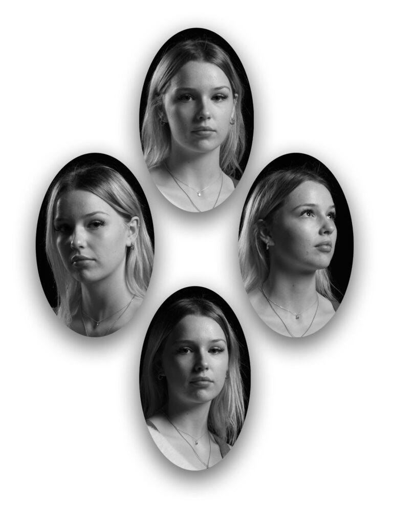
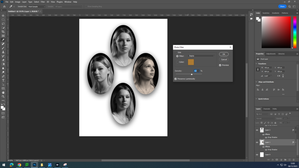
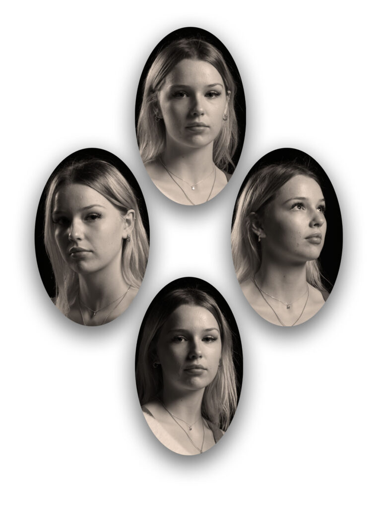
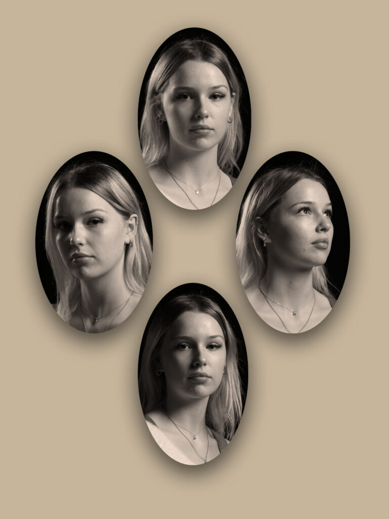
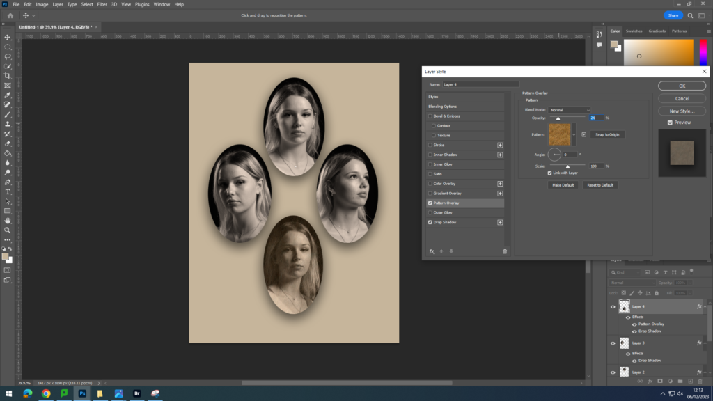
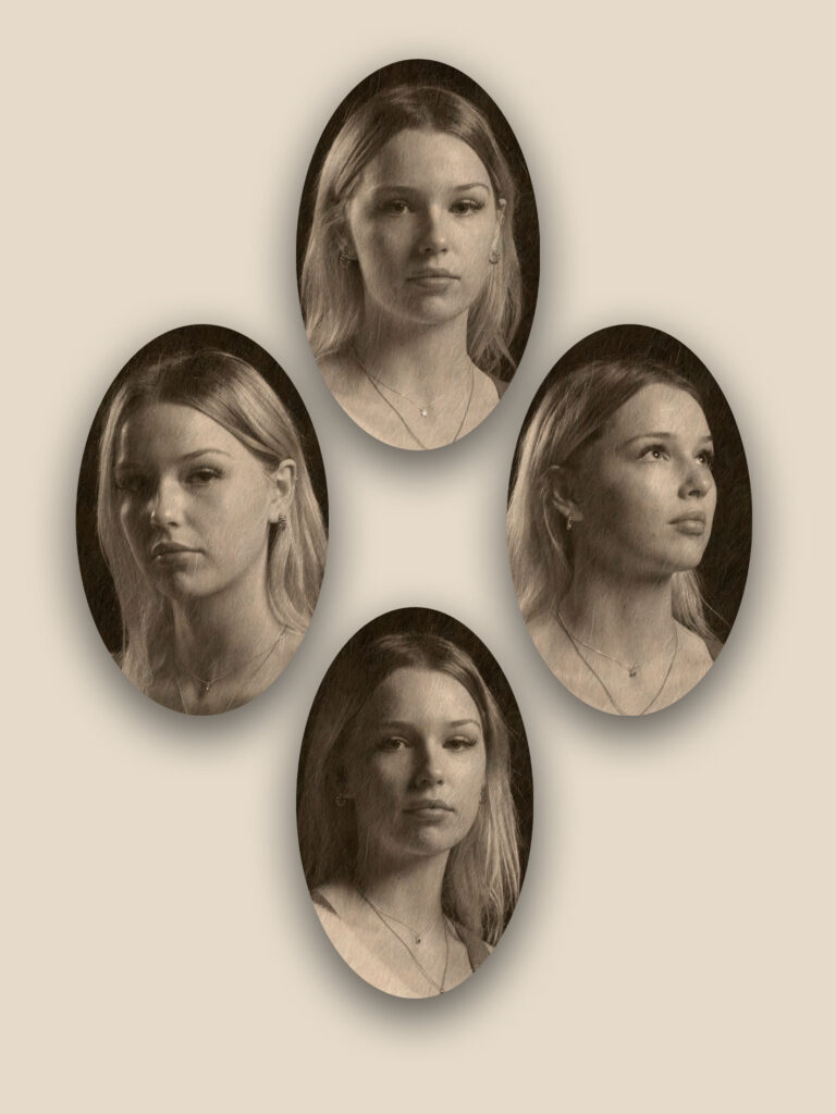
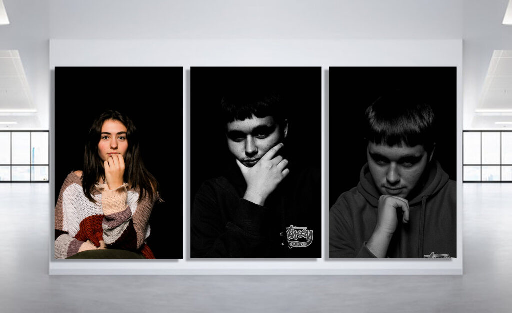
Here is my photoshoot part of nostalgia, These photos represent what I wanted to be like when I grow up. When I was younger I’ve always wanted to be older and grow up quickly. These photos represent what I wanted to be when I was younger and what I have become now.
Some of my photos where a bit blurry and the camera didn’t really focus, net time I would like to take my time and really explore the photo and the way the objects are presented. I could also make the lighting different by adding a colder, more bold look. However I do really like how I’ve used a warm tone lighting as the objects really represent the vibe.
overall I think my photoshoot went really well and really helped me understand what nostalgia and still life is. I got a better understanding of each concept which allows me to expand my ideas and thoughts into a planned photoshoot. Throughout my photos I believe that my photos almost look like an advert or a presentation.
This is my best photo as it has reflections and different lighting, I really like how the colours blend together and they represent the fall season with all the darkish but warm tones.
In photography, I use a DLSR Canon camera to take photos. I use this camera to ensure the quality is good and makes the photos better than an iPhone. This camera is extremely beneficial for photography as it allows me to change the shutter speed, ISO and aperture.
The shutter speed is the length of time from the moment the shutter opens and this then allows light into the camera. A fast shutter speed will create a short exposure whether as a slower shutter speed will create a long exposure because the shutter is open for a longer period of time which allows more light into the camera. The aperture is the opening of the lens’s diagram through which light passes through. Having a smaller aperture creates a sharper image. The ISO ( International standard organization) is an image sensitivity in a numerical value. Having a higher ISO can lower the quality of your photo and degrade is which will cause your photos to be grainy or “noisy”.
Canon Camera Simulator
This is website which allows you to play around with the different
Superficially, it can refer to the ability to “read” a photograph, to analyze its form and meanings. Photoliteracy is therefore a particular understanding that combines visual, linguistic, emotional and physical precision.
My response to Walker Evan’s and Harvey Regan’s work, was a very similar style, looking at how the object is presented in the photo. I started by trying different lighting settings until I found one that worked. I also used a few different objects, some that were particularly nostalgic to me personally and another that I thought was really quite interesting and could make a great result.
I started by adding all my photos into a collection on Lightroom and then rating each image and putting a corresponding colour code, red- low star rating, yellow for photos that have a middle ground rating, and then having green for any high rated photos that I will go onto edit.
This is the original image and the settings I used on the camera. I used a low shutter speed as the setting was static and fixed into a tripod with a low iso as the lighting was LED studio lighting. I took the image on a copy table as well so I will have to crop out the edges of the photo.
I started by cropping the image to get rid of the excess background and to focus the subject of the photo in the frame.
I then chose to adjust the tone by increasing the exposure to produce a whiter background and really highlight the comb.
Second Shot
I started by cropping this image as well, to again focus the subject.
I then changed the colouring slightly using the temperature toggles and the tint, this allowed me to level out the lighting as there was some small glares in the original photo.
My next step was to adjust the tone settings to create a whiter background while keeping fork true to real life colourings. By adjusting the exposure lower and the contrast higher to washed pout the background while bringing out the silver metal.
Choosing to next alter the presence as I didn’t like the purply light around the edges of the fork created by the previous editing, I reduced the texture as the fork is already fairly smooth it was unaffected however this removed the haze from the edges when used along side altered clarity and dehaze settings.
(This before and after doesn’t show the image before cropping) Overall I am very happy with the results as the editing has greatly benefitted the image. I have one more photo left I would like to edit using the skills and ideas of settings I have just learnt.
Third Shot
For my final image I chose to first again crop the shot, making sure the original is unlocked so I can individually adjust a side over having each side effect the rest.
These are the adjustments I did to make the photo slightly different. Originally I liked this edit, however I will go onto to remove some of the yellow as it looks slightly over saturated.
I much prefer this photo as it’s much more true to life with its’ colours. The background was effected meaning some of the purple tint came back but it doesn’t appear as purple and instead provides a solid, smooth background.
Fourth Shot
Starting again with cropping the image gives me a nice base to the editing. I try to frame all the images using the rule of thirds and removing as much of the unnecessary background as possible, like Regan and Evan’s style, instead focusing on the subject.
Looking at the colours in the photo, white background, white handle, black/ tarnished blade. I wanted the saw to stand out, which while it can be tricky to have white on white and make it stand out, as the saw is dirty and marked. (a reflection of how it has been used) The off white handle means it is bold on the page even without shadowing. This emphasises the shape and wear and tear with the tool.
This is the final image after editing, I like the follow on from the research of Evan’s and Regan’s work with the object in focus and a plain background keeping the focus on the subject and not everything around it. I used continuous hard lighting on a table with the camera on a tripod suspended over the object, ensuring the lighting didn’t wash out the saw if it was too harsh for the camera settings. Using white, harsh lighting made sure the object had little to no shadow, wasn’t an overly tonal image and didn’t feel warm and inviting instead intriguing and almost clinical in the attention to detail. While the photo started slightly under exposed as the shutter speed was 1/60 but the room was fairly poorly lit, after editing it was much improved by the increased exposure and decreased contrast. I’m happy with the image as unlike some of my previous work it does not have a purple tint, instead being a rather neutral boarding cold image, this is only emphasised by the saw handle being off white and showing high contrast between the pristine white background and the used saw handle.
These are my final images, by using a mixture of objects I created a varied array of shots which I then developed further with editing to produce my best four photos. The comb and boot brush are very nostalgic items for me personally and I love the way this style has captured every detail of each item making it very easy to at a glance remember all the good memories. the saw and the fork are not personal items to me but instead objects I found very intriguing to look at and are items that are very often used but never properly looked at, for the details and the flaws, or even the wear and tear of each object.
This photoshoot was inspired by Walker Evans and Darren Harvey Regan. We were experimenting with singular tools at first like Evans did, as he successfully portrays the significance of them through capturing one tool at a time. This is effective as it signals to the viewer the importance of the tool, and overall how useful they are in everyday life. In order to make these photos look productive, I ensured I had perfected the lighting set up and background, by going to the studio and capturing my photos from a birds eye view. Then I used my own imagination with no inspiration and took photos of multiple tools together which allows the viewers focal point to flow through each object in the image. I ensured to keep my background plain and neutral so the importance of the tools are still prominent.
Walker Evans – Beauty of the Common Tool – 1955.
Walker Evans was an American photographer and photojournalist best known for his work documenting The Great Depression. He was born on November 3rd, 1905, and passed away April 10th, 1975. His most characteristic images show American still life through outdoor advertising, the beginning of its automobile culture and domestic interiors.
Evans captured simple and flat, man-made objects with little shadowing to show the significance of the objects and valuing them. This adds a dark, old and almost scary feel to his images. Additionally, he doesn’t use much colour in his work, it is mainly based on shadows which helps create the common dull theme. He captures photos with a narrow depth of field to keep the viewers eye focused on the tools in his images, which prevents distraction.
My interpretation of Formalism:
Darren Harvey Regan –
Darren Harvey Regan is a photographer born in 1974, in Exeter. He was interested in the idea that photographs do not just exist to show things, but are physical things that become objects themselves. Regan was heavily inspired by Walker Evans after his portfolio “Beauty of the Common Tool” was released in 1955. Regan took inspiration from this, and began capturing valuable, man-made tools to signify the importance of them in day-to-day life. I believe Regan’s work is unique to other photographers, as he merged 2 tools together for creativity. He merged a wrench with a pair of pliers, and a Mason’s trowel with a pair of scissors. This was effective for the viewer because it is more intriguing than one tool in an image. It also makes us question what the relation is between the two tools and why the artist captured them together.
With this specific image, Regan successfully shows the value of the tool in his image by using a white background with no shadow. This also contrasts to Evan’s work as he often corporates shadows to show the depth of the tools. This could represent the fact he has modernised his photos.
Walker Evans was an American photographer and photojournalist best known for his work for the Farm Security Administration documenting the effects of the Great Depression.
He took documentary photography both for the American documentary movement of the 1930s and for street photographers of the 1940s and 50s. Producing a body of photographs that continues to shape our understanding of the modern era. He worked in every genre and format, in black and white and in colour, but two passions were constant: literature and the printed page.
His iconic portrait of Allie Mae Burroughs – a farmer’s wife, and mother of four – whose unforgettable eyes seem to stare right through us – is one of the most firmly embedded images in American consciousness.
I used flags, ratings and colours. I used different background’s to make more colours and variation’s.
This photo has different colour background for colourful effect with a single used tool.
I took this photo on a white background and here is how I took the photograph. These photographs are inspired by Walker Evans.
Here are some more images of some tools- inspired by Walker Evans.
This is one of my favourite pictures because its very clear and has a lot of purity. I edited this photograph to add higher colour.
In conclusion
I think that this photo shoot went well with all the colour and different styles of backgrounds, however I think I could’ve made the photos more clear and lit up the room more or even in light room. Although I do like the lay out and how you can move all the colours and pictures around. As well as mix up all the tools with many different o=objects surrounding them.
Walker Evans (an American photographer) greatly influenced Darren Harvey-Regan, and both artists paid careful attention to choice of objects, composition, lighting and exposure values. Walker Evans captured photographs of every day man- made useful daily objects from a birds eye view with little shadowing to show the significance of the objects and valuing them. Walker Evans work is behind a white background when the object is in the centre, this influences the photograph to catch the eye straight to the object. Its sort of as if Evans is celebrating the object as they are useful to our daily life. Both artists paid careful attention to choice of objects, composition, lighting and exposure values.
Walker Evans was an American photographer and photojournalist. He began to photograph in the late 1920s, making snapshots during a European trip. He is very well known for his work for the FSA, documenting the effects of the Great Depression.
Each tool tells a story about life during the Great Depression and how they played important roles for people struggling to make a livelihood.
DARREN HARVEY- REGAN
Darren Harvey-Regan was a photographer interested in the idea that photographs do not exist just to show things, but are physical things that become objects themselves.
Regan was heavily inspired and influenced by Evans after his portfolio of the ‘ Beauty Of the Common Tool’ was published in 1955. He then sourced matching tools, cut them in half and re-joined several halves together, with the resulting physical objects being photographed to create his work.
Regan’s work was unique and interesting as he merged 2 tools together for creativity. In which a ratchet wrench is combined with a pair of pliers and a Mason’s trowel joined with a pair of scissors. This made it stand out from the rest as the strangeness made it more eye-catching.
He named his work ‘Beauties of the Common Tool, Rephrased II, 2013’.
He took the story that Walker Evans represented and rearranged it, modernising it.
Within this photo, Regan uses a clear white (possibly on white balance) as a background with no shadow which contrasts to Evans work as Evans captured the shadow and depth of the tools. Evans often used different shades of whites whereas Regan did not. This could represent the fact he has modernised it. His photo is from birds eye view which is equal to Evans which shows similar qualities.
Formalism Inspired- My Photo
To achieve this photo, I went down to the studio and took these from a birds eye view to reach its full potential which links to Evan’s work as all of his photographs are and have a deep and clear shadowing to create a dull effect. I placed my tools onto a white blank sheet of paper to allow the tool to be in focus and so the light doesn’t reflect, which at first looked bright and modernised like Regan’s. >
However, after I took this photograph I continued to edit the saturation and highlights of the photo and this created it to be a lot more unique and more eye catching qualities such as deep shadowing and darker shades of whites to make it look like an older image. This links to Evan’s work as his photos have low saturation which gives the hint that they are old photographs specifically (1955)
I then continued to put these photos in black and white and placed them in a collage to make it even more similar to Evan’s work with the shadowing and dull effect with it to add more eye catching and interesting qualities.
In this photoshoot, I took pictures under the inspiration of Walker Evans. He took many photos of tools.
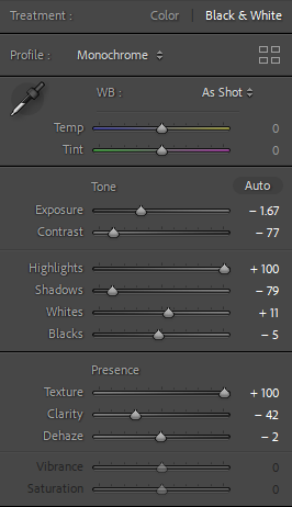
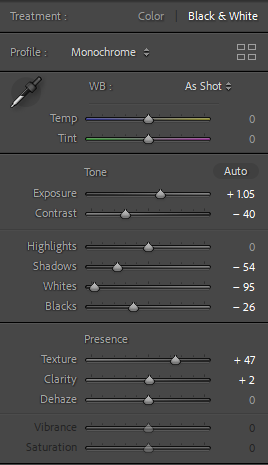
For this photo, I added contrast to show texture. I also adjusted the highlights, shadows, whites and blacks to what I thought looked appropriate for the photo. I also adjusted vibrance and saturation to add some colour.
In this photo, I didn’t change too much as i liked the photo as it was.
For this photoshoot, I picked a variety of different tools. I edited them using different sections of tone and presence. To take these photos I used the copy stand which takes pictures from above looking straight down.