Category Archives: Uncategorised

Filters

Author:
Category:

Single Object Gallery And Evaluation

I selected these two photos for my final presentation, I presented them in a gallery form using adobe photo shot. I picked these two because out of all of them I liked them the most, I thought they went well in the topic and was most lie my inspiration of Walker Evans.

This wasn’t my favorite topic as I didn’t find it as exciting taking photos of just single objects and dint show the best of my ability, I also thought while i’m still getting used to the camera and editing on adobe light room it is not the best I can do.

Even when looking at these final images now i see improvements that can be made, with the image on the left although i wanted that cooler temperature it was still too bluey and i think it was because there was something not right with my lighting and when i first took the photo there was a purple background. The image on the right is actually better i think because i increased the contrast so the darker colour really stands out more on the white background. You cant see very well in these photos but there are slight smudges in the background that i also dont like and when improving and learning more about photo shot i can edit those out.

Overall, i do like these images and of course they can improve but this was not my favorite topic.

Virtual Gallery – Artsteps

I have used Artsteps to create a virtual gallery as an exhibition with some of my best images.

I exported each image to my best images folder so I could easily access them. Then I imported them into Artsteps. This was really quick and easy.

Then, I dragged and dropped each image into the exhibition.

I altered the images sizing and placement on the wall, before adding a silver frame to make it look presentable.

Creating a Virtual Gallery

Photoshop:

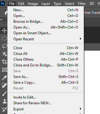
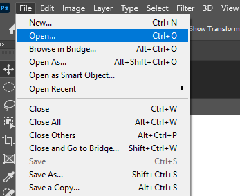
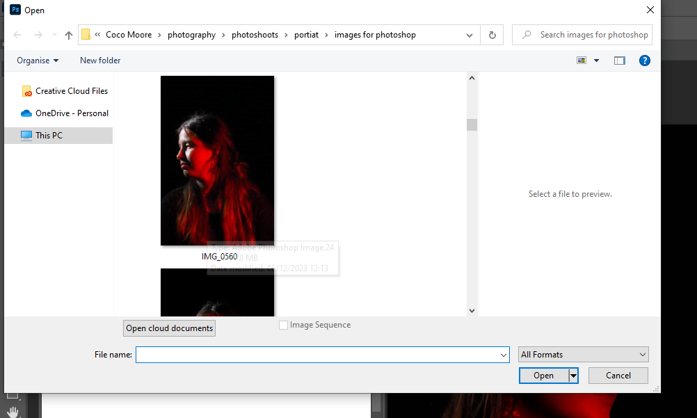
My first attempt of the photo gallery was created on photoshop. I first had to open up google to search ‘Blank gallery space’ to find my background. after I chose the one that is shown above, I put it into photoshop and then went to my files to open the image I wanted to present. the images I chose were ones that I had edited previously on Lightroom. I got my images from Lightroom which were already edited beforehand and imported them into photoshop. I used ‘control T’ to highlight the imported image to be able to move it to where I needed it. I also used the Ctrl icon when adjusting the image to make the angles change and for the photo to sit nicely on a wall. Using a drop shadow effect, I could make the image look more realistic and 3D when on the wall.

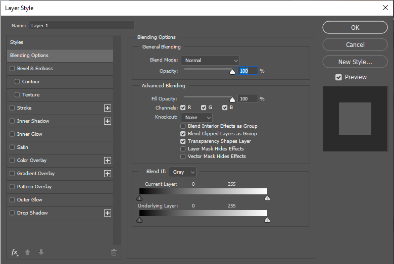
In the screenshot below, it shows how I was able to create the drop shadow on the images to make them more look like a photo on a wall. all I had to do was double click on the layer I wanted to edit and then tick drop shadow at the bottom. from there, I was able to adjust the amount of shadow and the angle I wanted it at.

Artsteps:

This was my attempt of the photo gallery using Artsteps. This was an easier process than photoshop as you can move around and choose the wall you want your image on while being in a large space. it doesn’t involve the added work of adjusting the image to a certain angle on a wall ands you can also add your own borders. You are also given the option to add more fixtures for your photos to go on so I experimented with that and added 2 walls on top of each other in the middle of the room. I chose my favourite photos from my Still Life Nostalgia photoshoot and then my favourite photos from my Formalism/Tools photoshoot.
Evaluation

Overall, I like how my gallery turned out on Artsteps. I like the gallery space I chose as I have a lot of areas to choose from and add my images to. I prefer this more than photoshop as its an easier process and on photoshop the angles of the images sometimes don’t turn out right or look the wrong angle.

single object tools photoshoot :
Here is my first edit from my single objects tools photoshoot, from this photoshoot my images didn’t quite come out as I expected as they came out with a darker orange kind of tint on the images so I used Lightroom and changed the tint of the images to create the effect I originally wanted on the images.
For these final two images that I have edited I played around with the tint a bit more leaving a more blue kind of tint on my images which almost makes them stand out even more then my first pre-set I made.

these are my tools still life photos inspired by Darren Harvey-Reagan.

‘Beauties of the common tool’- photoshoot
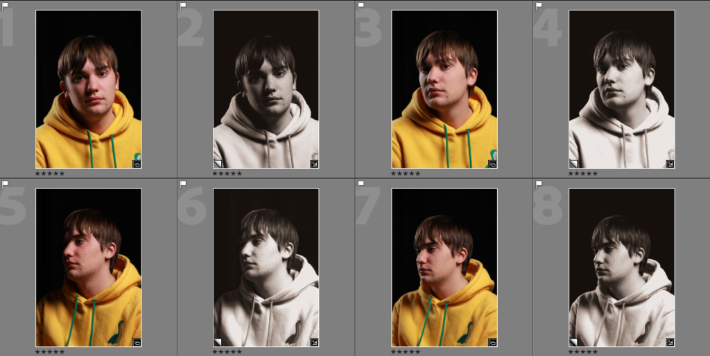
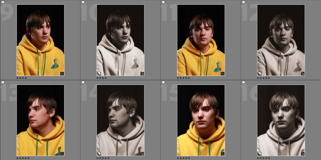
I rated, flagged and colour-coded each image in my photoshoot as it would give me a better perspective on which ones were the best and which were worse. It also let me see how much detail was in each image compared to the similar ones.
I flagged these images as red because a lot of them had an exposure that was too high/too low and didn’t give a lot of focus onto the actual object. However, in some of the images, they were blurred and lacked the detail that I wanted to resemble from Walker Evans’ work.

Then I edited my favourite images in Lightroom:

In my first image, I really liked the way the scissors reflected the light off of the metal. This gave it highlights to stand out more and catch attention. This also meant that the detail in the scissors was more visible. I increased the temperature to give the photograph more life, to then also increase the vibrancy and saturation.
In this image, I increased the sharpness slightly so that the chips and marks in the tool were more visible. Then, I made it warmer and used the adjustment brush to make the highlights pop. I really like how this made the image come to life more. I think this worked well because the parts of the tool which have been used are able to tell a story, just like Walker Evans did.
Finally, in this last image I used the auto button as a quick fix. This brightened the image as it slightly raised the exposure which meant that the details on the tool could be seen more. Then, I warmed up the image again to give the same effect that Walker Evans intended.

In these three images, I angled the lighting to be right above the tool and took a birds eye image. I think that this worked extremely well because it gives a glowing effect around the object which draws to the viewers eye more. I also thinks it draws the details out more where you can see how the tool has been used over a long period of time. I feel that the images look best with a warmer tone rather than a cooler, as it makes the image resemble Walker Evans more. Alongside that, I also feel that it makes the image look brighter and stand out more, otherwise it may blend in as it is just a single object.

In this photo I have used the adjustment brush to emphasize the highlights on the tool. Then, I increased the temperature as Walker Evans has a slightly warmer tone to his images which I wanted to recreate. I feel that the way I have angled this tool makes the image more interesting as it includes formalism elements – line. I photographed it in a different way to the three images above so that this would be more visible as I feel that it makes the viewers eyes look around more and follow the curved lines.
In this image, all I needed to do was enhance the lighting so it was more warm toned and lighter. This made the details and old markings more visible, showing its age. I liked the way this object has curved lines alongside straight because it makes the image more dynamic and allows me to include formalism elements- line. I think that this angle of lighting worked well because it captured the depth of the marks too alongside any dust or debris.

Artsteps Virtual Gallery

This image has an empty alt attribute; its file name is image-1365-1024x572.png

These are the edits of my virtual gallery and the process of completing it with more of my photos. To improve my virtual gallery I could crop the image of the violin and get rid of the dark edges because the background of the photo draws your eye to the sides of the image where its not the same colour instead of the main object which is the focus of the photo.

Single Object edits

I edited the tint of the background of my photo so that it was a brighter white and didn’t have the yellowish tint to it which made the object not stand out as much because the object was lost in the background. I also made the shadows a lot darker because the contrast between the object and the background in the original image didn’t give the object any depth or size it made the image look flat and uninteresting.

Single object photoshoot
These are my photos inspired by Darren Harvey-Regan “The wonders of the common tool.” The shadows on the objects give that contrast between the light background and the dark objects which makes the object look more in focus and makes it stand out. To improve these photos I’m going to change the background colour and make it whiter to get rid of the orange tint on the photos.

Walker Evans / Darren Harvey-Regan

Walker Evans

Walker Evens was a photographer and Photojournalist who was born on November 3rd 1903. In 1955 he was commissioned by the Fortune magazine and he took photos of tools in an article called ‘Beauties of the Common Tool’.

His photos of tools have no colour and a little amount of shadow. The tools are placed at the centre of the photo close up so we can see the detail and because they are the subject. The plain background helps draw our attention to the tools.

Darren Harvey-Regan

After Walker Evans article was published in the Fortune Magazine, Darren Harvey-Regan gook great inspiration in his photos.

What he would do is collage Walker Evans photos by cutting them in half and combining them to create photos with 2 different tools combined in a way that makes them look realistic.

Creating images in response to Walker Evans

To start I selected some tools similar to the ones that Walker Evens would have photographed. I decided to put a creative spin on his work by using colour instead of my photos being all black and white.

I decided to go into the lighting studio and take some photos of the tools using transparent colour sheets. here are some of the results:

Afterwards I uploaded all the photos I took to Lightroom and filtered the photos by flagging them and giving the photos star and colour ratings.

Some of the photos I took looked a bit underexposed because of the lighting so I fixed them in Lightroom and I also got rid of any dust marks caused by the camera lens with the spot remover tool. I also cropped some of the images so they were more centred and so there was nothing else in the frame.
Final images

After filtering and editing my images I had my final images, however I needed a way of presenting them. so I started by first creating A3 layouts of my final images on photoshop.

On the left image above I used triptych layout as I like the way the photos fit together almost like a jigsaw and added some thin black borders between the photos to help separate and define each photo.

On the right I used a diptych layout and added a 3D drop shadow to make the photos look like they are placed on top of a Portrait piece of A3 paper, as that’s the size of both the layouts I created.

Virtual Gallery

I wanted to see what my photos looked like in a gallery so I created this virtual gallery with my final photos in.

camera and studio setup

aperture

the aperture decides how much light is let into the photo you take. how it work? well as you make the lens smaller the less light it let in and vice versa. it can also blur the foreground and background to focus on that bracket the object your taking a photo of.

shutter

the shutter speed is what it sounds like it is, it dictates how long the shutter takes to close when you takes a photo (it shows the movement of an object)

Iso

Iso controls how much light is let in to the camera, it dictates how light or dark your photo is going to be.

exposure

exposure is when the amount of light that reaches your camera creating visual data.

exposure metre

exposure meter, also called light meter, photographic auxiliary device that measures the intensity of light and indicates proper exposure

white balance

white balance helps make the colours on a photo more realistic (more intense)

auto focus

auto focus is exactually what it sounds like it automatically focus’s on the subject of the photo.

manual focus

adjusting the focus by yourself with out an aid from the camera

this is the set up i used for one of my objects photo shoots. this set up matches the settings above i have presented.