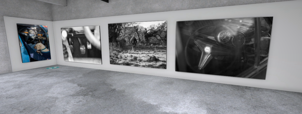
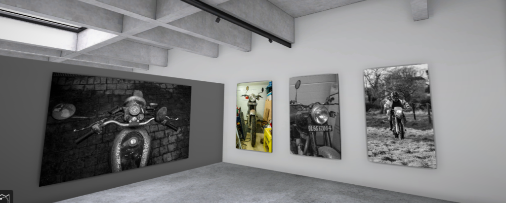
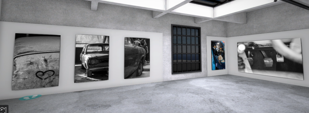
I presented my best images in a virtual gallery, choosing an industrial setting to go with the metal in all the photos. I placed certain photos together like the motorbikes ones, like my book. The mainly black and white images go well in the gallery and produce a good display.
Prints
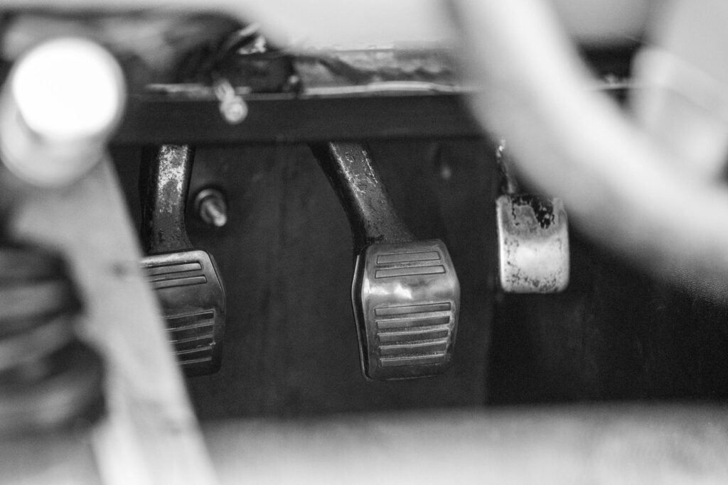
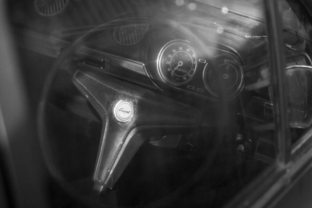
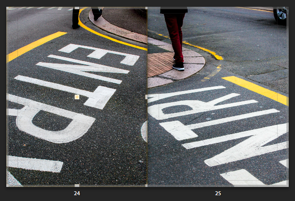
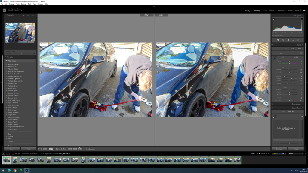
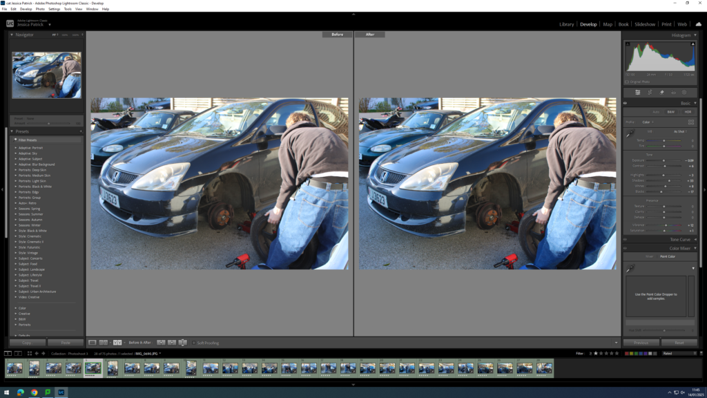
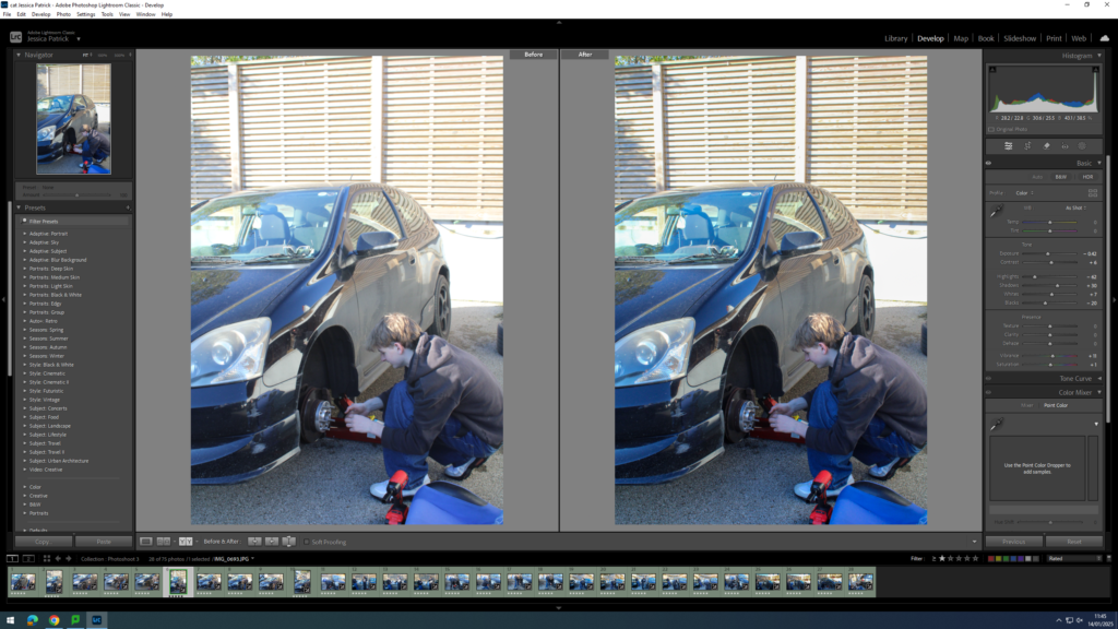
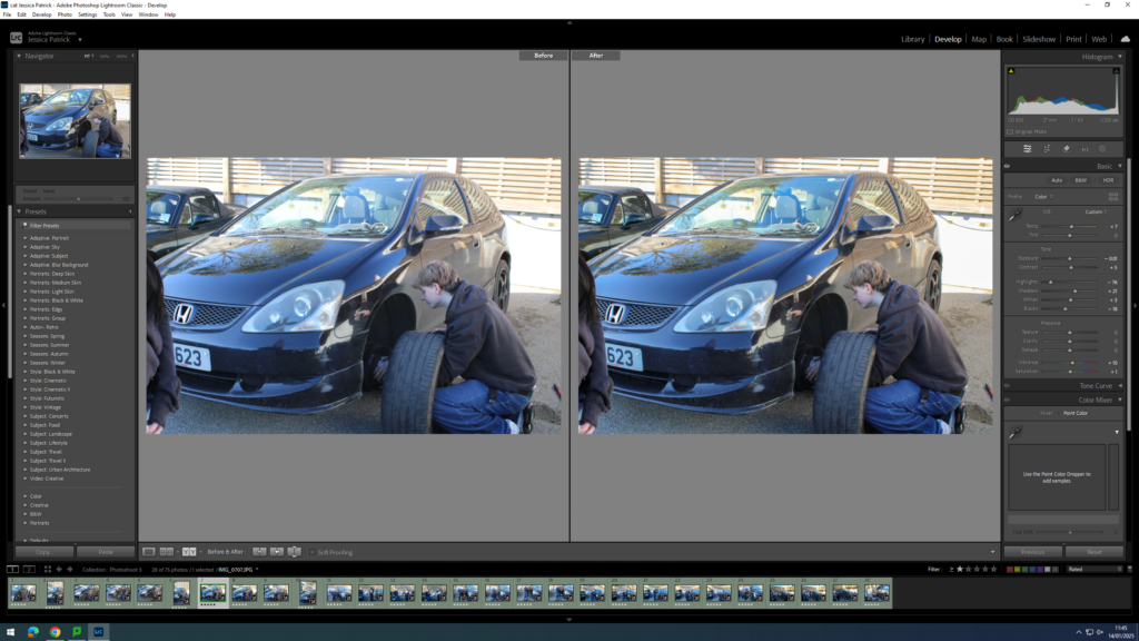
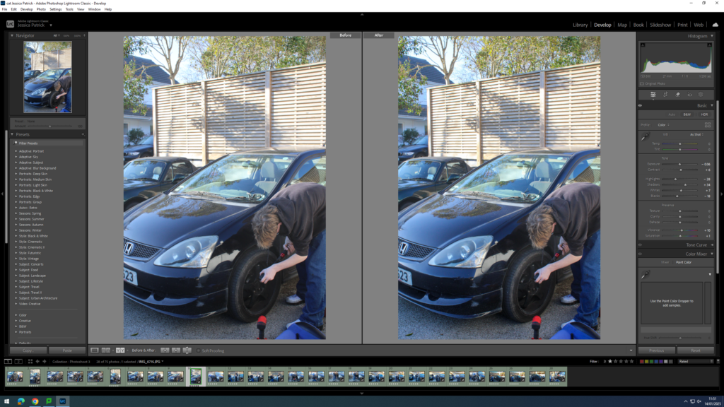
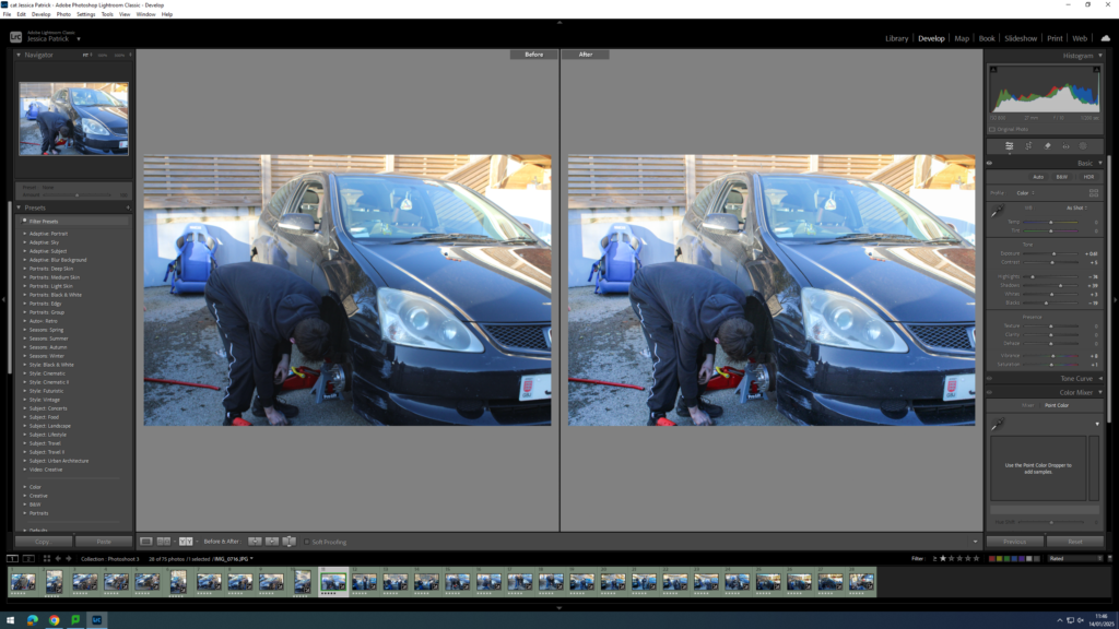
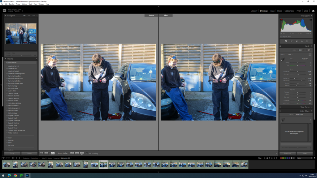
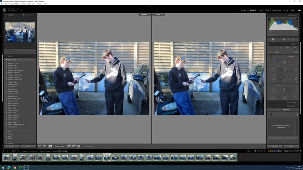
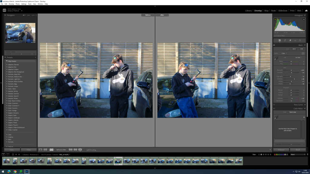
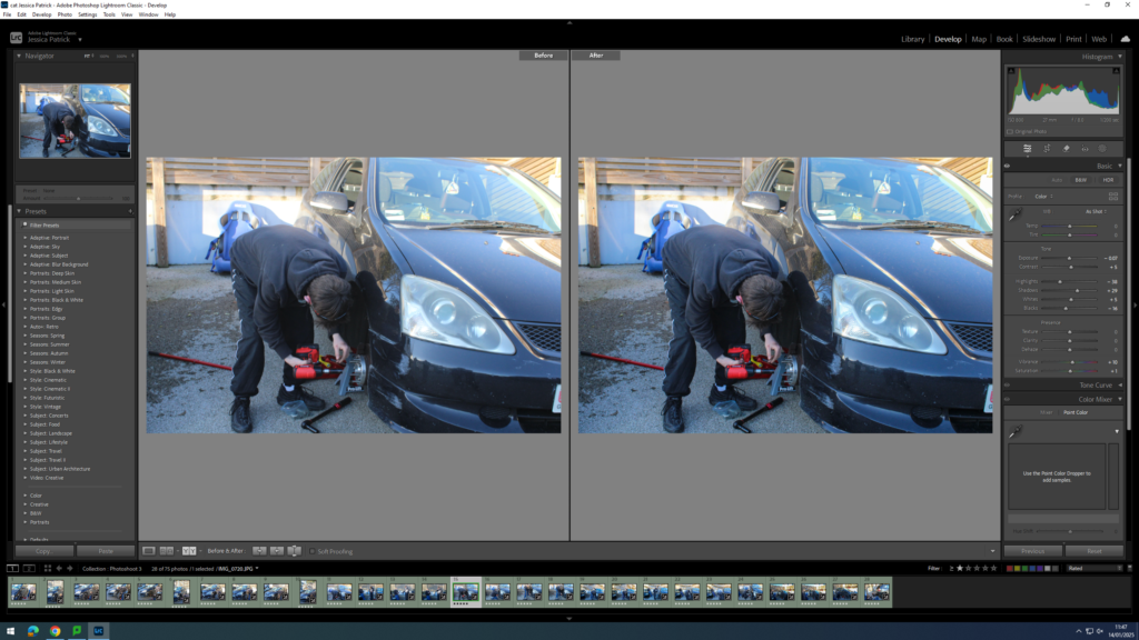
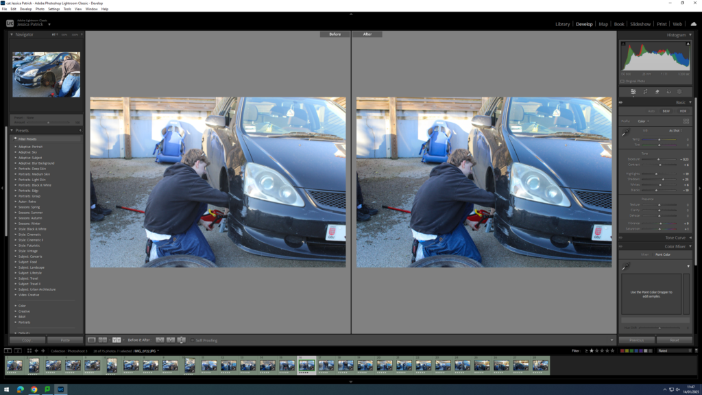
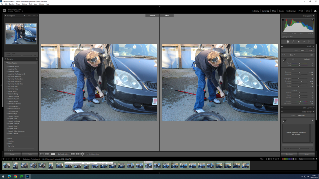
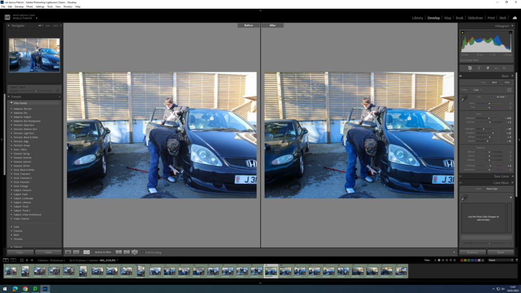
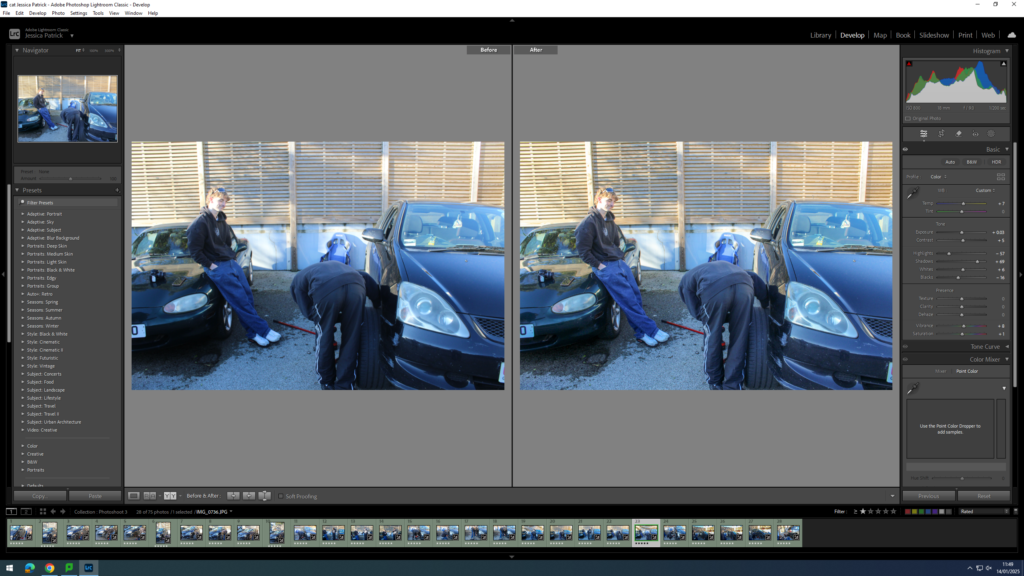
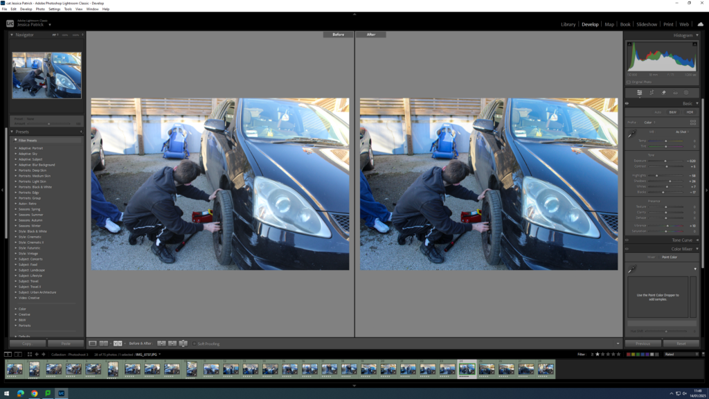
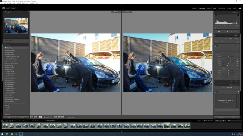
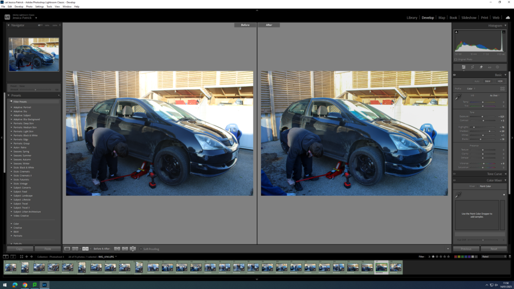
These images are my final prints, I picked a few that summed up the project, from three details shots to two half shots to then one full photo. This shows the memory fragments then progressing into a full passion for motorsport. I chose to go with all black and white images as a mixture with such a small number of photos could have been confusing and the colour could have overruled the black and white photos, even if the black and white were more important.
Here were some potential essay questions which I came up with:
In what way are the work of … and Lewis Baltz influenced by the change in Architectural Styles?
How has the New Topographics exhibition influenced contemporary photography?
How have the changes in Architectural Styles been documented through Photography?
To what extent was Lewis Baltz and the aesthetics of New Topographics a reaction to Ansel Adams and Romanticism/ classic landscape photography?
How is photography influenced by the changing styles in architecture?
I ended up settling for this question:
How have Historical Periods of Time influenced Architectural Changes and therefore Photographic Styles?
Essay Plan
Introduction (250-500 words):What is your area of study? Which artists will you be analysing and why? How will you be responding to their work and essay question?
For this essay, I would like to explore the link between different periods of time/social events and their outcomes. An example of this would be romanticism. Romanticism was a reaction to the age of enlightenment and people began to explore the beauty of nature, emotion and life. I would like to then link the new topographic as it was a reaction to romanticism and showed the new reality of an industrial/modern world.
Pg 1 (500 words):Historical/ theoretical context within art, photography and visual culture relevant to your area of study. Make links to art movements/ isms and some of the methods employed by critics and historian.
For this paragraph, I would like to write about Romanticism and what it is/what it was a reaction to. I will link this to how it saw changes in architectural styles and in photography. I will also write a bit about Ansel Adams as he was a key photographer who was associated with this movement.
Pg 2 (500 words): Analyse first artist/photographer in relation to your essay question. Present and evaluate your own images and responses.
For this paragraph, I would like to move on to talking about the New Topographics Exhibition and how it was a reaction to Romanticism and classic landscape photography. I would also like to refer to how it proposed a new way of thinking about landscape, place and environment with a focus on urban/ modern architecture. Furthermore, I will also refer to a photographer who was part of the new topographic exhibition, potentially Lewis Baltz.
Pg 3 (500 words): Analyse second artist/photographer in relation to your essay question. Present and evaluate your own images and responses.
For this paragraph I would like to interpret/analyse the work of Bernd & Hilla Becher and their formation of the Typology as a new aesthetics style/ approach to photography. I am going to use interview texts as a source of information for this, specifically an interview with Jean-Francois Chevrier, James Lingwood and Thomas Struth. I will link this change in photographic styles to the fact that they were influenced by the increasingly industrial environment at the time.
Conclusion (250-500 words): Draw parallels, explore differences/ similarities between artists/photographers and that of your own work that you have produced
I will conclude this essay by linking back the essay question and exploring the things I had previously spoken about and how they are relevant to the question.
Essay Draft
This is the first draft of my essay, before I made any final changes/adjustments.
Question: How have Historical Periods of Time influenced Architectural Changes and therefore Photographic Styles?
Intro
Photography is a way of preserving the world around you. It allows you to capture a moment of time and freeze it. This is significant as the world we live in is ever-changing. The world changes due to different movements and events. For example, the Climate Movement has caused people to be more considerate of the environment and, as a result, produce sustainable and energy efficient buildings. People also use Photography as a way of promoting that change is needed. Similarly, the Romanticism movement, an artistic and intellectual movement during the Industrial Revolution, influenced Architects and Artists to use nature as an inspiration for their designs. As we can see, there is a tie between social activities and world development. In photography, The New Topographics Exhibition was a reaction to the Romanticism movement and idealised landscape photography. Lewis Baltz, a photographer who was associated with this exhibition, explored the beauty within the realistic, industrial environment at this time.
Paragraph 1
Romanticism, first used as a term for aesthetic, became an artistic and intellectual movement in Europe in the late 18th Century. This movement was a reaction against the age of Enlightenment. This was when emotion had been sucked from art and literature and people focused mainly on science and logic. Romanticism was introduced during the Industrial Revolution, a time in which places such as Europe and the US experienced change in economy to one dominated by industry and machinery. The upbringing of Romanticism was heavily influenced by the political and economic atmosphere at the time and people used it as an escape from the new reality. During the Age of Romanticism, people explored the beauty of nature, emotion and life, creating an idealised reality within art and literature. This period also experienced a change in architecture, returning to medieval styles. Architects would use nature as an inspiration for their intricate designs, whilst also prioritising emotion and individualism. Furthermore, Romanticism is still present to this day. It can be found in art, music, films, literature, photography and more. An example of this would be Ansel Adams.
Ansel Adams was a modern-day photographer who was said to have embraced Romanticism. He was known for capturing the beauty of the natural landscape in America. Ansel Adams was part of the Sierra club which was an organisation that worked to protect the environment from industrialisation. He would use his photographic portfolios of the areas as a way to try and convince the members of congress to turn the areas into national parks. After many failed attempts, Adams had success in creating the King’s Canyon National Park in 1940, after publishing a photo book which caught the attention of many people, including President Roosevelt.
Paragraph 2
‘The New Topographics: Photographs of a Man-Altered Landscape’ was a photographic exhibition which consisted of the work of 10 different photographers. These photographers included Lewis Baltz, Robert Adams and Bernd and Hilla Becher. The exhibition was hosted at the George Eastman Museum by William Jenkins in 1975. It consisted of 168 prints, mostly in black and white. These prints were of things such as streets, industrial sites, warehouses and suburban houses. This exhibition was a reaction against romanticism and the idealised landscape, particularly the work of Ansel Adams. Its purpose was to challenge these traditional landscapes of the untouched by documenting reality and the growing impacts of industrialisation. After the II World War, America experienced a large increase in their economy, resulting in mass production of buildings and industrial developments. These buildings were constructed for their function, rather than their appearance, leading to the introduction of modern architectural styles and less detailed/aesthetically pleasing buildings. Although the photographers involved in The New Topographics simply displayed their everyday surroundings, the exhibition experienced a range of opinions. Many people felt responsibility towards the future of America’s landscape. This is suggested by the quote “I don’t like to think there are ugly streets in America, but when it’s shown to you – without beautification – maybe it tells you how much more we need here”. People were left feeling off-put with the representation of the American Landscape this exhibition displayed, making it one of the most groundbreaking exhibitions of the 20th Century as it completely rewrote the rules of Landscape Photography. This exhibition displayed settings which were often hidden from the camera, settings where the impacts of man-kind are evident. It proved that landscape photography can be more than just photographing the beautiful natural scenery and that it can also be capturing the ‘unattractive’ built environment.
Lewis Baltz, a crucial photographer of The New Topographics Exhibition, focused his work on searching for the beauty in bleakness. In an interview with Mr Witkovsky, Baltz stated that there’s an implied human presence in his work. There are traces of people but an absence of their physical presence. This is due to the fact that the subject of his photographs is the man-made environment. Baltz would capture stark images of the suburban landscape, revealing the impacts of urbanisation and mass construction. His photographs, displayed in black and white,
Paragraph 3
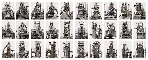
Bernd and Hilla Becher were another two photographers who were part of The New Topographics exhibition. They are best known for their method named the ‘typology’. In Carl Andre’s notes on Bernd and Hilla Becher, he stated that a ‘typology’ is simply ‘grouping similar views of different structures built to serve the same purpose’. This is evident in the image below.
This is a Typology consisting of 24 blast furnaces. These images were taken between 1969 and 1995. The blast furnaces are from locations all over the world and each have distinct features, however, they all were made for the same utilitarian function.
Previous to meeting Hilla, Bernd would produce paintings and lithographs of industrial structures. He would make these paintings from photographs, however, he soon discovered that he preferred taking the photographs than he did painting them. His interest in photography advanced and he found himself collecting old photographs of industrial structures so that he could later capture them himself. He would take these images using a step ladder to avoid optical distortion. After meeting Hilla, she too became fascinated by photography and Bernd’s ideas. She soon left her job in advertising to help him. The couple would travel together and make families of objects that they discovered in their path so that they could later create a typology. From 1961 to 1965, they worked mostly in the German Ruhr district which is known as the largest Urban area in Germany and the third largest in Europe. The pair had immense interest in the fact that the industrial world would one day disappear. This is why they photographed it as they wanted to fix it. They wanted to make sure that their typologies were able to describe the structures visually so that people can read the photographs and not need to visit them as they would be unable to, due to them no longer existing. They would consider their projects as finished once the structures had been destroyed. Additionally, in an interview with Jean-Francois Chevrier, James Lingwood and Thomas Struth, Hilla expressed that industrial structures are ‘nomadic forms of architecture’ and that they ‘come and go like nature’. Here, she is emphasising that these structures are only temporary and will be built or replaced depending on the need for them, alike nature’s lifecycle. I find this reference to nature very interesting as there is a huge contrast between the industrial and natural world in the sense that the natural world is completely organic and untouched and the industrial world is a man-made environment which is proven to be destructive to the natural environment. In this same interview, Bernd later made another reference to nature. He claimed that ‘all these objects that are linked to industrialization are disappearing. As in the world of nature, they consume each other.’ By this, Bernd is referring to the fact that industrial objects are constantly superseded by newer, better models, alike the food chain in nature. He also stated that, the fact there is no aesthetic thinking behind the architecture for industrial structures, it proves that people are only concerned with the idea of making money fast and efficiently. These structures are not built to last or to leave an impact as they will soon be replaced. Furthermore, the couple believed that photography should be used to describe and document things which is what they did in their work as they used their typologies to document industrial architecture and emphasize its nature, function and aesthetics.
Overall, Bernd and Hilla’s fascination in the industrial environment resulted in the upcoming of a new photographic technique, the Typology.
WHAT IS THE IMPACT OF DOCUMENTARY VERSUS TABLEAUX PHOTOGRAPHY IN TELLING A STORY?
‘To photograph is to appropriate the thing photographed.’ (Sontag S. 1977)
The meaning of this quote is to explain the difference between the real thing itself and an image of the real thing. The photograph of the real thing is only an appropriation, or rather a representation of that thing which the camera recorded, or the photographer chose to frame in a picture. However, the photograph itself as a print, is a real object that exists in the world.
Introduction
This essay explores two aspects of photography; documentary and tableaux, in their unique ability to entice and seduce the viewer to comprehend the story that is being told. Both photographic methods attempt to convey a story in a historical timeframe; documentary photography is often used in reportage (Tate.org) by comparison a photograph that uses tableaux can feel pre-planned and hence staged. Although, the two approaches maintain a common purpose in communicating a narrative, the method behind how each photograph has been produced is completely different.
The origin of tableaux photography emerges from Pictorialism in the late 19th century. The word documentary was first coined by British filmmaker John Grierson in 1930s. The line between a tableaux photograph being staged and posed and a documentary photograph showing ‘reality’ isn’t as black and white as the definitions say. For example, some photographers such as Tyler Mitchell and Justine Kurland fuse together both the real with the imaginary. (Gelder 2010). This means that to keep this essay on track, I will be explicitly focusing on obvious documentary or tableaux style photography.
This essay primarily analyses one historical and two contemporary image-makers; Dorethea Lange’s Migrant Mother, Paul M Smith’s tableaux photography focusing on masculinity and recreating scenes of war, and Neil Leifer’s documentary photos of sports. These artists were previously explored as part of my personal study, including them in this essay permits me to take a deeper dive into their images and make comparisons between tableaux and documentary styles.
Storytelling in photography is of particular personal interest, because my previous studies explored creating visual narratives of St Malo and St Helier Harbour, producing two different outcomes, magazine double spread and a photo-zine. My approach taken in both cases were documentary based. A similar approach will be taken to my current project, however this time the subject being explored will be basketball and the commitment and determination that a sports person needs.
Documentary – Contemporary Example
Documentary photography is the recording of people, events and places to create an accurate record or story. Documentaries are traditionally supposed to show ‘reality’ as well as highlighting issues and for promoting change (Tate.org). However, it can also be used as an art form. It is similar to, though not the same as reportage photography.
In its infancy photography was originally used for scientific purposes. This meant that a camera was only used for documentary purposes; nothing more than a simple record of reality. “This is one of the founding arguments about photography right from the moment of its original invention, that is, its capacity to store and reproduce other objects as a visual image” (Bate 2010).
Photographs only started moving towards a true art form in the late 19th century, gaining a similar artistic status to paintings and sculptures. This is known as the pictorialism movement, starting in the late 19th century and continued growing after. This meant photography can be a ‘naked’ and unaltered image that shows truth, or an artistic image, that the photographer planned to make it unique and impossible to replicate. This is where photographs start drifting away from a true depiction of history and to a depiction of the thoughts that a photographer has. The idea of a ‘Naked Image’ when referring to documentary photography is used represent history to fact and reality, as its often accepted to not tolerate any other form of presentation when it comes to a documentary photo. However, it’s impossible to take a photograph without aesthetics being added. And often, the most basic and obvious examples of a ‘document’ in a photograph end up being a formation of art photography.
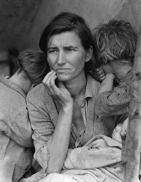
Above Dorothea Lange ‘Migrant Mother’ – example of documentary photograph taken during the Great Depression in USA during the 1930s.
The composition draws your eye to her face, which is tired and shows she is worn out, and hopeless. The image was used to raise awareness to the many Americans, especially farmers, that faced this kind of poverty (Eschner 2017). According to Lange, she approached the woman – as if drawn by a magnet – and snapped five pictures. Lange didn’t ask her name, but did hear of how the woman had sold the tires of her car just to buy food. Years after the photograph was published the subject of the photograph came forward to given her account. She said that she had not been paid and was told that the photograph would not be published. There are another five photographs of the same scene taken by Lange. In each photograph the furniture and the children are in different locations (Davis 2020). This has led to accusations that the final, iconic, picture was posed, staged. If this was the case does this take away the value of the image? As Bate (2010) said “in terms of history and memory, photographs demand analysis rather than hypnotic reverie” (Bate 2010).
Documentary – Neil Leifer
A more recent photographer, and someone who is an inspiration for my own personal studies, is Neil Leifer. Leifer has been documenting key sporting events in America for 60 years and is responsible for many classic sporting images (nielleifer.com). His style is primarily documentary and portraiture. He has taken many posed photographs of famous sports personalities however it is his documentary photographs that this essay will focus on.
Neil Leifer puts his success down to luck and being in the right place at the right time, however he also emphases the need to recognise that a great shot is there and grab it, even when it may be fleeting: “what separates the top photographers from the run-of-the-mill photographers is that when you get lucky a good photographer doesn’t miss.” (NPR 2016).
One of Leifer’s successes has been getting the camera in the right spot. He says this takes time and planning. For his famous shot of Ali v Williams boxing match at the Houston Astrodome in November 1966 he arrived four days before the match to set up and test his remote camera mounted in the rafters. He then took the film to the developers and waited for it to be processed “most photographers don’t hang around the magazine’s photo labs, but I would go to make sure they didn’t mess up my film” (Jonze, 2020). So, for sports documentary, it is important to be think ahead and plan and to control what you can, however it is equally important to be constantly on the lookout for ‘the shot’ and ensure you do not miss it.
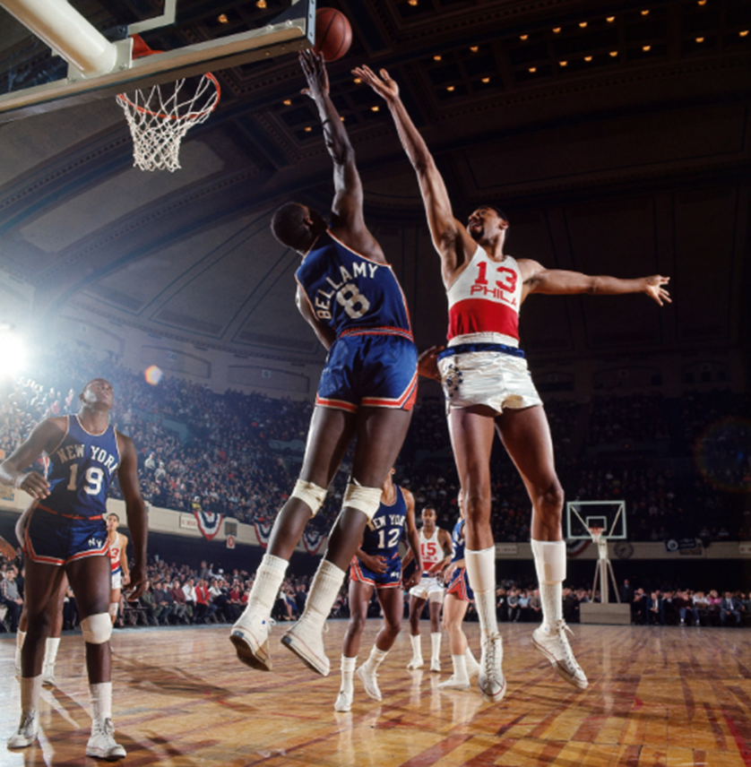
Above Philadelphia 76ers center Wilt Chamberlain shoots over Walt Bellamy of the New York Knicks during a game at Convention Hall. Philadelphia, Pennsylvania. March 1966 (neilleifer.com)
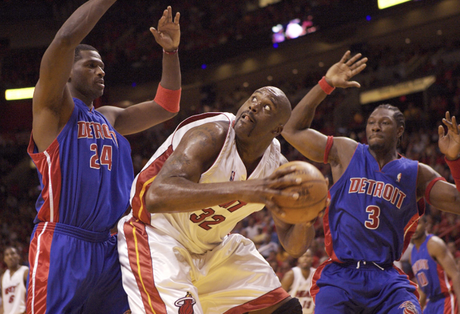
Above Miami Heat center Shaquille O’Neal goes up against Antonio McDyess and Ben Wallace of the Detroit Pistons during Game 5 of the 2005 NBA Eastern Conference Finals at American Airlines Arena. Miami, Florida. June 2, 2005. (neilleifer.com)
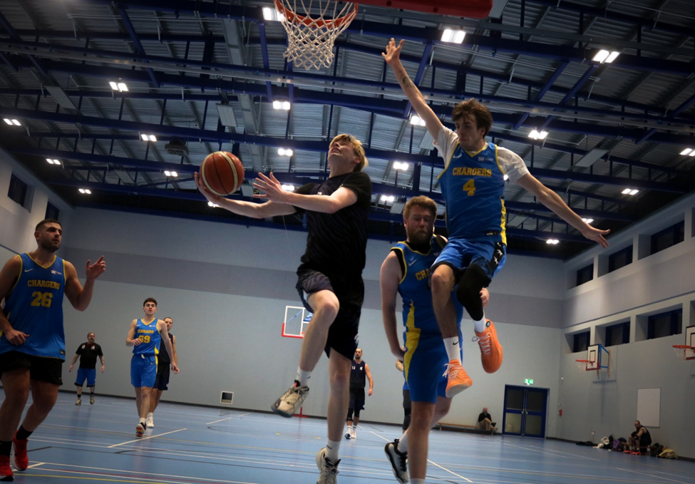
Above are some of my favourite basketball photographs taken by Leifer many years apart. With the first image, you can see a bright light shining on the players from the left, casting long and ominous shadows. Both players reaching for the ball are fully in the frame, making these players seem even larger than they are, this and the dynamism of the players is exaggerated by the wide angle lens and by having the camera low to the ground. This image is a good documentation of what basketball looked like back in the sixties, especially when compared to the second image with Shaquille O’Neal forty years later. You can see how the clothing has changed to being baggier, as well as the players being larger on average. The photograph captures the split-second pause as O’Neil eyes onto the basket before he shoots. O’Niel, in white, is framed on both sides by McDyess and Wallace, in blue. McDyess’s and Wallace’s eyes are both on O’Neil, drawing the viewer to the central figure. O’Neil’s eye’s are focused hard on the basket, which being out of shot sends the viewers gaze off to the top left of the image. This is a perfect example of what Leifer means when he says that good photographers do not miss the shot.
Above is one example from my photoshoot that I took during a D1 game in Jersey. I tried to replicate Neil Leifer’s Images by sitting close to the basketball hoop as well as using a wide-angle Lense to capture a wider field of view.
Tableaux
Tableaux photography is staged and often posed. The people in the photographs may be wearing costumes and props may be used along with artificial lighting to create a scene. Tableaux photography is an evolution from art, for example Renaissance paintings depicting scenes from the bible or mythology. People in tableaux photographs are staged such that they appear to be absorbed in their actions or surroundings and unaware of the photographer. (Tate and Pilgrim 2023). Tableaux photography operates in the space between reality and fiction, drawing the viewer into a scene that feels both familiar and uncanny. (David Bate). This tension between reality and fiction allows tableaux photography to be so powerful when it comes to telling a story.
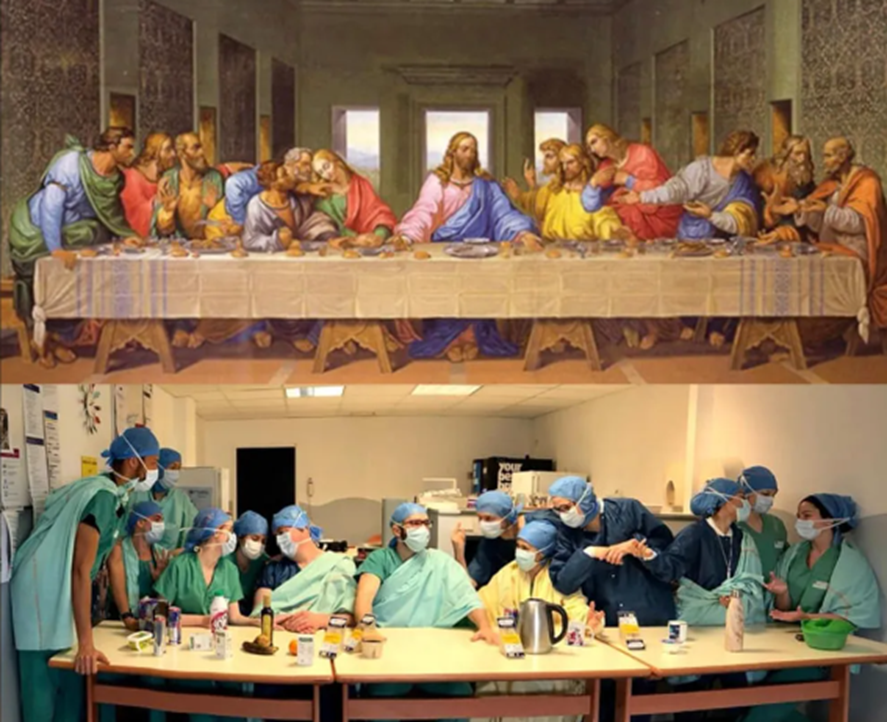
Below is a modern (amateur) example of a tableaux photograph below The Last Supper by Renaissance artist Leonardo da Vinci. The image, clearly posed by medical staff trying to have some light relief during the Covid Pandemic, is an example of a classic tableaux photograph, depicting a scene from the bible. (Smith 2020).
Above – The Last Supper painting by Leonardo da Vinci and tableaux by doctors at a hospital in Paris during the Covid pandemic (Smith 2020).
I’ve already talked a little bit about pictorialism in this essay, however, almost all tableaux photographs contain ideas from pictorialism and adds an aesthetic that’s pleasing to the viewer. Many contemporary photographers didn’t agree with this new movement at the time saying it marks a shift from an emphasis on ‘truthful’ representation to a recognition of its constructed nature. However, photographers that followed pictorialism believed it allowed viewers to pause and analyse them, allowing them to find there own meaning and symbolism. This can increase a story’s impact on the viewer as they are able to relate the photo to other moments in their own life, instead of taking the photo at face value which is often the case for documentary photography.
Tableaux – Paul M Smith
At first sight the images of Paul M Smith would not appear to be part of the tableaux genre. Smith is a British photographer who has produced several sets of images on the theme of masculinity. While his photographs appear to have the theme of documentary they are actually posed, and a large amount of effort has gone into capturing and editing the images in which, he, is often the only person in the photographs. These photographs do not record real events and are completely staged, they are tableaux.
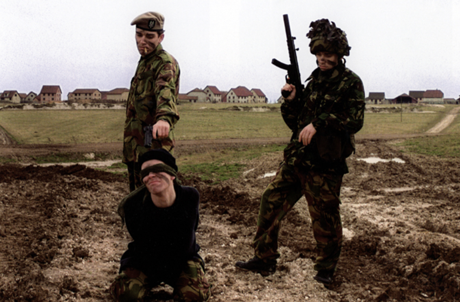
In ‘Artist Rifles’ Paul M Smith takes self portraits of himself dressed as different soldiers and uses photomontage to create fictional military scenes (some of which are relatively graphic, such as execution and burials).
Above Paul M Smith photograph taken as part of his Artist Rifles series. In this photograph each of the soldiers is posed by Paul M Smith himself and the image put together as a photomontage. While having the appearance of a documentary image, it is entirely posed and fictional.
This image and the rest of the ‘Artist Rifle’ series contradicts the ideal view of courageous and well-known superheroes against that of a soldier, since he previously produced a series called ‘Action’ which mocks the masculine ideas of a superhero. Solders are unfortunately often seen as faces among the masses. This makes them heroes, not through their individuality or charisma, and instead by the difficulties of being a soldier. The use of tableaux allows Smith to recreate images with a high level of emotion, as he can control every aspect of the image, including the subjects himself since he is the subjects. When he took these photos back in the 1990s, it was much harder to replicate himself without the current technology, making these images more visually striking to the viewer. The multiple self-portraits also emphasise the idea of ‘brothers in arms’ in war, where they all work as one unit. This image above is particularly realistic as well, not just with the subjects’ actions, clothing and placement, but the baren and war-like background, allowing a strong effect on the viewer. The cigarette in the left soldier’s mouth and the rifle in the right soldier’s arms is almost over exaggerating the stereotypes of masculinity since the viewer knows its staged, giving an amusing effect allowing the viewer to participate in the fantasy. Looking past the depiction of masculinity, the details in this image that Smith planned makes it seem like a real event.
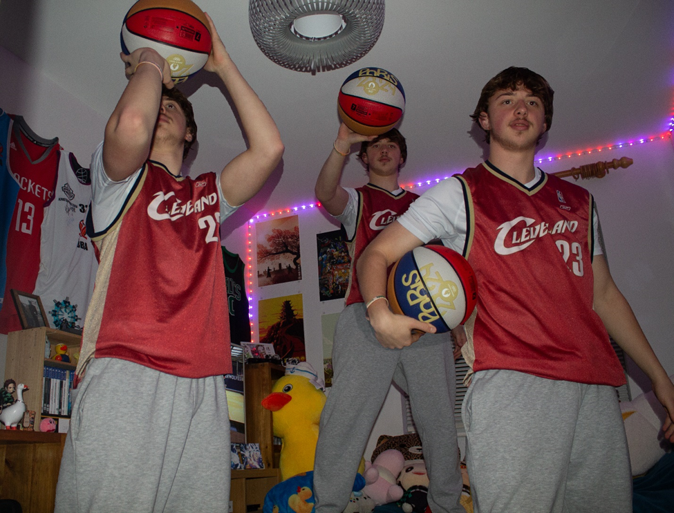
Above is my attempt at replicating photomontage in the style of Paul M Smith. I used photoshop to replicate the subject multiple times performing different things that are ‘basketball’ related.
Conclusion
It is clear from the examples given that both documentary and tableaux have the ability to tell a story.
Lange has potentially manipulated her image by having the mother and her children pose for the final and most famous image. Does this detract from Lange’s purpose of documenting the impact of the Great Depression and spreading the news of the suffering to the rest of America and the world? Does it remove the title ‘documentary’ from the image? Is it ‘fake? The truth is that the mother in the photograph was homeless and the children were starving. Perhaps all Lange is guilty of is using her skill as a photographer to marginally manipulate the story to make a greater impact on the reader, and by doing so raise the plight of the mother and others in her difficult situation?
It is interesting to compare the images of Lange with the sports photographs of Leifer. Both are well known documentary photographers, working at different times with very different subjects. However while the documentary images of Lange have a shadow of doubt over their ‘authenticity’ it is clear that the images taken during sports events by Leifer are true representations of what actually happened, the story of the match. It is very unlikely that these would be staged in anyway, and instead they are the product of a photographer who has the ability to foresee and capture a great image in the instant it happens during a fast-paced sports event.
The purpose of tableaux photography is to tell a story, whether that be the bible story of the last supper, the trials of working in a hospital during the Covid Pandemic, or the modern representation of masculinity and warfare.
Smith’s photographs are deliberately fabricated to mimic documentary wartime photographs. Only by looking closely is it apparent that all the people are posed by Smith himself. This creates a contrast between documentary photos and tableaux photos. Does a documentary photo carry more emotion because there are no lies? Or a tableaux photo, which can be endlessly modified to maximise the emotion the photographer is trying to create? It is my view that impact is not from whether the photograph fits the ‘tableaux’ or ‘documentary’ genre. Rather it more the ability of the photographer to convey the message they wish to tell. A documentary photographer who asks (implicitly or explicitly) the subject to change their pose, position etc, and in doing so is able to make a more powerful image while the most important elements of the truth remain is equally valid as the obviously posed tableaux that examines the meaning of its subject.
Bibliography
Bate, D. (2010) ‘The Memory of Photography’, photographies, 3(2), pp. 243–257. doi: 10.1080/17540763.2010.499609.
Davis L. J. (2020) ‘Migrant Mother: Dorothea Lange and the Truth of Photography’ https://lareviewofbooks.org/article/migrant-mother-dorothea-lange-truth-photography/
David_Bate ‘The Art Of The Document’
David_Bate ‘The_Pictorial_Turn’
Gelder, H. V. (2008), ‘Photography Today: Between Tableau and Document’, Photographie Volume 28, numéro 1-2, URL : https://id.erudit.org/iderudit/044589ar
Pilgrim, F. (2023) ‘Dreaming in Real Time’: How staged tableaux disrupt notions of authenticity in documentary photography’ https://www.felixpilgrim.com/blog-1/staged-tableaux-and-documentary-photography
Eschner (K), (2017) ‘Meet 10 Depression-Era Photographers Who Captured the Struggle of Rural America’, Smithsonian Magazine. https://www.smithsonianmag.com/smart-news/meet-photographers-charged-documenting-depression-era-america-farm-security-administration-180964123/
Smith W. S. (2020) ‘Tableaux Vivants Are Giving Us Life During the Pandemic’ Art News https://www.artnews.com/art-in-america/columns/ableaux-vivants-replicate-art-masterpieces-during-covid-19-quarantine-1202686492/
Jonze, T. (2020) ‘Muhammad Ali flattens Cleveland Williams: Neil Leifer’s best photograph’ The Guardian. https://www.theguardian.com/artanddesign/2020/dec/02/muhammad-ali-cleveland-williams-neil-leifers-best-photograph
NPR (2016), ‘A ‘Relentless’ Sports Photographer Explains How He Got His Shots’ NPR. https://www.npr.org/2016/05/06/476893044/a-relentless-sports-photographer-explains-how-he-got-his-shots
Sontag S. (1977) ‘On Photography’ Farrar, Straus and Giroux
How do feminist artists use art and photography to display messages to society?
“I wanted to foreground girls’ lives, centring them by creating an all-female society.” – Justine Kurland – 25th January 2023
The works of Justine Kurland express the heritage of youth, girlhood and a search for identity, capturing the lives of young teenage runaways specifically through her book, Girl Pictures. Girl Pictures is a photo book, presenting an enduring symbol of romance, rebellion, escape, and freedom through the representation of teenage runaways, which ultimately challenges traditional narratives of femininity. Created between 1997 and 2002, Kurland focused on the roads in the American wilderness, and her subjects are presented as companies to one another, promoting a strong sense of intimacy throughout her series. My personal study will take inspiration from her photo book, as I feel it resonates deeply with my ideas and what I want to portray. Her work evokes a strong sense of nostalgia and longing for freedom, and her images blend the innocence of girlhood with the strength and independence young women find during adolescence. The contrast of the two allow Kurland to construct a powerful narrative about the importance of connection and community during this time, which encourages girls like myself to delve into our own experiences including vulnerability and strength. Kurland’s work stands out to me because her subjects experiment with intimacy and protection, along with the experimentation of nostalgia to evoke a sense of freedom, rebellion and escape. These ideas successfully link to my project as I am aiming to reflect these themes through my own personal experiences as growing up as a girl in the island of Jersey. Family Album by Ramona Jingru Wang carefully investigates themes of identity and relationships, similar to Kurland. Wang shed light on the exploitations of models, and her work is a quiet refusal of specific representations of them. Wang’s images in this series depict her family, where she delves into the themes of identity and the connections between humans and the space around us, through capturing simple everyday moments that highlight femininity and nurture. I took inspiration from Wang due to her ability to shift certain stereotypes and present young women in a way that feels empowering to viewers like myself. I admire her unique approaches to photographing young girls, and this allows me to consider how I can use these ideas to portray my own experiences as growing up as a girl. Both Kurland and Wang stand out to me through their ability to challenge traditional female stereotypes and capture femininity and youth from a female perspective, making it easier for me to feel inspired by their work, understand their values and successfully incorporate them into my personal project.
I am basing my personal study project on the themes of youth and femininity as I feel passionately towards both topics. Femininity is significant to me as I am a young female who feels the need to carry out certain feminine qualities in order to display my place in social circles, as well as society as a whole. The male gaze is a term formulated by feminist theorist Laura Mullvey in 19th and 20th century. She introduced the concept in 1975, where she argued that the mainstream media constructs women into objects of male desire. The link below shows the psychoanalytic and feminist theory by Jacques Lacan and Luce Irigaray, in Mullvey’s Visual Pleasure and Narrative Cinema essay. I have read through the pages and deepened my understanding of the voyeuristic values that society have shaped around women and how long these values have been around, as well as where they have stemmed from.
After reading through the pages of Lacan’s and Irigaray’s views, I found myself most drawn to page 21, specifically the quote:
“Ultimately, the meaning of women is sexual difference, the visually ascertainable absence of the penis, the material evidence on which is based the castration complex essential for the organisation of entrance to the symbolic order and the law of the father”.
This quote tells me that power is determined by gender, ie. males with a penis holds more power, whereas castrated women are immediately frowned upon as it is assumed that they lack intelligence. It also exhibits the idea that females are judged by what they lack rather than the qualities they do have, which follows the traditional stereotypes. Therefore, this plays a key part in the development of gender identity and is perhaps the reason many women struggle with becoming at ease with their identity. Most art and photography projects that include women also follow the idea that women exist primarily to be looked at, and are only framed in a way that emphasizes their beauty or vulnerability, reinforcing male control. I believe that my artist Ramona Wang has included aspects of the male gaze into her work and perhaps taken inspiration from it to challenge stereotypes of women. For example, Wang uses the ‘camera’s gaze’ approach in a lot of her images, in which her subjects are looking seductively at the camera or posed in submissive ways. I believe that this approach to her photographs is to challenge traditional stereotypes of depicting women for male pleasure, as she has used her subjects to mimic the poses from photography and film, therefore exposing how women are forced to perform femininity. Contrastingly, Justine Kurland does not use the male gaze in her photography. Rather, her work rejects the idea, particularly in her Girl Pictures series that I am focusing on. Her work challenges traditional depictions of females in photography, as she has her subjects appear more free and powerful instead of weak and vulnerable, which is how women are often portrayed in art, photography and media. Femininity is a mixture of qualities and characteristics that exhibit narratives that only women can do, which therefore ultimately separates us from men. Despite this, feminism in general is seen as a movement to end sexism, which I also think plays a vital role in my project as women have faced many battles with sexism, and fought for values to be modernised in a way that allows an equal balance between genders. The girls in Girl Pictures are often presented as dirty, tough and portraying a tomboyish look, which goes against the idea that youth and femininity must be delicate. I aim to touch on these conventions in my project due to the natural ingrained stereotypes of females, and therefore shine light on the inequalities. These values of mine have guided me to focus my project on femininity, as I feel it allows people to find their personal identity and can help us explore how femininity is expressed through different generations and cultures. Youth is equally as important to me as I aim to successfully highlight the impact youth has on an individual, through being able to develop their skills and also finding their own personality that they feel they can express to the world. I think my two themes link effectively to one another because they are both mainly shaped by societal factors. In my opinion, society idolises youth and associates it with beauty which then creates pressure for young females to adopt these elements into their identity.
I will be responding to these two artists by taking in all of my inspiration from them and capturing several photoshoots that portray similar ideas to them both. For example, my first photoshoot will take place outdoors in a natural and rural landscape, similar to Justine Kurland. This is because she focused on photographing a fantasy and utopian world that teenage girls ran away from home to live in. I will recreate this idea using my friends as subjects, and the location of my shoot will be St Catherine’s woods where my subjects can explore the nature surrounding them. My second photoshoot will primarily take inspiration from Ramona Wang, located indoors. This is due to the fact Wang mainly captured her subjects indoors with minimal clothing and expressing a traditional exploitation of females, specifically her loved ones. My photoshoot will include aspects of the male gaze, as this is another significant factor that contributes to my project and the themes of youth and femininity. My third photoshoot will be another inspired by Kurland, where I will take my subjects into more scenes of nature where they can display the ‘runaway’ narrative and build relationships with one another in the wild. My fourth photoshoot will be one with no particular artist inspiration, an opportunity for me to incorporate my own ideas and imagination tied into youth and femininity. It will be shot outdoors similar to my first photoshoot to stay related to my main artist Justine Kurland, yet I aim to include exploitations of females to stick to my themes. My last photoshoot will be mainly inspired by Wang again, where I will be the main subject presenting female stereotypes. This is because I feel strongly about the topic, and by including myself I am able to present my values and beliefs in my project to add a more realistic effect. I will include images of me doing things that typical young women do, for example putting on makeup and dressing up to go out.
Justine Kurland
Justine Kurland uses her photography to challenge the traditional stereotypes shaped around women. She uses her platform to reinforce the idea that women do not have to perform in certain ways and exhibit specific behaviours in order to be feminine. In Girl Pictures, Kurland reimagines her models as independent, free and brave, which are characteristics that women are not usually seen to have. Due to mainstream media, male-dominated traditions have formed gender inequalities, leading to an uneven balance between men and women. I feel drawn to the idea that Kurland has focused her work mainly around young women, and has placed them in the centre rather than outside objects of desire for men to view. I believe that she has successfully criticised the expectations imposed on young women in most mainstream narratives, and suggested an alternative vision of female dominance which is very important for young girls to see. My overall aim is to break down these norms in my own work, following Kurland’s message to society in order for many young viewers to disengage with traditional stereotypes and expectations. Kurland stated: ‘There’s something political about creating a world that you want to exist.’ (Reference source using Harvard system…) This quote confidently reflects Kurland’s attempt to create a world where women exist outside following a patriarchal society, where we can live freely and not need to exhibit personas that men believe are important. The political side to it is displayed through Kurland’s work, as she is actively challenging the dominant ideologies and attempts to propose a new world which would be ideal for women.
In an interview with Aperture magazine, Kurland also stated: ‘The usually male protagonist doesn’t belong to the world as he has inherited it. He fights alienation by striking out to find a world of his own.’ (Kurland 14 July 2020) I was drawn to this quote by Kurland in the interview as it is suggesting that in mainstream media, it is common for men to be born into a world where they feel they don’t belong, and that most of them have the confidence to run away from it and begin a new life due to being unsatisfied. However, Kurland challenges this by adapting these ideas into her work about females where they escape the domesticity.
Comparison of my images to Justine Kurland:
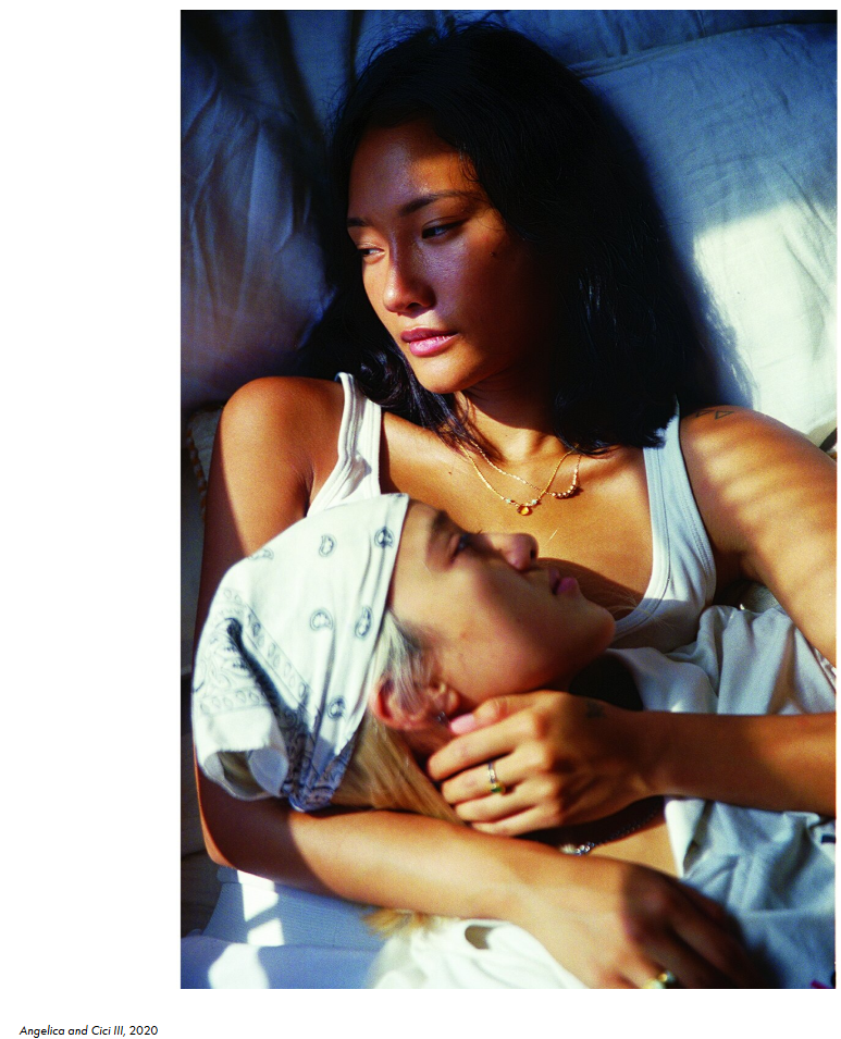
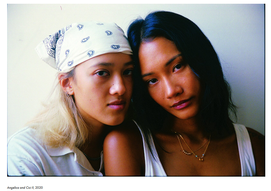
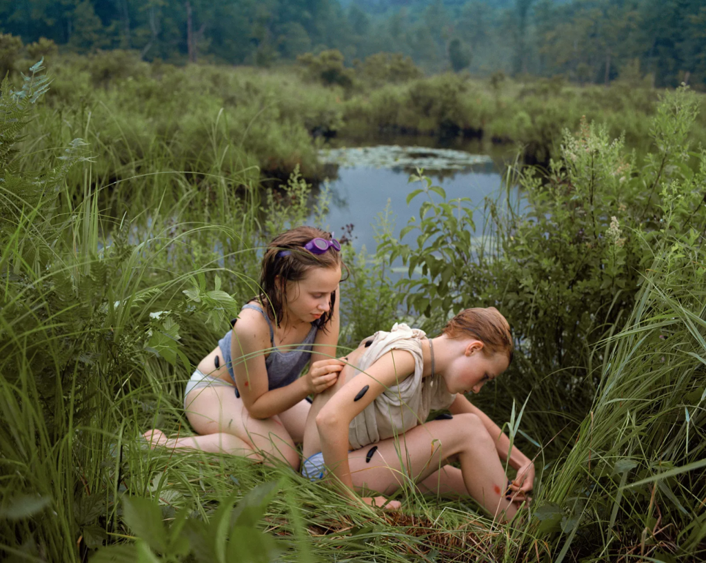
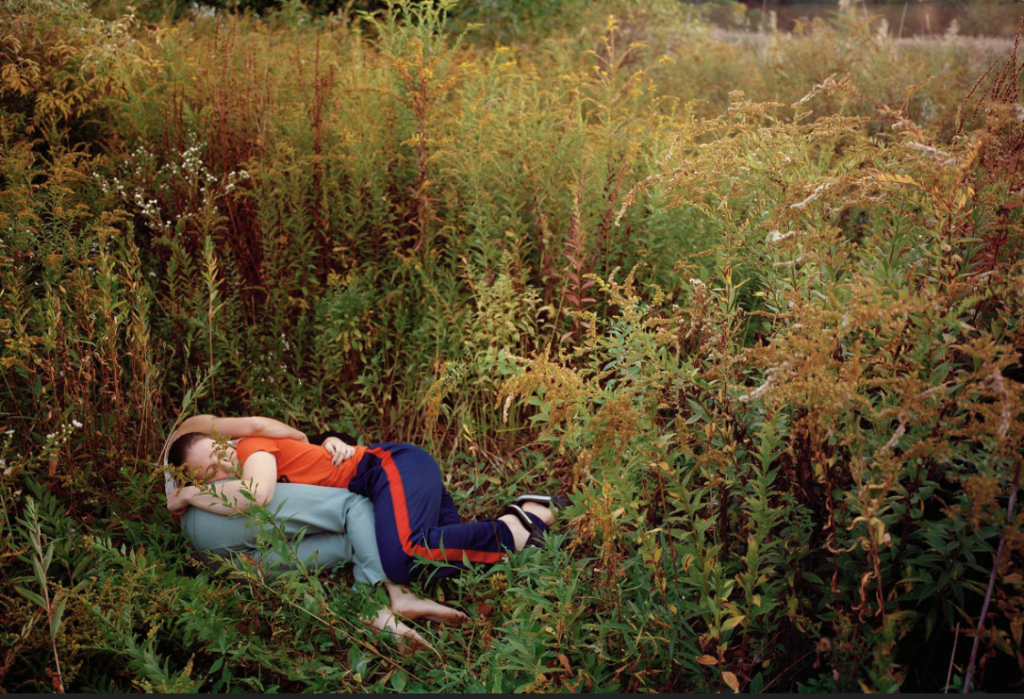
Within my response to Justine Kurland, I attempted to include similar aspects within this specific image inspired by her; such as the slight hint of red clothing, the background of nature and the physical close bond between the subjects, resembling strong relationships and intimacy.
Evaluation of my images compared to Justine Kurland:
The setting of nature is used in both mine and Kurland’s images, as they both take place in a natural, overgrown outdoor environment. I carried this out effectively as it allows my outcome to link to Kurland’s style of depicting her subjects in an untamed space. I also think I exhibited the composition of the image well, due to the subjects performing in an intimate manor which shows a clear connection between them. The main factor that differs my image from Kurland’s would be the overall tones within it. My image has been edited so that it has cooler tones being emphasised rather than warmer tones. This makes my image appear colder than Kurland’s, which I think overall changes the mood of the image and gives a slightly more melancholy effect. This is a drawback for me because I wanted this outcome to appear vibrant and reflect a happier mood, as the aim of this image is to allow the viewer to focus on the clear friendship between the subjects.
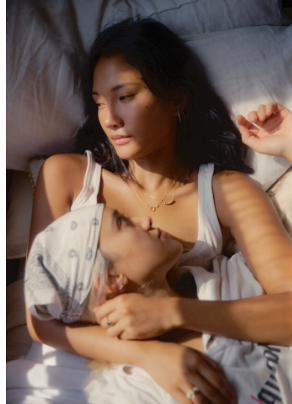
Ramona Wang
Ramona Jingru Wang uses her position in photography to reflect the themes of identity and community through her family and loved ones. Wang’s ethnicity plays a crucial role in her photographs, to create a strong narrative around the exploitations of Asian women in photography. Her heritage is a significant factor of the story behind her photographs, making her main aim through her work to delve into the connections between humans and the space around us, and also the impact that images can have on our perception of reality. She proposes her ideas into her work by photographing her loved ones building relationships with one another, and investigating how we as humans care for each other. Wang believes in discarding flat narratives of Asian models, as she is a model in art and photography herself. Therefore, her Family Album series was proposed in a way that implies blurring boundaries between private family life and public photography, where she captures intimate scenes at home focusing on the relationships of the people around her. I believe Ramona Wang’s approach to her work is important because it is a quiet refusal of the typical narratives shaped around women of her ethnicity. This ideology links to Kurland as the aim of both of their work is to challenge traditional stereotypes and ideologies surrounding categories of people, which relates to my work because I aiming to disregard typical expectations of young females and link it to my personal experiences with being a girl.
‘I’ve always wondered why naked female bodies are always presented and seen in a sexual way, so I decided to see if I could create photos of my body that are honest and not for pleasing anyone.’
This statement by Wang reflects feminist opinions on the male gaze and the rights of women. It challenges the conventional portrayal of the female body in art and photography, as she questions why it is only looked at in a way of sexualisation to be consumed by men, and not in a way where it can be understood that female bodies can be photographed within personal expression through a camera. From the quote ‘honest and not for pleasing anyone’, I can gather that she is attempting to gain reclaim control over the male gaze, and wanting to shift perspectives on women as she emphasises honesty, which overall implies that she wants to be free from the idea of objectification.
Comparison of my images to Ramona Wang:
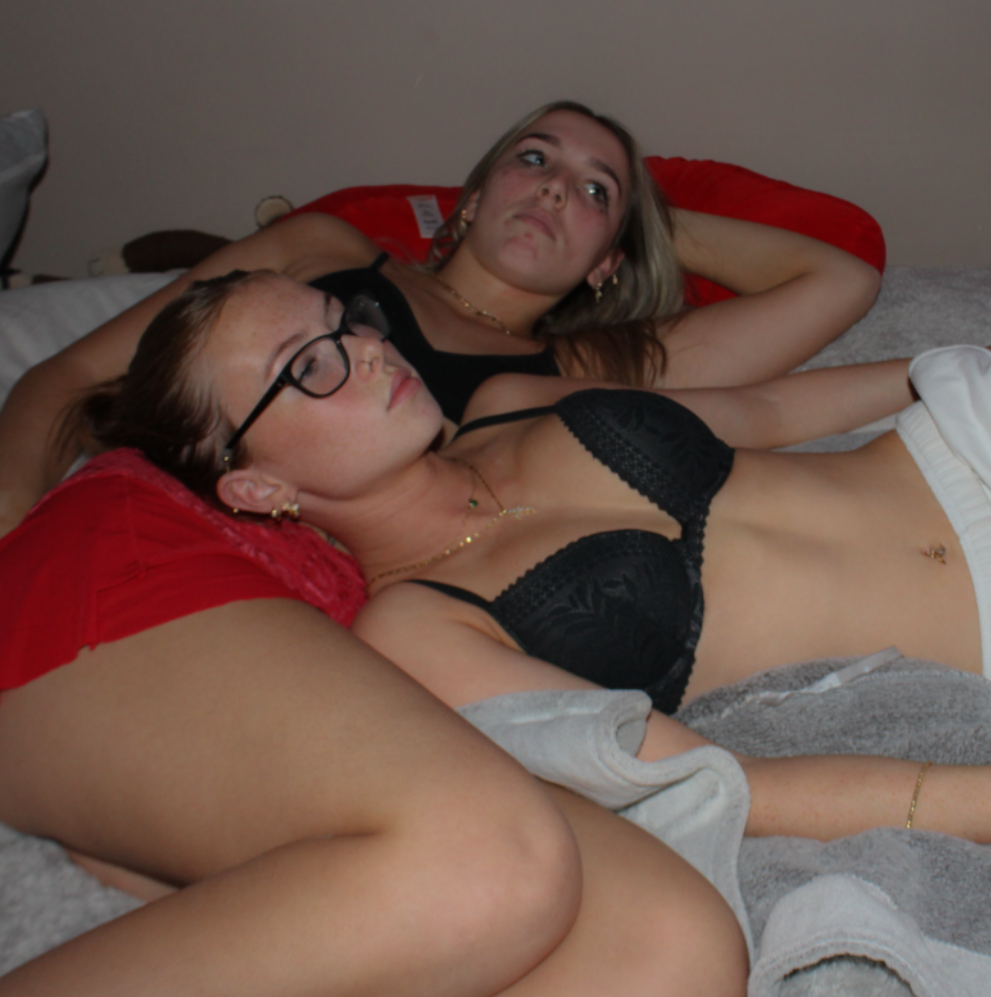
For my image comparison, I believe these two images share similarities within the subject matter, but differences within the overall tone and lighting. One thing that I think I executed well is the connection between my two subjects, as this links to what Wang produced and they both suggest a strong sense of togetherness, which is the aim I am trying to reflect. In both images, the subjects are also lying down, which implies a sense of realism as it gives the outcome a more casual effect, which allows it to look less staged. The frame and angle of my image is also very similar to the artists, as I have reinforced the focus on the facial expressions through the angle of the camera which is only focused on the subject expression. However, there are some clear differences between the two. My image was taken in the evening, meaning I had to use artificial lighting, whereas Wang’s image has been taken near a window in clear daylight as there is sunshine rays beaming on the subjects face. Another difference is the clothing on both of our subjects, Wang’s subjects are wearing softer clothing which gives her image a more relaxed and realistic effect, whereas my models are wearing minimal and harsh clothing, making it appear more dramatic.
Evaluation of my images compared to Ramona Wang:
To evaluate, I believe I executed similar outcomes to my artist inspiration by closely analysing the connection between models which I interpreted well as this was a main focus of mine to reflect on, as it links to my themes. I recreated this successfully in my image by using the same posing approach, where both my subjects are laying down with one lying on the other, and getting my subjects to perform in a way that presents a close relationship between them. However, I think Wang’s image evokes a deeper connection between her two subjects due to the model in the foreground looking up at the model behind her, which shows that Wang has carefully explored the theme of love and care, which I didn’t. Another drawback would be the difference in lighting as mine is artificial, which I think slightly shifts the perception of intimacy as it emphasises that the image is staged, whereas Wang’s image feels more natural.
Conclusion:
In conclusion, there are multiple parallels between both of my artist inspirations – Justine Kurland and Ramona Wang. They both explore themes of female representation and intimacy, linking to my themes on femininity and youth. Through carefully interpreting both of their photographic styles, in this project I was able to gain a strong sense of the conventional narratives on femininity and the way females are expressed through art and photography, through both landscapes and self-perceptions. The significant difference between my two artists is Kurland focuses on groups of young females in a wild and natural environment in which they explore a sense of freedom and escape, whereas Wang explores self representation with a more personal approach, challenging the traditional sexualisation of the female body. One of Wang’s main ideologies included throughout her work is the male gaze, as she questions how women are presented as well as perceived by men. Kurland does not explore the male gaze in her photographs, she explores a more crafted and opposing aesthetic through using nature and soft lighting to create a utopian world for young females. These two contrast heavily to one another, as Kurland’s approaches and compositions create a balance between innocence and real life documentary, yet Wang uses a more raw approach through self-representation which create a more unfiltered effect. Kurland executes her images in a way that highlights an idealised version of the world, through trying to challenge traditional domestic roles of women by depicting them as brave and free. On the other hand, Ramona Wang emphasises the reality of the female form, showing that she prioritises honesty.
I aimed to execute both of these ideologies throughout my five photoshoots for this project, tieing in both traditional stereotypes of young females as well as intimacy and resembling the close bonds that we share with one another. My overall objective is to create a seamless blend within my photo book, between the importance of personal identity through youth and the strong community between females. Drawing from Kurland’s depictions of her subjects, my photoshoots obtain a clear portrayal of freedom and female bonds as I focused on natural settings that evoke escape from traditional expectations. As Wang challenges the male gaze, I also incorporated aspects of this in my second and fourth photoshoot. I did this by using a more intimate approach within my subjects, to reinforce the idea of female objectification. By merging these two artists and their themes together, my project reflects a narrative where young females exist both collectively and personally, which overall challenges the way femininity is portrayed in art and photography.
Bibliography
Bengal, R. (2020) ‘The Jeremys’ in Girl Pictures. New York: Aperture.
Kurland, J. (2020) ‘Cherry Bomb’ in Girl Pictures. New York: Aperture.
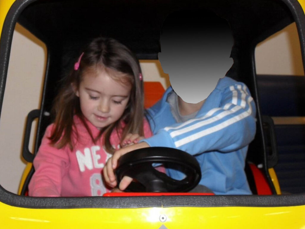
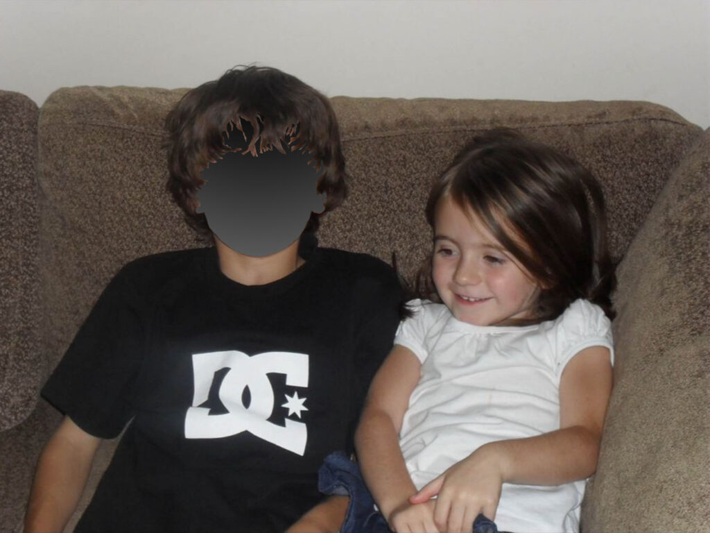
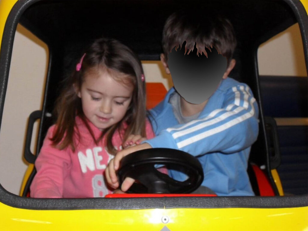
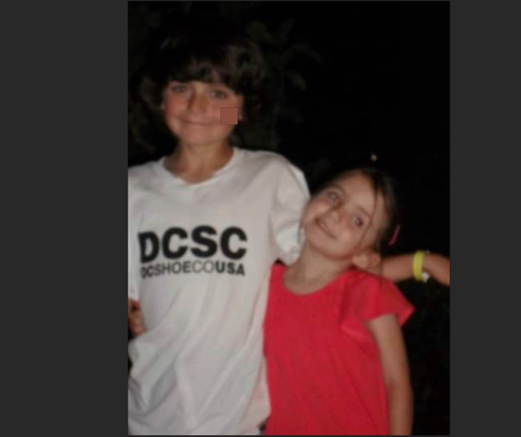
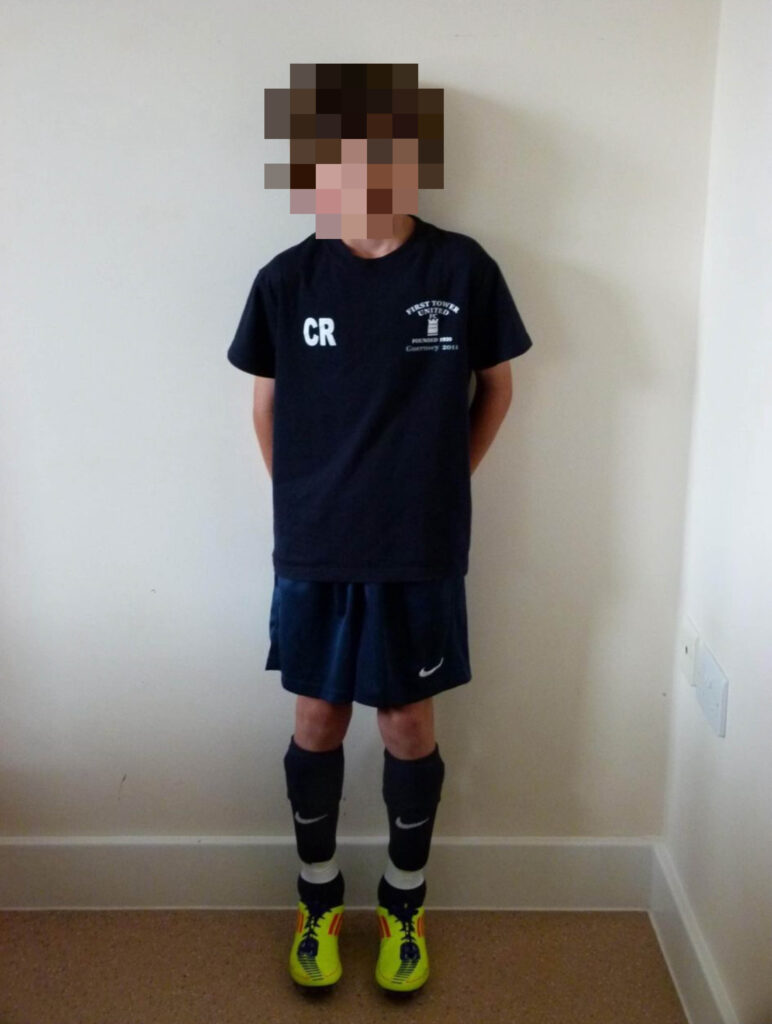
The first set of images I began to experiment with were digital archived images that my parents found of me and my brother, as well as singular images of my brother or with his friends from childhood. I imported these onto the computer from my phone and began to experiment with them in Photoshop using different techniques.
My initial idea going into this was to create adaptations to the images and convey a message of concealing his identity to protect him as these images are of me and him at vulnerable ages, susceptible to different kinds of traumas and the risks within the world that parents try to protect their children from. These images reflect a time of innocence and naivety to connote feelings of nostalgia. A very affluent theme within my personal study is looking at memories, so by making adaptations to these archived images that are associated with core memories from childhood, it changes the meaning behind the images to think back to how my brother used to be before this illness completely changed his identity. This also is representative of how these core memories with my brother are something I think back to all the time and reflect on the person who he used to be in comparison to now where the entire family dynamic has been altered.
However, although I am using family albums in my personal study, I still need to ensure that the image isn’t too under-exposed or over-exposed as I need to ensure I am using effective images.
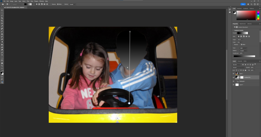
My first few experiments are inspired by the aesthetic of the ‘unknown user’ profile pictures that people typically use when trying to be anonymous. This is because I think that this is an effective way to show how my brother is not the person who he once was, and demonstrates how he may feel out of touch with himself or like another person because of how much the illness has deteriorated him. This anonymity also contributes to my idea of showing the stigma surrounding men’s mental health in a subtle and muted way as it could be interpreted as hiding away due to a diagnosis due to the perception that men shouldn’t be emotional or speak out about their mental health.
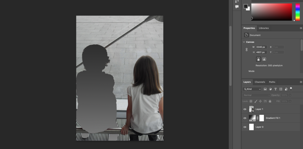
What I began looking at was empty silhouettes of my brothers face, using the Lasso tool in Photoshop to create my selection and delete it to reveal a plain white background. I then added the gradient tool to the white page so that this would be shown through the selection, instead of being this cut out as a block colour as this looked too strange and was very plain.
This experiment didn’t really align with the concept of memory
Whilst I did like this idea of total concealment, I found that the image still looked quite plain and didn’t really convey the message in a clear way. Even though there was a gradient in the image, it still looked very flat and not very interesting, even if I changed the colour it looked quite odd.
I then attempted this again with another image, however this time I included the strands off hair that were laying on his face as this would not only add more texture to the image, but make it look more detailed and intricate rather than being a flat and simplified cut out. I also repeated this method with the same image I used before so that I could see if the images would link together and work cohesively.
Whilst this looked better, I still was unhappy with itAnd this one too due to it looking too false
I preferred the way this looked more, however the cut out still looks very exaggerated and dramatic and I feel like this has the possibility of taking away from the ‘memory’ aspect of the image as it doesn’t have that soft touch to it. However, I may still use these as I feel like it looks like an anonymous user profile picture which I could use to link to the present. However, I am going to have to think about this after I begin taking my other photoshoots to see it aligns correctly with my other ideas.
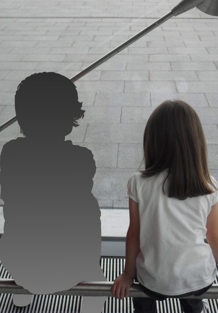
I didn’t really like these experiments that I created so I decided to try a different approach with this method where his entire body was surrounded instead.
I repeated this process again with another image as I felt that it would work very well with this technique:
I think that this was successful as it balances the aesthetic of the image instead of looking out of place.
I began thinking about the other ways I could represent anonymity and concealing identity in a way that I thought would be not only more accurate to the techniques that people usually use to remain anonymous, but would also have a softer touch to them to keep the same tone of nostalgia and protection as well as the aspect of remembrance. I did this because it means that I can include a variation of these methods in my final photobook.
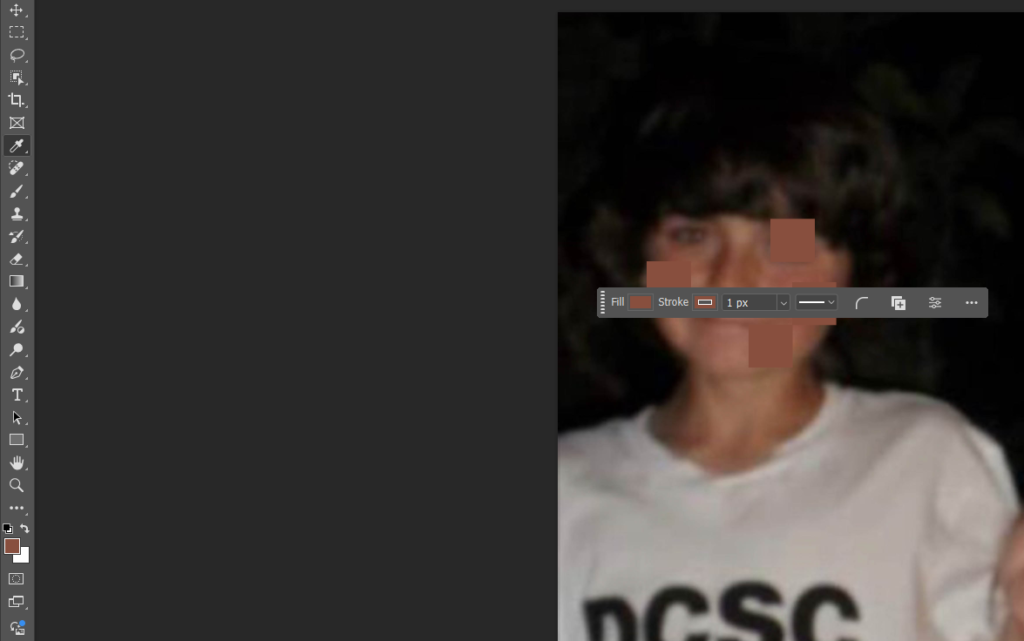
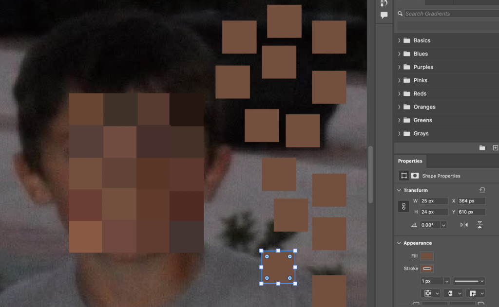
I began playing around with the idea of pixilation. There wasn’t a tool for this in Photoshop so I began by using the rectangle tool to make reasonably sized squares to begin covering my brothers face. I also used the eyedropper tool to select the different tones of my brothers skin and hair so that the pixels looked accurate. I had to make sure that both the fill (the box) and the stroke (the outline) were the exact same colour so that this wouldn’t look strange and actually looked as if his face had been really pixelated.
I started duplicating them and then changing the colour to make sure that each of them were the same size.
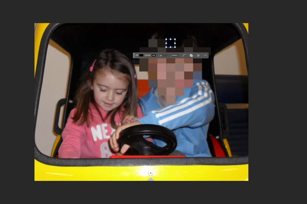
Whilst I was beginning to experiment with this, I realised that the resolution of the image was quite poor, and whilst I am using the snapshot aesthetic, the image was still quite blurry and out of focus. I decided to go back to the image that I used before as I wasn’t too fond of the initial outcome anyway, and the composition of the image was nicer too, for example I’m wearing pink whilst my brother is wearing blue.
I repeated this process continually over my brothers face until I thought that the shape and size of the cluster worked proportionally. This resulted in a large amount of layers:
Experiment 4 – I was really happy with this edit
Similarly…
Experiment 5
I didn’t really like the edits I made on this experiment as I felt that the pixels were too large so I attempted this again using smaller cubes:
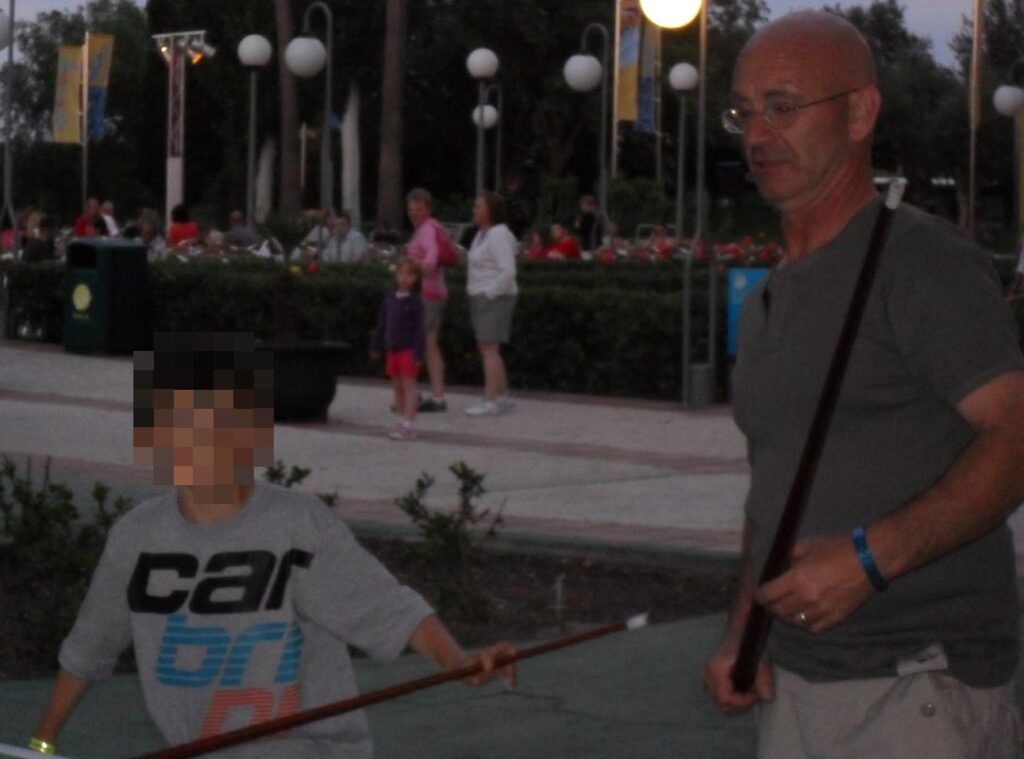
I pixelated this image of my dad and brother playing pool on holiday when he was younger. Whilst the resolution isn’t as great as I would’ve liked, I am still going to use this image in my photo-book because it acts as a contextual cue for my images containing the keyring of a pool ball. This way, I can imply how my brother’s mental health restricted him from continuing with his hobbies, and I feel that this will be a very reflective way of what my brothers personality used to be like and his different interests.
I repeated these two methods in several different images to have an element of consistency in my photobook. I also experimented with cutting out just my brothers face and also his body to still keep them differentiated.
Experiment 6
I found a few images of my brother in his football kit so I can enforce the same contextual cues.
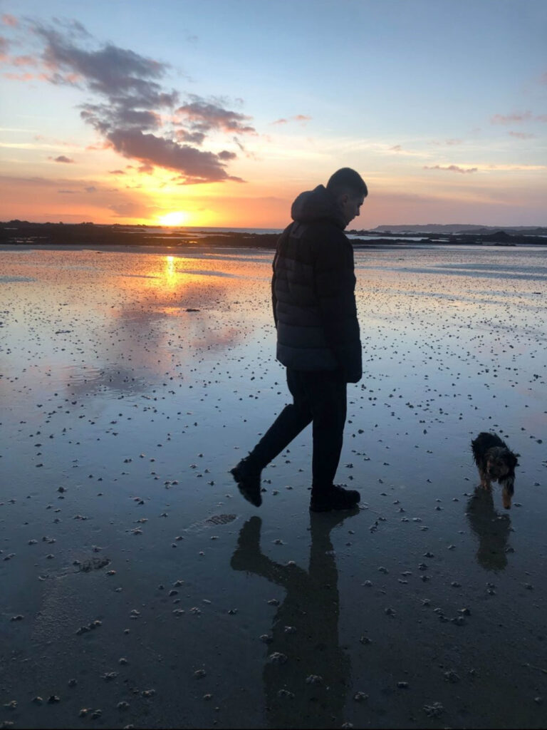
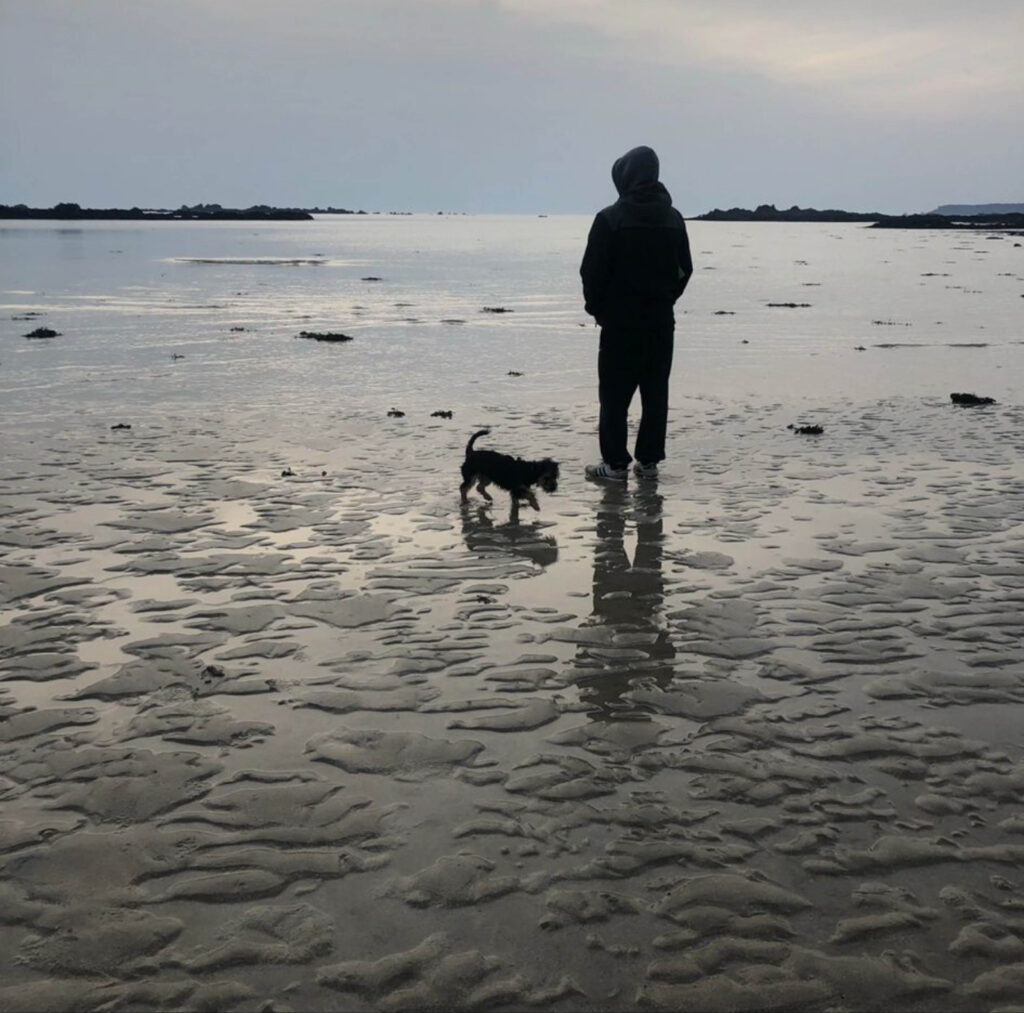
I am also going to use these two images to pair them with my second photoshoot that took place at the same beach to show context:
To what extent is Henri Cartier Bresson’s theory of the ‘decisive moment’ a true representation of reality?
To me, photography is the simultaneous recognition, in a fraction of a second, of the significance of an event as well as of a precise organization of forms which give that event its proper expression – Henri Cartier-Bresson, “Foreword”, The Decisive Moment (1952)
What does photography really capture? Is it the essence of a moment? Is it the emotions of a scene? Or is it simply just an image? Photography as an art is such a subjective genre. Within photography, there is a multitude of different styles of how images are presented, for example, portraits, landscapes, documentary etc. Even these categories have different approaches that can be taken. My project focuses on the documentary style photography. But what actually is it? Documentary photography is a way to tell stories through only an image, it portrays the contrasting lives of the ordinary people around us. Documentary photography can be seen in many different forms such as street photography, photojournalism, reporting and others. A subgenre of photography known as the ‘snapshot aesthetic’ focuses on the everyday traits of life and capturing that moment in time, the images can often be said to appear like both staged and candid, which is similar to the aesthetics of my images. My investigation will consist of exploring and documenting the same people/ groups of people, my friends and family – socially and isolated, but in different environments and situations. Although my images will use the same subjects, the photographs will be portraying the different parts of their lives, and in some way reflecting who they are, which is the narrative of my project. I have decided to take my images in the documentary style because I find that these images are the most authentic, however the reason I will be photographing only those close to me, rather than outsiders like street photography does, is to add a personal touch to my project. This way, my images will have consistency as well as being captivating, with each photo you will discover and learn more. This project discusses street photography, photographers whose work is based on street photography, as well as my own interpretations and my own photographs produced. To take good documentary style photographs, you need to be able to observe the environment you are in and decide what would be the shot that will capture people’s attention. This means ensuring the composition, the light, the atmosphere of the scene are all what would make the most aesthetic, perfect image. This process of image making is known as the ‘decisive moment’ by Henri Cartier-Bresson.
Henri Cartier Bresson was a well-known, French artist and photographer, best known for his candid photographs and street photos. It was in 1937 that his first photojournalist photos were published, and this time period where his career peaked. Cartier-Bresson was born in and grew up in France in 1908 with a wealthy family and from an early age, was introduced to the arts. This led to his first interest in painting until he discovered photography. Then his passion was solely photography, he saw it as an extension of drawing and an extension of the eye as he could capture exactly what he was seeing. He also used the description, “like hunting but without the killing”, to describe the art of photo taking. He then went on to travel around Europe and Africa to dive into other culture. Which then inspired his view of life which became ‘photography isn’t just about images; it’s about capturing the essence of existence’. This helped him to form his philosophy of the ‘decisive moment’. The decisive moment is the point in time where an image builds itself, where all elements and components come together, the scene is the exact right shot, so you shoot. Cartier-Bresson is considered a humanist photographer, meaning he incorporates human experiences within the images he makes. Due to his photographs being candid, he is portraying the lives of the people his images capture, truthfully. His documentary street photography falls under the category of ‘windows’, when discussing mirrors vs windows in photography. A ‘window’ image is one that is more objective, real and truthful, they show the external world which is what Cartier-Bresson’s images are.
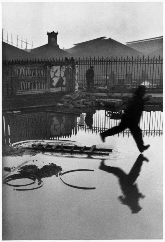
Henri Cartier-Bresson Behind the Gare St. Lazare1932
This photo, by Henri Cartier-Bresson, was taken behind the Gare St. Lazare, train station. The image miraculously captures the moment that this man jumped over a puddle of water. Because the man is mid leap, in the air, it is as if the photograph was planned, it almost seems too perfect. However, as we know from Bresson’s line of work, it was not planned which makes the image all the more intriguing. The background and foreground of this shot are also part of the reason that the image is as good as it is. Things such as leading lines, balance, framing and rule of thirds also make this image what it is. The leading lines in this photo can be seen going horizontally, along the gate and the reflection of the gate in the water. The positions of the leading lines guide you your attention, subconsciously to the leaping man as he is in between. Another aspect of the image which leads you to look at the focal point of the image, is the amount of negative space at the top and bottom of the image, this shows that there isn’t too much going on in the image, overbearing the viewers. Also, due to the puddle anything in the background of the image, is reflected causing a symmetrical middle ground to the image. The rule of thirds also adds to this image, this is because the man is in the right side of the frame separating him from other things going on in the shot but also, he is travelling in the same direction adding to the total composition.
I think that the theory of the decisive moment is a clever way of image making, this is because the images that are being produced from it, capture people in moments of ignorance, they are unaware they are being documented, or they are but they are caught off guard keeping their behaviours unchanged. Because of their unsuspecting state, this means the snapshots of them are all natural with no manipulation, making the images seem so genuine causing them to be intriguing. Since you don’t learn anything about what is really happening, you are left with questions that you ponder on or even make up the answers to in your head, making your own storyline to the image. Because of these reasons, I believe that the decisive moment is a true representation of reality as the photographs produced are candid shots, no staging, no manipulation, just the scene and the camera, adding a sense of vulnerability.
Tom Wood has a variety of projects around street photography, photographing people on the street, in pubs, clubs, markets, buses, essentially, anywhere, and everywhere. Wood has photographed since 1978 up until 2013, his photographs portray moments which have not been interfered with or staged, they are all naturally occurring images, meaning they are an authentic representation of the people in the images. Tom Wood spent a lot of his times taking the bus, which is what prompted him to take some of his best-known images. He would sit on the bus and shoot images of the strangers sharing the bus with him or of strangers out of the windows shooting pedestrians, buildings, traffic etc. When describing how he would take his images, Wood said, “I don’t think about it. The whole point is not to think – but more to feel, to be open”. This was his way of having the confidence to photograph these people he never knew, and to get his images pristine.
Tom Wood differs from Henri Cartier-Bresson’s style, the decisive moment, as he described his image making style by saying “I would just put up the tripod, open the lens and then wander around with a flash gun, not knowing how the photographs would turn out”. Whereas the decisive moment is about choosing when to shoot, paying attention to the details and shooting when the scene in front of you is the perfect image. Rather than looking through the lens, observing the details, Tom Wood would shoot quickly and whether or not the shot was good, would depend on chance. Similarly to Cartier-Bresson however, Tom Wood’s images are also ‘windows’, documenting the lives of the locals, in a genuine manner.
For this project, my photographs are being captured using a mix of both Tom Wood and Henri Cartier-Bresson’s strategies of photography. In most cases, I follow the theory of the decisive moment, I observe my scenery and shoot the image when I think all components have come together. Although, in some environments, I will take a photograph of what is in front of me without looking through the lens for long, I will watch what is happening and take images and decide after the shoot if the photographs turned out how I had hoped.
The second artist I have taken inspiration from is Andrew Kung, a modern photographer whose work is centred around portraying the lives of Asian American people. His specific project that has inspired me is ‘Dreaming on the Hudson’. The photographs from this project are documentary style, capturing the activities of young Asian men. The photographs produced in this project are staged situations of the men, plastered around in different settings of the Hudson River. Although the images were taken in the same location, Kung explored all of the different areas around the Hudson, allowing each individual photograph to be unique in its own way. For example, there are images in a field, the water’s edge, grassland etc. Even though the images are staged, they are taken in a documentary approach as the subjects don’t engage with the camera directly, they let themselves be documented.
Kung’s work and manner of shooting images differs from Henri Cartier-Bresson’s theory of the decisive moment, while sharing little similarities. Unlike the decisive moment, where the images produced are about the unpredictability of the moment, Kung’s image making is the opposite. The photographs are of arranged scenes, creating a cinematic feel to them. Although Cartier-Bresson’s images can have the same feel, his images can also be described as more chaotic, as they are captured in a moment of time that may not be captured again. Also, whereas Cartier-Bresson’s, as well as Tom Wood’s, images are ‘windows’, Kung’s images are ‘mirrors’. A ‘mirror’ photograph is one which reflects the photographer, they tend to be more subjective, staged etc., since Kung’s images are staged photographs portraying Asian American’s, they are ‘mirror’ images. Another difference between their photography style, is that Andrew Kung’s work is reflecting a message and meaning – “Through my images, my aim is to normalize Asian American beauty, belonging, and individuality. I often investigate themes of masculinity, family, intimacy, and what it means to be American“.
In my own project, I have taken inspiration from the aesthetics of Kung’s images, rather than his message, and have my own meaning behind the images. My aim is to highlight the idea that every individual has their own unique life, and to show a snippet of the lives of those close to me. The photographs taken of my friends are the ones that most reflect Andrew Kung’s images. This is because of the locations used and also due to how I have presented them in the images. In contrast to Andrew Kung, the majority of my images are not staged, I observed my friends socialising as normal, and shot images of them, apart from a few times where I directed them to perform a certain action to capture a better shot.
To conclude, I think that Henri Cartier-Bresson’s theory of ‘the decisive moment’, can be considered as a true representation of reality to a large extent. This is because, what the camera captures in the moment, is the exact scene in front of you. In terms of Cartier-Bresson’s photographs, it is a true representation of reality as he is not manipulating the images, they are authentic. Similarly, Tom Wood’s photographs, even though he didn’t shoot his images with the decisive moment in mind, both techniques share similarities, causing Wood’s work to also be a true representation of reality. However, Andrew Kung’s project consists of staged images, creating a false reality on the surface, but the true reality of the image is the meaning behind it. When taking my own images, during the photoshoots I would take multiple images while a scene unfolded in front of me, the final images produced are the ones where all of the components came together in place. As discussed previously, my images and procedure of image making have similarities and differences with Henri Cartier-Bresson’s as well as Tom Wood and Andrew Kung. In summary, I followed Cartier-Bresson’s theory of ‘the decisive moment’ to a certain extent, as I ensured all elements of the image were at their prime when taking the image. With Tom Wood’s photographs, my images share similarities in the sense that they were all documentary images, even though Wood didn’t prioritise that the style of his images were documentary, “I’m only interested in good pictures, if it’s a document then it’s a bonus”. I recorded the lives of those close to me and he reordered the lives of strangers in his town. Finally, my work is similar to Andrew Kung’s as a big part of my work is focussed on my friends who are youthful, like the people he photographed in ‘Dreaming on the Hudson’, also I find that the appearance of my images are similar to his. Oppositely to both Tom Wood and Andrew Kung, my final images are presented in black and white, whereas their photographs are bold and bright in colour. Each of these artists have a different approach to photography, and a different reason behind their work. In spite of this, in some sense, they all portray reality through their image, which is what my own photographs are intended to do.
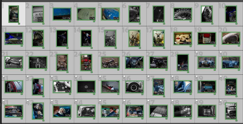
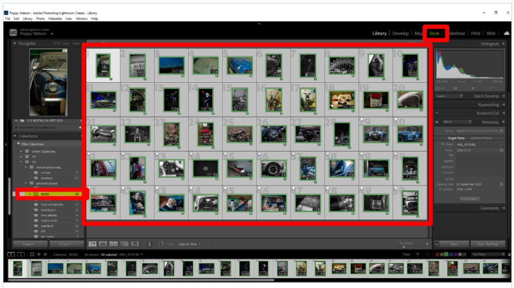
Once I had finished editing all the photos I added them all to one folder using filters to pick out the best ones from each shoot. This allowed me to then select all the photos using the arrow key and clicking on the ones I wanted. Having done this I then selected the book option at the top of the page.
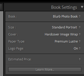
I then could select the book settings I wanted, I tried both landscape and portrait, both worked for certain images but portrait worked better for more. It also gave it a photo album feel which is a nice link to it’s basis on family history. I chose a hardcover image wrap as it prints the photo onto the covers. Alongside choosing the premium lustre paper, I have focused on what will be the best for my photos and enhance the narrative.
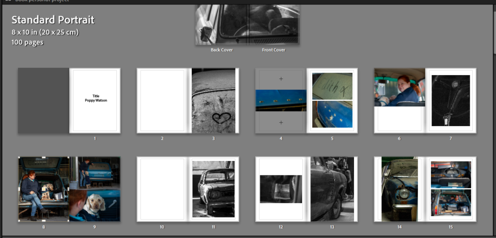
First few Pages Draft
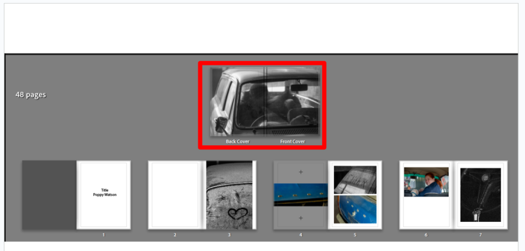
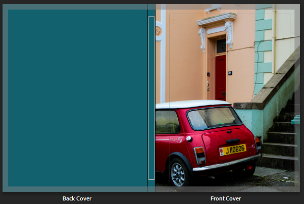
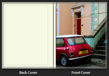
Cover draft, I tried different photos on the covers of the book, however I found many related too much to the individual shoot it came from. I tried this photo and thought it fitted well. Having the main subject in the photo out of focus reduces the specific of the photoshoot while having the car in focus allows for a vague idea on the books content to be interpreted. The technical elements of the image also work well, having a black and white shot with a cropped frame and many details creates an interesting but not too complex cover.
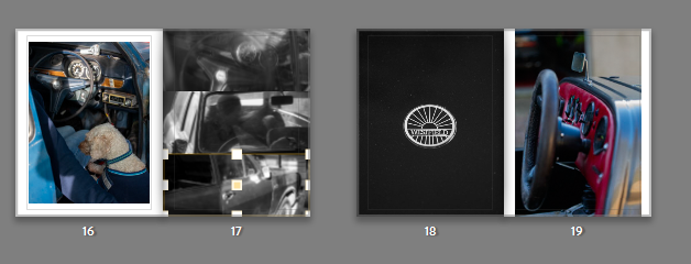
This page of the book is where I would like to add some archive photos. By adding the photo with ‘Edith’ written on the car as that is what the car is nick named so it adds a personal touch to then compare it to the archive photos of a different car. I have added the two ford badges from the current car to add context and like the two cars together, with them being a similar style and the same brand.
These are the next few pages, still using the combination of shoots I have created a story that flows onto the next page.
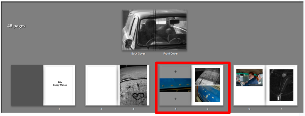
I have left this page blank as the previous two pages are full so it allows the viewer a minute to understand the photos before getting a simpler, contextual photo. I have created a comparison between old and new, the new being the three dog photos and the movement in the images adding life back to the car and then contrasting it with a simple black and white shot of half of the car, showing its age.
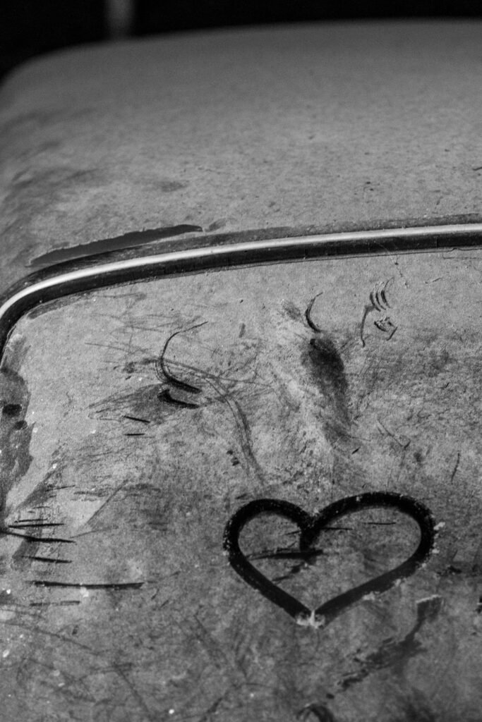
On this page I wanted to show the images presented together as the one on the top right is a closer look at the details from the photo below it. I also wanted to keep the dust heart featured in the book as it links shoots together.
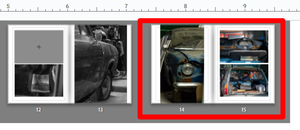
To then make the transition to the next part of the story I used a tryptic of three low contrast black and white images with lots of sunlight on page 17 then contrasting the bold high contrast badge image of the next car on page 18. I have used the badge of the car as a subheading, suggesting the latest part of the narrative.
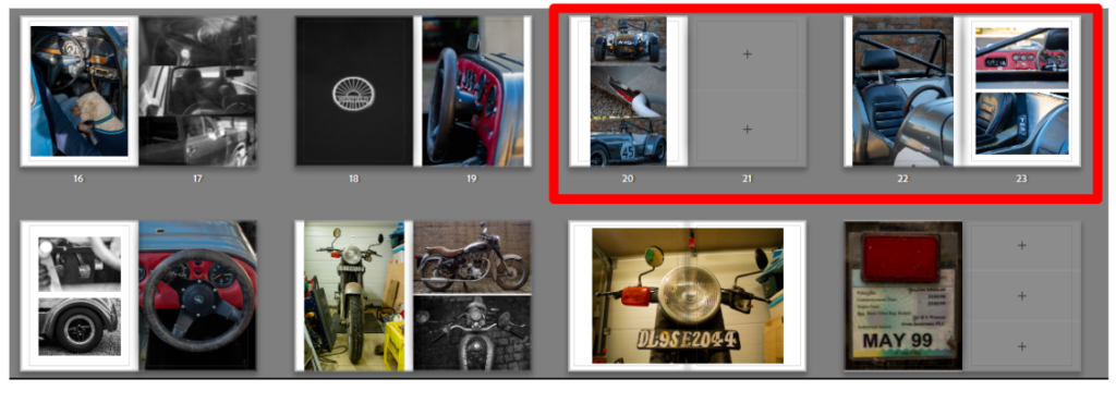
The next few pages I added photos of the Westfield, leaving spaces for where archive photos would best benefit the story. This photoshoot didn’t have any people in it so I didn’t give it many pages as I didn’t want the book to become to monotonous.
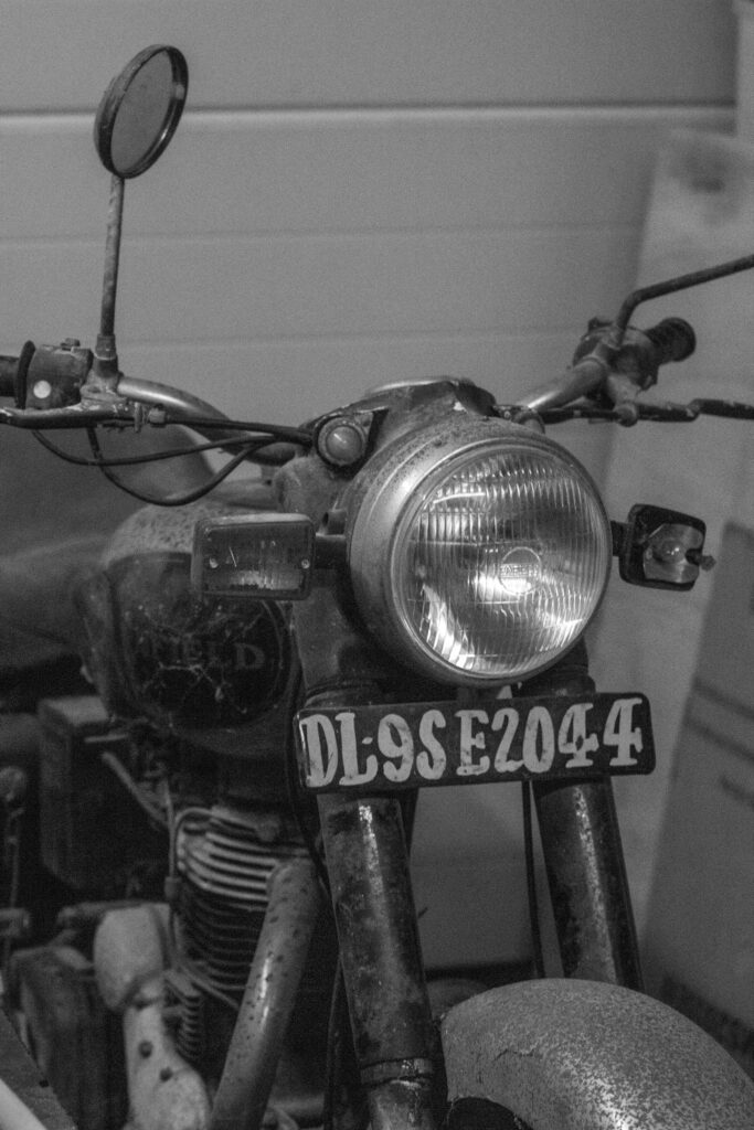
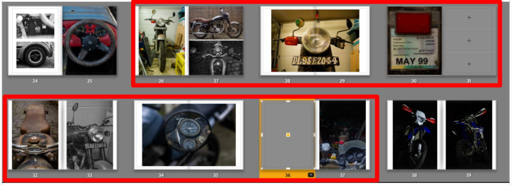
This part of the book is important as it is the bike I heard the most about growing up alongside the fords. It was brought in India and then ridden back to Jersey. I would like to put some text in mentioning this but I need to add the archive photos first as it might make it too busy. I have also, towards the end I have hinted towards the next section in the end of these photos as there are more modern bikes in the background, foreground.
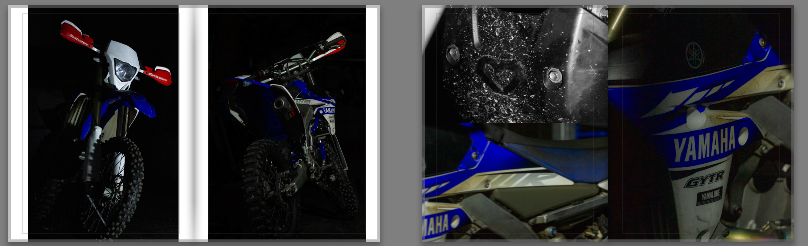
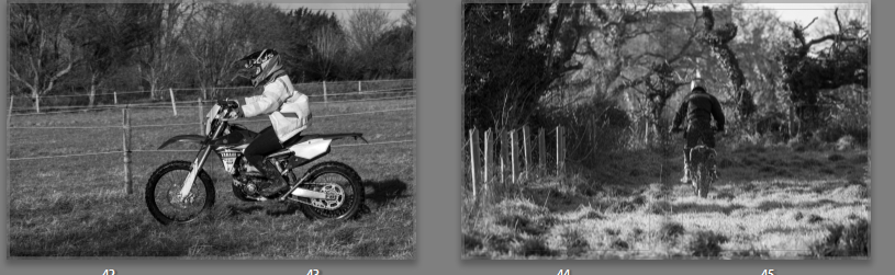
The next section of the book then goes onto my bike, the one I brought influenced by the family history of motorsport and my own passion for the sport. Again these photos didn’t have people in them as I wanted to focus on the stark contrast between bikes due to their age, the previous photos being about a 1999 bike and these ones being a 2017 bike.
This section of the book, the final section is important as it creates a conclusion for the book. The first photo is me on my bike, as shown in the previous pages of the book and then the last page is my father on my bike. I wanted to show it this way as it is a cyclical pattern of my parents love for motorsport and them sharing it with me, to me being able to share it back to them in my own way, sharing my bikes and car with them, training together. I chose to use these as full page spreads as I wanted the images to be prominent, I also made sure to place the subject slightly to the right as its a double page spread the book will have a crease in the middle and I wanted to make sure the subject wasn’t lost in it.
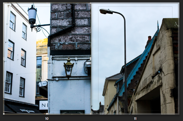
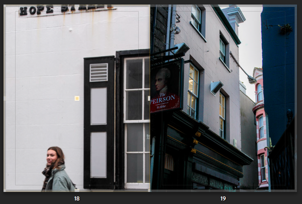
Final Layout
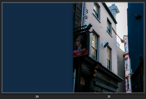
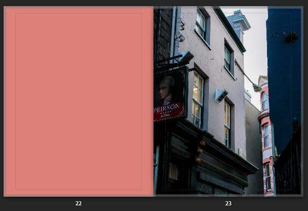
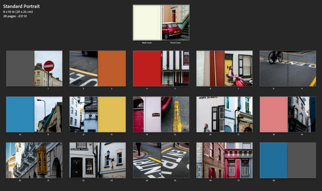
This final layout shows the book as a whole rather than page by page. This displays the colours, patterns and story telling skills I have used in creating this book. The flow of the book is old to new so older cars are the first half of the book. The newer bikes are the second half. I have used double page spreads for important photos or points within the story, connecting old to modern. Also using multiple photos on pages to highlight and group small details so they don’t get lost within the book. Within each section of the book there are blank slots for me to put archive photos into, this is an important part; for the book is based upon seeing these photos and hearing the stories with them, as a child. I ended up using many black and white photos, including the cover. I didn’t end up using a title instead choosing a photo that sums up the story without text. Encouraging the viewer to study to book and the photos within. Overall my book is inspired by the story the photos produce and the research I have done on photo books, looking at the styles I like. Experimenting with what benefitted the narrative of the book.
I began to by selecting my final images which I felt best worked together. Then started experimenting with how I could make the layouts very visual creating this aesthetic of colour, form, shape, and composition throughout.
Here I was deciding the layout for these particular pages. I took these photos both in the same area but from different angles, which created this different confrontational effect. The writing could be presented and was displayed from different angles where the lines and formations of the pavements could be realised differently. I felt having both pictures on separate pages presented a nice flow as both achieved very similar yet different perspectives and angles. However I went with both images, presenting on a double page (side by side) as this revealed a much more unique composition. I found the abstract approach complemented the photos individually as your unsure yourself what the writing is suggesting or saying, instead we are drawn to the pigmented, sharp lines and shapes of colour that works well with the compositional arrangement of the streets. However, both photos complement one another, and they different versions of each other.
The second double page above was the composition I went with. I felt each photo displayed their own structural formation through the way the person is walking off the page, to the letters and coloured lines. Then the way the photos complement one another side by side, creates intense leading lines in-wards or into the page, instantly gripping your attention as your eyes follow this formation. This creates a slight symmetrical feature (although they aren’t identical images) from the way the photo is angled. The photos was taken from the same place, I stood in the middle then captured to the right of me then to the left of me, both including different people walking away. This creates a nice sequence, one that we wouldn’t notice, until after we notice the abstract feature. This creates even more diverse angles and compositions reiterating their juxtaposing effect side by side.
I then started playing around with adding a full colour page, which complemented a stoke/detail of colour I found in my image and wanted to emphasise further. Looking at the colour wheel as guidance this allowed me to easily see which colour complemented on another. For some pages, where you could only see a little detail of colour, I then matched the colour onto the next page, giving this unique relation and comparison. For example for the third photo below, you can see the intricate red detail from the outline/structure of the window and sign, which stands out against the alternating black and white background. So to express this feature further I wanted to bring this out, revealing the colour/ making it more visible as it is an interesting graphical feature- so I matched a whole page. In other photos where the colour was more visible through bold shapes and lines, I wanted to create a contrasting feature so used complementary colours instead as the whole page. I mimicked this particular technique Siegfried Hansen used, as I was automatically attracted to this feature presented in the book, Hold the Line, because it broke up the busyness/hectic feel you would be presented with otherwise, but also describing this interesting narrative throughout as you can see a deep connection in relation to the image.
Complementing colours
Complementing colours
Same colour
For some photos I experimented further with Hansen’s technique of having a whole colour as a page, to then incorporating a more visual and structured version through my photos. I took inspiration from the singular, pigmented colour Hansen used, to then incorporating more than one to give this dynamic relationship, that I could further use to complement my other images (like the photo on the left). So throughout that photoshoot I noticed colourful buildings, and the particular shades of paint used that I could then use instead of editing a colour into the page on Lightroom. I felt this would give a much more interesting feature as I have taken the photo, and related this the image followed after or before.
Like for these pages, I found this wall that already had contrasting features expressed by three two tones. I straight away noticed how the colours where presented through the composition and structure of the building, as you get the strand of white running through alongside the angles and three-dimensional feature. I like this A-symmetrical feature you get, which gives this particular character and interesting depth followed by how the lines are to an angle leading you into the composition. I felt the simplicity of this could relate and complement my other images in a different yet similar way, instead of using a single block colour. As you can See I have exaggerated and brought out the tones found within this image as you can see the texture and intricateness blemishes in the wall, which overall adds character. You can see the relation, as similar tones are displayed. I like how the tones aren’t the same which shows you they can still work together and complement one another as they bring out other features within the photo, such as the yellow coming from the door, and the pink jumper, but also the patterns revealed from the black and white building. It works well as the tone of white in both is highlighted throughout the double page.
Like-wise for some photos where I was not intending to express the colour, instead it was the formation and angle I took it from, the photograph still expressed the same effect as the full colour page, only adding in extra details and formations – which gave this passionate, energetic, expressive characteristic:
This mix of compositions reveals a similar effect followed by the dynamic structure of the road markings. The similar use of of compositions related to one another as they both express a very dramatic feeling.
Breaking up the pages with colour:
I realised my images were very intense – from colour and composition so I was influenced by the Book ‘Hold The Line’ by Seigfreid Hansen, to add in full coloured pages.
Before
As you can this double age is very hectic and busy as their is lots of bold compositions. Although, I chose images that complemented one other through their colours and structural formations as their side by side, it still portrayed a very chaotic, intense double page – one that worked together but clashed. So increase the aesthetics I added in full coloured pages that broke this up, therefore creating this unique contrasting effect. The colours I chose for the pages complemented the photograph on page next to it, or very little of the colour was visible- therefore this brought the colour out making it visible. I kept the colour pallet simple using complementary colours or primary colours.
After:
Original layout
Front Page:
Final Book Layout
Evaluation:
How successful was your final outcomes (book, film, prints etc)?
Overall, I think my final outcome of creating a book was successful. My aim was to create a book influenced exploring colour. Influencing specifically by the formalist style From this dynamic formations were revealed which is what I think make it unique. Similar to Hold the Line by Seigfried Hansen, the photobook doesn’t express an obvious narrative, instead its open for us to interpret one. I think this is a very clever and different way of expressing a series of images in a book, as we are confronted with different angles and approaches which makes up the narrative. Through an abstract approach that we are straight away confronted with forces you to look beyond, focusing in on the formations and and structural elements of patterns and colour.
Did you realise your intentions?
What references did you make to artists references? comment on technical, visual, contextual, conceptual?
Both Saul Leiter and Seigfreid Hansen explore forms of colour which are defined through shapes and compositions. The similar yet different outcomes is what interested me the most. Seeing how moments and reality can be transformed into images which change your perspective, otherwise revealing moments you wouldn’t expect to see.
I captured the photographs in day light either when it was sunny or cloudy as this revealed two different effects expressed through the shadows and highlights. Focusing in on visual aspects such as colour, shape, pattern, line, texture and composition when out on photoshoots but also when making final edits. The visual elements all fitted together, complementing one another which is why I explored this abstract, confrontational effect. Seigfreid Hansen was my main influence, further shown in my final images in the photobook as he took everyday situations and moments and captured them in a way that revealed a type of structure defined with lines, patterns and colour. This then created contrast of colours and depth. Without expressing an initial narrative, it is left up to you how you interpret Hansen’s work. Leiter uses a similar approach, yet we soon figure out a narrative as subjects such as people interacting are captured. I tried to include this using people I know which created this staged look. In comparison, I then looked at Hansen’s style of abstract snapshots of particular moments, then created photographs in similar styles, with bike wheels and legs coming into the main photograph to give this contrasting narrative. My expliration of colour is expressed through different layouts which come together in the book, complementing one another. Using full coloured pages to break the caotic, intense images up, complemented slight details I wanted to enhance and make clear which would otherwise go unnoticed. Otherwise for some pages, I captured colours myself which included some lines and slight differences like the full coloured pages. This created the same effect as the full coloured pages yet made it more interesting.
How have Todd Hido and Hiroshi Sugimoto used the medium of photography to record and present the intangible?
‘A photograph might be a fixed image but, socially speaking, photography does not keep still.’ David Campany, The Photographic (2004)
A Photograph Is Intangible
A photographs takes a fleeting moment – the natural atmosphere and emotion – and immortalises it in a still frame. Once taken, that moment can no longer be revisited: it is intangible. Intangibility is the absence of a physical body. While a print out can be held and felt, the subject of the image is now immaterial – a copy of a memory. Take for instance a tourist. He may photograph himself in front of a landmark as “indisputable evidence that the trip was made” (Sontag 1977:9). But once he moves to the next location he cannot return to that same spot, the moment has passed. It does not exist any longer outside the frame. All the same people will exist, the same landmark stands however the exact makeup of that image is only present within the bounds of the frame. “The shutter clicks and the clock jumps to the past” (Stahel 2003:7). Similarly Susan Sontag draws parallels between the shadows in Plato’s Cave and the photograph. The shadows are a believed truth based on bodiless projection used to show the deceptive nature of our own perception. Both these shadows and photographs mislead the viewer into believing they know the ‘full picture’. What’s seen is believed as fact. “The picture may distort; but there is always a presumption that something exists, or did exist” (Sontag 1977:5). On the contrary, a photograph is a physical representation of what did happen, tangible evidence. Photographs are “fixed traces of the light” (Stahel 2003:7). You can hold it, share it and even fix it in a book. Photographs are the physical body of a memory. “any single statement about photography is likely to fail on some level.” (Campany 2004:10). Like anything physical, a photograph has dimensions. A photograph cannot be fully explained in one sentence, they connect emotionally to the viewer. Between even just two people, a photograph’s summary can vary drastically as throughout a photograph’s timeline it will pass through many different hands and the view of many eyes, a result of a physical form. “photography does not keep still” (Campany 2004:7). Unlike a paintings which is someone’s artistic interpretation, a photograph has a high degree of indexicality. It cannot lie or purposefully mislead, it shows what was captured, it is a tool.
Photographing the Intangible
How do you photograph something that doesn’t exist? There is a common consensus that the camera in one way or another killed the paranormal. If something exists there’s a picture so if you haven’t seen it, then it mustn’t exist. Tales of beasts in the woods and monsters in marshes have become increasingly difficult to believe without evidence. For early photographers like William Hope and William Mumler this was a matter of manipulation: using simple double exposure techniques to create ghastly effects. While its impossible to photograph the ghost of a loved one, printing a copy of them achieves a similar effect. Photographer Todd Hido captures feelings of isolation by alluding to humanity without ever showing it. The loneliness of his images utilises familiar imagery to trigger a personal response. Hiroshi Sugimoto turns something familiar into something unrecognisable through distortive blurs. “any single statement about photography is likely to fail on some level” (Campany 2004:10). This is because a photograph on its own has no context. It is an abstraction. Without context any interpretation is valid. In a collection, a narrative can be crafted however the ambiguity is what makes images resonate with the viewer. Any feelings associated with an image are entirely disembodied. “Photographs actively promote nostalgia.” (Sontag 1977:15). If a photograph represents a passed moment of time and nostalgia is the universal longing for the past then photography is the act of presenting nostalgia, intentionally or not. This is most easily seen with family photobooks but any photograph will elicit some level of nostalgia at some point in its timeline.
Surrealism and the Uncanny
Salvador Dalí – The Persistence of Memory (1931)René Magritte – The Son of Man (1964)
Surrealism as a concept was named by French poet Guillaume Apollinaire in his play ‘The Breasts of Tiresias’ (1917) where the term meant simply ‘beyond reality’. Surrealism built off of pre-existing art movement such as Automatism: the idea that unconscious behaviours that subject is unaware of as well as Dadaism: art that rejected conventional norms in favour of the absurd. It wasn’t until the First World War had cleared that Surrealism as a movement gained its own footing with poet André Bretons ‘Manifesto of Surrealism’ released in 1924. Following the atrocities of war, the general public questioned beliefs that blindly led them into the atrocities of war and choose to look inwards at themselves, rejecting Formalism: where images are based not on emotion but instead technical elements, and Rationalism: the belief that reason is the most important factor of knowledge, and practice healing methods such as self-examination and psychoanalysis based on works from Sigmund Freud and Carl Jung. Surrealism is the inwards looking movement meant to “revolutionise human experience.” (Tate Modern: 2). A surreal painting combined irrational, unseen aspects with totally rational and familiar imagery to create an end product that could be called hallucinatory or even uncanny. A famous example would be Salvador Dalí’s: ‘The Persistence of Memory’ (1931). This painting used a beach as the background for an a still-life arrangement of objects to sit in front of. The most notable of these objects are the clocks, a mundane object turned surreal by melting and distorting them. Its not just the clocks that are manipulated and changed however: the background is broken up into nonsensical boxes and a tree is growing out of a wooden surface. All these inconsistencies create the appearance of something that could only exist somewhere illogical such as the subconscious. René Magritte’s ‘The Son of Man’ (1964) is a seemingly normal portrait, something familiar and unassuming except for the floating green apple obscuring the face. By obscuring and manipulating something familiar such as the face into something new and foreign with an apple creates a sense of wonder and mystery in the viewer.
The uncanny was coined by neurologist and founder of psychoanalysis, Sigmund Freud. Psychoanalysis is the theory that personality is dependant on our past. Similarly the uncanny was the idea that childhood fears still cast immense fear over the adult mind, a reaction dependant on our past. If a grown adult saw a shadowed figure at the end of their bed the dread experienced would be called uncanny had they been fearful of tales such as the sandman as a child, while it is a reaction of fear, it is also a reaction of recognising some repressed familiarity. The word is now used to simply describe something uncomfortably recognisable and wrong at the same time, an unsettling juxtaposition that does not sit easy with viewers. Take a smiley doodle: the brain will associate it via eye and mouth placement as a face. When looking at a car the same might happen: the brain will see two shapes resembling eyes and something that might enough look like a face to decide that the car its watching you. When faced with a portrait, the brain will tell you that it is a person. If you then manipulated each feature enough that the portrait could no longer be of a real person, the brain will see the overall features and recognise it as a face. At a quick glance you may be fooled however something about it wont be quite right. When facing a doppelganger you will recognise the face as yours, however the nose may be too small to be correct, it would be described as uncanny. The uncanny leaves the feeling of unease and discomfort.
Todd Hido
House Hunting, 2001
Todd Hido creates photographs that could be described as both traditional and bordering uncanny at the same time. Despite the perceived simplicity of these photographs, they expertly embody feelings of realism and discomfort “as though they have been directly pulled from the recesses of your own memory”. (Kraft, 2021: 2) By taking a shared experience or memory and presenting them back to the viewer, the photograph will have created a personal connection on the basis of familiarity, in turn eliciting a stronger emotional connection. These shared memories however are twisted. He takes ordinary houses and transforms them into haunting dreams through soft lighting and quiet composition. This familiarity is required to create feelings of the uncanny, something only achievable by taking the familiar and changing it into something feared- in this case total isolation. House hunting creates a lonely narrative of being stuck as an observer on the cusp of society. While you can see houses and know someone must be present, you don’t see a single person. They’re hiding, from you. The viewers eye is made out to be that uncomfortable felt-presence, someone uninvited watching from somewhere just out of view. Its an uncomfortable yet strangely peaceful atmosphere that extends throughout this body of this project. Additionally this photograph has a muted colour pallet. The whole image is a cool blue toned with only white light and dark trees breaking this monotone pattern. The bleak colour pallet doesn’t elicit any exiting or extravagant reactions; it showcases the dullness of the mundane, a universally relatable topic that will reach a further audience than an American suburb.
Hiroshi Sugimoto
Hiroshi Sugimoto, Architecture (1997 – 2002)
Hiroshi Sugimoto creates photographs that “dissolves the lines between time, memory, and history” (Fraennkel Exhibition: 1) in his photographs. By creating images that seemingly stand outside the passing of time, they hold a strange sense of power over the reader and create an imposing atmosphere, an important feeling when photographing powerful buildings. This makes the presence of the buildings seem as large as they would physically be in person. In this image, Hiroshi Sugimoto has photographed a church. Churches were and still are, though to a lesser extent, powerful so the imposing atmosphere and emphasised cross shows power over the viewer. Although this image of a minimalist church could easily be associated with current aesthetics and movements, it could just as easily be taken from many points of your own memory and therefore history. Minimalism dependent on the present, its been present throughout modern history. The protestant church has been white and void of decoration to separate itself from Catholicism since its foundation in 1517. The lit cross looks angelic with bright glowing white but also inviting, like a welcoming hand which is representative of both the welcoming and openness of community but also the personal connection people build with their religion. At the same time the emptiness of the frame, the bareness of the room as well as the coldness the loneliness that comes with religious teaching and practices creating a cold and out of reach image. even if you wanted to reach out, it looks so large and far away, making the viewer feel unworthy and small. Additionally the image was purposefully made blurred which creates a dazy and unreal appearance. Like something from right out of your memories.
Conclusion
In conclusion, both Todd Hido and Hiroshi Sugimoto have created photographs that capture something seemingly right out of your own memories void of human presence. They have presented the intangible as an intimate emotional response through the use of familiar while also lonely imagery. Todd Hido’s images elicit feelings of nostalgia and loneliness while Hiroshi Sugimoto’s are powerful and intimidating. In response to Hiroshi Sugimoto I produced a number of images inspired by ‘in praise of shadows’ which I believe captures similar feelings of wonder and fear as ‘architecture’. These images create unique and striking shapes from a flame which has associations of danger. While my image didn’t create the same elongated streak, I think the humanoid shape creates an uncanny feeling instead which achieves a similar feeling of unease. As a response to Todd Hido’s ‘House Hunting’ I created a series of images documenting my walk around neighbourhoods at night. I didn’t manage to photograph in heavy fog or mist but I made sure each one showed signs of isolation regardless of the missing mystery of fog.
Hiroshi Sugimoto – In Praise Of Shadows (1998)ResponseTodd Hido – House Hunting (2001)Response
In this photoshoot I wanted to take a more masculine approach, just how Justine Kurland had the girls be more masculine in her book. I took images of my friends fixing/ adding things to there cars. This also relates to my identity and my youth, because my uncle would do this all the time when I was younger and I would watch and try to help.
Contact Sheet
The images that are highlighted green are the images I have chosen to edit, because they have the best composition and lighting.
Edits
I edited this image by increasing the contrast, shadows, whites, vibrancy and saturation, while decreasing the exposure, highlights and blacks. I did this, so that the image was slightly less exposed, as the lighting was slightly too harsh, due to the sun.
I edited this image, by increasing the contrast, shadows, whites, vibrancy and saturation, while decreasing the exposure, highlights and blacks. I did this, so that the image has better lighting and is more vibrant.
I edited this image by increasing the contrast, shadows, whites, vibrancy and saturation, while decreasing the exposure, highlights and blacks. I did this, so that the lighting was better in the image.
I edited this image, by increasing the contrast, shadows, whites, vibrancy and saturation, while decreasing the exposure, highlights and blacks. I did this, so that the image was more vibrant.
I edited this image, by increasing the contrast, shadows, whites, vibrancy and saturation, while decreasing the exposure, highlights and blacks. I did this, so that the image was vibrant and had better lighting.
I edited this image, by increasing the contrast, shadows, whites, vibrancy and saturation, while decreasing the exposure, highlights and blacks. I did this, so that the image was slightly less exposed.
I edited this image, by increasing the contrast, shadows, whites, vibrancy and saturation, while decreasing the exposure, highlights and blacks. I did this, so that the lighting was better.
I edited this image, by increasing the contrast, shadows, whites, vibrancy and saturation, while decreasing the exposure, highlights and blacks. I did this, so that the image is more vibrant.
I edited this image, by increasing the contrast, shadows, whites, vibrancy and saturation, while decreasing the exposure, highlights and blacks. I did this, so that the image is slightly more exposed, so that the lighting is better.
I edited this image, by increasing the contrast, shadows, whites, vibrancy and saturation, while decreasing the exposure, highlights and blacks. I did this, so that the lighting is better and the image is more vibrant.
I edited this image, by increasing the contrast, shadows, whites, vibrancy and saturation, while decreasing the exposure, highlights and blacks. I did this, so that the image was slightly more exposed.
I edited this image, by increasing the contrast, shadows, whites, vibrancy and saturation, while decreasing the exposure, highlights and blacks. I did this, so that the image is slightly more exposed.
I edited this image, by increasing the contrast, shadows, whites, vibrancy and saturation, while decreasing the exposure, highlights and blacks. I did this, so that the lighting is better.
I edited this image, by increasing the contrast, shadows, whites, vibrancy and saturation, while decreasing the exposure, highlights and blacks. I did this, so that the image is slightly less exposed, so that the lighting is better.
I edited this image, by increasing the contrast, shadows, whites, vibrancy and saturation, while decreasing the exposure, highlights and blacks. I did this, so that the image is more vibrant.
I edited this image, by increasing the contrast, shadows, whites, vibrancy and saturation, while decreasing the exposure, highlights and blacks. I did this, so that the lighting is better.
I edited this image, by increasing the contrast, shadows, whites, vibrancy and saturation, while decreasing the exposure, highlights and blacks. I did this, so that the image is slightly less exposed, so that the lighting is better.
I edited this image, by increasing the contrast, shadows, whites, vibrancy and saturation, while decreasing the exposure, highlights and blacks. I did this, so that the image has better lighting.
I edited this image, by increasing the contrast, shadows, whites, vibrancy and saturation, while decreasing the exposure, highlights and blacks. I did this, so that the image is more vibrant.
I edited this image, by increasing the contrast, shadows, whites, vibrancy and saturation, while decreasing the exposure, highlights and blacks. I did this, so that the image has better lighting and is more vibrant.
I edited this image, by increasing the contrast, shadows, whites, vibrancy and saturation, while decreasing the exposure, highlights and blacks. I did this, so that the image has better lighting.
I edited this image, by increasing the contrast, shadows, whites, vibrancy and saturation, while decreasing the exposure, highlights and blacks. I did this, so that the image is slightly less exposed and is more vibrant.