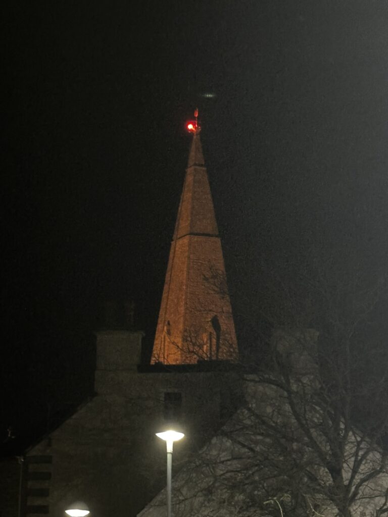
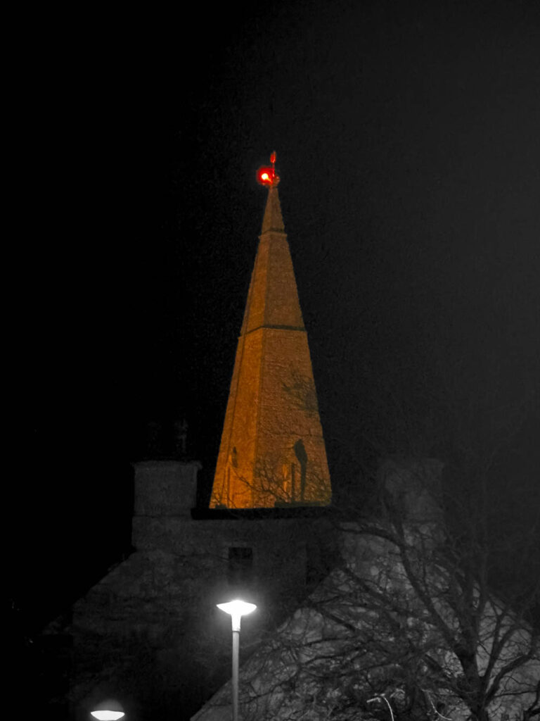
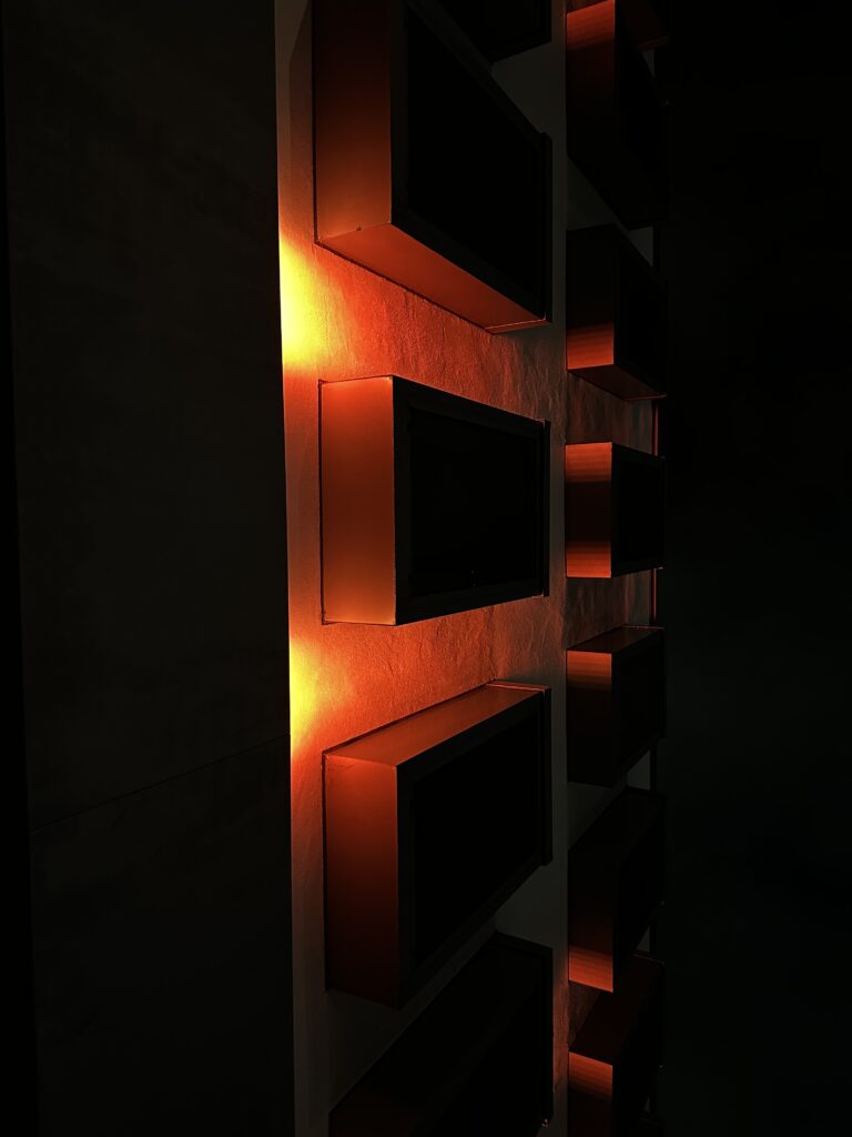
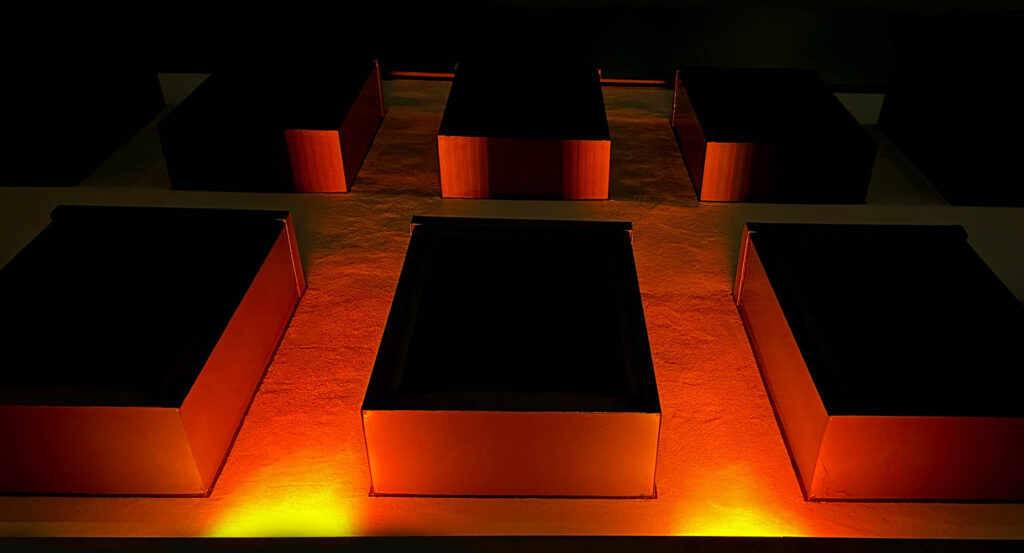
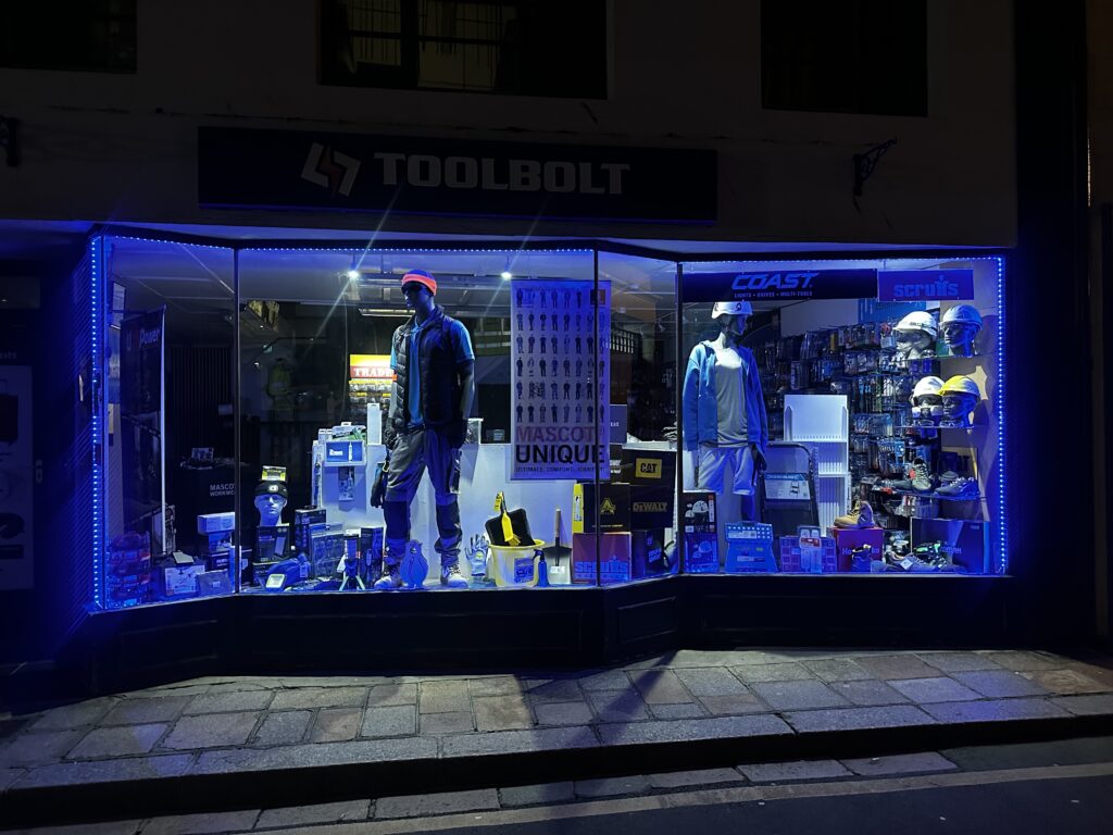
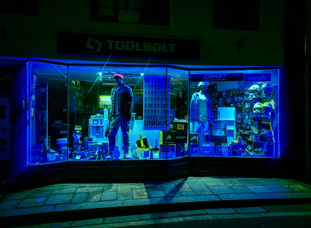
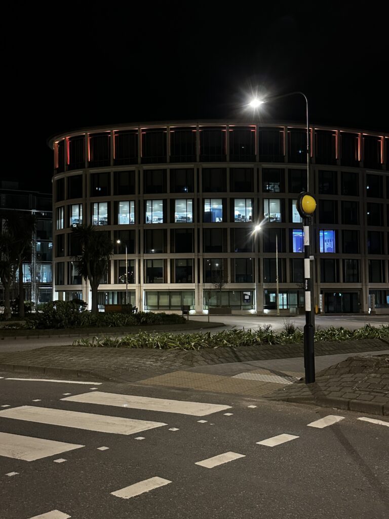
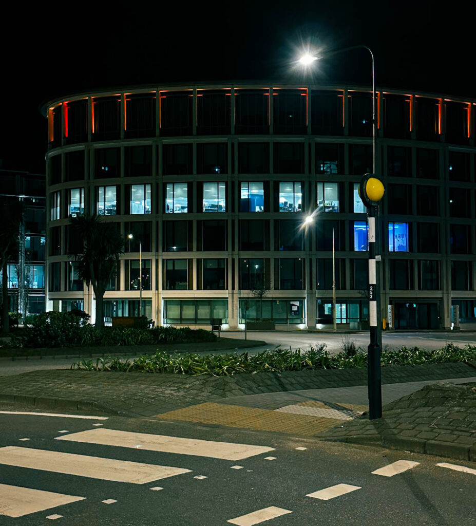
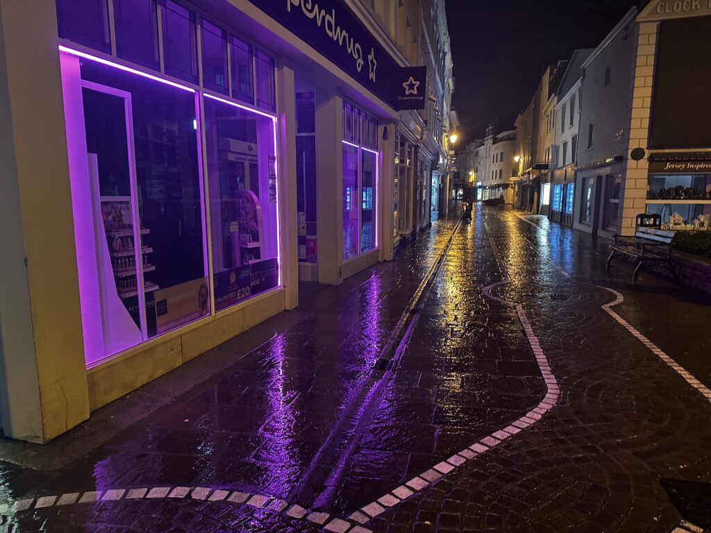
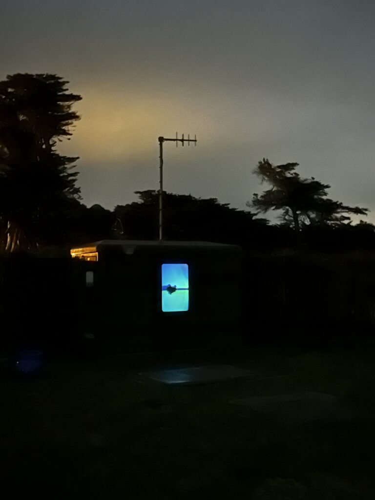
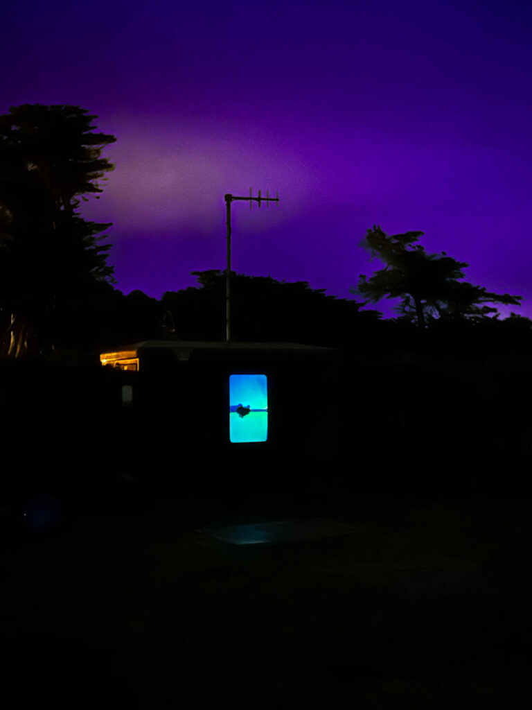
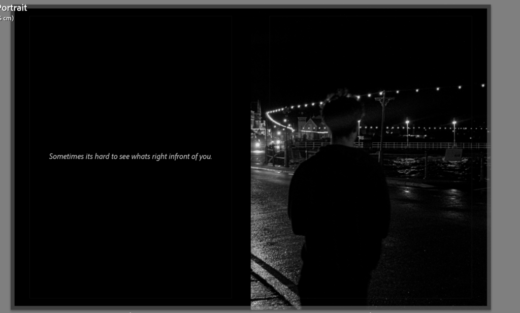
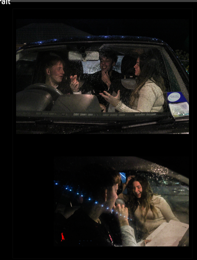
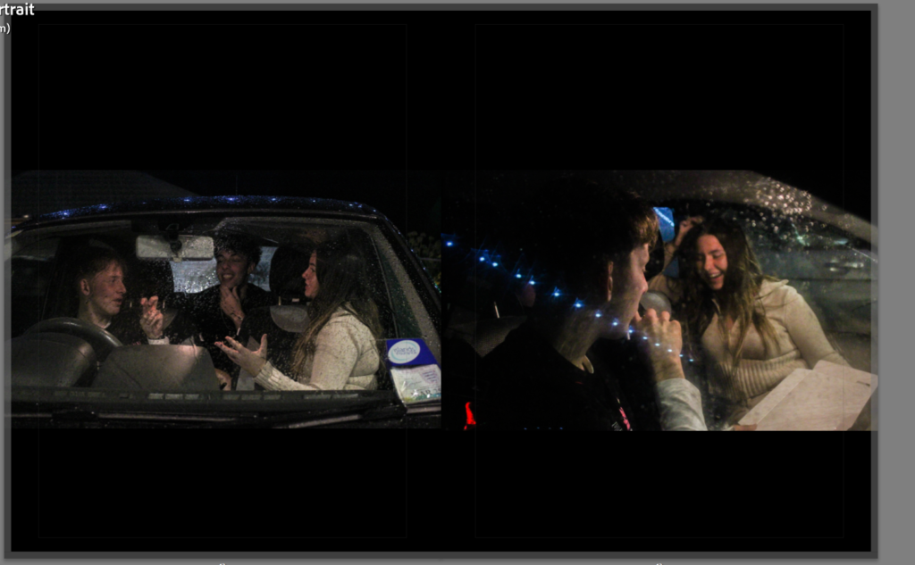
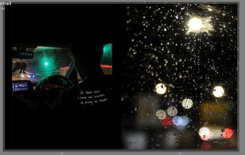
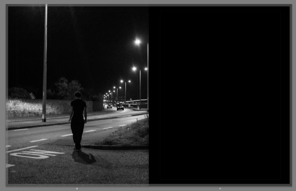
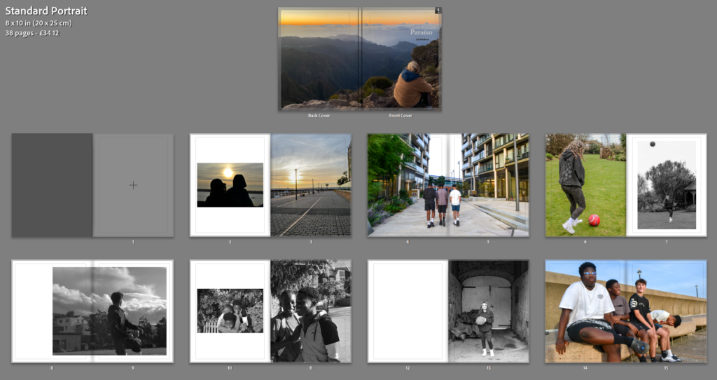
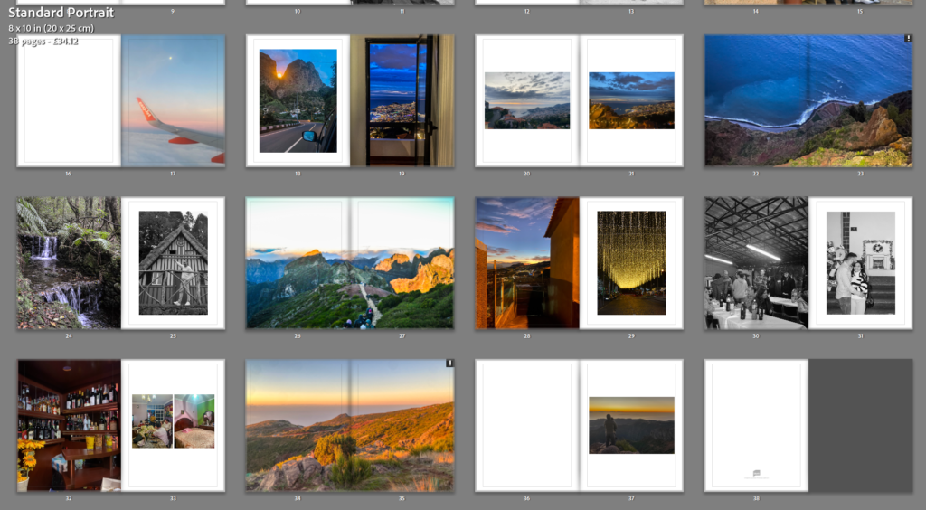
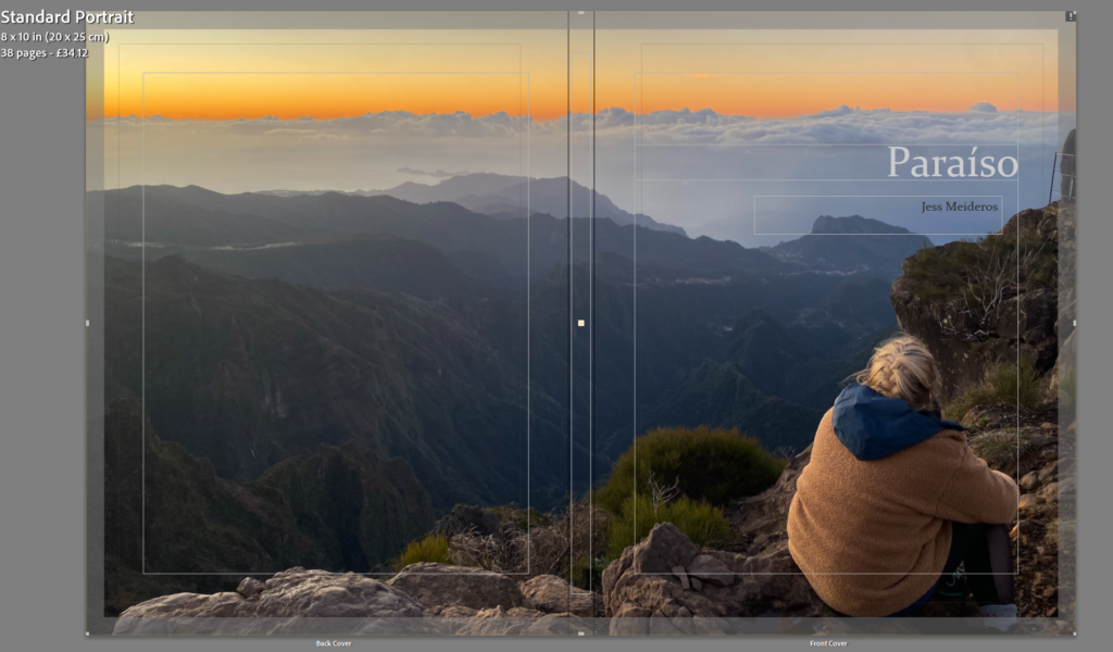
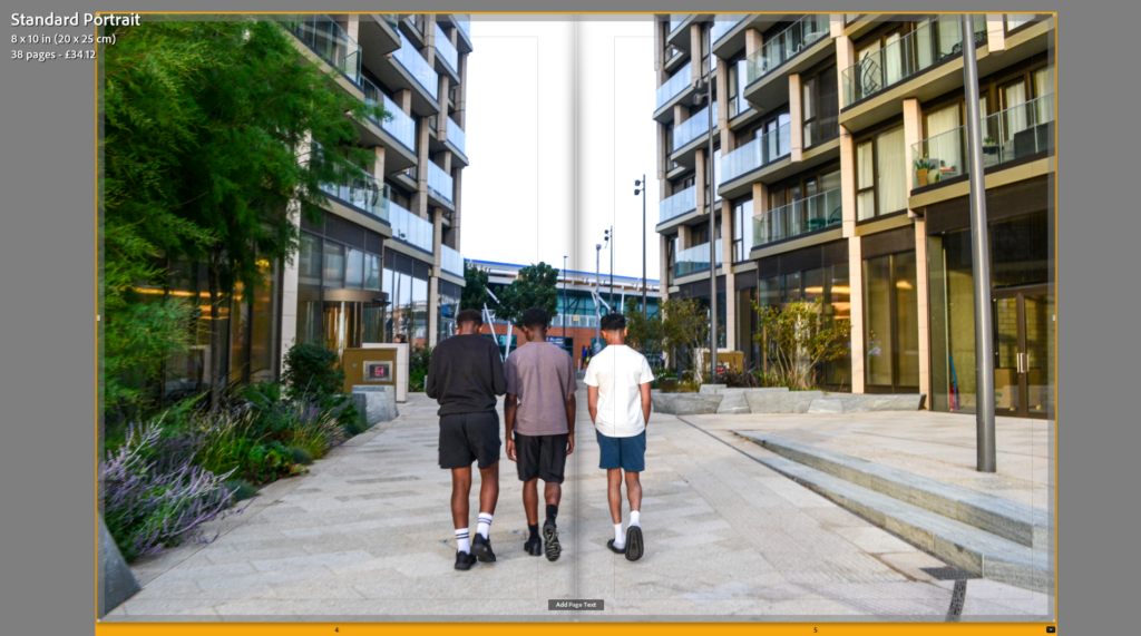
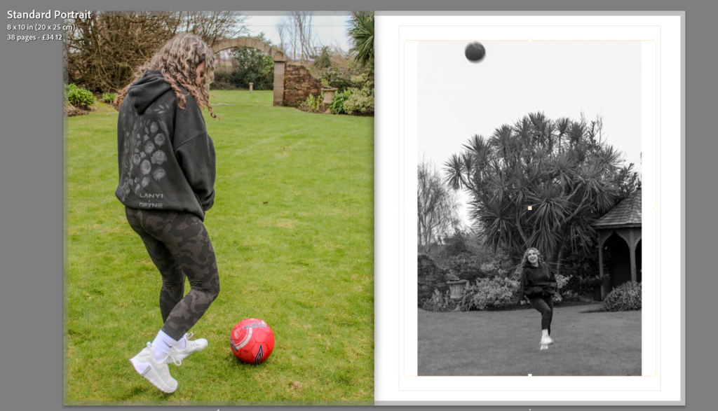
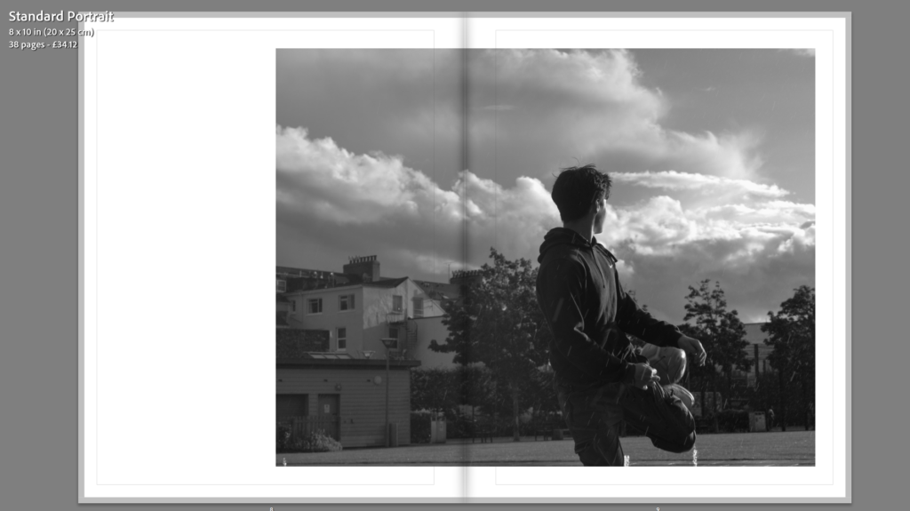
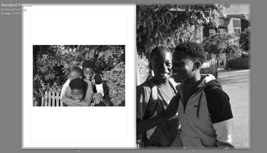
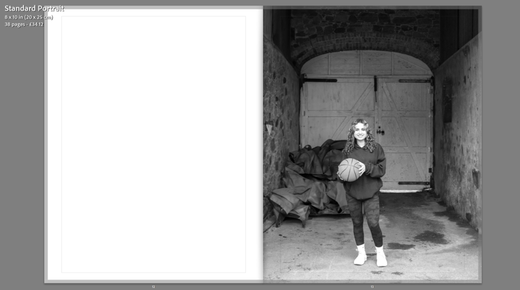
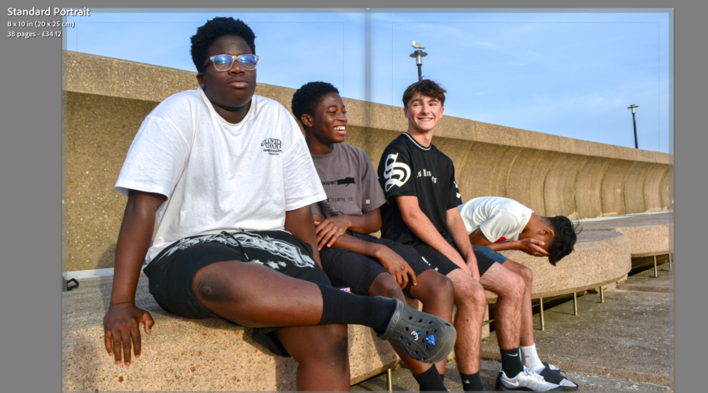
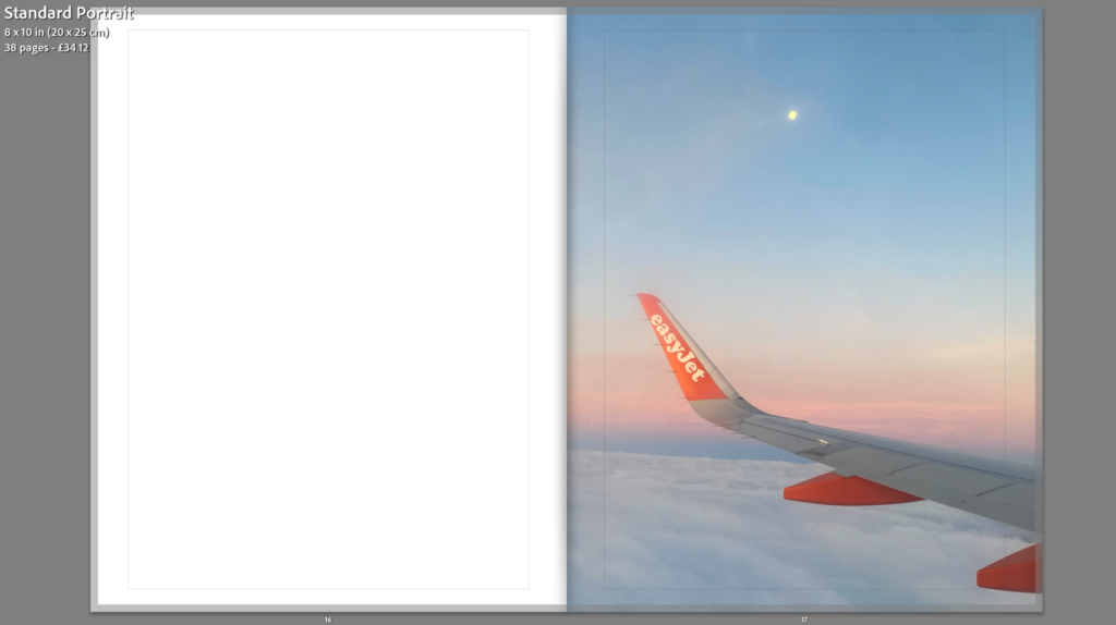
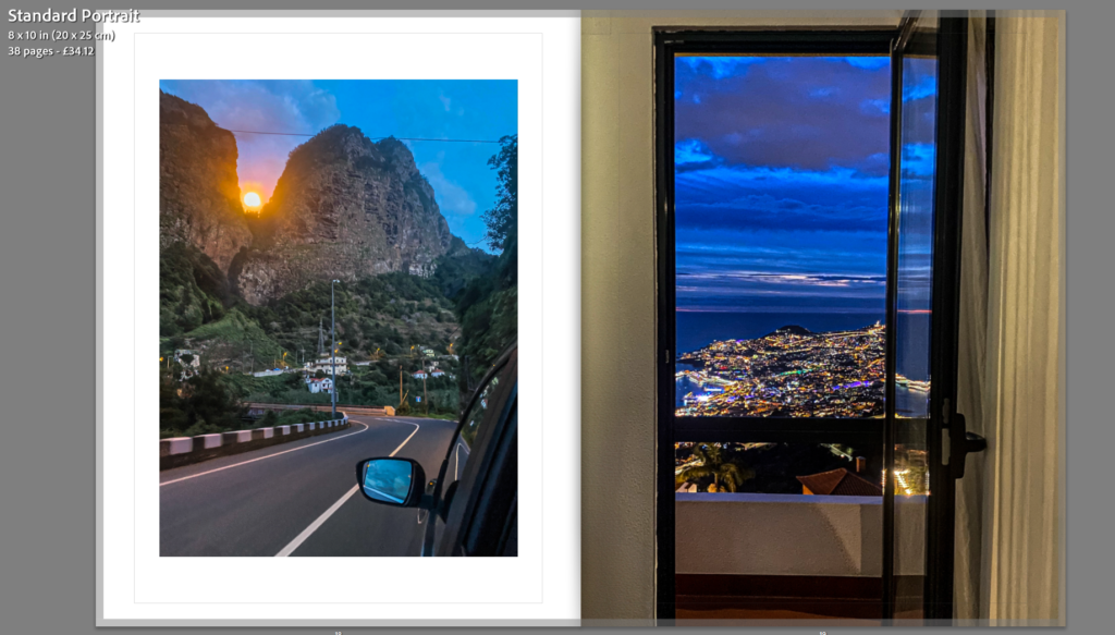
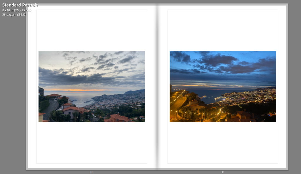
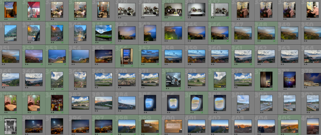
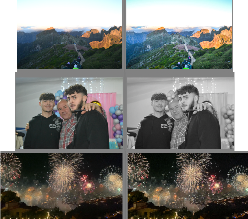
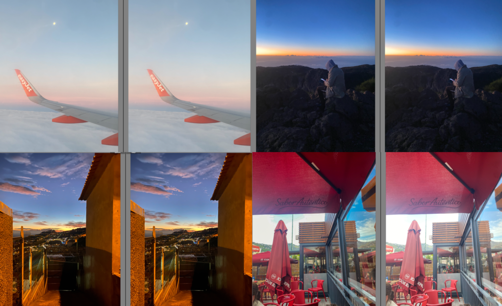
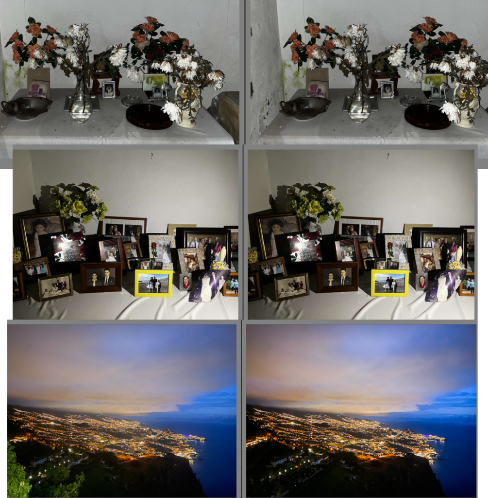
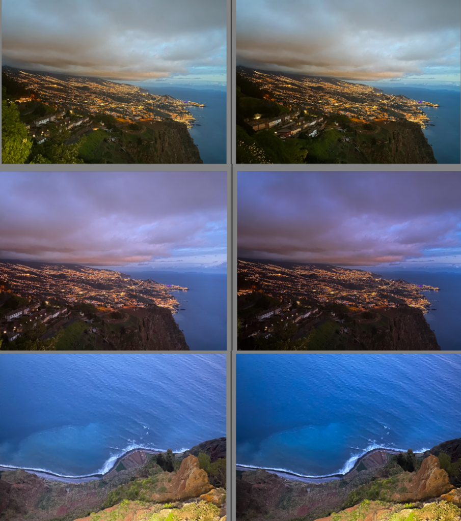
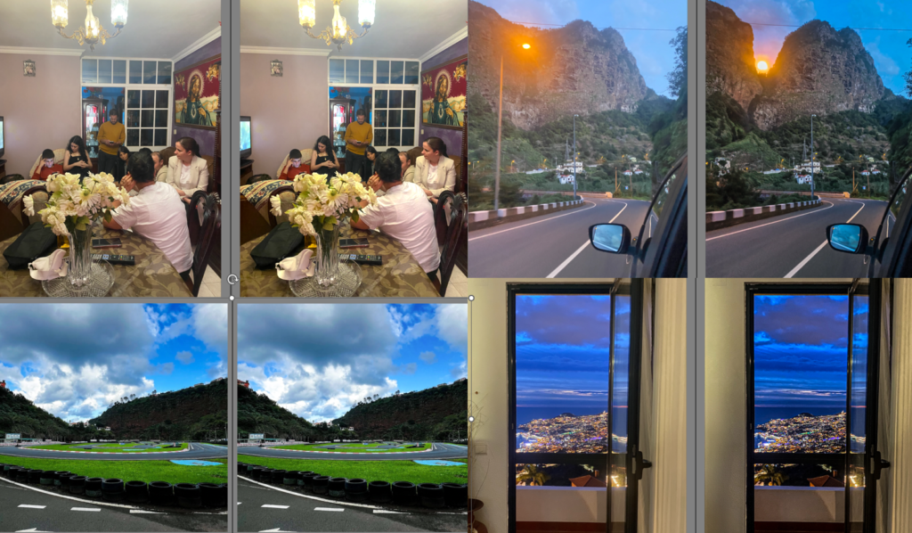
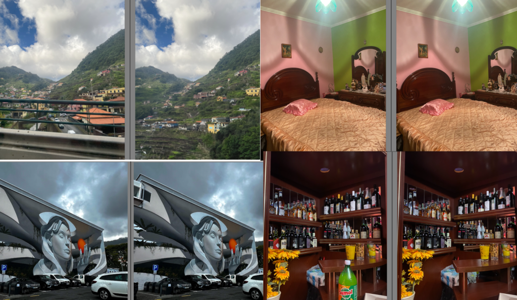
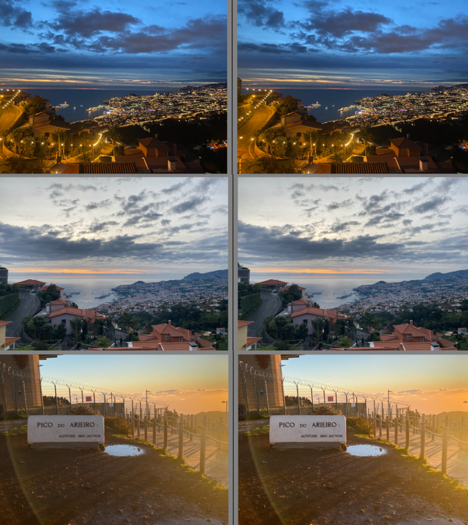
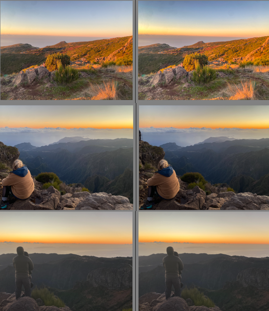
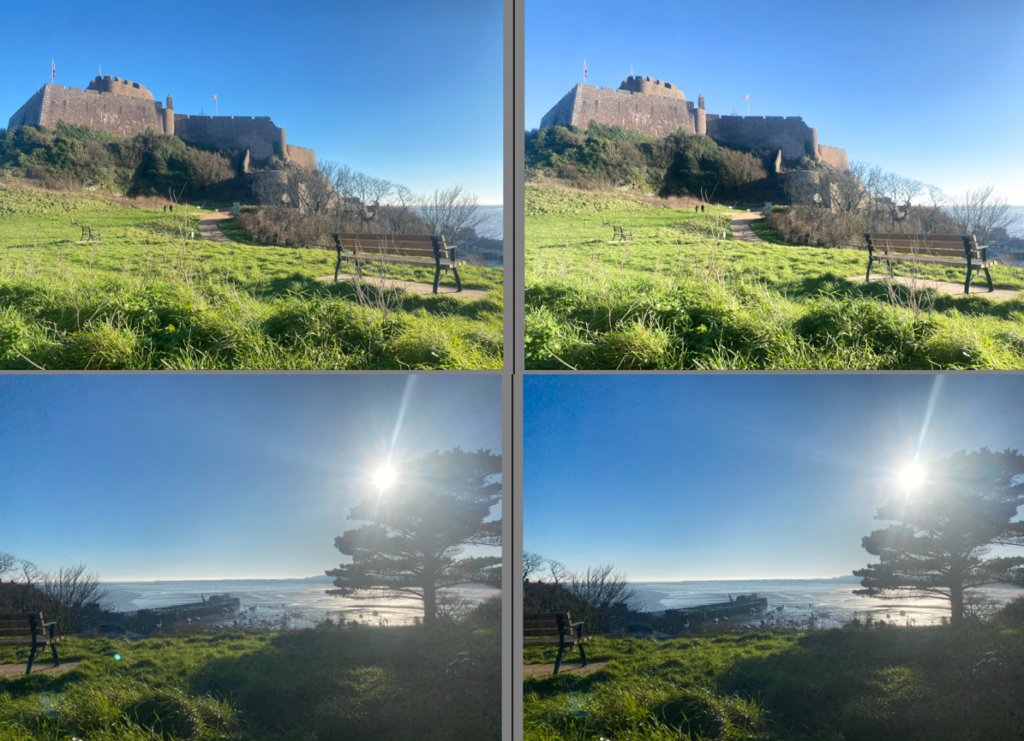
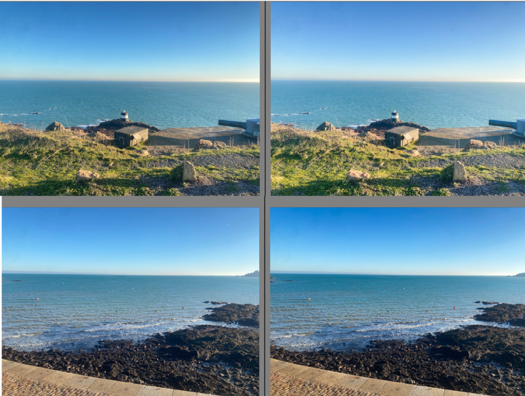
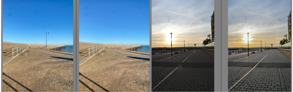
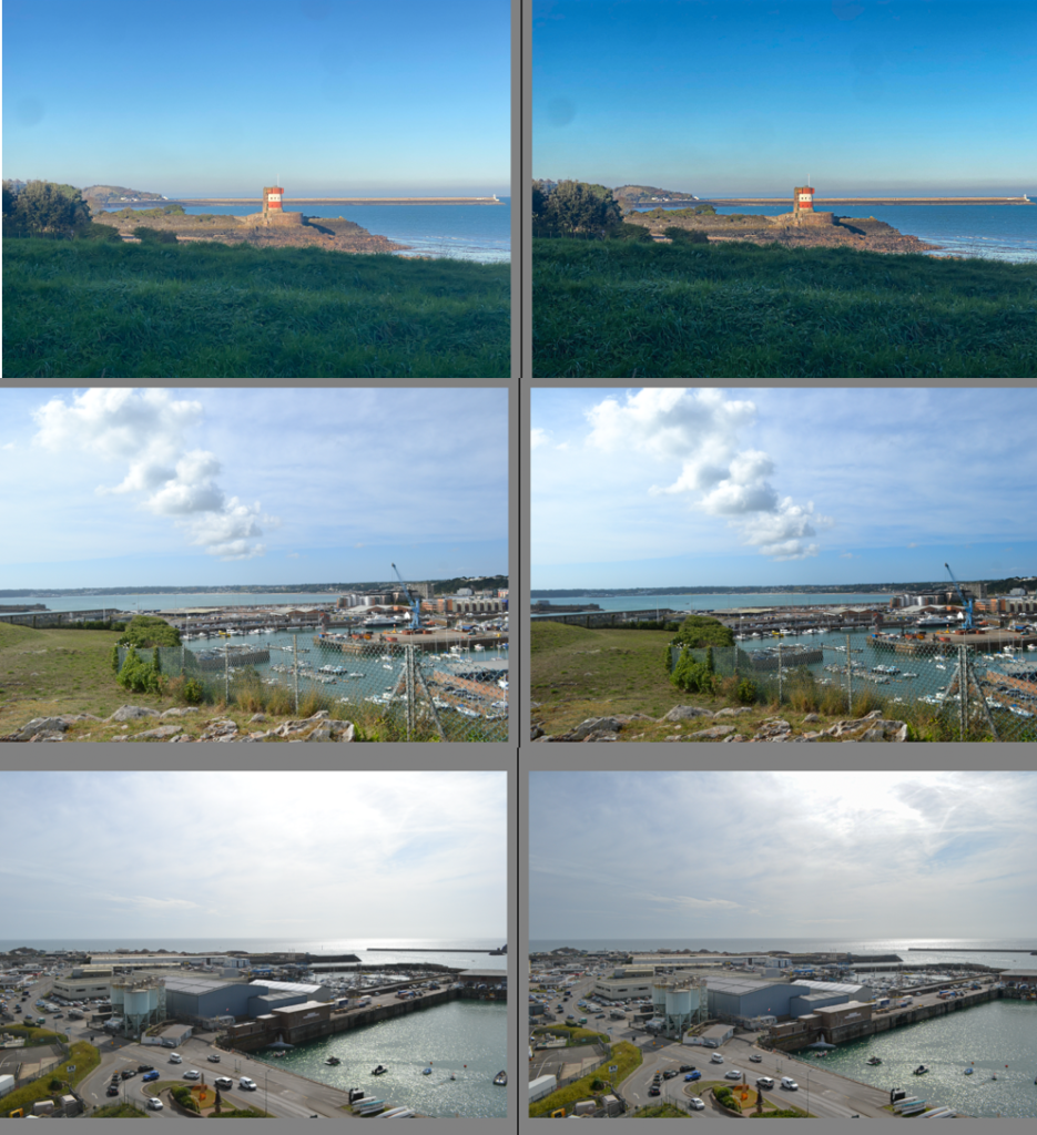
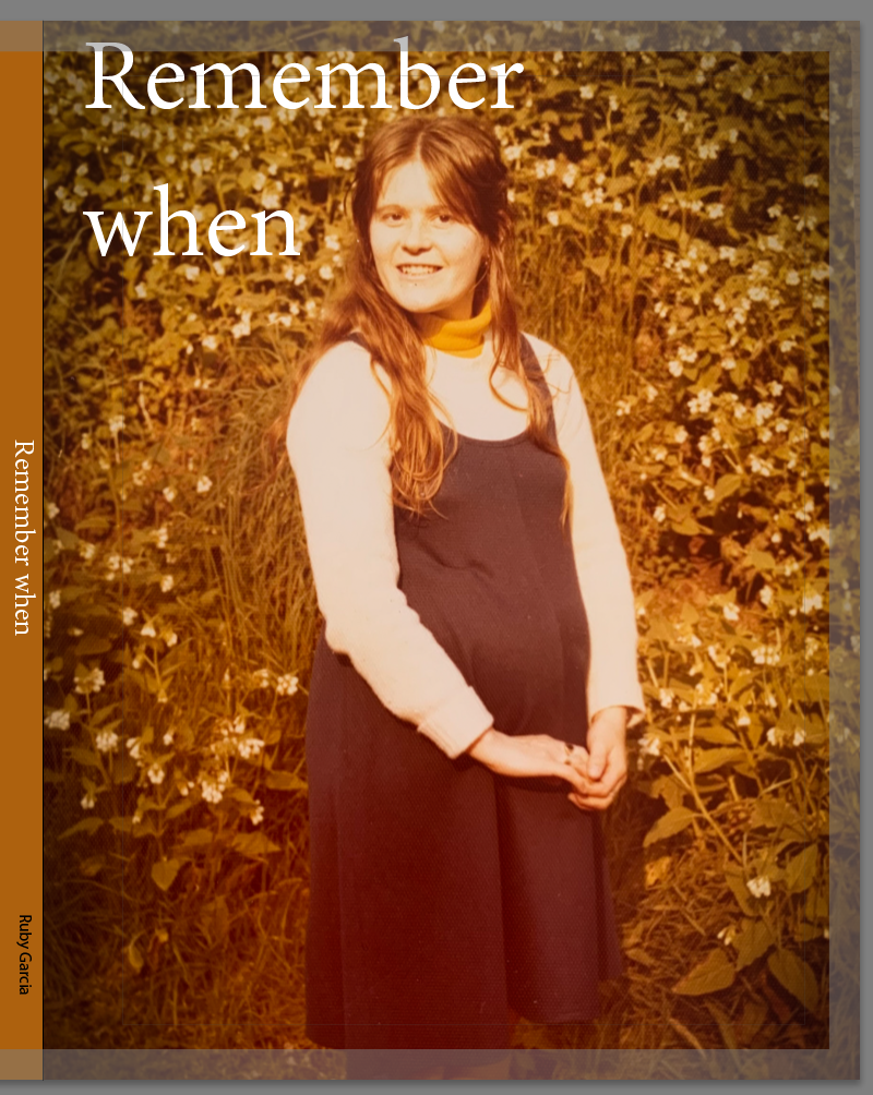
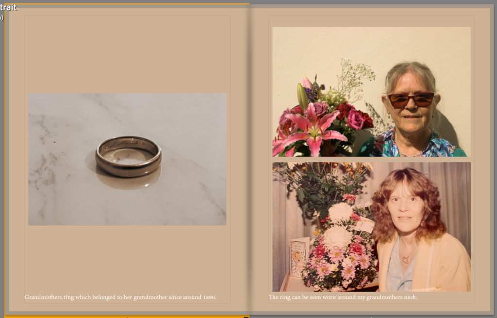
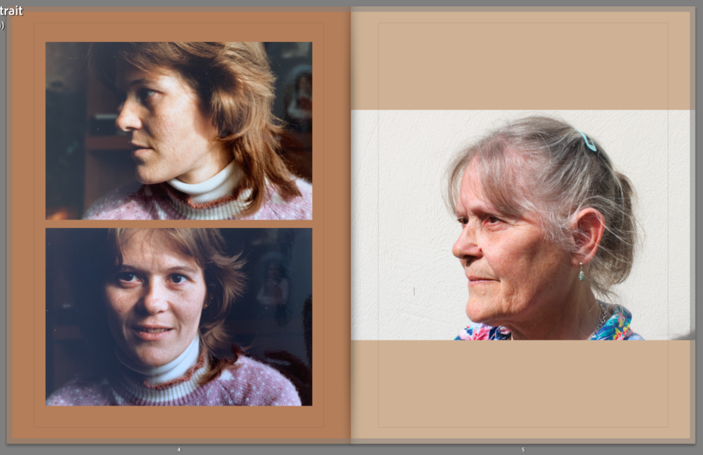
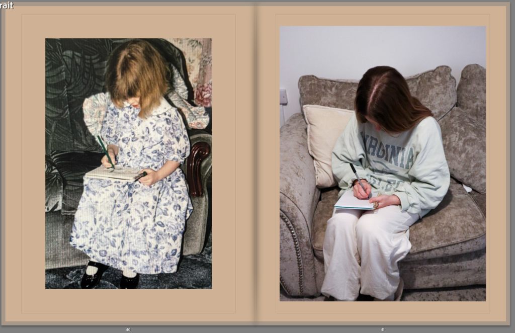
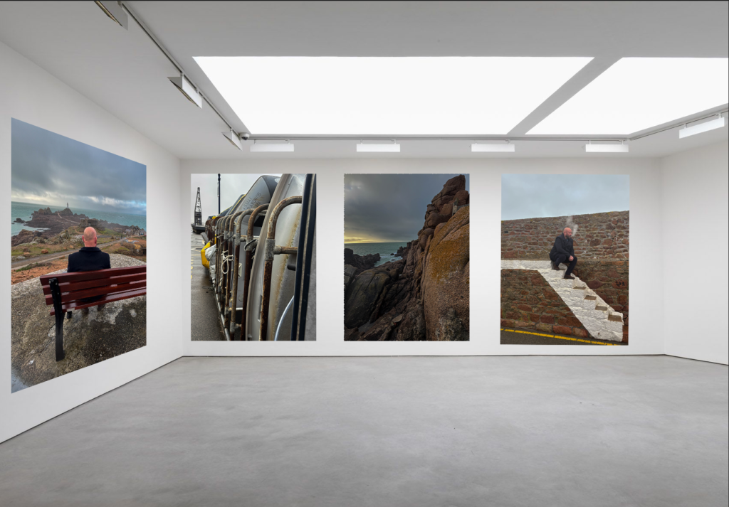
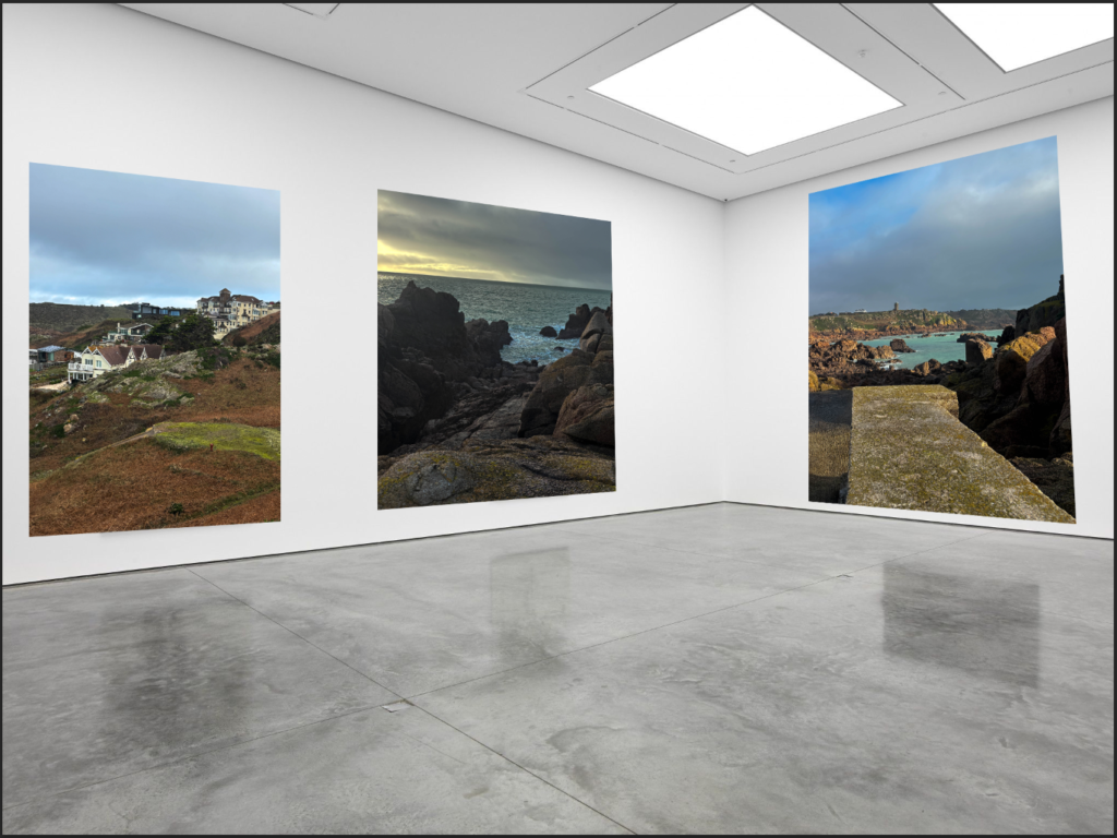
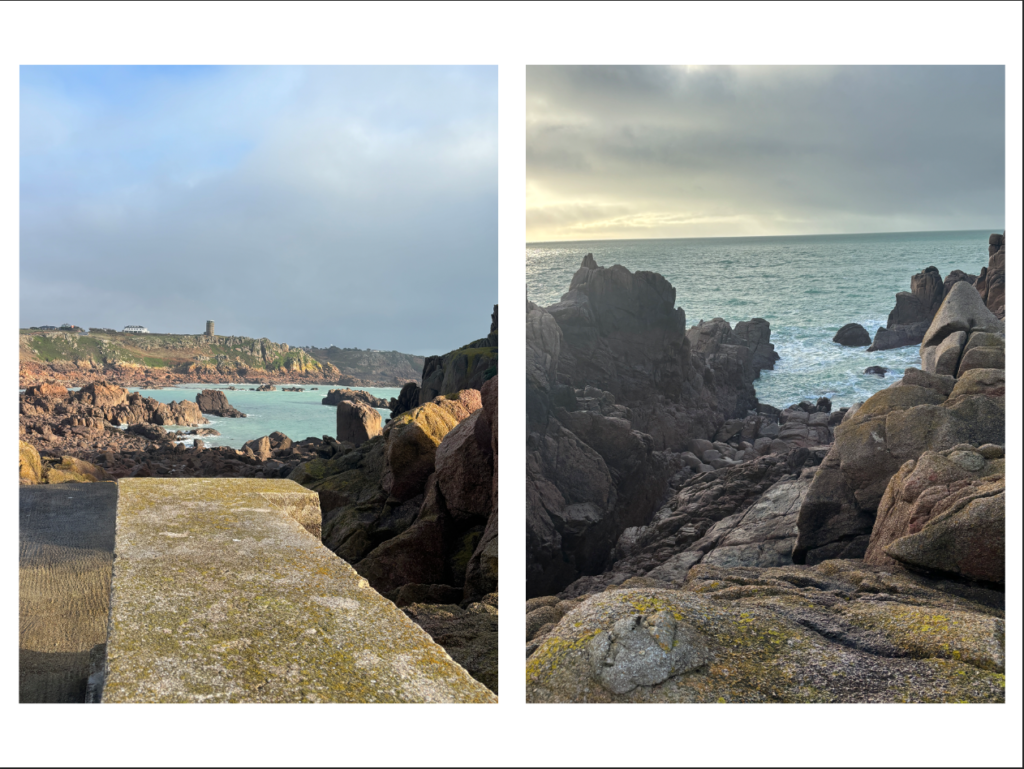
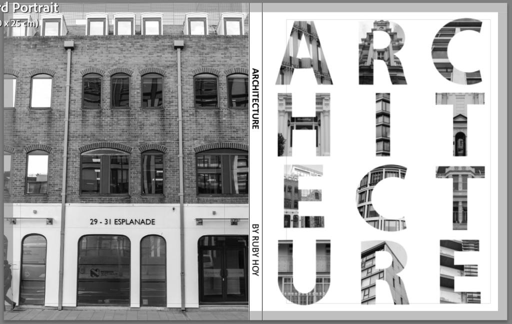
Completed Photobook
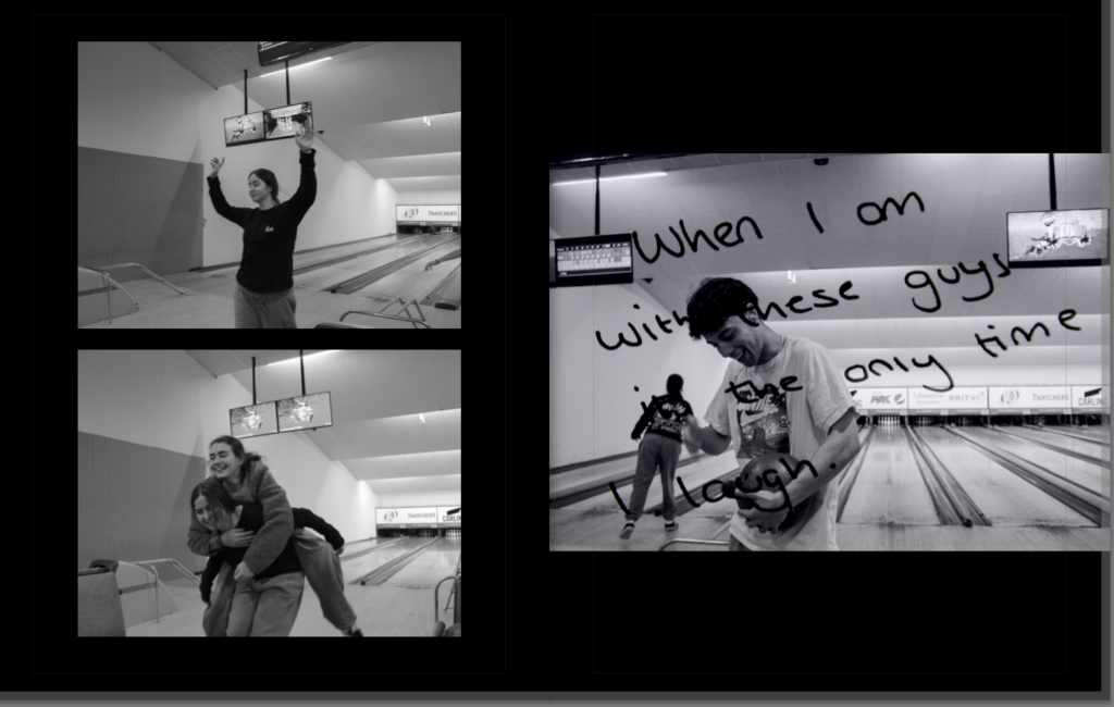
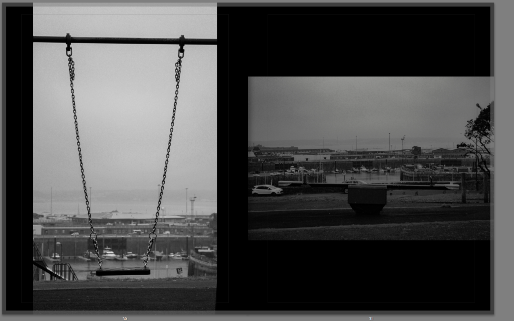
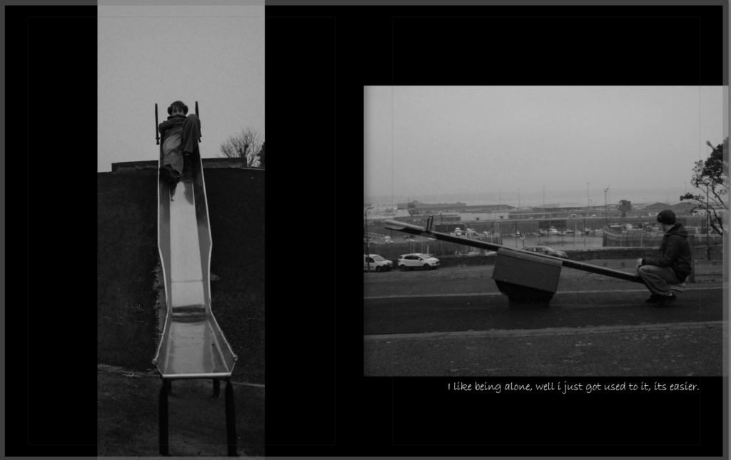
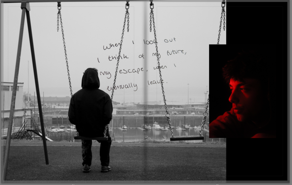
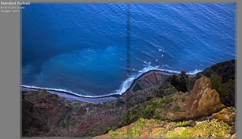
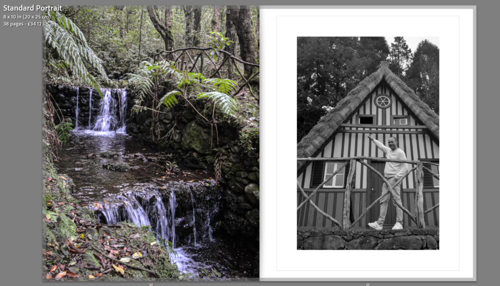
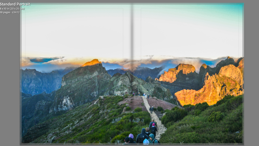
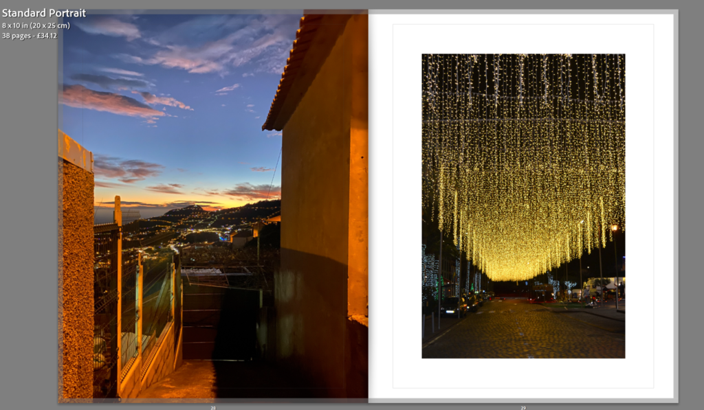
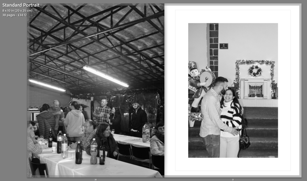
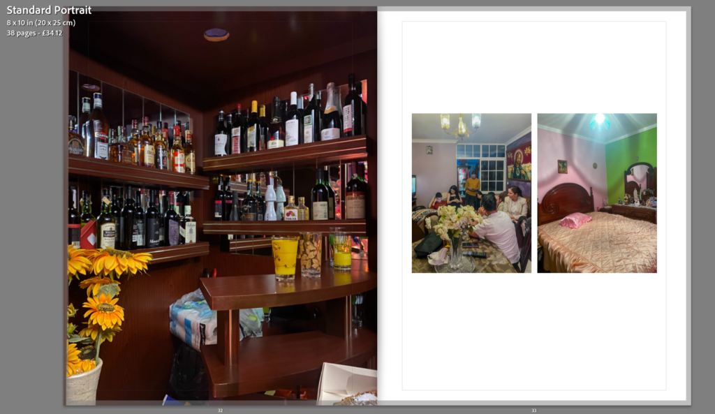
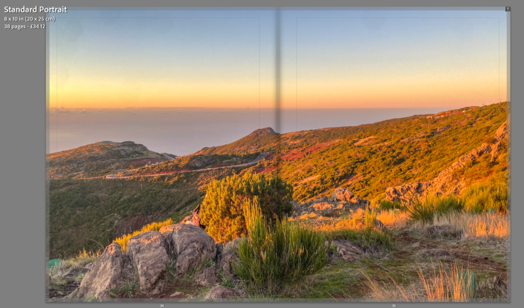
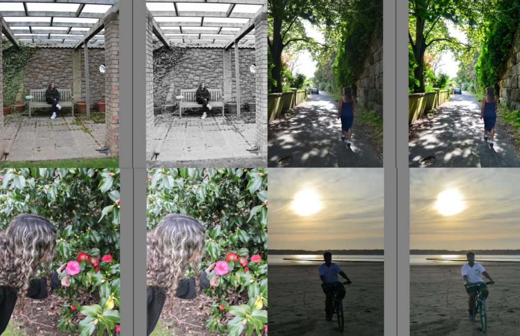
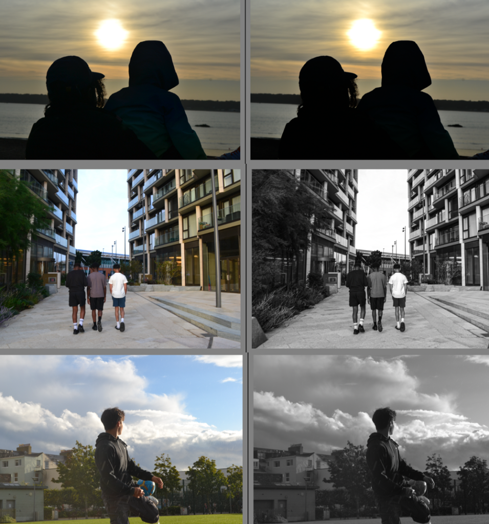
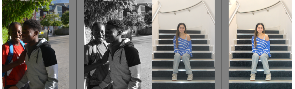
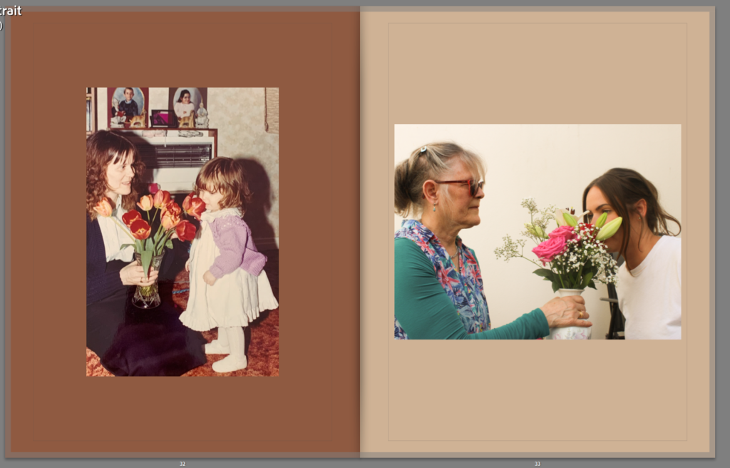
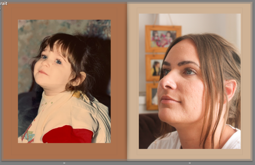
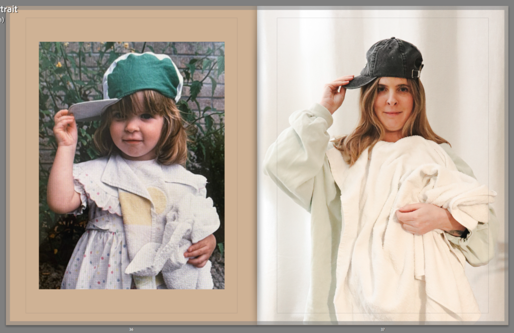
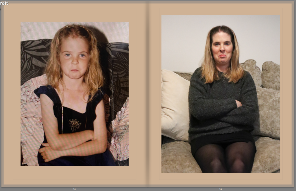
This is my completed photobook:
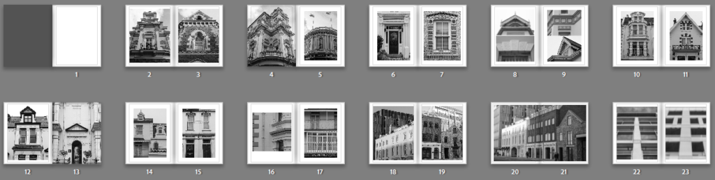
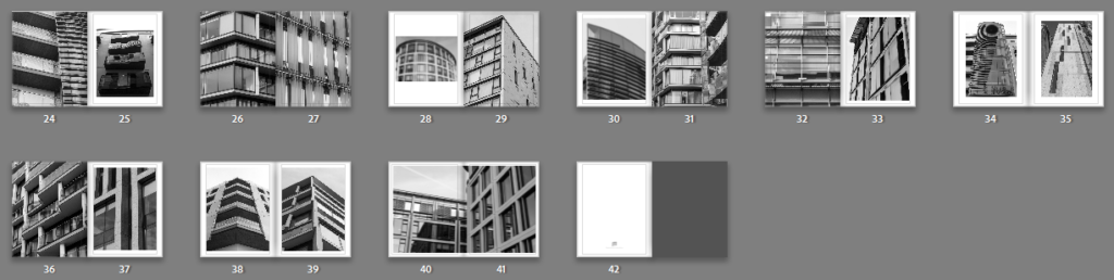
This is a link to my photo book as a PDF:
Evaluation
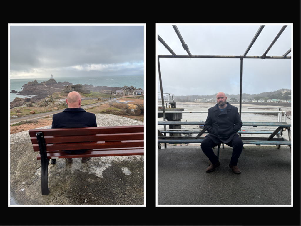
Overall, I am very impressed with my photo book. I think that it has turned out how I had visioned for it to in my head in terms of layout and design. If I were to be able to go back and improve this photo book I would probably try and get more images which have both old and new buildings in the same location to show them next to each other. This is because I don’t think the transition from old to new architecture is very clear. I also think that my images vary quite a bit from my artist references, however, each of the photos are to my visual style which I think makes the photo book more successful as there’s not such a huge contrast between the two sets of images.
Overall, I am very impressed with my photo book. I think that it has turned out how I had visioned for it to in my head in terms of layout and design. If I were to be able to go back and improve this photo book I would probably try and get more images which have both old and new buildings in the same location to show them next to each other. This is because I don’t think the transition from old to new architecture is very clear. I also think that my images vary quite a bit from my artist references, however, each of the photos are to my visual style which I think makes the photo book more successful as there’s not such a huge contrast between the two sets of images.