After looking through a photography book on masculinity I found three photographers with photos I liked, now I need to choose one to use as a possible reference.
1. Fouad Elkoury
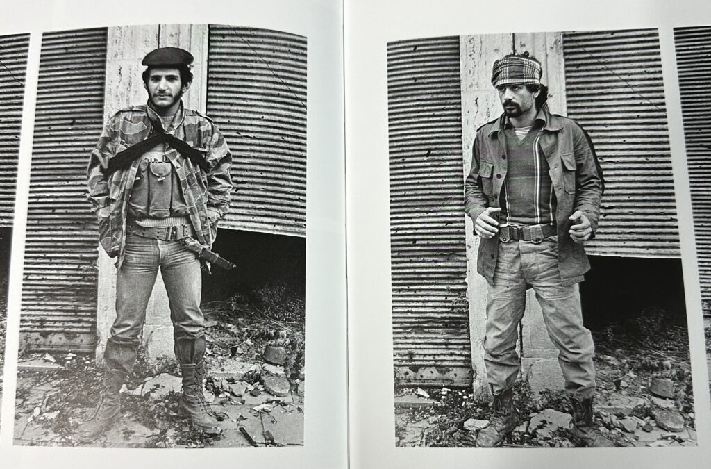
Fouad Elkoury is a photographer and filmmaker from Lebanon. He is known for his photographs of war in Lebanon.
His Photos are mainly in black and white and include environmental portraits of fighters in the civil war.
What I like about the photos is the photos give the theme of violence which can be seen as a masculine stereotype and a good area for me to explore in the theme masculinity.
2. Collier Schorr
Collier Schorr is an artist and fashion photographer from America.
The photo on the left comes from a collection of photos from 2012 called ‘Americans’ which includes photos of people in a montage with a photo on top in the centre, in this case a cowboy, to resemble hierarchy over the people in the other photos.
I could use the idea of the photos being a montage as a way of presenting my final images.
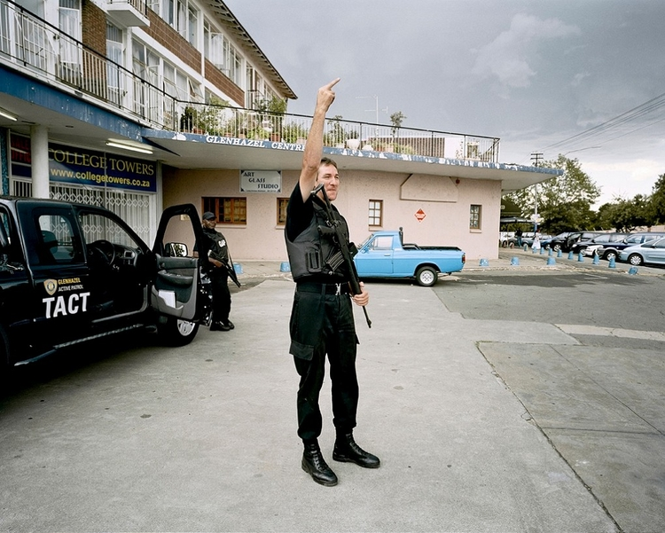
3. Mikhael Subotzky
Mikhael Subotzky is a South African artist based in Johannesburg who has done film, video and photographic work.
The photo on the left is called tactical unit from 2007 and shows a man at the centre of the photo with a bulletproof vest and gun sticking up his middle finger.
What I like about it, is the gun and middle finger make the photo seem rebellious which could be a good idea to explore when it comes to masculinity vs femininity.
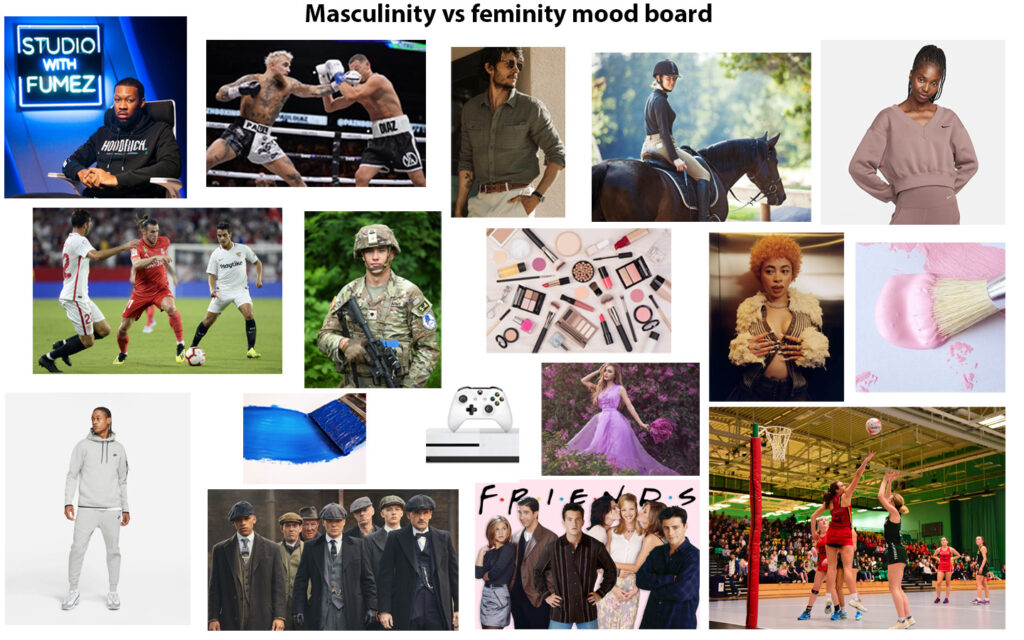
Masculinity and Femininity are binary opposites as they are similar terms with opposite meanings.
Masculinity definition: qualities or attributes regarded as characteristics in men or boys
Femininity definition: qualities or attributes regarded as characteristics in women or girls
Qualities and attributes that define masculinity and femininity are created in the society we live in and may be seen as stereotypes. Different cultures and societies may define these characteristics differently.
Upbringing can also affect peoples ideas on masculine and feminine attributes as they could have been brought up with the idea that certain behaviours are more masculine or feminine than they really are.
Identity is a collection of attributes, beliefs and experiences that shape how we, and other people see ourselves. A person’s identity includes but is not limited to a persons race, ethnicity, religion, beliefs, gender and sexual orientation.
Identity politics is the discussion and political activity around a persons identity. Common groups associated with identity politics and culture wars in the United states Identity politics was Developed after the civil rights movement and include African Americans, Asian Americans, Muslims, Native Americans, Jewish Americans, LGBTQ community and Feminists.
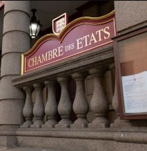
In Jersey, the government wants to protect the native language of Jèrriais, which is dying out, by creating a strategy, with the government saying “The Strategic Policy aims to ‘protect and value’ as well as ‘improve the built environment, to retain the sense of place, culture and distinctive local identity’” The government has also adopted it as part of the island’s identity, by including more Jèrriais around the island.
The problem with identity politics now days is it now causes conflict and division instead of being inclusive like it once was. This leads us to the topic of Culture wars.
Culture wars is a cultural conflict betwen different social groups/identities who want to impose their own ideology in society.
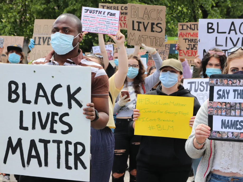
For example the black lives matter movement in America which started in Minneapolis as a conflict between African Americans and and the Minneapolis police department and the government over police brutality and racial injustice. However the protest gained attention and spread across America and part of Europe. Although the protest caused riots and destruction, it aimed to create justice and abolish racism in the community to create a nicer society for all.
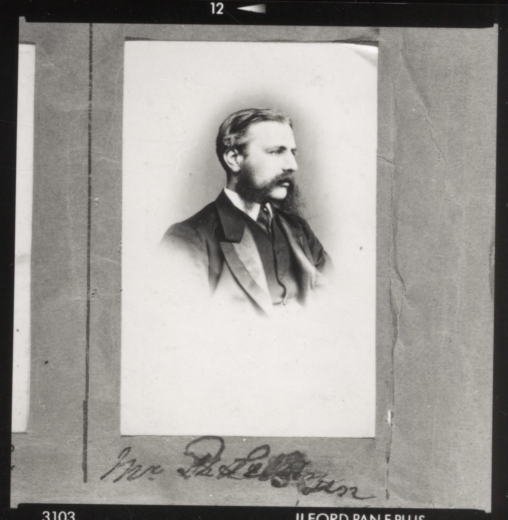
Henry Mullins was a portrait photographer during the 1800s, being the first professional photographer in Jersey. He moved from London to jersey in 1848 and formed a portraiture business. In around 21 years of him being in Jersey he took over 9,600 photos including photos of people in Jersey with a high status such as the Bailiff, the Governor and important bankers
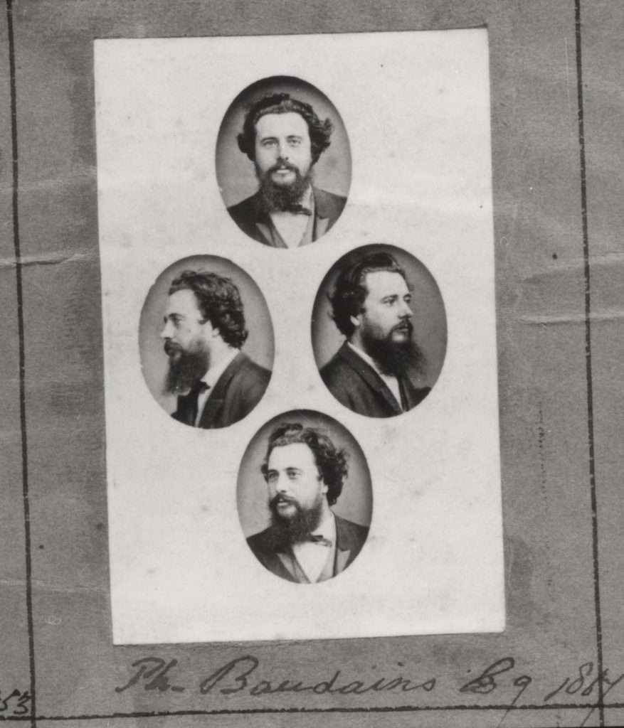
It was common for Henry Mullins to present the portrait photos he takes in the form of a Diamond cameo. (pictured on the right)
A diamond Cameo is when 4 photos of a person is presented on a carte-de-visite (a card) in a diamond shape.
His photos are in Black and White, as colour printers didn’t exist in the 1800s, with the subject being positioned at the centre of the photo usually looking in different angles on the diamond cameo.
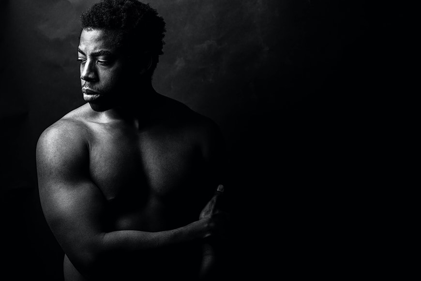
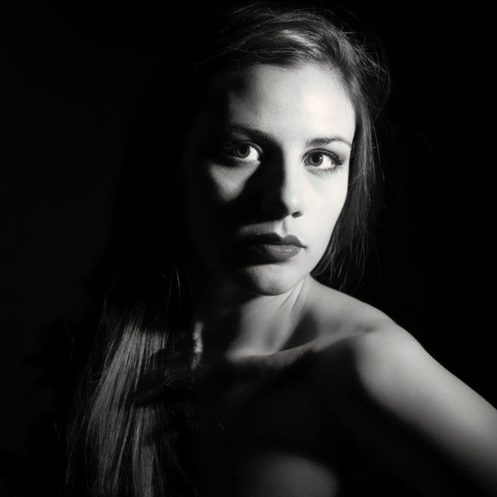
Chiaroscuro Lighting which means ‘light dark’ in Italian is a type of lighting technique used for strong contrasts between light and dark. It can also sometimes contain exaggerated shadows and highlights.
It was originally used by painters but has been adapted to be used by photographers when taking photos.
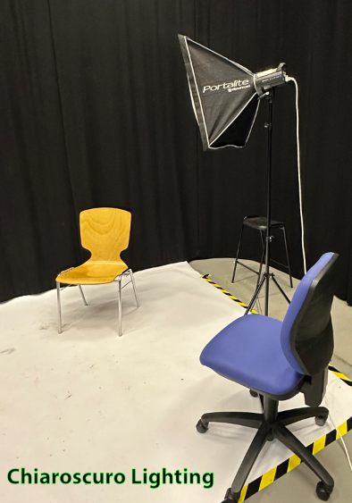
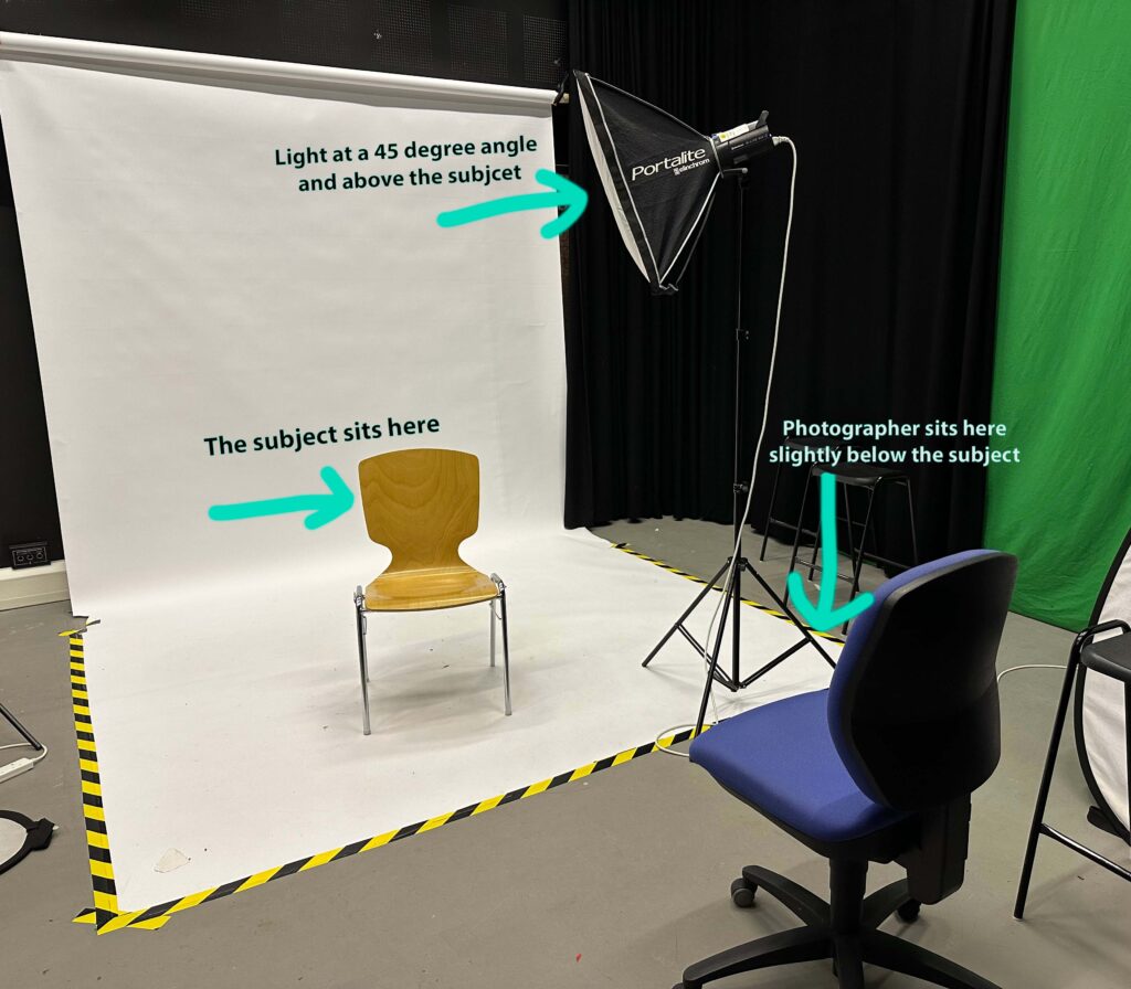
How to set up Chiaroscuro lighting in the studio
There are loads of different ways to set up Chiaroscuro lighting, as long as you get those contrasts between light and dark. Below is how we set it up, we also used a reflector in some photos to help highlight parts of the face
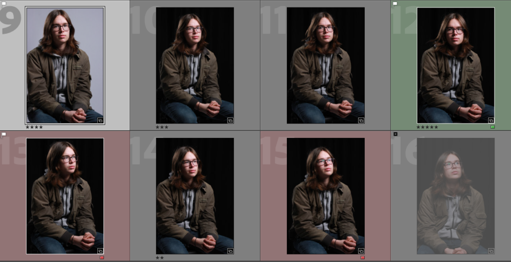
Below are some of the photos I took which best resemble chiaroscuro lighting
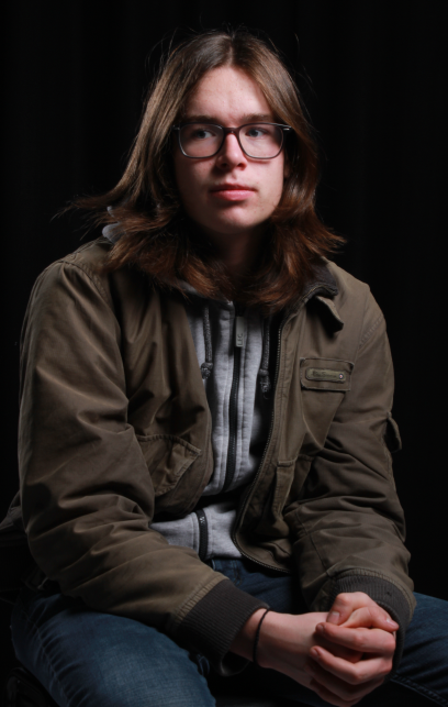
Final Photo & edits
After Sorting through all my photos this photo came out as the best one.
I decided to edit The photo in Lightroom to see if I could improve it. In the end I experimented with the saturation, Luminance, clarity and shadows, I also slightly adjusted the blues on the tonal curve
Studio lighting is used for consistency as you can take lots of photos with the same colour and lighting.
It is also used as you can easily recreate lighting techniques in an environment which won’t change based on the outside environment.
Furthermore you can also experiment and create lighting setups in a studio by changing the position, intensity and temperature of the lights.
1 vs 2 vs 3 point lighting
A point is a light source and could be a key light, backlight, fill light and could even be a reflector.
1 point lighting only uses 1 light source (usually a key light), this could be a light facing someone in a studio, or if someone is outside, the light source would be the sun.
1 point lighting is important as without any lighting you won’t be able to see anything and the photo would just be darkness.
2 point lighting commonly uses 2 light sources or a light and a reflector
2 point lighting is usually placed at a 45degree angle from the subject and usually uses a main light and a fill light.
3 point lighting is common for portraits as it uses three light sources to control the shadows and make the subject well lit.
3 point lighting normally features a Key light which acts as the main light in the photo and creates the overall exposure.
The second light normally used is the fill light which is used to control the shadows in the photo.
The last light normally used in 3 point lighting is the backlight which is placed out of frame and provides a highlight for the upper part of the body or the hair.
Fill Lighting
Fill lighting is a popular style of lighting used in theatre, film and photography. Fill lighting is commonly used with a 3 point lighting setup to light up darker shadows in order to reduce the contrast to make the subject look more natural. Furthermore it can increase detail by giving more light to darker areas revealing areas of detail.
Rembrandt Lighting is a form of lighting commonly used in photography and film. It is where their is an upside down triangle of light under the eye on the opposite side of where the key light is. It is also useful for creating shadows and contrast.
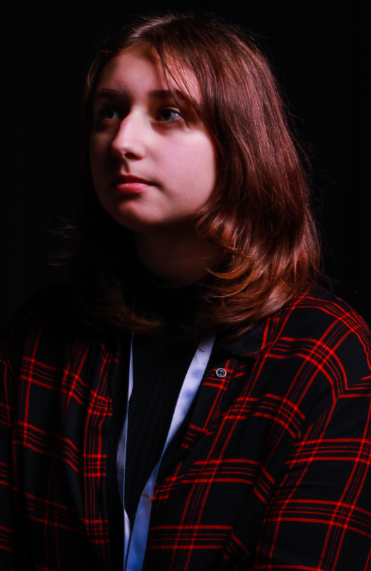
An example of Rembrandt lighting
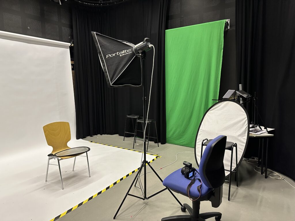
How to set up Rembrandt lighting
We decided to go into the lighting studio and try and take some photos with Rembrandt lighting. The photo below is how we set it up.
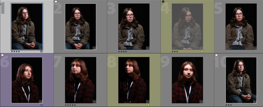
Below is a selection of photos I took which best fit the Rembrandt lighting style…
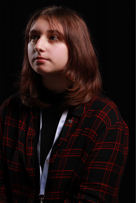
My Final Photo
I selected this as my final photo for Rembrandt lighting as I feel like the triangle is most accurate in this photo also it just stands out from the other photos I took. The only editing I did was slightly crop the photo and remove any small marks with the spot remover tool as I feel like the photo didn’t need to be overly edited.
Butterfly lighting is a popular lighting technique used when taking portraits of people in lighting studios as the light creates a little butterfly shadow under the nose and also highlights the cheek bones if done correctly.
Butterfly lighting is also known as ‘Paramount lighting’ because it was popular in Hollywood films and portraits.
An example of Butterfly lighting
How to create butterfly lighting
Below is how we set up the lighting studio to create butterfly lighting.
Below is a set of all the photos I took in the lighting studio that resemble Butterfly lighting.
Editing my Photos
I like this photo I took of my friend but I want to edit it to make him more centred I also want to try experimenting by adding a black & white filter as it is common for photos with butterfly lighting to be in black & white and I think it will look good in this photo. after slightly cropping the photo I experimented with the black and white adjustment to try and make the white a bit brighter. below is the result I got.
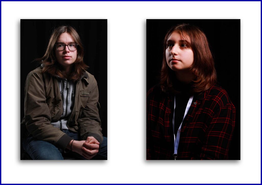
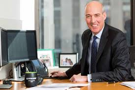
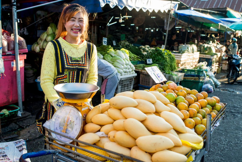
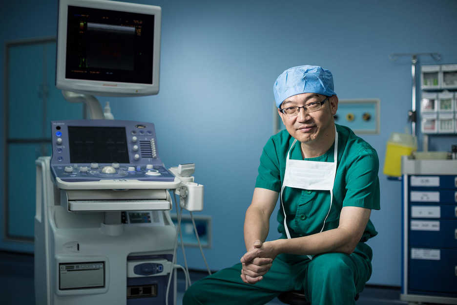
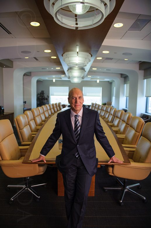
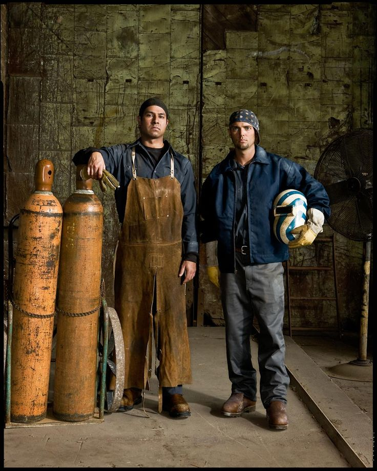
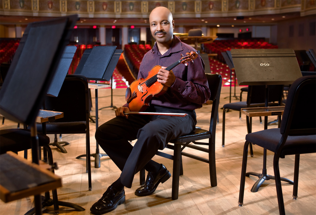
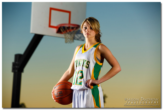
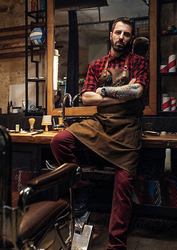
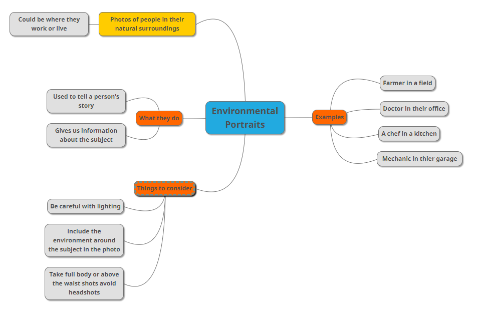
Environmental portraits are photos of people in their environment instead of being them with a blank background it could be them in their workplace or their home.
Some examples of Environmental portraits…
A brainstorm about environmental portraits I created