All posts by Yann

Filters

Author:
Category:

Anthropocene artist references

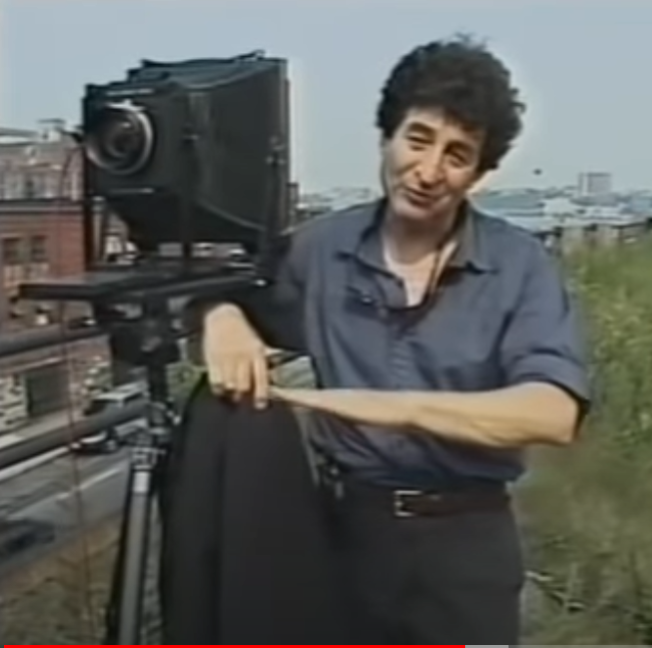
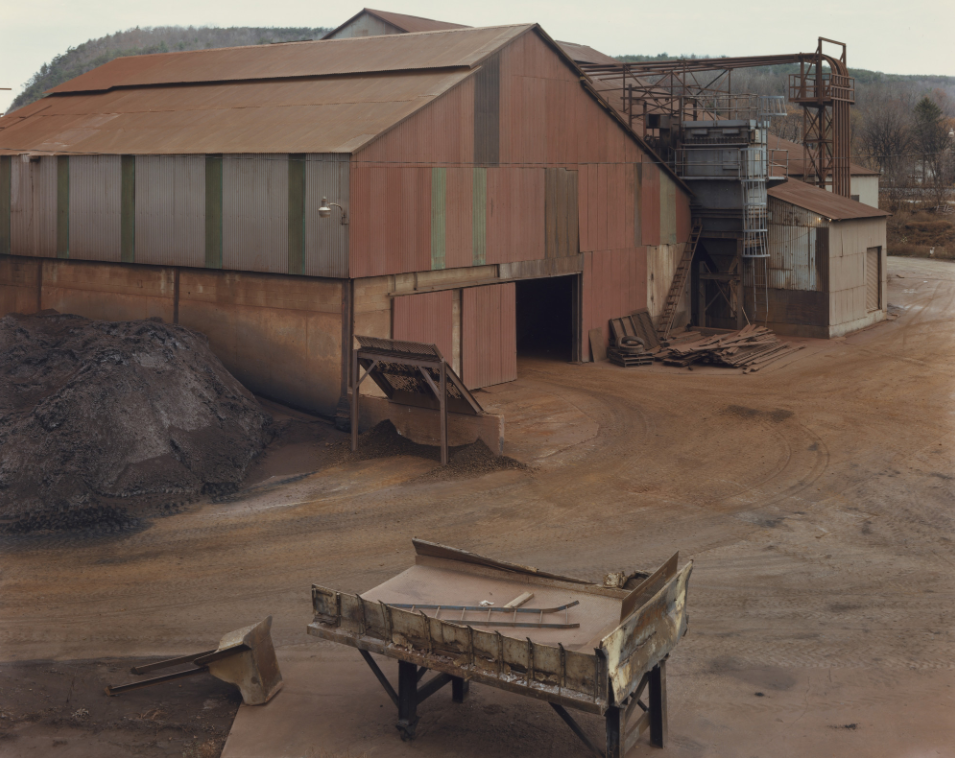
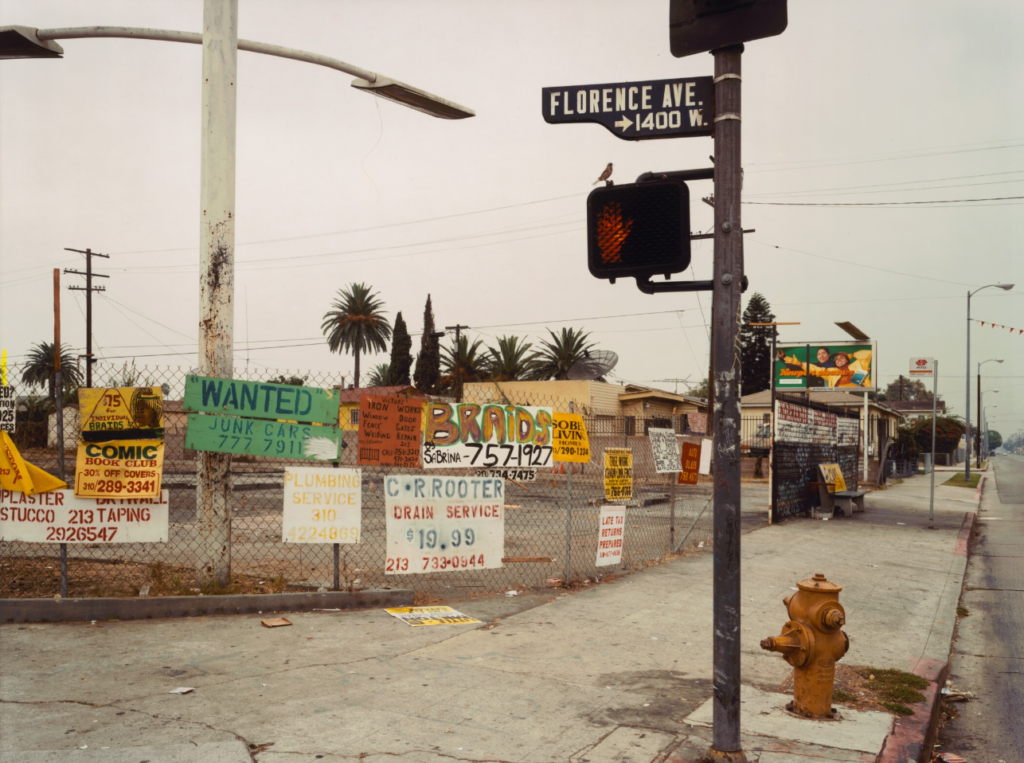
Joel Sternfeld is an award winning American photographer, from New York, who took landscape and portraiture photos, with a large format colour camera, across North America. his work consists of portrait photography and also landscape photography.
Joel Sternfield said in an interview about his work “My approach has been to look at the landscape to find a kind of beauty, as it truly exists”

Joel Sternfeld began taking photos in 1969 and started taking colour photos in 1978 with a large format camera. Reflecting the current times, as in the 70s colour photography was starting to become common.

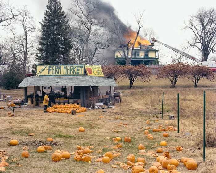
1987 Joel published his first set of work called American prospects which features mainly landscapes but also people and buildings from trips around North America he went on. This ended up becoming his most known work.

Joel Sternfeld + Anthropocene

Joel Sternfeld’s approach to his photography work is a documentary style, documenting what is going on with the land and people in North America. He said “The surface of the earth and what we do with it tells us an awful lot about ourselves” This relates to anthropocene as he is talking about the human impact on the world and how we have a large effect on it.

His work

I really like his photos and I feel like they have a good connection with landscape, the new topographics and anthropocene. I also feel the photos are interesting to look at, this could be because of the way they are composed or it could be the difference in the landscape compared to Jersey.

I chose Joel Sternfield as an artist reference because I like his work and approach to photography, such as his photos of overlooked areas such as industrial areas and the way his photos depict Anthropocene which is similar to the way I want my photos of anthropocene to be like.

Image analysis

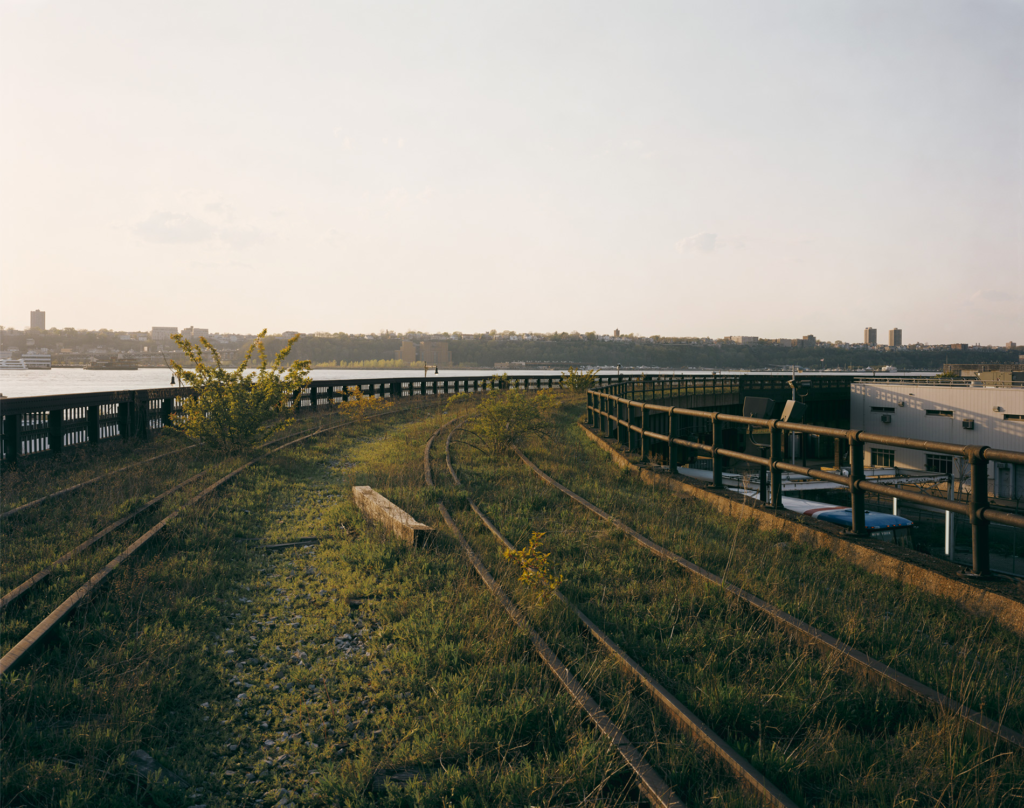
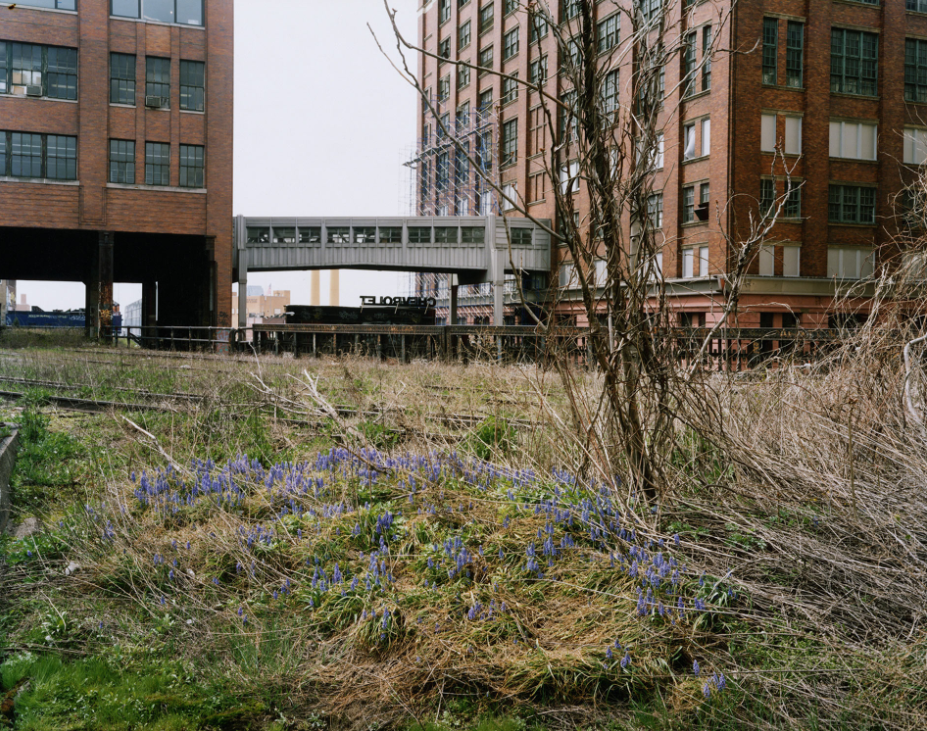
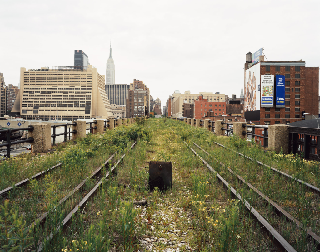
This photo was taken of the high line in New York City which was an abandoned over ground train line which has now been turned into a park with the first section of the park opening in 2009. The Image has the abandoned overgrown trainline as the subject in the photo, with it being centred in the middle of the photo.

The old train tracks are used as leading lines to lead the viewer into the distance/horizon, also highlighting the length of the tracks. The railings on the edge also are implied leading lines which are used to create distance but also provide a contrast between the overgrown, abandoned trainline and the urban city.

The Lighting in the photo is natural soft light due to the clouds diffusing all the light, this means there is virtually no shadows due to the soft light and not a strong contrast in the photo between the light and shadows. The clouds also give the image a colder white balance as it makes the sky a white/grey colour.

There is also a contrast between texture as the overgrown grass gives the abandoned tracks a soft texture, especially towards the middle of the photo. However the urban buildings contrast with this and the dark red brick creates a rough texture, this may be to further show the contrast between the abandoned trainline and the urbanisation in New York.

Anthropocene

Anthropocene is the time which humans are having a substantial impact on our planet -basically the influence human activity is currently having on the planet.

The causes of Anthropocene are: agriculture, urbanisation, deforestation and pollution.

How and why are photographers exploring Anthropocene?

Photographers are exploring Anthropocene by documenting the impact humans are having on the planet. They are doing it to spread awareness and educate people on the damage we are causing to the earth. This is because Anthropocene causes Global warming, habitat loss, destruction of natural habitats and extinction.

The Anthropocene Project

Edward Burtynsky, a Canadian photographer, helped create the Anthropocene project, with Nicholas de Pencier and Jennifer Baichwal. The project aimed to investigate the human influence and the future of the planet. They did this by responding with photography, film and augmented reality.

Edward Burtynsky said about the project that “We are having a greater impact on the planet than all the natural systems combined. I’m trying to let people know that.” Meaning he wants to make people aware about the impact humanity is having on the planet.

He also said “Scientists do a pretty terrible job of telling stories, whereas artists have the ability to take the world and make it accessible for everyone,” meaning he is trying to translate the science about Anthropocene into art so it can be understood better and to help recognise the importance of looking after the world we live in.

Mood board of photos from the Project

Mind map

Presenting my photos from the new topographics photoshoot

In this layout I got the edited photo of the outside of Pier road car park and paired it with another photo I took of the car park.

I was going to create a drop shadow on the photos but decided to put a border around them instead and to take it to another level I made the border gradient to give it more effect.

For this one I got the HDR edit I made and two other photos I took of the incineration plant. I positioned them in photoshop and added a drop shadow to make them look like they were placed on top of the white background.

Virtual Gallery

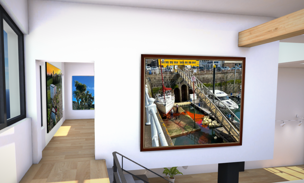
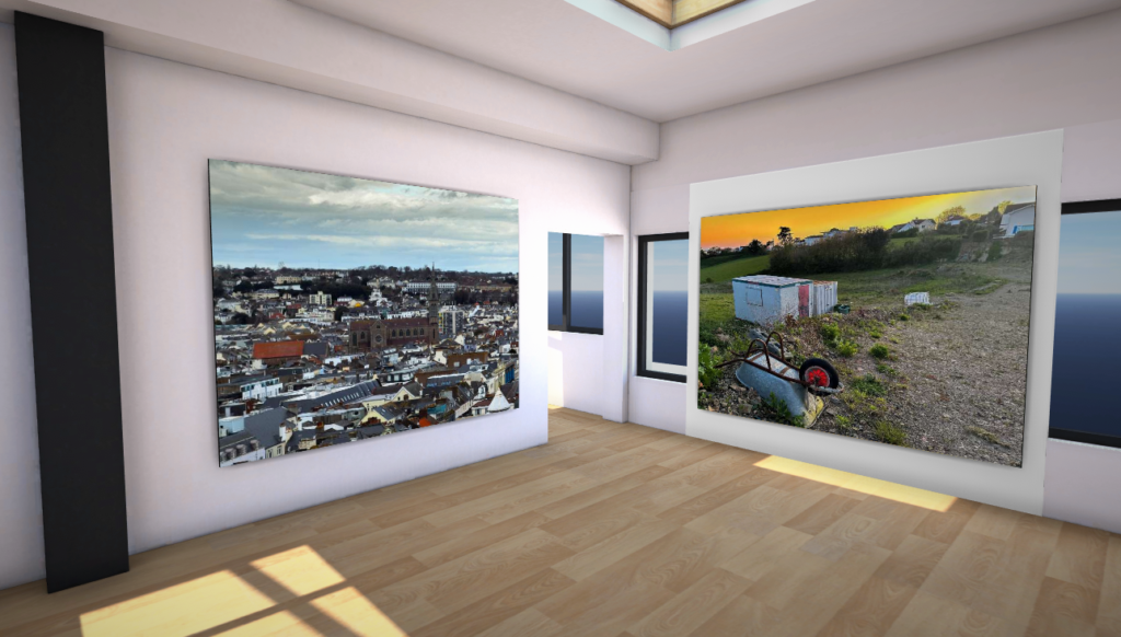
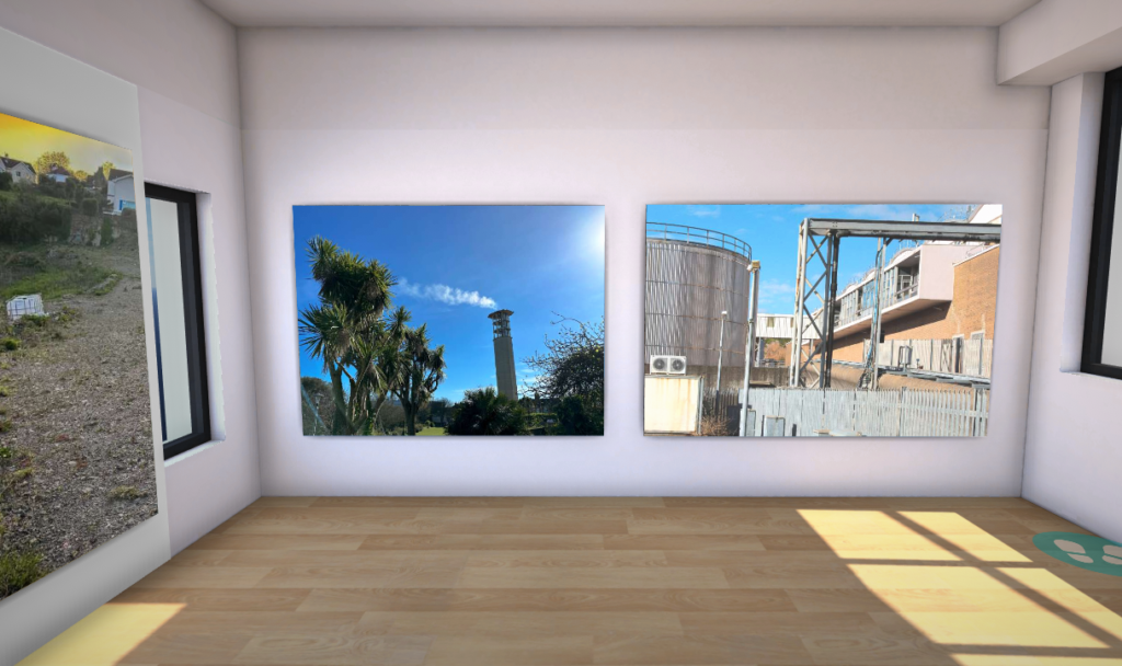
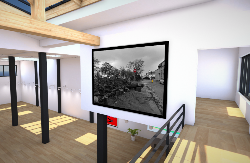
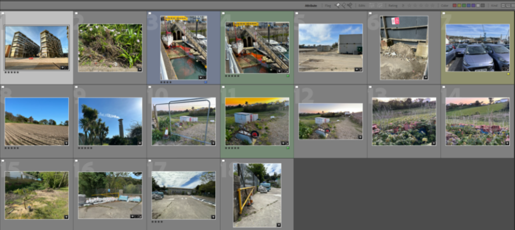
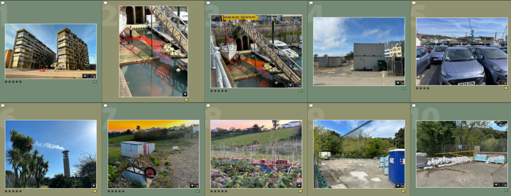
I selected some of my final images and edits, as well as other images I like which I took, and placed them into a virtual gallery as a way of showcasing the photos I took for the new topographics.

The New Topographics: photoshoot, edits & evaluation

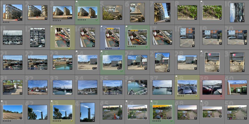
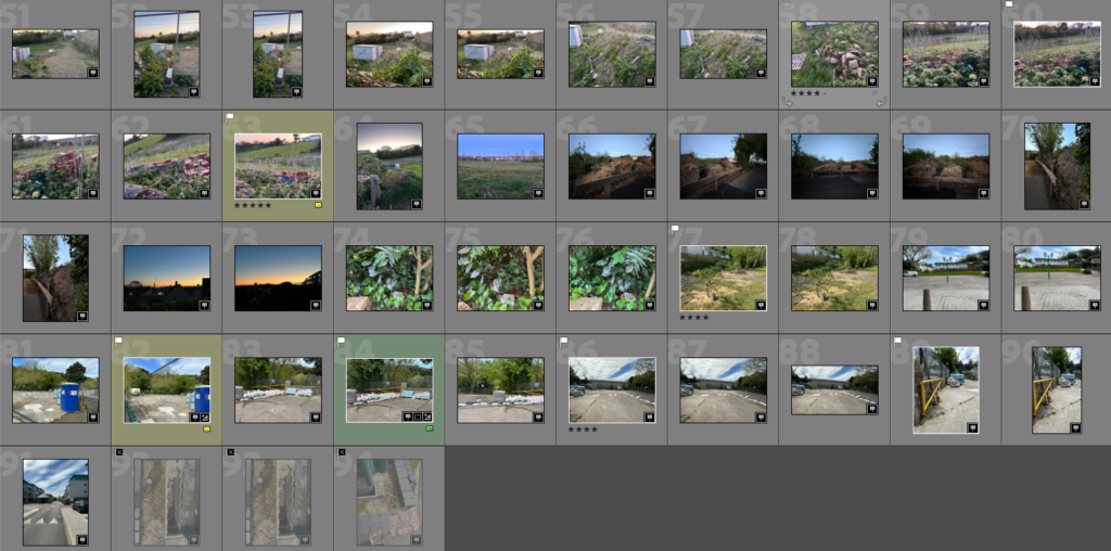
I went on a photo walk around Harve de pas and La Collette. Afterwards I continued the walk and went around fort regent and pier road. I took these photos using a mix between a DSLR camera and my phone camera. In total taking 237 photos.

Edits

I edited this photo by cropping and rotating it, so it was more centred. I also increased the sharpening to make the image look more clear, and I made minor adjustments to the temp and contrast to improve the overall image.

I like this photo as I feel like it does a good job at depicting the industrial landscape due to the objects in the photo, like the metal fence and metal thing in the middle. Furthermore I am also pleased with the Lighting in the photo as there aren’t too many shadows and the lighting is consistent throughout the photo with no incredibly dark or light patches.

I also made an edited copy of the photo in Black & White in the editing style of John Schott’s topographic photos. I feel that the photo also looks good like this.

Photo edit #2

The photo above I took of the landscape of St.Helier and shows urbanisation. I like the way there is a church in the middle of the photo surrounded with buildings, it really captures the urban sprawl and is a good anchor point for the photo.

I edited the photo to improve the contrast and exposure, as the contrast wasn’t the best. I also cropped the image to make the church more centred and the image more level. After some small changes to the image levels and tones I felt it looked much better and less bland.

Photo edit #3

For my third edit I am going to experiment with creating a high dynamic range (HDR) photo. To start I got the three photos I took using exposure bracketing.

The photo on the left is the result of merging the photos in Lightroom to make the photo have a high dynamic range.

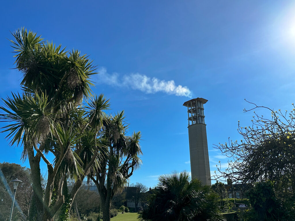
The Camera lens was a bit dirty when I took these photos so I removed any marks with the spot remover tool. I am really pleased with how the photo turned out and I believe it looks much better now the Photo is HDR. I also feel the photo represents industrial landscape really well as it contains the incineration plant and the chimney in it with them being the main focus of the image.

Photo edit #4

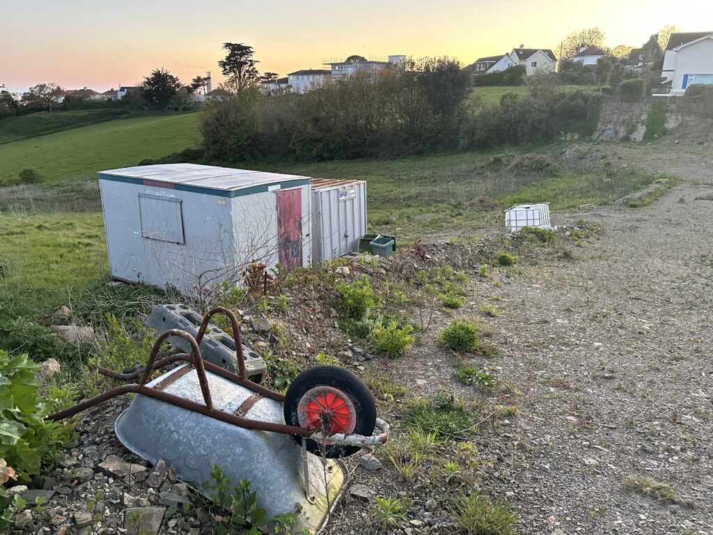
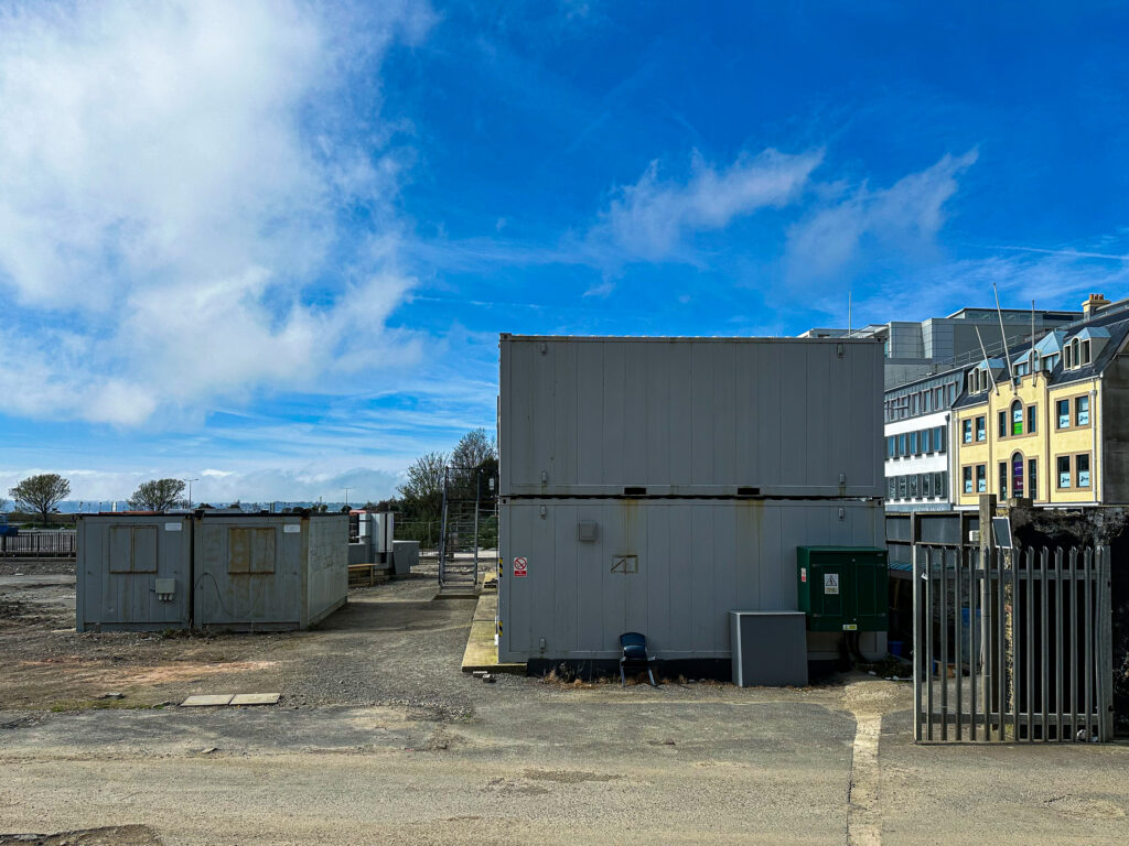
I decided to edit this photo to enhance the sky as I wanted to improve its exposure, I did this by using the graduated filter. I also Removed any marks caused by the camera and made minor adjustments to the whites and blacks.

Evaluation

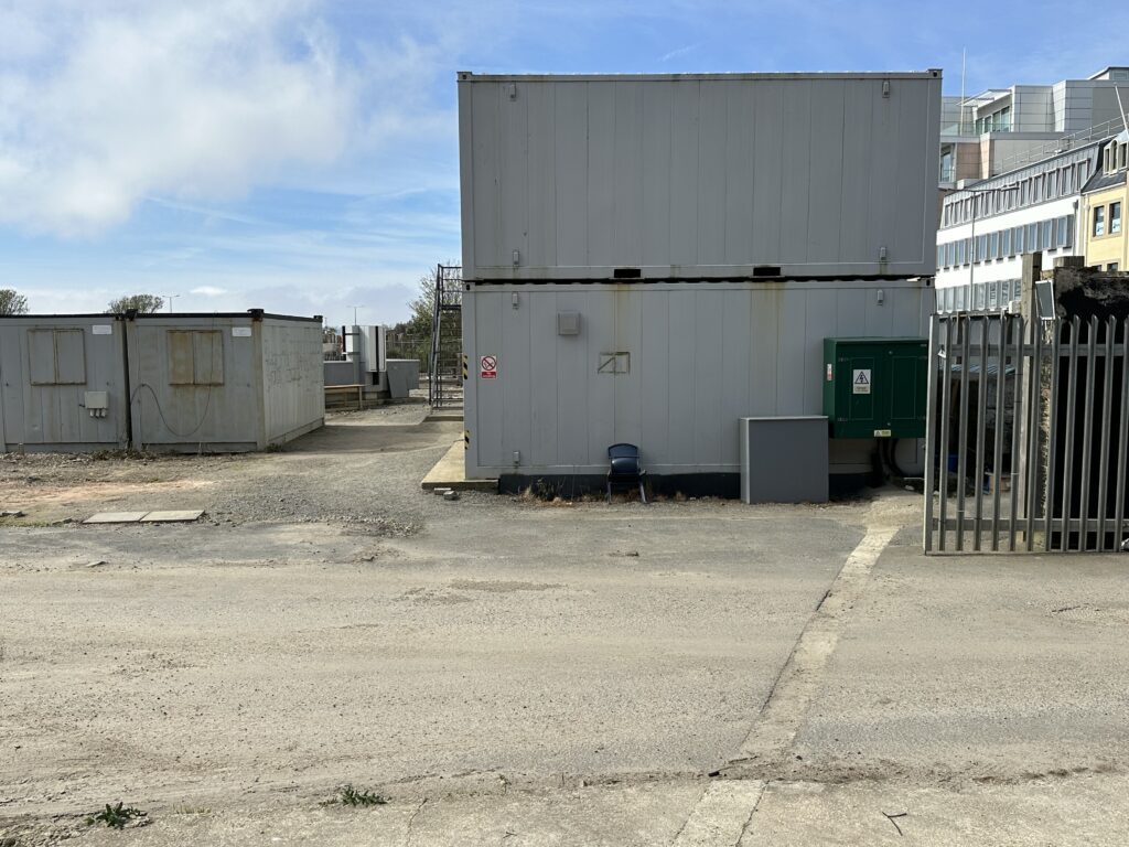
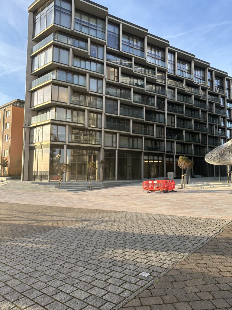
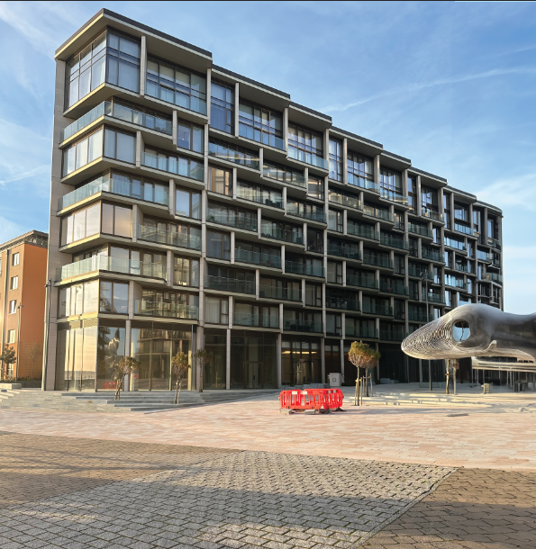
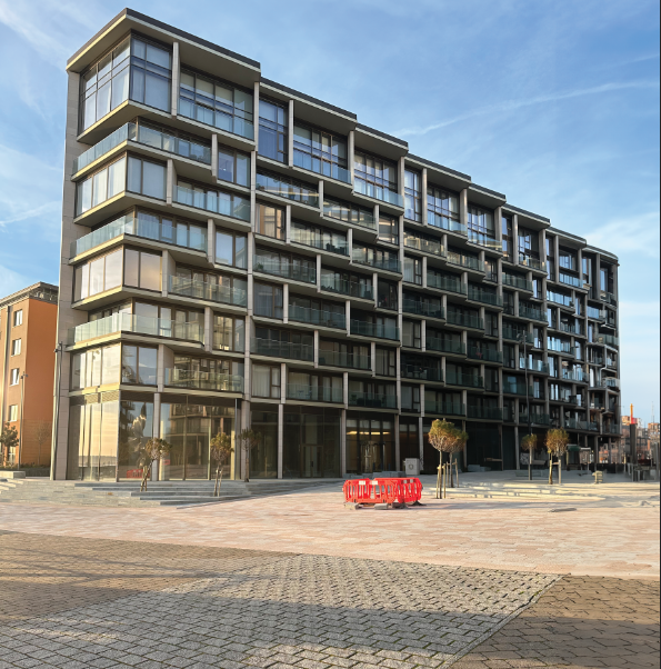
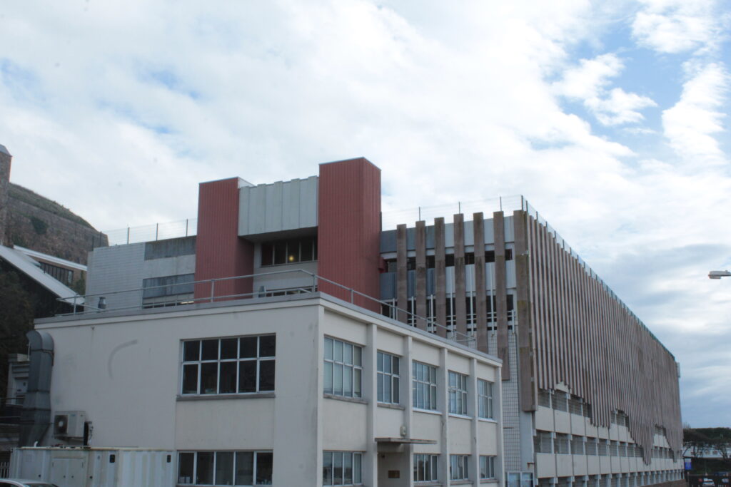
Out of editing all my favourite/best outcomes from the New Topographics, this photo below is my favourite. As it really shows the industrialisation which is a common theme in the new topagraphics. I also feel that the photo has an interesting feel to it as there is a lot going on in the photo, architecture wise.

I struggled to choose between this edit or the one in black and white, but after careful consideration I felt that the colour looks more better in the photo compared to it being in black & White.

Analysing the photo I took

In the photo the technical elements are not really important, but the lighting is good and there are no badly lit areas making all the photo easier to see. The temperature is also on the warmer side which is helped by the way the sun was shining when I took the photo.

The colour in the photo is mainly beige and grey/silver which can be seen as being quite dull, reflecting on what people see industrial architecture as. The blue of the sky almost creates a contrast, brightening the photo up and making it look less dull, as I feel if the sky was overcast the photo would probably look quite depressing and gloomy.

The photo has a variety of lines with horizontal, vertical and diagonal lines, however there are no leading lines. The texture and pattern in the photo are quite evident as on the left the silver structure is kind of shiny helped by the vertical lines which wrap around it creating depth. on the right there are the bricks on the building which are repeated across the building, creating pattern. The structure on the left, the metal fence in the middle and the bricks on the building on the left help give the photo a rough texture which fits in well with the theme of industrial architecture.

Next Steps

Next I need to focus on presenting my photos which I could do as a collage and/or a virtual gallery.

The New Topographics

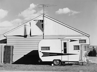
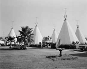
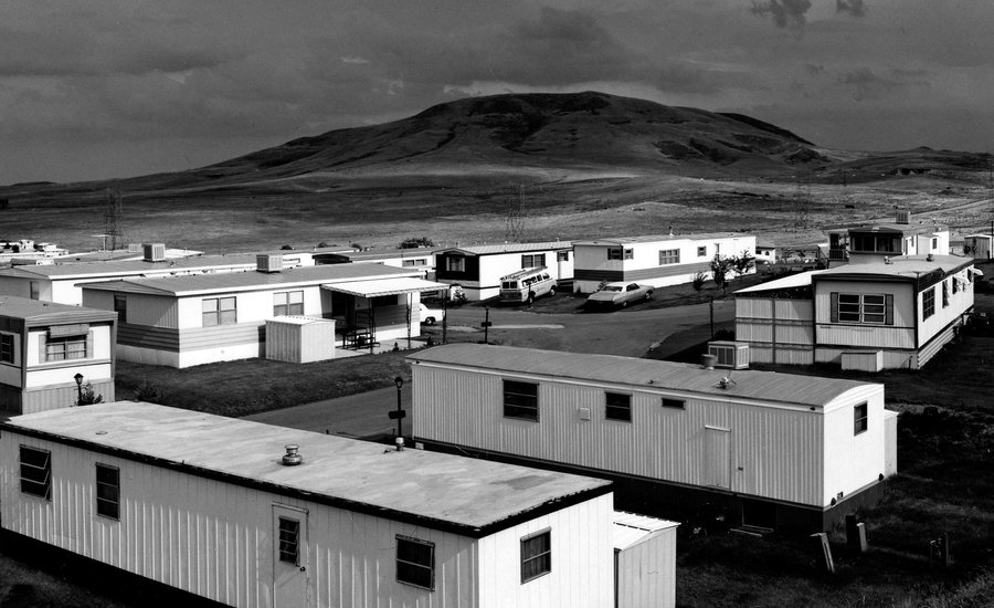
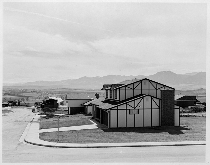
New Topographics was an exhibition, curated by William Jenkins, which consisted of contemporary landscape photography from the 1970s which focused on man altered landscapes instead of the traditional natural American landscape photography. For example post war urban landscapes commonly car parks, industrial sites, urban housing and caravan parks, rather than completely natural landscape. Sometimes with a contrast between the man altered and natural landscape.

New Topographics was a reaction to the post war American landscape, changing from natural to more urban, and showing a contrast to natural landscape photography such as the work of Ansel Adam’s, which which was dominating landscape photography at the time.

The photographers featured in the topographics were: Robert Adams, Bernd & Hilla Becher, Lewis Baltz, Joe Deal, Frank Gohlke, Nicholas Nixon, John Schott, Stephen Shore, and Henry Wessel Jr.

Some photos from the new topographics:

Industrial

After the war lots of industrial sites were being torn down and forgotten about as they were no longer needed, or being used.

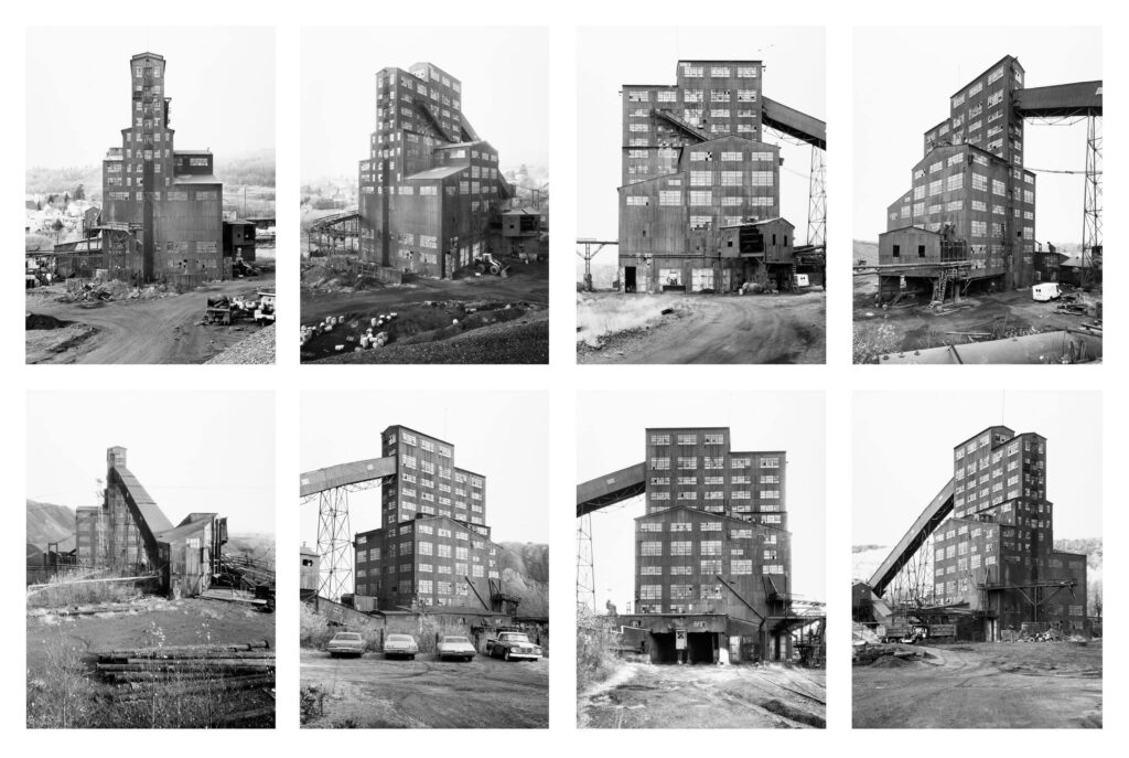
Bernd & Hilla Becher were a married couple from Germany, who saw an interest in these buildings and their architecture. They didn’t want them to be forgotten about so decided to photograph them as a way of remembering and documenting the existence of these buildings. The couple even said themselves “It seemed important to keep them in some way and photography seemed the most appropriate way to do that.”

The couple would go around the buildings and take eight photos of the buildings, capturing all the corners and sides of the buildings. The photographed the building with a large format camera in the same way Ansel Adams would take his photographs.

The photos they took would be presented in a grid layout showing all around the outside of the building. The photos were also all taken in Black and white and the couple would have to wait for the weather to be cloudy so there would be contrast between the buildings and the sky because if it was sunny the sky would appear dark in the photos because they are in black and white. They also preferred taking the photos when it was cloudy because the light would be softer meaning the building would be photographed without strong shadows and with a more diffused light in the photos.

The Land and us Exhibition

The land and us is an exhibition located at Capital house, and is a collaboration between ArtHouse Jersey, artists: Alexander Mourant, Remi Graves, Alice Burnhope, Hannah Fletcher and Sam Carvosso, as well as local organisations such as EYECAN Jersey, Dementia Jersey, Youthful Minds and L’Office du Jèrriais.

The Exhibition’s focus is on the need to reconnect with jersey’s natural word and consists of photography, poetry, sculptures, art and textiles.

Photos from the exhibition

Overall I enjoyed the exhibition and liked the sculptures they had as I thought that they were very creative and the detail was interesting. I also liked the way they included Jèrriais at the exhibition as it is a good way to help preserve the language.

Ansel Adams Case study

Ansel Adams was an important and iconic landscape photographer based in California.

He used his work to help increase the acceptance of photography by helping create the curatorial department of photography as an art, at the museum of modern art in New York. He also helped establish the San Francisco art institute which had the first ever department that taught photography.

He started off his career as a pictorialist but transitioned into pure/straight photography.

Most of Ansel Adams photos are based in the Yosemite National Park California, which is home to the Sierra Nevada Mountain range. His love for the National park and nature started in 1916 when Ansel Adams was a child and visited the Sierra Nevada on a family vacation. After this initial visit he started visiting the mountains annually and spent a great amount of his life there.

When Ansel was 17 he took on a Job as a custodian for the Sierra club’s headquarters in the national park. Eight years later in 1927, Ansel’s passion for photography grew as well as prescience in the Sierra Club. He started going on outings with the club and quickly became the club’s official photographer and in 1930 became the assistant manager for the club’s outings.

Ansel Adams even said his life was “colored and modulated by the great earth gesture of the Yosemite Sierra” which shows that is had a great influence on his life.

Group f/64

In 1932 Pictorialism was the dominant style of photography where photos were made to look more like paintings by focusing on tone and composition as well as using soft focus lenses.

Ansel Adams wanted photography to be more pure and less arty by creating photos with a high contrast and a sharp focus rather than a soft focus. This was known as pure/straight photography.

So Ansel Adams formed Group f/64 and consisted of eleven group photographers all wanting to create pure/straight photography and to make it the dominant form of photography.

The f/64 group members were:

  1. Ansel Adams
  2. Alma Lavenson
  3. Brett Weston
  4. Consuelo Kanaga
  5. Edward Weston
  6. Henry Swift
  7. Imogen Cunningham
  8. John Paul Edwards
  9. Preston Holder
  10. Sonya Noskowiak
  11. Willard Van Dyke

Why was the group named group f/64?

Back when the group was formed in 1932, the only cameras they had were called ‘Large format cameras’ and the smallest apertures the cameras had was f/64.

The group was named after this, as the f/64 depth of field was the best at the time for those cameras, and gave the images a sharp focus, making the photos look more pure/real, which links back to the groups aims of creating pure/straight photography.

The zone system

The zone system was developed by Ansel Adams and Fred archer, who was a portrait photographer who collaborated with Ansel to create the zone system, while they were both teaching photography at the art centre collage of design in Los Angeles.

Ansel Adams described the zone system as “A codification of the principles of sensitometry, worked out by Fred Archer and myself at the Art Centre School in Los Angeles”

The zone system was used to visualise different tonal values so they would be in a photo, leading to a higher contrast. It divides tonal range into 10 zones with 0 being black 5 being grey and 10 being white.

Ansel Adams + Romanticism

Ansel Adams’s work can be linked to the genre of romanticism as it has similar properties to romanticism art and photography, such as the focus on nature and its beauty. Ansel’s photos can also be linked to the sublime which is a key topic in romanticism. This is because his photos create awe by the beauty of the natural wilderness but also unease by how vast it is and how small we are compared to it e.g. the valley/mountains.

Image analysis

The Lighting used in the photo uses completely natural light and has a wide contrast as a result. The photo has a good exposure due to Ansel creating a high dynamic range. The photo also has a large Depth of Filed as the photo contains no blurring and has a sharp focus which Ansel wanted his photos to have.

The photo is taken in Black & White, hence having no colour, however it has a large tonal range, which creates depth, due to Ansel Adams using the zone system. The mountains in the photo are incredibly rocky and as a result it gives the photo a rough texture. However, because the photo is taken high up the trees in the bottom right look small and the leaves give that area a soft/softer texture, which contrasts with the rest of the photo.

The mountains in the background give the photo a triangular shape. This is due to the diagonal lines caused by the edges of the mountains, which form triangular shapes. In the foreground the rocks look three dimensional due to the shades of black and white created by the tone and the rough texture. This combination of tone and texture of the rocks in the foreground give them depth.

This photo was taken of the mountains in the Yosemite national park in California by Ansel Adams. The photo could be linked with romanticism and the sublime as the photo focuses on nature, giving it a sense of awe and beauty, but also a sense of unease due to the large scale of the mountains.

Editing my storm landscape photos

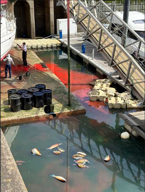
This is one of the photos I took after the storm.

For the photo I applied a Black and White filter and adjusted the levels.

Before I made the photo Black and White I made a copy of the layer and used the colour range selection tool to select the reds as I want the reds to show in my B&W photo.

The tool selected the reds then I did Ctrl+Shift+i to invert the selection and pressed delete and I was left with this. I also did the same for the yellow thing in the background.

After doing some final finishing touches, this was the end result. I am quite pleased with the end result as I feel it looks good and the reds and yellow in the photo go well and really compliment it.

Photo #2 edit

On the Left photo I slightly adjusted the saturation for the grass making it look greener and for the sky to make it slightly enhanced. The contrast, whites and shadows was also slightly increased, whilst also gradually decreasing the highlights and blacks. Basically small adjustments to enhance the photo.

On the right photo is the same photo but in Black and White as another variation.

I chose the edited colour photo as the better one, rather than the one in black and white, as I really like the colour detail and the contrast.

Romanticism & The Sublime

Origins of Romanticism

Romanticism is a movement which originated mainly in England as well as parts of Europe during the late 18th centaury, being sparked by the industrial revolution and the French revolution, and quickly spread to other parts of Europe and America.

The French Revolution began in 1789 and was caused by France being on the brink of bankruptcy and the growing dislike for the French monarchy. Before the revolution literature and also art was mainly made about high class people and religion, but after the revolution people were given more creative freedom to express themselves so started writing about nature and emotion instead. Romanticism was also used as an escape from reality which the French citizens needed after going through the revolution, further boosting romanticism and its popularity.

Industrialisation causes an increase in urbanisation (the increase of people living in towns and cities) and the increase in factories due to the demand for manufactured goods increased during the mid 18th centaury. This cased more people to live in cities and get factory jobs away from nature, which romanticists argued against and felt that this new industrial lifestyle was harsh and was supressing the natural human spirit. This caused romanticists to focus on nature again and natural human emotion as away to escape from this lifestyle.

The Romanticism movement mainly consists of an interest in nature and its beauty rather than the industrialisation which was going on at the time. Human emotion by expressing intense or true emotions, as well as the sublime. It also consisted of beautifying the past commonly the middle ages (medieval era) as ether a respect for the traditions and architecture or a sense of nostalgia. The movement was commonly displayed in the arts and forms of literature.

William Wordsworth

William Wordsworth was a popular romantic poet during the late 18th centaury and has been described as ‘the farther of romantic poetry’. Wordsworth moved into dove cottages in the lake district, which was known for its outstanding beauty. Wordsworth would commonly write about nature, history and an emphasis for a simpler life saying “For I have learned to look on nature, not as in the hour of thoughtless youth, but hearing oftentimes the still, sad music of humanity.”

Wordsworth also had a hatred for anything industrial, which was happening at the time, saying at the start of one of his poems: “Is there no nook of English ground secure From rash assault?” And when a trainline was proposed to run through the lake district Wordsworth and his fans did everything the could to get the train rerouted away from the lake district.

Romanticism vs The Age of The Enlightenment

The Age of The Enlightenment which is also known as the age of reason was a movement that occurred mainly in western Europe during the 17th to early 19th century which focused on science instead of religion an rationality over beliefs. The romanticists were against this idea and felt that reason was overemphasised and believed in connections to nature and human emotions even if it was irrational.

The Sublime

Nowadays the word sublime means really good or excellent, however the sublime was actually a key part of romanticism and has a completely different meaning.

Edmund Burk was an Irish philosopher who moved to London in 1750 and served in parliament in 1766. Edmund also wrote books, in 1757 he wrote a book called A Philosophical Enquiry into the Origin of Our Ideas of the Sublime and Beautiful. In this book he would go on to explore the ideas of ‘the sublime’ with Edmund describing the Ruling principle for sublime as the awe and beauty of nature, but also elements of fear and terror because of how merciless it is.

A common theme with the sublime is the sea as it can create awe by its beauty, but also terror by its vastness and powerfulness.

This is why shipwrecks can be a popular subject in these paintings as they can create feelings of terror, by the destruction and power of the sea/nature on the ships and awe by the emphasis on nature in the paintings, for example the sky and the waves.

Origins of Landscape Genre

What is the meaning of the word landscape?

Landscape is the visible features of an area of land often with an aesthetic appeal, and could be anything from natural to urban landscapes.

When did landscape emerge as a genre?

In western civilisations landscape emerged as a genre in the 16th century during the renaissance era. However it can be tracked even earlier in ancient China.

When did classical landscape emerge as a genre?

Classical landscape emerged in the 17th century and was influenced by classical antiquity, which means the culture and art of ancient Greece and Rome, and was used to illustrate Arcadia, a mythical, legendry place in ancient Greece known for its beauty.

How did the Landscape genre become popular?

During the late 18th century Romanticism started becoming increasingly popular in Europe due to the end of the French revolution and the increase in industrialisation. Romanticism has a large focus on nature, hence causing landscape genre to become increasingly popular.

Mood Board