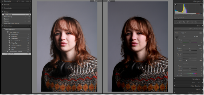
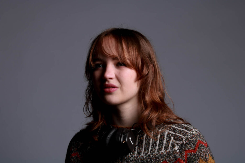
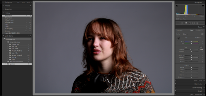
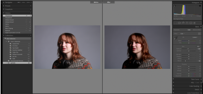
All posts by vickie

Filters

Author:
Category:

Tools Photoshoot with single objects photos

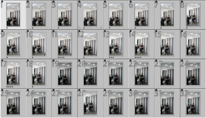
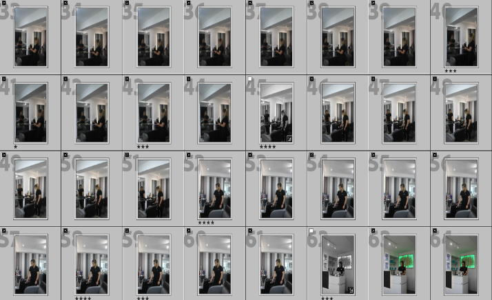
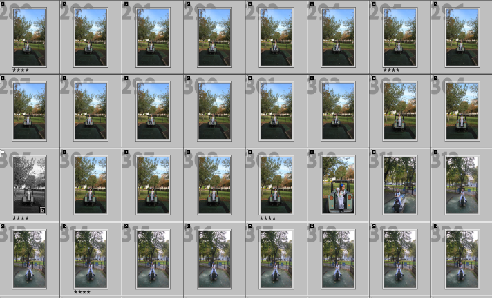
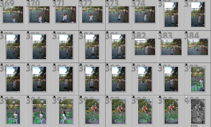
In this picture I rated, coloured and flagged my photos so that I could have an idea of what pictures I liked most and so that I could edit the pictures that I liked without editing the unnecessary pictures.

This was my set up. I took my all photos from the top which meant that I had to get on top of a chair and take the photo from there so that I could properly take the photo. I placed the tools in the middle of the white paper and then free handed with my camera and made sure my hands were stable enough and then took the photos when I was satisfied with the position of the tool. I took some in landscape and some in portrait because some objects were larger but some objects looked really good in landscape but better in portrait. my camera had the setting where when I took a picture the light on the left flashed. I didn’t have a continues light shining on my tools.

For this photo I wanted to enhance the shadows and colour of the tool. I kept temperature and tint the untouched, increased exposure for the photo to be brighter, clarity to increase the details in the photo, dehaze to increase the contrast in flatter areas and vibrancy to bring more intensity to colours that were ‘muted’. Then I decreased the shadows so that the shadows were more evident. I kept the highlights, contrast, whites, blacks, texture and saturation untouched because it didn’t add much to the picture and was unnecessary. This photo was taken free hand, I was standing on top of chair to give me height so that I could take a picture from the top. The photo was taken with a flash setting so when I took the photo the light on the left flashed.

For this photo I wanted to give it more of a homey feel to it so I increased the temperature to make it warmer, decreased the tint so that I could affect the mood and later enhance it increasing other parts of the photo, increased the contrast to give the picture a more lively look, decrease the highlights to recover some of the details that aren’t as apparent, increased the blacks so that I can make a better use of the tonal range of the photo, increased the texture to show more of the details in the books, increased the clarity so that the letters in the book was much clearer and lastly decreased the vibrancy so that some of the brighter tones in the picture were ‘deafened’. I kept exposure, whites shadows, dehaze and saturation untouched because I felt like it didn’t add much to the photo.

For this picture I wanted to highlight the rust in the wrench so I kept the temperature, tint, exposure and dehaze untouched because it didn’t do anything useful to my photo. To highlight the rust I increased the exposure to make the photo brighter therefore it increased the colour of the rust, decreased the contrast to soften the image, not give it such a rough tone to it, increased the highlights to highlight some of the lightest parts in the photo, decreased the shadows so that it increased light in some of parts of the photo that are quite dark, increased the whites to make the background much lighter, increased the blacks to bring out the darkness of the tool, increased the texture to show the detail of the tools and show the texture of the rust, decreased the clarity to create a more smooth tone in the picture so that is isn’t as ‘rough’, increased the vibrancy to make darker parts of the tool really come out and become present and lastly I increased the saturation so that the rust on the tool would become more visible which was what I was aiming for.

For this photo I wanted to make the red on the tool really pop out and I also wanted to make the photo warmer. I kept exposure, whites, and dehaze untouched because they didn’t do any good to the photo. To give the photo life I increased the temperature and tint to give it a warmer tone, decreased the contrast to make the photo a little muted so its not as harsh which is the opposite to warm, increased the highlights to make areas that are lacking of light become lighter therefore intensify the colour of the tool, increase the shadows so that the shadow the the tool created became more clear, decreased the blacks so that the background isn’t as dark but not too bright either, increased the texture so that the details in the photo are powerfully shown, increased the clarity so that the details in the photo reached their full potential, increased the vibrancy so that the red would really be brought out and finally I decreased the saturation so the photo didn’t have an ‘indie’ look to it.

For this photo I wanted to make it the same as the picture before this which was make the red on the tool to really pop out and I also wanted to make the photo warmer. So I I kept exposure, whites, and dehaze untouched because they didn’t do any good to the photo. To give the photo life I increased the temperature and tint to give it a warmer tone, decreased the contrast to make the photo a little muted so its not as harsh which is the opposite to warm, increased the highlights to make areas that are lacking of light become lighter therefore intensify the colour of the tool, increase the shadows so that the shadow the the tool created became more clear, decreased the blacks so that the background isn’t as dark but not too bright either, increased the texture so that the details in the photo are powerfully shown, increased the clarity so that the details in the photo reached their full potential, increased the vibrancy so that the red would really be brought out and finally I decreased the saturation so the photo didn’t have an ‘indie’ look to it.

In this photo I wanted to darken the red but give more colour to the background so, I kept the temperature, tint, exposure, blacks, dehaze and saturation untouched as I felt like it didn’t do much to the photo. I increased the contrast to sharpen the image, highlights to give some light to parts of the picture that didn’t have as much light, texture to add more dimension so the photo isn’t as flat, clarity to make the image clearer and increased the vibrancy to give the picture more life and colour. Then I decreased the shadows to lighten darker parts in photos, whites to make the photo cooler and finally decreased the saturation so that the picture to mute colours I didn’t want apparent.

For this picture I wanted to show more texture and bring more colour to the photo so, I increased the temperature to increase balance in the photo, tint to expand the colours in the photo, highlights to make parts in the photo that were bright even brighter, whites to show more of the whites in the picture, blacks to give the red a more deep colour, texture to show all the little details in the photo, clarity to clearly show the details on the tool and background, dehaze to darken the image and add more saturation to the picture and finally increased the vibrance to bring more vibrancy to the colours in the photo. Next I decreased the exposure to make the picture darker, contrast to increase the differences in the photo, shadows to make some of the unneeded shadows go away and finally I decreased the saturation so that the photo didn’t have ‘fake’ look to it.

For this photo I wanted to bring out the colour that wasn’t as noticeable in the original photo so I kept the vibrance and saturation untouched because they gave the photo an ‘indie’ look to it. I increased the tint, to give the photo more colour, highlights to bring out more light in bright areas, whites to bring out more of the whites in the photo, blacks to show the unseen colours on the tool, texture to increase the details in the photo and finally increased the dehaze to help with the haze in the photo. Then I decreased the temperature in the photo to create and imbalance in the photo that I can build by decreasing other parts in the picture, decreased contrast to make the photo more vivid, shadows to decrease the unwanted shadows in the photo and finally decreased the clarity so that the details in the photo weren’t too harsh.

For this photo I wanted to increase the texture and lighting, so I kept the vibrance in the photo untouched so that it didn’t take the details from the photo. I increased the temperature to give it a more warm colour to it, exposure to increase the lighting on the background, contrast to sharpen the photo, shadows to give the tool more shadow, whites to increase the whites in the background and make it brighter, texture to show the Fine details in the photo and finally increased clarity to enhance the details on the photo. After I decreased the tint so that the photo didn’t have uneccesaary tint on it, highlights to recover lost details, blacks to not make the photo darker, dehaze so that the haze in the photo isn’t as evident and finally I decreased the saturation to mute and fade unwanted colours in the photo.

Finally for this photo, I wanted to bring the yellow that wasn’t really show in the original, unedited photo. First of all, I increased the temperature to give the tool a more warm tone to it and to intensify the yellowish brown on the tool, exposure to expose more the colours in photo contrast to sharpen the photo, texture to show the details on the tool, clarity to bring more clarity to the background therefore lifting the colour in the photo, dehaze to darken the image a little, vibrance to bring out the colours in the photo and finally saturation to portray the photo with an ‘alive’ tone to it. Lastly I decreased the tint to improve the contrast in the photo, highlights to so that lost detail in the photo is recovered, shadows to bring out more of the shadows in the photo, whites to give a boost to the white in the background and finally I decreased the blacks so that to make the photo brighter which gave it more life.

still life photoshoots and contact sheet

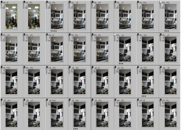
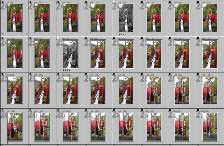
In this picture I rated, coloured and flagged my photos so that I could have an idea of what photos I liked most and so that I could edit the pictures that I liked without editing the unnecessary pictures.

In some pictures I used the copy-stand and in other i used an infinity screen.

For this photo I chose objects that I picked from the studio that portrayed a mysterious atmosphere. I wanted to give the photo more life so I added some techniques to the photo to reach its minimum peak. I kept the tint, temperature, contrast, highlights, shadows, whites, blacks, texture, dehaze and saturation untouched because I felt like the photo didn’t need them. I increased exposure to expose more the light in the photo, clarity to show more of the details in the photo, and finally increased the vibrancy to give the photo more colour. This picture was taken in an infinity screen with continuous light from the left and from a small light on the bottom of the infinity screen.

For this photo I wanted to create a warm and cosy tone to it. when I took this picture I looked at it and I really liked how it looked in general. I strongly believed that it showed the cosy feel to it yet it also was warm which, so I decided not to touch it and leave the picture just as it is . This picture was taken from an infinity screen with continuous light from the left and a small light on the bottom of the infinity screen.

Again for this photo I kept it untouched because I liked how it looked by itself. I wanted to have a photo that showed a slight off white look to it and was cool. I think that the photo naturally is cold and bleak so there was no need to edit it. This photo was taken in an infinity screen without the bottom light which gave it a cooler tone.

For this picture I wanted to play around with the white balance on the camera. I didn’t want the photo to have different lighting. I decreased the white balance to give the photo a more cool tone to it and finally to edit it, I increased the exposure the to make it lighter and cooler. This photo was taken from an infinity screen with a continuous light on the left.

For this photo I wanted to enhance the gold colour off the lipstick and also increase the white in the photo. I kept the temperature, tint, contrast, highlights, shadows, whites, blacks, texture, dehaze and saturation untouched because it did no good to the photo and didn’t help my aim with the photo. I increased the exposure to expose the brighter parts of the photo, clarity to show more off the texture in the photo and show the gold that the the original photo wasn’t showing and finally I increased the saturation to increase the saturation of the gold on the lipstick. This photo was taken from a copy-stand with continuous light coming from the sides.

For this photo, I wanted a homely and summery feel to it. When I took this photo I felt like I had already achieved what I wanted, without editing I think that it already had a homey feel to it so I left it unedited. This photo was taken from an infinity screen with a continuous light coming from the left

For this photo, I wanted to produce a clean and posh tone to the photo because I felt like the objects had that posh tone. When I took this photo I liked how it was very bright and illuminated the colours of the objects. I zoomed in the photo to show more of the details of the objects. Because I was happy with the photo unedited, I left the photo as it is and didn’t edit any of it. This photo was taken free hand with a black background and a white ‘floor’. The camera had a Flash setting so every time I took a photo, the light on the left flashed.

Again, For this photo I wanted to produce a clean and posh tone to the photo because I felt like the objects had that posh tone. When I took this photo I liked how it was very bright and illuminated the colours of the objects. I didn’t zoom in the camera lens, I kept my distance from the objects but made sure you couldn’t see the outside from the set up. Because I was happy with the photo unedited, I left the photo as it is and didn’t edit any of it. This photo was taken free hand with a black background and a white ‘floor’. The camera had a Flash setting so every time I took a photo, the light on the left flashed.

This is the set up I used to take the last two photos.

Walker Evans and Darren Harvey-Regan compare and contrast

Who is Walker Evans?

Walker Evans was a talented and inspiring photographer in the late 1920s. He started his career by making snapshots during a European trip, however he only published his first images in the 1930s when he returned to New York.

In his ‘beauties of common tools’ shoot, he shows the eyeful side of common tools. Although cameras with colour became a thing in the 1950s which was the around the time he took photos of his so called project, ‘beauties of common tools’, his images are not in colour because black and white was still the norm even though cameras already had colour. He stuck to the norm.

Most of Evans work was inspired by the effects of the depression and telling the story of the American working class. Evans project ‘beauties of common tools’ illustrates the simplicity of common tools. I think that in some way he compared working class to common tools. I strongly believe that he saw that common tools were just as hard working as working class.

Who is Darren Harvey-Regan?

Darren Harvey-Regan was a photographer interested in the concept that photographs do not exist just to show things, but are physical things that become objects themselves.

After Evans portfolio called ‘beauties of a common tool’ Harvey-Regan constructed a montage of Evans’s images to make new forms. Becoming inspired by the images, Harvey-Regan found matching tools, cut them in half and stuck them various halves together, then photographed his interesting work.

His idea to create such beautiful but bizarre objects was all because of Evans.

Comparing and contrasting the work of the two artists.

When it comes to Evans work, his work is quite cold. The photos have an eerie feel to it. The photos have this sense of strangeness to it and because of this, it creates this uniqueness and curiosity atmosphere that makes us question what Evans saw in those tools.

Darren’s work in the other hand is very neutral. They don’t have this strangeness to it and although Darren was inspired by Evans work, Darren’s work isn’t quit the same. His lighting is a lot harsher than Evans. However, Darren’s photoshoot inspired by Evans has a bizarreness and uniqueness to it. The fact that he combined two completely different tools together, suggests a very odd feeling to the photos. His photos are quiet simple, they don’t have much depth to them unlike Evans.

Now lets compare these two pictures

Evans picture, which is in the right has a very antique undertone. You can see that it was taken from a much older camera that didn’t have as much quality as Darren’s camera which has a clearer quality.

In Evans picture, the photo is in black and white even though there was colour in the period that Evans took this picture but it just wasn’t as common to use colour, because of this, Evans picture doesn’t have as much detail as Darren’s however when it comes to showing lighting, Evans shows it perfectly in his picture.

On Evans picture, at the top of the tool it is much lighter and in fact seems like its glowing. I think this is to show that the tool is used constantly because the parts where the tool is darker is where its not really being used. Evans is showing the importance of common tools and how hardworking they are. In the other hand, Darren’s picture of the tools is much darker. This implies that the tools are really old, maybe the tools weren’t as used now as they were used in the 1900s hence why the tools looks rusty.

A big difference between Evans and Darren’s work is that Darren combined two tools together and Evans never did that, Evans showed the ‘true’ form of the tools. However a similarity is that they both photograph common tools and they both wanted to show the beauty of the tools.

Formalism

There are seven basic elements of photographic art: line, shape, form, texture, colour, size, and depth.

Line: lines in photography are either straight, combined or a mixture of both. Different type of lines can mean lots of different things.

Shape: When a line, or more than one line, closes or connects, a shape is formed. there is lots of ways of defining what shape is but a definition that stands out to be is ‘spatial form or contour’

Form: Just as with shapes, there are two basic types of form, geometric (or regular) and organic. Geometric forms are the familiar sphere, cube, cone, cylinder…etc Organic forms are the objects that surround us in our three-dimensional world.

texture: In photography, texture can be felt with both the fingers (the print) and virtually (with the viewer’s eye). Texture can be described as many things and texture often enhances an image, showing its ‘vulnerable’ side.

colour: showing colour in a photograph can bring life to a photograph. a definition for colour that really stand out is, ‘a colour other than and as contrasted with black, white, or grey’.

size: size is the most elusive topic. showing how small/big something is can show the reality of an object/thing. types of size: Large, medium, or small

depth: depth is the most eye opening topic. a simple definition for depth is ‘the direct linear measurement from front to back’. looking at the depth of something can create a ‘form’ to the photography.

Formal analysis on posters:

STILL LIFE HISTORY & THEORY

Still Life

A work of art that shows inanimate objects from the natural or human-caused world, typically fruit, flowers and objects that contrasts with texture, like as bowls and glassware 
Still life has origins in Ancient Greco-Roman art and the Middle Ages. Still life painting appeared as a distinct genre in Western painting in the late 16th century and has remained significant since then.  

The earliest example of still life is in the beginning of the 1600s and later influenced by ‘tulip-mania’, were the popular floral paintings; these were followed by flowers with fruit, then the humble ‘breakfast pieces 
17th Century Still Life peaked by the 1670s and seemed to stagnate thereafter, maybe because of the deaths in the 1680s and 1690s. What survived was the two aspects fixed in the Dutch psyche: decorative hunting still lives and the flower paintings. 

Mood board

One artist that is highly focused in still life is a talented man called Mat Collishaw. Mat Collishaw, born in 1966, received his BFA from Goldsmith College, London, in 1989 and began his career exhibiting the acclaimed work Bullet Hole alongside his Goldsmiths contemporaries at the legendary show Freeze in 1988, and at Modern Medicine in 1990.

The beauty of Collishaw’s work is compelling, seductive, captivating, hypnotic yet repelling as we realise the darker fantasies within. His work is quite dark because he states that “I am fuelled by things in my past which were suppressed or held at a distance, which have generated some form of hunger to make my work.”

This is quite concerning as his work explores things like Pornography, the crucifixion, gleaming fairies, syphilitic child prostitutes, bestiality, bondage, addiction, religion, exaltation and despair, even the final hours of a death-row inmate but Mat has no dark corner he is unwilling to explore which is fascinating.

These pictures are from his project called ‘last meal on death rows’ taken in 2011. The pictures show the bizarreness of death rowers last meals and how different their priorities are within meals. Some meals are massive yet some meals are little to nothing. I think that it shows how unique and different death row meals can be.

Mat Collishaw project that was an innovative body of work was to show a different perspective of criminals last meals. He somehow brought ‘light’ yet darkness to their last meals. Some images are quite simple yet some show chaos.

One of the pictures that I am going to analyse is the picture below that was in the project ‘last meal on death rows’

Technical: The lighting in this photo isn’t natural. its quite dark and has no source of bright lights.
Visual: There is shrimps, what looks like some type of sandwich and sometime of beverage.
Contextual: This photo is a photo representing a prisoners death row meal.
Conceptual: It shows the how criminals in death row prioritised in food. it shows how different their food choices can be. I also think that the food choice is quite bizarre.

History of still life painting.

Ancient Egypt: The earliest known still-life artwork was produced in ancient Egypt. The paintings were produced in temples as offerings for the gods. Realism was not important.
Ancient Greece and Rome: these were more realistic than the Egyptians efforts. Still-life appears in mosaics on the floors and paintings, especially at Pompell colours and shading re more realistic.
Northern European renaissance:
After the fall of Rome, interest in still-life disappeared until the 1500s in Northern Europe. While Italian renaissance had renewed interest in ancient Greece and Rome. the north developed oil paint, which allowed for greater detail in paintings. objects began to take on symbolism, as well as depicting wealth and showing the artists skill. realism was essential to these artists.
Northern European renaissance:
in addition to being an art form of its own still-life objects were included in other types of paintings. the items chosen were meant to be symbols about the subjects of the paintings.
Northern European Renaissance:
a very specific type of still life is the vanitas painting. the idea was that people love the pleasures of life, the things that make them feel important or wealthy. and yet it all means nothing because time soon passes and we die. Artist used symbols to show this, like skulls, burnt candles, and witting flowers.
Impressionism:
after the renaissance ended. impressionist and post-impressionist artists in the 1800s continued to paint still lives instead of realism. they experiences with colour , shapes, and the wet paint was applied to the canvas to create beautiful; works. symbolism becomes less important.
Cubism:
Pablo Picasso and Georges barques invented cubism as a way of showing several sides of an objects at once. they felt it was better representation of an object because you could see more to it.
Modern still life painting:
modern painting is more of a reflection of an artists style. so paintings during the 20th century have developed into more abstract and unrealistic images. some artists use collage, paint, or photography to create modern-art still lives.

Vanitas: A still life painting of a 17th-century Dutch genre containing symbols of death or change as a reminder of their inevitability.

Memento Mori: Memento mori is a Latin phrase meaning ‘remember you must die’. A basic memento mori painting would be a portrait with a skull but other symbols commonly found are hour glasses or clocks, extinguished or guttering candles, fruit, and flowers.

Types of metaphors in still life and why?

Fruit: Varying Symbolism In Still Life Paintings.

Skulls: The Certainty Of Mortality.

Candles: The Passing Of Time. 

Flowers: Symbols Of Life And Growth.

Seashells: Birth, Purity, And Fertility.

Mirrors: The Soul In Reflection.

Insects: Transformation And Decay

Camera + studio set up + Canon Camera Simulator examples

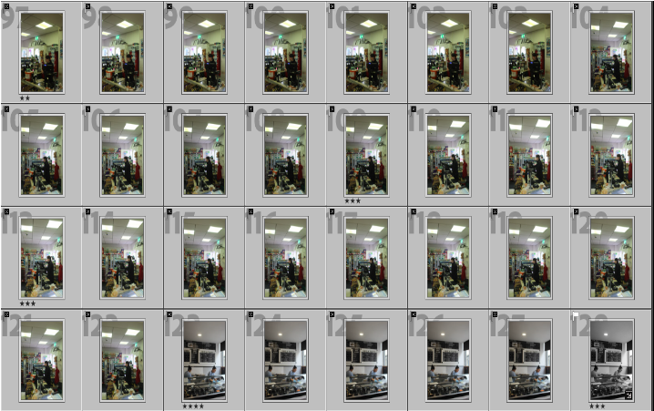
For this photo I increased the aperture by a lot, Because of this the photo doesn’t have enough light and disables the natural colours and light in the photo. it makes the photo really dull and lifeless. It also gives the photo a ghost like tone to it which is no good. However the wide depth of field is perfect as my subject and background are both in focus.

In this photo, I decreased the aperture which made the photo over exposed and stripped the colours from the photo. it really highlighted the whites in the photo and hide the colours from the photo. This photo has a shallowe depth of field which means that some parts are much more sharper than other parts in the photo. This photo also has a lack of movement which can be improved by increasing the shutter speed.

For this photo I decreased the shutter speed which made the photo over exposed and stripped the colours from the photo. it really highlighted the whites in the photo and hide the colours from the photo. The photo has a shallowed depth of field which means that some parts are much more sharper than other parts in the photo. This photo also has a lack of movement which can be improved by increasing the shutter speed.

For this picture I increased the shutter speed by a lot which made the white in the photo very apparent and overly exposed which made the picture washed out. The photo has a shallowed depth of field which means that some parts are much more sharper than other parts in the photo. In such slow shutter speed I need to have something to steady the camera to prevent the photo from not capturing any type of movement.

For this photo, I increased the ISO by a lot which made the photo very overexposed and extremely white washed. In this photo it has shallowed depth of field but instead of sharpening some parts of the photo it isolated the subject from the background. The shutter speed needs to be decreased so that it doesn’t make the photo ghost like.

For this photo I decreased the ISO which made the photo very underexposed and made the photo very ‘dead’ like. There wasn’t enough light in the photo to actually show the details of the background and in general objects. Because this photo has a shallowed depth of field it gives a wide open lens which means that the area of focus will be smaller therefore not showing enough details. In such slow shutter speed I need to have something to steady the camera to prevent the photo from not capturing any type of movement.

For this photo I left the aperture on 8 kept the shutter speed at 1/60 so quite balanced, and I kept the ISO setting balanced too (1600). The aperture gave the photo good exposure, the ISO setting gave it isolated my subject from the background so need to be improved and then the shutter speed needs to be increased to capture more movement.

For this photo, I kept the aperture the same as the photo above (8) but increased the shutter speed (1/180) and ISO (6400). With a slow shutter speed I need to have something to steady the camera to prevent the photo from not capturing any type of movement. The photo has a shallow depth of Field so which makes the area of focus smaller so it the ISO needs to be decreased.

For this photo decreased the shutter speed (1/250) kept the aperture the same as above (8) and kept the ISO setting the same as the photo above (6400). The ISO gives the photo good exposure. The aperture gives the photo a shallowed depth of field which make the subject the centre of attention and the background not as relevant which is okay so aperture will stay like that. The shutter speed is set at a good speed because it captures some movement.

For this photo I managed to perfect every single setting which made the photo perfect. I decreased the shutter speed at 1/250, the aperture at 9.5 so I increased aperture which I thought wouldn’t help but actually helped a lot, and I increased the ISO setting to 6400. Decreasing the shutter speed to 1/250 helped capture lots of the movement without making the movement too blurry. Increasing the aperture to 9.5 helped give the photo a wide depth of field which helped keep the entire scene in focus. Increasing the ISO setting to 6400 helped give the photo the enough amount of light, darks, shade, highlights and colour. I think this picture looks great.
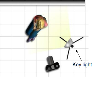
ALL THE STUDIO SET UPS AND LIGHTING ARRANGEMENTS THAT WE HAD AVAILABLE.

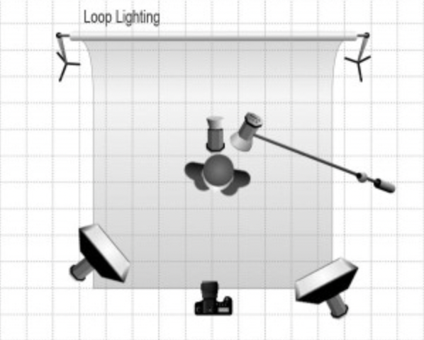
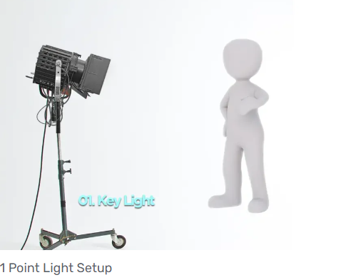
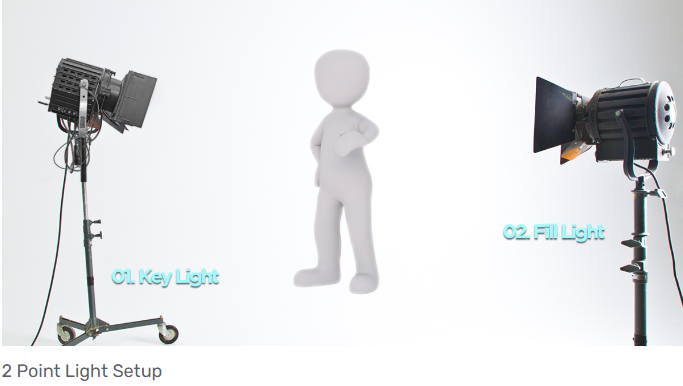
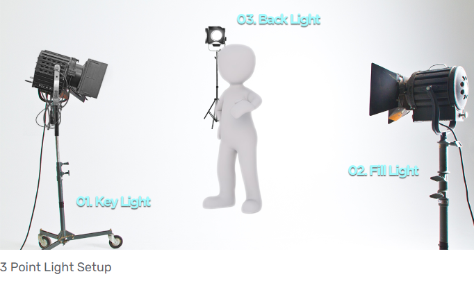
1,2,3 point lighting

flash setting

Static / continuous lighting

Copy-stand

Infinity Screen

Coloured gels / filters

ACTUAL CAMERA USED (canon 1300 D)

CAMERA SETTING AND EXPOSURE VALUES