
Shannon O’Donnell
Background: Shannon is a talented individual who completed her A level studies and continued with a passion for photography and in fact has recently completed her BA (Hons), a degree in documentary photography at the university of South Wales. Her age and birth date is unknown as there is no evidence of that type of information.
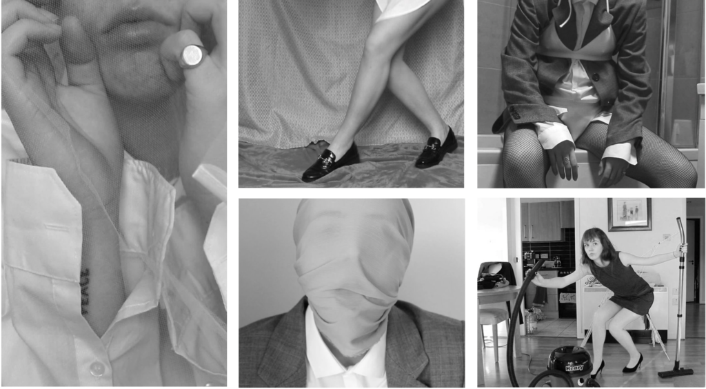
During her 3-year degree, she developed a number of projects based around gender identities and constructions. Her work is quite known and in fact has a certain uniqueness and depth to it.
Shannon is an amazing artist. She approached her work with a performative approach where she explores the gendered experience which are both personal and within contemporary and historical capitalist Britain. Shannon has a variety of ways she shows her art, she presents her art through things like, audio, text, archival research, moving stills and of course photography. She was the former Digitisation and Outreach Coordinator at the Société Jersiaise Photographic Archive and current Digitisation and Cataloguing Officer at Jersey Heritage
Claude Cahun
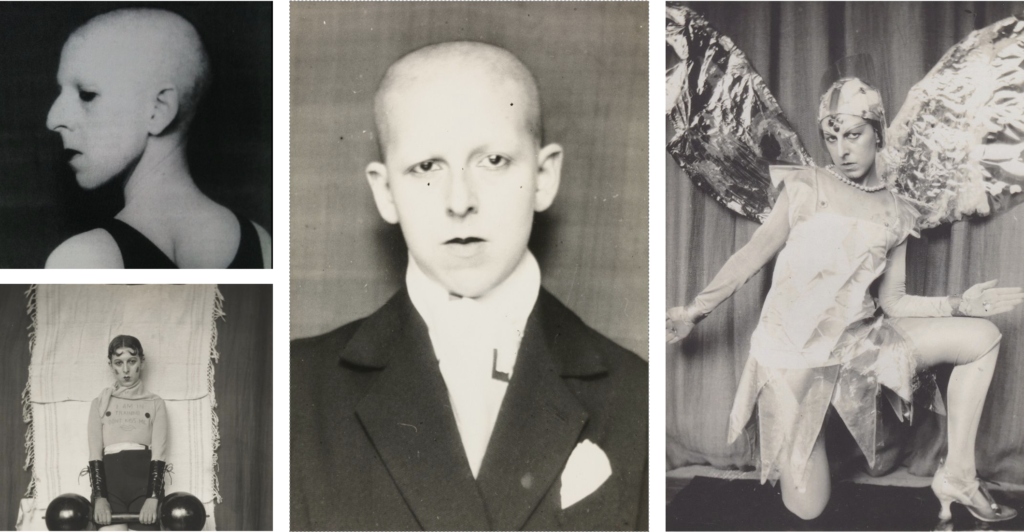
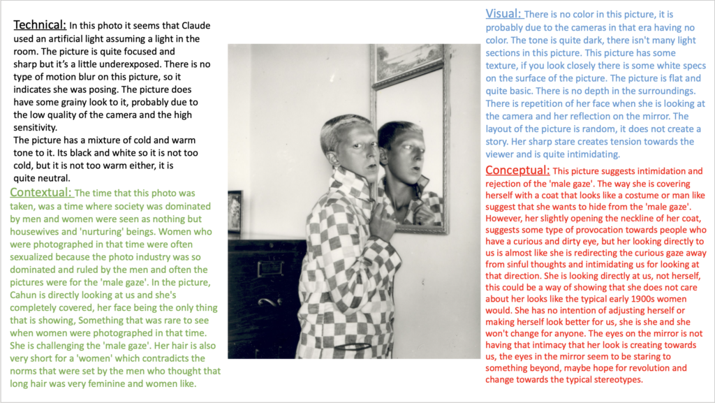
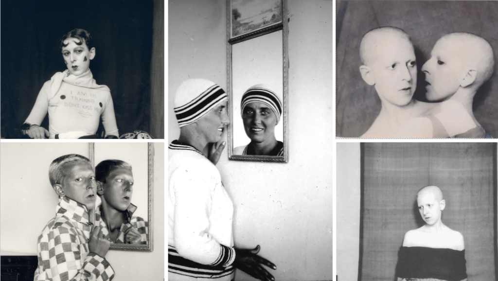
Background Claude Cahun was born in 25th of October 1894, Lucy Schwob in Nantes, France into a wealthy jewish family. Cahun was incredible, not only was she an artist but she was a photographer and writer. She is best known for her unique self portraits where she creates a range of personas, some include, weight lifter, doll and aviator. Cahun explored and questioned gender, identity and subconscious of mind, particularly position of women. She did this through her art and in the way she spent her life.
Later, in her late teens/early twenties, Cahun had been looking for a gender neutral name. Soon she changed her name to Claude Cahun in 1918.
Claude, soon moved to Jersey Channel Island, with her lover, Marcel Moore and her stepsister. Suddenly she was imprisoned and sentenced to death in 1944, accused of activities in the resistance during the occupations. Luckily, Cahun survived and nearly reached to the point where she was forgotten until in the 1980s where she started to be recognised, once again for her art. Lots of Cahun and her lovers work was destroyed by the Nazis due to them requisitioning their home.
Unfortunately, Cahun died in 1954 from ill health. It was rumoured that her time in captivity in German might have been partially to blame for her death. Later, Cahun lover, Moore killed herself in 1972. Both Cahun and Moore are peacefully buried together in St Brelade’s churchyard.
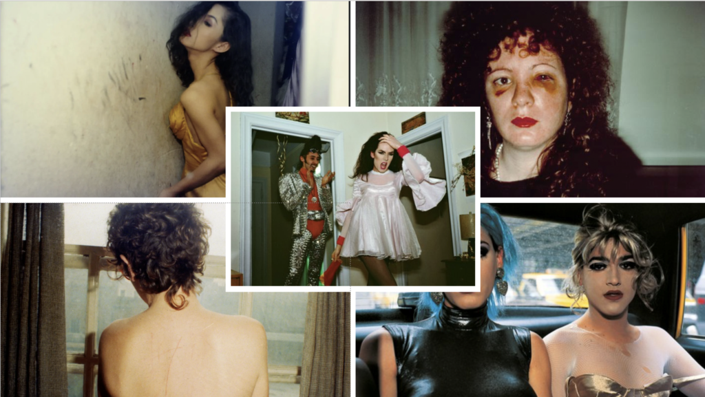
Nan Goldin
Nan Goldin, full name Nancy Goldin who was born September 12, 1953 is an American photographer and activist. Her work regularly explores moments of intimacy, LGBT subcultures, and the opioid epidemic, and the HIV/AIDS crisis.
Nan is an outsider by instinct and said to be nocturnal by nature and someone who lives on the edge of society where she creates her own rules. She revealed herself and name in the 1980s, visually recording her own stubborn life, and the often promiscuous lives of her circle of friends, which it included characters like addicts, hustlers, transvestites and prostitutes. Because of this, she redefined photography.
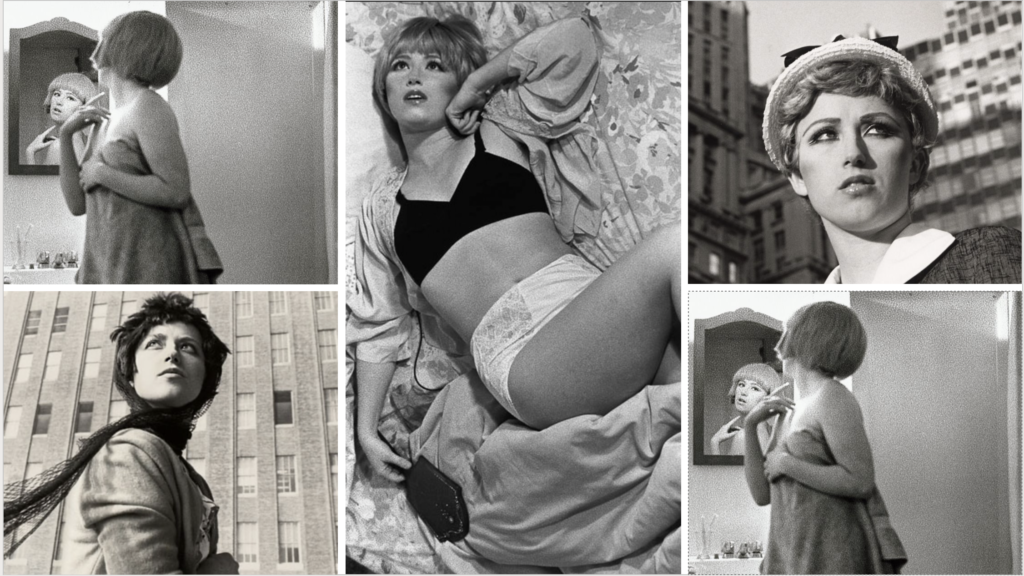
Cindy Sherman
Cindy Sherman, real name Cynthia Morris Sherman, is an iconic self portrait photographer who famously became known due to her untitled film still, which was produced in 1977-80, where she put of guises and photographed herself in multiple different settings and resembled the mid 20th-century B movies.
She was always interested in identity as she stated that “I wish I could treat every day as halloween, and get dressed up and go out into the world as some eccentric character”
She probed the contractions of identity where she often played with visual and cultural codes of art, celebrity, gender and photography.
Shannon O’Donnell
Shannon is a women who completed A level studies and continued with a passion for photography and in fact has recently completed her BA (Hons), a degree in documentary photography at the university of South Wales.
During her 3-year degree she developed a number of projects based around gender identities and constructions.
Claude Cahun
Claude Cahun was born in 1894, Lucy Schwob in Nantes, France into a wealthy jewish family. Cahun was the whole package, she was an artist, photographer and writer. Till this day, she is known for her surreal self-portrait photography where she dressed up as different types of characters. Cahun explored and questioned gender, identity and subconscious of mind, particularly position of women. She did this through her art and in the way she spent her life.
Later, in her late teens/early twenties, Cahun had been looking for a gender neutral name. Soon she changed her name to Claude Cahun in 1918.
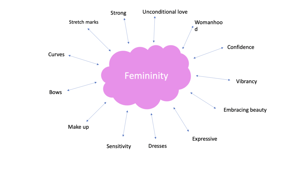
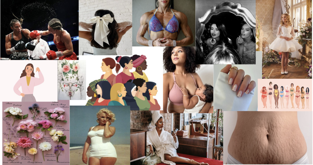
Femininity:
Femininity is having qualities or characteristics that are traditionally associated to women or boys. E.g powerful, nurturing and strong
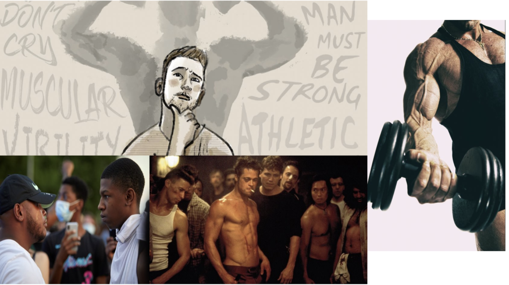
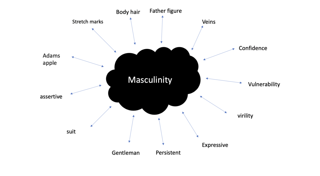
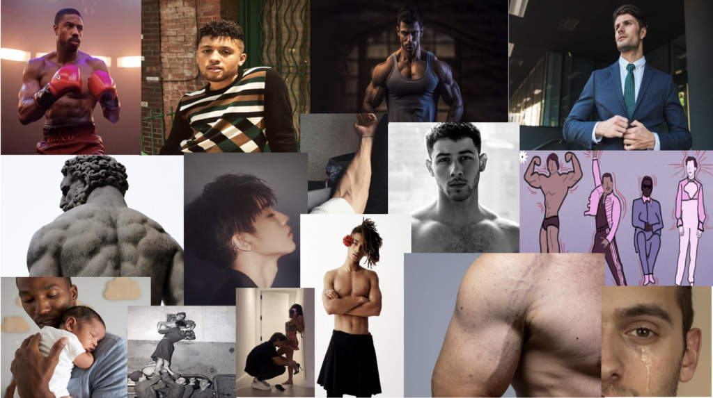
Masculinity:
Masculinity is having qualities or characteristics that are traditionally associated to men or boys. E.g strength, toughness and virility.
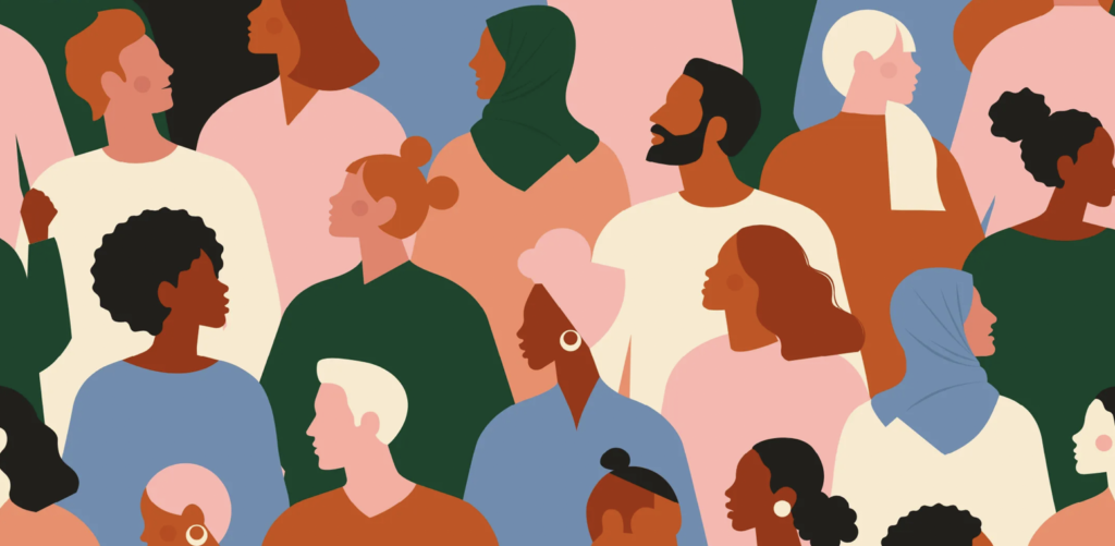
Identity within an individual or community can be hugely effected by the environment they are surround. For an example, if an individual is surrounded by a white supremacist group they will have tendencies to think like them, to think that the white race is superior and should dominate.
Identify can also be effected by they way an individual is brought up. If an individual is brought up surrounded by homophobia, they will probably follow their traits and therefore think that homophobia is okay. However, because of the individual being brought up in an homophobic environment, the individual might feel like they can’t express themselves and have a loss of identity because of their upbringing and fear of rejection.
However, an individual who is brought up with an open minded and non-prejudice parents/family/ group, may find it quite easy to express their gender identity or social identity. This is because they grew up with people who let them have free will and didn’t show any type of judgmental opinions about groups of people or a community.
An individual who grows up with same-sex parents will grow up learning that same-sex marriage/couples is very normal and okay. They will see it as a norm and in fact will see it as something that should be normalised unlike an individual who might’ve grew up in a very straight household that had homophobic and stereotypical tendencies which would imply that they would see same-sex couples as something that is wrong.
Furthermore, there are much more serious cases where environment massively effects identity. North Koreas leader, Kim Jong-un massively effects the identity of his citizens. Jong-un made rules that drastically changes the identity of the North Korean citizens. An example of this, is a law where there is only government-approved haircuts. This strips his citizens identifies as they are not allowed to experiment with their hair and express and find themselves through their hair. Doing something with your hair can be a form of expression or change in identity so Jong-un stripping this choice from his citizens, strips their identity. Another law that hugely effects Jong-un’s citizens identity is the fact that they have prison camps. These prison camps are used for people who have allegedly committed political crimes. This men’s that no one in North Korea has freedom of speech and has no say when it comes to commenting about Jung-un’s rules. This form of punishment effects someone’s identity because they are not able to express their thought or opinion due to a heavily controlled system.
Please note that AI may have been used to help construct this blog.
Mind map of femininity:
Mind map of masculinity:
Femininity:
Masculinity:
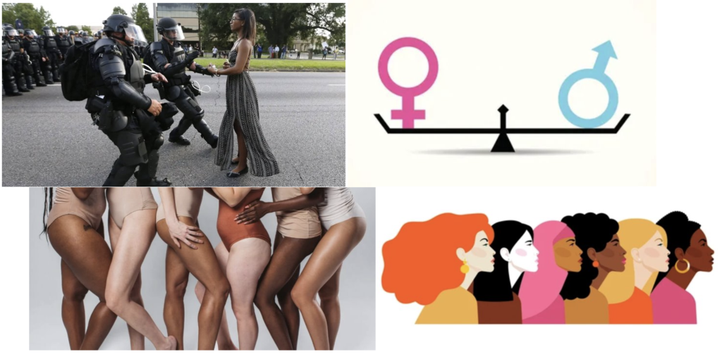
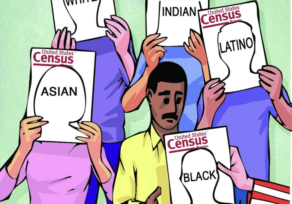
Identity politics is a type of politics that is based in a certain identity. Things like nationality, race, religion, gender, social background, sexual orientation, social class and so much more.
Identity politics can be quiet damaging to the younger half of society as it puts pressure on those individuals to express something they do not need to express just because they want to ‘fit in’.
There are some positive effects of Identity politics which are things like, society can feel more free to express themselves as there is a more excepting community and they can also feel free to identify themselves as who they want to be, wherever they are and not be judges for it. However there is some bad effect in identity politics. As said above, it pressures young individuals to express things that they don’t even properly know themselves which causes them to feel isolated because they can’t express themselves or don’t know how to or even don’t need to express themselves.
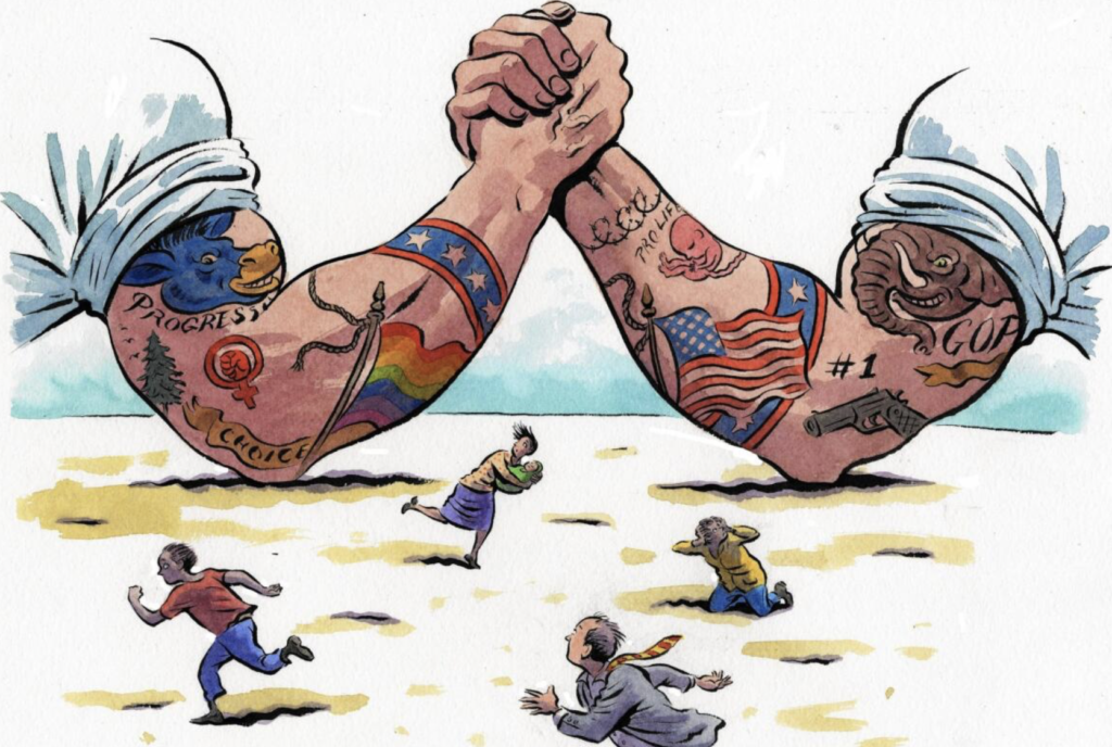
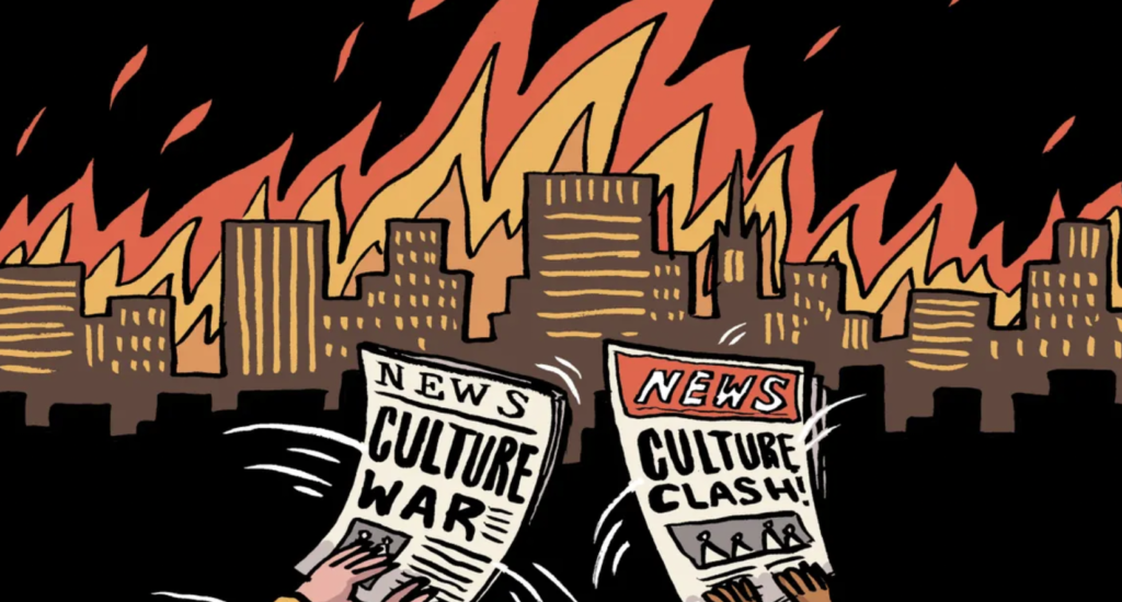
A culture war is a cultural conflict between different types of social groups that illustrate their struggles, beliefs and their want for dominance towards individuals.
Cultural wars can significantly effect society as a whole because it can influence a wrong set of individuals and therefore cause chaos. Cultural wars can cause distrust within a society which encourages people to cluster in their cultural groups.
There is some positive effects of cultural wars because it enables a set of individuals to express the same views and feel heard and appreciated. People who cluster in these cultural groups can relate to each other and set order to things that need to be said and done. However a negative effect to cultural wars is that there is constant conflict and things can get quite serious, even deadly.
Global:
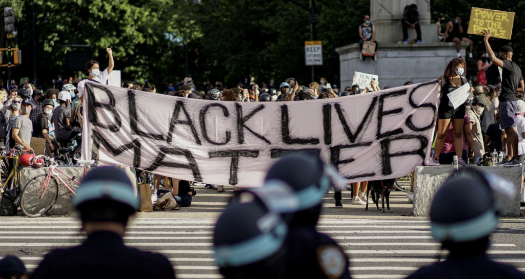
The Black Lives Matter movement:
Black Lives Matter or more known as BLM is a activist political and social movement that urges to highlight racism, racial inequality towards black people, discrimination, and it promotes anti-racism. The primary concerns in this movement are incidents of police brutality and racially motivated violence against black people.
It’s something that is know globally and still continues to power through, calling out anyone who’s against the whole purpose of the movement and especially making sure that those who purposefully commit such acts towards black people are to be called out.
This example is an example of political identity and culture wars globally.
Local perspective:
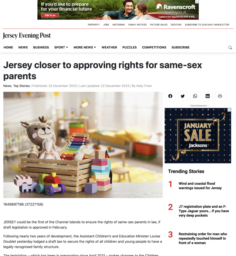
Something that happened locally recently was the discussion to wether same-sex marriages would be legalised. After 2 years of development and discussion, jersey is closer to legalising same-sex marriage.
The new law will encourage people to stop discrimination against same-sex as same-sex marriage will equally have the rights as an heterosexual married couple. The fact that it took 2 years for it to be nearly approved may imply that there was some type of conflict toward the whole development.
This is an example of identity politics and culture wars locally.
References:
https://blacklivesmatter.com/about/
https://www.loc.gov/item/lcwaN0016241/
Editing process:
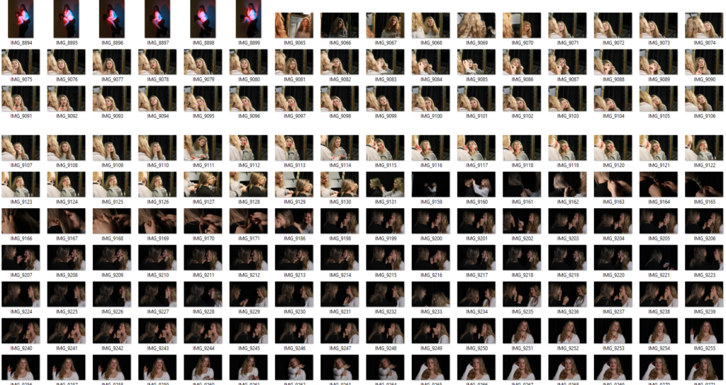
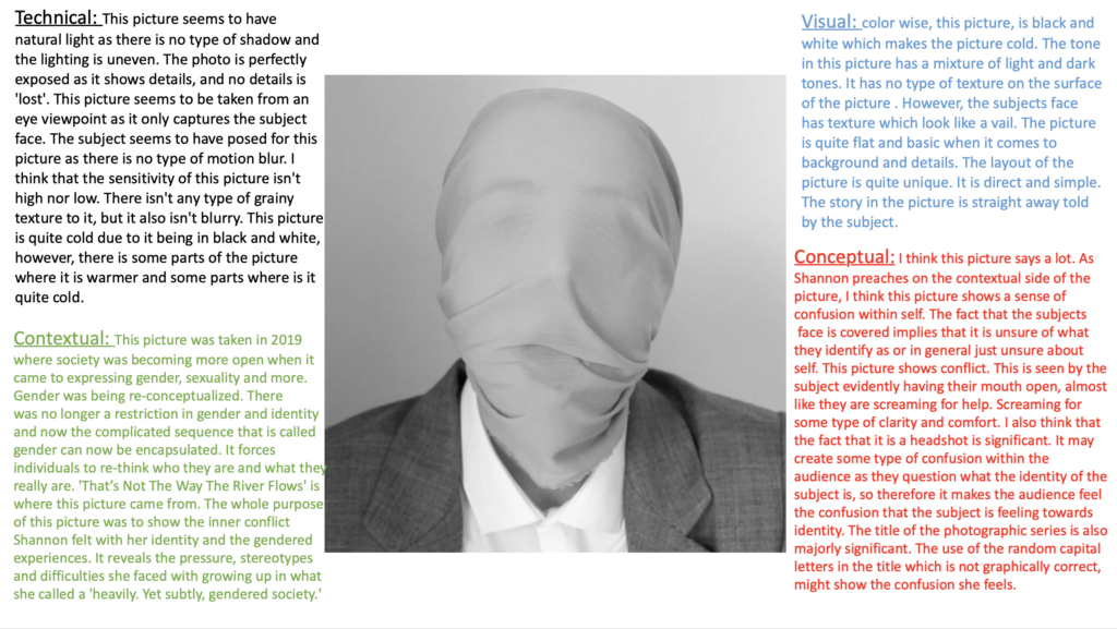
Evaluation and Critique: I really liked the result of this image because I like how the editing gave the bland picture and ethereal and euphoria sense to it. I think that it is a creative example of a headshot example. Out of the three experiments, this image is my favourite one. However, I could’ve given the picture some texture to create more diversity within the picture. I could’ve experienced with more of the editing tools in photoshop. Overall I’m really satisfied with the picture.
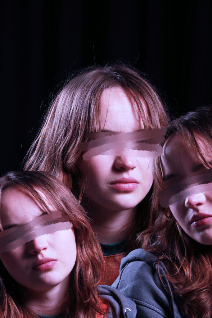
Editing process:
Evaluation and Critique: I quite liked the finish product of this image. I like the colour and the overall effect it has. This picture shows a sense of loss of identity or not wanting be aware of what’s surrounding them. However I think the editing in this picture I simple. I wish that it was a more divergent image that had more unique editing. I could’ve experienced with the different tools in photoshop.
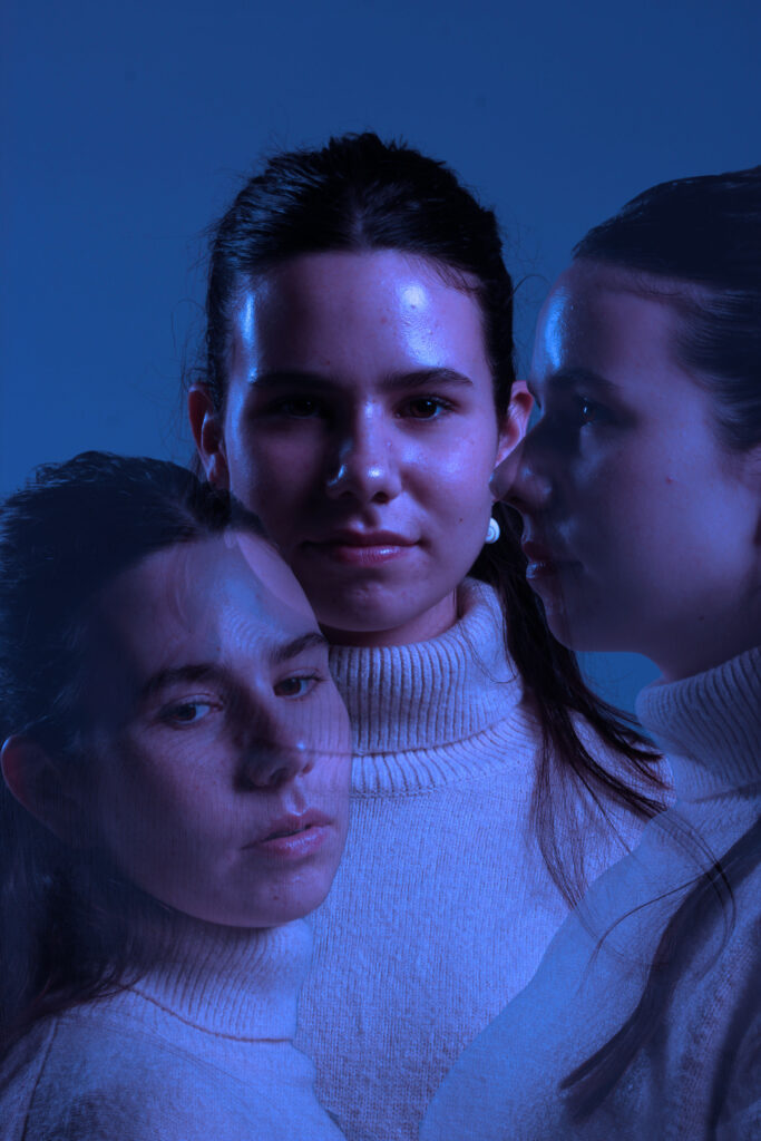
Editing process:
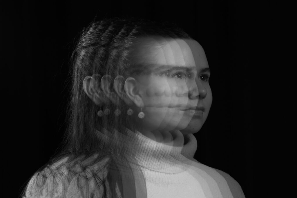
Evaluation and critique: I really like this picture, I like how I was able to create this motion like sense to the picture, making it look like I was able to capture the subjects movement in layers. I think that this picture is quite unique and detailed. However I could’ve experienced with texture or different colours instead of the usual black and white.
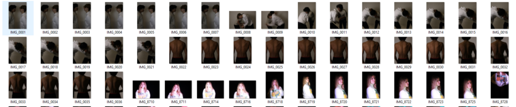
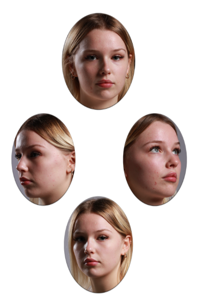
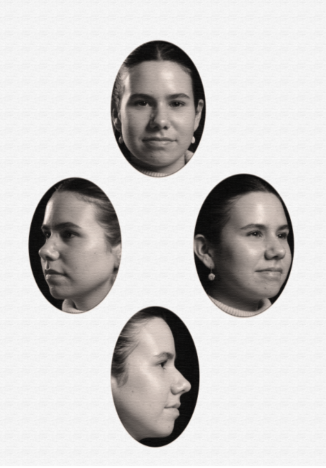
After creating a Diamond Cameo with different sides of my subject face, I decided that I wanted to edit them so they looked more rustic.
This is my Diamond Cameo without any type of editing (only blending was done as seen in my previous blog. I applied all these blending effect to all my experiment of Diamond Cameo) :
Evaluation and critique:
Although I quite liked the way the diamond cameo looked without editing except for blending, I didn’t like that fact that it looked really bland therefore I decided I wanted to experiment and see which one I liked most and showed that rustic tone to it.
Experiment 1:
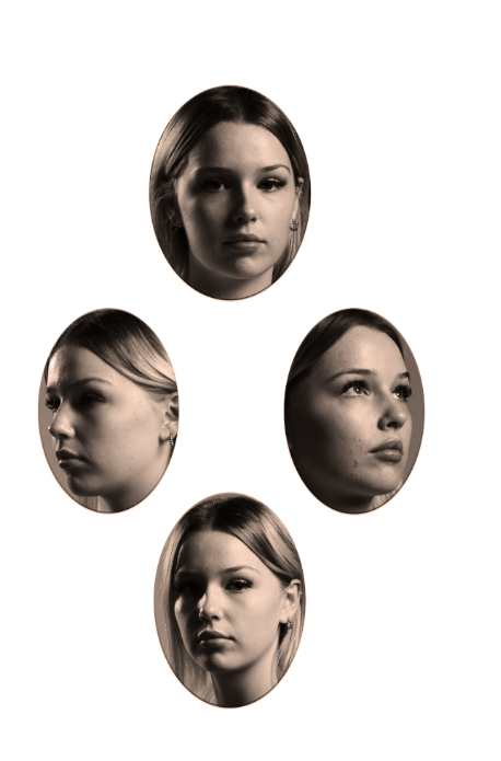
Editing process: After using all those blending tools stated above, I flattened image so that I could edit the image I pressed on adjustments and selected the filter called warm. That was all I did to this experiment of Diamond Cameo.
Evaluation and critique: I quite like this picture. I like the way the adjustment adds this rustic tone to the picture and how it gives the picture shadow however I don’t like how dark the picture is. In some parts of the picture, it is so dark that it strips away the subjects face and removes those beautiful details the subject has. I also don’t like how orange the picture is, it makes the subjects face look a little saturated.
Experiment 2:
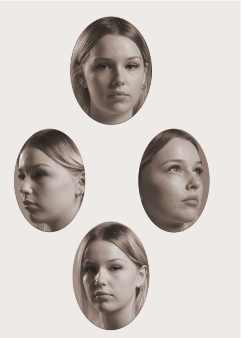
Editing process: For this Diamond cameo, I added an adjustment called soft sepia after blending my cut outs and flattening my image. That is all I did for this diamond cameo
Evaluation and critique: I really like this picture. I think that this picture is the picture that shows the most rustic tone. I really like the colour of it and how it doesn’t strip the details from the subjects face because it adds heavy shadows to parts of the picture like the experiment above. I really like how the adjustment brought the picture to life and really shows ‘oldies’ look to it. However this picture could have a more orange background like the original diamond cameos so that the diamond cameo would look more realistic.
Experiment 3:
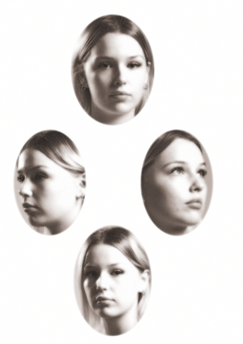
Editing process: For this diamond cameo I decided to add a different type of filter called diffuse glow after blending the cut outs and flattening the image. I added the diffuse glow by pressing filter on the top bar and then I pressed filter gallery and pressed the distort folder and selected diffuse glow and then I added a adjustment called warm. This was all I did for this diamond cameo.
Evaluation and critique: I think this diamond cameo looks alright. The filter adds a really nice, rustic look to the diamond cameo, however, I think that the diamond cameo is overly exposed and gives the subjects too much highlight in parts where the subjects face was more exposed to light. Because of this, it strips that rustic look the picture should have.
Experiment 4:
Editing process: For this picture I decided that I wanted to add texture and an adjustment so I pressed filter on the top bar and then I pressed filter gallery and pressed the texturiser, after flattening and blending my image. After applying texture I felt like the diamond cameo needed something more so I added an adjustment called sepia. This was all I did for this diamond Cameo.
Evaluation and critique: I really like the end product of this diamond cameo. I like the colour of the diamond cameo even though its not entirely that original diamond cameo colour. I also like how the texture added a more rustic tone to the picture. However it doesn’t really look as rustic as I wanted it to look because it doesn’t have that orange undertone that old pictures used to have. The picture is quite bland.
Overall, I really liked how my diamond cameos turned out. My favourite cameo was experiment 2 as I think that it is the most accurate out of all the experiments. I think that the format of my diamond cameos are pretty precise and I strongly believe that you can see that they are diamond cameos.
A strength that I had with my diamond cameos is how I was able to show creativity. I experimented with lots of textures and colours so that I could be sure to which cameo looked the most ‘correct’. I think that experiment 2 was the one that looked the most accurate and had that old look that Henry Mullins photos had. However that cameo could have some improvements like having a scrunched up effect to it or maybe some burned parts to it so that it looked more old. I could also show more of a yellow tone to it just like Henry’s photos looked like. I could’ve experimented with the colours and layered different colours to create a more aged look to it.
Finally I think that I’m quite satisfied with my diamond cameos. I think that they look exactly what they are meant to look like but I do think that I could’ve focused more in the editing and making sure that my experiments looked more like Henry Mullins photos. Instead of focusing on making them black and white I could’ve focused on trying to correct that yellow tone that Henry Mullins photos had.
Step to step guide on how I made a Diamond Cameo.
Step 1: First I uploaded my preferred picture from my headshots photography folder into an A4 paper in photoshop.
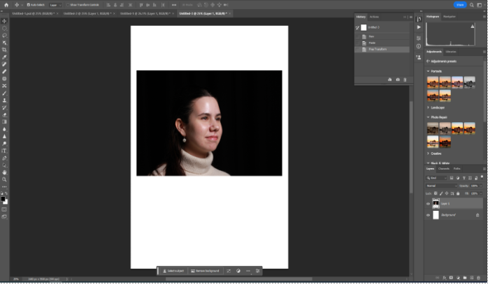
Step 2: Next I selected the elliptical marque tool and created an oval shape on the subject face, making sure I include most of the face. Then I selected the move tool and moved the oval shape which created a cut out of the face of the subject.
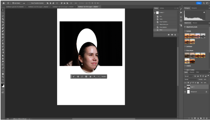
Step 3: Shortly after cropping the oval shape of the subjects face, I moved the tab at the top where the picture is and then created a new plain A4 tab. I grabbed the cut out and placed it on the plain A4 paper.
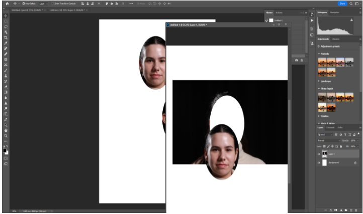
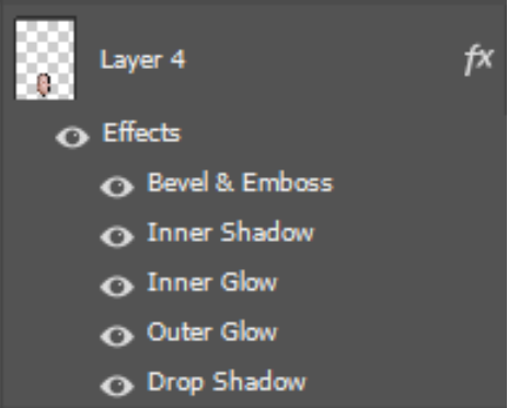
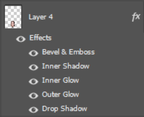
Step 4: I repeated this three more times to create a that Diamond cameo. Then pressing on each cut out I wanted to blend in the pictures, so I right clicked on my mouse and selected blending options and selected all the blending options below. However adding blending is completely an option.