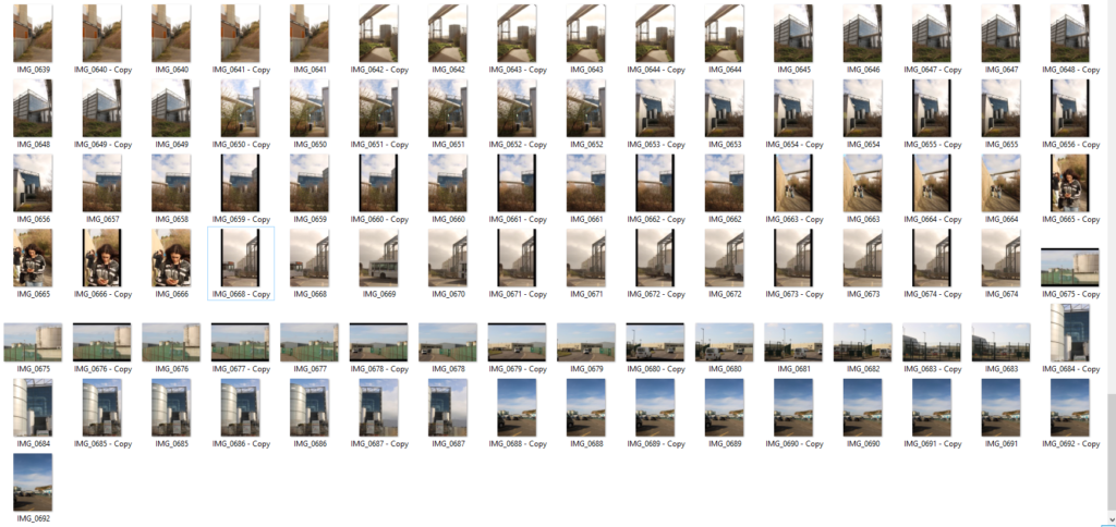
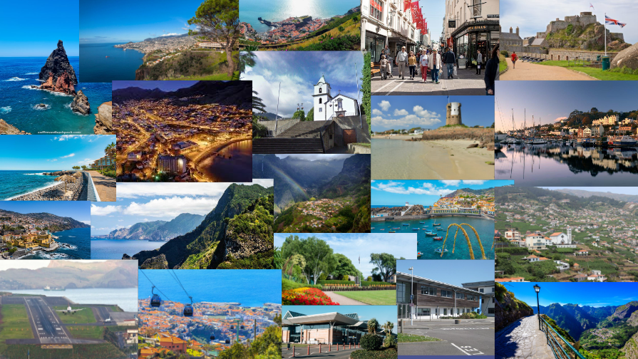
Photo case study-Mandy Baker

Zed Nelson, is a talented documentary photographer who is based in London. He is famous for the way he tackles significant global social issues. Multiples of his projects have be exhibited worldwide where he has earned numerous awards for his contributions to photography.
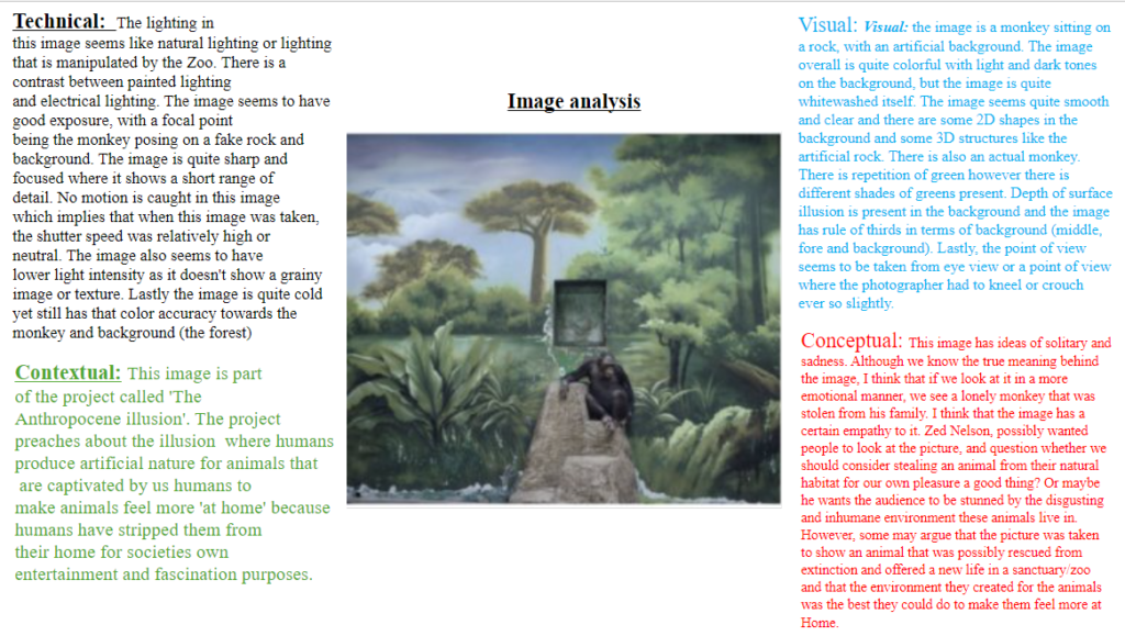
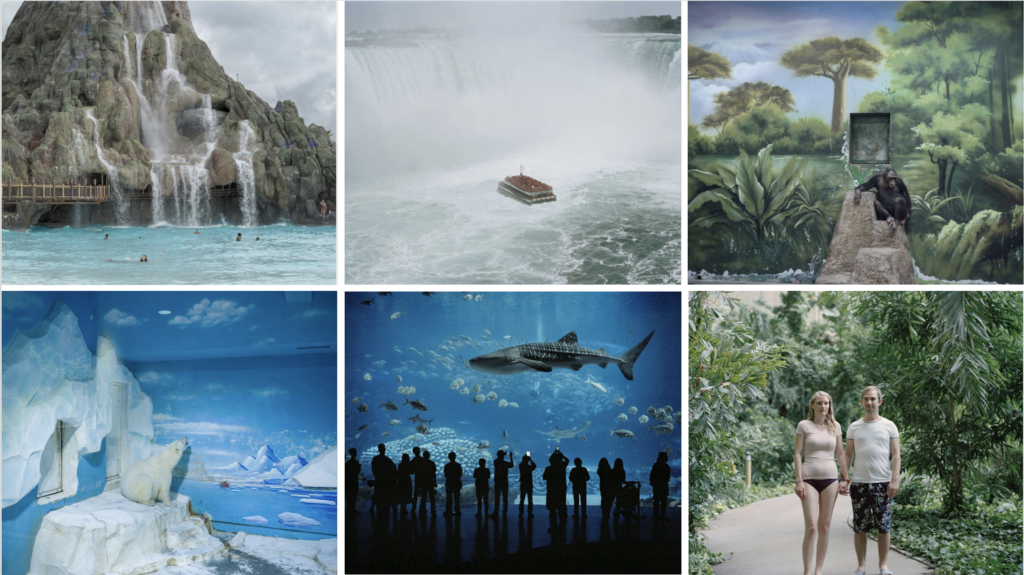
Nelsons recognition within audiences majorly succeeded in his latest project called “The Anthropocene Illusion”. In this project, it is evident that Nelson dug into the relationships between nature and humanity. It highlights how us human species have normalised curating and managing an artificial experience of nature while concurrently causing irreversible harm to the natural world. This project was only recently completed, 2024, and it took approximately 5 years to realise fully.
Nelson incredible work has acquired him several photography awards, Some including, CAP prize (Contemporary African Photography prize), The First Prize in the World Press Photo Competition, The Alfred Eisenstaedt Award (USA) and so much more.
His project “The Anthropocene Illusion” was debuted in the International Photography Festival “Xposure” in Sharjah. It illuminated the showcased work as a testament to humanity’s separation from nature, which arises destruction, while yearning refuge in the world of artificial intelligence as a means to getaway the malice reality.
Xposure is an ultimate photography and film extravaganza festival that offers unparalleled opportunities for growth and connection where you can immerse yourself in captivating photography talks, engage with renowned photographers and release your inner creativity with stimulating workshops. It is a festival where it welcomes filmmakers to showcase their talent and connect with industry professionals.
In more technical terms, Nelsons, mention allude to the concept of Anthropocene epoch. This is where human species have become a dominant force in shaping the planets geological and ecological systems. His exhibitions, hence dispenses a critical view of the human nature relationships, begging for reconsideration of humans approach to conservation and sustainability.
I have chosen this artist because I really like how unique his interpretation of Anthropocne is. The way he bring awareness to how silly humans are when it comes to animals in captivity is really admiring and eye opening. He shows the stupidity of the fact that us humans distort nature and then try to revert such irreversible damage to nature. I also just really like how he out of all artists, is highlighted due to the fact he brings awareness in such a way that is not commonly thought of.
2. What interests you about their work?
I like how his work has a depth and how different it is. I admire how his work has succeeded in such incredible ways and how his photos are breathtaking. His work is also quite humorous. He almost mocks humans for holding anime captive and then to ‘make it all better’, creating a habitat that looks nothing and feels nothing like their actual true habitat.
3. How does the work relate to the theme of Anthropocene?
He shows how humans over time has normalised the curating and managing artificial experience of nature while causing extreme amounts of damage to nature.
4. What are you going to do as a response to their work?
I’ll create similar picture like he has where it show animals held in captivity where their habitat is painted or artificial. I will also try to photograph parts of nature where humans consistently explore and gain profit from it because they see it as something that makes profit not something that is made to stay in the nature, untouched.
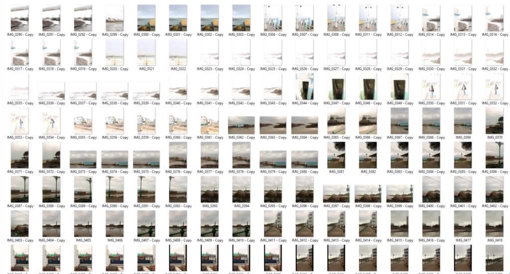
MOOD BOARD:
LINKS:
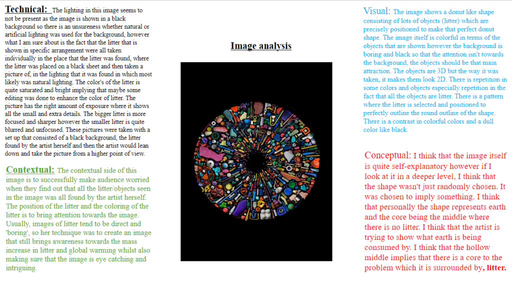
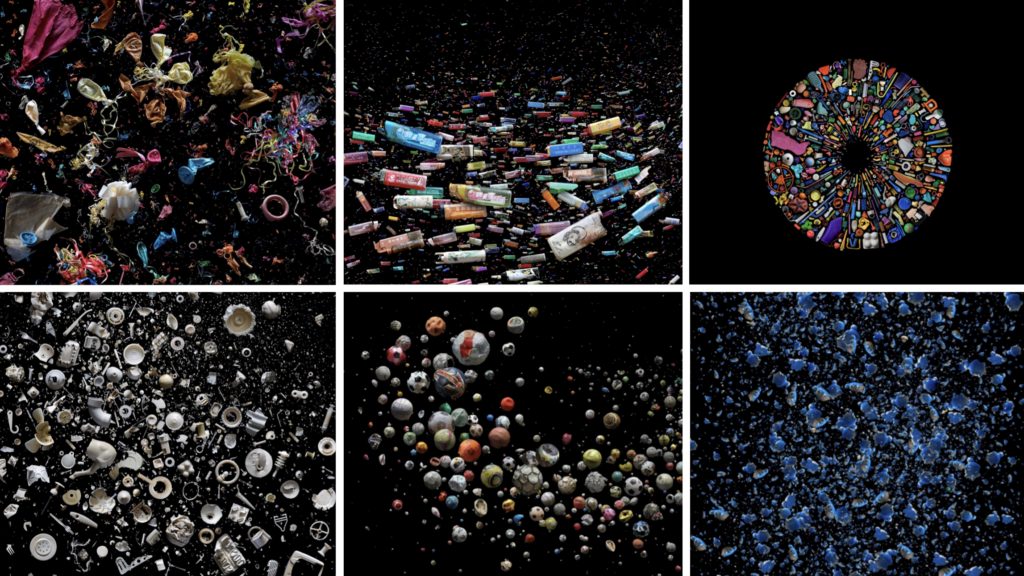
The international award-winning photographic artist, Mandy Barker, whose work consisted of marine plastic debris for more than 14 years. Her success has reached global recognition and her work with scientist is to bring awareness about the harmful truth of plastic pollution in the world’s oceans where it highlights climate change, the harmful affect on marine life and ultimately ourselves, which leads the viewer to take action.
Mandy extraordinary pieces of art has been published in over 50 different countries which consists of: TIME magazine, The new scientist, national geographic magazine, The guardian, Smithsonian etc..
Her work has been exhibited world wide from MoMA Museum of Modern Art, and the United Nations headquarters in New York, the Victoria & Albert Museum London, and the Science & Technology Park Hong Kong. She was shortlisted for the Prix Pictet award SPACE in 2017, which is the worlds leading photography award for sustainability, and she was also nominated for the magnum award for the Magnum doundation fund, LOBA award and the Deutsche Börse Foundation Photography Prize 2020.
She is a legatee of the 2018 National Geographic Society Grant for Research and Exploration. Her first ever book was called ‘Beyond Drifting: Imperfectly Known Animals’. It was was rightfully chosen as one of the Ten Best Photography Books of 2017, by Smithsonian, and her the other book ‘Altered Ocean’ was chosen by The Royal Photographic Society as one of the most desired titles and top 10 Photobooks of 2019. Mandy is proudly a member of the Union of Concerned Photographers UCP for short. This union is dedicated in using the power of imagery to highlight the urgency of environmental concerns.
In 2012 Mandy was awarded The Royal Photographic Society’s Environmental Bursary which enabled her to join a bunch of scientists in a research expedition which sailed from Japan to Hawaii. Its purpose being to acknowledge the build up of marine plastic debris, in the tsunami debris field in the Pacific Ocean.
She states “The aim of my work is to engage with and stimulate an emotional response in the viewer by combining a contradiction between initial aesthetic attraction along with the subsequent message of awareness. The research process is a vital part of my development as the images I make are based on scientific fact, essential to the integrity of my work. The impact of marine plastic is an area I have documented for more than 10 years and am committed to pursuing through visual interpretation, and in collaboration with science I hope it will ultimately lead to positive action in tackling this increasing environmental problem, which is currently of global concern”.
I have chosen this artist because I think that her work and dedication is extradordinary. I really like how she manages to transform something like a normal image with a black background, into something that has so much depth and meaning. I also really love how much awareness she brings with her images and how she manages to manipulate the audiences attention by producing an image which is only garbage but making it unique and something that peeks interest and therefore bring out recognition towards environmental concerns.
2. What interests you about their work?
How much depth the photos have. How she is able to intrigue audiences by controlling how she decides to portray her ideas. Instead of blandly displaying pictures of plastics, she creates this distinctive image which at a glance looks like an art piece but in more profundity, it is a masterpiece that also brings perception towards plastic litter.
3. How does the work relate to the theme of Anthropocene?
Her work evidently relates to the theme of Anthropocene because it shows the damage and negative change that human species have caused towards the planet. She does this by taking pictures of scary amounts of plastic litter, found around the world.
4. What are you going to do as a response to their work?
I’m going to create a set of images of types of litter that is most commonly found around the world, and display them in a black background like she does with her pictures. I think I also plan on producing an image where I create a type a circle, representing earth, but the circle will be created with all types of litter/trash to bring awareness of what earth is becoming. I want to also produce and image where I show how long it takes for pieces of litter to disintegrate.
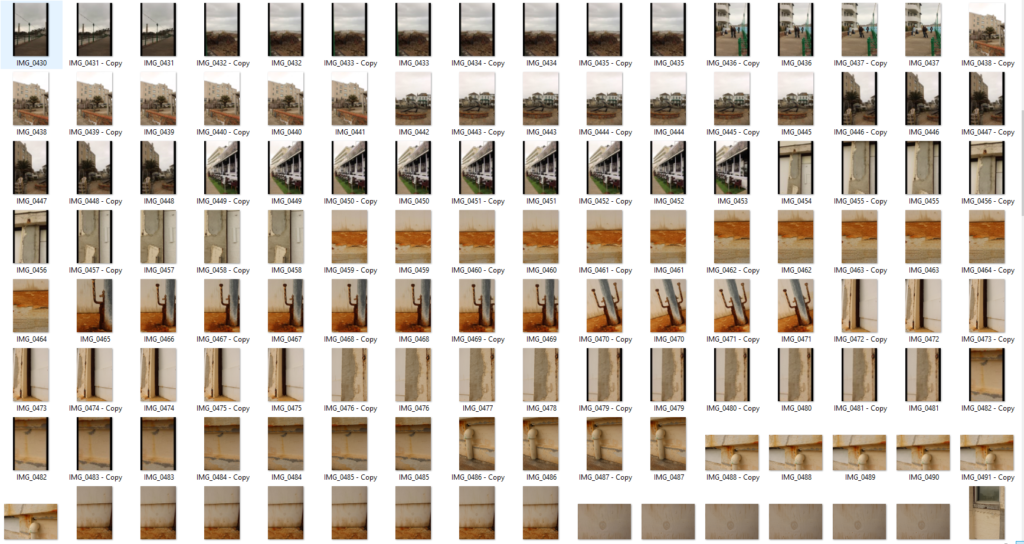
MOOD BOARD:
LINKS:
https://blogs.brighton.ac.uk/lm216photography/2019/11/01/artist-research-mandy-baker
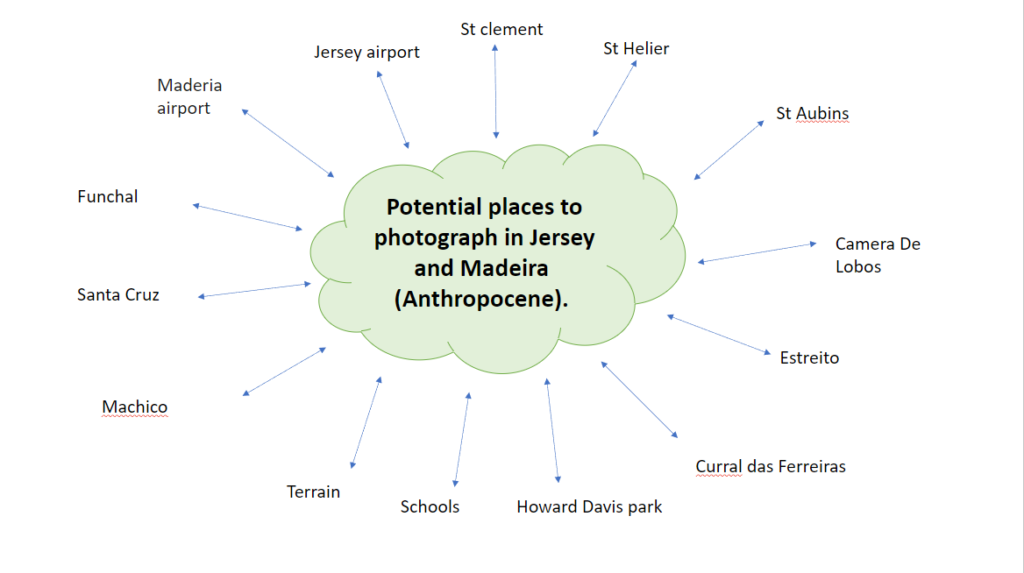
Mind map:
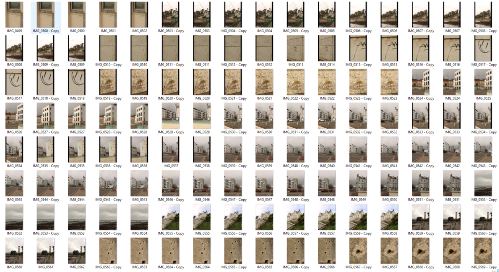
Mood board:
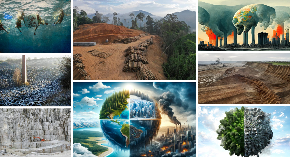
What is Anthropocene?
Anthropocene is a proposed geological era dating from the commencement of significant human impact on Earth until now
The history of earth is split into a hierarchical series of smaller sections of time, often referred as ‘the geologic time scale’. These divisions, in descending length of time, are called eons, periods, eras, ages and epochs.
Anthropocene Epoch is an unofficial unit of geologic time. it is used to outline the most latest period in Earth’s history where human activity started and where it began to have a major impression on the planet’s climate and ecosystems. The word Anthropocene is obtained from the Greek words anthropo, which stands for “man,” and cene which stands for “new,”. This was coined and made by the popular biologist Eugene Stormer and chemist Paul Crutzen in 2000.
There is a known theory that states that all of this began at the beginning of the industrial revolution of the 1800s, where the humans activity had significant impact on carbon and methane in the earths atmosphere.
However, others think that the actual beginning of Anthropocene was in 1945. This era was when humans tested the first ever atomic bomb and then proceeded to drop atomic bombs in the Hiroshima and Nagasaki, japan. This dangerous act, resulted in radioactive particles that were detected in soil samples, globally!
How and why are photographers exploring this concept?
Many photographer explore Anthropocene because its almost like a meeting point. It makes photographer stop, rethink and overcome the separation between the environment and humanity. It reflects this climate urgency which produced awareness to the environment and responsibility towards the planet that holds us and that we inhabit.
What are the 4 causes of the Anthropocene?
Consequences of the Anthropocene:
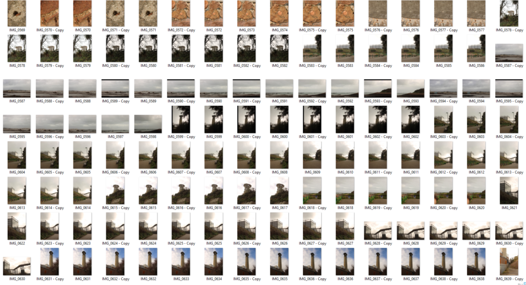
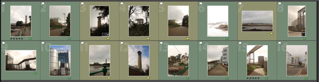
Moodboard:
Please note that AI may have been used to construct this blog
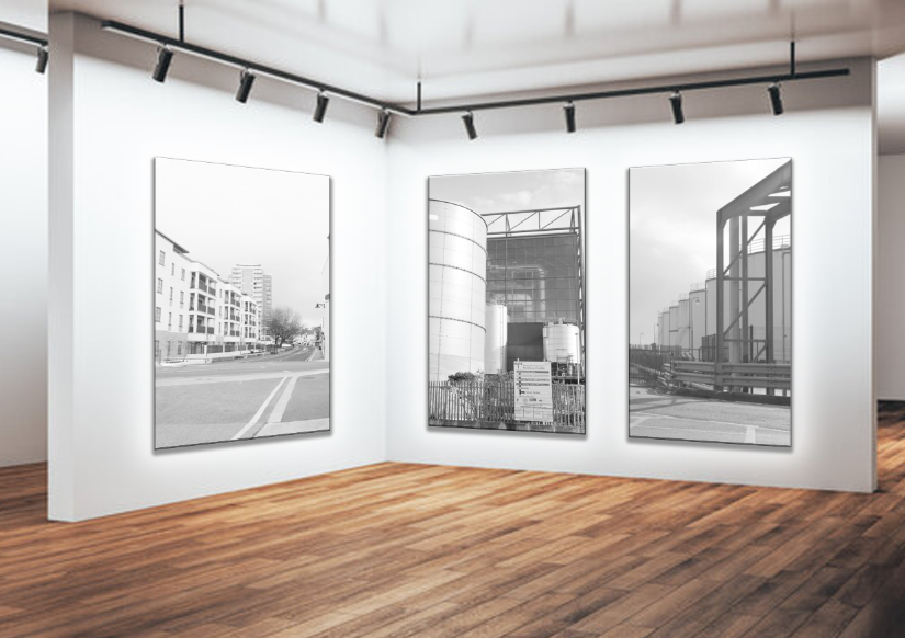
Presentation 1:
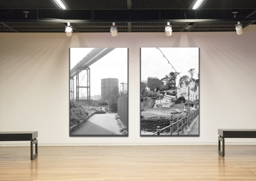
Presentation 2:
Presentation 3:
I think that overall, my outcomes are quite good.
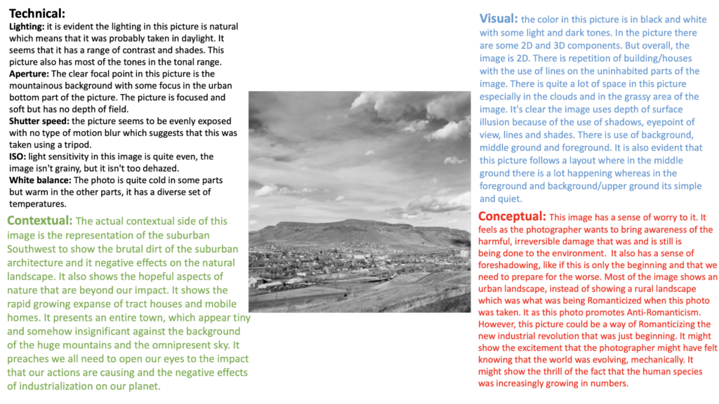
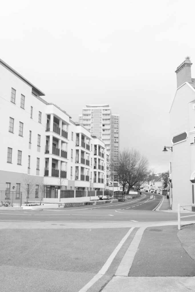
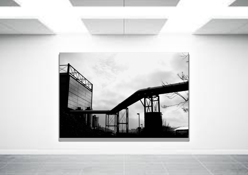
In my editing, I’m able to enhance the pictures and give these what were once boring pictures, pictures that now have character and uniqueness. I think that my editing is one of my highest strengths in this topic because I think that I clearly edited the pictures that revealed that inspiration I felt when looking at Robert Adams work.
My pictures show whitewashed pictures just like how Adams pictures were produced. The certain bland and deserted look that Adams picture had was something that I really liked, and I straight away knew that I wanted to produce picture that showed how heavily influenced I was by Adams work.
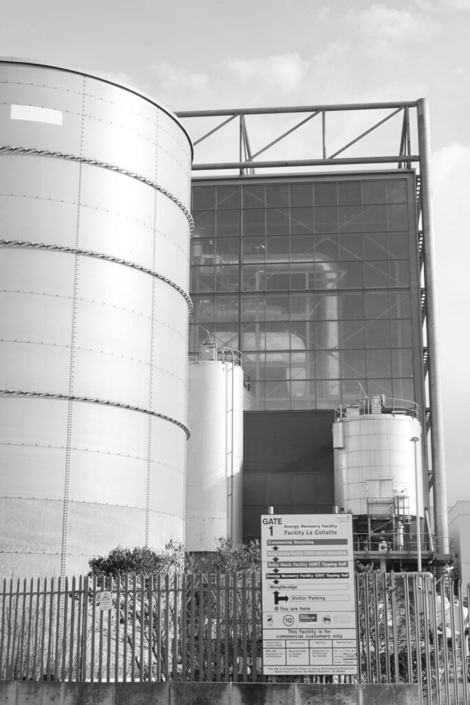
As seen in Adams’ work, Adams did produce some dark pictures that had a dark tone and highlighted the shadows of the obstacle he photographed. I really liked how he was able to bring a certain darkness to industrialization and how he portrayed it as something negative not positive. As seen on presentation 1, I presented a picture that showed a blackened building which, as stated above, was heavily influenced by Adams. I edited this picture so that it would make the building dark and unnatural and made the sky bright and natural environments lighter to communicate that the environment does not need this dark evil which is industrialization.
I strongly believe that the comparison between my work and Adams work is evident, and it is obvious that my work was influenced by Adams work.
However, there are some improvements my pictures need, like the fact that some of my pictures did not show the impact on earth. I could have photographed more specific places or buildings that heavily impacted the world. I should have photographed a building doing the destruction like photographing the place where plastic and rubbish are burned. I could have edited it in a dark manner to highlight how negative and impactful such action is to the earth. I should have photographed more serious matters instead of photographing buildings that might not even have much significance.
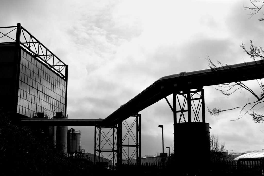
Image 1:
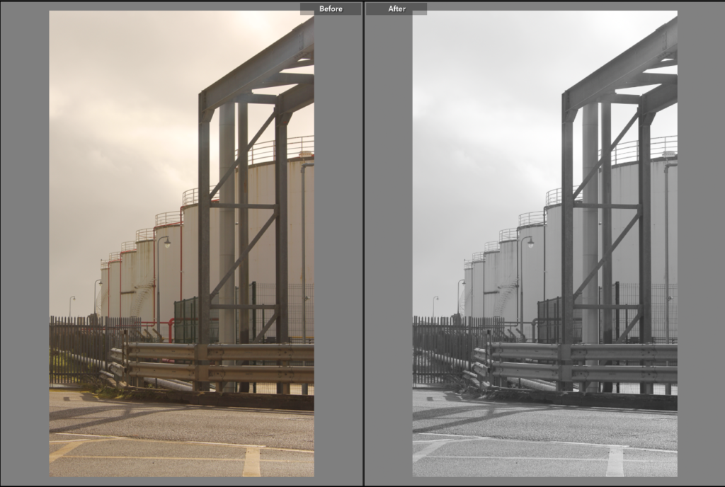
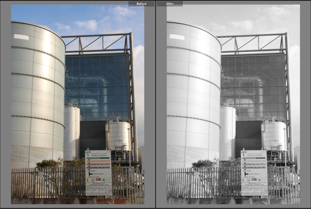
Editing process: For this picture, I pressed on the tab called develop and I increased exposure to +0.35, and vibrancy by +100, and then decreased saturation by –100. I then cropped the picture, using the cropping tool, so that I could remove the moving bus that was captured in the picture. This was all I did for this picture in terms of editing.
Image 2:
Editing process:
For this picture, I pressed on the tab called develop and I increased vibrancy by +100 and decreased blacks by –100, saturation by –100 and exposure by –0.09. Then at the top bar I pressed on an icon that looks like a paint brush that looks like this,

In this icon, I decreased the whites by –19 and then brushed these adjustments on the clouds in the picture, making sure not to brush on the darker parts/building in the picture.
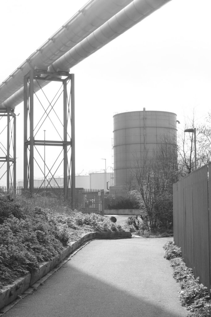
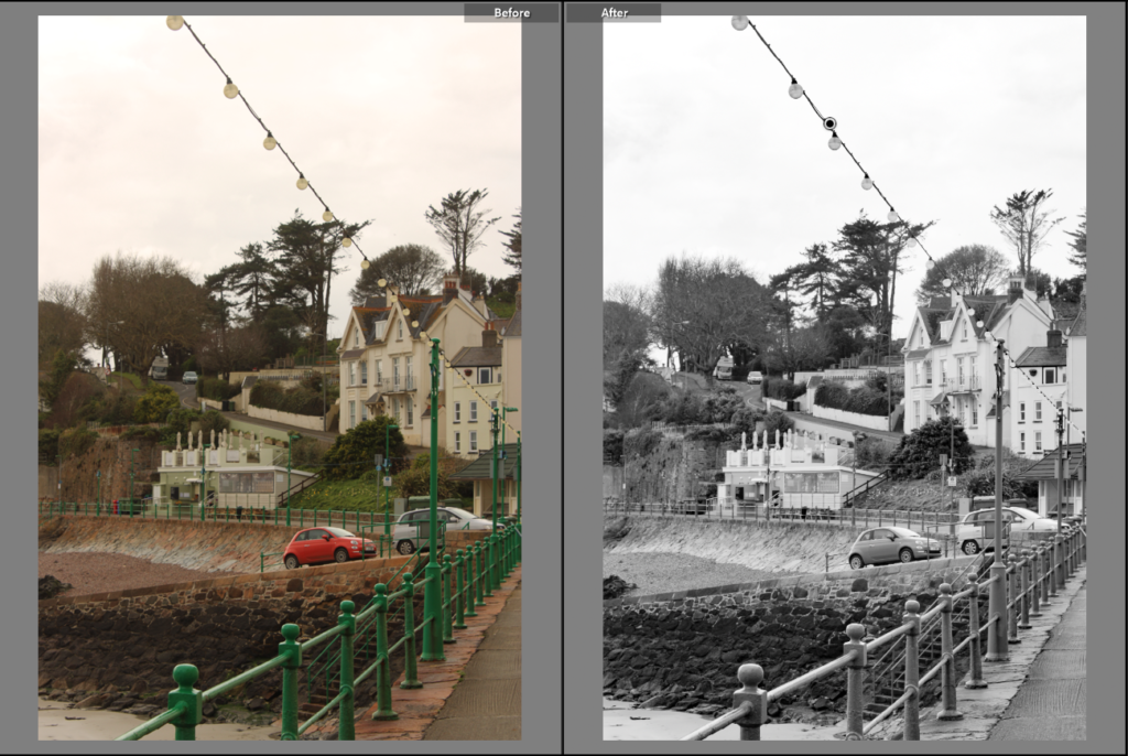
Image 3:
Editing process: For this picture, I pressed on the tab called develop and I increased vibrancy by +100 and exposure by +1.05 and then decreased saturation by –100. This was all I did in editing to improve this picture.
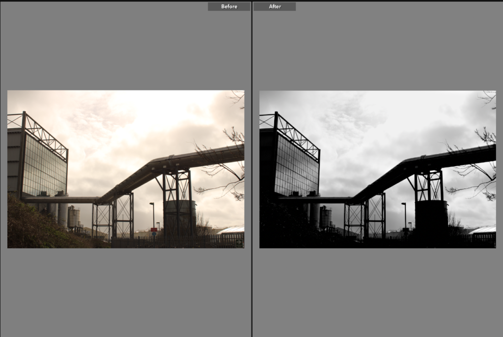
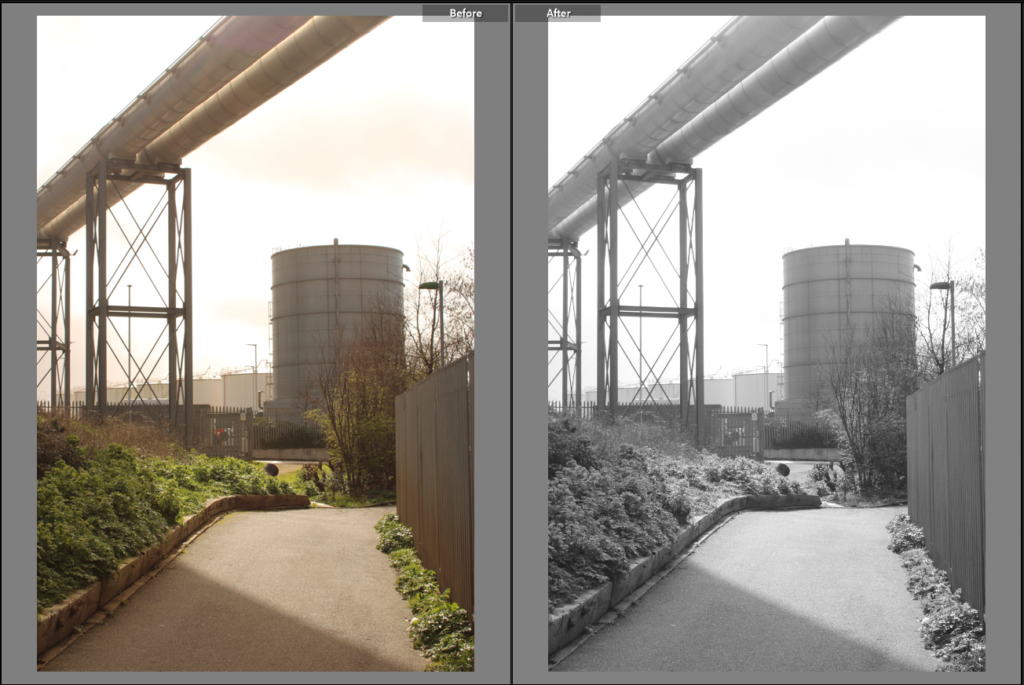
Image 4:
Editing process: For this picture, I pressed on the tab called develop and I increased vibrancy by +100 and exposure by +1.40 and then decreased saturation by –100. Then at the top bar I pressed on an icon that looks like a paint brush. In this icon, I increased dehaze by 68 and then brushed these adjustments all over the picture making sure I don’t miss any spot on the picture. This was all I did to edit the picture.
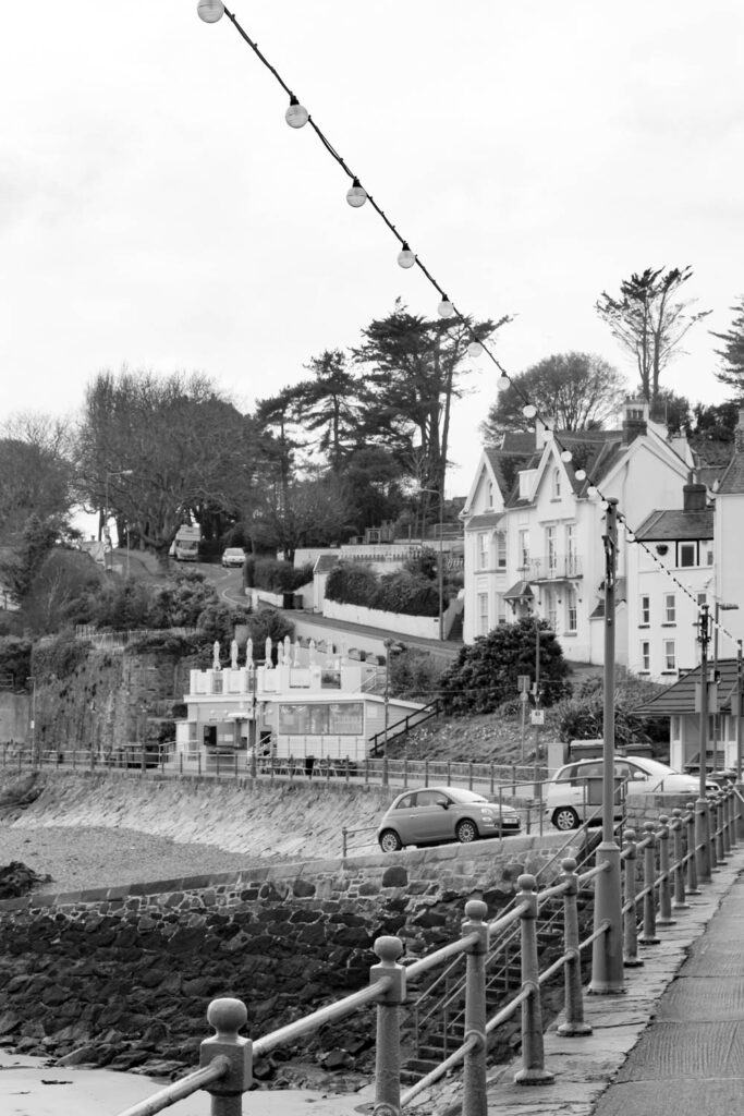
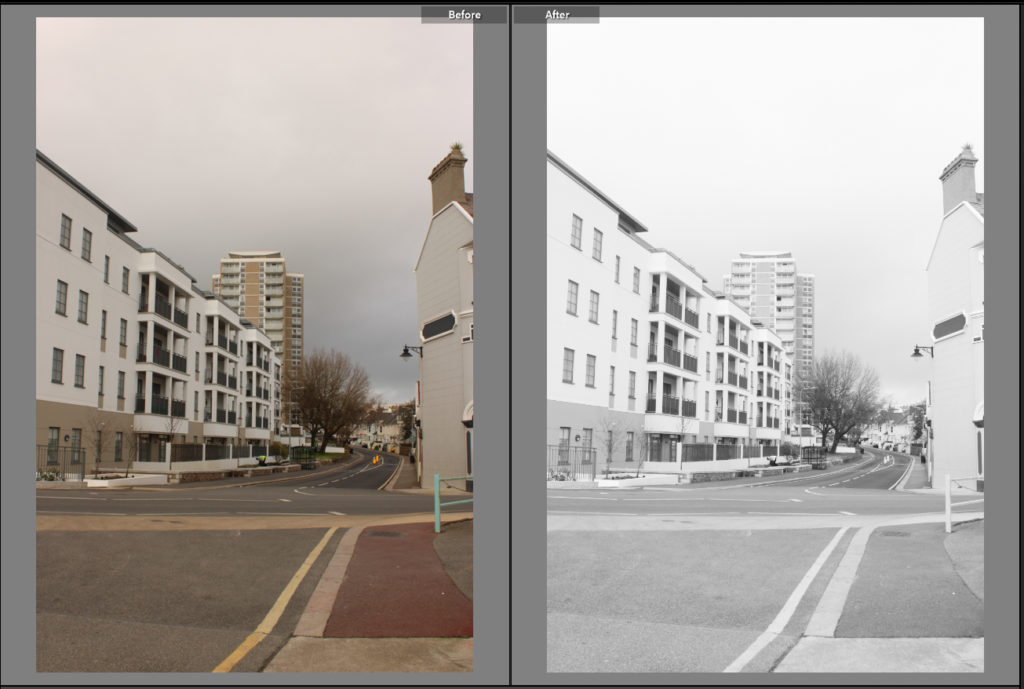
Image 5:
Editing process: For this picture, I pressed on the tab called develop and I increased vibrancy by +100 and exposure by +0.61and then decreased saturation by –100. This was all the editing I did to improve this picture.
Image 6:
Editing process: For this picture, I pressed on the tab called develop and I increased vibrancy by +100 and exposure by +1.63and then decreased saturation by –100. This was all the editing I did to this picture.