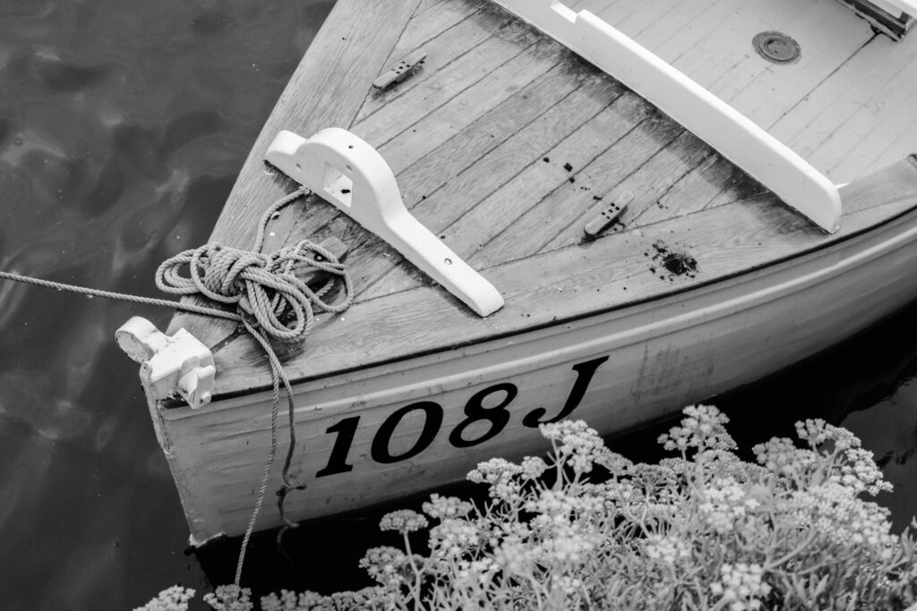
All posts by vickie

Filters

Author:
Category:

Editing of chosen pictures and evaluation- St helier harbour

Chosen picture 1:

Editing:

In this image I increased the exposure to give it a more white washed tone to the image so that when I decreased vibrance and saturation which made the image black and white, the image would look more brighter and whiter. I increased the clarity because I wanted the details in the images, that were lost by the gloomy weather, to be exposed. However I also increased blacks because I felt like the image became a little to white when I made it black and white. Finally I decreased highlights and shadows to expose hidden details lost from the darkness in the image. I did all of this to make the image more rustic like.
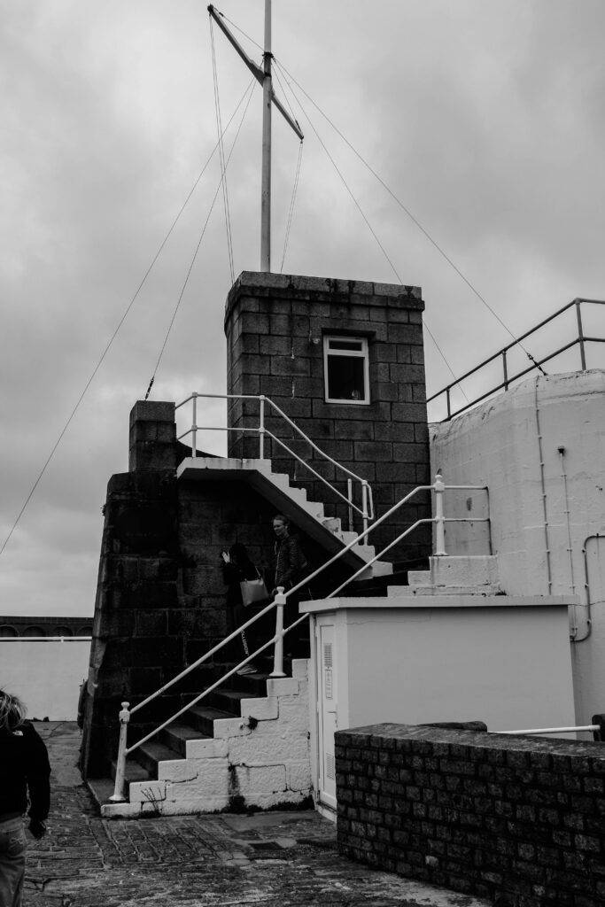
Chosen picture 2:

Editing:

For this image, I only increased vibrancy so that when I decreased saturation the image wouldn’t be as pale looking. This was all I did for the image because I thought that the image itself was quite good in terms of exposure and detail so I only made the image black and white and was satisfied.
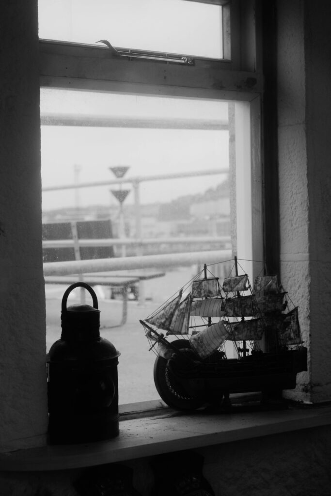
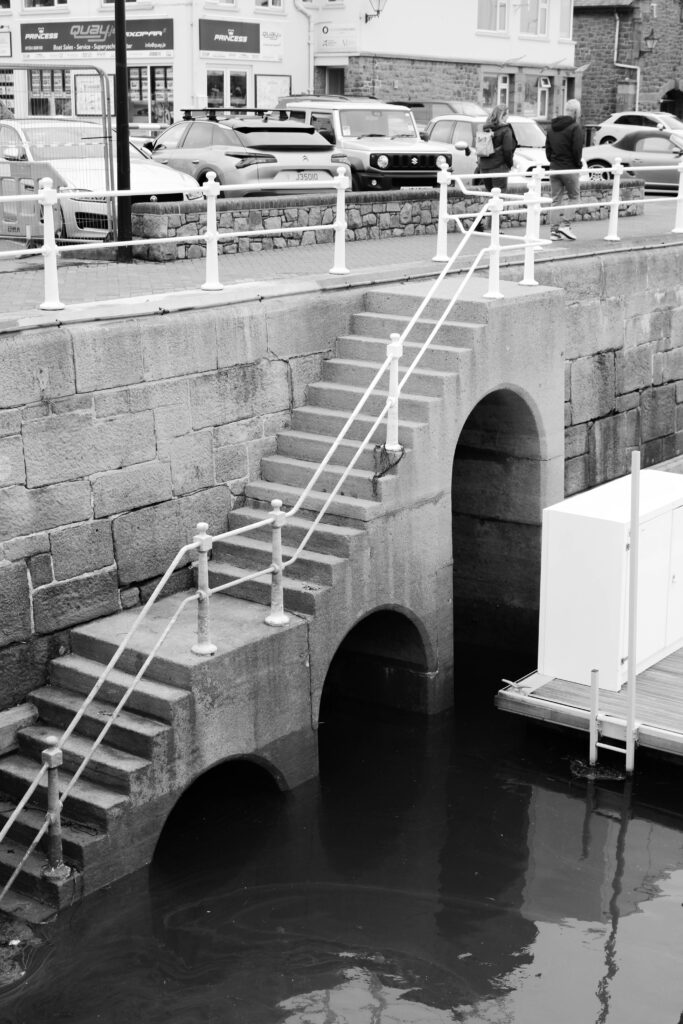
Chosen picture 3:

Editing:

Again, for this image I decreased vibrance and saturation to make the image black and white. I decreased contrast to increase the dark spots in the image but also increase the lighter parts of the image. I also decreased shadows to recover as much lost detail that was lost in the shadows of the image. Lastly I increased clarity to make the image a little brighter and for it to enhance more detail within the image. I did all of this to make the image look from the past.

Chosen picture 4:

Editing:

For this image, I really wanted to enhance the white’s and blacks in the images so I thought that decreasing vibrancy and saturation to make the image black and white would be start. Next, I increased clarity to make the image much clearer and enhance the white in the image and texture to give the image more texture but not too much because I didn’t want it to look too plain. I also slightly increased shadows to make the dark spots in the image more evident and whites to make the whites in the images more apparent. I also increased exposure to make the image slightly white washed. Lastly, I decreased contrast to enhance the blacks and whites in the image, highlights to give it a more matte look and blacks to magnify the shadows within the images.

Chosen picture 5:

Editing:

For this image I increased exposure to make the image brighter and also increased contrast to sharpen the image. I also decreased Shadows to make dark areas even more darker and whites to make the image as dark as possible. Lastly, I increased vibrancy so that when I decreased saturation the image wouldn’t be so pale. I really wanted this image to look old and rustic so I edited the image like this which meant that it came out exactly how I wanted it to.

Chosen picture 6:

Editing:

No editing was done in this image. This was because I wanted the image to show its ‘naked’ self. I wanted it to be quite raw and normal. I didn’t want to alter something that I already liked how it looked.

Chosen picture 7:

Editing:

No editing was done in this image. This was because I wanted the image to show its ‘naked’ self. I wanted it to be quite raw and normal. I didn’t want to alter something that I already liked how it looked.

Chosen picture 8:

Editing:

For this image I did the same thing I did to image 5, which is, I increased exposure to make the image brighter and also increased contrast to sharpen the image. I also decreased Shadows to make dark areas even more darker and whites to make the image as dark as possible. Lastly, I increased vibrancy so that when I decreased saturation the image wouldn’t be so pale. I really wanted this image to look old and rustic so I edited the image like this which meant that it came out exactly how I wanted it to.

Chosen picture 9:

Editing:

For this image I did the same to image 5 and 8 which is, I increased exposure to make the image brighter and also increased contrast to sharpen the image. I also decreased Shadows to make dark areas even more darker and whites to make the image as dark as possible. Lastly, I increased vibrancy so that when I decreased saturation the image wouldn’t be so pale. I really wanted this image to look old and rustic so I edited the image like this which meant that it came out exactly how I wanted it to.

Chosen pictures:

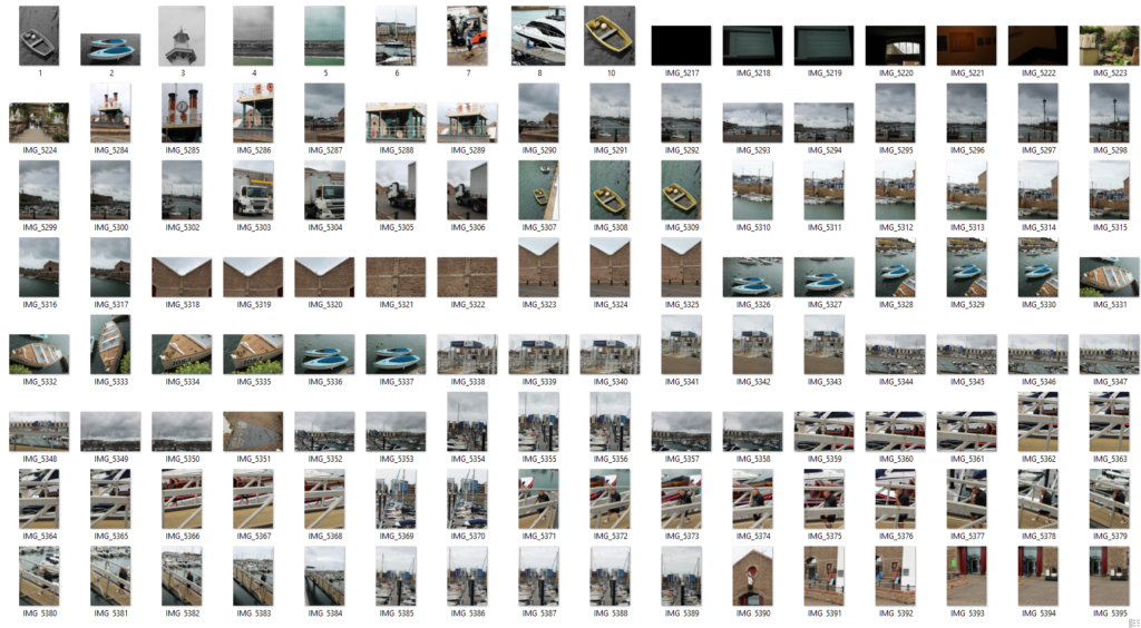
I chose these images for my final products because I thought that not only do they show the more aesthetic part of St Helier harbour, some of the images would also perfect fit in terms of the zine that I am planning to make. I also chose these images because they are high quality and just overall, really good images.

Evaluation:

Overall, I really like the images that I have produced. I’m satisfied with the end products and how I have edited the images.

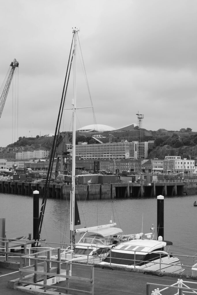
In my research about taking pictures of a harbour especially taking pictures in the St Helier harbour, I realised that there are many factors that make the harbour. Things like boats, fishermen, lighthouses but most importantly the sea, The cement to the harbour. I think that when it came to capturing what the harbour is actually like and what it consists of, I believe that I did it really well. Its clear that the focus of my photoshoot was a harbour which I made very evident by researching about the compounds within a harbour and then producing images that related to it.

In terms of editing. I strongly believe that my editing really shows my skills that I have developed and improved. With the inspiration still high towards Robert Adams, I wanted to mirror the skills that I learned through Adams and portray these skills onto this project and some of my images. As seen in some of my edited images, I edited in the way that Robert would. He produced images that sometimes where white washed and sometimes really dark. He made some obstacles darker than the background and I really liked that so I applied it to these images. I think that overall, I just really like the editing I applied in each of my images even the ones I didn’t edit. I’m really happy with my edited outcomes.

One last positive about my final outcomes, is that fact that I was able to closely edit images so that they looked antique and past like. I was able to show the present harbour as the past. However, I could have added texture to the images in black and white so that it would look even more realistic

However, I do think that my images could have some improvements. For an example, I could have been more creative with colour. I could have produced more images of colour and I could have also thought more creatively when editing the images. I could have used AI in photoshop to add people or boats. I could have been more creative in many ways so its something that I will take into consideration for my next project.

JERSEY MARITIME HISTORY

What was the involvement of Jersey mariners in the Canadian cod-fisheries and the Transatlantic carrying trade?

By the 1750s the fishermen of Channel Island had set up lucrative trade routes between Canada, Europe and America where they established bases on the Gaspé coast where they could prepare the salted cod.

A jersey merchant, Charles Robin ,operated one of the biggest companies on the Gaspé coast where he set up the fishing post at Paspebiac in 1767 right after Canada passed to the English.

This included Jerseys lieutenant-governor sir George Carteret, who was the founder member of the royal Africa company which traded ivory, golf and enslaved people in the early 17th century.

People like Captain François Messervy of Jersey who was murdered in 1722 during an uprising on board his slave ship off in the coast of Africa and the Jersey trader Josué Mauger who in 1752 advertised enslaved people for sale in Nova Scotia, Canada, where his business was based were involved in the enslavement of slaves.


Which ports did Jersey ships sail to and trade with?

The earliest harbours known in the island were areas such as Havre des Pas, St Brelade, St Aubin and La Rocque were used as ‘mini’ harbours. There was mention of an apparent Spanish ship taking on a cargo of wheat “in the harbour of St Obin”.

As ships became increasingly larger, Gorey, which is first mentioned as a port in 1274, began to grow its importance and on the year of 1685 Dumaresq map appeared a small pier was shown although a survey, Dumaresq describes as it being decayed. On the map it also appears a simple stone pier at St Brelade. However there were no type of facilities in St Helier at this time.

Effort to actually build a harbour was actually acted on, in the late 17th century, when work began on building a pier on the islet on which St Aubin’s fort stands. Then, during the 18th century, the St Aubin’s harbour was constructed and then the construction of the St Helier port, although the capital had to wait until the 19th century before it really began to develop as an actual port.

St Helier was the main harbour that was used for ships to sail and trade with

What type of goods did Jersey merchants exchange for cod-fish?

 Jersey had loads of ships which in peacetime held on two separate types of trade. The largest would go to the Newfoundland or the thereabouts in early spring or summer for cod, and returning in autumn, which was usually via mediterranean or Spanish ports.

The goods the Jersey merchants exchanged for codfish were things like tobacco, sugar, spices, ivory and many more

To what extend, has the island of Jersey benefitted from its constitutional relationship with Britain and the legacies of colonialism based on a slave plantation economy during the first Industrial Revolution (1760-1840)?

Due to the cod trade and related shipping industry, the spawn of shipbuilding industry with a significant number of shipyards on the south and east coasts of jersey. Initially, fishing vessels for the jersey fleet had been built in the outposts in Canada. This activity then shifted to jersey, with the large scale commercial shipyard starting operation in 1815. In that year, 69 vessels with the total tonnage of 7,519 were registered in jersey and by 1865, these figures had increased to 422 and 48,629, about 80% of the tonnage having been built locally. It is estimated that in the 1860s about 6% of the total tonnage of wooden fishing fleets built in the British Isles had been built in the Channel Islands, mainly Jersey

The best indication of the growth of the economy in the first half of the 19th century was the doubling of the size in population from 28,600 in 1821 to 57,020 in 1851.

This rapid immigration led to significant changes in the composition of the jersey population however after the Napoleonic wars, there was an influx of English speaking British army officers retired on half pay who found life in Jersey cheap due to this a demand in housing that was met largely by the expansion of St Helier.

Then, additional English speaking immigrant labourers, which many were Irish, came to work on the major building schemes such as the Esplanade, fort regent, St Catherines harbour project and the harbour development. The unskilled workers were underpaid and exploited which meant they lived in the poorest parts of town where they were exposed to cholera epidemics of 1832 and 1849. Other nationalities began their print on Jersey due to the work opportunities.

Please note that AI may have been used to construct this blog

2. Provide a short history of the development of St Helier harbour and produce a mood-board of images

Below shows and image which was the first ever illustration of the St Helier Harbour (1790). The harbour, which was built in the the 18th century, served as the only port for larger ships that Jersey owned. this would soon change in 1790 where a plan to construct a north pier on the island begun and was successfully finished in 1821.

As seen below, it shows a map of the St Helier harbour (1834) The new North pier which was constructed is seen on the map opposite to the French harbour which was later then made larger between 1887 to 1897.

On the 19th century, it was an exciting time for jersey, in terms of Harbours. This was because in 1847 to 1853 a new pier was constructed. This pier was named after Prince Consort (Albert). However before this, Victoria Pier was constructed from around 1841 to 1846.

Images of Piers reconstruction in 1930’s:

Image 1:

Image 2:

There are many more images which show the reconstruction of the pier but these two images shown above really shows the reconstruction of the harbour. During the 1900s, new developments were made to the harbour which allowed the harbour to be utilised in different ways.

The 20th century was also an exciting time for Jersey as this was the time where something called the Tanker was built. This allowed tankers to dump oil and fuel especially near a fuel farm. The tanker berth was built to allow for tankers to offload fuel and oil supplies close by to the fuel farm

Marinas started to show in places where ports no longer were utilised. The St Helier Marina opened in 1981 where it contained approx 400 berths. Then in 1998 the Elizabeth Marina was unlatched to the public, which held a whopping 600 berths. These berths were mainly for local boat owners.

With the evident increase in Jersey population, many people living in this tiny island, have preached about leaving and traveling the world. Because of this, rumours of recent plans have been said that the reconstruction and modernisation of the Elizabeth terminal is a possibility. A possible image of what Elizabeth Terminal may look like is seen above.

A more in depth Timeline of the St Helier Harbour can be seen bellow.

Reference: A timeline of the development of St Helier Harbour – Jerripedia (theislandwiki.org)

St helier harbour

St Helier Harbour:

Way before the 17th century, St Helier had no actual and decent harbour, although a map in 1545 says otherwise. It showed two stone piers in the area under Le Mont de la Ville, near where the South Pier is today.

The harbour was recorded to be constructed in the early 19th century where previously ships that came into town had only and small jetty at the site which is now called the English Harbour and the French harbour. The Chamber of Commerce urged the states assembly to build a new harbour however they refused so with the refusal, the Chamber took it into their own hands and paid to upgrade the harbour in 1790.

St Helier Harbour trip:

On Tuesday the 10th of September, we met at the Societe Jersiaise where we had a presentation for nearly 2 hours. In these two hours, we had a speaker talk to us about all the famous jersey photographers especially photographers who photographed the harbour and jersey harbours but specifically St Helier Harbour. The speaker showed us a variety of photos which were all produced by jersey photographers. The speaker also went on to describe how photography spawned in jersey and how jersey became an attraction to those who were in middle class who wanted to take pictures for a more cheaper price. After this we went on a walk around St Helier harbour and took a series of pictures of the harbour, making sure that recaptured different angles and perspectives. After the photography session, we had two speakers meet with us where they spoke about the St Helier harbour in more detail and how it all started.

Mood Board:

Please note that AI may have been used to construct this blog

Evaluation and presentation of final Picture story

Picture story 1:

After editing all the images seen above, I realised exactly what I wanted to do for my first picture story. I really liked the blue in the right picture so I knew that I had to have blue and I also liked the images that I produced in black and white so I also knew that black and white had to be included in my picture story. I learned that boarders make the picture story look better so I applied this realisation towards all of my picture stories. I realised that I had produced many pictures of people and landscapes of St Malo, so I knew that for this picture story I wanted to include loads of people and little landscapes as I thought that St Malo was about the people. However making the landscape in blue meant that even though it was the only picture in this picture story that had no people, the colour attracted attention towards the image. The title was definitely my highest point. I really loved the contrast of fonts in the title and I think that it look perfect. However I think that the placements of images, especially the ones in the left, could have been better and more spaced out. The picture story could have been more colourful to attract even more attention. Like putting the boarders around images as the colours of the french flag.

Picture story 2:

In all honesty, I don’t really liked this final product. The random shapes and colours make it look quite tacky and strange. My intention towards this paper story was to make it as colourful as possible to show how bright and important the French are, hence the title. I wanted to have the images in colour with the people highlighted to highlight the ‘aura’ they have. However I think it looks quite random and boring. Although I like how colourful the picture story is, I don’t like the different colours. I feel like if I had used different shades of the same colour like pink, and placed the shapes more strategically, the picture story would have looked bette. However I do like the contrast between the people being selected in colour and the background being black and white. It looks really unique. I learnt that I should have taken more time and patience towards this picture story so that it would reach the potential it had.

Picture story 3:

For this picture story, I realised that most of the images I produced for this picture story, had brown tones, so I knew that I wanted to make a picture story that had a brown theme. However I soon realised that I shouldn’t have decided a brown theme as the two photos on the bottom had nothing to do with brown so those two images look quite random and out of place. I should’ve looked for images that had brown tones or brown obstacles. I definitely knew that I wanted to make the title brown and French so I did and I really liked the outcome. It makes it ‘authentic’. The two images above were one of my favourite images I produced and edited. I loved the tones and aesthetic of the images. I loved everything about it. This picture story would have been perfect if I had all the images in it with a brown theme. I do like this picture story but I think that this picture story could’ve had many improvements.

Evaluation:

Overall, I’m satisfied with my final picture stories. My images are high quality and edited nicely. I also think that I had good concepts and ideas towards my picture stories.

In summary, my picture stories has many improvements to overcome, improvements that I need to take into consideration in the future. My picture stories could’ve been more creative and out of the box and so could’ve my titles. I think that my second and third picture story, specifically, lacked creativity. I need to incorporate different styles and techniques like cropping and maybe presenting the images differently, like formatting the images into shapes.

However, I think that when it comes to simplicity, I was really good at doing that even though it is something that I need to change. I feel like the simplicity of my picture stories make them quite firm and willing so I have to admit that I am satisfied with that.

Lastly, I should have thought better about my picture stories, I should’ve planned them better and I should’ve made sure that I knew exactly what I was doing and what I was intending to do. Having this certainty, would mean that I would be more confident and maybe even more creative as I would have more time to create a plan of what I really wanted to do, especially in creativity terms.

Analysis and deconstruction of chosen picture stories

Picture story 1 ANALYSIS and DECONSTRUCTION:

For the layout of this picture story, it was solely meant to show the the people or specifically the French people of St Malo, highlighting the aura they carry hence the title. The title gives the picture story a more clear storyline which is something that I really like. All the images relate because it shows people and tells a story by illuminating them, making them ‘important’. In this picture story there are multiple of types of shots used. They’re are major, minor and portrait. This diversity allow my picture story to stand out and be different. The major shot is the man with a mug on his hand, sat on the pavement. This is my major shot as its an image that Is really satisfying because the man is almost centred and symmetrical which is something that peeks interest. My minor images are the woman on the bike and the chef. This is because the images are quite far away and edited so that they are zoomed in. The images are still quite satisfying but not enough to be my major shot on my picture story. Lastly the portrait I have is of the lady holding her dog. This portrait isn’t a major shot on my picture story because the image is quite silly and candid, I wanted my major image to be more professional and constructed.

Picture story 2 ANALYSIS and DECONSTRUCTION:

For this layout I wanted to highlight the insane beauty and people that St Malo shows hence the title. The title is clear and unique as it has different fonts and Although my first Picture story shows people, for this picture I wanted to incorporate an image of A beautiful street in St Malo, seen on the major shot on the picture story which is the large image in colour, illuminating the colour blue. Although some may argue, all my images in this picture story relate. The major shot sided with images of different people is meant to show the tory of how these people have lost likely roamed the street show on the left, highlighting the fact that although all these people are from the same town and have walked the same streets, they have most likely not met each other, the term Sonder may come to thought as it is the ‘realisation that each passerby’s life is just as complex and unique as ones own’. The minor images which is the image of the kids playing on the beach, the girl in the umbrella and the man working in hospitality, are small and almost zoomed in.This is to show that even though they are important images, the image on the left is much more important.

Picture story 3 ANALYSIS and DECONSTRUCTION:

For the layout of this picture story is meant to show and zoom into the details within St Malo, hence the title which means the art of noticing. The images relate to each other because it shows details that some may ignore or looked over. It tells a storyline because it slowly shows images with more detail and images that are more zoomed in. There are many types of images in my picture story which promotes diversity. The major photo in this picture story is the picture of the lock. This was done because I believe that this image shows how the art of noticing is beautiful and how a lock like this on a fence wire is easily ignored, considering it the only lock on that fence. This major image really highlighted my title so I had to make it my major shot. The minor shots in my picture story are the two images on the left at the bottom. This is because it shows two images that have relatively close colouring to each other which is something I noticed and had to put on the picture story. Lastly the two environmental images on the left which shows parts of a restaurant were put on the picture story to show how I noticed that this restaurant had rustic and old pieces which if I hadn’t taken a minute to look, I wouldn’t have noticed.

Final picture stories:

Picture story 1:

Picture story 2 :

Picture story 3 :

Evaluation:

Overall, I’m really satisfied with my outcomes. The pictures story really show what St Malo means to me and it shows how I see St Malo or how I can portray and manipulate it.

When it comes to editing, I believe my editing is one of my strengths. This is because the editing in all my images really enhance my images and bring my images to life. My editing in my images manipulate what St Malo looks like to me. The images before editing were quite bland but using photoshop and Lightroom really helped me show a wider audience how I interpret St Malo and how the colours within St Malo are much more significant to me and are seen differently. It shows my innovation.

When it comes to layout, I also believe that it is one of my strengths. This is because all of my layout in my 3 picture stories, really compliment each other. The layout is diverse but meaningful. The layout has a meaning which is to show how many different parts of St Malo are connected in so many different ways. This is something that I clearly show in my layouts in my picture stories therefore I believe that my layout is consistent and powerful.

Lastly, I do believe that my picture stories lack unification. Although my picture stories solely focus in what consumes and consists of St Malo, which was my aim, I believe that I could’ve somehow linked my pictures stories by using a repetitive pattern. This could be having a continuous sticker or colour in my picture stories. Or even using the same layout to show consistency.

5. Experimentation- picture stories

Experimentation 1, 2,3,4 and 5 of picture story 1 :

1: in this experiment, I layered a bunch of different shapes with a various of shades of blue, thickness and opacity and although I liked the blue, I found it overwhelming therefore started to add different shades and colours. I also didn’t really like how the shaped overlapped the images, so this was rejected. I stuck with the title throughout the whole of the experiment because I really liked it.

2: For this experiment, I stayed with the blue shapes and didn’t change much from the first experiment however decided to add a black shape but immediately disliked it.

3: I started to find what I actually wanted to create with this picture story, in this experiment. I played with different colours like pink and grey and also played with the opacity and thickness. I liked how colourful it was getting and realised that I wanted to make it colourful so I carried on with the experimentation with colours.

4: Now her was where I was really having fun with the colours, I liked the contrast between the feminine colours and masculine colours and the different shapes. However I still did not like how the shapes were overlapping the images so thus was rejected.

5: This was my final product. I had finally figured that the coloured shapes would stay as the background and the pictures would overlap the shapes. I also decided to ass some shading and frames that coordinated with the images to enhance the images and really highlight the title in the mention of ‘aura’

Experimentation of picture story 2 (didn’t really experiment as I just went with the flow and liked the end products so kept it like that)I did however, play with the colours of the outlines of the photo frames. I debated wether the left side should be black and the right side all blue, however my main picture had lost of blue, so I put the larger frame on the left as blue to form a correlation between the image and frames. I also played with the thickness of the title especially the part where is is cursive. I thought the cursive words gave it a ‘Chique’ tone to it:

Experimentation 1 and 2 from the 3rd picture story :

1: with this experimentation, I played with the title in terms of size and font. I really liked the font and the size of it, especially the thickness and as seen on further blog posts, this ends up being my final product. I noticed that lots of my images in this picture story had brown in it so decided that I would put the frames for the image in brown.

2: in this experimentation, I changed the thickness and font of the title to see if it gave it a more rustic look to it however, I did not like the look that the font made the picture story look like. It made it look like really messy and childish, therefore it was rejected.

Exhibition trail of the Rohingya refugees crisis in Bangladesh- St Helier

Background research:

Bangladesh faced and still faces serious challenges related to refugees, mostly the Rohingya crisis. Since their arrival in the early 1990s and then again during periods of persecution in Myanmar in the 2012, 2016, and 2017, Rohingya refugees have progressively hunted safety in Bangladesh. The invasion has had severe demographic, socio-economic and environmental impacts.

In July 31st, in the year of 2017, Bangladesh officially secured 33,542 Rohingya refugees in cramped camps like Kutupalong and Nayapara, whilst over a million lived outside these factions. Despite numerous international efforts to banish the crisis, the situation remained and still remains complex.

The Rohingya, is a Muslim ethnic group with a unique language, have lived in Myanmar for many centuries but in 1982 were citizenship, labelling them stateless. This has refutation fuelled their persecution which led to forced migration.

The connection between Bangladesh and Myanmar is fatigued due to the Rohingya crisis, which has been dragged on since the late 1970s. Myanmar’s military government has labeled Rohingyas as illegal immigrants causing in the promption of violence and displacement. The military has operated many attacks against the Rohingya since 1948, accelerating the widespread of human rights abuses.

Visual examples:

Response:

The exhibition trail was all over St Helier where it showed a various of informative images. The images had a clear and serious message and it made me feel really upset that these innocent people are living these harsh, underserved lives. The images shows me this different perspective towards the whole situation and my attitude towards it has definitively changed from the first time I heard about it, especially with how informative it is. The format of the images show the organisation that sponsors the Rohingya people

Please note that AI may have been used to construct this blog