Mood board:
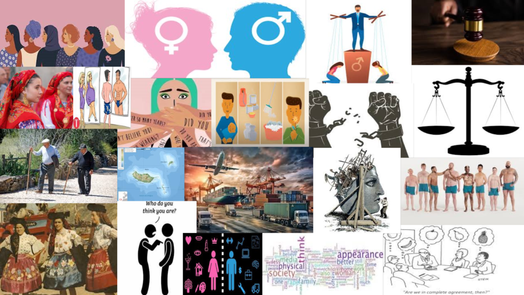
Mind map:
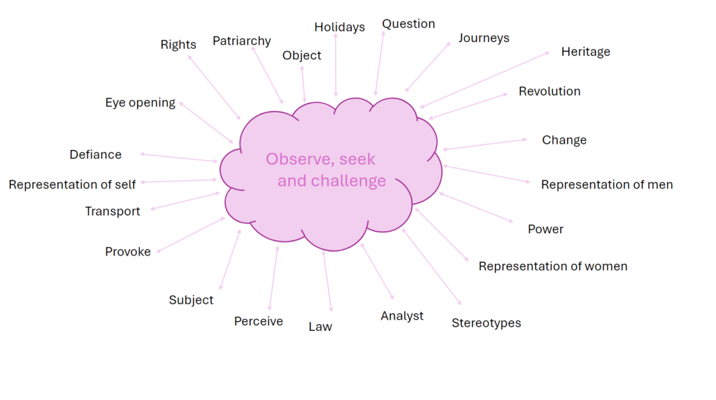
Mood board:

Mind map:

In the first year of photography, I learned many important lessons and now in my second and last year of photography I can tell you that, I’m still learning different and important aspects of photography.
Can you even define photography?
Many may bluntly say that photography is taking pictures from a camera or a type of art however I would like to argue that photography is much more than that. From all the projects that I have done, I can strongly state that photography is a complex art. I learned that, not all photographs can be edited or taken the same way, they all have their own type of ‘impurities’. There is many angles we need to consider when producing a photograph, photography isn’t something that is easily learnt, you have to know how to use a camera, how to change settings in the camera in regard of the surroundings and most importantly, knowing when to capture the perfect moment, a decisive moment.
I have learnt that photography can be a form of preserving a memory as it encapsulates moments in time and I’ve realised this by studying many artist in the 20th century, artist like Ansel Adams, Claud Cahun, Cindy Sherman and so much more talented artist’s. This preservation of memories enabled me to understand the development and contribution towards photography. Photography has also enabled me to express my views, what inspires me and most importantly what I love most. Producing photographs has allowed me to discover my style and format. I’ve also learned that, photography documents the social, cultural, present and historical issues. It brings awareness. After studying about an artist called Jason Jackson who preached about BLM, it brought me insight about what racism actually was and it’s impact.
Photography act’s as a watchdog, a term created by David Hesmondhalgh which is where the media is checked to ensure it’s accurate and fair
Proof that photography is a watch dog is by evidence I have gathered after studying a variety of artist that explored different topics. This allowed me to be aware of certain topics I wasn’t as aware of. One topic that I explored in photography that effected me the most was identity. It brought me awareness of how identity can be shown in many different ways and everyone has different type’s of perspectives in terms of identity. Nan Goldin was an incredible artist that completely changed my perspective towards identity, she redefined photography by recording the promiscuous lives of her unique friends and herself.
Overall photography taught me numerous things. It taught me how to become an artist, it taught me things I had no clue about, it taught me that, different is better, and lastly it taught me to view world differently than others.
Masculinity and Femininity:
Masculinity is often referred to the behaviours, roles traditionally linked with being a male and qualities, which are many times emphasised traits like strength, independence and assertiveness. Femininity is seen as something that has roles and qualities which are typically linked to being female, highlighted as nurturing, sensitive and empathy. The concepts or terms are both culturally and socially constructed which basically means they can vary across different time periods and societies within a community.
Someone who I studied and challenged femininity and masculinity was called Claud Cahun. She was a French photographer and an artist that showed her surreal self and was famously know for her self-portraits. She also explored identity and gender fluidity. Her provoking imagery challenged many traditional norms which made her a key individual in feminist art.
I learnt that, she was very evolved in her time period and her advanced thinking made her different to everyone. This challenged people, it made people have a different perspective of what identity actually was and even opened peoples eyes to gender fluidity. The project that I produced in response to her work, taught to me think outside of the box. It challenged me in many ways. It challenged me with defining what masculinity and femininity actually was and especially how I was going to express it without being stereotypical. It allowed me to be creative and open within my work.
Previous:
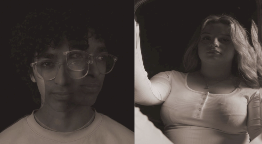
inspiration:
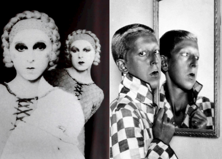
Evaluation:
My images had clear inspiration by Cahun’s work. I really liked my final outcomes and how I was able to mimic her techniques and ideas into my own perspectives, however if I was to repeat this study and response, I would try to be more accurate in colouring and editing.
Romanticism:
Romanticism was a literary and artistic movement from the late 18th to mid-19th century which sympathised emotion, nature and individualism. It evaluated imagination and often protested against traditional norms, the sublime and celebrating feelings.
An artist that I looked into that investigated romanticism was the talented artist called Robert Adams. He was known for his black and white landscapes of the American west where he compared the themes of human impact and nature. One of his project I looked into was ‘The New West’. He showed industrialised towns and often challenged these towns by capturing these towns with the background of the images being nature. He often put towns at the front and the nature in the back to comment on the effects that industrialisation was creating. The effect that he had when he put nature as the background was ground braking. Him doing this implied that we were forgetting about nature and worrying more about the human species and its ever growing population. His work brought me awareness and anger. It made me realise how much we have selfishly ruined and defrosted many fields to sustain our never-ending population. With this realisation, I was able to show this within my images. I was able to make urbanisation as something that was dark and bad in my images and make the nature/rural part of my image lighter, just like he did.
Previous:
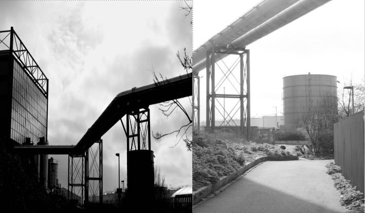
inspiration:
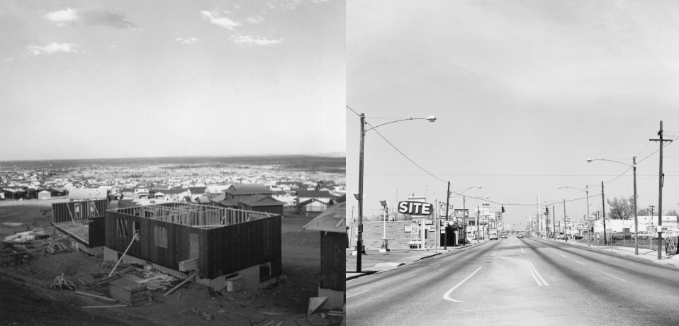
Evaluation:
This topic was one of my favourite topics I got to explore. I really liked how awareness was brought to me via images and how eye opening it was. I enjoyed producing images that brought awareness and with these images, I could use them as a way to shout at the human population about the mass urbanisation but not literally. I did it through my images. However, if I was to repeat this again, using my final images, I would take images of towns instead a place that wasn’t as highly populated. This would’ve brought even more awareness about the mass population and the message Roberts wanted to imply.
Identity:
Identity mentions the qualities, beliefs and characteristics that make a person or a group distinct So, identity is about how each individual person perceives themselves and how they are seen by others. Identity is often influenced by experiences and social contexts.
A artist that I really liked learning about her work was an artist called Clare Rae. She is an Australian photographer who is famously known for her intimate portraits which explore themes of femininity and identity. Her work combined fine art and documentary styles where she would use light and composition to create evocative narratives. Her work was unique. She expressed her frustration towards objection in women, directly or indirectly. Positioning herself in awkward poses, enabled her to show that and communicate things that she could say or didn’t want to say directly. I learned that a body is a very powerful message. Without using words or implication, you can use your body to show how you feel or perceive something and I find that powerful. I also learned that we can use our surroundings to produce and image and when you combine those two things, a body and a surrounding, you get a striking message.
Previous:
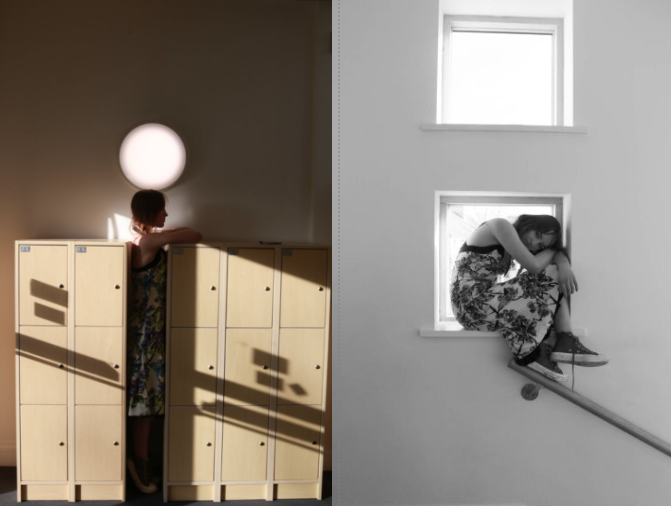
inspiration:
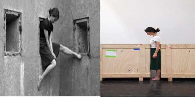
Evaluation: I really liked my outcomes that were inspired by Rae’s work. I think that I powerfully showed my inspiration and awkwardness in my images, just like Clare. The poses in awkward settings, enabled me to be creative and inspiring. However, if I was to repeat this topic and response. I would do Self-portraits instead of taking images of others because Clare did that, to indicate an important and persuasive message.
We can never determine where and who started photography due to the fact that in the time that photography was being invented, many individuals were exploring and working in similar things in relation to photography. However what is certain, is the fact that many revolutionary people contributed to the history and origin of photography and many are credited till this day. The two most important processes that were introduced in the early forms of photography is the two processes called Daguerreotype and Calotype. Daguerreotype was a direct-positive process which created a highly detailed image on a sheet of copper plated with a thin coat of silver without the use of negative which was invented by Louis Jacques Mandé Daguerre. Calotype was a technique created by William Henry Fox Talbot where it consisted of a sheet of paper coated with silver chloride that was then exposed to light in camera obscura. Some may say that in terms of John Szarkowski’s thesis where he states that the world can be viewed through a ‘mirror’ or ‘window’, these two processes can be applied towards the ‘mirror’ side of the thesis. This is because most pictures produced using these two processes, were pictures of family or portrait images of people, so they were quite personal and reflective of the people who made it. Szarkowski’s implies that ‘Art is a mirror, reflecting a portrait of the artist who made it‘ which contributes to the statement above. There is a strong agreement towards this saying as I believe that a mirror can be a reflection of what the artist see’s and interprets. However, some may contradict that the process Calotype views the world as ‘window’. Some images produced using a Calotype, were quite documentary in style, and showed a better and different perspective of the world. We can prove this by the saying that is said in Szarkowski’s thesis, which is ‘window, through which one may better know the world‘. Many may even say that these two processes are both ‘windows’ as they both document the past.
The image that has been chosen that shows ‘mirror’ in terms of Szarkowski’s thesis is the image shown below. This image is seen as a ‘mirror’. This is because the image is quite subjective itself. The time, 1997, that this image was taken was the time that women were seen as housemaids and things that had to have motherly features and attitudes. This is a self portrait taken by Cindy Sherman where it shows her in a very provocative outfit doing household chores. She projects that women in those times needed to look presentable for their husband for visual pleasure yet needed to act like a responsible and role model to their kids, taking care of the chores which was something that women were obligated to do in those time periods. This image reflects Sherman’s ‘Self’ especially her views, its almost like its quite a personal and private subject for her but she still chose to use her voice and express her views using photography. This picture also connects to the theorist Laura Mulvey, who explores the male gaze and states that representation of women is quite objective and defines their identity in relation to male character, which is exactly what Cindy Sherman is posed as. Laura Mulver implies that “Woman’s desire is subjugated to her image (…) as bearer, not maker, of meaning”. This was said the good reads, a website filled with her quotes. This acts in accordance with Shermen’s intention because Laura Mulvey indicates in the quote what women are stereotypical portrayed as which Cindy also explores in the image show below and in many of her images. This picture wholeheartedly reflects the person she is which is someone who is interested in exploring identity and she even said that, “I wish I could treat every day as Halloween, and get dressed up and go out into the world as some eccentric character” which was said in the MoMA website
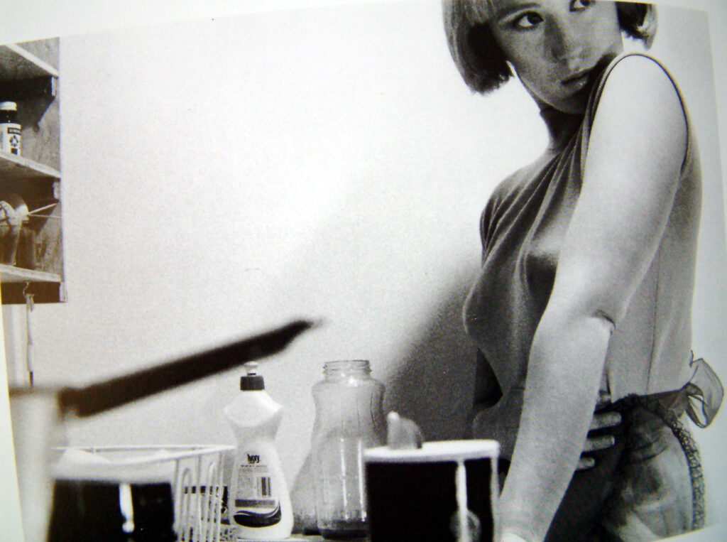
Szarkowski’s states that the “general movement in American photography in the past quarter-century has been from public to private concerns.”. Cindy’s images are subjective and private and we can extract the part where Szarkowski’s mentions the private concerns and apply it to her image. Although her images are quite controversial and ‘out there’, it is still private. How women were portrayed in that time was a private subject and something that was forbidden in terms of protesting about such roles within the female population. In Jed Perl review, Szarkowski’s comments on Minor White’s work as “romantic” and “self-expression,” which is something that is exactly represented in Sherman’s work. This strongly supports Szarkowski’s statement about how mirror is described.
The image that has been chosen that shows ‘window’ in terms of Szarkowski’s thesis is the image shown below. This image is seen as a ‘window’. This is because the image is objective. It literally states what its showing, it is common sense. This image was taken in 1933, Seville and entitled as, “Children Playing in Ruins”. Even in his descriptions he was objective and clear. After this image, The Spanish Civil War broke out, in the cities Henri Cartier-Bresson had navigated through. Although he did not know this would be the outcome, a war, this ruined building and crippled children became associated with the horrors of that war. If we look at Szarkowski’s theory about what a window is defined as, he says that “through which one may better the world” which is something that is exactly shown. Cartier-Bresson took this picture without realizing that three years after, war would unleash, which massively effected the way this image was read. It showed the possible outcomes of war and documented the distress of war, unintentionally.
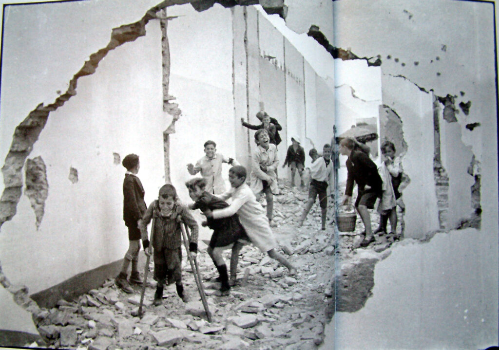
Szarkowski’s observes that “there is a fundamental dichotomy today between photographers who believe that all art is concerned with self-expression and those who see it as a means of exploration” seen in the website called MoMA’s . Cartier-Bresson’s work, especially this image had a tendency of being documentary like and we can actually apply and extract a part from Szarkowski’s suggestion about the ‘concern’ of ‘exploration’ and apply it to this image. Especially with the known fact that this was taken few years before the Spanish Civil War in Saville. Again proof of his dangerous exploration. In Jed Perl review, Szarkowski’s comments in franks work, and notices that his work explores “realism,” and “exploration”, again complying with the first statement done by Szarkowski. It is certain that Henri’s work has a certain realism to it, the realism of War and the youth that are effected by it. Henri declares that “Of all the means of expression, photography is the only one that fixes a precise moment in time.” which was shown in John Paul Caponigro’s blog. This obey’s Szarkowski’s theory as it basically implies that expression is shown as something that is documentary like, it captures the past.
If we refer back to the question, ‘how can photographs be both mirrors and windows of the world’. If we look at Szarkowski’s theory in summary, it is obvious that he see’s mirror’s as something that is “art, reflecting a portrait of the artist who made it, and window, as those who may better know the world”. However in Perl’s review, Szarkowski’s reviews and observes mirrors as something romantic and self-reflection and windows as realism and expression. We can agree and say that photographs can be both mirrors and windows especially with the two images that were analysed, above, especially when applying Szarkowski’s theory and Jed’s review. They have similarities and these are the way they have people in the images, creating a door to a more public approach something that is considered as mirror. Both images are factual, however very different. One is about the Spanish Civil War, showing realism, and the other is about the realities of how women were portrayed, this is romanticism of how women were seen, in a specific time period. However, the image that shows how a women is projected is quite fictional. The image is made up, it was creatively constructed by the artist, even though it was factual, because that was exactly how women were characterised, it was also exaggerated and staged. Lastly if we look at the images, they can be both be mirror and windows however they individually have sides that they lean more to so in conclusion I think that in images there are mirrors , windows and in-between’s.
My story will be seen as something that has a mixture and comparison of past and present. It might also show some form of the future in the St Helier harbour. This is to manipulate a realisation towards the audience for them to actually realise how quickly the time is passing and how quickly Jersey, more specifically, St Helier harbour, is evolving.
I will have my own produced images with a comparison and incorporation of mixture of images from the Archives and will also get the future images from a folder my teacher has provided me which shows a variety of future lookalikes that St Helier harbour may become.
At the beginning of my zine, I will have an introduction of the history, facts and more about the St Helier harbour. The first couple of pages will consist of landscapes of the St Helier harbour (present). Then I will have some past and present images, using the archive images and my own picture to compare. In this group of images, I will have the year it was taken and where. Then using some picture from the archive, I will incorporate the past people or objects from the past pictures and place them on my own, present images of St Helier harbour. These images will be placed on one side of the page and the next page won’t have any images because I will put a poem about St Helier harbour or sayings that people have said about St Helier harbour
I plan to have my font-types quite antic tone to them with words that change colors depending on the image that is shown (black and white or colored). The cover of the zine will be black and white with an image that indicates what the zine will be about. The text will be shown vertically on the right side of the cover on the middle. These words will be black and white

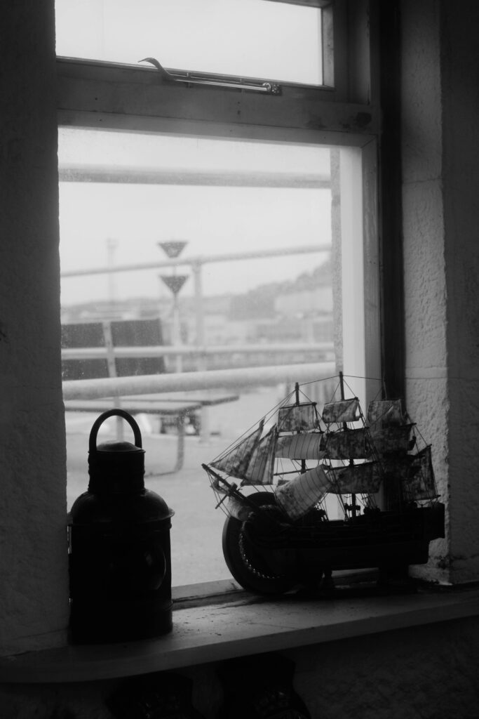


General layout:

Measurements:
Create new document
width: 148mm
height: 210
pages: 16
orientation: portrait
columns:2
column gutter: 5mm
margins: top, bottom, inside, outside: 10mm
bleed: top, bottom, inside, outside: 3mm
Paper plan:
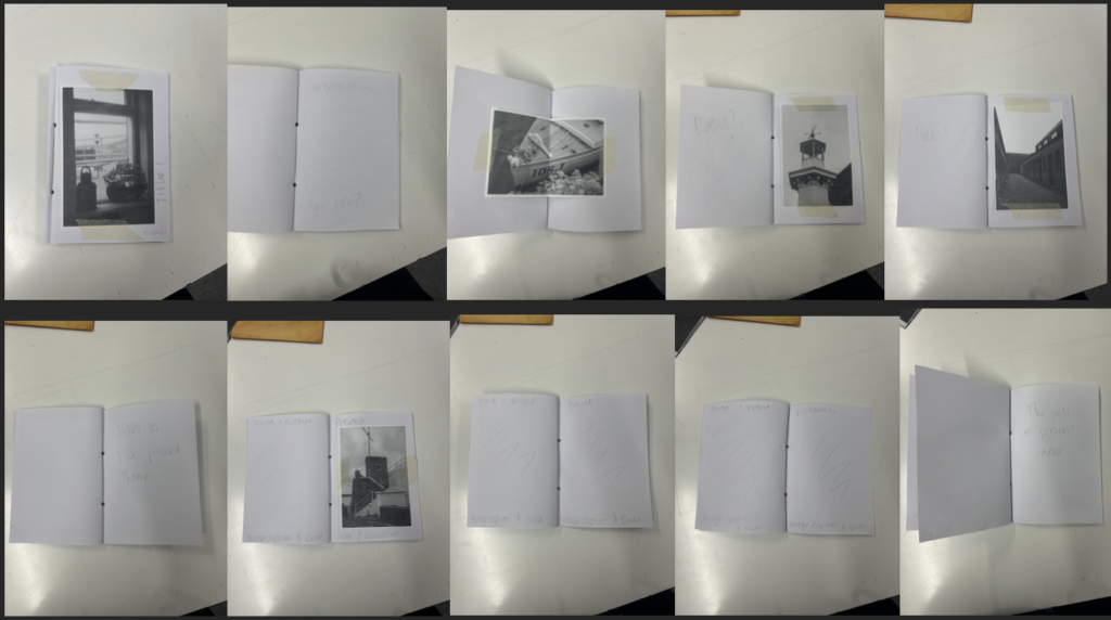

This was my first ever mock plan. I liked the Sequence of the photos however I didn’t really like the Layout of it and the fact that there was too much images to produce so this plan was rejected.
Indesign plan:
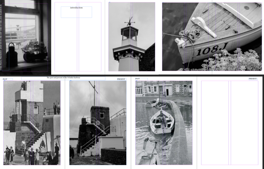
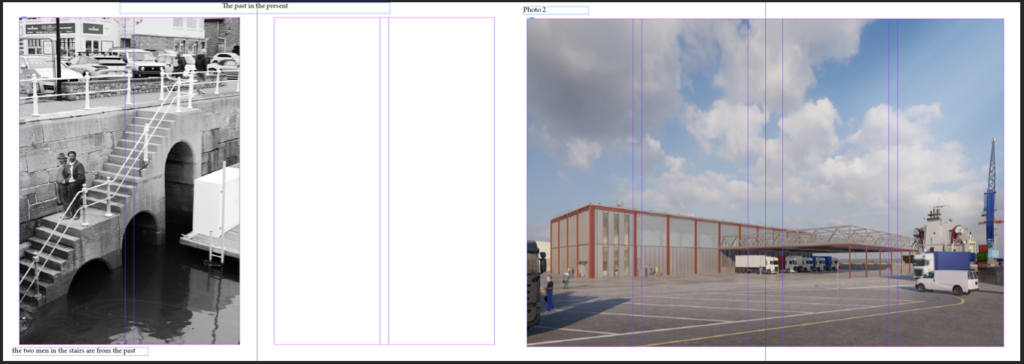
I liked the layout more and the features however the fonts and writing weren’t what I was looking for and there was too little images so I wanted to incorporate more images so this plan was rejected.
Actual Indesign plan:
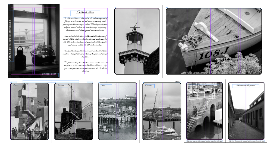
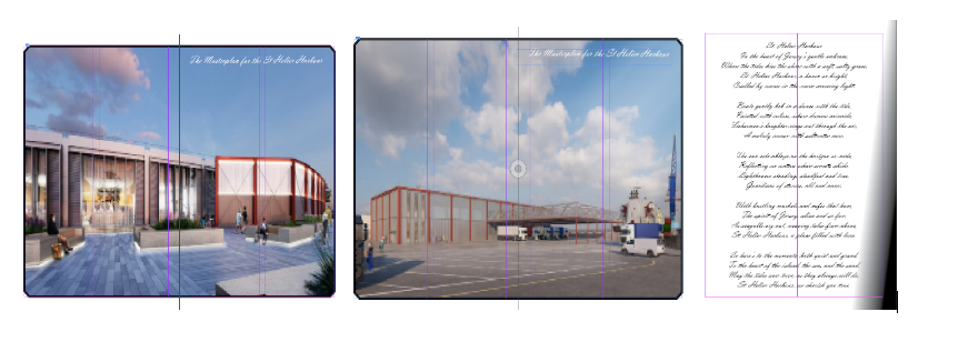
I loved everything about it, I liked the layout the sequence of images and most important the fonts and placement of the text. The design of the zine was also something that I was extremely proud of.
What is the difference between photographs that are mirrors or windows?
Mirrors tends to classed as quite subjective and romantic. It has denotations of a photographers sensibility of view which is a projection of self. Windows is objective, it explored the exterior region and illustrates reality and presence
John:
“The pictures included here are arranged in two
sections,”
Szarkowski suggests that there is a,
“fundamental dichotomy today between photographers
who believe that all art is concerned with self-expression
and those who see it as a means of exploration”
“Art is a mirror, reflecting a
portrait of the artist who made it, and those who see it as a
window, through which one may better know the world”
Jed:
White, toward an idealist, “romantic” goal of “self-expression,” a “mirror” that primarily describes the self; Frank, toward an introverted “realism,” involved with the “exploration” of a private “window” on the world.
“the general movement in American photography in the past quarter-century has been from public to private concerns”
Now, in Mirrors and Windows, he presents a binary theory of photography as art: an evolution from public to private concerns
RE-DO this
2. Select two images, one that represent a mirror and another that represents a window as examples to use in your essay.

Mirror-Cindy Sherman

Windows- Henri Cartier-Bresson
3. Use some of the key words that you listed above to describe what the mirrors and windows suggest.
Mirrors: subjective, personal, romantic, sensibility, private, expression, projection and complex,
Windows: objective, exterior, documentary, tableux, public, escape, landscape, still life, explore, world and elements
Please note that AI may have been used to construct this blog
photography is where you turn something ordinary into extraordinary and it can also be something like putting a frame into something and capturing that moment. It creates curiosity of who is the people framed in the photo and what lies outside the frame, it can transform what it describes. The camera is objective. Its like a story never ends in a photography because the photo was put into a frame with never ending ellipsis. Many say that photos can intrigue, outrage, disappoint and move people/society.
Supposedly, photography was invited in 1839, however the idea of it has been known way before 1839 and was used for a millennium.
Camera Obscura which is a Latin word for dark shadow is a technique consisted of a dark room with no light emitting in the room. Then a small hole or circle would be made to allow light to enter. After 20 minutes, and upside version of what is outside, emitting from the hole , should be displayed on the other side of the wall. The longer you wait, the more detailed image you will get. This technique was seen as something deep, primitive and natural.
Done like this,
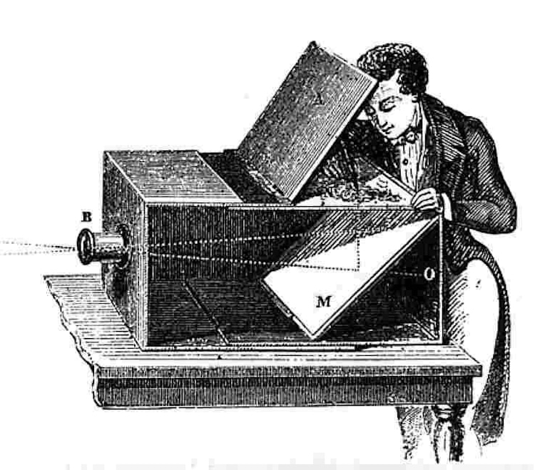
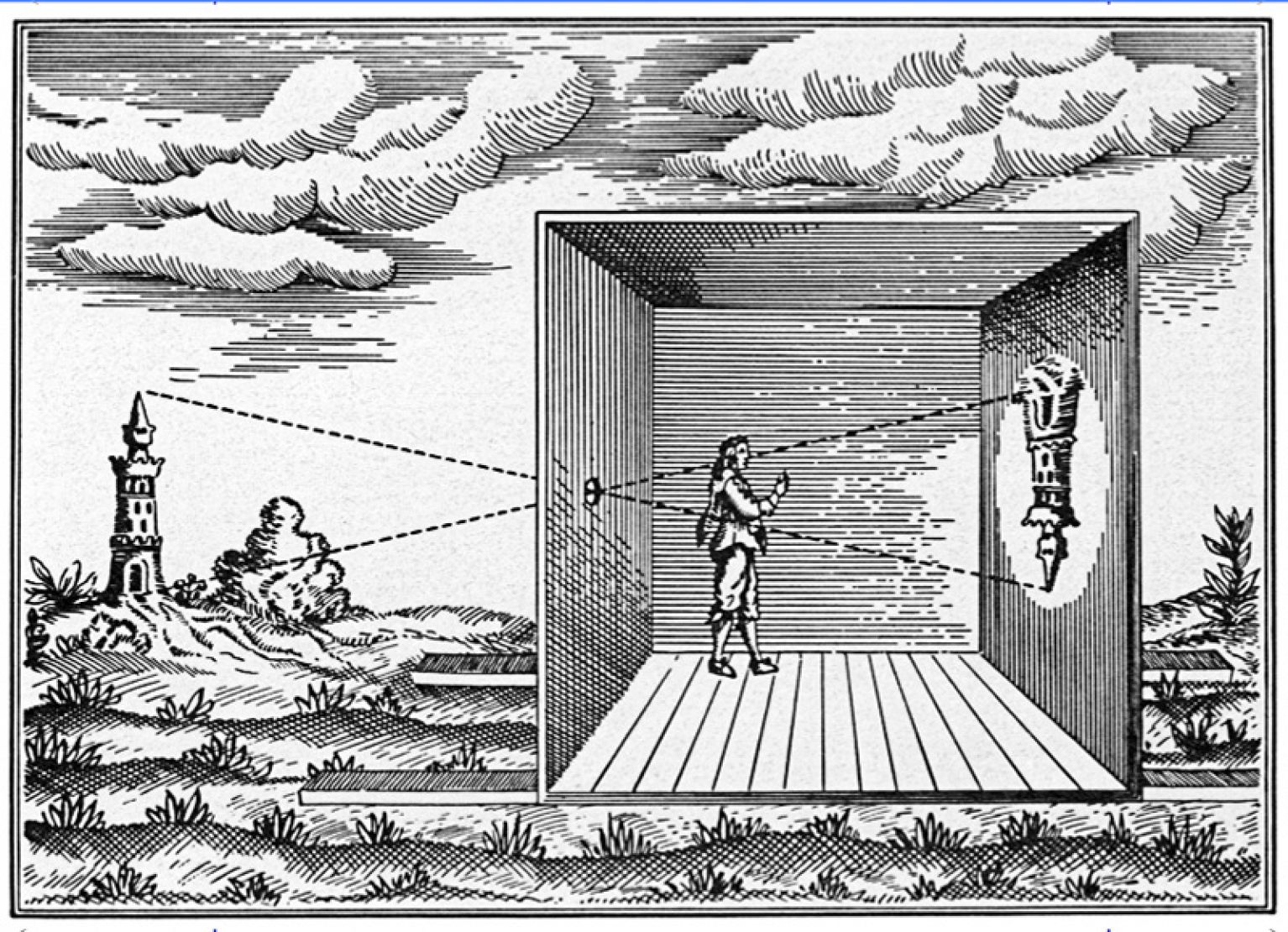
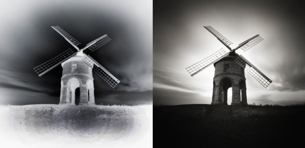
Pinhole photography uses the most basic concepts of a camera. A lightproof box, an aperture, and light-sensitive material. Light is passed through the pinhole to project an inverted image onto the paper or film on the opposite end of the camera. The distance between the pinhole and film determines the angle of view.
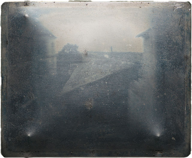
The Niépce Heliograph was originnaly made in 1827, during a period where there was fervent experimentation. It was and still is the earliest photograph produced with the help of the camera obscura known to survive till this day.
The photography shown below was made by Joseph Nicéphore Niépce where he was born in 1765 and died in 1833. He was born in a prominent family in France. Encouraged by the ever growing popular demands for affordable pictures, his photographic experiments were conducted with the dual aims of copying prints and recording scenes from real life camera. He produced legible but fleeting images or points de vue, as he called them, in 1816. Over time, he tried to order chemicals, techniques and materials to advance the process he ultimately called héliographie, or ‘sun writing’.
To make the so called heliograph, he dissolved light-sensitive bitumen oil of lavender and put a thin coating over a polished pewter plate. He then would insert the plate into a camera obscura and put it near a window in his second-story workroom. After several days of exposure to sunlight passed, the plate yielded an impression of the courtyard, outbuildings, and trees outside.
The daguerreotype is a direct-positive process, creating a highly detailed image on a sheet of copper plated with a thin coat of silver without the use of a negative. The process required great care. The silver-plated copper plate had first to be cleaned and polished until the surface looked like a mirror.
The daguerreotype was the first commercially successful photographic process between 1839 until 1860 stated in the history of photography. It was named after the inventor, Louis Jacques Mandé Daguerre.
In 1829, Louis partnered with Nicéphore Niépce, as mentioned above, the inventor of the first heliograph in 1822. However when Nicéphore Niépce suddenly died in 1833, Daguerre continued experimenting and produced the process which would later be know as Daguerreotype.

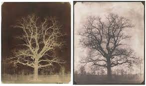
The Calotype was an early photographic technique by William Henry Fox Talbot of Great Britain in the 1830s. This technique consisted of a sheet of paper coated with silver chloride that was exposed to light in a camera obscura. The areas that where hit the most by light became darker which yielded a negative picture. This ever moving aspect of the process lat in Talbot discovery of a chemical called Gallic acid, would be the key to develop the image on the paper.
This acid would accelerate the silver chlorides chemical reaction to the exposed light. This discovery ensured a shorter exposure time in the camera with the drastic change, down from one hours to one minute.
“for when the eye was removed from the prism—in which all looked beautiful—I found that the faithless pencil had only left traces on the paper melancholy to behold.”
In 1839, late October or some say early November a 30-year-old man nestled alone in the works of his family’s Philadelphia gas lighting business. He noticed that in front of him was a makeshift camera where the cameras lens was fashioned from an opera glass.
He’d realize that the daylight was perfect to expose the meticulous prepared metal plate within the camera and decided to take a photograph of himself. Something that was revolutionary. This meant that he had to remain still and keep his posture for 10 to 15 minutes.
This extraordinary man was named Robert Cornelius, and some might even sometimes joke that he took the world’s first selfie that day. However it was said that he accomplished much more than the term “selfie” implies.

Julia Margaret Cameron received her first ever camera when she was only 48 ,from her daughter and son in law. Before her time of receiving the camera, Julia had followed albums and experimented with printing photographs from negatives. Once, she printed a negative image by developing with Swedish art photographer called O.G. Rejlander where they surrounded the portrait with ferns to create a photogram frame which is basically a combination of an picture made in a camera and a camera-less technique. This showed Julia’s experimental nature and provided us with a glimpse of her photographic practice before she even acquired a camera of her own.
When Cameron actually took up photography, it involved lots of hard and physical work which used potentially hazardous materials. Her set up was a wooden camera, that sat on a tripod, which was was large and awkward. She used the most common technique at the time, which was the production of albumen prints that came from from wet collodion glass negatives. The process required a glass plate which was approximately 12 x 10 inch, to be coated with photosensitive chemicals, in a darkroom and it had to be exposed in the camera when it was still damp. The glass negative would then be returned to the darkroom, to be developed, washed and varnished. Prints were mostly made by placing the negative straight on to sensitised photographic paper and immediately exposing it to sunlight.
She quickly devoted herself to photography and within a month of her receiving her well deserved camera, she made an extraordinary image which she called her ‘first success’. It was a portrait of Annie Philpot, who was the daughter of a family staying in the Isle of Wight where Cameron lived
“The capacity for delight is the gift of paying attention”

The introduction of the carte de visite has many introductions and beginnings, but all agree that they became popular in the late 1850s. They kept their popularity until the late 1860s and the a sudden decline happened decline however they were still produced in the 1900s. Cartes de visite contains of a print stuck to a card mount of about 4 ⅛” x 2 ½” in size. The prints were mostly albumen and then later were used in emulsion based printing out paper. Other uncommon processes, including carbon and Woodburytype, were also used but not as popular.
He was born in 27th of December 1818 and died in the year of 1880, was a British photographer who started working at 230 Regent Street in London in the 1840s and moved to Jersey in July 1848, where he then set up a studio known as the Royal Saloon, at 7 Royal Square. Initially he was partnered up with a Mr Millward, who we know very little about. By the following year, he started working alone and he continued to work in the same studio for another 26 years.
For a bit of time, He worked in London, but judging by the collection of his images which are now held by La Société Jersiaise, he found himself many of willing sitters in the island prepared to pay half a guinea (promoted as “one half of that in London”) to have their portrait taken by him.
As seen clearly, his speciality was cartes de visite and to which the photographic archive of La Société has a massive collection of these. They can be seen on the on line archive , on the website. They possess about 9600 go his images however the majority of these are set were up to 16 photographs taken in one single setting.
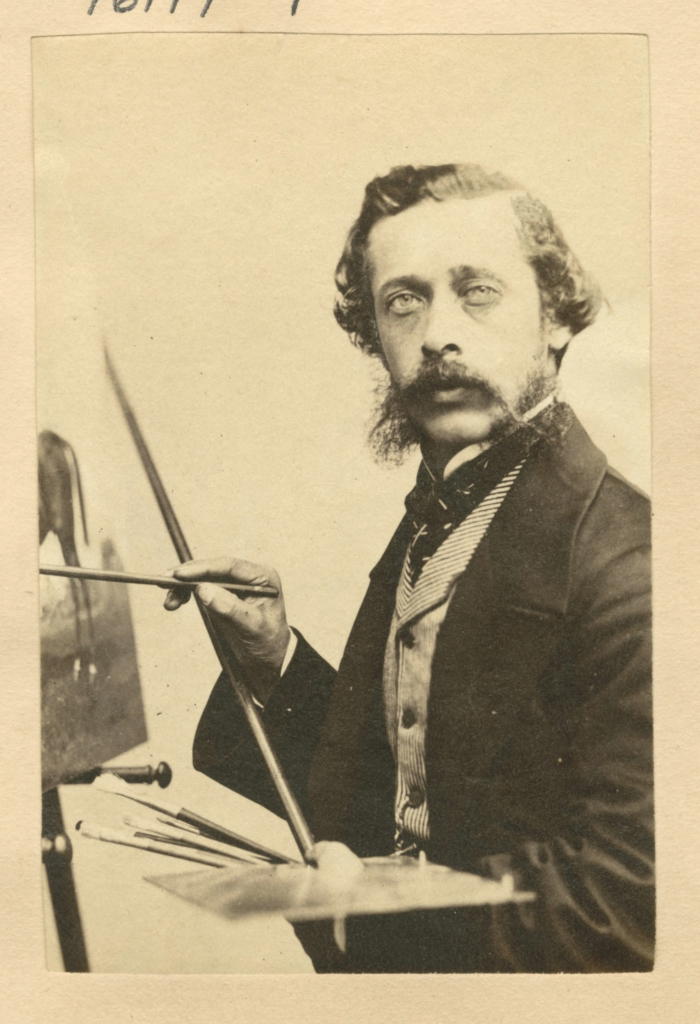
Richard Leach Maddox who was born in 1816 and then later died in 1902 was an English photographer who was also know as an inventor who was recognised in his significant participation in early photography. He is remembered for developing something called the ‘dry plate’ process. This process made photography more accessible and practical compared to the earlier wet plate techniques that were used. His discovery aided pave the way for the extensive use of photography in the late 19th century.
His creation of the dry plates made it easier to handle and meant that it could be stored for a longer time, which greatly enhanced the convenience of photography. He was also involved in various photographic papers and equipment. His handout were necessary in the evolution of photographic technology
My first lens was bought about 1846, but active professional duties prevented its being used until 1852; from that date onwards, as an amateur, I have been interested in photography’.

George Eastman who was born in 1854 and then died in 1932 was an American entrepreneur and inventor who diverted a crucial role in the construction of modern photography. He was best known for founding the what was called, The Eastman Kodak Company. He also was know for popularizing the use of roll film, which then made photography even more accessible to the public in general.
Here are some key contributions of George Eastman:
“Light makes photography”

The Kodak brownie was made to ensure that photography was more accessible to the public, especially amateur photographers to encourage them to pursue photography even more.
Here are some key features and historical significance of the Brownie:

Print and Film photography are traditional methods of producing and capturing.
Film and print photography have played and are still playing a crucial role in documenting history, art, and especially personal experiences. The tangent nature of film, onwards with the procedure of darkroom printing, has a tendency to appeal many photographers especially the ones who enjoy the hands-on aspects of the skill.
Even though there is a high rise in digital photography, film and print will always remain popular amidst enthusiasts for their particular aesthetic qualities especially the distinct processes involved.
The photographers that contributed to Film photography were artist like Joseph Nicéphore Niépce and Louis Daguerre. They were key features the early history of film. However George Eastman played a critical role in making photography accessible to the public.

Digital photography is something that has been popular for awhile and will continue to be so. It’s the process of catching images using digital cameras which record light through sensors called ‘electronic sensors’. Unlike traditional film photography, where it captures images on light-sensitive film, digital photography transforms the captured light into digital data.

This method consisted of ‘printing out’ which meant that the image would be formed by light rather than developed out of chemicals. The chemistry of this method involves solutions of sodium chloride like table salt and silver nitrate which when combined would convert to light sensitive silver chloride.

please note that AI may have been used to construct this blog post
Chosen images:
Virtual gallery 1:
Virtual gallery 2:
Virtual gallery 3:
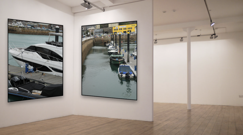
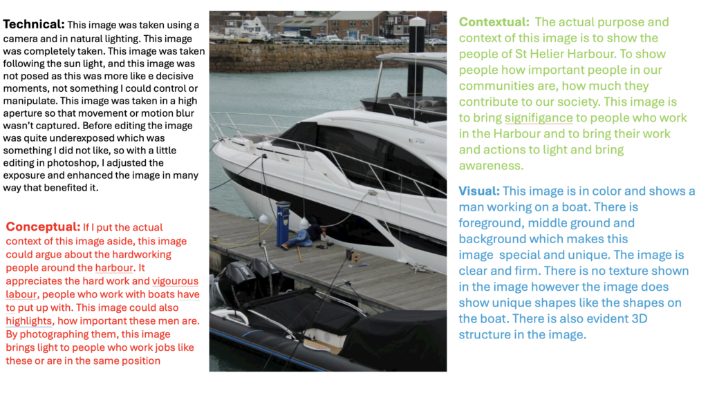
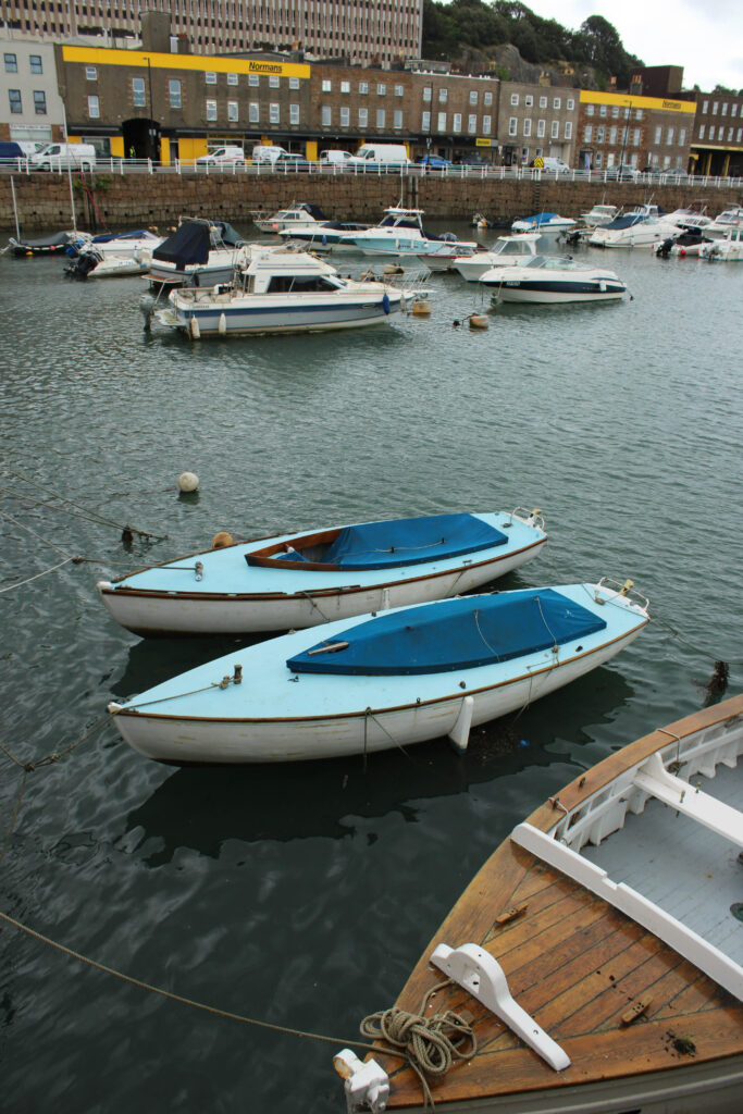
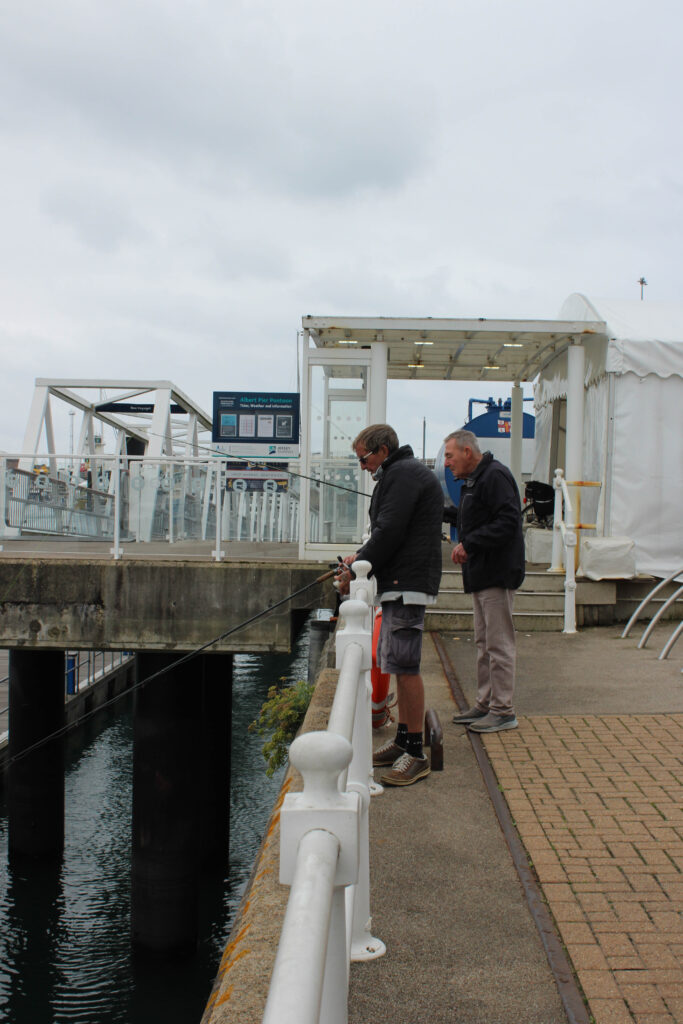
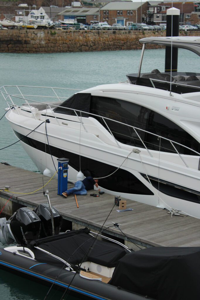
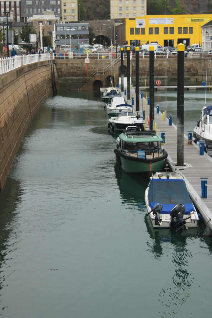
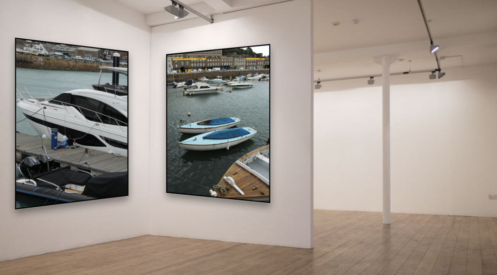
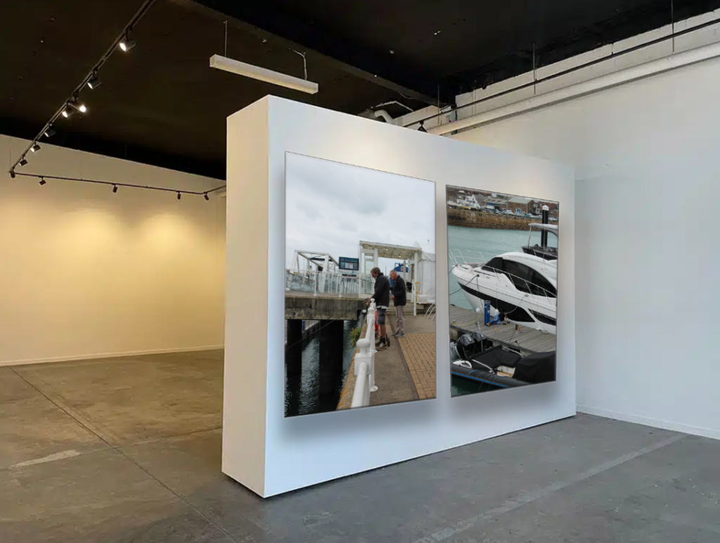
Overall, I am really satisfied with my final presentations and virtual gallery. This is because my images show what The St Helier harbour is like. What defines it, like the boats, sea, harbour and the people.
Some images I have presented in the virtual gallery compliment each other and some are polar opposites. I did this to show diversity and creativity but also because I thought it would look great. The images that compliment each other are linked. For an example the virtual gallery with the two images of boats, complement each other because they are both showing boats. I really like this because it creates order which is something that is satisfying. I show polar opposites in the virtual gallery which shows two men fishing and one working on a boat. This is polar opposites because one image focuses on men and the other focuses more on boats. This is because the images which has a boat you can barely notice the person. I really like this because in the two images I focus on something which shows my ability to focus and zoom into moments.
Finally, I believe that my editing could’ve been better. The editing in these images is very simple and boring which is something I don’t really like. To improve I could’ve used more colour in my images. I could’ve edited them in a way that enhances the sea as its something that almost all of my images consist of.
Experimentation 1:
What i did:
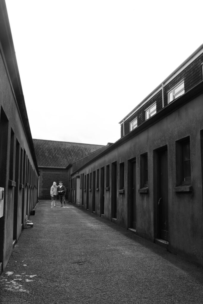
For this image, I opened photoshop and pressed new and pressed A4 portrait. Then in Lightroom I exported an image of the harbour and edited the image in black and white. Then using an image from the Jersey archive, I used the objection tool in photoshop to select the two kids in the image and then placed them on the black and white image. I then placed the two kids in the most appropriate place in the image. This was all I did for the experiment. I really liked how this image turned out so I was inspired to produce another one like this and use it for my zine.
Experimentation 2:

What i did:
For this image I did the exact same for experiment 1, I opened photoshop and pressed new and pressed A4 portrait. Then in Lightroom I exported an image of the harbour and edited the image in black and white. Then using an image from the Jersey archive, I used the objection tool in photoshop to select the two men in the image (same image used in experiment 1, just different people) and then placed them on the black and white image. I then placed the two men in the most appropriate place in the image. This was all I did for the experiment. I really liked how this image turned out and was certain that it was gonna be used in my zine.
Experimentation 3:
What i did:
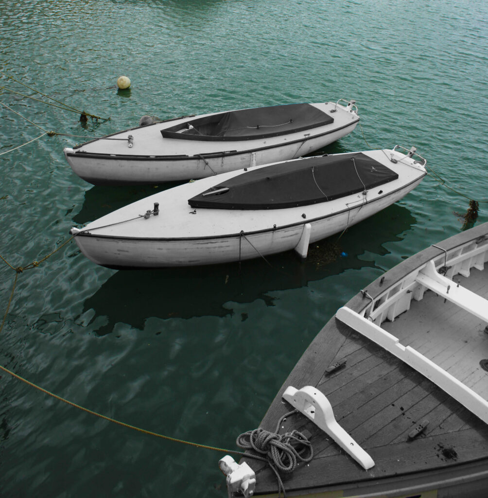
For this image, I opened photoshop and imported the plain image of the three boats onto photoshop. I created another layer to this image and in this layer I focused in editing the sea. I made the sea much greener and intensified the green tones it had. I then selected the first layer and with the objection tool, I selected the boats, took the editing/ colouring that was done to them when I was editing the sea and edited them in black and white by using adjustments and and I also cropped this image so that the focus was the boast and the sea, that’s all I did to this image. I didn’t really like how this image turned out. It was quite awkward and random so this image was rejected. However I wanted to do the method I used in this image differently so I tried it again, as seen below.
Experimentation 4:
What i did:
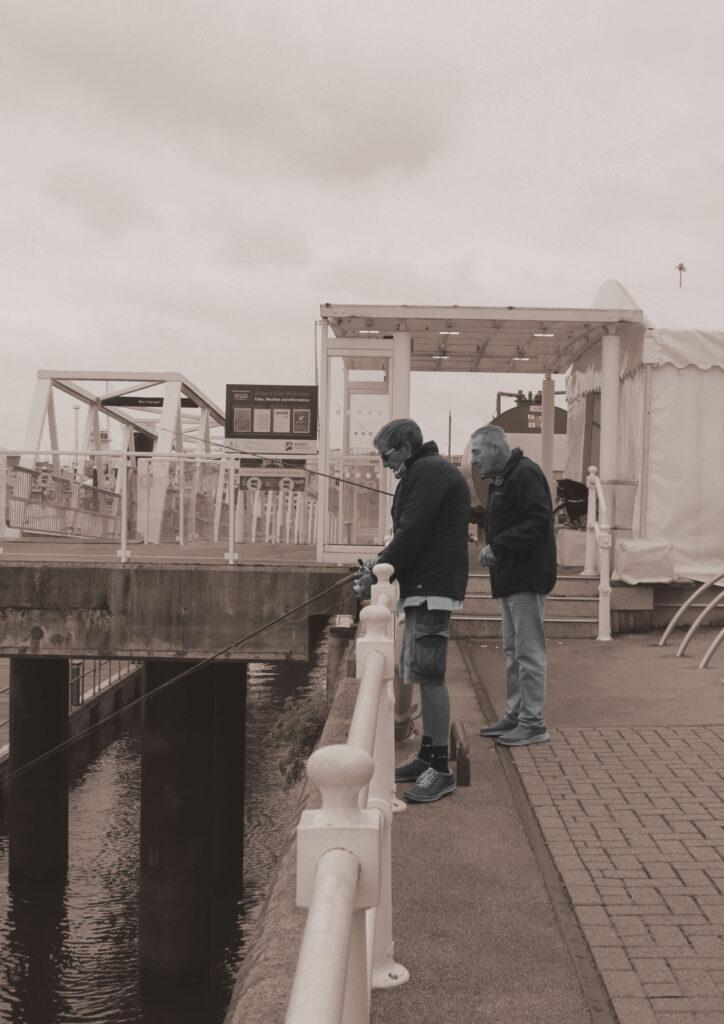
As stated above, I did exactly what I did for experiment 3 however just slightly different. For this image, I opened Lightroom and imported the plain image of the two men fishing onto Lightroom. I applied soft sepia to the image and then exported the image to photoshop. In photoshop, I created another layer to this image and in this layer I focused in editing the men. I selected the second layer to the image that I created and with the objection tool, I selected the men and took the editing/ colouring that was done to the background and edited them in black and white by using adjustments and filters and that’s all I did to this image. This image was rejected because I didn’t like the sepia colour and the men in black and white. It looked strange.
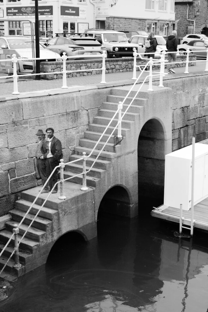

Out of all of the experiments shown above, I chose these two because I thought that they were the best edited and realistic. I liked how the past people were incorporated with the present really nicely. I also thought that it would be perfect in my zine as It could fit the narrative I was going for.