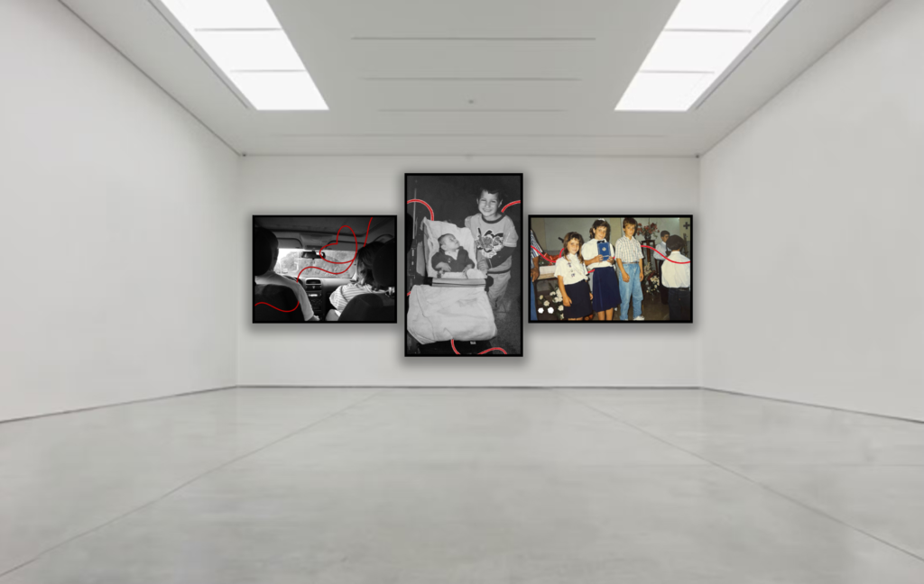
red line editing:
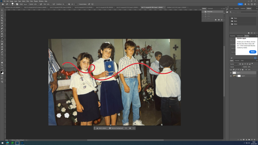
For this editing, I searched red line/ stitch on the internet and found an image that I was satisfied with and uploaded it onto Photoshop. In Photoshop, using the objection tool on the left, i selected the red line and moved it to the tab where the image, seen above, was. I placed the red line on top of the people seen in the image and decided if i need to make the line bigger or smaller or where the line needed to be positioned.
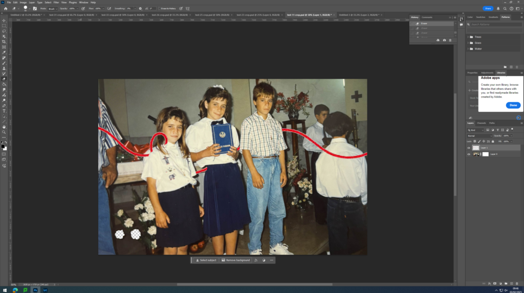
I selected the layer which the red line was on and used the rubber tool seen on the left side, to rub out the parts of the red line I did not want to be seen. I wanted it to look like the red line was going through the people seen in the image. As if they were connected by the red line, the ‘bloodline’.
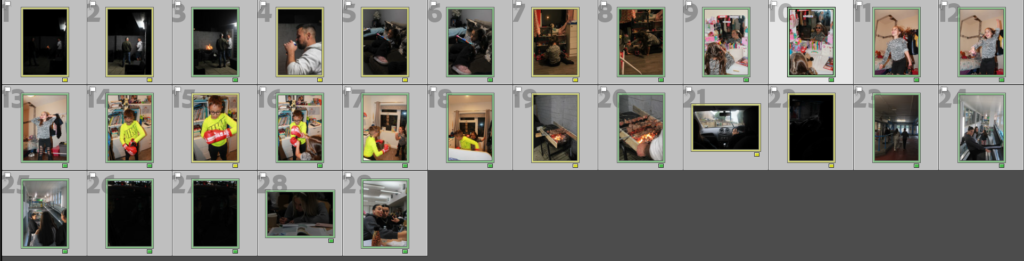
Update 1:
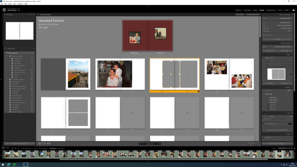
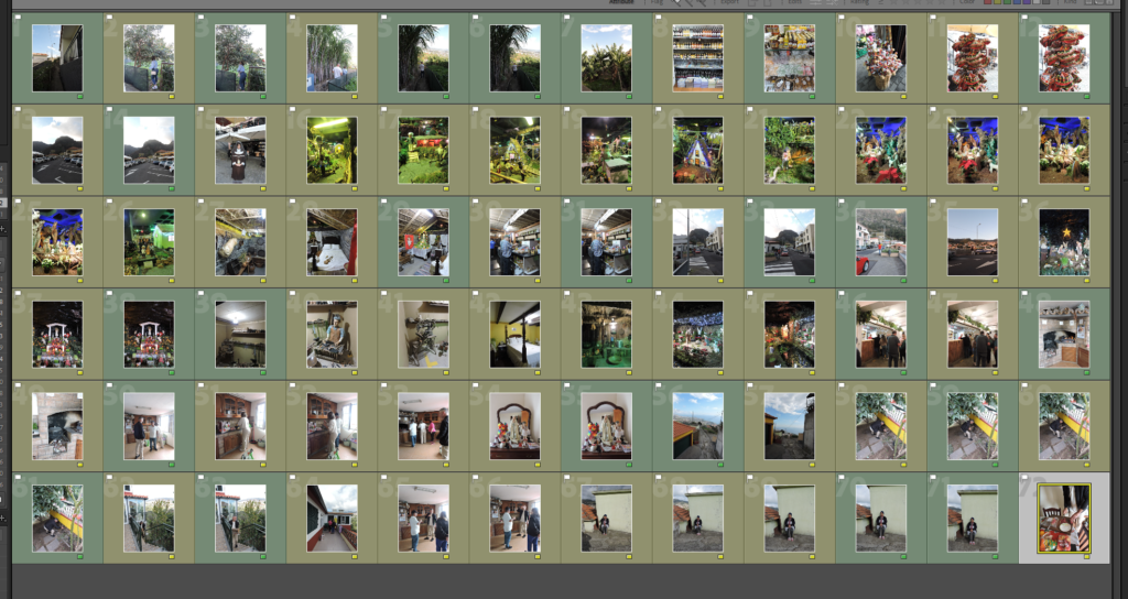
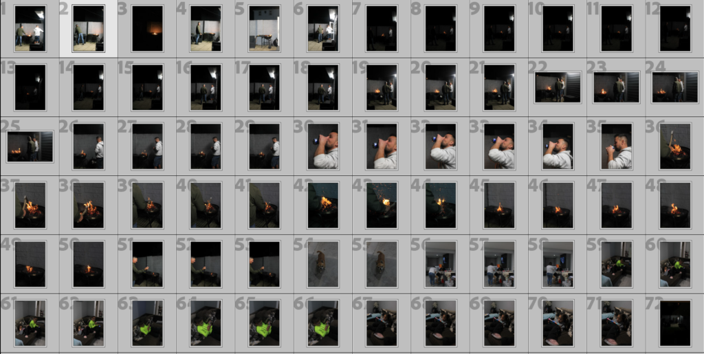
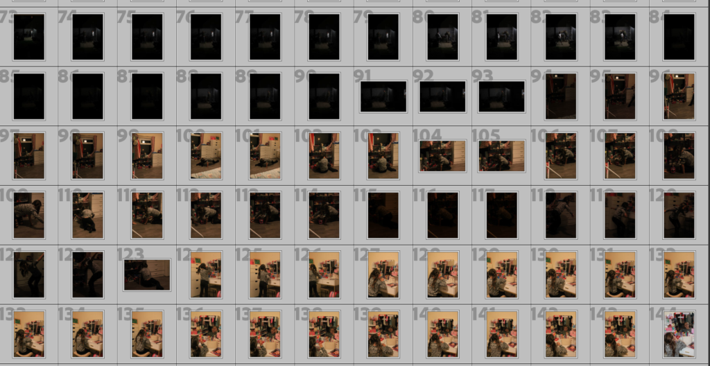
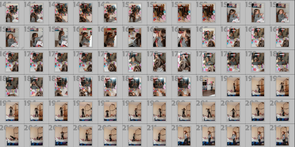
This is the first update for the photo book I have. In this update I had the front cover done and started adding images onto my book.
Update 2:
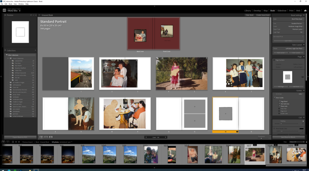
In this update, loads of things were changed. Photos was changed, structure of the book was changed. This is also where I started playing around with picture framing and positioning.
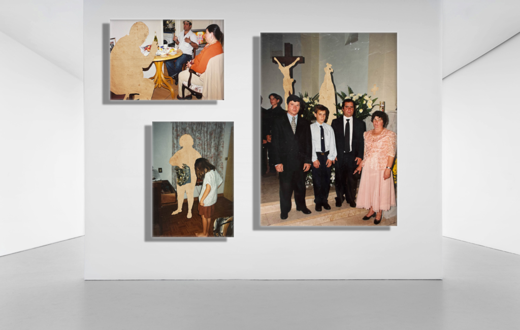
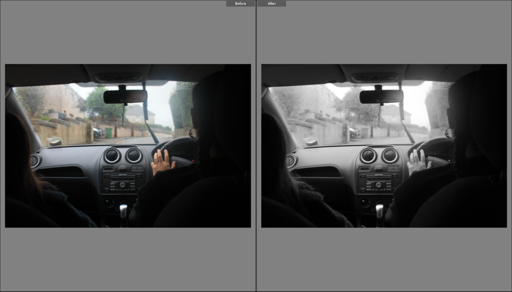
Paper editing:
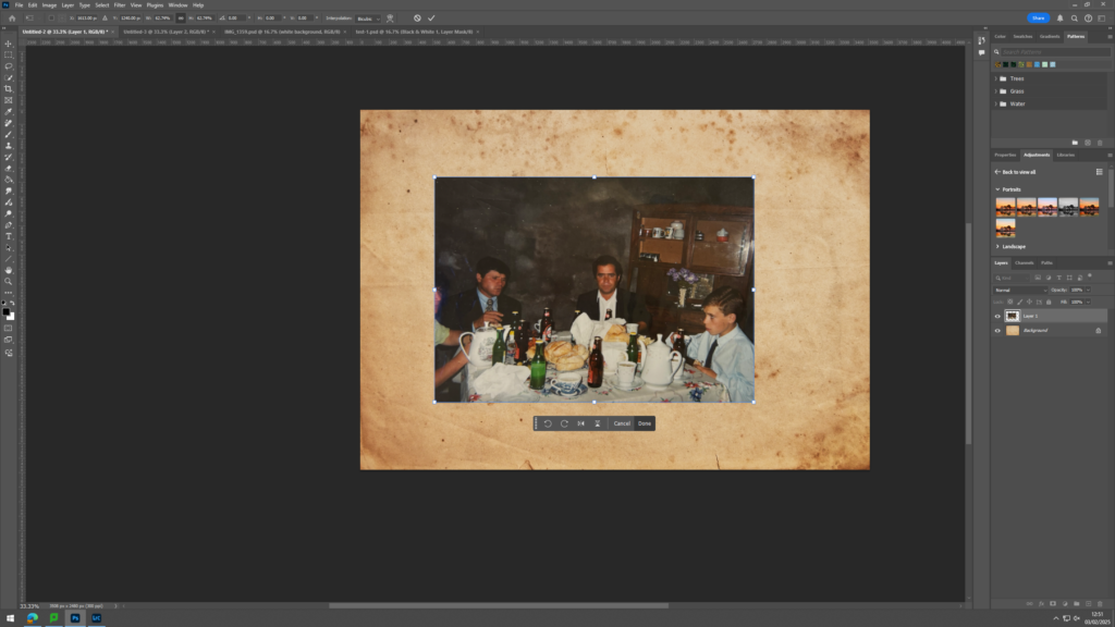
For this image, I searched in the internet for a yellow and old paper and uploaded the image that I was satisfied with onto Photoshop. After the image was uploaded onto Photoshop, I copied the image that I wanted to edit, found in my documents, onto Photoshop and applied the image on top of the paper, creating a second layer in Photoshop.

pressing the layer where the image is in and using the objection tool on the left side, I selected a person from the image and cut them out. I moved the selected section from the image, away from the image to reveal the old, yellow paper under it.
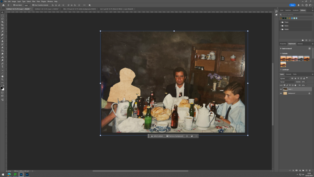
I moved the selected section from the image, away from the image to reveal the old, yellow paper under it. This was all I did for this edit.
Update 3:
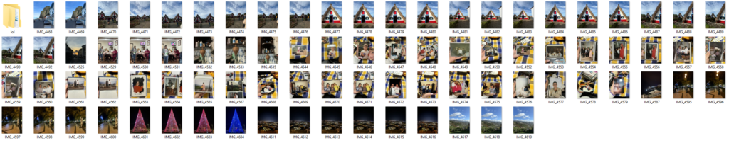
In this update, I started adding text to my images and playing around with the color of the text. This is also where I was trying to figure out where to put my text and how to smoothly add text in my book. I also started to add more images in my book and different frames to my images. I also started to figure out whether I wanted to have images that have a border of full bleed.
Update 4:
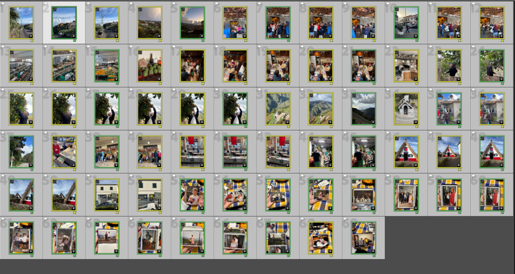
In this update, I started to be happy with the structure of the book and kept it constant throughout the book. I figured that I would start with a house of my grandparents and then and image of them in the next page. I also did this when I introduced images of my parents. After showing an image of my parents further into the book, I added an image of our house. This is where I started to find a more stern structure in my book and used different techniques like juxtaposition and match cut.
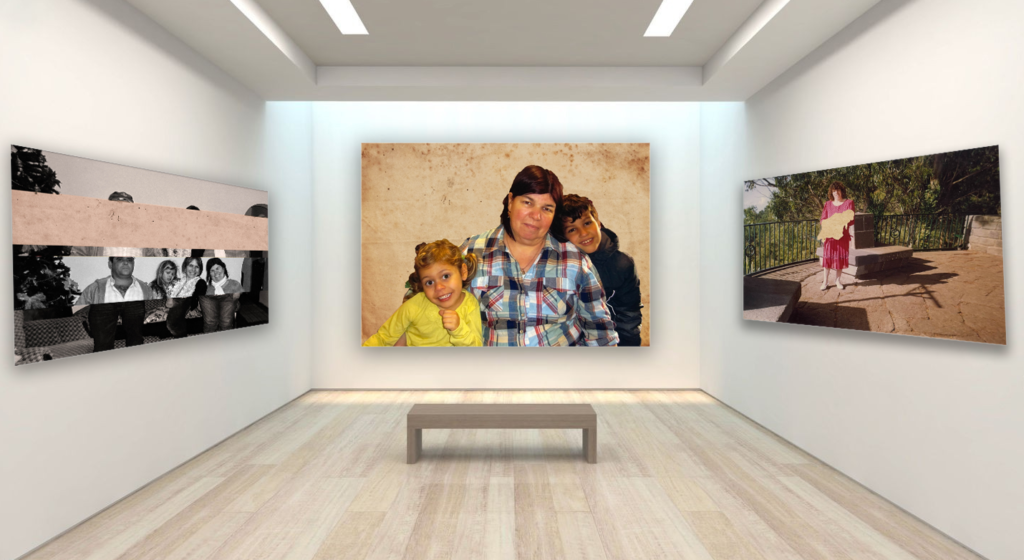
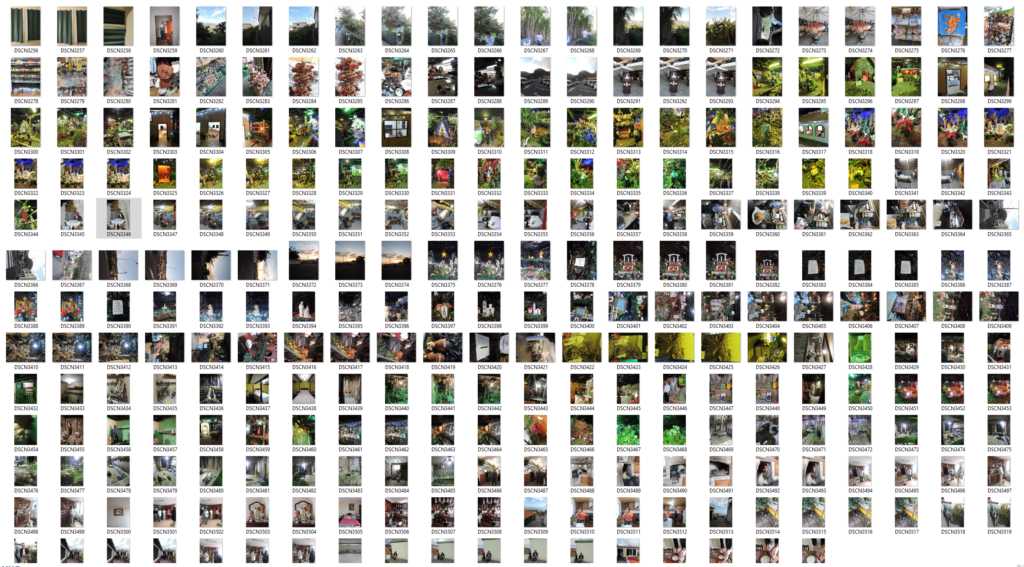
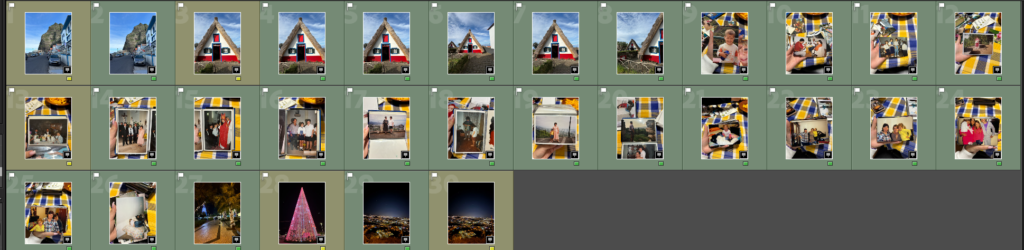
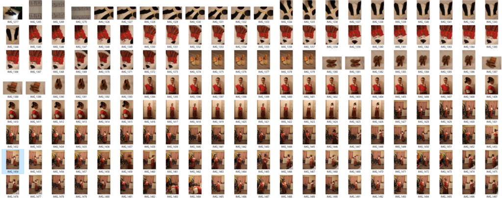
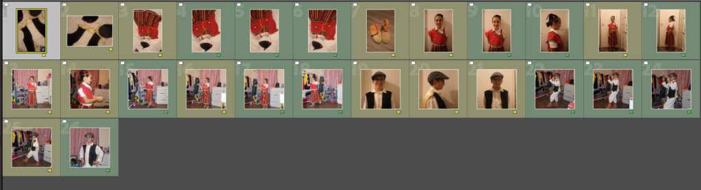
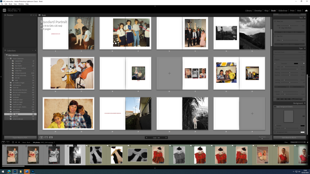
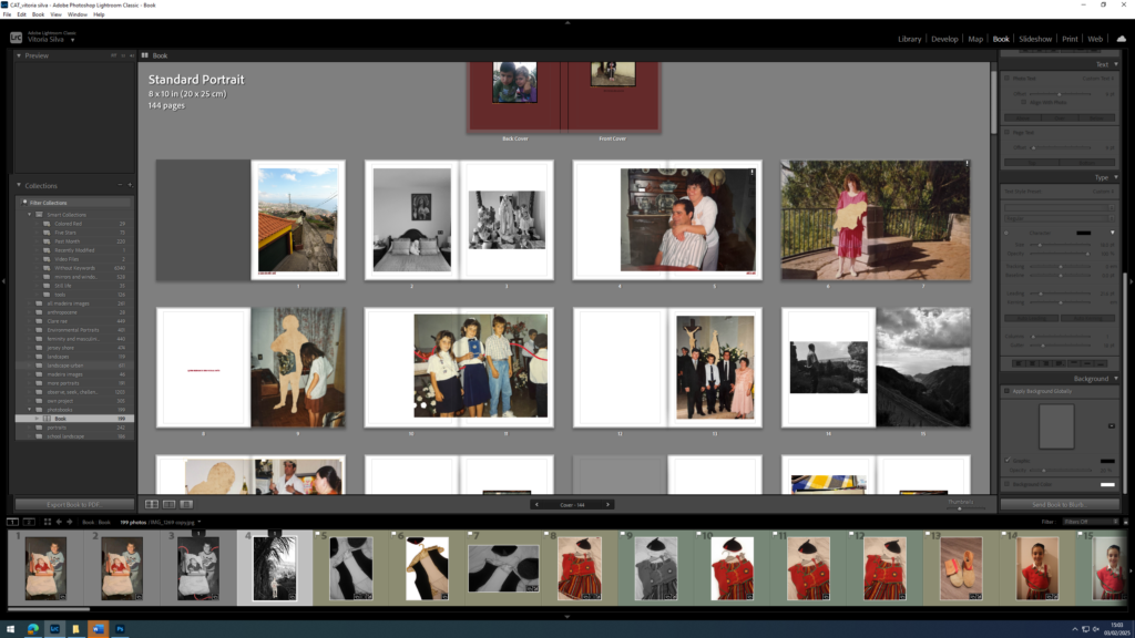
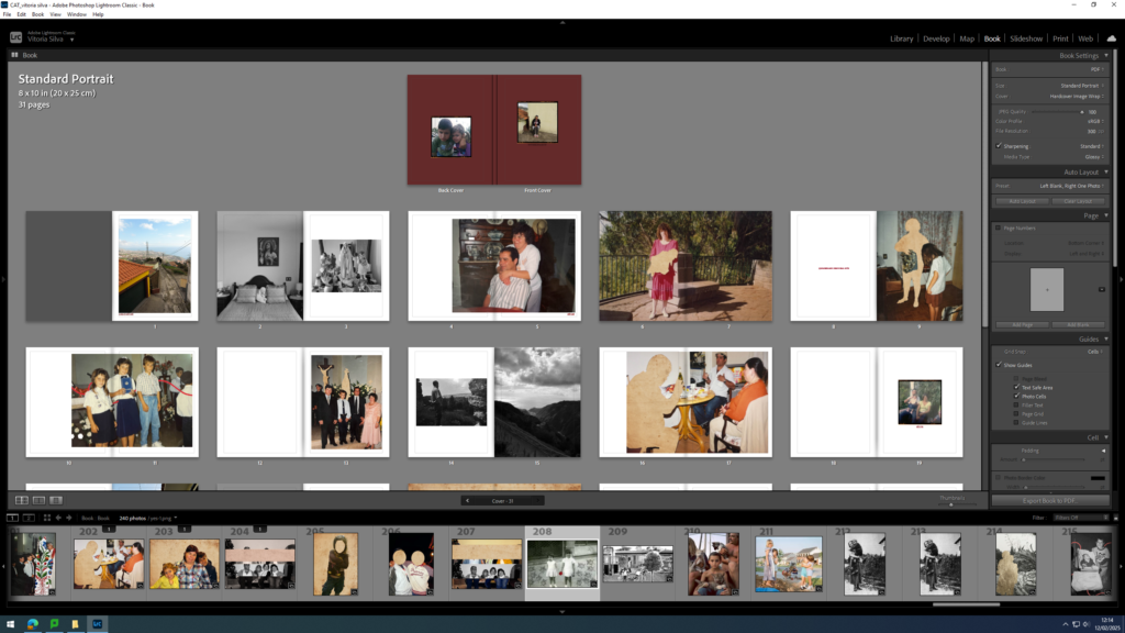
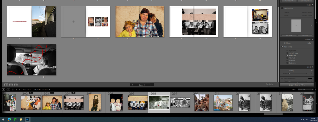
Full overview of final Photo Book:
Conclusion and evaluation:
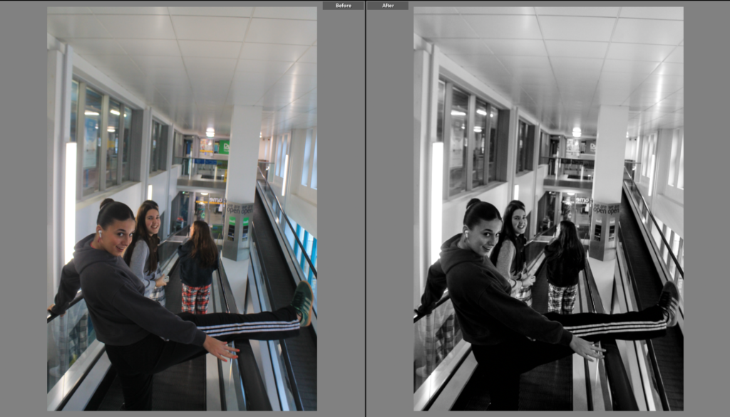
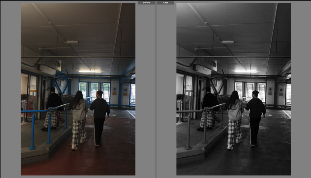
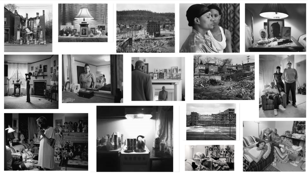
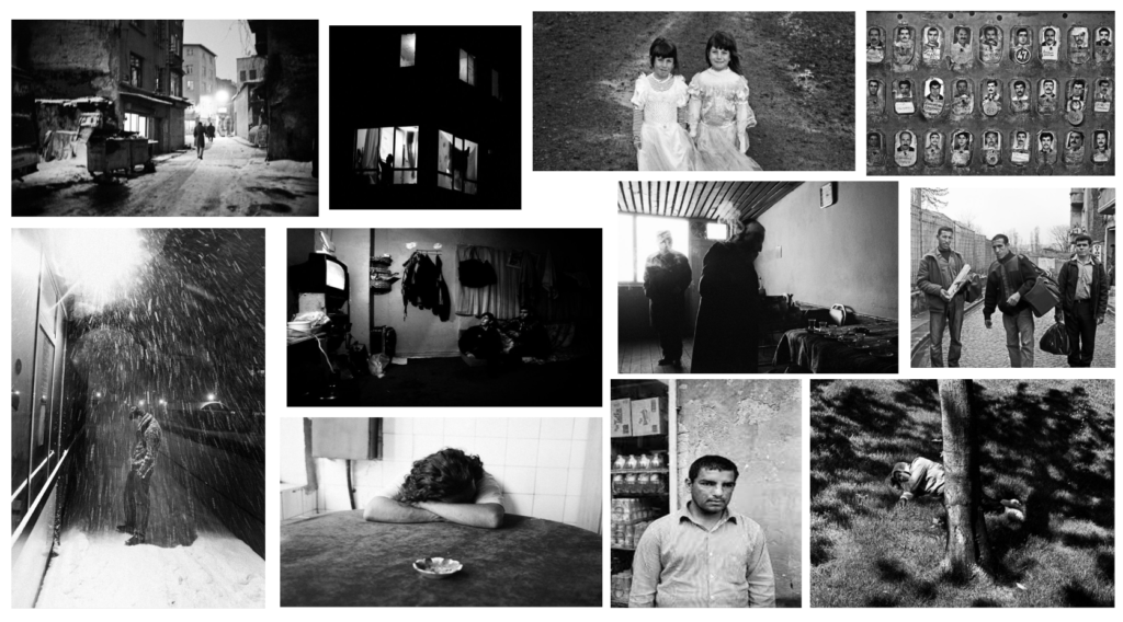
In conclusion, I think that I did really well in terms of editing. I was clear and strong with my editing and even showed repetition within my editing to show a clear inspiration found because of my two artist I studied. The use of red lines and aged paper was a clear inspiration from Carole’s work and the nostalgic editing seen in some of my images implies a clear understanding and innovation towards Jo’s work.
My overall editing was simple but effective. I didn’t do a big amount of editing in my images but I did enough to enhance my images and show inspiration.