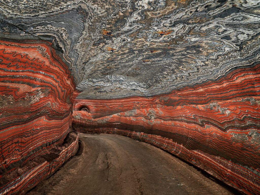
The Anthropocene Project is a multidisciplinary body of work combining fine art photography, film, virtual reality, augmented reality, and scientific research to investigate human influence on the state, dynamic, and future of the Earth.
The Anthropocene Epoch is when human activity started to have a significant impact on the planet’s climate and ecosystems using a unit of geologic time, used to describe the most recent period in Earth’s history. So, basically when humans had an effect on the earth’s nature and shows the negative impact humans had on it.
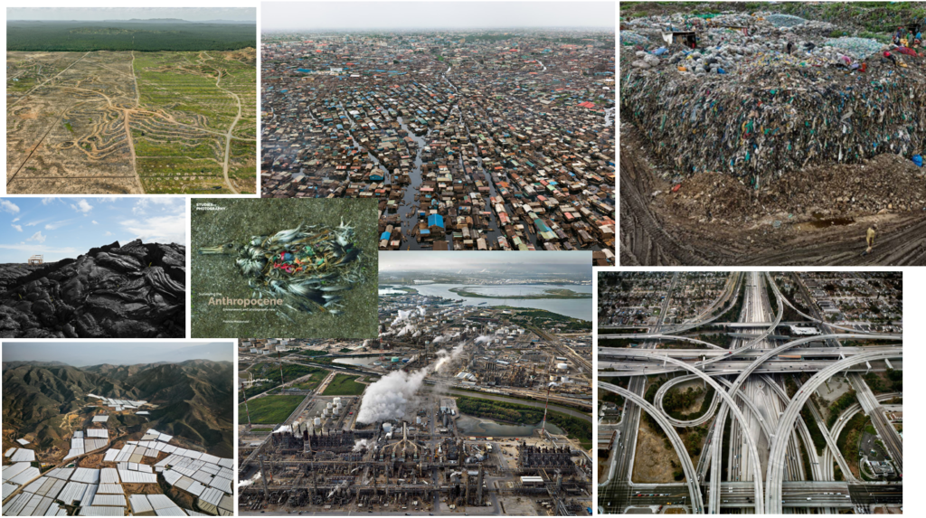
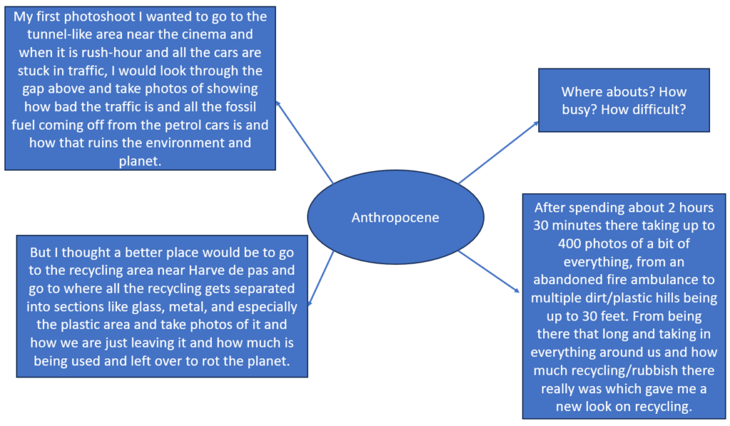
Mind map/Mood board:
What are some of the issues explored?
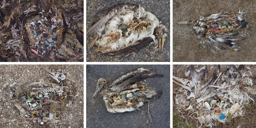
Some issues explored in Anthropocene photography are that it mainly focuses on humanity which believes that humans are responsible for everything that happened towards nature and the environment, such as fossil fuels making the air more polluted which is worse for our lungs and animals. Another example would be how much plastic there is in the sea which is due to humans littering and it ending up in the sea, then fish, birds and other sea animals would end up eating this plastic we deposited and then would end up dying and/or when we catch the fish and cut them up to eat, we can see all the plastic they have eaten in their body.
Are the Photos Beautiful?
Some of the photos we see from Anthropocene photographers are very stunning to look at ascetically of the big distances or landmarks like mountain ranges or fields/rivers. But, a lot of the photos they take are not helping the bad ecosystems or climate change, but they are spreading awareness for other people to react and start fixing the world.
Do you think that these photographers are solving the problem?
These photographers are not aiming to solve the problem of the litter in the ocean and animals and any other problems humans have done. But, what they are trying to achieve, is to spread the awareness of the litter and show normal people who may be the reason for the littering how bad it is and what it actually does to animals and the earth. Also, shows their way of caring for the animals and planet by showcasing all the negatives towards the public.
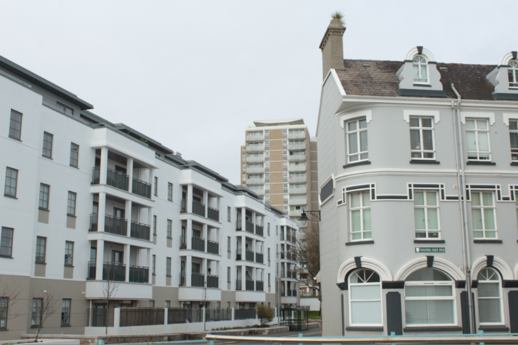
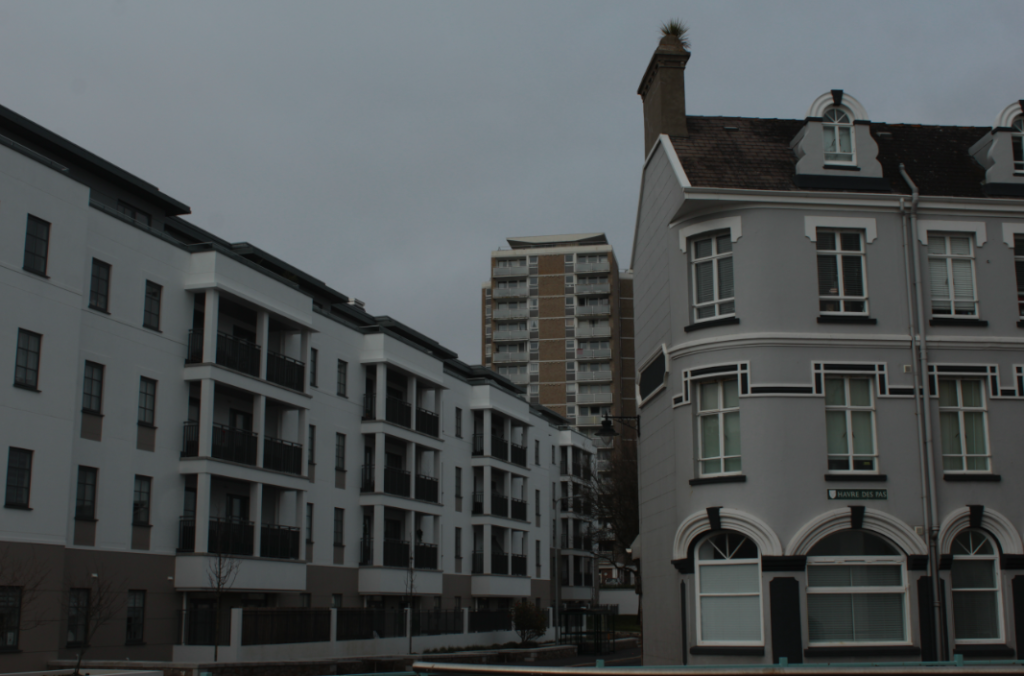
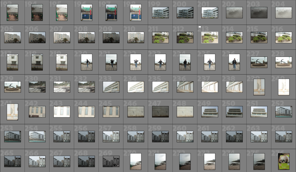
I started by seeing this perfect angle with these three buildings next to each other. At first they look similar, but if you look closely you can see they are all different styles with the front right building being old fashioned with the curved walls and windows and with the pointy roof chimney. The building in the back being 50/50 old and new with the old style of colours/windows and materials. But the new style with balcony’s and straight edged walls and so finally the long building to the left being fully modern with the white plane walls, mixed with black balcony gates, plus modern looking windows and straight walls and roof.
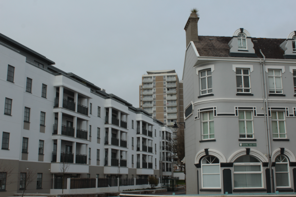
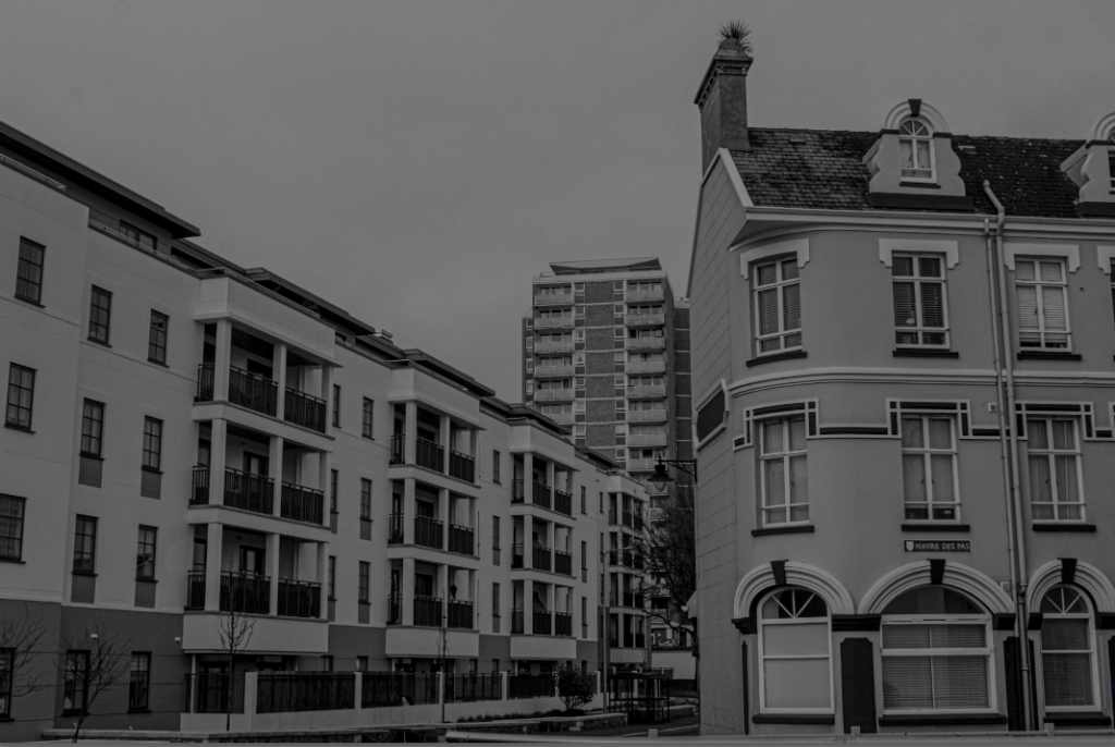
I really liked how these three different exposures looked but I felt confident with trying the B/W style on it. This worked very well with still showcasing each era of buildings but also the same contrast gives the photo the same idea of buildings.
This was the final photo after editing and the B/W added on top of it came out just as I imagined. I also love how each building is a different shape with the left building being rectangular going away from the camera. The right square-like building standing flat, face-on towards the camera and then the tall building in the background still very distant from the other two but still stands out as a main view in the photo.
For this photoshoot, I went from Havre de pas area towards the energy station focusing on urban objects, buildings and structures. I tried to include the man-made vs nature aspect in Jersey with the old/broken structures mixed with the overgrown trees and plants but also new buildings next to old.
Topographic Photography is a technique in which typically a landscape is being photographed from afar.
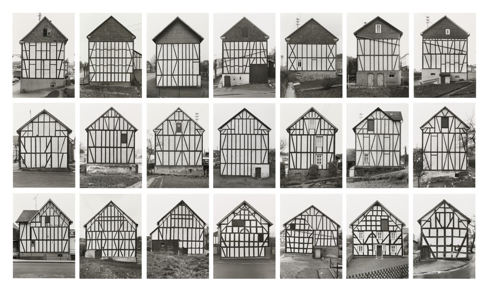
New topographics was a term coined by William Jenkins in 1975 to describe a group of American photographers (such as Robert Adams and Lewis Baltz) whose pictures had a similar banal aesthetic, in that they were formal, mostly black and white prints of the urban landscape.
Some very important New Topographic Artists were, Robert Adams, Frank Gohlke and then Bernd and Hilla Becher.
Robert Adams focused on changing landscape in the American West. ‘New Topographic’ from Adams, meant the romanticism and idealism traditionally associated with landscape photography. Instead, they adopted a more objective and detached approach to capture the contemporary urban and suburban environment.
Frank Gohlke was also an American but he received two Guggenheim fellowships from the national Endowment for Arts. Gohlke’s oeuvre is marked by a preoccupation with framing landscape as a manmade construct: an artefact of the way we live, a projection of human actions, ideals and aspirations onto the horizon. Landscape is where the human and the natural worlds connect, and in Gohlke’s view, humanity’s power is limited, fragile and temporary.
These topographic photos show a connection between nature and the human aspect called juxtaposition. These two differences join together to create contrast and show how humans and nature always conjoin throughout life.
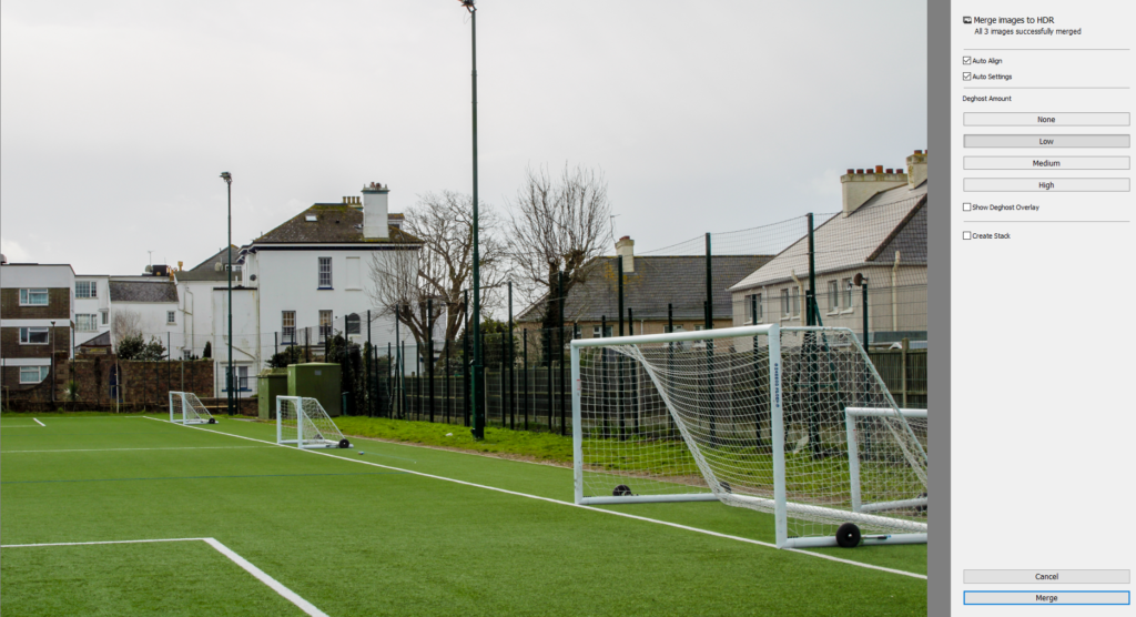
I used a method of HDR Merging which involves 3 or more of the same picture but at different contrasts and exposures. This is done by a tool on the camera which we set to 16/f-stop and used a shutter release with instead of taking the photo on the actual camera because we needed the photo to be still and in the same place for each photo and with any contact on the camera it would of moved it, even with a tripod.
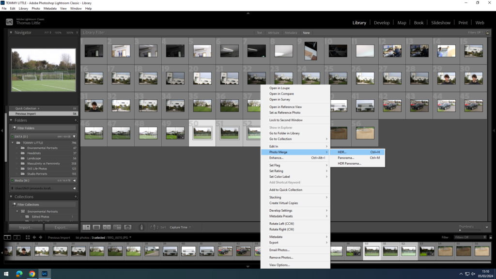
After I took photos of different landscapes with the 3 exposures for each photo, I uploaded it to my Lightroom, selected all 3 photos that I want to merge, selected ‘photo merge’, then ‘HDR’.
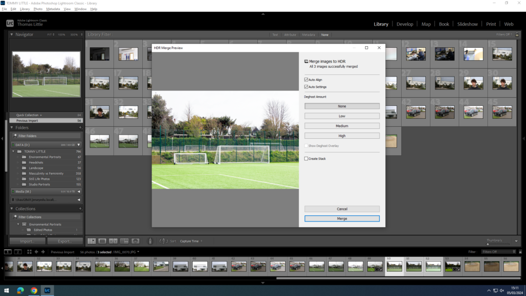
After pressing this, it will load a merged photo of all the photos you selected keeping the best parts of each photo into one photo.
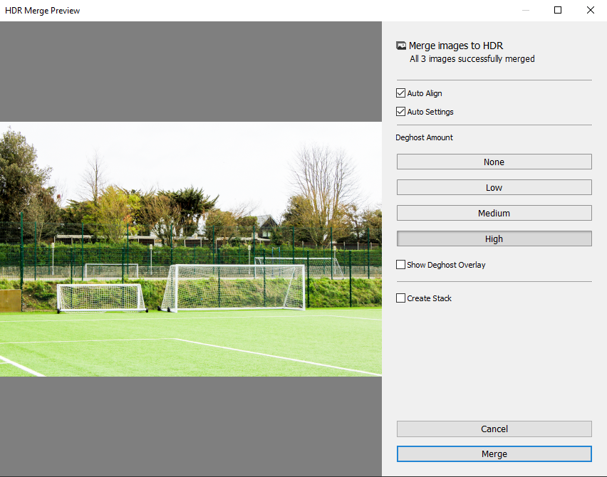
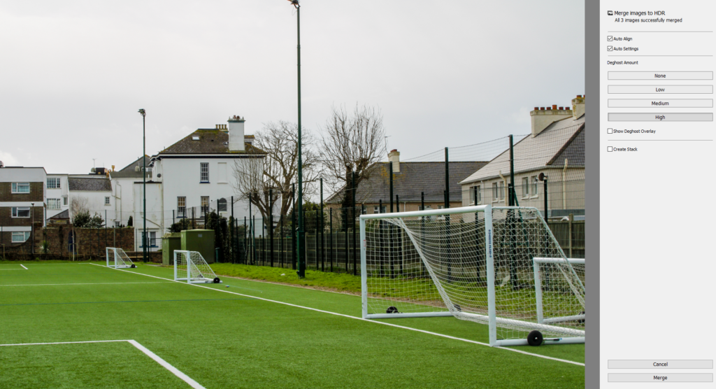
There is 4 types of Deghost amount, None, Low, Medium and High. These also change the exposure of the photos highlighting different sections depending if you want a brighter photo or a darker photo.
After I merged all of them and selected the high one which I thought was the best as it had all the good features from each photo but I still thought it needs to be more exposed as it was still too bright for my liking.
This was my final result which I really like because of how the grass is very green and really pops out but the whole photo is also not too bright which sets a nice mood for the photo.
I also realised that all these other HDR photos online aren’t really what the photographer sees in real life, it is all down to their camera editing and photo merging to create this aesthetic, colourful photo for the audience to enjoy.
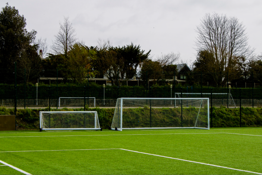
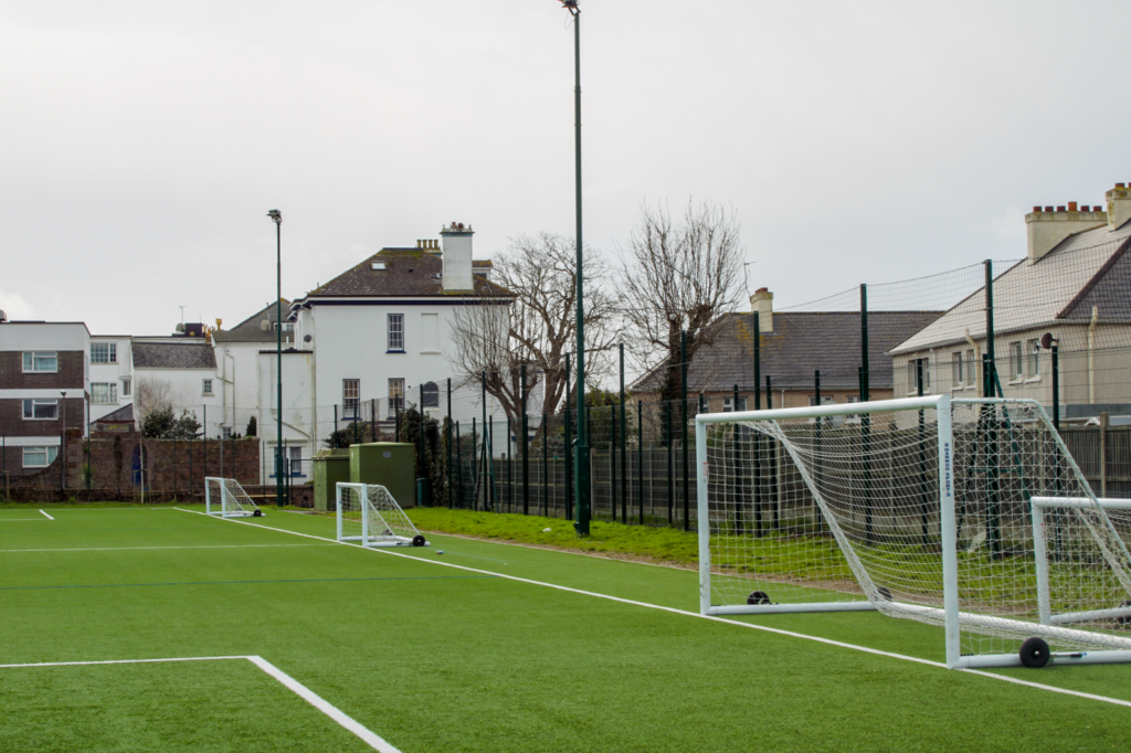
Another example photo I took, was of these 3 goal posts stood next to each other all equal distances apart.
I tried two different edits, starting with number 1 which was the photo merging at different levels of Deghost.
So started with Low Deghost.
Then Medium.
Then High.
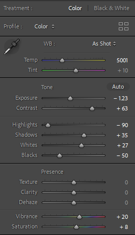
After I merged them all into one photo, I still felt as if the merged photo was still missing some exposure and contrast, so I manually edited it and I used these edits.
My Photoshoot Plan for the Landscape project is going to be going around Jersey to capture the dramatic landscape.
Capturing the sublime:
Jersey was recently hit by Storm Ciaran, which saw a tornado running through Jersey. I would like to start by trying to capture the environments captured by the storm, reflecting similar ideas of the Sublime in Romanticism. ifferent woods/forests with my dad taking photos of fallen
I would go to areas like these and take photos of different terrains, broken objects and buildings.
I will try take photos of the fallen objects in the rain, on a cloudy day, sunny day and on a windy day to try get a choice of each weather on the broken houses and nature.
I will try to use the HDR photo technique with my landscape photos trying to implant the multi-exposures and then merge the photo after to create this overall end photo with the best features all around.
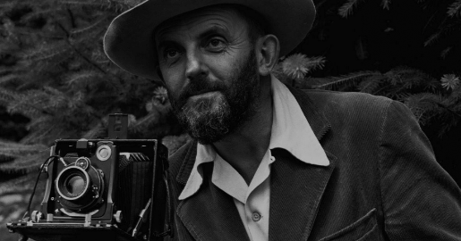
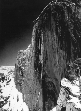
Adams was an American landscape photographer and environmentalist known for his Black and white photographs and how he put his own style onto photographs with the use of Monochromatic photos.
What is Monochromatic?
Monochromatic means having or consisting of one singular colour. This is a style of photography that relies on the use of one colour, in one or more shades, to create an image.
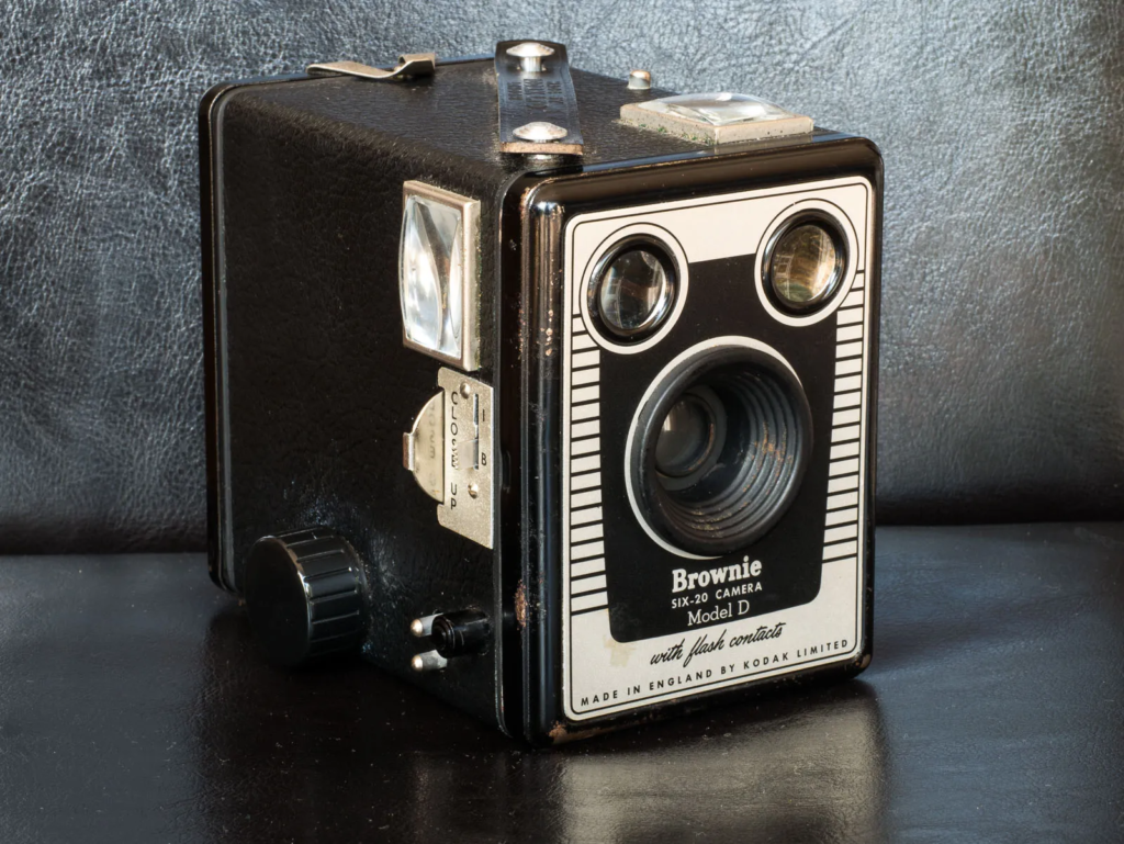
The type of camera Adams used was called a Kodak Brownie Box Camera. The design of it is in the name ‘box’ with its square-like shape, very old fashioned but very modern at the time with it being a series of camera models made by Eastman Kodak released in 1900.
Ansel Adams was born in 1902, when he got his first camera at the age of 14, he also started playing piano at 14 but he knew he wasn’t going to become a musician. Him and his family went to Sierra Nevada where he took photos of the mountains and different ranges and was really proud of his photos, and that’s where he knew he wanted to become a photographer. In 1906 there was a very big earthquake with a magnitude of 7.9 and during that earthquake Adams got hit and broke his nose. He left it due to the fact he didn’t want anyone to see it and thought it was alright until the fact he went to school and was so shy and insecure about his disfigured nose which made other kids look at him funny and he kept having to move schools because of this leading to eventually his dad pulling him out of school, home-schooling him and getting him a tutor. After that he was feeling a lot better but he still had this disfigured face/nose, but he really enjoyed walking through the forest and taking landscape pictures.
In 1927, he got a break that changed his life dramatically when he was named Sierra’s Club official trip photographer. The Sierra Club was one of the worlds oldest environmental preservation societies.
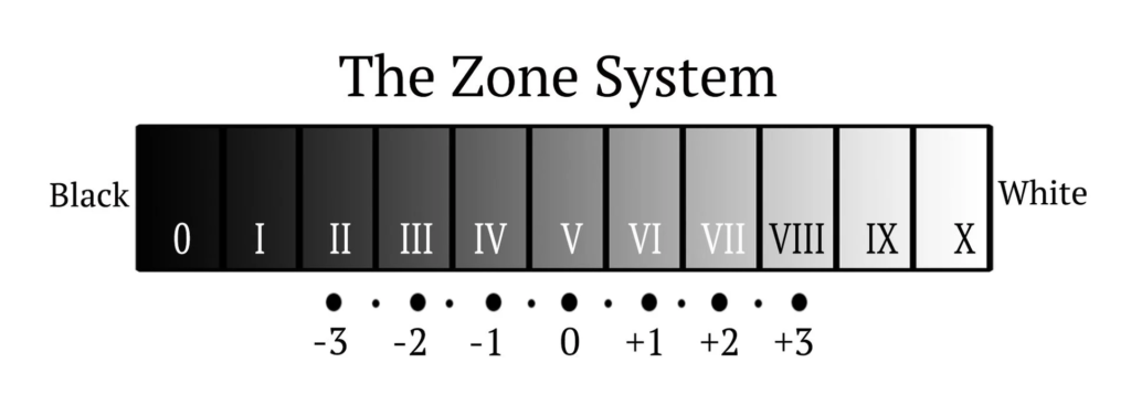
The Zone System:
Ansel Adams was known for pioneering the zone system to create dramatic tone in his photos.
Starts at grey which is on 0 F Stop. You change the aperture on your camera to change the shade of your photo.
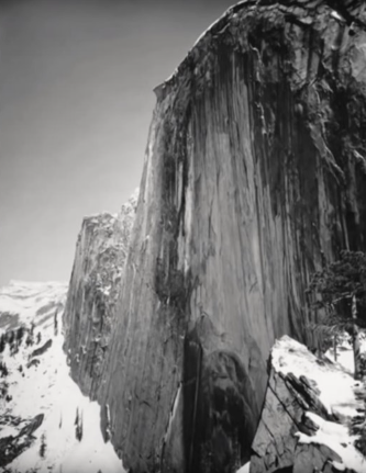
The photo below depicts one of Adams’ first experiments with filters that enabled him to capture the drama he wanted.
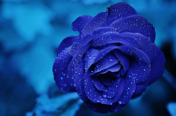
This is Adams trying a blue card over his photo which made the result look like this, but he didn’t like it and it wasn’t how he imagined it to be.
So, he tried another filter which was a red one. This made the photo come out looking like this which Ansel loved and so did many more worldwide.
Romanticism: Romanticism (also known as the Romantic movement or Romantic era) is an artistic and intellectual movement that originated in Europe towards the end of the 18th century. For most of the Western world, it was at its peak from approximately 1800 to 1850.
Romanticism emphasized inspiration, subjectivity, and the primacy of the individual. Romanticism is linked with landscape and the sense of romance of the landscape features its spirit in full bloom.
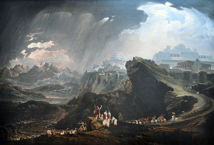
JMW Turner- Hannibal Crossing The Alps 1835
What is the meaning of Romanticism Style?
Romanticism is characterized chiefly by a reaction against neoclassicism and has an emphasis on imagination and emotions.
Romantic artists depict their nostalgic sentiment through their work.
Effects that were used in Romanticism: Small, Close strokes of complementary colours to create brilliance and vivid visual effect.
Subjectivity:
One main significant elements of Romanticism was increased emphasis on the personal and subjective power of the individual artist. Romantic artists began to explore different psychological, emotional, and mood states in their works. The Neoclassical obsession with genius and hero transformed into new ideas about the artist. Artists were able to express themselves fully, free from the tastes and rules.
Romanticism rejected the Age Of Enlightenment and Neoclassicism
What was the Neoclassical Period?
The Neoclassical Period was an art movement that sought to evoke the style of classical antiquity in writing, painting, sculpting, and architecture found in Greek and Roman culture. It was very popular between late 18th century and early 19th century.
Neoclassicism was a movement which involved idealized form. People were perfected not as they necessarily were but rather as an idealized version would. Romanticism hated that idea. Romanticism believed that the obsession with idealization led to a lack of emotion.
The Age of Enlightenment
Also known as the Age of Reason, was an intellectual and philosophical movement that occurred in Europe, especially Western Europe, in the 17th and 18th centuries, with global influences and effects.
Started in 1685 and ended in 1815.
The main idea for it was that reason is the primary source of authority and legitimacy. So, it was an emphasized reason over superstition and science over blind faith.
3 major ideas from the Enlightenment was the values of scepticism, reason and individualism.
Sublime:
Sublime means the high quality of greatness and beautiful through physical, moral, intellectual, metaphysical, aesthetic, spiritual and/or artistic. Also means, extremely good, beautiful or enjoyable.
“It is beautiful but terrifying at the same time due to its own power.”
Sublime in the 18th century was a concept first introduced by the philosopher Edmund Burke in the eighteenth century to describe art that is truly extraordinary, invoking a powerful mix of awe, wonder and terror.
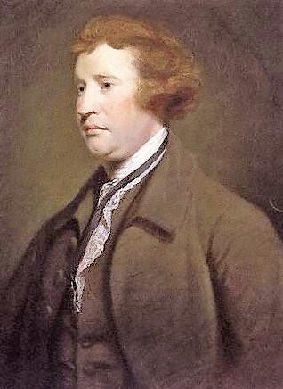
Edmund Burke
Edmund Burke was known and remembered for his support for Catholic emancipation, the impeachment of Warren Hastings from the East India Company, and his staunch opposition to the French Revolution.
He had a famous quote which says, “The only thing necessary for the triumph of evil is for good men to do nothing”.
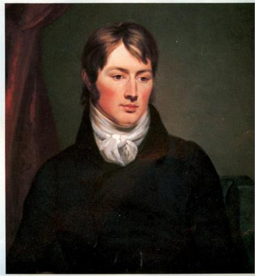
John Constable
John Constable RA was an English landscape painter in the Romantic tradition.
Constable is famous for his landscapes, which are mostly of the Suffolk countryside, where he was born and lived. He made many open-air sketches, using these as a basis for his large exhibition paintings, which were worked up in the studio.
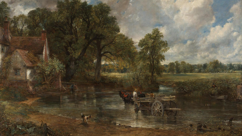
The Hay Wain
The Hay Wain – (1821) John Constable
The title, The Hay Wain, refers to the wooden wagon (wain) used for transporting cut and dried meadow grass (hay). The empty wagon is making its way through the shallow water to cross to the meadow on the other side where haymakers are at work.
The view is of the millpond at Flatford on the River Stour.
Flatford Mill was a watermill for grinding corn, operated by the Constable family for nearly a hundred years. It still survives and is about a mile from Constable’s birthplace at East Bergholt, Suffolk. The house on the left also survives; in Constable’s time it was occupied by tenant farmer Willy Lott.
It was created in the artist’s studio in London. Working from a number of open-air sketches made over several years, Constable then made a full-size preparatory oil sketch to establish the composition before painting the final picture.
The painting by John Constable depicts a tranquil countryside life. There is no sign of the Industrial Revolution going on at the time. People turned to his painting as an appreciation of rural life, away from the cities that were booming at the time.
What does Landscape mean? Landscape art and photography shows the spaces within the world, sometimes vast and unending, but other times microscopic. Landscape photographs typically capture the presence of nature but can also focus on human-made features or disturbances of landscapes.
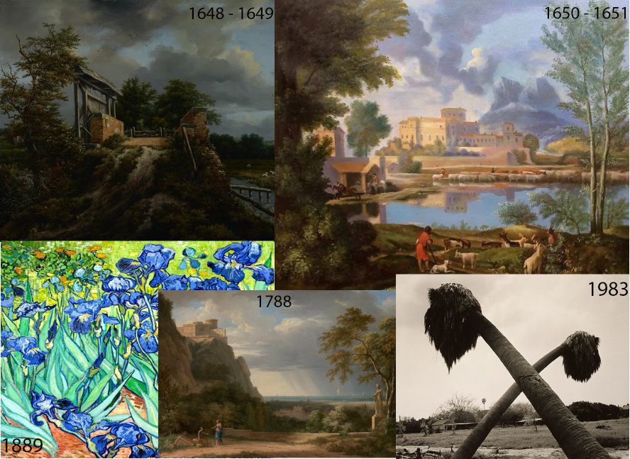
History and Traditions of LandscapePhotography
Artists have been painting the landscape since ancient times.
Landscape gained in popularity as a genre due to many factors such as Romanticism. Originally, it was looked as a religious significance, but it also became a method of self-expression with the emotions of the photographer and or painter shown on the painting/photograph.
Before the renaissance, (a period in history and a cultural movement marking the transition from the Middle Ages to modernity, covering the 15th and 16th century), Landscape Art wasn’t really recognised as a genre in its own right.
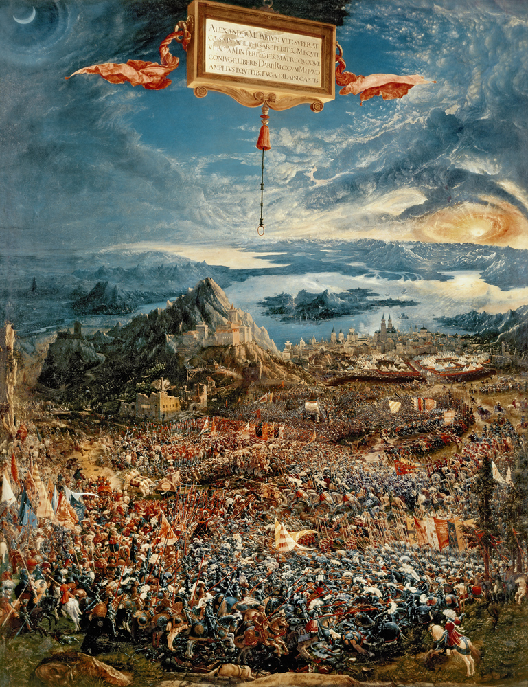
This photo is a 1529 oil painting by the German artist Albrecht Altdorfer (c. 1480–1538), a pioneer of landscape art and a founding member of the Danube school. The painting portrays the 333 BC Battle of Issus, in which Alexander the Great secured a decisive victory over Darius III of Persia and gained crucial leverage in his campaign against the Persian Empire. The painting is widely regarded as Altdorfer’s masterpiece, and is one of the most famous examples of the type of Renaissance landscape painting known as the world landscape, which here reaches an unprecedented grandeur.
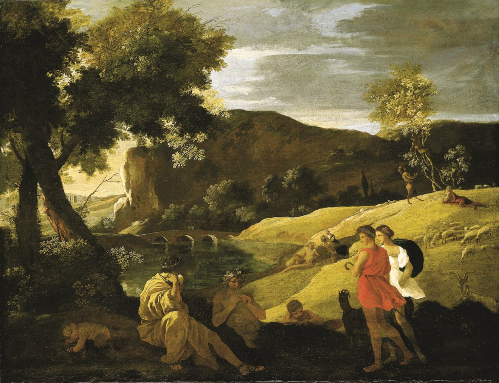
In the 17th century the ‘Classical’ landscape evolved . These paintings were influenced by classical antiquity and sought to illustrate an ideal landscape recalling Arcadia, a legendary place in ancient Greece known for its quiet pastoral beauty. Even though Classical Landscape was a new genre, it was not yet popular within the hierarchy of art genres.
Nicholas Poussin -an Arcadian landscape with stories from the legends of Pan and Bacchus
In the late 18th, early 19th century we start to see more landscape art coming about as a result of the industrial revolution. During this time, Landscape became more accepted by the academy.
Because industrial revolution had just come about, it made people long for their old life. This made people appreciate nature more, leading to people wanting to celebrate romanticism and showing love to it.
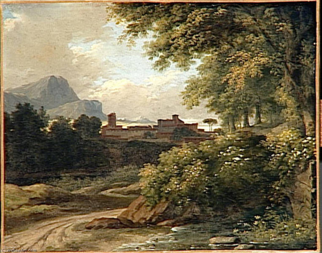
Pierre -Henri de Valenciennes – 18th Century
The very first photography that we know of was taken in an urban landscape during 1826 or 1827 by the French inventor Nicéphore Niépce.