All posts by Thomas Little

Filters

Author:
Category:

Edited Photos like Nicholas Gallery

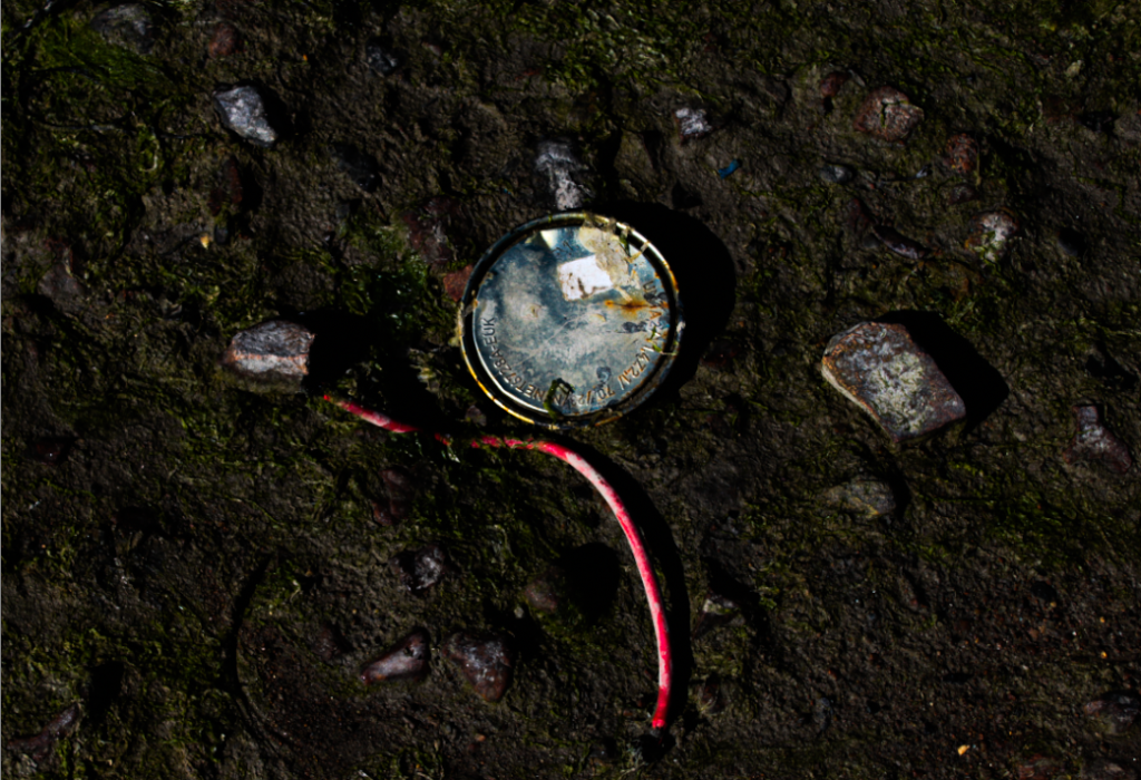
I started with this photo because I really like how it looks and matches with Nicholas’ style.

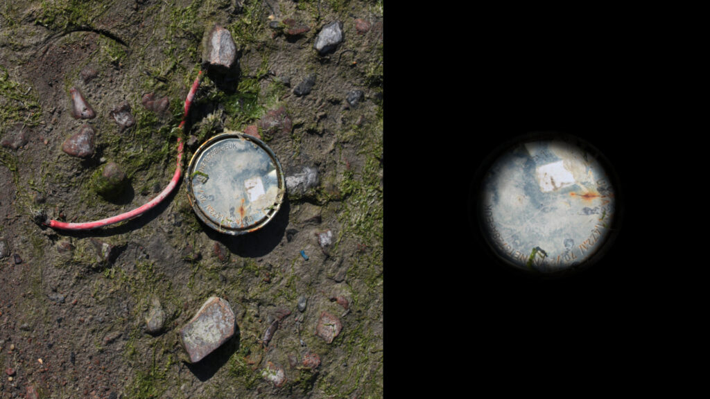
Now that I have done both parts for one photo, I will blend them together to create Nich’s style.

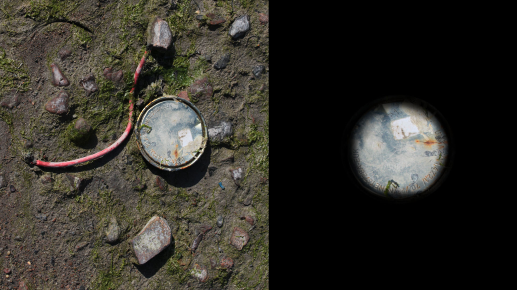
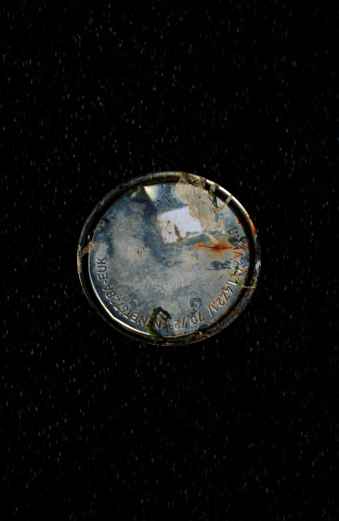
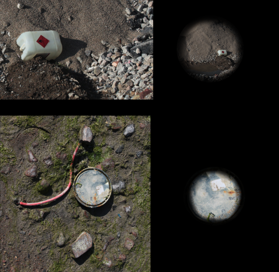
That was my first attempt trying to blend the two photos into one, and I will do more attempts to blend them using my different photos and styles. But I started by adding the main edited photo on the left in full frame with the other objects in the background. Then for the right side, I cut out the circular metallic object put it centre on a black canvas like Nicholas Gallery does, but I also noticed he blends the outside into the background so I added a light 10% black brush around the outside and went over it again until I liked the blend/eyeball look.

Nicholas Gallery

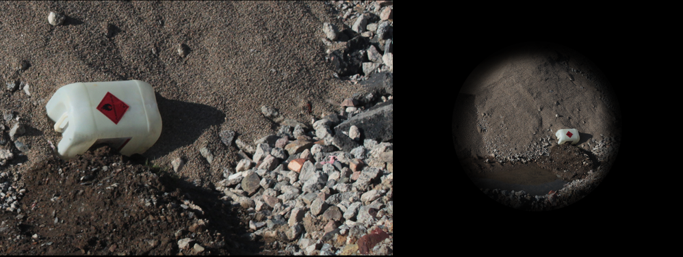
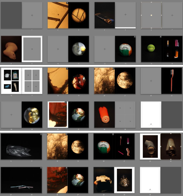
Nicholas used a nice style by having a photo full framed on the left and then on the right, cut out in a circular shape. Also, he will use a photo of a lighter for example on one side, showcasing the evil and what’s killing us and then on the other side something that is helping and saving us like an inhaler.

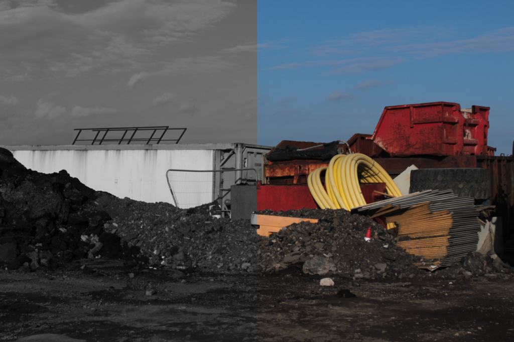
I really like this concept and I will be trying to take and edit some photos like his with the side by side effect meaning good and bad and also just cropped into a circle. But I will also add my own touch onto my photos by changing the shape of the cut out or maybe opposite colours on each side to showcase opposites.

Anthropocene Photoshoot

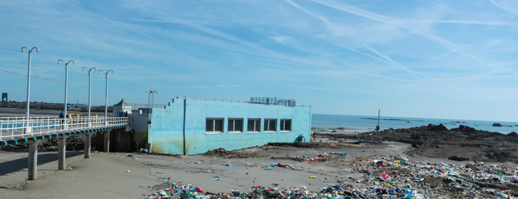
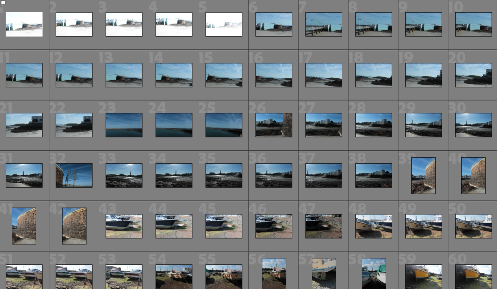
For my first photoshoot, I went around the harbour when the water was out taking multiple different photos of boats and how they have been affected by the ocean, corrosion and oxidisation. Didn’t get as many photos as the second photoshoot, but still got some good worthy photos I will be using from it.

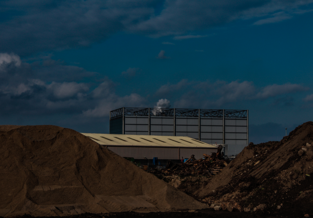
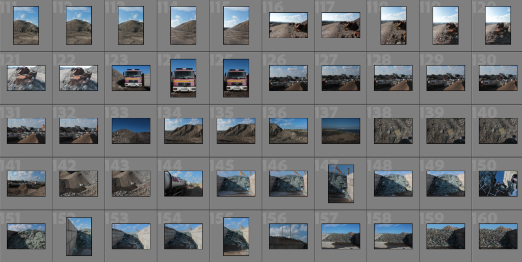
For my second photoshoot, I explored the dump/recycling area near Havre Des Pas to take photos of all the different recycling sections from glass, metal, plastic and the burned materials turned into dirt. With also seeing a lot of abandoned vehicles just left to rot.

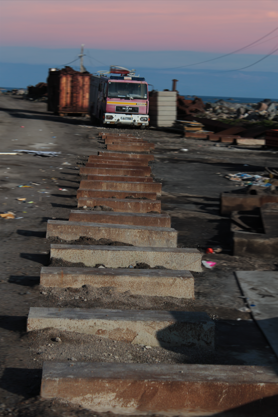
I started with this photo which I really liked with the bricks all placed down in a straight line, directing the attention towards the broken down/abandoned fire truck. But, I wanted to create more with the photo and focus on the straight line. So, I started by adding some AI rubbish on the left and right on the floor to create more of a dump/abandoned theme to match the whole photo. Then masked out the entire background apart from the bricks and the fire truck, and did (Filter – Blur – Motion blur – 30) which created a blurry/non-focus look to the photo but when you look closely and realise the bricks and fire truck are focused that’s what draws the viewers attention. Then, after that, the photo looked good but I didn’t quite like the sky and top half of the photo, so I told AI to add a sky, which gave me two boring/bad generates, but the third matched the theme with the power cables connection across the screen as you can see and so I kept that one. But then, asked AI to create a sunset as well, which came out exactly perfect as I imagined it, giving us the final result.

Edward Burtynsky

Burtynsky was a Canadian Photographer, who was famously known for his large format photographs of industrial landscapes. He has multiple locations all over the globe that represent the increasing development of industrialization and the impacts it has on nature and humans existence.

Burtynsky’s photographic style is characterized by the sublime nature of the scale of his photographs. He takes photos very far away from buildings, objects and environments with a large-format view camera, which shows humanity’s scarring on the landscapes which he makes his subject by always focusing on the consequences of global consumerism.

Some techniques Burtynsky uses is that he will get a variety of technology to achieve different perspectives, including traditional helicopters, fixed-wing planes, remote controlled drones, lifts and a fifty-foot pneumatic pole. He uses these methods in his photography to help with the Anthropocene look, with the plastic/metal and other materials affecting the environment and earth.

Anthropocene

The Anthropocene Project is a multidisciplinary body of work combining fine art photography, film, virtual reality, augmented reality, and scientific research to investigate human influence on the state, dynamic, and future of the Earth.

The Anthropocene Epoch is when human activity started to have a significant impact on the planet’s climate and ecosystems using a unit of geologic time, used to describe the most recent period in Earth’s history. So, basically when humans had an effect on the earth’s nature and shows the negative impact humans had on it.

Mind map/Mood board:

What are some of the issues explored?

Some issues explored in Anthropocene photography are that it mainly focuses on humanity which believes that humans are responsible for everything that happened towards nature and the environment, such as fossil fuels making the air more polluted which is worse for our lungs and animals. Another example would be how much plastic there is in the sea which is due to humans littering and it ending up in the sea, then fish, birds and other sea animals would end up eating this plastic we deposited and then would end up dying and/or when we catch the fish and cut them up to eat, we can see all the plastic they have eaten in their body.

Are the Photos Beautiful?

Some of the photos we see from Anthropocene photographers are very stunning to look at ascetically of the big distances or landmarks like mountain ranges or fields/rivers. But, a lot of the photos they take are not helping the bad ecosystems or climate change, but they are spreading awareness for other people to react and start fixing the world.

Do you think that these photographers are solving the problem?

These photographers are not aiming to solve the problem of the litter in the ocean and animals and any other problems humans have done. But, what they are trying to achieve, is to spread the awareness of the litter and show normal people who may be the reason for the littering how bad it is and what it actually does to animals and the earth. Also, shows their way of caring for the animals and planet by showcasing all the negatives towards the public.

My Take on The New Topographic

My take on Topographic Photography.

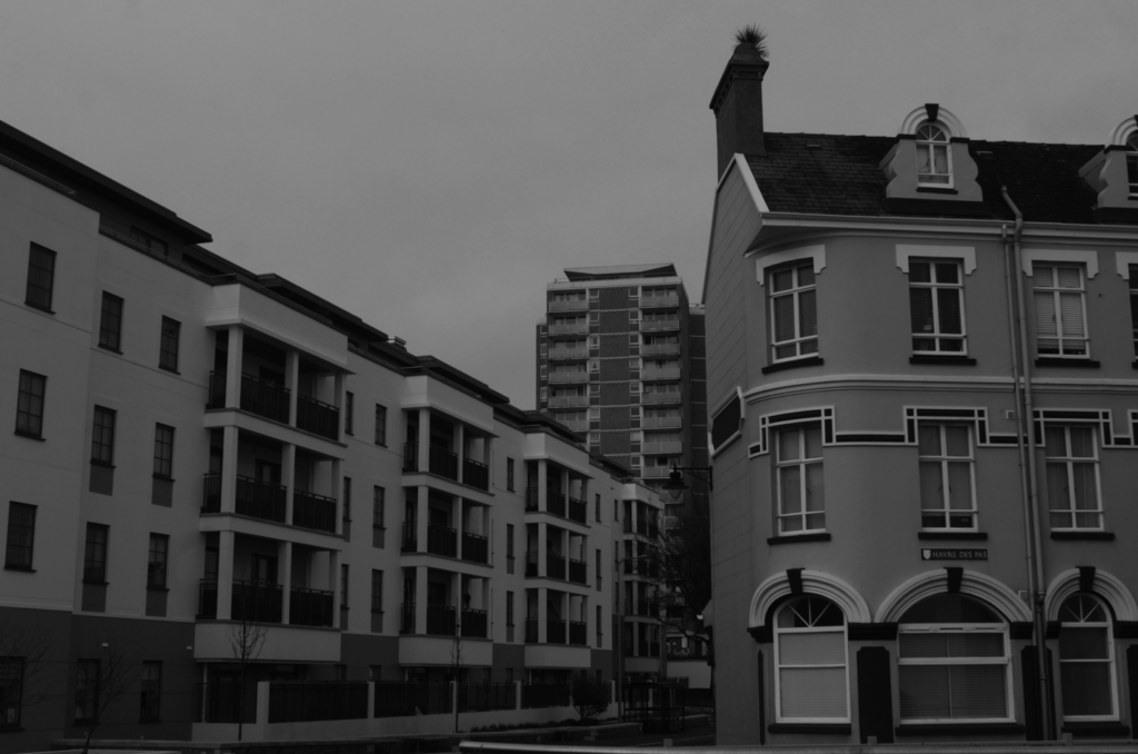
I started by seeing this perfect angle with these three buildings next to each other. At first they look similar, but if you look closely you can see they are all different styles with the front right building being old fashioned with the curved walls and windows and with the pointy roof chimney. The building in the back being 50/50 old and new with the old style of colours/windows and materials. But the new style with balcony’s and straight edged walls and so finally the long building to the left being fully modern with the white plane walls, mixed with black balcony gates, plus modern looking windows and straight walls and roof.

I really liked how these three different exposures looked but I felt confident with trying the B/W style on it. This worked very well with still showcasing each era of buildings but also the same contrast gives the photo the same idea of buildings.

This was the final photo after editing and the B/W added on top of it came out just as I imagined. I also love how each building is a different shape with the left building being rectangular going away from the camera. The right square-like building standing flat, face-on towards the camera and then the tall building in the background still very distant from the other two but still stands out as a main view in the photo.

The New Topographic

Topographic Photography is a technique in which typically a landscape is being photographed from afar.

New topographics was a term coined by William Jenkins in 1975 to describe a group of American photographers (such as Robert Adams and Lewis Baltz) whose pictures had a similar banal aesthetic, in that they were formal, mostly black and white prints of the urban landscape.

Some very important New Topographic Artists were, Robert Adams, Frank Gohlke and then Bernd and Hilla Becher.

Robert Adams focused on changing landscape in the American West. ‘New Topographic’ from Adams, meant the romanticism and idealism traditionally associated with landscape photography. Instead, they adopted a more objective and detached approach to capture the contemporary urban and suburban environment.

Frank Gohlke was also an American but he received two Guggenheim fellowships from the national Endowment for Arts. Gohlke’s oeuvre is marked by a preoccupation with framing landscape as a manmade construct: an artefact of the way we live, a projection of human actions, ideals and aspirations onto the horizon. Landscape is where the human and the natural worlds connect, and in Gohlke’s view, humanity’s power is limited, fragile and temporary. 

These topographic photos show a connection between nature and the human aspect called juxtaposition. These two differences join together to create contrast and show how humans and nature always conjoin throughout life.

Photo Merging – Landscape

I used a method of HDR Merging which involves 3 or more of the same picture but at different contrasts and exposures. This is done by a tool on the camera which we set to 16/f-stop and used a shutter release with instead of taking the photo on the actual camera because we needed the photo to be still and in the same place for each photo and with any contact on the camera it would of moved it, even with a tripod.

After I took photos of different landscapes with the 3 exposures for each photo, I uploaded it to my Lightroom, selected all 3 photos that I want to merge, selected ‘photo merge’, then ‘HDR’.

After pressing this, it will load a merged photo of all the photos you selected keeping the best parts of each photo into one photo.

There is 4 types of Deghost amount, None, Low, Medium and High. These also change the exposure of the photos highlighting different sections depending if you want a brighter photo or a darker photo.

After I merged all of them and selected the high one which I thought was the best as it had all the good features from each photo but I still thought it needs to be more exposed as it was still too bright for my liking.

This was my final result which I really like because of how the grass is very green and really pops out but the whole photo is also not too bright which sets a nice mood for the photo.
I also realised that all these other HDR photos online aren’t really what the photographer sees in real life, it is all down to their camera editing and photo merging to create this aesthetic, colourful photo for the audience to enjoy.
Another example photo I took, was of these 3 goal posts stood next to each other all equal distances apart.

I tried two different edits, starting with number 1 which was the photo merging at different levels of Deghost.

So started with Low Deghost.

Then Medium.

Then High.

After I merged them all into one photo, I still felt as if the merged photo was still missing some exposure and contrast, so I manually edited it and I used these edits.