All posts by Thomas Little

Filters

Author:
Category:

History of the development of St Helier Jersey Harbour

This Jersey harbour was created in the early 1700s century. The harbour dates back to 1680 when the then Governor Sir Thomas Morgan ordered a stone pier built at St Aubin’s Fort. Until this time, even though St Aubin was the island’s main port, ships were loaded and unloaded by carts at low tide.

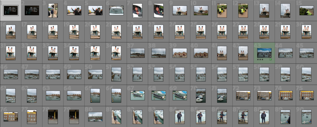
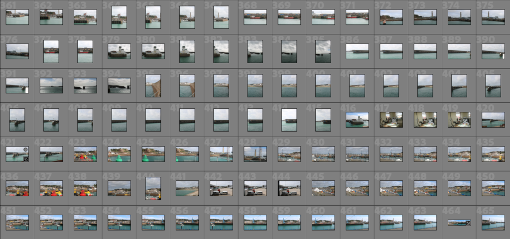
This was the harbour, as recent as possible, with myself going on the 10/09/2024, I can clearly say that the harbour has increased in size, and the amount of boats that use the harbour, and bigger/taller, with even land being built.

Jersey’s Maritime history and development

The channel islands were created due to rising sea levels during the Neolithic period, creating Jersey, (the largest island), followed by Guernsey, Alderney, Sark, and a few more little islands. The first mention of fishing in the islands appears in the Norman Exchequer Roll of 1195. The King having the right to require conger to be landed at specific ports and sold to merchants to whom the King had granted a right of pre-emption.

What was the involvement of Jersey mariners in the Canadian cod-fisheries and the Transatlantic carrying trade?

The geographical location of the Channel Islands, where trade from the west of Europe and the Americas passed close by. Led to many becoming skilled mariners, firstly as fishermen then as traders. Jersey would trade with the Canadian fishers in want for Cod-fish.

Which ports did Jersey ships sail to and trade with?

It was during the early 19th century that stone piers were built at La Rocque, Bouley Bay, Rozel and Gorey, to accommodate the oyster boats. The harbour at Gorey also took passenger traffic from Normandy.

During the Roman period there was an established trade route between Alet (St Servan) and Hengistbury Head in Dorset. Guernsey was the favoured stop off point, because of the natural deep water harbour at St Peter Port, although these boats undoubtedly called in to Jersey as well.

What type of goods did Jersey merchants exchange for cod-fish?

Salt was essential for preserving cod, particularly the salted and dried variety that was a major commodity. Some others are textiles, Wine and Spirits, Agricultural Products, Fishing Equipment and Supplies, Clothing and Household Goods.

To what extend, has the island of Jersey benefitted from its constitutional relationship with Britain and the legacies of colonialism based on a slave plantation economy during the first Industrial Revolution (1760-1840)?

Triangular Trade was a crucial role in the export and import of various goods from Jersey.

Page Spread: InDesign

I wanted to create a page spread with a lot of my photos that I used the colour saturation for. With these photos, I came up with a title called, ‘Colour-Popping Malo’. This matches the theme because in my photos I have the colours saturated out so you can only see the bright, colourful ones. I even changed the title to match the theme by making some of the letters the same colours as in my photos.

After this photo spread, I changed the layout around because I felt like the photos were too crowded on the bottom left area, so I moved one of the photos top right which also cut some of that big paragraph in half which was even better. Then added some more separate text in that middle left space. Also, I moved the title from the top right which stood out a bit and looked unnatural, to on top of the coloured umbrella photo which is my establishing shot. But, I kept the word ‘Malo’ outside of the photo with it maintaining the all black look to create difference and stand out more.

I changed the AI generated waffle text into actual English talking about different things to do, see, and go to in St Malo.

Picture Stories: Research and Analysis

These photos were from Budapest and it shows all the war and destruction caused and how the buildings were damaged. These photos were taken to show people who don’t know what’s going on around the world, all the danger and destruction. The way the photographer does this is by making all their photos black and white, with an almost ‘decisive moment’ frame in each picture which means it wasn’t planned, that’s what they all have to go through everyday.

These photos are for showcasing the breast cancer awareness and sadness of it.

These are some student exemplars from the past.

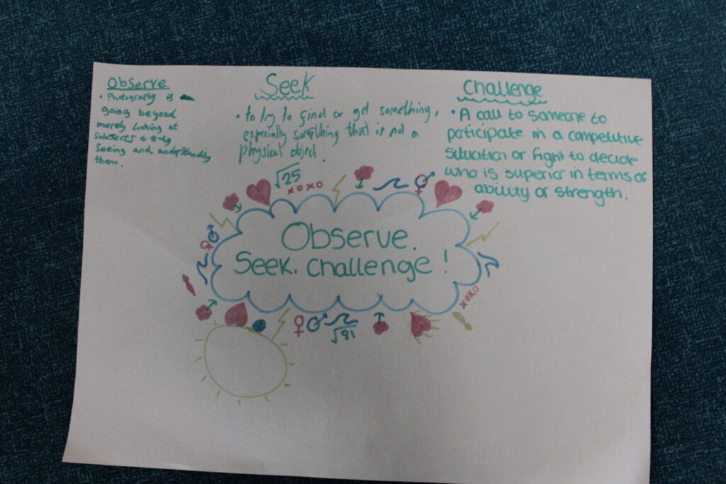
Henry Cartier-Bresson – Observe, Seek, Challenge

The running man is the main focus, as if the shot was framed where the man would be on the left, there wouldn’t be any ripples, reflection of the buildings on the puddle, fallen ladder and the other objects. It would be very plain with a lot of negative space. The chimney on top of the building is also perfectly diagonal to the man’s reflection. Another use of equal spacing and no negative space.

About taking the Photo.
He used a small aperture to capture the in-focus from the for-ground to the background. Used a fast shutter speed to capture the jumping man, even though he is a little out of focus and blurry, for taking it back in 1930, that is amazing and he is basically in focus. The photo relies on natural light, and the shadows suggest that it was taken during midday when the sun was glaring and high in the sky. The natural light adds an authentic, unmediated quality to the image, free from shadows an fake lighting.

The photo being in black and white was not by choice, in 1930s you could only take photos in black and white and so he was limited to that but the photo looked better in black and white than colour anyway, so in a way it helped Bresson. Without colour, it makes the viewers focus more on the subject and what’s happening in the photo and makes the texture become more pronounced. You can feel the environment from the surroundings for example, worn-out posters on the walls, waters surface and the grainy quality of the wet ground. Typically, photographers don’t like taking photos during midday sun due to the amount of glare, harshness and the strong shadows it can create. However, Cartier-Bresson embraced this photo with the sharp shadows to create geometric shapes and add depth. The sun’s angle and position created the vivid reflection’s in the puddle of the buildings, man and other objects.

Introduction:  Henry was a French artist and humanist photographer considered a master of candid photography, and an early user of 35mm film but preferred the 50mm lens.

He was known for humane, spontaneous photographs helped establish photojournalism as an art form.

His background: He was born into a wealthy family in France, and was introduced from an early age into arts. He started off with painting, but quickly realised he has a passion for photography which he saw as an add-on from painting with an extension of his eye.

Henri realised he could interact with the world using this tool/camera and travelled frequently from Europe to Africa to see and take in each different culture.

“Photography isn’t just about images; it’s about capturing the essence of existence.”

‘The Decisive Moment’
This means a visually pleasing image is combined with deeper meaning by capturing the very essence of what was happening when the shutter is pressed.

Henri Cartier Bresson was known for using a Leica rangefinder with a 50mm lens because:
These cameras were compact, reliable and their design was very discrete and more hidden to the naked eye than other cameras of the era. This allowed him to take quick snapshots with using an unobtrusive shooting style which is ideal for street photography.

Another main reason he used the Leica rangefinder was because of it’s stealth, quiet shutter which allowed sneaky photos to be taken without drawing attention, allowing life to unfold naturally through his lens. This silent tactic was crucial for someone who believed in capturing natural, realistic, authentic, unstaged moments. It also allows a new field of view to his photos.

One of the standout features is the use of leading lines/rule of thirds.

The railings are in line with the top line for the rule of thirds, both physical and shadowed, act as arrows, pointing directly at the main subject. Even the subtle lines in the water and the contours of the puddle help direct the viewer’s gaze towards the man. Also, the use of negative space with nothing going on in the top third of the photo and not really the bottom left area, helps direct our eyes towards the subject in the middle and where all the action and focus is.

Balance – The reflection from the man onto the puddle creates an almost yin-yang feel where the reality and its reflection coexist and perfectly are in opposite which creates a better look and a more natural look for the photo.

Final Photos

Anthropocene

For Anthropocene, I have gone with this photo because it represents the nature in the photo but also shows the destruction and human killings including the smoke entering the atmosphere in the background at the top of the energy station.

Topographic

Landscape

Anthropocene – Using AI for the Past, Present and Future

First try using AI on my photos.

Past- Havre De Pas but in an idea of how it would of looked in the past with the old street lamps, the main building not finished building yet and the sky being very bright.

Present – The building has been made now and it has new changed windows with different newer street lamps, but same pillars and main circular stone wall.

Future – The stone building has now been flattened and turned into more of a blue building with more different windows, again different newer street lamps, with new white pillars also, to match the bridge. Also, there is a lot of rubbish and plastic scattered all over the beach to show how the world is getting destroyed by people littering/killing animals.

Second try using AI with my photos.

Past – Anchor.

Present – Anchor.

Future – Anchor

Edited Photos like Nicholas Gallery

I started with this photo because I really like how it looks and matches with Nicholas’ style.

Now that I have done both parts for one photo, I will blend them together to create Nich’s style.

That was my first attempt trying to blend the two photos into one, and I will do more attempts to blend them using my different photos and styles. But I started by adding the main edited photo on the left in full frame with the other objects in the background. Then for the right side, I cut out the circular metallic object put it centre on a black canvas like Nicholas Gallery does, but I also noticed he blends the outside into the background so I added a light 10% black brush around the outside and went over it again until I liked the blend/eyeball look.

Nicholas Gallery

Nicholas used a nice style by having a photo full framed on the left and then on the right, cut out in a circular shape. Also, he will use a photo of a lighter for example on one side, showcasing the evil and what’s killing us and then on the other side something that is helping and saving us like an inhaler.

I really like this concept and I will be trying to take and edit some photos like his with the side by side effect meaning good and bad and also just cropped into a circle. But I will also add my own touch onto my photos by changing the shape of the cut out or maybe opposite colours on each side to showcase opposites.