All posts by Tama Coxshall

Filters

Author:
Category:

Environmental Portraits Contact Sheets + Final Images

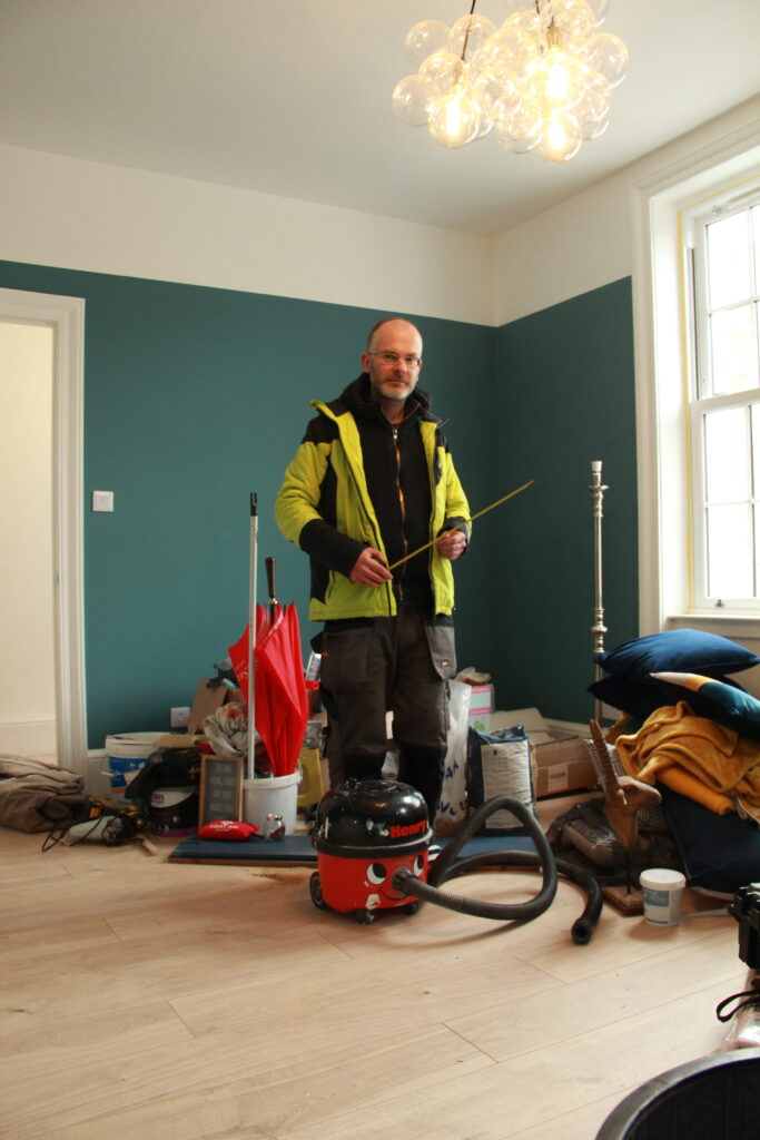
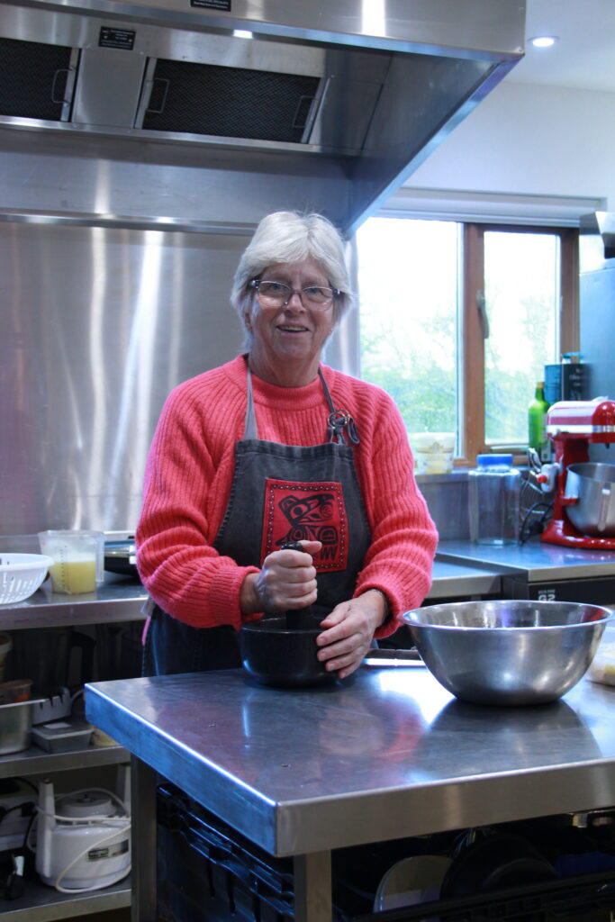
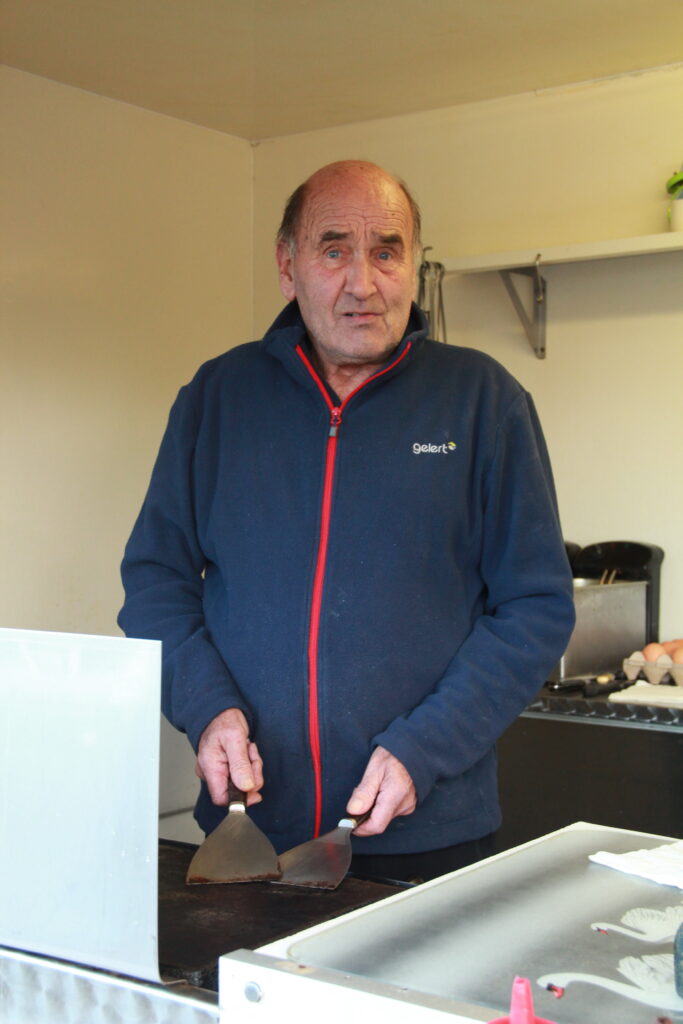
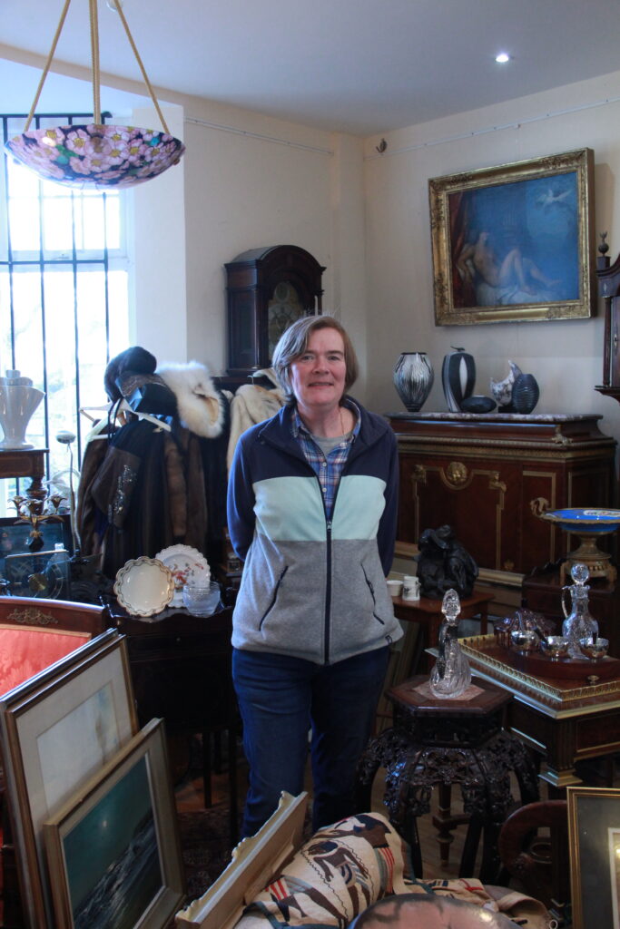
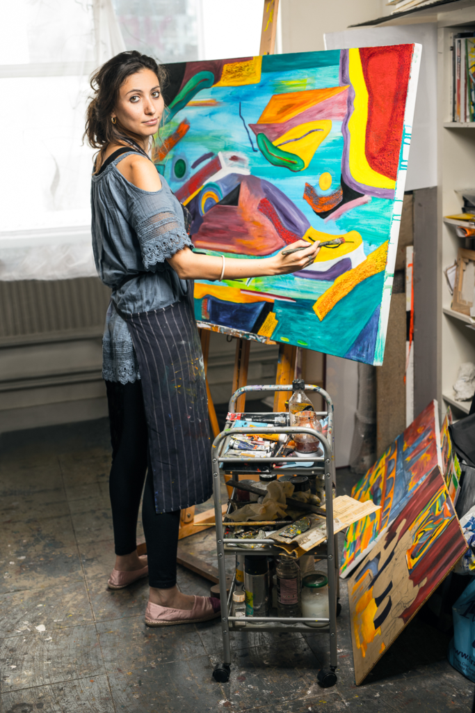
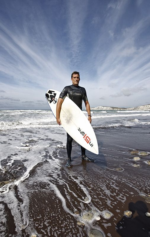
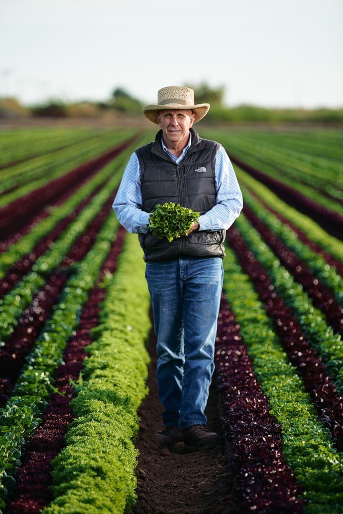
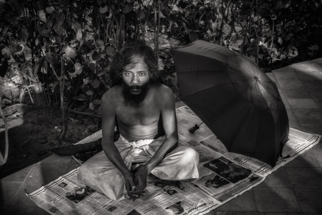
I spent time on 3 different days taking photos at the Arts Centre, a house in St. Peters and multiple locations in St. Lawrence and St. Helier.

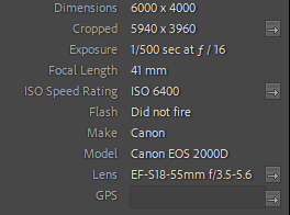
During my photoshoot with Jaime I used a tripod with camera settings approximate to this for most photos:
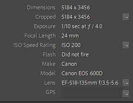
Most other photos I stuck to a low aperture (4-6.3), 400-800 ISO and a shutter speed of about 1/60.

Most my photos were rejected because I was not happy with the exposure, focus or pose. Because I had medium-dim indoor static lighting I had trouble figuring out how to take clear photos without blurs.

Some photos were taken with a mix of natural light which contrasted heavily with the indoor lighting and also meant I had a hard time selecting white balance.
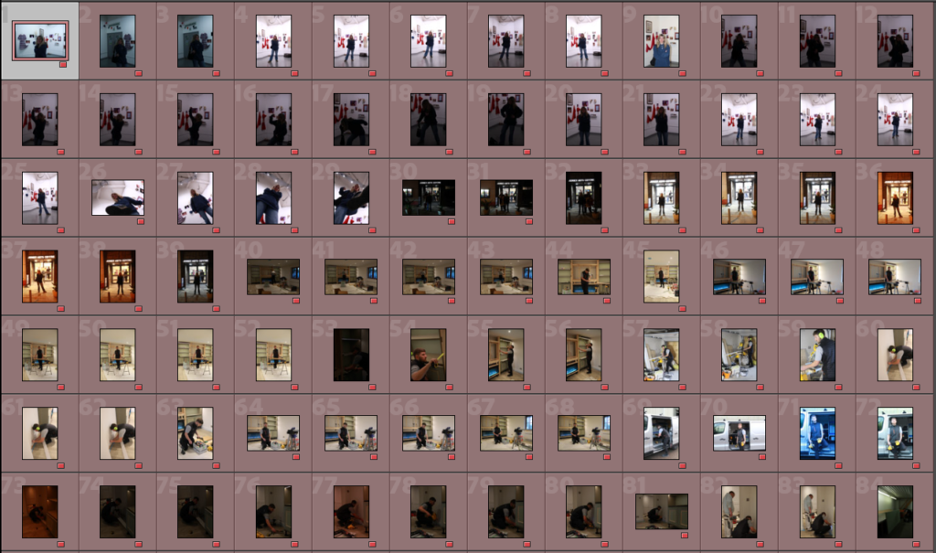
Photos that I deemed to have potential made it into the so-so rating as there wasn’t anything inherently great about them and they could have been improved by sharper focus or lighting, or a more intentional pose. Others in the yellow category had good composition but too harsh lighting.
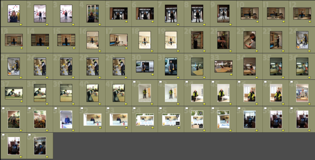
Finally, the 32 photos I have approved are sharp, have balanced exposure and capture the formality of environmental portraits.

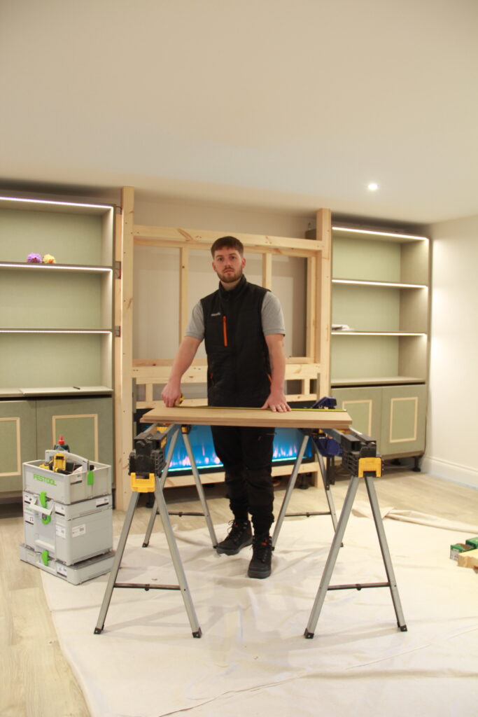
Most of the photos I have selected where taken after I had experimented with the cameras settings in the same shot to understand and intentionally capture what I wanted.

Best Photos (unedited):
Final Edits:
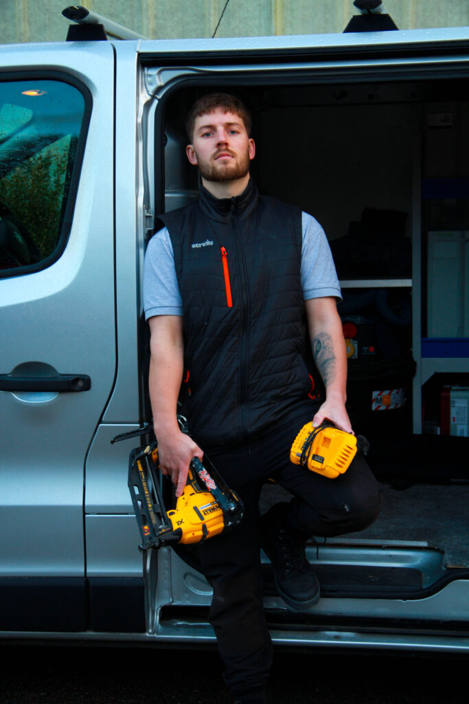
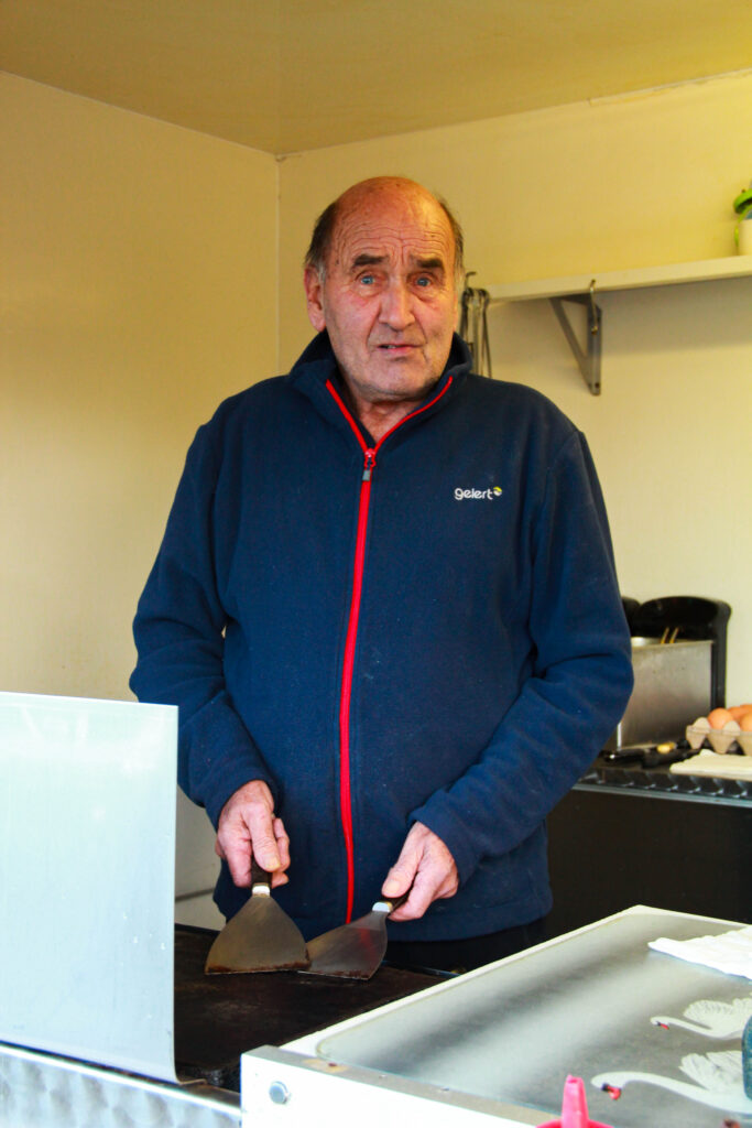
Jaime Paull, JP Carpentry

This photo was taken in the early morning (8:30ish) to have a soft lighting coming in from the right side and is taken outside of his work van where he carries all of his equipment and resources.

Using the van door frame I framed Jaime against the dark interior of his work van for some contrast. Additionally, the saturated power tools strike quite boldly against the monochrome background.

I think the photo is quite sharp, so I increased the saturation as much as I could to accentuate different objects, bone structure and shadows.

Also, to remove any distraction from the background above and beneath the vehicle I placed a light vignette which also softens of the sides of the image as a nice break from the strong colours and lines in the focal point.
Portraits | Multi-exposure

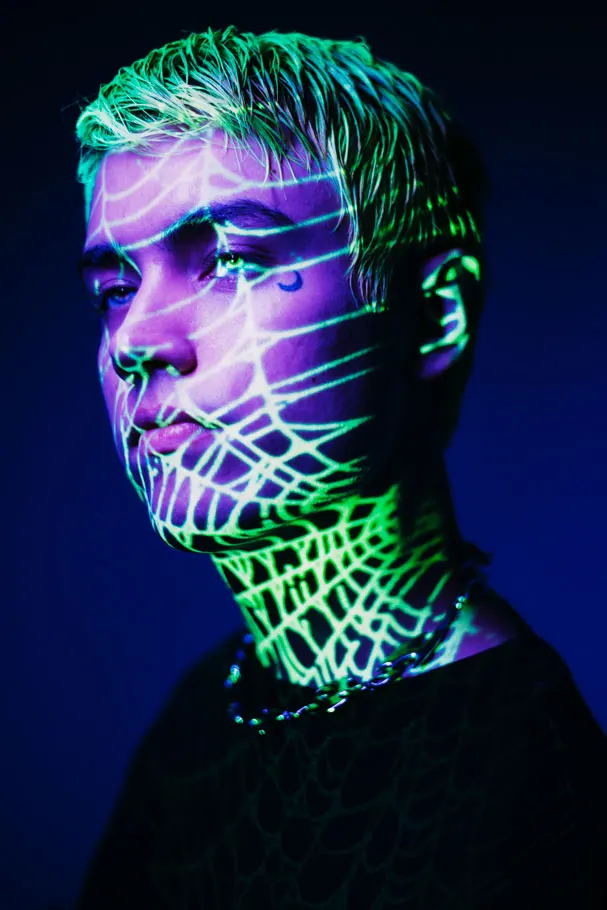
For this photo I had a 2 point lighting setup with a honeycomb light lighting the foreground and a snoot light in the background.

I enjoyed the heavy contrast between the two saturated colours so in Lightroom Classic had the temperature decreased for the royal blue and increased the tint for the ruby red and copied the settings to a similar photo.

Finally in photoshop I imported both photos, opacified the second one and dragged the spot heal tool sporadically until I ended up with the eyes. To achieve the aquamarine highlight I simply increased the overall exposure.

This is a simple setup with one key light. I added a gaussian blur to the primary layer to smooth out the subject.

On the secondary layer I positioned a similar image in the same place with a motion blur then copied and cropped the eyes from the layer and added to it additional motion blur for this dreamlike look.

(This last photo had to be downsized to fit the upload limit)

Like the previous image I added a gaussian blur and spot healing to smooth out the subjects face in both images.

I tried to make the red highlight more subtle so opacified that layer. This works out quite well as the opaque layer is directly staring into the camera

Inspiration

Overall these edits take inspiration from the work I’ve seen from Jonti Wild.

The stark neon colours and use of blur gives his images a new type of depth I want to add into my own portfolio.

Headshots – Intro

Headshots are photographs that put a clear focus on a subjects face and give the viewer

Headshot originated in 1839 with Robert Cornelius when he started taking selfies.

In 1854, André-Adolphe-Eugène Disdéri came up with a more affordable process of photographic portraiture by cutting up full-sized plates into 4 separate small portraits. The photos would later be known as Carte-de-visite, or visiting cards and are thought to be the first business cards.

In modern times, headshots are usually used for methods of identification and professions like acting or music for marketing purposes.

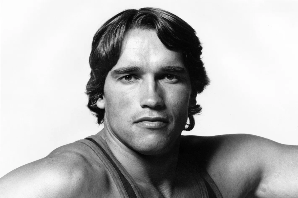
Most of the time headshots implement a lot of negative space like a white background to remove all other focus other than the subject.

Exploring Lighting | Chiaroscuro

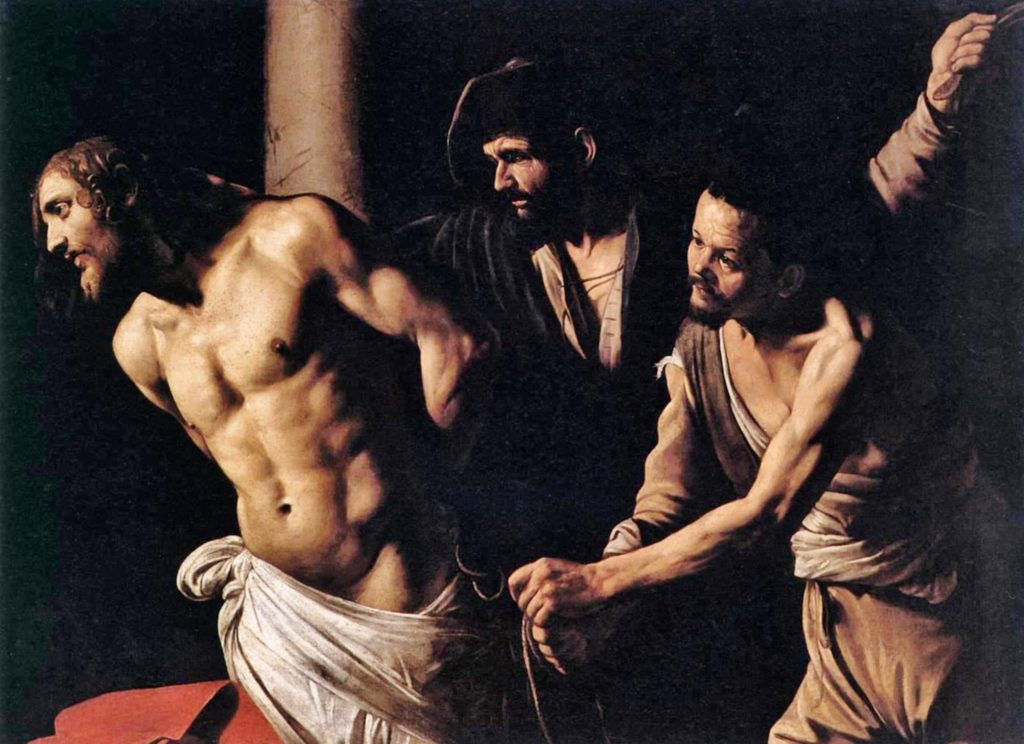
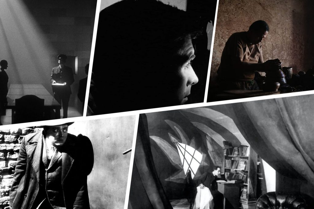
Italian for ‘lightdark’. Chiaroscuro has a heavy contrast on light and shadow which gives the subject volume and depth.

This style evolved from 16th century renaissance paintings and made its way into the French film genre ‘film noir’ which utilised chiaroscuro lighting to suggest sexual motivation and moral ambiguity.

In ‘Citizen Kane’, chiaroscuro lighting is used to highlight the mysterious qualities in him and the difference between Kane’s personal and political lifestyle.

Method

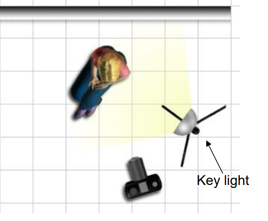
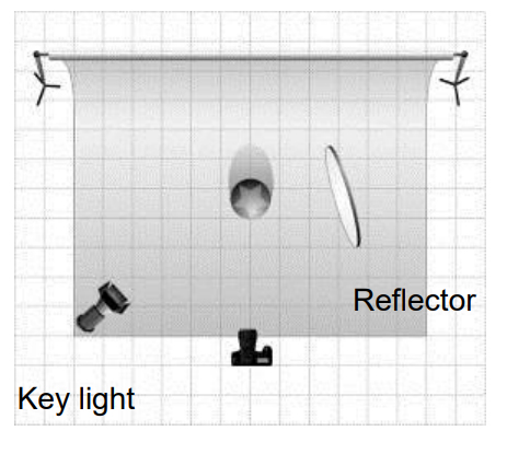
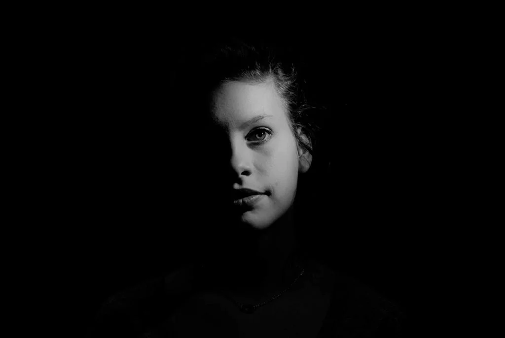
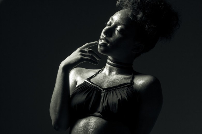
To achieve chiaroscuro lighting you need to use a single key light. The unlit parts of the subject should all be dark like the background.

For a less dramatic and softer setting you can also use a reflector to diffuse the light and lighten up dark patches.

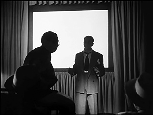
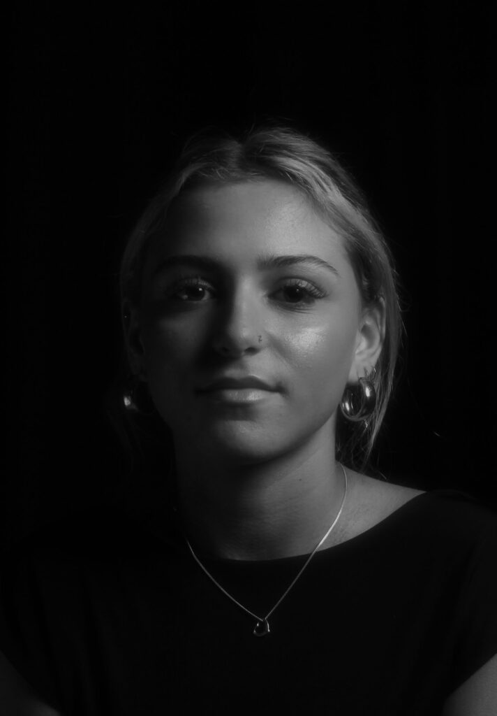
This image has a harsher lighting which hides the subject from view, adding more of a mysterious element to the photo.

This uses a softer lighting for a more intimate photo

Attempt

In this image we positioned the key light to only cover her side.

In the editing process I used the spot healing took to clear up blemishes but didn’t want to blur the image otherwise it would distort too much detail.

Exploring Lighting | Butterfly Lighting

Butterfly lighting, otherwise known as paramount lighting or glamour lighting, refers to the butterfly shaped shadow created under the nose from a light source above the camera.

It gets the name paramount lighting from the technique being used on lots of Hollywood stars. Because the light source angles downwards it creates shadows under the cheeks lips and nose which gives the subject a slimmer appearance.

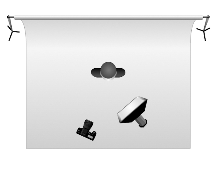
This is an example of a butterfly lighting setup. The light source can be of any kind including natural light or strobe lights because the quality of light is not important.
For a softer effect, you can use a modifier like an umbrella to help more evenly distribute light across the subjects skin.

Personal Attempt

During editing, I created a layer with 25% opacity with gaussian blur and spot healer to remove blemishes.

There are clear shadows that run down the subject but for next time I wish to create sharper shadows that to divide up sections of the face more.

Exploring Lighting | Rembrandt Lighting

Oliver Doran Studio Portrait

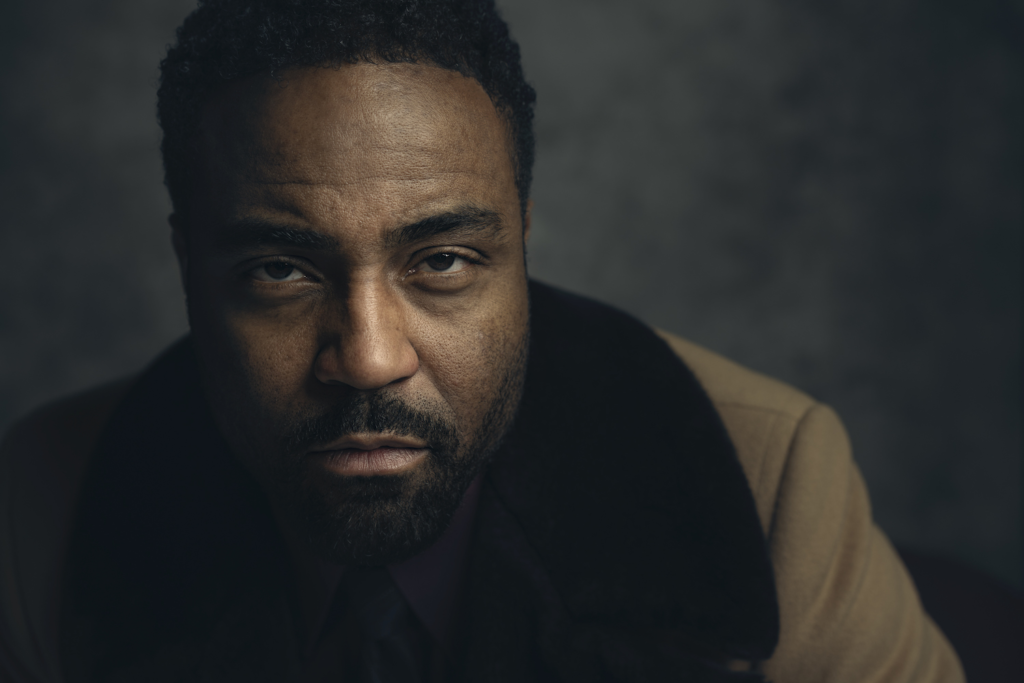
Rembrandt lighting is a style of lighting that adds dramatism and focus on the subject that uses an upside-down triangle underneath the eye of the subject.
In the example above Oliver Doran used rembrandt lighting to isolate the subject and keep the attention on his face.
Rembrandt lighting is used to create shadows and contrast. It’s another method like grid lines or negative space to draw a viewers attention.

Using hard and soft lighting can also heavily affect how your final image presents itself.

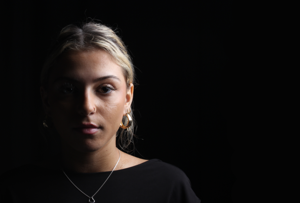
The hard lighting in this image combines with the cold lighting and creates a bolder and harsher setting.

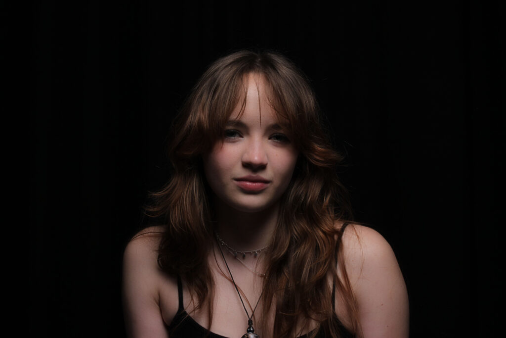
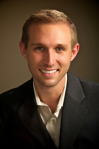
The softer lighting in this image in combination with the warm lighting and facial expression makes the image appear less serious and more gentle.

Rembrandt lighting is created by having a primary light source in a dark room tilted at 45 degrees side-on and above the subject.

A 50mm works really nicely for portraits and will give a nice depth of field if you’re shooting at a shallow aperture. But a 35mm will give you a wider point of view and is great to fit more of the body in of your subject.

Personal attempts

Objects – First Edits

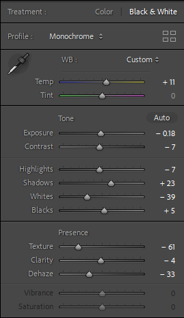
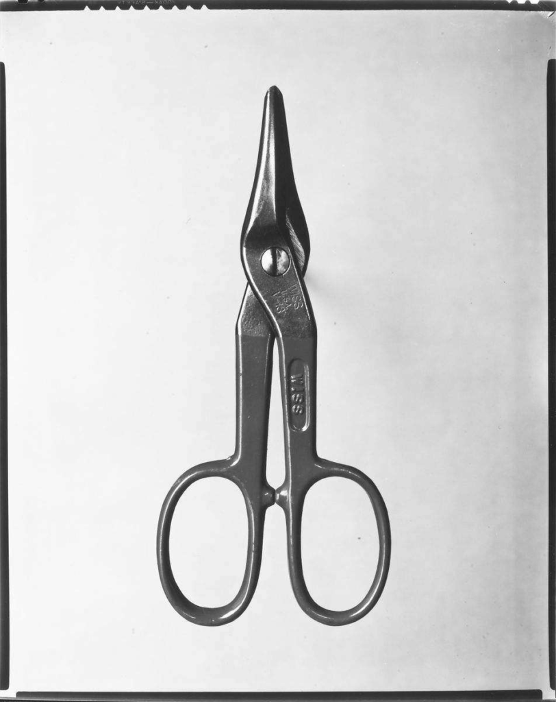
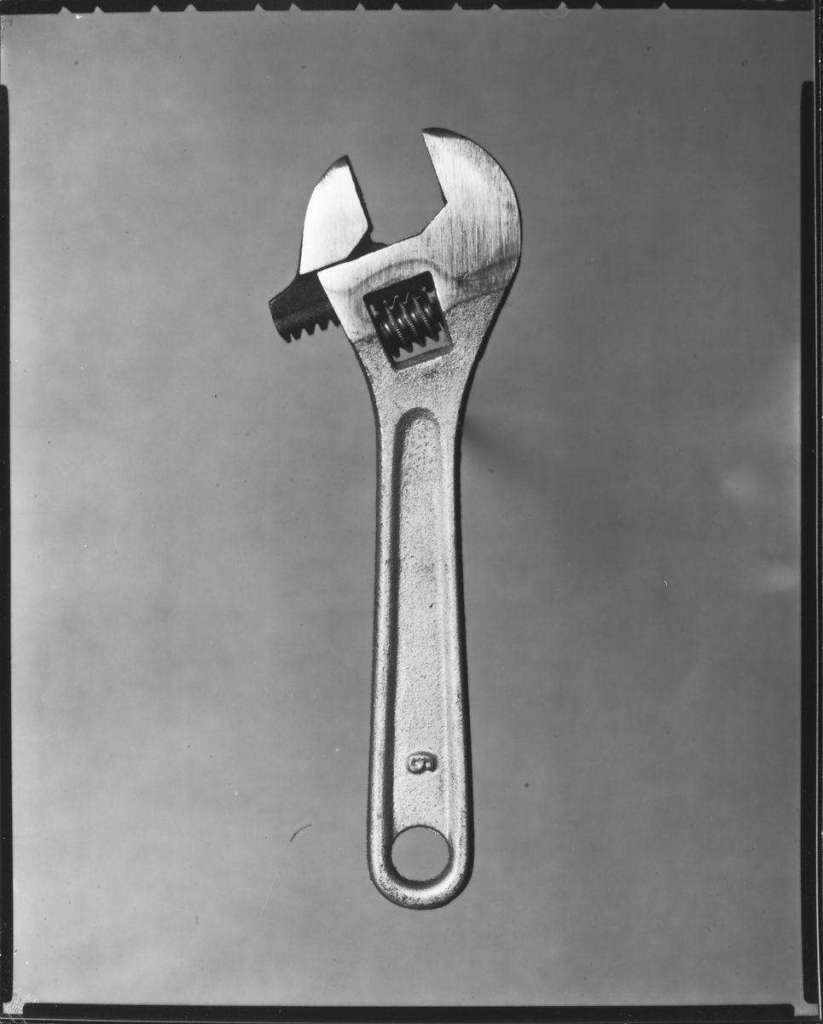
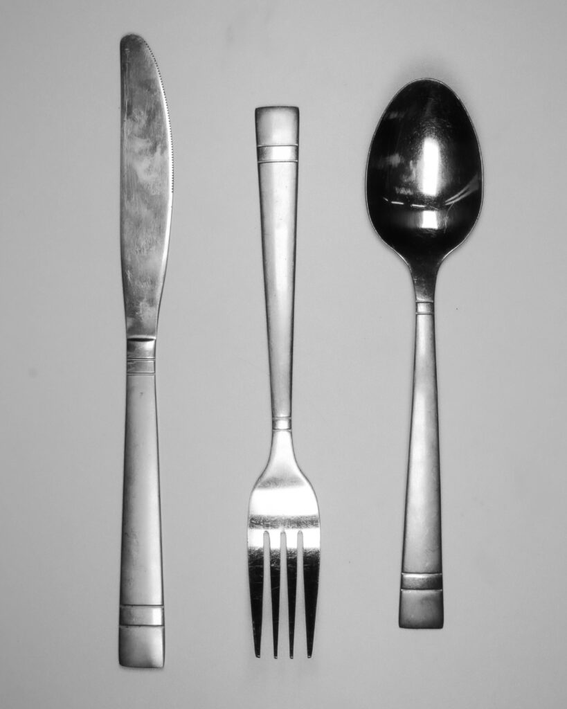
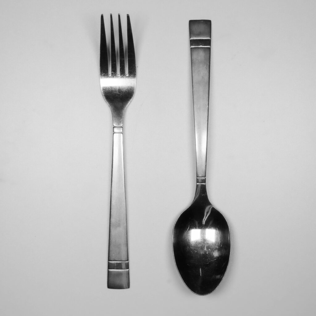
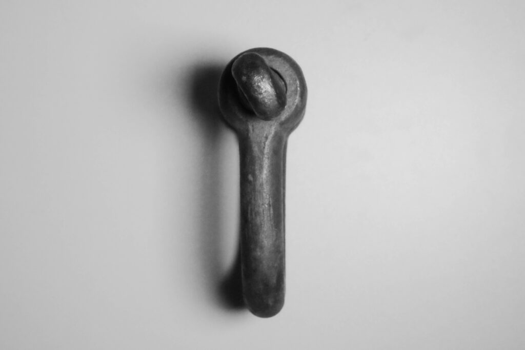
I have tried to mimic the Walker Evans style by matching the monochrome theme and soft textures of the Polaroid SX-70 that he used by reducing the dehaze and texture.

I also wanted to lightly emphasise the shadow so I have increased the blacks over the whites.

Additionally, I have attempted to centre the subjects on a vertical axis to match Walker Evans positioning as well.

Walker Evans usually centres his subject as a line or a grid which I think I could have developed on.

Our ISO, shutter speed and aperture were too high for our lighting setup which resulted in some images being dim, grainy and way too under exposed.

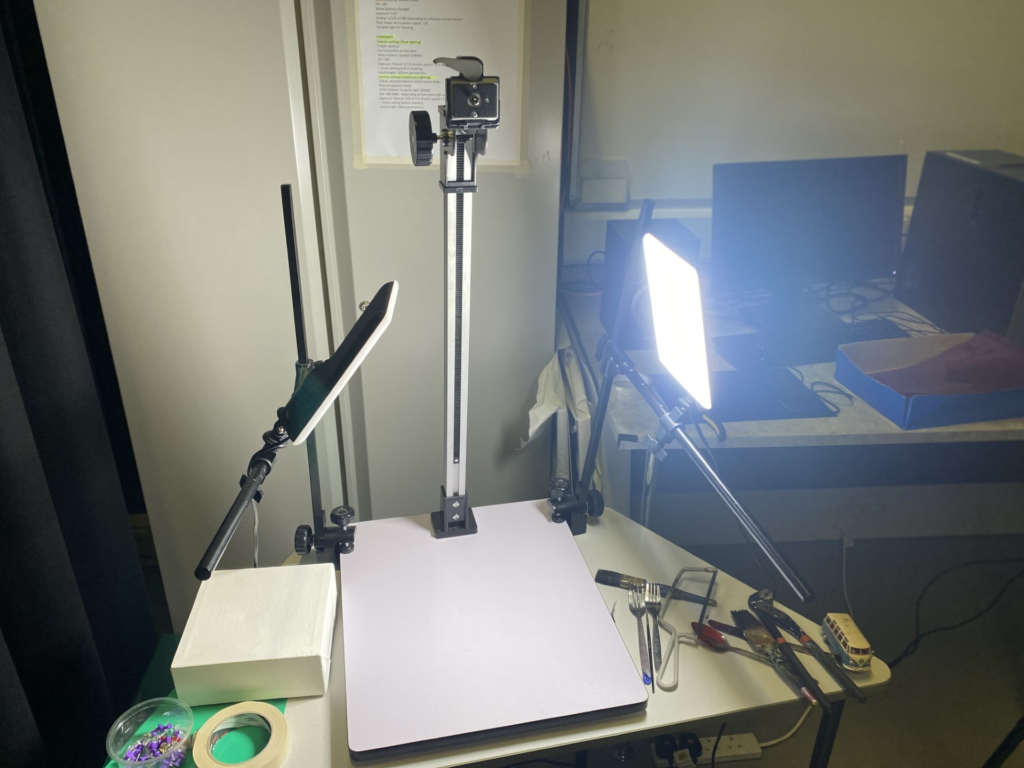
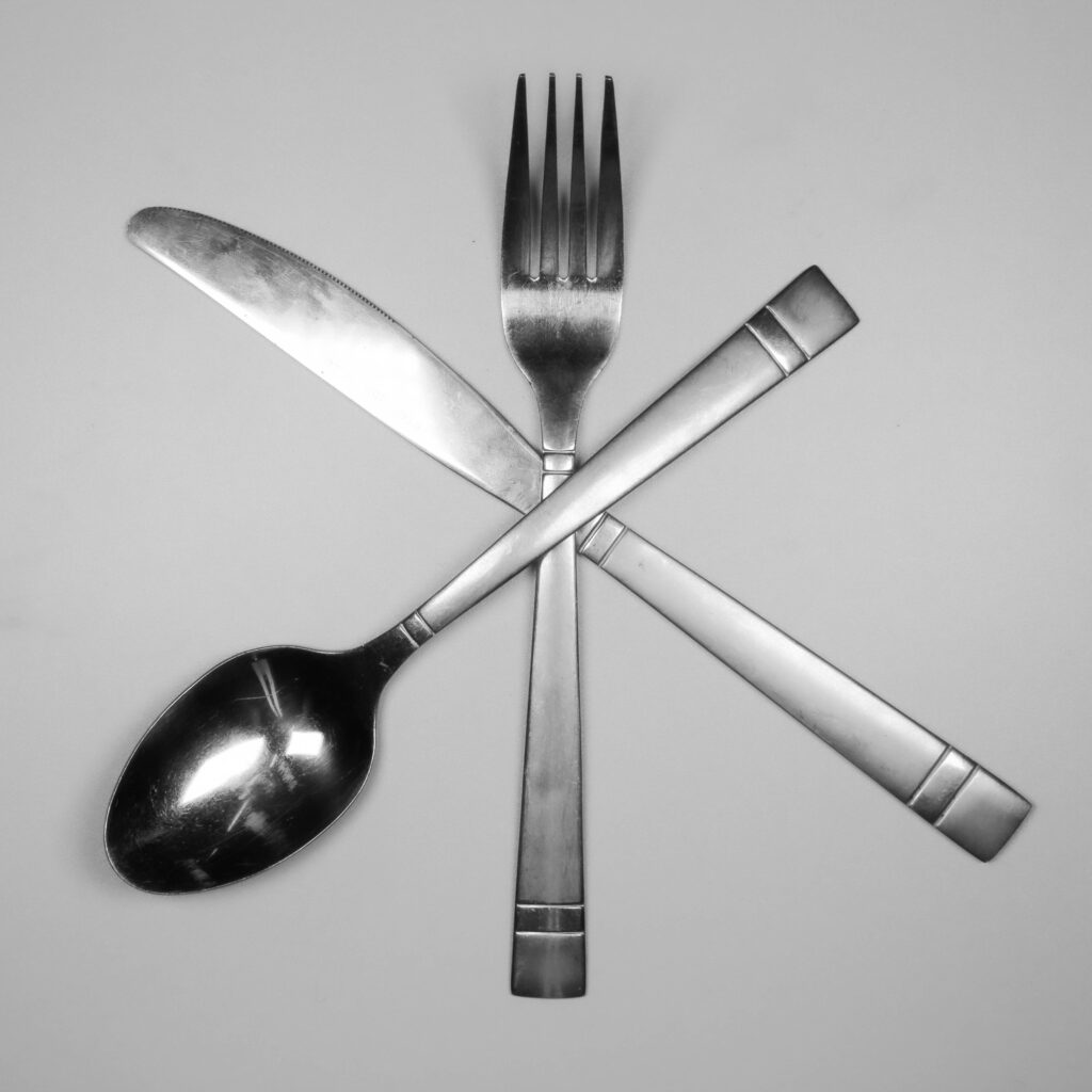
We used a studio table top setup with 1 point continuous lighting.

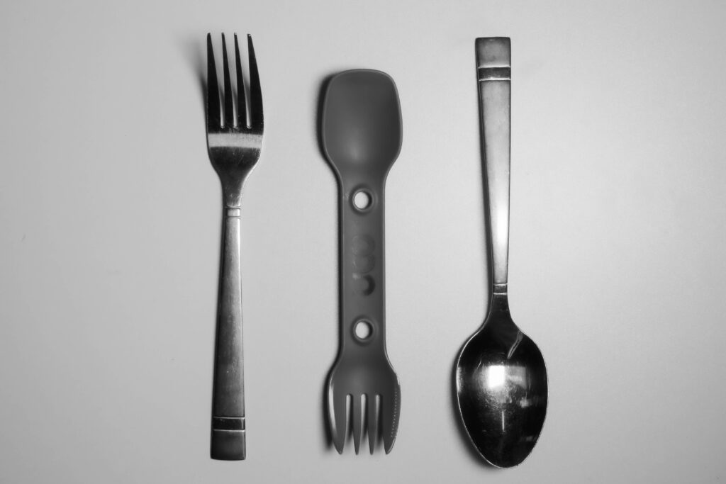
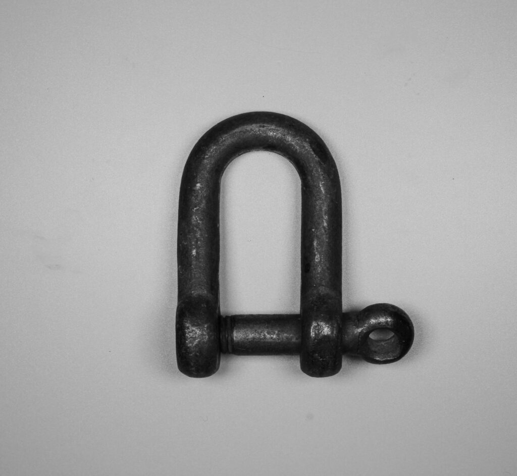
In this image I have used the wider side of the object to create parallel lines that give the image some shape.

Standing the subject on its side gave the photo some depth because of the shadow cast by the single static light.

By crossing the cutlery it created an interesting shape.

Environmental Portraits

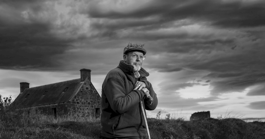
Environmental portraits are photographs used to capture a subject in their everyday workplace or home. It highlights the subjects surroundings and life style in a very direct way.

Environmental portraits can give the subject an ambiguous private identity but will give a simple notion towards the subjects work identity.

Mood Board

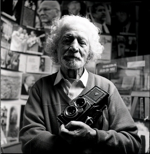
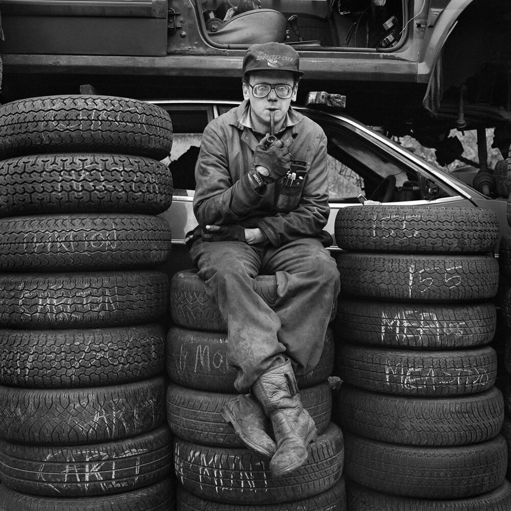
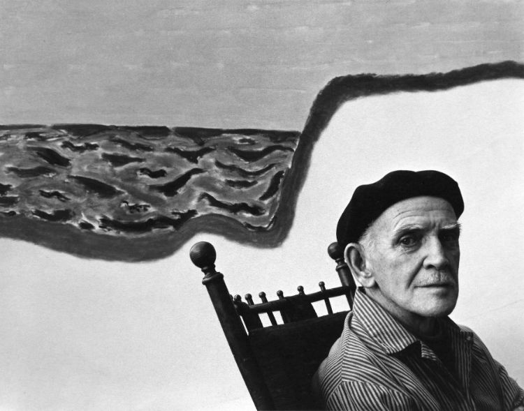
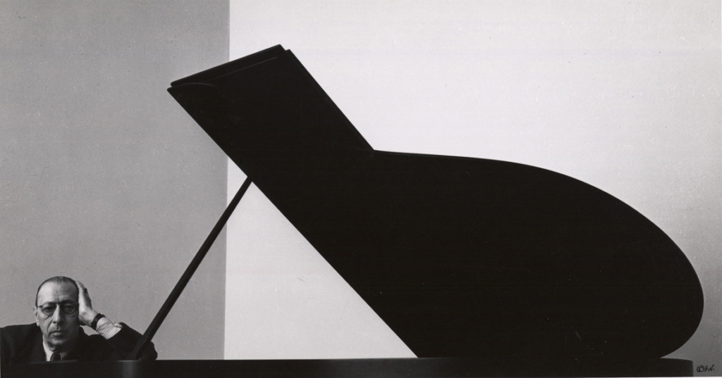
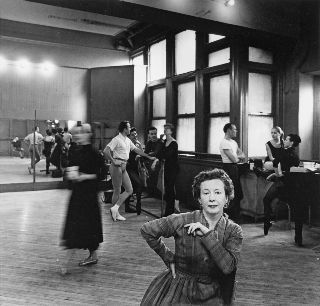
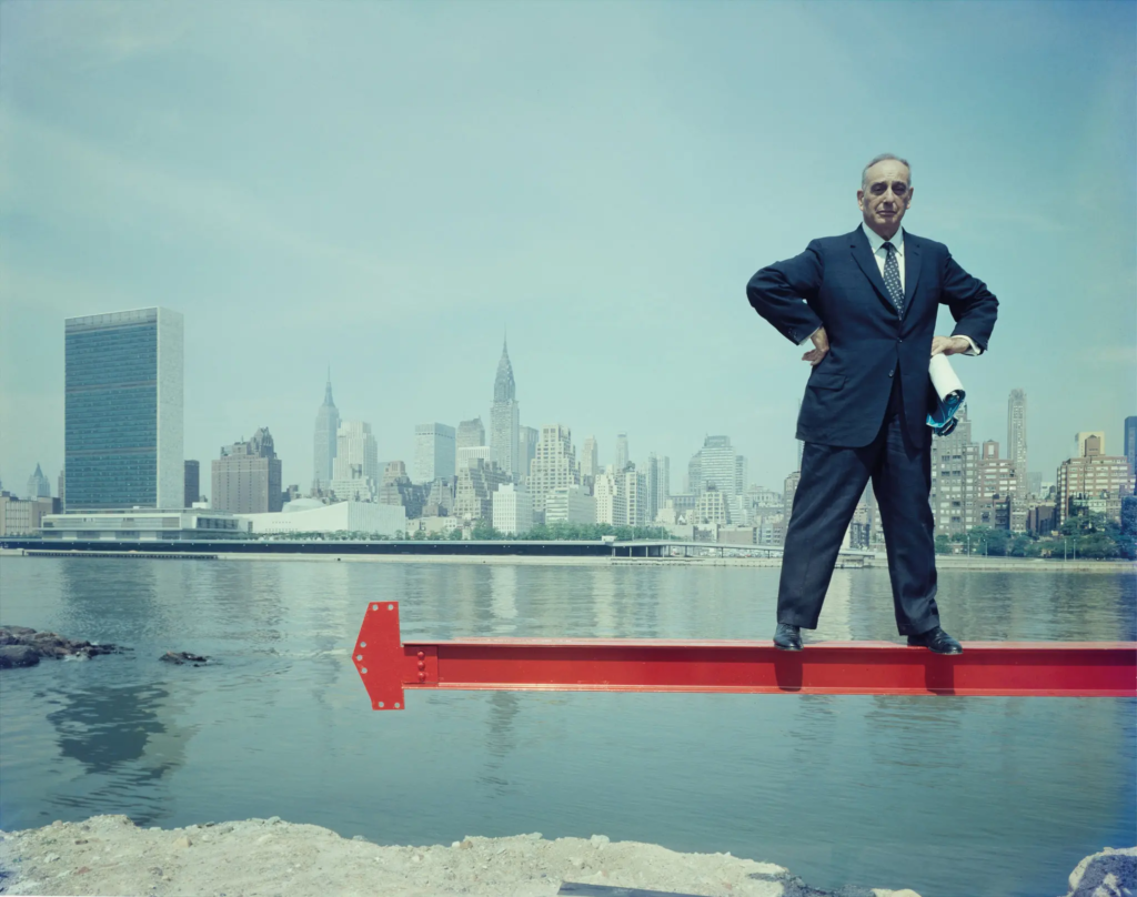
Arnold Newman

Arnold Newman makes use of shadows to create a 50/50 split of light and dark.

Some of his work is quite flat and bleak and the only dimension is the shadows on the people in the photograph.

In this image Arnold Newman creates an idea surrounding Agnes de Milles’ choreographing and dancing career by blurring people in the background which gives motion to the image.

Additionally, a lot of his environmental portraits use lines to add dimension and shapes to the photograph.

Camera Handling Skills

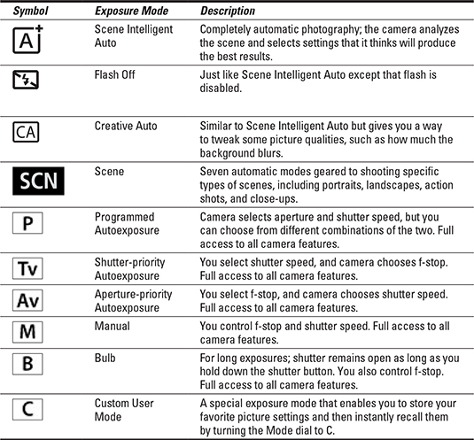
Three important components in camera handling:

  • Aperture (f/x)
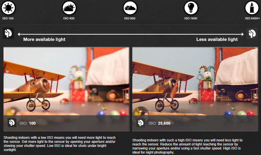
  • ISO (100, 200, 400, 800 etc.)
  • Shutter Speed (1/X)

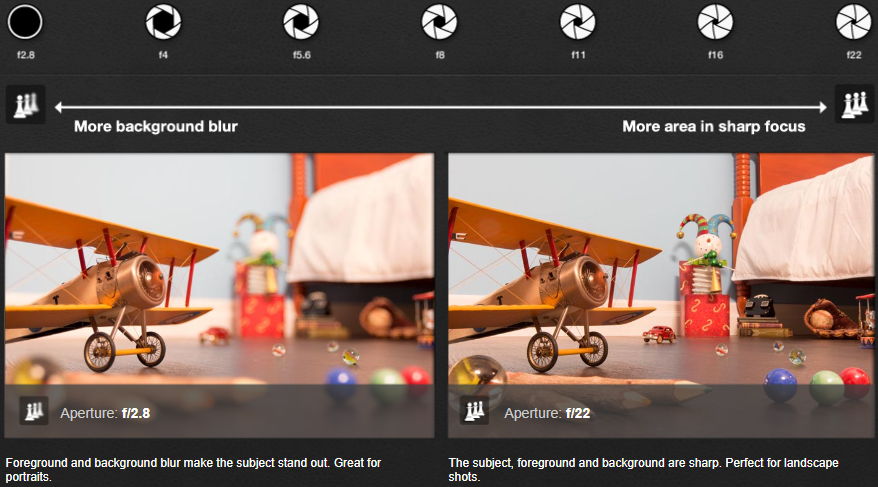
Aperture

Aperture controls the size of the lens opening which allows light into your camera.

Opening the lens more or having a low f-stop number (e.g. f/1.4) blurs the background/foreground around your subject. This is known as a shallow depth of field.

Keeping the lens more closed or having a high f-stop number (e.g. f/16) keeps the photo sharp throughout. This is known as a wide depth of field.

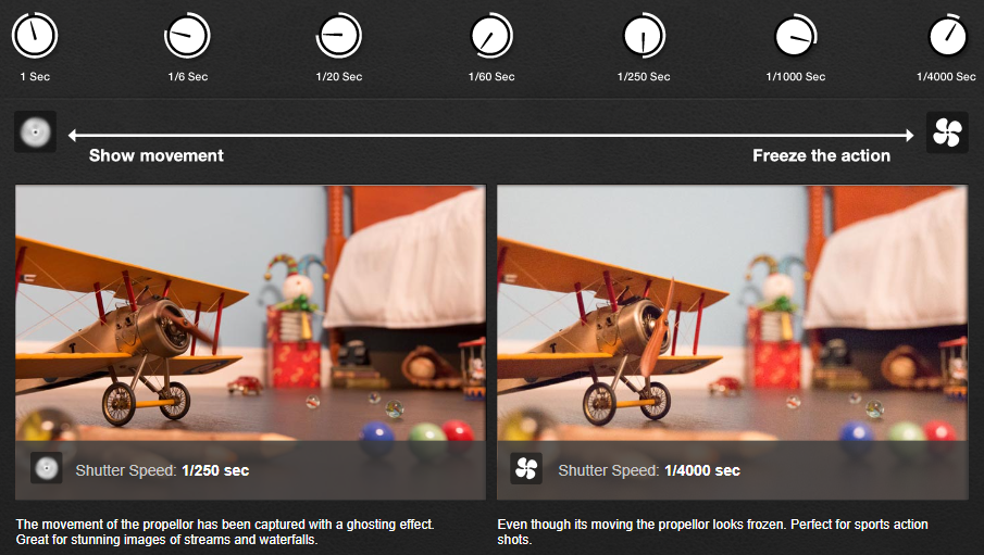
Shutter Speed

Shutter Speed is the amount of time the shutter is open to expose the image sensor to light.

Slow shutter speeds expose more light to the image sensor so still objects will have more detail and moving objects will appear to have more motion/be blurry.

Faster shutter speeds means less light is exposed to the image sensor and moving objects appear more still.

ISO

The ISO of a camera selects how much light the image sensor detects.

Too much light on a sunny day can cause overexposed shots so a lower ISO would be preferred.

Too little light in a shady room or day can cause grainy images.

The general rule is to use the lowest ISO possible to get the most detail possible.

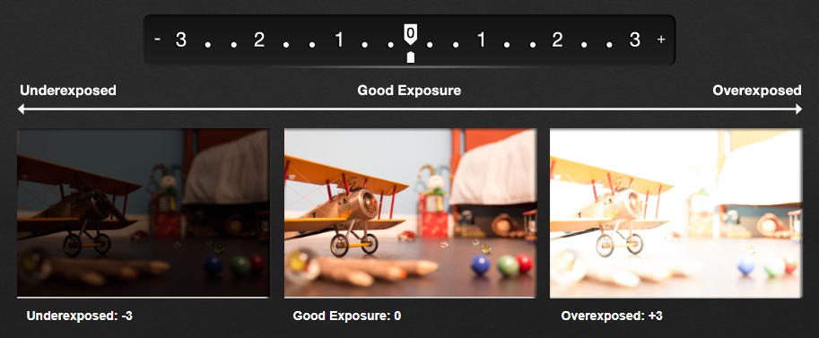
Exposure Meter

 The Exposure Meter is your final check before you snap a shot. It shows you how well your aperture, ISO and shutter speed are working together.

It is used as a guide to show exposure.

White Balance

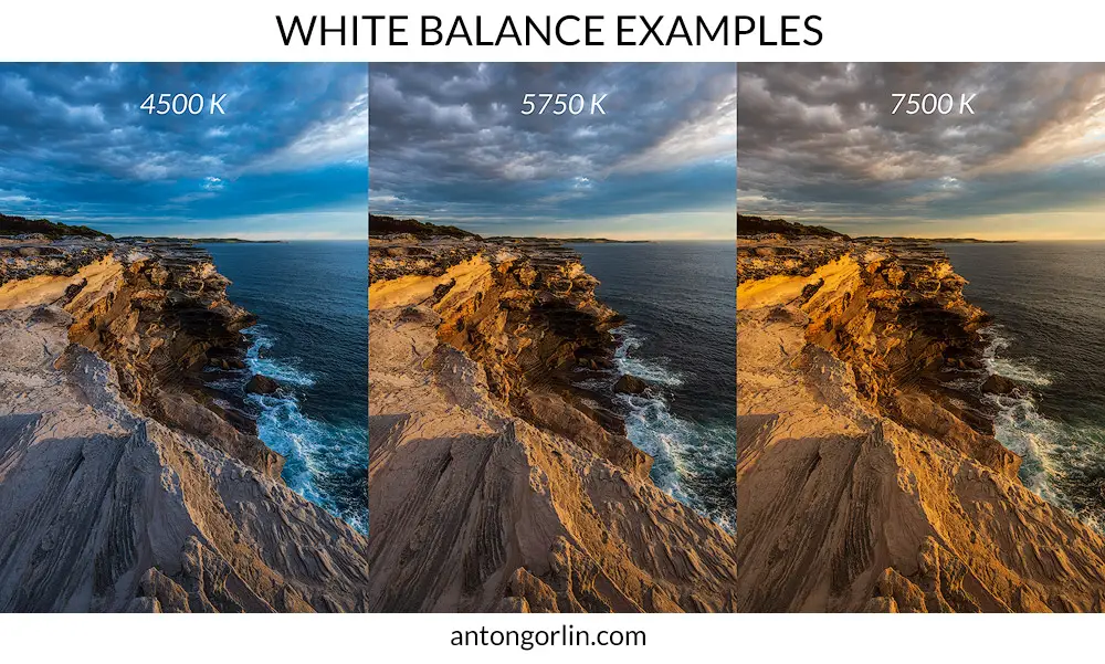
White balance is the ratio of blue light to red light in an image which refers to the concept of colour temperature.

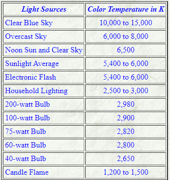
White balance is measured is Kelvin(K). Higher values of Kelvin contain more blue light whereas lower values of Kelvin contain more red light.

Here is a table of Kelvin which shows the colour temperature of possible subjects. You can see that a cameras electronic flash is similar to sunlight.

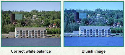
Below is an example of an image in a warm lighting that has the correct white balance next to a copy with too high a Kelvin value. The image is more yellowish because it is expecting excessive blue light but the image is only being lit with reddish lights.

Here in this image the camera is set to a low Kelvin value (which tells the camera to absorb more red light) in sunlight. This results in a bluish image.

https://pages.mtu.edu/~shene/DigiCam/User-Guide/white-balance/wb-concept.html#:~:text=The%20unit%20for%20measuring%20this,i.e.%2C%20smaller%20Kelvin%20value).

Objects – photoshoot and contact sheet

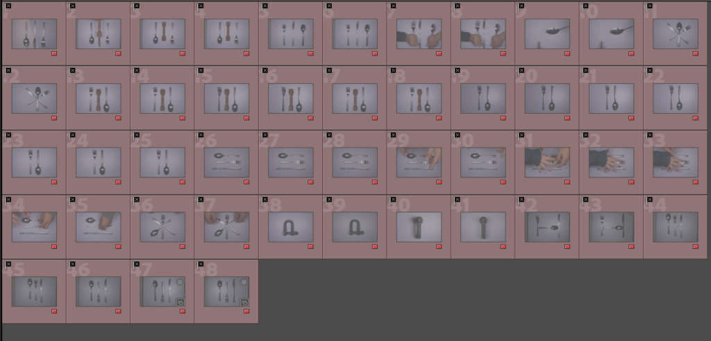
I’ve discarded these photos because they didn’t meet a standard, and a lot of them involved hands and blurs that were automatically taken by the camera.

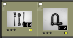
These are two photos that I deemed valuable enough for an edit, but overall didn’t turn out too great and I wasn’t impressed with the result of the editing process. They were too grainy and lacked the detail in texture that I wanted to replicate from Walker Evans and Daren Harvey-Regan

Overall I think these images turned out the best of the 54.

The shadows and texture were what I wanted from this photoshoot and they also contained the specific clarity and vintage look I wanted to include to match that of Walker Evans and Daren Harvey-Regan.