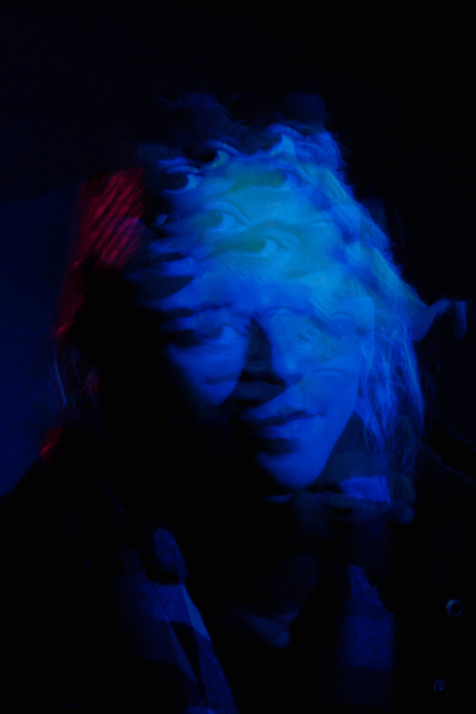
Martin Toft explores themes of suppression and silence with abstract representations of Jèrriais speakers using black and white portraits beside places of special interest in Jersey’s landscape.
I like the use of the archive photos and stylised title texts that are held on screen, it gives you time fully realise the questions and responses in the documentary. Perhaps I could photograph physical cards of text that I’ve made with links to Jèrriais culture. The editing is very minimal, but has reminded of the importance of colour and sound on a documentary. I’d like to experiment with colour and mood in my project.
In Mathinnyi by Kit Ashton, he records various generations and supporters of the language discussing thoughts on the revival of Jèrriais. He uses old footage of his father on a fishing boat in the introduction, and in-between the various locations has artistic shots of the island.
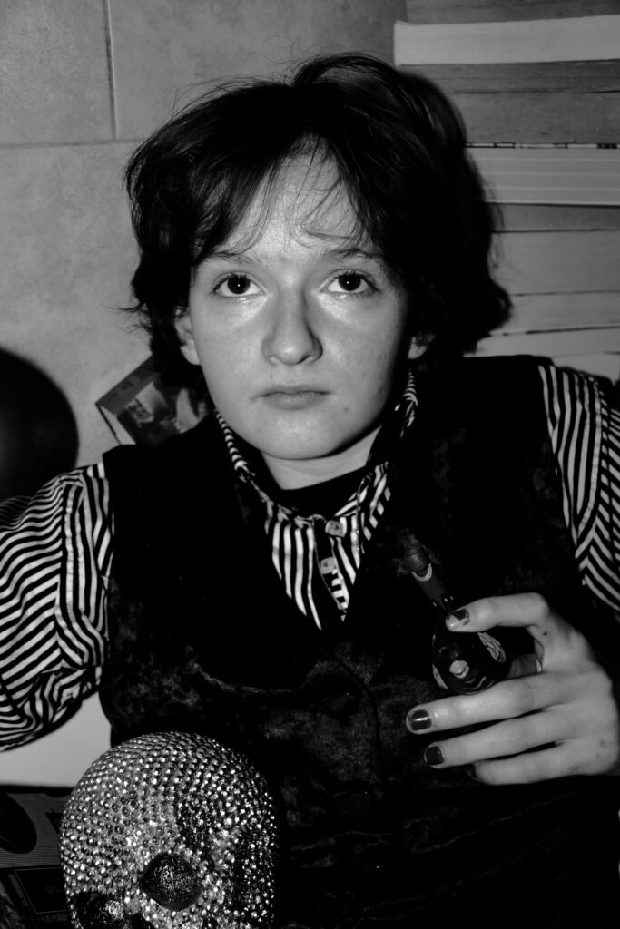
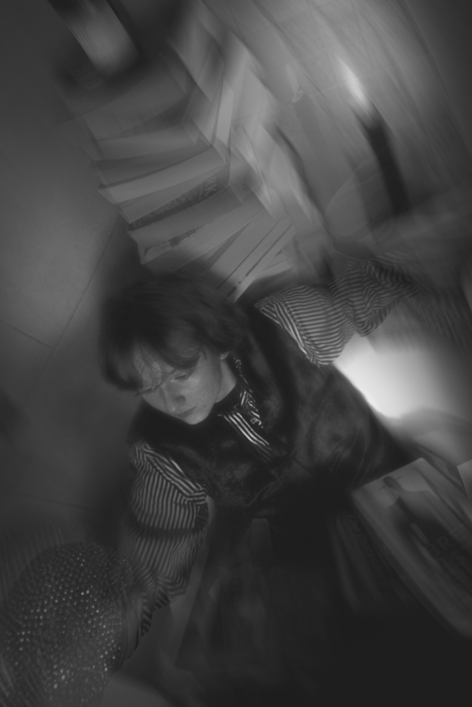
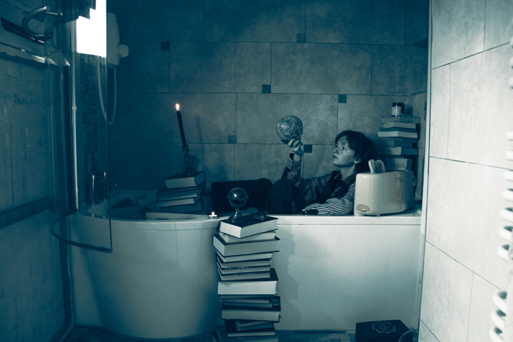
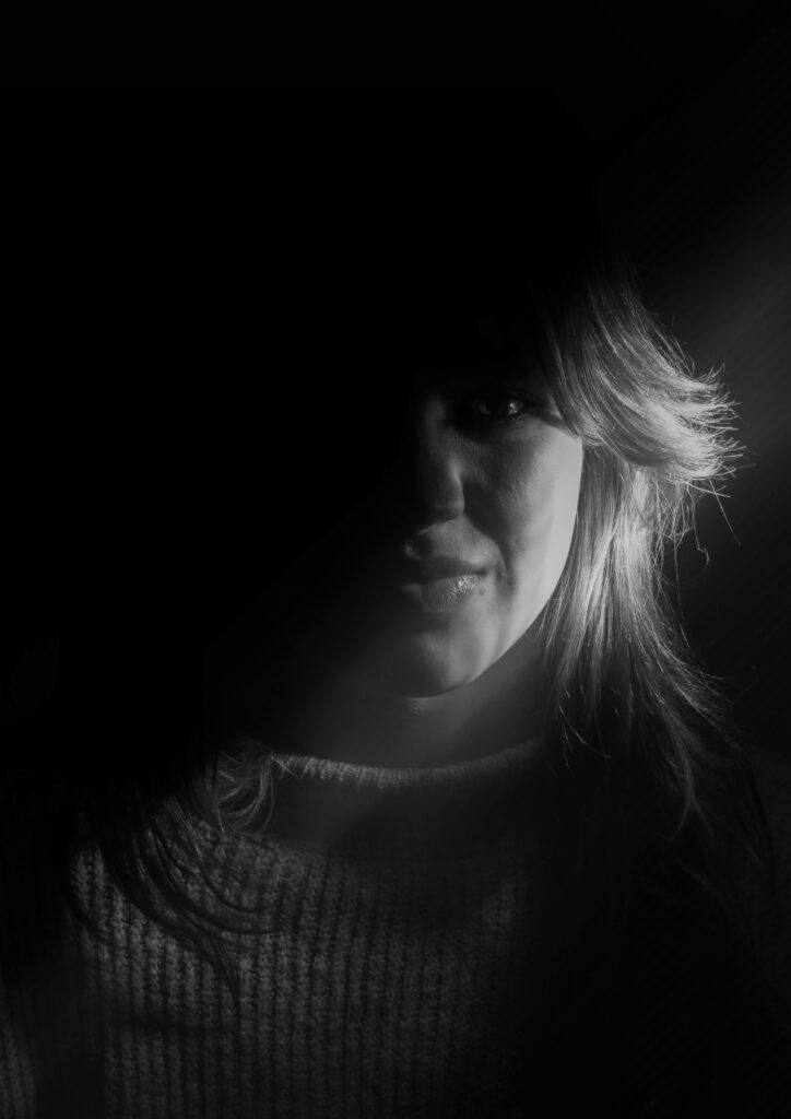
This January I did a quite absurd photoshoot with my friend Elliot stemming from one of my many sporadic ideas. I wanted a portrait photoshoot in a bath with a toaster.
Elliot is a massive book and musical fiend, a fan of the gothic aesthetic and a historical whiz. Other than the toaster those are all his belongings. Elliot’s creative contribution comes from the literature If We Were Villains and Cirque du Soleil.
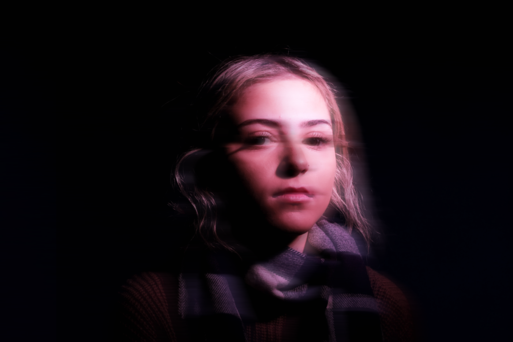
First Mock Selection
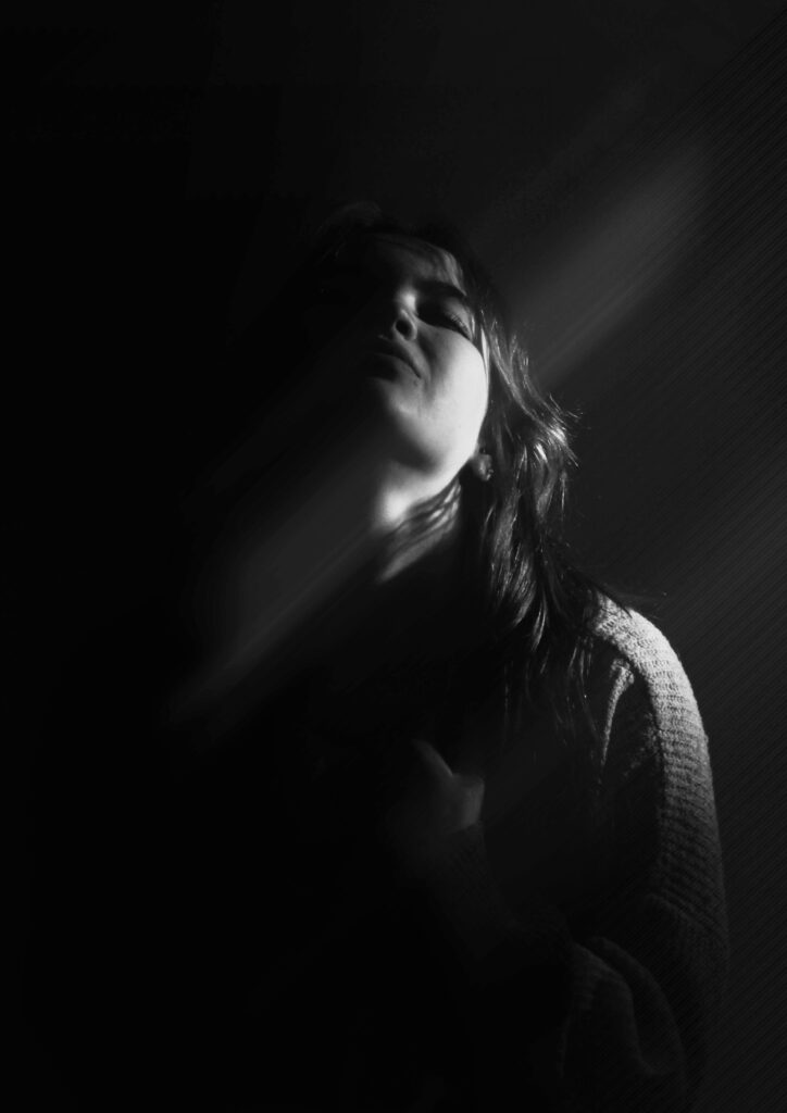
The beginning of A levels really threw me in the deep end, but my mock selection portraits from light experimentation are interest me despite the over the top editing.
At the time I would have discovered the photographer Jonti Wild. His stark style pulls colour and lighting to the forefront, which is what I somewhat got to explore in this project.
Danny Damien
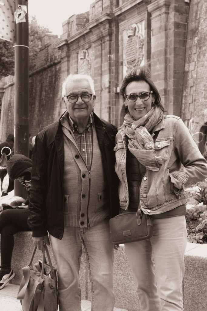
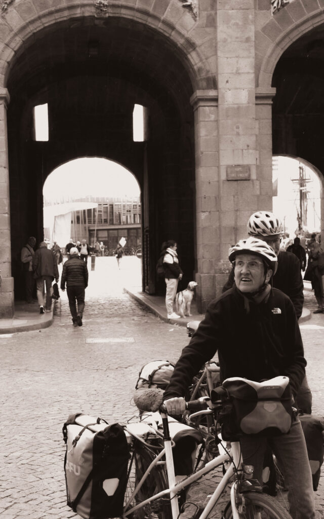
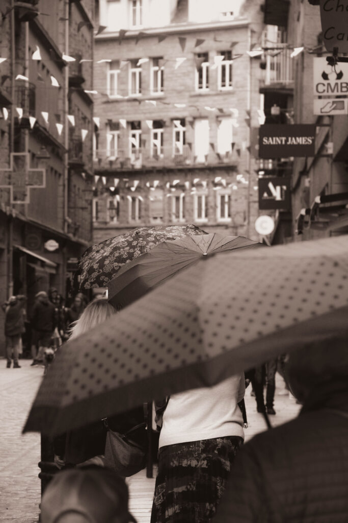
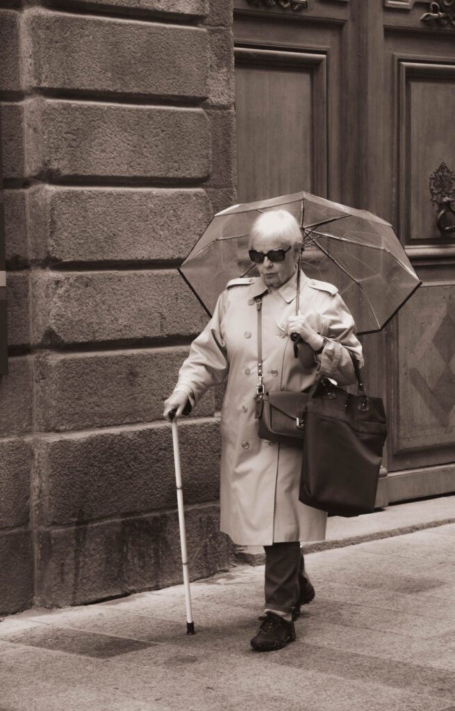
St Malo
The opportunity to take photos in a foreign country gave us an unbiased and fresh perspective to review our skills.
This photo is my favourite of the selection for its candid narrative and sharp capturing that gave me minimal work to do in post.
The pictures are too purple for me, but the concepts and composition I admire and want to build from.
Henri Cartier Bresson was the main influence here. I was intrigued by his photos of people doing odd movements but couldn’t pass the opportunity to photograph people that interested me.
James Popysy’s style where he lightly overexposes the shot was creeping into the back of my head at the time hence some of the shiny whites. It’s a technique I want to follow up now as well.
James PopsysCartier Bresson
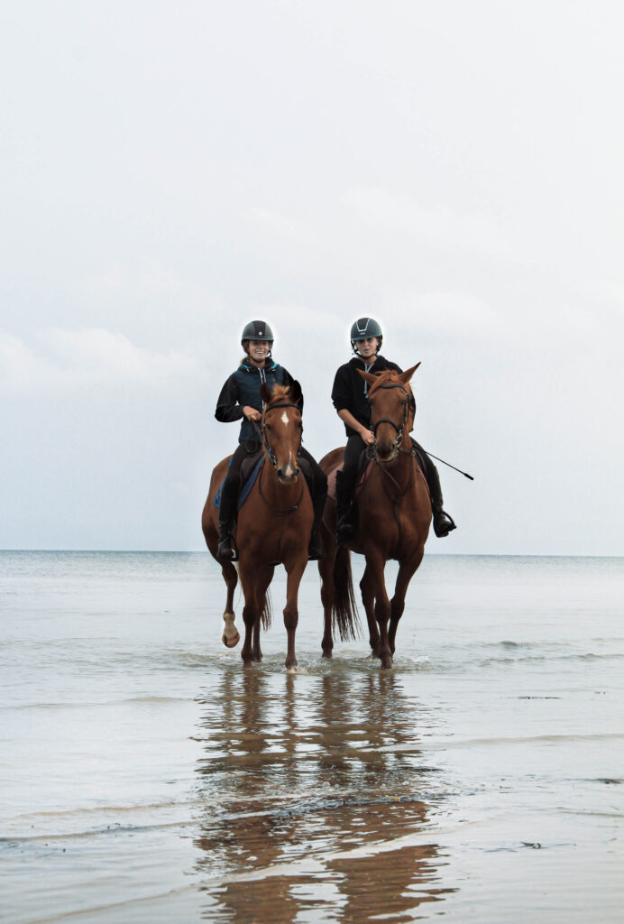
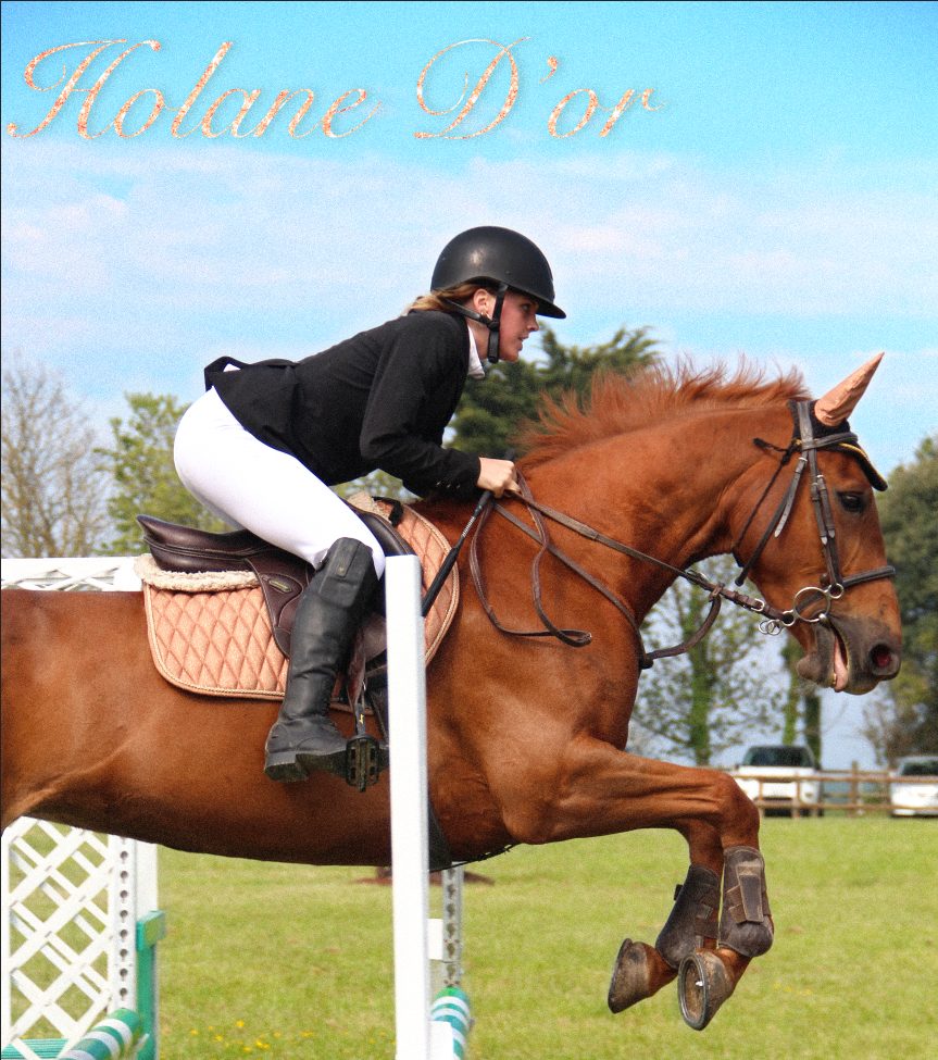
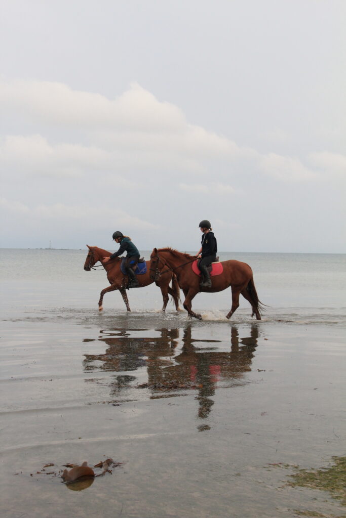
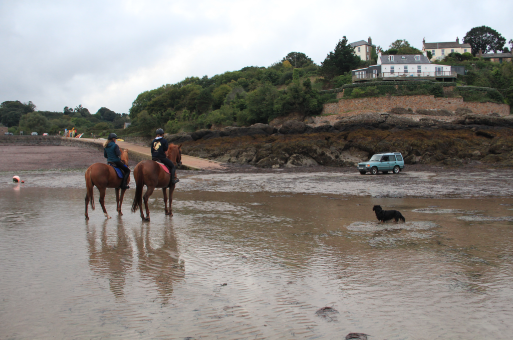
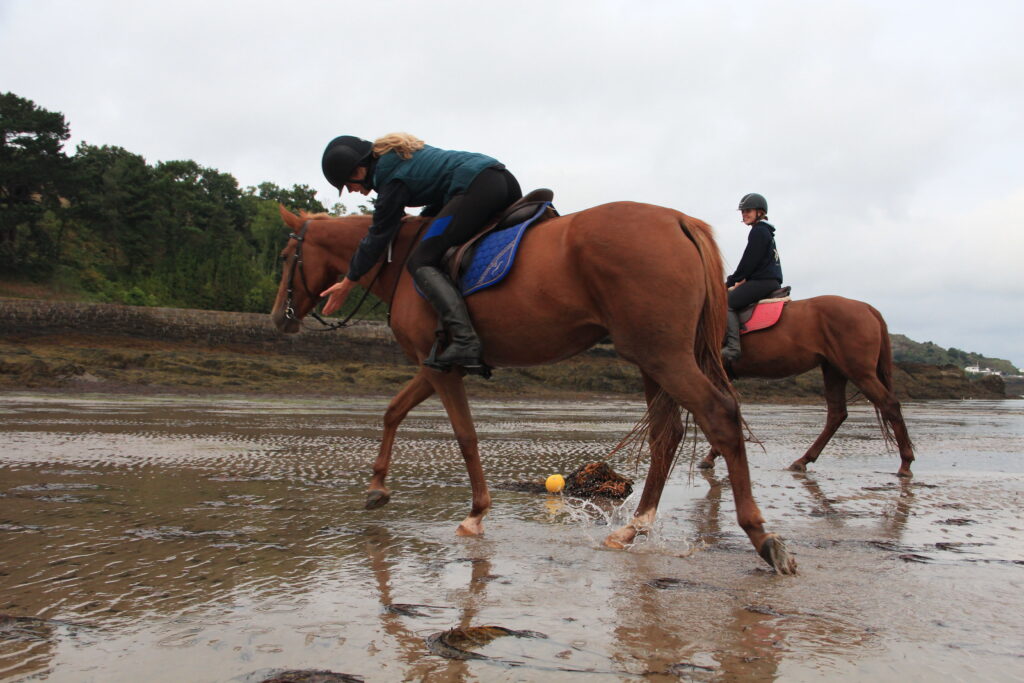
Equestrian Portraits
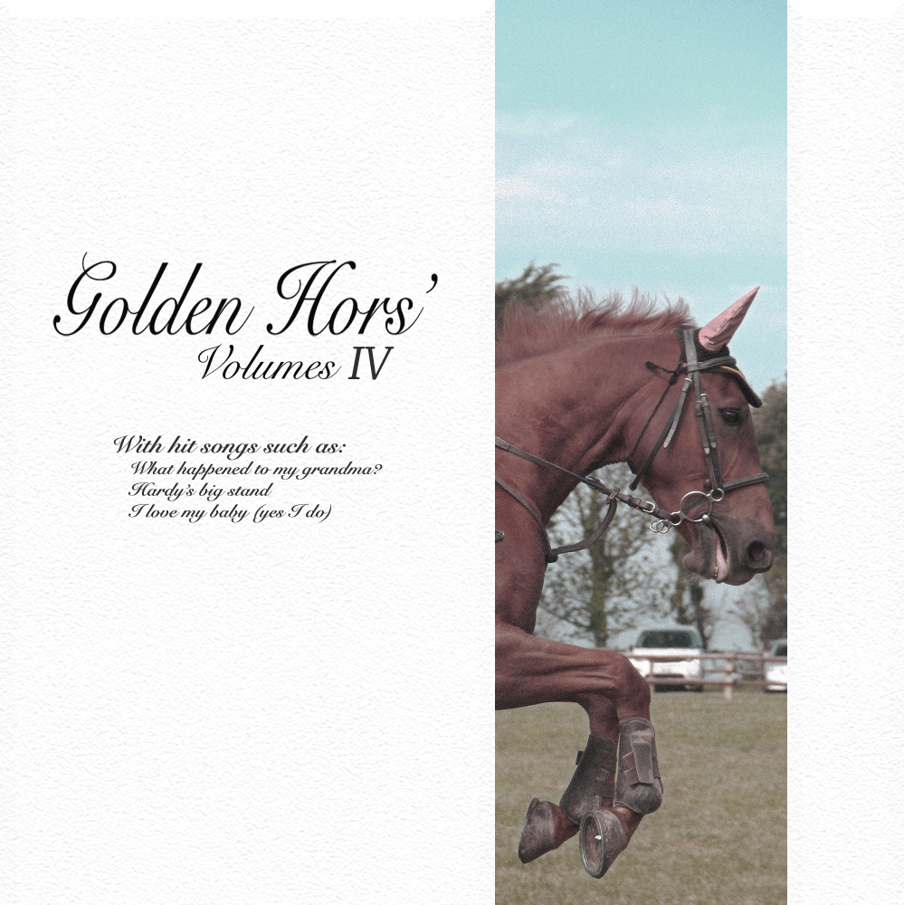
Ellie on Kea (left), Maisie on Holane D’Or (right)Maisie jumping Holane D’OrA joke album cover using the same photo
and the raw photos
In my spare time I like to take photos of my girlfriend and her friends on their horses. It’s a good opportunity to capture photos in a fast pace environment and to play with light (e.g. reflections) and composition.
I don’t really have any inherent inspiration, I just practice my skills.
Multi Exposure
I got to experiment with photoshop during our multi-exposure experimentation. I sparingly used motion blur and the clone stamp tool for these photos. Jonti Wild again was a big influence on me.
Photoshoot with my sister and an experienced photographer
At the start of photography A level my sisters co-worker asked to do a photoshoot of her. I was invited so I could learn and take photos which was essential for me learning exposure and composition tricks. I also practiced colour editing afterwards, but it was very beginner.
The Mirrors and Windows exhibition of American photography has been around since 1960, and in 1978 opened in New York City at The Museum of Modern Art. The curator, John Szarkowski, wanted to categorise photographers into subjective work, reflective of the individual and objective, documentary work that sought outside the individual.
What is the difference between photographs that are mirrors and windows?
Mirrors and windows are ideas of a binary opposite. ‘…two creative motives…’ [Szarkowski, 1978] that have conspicuous contrasting ideas.
Mirrors is an idea about expression and originality. Multiple, subjective perspectives can be interpreted. Just as mirrors, photos can have a warped or manipulated perspective to emphasise a narrative/point.
This ‘creative motive’ is reminiscent of the theatrical visual art of tableaux vivant, that would recreate artworks with props and actors on stage. Similar to the way a photo recreates ideas with its subjects, composition and themes.
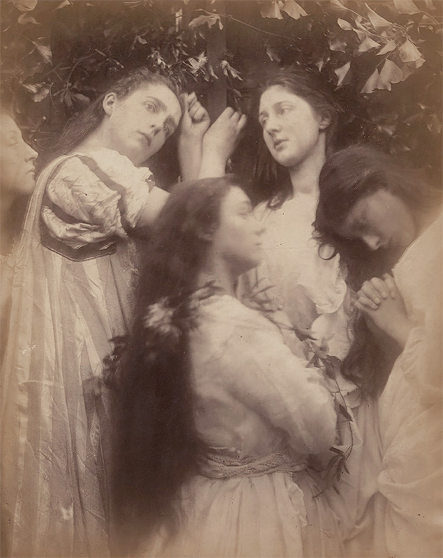
To Szarkowski it was ‘…reflecting a portrait of the artist who made it…’. Early examples of this romantic style photography can be seen in the works of Julia Margaret Cameron, who was directly inspired by tableaux vivants.
Julia Margaret Cameron
Windows is of a single objective perspective. They are descriptive, documentary and formal as they tell a clear narrative in from a fixed point of view.
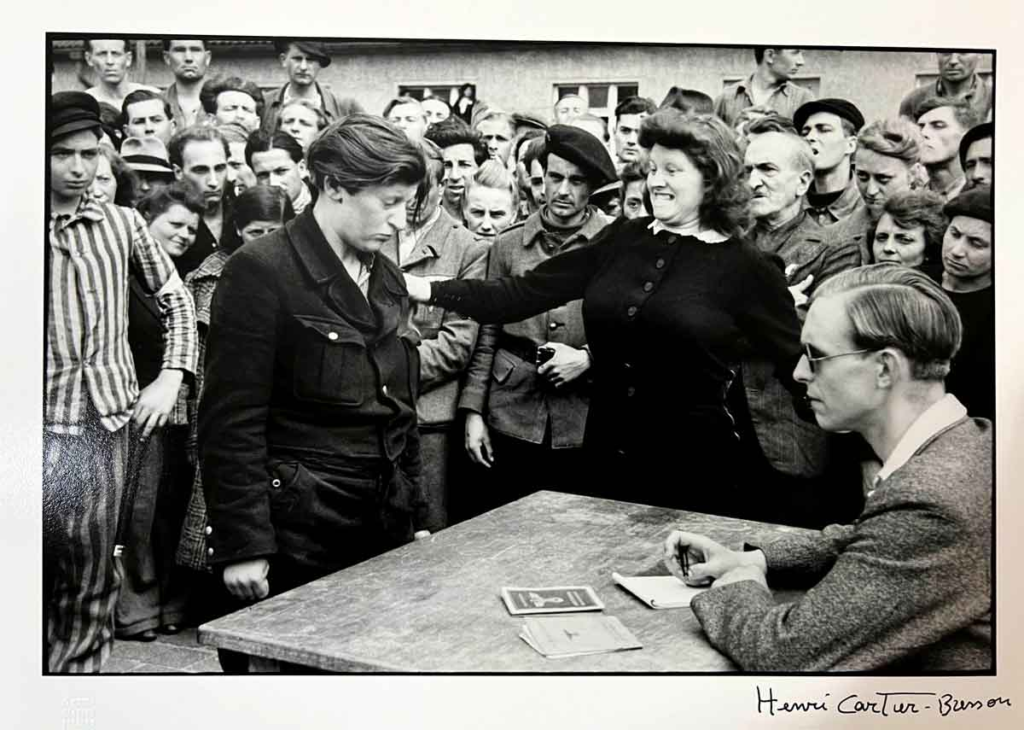
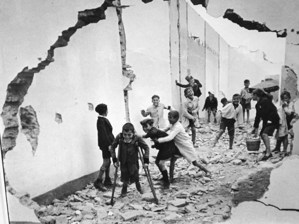
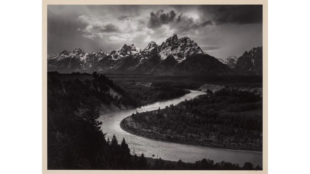
Examples of ‘window’ photographers are Henri Cartier Bresson – and photojournalist who travelled the world merely observing conflicts, communities and cultures – and Ansel Adams – a photographer and activist of many conservation groups, capturing the candid beauty of national parks.
Gestapo Informer Recognized by a Woman She Had Denounced by Henri Cartier-Bresson, 1945Seville, Spain by Henri Cartier-Bresson, 1933
‘Window’ effect with using the hole as a frame.
Rain, Yosemite Valley, California, Ansel Adams
Windows describe something present whilst mirrors describe the interpretation of what is present.
The compositions are always creative, and can be informative or abstract. Windows and mirrors to me seem to a spectrum to exercise ideas and storytelling.
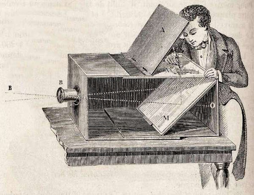
The ancient camera obscura is thought to have appeared as long ago as 4th century China and Greece. Throughout the ages it has been used for religious ceremonies, astrological observation, drawing aid, entertainment and more.
The camera obscura worked by having a small pinhole opening. The rays of light from an object would pass through this hole and appear inverted as they hit a surface on the other side. A biconvex glass lens was later added allowing for focusing and refracting the light which meant no more inverted images. The pinhole would be installed inside a large dark room or tent, later versions becoming small boxes with mirrors so you could angle the image.
Edinburgh’s Camera Obscura built in 1835
Nicephore Niépce & Heliography
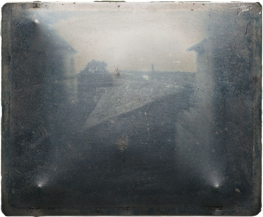
Heliography is an invention of 1827, 12 years before the invention of photography was announced in in both England and France. A decade of experimenting only to end up with fleeting pictures gave Niépce the discovery of the Heliograph.
Niépce’s method required dissolving light-sensitive bitumen (derived from crude oil used in asphault) in lavender oil and applying it over a polished pewter plate (metal alloy). Inserting the plate into a camera obscura and left exposed for several days to sunlight it would reveal an impression.
His first heliograph was left by a window on his second-story work room, leaving an impression of the courtyard, buildings and trees outside.
Louis Daguerre & Daguerreotype
Louis Daguerre was a showman, a presenter of art. The first French panorama painter and apprenticed in architecture and theatre as well. He invented the diorama, opened in 1822.
Daguerre continued from the work off his deceased partner Nicéphore Niépce, inventor of one of the first photographic images (heliograph). He developed the process which became known as a daguerreotype. It went public at a convention on 7th January 1939 and described in not enough detail to be accurately recreated though the images were rightfully praised. The rights were acquired by the French government in exchange for life pensions for himself and Niépce’s son.
With the work on the physautotype that Daguerre did with Niépce, he managed to develop the daguerreotype.
physautotype
The process of the daguerreotype involved polishing a silver plate till it became a mirror and clear of any blemishes, finally swabbed with nitric acid. In darkness it would be exposed to halogen fumes, originally iodide, to create a silver halide coating, originally silver iodide.
The plate was placed into a lightproof plate holder. A ‘dark slide’ would be removed and then the plate would be exposed by removing the lens cap. This would take from few seconds to a few minutes. The plate was then developed in red light and mercury fumes.
The silver halide was removed with sodium thiosulfate and ‘gilded’ with a gold chloride that was heated over a flame. Then finally rinsed and dried. Without the gilding process the image would be as delicate as dust.
Henry Fox Talbot & Calotype
In 1834 Talbot connected his background in optical research with the camera obscura and through this developed the calotype. Coating paper in silver iodide created a non-light sensitive paper that could be stored. Brushing the paper with “gallo-nitrate of silver” solution would balance the chemicals and made the paper light sensitive. In a small lightproof box, nicknamed a mousetrap, the paper was inserted and exposed. By warming the paper and again brushing it with “gallo-nitrate of silver” silver bromide would form. It would be fixed in a hot solution of sodium thiophosphate and produce a translucent negative. The negative could be used to create infinite positives via contact printing. This calotype was groundbreaking but had limited contrasts and details. At Friday Evening Discourse at the Royal Institution on 25 January 1839, Talbot revealed several prints he made in 1935 and would give people an in-depth explanation on his process, unlike Daguerre who initially gave more of an overview.
A negative and printed-positive of a fractal-like tree
Robert Cornelius & self-portraiture
Born in the United States, Robert Cornelius was schooled privately with a particular interest chemistry. In 1931 he began worked for his father in silver plating and metal polishing.
In 1939, Cornelius met Joseph Saxton who was looking for better plates for daguerreotypes which sparked for Cornelius’ an interest in photography. A month later in October, with an improvised camera obscura Cornelius stood for 10-15 minutes to take a portrait outside of his family shop. This portrait is known to be at least one of the first intentional self-portraits in the world.
Cornelius’ family portraits didn’t get preserved but, a student at Cornelius’ studio, Marcus Aurelius Root, published it in a book about the roots of photography in the USA.
Julia Margeret Cameron & Pictorialism
Pictorialism, an approach to photography that emphasizes beauty of subject matter, tonality, and composition rather than the documentation of reality. | Britannica
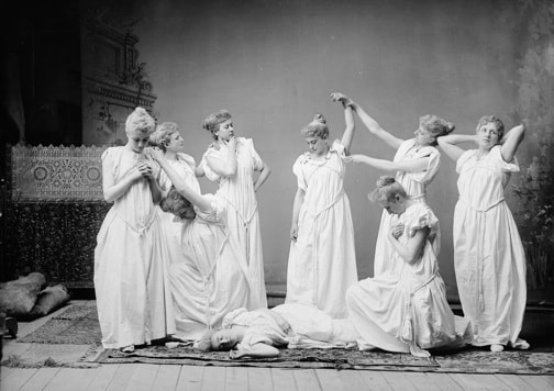
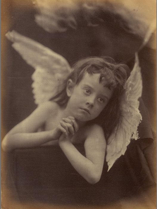
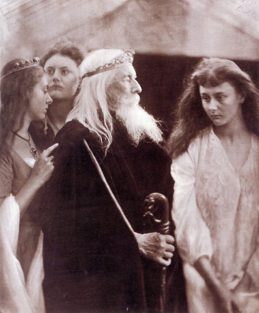
Julia Cameron was born British, in west India, and known as a keystonephotographer of the 19th centuryandforhersoftportraits. Cameron’s portfolio consisted of famous Victorians and depictions of Christianity, mythology and literature.
On her 48th birthday in 1863 she was gifted a camera by her daughter. Theatre, tableux vivants, 15th century painters and italian contemporary artists inspired her first photos. She produced 900 photos over 12 years.
Her portraits were of beautiful and delicate women….
distinguished gentlemen…
and illustrative interpretations.
Cameron was very much a forward thinker and ambassador of her time of the romantic era. She captured the sublime elements of her subjects in a niche and artistic aesthetic.
I especially enjoy this romantic and early contemporary art thinking. Stereographs, panoramic and sublime point of views established photography as an art form, an experience, not so much purely science. It is clear Cameron had this very perspective.
Henry Mullins & Carte-de-Visit
Henry Mullins was by far the most prolific of the first generation of Jersey photographers in the mid-19th century. He produced thousands of portraits of islanders between 1848 and 1873 at his highly successful studio in the prime location of the Royal Square, St Helier. | Jersey Heritage
An early daguerreotype of Mullins’
After working in London, Mullins moved to Jersey in 1848 and began making ‘Carte de Visite’ (visiting cards). For further context, Carte de Visites were traded among Victorians and could fit in your pocket.
Henry Mullins took up to 9600 portraits that are now in the possession of the La Société Jersiaise.
Henry Mullins would use calotypes and charge islanders “one half of that in London”.
As he advertised in the paper, portraits could be of…
Individuals…
Duos…
Of groups… The photos would typically have contact sheets of 10s or 16s. Not to mention, they could vary in sizes.
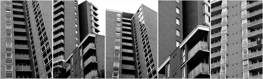
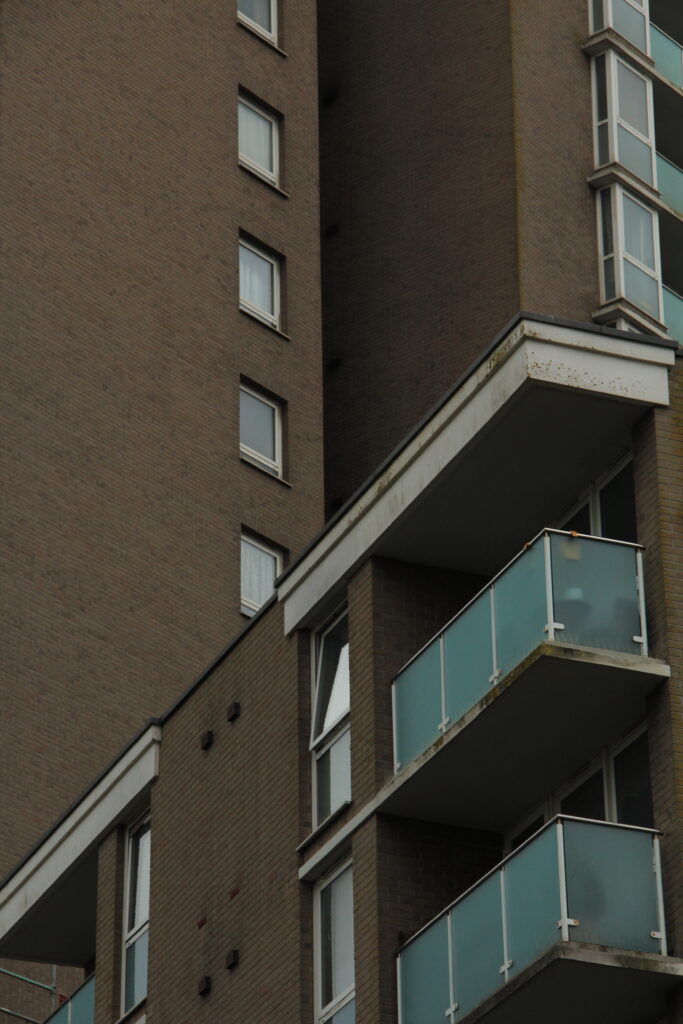
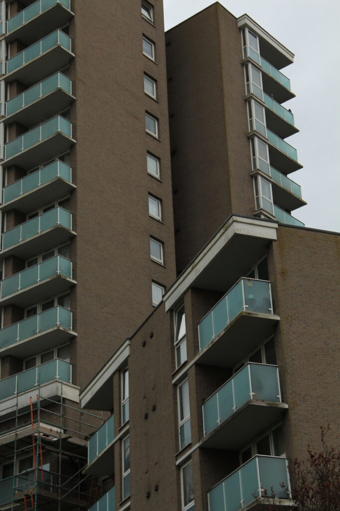
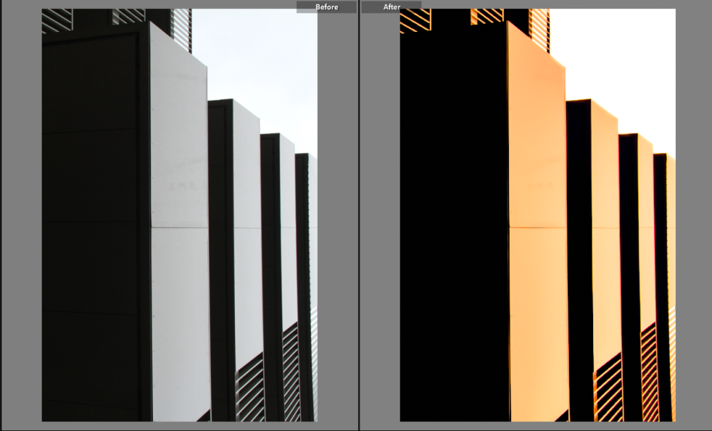
The geometric nature of these post-war modernist buildings drew my eye to them as their repetition was mesmerising but also strikingly contrasting to the natural world’s arbitrary shapes.
The human obsession with uniformity I find very unsettling, especially when realising how dominating it is in built up and man-altered natural landscapes. I’ve tried to highlight the dominance of and cramped living spaces in the buildings by filling the frame, worms eye view and the black and white theme because it emphasises the grid-like lines and boxy arrangements.
The mid-tones make up most the images but to balance this out I made sure to increase the presence to add depth to the bricks and windows.
For extra texture I added grain which is a subtle but nice touch to make the photo look more worn, something that exaggerates their age and brutal style.
The final edits are moody and brutal which was the idea I thought fit the images best. Put in black and white and unsharpened, they give a murky impression. The colour would have almost glamorised these buildings when in actuality I find them all to be just eyesores that are perceived across much of town.
Formalism and Brutalism
Virtual Gallery
Evaluation
Overall I’m satisfied with my final set of images, the composition, ideas and editing achieved more than I expected they would. Though a small focus, I believe I have successfully delivered the message of Anthropocene in my work by displaying the towering and cramped feel of how we’ve designed our own living conditions and how we’ve transformed natural materials into these brutal and unnatural blocky buildings which shows the disconnected relationship between some of humanity and nature.
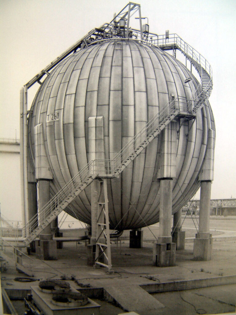
These 2 pipes going into and from the incinerator at La Collette. I decided to emphasise the reflective and battered texture of the pipes by increasing the overall presence, shadows and whites of the image. This also helped the lens flare stand out on the left pipe.
The beautiful clouds in the background of the image gave nature a presence in an image of mostly manmade components. To reveal them I lowered the exposure of the sky using the LRC masking brush.
Just to add a bit more tone contrast I used a graduated filter to the bottom with -2 exposure.
Like Albert Renger-Patzsch, I’ve made the most of the subjects fundamental shapes and lines photographing the pipes at a warped perspective.
The bricks, cracks and metal rail going up this chimney are all made more interesting and given more depth with the use of the shadow that takes half of the left half of the chimney. It’s important that the shadow isn’t too dark that it hides the bricks.
Similarly to Renger-Patzsch, the shadows on the underside of the pipes are just bright enough to see the detail of the scratches and welding, whilst the bright light hitting the top and right of the pipe reflects onto the underside making the tubes less flat. Additionally, the symmetry is broken with the same rail looking thing on the side.
Renger-Patzsch wanted to capture objects as interestingly and objectively as he could. Compared to my image, the blending between tones is smoother and tonal range is lesser so the environment doesn’t effect the subject too much. Though I have included a lens flare and brightened the highlights, the environment doesn’t effect the subject too much and still gives an accurate representation of the pipes.
#2
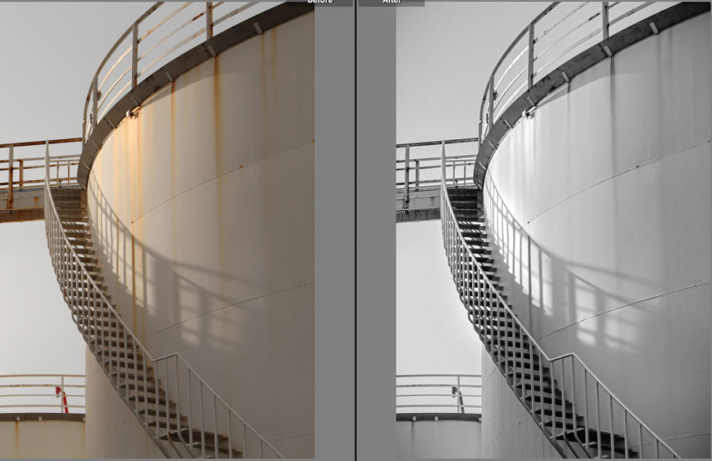
Initial before and after
My next few photos take some influence from Hilla and Bernd Becher as I wanted to capture the texture and shapes within the industrial structures but with a less dead pan and more cropped approach.
[Hilla and Bernd Becher ->]
To uniquely enhance the grate-like texture on this container of sorts I increased the highlights and blacks of the shadows of the image. Because this was quite harsh and unbalanced I added a brush mask around the ladder not only to draw your eye to it but to lower the exposure.
Additionally the spotlight was too dark so I made it sharper and brighter with a brush mask.
The crop gives more attention to the lamp post and ladder with the grate-like texture in the midground being quite distracting to the eye.
Slightly blending a navy blue in the shadows and mid-tones actually softened the grate-like texture further whilst giving it a more metallic appearance.
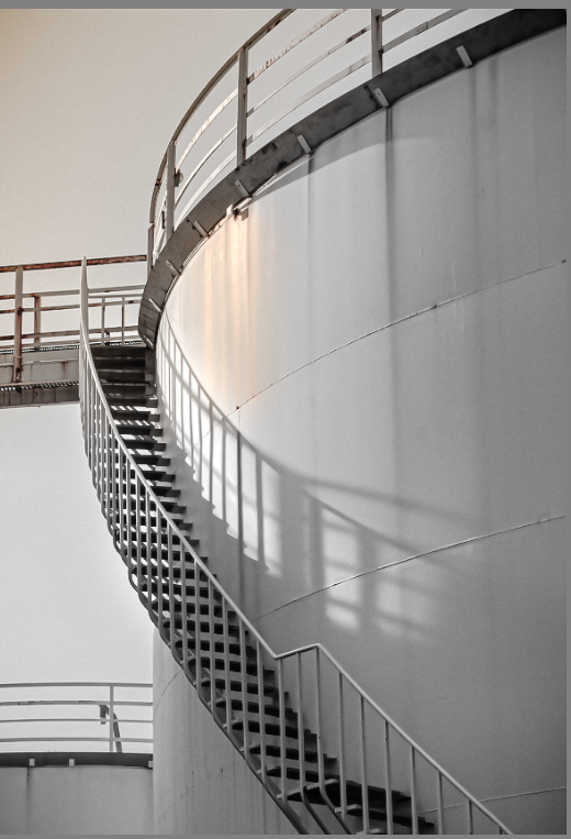
Final edit
I think the composition of my image takes great influence that of Hilla and Bernd Becher, but emphasises the lines that wrap around the industrial structures.
My use of shadows is more similar to that of André Kertész in this image here. The shadows almost paint over the scene.
#3
Initial before and after
The subtle blue added to the mid-tones makes the image whiter and cleaner.
The final B&W version came from an edited copy of the original
Final edit
In comparison to Hilla and Bernd Becher, I’ve tried to include sharp shadows to add contrast and add lines in my photos. Whereas their photos feature quite diffused and blob-like shadows.
#4
Originally cropped to focus on the the shadow of staircase
Initial before and after
After this version I realised a splash of colour made the image more interesting. Colour grading the mid-tones an aqua blue gave the de-saturated cream a cleaner, whiter hue.
Final edit
Looking back at the original composition of this image made me realise the negative space was important in effectively establishing the forms of the subjects in my image. The new coloured area proved to help the negative space give depth to the structures and divide the image into two sections. Additionally, the added warm colours narrates the direction of the light source some more.
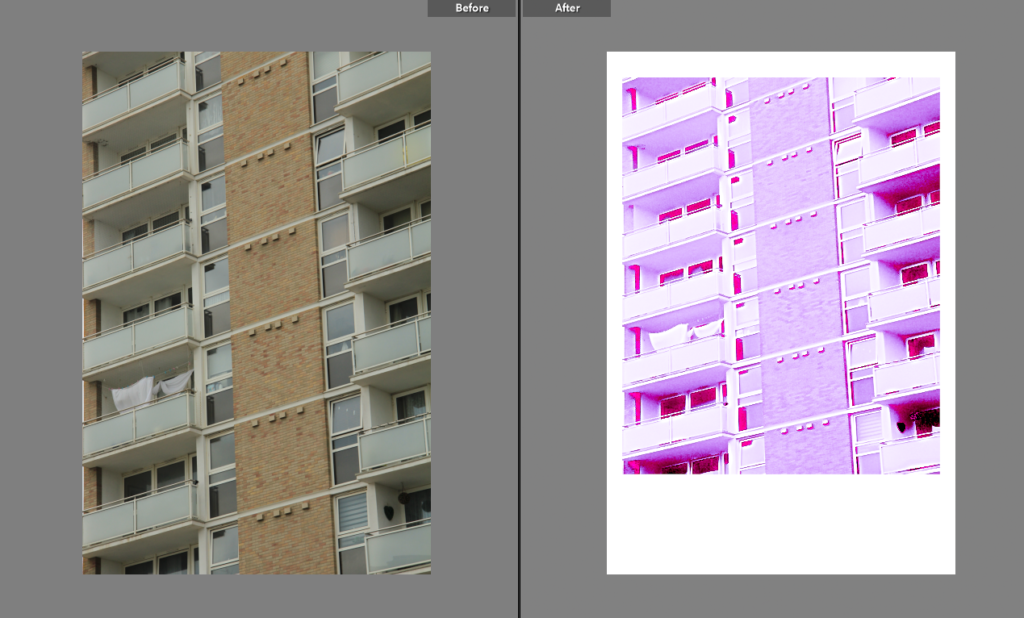
The basic geometric shapes around La Collette’s flats intrigued me after seeing a variety of architecture photography on Instagram. My final images are going to be from this photoshoot.
15.3.24
This photoshoot was based around Havre Des Pas and La Collette with the photography duo Bernd and Hilla Becher in mind.
9.3.24
I was attempting to do some HDR photos with this photoshoot but it didn’t go to plan as the lighting, some of the composition and exposure settings weren’t at all very good.
I narrowed down my overall collection of images to these 6, but to by removing images one and two my final images could focus more on the geometry of the flats. This is because otherwise I find the other 2 less interesting and irrelevant when it comes to analysis.
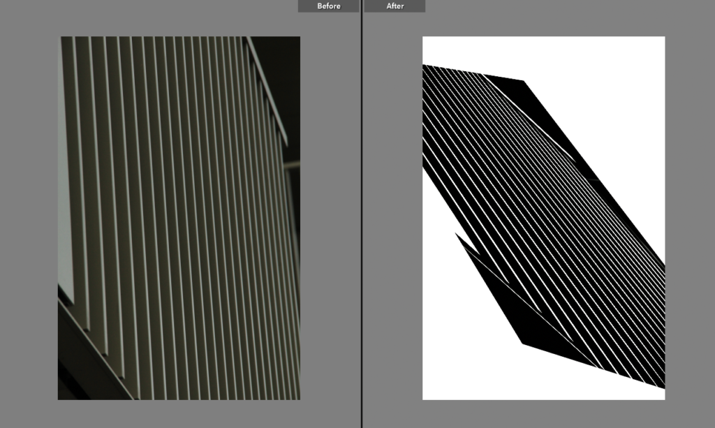
In an attempt to get any work done in photography I have resorted to creatively destroying my work by creating the worst images possible.
This is a photo i captured at the new flats at Havre de Pas. In the beginning I turned tint and exposure fully up and decreased blacks and whites fully.
After messing around with the colour grading I brightened the highlights and gave it a hazy effect. I really enjoy the chaotic composition of the balconies.
After maximising and minimalising most of these values I had made the image monochromatic.
All the low-mid to high values have been boosted.
Finally I adjusted the position of the photo.
It turned out like an optical illusion comprised of lines, stripped of any depth or colour it had in the original.
This image went over a similar process to the other photos with some additional grain.
Random parameters being removed or maxed out.
As the image was heavily overexposed I took away as much as I could from the midtones and shadows.
I’ve also positioned the image to give a polaroid style position. This is obviously really out of place on purpose because otherwise the image would look entirely unfamiliar and the loss of the detail and sparkly pink reminds me of the y2k photography aesthetics.
This photo reminds me of what could’ve been old colourised photo from the 19th century because the vignette and overall image looks quite smudged. The vignette also almost adds a subtle fish eye effect.
I found these settings gave it quite a ghostly appearance.
I was curious as to how following the general slope of the histogram would look which gave it a similar output to the pink polaroid photo.
HSL and colour grading was again me trying to figure out the most appropriate and jarring colours.
I actually genuinely really liked the original photo as it obeyed the rule of quarters and has a lot of interesting textures but I find the colours to be quite cumbersome. But I thought, ‘time to ruin it’.
I won’t talk through any of the changes I have made already to other photos.
I wasn’t happy with the natural distortion of vignetting on the original image so to give the photo more character I changed that.
I added this grain as a final touch to add to the worn and torn look of the image.
This original image was cropped and I made two edits of it. I thought it kind of looked like a western concept of cyberpunk skyscrapers because of the confirmative and geometric shapes. I leaned into this idea by darkening the shadows and adding a dirty-dusk colour scheme.
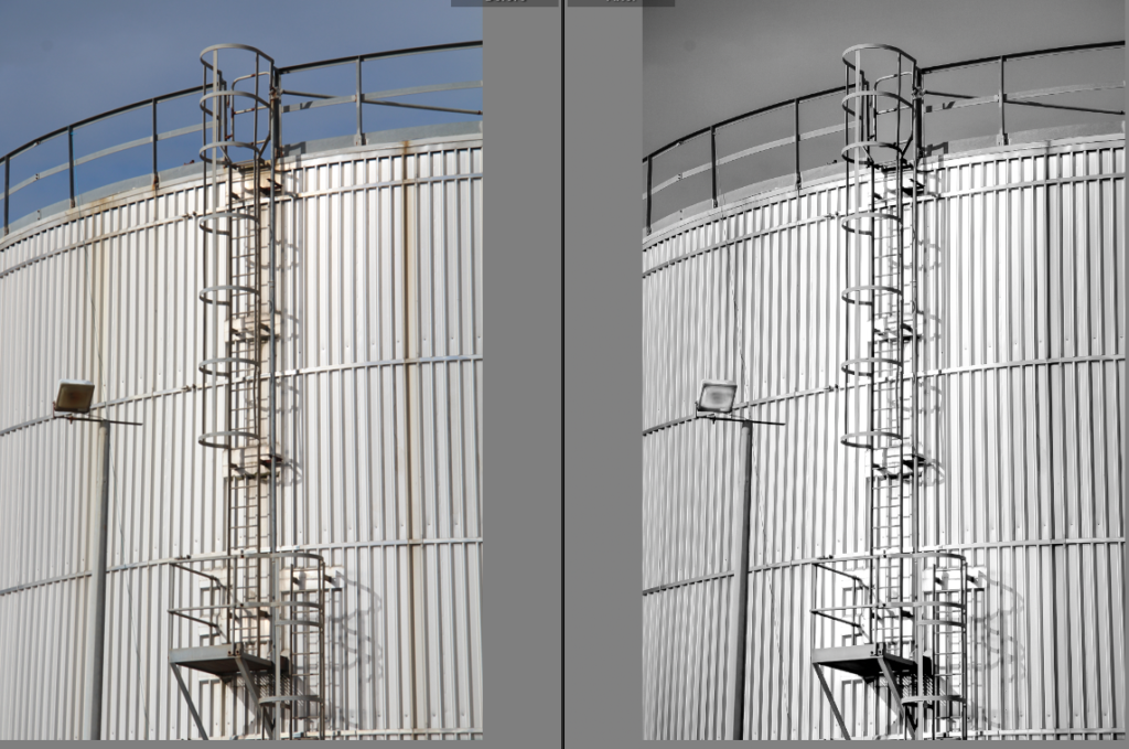
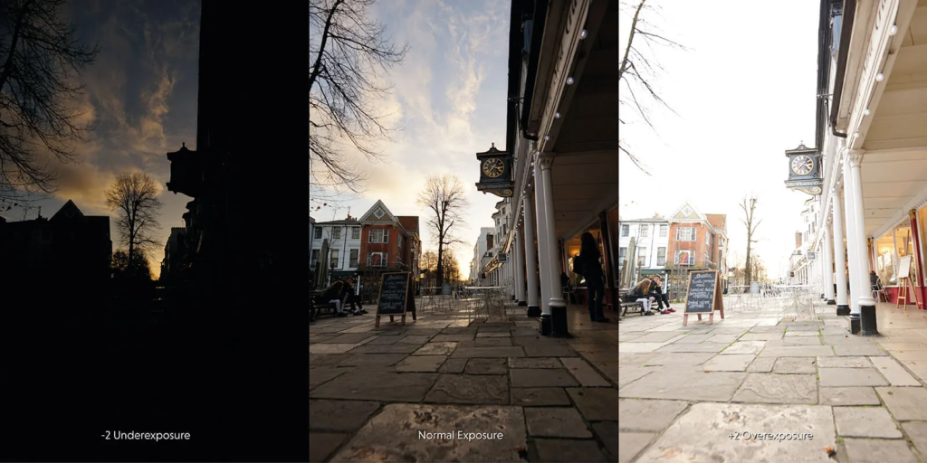
Exposure bracketing in photography is taking multiple same photos in different exposures.
Exposure bracketing can be done automatically on modern cameras.
These settings are meant to take a burst of 3 photos. It is important to note when doing exposure bracketing that only the ISO and shutter speed should be changed, the aperture must remain the same as it changes the image too much.
Exposure bracketing is important so we can combine the most detailed or interesting parts from each image.
High Dynamic Range HDR
Dynamic range in photography is the difference between the darkest and lightest tones in photography.
This image has a small dynamic range as their is mainly mid tones and a small colour depth.
This image has a high dynamic range as there is a large colour depth and a vast array of highlights, mid tones and low tones.
High dynamic range images are achieved by merging the most detailed parts of these exposure bracketed images where everything is equally exposed.
Claude Cahun (1894-1954) was a surrealist photographer (and much more) known for exploring themes of gender identity and sexuality with different characters in their self-portraits. Their androgynous appearance challenged gender roles during their time.
Analysis
Claude Cahun explores absurdity in their portraits. Each of their works comes together as a whole to symbolise a spectrum of ideas.
Self-Portrait (1939)
Cahun’s composition of themselves in the photo above is them looking away from the camera and like most of their photos an organic pose which decorates the image with the impression of pure human expression and identity – these ‘organic’ shapes are seen in other art forms like contemporary dance, which focuses on bodily awareness and mindfulness, fluidity and emotional expression – displaying that they don’t need to comply to others ideas of how people should present themselves.
Claude Cahun and Solange Roussot in costumes for Le Mystère d’Adam.
I like this photo because of the unusual, curiosity evoking costumes worn by Cahun and Solange Roussot as if they are rebelling against the traditional religious connotations of Le Mystère d’Adam.
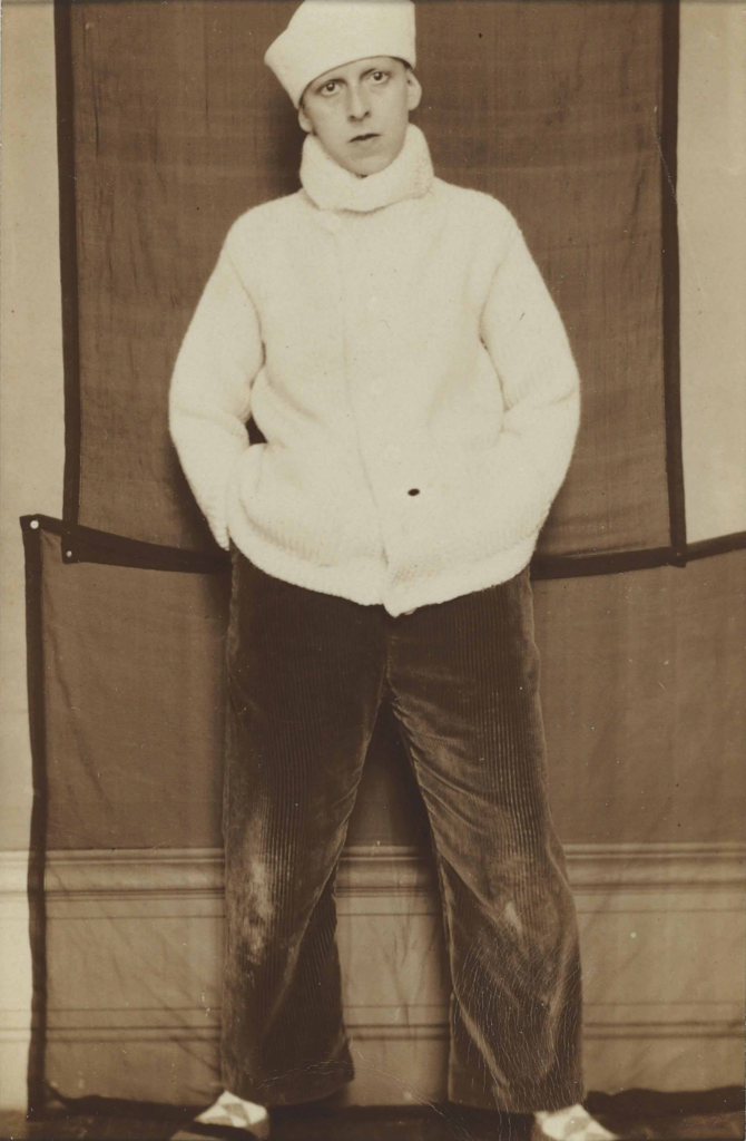
Cahun appears to use natural light and fleshes out backgrounds with often unusual impressionist or household objects with interesting textures and shapes such as curtains, towels or botanical objects, faux and real. For example, in Self-Portrait in Sailor Hat the silky, bumpy reflection of the corduroy trousers that pairs quite well with the scratchy and thin rectangular sheets in the background.
Often these cloths and curtains are used to create shade contrast in the contemporary black & white style – creating negative space and bringing forward the subjects to the viewers.
I also really admire how even though Cahun’s photos are quite unusual the repetitive patterns from tassels on towels or parallel straight lines on the skirting board add a sense of familiarity and relatability that let their photos speak more.
Self Portrait in Sailor Hat 1920
Another feature of Cahun’s work is their use of typical masculine objects like dumbbells and masculine clothes (see below) to illustrate the inner conflict with their identity during the period of their life where they took on the appearance of a man in order to have the ability to live out another aspect of their person without prosecution. The hysterical nature of it is protesting against and dismantling the defined cisnormative stereotypes Cahun feels trapped by. Their photographs are artfully tinted with absurdist and extremist appeal which are considered as foundation for modern feminism.