All posts by Shelbs

Filters

Author:
Category:

Camera Skills

Using Auto-Focus

Auto-Focus consists of holding your camera, pointing at the object/ what you are aiming to photograph, and instead of just pushing the shutter down and taking the photo straight away you hold the shutter down half way which allows the camera too auto-focus. The lens may need to be in “AF” mode. This can be useful when you are taking a photo of something that is moving, and may be helpful when taking photos of dynamic situations.

Using Manual Focus

Manual focus is used by using the switch on the lens and turning the front ring to adjust, this is you taking control. Manual focus provides you with precision and ultimate control over your focus. Manual focus vs Auto focus will always come down too the situation of the photo you are wishing too take. Most professional photographers tend too use manual focus due to being able to have full control.

White Balance

White balance is used too improve photos, it is used by going too your cameras menu, selecting the option to set a custom white balance, and then set it by choosing your photo. White balance is a setting in your camera that helps you produce a natural-looking colouration in your image. The goal is too achieve the most natural looking colours as possible. You can also set a white balance in your camera, such as “Daylight WB” which can be used to naturally capture warm scenes.

ISO

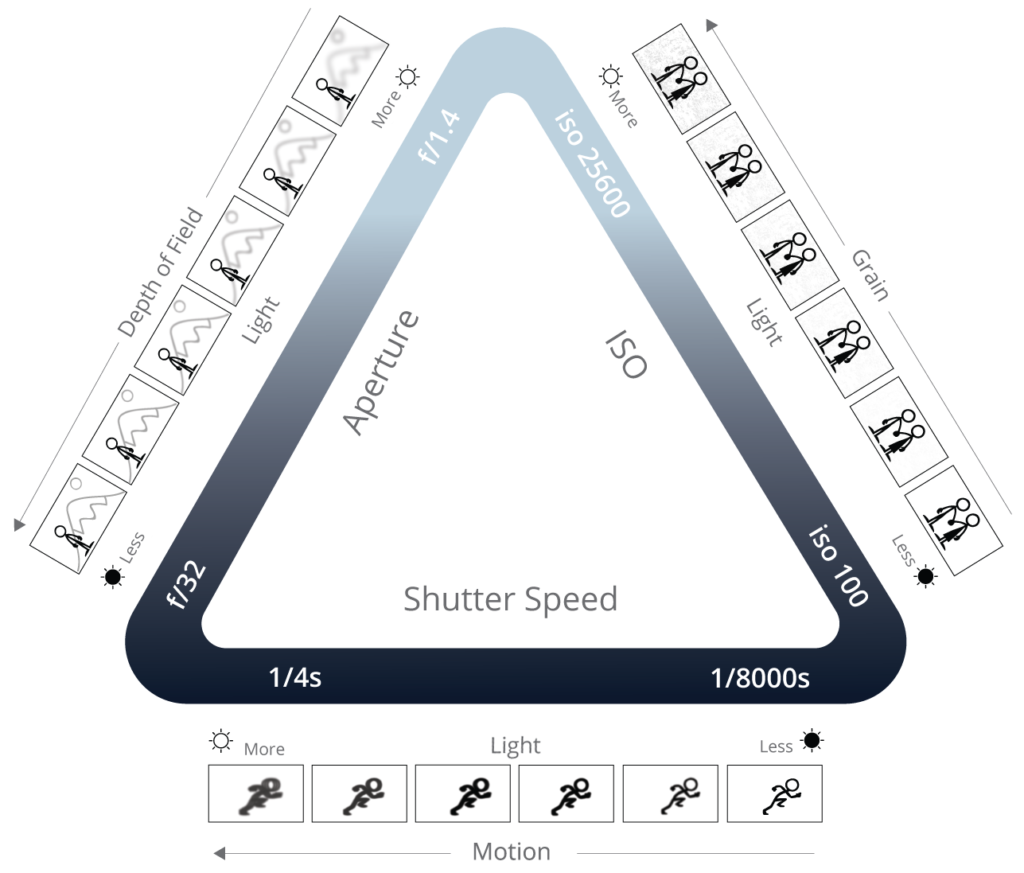
ISO is simply a camera setting that will brighten or darken your photo. Low values such as ISO 100 are most useful for a sunny out door shot, whereas things like ISO 1600 or higher are best for shooting at night. Keep the ISO setting as low as possible too reduce graininess. You can change the ISO by opening the menu, or the quick menu of your camera, otherwise there is a button on the camera near the shutter release that says ISO. If you press this button, your dial previously used to control shutter speed will instead control ISO until a value is selected

Aperture

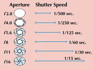
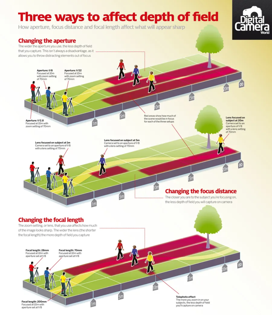
Aperture in photography is the opening of the camera lens, which is related to the amount of light that passes through the camera lens to the image sensor. Low apertures let more light into the camera and higher apertures let less light into the camera. A higher aperture is better when you want your shot to be in focus, and a lower aperture is better when you are taking a photo in low-light. Many cameras have a physical dial that can be turned to change aperture which is measured within f-stops. If yours doesn’t have a dial just check your cameras general settings.
Focal Length : wide, standard and telephoto lenses

Focal length controls the angle of view and magnification of a photograph. A wide-angle lens has a focal length of 35mm or shorter, which gives you a wide field of view. The wider your field of view, the more of the scene you’ll be able to see in the frame. Standard lens (focal length 35mm to 70mm): These versatile lenses are good for just about any type of photography, from portraits to landscapes. These all-in-one lenses render images roughly the way the human eye sees the world, and easily adjust to a shallow or deep depth of field, depending on aperture. Most telephoto lenses range from “medium” (with a focal length between 70 and 200mm) all the way up to “super telephoto” (with focal lengths longer than 300mm). This is when the physical length of the lens is shorter then the focal length. They are great for brining distant scenes and subjects closer.

Depth of Field

Depth of Field is the distance between the nearest and furthest elements in a sense that appear to be “acceptably sharp” in a image. Depth of field is the portion of that distance or ‘depth’ that is ‘in-focus’. A higher depth of field would see the whole image from foreground to background sharp and in focus, a lower depth would result in blurry backgrounds and blurred elements in the foreground too. You can affect the depth of field by changing the following factors: aperture, the focal length and the distance from the subject. A wide angle lens will have greater depth of field than a normal or telephoto lens at any given aperture.

Slow/ Fast shutter speed

A slow shutter speed keeps the shutter open for longer. This not only allows more light to be recorded, it also means any moving objects will appear blurred. Slow shutter speeds are commonly used for photographing in low light conditions, or to capture motion blur.Fast shutter speeds in photography allow you to control the action and the mood of the image you’re creating. You can freeze moments that are too fast for the naked eye to see. To change your camera’s shutter speed manually: Select ‘Shutter Priority’ mode. On the camera’s dial, this is usually indicated by an ‘S’ or ‘Tv’. Scroll through and choose the shutter speed you want.

Exposure and exposure compensation

Exposure compensation basically helps you override automatic exposure adjustments your camera makes in situations with uneven light distribution, filters, non-standard processing, or underexposure or overexposure. It lets you take control of your image’s brightness by manually increasing or decreasing exposure. For manual exposures, start by changing the aperture and shutter speed until the meter indicates that you have the correct exposure , then adjust from there.

Exposure bracketing

Exposure bracketing is when a photographer creates pictures with different exposure settings. The purpose of this is to cover more of the dynamic range. You should make sure that your ISO is quite low when using exposure bracketing. Basically, when you bracket your shots you take exactly the same picture of your subject at several different exposures. This technique gives you a range of options to choose from when you’re editing.Because bracketing photography involves taking multiple shots with one press of the shutter, it should be used with caution when shooting fast moving subjects such as in sporting events or even wildlife.

Tools Photoshoot:

From this shoot I have given each photo three different ratings, a flagged rating with (p) as a filled white flag and (x) and a non-filled flag with an x in it. (p) for photos I prefer, (x) for photos that aren’t my best. The second rating is a star/number rating, 1-5 stars varying in how I would rate each photo out of five. My final rating is my colour rating, red for photos that I really don’t like, yellow for sort of mid photos, green for photos that are very good but not top top rated photos and purple for my personal best photos.

I then clicked into the develop mode and played around with the colour settings.

I personally like these colour settings as the red tape really pops out.
I then looked into the cropping/angle tool.
This was my photo after cropping.
I then applied a black and white filter.

Walker Evans & Darren Harvey-Regan

Beauties of the common tool is a portfolio by Walker Evans, published in 1995. Evans completely flattens the depth of the images, normally disregarding shadows leaving the image as all but a simple tool.

Darren Harvey- Regan, blurring the boundaries between photography and sculpture, Exeter-born his work challenges us to scrutinise the divide between an object and its representation. His portraits of welded mismatched industrial tools appear pristine and polished, captured on a film like a collection of precious and revered objects.

Darren Harvey-Regan is a contemporary British artist and photographer known for his work that often explores themes of identity, memory, and the passage of time. He utilizes still life photography and mixed media to create evocative compositions that challenge viewers’ perceptions of reality and the ordinary. His practice often incorporates personal narratives and reflections on memory, using objects and settings to evoke emotions and provoke thought. Harvey-Regan’s work has been exhibited in various galleries and is recognized for its artistic depth and conceptual rigor.

Darren Harvey-Regan’s images often symbolize themes of identity, memory, and the transient nature of life. His use of still life and mixed media allows him to create layered narratives that invite viewers to reflect on personal and collective experiences. Objects in his compositions frequently carry symbolic meaning, representing emotions, memories, or the passage of time.

Through careful arrangement and lighting, his work explores the fragility of existence and the complexities of human perception, prompting contemplation about how we relate to the world around us. Overall, his images serve as a poignant commentary on the interplay between memory, identity, and the objects that populate our lives.

This body of work started with Walker Evans’s Beauties of The Common Tool – a commission for Fortune magazine in 1955. The series is a prime example of photography transitioning towards an accepted artform, using the medium to capture the beauty inherent in seemingly banal and commonplace objects.

A key difference between their works would be that Walker Evans tools are simple, lighting is placed to make them just simple shapes and lines rather than abstract art whereas Darren Harvey-Reagans work differs due to his welding two different tools together leaving the mind to question what the meaning of his work is.

Walker Evans was an influential American photographer known for his documentary style and ability to capture the essence of American life. Born in 1903, he gained prominence during the Great Depression when he worked for the Farm Security Administration (FSA). His most famous work, “Let Us Now Praise Famous Men,” features striking portraits and images of impoverished families in the South, revealing the harsh realities of their lives.

Evans was known for his meticulous attention to detail and composition, often using large-format cameras to create images that conveyed both beauty and social commentary. His work extended beyond documentary photography, influencing the fields of art and visual culture. Evans’s legacy continues to resonate, as he is celebrated for his profound ability to document everyday life and the American experience through a humanistic lens.

Walker Evans’s images symbolize the complexity of American life, particularly during the Great Depression. His work captures the struggles and resilience of individuals, emphasizing themes of poverty, identity, and the human experience. Through his meticulous compositions, Evans highlights the dignity and humanity of his subjects, often portraying their environments in ways that reflect broader social and economic conditions.

His photographs serve as powerful social commentary, inviting viewers to confront the realities of hardship while also celebrating the beauty in everyday moments. The use of straightforward, unembellished imagery in his work symbolizes authenticity and truth, making his photographs not just historical documents but also poignant reflections on the human condition. Overall, Evans’s images evoke empathy and provoke thought about social issues, identity, and the passage of time in American society.

My photos:

This would definitely be my own personal take on the photo due to the colour contrast, neither Darren or Walker Evans used colours like this within there work so this would be my own personal take on the ides. This image is a spin on there work, I have still utilized the ides of normal everyday tools but just used a different background so that people can see them within a new light.
This photographer has a very clear white background, making the simplicity of the tool stand out, leaving nothing else to the eye apart from this singular paintbrush. This photo does look a little bit more like there work but I would personally say still has my spin on the ides of there photographs.
Although this is nothing like a hammer or a pair of scissors I would say this looks like most like there work, the ideas of stacking the tape upon each other leaves more to the image but still only really has one simple image.

Still Life History & Theory

What is Still Life?

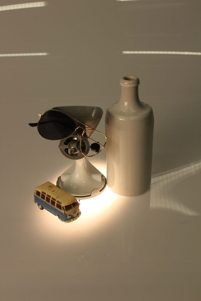
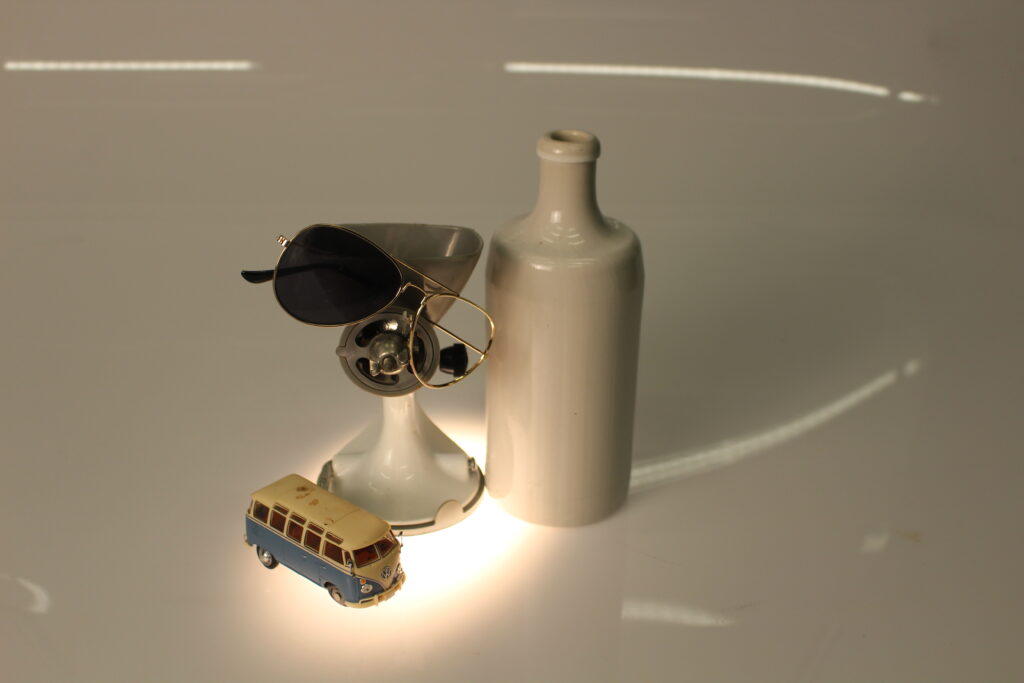
Still life photography is a genre of photography, which is similar to painting, it is used for the deception if inanimate objects, typically a small group of objects. Still life photography can be categorized into two categories: “Created Still Life”, in which the photographer arranges the objects around, and “Found Still Life”, where the photographer captures already made arrangements.

Still life photography is a genre that focuses on capturing inanimate objects, often arranged in aesthetically pleasing compositions. This type of photography can feature a diverse range of subjects, including natural elements like fruits and flowers, as well as everyday man-made items such as books and glassware. The photographer carefully considers aspects like composition, lighting, and texture to create visually compelling images that evoke emotion or convey a narrative. By manipulating these elements, still life photography allows for artistic expression and exploration of themes, often emphasizing the beauty and intricacies of the ordinary.

Examples:

Still Life Painting - Houseart
Make Still Life Photography Come Alive With This Simple Guide | Light ...

Olivia Parker

For more than 40 years Olivia Parker has created alluring, poetic still life photographs that transform the everyday and enchant the familiar. My favourite set of photographs from Olivia Parker would be “Toys and Games, 1993-2000” Which includes simple everyday objects, but makes minds think and see them in a different way.

Olivia Parker is an American photographer known for her innovative approach to still life photography. She gained recognition for her unique style that often combines traditional still life techniques with contemporary themes, using elements like light, shadow, and color to create evocative images. Parker’s work frequently explores the relationship between objects and their environments, and she has been influential in the realm of fine art photography. Her photographs have been exhibited in galleries and featured in various publications, making her a notable figure in the field.

Timeline of Still Life photography

The English term “Still Life” originates from within the 17th century when still-life art was at the height of European popularity. Still-life has existed since the 17th century until the modern day but, in the 19th century, artists adopted photography as a new medium for still life art, to express there concepts. Today still life photography is still very popular among many photographers. These artists appreciate the challenge of aesthetically capturing the beauty of ordinary items.

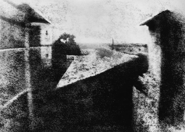
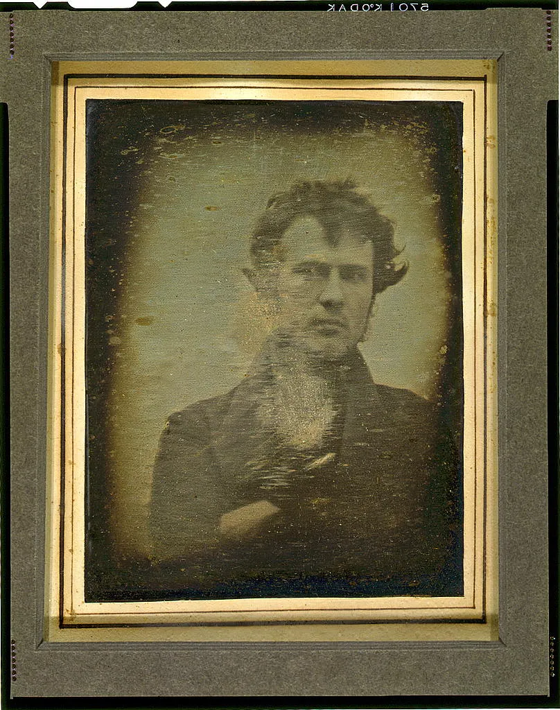
Still life photography began in the 1830s with the advent of the daguerreotype, as early photographers experimented with inanimate subjects to capture their beauty. By the 1860s, artists like Julia Margaret Cameron were elevating the genre, using soft focus and dramatic lighting. The early 1900s saw pioneers like Edward Weston exploring abstract forms, while the 1920s introduced commercial applications in advertising. The mid-20th century featured influential figures like Irving Penn, whose bold compositions shaped modern aesthetics. In the 1980s, postmodernism brought new concepts and digital experimentation, leading to vibrant color photography in the 1990s. Today, still life photography continues to evolve, blending traditional techniques with contemporary themes, reflecting identity and consumerism in the modern world.

What is Vanitas

Vanitas is a genre of art which mainly uses symbolism to show the transience of life, and the certainty of death. The painting involve still life imagery of transitory items. This genre began in the 16th century and continued into the 17th but since then it has lost its popularity by a lot.

Vanitas is a genre of art and a theme in still life that reflects on the transience of life and the inevitability of death. Originating in the 16th and 17th centuries, particularly in Dutch painting, vanitas artworks often feature symbolic objects that represent mortality and the fleeting nature of earthly pleasures. Common motifs include skulls, hourglasses, wilting flowers, and decaying fruit, alongside items like books, musical instruments, and candles that symbolize knowledge, beauty, and life. The overarching message of vanitas is to remind viewers of the impermanence of life, encouraging contemplation of what truly matters beyond material possessions.

What is Memento Mori?

Memento Mori is an artistic or symbolic trope acting as a remined of the inevitable death. The concept has its roots in the philosophers of antiquity and Christianity, and appeared in funerary art and architecture from the medieval period onwards.

Memento mori is a Latin phrase meaning “remember that you must die.” It serves as a reminder of human mortality and the inevitability of death. This theme has been prevalent in art, literature, and philosophy throughout history, encouraging individuals to reflect on the transient nature of life and the importance of living meaningfully.

In art, memento mori often appears in still life and portraiture, featuring symbols like skulls, hourglasses, withered flowers, and decaying objects. These elements serve as reminders of life’s impermanence and the futility of earthly pursuits. The concept invites viewers to contemplate their own mortality and prioritize what truly matters, emphasizing spiritual values over material concerns.

What kind of metaphors and symbols are used in still life and why?

  1. Fruits are some of the most ubiquitous subjects in still-life paintings over the centuries. Not only does a basket of fruit offer the artist a variety of colours and textures to utilize, but it also offers a variety of religious and mythical symbols. 
  2. Made famous by Dutch and Flemish artists of the sixteenth and seventeenth centuries, vanitas still-life paintings express the transience of life and the futility of materialism. This tradition also provided a justification for painting beautiful and expensive objects instead of more overtly moralizing subjects. One of the more heavy-handed symbols that appears in vanitas still life paintings is the skull, which is a striking reminder of the certainty of death. Such a symbol is called a Memento Mori, a Latin phrase meaning “Remember that you will die.”
  3. In ancient times, it was believed that a person’s soul was contained in their reflection. Mirrors have been included in a variety of paintings throughout history. They can represent either truth and self-assurance or vanity and distortion—the difference depends on who is looking at their reflection. A broken mirror is universally recognized as a bad omen.

In still life photography and art, various metaphors and symbols are used to convey deeper meanings, often reflecting themes of mortality, beauty, and the passage of time. Here are some common symbols and their significance:

  1. Skulls: Often used as a direct reminder of mortality (memento mori), skulls symbolize the inevitability of death and the fleeting nature of life.
  2. Hourglasses: Represent the passage of time and the idea that time is limited, encouraging reflection on how one spends their life.
  3. Flowers: Fresh flowers can symbolize beauty and life, while wilted or decaying flowers signify transience and the inevitability of aging and death.
  4. Fruit: Ripe fruit can represent vitality and abundance, whereas overripe or rotten fruit serves as a reminder of decay and the impermanence of pleasure.
  5. Candles: Often symbolize life and the soul, with their flickering flames representing the fragility of existence and the approach of death as they burn down.
  6. Books: Can represent knowledge, wisdom, and the passage of time. An open book might suggest ongoing learning, while a closed book could symbolize lost knowledge or the finality of life.
  7. Musical Instruments: Symbolize the beauty of life and creativity but can also represent the ephemeral nature of music and art, which exist only in the moment.
  8. Glass Objects: Their transparency can symbolize fragility and the idea that life is delicate, while reflections might represent the complexity of perception and reality.
  9. Clocks: Serve as a reminder of the relentless march of time, urging viewers to consider how they allocate their moments.

These symbols and metaphors enrich still life compositions, inviting viewers to explore themes of existence, beauty, and the inevitability of change, ultimately encouraging deeper contemplation of life’s meaning.

Why still life?

Still life photography gives you an opportunity to play with light, texture, materials and subjects in a controlled environment. A lot of still life is simply about experimenting just how creative you can be.  It all comes down to intent and context.When it comes to still life photography, “nothing is moving, and you’re in complete control,” according to experienced photographer and teacher Ben Long. He continues, “It’s a fantastic challenge for your compositional skills because it’s entirely about form and a pleasing arrangement of forms within the frame. The image needs to be well balanced and have an interesting geometric play. Everything that you’re doing in the frame is guiding the viewer’s eye.”

Taking still life images allows photographers to explore creative expression through careful composition, lighting, and arrangement of objects, providing a controlled environment to experiment with artistic ideas. This genre enables the conveyance of narratives and themes, such as beauty, mortality, and the passage of time, while highlighting the textures and details of everyday items often overlooked. Additionally, still life photography serves as a valuable practice for honing technical skills and can have commercial applications in product photography. Ultimately, capturing still life can be both an aesthetic pursuit and a means to provoke deeper contemplation, making it a rich and rewarding area of photography.

Formalism

What is Formalism?

Formalist photography is when the design, composition and lighting are dominant over subject matter. The photographer becomes a visual designer whenever a frame is captured. Camera cropping concentrates on the desired subject while eliminating everything else. Formalism in photography is an approach that emphasizes the visual elements of an image rather than its content or narrative. This style focuses on the composition, shapes, lines, colors, textures, and overall design of a photograph.

Line

Line is the most fundamental of the seven basic elements of photographic art, in almost all photographic art there will most likely always be some element of lines. Lines are considered to be “A straight or curved geometric element that is generated by a moving point and that has extension only along the path of point” There are many different types of lines, they can be solid, dashed, intterupted, implied or physcological. The horizion is an example of an implied line. Lines are everywhere in photographs. Lines surround us, and every photograph contains lines.Lines in photographs often connect points inside the image.

Shape

The Merriam-Webster definition of “shape” that we are concerned with as photographic artists is:

1 a : the visible makeup characteristic of a particular item or kind of item

1 b (1) : spatial form or contour

1 b (2) : a standard or universally recognized spatial form.

Shapes are two-dimensional. Sometimes a familiar shape can transform into an unfamiliar or unrecognizable shape based on the viewpoint of the photographer Different shapes, when they intersect and overlap, can combine to create a new shape. Shapes can also surround an area to create another shape. In a photograph, a silhouette is the purest essence of a shape—no form, texture, or colour. There are two basic types of shapes: geometric (or regular) and organic. Shapes can be as simple as a triangle or infinitely complex.

Form

What separates form from shape? Form takes shape from the two-dimensional and brings it into the three-dimensional.”the shape and structure of something as distinguished from its material” Form is three-dimensional. Form has overall height, width, and depth.Just as with shapes, there are two basic types of form—geometric (or regular) and organic.Like shapes, forms can be simple or infinitely complex.A photograph captures all the forms in the field of view of the lens.Three-dimensional forms are rendered in two dimensions by the photograph. Whether on the print or on the screen, the final image does not have depth. 

Texture

In photography, texture can be felt with both the fingers (the print) and virtually (with the viewer’s eye). “the visual or tactile surface characteristics and appearance of something”

Texture in “real life” can be, basically, smooth or rough. We can use other descriptors as well: slimy, wet, hard, soft, bumpy, shiny, etc. Texture in the photograph is similar to form in that it is revealed by variations in tonality and presented in two dimensions. In a photograph, smooth objects might have reflections or specular highlights. Rough objects might have aggressive areas of light and shadow without reflections. Texture can be elusive in a photograph, depending on the subject, the lighting, and the forms in the image. A lack of visual texture might mean that the object is smooth. It could mean that it is too far away from the camera and the texture cannot be resolved. A photograph of a full moon does not show much in the way of surface texture, but the oblique lighting of a crescent or gibbous moon, viewed through a telephoto lens with sufficient resolution, will show incredible texture on the surface.

Colour

” a phenomenon of light (such as red, brown, pink, or grey) or visual perception that enables one to differentiate otherwise identical objects” Light itself has no perceived colour. But, send light through a prism or a drop of water and we can see that it is comprised of a literal rainbow of colours. Colour has three properties: hue, value, and saturation: Hue is simply the description of the colour (e.g., blue, red, yellow, etc.). Value is the relative brightness or darkness of a colour. Saturation is the intensity or purity of a colour. The purest colour is a hue with no white, black, or grey added to it. Bold and bright colours are known for grabbing our eye. Harmonic colours are colours that complement each other—serve to create distinct feelings in photographs. Mainstream colour film was not available until the 1930s—around 100 years after photography was invented. A key to approaching colour in photography is to recognize the colours in a scene, and evaluate your composition based on including or excluding the range of colours in your field of view. Frame your image to highlight the colours you think will enhance your subject and best convey the mood of your image.

Size

“physical magnitude, extent, or bulk : relative or proportionate dimensions” Size in a photograph is relative and can be an illusion. When a familiar object appears in the frame of a photograph (car, basketball, streetlamp, etc.) we immediately get a feel for the scope of the entire scene. The camera, lens, and print can render large objects small, or small objects large. Even objects familiar to our eyes can be rendered relatively large in a photograph, while things we know to be enormous are rendered small. With a casual snapshot, size might not be something one even considers when composing the image. The size of common objects in the photograph gives the scene a sense of scale. But a single object in space might not accomplish this since there is no means for comparison. If you want to emphasize the size of an object in the photograph in relation to its surroundings, you should get closer to that object. Overlap is another way to render a scene virtually in three dimensions, and overlap can also give hints to size.

Depth

the direct linear measurement from front to back” Naturally, even in a casual snapshot, we are given a sense of depth due to various visual cues. This perception of three-dimensional space is what our eyes experience whenever they are open, and that is what our eyes try to experience when looking at a photograph. How well the depth is rendered is dependent on the objects in the frame, your choice of composition, and your perspective in relation to the objects in the frame. Most images have a foreground, middle ground, and background. The stronger the delineation between those successive “grounds,” the stronger the sense of depth in your image. We have all seen the photographs of the highway heading toward the horizon or the train tracks narrowing as they become more distant (do not take photos on train tracks!). This convergence of lines is called linear perspective. Where you place an object in a frame also offers clues toward depth. The higher an object is in the frame relative to the horizon (seen or implied), the greater is the perceived distance to that object. This is called upward dislocation.

Formalism | The Essence of Things

Evaluation Of Images –

Evaluating formalist images involves analyzing various visual elements and how they contribute to the overall impact of the photograph. Here are some key aspects to consider:

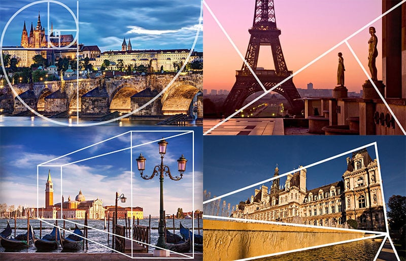
  1. Composition: Assess how the photographer arranges elements within the frame. Look for balance, symmetry, and the use of space. Consider whether the composition guides the viewer’s eye effectively.
  2. Use of Lines: Examine the lines in the image—are they straight, curved, or leading? Lines can create movement and direct attention to focal points, contributing to the overall dynamism of the image.
  3. Color Palette: Analyze the color choices and their relationships. Are the colors harmonious or contrasting? Consider how color influences the mood and emotional response of the viewer.
  4. Light and Shadow: Observe how light is used to shape forms and create depth. Look for highlights and shadows that enhance texture and add dimension to the composition.
  5. Texture and Detail: Pay attention to the textures captured in the image. Is there a rich detail that draws the viewer in? Textural elements can create a tactile quality that adds interest.
  6. Abstraction: Consider the level of abstraction in the image. Does the photograph transform ordinary subjects into something more visually compelling? Evaluate how effectively it communicates form over function.
  7. Mood and Atmosphere: Reflect on the emotional response elicited by the image. Does the formal composition create a specific atmosphere or feeling?
  8. Minimalism: If the image employs minimalism, assess how effectively it conveys meaning through simplicity. Does it succeed in highlighting essential forms without distractions?
  9. Conceptual Depth: Even though formalism emphasizes form over content, think about any underlying concepts or ideas that emerge from the composition. What might the photographer be communicating through the arrangement of visual elements?

By focusing on these aspects, you can gain a deeper understanding of how formalist images operate and appreciate their artistic value. This evaluation encourages an engagement with photography that prioritizes visual language and aesthetics.