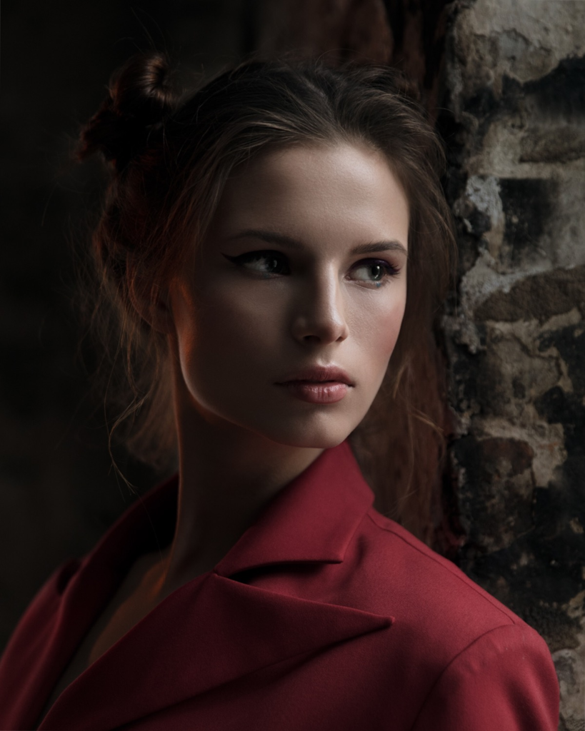
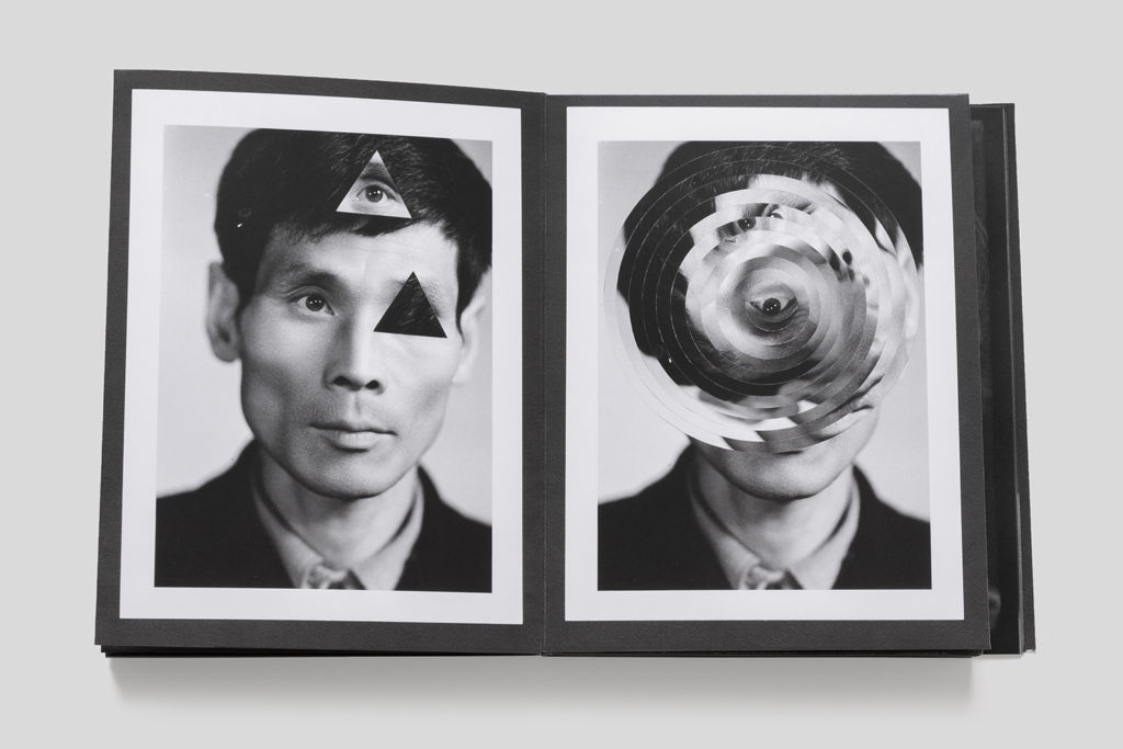
Photomontage is the process and the result of making a composite photograph by cutting, gluing, rearranging and overlapping two or more photographs into a new image.
My response:
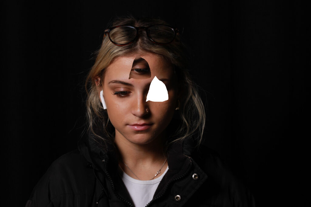
Photomontage is the process and the result of making a composite photograph by cutting, gluing, rearranging and overlapping two or more photographs into a new image.

My response:

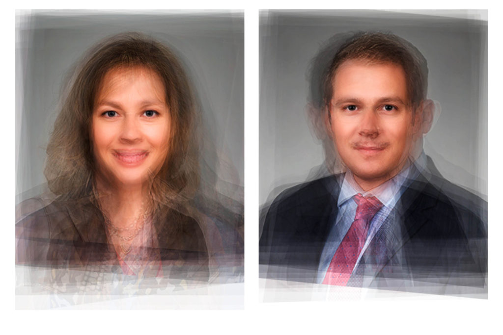
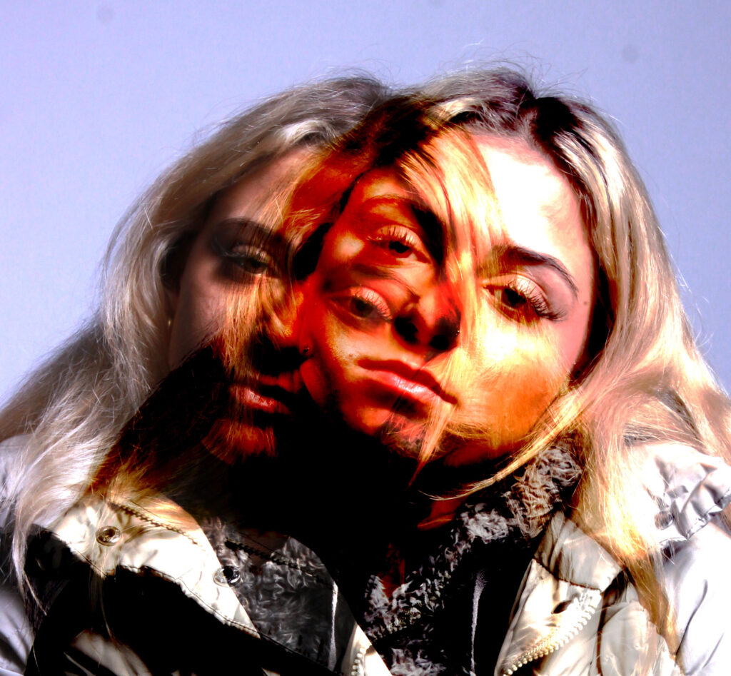
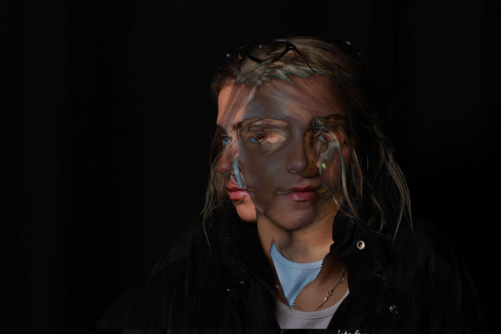
Double or multiple exposures are an illusion created by layering images (or portions of images) over the top of each other. This can be achieved in the camera settings, or on Adobe Photoshop by creating LAYERS and then using BLENDING OPTIONS and OPACITY CONTROL. Artist have used these techniques to explore Surrealist Ideas and evoke dream-like imagery, or imagery that explores time / time lapse.
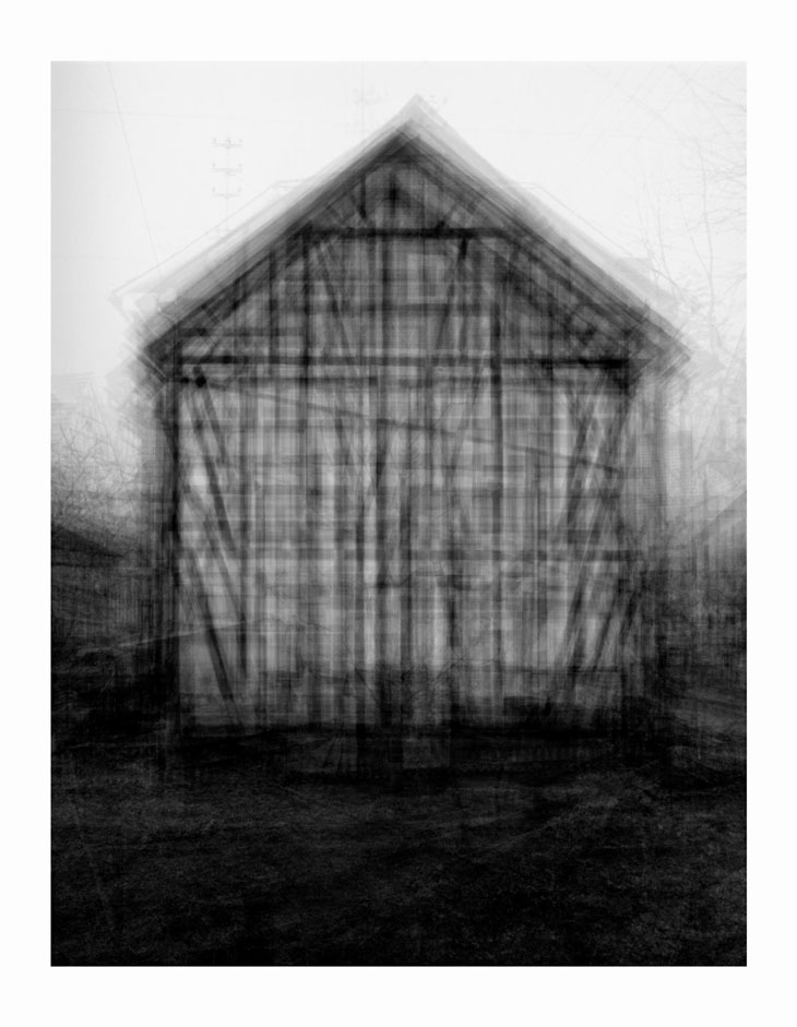
Since 1959 Bernd and Hilla Becher have been photographing industrial structures that exemplify modernist engineering, such as gas reservoirs and water towers. Their photographs are often presented in groups of similar design; their repeated images make these everyday buildings seem strangely imposing and alien. Idris Khan’s Every… Bernd And Hilla Becher… series appropriates the Bechers’ imagery and compiles their collections into single super-images. In this piece, multiple images of American-style gabled houses are digitally layered and super-imposed giving the effect of an impressionistic drawing or blurred film still.
My responses:
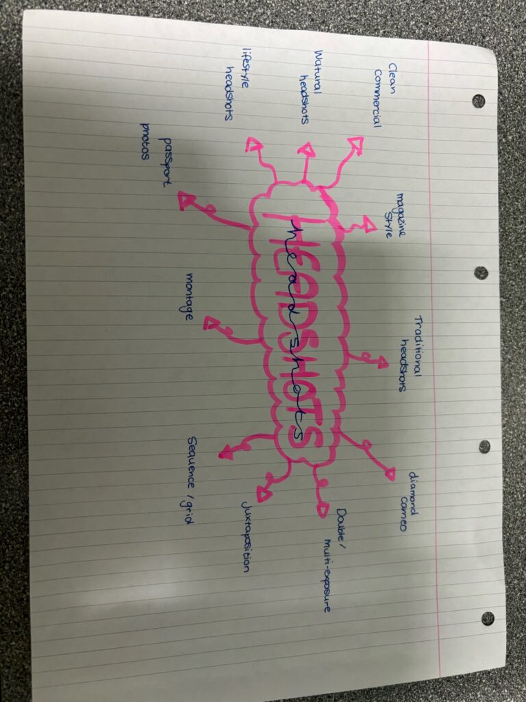
Photoshoot One:
My first plan is too take passport like photos, photos with no shadows, a plain face (no facial expressions, mouth closed), a very formal image which includes shoulders and clearly shows facial features.
Photoshoot Two:
Diamond Cameo, this will require taking yet again more plan boring images of the model, but I will need a left and right side profile, and many images of the model looking in different directions, in order to create my diamond cameo I will have too use photoshop.
Photoshoot Three:
For my third photoshoot idea I want to create multi-exposure photos, this will obviously have too be done in photoshop, but in order to create the photo i might want too take a photo of the model looking up and then one of the model looking down, this will make it easier to edit the image later on.
Technical
You can use either, Flash Lighting:
Camera settings (flash lighting)
Tripod: optional
Use transmitter on hotshoe
White balance: daylight (5000K)
ISO: 100
Exposure: Manual 1/125 shutter-speed > f/16 aperture
– check settings before shooting
Focal length: 105mm portrait lens
Continuous Lighting:
Camera settings (continuous lighting)
Tripod: recommended to avoid camera shake
Manual exposure mode
White balance: tungsten light (3200K)
ISO: 400-1600 – depending on how many light sources
Exposure: Manual 1/60-1/125 shutter-speed > f/4-f/8 aperture
– check settings before shooting
Focal length: 50mm portrait lens
The deadpan aesthetic
The origins of the word “Deadpan” can be traced to 1927 when Vanity Fair Magazine compounded the words dead and pan, a slang word for a face, and used it as a noun. In 1928 the New York Times used it as adjective to describe the work of Buster Keaton.
In summary Deadpan photography is a cool, detached, and unemotional presentation and, when used in a series, usually follows a pre-defined set of compositional and lighting rules.
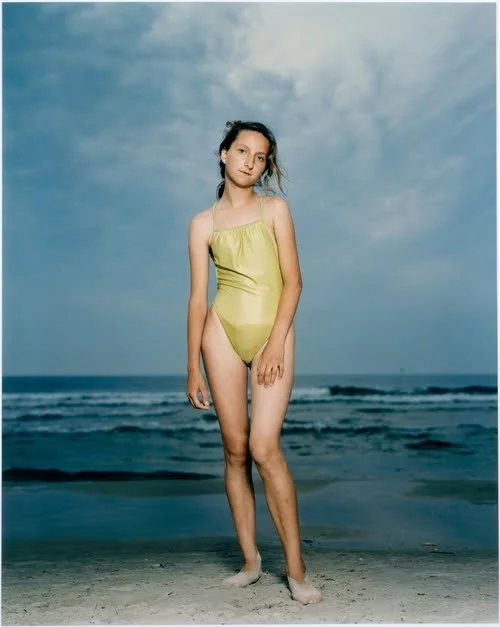
The deadpan aesthetics is considered a technically perfect photograph which depicts a landscape, still life or a person by a direct centred composition. The photographs usually have a single central theme (a mining tower, face, mound of clay, etc.), the background is usually unimportant (which does not apply for more sociologically oriented concepts), ignored or is neutral and sterile.
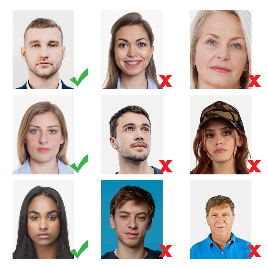
Passport Photos
The UK government has a specific list on what passports must include, this can be found on the UK government website.
FACE:
BACKGROUND:
Photos must have a background which:
Typologies
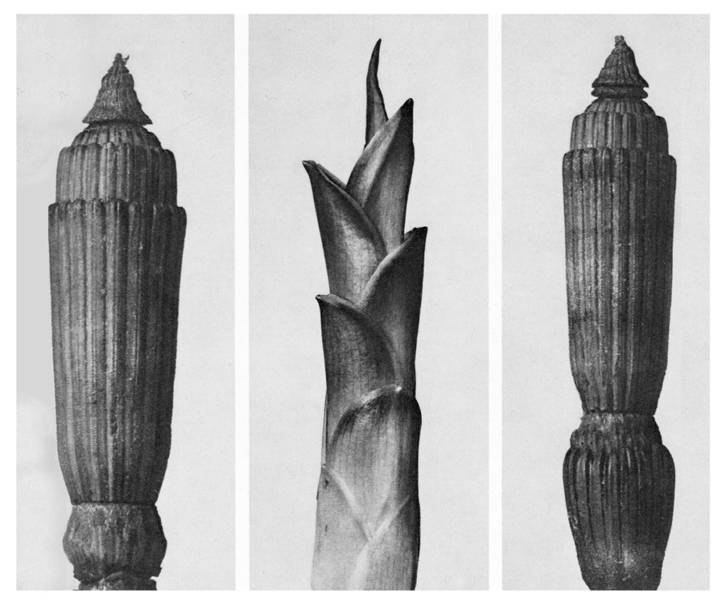
the study and interpretation of types and became associated with photography through the work of Bernd and Hilla Becher, whose photographs taken over the course of 50 years of industrial structures; water towers, grain elevators, blast furnaces etc can be considered conceptual art. The Becher’s were influenced by the work of earlier German photographers linked to the New Objectivity movement of the 1920s such as August Sander, Karl Blossfeldt and Albert-Renger-Patzsch.
Upclose
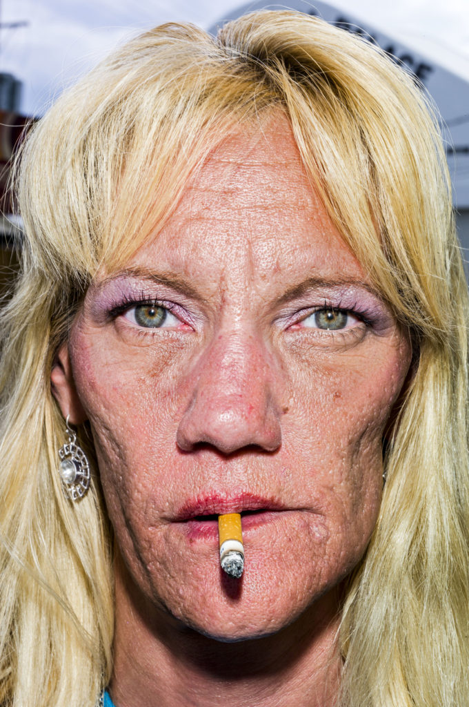
BRUCE GILDEN: FACE: Bruce Gilden is renowned for his confrontational style and getting up close to his subject. Between 2012-14 Gilden travelled in America, Great Britain, and Colombia and created a series called FACE. In addition to focusing on details of the face try and isolate body parts, gestures, clothing and physical features, such as hands, elbows, shoulders, neck, torso, hip, knees, feet. Your understanding of abstraction in photography; focusing on shapes, colours, light and shadows, textures and repetition is crucial here.
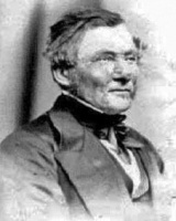
Who is Henry Mullins?
Henry Mullins started working in London in the 1840s and moved to Jersey in July 1848. He set up a studio known as “the Royal Saloon”, at 7 Royal Square. He was initially in a partnership with Mr Millward, but a year later he was working alone, he continued to do so for 26 years in the same studio. His photographs are now held by La Societe Jersiaise, and he found many people willing to have their photos taken.
Cartes de visite
His speciality was Cartes de visite, La Societe Jersiaise holds 9600 of these images, but the majority are 16 photographs taken in a single sitting. “The carte de visite was a format of small photograph which was patented in Paris by photographer André Adolphe Eugène Disdéri in 1854, although first used by Louis Dodero” The size of a carte de visite is 54.0 × 89 mm normally mounted on a card sized 64 × 100 mm. In Mullins case he mounted his carted de visite into an album.
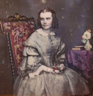
Albumen Print
Cartes de visite photographs were taken as a albumen print, this was published in January 1847 by, Louis Désiré Blanquart-Evrard. It used the albumen found in egg whites to bind the photographic chemicals to the paper and became the dominant form of photographic positives from 1855 to the start of the 20th century. During the mid 19th century, the carte de visite became one of the more popular uses for the albumen print.

Henry Mullins Work
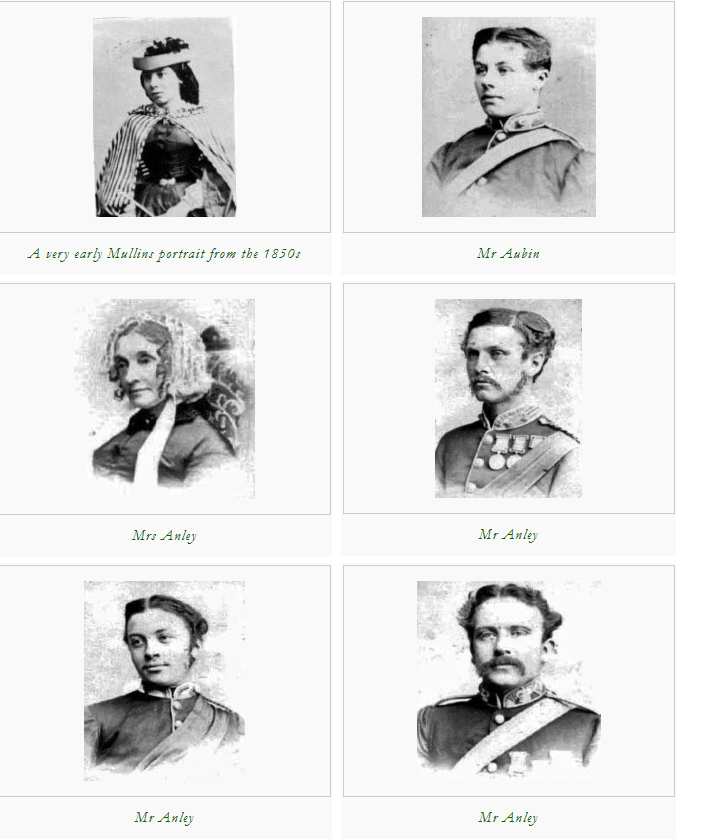
Image Analysis
Henry Mullins photographs portray something like a passport photo, no shadows, uniform lighting, light grey/cream background, eyes are open and clearly visible, with no flash reflections, facial expression are neutral (neither frowning nor smiling), with the mouth closed, photos show both edges of the face clearly, photos show a full front view of face and shoulders, squared to the camera, the face and shoulder image must be centred in the photo; the subject must not be looking over one shoulder (portrait style), or tilting their head to one side or backwards or forwards, there is no hair across the eyes, photos with shadows on the face are unacceptable.
Henry Mullins uses different poses within his photos, such as looking directly ahead, to the right, to the left, up and down. This creates framing which almost changes the look of the models face, allowing for different interpretation and eye contact with the camera, or a side angle pose.
My responses
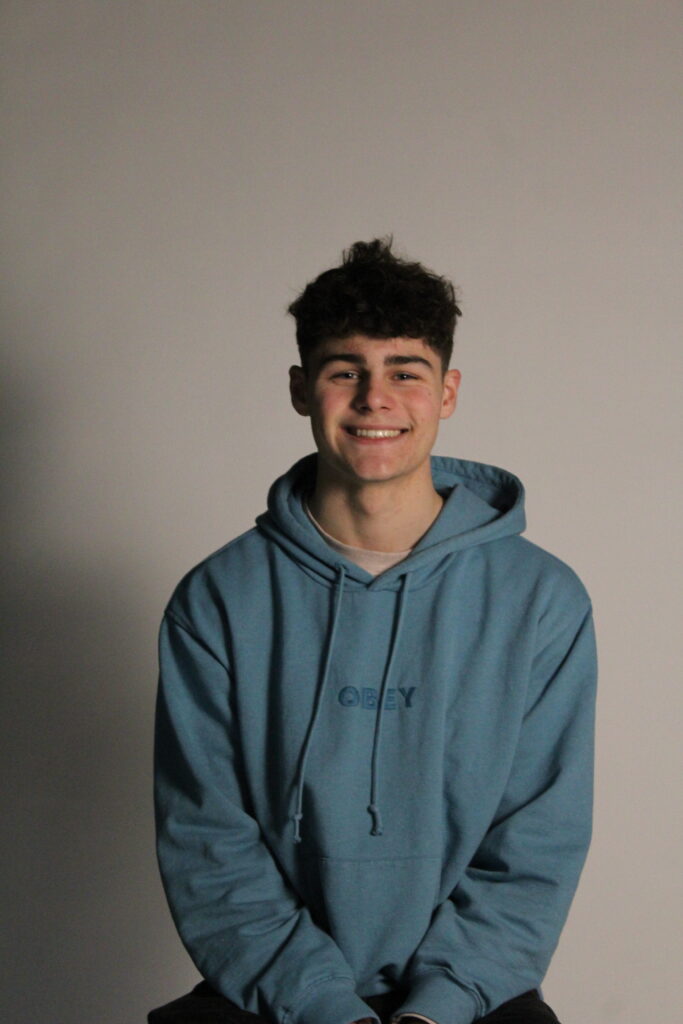


I took inspiration from Henry Mullins’ photos by using his poses, by taking photos from left, right or central angles, to portray all different sides of the face to show how a person can come across different depending on the angle you view them from, which also touches on the perception of the human eye, how everyone views everyone differently depending on their perception.
Who Is Oliver Doran?
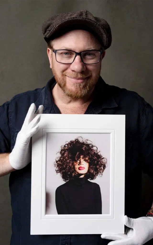
Oliver Doran is a photographer based in Jersey, he has immersed himself in portrait photography ” Myself and my team strive to capture the essence of our subjects, a process that begins well before my camera clicks. Building relationships with our subjects, from calls and interviews to casual chats, helps us truly understand their personalities.”
“Studio Portrait Experiences”
Oliver Doran runs studio portrait experiences where you can book and have him take your photos, he includes a what to expect section on his website, where he says how he will discuss with you what you are looking for during your sessions, what your wardrobe styling will be, hair and makeup styling and much more, this proves how his photos will explore you personally, he creates specific environments’ in specific photos, although he says that he approaches all shoots with the same ethics all the shoots tend to come out differently.
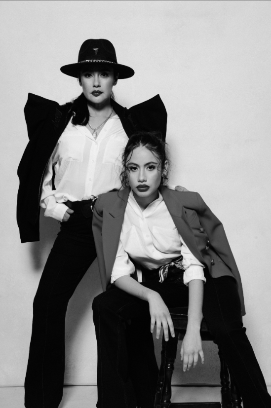
Exploring his Images
Oliver Dorans images all tend to have a shadowy lighting effect, showing clearly where he has placed the lights too really frame and capture his subjects face. His photos are also normally in black and white, but not just like a pasted over black and white filter but instead they have real depth, you can see shine on the chairs in his photos, gloss on his subjects faces, and shimmer within there outfits, proving real depth within his images, making them actually come to life rather them boring two dimensional photos.
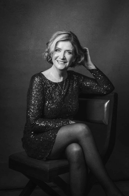
My Comparison
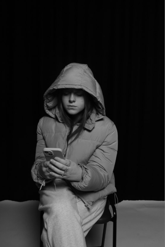
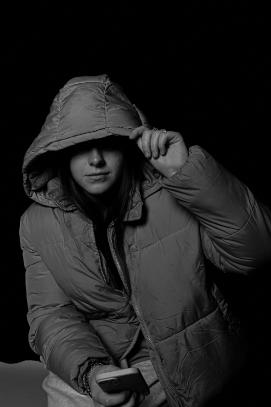
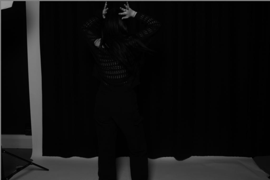
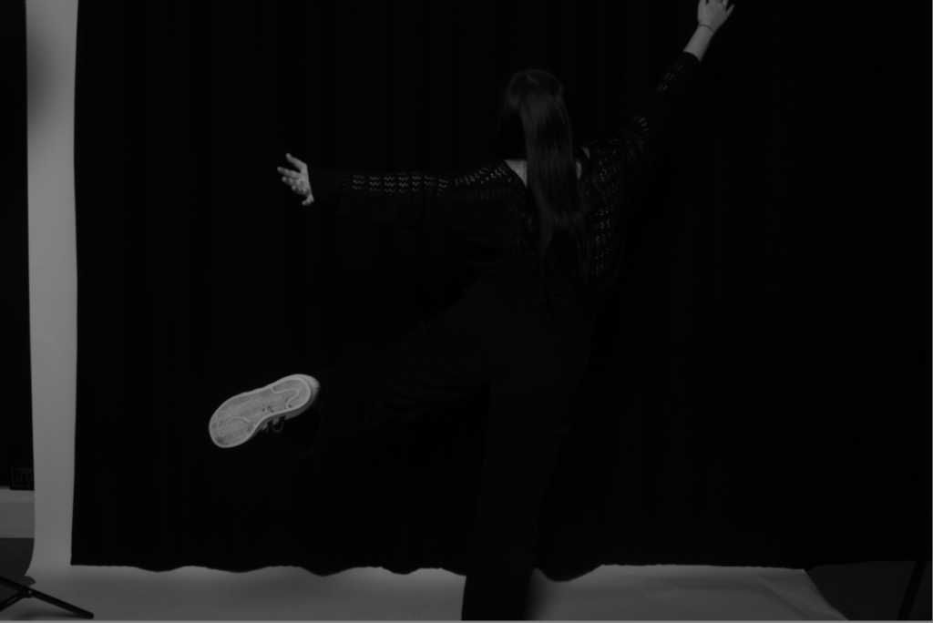
My images compare to Oliver Dorans, due to them being almost full body or just full body, he does this too create a personality within the image, and normally takes photos of people for things’ like there businesses so by doing this he can make these models come across as who they are through a lense which i have captured. His images also tend to be black and white, this is due to making an image black and white gives it a more of over all filter, and by doing this it calms down any lights or colours leaving your only focus being the model. The lights have been placed too frame the model, and place shadows in certain places too create a main focus.
Butterfly Lighting:
1.

2.
3.
Evaluation:
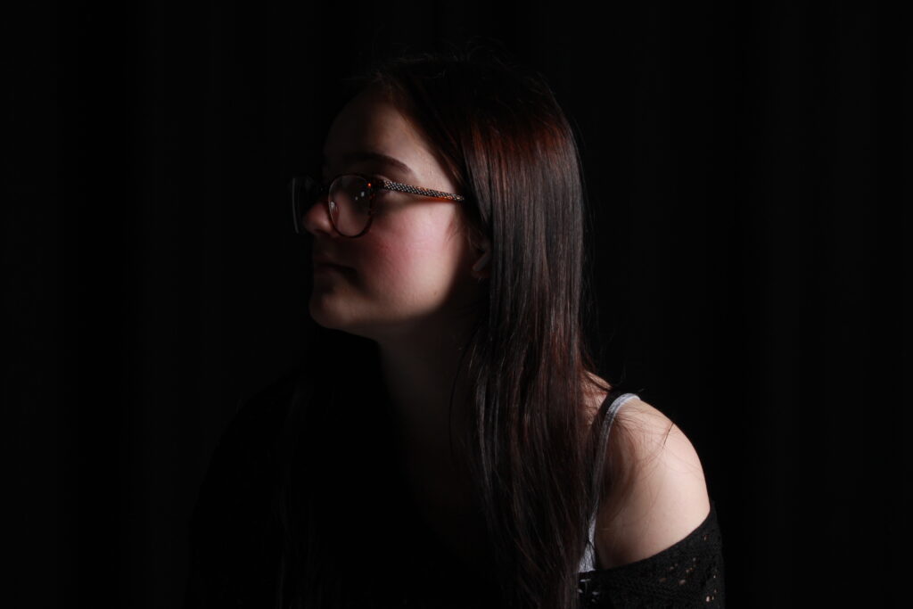
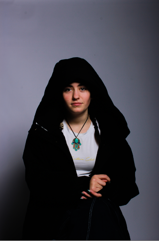
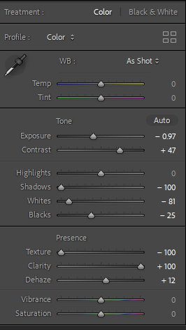
Butterfly lighting is regularly used within portraits due to its flattering effect, which I can see is clearly proven here. It has highlighted the subjects cheekbones, and also created shadows under the neck. I used a key light that was flash rather than continuous, meaning it will only light up when the photo is actually being taken, this gives a more vibrant and brighter effect. I used a hard light rather than a soft light, to really create the effect of those shadows. A reflector was used in the first photo in order to make the light bounce off the nose and soften the shadow under the chin. We used a silvery/ white reflector which gave off a more neutral tone. The subjects face was towards the light but with the light pointed at quite a high angel making sure all the shadows were captured. The second two photos I have included have a dimmer look too them, this is to create a different atmosphere, one of darkness, while still capturing the shadows on the models face. I have also included how I have developed the photos within lightroom, to show how I have managed to make the shadows stand out more and make them deeper.
Chiaroscuro Lighting:
2.
3.
Evaluation:
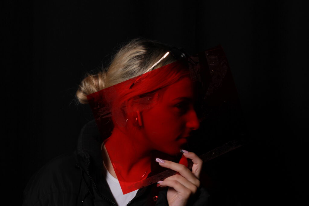
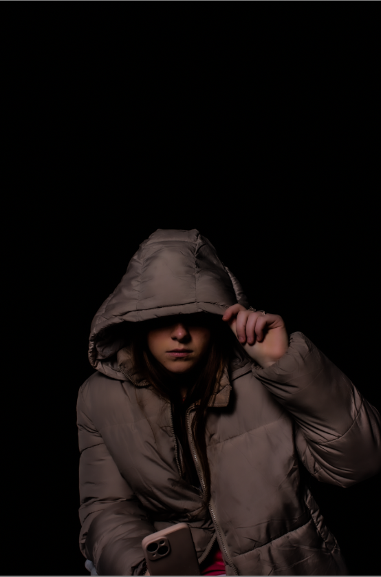
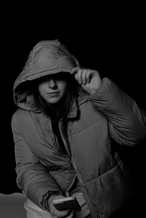
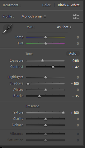
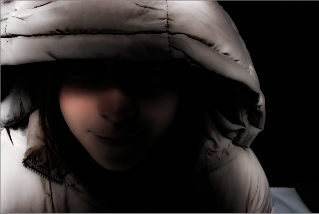
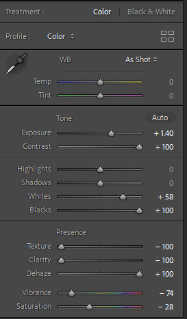
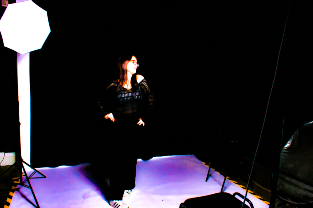
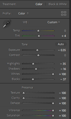
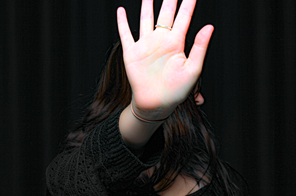
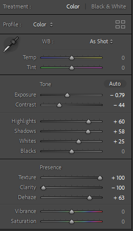
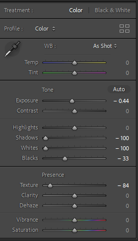
Chiaroscuro lighting means light dark lighting, where there is a bold contrast between the two. It is generally used to create dramatic images, which I think I have captured here, it adds a sense of mystery too the subject. I used one key light and then another light within the back, I also used a reflector in 3rd image. The first image is a contrast due to the shadow of the hood, and the darkness of the background contrasting with the bright light on the subjects face, this creates the effect of not actually being able to see the subjects face, which then creates a sense of mystery. As you can see I have heavily edited the second image, purely just because I think the idea of black vs white light reflecting is a bit boring, so I heavily saturated the image so that is what a more purple tone reflecting against the black background, I don’t necessarily think this creates a sense of mystery but it certainly creates a different vibe, one maybe of vibrance? I have included a screenshot of how I developed the image within lightroom. The last photo I have included shows a clear contrast between the light reflecting onto my hand and my dark hair/dark background. Yet again using something too cover the face to create a sense of mystery.
Rembrandt Lighting:
2.
3.
Evaluation:
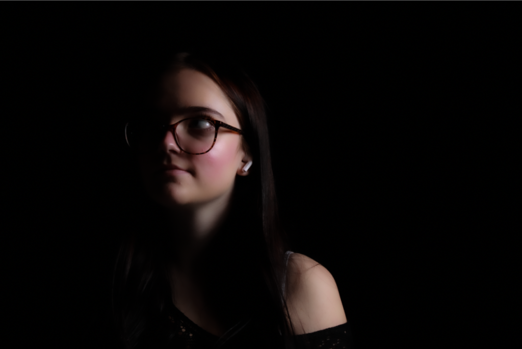
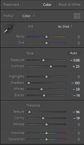
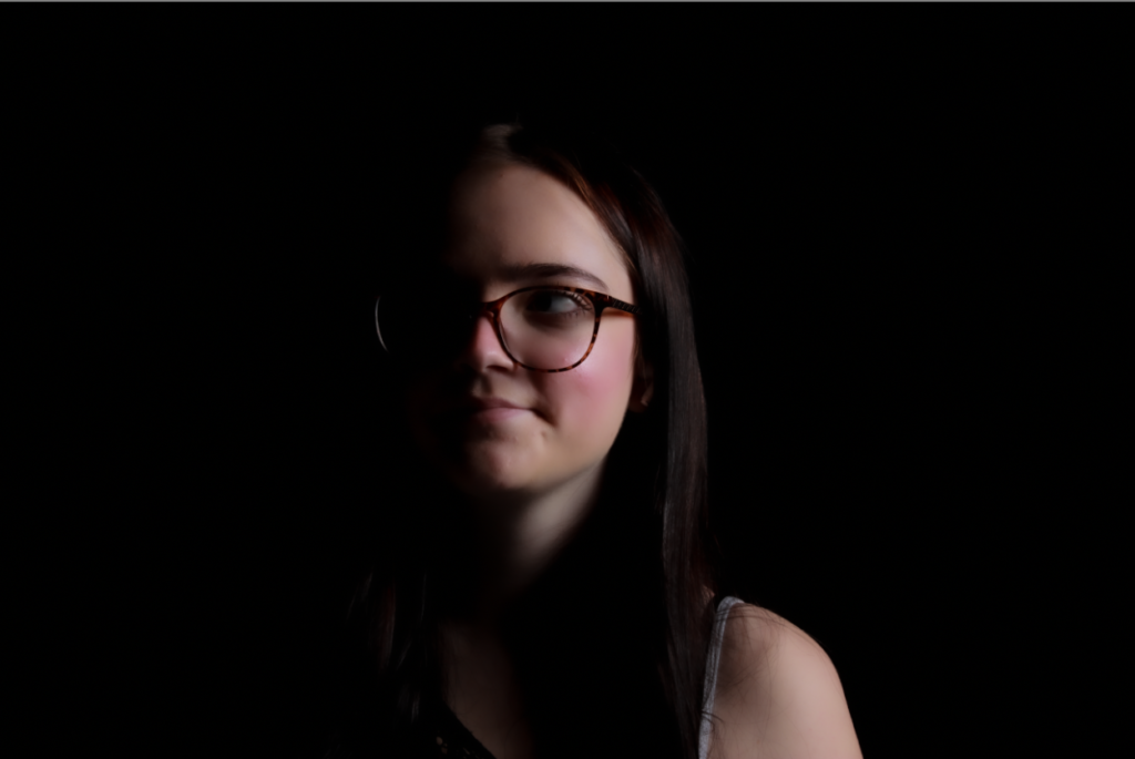
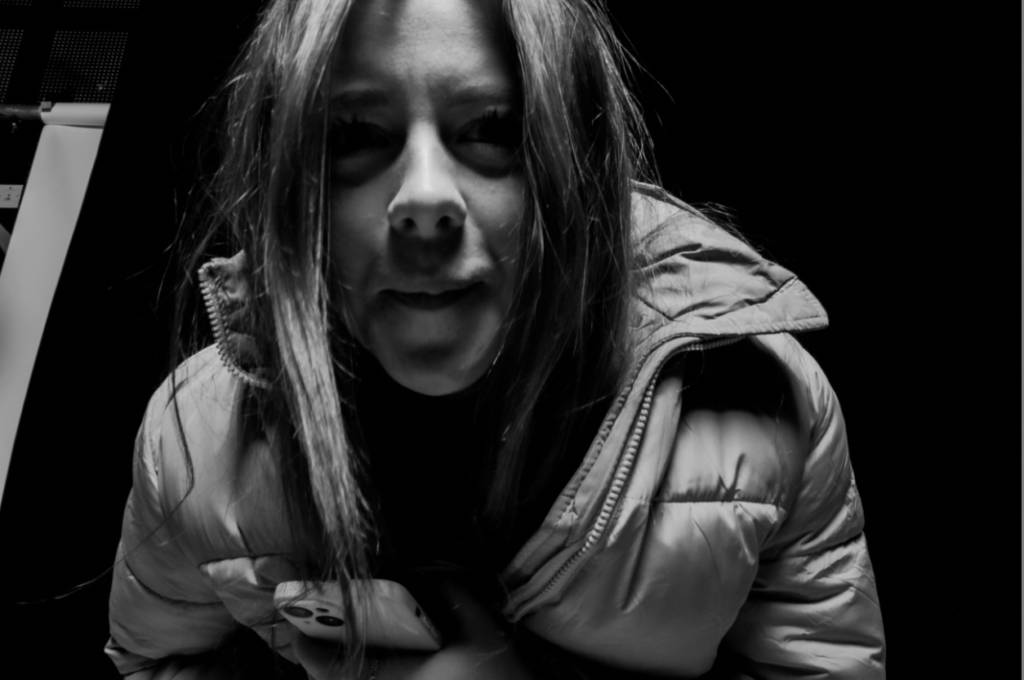
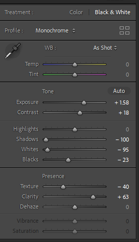
Rembrandt lighting is created when there is a small triangle of light on the subjects cheeks opposite the light source, this creates a more artistic effect. Although I didn’t quite manage to capture the triangle shadow I did still managed to capture a shadowed face. I used two lights, one main light and one background light, I didn’t use a reflector because I felt that the hard lighting was enough. I have managed to draw into the subjects eyes (or eye), which creates a more in depth look. The eyes are the main focal point in portraiture, due to how they can take on many forms and show emotion. This makes it a more appealing image as there is actually something to look at and focus on rather than just a random environment. It isn’t just general light on the face and it exposes the features of the face more. When shadowing half on the subjects face is obviously brings the focus to the highlighted half allowing a really focused photo. I used lightroom to edit the first two images to give a more untextured effect too almost make a blur into the shadows, this brings a big focus too the gloss of the face. I have included screenshots of how I edited the images in lightroom.
My Top Three Images:
1 ~
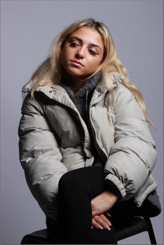
This is one of my top images due to the pose of the model, it allows many focal points, the image is bright and in focus and also has many different things too look at. The facial expression of the model also gives off a sense of their personality.
2~
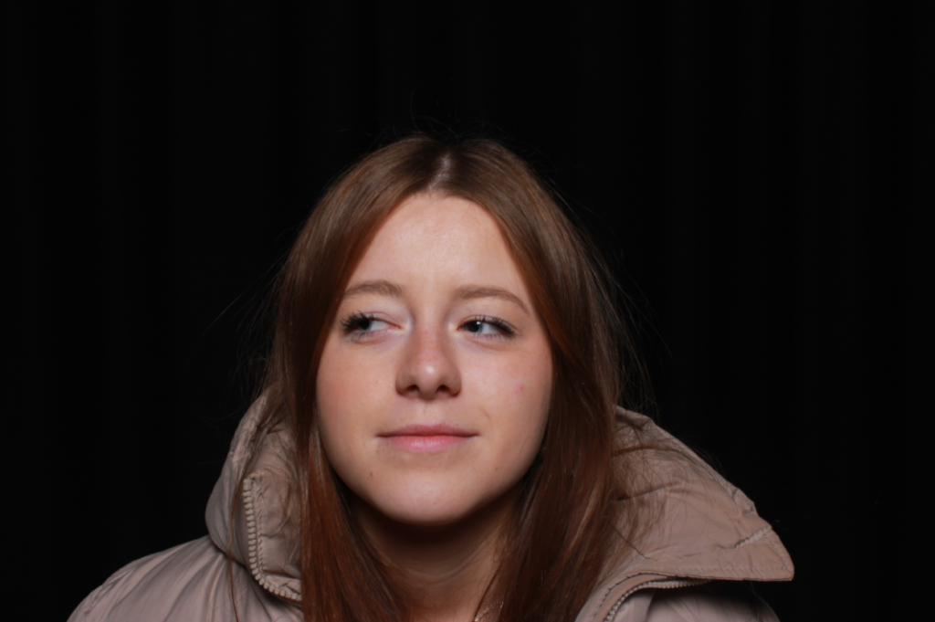
I also chose this photo as one of my main images due to the models facial expression really showing off her personality. I also really like this image due to the main focus on the models face, this is due too they model having one main light on her and that contrasts with the black background.
3~

This was one of my favorite images due to the use of the smoothing tool and making the image so untextured creates a blend between the shadow’s and the models face. I personally think this looks really good and captures the attention of people looking at it.
One Point Lighting

Single Point Lighting is the simplest type of light placement and mimics something we see everyday, the sun. It has the most natural look and can have a dramatic lighting effect, it also draws attention. But it may though give the person you are photographing may look more flat or two dimensional. It’s a bit of a basic lighting due to having the option to choose so many different types of lighting but then only sticking to one light.
One-point lighting, also known as single-source lighting, refers to a lighting setup that uses one primary light source to illuminate the subject. This technique creates strong contrasts between light and shadow, emphasizing texture and form.
In photography, one-point lighting can be achieved using various light sources, such as natural light from a window or a studio light. The placement of the light significantly impacts the mood of the image: for instance, positioning the light at a 45-degree angle can create dramatic shadows and highlights, enhancing the subject’s features. This approach is commonly used in portrait photography to create depth and dimension, while also allowing for creative effects and a more intimate atmosphere.
Several artists and photographers are known for their effective use of one-point lighting to create striking visuals. Here are a few notable figures:
These artists showcase how one-point lighting can be effectively utilized to create depth, drama, and emotional resonance in their work.
Two Point Lighting

A two-point lighting set up is when theyre are two lighting sources, which are usually placed at a 45 degree angle point from the subject. One of them is your key light, which is the main light used to illuminate the subject and the second is your fill light which helps to remove harsh shadows on the subject that are created by the key light.
Two-point lighting is a lighting technique that uses two light sources to illuminate a subject, creating depth and dimension in the image. This setup typically includes a key light and a fill light:
By using two-point lighting, photographers can achieve a more nuanced and balanced look, enhancing the subject’s three-dimensionality while maintaining a natural feel. This technique is commonly used in portrait photography, film, and video production to create a pleasing and dynamic visual effect.
Several artists and photographers are known for their effective use of two-point lighting to enhance their work. Yousuf Karsh is celebrated for his iconic portraits, often employing two-point lighting to create depth and dimensionality in his subjects. David LaChapelle, known for his vibrant and theatrical style, frequently utilizes two light sources to achieve a balanced yet dramatic effect in his fashion and celebrity photography. Diane Arbus also employed this technique, using it to illuminate her subjects in a way that highlighted their unique characteristics and emotions. Additionally, contemporary photographer Annie Leibovitz often uses two-point lighting in her portraits to create rich textures and striking contrasts, emphasizing the personalities of her subjects. Each of these artists demonstrates how two-point lighting can enhance storytelling and visual impact in photography.
Three Point Lighting

Three-point lighting is a traditional method for illuminating a subject in a scene with light sources from three distinct positions. The three types of lights are key light, fill light, and backlight. Three-point lighting is a standard method regularly used in visual media such as theatre, video, film, still photography, computer-generated imagery and 3D computer graphics. This technique can be used to eliminate shadows cast by foreground elements onto the background, or to draw more attention to the background. It also helps to off-set the single eye nature of the camera, this means that it helps the camera give depth to the subject.
Three-point lighting is a comprehensive lighting technique commonly used in photography, film, and video production to create a well-rounded and balanced illumination of a subject. This setup involves three key light sources:
Together, these three lights work harmoniously to create a balanced and dynamic look, making three-point lighting a versatile technique widely used in portrait photography, interviews, and cinematic lighting.
Several artists and photographers effectively utilize three-point lighting to enhance their work:
These artists showcase the effectiveness of three-point lighting in creating visually compelling and dynamic portraits across various genres.
Basics:
Lighting can be used in many different ways to achieve many unique photos. Studio lighting in particular is great for portraits. It is often used in many different ways, from flash to a technique called practical lighting which is where the light source is visible in the frame but appears natural light a lamp in a set of a living room. Within portraiture there are many different techniques used to achieve the perfect shot.
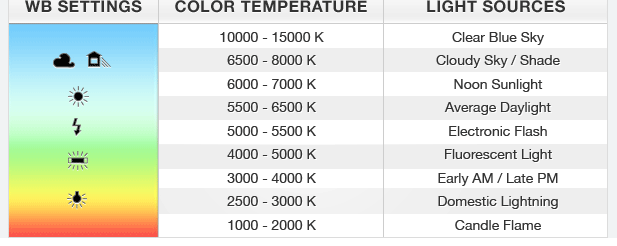
Here are some photography lighting basics to help you understand how to effectively use light in your images:
By mastering these basics, you can effectively manipulate light to enhance your photography and achieve the desired artistic outcomes.
Butterfly Lighting
A type of portrait lighting technique, used primarily in a studio setting. Its name comes from the butterfly-shaped shadow that forms under the nose because the light comes from above the camera. You may also hear it called ‘paramount lighting’ or ‘glamour lighting’.
Butterfly lighting, also known as “paramount lighting,” is a popular portrait lighting technique characterized by the creation of a butterfly-shaped shadow under the subject’s nose. This effect is achieved by placing the key light directly in front of and above the subject, typically at a 45-degree angle. The resulting shadows enhance the cheekbones and create a flattering, sculpted look, making it particularly effective for beauty and glamour photography. Butterfly lighting works well with a soft light source, as it minimizes harsh shadows and produces a smooth, even illumination on the face. This technique is often used to convey a sense of elegance and sophistication, making it a favorite among portrait photographers.
What is it used for?
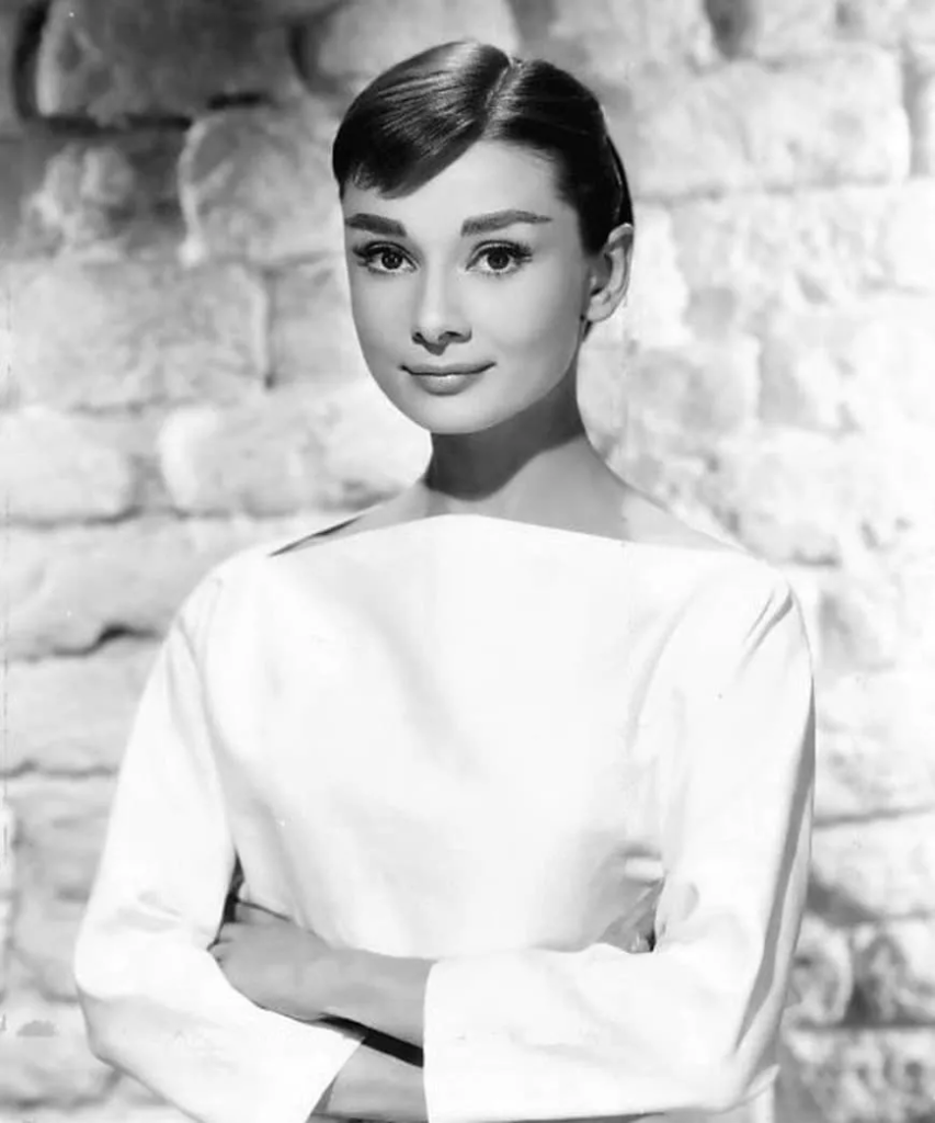
Butterfly lighting is used for portraits, because it is a lighting that flatters almost everyone, as it can highlight cheekbones and create shadows under them, as well as under the neck, which makes the model look thinner. This makes it the most commonly used lighting setups. This lighting has also been used for famous stars, from classic Hollywood and that’s why it’s also called Paramount lighting.
People use butterfly lighting for several reasons:
Overall, butterfly lighting is favored for its ability to enhance beauty and create striking, professional-quality images.
How to create it:
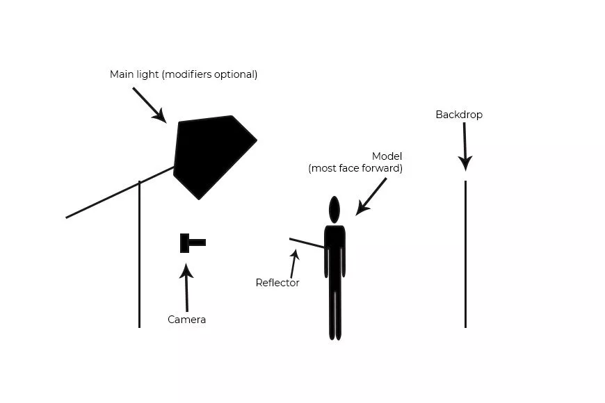
Butterfly lighting requires a key light that can be a flash unit or continuous. If continuous, it can be artificial or natural. In other words, you can use strobes, speed lights, LEDs or even the sun. A butterfly lighting effect refers to the setup and not to the quality of light – it can be soft or hard light depending on the effect you want. If you want to create a soft light, you’ll need to use modifiers. A beauty dish is perfect for glamour photography as it distributes the light evenly and smooths the skin. You can also use a soft box or an umbrella. Instead, if you want to have hard light, you can leave the light source as it is. Alternatively, you can use grid spots to direct it and create different effects.
To use butterfly lighting effectively, follow these steps:
By following these steps, you can effectively utilize butterfly lighting to create beautiful, professional-quality portraits.
Experimenting:
Once you have the key light set up, it’s time to fill the shadows. You can use a reflector to bounce the light back up and soften the shadow under the chin and the one from under the nose. To do so, position the reflector under the subject’s face. Start at waist level and see how it looks. If the shadows are still strong, move it closer to the face and so on. Experiment with different positions to achieve different effects. You can also change the colour of the reflector. A white one will give you a neutral tone, while a golden one gives a warming overcast. Once you’re happy with your butterfly lighting, direct the model to have a striking fashion pose or whatever the desired pose or expression you’re looking for. Just keep in mind that the subject’s face needs to be towards the light in order to have the butterfly shadow under the nose.
Examples:
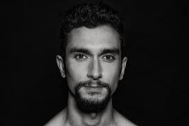
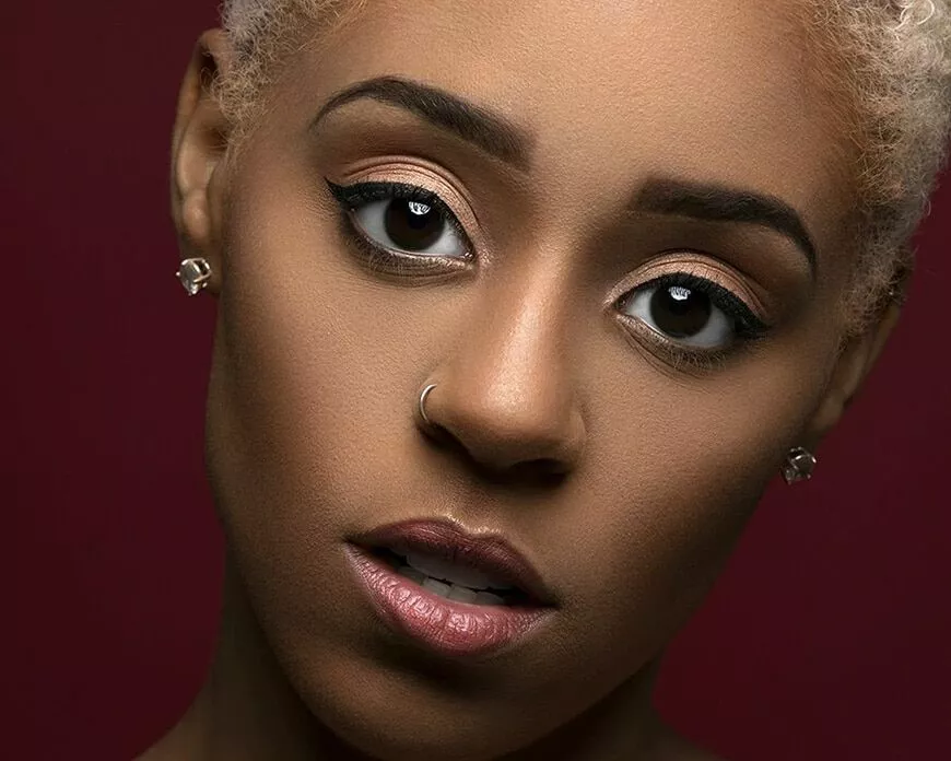
Chiaroscuro lighting
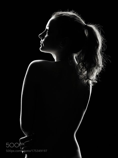
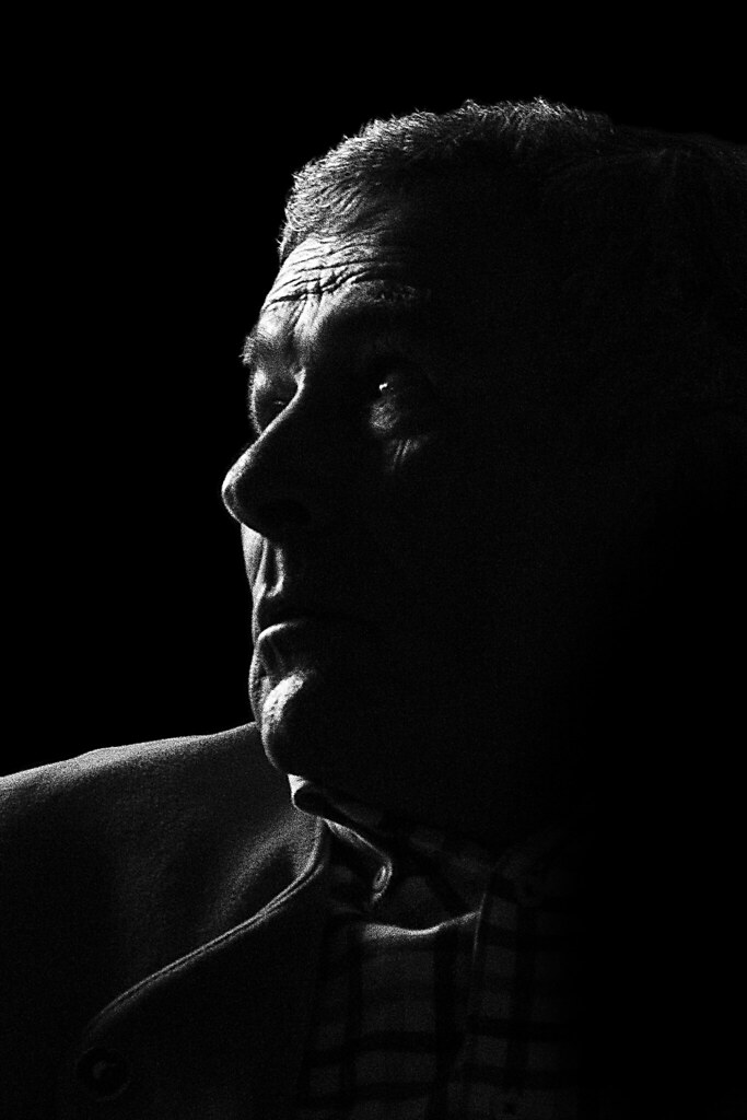
‘Chiaroscuro’ is an Italian term for lightdark as this lighting technique creates a bold contrast between light and dark. This can also be defined as a high-contrast lighting technique that utilises a low-key lighting setup to achieve contrast between the subject and a dark background.
Chiaroscuro is an artistic technique that uses strong contrasts between light and shadow to create a sense of volume and three-dimensionality in an image. The term, derived from the Italian words “chiaro” (light) and “scuro” (dark), emphasizes the interplay of light and dark tones to enhance the dramatic effect and depth of a composition.
In painting and photography, chiaroscuro can be used to direct the viewer’s attention to specific areas of the artwork, convey mood and emotion, and add a sense of realism. This technique has been employed by many renowned artists, including Caravaggio and Rembrandt, who used it to create striking visual narratives. In photography, chiaroscuro can be achieved through careful manipulation of lighting, often involving a single light source to create deep shadows and bold highlights, enhancing the subject’s form and texture.
What is it used for?
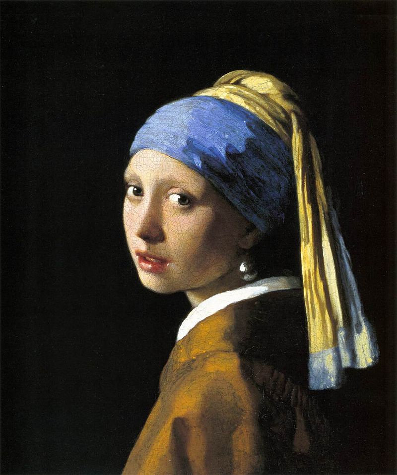
This form actually originated in paintings during the 15th century in Italy and Holland (Flanders), yet this was truly developed a century later in Mannerism and Baroque art. Today, it is prominently used in film-making due to the striking and dramatic images this technique produces. This form of lighting adds a sense of mystery to the characteristics of the subject, making their features become framed and draw attention to the viewers eye in places they would not normally see. Caravaggio and Rembrandt used this in their paintings where dark subjects would be dramatically shined on by a shaft of light:
How to create it:
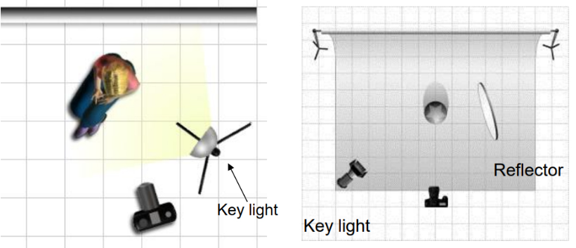
In photography, these are produced by using one key light and a variation using a reflector that reflects light from the key light back onto the sitter. The reflectors colour can be changed to produce a different tone onto the subject.
Experimenting:
Using flash, there are a range of possibilities as, depending on how you want the images produced, you can create images in low or high lighting scenarios through:
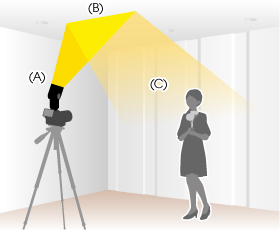
For example, flash “bouncing” softens the effects and creates a larger fill area. This must be done on white walls or ceilings as the flash is directed either to the side or above the subject.
Examples:
Rembrandt lighting
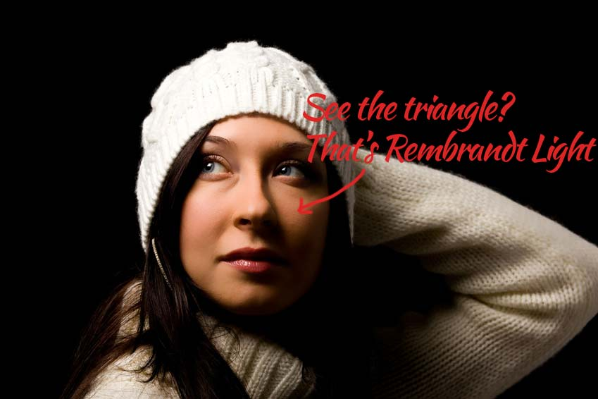
Rembrandt lighting is a technique named after the Dutch painter Rembrandt. Its the cauterized by a small triangle of light on the subject cheeks opposite the light source, creating a dramatic and shadowy effect. Its often used in portrait photography to add depth and dimension to the subjects face.
What is it used for?
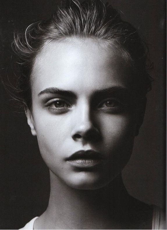
Many Photographers use Rembrandt lighting because it creates a dramatic and artistic effect in portraits. it involves positioning the main light, source at a 45-degree angle to the subject. creating a triangle-shaped highlight on the cheek opposite the light source. This technique adds depth and dimension to the subjects faces, accentuating their features and creating a sense of mood and atmosphere in the photograph.
How to create it:
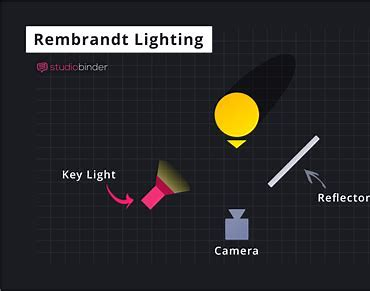
It consists of using one light and one reflector (or two lights), instantly creating shadows and contrast. This specific technique creates a triangular shape under the subjects eye which increases the emphasis of drama to the viewer. This draws them in because the eyes are the main focal point in portraiture and something that can take on many forms and show emotion. This makes a more appealing image as it has a creative side to it – it isn’t just general light on the face and exposes the features of the face more.
Experimenting:
The lighting depends on its position to the subject. In this case, it must be 40 to 45-degree angle and higher than the subject. Flashlights and continuous lights are the correct ones to use.
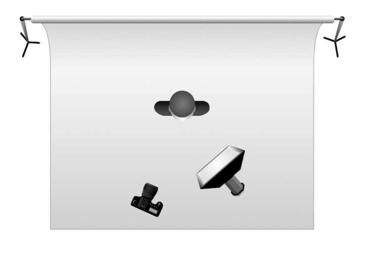
Depending on how much of your subject you are aiming to shoot, you should use a 35mm or 50mm if you’re looking at including more of the subject than just the head and shoulders. However, 50mm will give a nice depth of field.
Examples:
