

What is HDR?
In photography, HDR stands for high dynamic range. Dynamic range is simply the range of the lightest tones to the darkest tones within a photo. Put another way — it’s a measure of the light intensities from the highlights to the shadows.
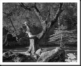
This photograph is just one of may for which Ansel Adams used the water bath development technique. Often times it was trial and error. So his practice was to expose two sheets of film identically for a scene he anticipated would be significant. If, after developing the first he concluded it needed a different development treatment he developed the second as was the case with this negative.
Photoshop HDR editing
HDR ONE
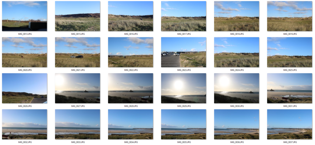
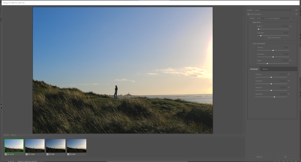
I used these four images:
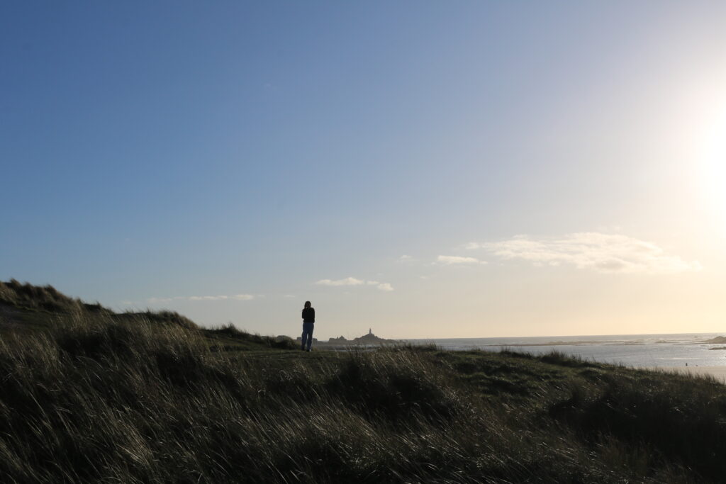

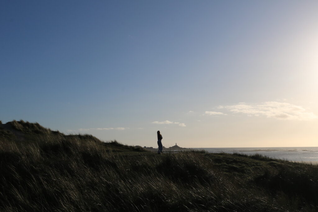
Which then created this:
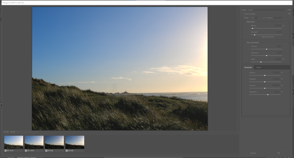
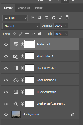
I then played around with the dials on the right, things the the shadows and the highlights:
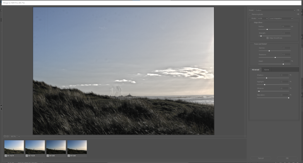
I then played around with the “remove ghosts” option, which created this:
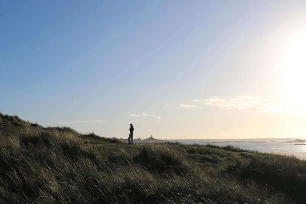
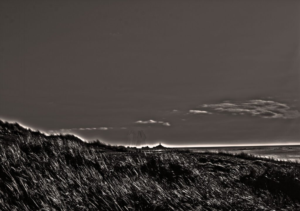
My final piece from my editing of the four images was this, I think it shows some perception of Ansell Adams ideas of HDR and how his images looked, I used a model to portray the actual size of the landscape, and to give more dynamic to my image:
HDR TWO
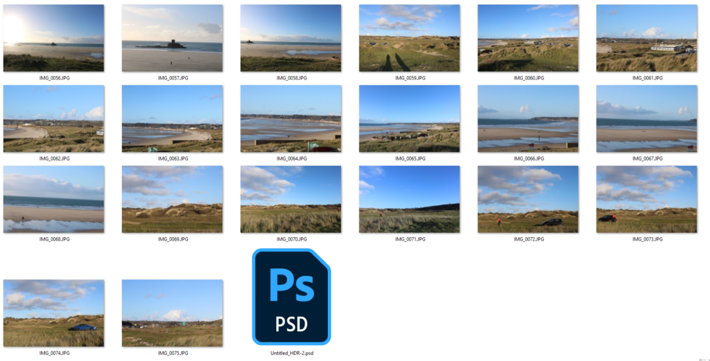
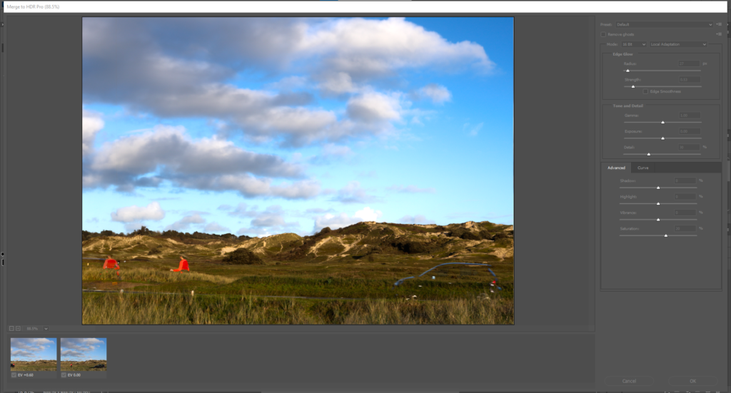
I used these two images:
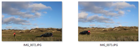
Which then created this:
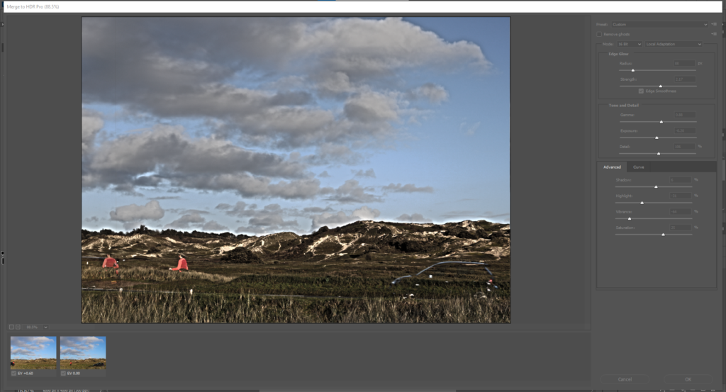
I then played around with the dials on the right, things the the shadows and the highlights:
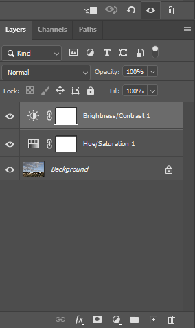
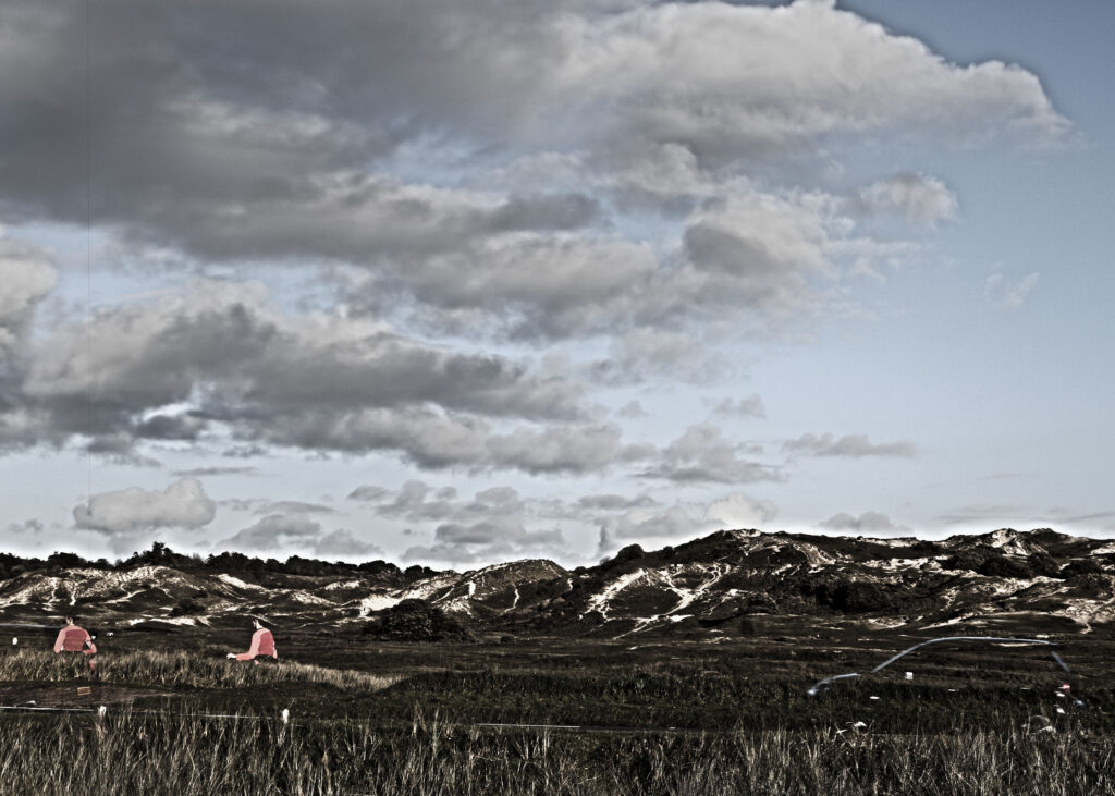
This is my final piece from using these two images, I think the momentum of the car created a blur which adds depth to the image, and in a way obstructs your field of view away from the beautiful sand dunes, also the use of the woman running created another motion blur, although this image may not relate to Ansell Adams I think that it is one of my post dynamic photos, and allows many different things for the eye to look at by the use of things like lighting, field of view ect :
HDR THREE
I used these two images:
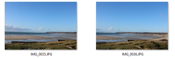
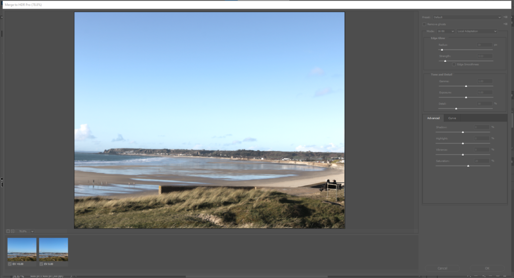
Which then created this:
I then played around with the dials on the right, things the the shadows and the highlights:
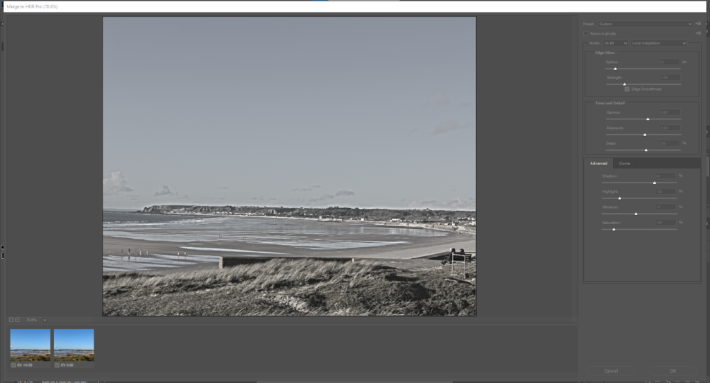
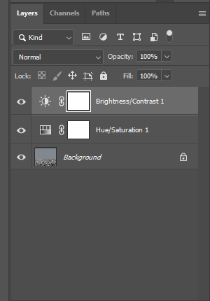
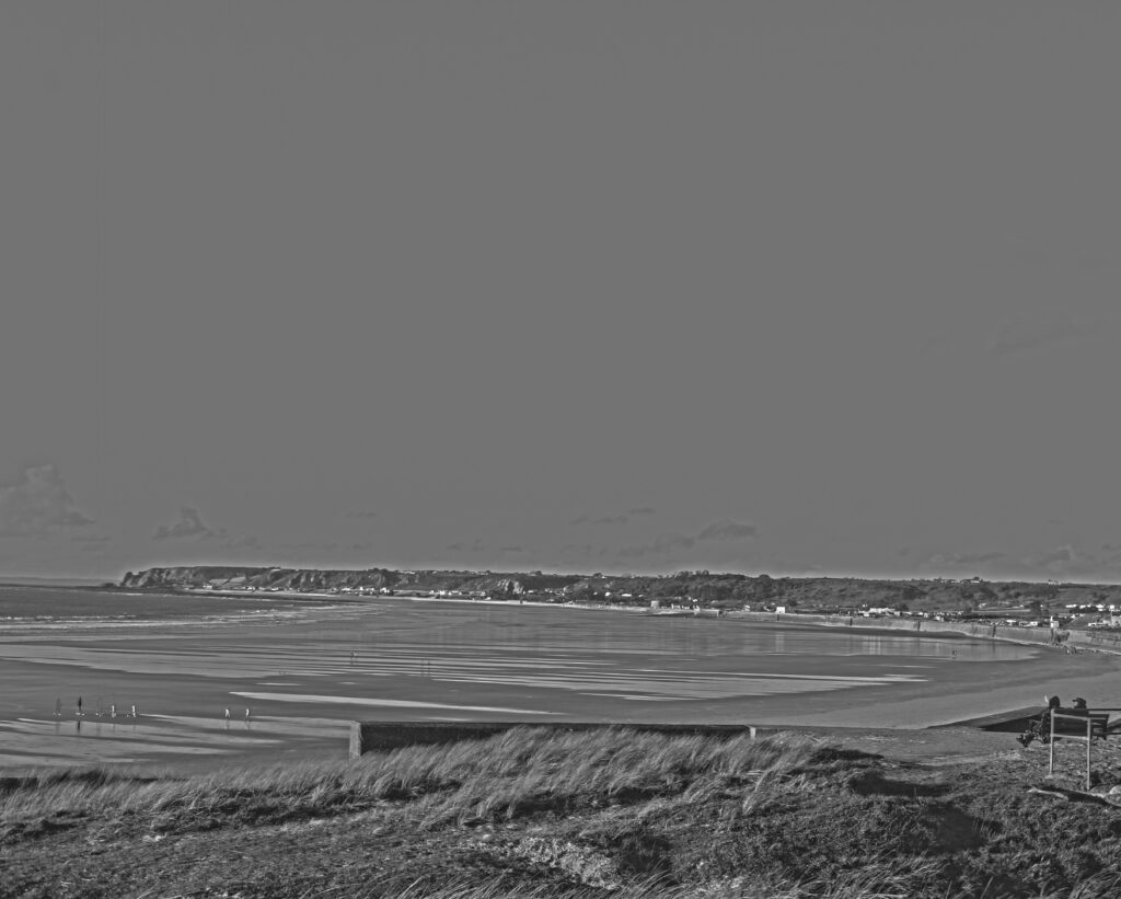
My final image related to my other artist reference Peter Mitchell, the reason I think it relates is because his images are those more of environmental photography, so I think within my image the two people sitting on the bench together portrays a sense of his imagery:
Ansel Adams was an American landscape photographer, and environmentalist, known for his black-and-white images of the American West, whereas Peter Mitchell is a British documentary photographer, known for documenting Leeds and the surrounding area for more than 40 years.
Ansell Adams example:
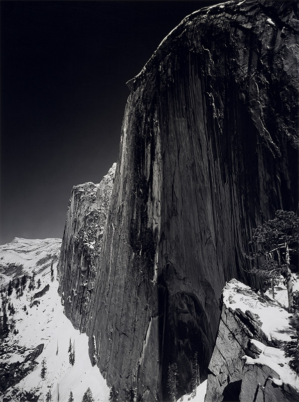
Ansell Adams photography relies very much on ‘the zone system’, which portrays dark and in depth element’s, which creates more within the field of view and creates a story. This creates a new lense over the human eye and a new story, portraying that it obviously didn’t actually look like this when the photograph was taken, he has added his own spin on what the human eye is viewing.
Peter Mitchell example:
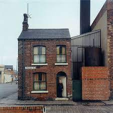
Peter Mitchell’s photographs create a reality, where the image is almost exactly the same as he would’ve seen when he took the photo. The photo portrays a real life story, one where you can really see what he was trying to capture and where you can see his ideas coming to life, using a model to create a field of depth within the image, and a scale tro size of how widely he has taken this image.
Comparison:


These two images are so similar yet so different. Some similarities include the use of wide landscape photography, created a long vertical image which focuses on things further in the background rather than an image like a up-close headshot for example. They also relate in how they use field of view, for example Peter Mitchell’s use of thing like the man stood at his door and the use of the green bin on the right of the house to portray the actual scale of things within the image such as the house, similarly Ansel Adams uses shading within the image such as the lighter slow compared to the darkness of the mountain which creates a tone of contrast. These images differ within how they use colour, with Ansel Adams keeping to a grey scale whereas Peter Mitchell has used colours such as brown and green to portray the liveliness of the world, both images give off different stories and different emotions which can be portrayed in colour as Ansel Adams photography creates a more eerie and dimmer tone to create a more melancholy story.
Exposure bracketing means that you take two more pictures: one slightly underexposed (usually by dialing in a negative exposure compensation, say -1/3EV), and the second one slightly overexposed (usually by dialing in a positive exposure compensation, say +1/3EV), again according to your camera’s light meter.
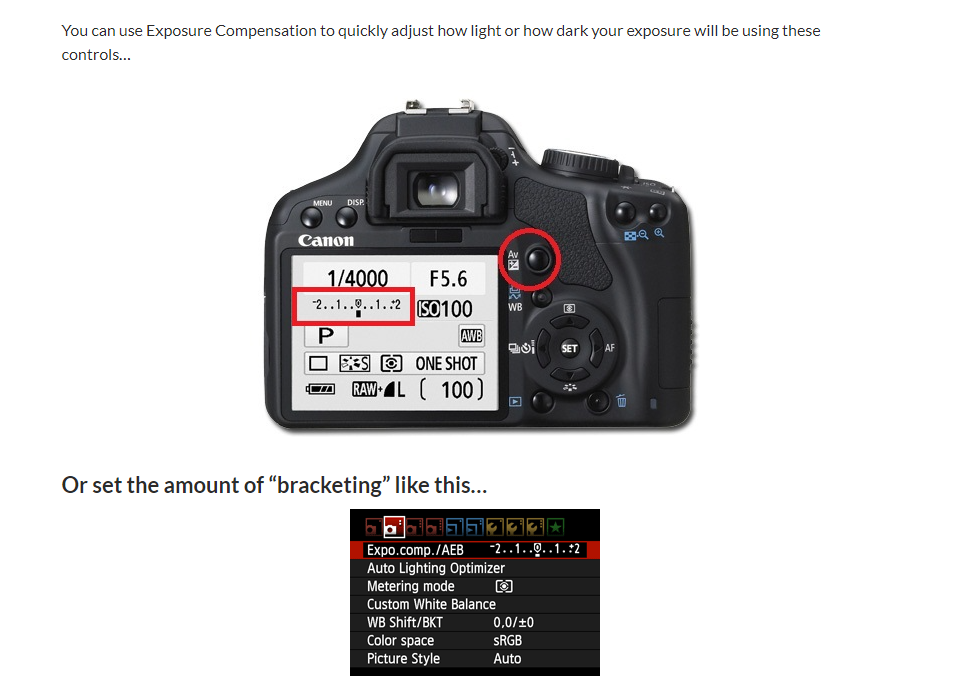
The basics:
Getting exposure right can be a complex subject. There are lots of things you have to balance: how your camera is metering the scene, your camera’s dynamic range, and of course, what settings you’re using. By also taking one photo that is a stop or two underexposed and another that is a stop or two overexposed, even if you misjudge your exposure, you still have the bracketed shots. Landscape photographers sometimes refer to bracketed shots as “safety shots” for this reason.If you shoot bracketed shots, there are also a few more advantages: you can always create an HDR image, you can blend different parts of the image yourself if you need to, and, if something is moving through the scene, you can replace it with original image data instead of relying on Photoshop’s tools.
How to take bracketed photos:
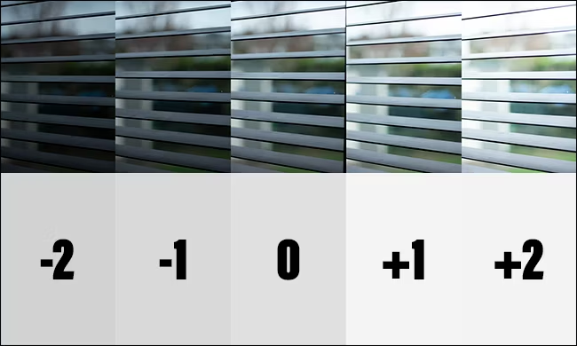
To manually take bracketed exposures, set up your camera for a shot as normal. You can create the best photos by using a tripod as you know excatly where you have taken the photo and can therefore change the exposure without moving your cameras positioning around too much. As soon as you take your first shot, adjust the exposure compensation, shutter speed or ISO by around one stop and take a second shot. Adjust the shutter speed or ISO two stops in the other direction and take a third. Now you should have three identical photos that are one stop underexposed, correctly exposed, and one stop overexposed. To automatically take bracketed exposures, you’ll need to dive into your camera’s settings. The procedure is a bit different for every camera so check the manual for the specific steps. Once you have exposure bracketing set up like this when you hold your finger on the shutter button your camera will take a burst of photos varying the shutter speed each time.
My artist references are Ansel Adams and Peter Mitchell, I am going to take inspiration from there “story telling” images.

The reason I have chosen to put these images on my mood board is because I like the emotions the images create. The use of colour and lighting is what I want to be in my imagery. The use of models is also what I want to use. I like how these images have huge contrast within all of them, the contrast of lighting, the contrast of colour, the contrast of weather. These really change peoples attitudes when they look at photos.
About
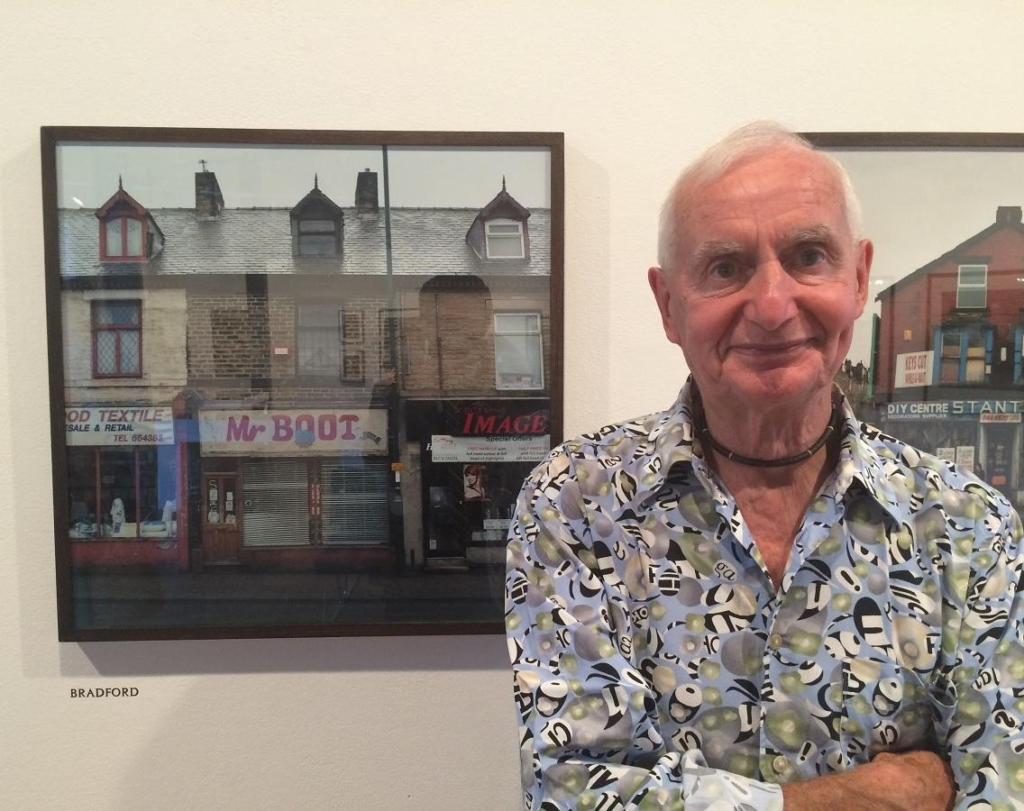
Peter Mitchell is a British documentary photographer, known for documenting Leeds and the surrounding area for more than 40 years. Mitchell’s photographs have been published in three monographs of his own.
A selection of Peter Mitchell’s most inconic photographs, some of which had been sat unseen for over 30 years, are now available as A2 poster prints, printed on 200gsm paper.
These photographs can be seen in his publications, Early Sunday Morning, Memento Mori and Strangely Familiar. Hundred-year-old terraces and cobbled streets sit flanked by concrete flats, with newly cleared ground to either side are presented with Mitchell’s, typical graphic framing.
“It is as if Peter Mitchell has taken the atmosphere and mood of Edward Hopper’s famous painting and established it as a matter of documentary fact in the north of England at a moment when collapse can lead to further desolation or possible renewal. So these beautiful pictures are drily drenched in history – social, economic and photographic.” – Geoff Dyer
Photos
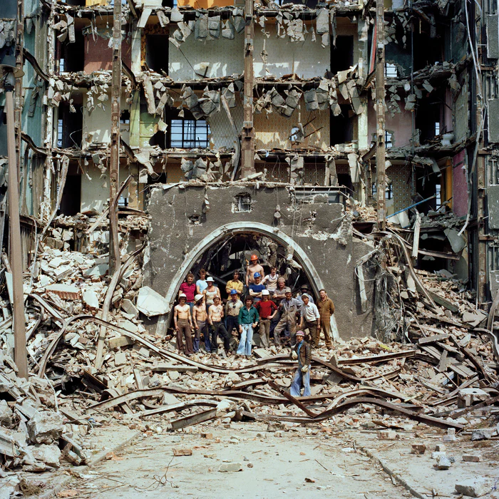
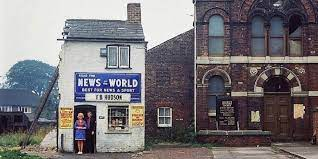

Peter’s striking images were an essential part of the colour documentary scene in the seventies and eighties and often featured shopkeepers and factory workers outside their places of work. I was interested in talking to Peter about his days back then, and how he came to photograph the changing face of the city, he now calls home.
Story Work
Many of Peters work portrays a story for example,
The argument among some is that the term ‘Rave On’ didn’t originate until the acid house and rave explosion in the late 80s. I did my best to explain that it was popularised during the rock and roll and jazz eras of the 1950s. When I caught up with Peter, he found this hilarious. “I’m a Buddy Holly fan, that’s why I took it. The single ‘Rave On’ was released in 1958, and it’s one of my favorite Buddy Holly tracks!”
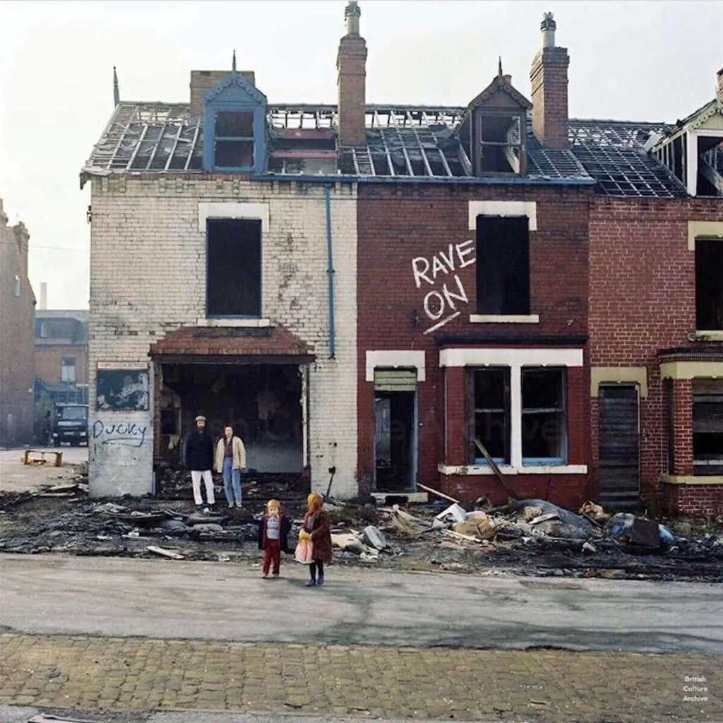
Image Analysis
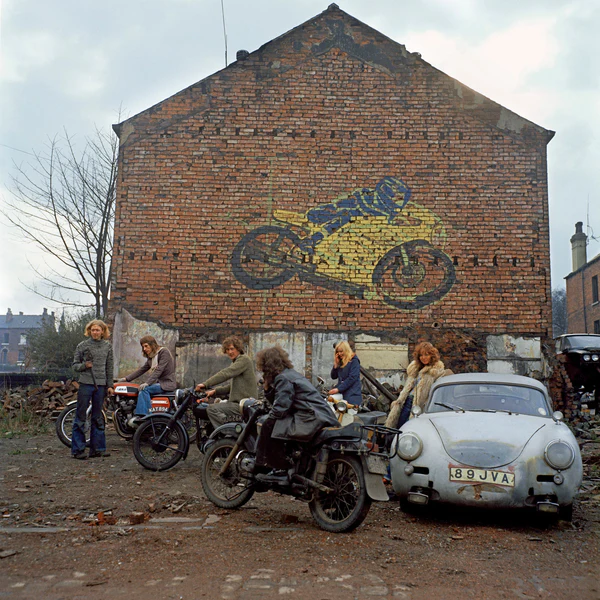
Mitchell’s photography tells a story, he uses visual imagery to portray meaning, he knows what aesthetic he wants and how to achieve it. He does this by how and when he chooses to shoot his photos, for example the photo above has been taken on what looks like a cloudy maybe even rainy day, which creates an atmosphere surrounding the image, and pulls on people’s emotions. Mitchell knows what he is doing here. He has photographed a group of bikers, who already have a reputation of bringing trouble wherever they go, and Mitchell has added to this by photographing them under vandalism and a grey sky. He has used over exposure to create a lighter sky and make the blacks darker. This image has been shot with a wide lense, which shows a whole entire view of the situation, to ensure the whole story is being told.
What Is A Landscape?
All the visible features of an area of land, often considered in terms of their aesthetic appeal, a format of printed matter or screen display that is wider than it is high. It consists of the geographic features that mark, or are characteristic of, a particular area. The term comes from the Dutch word landschap, the name given to paintings of the countryside.
Fay Godwin
Fay Godwin (17 February 1931 – 27 May 2005) was a British photographer known for her black-and-white landscapes of the British countryside and coast.
Composition in Landscape Photography
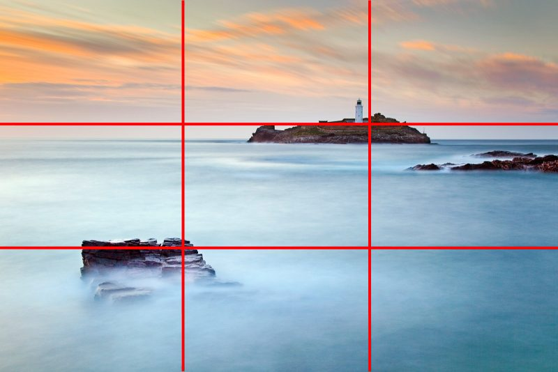
The Rule of Thirds is very simple. Just imagine a grid of 9 rectangles on your image and try to compose the photo so that the main points are situated on those lines – or better still at the point where two lines intersect. Generally, when following the Rule of Thirds, I would aim to place the bottom of the horizon on the top third line (occasionally the bottom third) and put a focal point on the top left or top right intersection of thirds. I would then try to find a secondary point of interest and place that on the diagonally opposite intersection of thirds. This creates a diagonal within the photo which tends to add depth.
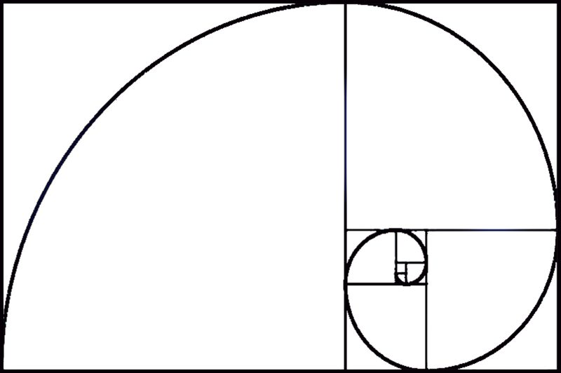
he Golden Ratio can be seen in nature and it has been used by us, either consciously or subconsciously, in architecture and art dating for a long time. When key elements of a painting, building, or photograph are positioned in the Golden Ratio they are thought to be as aesthetically pleasing as possible.
Perspective in landscape photography
The height also gives an important perspective in a landscape scene, there are two dominant zones: the ground and the horizon. The closer a photographic element is to the horizon, the more distant and smaller it will appear. The closer an element is to the lens, the further away from the horizon, the larger it appears.
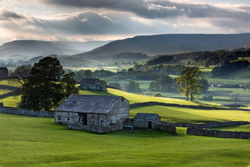
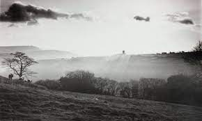
We are probably all aware of the impact of atmospheric perspective without necessarily ever having thought about it. It is most obvious in scenes where we can see a long way. Notice how, in the above photo, the landscape features become less well defined as we progress into the distance.On very clear days distant hills might look closer than normal, an illusion created by the clarity with which we can see them but, when compared to foreground, distant landscape features always look less saturated and have less contrast, giving them a slightly hazy, often blue, appearance.
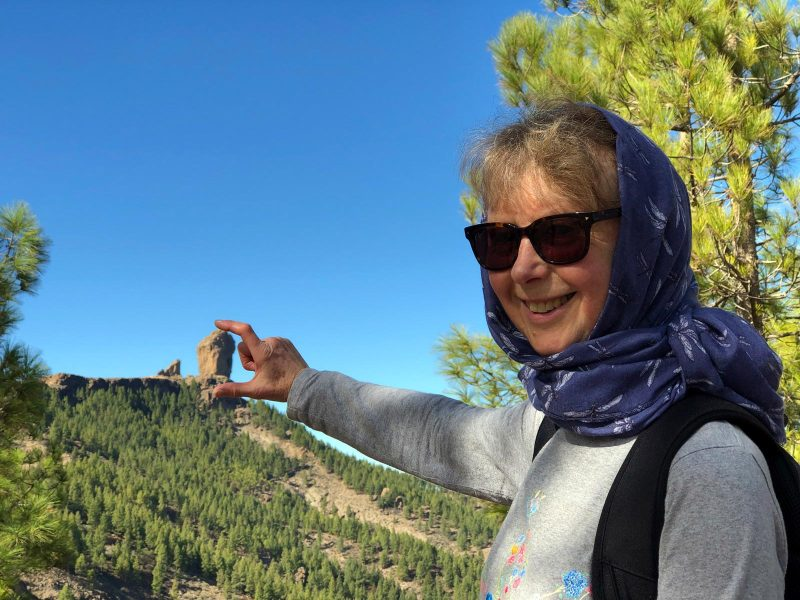
Even without atmospheric perspective, we would still interpret interlocking hills as a feature of a 3-dimensional scene. We know that where one hill slope is broken by another we have an overlap of features, and one is nearer than the other.But this type of perspective is often used to create illusions, such as having someone nearer the camera, effectively leaning against the top of a tall building or holding a distant object in their hands.
Depth in landscape photography
You already know how to get more depth of field, you stop down the lens aperture. Stopping down a lens to smaller apertures means more of the view will be in focus then if shot with a wider aperture.Having foreground interest goes hand in hand with the previous tip, or you can implement this technique on its own. Foreground interest tends to make a view as though they are part of the image, since the foreground element may be seen as a substitute for the viewer.
A leading line brings the viewer somewhere. Depending on intent, you can lead the viewer from one side of the image to the other or it can lead the viewer deeper into the photograph.
A tool for creating depth in landscape photos that may not be completely obvious is adjusting exposure and also contrast levels from light to dark or vice versa.
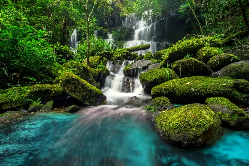
The way this works often depends on the percentage of light to dark, how extreme the difference, and where in the photo we place the differences. This is similar to the previous tip about light to dark and vice versa, simply using color differences instead.
Scale in landscape photography
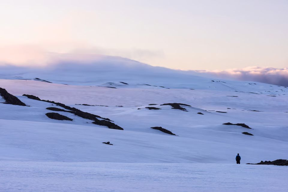
Perhaps the most common way to show the size of a grand landscape is to include a person for scale. Some find this technique overused, but there is a reason it is so popular — people are easy to find. In the same way that it is easy to judge the size of people in a landscape, other animals also are quite good at providing a sense of scale to your photos. Of course, it is difficult to find a beautiful landscape with picturesque wildlife in the same frame — which is why it is easier to use people for scale, if that works for your image.So far, I have discussed the living creatures that can provide scale to a scene — people, wildlife, and plants — but nonliving structures can do the same job. Everything from roads to houses can be incorporated into a landscape photo, and they make it possible to demonstrate the size of the scene as well. Though not as exact as including objects for scale, it also is possible to compose your photos in a way that shows the size of your scene. Sometimes, this isn’t feasible — for example, it can be impossible to show the size of a distant sand dune without including an object for scale — but other landscapes can be put into perspective simply by the way you frame your photo.
Light in landscape photography
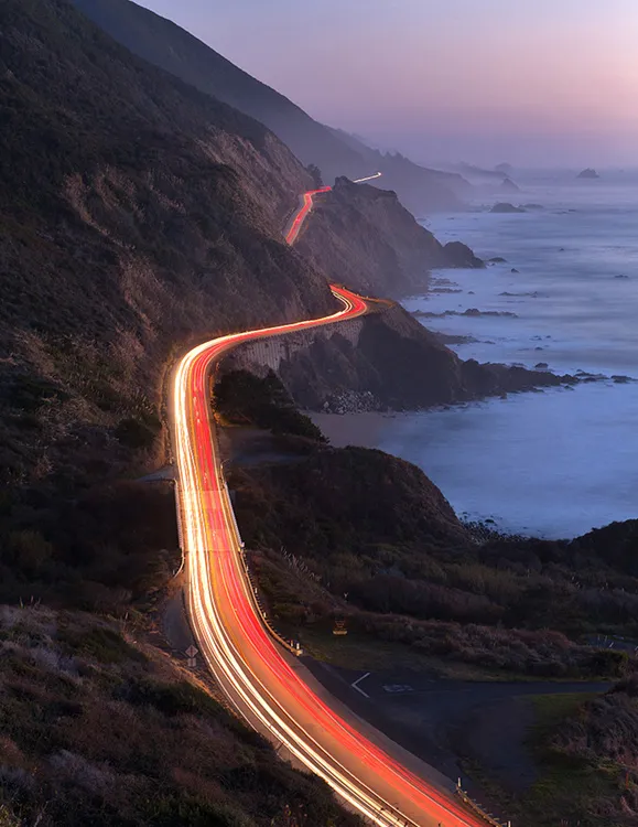
Landscape photographers talk about two essential lighting characteristics: the quality and the direction. Lighting quality refers to the hardness or softness of the light, where soft light produces limited shadows and saturated colors, while hard light adds lots of contrast and heavy shadows.And lighting direction refers to the direction at which the light strikes your subject. For instance, noontime sunlight hits the subject from above, evening sunlight hits the subject from the side, etc. Reflected light, also called bounced or diffused light, occurs when direct sunlight reflects off an adjacent surface. It can make for stunning photos, thanks to its soft, even, beautiful effect.Light on overcast and foggy days is soft, subdued, and bluish. Shadows are negligible, and light directionality essentially disappears.Note that you can have partial backlighting, when the sun comes from roughly behind the subject, and you can have total backlighting, when the sun beams out from directly behind the subject. You can also use human-made light to carefully illuminate subjects with a flashlight (this technique is known as light painting).
Colour in landscape photography
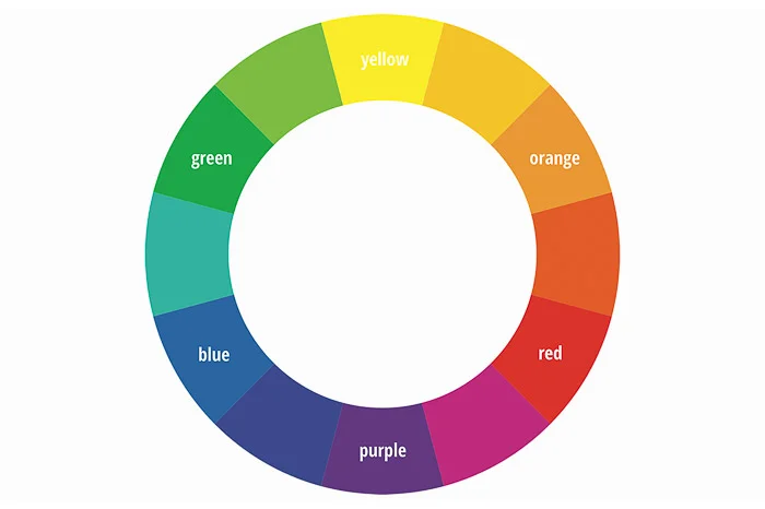
Colors have different psychological associations. Different combinations of color determine how we comprehend a photograph. For example the harmonious combination of blue and green cultivates a relaxed atmosphere. The color wheel contains all the colors in a readable format.All creative applications of color exist within the color wheel. This allows photographers to refer to the tool as a handy guide. Here is a version below.
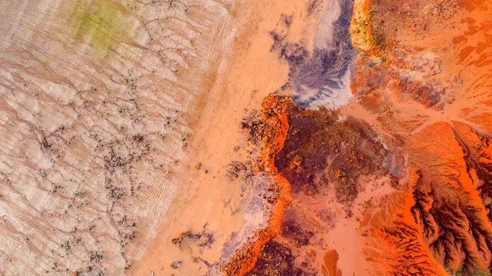
You can use analogous groups like autumnal reds, vermilion, and oranges in landscape photos. Or you can use marine greens, teals, and blues. These create depth and visual resonance.
Shadow in landscape photography
The visualization of a photograph, whether it is a landscape or not, arises from the creative intention of the photographer, which in turn leads to the framing of the composition. From there, the choice of the quality of light (e.g., the directionality and color temperature) provides the photographer his or her most powerful tool to translate that artistic vision into reality.
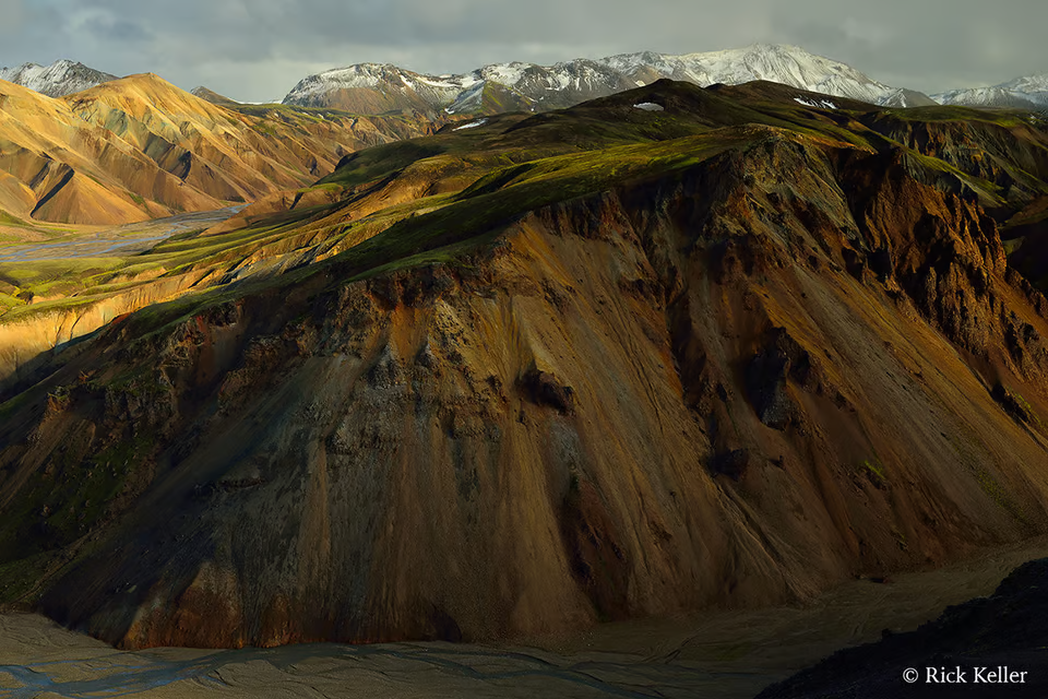
Texture in landscape photography
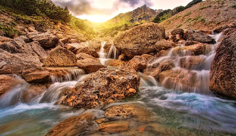
Textures are all around us; especially in the natural world. By paying close attention to the details found in nature, you’ll be able to incorporate textures into your photographs more easily.One way to make a big impact with texture is by looking for contrast. Whether it’s soft, billowing clouds contrasting with rugged trees and mountains, or a smooth, flowing river and rugged rocks, look to combine contrasting textures for maximum visual impact.
Tonal Values in landscape photography
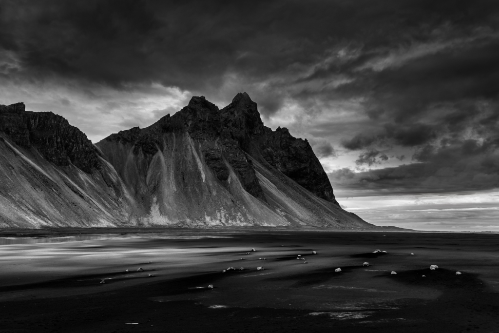
Tonal range in photography is the brightness levels of light captured by your camera. This can range from pure blacks to pure white and shades of grey in-between. An image with a wide range of tones will have pure black to pure white in your image. A small or narrow range of tones will include a smaller range from shadows to highlights, no pure white, or no pure black, or neither black or whites. The brightness levels within your photo also determines the extent of contrast. If you capture an image with a small range of tones, the overall contrast will be flatter vs. a larger range. In post-processing, you can increase the range of tones to add more contrast by stretching the image to the outer edges… by adding pure black and pure white.
How can landscape photography portray meaning?
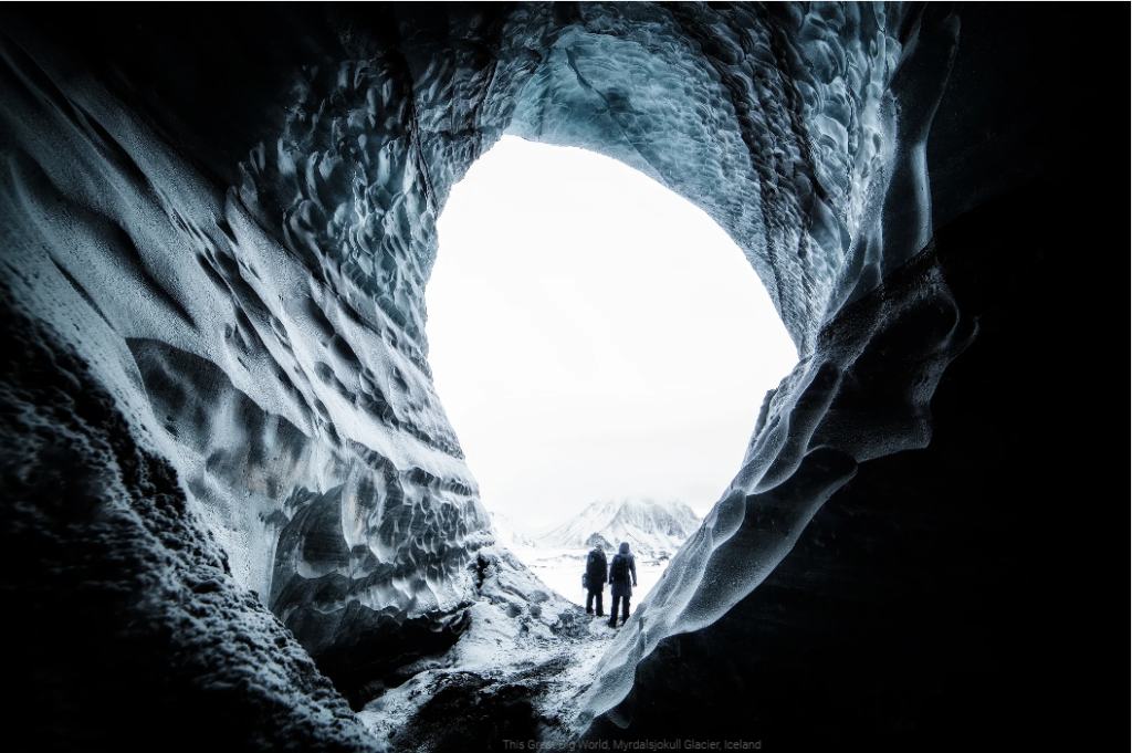
Creating emotion is very important during landscape photography, it can portray an emotion with a dramatic and drastic scene. These photos are the ones that draw people in, making them feel like they are within the story line and immersed in the image. Lighting and weather is a really big one when it comes to portraying emotion within a landscape, weather can heavily instantly affect a persons mood and attitude towards a photo. If a landscape photo is taken in the rain it will instantly change a persons attitude to be more gloomy and sad, whereas the sun generally brings out the best in people.
The Background Of Ansel Adams
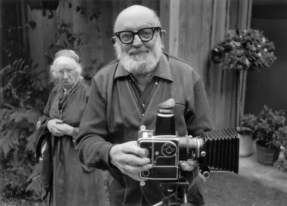
Ansel Adams was an American landscape photographer, and environmentalist, known for his black-and-white images of the American West. When Adams was only four, an aftershock of the great earthquake and fire of 1906 threw him to the ground and badly broke his nose, distinctly marking him for life. He was not successful in the various schools to which his parents sent him; consequently, his father and aunt tutored him at home.The most important result of Adams’s somewhat solitary and unmistakably different childhood was the joy that he found in nature, as evidenced by his taking long walks in the still-wild reaches of the Golden Gate.
Monolith, The Face of Half Dome
The Story Behind The Image – On the chilly spring morning of April 10th, 1927, Ansel Adams set out along Yosemite’s LeConte Gully to capture an image of the striking sheer face of Half Dome, one of Yosemite National Park’s most iconic natural features.The photograph he made, shows the mountain rising from an ink-black sky, its face illuminated by a dazzling midday sun just out of frame. Though Ansel initially made an exposure using a yellow filter, he immediately swapped that for a dark red filter, which darkened the sky and produced the deep shadows and bright light we recognize in the final image. Today, the image stands as not only one of Adams’ finest works, but as a lasting and iconic depiction of one of the most unique spots in the American wilderness.

What Is The Zone System
One does not hear much about the origin of the Zone System anymore. Many of us shoot with digital cameras and no longer use a spot meter or full manual exposure mode for that matter. My advice is to take a bit of time and learn why this vital technique, formulated by Ansel Adams and Fred Archer in the late 1930’s, played such a crucial role in their work. Although the technique originated for use with black and white sheet film, the fundamental lessons can be carried through to digital work, and can help you compose for best results today.Ansel Adams wrote a deeply descriptive book detailing the Zone System called The Negative, which can be found on Amazon. It takes the reader on an in-depth journey into the Zone System.
How To Use The Zone System
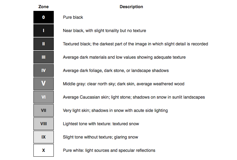
The 11 zones in Ansel Adams’ system were defined to represent the gradation of all the different tonal values you would see in a black and white print, with zone 5 being middle gray, zone 0 being pure black (with no detail), and zone 10 being pure white (with no detail). Theoretically, each zone represents one f-stop in exposure. You’ll also notice there is then an 11-stop difference between pure black and pure white, with a 7-stop difference between the darkest black with detail and the lightest white with detail.
The American West
In his autobiography, Adams expressed his concern about Americans’ loss of connection to nature in the course of industrialization and the exploitation of the land’s natural resources. He stated, “We all know the tragedy of the dustbowls, the cruel unforgivable erosions of the soil, the depletion of fish or game, and the shrinking of the noble forests. And we know that such catastrophes shrivel the spirit of the people… The wilderness is pushed back, man is everywhere. Solitude, so vital to the individual man, is almost nowhere.”With increasing environmental degradation in the West during the 20th century, his photos show a commitment to conservation.
Group f/64
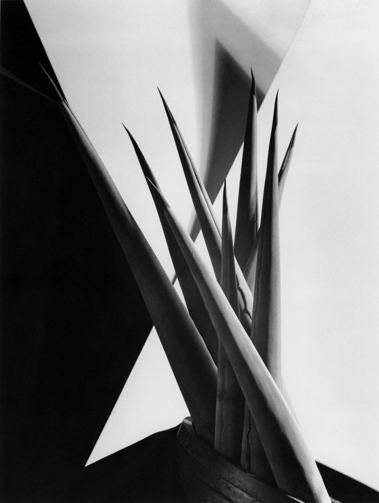
Group f/64 or f.64 was a group founded by seven 20th-century who shared a common photographic style characterized by sharply focused and carefully framed images seen through a particularly Western (U.S.) viewpoint. In 1932, Adams helped form the anti‐pictorialist Group f/64, a loose and relatively short-lived association of like-minded “straight” or “pure” photographers on the West Coast whose members included Edward Weston and Imogen Cunningham. The modernist group favored sharp focus—f/64 being a very small aperture setting that gives great depth of field on large-format view cameras—contact printing, precisely exposed images of natural forms and found objects, and the use of the entire tonal range of a photograph. Group f/64 limits its members and invitational names to those workers who are striving to define photography as an art-form by a simple and direct presentation through purely photographic methods. The Group will show no work at any time that does not conform to its standards of pure photography.
The emotion his images make you feel
Ansel Adams images are generally dark and dim, he uses the zone system and takes photos of mainly the American West. He did this to express his concern for the loss. So he used his images to create a feeling, to portray to people his specific concern. He has used imaragy as a outlook, and as a way of processing what he is going through. He uses it to put his emotions on other people, he wants to make people feel how he feels. He is letting people in on his emotions in an artistic way.
The Age Of Enlightenment (1700-1800) VS The Age Of Romanticism (1800-1900)
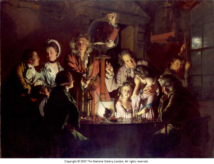
Artists and Writers rejected the notion of enlightenment, which was also known as the age of reason, meaning everything was thought about theoretically, there was an intellectual and philosophical movement that occured in Europe which had a global effect. “the pursuit of knowledge obtained by means of reason and the evidence of the senses, and ideals such as natural law, liberty, progress, toleration, fraternity, constitutional government, and separation of church and state”
The shift, in short, Romanticism seeks to find the role of the individual in a chaotic and mutable world, while the Enlightenment looks for the empirical and justifiable strictures of such a world. The Enlightenment stressed reason as to the key of truth, whereas romantics emphasized feelings and emotions as the source of knowledge. Romanticism was a revolt against the aristocratic social and political norms of the Age of Enlightenment and also a reaction against the scientific rationalization of nature. Romanticism legitimized the individual imagination as a critical authority, which permitted freedom from classical notions of form in art.
The Meaning Of Romanticism
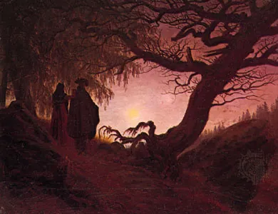
Put simply romanticism is ‘describing and portraying things in an emotional way rather than a intellectual way’. It may even be described as admiring the true beauty of nature, a general emotion over reason. Many Romantic ideals were first articulated by German thinkers in the Sturm und Drang movement, which elevated intuition and emotion above Enlightenment rationalism. Romanticism placed the highest importance on the freedom of the artist to authentically express their sentiments and ideas. A glorification of elements, a spiritual higher power side of describing and meaning, leaving things up to the gods and letting nature carry its way rather than looking into everything.
Examples
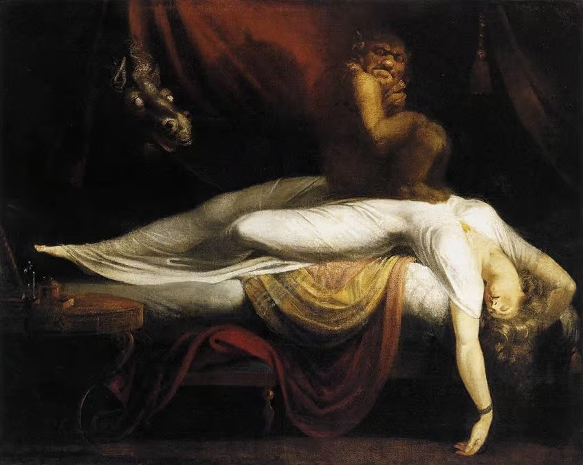
Henry Fuseli’s Romantic artwork, The Nightmare, was the first of its kind making Fuseli somewhat of a transitional figure– leading the progression of art from The Age of Reason to Romantic-era art. The woman has her arms stretched below her, with a demon-like incubus crouched on top of her, glaring threateningly at the viewer. Partially hidden, we see a mysterious mare with bewitching white eyes and flaring nostrils. In Fuseli’s ghastly portrayal, he paints the woman in an idealized manner, which coincides with the principles of Neoclassicism. (Neoclassicism was a Western cultural movement in the decorative and visual arts, literature, theatre, music, and architecture that drew inspiration from the art and culture of classical antiquity)The Nightmare frightened and shocked its audience when exhibited at London’s Royal Academy. It was unlike anything the public was used to seeing, as the subject matter was not taken from the bible or a moment in history, nor was it created for the sake of moralizing the viewer.
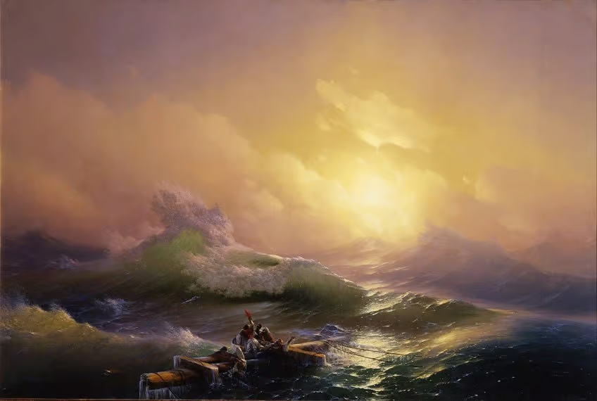
The painting depicts massive waves sweeping across a volatile ocean. The wreckage floats in the painting’s foreground.The figures cling to the debris from the ship, in the face of death they attempt to save themselves. It is suggested that the wreckage forms the shape of a cross, indicating a religious undertone in Aivazovsky’s work. This work serves as an allegory, according to Christianity, for salvation from sin.The palette of the painting utilizes warm tones, diminishing the ferocity of the sea and conveying a sense of hope and a chance for survival. Aivazovsky masterfully demonstrates the beauty and devastation of nature.
Final Lighting Techniques
I have produced three final lighting images for my mock project, I have used a range of different lighting within the studio and a range of different lighting experimentations.
Photo One~
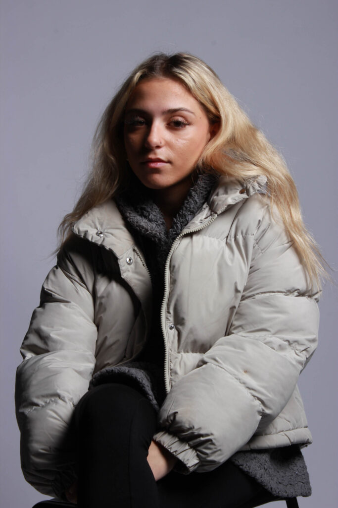
This first photo is an example of using softbox lighting, by having the light placed above the models head it creates a shadow across the models face and allows for a very bright lighting. This photo is also an example of a three-point pose where you can see from above the thigh of the model but not the feet.
Photo Two~
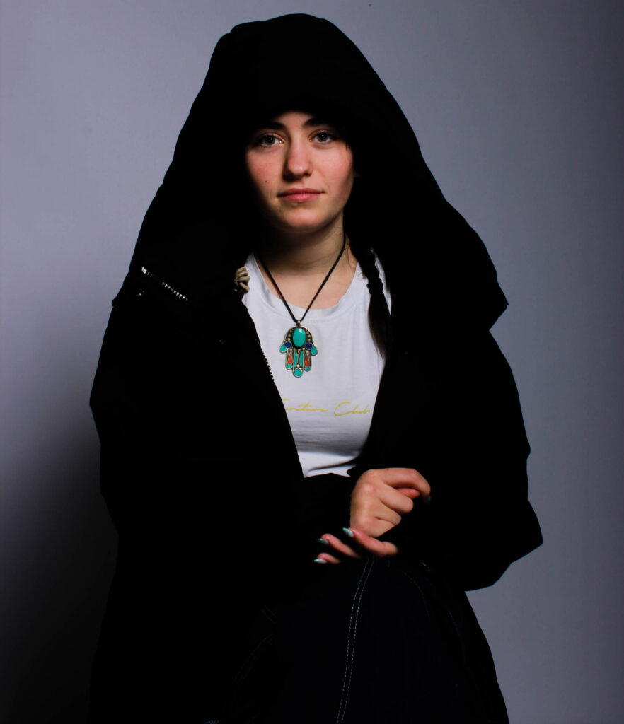
This photo is another example of soft box lighting but with the model looking straight at the camera creating a further personal effect, this creates a personal attention between the person looking at the photos .
Photo Three~
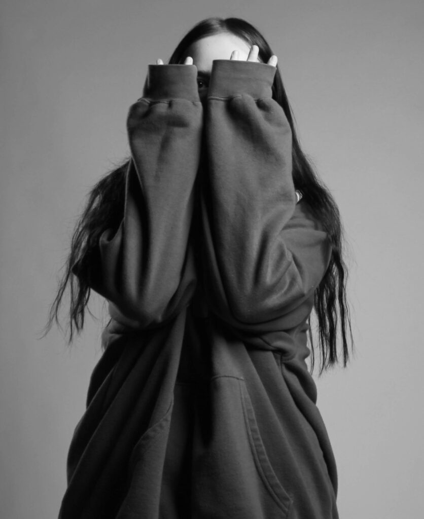
I edited this photo to be in black and white to create a more vague effect, to allow the mind to think, you can see the different lightings within this self portrait on the crevices in my jumper.
Final Masculinity and Femininity
Femininity and masculinity is a very hard thing to pick up just generally on a camera, there is so much baggage that comes with either/or so I have tried my best to represent this in a in depth story telling way.
Photo One ~

I have chose this photo as one of my final outcomes due to its display of the beauty of being feminine rather than all the baggage that comes with it, a woman’s mind generally goes both ways when a male starts talking about femininity, either wondering if there about to display sexism and sterotypical explanation’s or whether theyre going to talk about the beauty of being a woman. I feel like there is so much negativity around girlhood and womanhood so I’ve decided to try my best to portray the fun within it. The stereotype that only females can wear makeup has been around since makeups birth, and many people either frown upon this or agree, I have captured my model doing her makeup (lip-gloss), to show just how much fun something like makeup can be. Many people (mostly men) shade on makeup claiming that nowadays a woman’s beauty can be removed with ‘one wipe’, and so what? Woman have been denied fun all their lives, being shoved into stereotypes of cooking and cleaning, and when makeup was created this changed the lives of women and girls all across the globe, this is why I have captured my model in a very girly lit environment, not only to juxtapose her and her surroundings’ but also to create ambient lighting to portray the mood of female empowerment and all the happiness that comes along with it.
Photo Two~
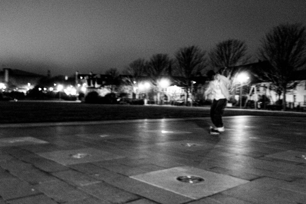
I have taken the opposite approach for my second photo, this photo is aiming to describe what it’s like to be a man. Men are stereotyped to generally not talk about their emotions and that would make you ‘feminine’, so i have tried to capture this by photographing the ‘lone skater’. Men are known for being ‘alpha’ and like they should always have one foot forward and planning ahead, for example they should provide for the whole family, and although this may give them a purpose in life this may not be what they were personally born to do. Men have hobbies too, such as skating,skating is generally seen as masculine as its a sport of throwing yourself around, but i wanted to capture skating as a breath of fresh air, something to free a males locked up mind, by skating you can take all the pressure off your head and do something that they enjoy, I have seen men be shamed for doing what they want to do instead of fitting into their own stereotype, so i wanted to portray this as a sadness, a lone sadness, like males cant have fun with their friends but instead have to roam alone. I have put this image in black and white to use the darker colours to portray the meaning behind the image, the scariness and loneliness like theres no one around to lean on.
Photo Three~
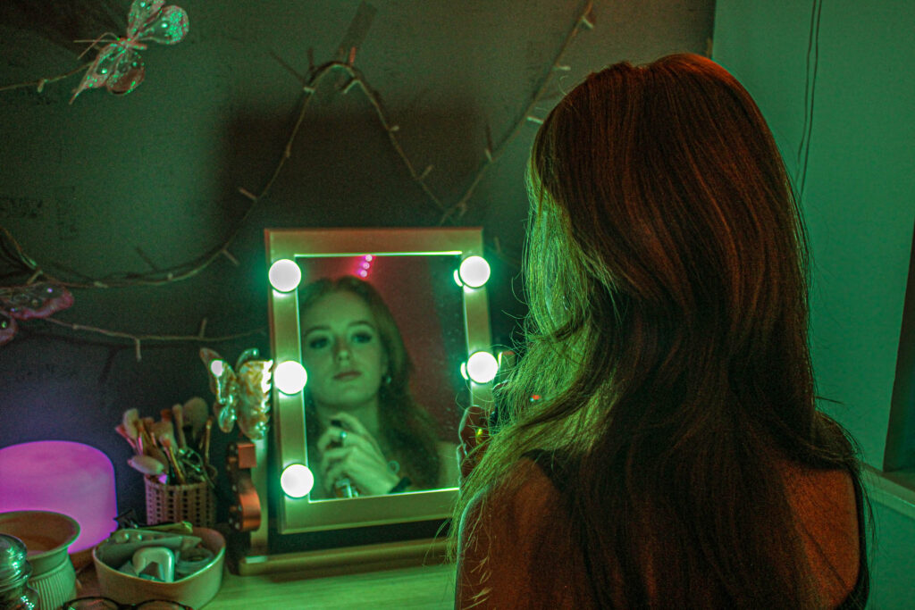
I have tried to make this feminine photo more masculine by adding a colour tint to the image, I chose the colour green which is typically related with masculinity to create a sense of incongruity. I wanted to capture the beauty of being a female and how many fun things you can do that ‘males cannot’, such as makeup and looking pretty spending hours getting ready, to prove that we literally just do it for ourselves and not for men.
Photo Four~
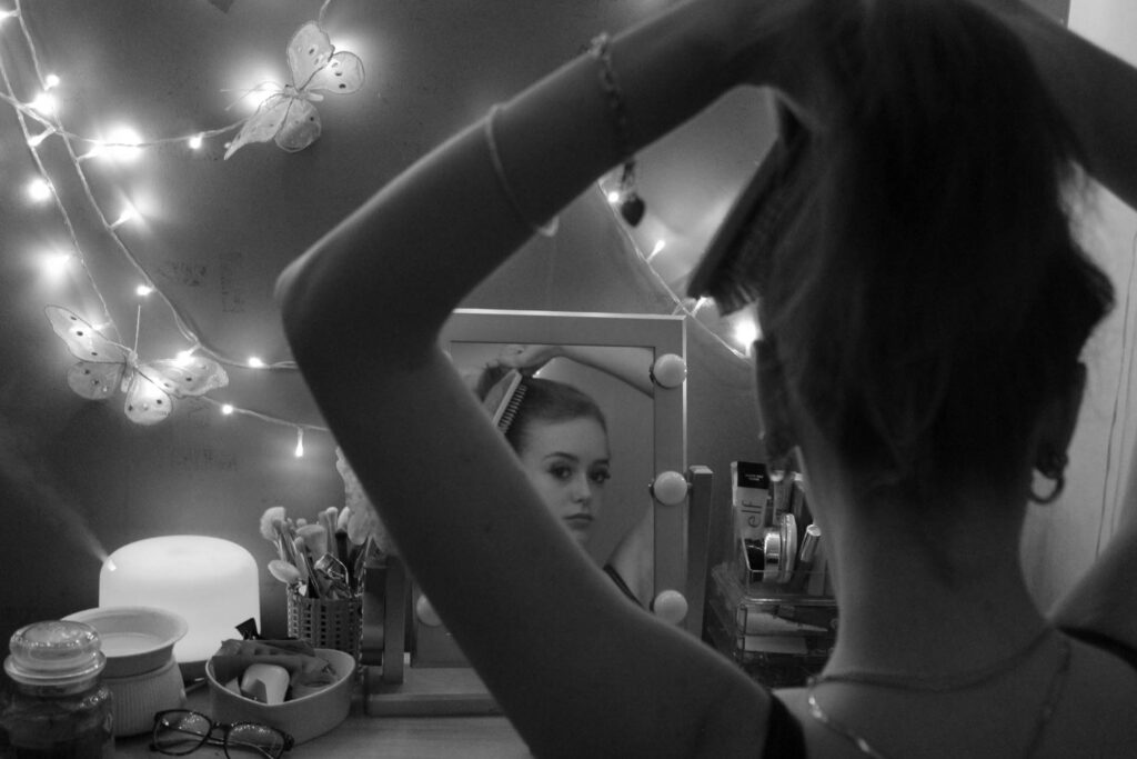
Final Environmental
An environmental portrait is executed in your characters personal environment, it’s the beauty of finding a model and snapping a photo of them doing what they love most to tell a story, this is why I have chose these two photos as my final images.
Image One~
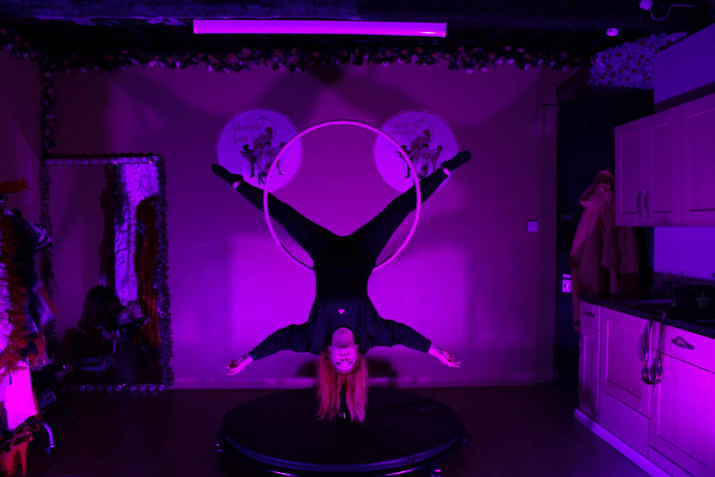
I have chose this full-body shot photo to be one of my final submissions for environmental photography because it tells a whole story. The lighting within this image portrays many different things about this character’s emotions when within their environment the brighter lighting shows emotions of confidence and happiness rather than being hidden in the corner of darkness, the shade of fuschia pink shows the ‘girliness’ of the environment, which coordinates well with subliminal messages being portrayed by items also within the images, such as the flowers around the mirror, the clothing on the clothes rail which is only slightly being captured and much more, this creates an intense ambiance of feminine energy. There are also other concealed things within this photo that tell a story, such as the two business logos he hind my model which display ‘showgirl sass’, a hidden message like this can make you wonder what they are, ‘showgirl sass’ is my character’s business, where she dances and teachers other people her passion. Overall this is a very wholesome photo, which is another reason why I have decided for it to be my final submission. Although the image is quite grainy it almost makes it look more alive, like there is an actual conversation and interaction going on behind and infront of the camera.
Image Two~
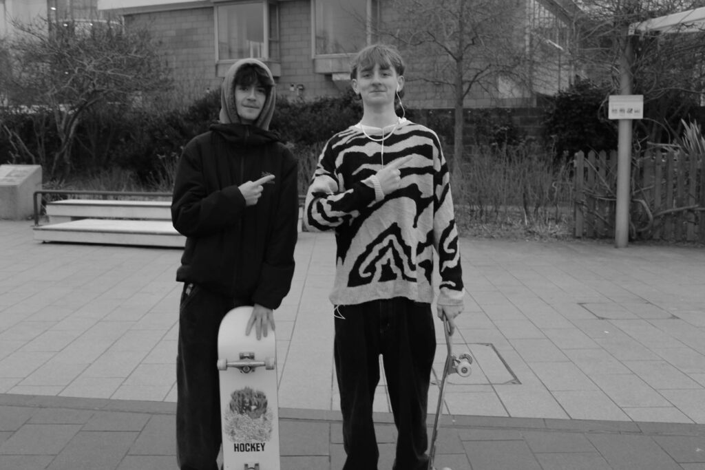
I have chosen this as my second environmental portrait because I love this three-point image, I have edited the photo to be in black and white to keep the main focus on the energy this image is giving off and the pure emotion which is captured within it. This image consists of two friends skating, making valuable memories which they will one day go on to tell their children, which allows this image to portray a story. By having my models smiling it yet again adds onto the sheer raw emotion which has been captured within this image. The lighting I used was the daylight on a cloudy day, and although that may seem gloomy the atmosphere was most certainly the opposite, showing how a good friendship can allow you to be happy even on the darkest of days. This photo creates a sense of stereotype as well, the fact that they are ‘obviously boys skating’ ad not girls and also there ages, skating is generally perceived as a sport for the young which I have portrayed here but this doesn’t mean that it completely vanishes from you when you are older, it’s something that you can teach on, a passion.