All posts by Shelby

Filters

Author:
Category:

Mock Up Of Final Images Anthropocene

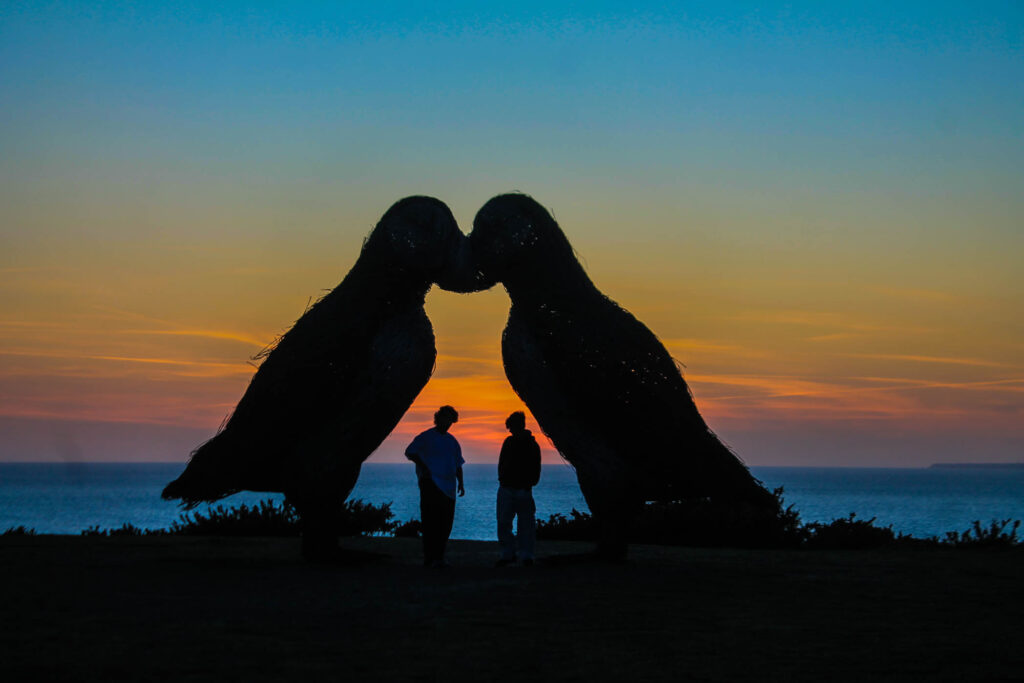
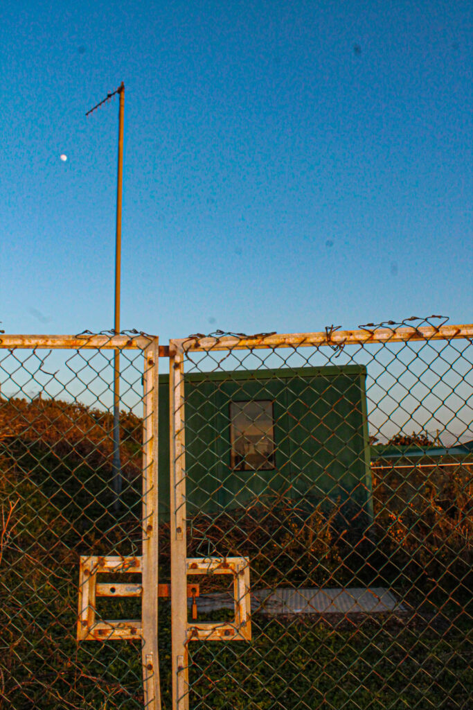
The reason I have chosen to display my images in this way is because they both have the same type of lighting, being natural daylight, with the sun quite low and setting. This gives a less intense look but a vaster tonal range. They are also both taken with a wider angles lens, and are both portrait photos rather than landscape. They have a similar yellowy golden colour temperature which gives them both a warm feeling. I have used foam board to originally mount the 6 pieces of image and then stuck it into black card to create a vast tone between light and dark. This makes the image 3D and gives it a simple repetition pattern, I have jumbled up the composition of the two images with each other, creating a hybrid blend of harmony. This changes a person’s viewpoint of the image, and creates an illusion which people would generally get lost within. By doing this I have combined the history and context of the two images, see one image is of a sculpture of the puffins taken through the gates of a bunker, this contrast the history of the bunker with the futuristic sculpture. Maybe showing that no matter how hard we try to change, and rebuild the earth our past will always follow us. I have contrasted that image with a image of a radio tower taken only a few meters away. I think this portrays irony within trying to save the planet and the animals, whilst literally creating disruption a few meters away. I think this is quite a conceptual image as people really have two look at it to understand and work out how he two images have been put together.

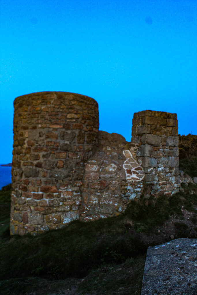
The reason I have chosen to portray these three images in this way is yet again because they all have a similar daylight to them, with the sun setting, and all have that warm feeling. I stuck these images on a big piece of black card after putting them on foam board. There is a 3D pattern to these images, and a lot of space between them but one of the main reasons I have put these together and cut the top right into four is because I wanted to change the harmony, I wanted to disrupt a person’s point of view, and create tension in people’s minds so they don’t actually know where to look first. I think I have achieved this by mixing up the images, cutting it into four and having so many bright bold colours. The reason I have done this is because of a contextual elect, the bottom right image is a photo of an old bunker, and the top right image is a photo of an old castle, whereas the photo in the middle on the left is quite a new and modern structure. This can get people’s minds thinking about the past and the future and the present. It can make them wonder how the damage that we used to leave was just a simple structure whereas now the damage we are leaving is endangering animals.

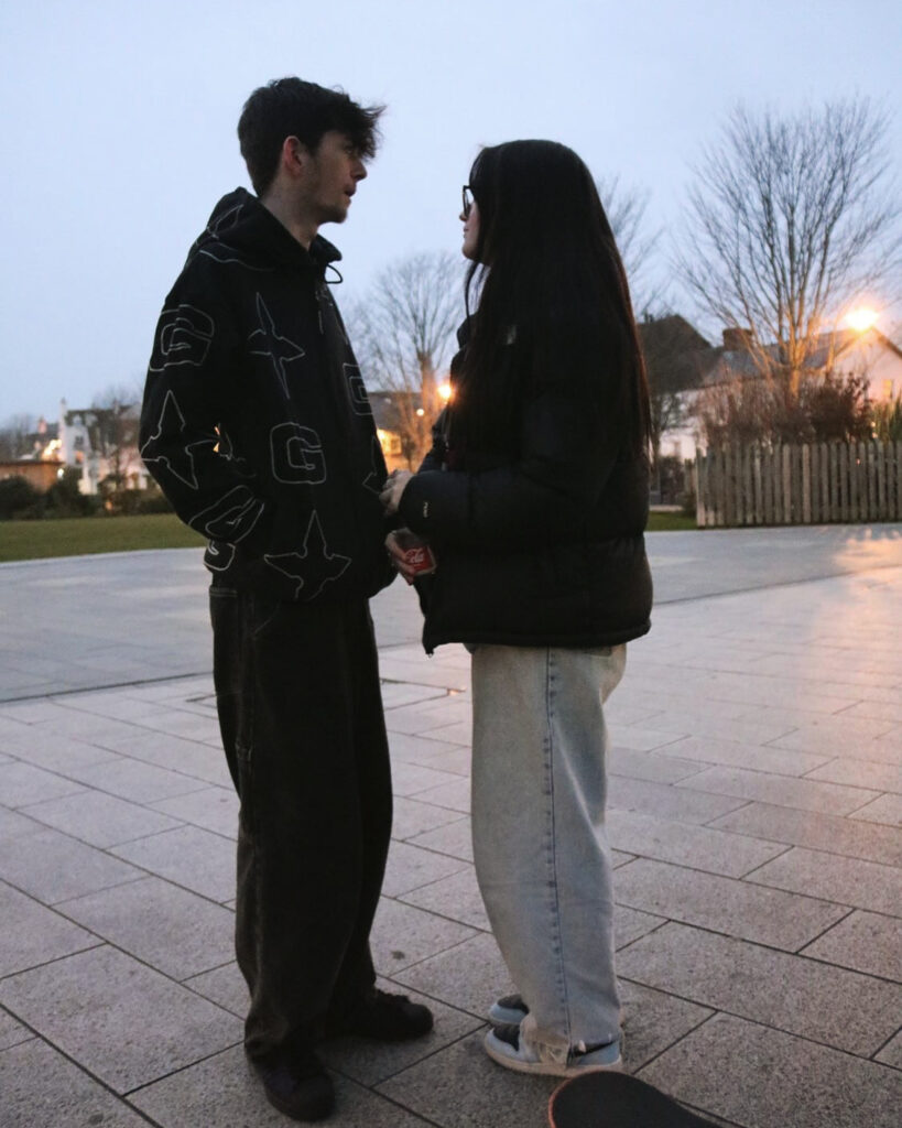
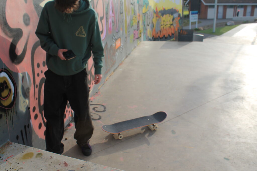
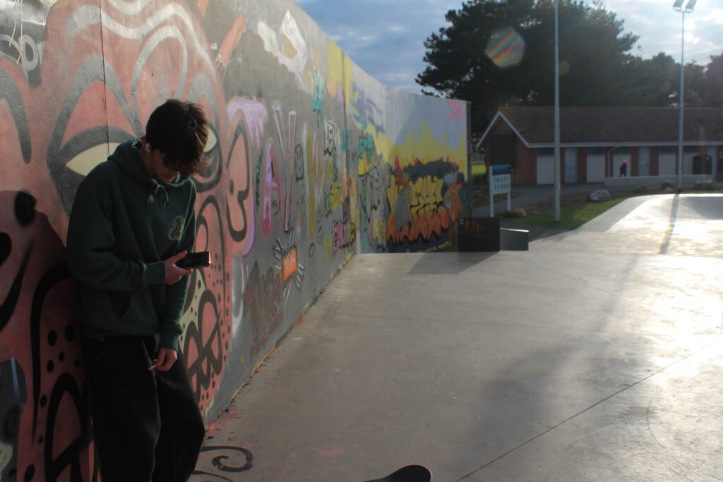
The reason I have chosen to put these two images together is because they have a similar lighting to them, a dimmer gloomier tone rather than my most recent warm pictures. The image on the top left is also under exposed, making the moon look like the sun, although this makes the photo a little bit blurry I think it correlates well with my idea of being left in the darkness. I mounted the images and the text onto foam and then onto black card. This makes them 3D and stand out, I have made no ‘middle image’ so that nothing stands out massively as I wanted both the photos to be equal. The reason I have decided to include text is too add a context to get my point across. I didn’t want these images too just be seen as people having fun and just throwing rocks, I wanted the image too be seen as something more, something like people being lost in the darkness. When you read the description it makes the images quite conceptual and makes your brain think more about the image creating an essence of having to listen to me and my ideas and agree with them, almost brain manipulating humans into changing their ways.

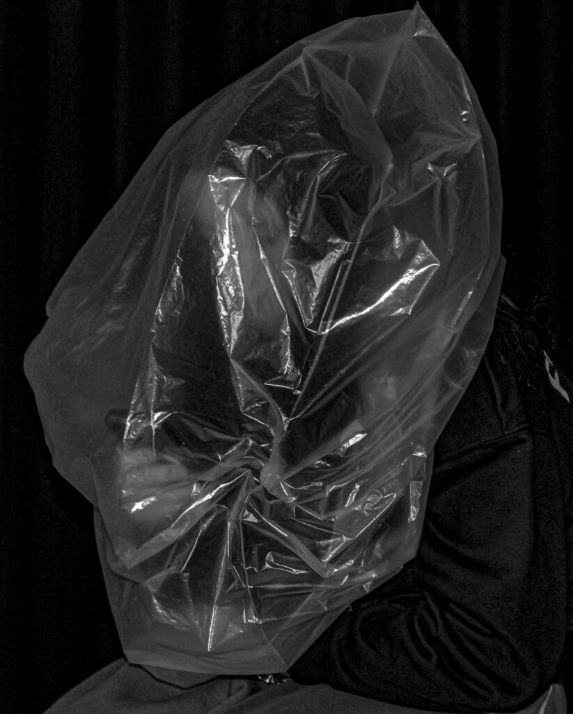
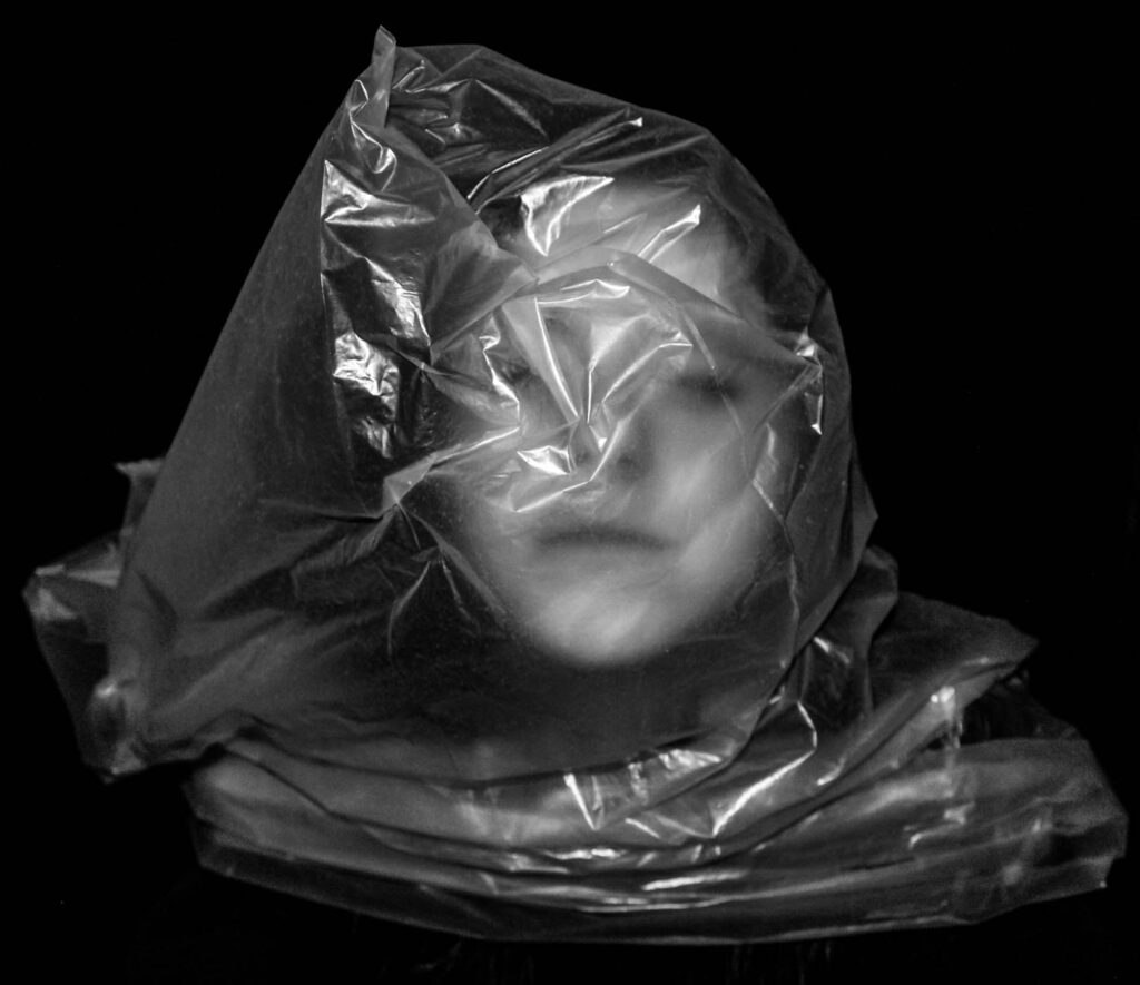
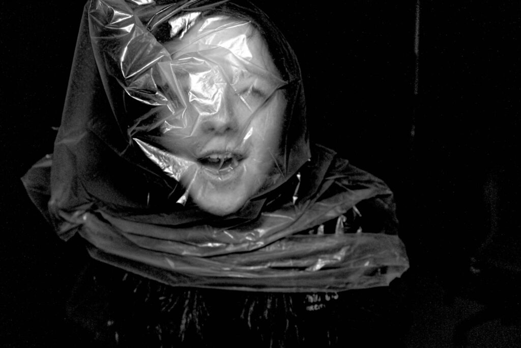
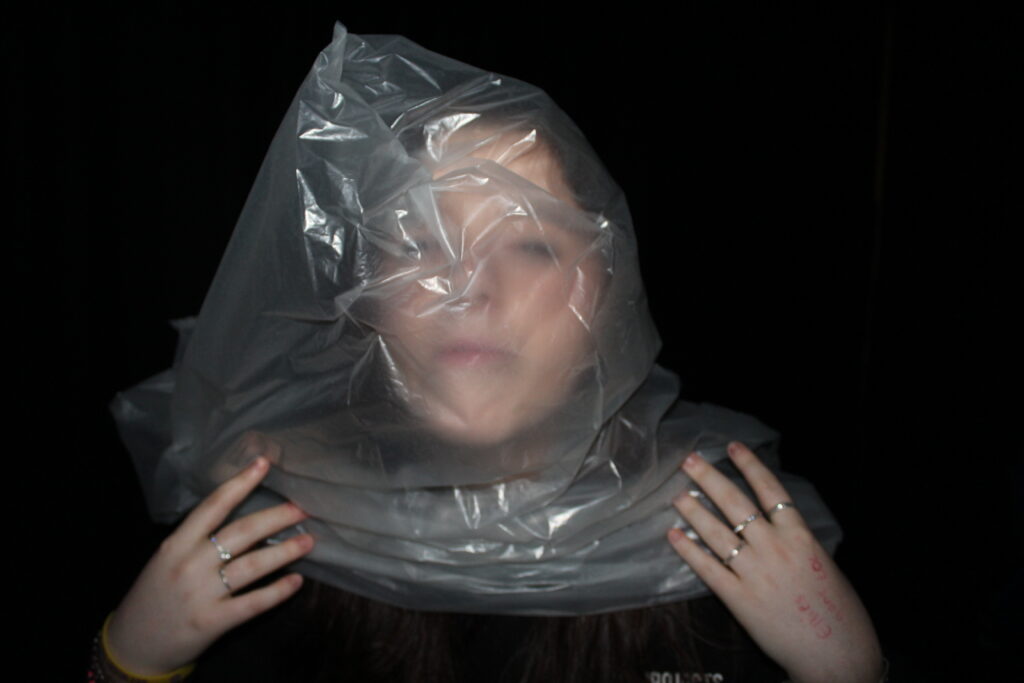
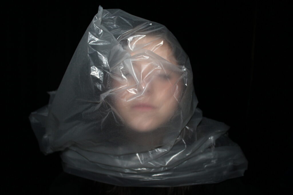
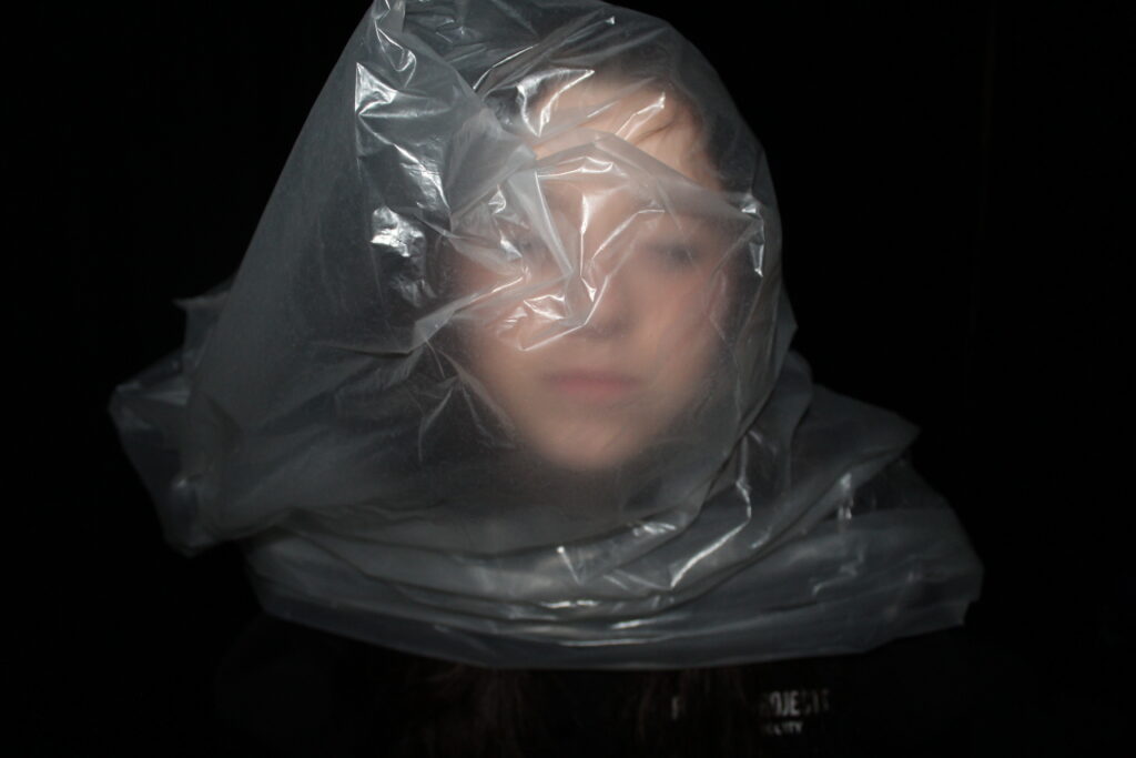
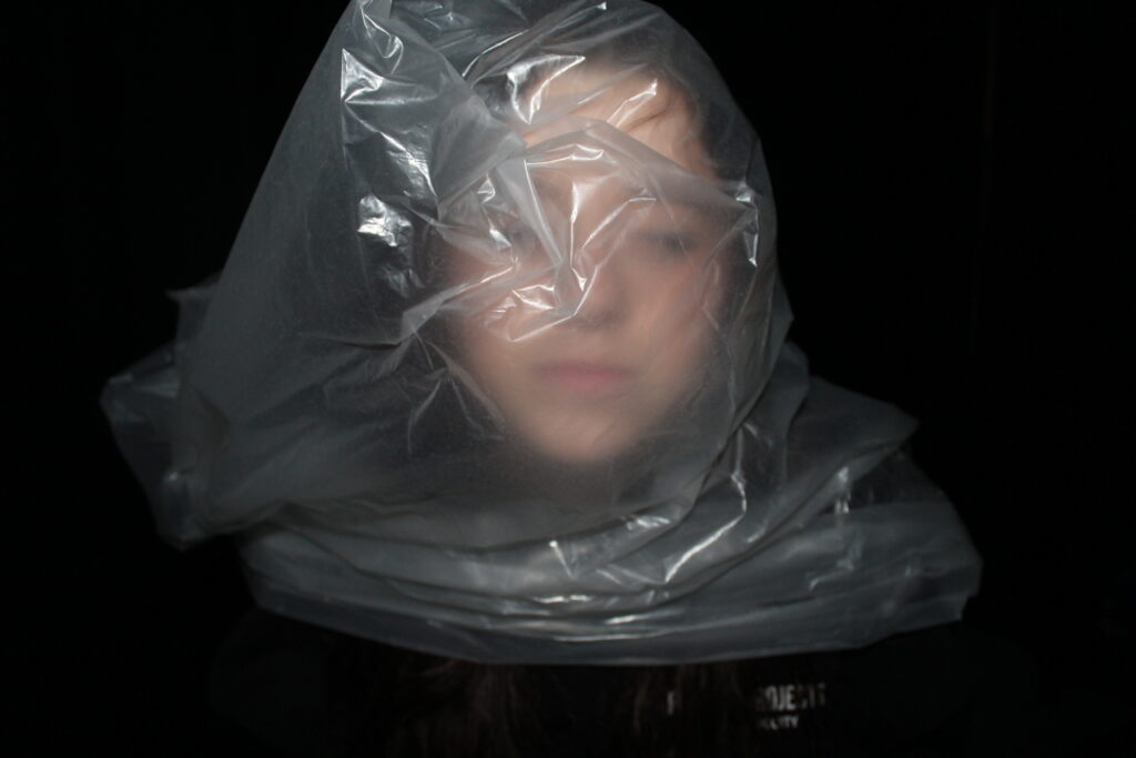
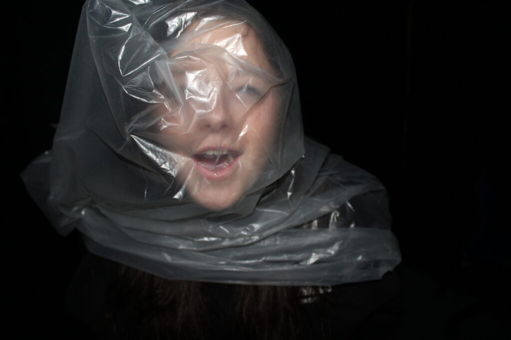
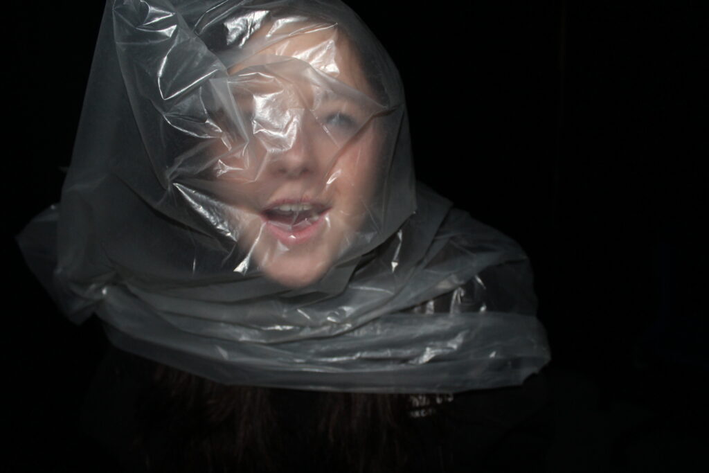
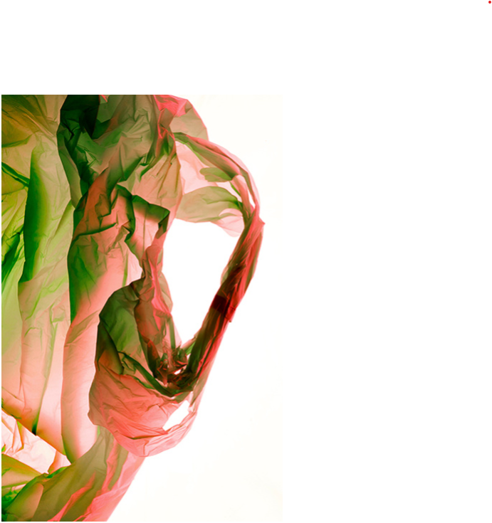
The reason that I have chosen to put these images together is basically because they are all the same thing. They are taken with studio lighting ( flash ) and have a black curtain background creating a massive tonal range. You can see texture within my images, where the paper bag is wrinkled and my model is trying to breath it in. I wanted to create drama, a dramatic piece to embarrass humans as they have done this to animals but just find it insane when it happens to one of them. I think these images are really conceptual as they really get people thinking about how they would like it, and they very clearly wouldn’t, so this embarrses people.

Anthropocene Evaluation To Artist Case Studies

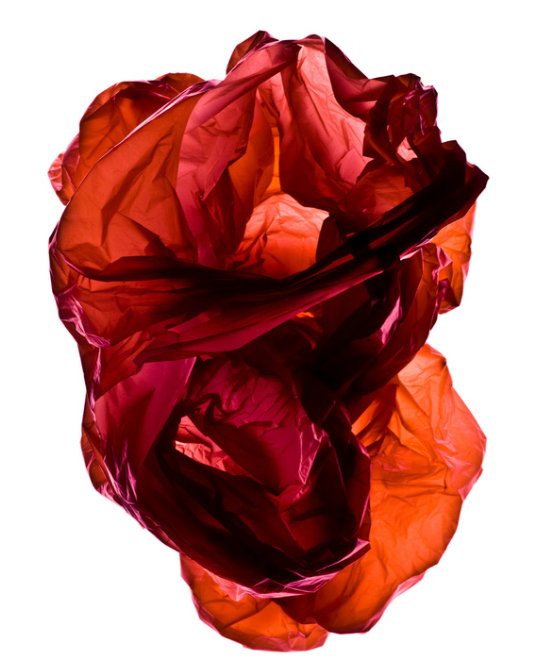
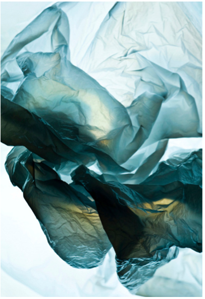
My first artist case study was Naomi White and her Plastic Bags, where she took something so normal and dramatized it to make it portray a feeling.

My response to this was this image –

The reason that I think this image relates to her work so much is because of the use of an ordinary plastic bag, created into something special. She was interested in the way that plastic responds to touch, you can see that my model is breathing in and suffocating herself with the bag portraying how the plastic bag is responding to touch. The main reason I wanted to take inspiration from her was to spread awareness, almost everyone has seen an animal entrapped in a plastic something, in danger and in pain. This doesn’t faze people anymore, whereas something as dramatic as this happening to a person will faze people, this will raise awareness and almost embarrass and scare people, they know that they’ve used many disposable plastic bags before, harming the earth, and will end up feeling guilty for harming an animal now that they see it happening too someone who could be them. Although her images are studio lighting, portrait and on a light box I did keep it similar with the use of studio lighting, keeping it plain and simple.

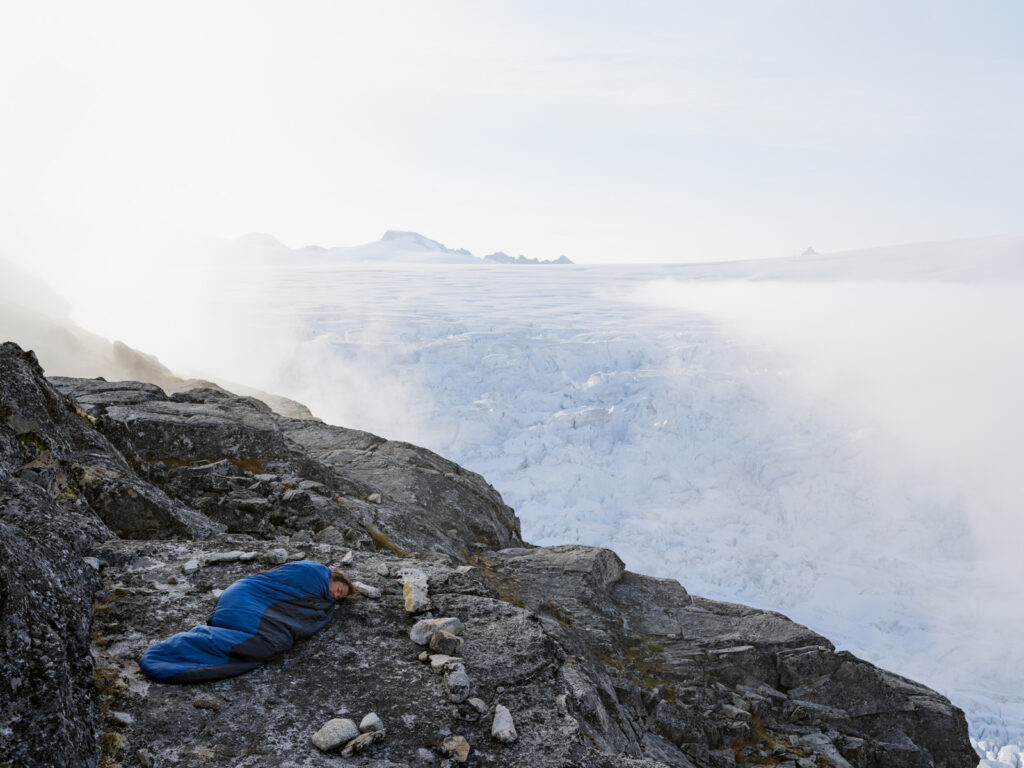
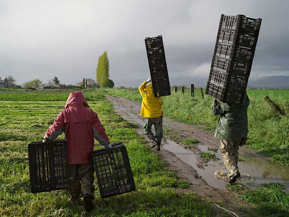
My second artist case study was Lucas Foglia and his ‘human nature’, where he dramatises misuse of the earth’s element’s.

My response to this was this image –

The reason that I think this relates to Lucas Foglia’s work is because it is a dramatic difference. I didn’t take use of how he used elements simply because I thought that would be too difficult for me to do, but instead I took use of his contrast. He usually takes images of humans sat with something very dramatic which can create a huge scare within people, wondering how they ever managed to do that. I have used natural lighting, which portrays the earth like he does and have taken a photo of a new sculptured through the gates of an old bunker dramatising change. Maybe proving that people cannot change their ways, there will always be some type of disruption that they leave behind no matter how hard they try to change.

Anthropocene Final Images

Image 1

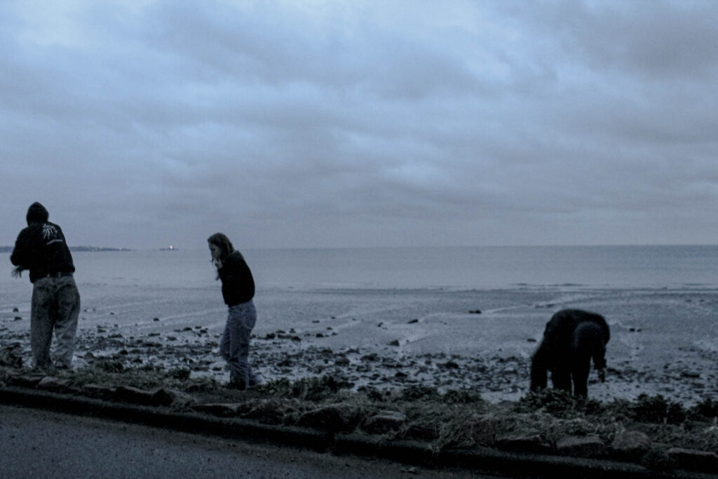
I have chosen this as one of my final images to come out of my anthropocene project, because I think it clearly incorporates one of my artist case studies ‘Lucas Foglia’ this is due to the way he uses natural earthly lighting to create a raw natural imagery effect, as to show the world how it is. He also incorporates a depth of field by having his model close up to the camera compared to the rest of the landscape behind them, I think he uses this to create a conceptual idea of the destroyed vs the destroyer. His images are often 3D, including a lot of textures caused by weather, for example in his images you can see raindrops on peoples clothing, so I have incorporated this by using the wet sand to portray how the tide has just been up and that it is raining. His images are often very conceptual and I think I have portrayed this, by showing a sort of ‘ghost town’ something that may happen in the near future, and how destruction needs to stop.

Photo 2

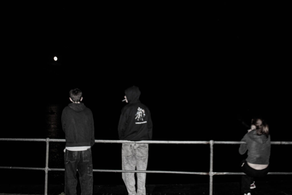
I have chosen this image as one of my final images for basically all the same reasons as the first one, the use of depth of field, 3D texture, and a contextual meaning. But I really like this image as I think it portrays something more, I think it portrays a type of group of people, like no one knows what to do but they all know that about each other, they all know they need to do something. I think this is influenced by the contrast of the moon against the sea, the moon often tends to create a different feeling within peoples heads than the sun, the moon often tends to bring more peace to people’s minds and more comfort. I wanted to use this image as it’s not as harsh as my other ones, and not as much of a blame to humans, but rather a sign and green flag that we are trying to move forward.

Photo 3

The reason I have chosen this image is because I was inspired by Naomi White, Naomi Whites images are of objects, plastic bags under bright lighting, the reasoning for this is because she wanted to turn something familiar into something strange, this is what I also wanted to do. I wanted to take something as familiar as a plastic bag and change it into something strange, I wanted to create an image that people generally don’t want to look at, one that exposes the harsh truth that plastic won’t only end up killing all our wildlife but also us. I have used texture and studio lighting to portray how we will be choking on the plastic bag, or even choking on our words that ‘everything will be fine’.

Photo 4

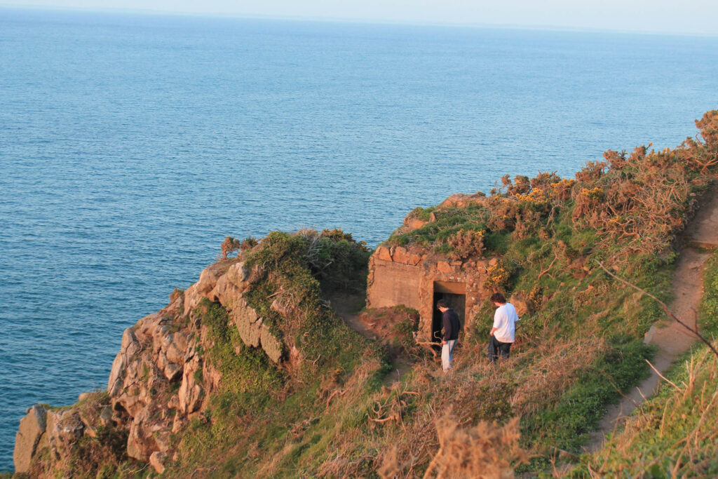
The reason I have used this image is because in a way it relates to lucas foglia’s work, but I have also used it because I wanted to portray the history of the Island compared to now. I took this image up at plemont, where we spotted an old bunker, and they went in and explored while I took images. I think this portrays a massive contrast, of what that bunker would’ve been used for compared to people just using it to explore now. I think that this image is the definition of anthropocene,  ‘humans have had a substantial impact on our planet‘, something made over 100 years ago is still standing, showing how much of an impact we have actually had on the planet.

Anthropocene Virtual Gallery’s

Virtual Gallery One (Plastic Killer)

Anthropocene is used to describe where human activity started to have a significant impact on the planets climate and ecosystems. I wanted to reflect this within this photoshoot by describing how plastic is a killer. Plastic is not biodegradable and is just filling up piles and piles of waste. Many animals within the ocean and on land get caught within this plastic causing them to become seriously injured or even die, you don’t see a fish walking around carrying a plastic bag so why do they have to be punished for our actions? I wanted to create something similar to the work of Naomi White, who takes still life imagery of plastic bags, she has described her reasoning for these photoshoots as ‘taking something from everyday life and making it look strange’. That quote was my main inspiration for my photoshoot. I wanted to take something that we use everyday and portray the dramatics of it, and the fact that these dramatics are happening to living things who didn’t cause the damage but not to the ones who did. I used bold studio lighting so create a contrast between the dark background and the fluorescent bright white light on my models face, this helped really emphasis all the wrinkles within the bag that something could get caught up in, and the fact that my model is inhaling trying to breath through the bag but it is suffocating her. I have also included an image of my model on her phone, whilst inside the plastic bag being unable to breath, this is to portray just how unbothered we are with the damage we have done.

Virtual Gallery Two (Time is catching us)

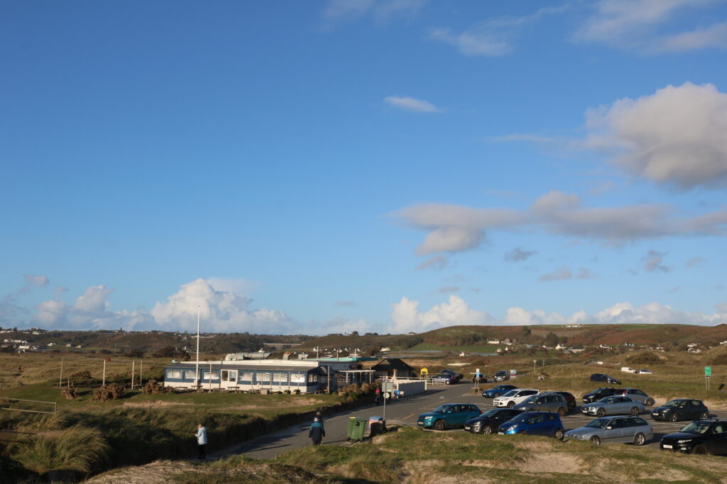
The anthropocene period is also sometimes known as the great acceleration. I wanted to take some imagery whilst the sun was setting to portray how an acceleration will always have a decline. For this photoshoot I went to plemont, where they have a sort of puffin sanctuary in order to portray how they are endangered and we need to save them, but upon my visit I found the place to be almost like a ghost town, no sign of any life at all, not even the noise of birds tweeting, I also found a lot of history such as old bunkers. Therefore I used all the things I saw to portray that our efforts are now not working, the effort of building these big puffins in order to make awareness has now not worked, it is too late and we are running out of time, by incorporating the old bunker and the sun setting it can portray nostalgia and history, that maybe too one day these puffin sculptures will be sat growing moss, deteriorating away just like the bunker. My artist case study reference for this idea was Lucas Foglia, his project ‘human nature’ photographs humans in the strongest of elements, now although I haven’t photographed in very strong elements my inspiration from him was to put the subject in the middle of what they have created. It was to create something bold and frightening to humans, to really open their eyes to what they have done, and explain how time is running out and if we do not take more action it will end up becoming a ghost town. I have used natural sunset lighting, due to its beauty but also its dramatic effect, because as we all know after sunset comes the darkness. I have used composition within my images to put my models up front and center.

Virtual Gallery Three (Sensitivity)

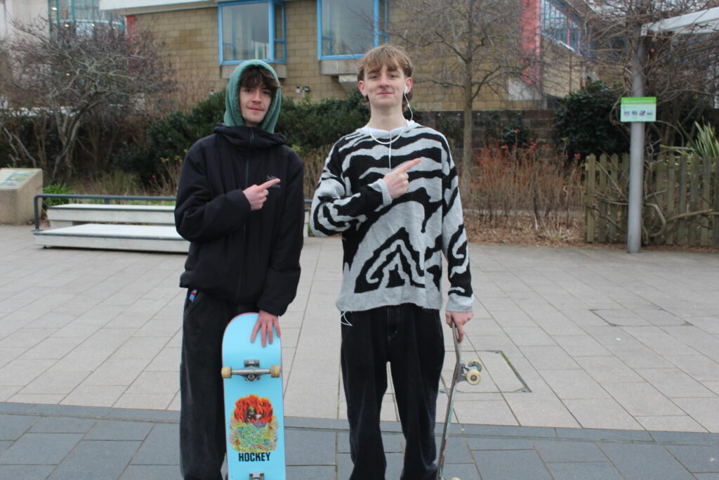
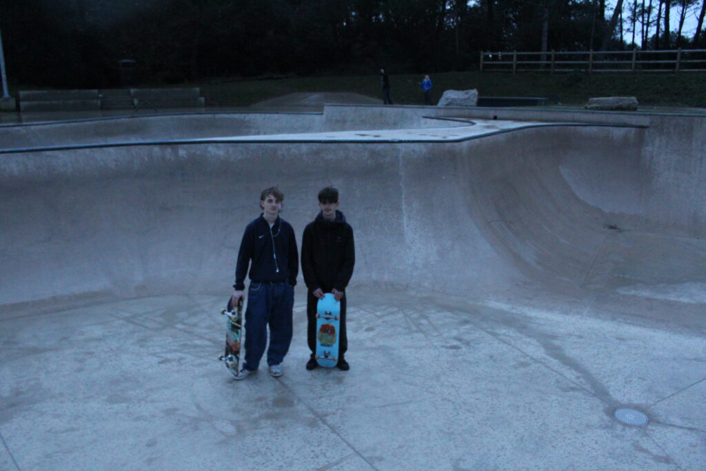
Humans tend to be sensitive about their own actions, not taking criticism very well at all. Within this image you can see my models being sensitive, embracing nature by throwing rocks in the rain, loving all the elements. But yet they cannot see how they are damaging these elements. By loathing in mother nature, humans will eventually reveal to themselves what they have done, so I wanted to portray their sensitive side, in order to show how they may not know how they caused the damage or how to reverse, therefore embracing their sensitive side.
Virtual Gallery Four (In the darkness)

We have created so much damage in the world, which is what anthropocene describes, but the ways of anthropocene are very harsh, calling humans out for their actions and embarrassing them when many people may not know the next step forwards, they may not know how to reverse all the damage, or even how to stop in from happening therefore many people are left in the darkness. I wanted my imagery to portray how sensitive we can be, and that really all we are on this earth for is to help each other and join together. No one can truly live a happy life without friendship so by joining together maybe we can not only be happier but also fish ourselves out of the darkness. By helping each other out we may be able to reprimand what we have done.
Anthropocene and AI/ Image experimentation manipulation and editing

What is AI?

Artificial intelligence, or AI, is technology that enables computers and machines to simulate human intelligence and problem-solving capabilities. Making jobs quicker and faster to do, instead of humans sepening hours or even days to complete a task.

How is it used within photography?

“To create AI-generated images, the machine learning model scans millions of images across the internet along with the text associated with them. The algorithms spot trends in the images and text and eventually begin to guess which image and text fit together. Once the model can predict what an image should look like from a given text, they can create entirely new images from scratch based on a new set of descriptive text users enter on the app.”

To produce an image, a user enters keywords and a model generates images utilizing those keywords. Strings of words can be used.

How do you use it?

Ai has recently been introduced to adobe photoshop in the form of generative fill, this not only allows photographers to add elements to their images that elsewise would have been difficult or impractical to accomplish, this makes a photographer much more able to accomplish what they envision

#AI image mood board inspiration

Experimentation

Example Of Creation

I used AI to adapt this image within photoshop, I sed the generative fill tool, i selected the sky and then simply typed in “Stars”, and it generated this. It was once just an image of a plain purple looking sky which has now been transformed into a beautiful starry sky.

Final Three Favorite AI Images and Evaluation

This is one of my favourite photos’ I have created due to how the sunset is so dim yet so bright, when you first look at an image you are instantly drawn to the brightest thing within the image. So I like how the faint people swimming within the water are almost like a challenge, you have to almost focus too see them swimming down there. My concept for this image was that the ocean is a part of mother nature and the earth its self, and we are merely sharing in her offerings, I have portrayed this by making the people swimming in the water so small compared to the massive scene around them. I used photo shop to AI generate the people swimming in.

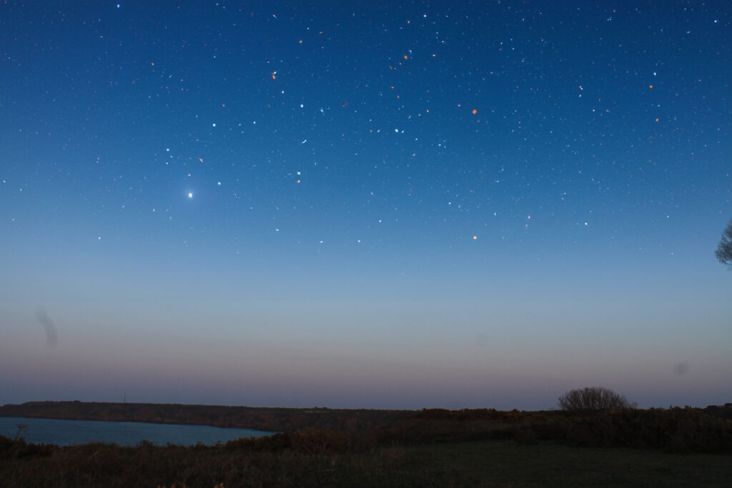
I really like this image of a starry night due to the contrast I’m the colours of lighting, this image has a very wide tonal range, it almost looks strange to the human eye too see a sunset mixed with a sky full of stars as generally the stars don’t come out until the sun has fully gone away. I love just how realistic the stars look, giving the image texture and tone. My concept behind this photo was to portray what our sky’s could actually look like without light pollution, artificial light has done much to safeguard and enhance our night time environment but, if not properly controlled, obtrusive light can present serious physiological and ecological problems. Yet another issue that humans have created which takes the earths natural beauty away. I used generative fill on photoshop too add the stars in this image.

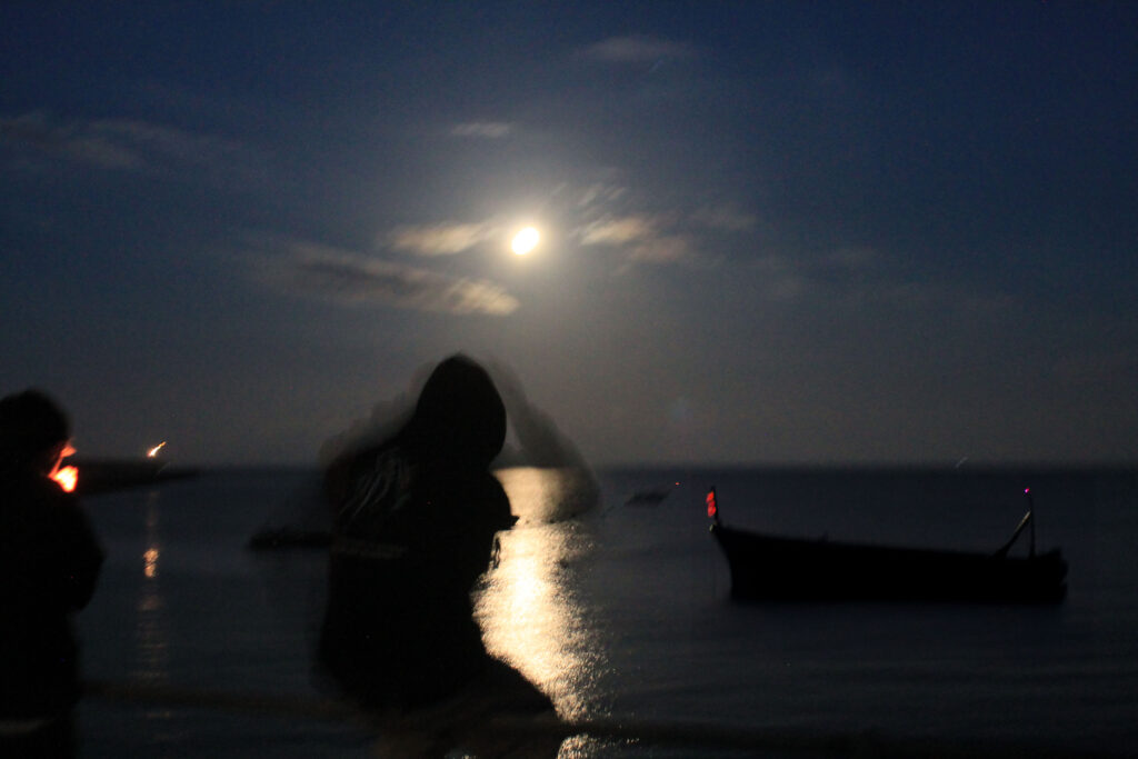
I used ai generative fill on photoshop to add the boat within this image. This image alone was not one of my favourite’s at all, due to how blurry it is and how strange the lighting is within this image. But I do like the movement shadow’s off the model in the centre of the image, as I think it adds surface leading the eye to that golden section. I think the composition of this image is very important as it takes away from the blur/shake and makes it look less harsh. My concept within this image was to portray how, there are always many different scenario’s happening around us, including our own one, and we are only the main character in our own story, which is why it makes it even more important too look after our planet, as you are the only person to blame for what you are doing, its your own scenario and your own life, so it is all on you what you do in regards too things like pollution.

Past

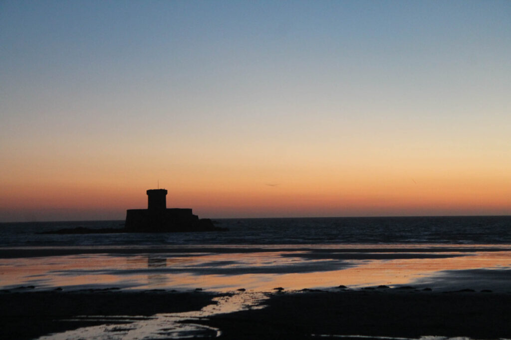
For my AI generated image of the past I have used a photo of le bray beach, where you can see the La Rocco tower, which was the 23rd and last coastal tower in Jersey to be built following the Conway design and was also the largest and most heavily armed of the whole series. It maintained a military role into the mid-19th century, as evidenced by a Royal Engineers report in January 1848, which records that La Rocco Tower and Battery (as it had by then become known) was armed with five 32-pounder guns. I used the selection tool to get rid of the people I originally photographed on the beach, and then used generative fill to create a narrative of soldiers shooting up at an enemy plane.

Present

For my AI generated image of the present I used a photo that I took up at active in St.Brelards, I originally took this image to capture the storm damage of the fallen trees, and I used AI generate tool to add people walking on the grass, too show that present life doesn’t just stop when an issue as big as a storm occurs.

Future

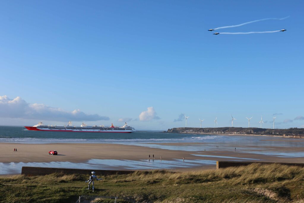
For my AI generated image of the future I used another image that I took along the five mile road, I used the AI generate tool to add many things to this image, for example, a car on the sand, a robot on the grass, flying cars in the sky, a big cruise ship in the water, and wind turbines. Wind turbines have been something already discussed for Jerseys future so I thought this would be a more realistic thing to incorporate rather than the flying cars, but you never know what the future holds for Jersey.

New Topographics MoodBoard

I’m going to take inspiration from my photographers I have wrote case studies about, Robert Adams and Joe Deal, My plan is to take images of manmade things with a human stood in front of it, so we as humans see just how much damage we have done, and portray how oblivious we are too it. But I also want to capture the beauty of the environment.

Joe Deal

Who Was He?

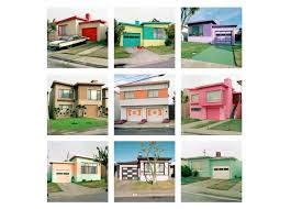
Joe Deal (1947-2010) was born in Topeka, Kansas. He earned his BFA at the Kansas City Art Institute and his MFA degree from the University of New Mexico. While teaching at the University of California, Riverside, Deal established the UCR/California Museum of Photography. He is one of the founding artists of the New Topographics movement. Deal was among the eight photographers included in the seminal exhibition “New Topographics: Photographs of a Man-Altered Landscape”, an exhibition curated by William Jenkins at the George Eastman House’s International Museum of Photography in 1975. This school of photography was marked by pictures that depicted the growing complexities of the American landscape with “stylistic anonymity” as Jenkins put it. Following the success of this landmark exhibition, in 1980, Joe Deal completed The Fault Zone Portfolio, a group of 19 silver gelatin prints that documented suburban life along the San Andreas Fault Line in Southern California. 
  Near the end of his life, the artist produced another remarkable body of work titled West and West. In these crisp black and white photographs of the Great Plains, Deal drew upon 19th century survey photography, but used the horizon line and symmetry of square format to reframe our perception of the landscape as finite. His work is included in numerous museums and collections, including the Museum of Modern Art, New York; The San Francisco Museum of Modern Art; The Museum of Fine Arts, Boston; the J. Paul Getty Trust, Los Angeles; Nelson-Atkins Museum of Art; and in the International Museum of Photography at George Eastman House, Rochester. Joe Deal died in Providence, Rhode Island in 2010.

His Images

Joe Deal, Flint Hills, from the series West and West, 2006; Courtesy Robert Mann Gallery; © Joe Deal

Like his peers in New Topographics, Deal trained his camera on landscapes that had been overlooked by the prominent photographers of the preceding generation, Instead of majestic, snow-covered peaks or meadows dotted with wildflowers, Deal chose to photograph places irrevocably marred by human hands, landscapes most people would consider unredeemable ugly, like the dirt road in Wyoming, at right.Among the artist’s favored subjects early in his career were sites graded for future developments, newly cut roads, mobile home parks, and all manner of shoddily built housing. Although he certainly felt they were eyesores, Deal deliberately chose to photograph these aspects of the built environment from as seemingly neutral a point of view as possible, as his interest was in visual analysis, rather than in conveying an explicit social or political message.In a more recent series, West and West: Reimagining the Great Plains, Deal stripped his pictures down to the barest of bones: rock formations, grass, sky. A return to the region where he grew up and a meditation on the constructed nature of landscape, it includes some of the sparest photographs Deal ever made.

Image Analysis

Deal has used natural daylight when taking this image, which creates a lower level of control over what you want to be lit as you cannot control the sun, but one thing you can control is exposure and things like the lense settings, which we can see that in some places of this photo the image is overexposed and blurry for example the background but the foreground is more in focus, which creates a depth of field to focus our eyes on the foreground. They do look like just some boring rocks and grass but Deal has used many different tones and texture to really portray what he could see with his eyes standing there and more, which adds depth to the image, and emotion, which ups the value of nature , and makes us want to worship it more, after seeing all the destruction we are putting on it compared to just a ‘boring’ image of natural land. Joe Deal’s photograph Colton, California is from his series The Fault Zone, which documents life along the San Andreas Fault Line in Southern California. The work encompasses themes and ideas that Deal explored throughout his career in photography, including how humans alter the landscape through ever-expanding construction. Deal’s work gained national attention in 1975 when he contributed photographs of newly constructed homes against the landscape of the American Southwest to an exhibition at the International Museum of Photography at the George Eastman House in Rochester, New York, titled New Topographics: Photographs of a Man-Altered Landscape. Deal and the nine other photographers in the exhibit were seen as breaking away from the precedent set by earlier American landscape photographers who presented romantic, sweeping vistas largely without the presence of people; the photographers in New Topographics instead turned their cameras on the built environment of modern America.

The New Topographics

What is it?

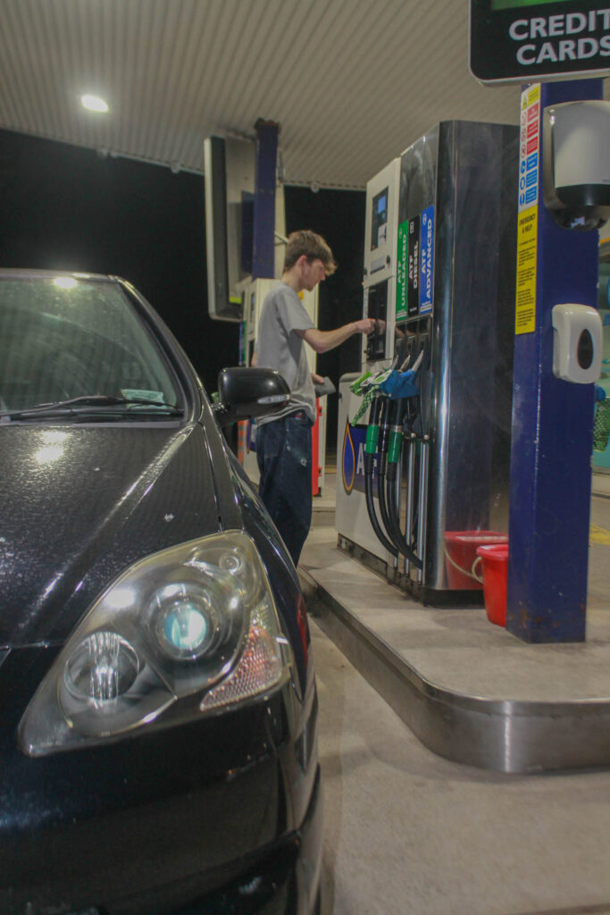
The new topographics are pictures that portray unromanticised views of industrial landscapes, and suburban areas, areas that are not normally given a second glance. Its known as ‘The Man Altered Landscape’. It is the examination of the American Landscape in a new way, instead of focusing on natural and pristine scenery like parks they turned there cameras to more suburban things like petrol stations, freeways etc.

Post-War America

The New Topographics movement in America was an attempt to be “objective” about its survey of the West in post-war America.

Post-war America struggled with

  • Inflation and labor unrest. The country’s main economic concern in the immediate post-war years was inflation. …
  • The baby boom and suburbia. Making up for lost time, millions of returning veterans soon married and started families…
  • Isolation and splitting of the family unit, pharmaceuticals and mental health problems
  • Vast distances, road networks and mobility

The Shift

New Topographics represented a radical shift by redefining the subject of landscape photography as the built environment. In the 1920s, Ansel Adams formed an approach to landscape photography that posited nature as separate from human presence. He used vantage points that emphasized the towering scale of mountain peaks, and embraced a wide tonal range from black to white to record texture and dramatic effects of light and weather. What was both novel and challenging about New Topographics was not only the photographs’ content, but how they made viewers feel. By foregrounding, rather than erasing human presence, the photographs placed people into a stance of responsibility towards the landscape’s future—a position that resonated with ecology, the branch of environmental thought that was gaining traction in the 1970s.

The Aesthetics

Within these images, for example Robert Adams images, they used very neutral boring lighting, for example they just used day lighting, such as the sun shining bright in the middle of the day. This wouldn’t give as good of results as sunset or sunrise, and the sun would be very in the middle of the sky, just shining bright, and there wouldn’t be much room for movement, for example when sunset the sky changed shade and colours to orange and pinky sky’s, but during the day the sky would just be bright blue, or a gloomy grey.

Artist References

Robert Adams’s (no relation to Ansel) 1973 image Tract house, Boulder County, Colorado. The photograph pictures a two-story house whose half-timber framing appears decorative rather than structural. Recorded under bright noon sunlight, the house’s shadow barely extends into its grassless yard. The flag on the mailbox is up, perhaps to signal the presence of outgoing mail, but there are few other signs of habitation.

Joe Deal, Untitled View (Albuquerque), 1973, gelatin silver print (George Eastman Museum, © Estate of Joe Deal)

Joe Deal photographed new homes and construction sites in Albuquerque, New Mexico from the steep foothills of nearby mountains. Eliminating the horizon from his pictures, he filled each square frame with a dense patchwork of surfaces: driveways, newly cut roads, empty lots, and expanses of brush yet to be tamed. The effect was that the terrain appeared compressed into flatness, encouraging viewers to study the photographs as if looking at topographical maps.Deal enabled his viewers to consider the cost of rapid growth in the fragile desert.

Robert Adams

Who Is He And What Did He Do?

Robert adams was a photographer who documented the damage to the American West, including the extent of it and its limitations. He created over fifty books of pictures, which included both despair of the environment and also hope. his goal as he said “is to face facts but find a basis for hope.” Adams grew up in New Jersey, Wisconsin and Colorado, and enjoyed the outdoor environment with his Father in each of them. When he was twenty-five he was a collage English teacher, and that is when in his summers off he picked up photography, After spending time with his wife in Scandinavia he realized that there were complexities in American geography.

His Works

Within the 1970’s and 80’s he produced a series of books which included- The New West,Denver,What We Brought,Summer Nights- which focused on expanding suburbs along Colorado, books that portrayed the need to development but also the surviving light of the natural world. He also examined humanity’s footprint and nature’s resilience in the wider western landscape. Adams has occasionally published smaller, sometimes more personal volumes. These have included a prayer book set in the forest (Prayers in an American Church). He has sometimes directly engaged civic and political issues as well. A series of photographs at the Ludlow memorial, for example, speaks for organized labor, and another at a protest against the second Iraq war records the suffering that accompanies empire. 

Image Analysis

Robert Adams. Burning Oil Sludge, Boulder County, Colorado, 1974. Gelatin silver print; 11 × 14 inches. © Robert Adams. Courtesy Fraenkel Gallery, San Francisco and Matthew Marks Gallery, New York.

Adams has used natural daylight when taking tis image, which manipulates the intensity of the sunlight reflecting against the ground. It also looks as if the image is a bit over-exposed, in order to manipulate the burning oil smoke to be as dark as possible compared to its surroundings to show its intensity, and how much damage it is creating. This photo is sharp and infocus, and has a sharp tonal range, using different shades of grey and linking them to emotions. He has laid out the image within a way that the damage to the environment is right in our face while still capturing the environment trying to fight back against this man made damage, he has done this by creating a depth of field where the destruction is right in our faces, but the beauty is surrounding it, we see this when the bug black burning oil smoke is right in our faces, making it very hard to miss, but there is a small tree standing very still to the left of the destruction. His image also relates to a political context, where people were fighting for the burning of oil to be calmed down or stopped all together, this relates to the 1973 oil crisis – In October 1973, the Organization of Arab Petroleum Exporting Countries (OAPEC) announced that it was implementing a total oil embargo against the countries who had supported Israel at any point during the Fourth Arab–Israeli War, In an effort that was led by Faisal of Saudi Arabia,[2] the initial countries that OAPEC targeted were CanadaJapan, the Netherlands, the United Kingdom, and the United States. This list was later expanded to include PortugalRhodesia, and South Africa. In March 1974, OAPEC lifted the embargo,[3] but the price of oil had risen by nearly 300%: from US$3 per barrel ($19/m3) to nearly US$12 per barrel ($75/m3) globally. Prices in the United States were significantly higher than the global average. After it was implemented, the embargo caused an oil crisis, or “shock”, with many short- and long-term effects on the global economy as well as on global politics.[4] The 1973 embargo later came to be referred to as the “first oil shock” vis-à-vis the “second oil shock” that was the 1979 oil crisis, brought upon by the Iranian Revolution.– which gives his image a motion, he was showing the people all the many flaws with oil burning, harming the planet, and now also harming people financially. Which turns his image into conceptual art.