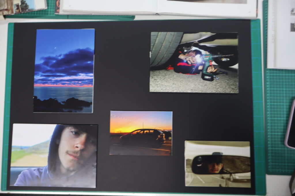
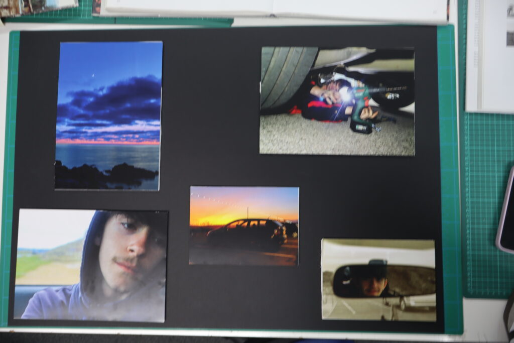
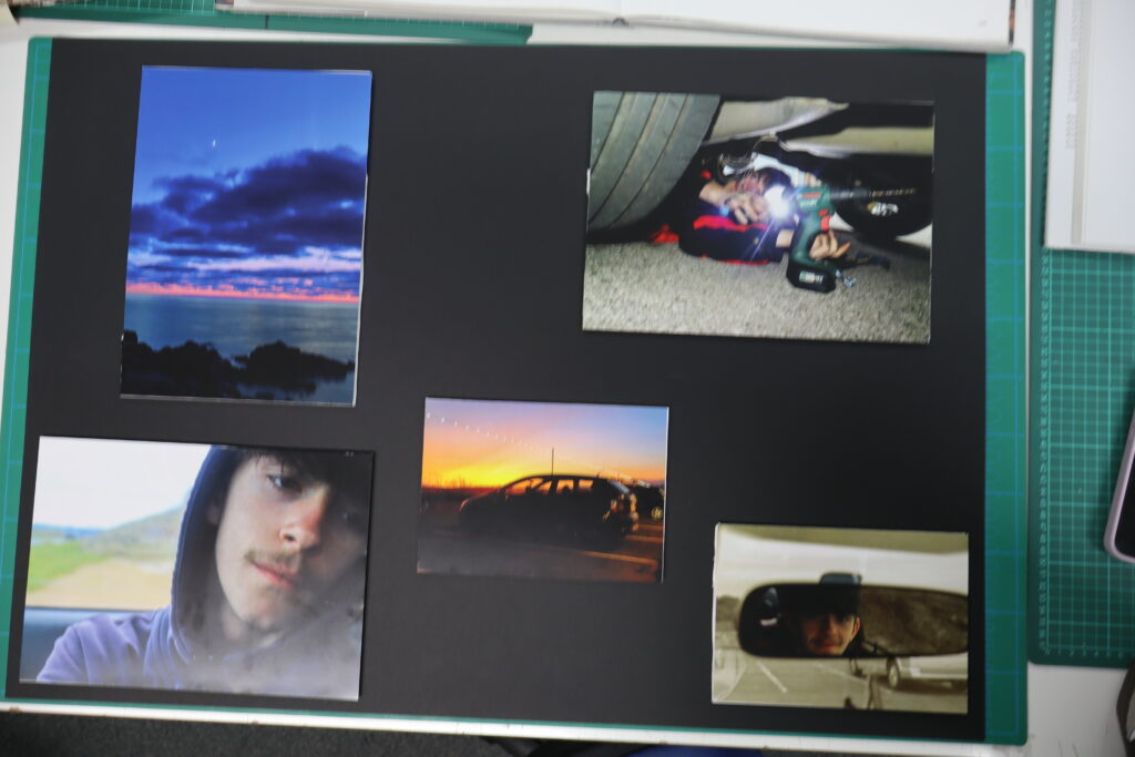
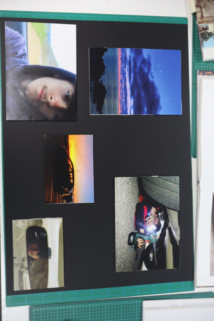
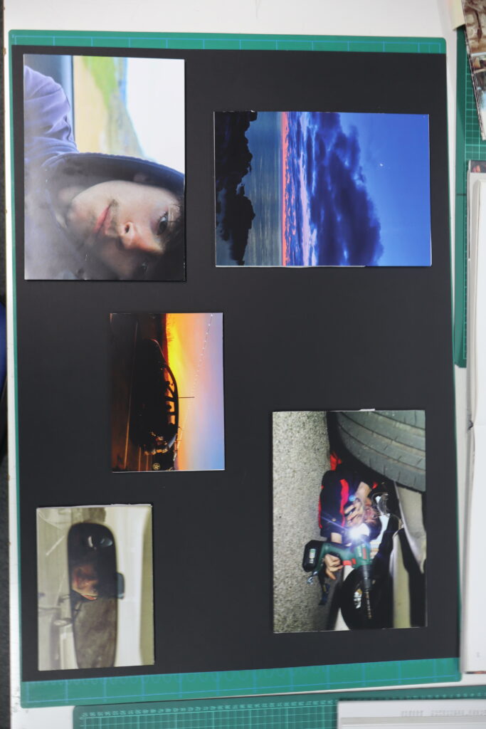
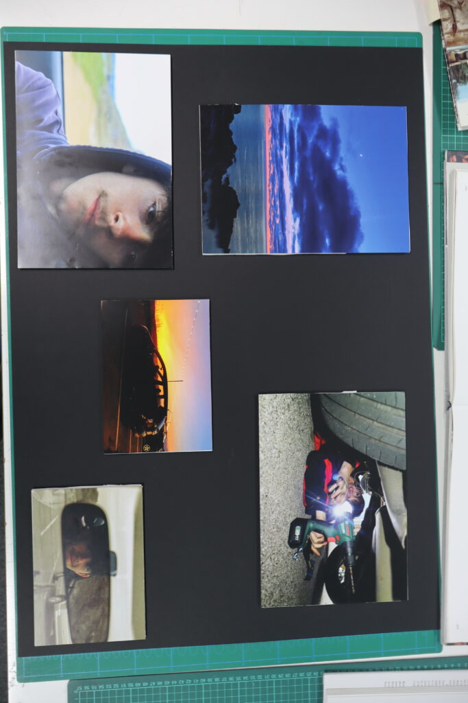
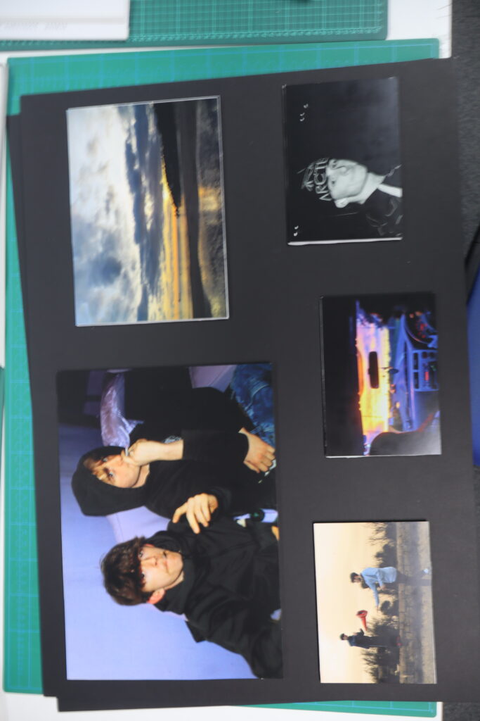
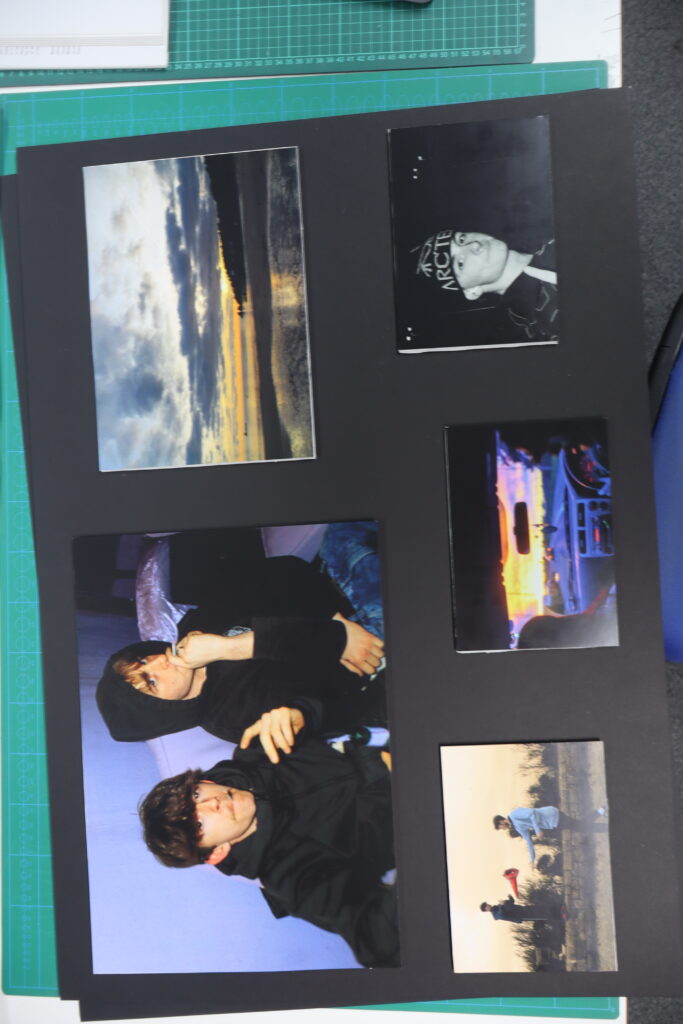
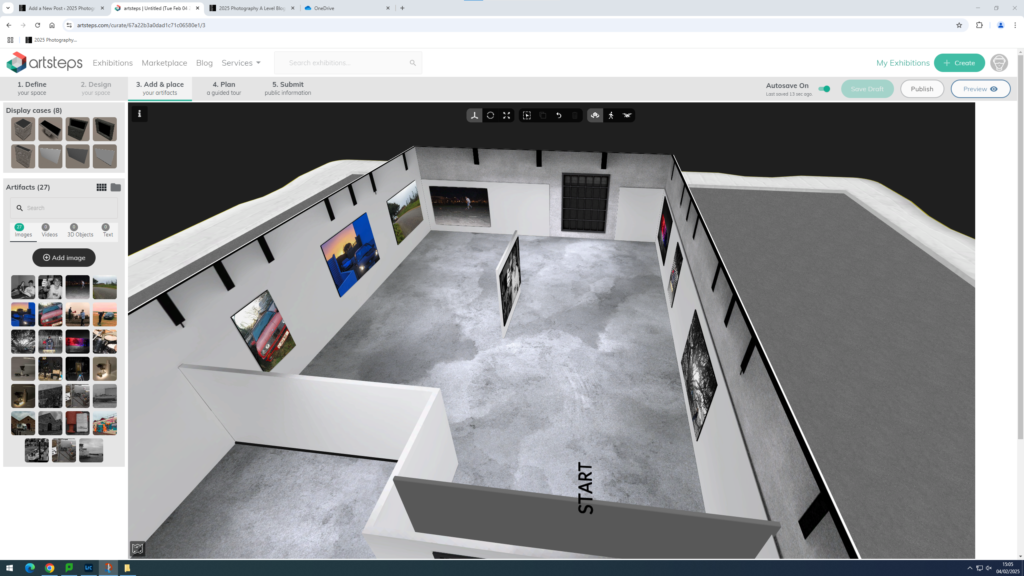
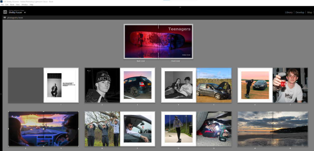
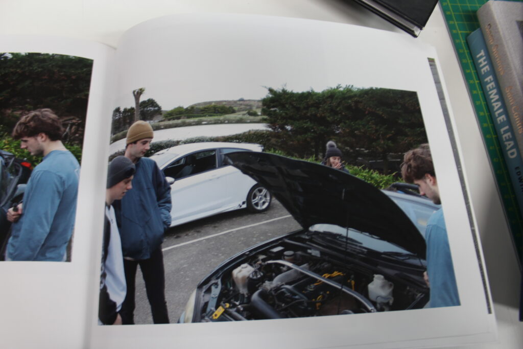
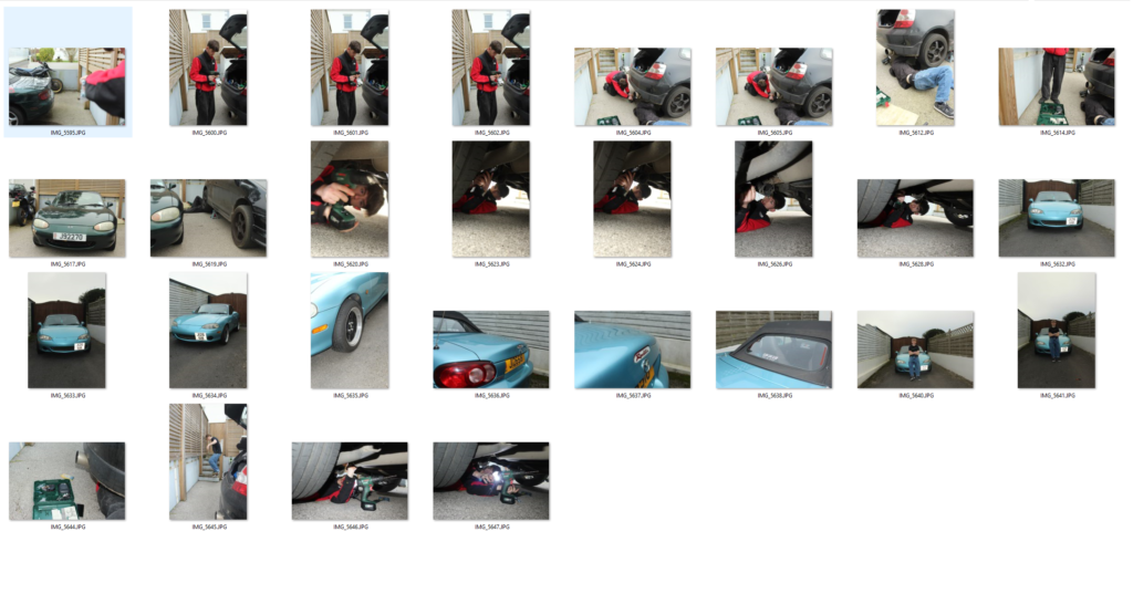
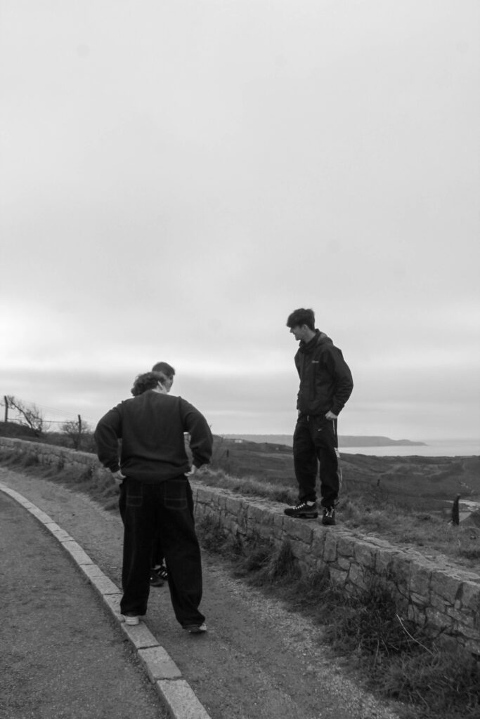
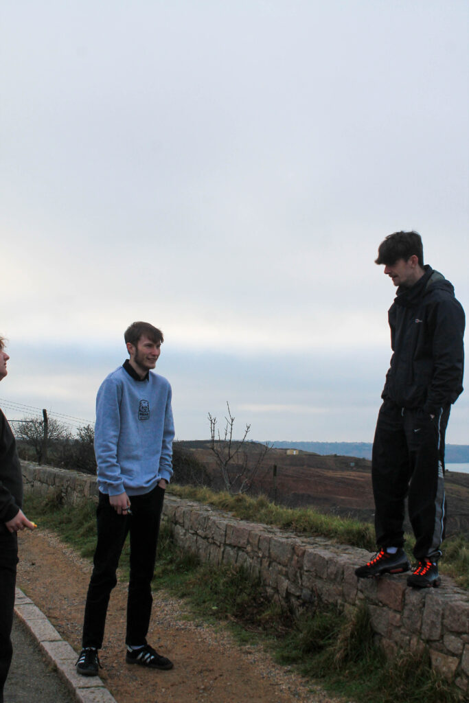
I have decided to do some final mounting as well as my photobook. I have portrayed my images in two separate layouts.
The first layout includes images of mainly cars, with some landscape images, it acts as a breakup blackboard. Having some more personal close up shots as well as some further landscape images it provides a wide variety of images from different aspects.
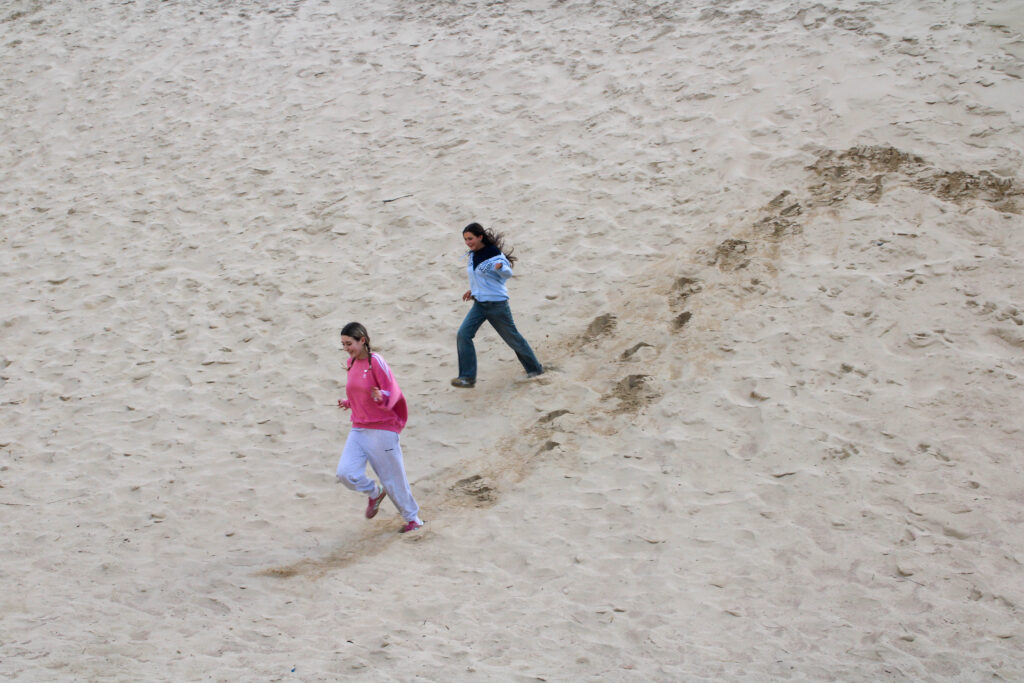
My second blackboard consists of more fun related images, of the group engaging in some more personal activity’s rather than there main hobby that brings them together. This provides a different outlook on the people that I have photographed.
Select a set of 5-6 photographs as final outcomes and evaluate
A3
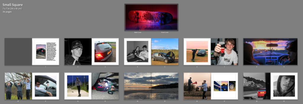
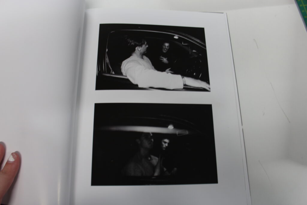
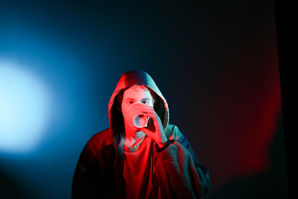
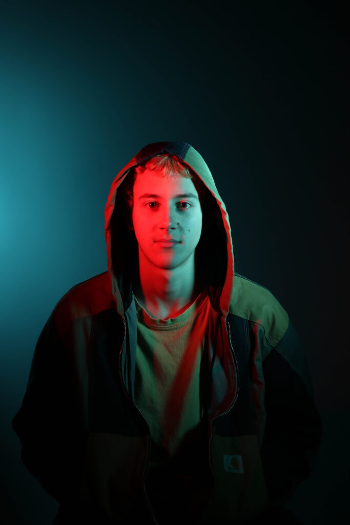
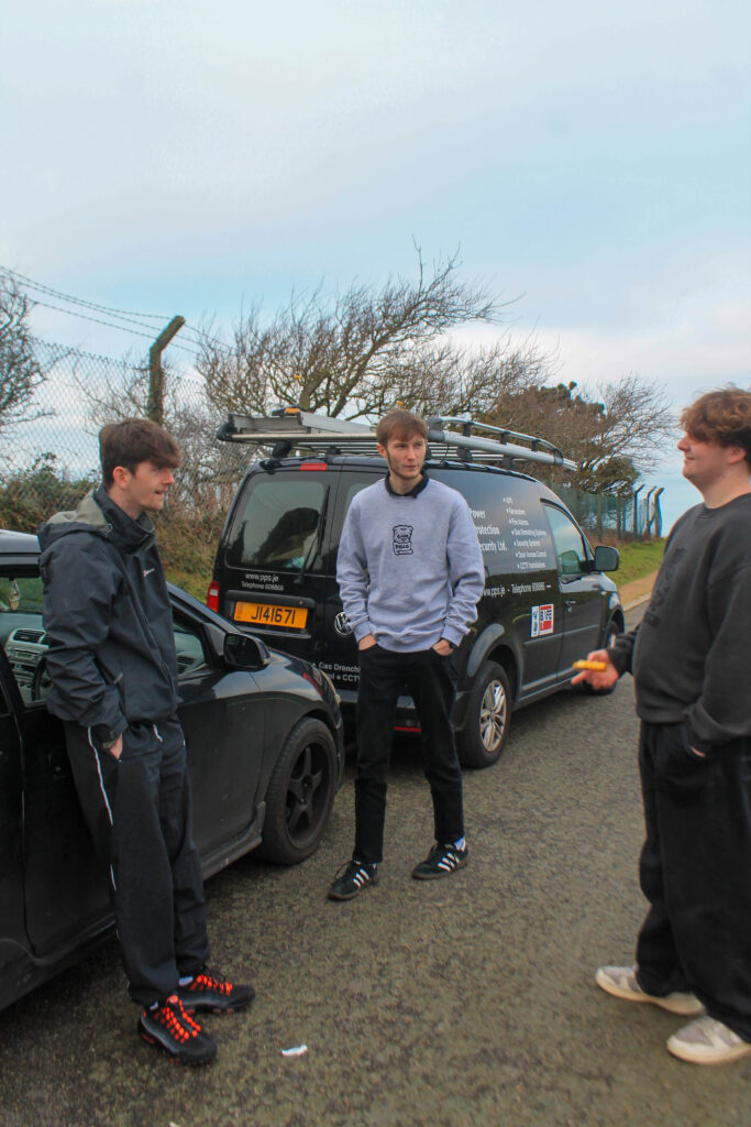
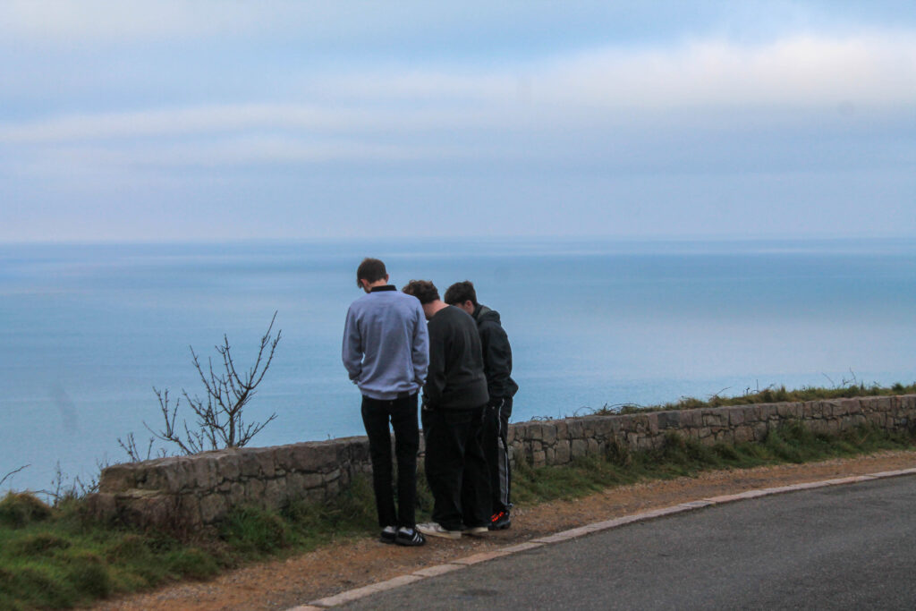
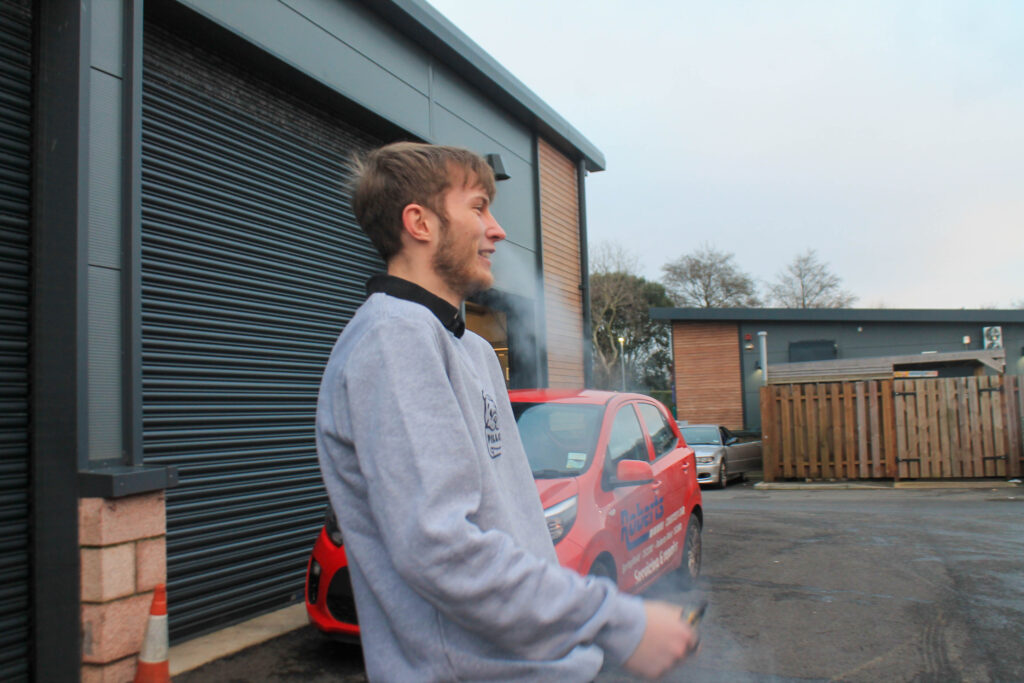
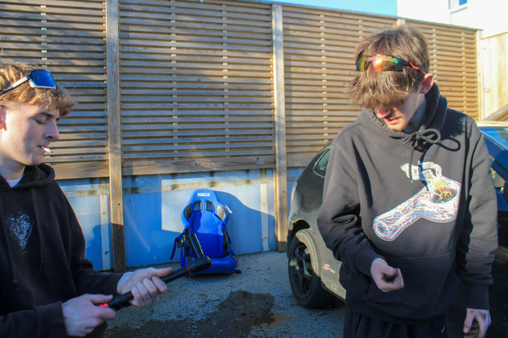
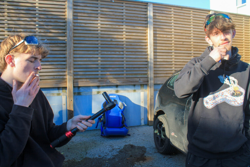
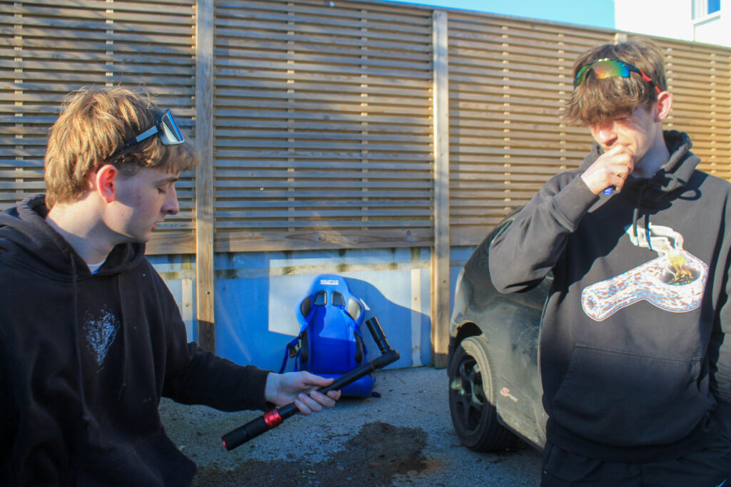
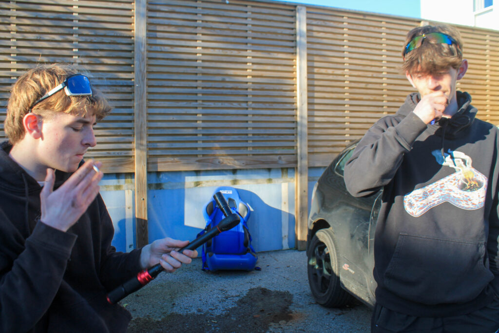
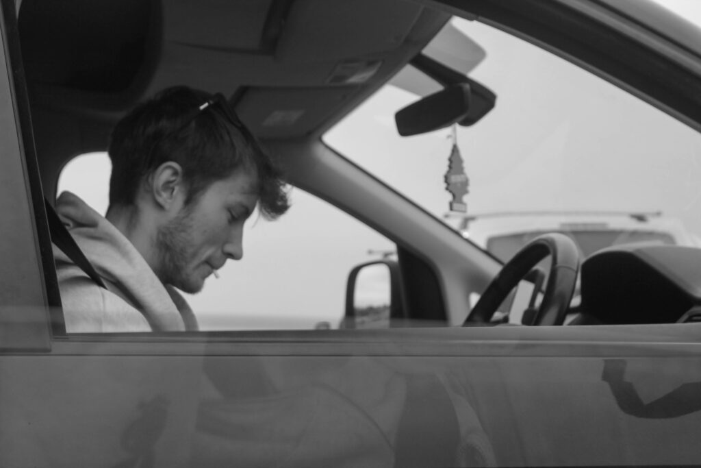
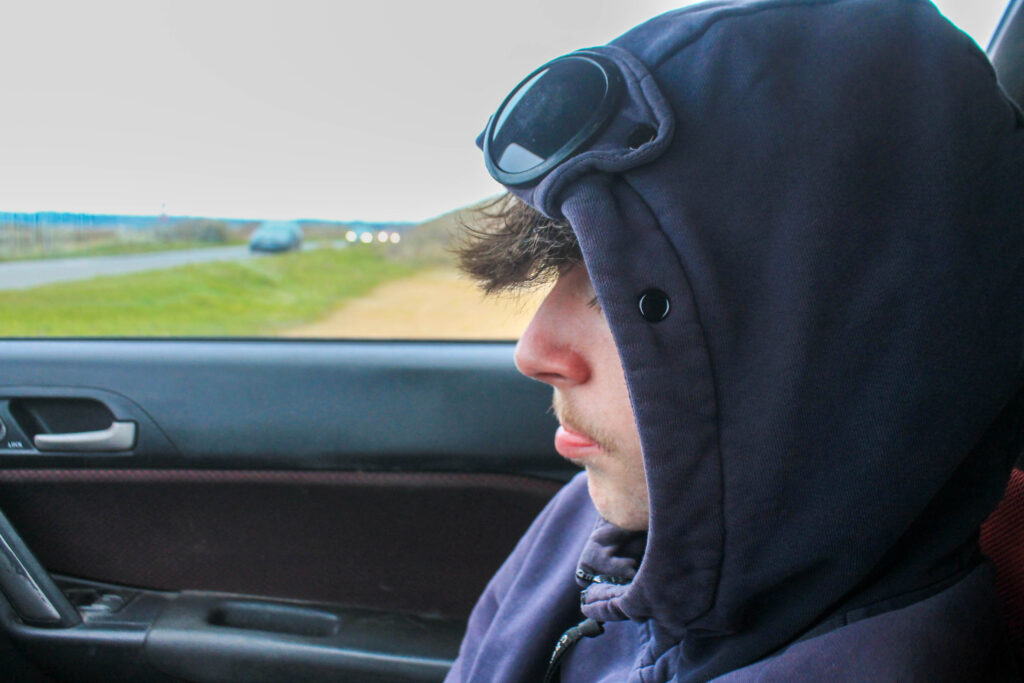
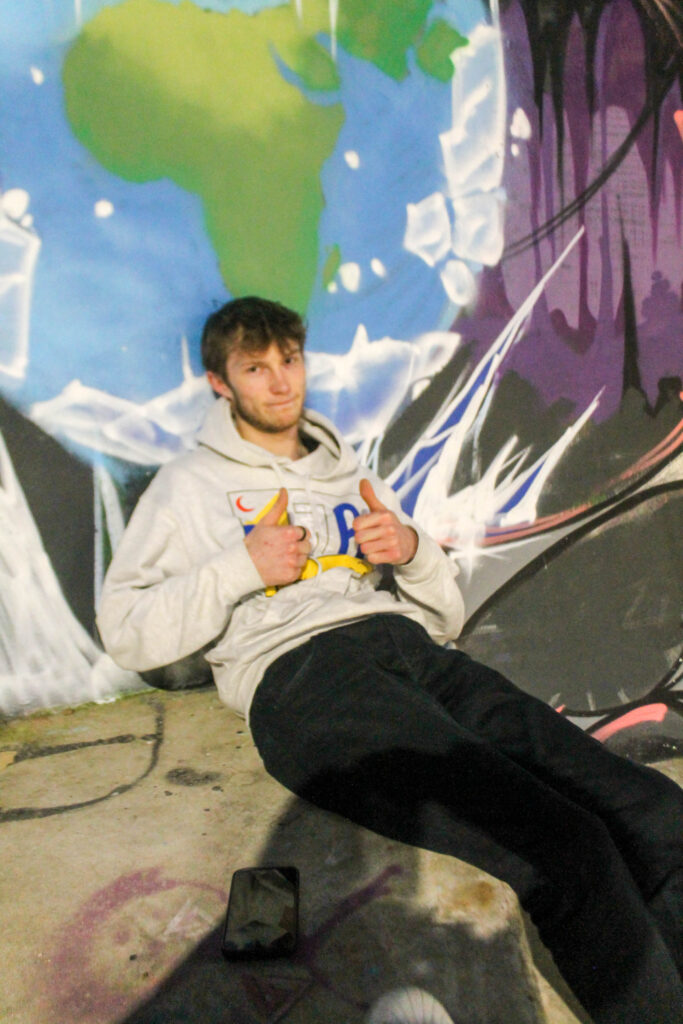
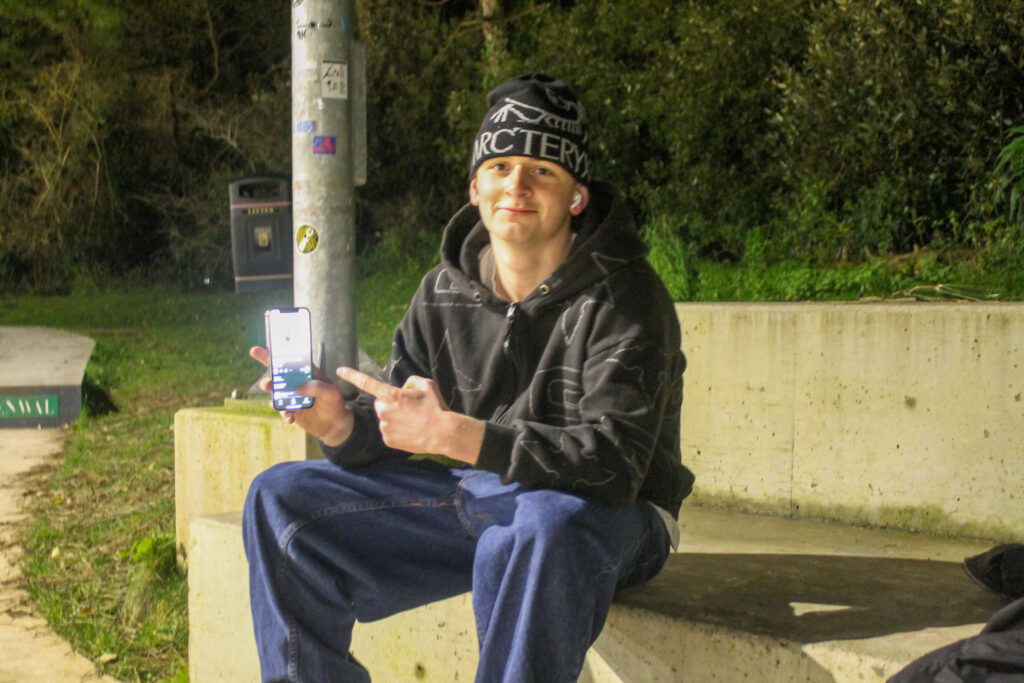
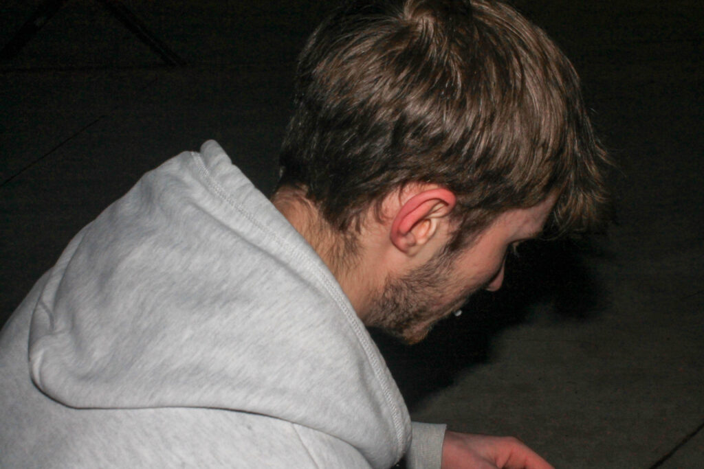
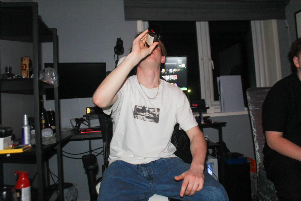
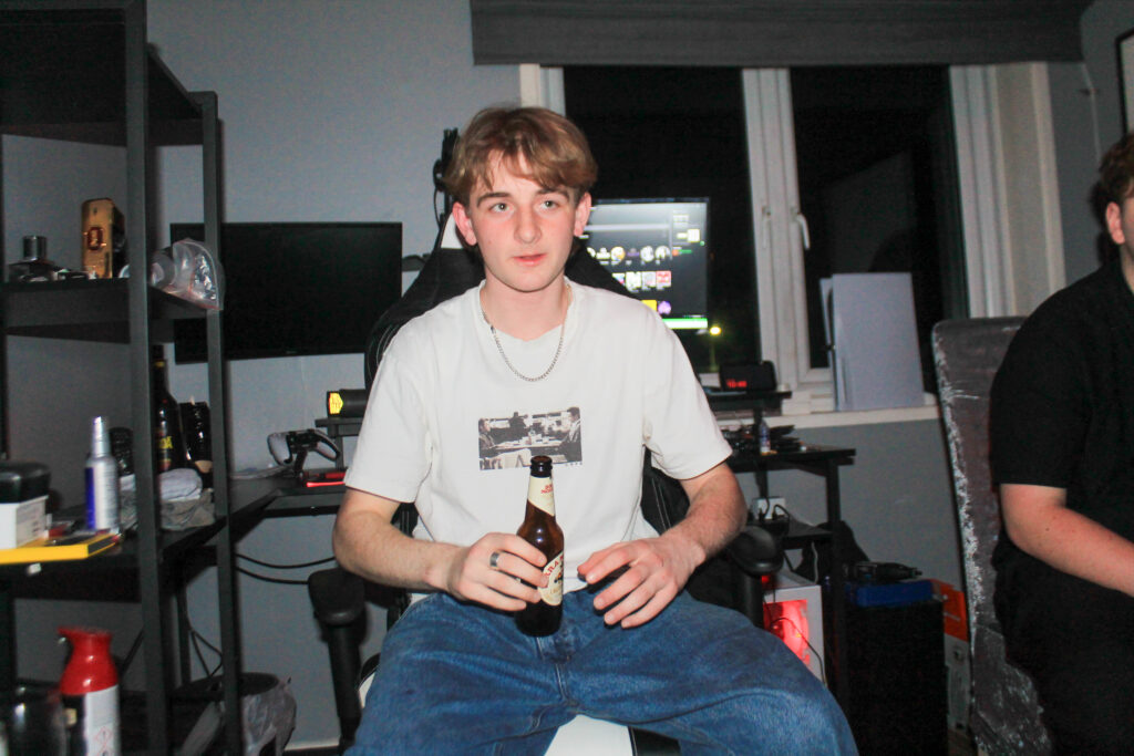
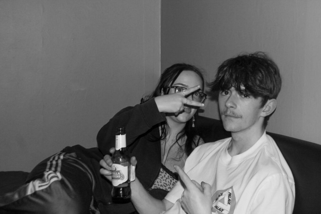
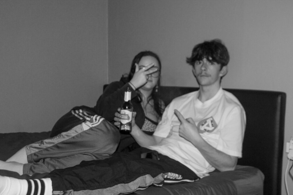
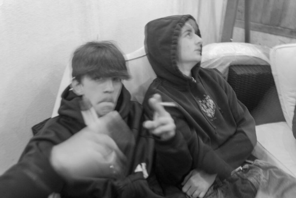
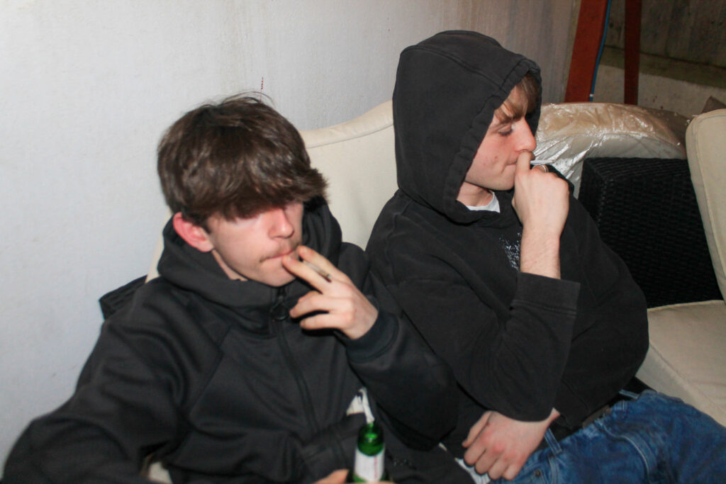
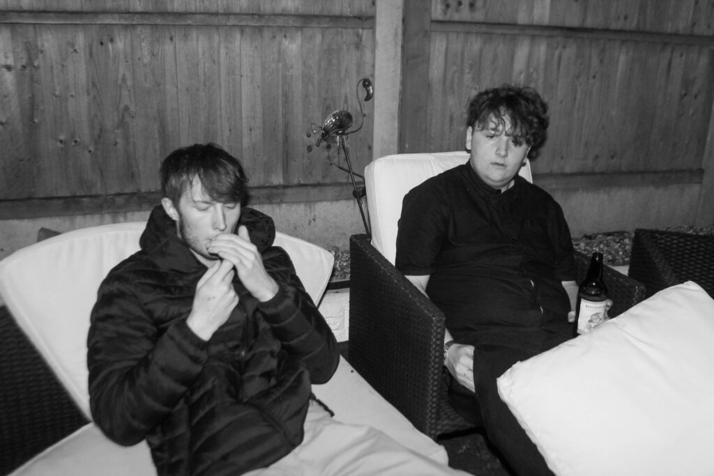
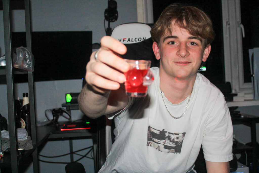
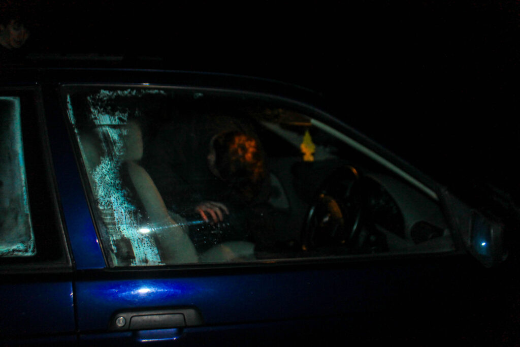
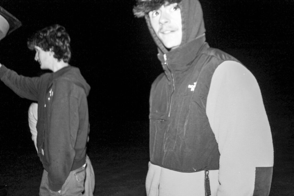
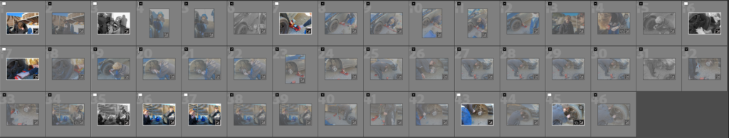
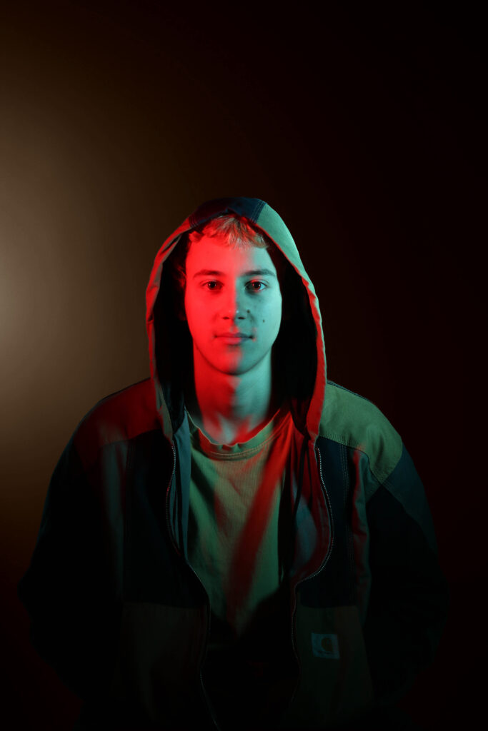
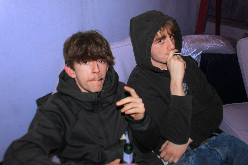
The reason I have chosen this image is because of its technical composition, I like how I have used the flash for my lighting which create a glare on their eyes and adds more depth to there outfits, creating brighter blues and darker blacks etc. This creates a exposed glare, adding a sense of realism to my image. By using a zoomed in lens I have focused on my subjects, the camera that I was using was actually broken and didn’t have automatic focus hence the aspect of unfocusedness, but I think that this adds to the image creating a sense of mystery. I think my image is a bit over exposed allowing my subjects to have brighter skin, which I think looks good with the blue background I have created using photoshop. This image has a clear tonal range of dimmer colours, deep blues and blacks. Creating a dark colour temperature. My image is textured through the use of the ruffled jacket and the gloss on there hair. I think that I have created a 3D form and repetition with both the boys smoking, by both doing the same thing they work well together in the image.Creating a smooth composition. Using the rule of thirds by centering my image, having the main subjects in the middle and the outer parts of them on the two outsides. The eye contact within this image can create a deeper conceptual meaning. By creating eye contact while smoking and drinking we can read through there eyes that they are not doing this in a negative way to escape their emotions but more socially to have fun. This creates a contextual meaning that the two are friends, so I overall think that this image can be easily read.
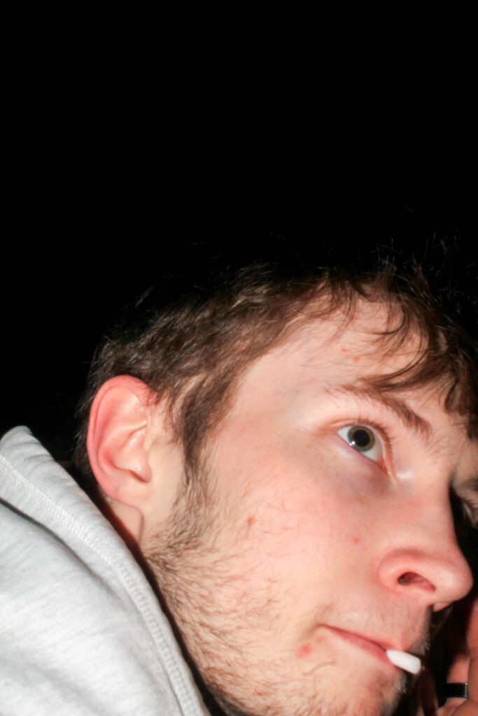
A4
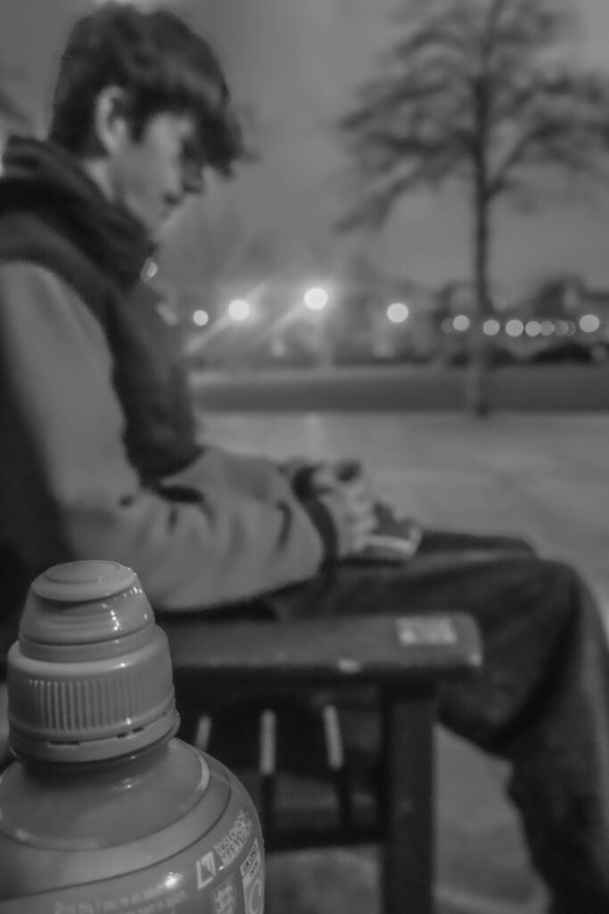
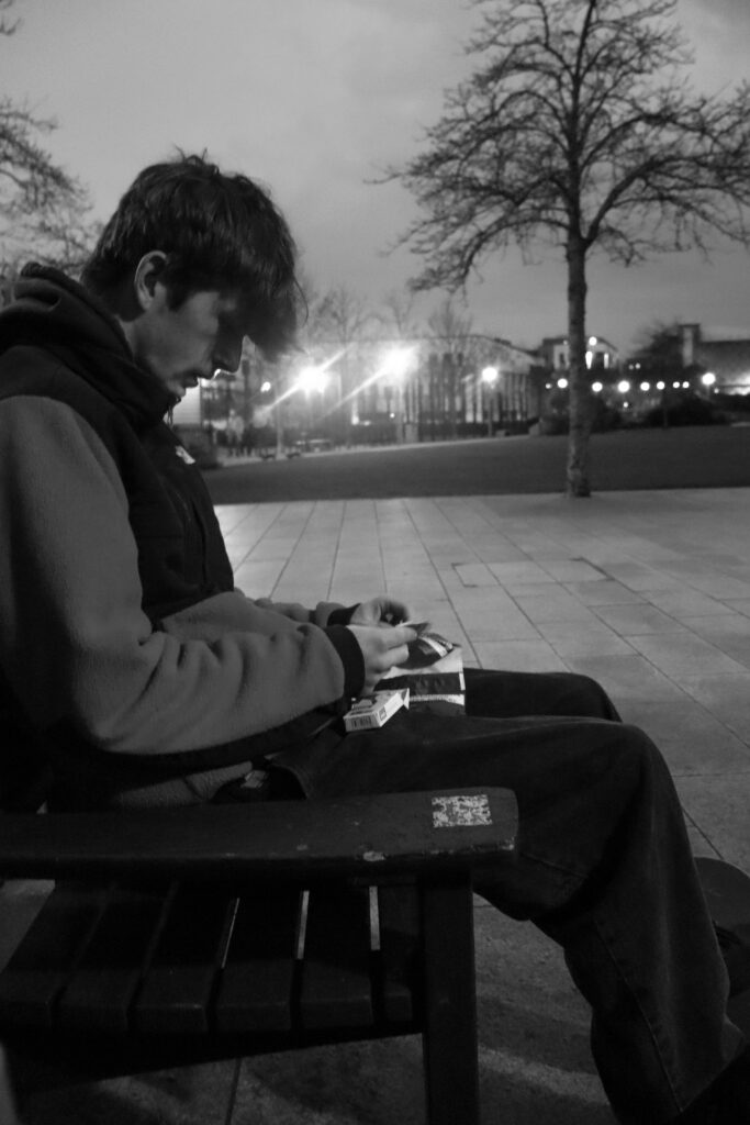
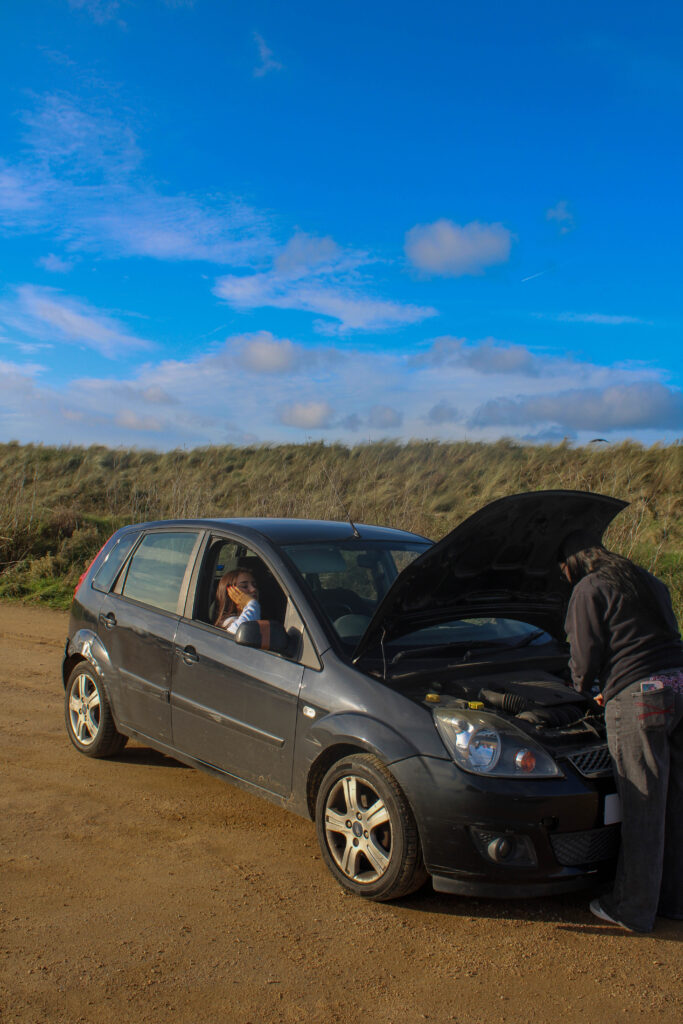
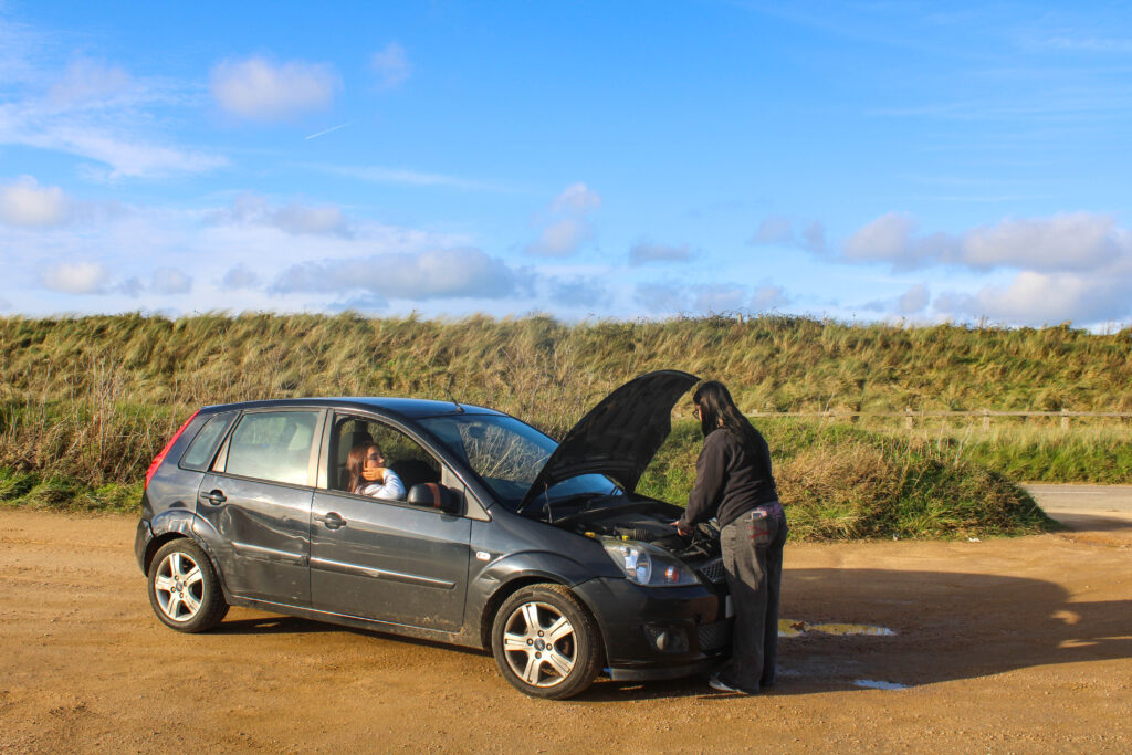
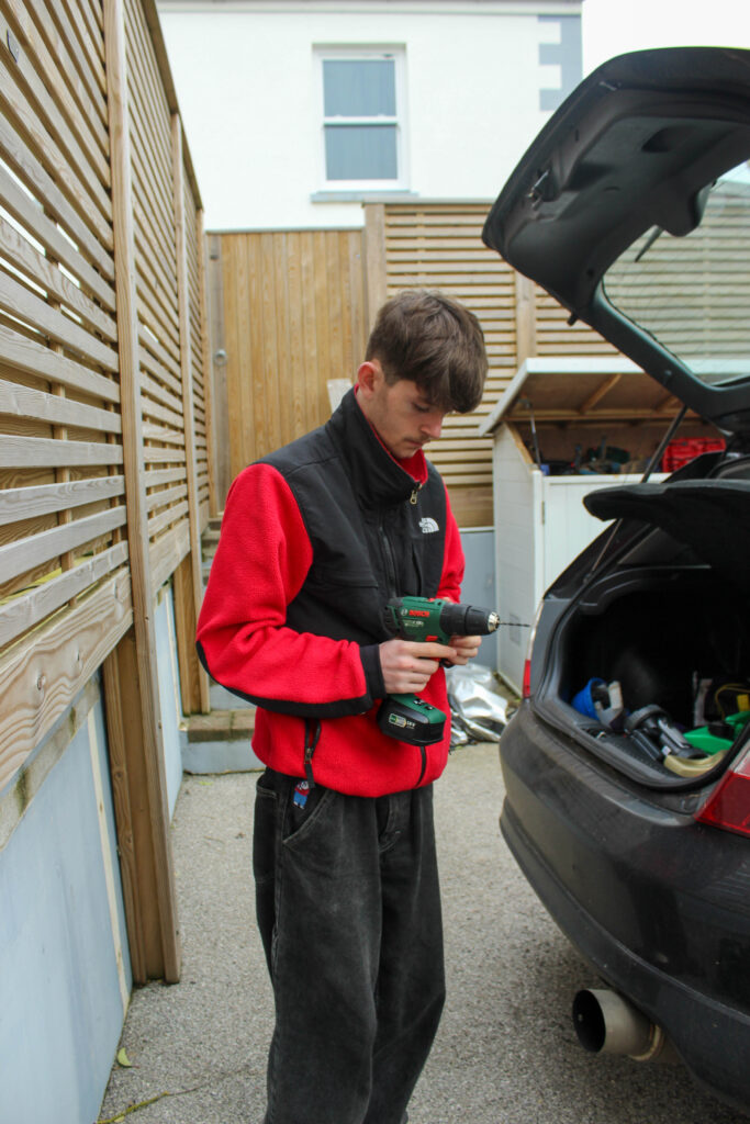
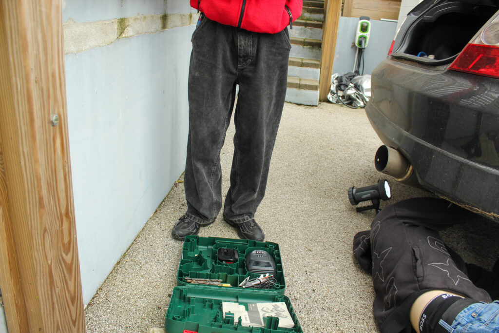
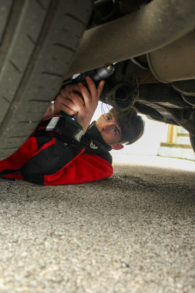
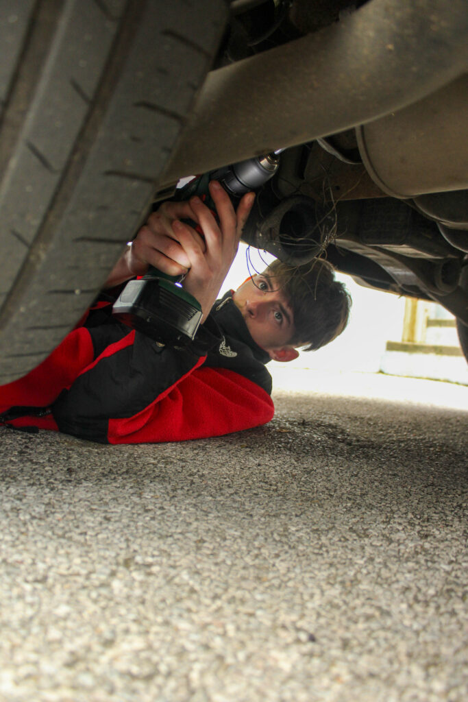
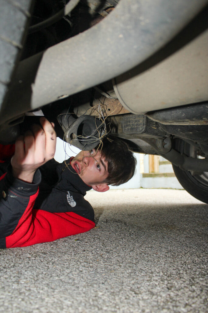
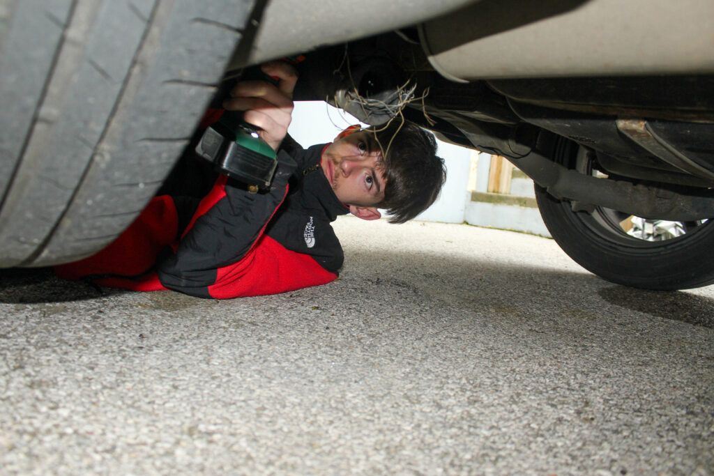
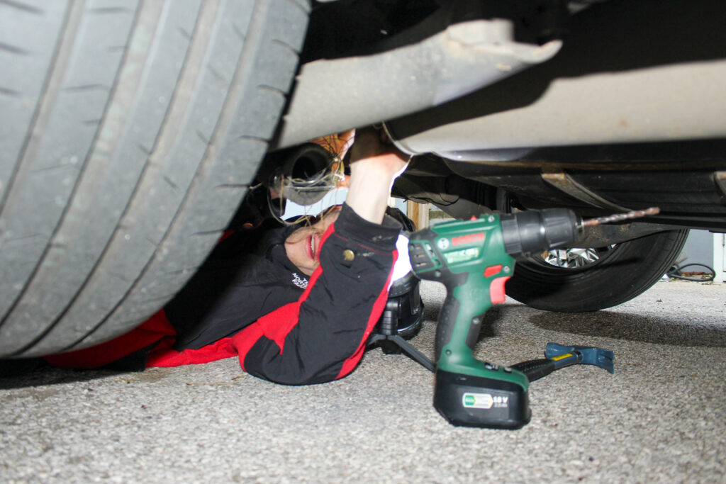
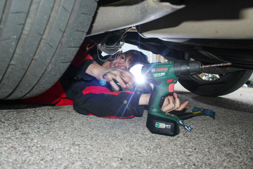
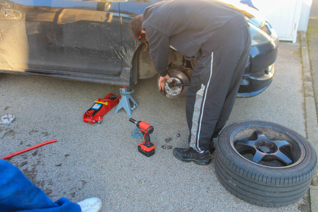
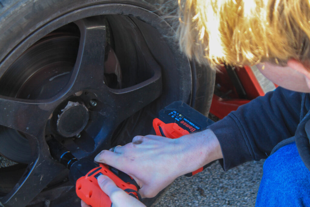
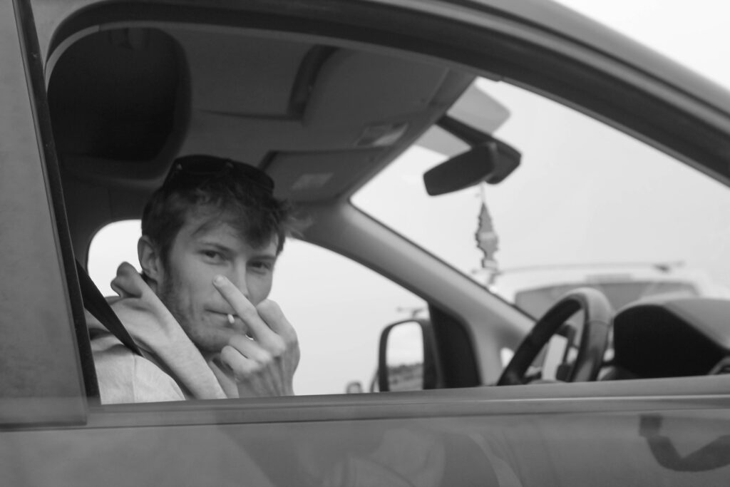
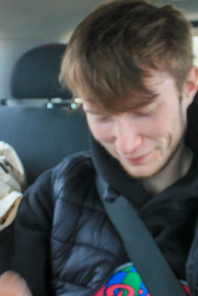
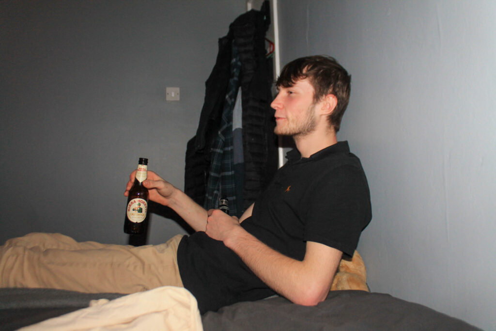
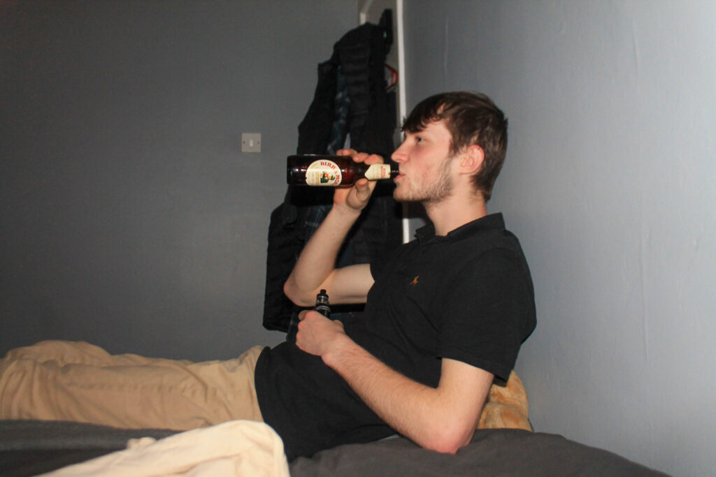
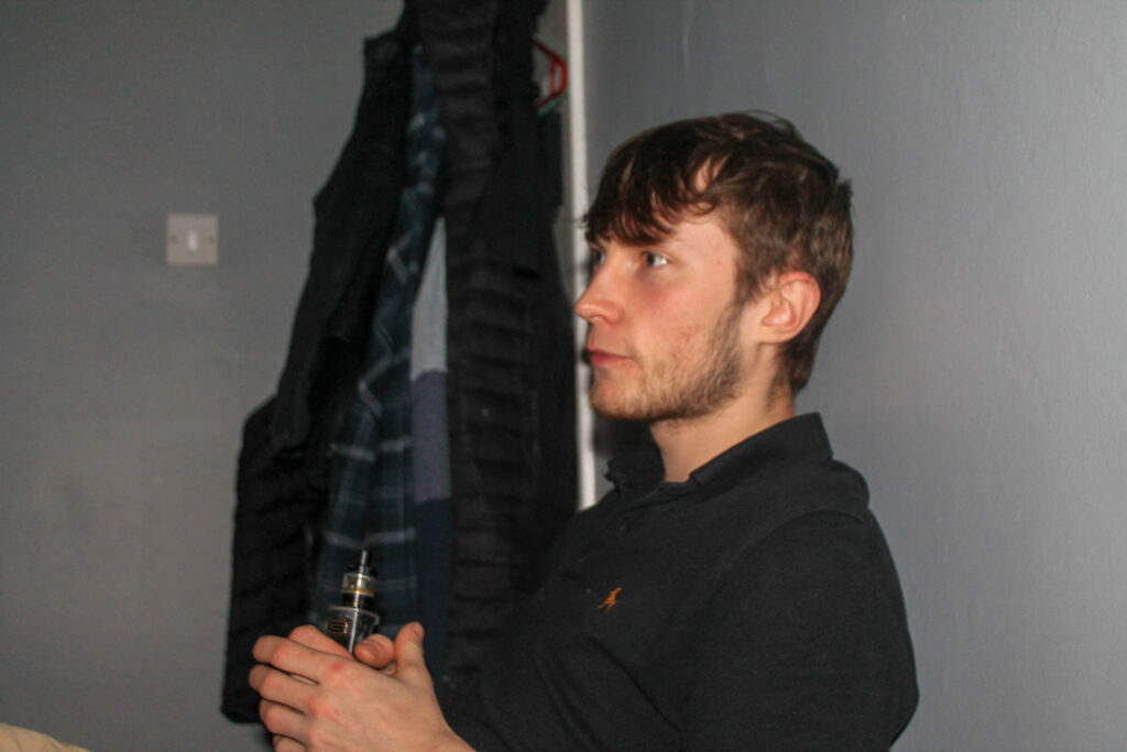
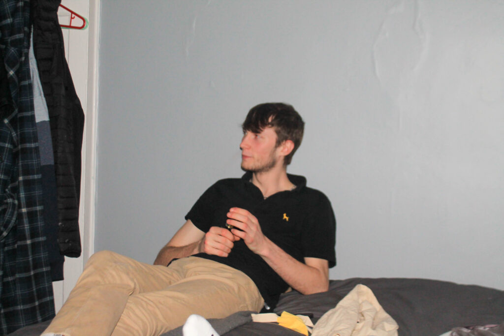
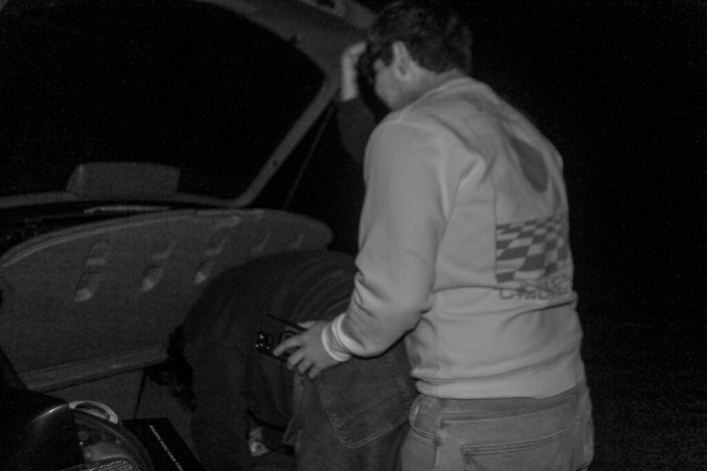
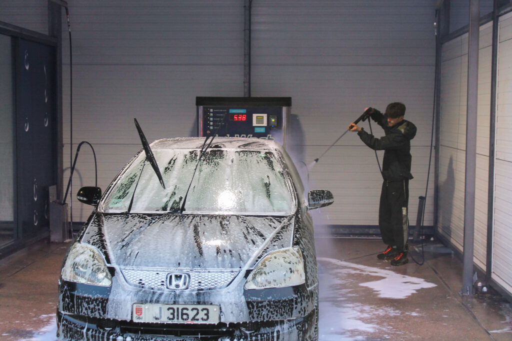
I have chosen this image as I wanted to progress the storyline of my final prints, focusing on this boys life and what he does to make it enjoyable. I have used daylight and the flash of the camera but the shine of the torch creates a sort of glare spot which adds to the imagery contrasting the bright whiteness against the darker colours. I didn’t have much control over the levels of the lighting but I think that I have clearly manipulated it through the use of editing. My image has a cooler tonal range, portraying how what he is doing is more clean and sterile as he needs to focus. I have used visual elements by having him in the background and the tools that he is using in the foreground, to create the ideology that he is not the main focus in this image but it is more what he is doing. What he is doing really adds context to his story line and this can also be read through how dirty his hands are and by the struggle in his face. The conceptual thought behind this can be read in two ways, wondering if he is actually enjoying this or it is a task that he needs to do, my other images around this one will provide the evidence needed to conclude that he is actually enjoying himself.
A4
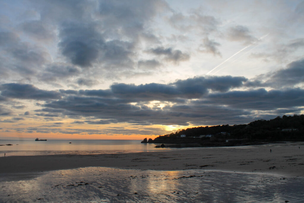
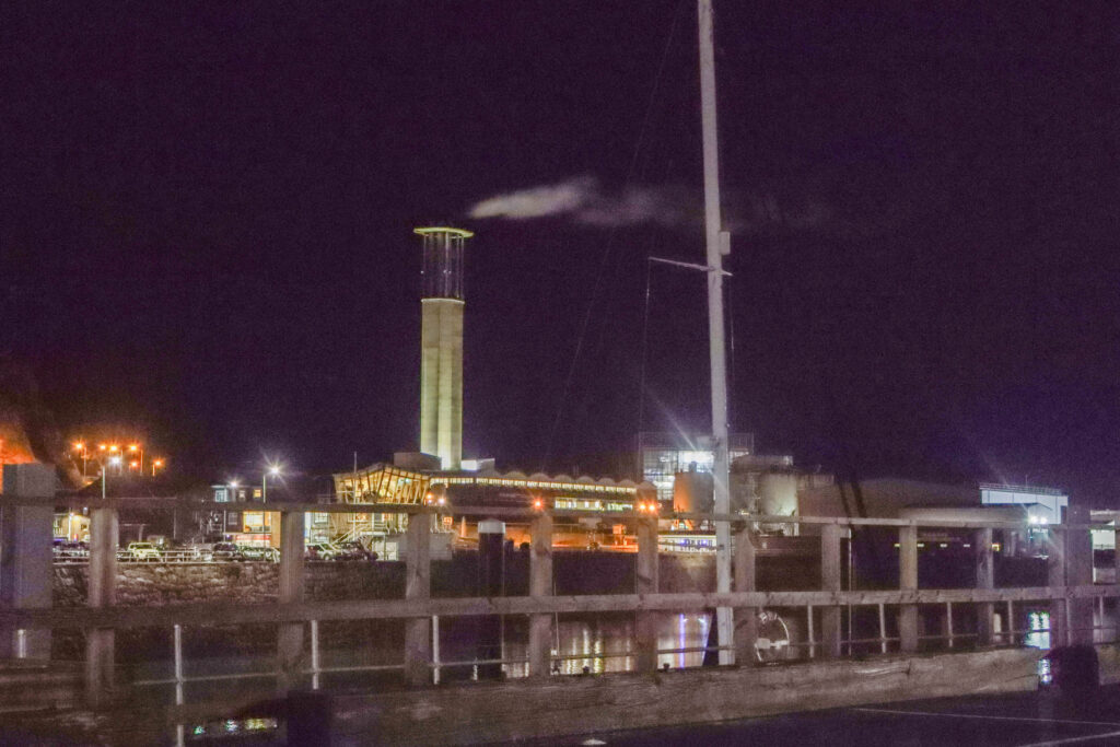
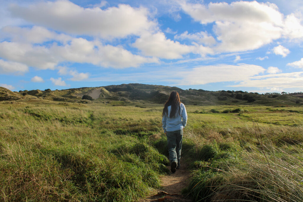
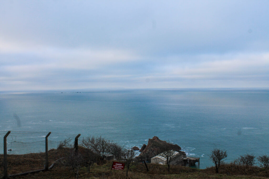
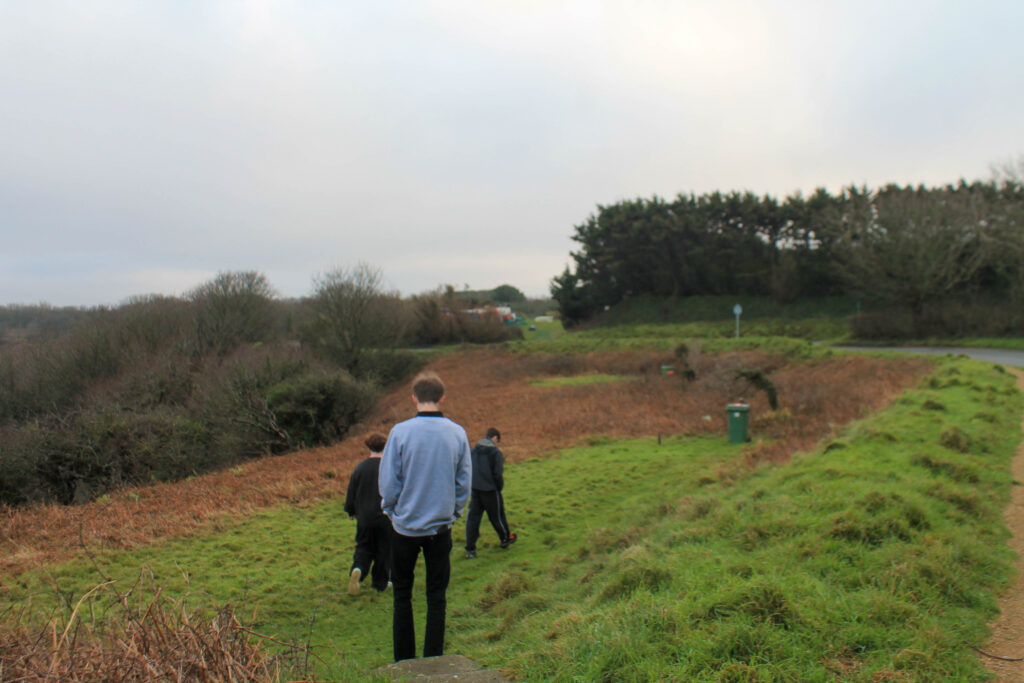
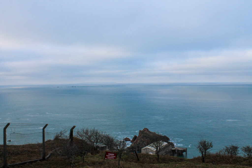
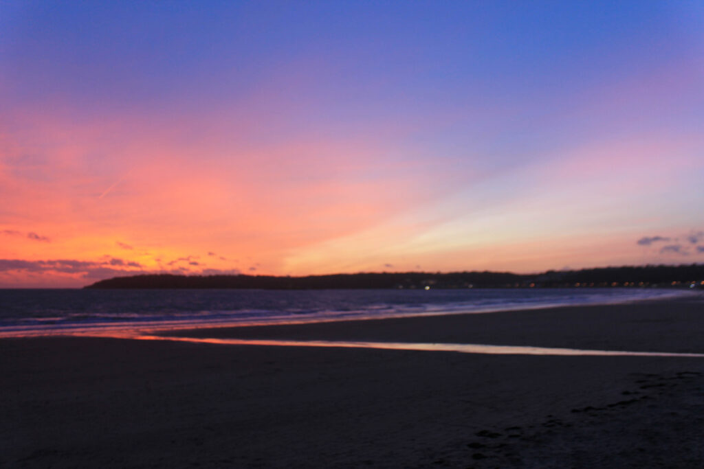
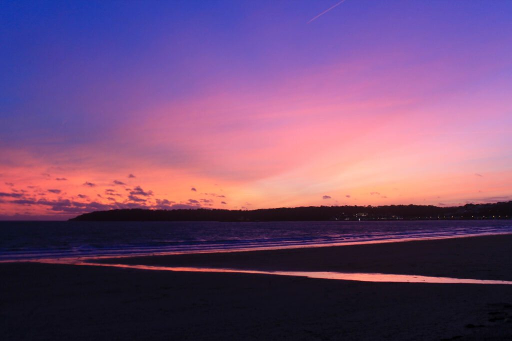
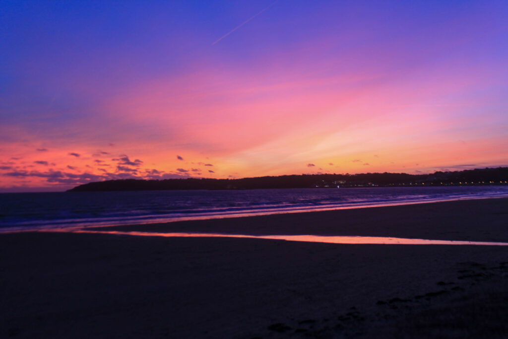
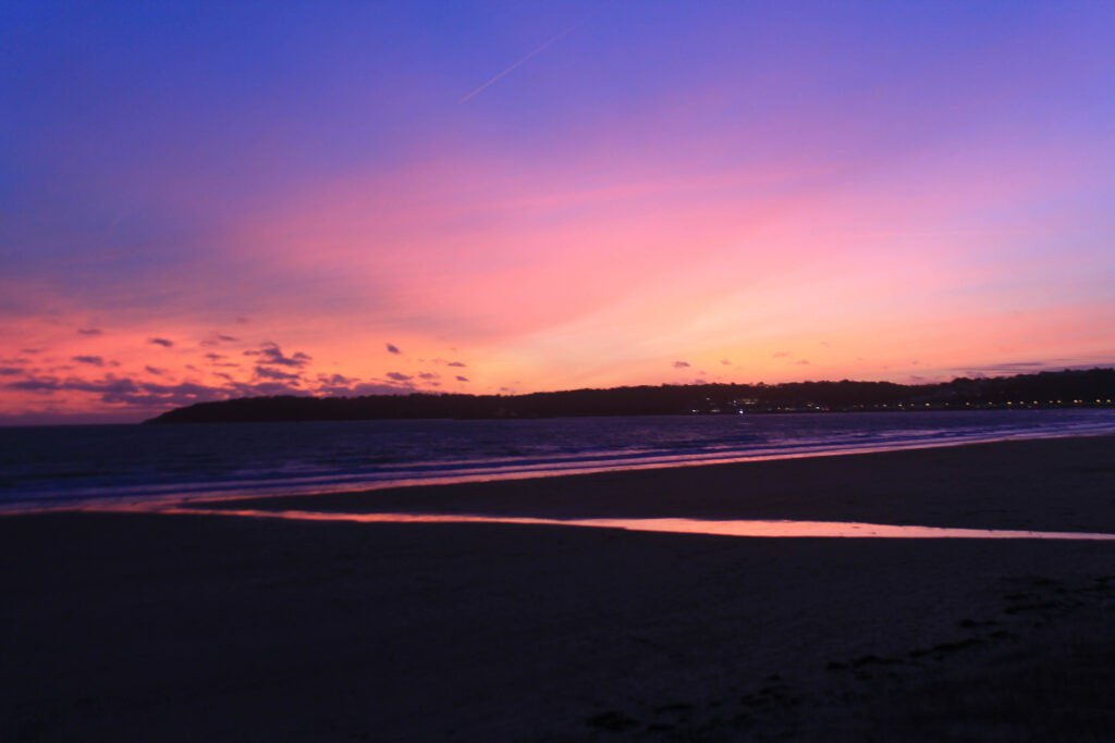
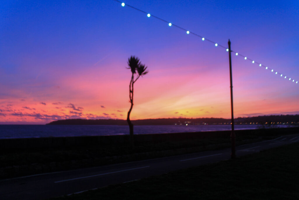
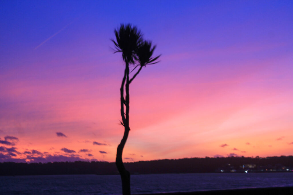
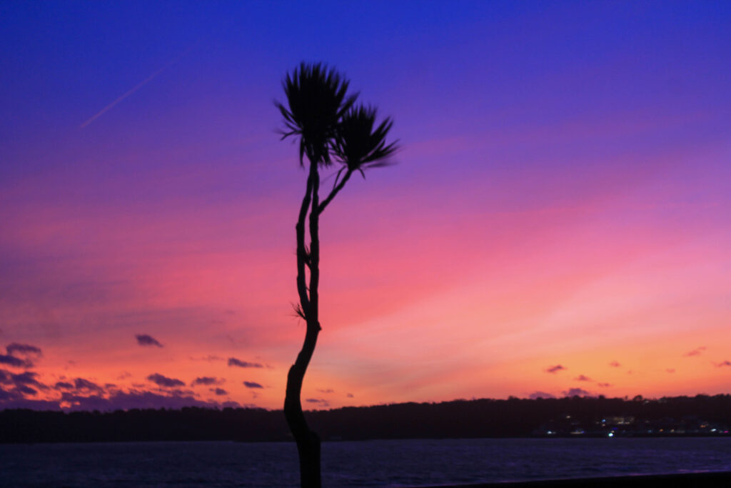
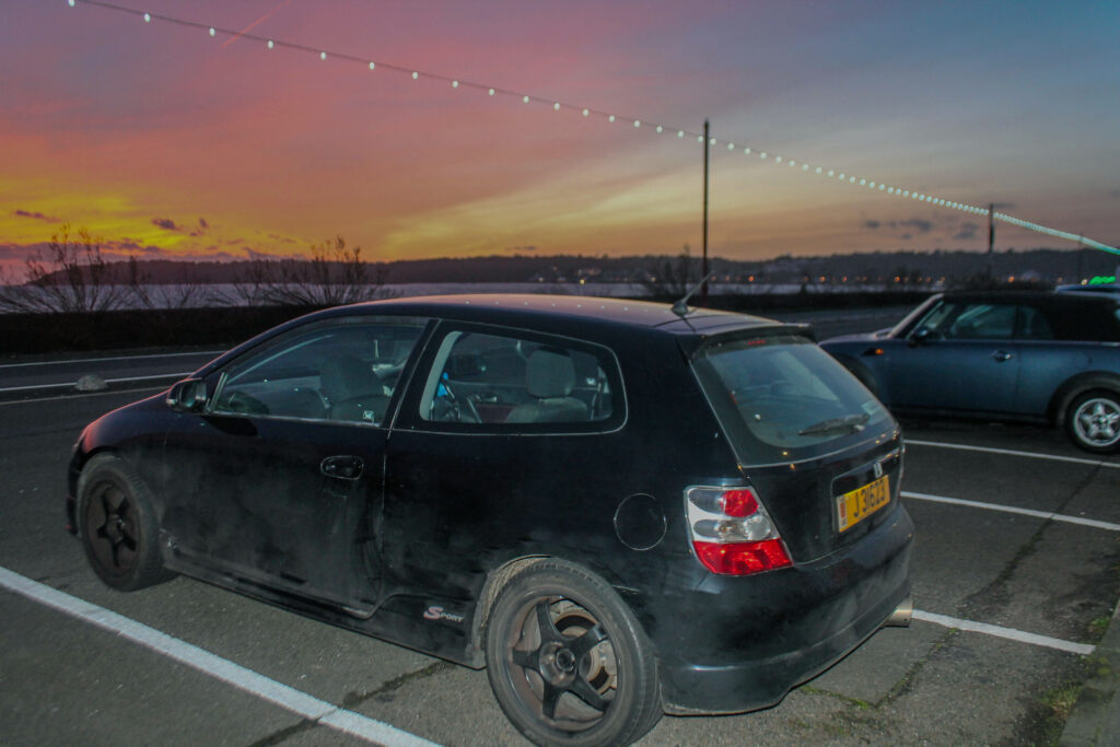
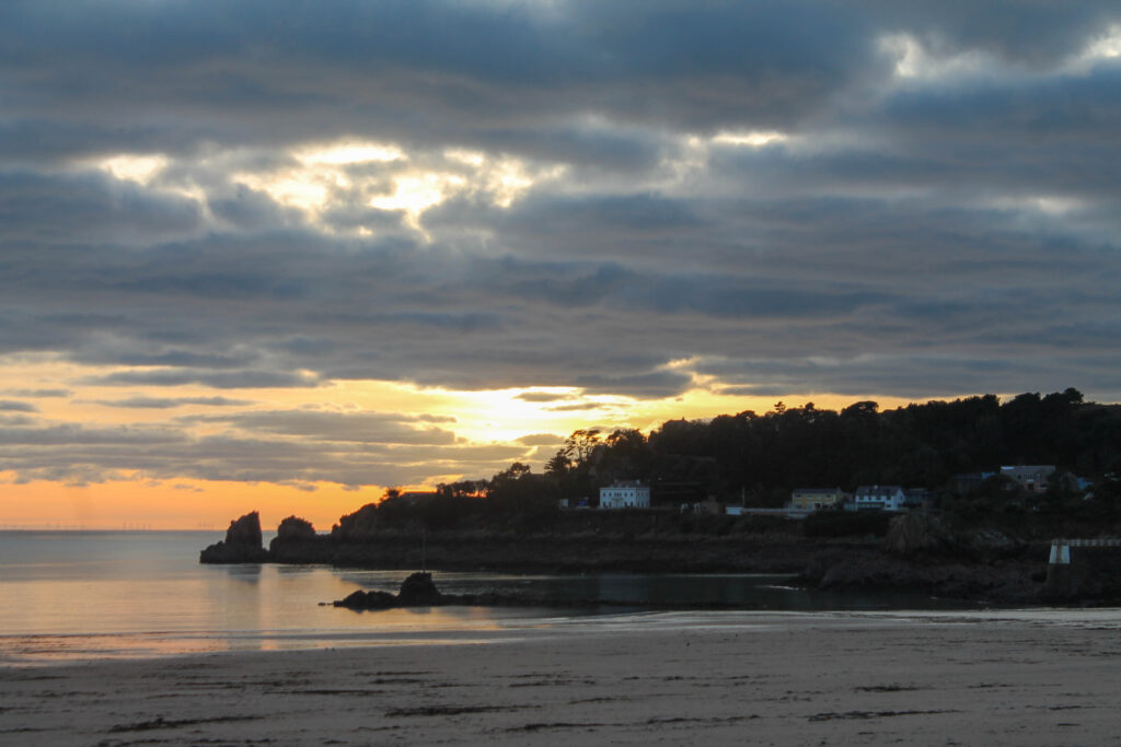
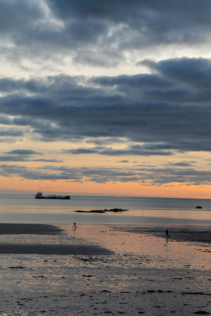
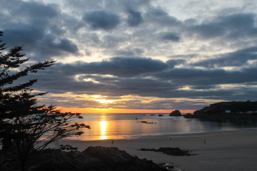
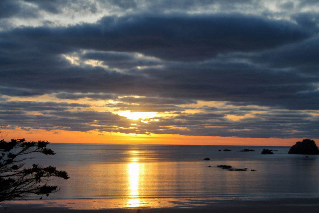
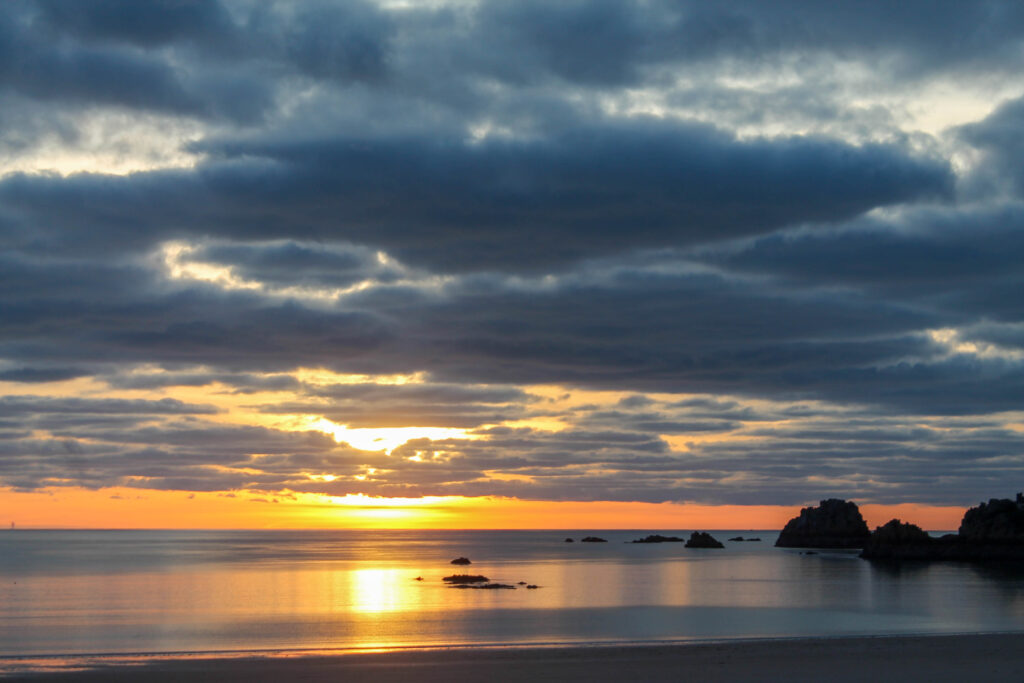
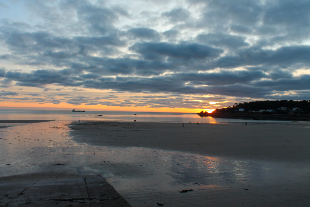
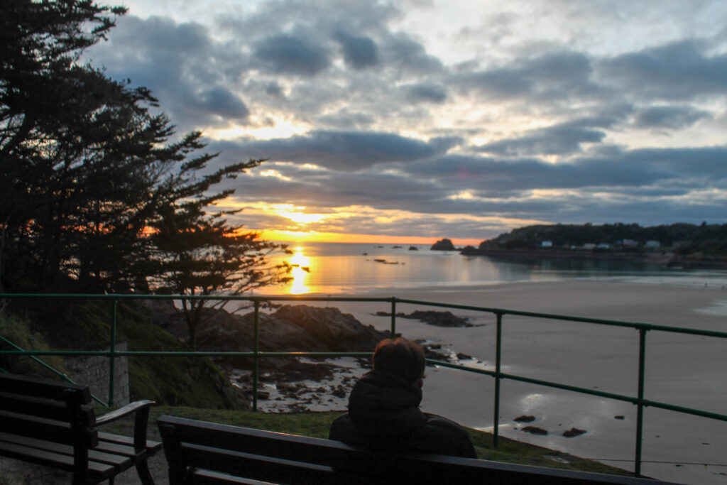
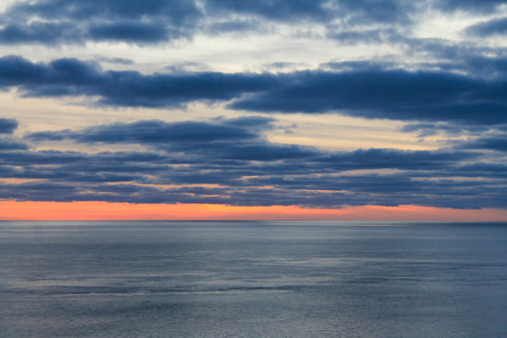
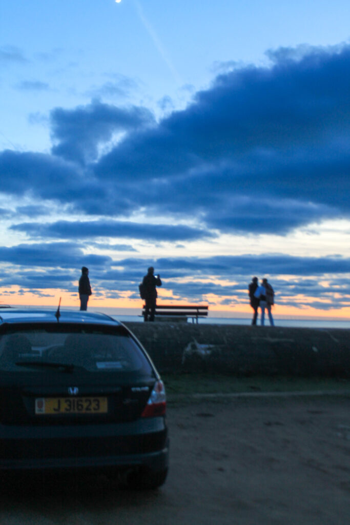
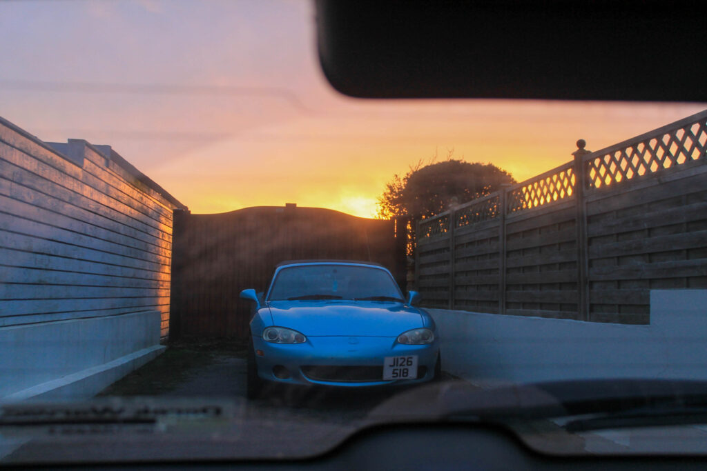
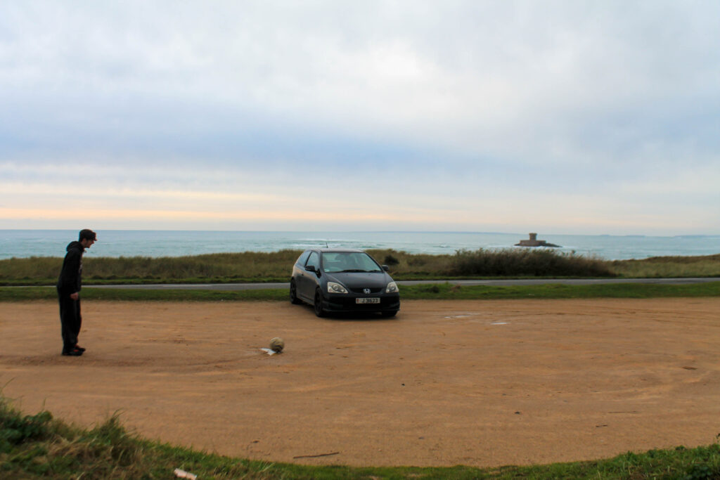
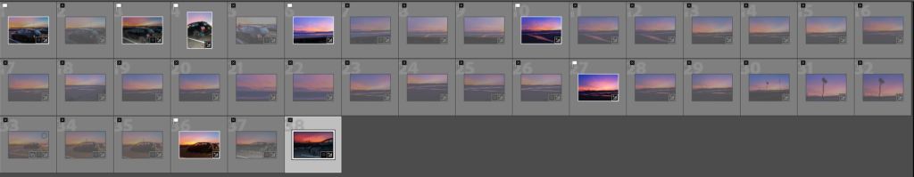
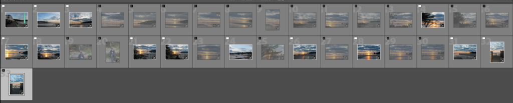
This image is going to be one of my breakthrough images. Using the lighting as bright creating a positive connotation around my other images. I have used a wide landscape lense to add to the foreground and background, having the reflection of the sun in the water may add a conceptual analysis and texture. This will make people think more about how we miss the beautiful things because we are so obsessed with ourselves. This image is very 3 dimensional, the texture of the clouds and the stillness of the water creates a sense of calm, adding context to my image to provide the evidence that I want to create a positive board.
A4
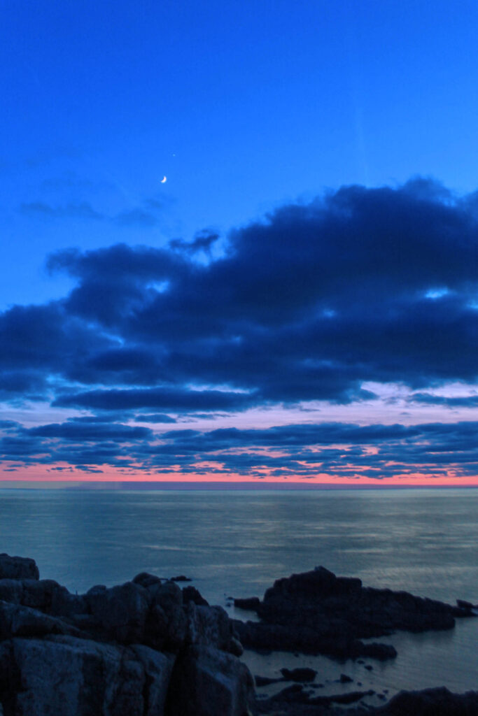
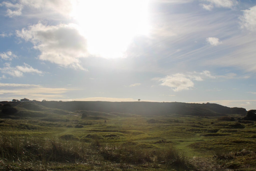
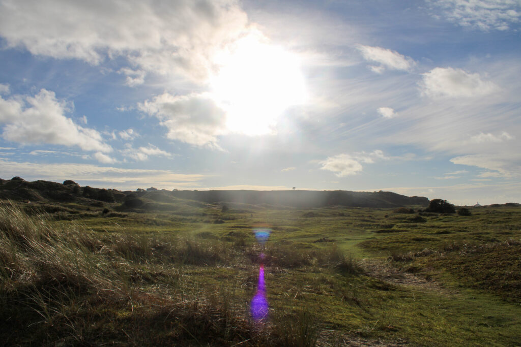
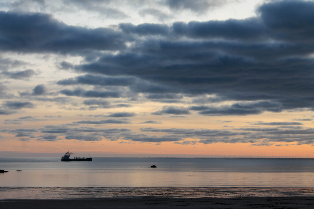
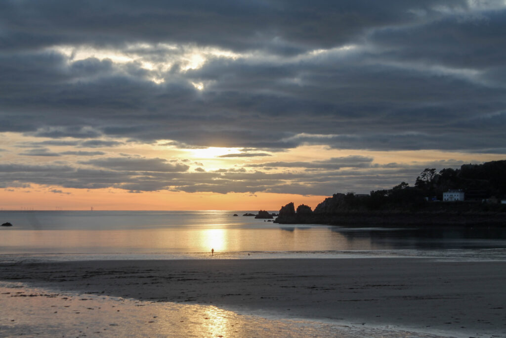
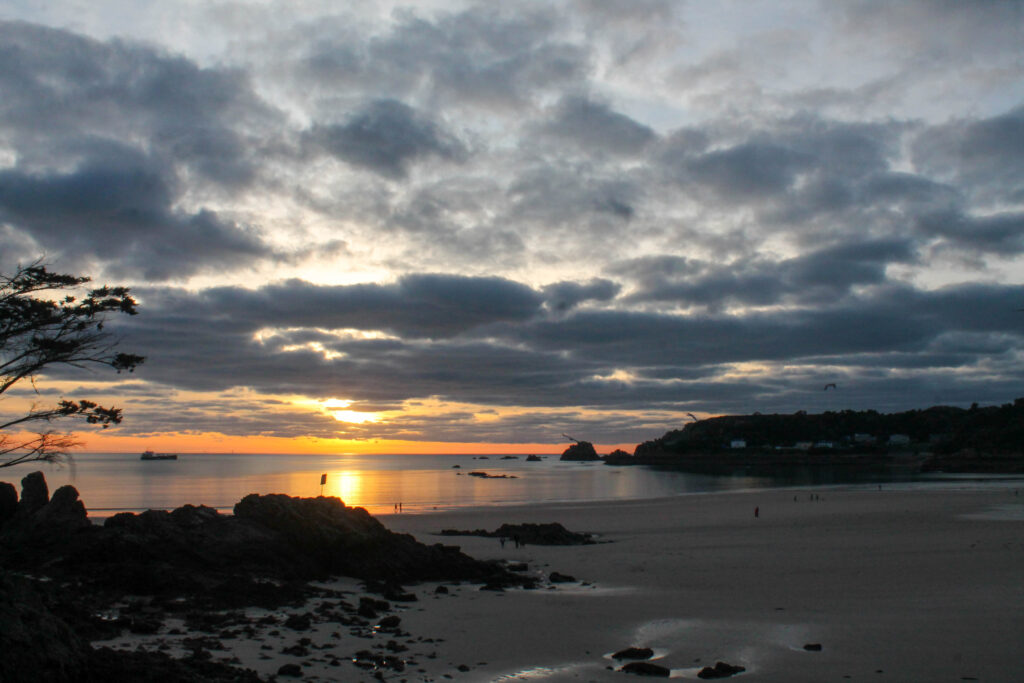
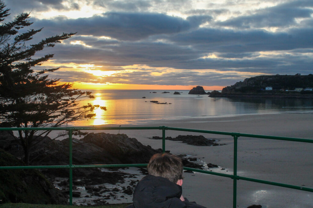
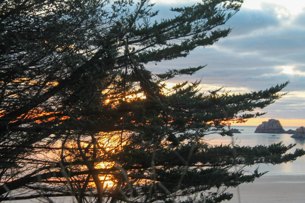
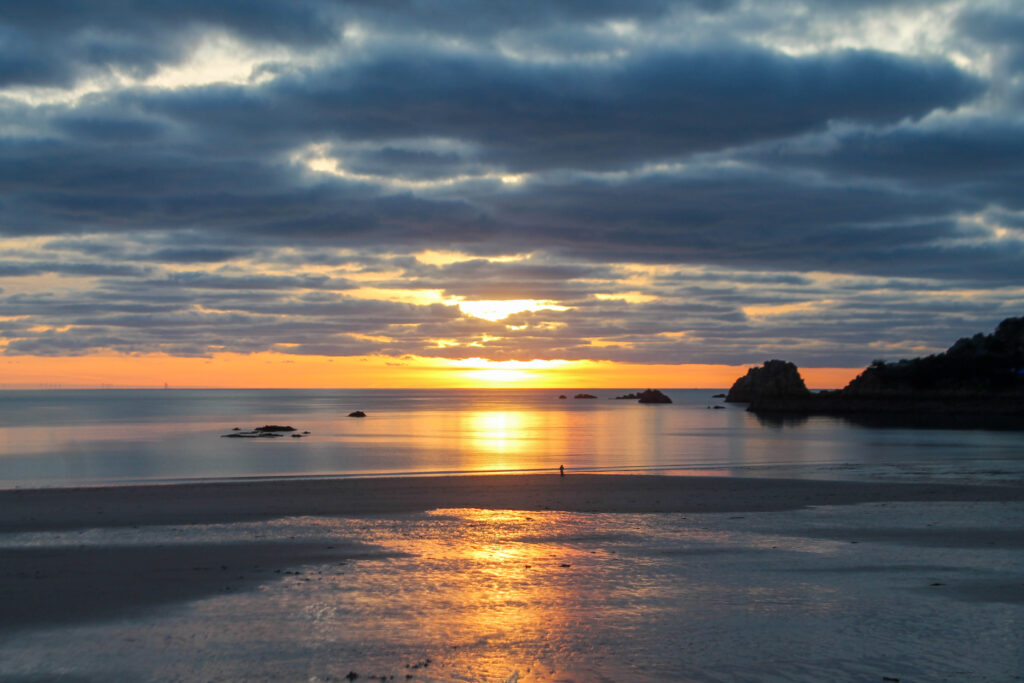
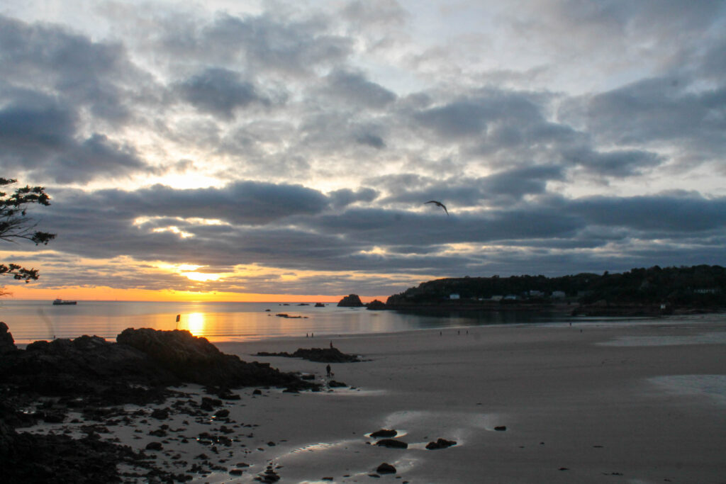
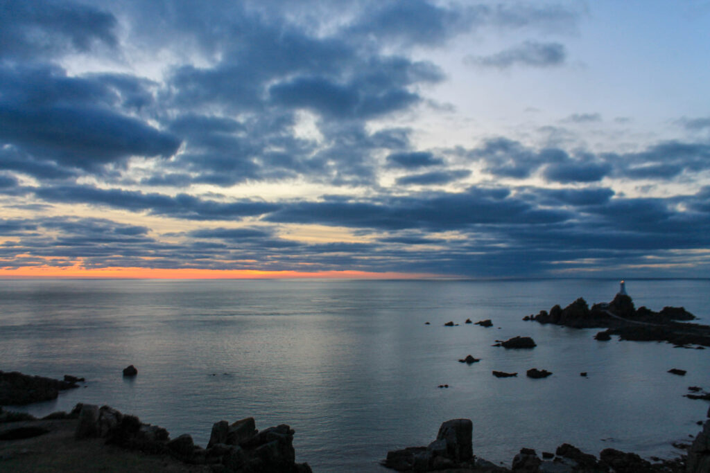
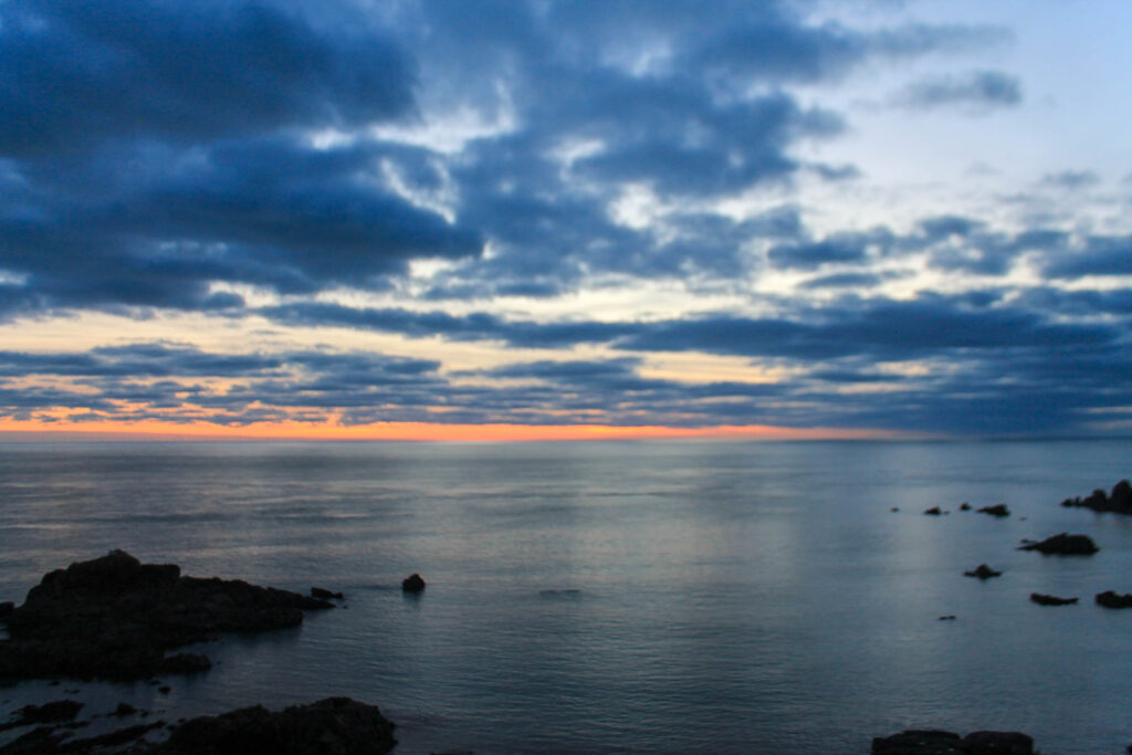
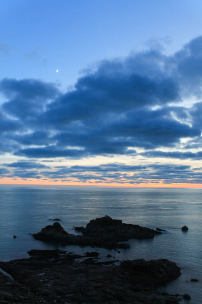
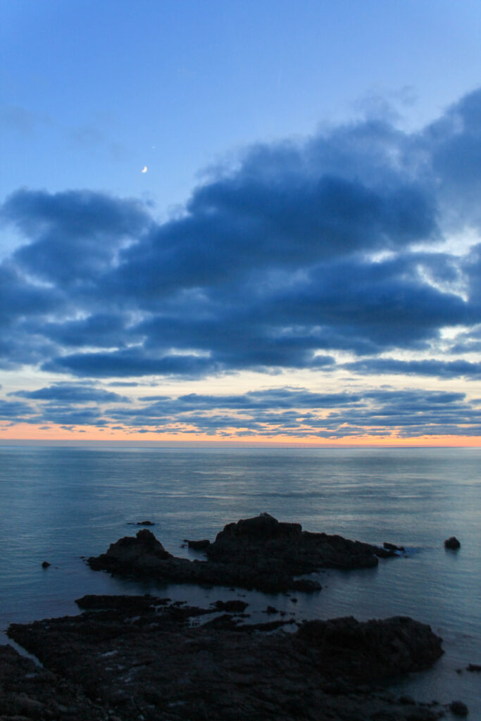
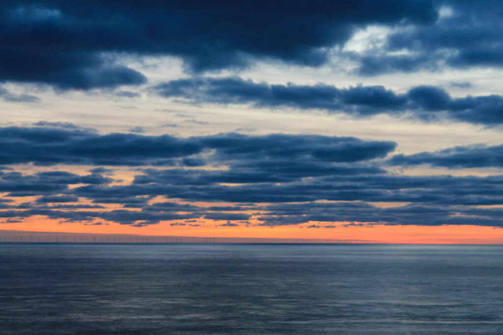
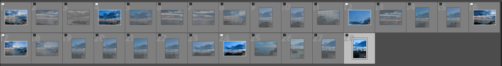
This is going to be another one of my break through images but with a cooler tone. I wanted to add something with a darker composition and more focus on the background rather than the foreground to allow the viewer too breath. By adding something that is easier on the brain it will make them think more conceptually about this image and more contextually about the others, trying to use the other to build up a storyline but using this one to build up a conceptuality, creating an essence.
A4
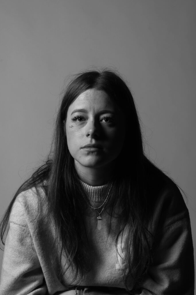
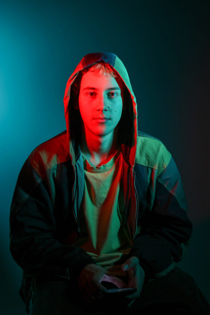
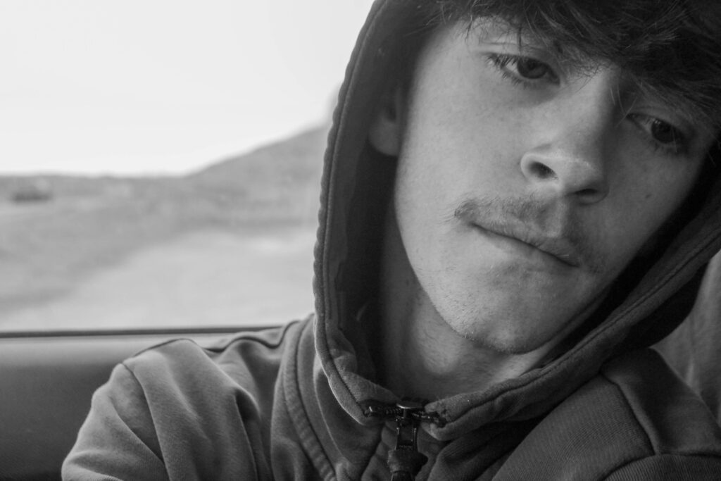
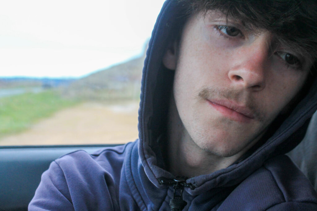
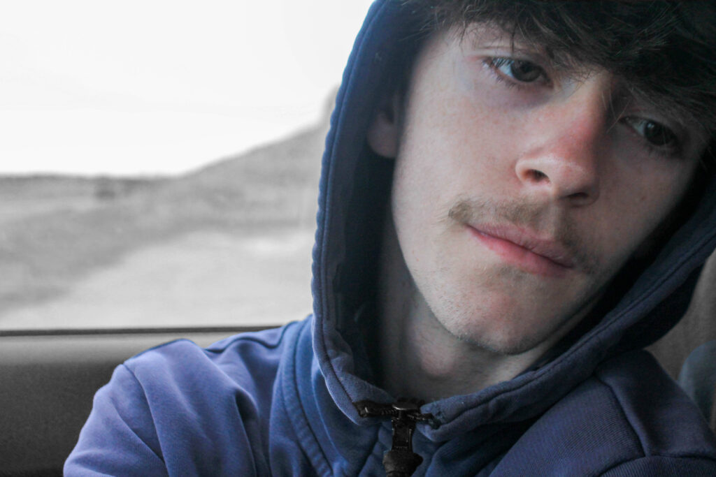
I have added this image to add onto the contextual meaning of my board. This image is up close and personal, using texture on his face and 3d elements to feel that connection. By adding a up close image it breaks up all the other story lines, delving deeper into him. I have used background light to reflect on his face and bold colours around him to make his skin tone pop. All my images will cross over onto each other, but I wanted this one to stand out a bit more, allowing for a more waved pattern rather than simple repetition.
A5
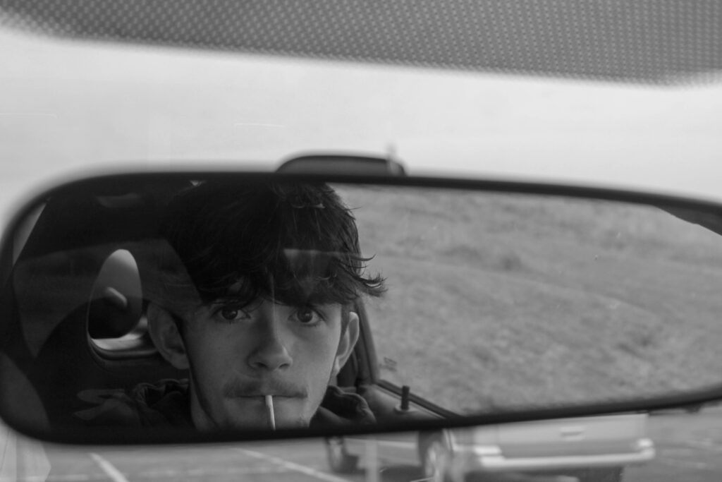
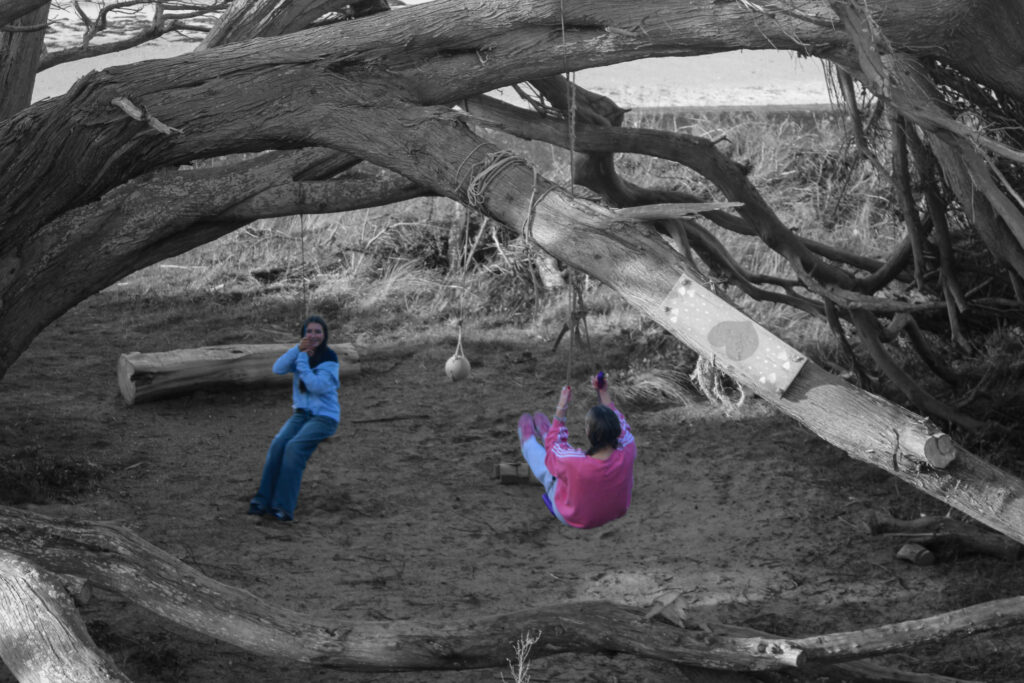
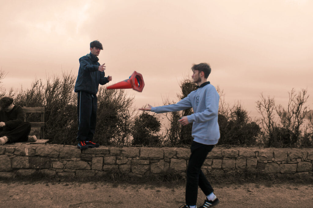
I have used this image to break up from the drinking and smoking. By adding something more childlike and nostalgic it will add context and a conceptual meaning about how there are always multiple sides to people. The motion in the image allows for texture and the use of two people allows for action. I have used photoshop to edit the background to make it a bit cooler rather than fully grey as I wanted this image to have the golden connotations of nostalgia. My image is a bit grainy but that adds to the old-style I was trying to replicate. Using harmony between the shades of the wall and the golden shades of the sky but contrasting with the bolder colours of their clothes.
A5
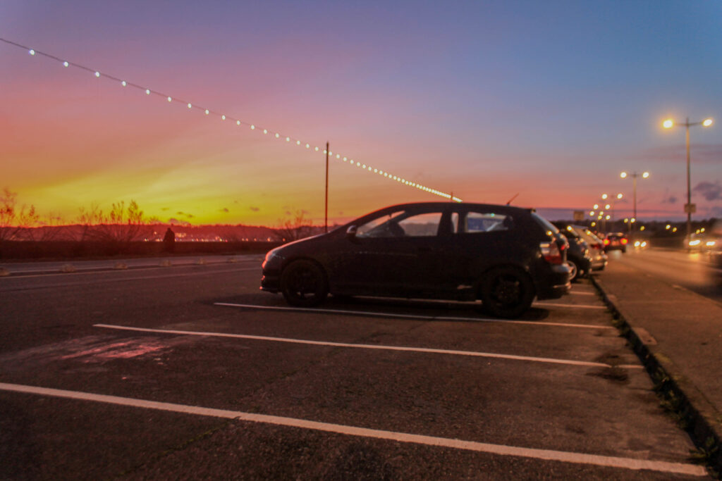
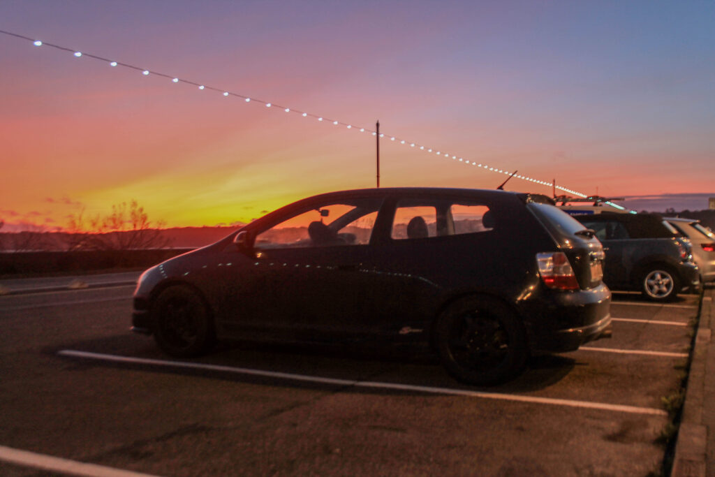
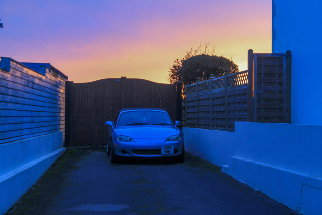
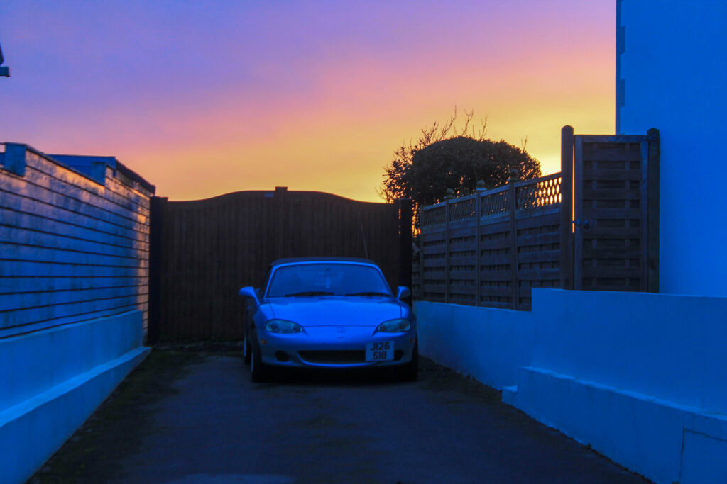
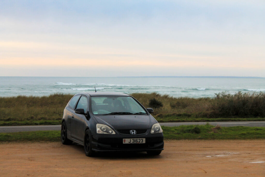
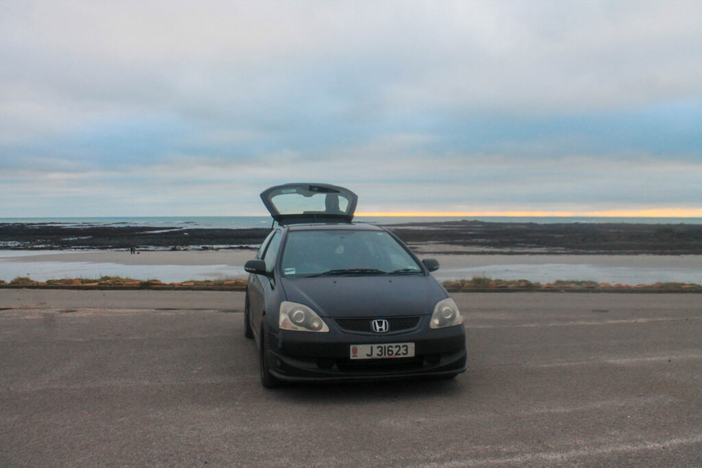
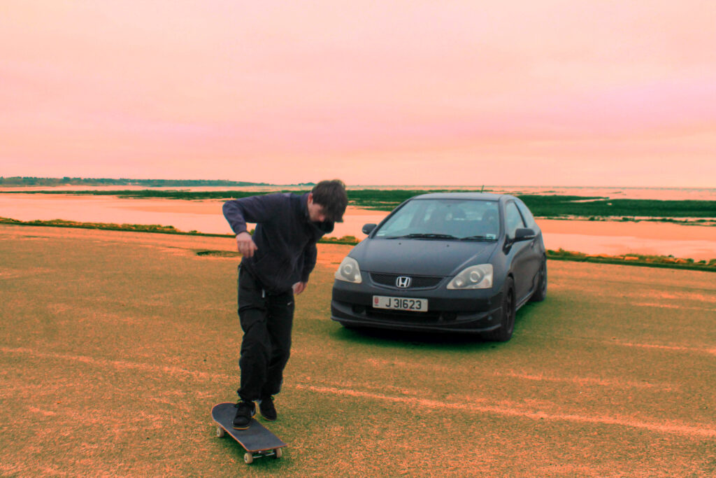
I wanted this image to stick with the golden style but be a bit brighter. I have still kept this landscape as a breakthrough but I wanted to add the car to the image to create a harmony between all of the elements. To explain the conceptual meaning that we can still have fun while observing the world around us, we don’t always need to just focus on ourselves and what we are doing and we can always branch out and take in other things as well. This bring deeper value to my imagery, adding a key narrative. This creates a depth of background, with the borght colours of the natural sky even coming through the car windows it show how everything can actually flow together.
A5
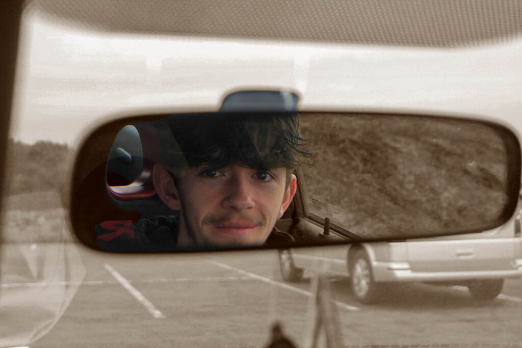
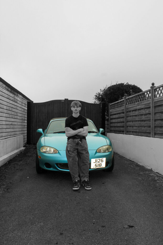
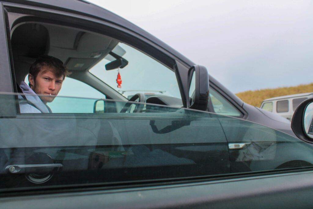
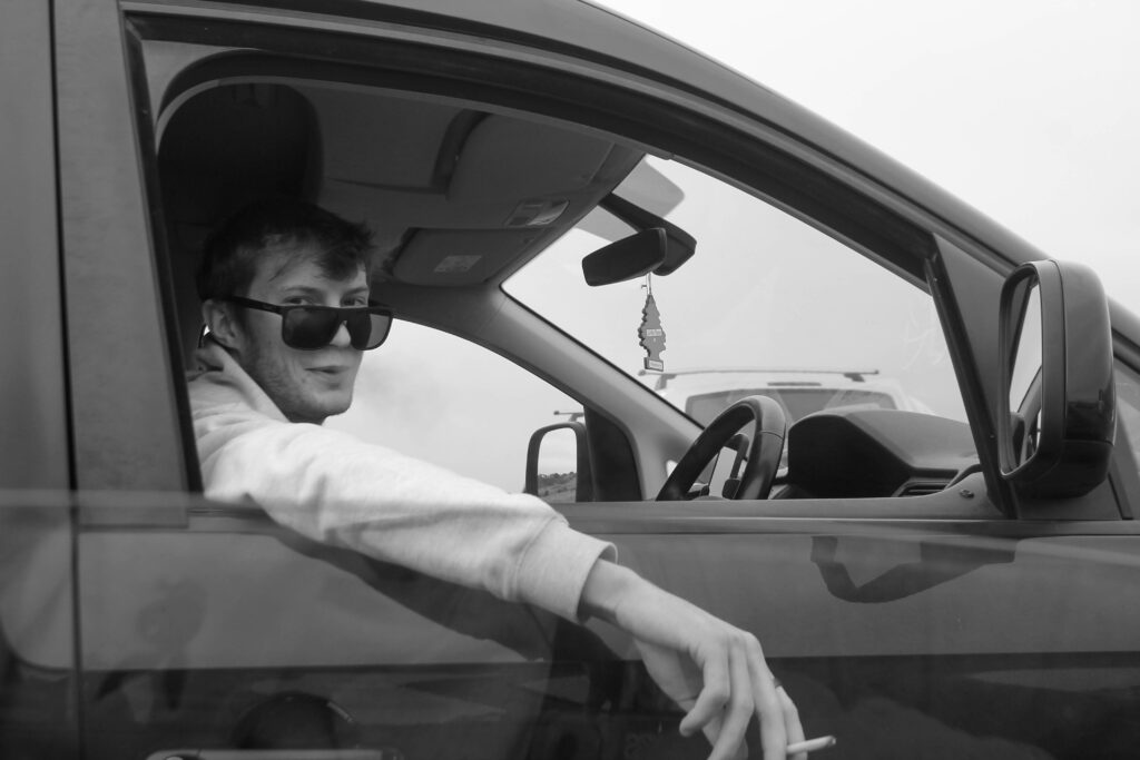
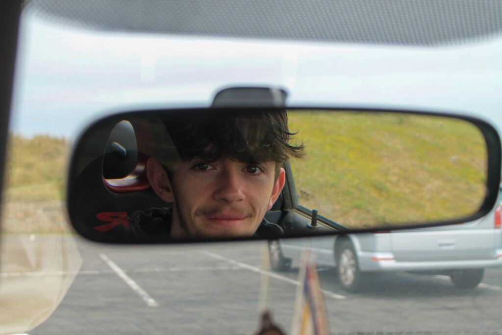
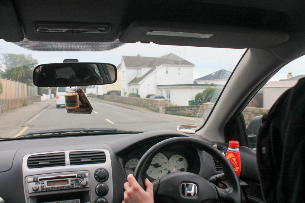
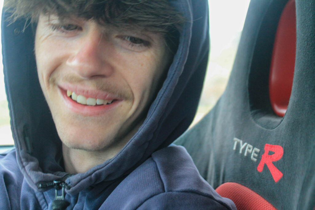
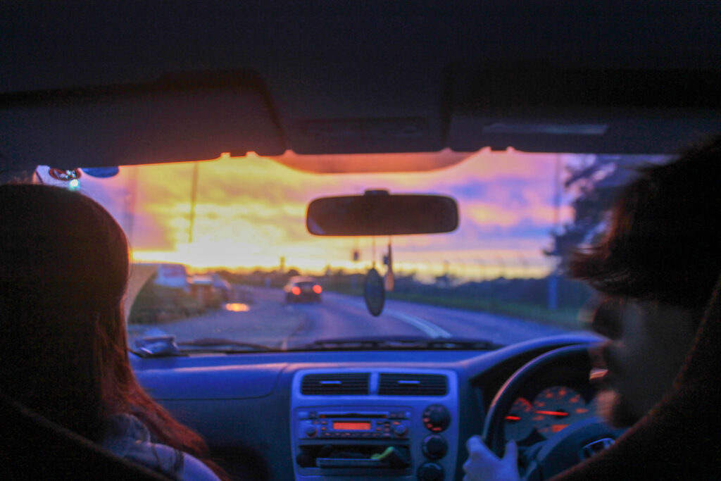
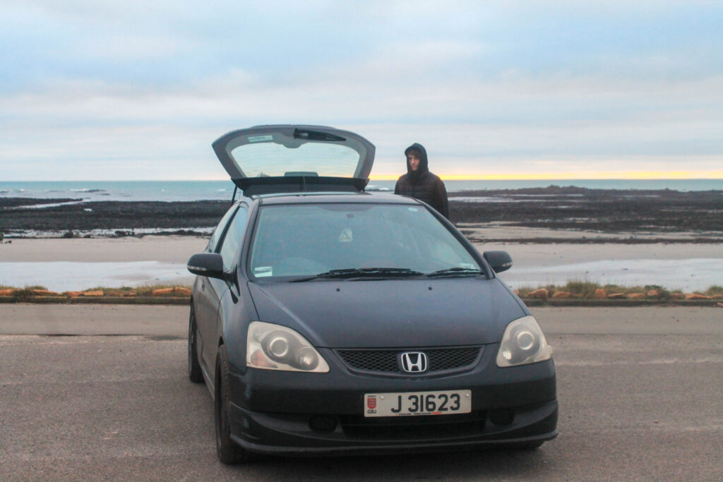
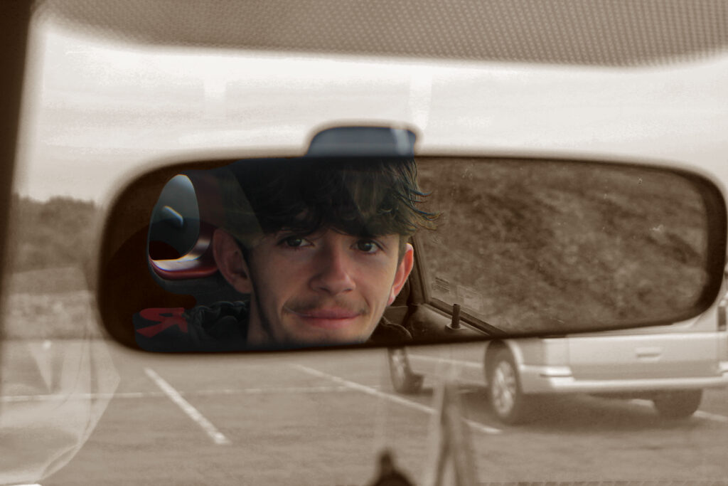
This image will add a deeper personal connection through all of my images, I wanted to keep the use of eye contact but add a smile to show how when he is in his car he is happy. Providing proof that working on the car does make him happy. I have used Photoshop to edit this background to keep to the golden colours of all my images allowing a simple harmony between all of them. I took this photo in daylight to not have a glare on the mirror through the use of the flash.
A5
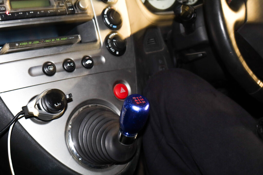
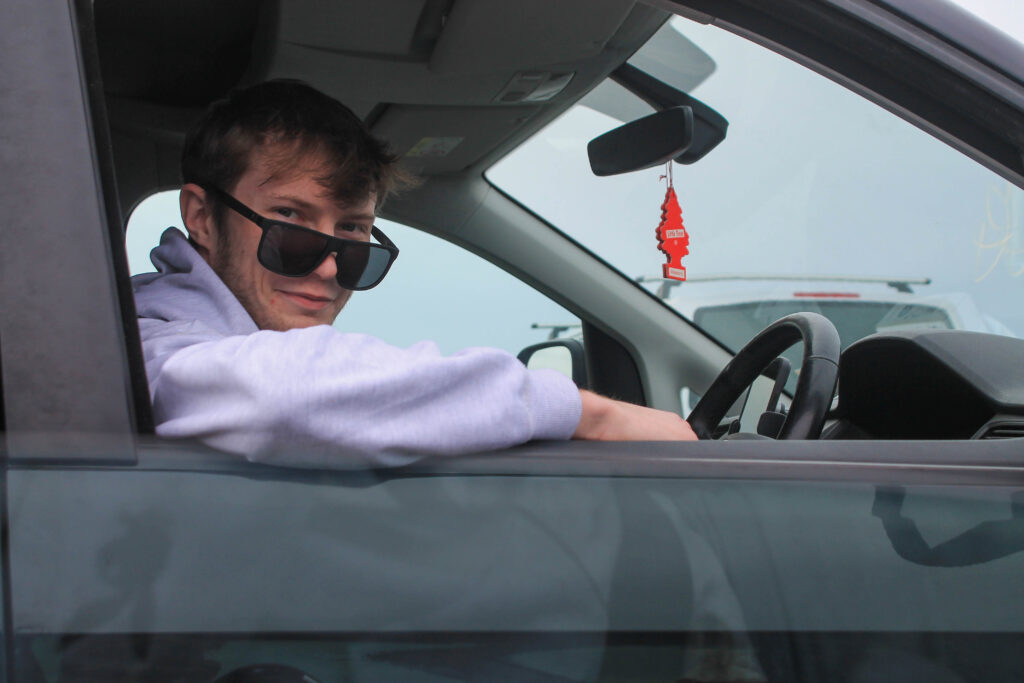
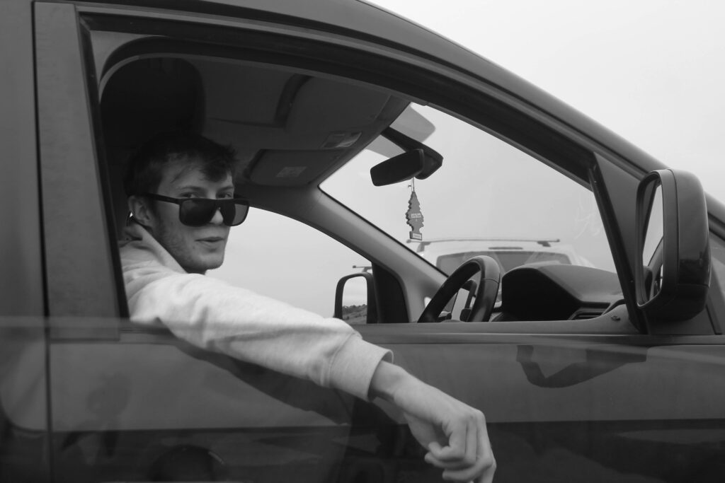
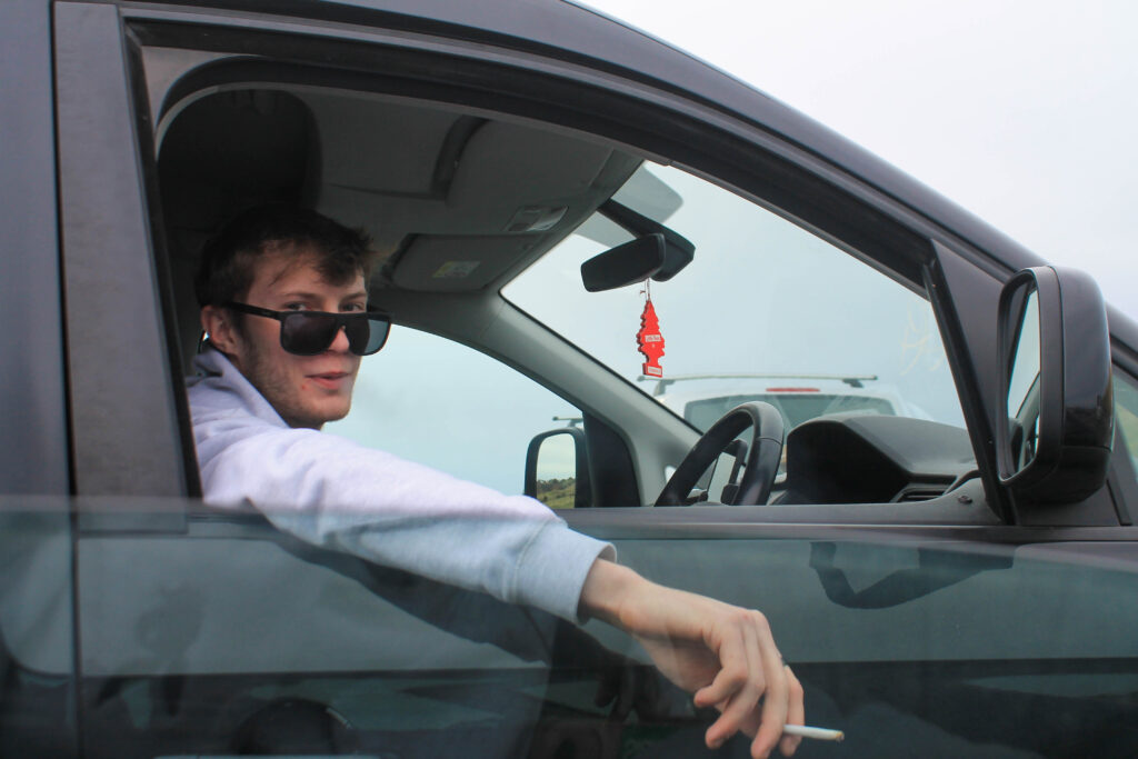
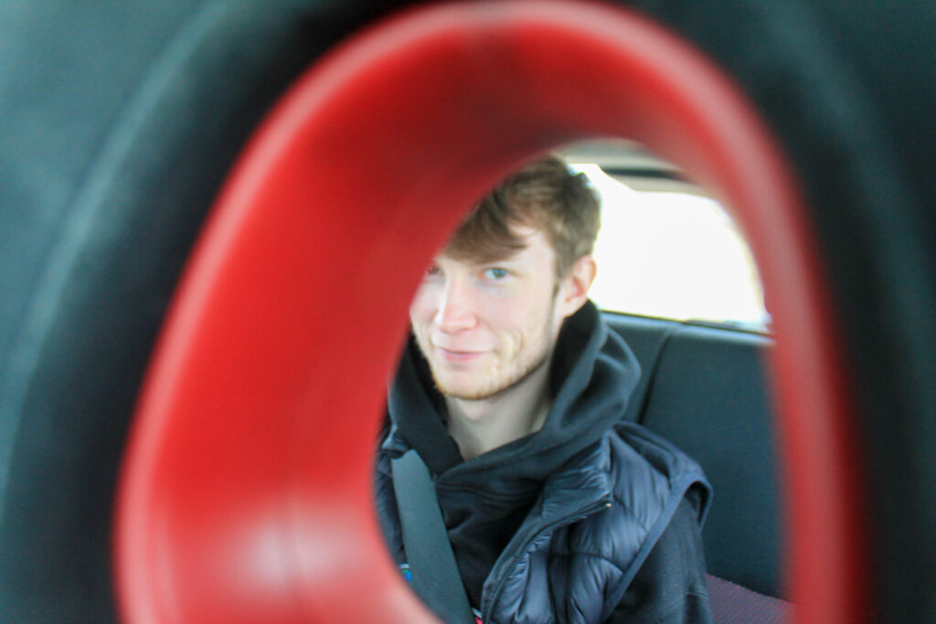
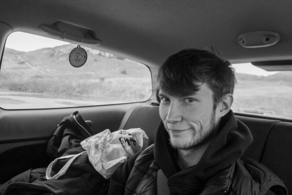
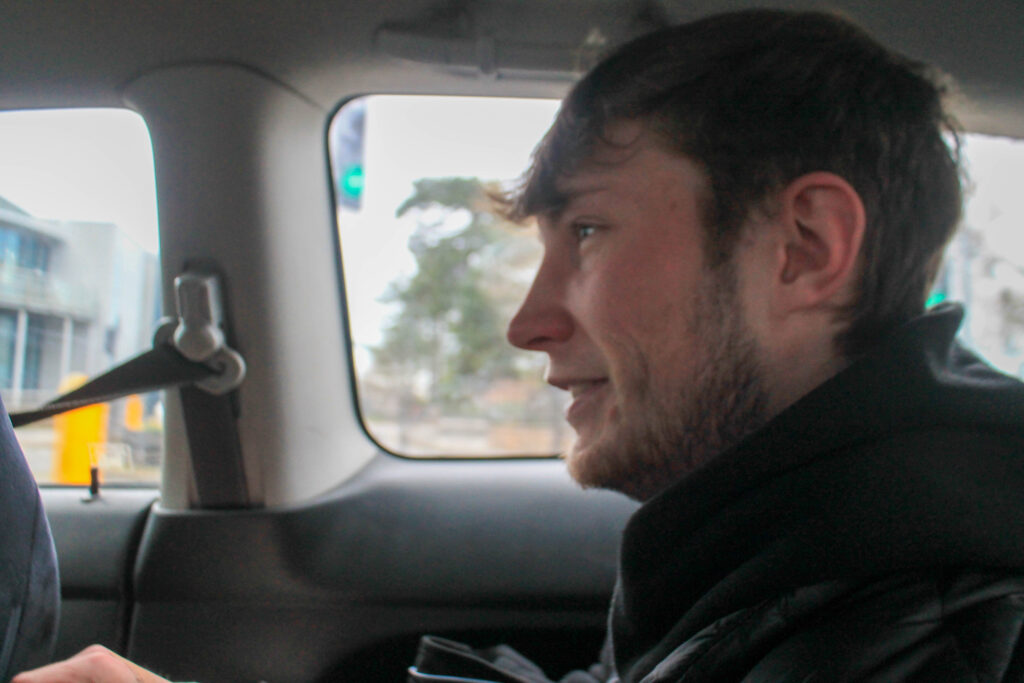
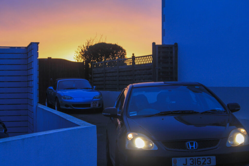
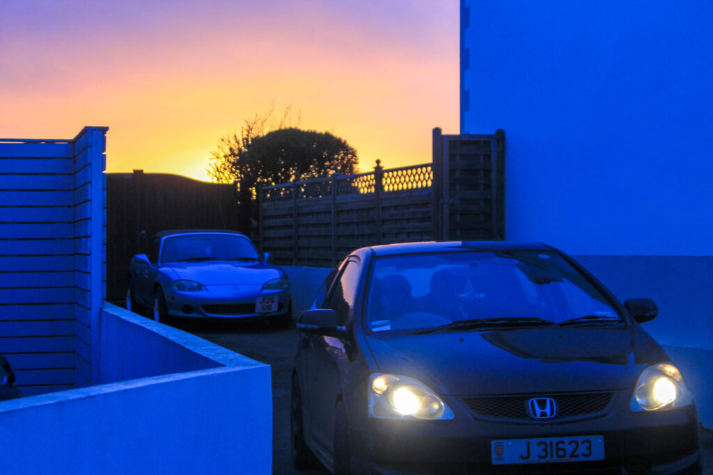
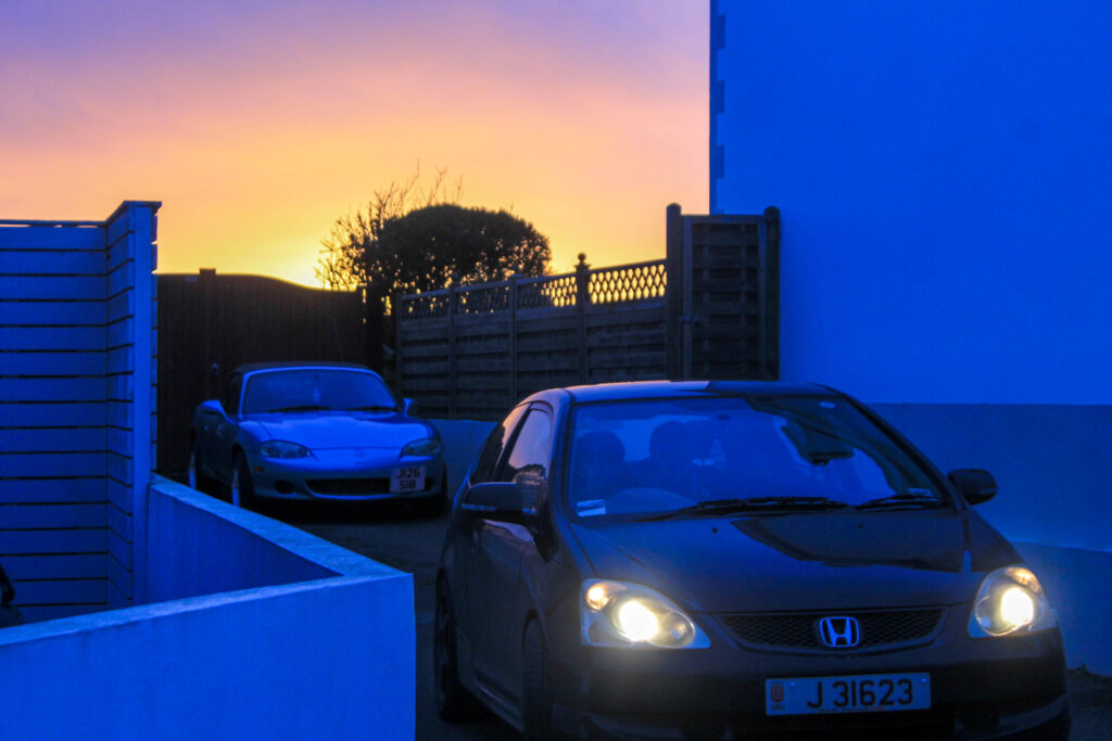
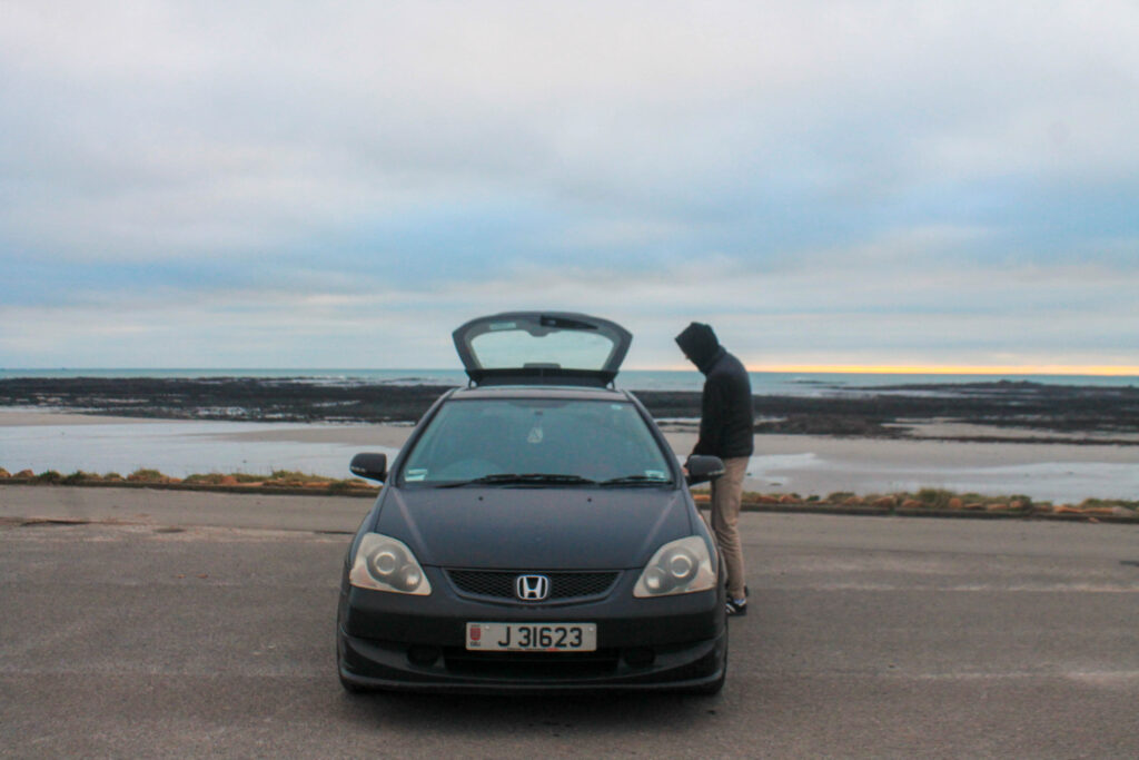
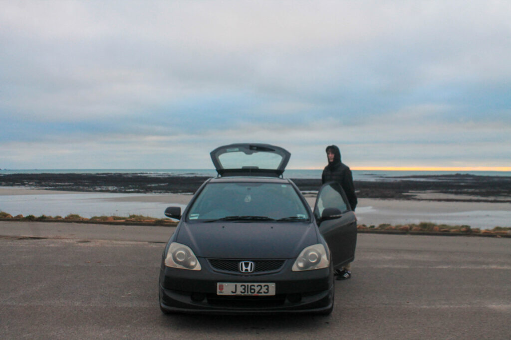
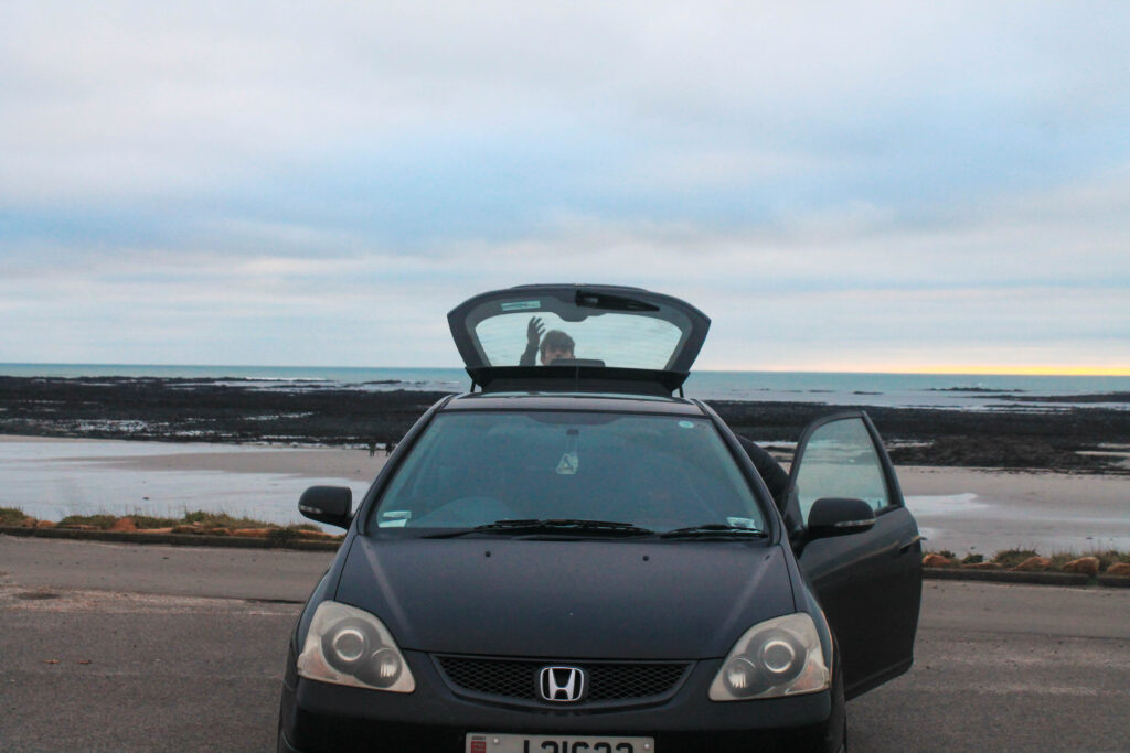
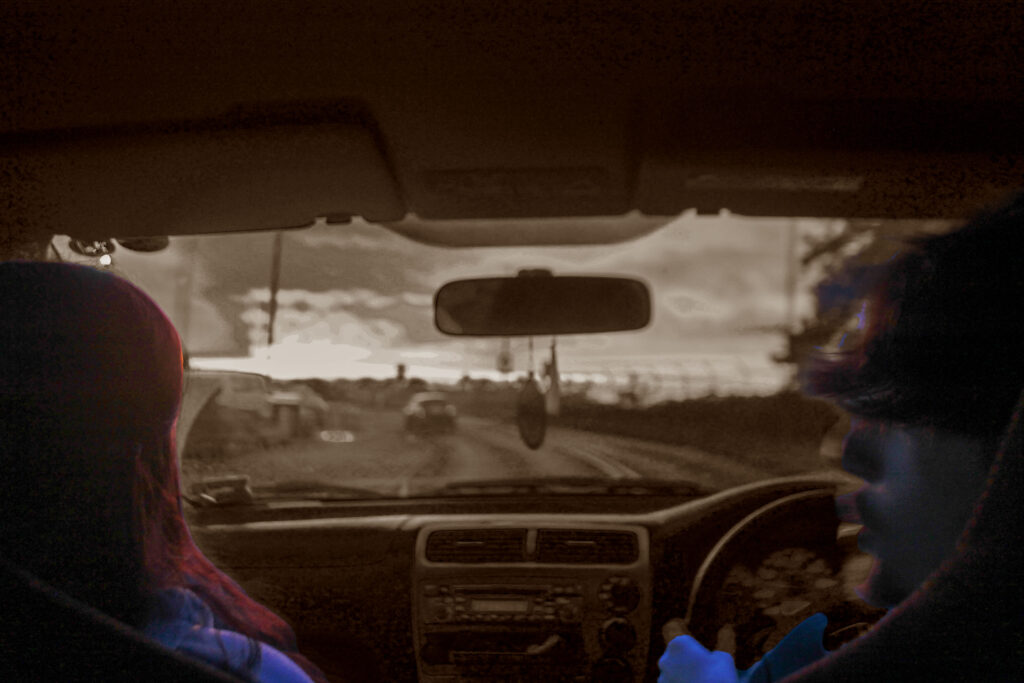
I have used this image to add to the conceptual analysis of how the car is a safe space. By the use of natural lighting I think it goes well with the happy aesthetic of my images. Using a zoomed in lens to tell a story about the two characters. The fluorescent lighting manipulates the car’s interior lights creating a very apparent contrast between the two.
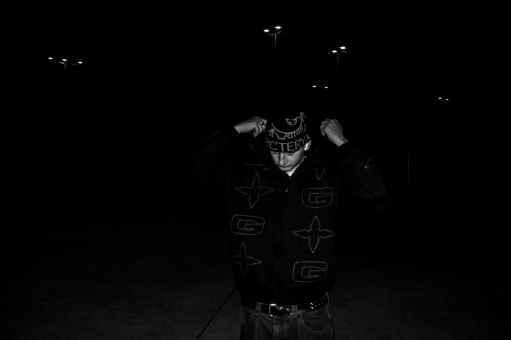
A5
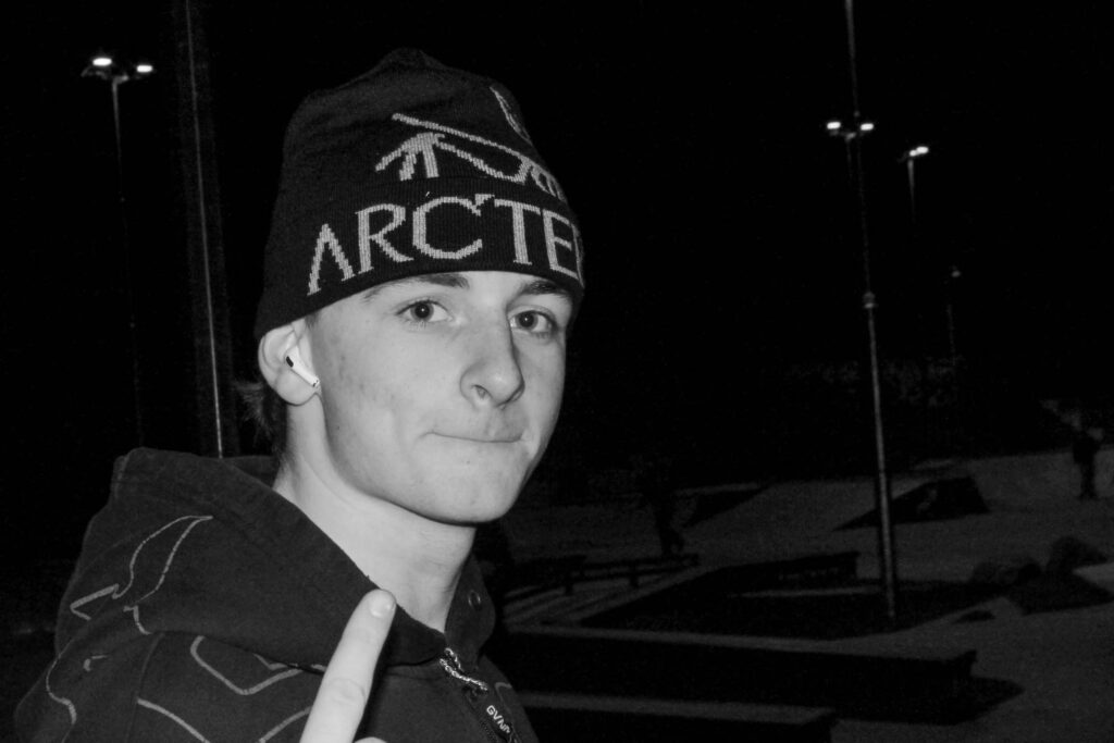
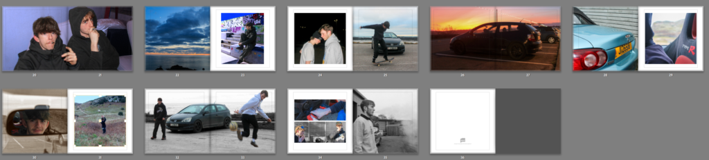
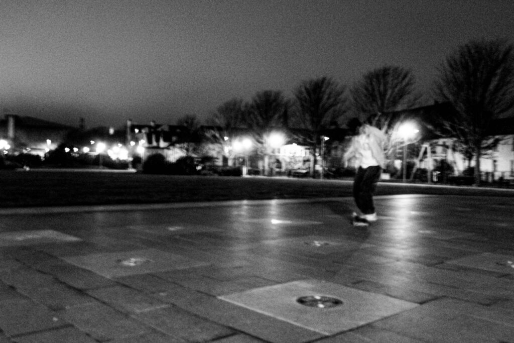
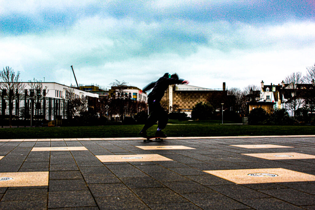
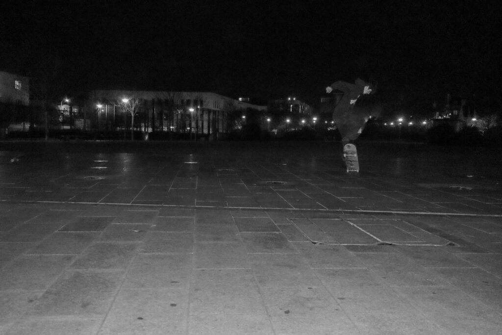
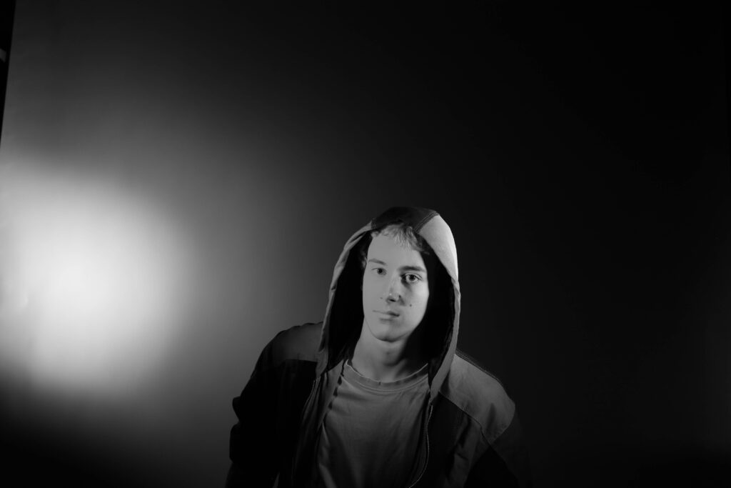
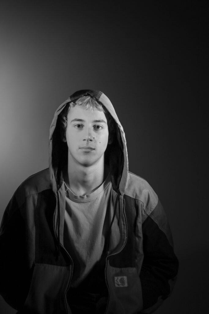
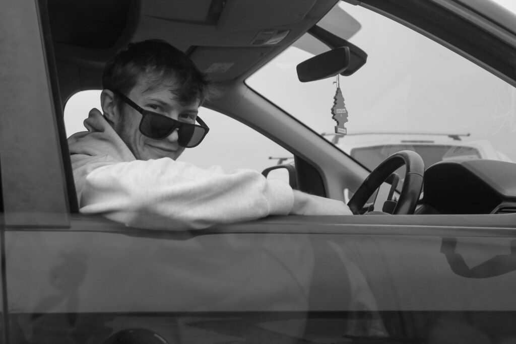
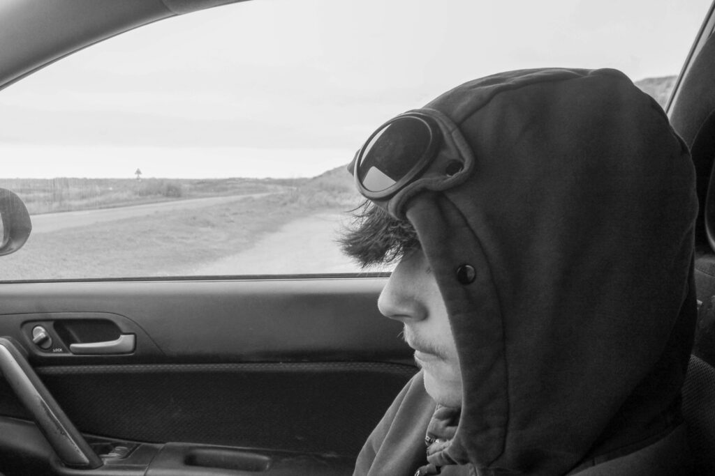
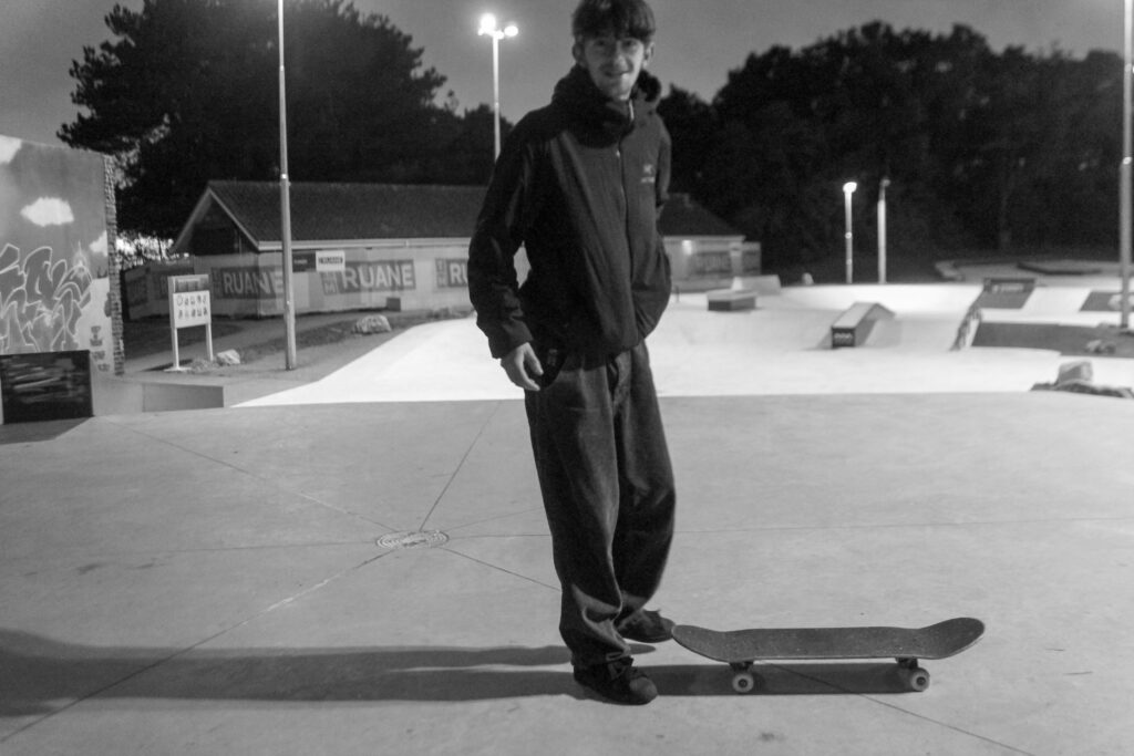
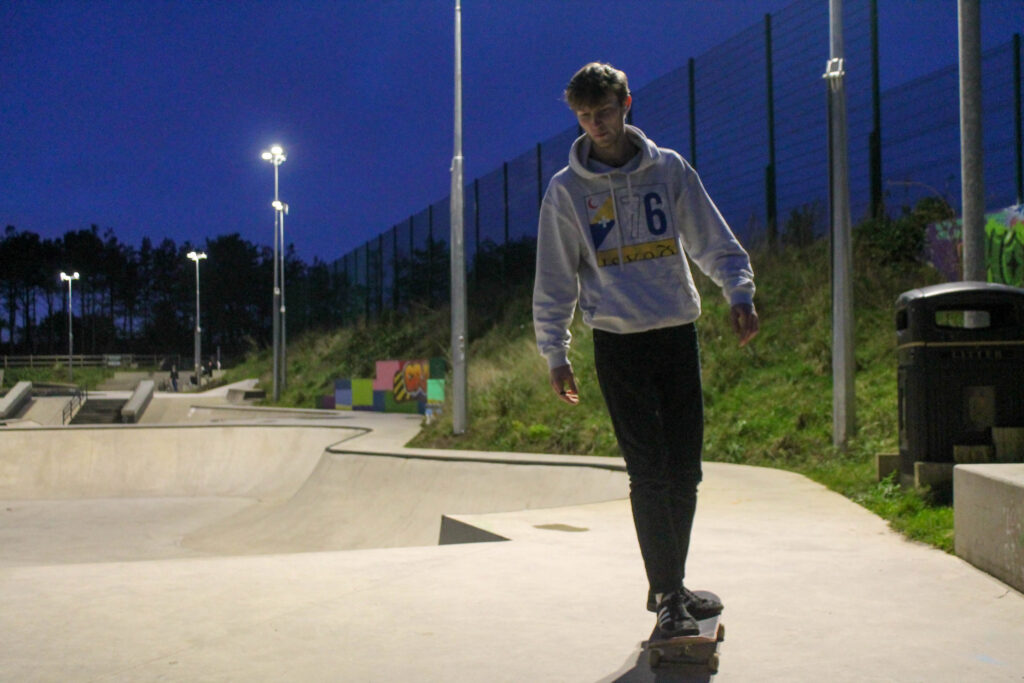
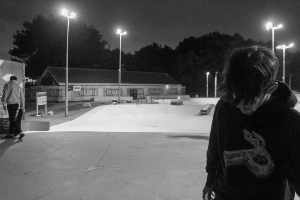
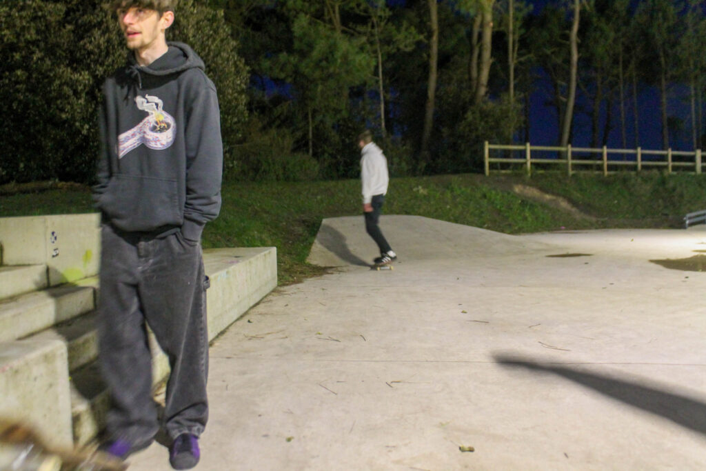
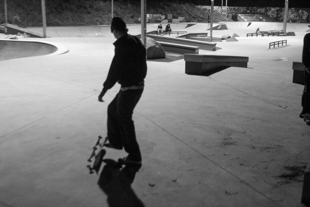
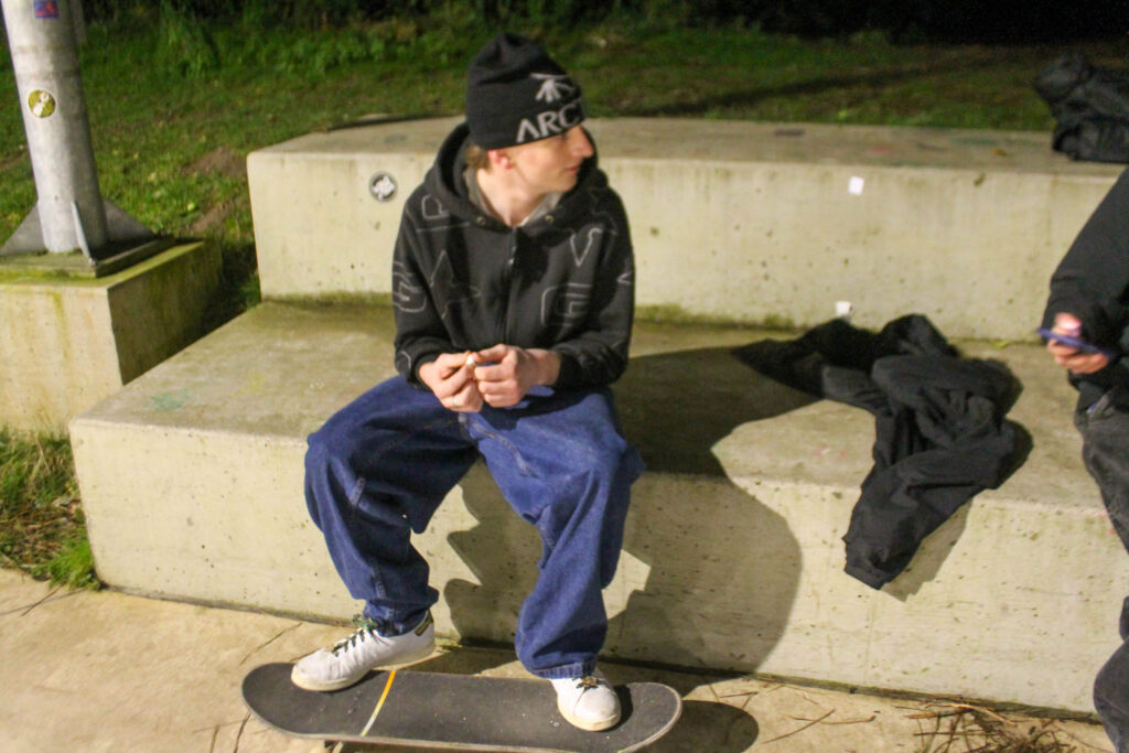
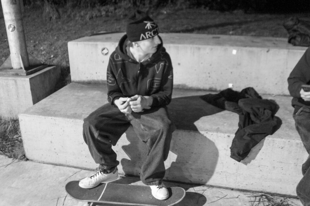
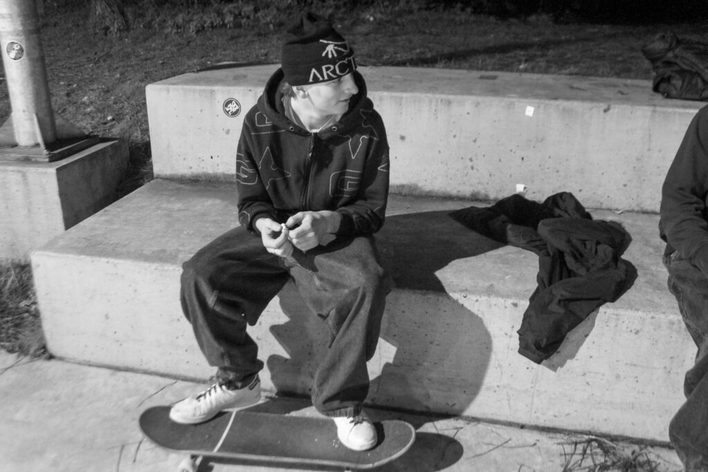
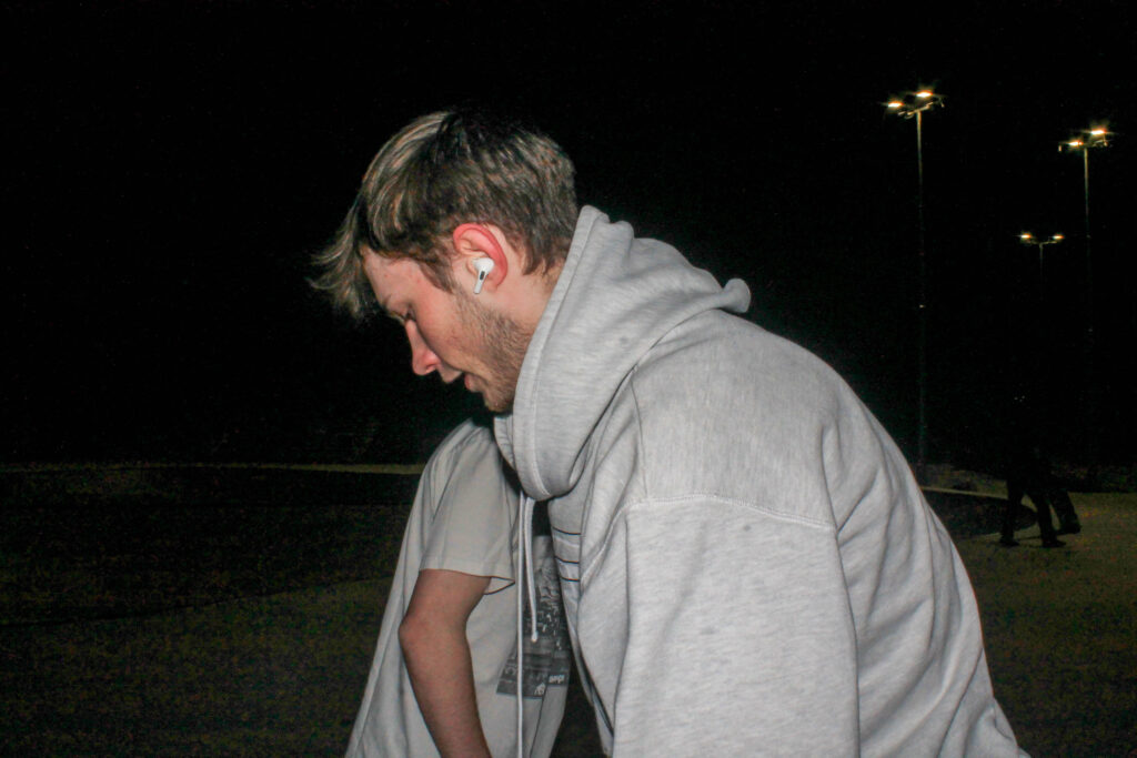
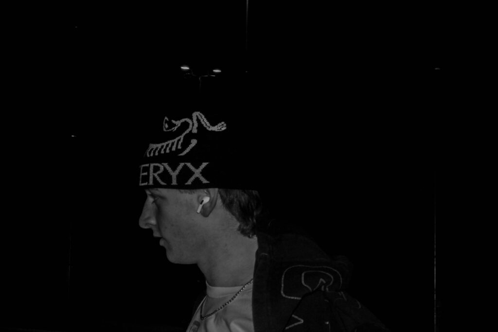
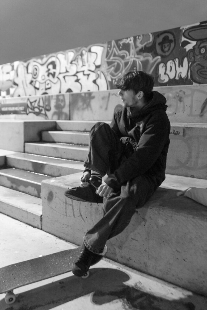
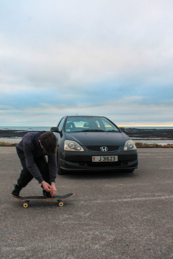
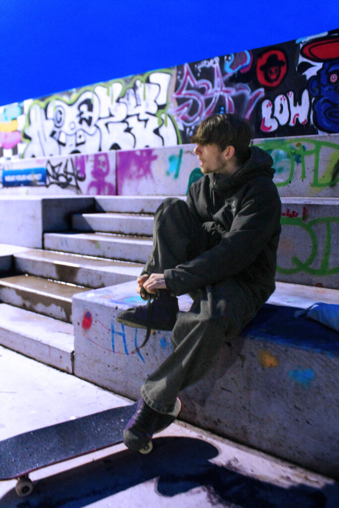
This black and white portrait captures a teenage boy who’s face may carry a look of determination, confidence, or introspection, depending on the moment captured. The skate park behind him , becomes an extension of his identity adding further context, subtly reinforcing themes of freedom, rebellion, or solitude. Compositionally, the use of leading lines, shallow depth of field, or high contrast lighting can enhance the impact of the portrait. The softer, diffused light of the flash creates a more introspective mood. The black and white format intensifies the rawness of the image, making every detail—from facial expressions to textures—more pronounced.
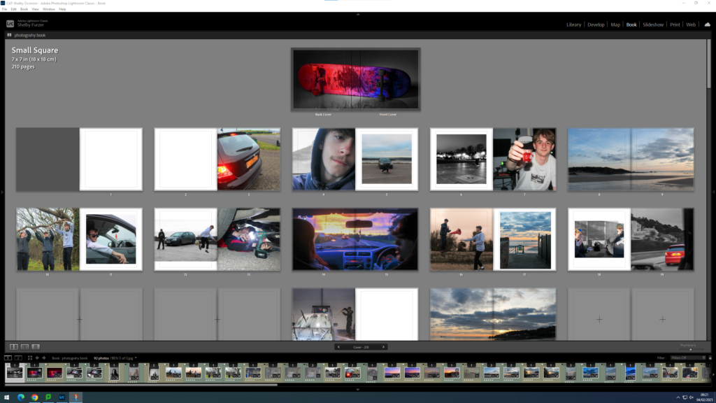
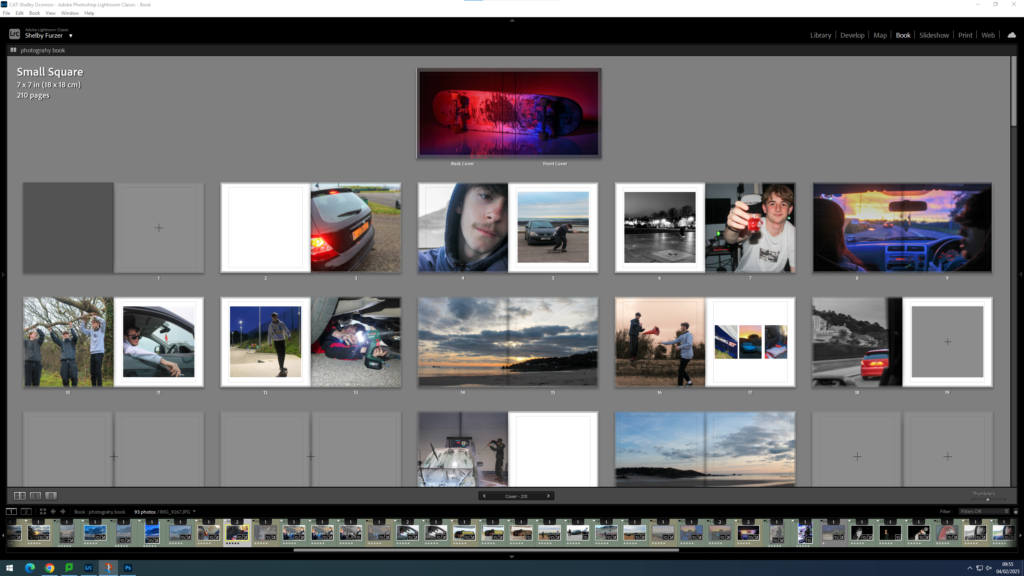
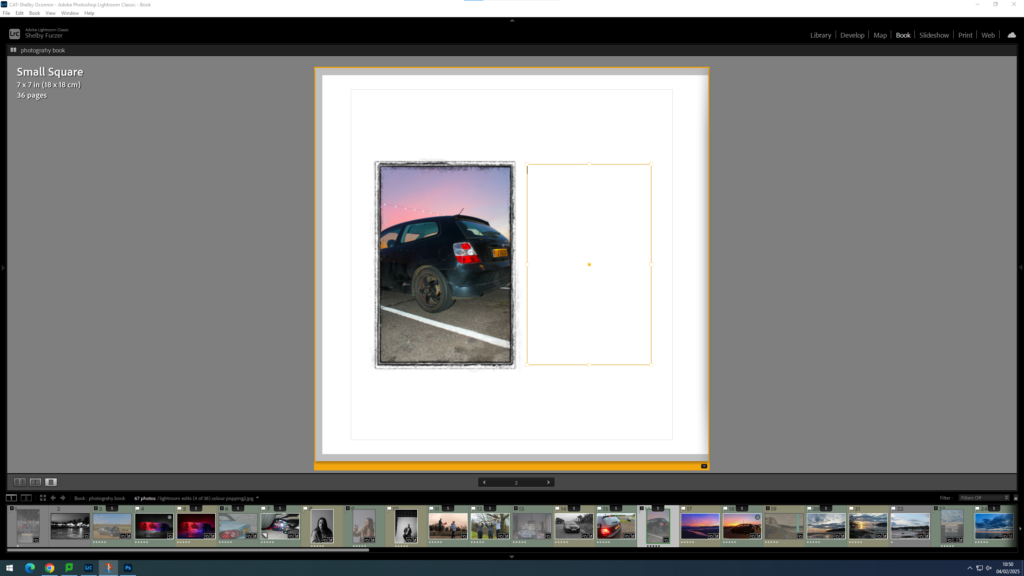
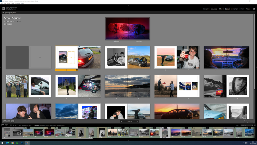
Personal study folder. Select all using ctrl A. Go back into top collections, create collection inside of personal study, seperate folder. Click book, create. Drag in new images and create save book. Blurb book- choose size- square- orientation and format. Hard cover wrap images. Premium paper. Name and title page? Maybe a short paragraph. Images are at the bottom can drop and drag them in, use zoom button and favorite different templates. Use right click too add pages.
Using Lightroom
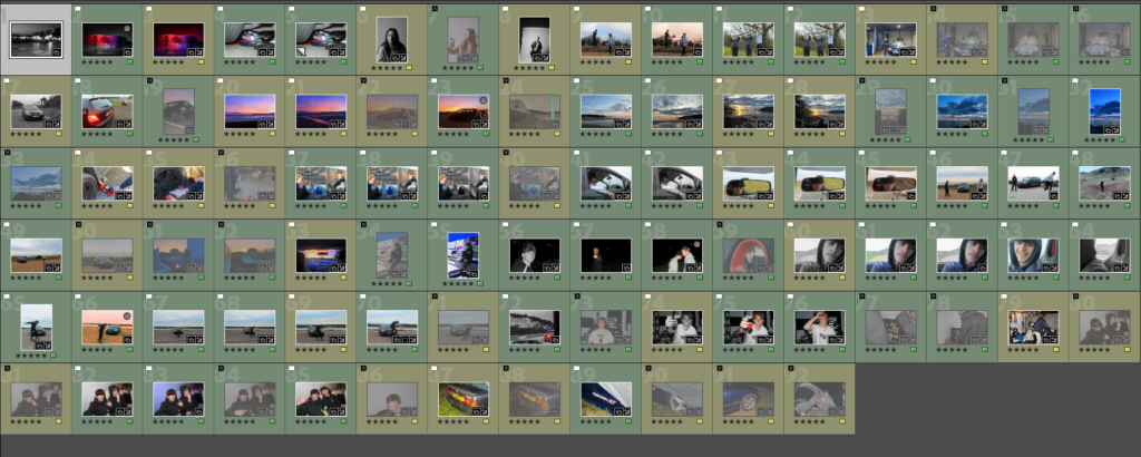
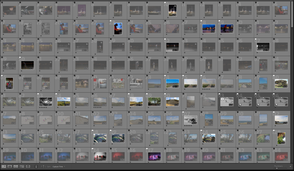
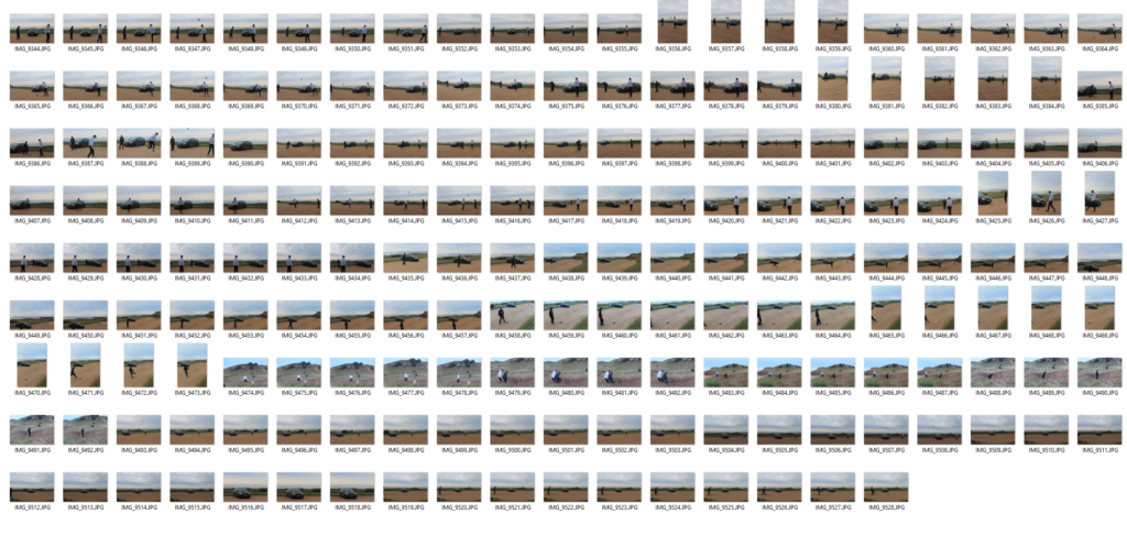
Make a rough selection of your 30-50 best pictures from all shoots.
Grading
I have added stars to my images to make it easier to decide which images I want in my book and which images I dont. By doing this I can then just select my images by colour grading them.
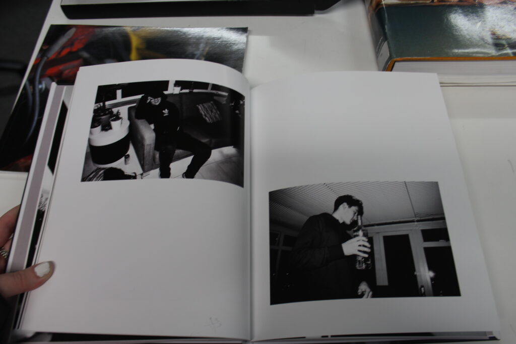
Book Making
I then added all these images into the book option on lightroom and started playing around with the order of the photos to make the book that I want.
Experimentation
Final
EVALUATION:
Comment on the following:
How successful was your final outcomes (book, film, prints etc)?
I think that my final outcome was very successful, my book has created a real meaning.
Did you realise your intentions?
Not really, I knew that I wanted to photograph teenage life and comment on the experience but I didn’t realise how well it would turn out.
What references did you make to artists references?
I have used images very similar to Jim Goldbergs like my cover of the skateboard, and some like Diane Arbus with my use of eye contact.
Sontag, S. (1977) ‘In Plato’s cave’ in On Photography. London: Penguin Books.
Solomon-Godeau, A. (1994), ‘Inside/ Out’in Photography At The Dock: Essays on Photographic History, Institutions, and Practices. Minnesota: University of Minnesota Press.
My book will be about what life is like ot be a teenager in this current generation. My main focus is on male teenage life rather than female because I didn’t want my personal bias to be portrayed, I wanted to be an outsider I terms of Solomon-Godeu’s theory of insiders and outsiders. The concept will consist of an obsessions with cars and landscape images to contrast this, how there is so much beauty around us yet we focus on the things that destroy this. Creating a binary opposition in terms of Levi-Strauss’s theory. My design will be a normal photobook, with some multiple page spreads, and some smaller images to focus on the small print. I will also add text to my book so that I can really reiterate my narrative.
My story in 3 words, a sentence and a paragraph.
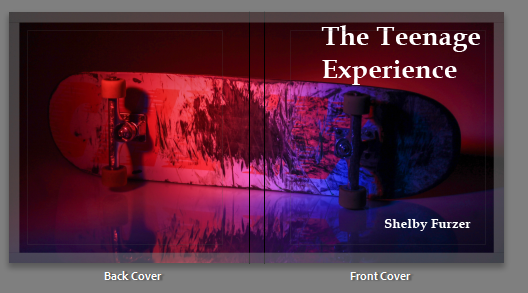
The Teenage Experience.
A portrayal of teenage life in comparison to generational changes.
My story is about male teenage life, and how it is altered depending on current world events. My book will contain examples of the current events, to portray a true authentic storyline of what it means to be a teenager in this generation. I want to do this to create a representation of how the current events change how we live, I will do this by using the view of an insider and an outsider.
Write a book specification
Narrative: What is your story? Describe in:
3 words
Male Teenage Experience
A sentence
A story line consisting of current trends and the way that teenagers life their life.
A paragraph
A story line consisting of representation by using different photographic tools, such as landscape photography to portray how the environment around us changes out narrative. Also consisting of portrait imagery to make a personal storyline adding depth to the characters.
Design:
Consider the following
How you want your book to look and feel
I want my book too look consistent by using a sequence within my imagery, and I want it to feel smooth rather than shiny.
Paper and ink
I will use premium paper and mainly black ink.
Format, size and orientation
I want a smaller square book as to not stretch out my images which would focus on its imperfections.
Binding and cover
My cover will be a wrapped image to contain the book.
Title
My title will be a short description of my book, trying to give as much context as I can in a short sentence.
Structure and architecture
My book will have a structure which dive deep into the personality of each character and be broken up by a landscape image.
Design and layout
I want to have some smaller images and some images that are full bleed to create attention to the full bleed images portraying them as more important to the story line.
Editing and sequencing
I have edited my images to contain bold colours with some more personal black and white images.
Images and text
I will add part of my essay into my book to create a contextual element.
To be concerned with beauty. A set of principles underlying the work of a particular artist or artistic movement.
2. The cubist aesthetic
Cubism was a revolutionary new approach to representing reality invented in around 1907–08 by artists Pablo Picasso and Georges Braque. They brought different views of subjects (usually objects or figures) together in the same picture, resulting in paintings that appear fragmented and abstracted.
3. Formalism
Formalism describes the critical position that the most important aspect of a work of art is its form – the way it is made and its purely visual aspects – rather than its narrative content or its relationship to the visible world. Structure over content ,no emotion or context.
4. Indexicality
Guide signs and symbols memory. In photography, indexicality refers to the direct relationship between the photographer, the photograph, and the subject. This concept emphasises that photographs are inherently linked to the physical reality they capture, serving as an imprint of the real world.
5. Representation
Ideas are depicted. To understand representation in photography is to understand how you are interconnected to the thing in which you photograph. It is to accept the responsibility for how you depict a particular subject. Understanding the deep impact images have in our society is the reason for teaching representation in any capacity.
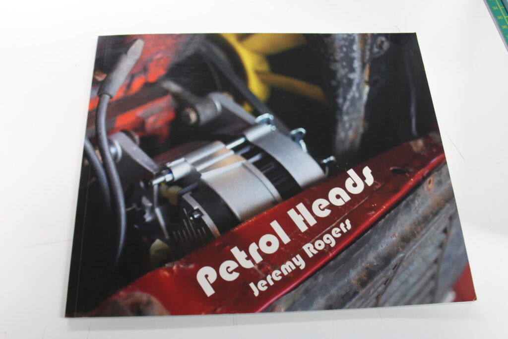
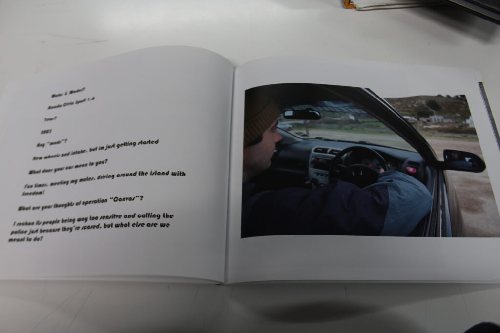
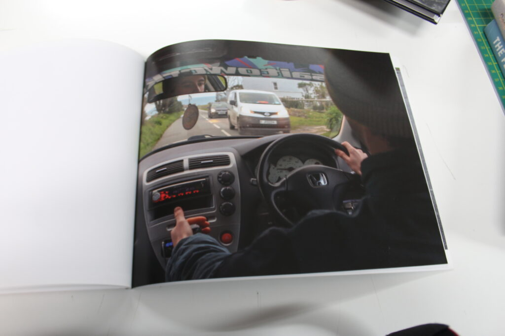
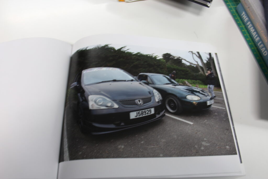
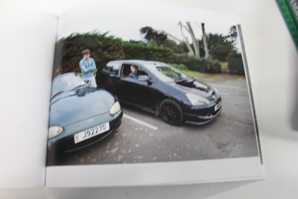
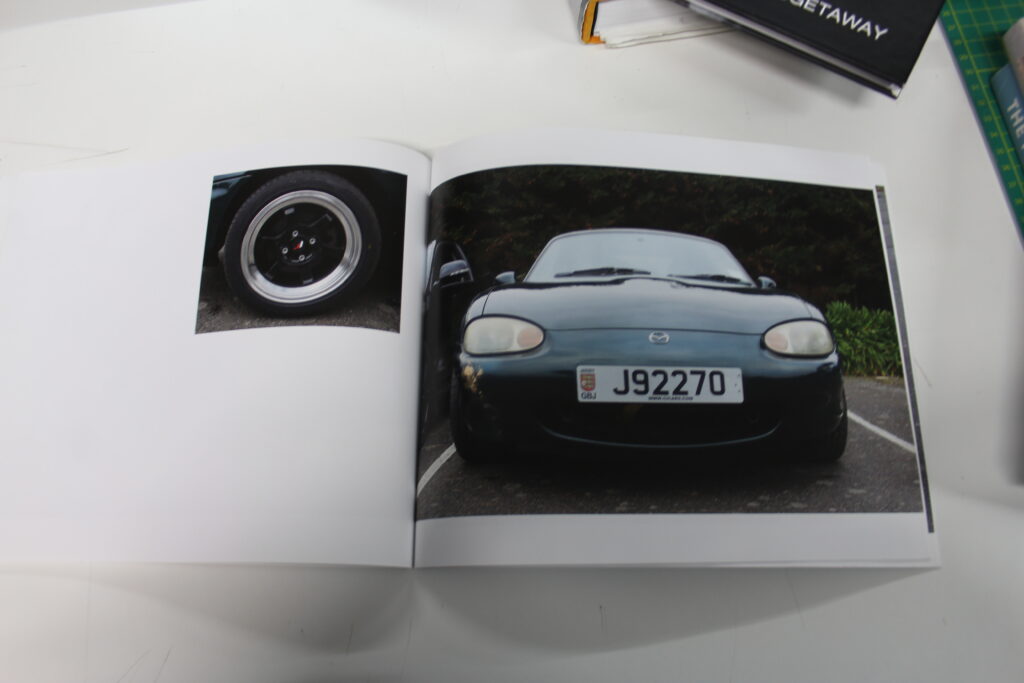
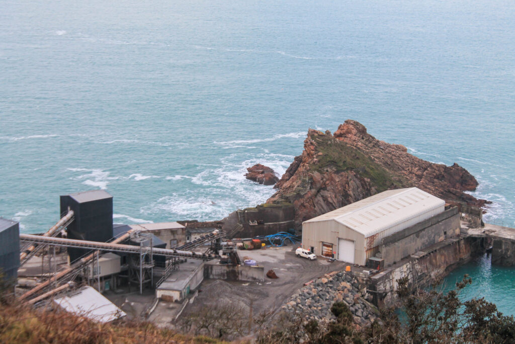
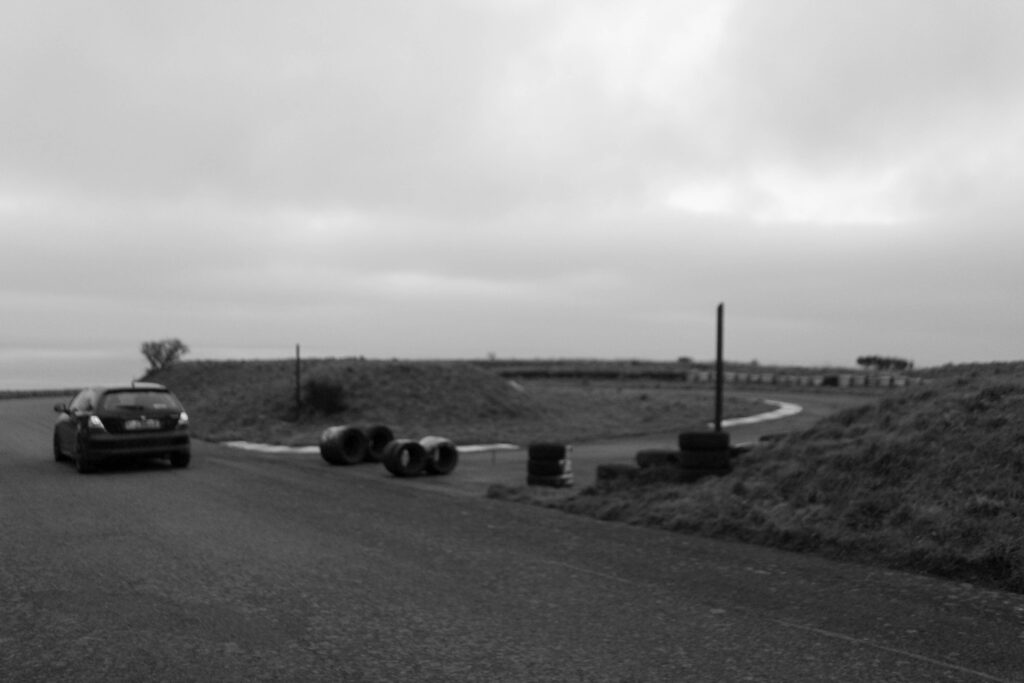
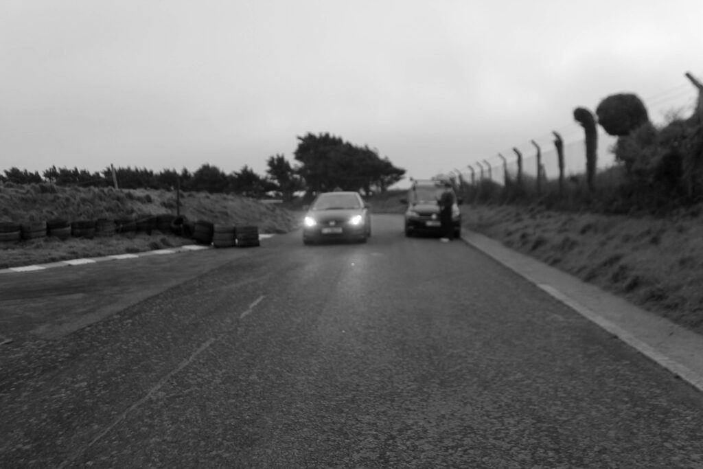
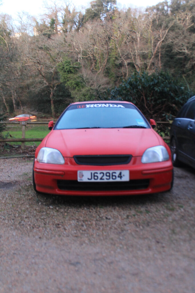
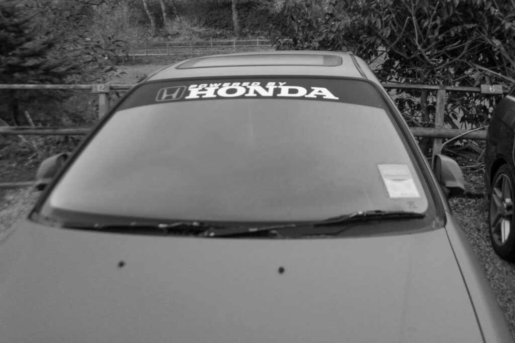
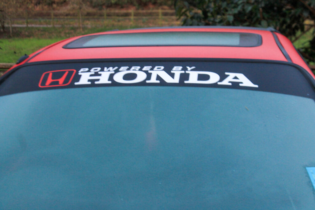
The story of this photo book was about which cars he has and what types of modifications he is going to do on them and why. He explains how he enjoys driving around and talks about the operation canvas that happened over here on the Island. Operation Canvas was launched in July 2020 amid growing concerns at the manner of some people’s driving. The genre is something of non-fiction, focusing on car culture, an automotive-enthusiast. His approach to image taking was a documentary style, with some close up shots telling the story of what modifications he has made to the cars.
The photographer is called Jeremy Rodger, who made this book as a hautlieu student. I think his intentions were to reflect operation canvas and portray that this wouldn’t alter the way he lives his life and that it was overall pointless. He says ‘but what else are we meant to do’ which implies his negative feeling towards the police operation. I think that audience was for car enthusiasts along with DIY enjoyers.
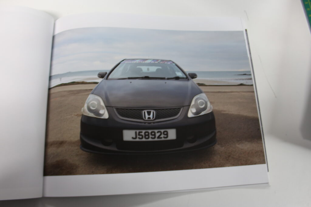
The book was a paperback, with a few images that are wide spread, these images mainly being the car as a whole and then some zoomed close ups of the modifications he has personally done showing his proudness of the car. The title is relevant and intriguing leaving you to want to read into why he likes car so much. The narrative is told in a way of how much he enjoys racing around and why and implies that the police are not going to stop him.
We can apply Rowland Barthes theory of proairetic and hermeneutic codes. With the proairetic code, being the action/ movement which would be his text about operation canvas. The hermeneutic code which is his reflection and dialogue about how this makes him feel, which is his images of modifications to go against the police. The enigma code which is the way in which to intrigue and gain the audience, being the fact he is so reckless, calling the police scared of him.
theGETAWAY
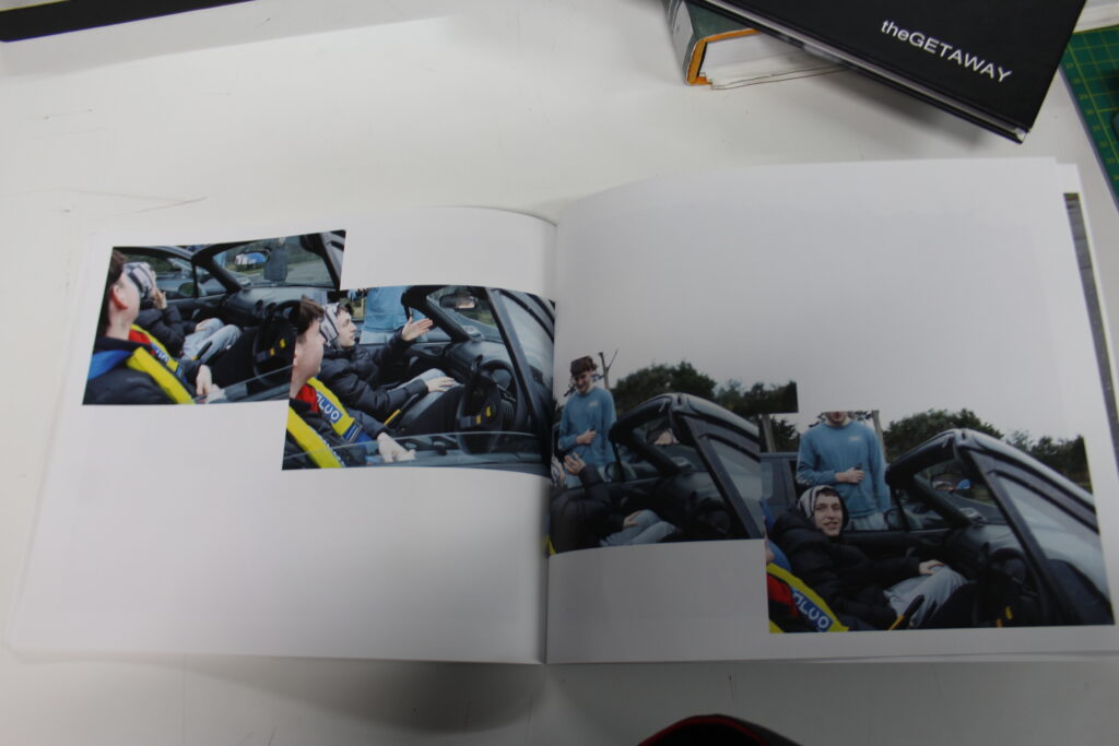
This book was a story about a guy and his girlfriend, which explained how the only time they were alone was in the car. He portrays his love for the car and how it is there safe space. This book was made by another hautlieu student,m who had clear intentions of making it a romantic genre, one that show the teenage struggle of constantly watching each other. Portraying how we are so focused on ourselves and other people looking at us that we don’t realise they are also too focused on themselves to notice what’s even happening around them. He shows how him and his girlfriend go to party’s together, and socialised with their friends, but they show that they also need their personal alone time. I like how narrative driven this book is portraying the deepsense of the story. The book is a paper back with an intriguing title. With incorrect grammar to portray the informalness of the story.
The book has a tactile and emotional quality mirroring the intimate and personal story it tells. Holding it evokes a sense of nostalgia, and even slight melancholy. The mix of matt and gloss paper symbolizes the contrasts between private moments of reflection (matte) and vivid intimate moments with his girlfriend (gloss). With the book being primarily black and white give’s a raw timeless feel. Using some slight dim colours like darker green it highlights emotional significant moments. Like the glow of the light when his girlfriend is doing her makeup in the car mirror. The small shape of the book resembles something personal, like a intimate nature, for example a diary or journal. With around 40 pages it’s enough to tell the story without overstaying its welcome. The binding allows the book to lay flat. With a wide image on the cover it gives it an approachable feeling whereas a smaller image on the cover would’ve given it a more tactile feel. The muted moody images of the car, with dusk and raindrops on the windshield may relate to the dark atmosphere of the title. The title has relevance, inviting interpretation. The book explores the car as safe and intimate, acting as an escape for connection. It is told through a mix of photos, the interior and close up of mirrors. There is repeated motifs like the use of eye contact, and a clear concept development through the cars progression from a sanctuary and intimate place to reflect solo imagery to paired moments. The images have been selected to have a chronological flow, the escape of the girlfriend. With empty car parks to create an intimate emotional push and pull. This approach ensures that every element of the book ties into its narrative, creating a deeply engaging and tactile experience for the reader.
How can the complexities of being a teenager in this generation be portrayed through photography?
‘My only agenda is to bring attention to otherwise ignored and shunned lives.’ Jim Goldberg
The definition of youth from the oxford dictionary is ‘the period between childhood and adult age’.1 In this essay I will reflect not just on the technicalities of it but also the raw emotions. By using nostalgia I create a relationship between the view of the images and your feelings. My images consist of light and dark, happiness and sadness, correlating with the ever ending roller coaster of youth. Two photographers that inspired me are Jim Goldberg2 and Danny Evans3. I resonate with their portrayals of being a middle class teenager. I have used these inspirations to intertwine my work to be something reflective of me and the life that I live. Jim Goldberg is an American artist and photographer whose work reflects long-term relationships with ignored cultures.4 He is mainly known for his Raised by Wolves publication, where he was concerned for the risk of homelessness youth in California. Goldberg would find teenagers on the street who were struggling and take candid raw photos of them to portray how action needed to be taken to create a change. ‘Every single immigrant is part of a larger history that needs to be communicated in all its ambivalences and complexities.‘5 Goldberg further explains how change is not aimed politically but is for the people. ‘I’m not a politically radical person. In fact, I’m much more interested in being radical aesthetically.’6 His book presents teenage culture as hard and alienating through the single snapped shot of raw emotions.
I am going to investigate the position of the photographer being an insider or an outsider. This is a theory to do with the ethics of photography, written by Abigail Solomon-Godeau.7 There are some key moral questions that we can ask ourselves when making photographs, for example, ‘does it make a difference whether or not you have a personal relationship with the subject of a photograph?’. 8 I personally think that there is a big difference when making photograph on how you portray them depending on if you have a personal relationship with the subject or not. Your own personal enigmas will translate through your imagery, either objectifying your subject to have positive or negative traits. For example, Jim Goldberg has made images of homeless youth in California, although he is not a part of this group. Through the images he made of youth on the streets in Los Angeles, he is portraying them in a empathetic light. Although his position is an outsider looking in he is wanting to help these minority teenagers by portraying a view from the inside. This is because he is within the situation of the community that he photographed and the images created an awareness, by using codes such as a young woman hurting herself9. Although the images are depicting the lives of young and vulnerable people in situations, such as sexual activity, drug taking and criminality, which could be seen as morally wrong and intrusive, his empathy with his subject allows for other images of tenderness and understanding thus creating an awareness of street homelessness.
I want to incorporate Solomon-Godeau’s theory within my work as the insider. ‘If it were possible, I’d want no mechanism between me and the moment of photographing’.10 I want to portray this, by going against the stereotypes of teenage life, and portraying how we actually live. Parents all around the world seem to think that they know what teenagers go through, but realistically they have no idea what it is like to be a teenager now days, having to live up to the impossible ideals of the media and with every growing technology ruining relationships. Jonathan Haidt wrote the book ‘The Anxious Generation’, which describes how growing technology is ruining children’s and teenagers lives. ‘We don’t let preteens buy tobacco or alcohol, or enter casinos. The costs of using social media, in particular, are high for adolescents, compared with adults, while the benefits are minimal. Let children grow up on Earth first, before sending them to Mars.’11
The reason this area of work interests me is due to Stuart Hall’s theory of representation12. He describes that representations are constructed via codes, and these codes portray key stereotypes. He discusses that these stereotypes can infer that negative traits are natural, for example the trait that all teenagers are inactive and lazy. I want to portray his ideas that stereotypes can be challenged and changed by the use of imagery reflecting key ideas and binary opposites, to go against societies’ myths and ideologies.
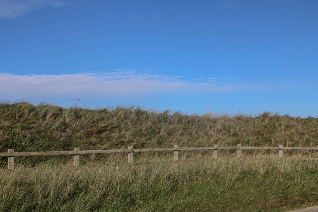
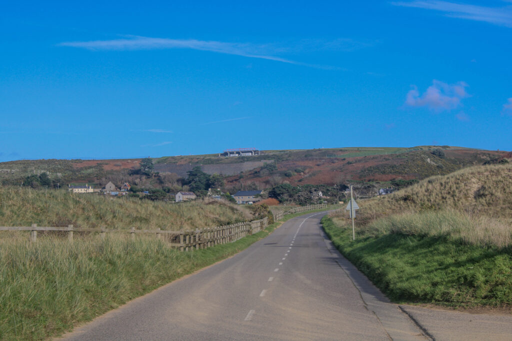
I want to prove that teenage life is not what it used to be. I will be making images of my own friendship groups in similar snapshot aesthetic and documentary style to Goldberg. In addition, I will be exploring themes of anthropocene and landscape imagery in relation to concerns about the environment. Global warming is a serious issue that is happening now. Our generation will have to be the ones to clean this up, so in a way I wanted to use my book as representation of this inheritance. I have taken inspiration from Naomi Whites images, ‘Plastic Currents’13. She portrays how the simplest things, like buying one singular plastic bag is ruining our environment. I want to portray how male teenage life has an obsession of cars, and how cars are ruining the planet. I will do this through the use of what Claude Levi-Strauss called ‘Binary Oppositions’. 14 We cannot refer to something without portraying its opposition. I will do this by including images of teens working on cars and driving cars, but then opposing them to imagery of the landscapes and the world around that is ruined by the mass consumption of fossil fuel.
I have also gained some inspiration from discovering Diane Arbus. She was a troubled photographer who took her own life. 15 She felt at home among the outsiders she photographed. I feel that I have created this feeling for myself, although I am similar to who I photographe age wise, being the opposite gender means that I live in a completely different world to them. This is the reason I wanted to photograph teenage males instead of females, so I can have that opposition to create less of a bias in my imagery. Arbus may have felt an enormous empathy with the people she photographed, but she was not one of them, however much she identified with their outsider status.16 She said, ‘I wanted to look at those people who were outsiders, like I was‘17 I want to take images that stand the test of time, no matter who looks at them I want them to feel like an outsider, like they will never understand the true emotion being portrayed because they have not personally lived through it.
I want to create something palpable, something that you can feel close to which will create a tangible feeling. After reviewing his publication ‘Fingerprint’, I have realised that to create a meaningful project I will need to create context. By adding dialogue to my images it will dive deeper into the emotions. Revealing the complex construction of identity itself. 18 ‘Feeling like an outsider enabled me to evoke stories from the people I worked with because I could relate to them‘19 Goldberg explains that having people write directly on the images allows an insight to their thoughts. I want to also create this by adding people’s thoughts and feelings along with the images I have created. A key thing Goldberg did to gain feedback was show his models the images and ask them key questions like if they seem right, or like how they are being portrayed. I will also do this and add this to my book to portray my process of representation.
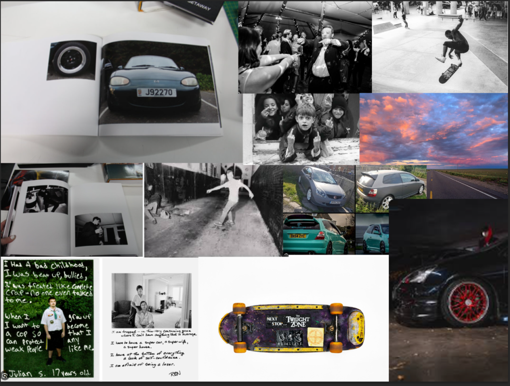
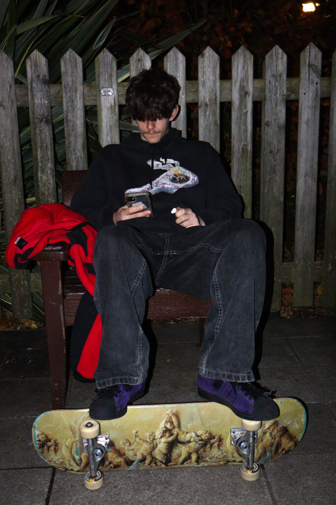
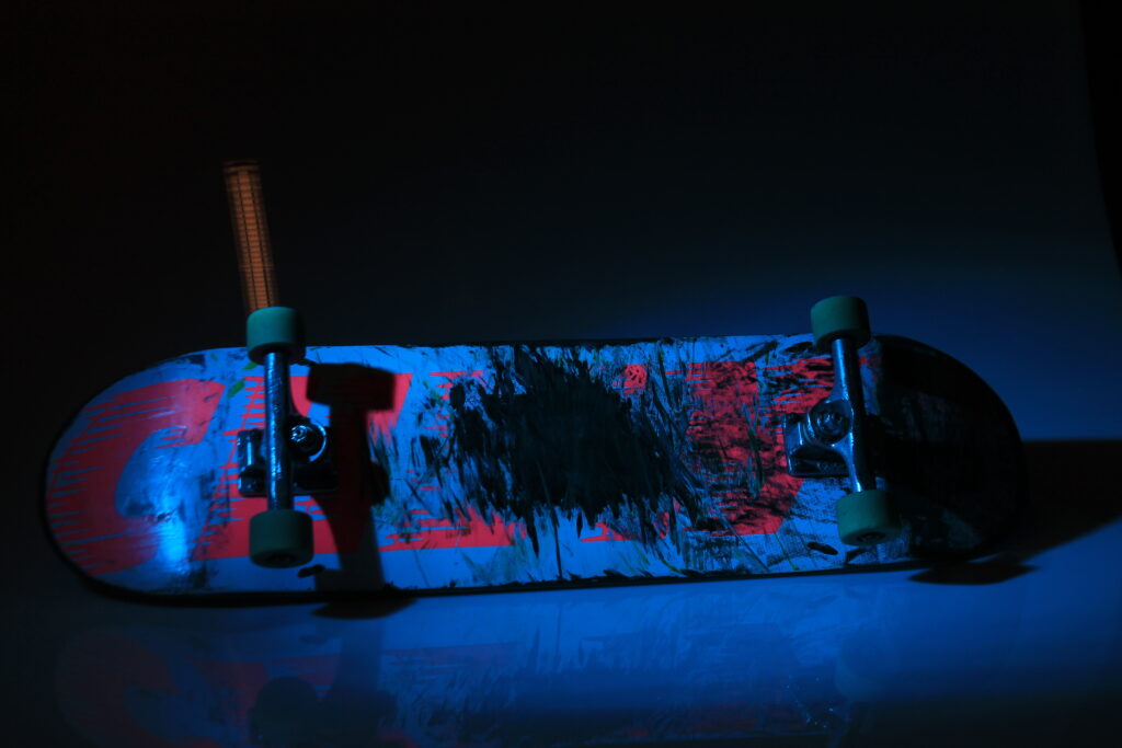
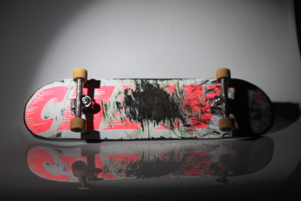
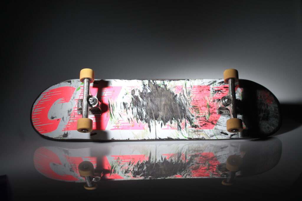
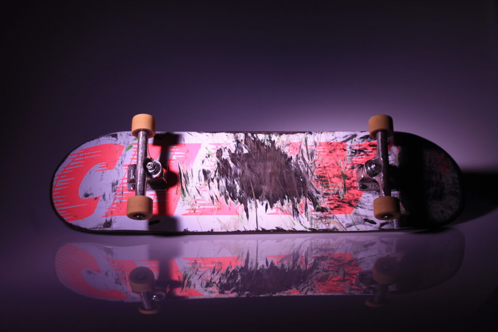
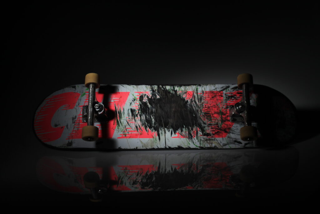
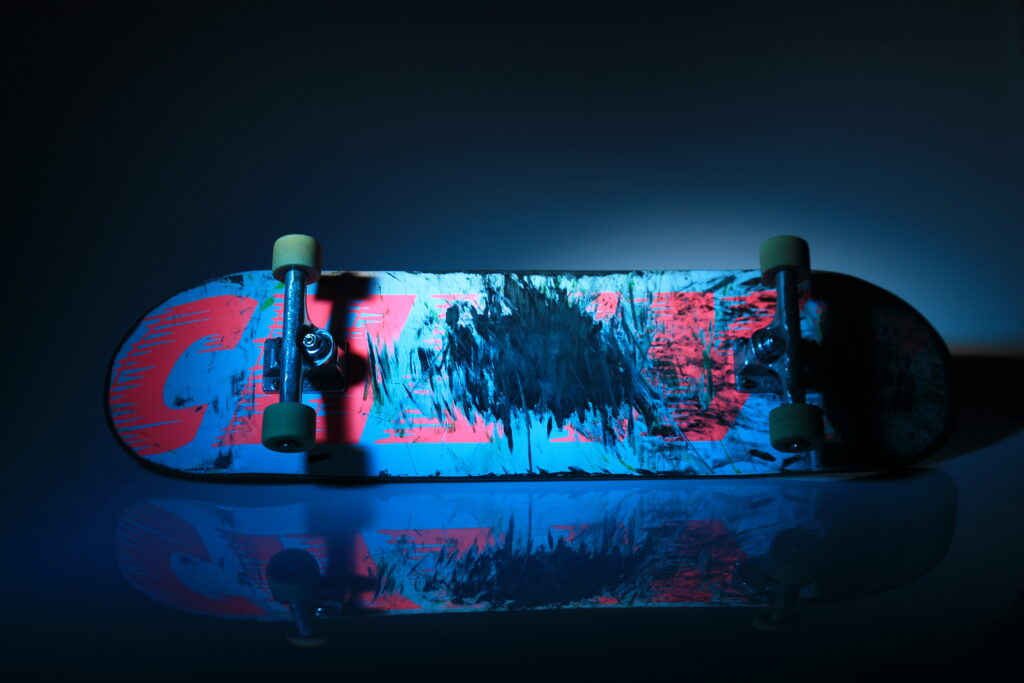
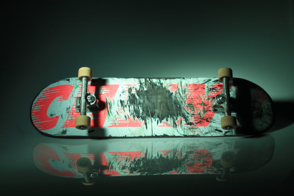
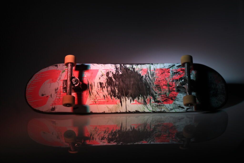
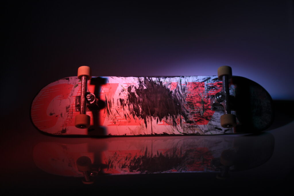
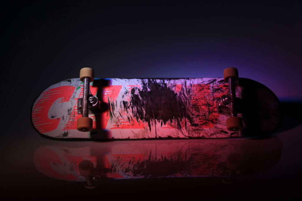
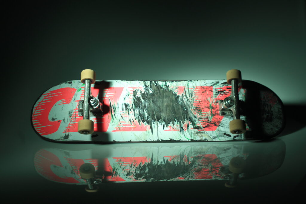
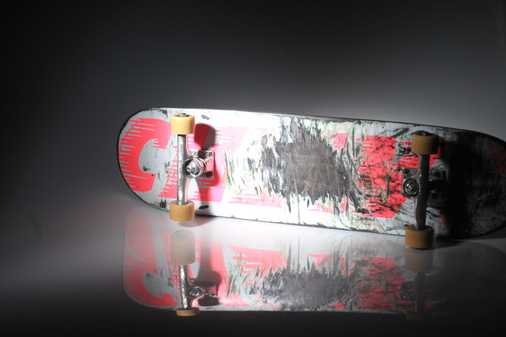
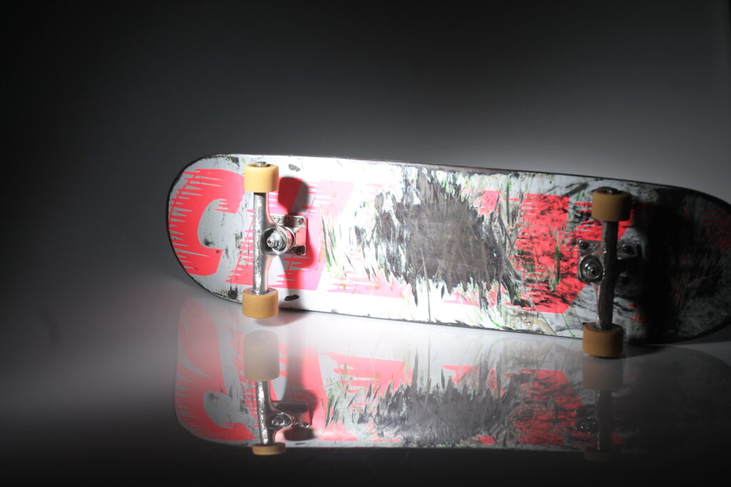
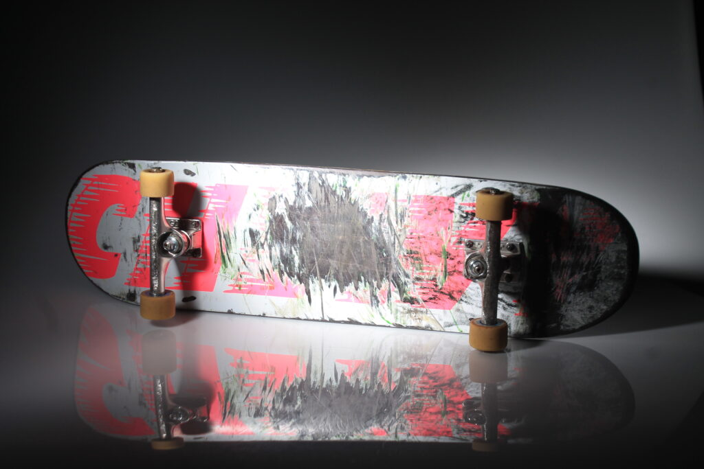
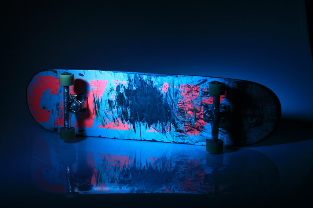
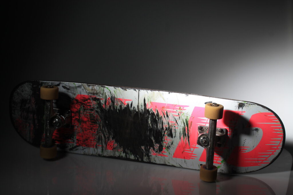
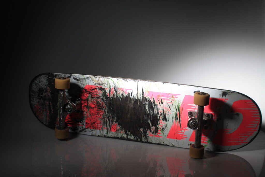
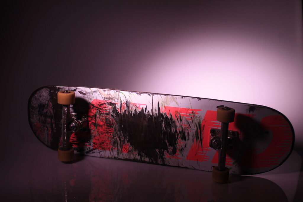
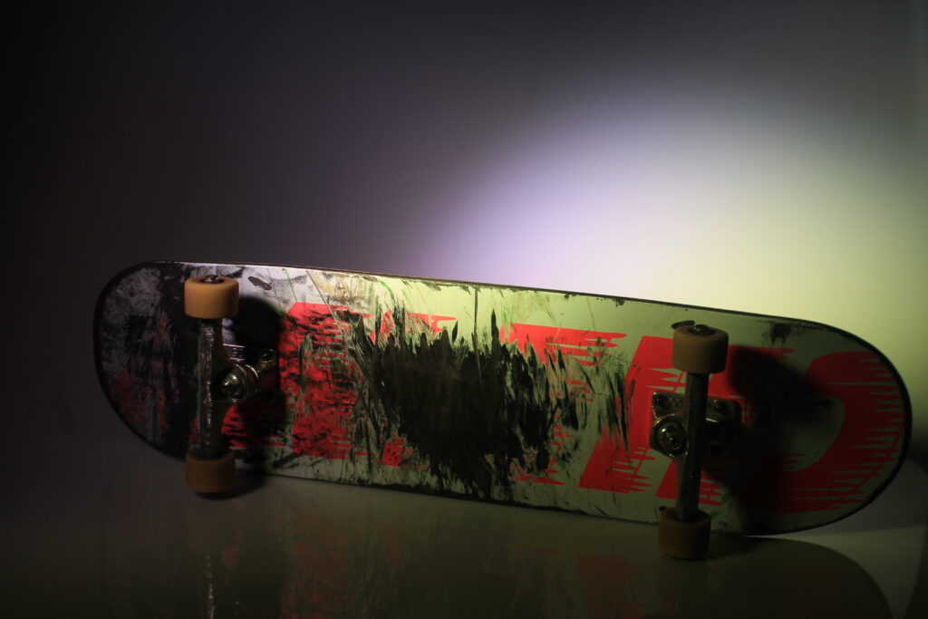
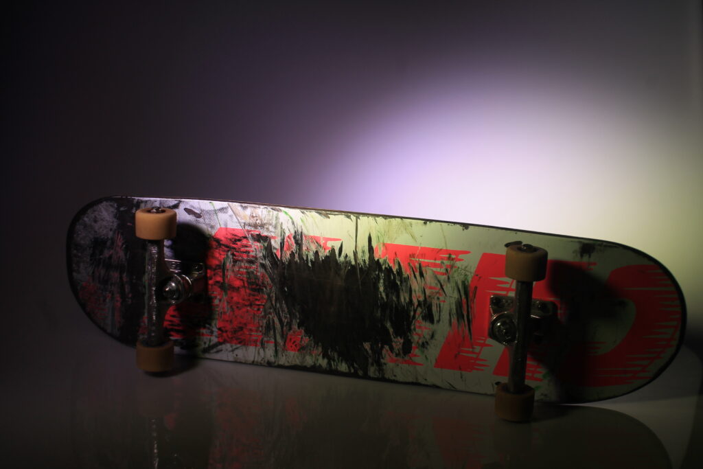
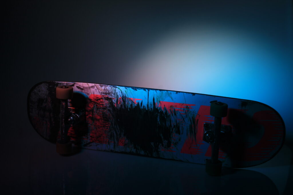
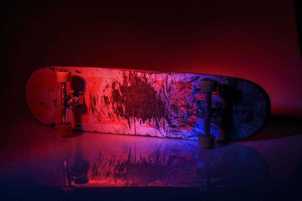
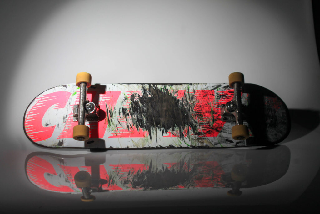
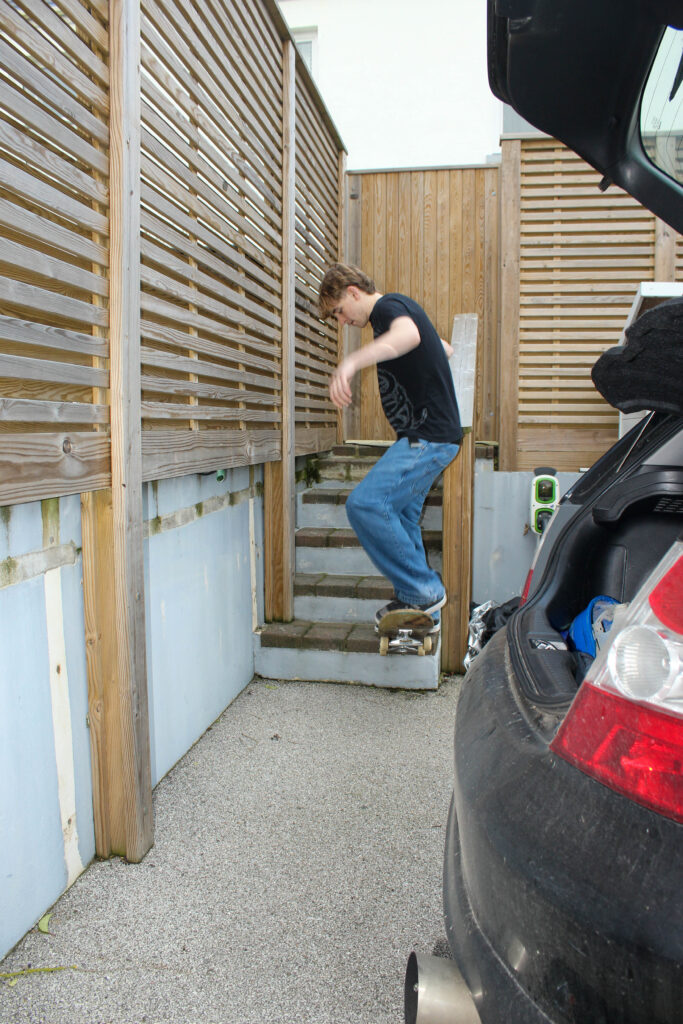
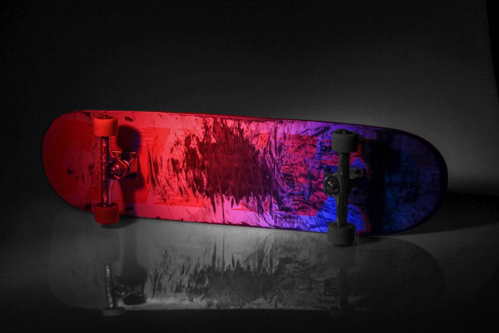
Jim Goldbergs image tend to be in a documentary style, allowing them to be analysed in a contextual way. Through the use of a simple skateboard he can highlight elements such as the worn down wheels or the scratched bottom and tail to portray its use. This can connotate how the teenagers he photographed feeled, due to the reckless connotations of their own belongings we can see how these teens were troubled, allowing themselves to move freely.
Diane Arbus alos uses a documentary style to represent people. By doing this she uses key eye contact to portray raw emotions. This creates a connection between the reader and the character being photographed. This gives an insight into the characters life, allowing a view from the outside too look in. “For me the subject of the picture is always more important than the picture. And more complicated.” 20 She explains how the subject is most important as they are who creates the image, without the subject there would be no room for evaluation. “I don’t press the shutter. The image does, and it’s like being gently clobbered.”21
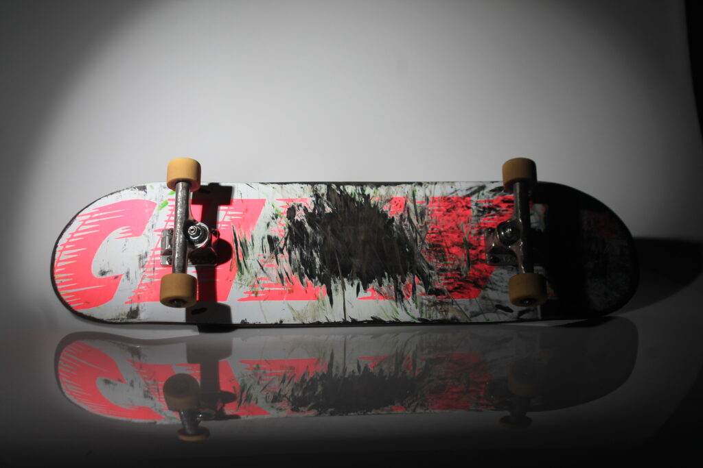
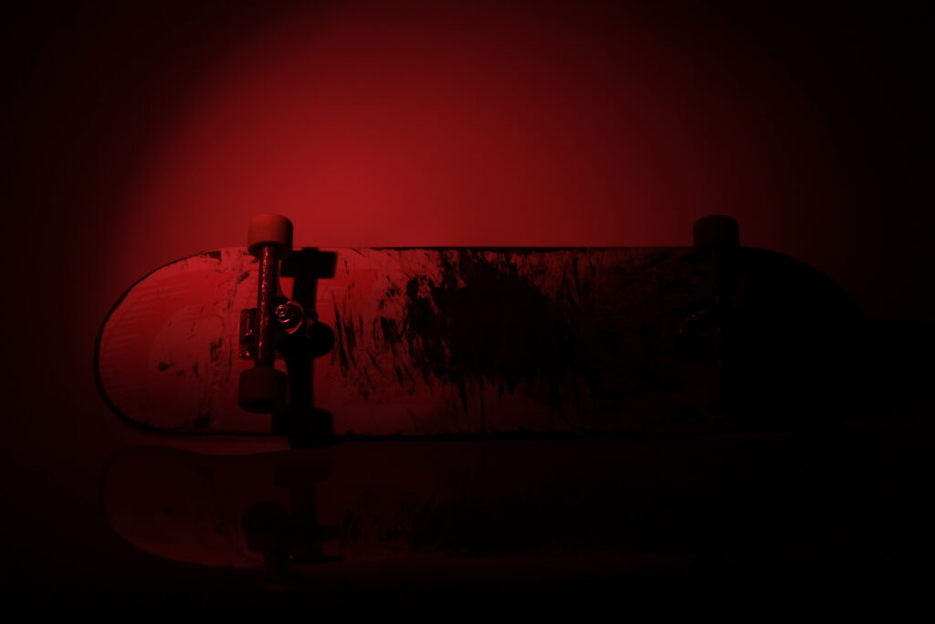
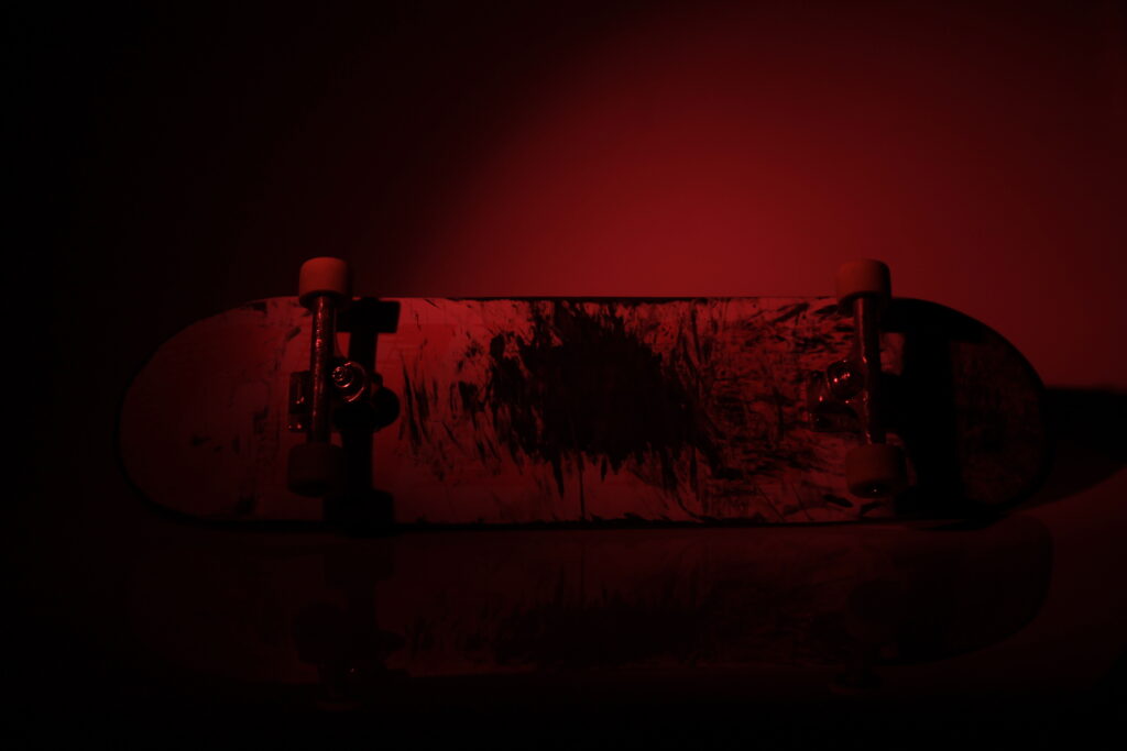
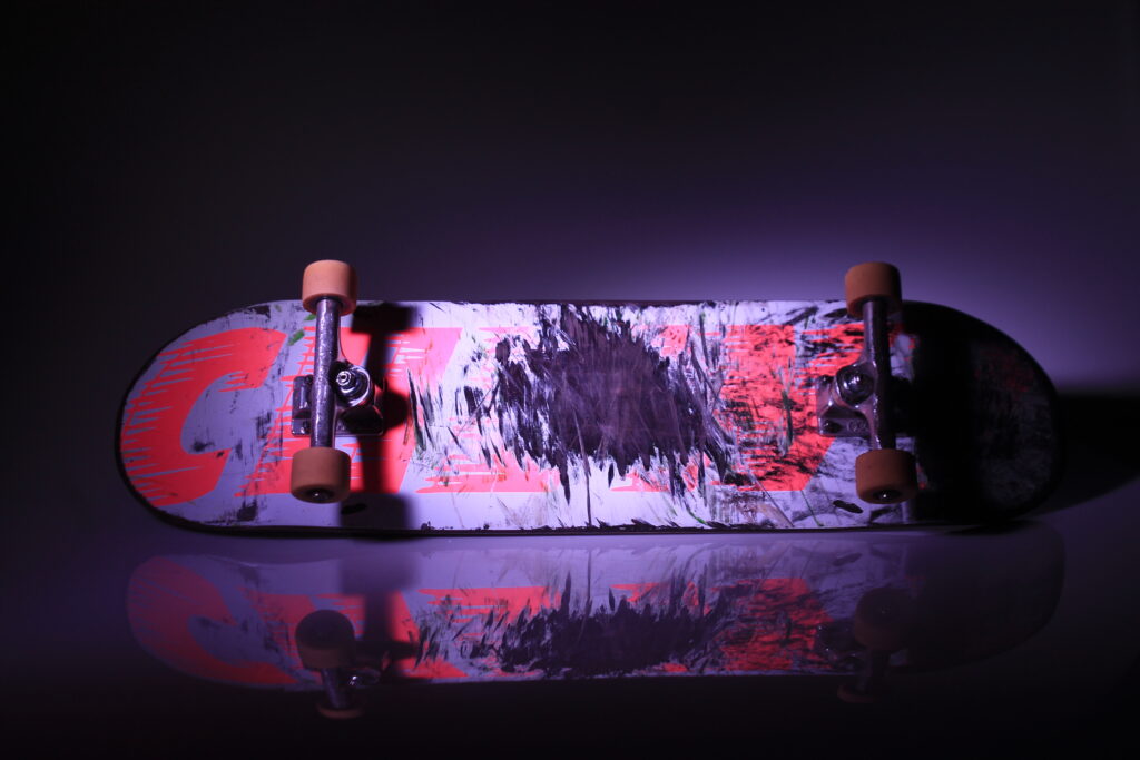
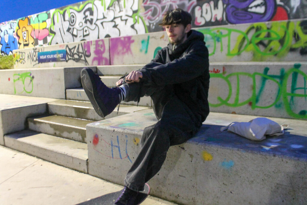
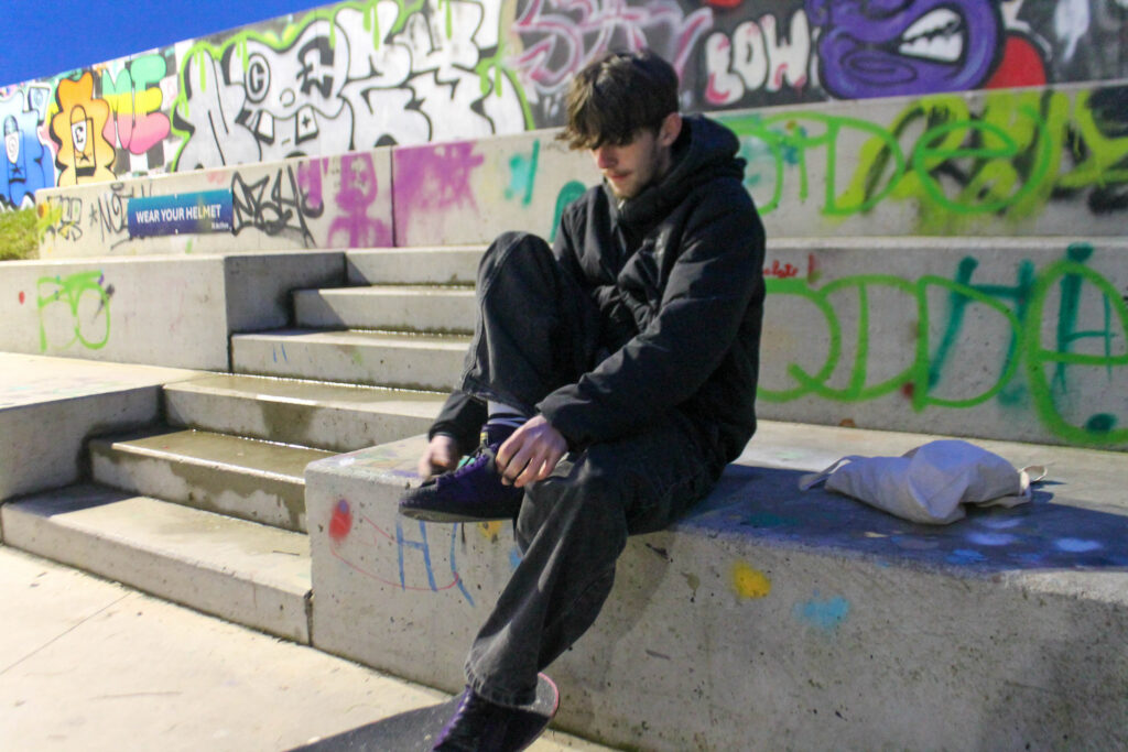
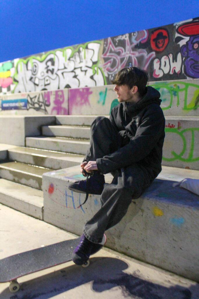
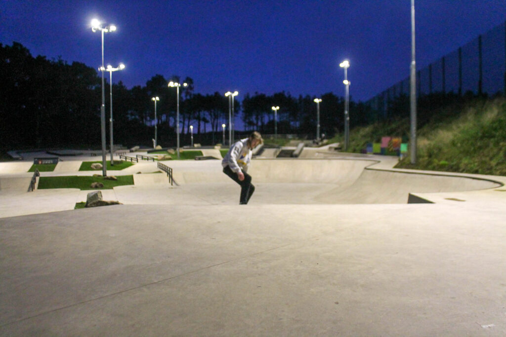
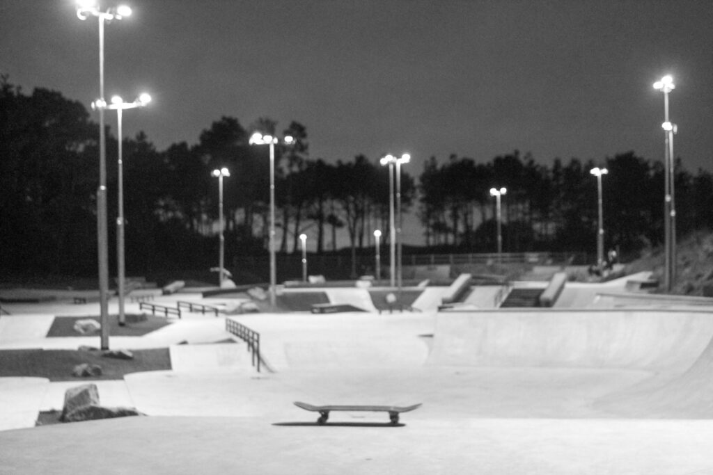
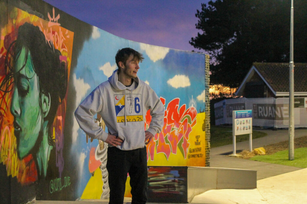
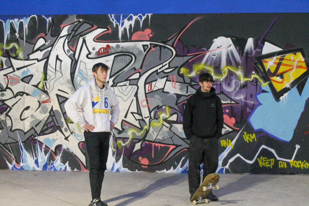
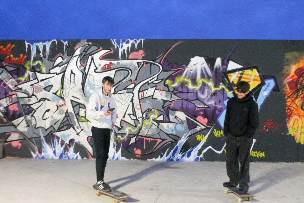
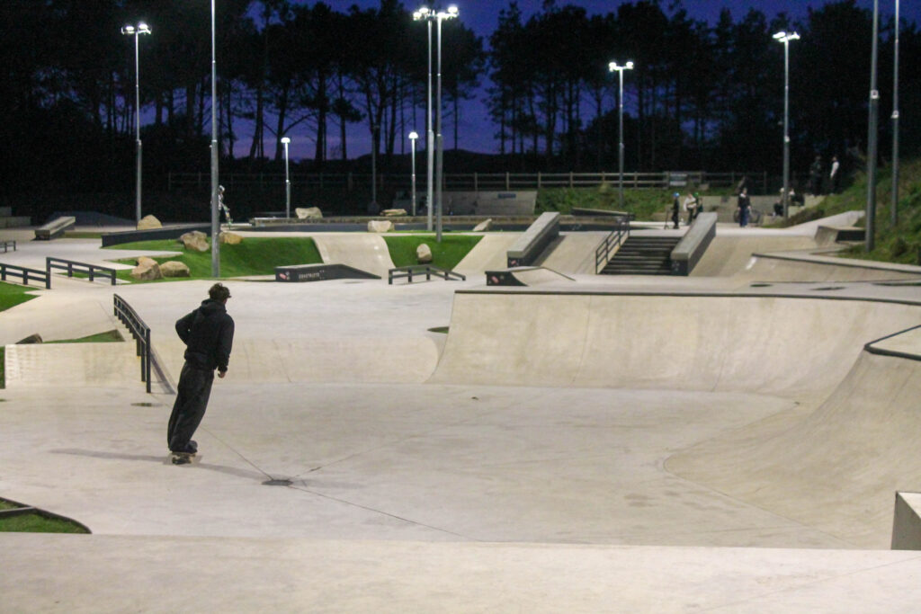
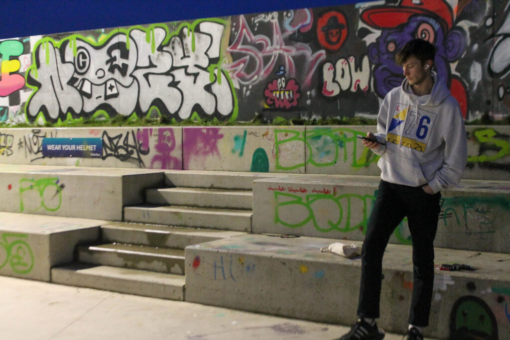
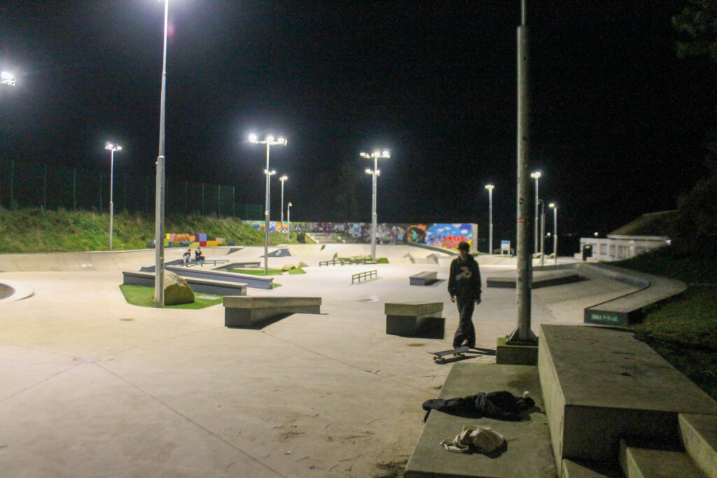
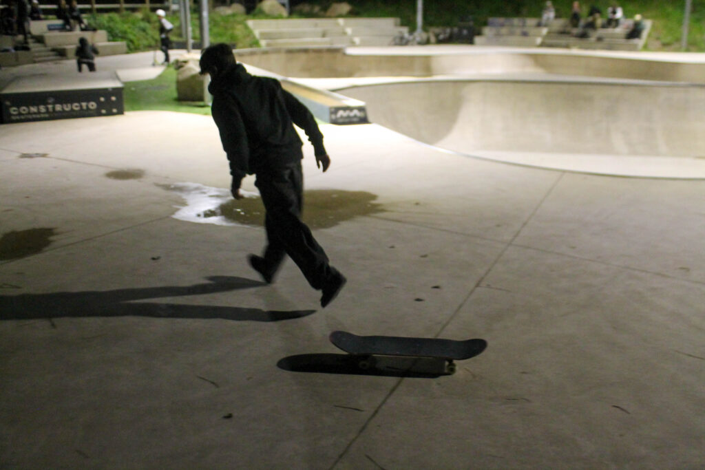
The reason I have chosen this image is because it portrays what teens can do in Jersey.Skate culture.AnthropoceneAnthropoceneTypologies.
Photoshoot 1 plan-
skateboarding
environmental
personal
meaningful
night time
anthropocene
global warming
Outcome-
Lightroom edits-
Favorites-
Results-
I overall think that this photoshoot didnt go to well. I was using one of the newer cameras which I am not quite comfortable with yet, so some images have come out blurry or under exposed. To do better next time I will get a camera that I am comfortable with and use that instead, but I do think this photoshoot is centered around the right idea.
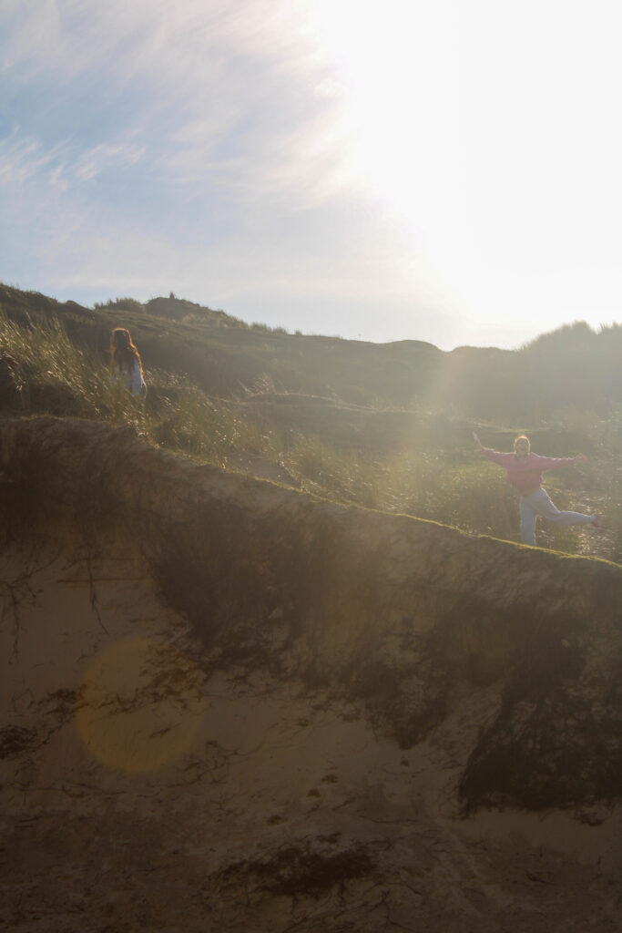
Photoshoot 2 Plan-
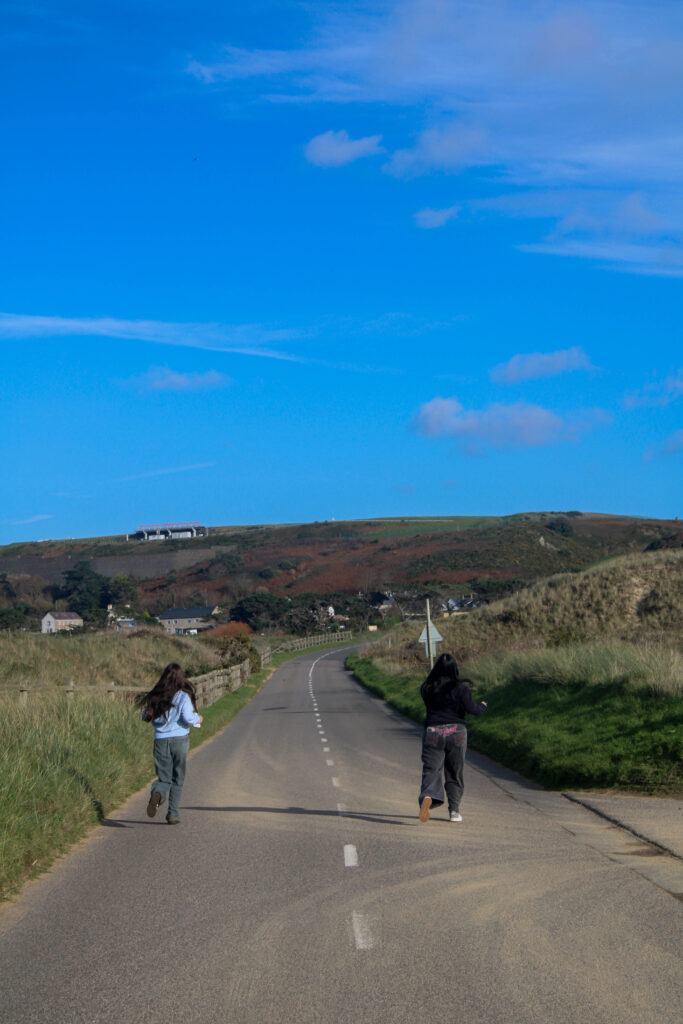
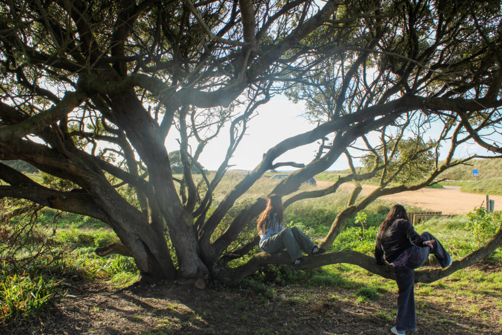
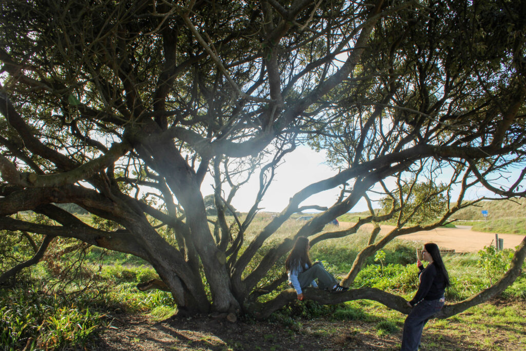
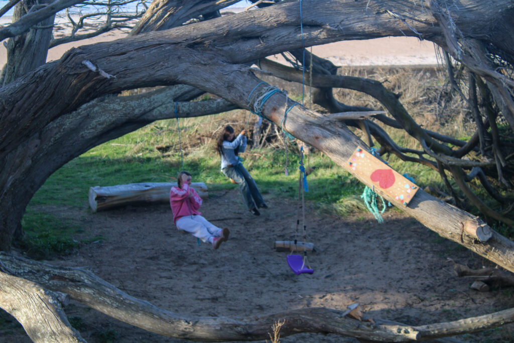
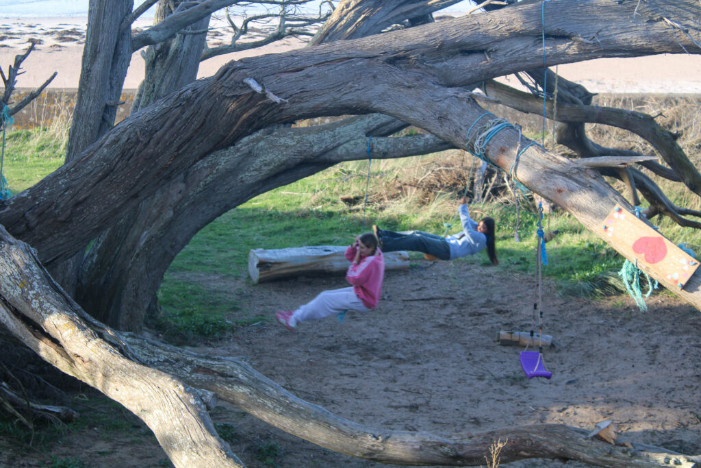
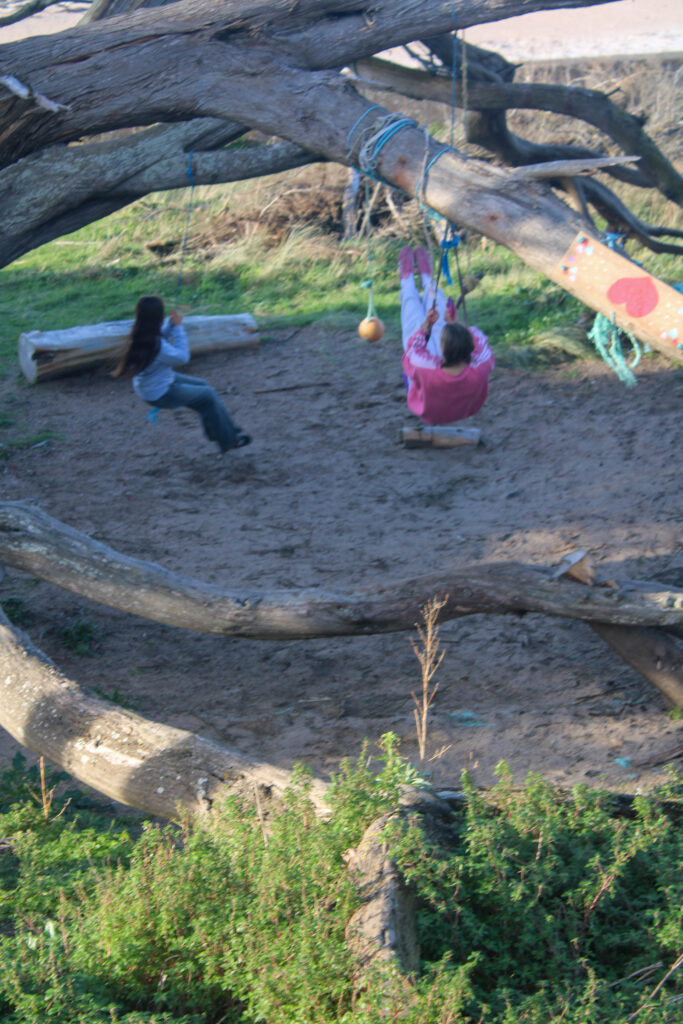
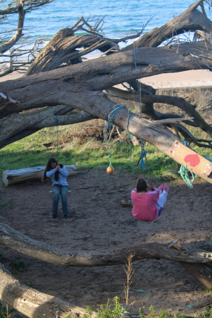
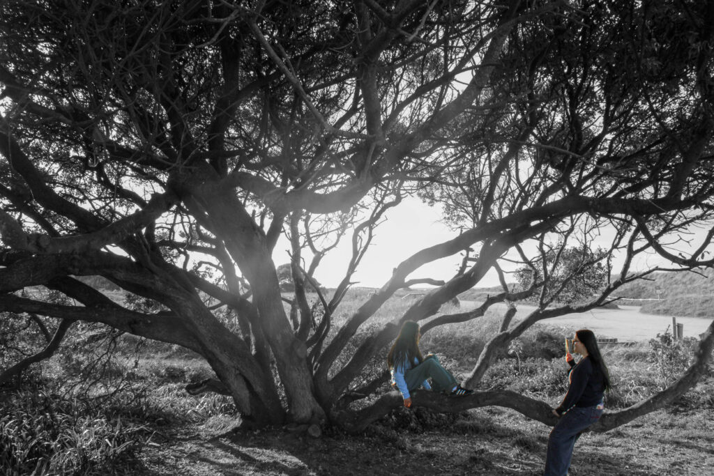
girlhood
environmental
teenage culture
sunny
Outcome-
Lightroom Edits-
Favorites-
Results-
I think that this photoshoot came out very well, it is centered around the right idea of youth culture and girlhood. I think it also entails some environmental photography and I think that the images came out concise and clear.
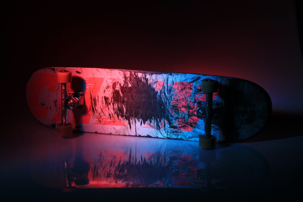
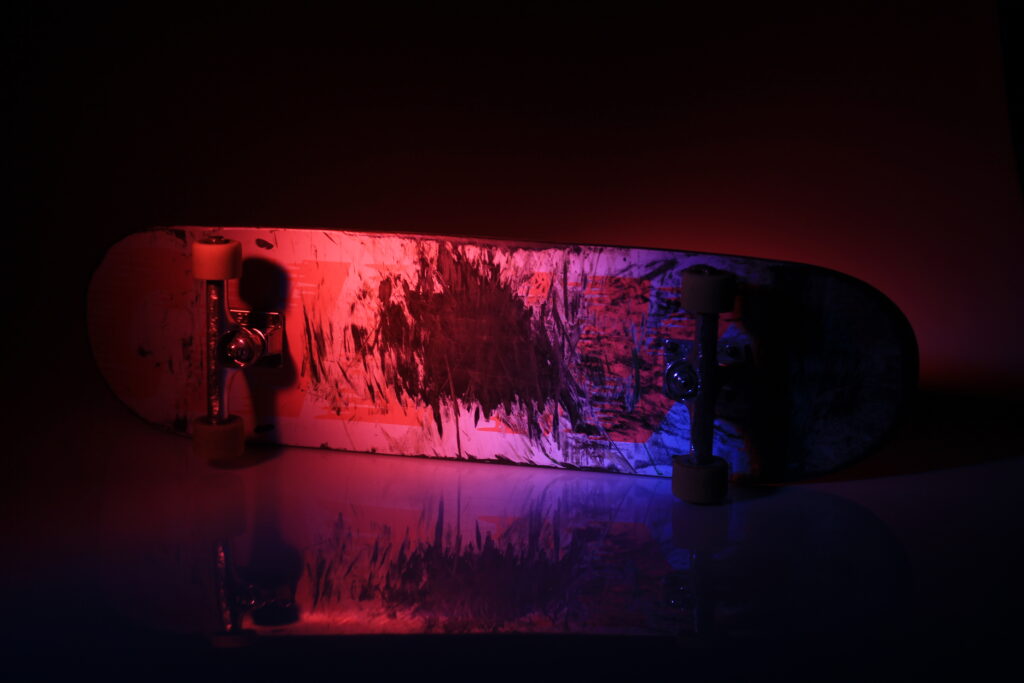
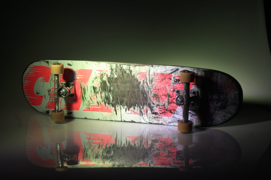
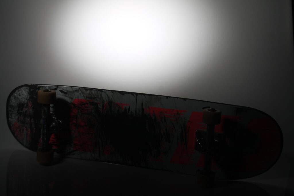
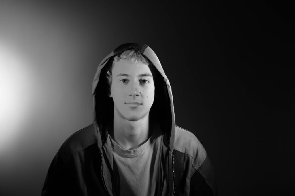
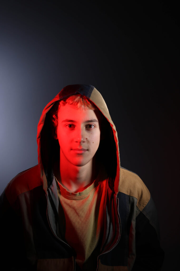
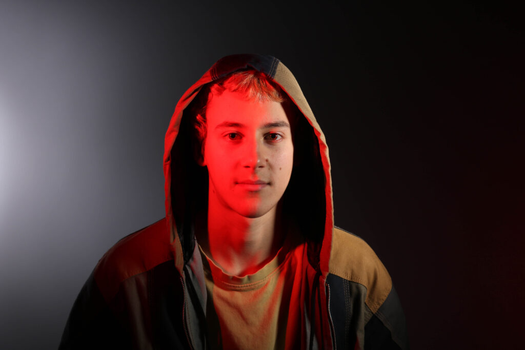
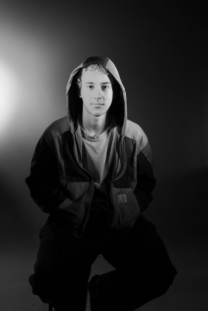
Photoshoot 3 Plan-
studio
white background
coloured gels
skateboard
Experimentation-
Outcome-
Lightroom Edits-
Favorites-
Results-
I think that this photoshoot is my best one yet. I have created a different kind of imagery compared to my usual candid photos which require people or my landscape images. I think that this photoshoot came out very clear and within edited them I have been able to create vibrant colours with key detailing.
Photoshoot 4 plan-
masculinty
teenager
work
fun
cars
environmental
Outcome-
Lightroom edits-
Favorites-
Results-
I think that this wasn’t one of my best photoshoots, I think that it’s clear that I didn’t really have a consistent plan throughout, but I do think that the images have come out clear. Some of the images are quite useful and wll link into my storyline of teenage culture, and I will add words to my images for example ‘your only young once’.
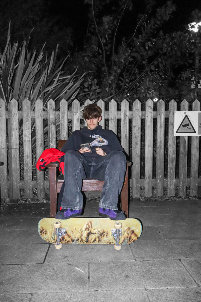
Colour Popping Experimentation-
Results-
I used photoshop to create these images. By cutting out a layer and making the background layer black and white I have made the subjects f my images pop. I think that this creates a clear meaning of what emotions I am trying to portray.
Photoshoot 5 Plan-
studio
portriats
environmental
Outcome-
Lightroom Edits-
Favorites-
Results-
These images were really just for experimentation, but I think that the photos of the boy model to fit into my aesthetic and I will use them within my book.
Photoshoot 6 Plan-
boy
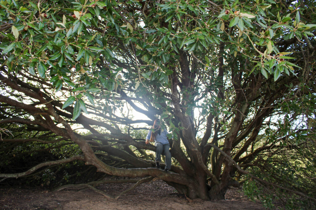
greenery
daily life
candid
gloomy
Outcome-
Lightroom Edits-
Photoshop Edits-
I had to take some of my lightroom edits and further edit them on photoshop due to the smudging on the dirty lense of the camera, I used the spot blending tool to fix this.
Favourites-
Results-
I overall think that this photoshoot went very well, although the weather was very foggy and the lens was dirty with some heavy editing I think that I have managed to get some key images for my book.
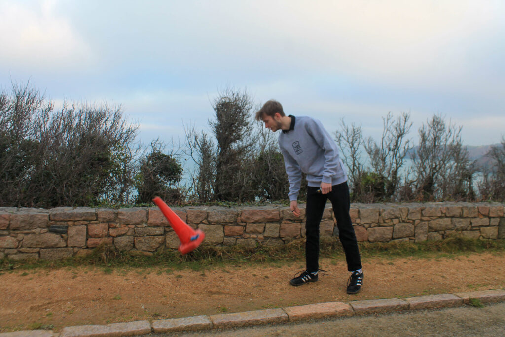
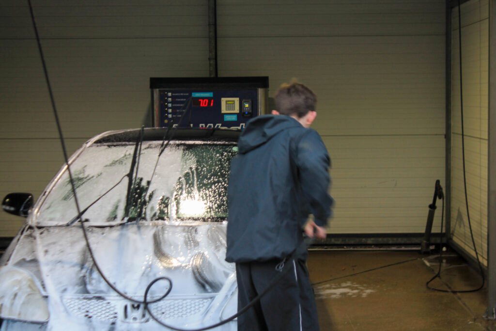
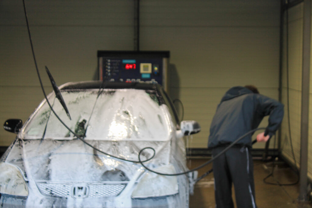
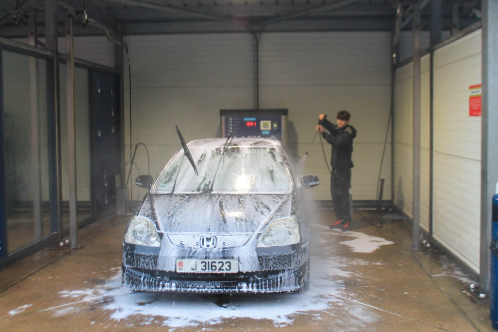
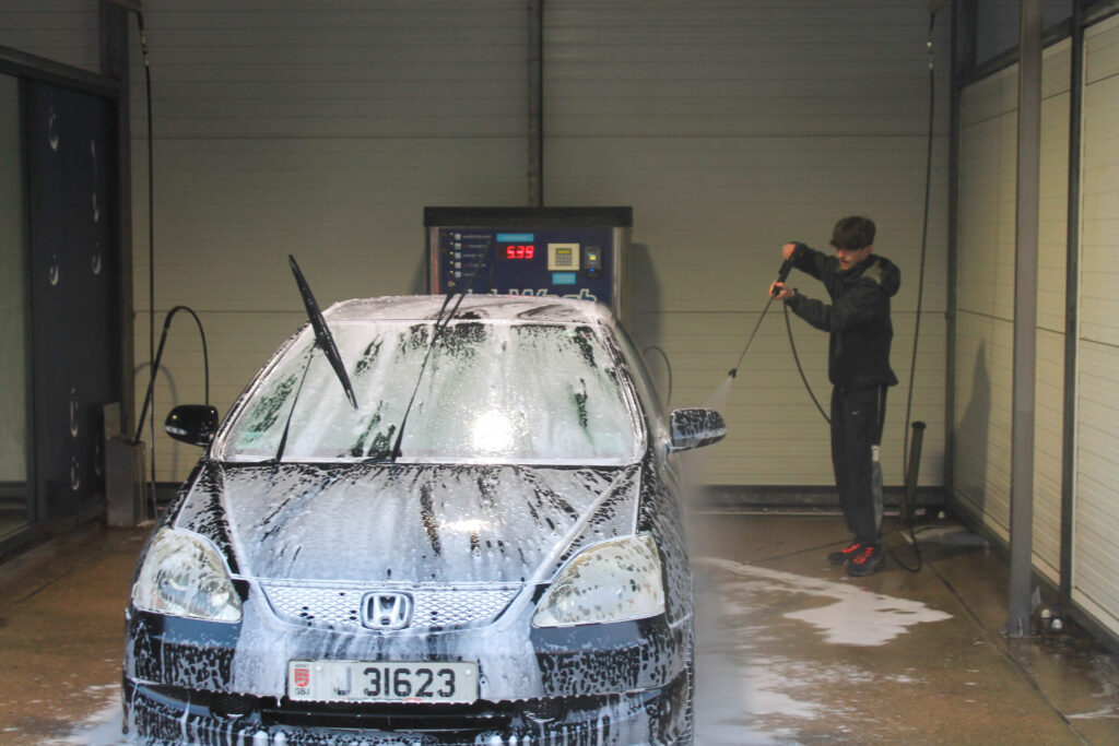
Shoot 7 Plan-
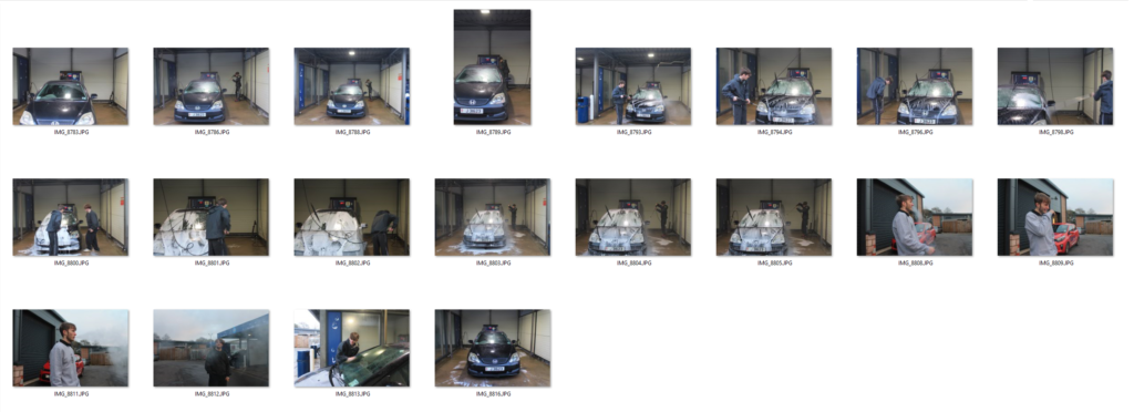
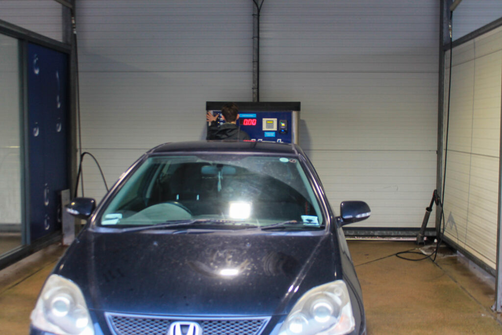
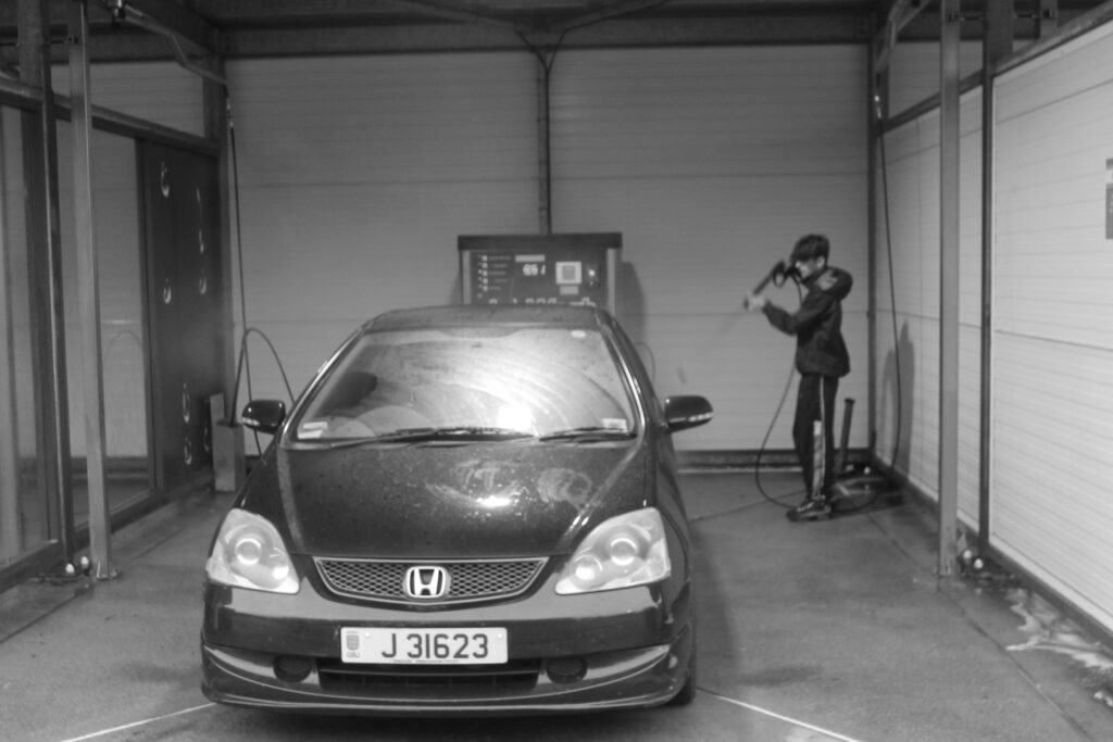
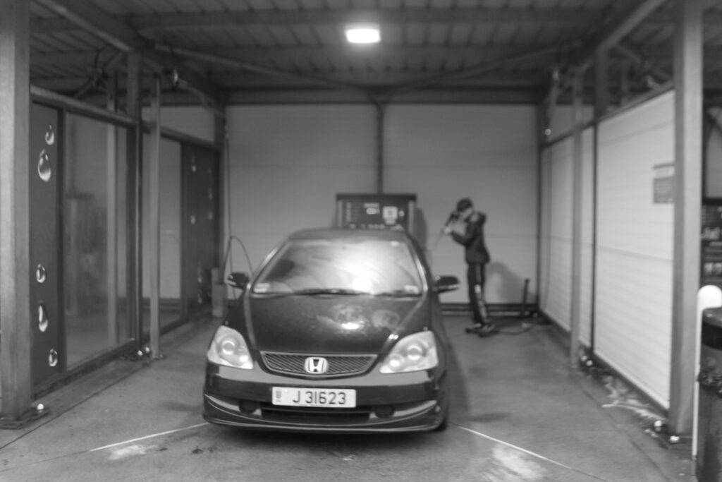
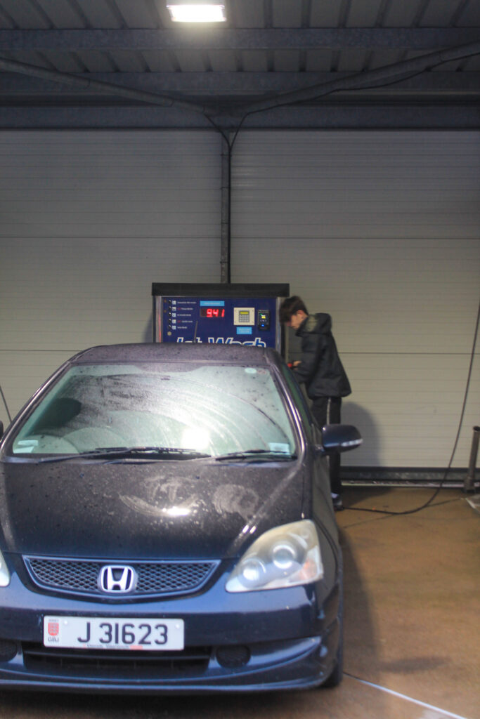
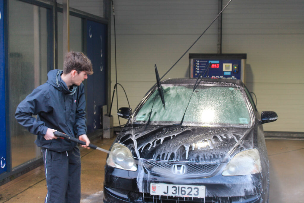
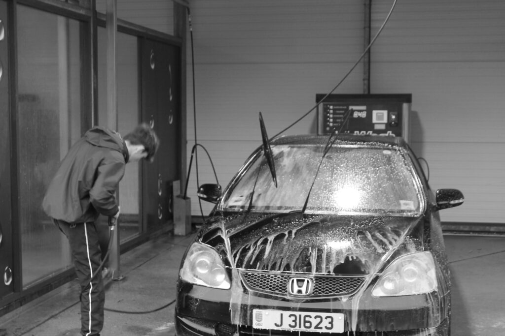
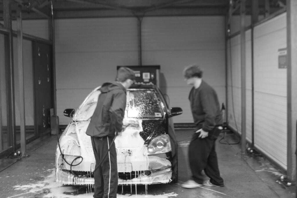
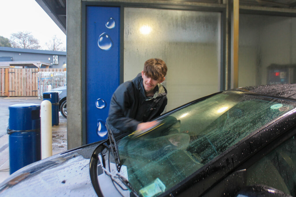
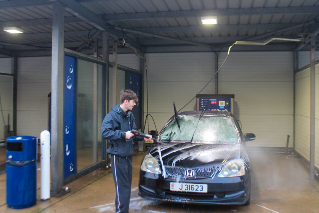
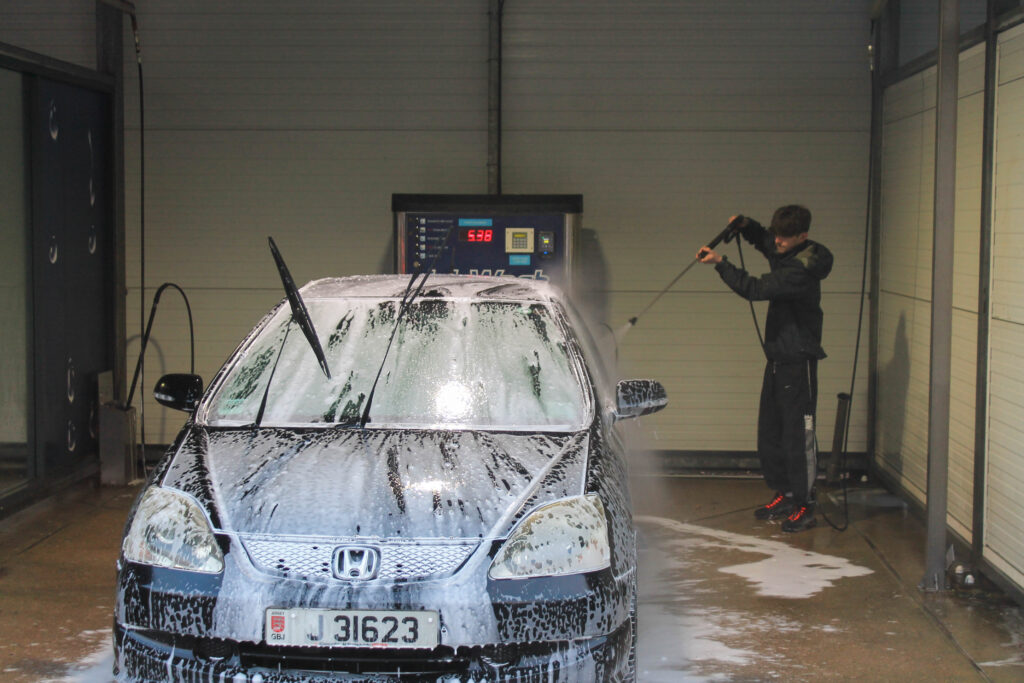
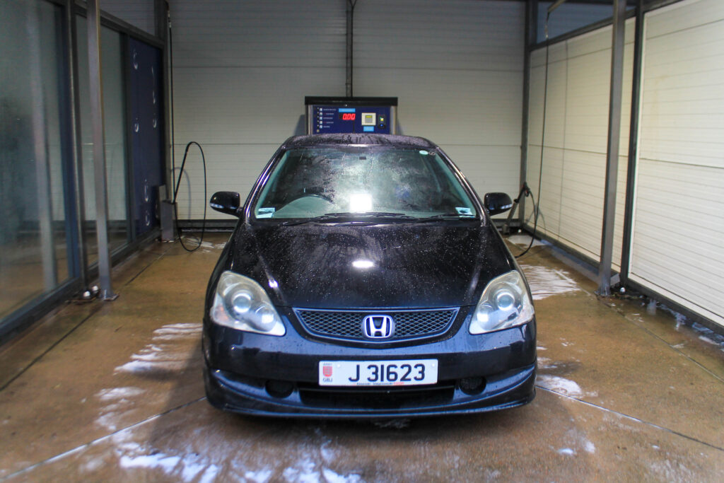
carwash
boy
teen activitys
fun
candid
Outcome-
Lightroom edits-
Favorites-
Results-
I think that this photoshoot wasn’t the best and definitely could be better, but I also think that they could be some good linking photos.
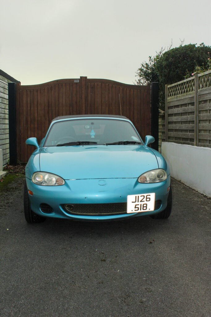
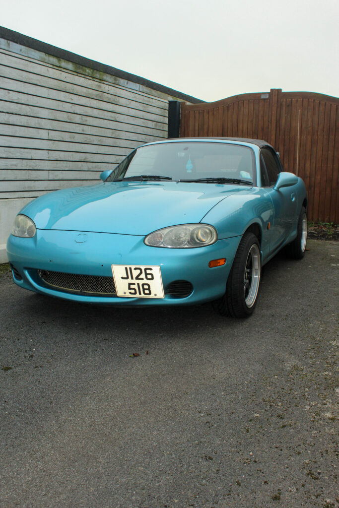
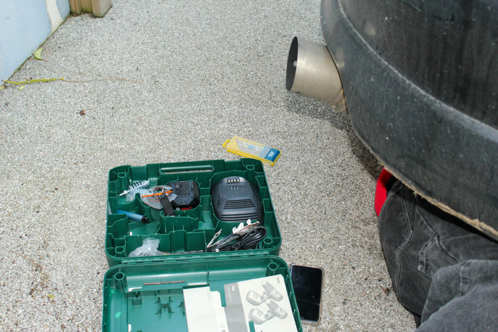
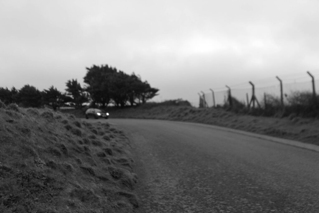
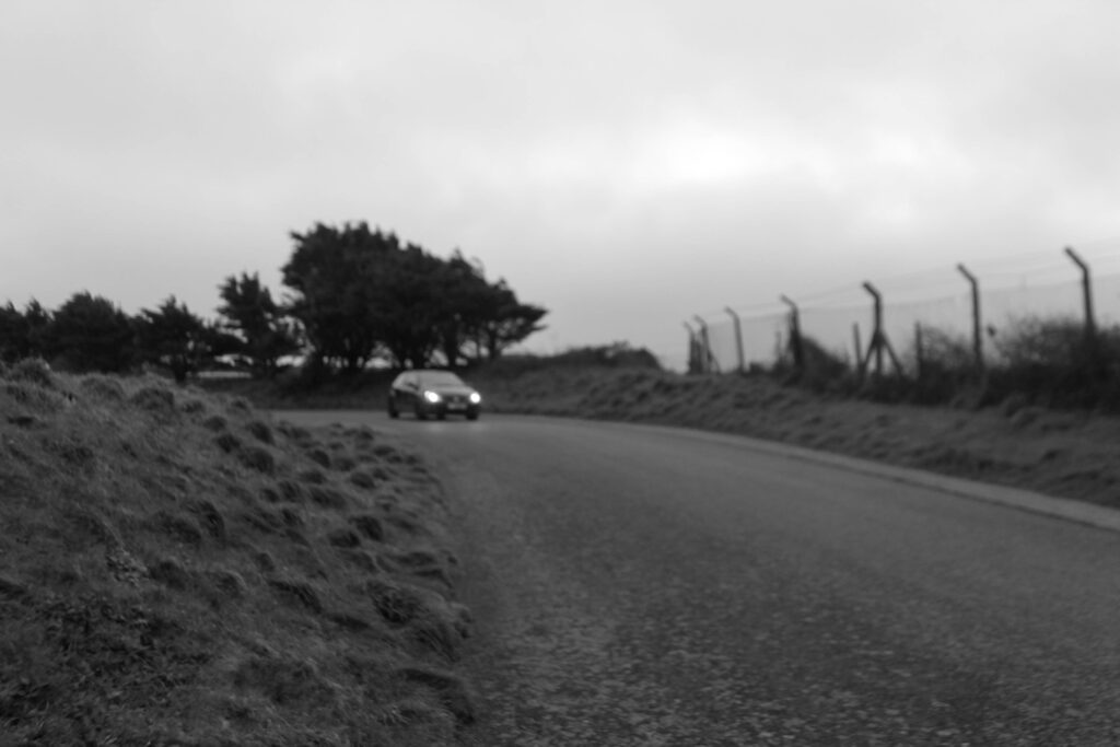
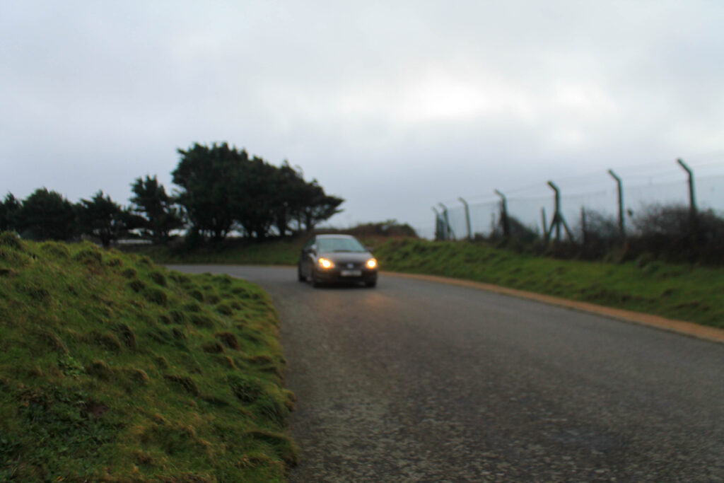
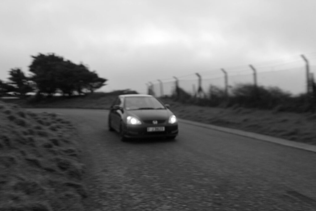
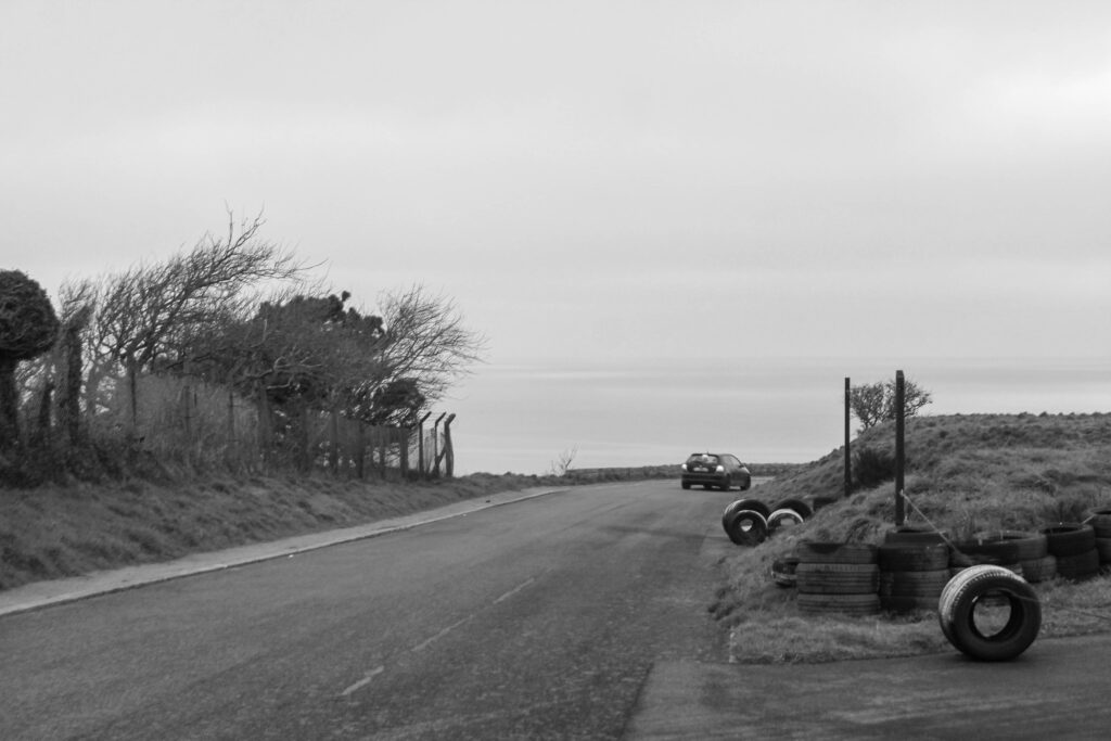
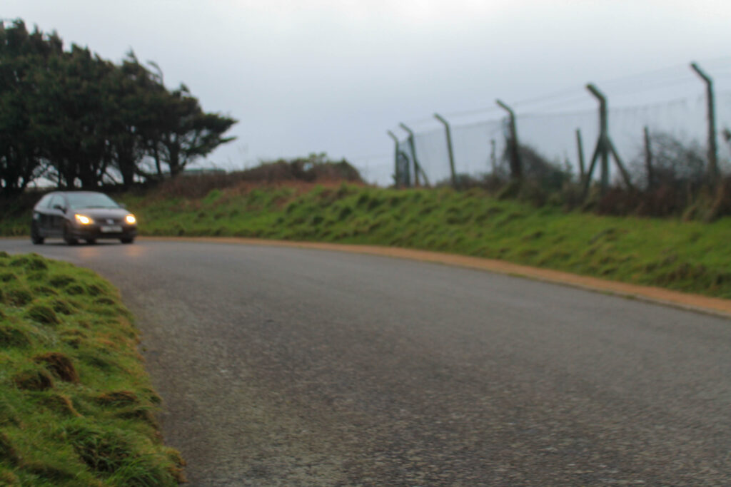
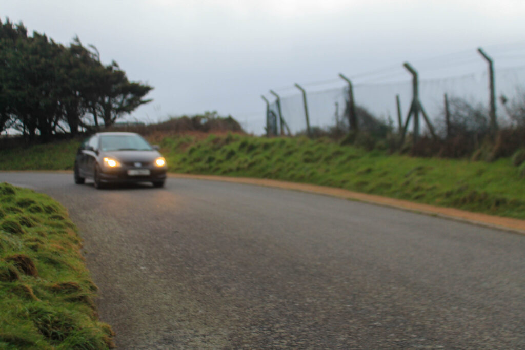
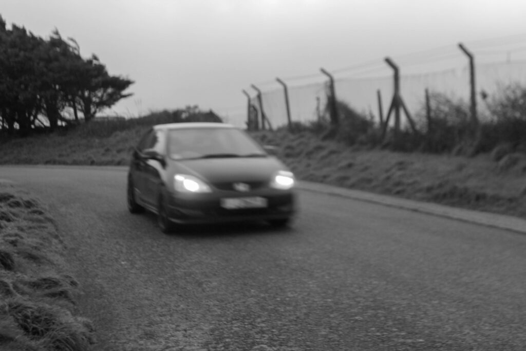
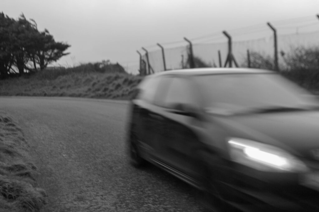
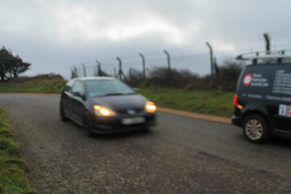
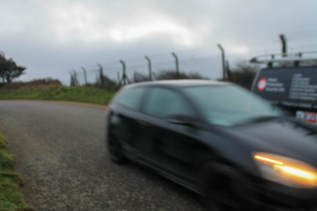
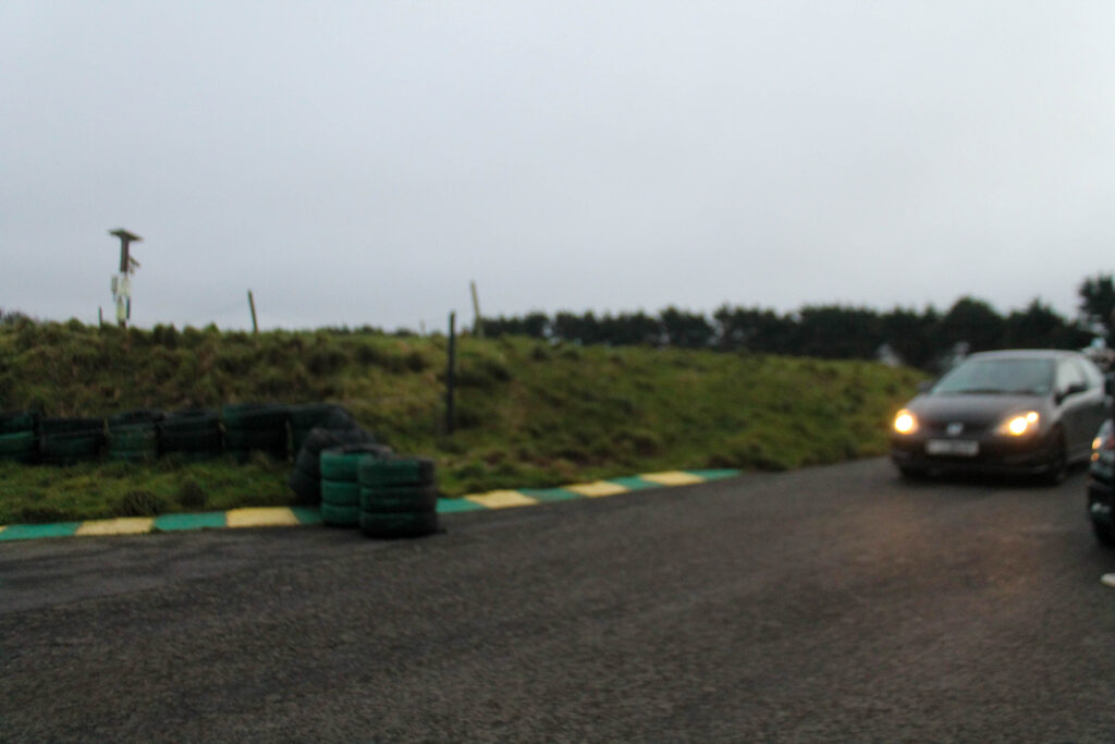
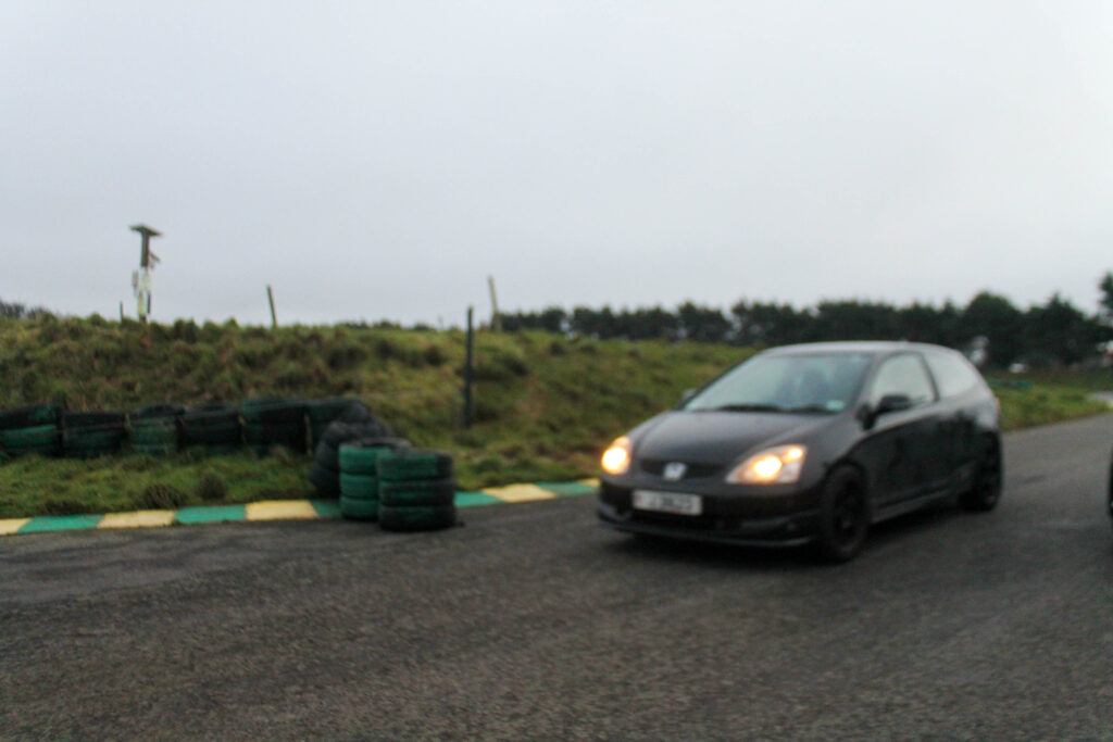
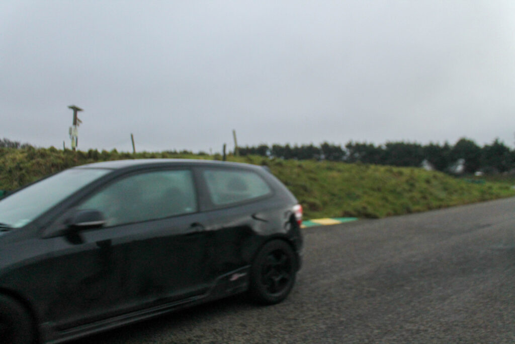
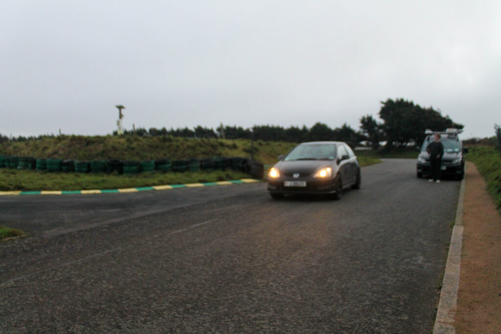
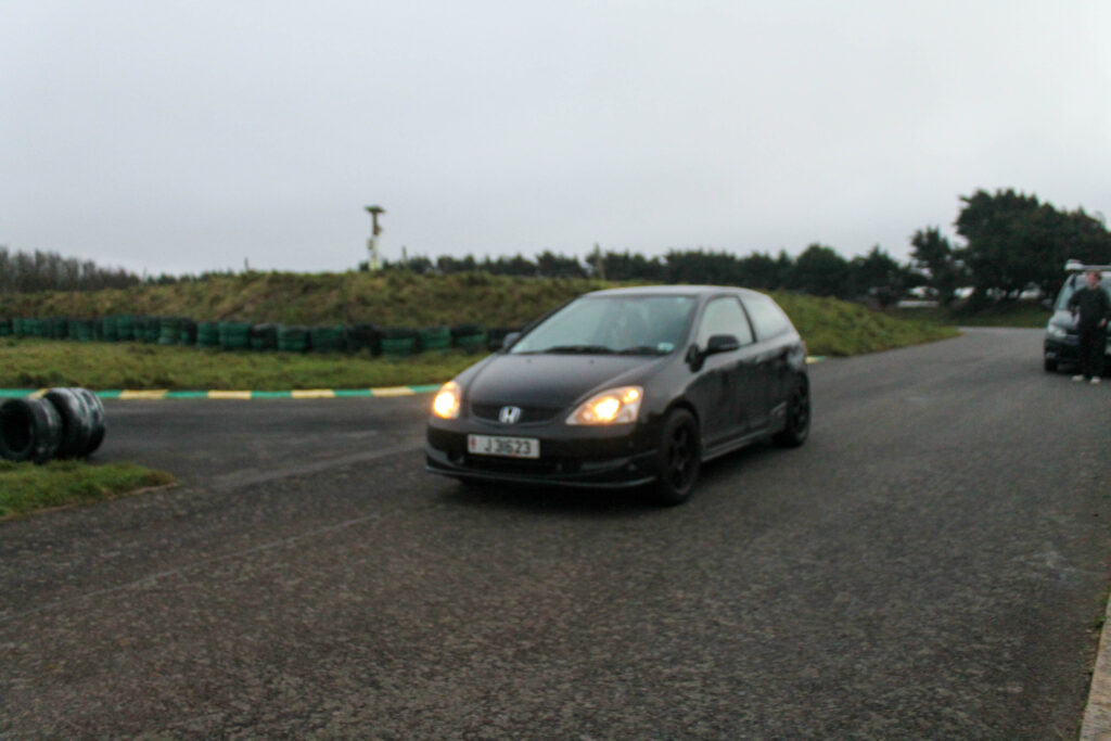
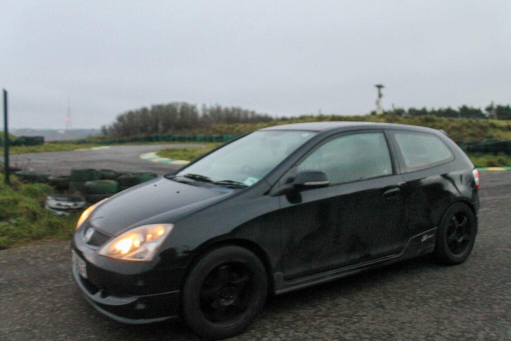
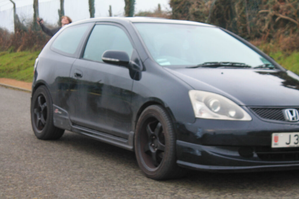
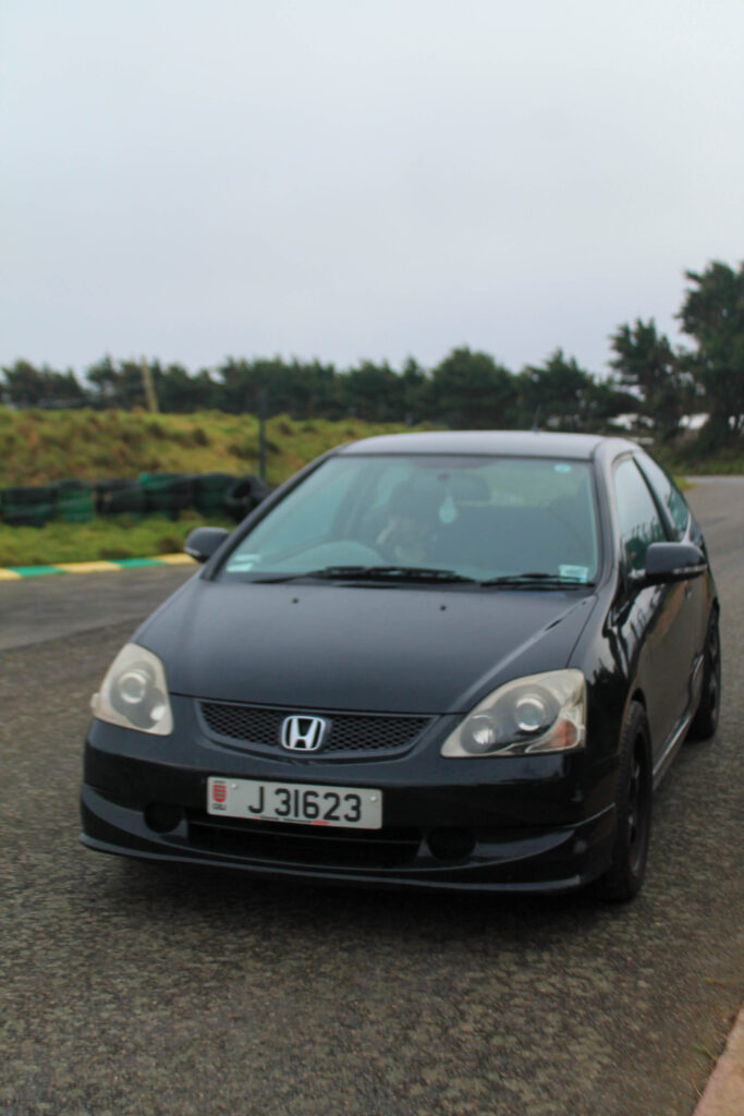
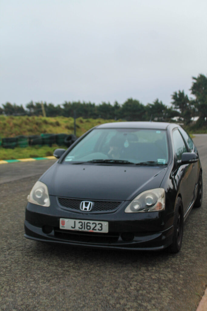
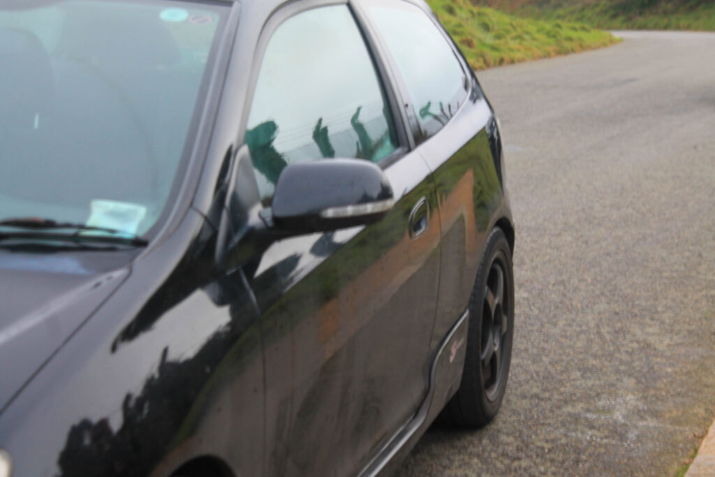
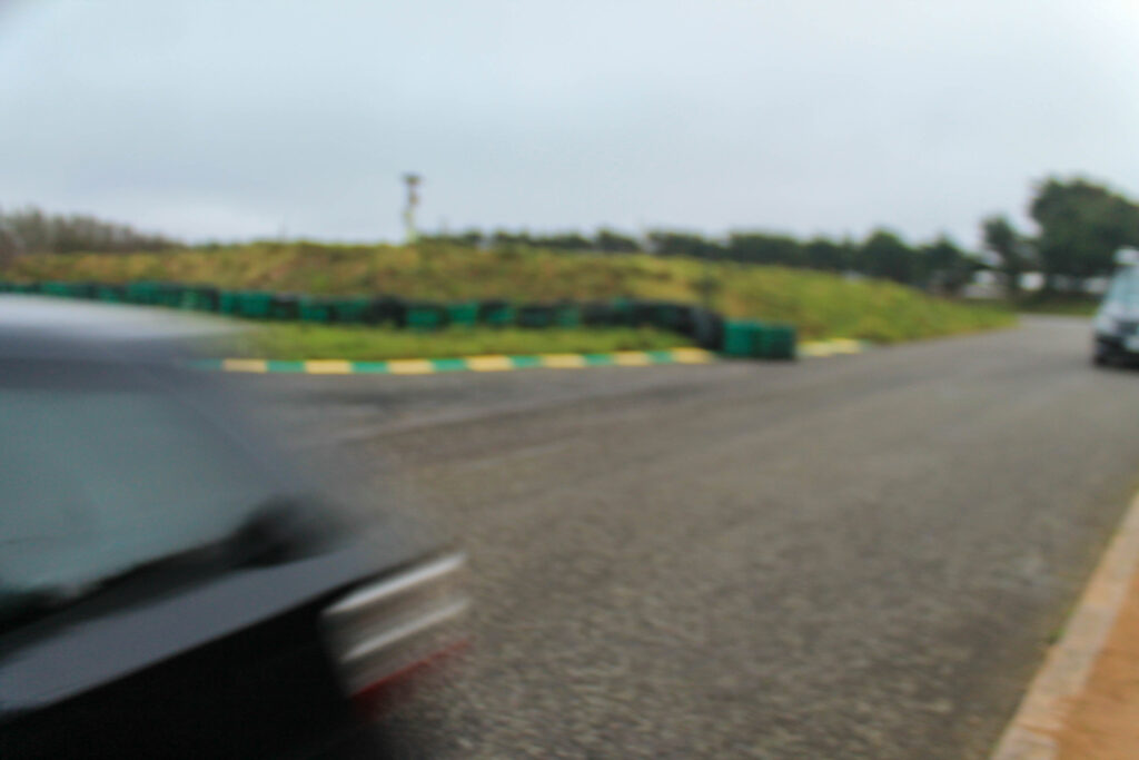
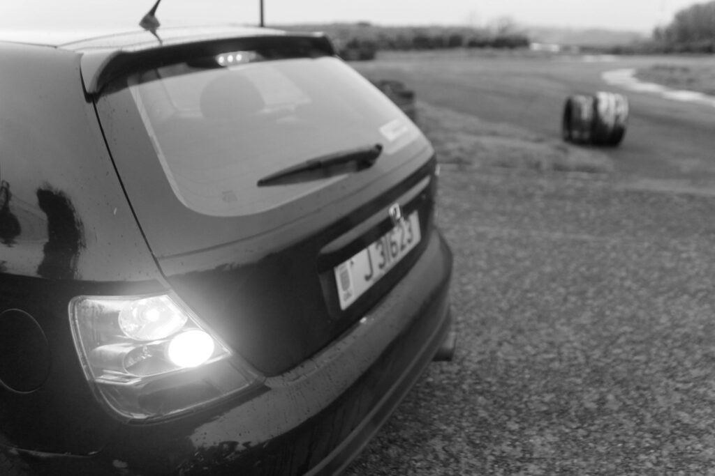
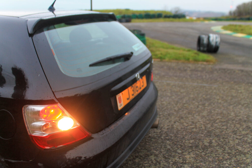
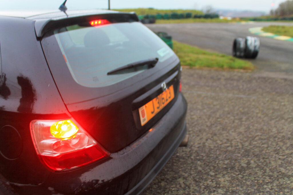
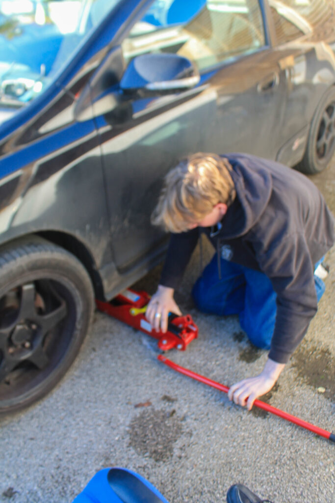
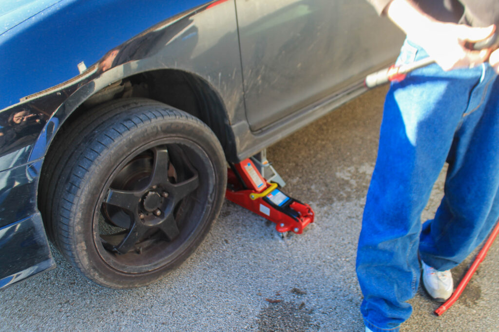
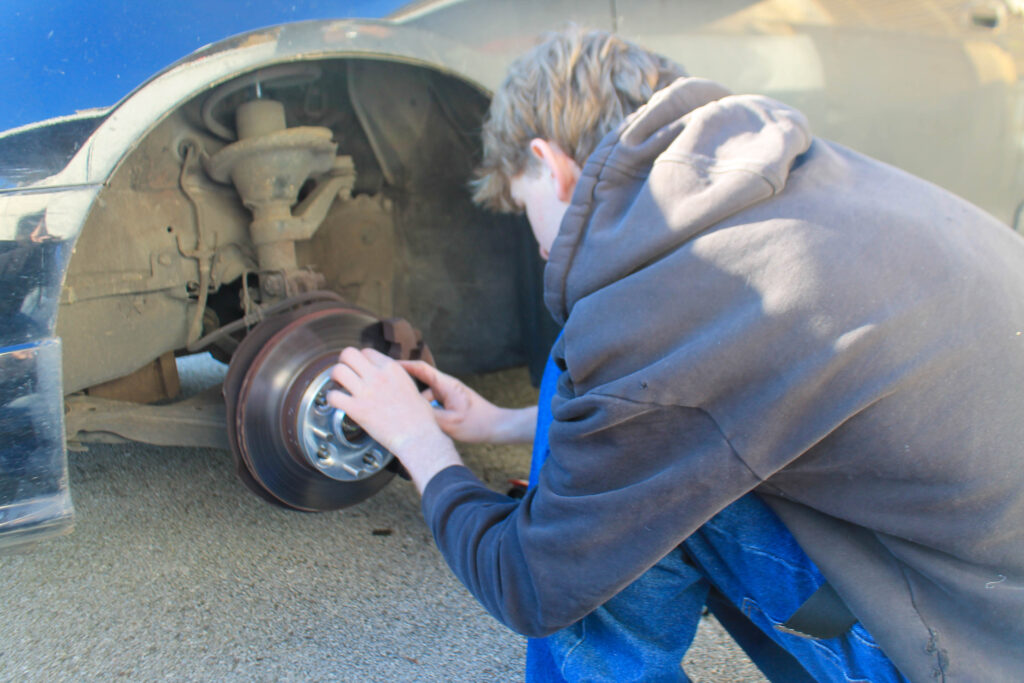
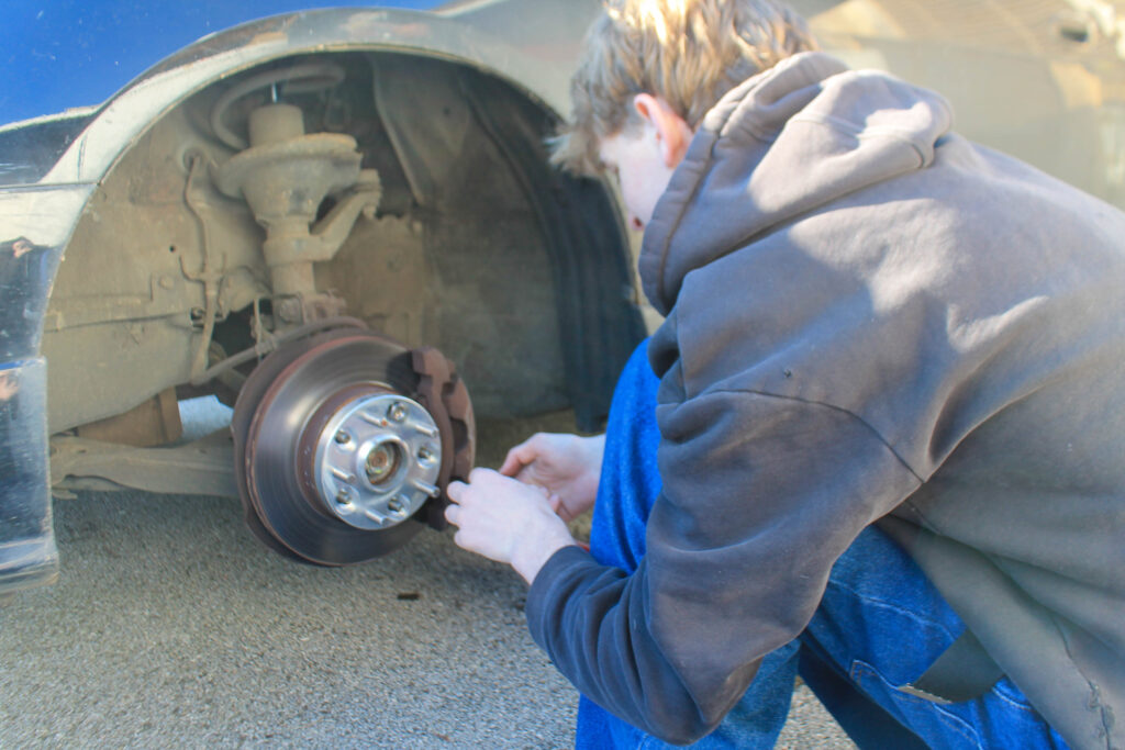
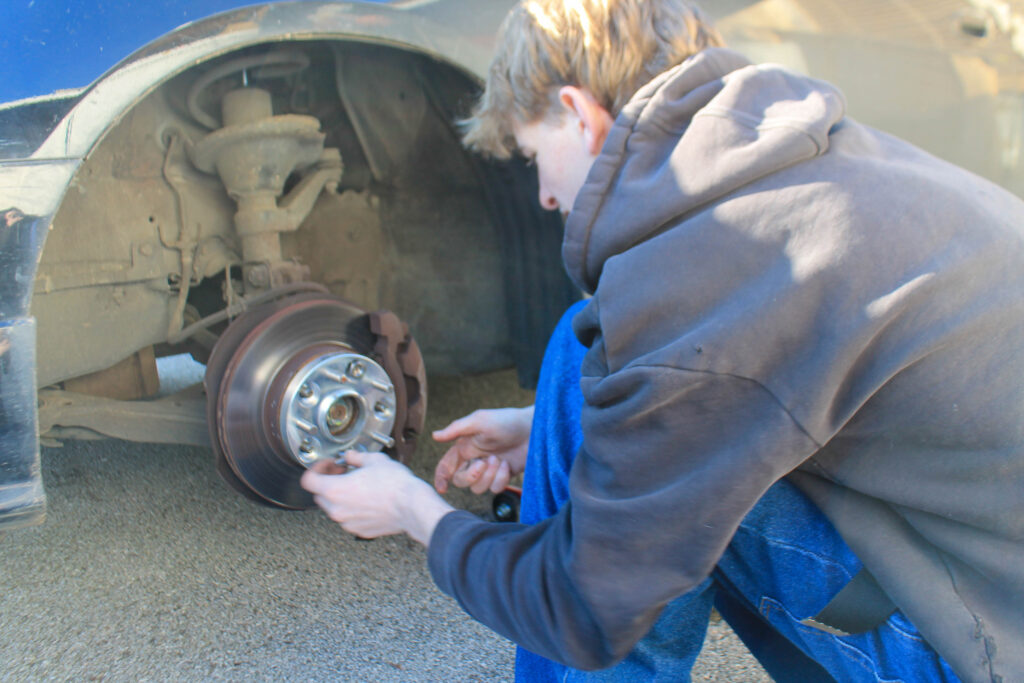
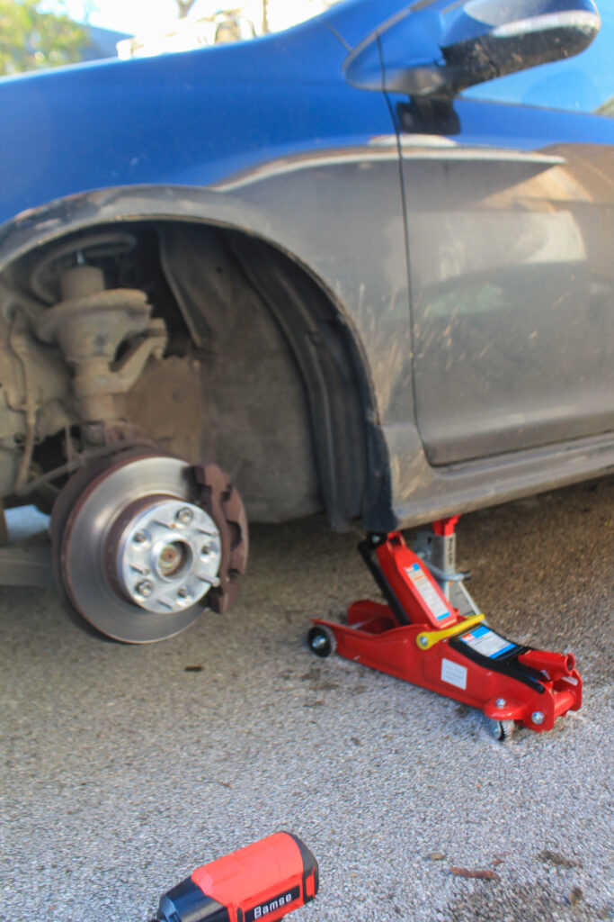
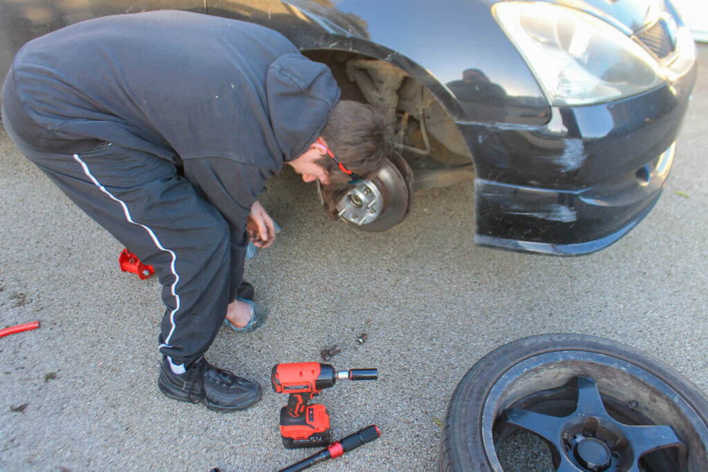
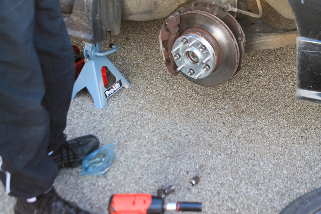
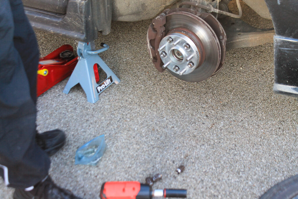
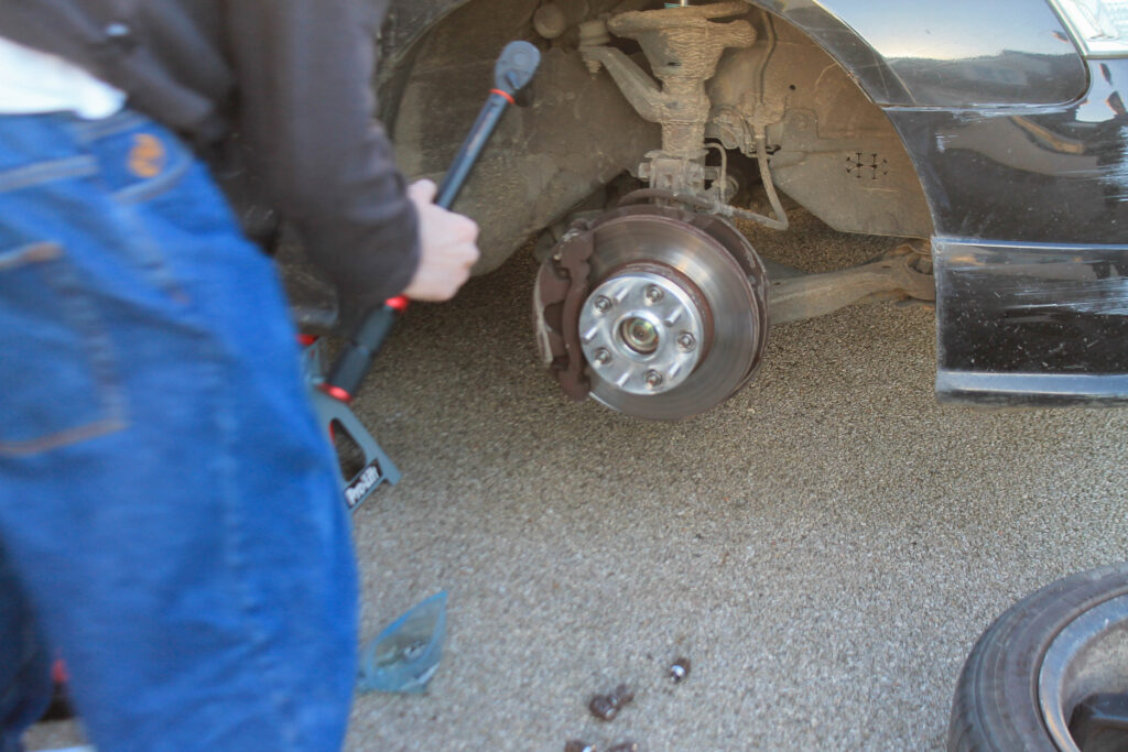
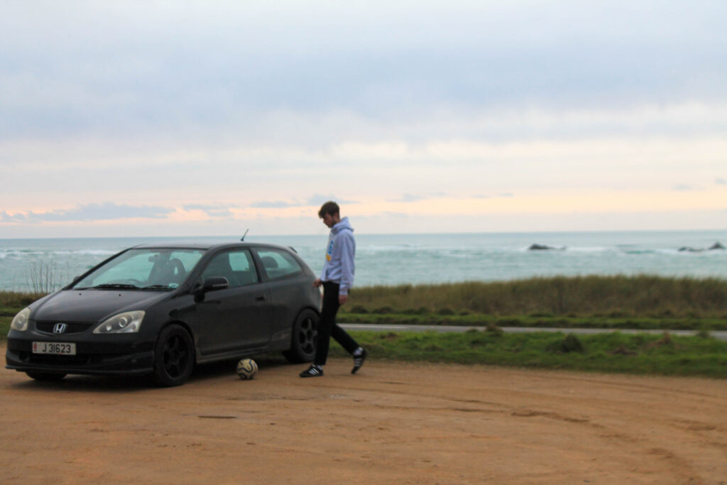
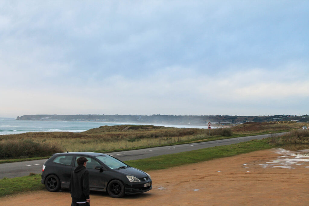
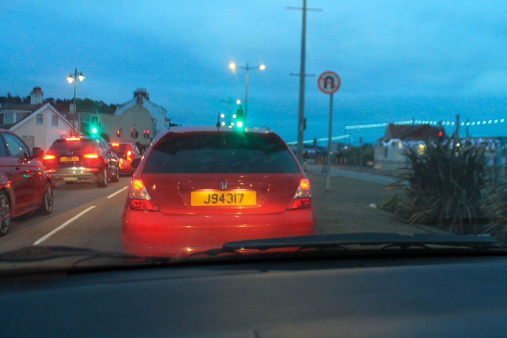
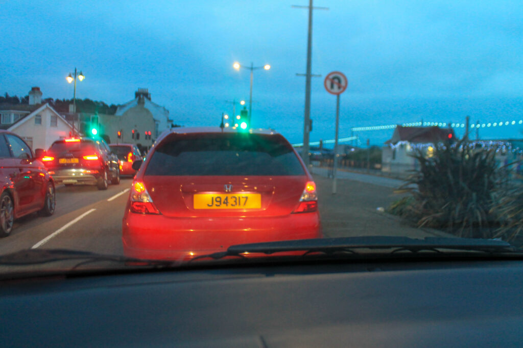
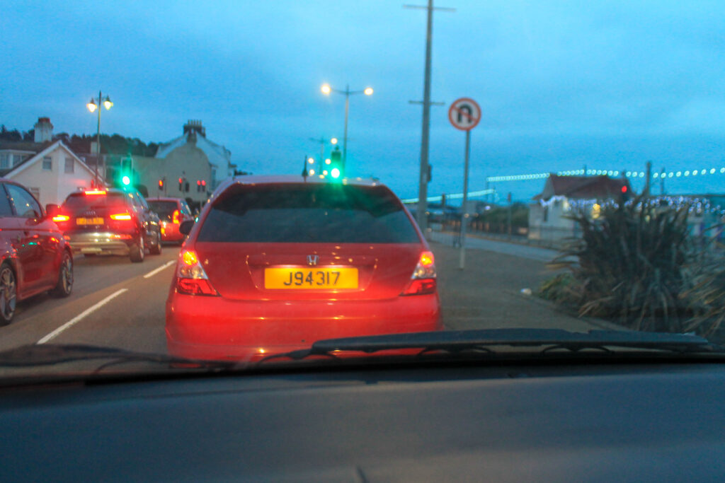
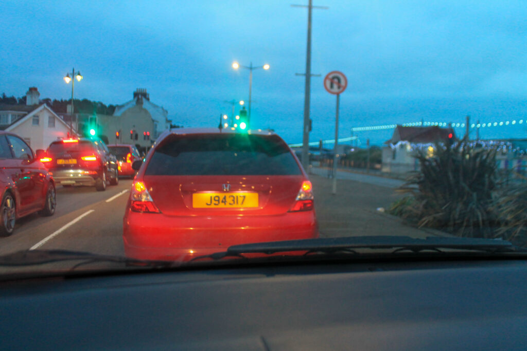
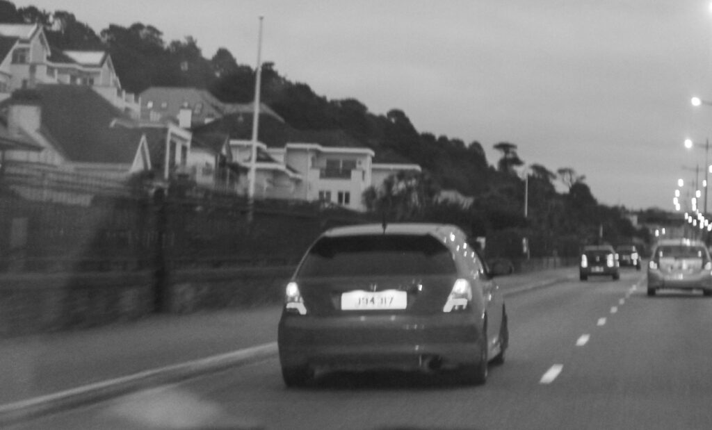
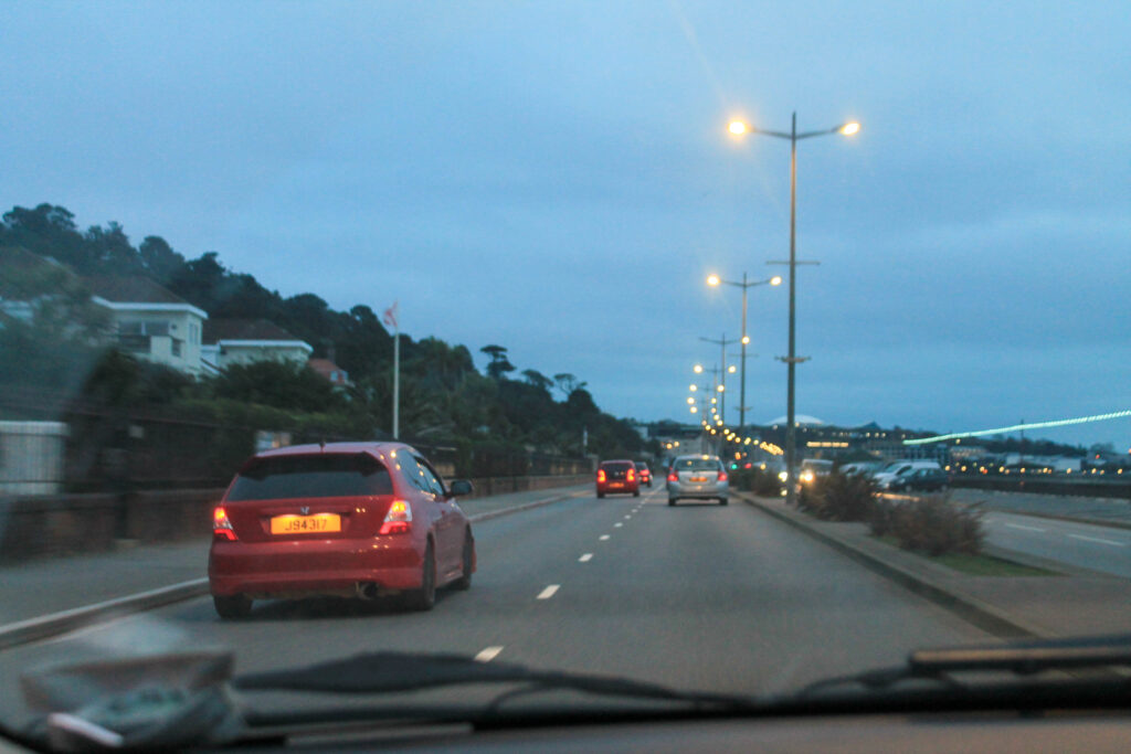
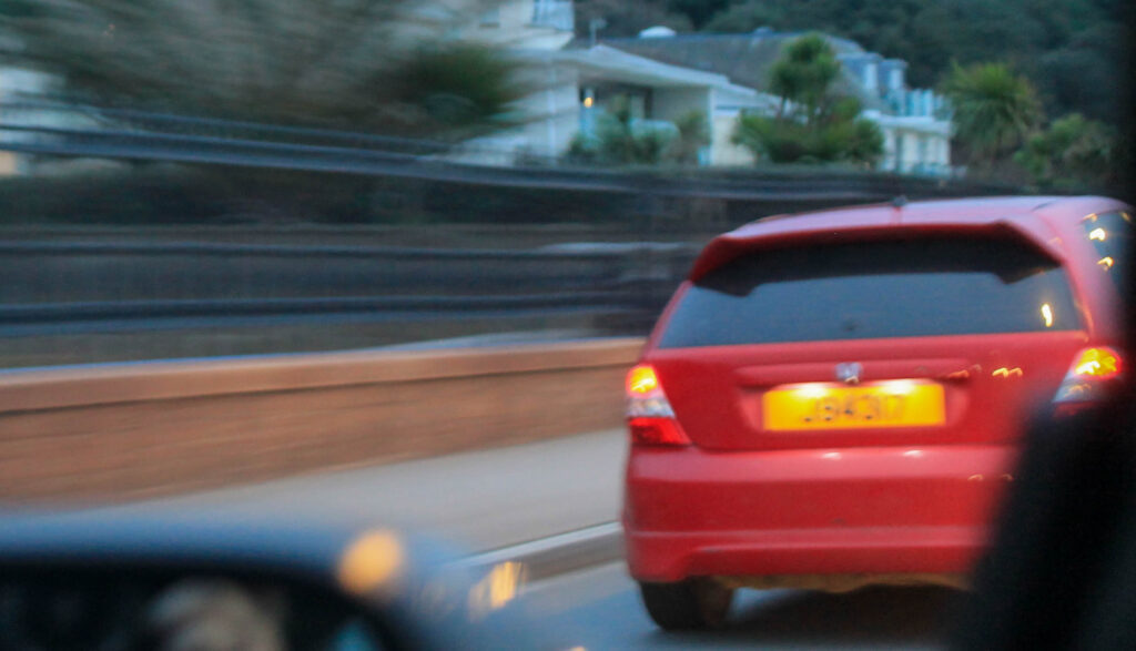
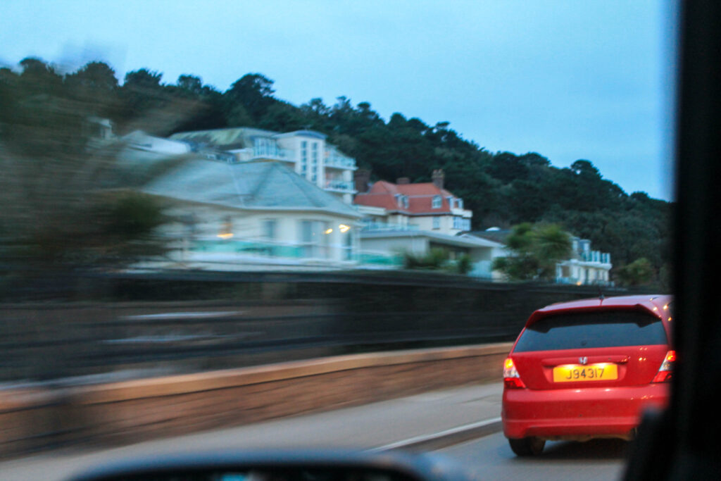
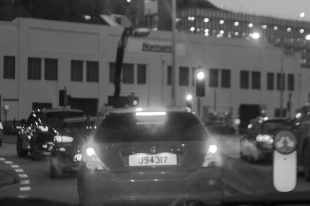
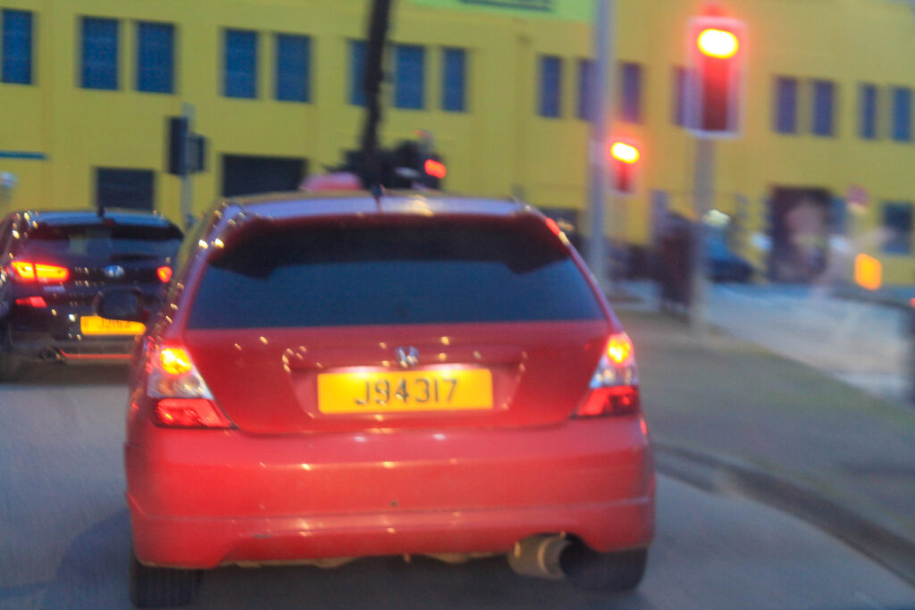
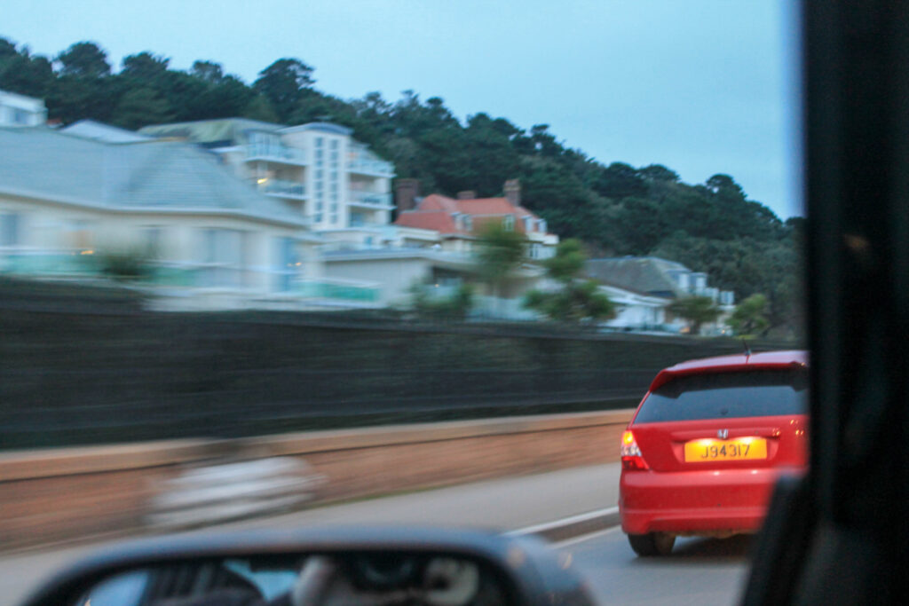
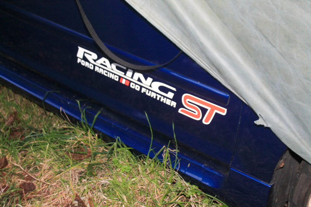
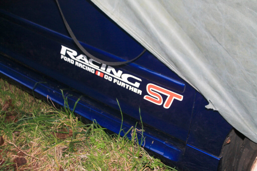
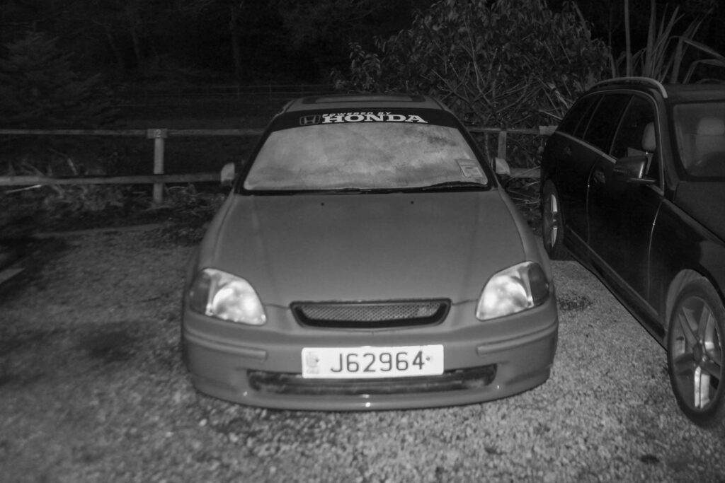
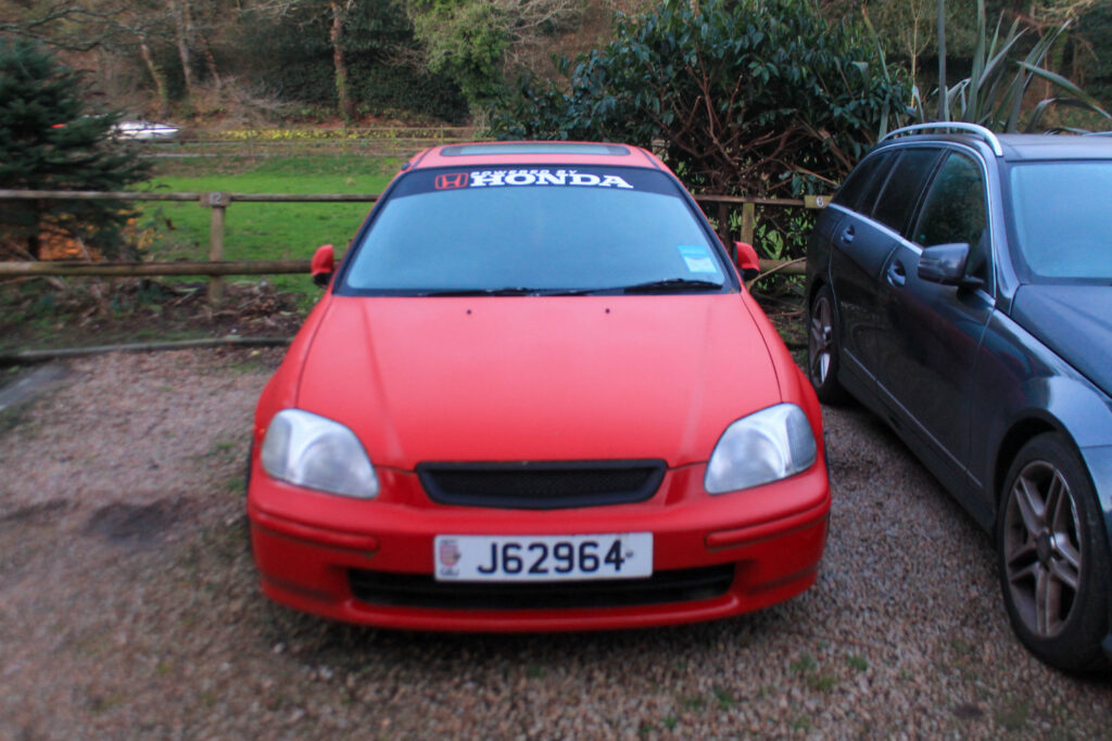
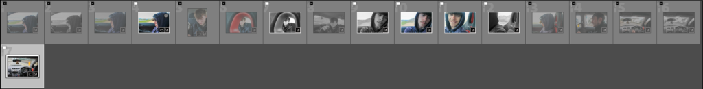
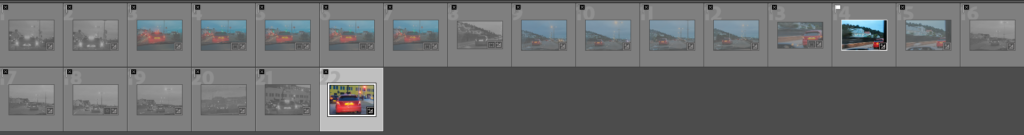
Photoshoot 8 plan-
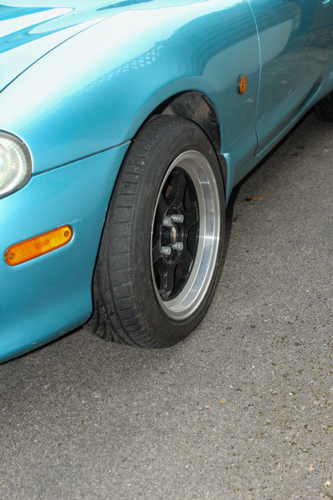
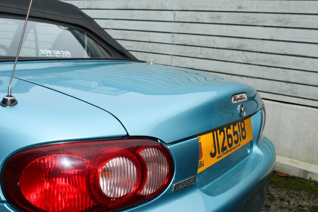
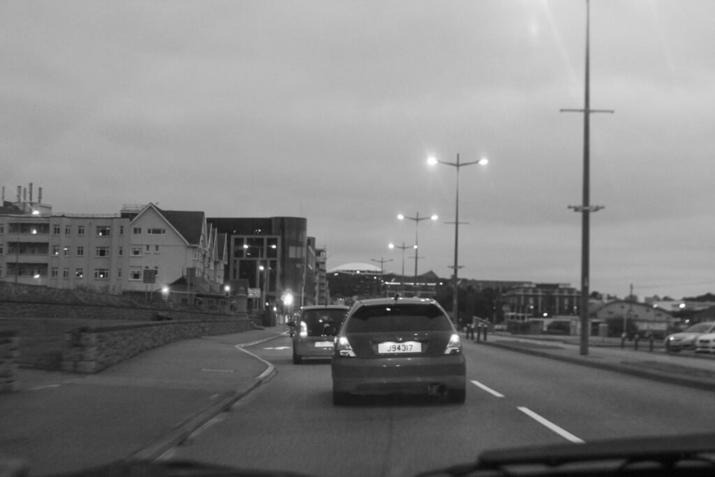
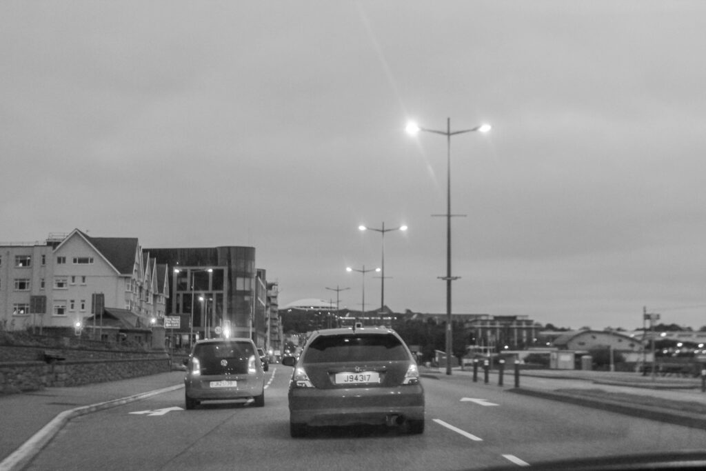
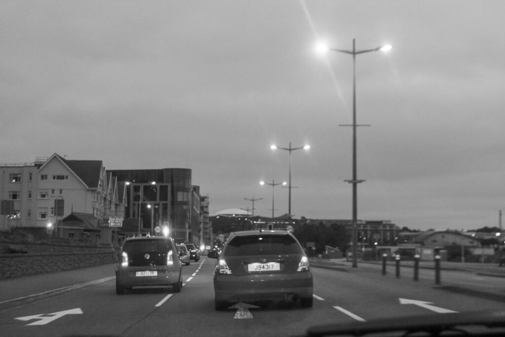
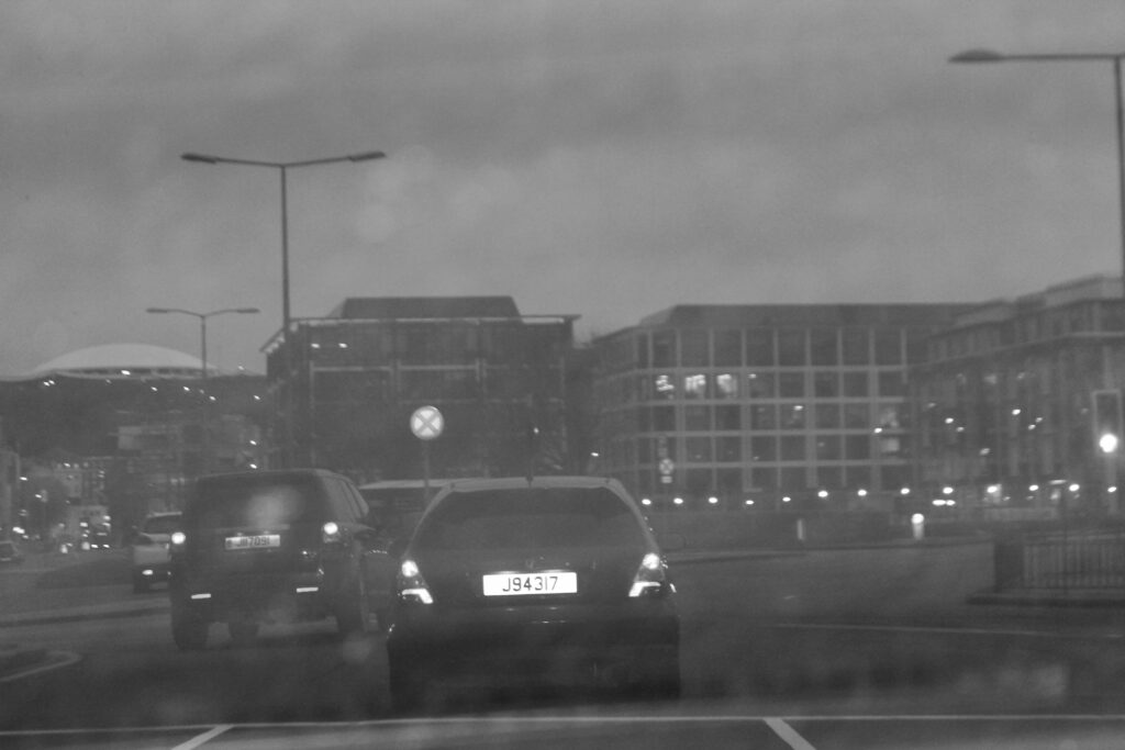
cars
motion
dark
Outcome-
Lightroom edits-
Favorites-
Results-
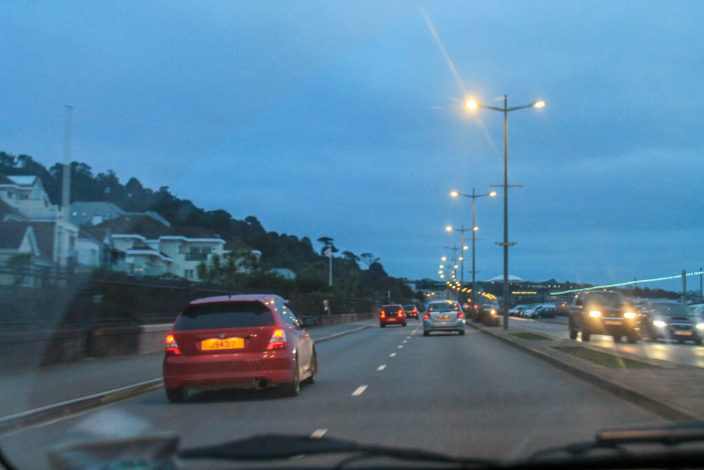
I don’t think this photoshoot went too well I think that there is a bit too much motion blur, so I will redo this shoot so that there is less of that, I will do this by changing the settings on the camera and asking the driver to slow down.
Photoshoot 9 plan-
sunset
euphoric
teenage
candid
foreground/background play
Outcome-
Lightroom edits-
Photoshop edits-
Favorites-
Results-
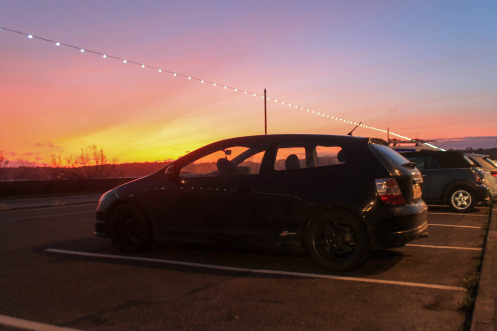
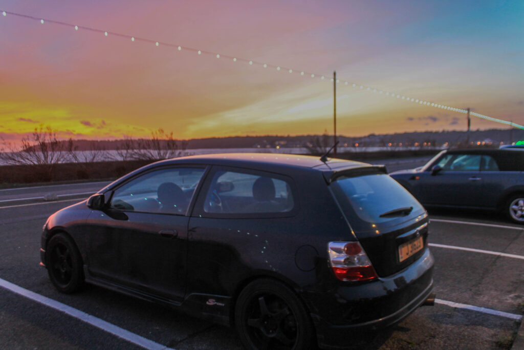
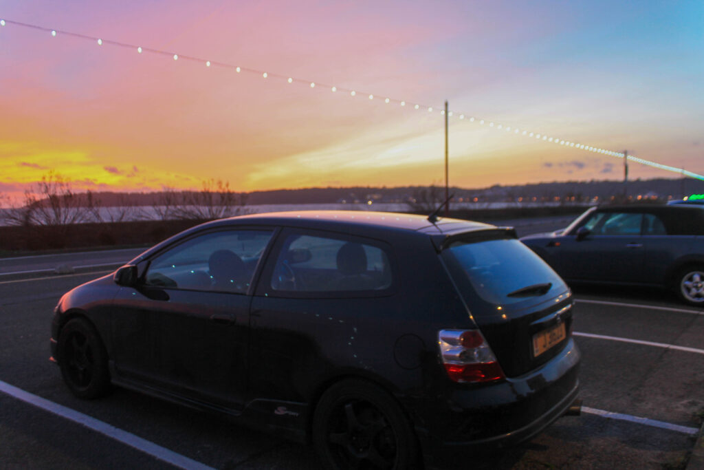
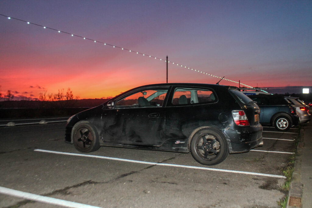
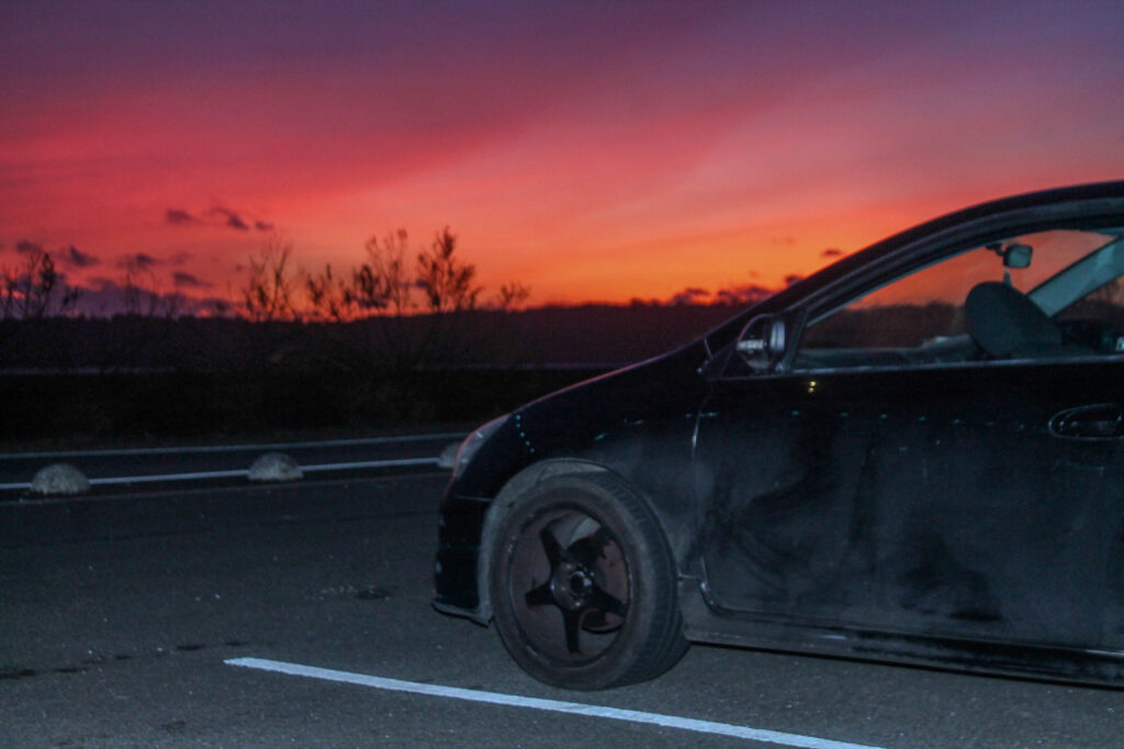
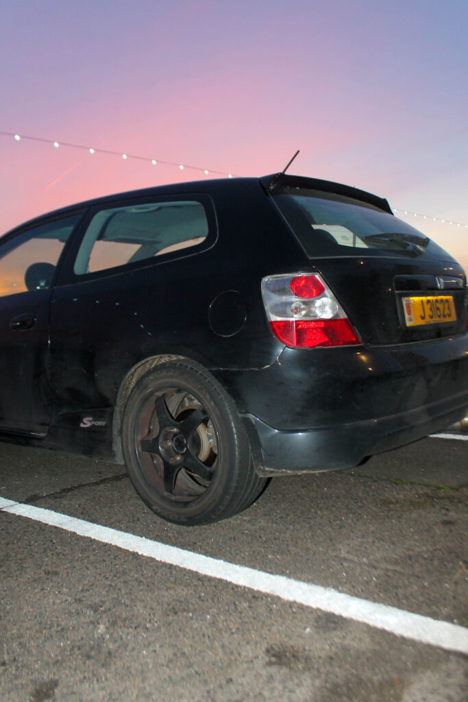
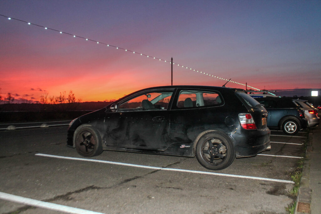
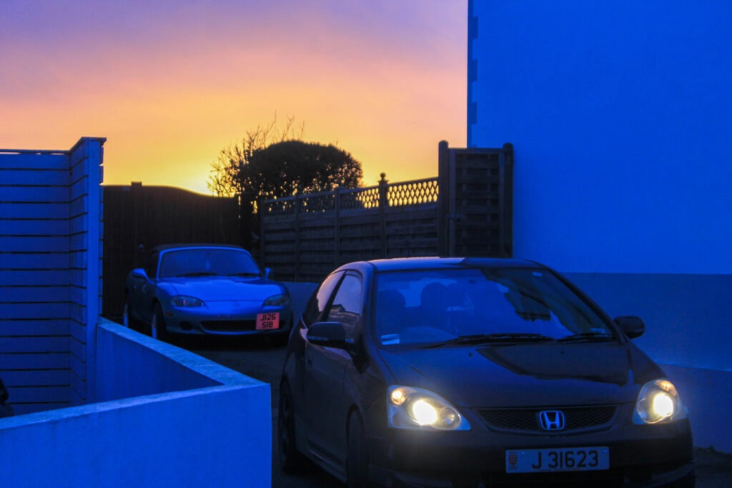
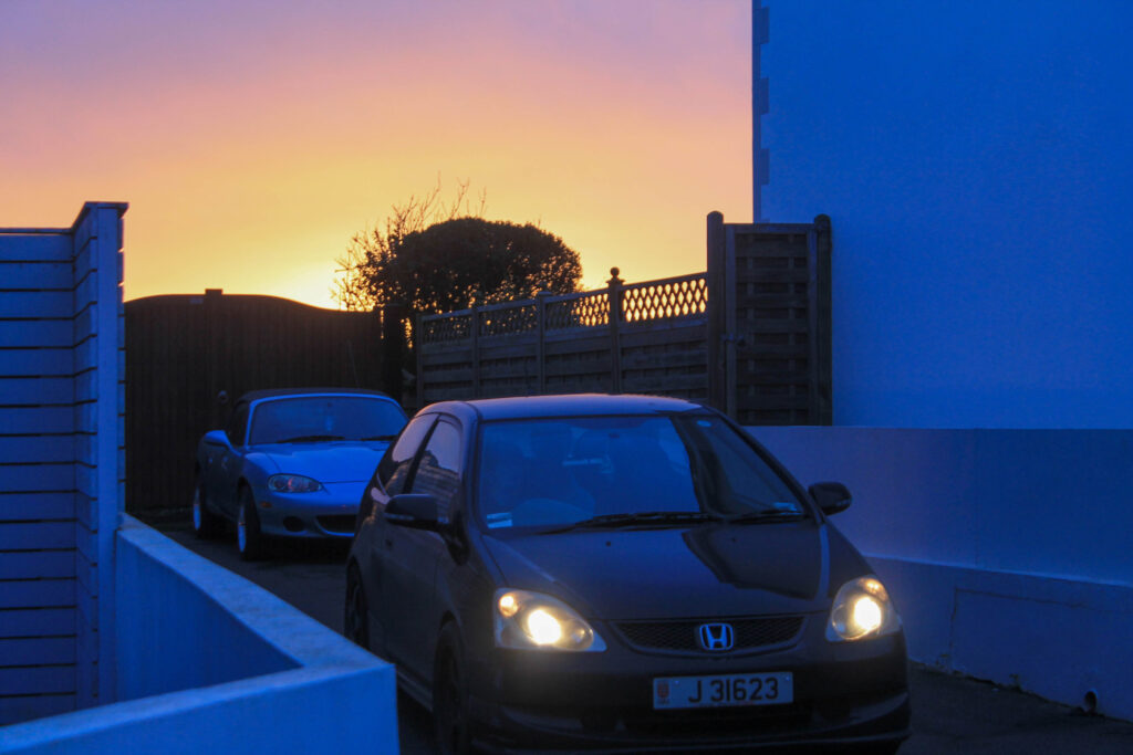
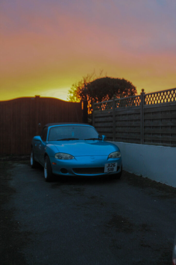
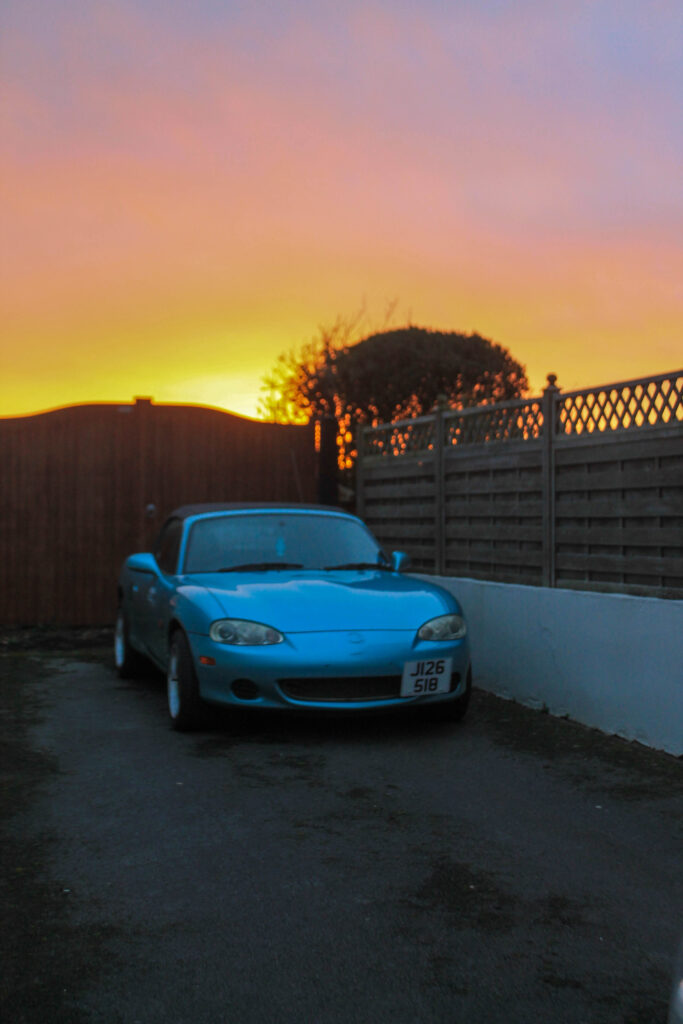
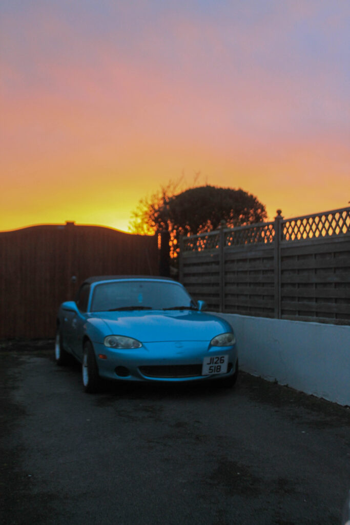
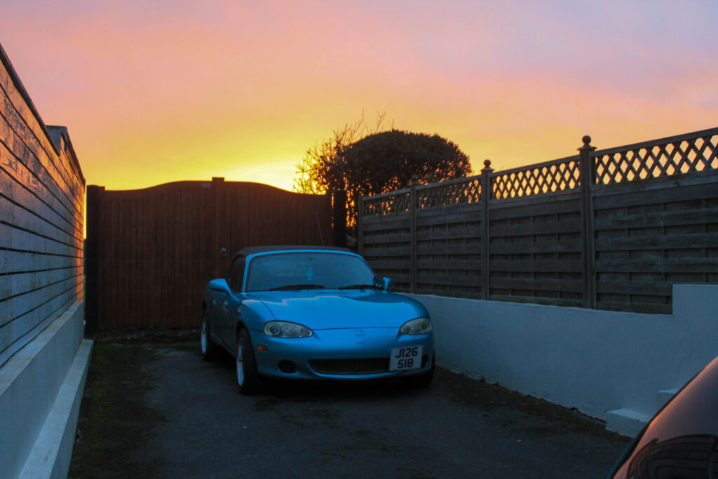
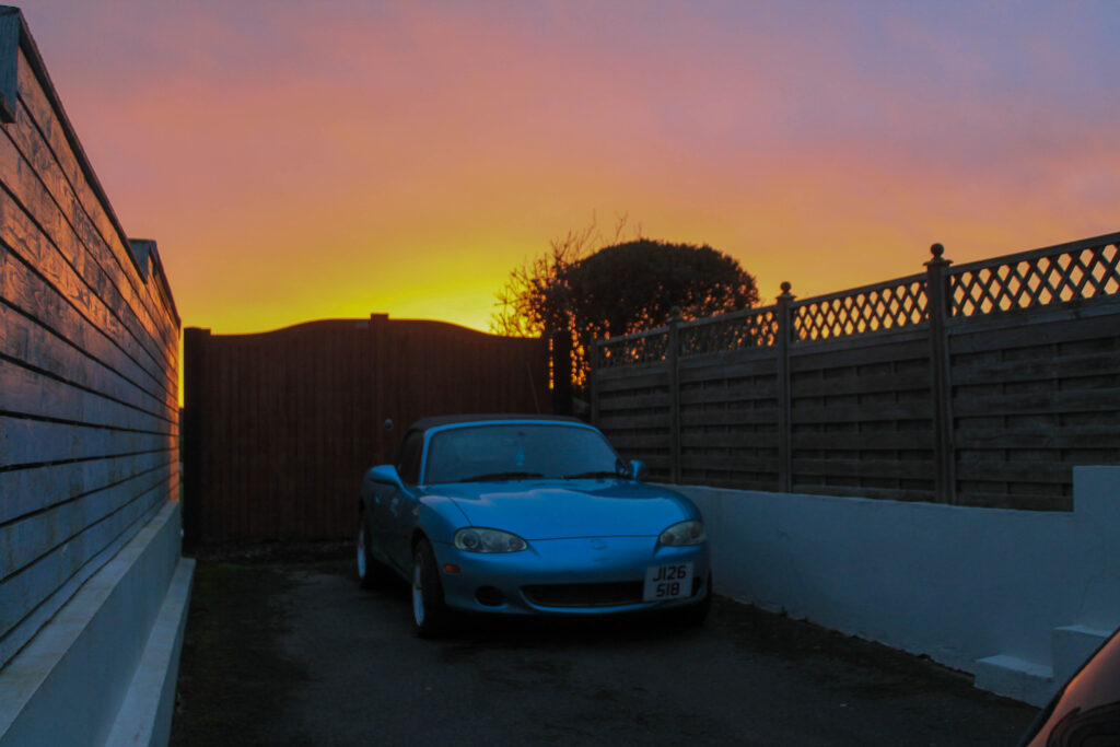
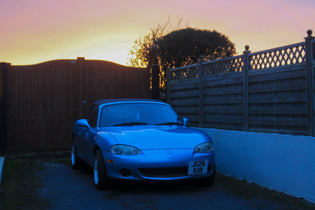
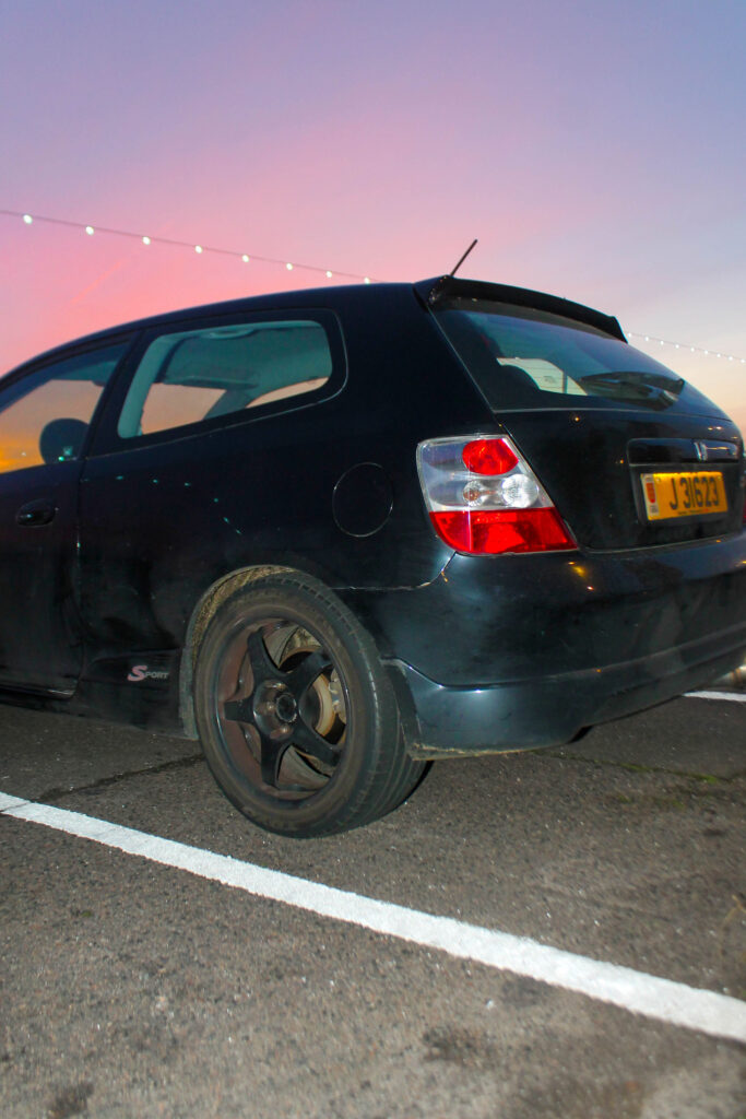
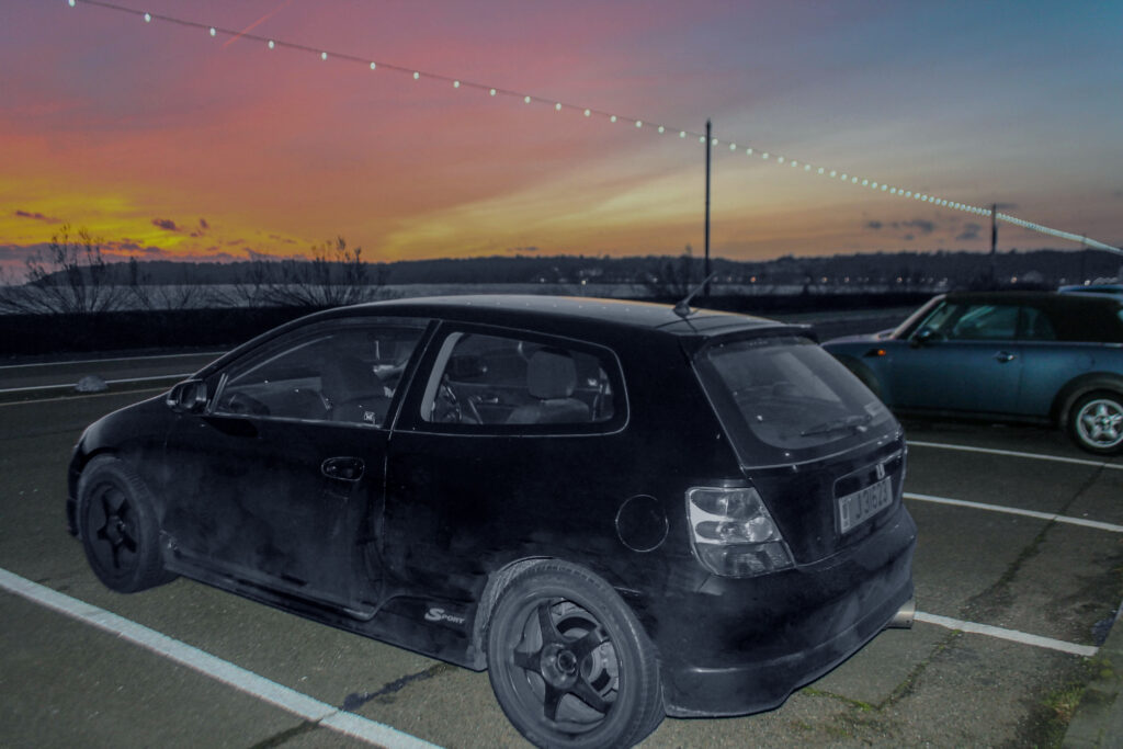
I overall think that this is one of my favorite photoshoots, I love the brightness and colours of the sunset compared to the darkness of the car. I also think that the photoshop editing of where the car was scratched and dirty really made the images pop.
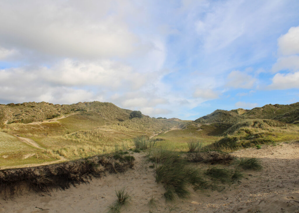
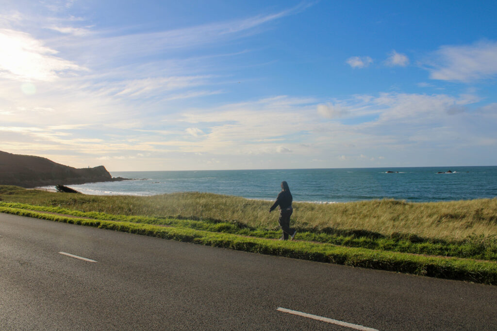
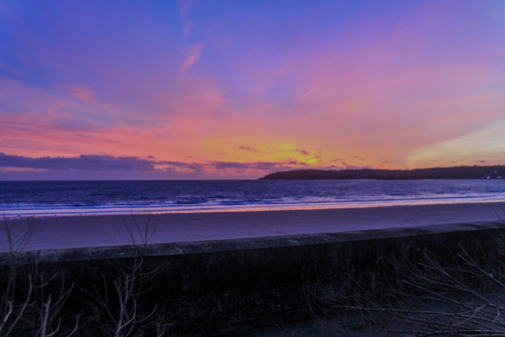
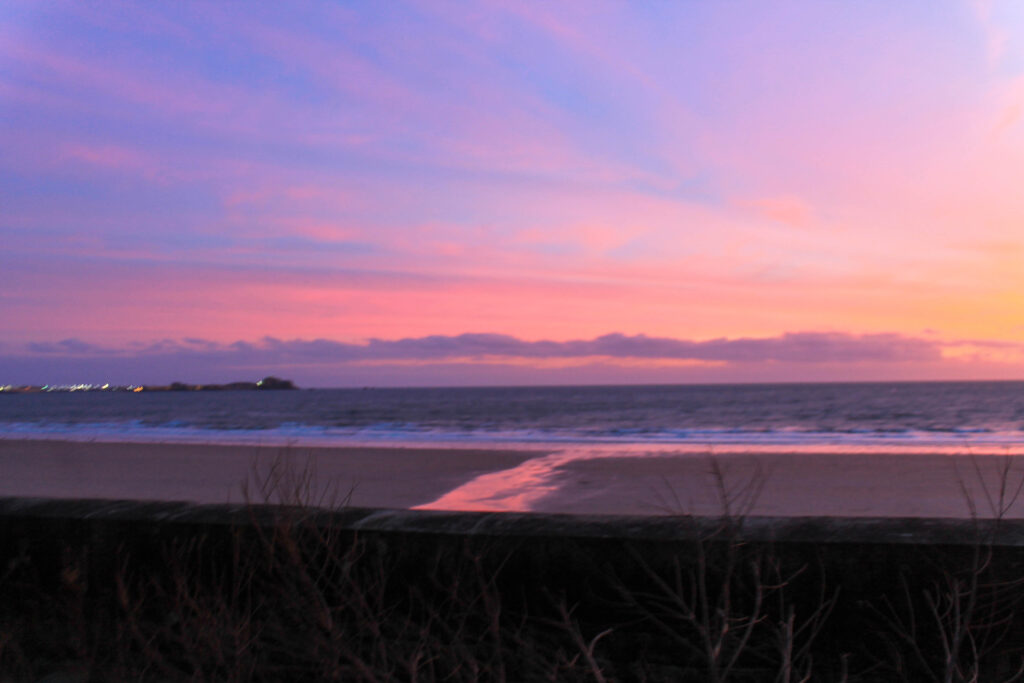
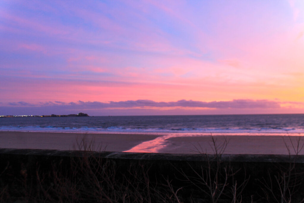
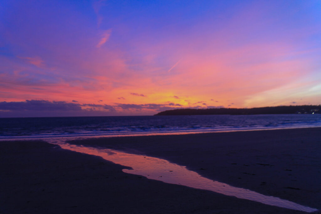
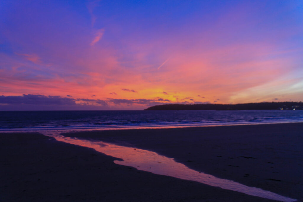
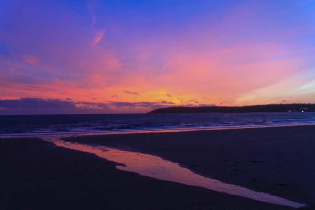
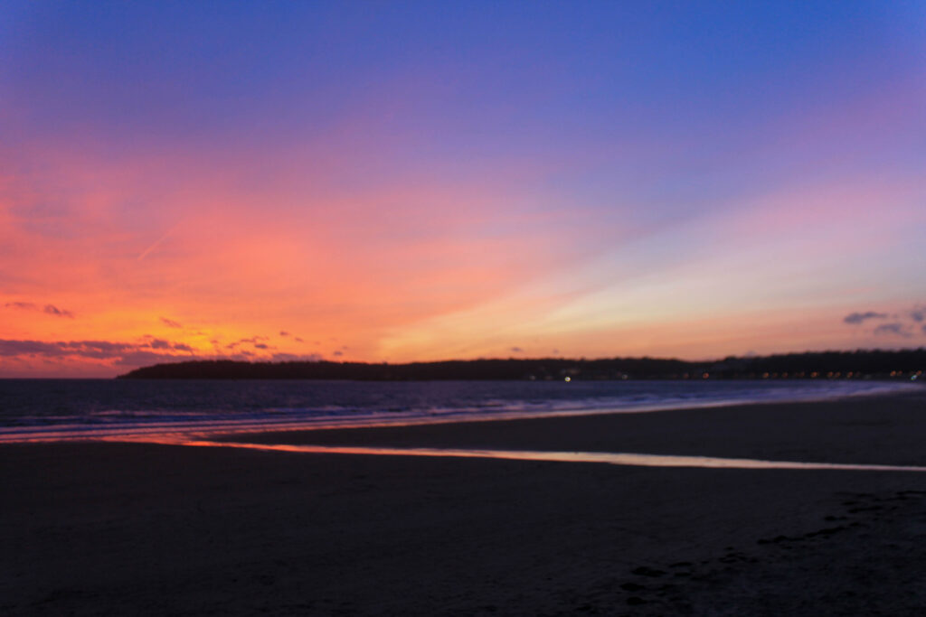
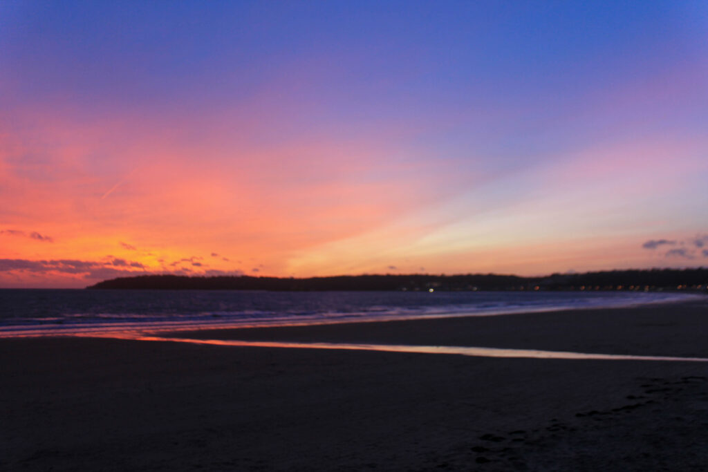
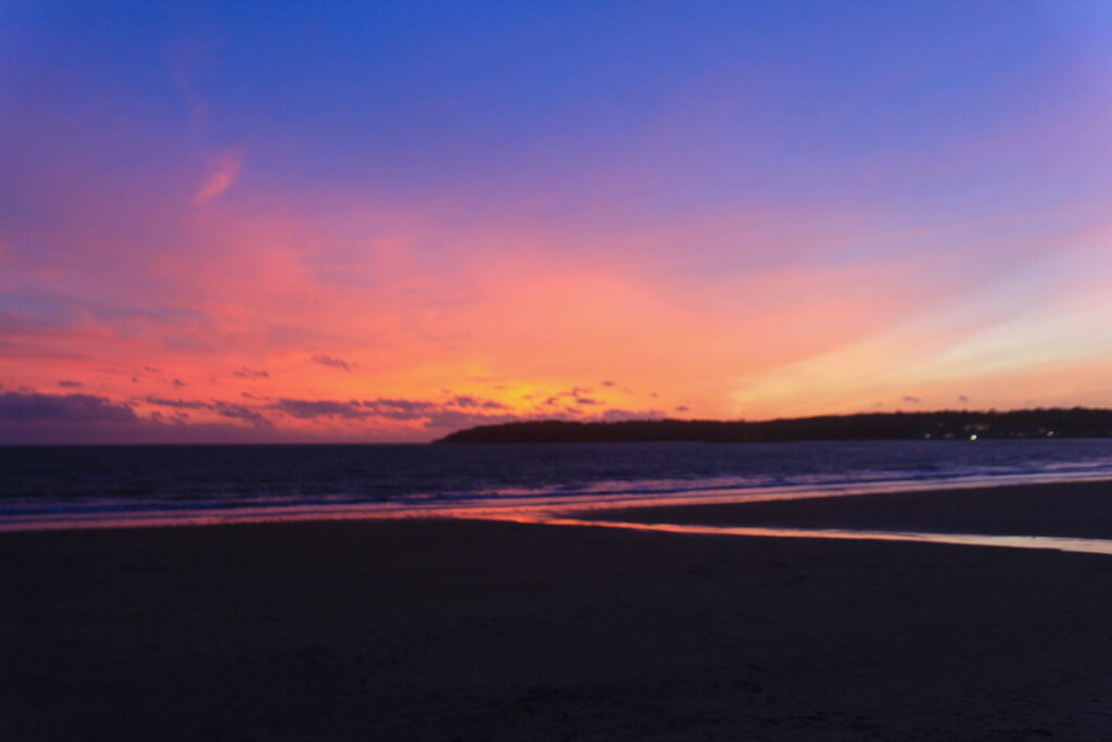
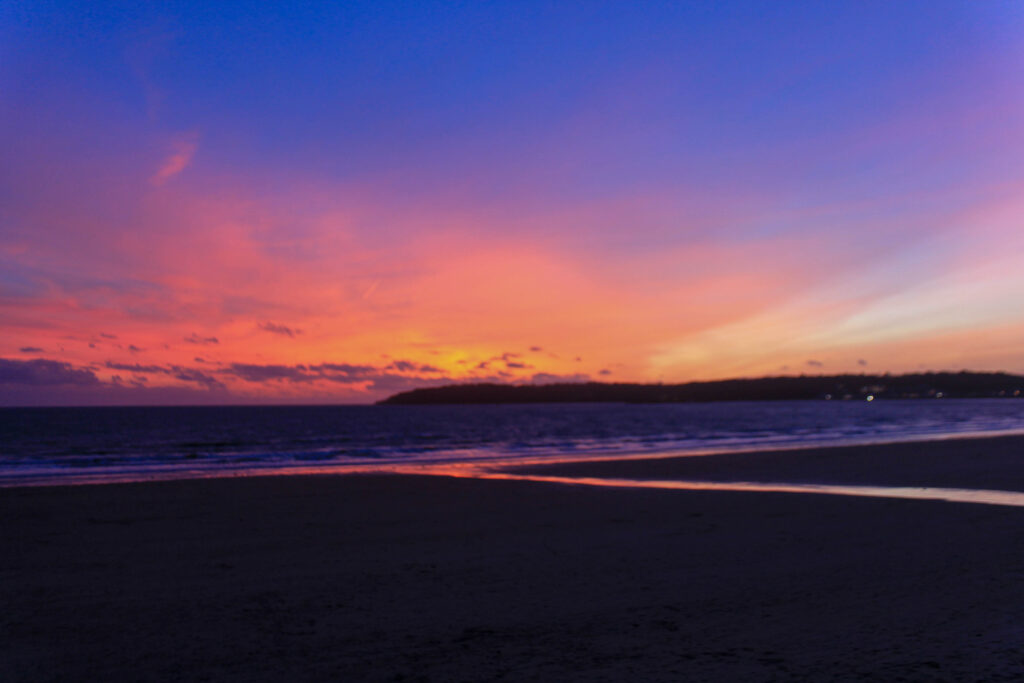
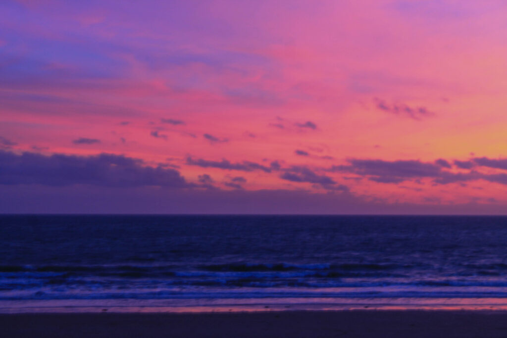
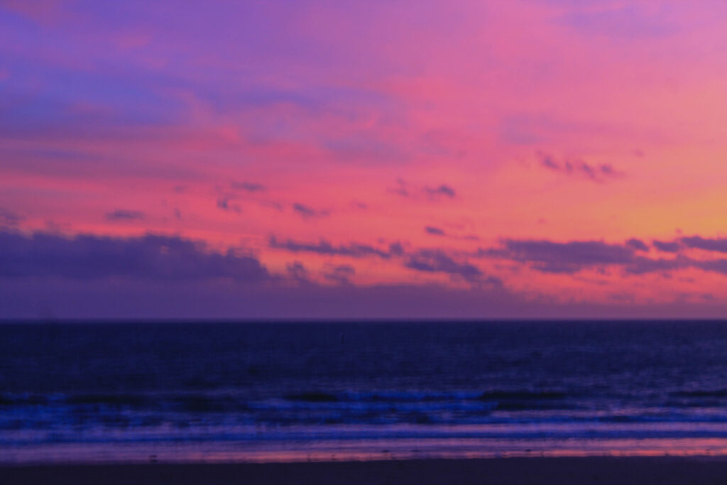
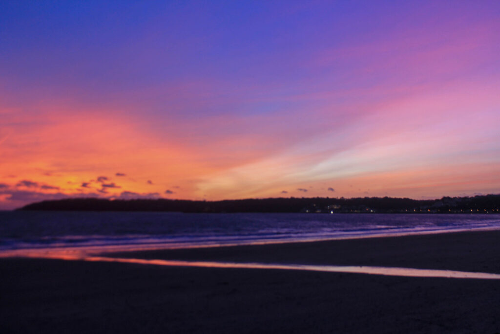
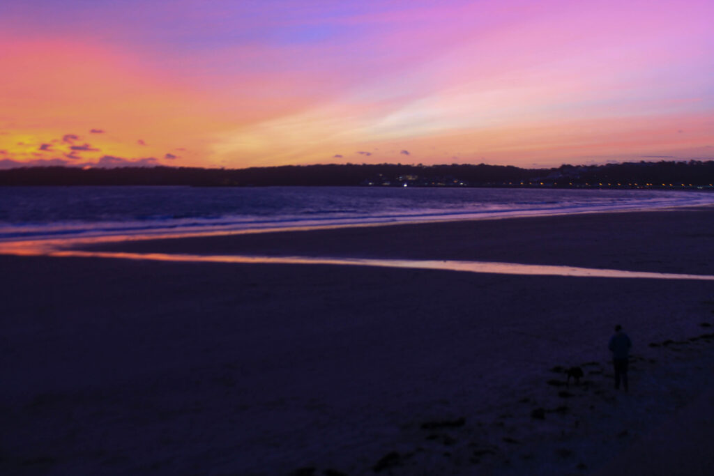
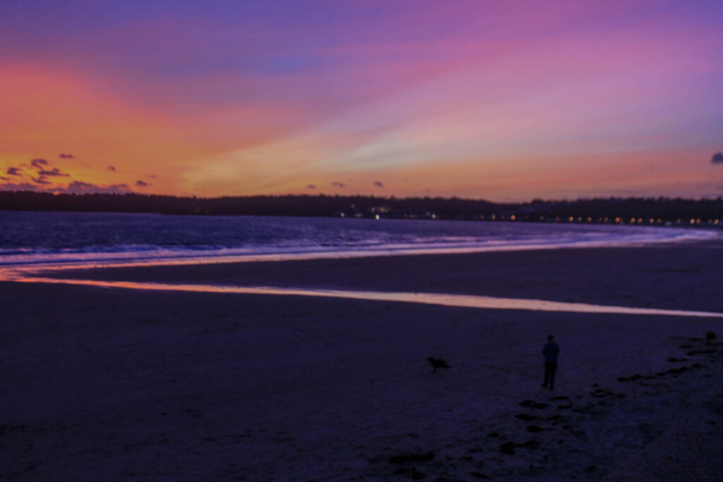
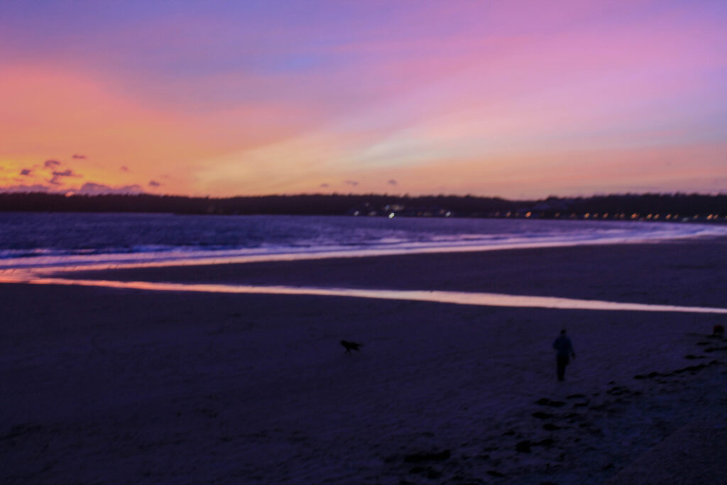
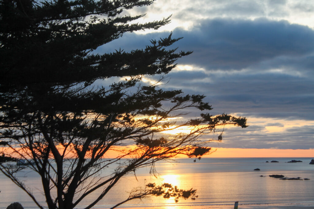
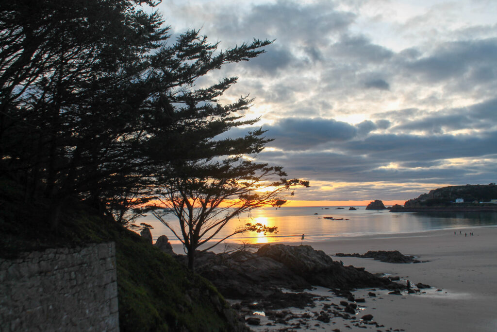
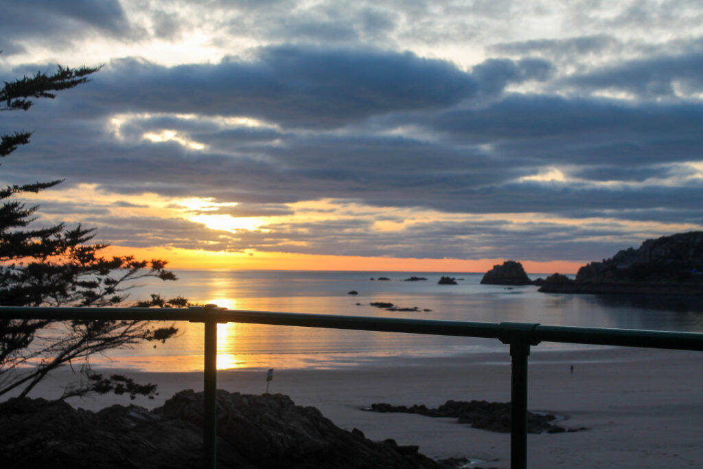
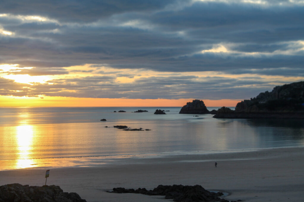
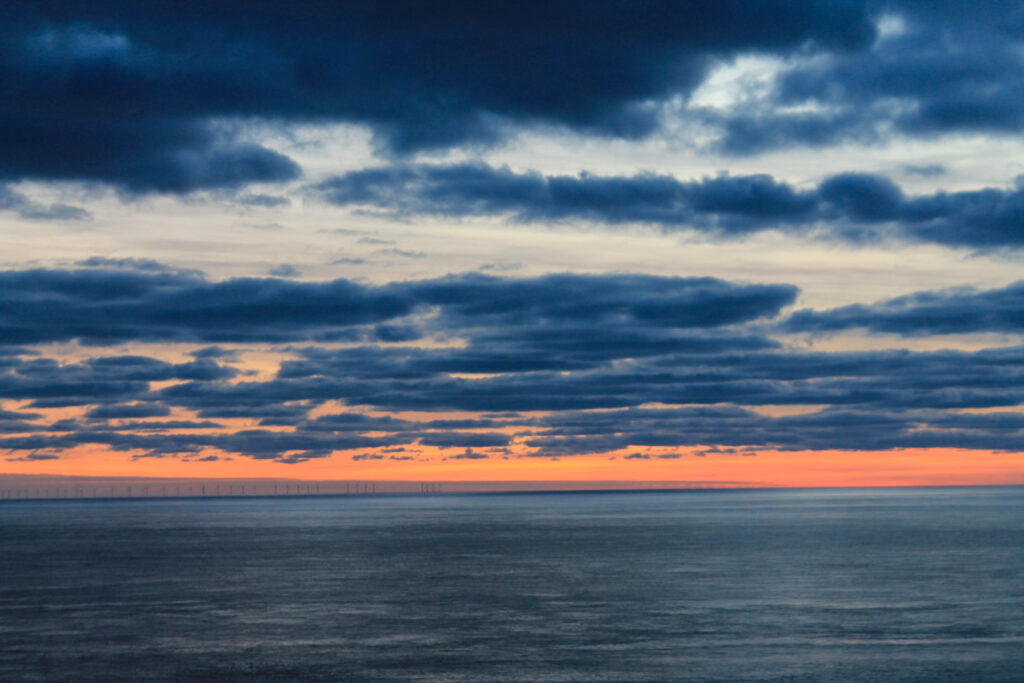
Photoshoot 10 plan-
modle
landscape
beach
light
sunset
light composition
neutral tones
calm
Outcome-
Lightroom edits-
Favorites-
Results-
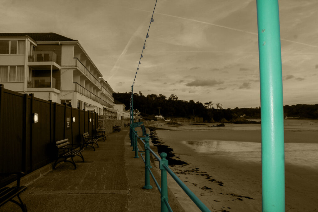
I overall think that this photoshoot went quite well, I wanted some images which weren’t as bold and had more natural tones. I wanted something that could be a gap between the harsh images.
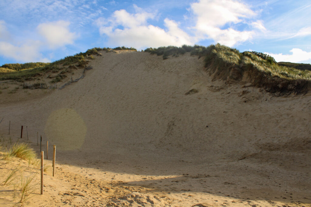
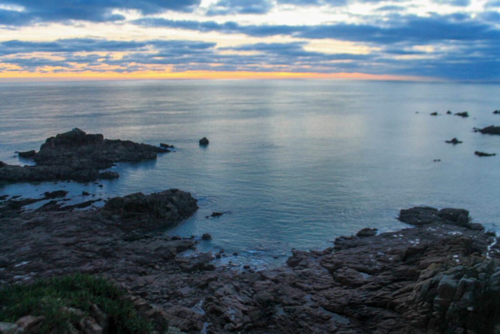
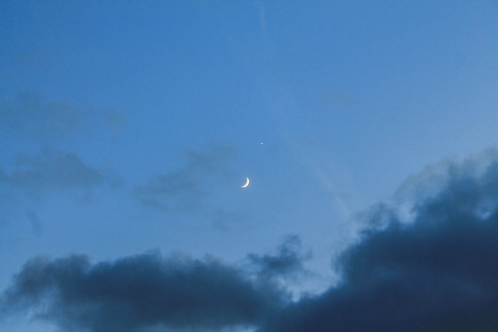
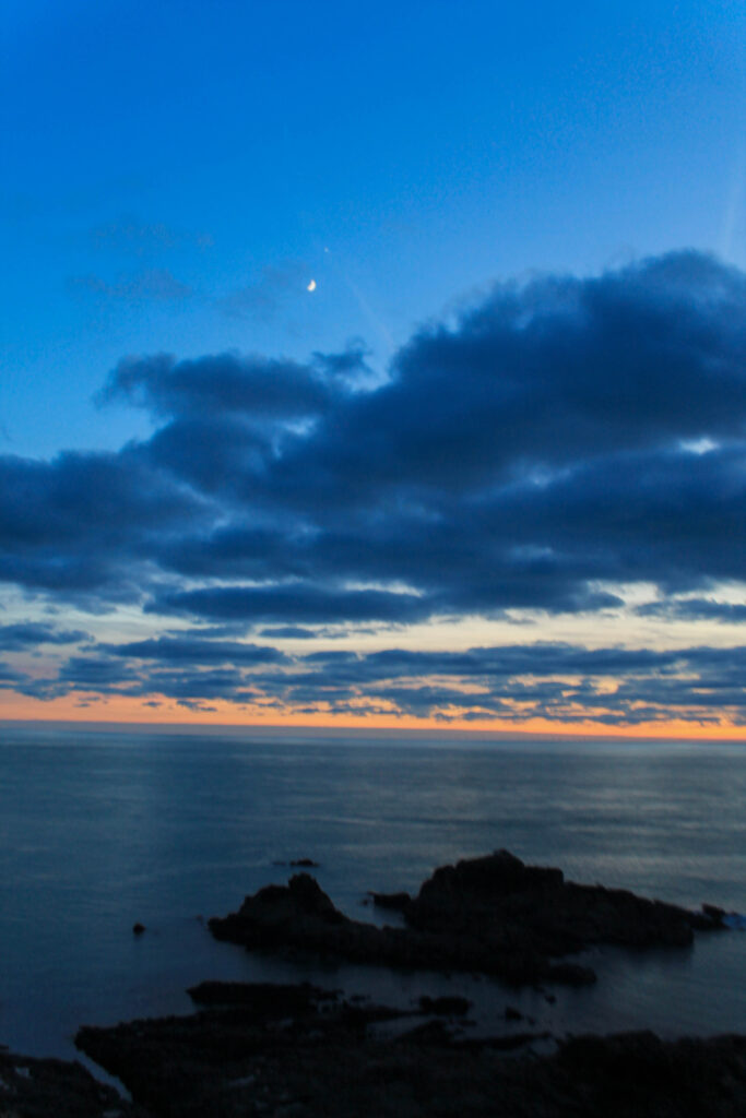
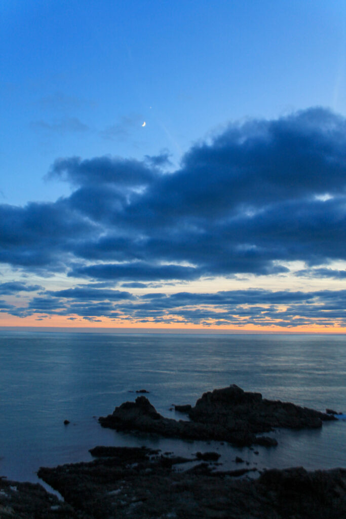
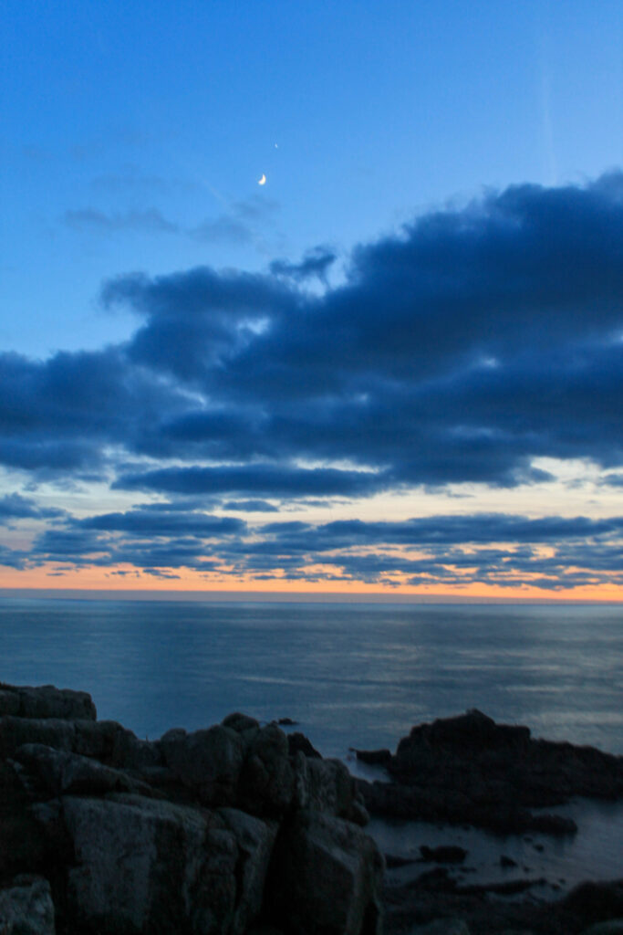
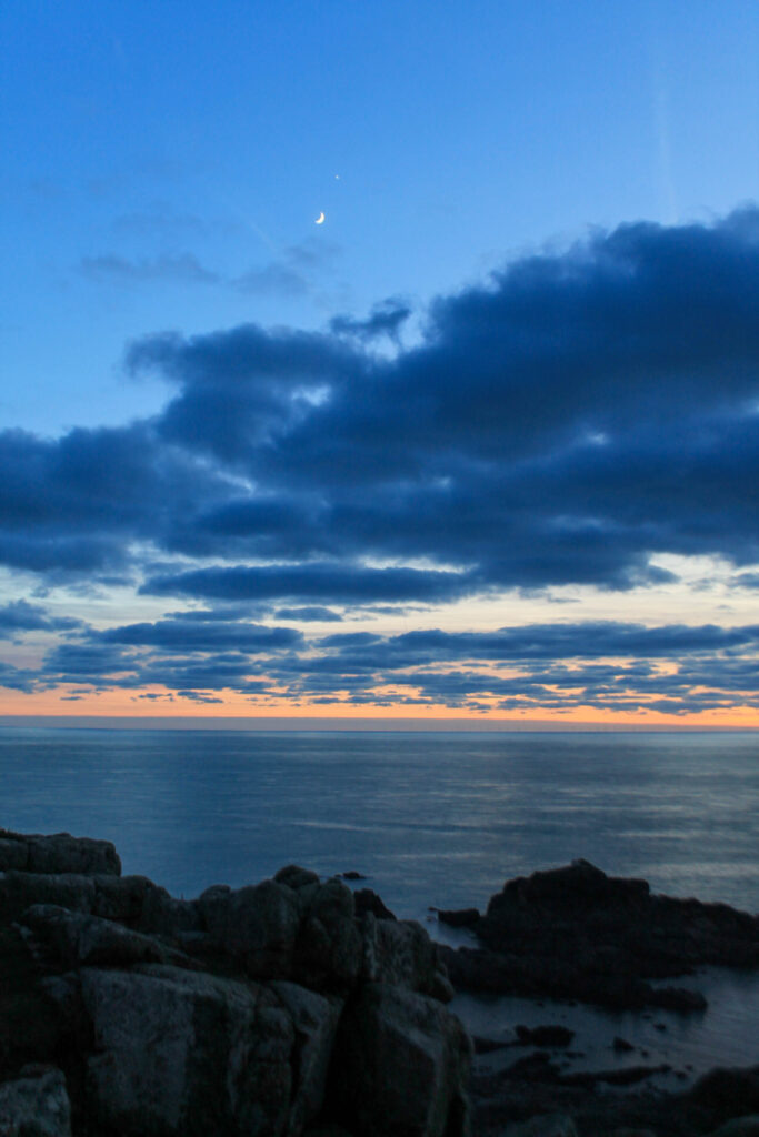
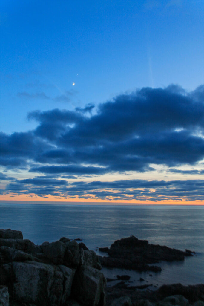
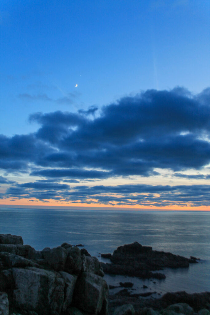
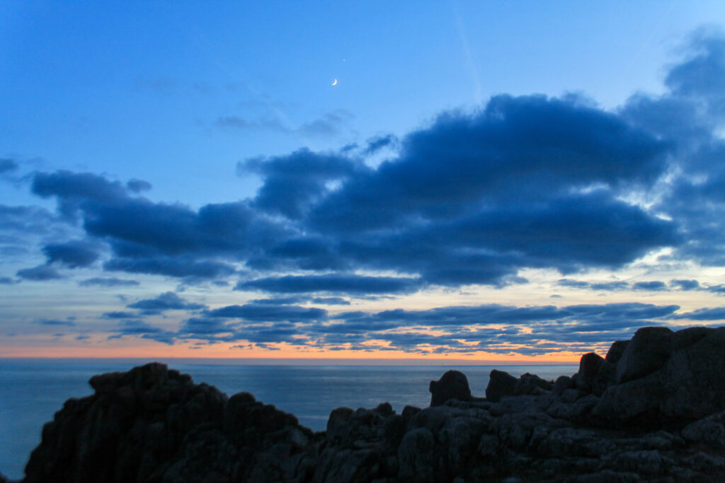
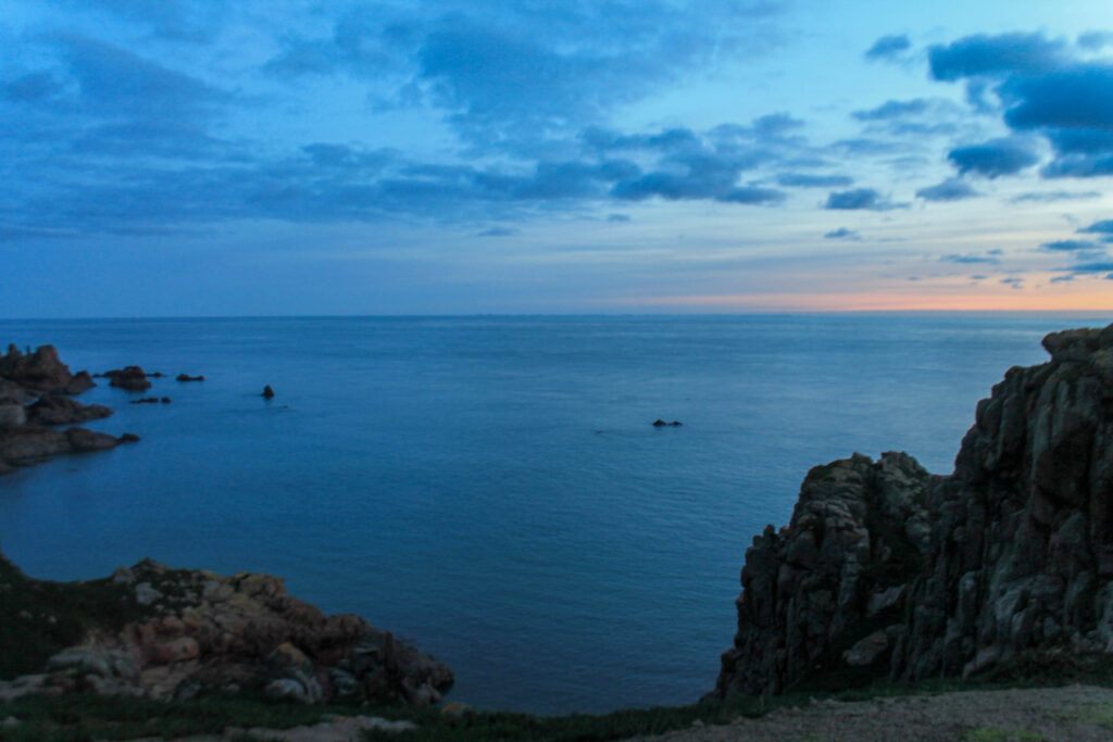
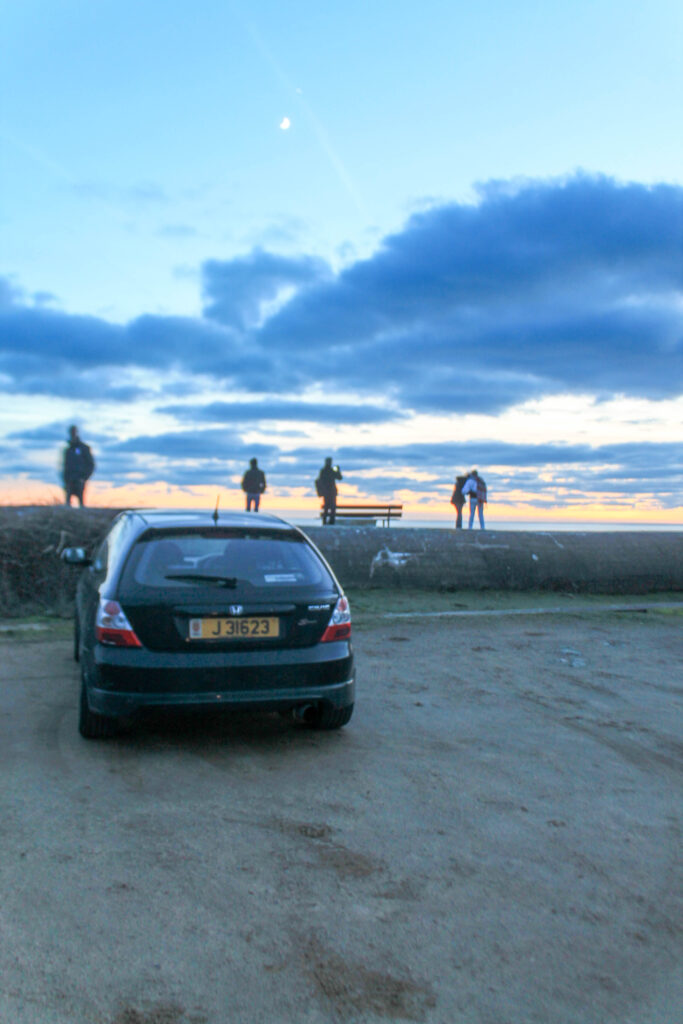
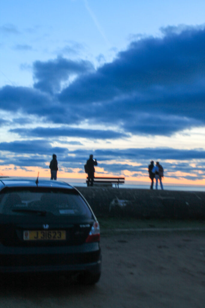
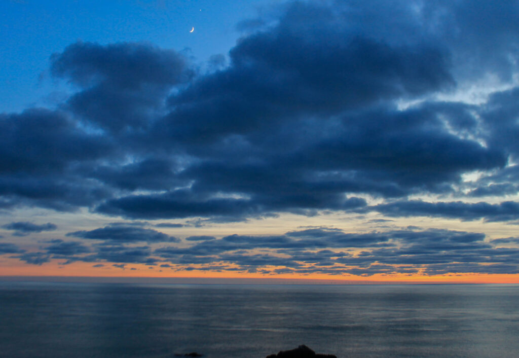
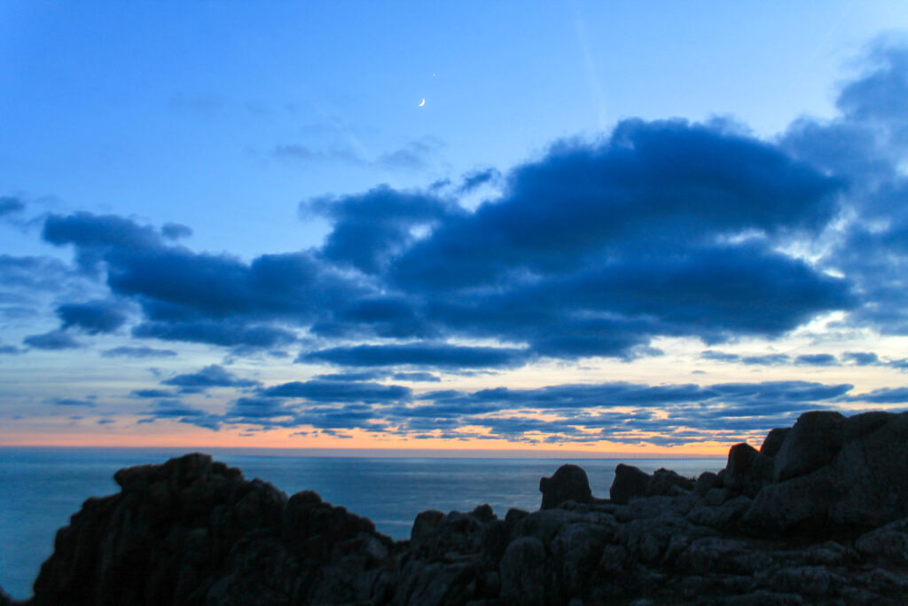
Photoshoot 11 plan-
stars
night
darkness
contrast
landscape
anchorage
Outcome-
Lightroom edits-
Photoshop edits-
Favorites-
Results-
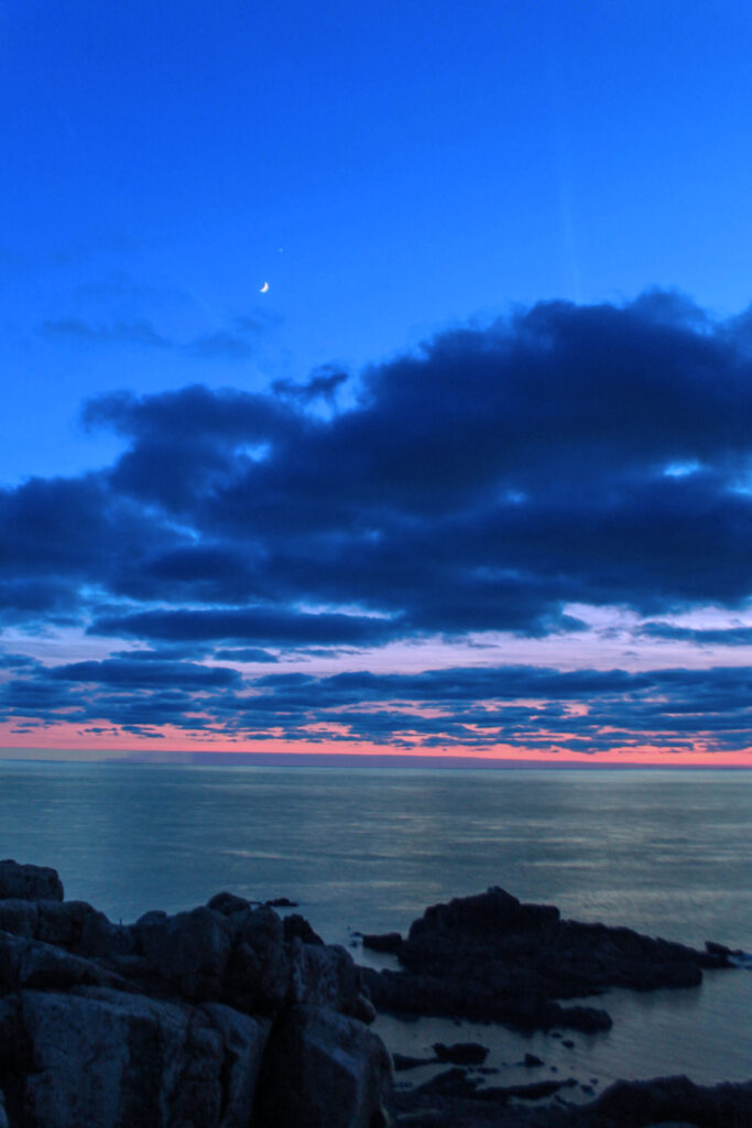
I overall think that I have achieved my goal of finding an in-between, something that has two sides of the story. By contrasting the moon and the sun.
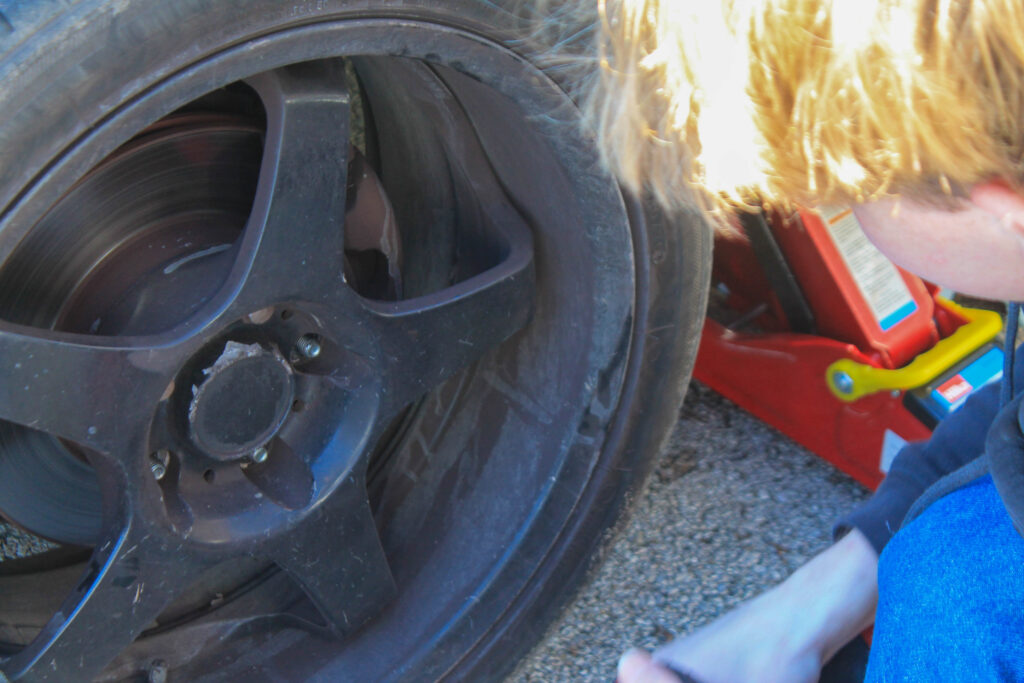
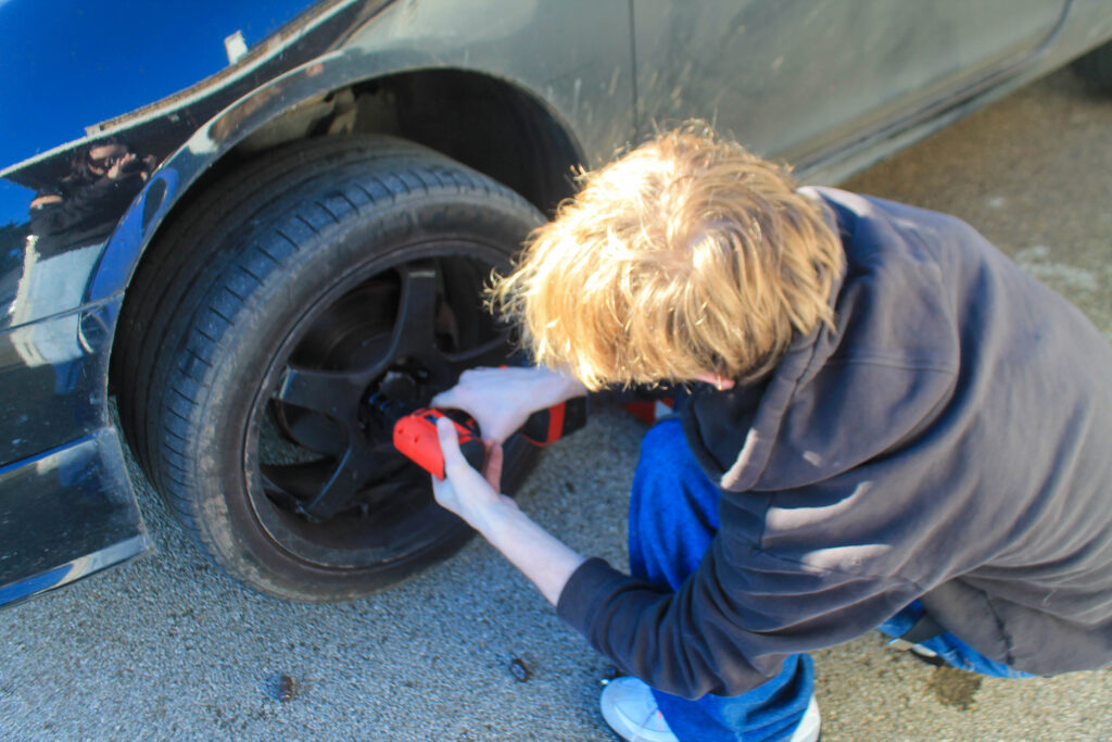
Photoshoot 12 plan-
car
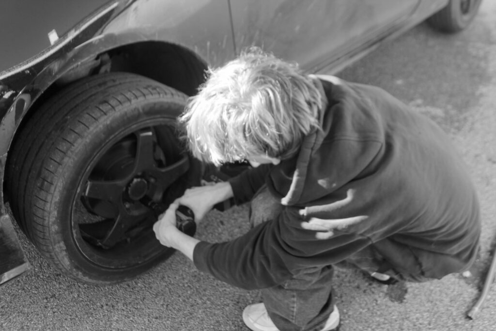
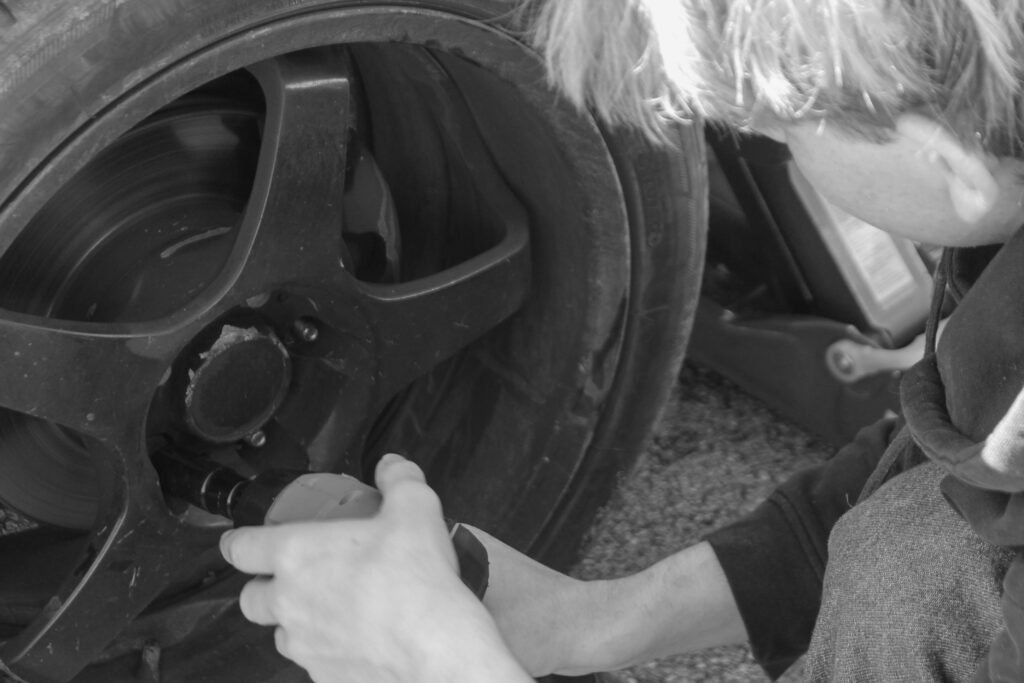
working on cars
enaging
documentary
colourful
Outcome-
Lightroom edits-
Favorites-
Results-
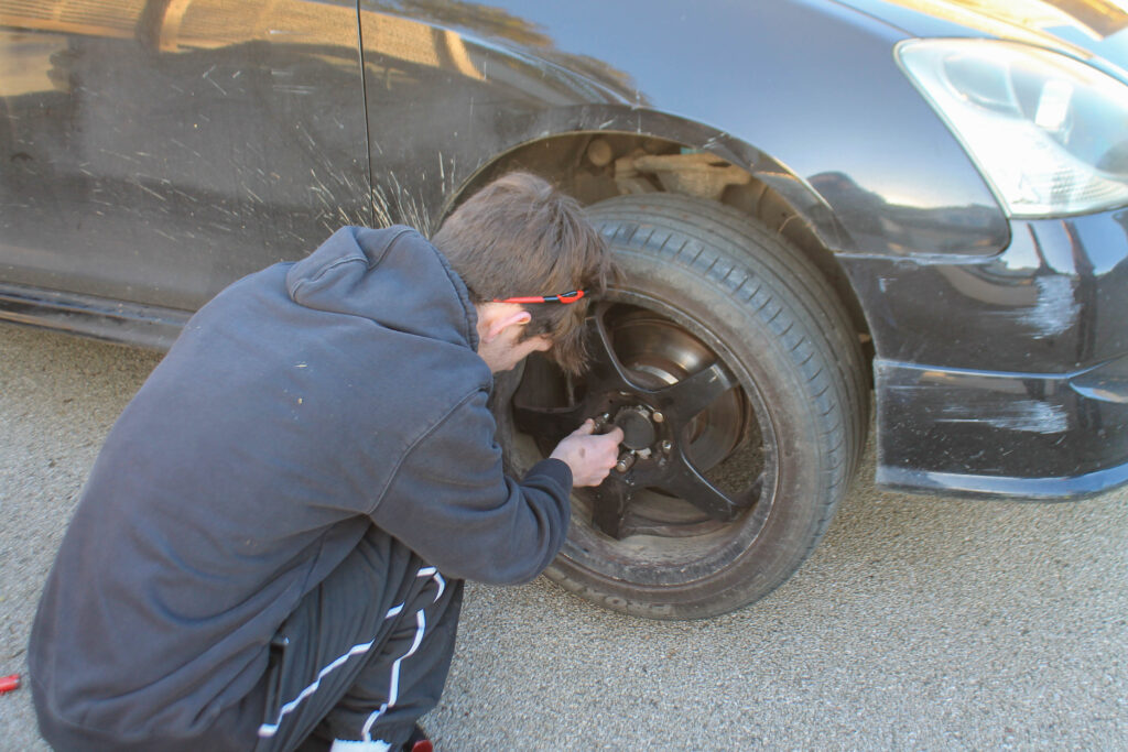
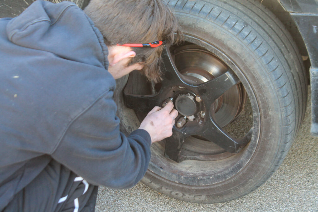
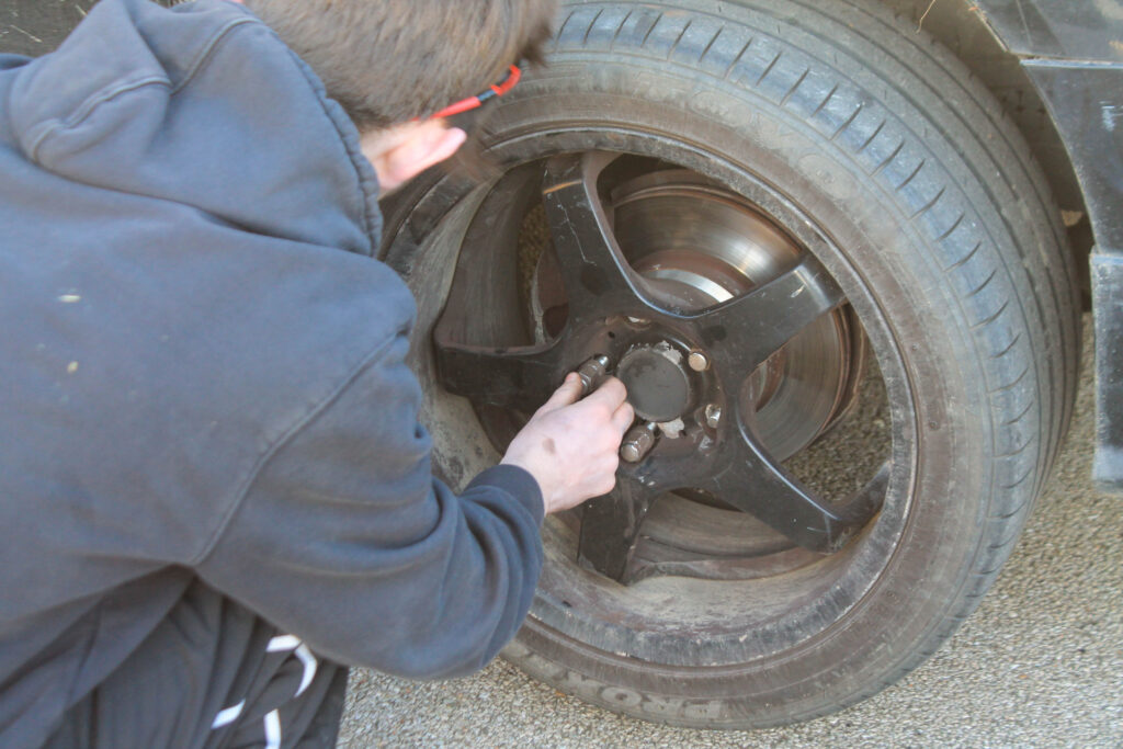
I overall think that this photoshoot went quite well. My main aim was to get some better storytelling photos of the activates that they do which makes them so car obsessed.
Photoshoot 13 plan-
headshots
viewpoint
looking
eyecontact
Outcome-
Lightroom Edits-
Favorites-
Results-
I overall think that I got the eye contact that I needed to build up my story line to learn more about the characters.
Photoshoot 14 plan-
interior
close up
personal
individual
linking material
Outcome-
Lightroom Edits-
Favorites-
Results-
I think that these will make some good close ups to allow the story to flow and to gain character development and recognition.
Photoshoot 15 plan-
ambient lighting
dimmer
calm
flow
outcome of story line
Outcome-
Lightroom Edits-
Favorites-
Results-
I overall think that I got the dimmer images that I wanted to end my story line on.
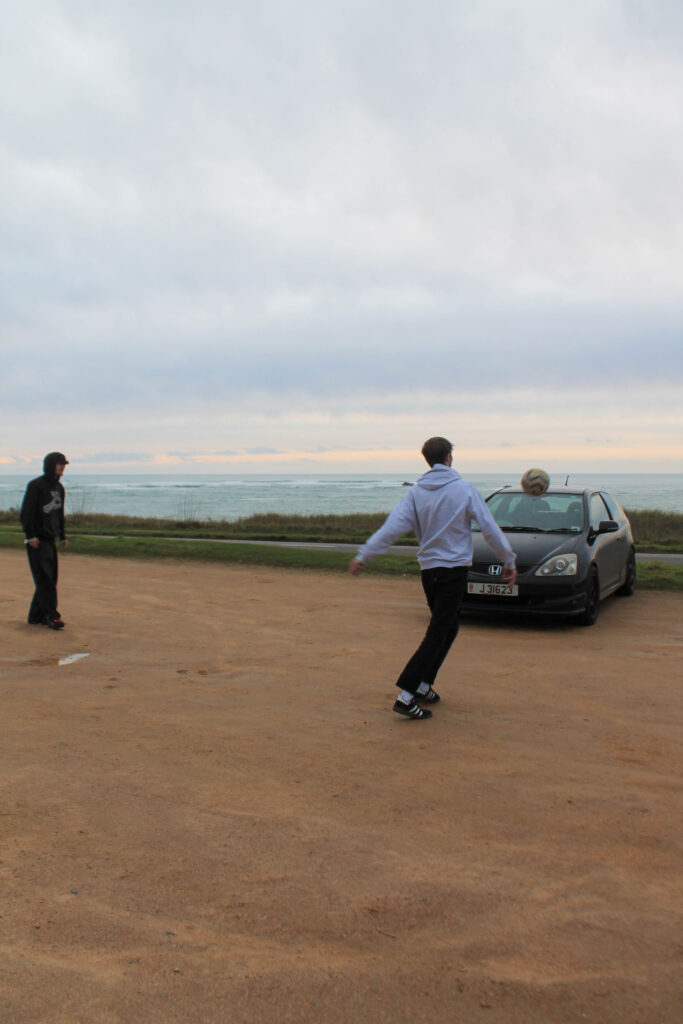
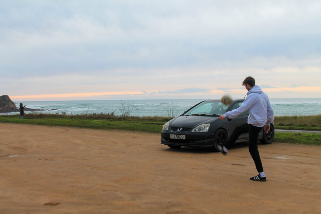
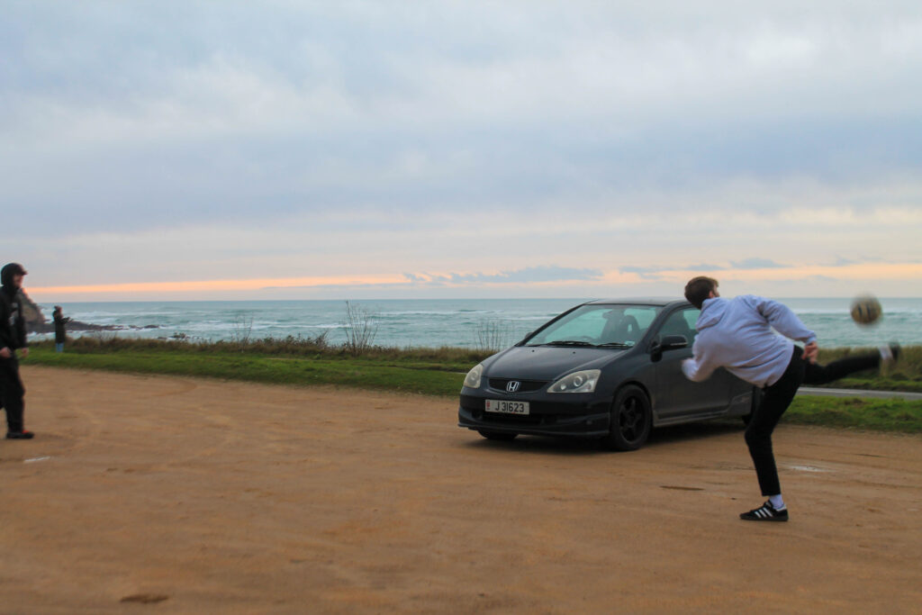
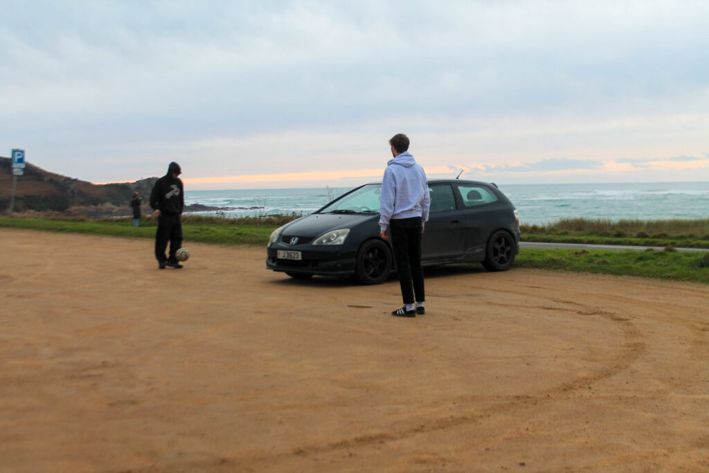
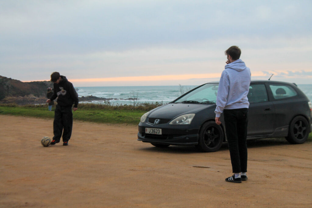
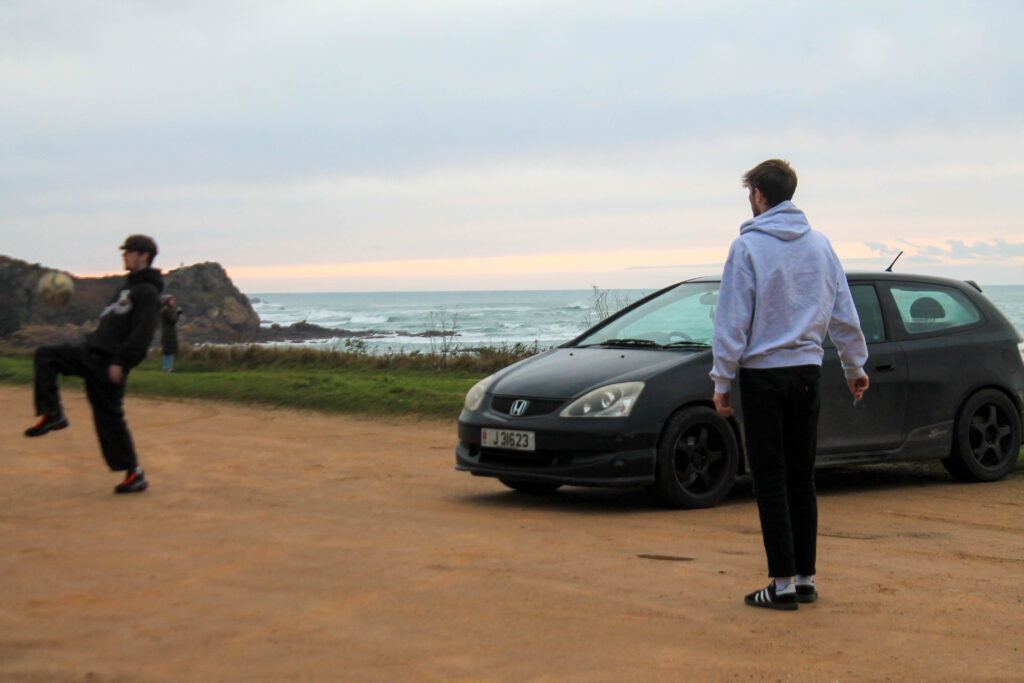
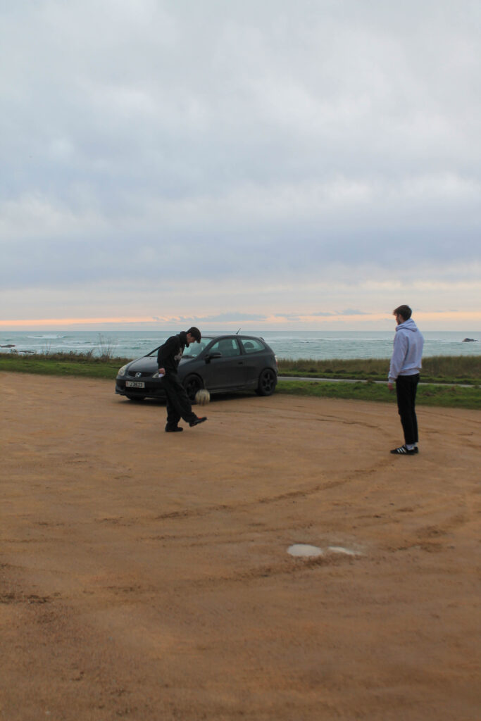
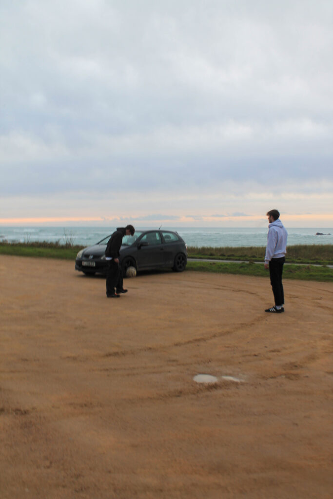
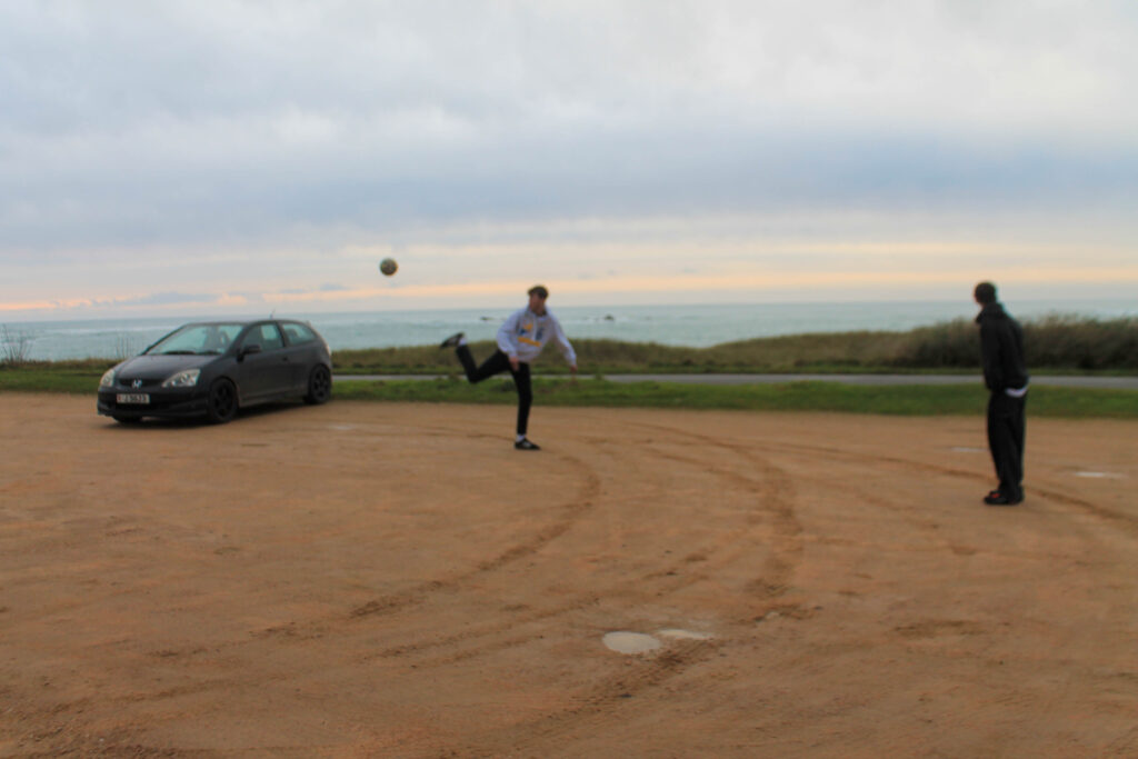
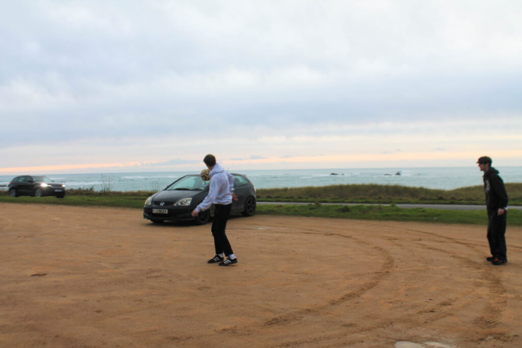
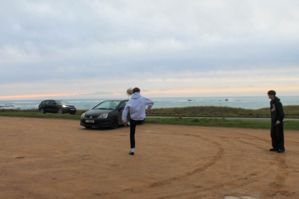
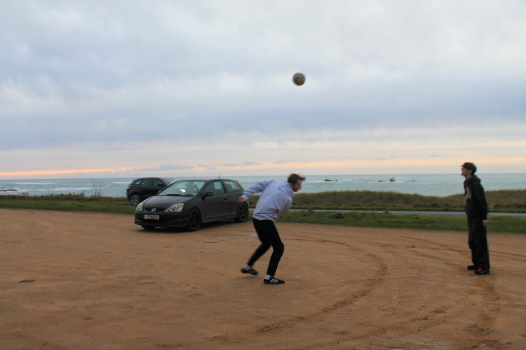
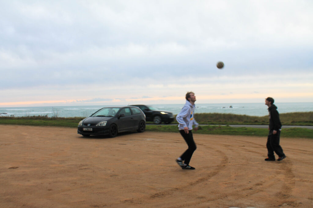
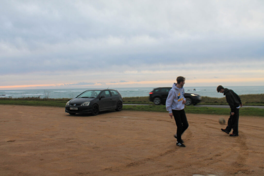
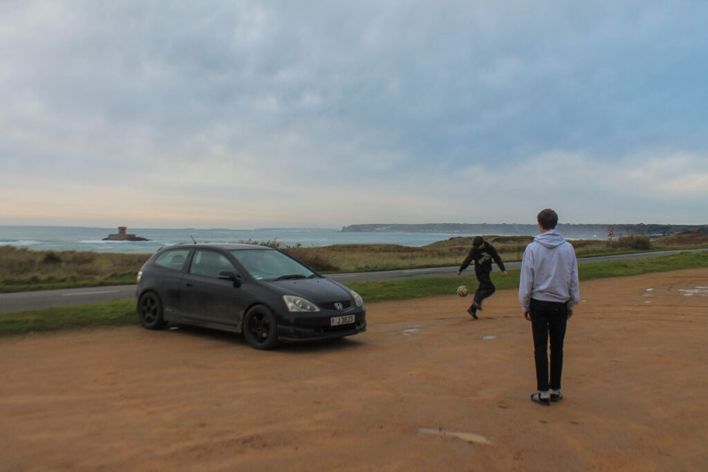
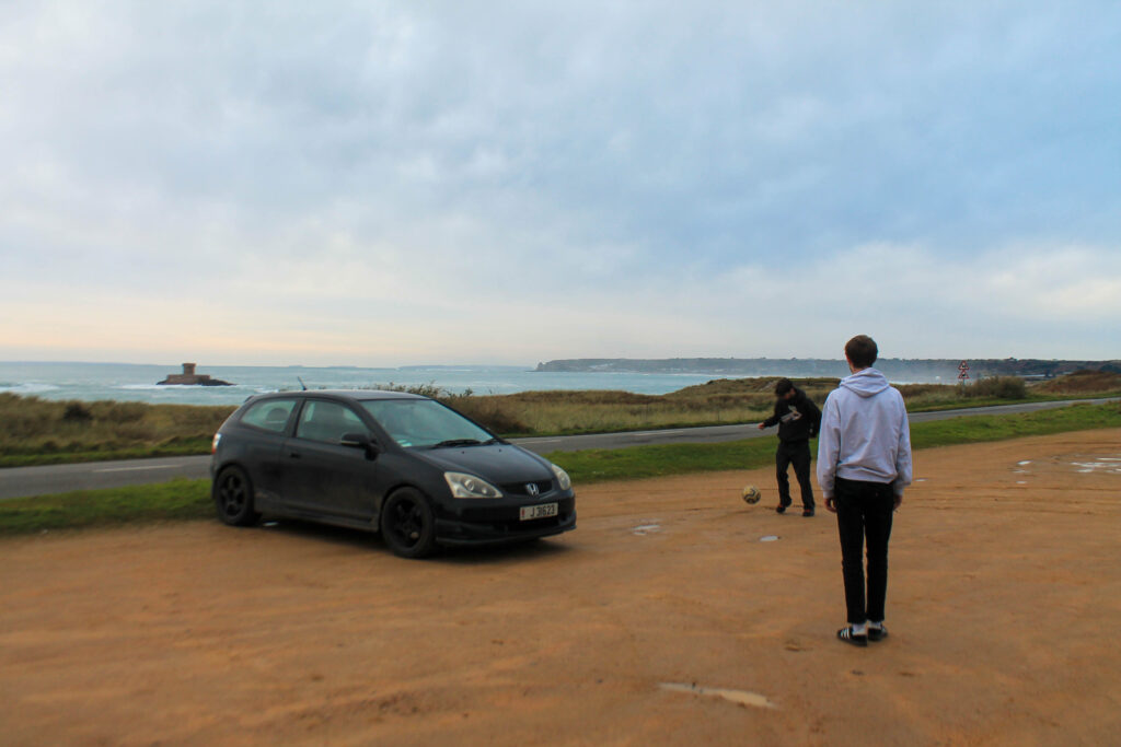
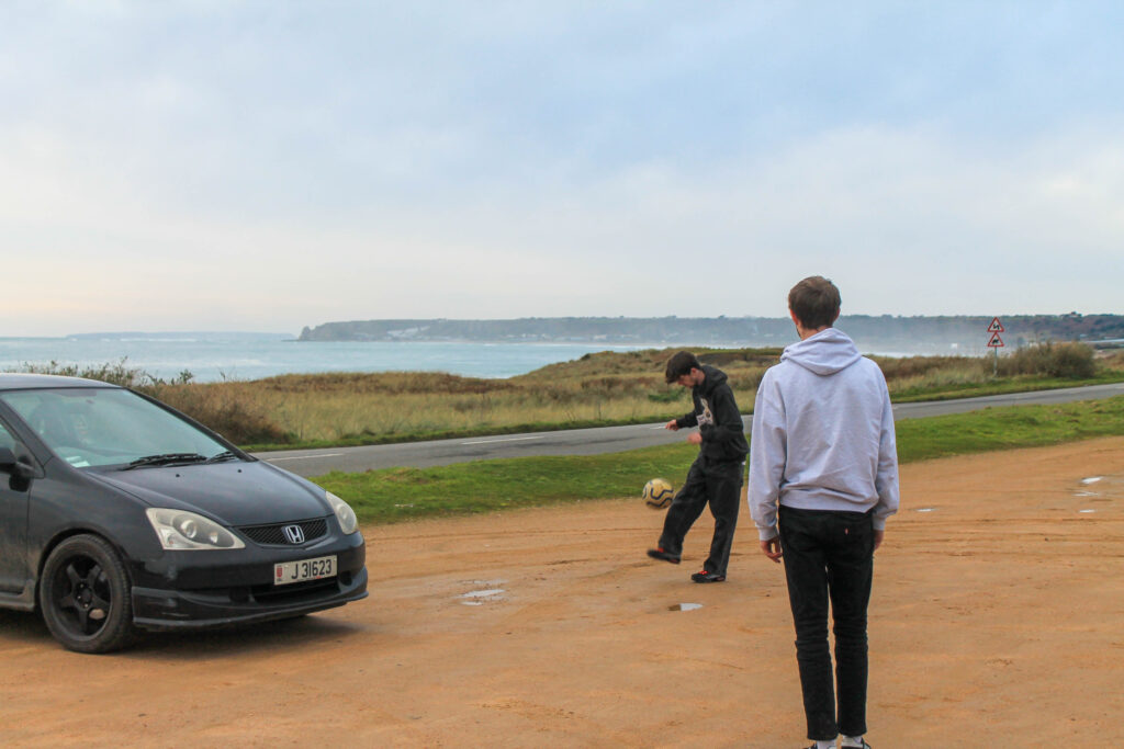
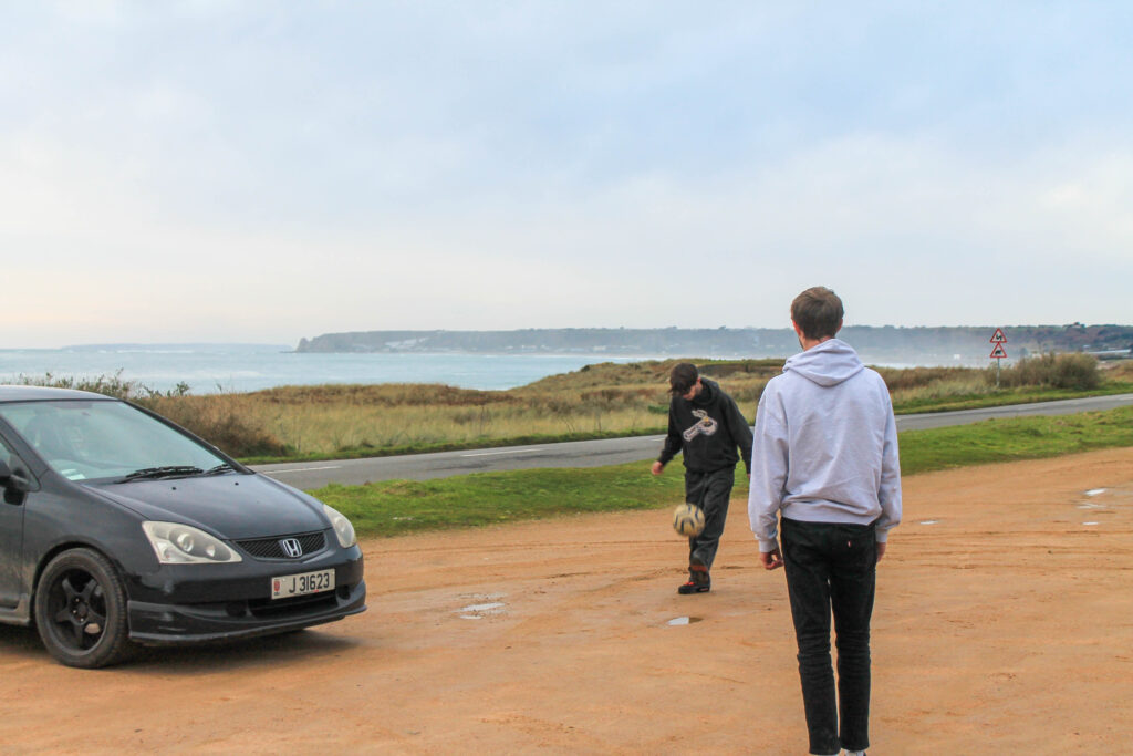
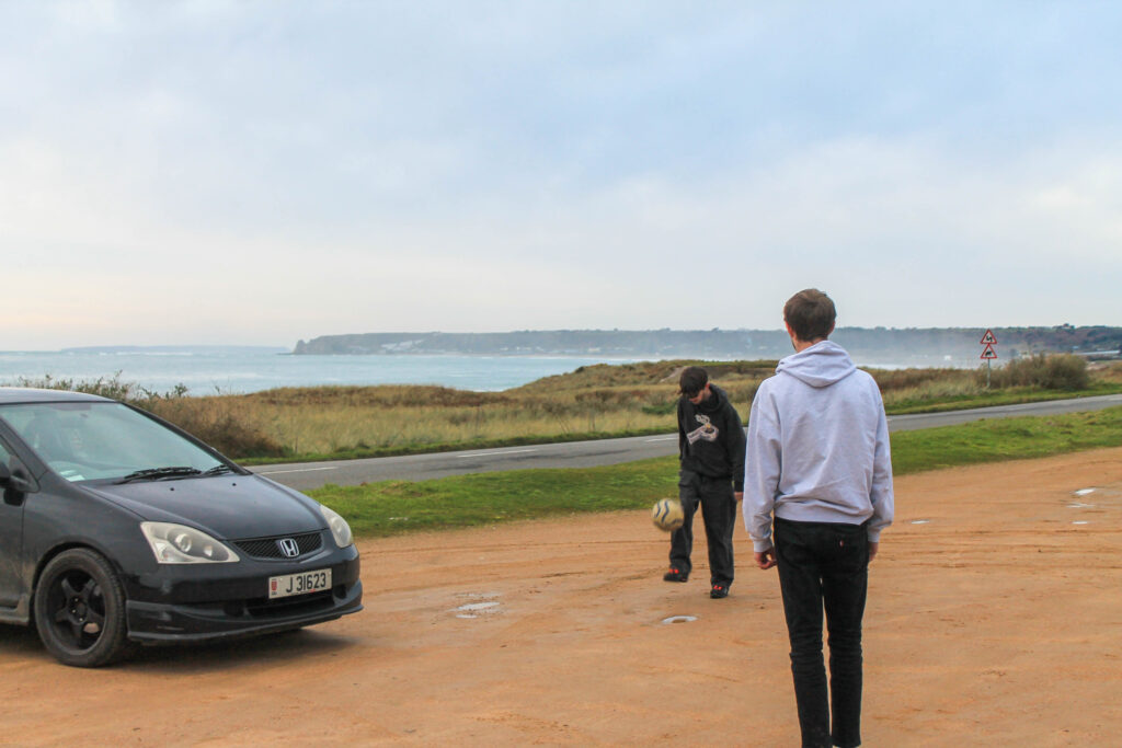
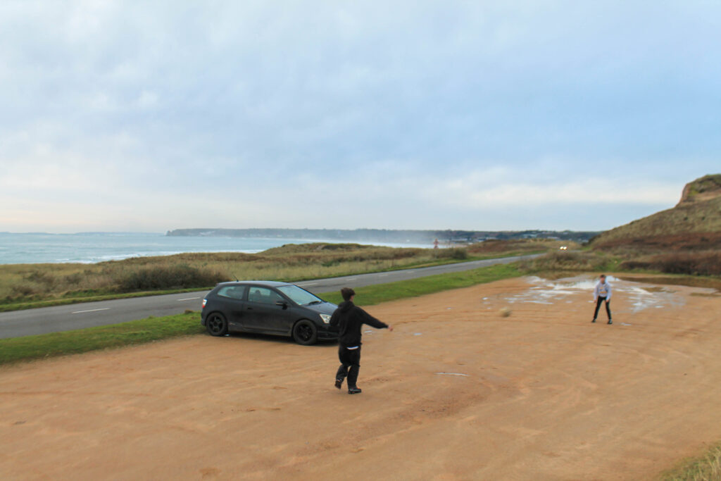
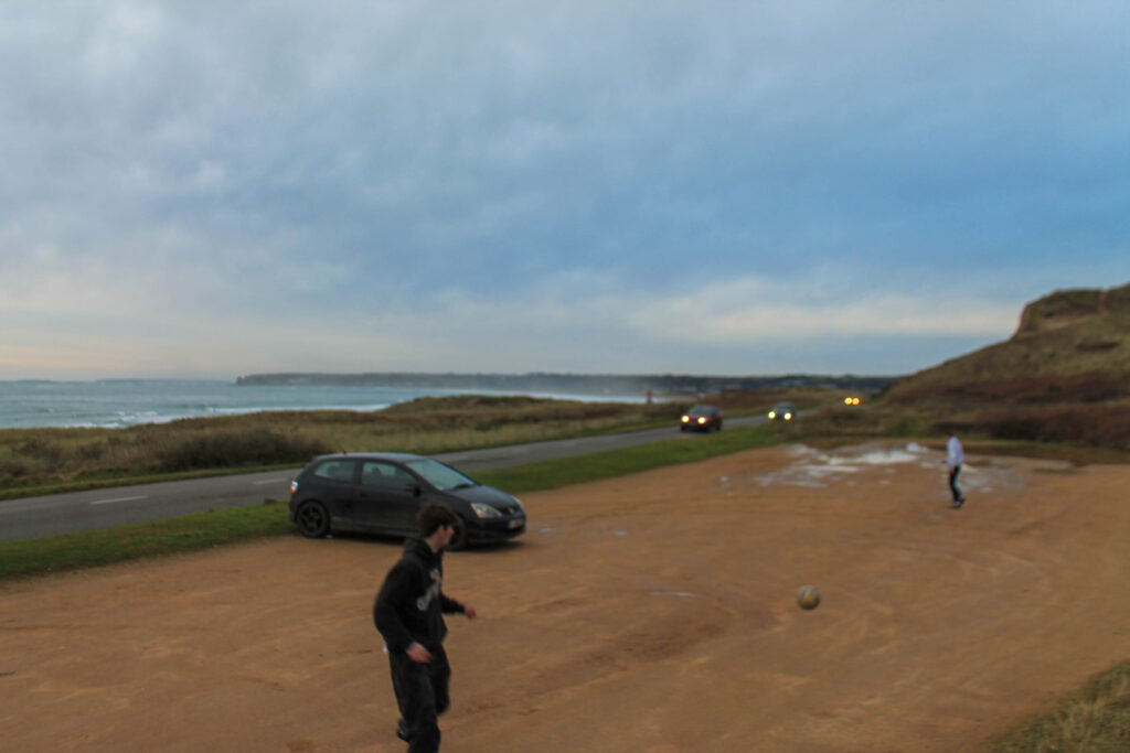
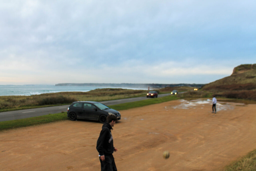
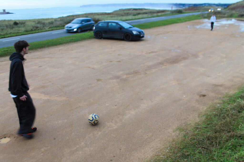
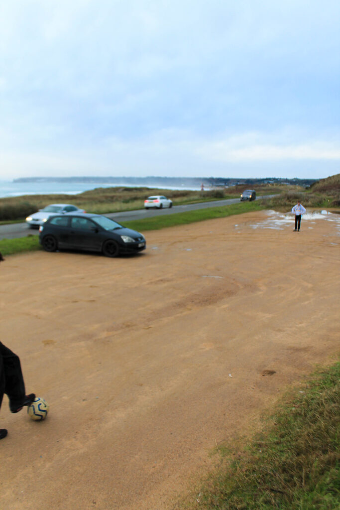
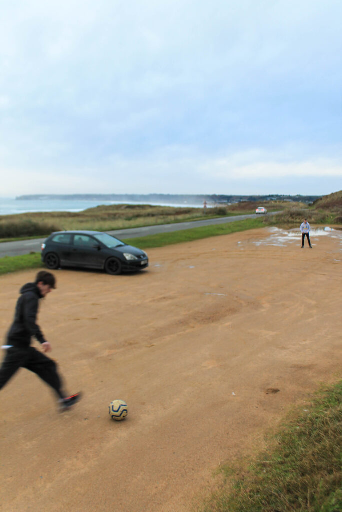
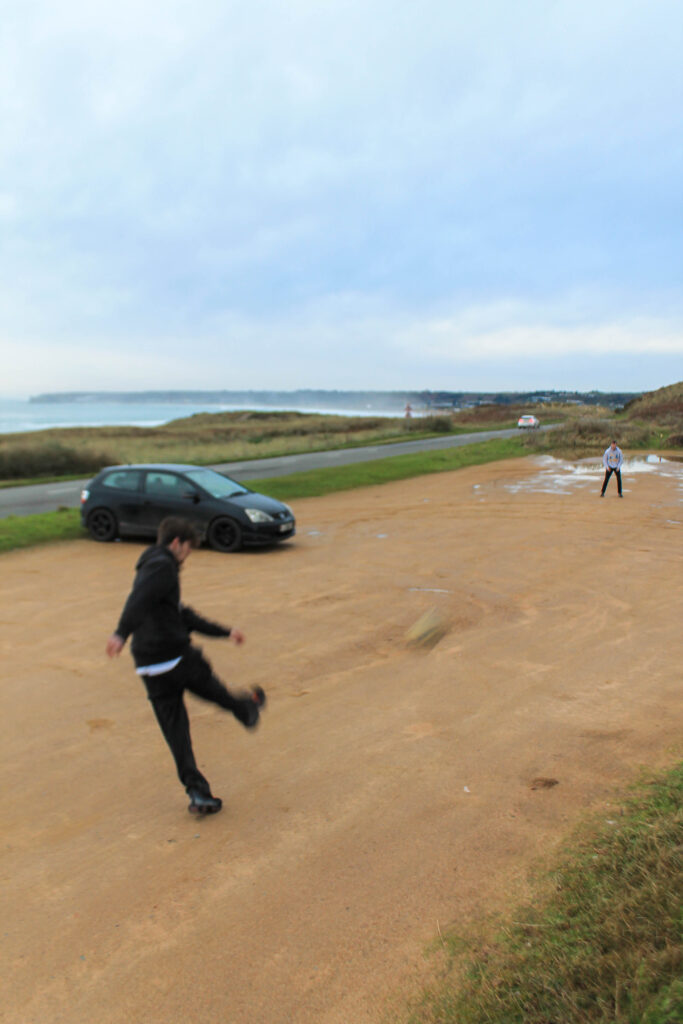
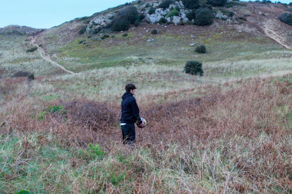
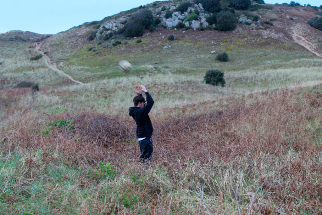
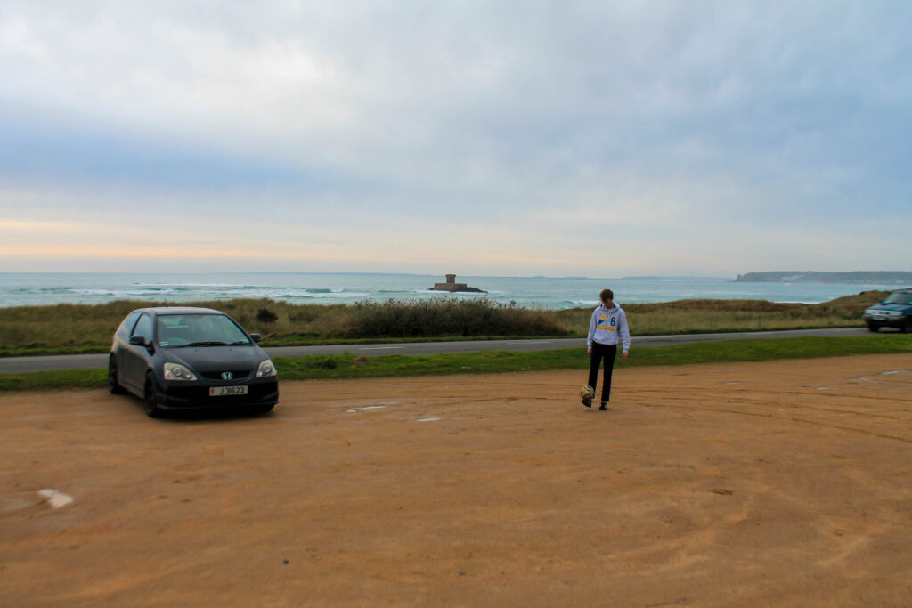
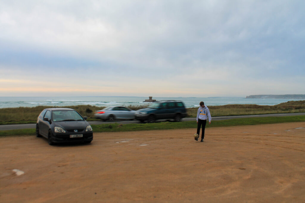
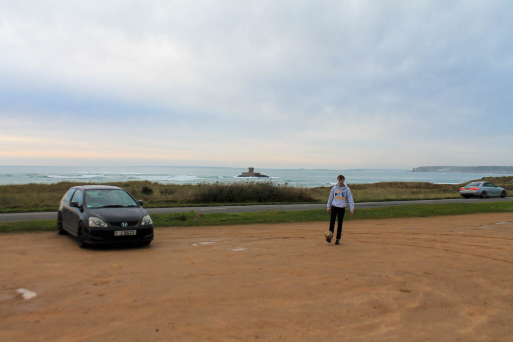
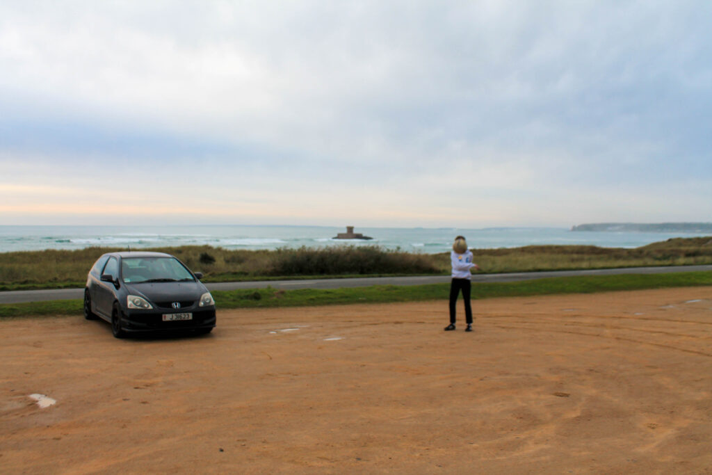
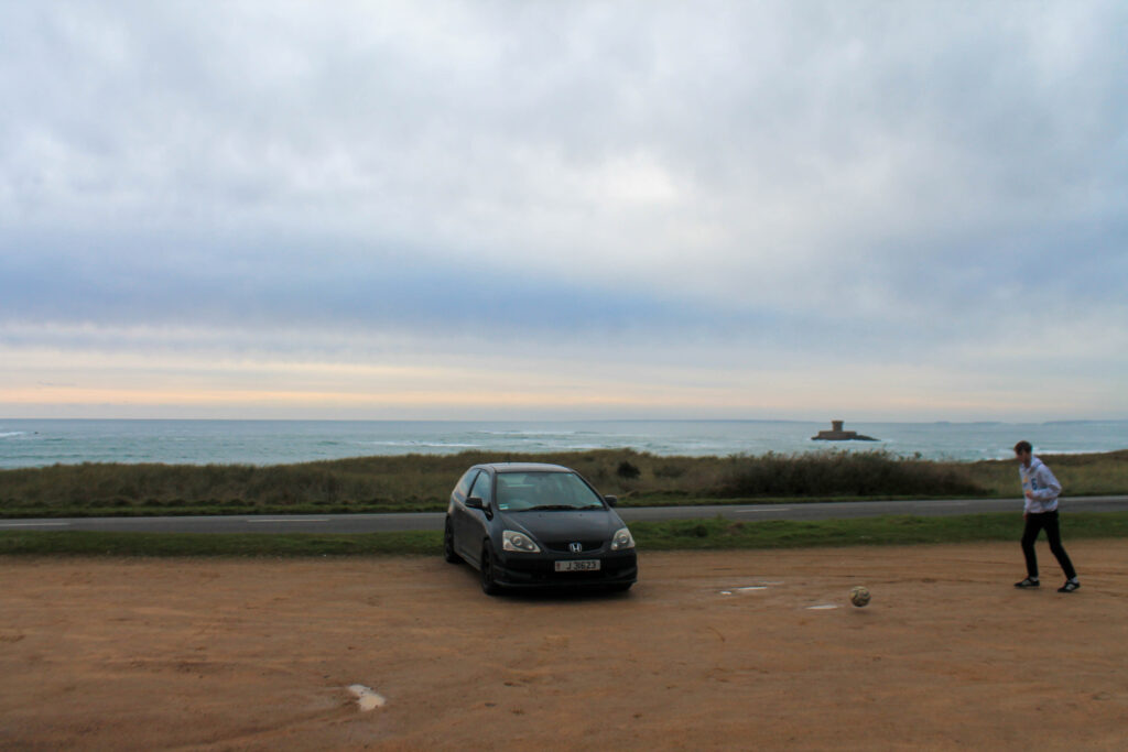
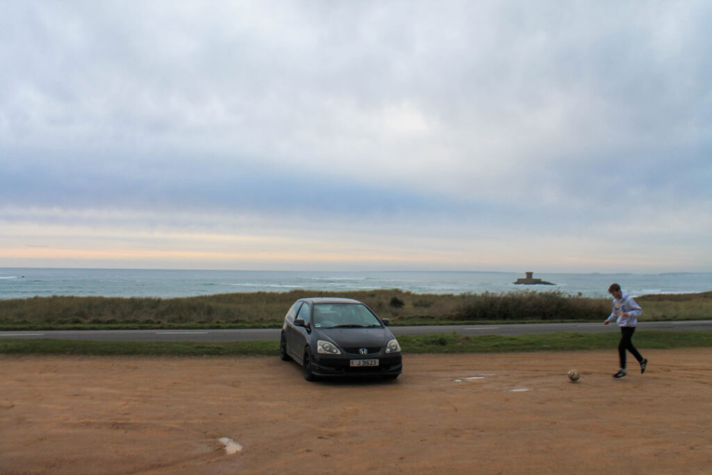
Photoshoot 15 plan-
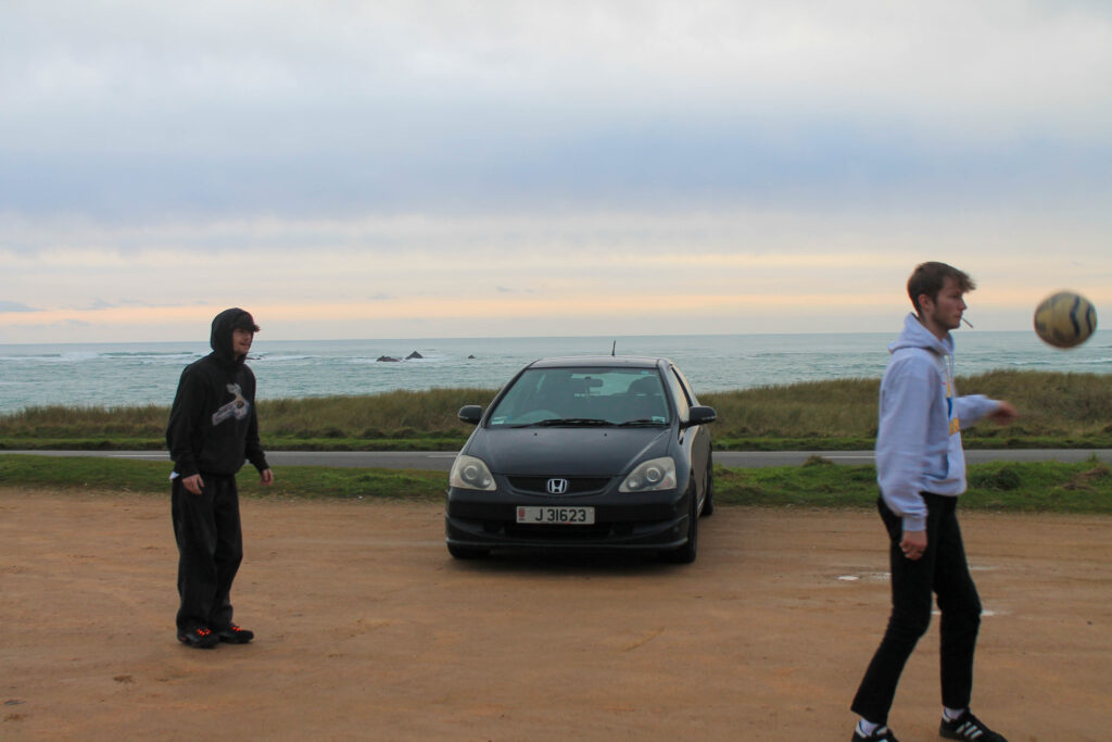
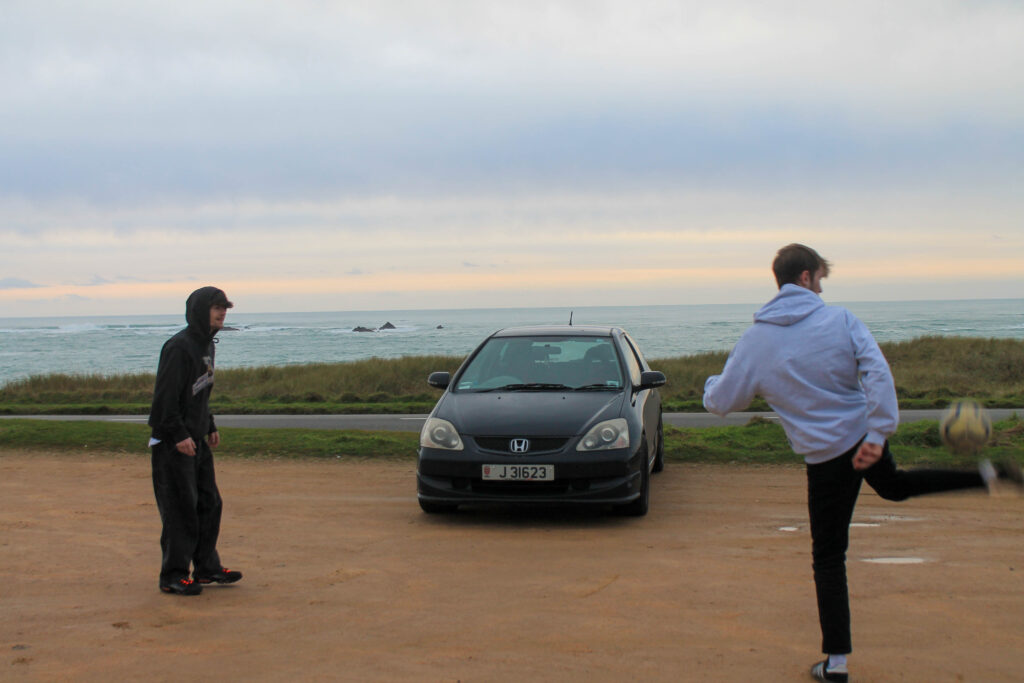
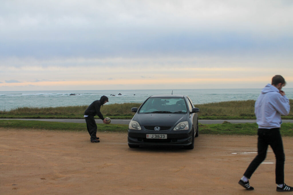
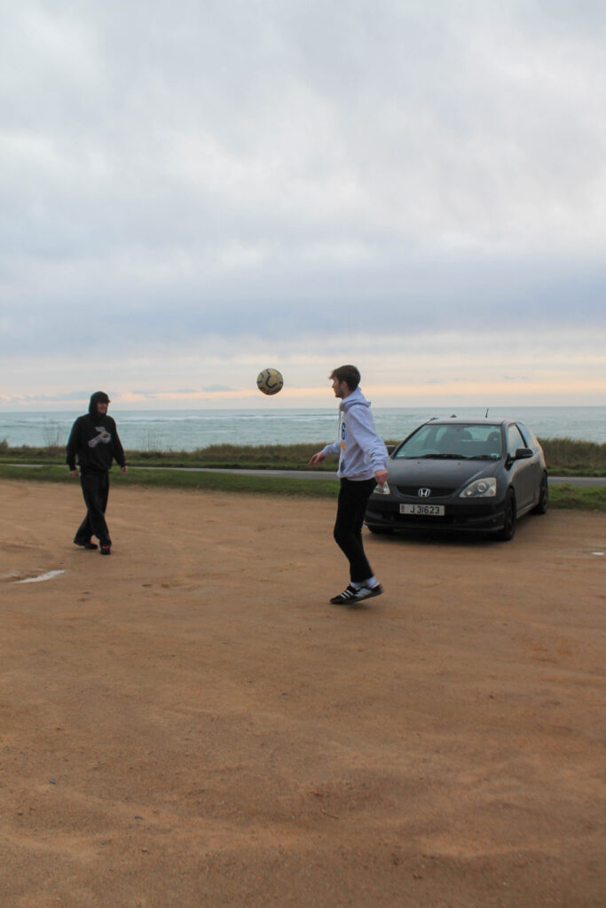
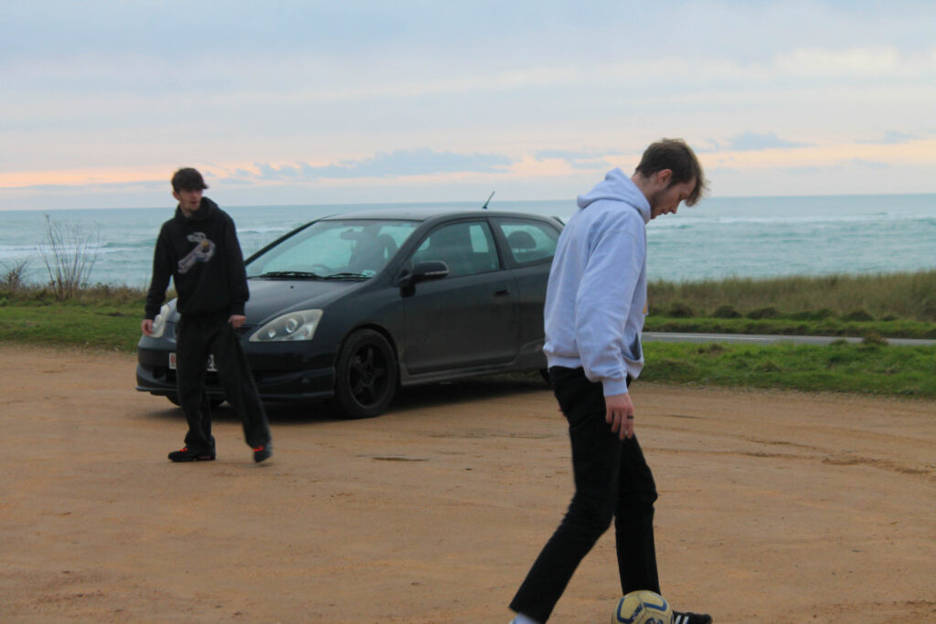
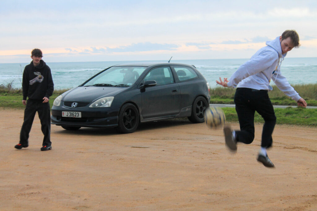
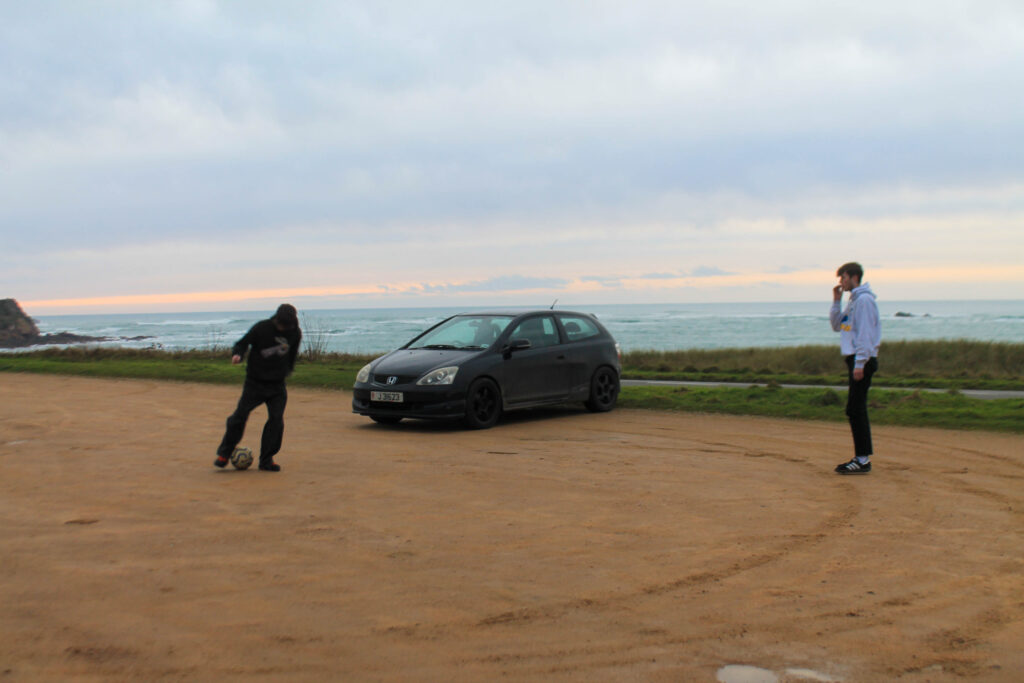
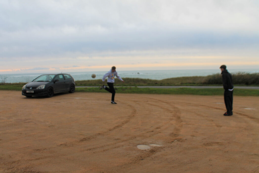
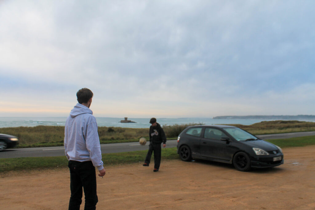
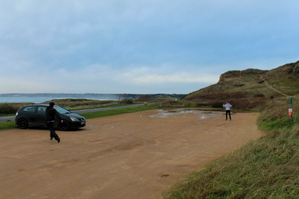
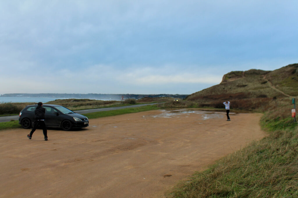
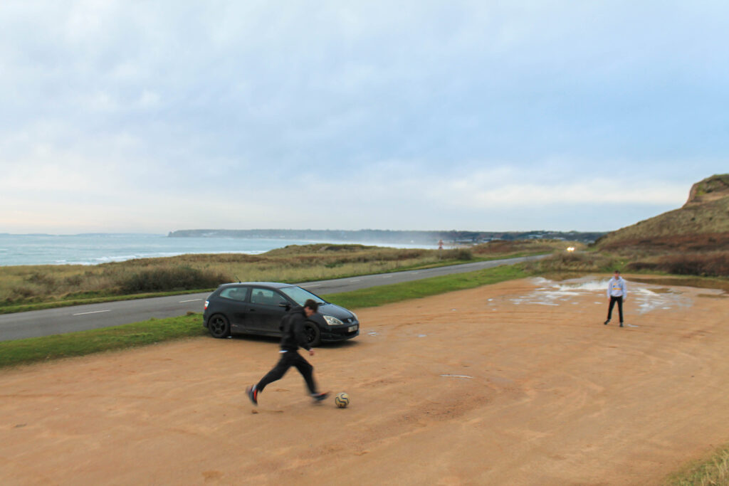
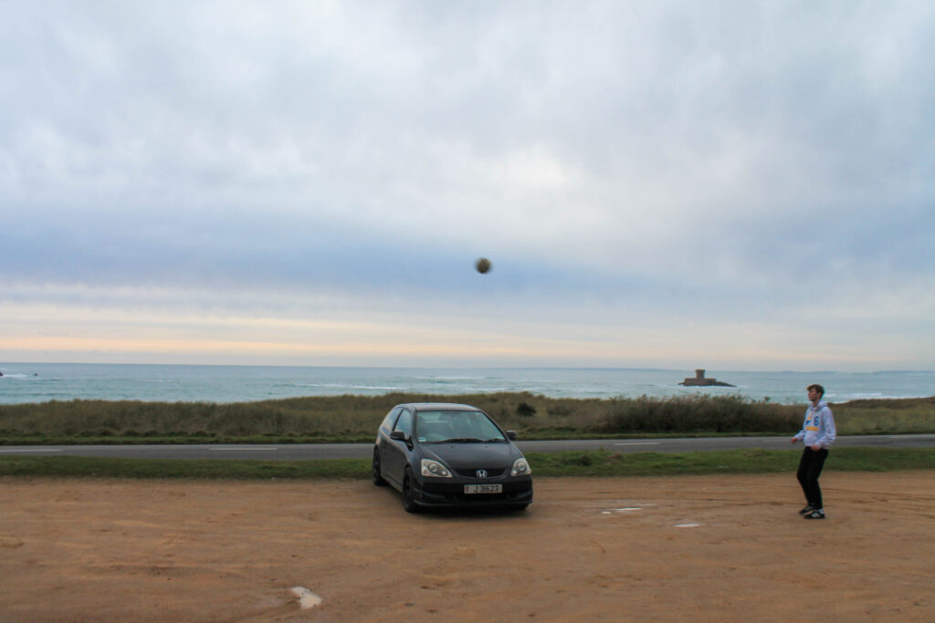
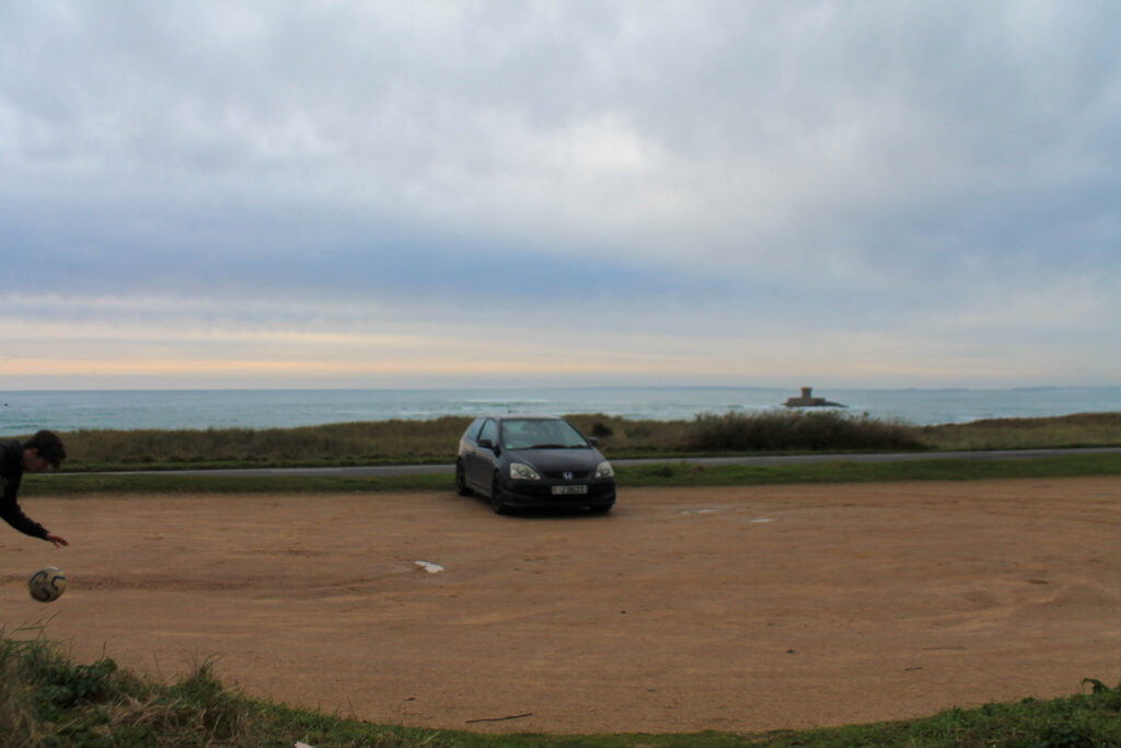
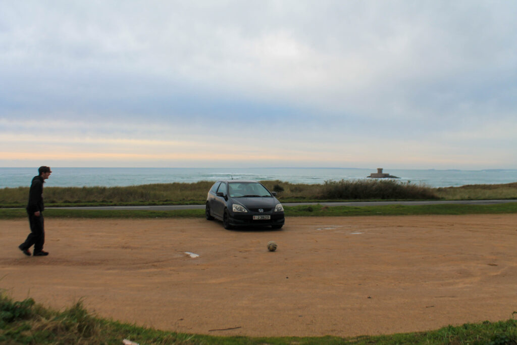
football
active
story line
add on
Outcome-
Lightroom Edits-
Favorites-
Results-
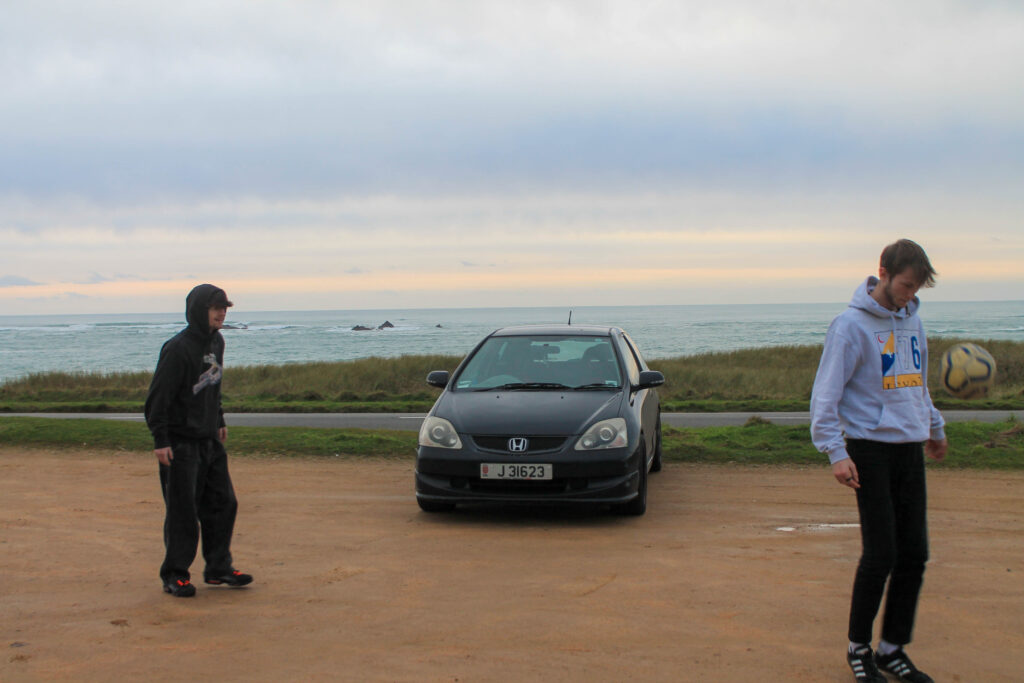
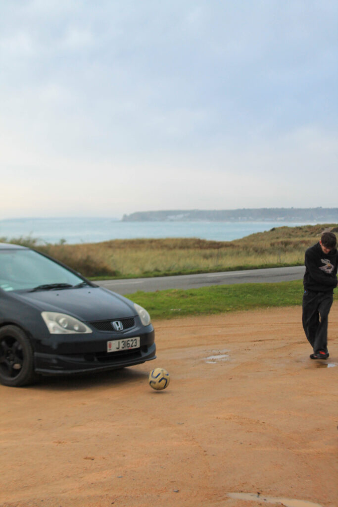
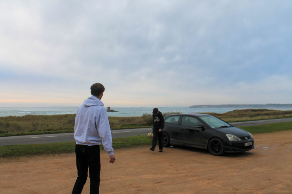
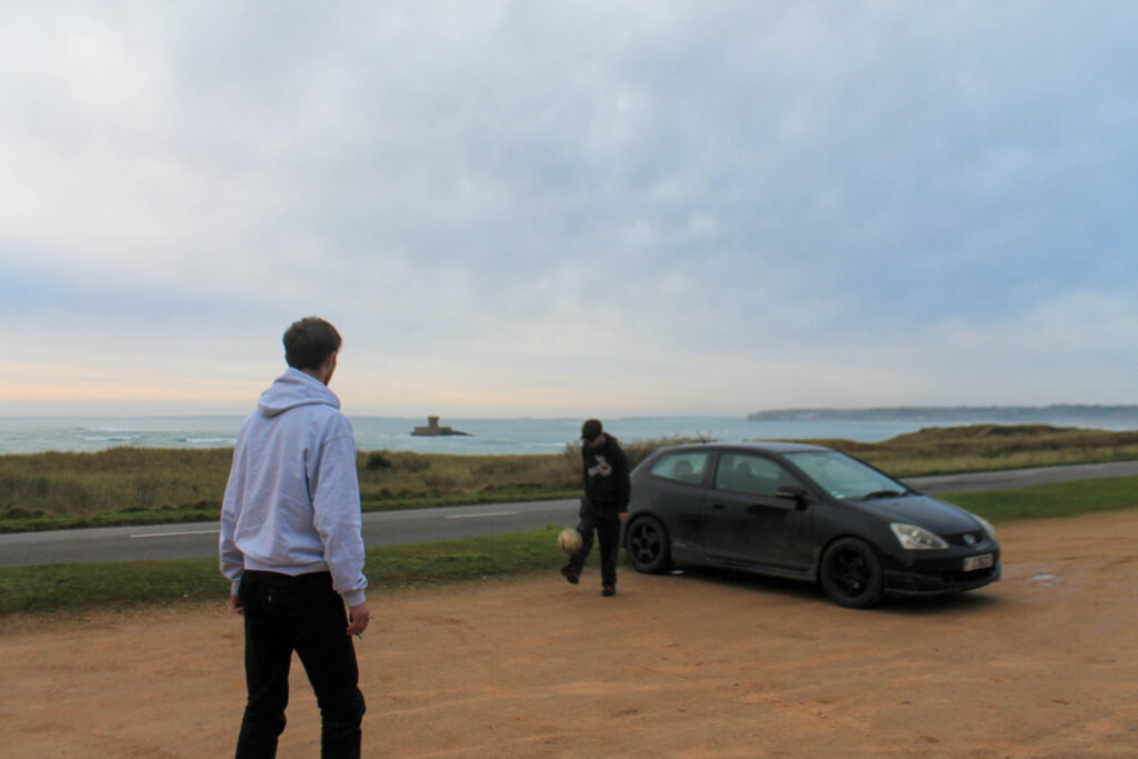
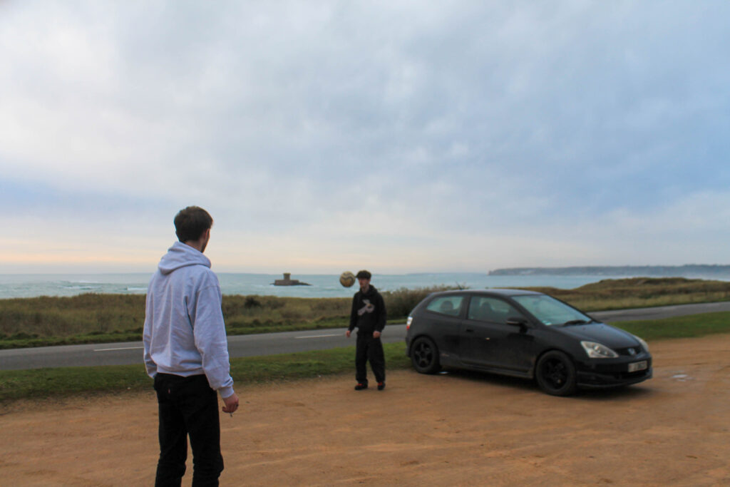
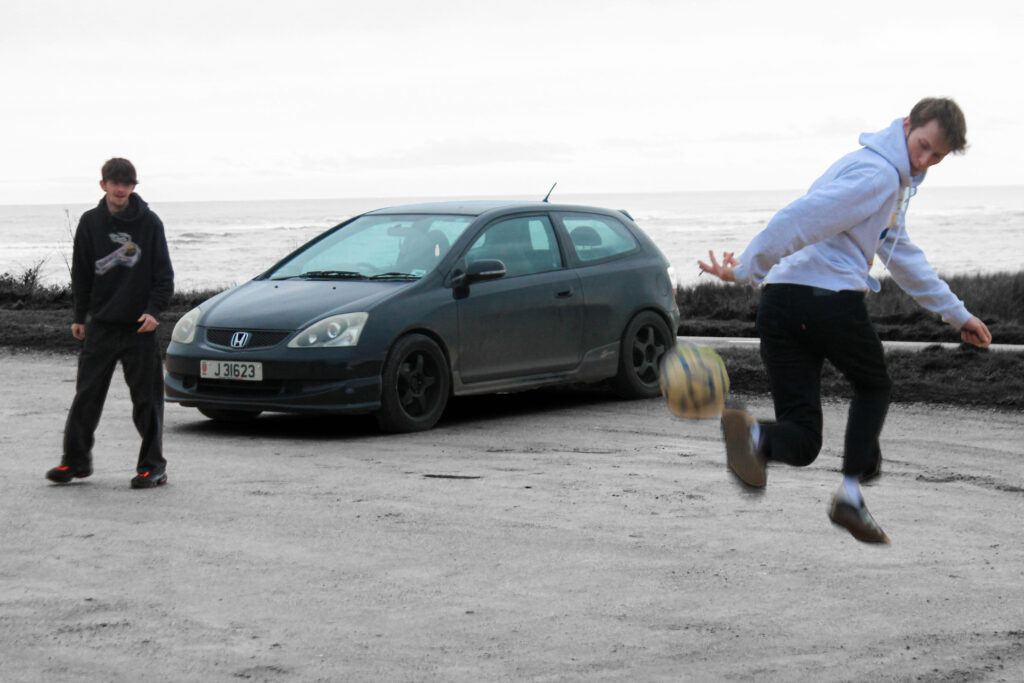
I overall think that I got some good sport imagery to create a flow to my images.
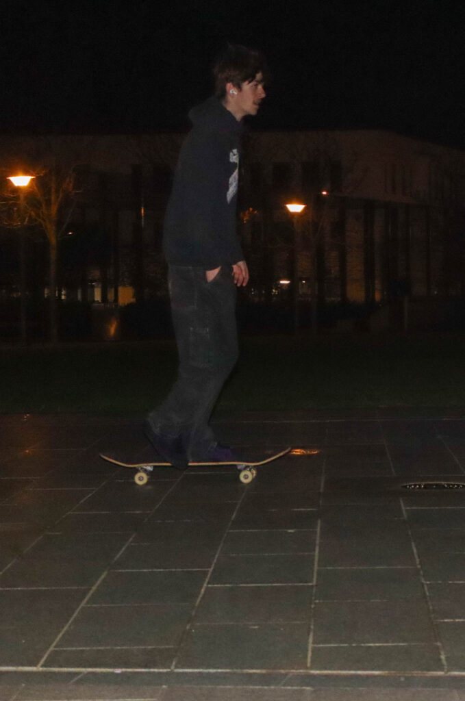
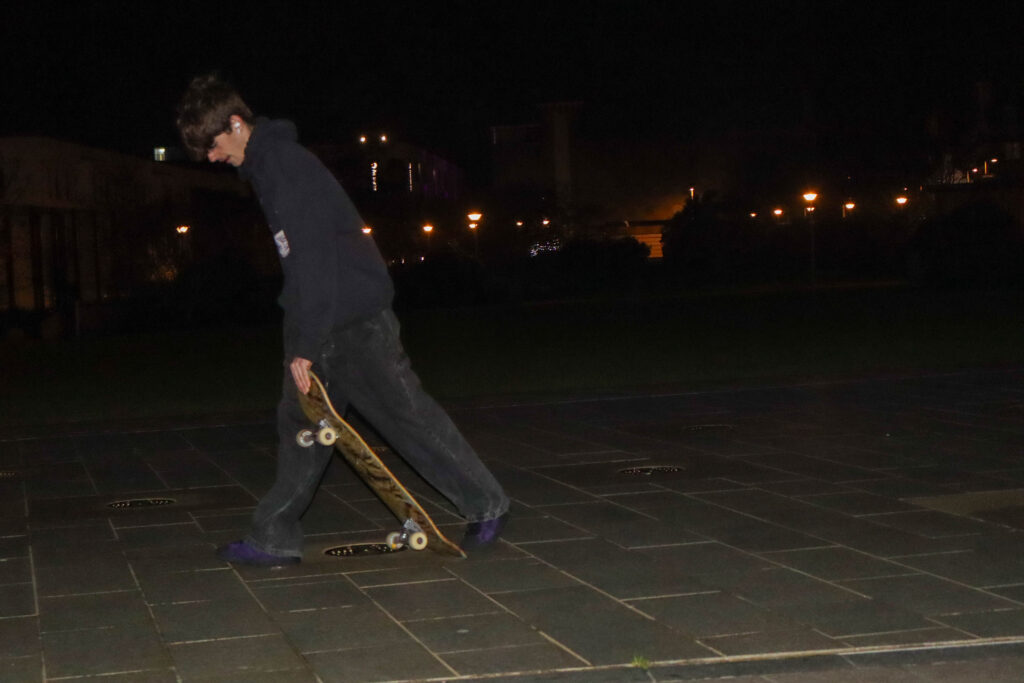
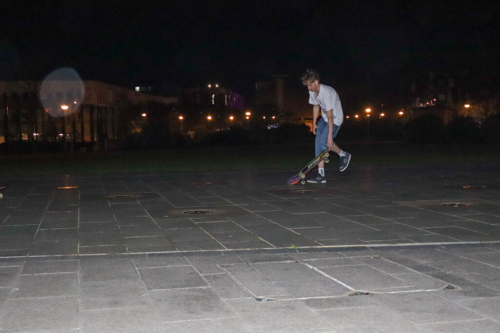
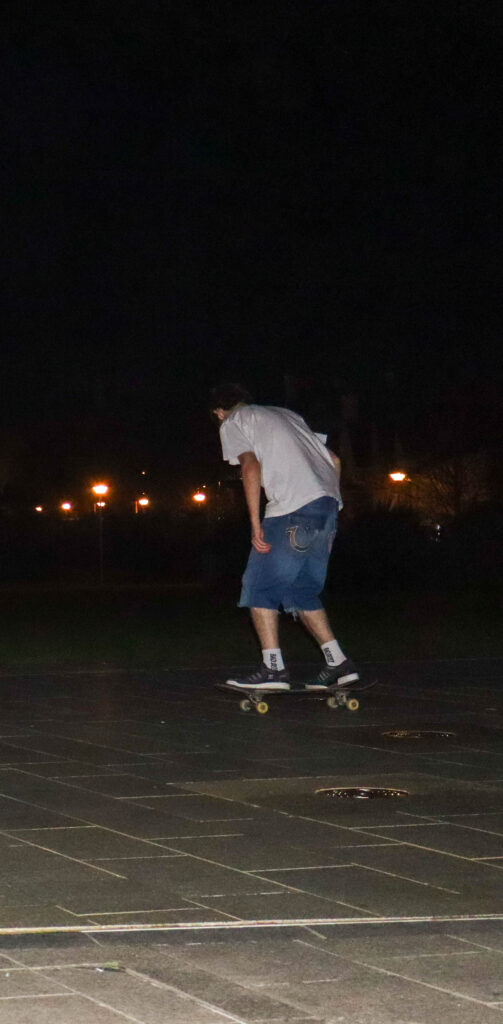
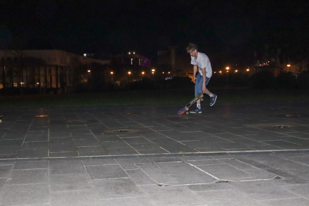
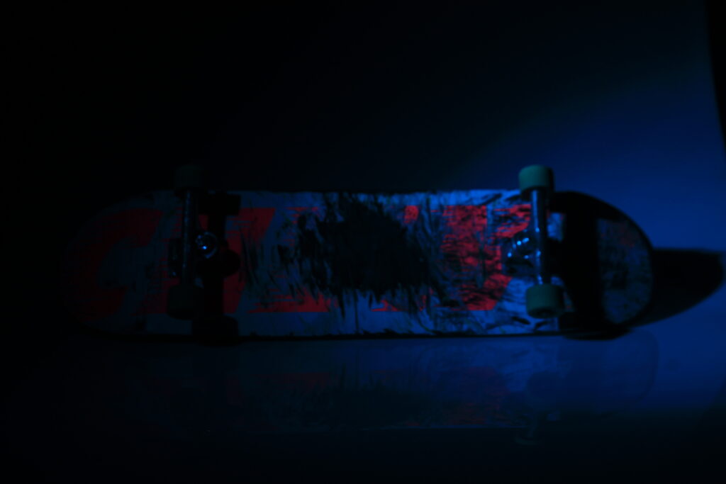
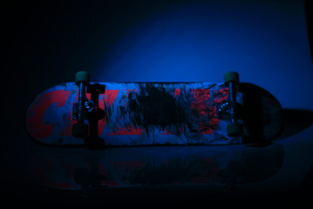
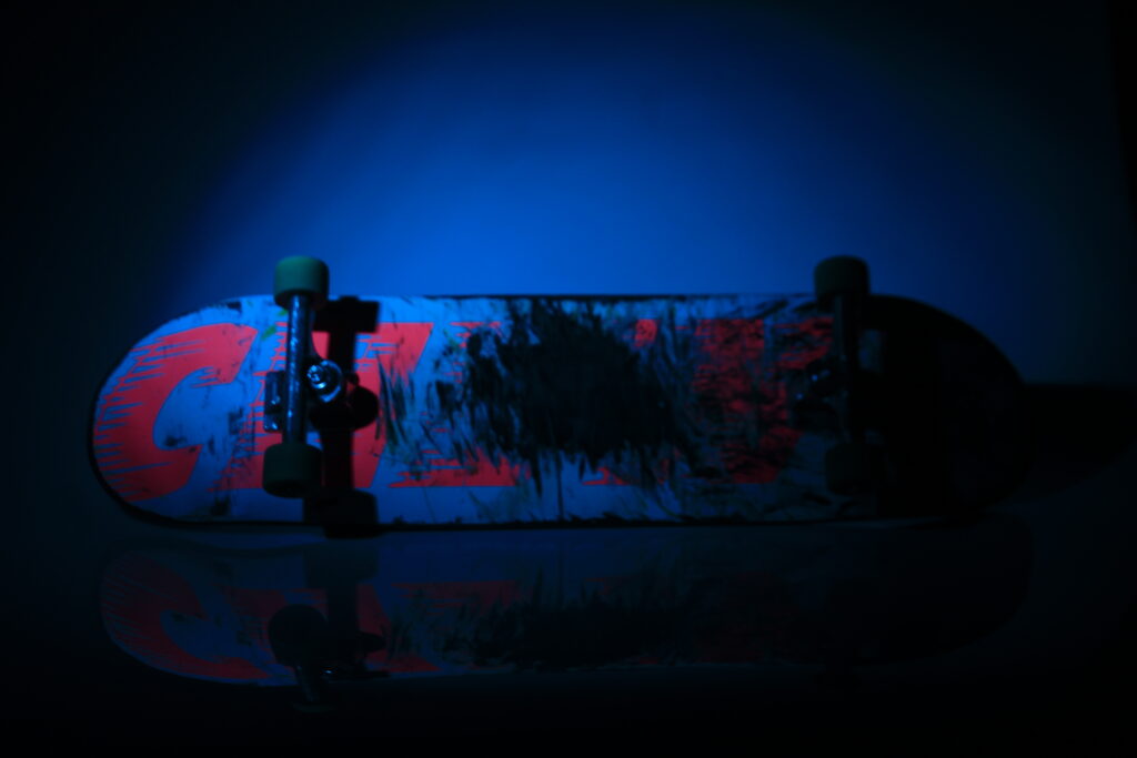
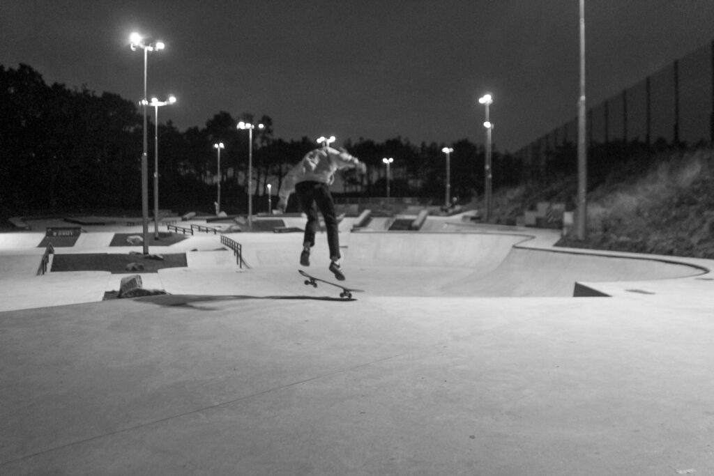
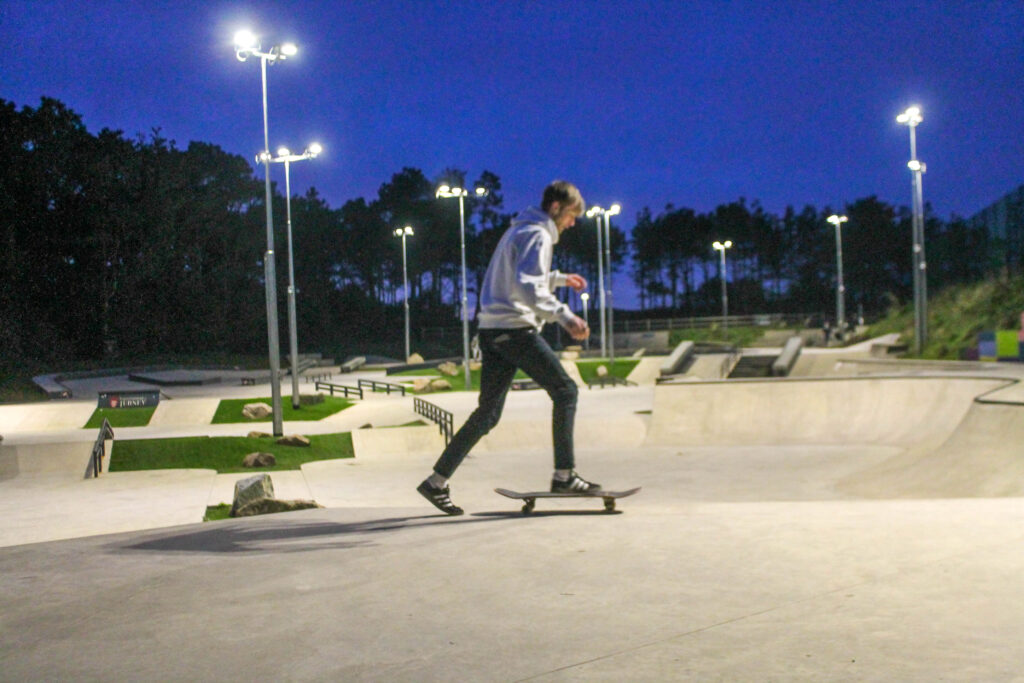
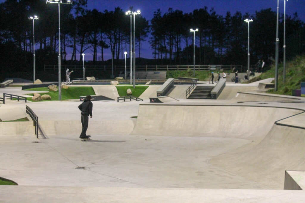
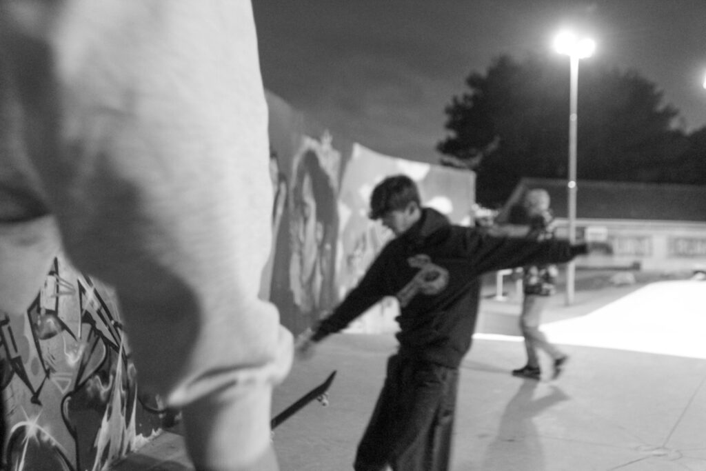
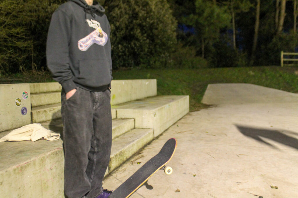
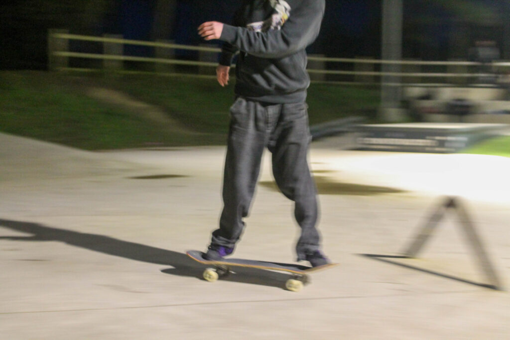
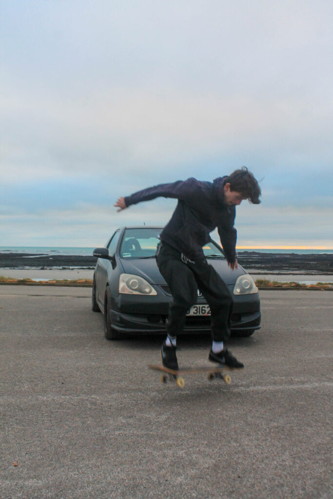
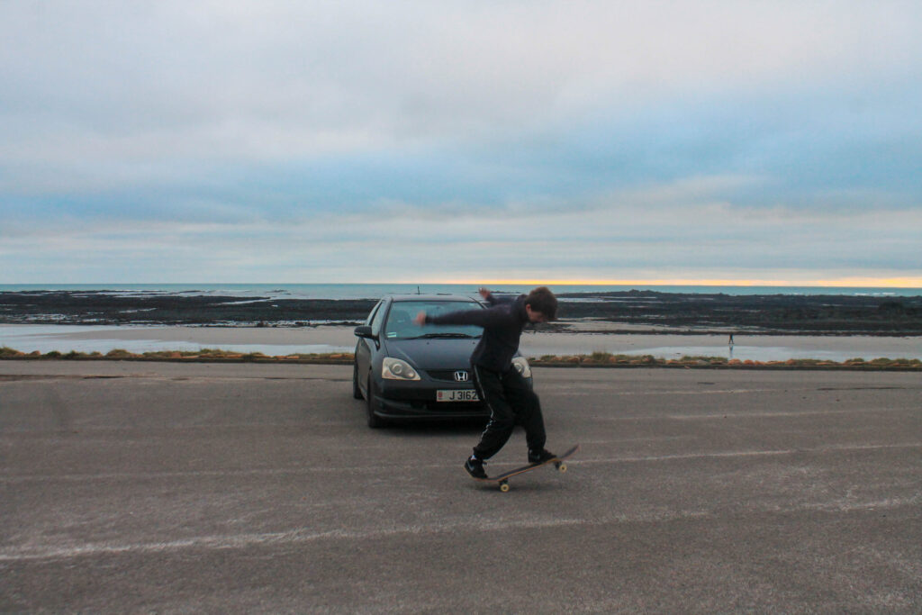
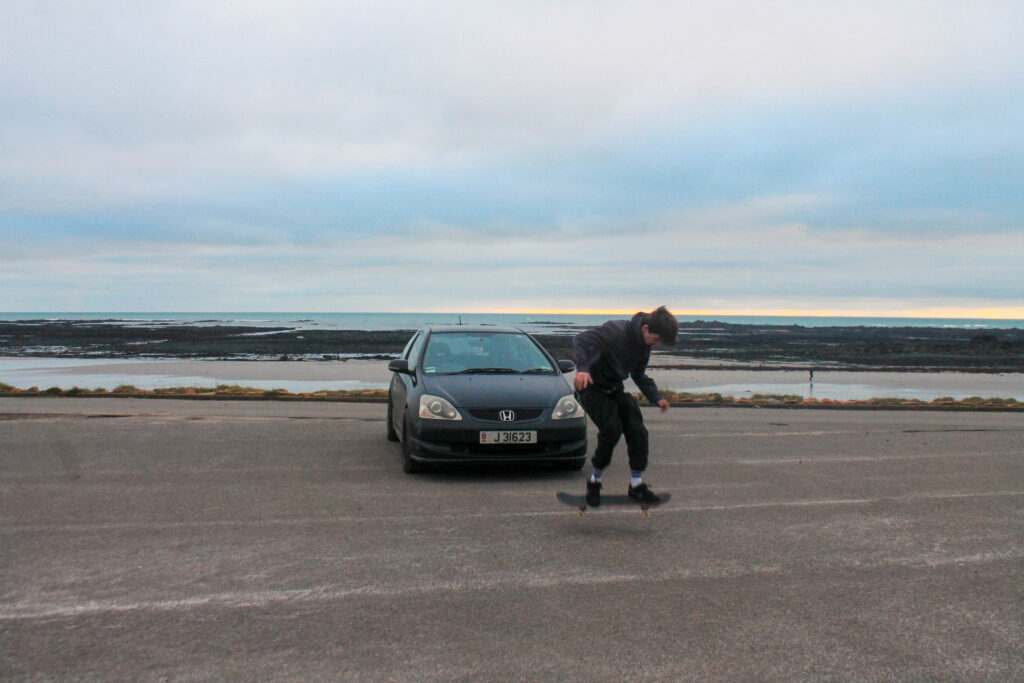
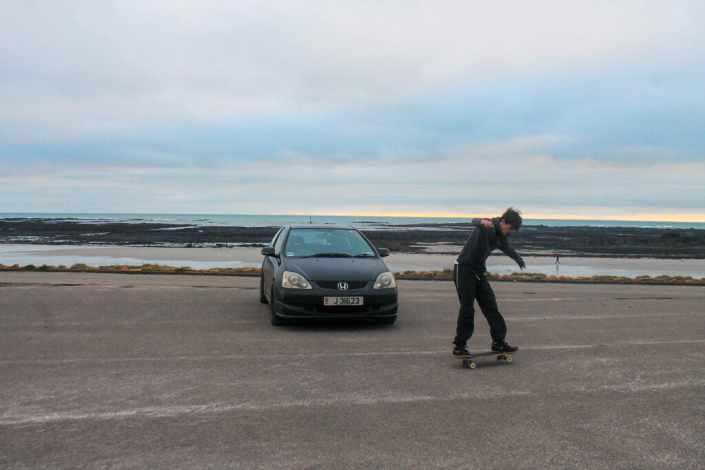
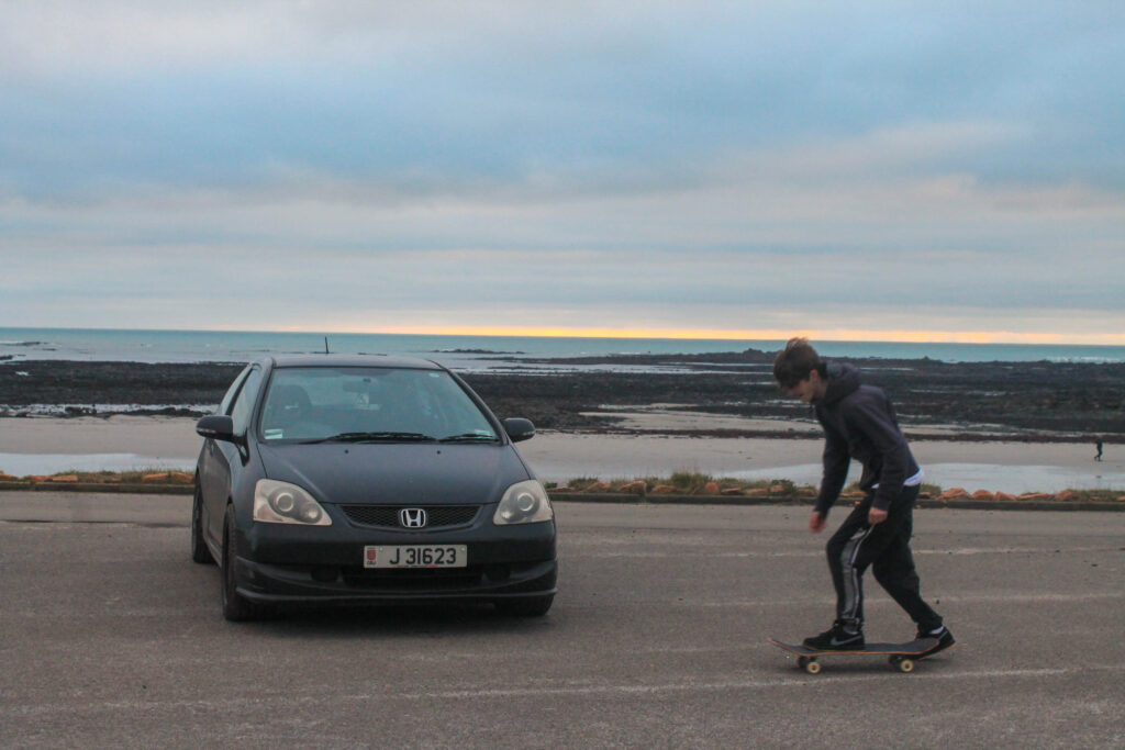
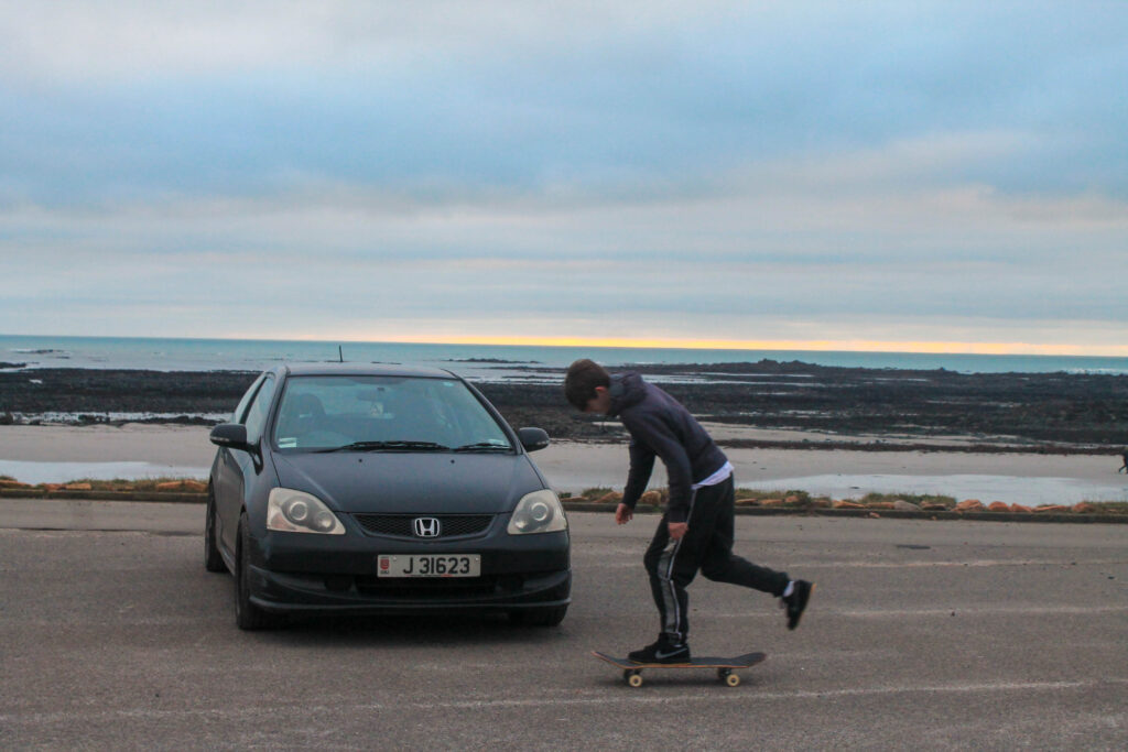
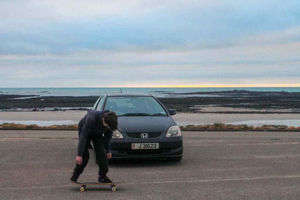
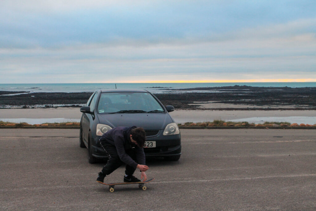
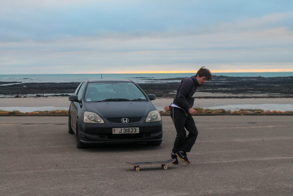
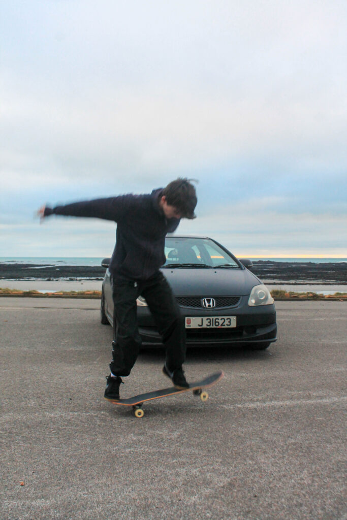
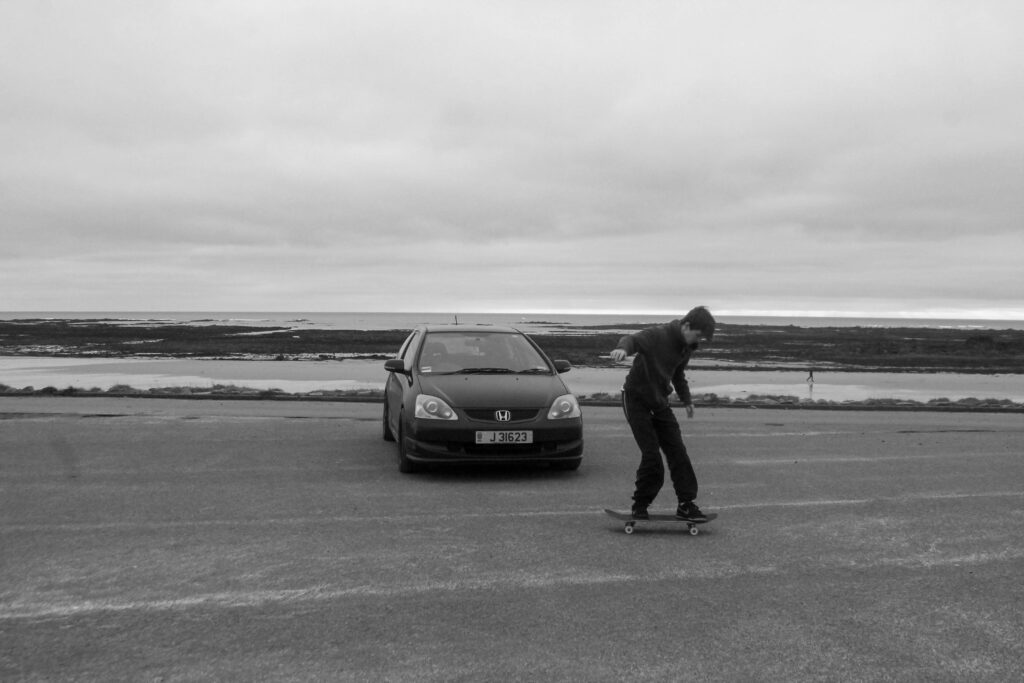
Photoshoot 15 plan-
skating
dark
flash
movement
Outcome-
Lightroom Edits-
Favorites-
Results-
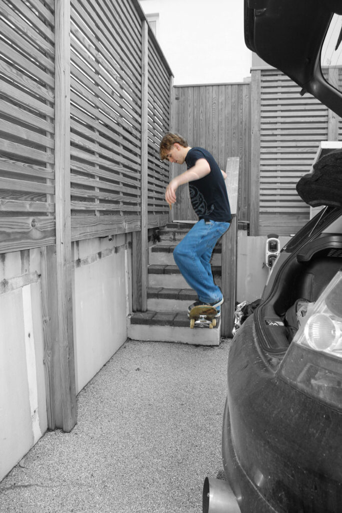
I think that I got some good close ups to change the contrast of my book.
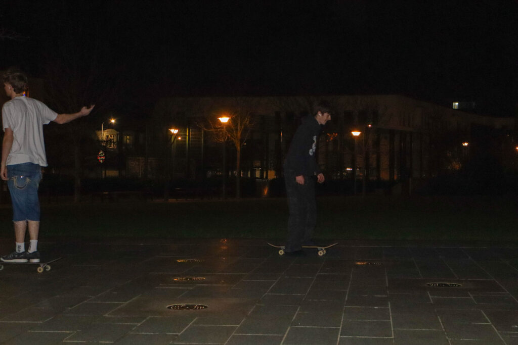
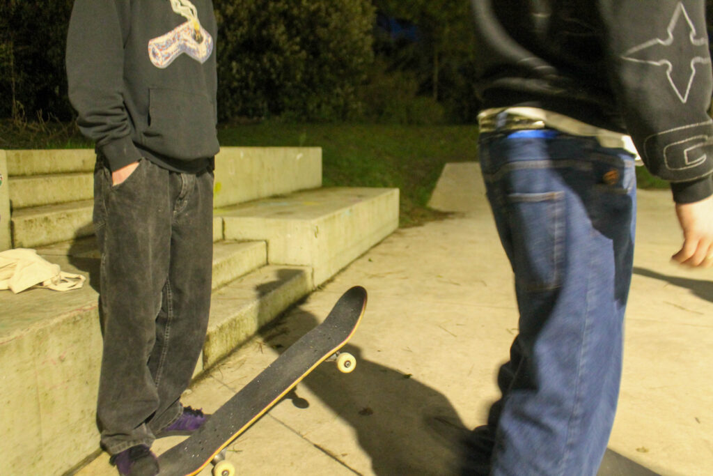
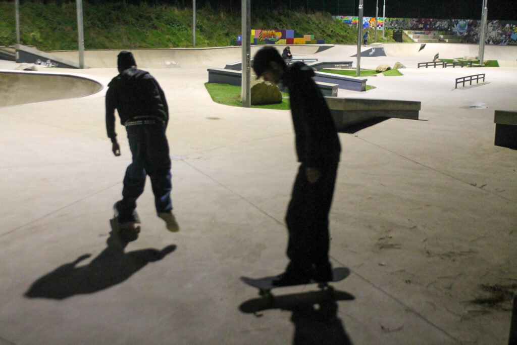
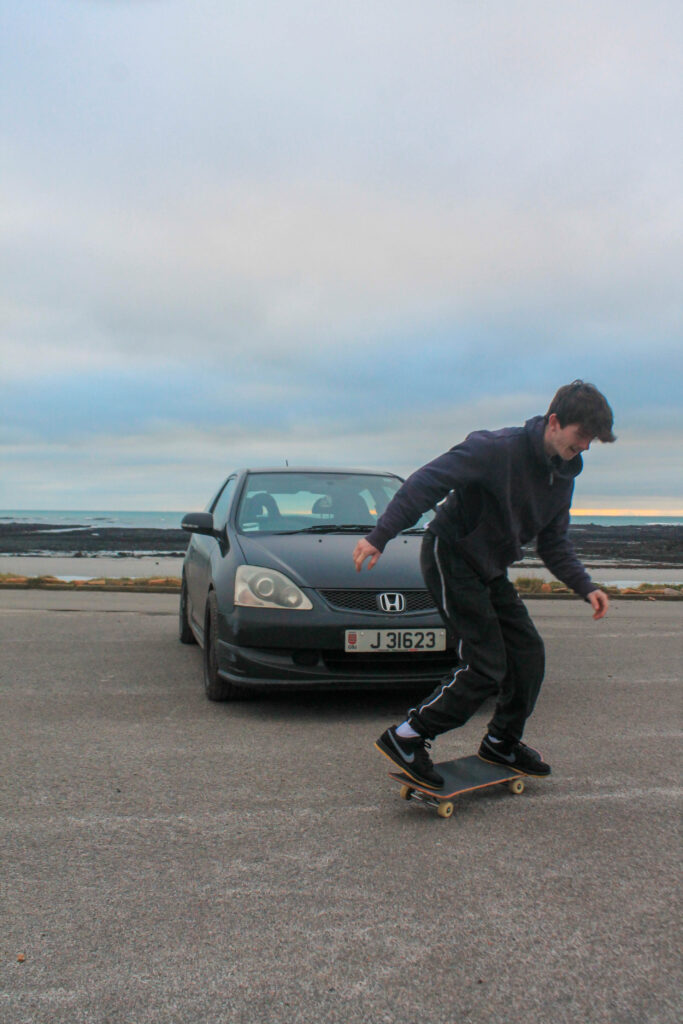
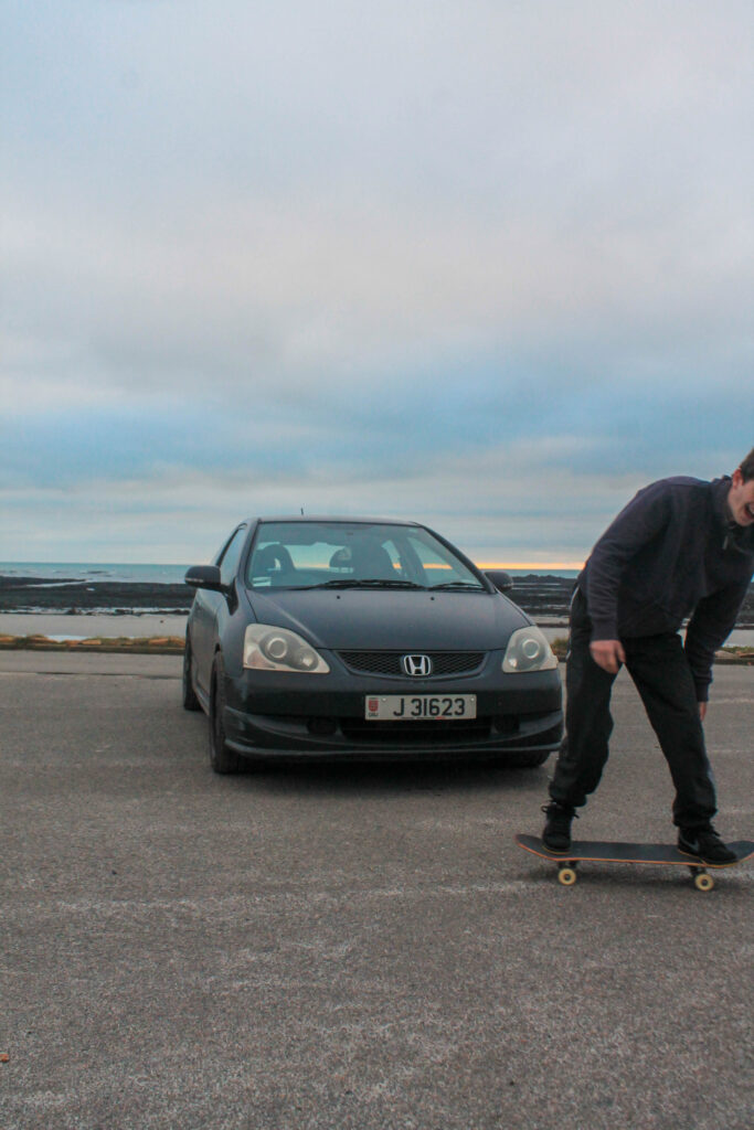
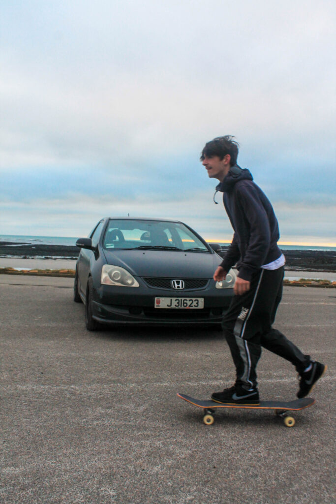
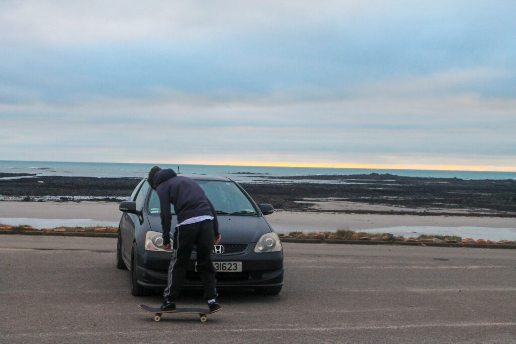
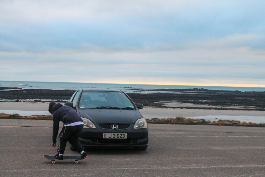
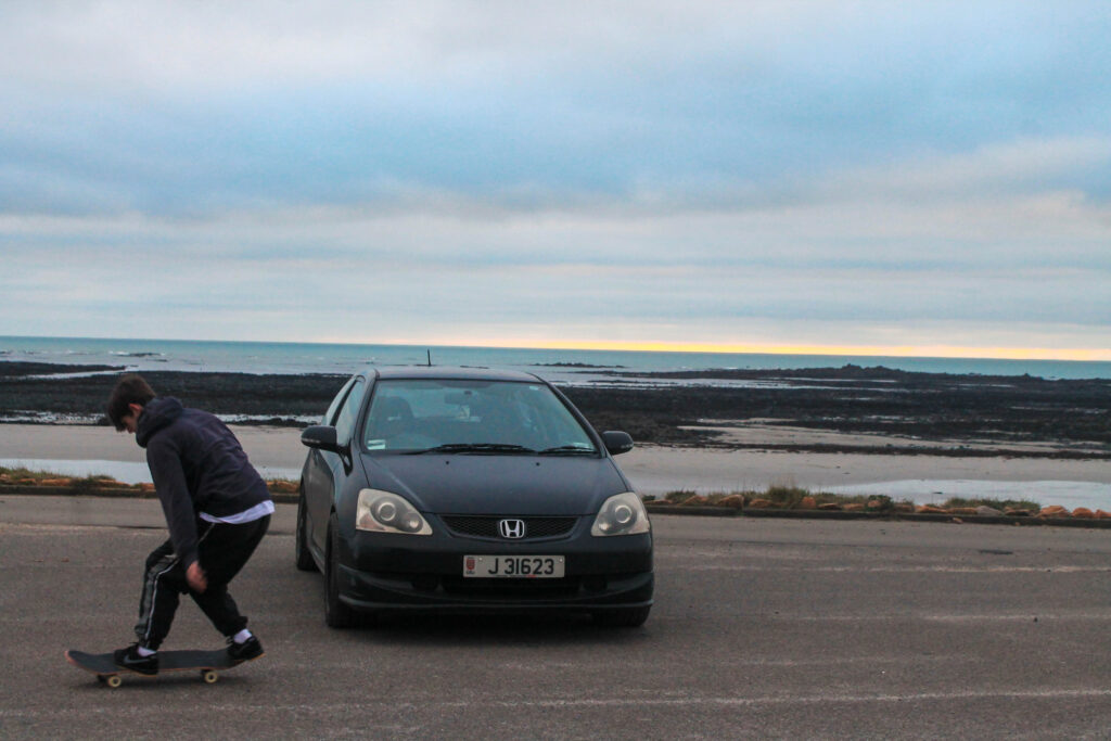
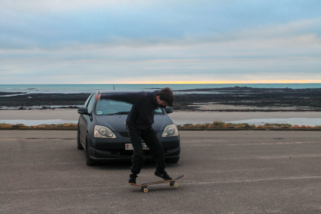
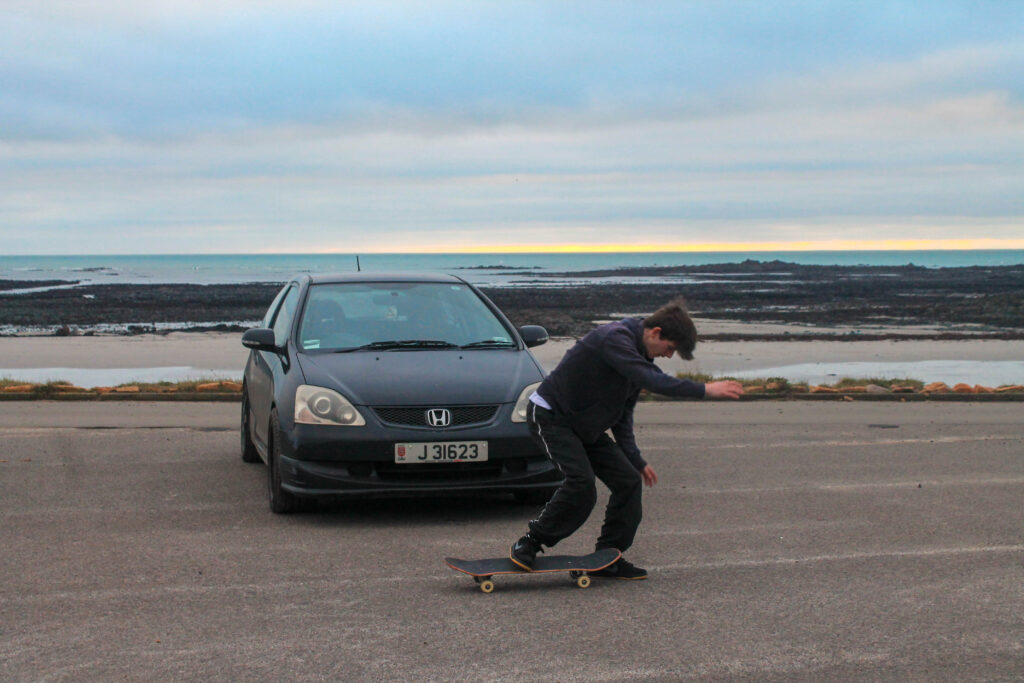
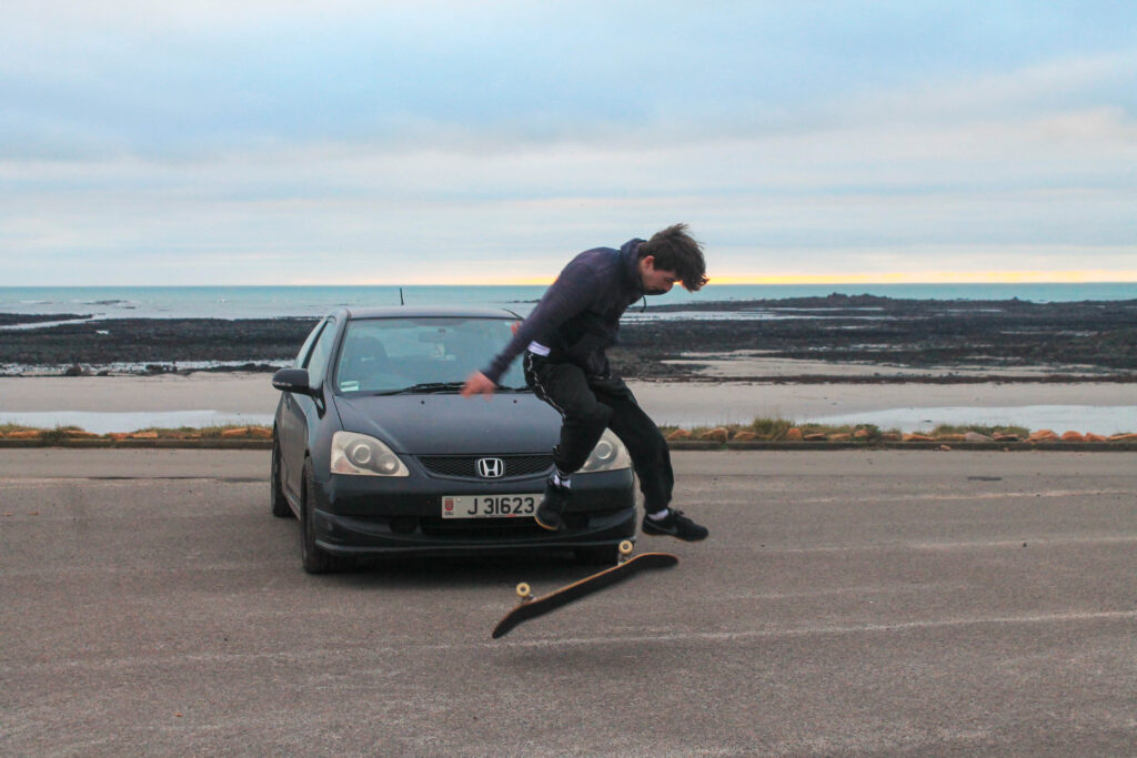
Photoshoot 16 plan-
contrast
addition
putting two together
Outcome-
Lightroom Edits-
Favorites-
Results-
I overall think that I have managed to get a good link between car photography and skating, linking the two hobbies together to make the story flow.
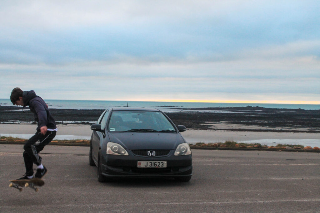
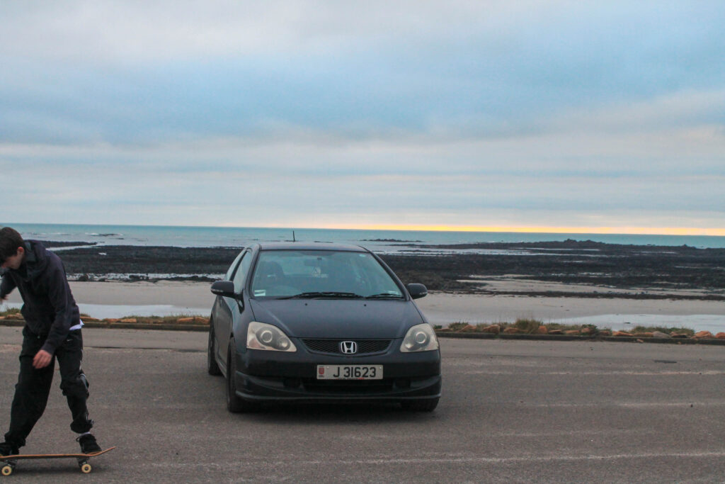
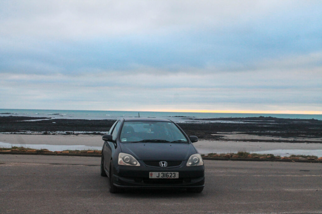
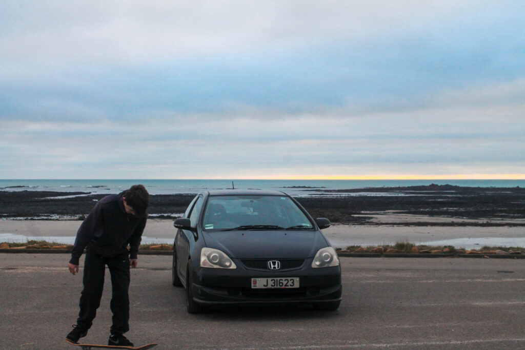
Photoshoot 17 plan-
motion
new car
different enviroment
action
Outcome-
Lightroom edits-
Favorites-
results-
I overall don’t think that these images came out great, I think that some of them are nice due to being in a different environment and having a new car to be the newer subject, but I am not sure that I will use them in my book because I think that they are a bit too blurry and my camera was dirty not allowing the best outcome.
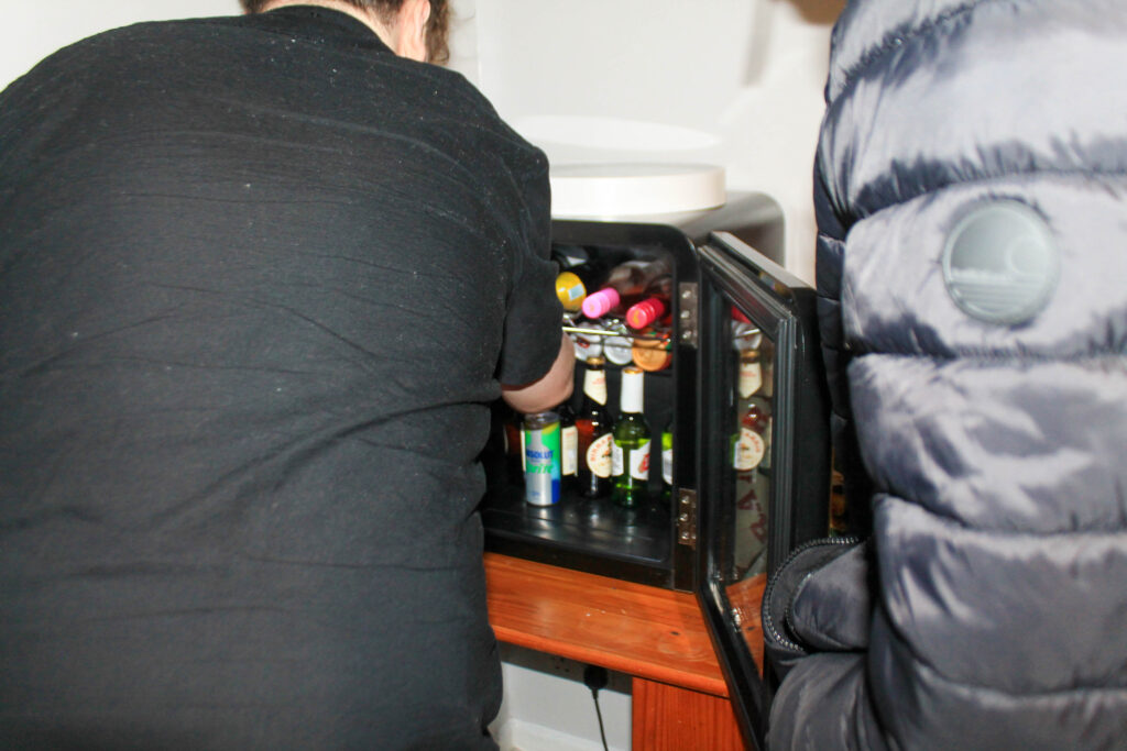
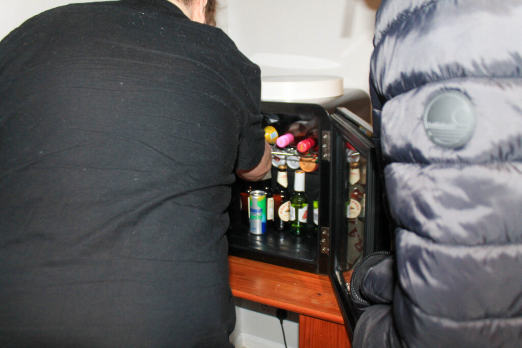
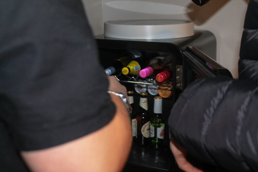
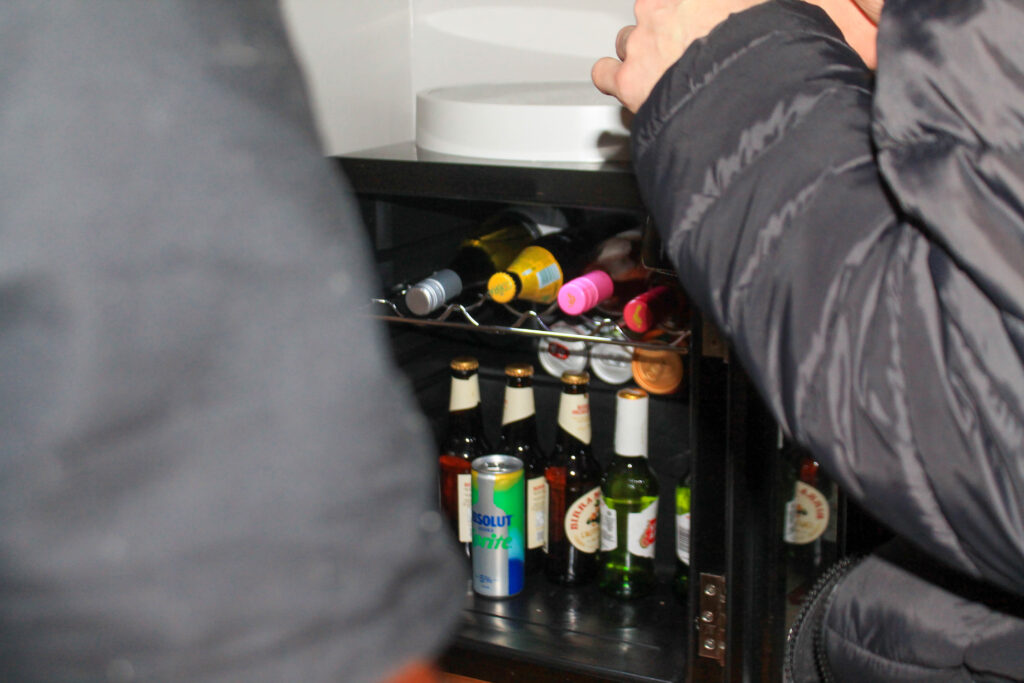
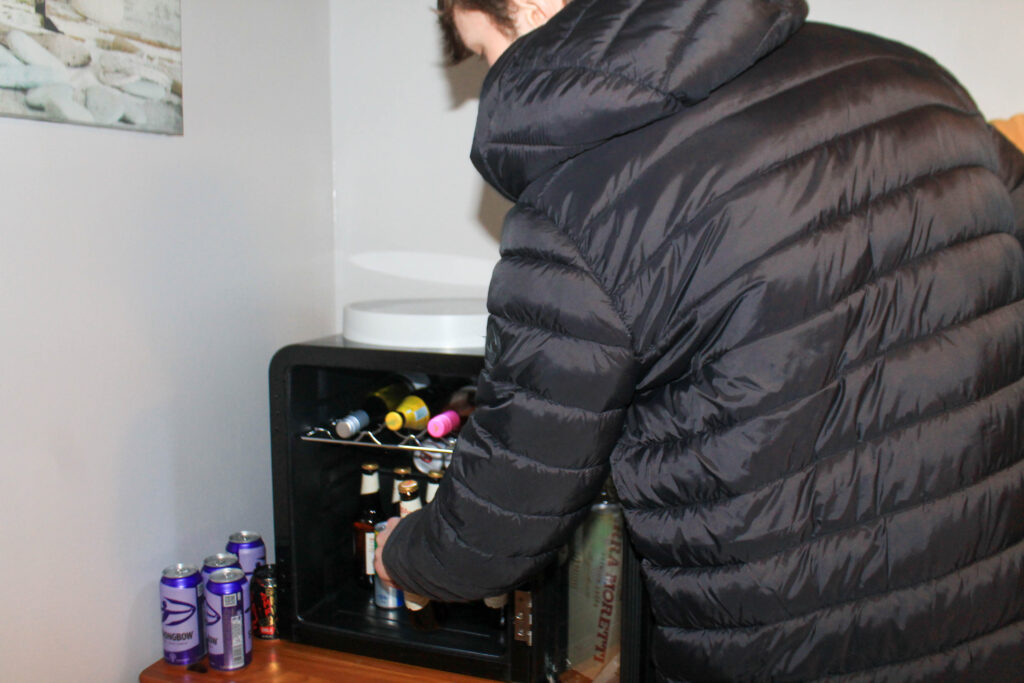
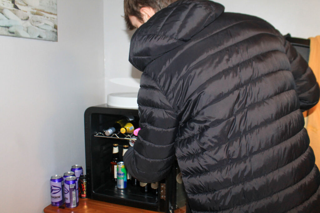
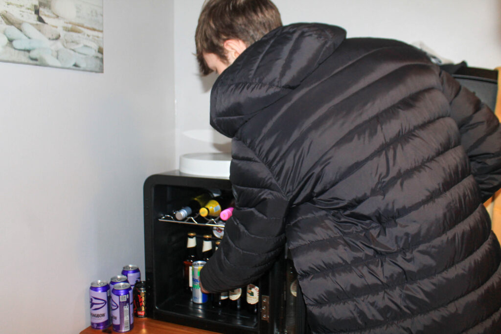
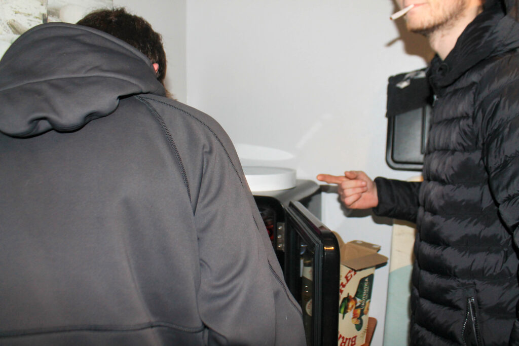
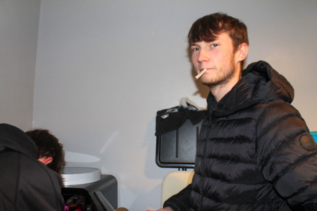
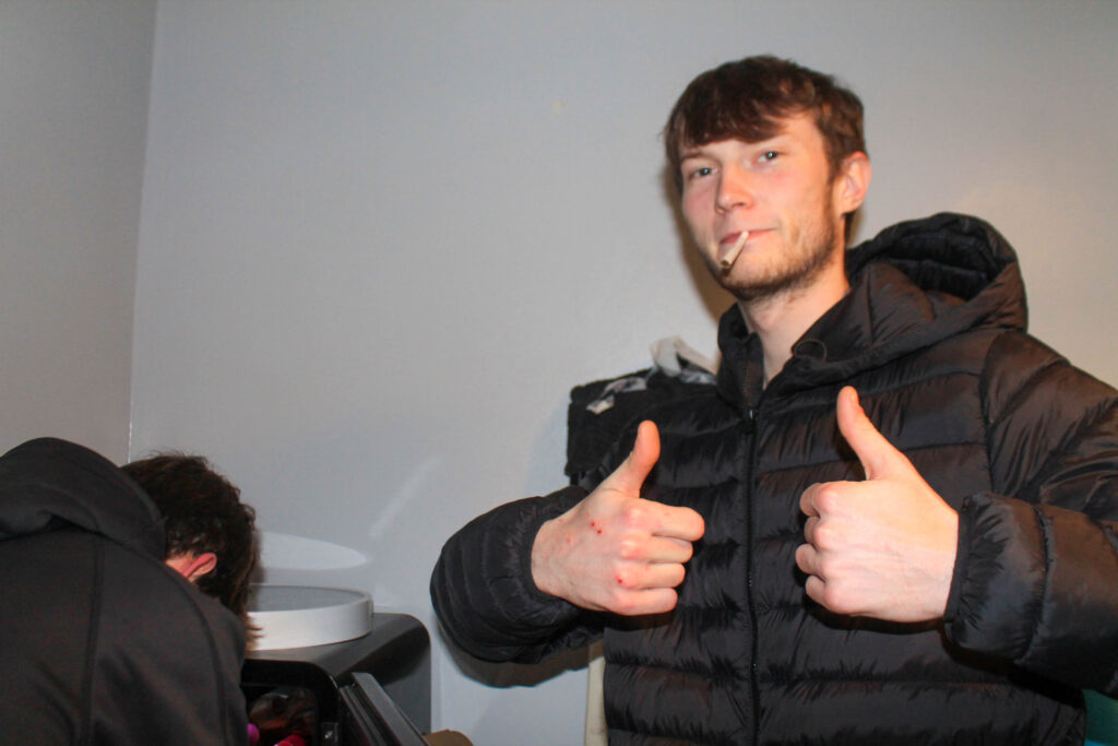
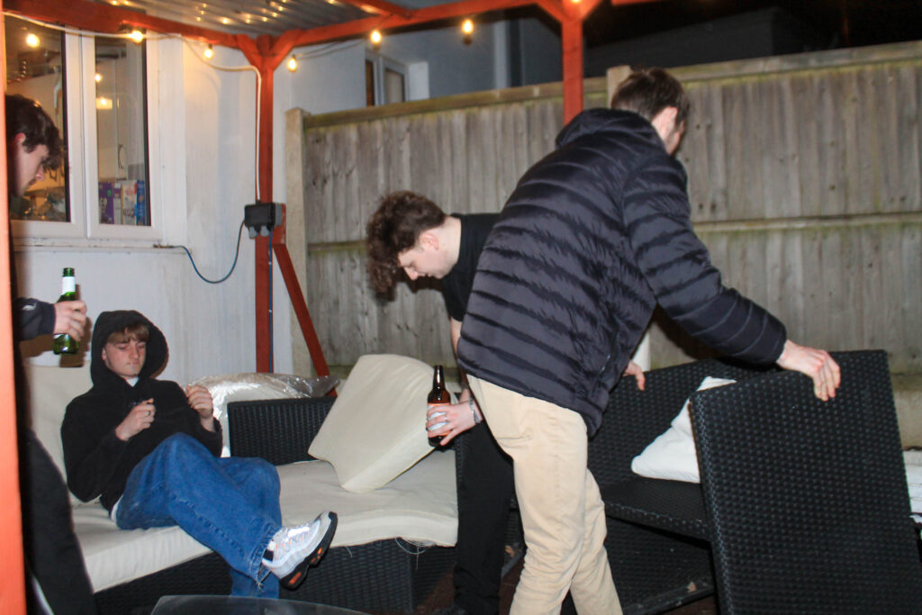
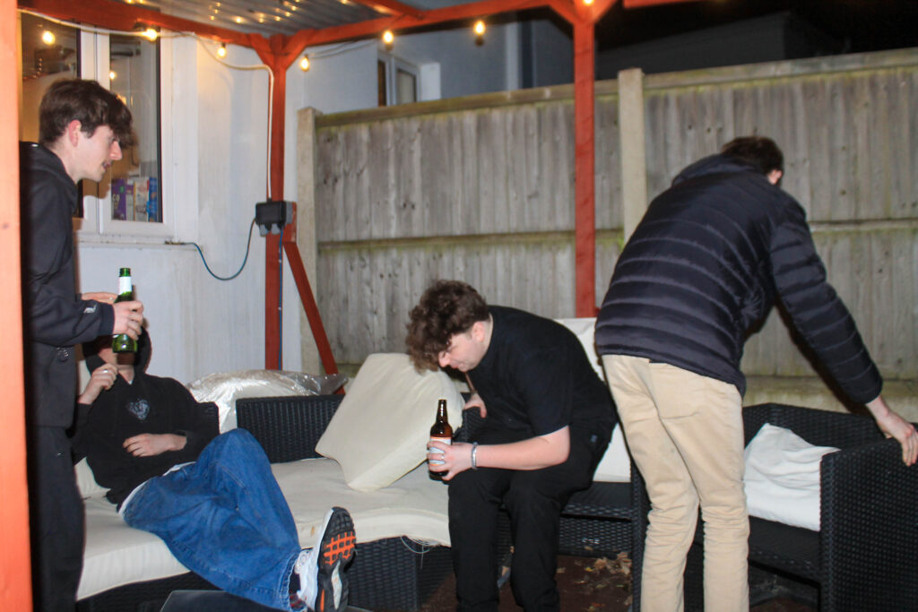
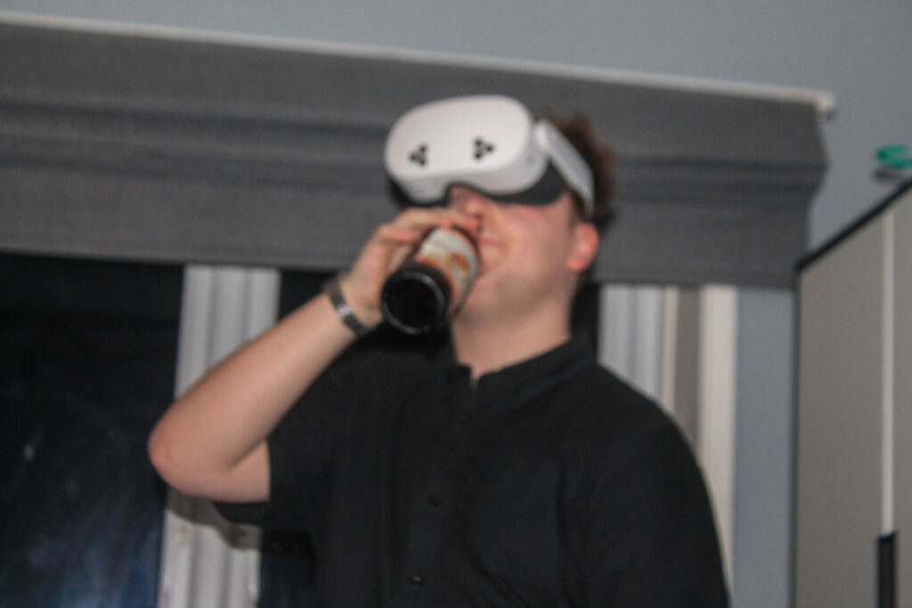
Photoshoot 18 plan-
party
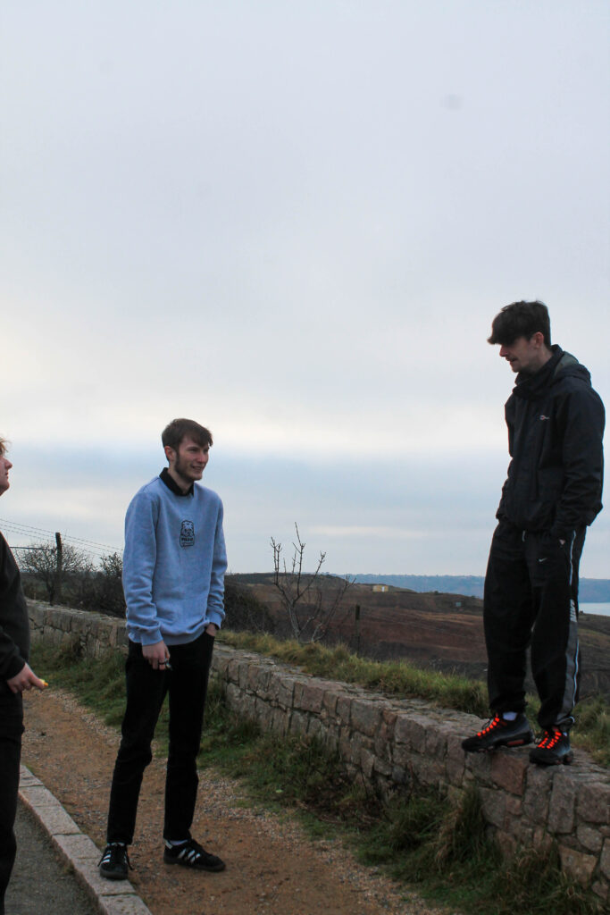
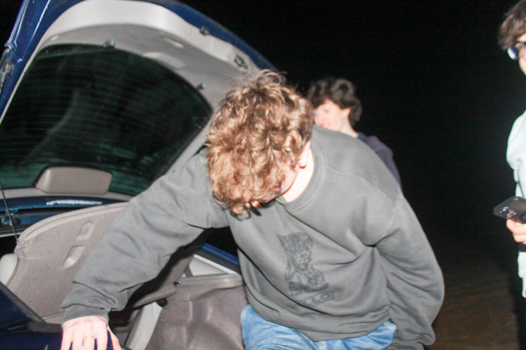
lining
friends
dialogue
Outcome-
Lightroom edits-
Favorites-
results-
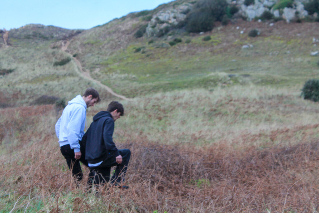
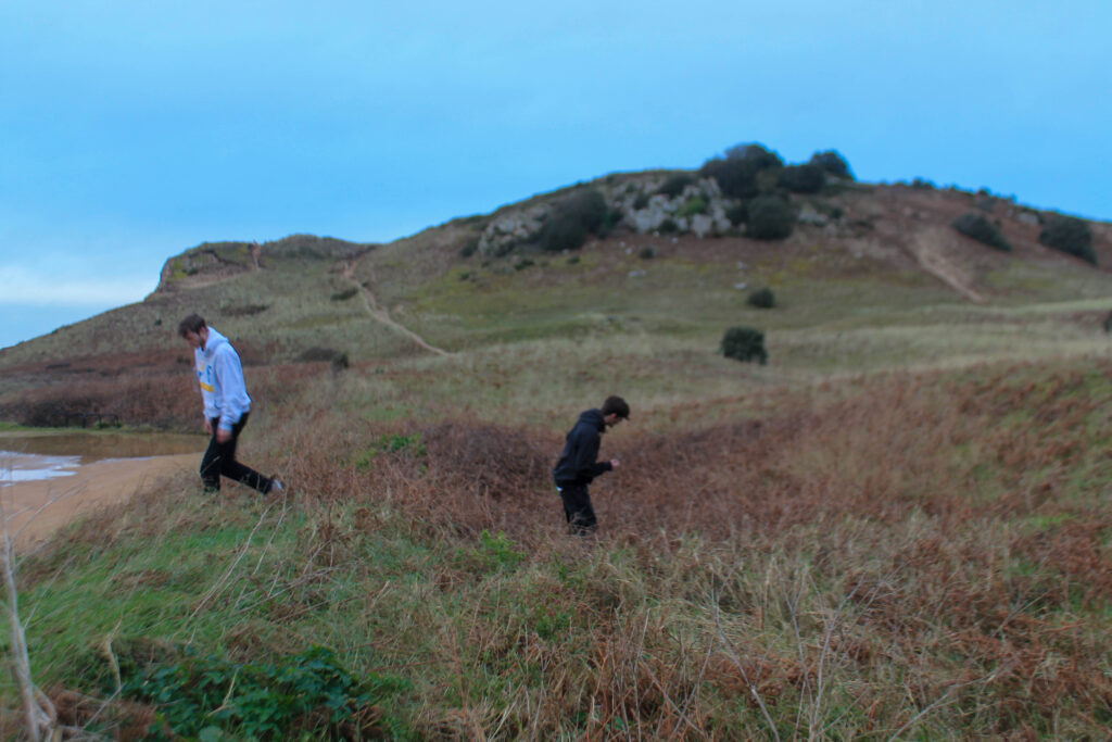
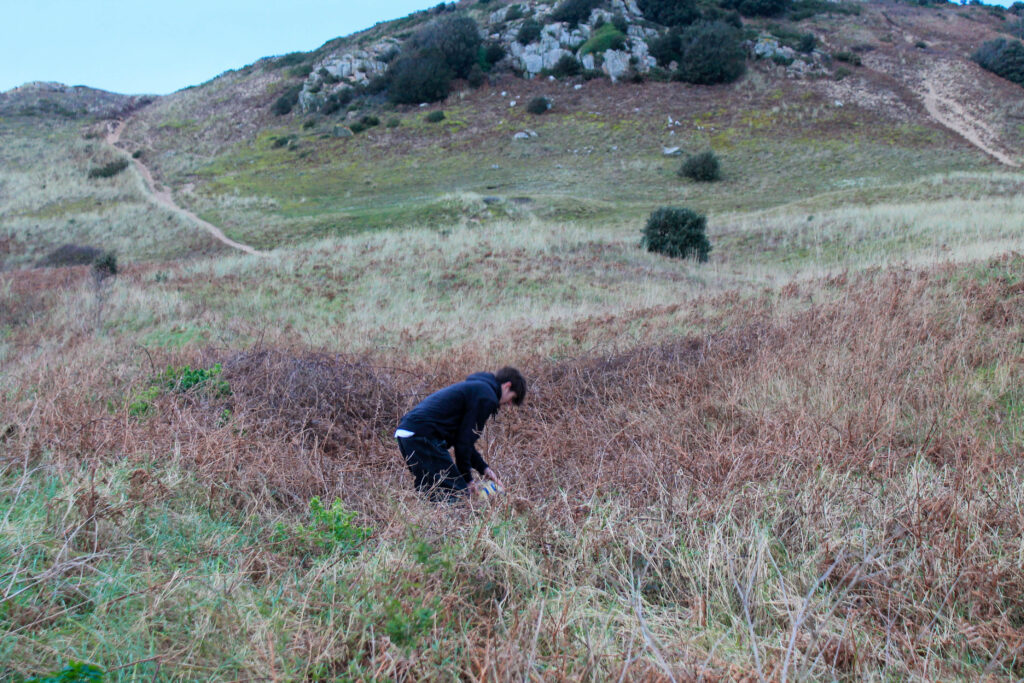
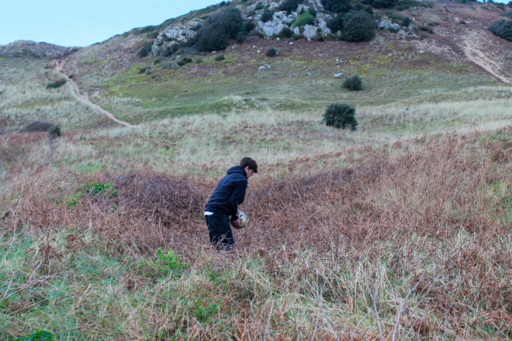
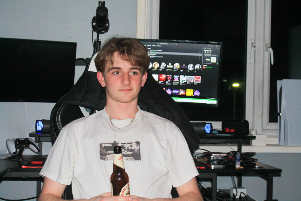
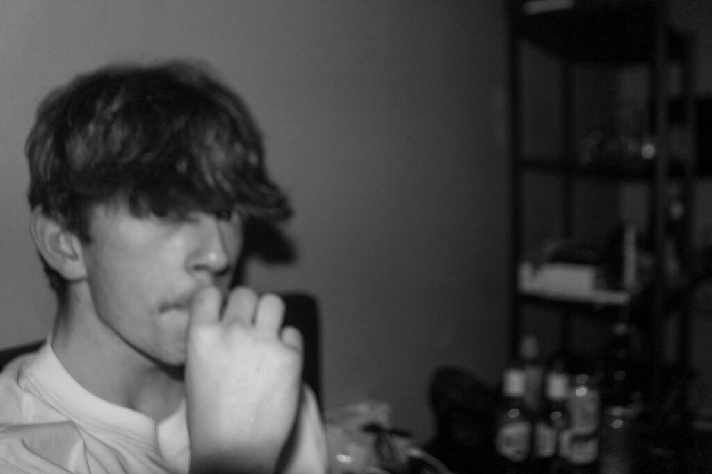
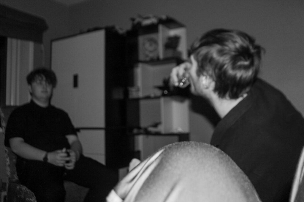
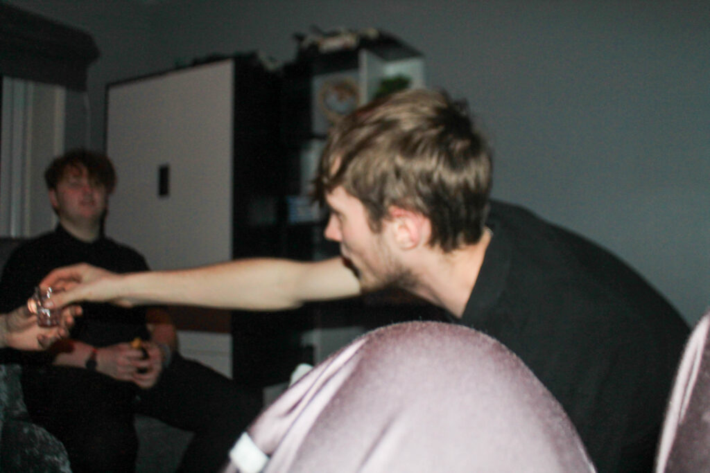
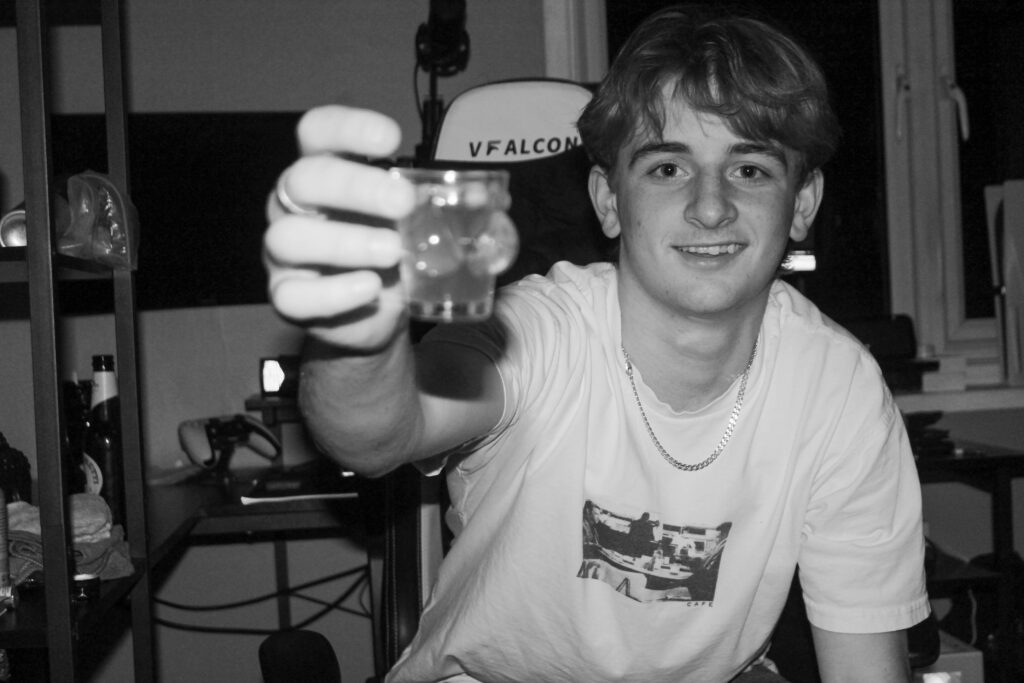
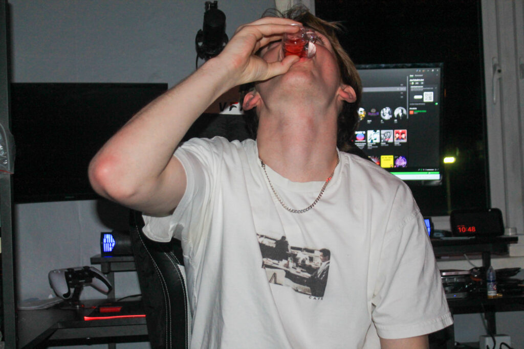
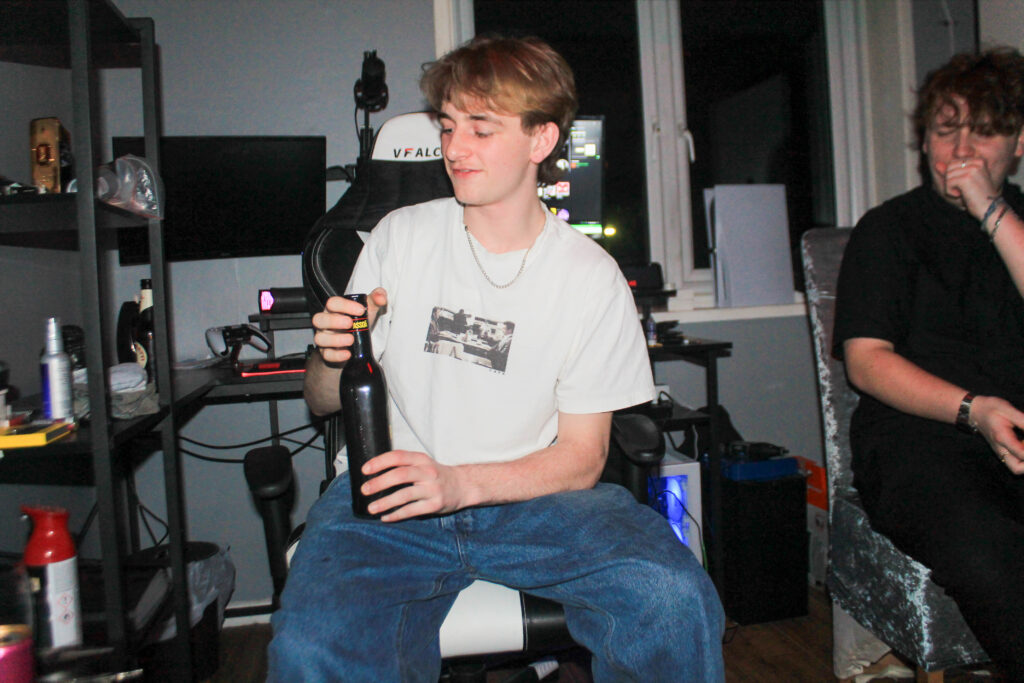
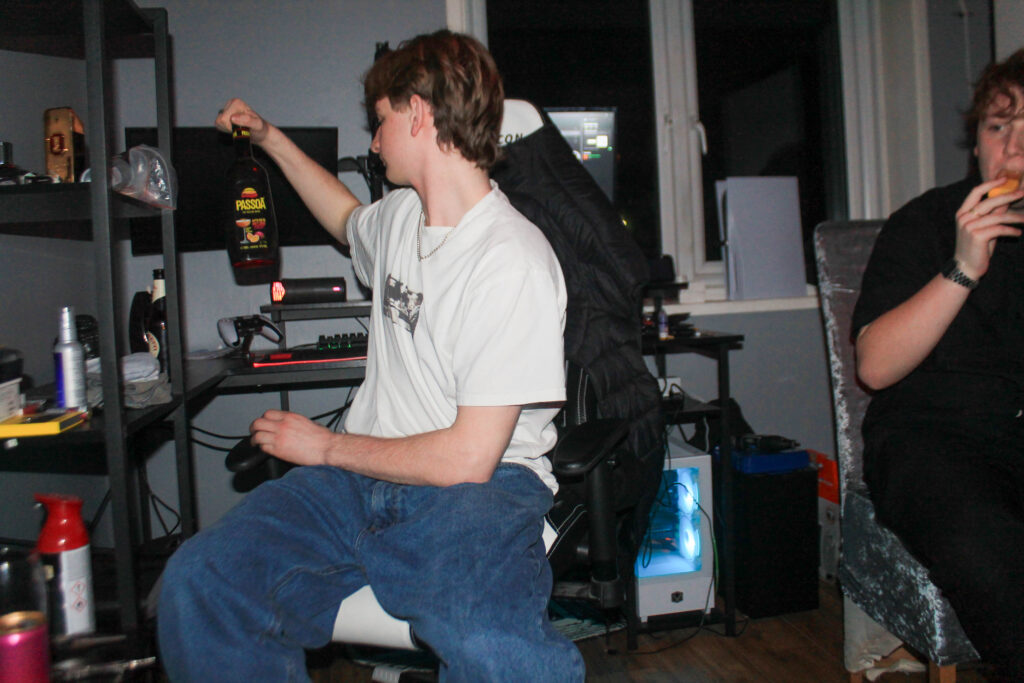
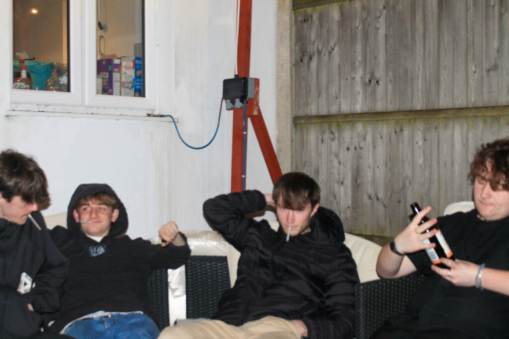
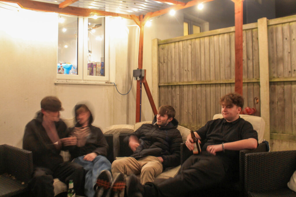
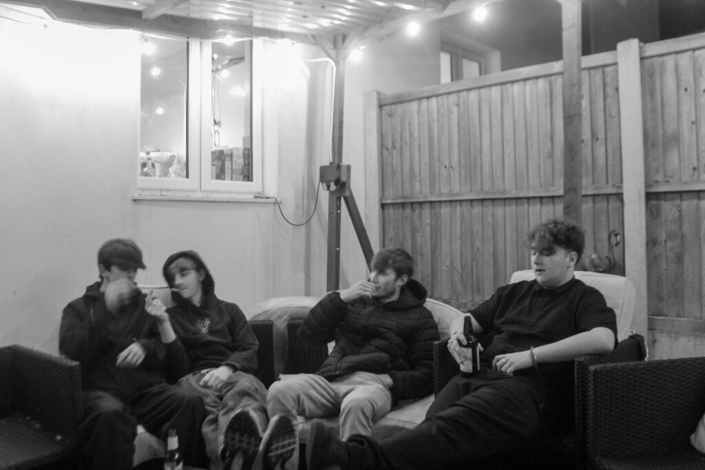
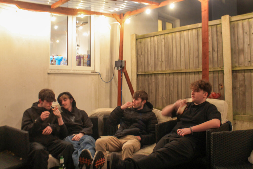
I overall think that this is one of my best photoshoots, I think I have really depicted teenage life, and that this will add a good anchor to my book to allow it to flow with dialogue and documentary photography.
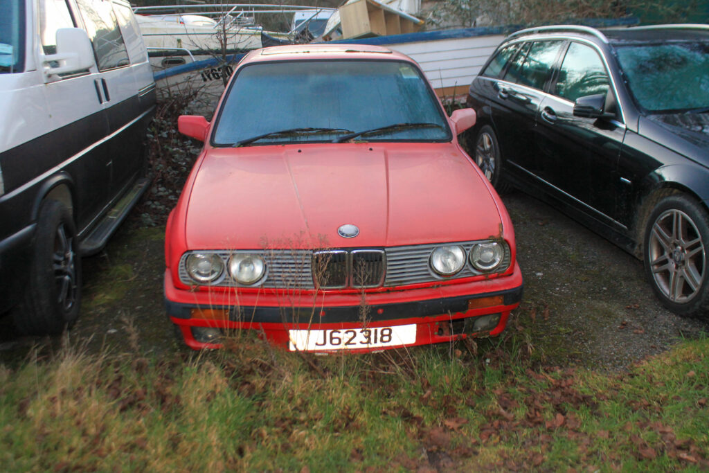
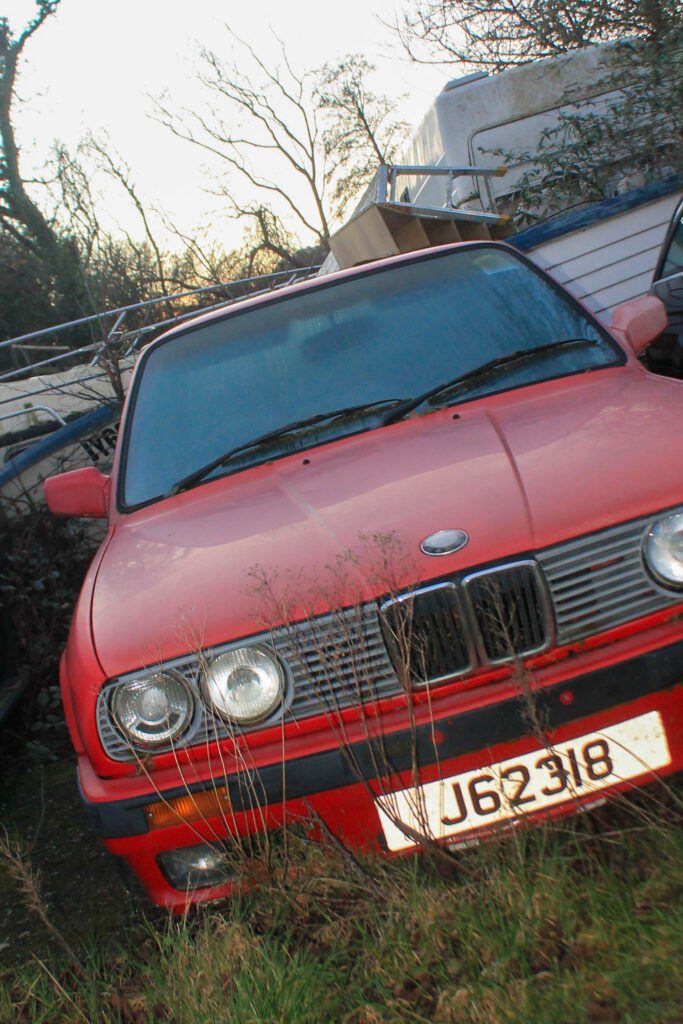
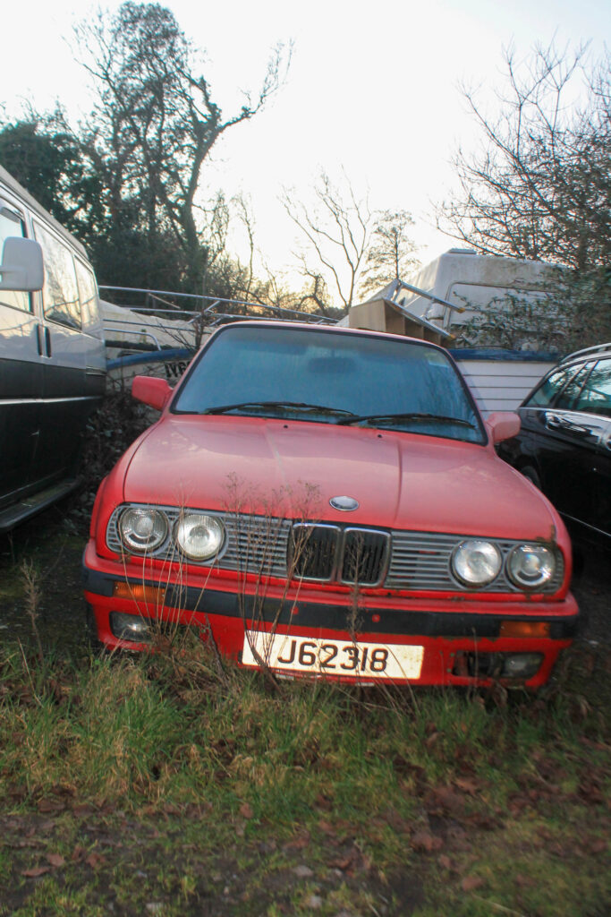
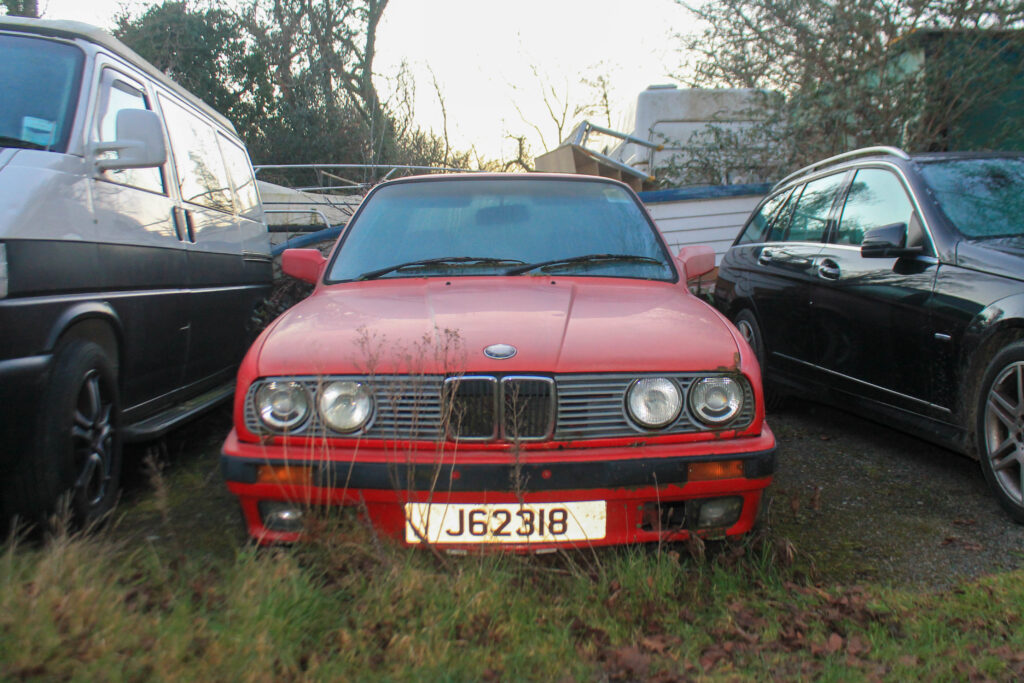
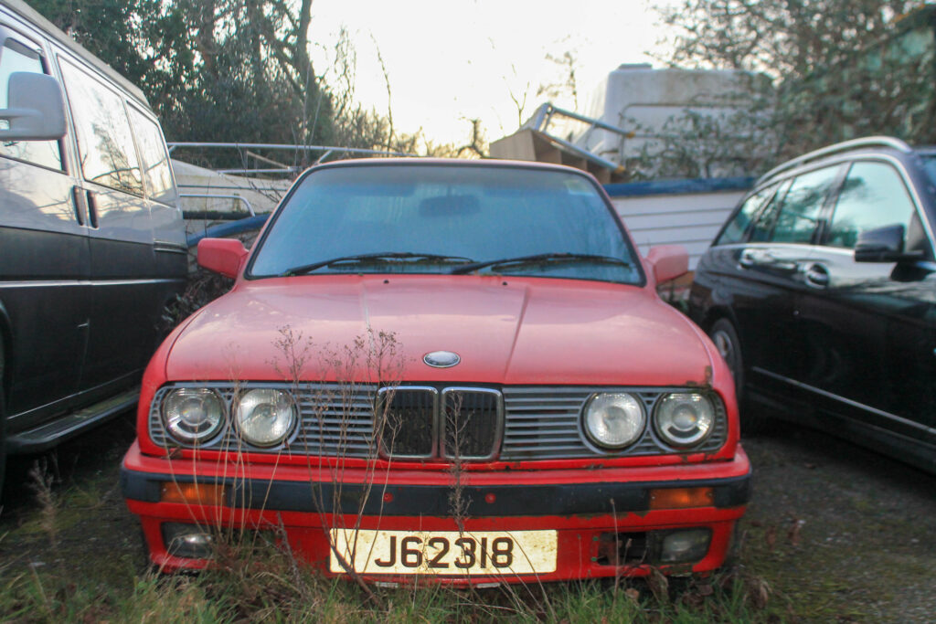
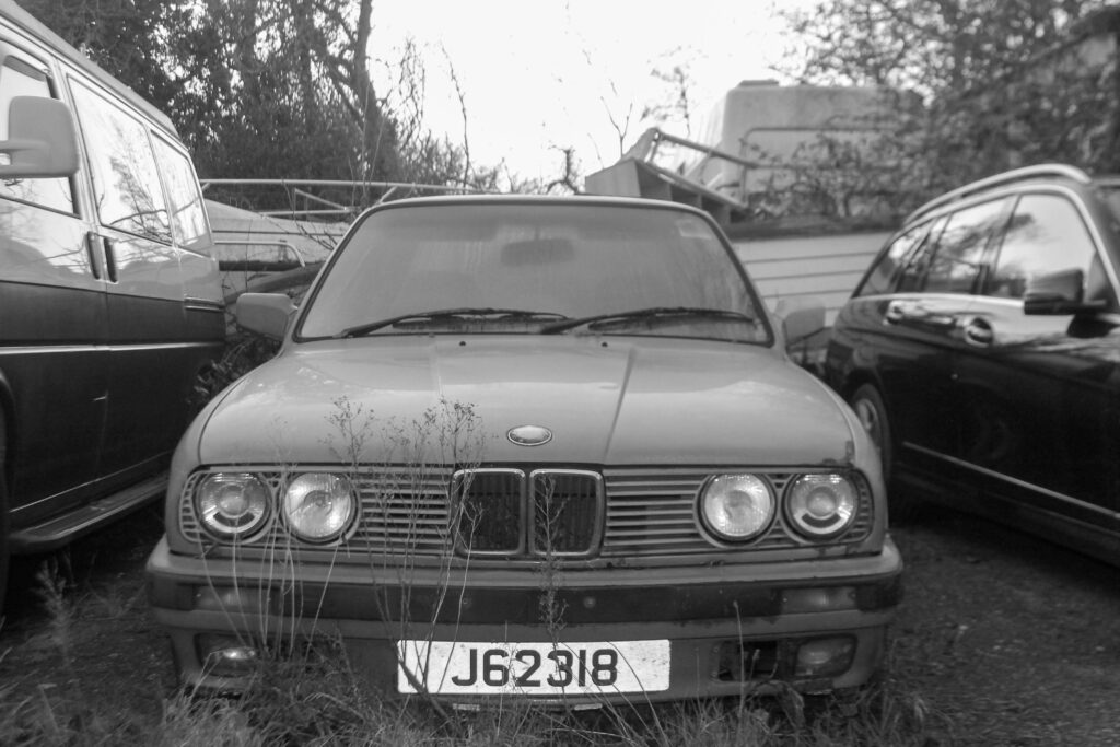
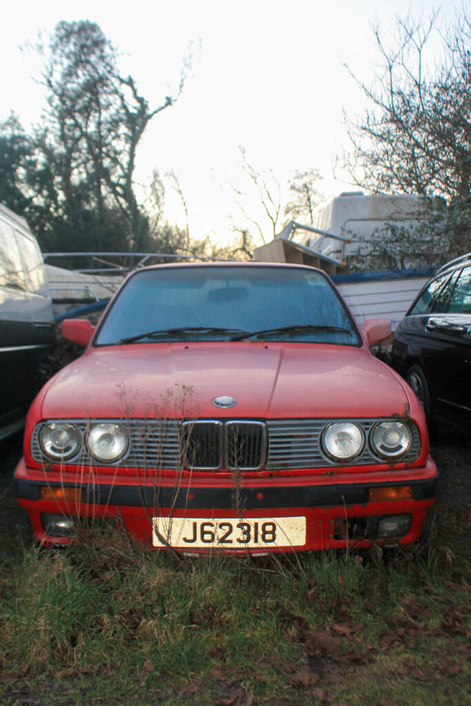
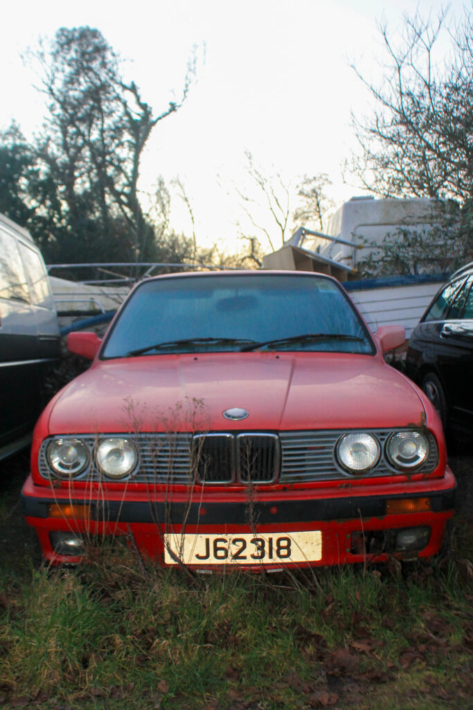
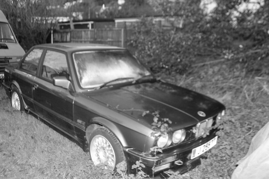
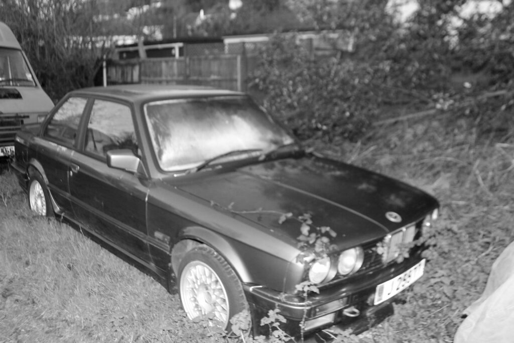
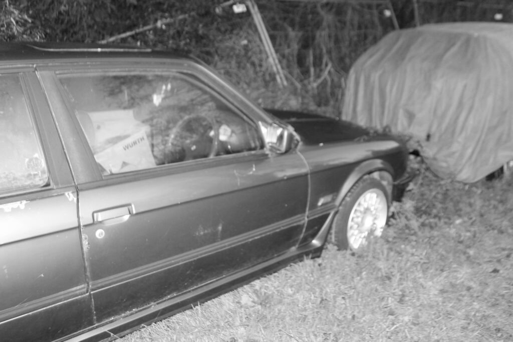
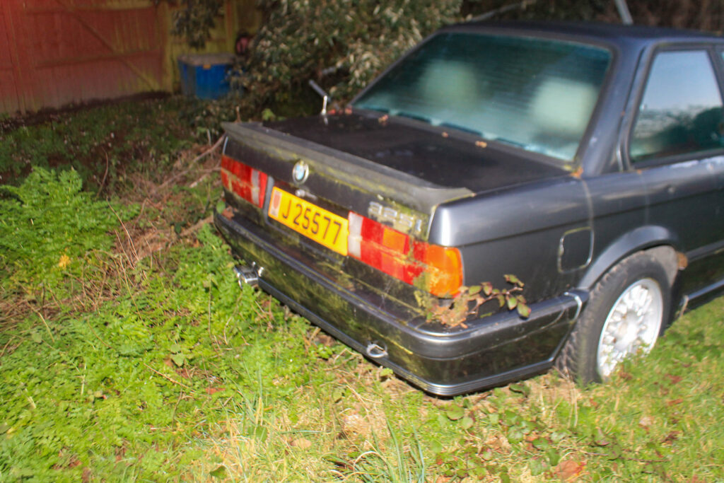
Photoshoot 19 plan-
cars
new cars
old cars
portrayal of where it all ends up
anthropocene
Outcome-
Lightroom edits-
Favorites-
results-
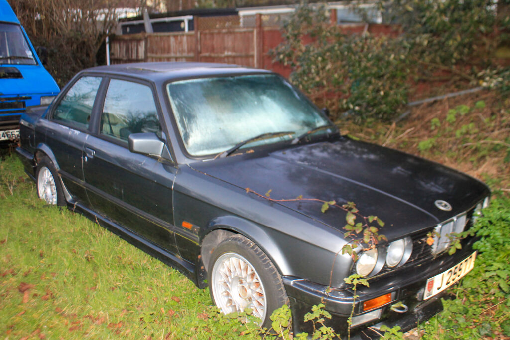
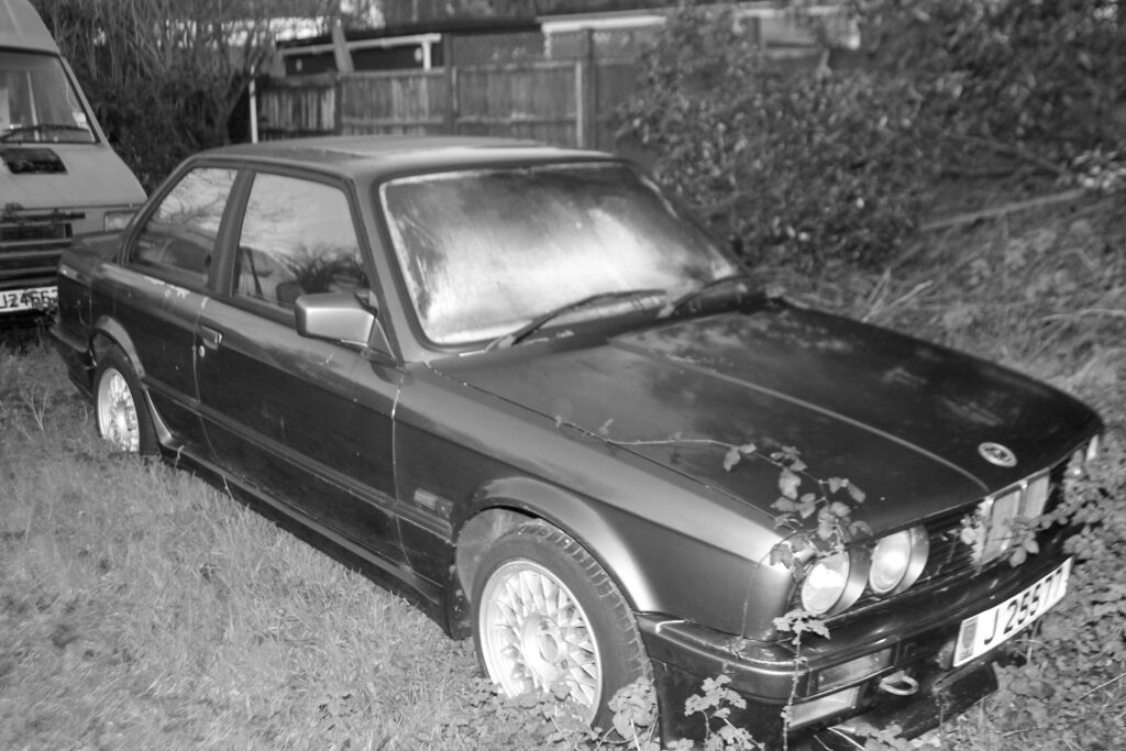
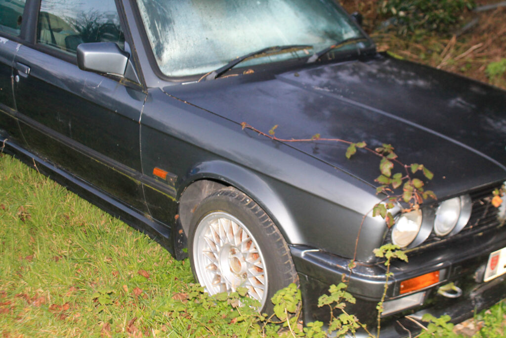
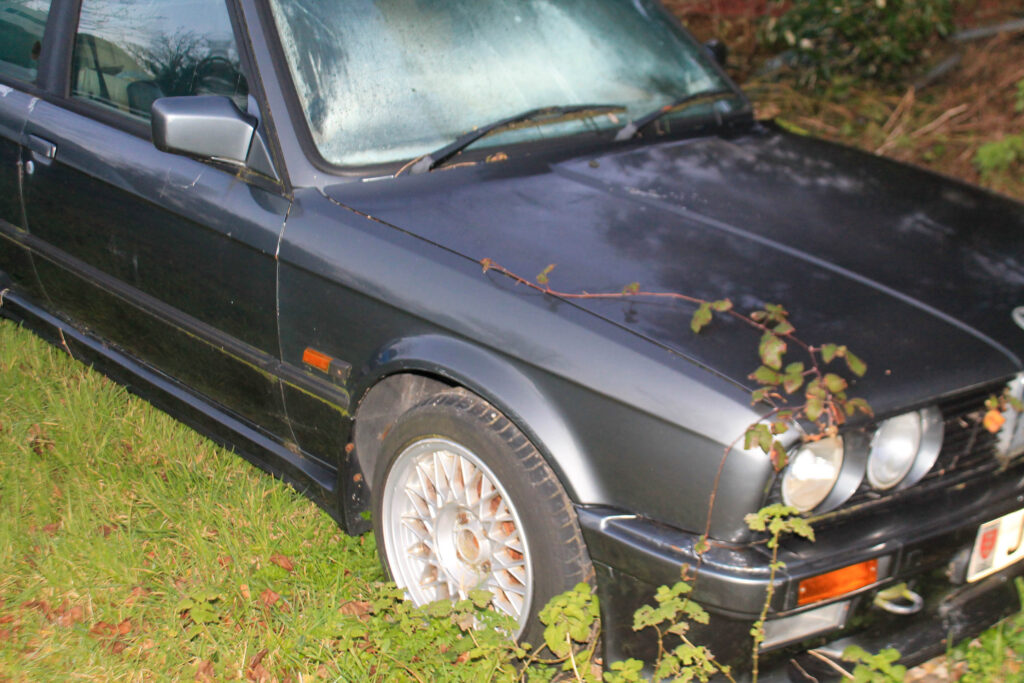
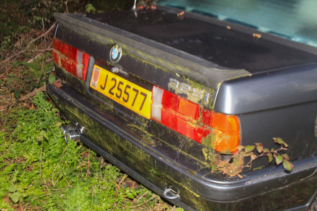
I think that I have got some good anthropocene photos by portraying how their love for cars is just a phase and that it will eventually die out and just become landfill.
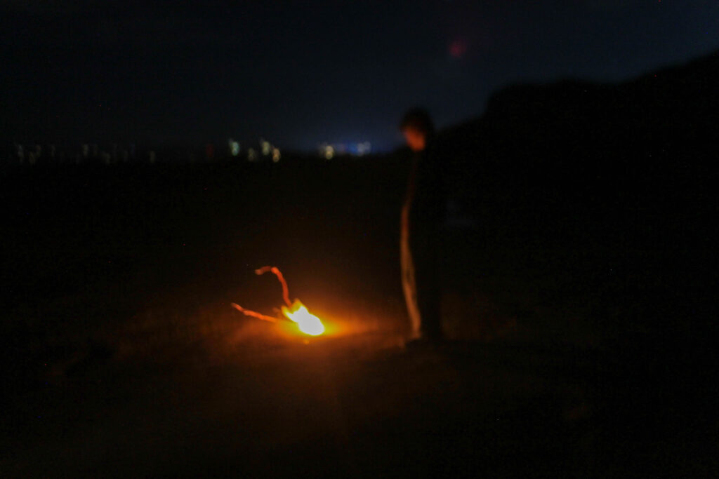
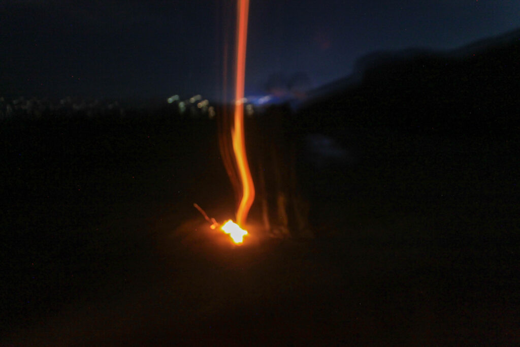
Photoshoot 20 plan-
dark
fire
end
Outcome-
Lightroom edits-
Favorites-
results-
I think that this photoshoot is different to my other ones due to it being in the pitch black dark which makes it unique.
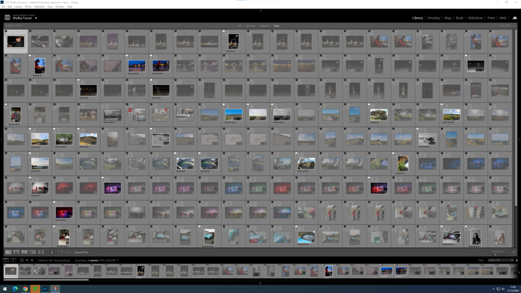
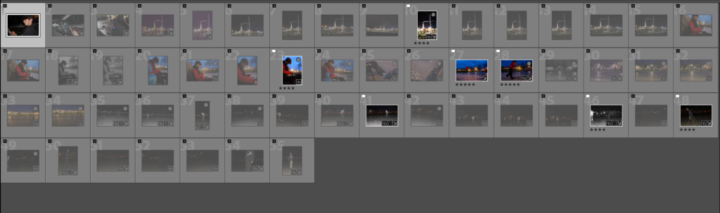
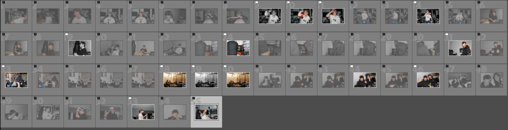
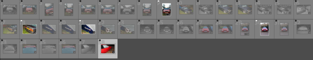
Lightroom categorizing-
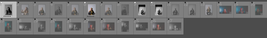
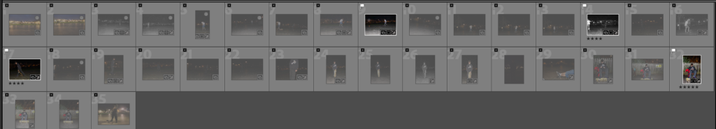
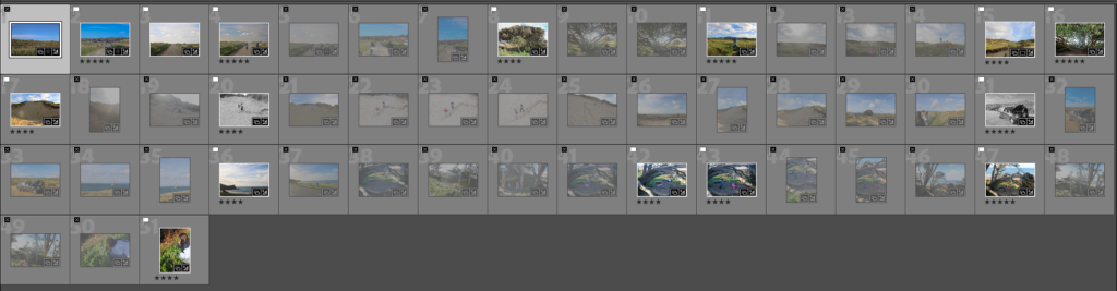
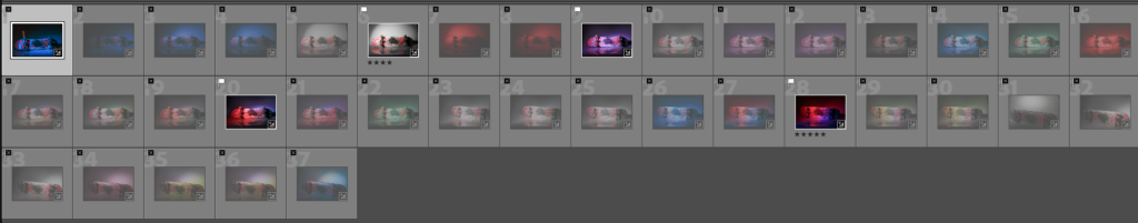
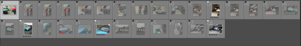
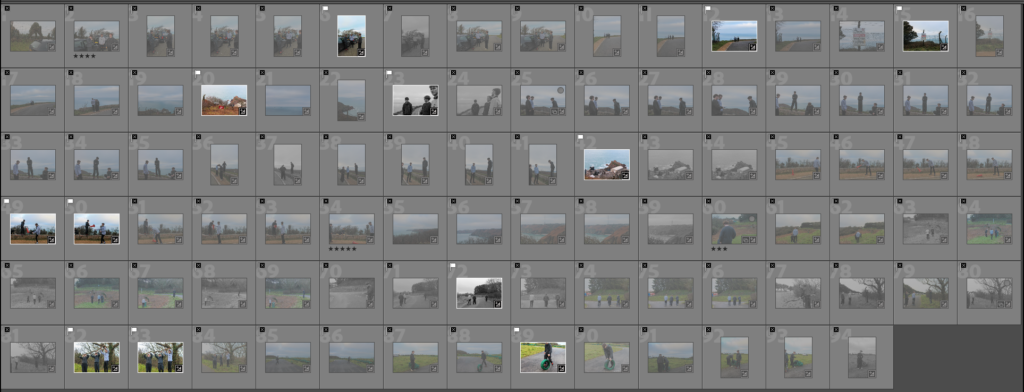
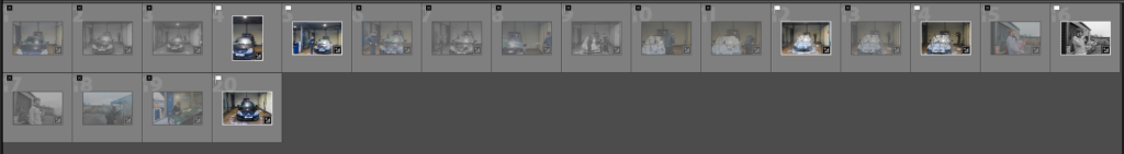
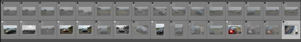
I have flagged my images, adding a plain flag for ones that I like and a blacked out flag for images I dont. I also starred my images, four stars for ones that I think I could use but need some editing and five for images that I will definitely use.
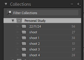
I also created a personal study collection, where I have put all of my images into different folders.


