All posts by Saskia

Filters

Author:
Category:

Tools Photoshoot

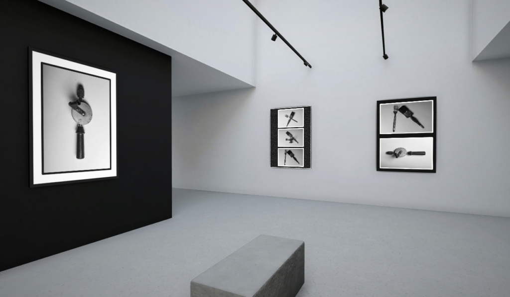
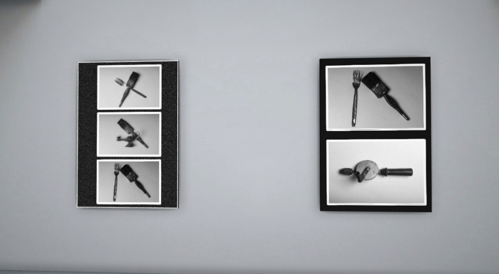
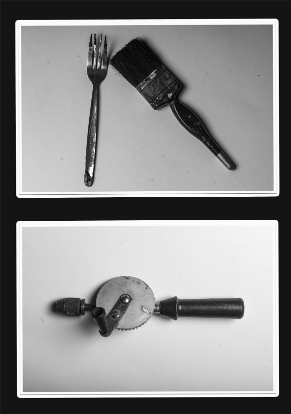
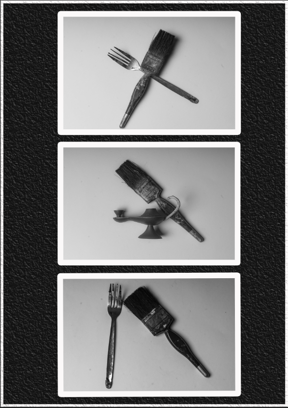
In response to the Walker Evans and Darren Harvey-Regan research, I have taken a range of different photos of objects and narrowed them down to my best seven images that I have edited and developed in lightroom.

I have selected the spot removal tool to get rid of the visible dust spots on my best image, that have been caused by the camera lens.

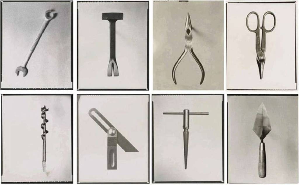
Below are examples of Walker Evans’ work, I have used them to get an idea and compare my work with his to try and make mine match the style of his.

Annotations

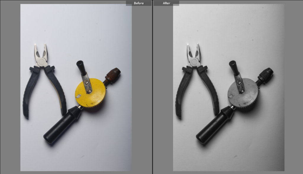
I have edited my final images by using a black and white pre-set filter and then adjusting the strength of the shadows and highlights, textures and exposure.

I have used a low sensitivity in my images so that they ended up looking sharp and not grainy. I’ve used a range of tone and texture in my images to try and capture the style of Walker Evans.

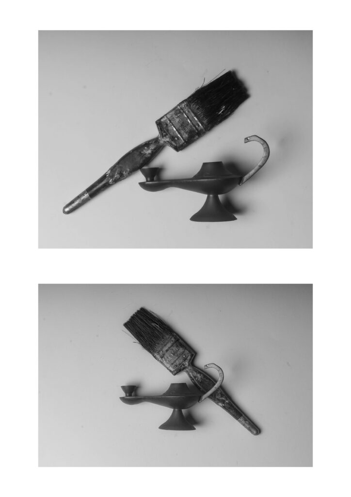
I experimented with the layout of my objects with the aim of trying to make them look 3D by placing an object on top of the other as well as positioning them in different ways. I had kept a white background to try and contrast with the darker objects to try and make them stand out more.

I have cropped the images so that the objects stayed in the middle of the image and are the main focus point. I have also left some shadow in the background to try and keep depth in the images too.

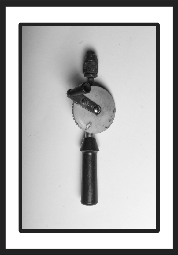
Best Image

I have chosen this as my best image because it looks the most appealing and accurate to Walker Evans’ style.

I have kept the layout simple like Evans’ own images and adjusted the tone to make it darker and tried to keep the highlights bright but still a bit muted.

I experimented with the contrast of the background and the tool itself to try making the object stand out more. I’ve also confined the background to keep the attention on the object.

I’ve also kept the shadows in the background to try and mimic the old or worn affect that Evans’ has in his own images, I’ve also done this to try and keep texture in the background.

Walker Evans and Darren Harvey-Regan Research and Comparison

Walker Evans

Walker Evans was an American photographer who was known for his for his black and white images which documented the impact of the Great Depression.

He had aimed to capture the quotidian beauty and diaristic events of daily life.

What makes his style unique is that he took pictures of his selected subjects in all sorts of angles and aimed to capture his images in the moment.

He had used a shortened exposure time in most of his images which allowed him to capture movements in time, as well as making the images sharp.

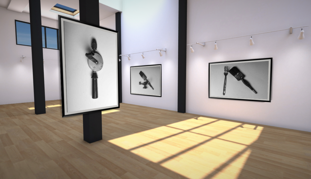
Below are examples of his work:

These images come from a portfolio created by Evans called “Beauties of the Common Tool” which was a commission by Fortune Magazine, that was originally published in 1955.

Darren Harvey-Regan

Darren Harvey-Regan is a graduate of the Royal College of Art in London.

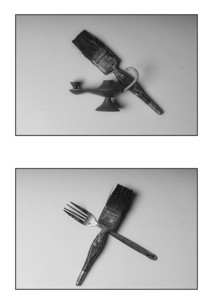
He is heavily inspired by Walker Evans, who inspired him to construct a montage of Evans’ images, he had planned to make new forms by sourcing matching tools ,that walker Evans has used for his images, cutting them in half and re-joining multiple different halves together which resulted in the objects being photographed to create his final work.

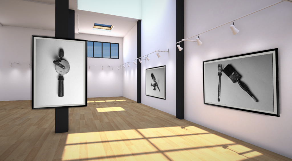
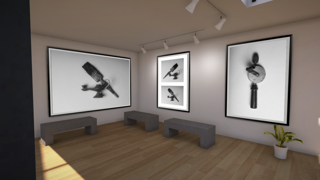
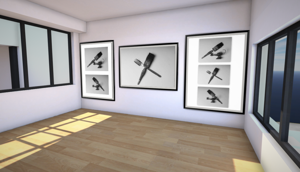
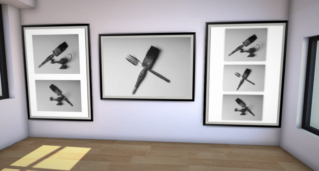
Below are a few of Darren Harvey-Regan’s final images from his montage:

Comparison

Compared to Walker Evans, Darren Harvey-Regan has a more modernistic and abstract style and mainly focuses on still life, while Darren Harvey focused on the American working class people during The Great Depression as well as buildings and streets during that time.

Both photographers paid careful attention to choice of objects, composition, lighting and exposure values. They use/used a lot of texture in their work, as well as a huge range of shadows and tone, However, Walker Evans’ photos are much grainier and soft-looking than Darren Harvey-Regan’s work, which is much more clear and sharp.

Both photographers also use a large range of grey, white and occasionally black. They both also use artificial and natural lighting.

Walker Evans took his photos because of a commission from fortune magazine, he wanted to show the beauty of common tools through his photography. He wanted people to focus on the tools shapes and not just their uses; “Aside from their functions…each of these tools lures the eye to follow it’s curves and angles…” -Walker Evans

Darren Harvey-Regan also focuses on the shapes of tools and like in his montage he experimented with cutting two objects and placing one of their halves together to create a new tool using their different shapes and matching them up. He is inspired by object photography as well as the meaning behind tools themselves; “I think photographing materials is a way to consider the means of creating meaning, and it’s a tactile process with which I feel involved”. 

First Edits In LightRoom

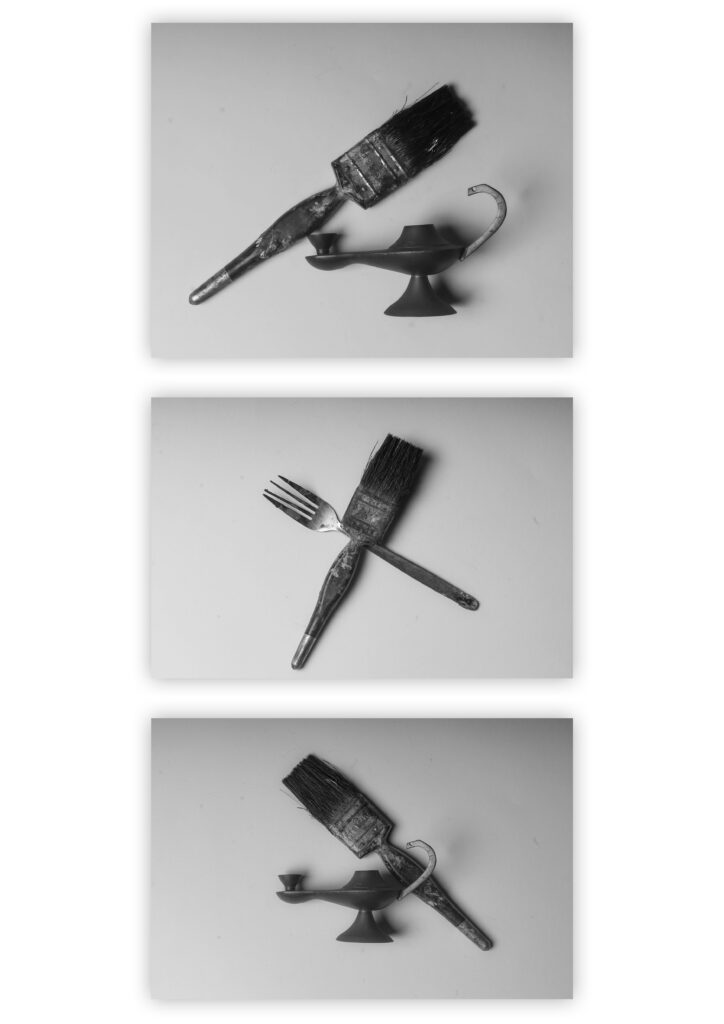
In this image above I have picked out my best three images from my photoshoot and edited them.

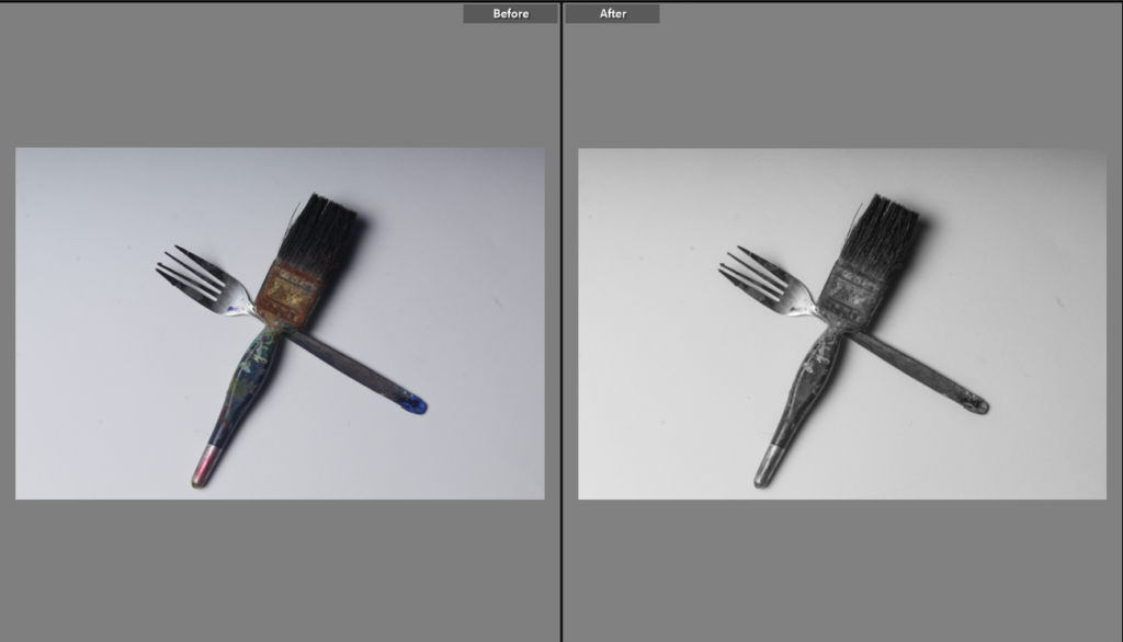
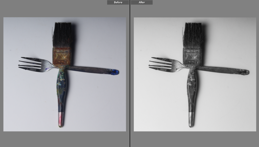
Below are the before and afters of my best images from when they were edited in lightroom.

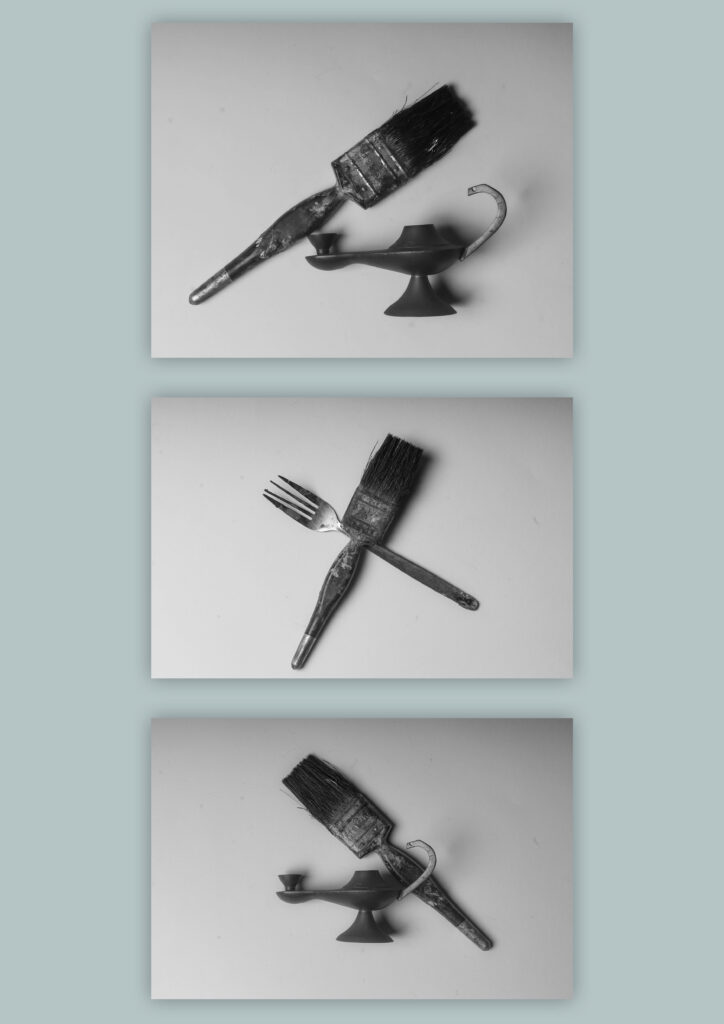
I’ve attempted to experiment with different temperatures to see which one would suit the images best, I preferably like the warmer toned image in the middle instead of the colder toned one as it is much nicer to look at. My worst image is probably the last one because of the blue card background and how it has been positioned.

Best Image

I have used a range of different artificial lights, this includes a tungsten light that was placed under the objects to give a warm glowing affect to the objects.

I thought carefully about the arrangement of my objects so that the image turned out looking interesting. I’ve placed some objects behind and in front of each other to try and create depth, I have also placed a block behind the objects to seclude the objects in that one spot and make them the main focus point.

I have experimented with the different tones in lightroom to add more warmth to the image and give it a more nostalgic, soft feeling, I had also done this to make the image more appealing to the eyes.

Still Life Photos/Photoshoot

These are my best photos from the photoshoot.

I experimented with the background during my final photos of the shoot to try and add colour to the images instead of them being just in black and white, however I could have positioned the blue card in a better way so that the whole background is blue or more in the frame of the image.

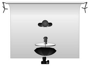
Studio Setup + Camera Simulator Screenshots and Understanding

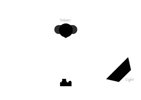
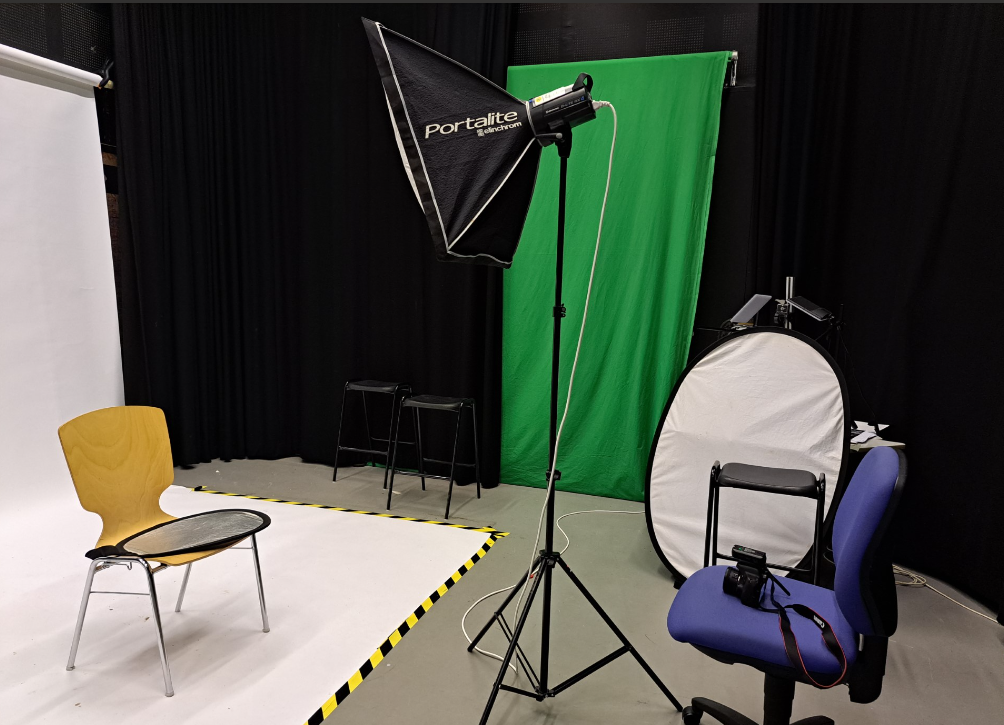
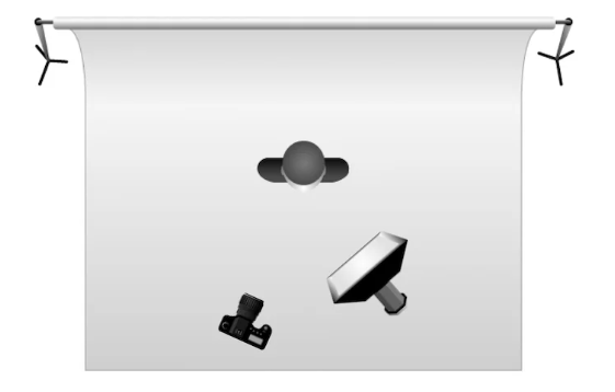
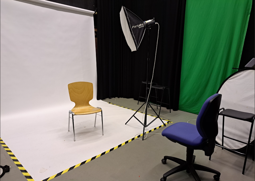
Studio Setup

Canon Camera Simulator Screenshots

The Aperture, IOS and shutter speed are well balanced, and there is an invisible motion created by the slow shutter speed on the propeller of the toy plane. 

Because the aperture and IOS were unbalanced the image turned out to be very overexposed, this was caused by a slow shutter speed which allowed too much light exposure.

Because of the shutter speed being quite fast, it captures the movement of the propeller very quickly which causes the propeller to look like it’s not moving at all. There is also a very shallow depth of field making further away objects blurry. The main subject in the image is the toy plane that is why it is the sharpest looking object in the image since the camera is mainly focusing there.

This image has an empty alt attribute; its file name is image-582.png

Because the ISO is unbalanced, the image is underexposed which makes it harder to see the content in the image. 

Formalism + Formal Analysis Poster

Definition: Formalism means the way a piece of art or something has been made and the works visual aspects.

The Formal Elements

Line

Definition: A straight or curved geometric element that is generated by a moving point and that has extension only along the path of the point.

Lines are either straight, curved, or a combination of the two. Lines can be solid, dashed or interrupted, implied, or psychological. They can be vertical, horizontal, or somewhere in-between. They can be mostly seen in man-made but can also be seen in nature too.

Here is an example of a photograph that includes lines:

Shape

Shape has many definitions: The visible makeup characteristic of a particular item or kind of item, spatial form or contour, or a standard or universally recognized spatial form. Shapes are two-dimensional. They can be measured by overall height and width. Shapes can be the outline of an object—familiar or unfamiliar.

There are two types of shapes, Geometric and organic.

Here is an example of a photograph that includes geometric shapes:

Here is an example of a photograph that includes organic shapes:

Form

Definition: The shape and structure of something as distinguished from its material.

Form has an overall height, width, and depth.

Just like with shapes, there is also two types of form, Organic and Geometric.

Here is an example of a photograph that includes form:

The shadows in this image shows us more of what the actual form of the plane wing looks like.

Texture

Definition: The visual or tactile surface characteristics and appearance of something.

In a photograph, smooth objects might have reflections or specular highlights. Rough objects might have aggressive areas of light and shadow without reflections. Different patterns could indicate/show texture. Different angles of lighting can also show texture and even hide it and whether the camera is quite far or close to their subjects, if the camera is also out of focus.

Here is an example of a photograph that shows texture:

Colour

Definitions: A phenomenon of light (such as red, brown, pink, or gray) or visual perception that enables one to differentiate otherwise identical objects or the aspect of the appearance of objects and light sources that may be described in terms of hue, lightness, and saturation for objects and hue, brightness, and saturation for light.

Light itself has no actual colour. But, sending light through a prism or a drop of water and we can see that it is comprised of a literal rainbow of colours.

Different colours may represent different things, for example red may symbolise danger, and yellow may symbolise happyness.
Colour has three properties:

Hue– It is simply the description of the colour (e.g., blue, red, yellow, etc.).

Value– It is the relative brightness or darkness of a colour.

Saturation– It is the intensity or purity of a colour. The purest colour is a hue with no white, black, or gray added to it.

Here is an example of a photograph that shows bright, neon colours:

Size

Definition: A physical magnitude, extent, or bulk : relative or proportionate dimensions.
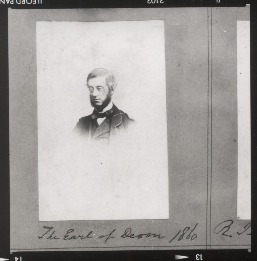
Size in a photograph is relative and can be an illusion. There can be a variety of sizes, however the most common names for these sizes are: Large, medium, or small.
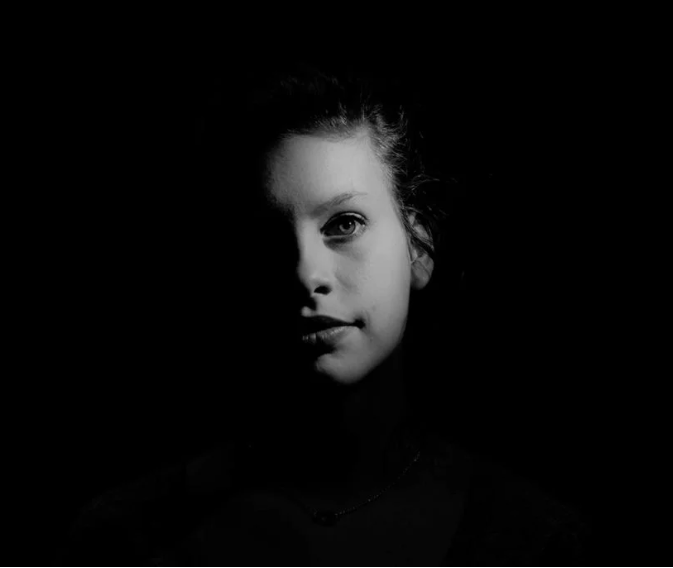
In the real world, the eye and brain automatically adjust the retinal image in what is known as size constancy. This means the perception of an object as having a fixed size, despite the change in the size of the visual angle that accompanies changes in distance. 

Here is an example of a photograph that shows size:

This image shows the size difference between the persona and the ship.

Getting close to an object can emphasize the size/it can make the objects/subjects/things in the image look much bigger or much smaller than they actually are.

Below is an example of this effect:

Overlapping objects/subjects/things is another way to render a scene virtually in three dimensions, and overlap can also give hints to size.

Depth

Definition: It is the direct linear (using converging lines to show the depth in a frame) measurement from front to back.

Depth is rendered on how well the objects in the frame are dependent, composition, and perspective.

Most images have a foreground, middle ground, and background. The stronger the delineation (Any kind of accurate or vivid portrayal of something else) between successive “grounds,” the stronger the sense of depth in your image.

Depending on the quality of the surrounding air or atmosphere, distant objects in a photograph will have less clarity and contrast than objects in the foreground. 

Texture can also show depth within an image by using shadows and light.

Here is an example of a photograph that shows depth:

All of these formal elements are used to make any pieces of art, they are often being used together and are composed/organised in certain ways, which will determine what the final piece would look like.

Visual Elements

There are seven visual elements, these are:

Line– It is a point that continues; it implies motion.

Shape– It is the two-dimensional appearance of objects as your camera captures them.

Form– It is when shape takes on three dimensions. 

Texture– It is the visual quality of the surface of an object, revealed through variances in shape, tone and colour depth. 
Colour– It is a component of light that is separated when it is reflected off of an object. 

Size- It is the term given to describe the height and width of an image in pixels. 

Depth– It is the distance in an image where objects appear “acceptably in focus” or have a level of “acceptable sharpness”.

Formal Analysis Poster

Still Life History and Theory

What Is still life? 

Still life is inanimate objects (objects that cannot move). 

Examples of still life paintings and photography: 

Provide a chronological timeline of still life photography. 

Still life has been well known ever since around 1504 when it was first invented by an Italian Early Renaissance painter Jacopo de Barbari, however, it did not officially become it’s own genre until the 17th century this was known as the “golden age” of still life painting. Later on Still life had then been adopted by photographers during the 19th century.

The first still life photograph was taken by a man named Jacques-Louis-Mandé Daguerre.

Analysis of an image using the matrix

Technical: In this image you can see that the photographer has used artificial lighting. They could have used a long aperture as the image is quite sharp and there is a long depth of field, the photo is also equally balanced. There is an equal balance of warm and cool colours and a fair amount of contrast between the different objects and butterflies.

Visual: The image is very bright and has vibrant colours, as well as a range of different shapes and organic forms. All the objects are 3D and not flat, there is also little shadow seen. The objects have been spread out most likely to use up most of the space or to keep the butterflies apart from each other. The objects have also been arranged so that some are more forward and some are more pushed back which gives the image more depth.

Krista van der Niet

What is Vanitas? 

Vanitas is a symbolic work of art that shows the transience of life, the futility of pleasure, and the certainty of death, often contrasting symbols of wealth and symbols of ephemerality and death. It also includes other symbols such as musical instruments, wine, and books. 

What is Memento Mori? 

Memento Mori is artwork that reminds the viewer of the shortness and fragility of life (inevitability), This can be portrayed using symbols such as skulls and extinguished candles, this could also be shown through an hour glass like the image on the right.

What kind of metaphors and symbols are used in still life and why? 

Symbols are used to remind viewers of death, the fragility of human life, and the brevity of our existence through objects, as well as presenting a moral message through them. They can also be used to add meaning to photographs.

Below are some symbols used in photography and the meaning behind them:

Fruit: Varying Symbolism In Still Life Paintings

Skulls: The Certainty Of Mortality

Candles: The Passing Of Time

Flowers: Symbols Of Life And Growth

Seashells: Birth, Purity, And Fertility

Mirrors: The Soul In Reflection

Insects: Transformation And Decay

Photography Research/Quiz Answers

What is etymology?

Etymology is writing with light coming from the Greek roots φωτός (phōtós) and γραφή (graphé).  

What was the first photograph made in camera?

1826 (Joseph Nicéphore Niépce). 

When did the first photograph of a human appear? 

1838 (Louis-Jacques-Mandé Daguerre). 

Who made the first ‘selfie’?

Robert Cornelius (1839). 

When did the first colour photograph appear? 

1861 (James Clerk Maxwell).

What do we mean by the word genre? 

A style or category of art.

What do we mean by the genre of still-life? 

An image that shows inanimate objects from the natural or man-made world. 

What was the main purpose of the Pictorialist movement?

To affirm photography as an art form.

How do we describe the term documentary photography? 

Provide in-depth information about a subject over a long period of time. 

What is exposure in photography? 

The amount of light that reaches your camera’s sensor. 

What controls exposure on your camera? 

Aperture, shutter speed, ISO.

What control on our camera records moving objects? 

The Shutter and it’s speed.

How do we explain depth of field? 

How much of your image is in focus.

What factors affect Depth of Field?

Lens aperture, distance from camera to subject, and lens focal length. 

What is composition in photography? 

The arrangement of visual elements within the frame. 

What is your understanding of aesthetics in art? 

Concerned with the nature of beauty and taste.

What are contextual studies in photography?

To provide historical, cultural and theoretical understanding of images. 

How many images are captured on average every day worldwide? 

4.7 billion images on average.

Which portrait is the most reproduced in the world? 

The Queen (Elizabeth II).