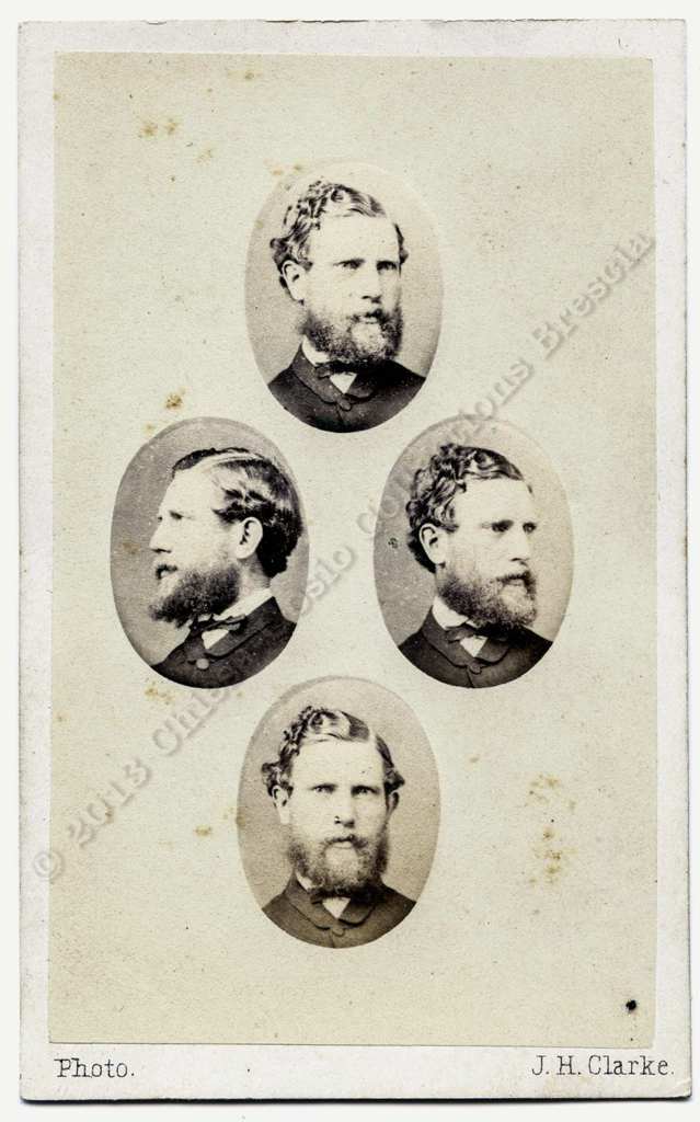
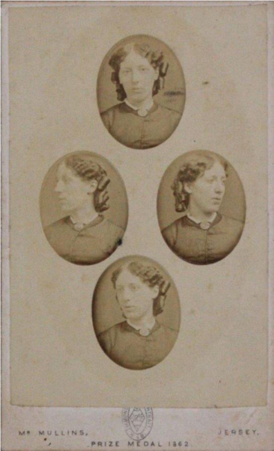
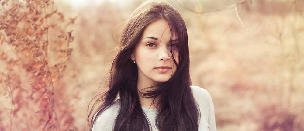
All posts by Rosie

Filters

Author:
Category:

CHIAROSCURO

Chiaroscuro was a compositional device developed by Ugo da Carpi, however high renaissance artists Leonardo da Vinci was found out to have also helped to ‘pioneer’ the creation of Chiaroscuro lighting. Chiaroscuro is a renaissance painting technique which means “light-dark” in Italian. The theory of Chiaroscuro is that it is always best achieved by the effect of light falling on the model/ subject however it must also allow the shade to give two-dimensional figures a sense of volume.

How To Do It

Through my research I have found out that the most important elements of chiaroscuro lighting are:

(Definitions obtained from google)

  •  highlights– Highlights are the lightest elements in an image, whereas shadows are the darkest areas. Dynamic range is the ratio between those vivid highlights and dark shadows, from bright white to pure black. That range is key to an image’s depth and drama.
  • halftones– Halftone is the reprographic technique that simulates continuous-tone imagery through the use of dots, varying either in size or in spacing, thus generating a gradient-like effect. “Halftone” can also be used to refer specifically to the image that is produced by this process.
  • deep shadows– Shadows are the dark areas where a light source is blocked by an object. Shadows change shape, intensity, and even colour along with the angle, direction, and temperature of light.
  • reflected lights– Reflected light is light that’s reflected off a subject. No matter what direction the light is coming from, it will be affected by what it’s bouncing off. The subject will determine which type of light will be reflected.
  • cast shadows– The difference between core shadows and cast shadows is that core shadows are the darkest part of a shadowed region on a subject, whereas cast shadows are shadows that are cast by one object onto a different object. The silhouette you see of yourself on a sunny day is a cast shadow of yourself.

Creation and Development of Chiaroscuro

Chiaroscuro lighting is known as a ‘high-contrast’ lighting technique that uses a low-key lighting setup which achieves a contrast between the model and a dark background. Chiaroscuro lighting helps to balance its high-contrast light and its shade which gives the appearance of depth, creating an enhanced or more dramatic monochromatic effect. 

Da Vinci quickly discovered that he could create depth through slow gradations of light and shadow. He then decided to use this in his paintings, this is demonstrated in the painting below. The parts of the painting in the squares are the particular areas that highlight the chiaroscuro lighting technique and how Leonardo Da Vinci used it in his paintings.

Examples of Chiaroscuro Cinematography

These images I have collected from a movie I have researched called ‘Apocalypse Now’ I chose this movie because I have seen the amazing cinematography throughout. Here are some images that represent the elements of chiaroscuro lighting in this film.

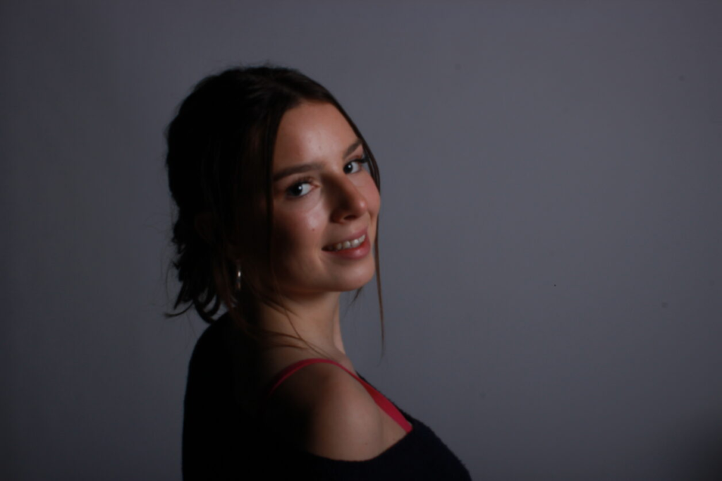
These photos are a perfect example of low-key lighting in cinema. During the ‘Willard’s scenes’ it shows the characters face is darkness apart from a small yellow back light, which lights up the image from behind with only the left half being illuminated. This element of chiaroscuro is shown by some parts of the face being shaded, some slightly exposed to light and some completely exposed to light. The creator made a challenging lighting scenario, however it has positively impacted the images as they create a sense of mystery melancholy and sinister impression . This has inspired me with my photography using the chiaroscuro technique.

My Chiaroscuro Photography

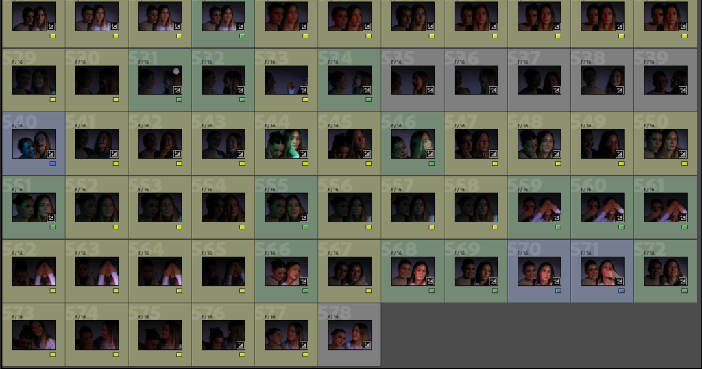
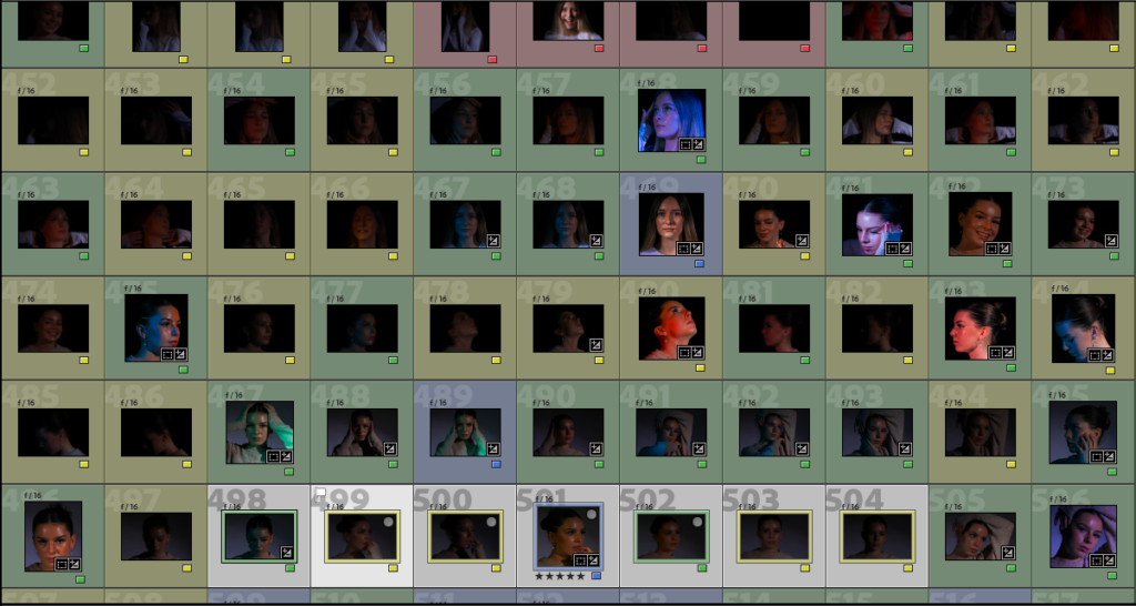
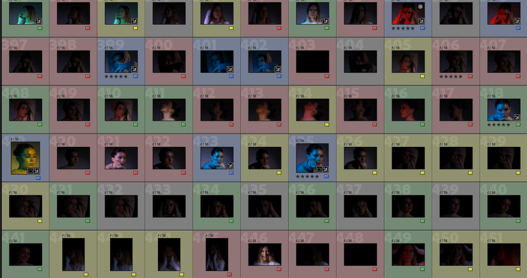
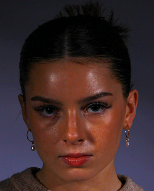
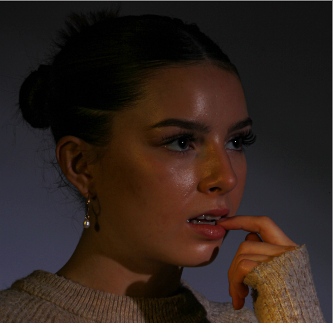
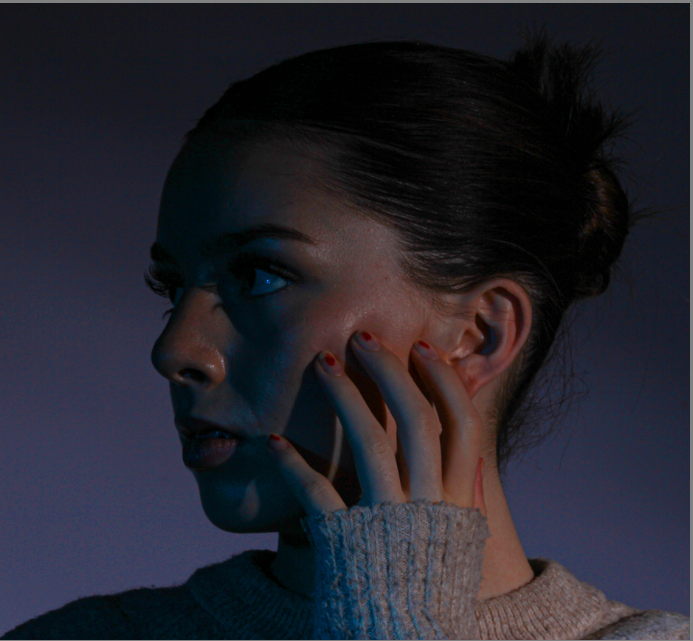
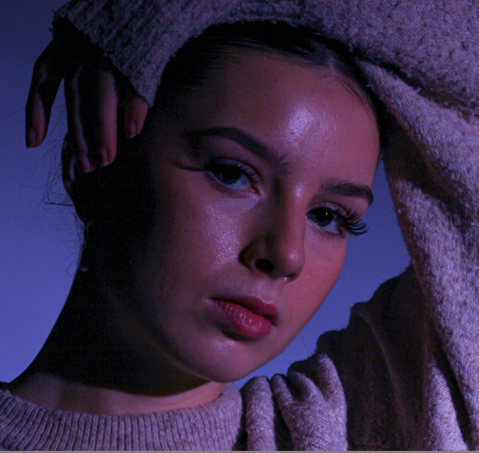
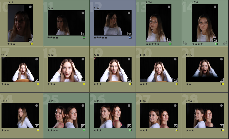
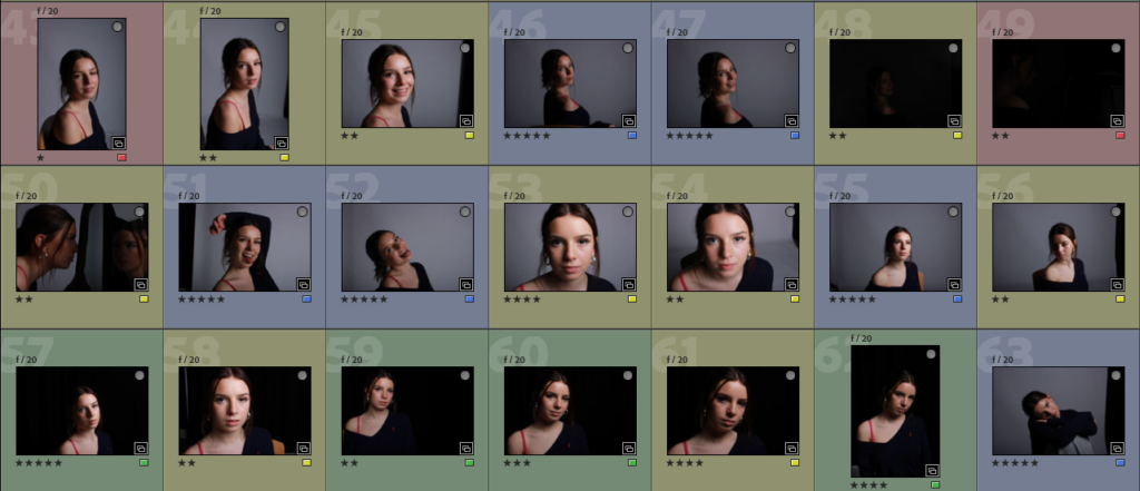
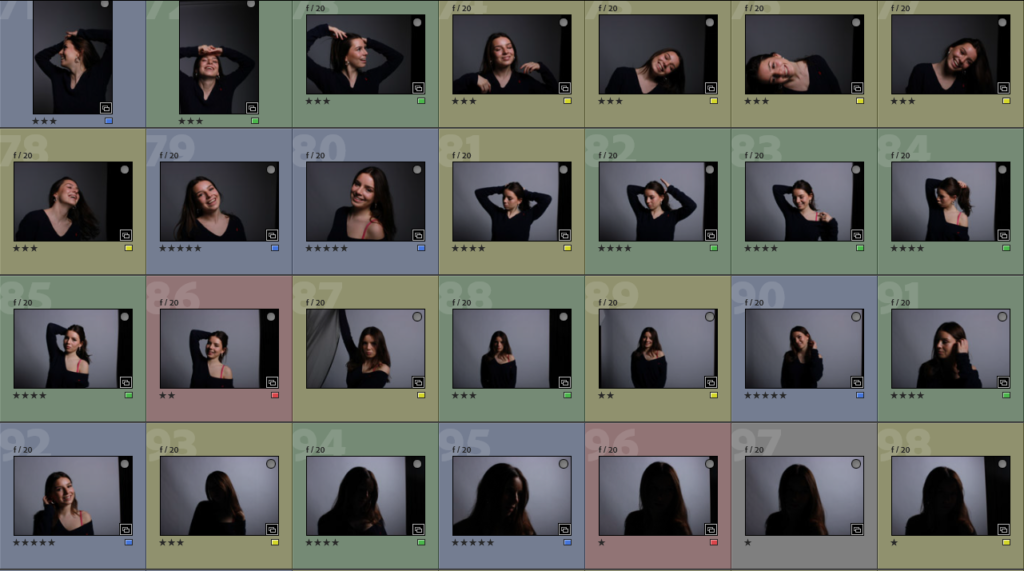
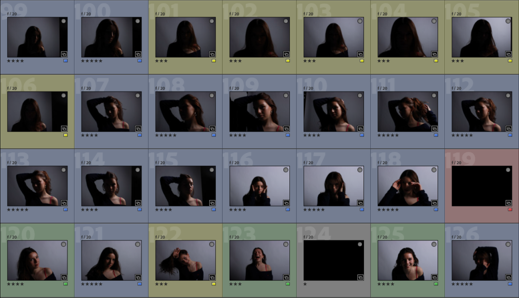
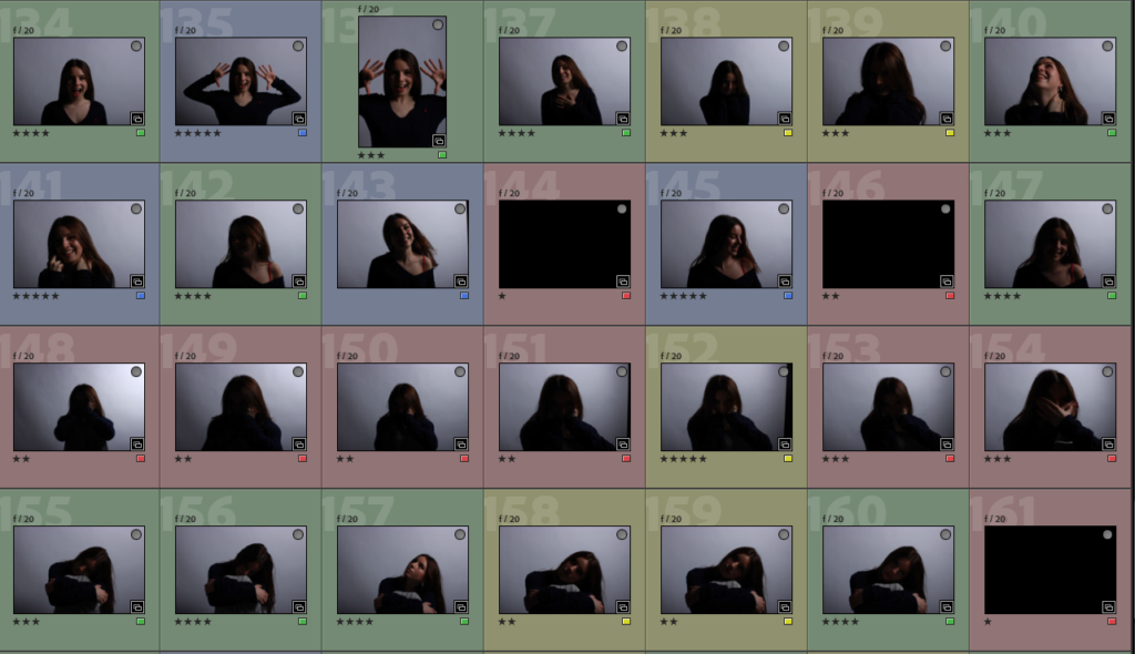
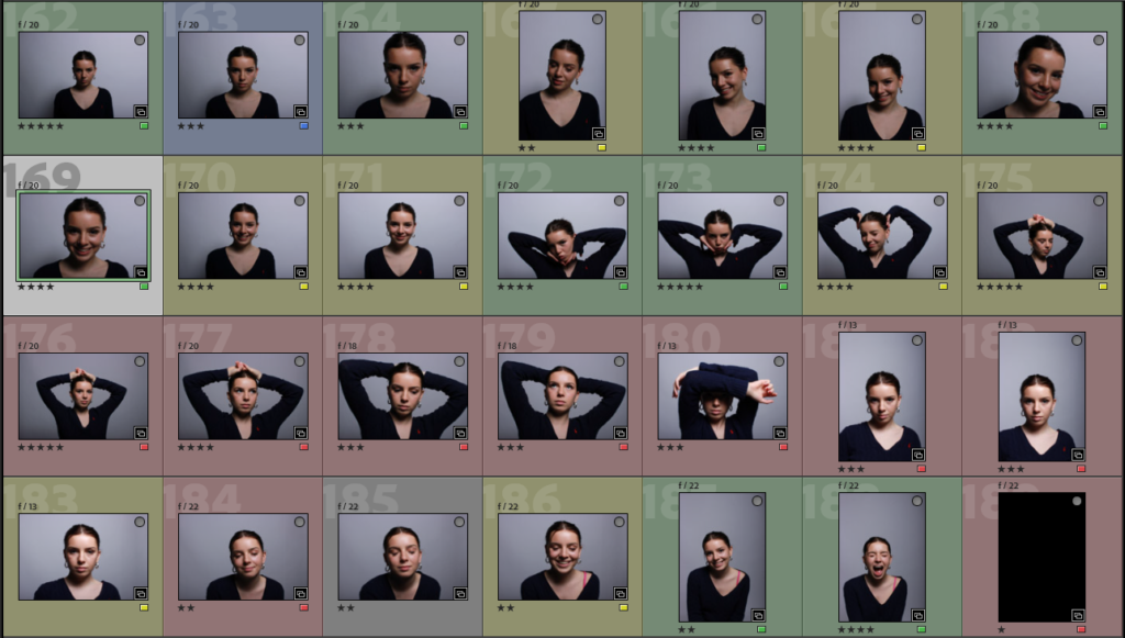
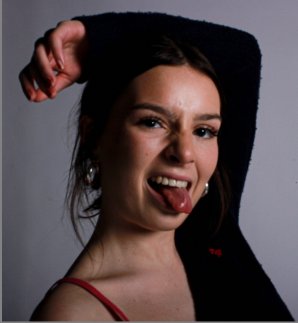
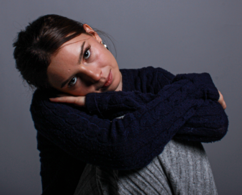
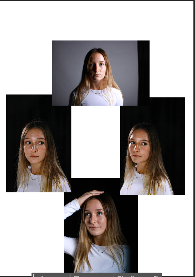
This is a virtual gallery of all the photos I have taken during my photoshoots. I labelled these photos with multiple different colours. I labelled my Rembrandt lighting photos red, my chiaroscuro lighting images green and my butterfly lighting photos in blue. I also then labelled some photos in yellow, this was for photos that include none or multiple of these lighting techniques. This is an easy and simple way to identify images and separate them into different categories. I then categorized them further with stars. This helps me to further categorise my photos and easily pick my highest quality photos. I categorised these by having my best images at 5 stars ‘*****’ and my least favourite, low quality images at 1 star ‘*’.

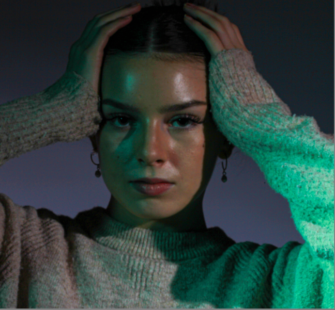
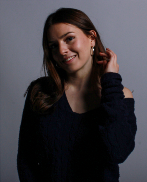
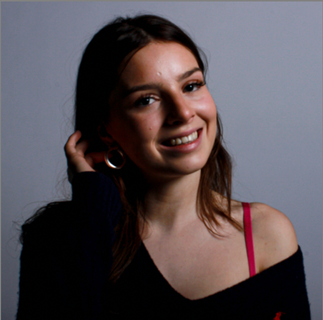
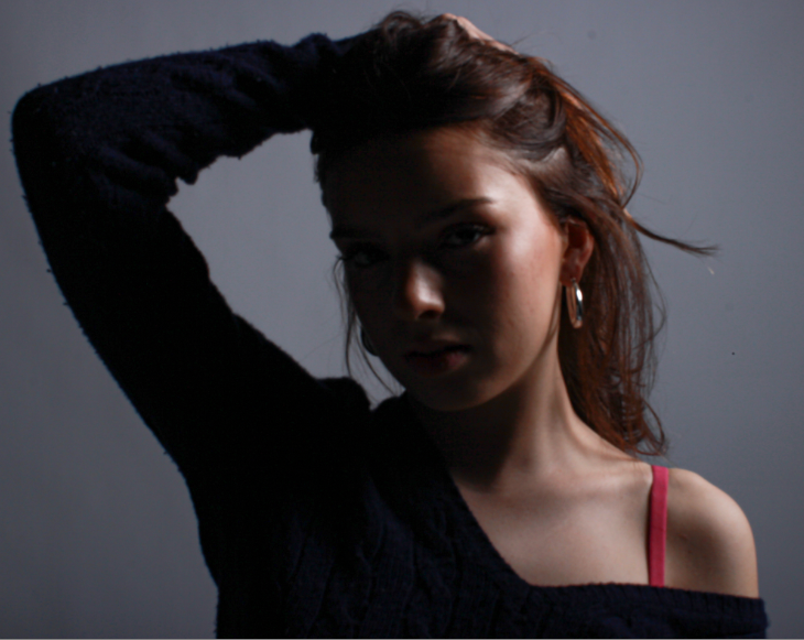
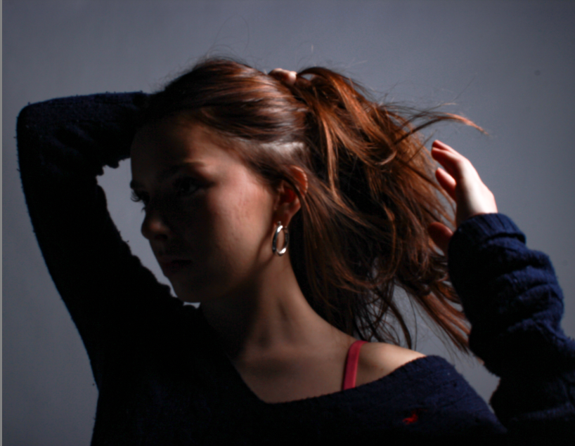
I think this photo is a perfect powerful stance for my model. It is a beautiful 1/4 body shot which demonstrates power through her pose and the chiaroscuro lighting.

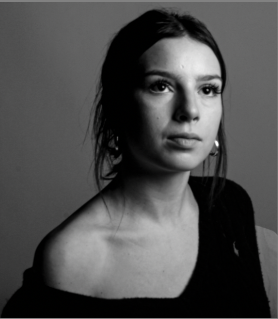
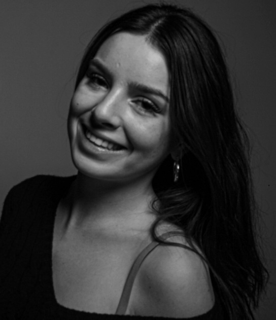
I then took these chiaroscuro inspired images and edited them into black and white, this black and white effect has added an extra element of wonder and dramatic impressions. I think the lack of colour has brought out more contrast and has given them more cohesion to the overall look of my images.

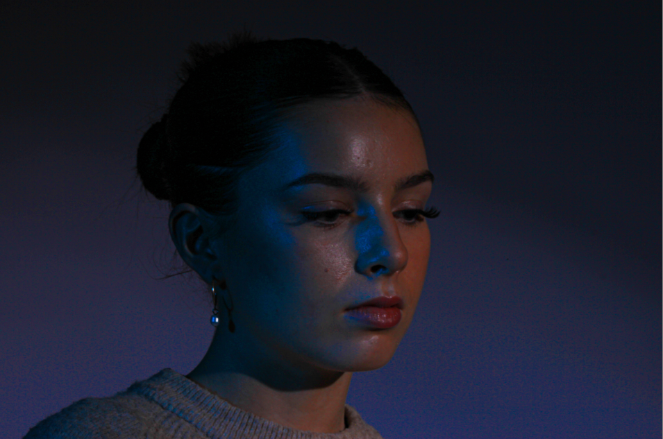
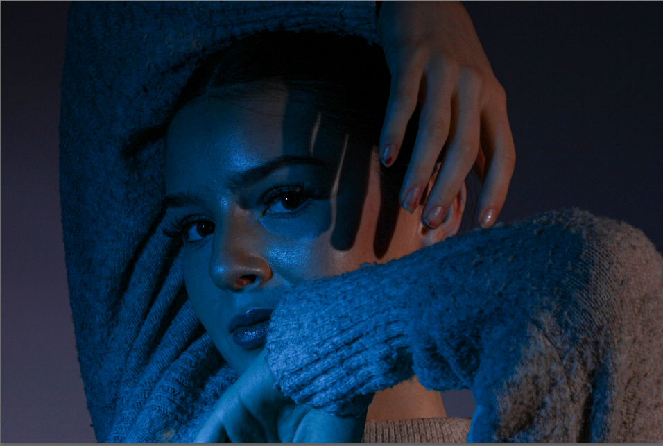
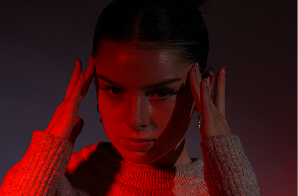
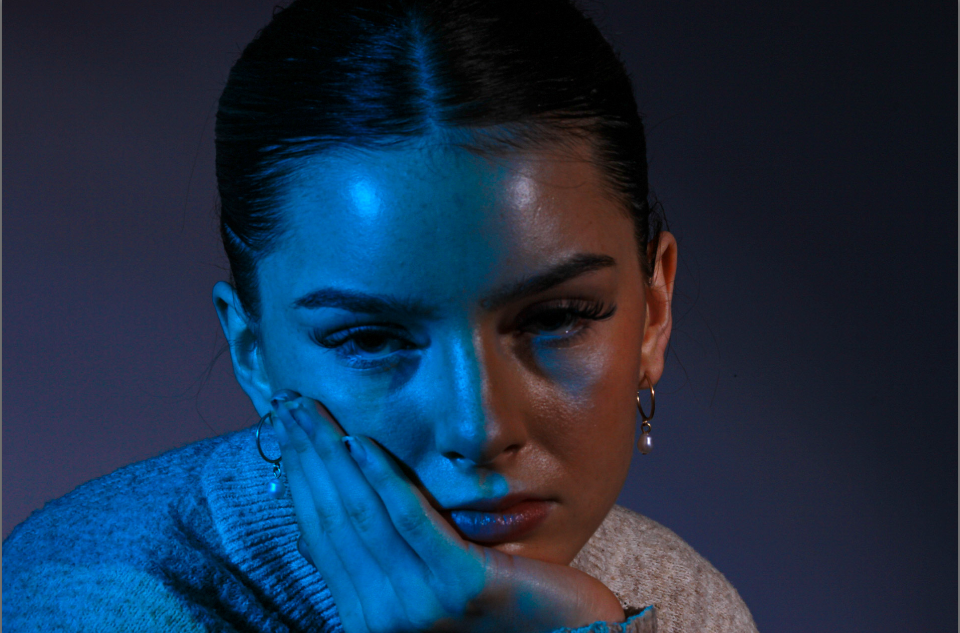
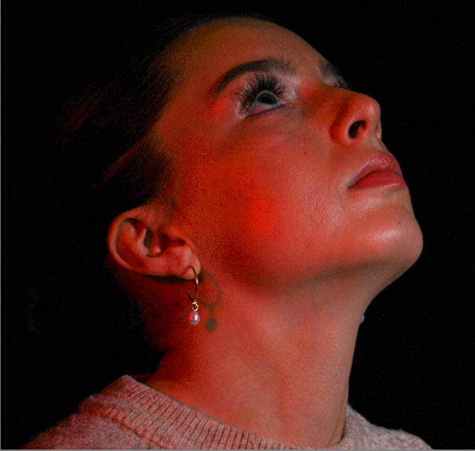
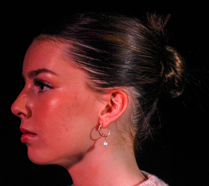
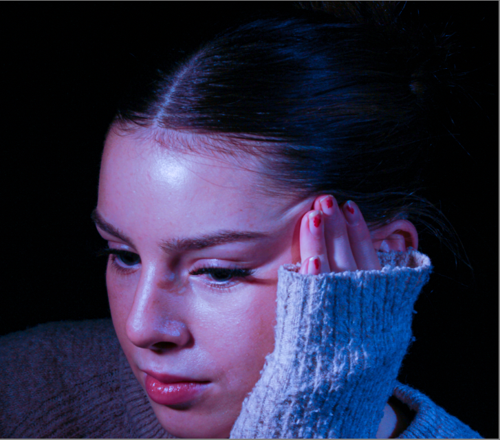
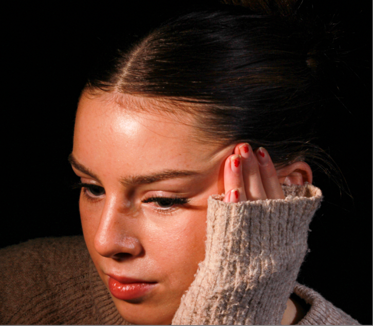
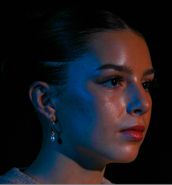
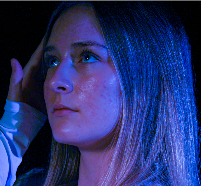
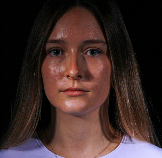
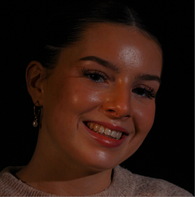
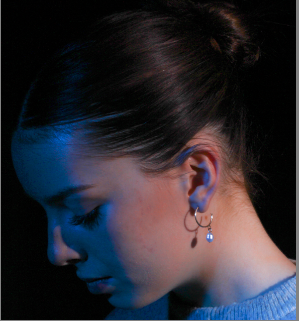
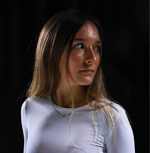
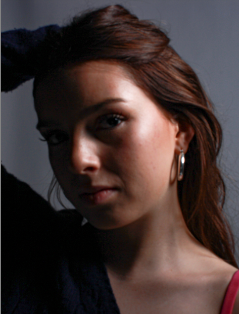
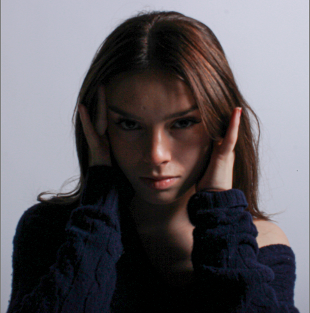
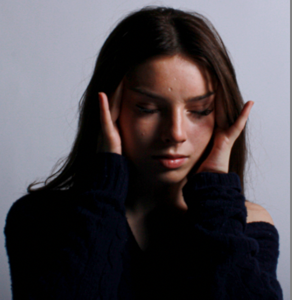
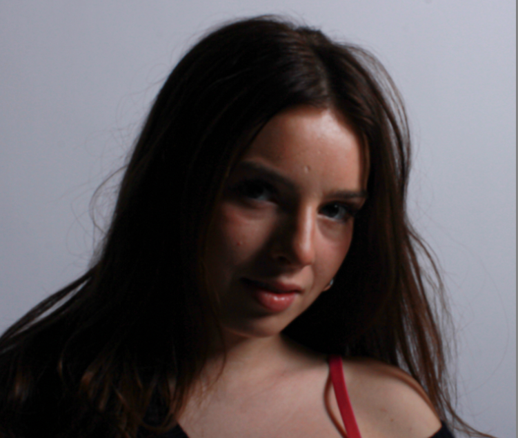
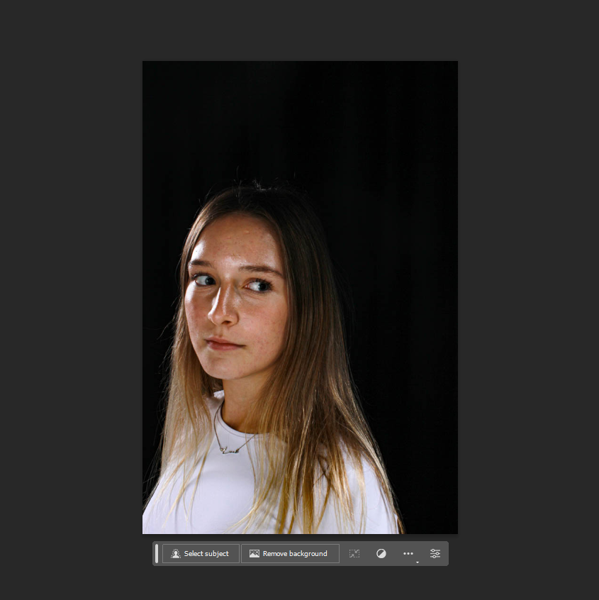
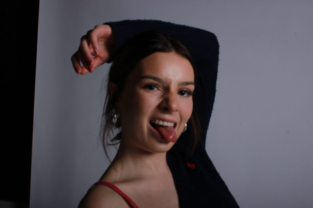
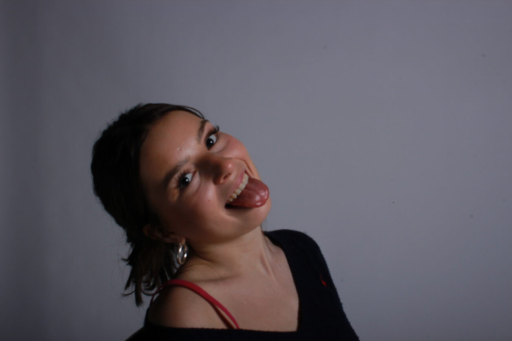
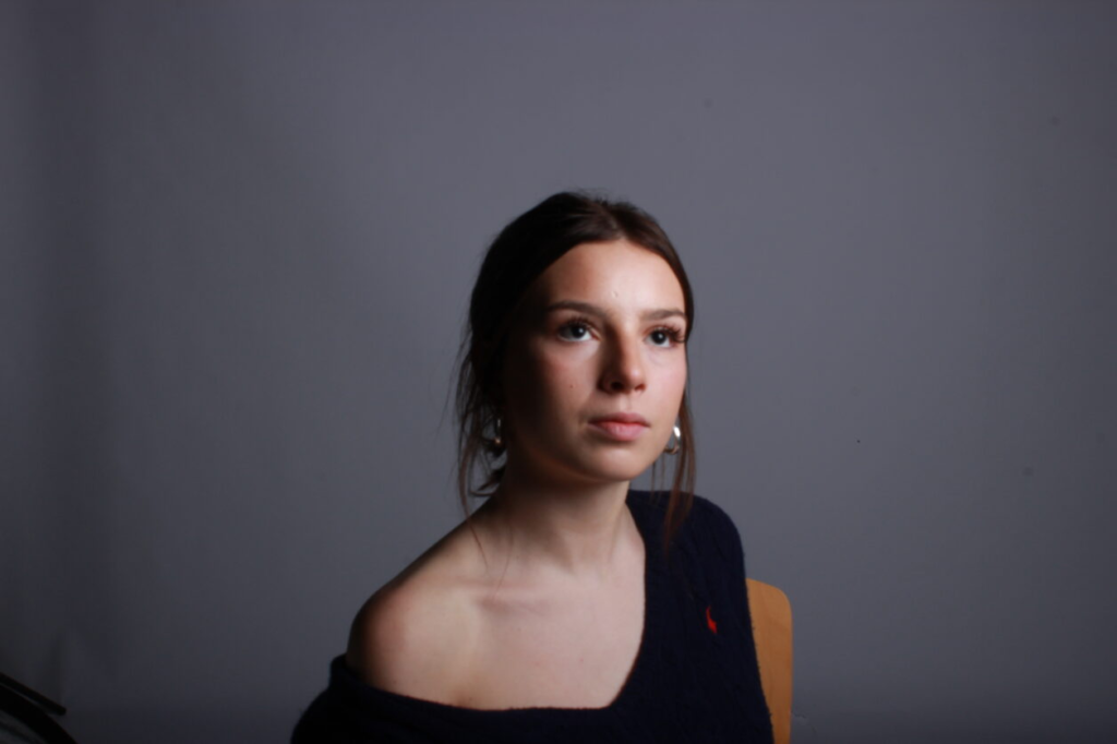
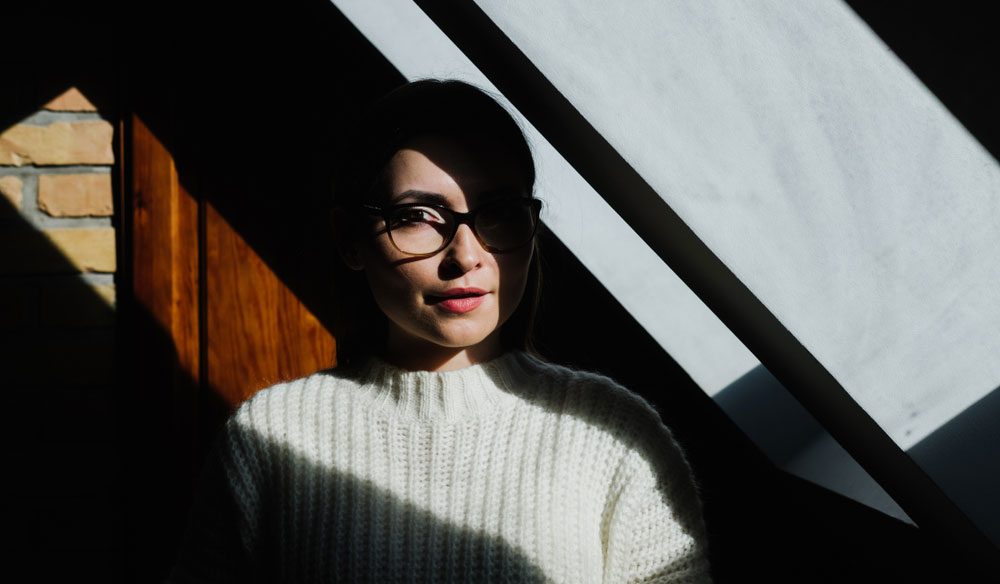
These photos I think perfectly demonstrate chiaroscuro lighting, the way some parts of her face are shaded and some are exposed shows this interesting and mysterious impression about my photos. I think that the lighting technique of chiaroscuro is definitely a great method in accentuating form throughout my photography and editing. Chiaroscuro lighting also will help draw viewers’ eyes to things they might not focus on otherwise in my photos.

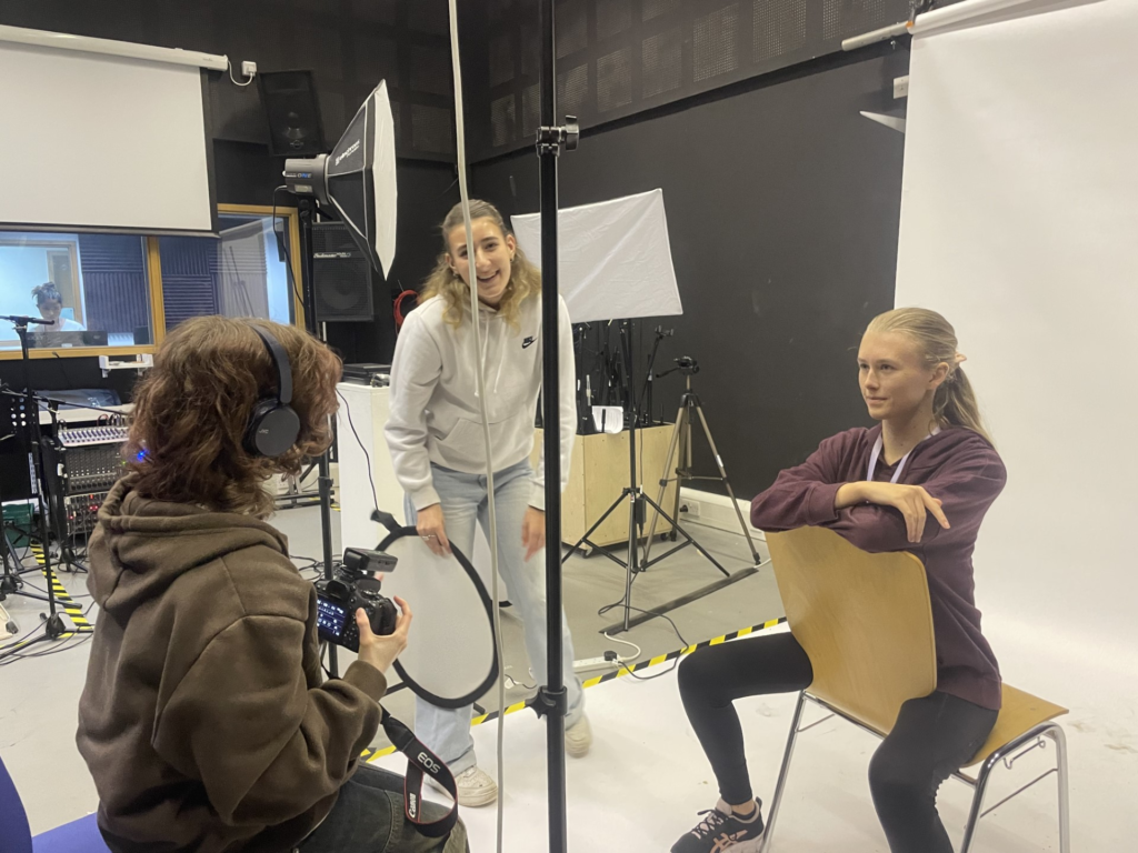
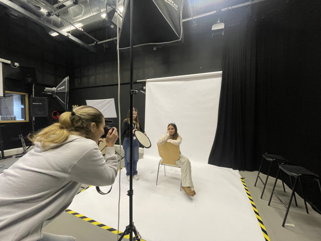
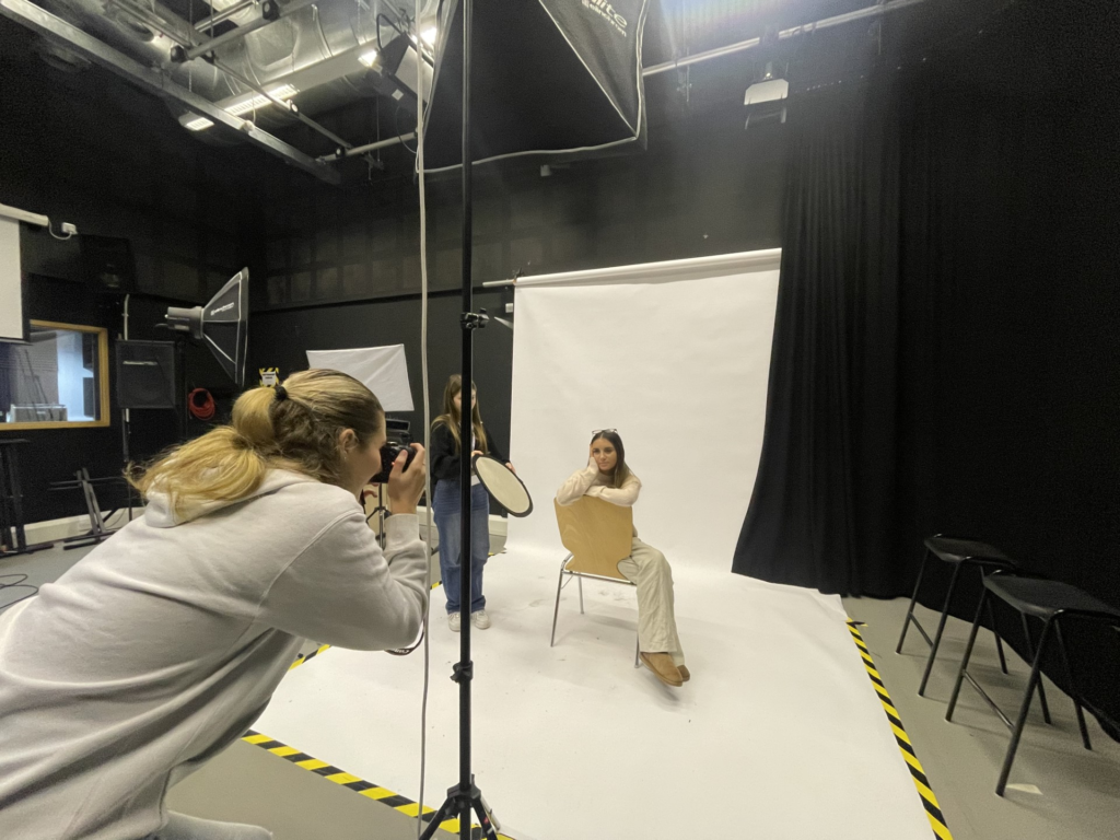
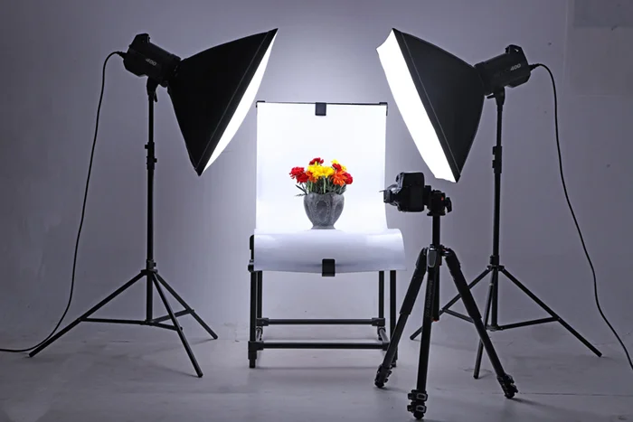
I think in order to take my work to the next level when it comes to Chiaroscuro, Rembrandt and Butterfly, I should use a reflector, this includes another person helping and holding a reflector that looks like this..

These photography tools called ‘reflectors’ help to redirect light onto my model, I must remember that it does not It doesn’t create any light but it will move and redirect light that is created by a flash head create fill light and lessen shadows.

Butterfly Lighting

Butterfly lighting is a lighting technique used by photographers where a light source such as a flash head is placed right above and ever so slightly in front ‘an exact 45-degree angle’ of the models face. This creates a small butterfly-shape made from a shadow under the nose. This technique is often used to make the model look thinner and their eyes look larger.
Creation and Development of Butterfly Lighting

One of the most famous photographers to use butterfly lighting was George Hurrell. Hurrel used multiple sources such as precision lighting, spotlights, shadows, and hand-retouching. He made ‘romantic portraits’ these portraits then became his trademark style, this style of photographing became extremely famous and glamourous in the celebrity and movie industry. This look then became known as “Hurrell style.” Here are some examples of ‘Hurrel style’ butterfly lighting images.

My Attempt at Butterfly Lighting

Whilst editing this 1/4 shot photo I focused on capturing butterfly lighting. In this setup, my light is placed directly in front of my model , right behind my camera. It was around one foot above my model’s face, this creates a slight shadow under her nose. This shadow is meant to represent a butterfly shape, to edit these photos I mainly focused on decreasing the highlights, increasing the texture and increasing the shadows.
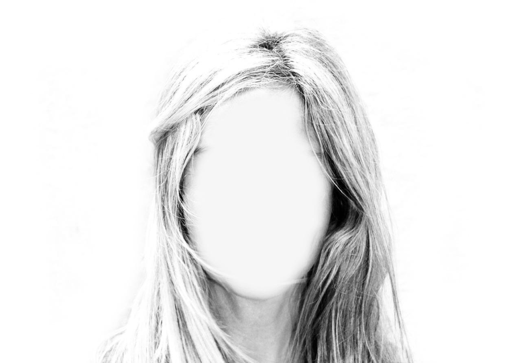
EXAMPLE:

Above is a perfect example of butterfly lighting, this shadow under the lose creates a butterfly- like shape. Here are my attempts of butterfly lighting in my first photoshoot.

These are the camera settings I used for these photos, I focused on having a reasonable shutter speed, a fast shutter speed creates a shorter exposure and a slow shutter speed gives the me a longer exposure. I also made sure my aperture was not too high, if it was, too much light would be let in and my photo will look washed out.
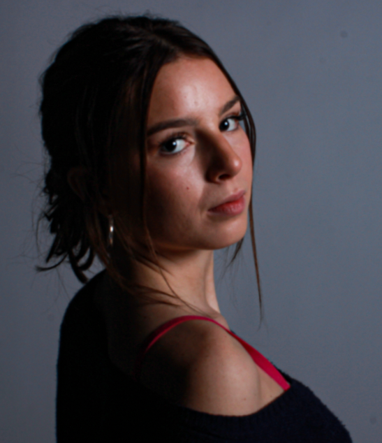
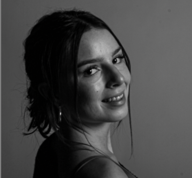
This photo I took is high quality due to my model having a strong pose and the photo is balanced, however, my shutter speed was too high. I want the shutter to move fast and let in less light. Next time I will start with a shutter speed around 1/125 for my still portraits and increase as needed to darken your photos.

Rembrandt Lighting

Rembrandt lighting is a technique utilizing one light and one reflector or two separate lights.

It can be described as a low-key lighting technique. It is lighting particularly for light/dark contrast to emphasize volume and specific areas.

Rembrandt lighting is characterized by an illuminated triangle under the eye of the person, particularly on the less illuminated side of the face. It’s a popular technique because it creates images that look both dramatic yet natural.

THE ARTIST HIMSELF

Why was Rembrandt important?

Rembrandt Harmenszoon van Rijnprolific was seen as a painter, draftsman, and etcher, Rembrandt van Rijn is usually regarded as the greatest artist of Holland’s “Golden Age.” This technique was made during the Renaissance period, but Rembrandt then pushed t even further and used dramatic lighting to lure out the ‘psychological depth’ of his models.

How to Do It

1. Use a Spot Meter for Precise Control of Focus Point

2. Experiment With Multiple Light Sources

3. Practice With Models or Yourself

4. Practice Placing the Inverted Triangle of Light

5. Shoot It Raw To Make the Most Of Lighting Contrast

6. Occasions and Models Suited to This Lighting Type

Studio Photography Using Rembrandt Lighting

Camera settings I used:

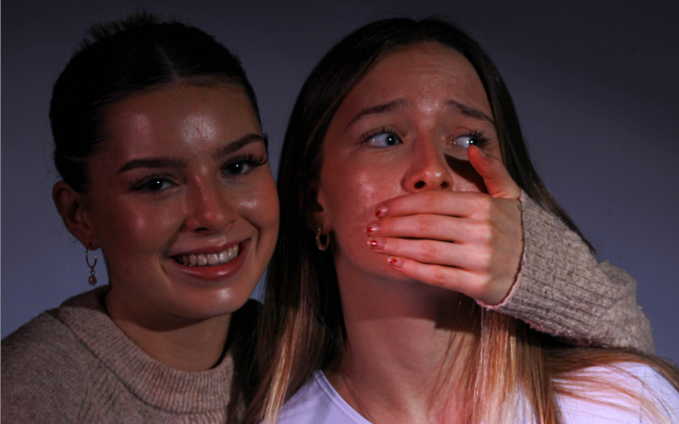
This photo was my favourite photo from my collection of Rembrandt photos I took of this model.

  • I first of all cropped this image to dispose of any extra space in the background. Cropping this image helps the photo to increase in detail as the person looking at it is able to focus more on the important parts and the focal points such as the eyes or the mouth etc.
  • The pose I asked my model to do is to look shocked into the camera, she did this by widening her eyes, opening her mouth and covering her face and mouth with her hands. This emotion in the photo portrays shock, surprise or fear.
  • I then edited this photo further than I usually do with my images. I first edited the highlights, texture, clarity etc.
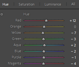
  • I then went into further editing on Photoshop and edited the colour, saturation and luminance. I increased the colour purple fully up and then the saturation colours orange, green and purple. I then increased the luminance of red slightly and then blue completely.
  • This further editing with colour added extra dimension to this photo, the background colour has slightly changed and the photo is slightly more vibrant but still maintains its shadows and darker parts of the face and hands.

For these headshots I took photos of a new model. I focused mostly on different facial expressions than different positions. I asked my model to be herself and act natural to be able to take more personal photographs. I edited these in adobe photoshop. I can really see the Rembrandt triangle shown here on my models left cheek.

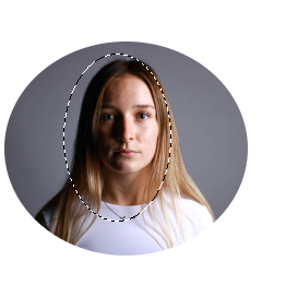
This photo is my favourite photo I’ve taken in my first photoshoot. This 1/4 body shot perfectly represents Rembrandt lighting, this is because there is a triangular shape on my models left cheek. I made this triangle on a 45 degree offset from the subject, about 5 feet away. The triangular shape truly demonstrates the Rembrandt effect and how it shows an image to look professional and high detail. I have highlighted the triangle created to clearly show the technique I have used.

these are my two images after cropping them to capture only the model and less of the background. This is to help improve my image’s quality as there is less of a backdrop.

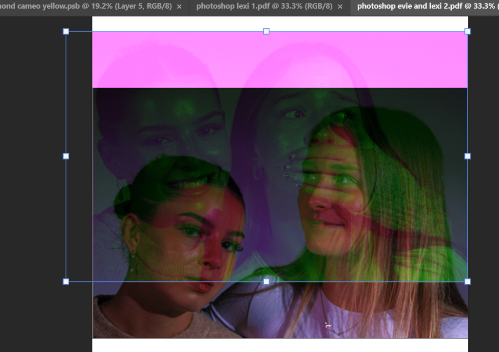
I edited these two photos to create a coloured background. The first I created a more pink background and maintained the colour of her face and body. I did this by increasing the luminance This helped to experiment with different backgrounds and how these can improve my photos. These are the editing tools I used to edit the photos above.

Further Editing Settings

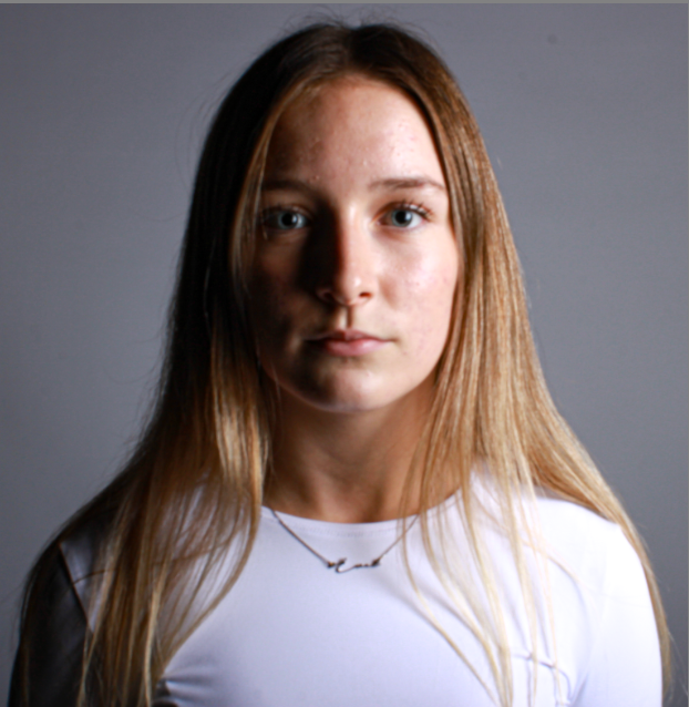
I then took these half body shots. In the first photo I told my model to look straight at the camera and pose naturally. This creates a perfect position to capture a portrait of my model and experiment with different lighting techniques. I like how she is looking directly at the camera, due to my lighting techniques and correct camera settings, these photos did not need a large amount of editing.

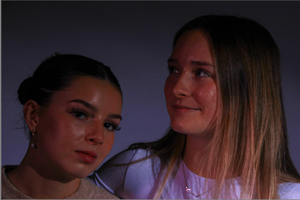
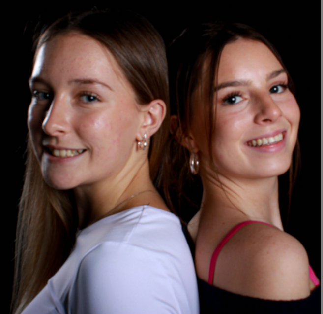
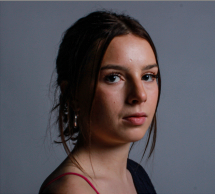
I then used another model to help with my portrait experimentation. I was able to capture Rembrandt lighting on my model on the right. However, my model on the left is missing the clear triangle on her cheek. To improve these half body shots, I would attempt to capture clear Rembrandt lighting techniques on both of my models to elevate these images even further. These photos are black and white, this helps with creating more mystery and dimension into my images, I think this black and white effect In Lightroom has really made these photos more effective and look much better. These are the editing tools I used to create this black and white effect:

I then took photos of a new model, these photos were taken originally very dark, this was due to a incorrect exposure. Exposure is the amount of light that gets into your camera and produces the picture on the image sensor. To improve these photos, next time I need to widen the aperture, extend the shutter speed, and boost the ISO. However, I needed to edit these on photoshop instead, I increased the exposure, highlights and whites to help the quality of the photo increase and make it brighter. This was a challenge for me as I found it difficult to maintain the high quality of her features and textures etc, whilst brightening up the photo.

Environmental Photography 2

I like this three quarter length photo that I took because she is looking directly at the camera, which shows she is engaged and se is in a posed position. She is surrounded by random objects around her which we attempted to convey a message of randomness. I like the contrast between her uniform position with a blank expression with the amount of objects around her.

I then edited another photo which is a full-body shot from these series of photos I took and made it black and white. I trialled this in black and white to see if this would help with the contrast of my models seriousness with the wildness of the background. I prefer these photos in colour so that you can all the colours of the objects.

This photo is a half body shot which shows my model in the same shot but at a closer up angle, this is a strong photo I think, but I think to improve she could be doing something in the photo for example, completing work or doing what she would be doing in her ‘natural environment’.

I like these half body shots of a teacher in her natural environment. She is teaching, which is her job. My model is standing doing her work by using test tubes and scientific equipment, her posing perfectly portrays what she does in her day-to-day life. I like the different colours such as the greens and reds, I think this is a good focal point for the picture. I also like the shadow behind her, I tried to maintain this whilst editing this photo.

After Before

I had to edit this photo and focus on increasing the brightness as I took it in an aperture which made the photo very dark.

I think that this photo is the strongest photo I took during this photoshoot. I think this perfectly shows a students natural environment around my model, I also think a big impact can be made from her standing in the middle of the street, making a full body shot. The way the world is still continuing around her but she is not reacting creates a powerful message for my environmental photography.

These photos had a white shadow reflecting on my model, due to this, I used Photoshop to attempt to edit and remove the white glint as much as possible however, this made the exposure very high and the photo very dark. This reduces the quality of the photo, however without this white glint I think this image of a guitarist learning a song could be very strong.

Environmental Photoshoot 1

Camera settings I used:

Portrait Plans

For my Environmental Portraits, I will photograph indoor and outdoor locations of people at:

  • School

I will be photographing my:

  • Friends.
  • Acquaintances/ fellow students.
  • Teachers

I will take my photos:

  • During my lesson time
  • In my free times
  • Whilst on a break.
  • Hanging out with friends.

How I will take my photos will be:

  • With a Camera.
  • In a place I am comfortable
  • With my friends

why I will take them is because:

  • It captures people in a natural environment.
  • Displays school life and people’s natural environment
  • Examples of what students, teachers and workers do and what environment they are in.

For my first experimentation with environmental photography I photographed my friends around school and focused on the different backgrounds and different angles whilst they are in their ‘natural environment’. This consists of working or learning or conversing with friends, completing schoolwork or teaching a lesson. Taking these photos was beneficial to helping me adjust to taking portrait photos of people instead of objects.

These full body shots were taken in the locker room, I took these photos to represent students as they daily enter the locker room and socialise with friends etc. I got my model to pose for these photos to create a mixture of photos in my experimentation. I wanted her to look directly at the camera and engage with it whilst looking happy with positive energy. Next time to improve I would remove the shadow from behind her as I think it makes the image confusing and looks slightly more unprofessional.

I first of all edited this half-body shot photo by increasing the exposure and making it more colourful and far less dull. I like this picture because it shows her looking directly at the camera with a blank expression, this shows her possible inner feelings and shows her concentration and calmness.

However, I decided to edit this picture in black and white. I think this works with the image as it has many different shadows. I prefer the image above due to the brightness of colour showing more personality through the high exposure and highlights.

I took these photos of students in their natural environment. I think these photos are effective because they were not posing and they were genuine. These differ from my other photos due to the fact they they are not looking directly at the camera like the others and that they show real emotion whilst conversing with friends, which is perfect for school environmental photography. I edited this photo by increasing the exposure and focusing on making it slightly brighter with more colour. However, I do not like these photos as much due to the background being slightly blurred and two people are also blurry. This lowers the quality of the image and makes them less strong.

I like these photos because they are landscape unlike my other photos, they again show a school environment with two students. I easily edited these by just increasing the brilliance, contrast, exposure. This helped escalate my images by just making them more colourful and stand out more. I also made these photos slightly darker and created a shadow around the two people whilst they look more serious.

This photograph was a photo I look from a heightened angle or ‘above angle’ to capture these students in their natural environment. I wanted to quickly capture this photo whist these students weren’t looking, this helped with the rawness of the photo and the students in their natural element. I like how they are all doing their own thing.

  • Two students are on their phone
  • One is communicating

I like this because they aren’t all doing the same thing and it shows a reality of school life throughout adolescent teens.

This photo shows environmental photography in school In a unique way. This photo of a single student is powerful in my opinion. I like it because of the blurred background around her, this helps her to stand out more and become even more eye-catching. Her lack of emotion portrays how she feels and her eyes are directly looking into the lens which shows her engaging with the photo.

I edited these photos by adding multiple different colours. In the first photo, I added a slight yellow tint, I like this because It creates a warmer colour around her which helps to highlight her and create a contrast between a bluer background with colder and warmer tones. The second photo I only added a small amount of yellow and focused more on the slight blue tint to it, I did this to focus more on this colder approach.

However, I like the yellow in the second picture because of the I think this was a good addition to this photo as it brightens the photo but does not add too much warmth to the photo.

Arnold Newman

“You don’t take pictures with your camera. You take pictures with your mind and your heart.” – My favourite Arnold Newman quote.

” The Portrait is a form of biography. Its purpose is to inform and to record for history” – Arnold Newman

 Arnold Newman was born on March 3, 1918, and passed away on June 6, 2006. Newman was an American photographer who was greatly known for his exquisite environmental portraits of mainly artists and politicians.

EXAMPLES:

However, he was also greatly known for his still life images which were described as ‘Abstract’.

EXAMPLES:

The first ever environmental portraits were created by Arnold Newman. Newman was seen to have ‘pushed the boundaries’ of traditional portrait photography during the middle of the 20th century, he began taking environmental portraits in the 1940s and became increasingly popular due to his new and different approach to taking photography. He included a variety of people such as famous people, workers, composers, political leaders and scientists. He began shooting photos for Look and Harper’s Bazaar, this skyrocketed his photography career of capturing his subjects at home or working.

I particularly like this photo Arnold Newman took of Carl Sandburg and Marylin Monroe on January 20th, 1962 because I think It creates a realistic photograph of a scene of conversation and friendship. From my research I found out that Marilyn complained about her sleep disorders at that evening, and this photo demonstrates Carl Sandburg showed her exercises that she should do before she goes to bed. Arnold Newman capturing this moment as a part of environmental photography shows that you do not need the backstory of a photo I understand the meaning of the photo, In this instance it represents conversation, possible concern and friendship.

My favourite thing about Arnold Newman and his work is how raw his images are. It truly captures the reality of people’s environment and how real he kept it whilst photographing them. The people in the images are not necessarily ‘posing for the camera’ and instead, they are doing their usual duties in their e.g. workplace. This is something I hope to replicate in my photos as I want to recreate people truly in their environment and not necessarily ‘posing’. I hope to compile a various amount of images where some subjects are still in their environment but also looking directly at the camera and some of my subject in other photos not looking directly at the lens and instead looking at and doing what they do in their ‘usual environment’. I think that this would create a good variation of photos and help them differ. They can then fit into similar categories of multiple famous photographers I can take inspiration from.

Environmental Portraiture

“An environmental portrait is a portrait executed in the subject’s usual environment, such as in their home or workplace, and typically illuminates the subject’s life and surroundings”.

Throughout history, Environmental Portraiture has been an admired by artists and photographers. It is seen to be a form that addresses social and political issues relating to its natural or urban environment. The purpose of ‘Environmental’ portraiture is to illuminate the subject’s life and surroundings. The images are taken to instead appreciate a story or backstory to the person or the job/ activity they may be doing.

Key Features

  • formal (posed) – This is when a person is sitting or standing in a fixed position in a particular way to convey something
  • head-shot – only the head face and occasionally shoulders
  • half body – Only half of the body is on show, usually down to the torso
  • three quarter length – Only three quarters of the body is shown, usually up to knees / full length body shot

The angle of a photo can really influence the outlook . The impression of a photo can change depending on the angle that the person is is captured from, an example of this could’ve been from the side, diagonally above, or directly above. These angles are named high angle, low angle and canted angle.

  • The colour of the photograph can also be either black and white or colour. The difference between these two can completely change the impression of the photos taken. For example, a black and white photo can infer a more emotional impression of the portrait and add imagination, drama and mystery. However, a black and white image could also do the opposite and infer a less emotional and possibly a more formal, aged impression. The different shadows and effects on a black and white image could be used to juxtapose each other within a composition for a more dramatic effect.

However, a coloured picture can be used to guide the person looking at it, where you want them look and brighter colours can be used to highlight a focal point, where duller coloured can show less important elements. Coloured images can also influence how they feel about what they see and have a better idea of the message the image is trying to convey.

Artificial Gallery

This was my final first practice gallery on Adobe Photoshop. To create my first artificial gallery, I found an image on images and imported it into Photoshop. I chose these particular images that I took to represent still life and transitioning into formalism. I think these all correlate in some way and have some sort of direct link to each other. The colours compliment each other well and I think this helps to escalate my gallery to look better and more presentable when the images I have taken all look similar but different.

I then exported my own photos onto the image of the gallery, to put on top of the walls. I chose this image because I think it shows a clearly displayed and open space to place my photos. I also chose this image because I think it helps to challenge myself as the walls are slanted and give me an opportunity to test my new skills whilst editing images I have taken into a virtual gallery.

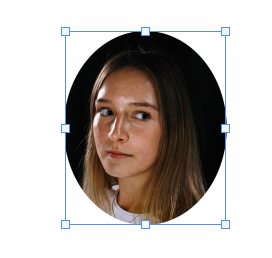
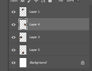
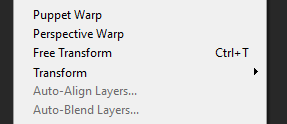
  1. After importing them I created a new layer and resized and distorted it to fit the walls. I did this in a particular way to fit the entirety of the wall then made them smaller in order to look presentable.
  2. I also changed the angle of how they sat on the walls. This helps them to look more realistic and straight. The straighter my images I took sit on the wall, the more realistic they look.
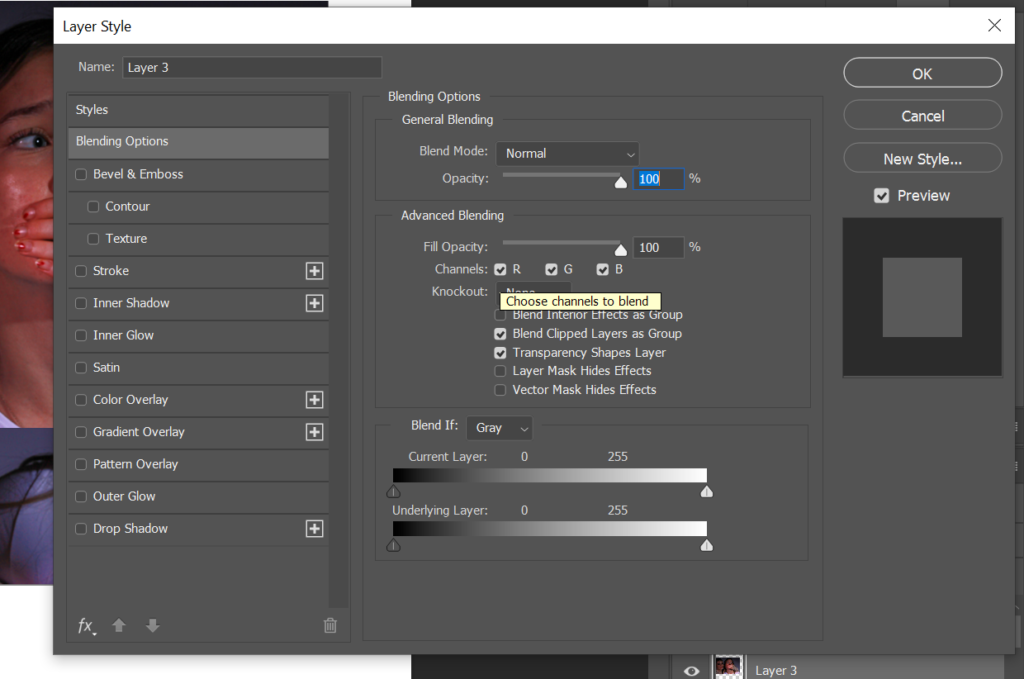
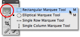
  3. I then pressed blending options after clicking the rectangular marquee tool. I then press drop shadow to control where the shadow is able to sit behind my image. This is to create a 3D effect.

I then moved onto Art steps and made another virtual gallery to display my still life photography. This website provided me with a more professional looking, but simpler approach to displaying my photographs.

In my virtual gallery I made my photos look hung up on the wall. I also experimented with different borders of my photos. From a range of black white and grey backgrounds I was able to experiment which different colours complimented my photography and brought out their detail. I enjoyed using Artsteps so that I could properly evaluate my work in a digital gallery I could explore, this gave a more realistic approach instead of just a photo. I think I prefer using Artsteps as it gives me more time to focus on editing my photos without having to focus on the angle, distortion and shadowing on my artwork on the wall.