All posts by Rosie

Filters

Author:
Category:

PHOTOBOOK FINAL LAYOUT.

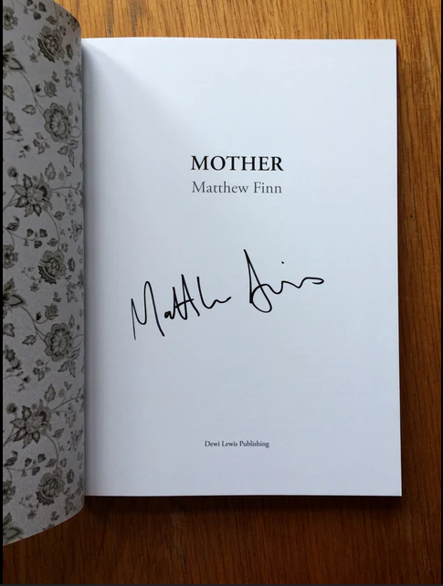
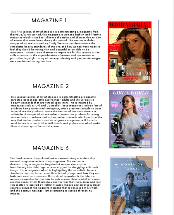
When creating my photobook unfortunately all of my screenshots were deleted, I had previously recorded screengrabs of the progress I had made throughout the 2 days of my mock and the days leading up to the mock, however I am able to provide a walkthrough of the making of my book as best as possible. I have screenshots of my book when the images were firs placed inside and my final layout. I can attempt to explain my process and decisions made with the pictures I can find. In my photobook, I wanted to display my photographs in a way which was interactive and interesting to the viewer, I also wanted to produce images that shined light on certain elements which would usually go unnoticed and unhighlighted due to it being a controversial or ignored topic. I wanted my book to have a clear and planned out structure of a front cover, inside front cover, contents page, 1st magazine cover, 1st set of images, 2nd magazine cover, 2nd set of images, 3rd magazine cover, 3rd set of images, essay, back inside cover and back cover. I chose for my 3 sections to be placed in this clear and effective structure, so that my viewer can understand what is in front of them and what message I am trying to convey.

Mock Best Criteria:

Here is the best level of criteria I was referring to throughout my Mock in order to maintain which grade I was aiming for, this helped me when setting my goals and attempting to complete my work to the best quality and calibre I could for the best grade I could achieve.

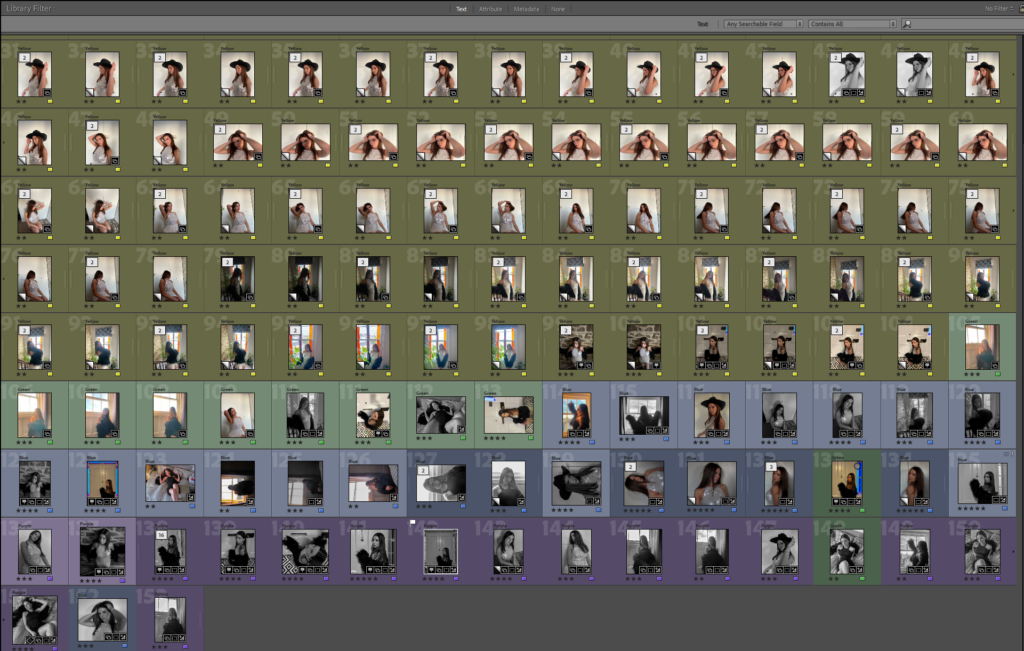
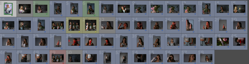
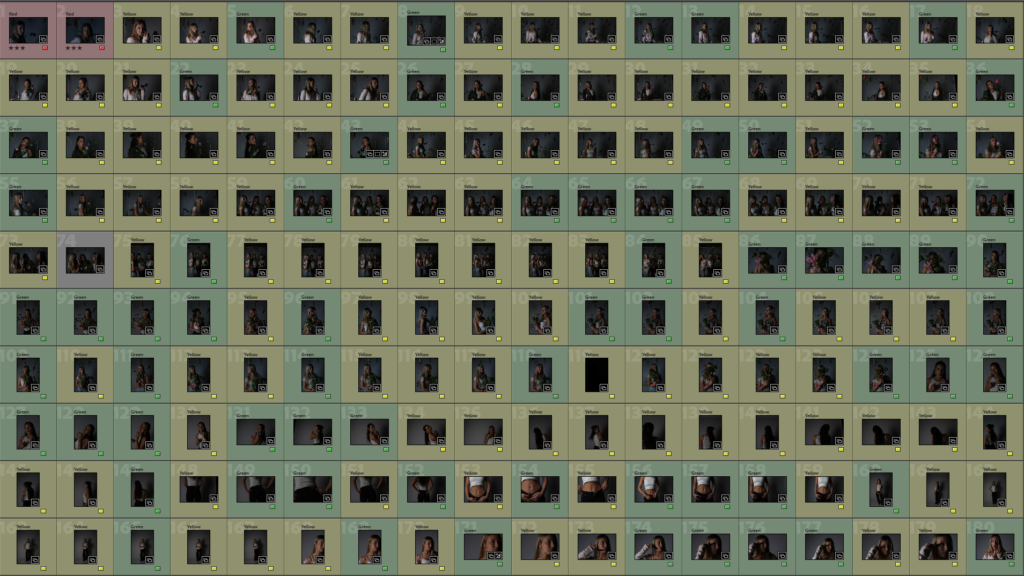
Here is the categorisations of images I used when choosing which images to include in my photobook. I chose to have green labelled images displaying work I liked and would possibly like to include in my photobook, however these images may need improvements such as editing or cropping before being included in my book. I also created blue images which display images that I think need to be included in my book and are ‘basically perfect’ however, I had too many blue images for my book, so I had to decided on my ‘best of the best images’ and create a new category of purple images that I knew were being included in the book in order to easily identify them when including images.

First Front Cover Idea:

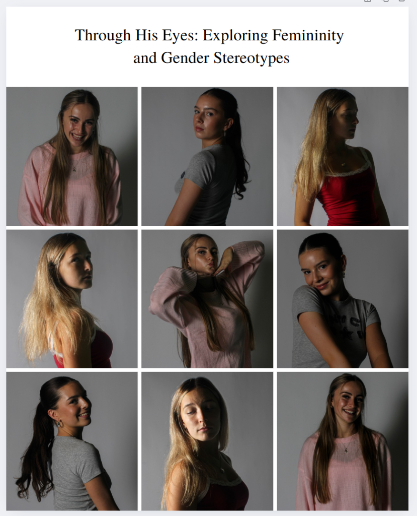
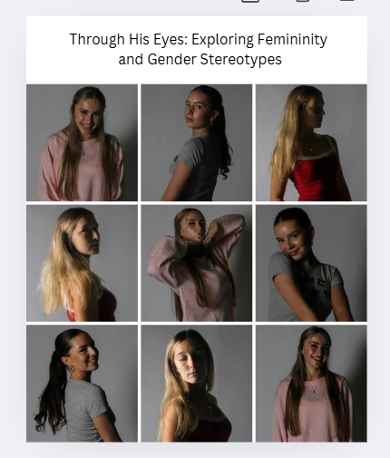
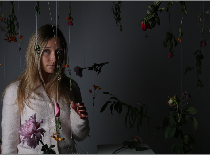
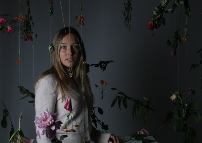
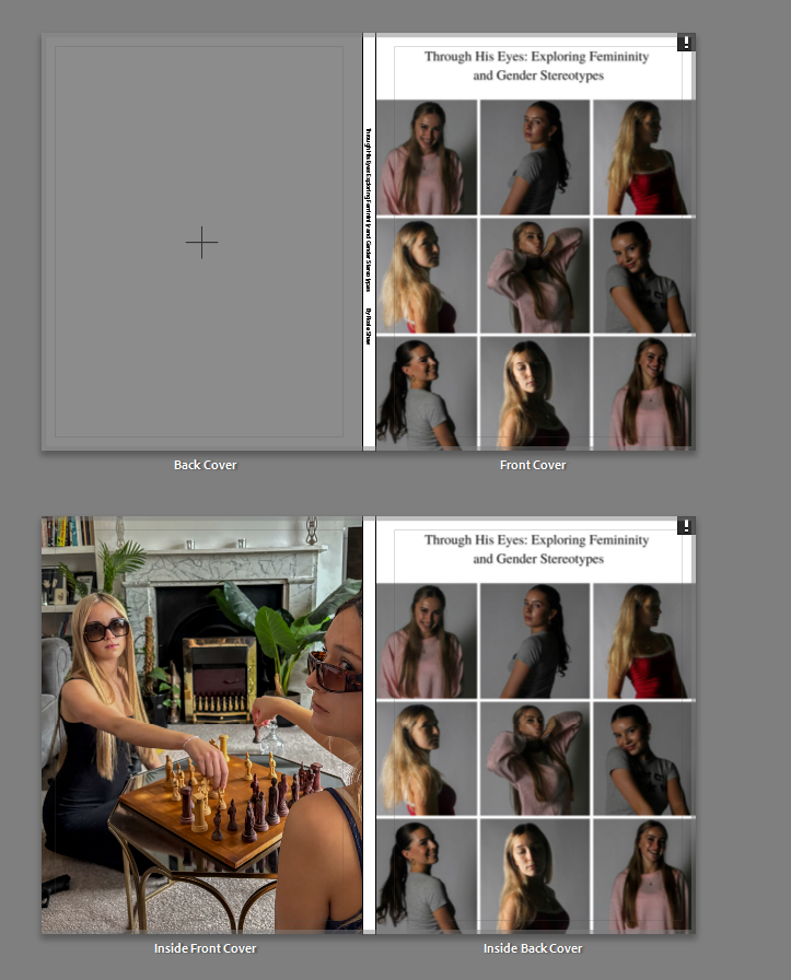
I first chose to have my front cover as a montage of 9 images using my 3 chosen models throughout this project, this was to show them expressing their natural personalities and how they express themselves. This was also to show a more natural and positive light onto women and show them being happy and content in their natural state. I also decided to pair this with my title of ‘Through His Eyes: Exploring Female Gender Stereotypes, however, after careful consideration me and my teacher decided that this front cover would not be effective for my book and is too ‘different’ and not suitable for displaying what my work inside the book is about, it also does not give the audience a taste of what is going to be inside the book as none of these images can be seen displayed in the book, we also decided that the font was too much of an old-fashioned vibe and did not fit with my aesthetic. I instead decided to include this image into the back of the book as an inside back to my back cover as a small overview of the book when the viewer comes to the end of the book, after reading my essay.

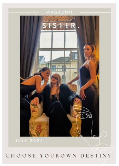
Second and Chosen Front cover:

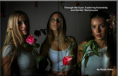
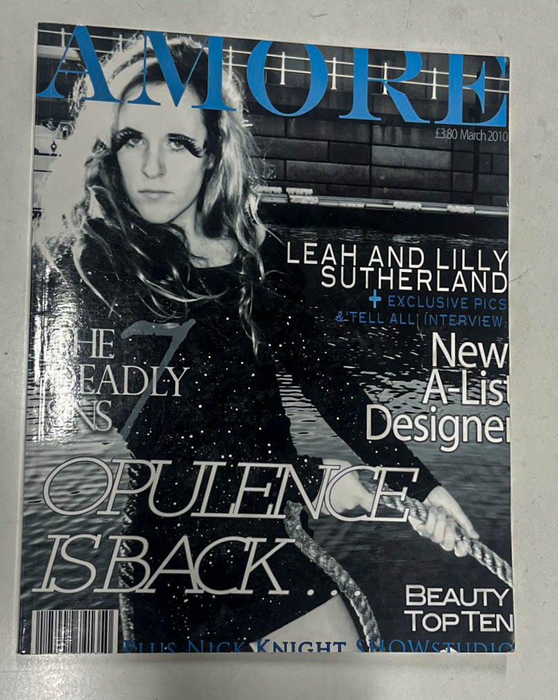
I then decided to replace this image with this front cover which is one whole image which stretches over to the front and back cover and still incorporates my 3 chosen models, but also gives the audience a taster as to what is going to be inside the book, I feel this was the correct decision to make. I also decided to change the font to a more modern day and casual font for the title, to show an impression of when it was made and that although it has many elements including the past, it is focusing on the present day and the changes and positive elements which must develop in order to support women through both the media and in general life. This large title is also accompanied by a subheading at the bottom of ‘By Rosie Shaw’ as an indicator that this is my photobook, which is also in the same font.

BEFORE EDITING AND WORKING ON LAYOUT:

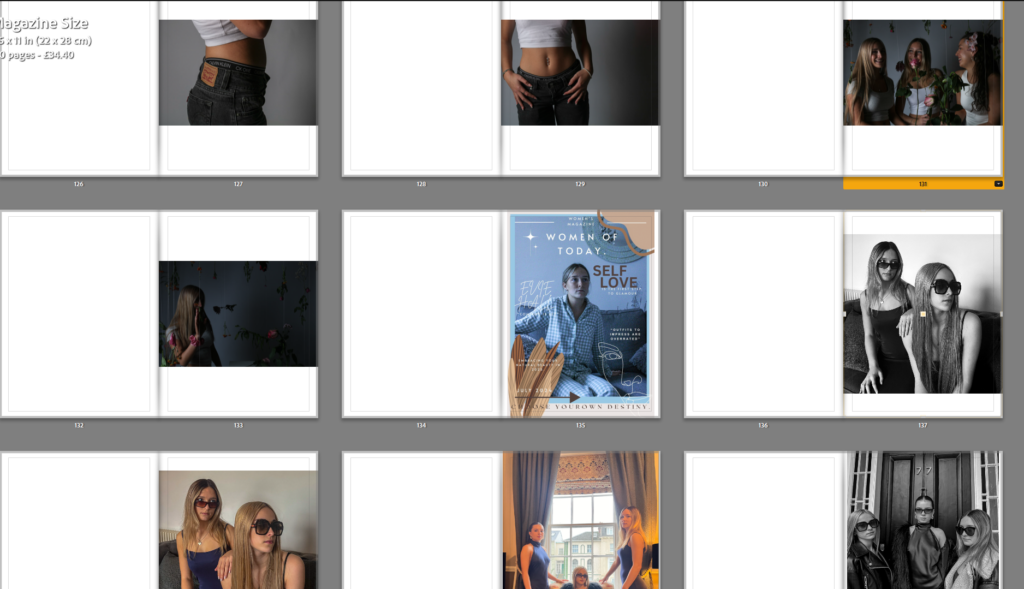
Here is the initial layout of images in my Adobe Lightroom, after creating a folder named ‘book’ in my Lightroom and compiling all the images I would like to use and doing some final editing on the images, I chose my final images I would like to use in my book, I then pressed the create book icon and it compiled these images into this order for my book. This initial order was messy and did not have a strong layout that I could use for my final book. So, on the second day of my exam, I chose to start editing these images to fit the book and creating my magazine covers to be included into the book.

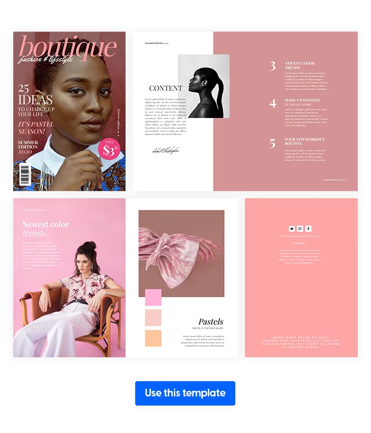
Front Cover, Inside Front Cover, Inside Back Cover, Back Cover:

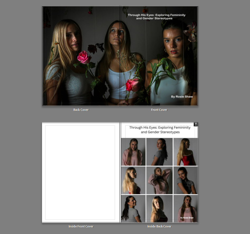
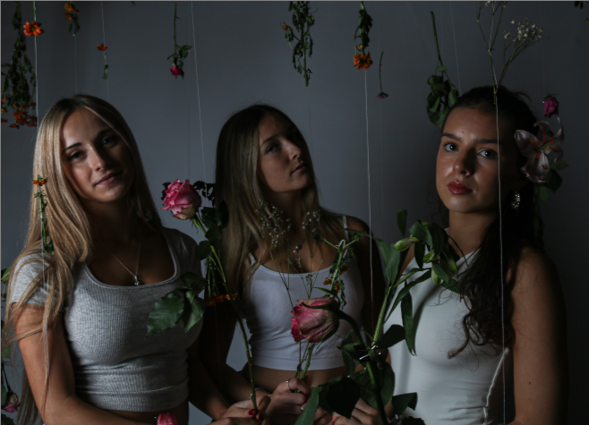
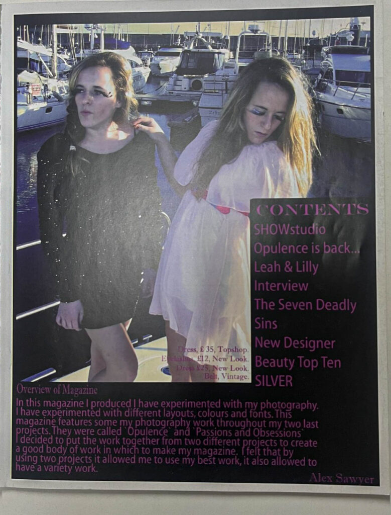
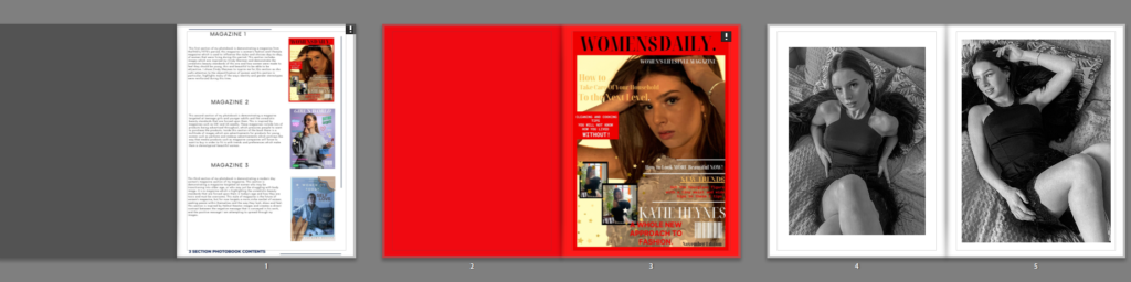
I chose to have this image as my front and back cover (as explained above) in order to have a high quality and strong photograph of my 3 models across a front and back cover spread as It is a strong image that helps the viewer to see what Is going to be inside the book and what kind of images they are going to see. I like this photo because it comes across as mysterious and interesting and will make the viewer want to see more. I feel the most interesting element to this photo is my models, but also the flowers around them and this feeling of femininity, gentleness and happiness that is radiating from this, however this is in contrast with a dark and mysterious background accompanied with light highlighting my 3 models from the background and helping them to stand out from this dark backdrop. For my inside front cover, I wanted to maintain a traditional white cover which appears in most books before introducing my contents page. For my inside back cover, I chose to include my initial idea for my front cover so that this cover did not go to waste and so that I had a final overview for my book, I feel this adds a final bit of interest for the viewer.

Contents Page:

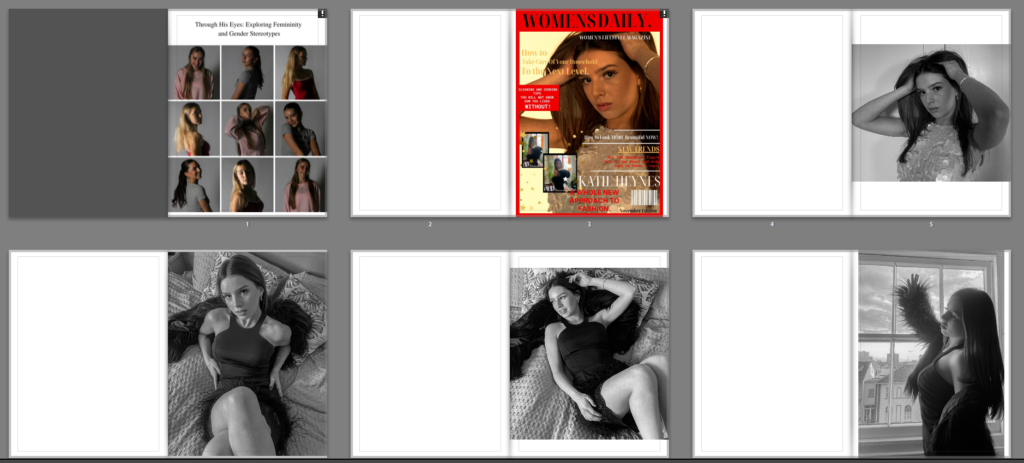
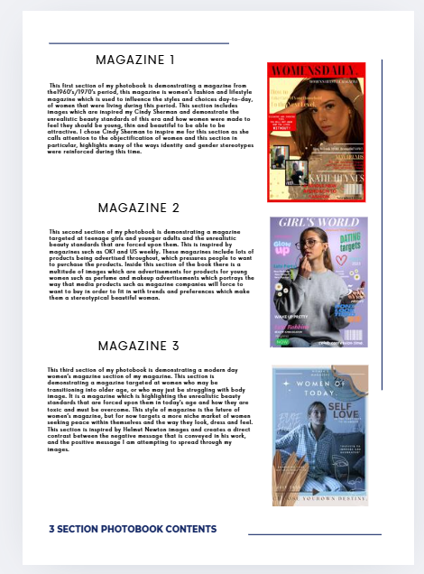
I chose to have a contents page in my book/magazine as I felt without it my magazine may come across as jumbled up or confusing which is not the approach I wanted to have. I created this contents page on the first day of my exam using the Canva app, this app helped me to create 3 headings and 3 paragraphs accompanied by an images for each which are my front covers slightly smaller next to them so that It is clear what each front cover and photoshoot was about and why they are placed in this order. I feel this added a potentially more BOOK like feel instead of a MAGAZINE feel to my magazine, however, I feel that my magazine does have many book qualities and is a slight hybrid of both book and magazine styles. I really like my chosen layout for this book and I feel it added a more luxurious feel to the book which helps my book stick out from others as a clear walkthrough of contents is provided for my readers.
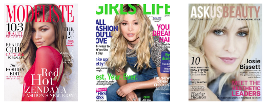
Cover 1:

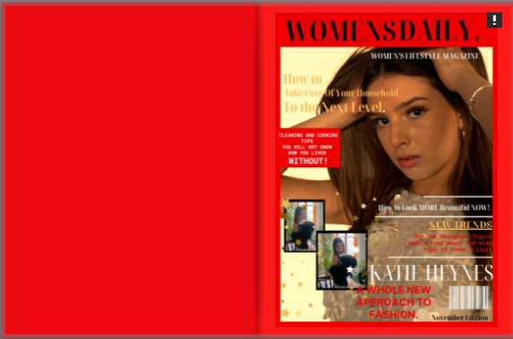
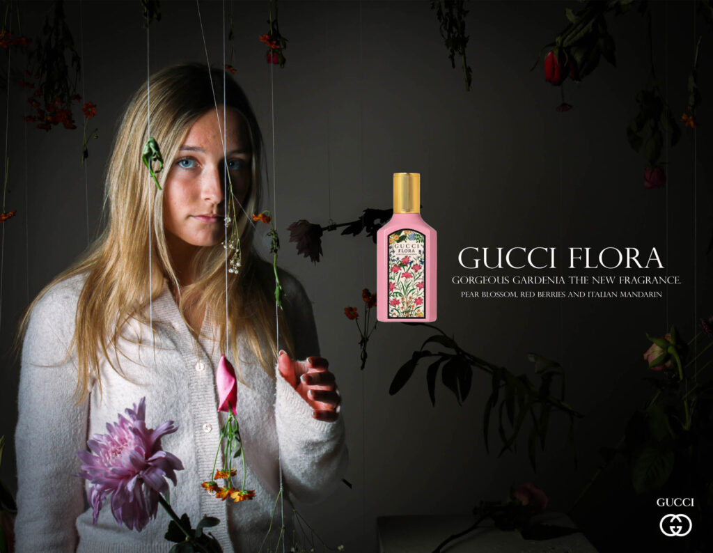
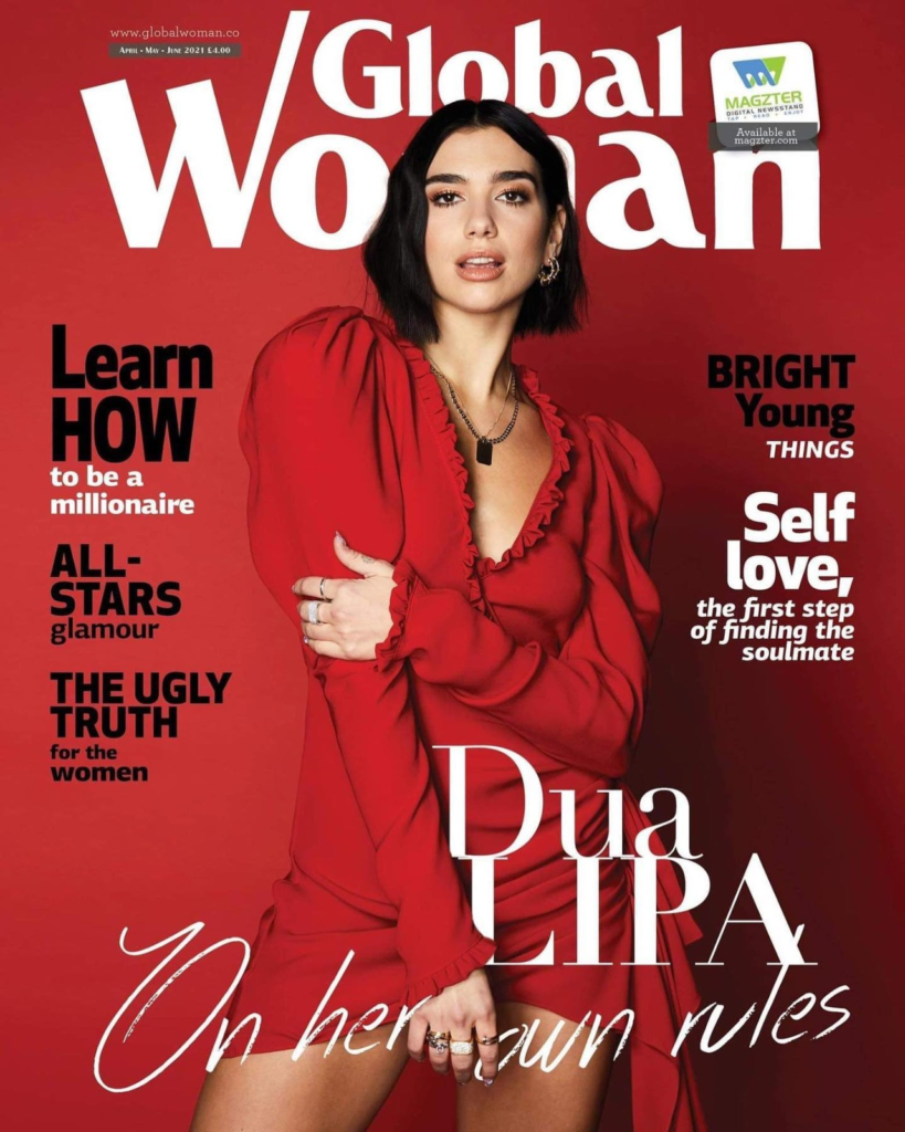
I decided to have a bright red background for the blak page before the magazine cover and surrounding it. This helps for hr cover to stand out and also to indicate that this is the first section of the book and makes the reader interested to see the contents of the book. I also feel that the contrast in bright colours such as red and yellows used in the front cover, with the black and white images inside works well for the approach I wanted to go for of women and girls being exploited and it being covered up with bright flashy colours in order to conceal these secrets and deep meanings that producers do not want audiences to pick up on.
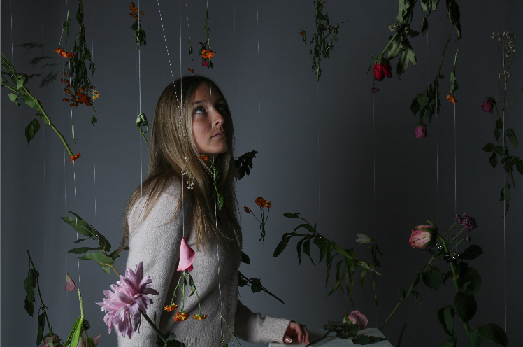
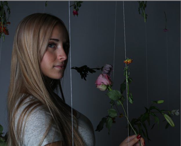
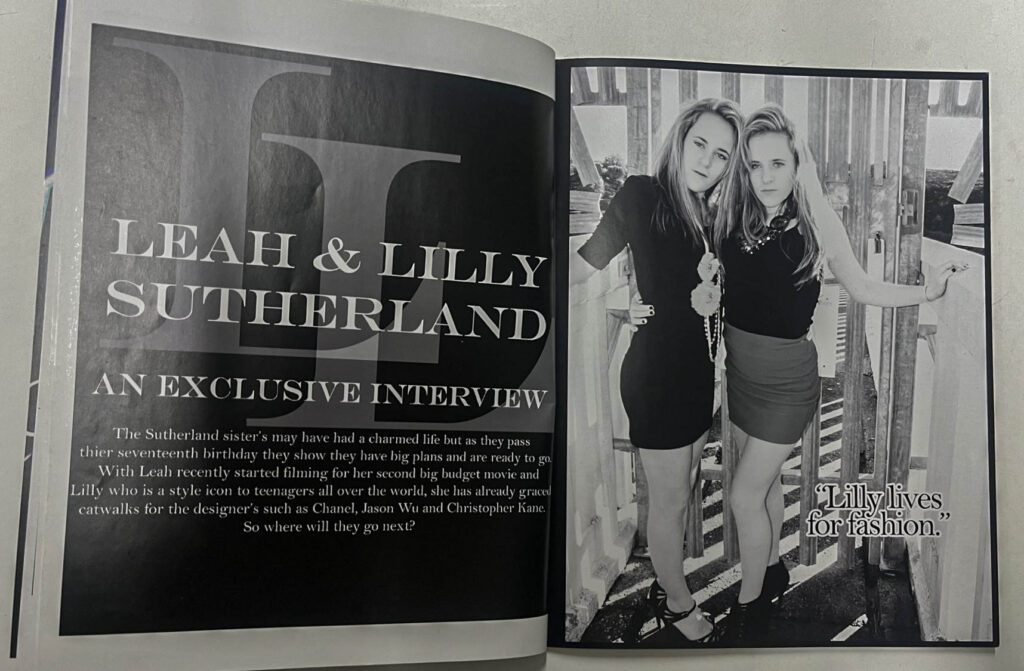
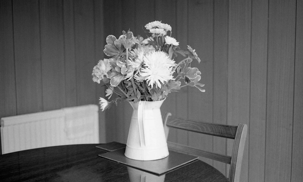
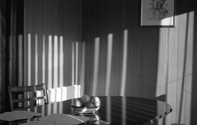
Photoshoot 1:

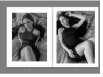
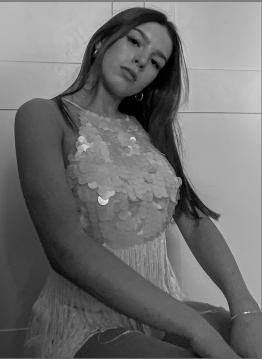
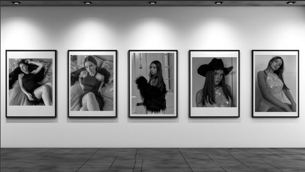
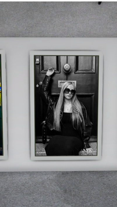
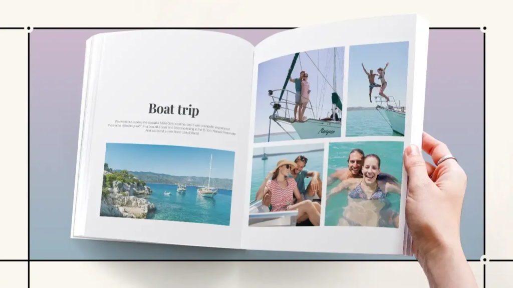
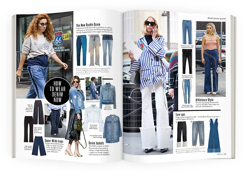
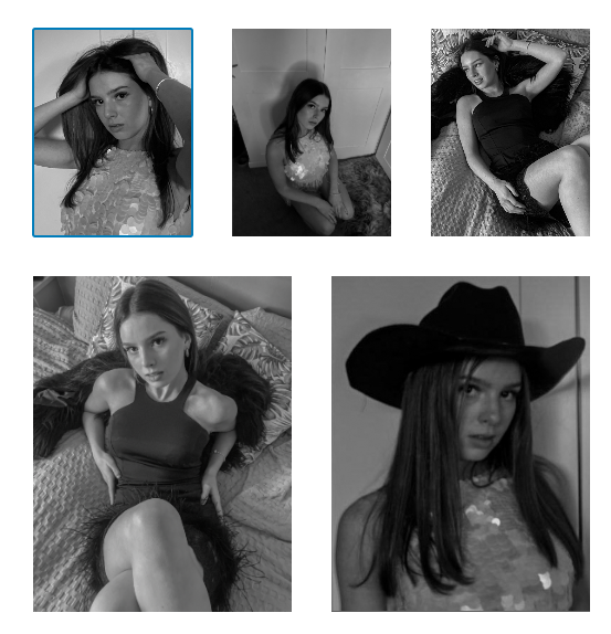
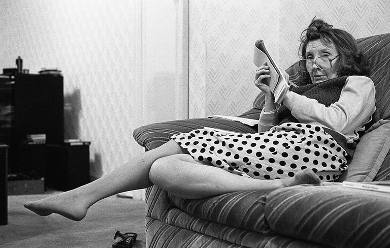
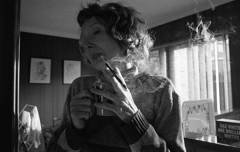
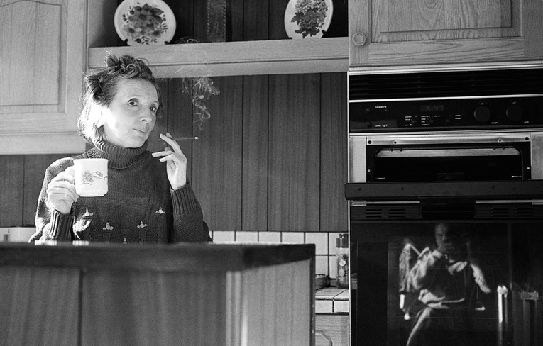
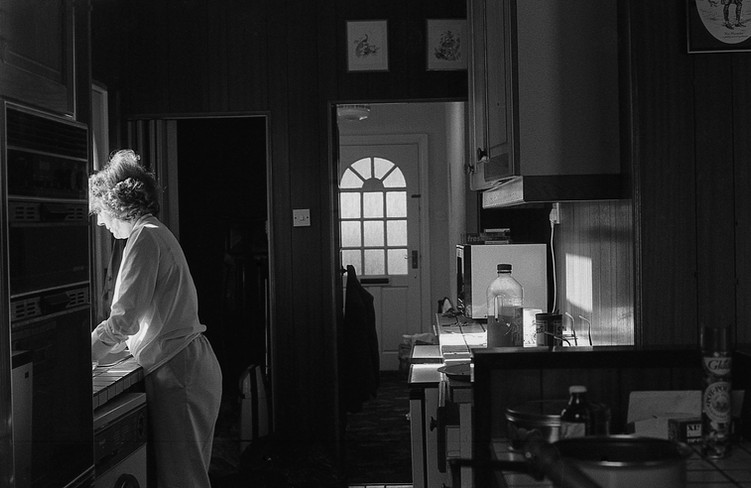
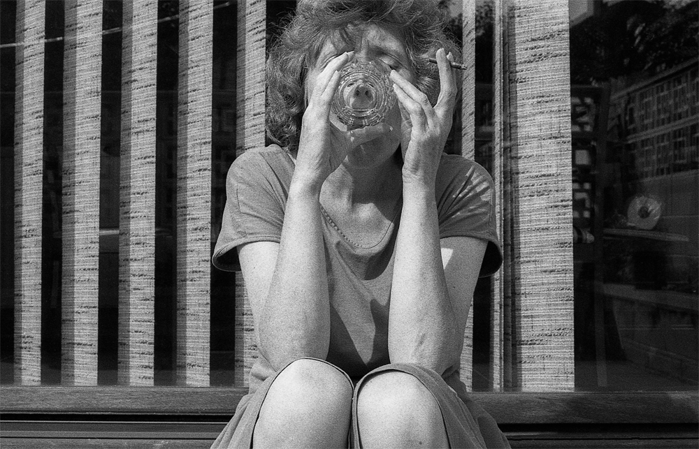
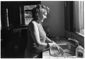
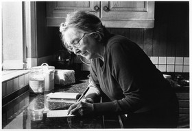
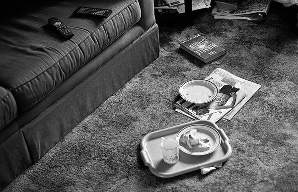
Here is a (low quality) insight to my first photoshoot images that I chose to include in my book and the specific layout I chose so that the images did not clash with each other, I feel this is least favourite photoshoot, although it is a good, strong start to my book, I feel the other photoshoots include stronger and more interesting images, however I do like these images and how they relate to Cindy Sherman’s work. I also chose these images to go first as this is the oldest style of images that I was inspired by.
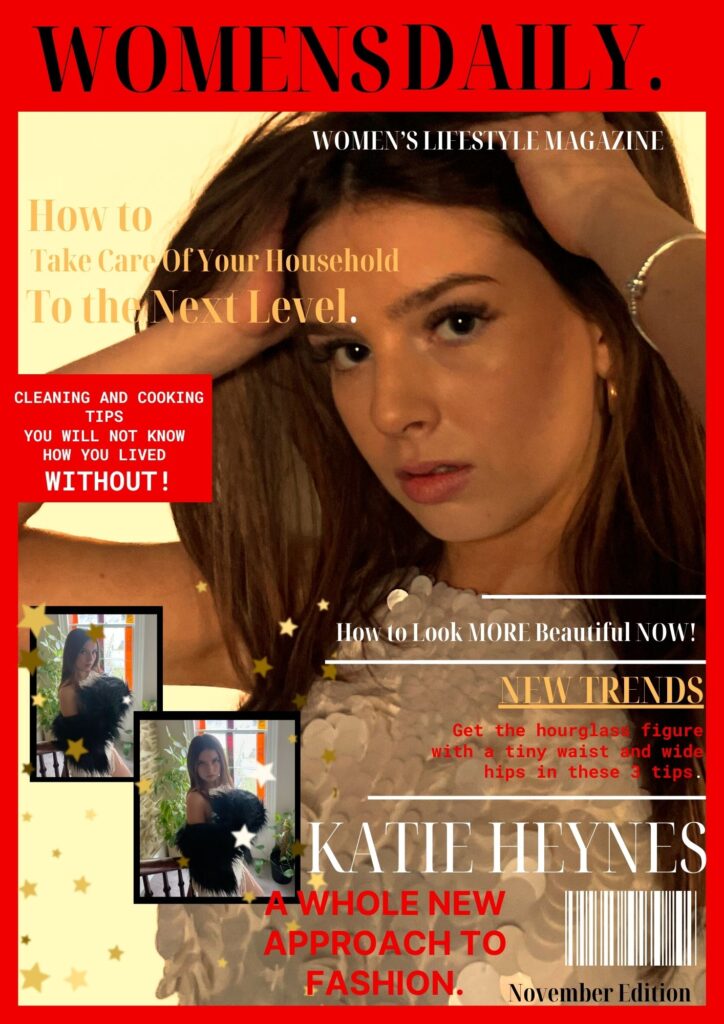
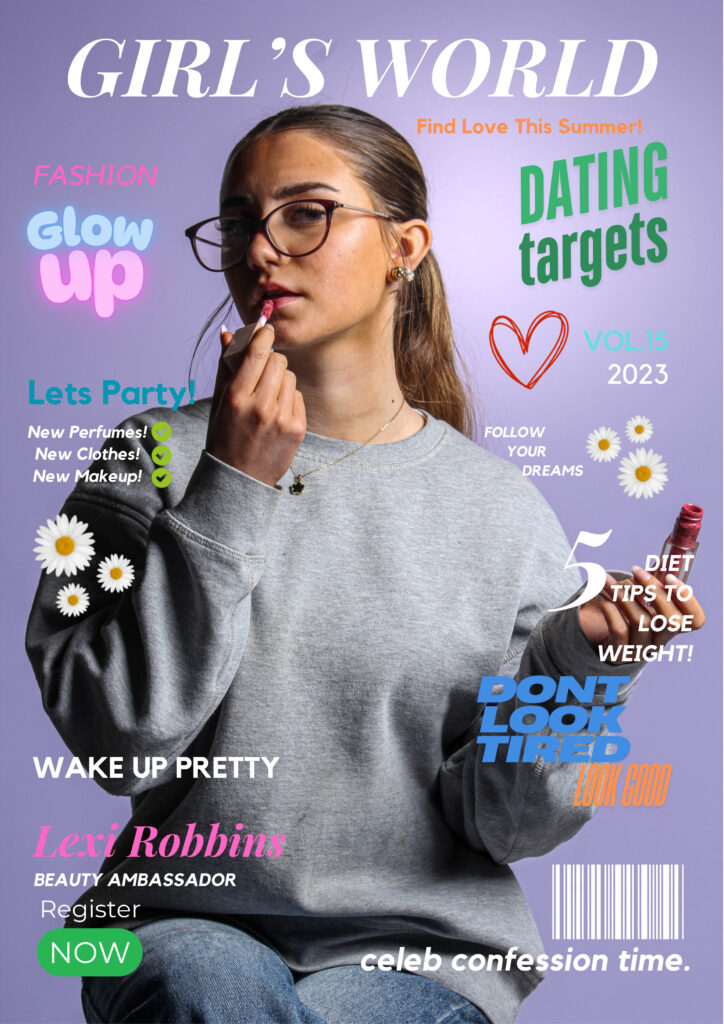
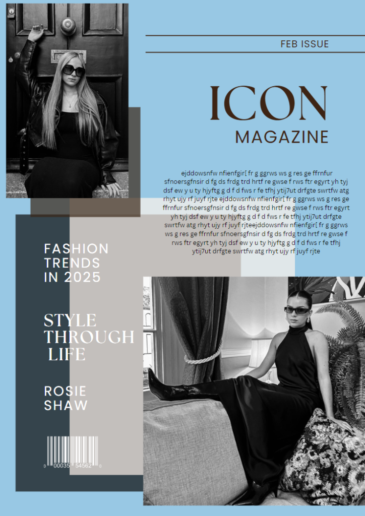
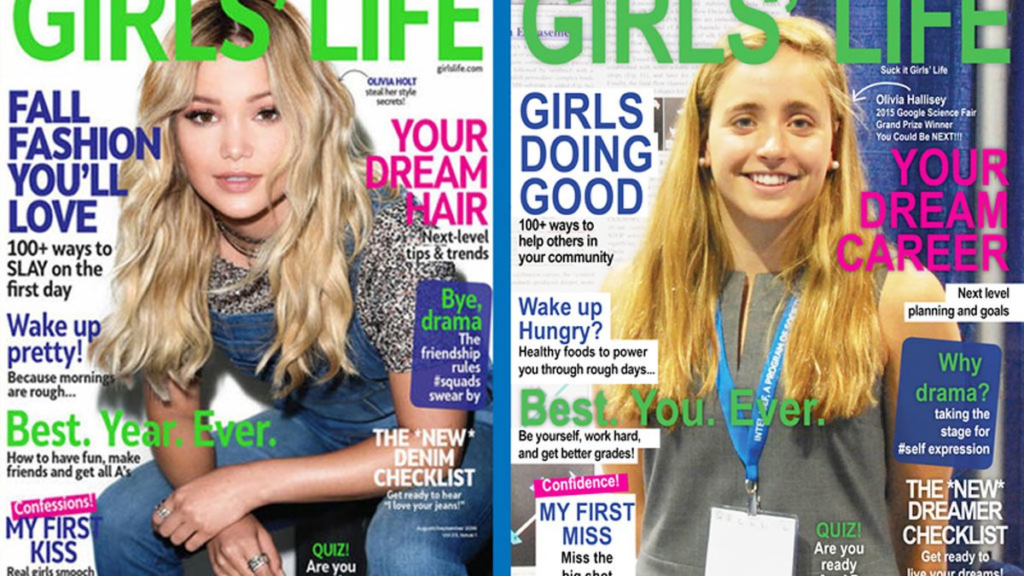
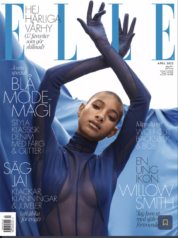
Cover 2:

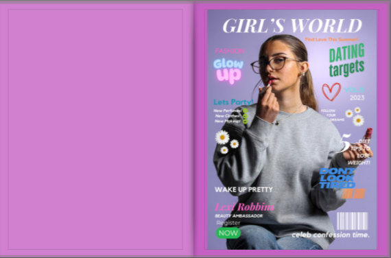
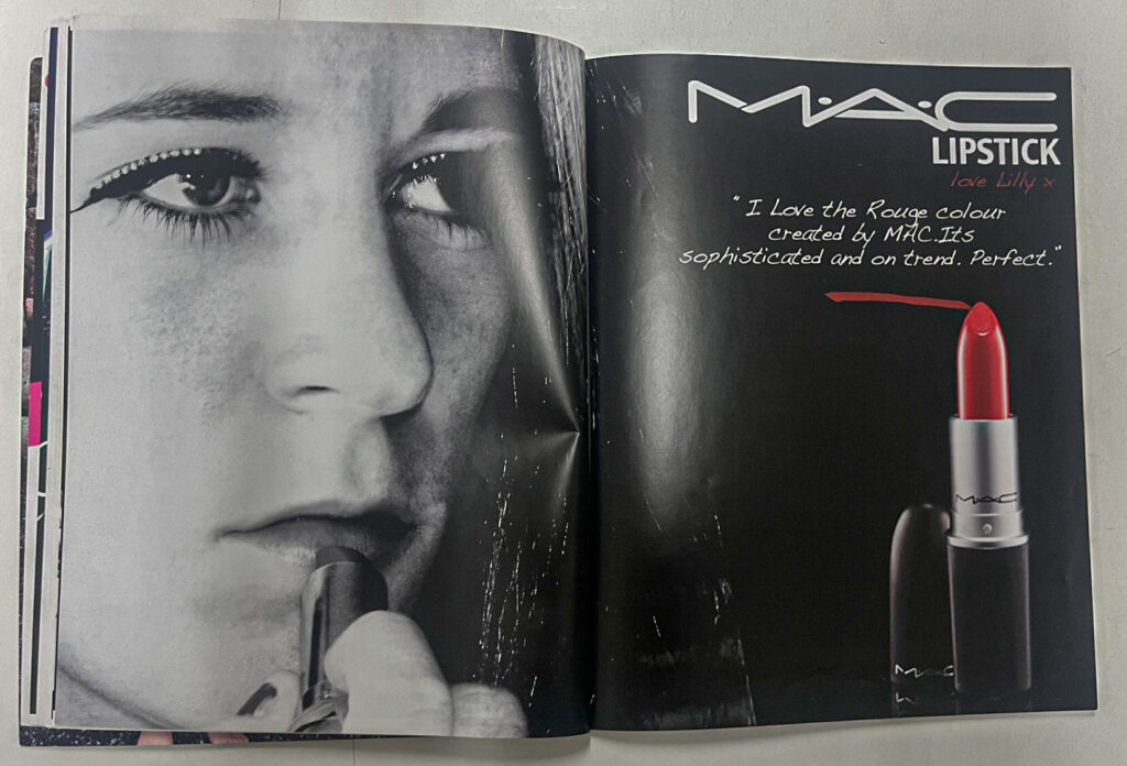
This second magazine cover I particularly like as I think it is the most realistic and really makes the viewer want to turn the page. I chose have a plain purple page and have this colour also as a background for this magazine cover. I created this magazine cover in Canva and feel that my colour choses display a seemingly light-hearted bright girls magazine for promoting fashion and beauty products.
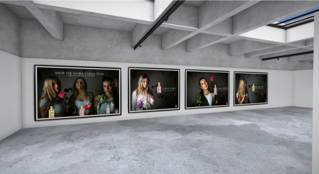
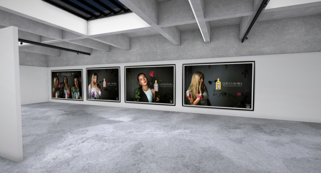
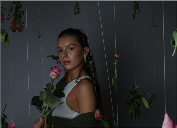
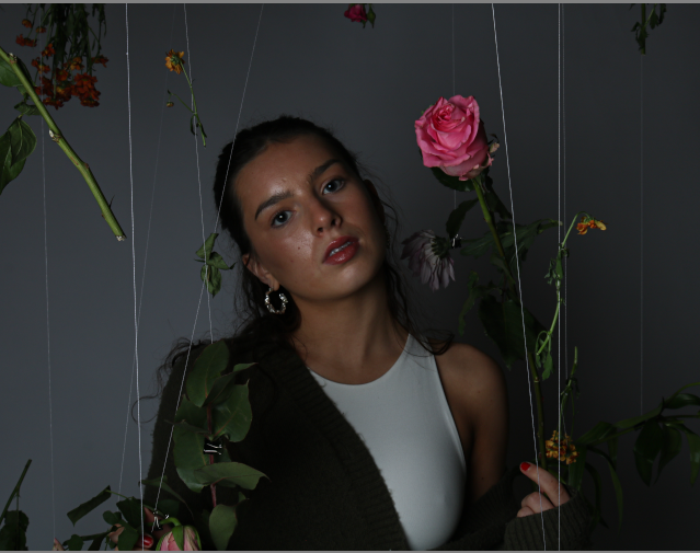
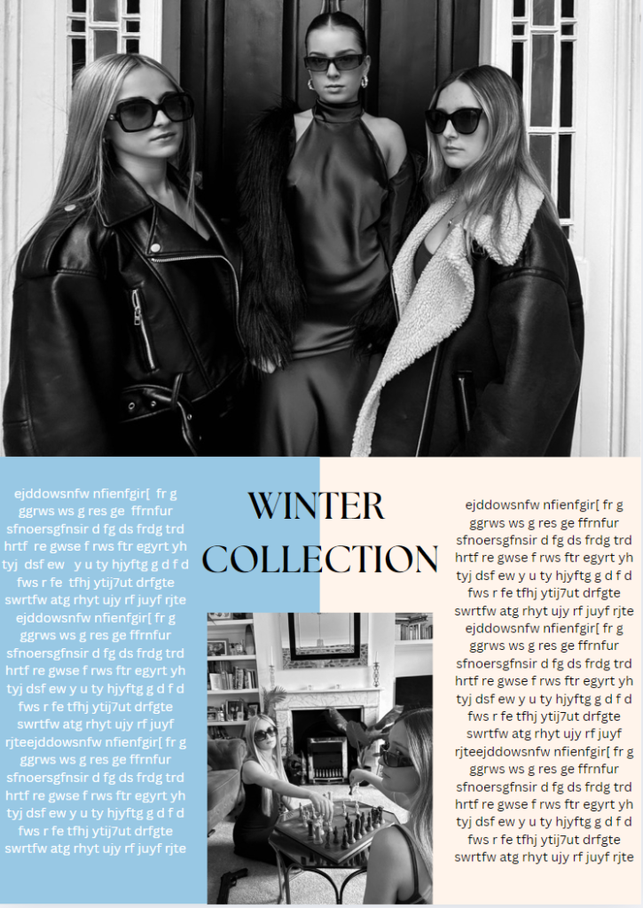
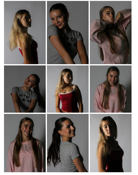
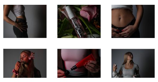
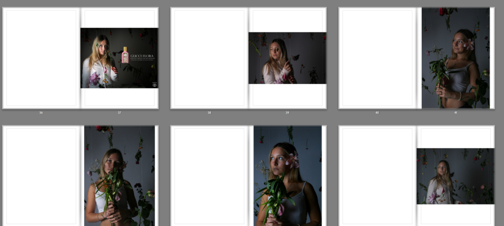
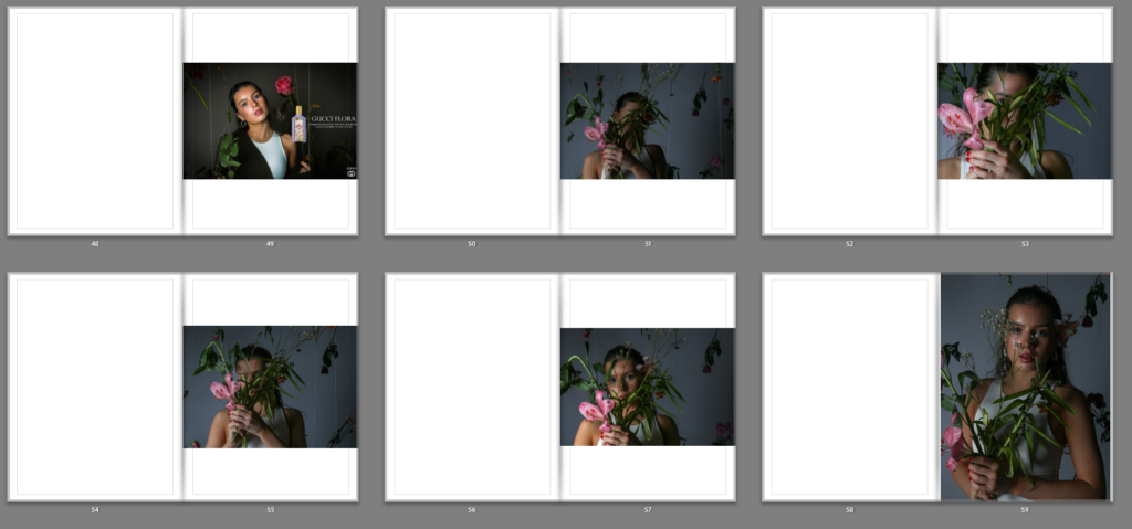
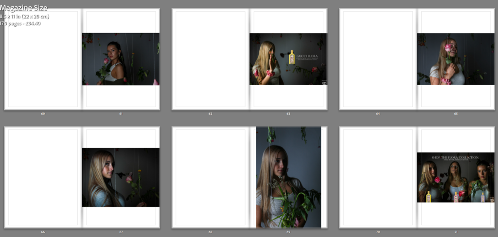
Photoshoot 2:

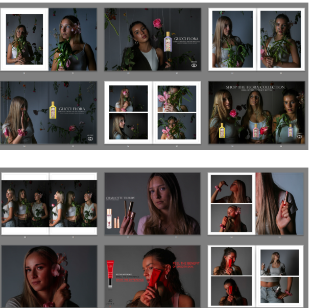
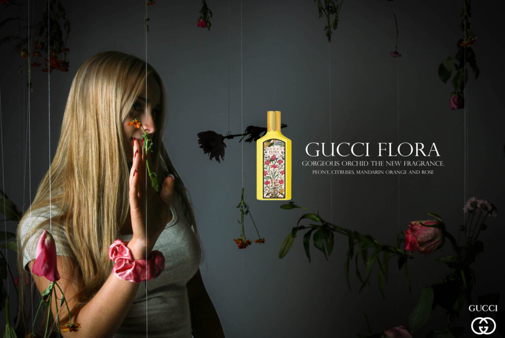
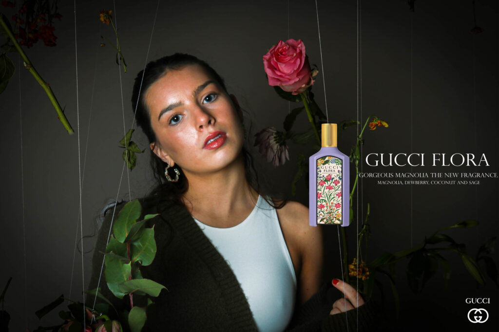
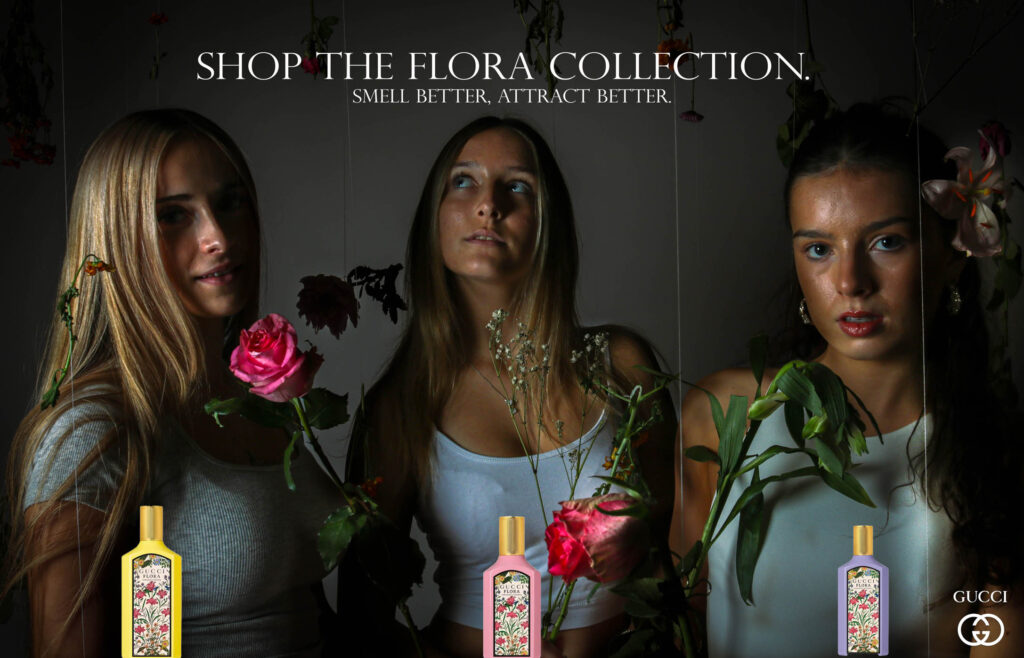
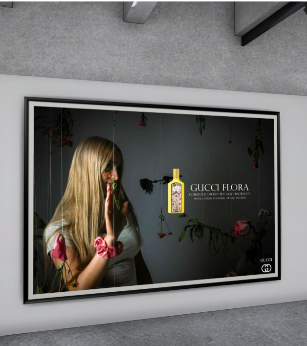
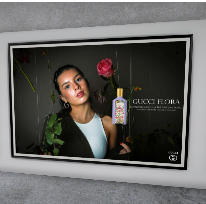
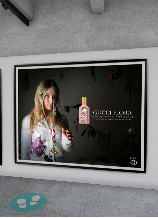
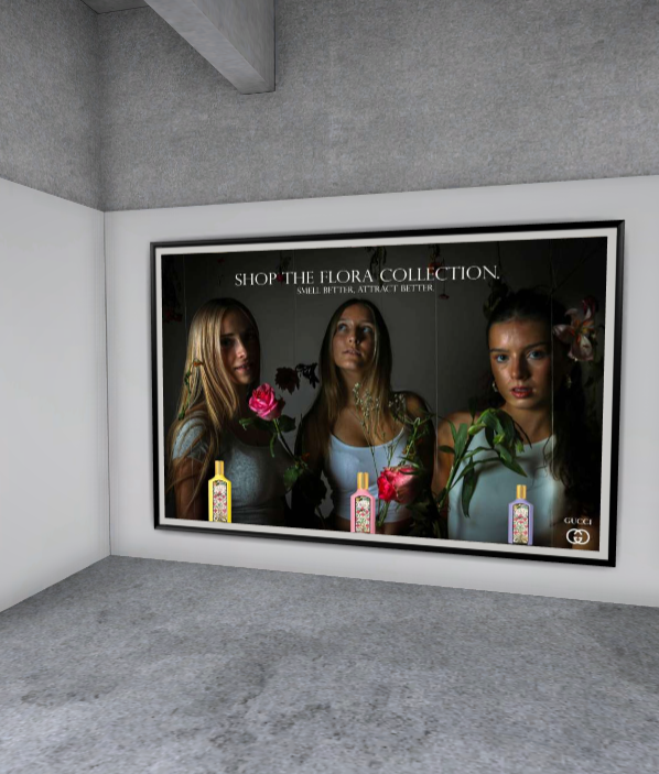
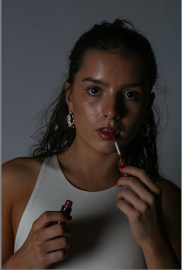
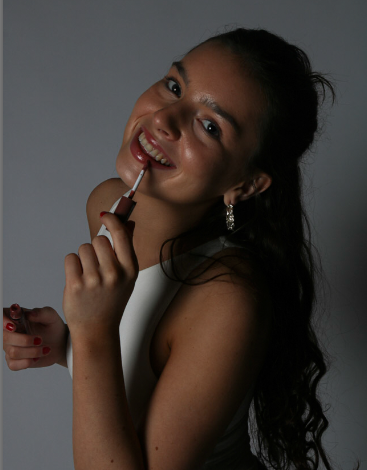
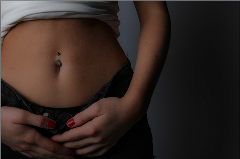
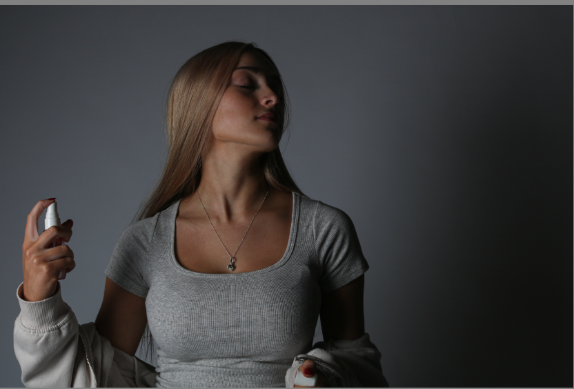
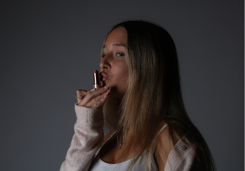
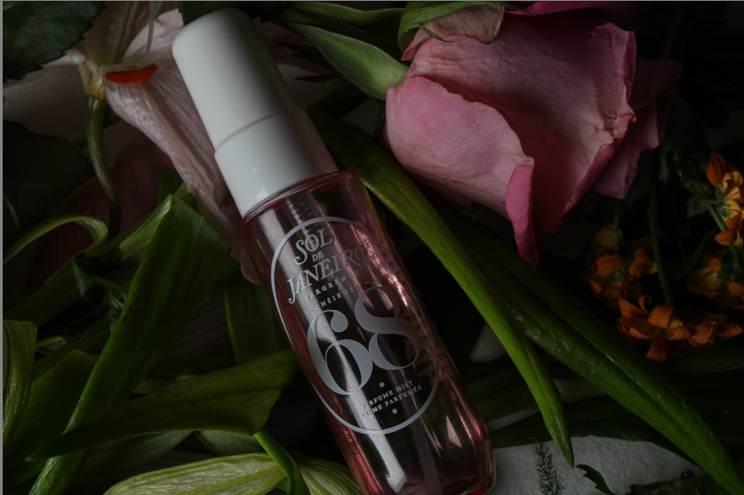
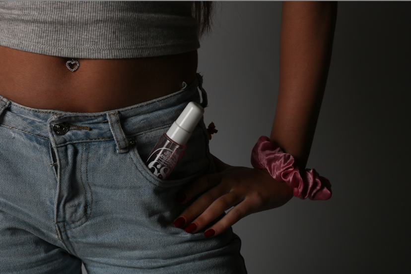
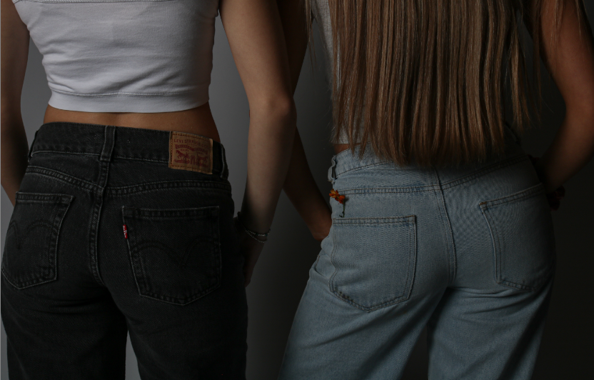
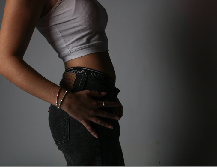
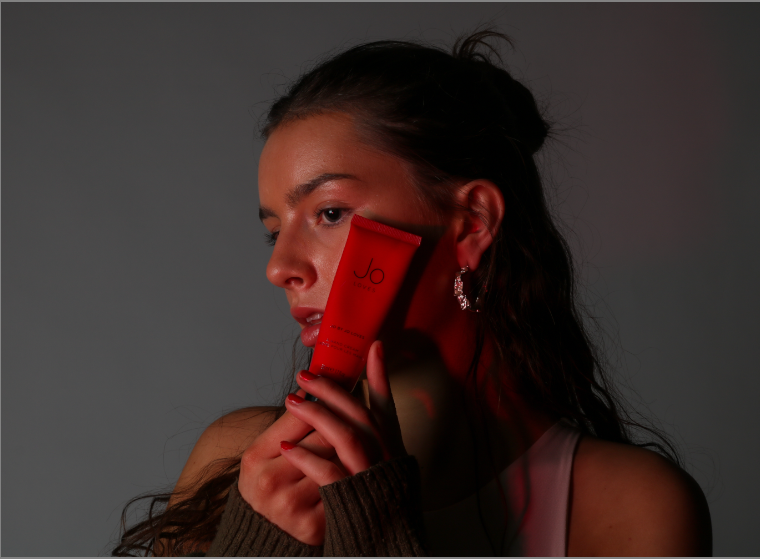
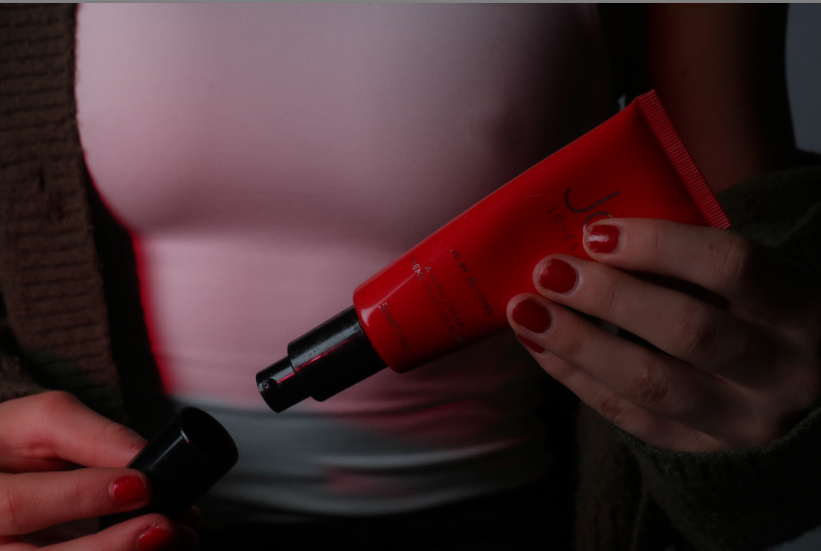
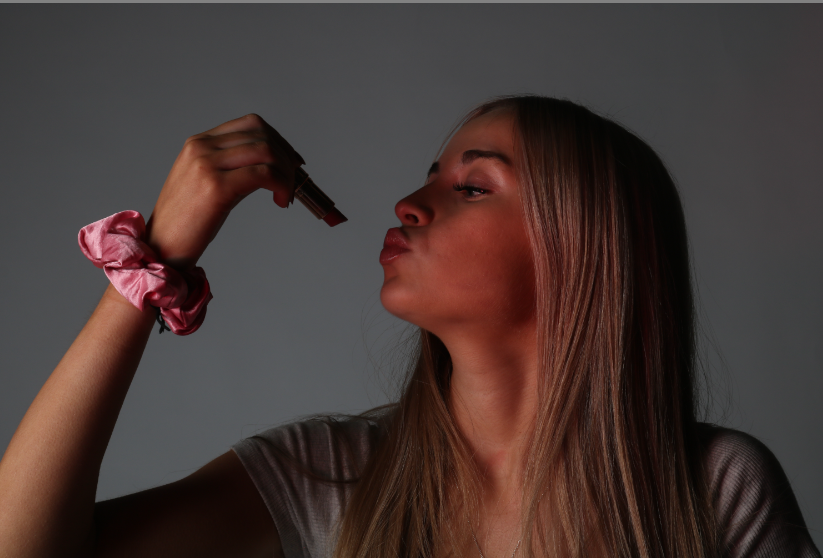
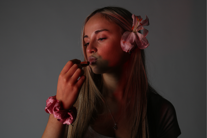
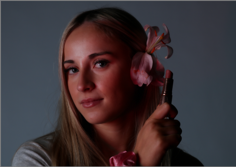
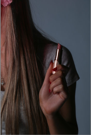
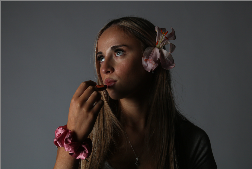
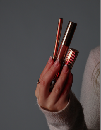
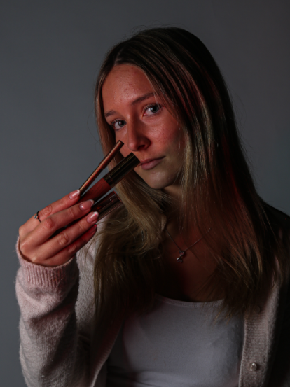
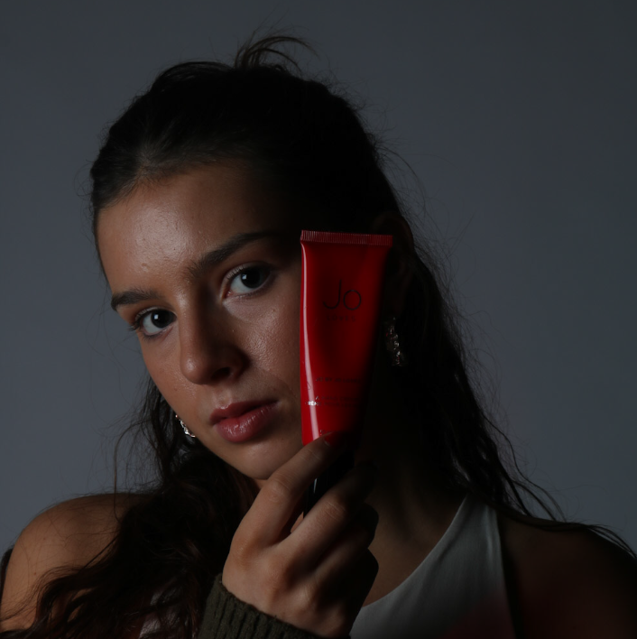
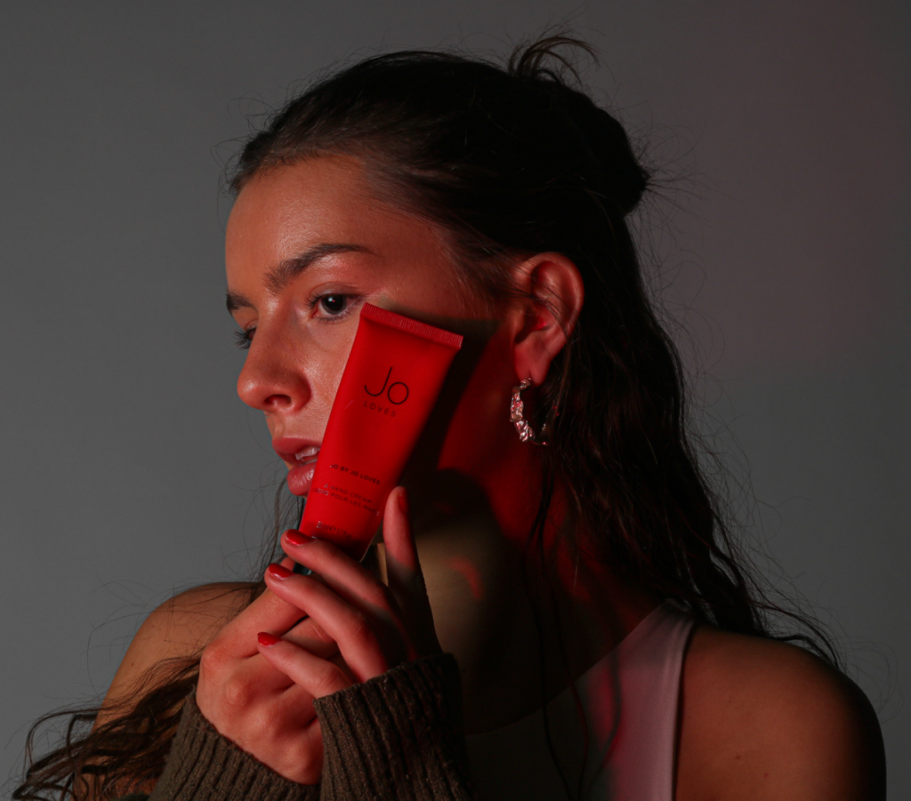
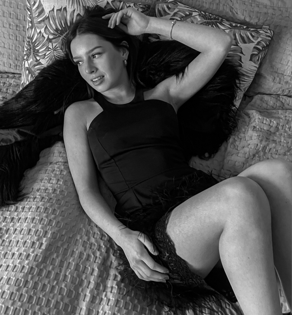
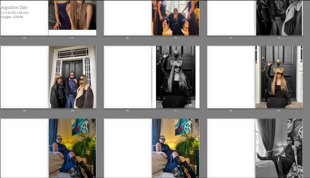
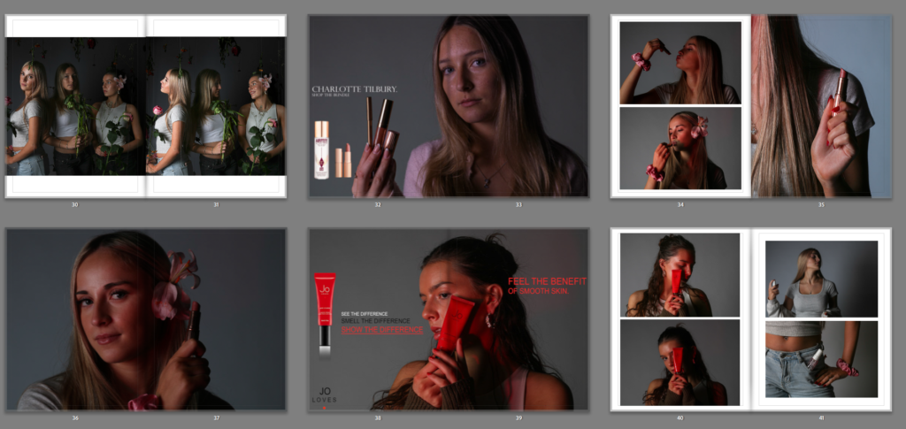
I really like this middle section photoshoot for my book as I feel these are my highest quality images which I took in the school’s lighting studio. I also edited these images in Adobe Photoshop and added small products into my images alongside logos and captions such as ‘smell, attract better’ in order to display this hidden meaning of the urge to be attractive that pushes women and girls in this generation to be as pretty, attractive and appealing as they can be in order to ‘fit in’. I like the attention to lighting in this photoshoot and how images with e.g. a red product, displays a red light onto my model, or a product with a pink product, displays a pink light onto my model, I feel that this makes my photographs look more professional and visually pleasing for a viewer.
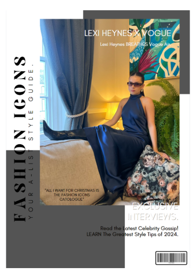
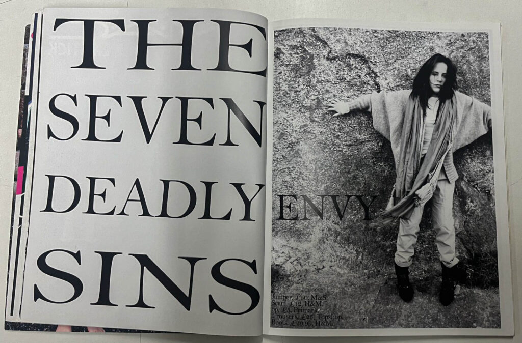
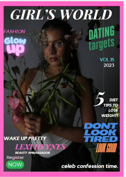
Cover 3:

This cover is my second favourite out of the entire book, I particularly like the colours and decoration associated with this front cover, however, I dislike the shade of brown chosen for the page alongside it and the background of the image. This is because of the darkness accompanied with the light colours of the cover. However, the heading of ‘self love’ is the same colour as this page which helps it tie into the theme of the cover, however I feel a more lighter and inviting shade would be less harsh on the eyes and create a more easy-going and light-hearted shade of cream, to still tie into the themes.

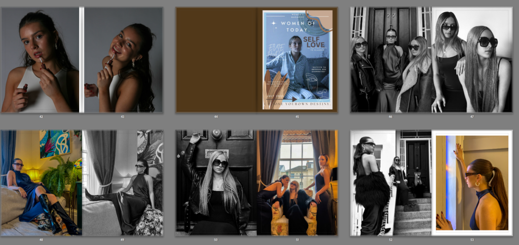
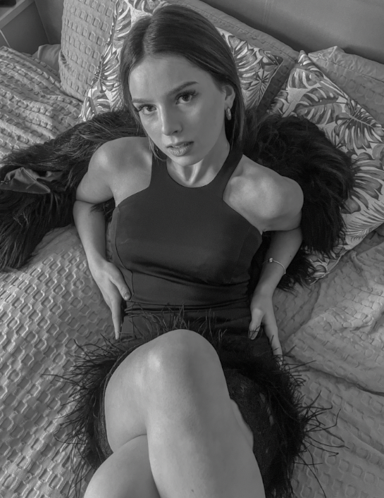
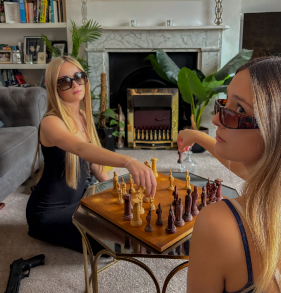
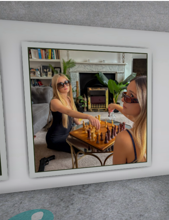
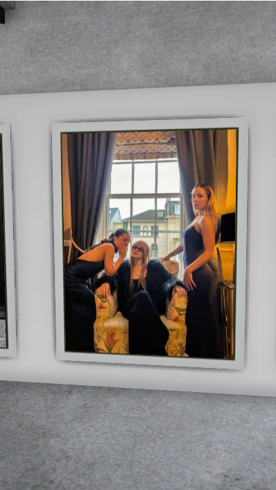
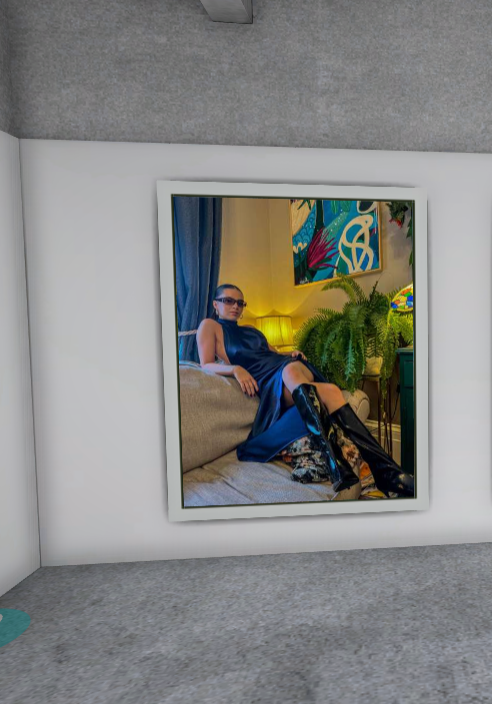
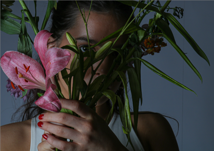
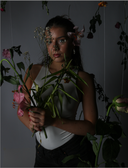
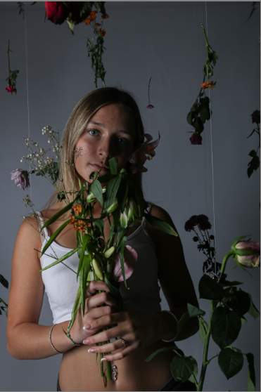
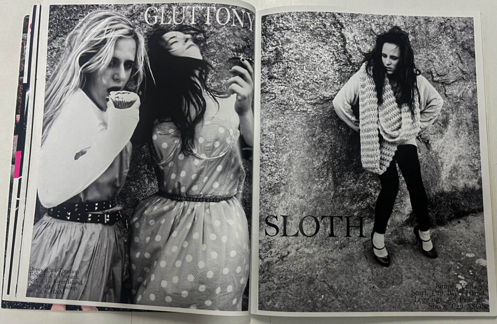
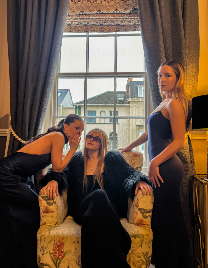
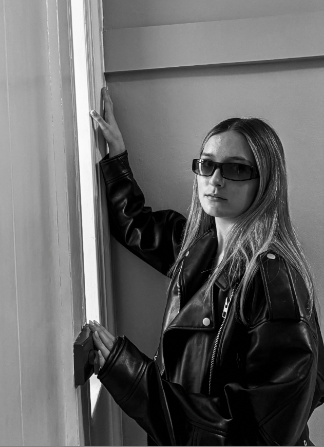
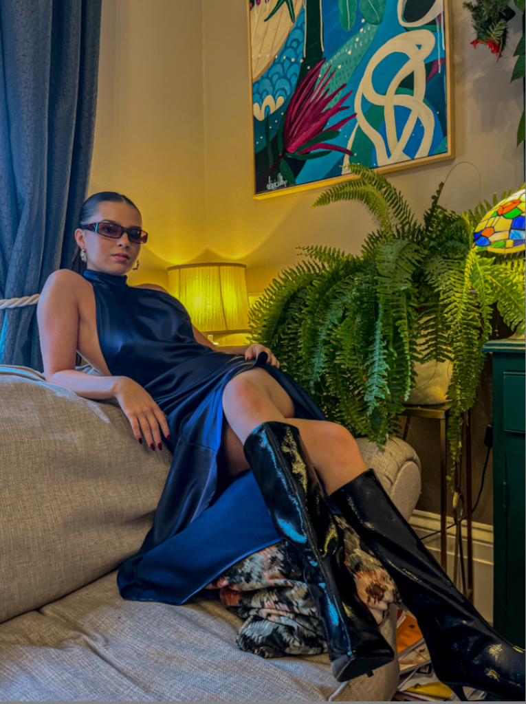
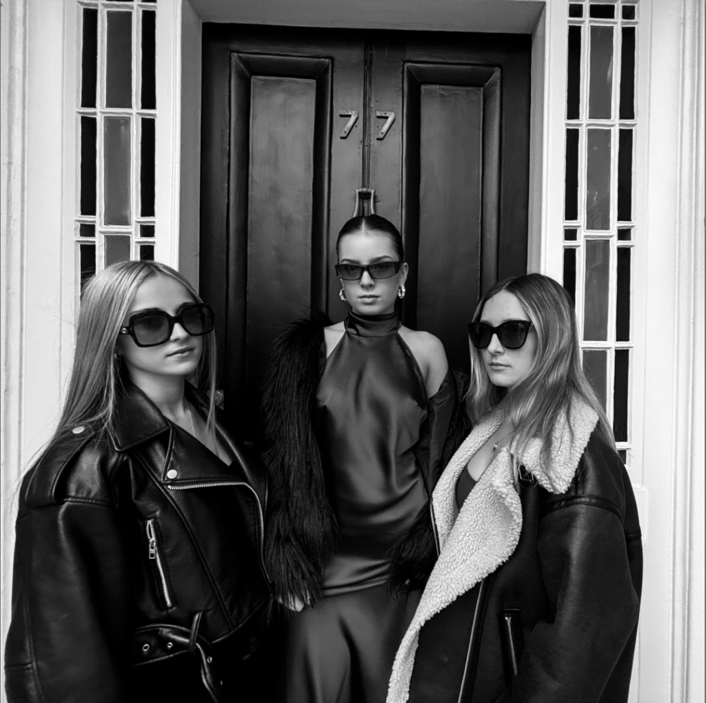
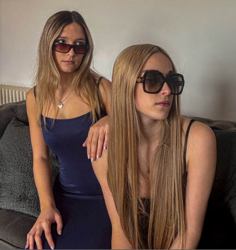
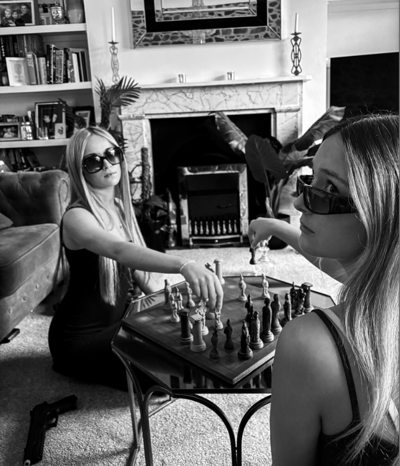
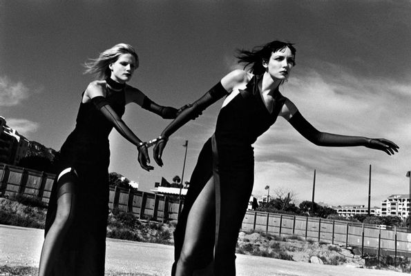
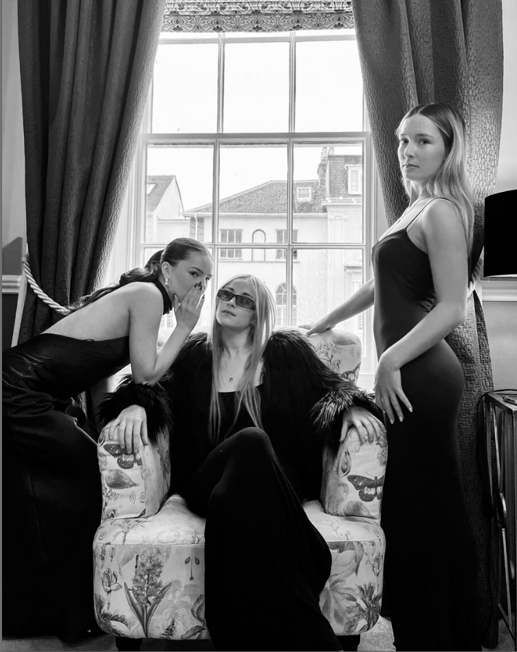
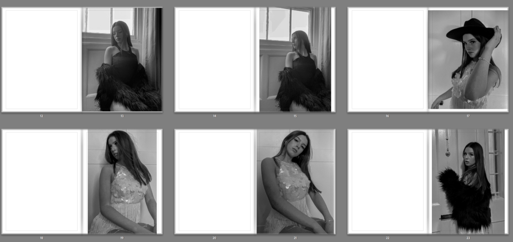
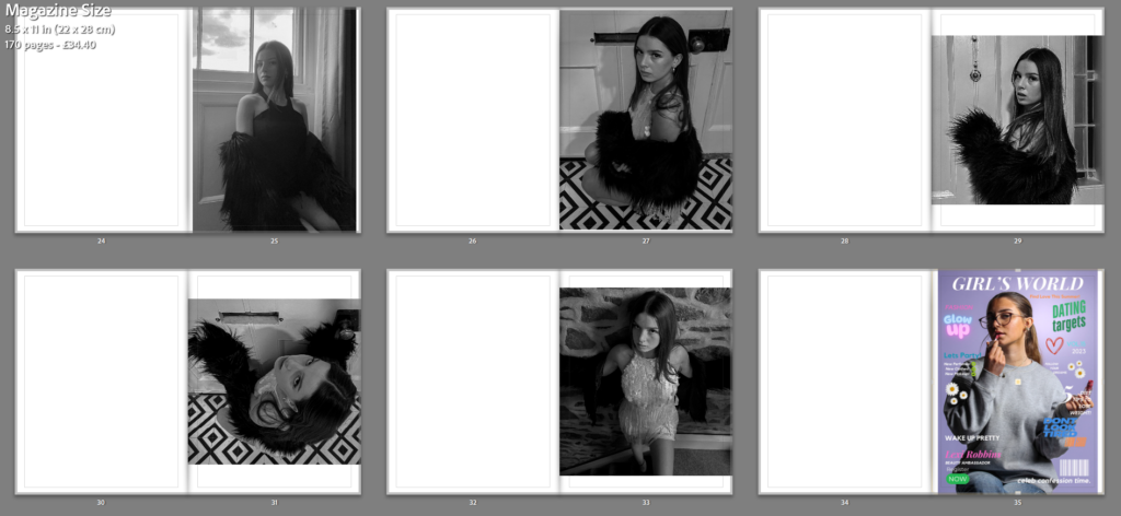
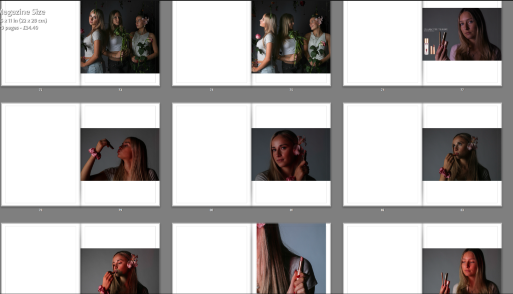
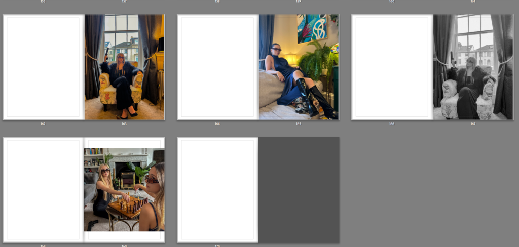
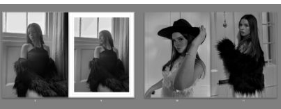
I really like this final section photoshoot for my book as I feel these are a more interesting, formal aspect to my work which displays Helmut Newton inspired images, I took these at a friends house and decided to use grand furniture and bright colours in order to display themes of setting and objects that Helmut Newton did also. I also chose to have similar costume for all my models which was long black/navy dresses which is an aspect I feel paid off in these images, I also used sunglasses on my models to seem more traditional and higher class. I feel the editing of these images also helped with making them look more striking and eye-catching like Helmut Newton’s work is. I like how there is a mix of black and white images with coloured images which help to tie in the other two photoshoots as one was all black and white images and the other was all colour images. I feel these more dramatic and tableaux style images is a good end to my book and differ very much from my second photoshoot and its modern twist as this photoshoot focuses more on previous work by famous photographers like Helmut Newton.

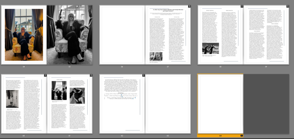
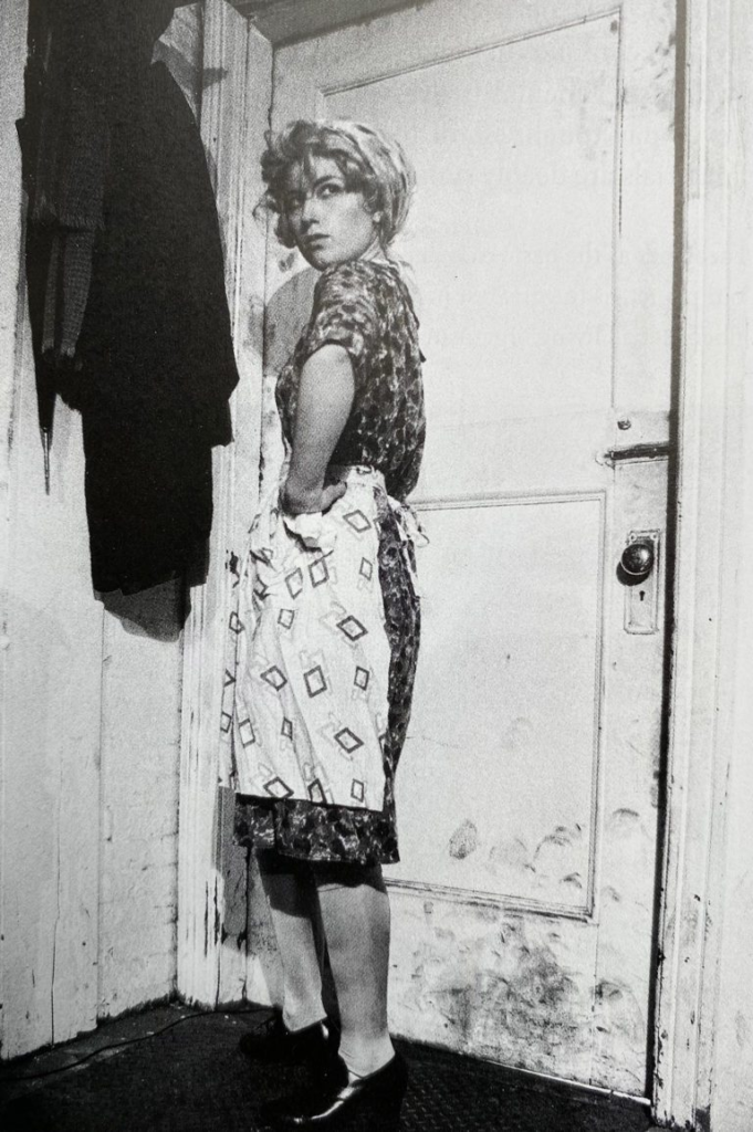
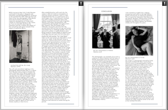
In my final pages of my book, I have displayed my essay. I chose to have 1 blank white page separating this essay from my photographs to show that the photoshoot has ended and the essay has begun. My title of ‘Through His Eyes: Exploring Femininity and Gender Stereotypes- is displayed largely at the beginning of the essay at the top of the page to display that it is my essay. I used headings for each paragraph to indicate what it is about and I also used photographs of both photographers work such as Cindy Sherman and Helmut Newton, and also my own images to show examples of images I have made in response to these photographers, I also included my bibliography in my essay to show all the references I used throughout my essay such as quotes and information from the internet and websites. I really like how my essay was displayed and I feel that the layout matches the contents page which is a nice touch to my book and shows a theme throughout. Here is an example of how my layout of my essay is similar to my contents page.

ESSAY LAYOUT
CONTENTS PAGE LAYOUT

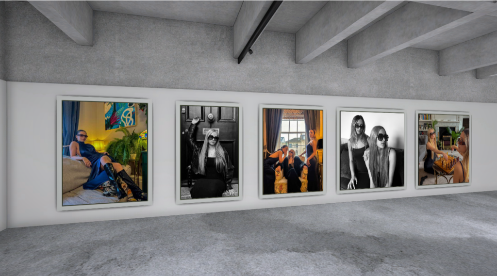
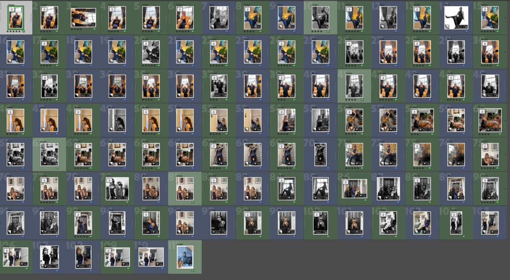
AFTER EDITING: Here is a full final layout for my photobook.

Here is a link to my magazine: Through His Eyes

Virtual Gallery’s on Photoshop.

Creating a Virtual Gallery.

My Chosen Gallery Image:

When creating my virtual gallery I like to first begin with choosing a good, strong empty gallery image which will display my images to their best quality and will look good whilst being displayed, I like to have a white wall image which shows light onto the pictures as if they are in a real gallery, whilst being displayed on black canvases.

My Chosen Images:

I then chose my best images from my first photoshoot that I wanted to be displayed in order to show off my work in the best way possible and show the best images from this shoot to be put into a virtual gallery. I chose these 4 images specifically as I feel this amount of pictures fitted the layout of my chosen virtual gallery the most.

Creating Virtual Gallery:

I first started by importing a virtual gallery into Adobe Photoshop and positioned it to fit the shape well. I then imported my 5 images and fitted them to the best scale on these evenly sized picture frames. I quite like how the images do not completely fi the frames as it shows each image is different and displays them all in a way that is not too boring on the eye and stays interesting and different when viewing each different picture.

Shadows and Perspectives:

For this specific chosen empty gallery image, I did not have to work on my chosen perspectives such as tilting them as if they are on e.g. a side-on wall facing inwards, as all 5 images are facing forwards. This means that instead I had to focus on the shadows that would occur if these images were to be on a wall. For this i used the drop shadow icon. To achieve this..

I first double clicked my chosen layer which contained the image I wanted to create a shadow for first…

LAYER 2 SELECTED TO ADD DROP SHADOW

Then appears the layer style tool bar which allows me to add my drop shadow my clicking the ‘drop shadow’ icon at the bottom.

LAYER STYLE TOOLBAR

I am then able to choose the opacity, distance, spread, size and angle in which I want my shadow to be. I need my shadow to be below the images as this is the perspective that is created when an image is presented on a wall facing forwards.

DROP SHADOW TOOLBAR.

Here is my final first outcome of a virtual gallery of my images, feel this is a good first virtual gallery displaying 5 images from the first section of my book. This is the photoshoot is used to represent a 1960’s/1970’s women’s fashion and lifestyle magazine which is used to influence the styles and choices day-to-day, of women that were living during this period.

My Next Virtual Gallery.

My Chosen Images.

These are my 4 chosen images for my virtual gallery, I feel these images are the strongest from the second section of my magazine which is a photoshoot dedicated to my modern day girls magazine section of my magazine. This section is demonstrating a magazine targeted at teenage girls and younger adults and the unrealistic beauty standards that are forced upon them. I decided to create my virtual gallery on Artsteps this time, in order to create more variety in my virtual galleries and show different methods of presenting my work. I found using Artsteps particularly confusing, but after getting an understanding of how it works, I was able to figure out the instructions and way to create this gallery.

IMAGE OF GALLERY BEFORE PHOTO INPUT.

My Final Outcome:

My Next Virtual Gallery.

My Chosen Images.

These are my 5 chosen images for my virtual gallery, I feel these images are the strongest from the third and final section of my magazine which is a photoshoot dedicated to my modern day women’s magazine section of my magazine. This section is demonstrating a magazine targeted at women who may be transitioning into older age, or who may just be struggling with body image. It is a magazine which is highlighting the unrealistic beauty standards that are forced upon them in today’s age and how they are toxic and must be overcome. I also used Artsteps again for this virtual gallery in order to gain more confidence with using the software, for future purposes, such as my exam.

IMAGE OF GALLERY BEFORE PHOTO INPUT.

My Final Outcome:

Overall, I feel this process of creating virtual galleries has been successful for trying out new software and attempting to display my images in the best way possible. However, overall I feel I prefer to edit, input and display my images in Adobe Photoshop, and I feel for my exam work, this will be the best way possible to create my virtual galleries, although I think these three galleries have been mostly successful.

MOCK DAY BOOK EVALUATION.

I believe my final photobook was extremely successful. However, to improve I believe my experience would’ve been a lot easier with more preparation In prep for my next mock exam and the final exam, I must remember to complete small details which should not be left until the final 3 day exam, as this will waste time and may prevent me from finishing all my tasks. Unfortunately I was not able to print my book to Blurb on the final day of the mock exam, and instead had to order it the day after, this can not happen in my real exam and must be completed within the time limit. However, this mock has taught be to work more efficiently with time and pay attention to the blog posts, planning and prep hat needs to be done in the weeks leading up to the final mock. I believe that however, I worked well under the pressure and solved any issues which resulted. For example, my images were not of a high enough quality to be posted onto my book, this was an issue I had to overcome, and attempt to find images of better quality which would not result in low quality and blurry images in my final book. Another issue I also faced is my final complete blog post with all screenshots and aspects of my mock process was unable to saved and erased from the blog, the outcome of this has been a highly less detailed analysis of my work completed on the mock date, however, with extra work and more explaining I will be able to overcome this by attempting to replace any screenshots that were erased and attempting to find clear pictures that I can use to input into my analysis blog post. I also need to beforehand, work on a practice book on Adobe Lightroom, where I can experiment with photo layouts and what kind of layout will look clean and effective to help my images be presented in the best way possible. An aspect of my work I am glad I included was a small paragraph demonstrating my intention for each magazine at the beginning of the book, this sort of contents page has helped to escalate the quality of my book and helped the reader to understand my intention of female gender stereotypes over time. I have focused mostly on the contextual and conceptual side of my work and focused more on a storyline of work and demonstrating a feminist viewpoint and both critiquing and praising the works of photographers through time. I also referenced both of my inspiration photographers Cindy Sherman and Helmut Newton in my book through my essay. I incorporated their work into a paragraph of analysis on their work and their intention. I then focused a paragraph on image analysis of their work and how I can relate it to my own, I then also compared a theorists with their work and highlighted the differences and similarities of their work, alongside the positives and negative of their viewpoints. I also incorporated my two inspiration photographers by including a photoshoot each in my book of images inspired by their work, this has helped my work be more relatable to the analysis I have completed on their work, and how modern day photography can relate to their work, without provocative and negative stereotypes of women.

Photobook Specification.

PHOTOBOOK: Mon-Wed + MOCK EXAM
Follow these steps:

You want to aim for a draft layout before the Mock Exam begins, then use the two days allocated to fine tune final layout and design.

Draft Layout of Photobook.

1. Write a book specification and describe in detail what your book will be about in terms of narrative, concept and design with reference to the same elements of bookmaking as above.

Narrative-

Narrative: – Describe in:

  • 3 words – Female Gender Stereotypes

  • A sentence– The importance of stereotypes forced upon women in the past and present day and how it affects society and young adolescent girls.

  • A paragraph– The topic I would like to explore is girlhood and femininity. I will be focusing particularly on older teenagers at the age of 17-19 and the struggles of moving from adolescence to adulthood and the hardships young women face. I like this topic as it is a current topic which is faced globally, and I feel it is a topic which I will enjoy expressing my opinion on and it is an important topic which needs embracing by young people especially. I would like to initially explore how the media portrays women in positive and negative ways and how it creates derogatory and unrealistic stereotypes of women. Gender Identity and roles is a topic I wanted incorporate and the stereotypical themes and personality traits a woman is expected to have. I find this topic interesting as expectations and views on women are changing but not particularly quickly. By focusing on multiple branches of femininity and youth such as empowerment, stereotypes, different eras, I would like to cover different aspects of women, femininity gender stereotypes, identity and rights. The idealised view of women is the key part to my chosen topic, and I feel I can expand on this by including both positive and negative viewpoints. 

  • How you want your book to look and feel– I would like my book to be a hard cover rectangular/ squared book with a clean sleek feel to it. I would like it to be relatively large (around A4) this is to create a book which is not too difficult to read and so that my images are not too small to see the details and understand the message behind them.

  • Paper and ink

I am using a magazine layout style book which will have thinner paper for my book to have a more magazine feel to it rather than a book feel. This will be thinner paper inside which magazines and newspapers typically have.

  • Binding and cover

This front cover will be a soft/paper back front cover due to it being a magazine and not a book.

  • Title – My title will be something to do with the male gaze. I would like the title to just plainly be ‘The Male Gaze’ but I feel this title may be slightly too basic and not capture an audiences attention as quickly. However I also like the idea of ‘Through his Eyes: Exploring Femininity and Stereotypes, I really like this title as it is including the male gaze in a way of not directly saying Laura Mulvey’s idea of the male gaze but instead saying it in a less direct way. The next part of ‘Exploring Femininity and Stereotypes’ also is a short way or explaining the project I am exploring. However this second section may make my title slightly too long, however I really like this title but could also shorten it to ‘Through his Eyes’ as a large title and then accompanied and anchored with the subheading of ‘Exploring Femininity and Stereotypes’. Here are some other ideas for title names:
  • – The Male Gaze
  • – The Gaze
  • – Gazing
  • – Through their eyes
  • – Through His Eyes: Exploring Femininity and Stereotypes

  • Design and layout

I am going to have a book with a main front cover, a first front cover with a magazine interpretation of a 1960s/70s magazine., using Cindy Sherman inspired images. I am then going to have a magazine cover of a modern day girls magazine with promotional images of products inside, I will then have a final magazine cover from a modern day women’s empowerment magazine with Helmut Newton inspired images inside.

  • Editing and sequencing

I am going to create this book on Adobe Lightroom and It will include images that are edited by using black and white filters and also editing resources provided by Lightroom to make my images bolder and higher quality. I will also be editing a section of images on Adobe Photoshop, which make the images look like promotional images with brands such as Gucci, Charlotte Tilbury promoted inside the book, I have also edited the magazine covers on Canva in order to create realistic magazine covers from software specialising in covers, this has helped to increase the value and complexity of my work to make it more realistic and believeable.

  • Images and text-I would like my images to take up the whole page so that they are large enough to see, however this may be a struggle as many of my images are portrait and many of them landscape. This may means that my e.g. portrait images would not be able to fit the page completely. However, any portrait images could have a small white border around them, but still take up the majority of a page, or vice versa. I do not think that I want more than 1 image on a page, however when it comes to my second section and I am focusing on the fashion and beauty industry pushing beauty products onto young girls in order to make them want to be beautiful and purchase their their products.

2. Produce a mood-board 

Here is a mood board of the Blurb Inspired photobook I have seen. I would like my images to be presented in a clean, sleek way which makes the book easy to read and enjoyable. I like his layout of clean white lines to separate images as I think it makes the page look less busy and does not clash with other images which decreases the quality of the book.

9EVALUATION: Upon completion of photobook/ film and presentation of prints make sure you evaluate and reflect on your learning and final outcomes. Comment on the following:

I believe my final photobook was extremely successful. However, to improve I believe my experience would’ve been a lot easier with more preparation In prep for my next mock exam and the final exam, I must remember to complete small details which should not be left until the final 3 day exam, as this will waste time and may prevent ,e from finishing all my tasks. Unfortunately I was not able to print my book to Blurb on the final day of the mock exam, and instead had to order it the day after, this can not happen in my real exam and must be completed within the time limit. However, this mock has taught be to work more efficiently with time and pay attention to the blog posts, planning and prep hat needs to be done in the weeks leading up to the final mock. I believe that however, I worked well under the pressure and solved any issues which resulted. For example, my images were not of a high enough quality to be posted onto my book, this was an issue I had to overcome, and attempt to find images of better quality which would not result in low quality and blurry images in my final book. Another issue I also faced is my final complete blog post with all screenshots and aspects of my mock process was unable to saved and erased from the blog, the outcome of this has been a highly less detailed analysis of my work completed on the mock date, however, with extra work and more explaining I will be able to overcome this by attempting to replace any screenshots that were erased and attempting to find clear pictures that I can use to input into my analysis blog post. I also need to beforehand, work on a practice book on Adobe Lightroom, where I can experiment with photo layouts and what kind of layout will look clean and effective to help my images be presented in the best way possible.

5. Print a set of small work prints (4 to one A4 page) on the Laserjet, cut them up in guillotine and lay them out on the big white table for editing.

6. Decide on format (landscape, portrait) size and style of your photo-book. Begin to design your photo book, considering carefully, narrative, editing, sequencing, page spreads, juxtaposition, image size, text pages, empty pages, use of archival material etc.

I would like for my book to be around 30-40 pages long, like a usual conventional magazine and I would like for there to be sections dividing up my photoshoots, I will be adding my essay to the back of the book and I will be including a contents page to the beginning of my book.

7. Add your illustrated essay at the end of your photo book, including title, any captions (if needed), bibliography, illustrations of artists work (incl data) and images of your own responses. Think carefully about font type, size and weighting.

Book Layout:

FRONT COVER:

I have chosen to pick two strong images from my photoshoots to use as the front and back cover of my photobook, this is to immediately get the viewers attention of what is expected inside the book. I like this image because it displays the high quality images that are going to be inside the book. This gives the viewer a clear indicator of what images are going to be inside and what the intention of the book may be about.

PARAGRAPH OF INTRODUCTION:

I would first like to begin with a small introduction to my book and explain the contents and basically why there is three different magazines inside and WHY there is 3 different viewpoints throughout time, of women. By having this introduction, the viewer will be able to understand the intent of the book, before they read it, by understanding the contents before they read it, a more straightforward flow of reading and viewing images, is able to take place. This contents page includes a small picture of each magazine cover and a small paragraph explaining which artist the section is inspired by, and what style of photography is included. The paragraph also includes

MAGAZINE COVER 1- 1970s Style Magazine.

This is the beginning image for my photobook. This image consists of a front cover of a 1960’s/1970’s women’s fashion and lifestyle magazine which is used to influence the styles and choices day-to-day, of women that were living during this period. Whilst analysing magazines from this period in order to create the best product possible, I took ideas on which colours, layout designs and which key headings were used to draw in the attention of this target audience.

HERE ARE MY TOP 3 IDEAS THAT I USED FOR INSPIRATION.

I chose to have a red border in order to incorporate an eye-catching bold colour surrounding my chosen image with a semi border of black to help it to stand out. I feel this black border also ties with the black title and this automatically displays that this is a women’s magazine aimed at this specific demographic of audience. I then chose to create phrases such as “Get the hourglass figure with a tiny waist and wide hips in these 3 tips.” and “CLEANING AND COOKING TIPS YOU WILL NOT KNOW HOW YOU LIVED WITHOUT” these are some quotes from this cover which demonstrate the target beauty standard for this era and what the traditional beauty standards were for women in order for them to be beautiful and attractive. I chose these specific ones as the ‘hourglass figure and wide hips’ was the most idealistic body type for women. I wanted these phrases to be short and demanding in order to demonstrate that these magazines and media products chose to push these standards on to women and make them feel as if they are pressured to look this way, and that the way for females to look like this, was my purchasing their products and in taking the advice from’ their favourite stars’ and how they look in order to get male attention.

IMAGES INCLUDED FOR INSIDE THIS SECTION.

MAGAZINE COVER 2- Modern Style Magazine.

This is the front cover for my modern day girls magazine section of my magazine. This section is demonstrating a magazine targeted at teenage girls and younger adults and the unrealistic beauty standards that are forced upon them. Whilst analysing magazines in this style in order to create the best product possible, I took ideas on which colours, layout designs and which key headings were used to draw in the attention of this target audience.

HERE ARE MY TOP 3 IDEAS THAT I USED FOR INSPIRATION.

This is inspired by magazines such as OK! and US weekly. These magazines include lots of products being advertised throughout, which pressures people to want to purchase the products. I have chosen for my magazine cover to include lots of pastel colours and bright colours which would catch the eye of a young adult and have a large picture of a beautiful girl on the cover which a girl may aspire to look like and therefore want to read. I also used phrases such as “Wake up pretty” and “5 Diet tips to lose weight” which may appeal to girls which want to in- fact be pretty and lose weight. Whereas in reality, these are derogatory and toxic phrases which may pressure girls into wanting to fit in, I chose to have such harsh things said on a seemingly wholesome and girly front cover to show how easy it is for these things to be covered up and ignored when people who actually read them are affected by their content. I also used flowers, pinks, purples and bright short quotes such as “Don’t look tired, look good” and “Glow Up” which are all small things girls have reported that they feel are pressures they feel in their teenage and young adult years. The idea of having words such as “glow up” on my cover, insinuate that inside there will be products that people can buy in order to glow up and ‘become pretty’. Then, inside my book there is a multitude of images which have been made into perfume and makeup advertisements which will force young girls to want to buy in order to fit in with trends and preferences which make them a stereotypical beautiful woman.

IMAGES INCLUDED FOR INSIDE THIS SECTION.

MAGAZINE COVER 3- Modern Style Women’s Empowerment Magazine.

This is the front cover for my modern day women’s magazine section of my magazine. This section is demonstrating a magazine targeted at women who may be transitioning into older age, or who may just be struggling with body image. It is a magazine which is highlighting the unrealistic beauty standards that are forced upon them in today’s age and how they are toxic and must be overcome. Whilst analysing magazines in this style in order to create the best product possible, I took ideas on which colours, layout designs and which key headings were used to draw in the attention of this target audience.

HERE ARE MY TOP 3 IDEAS THAT I USED FOR INSPIRATION.

I chose for this magazine cover to have a more homely, welcoming feel to it which is able to let the reader know it is a safe space within the magazine and that they will not be pressured or encouraged to purchase products that are meant to make them look thin or beautiful or always well dressed, but instead to promote comfort over look and natural over glam. This style of magazine is the future of women’s magazine, but for now targets a more niche market of women seeking peace within themselves and the way they look, dress and feel. I chose to have colours such as browns, whites and very beige colours for this cover as it is less eye-catching and popping with colour like the other magazines, as these magazines use these colours and bold writing to mask the underlying message of “if you do not purchase these products, then you will not become beautiful” whereas, in this magazine, the message is ‘Natural beauty is key, to finding yourself and your inner peace. The photograph on the front cover also displays a girl in her pyjamas and wearing no makeup, this is to automatically stick out from other products as viewers will notice that there is no, over the top, dramatized image with bold colours and makeup, and instead appreciate the unconventional front cover of a popular magazine, where a model is seen in her pyjamas and with no makeup on.

Essay Layout.

IMAGES INCLUDED FOR INSIDE THIS SECTION.

Inside Back Page Contents.

This page includes a final overview of the book through photos. I chose to include the section of the book and a small section of pictures included in the back to display a different perspective of the women included in my book and how they are displayed as positive and happy in their natural state, clothing and comfortable in their own skin. I believe that this was necessary to include in my book to shine a positive light on this project and subject that I have explored and display a natural and positive end to my book after exploring such complex and negative stereotypes of women and highlighting many errors in society.

MOCK PLANNING.

Mock Day 1-

Finish essay and make sure bibliography is correct. Also check that references are correct, essay plan is also clear and added to. Then PUBLISH essay+ essay plan.

EDIT images that are being included and in the book and make sure they are all the same type of lighting and vibe as the others. X3.

1ST PHOTOSHOOT, Front Cover! All similar sizes and orientation, also select the amount of photographs I would like to include and make sure they are not all too similar. ALL BLACK AND WHITE IMAGES

2ND PHOTOSHOOT, Front Cover! Make sure the images have a brand label at the beginning and then how some similar images, then include the next brand, show some similar images, brand 3 then show some similar images. ALL COLOUR IMAGES.

3RD PHOTOSHOOT, Front Cover! Make sure all images are edited and be mindful of lots of different orientations, choose images with the best quality and a mixture of black and white, best way forward. MIX OF COLOUR AND BLACK AND WHITE IMAGES.

WHILST CHOOSING, EDITING AND EXPERIMENTING, TAKE PHOTOS FOR BLOG AND ANALYSE ALONG THE WAY.

WHAT WENT WELL+ WHAT TO IMPROVE ON ANALYSIS.

Mock Day 2-

Complete photobook design and post pictures on the blog. Showing process and evaluate it. WHY have I chosen this layout, Why in this specific order. WHAT am I trying do demonstrate.

ADD ESSAY AT THE END OF THE BOOK+ SMALL INTRO TO THE BOOK AT THE BEGINNING.

Select my final prints, produce blog post on why chosen, layout ideas for images and SAVE TO PRINT FOLDER.

THEN, Finish any missing blog posts.

ADD TO BLURB AND PRINT.

Photoshoot 4

I decided to make a mood board for this photoshoot in order to gather ideas and inspiration for the type of images I would like to create. I wanted this photoshoot to be for the middle portion of my photo book and be for the promotion of products such as perfumes, makeup and clothing. I will be imitating different companies such as Mac, GUCCI and Charlotte Tilbury. I wanted to include lots of flowers in my photoshoot to demonstrate stereotypical female traits. I used 3 models for this photoshoot and focused on varying images from zoomed in, zoomed out or portrait and landscape to create images of different types. I wanted to include lots of flowers, makeup and stereotypical female colours such as red and pink which portrays an idealistic view of a women from the male gaze. I really like this mood board as it is eye-catching, girly and would draw in teens and women as it is an ideological aesthetic lifestyle they may want to relate to or aspire to live.

ALL PHOTOS:

This is the contact sheet of all my images= 400 images. I feel 400 images Is a successful amount for me to categorise and edit in Lightroom to pick the strongest images to edit and use in my final photobook. I feel this is one of the most successful photoshoots I have done in this personal study project as I really liked the lighting and accessories and objects used to convey the subject I wanted to interpret. I liked how although the images were taken in the photography studio, they are still interesting and relevant however, more interesting and colourful backgrounds could’ve helped to escalate these images. However, I could also edit these images in Adobe Photoshop or Adobe Lightroom in order to make the background colourful or patterned. Although, I also believe that these flowers I used have helped to make my images more eye-catching and interesting. I feel there are many pictures to work with and edit to create advertisement style images. I feel what went well in this photoshoots are the lighting and camera settings to help my images look high-quality and detailed. My lighting has also helped to create a slight spotlight effect on my images to show that the model is the focal point of the images alongside the products. I also feel my models’ positioning and posing was something that was successful in this photoshoot as they are doing the correct facial expressions and body language to ‘sell products’. This consists of straight faces, laughing, smiling and looking directly at the reader in order for the viewer to feel targeted and draw them into purchasing the product being promoted. However, In this photoshoot I feel that the although the lighting is good as it is mysterious and interesting, some of the photos have come out dark, although this can be fixed in Adobe Lightroom by increasing the exposure and increasing the whites and contrast in settings.

My Best Photographs:

I first decided to experiment with flowers to demonstrate stereotypical femininity and flowers often symbolise grace, gentleness, and happiness which demonstrates an idealistic way that can interest females and make them look at an images and read about a product which encourages them to purchase it. I feel this aspect has also added to my photos as the flowers are bright and eye-catching. The expressions of happiness also capture ‘joyful moments’ which makes the viewer associate the feeling of happiness being created when this product is bought. By having creative and highly visual aspects such as bright colours and striking images, makes the images stand out to the viewer. The product I would like to ‘pretend to promote’ is a perfume named ‘Gucci bloom’ which is a range of perfumes by Gucci which represent floral smells and bright coloured flowery packaging which is a stereotypical product which expects women to want as they need to smell girly and like flowers in order to ‘be womanly’.

These are my best photographs from this photoshoot. I feel these are the photos with the best lighting and quality. I have edited these on Adobe Lightroom. These images are to be displayed in the middle portion of my photobook which displays a magazine from the modern day which consists of celebrity gossip, product promotion, advertisements and content for teens and young adults. This is to promote products such as perfumes, makeup products, lip products etc. I wanted to make a range of images displaying photographs for my second segment of my photobook. These images consist of images of my models holding the products, the products being displayed and my models posing for a photoshoot, to promote the product. This means that I can group these images together for different segments of this chapter of the book. There is also images of my model on their own which I wanted to photograph for any extra pages where my book may need pages filled with relevant photographs.

I feel this photoshoot was very successful as my models are young adults who are the target model age for my work and their clothing and settings match the aesthetic and message I would like to portray. I like the colours of my images and chose to add a coloured gel over my light in order to create hues of reds, purples and pink. For example.

IMAGE WITHOUT RED HUE FROM COLOURED GELS.
IMAGE WITH RED HUE FROM COLOURED GELS.

I feel like this small change in the image makes it look more high quality and also makes the image more interesting as the product is more eye catching and the model looks more bright which helps the image to stand out and look less flat. I feel this was a good decision to make in my photoshoot and Is something I wish I had included throughout the shoot and not just towards the end. I also believe I may need to do one more photoshoot for images for my photobook, however, I also feel that around 3-4 photoshoots have captured the types of images I wanted, however, I think that a wider range of images Is more reliable when choosing images for my photobook, but this means more products, logos and editing on Photoshop is needed to add these into the middle section of my photobook which may be time-consuming and difficult within my time frame.

Magazine/Photobook Ideas.

I have decided to create a magazine page to experiment what my images would look like in my book if I were to create a magazine style book.

I have researched on many previous students’ work that have revolved around women’s’ equality, beauty and fashion magazines and Cindy Sherman’s entitled film skills. By researching these different themes of femininity in photobooks I am able to choose the specific layout and style of book that will compliment my work of the juxtaposition between fashion magazine modelling and how it undermines, humiliates and sexualises women, BUT also how feminist movements and support is helping to shift these stereotypes.

EXAMPLES:

Here are some layout examples of modern day fashion, celebrity and gossip magazines. However has my images vary in themes styles and eras, I am struggling to figure out a way that can differ my photoshoots and their different meanings.

TEMPLATE:

MY MAGAZINE:

EXAMPLE OF AN AIM:

This is an example of a magazine that could be a usual, mainstream fashion magazine which has women empowerment, but is also slightly stereotypical by including celebrity gossip and ‘style tips’ as opposed to women’s stories and empowerment about a ‘new wave of beauty’ and how being natural and yourself is not ‘not beautiful’.

PAST STUDENT WORK INSPIRATION.

By researching this style of photobook I have gained ideas on layout content and photographs. This past student’s work is very similar to what I would like to create apart from few minor details. I would like my photobook to include at least 3 different magazines inside. This past students work of ‘Leah and Lilly Sutherland’s’ work has helped me to direct the type of work I would like to create in progress with my personal study project. They have incorporated fashion into their photography and used well known brands such as Mac and Dior to impersonate promoting these brands through modelling. This is particularly inspiring for me and has shown me ideas on how to layout my images for my middle section of my photobook which will include a magazine for promoting products through the objectification of women and stereotyping them into believing they must look good, smell good and please the male gender in order to be attractive and successful.

LAYOUT IDEAS:

I would like my photobook to include 3 different viewpoints and interpretations of magazines. This would show the viewer the types of negative and positive messages that are shared in mainstream media and highlight the key difference between them. The front cover would differ from the magazine. I would like my first magazine to have its own front cover style first page and include photographs from the photoshoot which relates to that era and style of photographs. I would like my second section to also then have a magazine style front cover and include images hat are edited in photoshop to example articles and spreads in media products that pressures and create negative imagery for young people to want to spend their money on in order to fit the demographic of the young beautiful idealistic woman. The last magazine will also have a magazine style front cover and then include images that are simply displaying fashion and do not dehumanise or objectify women and instead show them as having possession of power and authority.

Front Cover Idea.

The front cover would be a basic cover not related to either of the three magazines but more an overview of the general message. Most likely I would like to include images that I have taken in a previous photoshoot of my 3 models. These images show women showing their natural personalities. These images show my 3 models that are used within the book in their normal clothes displaying whatever behaviour they feel at the time of being photograph. I believe that this shows a more authentic natural display of these women and how they stay positive and strong regardless of the hardships and difficulties they face.

First Magazine Interpretation Idea.

One would be portraying a negative, dehumanising style of magazine that is forcing negative stereotypes on women and how they should be this, beautiful and attractive at all times in order to please the male gender. This style would be from my Cindy Sherman inspired photoshoot and display a more ‘old fashioned’ way of portraying women. This is to show how time began with media’s portrayal of women and how women directed magazines raised women to think and act.

Here are some examples of women’s magazines which influence women to have negative views of themselves and also influence men to have patriarchal unequal views on their wives, girlfriends and women as a whole.

Examples of traditional newspapers from within this time period:

From Marilyn Monroe to Cindy Crawford: A Historical Analysis of Women’s Body Image Depicted in Popular Magazines from 1952 to 1995

  • Harper’s Bazaar
  • Glamour
  • Woman’s day
  • Flair
  • The Ladies’ Mercury
  • A Lady’s Year
  • Vogue
  • A vintage view

Here are some quotes I could include in my front cover in this magazine and also throughout my images of the first section.

  • How to look beautiful now.
  • How you can be more beautiful in 1958

Examples of the type of images to be included in section 1.

Second Magazine Interpretation Idea.

The next magazine style would be a more modern day ‘gossip magazine style which portrays women in a typically less human way but also still focuses on gossip, drama and invading peoples personal lives, whilst also promoting fashion and style products. I would like this magazine to focus on a slightly younger girls and how gender expectations and stereotypes are used to convince girl to purchase goods and products such as makeup, perfume and clothing.

Examples of traditional newspapers from within this time period:

  • In Touch Weekly
  • Us Weekly
  • Closer
  • Women’s Health
  • OK!
  • PEOPLE Magazine

Here are some quotes I could include in my front cover in this magazine and also throughout my images of the second section.

  • Get slim detox diet
  • Makeup to cover all those insecurities
  • Smell better, attract better
  • Longer, leaner, legs- dress to look taller
  • Dress to impress the boys this summer
  • Win a full makeover to WOW your boyfriend

Examples of the type of images to be included in section 2.

Third Magazine Interpretation Idea.

The next magazine style would be a more modern day women’s empowerment style magazine which displays women as strong and powerful. This section will target a niche market and display women in the way they should be which is inspirational. This is to highlight the future of advertising and how it should be in order to motivate and encourage women to celebrate themselves.

Examples of traditional newspapers from within this time period:

  • Vogue
  • Professional Women’s Magazine
  • Rebellion
  • Women
  • Power

Here are some quotes I could include in my front cover in this magazine and also throughout my images of the third section.

  • Break your silence
  • The fresh faces of feminism
  • Share your voice. Stand up

Examples of the type of images to be included in section 3.

Here is an example of a more empowering magazine. This magazine would be about empowering all forms of femininity, beauty, and individuality. By encourage women to be confident, smart, and independent. This differs from mainstream media products and targets more of a niche market of women who are seeking inspirational and empowering content.

DECONSTRUCT PHOTO-BOOK.

1. Research a photo-book and describe the story it is communicating  with reference to subject-matter, genre and approach to image-making.

2. Who is the photographer? Why did he/she make it? (intentions/ reasons) Who is it for? (audience) How was it received? (any press, reviews, awards, legacy etc.)

3. Deconstruct the narrative, concept and design of the book and apply theory above when considering:

  • Book in hand: how does it feel? Smell, sniff the paper.
  • Paper and ink: use of different paper/ textures/ colour or B&W or both.
  • Format, size and orientation: portraiture/ landscape/ square/ A5, A4, A3 / number of pages.
  • Binding, soft/hard cover. image wrap/dust jacket. saddle stitch/swiss binding/ Japanese stab-binding/ leperello
  • Cover: linen/ card. graphic/ printed image. embossed/ debossed. letterpress/ silkscreen/hot-stamping.
  • Title: literal or poetic / relevant or intriguing.
  • Narrative: what is the story/ subject-matter. How is it told?
  • Structure and architecture: how design/ repeating motifs/ or specific features develops a concept or construct a narrative.
  • Design and layout: image size on pages/ single page, double-spread/ images/ grid, fold- outs/ inserts.
  • Editing and sequencing: selection of images/ juxtaposition of photographs/ editing process.
  • Images and text: are they linked? Introduction/ essay/ statement by artists or others.  Use of captions (if any.)

UNDERSTANDING PHOTOBOOKS:
NARRATIVE, EDITING, SEQUENCING
DESIGN, FORM, FUNCTION 

Mother- Matthew Finn.

INFORMATION:

HARDBACK= 280MM x 200MM

ISBN= 978-1-911306-14-6

PAGES= 96 PAGES

LANGUAGE= ENGLISH

PUBLISHER= DEWI LEWIS PUBLISHING

PUBLICATION DATE= NOVEMBER 7, 2017

DIMENSIONS= 11.46 X 0.63 X 9.45 INCHES

ITEM WEIGHT= 1.6 POUNDS

INDIVIDUAL PHOTOGRAPHER MONOGRAPHS= BEST SELLER RANK NO. 3195

PORTRAIT PHOTOGRAPHY= BEST SELLER RANK NO. 5823

Matthew Finn Qualifications.

  • MA Photographic Studies (University of Westminster)
  • BA Photographic Studies (University of Derby)

Matthew Finn Teaching.

  • BA (Hons) Photography at Arts University Bournemouth
  • BA (Hons) Photography at Lincoln University
  • BA (Hons) Photography at University of Wolverhampton
  • MA Fine Art at University of Wolverhampton

Matthew Finn Awards.

Jerwood/Photoworks Award- 2015

1. Research a photo-book and describe the story it is communicating  with reference to subject-matter, genre and approach to image-making.

This book is a representation of Matthew Finn’s mother, Jean. He decided to photograph her in her home in Leeds in order to record and document her life as she ages and lifestyles change. The photos are reflecting a meaningful and touching overview of parents dealing with loneliness, old age and death. The bond between mother and son is also displayed throughout as relationships change and evolve through time. The quote “For my mother and I, this switch of roles was quick. Diagnosed with mixed dementia two years ago, she fell silent and our collaboration was over. I no longer exist to her and she cannot recognise herself. What remains are these picturesdemonstrates how mental issues and illnesses can both affect the person but also those closest to them. Adaptation to lifestyle changes cause emotional damage and this book was created to explore and spread a message about the fragility of life and how domestic changes affect a child. Creating images of his mother became a routine and a comfort to Matthew Finn as a way to appreciate and remember his mother throughout difficult times in their life. Small aspects of his mothers personality and style are repeated throughout such as her hair and significant clothing she treasured. The feeling of needing to protect and support his mother is reflected throughout. After being diagnosed with dementia, his images were no longer able to be captured, so this book is used as a way to reminisce and remember his mother as her true self before illness. The quote “I’ve lived a good life” demonstrates how no matter what hardships and obstacles his other has faced, she is still grateful and positive about the life she has lived.

2. Who is the photographer? Why did he/she make it? (intentions/ reasons) Who is it for? (audience) How was it received? (any press, reviews, awards, legacy etc.)

I chose to research this specific photobook as I believe it contrasts the work I am currently studying of Helmut Newton. My chosen photographer of Helmut Newton, demonstrates high-quality, glamourous fashion images used to promote clothing and products, whereas in contrast, these images focus on the documentation of the life of the older generation and highlight the not so glamourous and idealistic aspects of life. The models displayed in Helmut Newton’s images are photographed for fame, money and attention, whereas Matthew Finn’s mother was photographed as to be photographed is to be appreciated, to be seen and wanted which is an activity where his mother could feel needed and was able to express herself by taking role in what looked good and what she didn’t like. I find it very interesting that Matthew Finn did not mean for his project to become so meaningful and important to him as when he began photographing his mother he believed he created the book “Because she was there! I was about 16 in 1987. I’d just become seriously interested in photography and needed people – things – to take pictures of,” I find this particularly inspiring as something so basic as needing someone to photograph became a popular and touching lifelong project which highlights moments of hope, struggle and frailty are conveyed through Finn’s unceasingly compassionate filial gaze. The photographs are not portraits in the usual sense of the word, yet they are an account of a life, a deeply humanistic response to a set of human circumstances. Whilst viewing this piece of art the audience is able to join the photographer and his mother on a journey of life and how his mother has aged and how some particular habits never die out. These images may relate to viewers and help to consider the meaning of life an dhow their own parental figures have a larger and more significant role in their life than they’d think. By sharing these images, Matthew Finn is displaying only one journey of a single, aging parent in Britain, which represents a certain social class and culture. However, In reality multiple social classes, ethnicity and types of people all still deal with grief, loneliness and solidarity throughout life, especially in such a crucial stage of life such as motherhood.

Photo-Layout.

Matthew Finn’s book layout consists of a hardback book containing a beginning page of wallpaper from his mothers home. This beginning page creates an immediate homely, calm feeling of a mothers comfort and how even though he no longer lives in that house, the wallpaper will immediately remind him of childhood nostalgia and looking back. It is then followed by the title of the book ‘Mother’ and the photographers name “Matthew Finn”, followed by a signed signature personally by the author and the publisher in a small font below.

Evidence of ‘mothers wallpaper’ pages and title page.

The book then continues to a small 2 page explanation of touching moments in his mothers life such as different times he has taken images of her over the 30 years and how this project was not carefully ordered material but in fact a need to create stability and a ritual that he was not able to abandon. This essay helps to introduce the reader into the images there are going to view and provides an overview to the love, loss and hardship his mother faced throughout the period of 30 years he photographed her in her home. By doing this, the reader will feel a sense of familiarity and care for the mother and sympathise or empathise with the emotions and struggles she faced, alongside the happy and positive moments she shared with her son.

Image preview

His book then consists of around 90 images of his mother which are displayed as single images, double page images and occasional images with a white border around them. However, these three formats create a theme throughout the book as all the images are presented similarly but differ slightly.

I can see this because in some images she is looking and posing or the camera whilst smoking, talking, writing, drinking cooking or cleaning. This demonstrates her daily duties in her life and her routine in life at her household. and in others she is mid-motion and not looking at the camera.

The majority of the images are of the woman herself, however, some of the images are of her possessions and objects in her home such as picture frames, her sofa, tables and rooms. These images are to show her possessions and how they have meaning and purpose in her life as memories and comfort items.

The title ‘Mother’- is a straightforward, to the point title highlighting who and what the book is about. The word mother immediately displays to the reader that the person is a parental figure who is an important part in the artists life. The narrative is a story of his mothers life throughout the 30 years and how her physical appearance has changed and how she can been affected by old age and illness. The photos have a trend of candid or documentary photography styles. The structure consists of a concept and narrative of basic everyday life, but instead romanticises a comfort with everyday routine and how her life goes on despite outside events. All the photos are in black and white which is a trend amongst them all as it shows they are all equal and of equal matter. It also shows a more solemn and dismal view as the dark tones show a sense of loneliness and sadness which the mother experiences. Although the images are taken along 30 years the editing of black and white are all similar although technology has evolved massively over time.

ESSAY

In what way have Helmuth Newton and Cindy Sherman portrayed women?

‘Men look at women. Women watch themselves being looked at. This determines not only most relations between men and women but also the relation of women to themselves.’
John Berger, The Ways of Seeing, 1972

INTRODUCTION

The representation of gender roles and stereotypes have been interpreted in multiple ways and in many different forms throughout history. As a society, the world has begun to slowly adjust its ways and modernise values upon women into an equal balance between genders. However, along the way artists and photographers have shone light onto areas of society and media which demoralize and objectify the female gender for others’ gratification. Traditional gender stereotypes have been criticized and modified as individuals fight for attention to their true and deeper self instead of reducing them to mere physical appearances. By exploring how women are portrayed in art by different photographers throughout time, I am able to shine light on different views and interpretations from artists, both past and present. ‘Photographs alter and enlarge our notions of what is worth looking at and what we have the right to observe.’1 This quote portrays the purpose of exploring human perception of the world and highlighting the beauty in appreciating the smaller details that are essential to be exposed otherwise might go unnoticed by us as a society. This quote relates to my work as I am focusing on an area of the world which raises ethical and philosophical questions around the topics of overstepping a boundary and distorting female identities and worth to fit narrow beauty standards. The photographers I will be exploring are Cindy Sherman and Helmut Newton and how their work relates, differs and what message they create for the audience. I will be responding to their work by producing images with a similar style and message but with a modern-day twist on how photographs with the same underlying message are continued today even after a revolution of women’s movements.

Movie still from the film “Jailhouse Rock” 1957, by Bettmann.

THE MALE GAZE

The idea of the ‘male gaze’ was introduced by Laura Mulvey who explored this concept of the way ‘straight, white men’ see women in TV, cinema and print work. Throughout time, movements such as 1st and 2nd wave feminism protested for men and women to be treated as rational beings and women have the rights to social and political rights. Sexism and misogyny are continuous stigmas between women and men. However, the Women’s Liberation Movement introduced the process of “consciousness raising” in which they highlighted and opposed the systematic ways in which boys and girls are brought up with the assumption that the male is always superior to the female. By raising movements such as these, groups such as the Suffragettes announced their beliefs on equality and succeeded in raising awareness as feminist critical thinking became much more prominent and pronounced during the counter cultural movements of the late 1960’s and early 1970’s. Laura Mulvey’s work on ‘the male gaze’ in cinema and TV contributes to my work as photographers such as Helmut Newton, focus on this target audience of a ‘straight white man’ in order to increase sales and engagement. The concept of “scopophilia” and “narcissism” perfectly portrays Newton’s work and its purpose, which is to give a patriarchal audience the opportunity to view images disguised as fashion promotion in a normalised voyeuristic manner. The quote ‘Cinematic codes create a gaze, a world, and an object, thereby producing an illusion cut to the measure of desire.’2 applies to my view as I believe that small elements such as lighting, angles and editing all contribute to an audience’s perception of this particular repeated narrative of voyeurism and female objectification to satisfy the heterosexual male viewers. By researching such a popular and oppositional photographer I have been able to gain awareness on both viewpoints and how they have both faulted, excelled and how their rise to fame has altered the opinions and stereotypes that still maintain to this day.    

HELMUT NEWTON.

Helmut Newton was a photographer who was deeply significant amongst the fashion industry and its photography throughout the 1970s/80s. I think that his work is the perfect comparison for the world of fashion and modelling that I would like to similarly replicate and explore in my work. This is because I have a particular interest in the black and white style, elegant and high fashion black and white images that he created throughout his prime, and the definitive style and aesthetic that is displayed throughout each one of his images. The sophisticated and graceful style with high-fashion styling, empowered presence and timeless beauty reels in the viewer to never forget an era of high heels, flowing gowns and chic modern, complex elegance. As Helmut Newton was a very powerful and significant individual in the fashion industry, I feel he is an imperative element I must include in my work as a tool to examine the topic of representation of women in the media industries. The idea of how his beautiful yet underneath explicit content and objectification creates more of an impact than what meets the eye, was a key element of his work that I feel displays how media products are disguised as a confident and powerful female perspective yet reinforce women as an object of desire. Something that makes me fascinated with his work is the fact that Newton’s distinct style often featured strong, dominant women in exaggerated, sculptured poses and striking settings. His images were characterized by a high contrast, stark lighting, and a sense of voyeurism.   

Helmut Newton; Thierry Mugler (Monaco 1998) – Helmut Newton Estate

The lighting in this photo is a black and white dark toned image which has a high contrast which creates a striking atmosphere. The shadows are harsh and strong with the highlights being white and brighter. This creates a high contrast and bold impression. In this photograph the two women are highlighted as the focal point in the image due to the sharp shadows and dark dresses which have a strong and powerful style to them. This image includes a sense of symmetry and geometric framing. This is due to the way the two women are stood in a specific place which is known as deliberate positioning. This creates an easy way for the audience to immediately look at the subjects instead of the background. Shadows also accompany the focal point of the women by emphasising their bodies and in this image, possibly promoting the outfits the women are wearing. The female form is a main part of Newton’s work, and it is displayed in this image as there is emphasis on the shape of these women’s bodies and they display an idealistic and stereotypical body to please the male audience. The lighting of this images highlights the bodies of the women and their sculptural beauty. I like how cinematic thus image is as it looks like a quick shot taken out of a movie, as the women are mid motion, this creates a cinematic and narrative impression. The main contextual element to Helmut Newton’s work is exploring gender roles and sexuality. Helmut’s work has been previously critiqued for objectifying women, however, in my chosen image, I believe the women are shown as being dominant and in control. I like how his work challenges social norms and how he sees his photography as an opportunity to push himself to the extremes in order to convey his message. During the time this image was made, political and social issues were being faced globally. Women were fighting back for rights and equality and feminists were also challenging the patriarchal gaze. In this image, I believe the two women are challenging the idea that women should only be seen as passive objects of male desire. As Helmut Newton is also a fashion photographer, people, predominantly women, were used to promote outfits by creating a specific mood and impression though a story by the model and location. In this image, the women are in high- quality, high-fashion outfits, whilst portraying their strength and confidence through art. In Helmut Newton’s work, he focuses on the exploration of power, and gender, however, this message is executed in multiple ways that differ him from other fashion photographers. Helmut Newton orientated much of his work around nudity of women. This was to challenge traditional women forms and exploration of desire, dominance, and control. In this image, the concept and meaning behind it, explores ‘the perfect woman’ as both women are young, confident and beautiful and uses boldness to highlight their power over a traditional angelic woman. This image is an example of Helmut Newton, “pushing boundaries” and makes the viewer question whether the women are being celebrated or objectified. Helmut Newton’s work also complicates the male gaze as the women are not submissive and vulnerable, but powerful and in control, which contrasts the traditional male gaze, as the woman are aware and complying with it. This has sparked debates about whether Newton’s photography reinforces the male gaze or offers a more nuanced representation of female sexuality. 

JOHN BERGER

John Berger’s contributes to Laura Mulvey’s idea of the male gaze and believes that, ‘men look at women. Women watch themselves being looked at. This determines not only most relations between men and women but also the relation of women to themselves.’ 3this quote relates to my work as it explores how women are automatically deemed to cater to a male audience and do not view themselves through their own eyes, but instead through the eyes of men. This concept displays how gender roles continue in modern advertising today and mirrors how women must incorporate how a man is going to view her in day-to-day life, instead of focusing on a style or image she would prefer to have of herself. Berger also introduced the concept of the “surveyor” and the “surveyed” which simplifies the different viewpoints a woman has of herself. The woman becomes the surveyor, somebody who watches herself as an object, and she will also become the surveyed, who is being looked at. This split displays the “normality” of women being objects of vision and a form of “self-surveillance” is enforced to constantly monitor the different ways they may be perceived. His exploration on female nudes and how they are positioned to be admired, highlights how they are often gazing outward as if inviting the viewer’s attention, instead of focusing on their own self-love and value and not seeking validation from others. John Berger ties into my project, and my exploration on Laura Mulvey, but slightly differs with his views as he explores more critiques of the male gaze in historical art and advertising, whereas, Laura Mulvey examines the concept in the context of film and psychoanalysis. This means that, their main concepts of the “surveyed” and the “male gaze” relate to one another but their main arguments of women are conditioned to view themselves through a male perspective, and Hollywood films reinforce patriarchal power through visual pleasure, both investigate female gender roles in society and therefore, relate to my project of female gender stereotypes and representation.

CINDY SHERMAN

Cindy Sherman is an independent photographer who took photographs predominantly in the 1970’s. Something I find particularly admiring, is how she took her camera and pointed it at herself, instead of photographing someone else. I find this very unique and actually brings more meaning and creativity to the photos she created. This gesture then became her signature style and showed her strong views on gender and the construction of identity through key times when opinions and personalities were particularly changing in history. She also made many different characters that she would act as, in her images, in order to create a character in her photos by experimenting with makeup, hairstyles and costume to demonstrate these characters’ roles and status in life. The quote, ‘I feel I’m anonymous in my work. When I look at the pictures, I never see myself; they aren’t self-portraits. Sometimes I disappear’4 supports this as Cindy Sherman explains how she is transported into another persona, when becoming a different character. I feel that the subject of femininity and women in today’s age as it is a subject that I, myself live through and endure, and I have chosen Cindy Sherman’s work to convey my message from a strong feminist perspective. Analysing Cindy Sherman has aided the idea of how women are portrayed in the media as she, herself has worked on how women can be interpreted in different ways and all the multiple narratives they can fit in advertisements. Cindy Sherman’s work which was her most famous, was her Untitled Film Stills which are small black and white photos where Cindy has impersonated different female characters through glamourous and meaningful images. Throughout these film stills, Cindy Sherman imitated different lifestyles and character stereotypes which shows how women and women’s bodies are perceived by the mass media and by the male gender. Whilst moving to New York, Cindy Sherman continued to role play in disguises and characters and photographed her imitations as the Untitled Film Stills. Although she took many of her own photographs, some photos were shot by family and friends. The voyeuristic perspective of Cindy’s work creates an imposing feeling on the viewer, as if you are secretly observing the character and she is always the subject of the controlling male gaze instead of the object of masculine desire.

Untitled Film Still No. 35- Cindy Sherman. (1979)

The soft and naturalistic lighting in this photograph demonstrates that it is a photo from the past and is meant to display the time of the late 1970s. Which explains the low quality and slightly pixelated camera settings that are not very focused. I think that high contrast lighting, with a wide difference between highlights and shadows, brings a sense of intensity and depth to an image with dramatic qualities, which is what Cindy Sherman has done with a large amount of her work. The aperture is also slightly blurred and has a higher sensitivity ISO which causes a grainier image with a lighter grey monochrome tone rather than cool colours. This black and white tonal structure has a colder impression which displays a sense of loneliness and emptiness in the image. The use of shadow and light in the Untitled Film Stills heightens mood and tension, which isolates the subject within the frame. This dramatic lighting also helps to portray a specific genre of film such as drama, mystery or even horror. After establishing her outfit and role, the viewer is able to create an assumption on what the woman’s purpose is and it is then established that this is a small section of a much larger story. Cindy Sherman’s Untitled Film Stills includes contextual layers that address essential historical issues of gender, identity, and media representation. She created these photographs throughout 1977-80s; however, they are based on the 1950/60s. During this period of the 70s, second-wave feminism was arising, and women were beginning to challenge gender roles and opinions on women in media products were being raised as women began to question and challenge their portrayal and how they were being objectified and seen as an object to please the male gender. The “male gaze” refers to the way women are depicted in visual culture for males, Cindy Sherman chose to display her cultural and social concerns about the roles and representations of women in tv, cinema and media products. This work is technically ‘mocking’ the media as the series of images contains a female subject that is both the object and the creator of her image. The roles she portrays are characters which may demonstrate a victim, an innocent woman or a seductress. This creates a way for Cindy Sherman to control the portrayal of female objectification as the turning the camera on herself to expose the true meaning behind these roles. In this image her portrayal of a working-class woman can be seen by her outfit and demonstrates the period this photo is alluding to and women’s’ role during this time. This photo explores the male gaze. As number 80 film stills, became iconic. Chose herself for the model. Washerwoman maid in a feminist move way to redirect the male gaze to show she was in charge. Her angry expression by looking over her shoulder at us to show she is done and wants to find an escape from her current position as a housewife or domestic worker and move onto bigger dreams. She is standing slightly hunched and is wearing an apron and a blouse which shows the viewer that she is lower class and is ‘insignificant’. She is mid-movement and has a slightly distracted expression on her face whilst not making direct eye-contact with the camera which demonstrates her vulnerability and distraction. The message from Cindy Sherman portrays the reality of a “happy housewife” who is safe and content at home when in reality, they are lonely and struggling mentally. The lack of context for this image causes the reader to assume and create their own interpretations on the photo. The vulnerability, beauty and individuality of the character makes the audience feel a sense of guilt for the woman and feel a sense of reflection and remorse for women during this period. 

CONCLUSION 

My own interpretation of Helmut Newtons work

This photograph is an example of my work in response to Helmut Newton and the topic of female stereotypes from the viewpoint of a successful fashion photographer. I wanted the feeling of confidence and authority to radiate in my work as Helmut Newton’s wok gives off a feeling of power and control. The soft and naturalistic lighting in this photograph demonstrates that it is meant to be an image that has not been taken in the modern day. This image also relates to Helmut Newton’s work as it demonstrates high contrast images with bold lighting, which is a particular style of contrast that Helmut specialises in. I feel this lighting incorporated with a black and white filter has heightened the quality and the sense of mystery and allure to my work which helps to relate to Helmut Newton’s. I also believe that these images revolve round a strong and powerful feminine energy of strength, which elevates the clothing promoted in a magazine as an audience will feel encouraged to purchase the clothing through the display of self-assured and confident models. An impression of elegance, aggression, sass and glamour is a message I was attempting to share in my photoshoot as it opposes traditional depictions of female models in the fashion photography industry. I also wanted my model’s hair, makeup, accessories and outfits to be high fashion, quality and portray an expensive aesthetic. This is to give the impression that these are top fashion designer clothing which would be displayed in magazines such as Vogue, a magazine that Helmut Newton has worked closely with throughout his years.

My own interpretation of Cindy Sherman’s work

This image is a photograph inspired by Cindy Sherman’s Untitled Film Stills, I particularly chose to focus on elevated glamour and more extravagant clothing to relate to her work on different characters of social classes in her images. I feel that this style differs from Helmut Newton’s as it shows a more stereotypical viewpoint of women and although it still incorporates the idea of glamour and luxury, the image is displaying more of a storyline about the women, instead of the clothing she is wearing. Whilst analysing her work I noticed that many of her images contain a dramatized and over-the-top pose, so I decided to capture the dramatic aspect in my own photographs to accompany my models’ facial expressions to convey a message within each photograph. I feel like the costume really helped with showing the period which these were meant to be set in, and what type of lifestyle this woman in the image may live. I think this has worked well whilst maintaining my own style but taking inspiration and referring back to Cindy’s Untitled Film Stills poses, lighting and costume. I found that using Cindy’s work as inspiration and incorporating her style of lighting and framing has helped to make my photographs look more authentic and realistic as if they could be similar to her work on her Untitled Film Stills.

By researching two different theorists who have different, strong views on feminism and women through time, whilst also relating them to two different artists through time which oppose in views, I have gained the ability to highlight, similarities and differences in Helmut Newton’s fashion photography and Cindy Sherman’s self portraits. This knowledge has helped me to merge their work into my final photobook and display the different forms of feminism and how they are critiqued and celebrated. Although Helmut Newton can be seen to portray women occasionally in a morally wrong light, I have grown to view his work in a more positive light as he also focuses on women and how they can in, fact be strong and independent compared to an idealised view of being helpless and dependent on men. I would like to incorporate this specific positive side to my project because although a stigma of negativity towards women is continued in the modern day, positive changes are progressing for us as a collective. 

REFERENCES.

  1. Sontag,S. (1977) ‘In Plato’s Cave’ in On Photography. London: Penguin Books.
    ↩︎
  2. Mulvey, L. (1975) ‘Visual Pleasure and Narrative Cinema’, Screen, 16(3), pp. 6–18. ↩︎
  3. Berger, J. (1972) Ways of Seeing. London: BBC and Penguin, p. 47. ↩︎
  4. Sherman, C. (1990) Interview with The New York Times. ↩︎