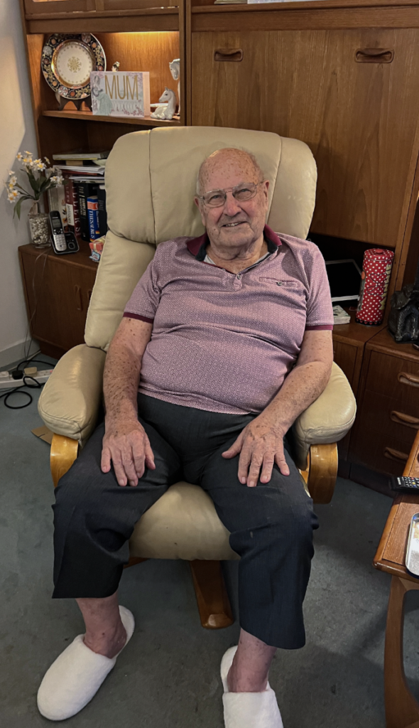
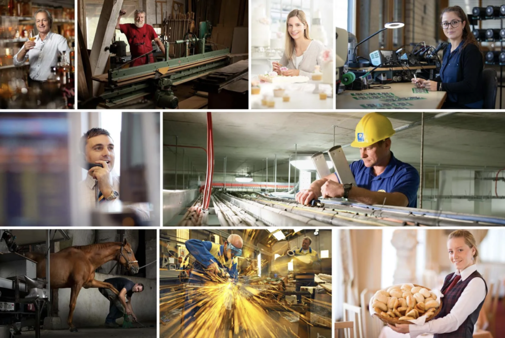
I personally think that this image is one of my best Environmental Portraits because I think it is effective how his outfit fits the environment he is within and I also think that the photo is unique because it’s not very easy to get into the warehouse for the government vehicles. If I were to take this image again, I would potentially try and take in in another position so that you can see more of the warehouse, however, I was not allowed to get the number plates in the photos.
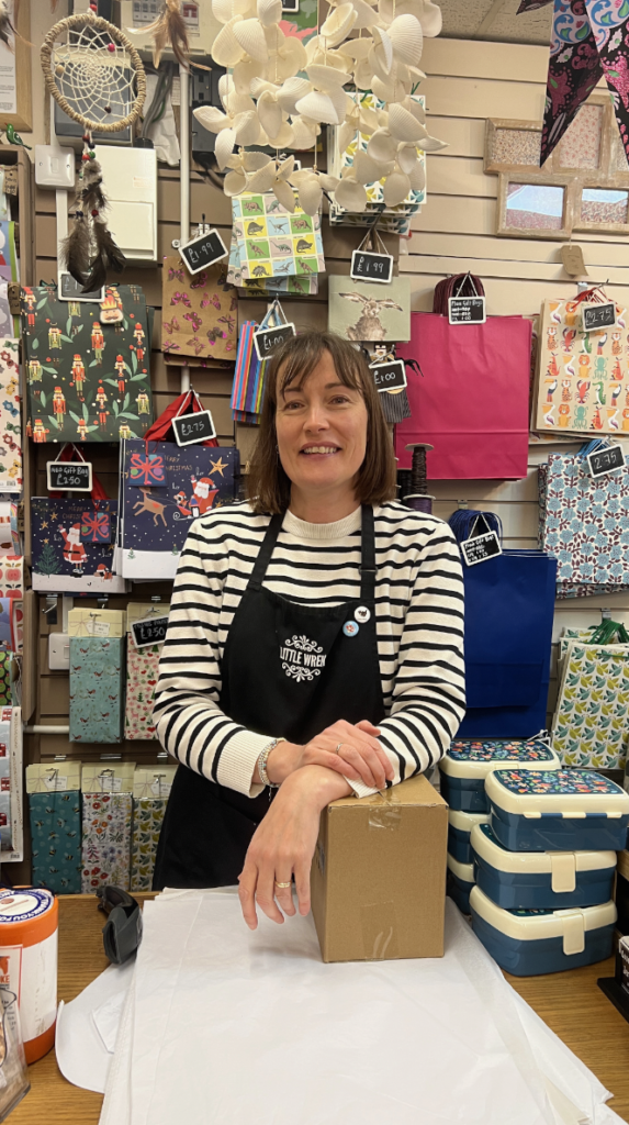
I also really like this photo because I think that the women’s character and appearance reflects the shop she is in and I also like how she is wearing her apron with the little badges as they suit the background.
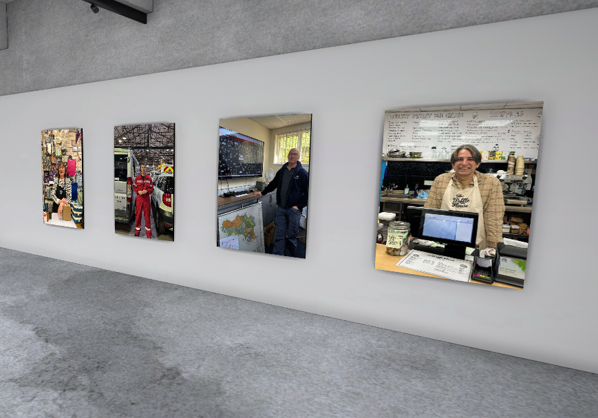
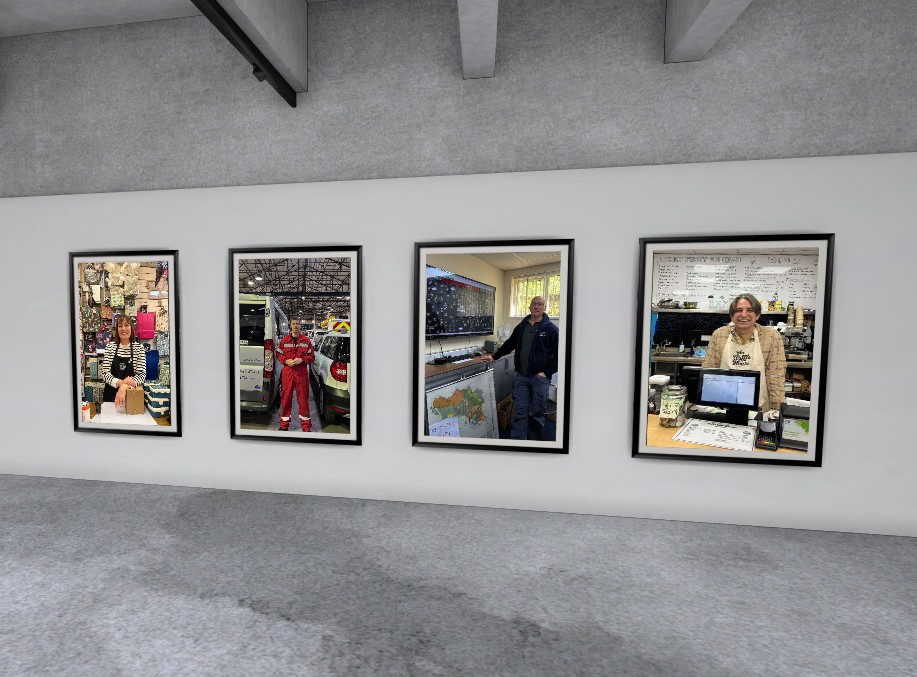
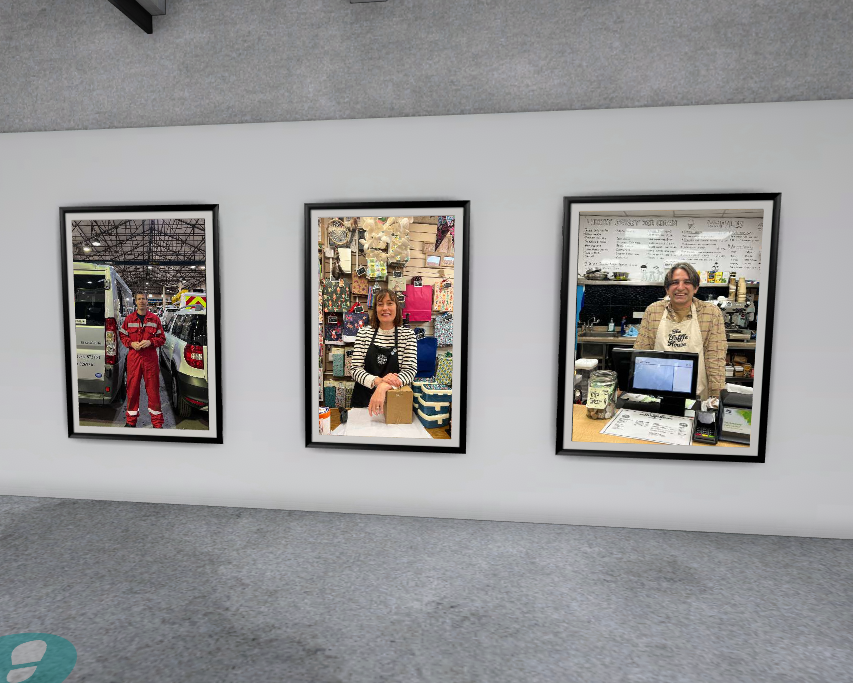
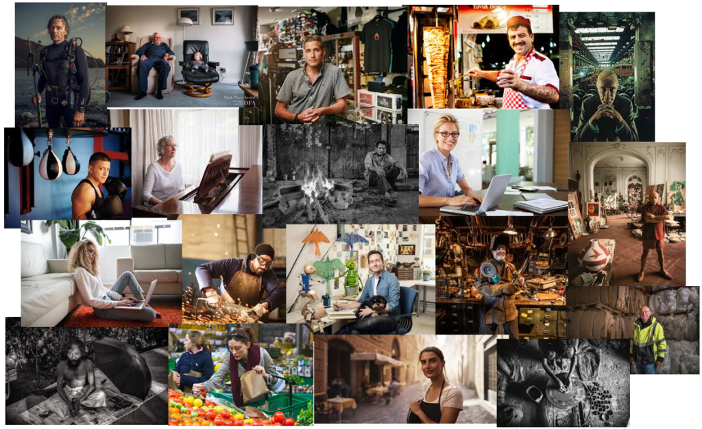
My plan for this photoshoot is to go to various workplaces and take photos of people within their own workplaces. I would like to aim to take photos of mainly people who have dresses in a way that links to their workplace, such as by wearing an apron, suit or outfit with logos of the workplace. I also think it would be a good idea to get photos of my Grandad in his armchair as it is typically the place he is associated with. Some locations I am going to try get photos are in the Market, at Waffle House and I may see if I can go to the States of Jersey offices with my parents.
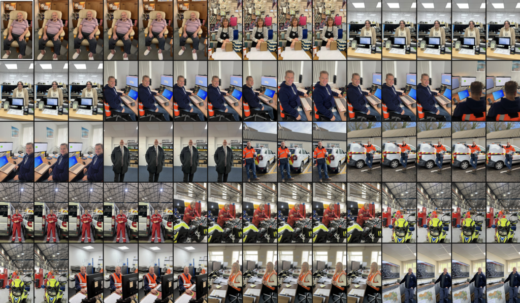
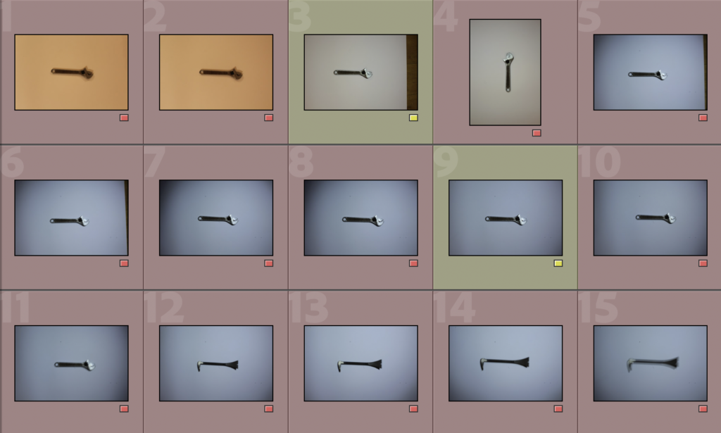
Contact Sheet
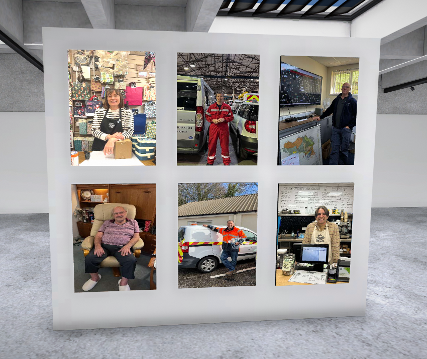
This is my contact sheet of all of my photos taken in the photoshoot. I am now going to create a smaller contact sheet with all of my best images for editing.
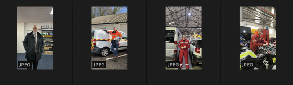
This is a collection of my best photos which I am going to use to edit.
Edits
Edit 1
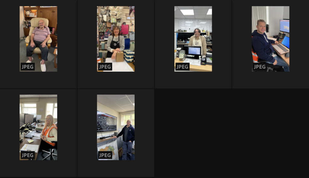
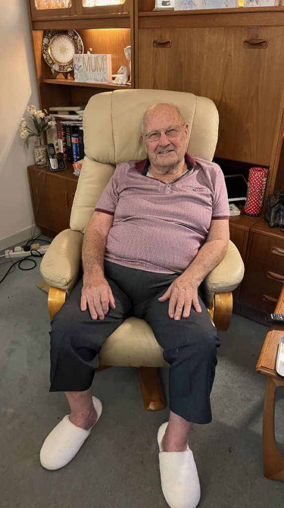
This is a photo of my Grandad in his Armchair. I edited this photo by cropping it then decreasing exposure, contrast and shadows. I finished off by increasing highlights, texture and clarity.
Edit 2
I got this photo in Little Wren in the Market of the lady who works there stood at the till. I edited this photo by slightly cropping the bottom and increasing the texture and clarity to make the image more clear and give it more depth.
Edit 3
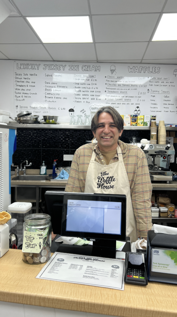
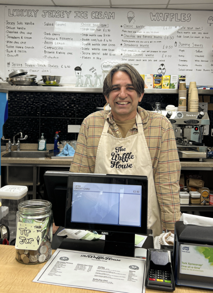
This is a photo of the man who works in Waffle House. I edited this photo by, starting off, cropping the top, bottom and left then slightly decreasing the exposure. Lastly, I increased the temperature, tint, texture and clarity.
Edit 4
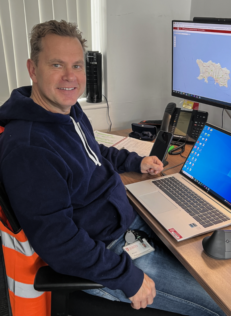
This is a photo of my Dad at his desk at work. I edited this photo by cropping the top and bottom then increasing the texture and clarity.
Edit 5
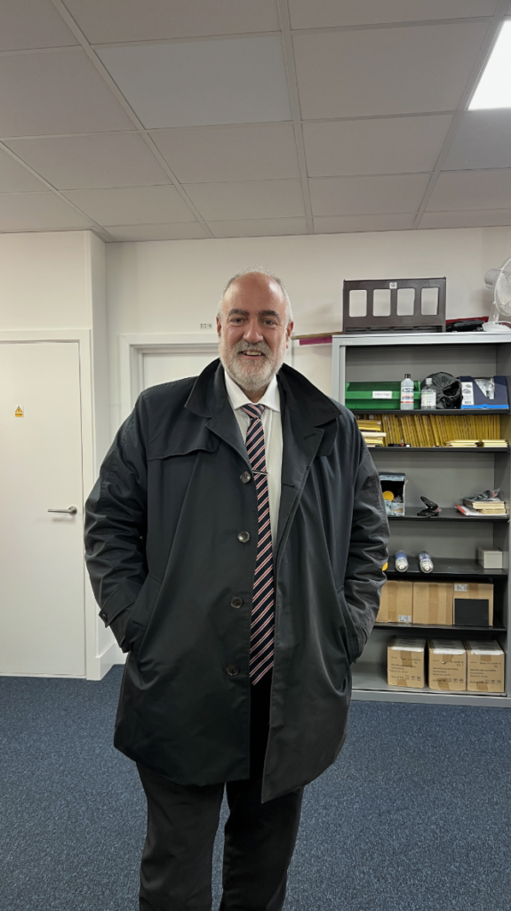
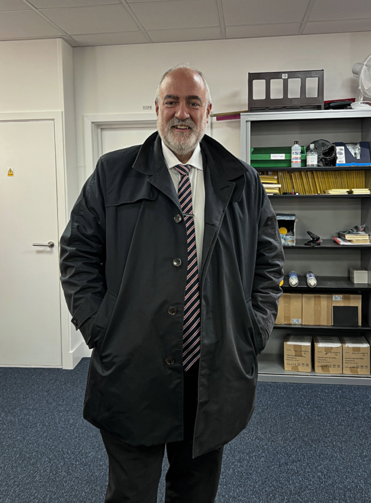
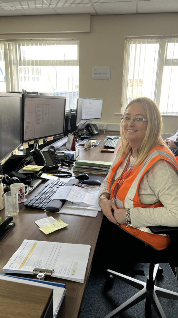
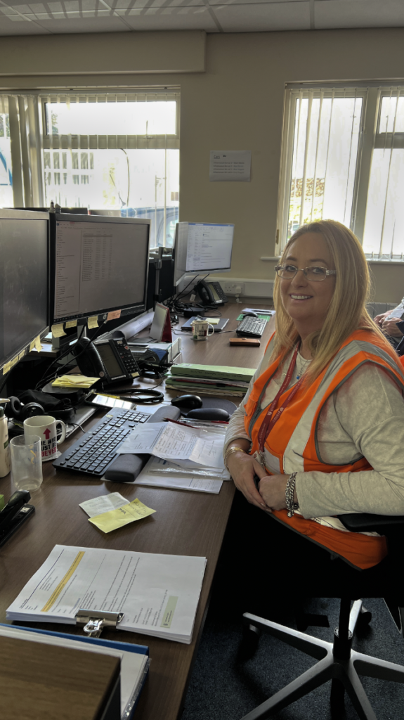
This is one of the very important bosses within the States of Jersey. I edited this photo by, firstly, cropping the top and bottom then slightly rotating it so that the side of the shelving unit lines up with the side of the photo. Finally, I increased the exposure, highlights and texture.
Edit 6
This is a photo of a random guy at the States building. I edited this photo by cropping the bottom and then increasing the texture and clarity to enhance the finer details.
Edit 7
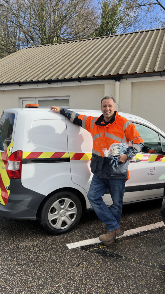
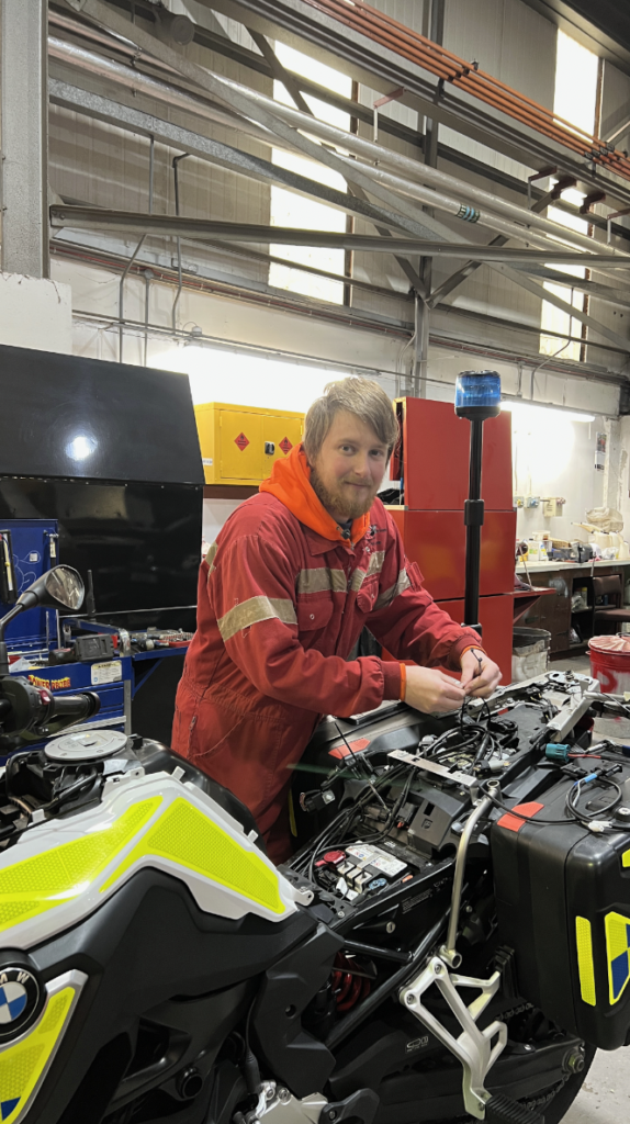
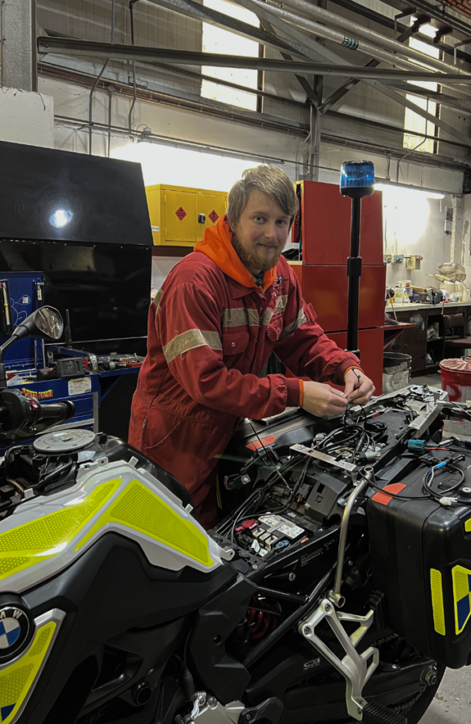
I took this photo in the Warehouse where they maintain Government vehicles, this is one of the Mechanics. I edited this photo by slight rotating the photo so that the beam across the image is straight and then I cropped the top of the image. I also increased the texture and clarity and slightly adjusted the exposure.
Edit 8
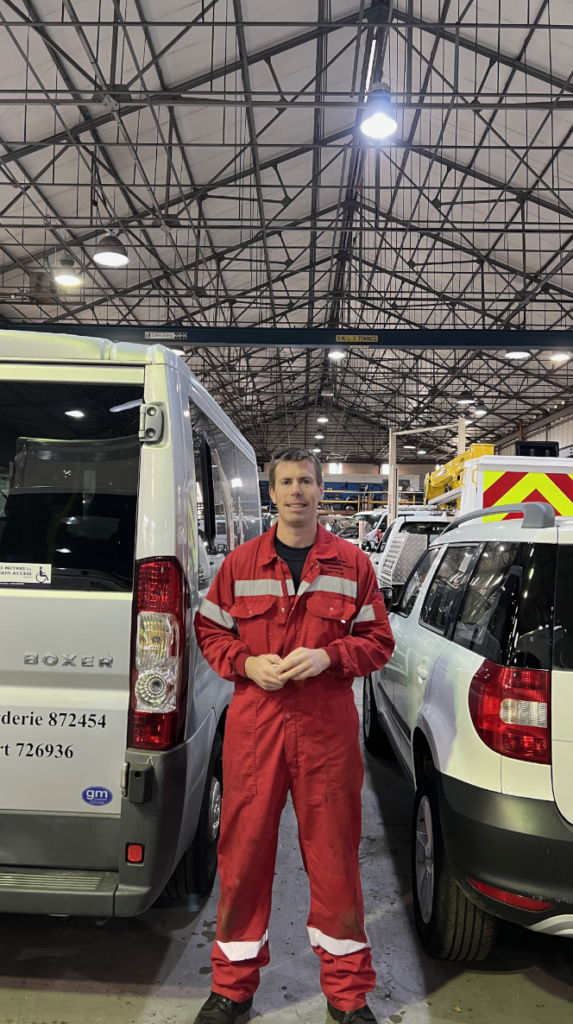
This is a photo of another Mechanic who is doing work on a Police Motorcycle. I edited this photo by cropping the top and slightly decreasing the exposure to make is more clear and less pixelated.
Edit 9
All I did to edit this photo was decreasing the texture then, additionally, using the brush tool to decrease the exposure of the windows.
Edit 10
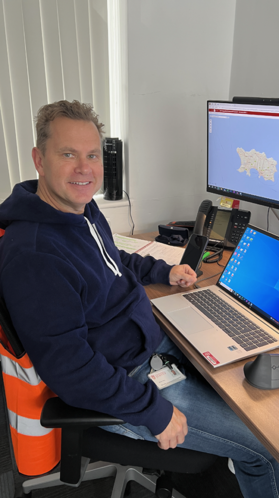
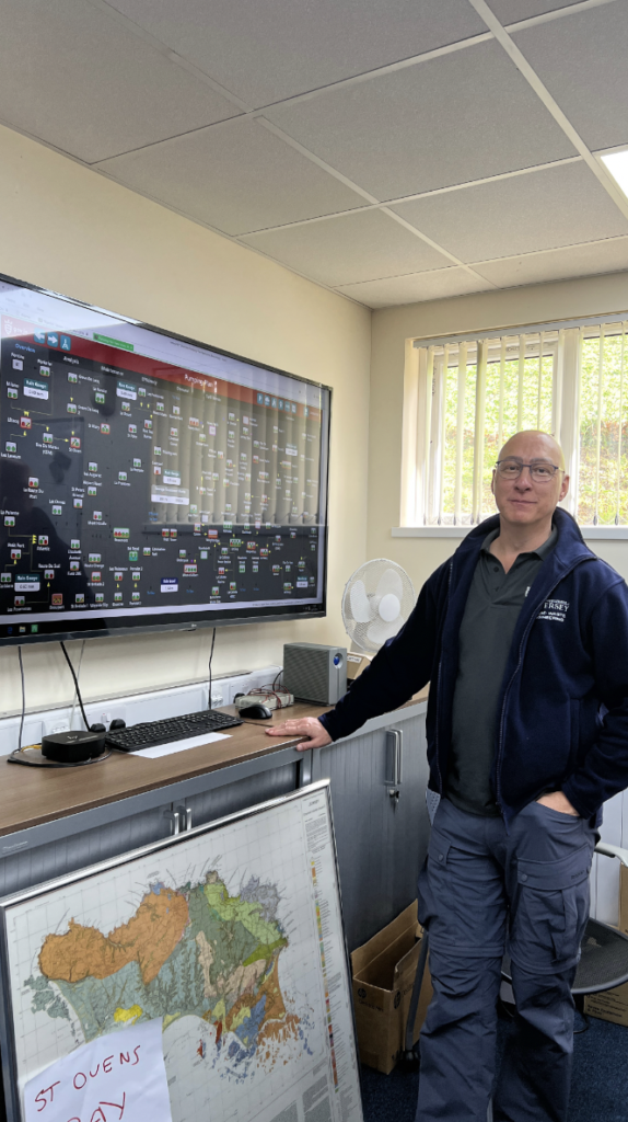
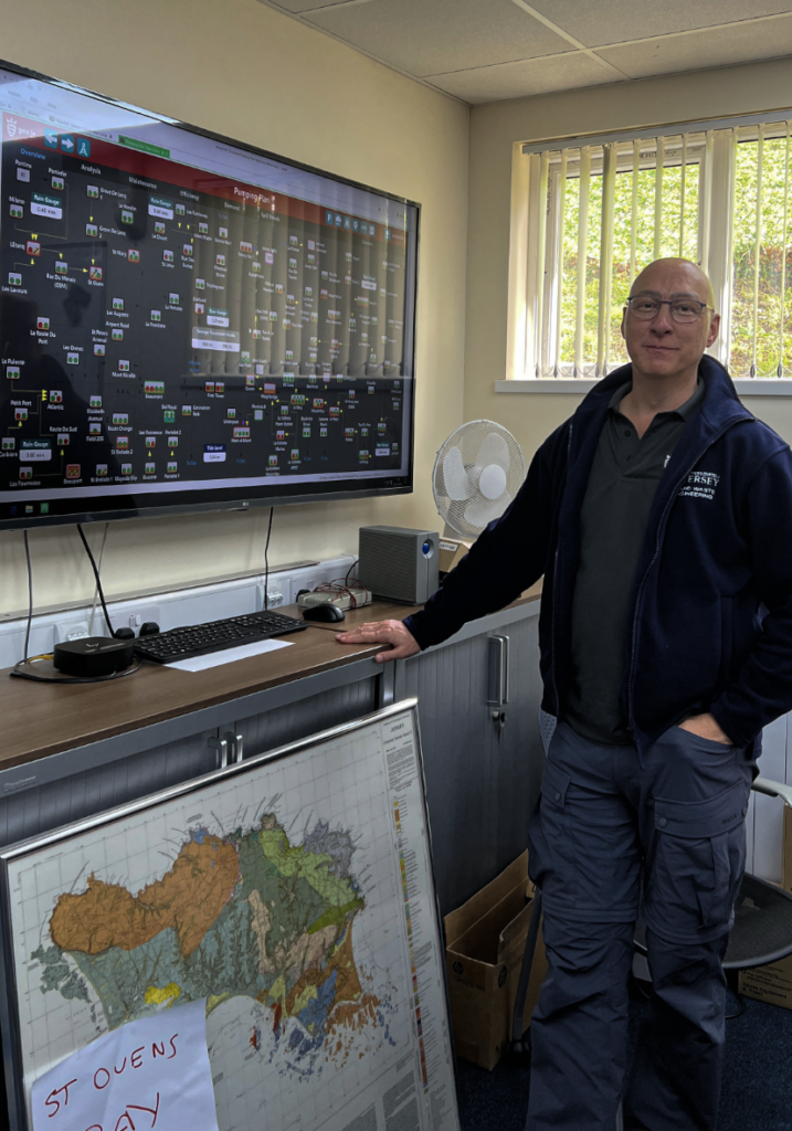
This is a photo of one of the States workers who are in charge of the pumping stations on the Island, as shown by the map on the TV screen. I edited this photo by cropping the top and then increasing the texture and decreasing the exposure.
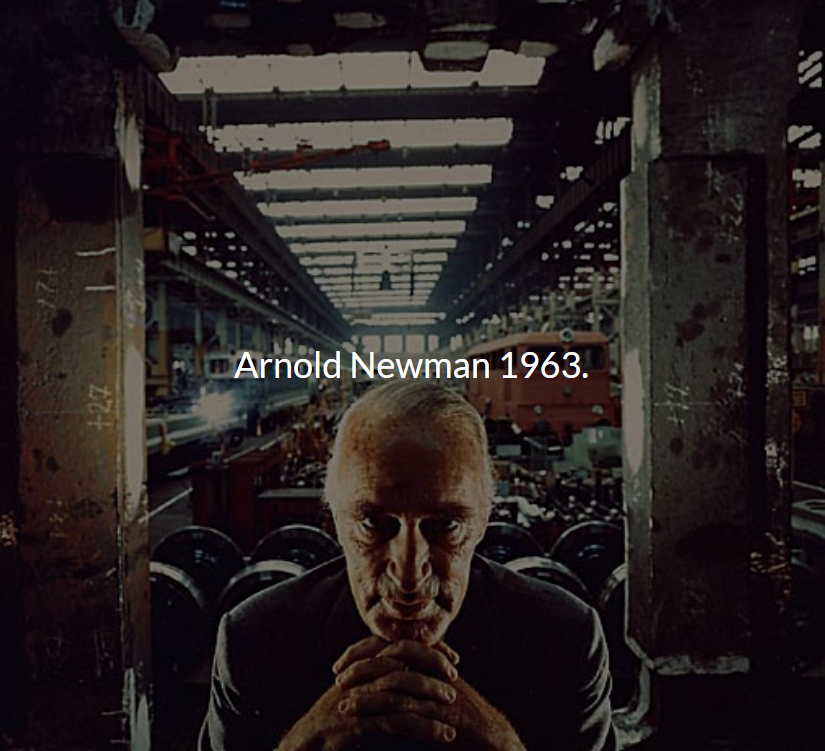
Arnold Newman was an American photographer, born in 1918 and died in 2006. From 1936 to 1938, Newman attended the University of Miami then later became an assistant in a Photography studio. In 1941, Newman had his first major exhibition in New York, where he eventually opened his own Portrait studio in 1946 after visiting the City frequently. Arnold Newman was best known for his Environmental Portraits, featuring various artists, writers, political leaders, scientists and more, typically in their own space or somewhere constructed to fit their character. Some of these people include Pablo Picasso, Marilyn Monroe, Jean Cocteau and Igor Stravinsky, many of these images published within magazines such as Time, Look, Life and Harper’s Bazaar.
Image Analysis
Emotional
This photograph makes me feel quite intimidated as the man in the image appears unfriendly and stern and the surroundings look cold and harsh. The positioning of his hands also give the impression that he is plotting an evil scheme, this adds to the oppression.
Visual
This image consists of dull colours with a lack of natural light and was taken in an industrial place. The subject’s aged, stern appearance fits in with the background, which looks like a train factory because it appears like it would be a manly and hard workplace. The fact that the subject is wearing a suit implies that he has authority, therefore, he may be the boss of the factory. The serious look on his face, texture of his skin and the background together all create the impression that the subject is firm and solemn. In this image, there are also many dark tones which may represent the subject’s personality and morals.
Technical
This image has a wide depth of field as you can see far into it and, in terms of perspective, it looks like it is getting further away. The focus/focal point of this photo is the factory owner and it can be seen that there are various leading lines towards him. These include the lights on the ceiling and the trains each side of him. the two pillars and the fact that he is centred within the photo creates symmetry and a sense of balance. Additionally, the pillars also provide a frame for the subject which makes your focus go towards him. The lighting coming from the rear side in this image is quite unique and peculiar as well as the lights on each side of his face. This lighting gives the subject a slender appearance and creates a darker atmosphere, linking with his sinful nature.
Conceptual
This image was taken by a Jewish Photographer, Arnold Newman, of a German Factory Owner. The Factory owner, Alfred Krupp was a convicted War Criminal, therefore, Arnold Newman’s intention was to portray Krupp as evil in the photograph. He did this by making Krupp look like he was plotting an evil scheme through his facial expressions and positioning and using lighting to highlight Krupp’s features such as his wrinkles and nose, almost as if to make him look unpleasant. After seeing this photo, Alfred Krupp was furious as he was just asking for a regular self portrait.
Contextual
In 1963, Newsweek magazine wanted to commission Arnold Newman to take a photograph of Alfred Krupp, a German industrialist who was a convicted war criminal for helping the Nazis, however, he was later pardoned. Arnold Newman originally declined this offer as he was Jewish, therefore didn’t want to be involved with him, but then changed his mind and wanted to backstab Alfred Krupp so he went and proceeded with the job.
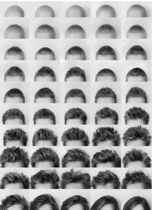
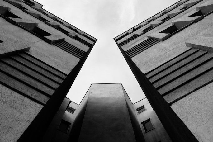
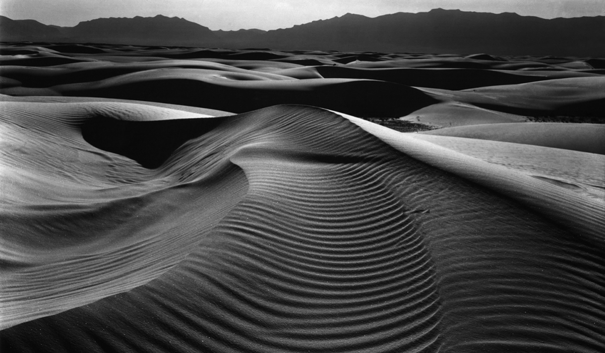
What is environmental portraiture and how is it used?
Environmental portraiture is a style of photography when a portrait is taken in the subject’s usual environment, such as in their home or workplace. The location is usually somewhere significant to them. Environmental portraits often provide context and insight into the life of the subject, possibly even displaying their personality or profession to offer a deeper understanding of who they are. Finally, this style of portraiture reveals an understanding of the person being photographed and depict the nature of their personality.
Moodboard
Typology in Environmental Portraiture
Typology refers to a series of photographs that share similarities within a specific category. Typologies are used by photographers to highlight patterns, variations and characteristics and allow the viewers to identify a common theme or subject.
Typologies can be presented in environmental portraiture by creating a variety of portraits which fit into groups such as ages, occupations, locations, workplaces, genders, hobbies and more. Additionally, other ways of creating a typology within environmental portraiture could be using similar camera angles, lighting techniques, subject placement or even colours. By presenting the images within a typological series, this can create a deeper understanding of the subject to the viewer.
I created the illusion that the far right image is on the wall by selecting the image and adjusting the perspective and skewing it. I then added frames and a shadow to each image by selecting it then below the layers there is a little fx, I selected that and then added a stroke and drop shadow.
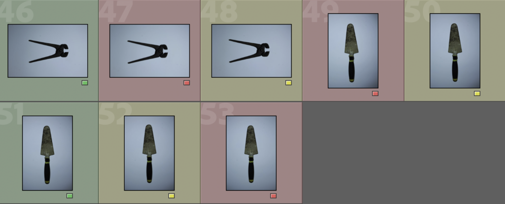
For these images, I took them over a large, white piece of card whilst my Dad held up the torch. I set my camera settings to a fast shutter speed and auto ISO. The images which have been coloured green are the ones that I am going to be editing as they as the most clear and detailed.
Edits
To edit each of these photos, I cropped and rotated them and made them B&W, whilst also sometimes making adjustments to things such as exposure, texture and clarity, etc.
These are my final results:
Experimentation
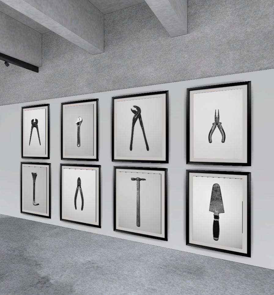
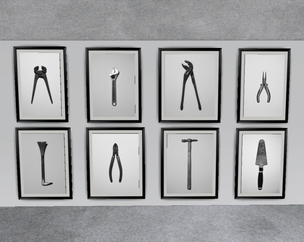
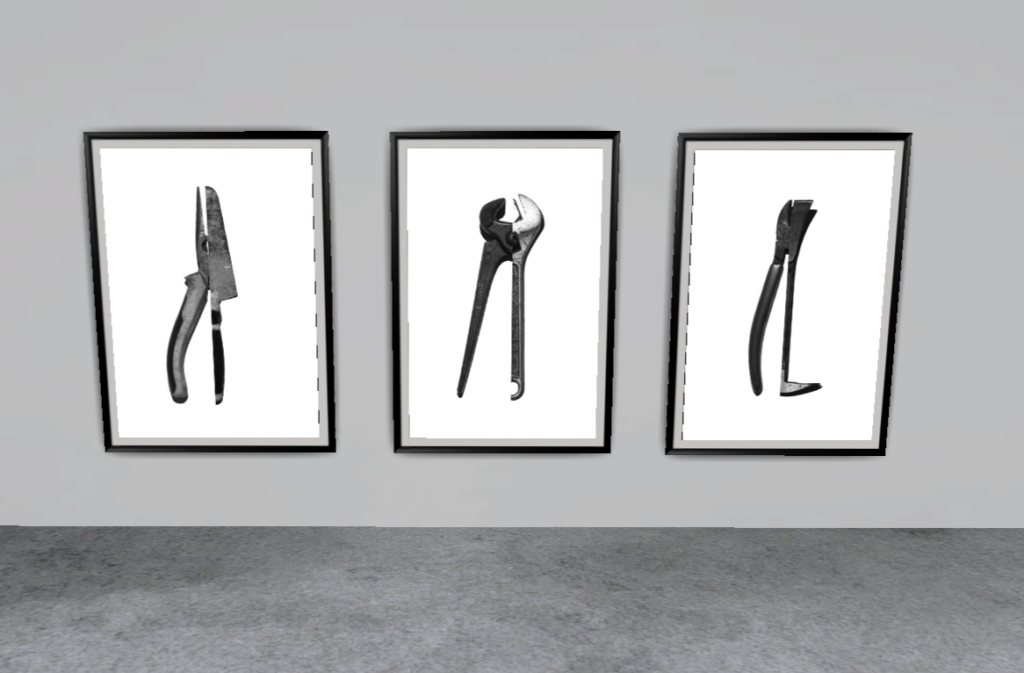
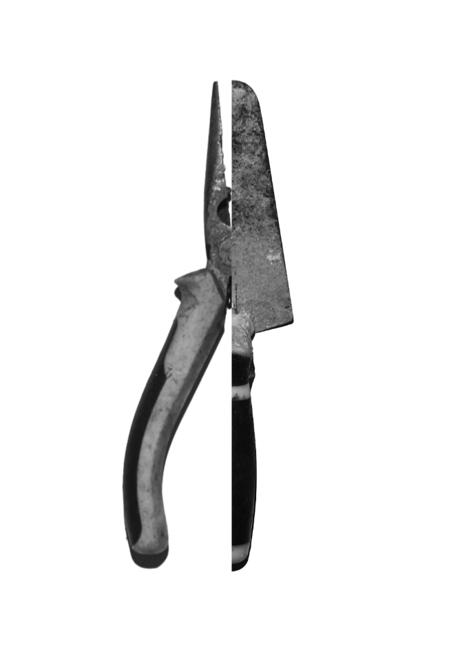
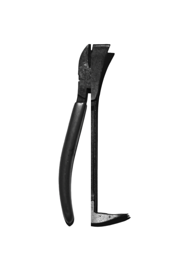
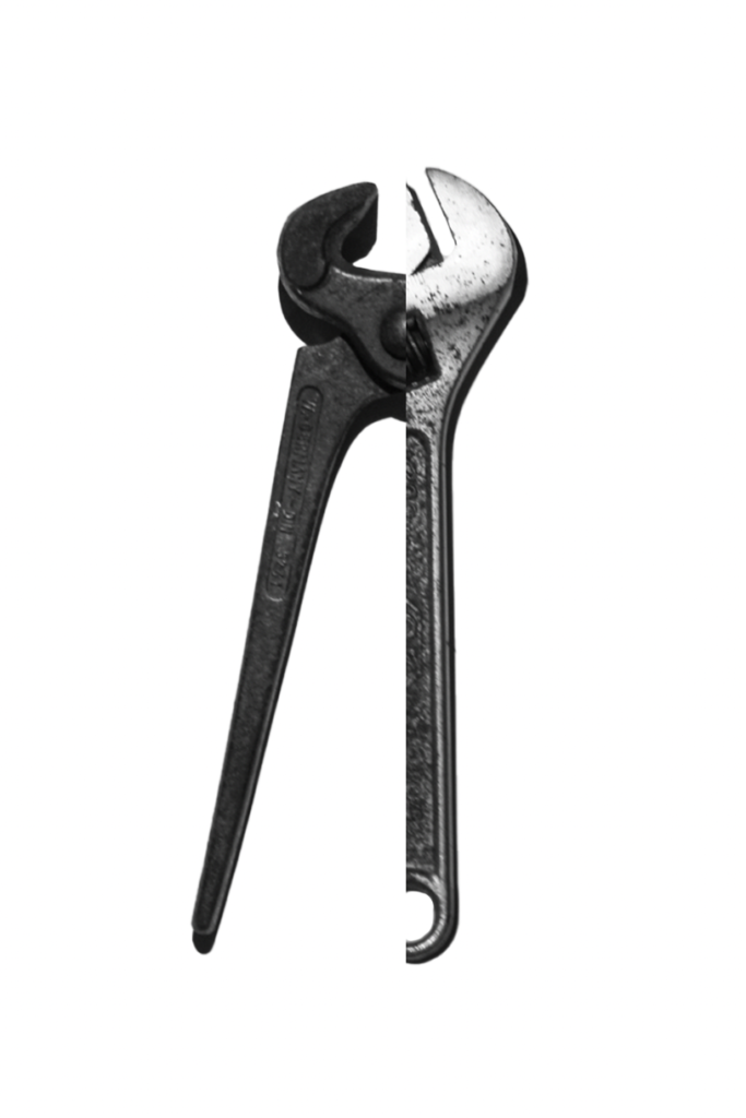
I decided to try and imitate Darren Harvey-Regan’s work using my own photos, rather than Walker Evans’.
I did this by opening the images in Adobe Photoshop and using the Object Selection Tool to select the tools and remove them from their background.
I then cropped half of the tool and resized them so that they fit together.
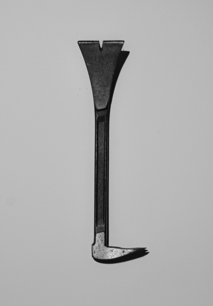
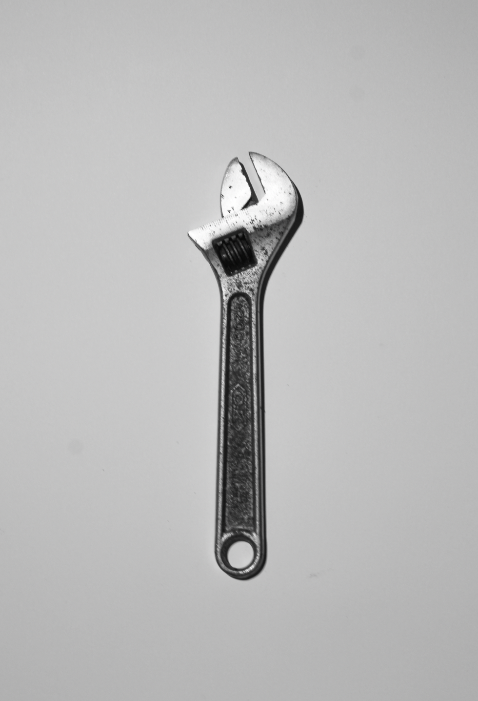
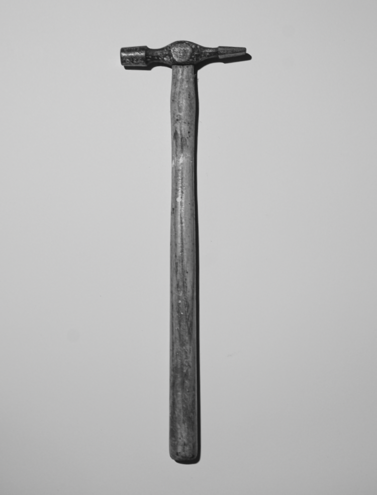
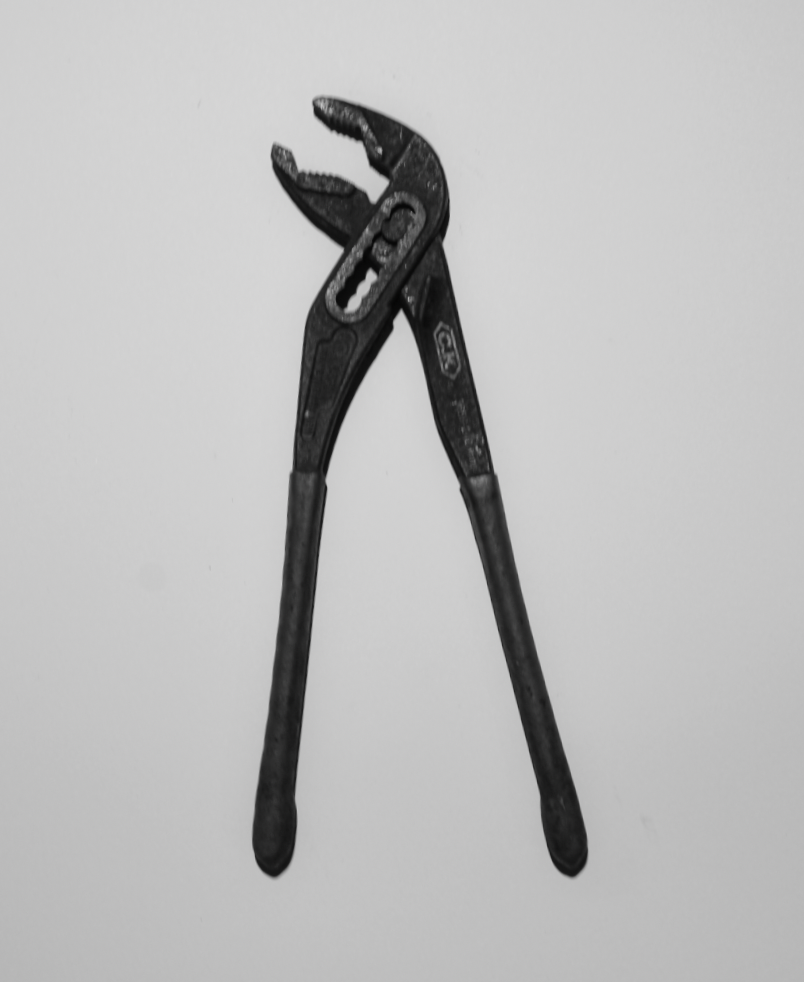
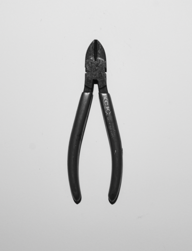
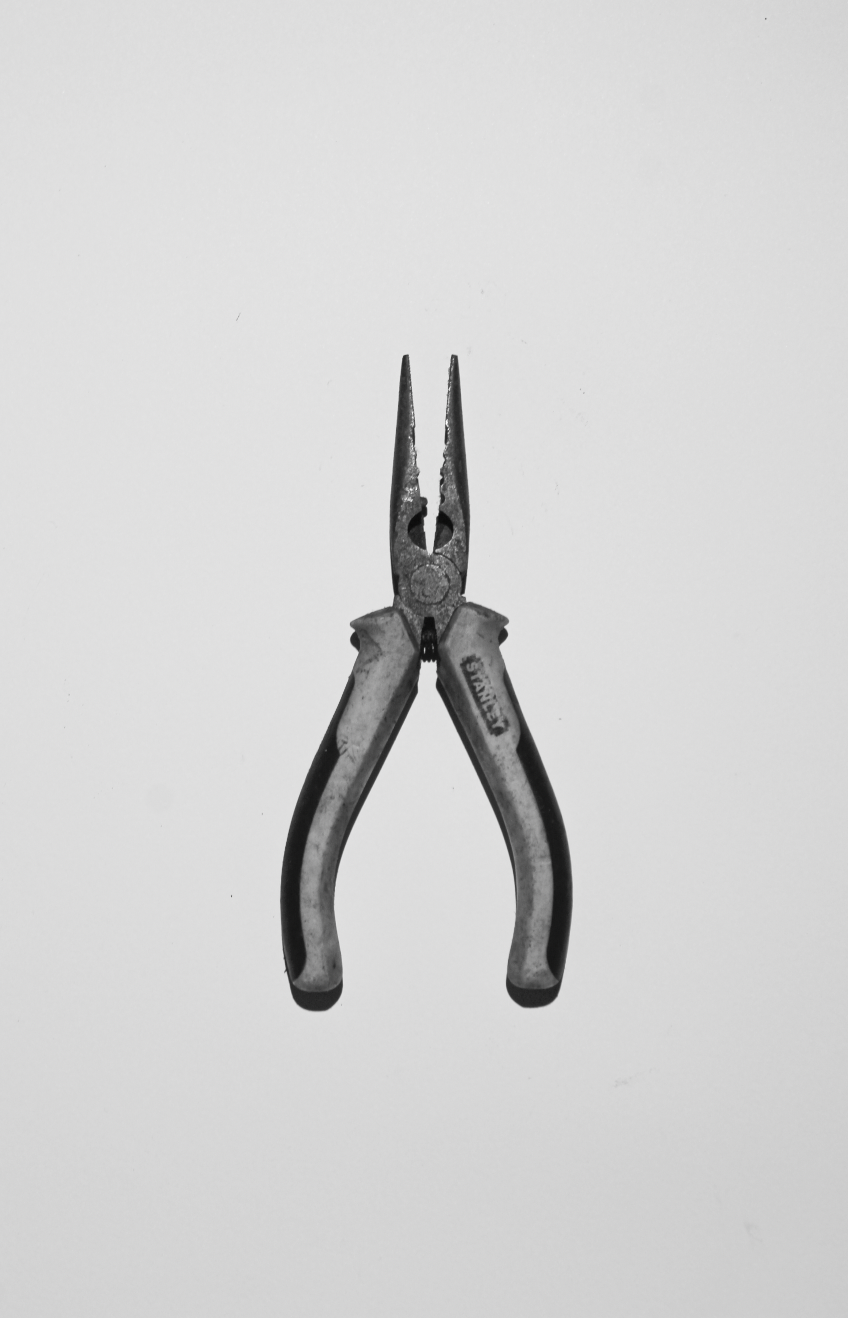
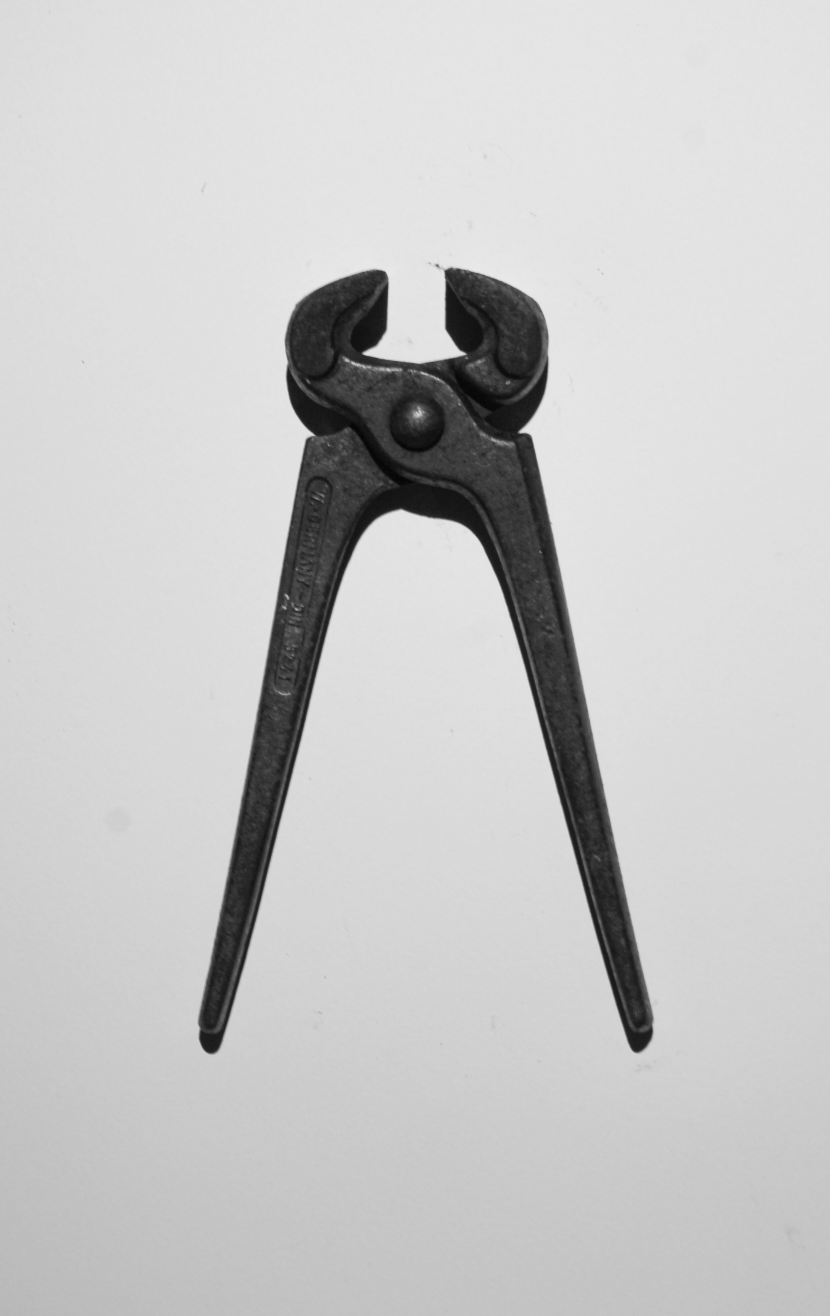
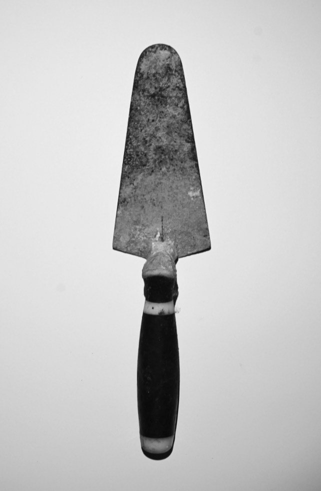
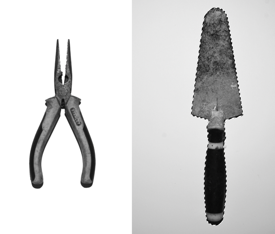
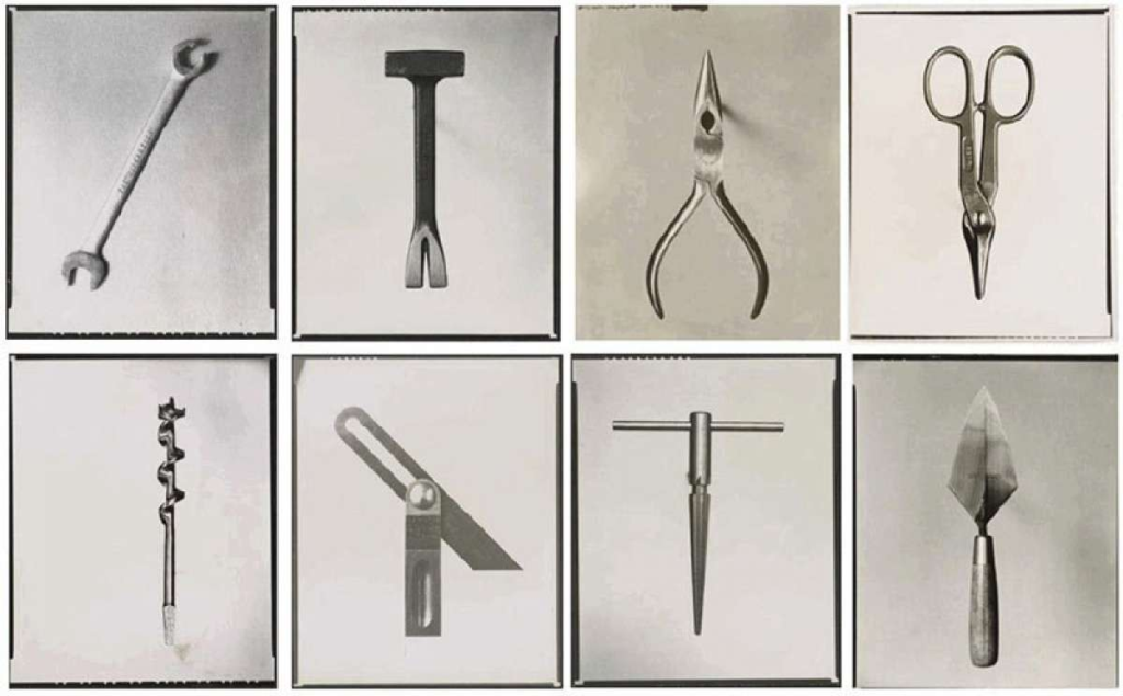
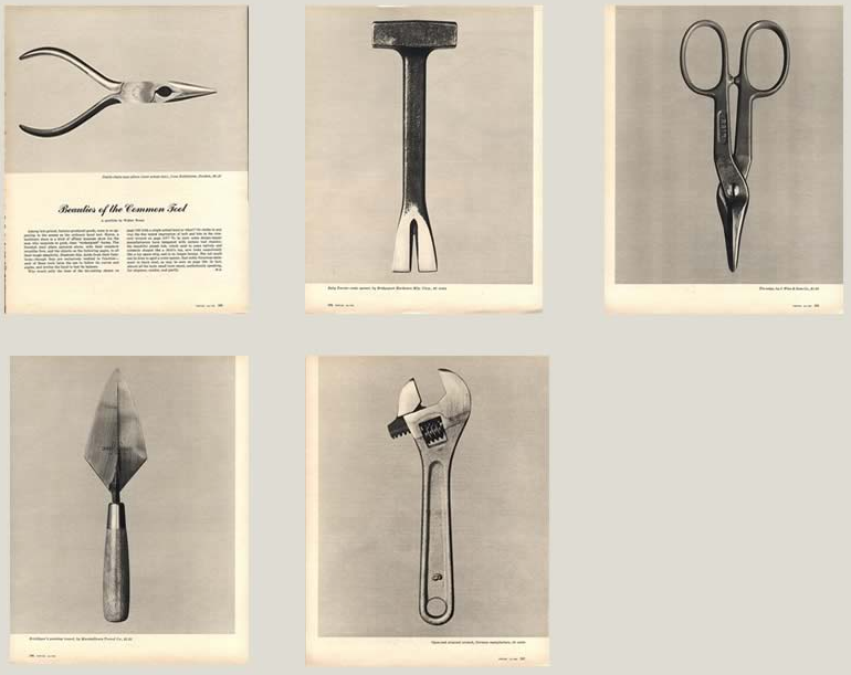
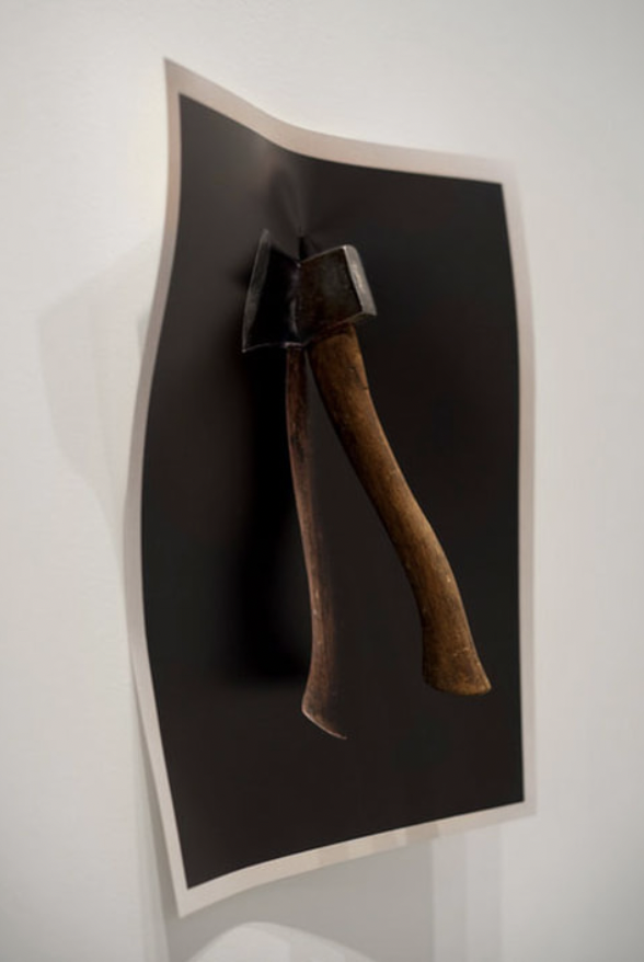
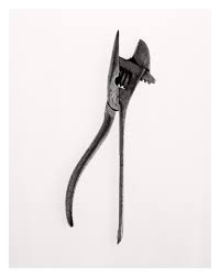
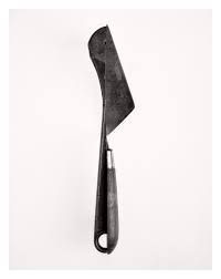
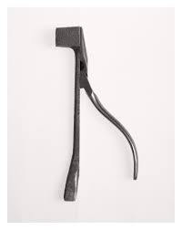
Walker Evans was a Photographer and Journalist who was best known for his work documenting the Great Depression. He was born in 1903 and unfortunately passed in 1975. His photographs generally captured the everyday struggles and lives of people which has made a lasting impact to documentary photography. Walker Evan’s work is recognised to this day for its cultural and historical significance and influences many other photographers, such as Diane Arbus. Walker Evans also produced a series of photographs named ‘Beauties of the Common Tool’. This is a series of still life photos featuring tools in black and white.
Beauties of the Common Tool
This series was posted in Fortune Magazine in 1955, spread across 5 pages. It captures a variety of tools, shot from above with the same lighting that appears to give them depth and emphasise their small details. These images could be an example of typologies as they clearly have the use of the same lighting, angles and they have the same purpose, which is to highlight the elegance of the tools. Additionally, Walker Evans intentionally made these images boring and not interesting so that the viewers will focus on the tools.
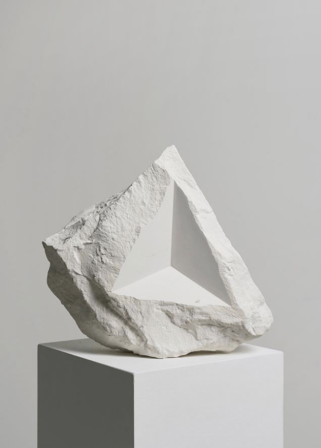
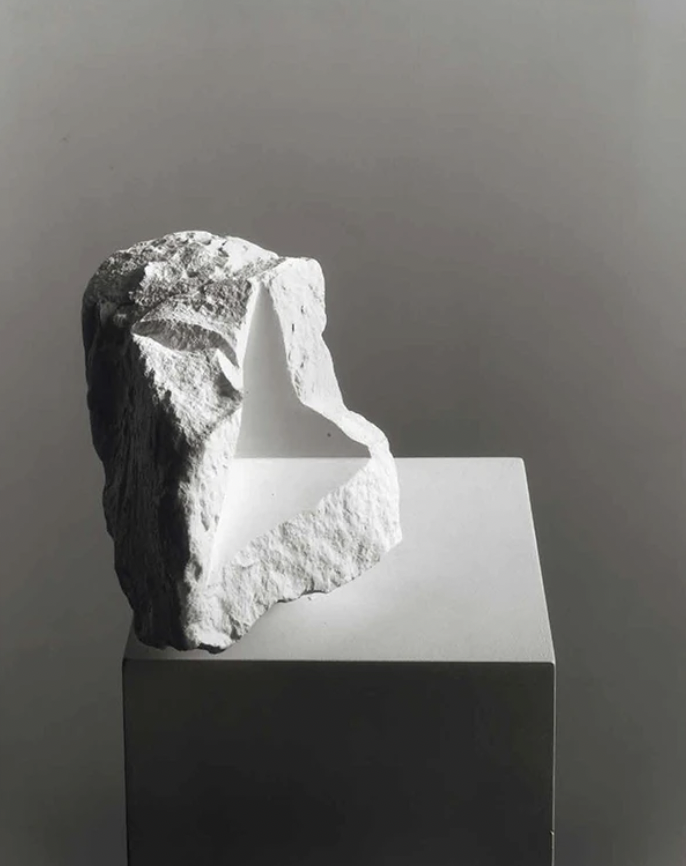
Darren Harvey-Regan
Darren Harvey Regan is an English Photographer, born in 1974, who’s work is highly inspired by literature and the forming of words to convey ideas. He personally believes that most of his work is a sculptural in the process and photographic in the end result. In 2010, he graduated the Royal College of Art and since has had many exhibitions and features in Museums, such as the Victoria & Albert Museum in London.
Some of Darren Harvey-Regan’s Work
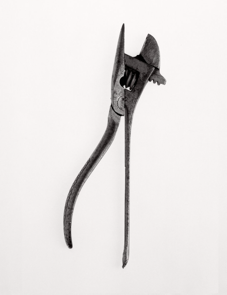
Darren Harvey-Regan typically makes sculptures out of plaster and photographs them, however, he also produced a series of photographs in which he digitally montaged Walker Evans’ photographs by snipping and rejoining them to make them into something more enticing and unique. These photographs were printed out 87 x 69cm and are rephrased versions of Evans’ work.
Darren Harvey-Regan Interpretations of Walker Evans’ work
Work Comparison
Technically, both pieces of work are originally by Walker Evans, however, Darren Harvey-Regan used Evans’ photos to make them into something more. Regan’s montages appear much more interesting and, by first glance, may be quite confusing to some viewers as they no longer appear as ‘common’ tools. The contrast between the tools and background in both artworks draw your focus towards the tools and in Darren Harvey-Regan’s montages the tools appear to have been made darker with a lighter background. This makes the images appear more clear and pristine.
Formalism is a type of photography in which attention and accuracy is put into the composition, detail, lighting and camera settings, etc. over the main subject. The photographer often aims to draw your eyes to the formal elements of the photo. These elements include light, lines and shapes, patterns, colours, texture, value/tone, space and composition.
There are 7 different aspects of Formalism:
Line
Lines come in all different forms and types. For example, they can either be straight, curved or a combination of the two. They can also be:
Solid – Most commonly found in the physical world
Dashed – Easy to draw but not as prevalent in the physical world
Implied –
Psychological – Imaginary, created by, for example, the gaze of a subject
Furthermore, they can also be vertical, horizontal or diagonal.
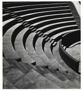
Shape
When a line, or multiple lines, connect or close, a shape is formed. Shapes can be the outline of an object, familiar or unfamiliar. When a shape is unfamiliar or unrecognisable, it is often when an object is viewed from a different perspective.
Different shapes can combine to create a new shape by intersecting or overlapping. The area containing a shape is often referred to as positive space and the outside area is called negative space, however, negative space creates its own shape.
There are two basic types of shapes in photography:
Geometric – standard shapes such as circles, squares, triangles, etc. Often man-made.
Organic – the outline of an animal or plant, etc. The shape of a cloud or rain puddle could also be defined as an organic shape. These shapes are often natural and not man-made.
Shapes are everywhere in photography and the world around us.
Form
Form is 3 Dimensional and has overall height, width and depth. Alike shapes, there are two different types of form, geometric (normal) and organic. Examples of geometric forms are: sphere, cube, cone and cylinder. Organic forms are the objects which surround us in the world. When a photo is taken of forms, they become 2 Dimensional as the image does not have depth, however forms can be perceived by shadows.
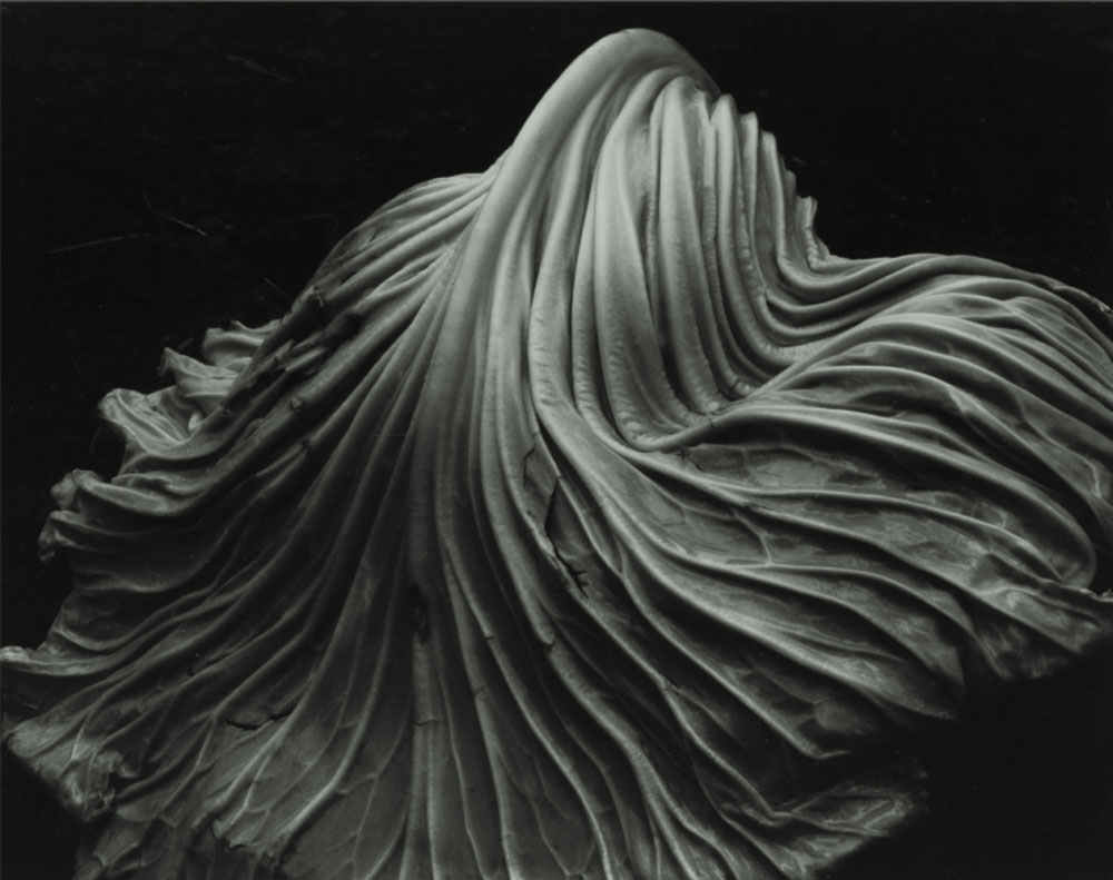
Texture
Texture can be defined as ‘the visual or tactile surface characteristics and appearance of something’. Textures in “real life” can be smooth or rough. Other ways of describing texture could be slimy, bumpy, shiny, soft, slippery, etc. Texture is similar to form in the way that it can be revealed by variations in tonality. Texture cannot be physically felt through a photograph but it can mentally. For example, if someone looks at a photo of a fluffy blanket, they could imagine what it would feel like if it’s a familiar feeling to them.
Colour
Colour can be described as ‘a specific combination of hue, saturation and brightness’ or ‘visual perception that enables one to differentiate otherwise identical objects’. Colour has 3 properties:
Hue – the description of the colour (e.g. blue, red, yellow, etc.)
Value – the relative brightness or darkness of a colour
Saturation – the intensity or purity of a colour
Colours can be perceived as meaning various things such as: red means danger, yellow is happy and blue is sad. Bold and bright colours are known for grabbing our eye. Having a bold and bright subject in a photo can be good but if the subject was muted and dull but there’s bright colours elsewhere it could detract your eye from the subject.
Harmonic colours are colours that compliment each other. These colours in a photograph can create a powerful image, this is the same with muted tones. The reflected light we see as colour is light from the sun or artificial sources that is absorbed and reflected by different objects.
Size
Size can be defined as ‘a physical magnitude’ or ‘relative or proportionate dimensions’. Size in a photograph is relative and can be an illusion. When a familiar object appears within a photo, we can determine the scale by looking at it. Optical illusions can make it difficult to determine the size of an object within a photograph. Things that are unfamiliar to a person in a photograph would make it almost impossible for them to determine its size. This is called size constancy, which does not exist to a child as everything is new to them. The size of a common object in the photography gives the scene a sense of scale. To emphasize the size of an object in the photograph, you could brig the lens closer to it. Overlapping objects also gives hints to size as when one object is close in front of another and is smaller than the object behind it, we generally know the relative sizes of the two objects.
Depth
Depth can be defined as ‘the direct linear measurement from front to back’. How well the depth is shown in a photograph depends on the objects in the frame, choice of composition and your perspective in relation to the objects in the frame. Depth is provided by visual cues. Depth can be show by a road narrowing as it gets further from the camera. This is called linear perspective as the road doesn’t actually narrow, it just looks like it does. Aerial perspective, also known as atmospheric perspective refers to how the distant objects in a photograph have less clarity, indicating depth. Texture gradient shows depth in a photograph, as we,, as size diminution (when an object is smaller, it appears more distant). Finally, upward dislocation shows depth.
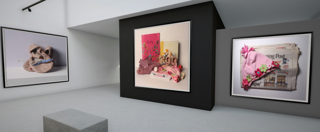
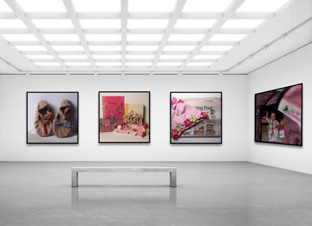
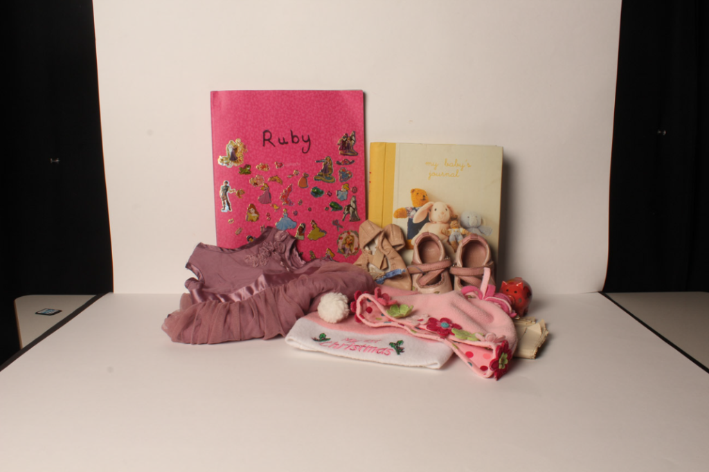
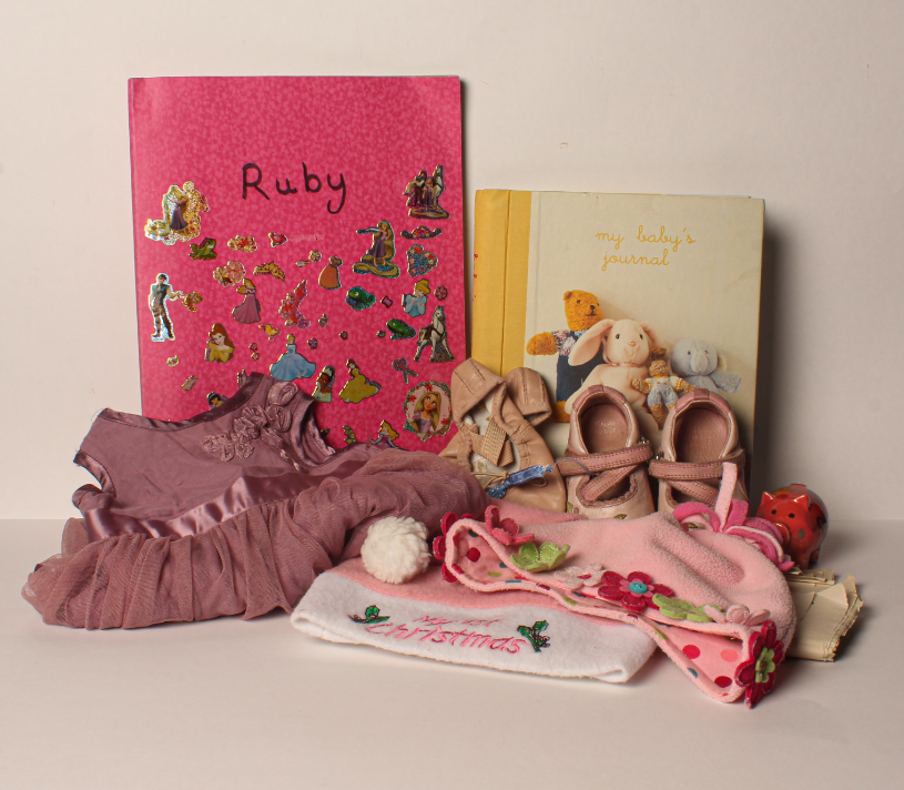
I have taken photos for Still Life under the theme of Nostalgia. To do this, I collected some old objects from when I was younger and arranged them in multiple ways.
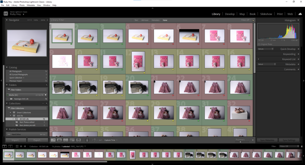
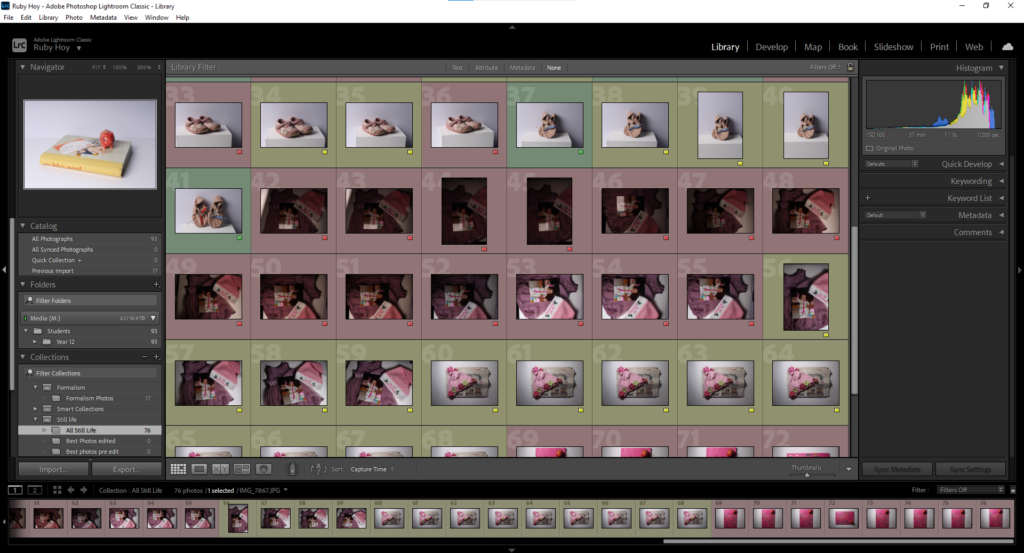
Lightroom
This is my Adobe Lightroom Classic setup, I uploaded my photos and made a folder for them then arranged them by colour coding them. Green being good, yellow alright and red bad.
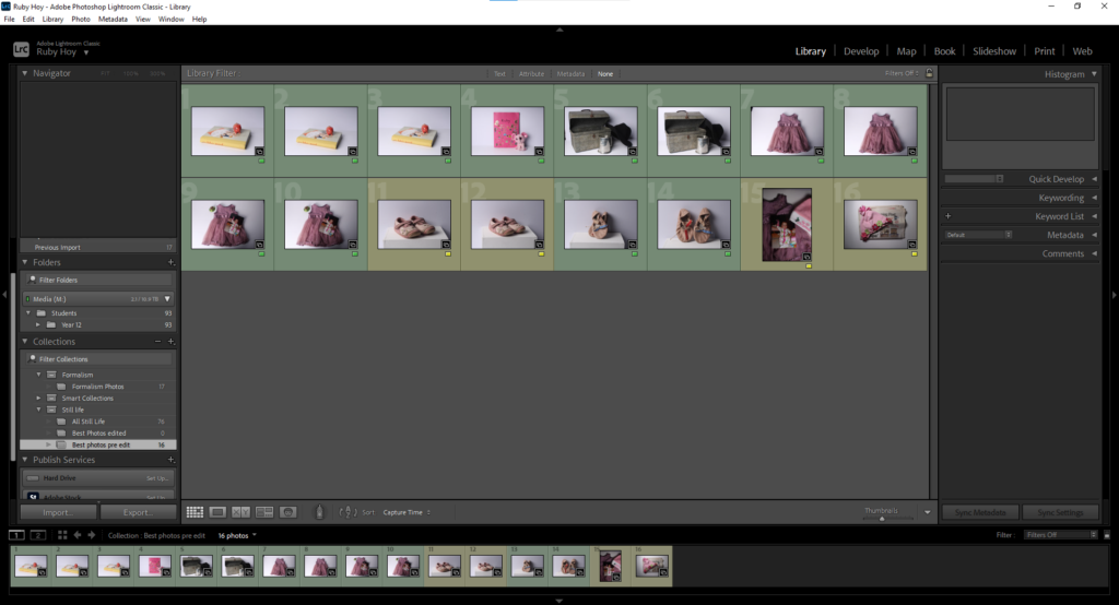
This is the folder I created showing my best Still Life Photos before editing:
Camera Settings
When taking the photos I made sure that the image had a good exposure by lowering the ISO and increasing the shutter speed when taking photos in a bright environment. I also made sure that the image was focussed, switching between both manual and auto focus. I took the photos with a low aperture as only a low depth of field was needed due to the objects being close to the lense.
Editing process
Edit 1
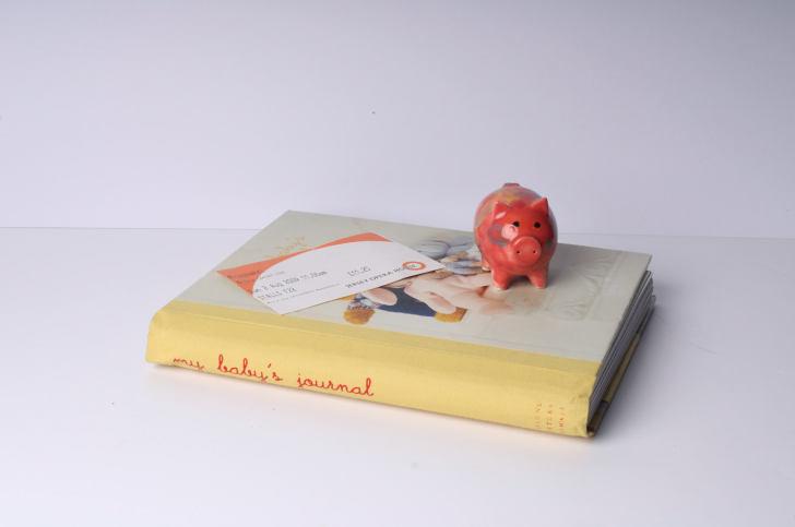
To edit this photo, firstly, I cropped it then decreased the exposure, contrast and whites. This made the image less vibrant, therefore I increased the saturation because, to me, nostalgia is colourful and not dull, therefore I want my image to reflect that.
My intention for this image was to show the early events of my life as the baby journal is a record of my first experiences, such as my first step or my first smile, the pig is from the first time I ever went pottery painting and the ticket is from the first show I ever went to. I could improve this photo by making the background more white as, due to the decrease in exposure, it has become greyish blue.
Edit 2
To edit this photo, I began my cropping it then using the adjustment brush tool to balance out the background by changing the exposure in different areas. I then decreased the overall exposure and used the adjustment brush over the dress to increase the exposure and saturation. I also decreased the contrast .
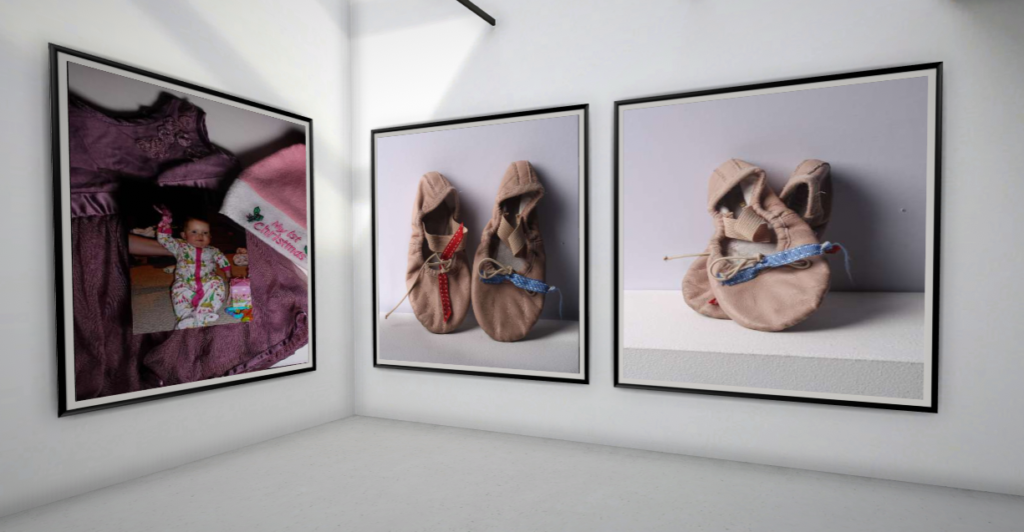
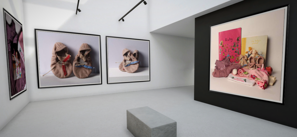
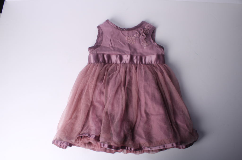
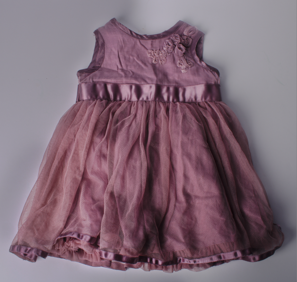
This is a photo of my first ever dress. I had no intention for this photograph, I just thought I would be effective. I think this image links to nostalgia as the subject of the photograph is an outfit which holds many memories from when I was a baby.
Edit 3
To edit this photo, I started off by cropping it then I increased the texture and made slight adjustments to the whites and vibrancy. I decided to leave the exposure as it was as I believe that the photograph already has good exposure.
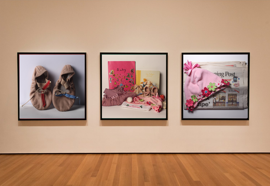
My intention for this photo was to arrange my nostalgic objects in a way similar to Still Life Paintings, where artists gathered various objects, often fruit and arranged them to paint. This image links to nostalgia because it includes many objects from when I was a baby which all have significant meaning to me.
Edit 4
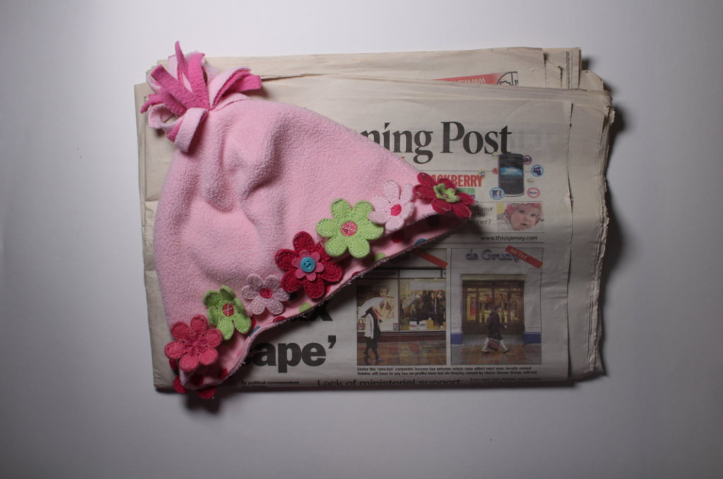
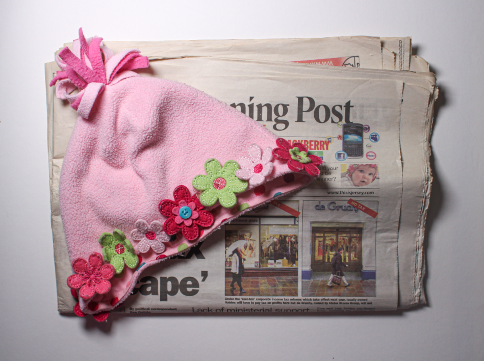
To edit this photo, I rotated in to make the newspaper straighter then increased shadows, whites and texture. Once completed, I cropped the edges of the image as I wasn’t satisfied.
My intention for this photo was to make the bottom of the hat lead your eye towards the small image on the newspaper, which was a photo of me as a baby wearing the same hat.
Edit 5
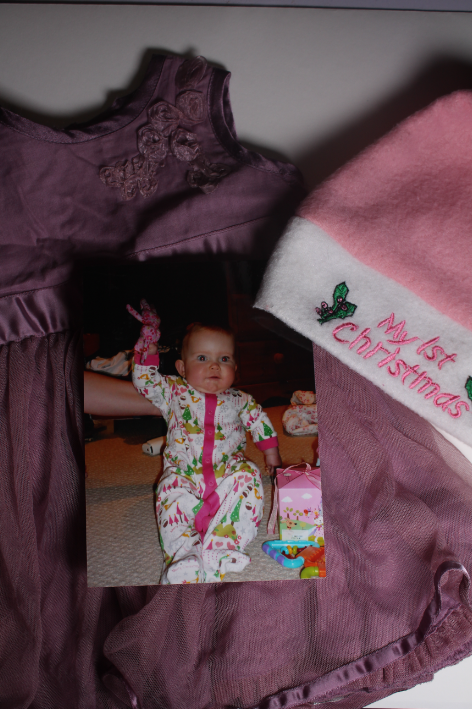
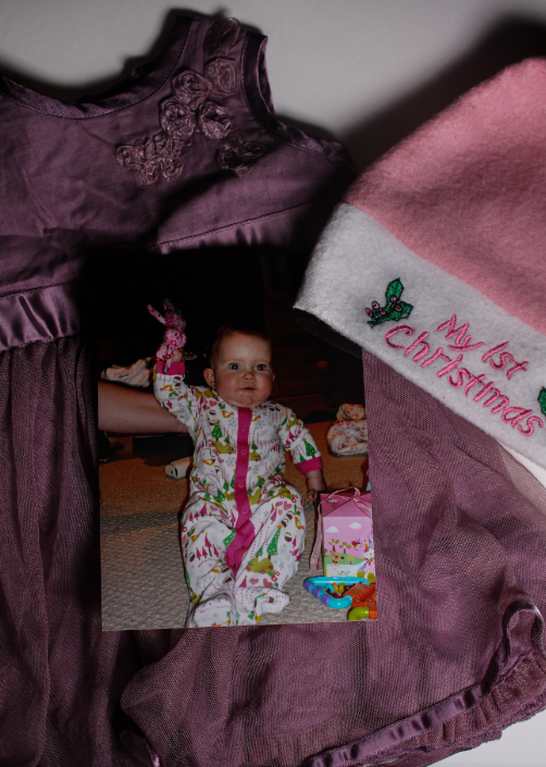
For this edit, firstly, I cropped the top of the photograph as you could see the edge of the table. Next, I used the brush adjustment tool to increase the exposure at top of the image because I believe it was too dark. Finally, I finished off by increasing the texture and clarity of the entire photo.
My intention for this image was to represent my first Christmas. I did this by gathering objects such as the dress I wore later on that day, my 1st Christmas hat and a photo of me on that day.
Edit 6
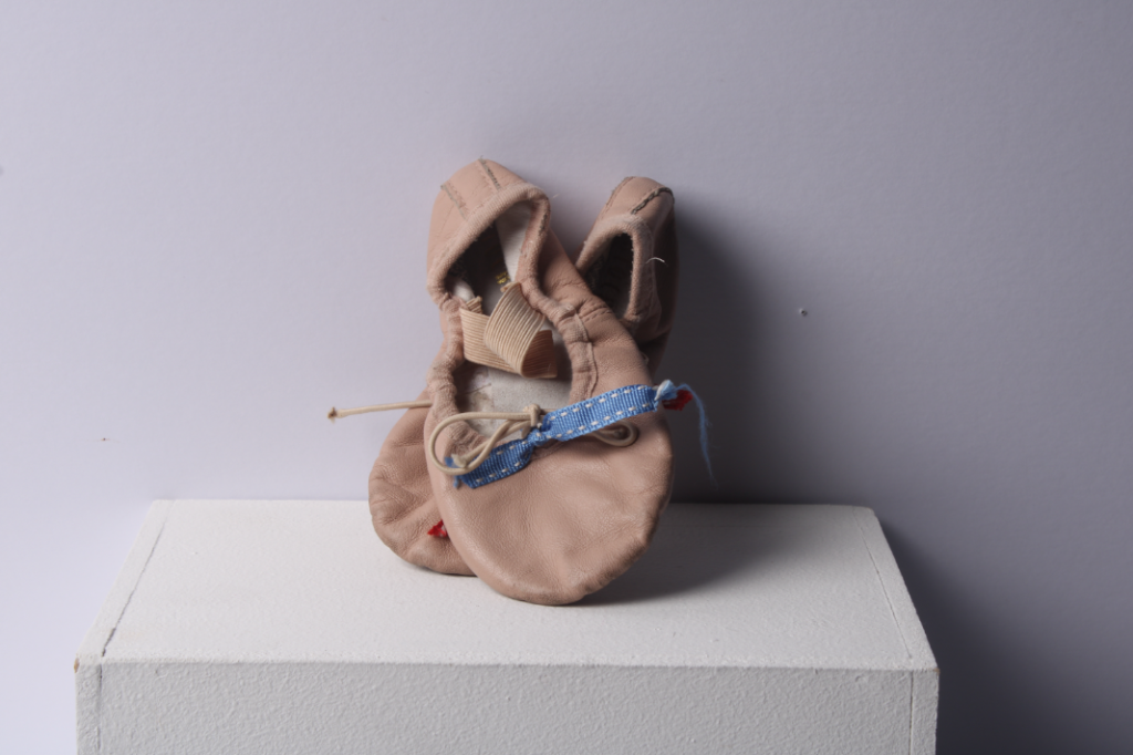
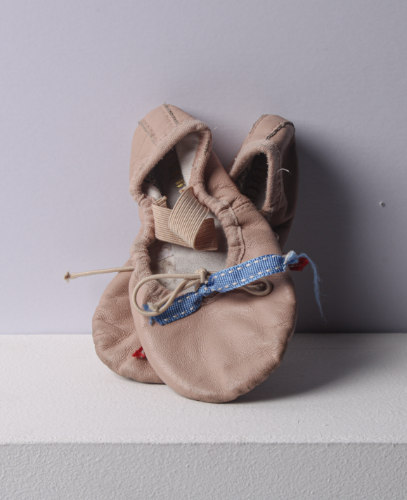
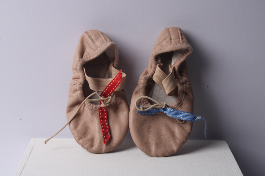
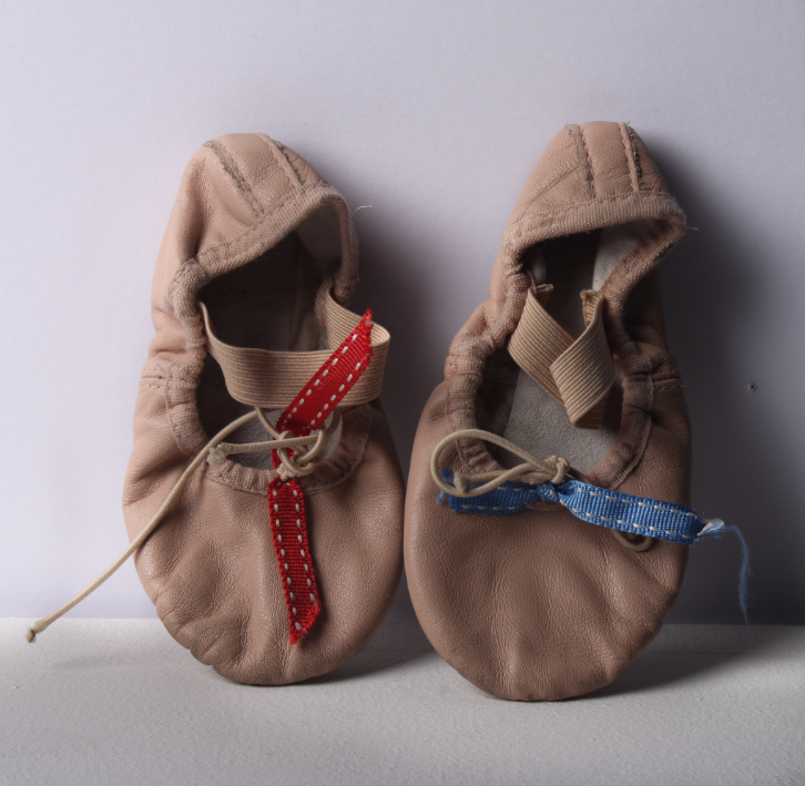
For this edit, firstly, I rotated and cropped the photograph. Then, I decreased the contrast because I think that it was a bit too dark. Lastly, I increased highlights, texture and clarity to make the ballet shoes a lighter colour. This makes the photo more nostalgic rather than sombre.
Both this image and the one below had no intention, however I think that they relate to nostalgia as they are my first ever ballet shoes and I used to love ballet. I personally think that these are effective images as these shoes hold many memories to me. For example, when we would do little shows in our classes for our parents and when I used to dance around the house wearing them.
Edit 7
I edited this photo by, firstly, cropping it. Then, I used the brush tool to balance out the exposure of the bottom of the image. After that, I slightly adjusted the overall clarity and, lastly, used the brush tool to increase the exposure of the background.
Final Images
Image diagnosis of my own image
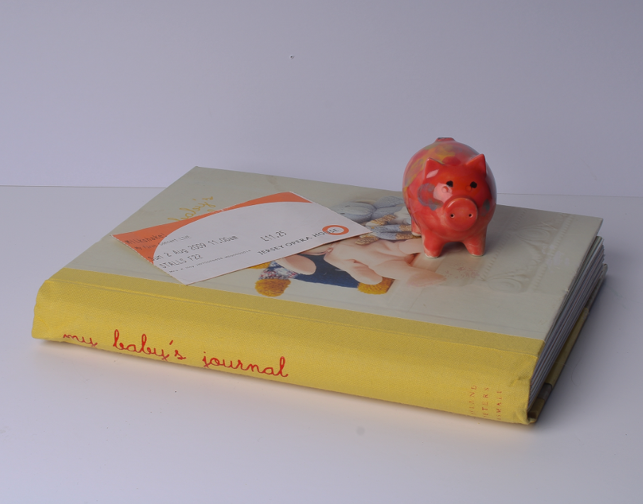
This is my personal favourite of my images. This image looks to be in focus, possibly indicating that it was taken with a normal depth of field as the objects aren’t very far from the camera lense and all of them are in focus, as well as the background. This photo was taken using a softbox that’s triggered by the push of the shutter button on the camera. You can tell by the shadows that the softbox was to the left of the objects. Perhaps, the lighting would have been more effective if it were straight on to the objects so that there would be no shadows. I would say that this image has an unbalanced exposure due to the shadows and how the image looks darker from left to right. I used a low ISO for this photo and high shutter speed to make the image clear and not too over-exposured. The image has a slight tint off yellow, giving off the effect that it was taken within tungsten lighting. In conclusion, this photo could be improved by positioning the softbox straight on to the objects.
Still life is a work of art depicting of inanimate/non-living factors.
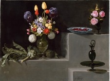
It originated in Ancient Egypt then resurfaced and became more popular in the classical period, during the 1700s. Although this is when it became more popular, there is evidence that Jacopo de’Barbari, an Italian Painter, painted a still life piece in 1504.
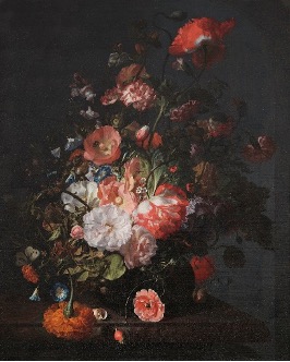
Joris Hoefnagel – 1589Jacques de Gheyn II – 1603Jacob Vosmaer – 1613Pieter Claesz – 1628Sebastian Stoskopff – late 1620sWilliam Claesz Heda – 1635Georg Flegel – 1625-30
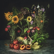
Examples of Still Life Paintings
Still Life Artists
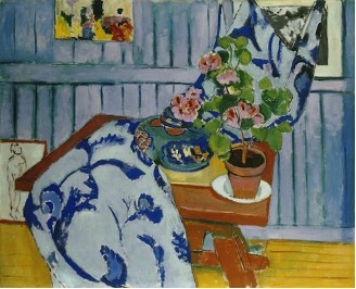
Pieter ClaeszCaravaggioHenri MatisseRachel Ruysch
Analysis of Painting
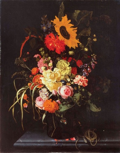
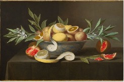
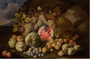
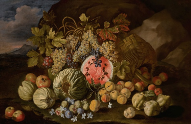
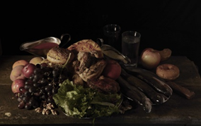
This is a Still Life Painting which features many, from the time it was taken, exotic fruits. These fruits were probably gained by traveling and trading with people from different countries. The lighting in this painting looks to be tungsten light, however it’s hard to tell as there’s a background of mountains where the sky is slightly illuminated. This could indicate that the photo was taken at dusk/dawn. The colours in this painting are relatively contrasting between dull and bright. For example, the watermelon is a very bright colour, however towards the top of the painting it consists of mostly dark green/brown. There’s lots of texture in this painting as the fruits are 3D and their lines and edges are prominent. The way in which the objects within the painting have been arranged shows that it is staged. The watermelon is the focal point in this painting as it is the most vibrant and within the center. The grapes above almost look as if they are pointing towards the watermelon, leading your eye, as they drop down in its direction. This painting may be a symbolism for religion, due to the apples and grapes (explained at the end of this blog post).
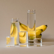
Examples of Still Life Photography
Still Life Photographers
Krista van der NietMat CollishawPaulette TavorminaHenry Hargreaves
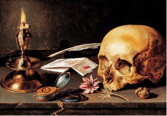
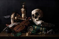
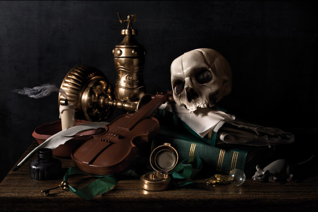
Analysis of Photo
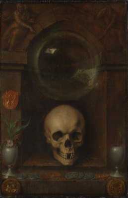
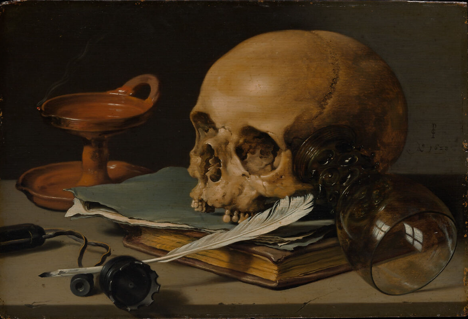
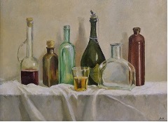
This is a Still Life photograph of objects which were often featured in paintings. For example, the skull was often used to symbolize the inevitability of death and the instrument to symbolize beauty and transience. These objects together create a juxtaposing effect, however, the fact that they are facing towards each other may symbolize the peacefulness of death. The lighting gives the impression that a continuous light was pointed straight on to the objects. The image is in focus, which indicates that the photo was taken with a large depth of field, fast shutter speed and a relatively low ISO. The colours in this image are all very dark and dull which creates a sombre mood. The skull is the focal point of this photo as itself and the material underneath it are the brightest in the image, creating a contrasting effect. The instrument can be interpreted as leading lines towards the skull. The textures in this image all look relatively smooth and the forms are all organic rather than geometric.
Colonialism
Colonialism is when there is control by one power over a dependent area or people. For example, a country having control over people or different areas of the world.
Colonialism impacted still life as new materials and techniques were shared across the world, such as oil paints, canvases and paper becoming more widely available.
Early still life paintings consisted of mainly rich foods and materials, such as exotic fruits and wine, which links to how people used to travel to different places and trade, coming home with many things not commonly found where they live.
Vanitas and Memento Mori
Vanitas is a genre of art which uses symbolism to show death or change as a reminder of their inevitability. This artwork usually features Memento Mori, which is an object kept as a reminder of the inevitability of death, such as a skull. In still life there are also many other objects and symbols used for metaphors such as:
Religious and mythical symbols – For example, apples signify temptation and knowledge in reference to the Old Testament account of Eve eating the forbidden fruit. Grapes can symbolise pleasure and lust as they are the main ingredient in most wine, associated with Bacchus, the Roman God of wine.