Question: How have Historical Periods of Time influenced Architectural Changes and therefore Photographic Styles?
Introduction
Photography is a way of preserving the world around you. It allows you to capture a moment of time and freeze it. This is significant as the world we live in is ever-changing. The world changes due to different movements and events. For example, the Climate Movement has caused people to be more considerate of the environment and, as a result, produce sustainable and energy efficient buildings. Similarly, the Romanticism movement, an artistic and intellectual movement during the Industrial Revolution, influenced Architects and Artists to use nature as an inspiration for their designs. As we can see, there is a tie between social activities and world development. In photography, The New Topographics Exhibition was a reaction to the Romanticism movement and idealised landscape photography. Lewis Baltz, a photographer who was associated with this exhibition , explored the beauty within the realistic, industrial environment at this time.
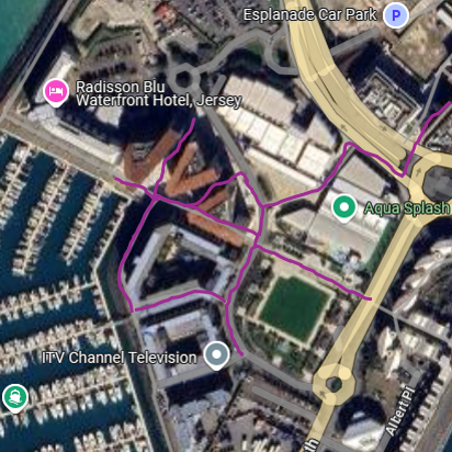
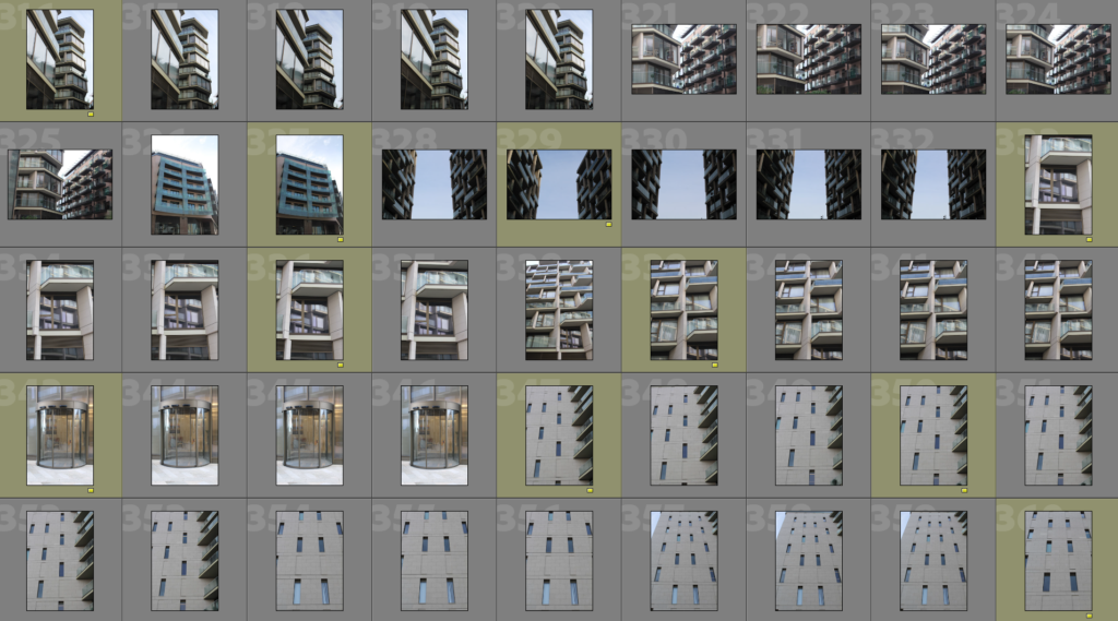
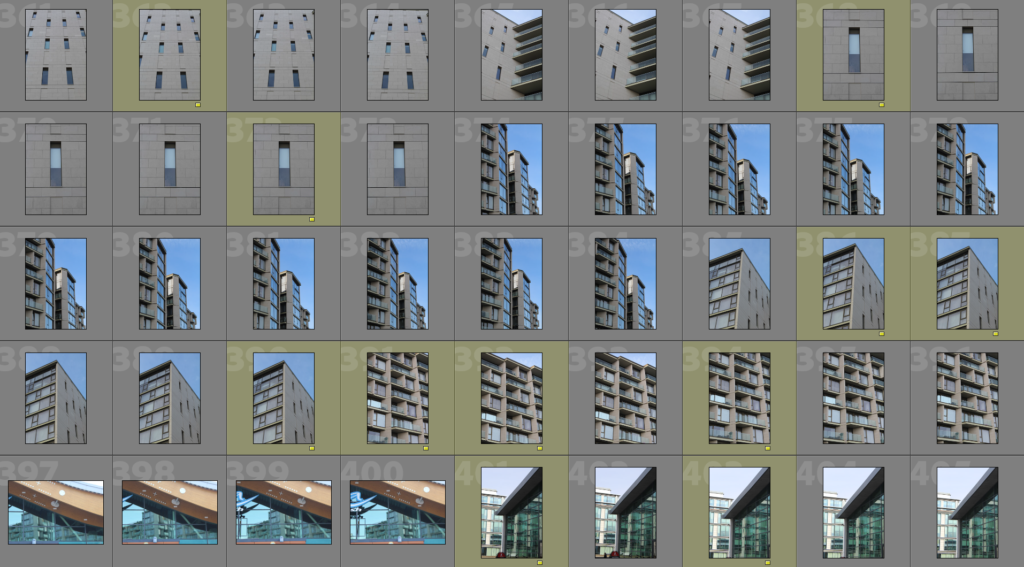
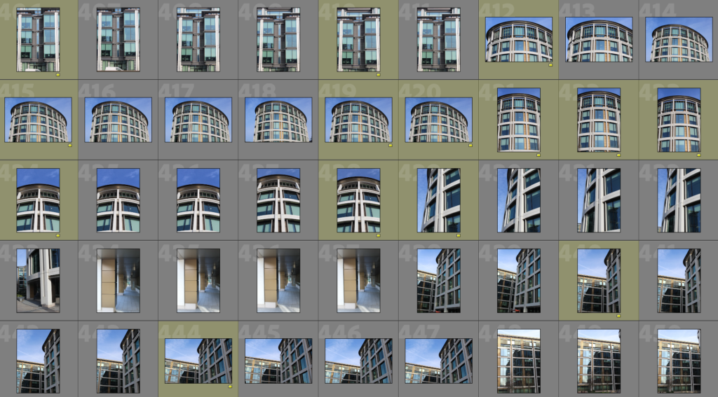
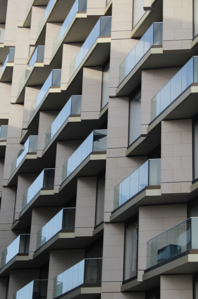
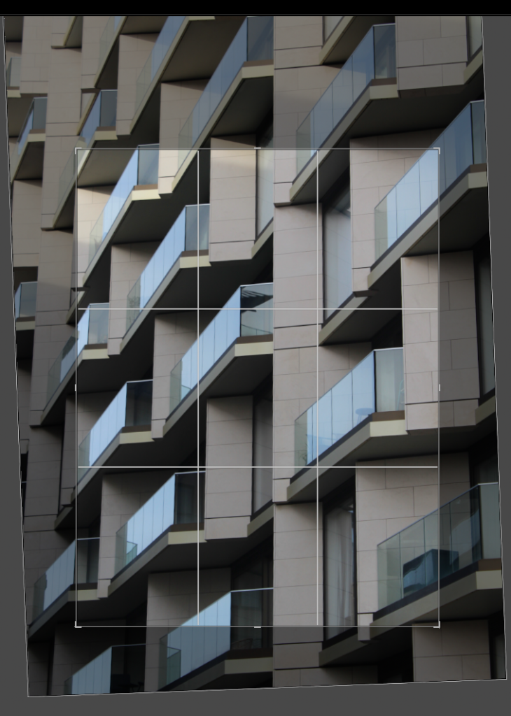
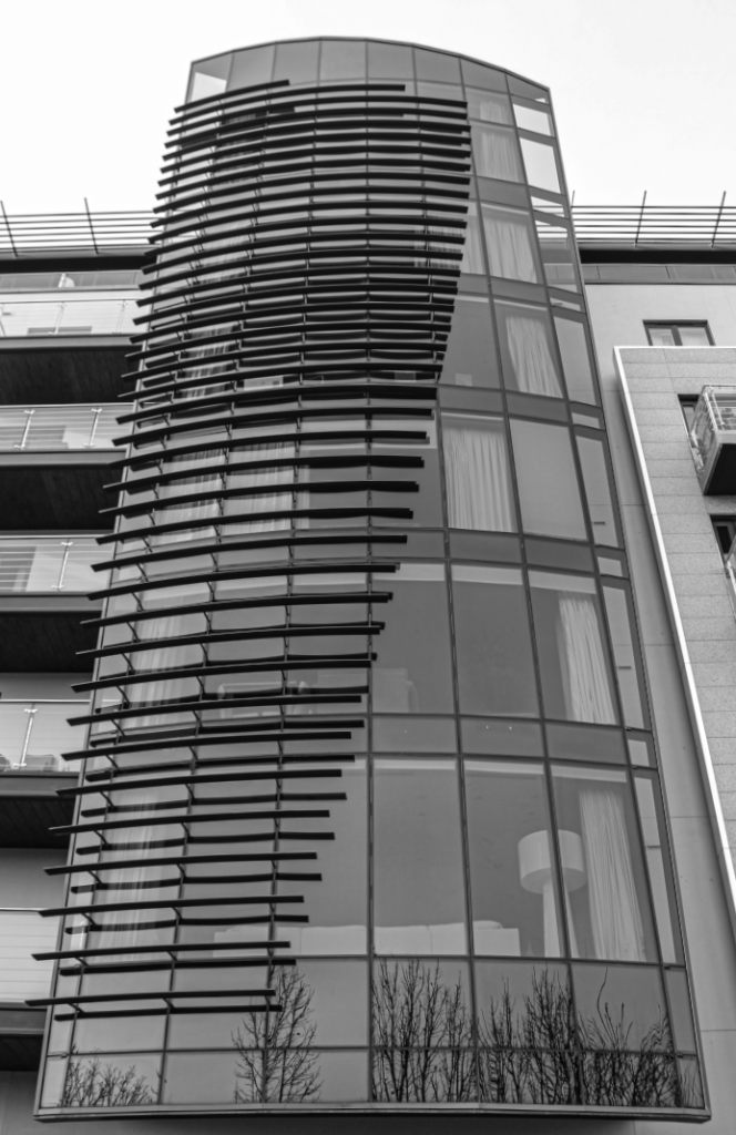
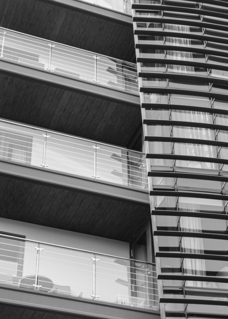
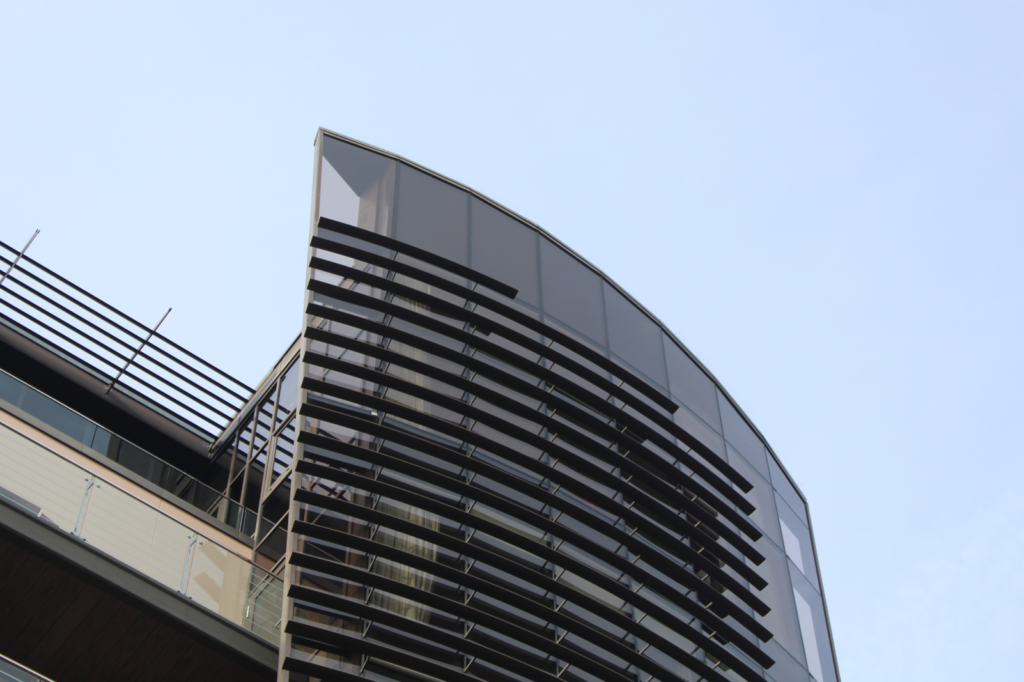
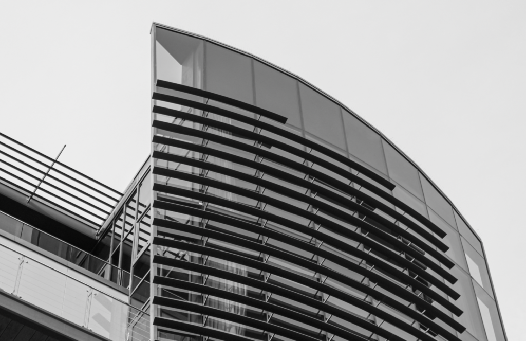
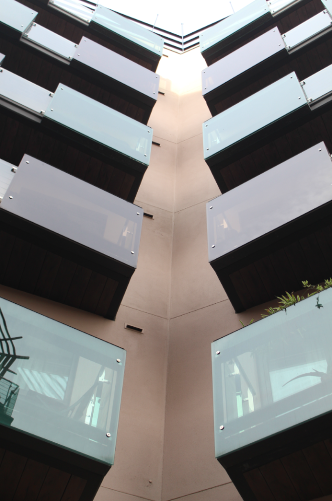
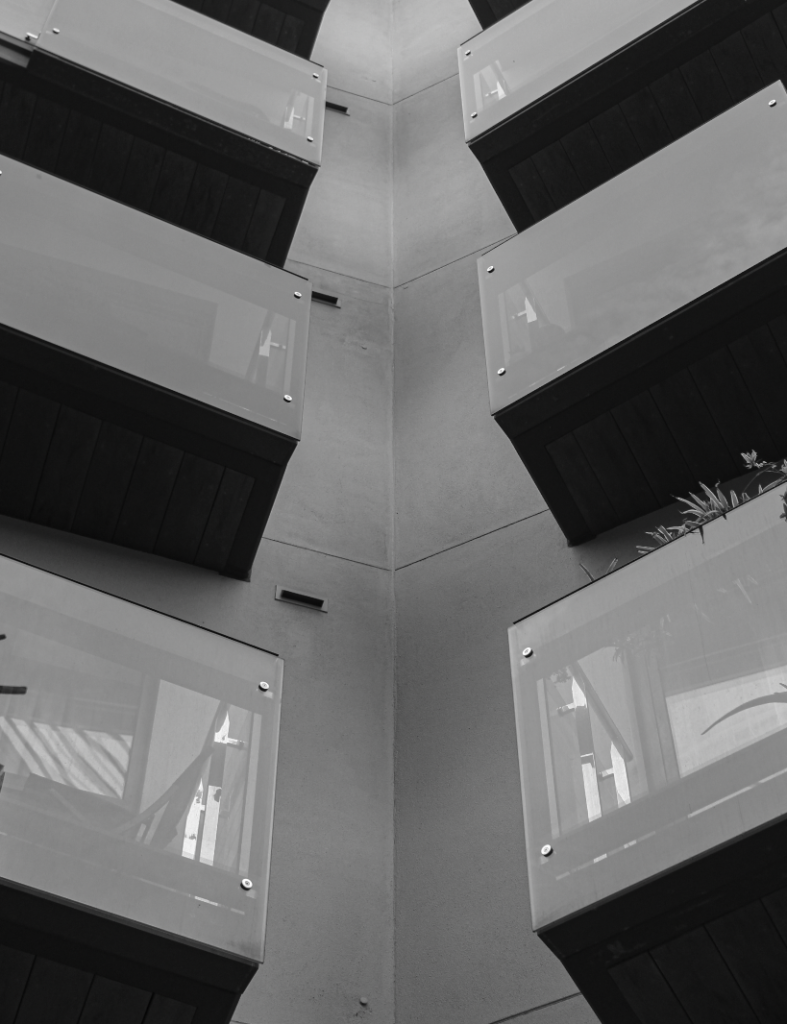
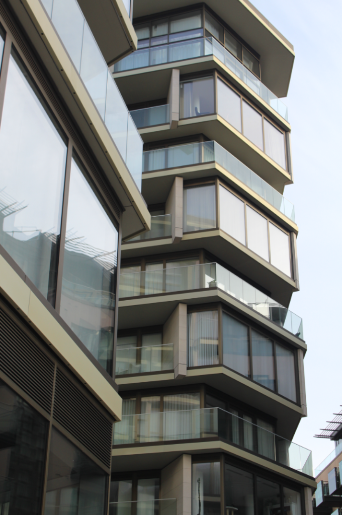
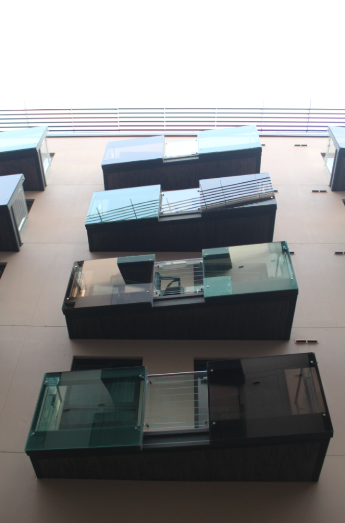
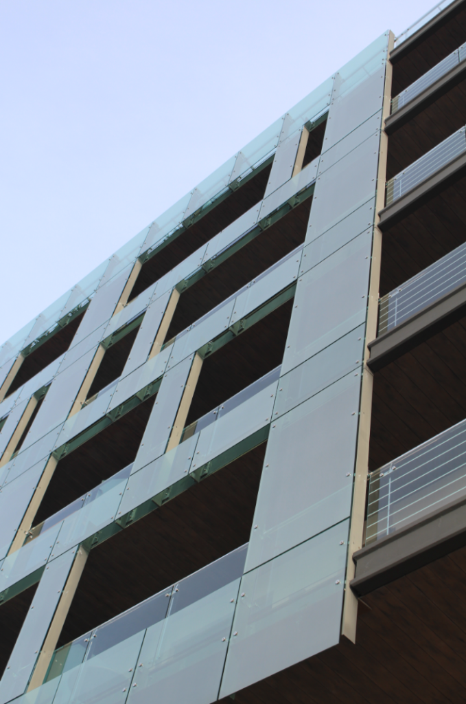
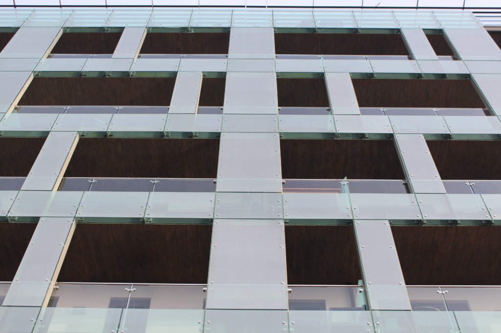
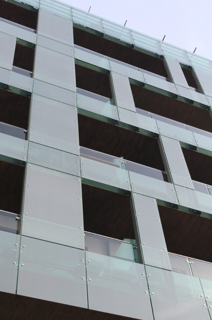
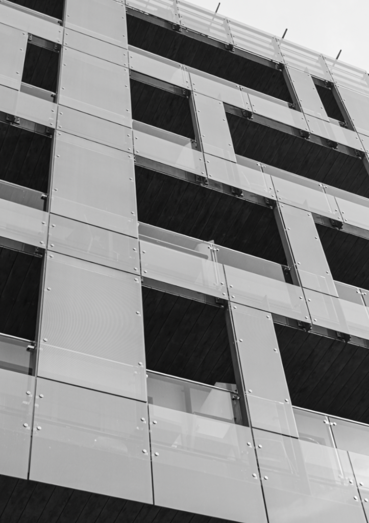
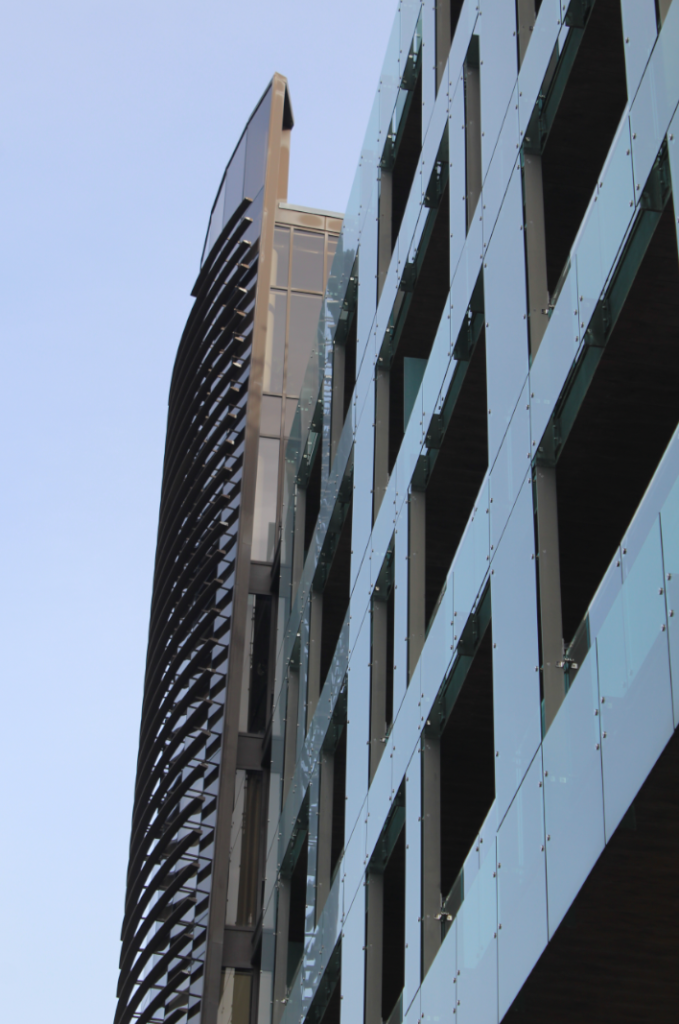
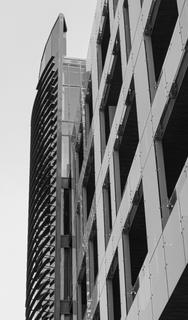
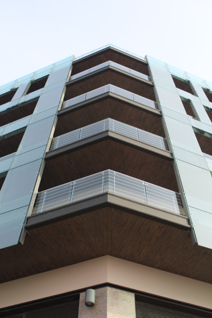
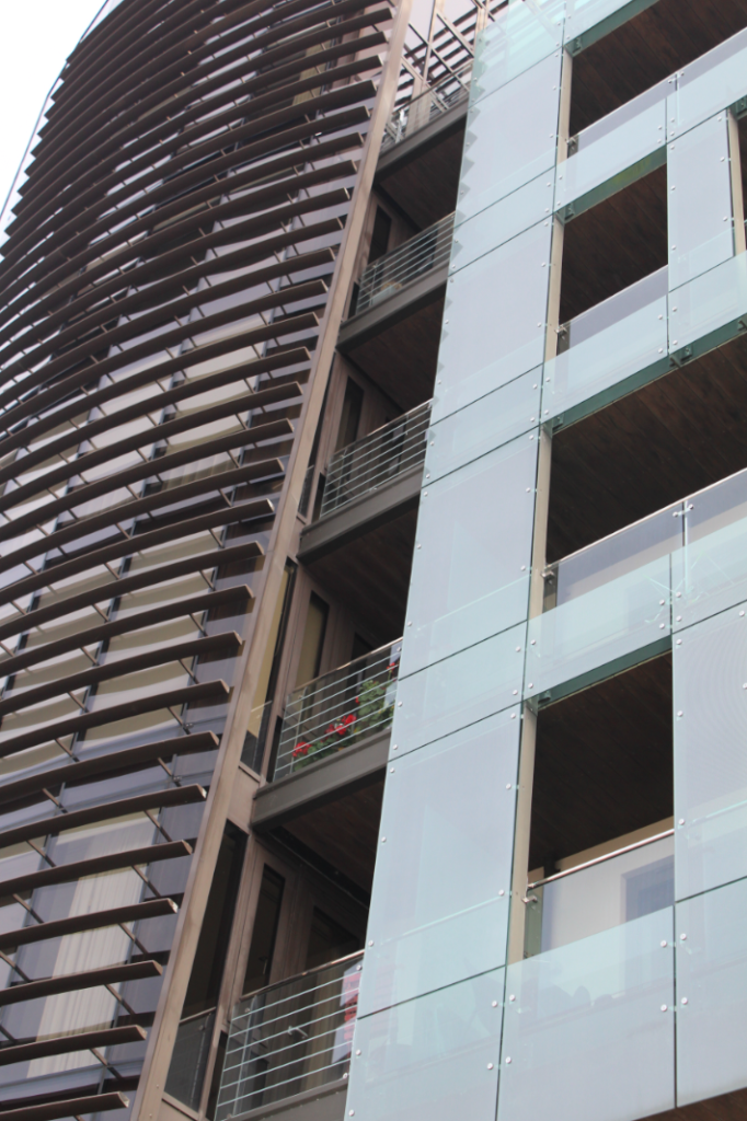
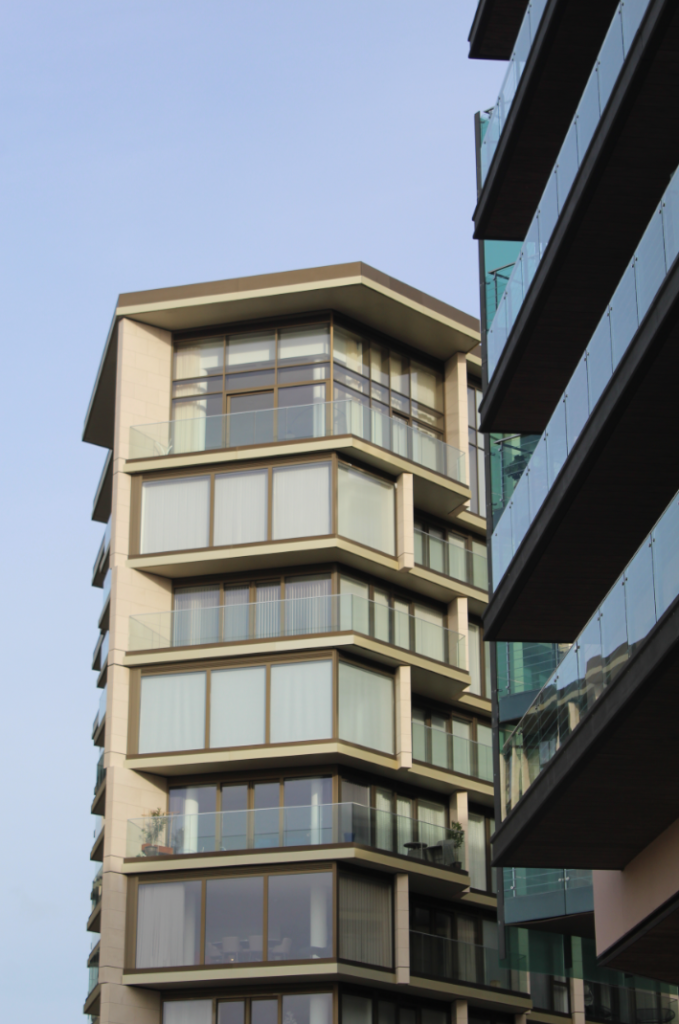
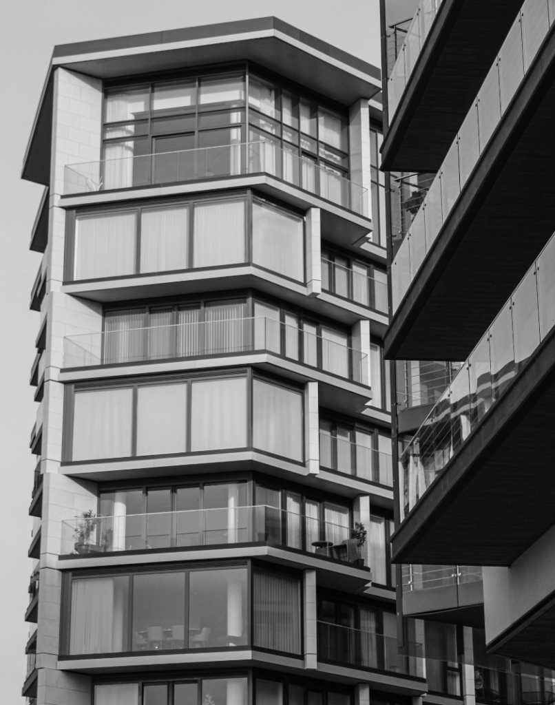
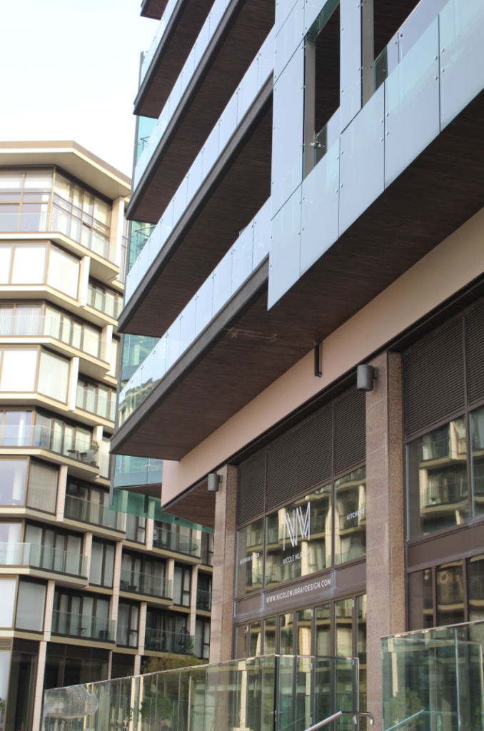
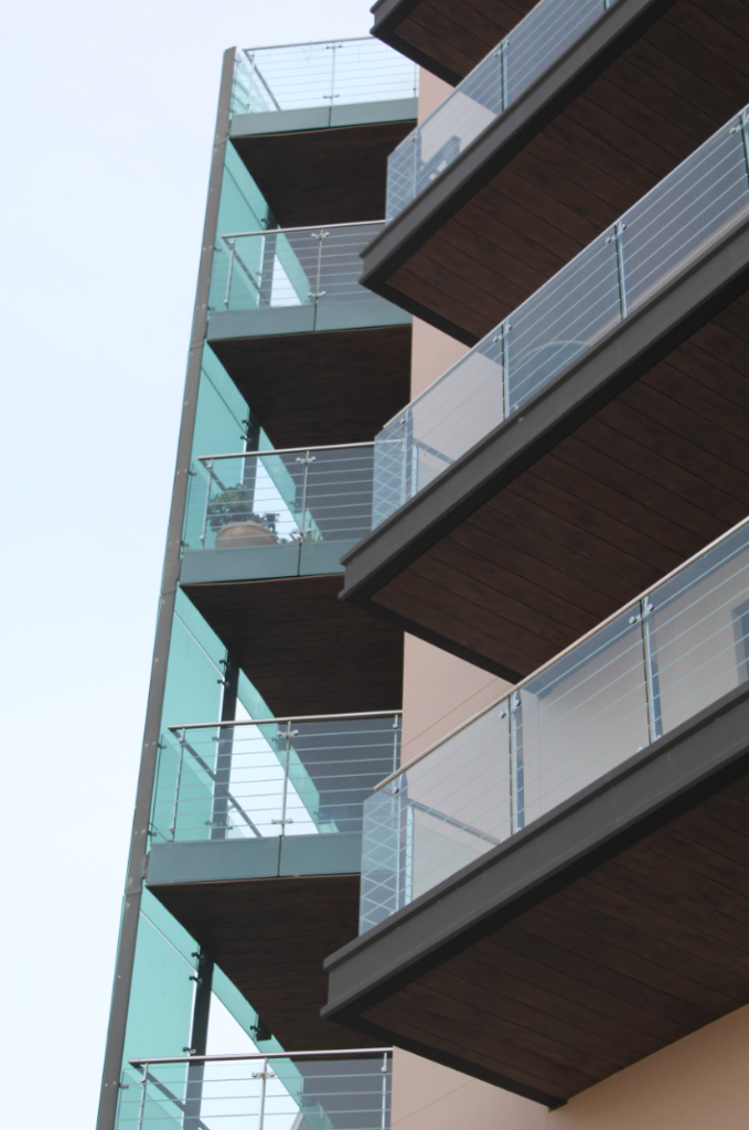
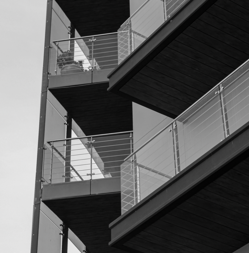
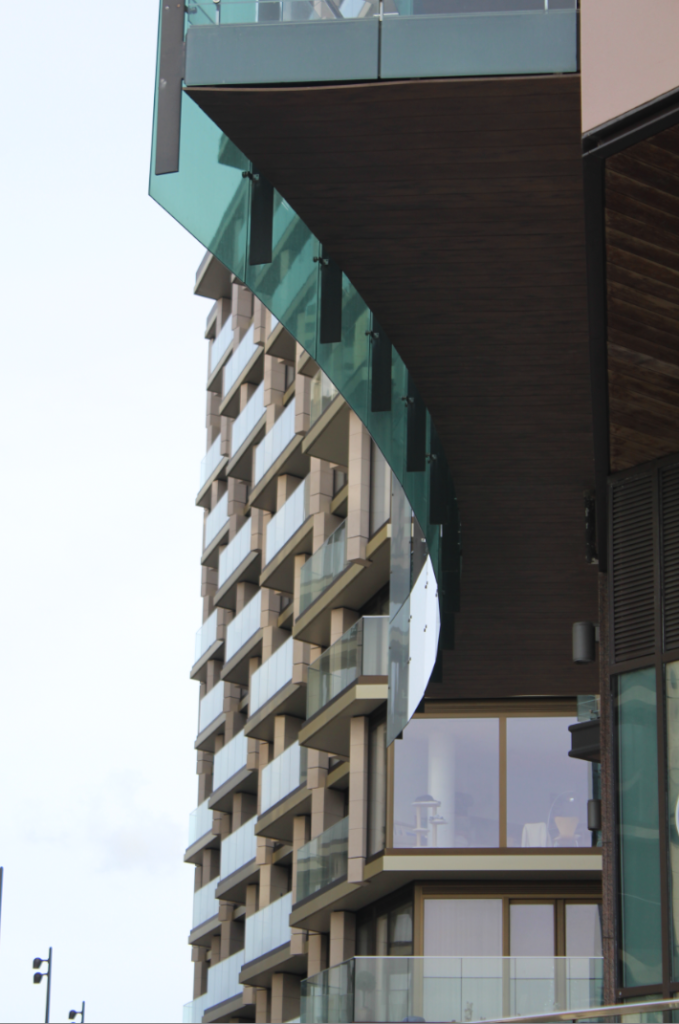
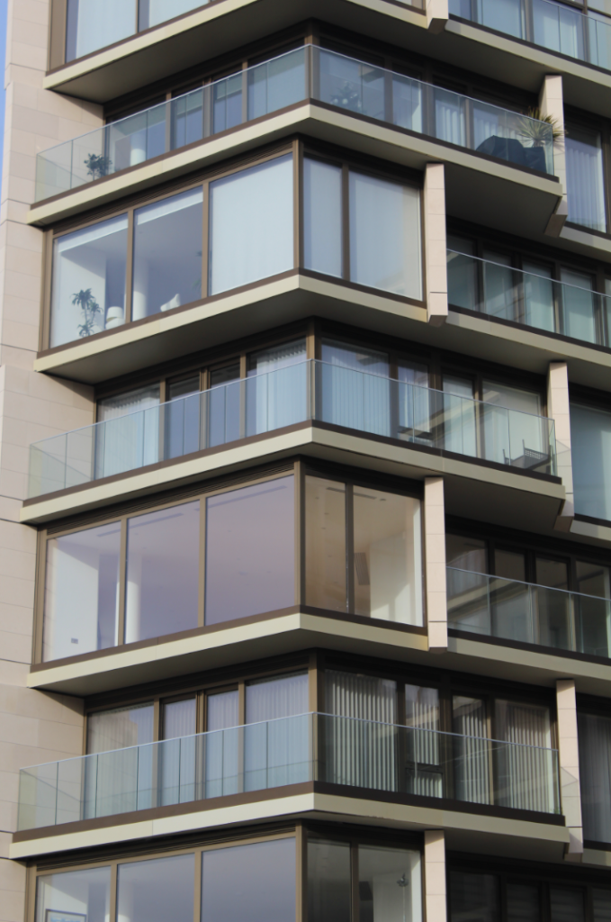
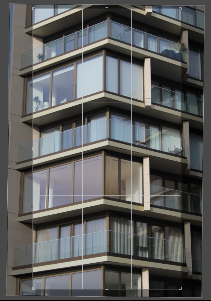
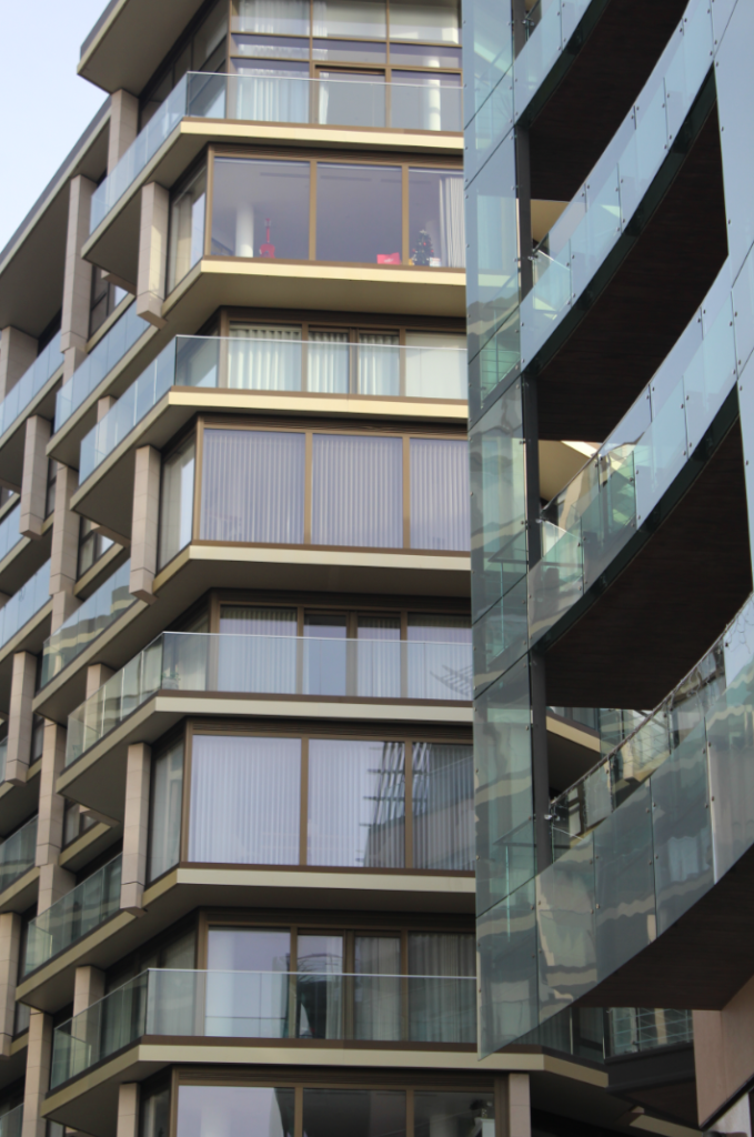
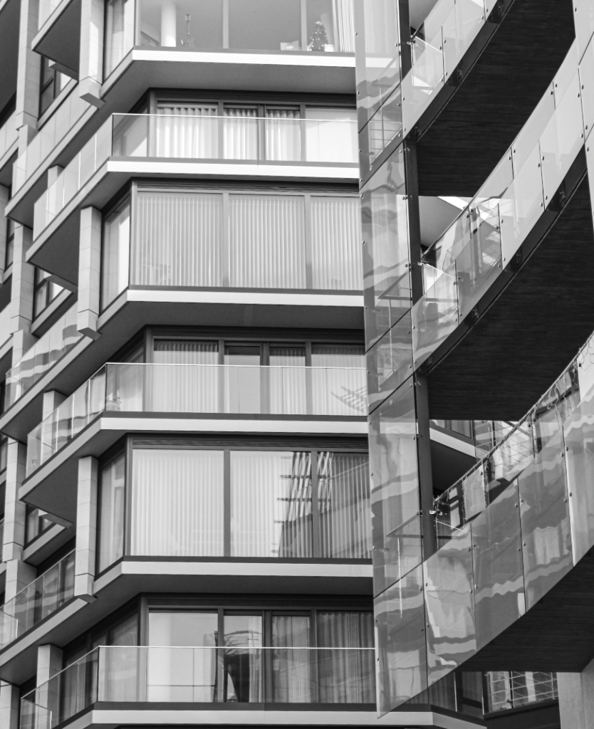
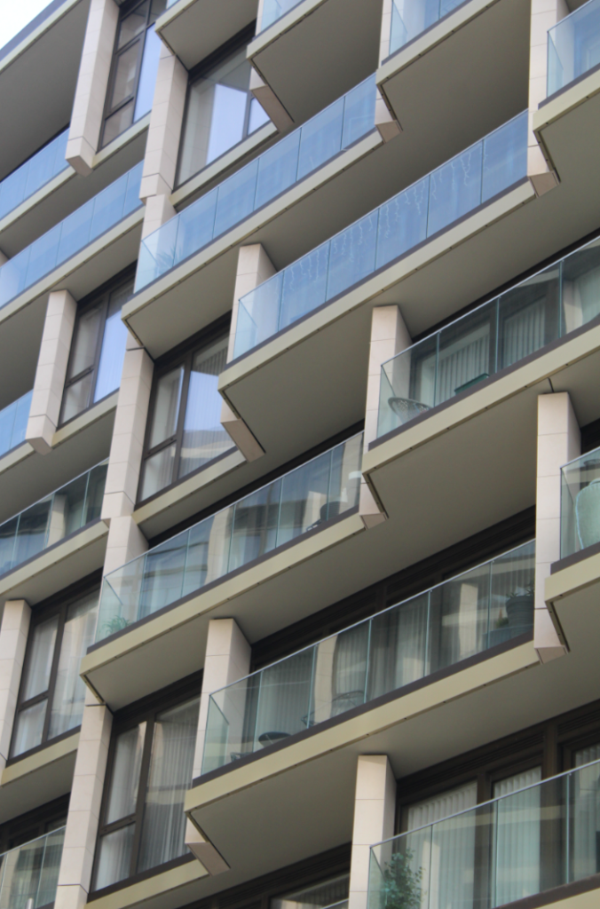
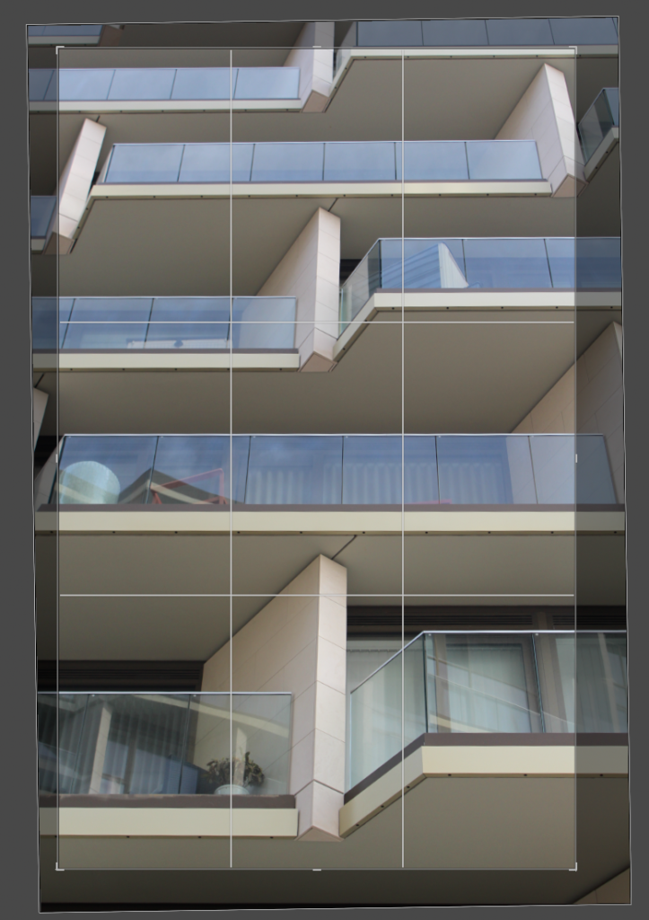
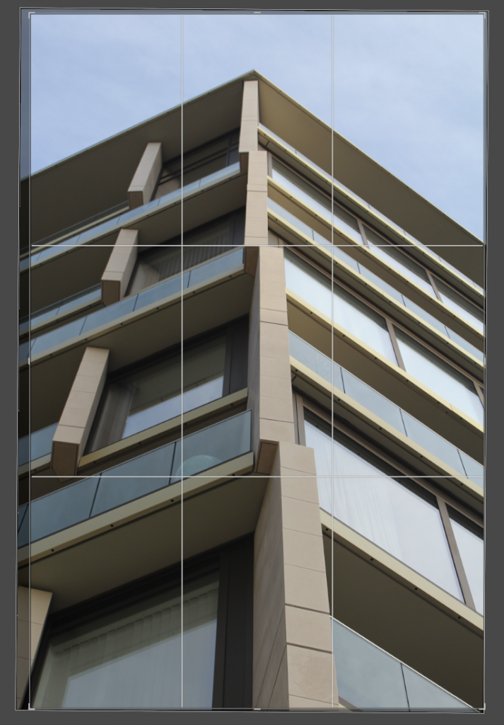
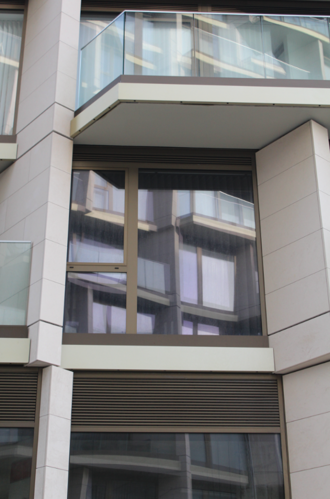
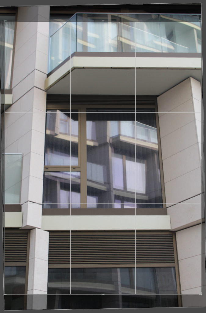
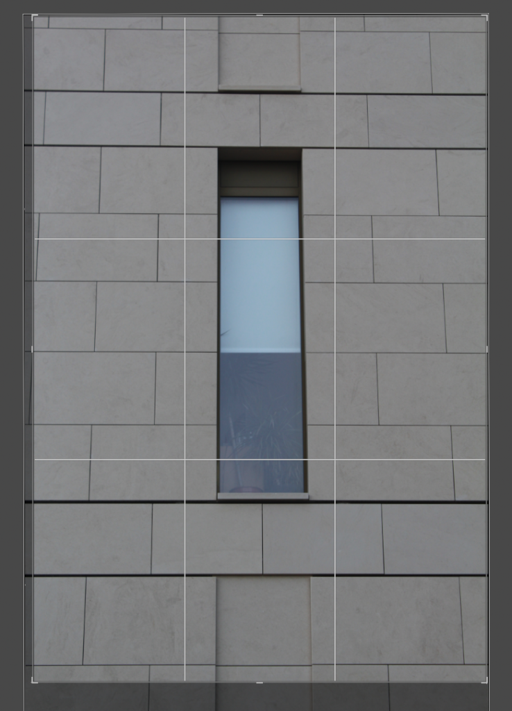
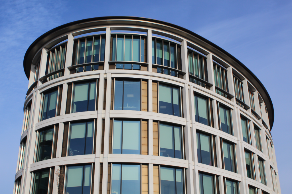
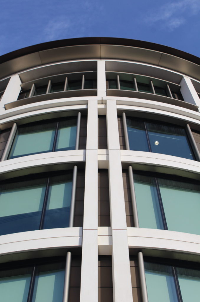
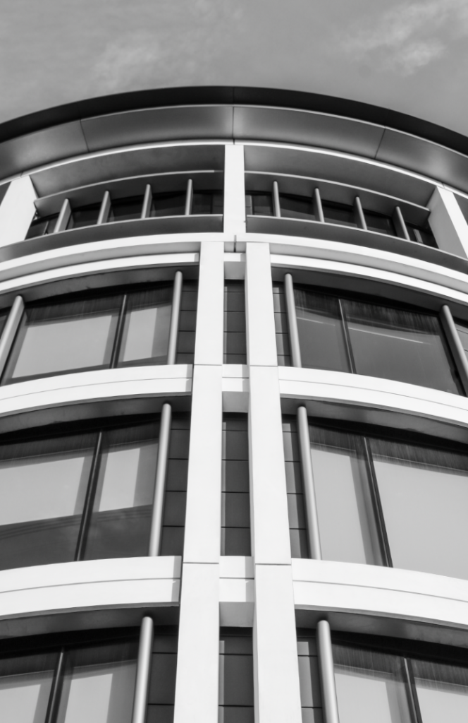
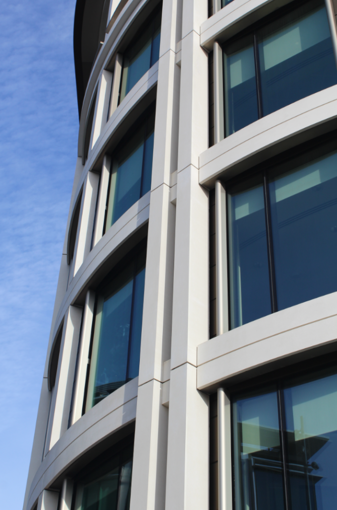
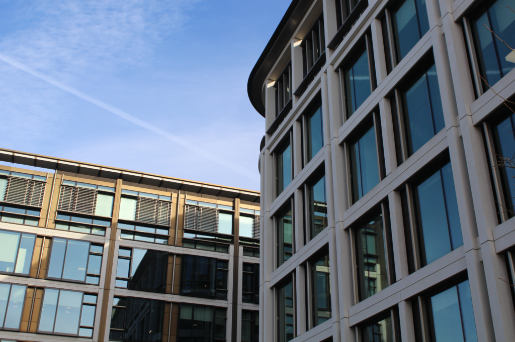
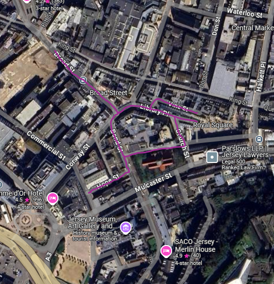
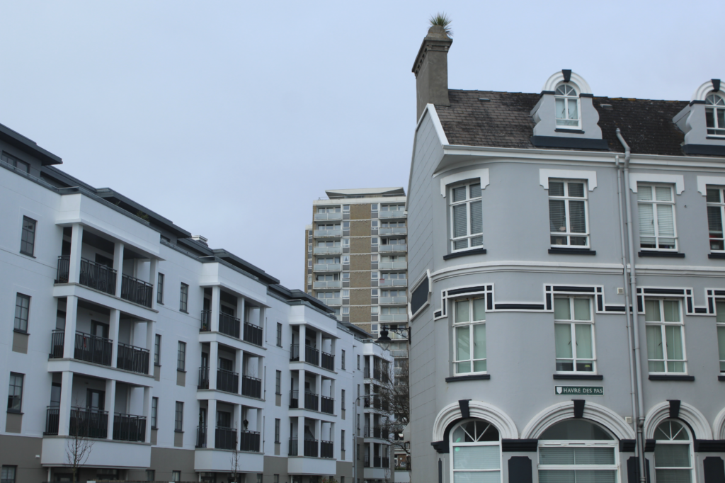
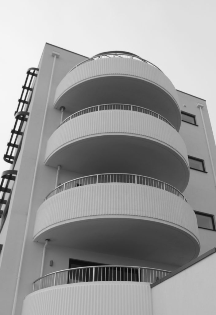
For this photoshoot, I focused on modern buildings, specifically on the water front as they are high-rise. I attempted to photograph these buildings in a way that is abstract, capturing the shapes and textures of the buildings. This is the route I walked:
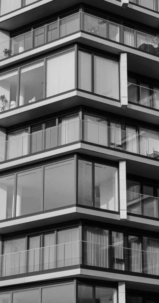
I have done a small photoshoot in St Helier to experiment with what I would like my outcomes to look like. I personally am not too satisfied with these photos and would prefer to get more detail and deadpan shots. I also think the lighting and composition in these images aren’t the best.
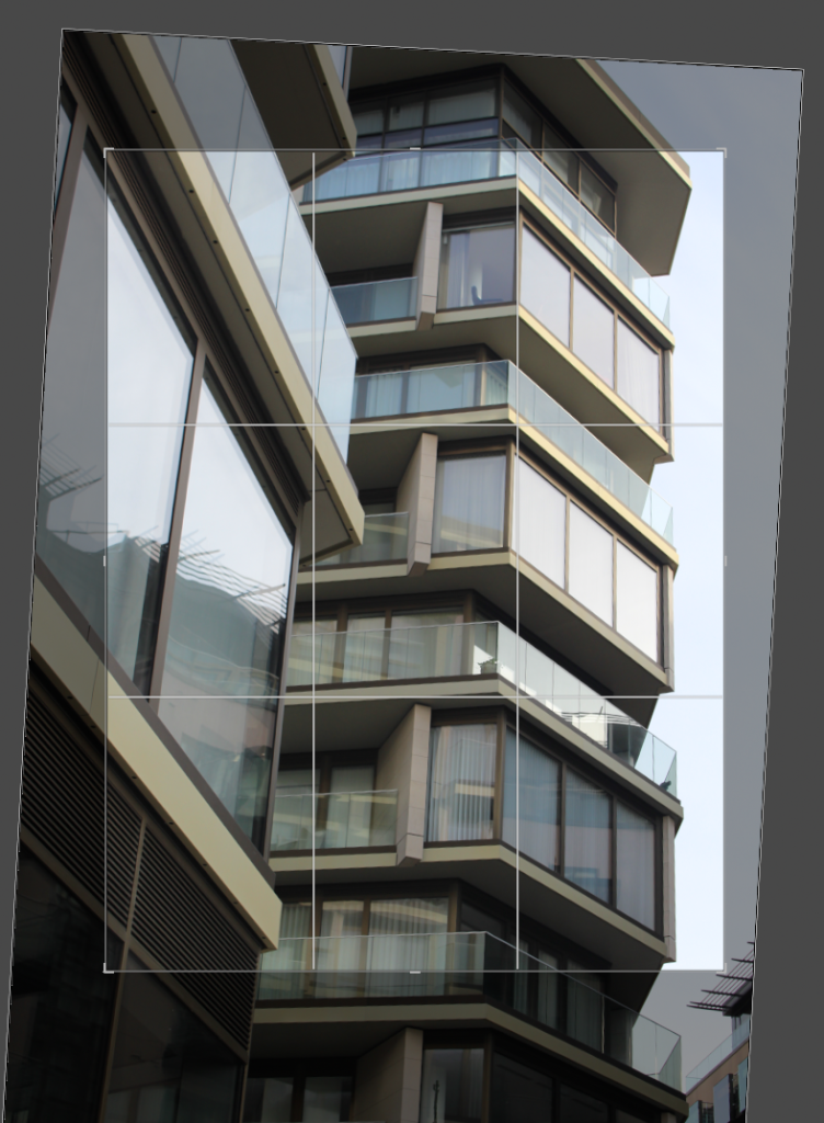
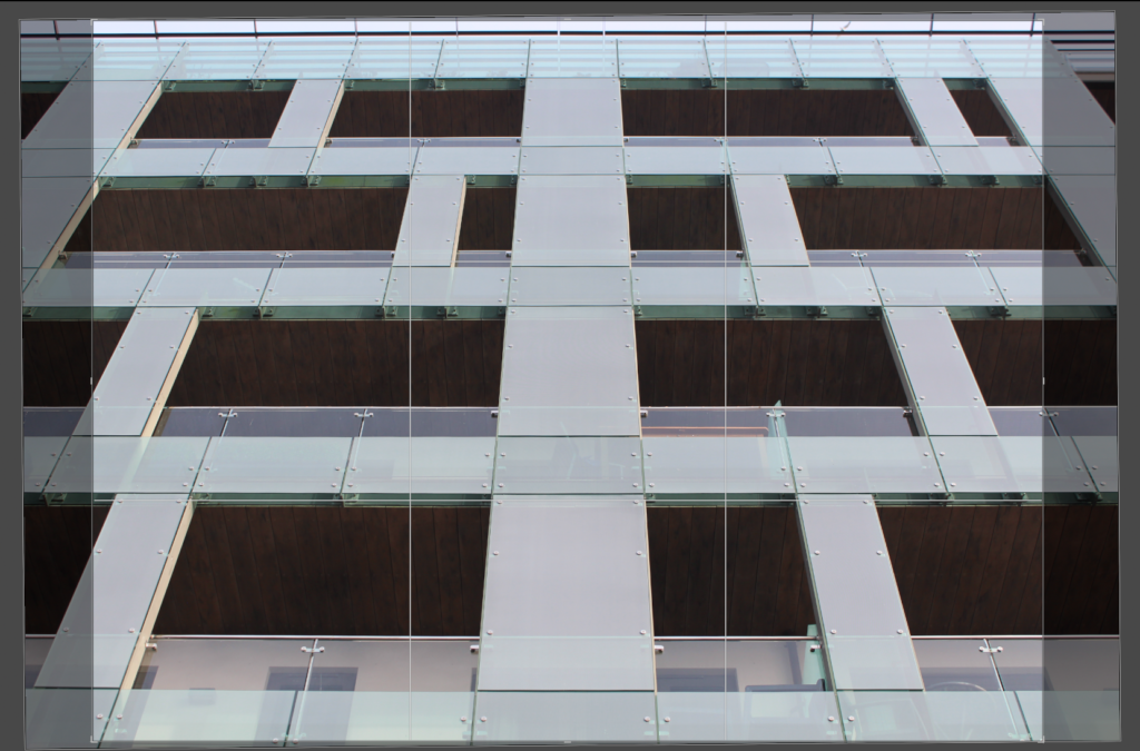
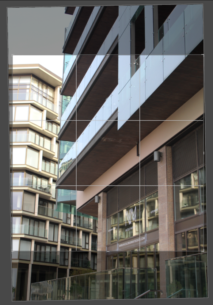
This is a map showing the area in which I walked:
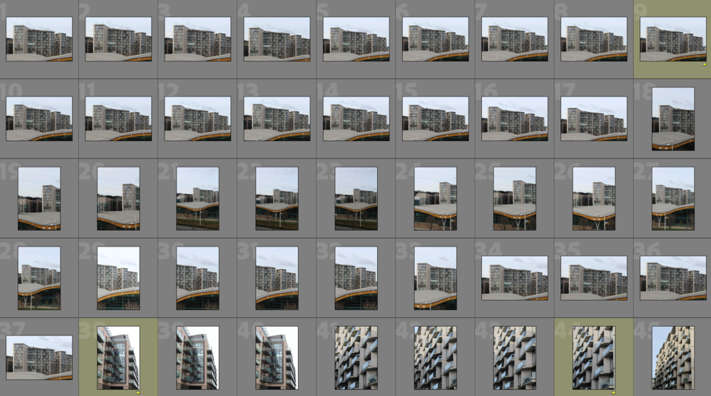
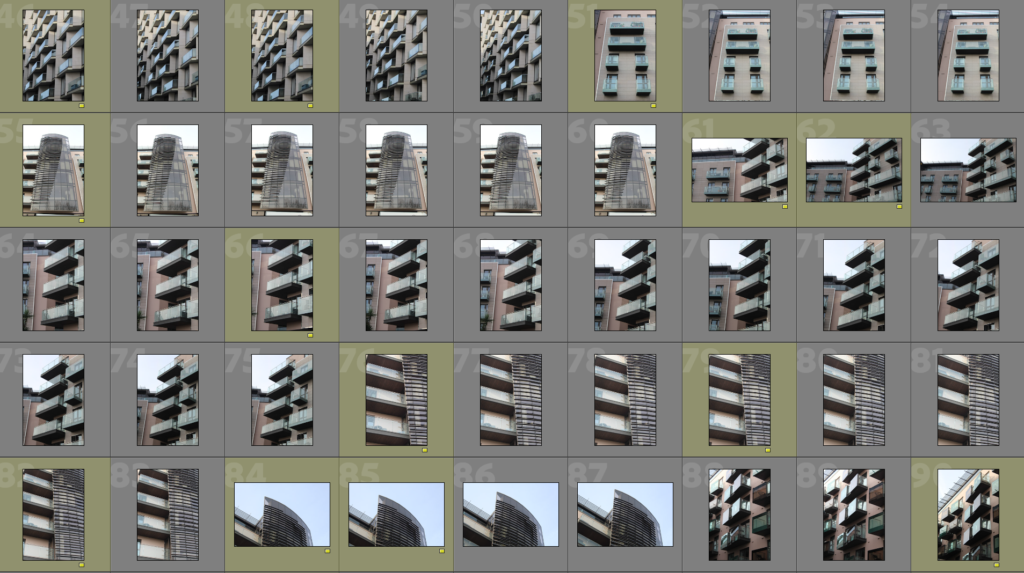
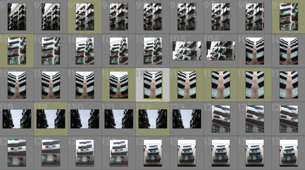
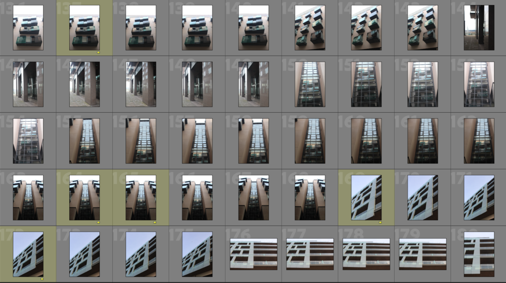
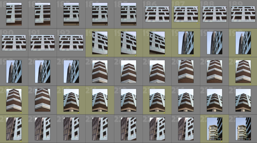
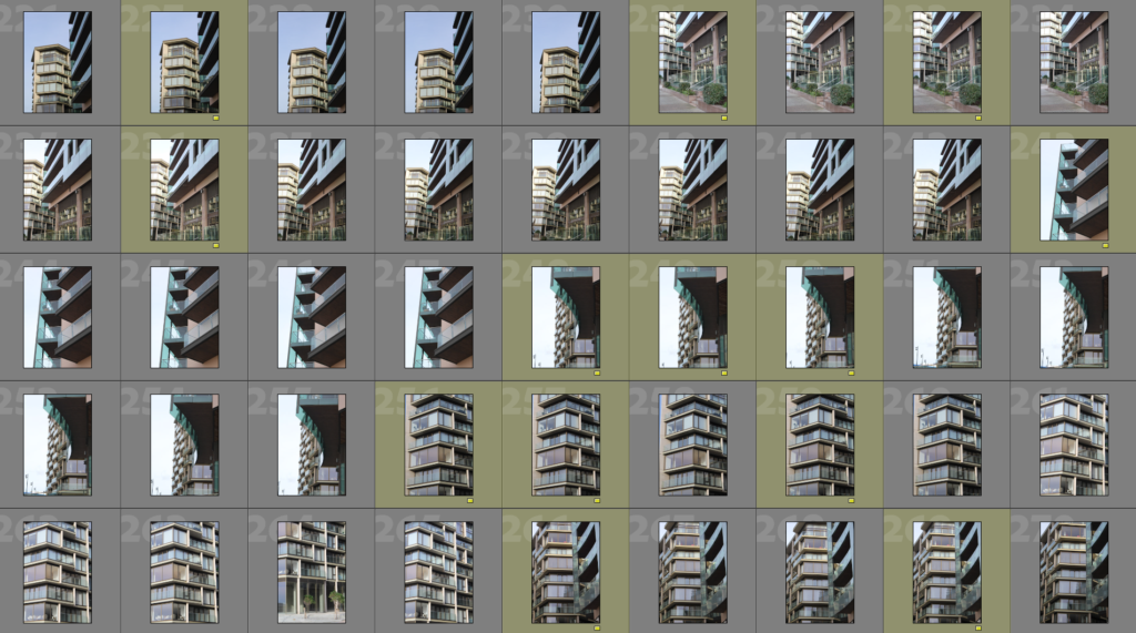
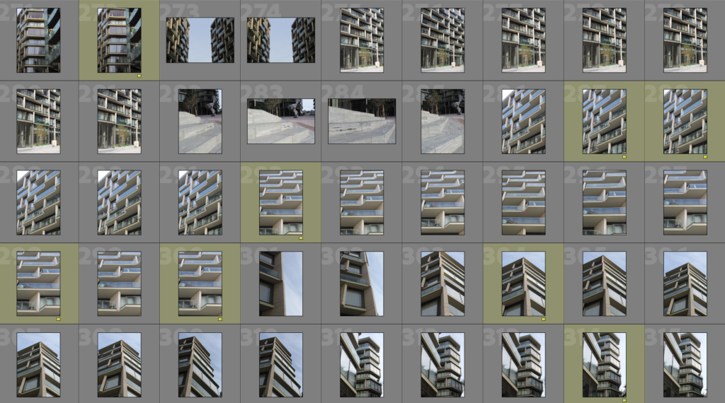
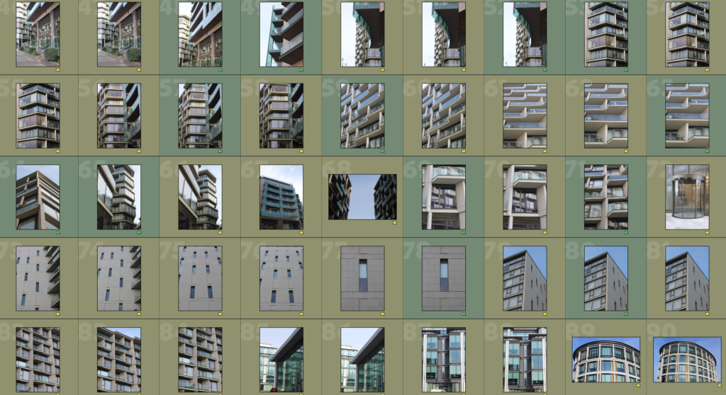
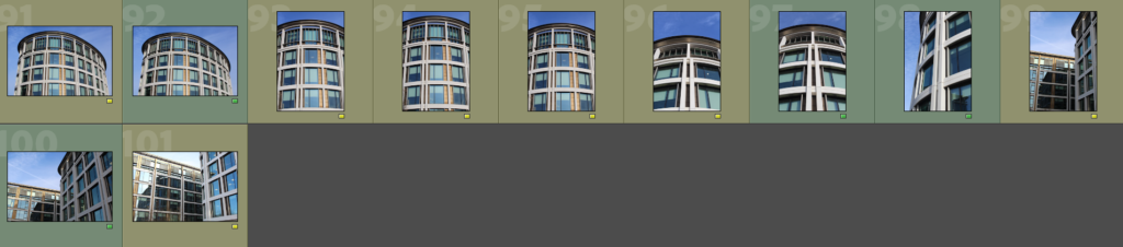
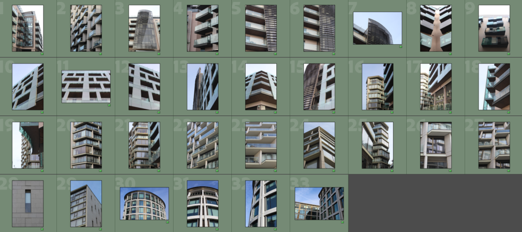
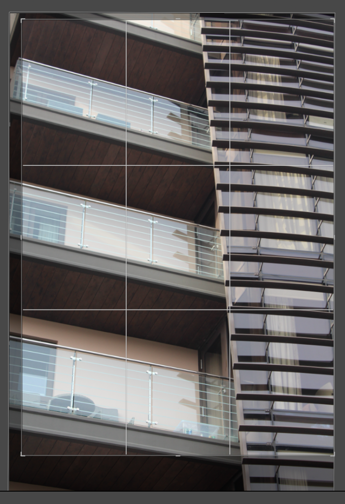
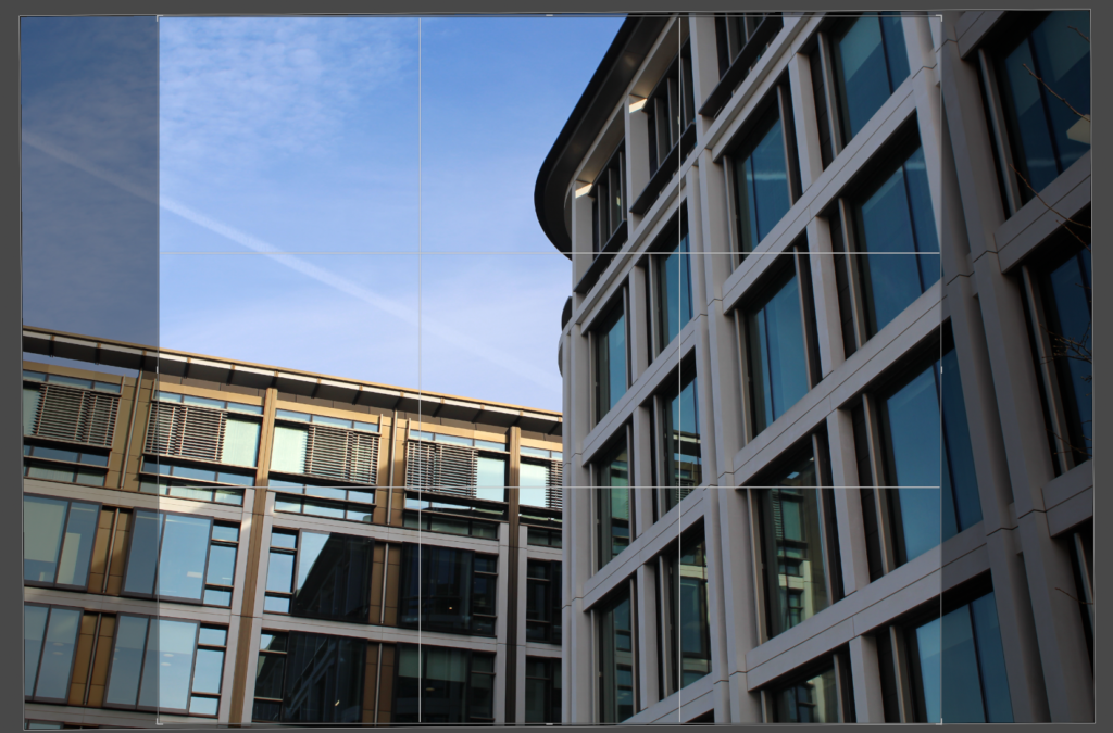
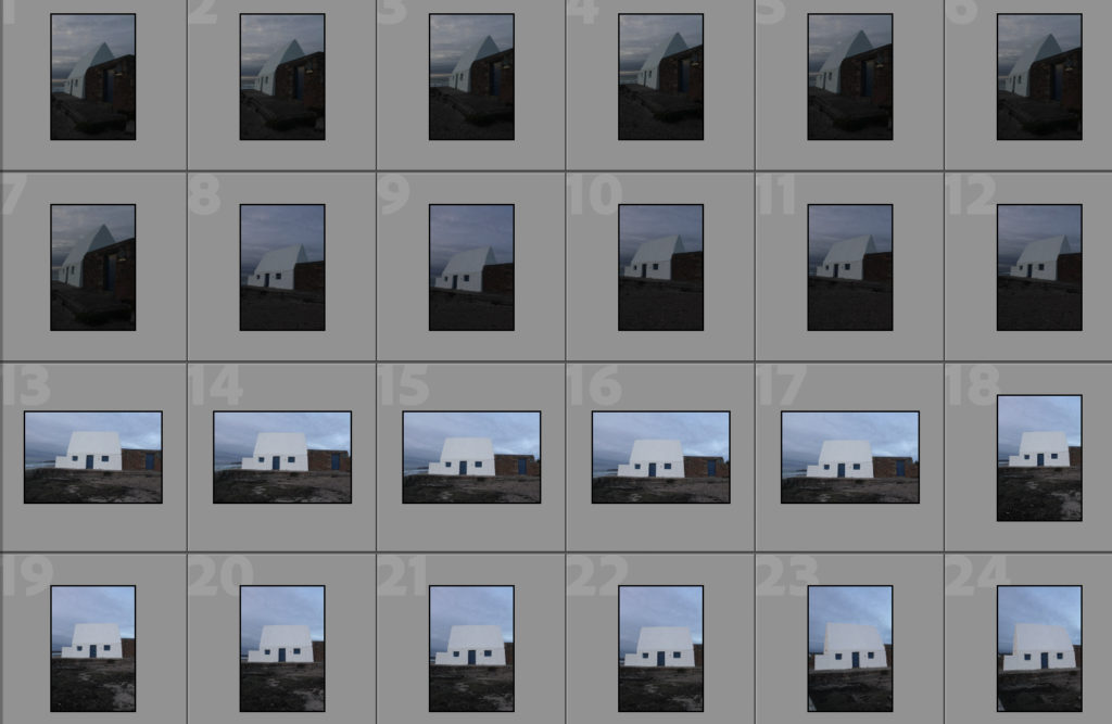
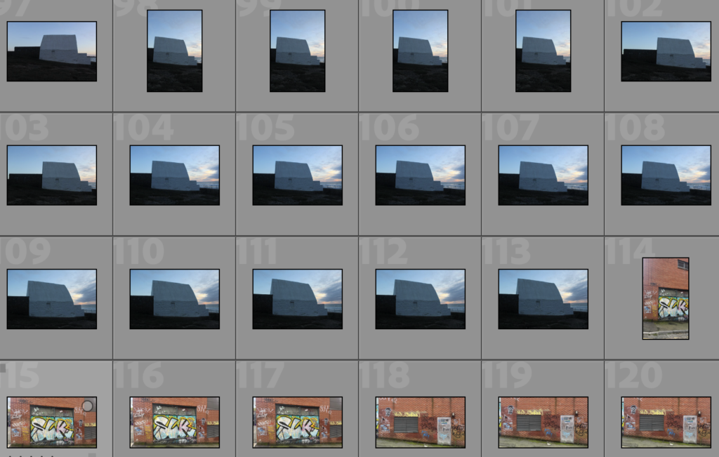
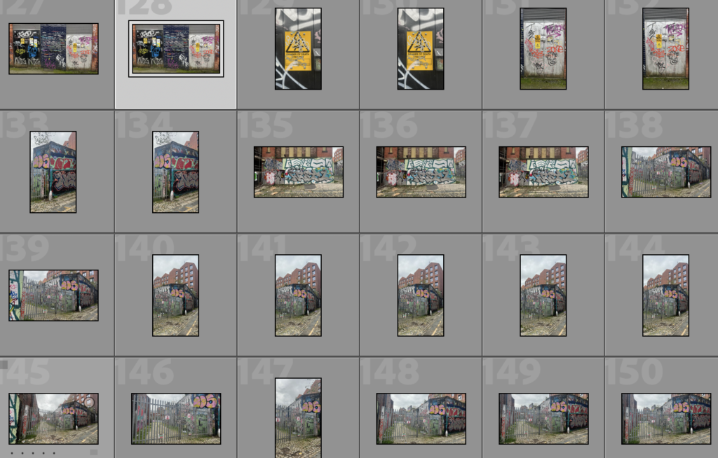
Contact Sheet
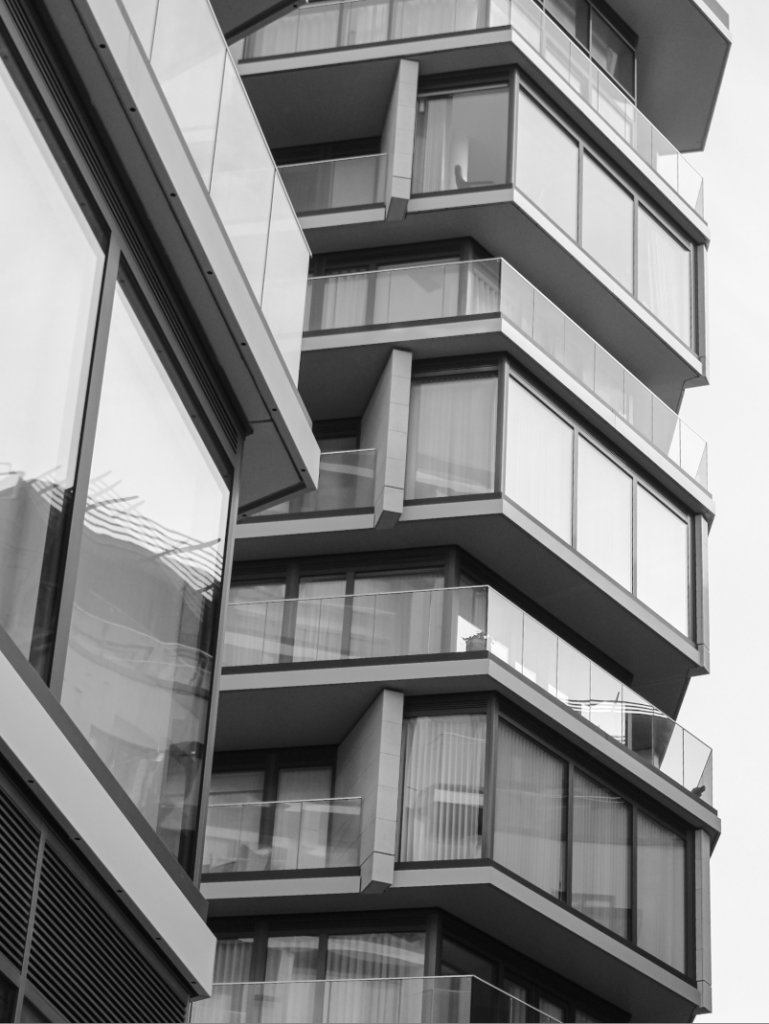
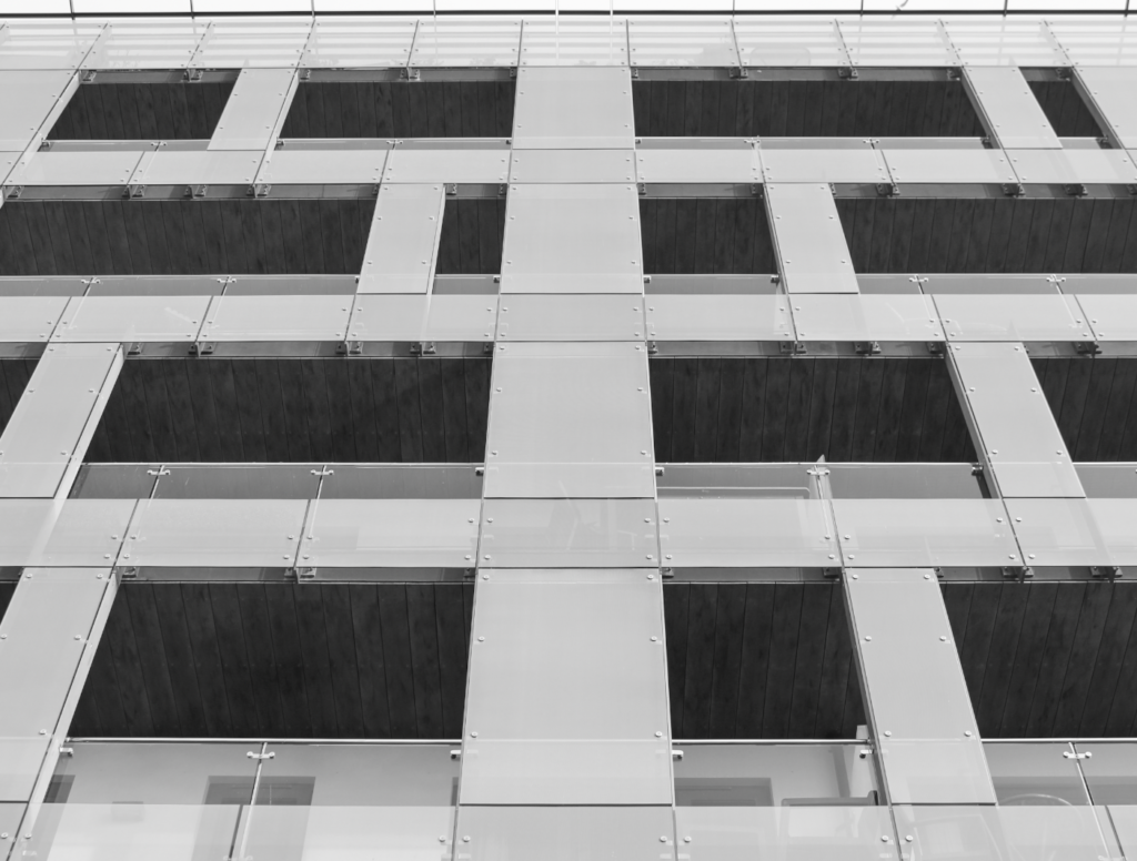
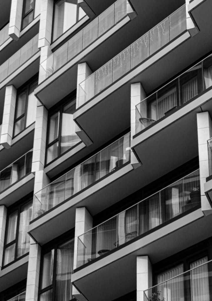
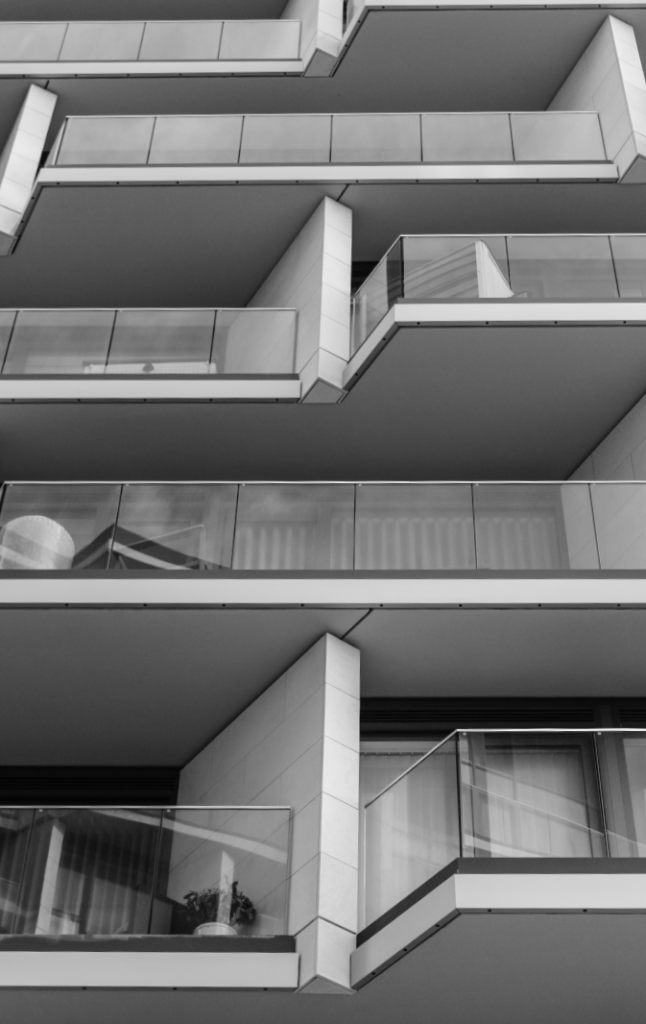
Edit 1
Edit 2
Edit 3
Edit 4
Edit 5
Edit 6
Edit 7
Edit 8
Edit 9
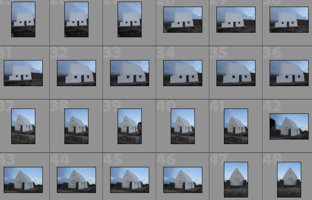
Edit 10
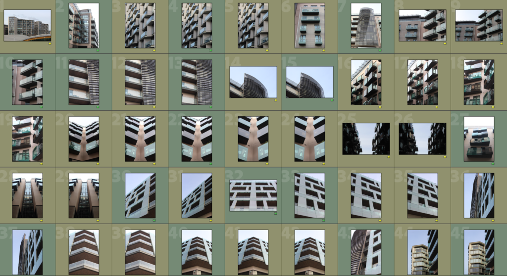
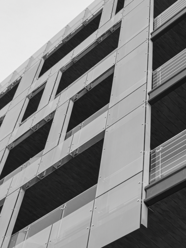
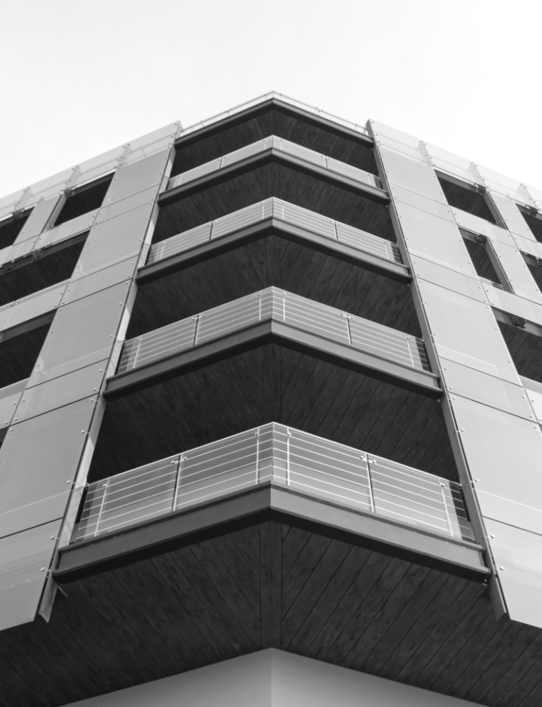
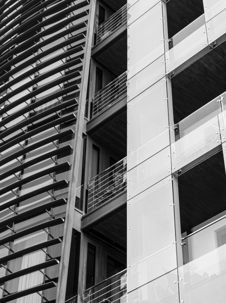
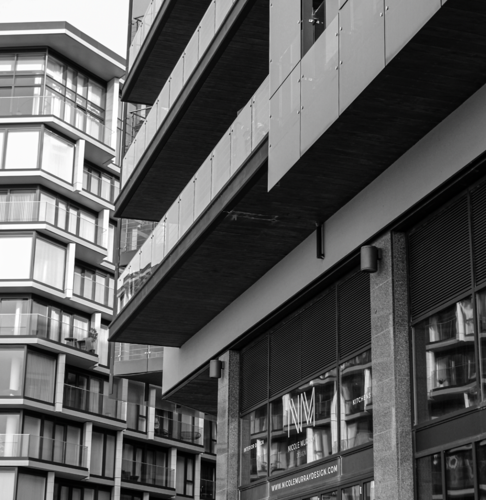
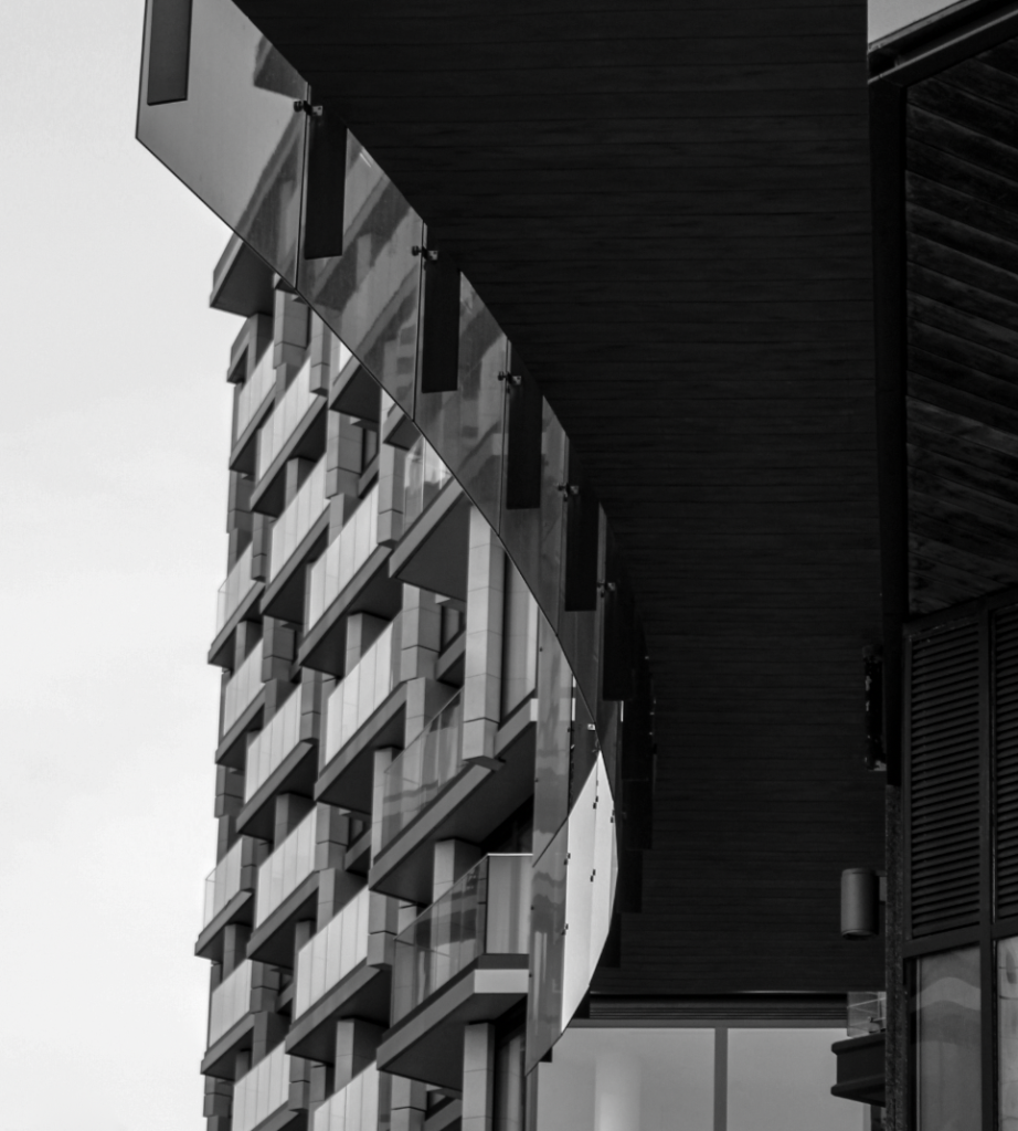
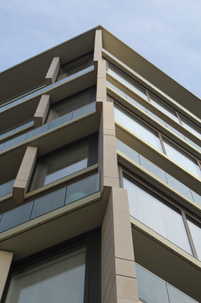
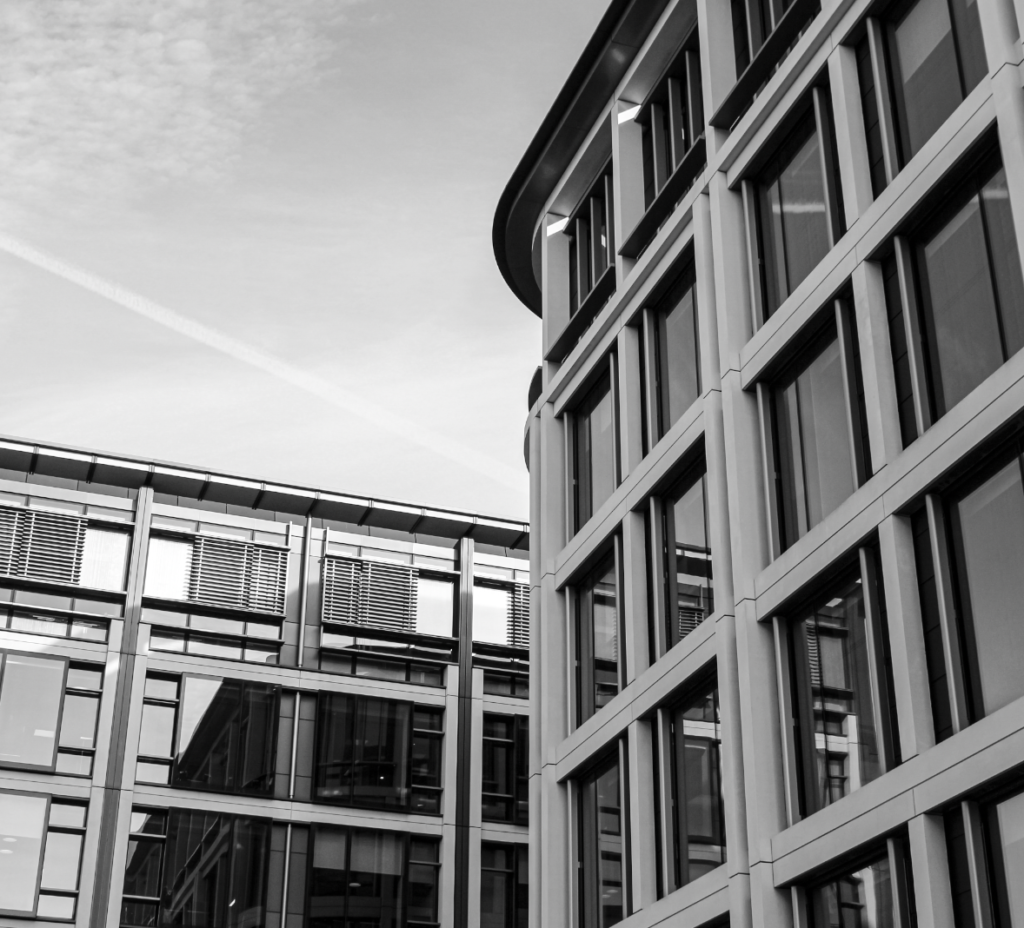
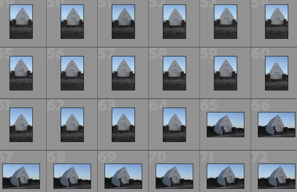
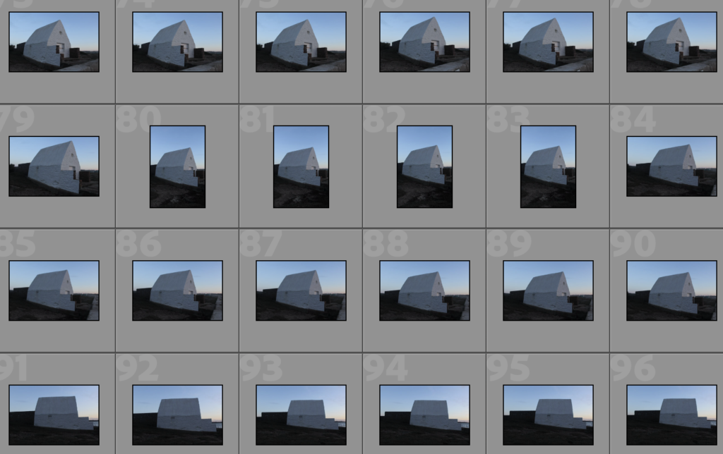
Final Images
Image Comparison
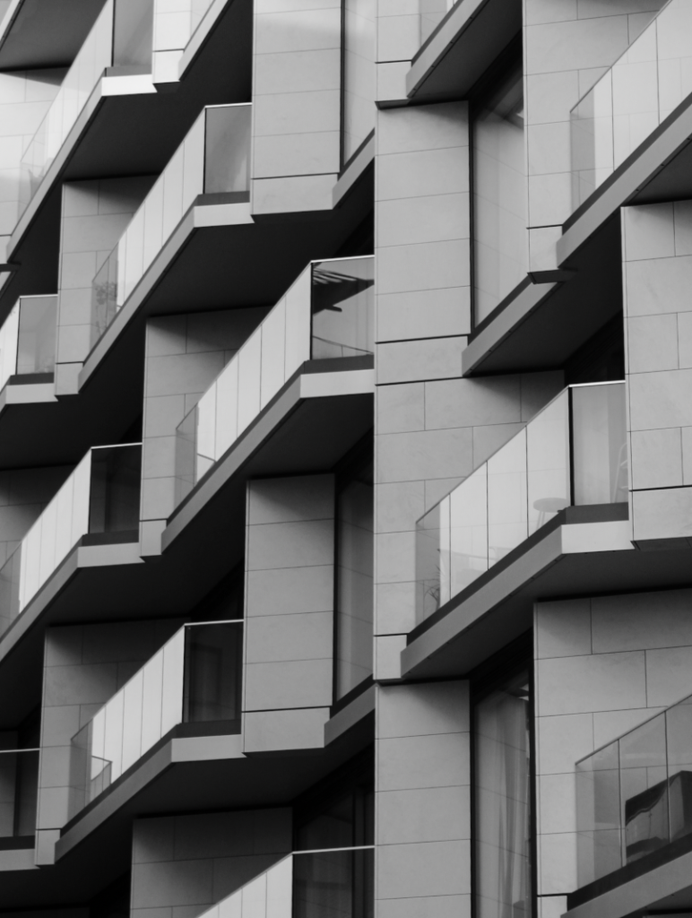
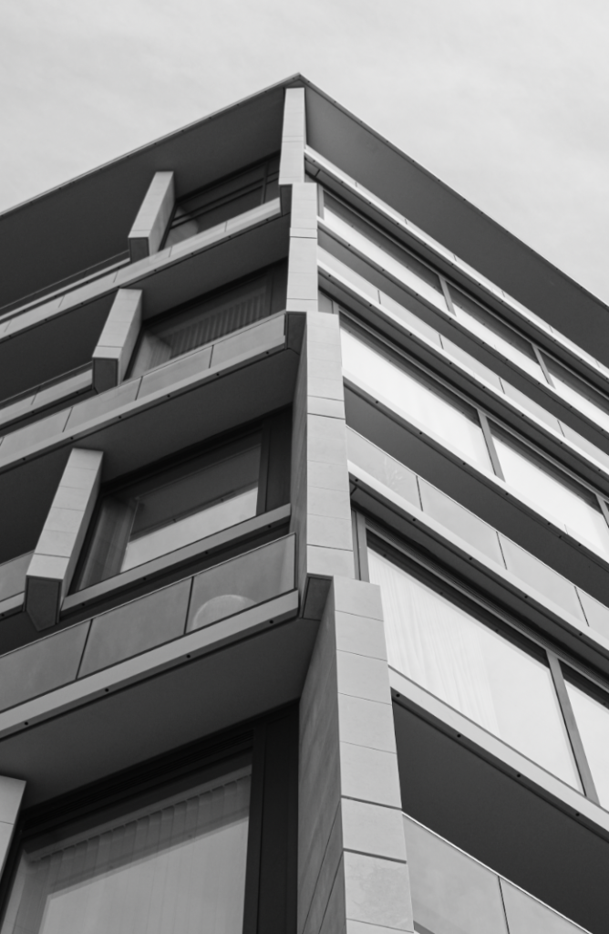
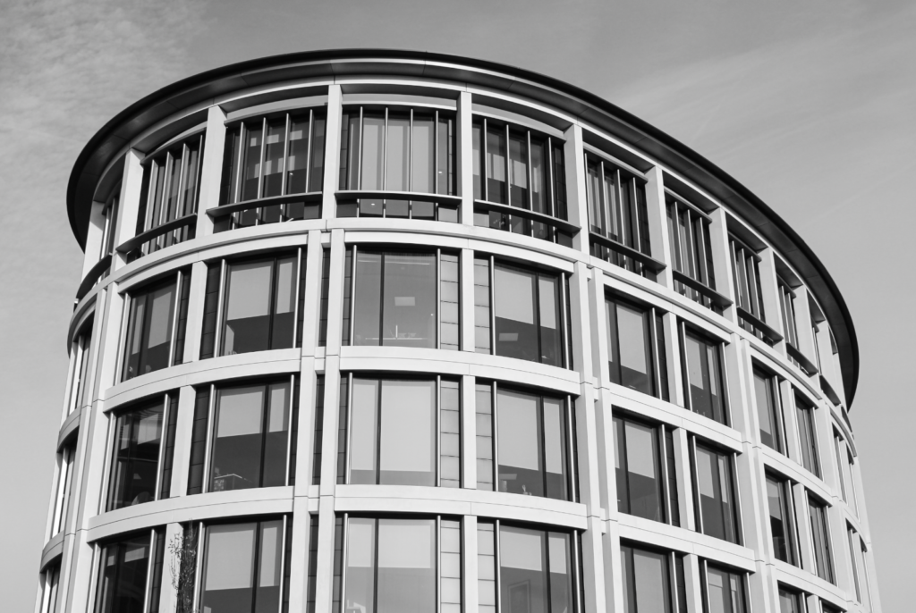
On the left is an image by my artist reference, Keith Dotson, and on the right is an image which I have taken. These images are similar as the style of each building are quite alike and each of these images have been taken from an angle. On the other hand, Keith Dotson’s image has a lot more contrast and detail than mine. This could have potentially been due to bad lighting or editing on my behalf, or just the buildings in general.
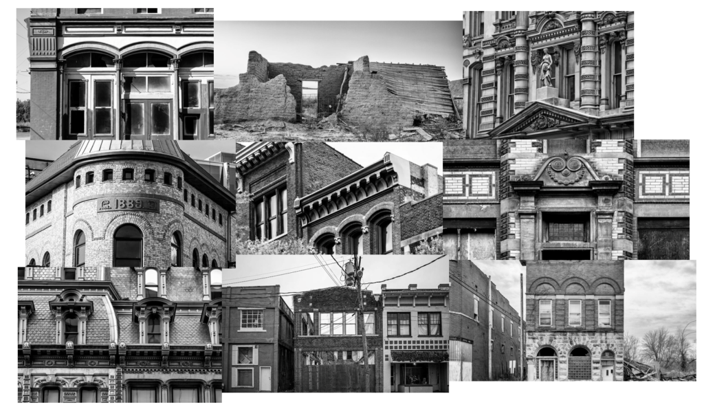
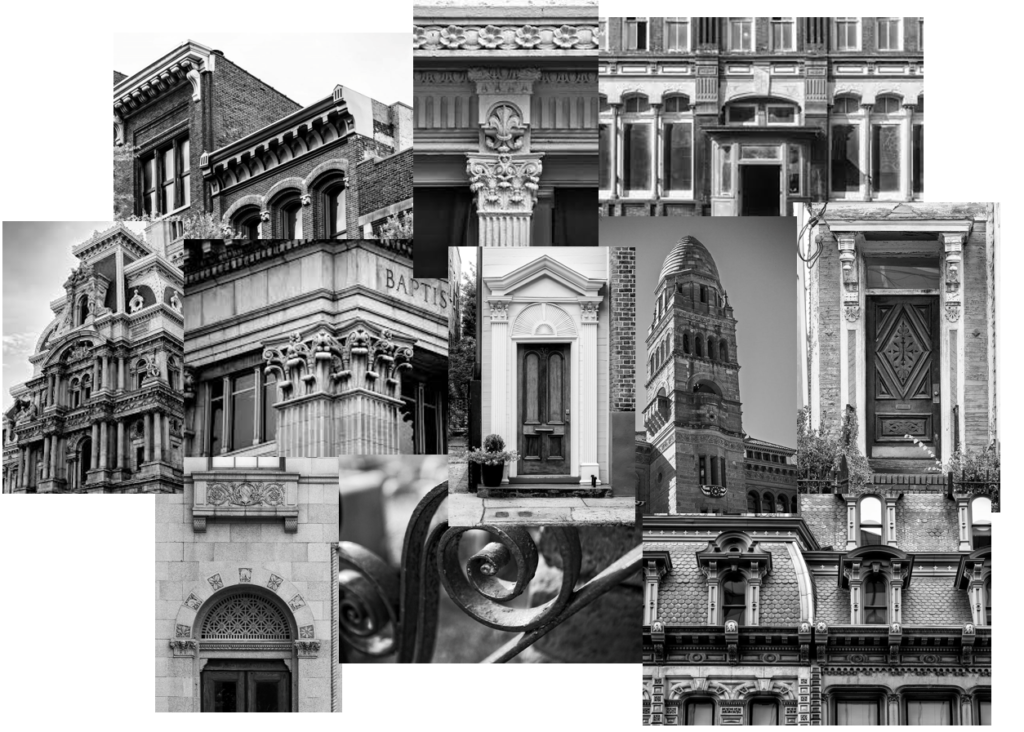
Keith Dotson is a fine art photographer who specialises in black and white photography. Keith was born in Texas, where he later graduated college and worked as a professional art director. He then went on to teach Art and Design in various colleges, before moving to Nashville, Tennessee. Although he is settled in Nashville, Keith loves to travel and capture photographs, his favourite subjects being landscapes, cityscapes and nature. Keith is drawn to historic and/or abandoned places and said that he prefers to take his photographs on gloomy days, when there is soft natural light. Keith presents his images in black and white which allows the drama and mood of the subject to shine. I personally really like his photographic style and believe that it is similar to what I try to achieve when I take my own photographs. Specifically, I am inspired by Keith Dotson’s Architectural Photography. I particularly like how he captures the details of various buildings and structures. I also like how his images have high texture and clarity.
These are some other images by Keith Dotson. I would also like to also produce detail shots like these:
Image Analysis
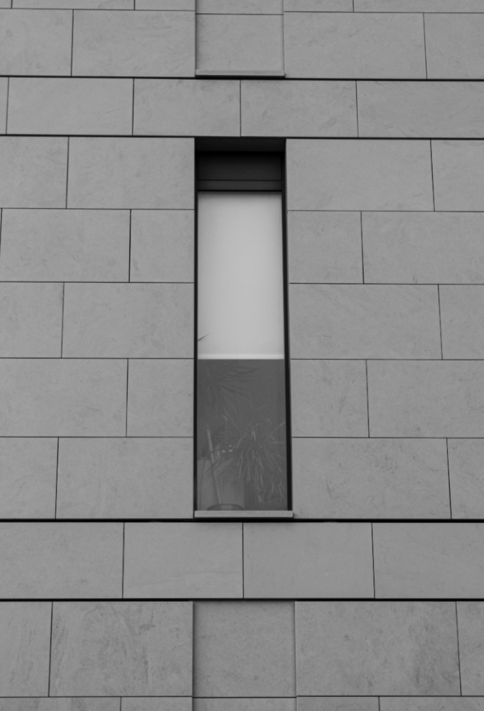
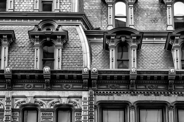
This is an image by Keith Dotson. This image has been taken in natural light and is displayed in black and white with great tonal range. The features in this image are sharp and detailed, with high texture and clarity. Furthermore, this image looks as if it would have been taken from a ladder or a heightened surface from the ground as it is almost deadpan, however, at a bit of a lower angle. When taken this image, it looks like Keith Dotson would have used a low aperture for a large depth of field and a quick shutter speed as the image is clear and not too over-exposed. Moreover, this image is aligned through the middle and looks like it uses the rule of thirds as the middle windows would made the middle horizontal third. The 2 horizontal lines above and below the middle windows draw your eyes to the windows as they sit between them. Finally, I believe that Keith Dotson has taken this image to highlight the detail of the building as all of its features are very detailed, even the roof tiles. I really like this image because I think that it has been beautifully designed and the image is very aesthetically pleasing to look at.
Alex Upton
Some photos by Alex Upton:
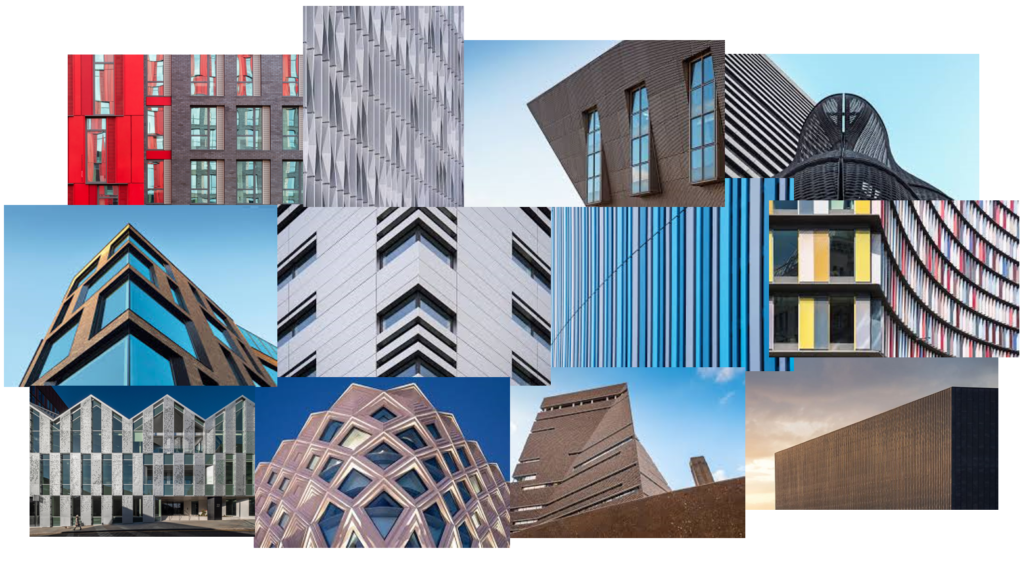
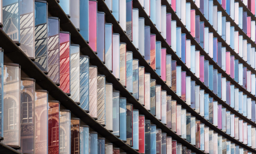
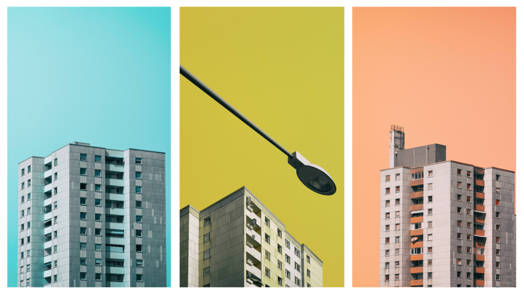
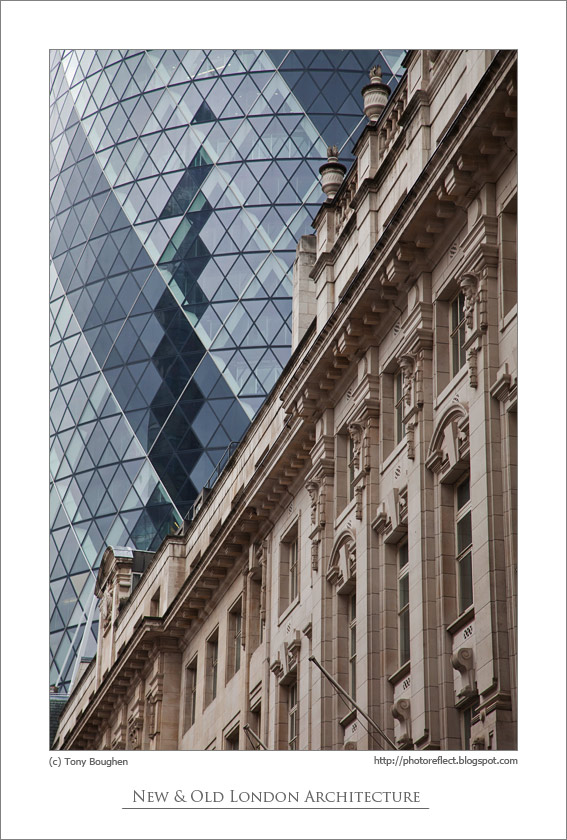
Alex Upton is a photographer who is based in London. He specialises in photographing the built environment and interiors. Alex got a first-class honours degree in Fine Arts at University of the Arts London and, since, has been working on Architectural Photography for several years. Through studying Fine Arts, Alex enhanced his attention to detail and understanding of form, space, composition and materials in relation to Architecture. To this day, he is constantly gaining knowledge and experience as his client base increases. Alex’s work covers everything from the initial stages of construction to the completion of a building. I am specifically inspired by Alex Upton’s Detail images. These images form a collection within his Portfolio and they are each presented as abstract images of buildings, with a range of shapes, colours and textures. I really like the way he takes these images as its like he views them from a different, artistic perspective than what you typically would see when you look at the building.
Image Analysis
This is an image by Alex Upton. This image looks like it would have been taken in natural light with a fast shutter speed and a low aperture. Rather than black and white like Keith Dotson’s images, this image is in colour. The colours in this image are contrasting as there are both cool and warm tones and a combination as the colours are red, blue, white and purple. Furthermore, this image looks as if it has been taken from the ground, pointing the camera up at the building from an angle. The glass of the façade in this image is creating a reflection of another building nearby and it creates a sense of perspective as it appears smaller as it gets further away, towards the right side of the images. The curve of this façade leads your eyes to the main focal point which is the left side of the image, where you can see the reflections of the other building. This building appears to be an older, not modern building which I believe adds more effect in the photo as it creates juxtaposition between the architectural styles. That is why I chose this specific image to analyse as I believe it fits well with my project. Moreover, this photograph, at first glance, looks like a pattern which starts in the top right corner and is curves which get further apart each time with lines within them. Finally, I don’t think that this image follows the rule of thirds as it is abstract because it focuses on the colour, shape and lines of the building.
Comparison of Photographers
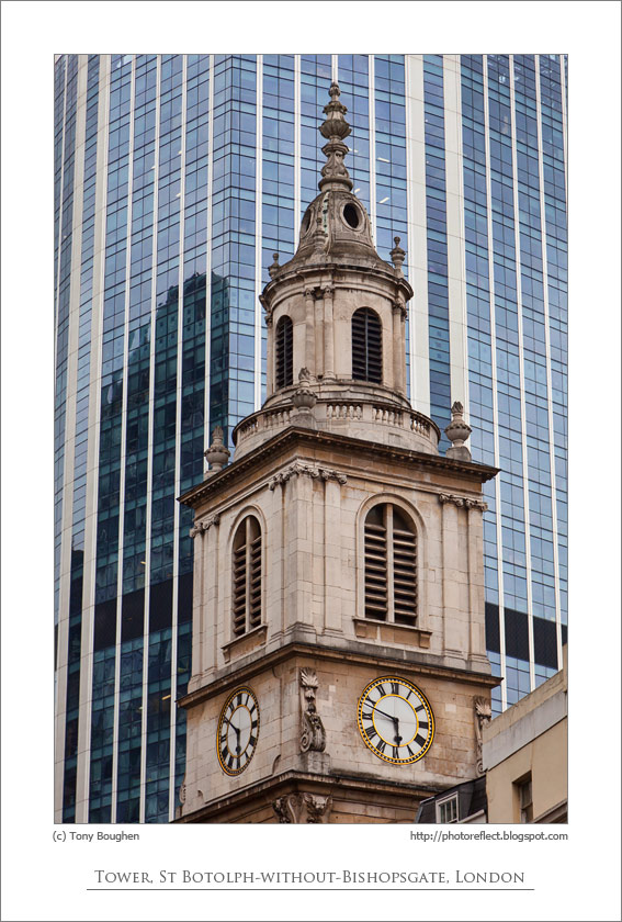
The key similarity between these photographers is that they pay close attention towards the composition of their images and the angle at which they depict the buildings from. Specifically, Keith Dotson often takes his images straight on from the building to highlight the key details, whereas Alex Upton will often approach the building from the side/at a diagonal for a more abstract approach. They key difference between these photographers is that Keith Dotson captures the details of historical and derelict buildings, however, Alex Upton captures the geometric shapes, patterns and forms of modern architecture. Furthermore, unlike Keith Dotson, Alex Upton displays his images in colour to draw your attention to the focal points and to make the images more interesting. Altogether, the work of each of these photographers have a very different approach and subject matter, creating juxtaposition when paired together.
I like the style of Nick Frank’s photographs as an idea for for further experimentation. I could create photographs similar to these by using my unedited photos of buildings, opening them in photoshop and cropping out the building to paste it onto a coloured background. I could then get an image of the colour of the background and lay it on top of the entire thing, including my building, then lower the opacity.
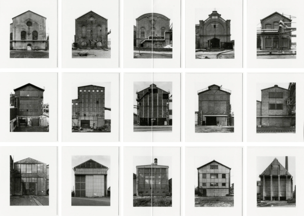
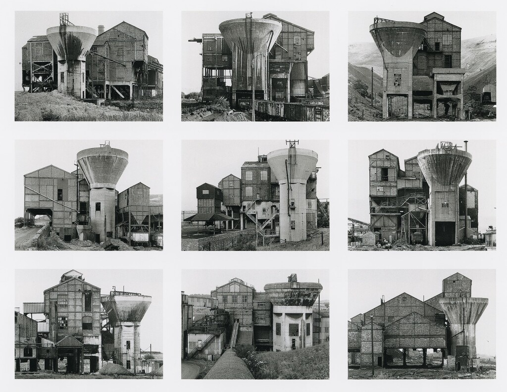
Bernd and Hilla Becher
Some photos by Bernd and Hilla Becher:
Another idea for further experimentation is to present my images as typologies. I could do this in many ways such as arranging images of buildings from the same age or creating a typology of buildings from different ages. This may make it look more like a photo story as it will illustrate the change in architectural styles over time.
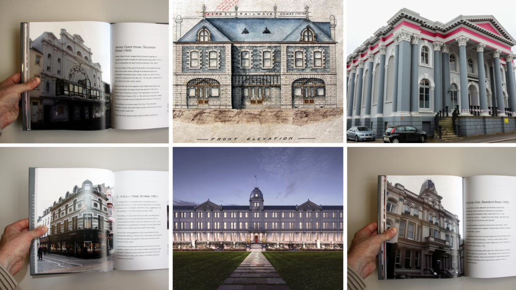
For my personal study, I would like to explore the different styles of Architecture through the ages in Jersey. I would like to do this because I am passionate about Architecture and I aspire to be an Architect in the future. I also believe that Architecture is so important and can transform the way people act and feel within a building. For this project, I will aim to capture the details and shapes of different buildings, both historic and modern. Firstly, I would like to photograph historical architecture such as the unique facades at Havre des Pas. I am interested in taking photographs of older buildings as they have great detail which gives me the opportunity to capture architecture detail photographs. A key Jersey Architect who’s buildings I would like to photograph is Adolphus Curry. Adolphus Curry is one of the most notable photographers and engineers in the history of Jersey. Curry was a member of the Societe of Jersey and played a big role in the development of the Museum and the preservation of many of the island’s historic buildings. Furthermore, Adolphus Curry was a very well-known and loved man and the week leading up to his death in 1910, there were daily updates of his health in the newspaper. Overall, Adolphus Curry was more than just a designer, he contributed to Jersey’s Community by having involvement in other things such as the harbours, railways, sports, rubbish disposal and more. Source
Buildings designed/altered by Adolphus Curry:
These buildings include:
Jersey Opera House
Ladies College
DeGruchy
St Helier Railway Station (At Liberty Wharf)
2-6 Queen Street
Victoria Club, Beresford Street
Ommaroo Terrace, Harve des Pas
Midland Chambers
Masonic Temple
For these images, a key photographer who I am inspired by is Keith Dotson. Here are some images by him which I would like my outcomes to be similar to:
On the other hand, I would also like to photograph modern buildings and their shapes and details. I would like these results to have an abstract approach. I will do this by thinking creatively about the angles in which I take the photographs and paying attention to the framing and composition. A photographer who I am inspired by for these photos is Alex Upton. Here are some of his photos which best indicate what I would like to do:
When reviewing my images, I would like to create juxtaposition between old and new architectural styles by finding images which I can match together. I would like to present my final images in a photobook, starting from historical, detailed architecture to modern, high-rise buildings and the juxtaposition between the styles.
Here are some examples of inspiration for these juxtapositions:
I can recreate these ideas by using images of high-rise buildings, such as Horizon Apartments and the International Finance Centre, and manipulate them by editing images of historical/old buildings onto them in Photoshop.
In addition, I would like to do a typology study of the external facades of buildings at Havre des Pas as they have a unique architectural style.
My Inspiration:
Bernd and Hilla Becher, Preparation Plants, 1966-1974
Overall, my personal study will be focused on architectural styles and details and the contrast between the old and new.
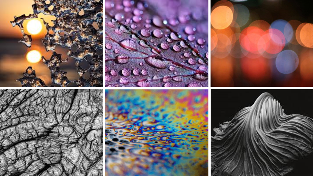
Here is a mind-map which I produced with 2 of my classmates. In the green and blue is the a breakdown of the words Observe, Seek and Challenge and what they mean to us. In the pink and orange is ideas for our personal studies. We covered a range of ideas from personal interests to the exploration of history and natural forms such as the human body and landscapes.
Mood-Boards
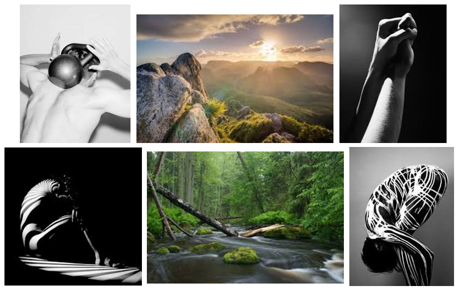
Natural Forms (Human Body + Nature)
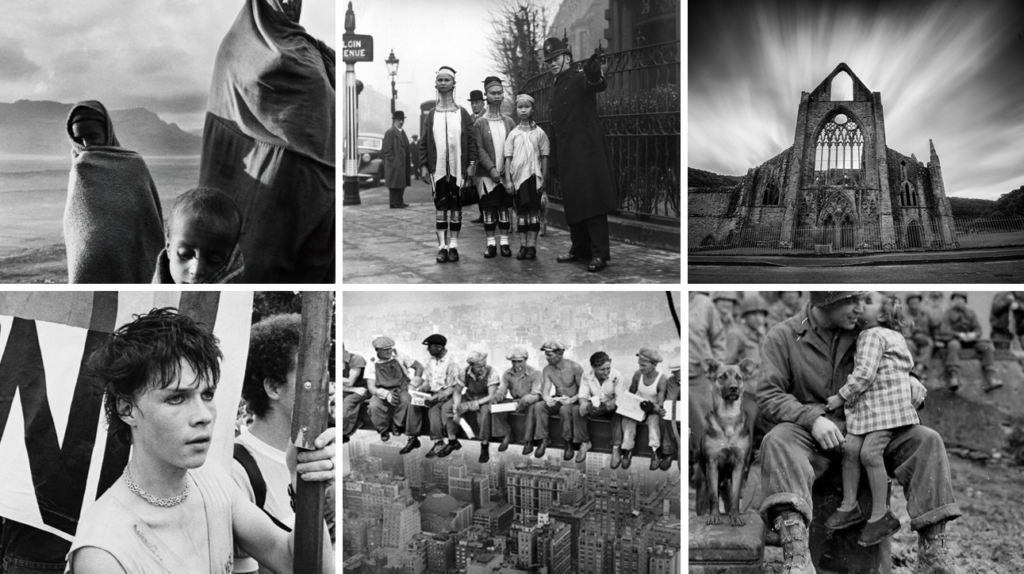
History + Ideologies
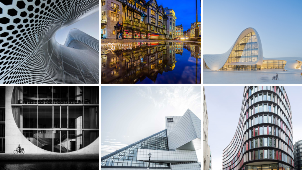
Personal Interests
This mood-board is based on Architecture as it is my passion.
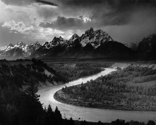
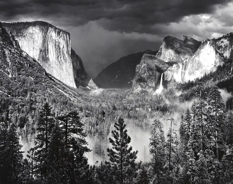
Romanticism in photography consists of capturing sublime scenes and dramatic landscapes which create a sense of awe for nature. For this topic, I created HDR Merge Images of the cliffs at Plemont and L’Etacq. This was inspired by Ansel Adams as he would photograph picturesque landscapes, mainly mountains. He also used the Colour zonal system which is a system of tonal values from black to white as his images were in B&W. This is why I used HDR Merge so that my images displayed a range of tones and colours. I really liked this project because I enjoyed capturing the beauty of the natural landscape and, at the same time, it can nice to go out and take the photos.
My Images:
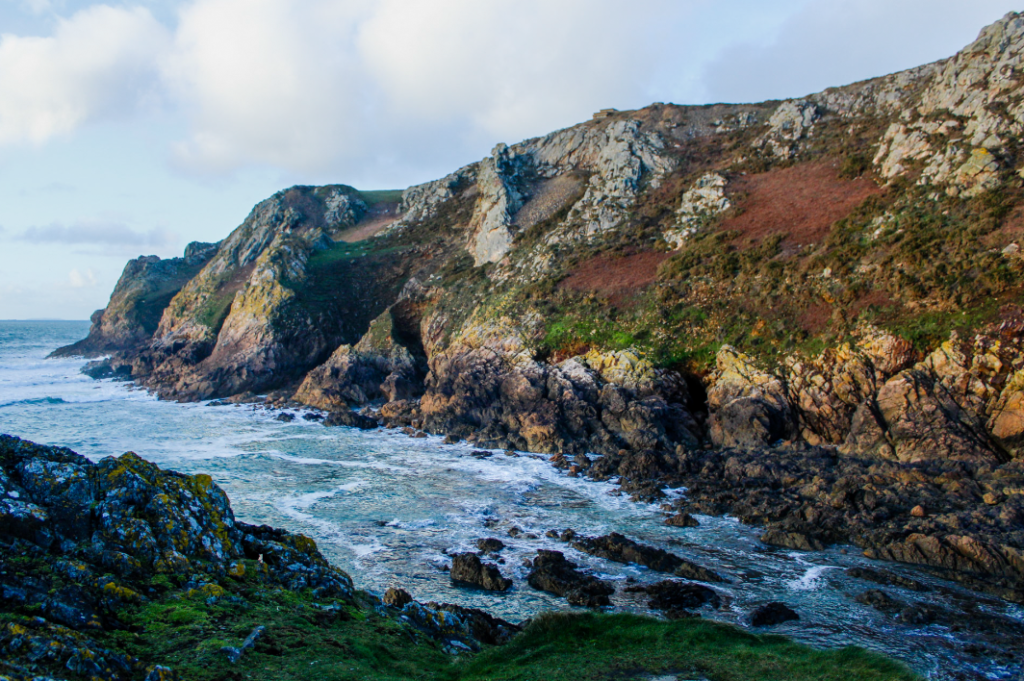
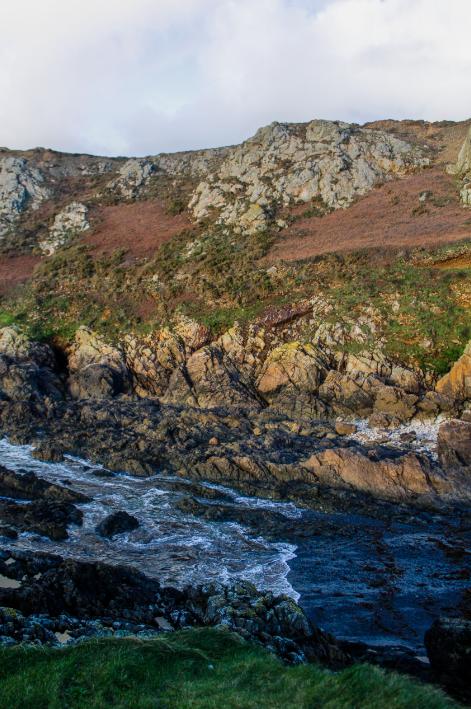
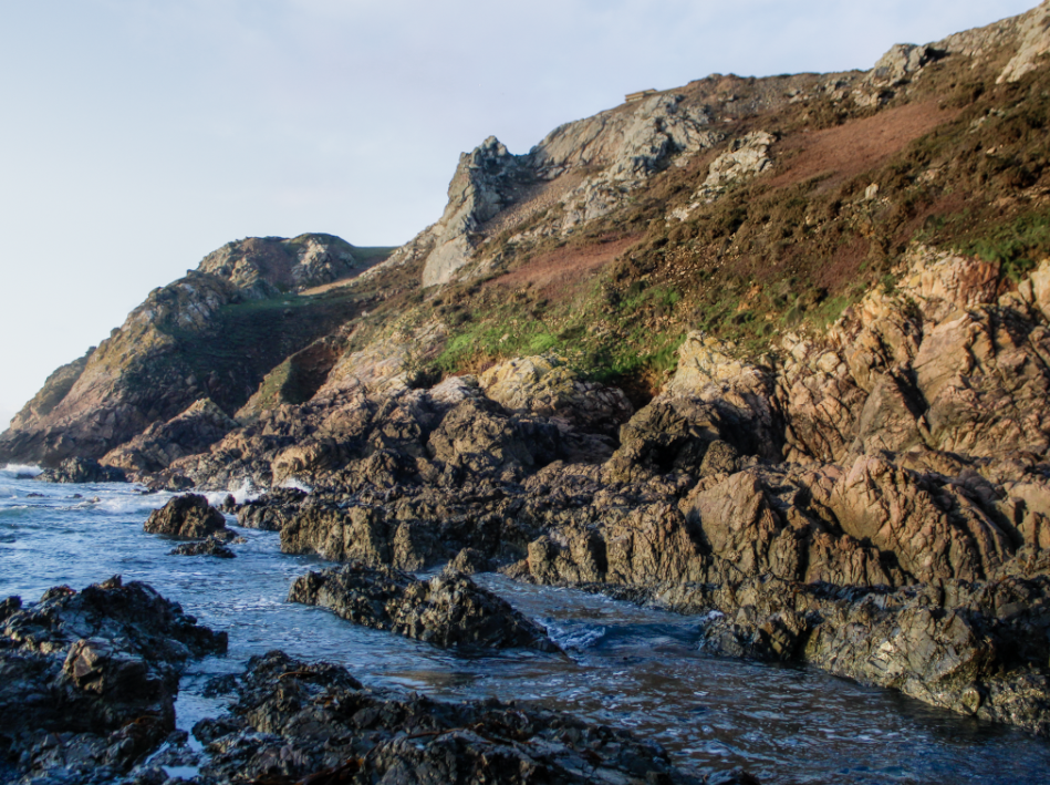
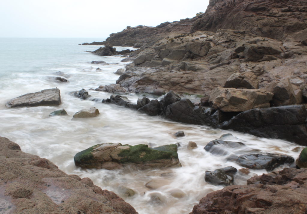
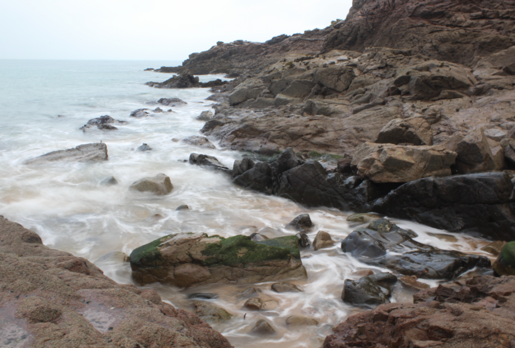
The New Topographics
The New Topographics is a project which explores how humans have altered the natural landscape. For this project, I walked around Harve des Pas and captured images of buildings and a combination of both the natural and built environment. I really enjoyed this project and it inspires me to photograph the urban environment for my personal project.
My Images:
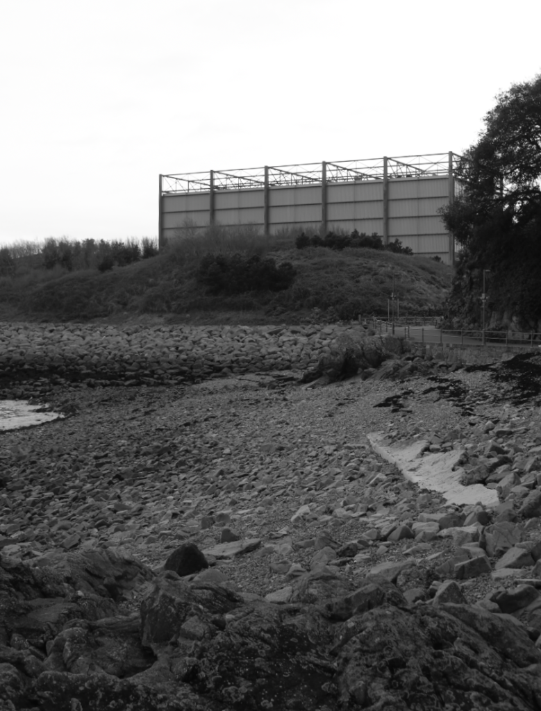
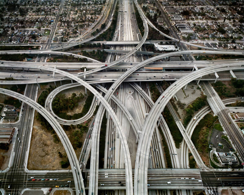
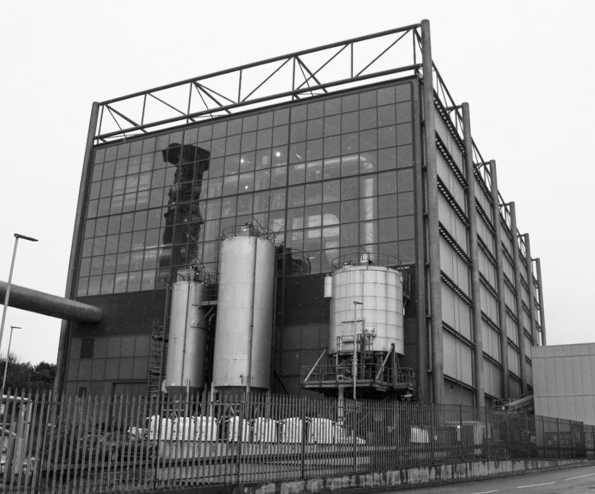
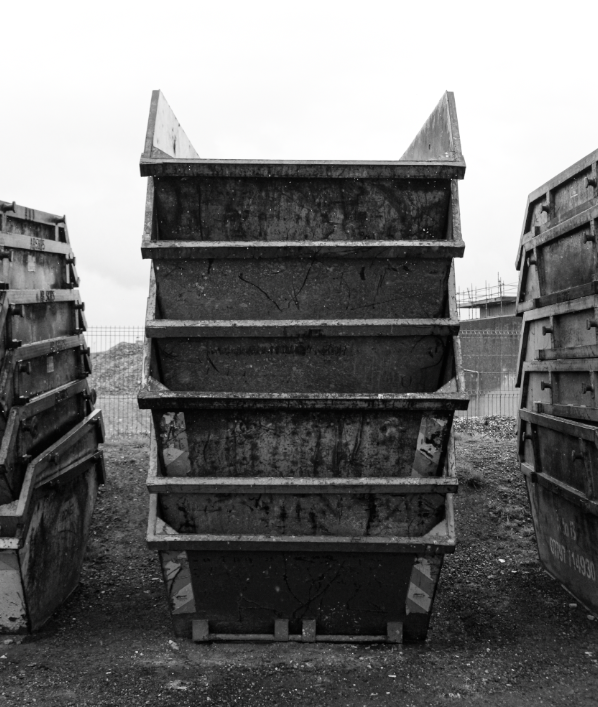
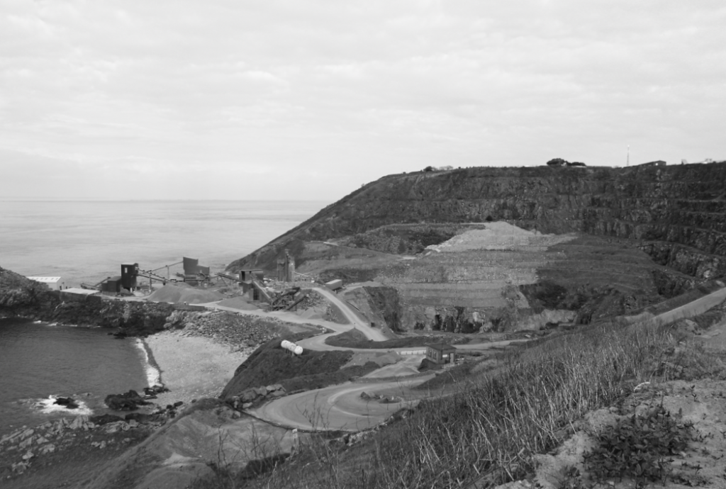
Anthropocene
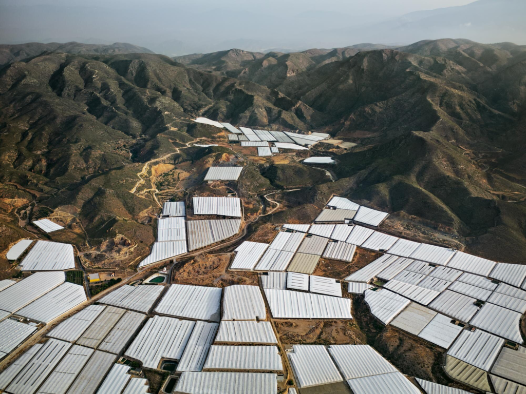
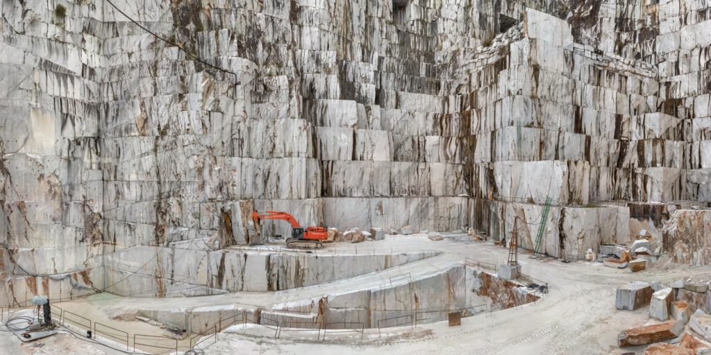
Anthropocene is a word used to describe the impact of human activity on Earth’s climate and ecosystems. For this project, I photographed industrial areas of Jersey such as La Collette, Bellozanne and the Quarry at Sorel. I enjoyed this project as it allowed me to be creative whilst also illustrating the Island’s impacts on climate change. This project inspires me to capture photographs of positive actions that the island is taking towards climate change such as the construction of sustainable buildings.
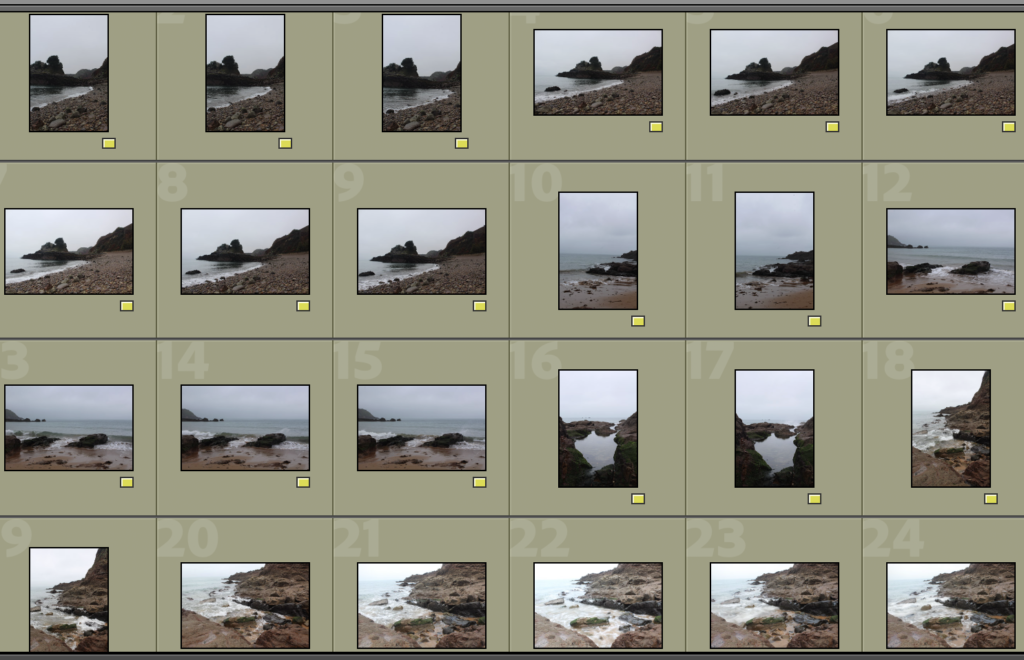
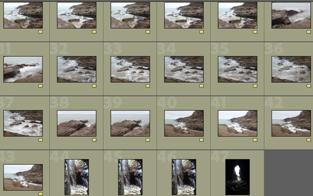
These are all of the images that I think were successful.
Best Images
These are my best images out of the ones above. I have decided not to edit these photos as I would like for them to be kept natural and not be manipulated.
Evaluation
‘Mirror’ Photographs
Inspiration for Mirror Images
My Mirror Images
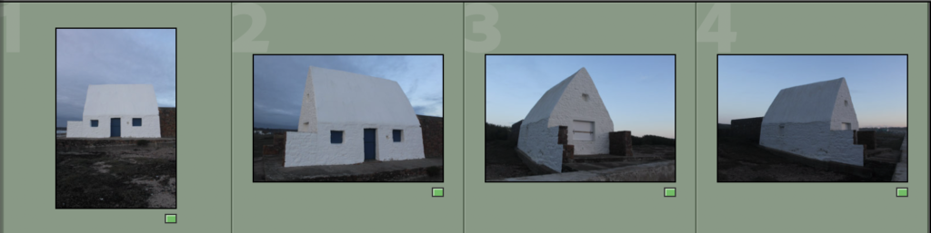
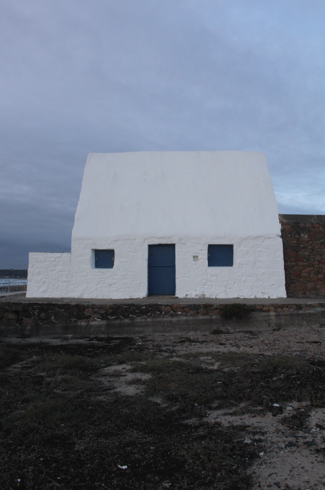
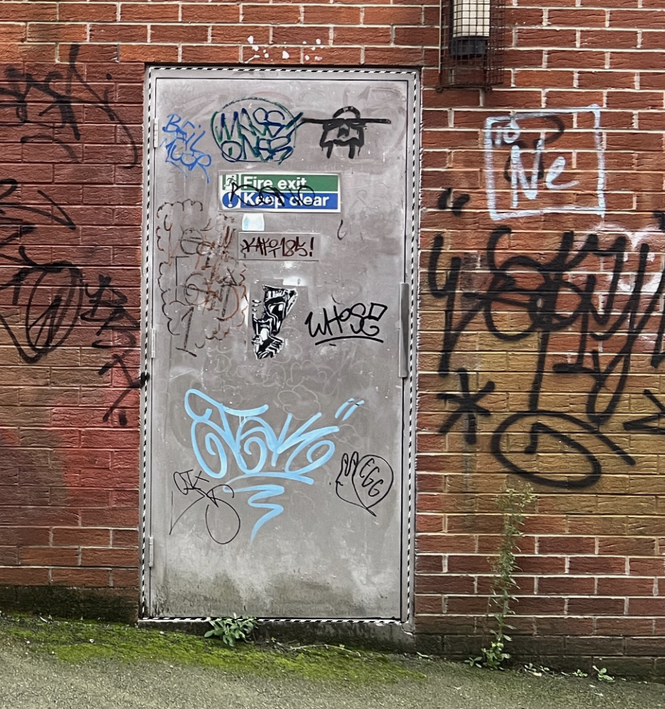
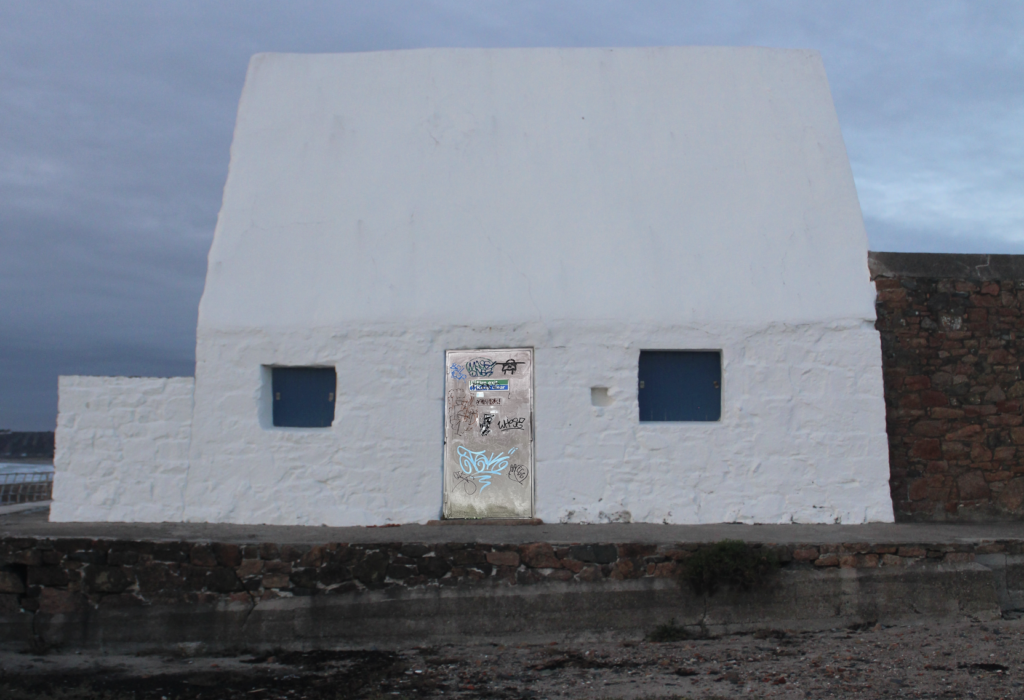
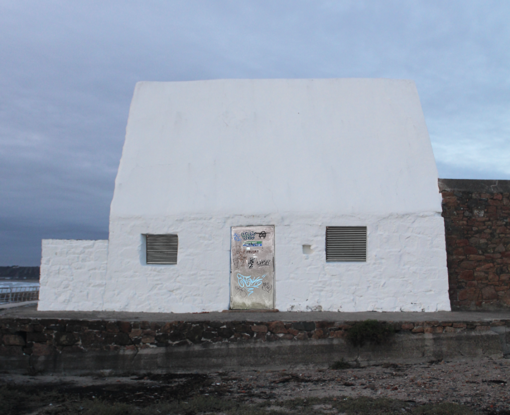
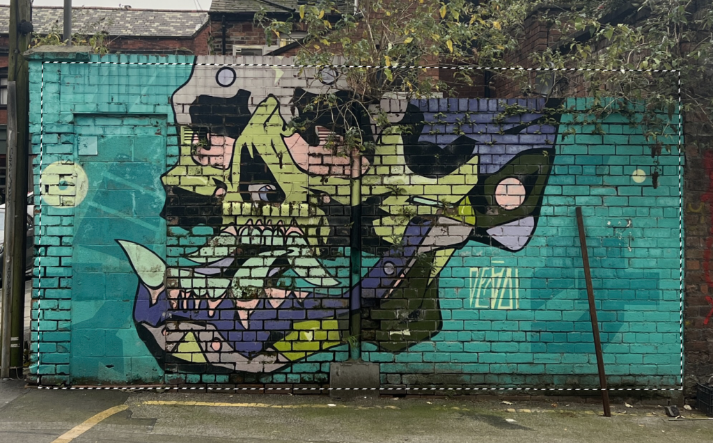
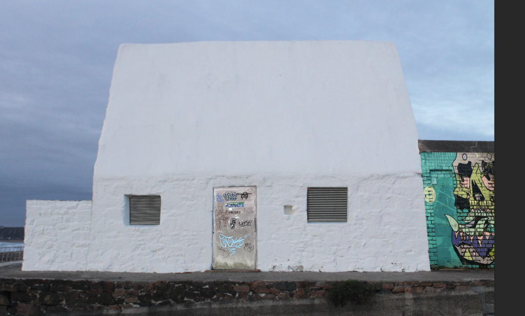
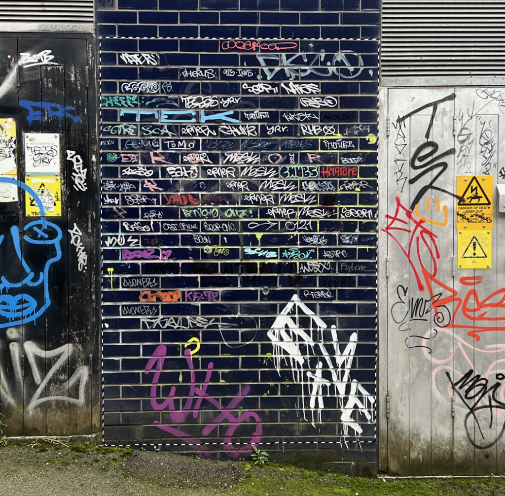
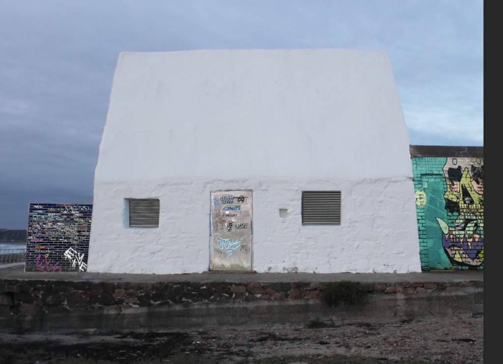
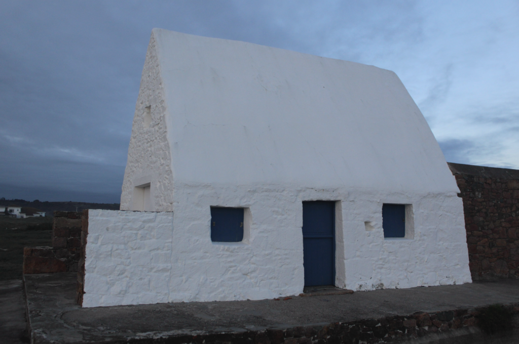
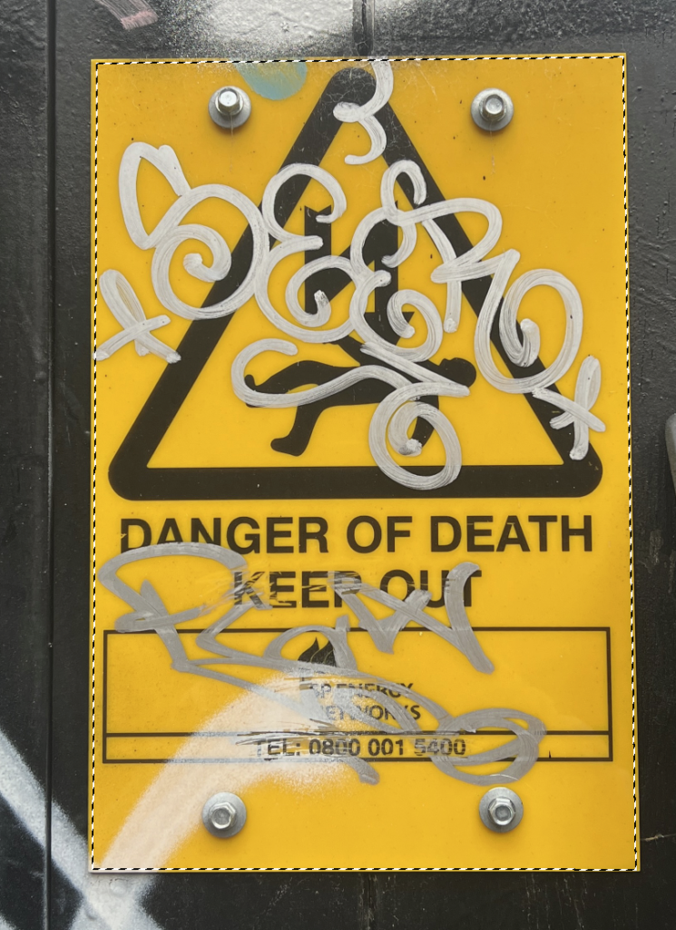
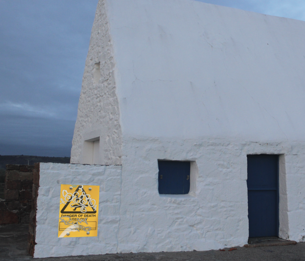
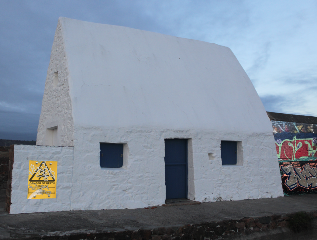
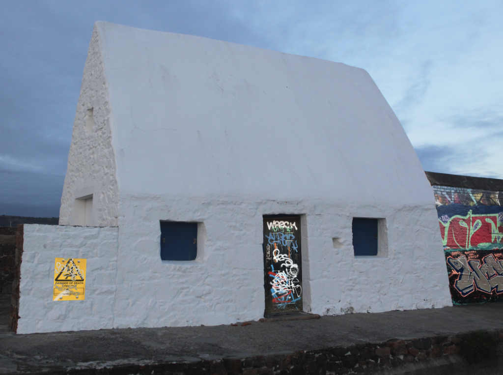
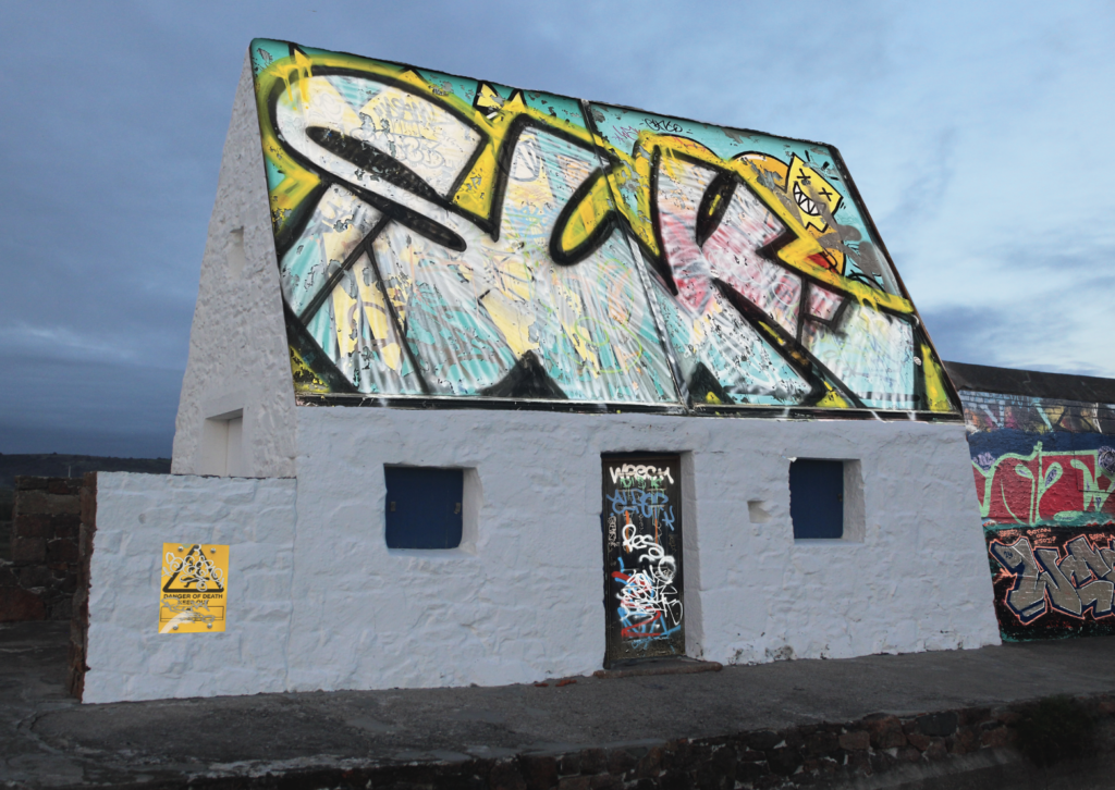
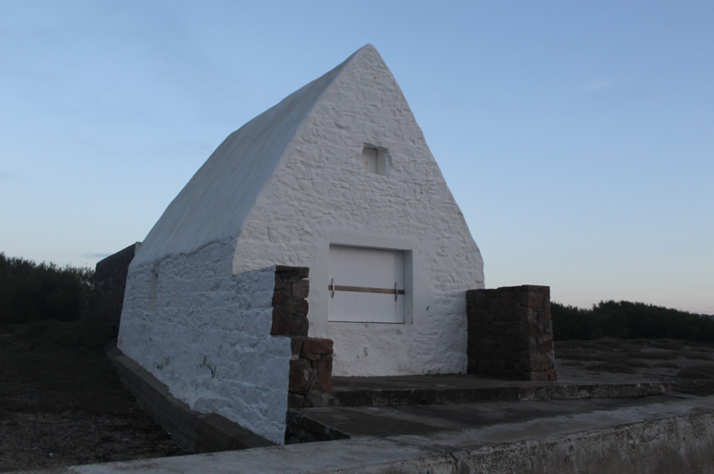
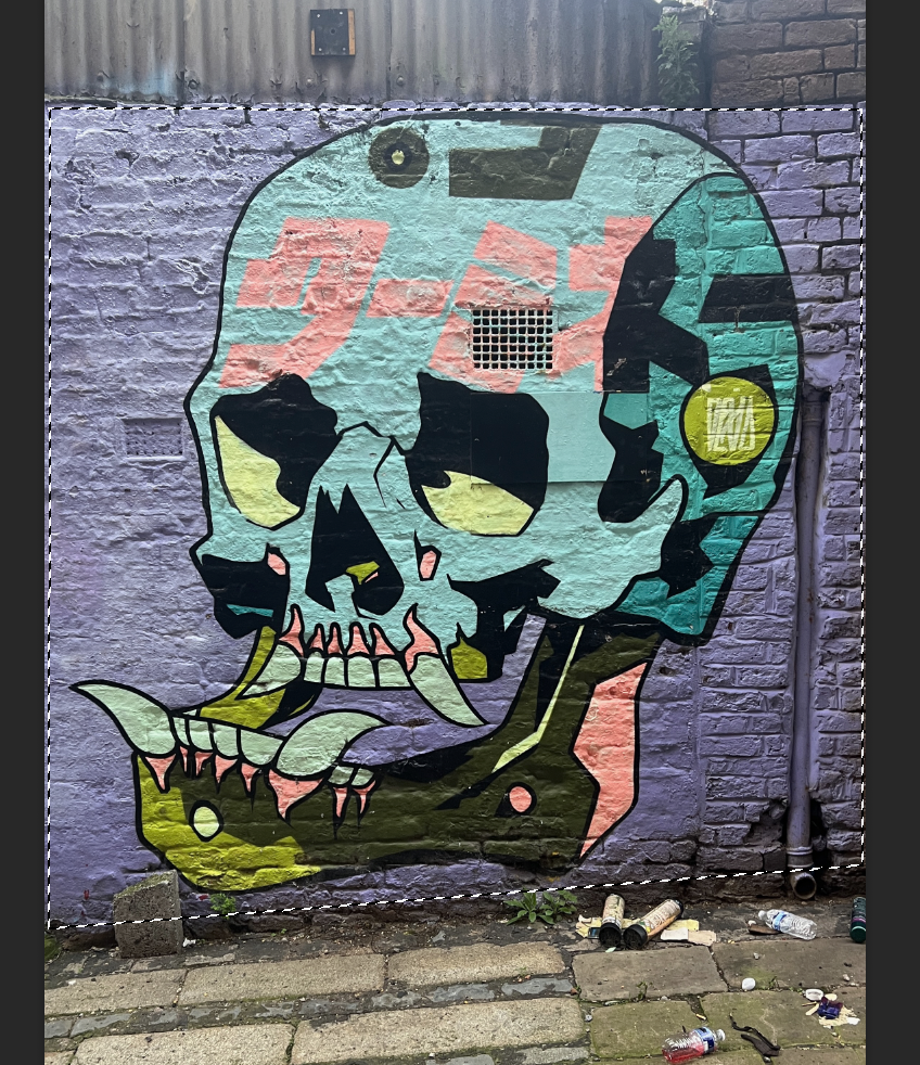
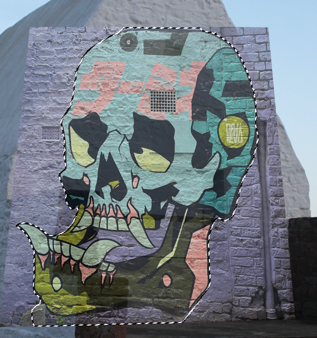
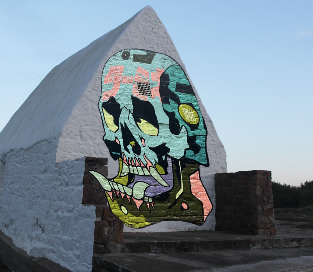
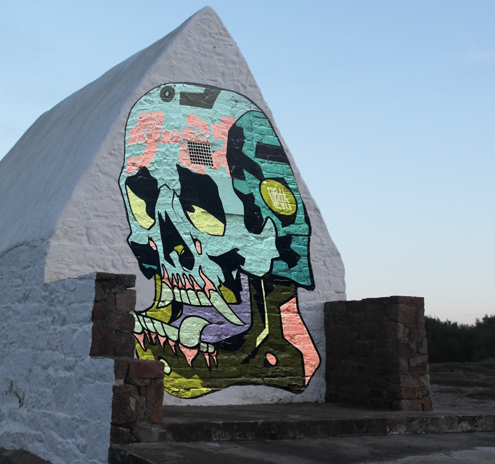
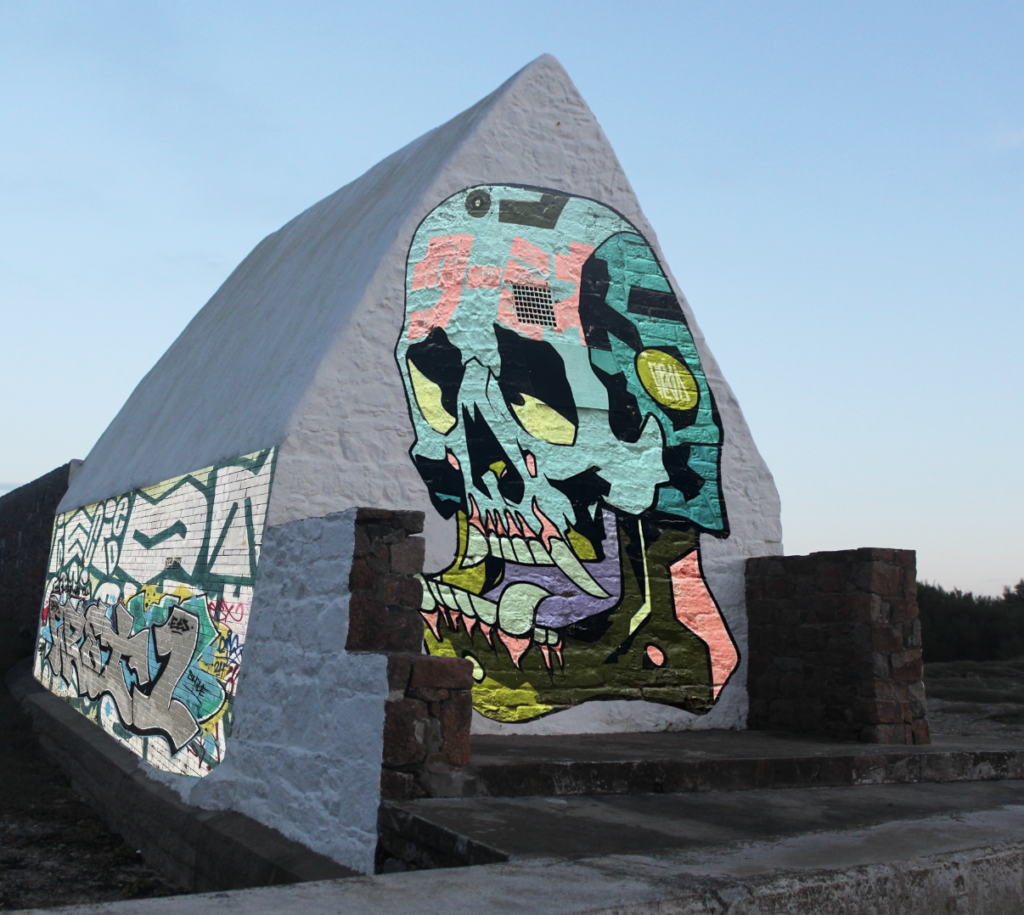
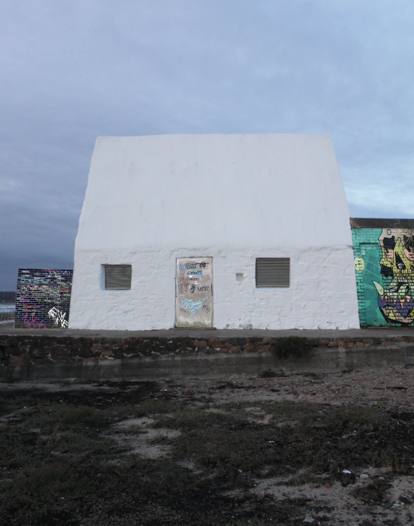
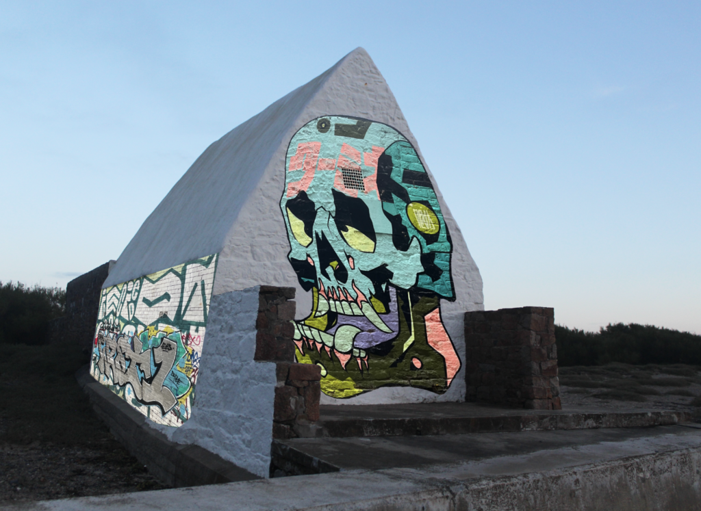
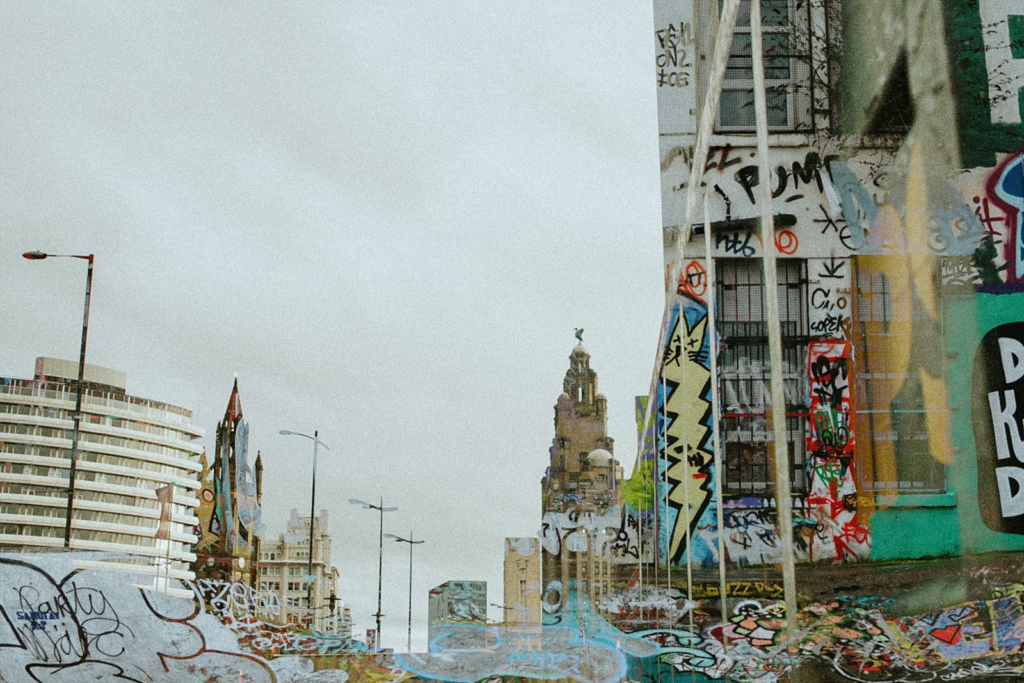
These are my final images. These images can be considered as mirror photos as they have been edited and manipulated. For these photoshoots, I used images of graffiti which I took when I went to Liverpool and edited them onto photos of the little white hut (Le Don Hilton) which I took in St Ouen. I think that this is an interesting combination as it takes the natural environment and displays it as an industrial one.
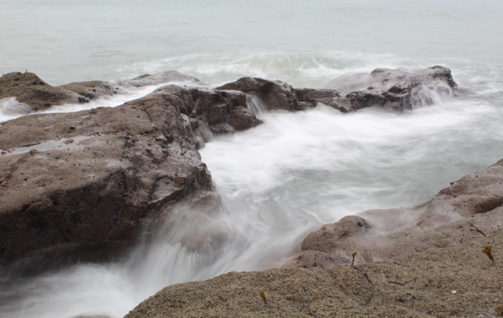
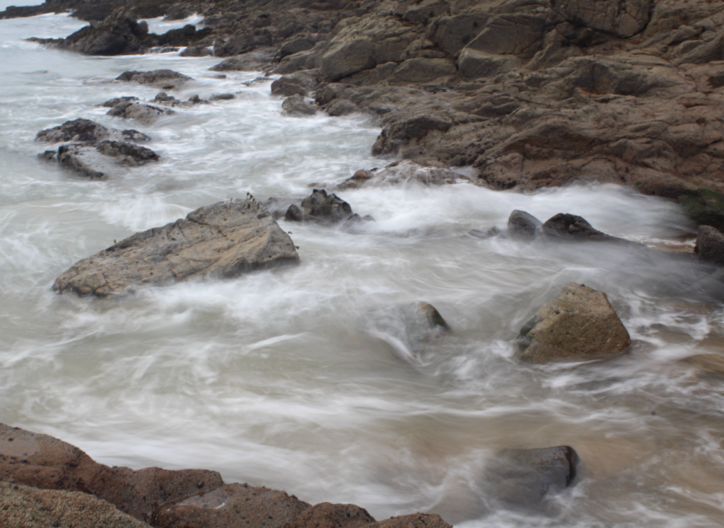
‘Window’ Photographs
Inspiration for Window Images
My Window Images
It is debatable whether these would be true ‘mirror’ photos as it is turning something real into something that is surreal/has been embellished. This style of photography could be classed as pictorialism as it emphasizes the natural beauty of the sea by altering reality. Since this is altering reality, you could declare that these aren’t true mirror images, however, you could also argue that this is not what your eye truly sees, but rather what the camera sees. Furthermore, these images capture the movement of the sea which is a natural process and, although these outcomes aren’t what the eye would typically see, these photographs are fully organic and have not been edited. Overall, I would say that these images are sit between the mirror and window categories but lean more towards being windows.
For my ‘mirror’ photos I would like to take images of buildings and edit them by using photos of graffiti and layering them on top. These would be mirror photos as they are staged, due to the editing, and display a false environment.
This is my inspiration:
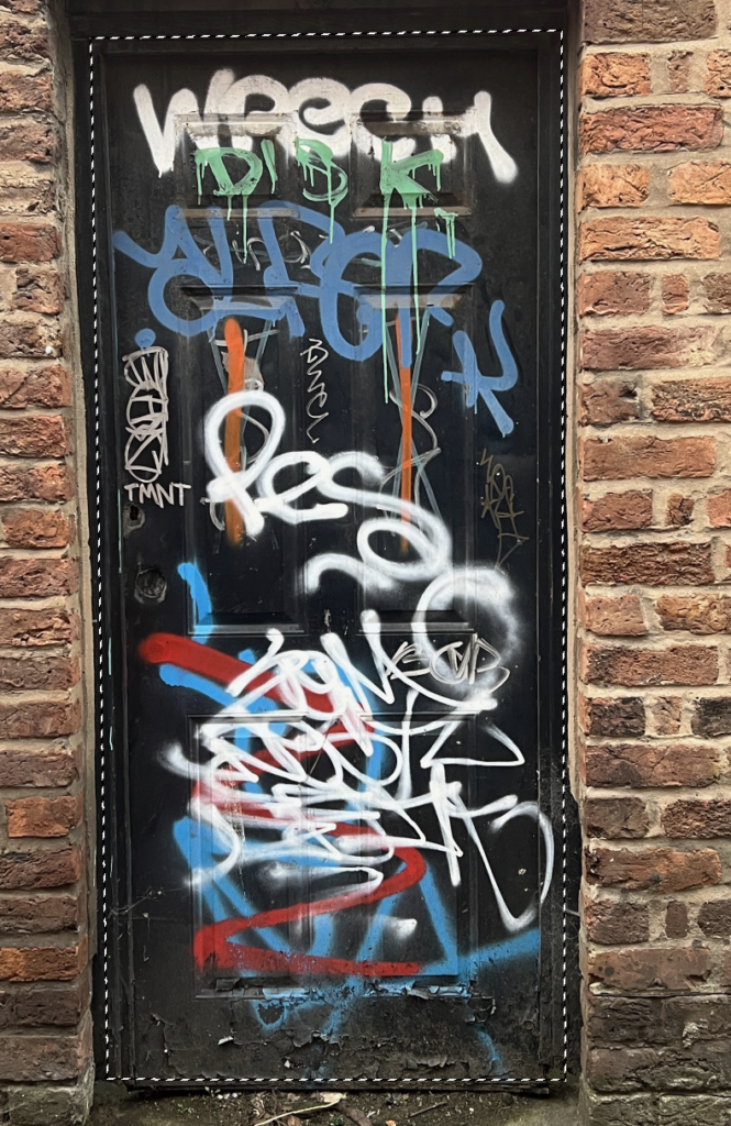
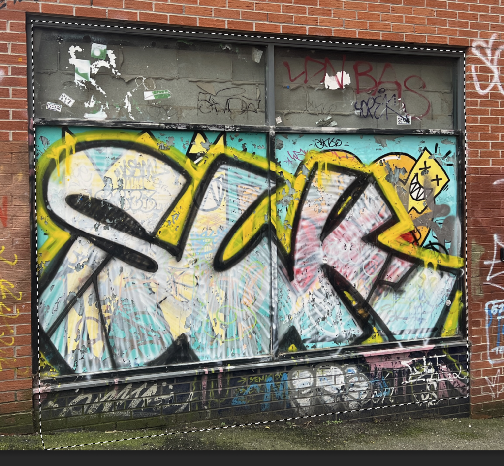
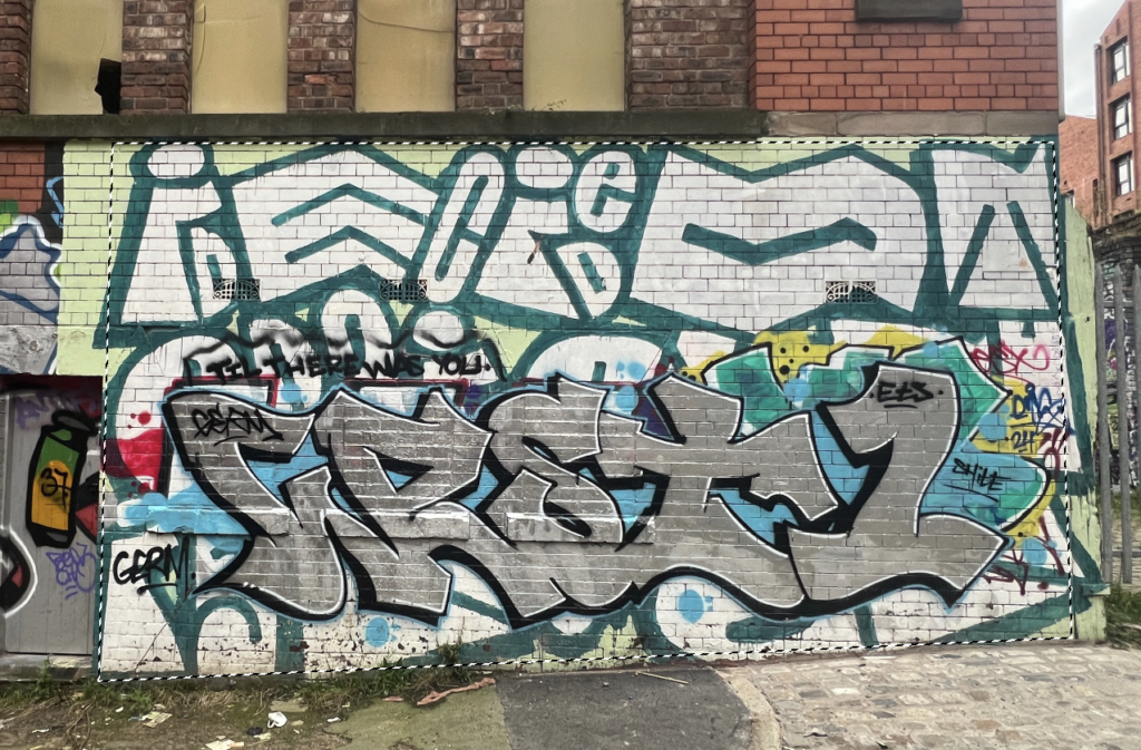
This is an image by a photographer called Matt Embee who went around the Baltic Triangle Area of Liverpool capturing street photos. This image has been edited using double exposures, displaying buildings and graffiti. For my own images, I would also like to experiment with photos of graffiti, creating altered landscapes of an already urban environment or perhaps even a building within a natural environment such as the little white hut in St Ouen.
Matt Embee
Matt Embee is a Manchester Wedding Photographer who has gained many awards is photography such as Masters Manchester and he has been selected as one of the top 10 wedding photographers in the UK. Furthermore, Matt has been doing wedding photography for around 13 years and he enjoys capturing human emotion and interaction. Although Matt is mainly a wedding photographer, when he has time spare he likes to test his photographic skills. In 2018, along with a group of wedding photographers, Matt travelled to Liverpool, specifically the Baltic Triangle, to experiment with double exposures and capture images of graffiti and the industrial heritage of the area. Here are some other images from this photoshoot:
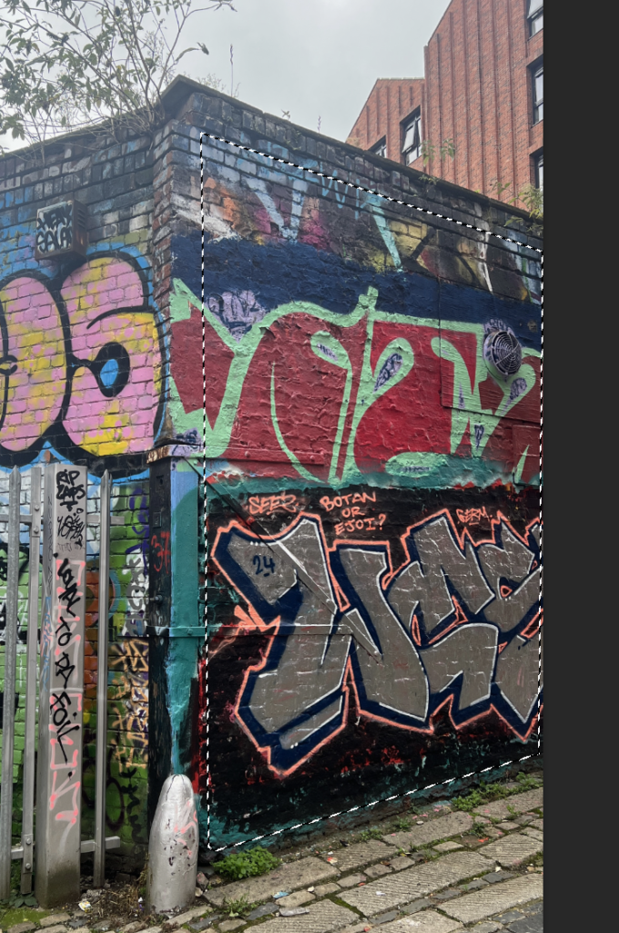
Since I will be going to Liverpool, whilst I am there I will try to capture photographs of graffiti to use for my final products.
Plan for Window Photos
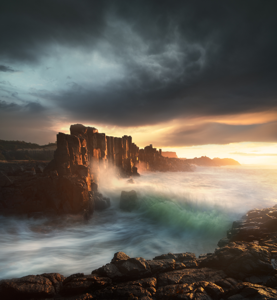
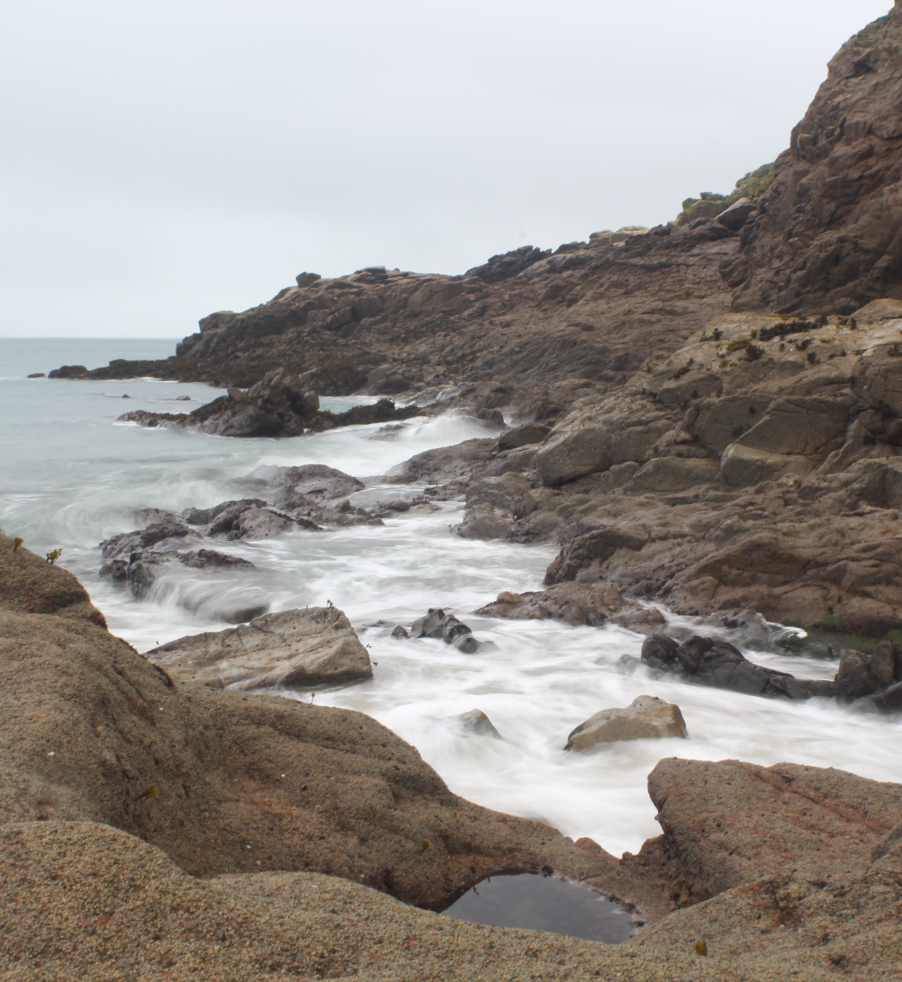
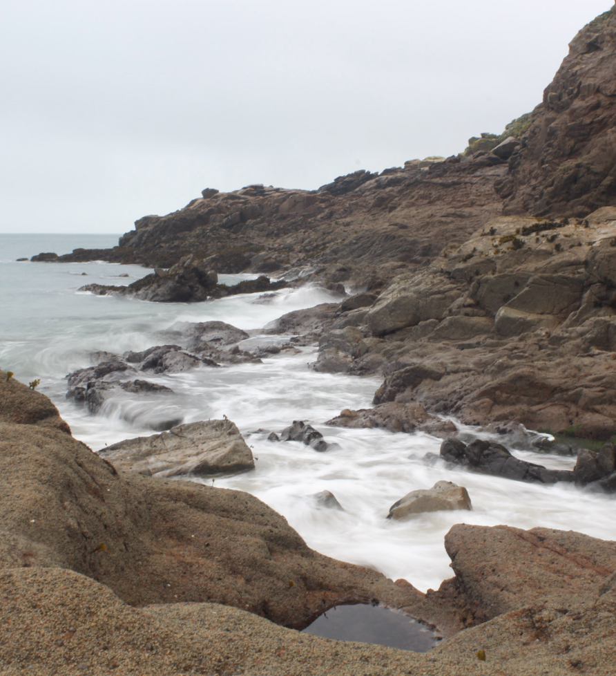
For this photoshoot, I would like to focus on the beauty of the natural environment, creating photographs that will contrast to the urban, manipulated environment of the previous ‘mirror’ photos that I will create. This links to previous projects such as Anthropocene and The New Topographics as my photoshoots will present 2 different landscapes, one that has been transformed by humans and the other which has been untouched. For this photoshoot, I am going to focus on photographing the movement of the sea at a slow shutter speed. I will have to do this at a time of day where it is dull and there is not much light such as early morning or in the evening as I don’t have an ND Filter. I will take these photographs by using a tripod and setting the camera to a low ISO and slow shutter speed ranging from about .4 to 2 seconds. Some locations I may go to include Plemont, Greve de Lecq, Bouley Bay and St Catherine’s Woods.
My Inspiration:
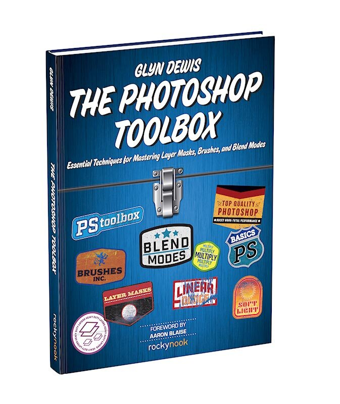
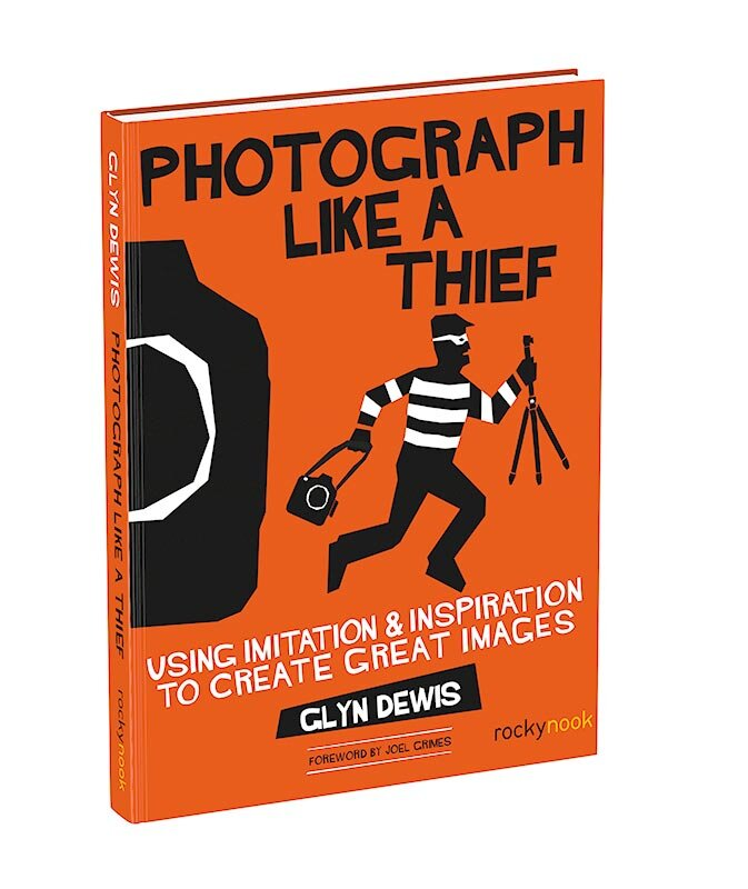
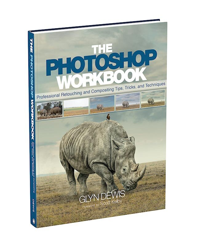
Glyn Dewis
Glyn Dewis is a photographer who lives in the South West of the UK. He also educates people on photography through YouTube and his 4 books:
Furthermore, Glyn is an ambassador for various companies such as BenQ, Westcott Top Pro and Calibrite. Glyn’s photographs have also been on the front cover of various magazines and he has presented at various conferences and exhibitions around the world for Photoshop and Adobe.
At the start of 2019, Glyn Dewis began his 39-45 Portraits Project which lead him to photographing surviving WW2 veterans. This resulted in Glyn to become an Ambassador in the Veterans Charity.
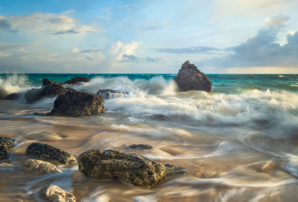
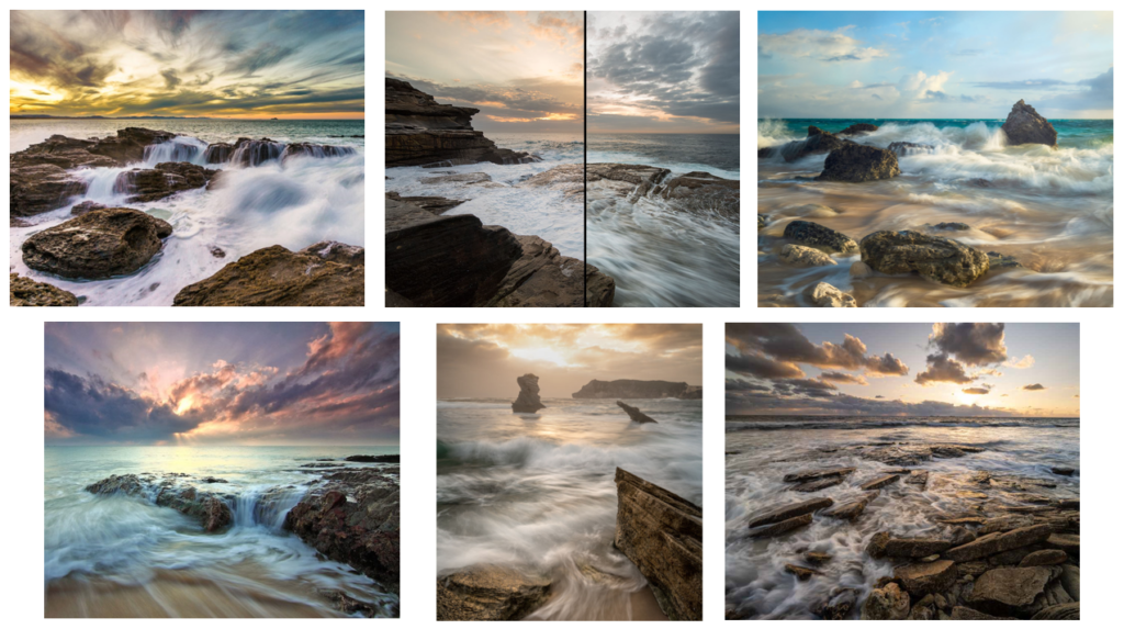
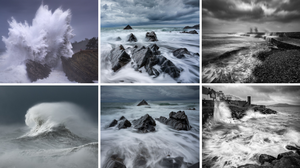
I learnt about Glyn Dewis through his seascapes project, in which he captures remarkable photographs of colossal waves crashing over rocks and brisk flow of the sea. He takes these photos on his iPhone using a tripod and phone grip then retouching them on his iPad in Lightroom.
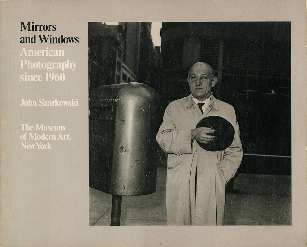
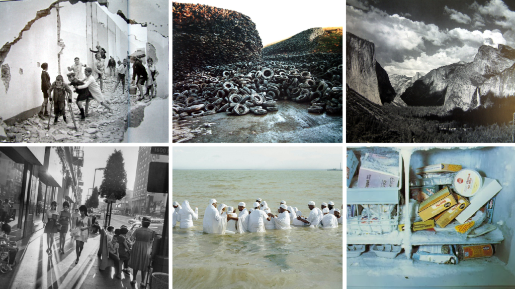
Mirrors and Windows was an exhibition at the Museum of Modern Art in New York in July 1978. The curator of this exhibition was John Szarkowski, an American photographer who attempted to categorise the work of various photographers into two components; Mirrors or Windows.
What are the differences between photographs that are MIRRORS and WINDOWS?
Mirrors
Mirrors are metaphors for photos that reflect the beliefs and interests of the artist who took it or its subject. These images are often staged in order to portray a message. An example of a mirror image could be an environmental portrait.
Words associated with Mirrors:
Romanticism
Fiction
Staged
Subjective
Reflective
Personal
Windows
Windows are metaphors for images which are a documentation of reality. These images are truthful and have clear objectives. Examples of window images are newspaper images used to display events which are taking place to raise awareness.
Words associated with Windows:
Documentary
Realism
Public
Candid
Objective
Truthful
Examples
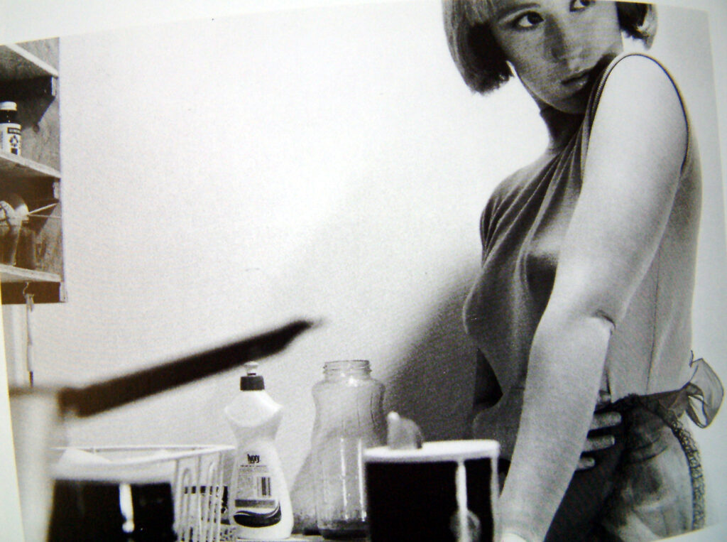
‘Mirror’ Image
This is an image of Cindy Sherman attempting to oppose patriarchy by posing as female stereotypes. This would be a mirror image as it is personal and reflective of her beliefs that women are not less superior than men. Another reason as to why this would be a mirror image is because it is staged, rather than showcasing real events.
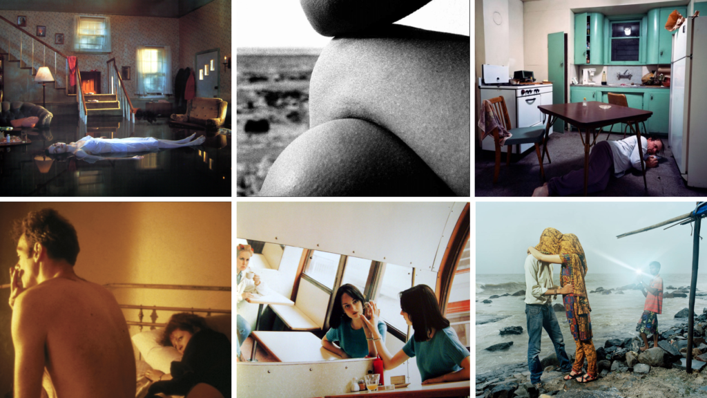
Other Mirror Images:
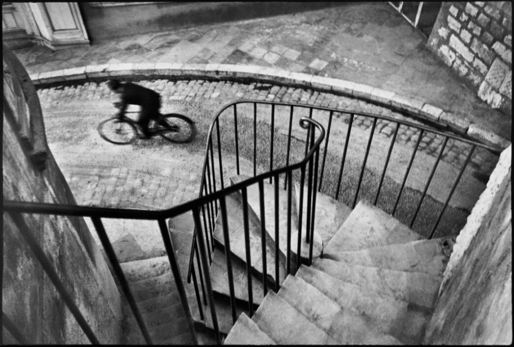
‘Window’ Image
This is an image by Henri Cartier Bresson, a photographer know for capturing the Decisive Moment in his work, as previously researched on an earlier blog of mine. This is an example of a window image as it is a candid photograph of a cyclist who was passing Henri at the time.