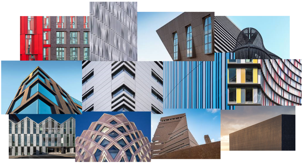
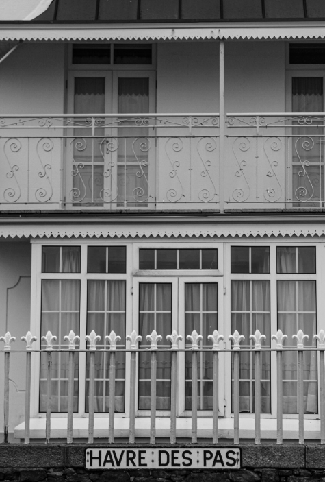
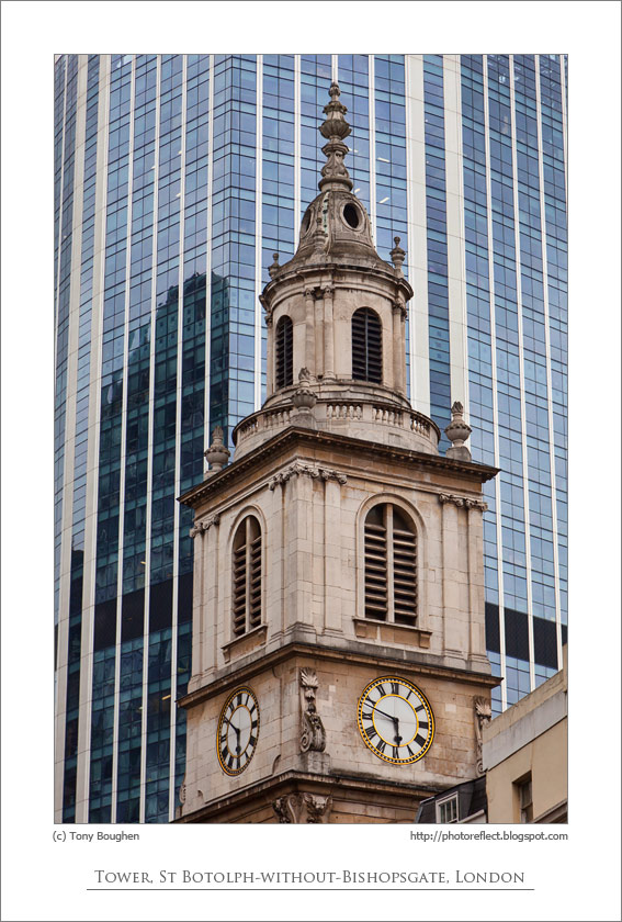
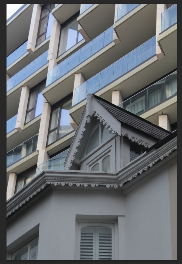
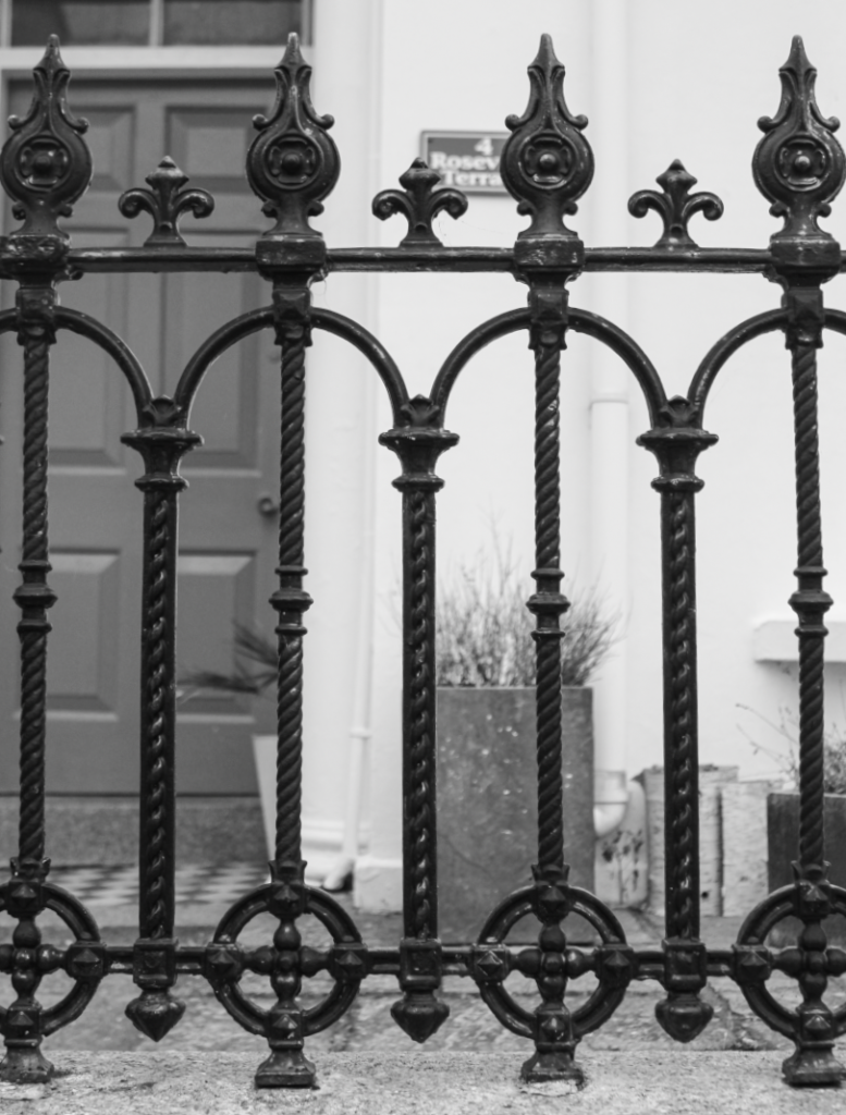
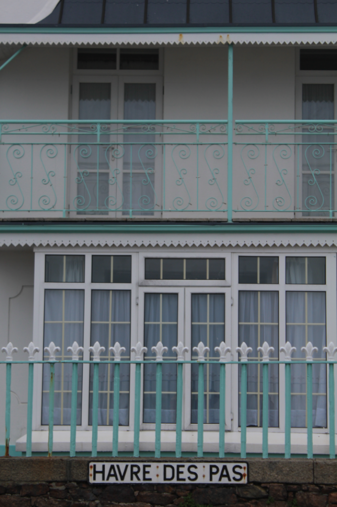
How have Historical Periods of Time influenced Architectural Changes and therefore Photographic Styles?
Photography is a way of preserving the world around you. It allows you to capture a moment of time and freeze it. This is significant as the world we live in is ever-changing. The world changes due to different movements and events. For example, the Climate Movement has caused people to be more considerate of the environment and, as a result, produce sustainable and energy efficient buildings. People also use Photography as a way of promoting that change is needed. Similarly, the Romanticism movement, an artistic and intellectual movement during the Industrial Revolution, influenced Architects and Artists to use nature as an inspiration for their designs. As we can see, there is a tie between social activities and world development. In photography, The New Topographics Exhibition was a reaction to the Romanticism movement and idealised landscape photography. Lewis Baltz, a photographer who was associated with this exhibition, explored the beauty within the realistic, industrial environment at this time.
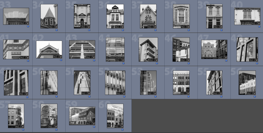
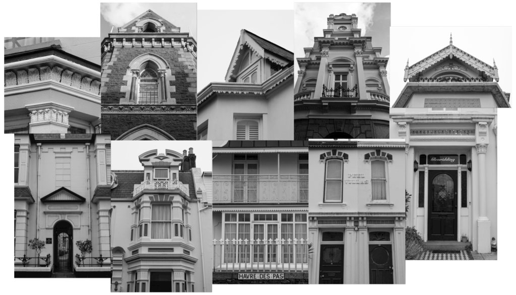
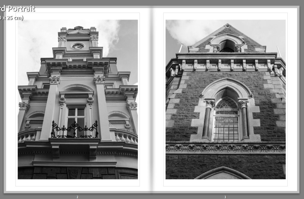
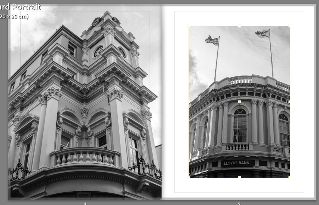
Romanticism, first used as a term for aesthetic, became an artistic and intellectual movement in Europe in the late 18th Century. This movement was a reaction against the age of Enlightenment. This was when emotion had been sucked from art and literature and people focused mainly on science and logic. Romanticism was introduced during the Industrial Revolution, a time in which places such as Europe and the US experienced change in economy to one dominated by industry and machinery. The upbringing of Romanticism was heavily influenced by the political and economic atmosphere at the time and people used it as an escape from the new reality. During the Age of Romanticism, people explored the beauty of nature, emotion and life, creating an idealised reality within art and literature. This period also experienced a change in architecture, returning to medieval styles. Architects would use nature as an inspiration for their intricate designs, whilst also prioritising emotion and individualism. Furthermore, Romanticism is still present to this day. It can be found in art, music, films, literature, photography and more. An example of this would be Ansel Adams.
Ansel Adams was a modern-day photographer who was said to have embraced Romanticism. He was known for capturing the beauty of the natural landscape in America. Ansel Adams was a big part of the Sierra club which was an organisation that worked to protect the environment from industrialisation. He would use his photographic portfolios of the areas as a way to try and convince the members of congress to turn the areas into national parks. After many failed attempts, Adams had success in creating the King’s Canyon National Park in 1940, after publishing a photo book which caught the attention of many people, including President Roosevelt.
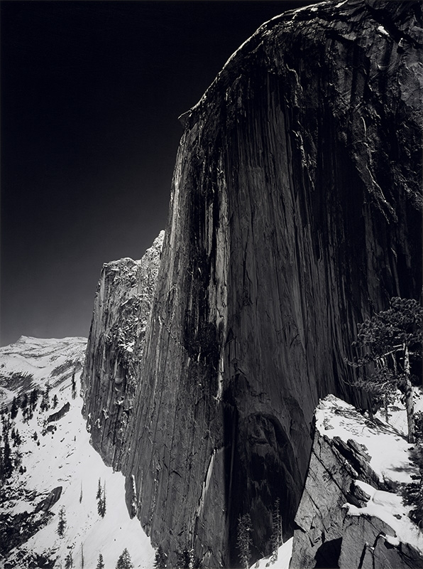
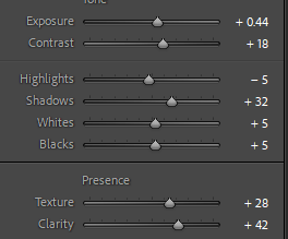
This is a photograph which was taken by Ansel Adams and it transformed his career. At first, he had taken this photo with a yellow filter but he later changed it to a dark red filter. The dark red filter created deep shadows in this image and darkened the sky. These dark features contrast to the white of the snow and the greys of the illuminated face of the half dome. Furthermore, Ansel Adams was recognised for his use of the colour zonal system. This is a system where different tones, from black to white, are represented with a number 0-10. Adams used this system to ensure that his images display a range of both highlights, shadows and the in-between. Ultimately, Adams’ use of this system revolutionised photography by introducing a more controlled and expressive approach to landscape photography. This inspired many photographers to pay more attention to the contrast and clarity of their images.
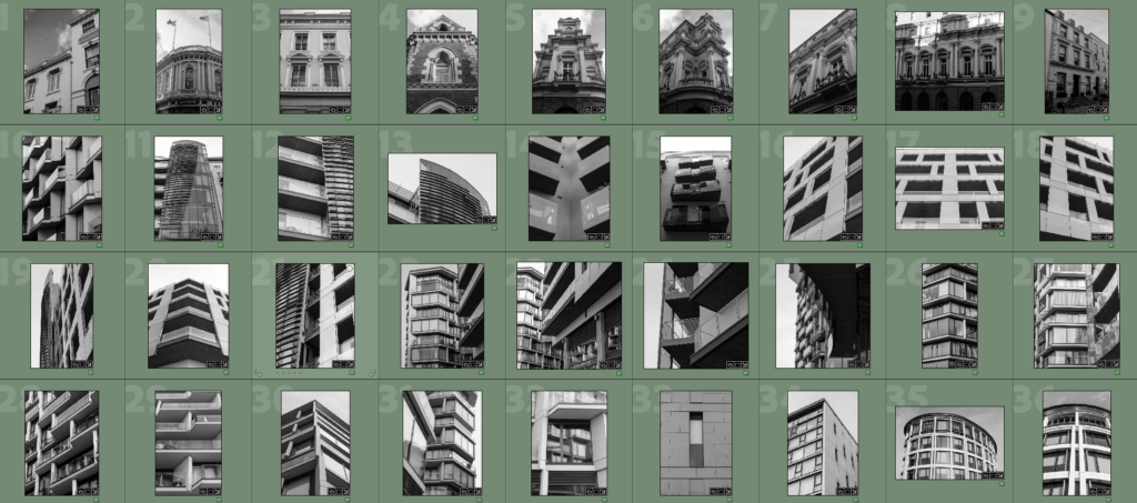
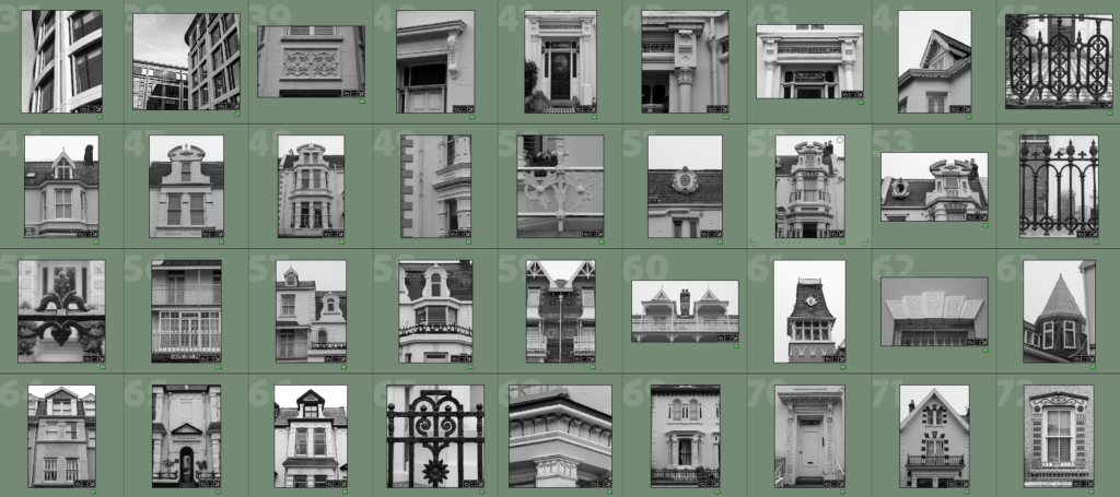
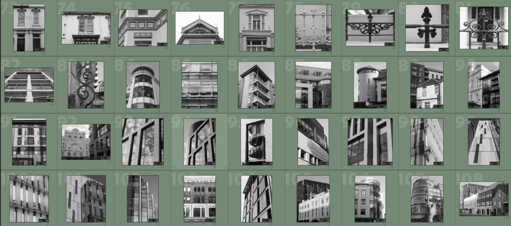
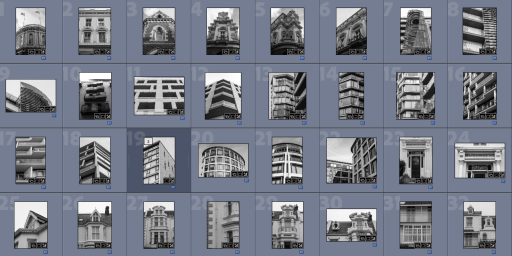
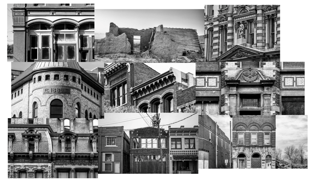
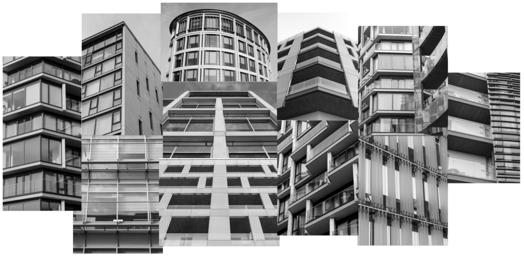
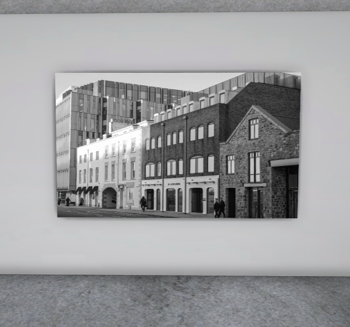
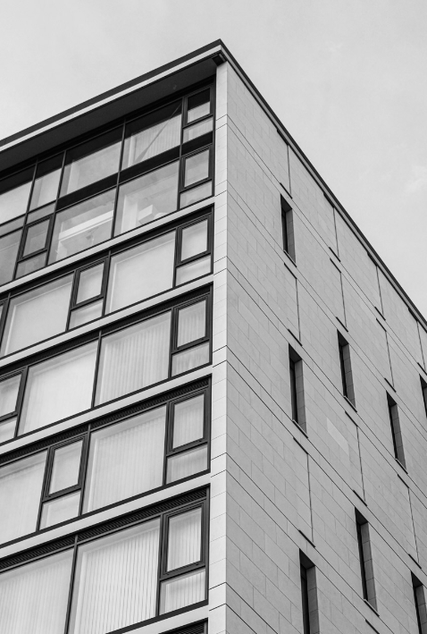
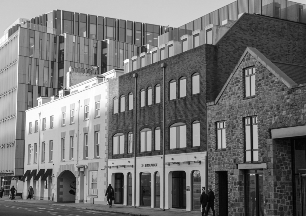
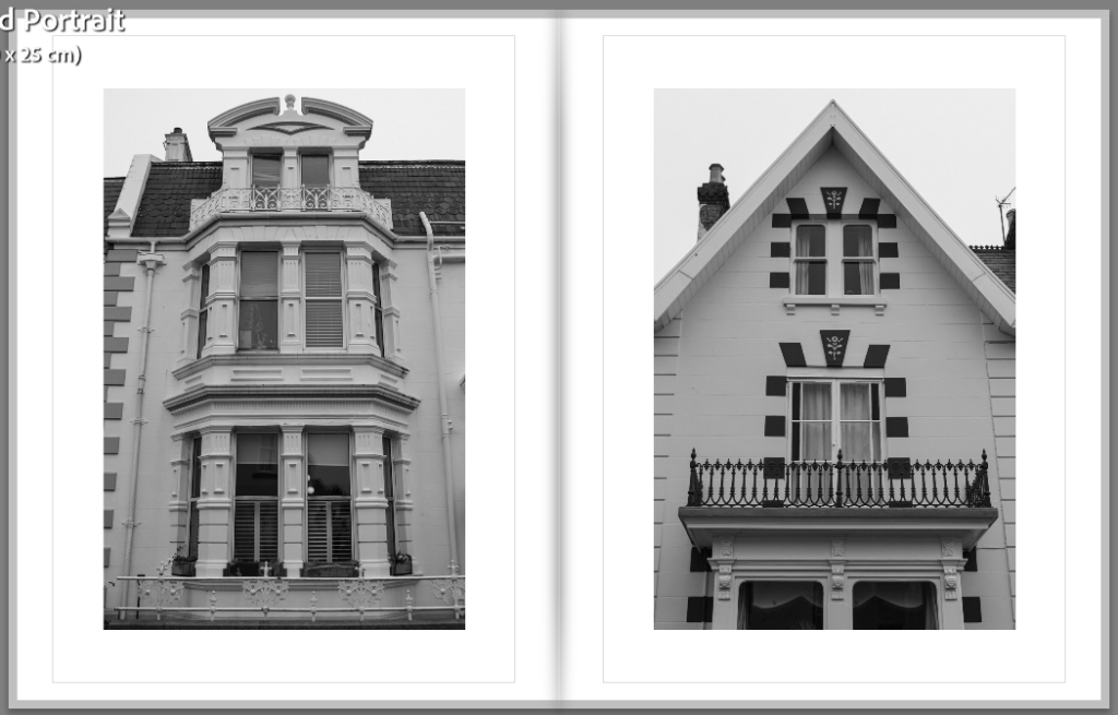
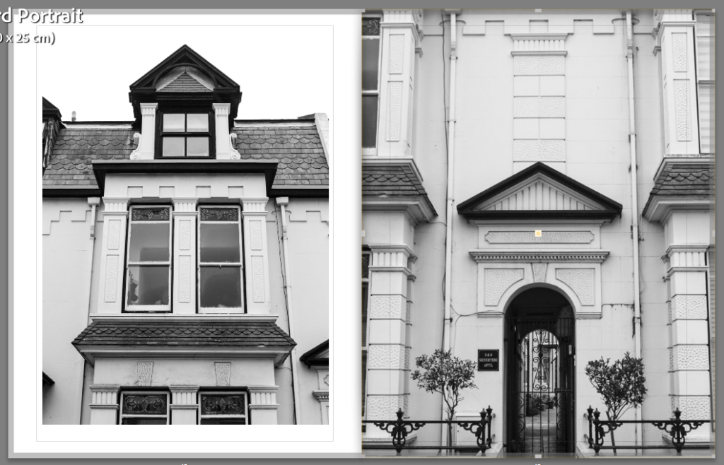
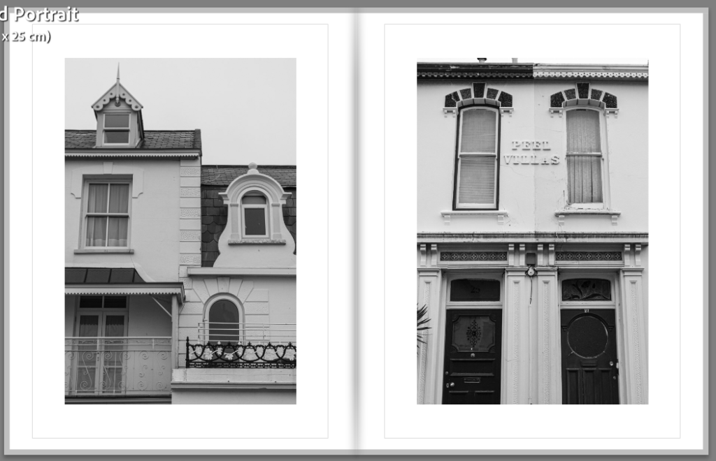
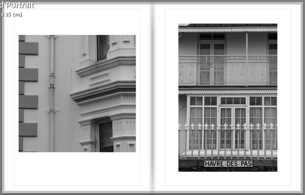
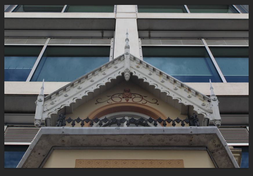
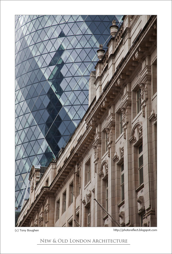
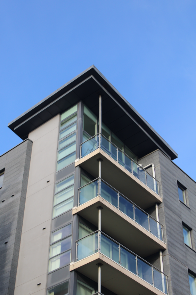
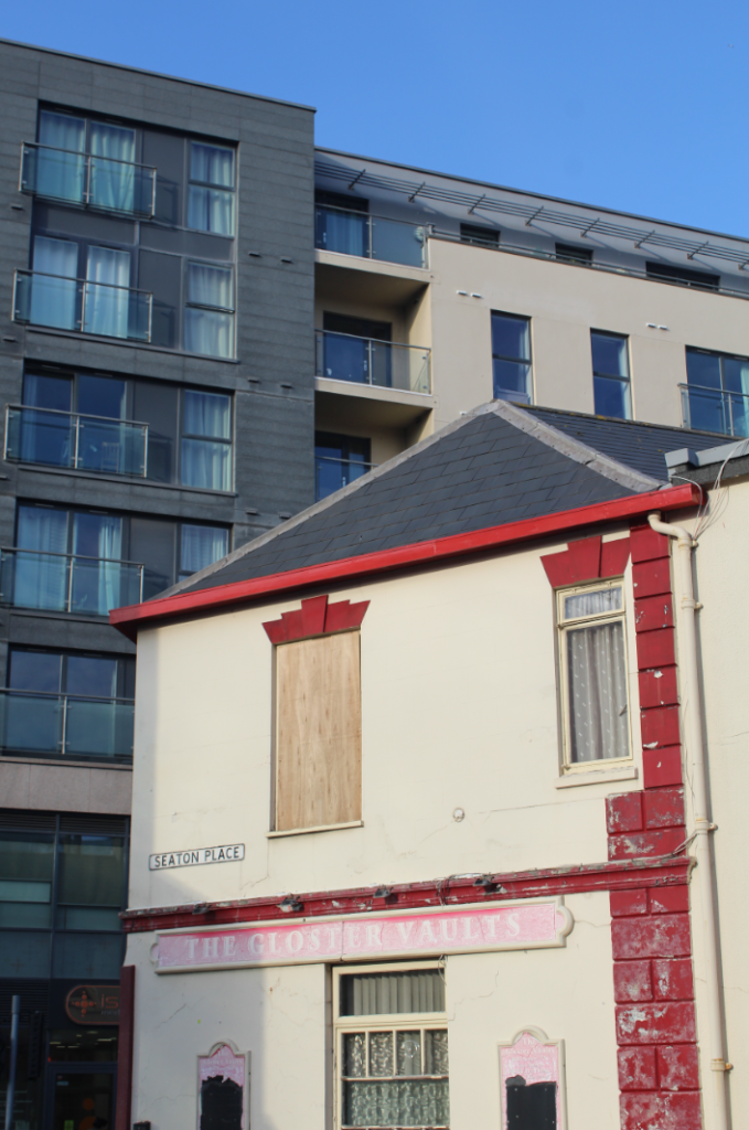
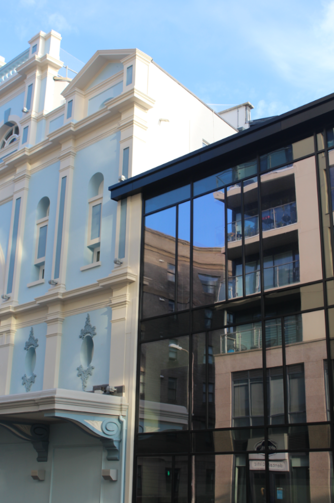
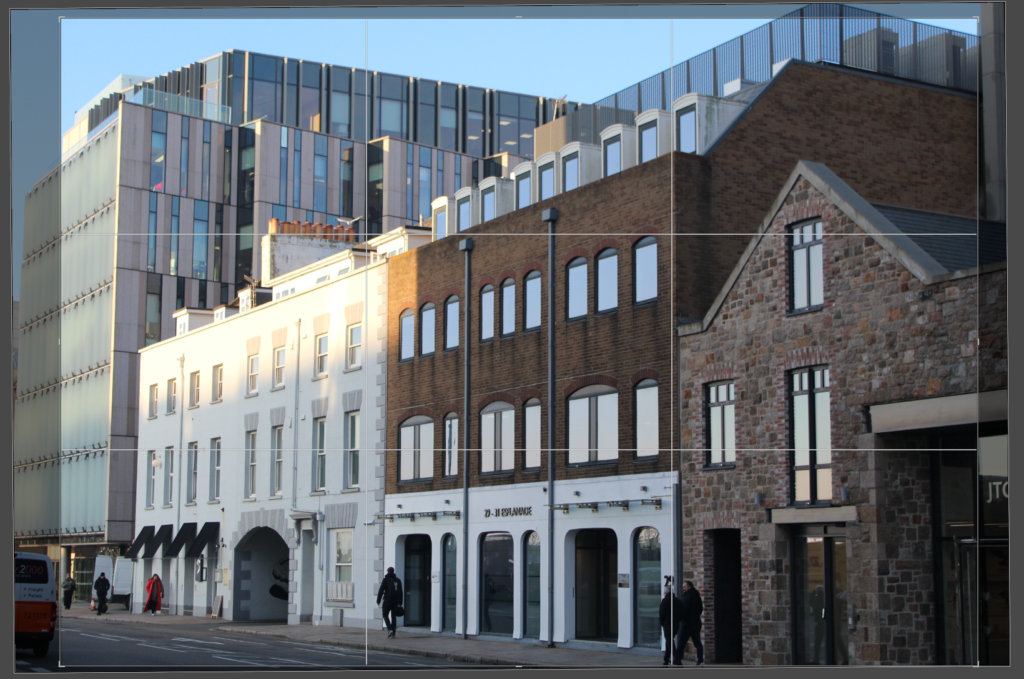
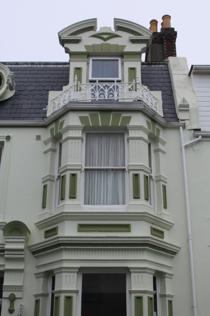
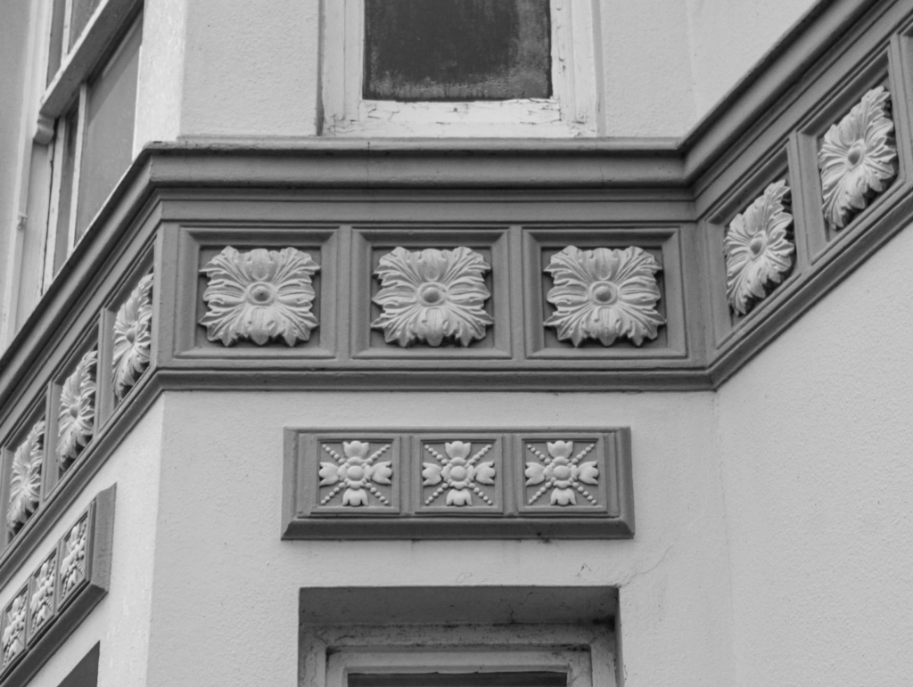
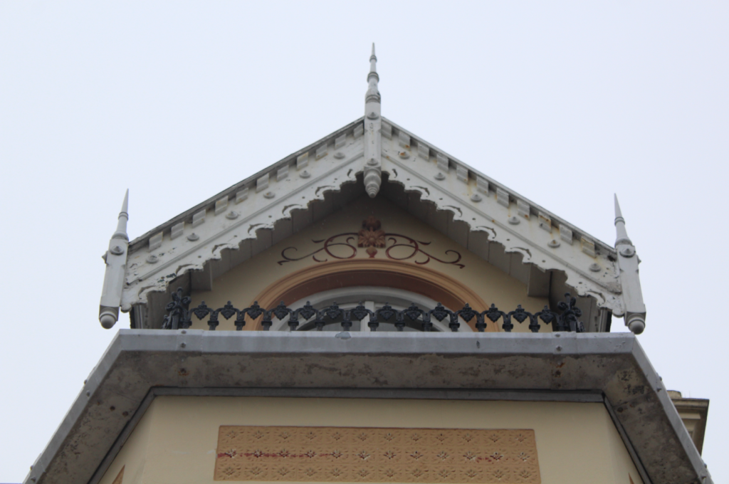
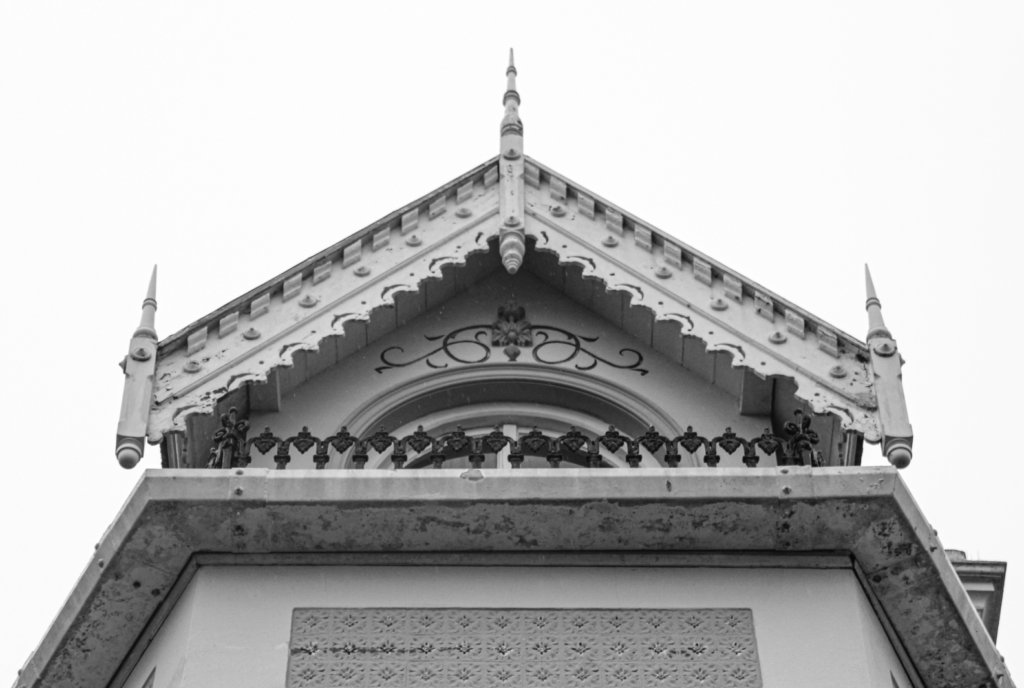
‘The New Topographics: Photographs of a Man-Altered Landscape’ was a photographic exhibition which consisted of the work of 10 different photographers. These photographers included Lewis Baltz, Robert Adams and Bernd and Hilla Becher. The exhibition was hosted at the George Eastman Museum by William Jenkins in 1975. It consisted of 168 prints, mostly in black and white. These prints were of things such as streets, industrial sites, warehouses and suburban houses. This exhibition was a reaction against romanticism and the idealised landscape, particularly the work of Ansel Adams. Its purpose was to challenge these traditional landscapes of the untouched by documenting reality and the growing impacts of industrialisation. After the II World War, America experienced a large increase in their economy, resulting in mass production of buildings and industrial developments. These buildings were constructed for their function, rather than their appearance, leading to the introduction of modern architectural styles and less detailed/aesthetically pleasing buildings.
Although the photographers involved in The New Topographics simply displayed their everyday surroundings, the exhibition experienced a range of opinions. Many people felt responsibility towards the future of America’s landscape. This is suggested by the quote “I don’t like to think there are ugly streets in America, but when it’s shown to you – without beautification – maybe it tells you how much more we need here”. People were left feeling off-put with the representation of the American Landscape this exhibition displayed, making it one of the most groundbreaking exhibitions of the 20th Century as it completely rewrote the rules of Landscape Photography. This exhibition displayed settings which were often hidden from the camera, settings where the impacts of man-kind are evident. It proved that landscape photography can be more than just photographing the beautiful natural scenery and that it can also be capturing the ‘unattractive’ built environment.
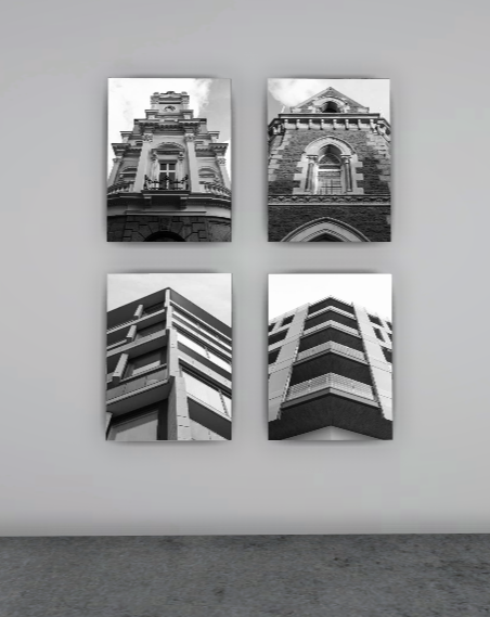
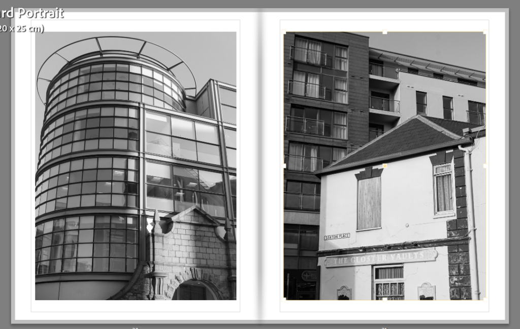
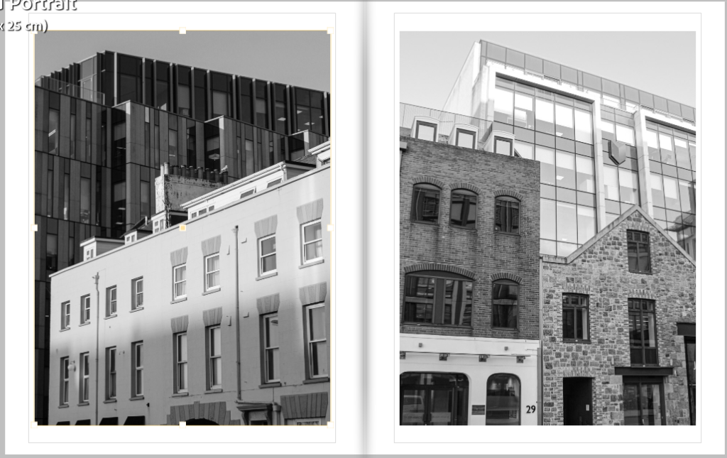
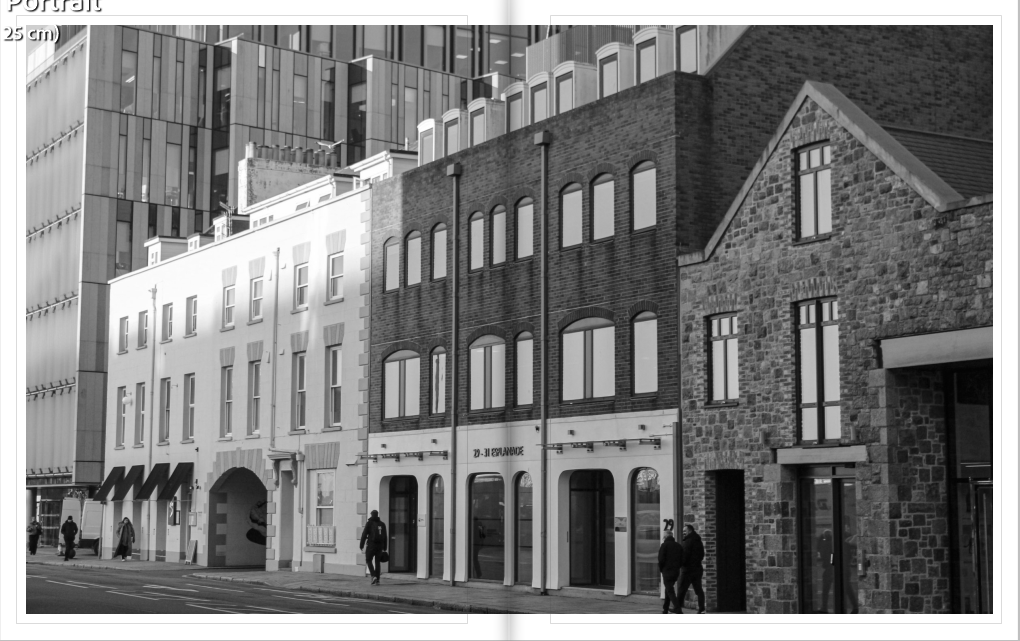
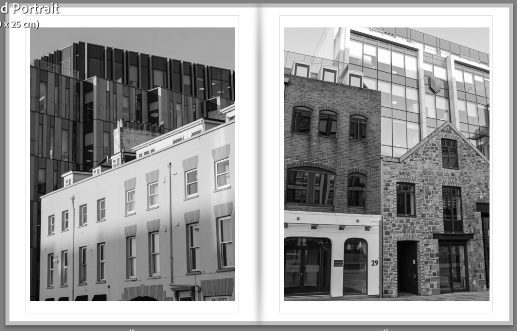
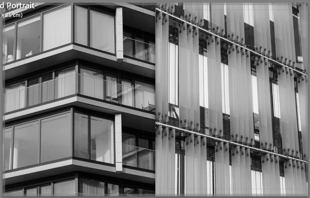
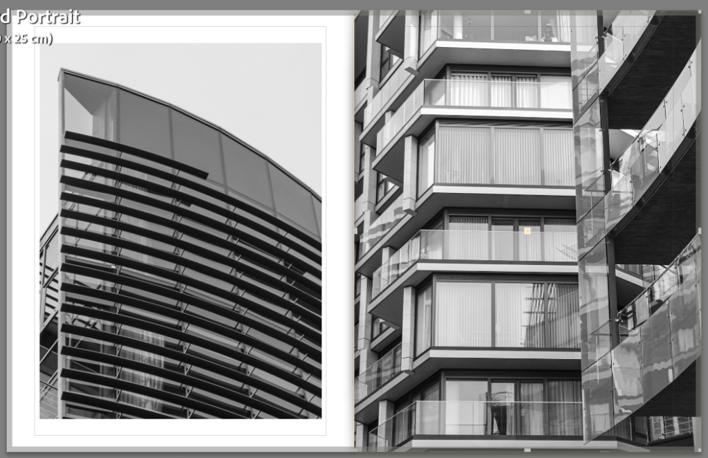
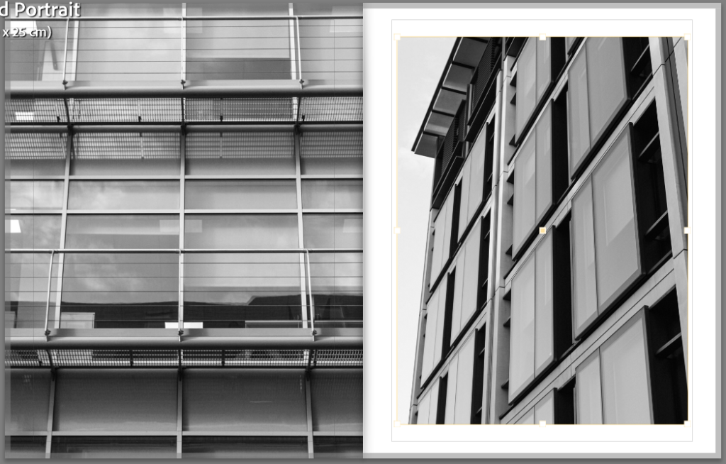
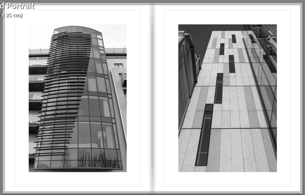
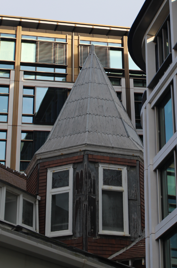
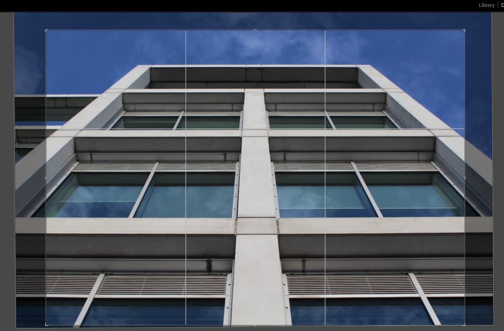
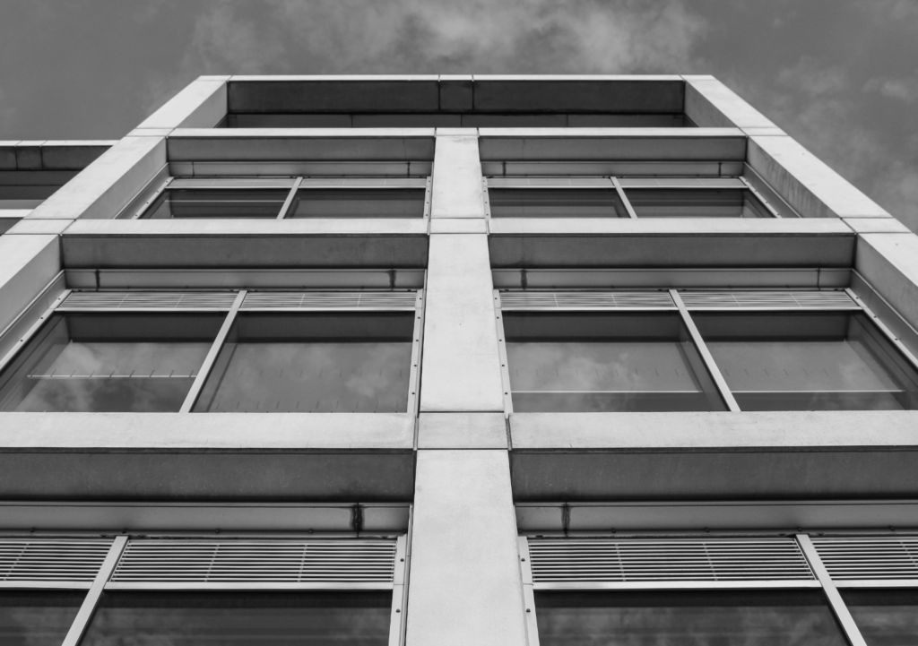
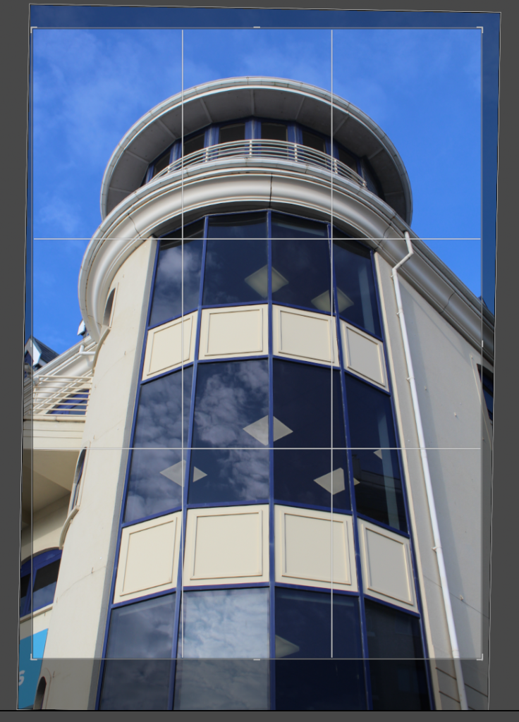
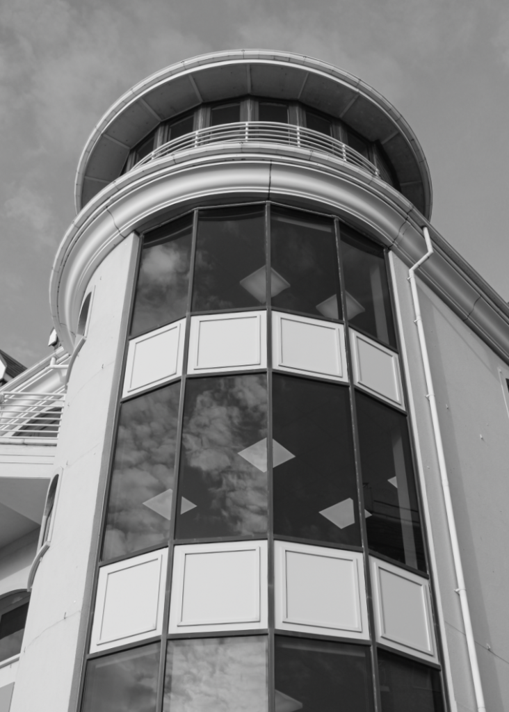
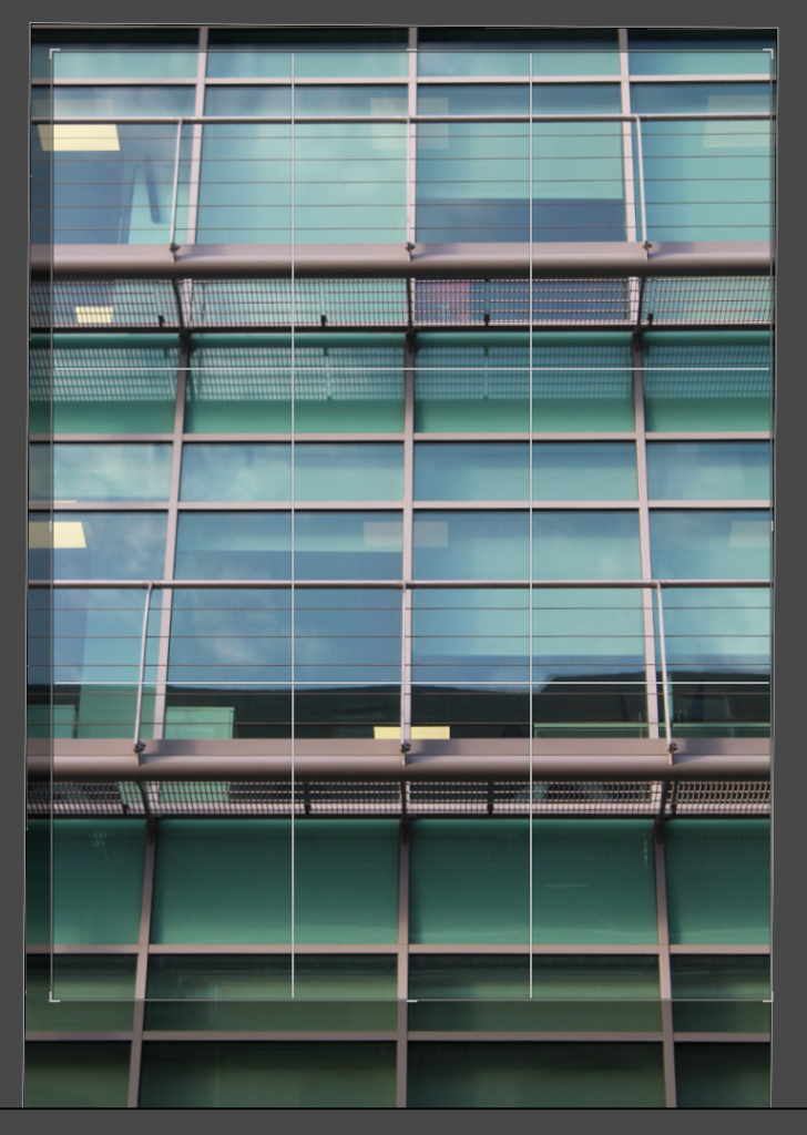
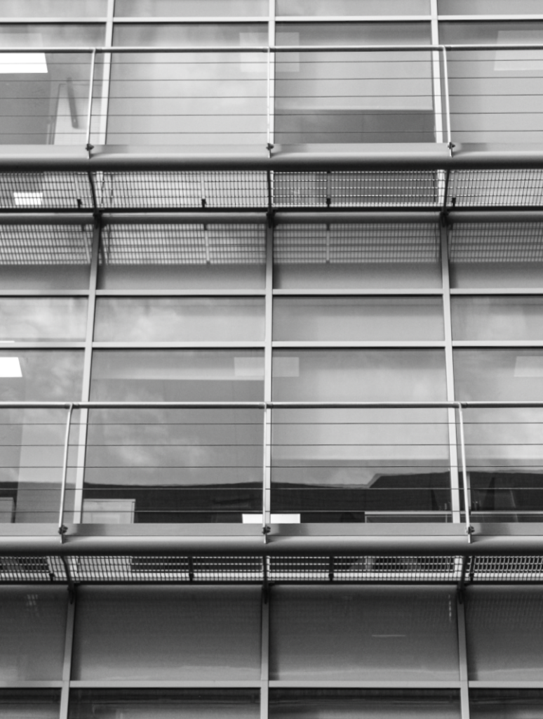
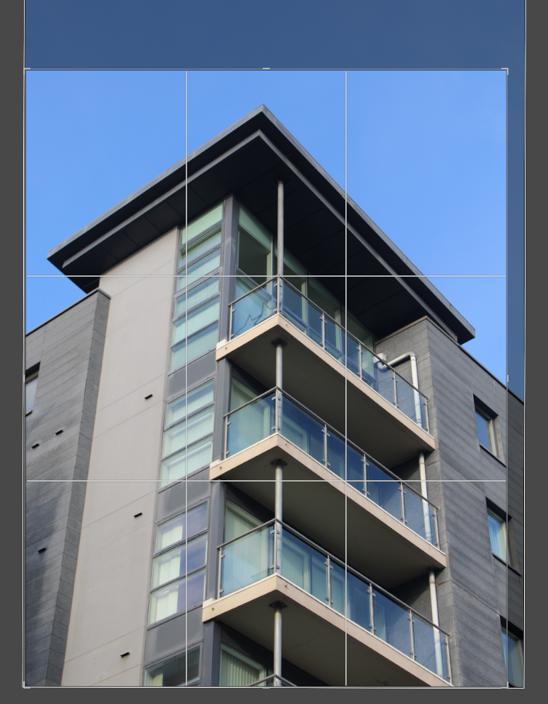
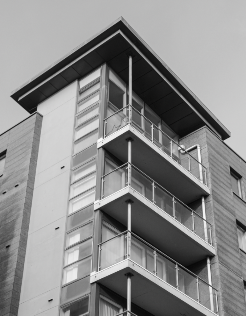
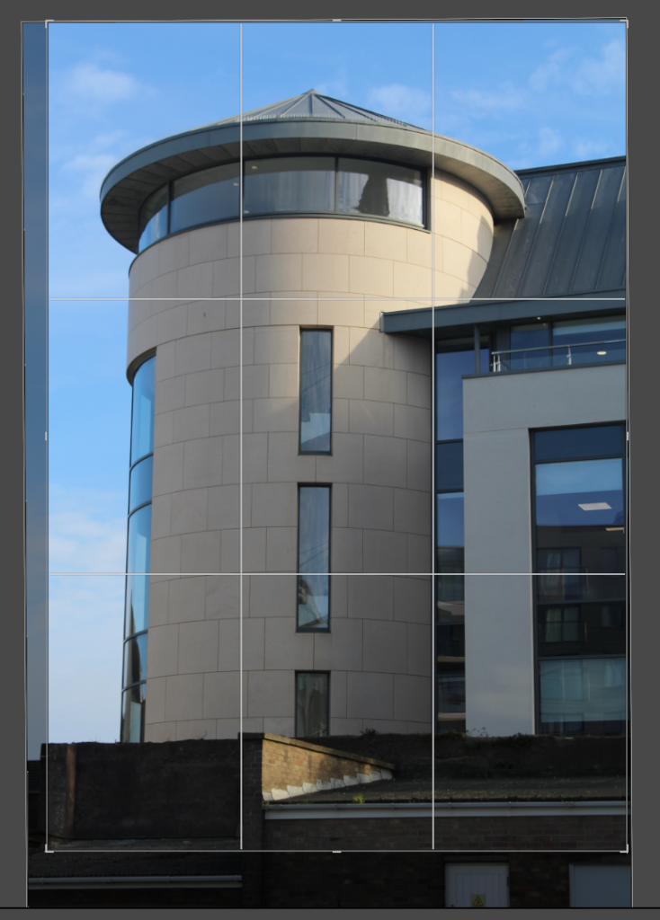
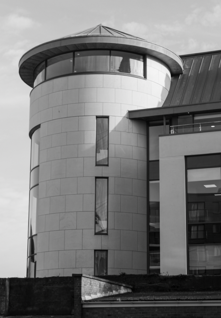
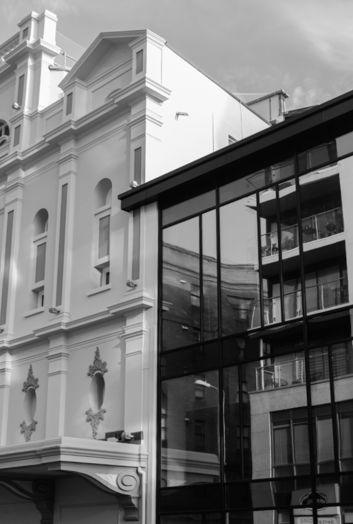
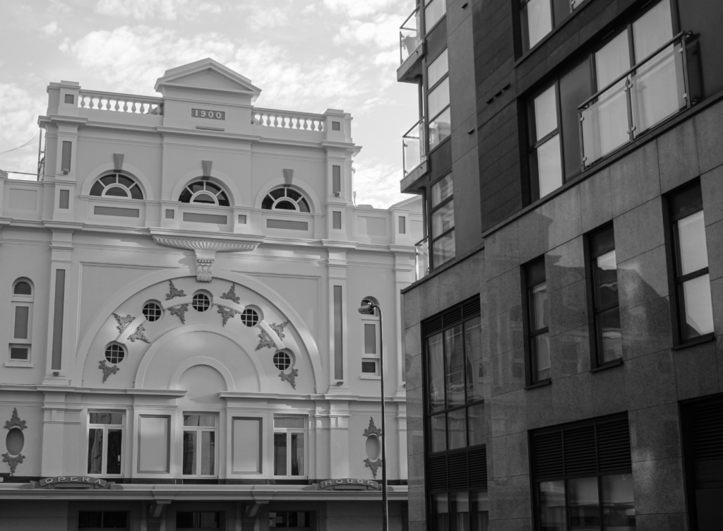
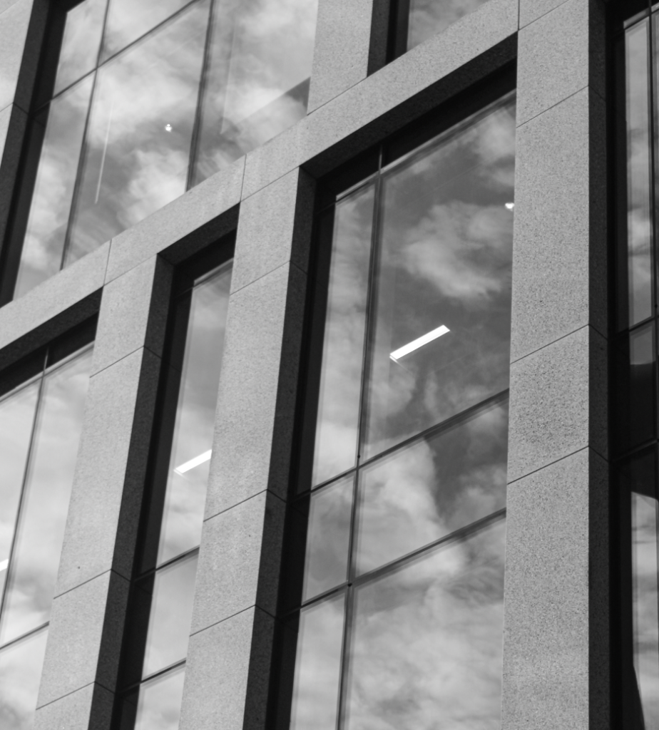
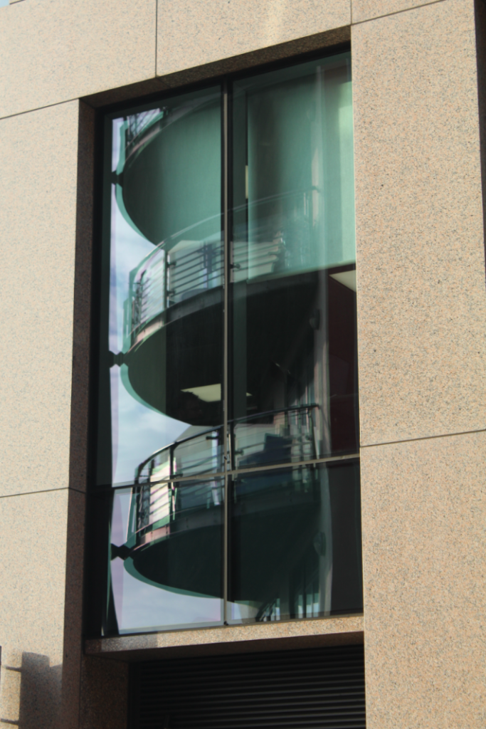
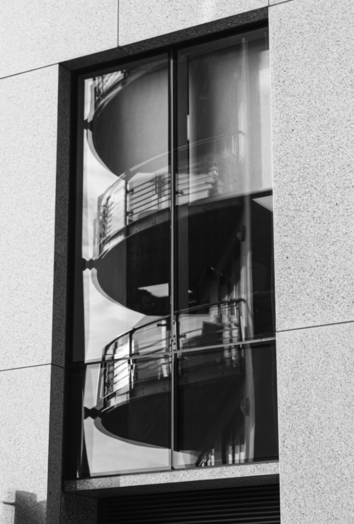
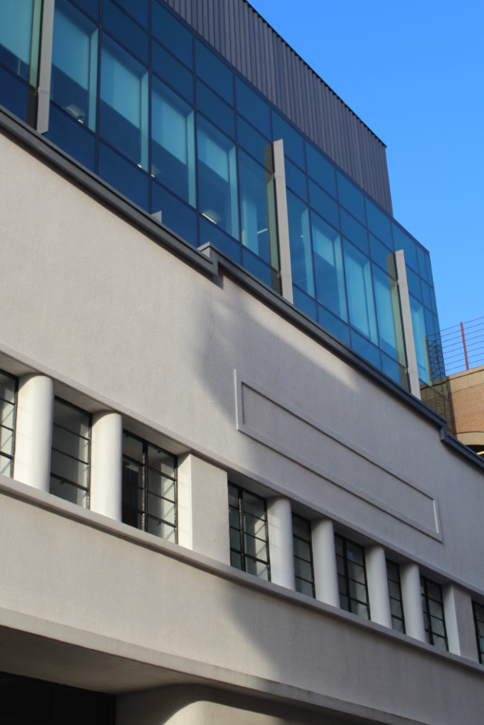
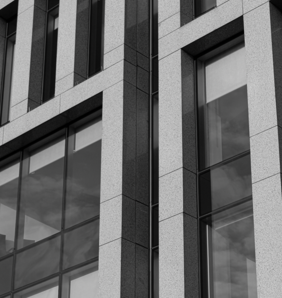
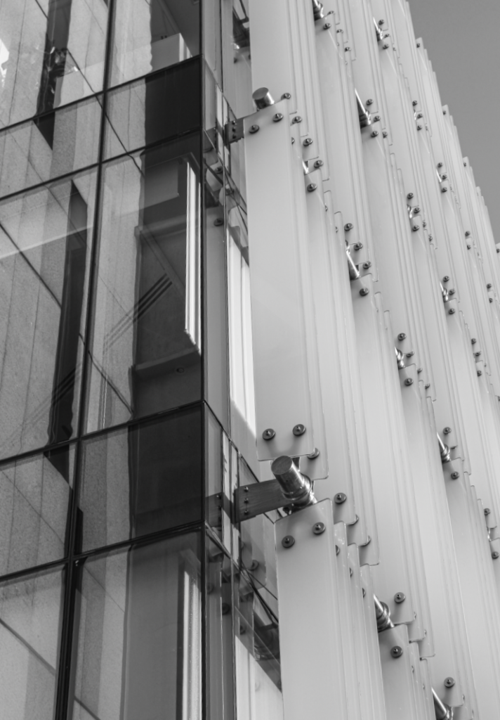
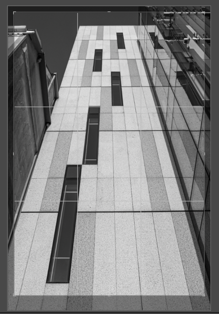
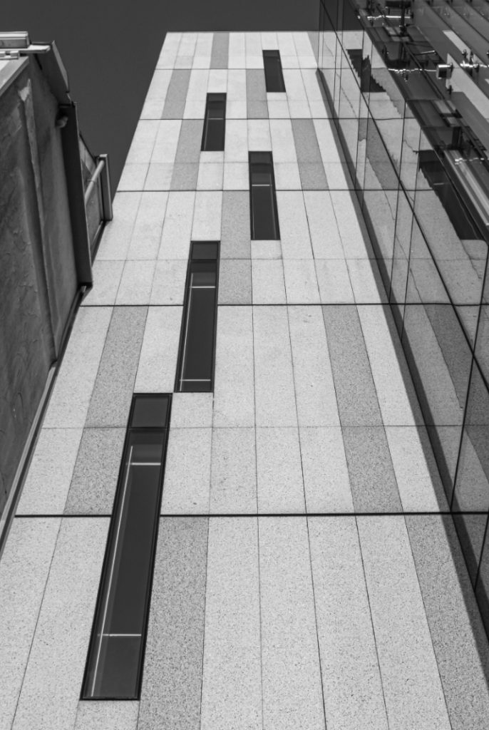
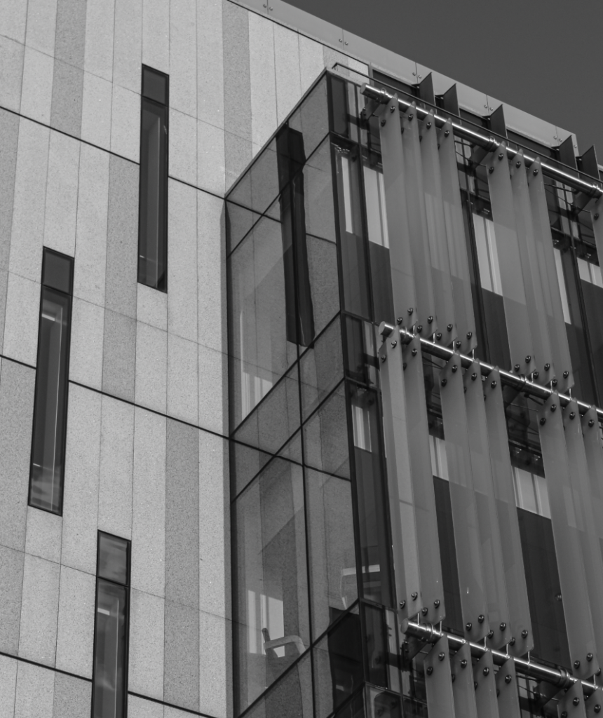
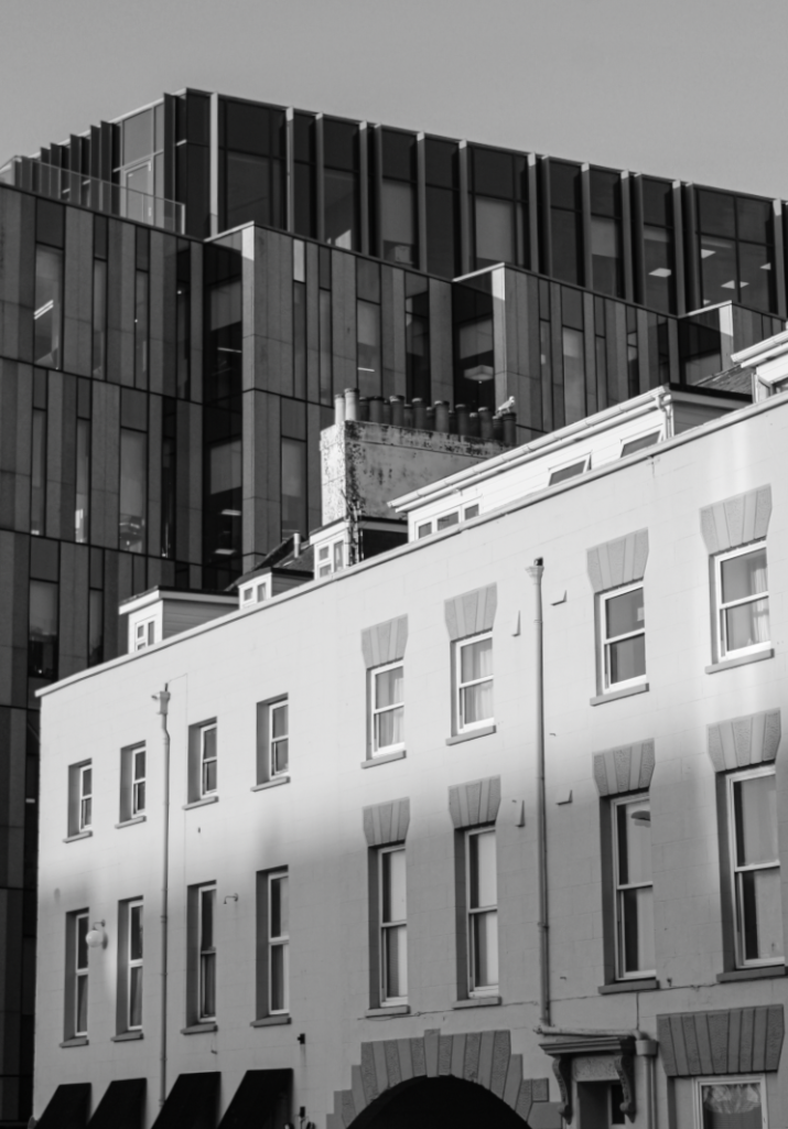
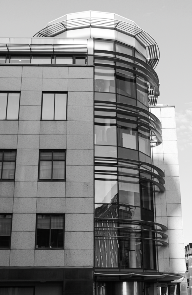
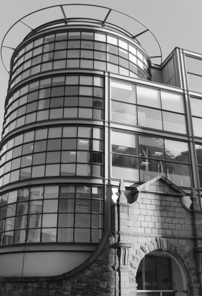
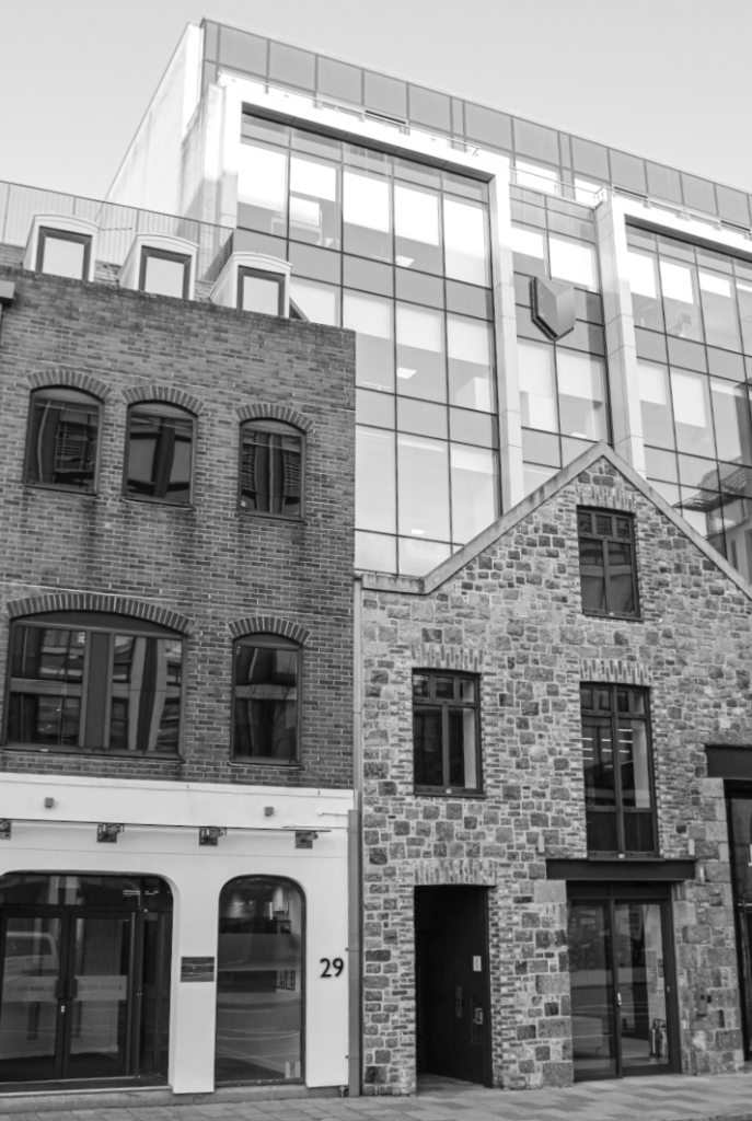
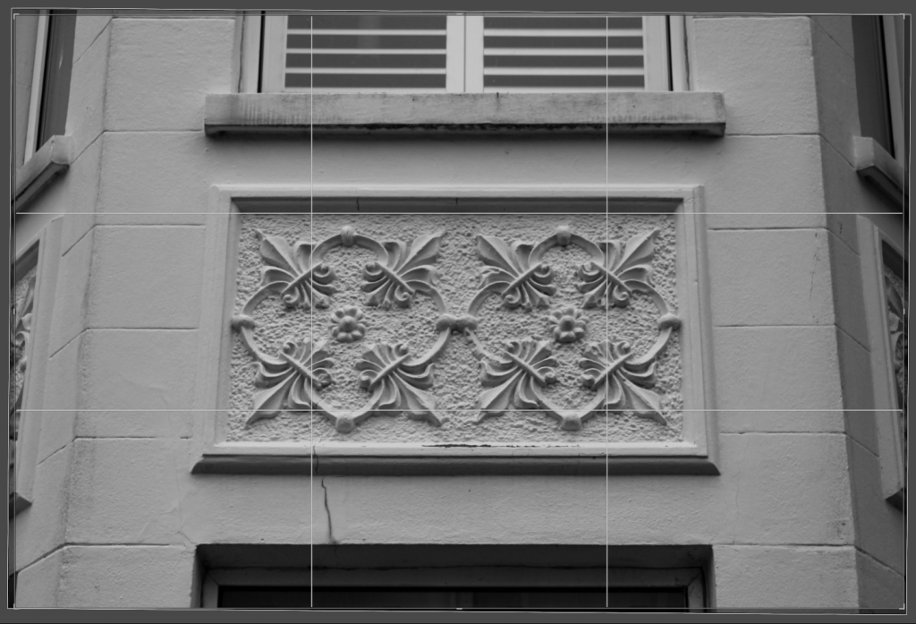
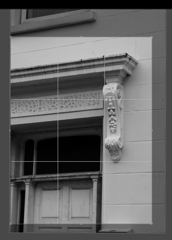
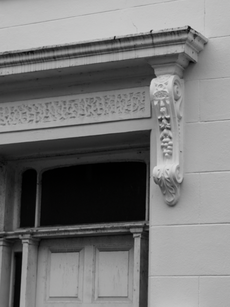
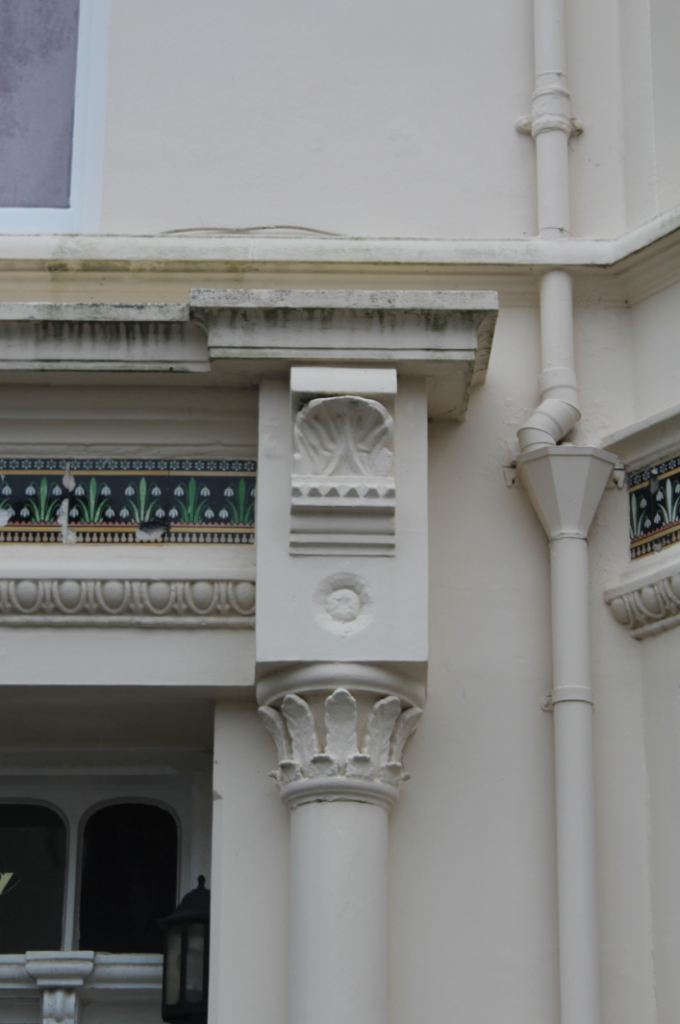
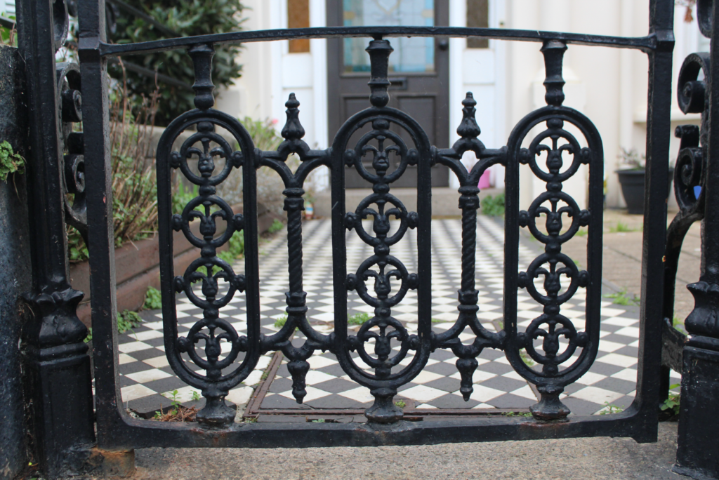
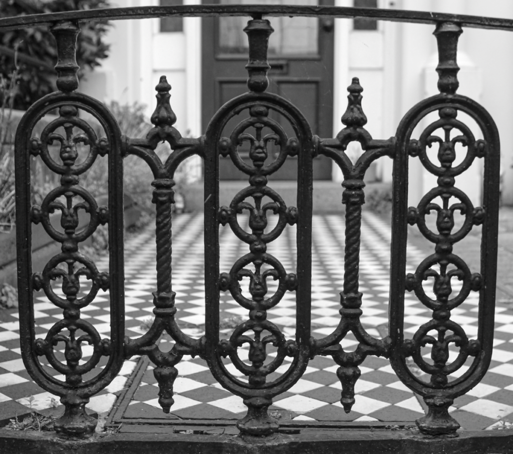
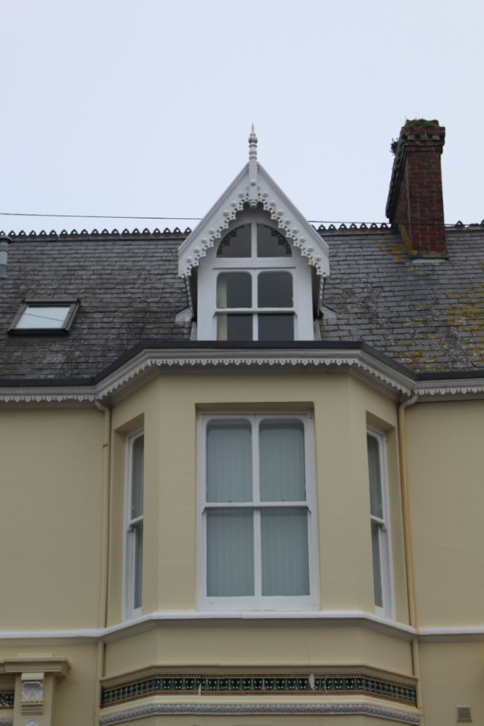
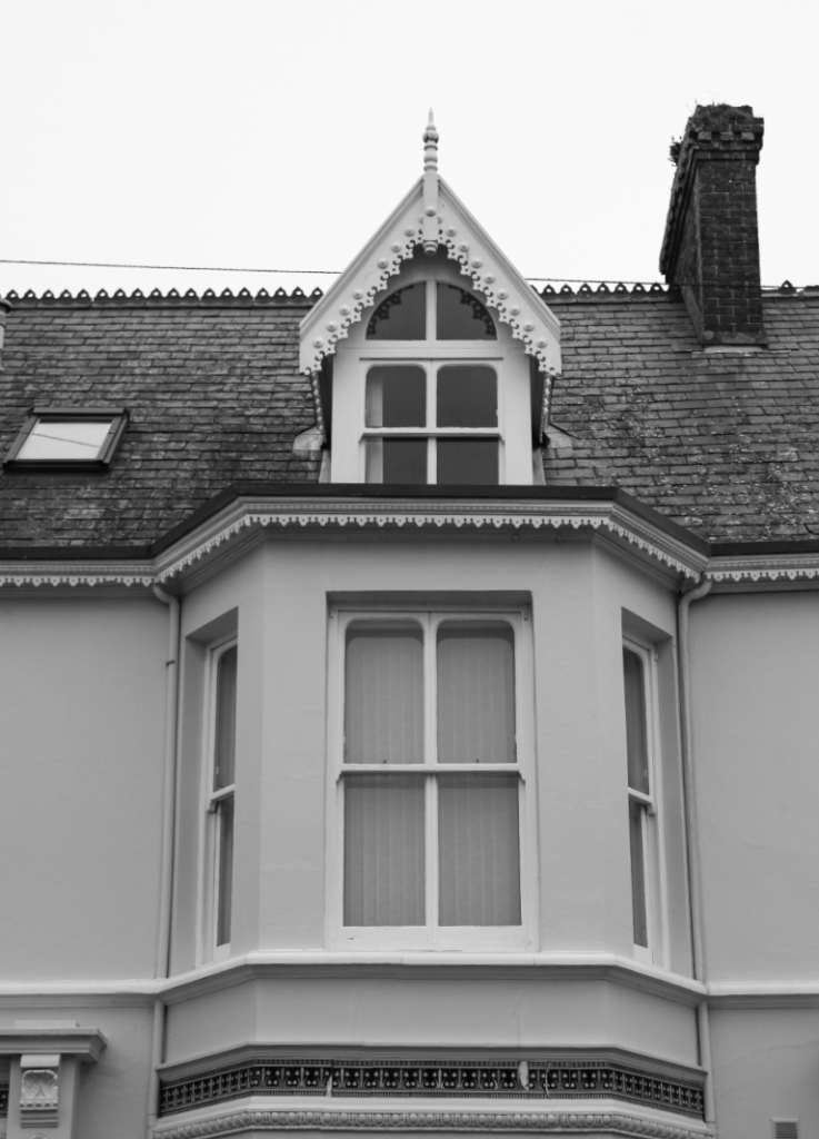
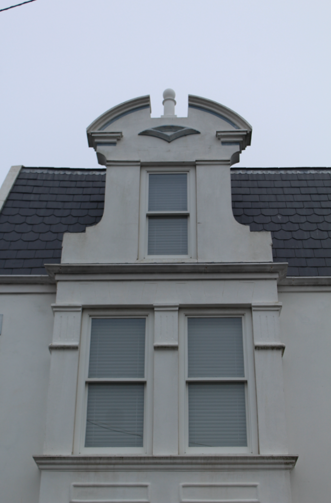
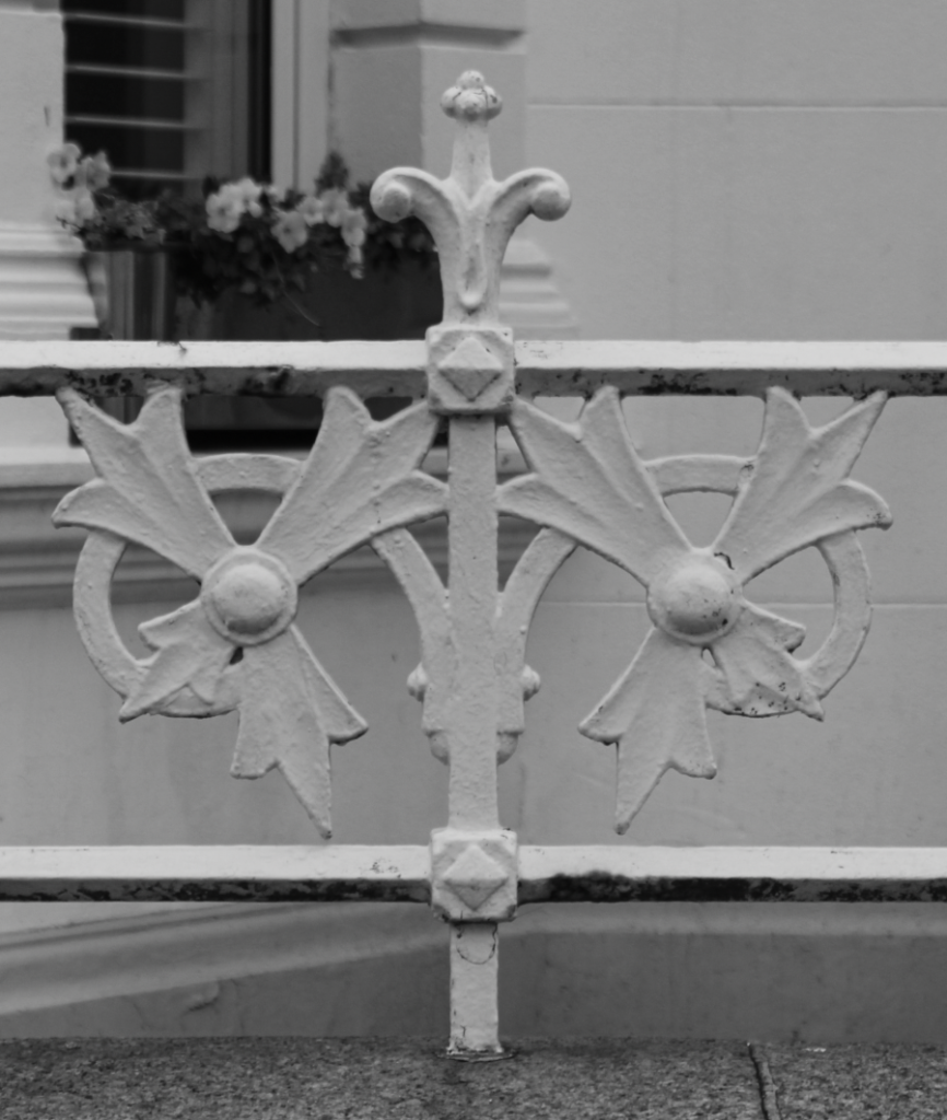
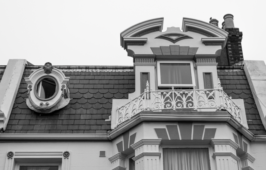
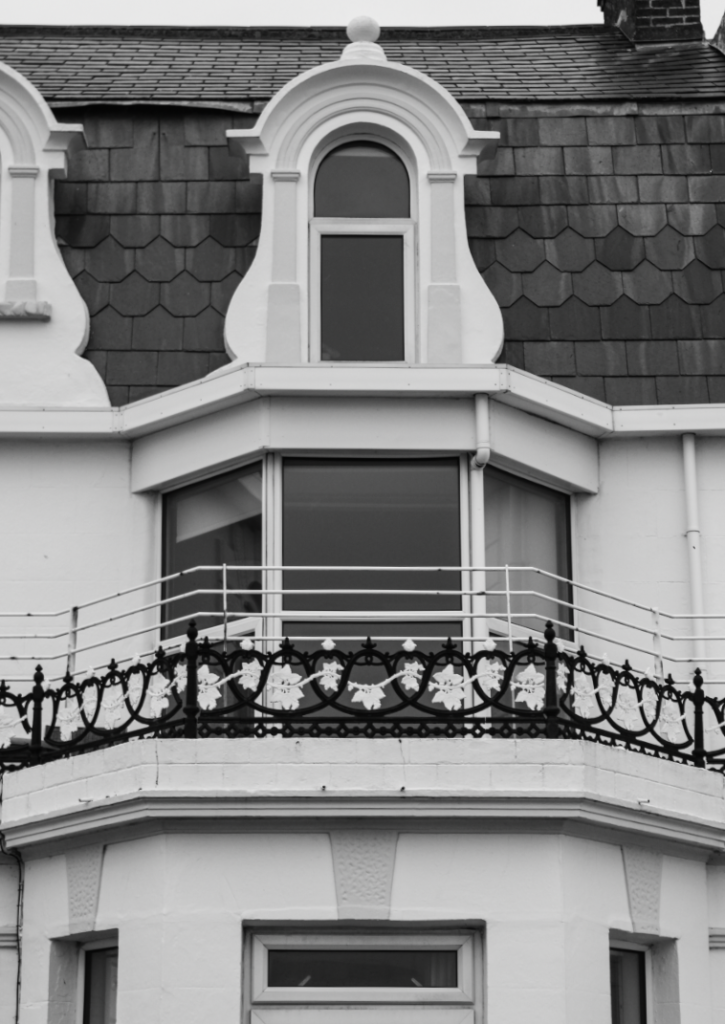
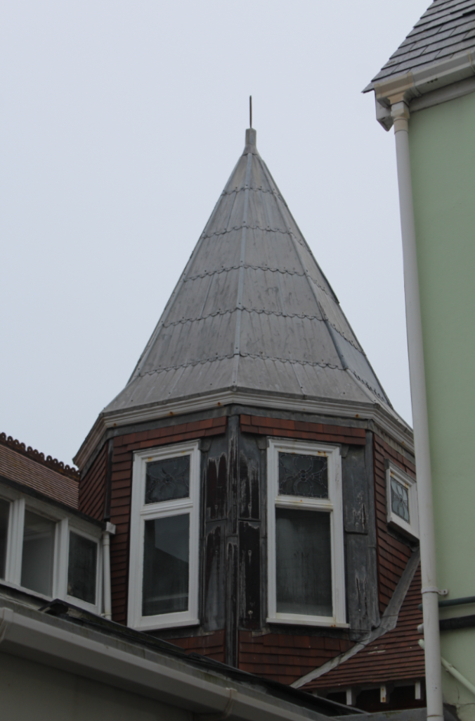
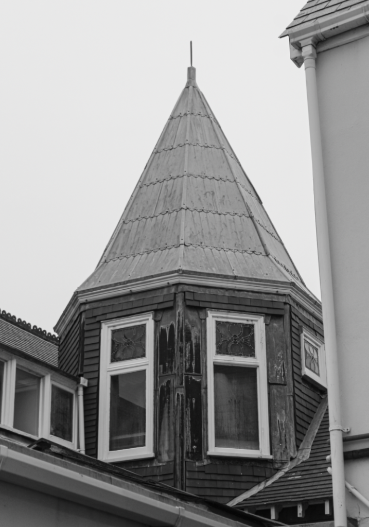
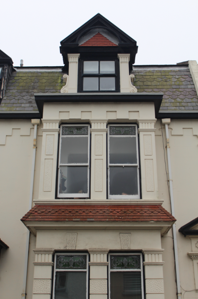
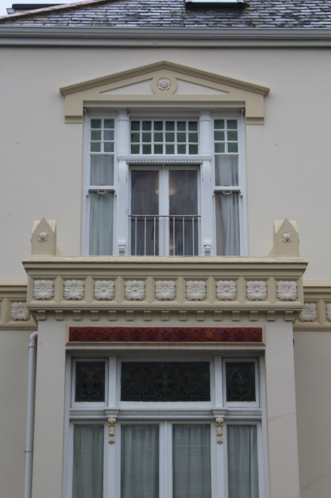
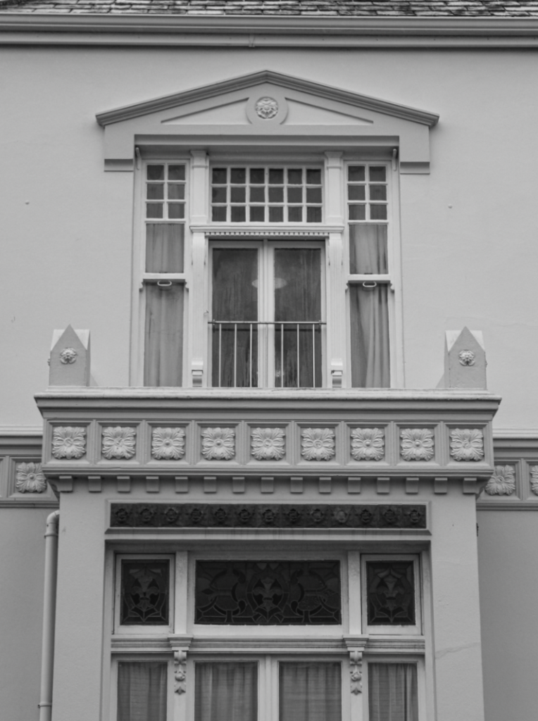
Lewis Baltz, a crucial photographer of The New Topographics Exhibition, focused his work on searching for the beauty in bleakness. In an interview with Mr Witkovsky, Baltz stated that there’s an implied human presence in his work. There are traces of people but an absence of their physical presence. This is due to the fact that the subject of his photographs is the man-made environment. Baltz would capture stark images of the suburban landscape, revealing the impacts of urbanisation and mass construction. His photographs, displayed in black and white, often were geometric and bare. Many of these images were desolate and had a sense of emptiness.
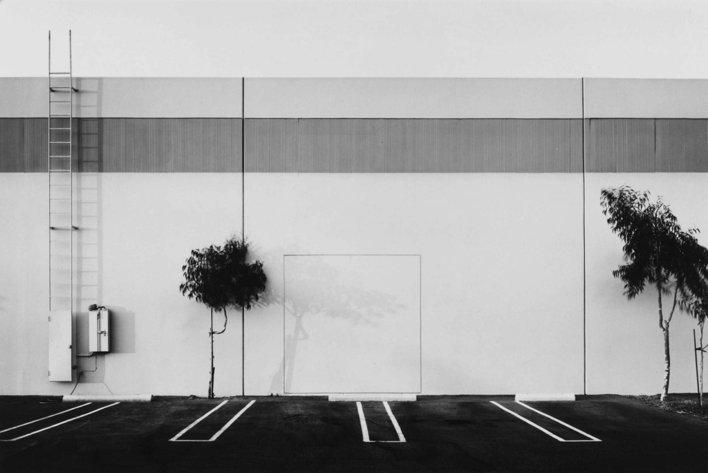
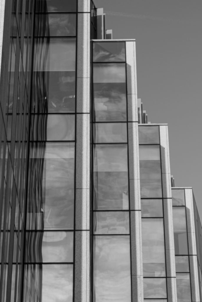
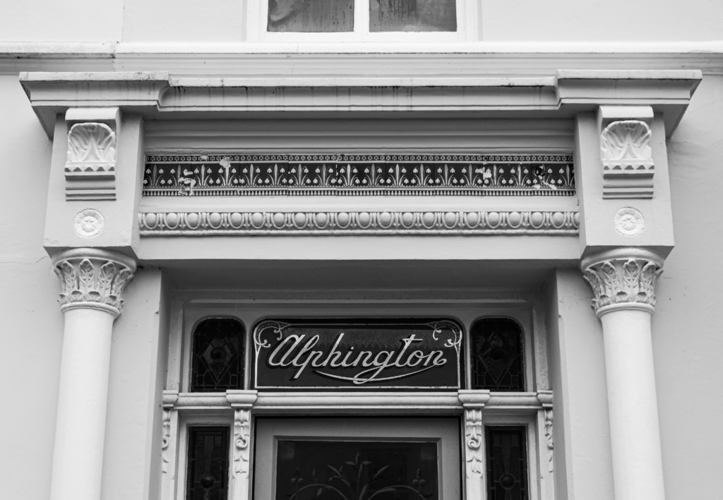
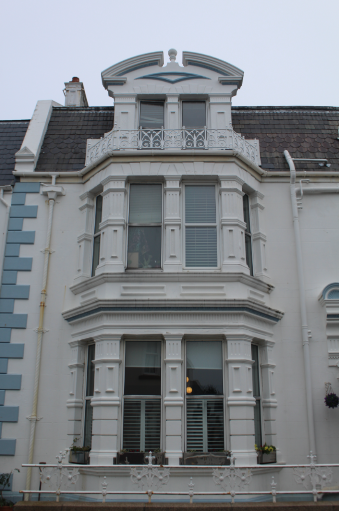
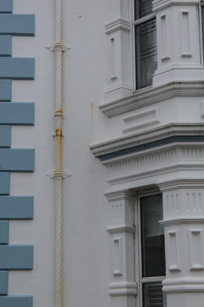
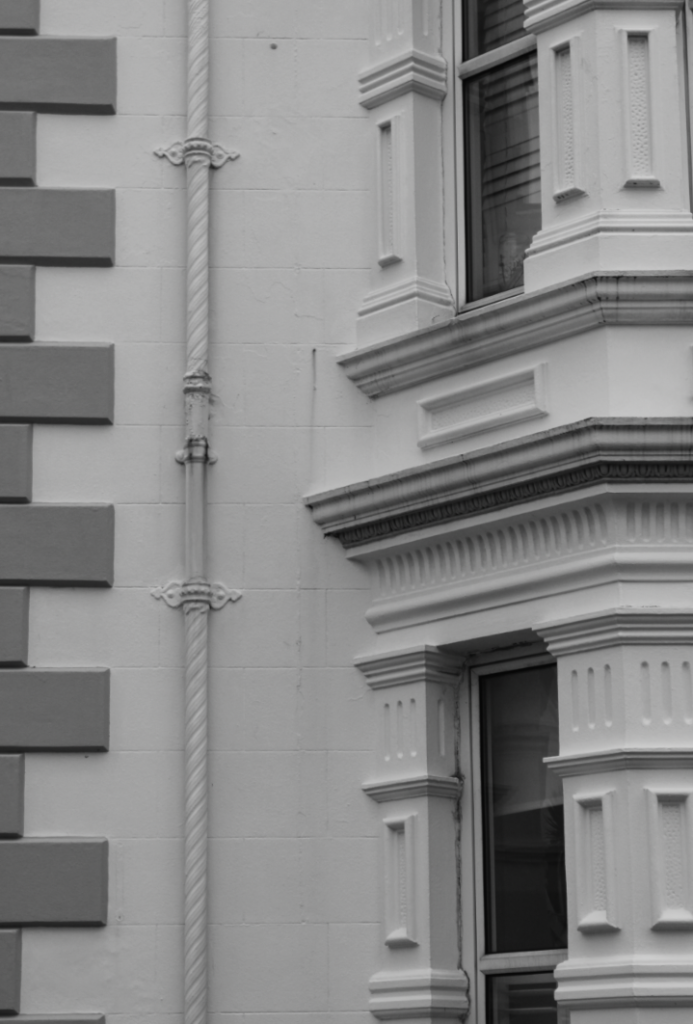
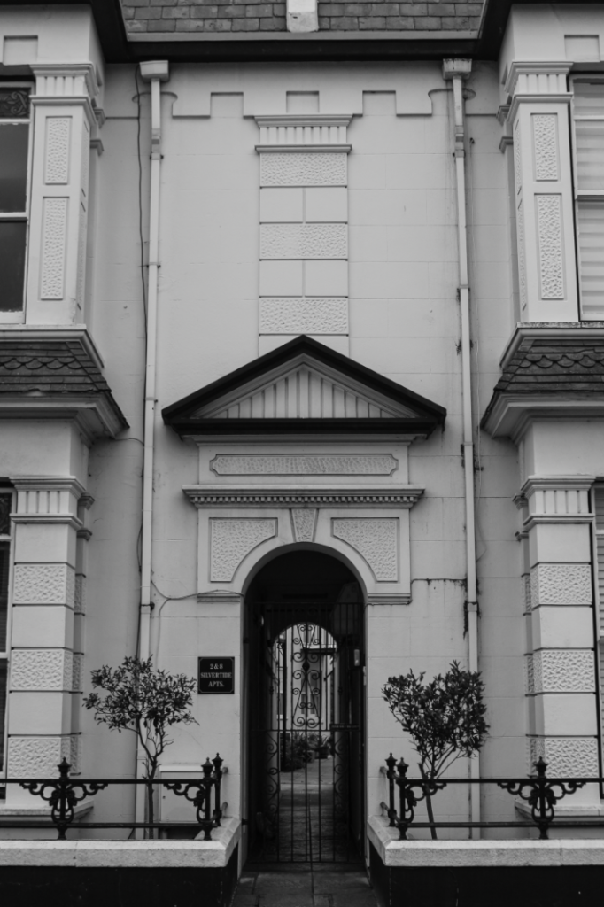
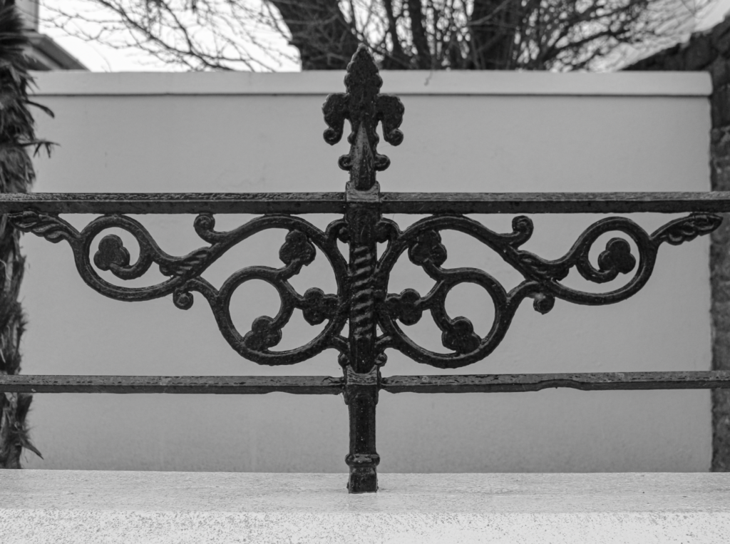
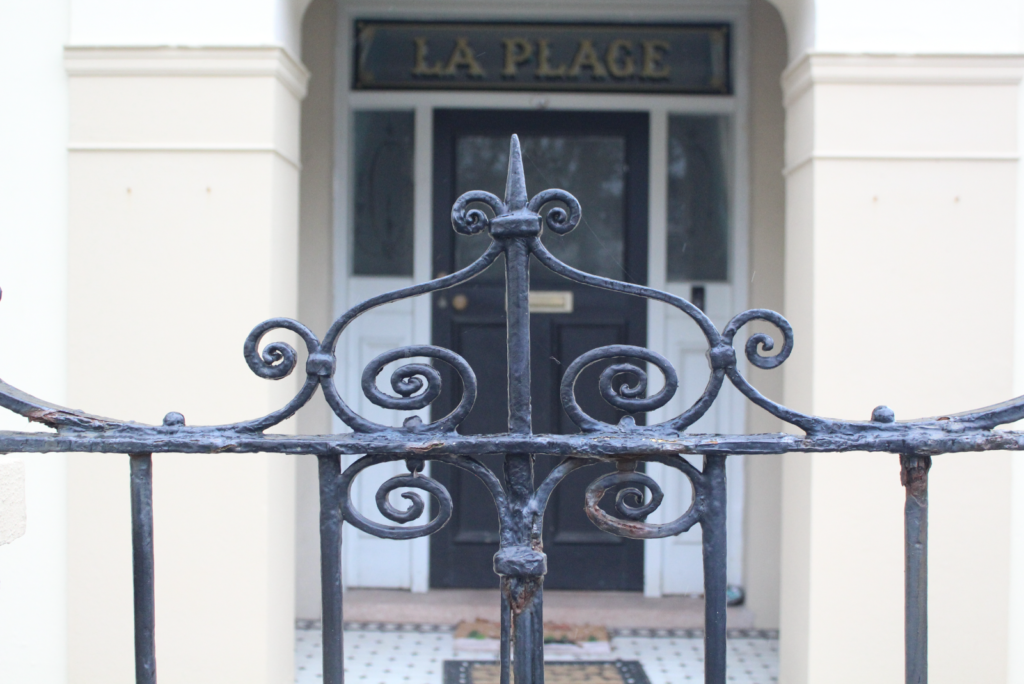
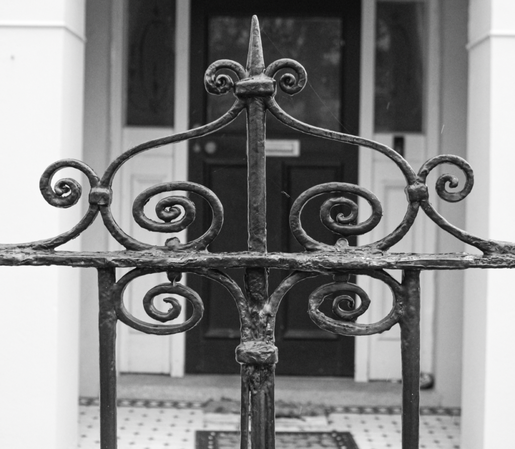
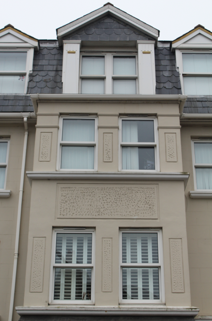
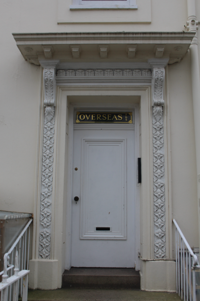
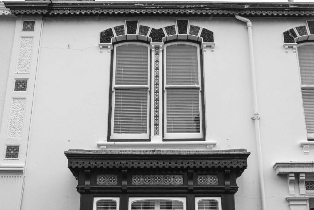
This is a photograph by Lewis Baltz. It displays an empty parking lot with a garage door, a ladder and two trees. The trees in this image are an interesting feature as they emphasise the industrial, man-made environment they’re surrounded by. This creates juxtaposition and tension between nature and urban development. On the other hand, you may be able to argue that these trees are also a result of the human presence as they clearly would have been planted by a man, made evident by their positioning. Furthermore, the colours in this image are mainly white and black, with a small amount of grey. The sharp contrast and lines of the warehouse present coldness and strip away the warmth of the trees. It also emphasises the oppressive nature of industrial areas and how they are built purely for their function rather than aesthetics.
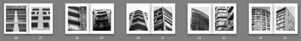
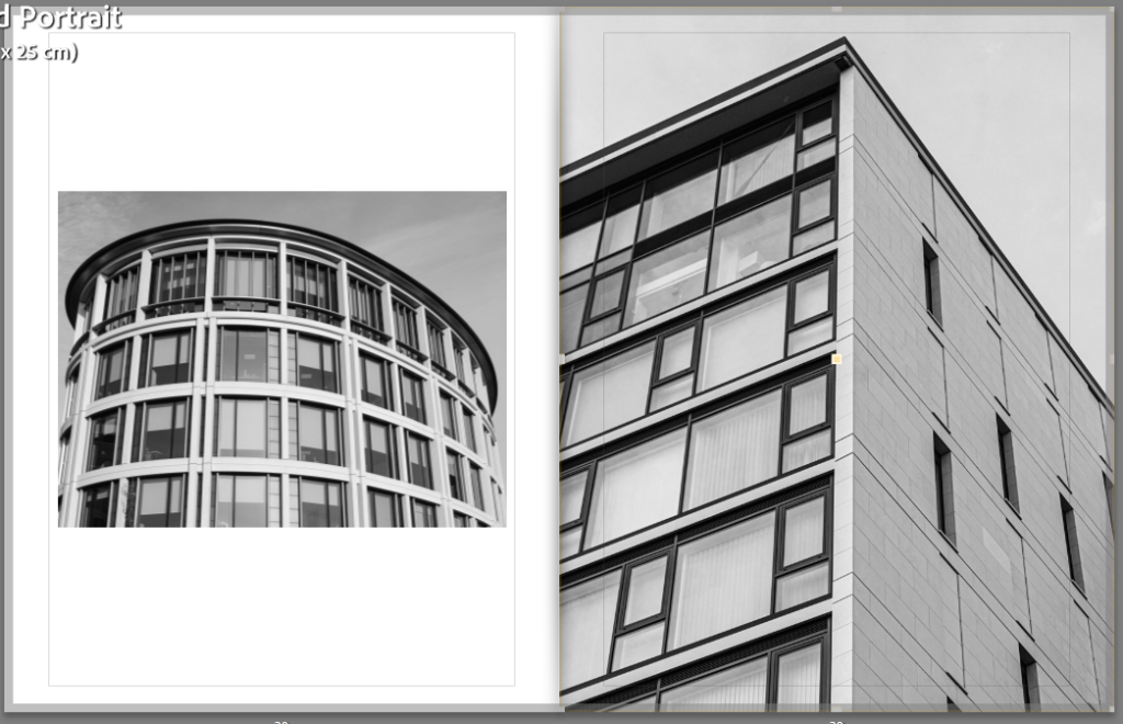
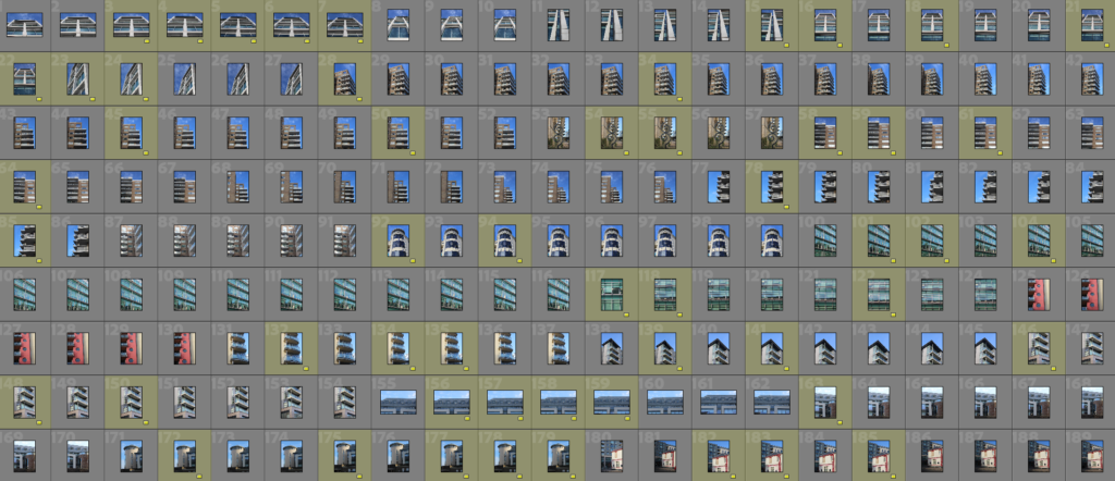
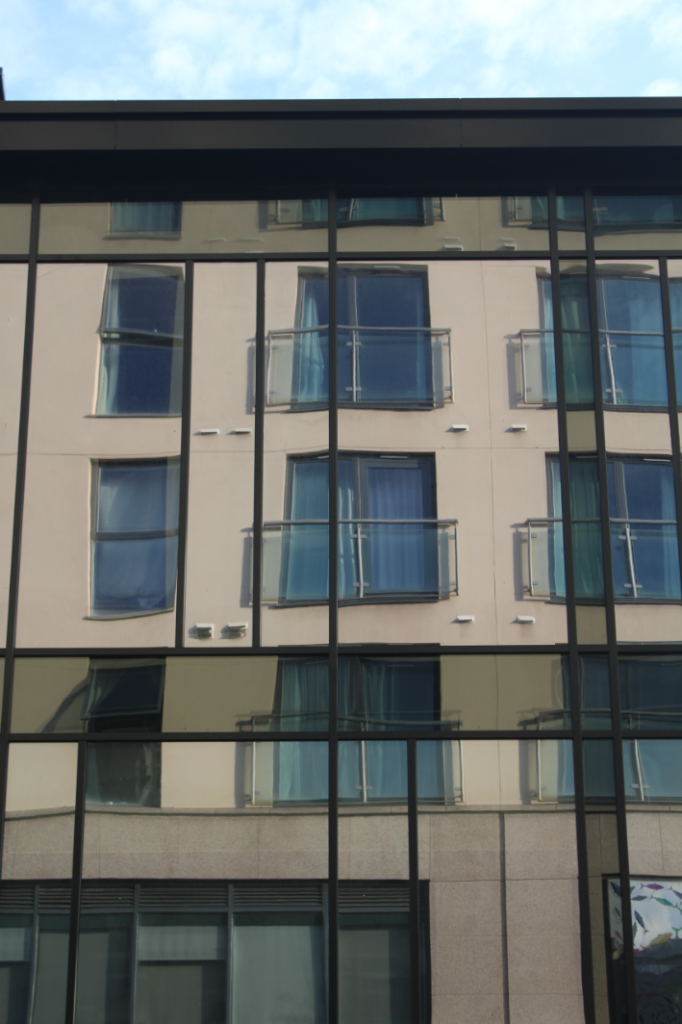
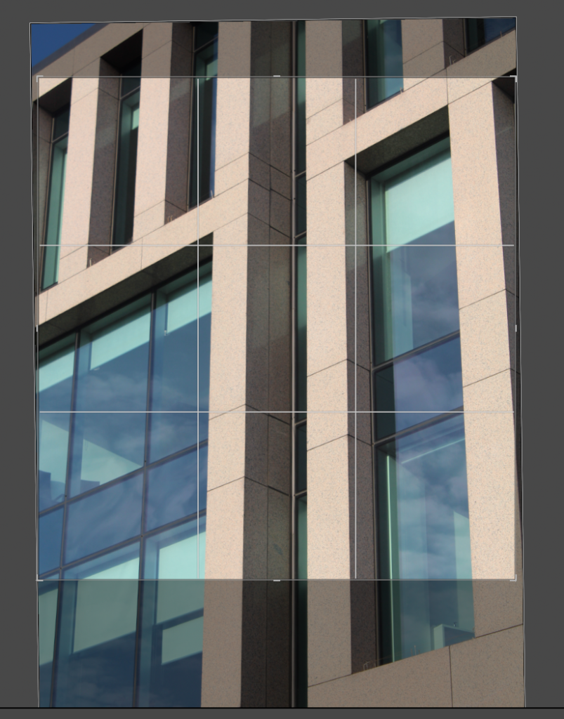
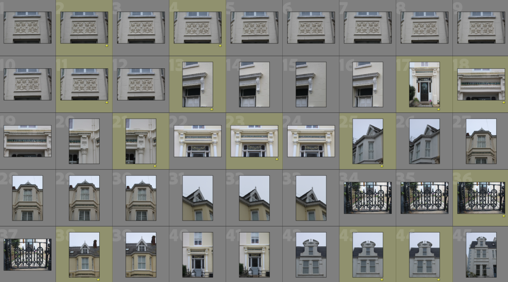
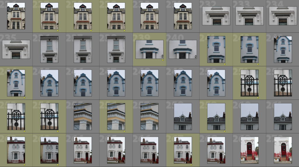
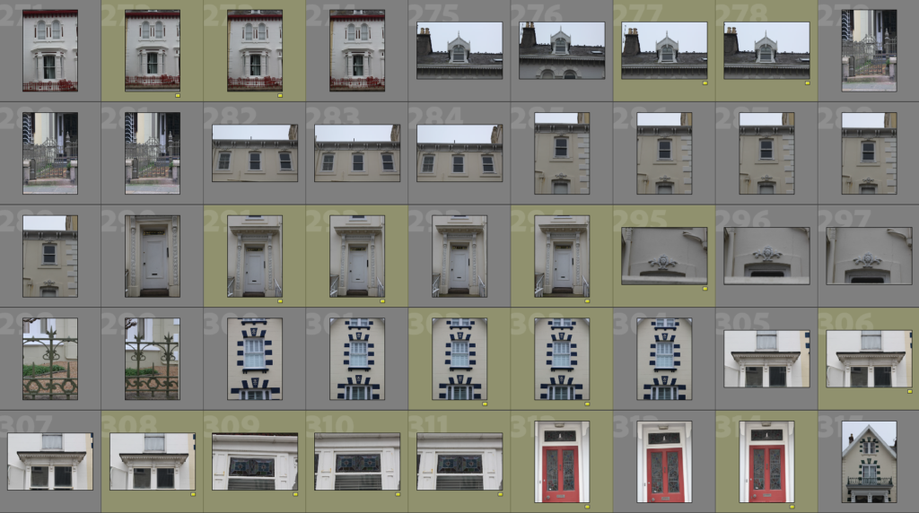
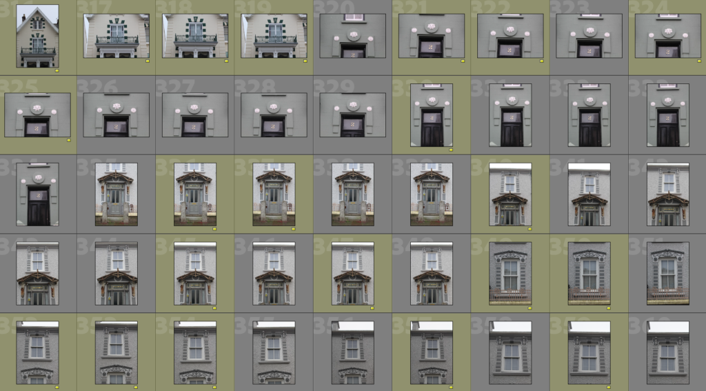
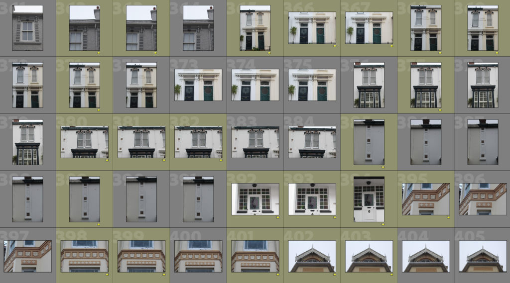
Bernd and Hilla Becher were another two photographers who were part of The New Topographics exhibition. They are best known for their method named the ‘typology’. In Carl Andre’s notes on Bernd and Hilla Becher, he stated that a ‘typology’ is simply ‘grouping similar views of different structures built to serve the same purpose’. This is evident in the image below.
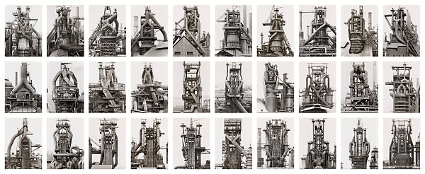
This is a Typology consisting of 24 blast furnaces. These images were taken between 1969 and 1995. The blast furnaces are from locations all over the world and each have distinct features, however, they all were made for the same utilitarian function.
Previous to meeting Hilla, Bernd would produce paintings and lithographs of industrial structures. He would make these paintings from photographs, however, he soon discovered that he preferred taking the photographs than he did painting them. His interest in photography advanced and he found himself collecting old photographs of industrial structures so that he could later capture them himself. After meeting Hilla, she too became fascinated by photography and Bernd’s ideas. She soon left her job in advertising to help him. The couple would travel together and make families of objects that they discovered in their path so that they could later create a typology. From 1961 to 1965, they worked mostly in the German Ruhr district which is known as the largest Urban area in Germany and the third largest in Europe. The pair had immense interest in the fact that the industrial world would one day disappear. This is why they photographed it as they wanted to fix it. They wanted to make sure that their typologies were able to describe the structures visually so that people can read the photographs and not need to visit them as they would be unable to, due to them no longer existing. They would consider their projects as finished once the structures had been destroyed.
Additionally, in an interview with Jean-Francois Chevrier, James Lingwood and Thomas Struth, Hilla expressed that industrial structures are ‘nomadic forms of architecture’ and that they ‘come and go like nature’. Here, she is emphasising that these structures are only temporary and will be built or replaced depending on the need for them, alike nature’s lifecycle. I find this reference to nature very interesting as there’s a huge contrast between the industrial and natural world in the sense that the natural world is completely organic and untouched and the industrial world is a man-made environment which is proven to be destructive to the natural environment. In this same interview, Bernd later made another reference to nature. He claimed that ‘all these objects that are linked to industrialization are disappearing. As in the world of nature, they consume each other.’ By this, Bernd is referring to the fact that industrial objects are constantly superseded by newer, better models, alike the food chain in nature. He also stated that, the fact there is no aesthetic thinking behind the architecture for industrial structures, it proves that people are only concerned with the idea of making money fast and efficiently. These structures are not built to last or to leave an impact as they will soon be replaced. Furthermore, the couple believed that photography should be used to describe and document things which is what they did in their work as they used their typologies to document industrial architecture and emphasize its nature, function and aesthetics.
Overall, Bernd and Hilla’s fascination in the industrial environment resulted in the upcoming of a new photographic technique, the Typology. Furthermore, the Romanticism Period, a deflection from the reality of what was happening in the world at that time, lead to people exploring the beauty of nature. Ansel Adams found inspiration from this period and, as a result, transformed photography by developing the Zone System which allowed photographers to have more precise control over exposure and contrast. He also emphasised how photography can be used to raise awareness for things, specifically environmental awareness. Finally, the New Topographics Exhibition, a reaction to the increasingly industrial environment at the time, rewrote the rules of landscape photography as it proved that landscapes didn’t have to be of the sublime nature. Rather, this exhibition demonstrated that landscape photography could be documentary and used to showcase reality, rather than hide from it.
Literary Sources/Bibliography
https://www.metmuseum.org/toah/hd/roma/hd_roma.htm
https://www.britannica.com/event/Industrial-Revolution
https://www.britannica.com/art/Romanticism
https://www.tate.org.uk/art/art-terms/n/new-topographics
https://www.artspace.com/magazine/art_101/book_report/phaidon-art-in-time-new-topographics-54444
https://smarthistory.org/new-topographics
Carle Andre – A Note on Bernhard and Hilla Becher (1972)
Bernd and Hilla Becher – Conversation with Jean-Francios Chevrier, James Lingwood and Thomas Struth (1989)
https://socks-studio.com/2015/10/16/absence-of-style-lewis-baltz-and-the-new-topographics/
https://emilyallenphotographyblog.blogspot.com/2016/11/the-new-topographics.html
https://www.icp.org/browse/archive/constituents/lewis-baltz?all/all/all/all/0