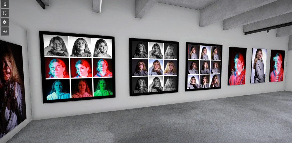
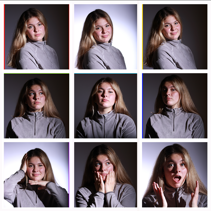
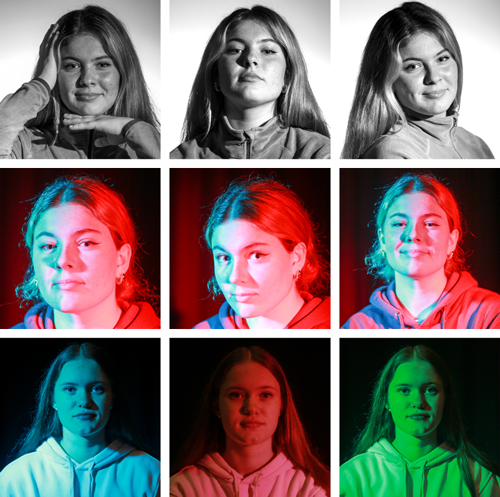
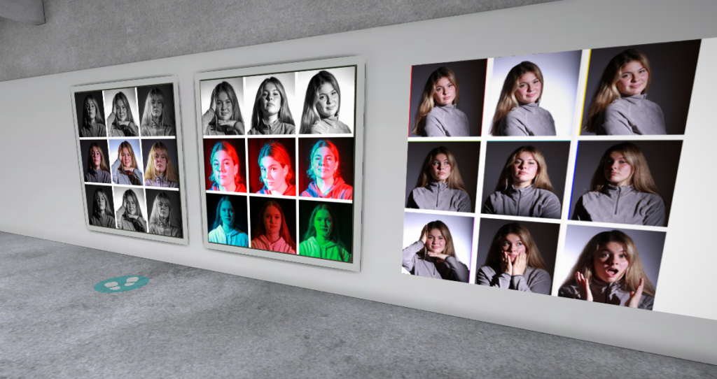
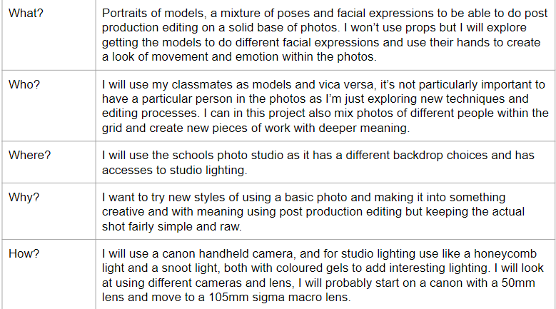
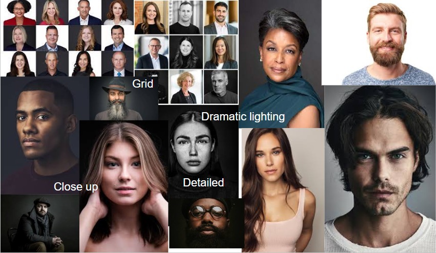
To present the entirety of my headshots project together I have collated my best three outcomes of each project and put them together in a virtual gallery. I chose not to mis the projects and present all the same editing style images together so it doesn’t look too busy as the portraits are already bright, colourful and high in detail with interesting things to look at with each one. I added frames on the grid photos to make the photos feel finished and add a bold outline to the grid.
Final Project Evaluation
Overall I really enjoyed this project, it allowed me to try using different studio lighting and then go onto edit creatively using new photoshop techniques while drawing inspiration from prominent photographers. My outcomes are solid and well executed leaving me with lots of new editing tricks and ideas and it helped spark a further interest in studio portraiture.
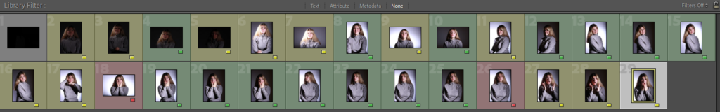
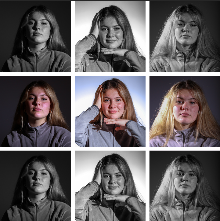
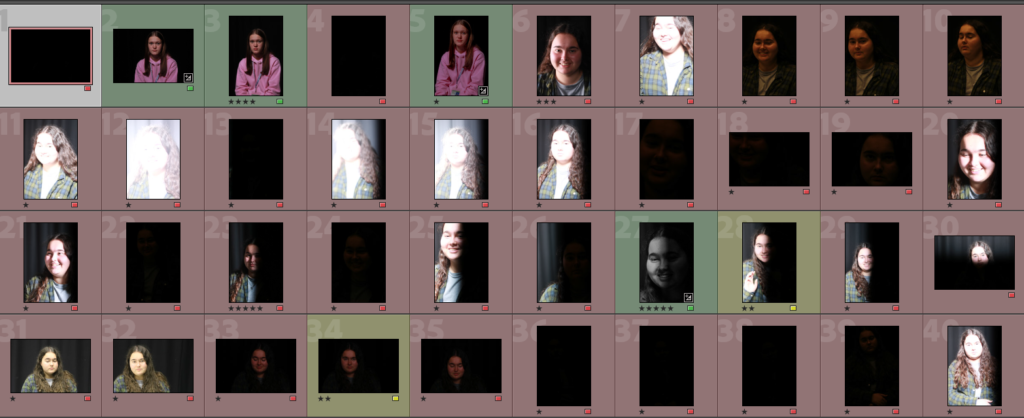
These are my contact sheets for this shoot, I picked my best shots by making the best shots green and the worst red. I was looking for photos that the lighting was already good prior editing and were well composed.
Edit One
I started by opening one shot on photoshop and dragging a second shot on top of the image, for this one I chose completely contrasting shots, one is black and white and one was taken with coloured gels.
The next step was to adjust the blending layers so both shots were visible creating the unusual multi exposure effect.
Edit Two
Edit Three
Final Outcomes
These are my final outcomes for editing using double exposure, while this is a technique that can be achieved by using a slow shutter speed on the camera I wanted to actually to try and merge two images together using photoshop. The results are quite interesting and like the previous editing of this project I chose too try three quite different edits within the technique I was trying.
Best Shot Evaluation
This is my favourite edit, I love how the colours blend together and let the black and white image poke through beneath the top layer adding depth. The two images have combined to look like one as the bottom layer has the models arm in the shot which I made sure lined up with the top layer fading into the bottom layer. The bottom layer which is the black and white layer has also lined up with the top layer so the models hand is under the colourful layers chin creating lines of grey in amongst the bright colours. The black and white image creating a sort of patchwork appears like the image is pushing thought the top layer. I love how unusual the image looks but for two completely different shots they combine very well looking intentional and focused. It is a playful result of using this editing technique which can create so many different outcomes and styles, however I love how the image isn’t as it first appears and in fact the more you look at it the more details emerge. I think it askes the viewer to look deeper into the photo and while it doesn’t have a deep meaning I aim for it to teach people to not just glance at things and in fact learn form everything you can and that allows you too as it isn’t always as it seems.
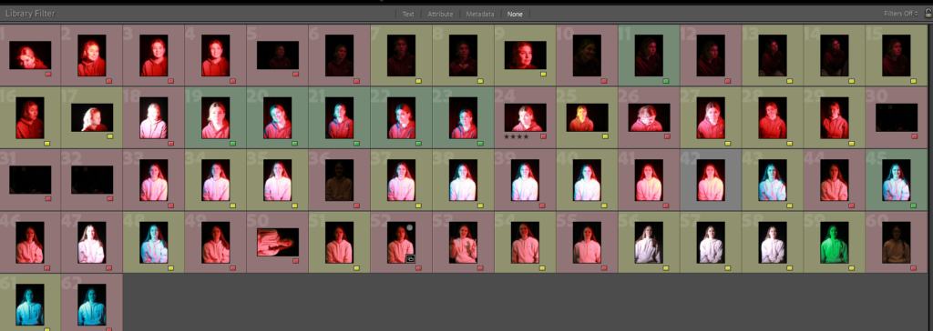
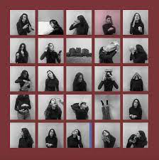
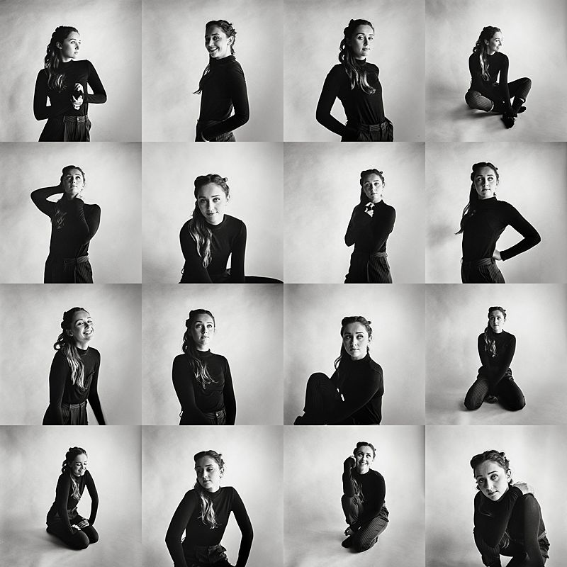
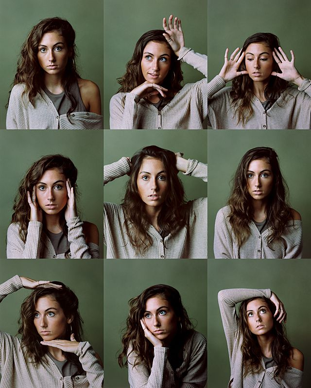
These are my shots from both shoots, I have marked the ones I like and will consider using with green and yellow. The red shots are not useable but not at all what I’m looking for or are a bad shot as the model is blinking etc.
Edit One
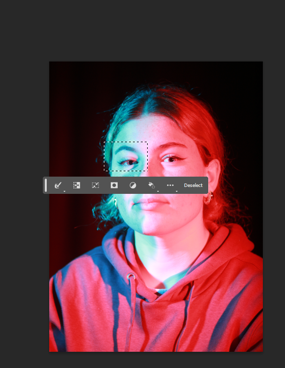
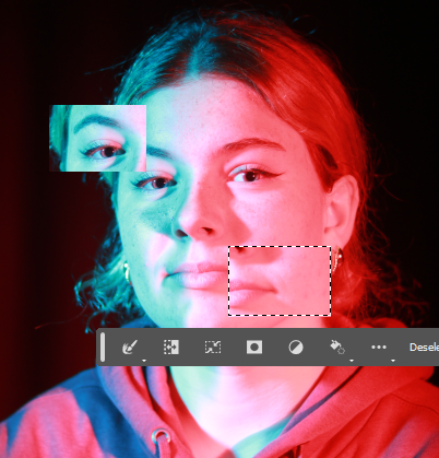
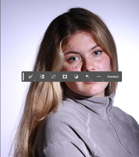
The first bit of editing I did on this shot on photoshop was to crop the excess blank space out of the image and then use the rectangular marquee tool to select a section of the photo, the models eye.
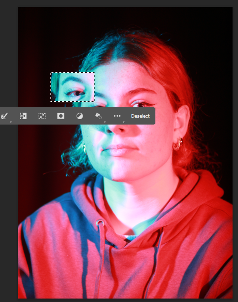
I then used the move tool to move the selected area and start to create my photo montage.
I repeated the process making sure I moved the selected aeras to new parts of the photo making for an off kilter appearance.
I then created a new selected area and copy and pasted it multiple times, this allowed me to create a layered effect but using the same part of the photo.
Edit Two
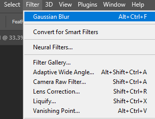
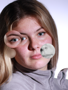
For this shot I used the elliptical marquee tool to create a circular shape instead of a rectangle, I repeated the same process as the previous edit but used a circle instead.
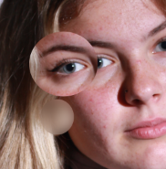
I wanted to create something unusual with this photo so I used the filter tab on the one of the selected circles, I did this to be able to then have a blurred circle.
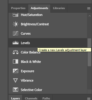
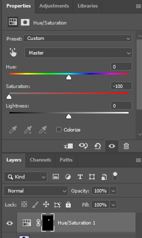
I wanted to create a black and white element within the photo so I used the new adjustments layer on the selected circle selecting the option from the bar below the selected circle.
I then adjusted saturation to make the circle black and white. This adds contrast to the over all photo making for a more interesting montage.
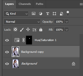
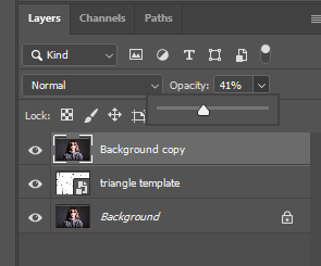
I then selected the background copy layer, once I had done this I used the move tool to move the entire layer moving all the circle selections into an interesting shape and creating further depth to the photo.
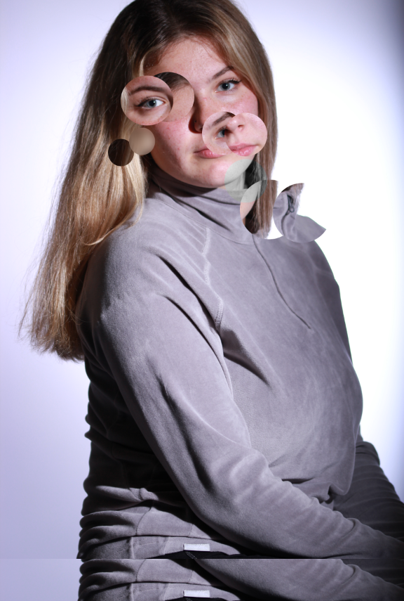
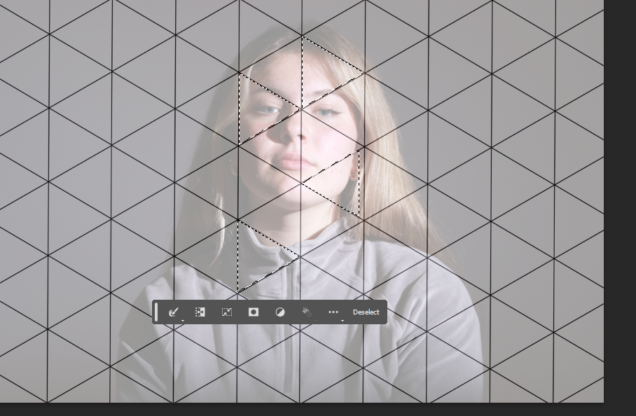
Edit Three
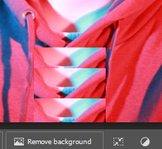
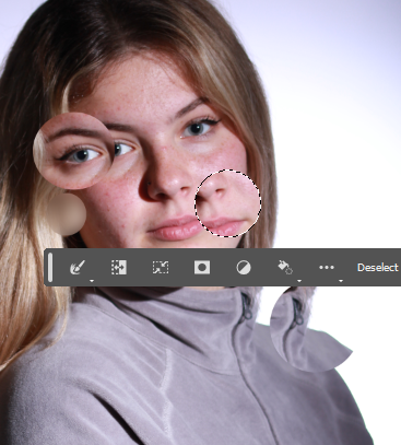
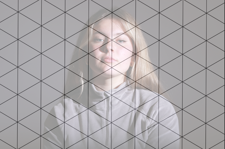
I then selected remove background on the triangle layer. Leaving the white triangles over the models face slightly opaque.
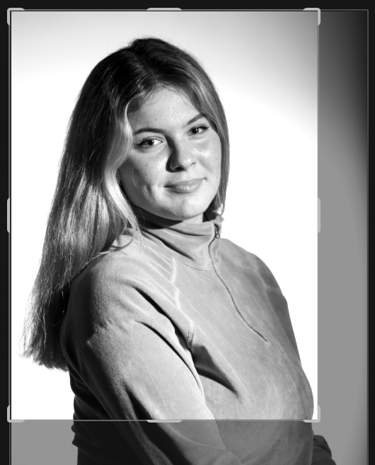
I also reedited the first photo I edited by using all the skills I had learnt doing the other edits, I chose to use the polygon lasso tool to allow me to cut out interesting and free hand shapes, I made three out of four of the cut outs black and white by once the area was selected going to image-adjustments-saturation-contrast+brightness adjusting each to suit the area of the photo.
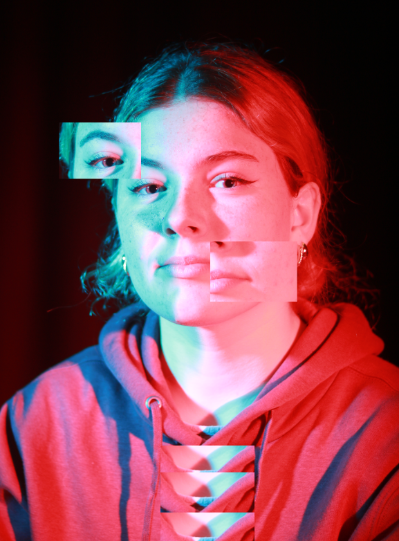
These are my final four photos, I have tried very different ideas on each one. By doing this it has allowed me to experiment with new techniques on photoshop.
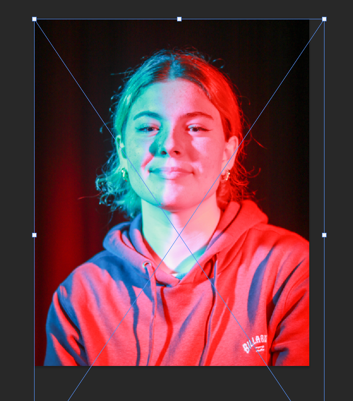
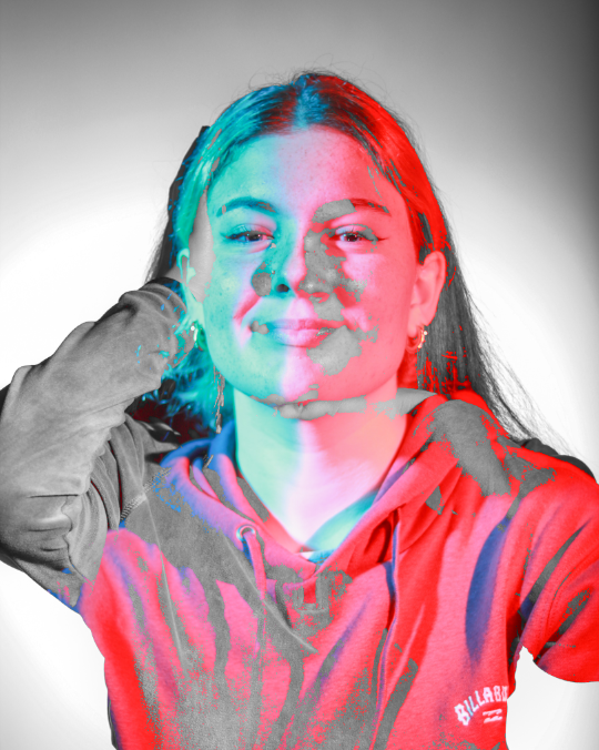
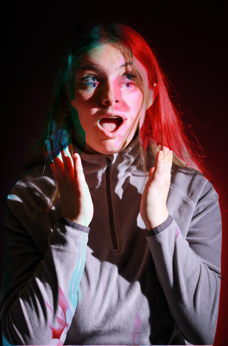
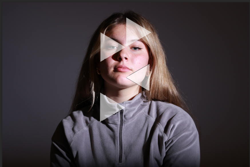
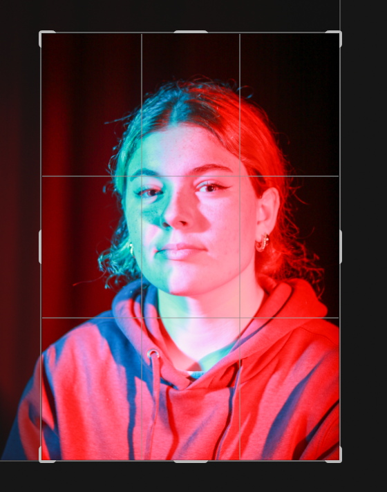
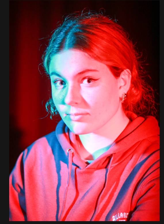
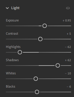
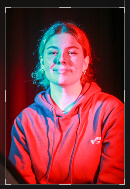
This is my favourite final image, it was actually the first one I did but I really like the ‘glitch’ effect created by the editing. The coloured lighting created by using coloured gels on the honey comb flash head has added intrigue to the photo as the lighting is split perfectly down the middle of the image it adds dimension to the shot, however as the hoodie was a reddish colour it has allowed for the editing of the layers to blend in and create an interesting pattern from the shadows and meeting of fabric. I like how it draws the eye into the displaced parts of the photo and creates a powerful feeling as the pose, having the model looking down onto the camera feels like the model is above/ higher figure of authority. Particularly, I like having the black background and how it contrasts well with the blue of the far left displaced rectangle. It doesn’t change the original photo much but does make it a unique image and one that draws the viewer in forcing them to look where parts of the photo are from and ask why it was done. Following this shot I edited two other photos however I think sometimes the simplicity of this photo makes it a very strong, well balanced image. It askes the viewer questions they might not even know the answer too, and as a the photographer and creator of the image myself I am not all too sure ether, it askes the viewer to reflect on why we always look at peoples face first and that is what we tend to judge off of but as humans we have many different layers which one we choose to show an individual is up to us. To explain this idea I used crops of the image and pulled them across and misplacing them to show we look the same but there are different layers to a individual from our emotions to how we react in certain situations.
This is the lighting set up I used, by having the flash head behind me as the photographer it allowed for the light to cover the entirety of the models face, I also used another flash head with a transmitter on the camera for both, to light one side of the models face to create interesting and dynamic Chiaroscuro lighting. By having two different flash heads it allowed for good lighting without over exposing the model.
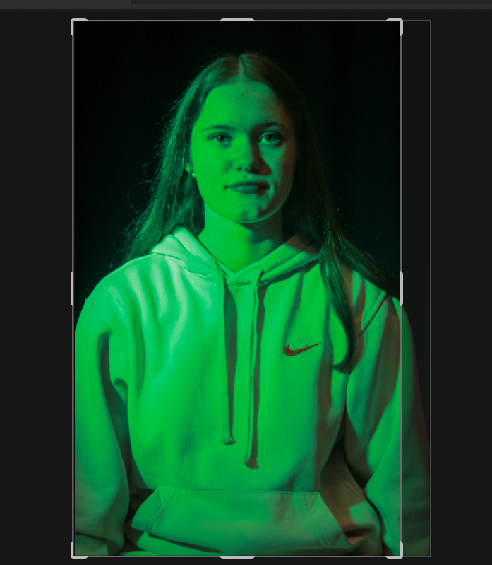
In some of the later photos I used a honey comb filter and coloured gels over a snoot light to keep similar lighting but a coloured filter over the image. This was great as it allowed for me to experiment with different lighting and multiple colours by holding a acetate sheet over one of the flash heads at the same time.
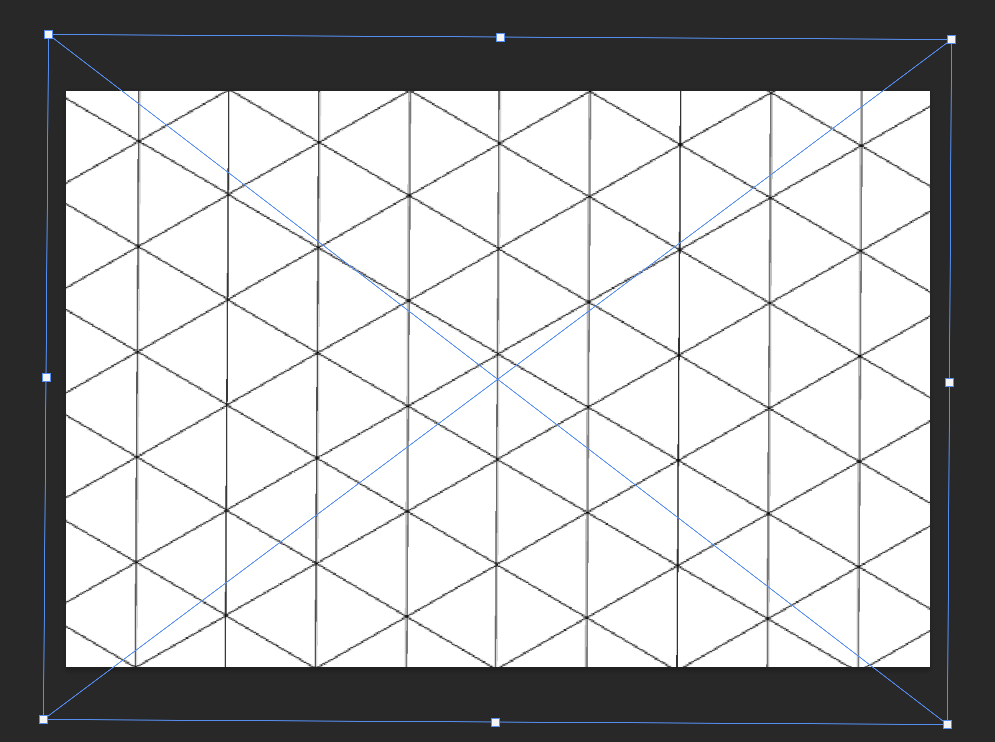
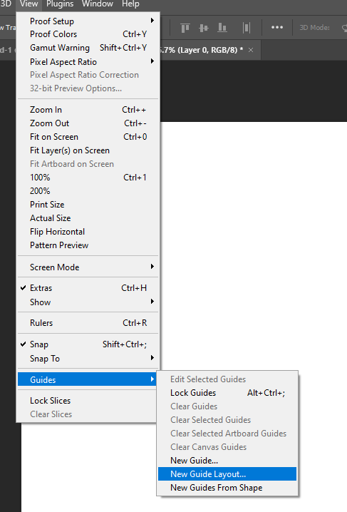
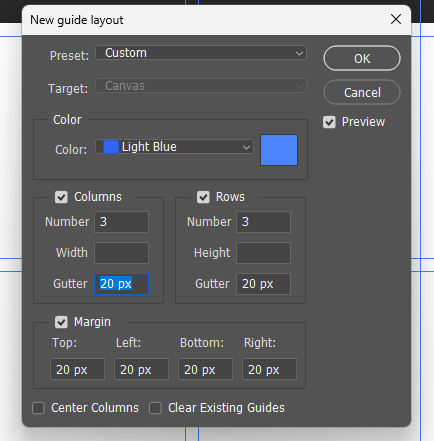
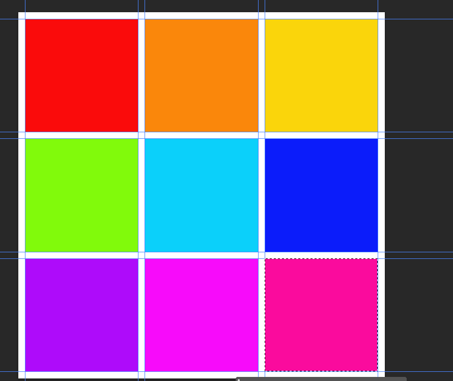
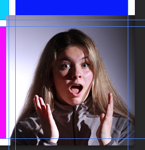
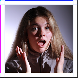
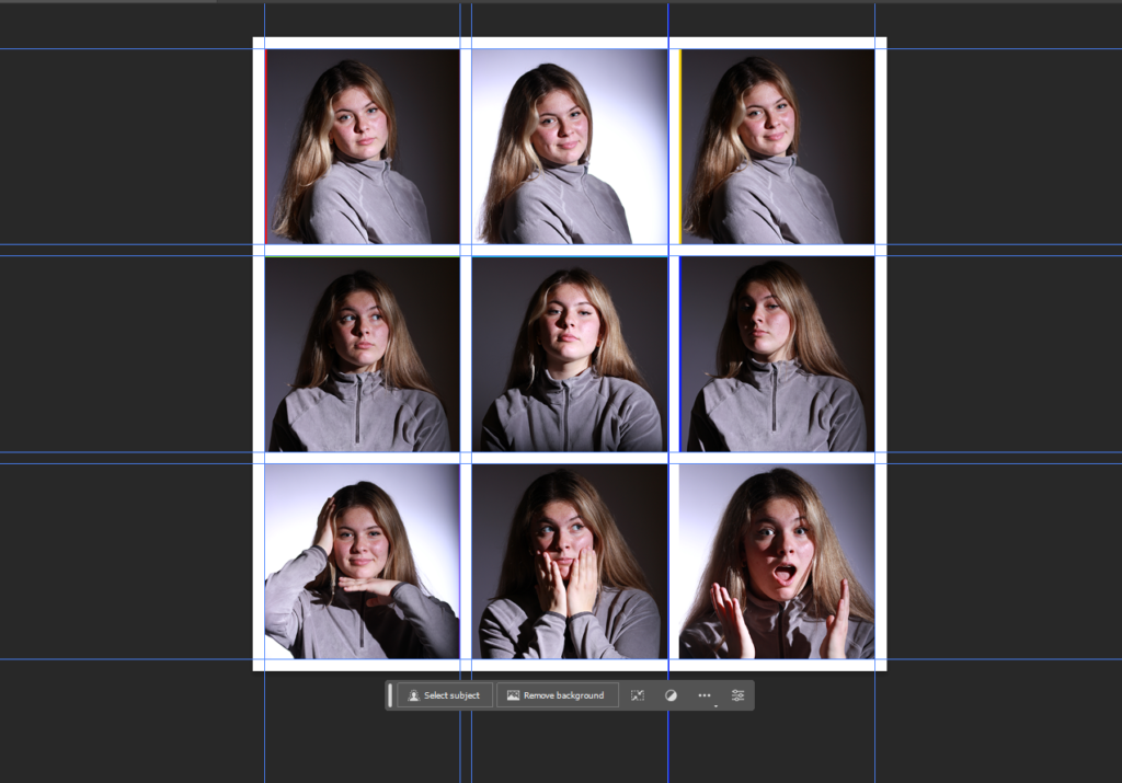
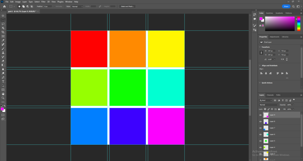
To start making my grid layout I started by opening a document with a width of 1080 and then a res of 72 pixels/inch. I then went onto the view drop down tab and selected guide – new guide layout.
I then put in the details I wanted, I chose to have a gutter and margin to try to keep space between each shot.
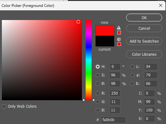
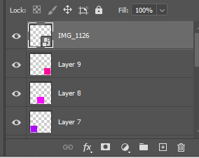
After that I created a new layer and then on the rectangular marquee tool picked a new colour from the side bar.
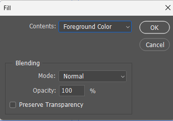
Next I selected a box using the rectangle marquee tool and the right clicked and pressed fill, foreground colour.
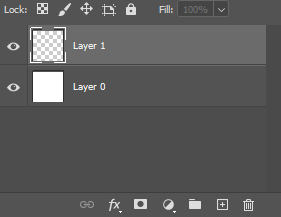
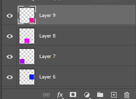
By repeating this process it left me with a colour coded grid on separate layers.
The next step was to click on a layer, selecting it, and then dragging a photo onto the box and clicking the tick.
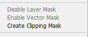
I then right clicked on the layer to produce the option of create clipping which then fits the photo to the box.
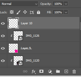
Once I had done the above steps for all 9 boxes I had 19 layers.
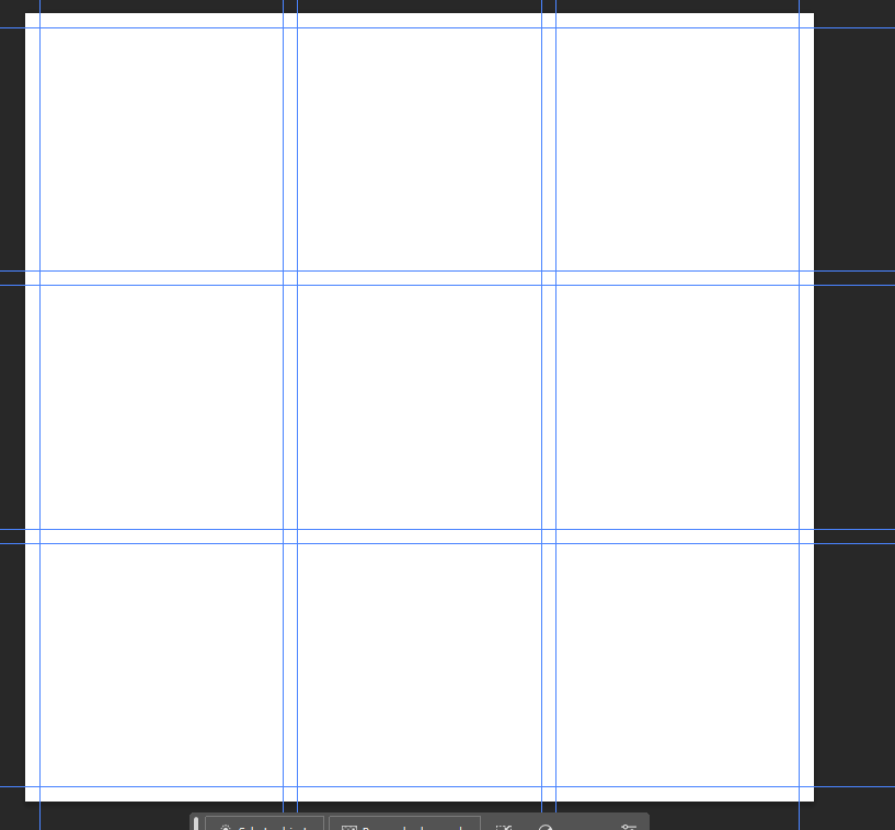
Clicking a new layer open then using the rectangle marquee tool to select the entire document.
After that I used select- deselect, then view-show- guides.
Edit Two
I then repeated the process making sure to have 9 separate layers with different colours on each selection. I started by making the grid and then editing each photo on Lightroom.
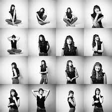
I chose to make an usual grid for this one as many would think it would look better if I put the black and white row in the middle of the grid, however I actually did this to show progression from fashion style, high contrast dramatic photos to fun coloured more natural captures to then a combination of both with interesting lighting but the same pose to not take away from the models natural appearance.
Edit Three
Final Evaluation
I think this is a great way of displaying photos and I really like the outcome, it allows for many photos to be displayed and its an uncomplicated way to draw peoples attention to different photos and really encourage them to think about the meaning. I used three different approaches on the first one I used the three different rows to display the model posing three different ways, on the second grid I tried to make the grid make no sense using three different colour ways and two different models, and the third grid I repeated the same three photos in the same order on each row although by having the middle row in colour it made appear to be different photos unless the viewer looked at each individual shot and then the grid as a whole. It has also allowed me to expand my photoshop knowledge and I will definitely look at using a grid in the future as it’s a simple way of displaying multiple images to convey meaning and make a point by having very few images or tens of images.
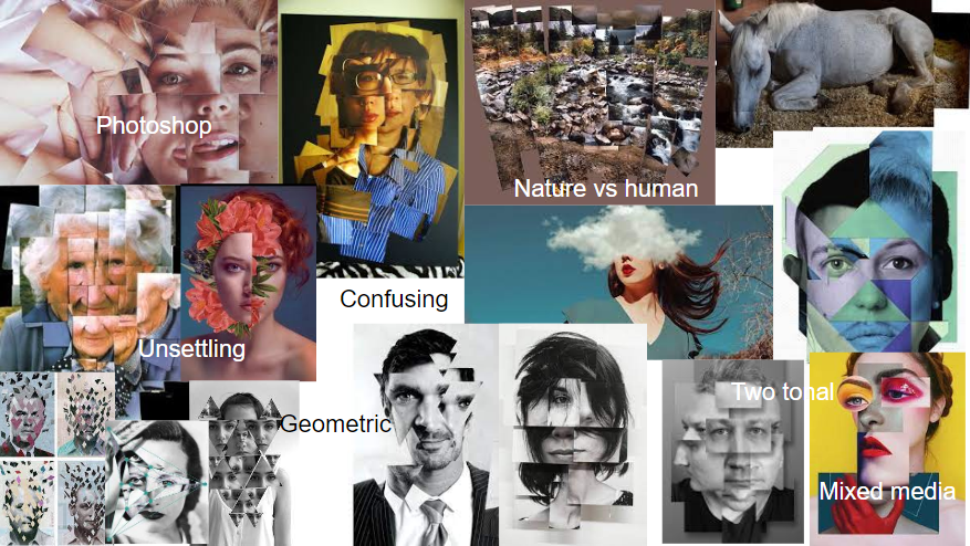
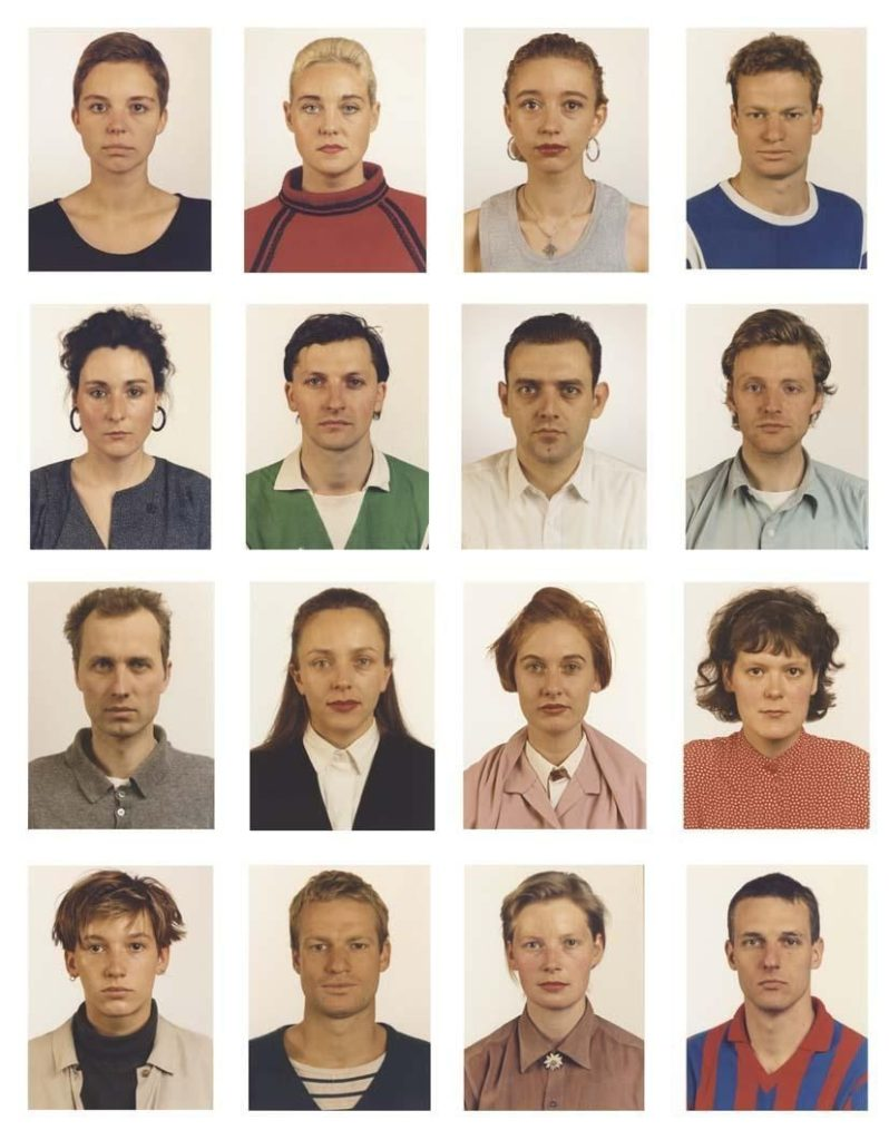
Grid sequence of photos can be used for many different things, from documentation of progression to creative outlets. Most commonly used to make comparisons and group individuals together, for example they are often used to show a team within a company as they create a team feeling and not a narrow focus as everyone’s photos is as important and similar to the next. They have also been used for things like typologies, however I’m, going to be doing headshot portraiture and a typology tends to be a grouping of similar objects or constructions etc.
Brain D Smith is a portrait photographer based in Charleston SC and Traverse City MI, he began his career after feeling unfulfilled in his successful engineering career. He was always a hobby photographer until one day he photographed a wedding and the results were beyond what he was expecting and instantly he knew this is what he wanted to do as a career. He had a passion for photography and quickly grew with his unique style of portraiture, he started by doing only wedding portraits before quickly moving onto studio portraiture as well to allow a creative outlet. When he is not photographing a wedding he does mainly editorial shoots as he puts it ‘Portraits and editorial work present an opportunity to slow down, and craft something artistic and uniquely mine. It’s an opportunity to share a bond with a subject and for a brief moment reflect something beautiful within one another.‘ He started his own studio, in which he provides many different types of shoots from professional portraiture to bridal detail shoots.
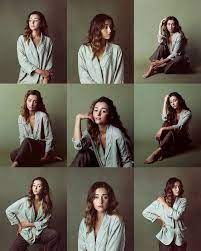
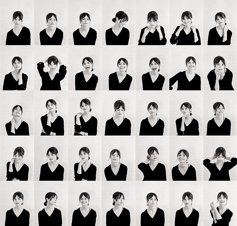
He combines the idea of 1960’s vouge style shoots with fine art editing, particularly in the bridal portraiture shoots, this allows him total creativity creating stunning, unique results. For this project I’m looking at his studio portraiture that he has made into a sequences of photos displayed in a grid pattern. He uses a simple matching colour palette to create softness in his work that isn’t always clear in many other headshots. I think this makes his work feel friendlier and more appealing.
I love this grid set he has created as there is a real sense of integrity within the photos. There is small details that seem unusual for this style, for example in the middle shot on the bottom row he has posed the model to not be following the rule of thirds and instead having the arm of the model touching the edge of the portrait. He has done this on the top photo of the same column as well, I think this stops the grid feeling too formal and constricted. However the rest the shots are ordered and uniform with following the rule of thirds even if they do not firs appear to be with how he has posed the model when you look closer they do fit the rule. He has posed with model creatively with a different pose in every shot. the first row has the model looking in three different directions including directly into the camera. Where as in the next row the model only looks directly into the camera lens and only her hands move which contrast the last row where the model is looking anywhere but the camera and her arms move in each shot as well. It appears almost like a progression of creativity captured in a series of photos, from how people go about their everyday life fitting their actions to certain situations to then at the end the model doing what suits her and possibly acting outside of societal norms.
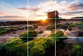
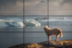
The Rule of Thirds
The rule of thirds is a simple useful tool, used in most styles of photography to create a well balanced, equal photo, that draws the eye in. ‘a composition guideline that places your subject in the left or right third of an image, leaving the other two thirds more open‘ there are many other techniques similar to the rule of thirds with similar intentions but rule of thirds is the most common and most widely used.
Double exposure is a photography technique used by many photographers around the world as a creative outlet or to create emotive pieces of art like photography. It can be done in many different ways, from using a slow shutter speed and movement to create raw images with double exposure elements, to post production editing on photoshop layering multiple different shots to create a desired results. If there is a particular aim for a shoot then it is more likely the photographer will take multiple photos and merge them together in photoshop, however for things like light painting it tends to all be done in one very slow shot. The results are often emotive, surreal feeling photos commonly having a creepy appearance.
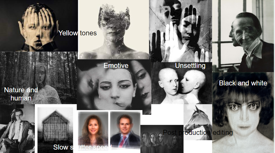
The style of surrealist photography had a big impact on the idea of double exposure photography. As it was the first variation of the double exposure technique often used to show multiple, odd objects or subjects, to put across ideas, in one shot. First appear as a style just after the first world war, as the horrors had shifted the perception of reality for many people. It was actually a French writer who first released a book, that rejected the rational way of seeing the world and instead asked people to explore creativity and imagination to view as perceptions of life and the world instead, this is what first solidified the surrealist movement. Surrealist styles created an exciting challenge for photographers as while a painter can take ideas from their imagination with brush and paint, a photograph is derived from the real, material world.
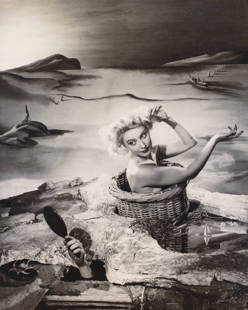
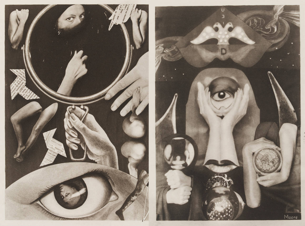
A Day Dream, Angus McBean, 1938Claude Cahun and Marcel Moore, taken from a collage made 1930Exploding Hand, Lee Miller, 1930
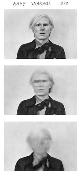
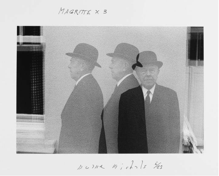
Duane Michal’s is known world wide for his photography work using multiple exposures, series and text over the past years. He first made strides in the photography world in the 1960’s when the world was thoroughly influenced by photojournalism in which Michal’s himself manipulated and changed to allow for his work to tell narratives. I feel the political aspirations are impotent. They can never be seen. If they are, it will only be by a limited audience. If one is to act politically, one simply puts down the camera and goes out and does something. I think of someone like Heartfield who ridiculed the Nazis. Who very creatively took great stands. He could have been killed at any moment, he was Jewish, and my God what the guy did. It was extraordinary. You don’t see that now. Interestingly and unlike most photographers/artists Duane feels that aspirations are pointless to put it simply and aims for the viewer to see the photo and not much more, unless you choose to.
Duane Michal’s Research
Duane Michal’s first began to explore art and photography at 14 years old when he started a watercolour class, he went onto continue his education by completing a B.A. at Denver university before then completing two years in the army before retuning to school to become a graphic designer however he never completed his studies. He actually began his photography career while on holiday in 1958, the work he produced during this holiday actually was displayed in the underground gallery in New York in 1963. Continuing his career he was a commercial photographer also covering filming. He did not have his own studio and instead took portraits of people in their own environment which was a complete contrast to some of the famous photographers of the time like Irving Penn. As his career continued he was asked by the Mexican government to photograph the 1968 summer Olympics, which built a following for him to then continue on personal projects before releasing a book and showcasing more of his work.
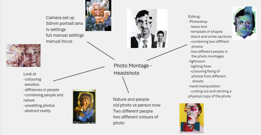
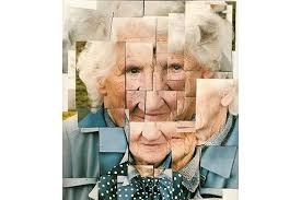
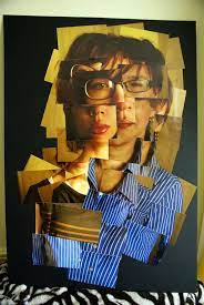
Photo montages are a style of photography that uses post production editing to achieve interesting and unique results. Transforming basic headshot photos into an entirely new composition. There are many different ways of doing this the most common is a collage style using a printed version of the photo and cutting it and moving the physical copy before photographing the results. This became popular through David Hockney; the style is also often done by using photoshop and ether set shapes or templates.
David Hockney was born in 1937 in Bradford. As he grew up he went to Grammar school and then went onto the Bradford Collage of Art and then onto the Royal Collage of art in London which is where Hockney said he felt at home and took pride in his work. While studying at the Royal Collage of Art in London his work was featured along side Peter Blake, this associated him with the expressionist movement. However the RCA didn’t allow him to graduate as Hockney refused to complete a live drawing of a live model in 1962 and complete an essay. To counter this Hockney painted ‘Life painting for a diploma’ exclaiming he should only be assessed on his artwork solely. Interestingly the RCA having recognised his talent actually changed the regulations regarding final exams and how students were graded. He went onto to teach at Maidstone Collage before moving onto teaching at the University of Iowa, after this he continued to teach at many other universities and collages. In 1964, when Hockney moved to LA he created a series of paintings of swimming pools in a fairly new style of the acrylic medium using punchy, vibrant colours. He then moved between Paris, LA and London before buying a house in Hollywood Hills and expanding his studio with his long term business partner Gregory Evans. Hockney continued to expand his business with his classic demeanour of trying many different styles and inspiring others around the world.
Photo Montages – ‘Joiners’
These photos are one of Hockney’s many projects in the early 80’s, he used a 35mm lens to print polaroid photos which were commercially coloured photo prints. He accidently created the joiners when wide angle lens became popular in the 1960’s and he noticed these lens distorted the shots which he did not particularly like. He started using this technique of cutting photos up by hand and sticking them back together when he was actually painting a living room and not a person but he found the new ‘joiner’ looked good as a composition within itself. After discovering this technique he began to create more purposeful versions of the photos and this led to him completely stopping painting for a while and focusing on his photography work. Sadly over time he became irritated with photography and as he felt ‘it’s one eyed approach’ and returned to painting but not before he left his mark on the photography world with his work and his ‘joiners’ work in particular.
Headshots are a style of photography in which a persons head and top of their shoulders are in the view. They tend to be a practical choice like a passport photo that is a headshot and things like documentative portraiture. Many famous photographers have done headshot projects which have become what they are known for as while they are most commonly used for a certain purpose like passport photos. Photographers have also used them to document uncomfortable or unsettling images of people, it’s a great way of getting us to look deeper into the photos and the people within the shots.
Technical
When it comes to technical elements within headshot photography there isn’t a huge amount to consider but the things that are involved can completely change the outcome of the headshot. I will need to make sure I have a good lighting set up and if I don’t I need to adjust my camera settings accordingly. These are fairly simple photos so if things are done well it is very noticeable.
Camera settings (flash lighting) Tripod: optional Use transmitter on hot shoe White balance: daylight (5000K) ISO: 100 Exposure: Manual 1/125 shutter-speed > f/16 aperture – check settings before shooting Focal length: 105mm portrait lens
Camera settings (continuous lighting) Tripod: recommended to avoid camera shake Manual exposure mode White balance: tungsten light (3200K) ISO: 400-1600 – depending on how many light sources Exposure: Manual 1/60-1/125 shutter-speed > f/4-f/8 aperture – check settings before shooting Focal length: 50mm portrait lens
Deadpan
Deadpan is an commonly used facial expression that has the model with no emotion on their face. It is used for things like any id photos, as well as being a great tool photographers use to capture a great photo with a model who isn’t making and particular facial expression. Many photographers use it to depict the models feelings about a certain situation particularly one where they should be happy or overly upset. It stops the viewer guessing how the model is feeling by what is shown on their face and instead asks the viewer to look around and consider the context of the photo in cases where there is a background and foreground and not a backdrop. It is achieved by having the model have eye contact with the camera lens with an intense almost glare.
eyes must be open and clearly visible, with no flash reflections and no ‘red eye’
facial expression must be neutral (neither frowning nor smiling), with the mouth closed
photos must show both edges of the face clearly
photos must show a full front view of face and shoulders, squared to the camera
the face and shoulder image must be centred in the photo; the subject must not be looking over one shoulder (portrait style), or tilting their head to one side or backwards or forwards
there must be no hair across the eyes
hats or head coverings are not permitted except when worn for religious reasons and only if the full facial features are clearly visible
photos with shadows on the face are unacceptable
photos must reflect/represent natural skin tone
BACKGROUND:
Photos must have a background which:
has no shadows
has uniform lighting, with no shadows or flash reflection on the face and head
shows a plain, uniform, light grey or cream background (5% to 10% grey is recommended
This is a great example of how to achieve and deadpan headshot and an example of how often they are used in daily life.
This project was something quite new for me but I thoroughly enjoyed trying new styles and learning new techniques I can continue to use in the future. It started quite tricky getting all the elements to work as one, the first photoshoot created some interesting results while trying different lighting techniques. As I progressed in the project I started to be able to manipulate and change how I was asking the model to pose or knowing how the lighting needed to be adjusted. My favourite technique out of the three I used was by far Rembrandt, while it was tricky to achieve the triangle at times, it created unique results that were flattering on the models, I also felt it best fitted my style of photography, such as the models tended to be rather solemn and the Rembrandt lighting highlighted their facial features well creating interesting shots. When it came to editing the best shots of each lighting technique I used Lightroom, experimenting using different tools like the adjustment brush to further enhance my photos, particularly the dark parts of the Chiaroscuro lighting shots. I would love to try more complex and interesting portrait shoots in the future, possibly using more lights or even more post production editing.
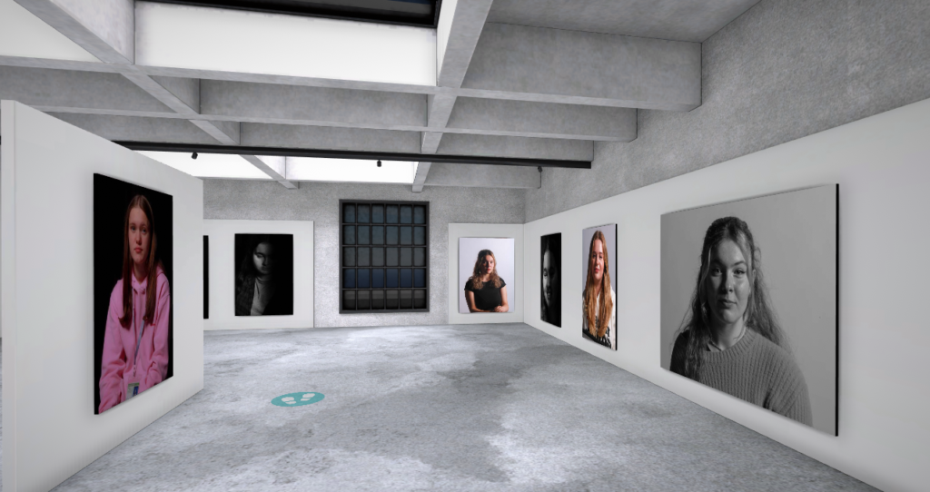
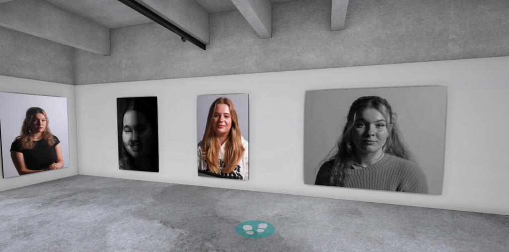
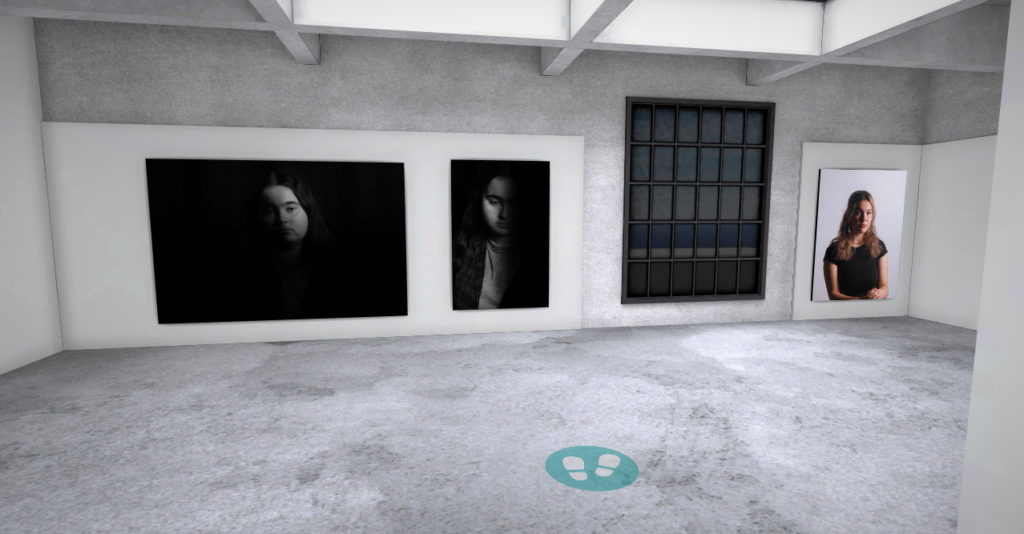
Gallery Evaluation
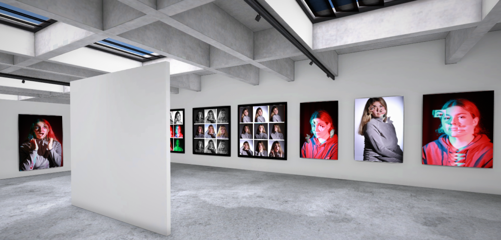
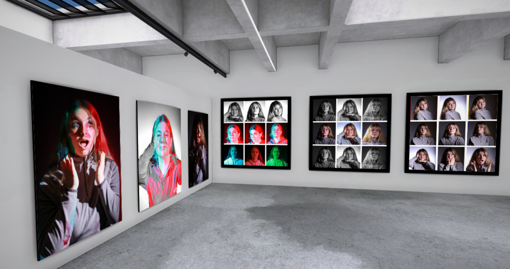
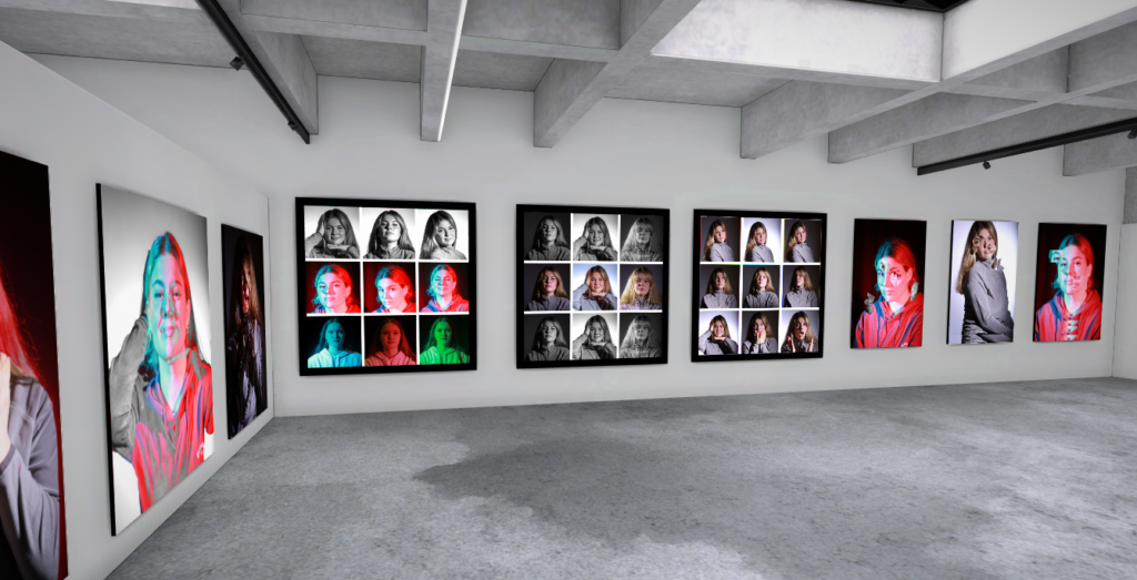
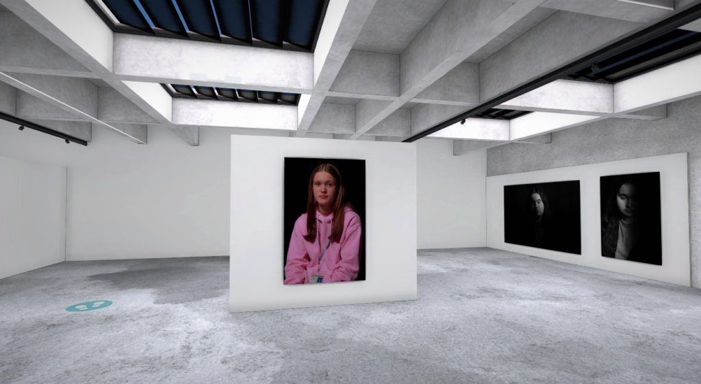
Below is my virtual gallery for this project, I picked some of my favourite shots from each lighting style and presented them in a virtual gallery. I chose an industrial style gallery as I think it contrasts the photos well, as ether the background is black contrasting the white walls or the model is wearing a contrasting colour like black or pink. This helps the photos really stand out in the gallery. I also didn’t choose to group the photos by technique instead using the walls and change of direction in the gallery to get people to look around the gallery. I feel if I had grouped the photos by technique the viewer would have gotten bored an stopped noticing the smaller details the technique highlights in the shot.
For this lighting set up I used the set up below. I found this one the trickiest to get right, but it has produced some great shots. Below I have put my best shots and shown the editing process.
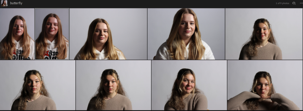
By being under the light to create the butterfly lighting gave me the best results when taking the photos. I mostly had the model facing front on to emphasis the butterfly lighting under the nose.
For this contact sheet there is a mix of Chiaroscuro and butterfly lighting shots as while I was trying to get the butterfly lighting to work I took some great Chiaroscuro shots.
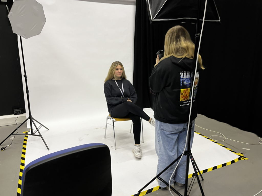
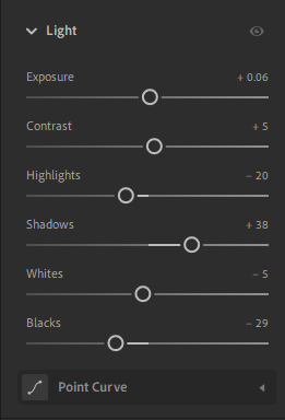
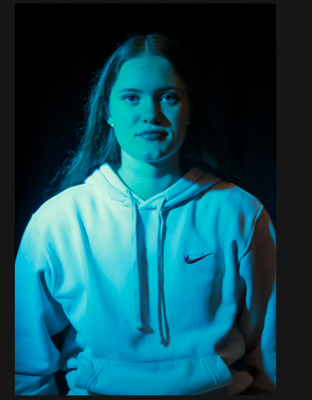
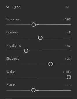
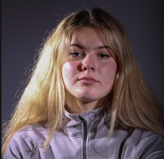
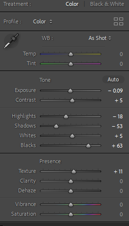
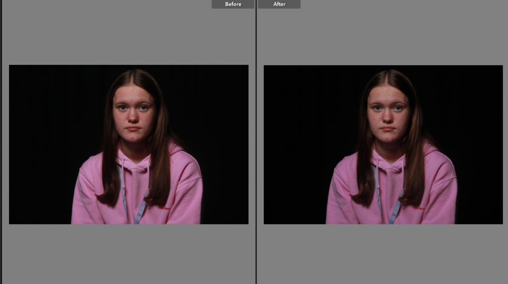
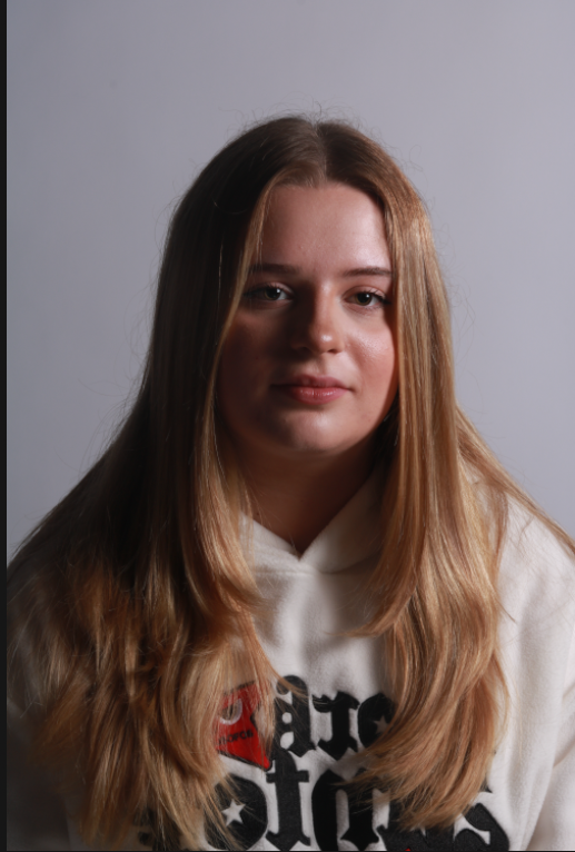
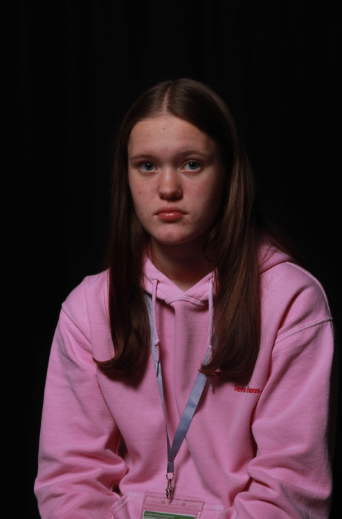
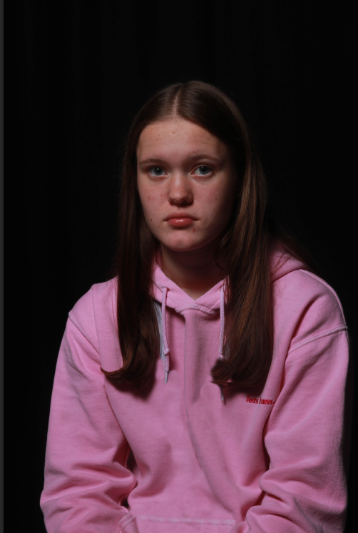
This was some basic lighting adjustments to level the shot out with the pink jumper reflecting making the models face have a pink tint. I would like to remove the lanyard in the future as I think it looks messy but it is accurate to the model being a student.
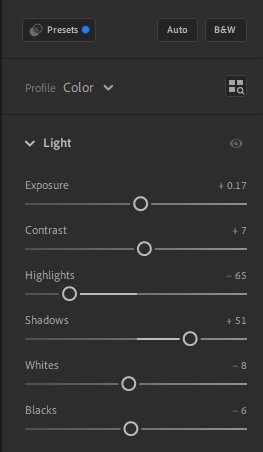
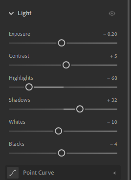
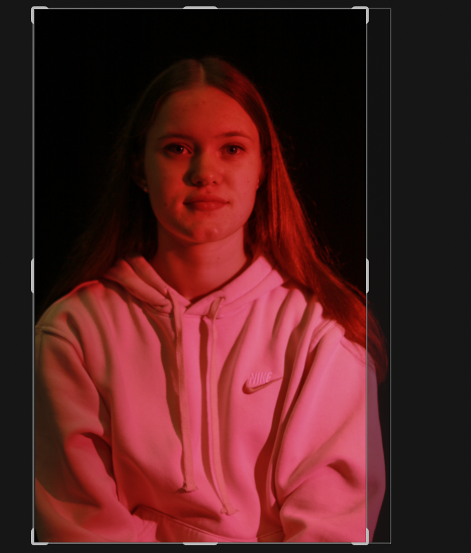
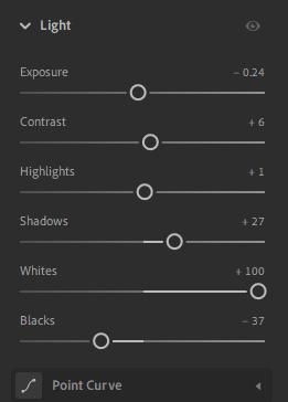
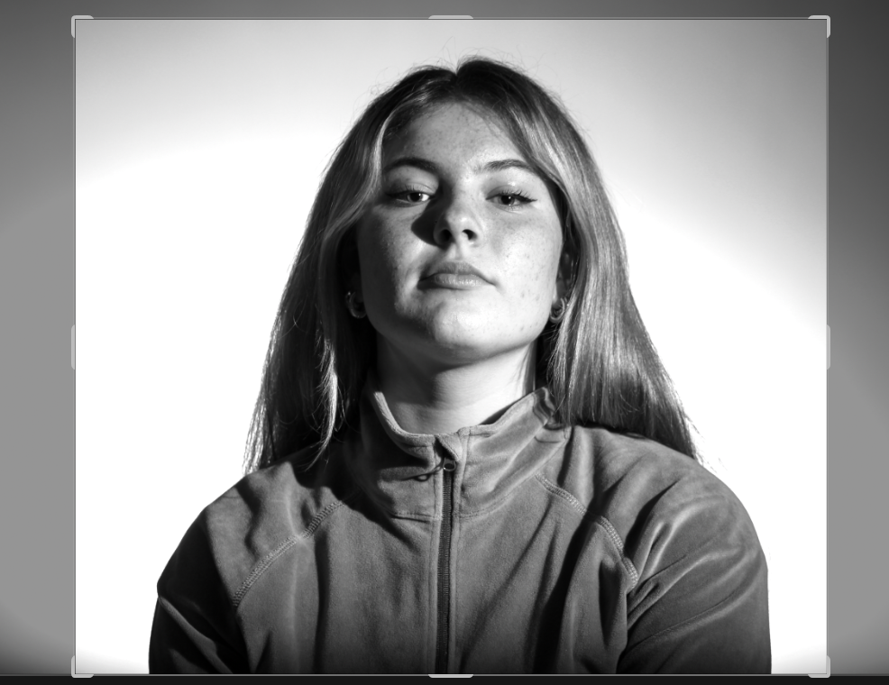
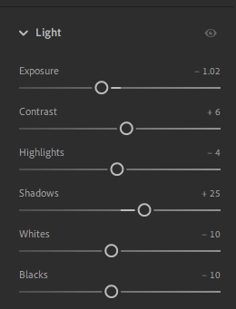
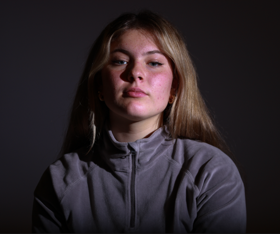
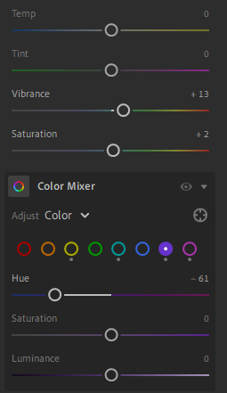
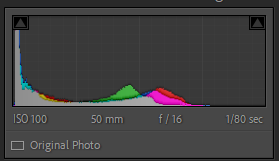
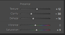
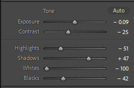
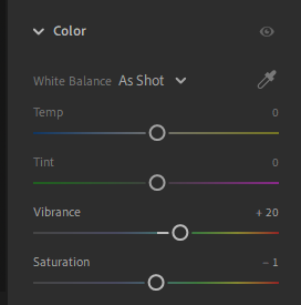
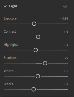
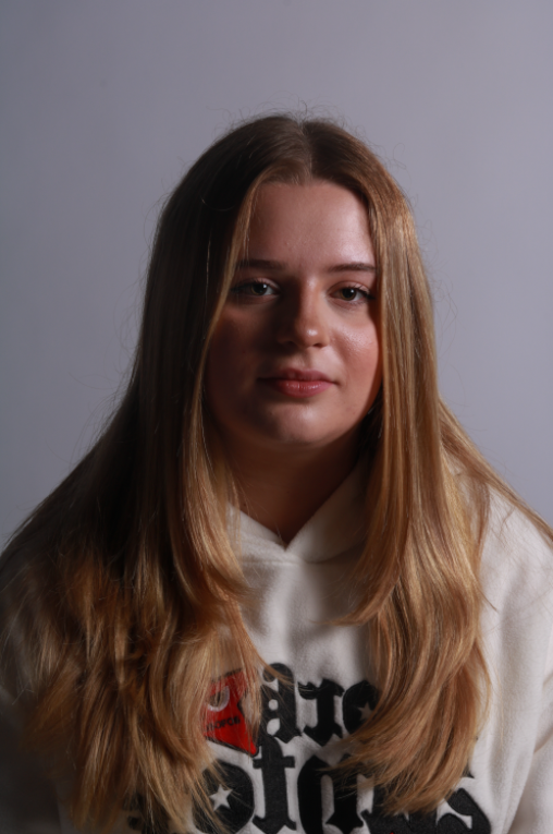
For this shot I used the lighting settings to manipulate the image. While this isn’t the best shot I took for butterfly lighting the shadow was improved when enhanced by editing. By also adjusting the presence settings the texture was increased while taking the clarity down and dehazing the image added to the smooth effect the lighting created. It also brought out the golden colour in the models hair.
These are some shots I have picked from other shoots that actually have butterfly lighting features. By changing the lighting to get different shots often means that sometimes when while you are trying to take photos for a particular style you end up with different techniques.
Before After
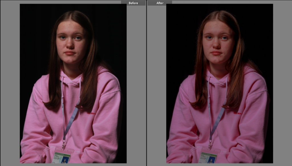
This is one of the shots that is bordering butterfly lighting while this isn’t textbook butterfly lighting it certainly has elements and in general is a nice shot. I like how the model is looking at camera, her hair frames her face nicely creating a frame around her face, pulling the viewer to models face.
Before After
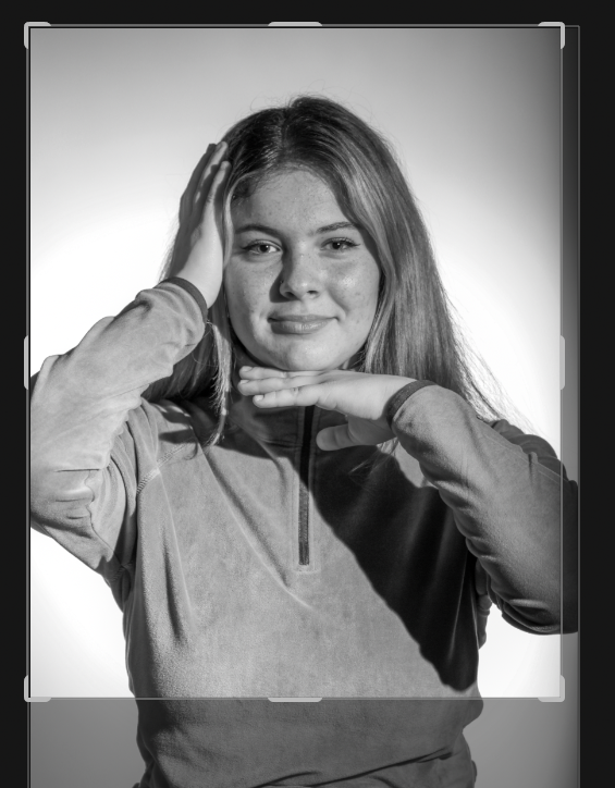
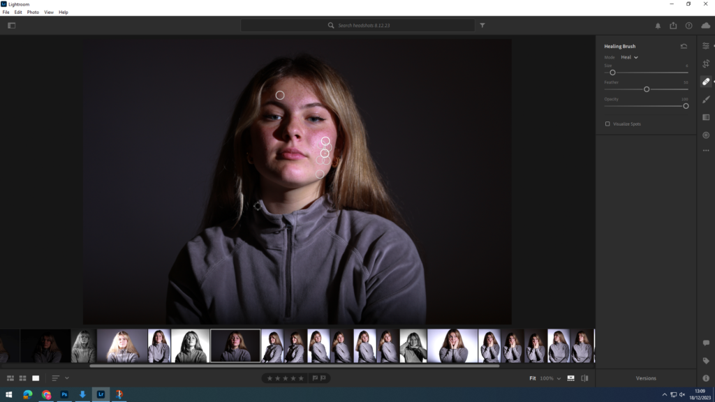
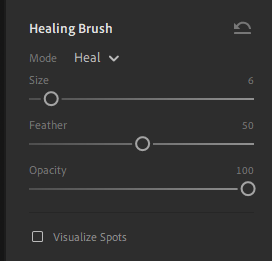
I had a quick go at removing the lanyard off the model on this shot I have already edited. By using the clone stamp tool on varying brush hardness’s and it allowed me to play around with removing the lanyard, while it’s not perfect it is a good insight into potentially future editing.