All posts by Poppy Watson

Filters

Author:
Category:

Jersey Maritime History – Seek, Observe, Challenge

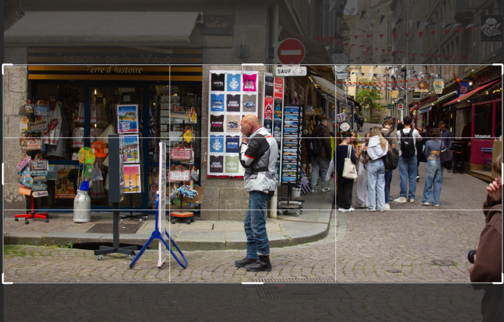
Jersey is small island but it has a rich maritime history from ship building industries to cod fishing and Canadian connections. Many Jersey men would travel over to Canada to work and then return back to Jersey in the winter to work the farms, bringing resources back with them to benefit the island and thriving industries.

To what extend, has the island of Jersey benefitted from its connections with slavery in the past?

Jersey benefitted from the slave trade hugely, from getting wood from the plantations to help with the ship building industry to trading cod for slaves to help with the industries around the island. At the time this was very common practise with trader like Josué (Joshua) Mauger who had a ship building business as well as trading people. The industry of trading people themselves created many of the things we know today, like No 9 Pier Road – built by Philippe Nicolle in 1818. After Philippe inherited money from his great uncle Joshua Mauger. The inheritance of money generated partly from the transatlantic slave trade was part of Philippe’s wealth when he set himself up as a merchant and built No 9 Pier Road in 1818.

Cod trade and Jersey’s Connection

For many hundreds of years the Jersey economy was based on the maritime trades, encouraging many of the Jersey citizens to be involved with the Atlantic trade also known as the merchant triangle. This was a mixture of selling and trading, mostly trading products and manufactured goods like cod, spirits, salt, slaves and fibres. This was engineered by main components: the British Empire, other European colonies such as South America and the Caribbean. Barrels of dried cod, 1,000-2,000 quintals a year, each weighing roughly 50 kg, were traded each year through the trading triangle, this goes to how the large scale the merchants operated on. However by the end of the 1800s the cod trade died out as privateering increased and new job opportunities appeared.

Cod Trade Triangle

This diagram shows all the links between trading cod and then trading further goods between jersey and the rest of the world as well as the routes the goods took. For example, fish like cod would go from Jersey to Canada and Jersey would get labour or ship building material (at one point in time Jersey had the 4th largest ship building industry) and the Canada would export the fish to the West Indies market returning with sugar, rum or molasses.

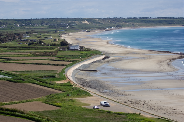
Newfoundland and Gaspe fishing trade 

In the 16th century there were many Jersey men who would launch boats and crews to Newfoundland from as early as 1562 with some men staying and returning later in the year to farm in Jersey for the winter having made a better income on the Newfoundland trips. Many ended up staying in Newfoundland working opportunities not available in Jersey itself. This continued into the 18th and 19th century when the Gaspe fishing v trade started to appear, similarly the Jersey men would leave to work a season and then return or again many stayed taking opportunities not available to them at home. 

Charles Robin 

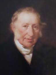
Charles Robin was one of Jersey’s main cod merchants who created his own company in 1766. His headquarters was in Gaspe. His trade specifically was two types of salted cod, a green and a yellow, the green having a shorter shelf life than the yellow but the yellow being more time consuming to produce. Robin would then complete a trip to the plantations providing the green cod for the slaves, in return he would get produce from the plantation like rum, sugar, coffee and cotton to then make the trip to Jersey and other places to begin the trading process again. 

Picture Stories; research and analysis – Seek, observe, challenge

Picture Stories

Picture stories are essential for most mainstream physical media, from magazine spreads to blog posts online. For years we have been using text and photos to reiterate a story, from newspapers to scientific textbooks. However in photography terms a picture story is using a series of shots with adept text to tell a narrative. As in the examples above, it’s clear some use a more creative approach in all black and white scattered pictures with text in between and some use a more direct, documentary style. It depends on the narrative the page is trying to tell. 

St Malo Picture Stories

Having taken photos (street photography) of the st malo streets and the people in them I would like to use them to create a picture story, showing and explaining parts of St Malo from a photographers perspective. I’d like to do something show casing certain joining points in photos, like photos with an abundance of certain colours and maybe one telling a narrative about the people, whether locals or tourists. 

How Will I Create My Picture Story?

Using in design I can completely customise the page spreads before printing. I will start with the same layout for all of them and then place the photos in, moving the text and flow of the page to fit the images. There is a particular way to approach a photo story, mainly using an establishing shot, this is the main attention pulling photo on the page, often the biggest and drawing the eye around the rest of the page. It’s important that this shot grabs the viewers attention and gives a small overview into the narrative you are telling. I will also before adding text look at how the images flow on the page, by not having text it removes distractions and allows me to focus on how well the photos flow around the page and if the story is interesting without the text. This also allows me time to check the images all work together and nothing is too different or confusing. 

Using In Design – St Malo – Seek, Observe, Challenge

Another way of presenting images, is creating page spreads. This allows for many photos to been seen at once with text providing context. I have selected good photos from the St Malo day trip, already edited to use in the process of creating page spreads. I will look to pair and match similar photos ether compositionally or narratively, this will help create a joined, polished page spread. My aim is to describe St Malo through photos, from the walled city to the shopping streets to the exposed nature of rough rocks and sandy beaches, capturing how people interact with all theses elements.

 A3 Page-Spread Designs:
InDesign

Create new document
width: 420mm
height: 297
pages: 3
orientation: landscape
columns: 4
column gutter: 5mm
margins: top, bottom, inside, outside: 10mm
bleed: top, bottom, inside, outside: 3mm

Short cuts

CNTRL D – place photo

Shift W – preview

W – remove margins

CRTRL -/+ – zoom in and out

Move Image-use centre of photo to pull photo

Make box, for photo.

Right Click – fitting – fill frame proportionally

This is my first attempt working out how to use the different tools to import and aline photos.

Adding to Photos

To add borders I selected the photo using the arrow tool and then increased the size of the border to add make it more visible.

To add drop shadow to photos I used the same process just selecting the drop shadow tool rather than the border weight.

Adding Drop shadow (left) adding border weight (right)

By trying both, drop shadow and borders on the photos it has given me a chance to compare what creates a stronger presentation and what would make a weaker one. I like both results but the bordered one helps make emphasis on the individual photos not just the page spread as a whole.

Backgrounds

To keep the background from being blank I added another photo from the same shoot that complemented the others without taking away from them. To do this I created a box over the whole page and then imported my photo, right clicked and selected arrange, SEND TO BACK to move the photo behind the rest. I then used the opacity slider to reduce the opacity and make the photo duller and less distracting.

Opacity Slider

Editing Text

Design Ideas

Final Designs

I tried many different options for my page spreads, this allowed me to experiment and create new content. I ended up with a double page spread of two different styles but using the red in both to tie the pages together. By the page on the left having the French flag as the background it is obvious to the viewer this is France, made more clear with the title ‘Saint Malo the walled city’. By using an establishing shot in the top right corner I draw the viewers eye to the text surrounding it then the rest of the smaller photos. The red is also on the under the establishing shot as other than that’s the way the flag is it draws the viewer to the other page spread, ‘red in the walled city’ which is a progression on an overview of the city, delving deeper into the colour that is often seen and used in France. Overall the pages are successful and provide knowledge as well as dynamic photos to keep the viewer interested, I also used border weight and drop shadow, backgrounds etc to emphasise the significance of each picture and keep them from becoming flat to the background. 

Cropping Experiments – Seek, Observe, Challenge

Cropping is a great tool photographers have to completely change the look of a photo and its impact on the viewer. Generally it’s a basic crop to get rid of excess negative space or to focus down on one subject. However there are more unusual crops that are just as effective and make the photos significantly more interesting to look at. To test my own creativity I have used my St Malo street photography photos in a number of different cropping styles looking at what fits a photo best and trying different outcomes before settling on one.

Panoramic Crop

For this photo I chose to do a panoramic crop as I felt it was a great photo for it, keeping the man central looking at board. While cropping the photo down I was wary of the text on the signs and shop sign as well as the colourful sign. This kept the straight lines in without making it feel like it was cropped incorrectly but cutting the text off. This removed the busyness in the background which made the photo more successful as it focused down on the subject while making the wider view more obvious.

Landscape Crop

For this crop I used Lightroom to reduce the original photo, this helped focus down on the subject, I looked at making sure the roof tops were in line without effecting the depth of field too much. This helped focus on the subject and emphasis the colour while also removing distraction from the people walking away from the camera.

Square Crop

I used the doorway to frame the subject and my crop. By using the crop to remove distractions it helped focus in on the subject and remove the negative space from the bricks. It has done a good job of making the photo feel human as it is a similar eyeline view to what as the photographer I saw though a not full frame camera.

Portrait Crop

This crop I used the same photo as the square crop to have images to compare on which crop suited the image better. Both change the photo dramatically but the portrait one makes the photo seem taller and more complete as it has more foreground and fits the narrow doorways look of being an overall narrow image.

Comparing Crops

Polygon Crop

This tool is great for picking out elements of a photo rather than using a traditional box crop. Meaning it has more options to outline certain shapes in a photo.

This is the tool I used on photoshop, when selecting the lasso tool then right clicking and picking the polygon option.

These two images are now a more geometric style having used an unusual crop, by using the polygon lasso tool on photoshop to outline the sharper edges of the image and patterns that add to to the overall feeling of the photo. I have presented these two edits next to each other so the edit choice becomes more of a pattern and the style becomes more apparent as the elements make sense next to each other. This benefitted the street photography style in that in focused in on the subject and their direct environment but it has taken away from the authenticity feeling of the style.

Porthole Crop

It is often visually compelling to crop an image into a circle. One common use is when presenting images of people.

To make a porthole crop I have used the frame tool and then selected the circle.

Once I’d dragged the circle shape onto where I wanted on the frame I adjusted it to fit the subject into the middle.

The next step was to unlock the layer and drag the layers together.

That step led onto this in which I can then right click on the layer and export as a PNG.

Presenting porthole crops

I wanted to make a series to add make the cropping appear purposeful, which while it was a one off didn’t look right. By grouping the circles as three equal sizes with the two lighter stone and the darker middle adds to the intentional feeling. This has created a polished look that gets people to focus in on the subject of the photos. This has also complemented the street photography style by not taking away from the unaware feeling or removing too much of the background and presents as a nice mix of photos of daily life in St Malo.

St Malo Photoshoot – Seek, Observe, Challenge

Out of the nearly 400 photos I took this day many were not ones I deemed useable hence the red colour, some I marked in yellow to check again as I liked elements but they weren’t the strongest. The green ones were my strongest images and the ones I will go on to edit.

Best Photos

These are all photos I think are strong compositionally, capture Saint Malo and are in a similar style to Henri Cartier Bresson. As they are the best ones they are the ones I will edit and use for picture stories.

Edit One

This is my first edit for this photoshoot, the original was taken on a slight angle so I used the crop tool to balance the photo, I then used the black and white feature to turn the photo black and white, in the style of Henri Cartier Bresson. This benefitted the photo as the dark outfit contrasted with the white van and light sky and round about.

Edit Two

For this shot I pulled the crop in a bit closer to use the edge of pavement and ladder as a central leading line from a close depth of field to the sky with the chimney pots. I also changed the exposure to make it more obvious that the line splits the middle of the photo and that the left of the line is a lighter grey not only the buildings, but the people also on each side of the line the guy on the right is darker matching the shadow and building and the guy on the other side is lighter again matching the building.

Edit Three

For this shot I wanted to emphasis the diagonal line created by the guy sitting on the left. The next thing I did was reduce the highlights so the sign was dulled down a bit as it was distracting from darker grey and black hoodies.

Fourth Photo

This photo I took at a wider angle including more of the background to help use this I adjusted the exposure and shadows etc. I felt it needed more to pull away from the grey scale tone to get a better, higher contrasted black and white so I used the brush tool on Lightroom with a small adjustment to the shadow slider so when I coloured over the subject it made them a little darker without altering the whole image.

Fifth Photo

I liked how this shot was composed with subject being in the door way so he was framed in the centre. By adjusting the photo to black and white again I then increased the contrast to make the blackboards and environment around the subject darker while he remained framed by the white door frame. I also cropped the image down to remove some of the extra stuff in the photo that draw away from the subject.

Sixth Photo

For this photo I really liked how the person is stepping while being in the middle of the two windows. It has a symmetrical and undenounced feel to it, to emphasis this and help it fit with my other photos I used the contrast slider to increase the darker areas.

Seventh Photo

For this one I produced two final photos, one with higher contrast and one with lower contrast. The lower contrast looks better individually as the rocks don’t have a s much texture, however to suit the rest of the photos and follow the Bresson style I increased the contrast the get the pockets of darker grey which added the texture back to the rocks but also the subject.

Eighth Photo

Ninth Photo

Tenth Photo

Selective Colour Editing

Selective colour editing is when the photographer edits the photo by making everything except a certain colour black and white. This adds a pop of colour to the photo, making the photo black and white adds to the contrast and atmosphere to the photo while the splash of colour adds a dynamic element to the photo. I will edit a few of mine in this style picking a certain colour as I think it would make a great trio of photos to present.

Photo One

This was the photo I edited first in the colour pop style. I started by selecting HSL colour and reducing all the colours except red to make the rest of the photo, minus the red areas, black and white. To then complete the photo I used the brush tool with 0 saturation to remove reds parts that just didn’t work in the photo.

Edit two

This is the second photo I edited in the same style I chose to select red colour in photos so make a trio of photos. Again I desaturated the entirety of other colours that weren’t red to make the photo black and white with a element of colour. This has been very successful for this image as the red coat ties into the rest of the image with the added section of red on the opposite coat.

Edit Three

This photo I did the same again with the saturation. With this photo particularly I used the small sections of red to pull the photo together with the section on the guys jumper and the text on the sign behind the other guy frames and makes them fit into the photo well with the red door frame.

Final Colour Pop Edits

Final Photos

Final Evaluation

For this photoshoot, it was actually a day trip to St Malo so required some planning before hand to make sure I had the right equipment. I took my cannon 550D with a 24-105 mm zoom lens. This is a very versatile lens that meant I could grab quick shots close to me or wait and use the zoom to be unnoticed. Street photography was new to me but this was a successful day of quick snapshots and planned shots waiting for the perfect moment. I kept the camera at sinker settings all day Tv, 1/400 shutter speed and auto iso and f stop. In the end I picked my six best shots all of which had similar features, the subject was centred and unaware they were being photographed. Overall I am pleased with the results especially after editing the photos have captured Saint Malo very well from the busy shops to a peaceful moment on the rocks surrounding the old town. I think I created a successful photoshoot inspired by Henri Cartier Bresson’s theory of ‘the decisive moment’ deciding which precise moment exactly, while much easier with modern cameras still remains a complex mixture of angles, lighting and covertness. I will now go onto use some of the images in a picture story, describing Saint Malo in images.

Henri Cartier Bresson – Seek, observe, challenge

Henri-Cartier-Bresson

Henri Cartier Bresson, was a legendary humanist photographer known for his candid photography of Paris in particular. From unknown strangers to people of the time, he made human life seem connected and together through his work. He felt the camera was an extension of his eye and that taking photos was a physical pleasure. He was the best photographer at the time when it came to trusting his own intuition and grabbing the perfect shots and using composition to build a base for the perfect moment. Later on ‘the decisive moment’ was likened by Bresson to hunting but without the killing this was Bresson’s approach to his work with watching, waiting, trusting his intuition to get the best shot he could. His style and philosophy behind his work froze particular human moments in time.

Biography

Born in 1908, Henri Cartier Bresson was born into a wealthy French family who taught him to appreciate the arts as he grew up, he was an avid painter prior to taking up photography. Bresson continued to paint and develop his poetic style as he studied literature at Cambridge university prior to travelling around Europe and Africa. A few years after attending university Henri took up photography on his Lecia camera which continued to be his camera of choice going forwards, this went with him everywhere in his words ‘it never left my hand, except for when I was shaving’. He quickly progressed with his passion learning what exactly he wanted in each shot, very quickly having his first exhibition of many in 1933. However as WWII progressed he was taken as a prisoner of war in 1940 until he escaped in 1943, going onto help others escape and flee to safety. As the war ended he quickly went back to his photography routes, his first photos back being of the Liberation of France in 1945 before teaming up with other professional photographer to film ‘Le Router’. As his career developed and he continued to travel further capturing and exploring more of the world through his work he founded Magnum photos with a few others- this became and still is a place for photographers to gain recognition and is an archive for many older photos of much beloved photographers work like, Bresson’s work. He continued to be a creative till his death in 2004, however as his photography career grew eventually he returned to his roots in painting and sketching while still displaying his photography work in his own foundation.

The Decisive Moment

The decisive moment was Bresson’s philosophy when it came to his work, picking the precise moment to take the perfect shot capturing his envisions when he originally composes each shot. While Bresson didn’t actually coin this term it has stuck around him as it describes his style perfectly along with another comment form Bresson himself when he liked photography to hunting, waiting for the perfect moment while the tension builds as you get one shot, especially with the cameras at the time and you will know when you have missed the perfect shot.

Camera and Lens

Henri Cartier Bresson was known for his lifetime use of the Lecia range finder camera with a 50mm lens. The Lecia rangefinder were particularly revolutionary to the time period as with its unusually quiet shutter release, and were smaller while maintaining the quality of other cameras of the time. This benefitted his work as he managed to remain conspicuous to the subject and with a 50mm lens he manged to keep a similar view to the human perspective. This all benefitted his street photography style of remaining unknown to the subject in the photo keeping the candid authenticity.

Photo Analysis of Gare Saint – Lezare

Composition

The composition of the photo appears to be a lucky, fleeting capture at first until you start observing the details, for example Henri Cartier Bresson has used the rule of thirds to place the leaping man in the far right grid box, this means the viewer is led away from the busy background of fencing and the train station to the smoothness of the water and the movement the man is creating. The horizontal lines have also been lined up very well in the grid pattern, the fence line matching up with the rule of thirds grid, this creates a balanced look to the image and provides structure to the shot. It is an interesting photo as while there are significant leading lines, the fence and roof tops they don’t necessarily lead anywhere making the viewer look at the rest of the photo. Saying this, this does add to the geometric elements of the photo, as there are many roof tops and sharp angles used to create a geometric element to the contrasting the slightly grainy look to the shorter depth of field. The overall image is very well balanced with the chimney pot and the mans reflection, again another compositional master piece of Bresson’s making sure the photo was balanced was important with the rest of the image having such a mix of focus, contrast and movement, this balancing of the two diagonally opposite elements has allowed the photo to remain feeling connected with its large depth of field and focal point meaning there are many different elements. To continue to help the composition in the photo work, Bresson has used the negative space of the sky and water to make sure the photo doesn’t feel too busy or too complex, again drawing the viewer to look at the man leaping over the dark, busy background as the negative space of the water with just the ladder in it leads the eye to the man and his reflection. There is significant texture in the photo from the time period of the 1930s the cameras were and still are ever developing in quality so the grain was common at the time, but the way Bresson has used it to his advantage just adds to the photo with the high contrast and patterns from the railings. It adds to the quick, snapshot feeling of this shot that while was very well composed Bresson couldn’t have known the man would leap across the puddle and unlike modern day camera he wouldn’t have had multiple shots for the one moment. Following this while the monochrome was not a style choice but apparent to the time it still adds a timeless quality to the image, forcing the viewer to look at the subject and the individual textures within the image as if it was in colour you wouldn’t see the wear and tear on the posters as much as you do with the lack of colour.

Exposure settings:

There is no way we can be sure on Bresson’s camera settings but by looking at the photo as the result we can predict that his settings consisted of a smaller aperture for a long depth of field, this keeps the full scene in focus capturing everything not just the subject adding to the everyday scene and how lucky the capture was over a planned and modelled shot. To capture the movement he would have had a fast shutter speed to capture the movement well, the focus isn’t perfect but for the time it was good. Due to the shot being taken during the 1930s ISO wasn’t such an apparent feature on cameras instead there was film speed which effected the lighting of each shot.

Lighting

This photo is unusual as Bresson has embraced the bright sunlight which is unusual for photographers as it can create harsh shadows or bleach subjects out. Bresson however has used the shadows and silhouette of the subject, buildings and reflections to make best use of the bright sunlight and create a high contrast, sharp image. This has added an authentic feel to the image common in the street photography style. He has also considered how the contrasts fits the photo, for example Ansel Adam’s zone system fits well in this image working through many different tones, creating texture and intensity in the photo.

Symbolism

This photo is often known to be the photo that started the shift into wider more creative photography, pulling away from the 1900s planned portrait era and starting to explore and capture daily life in a more documentary style. This linked with Bresson’s philosophy when it came to his work which was ‘the decisive moment’ which meant he would compose a photo and wait till the perfect moment in which he made the decision to take the shot or wait for another subject, however waiting too long would change the lighting or other elements so he had to choose what the best shot in a world of unknows would be. This is reflected extremely well in this photo as he wouldn’t have known the subject would jump but he thought it would be the best use of the shot he set up and it turned out to be one of his most respected pieces of work with a whole new era of candid, creative photographers following in his footsteps.

The Sublime Final Evaluation – Landscapes

This is one of my favourite shots from my project into the sublime. The composition of the shot appears rather abstract at first with the high contrast black and white and trees creating rough patterns. It really is a great reflection of the sublime, inspired by Ansel Adam’s work of the sublime with the harsh lines and broad scenery but also pulling on previous work of mine capturing the aftermath of Storm Ciaran, both to me represent the sublime from the sheer beauty and vastness in Ansel Adam’s work to the violence and damage nature can reap on itself. This shot in particular reminds me of an x-ray, as though I have captured the bare bones of the world around us truly showing us it’s power and the devastation it can bring, for me tis is a true representation of the sublime.

To finish this project I put the final images in a virtual gallery, by choosing to place the three most similar images on one wall and the final image behind it I have created a feeling of the sublime within the gallery going from the expanse of three photos of large areas of scenery next to each other on the wall to one single photo showcasing how the scenery can change overnight. I also placed the three photos in order of progression from the photo with the stormy sky, to the photo with damage to a few trees to the the photo with fallen trees and fence lines, this further emphasises the effect of the sublime.

Final Analysis + Virtual Gallery – Anthropocene – Landscapes

Virtual Gallery

I created a virtual gallery with my final images to see what they looked like presented in a gallery format before I printed them. By using a blank wall I presented them as a tryptic display, as each shot connects to the next and they are more impactful next to each other. I also used a mixed black and white frame to match the colour theme throughout the images, this helped add a border to the photos so they didn’t feel like the geometric elements blended into the grey wall taking away from the harsh lines.

Final Analysis of Photos

The photos are all edited in a the same way, all black and white with blocks of black and white colour. This links all the photos together nicely as each photos content is a little different to the next. I went about the black and white editing on an individual basis making sure I tailored the overall low toned black and white look to each photo. This also meant I had to look after the texture of each photo, sometime increasing the texture to emphasis the point of the photo, sometimes decreasing to reduce the noise and make the point of the photo clearer. All three photos have the geometric style in common, as I used the same blocks of black and white alternating colour on all three photos adding a new element to the composition of the shot. Using the curves of the bay or harsh lines of houses is something I have done in each shot to provide leading lines and structure as otherwise photos in this style can get quite messy.

Analysis of Presentation

I have presented the photos as a tryptic both in person and on the blog. The hard copies I printed out at A4 size to ensure the details in the photos weren’t missed from being too small but also A3 would have been too big and the details of each shot would have been overwhelming. I then backed each shot onto foam board without a boarder as the white foam board looked like an extension of the photo with the photos have large amounts of white near the edges. Saying this I did then back the mounted pieces onto black mount board to group them together. This meant the shots would be displayed together with a high contrast similar to the colour blocks with the white in the photo and the black of the mount board. I chose to display them vertically as it breaks up the landscape orientation of the shots themselves, encouraging the viewer to apricate how large the areas of effected land are and it’s not just one scene. This also helped show the differences between each shot but where the similarities tied them together both in the editing and composition of the shots.

Analysis of Links to Photographer

In my final presentation of my final three photos, there are obvious links to all the photographers I looked at both for editing style and actual photos. In my final editing process I made sure I was using what I had learn through not only my first set of editing but also what I had learnt from researching and analysing Nick Frank and Guy Catling’s work. Both make use of natural geometric shapes created in the photos, removing sections nd replacing with solid colour and patterns drawing the eye to the subject of each photo. Particularly in Nick Frank’s work he uses the colour blocks to remove distracting details, details of the background highlighting the important areas of his work. I used the colour blocks to show the varsity of the areas effected by humans, almost doing the opposite of Nick Frank and using the colour blocks to draw attention to the area of photo beneath the block layer that otherwise would be over looked.

Analysis of Links to Anthropocene

The final photos I have presented have taken an unusual approach when it comes to talking about Anthropocene and it’s effect on our planet, simply because I haven’t looked into plastic or pollution individually but an area of Anthropocene as a whole. Telling the untold story of how we as humans have impacted the world around us, without even noticing. Often we have had good reasons to change a natural landscape whether it be farming so we don’t have to import so much food or housing and roads so we can access the island as a whole and reduce any over population in St Helier. My photos have also taken a dramatic editing style as well often not seen in photos around the Anthropocene as they are often kept natural so people can see it truly as it is. However I used the fact many people know the area well and overlook the differences, to my advantage, by covering the human impacted areas with blocks of colour it doesn’t just give a visual impact for the viewer but separates what they normally see with what they normally see that is human creation.

Lewis Baltz – Landscapes

Lewis Baltz

Born in Newport Beach, California in 1945, Baltz grew up to be a photographer and educator. He rose to fame in the 1970s for his work in the New Topographics movement. Baltz father died when he was 11 but he continued onward attending collage and university, meaning by 1969 he held a Master of Fine Art degree and a BFA degree in Fine Arts. He first became interested in photography at 14 when he started working in a camera shop, however Blatz said from the start he never saw himself a photographer so much as an artist because ‘I never felt any allegiance to it’s history’ in fact he went onto say, ‘I made photographs because photography was the simplest, most direct way of recording something.’ Growing up just shy of WW11 Baltz saw for himself the toll American urbanisation was taking on the world around him and how quickly it was moving. As Baltz developed his career he went through many subject matters before becoming the photographer he is known as, during the 1980s he moved to Europe and started to create large coloured prints of his work. He continued to have a rich ever developing portfolio throughout his career, having many publications and books of his work published also becoming a professor of photography passing on his talent to the next generation. 

Work

Baltz’s work has always focused around the destruction of the world around us, particularly framing images in a monochromatic, deadpan manner highlighting the lack of detail and power humans have on the world stealing nature away to turn it into mass concrete structures. His work often comes across as simple, which you can’t deny it is, however it showcases the details or lack of details in the man made world instead the natural ruggedness destroyed for geometric beauty perfectly expressing the soullessness of the modernising world.

Photo Analysis

New Industrial Parks 1970

Common in Baltz work is the mid tones of Ansel Adam’s zone system, a geometric structure and a hint of nature. This picture perfectly showcases this, unlike many other photographers work there isn’t lots of context available about this photo as Baltz worked in an anti-style of sorts, creating a link between the majority of his work all aiming to project the same idea rather unlike modern day photographers who tend to change what they want to say each new shoot, however this is just a product of current society as was Baltz work. In this photo in particular there is great use of the geometric elements of the building, using the corner to center the photo and creating a unique angle to view the building from. This is then contained as the building is then cropped so the frame is nearly fully filled with the building and the areas that aren’t are blank space creating the deadpan feel to the photo. To break up the harshness of the photo Baltz has left four and a bit trees in frame, doing so creating a further divide between the natural world and the -at the time- current urbanisation of America. Overall it’s a simple but powerful photo highlighting the modern worlds take on rugged, natural places and creating geometric modern but soulless structures all done with a low angle of a corner of a building and monochromatic, high contrasted use of blank space and harsh lines. 

Final Edits – Landscapes- Anthropocene

Edit One

These tools are what I used to fill in the blocks of colour. Starting by using the polygon lasso tool to select the outline of fields I then moved onto filling in the selected area with the bucket tool, switching between the colours at the base of the tool panel.

The photo above shows the layer blocked with colour, showing the shapes I made and selected using the polygon lasso tool.

This created the final image presented above. By blocking out parts of the field in black and white to match the photo it forces people to look at the image as it’s bold and intriguing.

Edit Two

This is a comparison between the original image and the black and white edited version. When editing the image I adjusted the highlights so the grey seemed duller, improving the visibility of the lighter sand patches and the sea wall. This helped me see the parts in the image I was going to cover while making the rest of the image a high quality black and white image.

For this photo I again, blocked out the fields/agricultural area in the photos showing just how much of the land is commercialised and effected by vital but often destructive human influence on the land.

Edit Three

Before
After

For this photo I used the same process of changing the photo to black and white in light room before moving the image to photoshop to use the select and fill tools to map out the fields in the same style of the the other shots.

Final Images

This created a trio of photos edited in a similar style with the same emphasis on the environment. By using the fill tool to blank out sections of the agricultural landscape, it adds direction to the photos encouraging the viewer to look at the environment and how agriculture has effected it. By using black and white images with black and white blocks on top it has created a monotone effect adding harsh contrast and geometric shapes to help get the point of how much agriculture has effected out landscapes. Although it is essential the effect is still there.