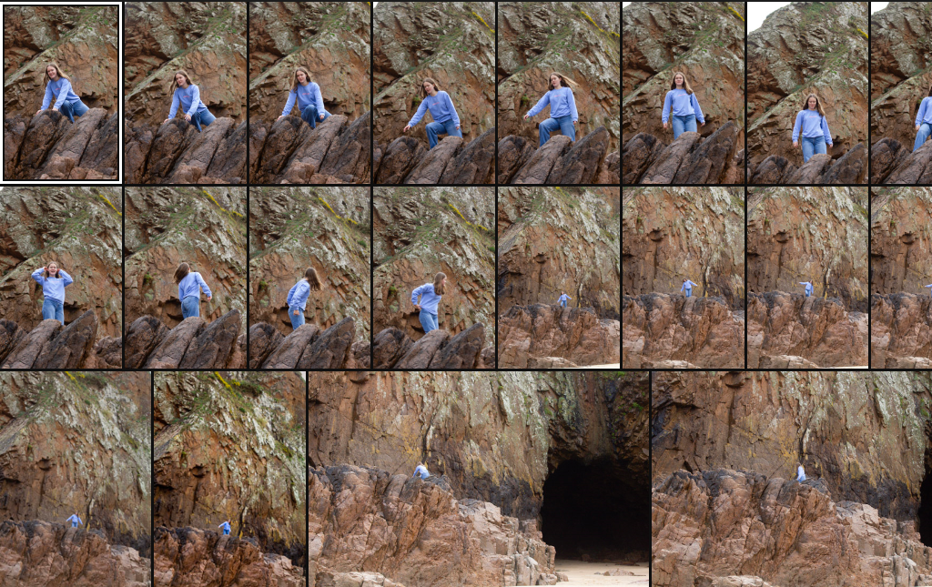
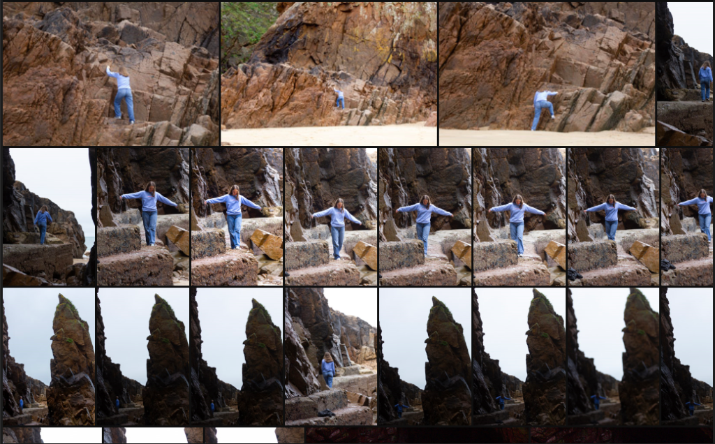
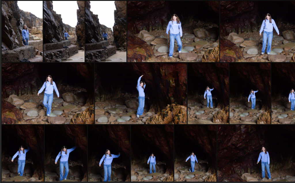
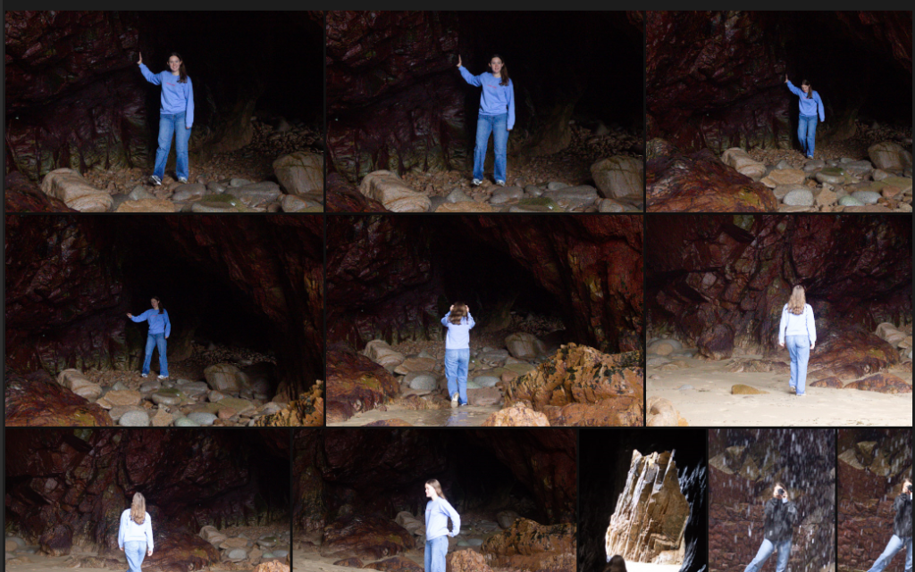
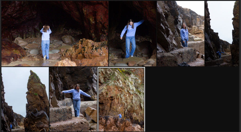
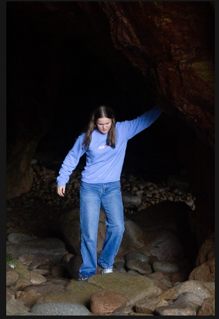
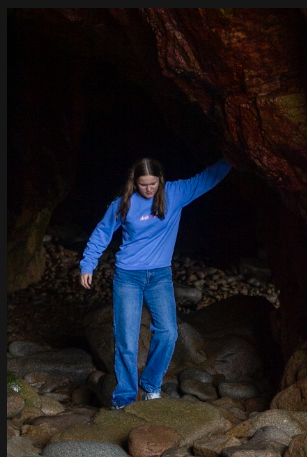
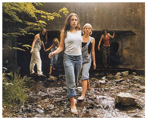
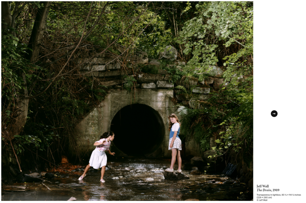
This photoshoot was inspired by Jeff Wall’s ‘The Drain’. I have selected the best shots, and filtered them from the main gallery.
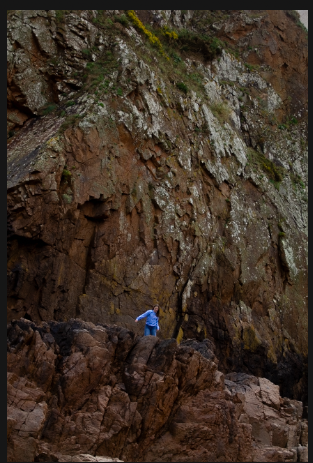
Edit One
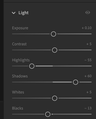
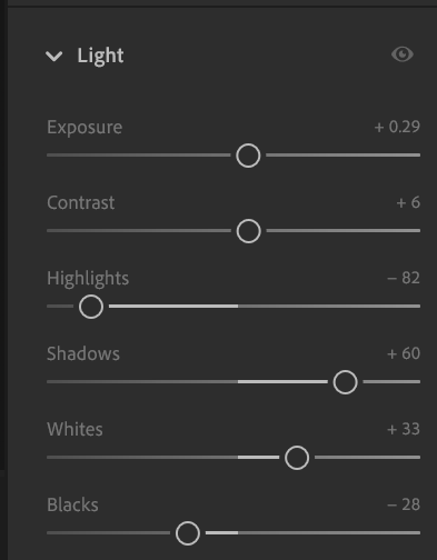
For this photo I wanted the blue jumper and jeans to be bolder. By adjusting the highlights and increasing the shadows it has given the jeans and jumper a brighter colour without making the cave in the background brighter.
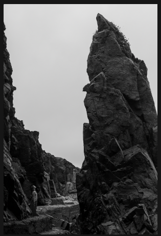
Edit Two
When planning this photoshoot, I knew this is a shot I wanted. To edit it, while I liked how the blue stood out against the rock the black and white enhances the size of the rock making it a more impressive photo. I like how I asked the model to pose, looking up in awe, it adds to the sheer size of the photo.
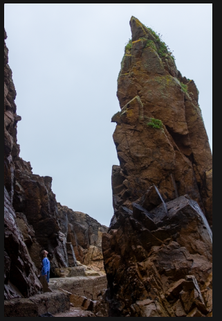
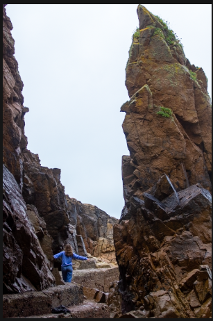
Edit Three
Similarly to the last the intention was to make the model look tiny in comparison to the rocks. In this shot I liked the blue jumper and how it stood out against the rocks, as the lighting was good I only had to make minimal adjustments to improve this shot. Levelling out the colouring.
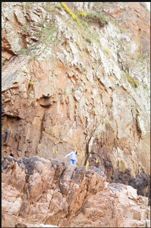
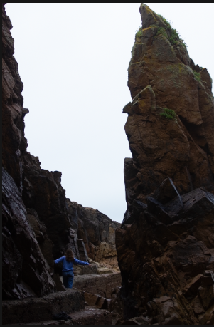
Edit Four
Although for this short project I only need three final photos I wanted to edit an extra one to give me choice. I like this one as it is a similar theme to the previous two, vast rocks and cliffs making the model seem tiny in comparison. As I already had a black and white photo of this rock, I kept this one in colour to make the photos not look too similar.
Final Photos
These three photos are my final photos, this shoot was using the ‘mirror’ method creating a scene rather than shooting a naturally occurring one. I posed the model to be in awe of the dramatic cliff faces, creating a childlike wonder in some. I wanted to show how small we are in comparison to the natural world. This however being a mirror style photo shoot is shot in a cropped way, composing the photos with a posed model rather than letting the viewer see the whole picture. I like these three the best as the model appears very small in comparison to the natural rock faces. The blue jumper photos contrast well with the black and white, creating the story I wanted to produce. Similarly to Jeff Wall’s ‘The Drain’ I posed the model to be unaware of the camera, even though they were. He created a covert onlookers perspective in a mirrors photography style, this is what I did within my photoshoot.
For my first photoshoot I will look into the idea of Jeff Wall’s ‘The Drain’ I really like the narrative the photos tell, they appear quite nostalgic in a way people playing in the stream. Equally they also have a creepy undertone as it looks like some of the people have appeared from the tunnels.
Photoshoot Plan
‘Window’ Photoshoot Plan
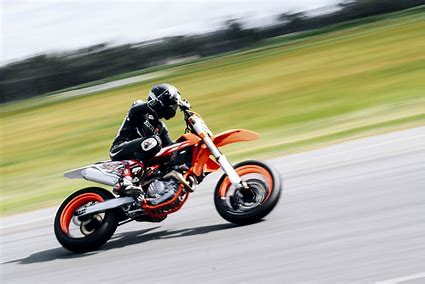
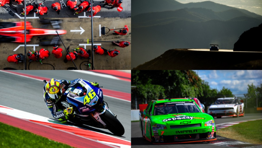
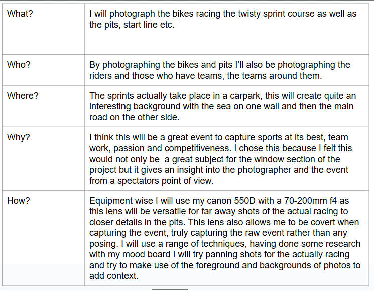
I have always had an interest in capturing candid sports photos, when researching this project, mirrors and windows, my first thought for windows was motorsport pit lanes or service photos. A true insight into raw emotion, small details, the machines themselves and how teams work.
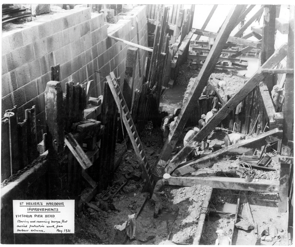
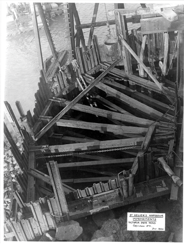
On the topic of mirrors and windows of the world, in photography, daguerreotype and calotype photographs crop up. A daguerreotype is a one off image produced without a negative, appearing on a thin metal sheet. In contrast a calotype produces a negative in the camera that can then be used to create new positives of the same image. In fact the calotype was the first in camera negative, making it revolutionary for its time. These processes raise an interesting discussion in the photography terms of mirrors or windows, more specifically John Szarkowski’s idea of mirrors and windows. Using Szarkowski’s idea of mirrors and windows a daguerreotype is a window as you cannot alter this style, once it is created it is final, similarly this method of photography was mostly used for documentary purposes, creating keepsake portraits, capturing how families or people of importance looked over the years. However a calotype is more likely to be considered a mirror as creating an in camera negative means it is easier to alter images, or mass produce them. This made them the subject of many romantic styles and gave photographers a way to experiment with their own style – a mirror of themselves and how they see the world- rather than having to only create a positive on a piece of metal. A calotype gave them more creative freedom, self expression – mirror where as a daguerreotype documented rich history through headshot portraits in a documentary style – windows.
One brief quote from Szarkowski is ‘“world exists independent of human attention” a photograph is, after all, a record of nature, of the world’s lights and shadows. Szarkowski is correct, the whole premise of taking a photo is to capture a moment in time, in very basic terms no matter what you are photographing it ends up being a capture of the light and shadows at that precise moment in time. Humans do not pay attention to this but the bigger picture, so Szarkowski suggests we are normally overlooking things when we take photos but the whole point is to capture it how we remember, overlooking or not.
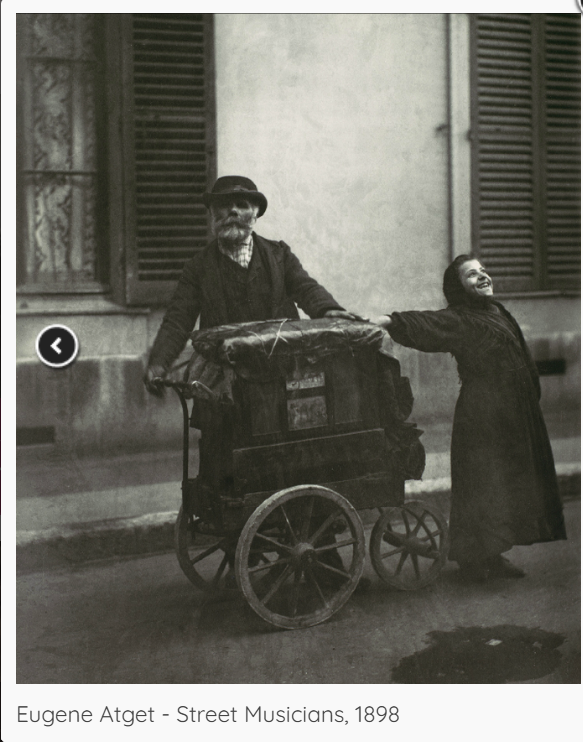
This photo is a window, a window into life in 1898. The photo captures two street musicians, a candid insight into their livelihoods. This is a window photo, one that is not set up, simply snapped at the time. The rushed composition, apparent in the framing of the photo, gives the photo its true feel to the sense of reality. The intention of a windows photo. It is an interesting shot, both when it was produced and now, when it was produced it would have been a common sight, but not regularly photographed. Unlike now it is not a common sight, meaning this photo is not only a windows photo in the way it was taken but in true windows photo method it gives us a sense of reality even all these years later. Allowing the viewer a glimpse into a world unlike theirs. This was a true windows photo, as defined by Szarkowski, capturing the world humans don’t recognise to show them a world they do.
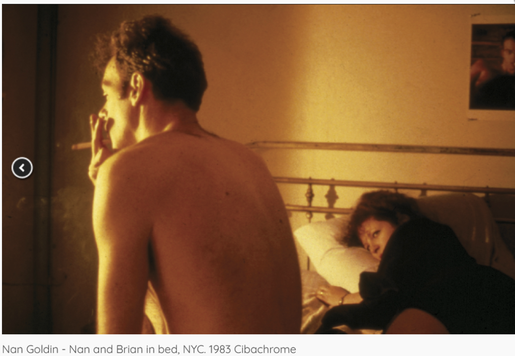
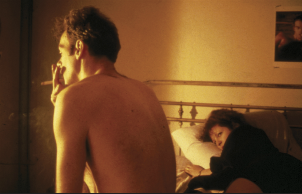
In contrast, this is a mirror photo. A photo taken from a subjective view point. This might appear un posed at first but the photographer is Nan Goldin, the woman lying in the bed is Nan Goldin. This is a posed, planned photo, in which the photographer dictates the story. Goldin gives us an insight into a personal moment in the busy city of New York. Goldin has used herself to tell a story about herself, that many can relate to. This is a true depiction of a mirrors photo, often a photo that appears candid at first glance but is a well thought out shot. Complimenting Szarkowski’s idea on point of view in photography, Goldin shows you can create a story from a moment, whether it be a thought, dream or memory if you plan well enough. Making sure to use the technical elements like cropping, to make the photo feel more like an intrusion Goldin has created one of the most successful mirror photos.
Szarkowski comments on the idea of the death of print media like LIFE and LOOK in his ‘mirrors and windows’ book, suggesting we still photograph but often hide our work now, being overruled by other media sources. Following then into his separation of the two ideas, windows and mirror photography. Both taking different approaches to provoke the viewer with outcomes, make them question and think while allowing photographers further creativity pushing their talent further. The two photos above are separate images one mirror and one window, however it brings up the question can a photo be both? To some extent I believe most are, while mirrors are composed they must be based on some truth, some strong motivation to tell a particular story, capturing it through photography. Equally in a windows photo there must be some extent of planning and pre decision, even small things like where to walk that day, what to actually photograph. Szarkowski produced an interesting topic, not only igniting photographers passion but in the bigger picture allowing people to understand their own work. Each photographer will have a slightly different definition of a window and a mirror and where the lines blur between them, however all photographers will capture light. The light particles creating a memory forever, dating back to camera obscuras to modern day.
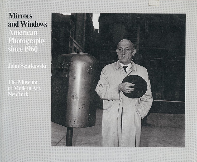
Windows and mirrors is an exhibition ‘Mirrors and Windows’ anexhibition of American photography since 1960, opened at The Museum of Modern Art, New York in July of 1978. This was John Szarkowski’s attempt at categorising photographers, whether their photos were mirrors or windows.
What is a Mirror Photo?
A mirror photo is a photo that is subjective to yourself, one that you can design or create before hand or see as a reflection of yourself through photography. Another way of thinking of it is, does it capture/represent you as an artist, either through an abstract or planned scene? This is often an editorial style of photography or a personal project for a photographer.
What is a Window Photo?
A window photo is the opposite of a mirror, instead capturing the world true to life. A version of this being documentary photography or journalism photography. By reflecting the truth a photographer has little to no personal influence or output onto the photo as it is as others would see the scene.
Do Mirror and Window Photography Cross Over?
Szarkowski – ‘is it a mirror, reflecting a portrait of the artist who made it or a window, though which one might better know the world.’
Mirrors and windows often cross over, for example recreating a crime scene. This is posed and being directed by someone but it is also a capture of what supposedly happened at the time. In many mediums there is a cross over of mirrors and windows, but in particular photography is guilty of this. Many photographers will use mirror photos to get a point across and have ‘perfect’ photos or said better, an accurate representation of what they imagined, however this also occurs in ‘window’ photos. While a true window photo will be snapped completely candidly sometimes photographers have an idea that cannot be completed just using candid work but want the style to remain similar to a window photo. Photographers might also start with a window photo, snapped at chance and then find it inspires them to get a particular planned shot (a mirror photo) the next time they come across a similar situation or even planning a whole shoot around that one window photo.
Photo Analysis
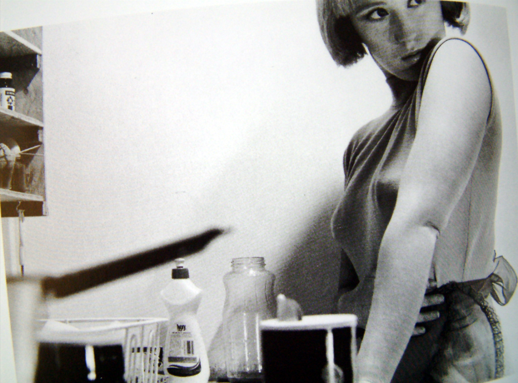
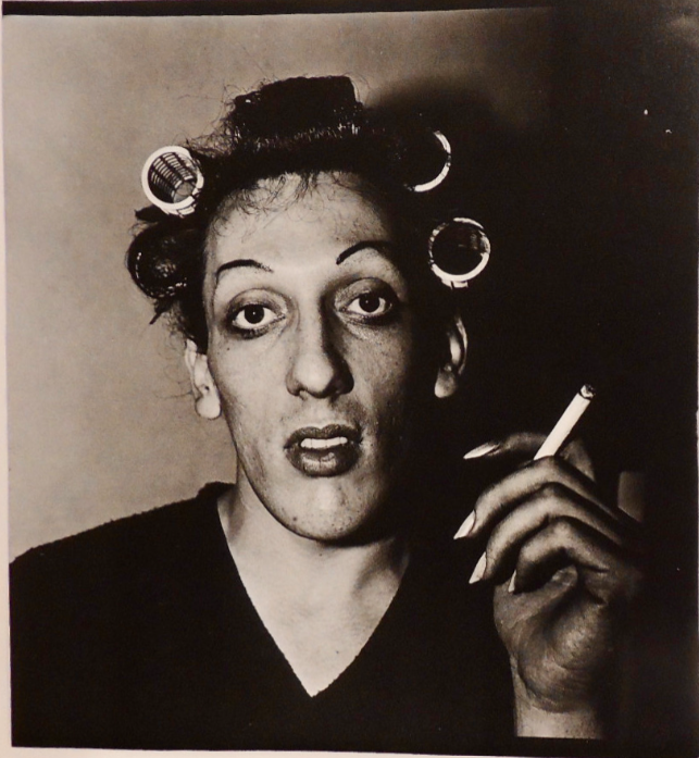
This is a photo from ‘Mirrors and Windows’ the book but I think it accurately shows the blend between mirrors and windows at times, this could be a candid portrait as the subject is just in their home preparing to go out, but it also has elements of a mirror photo as it is planned and a thought out image. I find that may times when mirrors and windows cross over it is because they want to tell a personal story or capture something that just isn’t regularly captured without planning but the photographer wants to do so in a documentary style. This is a very successful photo when it comes to be able to break it down and pick interesting elements from a very basic photo, it is also quite impactful as it is something not normally seen, normally curlers aren’t normally seen anywhere but the comfort of the subjects home and not a normal subject in a photo as he is just ready for a night in rather than composed, formal portraits.
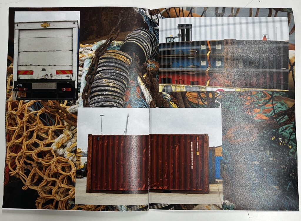
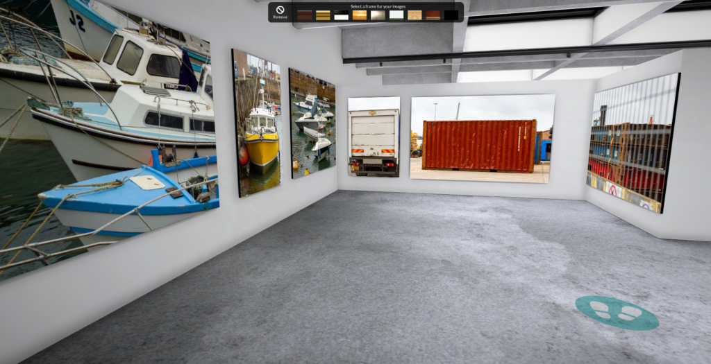
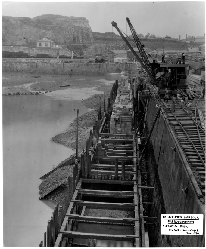
Overall my zine made good progress form the raw photos to the final product. I went through a lot of editing to pick the best photos from multiple shoots, I then found some photos I liked originally didn’t fit with the rest of the photos I had to re edit the image or pick one to replace it. It was a tricky balance between picking good photos technically and picking photos that went together and told the story I wanted to tell, an insight into the harbours. I found a mixture of detailed, abstract shots and wider perspective shots of the harbour made for the most comprehensive narrative. To keep cohesiveness throughout the zine I matched colours of photos, for example on one page I put three predominantly yellow photos on a black and white background photo. I also thought about this seeing the success of it in the zine when creating my virtual gallery I used a similar technique paring photos with similar colours, themes and textures together. A particularly good page in my zine is the second to last double spread, it shows the industry not only in detail with the background shot being a close up but the in the bigger picture with the bigger photos, with this page I thought back to the visit to Societe Jersiaise and how the industry has changed over the years from horse and cart and doing everything mostly by hand to now the machines and even how the scale of the industries has hugely increased while it’s not cod fishing anymore, over here, the harbour is still a huge part of the islands income and essential to the island. I also chose to use deep colours on this page contrasting the old photos of the harbours industries. Overall I am very happy with how the zine came out and I think I made great use of all the research I did into the history as well as capturing the new elements of the harbour of Jersey.
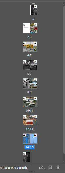
This was how I set up a new document that then became my zine.
This is how the document came out, this allows me to have creative freedom over each photo I put into this zine. I will use my paper mock up to help create a base before I make any major changes to it.
To make sure I have access to the tool bars, I changed the setting on the top right from ESSENTAILS to ESSENTIALS CLASSIC.
I changed this setting to make the zine high quality without having to use the shortcut SHIFT W to remove the guidelines.
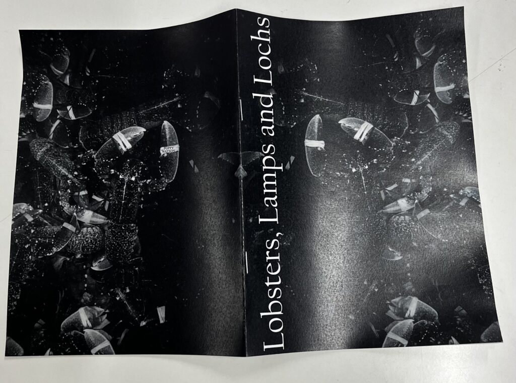
Front Cover
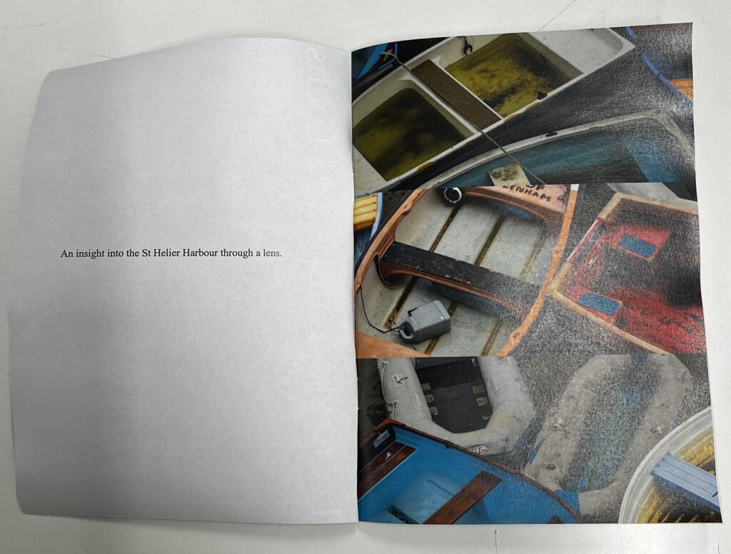
Page One
Following my paper mock up I put these three photos on the first page after an empty page. By matching up the images making them into a sort of joined tryptic photo. This worked well and created a bold, interesting first page setting the narrative for the rest of the zine.
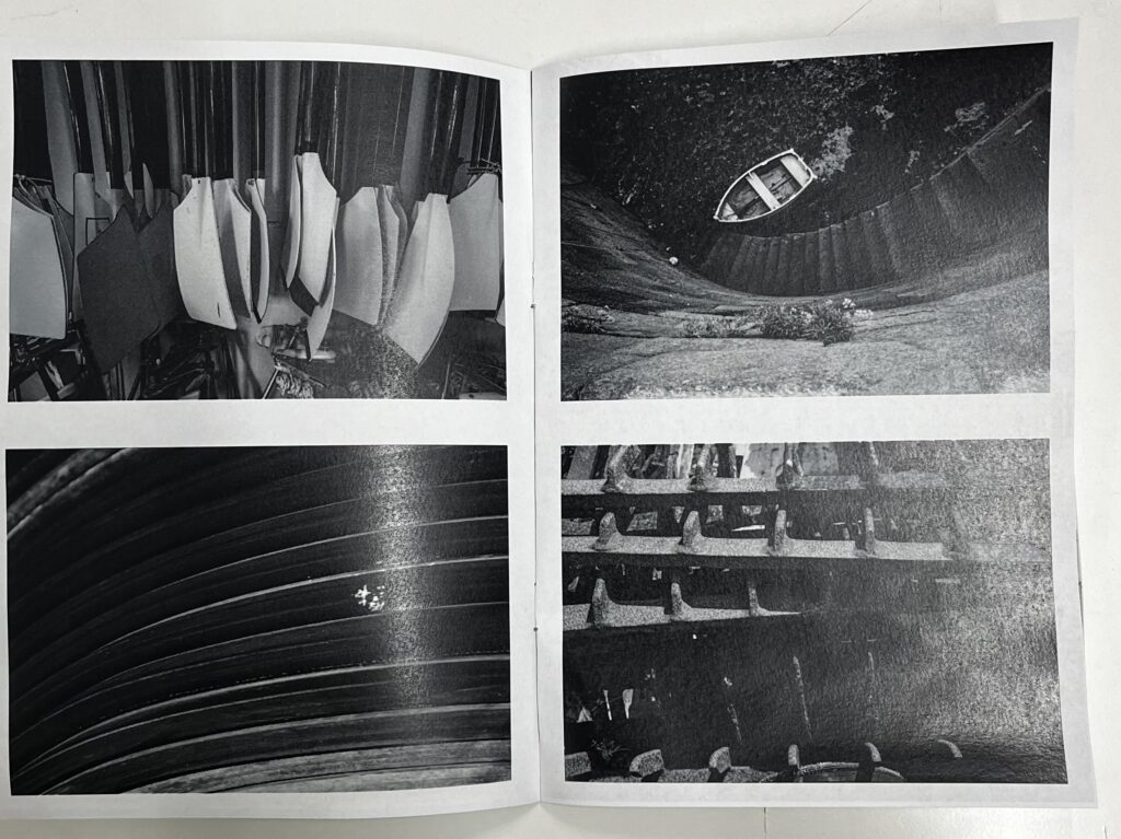
Page Two
Before
After
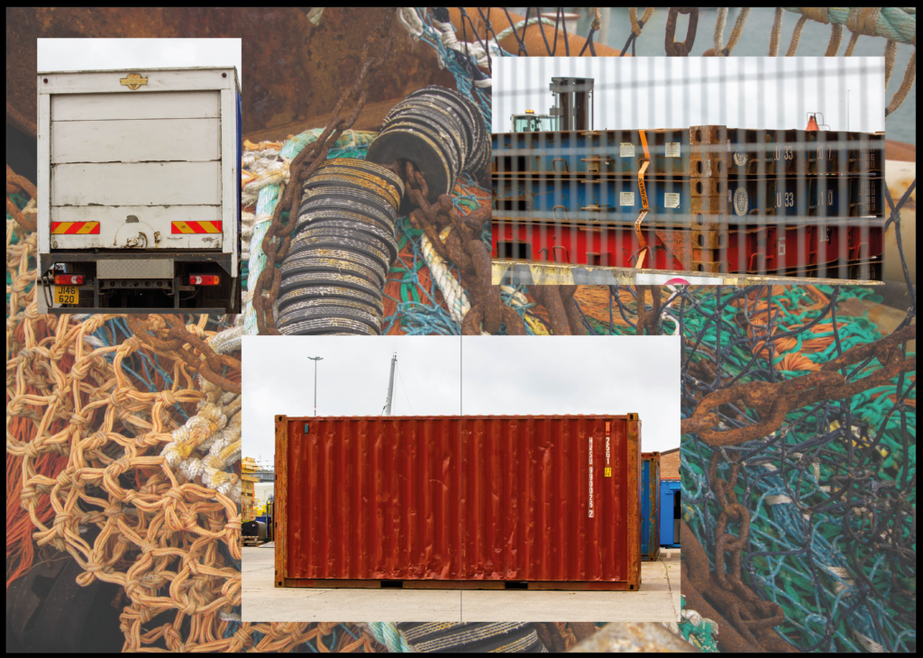
For this page on my mock up I kept the background blank, however when I did this on the actual document it appeared too empty so I experimented with backgrounds, before settling on the one above. This actually then helped link the next page in as the next page is all black and white images, while also providing context as the rest of the photos are mostly small snippets and details shots. I also made this a double page spread to give the images enough room to be seen without being overcomplicated, I used the imagine in the middle to split between the two pages as it is a detailed image unaffected by being folded across the two pages.
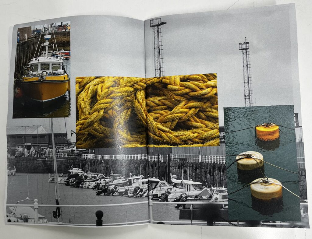
Page Three
This was my original design however I felt the bottom left photo of a roll of rubber wasn’t quite right. The shadow was distracting and the lighter tone didn’t quite fit. To fix this I re-cropped the image and re edited the image. This made for a much better overall look.
Page Four
I kept this page the same as paper mock up as it worked well when I placed it onto the pages, I like the contrast of the full size black and white image with the two smaller full colour images.
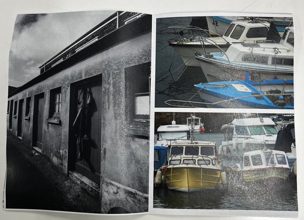
Page Five
Again I tried making the page the same as the paper layout but the page appeared to blank with too much free space. To fix this I added an abstract detailed photo in the background with lowered opacity. I also made sure the colours in the three images worked with the background photo.
Page Six
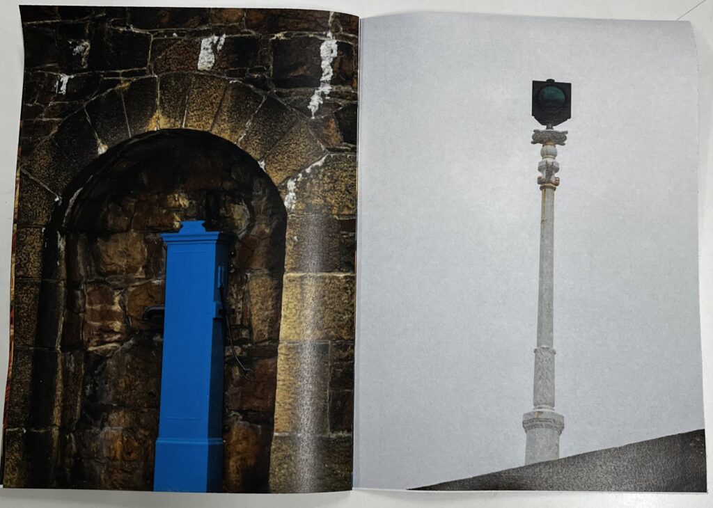
As I had used the original photo on the left for the background of the previous page I needed to swap the photo on the left out. The photo on the right matches well as this is actually the same wall as the photo on the left just at different points, both are important historical points to the Jersey harbour. The photo on the it is a traditional Jersey arch with the three blocks sticking out as the style and the lamp acting as a ‘traffic light for boats’.
Back Cover
Front cover . Back Page
The final page I kept the same as the front cover, however I flipped the photo so if you opened the pages out it appeared one whole image rather than the same photo twice. I also put my name on the elastic band to keep it almost hidden.
Overview
I have now finished the zine and as above I have captured the process I went through to select the final version of the zine from a paper mock up to the final print out. By recording each decision I made allowed me to reflect on the choices and how I could change things to fit with each other as well as giving me an opportunity to understand my own choices and how well the narrative flows by how easy it was to explain in words. I found sometimes I was making connections only I would as I knew my work and photos as well as what I was trying to say so this gave me a point of comparison to reflect on. The zine captures the harbour well, I paired it with the title ‘Lobsters, lamps and lochs’ as I felt this was a simple overview of the zine and also harbour through an intriguing alliterated phrase. As the zine goes on the the history is more and more obvious highlighting further specific links to the Jersey harbour over any other harbour. I have shown this in the photos, for example on the second last page there is a photo of an arch and pump which is where sailors would have gotten fresh water from, but the arch is specific to Jersey as the design of three bricks sticking out on the non curved part.
A photography zine is a small book almost of a collection of photos. They are designed to tell a story through photos and limited text, unlike like picture stories they don’t have text on every page and cannot be viewed as one page so much as a progression in story like a normal book. Each zine is completely personal to the creator/photographer some choosing bold, vibrant designs and others picking heavy white boarders around each photo. Some contain completely abstract photos others providing large overviews of the topic, most are a mixture of small detail shots and large overview photos. I personally liked the zines with detailed covers, with heavy texture or colour I found this draw me into the zine wondering what was inside rather than having an overly complex imagine that was easier to skip over. Following this, I found my favourite zines had a mixture of detail shots and larger scale photos, I found this explained the narrative the best.
What is your story?
3 words
land, sea, history
A sentence
-A brief glance into Jersey’s maritime industries new and old.
A paragraph
This zine will explore the old and current Jersey harbours, specifically the St Helier harbour we all know as ‘the harbour’ before venturing into the old French and English harbours. It will also show the narrative of the industries from fishing to sports like rowing.
What is Narrative?
Narrative is ‘a spoken or written account of connected events; a story.’ Or in photography terms, using photos to show a story to the viewer with minimal words. This can be done in many ways, in fact any photo tells and story so it can be done in a single photo or a small collection of photos like a picture story. However in this case I am creating a zine with the photos and knowledge I have gained researching and capturing the Jersey harbour’s over the past month.
How will I tell my narrative?
I will tell the story of the Jersey harbour through my photoshoot results, more specifically I will use a zine I design on Indesign. I have decided I will use negative space and backgrounds to add context as well as keep the zine interesting. By adding background images I will use photos that add context but aren’t enough for a page by themselves. Having done research I know I found the most interesting zines were the ones with a mixture of colour, texture and subjects, meaning in my zine I will use black and white as well as bold colour to my advantage emphasising detail with tonal black and white and using bright colour to represent true to life colours of the harbour and keep people interested in the zine.
Further Ideas
Text
A book or other written or printed work, regarded in terms of its content rather than its physical form.
I can use text to help add context and further the style of my zine. I will have a title to help give an idea bout the zine on the cover other than the cover photo. I might also put a small paragraph or sentence on the first page to make use of blank space and provide a small explanation before the zine is continued. This gets the reader to think with a purpose and ask questions about each photo related to the theme rather than just guessing.
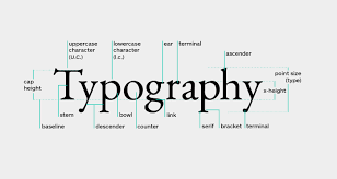
Typography
The art and technique of arranging type to make written language legible, readable and appealing when displayed.
I can use typography on any text I put in, including the title this will help create a style to the zine.
Examples: creative uses of words, letters, font-types, sizes
Mood Board
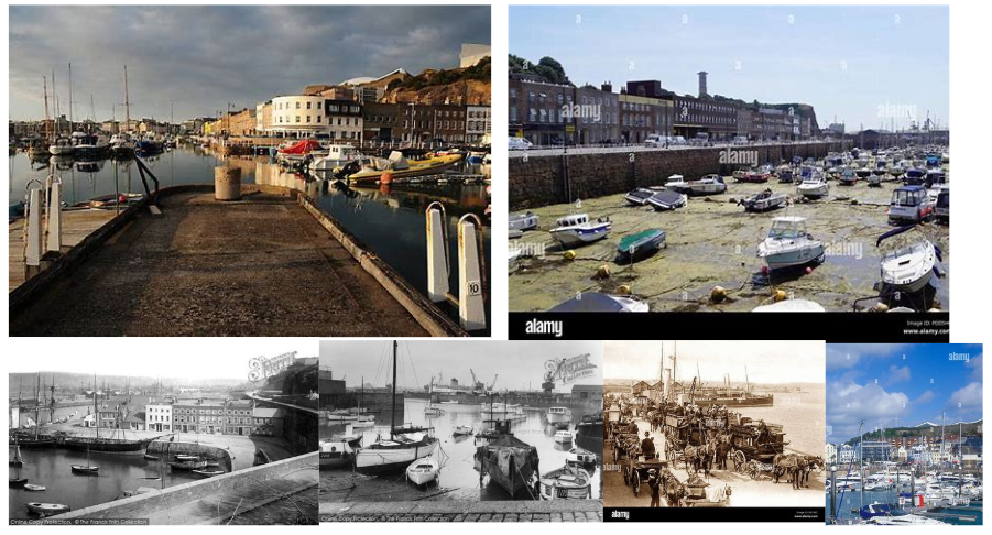
In this mood board I used a mixture of photos from the SJ archive as well as photos of how the harbour is today. I like the mixture of overview shots combined with all the smaller detailed shots. This provides contrast while keeping a full picture of the harbour from the smaller details of industries to the larger structure itself.
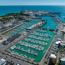
For the second shoot I started at the maritime museum, learning more about the history of the Jersey maritime history, from this I grabbed some quick shots to inspire me for the rest of the shoot. I then went onto walking around the harbours again. This time I had a different lens instead of the 70-200mm I had a 10-20mm this allowed me to get really wide angle shots.
Contact Sheets
Edit One
This photo was great compositionally but I didn’t like the red so I changed the photo to black and white to emphasise the texture and tones in the photo, this helped also show the purposeful angle of the image, showing all the doors on the fishing storage sheds.
Edit Two
I like how the black and white evens out the photo from the over exposed area, it helps the repetitive pattern of the dredging tools. (a harsh, destructive fishing technique)
Edit Three
For this shot I think the colour actually adds to the image, not only is there many different textures but there is many different colours from the rusty chain to the green netting. The exposure being moved lower has helped enhance the colours and make them bolder making the photo feel more intense.
Edit Four
I orginally liked this photo for the lines but I didn’t like the yellow tone or noise from artifcial light, to fix this I changed the photo to black and white, this meant it empahsised the dimeson and removed the issues of colour.
Edit Five
Again I liked the lines and dimesion of the photo as it has the contuinal curve of the wall at the bottom of the shot but keeps the boat jus off center at the end of steps creating a great leading line. I again turned th ephoto to black and white as te true colours wern’t captured well so this helped add depth to the photo as the colours having been washed out took the dramatic tones out of the photo.
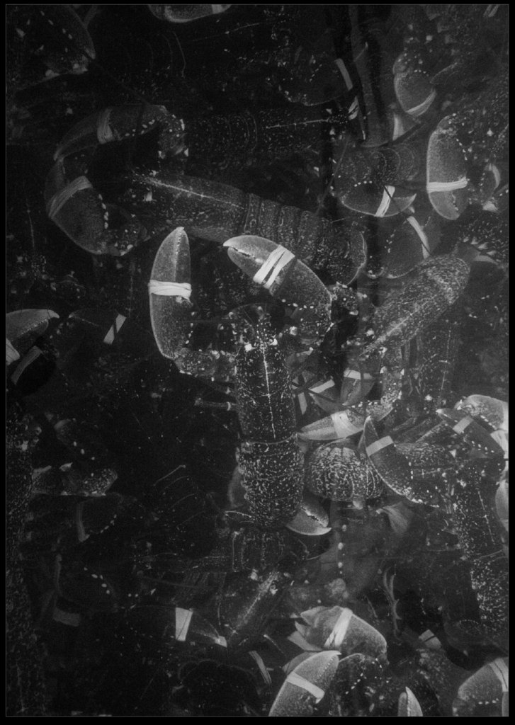
Edit Six
As I had fixed the last few photos I like but the lighting was off by turning photos black and white I thought I would try it with this one. I liked how the lobsters were an interesting subject choice with the one lobster in the middle, on top of the others it added a focus to the photo. The photo was indeed dramatically improved when I changed the photo to black and white revealing otherwise hidden areas of the busy photo.
Edit Seven
Following on the black and white theme I changed this photo to a similar, tonal black and white image again elevating the image from fairly flat and uninteresting to a dynamic, abstract photo.
Final Thoughtson the Editing
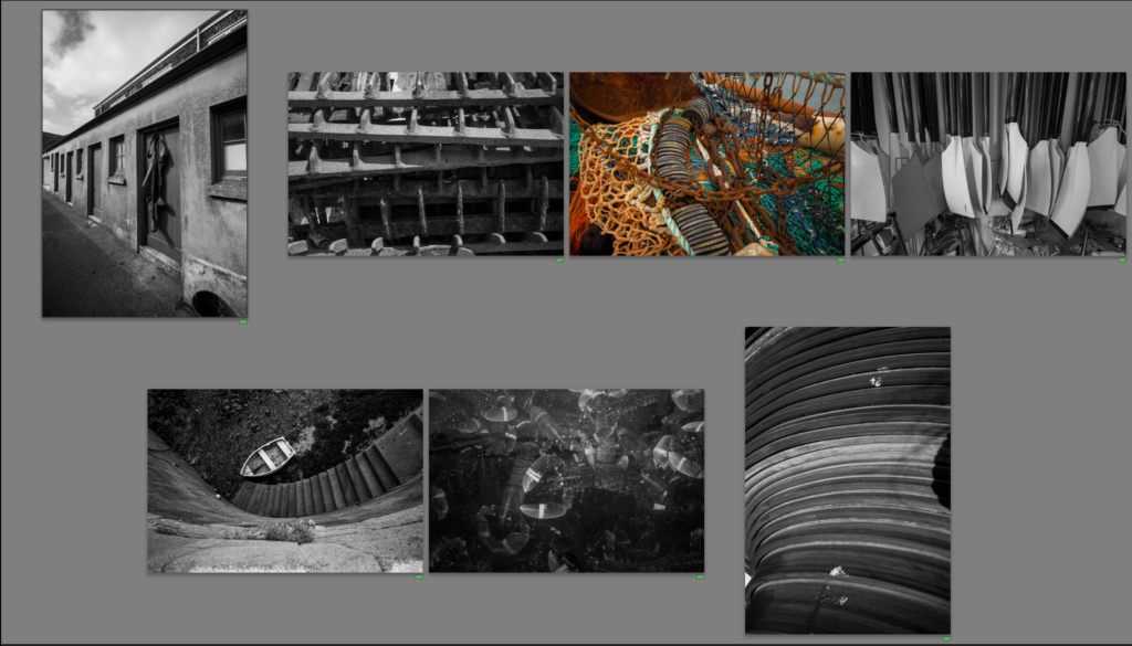
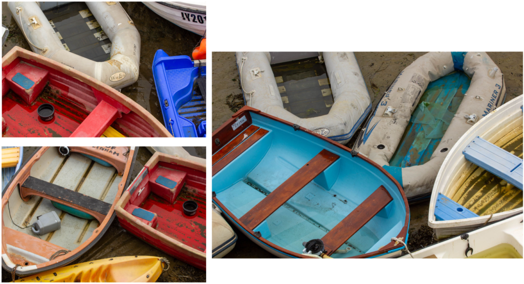
From this shoot I focused more on the details rather than the whole picture like the first photoshoot. Although not quite what I had planned it worked out well with getting quite a few good abstract shots of the harbour. I think having had quite a few of these edits in black and white I might use a double page spread in my zine to create pages of black and white photos especially the abstract ones so a fuller picture is given through small snippets.
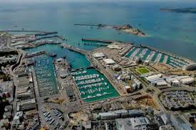
For the first shoot, I visited Societe Jersiaise researching old photos of the harbour with archivists. Having done some research I went on a guided walk, with a former harbour master, learning about the new and old harbours. I then took photos of the harbours and everything in and around them, capturing the details of the harbour to the the harbour as a whole.
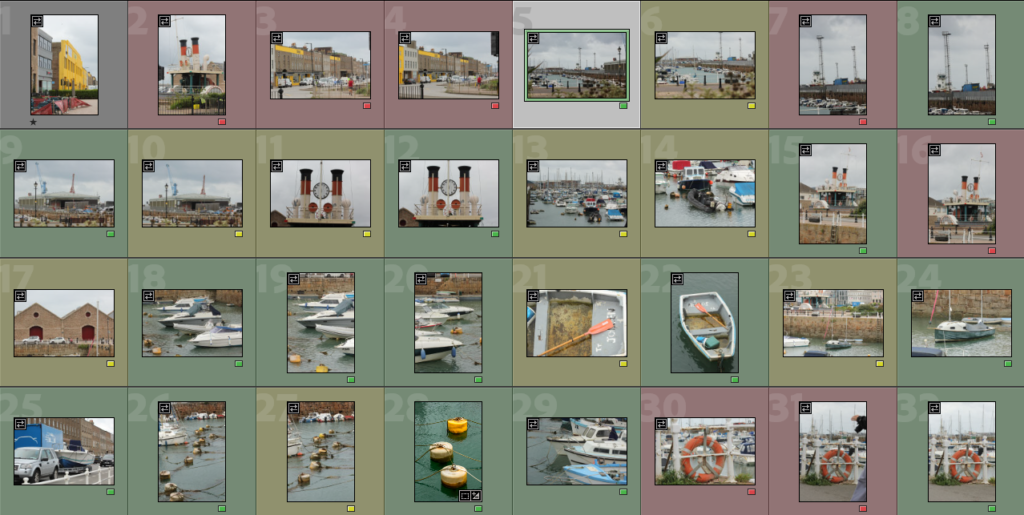
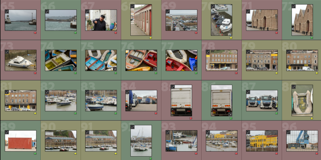
I then went onto upload and edit the photos, starting by going through the photos, colour coding each one, ether red, green or yellow.
I then went through the green flagged photos and selected the best from those, this allowed me to have a small selection of good photos to then select a few good ones that go well together to edit.
First Edit
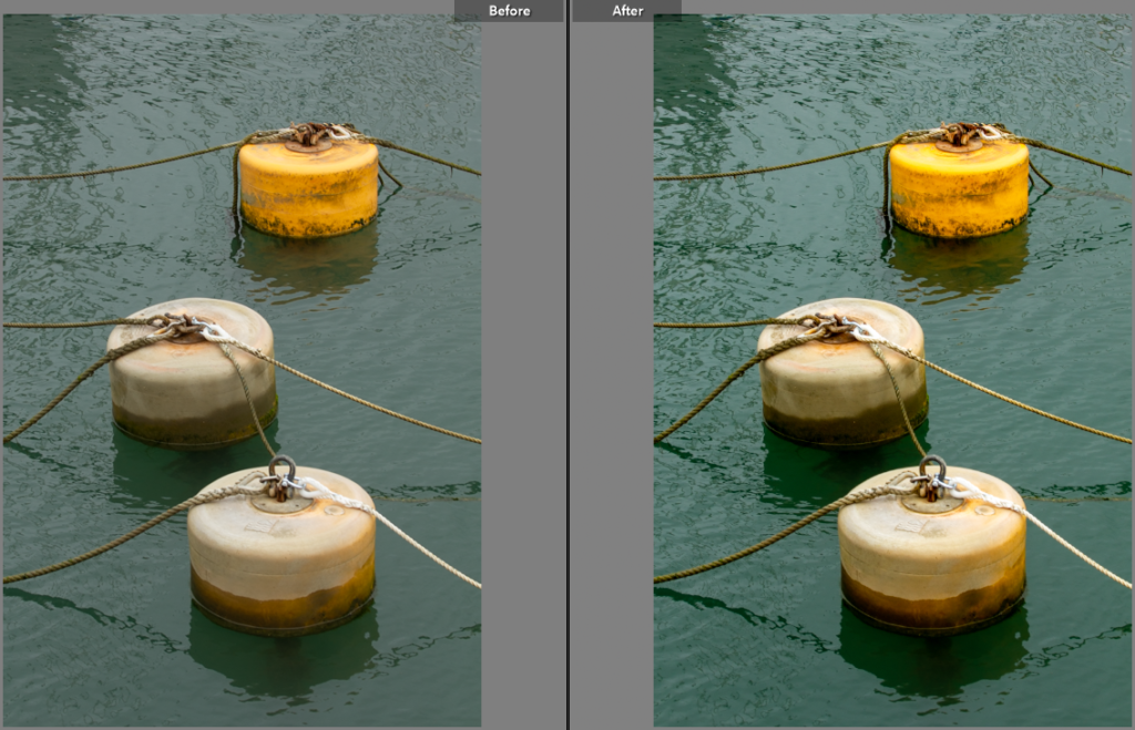
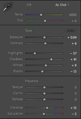
For this photo I cropped it to centre the buoys, this fits the photo into the grid lines (rule of thirds).
By making small adjustments to the colour I brought out the colour in the faded buoys and the sea, this also helped bring out the texture of the sea.
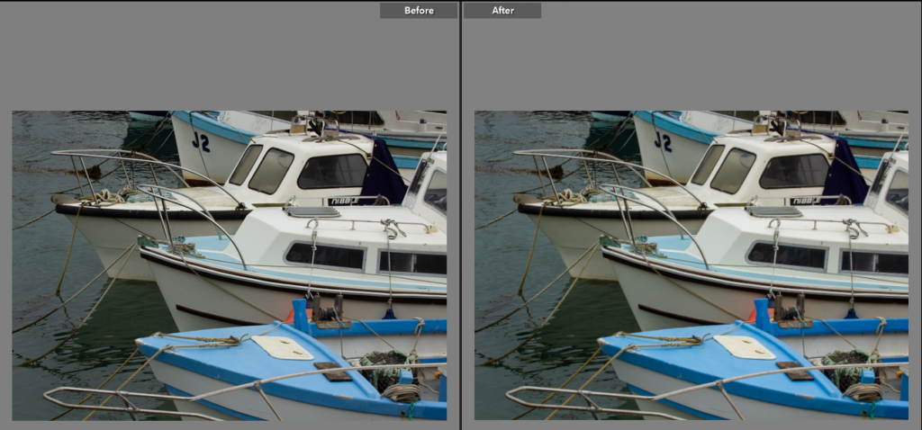
Edit Two
I liked the diagonal line the boats create in this photo so I then edited the colours to reduce the highlights as the glare on the boats was quite harsh form the lighting. I cropped photo to highlight the line and frame the photo better, this also removed the cars as in the frame it was distracting.
Edit Three
Edit Four
For this photo I sorted the slight angle and also cropped the image down so background wasn’t as visible. This helped create a further ambiguous effect, not revealing the background or context.
Edit Five
Edit Six
For this photo there was spots that were distracting so after the colour editing I used the spot heal tool to neaten up the photo.
Edit Seven
Edit Eight
Edit Nine
Edit Ten
Edit Eleven
Final Edits
Final Evaluation on this photoshoot
This photoshoot was the bas of my ideas, capturing everyone and everything at the harbour to create a style of images. I particularly liked the detail shots, or otherwise known as abstract shots. I think these help add emphasis on how brutal the harbour can be with the constant soaking in salt and open windy area. I also picked some with the boats and also the trucks, shipping containers to show how the sea a natural thing has been industrialised through the years with constant improvement on the harbour as not only times progress commercially but as industries die out. By using the 70-200mm lens I had many strong, high quality photos however I think it would be great to revisit these areas with a wider angle lens to add deeper context on the areas with broader shots now I have gotten the smaller details and started to understand the harbour around me. Particularly having done the research on the harbour before hand it gave me a strong base to capture the essence of the harbour. I chose not to change the colours as I actually think the bright colours make up a huge part of the harbour and highlight the development over time of the harbour from dull steel and wooden boats historically to bright cheap plastic dingy to carry people to the new shiny mechanised boats of the modern day.