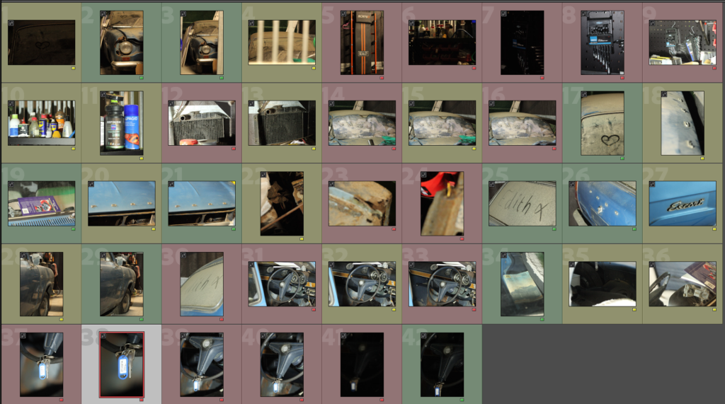
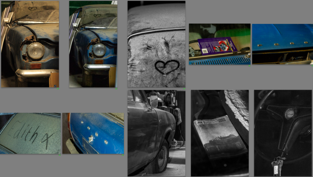
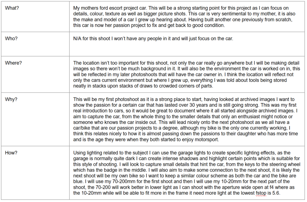
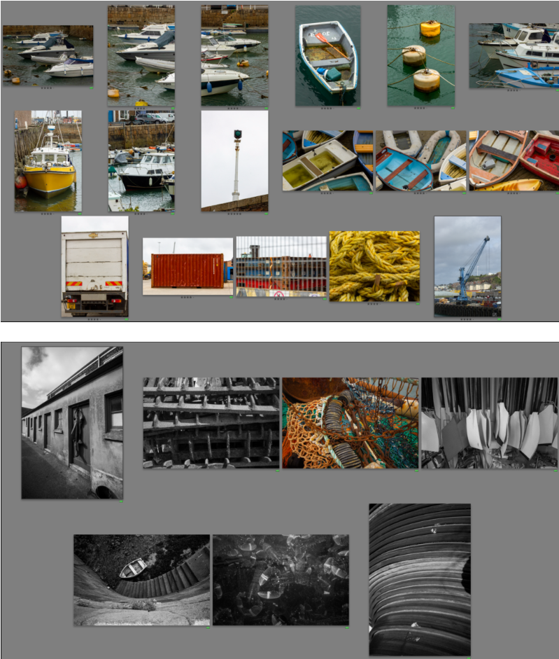
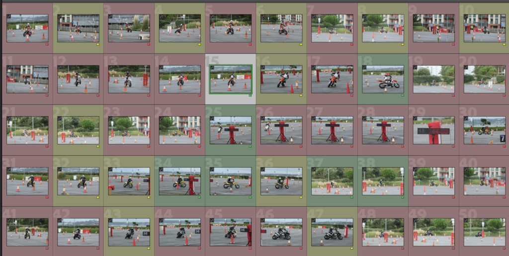
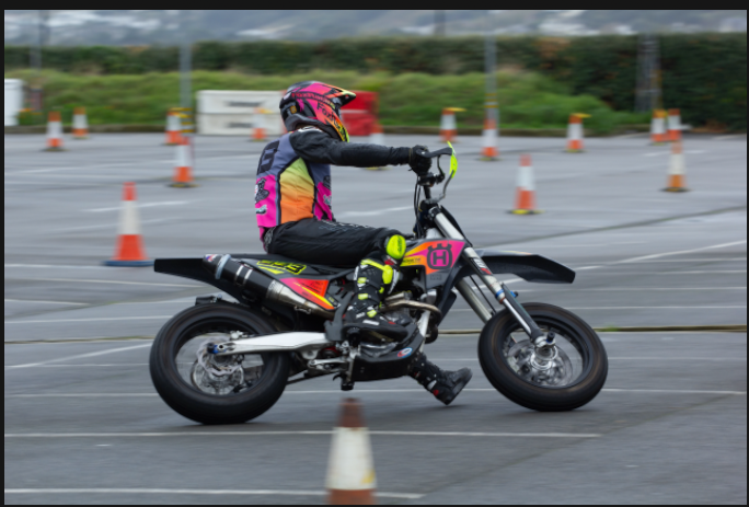
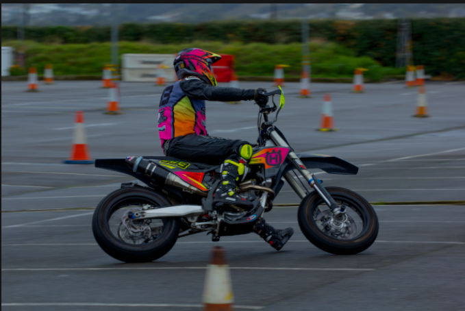
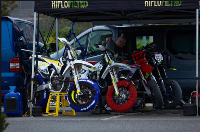
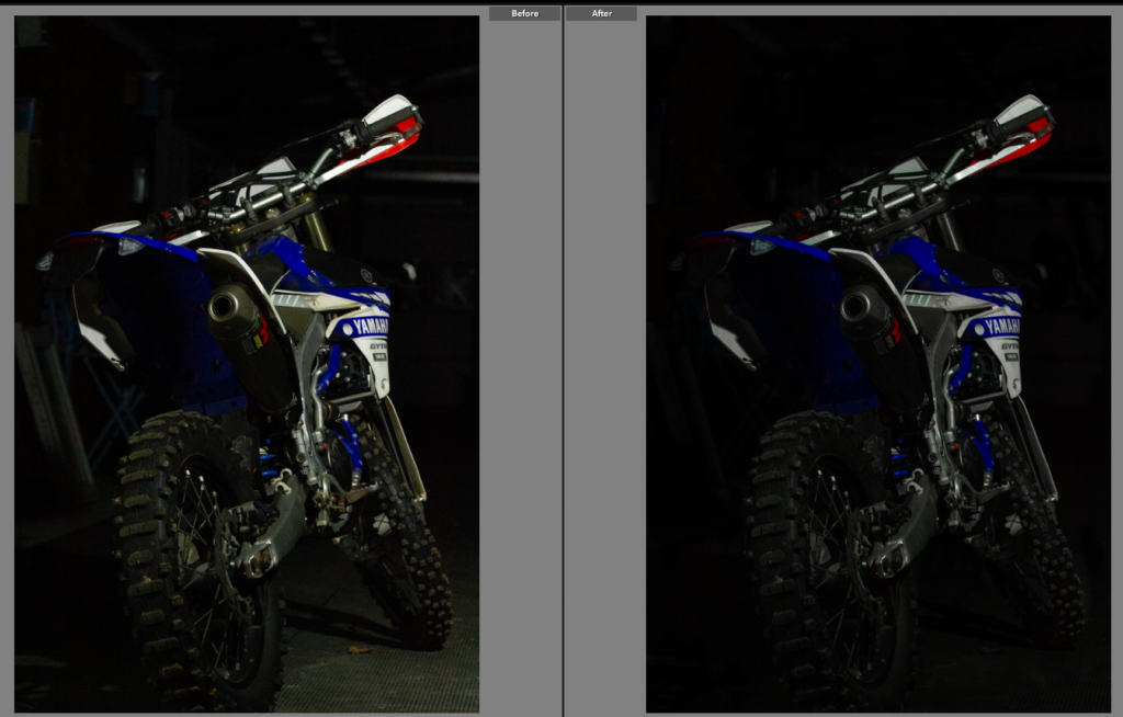
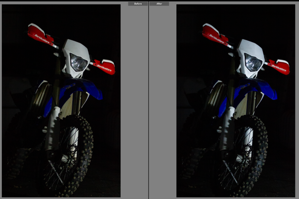
Contact Sheets
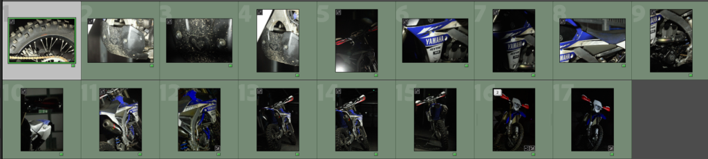
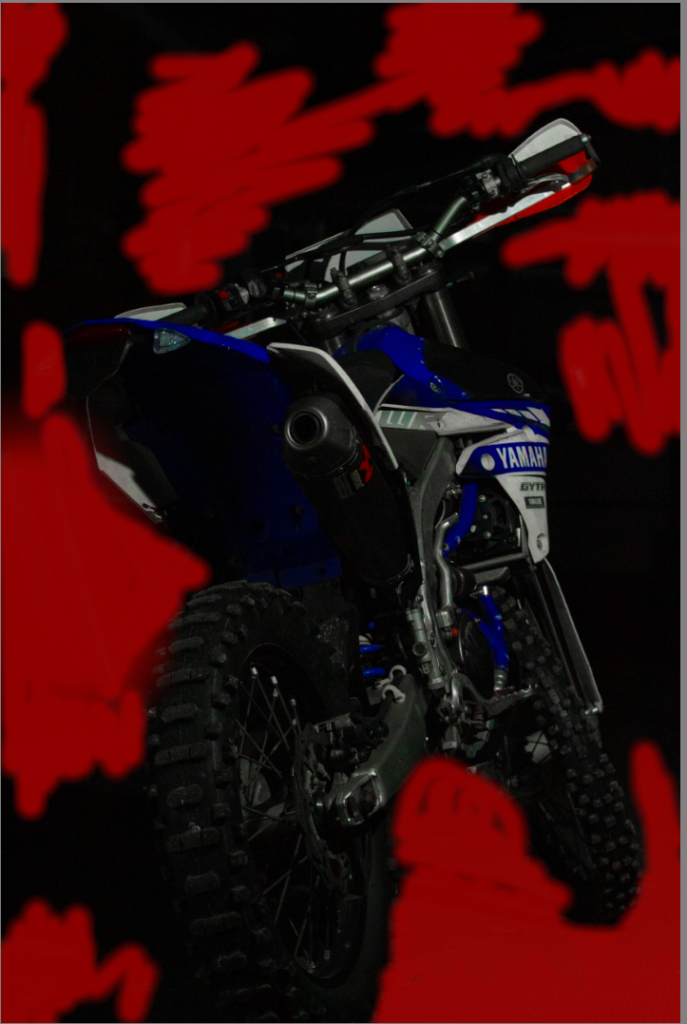
From this shoot, I ended up with 17 good shots. I need to go onto to edit these shots now as again the lighting proved tricky.
Edit One
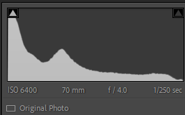
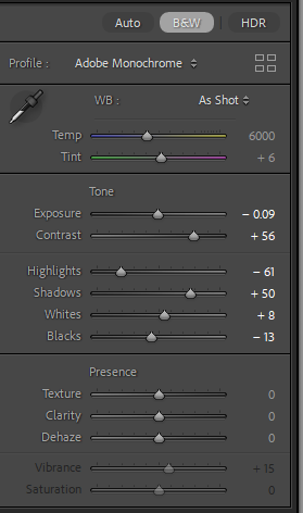
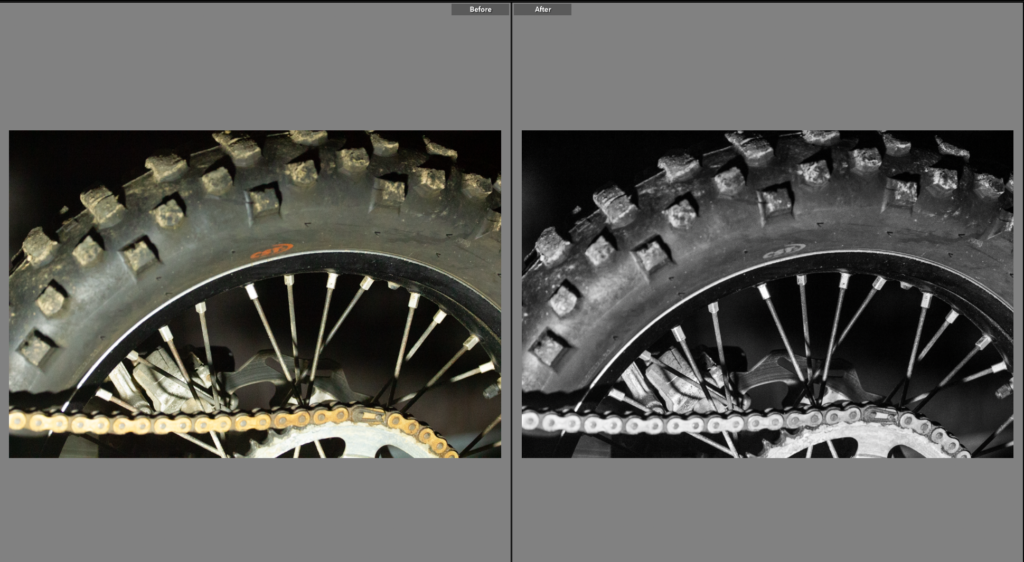
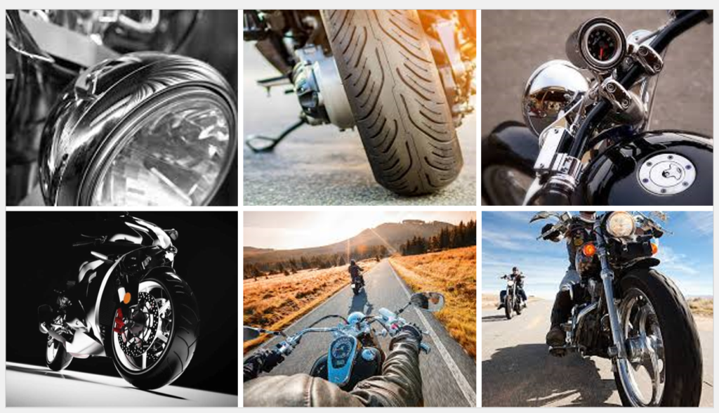
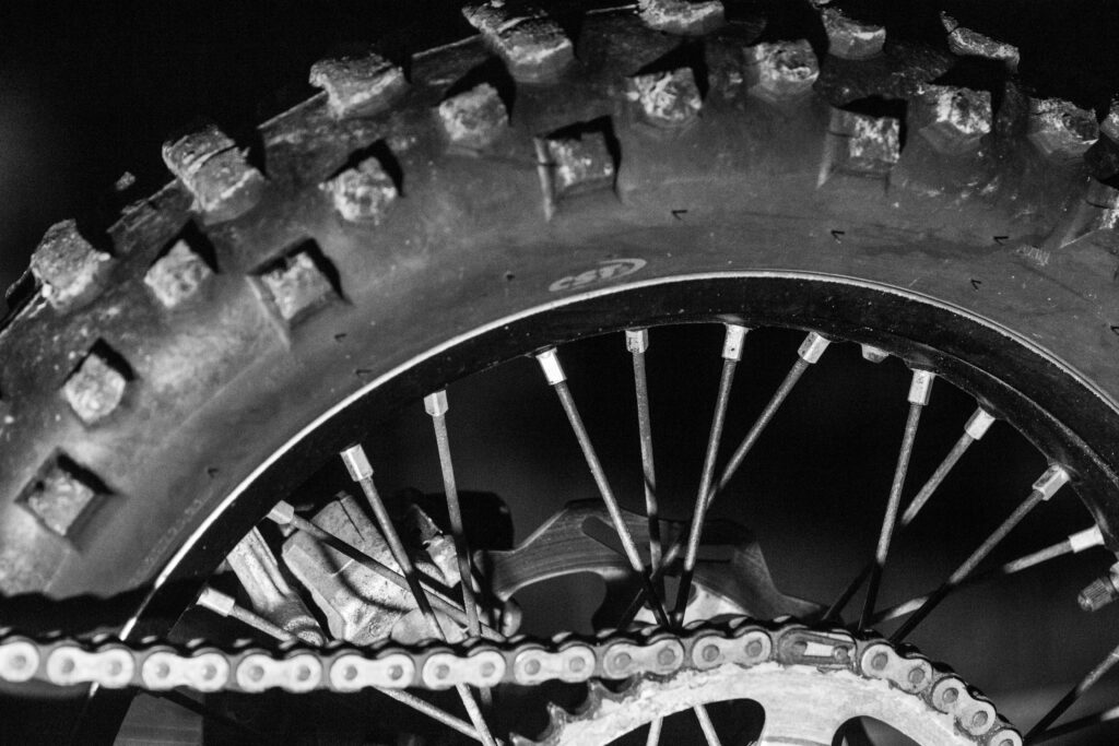
I liked this shot, the texture from the tires to the repeated pattern from the spokes and chain. It is similar to the previous shoots detail shots meaning the shoots link together.
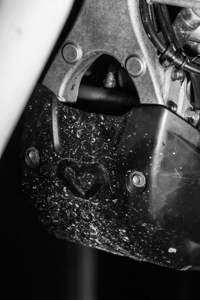
Edit Two
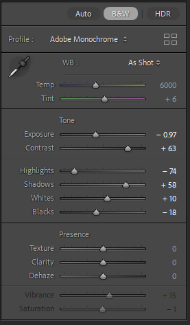
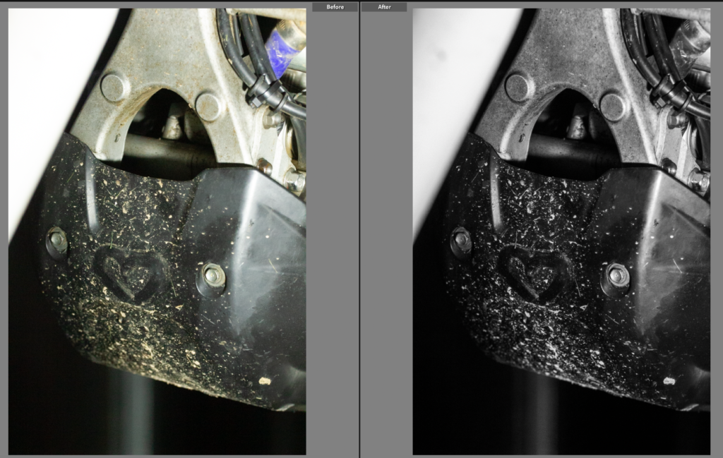
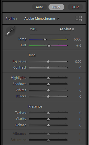
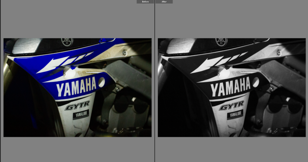
Having previously done a similar photo in the last shoot I liked the idea of having a similar photo from a different shoot, linking the shoots and subjects together. I chose the black and white as it added tone to the image, taking away the yellow tinge to the photo. It also highlighted the texture of the mud on the bash guard.
Edit Three
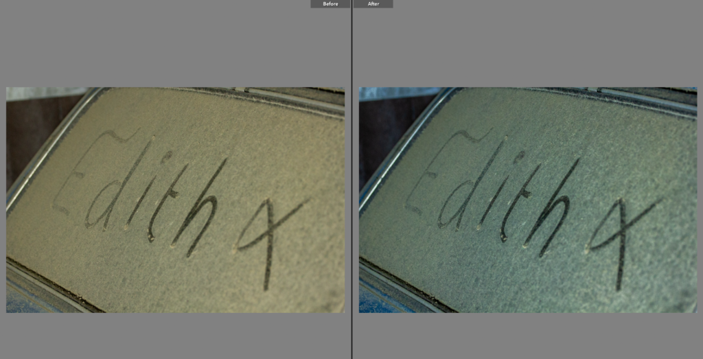
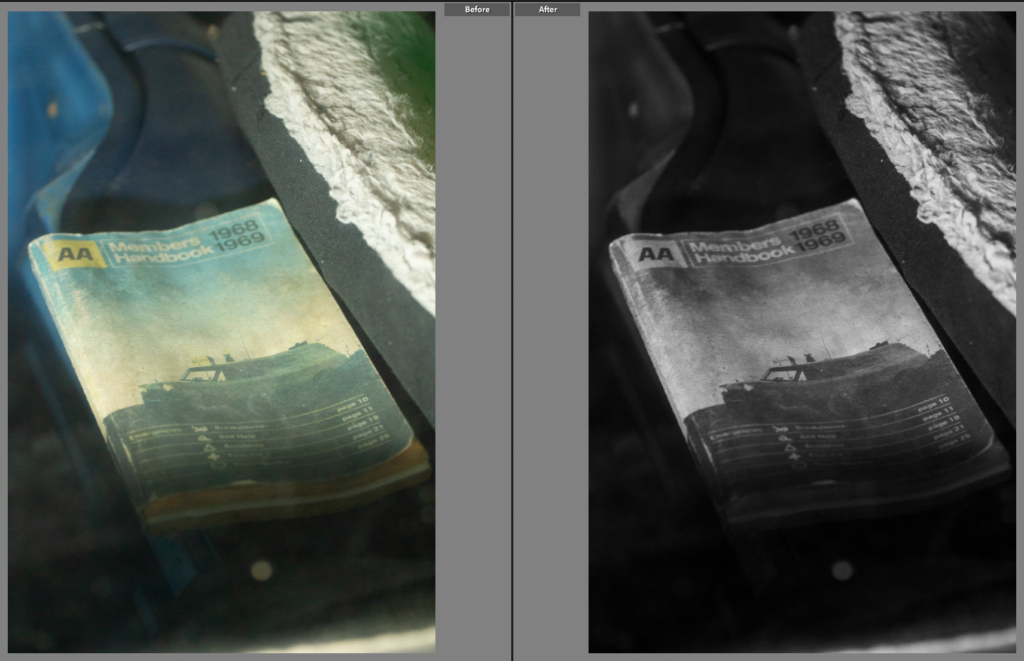
This photo needed cropping, as while it was composed well it would work better with the frame pulled in. the black and white is becoming a common theme throughout these photos as actually the colour doesn’t add much to the image, in fact it is a stronger photo in black and white as it counteracts the lens flare in the corners as it takes away the green colour making the lighting softer.
Edit Four
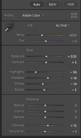
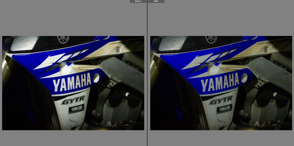
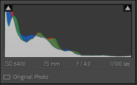
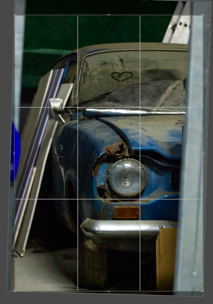
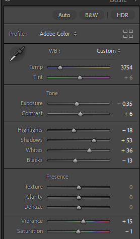
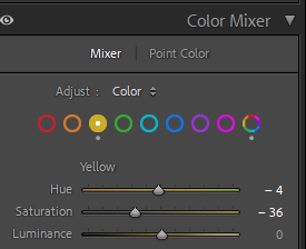
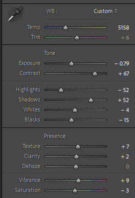
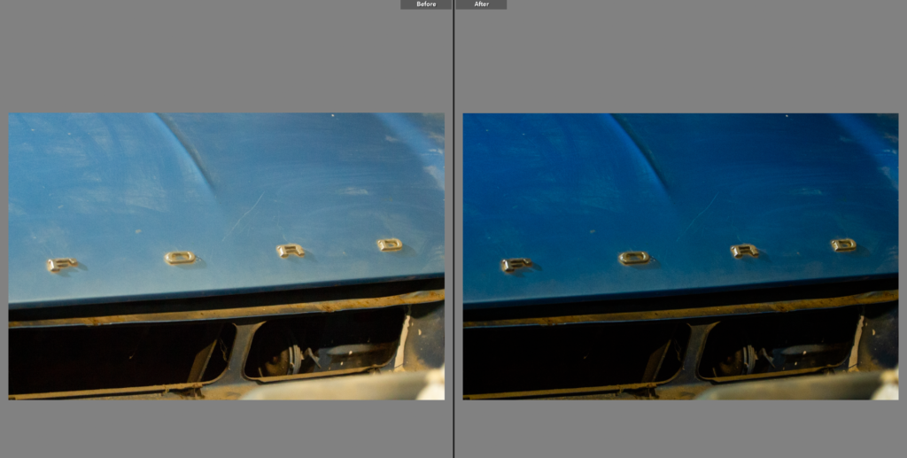
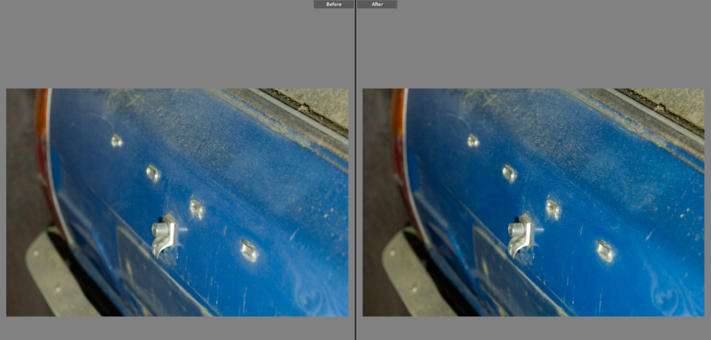
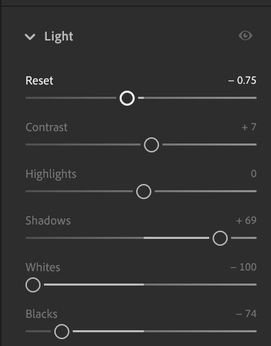
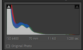
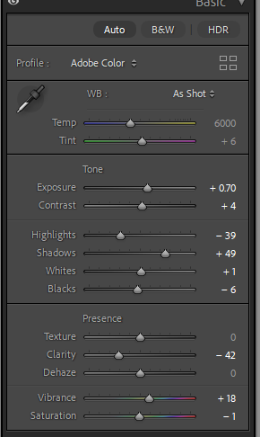
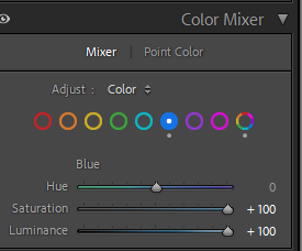
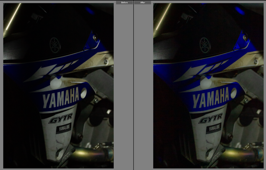
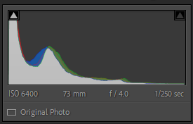
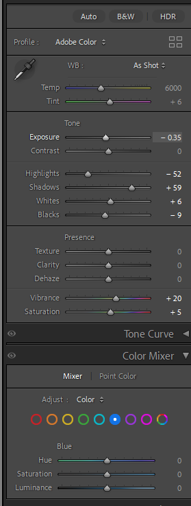
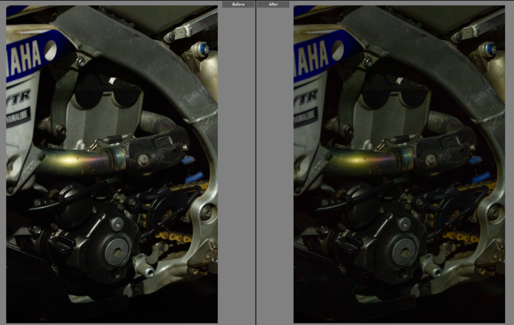
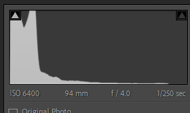
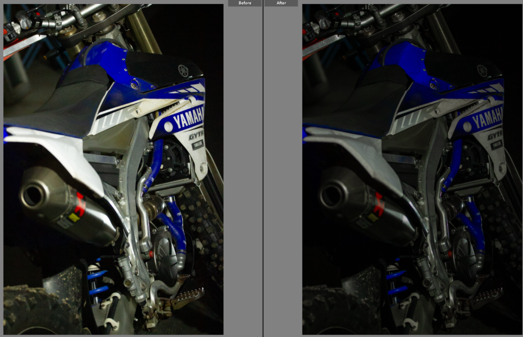
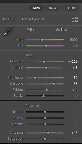
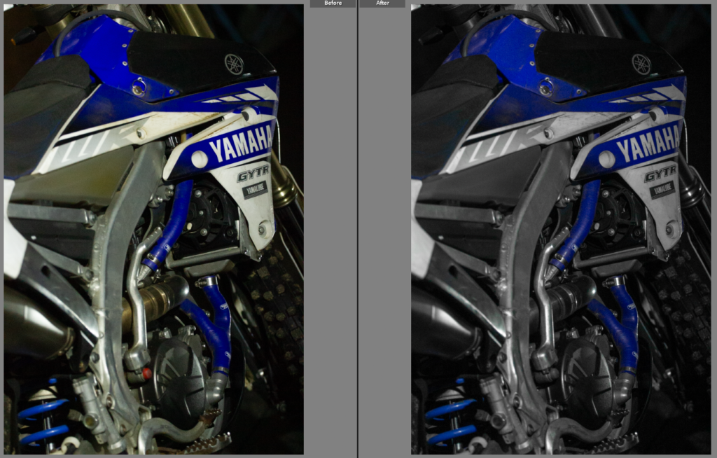
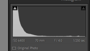
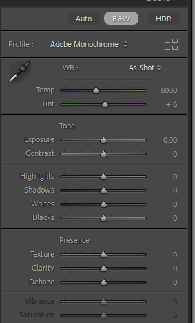
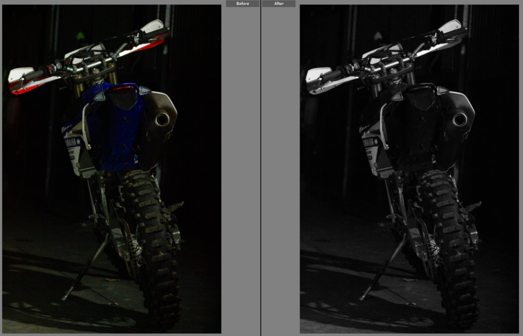
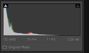
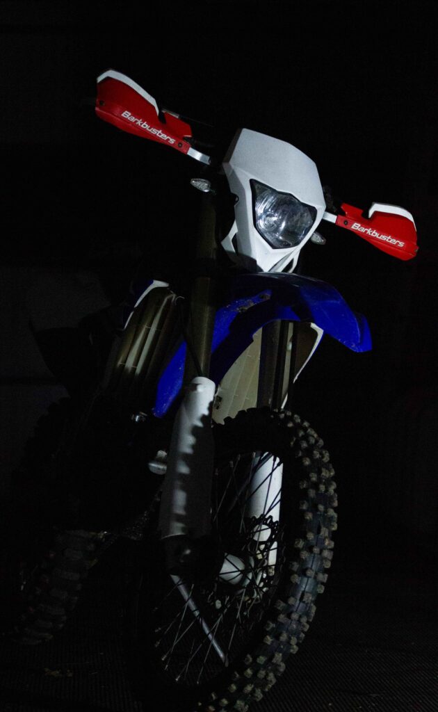
Unlike the previous photos, I trialled this photo in black and white but found it to work better in colour. Having kept the photo in colour I then increased the blues on the colour mixers as well as increasing the shadows to make the background a deeper black and decreasing the highlights to remove some of the glare from the white plastics. This helped the photo have a bright, vibrant colour, capturing the colour of the bikes graphics, similarly to how, in the previous shoot, I captured the true colour of the cars paint.
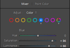
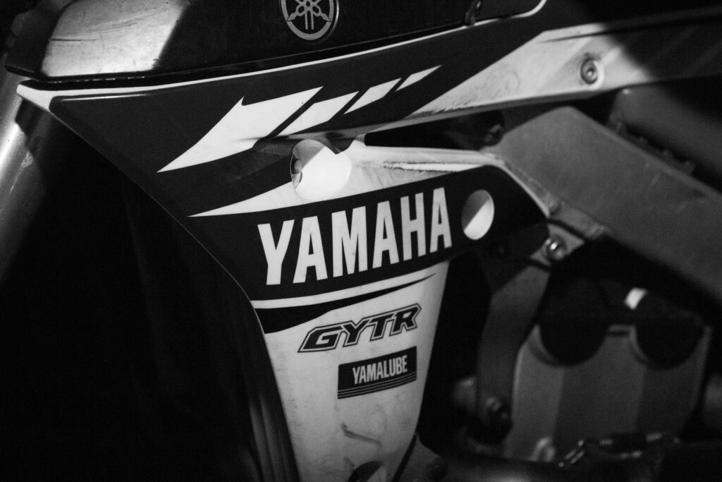
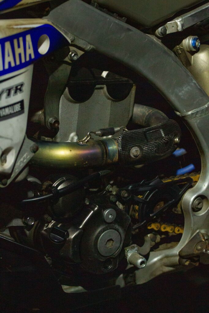
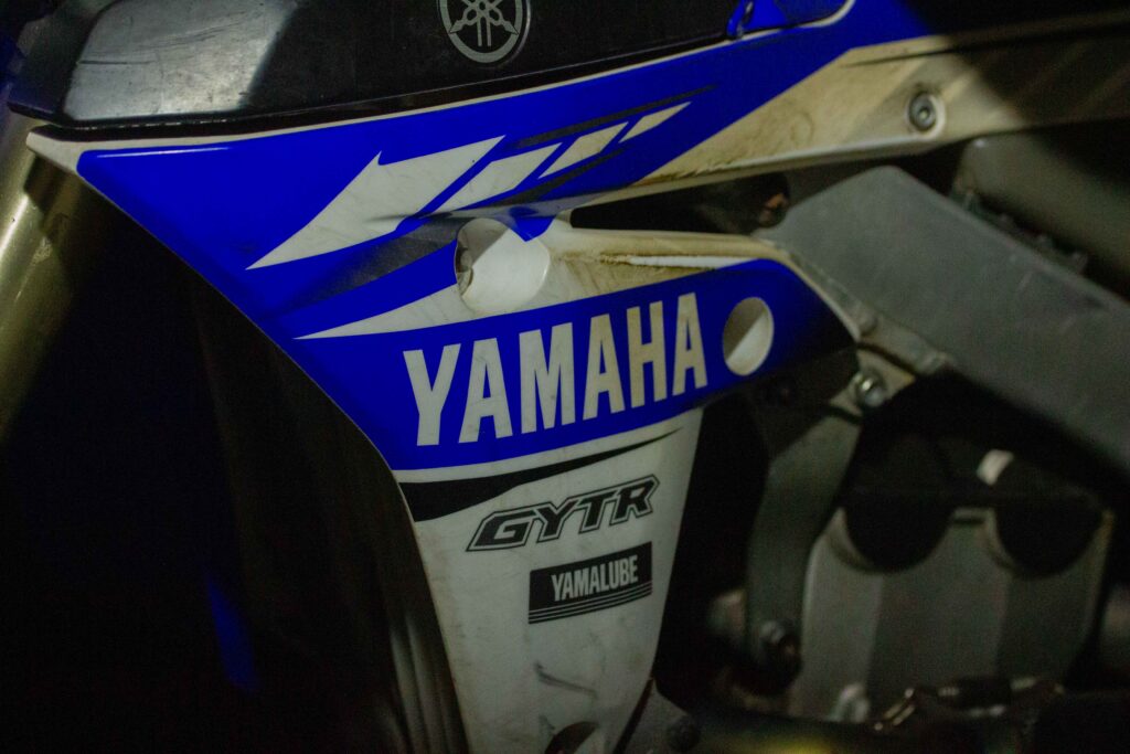
Edit Five
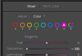
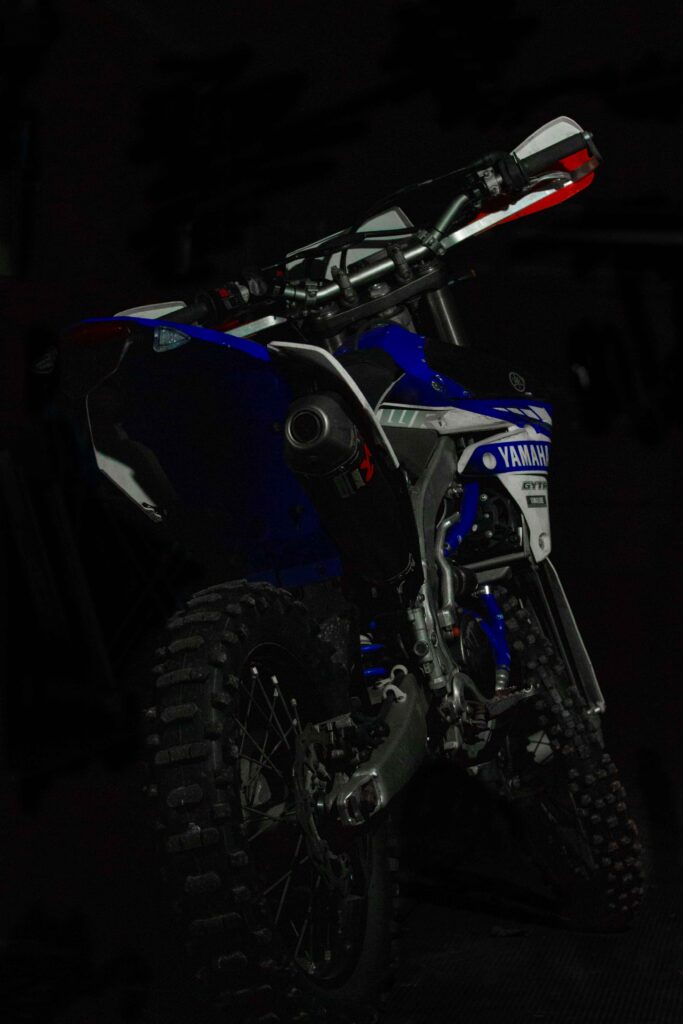
I went for a similar approach in this photo, by again increasing the shadows and decreasing the highlights. Following on with an increase in luminance in both blues on the colour mixer panel. This helped bring out the Yamaha blue on the plastic panels, highlight the Yamaha badge on the black plastic panel. It also benefitted the ‘rainbow’ on the exhaust, bringing out details specific to the bike in the photo.
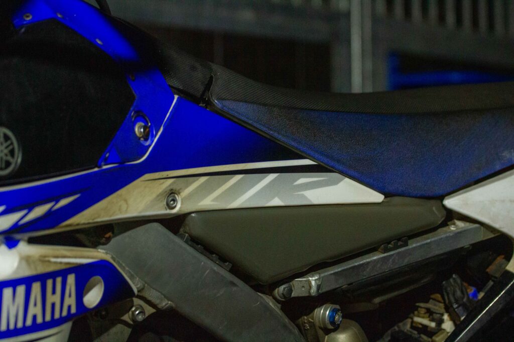
Edit Six
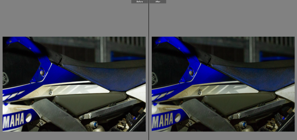
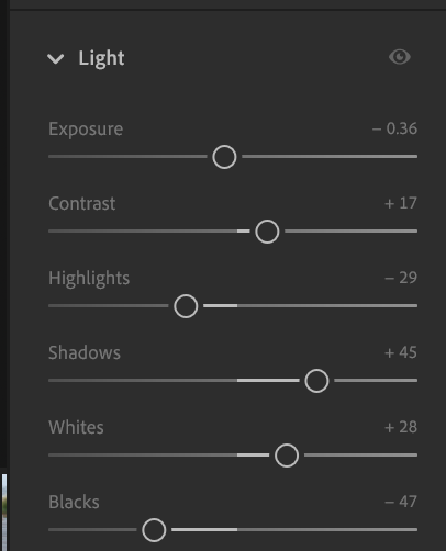
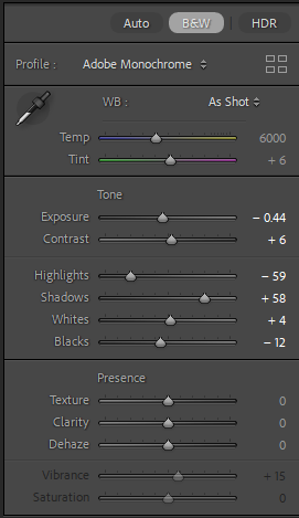
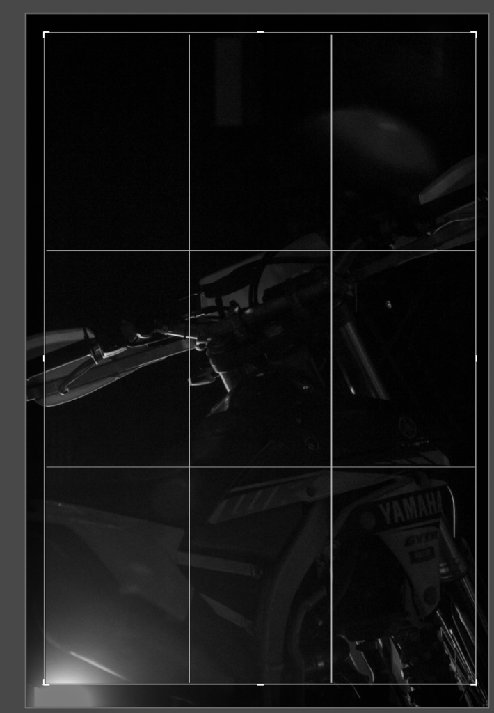
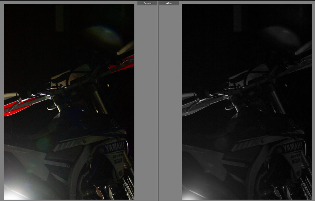
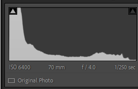
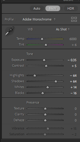
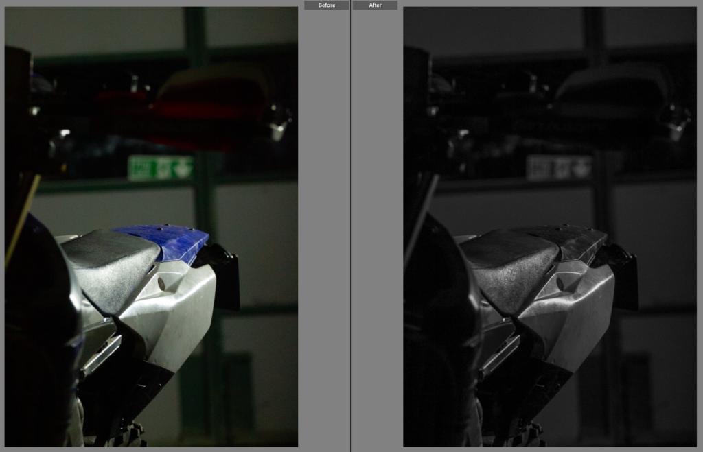
This shot needed very little work but I did want to highlight the ‘WR’ just off centre in the shot. I did this by increasing the shadows, contrast and whites. Following with decreasing exposure, highlights and blacks. This helped bring out ‘WR’, the blue texture on the seat and the blue washers. All of this helped pull the rest of the shots together, having the same blue colour and neutral lighting, focused, detailed shots.
Edit Seven
This shot was trickier to edit as I wanted to highlight the ‘rainbow’ as I had done previously but I needed to make sure the chain didn’t end up looking too rusty as it’s actually gold in colour not rusty. Surprisingly by reducing the exposure and the highlights it made other details pop out, like the blue of the suspension spring and the blue washer again. All these features help pull the photo together and make sense of the composition of the shot.
Edit Eight
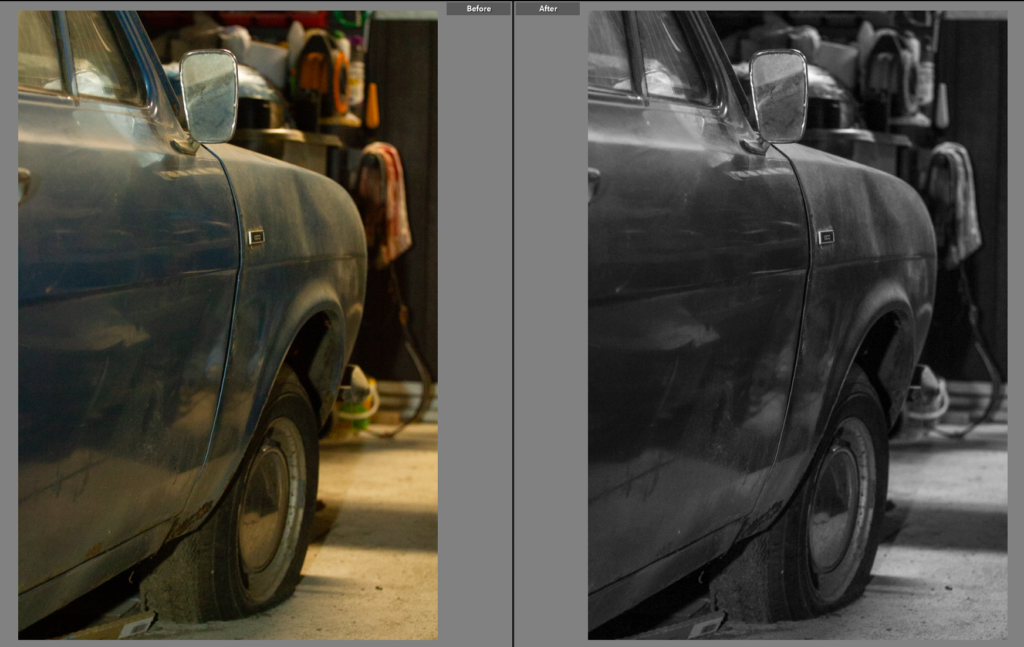
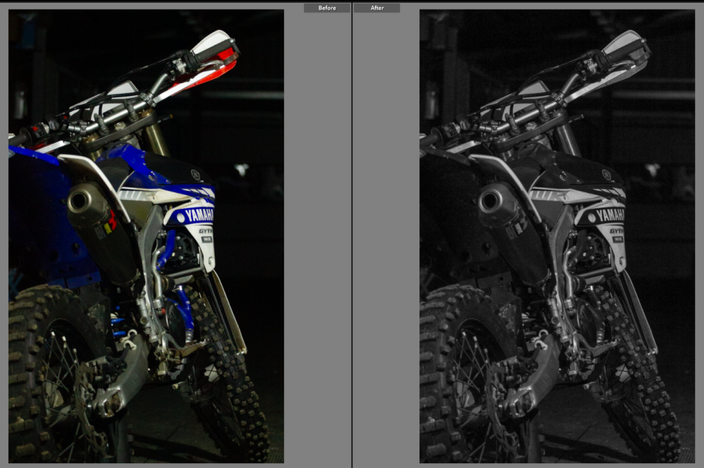
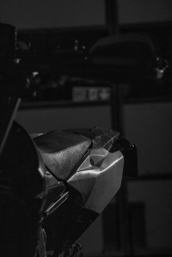
Originally I wasn’t sure I liked this shot, it seemed a bit of a throw away shot, but I liked the use of the foreground to pull the handle bars and wrist guards out of focus while keeping the seat and tail in focus. It created this double focused image, as you saw the seat and then flowed the line from it to the handle bars adding deeper depth to the photo. I changed the photo to black and white because it added so much to the tone of the images, the plastics panels allowed for large, smooth panels of different shades of grey. This only added further to the photo as while my tone is fairly low contrast for the black and white shots this ones had so many shades of grey it was interesting to look at and highlighted each section of the bike.
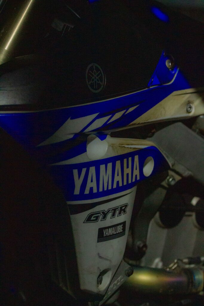
Edit Nine
Alternately I actually did like the raw shot, however to keep it blended with the rest of the shots, I increased the shadows, decreased the highlights and changed the blues on the colour mixer. This not only kept the photos consistent throughout the shoot but it solidified details, like the ‘WR’ and the blue parts of the bike that were otherwise washed out in the original image.
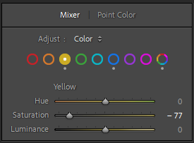
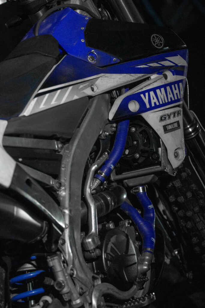
Edit Ten
Normally I’m not a fan of colour pop edits. However when I first saw this photo my first thought was, ‘what would this look like if I used a colour pop technique?’ To do this I went onto the colour mixer and reduced the saturation on every colour other than blues. This worked well, showing the details of any bikes graphics and highlighted the blue parts on the bike. It made for a strong image as in the previous shots I was trying to highlight the blue parts of the bike as it links to my mothers car and is specific to this bike being a Yamaha. This shot also won’t look out of place as the blue on the seat softens the black and white with blue elements. Having edited many of the previous shots in black and white this helped this shot blend in, keeping the tone the same as the previous shots helped as well.
Edit Eleven
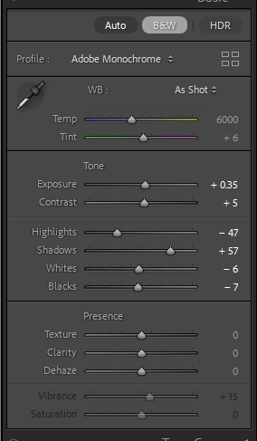
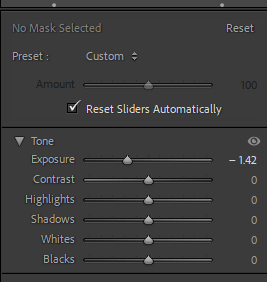
This photo, was tricky. Again I struggled with the yellow lighting in this shot, I also found I didn’t really like the shot. It had potential but I found the background distracting and made the shot look unfinished. I went onto to try the photo in black and white but it didn’t help, however I then tried using the masking brush tool. With the tools exposure lowered I then coloured over the background to darken the distractions. This hugely benefitted the photo as it polished the image, creating more of a studio setting.
Edit Twelve
This shot is the same composition, just slightly zoomed in as the previous shot. However when editing it I wanted to keep to background as it is less distracting than it was in the previous shot, and in fact the soft lighting factors and soft grey tones benefit the photo. I did make this shot black and white, unlike the previous one as the shots looked too similar and I liked how the soft greys make the graphics lines and patterns clearer.
Edit Thirteen
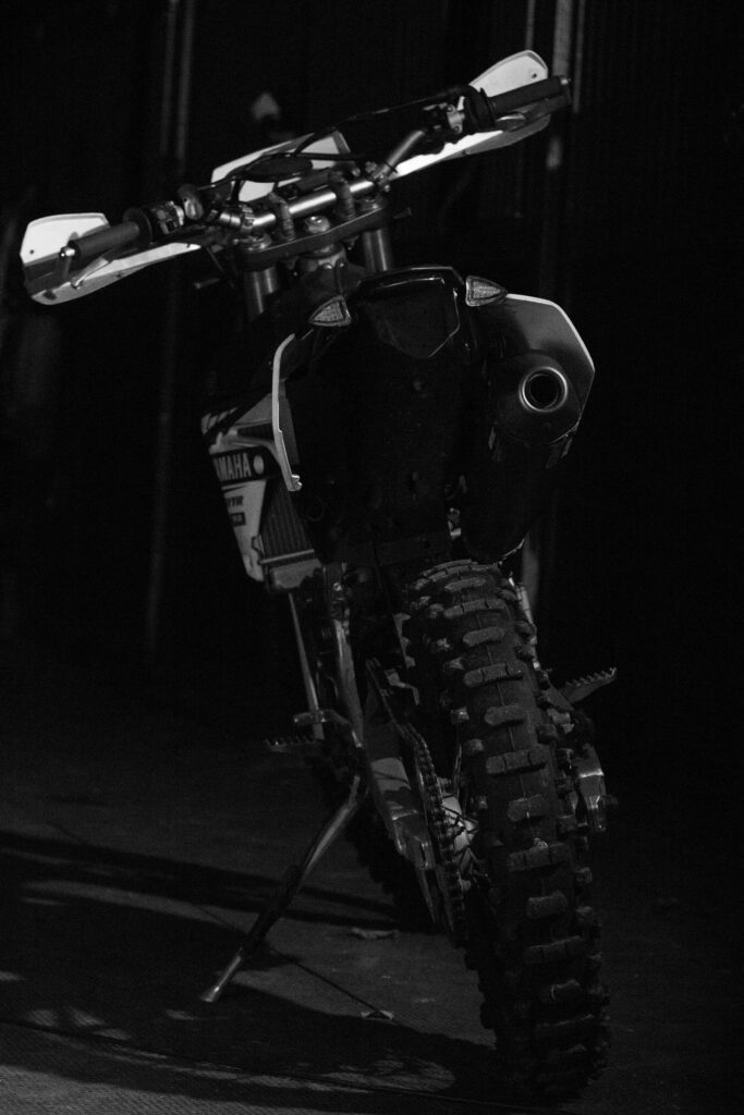
This shot is a common one within the motorsport community, I liked the shot as it shows the bike through my eyes as I normally walk up to it on the left. The black and white, again does benefit the photo as it highlights the shadow of the bike and draws the bike out from the background. Even though I changed the photo to black and white it didn’t need additional editing and already fitted fairly well with the other black and white images I’ve produced. I did move the tone slider to reduce the yellow from the lighting though, this helped keep the greys, grey rather than have a yellow tinge.
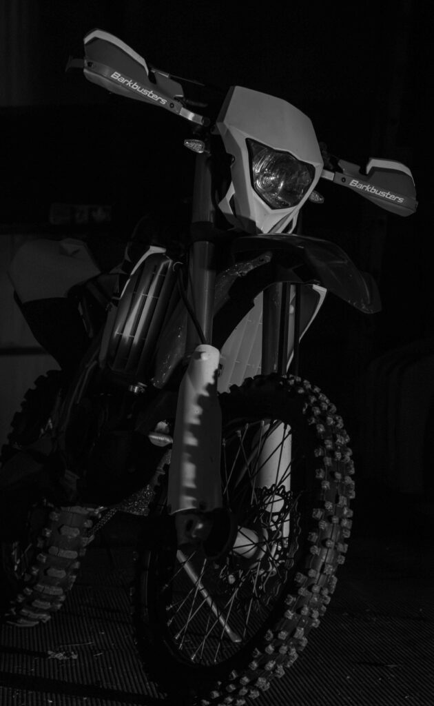
Edit Fourteen
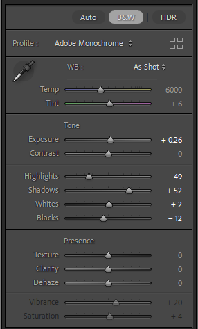
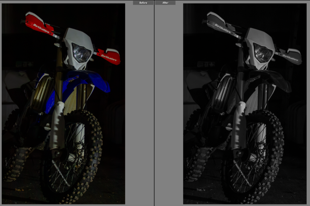
This is a very simple shot, an angled front on shot. However it does show the bike well and the close cropped frame draws the focus to the bike as there isn’t much room for looking around the photo. I liked the colour with the blue and red contrast but the yellow from the lighting had reflected on the white plastics so I preferred the shot in black and white, highlighting the details with light tone and many greys rather than black and white.
Edit Fifteen
This shot is very similar to the previous one, but I had changed the lighting and it created a very different effect, the bike looks like it is appearing out of the background, which is what I was originally going for as I wanted to focus on the bike itself. I kept this shot in colour just pulling the tone to a bluer setting. Having kept it in colour it has allowed for the bikes colours to be seen, showing the personal choices I made to customise the bike. (red wrist guards on a Yamaha)
Overall Summary
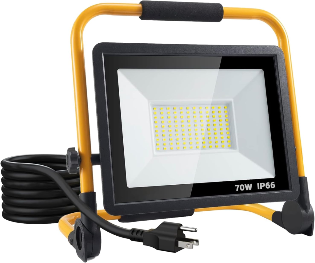
This shoot wasn’t easy, I found the lighting tricky to contend with, as it was dark outside and I only had two small lights to move around. However I did find this taught me a lot about what I actually wanted in the photo rather than just trying lots of things with little direction. This helped pull me in direction of planning each shot before hand, moving the lighting purposefully framing each shot. I went into the shoot with the intention of getting a mixture of detail shots and full shots of the bike, similar to my previous shoot. I had liked the results of my previous shoot so I wanted to link the two together by keeping the style similar. By having very little background showing I have presented the bike without much context, this allows the viewer to see how the bike is mine as such. Like any person who likes their bike/car there are certain things I’ve changed and kept on the bike, like the choice of red wrist guards on a Yamaha (a blue bike brand) it shows the love for the bike and the personal choices I ‘ve made for it both appearance and mechanically on the bike. This is shown through my parents bike and car. I picked up a lot of my choices from them, with them both having unusual aspects to their bikes/cars or just in general unusual taste. It’s clear I’ve followed in their footsteps with odd colour combinations on the bike, this is what I wanted to capture in this shoot, not only the bike itself being one of my bikes but how my parents have influenced even the smaller parts of the bikes.
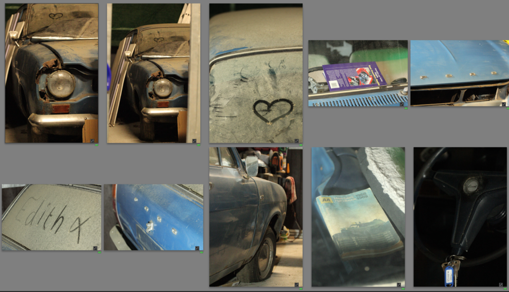
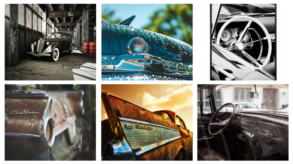
Final Photos

Having looked through the pictures I then arranged them in a grid, placing images that work well together, together. I found I had a lot more interesting detail shots than bigger picture photos, but the wider framed photos were important to provide context. With a mixture of editing styles from simple low contrast black and white images to bright, luminance colour shots to a mixture of both with colour pop style editing. I think this worked well, keeping all the photos interesting but by having three ‘set’ editing themes all the photos are cohesive, working well together to show the colours, textures, patterns of the bike which is what I wanted to achieve.