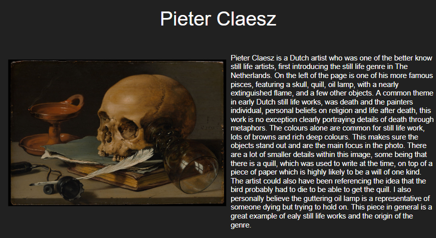
Newman was a Jewish photographer who created environmental portraits as his main style of photography. Particularly after the war he captured a very famous shot of a man called Krupp. He started working with photography as a medium in 1938 while working in a chain of portrait studios in Philadelphia. It was here he found his love for creating documentary style photos himself. In 1941 his work was featured in it’s first exhibition and he began to produce environmental portraits as they are know today. After moving home due to the war in 1942.1 In 1945 his Philadelphia Museum of Art one-man exhibit, ‘Artists look like this’ was recognised around the world quickly allowing Newman to open his own studio in 1946 also becoming a member of the American Society of Magazine Photographers (ASMP.) His work grew greatly in popularity as more exhibitions and purchases of his work happened. Over his life time he won many awards and took photos that hoard such strong messages and reasons with what appears to be a simple snapshot portraits that even now his work is world widely famous.

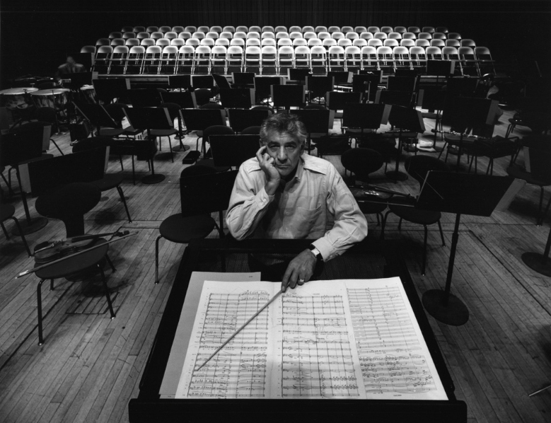
This photo has many different aspects to it as it is a highly emotive, powerful photo. There is a lot of history and tension within the subject of the photo and the photographer which while I don’t find the tension is the main aspect of the photo there is a huge aspect of intimation within the image. Newman purposefully created this by using the lighting and pose of Krupp as he felt it was a great way of portraying Krupp’s true character. It was a unique situation in general as Krupp was a huge part of supporting the Nazi’s with suppling them with weapons and other equipment during WW11 so when Newman a Jewish photographer was asked to take the photo of Krupp he originally declined before then accepting and making it his aim to have a goal of personal revenge against Krupp hence the portraying of his true character from Newman’s composition of the photo. This led to Krupp being furious when he saw the shot but Newman felt satisfied with his accomplishment, ‘a little moment of revenge’ this quickly became one of Newman’s best photos.
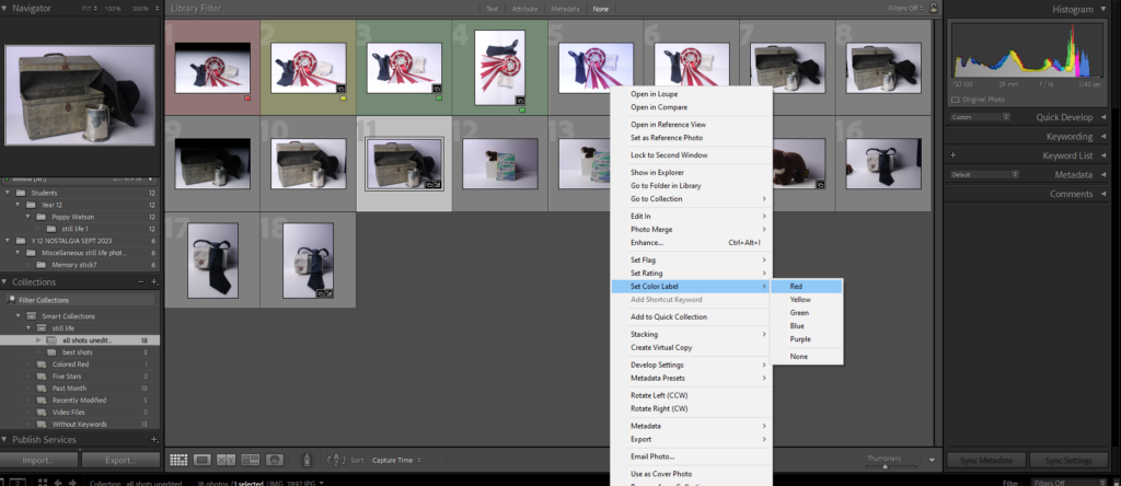
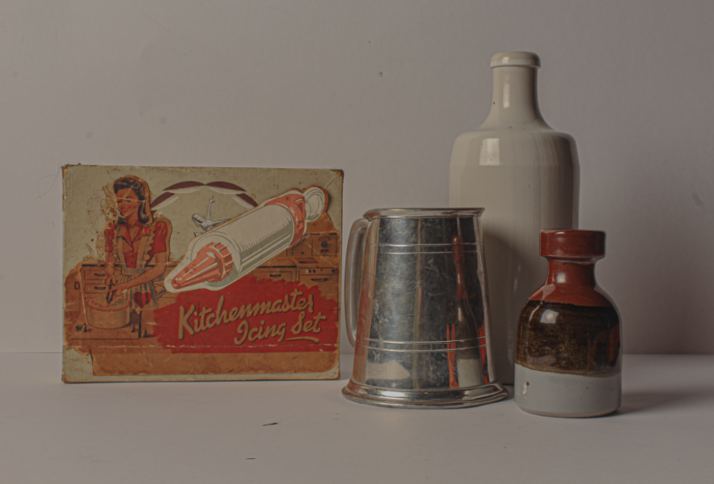
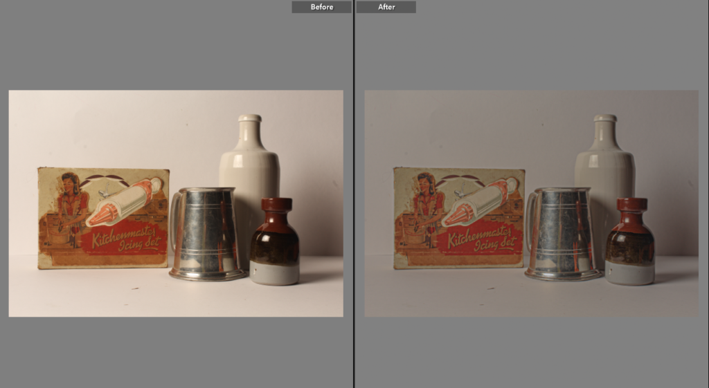
Image Analysis
It is an emotional shot, holding a lot of anger and intimidation within it due to the historical context of the shot. Krupp who is the subject of the image is illuminated in an unusual manor by having the lighting rear and the side makes Krupp’s eyes become quite dark and less noticeable making him appear sinister and unfriendly. There are harsh lines though tout the image starting with the two large pillars ether side of the subject framing him with blocky, dark, imposing features, then leading onto the industrial background of the shot has lines of light filtering through the roof. The colours of the image are dark or a rusted orange adding to the feel of danger as it’s not inviting and instead almost forces the viewer to look into Krupp’s eyes which are also dark and not very visible in the shot. Krupp himself had a weathered face from age and Newman highlighted this in his choice of lighting creating deep lines and grooves all over Krupp’s face furthering his appearance of an imposing, harsh character. Newman used perspective to his advantage, by putting Krupp’s o a close depth of field and the rest of the shot has a fairly long depth of field it encourages the viewer to look at Krupp’s and enforces his not necessarily good authority.