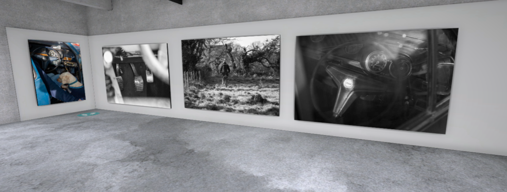
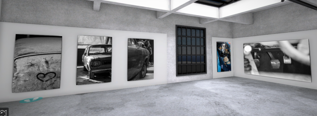
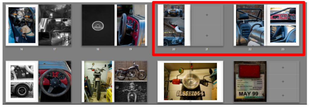
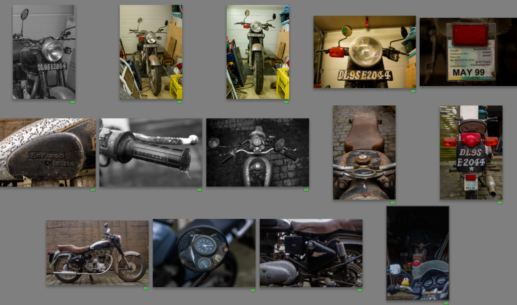
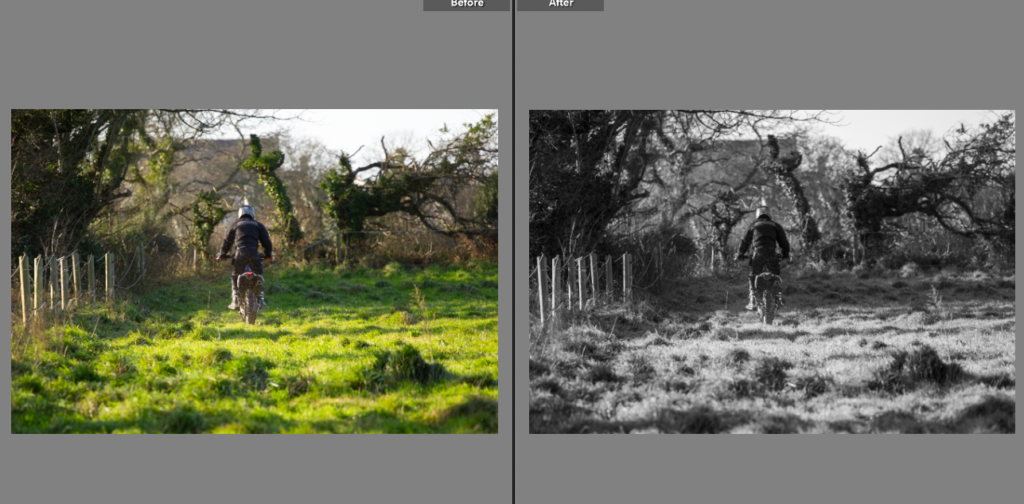
I presented my best images in a virtual gallery, choosing an industrial setting to go with the metal in all the photos. I placed certain photos together like the motorbikes ones, like my book. The mainly black and white images go well in the gallery and produce a good display.
Prints
These images are my final prints, I picked a few that summed up the project, from three details shots to two half shots to then one full photo. This shows the memory fragments then progressing into a full passion for motorsport. I chose to go with all black and white images as a mixture with such a small number of photos could have been confusing and the colour could have overruled the black and white photos, even if the black and white were more important.
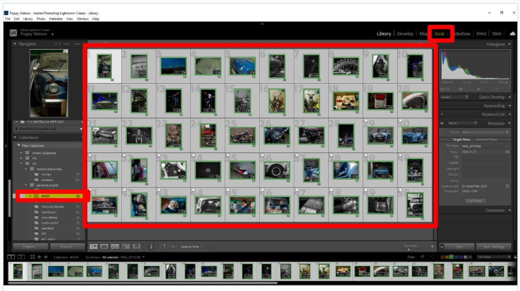
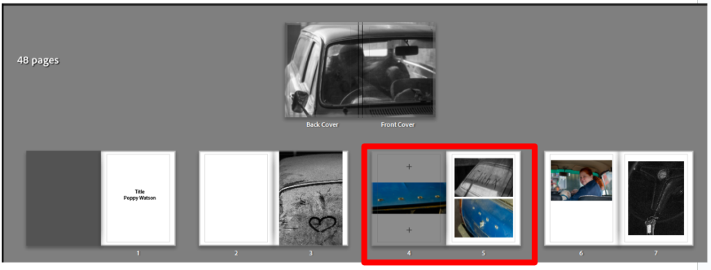
Once I had finished editing all the photos I added them all to one folder using filters to pick out the best ones from each shoot. This allowed me to then select all the photos using the arrow key and clicking on the ones I wanted. Having done this I then selected the book option at the top of the page.
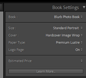
I then could select the book settings I wanted, I tried both landscape and portrait, both worked for certain images but portrait worked better for more. It also gave it a photo album feel which is a nice link to it’s basis on family history. I chose a hardcover image wrap as it prints the photo onto the covers. Alongside choosing the premium lustre paper, I have focused on what will be the best for my photos and enhance the narrative.
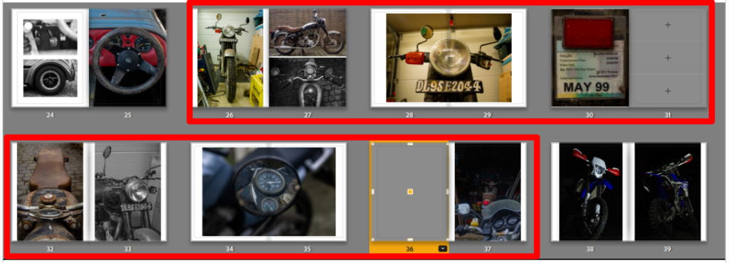
First few Pages Draft
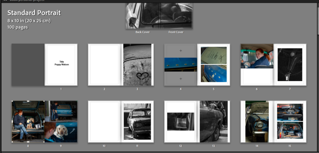
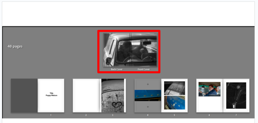
Cover draft, I tried different photos on the covers of the book, however I found many related too much to the individual shoot it came from. I tried this photo and thought it fitted well. Having the main subject in the photo out of focus reduces the specific of the photoshoot while having the car in focus allows for a vague idea on the books content to be interpreted. The technical elements of the image also work well, having a black and white shot with a cropped frame and many details creates an interesting but not too complex cover.
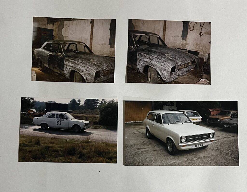
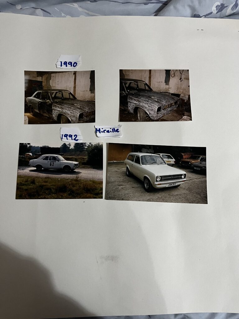
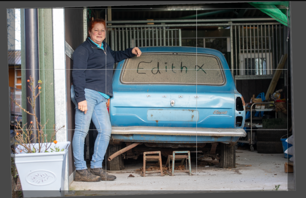
This page of the book is where I would like to add some archive photos. By adding the photo with ‘Edith’ written on the car as that is what the car is nick named so it adds a personal touch to then compare it to the archive photos of a different car. I have added the two ford badges from the current car to add context and like the two cars together, with them being a similar style and the same brand.
These are the next few pages, still using the combination of shoots I have created a story that flows onto the next page.
I have left this page blank as the previous two pages are full so it allows the viewer a minute to understand the photos before getting a simpler, contextual photo. I have created a comparison between old and new, the new being the three dog photos and the movement in the images adding life back to the car and then contrasting it with a simple black and white shot of half of the car, showing its age.
On this page I wanted to show the images presented together as the one on the top right is a closer look at the details from the photo below it. I also wanted to keep the dust heart featured in the book as it links shoots together.
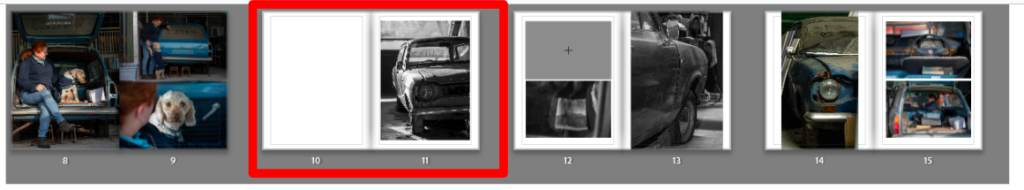
To then make the transition to the next part of the story I used a tryptic of three low contrast black and white images with lots of sunlight on page 17 then contrasting the bold high contrast badge image of the next car on page 18. I have used the badge of the car as a subheading, suggesting the latest part of the narrative.
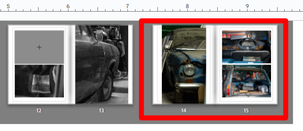
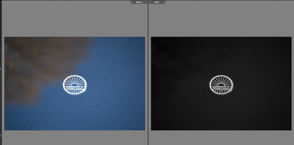
The next few pages I added photos of the Westfield, leaving spaces for where archive photos would best benefit the story. This photoshoot didn’t have any people in it so I didn’t give it many pages as I didn’t want the book to become to monotonous.
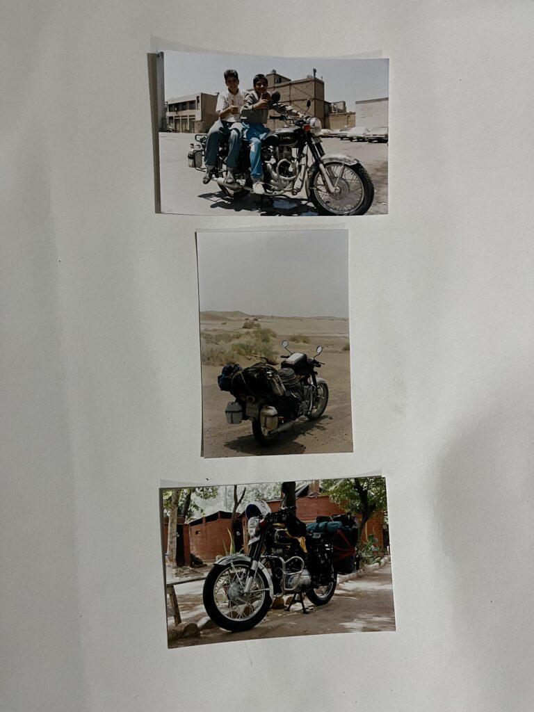
This part of the book is important as it is the bike I heard the most about growing up alongside the fords. It was brought in India and then ridden back to Jersey. I would like to put some text in mentioning this but I need to add the archive photos first as it might make it too busy. I have also, towards the end I have hinted towards the next section in the end of these photos as there are more modern bikes in the background, foreground.
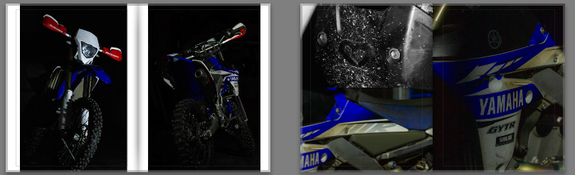
The next section of the book then goes onto my bike, the one I brought influenced by the family history of motorsport and my own passion for the sport. Again these photos didn’t have people in them as I wanted to focus on the stark contrast between bikes due to their age, the previous photos being about a 1999 bike and these ones being a 2017 bike.
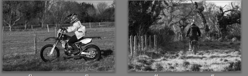
This section of the book, the final section is important as it creates a conclusion for the book. The first photo is me on my bike, as shown in the previous pages of the book and then the last page is my father on my bike. I wanted to show it this way as it is a cyclical pattern of my parents love for motorsport and them sharing it with me, to me being able to share it back to them in my own way, sharing my bikes and car with them, training together. I chose to use these as full page spreads as I wanted the images to be prominent, I also made sure to place the subject slightly to the right as its a double page spread the book will have a crease in the middle and I wanted to make sure the subject wasn’t lost in it.
Final Layout
This final layout shows the book as a whole rather than page by page. This displays the colours, patterns and story telling skills I have used in creating this book. The flow of the book is old to new so older cars are the first half of the book. The newer bikes are the second half. I have used double page spreads for important photos or points within the story, connecting old to modern. Also using multiple photos on pages to highlight and group small details so they don’t get lost within the book. Within each section of the book there are blank slots for me to put archive photos into, this is an important part; for the book is based upon seeing these photos and hearing the stories with them, as a child. I ended up using many black and white photos, including the cover. I didn’t end up using a title instead choosing a photo that sums up the story without text. Encouraging the viewer to study to book and the photos within. Overall my book is inspired by the story the photos produce and the research I have done on photo books, looking at the styles I like. Experimenting with what benefitted the narrative of the book.
a small insight into my families history and passion for motorsport
Using a book format, featuring photos and small amounts of text showcasing family history and connections within motorsport. And how it has influenced my own passion for motorsport. This will also include archived images from family albums, creating a stronger sense of connection and narrative throughout the book. Using colours, textures, compositions I will aim to make connections between new and old images, for example I will include old photos of dogs in cars to now my dog in my mothers car. I hope to create a book that feels like a family story with enough context even a non family member can see how my parents have influenced me.
Design
How you want your book to look and feel – I want to book to have a smooth, slightly matte look to it, similar to plastics on a bike. This will replicate the car/bikes themselves.
Paper and ink I have selected premium lustre paper as a lot of my photos have deep detail and soft lighting so its important to have high quality ink and paper to preserve the photographs.
Format, size and orientation I tried a few different book styles, before settling on a portrait 20X25cm book, allowing for my portrait photos to fit well and having to stretch the photos less to spread across a double page.
Binding and cover My cover will be a hardback with a printed photo, while I like the idea of a dust cover I have found they gain greater damage than an image wrap cover.
Title I do not think a title will benefit this book so won’t have one, instead I will have the focus on the cover photo. One that will provide an insight into the book, similar to a titles purpose.
Design and layout – Within the book it will be produced in ‘sections’ using the photoshoots as mini stories within themselves. By doing this I can create a feel for each individual story that has gone into shaping my own passion. At the end I will include a snippet of my own story as a summary of the book.
Editing and sequencing – the editing will remain similar throughout the book, keeping continuity within the narrative. As narrative progresses the bikes will get more modern requiring slightly harsher editing to enhance the colours and textures but this will be a very small element. Highlighting the progress within the sport. A lot of my images will be black and white, low contrast, softly lit. This adds a family album like feel, creating joyous, interesting photos with story rather than harsh tones.
Images and text – there won’t be any text (subtitles and captions) within the book. While I have written an essay I won’t include it as I feel it would only break up the flow of the book. Having no text (other than author name) is unusual for photo books, however I think this suits the style I am going for, family photo album. The way I have taken the photos has allowed for the photos to tell stories without words. For example a comparison I will draw are the two photos below. Creating a connection and story without words.
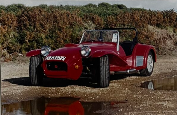
Comparison between the original colour of the car in archive photos and the cars current colour with the old colour still showing slightly.
Book Design Mood Board
Having looked at blurb I have created a mood board of book covers I like. Most of them are black and white using a simple photo as the cover, something that sums up the book without having too much detail. There is a couple with smaller photos on the cover adding emphasis on the title, however while I like the covers I’m not sure it will suit my book. I also liked the red text on one, it helped the title stand out against the colour photo cover. All of these designs are image wrap covers, the option I will likely use for my book.
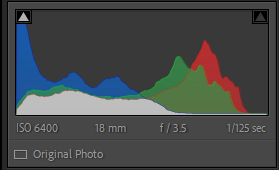
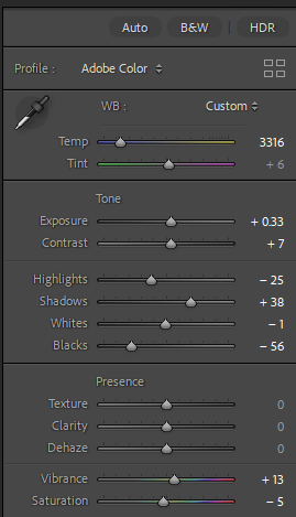
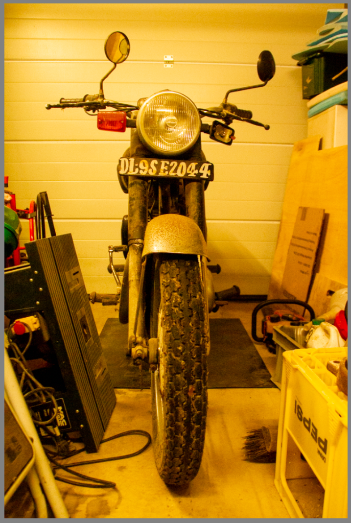
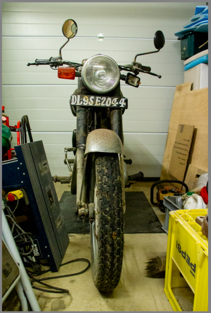
This shot was originally yellow from the garage lighting, I did manage to correct this using colour grading within Lightroom however, it didn’t match the rest of the photos. By choosing to turn the photo black and white I adjusted it to fit the other photoshoots. It has also helped highlight the texture from the rust and age of the bike, similar to the photoshoot with the ford.
Edit Two
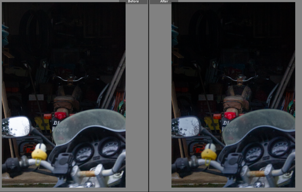
This photo had a similar issue, the lighting was too yellow. By moving the temp. slider down to a bluer tinge it has reduced the yellow lighting. I do like the photo now the tinge has been removed, it has allowed the bike to be seen within the garage context.
Edit Three
I did this edit in a similar way, adjusting the temperature to a suitable level of blue adjustment, allowing for the yellow tinge to be removed without changing the tint to blue. While the yellow tinge added to the age it did not fit with the rest of the photoshoots.
Edit Four
This photo is taken from an interesting angle, on a wide angle lens. I wanted to enhance the deep colours against the off white background. To do this I first adjusted the temp. slider before making small adjustments on the other sliders, enhancing the orange and blacks within the photo.
Edit Five
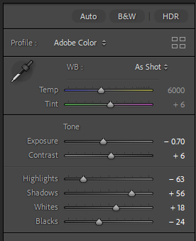
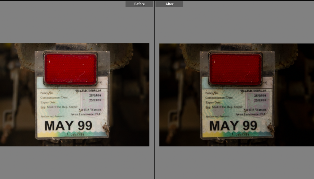
An insurance disc is something everyone knows, I wanted this shot as it shows the bike hasn’t been used for over 20 years, but still holds many memories. I originally thought I’d like this shot in black and white but I actually liked it in colour showing the typical insurance disc colourings. I decreased the exposure and highlights to bring out the pattern on the disc itself, which adds to the photo.
Edit Six
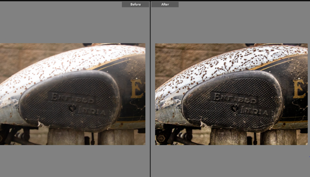
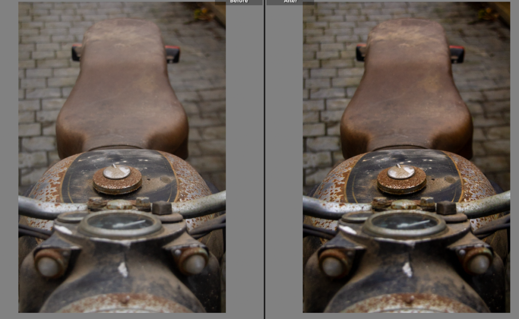
The texture on the tank from rust is something I wanted to highlight, adding back texture and increasing the clarity has done this. Alongside the decrease in exposure which brought out the slightly washed out colour. I took this using a 35mm zoom length so the focus was the writing rather than the rest of the bike, the writing being the brand name.
Edit Seven
This shot will pair nicely with the previous one, adding to the idea on what the bike is, I preferred this shot in black and white to provide contrast with the textured, bold colour of the previous shot.
Edit Eight
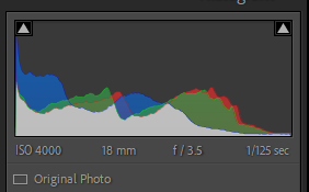
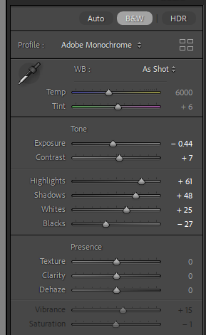
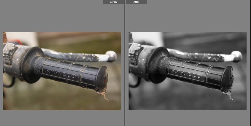
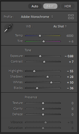
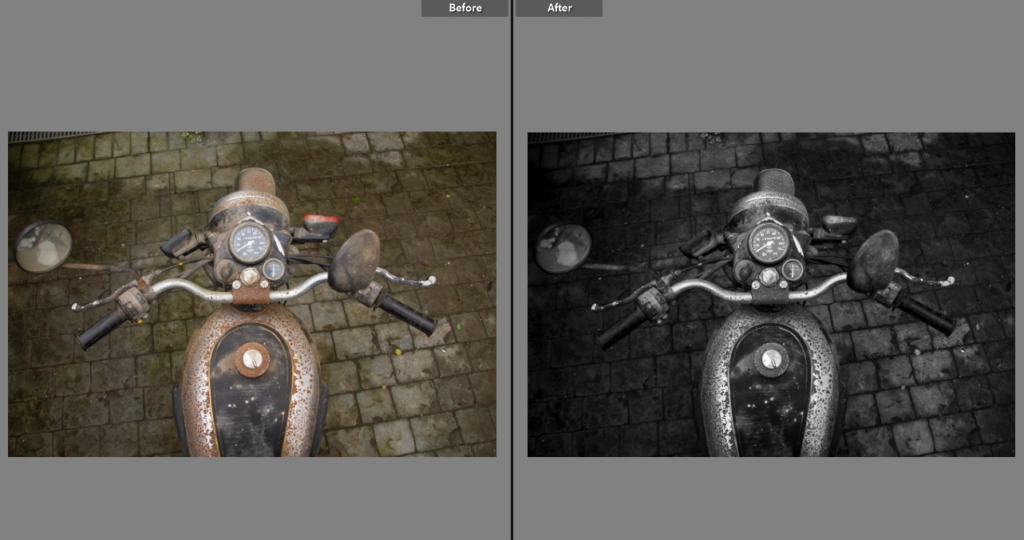
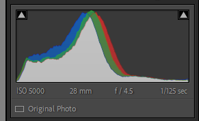
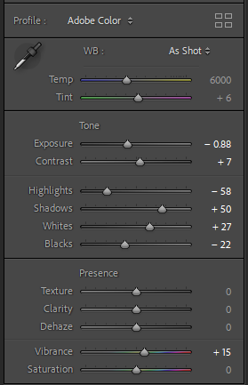
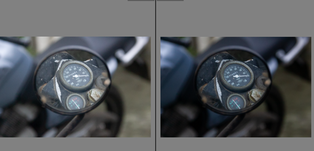
Having heard many stories about this bike, but having never ridden it myself. I wanted to create the idea of what the bike would look like from the perspective of being ridden. While the world isn’t black and white so would not appear that way when riding, it forces the viewer to look at the details within the bike. The needles on the speedometer and temperature gauge showup better in the black and white version, it also helped remove the distraction of the floor from the shot.
Edit Nine
This shot is an interesting angle, I liked the comparison between the colour of the rust and the brown of the seat. Taken from through the handle bars it has a unique viewpoint on the bike.
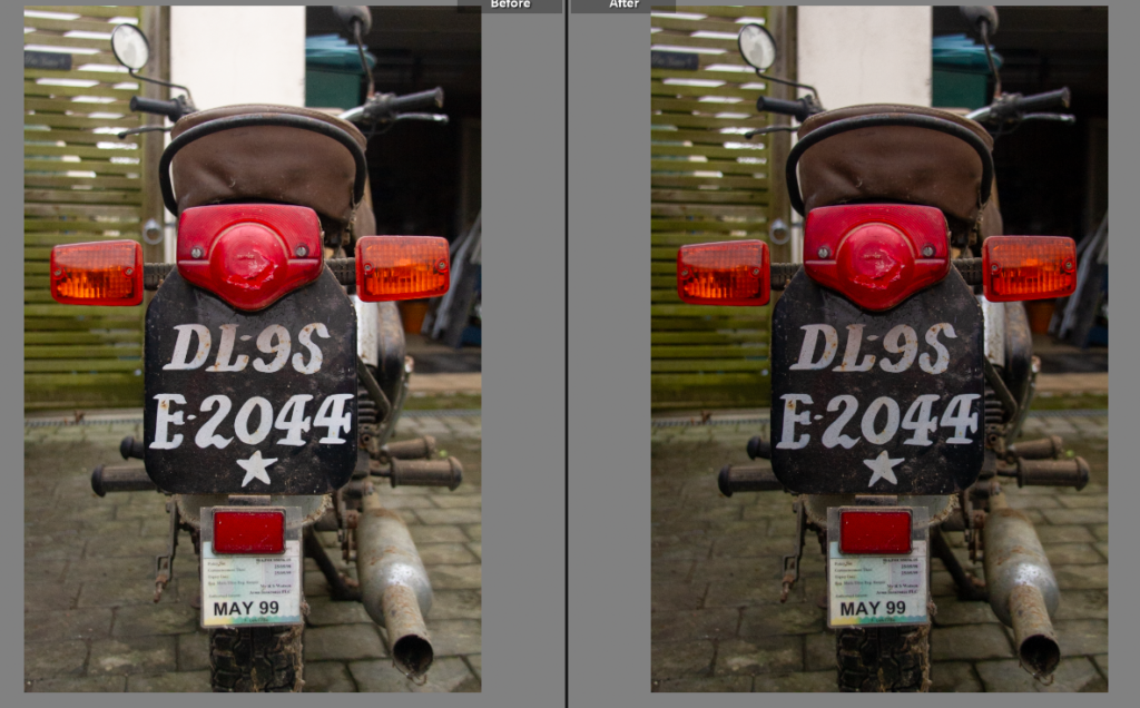
Edit Ten
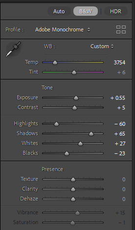
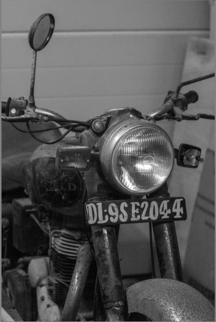
While I don’t think this shot is particularly great by itself I think the number plate plays an important part in the narrative of the book, I remember being told how the number plate was just a sheet of metal with paint on it. It also shows the bike is not from Jersey and adds to its story.
Edit Eleven
This shot is interesting as it shows the whole bike side on, giving a fuller picture of how it was used and how basic it is in comparison to it’s modern counterparts.
Edit Twelve
Compared to the rest of the shots, this photo is dynamic and interesting. While it doesn’t give a fuller picture like previous shots, it does make a comparison between new and old. The newer bike, my bike being in the background and the mirror of the older bike reflecting the older bike, my dads bike.
Edit Thirteen
I liked this shot because it had the name of the bike framed in the middle. I just did basic adjustments to add to the photo but I think I do have stronger photos.
Edit Fourteen
Similarly to the mirror shot, I loved the way this one had the old and the new, the two generations of the families bikes. I used masking overlays to create depth within the image, the background darker and increasing the exposure on the bikes adding more focus onto them.
Final Edits
This photoshoot, produced a range of shots, from more contextual style shots to narrative enhancing shots. Each photo can be used in a specific way to benefit the books narrative. I also want to link these to archive photos of the trip done on this bike, adding comparisons and emotion to the photos. I have used a mixture of black and white editing alongside colour edits, to add depth and contrast within the final photos. I was limited with this shoot as the bike can’t move so I had to take the photos on the driveway but I think I have enough dynamic and interesting photos to make the intended impact. Having researched W Eugene Smith and his style I looked to add a human emotion element to the photos, which is tricky without a person in the photos but I looked for small details and otherwise unseen perspectives which created the strong range of images above.
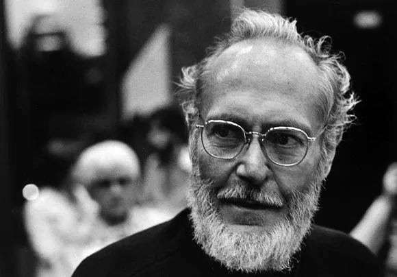
‘The single photograph is always fragmentary, only part of the story it shows’ Henry Luce, the founder of LIFE magazine, personal take on the importance and need for the modern photo essay format. He suggested we can see much more of the story by using many powerful photos rather than one well taken photo. I will be looking at the development of the modern photo essay, specifically how W Eugene Smith was the pioneer of the modern photo essay. W Eugene Smith was the fundamental photographer when it came to the creation of the modern photo essay. It first became apparent after his ‘Country Doctor’ project, he spent 23 days photographing a local doctor in charge of caring for the entire ranching town. Smith created this project while working for LIFE magazine, one of the couple of large magazine firms he worked for, this being on of the most significant. Smith created one of the most known photo essays to exist even in modern day, having done this he quickly became associated with the modern day photo essay format. He captured the indexicality needed within a photo essay, the point of life, death, presence and absence needed to tell a story, bitter or joyous, through a photo essay.
The photo essay was a movement, with the invention of the handheld film camera and halftone printing, magazines were created. The starting point for the photo essay was the magazine, Life being the first one to make a significant impact with 50% of the American population reading the magazines. The idea of printing and linking photos with text seems obvious, a ‘magazine’ wouldn’t be overly successful if it was just text. As the magazine movement spread worldwide, more and more magazines started to introduce more photos and less text, simply using text to link the photos together. In 1931, the more illustrated style of magazine was dramatically increasing its popularity, right up until world war two. Within world war two, the production stopped, instead the printing presses were used to print German propaganda. LIFE magazine was quickly taking over in the world of photojournalism, having started before the war in 1936 and then continuing onwards after the war. The term ‘photo essay’ was coined by Henry Luce the owner of LIFE magazine, Kurt Korff an editor within the magazine was the one to introduce and trail a new magazine concept. The photo essay was born, leaving behind the previous formalism photography style for one that focused on raw emotions and reality, telling a story through powerful photos. This led to the founder realising people wanted a true sight with many photos rather than a well written article, they wanted something they could glance at and understand. In 1936, pre world war two is when Luce, the founder of LIFE, started to implement this within the magazine. The first copy, using this photo essay style, featured the Columbia river dam, a political, controversial, attention grabbing image. Commenting on America and its historical progress to be building this dam while encouraging people to pick up the magazine. And, inside the same issue of LIFE a photo of a new born baby, mere seconds after birth. This was something that wasn’t an average photo to be in a magazine let alone without an article, although this image did have a caption. The caption however, doesn’t describe the photo or the reason for it nor does the image illustrate what is being said in the text, these are revolutionary steps within the photo essay production. LIFE became the known source for unique, entertaining journalism, developing the photo essay as they went, until W Eugene Smith produced his own take on the photo essay within LIFE and this became the format we know today. It is worth noting, while W Eugene Smith is considered to be the pioneer of the modern photo essay, his style was heavily influenced by the original creators and his publisher, at the time, take on photo journalism.
W Eugene Smith, was the driving force of the modern photo essay, his country doctor essay becoming the known standard and style for photo essays within photojournalism. Showcased within his work is sheer depth, looking into every element of life, forcing the viewers to acknowledge all the good but more over the less documented raw reality of some of the subjects, from war and all its atrocities to the bleak reality of a country town doctor pushed to his limits. Unlike previous photo essay structures Smith left no rock unturned taking photo journalism to a new level, showcasing a new photo essay style in which he pushed to the limits to get a true account, unlike previous styles that simply took some good formalist style photos and left it at that, providing biased, unrealistic images. Smith, focused the country doctor essay around a single rural country doctor, following him and creating the narrative we know to be the ‘Country Doctor’ photo essay. By shooting for days beforehand without film, understanding what he wanted the aesthetic of the shoot to be, how he felt he could best represent the never ending, gruesome job of the country doctor. Smith was a realist and dedicated his life to the craft of allowing others to see the true reality, within the country doctor photo essay there are photos of life, death and everything in between. This is reminiscent of Smith’s earlier work, becoming the first photographer to produce a photo of a man dying, forcing the world to see the war in its all. Add photo This shot wasn’t taken with the formal elements in mind, completely contrasting the previous ideas on how to shoot for a magazine, Smith crossed lines many daren’t to go near. Looking at this shot, the situations Smith put himself in for the photo he felt the world needed to see was unlike many others. It would be simply immoral to judge this photo on anything other than the story it’s telling and how it is telling it. Smith didn’t work in photos that had good technical elements; he wanted people to feel and experience a snapshot of the scene in a quick glance, expanding peoples worlds with a series of images. Within my own work I have composed shots, which does contrast Smith’s style, however I have considered what I wanted to show, how I can add text (captions) in the style of LIFE editorial style. Having noticed Smith uses largely human emotion of the subject within shots to convey his message, I have constructed photoshoots in which I can connect and capture the emotion between the car/bike and owner. Smith always shoots in an ‘environmental portrait’ style due to the task of photojournalism. I have kept the same theme, allowing the background to speak for me in my images. In particular I like the comparison of this image and ‘country doctor drinking coffee after a long surgery?’ They are wildly different images of Smith’s being associated with the pinnacle of life and death and mine being focused around a sentimental car. I like the similarity of lack of camera acknowledgement and emotion portrayed within both shots. Even the dog within my photo adds not only another element to the photo but provides another emotional element, the shape of the dog looking down suggesting the interest and confusion as to how the car is dearly loved but in the current condition its in. Similar to Smith’s photo in which the Doctor appears exhausted and overwhelmed, having completed a job in which not only is he essential but he must have had some love for to commit to.
In contrast to W Eugene Smith’s photo essay development, within LIFE magazine, LOOK magazine attempted to make a similar photo essay. However they took a different approach, LIFE used a more formalistic style, creating high quality, technical photos. This contrasted Smith’s style of the many, small insight photo styles. LOOK was often considered to use a picture story style rather than a photo essay as such, while they seem similar the photo essay is less focused on technical elements instead looking at emotion, reality, whereas picture stories look to tell a tale through good quality photography, using well composed shots. Within Smith’s photo essay development he produced hundreds of photos, he actually aimed to create projects too vast for a gallery. LOOK on the other hand, while is the most comparable in terms of photo essays, how they were used and how they were developed, actually focused more on the single shot. Within my own project I used Smith’s photo essay, creating hundreds of photos, choosing the ones that while not being the best single images, told the story I hoped to show. LOOK used dramatic single shots on the cover of their magazines, normally completely unrelated to the contents inside, completely contrasting Smith’s developed abundance of photos often complimented with large chunks of text, explicitly, his Country Doctor essay was a true display of the contrast and development of the photo essay. LOOK started producing their magazines in 1937 which was over ten years before Smith produced what is considered to be the modern photo essay, however even when this was released LOOK stuck to their picture story style, focusing on single shots.
Both LOOK and LIFE had a hand in developing the modern photo essay, but it is clear, truly W Eugene Smith was the developer of the modern photo essay format. His work is still known world wide to this day, even more so the historical impact of his work is something still deeply moving and eye opening to the modern viewer. This is largely due to his style but also the photo essay format, allowing the viewers to be transported to a new world, someone else’s life, good or bad. LOOK on the other hand, created world wide known work but it wasn’t revolutionary in style. Smith was the pioneer for the modern photo essay, in the format of large amounts of photos, not taken solely based on the formal elements, often complimented with text, but not describing the photos but trying to put the emotion and impact into words, further developing often already intense photos, forcing the point home. My style was similar to Smith’s to begin with creating photos ‘I could feel’ photos that others might not understand to begin with but hopefully once a collection of them are placed in front of them they can feel the impact and intention behind them. I love how Smith approached adding text into his work, further developing his photos rather than deconstructing them, making them devoid of meaning to a degree. Having said this, I have some photos I will add captions to explain the significance of the shot, as a few of my shoots are inanimate objects so need the explanation, alongside human elements in the others and following Smith’s idea of many good photos to tell a narrative rather than one which can be misleading and not allow people to truly understand.
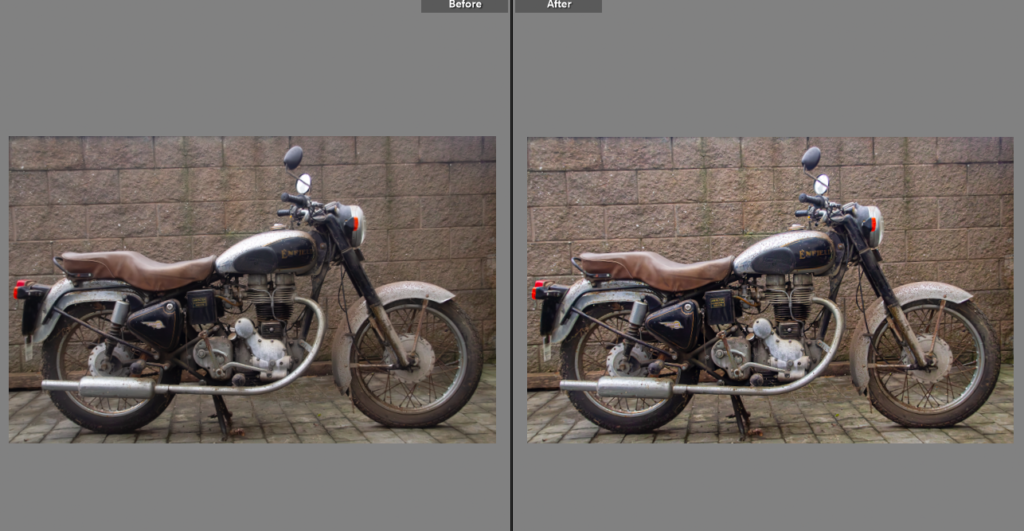
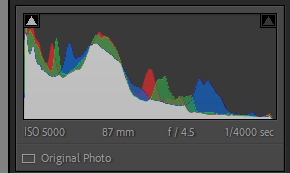
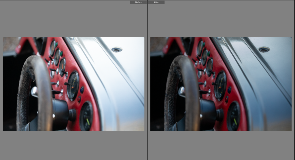
This photo needed the exposure reducing so the car was true to colour. Although this shoot was done in day light I wanted the editing style to be similar to my first photoshoot with the ford escort, my mothers car. Which was done in the dark so I am editing with a style choice of slightly noisy, lower exposed adjustments.
Edit Two
I liked this photo, the angle of the car is appealing, cropping the front of it out and focusing on the seat and number. I lowered the exposure, while increasing the contrast to give the deeper colour on the car.
Edit Three
Unlike the previous shots, this one was more abstract, hiding the majority of the car and looking at details that show the cars original owners influence. I lowered the exposure to maintain the editing style, darkening the wheel and bonnet. This made for a better photo, removing some of the glare from the original photo.
Edit Five
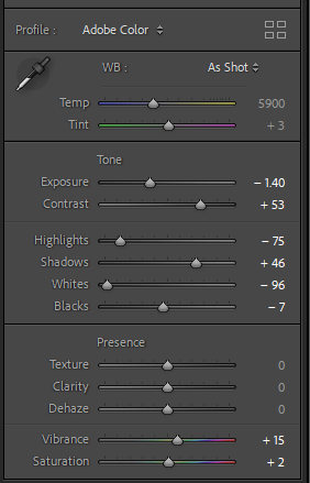
This photo is similar to the previous in terms of what is in the shot, however I preferred this angle. After editing both I can make a comparison on which is the more fitting photo. I like the previous photos colours and lighting, but the composition of this photo is much stronger.
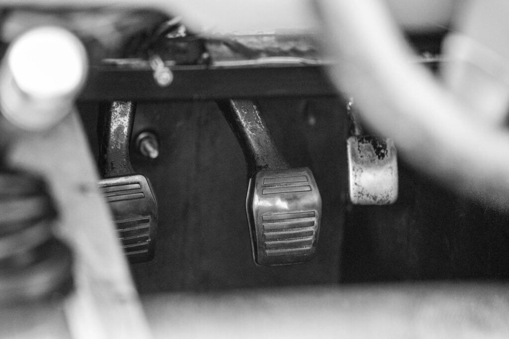
Edit Six
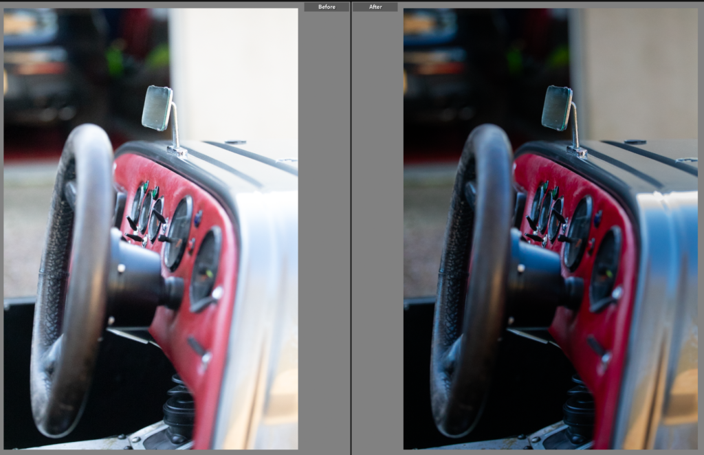
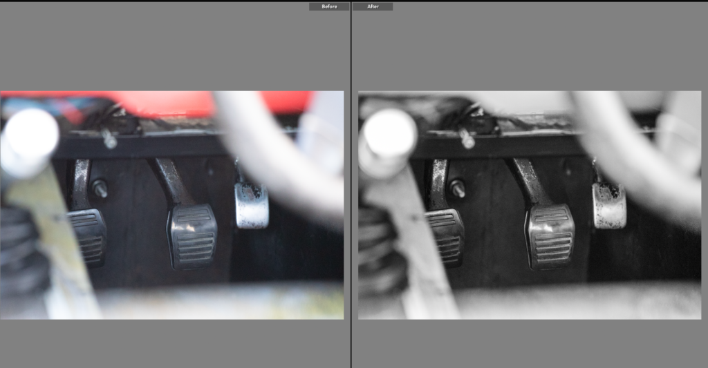
Niche to this style of car is the pedals, often forcing the driver to wear racing shoes due to how close the pedals are. This was an important element of the car for me to show, having been told this fact by my father as this car has previously been his. The colour was good in the original shot, but I found the shot looked busy so chose to use black and white with increased clarity to remove the busyness without removing the tarnish on the pedals.
Edit Seven
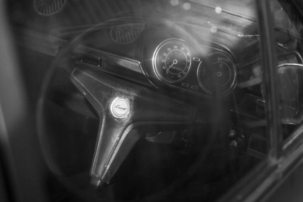
A simple detail can add huge amounts of context to a photoshoot, this is the badge of the car. Another important element within my connection to this car through my father and how he spoke of it when I was growing up. As I’ve gotten older I’ve found key points like this have helped me negotiate the motorsport world.
Edit Eight
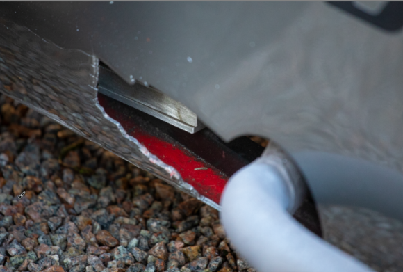
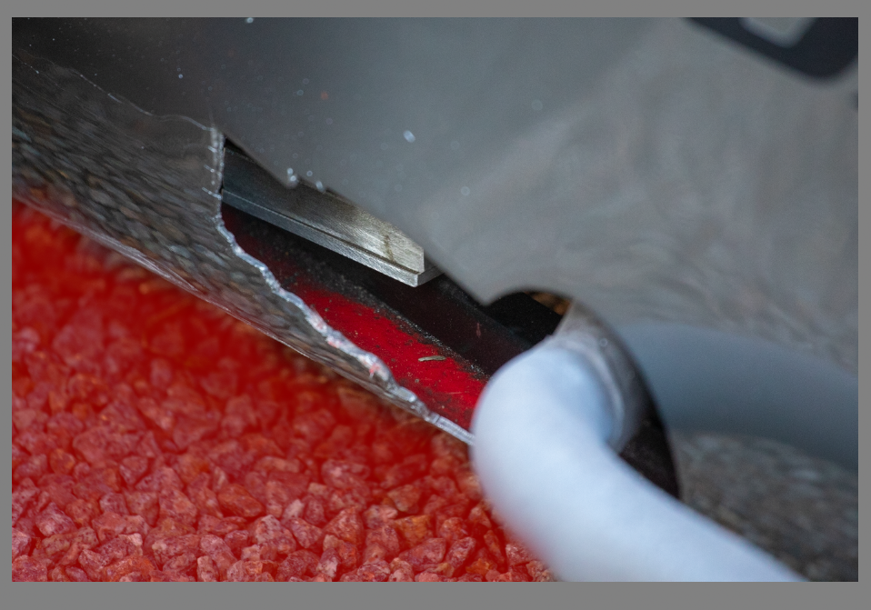
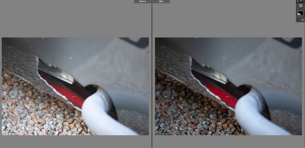
Having seen photos of the car when my father owned it, the car was red. Now the car is gun metal grey, there is some remaining red elements, the leather panel is still red and where the exhaust comes out of the car you can see the remaining red paint. I want to place this image next to an archived image to show the comparison. I needed to reduce the brightness of the gravel alone as it took the focus off he red paint so I used the brush tool having already edited the rest of the image.
Edit Nine
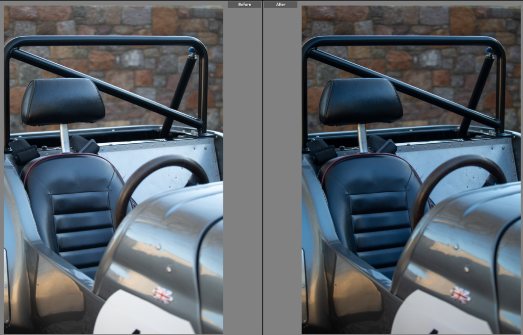
Most of the photos are close crops of the car, showing snippets of parts individual to the car, ones someone who doesn’t know much about the car might not pick up on. I liked this as it shows the roll bar and the drivers seat, linking back to the drivers connection to the car.
Edit Ten
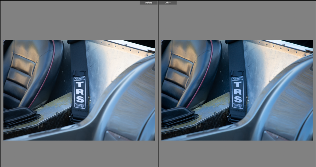
While this photo isn’t significant to the connection, I do like the photo as a whole, introducing us to the car. From the central point of the seatbelt text, showing the viewer it is used to race in, to the leathers texture contrasting well with smooth metal sheets.
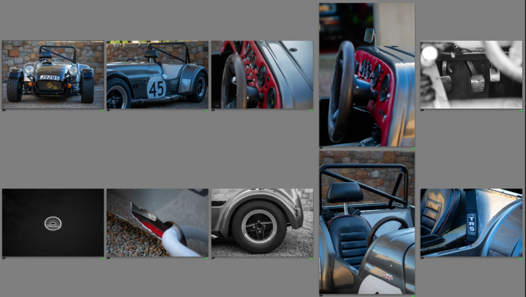
Final Photos
These photos were interesting to take as I had to go in with a plan to get similar shots that worked well together. I aimed to edit them in a similar style to the original photoshoot with the ford escort. Using small crops and high contrast images, I created a set of unique, story telling photos. I will be able to pair these with the achieve photos, which were the original inspiration for the photos. The archive photos didn’t have the person in them so I didn’t have a person in these photos. Instead I want to add captions next to the photos, explaining the reason for the photo and adding connection to the photos to the book. By mixing black and white photos with colour, I have referenced the original colour of the car as well as adding dynamic and interesting photos through a mixture of both colour and B&W photos. This shoot is reminiscent of Keith Dotson’s style, I looked at his work of rusty cars in the woods and this is the opposite. However, he used close up shots, small details and unusual angles while keeping eyelevel with the car so I took this approach to create these photos. The overall photos work well together and tell a story about the car, having captured the small details it allows me to make a comparison between the archive photos (when I put them into the book) and how the car is now.
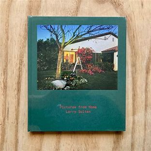
Pictures From Home – Larry Sultan – Deconstructed and Explained
Pictures from Home – Larry Sultan
Published in 1992 this book was an interesting combination of memories and current day scenes. An insight into an American lifestyle, originally based around the families political views however it became a passion project of sorts looking at how he saw his family, how his family saw themselves. Sultan himself said ‘I wanted to puncture this mythology of the family and to show what happens when we are driven by images of success. And I was willing to use my family to prove a point.’ Woven into the book are old family photos and stills from home videos. The current photos he took are of his parents enjoying their ‘American dream’ retired living how they would like to.
Why?
Sultan produced this photobook to show an American dream. -The “American Dream” is a phrase referring to a purported national ethos of the United States: that every person has the freedom and opportunity to succeed and attain a better life- the one of his parents and how they chose to live it, when retired. Sultan started the project with the idea of explaining politics or at least exploring his parents conservative views. However over the ten year production period it became focused on his family, old photos and videos. A desperate attempt to stop time in it’s place, capturing details forgotten over a day and details forgotten over years. It was received as such, with phrases like ‘One of the most incredible things about Pictures from Home is how vulnerable Sultan allows himself to be in the text, in which he confronts insecurities about himself and his work, brilliantly deconstructing the project and the challenges of making it.‘ and ‘Larry Sultan’s images and words were his reconciliation with the oedipal mess of the American Dream.‘ and ‘one of the most moving and indelible family portraits I’ve ever read‘. The book, moved people, a relatable attempt to store memories and explain ones life. It is an intense family portrait sublimated with snippets of conversation, tension and love, flaws and all is featured within this book.
Larry Sultan
Larry Sultan a widely known photographer. Having grown up in California this quickly became the main inspiration source for many of his projects. He has published books and photographs, combining documentary and staged photos to create his desired effect of heavy, psychological photos, depicting family life and everything around it. His most known project is ‘Pictures from Home’ published in 1992 having spent a decade creating and capturing photos and recordings. Sultan went onto create more photos and photo books all mainly in the same California setting, never straying to far from home.
How Sultan took the photos
Sultan took these photos by visiting his parents every few months armed with his camera gear. Spending a few days executing ideas while recording notes and conversations, completely confusing his parents. This was reflected upon within the book, in which his parents voiced their confusion and almost annoyance for the project, not understanding the purpose. One shot in particular had Sultan sneaking in while his mother was asleep and taking photos. This describes his approach to photography well, he uses the concept literally, trying to stop time in moments others might not notice and would be forgotten about.
The Book Itself
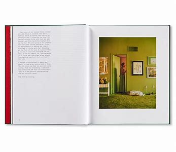
The book has a slightly rough feel, with a textured hardback cover and a smooth added photo onto both sides of the cover adding a preview into the book itself. There is indented text, the title in small on the cover and spine, simply stating the title and photographer. Within the book the photos themselves have been printed onto two types of paper, thick glossy photopaper for the bulk of the photos. But for the old family photos and video stills they are printed onto softer, non-glossy paper. A mixture of colour and black and white have been used, the black and white being old family photos taken in black and white originally. Sizing is important when it comes to producing books, as this one has many orientations of photos the book is 23x27cm a size similar to a4 but squarer. This allows different photos to fit while keeping the book portrait. Overall the book has 192 pages with 140 of these being black and white. The cover itself is a hardcover with a photo stuck placed in the upper half, giving the appearance it was stuck on, like a family photo album would have on the cover. The title is on the cover, ‘pictures from home’ a literal title describing the book. The story was originally based upon political views before switching to a documentation of a retired couple living their ‘American Dream’ and how the photographer is related, his views and relationship with the subjects, his parents. He tells the story through a series of documentary and posed photos of his parents in their home and enjoying their lives. Often using a deadpan approach. There is no specific layout, using double pages or full spreads for some and putting multiple photos on the next page. Creating an interesting, relatable, unpredictable family dynamic. Each photo is carefully selecting, relating to the text beside it or following on from the previous section of photos, by editing the photos in a, true to life, colour scheme. Using the bright, bold colours to keep a theme throughout the book, reminiscent of the time period in which the book was created. It appears Sultan has done the book in chronological order of his parents day, slotting in shots and conversations when it added to that part of the story.
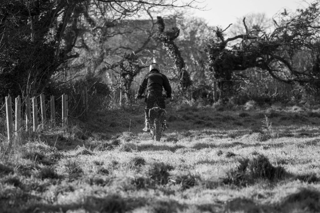
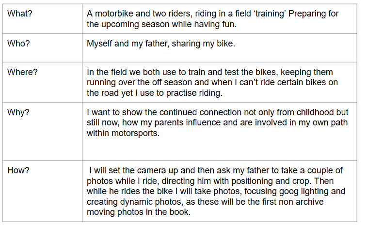
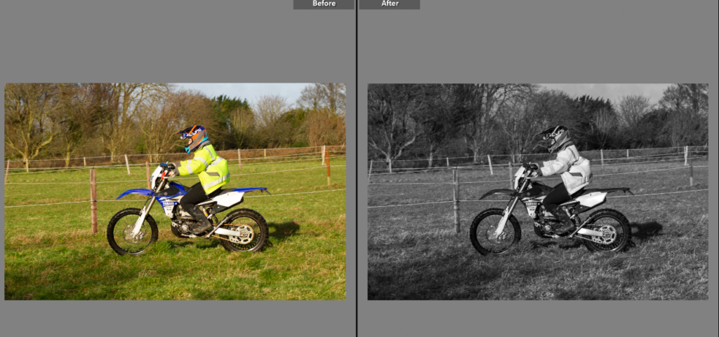
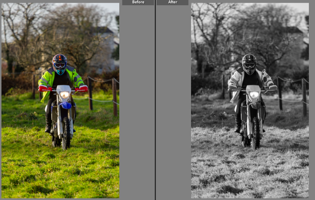
This shoot is the final shoot of my project, summarising how my parents passion for motorsport has influenced my own.
Edit One
This photo was slightly too bright to fit with the rest, so the black and white is a better option. Allowing the focus to be on the bike rather than the jacket.
Edit Two
The lighting in this one is similar to a previous photoshoot for the project, using the large sections of soft lighting with shadows creates a low contrast black and white image that works with the rest of the shoot.
Edit Three
I don’t need many photos from this shoot as it is the final, conclusion of the project. I liked this one through as the grass is flicking off the back wheel adding a sense of movement to the photo. I liked the black and white more due to the way I set up the camera and positioned the photographer. It also removes the harshness of the yellow coat.
Final Photos
These are the best photos, I only chose to edit 3 photos (one with two versions) as I only needed a couple for the book and it was a small photoshoot so I didn’t have too many photos I wanted to edit. I chose shots that showed the movement of the bike, with the mud/grass flicking up or a side on shot showing the bike moving. I liked the lighting so the colour shots did look good, however to fit the rest of the book the black and white versions were better as in the colour shots the grass and yellow coat made for vibrant photos that didn’t fit with the rest of the book. I like how the lighting adds to photos making each image slightly more dynamic with sections of shadow and sections of soft sunlight. For the book I will choose two shots that work well, as I would like to place this shoot at the end adding the idea of how the story continues, from parents to daughter.
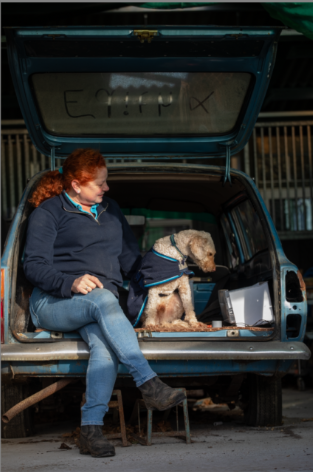
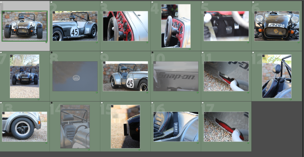
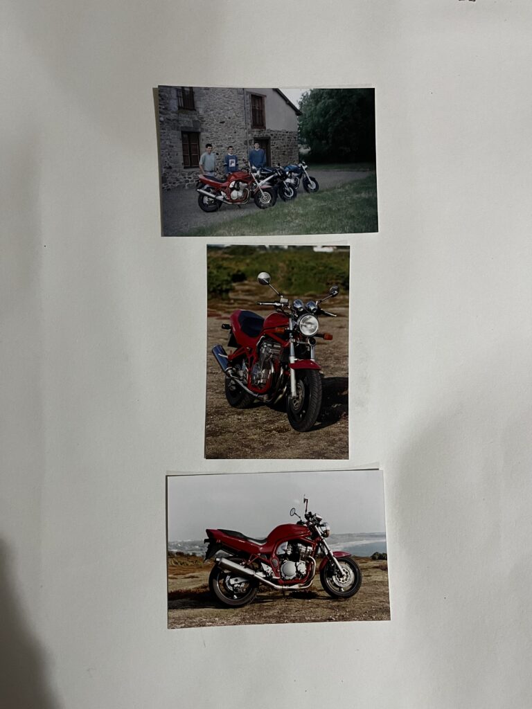
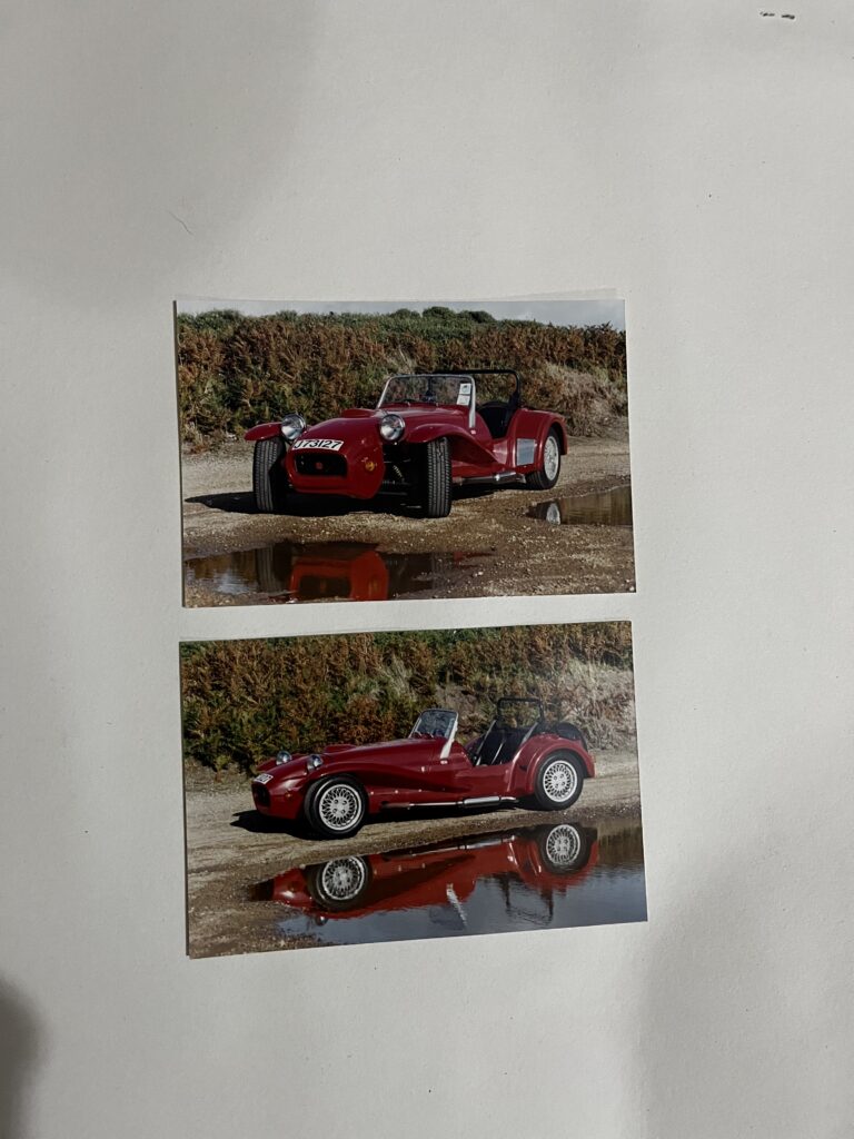
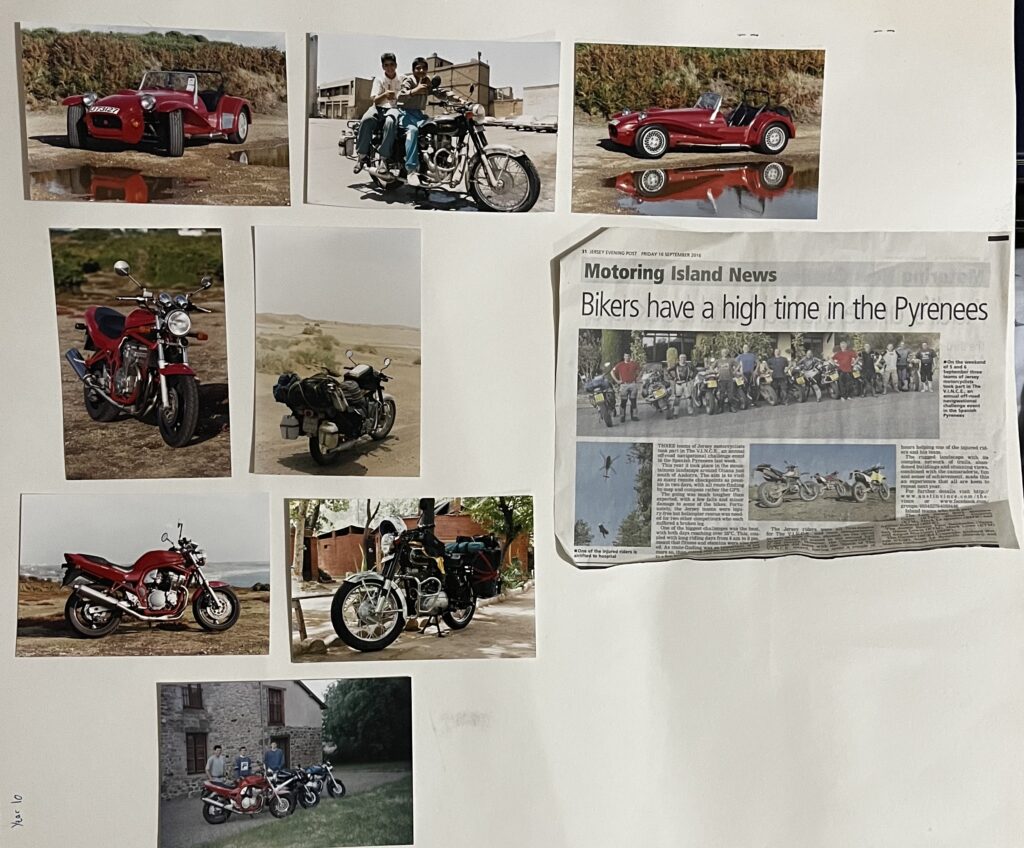
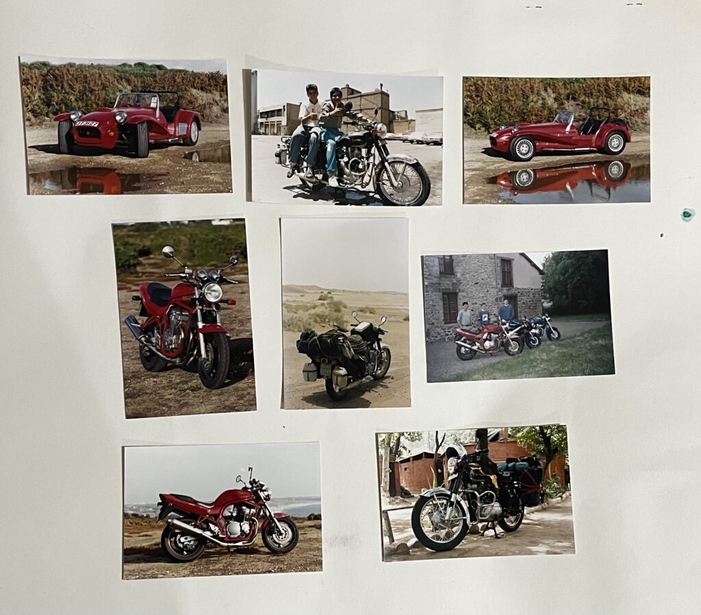
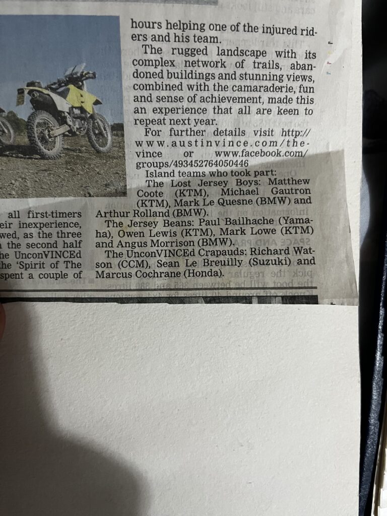
This is a small selection of the photos I have looked at when producing this project. A mixture of my father and mothers backstory in motorsport in photos. Having looked through these photos has helped me piece together the main part of my book and how I want to present it. Alongside looking at these photos I have asked about the stories behind them, or in some cases read the newspaper articles. Giving me an insight into chronological order, what I would have heard about growing up and now seeing the photos from the stories. Within my book I would like to add some of these images for context and background. The red westfeild car, has been sold and now looks different so I would like to take photos of how it looks now and compare it to how I knew it. This will strengthen the story I am telling within the book as it adds further context the story and shows the viewer what I am thinking about in each section of the book.
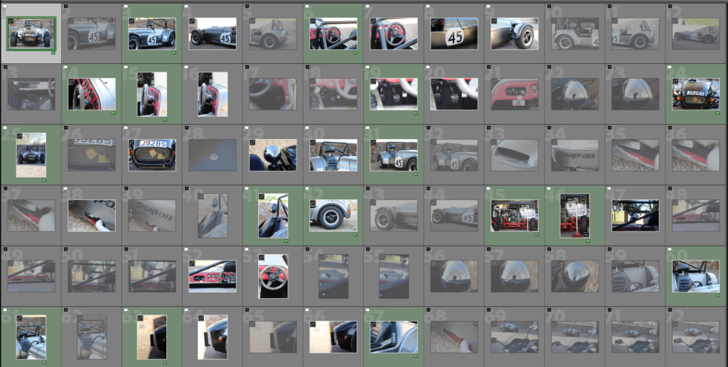
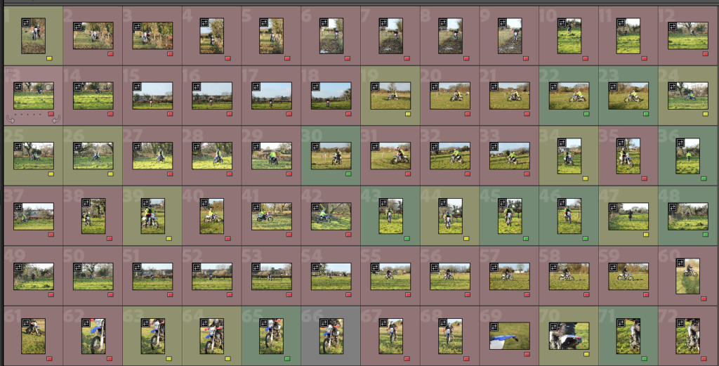
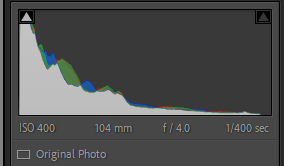
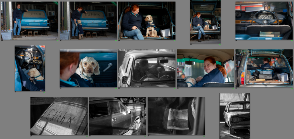
I went through the whole photoshoot, picking the best shots and flagging them, then going through the flagged options and colour coding the photos yellow and green to marking the best shots and ones I might use.
Edit One
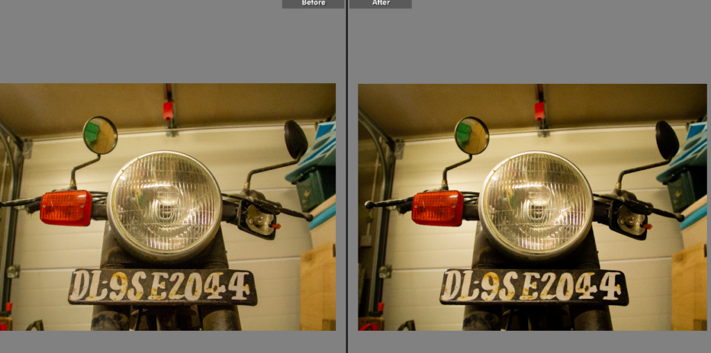
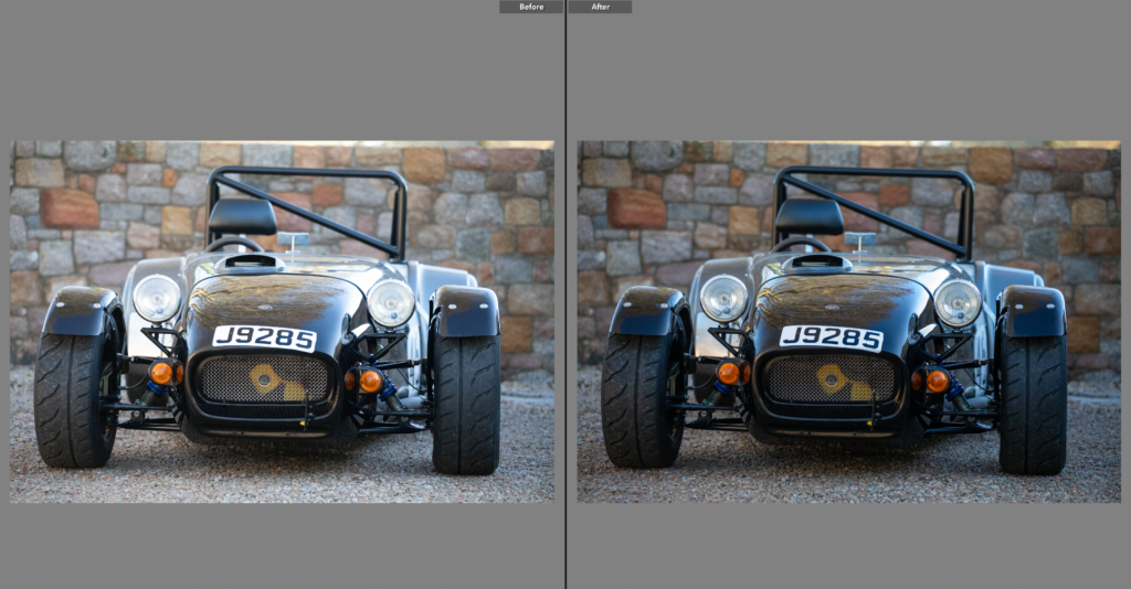
I needed to crop and reangle this photo as it was slightly slated.
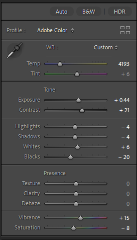
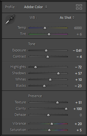
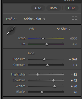
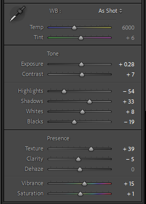
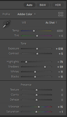
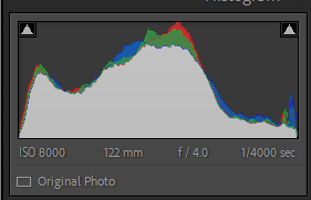
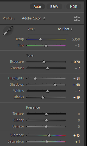
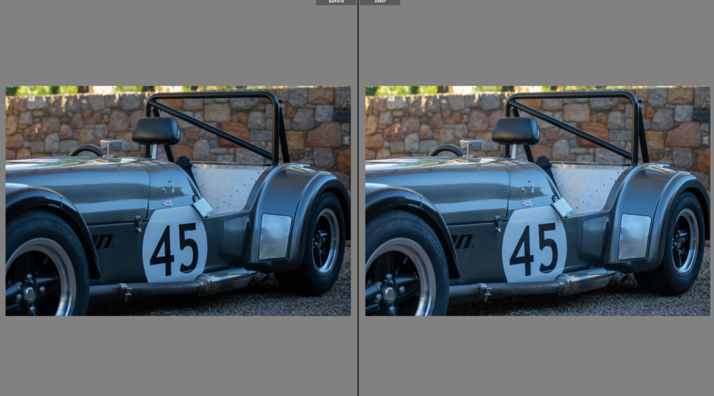
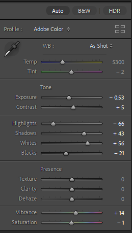
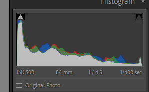
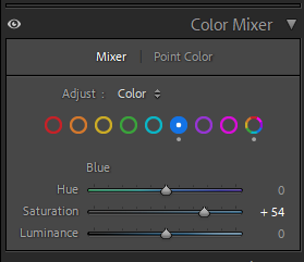
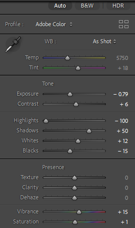
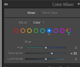
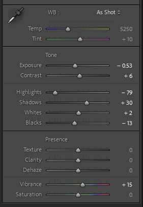
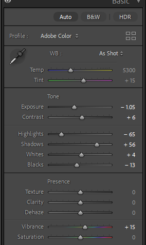
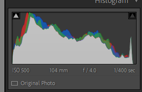
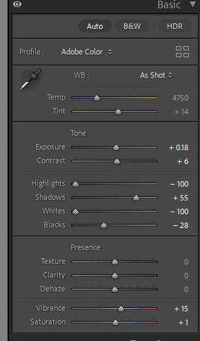
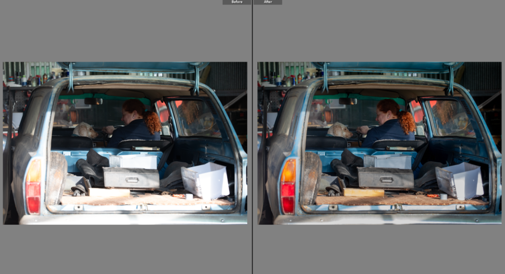
This photo needed, the highlights reduced as there was harsh lighting effecting the cars colour, once reduced I could decease the exposure and adjust the colour mixer panel. Selecting the darker blue, increasing the saturation to bring the cars true colour back to the photo.
Edit Two
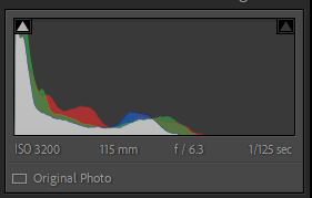
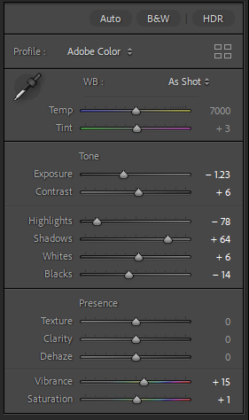
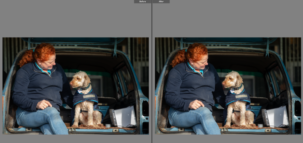
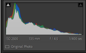
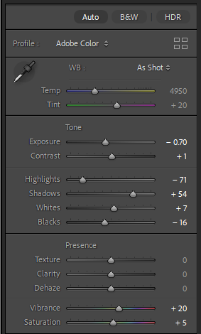
This photo is similar to the last but I liked dog jumping up in this one, adding movement to the photo. I went through a very similar editing process, with adjusting the exposure, shadows, highlights and the colour mixer board. On the colour mixer board I tried to match the cars colour not only to the true colour but the previous edits photo.
Edit Three
This one I needed to reduce the shine on the dog that appeared due to the harsh lighting. To do this I used, the exposure on a decrease, as well as the highlights. I made other small adjustments to the image solving smaller issues within it. The cropped frame meant the angle re-adjustment wasn’t needed.
Edit Four
While this photo was similar to the last I haven’t decided which one I might use. The previous one is a better photo at first glance but I like the detail of the cars shown in this one. When editing this one I had to be careful to reduce highlights without making the background too dark as the car shown is why I like this photo.
Edit Five
I did try this photo in black and white to tie to previous shoots, however I preferred the colour as the contrast between the dark navy and wooden interior is not something you get in modern cars and creates a lovely contrast within the photo. I decreased the exposure to bring out the colours of the interior.
Edit Six
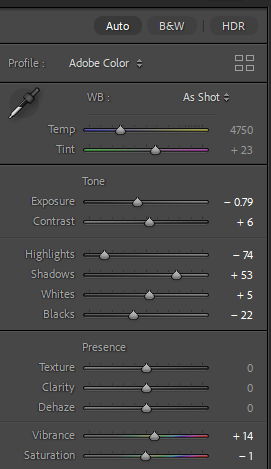
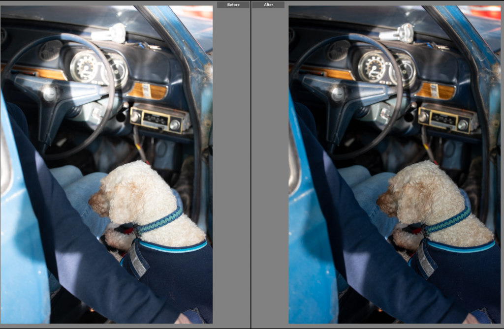
he blues in this photo highlight the unusal colour of the car. The dog adds human feel to the photo.
Edit Six
I loved the textures in this photo and the framing, having the person out of focus added to this photo. The dog staring into the camera works well as its a quiet moment of the dog in the car. I decreased the exposure as the photo was slightly over exposed so this added the detail back in, and added the cars details back in as before they were a little flat.
Edit Seven
I liked this photo however I knew it would be much stronger in a low contrast black and white, I liked the slightly out of focus look and the black and white enhanced this. It gives this feeling of connection and natural environment rather than a posed photoshoot. I loved the section of light on the windshield and bonnet and the black and white enhanced this showing how I used light and the shadows to create dynamic interesting photos.
Edit Eight
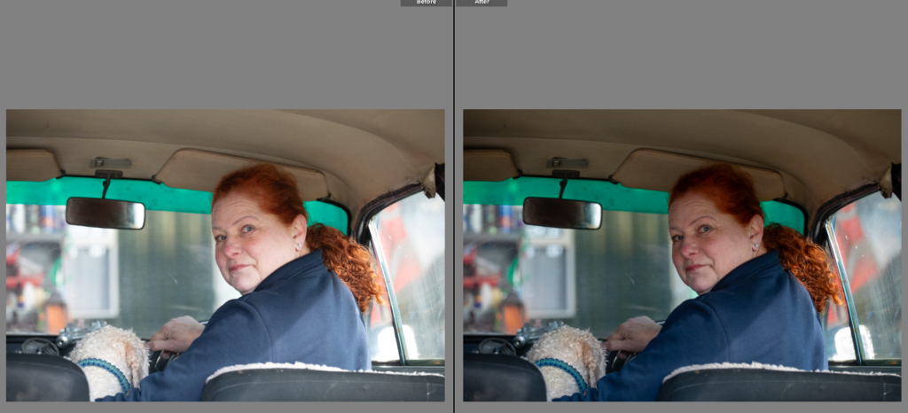
The colours in this photo made an interesting photo, I did try the shot in black and white to highlight the section on light on the persons back however it took away from the image. The models red hair contrasts well with the navy jumper, beige roof lining and dog. I moved the exposure down as the soft lighting washed the model out, adding depth back to the image creates a polished photo. I like the framing of this image as there isn’t too much of the car showing but the model looking over her shoulder creates a feeling of connection.
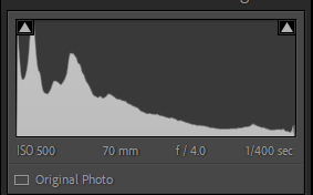
Edit Nine
Edit Ten
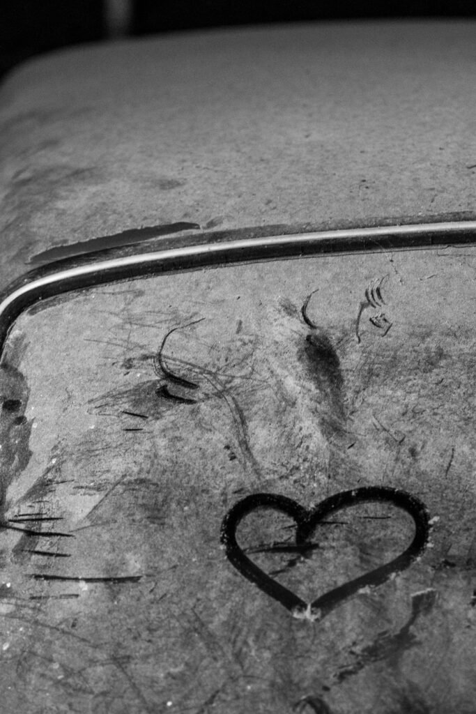
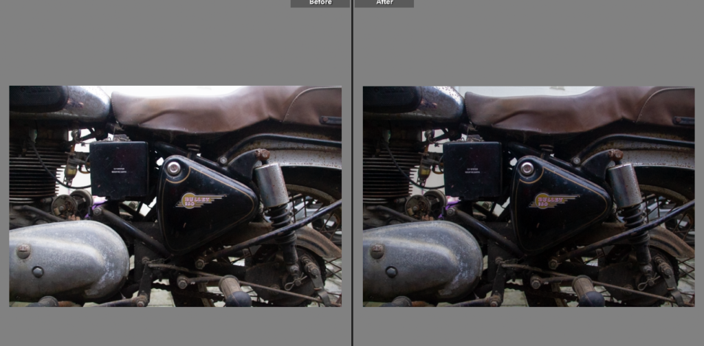
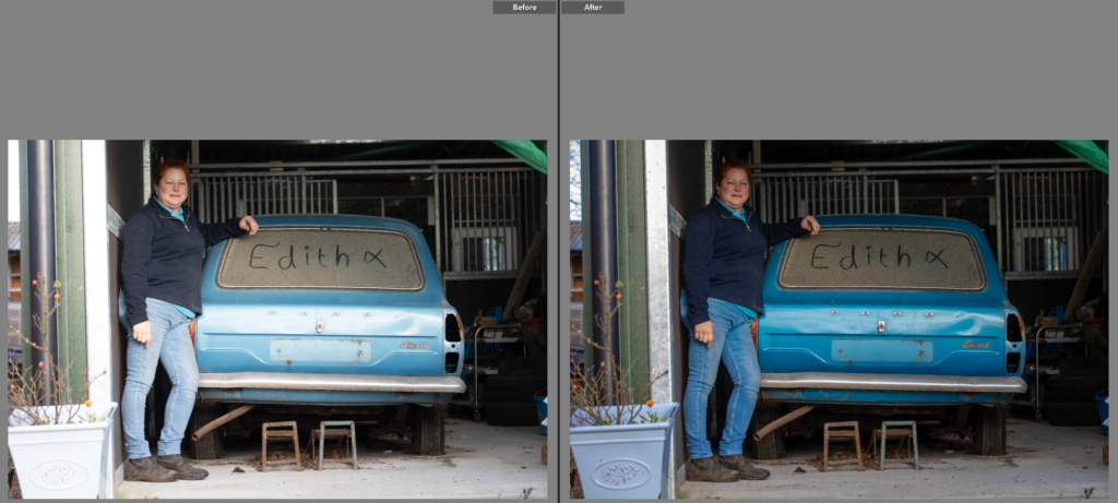
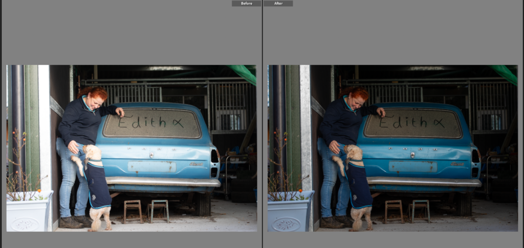
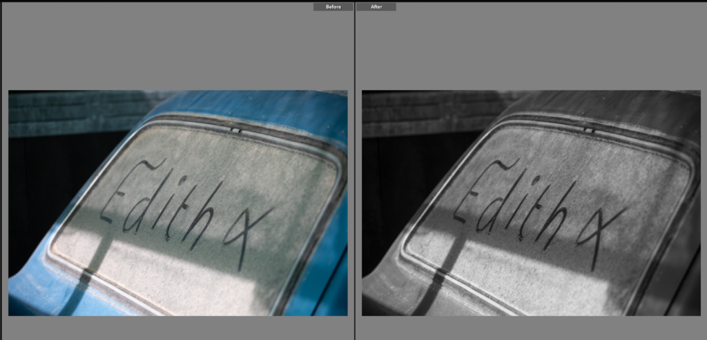
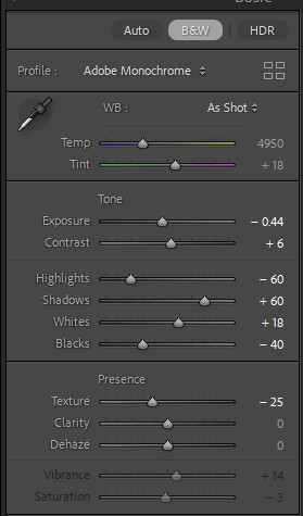
I like this photo, the nickname the car has been given has been written into the dust. The shadows add depth to the photo, almost underlining the word.
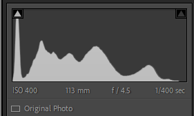
Edit Three
I tried this photo in colour, but it is much stronger in black and white. However when I first made the photo black and white I found the highlights, the bright sections of light are great at highlighting the parts of the car and making an interesting photo.
Edit Eleven
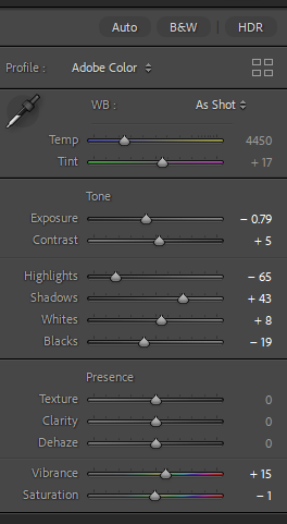
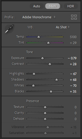
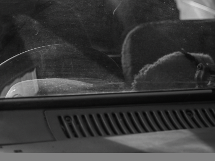
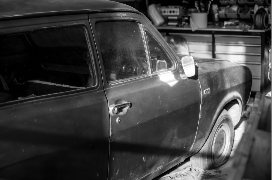
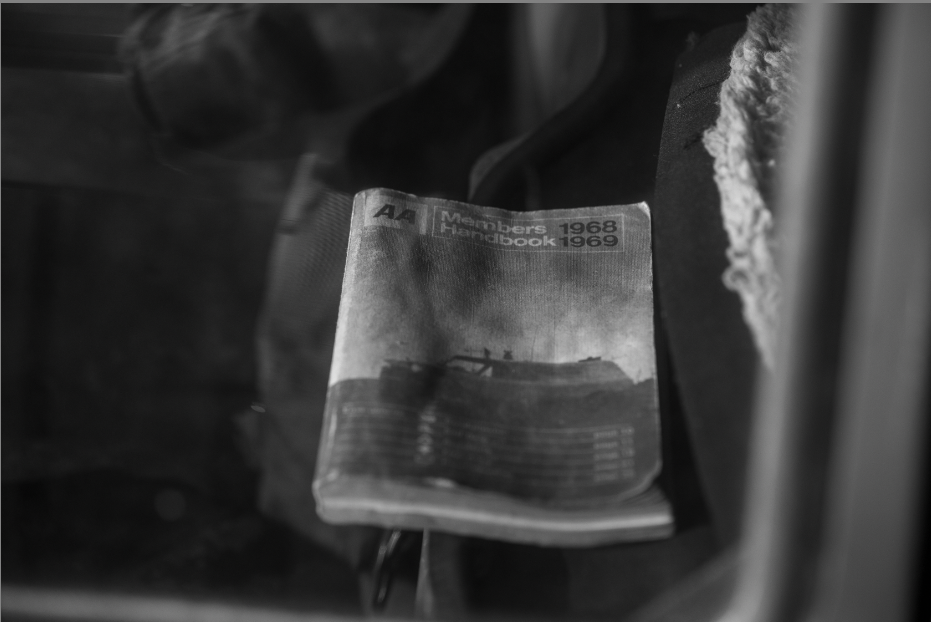
Having taken this photo through a window I was concerned here would be a glare, but instead it made the handbook standout. The left of the photo is mostly dark with different patterns and then the right side of the photo shows a section of the back of the seats. I like that you can see the age on the book, adding to the idea about the cars age. This was helped with the black and white as it removed the distracting colours from the background, leaving the focus on the book alone.
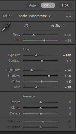
Edit Twelve
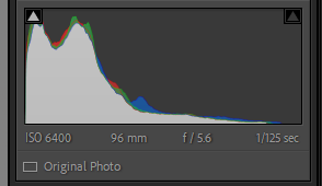
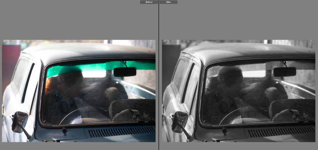
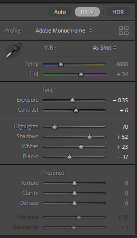
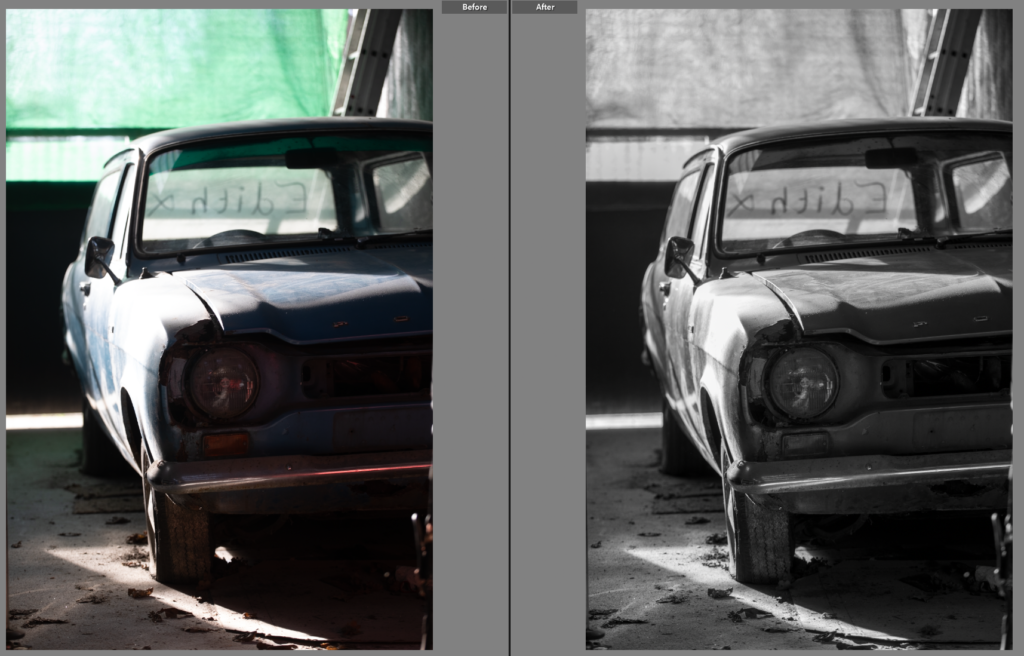
Being able to compare both photos was essential in the development of this shot, Originally I liked the colour version, with the shadows and sections of light highlighting the colour of the car. However I then compared it to the black and white version and found I liked that version better as the green mesh wasn’t as visible in the background, in fact it highlighted the writing on the cars back window. The black and white also brought out the details in the headlight and rust around it.
Final photos
I love the final outcomes of this shoot, I think there is a great mix of colour and black and white shots. Showing details, like the the original car handbook, to the owner and the car, to the dog in the car. All have created a mini narrative within the wider project. Showing the relationship between the car and the owner. I like how apparent the dust is in each shot, showing the age of the car as well as how the passion for the vehicle hasn’t changed over time. This is what I’m aiming to show in the next photoshoot with my father and his old bike that he still loves. Hoping to show how I have been around them most of my life and it has influenced my similar passions. The lighting in this shoot was harsh but created sections of light and darker shadows adding depth and feeling to the photos.