All posts by Marta

Filters

Author:
Category:

Lewis Baltz-Case Study

Introduction to Lewis’ Life:

Lewis Baltz was (born in California, Newport Beach 1945) a freelance photographer in California and he taught photography at various institutions: including the California Institute of the arts, the University of California as well as Yale etc.

Lewis has been based in Europe since the mid-80s and travels extensively. The photographer produces images in series that are focus on a particular theme or geographical area. Lewis usually publishes these photographs in book form.

Lewis in terms of The New Topographics:

His work, like that of other associated with the western approach of The New Topographics, he challenges the 19th century tradition of the American landscapes photography represented by Timothy O’Sullivan, Carleton Watkins as well as William Henry Jackson by presenting a less innocent view of the landscape.

His perception and perspective of the landscape reveals that the effects of the 20th century culture and suburban development on the nation’s topography.

Baltz focused his camera on the unassuming green spaces as well as architecture of tract housing, office car parks and industrial parks. 

He as part of the New Topographics movement, through his work he shared an aesthetic that drew on contemporary art and rejected the romanticism of traditional landscape photography.

I like Lewis’ work as it is straightforward but very effective, I believe that the simplicity of the image and the idea that it’s empty presents this abandonment clearly and the fact that there is no life, no people or established buildings as during the time the theme of new topographic raised poverty, people moving to new places and leaving behind the old was common during the era after the world war.

He once said:

“I was living in Monterey, a place where the classic photographers—the WestonsWynn Bullock, and Ansel Adams—came for a privileged view of nature,” he once said of his work. “But my daily life very rarely took me to Point Lobos or Yosemite; it took me to shopping centres, and gas stations and all the other unhealthy growth that flourished beside the highway. It was a landscape that no one else had much interest in looking at.”

The New Topographics Contact Sheet & Photographs

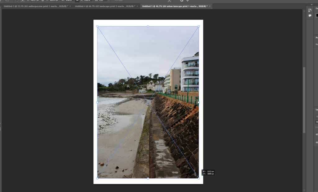
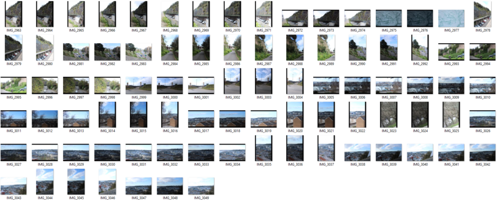
For this photoshoot I decided to present my contact sheet of photographs I took on the walk around from Havre des pas beachy and old contrasting to modern building textures, as well as the more machine-like buildings around la Collette like the jersey electricity centre, the disposal centre and the jersey marina where the viewpoints of the man made boats and structures of buildings contrasts with the nature and the ocean itself, this collision of the “New Topographics” is evident in my photographs presented below.

In the screenshot presented above I have demonstrated the HDR merging of my photographs specifically the one where the marina is present with the colourful and the nature as well as the La Collette Chimney being present in the photograph above.

I believe that the use of this HDR merging makes the images look a lot more vibrant and modern as it makes them appear alive, bolder and more saturated the combinations of the images together of the landscapes.

  • Desaturate / B&W
  • Levels and adjustments
  • Adjusted brightness and the contrast the same
  • Compared the shadows and highlights.

In the photograph above I tried to include the machinery on the beach as well as the buildings and strictures in the background. The lower and higher part of the image challenges these ideas of textures in “The New Topographics”. The idea that in new Topographics the contribution of the man made and natural elements in one image presents the change of architecture and general human activity change. The idea that “ecosystems are damaged or destroyed…suburbia expands, encroaching ever more on the last refuges of the original, pre-European invasion landscape”.

In these images above I took I focused where the contrast between again ” natural and manufactured” features as well as when the darker and brighter/lighter tones appeared in the photograph. From the sea’s waved pattern in the cracks and creases in the Havre Des Pas swimming pool structure to the appearance of finish of the stairs presented going down to the swimming pool.. The clear slit between the darker and light areas makes the image appear more interesting to look at and looks engaging as it looks unconventional; the way the tonalities are positioned in some of the photographs for example the first image and the second to last image.

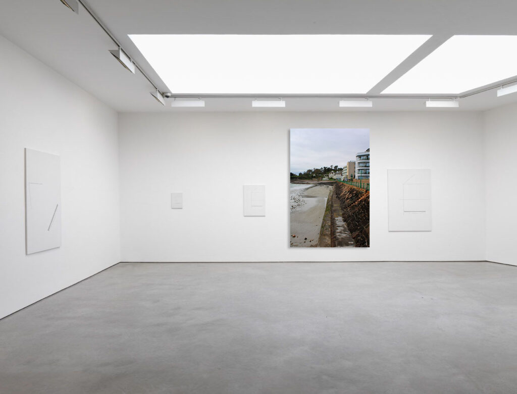
In this photo I wanted to show the composition of the image where a good 3/4 of Havre Des Pas is presented including the direction of the clouds presented in the top of the image itself.

I believe the image presents this landscape well, despite the image being in a monochrome tone. I think the clouds at the top work well coming from the left corner direction.

In the photograph especially on the left I feel as though the tones are presented well like mentioned before the clear contrast between the much darker textures and the much lighter ones. I n many of Lewis Baltz photographs the influence of human activity and control/reflection is clear, I tried to present this in my own photoshoot.

The Leica camera which was used by Lewis himself to shoot his photographs whereas to take my photographs I used a canon dslr camera. I aimed to take inspiration from his work despite using the canon dslr, the Leica has ” better results” and is “far easier/faster to shoot”. (https://www.kenrockwell.com/leica/m9/sharpness-28mm.htm)

In the photographs above I looked specifically at the textures and the buildings and the difference between the modern buildings and for example the contrast between the newer and older building having construction.

In the photograph on the left presents the building with many different layers and the shadows presented below each layer, I think this plays well into the photoshoot as the different tones are highlighted as well as the rock texture in the bottom right corner.

I like the photograph specifically on the right especially as there is an evident split of colours and nature vs urban scenery. Most of the darker tones are presented on the right side which looks similar , the split, to Lewis Baltz photographs where the black and white contrast is clear and looks very sharp as well as clean.

In the photograph above I think the different textures work well. The building looks a bit worn out and the colour looks plain, no vibrant colours show up so the image fits with the theme of new Topographics and the less interesting landscapes.

In the photograph above I think the industrial elements play a part alongside with the nature and greenery. The contrast looks interesting as it’s almost split, the juxtaposing features look unusual as below in the lower part of the image it appears brighter than the top half creating the effect and opposition of life vs man made clear.

In the photograph above I think that the contrast between the different buildings looks quite interesting with the distinct appearance of each one, the landscape differentiates as the three different appearing structures are all in the frame and look unique as they all have different window panes, different structures, shades and heights as seen above.

Following the topics of New Topographics I think that the two images above present it well, with the first image at the marina, it presents the water with the land in the background as well as the boats either side of the image framing it an interesting element.

The New Topographics

What was The New Topographics?

The New Topographics was a term created by William Jenkins in 1975. This term described American photographers (including Robert Adams and Lewis Baltz). These photographers had a similar banal aesthetic (art described such as things than are unoriginal, obvious and boring in the general public eye). These “new Topographics” signaled a radical shift away from traditional depictions of landscape, topography is always changing and being reshaped through the power of weathering, erosion as well as deposition. The Topographics caused an emergence of an absolute new approach to the landscape as well as it demonstrated the influence of Conceptualism and Minimalism in the 1970s in photography.

May of the photographers such as Robert Adams, Stephen Shore, Lewis Baltz etc. associated and inspired by the man made, selecting subject matter that was matter of fact. Car parks, the suburban housing and the warehouses were all depicted by the stark severity which looked beautiful, almost in a way how early photographers documented the natural landscapes. The suburban sprawl was also presented as well as the everyday scenes we usually don’t give a second glance at.

https://www.kierangosney.com/blog/new-topographics-a-short-history

An exhibition at the International Museum of Photography in Rochester, New York which featured these photographers also revealed the growing unease about how the natural landscape was being eroded by industrial development, both highlighting then the natural and manmade features.

The New Topographic reflection was also due to the the post-war consequences. The post-war America struggled with:

  • Inflation
  • Isolation and mental health issues among many.
  • Lack of road networks and distanced and vast length of range
  • Baby boom (result of lost time, veterans millions of them soon married and starting families)
  • Suburbia being a big factor (the outer parts of a town, where there are houses, but no large stores, places of work, or places of entertainment)

Edward Weston Artist Research:

Earlier Stages/His background & Style:

Edward was an American Photographer (Born in Chicago in 1886 and moved to California at 21 years old), he has been called the “one of the most influential and innovative American photographers” as well as “one of the masters of 20th century photography”. Over the course of Edwards’s 40 year career he too photographs of a large amount set of subjects, including landscapes, still life’s, nudes, portraits, genre scenes and even whimsical parodies.

He spent the years 1923-1926 in Mexico City as part of a international milieu of creative minds which was attracted by the post-revolutionary excitement of political activists/artists such as Diego Rivera, Jose Clemente Orozco, Tina Modotti as well as others.

In 1937 he was the first photographer to receive a Guggenheim Fellowship as well as over the next two years he produced nearly 1,400 negatives using his 8 × 10 view camera. 

It is said that Edward developed a “quintessentially American, especially Californian, approach to modern photography” because of his focus on the people and the places of the American west.

As well as Ansel Adams along side him Edward evolved a modernist style which was characterized by the use of a large format in order to create rich black and white photographs with a sharp focus.

In the initial stages of his work it revolved around and was the typical soft focus pictorialism, which was popular at the time. Edward abandoned the style after a few years and he went on to be one of the “foremost champions of highly detailed photographic images”, he concentrated on precise studies of such forms as fruits, vegetables, shells, and rocks.

In the year 1947 Edward was diagnosed with Parkinson’s disease and soon after stopped photographing. The photographer spent the rest of his 10 years remaining spent on overseeing the printing of more than 1,000 of his most famous images.

More on his style:

With the combination of Edwards passion for the love of nature and form as well as his stark objectivity, these factors came in play with and gave his still life’s, portraits, landscapes, and the nude qualities that seemed suited for expressing the New American lifestyle and aesthetic (that had emerged from California and the West from the end of the two world wars)

Edward helped develop a more modernist style characterized by using a large-format camera to create these focused and detailed black and white photographs.

(Ansel Adams Inspired) Natural Landscape Photoshoot:

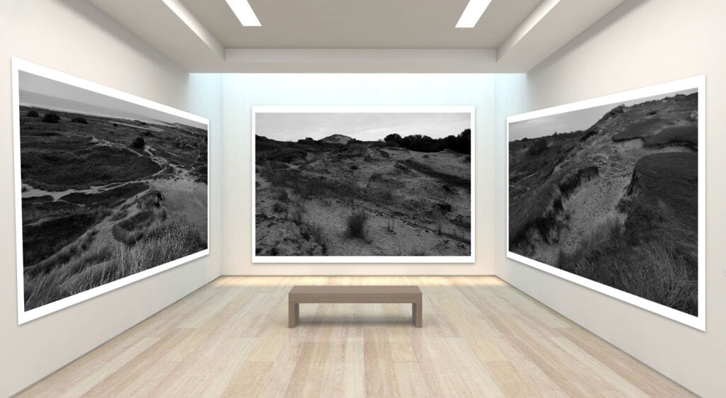
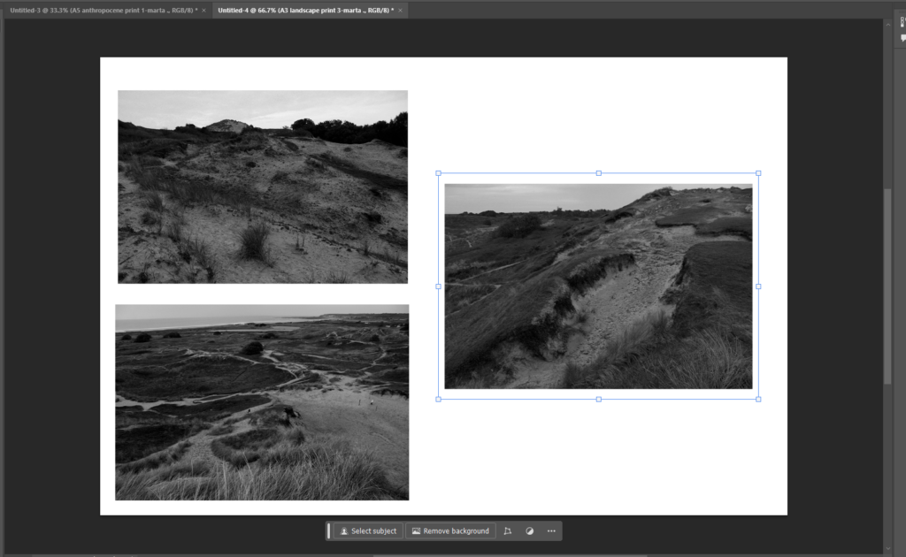
In this photoshoot I looked at the sandy dunes specifically and how it can intertwine and show inspiration from Ansel Adams’s work. I looked after different pictures from many different perspectives and from different heights to get different views. Despite the heights of the hills not being as high as Ansel Adams’ I was still able to get a nice range of different photographs from a different stance.

In my photoshoot I took them in daylight so the textures are able to be seen, if I were to taken them in a darker setting the outlines and different gradients of the photograph would not been able to be seen, especially if I were to edit them in a black and where monochromatic scale then the features would not show up clearly as I want them too. Despite the dunes not presenting themselves as high as they appear in person rather than on camera, I believe they look interesting and dramatic due to the different patterns and appearance of the grass, greenery, sand and rock.

I think that in the photographs above I have tried to display my ideas of natural landscapes. I believe it was a good locations where the combination of the dunes of sand and the different textures of grass and the land especially with the different heights put into perspective. I took photographs from many perspectives eg. up close, from below, from above, across the horizon, zoomed into a specific area highlighted etc.

I believe that the photographs produced and presented on the page look interesting and how the different textures are shown looks appealing as it not just a flat structure and flat organisation of subjects. I believe that the black and white contrast to the colour looks even more dramatic with the shadowed and darker shades presented the difference between the light and dark shadows looks.

In the photographs above I show the difference between the light and the quality. The white and dark tonalities look more prominent in the black and white photograph therefore looking similar to the photographic work of Ansel Adams where his “Zone System” comes into play where the level the darker tones range at 0-4 mostly in that specific photograph and the brighter ones from 7-10.

In the photographs above I believe that the landscapes looks interesting as the different patterns of the paths looks almost as if the continuous patch of greenery is almost cut and disassociated, it almost looks as if it’s separating from it.

The combination of the sand and different coloured/shaded grass looks almost like a swirl patter as the landscape presented is not in a straight pattern (almost looks like a maze or a map where there is many paths and journeys).

Especially in the first photograph below the previous writing the “map/maze” ideas comes into terms as it shows the landscape below in a bigger perspective whereas the second photograph the landscape below is cut off in half but the landscapes and feature closer to the lens which is a complex of textures of sand especially and rock at a slant.

The third photograph looks directly downwards onto the landscapes in a lower down perspective. The photograph includes the ocean and the element of the coast so not only is the greenery included the contrast between that also appears.

The integration of natural vs man-made is evident here where the subtle element of man made structures is presented here.

AI Experiments through photoshop:

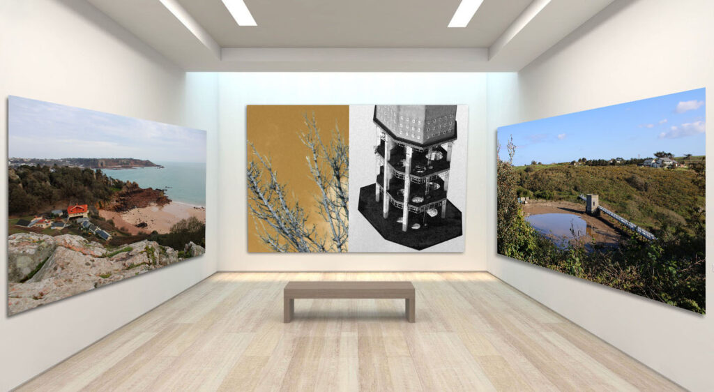
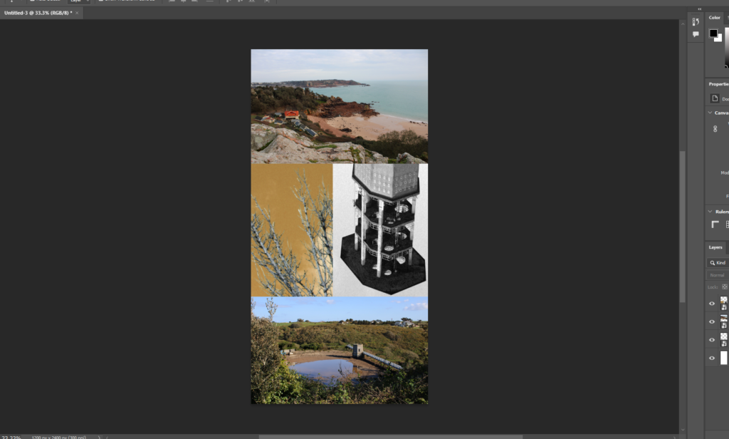
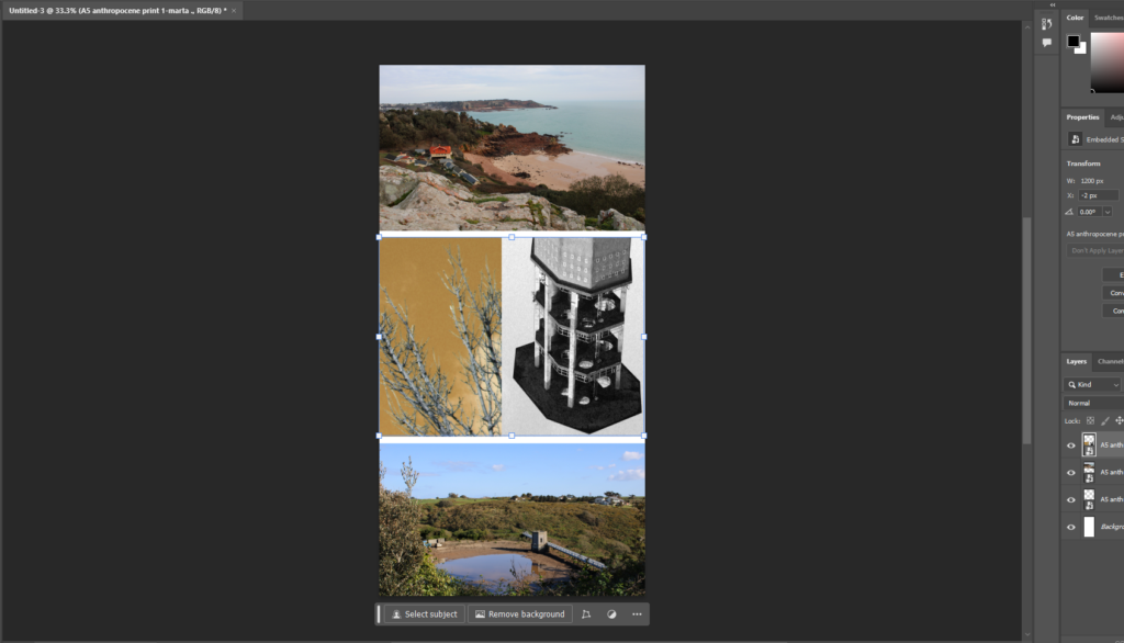
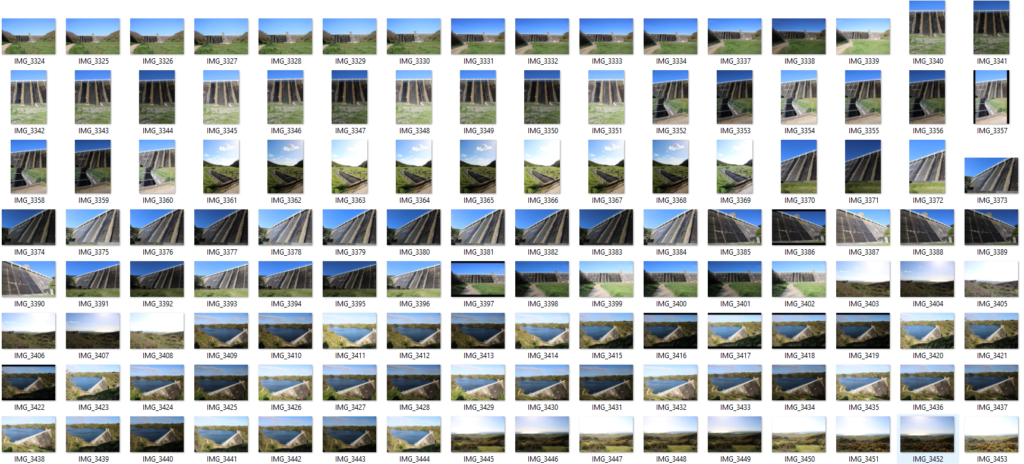
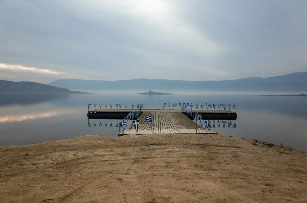
In this specific photograph, I believe that the picture could look interesting with contrast such as giving the artificial intelligence words to create such as “drought”, “desert”, “dried up” or “emptiness”. This contrast works well with the topic of Anthropocene as it could present how the future may look for the dam if the water continues to run out progressively.

In the image above presented the intelligence worked well with the image and created what result I wanted despite it showing the results of dryness and drought, I believed that the lower ground approach would have been more effective due to its ingratiating/decreasing in level.

The images above are my artificial intelligence photos of the different results, I feel as though the different outcomes look very realistic as indeed the reservoir could be predicted to look like those outcomes if environmental changes continue to affect the planet in ways like these:

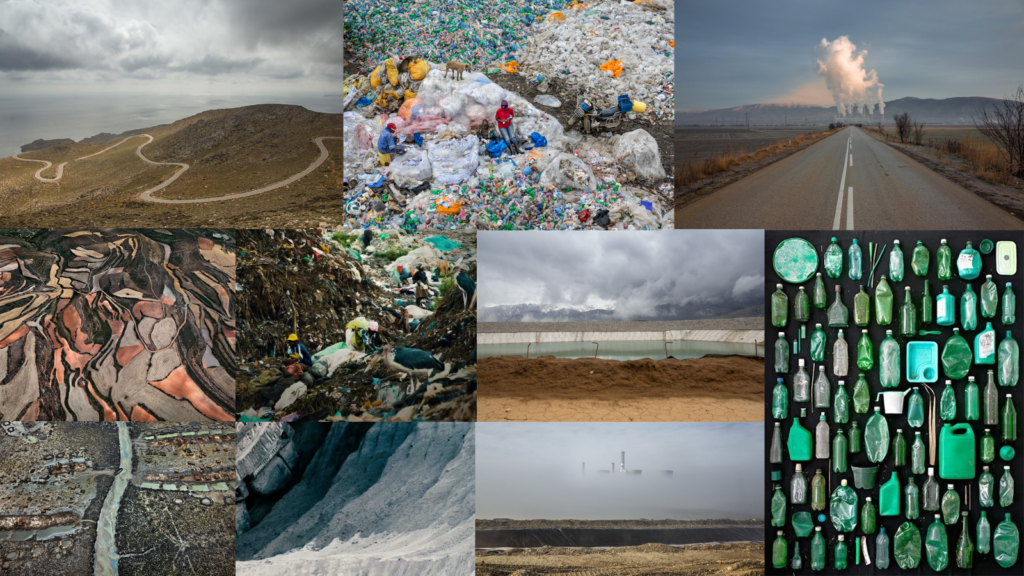
In the print screens above I took inspiration from the topic Anthropocene and its response on the planet to create a dirty and polluted area in the waters as generally, the ocean is contaminated all around. I selected the areas necessary that I thought looked the most lifelike and inserted connotations and ideas of muckery, dirt as well as dangerous environments of potential risk.

I believe that the bright plastic contrast to the rest of the simple and timid coloured photograph looks unique and interesting almost as a piece of art as the plastic due to its bent form in a sort of collage looks almost even if it’s extremely damaging.

Natural Landscape Photoshoot 2:

In this photoshoot I experimented with taking photographs near Corbiere. I believe that taking photographs in this particular location is good as it captures the landscape well, including the different textures of the rocks on the cliffs, the rock and different colours contrasting to the water below looks interesting and brings the audience into the scenery as each element appears.

It also looks appealing when the photographs are taken at a high vantage point as well as the photograph gives the viewer a view they may not see normally.

In these photographs I believe that more of the colour adds to the textures as in the brighter colours such as the yellow and green the textures and different

Coastal Landscapes Photoshoot 1:

I have presented my contact sheet, in this photoshoot I focused on getting a perspective including the greenery, the rock element and the coast so that sand and waters.

I believe that including the black and white feature in the photograph plays well with the outcome, the darker elements of the photograph look even more dramatic.