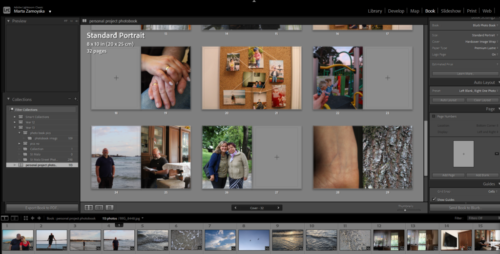
Final Finished Layout and Arrangement of Personal Project Photobook-

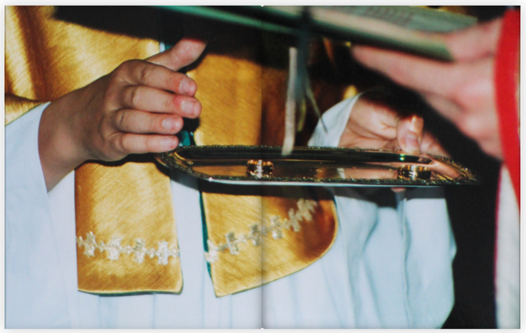
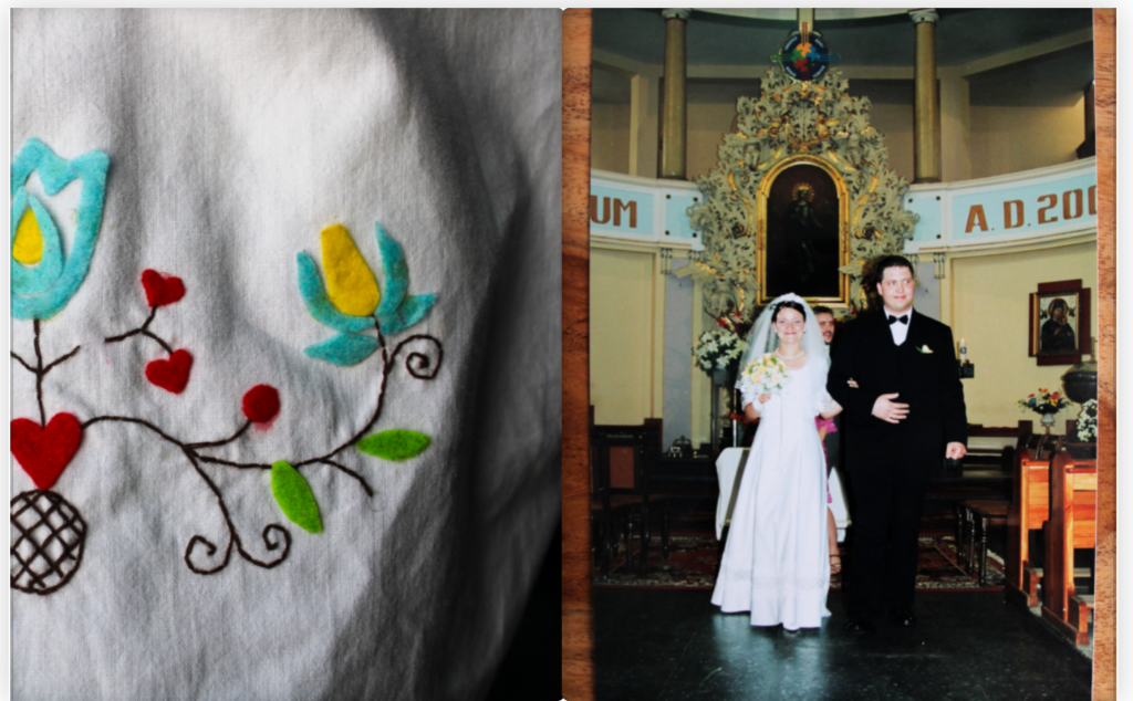
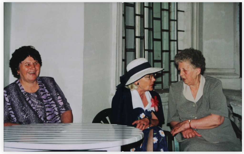
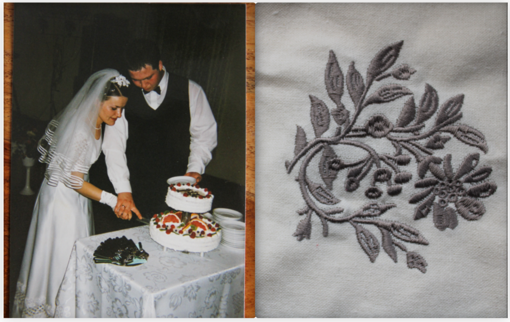
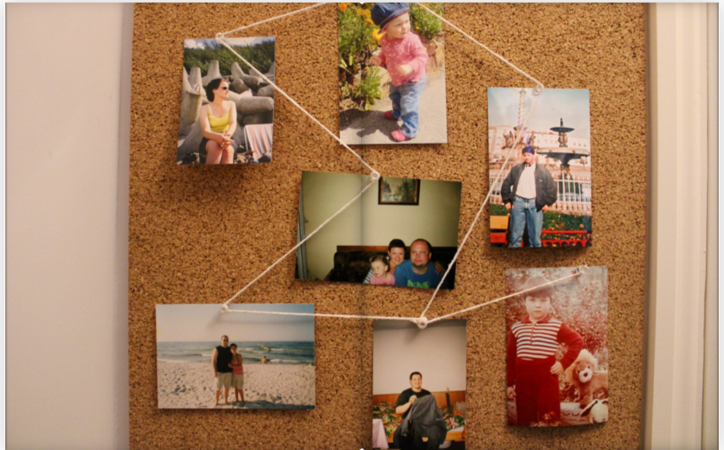
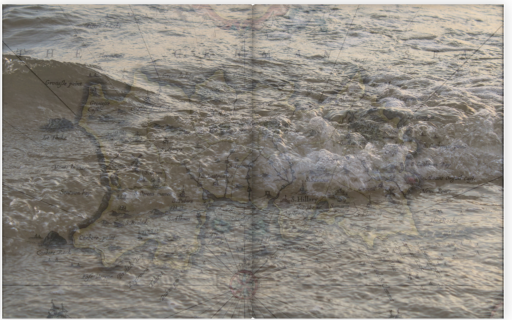
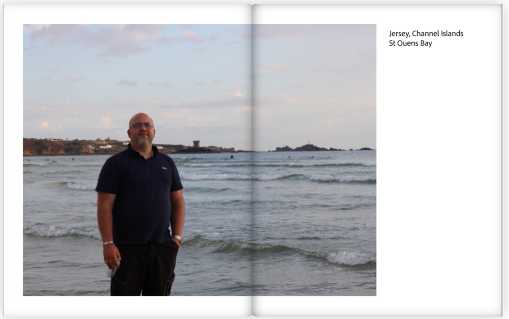
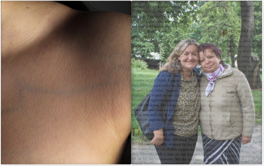
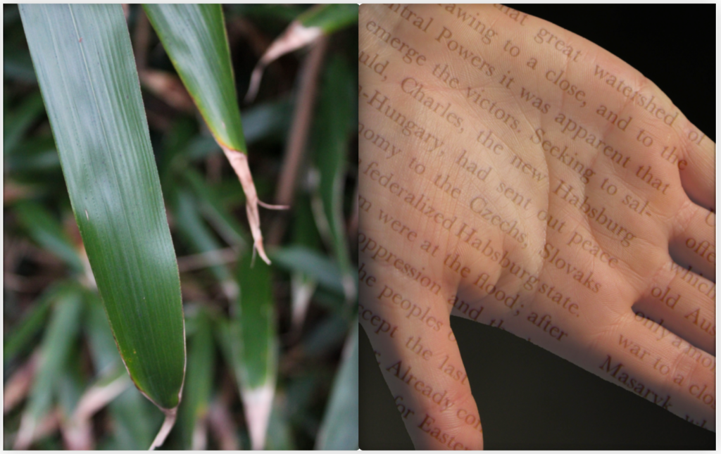
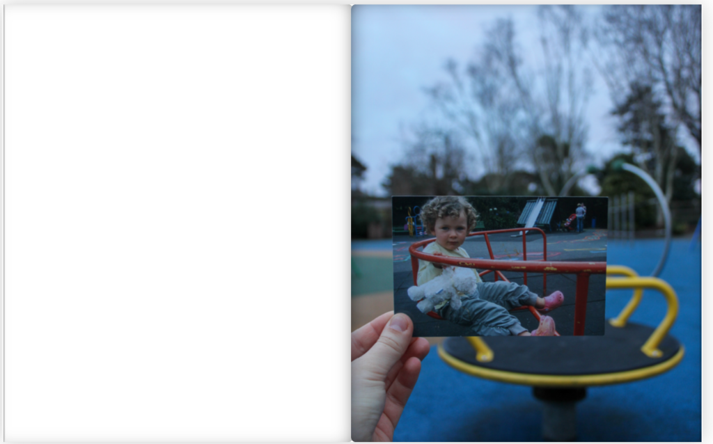

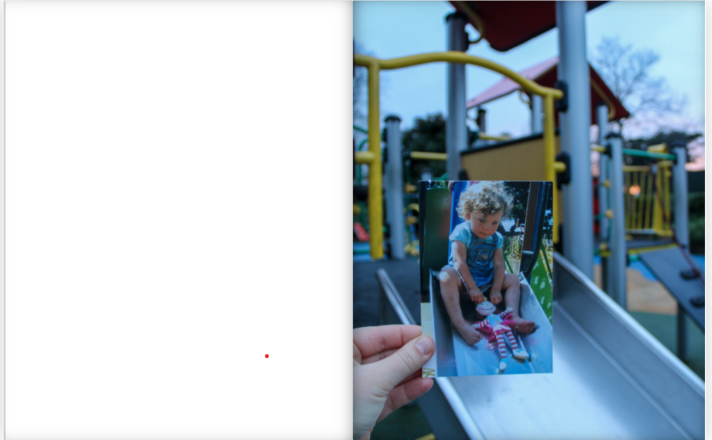
Final Finished Layout and Arrangement of Personal Project Photobook-


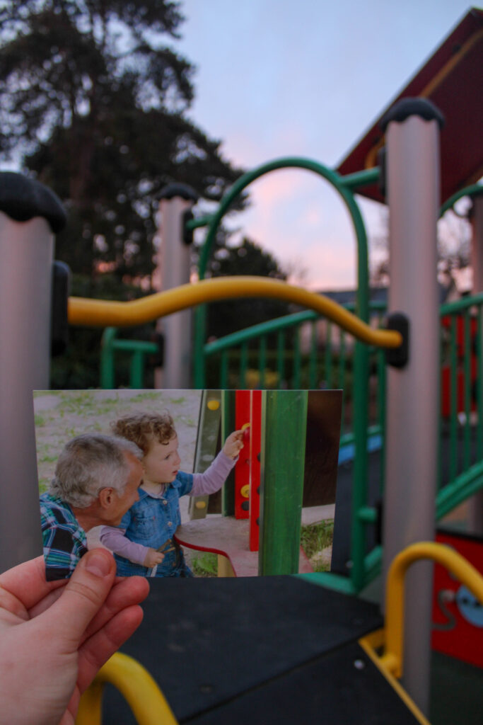

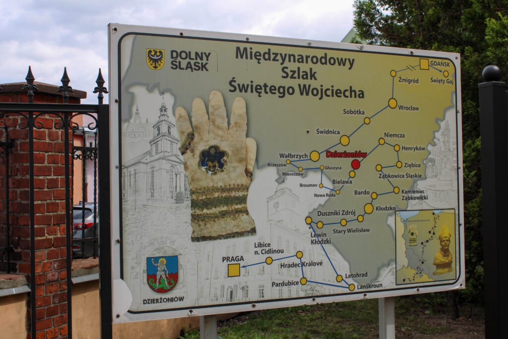
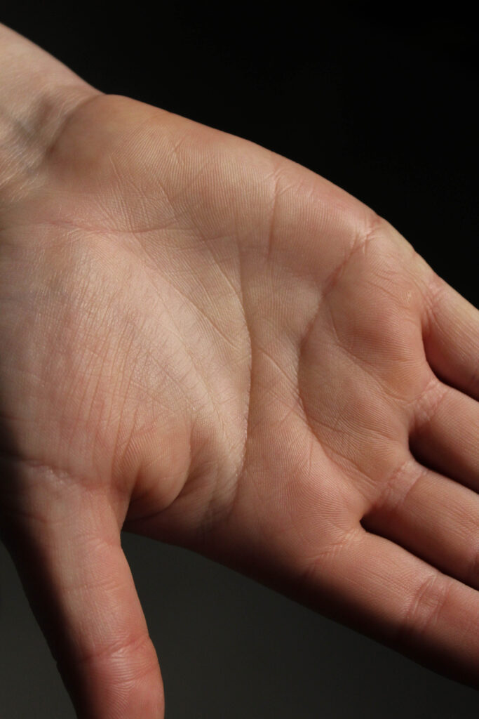
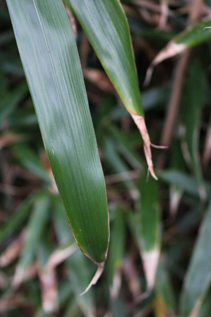
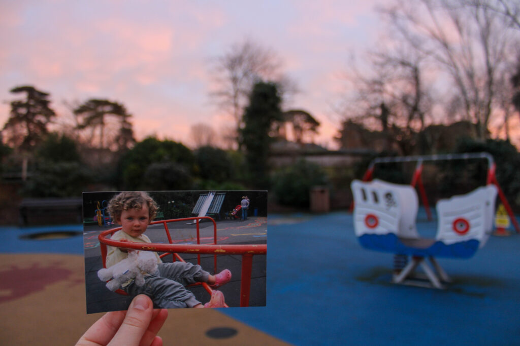
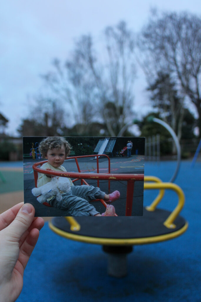
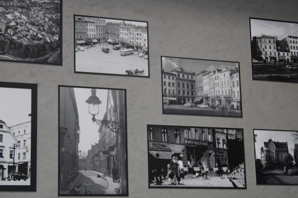
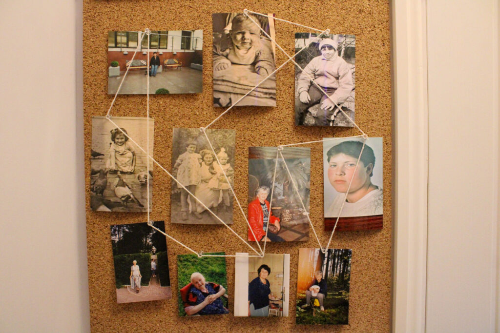
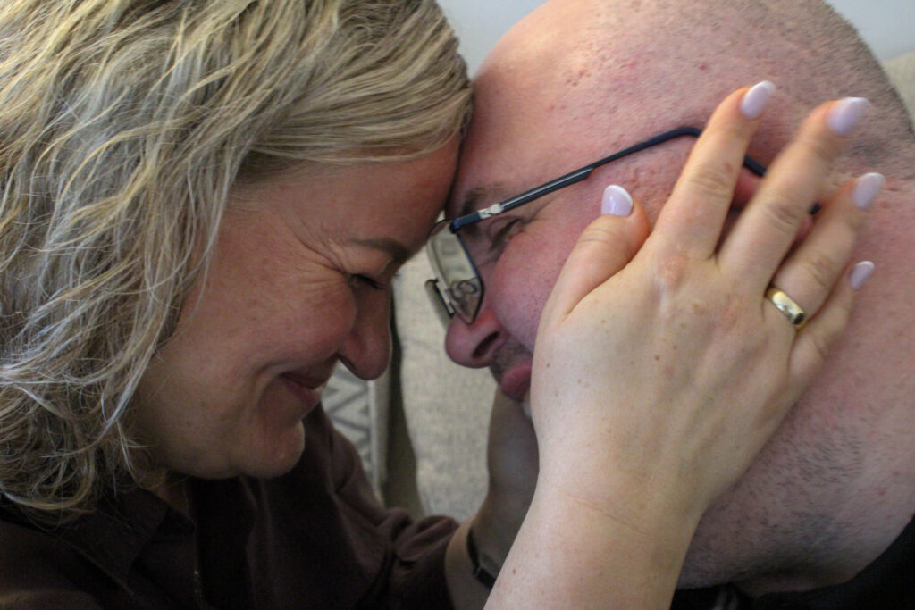
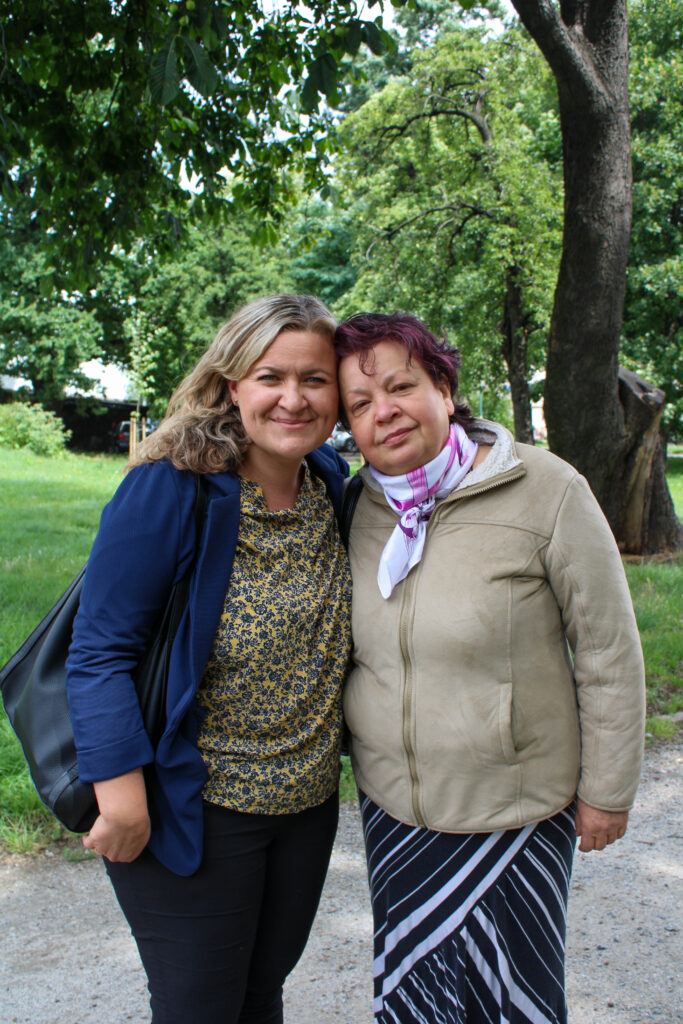

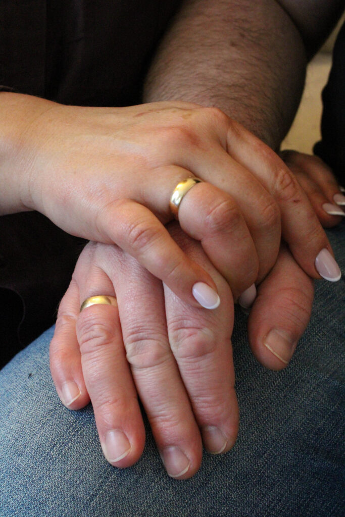
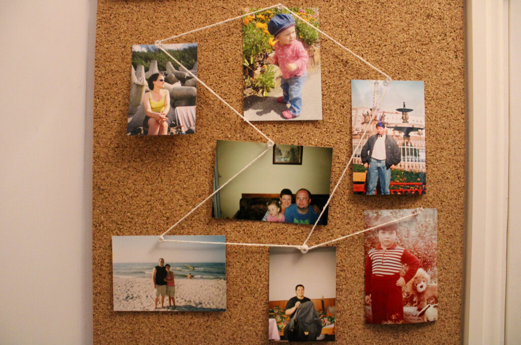
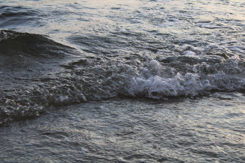
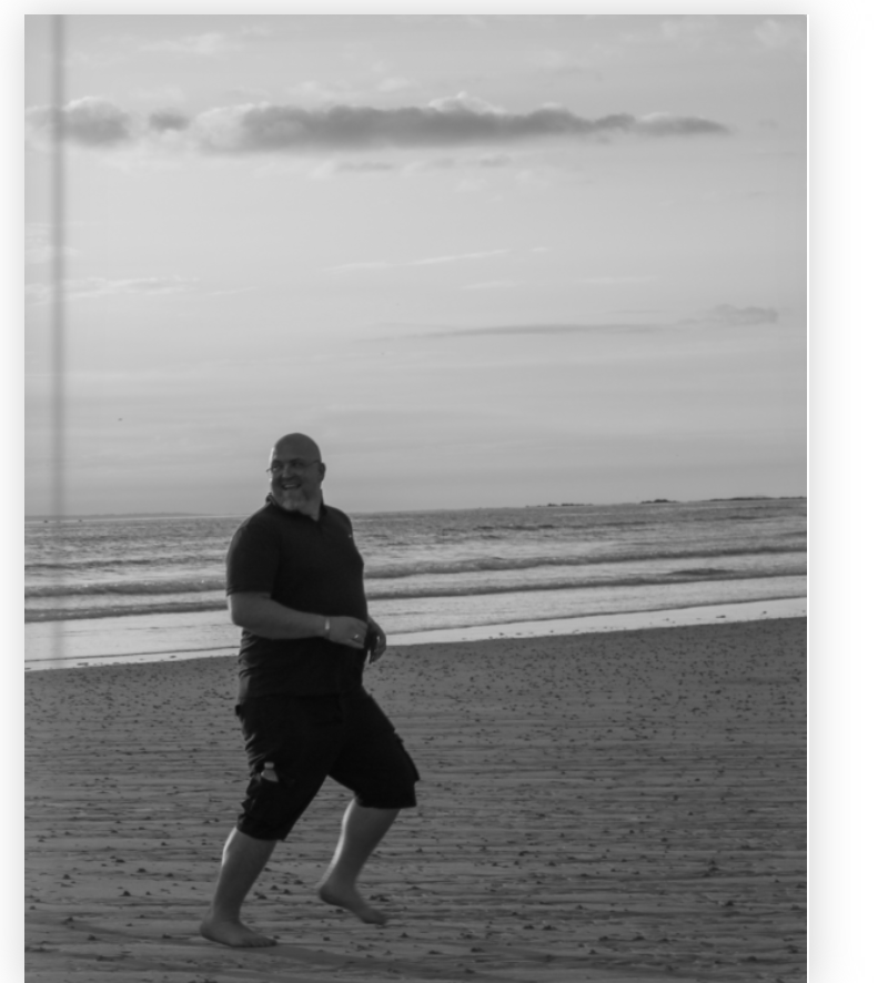
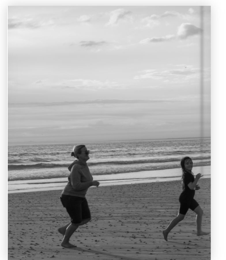
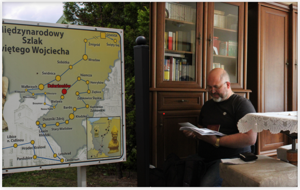
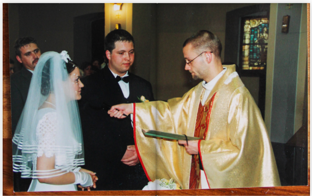
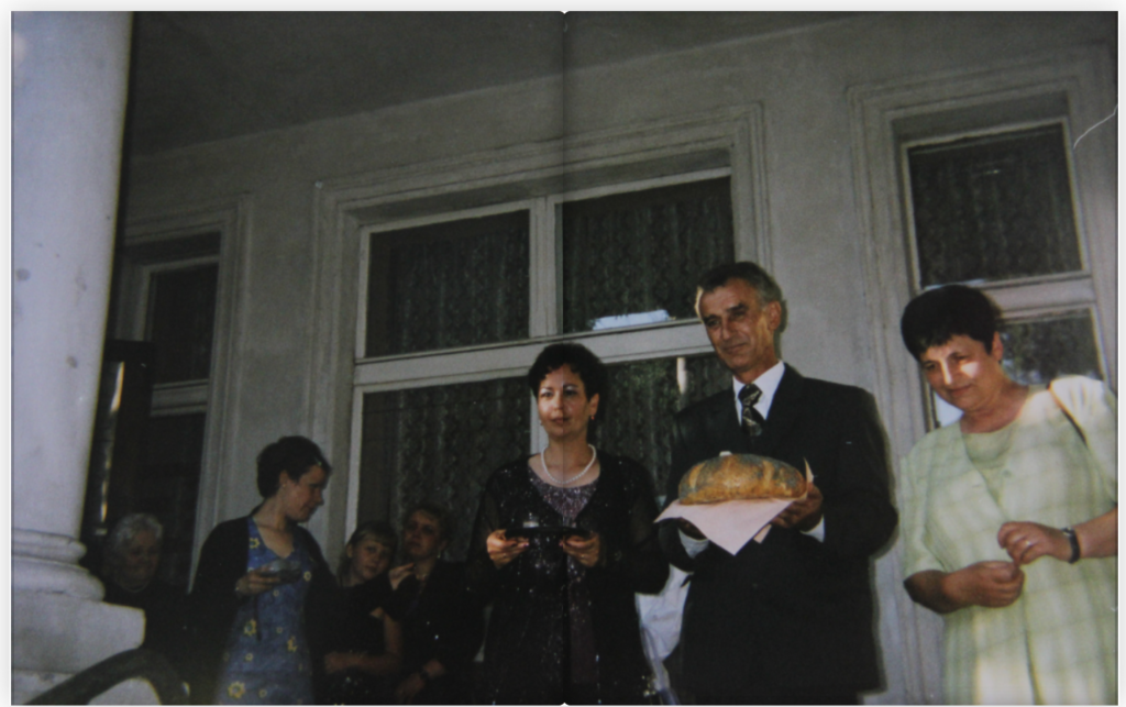
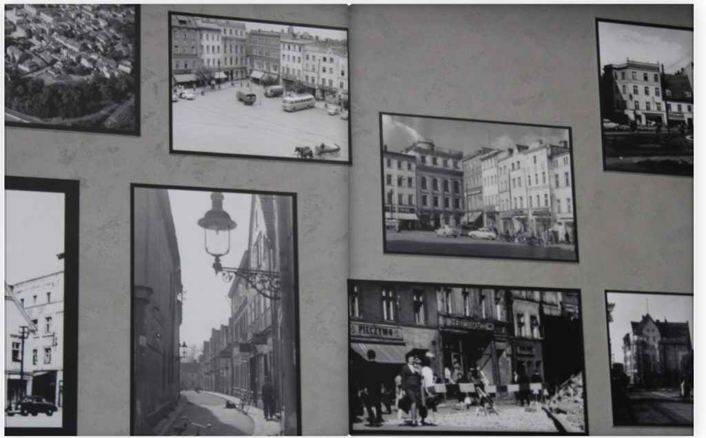
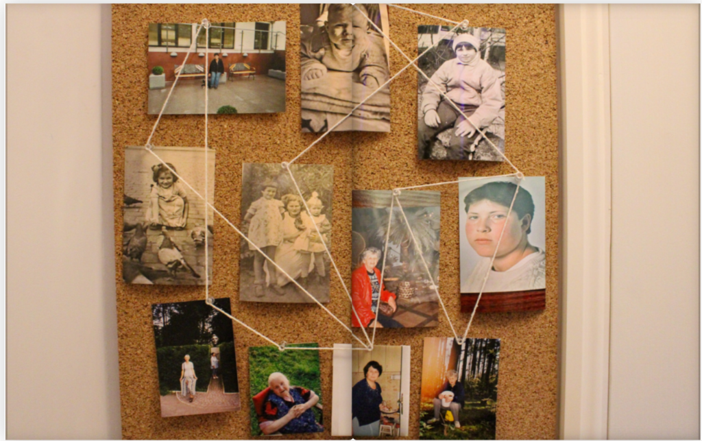
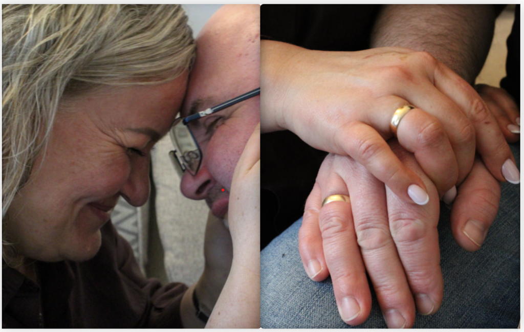
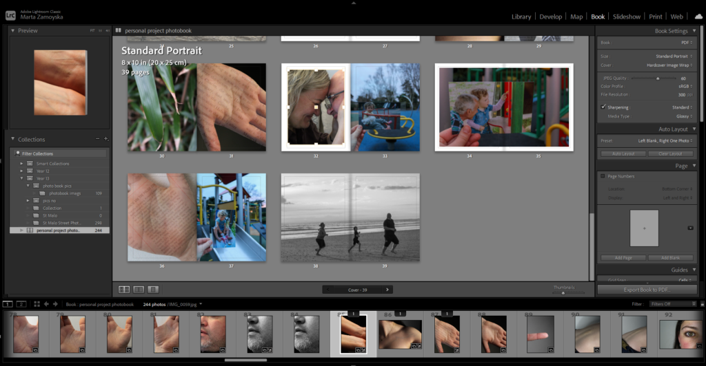
While these final images are not fully edited, I’ve chosen to include them in this form because they still speak strongly to the themes and visual rhythm I aimed to create.
I’ve included them here because I feel they still capture the same outlook of what I’m trying to say visually. While working in Photoshop, I made some slight tweaks to bring out the vibrancy a bit more and to deepen the darker areas, just to give the images a little more presence and contrast. I didn’t want to overdo it, so most of the adjustments are subtle—like lifting the shadows in certain spots, slightly adjusting the color balance, and making minor changes to the exposure where it is needed. The goal was to enhance the natural texture and feeling of each image without stripping away their rawness.
The images themselves are a mix—some are close-up shots I’ve taken recently, while others are archival pieces that carry their own sense of history and weight. I think they work well together because, despite their differences in time and style, they all share a kind of intimacy and detail. Whether it’s a modern photo or an old one, each image feels like a small fragment of a larger story—something personal, textured, and a little imperfect, which is exactly what I wanted.
Even in their unfinished state, I think there’s something compelling about how they sit together on the page. and the sense of quiet cohesion is what makes them feel like part of the same stor.
That’s really what ties them all back to the title of this work: What connects us together? (translated from polish/Original Title “Co nas więżi razem?) It’s not about big, dramatic moments, it’s about the things we recognise. Familiar textures, memories, and quiet gestures that link people across time and space. The edits though being incomplete still allow the images to hold that connection. They’re fragments but together they form a bigger picture, one that speaks to relationships, history, and shared experience. These photos communicate something honest. They feel like pieces of a conversation some from the past, some from right now but all part of the same thread essentially .
Photographs used:
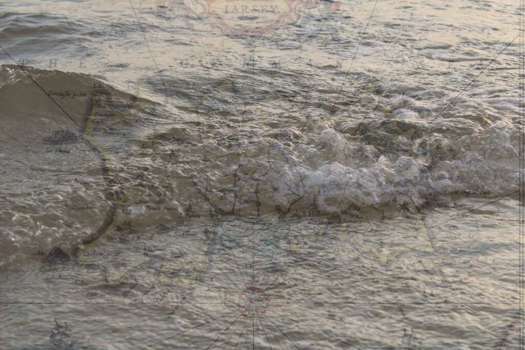
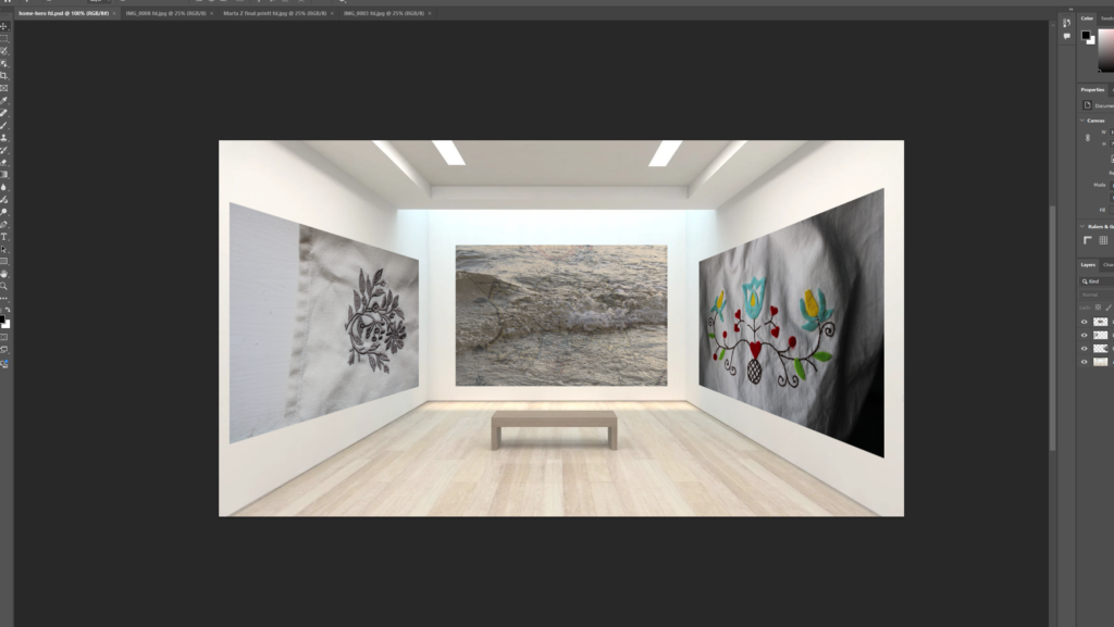


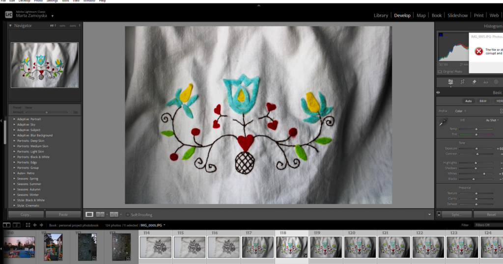
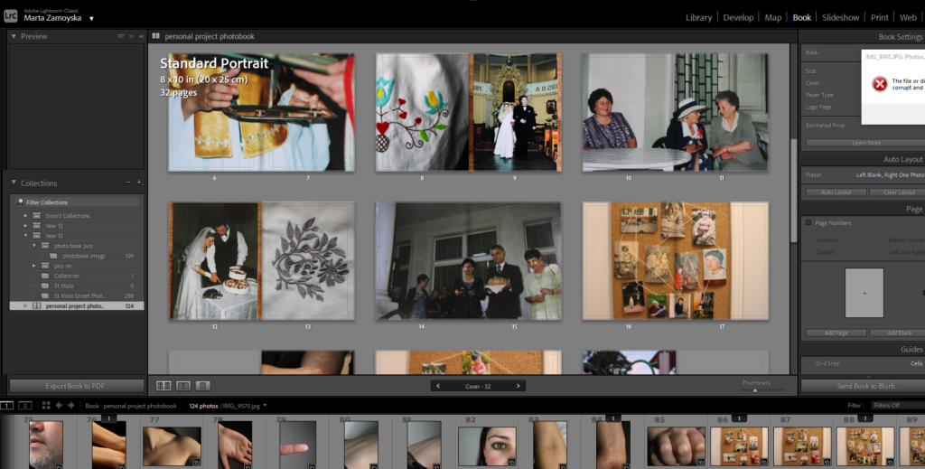
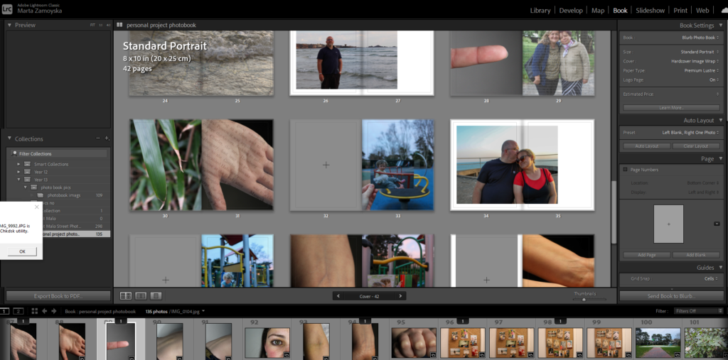
When creating my photobook on Lightroom classic I made sue when exporting it to the final destination Blub that all the measurments and images wee in the place I wanted them in.
The platform includes a variation of design tools, quality printing and distribution options. It also offers a range of high quality printing options which includes professional-grade paper types which is an essential option for photobooks. The quality of the paper and the print is crucial for preserving the integrity of the photos. The website also includes features of glossy or matte paper with options for lay-flat binding. It ensures that your photographs will be showcased in the best way.
If a persons work involves fine details, high printing prints are neccessary to bring out the true colour, texture, and lighting in each photograph.
It also provides an integrated online platform, where you can sell your photography book directly to the public through their website. Additionally, the platform allows you to distribute your book to other online retailers like Amazon that makes it easier for a wider audience to discover and purchase your work. This could significantly expand the reach of a photographers book without needing a traditional publisher or intermediary.
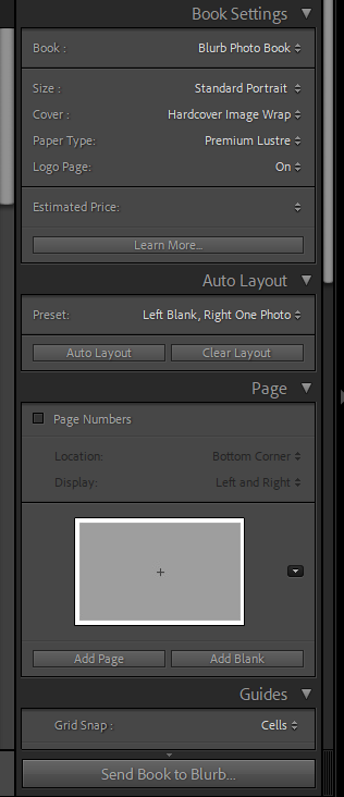
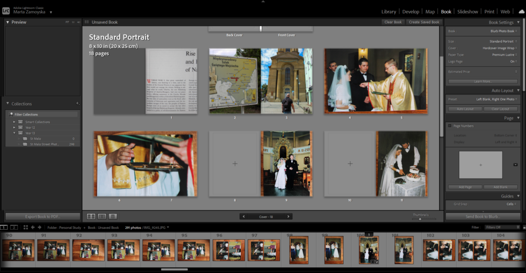
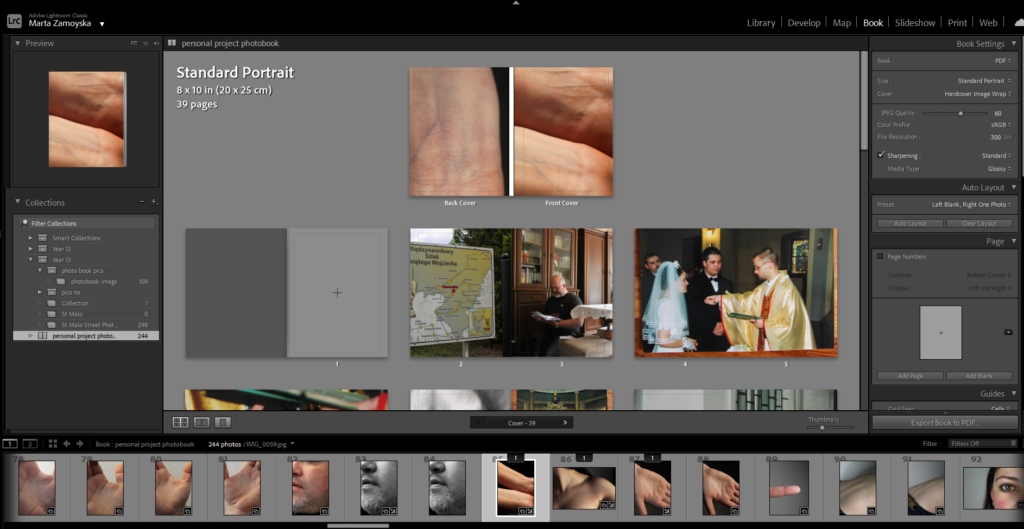
In terms of my layout and design for my photobook, I will be using these certain settings to produce my book.
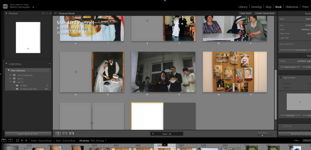
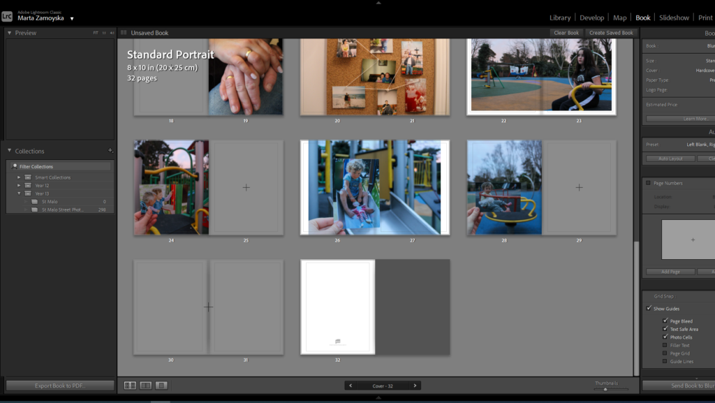
When laying out the pages in my photobook, I focused on including a range of different shaped and sized images to differentiate the layout more. For the front and back cover I put a double page spread in monochromatic colouring differentiating to the rest of my photo book.
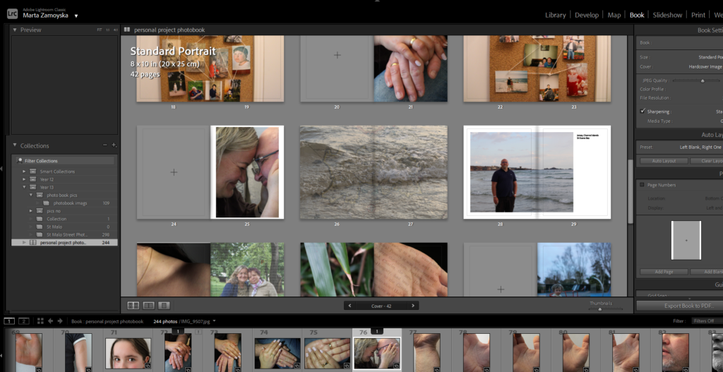
Inside the photobook I tried to include a range of archival imagery as well as contrasting to modern images showing changes and connections through family, people, nature etc. relating to the tile of my essay “Co więźi nas razem?”.
For the book settings I decided to choose standard portrait as it would fit the rest of my photobook and premium lustre for my pages so that it presents good quality of my images.
For the photobook’s setting, the layout allows for a balance, giving space to showcase each image while maintaining an neat structure. My chosen paper type enhances the colors and details of my photos, giving the photobook a professional and polished feel while maintaining the warmth and depth I want to convey through my family’s story.
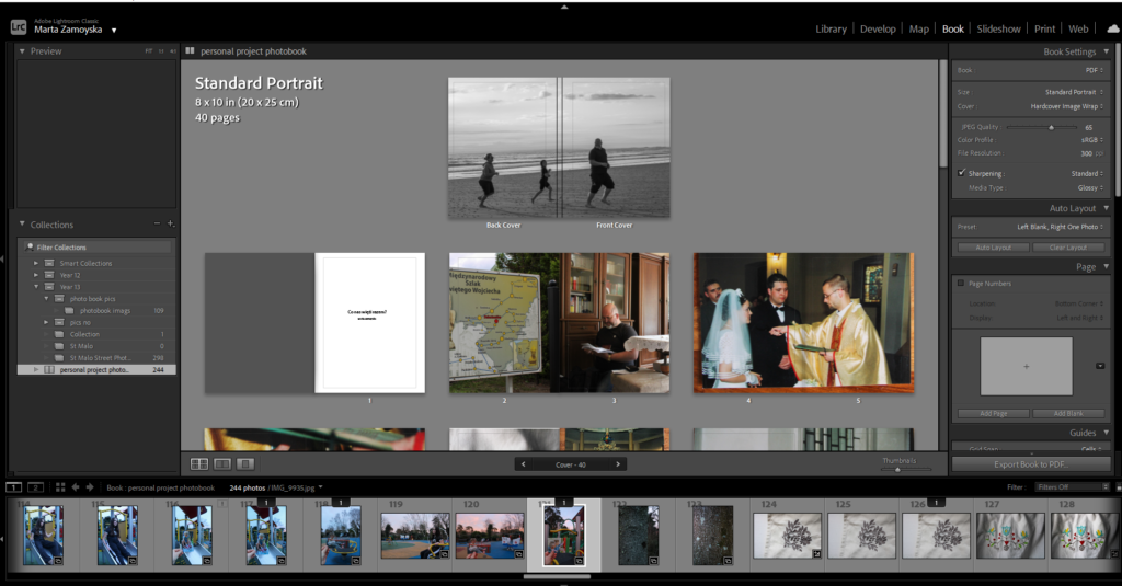
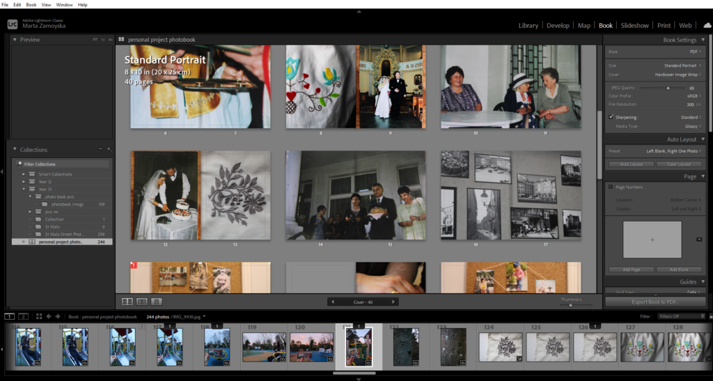
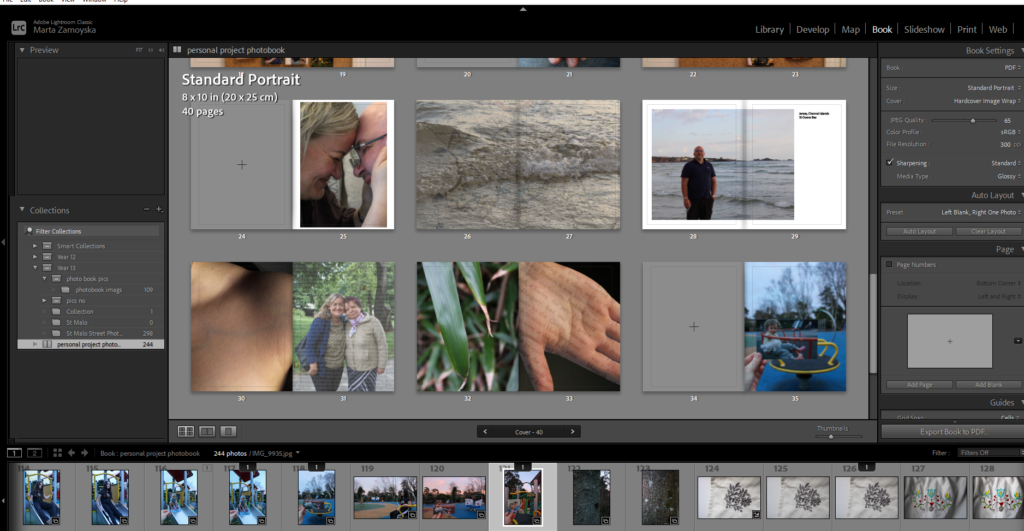
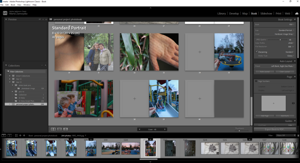
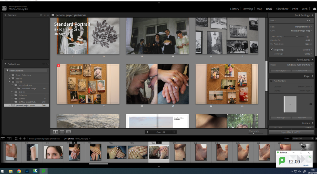
When laying out the pages, I made sure to include a variety of image sizes and shapes, which helps break up the design and adds dynamic visual interest throughout the photobook. I wanted to differentiate certain pages, so for the front and back covers, I chose to create a double-page spread in monochromatic tones, setting them apart from the rest of the photobook. This design choice offers an introduction and conclusion to the book which creates a sense of continuity while still maintaining an artistic flair.
Inside the photobook, I deliberately contrasted archival imagery with modern photos. This juxtaposition not only highlights the passage of time but shows the connections and changes that have occurred within my family, nature, and the people who have shaped my journey. The theme of change and continuity resonates with the title of my essay, “Co więźi nas razem?” (What Bonds Us Together?), as it reflects on how family ties remain strong despite the changes in time, environment and culture.
Imie na tytul: Co nas wiezi razem?
1. Write a book specification and describe in detail what your book will be about in terms of narrative, concept and design with reference to the same elements of bookmaking as above.
Title: Co więźi nas razem? (What Bonds Us Together?)
Through this visual narrative, I aim to reflect on how identity, heritage, and human relationships remain intertwined despite the changes that time and history impose.
The title, Co więźi nas razem? (What Bonds Us Together?), reflects the question of the photobook: how family, place, and shared experiences create enduring connections, even as these elements evolve. The book reflects both the continuity and change within the familial and cultural landscapes, particularly focusing on the journey of my family and the lasting imprint of Eastern European identity.
The photobook is an exploration of how physical spaces like the landscapes of Poland, and human connections, such as those within my family, shape who we are and continue to influence our identity, even across generations. The archival imagery will be complemented by new photographs that bring these themes into the present offering a perspective on how our family’s history and identity continue to play out.
The layout of the photobook is carefully designed to complement the narrative, offering a visual flow that guides the reader through the history, changes, and connections within the story. The design will emphasise contrast between past and present, between Eastern European heritage and my own personal experiences.
I’ve chosen to mix image sizes and formats throughout the book, ensuring a dynamic design that offers visual variety and engagement. Larger images will be used for more impactful moments perhaps significant family events or key images that highlight important moments in history while smaller images will be used to create a sense of intimacy and to allow the viewer to explore the subtle details of family life and heritage.
For the front and back cover, I have opted for a striking double-page spread in monochromatic colors. This design sets the tone for the entire book, differentiating the opening and closing pages from the rest of the book, creating a visual bookend that reflects the timeless nature of family bonds. The monochrome coloring provides a sense of nostalgia while also creating a cohesive introduction/ conclusion.
The book will be produced in a standard portrait format as this fits with the narrative’s need for a structured layout while offering space for the photographs to breathe and take centre stage. It is ideal for presenting both large images and smaller, more intimate shots that maintains a balanced flow from start to finish.
The content of the book will follow a carefully structured narrative, beginning with the exploration of my family’s roots in Eastern Europe and their migration to new places. The archival images will serve as a starting point, providing historical context and visual documentation of my family’s early years. These images will be paired with personal stories or reflections to create a deeper understanding of the historical backdrop and the personal connections within the family.
The middle section of the book will transition into a more contemporary exploration of how these familial connections continue to influence my life today. New photographs will document my experiences, juxtaposed against the archival images to create a dialogue between past and present. This section will also explore the broader concept of human connections to different places both in terms of physical relocation and the emotional ties we have to our cultural heritage.
The final section will serve as a reflection on the concept of home, belonging, and identity, asking how these ideas have evolved through the generations. The book will conclude with a series of images that encapsulates the themes of continuity, connection, and the enduring ties between family and place.
Narrative: What is your story?
Describe in:
3 words:
Heritage, Connection, Legacy
This photobook tells the story of my Polish heritage, exploring the deep bonds between my family and Eastern Europe through a blend of archival images and contemporary photographs, reflecting the lasting impact of place and identity.
Design:
I want my photobook to have an intimate feel, something that invites the reader to slow down, reflect, and engage with both the images and the story. The design should feel like a bridge between the past and present, combining historical richness with a contemporary perspective. The book will have a sense of timelessness. It should feel personal yet polished, allowing for an immersive experience.
I’ve chosen premium lustre paper for its balanced finish, sleek, yet not too glossy. The lustre finish will ensure that the colours in both the archival images and contemporary photos are vibrant and true to life, while softening contrast for a more cohesive feel. The ink used will be high-quality, ensuring that both black-and-white and color images maintain their depth, sharpness, and warmth, creating a consistent aesthetic throughout the book.
The book will be in a standard portrait format, which will allow for a clean and structured layout. The format is ideal for balancing image sizes and offers ample space for creating a cohesive narrative flow. The size will be large enough (around 10×12 inches) to showcase the richness of each photograph while maintaining a manageable and approachable feel for the reader. The portrait orientation suits the vertical nature of many of the images I plan to include, making it easier to highlight the details and compositions within each shot.
For the binding, I chose a sturdy, hardcover binding. This choice not only makes the book feel substantial but also ensures the longevity which allows it to be a keepsake. The cover will be minimal and striking, with a monochromatic design that contrasts with the vibrant, rich images within. The title, Co więźi nas razem? (What Bonds Us Together?), will be elegantly embossed inisde the book in the second page on the right, in a subtle, classic font, to keep the focus on the narrative and image.
The book will end with a reflective section on identity and belonging, exploring the broader theme of human connections to places. Each section will flow seamlessly into the next, with the layout providing a visual progression from past to present.
Design and Layout:
The design will be clean and minimalistic, allowing the images to speak for themselves. I will use a variety of image sizes and placements to create dynamic pages that feel balanced yet engaging. Larger images will draw the viewer’s eye to moments of significance, while smaller, more intimate images will create a sense of intimacy and allow for reflection. For visual contrast, The pages will also be spaced thoughtfully to avoid overcrowding, ensuring the book has an airy, organized feel.
The editing process will involve sequencing being crucial in guiding the reader through the narrative, alternating between archival and modern images to show the interweaving of the past and present. The flow will not only make sense chronologically but will also emphasize thematic connections such as family, place, and continuity. Each image will be paired with text or captions when necessary, ensuring the context and connections are clear.
Images will take centre stage with minimal text to allow the photographs to truly speak for themselves. Where appropriate, short captions or reflections will accompany the images, providing context or insights that deepen the understanding of the story. Some of the archival images may include small annotations to give additional historical context or personal details about the family members in the photographs.
Rita Puig-Serra: Where Mimosa Bloom
1. Research a photo-book and describe the story it is communicating with reference to subject-matter, genre and approach to image-making.


2. Who is the photographer? Why did he/she make it? (intentions/ reasons) Who is it for? (audience) How was it received? (any press, reviews, awards, legacy etc.)
The photographer is called Rita Puig-Serra Costa
The book was created after the death of her mother, she made it as a way to deal with her grief following this.
The book “Where Mimosa Bloom” takes the form of an extended farewell letter with the use of photography presenting a visual outlook. It is part photo-essay, part family biography, part of a personal message to her mother.
The elements combine to create an intriguing view and discourse of love, sorrow and loss. The book is a finished result of over 2 years collecting different materials as well as preserving and maintaining them. She also took photographs of places, objects and people that had a significant part in her relationship to her mother.
She proves in her book that some aspects of grief can be universal or can be made so through the honest and precision with they are articulated.
The book is a First Edition and from what I found out it has:
The book also explores themes of memory, nature, and the passage of time, specifically through the motif of the mimosa flower. It invites the reader into a sort of experience, offering not just a narrative through its images but also through the physicality of the object itself. To fully understand the book’s impact, it’s important to consider its narrative, design, and structure in detail.
3. Deconstruct the narrative, concept and design of the book and apply theory above when considering:
Book in hand: how does it feel? Smell, sniff the paper.
Paper and ink: use of different paper/ textures/ colour or B&W or both. Format, size and orientation: portraiture/ landscape/ square/ A5, A4, A3 / number of pages.
Binding, soft/hard cover. image wrap/dust jacket. saddle stitch/swiss binding/ Japanese stab-binding/ leperello
Cover: linen/ card. graphic/ printed image. embossed/ debossed. letterpress/ silkscreen/hot-stamping.
Title: literal or poetic / relevant or intriguing.
When you hold “Where Mimosa Bloom“, it’s clear that the book is designed to be an experience. The cover has a soft, linen texture that feels inviting and warm. It’s a tactile quality that pulls you in and encourages interaction. The weight of the book is substantial (not too heavy—just enough to feel like a well-crafted object in your hands).
When you open the book, you immediately notice the subtle scent of fresh paper and ink. It’s not overpowering, but it adds an extra sensory layer to the experience, especially when flipping through the pages. The texture of the pages is smooth with a slight tooth to them, which complements the natural themes of the book.
The paper used is slightly off-white with a matte finish. This paper choice isn’t glossy, which helps to prevent any glare, allowing the colours in the photographs to stand out in a more subdued, intimate way. The book is printed in full colour, and the images—often of lush landscapes, flowers, and natural settings—have a soft yet vibrant quality. The book is in portrait format, which feels appropriate for the subject matter, allowing each image to be presented with enough space to breathe. It’s not too large or too small; the dimensions strike a good balance for the photographs to hold the reader’s attention while still feeling accessible.
The book is bound using Swiss binding, which allows the pages to lay flat when opened. This binding style is ideal for a book like this, where the sequencing of images is essential. The cover is linen-wrapped, with an embossed title. There’s no dust jacket, which gives the book a more intimate feel. It’s minimal, but the tactile experience of the linen cover and embossed title make the book feel special.
The book has a hardcover as well as including inside matte paper pages this is consistent throughout the whole book.
The book is in a portrait format as well as in A4. The front cover has printed matte image of a young child, the front cover is quite blurry so it isn’t clear what the image actually is trying to make out to be. The title appears on the spine of the book which include the name of the photographer the title in the middle stating “WHERE MIMOSA BLOOM” as well as in the right corner “Editions du LIC”.
Narrative: what is the story/ subject-matter. How is it told?
Structure and architecture: how design/ repeating motifs/ or specific features develops a concept or construct a narrative.
Design and layout: image size on pages/ single page, double-spread/ images/ grid, fold- outs/ inserts.
Editing and sequencing: selection of images/ juxtaposition of photographs/ editing process.
Images and text: are they linked? Introduction/ essay/ statement by artists or others. Use of captions (if any.)
The story in Where Mimosa Bloom is not told in a traditional sense. It’s less about a linear narrative and more about an exploration of themes like memory, loss, and the fleeting beauty of nature. The mimosa bloom becomes a metaphor for these transitory moments in life—beautiful yet brief.
The book allows the images to communicate the narrative. There’s a quiet, reflective mood throughout it. The subject matter is focused on the mimosa flower and natural scenes, with images of landscapes, close-ups of flora, and the gentle play of light and shadow (relating to the title). These photographs don’t tell a story in a traditional sense but instead invite the viewer to reflect on the beauty of these moments and the passage of time.
The relationship between the images and text in Where Mimosa Bloom is minimal but thoughtful. There are no long essays or extensive captions; instead, the book relies on the photographs to tell the story. The text is used sparingly, with brief captions that offer a few words of reflection or context, but these are secondary to the images themselves.
The captions are brief and poetic, they’re not meant to explain the images but rather complement them, adding a layer of reflection that allows the viewer to dive deeper into the emotional and thematic elements of the book. The lack of extensive text allows the images to remain the focal point, which is key in this book, where the photographs themselves are the primary means of communication.
UNDERSTANDING PHOTOBOOKS:
“Where Mimosa Bloom” is a thoughtfully designed photobook that explores themes of impermanence, memory, and the beauty of nature. Its careful attention to physical details—the tactile quality of the paper, the thoughtful binding, and the use of space—invites the reader to engage with the book in a sensory way. The narrative is built through the images themselves, with minimal text, allowing the viewer to experience the fleeting beauty of the mimosa blooms and reflect on the passage of time.
The book’s structure, design, and layout all work together to create an experience where each image is given the space to resonate and connect with the viewer. Through careful sequencing, image selection, and the integration of text, Where Mimosa Bloom becomes more than just a collection of photographs and turns into an emotional and sensory journey that encourages reflection on the transience of life.
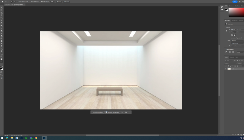
n my photobook i’m going to explore my heritage and identity through the use of lightroom classic and use their features in order to order my book through the Blurb website after wards.
My photobook that will capture my family, heritage, and cultural identity. The focus will be on my Polish and Jersey roots with a mix of archival images and newer photographs that tells a narrative of where I come from and how these influences shape who I am today.
Using Adobe Lightroom Classic as my main tool to bring it to life. The app offers the flexibility to put together old and new images, allowing me to preserve these family memories while presenting them through my current lens. The archival images will reflect generations past photos of my family. Alongside them, I’ll include new photographs inspired by my personal experiences, blending past and present in an impactful way.
The project gives me an opportunity to dive deeper into the elements of heritage and identity. I plan to research a range of artists who explore themes of family, culture, and heritage in their work. I’ll get inspiration from their photography and artistic expressions to shape my project. These artists explore similar elements Eastern and the richness of family connections and their work will help inform how I approach my own photos, adding layers of meaning and emotion to each photo. I also want to explore how these artists use composition, lighting, and other creative techniques to portray their subjects, and how I can apply that to my own images. My goal is to combine the personal with the artistic, creating a photobook that’s not only a visual narrative of my heritage but also an artistic exploration of identity. The photobook will serve as both a tribute and a personal journey that can explore the past while creating a visual story for the future.
“Connecting past and present, my composites include old family photos combined with images reflecting how I perceive my heritage today.”-Astrid Reischwitz
“I look for unity between the human body and the nature. The older I grow, the more intense this desire is. By combining images of the human body and elements of nature I am trying to show that we are inter-connected and that our separate existence is impossible.”- Alicja Brodwicz
Essay Question: How can photography change the way we remember and connect people and events?
Exploration of connection holds a deep relation within my ideas of nostalgia, family, documenting and my day-to-day life. In this investigation I explore similar themes and motives portrayed through the work of a range artists. From personal archival images, Astrid Reischwitz work consists of keepsakes from family life that she transforms a visual world in her work of memory, identity, place, and home. Alicja Brodwicz searches for connection within the human body and our unique relationship to nature similarly to Agnieszka Lepka’s work project that explores the similarities of it. I’m hoping to portray in my personal study the familiar elements from each of these artists and my individual reflections of relations and attachment.
Documentary Photography describes photography that attempts to capture real-life situations and settings through the art of archival imagery. Photography’s capacity to capture reality led to an interest in documenting all the aspects of contemporary life. They play an essential role between the past and the present, they can connect us too our own personal histories. It emerged with the increase of the government taking social responsibility and of industrialised war. It’s mission was too serve the increasing need on the part of the democratic governments to justify their social and political policies to the ordinary citizen in the community, which was documentary photography’s main target. By the time of the Civil War, the daguerreotype and its descendants had established a popular following. Documentary photography had expanded in this period of time and was often allocated by art critics to the realm of journalism, an association that carries into the present. This assignment implied that documentary photographers were mere recorders, skilled technicians to be sure, but passive observers of the social scene and definitely not artists. Documentary photographers accepted this description in order to burnish the perceived interest in what’s lifelike and real
of their imagery. They presented as fact gatherers and denied having beauty-related or political calendar’s. In this new age, though documentary photography is not dead, as a practice, it is in transition and it faces serious challenges such as facing restrictions of war and more important issues that make a difference in our community. Documentarians were not simple propagandists for the western part of the world but were rather artists that had discerned central patterns of thought and feeling that were emerging in democratic societies. Finding people that took these new value into consideration, the documentary photographer was required to make narratives that would reject fascism, tyranny or totalitarianism. Although defined by content, the history of documentary photography, as with all photography, is the history of its technologies. photographs can be documented from the 1890s from family portraits to wedding portraits to individual ones. Documentarian photography can be identified through the outlook and layout of it whether in a diamond shape or a different irregular one, can be recognised through the colour difference in it when comparing. New technology has always challenged old perspectives by expanding the possibilities of what can be photographed. The emergence of social media platforms and digital camera technology, including smartphones, has been transformative in reinventing and rekindling the practice. My chosen themes of connection, family, identity, nature, and nostalgia can be linked to: Ansel Adams’s famous influence of work documenting natural landscapes through the 1930s stimulating a sort of spiritual connection to nature, as well as the earlier use and discovery of the zone system popularly used throughout the scale of photography, the relation of the connection of nature can be seen in Alicja Brodowicz more recent work when connecting nature vs human-like features. In terms of including archival imagery and photos relating to nostalgia, photographers like Diane Arbus and Christian Boltanski explore dynamics through family in the 1960s as well as using family photographs to explore further themes of memory and remembering human life. Similarly now, photographer Astrid Reistchwitz and Zoltán Kerényi using the power of archival imagery to connect individuals with a more broader social context.
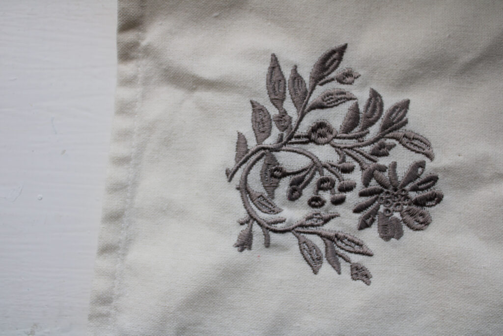
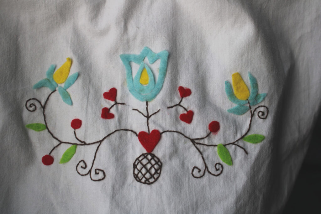
In relation to “How can photography change the way we remember and connect people and events?” I feel as though Astrid Reischwitz portrays her work in this way. Through her image of “Blue” from the Spin Club Stories she places a photograph of a baby in comparison to a modern day taken photograph of a vibrant knitted jumper bordering the archival image and on the left of the archive a photograph of a woven through embroidered traditional pattern on linen this is because it may represent a certain tradition and/or cultural memory Astrid’s felt inspired by when she embroidered photographs. I can see that. She had clear intention for her work to look a certain way taking inspiration from the tradition of spin clubs in Northern Germany. From her past, Astrid grew up in a small farming village, a village that is bound to its history and that stands out through its traditions even today. Astrid’s upbringing probably had a significant impact on how she views and approaches the themes of memory as well as history in her work. The act of embroidering something can be often associated with tradition and domesticity. By immersing photography in this medium, she reinforces this idea that memory is personal in comparison to it being shared and collective. It is something that exists in physical form as well as visual, emotional connection to materialistic cultural. Her intention seems to be that photography can preserve traditions through its art, it can connect generational gaps and it can maintain these connections between the future, present and the past especially. The blend between photography and embroidery speaks as more of a passive recording tool, it becomes a mean of communicating through identity, memory and connections over time similarly linking to the previous themes mentioned. Astrid’s “Stories from the Kitchen Table” can also reminisce the times where of the hardship of farm ship and event during the second world war which still shadows over certain family members Astrid explains, hardship can can still be felt today and through that hardship she tries to represented that as and tell the tales which can give her a chance to reflect and transform her ideas. Researching her work closely, I believe that Astrid’s work can closely be linked to the question “How can photography change the way we remember and connect people and events“. This because it clearly encapsulates her motives for the project of Spin Club Tapestries” and creating her “Stories from the Kitchen Table” presents the topic of photography as an everchanging art form.
In relation to “How can photography change the way we remember and connect people and events?” I feel as though Alicja Brodwicz portrays this in her work. Alicja’s work focuses on references linking to how we view nature and how we connect the natural environment to a living being. Alicja’s clear connections highlight that life is in some shape or another clonnected whether by apparence or by human nature. Through the photographers work she presents an obvious comparsion between skin, veins,bones and other features that are natural to us. As well as exploring these topics Alicja’s work can express an association to memory and her work can become a tool for sensing moments for nostalgia and the present e.g. ageing of skin etc. The different ways light, shadows, trees and seasons could highlight Alicja’s influence and it could possible reflect human emotions such as being growth, decay or even rebirth. Through the aesthetic of Alicja’s work and making her work appear interesting and appealing to the viewers eye, she includes abstract elements where the human form is somewhat fragmented as well as it being intertwined with natural like elements like water, light or a relation to a forest-like setting. Some viewers may feel unsettled by this as it may present human being thought to being closer related to other subjects wheras an opposing audience may feel that capturing this moment of stillness and the close relationship between the two elements as symbolic and as conveying a deeper meaning of existence and meaning of life. The different ways light, shadows, trees and seasons could highlight Alicja’s influence and it could possible reflect human emotions such as being growth, decay or even rebirth. Her focus on family and individuals can relate to how we change the way we remember and connect people and events, this presented in her images through her emphasis of the importance of having these shared experiences and how they shape our sense of self and our close relations with others. In some of her other similar work she present interection between others whether they are distant or intimate. This demonstates that photography can help in a way preserve the relations and present the emotional complexities that may be inlvolved. It may also prompt the audience to reconsider how they percieve people and percieve the natural world, percieving it as an active part of our world and as a partipant in how our memories, identity and experiences change.
Similarly to the other artists my work seems to deepen the viewers understanding of identity, human experience and relationships. Whether the work is focused on memory, natures and subcultures there is common elements of photograhy that can uncover deeper levels of personal and or collective narratives. In Astrid Reistchwitz’s works she documents a specifc subculture wheras Alicja Brodwicz’s work entails a sense of fluidity in human and nature connections. In my work I try and present more intimate and more isolated moments when looking at perosnal histories with present day identities e.g. looking at my familes archival documents and comparing to modern day changes and fluxtations. I want my approach to experiemtent more with abstract elements or conceptual images as using these visual representations may make the viewert feel and be more willing to give emotional and influenced responses. While there are overlaps in in the way my chosen photographers and I approached the themes of memory, identity, relations, nostalgia, connection and inldung the medium and specifc topic that may vary constrastly, it allows for a diverse interpretation of the relationship between people, history and the world around.
Literary Sources
Haas-K, Astrid-Reischwitz: Spin Club Stories [online] https://www.reischwitzphotography.com/book [accessed 9th Jan 2025]
Unknown Author, Alicja-Brodowicz-Visual Exercises: A Series Of Diptychs [online] https://independent-photo.com/stories/visual-exercises-a-series-of-diptychs/ [accessed 9th Jan 2025]
Curtis-J, Making Sense Of Documentary Photography [online] https://historymatters.gmu.edu/mse/photos/photos.pdf [accessed 23rd Jan 2025]
Bogre M-, Documentary Photography Reconsidered [online] https://www.taylorfrancis.com/books/mono/10.4324/9781003103516/documentary-photography-reconsidered-michelle-bogre [accessed 26th Jan 2025]
Some inspiration from websites I’ve read:
Wells L. (1998). ‘The Subject as Object: Photography and the Human Body’ in Photography: A Critical Introduction. London: Routledge.
Kotz, L. (1998) ‘”Aesthetics” of Intimacy’ in Bright, D. (1998) The Passionate Camera: Photography and bodies of desire. London: Routledge
Kelly, A. (1998). ‘Self Image: Personal is Political’ in Photography: A Critical Introduction. London: Routledge.