All posts by Lainey Peel

Filters

Author:
Category:

Chiaroscuro lighting

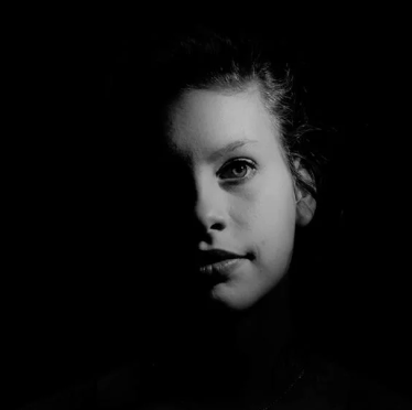
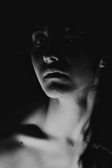
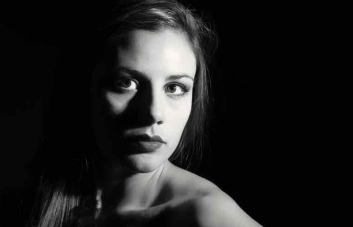
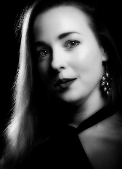
Chiaroscuro lighting is a high-contrasting light technique that utilises a low-key lighting set up to achieve contrast between the subject and the dark background. Window light is the most accessible for this technique, as it focuses on only half of the models face being seen. By using window light, the photographer is able to enhance the exposure to avoid any distraction in the background of the photo. This helps keep the spotlight on the model. The window must be the only source of light when using this technique, if there is other background lighting then the focus will drift from the model into the background.

This technique is mainly used in film to create striking images or evoke a certain feeling. The contrast between light and shade can help frame a subject more effectively. Drawing viewers eyes to things they would not usually focus on in the image. Chiaroscuro is a high-contrast lighting technique. Chiaroscuro uses a low key lighting setup, where a key light is used as the sole light source to achieve dark backgrounds with starkly lit subjects.

Chiaroscuro simply means is ‘ the use of strong contrasts between light and dark, usually bold contrasts affecting a whole composition. ‘

Chiaroscuro provides a sense of drama and intensity that remains striking today

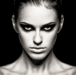
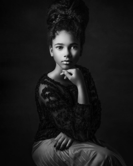
Examples of Chiaroscuro Lighting:

Lighting set up:

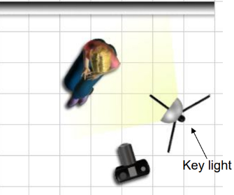
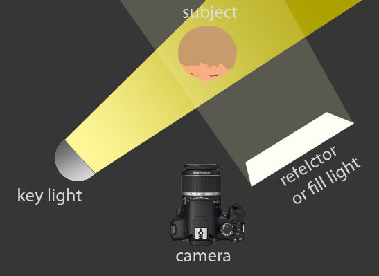
For this effect, you light across your subject in one direction, and here we lit the background in the reverse direction. Ideally, the subject should go to black on the unlit side and the same for the background. Chiaroscuro lighting typically involves using a single, strong light source positioned at an angle to the subject. This directional light creates dramatic shadows and highlights.

Light – Chiaroscuro mainly uses one key light, and a variation using a reflector which helps deepen the contrast between the shadows.

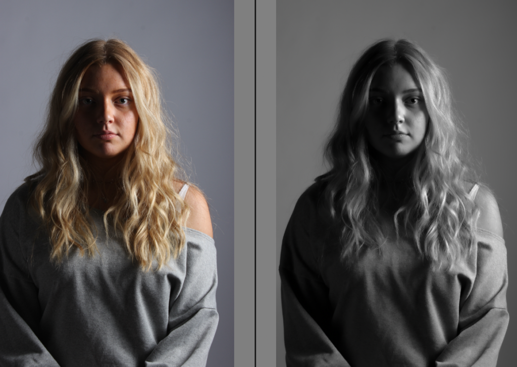
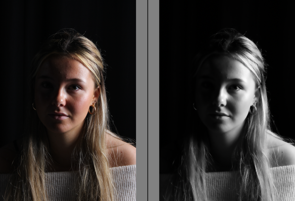
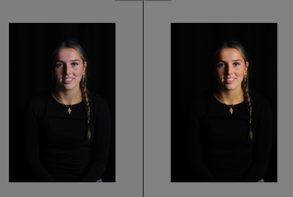
My own photoshoots-

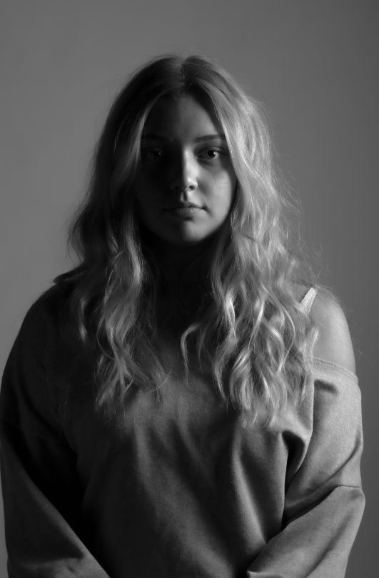
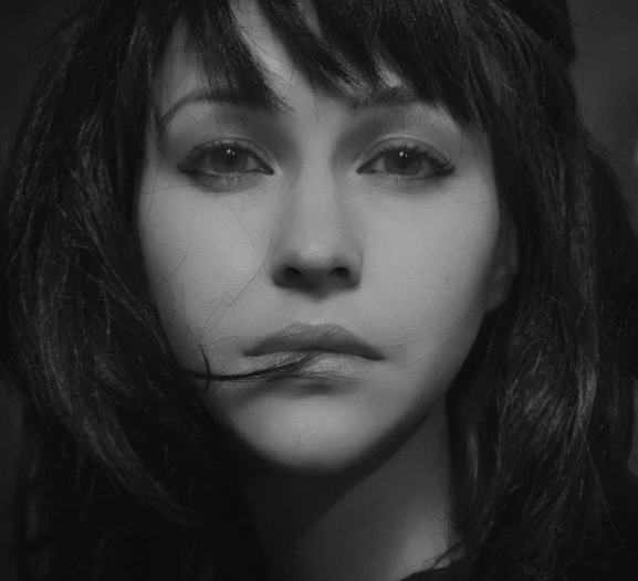
Overall, I am happy with these outcomes. They are definitely my most preferred out of all three styles of lightings as I personally think we have got the closest to the correct lighting in this style. We experimented with a black and white backdrop as shown and not just a head shot but personally my favourite is with a black backdrop as the shadows blend in with the background which creates a unique effect and looks more professional. I edited the images to create more depth of the shadows but still keeping it light and bright. One benefit of this technique is if the model prefers one side of their face and also creates a dramatic significant effect. One side of their face is almost gone from the shadows but definitely black drops are my favourite which links to the famous work above as they have also used black backgrounds.

Butterfly Technique Lighting

Butterfly lighting is a lighting pattern used in portrait photography where the key light is placed above and pointing down on the subject’s face. This creates a dramatic shadow under the nose and chin that looks like a butterfly. One of the most famous photographers to use butterfly lighting was George Hurrell, who was known for his dramatic portraits of Hollywood stars, and since, the technique has grown more popular.

This creates a shadow under the nose that resembles a butterfly. It’s also known as ‘Paramount lighting,’ named for classic Hollywood glamour photography.

Some benefits of butterfly lighting is-

  • It’s Perfect for Portraits. Butterfly lighting is often used in portrait photography, especially in headshots. …
  • Create Different Moods. …
  • Easy to Set Up. …
  • It’s a Natural Look. …
  • It’s Versatile.

Butterfly lighting is primarily used in a studio setting. It is named “butterfly” because of the butterfly shaped shadow that it creates just under the models nose. This occurs because of the lighting in the shot, comes from above the models head. Butterfly lighting is mostly used for portraits, as it is flattering on everybody.

Lighting set up:

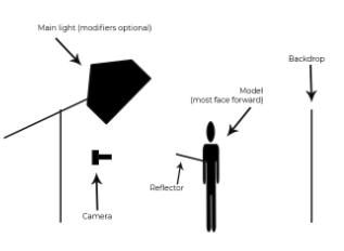
Light – Butterfly lighting requires a key light that can be a flash unit, or continuous. If continuous, it can be artificial or natural, meaning you have a lot more choice in which lighting you think would benefit your photos a lot more. Butterfly lighting can be varied, soft or hard depending on the objective of the image.

Lens – The most popular lens used for butterfly lighting is between a 50 – 85mm lens. This helps the photo because it allows a larger depth of field.
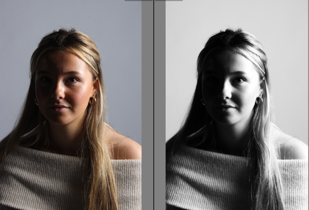
My own photoshoots-

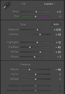
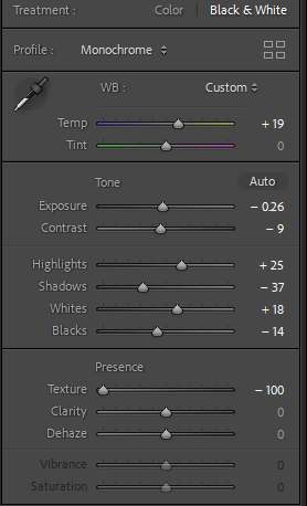
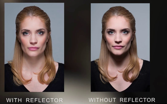
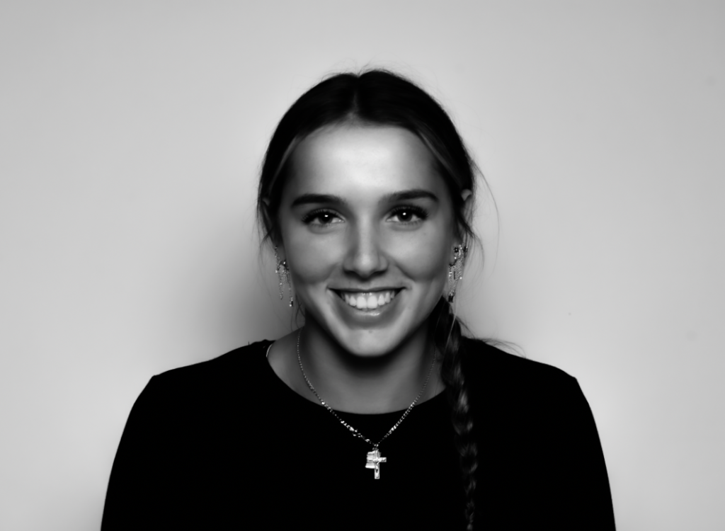
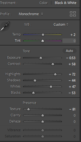
Within these photos, we placed the light in a 45 degree angle above the subject in order to attempt to get the shadow underneath the subjects nose. We attempted to get that strong eye catching deep shadow however we used a reflector in the set up which as shown above there is a significant better result without the reflector. I have therefore learnt for future photoshoots using this technique in order to improve and result in a better outcome without a reflector would be better. However within these images, I either increased or decreased the exposure depending on how exposed and bright the image was so it has the correct amount of brightness. I increased the contrast on both images so the image was more detailed and had high depth in the shadows which is needed for this lighting style. To emphasize this, I decreased the shadows just to add more eye catching and significance to the image but contrasted that with increasing the highlights so the image wasn’t too dark or dull as the contrast had been increased. Finally, I increased the whites and decreased the blacks so it had a perfect mix and balance of both. Overall I decreased the texture so the image looked a lot smoother therefore making the outcome look a lot more professional.

Rembrandt Lighting

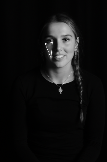
Rembrandt lighting is a technique that was taken from a famous painter in the 1600s, Rembrandt Harmenszoon van Rijn. It’s a popular technique because it creates images that look both dramatic yet natural. This technique is a way of lighting the face so that a small upside-down triangle of light appears just under the models eye, on the less illuminated side of their face. It is a simple, effective photography lighting setup that’s flattering to a wide variety of faces, and is easy to master quickly. It’s possible to achieve this using just your camera and a single light source, which is why its so popular. Rembrandt lighting is a technique utilizing one light and one reflector or two separate lights

The technique is very popular because it is capable of producing images which appear both natural and compelling with a minimum of equipment. Rembrandt lighting is characterized by an illuminated triangle (also called “Rembrandt patch”

The Rembrandt lighting technique is mostly known for dimension and depth it adds to portraiture. By using it you instantly create shadows and contrast in your photos. It also adds an element of drama, which is effective in photography because it draws the viewer’s attention immediately.

Here are some examples of Rembrandt lighting

My own photoshoots-

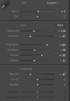
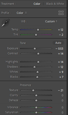
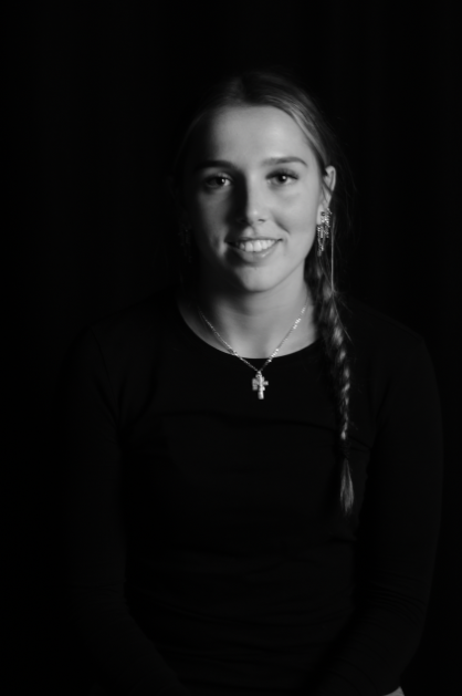
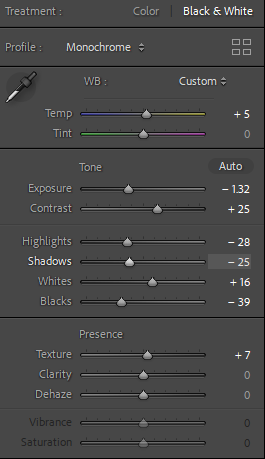
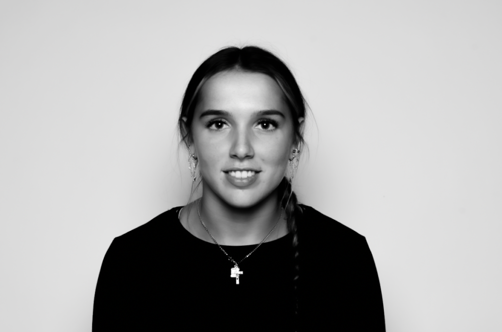
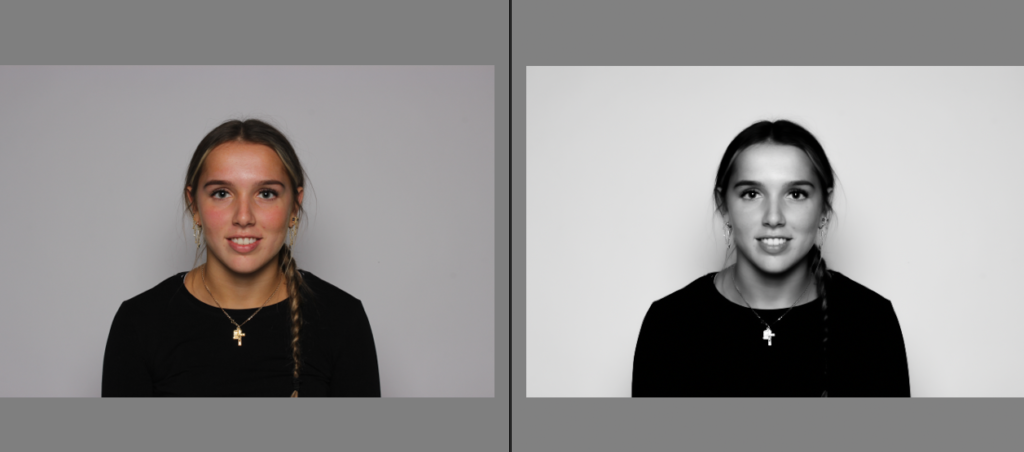
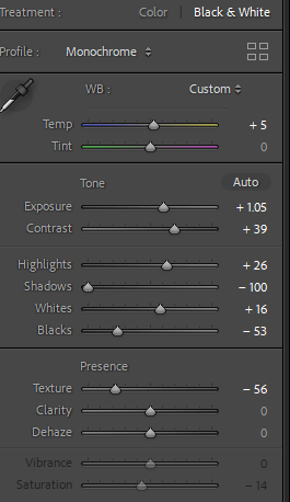
As shown, I firstly increased the temperature to give it a warmer look to make it look less dull and bland to make it more professional, I then decreased the exposure to deepen the upside down triangle leading to it to relate to the Rembrandt lighting. However increased the contrast so the shadow had more depth. I increased the white and highlights so the image had the correct amount of light leading it to be not too dark but with the correct depth of dark shadows to emphasize the triangle. Lastly, decreased the texture so the image looked smoother and more professional, and finally decreased the shadows to emphasize the shadows and Rembrandt’s shadows are emphasized.

I then put it in black and white so it connected to Rembrandts lighting theme as majority of famous and known photographs are in black and white and also really emphasize the triangle as in colour that is generally more eye catching than the triangle therefore meaning in black and white the triangle is a large factor to only focus on.

Lighting set up-

Light – lighting styles are determined by the position of your light source. Rembrandt lighting is created by the single light source being at a 40 – 45 degree angle and higher than the subject. Both flashlights and continuous lights can be used for this technique.

Lens – a 35mm or 50mm lens will work the best for this technique if your space is at a premium. Or, if you’ re looking at including more of the subject than just the head and shoulders. A 50mm works very nicely for portraits, and will give a nice depth of field if you’re shooting with a shallow aperture. However, a 35mm will give you a wider perspective, meaning you can include more of the background in a photo. However, this is usually not needed in portraits as we want to focus on the subject.

Edited Environmental Portraits

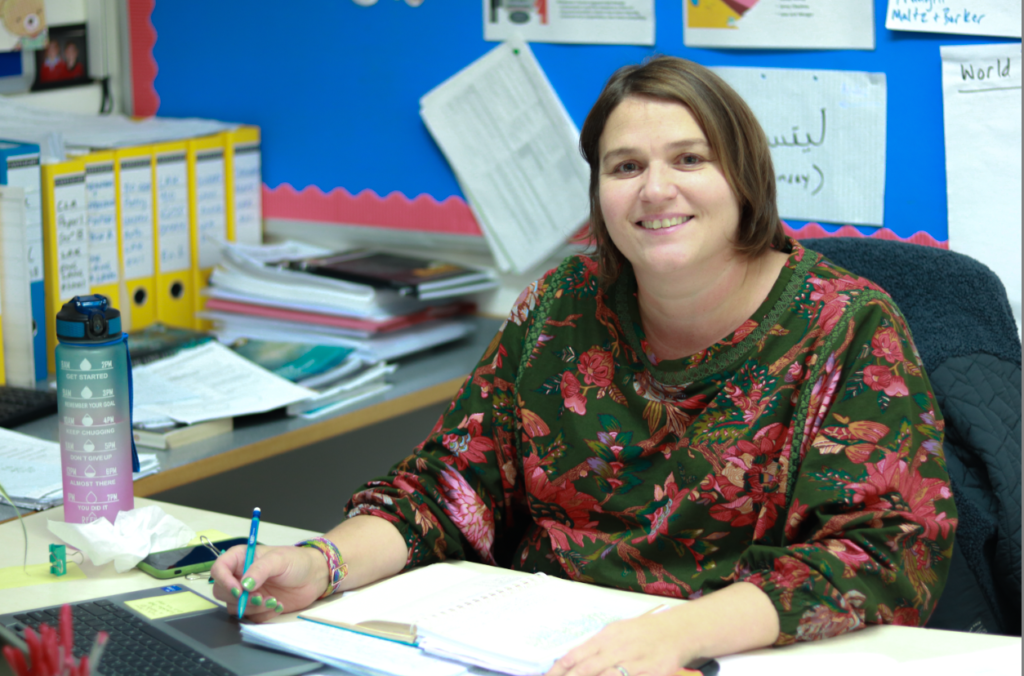
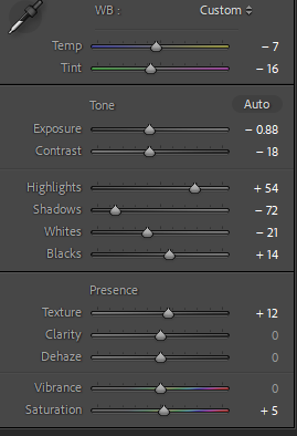
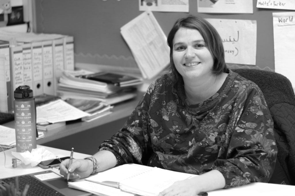
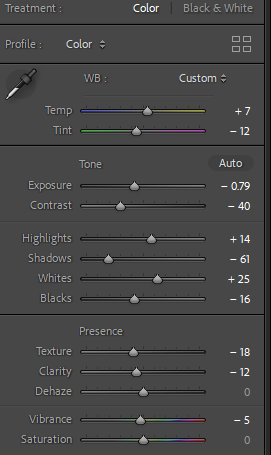
Within this photo, I personally like it as it has a successful background to make environmental portraits by the outfit and props behind her to make her significantly blend in with the background. I did some experimenting and increased the temp however kept the tint the same. The original photo on exposure was too high so I decreased the exposure until it had the correct amount. I then continued to decrease highlights as if I decreased my shadows next it would significantly deepen the depth of shadows which shown successful, however this image originally has natural lighting whereas forced lighting in a certain area would emphasise these shadows. Lastly, I put it in black and white to create an effect of vintage and nostalgia and the original image was too colourful in my opinion.
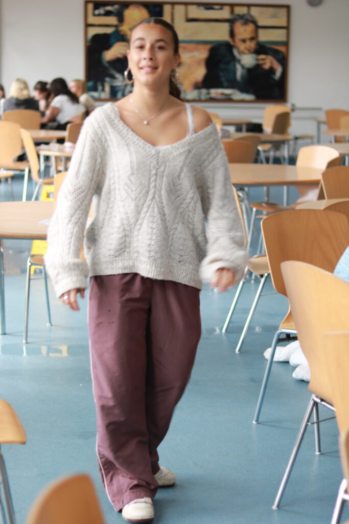
Firstly, I edited the colour one to create a warmer temperature and lowered the exposure ever so slightly so the image wasn’t as exposed and bright. Decreased the shadows to deepen them but contrasted it with increased the highlights to make it not too dark. I then put it in black and white to see if I liked the possibility of it being in that colour however I definitely preferred it in colour as the image itself and surroundings are very bright and colourful and I think that adds to the image and ultimately creates environmental portrait so the viewer has more of an understanding of the environment behind her.

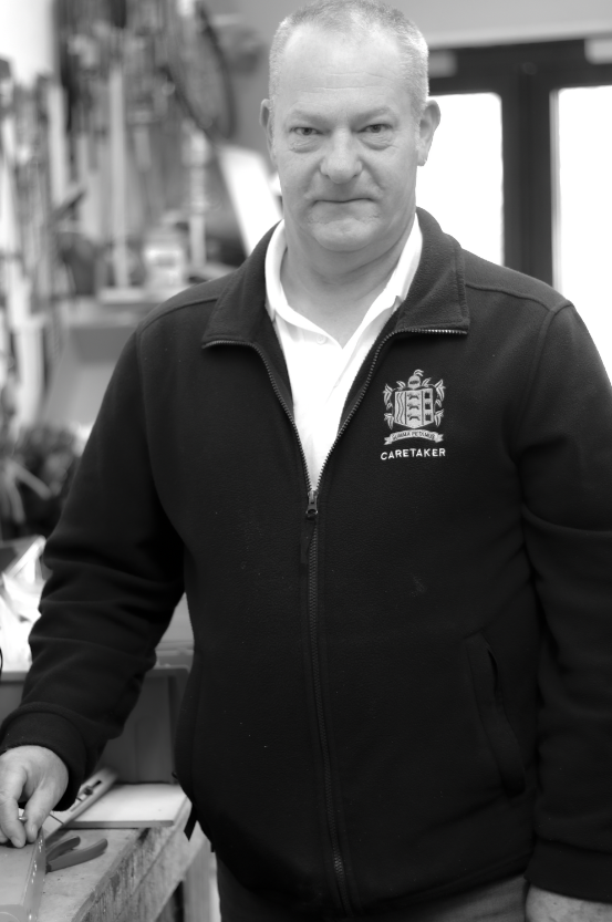
Personally, I couldn’t decide which one I preferred as I think the colourful image is more eye-catching however the black and white reduces all the tones especially the green tone but the colourful image does help the viewer see the props and background to actually understand what environment relates to him as a person.

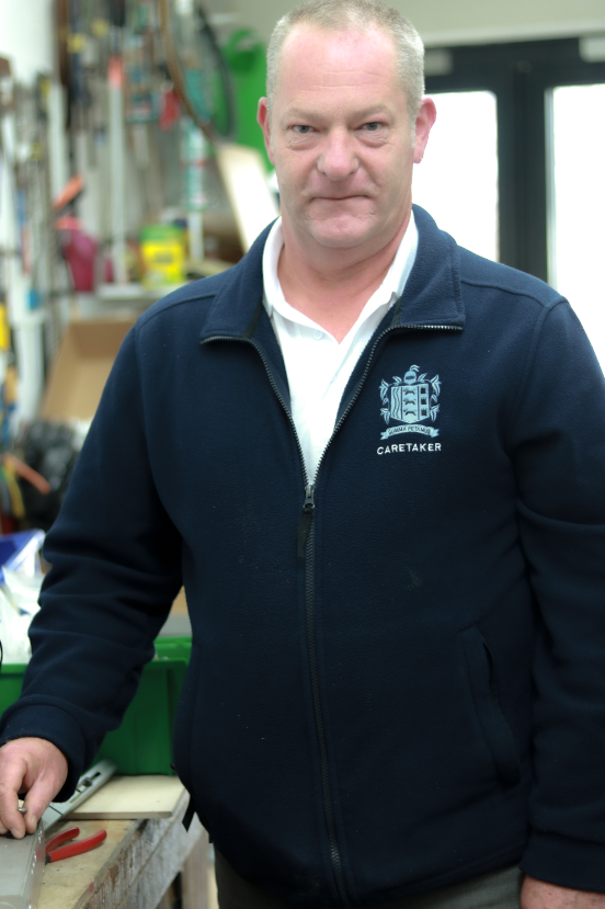
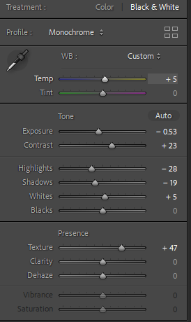
I definitely prefer this image in black and white as he gives off old energy which links to the nostalgic theme and black and white significantly adds a vintage vibe. I decreased the exposure to make it less bright and exposed and contrasted it with increasing the contrast so the image had more definition and decreased the shadows too deepen them as its in black and white and finalised it by adding some texture so the image had more definition and looked more realistic.

I flagged and made my images green to make it easier for me to quickly reach my best images in my environmental portrait collection and therefore be able to see what to do next to improve or do the same for my next project to be able to be more successful.

Environmental portrait photoshoot-

Photo shoot 1:

Photoshoot 2:

Photoshoot 3:

Photoshoot 4:

Photoshoot 5:

Photoshoot 6:

Photoshoot 7:


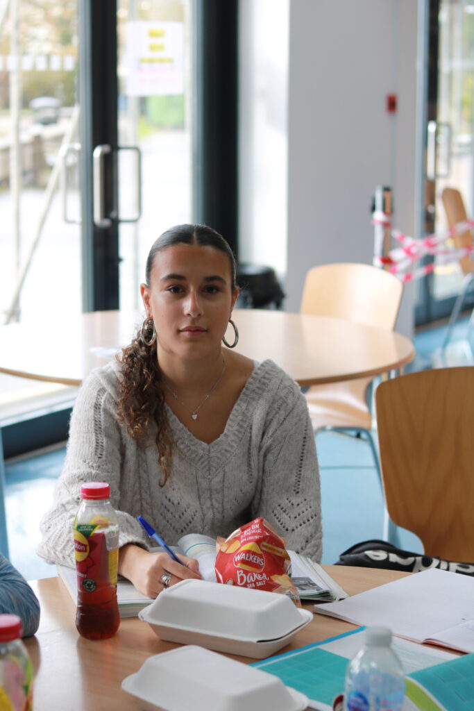
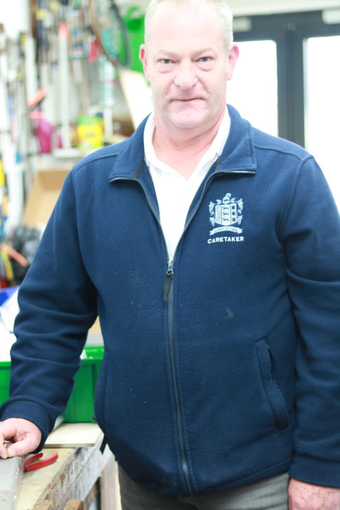
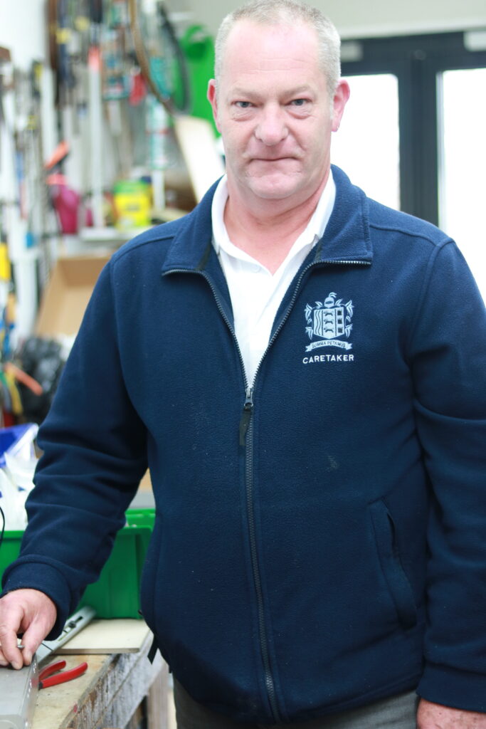
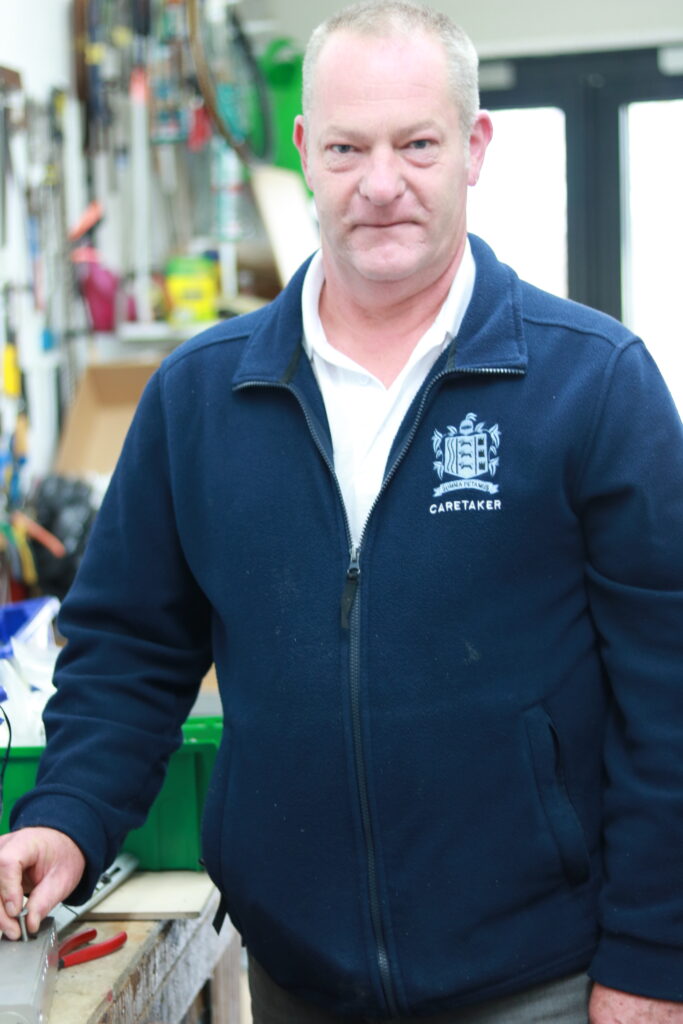
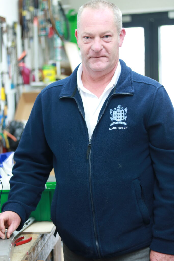
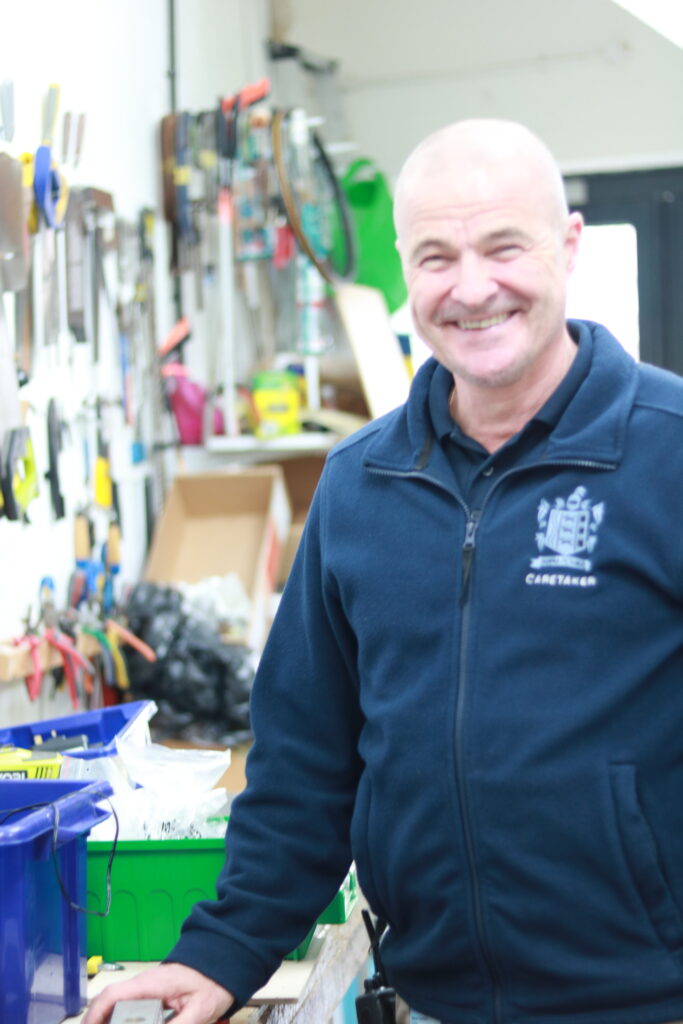
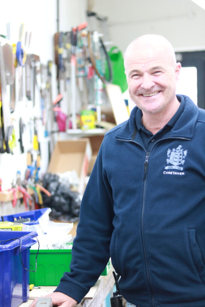
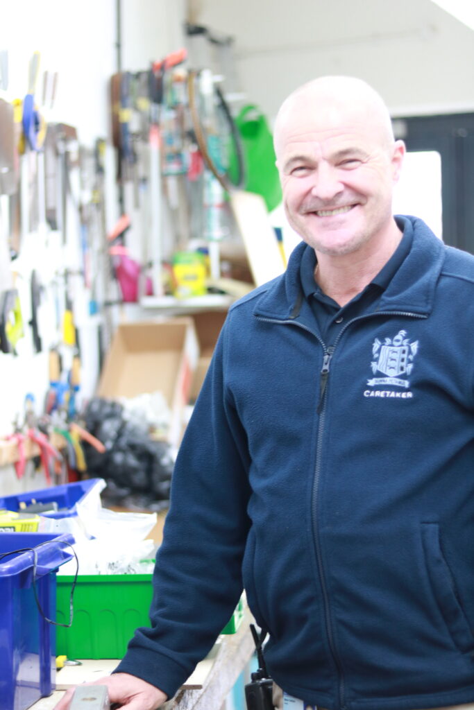
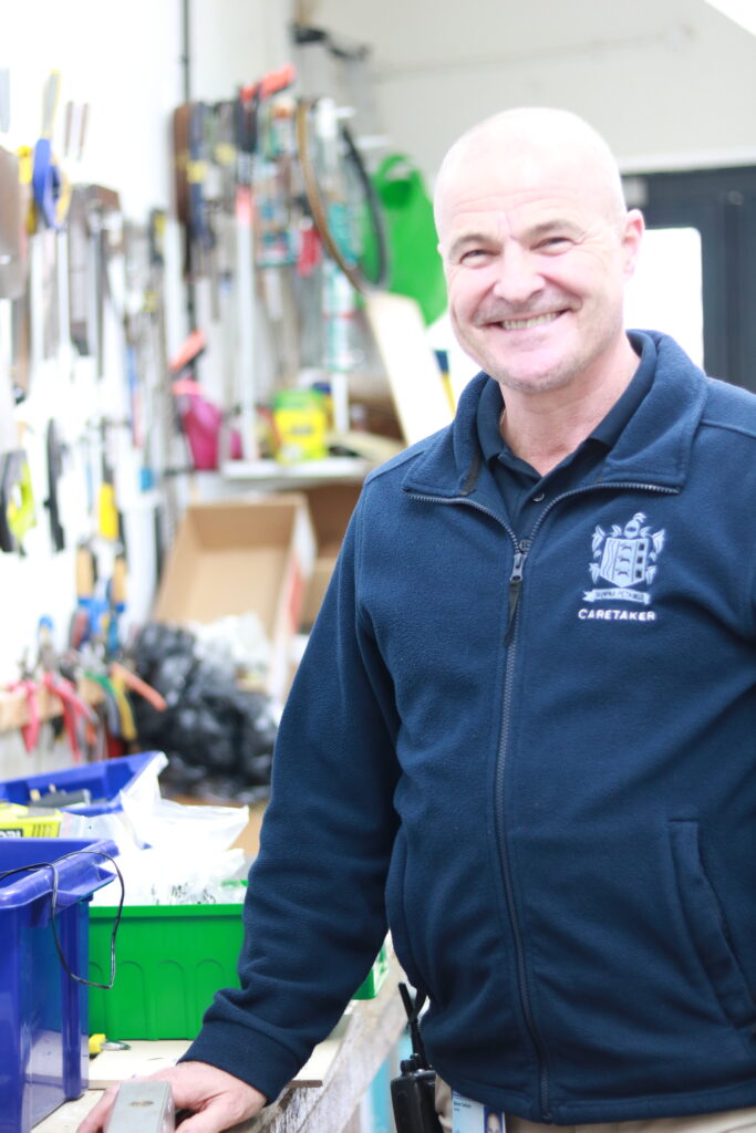
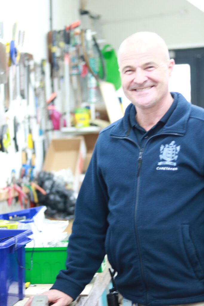
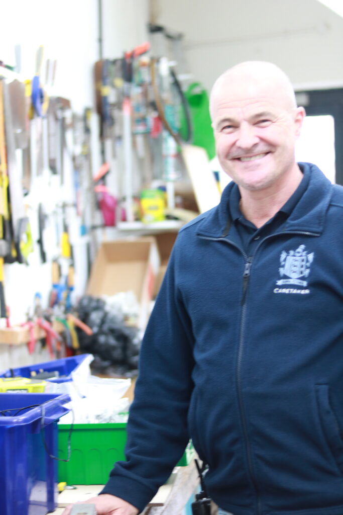
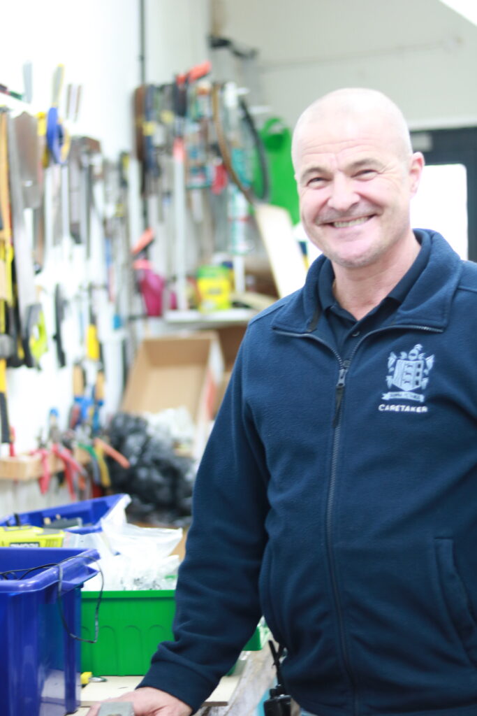
For this photoshoot, we went around the school to experiment in taking our environmental portraits because the background effect of education and learning significantly added the effect to make it a successful environmental portrait. We tried to get each adult or teacher to make eye interaction with the camera to make it fit in the theme of environmental portraits. This gave us the opportunity to investigate how to make the subject the main focus in the image however the background is definitely a large factor to add to the image, either way one without the other would not make a successful environmental portrait. Overall this photoshoot deepened my understanding of environmental portraits and how props and backgrounds can deepen and add more value to the image itself. My favourite photoshoot is probably photoshoot 2 and the last 2 images of photoshoot 5 as the background is emphasizing and overpowering the main subject as the photo is in full frame meaning the effect of the props are significant. My least favourite is photoshoot 7 as they isn’t really a good background to make the image full, there isn’t much eye catching features apart from him as the main subject. However, if I look at the photo on another aspect that may possibly be the aim. Another least favourite are the last few photos of photoshoot 3 as they are slightly out of focused and also saturated and made him look shiny. Although, a way to reduce this is editing in light room which may change my opinion on this photoshoot.
Artist Reference and Case Study

Vanessa Winship 

Vanessa Winship is a British photographer born in 1960 who works on long term projects of portrait, landscape, reportage and documentary photography. These personal projects have predominantly been in Eastern Europe but also the USA.

She uses black and white photographic film in natural light. For her work in a reportage or street style she has used a 35 mm hand-held camera, for her landscape work she has at times used a medium format camera and for her portraiture work she has at times used a 5×4-in large format camera. She says of the difference between using 35 mm and large format that “Each methodology makes for a different relationship with my subjects [and] both have their own beauty for me”.

In her series Sweet Nothings she has been taking photographs of schoolgirls from the borderlands of Eastern Anatolia. She continues to take all photographs in the same way; frontal and with enough distance to capture them from head to toe and still include the surroundings. Personally, I like her work because she is bringing political and realistic portraits to keep them natural. Environmental portraits are also to associate with the people being photographed and they tell a story of the people by using the background. This is a good way to make a photograph political which links to Vanessa’s work since she is a documentary photographer.

Winships work focuses on cultural diversity and lifestyle from using environmental portraits.

My emotional response to these portraits definitely varies depending on what aspect I focus on. Overall the photo reminds me the different cultural habit and lifestyles I forget exist in the world. In this album of images, she also uses young children from head to toe in the frame. She may be portraying the vulnerability and innocence of the children by showing them in as it looks school uniform and their height. She also uses a series of two children to portray connection and family. This makes her photos unique and reminds me that family is important and valued everywhere in the world.
These photos were taken in black and white possibly to make them look older and vintage which links to the theme nostalgia. As they are children as well this links to the theme as well. She uses natural lighting with a clear sense of shadowing. She may of used black and white to emphasize the depth of shadows. Especially in the middle one which seems to look like a school in the background which tells us they are educated.

As I can see, the two people are normally physically touching which gives off a sense of warmth and connection. However, this contrasts to the interaction they are giving with the camera as they are not really showing an emotion. They are numbly staring at the camera which doesn’t tell us a lot on how they are feeling. Overall the physical touch gives off a growing up in a family and caring lifestyle. However majority of her images are in black and white which ultimately make the images feel nostalgic which also links to the fact they are children, although it would be interesting to see the background, colours to be able to tell the weather and what time of day for the outside for pathetic fallacy. On another note, I like how the picture is a head to toe frame of the children and how there is more than one.

Introduction to Environmental Portraits

MOODBOARD

An environmental portrait is a portrait executed in the subject’s usual environment, for example their home or workplace, and typically illuminates the subject’s life and surroundings. The term is most frequently used of a genre of photography.

The surroundings or background is a key element in environmental portraiture, and is used to convey further information about the person being photographed.

While it is often true that the background may dominate the subject, this need not necessarily be so. In fact, the details that convey the message from the surroundings can often be quite small and still be significant. It can be used as a way to tell a story.

Two good rules of thumb when attempting to photograph people in their surroundings:

1. “Half of all location photography is moving furniture.”

2. “‘Available light’ means any light that’s available.”

Both sayings have been attributed to the great location portraitist Arnold Newman. More importantly, each can help spell the difference between a good environmental portrait and a great one.

Why shoot environmental portraits?

  • they give context to the subject you’re photographing
  • they give points of interest to shots (something you need to watch as you don’t want to distract from your subject too much)
  • they help your subject relax
  • they often give the viewer of your shots real insight into the personality and lifestyle of your subject

These shots sit somewhere between the purposely posed shots of a studio portrait (they are posed and they are unmistakably ‘portraits’) and candid shots which capture people almost incidentally as they go through their daily life.

Some important objectives are:

Spend time getting to know your subject.

Choosing a Location- Your person needs to associate with the background or location.

Props

Posing- This can depend on the mood/tone of your image.

Camera Settings

Typologies- A body of work with a consistent style. Often portrayed in many different forms, some being in a structured group with equal spacing in-between or a particular style in general like the style of environmental portraits. Environmental portraits are often associated with the style of typology as they are always structed images with the same idea of the subject looking into the camera and often centred.

MINDMAP

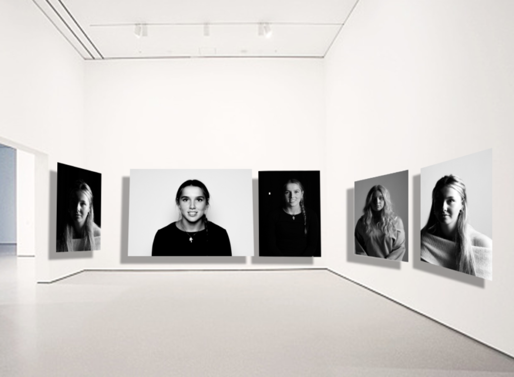
Virtual Gallery

The photos I used:

Firstly, I used this photograph in the genre (still life) so I included all genres we have covered so far. I used this image as it has a warm tone, landscape and therefore differs from the other images I used. It also has outstanding and unique objects in a special arrangement so in my opinion, without this image the gallery may look dull and boring to look at. However, in order for not all the attention and eye catching features to draw the eye to the one image I attempted to balance it out by using another still life photograph shown below.

Although this photograph has a dull tone, it is still eye catching by the correct amount with the amount of depth to the shadow, increased highlights and exposure. It also has unique qualities from the objects and the arrangement. Since I have used 2 landscape still life photos. I then added 3 portrait formalism images to break up the pattern of still life and landscape.

Formalism images I used:

I have chosen these images as they are a wide variation of formalism. The first photo includes a daily and useful object which relates to Evan’s work since his purpose is to value and celebrate the man-made objects. The singular object symbolizes the importance of the image and eye catching with a plain background. I then used a paintbrush behind a plain white background which is similar to the first. To create a variation I added an image with 4 other objects to make it differ. Another quality that contrasts with the other images is that I included a knife in the image. This could possibly signify that although we do not think about it. Cutlery is a daily and necessary object in our lives. This relates to Evans work just simply in more of a hidden way.
I could improve my gallery by making my formalism photographs black and white so it relates to Evan’s and Regan’s work and also differs from my still life photographs on the side to create a variation and contrast in my gallery.

In these photos, I increased the exposure to make it more clear meanwhile decreasing the contrast to create more vivid detail. Lastly, I decreased the shadows to create more interesting features to make the objects look as if they are levitating so they are similar to Evan and Regan’s work and increased the highlights.

Still Life photoshoot & editing

Before I had taken this photograph I used books as they give a nostalgic and vintage effect and placed them in the arrangement I thought looked best. Within this photograph, I edited the image in Lightroom and increased the temp to make it have a warmer tone which gives off a vintage effect which links to still life as it has existed from the 17th century until the modern-day, but in the 19th century, artists adopted photography as a new medium for still life art. I then increased the exposure and contrast so the shadowing had more depth and was more eye catching to make the image more interesting to look at. I decreased the highlights so the image stayed clear and detailed but at the correct amount so it didn’t look to bright nor dull. I increased the shadowing by a little to make the shadowing darker. Lastly, I increased the whites so the image wasn’t too yellow or bright and so it is the correct tone I want it to be.

I then continued to do the same but with different objects for a variation. This time, I added metal vintage and ancient boxes and lids to make it nostalgic and fit the genre ‘still life’. Within this photograph, I increased the temp and tone ever so slightly to create a warmer tone which gives off a more ancient look to the image. I continued to increase the highlights to make the image clearer and brighter but contrast it with decreasing the shadows so it emphasises the shadows in more depth. After, I increased the whites and decreased the blacks so the image was less yellow.

In the same image, I put it in black and white but overall, decided that I preferred the colour image as it adds more to the image and more eye catching colours and shadows. As the photograph has a warm tone with the objects, put together it creates an ancient and vintage look to it which shows similar qualities to ‘still life’ as most famous ones are in colour and are taken years ago as they started in the 17th century. I also prefer it in colour because the details are clearer on the writing on the book and you can tell what the objects are clearly, however the black and white oppositely could be better as it leaves a mystery keeping the viewer guessing. This links to ‘still life’ as most images from this genre have symbols to tell the viewer what the photograph is about. Whereas my photo do not have symbols but still keep the viewer guessing on what story the image is trying to tell.


Still Life Quiz

Q1. Where and when did still life originate?

  • The early 1600s from Dutch and Northern European paintings

Q2. What does colonialism mean?

  • Control by one power over a dependent area or people

Q3. How did colonialism impact the still life?

  • It introduced new materials and techniques.

Q4. what do you see in early still life paintings?

  • Variety of foods, flowers and occasionally skulls.

Q5. What could they symbolize?

  • They could symbolize wealth and power in some cases and others maybe death, and lack of time which is shown in the paintings with skulls and or hourglasses.