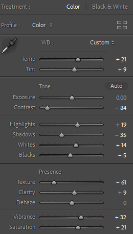
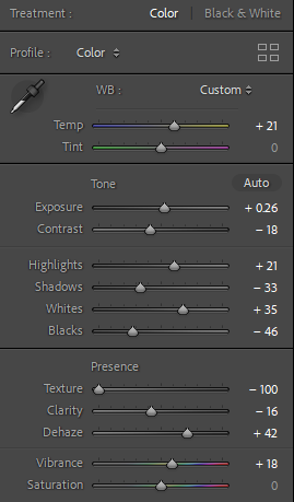
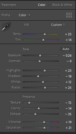
When taking a single-exposure photo, you might notice that the scene’s dynamic range is too wide for your camera. In other words, your camera doesn’t capture all the detail in one frame.
For example, suppose you are photographing an object in sunlight. In this case, the brightest elements will appear glaring white, and you will lose the details of these elements.
Similarly, when taking a photo of a person in front of a bright background, your camera might capture your subject as a flat shadow with no detail.
HDR stands for high dynamic range. This function increases your camera’s dynamic range to pick up detail in the shadow and the light elements of a frame.
HDR processing involves taking multiple images and capturing the same scene at different exposure values. Then, you need to merge these images using high-end photo editing software such as Adobe Lightroom
The result is an image with visible detail in its lightest and darkest elements, making it appear more natural to the human eye.
I would successfully execute by adjusting my camera settings- I would control my camera’s aperture while my camera automatically adjusts the shutter speed.
I would adjust my ISO setting as it determines your camera’s light sensitivity. Choose the lowest possible setting to ensure that your images are not grainy.
Select the correct aperture- In landscape photography, a narrow aperture of f/11 or higher is ideal. All your subjects will be in focus at these aperture settings, even at varying distances.
Adjust the correct exposure levels for my specific images- Most photographers take three shots at exposure values of -3, 0, and +3. A negative value results in a darker exposure, and a positive exposure is brighter.
A camera with an auto exposure bracketing (AEB) function can automatically take multiple photos at varying exposure levels.
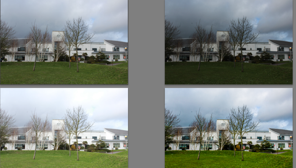
We made sure to use a tripod so there isn’t any noticeable movements or camera shakes.
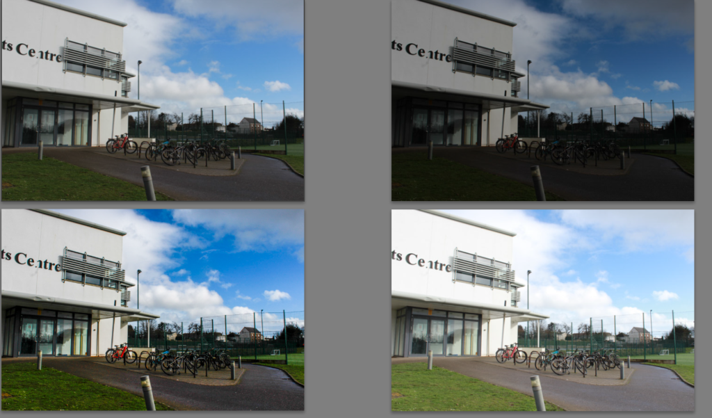
We put the camera settings on continuous shooting so we can quickly take 3 images without the camera moving or shaking as well as using a tripod. Also preventing a subject moving in the image e.g. a car or person which unfortunately happened within these images. However when I merged the image the person came out clear and detailed therefore didn’t cause much of a problem.
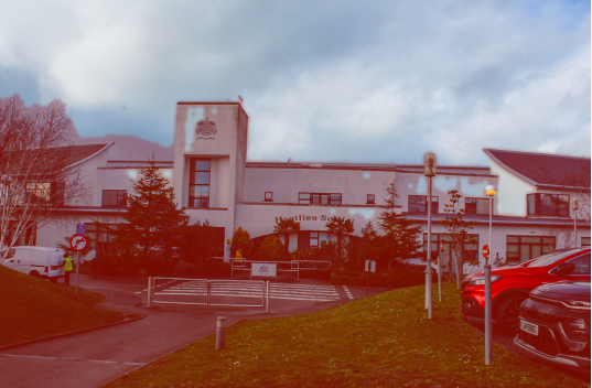
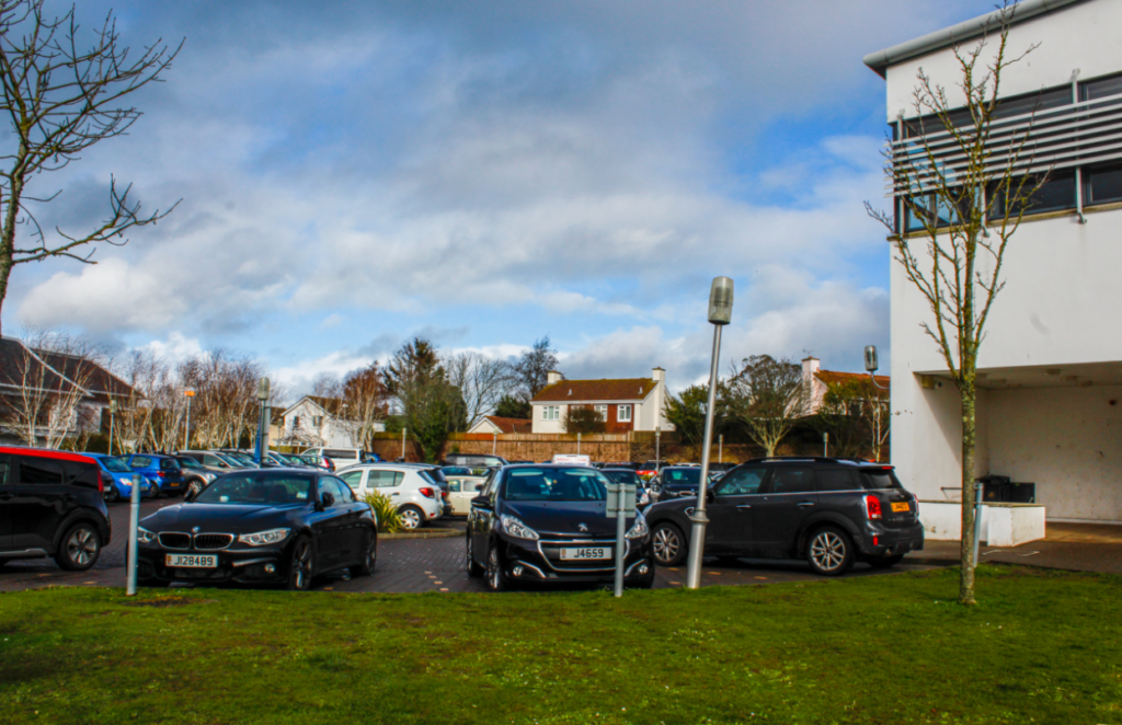
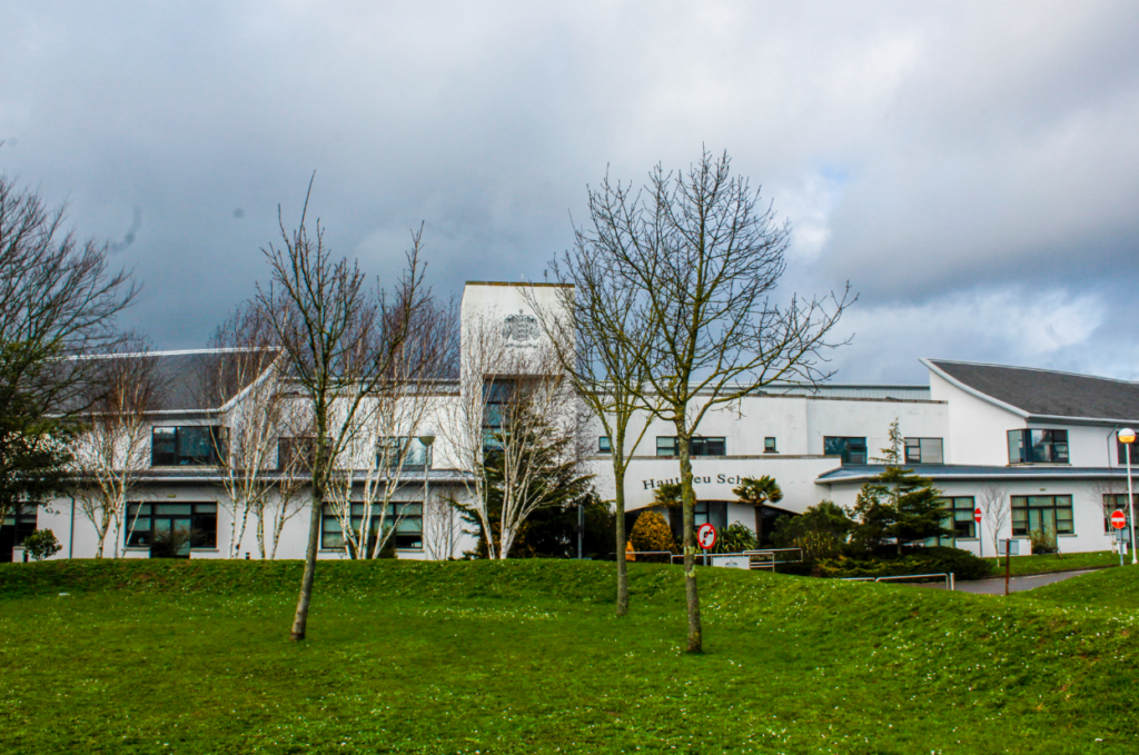
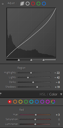
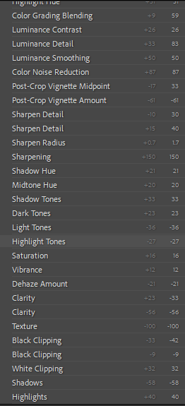
Here is a preview of what merged together within the image. I selected high DE ghost amount which clearly shows what created the final outcome.
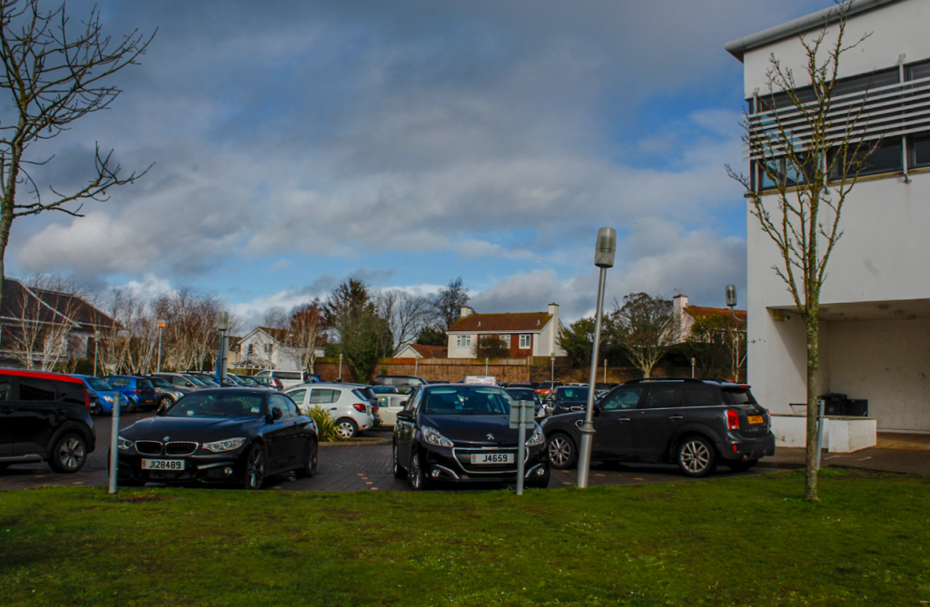
Personally, I think this image is slightly grainy and looks unrealistic within the tones and shades so I could select a lower De ghost amount to make it look more realistic.
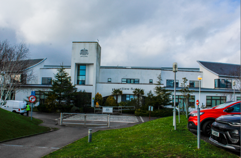
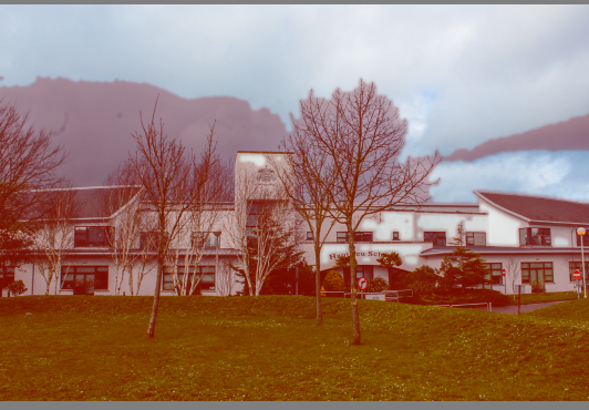
There isn’t a significant amount of change however I personally prefer this photograph as it slightly looks more realistic as you ca see a slight difference within the shade of the grass and the sky.
Within this image I selected the high exposure level and selected show the De ghost which ultimately shows what has been merged with red highlights to show you the difference.
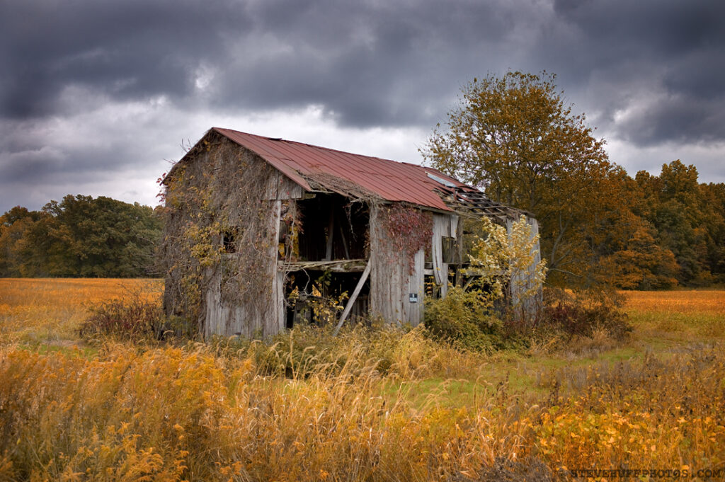
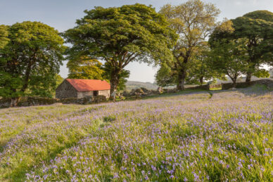
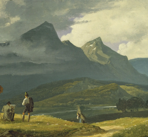
The rural landscape includes a variety of geological and geographic features such as cropland, forests, deserts, swamps, grasslands, pastures, rivers and lakes. The rural landscape provides natural resources, food and fibre, wildlife habitat and inspiration.
Rural landscape photography is in many ways similar to photographing urban landscapes. The difference is rural photography is about capturing the “life” in the countryside. Of some reasons I like to think of rural as something “old” while urban is mostly modern.
Rural is defined as “of or relating to the country, country people or life, or agriculture.” A critical element in successful photography is capturing the interaction that occurs between subject and environment.
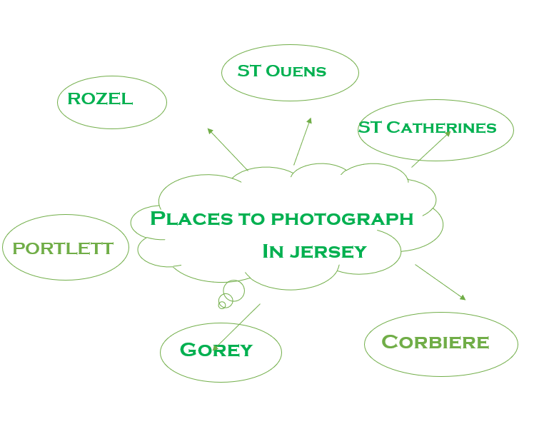
MOODBOARD
As you can see, most of these images include an old barn or hut of some sort with autumn leaves and colours in the countryside. This is the opposite to urban landscapes as it gives off a nostalgic and vintage feeling to the image using mostly natural environment factors to create more significance and meaning. In my opinion, keeping this image in colour creates the whole “vintage” look
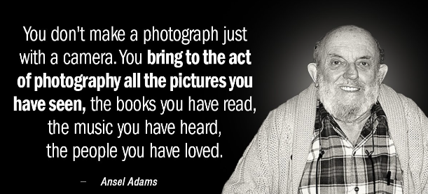
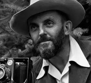
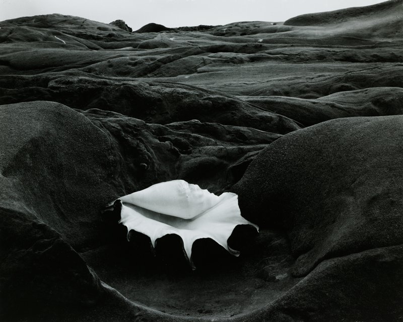
Ansel Adams
Ansel Easton Adams was an American landscape photographer and environmentalist known for his black-and-white images of the American West. Ansel Adams is one of America’s most famous photographers and is known for his stunning photos of the American wilderness and his passion for conservation. Ansel Adams’ photography puts the American wilderness on display, highlighting its enormity and beauty through dramatic black and white photos.
Why did Ansel Adams photograph in black and white preferably?
There are two main reasons, according to an expert source, why Adams preferred black and white. The first was that he felt colour could be distracting, and could therefore divert an artist’s attention from the achievement of his full potential when taking a photograph.
However, Renowned as America’s pre-eminent black-and-white landscape photographer, Ansel Adams began to photograph in colour soon after Kodachrome film was invented in the mid 1930s. He made nearly 3,500 colour photographs, a small fraction of which were published for the first time in the 1993 edition of ANSEL ADAMS IN COLOR.
Few artists have had a greater impact on environmentalism than Ansel Adams. His belief in the possibility of humankind living in harmony with the environment was illuminated through his artwork and worked to strengthen other environmental efforts.
Who was Ansel influenced by?
Adams was strongly influenced by Alfred Stieglitz, whom he met in 1933 and who mounted a one-man exhibition for him in 1936 at Stieglitz’s An American Place gallery in New York City.
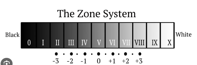
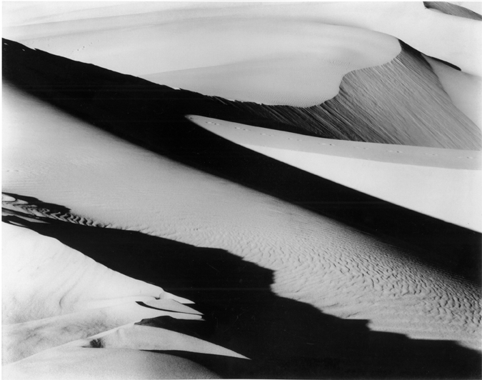
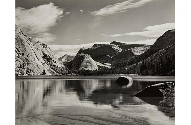
Ansel Adams uses the zone system. The Zone System assigns numbers from 0 through 10 to different brightness values, with 0 representing black, 5 middle grey, and 10 pure white; these values are known as zones.
Group f/64 was created when Ansel Adams and Willard Van Dyke, an apprentice of Edward Weston, decided to organize some of their fellow photographers for the purposes of promoting a common aesthetic principle. In the early 1930s Van Dyke established a small photography gallery in his home at 683 Brock Hurst in Oakland.
64, loose association of California photographers who promoted a style of sharply detailed, purist photography. The group, formed in 1932, constituted a revolt against Pictorialism, the soft-focused, academic photography that was then prevalent among West Coast artists.
What style is Ansel Adams associated with?
Where landscape artists used colour and brushstrokes to show the beauty of the places that became part of the National Park System, many of Ansel’s photographs were minimalist, shot in black and white using sharp contrast and deep focus. Ansel’s photography is known for its realist style.
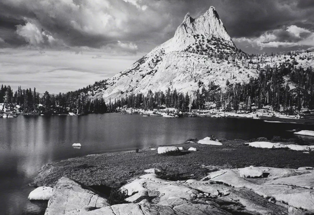
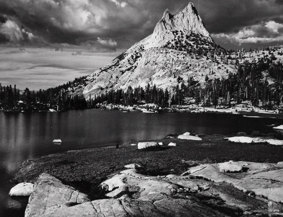
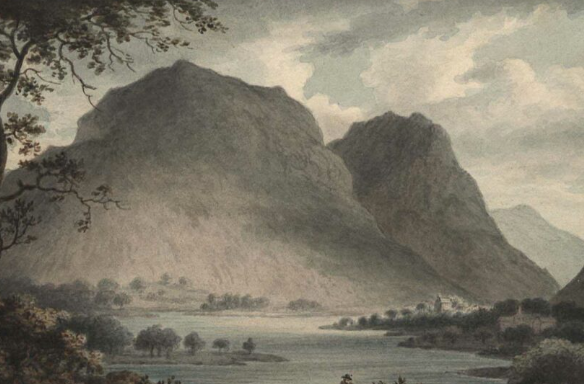
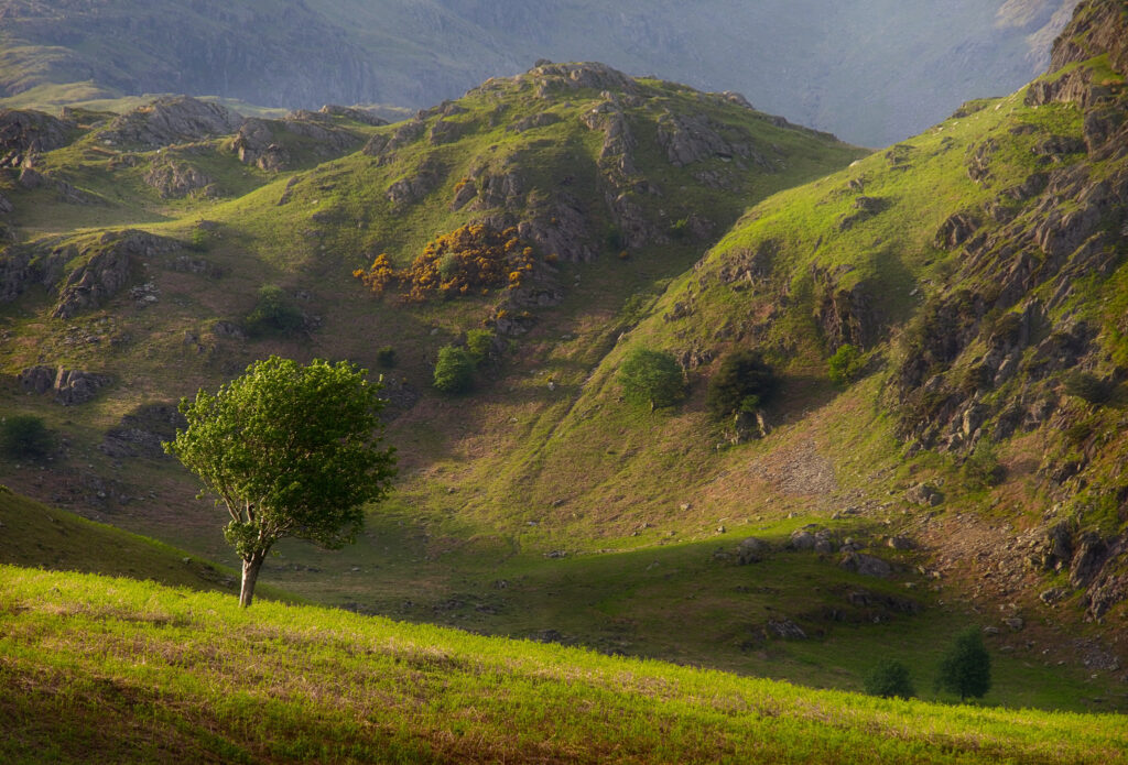
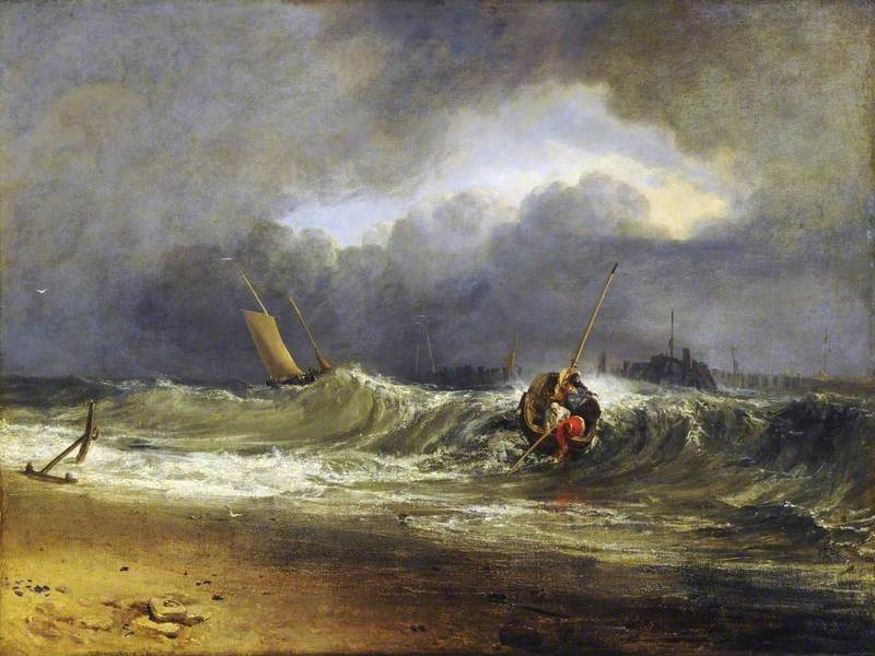
The zone system is a range from the amount of shades which ultimately create a contrast and a significant eye catching feature to the image. It is important to recognize that Adams made this effect in the 20th century without the use of adapted technology. An example is this image.
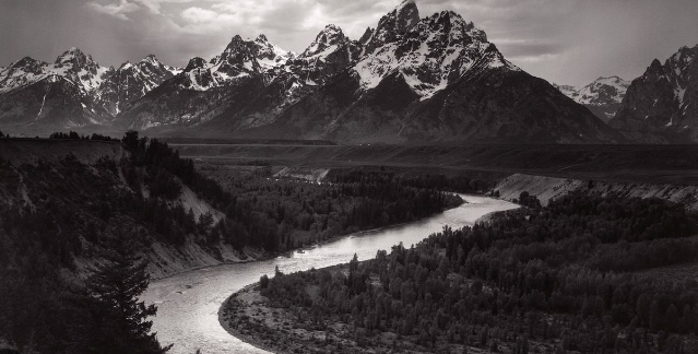
In this image you can see the river is highlighted with light shades ( end of the zone system ) contrasting with more blacks with the trees with detailed greys which easily catch your eye. With the highlighted sky contrasting with the mountains creates significant importance with this photograph.
ANSEL ADAMS AND ROMANTICISM
Similarities& Differences
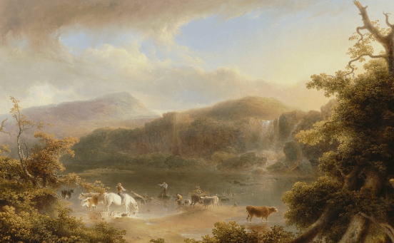
A similarity within these images is that they both have significant contrasting and highlights to create a beautiful look within the environment and atmosphere. They both are typical landscapes obtaining natural/non- man made objects. An important difference is romanticism typically involves historic values and sometimes humans however they still normally do not make it the main subject of the image as the background is the main eye catcher. A major difference is that Adams prefers to use black and white but still manages to contrast the highlights and shadows so it isn’t all one tone and shade. Ansel’s work looks a bit more detailed and focused however these romanticism images are more hazy/misty and less focused compared to Adams.
COMPARISON WITH EDWARD WESTON
Edward Westonmood board–
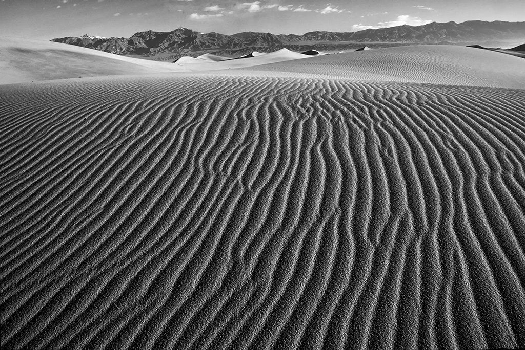
My first initial thought from my perspective is that Weston focuses on texture rather than tone and shade like Adams. Each landscape has a different type of texture and is the main subject of each image. Whereas Adams focuses on the environment and landscapes but most importantly he focuses on the zone system which Weston does not which is obvious as he does not use a large range of shades. A similarity is they are both of environmental and natural scenery and are both typically in black and white. Although Weston images are significantly contrasting between light and dark his images mainly create this by the use of very dark tones of black almost pure black and then grey tones. This shows us that Weston does not follow the zone system created by Adams. Edward Weston in my opinion shows romanticism however still changes it from what we would see by the naked eye yet still beautiful and captivating way, he uses the use of patterns and lines. It is almost as he uses each curved line in this image as a different section and tone of grey or black. The ripples show consistency through the image which makes it appealing to look at and gives the image the calmness and natural beauty of romanticism images. Weston’s vision and photographic theories were heightened and perfected. He believed in the previsualization of the final photographic image. If cropping was necessary, the image was a failure.
“The camera should be used for a recording of life, for rendering the very substance and quintessence of the thing itself, whether it be polished steel or palpitating flesh.” “My own eyes are no more than scouts on a preliminary search, for the camera’s eye may entirely change my idea.”
How did Adams influence others?
Ansel’s photography has had great impact indeed, not only in awakening people to the beauty of nature but in inspiring many other photographers to turn their efforts to the natural scene and to use photography in the interests of environmental preservation.
Ansel Adams’ love of nature and his work in capturing vistas within the Sierras and other protected lands for all to see changed the American art world to include nature photography.
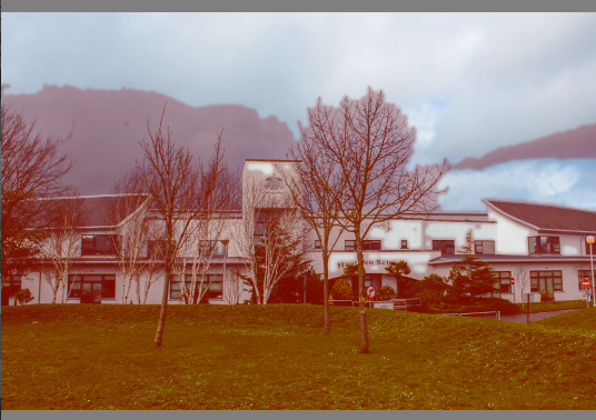
IMAGE ANAYLYSIS
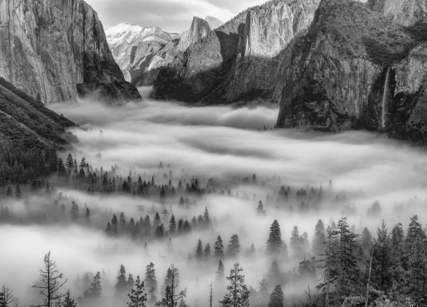
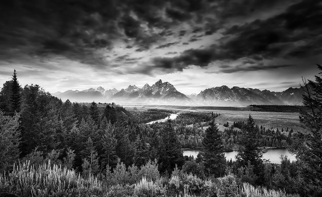
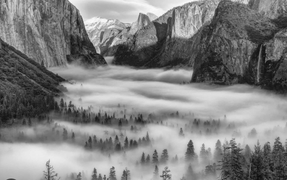
The first noticeable feature of this image is the mist between the trees. Adam’s successfully contrasts the trees against the mist using the zone system as the trees are low within the zone system. He also significantly uses dark mountains but in the background you notice the sun slightly shining in with a higher zone system and lighter shades. The start of the image the mountains are dark and they slowly go lighter because of the sun. This creates an interesting factor by preventing it from making the image dull and boring with one shade and tone. The trees stop poking out of the mist half way through the background which creates mystery as we do not know what is underneath however we assume there is trees. To prevent this image from being dull he uses a range of grey shades from the zone system. This image also contains different textures from the mist to the trees and mountains which shows HDR high dynamic range.
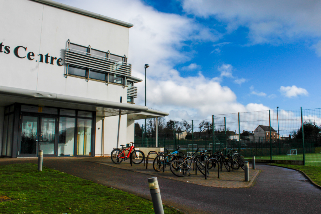
MY PHOTOSHOOT PLAN
Within my images I want to create a HDR image so it obtains all detail and shades to create an interesting factor.
What are HDR photos?
When taking a single-exposure photo, you might notice that the scene’s dynamic range is too wide for your camera. In other words, your camera doesn’t capture all the detail in one frame.
For example, suppose you are photographing an object in sunlight. In this case, the brightest elements will appear glaring white, and you will lose the details of these elements.
Similarly, when taking a photo of a person in front of a bright background, your camera might capture your subject as a flat shadow with no detail.
HDR stands for high dynamic range. This function increases your camera’s dynamic range to pick up detail in the shadow and the light elements of a frame.
HDR processing involves taking multiple images and capturing the same scene at different exposure values. Then, you need to merge these images using high-end photo editing software such as Adobe Lightroom
The result is an image with visible detail in its lightest and darkest elements, making it appear more natural to the human eye.
I would successfully execute by adjusting my camera settings- I would control my camera’s aperture while my camera automatically adjusts the shutter speed.
I would adjust my ISO setting as it determines your camera’s light sensitivity. Choose the lowest possible setting to ensure that your images are not grainy.
Select the correct aperature- In landscape photography, a narrow aperture of f/11 or higher is ideal. All your subjects will be in focus at these aperture settings, even at varying distances.
Adjust the correct exposure levels for my specific images- Most photographers take three shots at exposure values of -3, 0, and +3. A negative value results in a darker exposure, and a positive exposure is brighter.
A camera with an auto exposure bracketing (AEB) function can automatically take multiple photos at varying exposure levels.
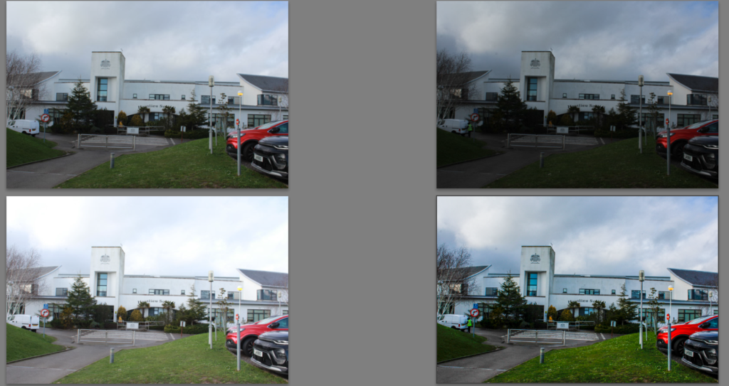
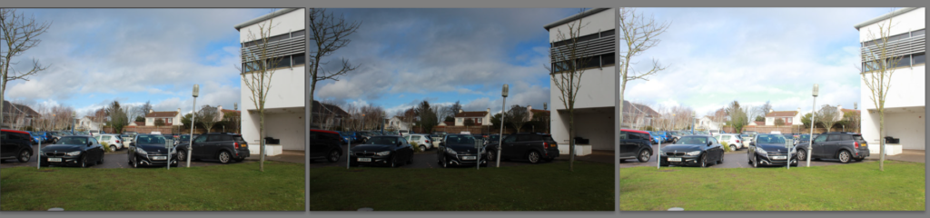
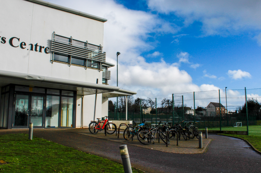
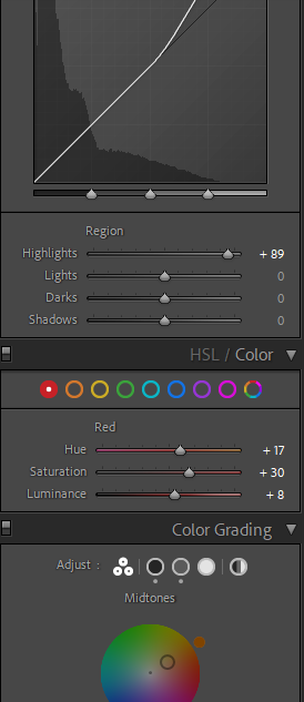
After I have adjusted my camera correctly and experimented by taking photos. I can merge all 3 images with 3 different exposure levels to create an HDR image in Adobe Lightroom. If I am not happy with my final result I can continue to edit them in Lightroom.
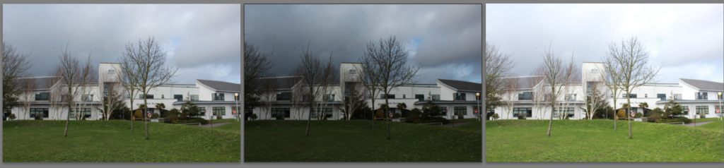
My Example/ Not final Products
As shown, there are 3 different images with different exposure and saturated levels and with one extra image which all 3 have merged to create.
Within this image it shows what has been merged together using red highlights. I selected the ‘high’ DE ghost amount as it was personally my preferred out of all the options and it obtains the most noticeable exposure levels without it making it to grainy which I personally like as it creates an interesting factor to the human eye.
Now, I will do the same method and take landscapes related to Romanticism and try to use the zone system like Ansel Adams.
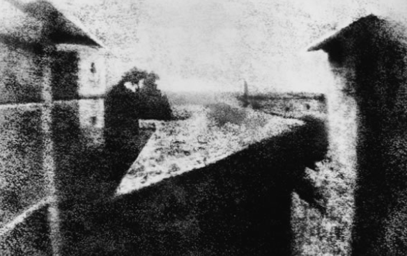
It is hard to trace the exact origin of landscape photography since the very first photography that we know of was taken in an urban landscape during 1826 or 1827 by the French inventor Nicéphore Niépce. Then in 1935 the English scientist Henry Fox Talbot came into play with various photography innovations.
Traditions
Landscape photographs typically capture the presence of nature but can also focus on human-made features or disturbances of landscapes. Landscape photography is done for a variety of reasons. Perhaps the most common is to recall a personal observation or experience while in the outdoors, especially when travelling.
According to records, the earliest known evidence of a landscape photograph was taken between the years of 1826 and 1827. It was an urban landscape photo taken by a French inventor by the name of Nicephore Niepce.
The first landscape photograph
Modern Landscapes
How have landscape photography evolved?
The first cameras used for landscapes were simple wooden boxes with a photosensitive material coating a plate. After some photographic innovation, view cameras became possible. These cameras are also known as large format cameras and are precision devices built to capture reality in a way no other camera can.
Landscape photography commonly involves daylight photography of natural features of land, sky and waters, at a distance—though some landscapes may involve subjects in a scenic setting nearby, even close-up, and sometimes at night.
When did the genre of landscapes begin?
After the fall of the Roman Empire, the tradition of depicting pure landscapes declined, and the landscape was seen only as a setting for religious and figural scenes. This tradition continued until the 16th century when artists began to view the landscape as a subject in its own right. In the Eastern tradition, the genre can be traced back to 4th-century-ce China.
Artists have been painting the landscape since ancient times. The Greeks and Romans created wall paintings of landscapes and gardenscapes. After the fall of the Roman Empire, the tradition of depicting pure landscapes declined, and the landscape was seen only as a setting for religious and figural scenes. This tradition continued until the 16th century when artists began to view the landscape as a subject in its own right. The artistic shift seems to have corresponded to a growing interest in the natural world sparked by the Renaissance.
The term “landscape” actually derives from the Dutch word landschap, which originally meant “region, tract of land” but acquired the artistic connotation, “a picture depicting scenery on land” in the early 1500s (American Heritage Dictionary, 2000). A landscape is the visible features of an area of land, its landforms, and how they integrate with natural or human-made features, often considered in terms of their aesthetic appeal. The development of the term in the Netherlands at this time was logical because the Netherlands was one of the first places that landscape had become a popular subject for painting. At this time, the rising Protestant middle class sought secular art for their homes, creating the need for new subjects to meet their tastes; landscapes helped fill this need.
Birth of the Classical Landscape
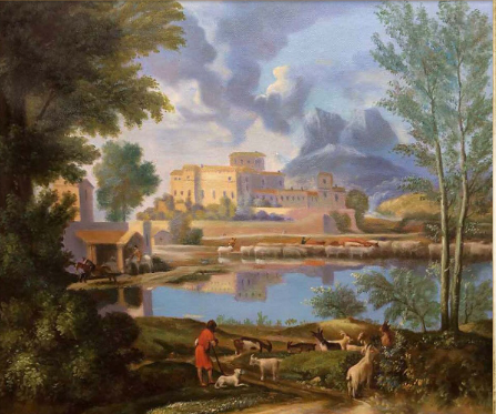
Landscape with a Calm, Nicolas Poussin, 1650–1651
In the 17th century the classical landscape was born.
VS
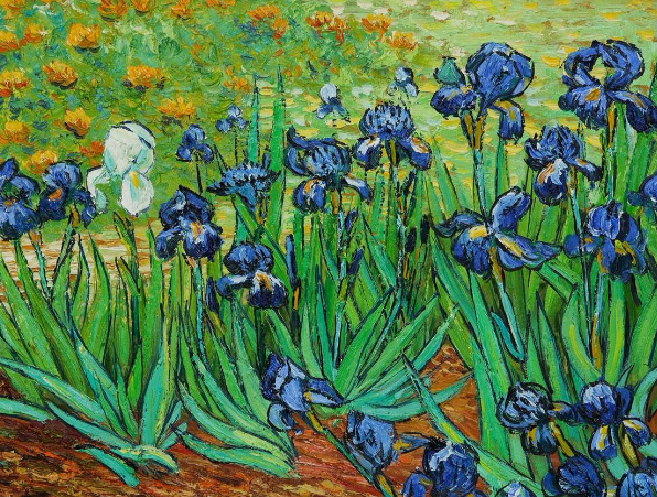
The Modern Landscape
Irises, Vincent van Gogh, 1889
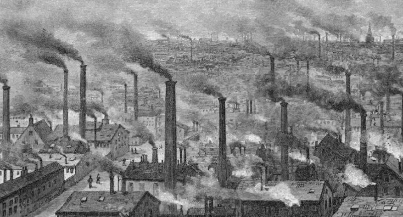
The 19th century held many milestones for the history of landscape art. As the Industrial Revolution altered the traditions of rural life, the old hierarchy of subjects crumbled.
Comparison
Within these two famous paintings, you can instantly tell they are significantly different and have impactful contrasting qualities to one another but also similar. One similar quality they both have is they are both inspired by beautiful things. However the classic landscape contains man-made and is influenced by by classical antiquity and contains a ” rich” part of the land. Arcadia, a legendary place in ancient Greece known for its quiet pastoral beauty. In a classical landscape the positioning of objects was contrived; every tree, rock, or animal was carefully placed to present a harmonious, balanced, and timeless mood. This painting is also painted to look realistic and natural. Whereas, the modern landscape is not-man made and is natural in a different sense however is purposefully painted to look fake as if it has been painted. This creates a large contrast between the two. The modern landscape also only contains one natural object rather than multiple therefore you are only looking at one thing as there is no more eye catching objects.
Photography and the 20th-Century Landscape
In the early 20th century, painters continued to embrace the landscape. As photography gained acceptance as an art form, artists used the medium to create interpretations of the land through pictorialist effects and, later, through formal compositions of close-up, cropped views of the landscape. In America, photographer Ansel Adams captured the country’s attention with his breathtaking views of the wild beauty of the American West. Even though the major artistic movements of the mid-20th century were no longer dominated by the landscape as a subject, the genre’s importance continued as artists responded to fears of increased industrialization, the threat of global destruction, and ecological disasters.
In the second half of the 20th century, the definition of landscape was challenged and pressed to include concepts like urban landscapes, cultural landscapes, industrial landscapes, and landscape architecture. Landscape photography continued to evolve and rise in popularity. American photographers like Robert Adams and William A. Garnett used the medium to raise awareness of conservation concerns. Today, the landscape continues to be a subject artists turn to when contemplating the ways we relate to the places where we live and the impact we as humans have on the land.
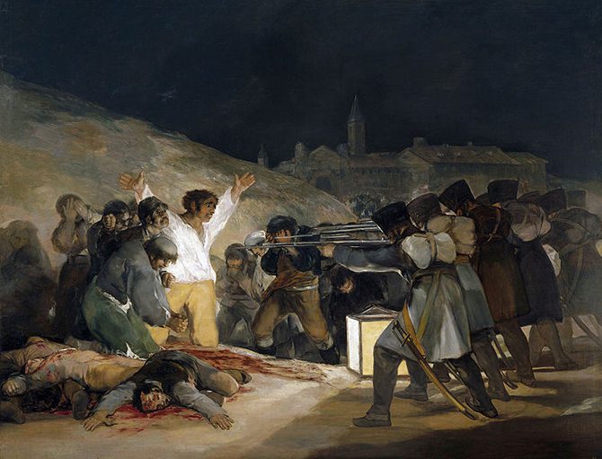
SUBLIME IN ART
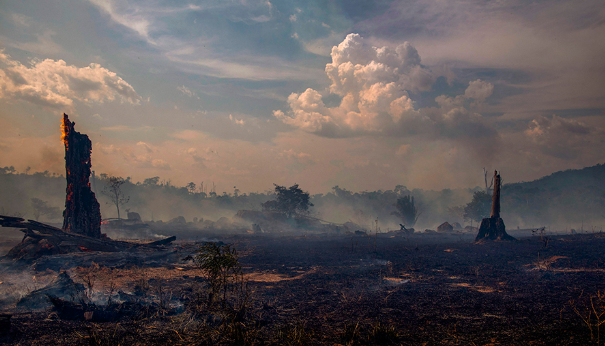
What is Sublime? Sublime is the quality of greatness beyond all measure. The Sublime is a western aesthetic concept of ‘the exalted’ of ‘beauty that is grand and dangerous’. The Sublime refers to the wild, unbounded grandeur of nature. Sometimes, we photograph things that are awe-inspiring and not necessarily beautiful.
The sublime is both beautiful and terrifying in its power or potential darkness. Artists explored the sublime in depth through art using paintings and drawings of the imagination, however they could often turn into nightmares. Natural landscapes were mighty and nice to look at and people admired the aesthetics but they were always dangerous.
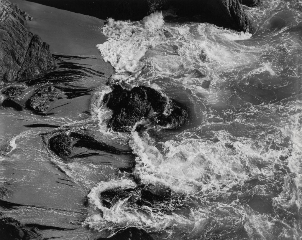
Ansel Adams’ photographs of towering mountains and canyons are arguably major expressions, exemplars and evokers of the sublime in photography. The sublime involves the formlessness of uplifting spectacles and produces feelings of awe and terror.
Humans subconsciously connect to nature as we admire it as we live in it however this contrasts as we also mistakenly destroy it e.g. by polluting the air, cutting down trees and leaving litter around. Us as humans are not grateful enough for the nature that we are given although we admire it. This is a large contrast within how we feel vs what we do which creates a significant debate.
Within this image, there is a disaster however it is sublime. The natural and non-man made objects are beautiful but the concept within its self is not but it is however grand. The clouds and other images are beautiful no matter the context. This makes it sublime
FAMOUS IMAGES
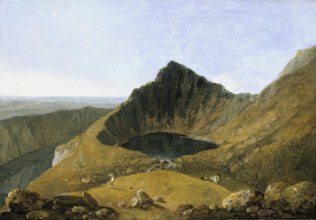
Richard Wilson 1713–1782
ROMANTISM
The Age of Romanticism (1800-1900ish)
Romanticism emphasized the individual, the subjective, the irrational, the imaginative, the personal, the spontaneous, the emotional, the visionary, and the transcendental. Travel to the turn of the 19th century to experience the Romantic musical, literary, and artistic movement.
Romanticism is an artistic and intellectual movement that originated in Europe towards the end of the 18th century. For most of the Western world, it was at its peak from approximately 1800 to 1850.
How did romanticism change art? Along with plumbing emotional and behavioural extremes, Romantic artists expanded the repertoire of subject matter, rejecting the didacticism of Neoclassical history painting in favour of imaginary and exotic subjects. Orientalism and the worlds of literature stimulated new dialogues with the past as well as the present.
Today, Romanticism can be found in a wide cross-section of film, television, literature, music, and art. Whether it is a focus on the eternal power of nature or an audience’s visceral reaction to a particular medium, contemporary society is ripe with Romance in the Romantic sense.
Romantic artists often sought to capture the moods, feelings, and emotions of their subjects, using expressive compositions, vivid colors, and dramatic contrasts of light and dark. Nature was another important theme in Romantic art, with many artists exploring the beauty and power of the natural world.
There are strong echoes of Romanticism in contemporary concerns about the environment and the need to appreciate and preserve it. Romantics also embraced the foreign and the exotic, especially eliciting an interest in Orientalism, and this too affected the history of art.
The Industrial Revolution 1760-1840 was based upon the efficient exploitation of nature’s raw materials and labour as new scientific theories developed by the Enlightenment thinkers were quickly transformed into practical, money-making applications.
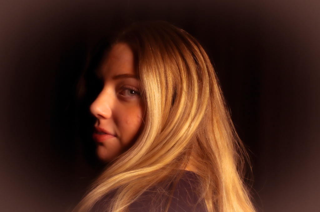
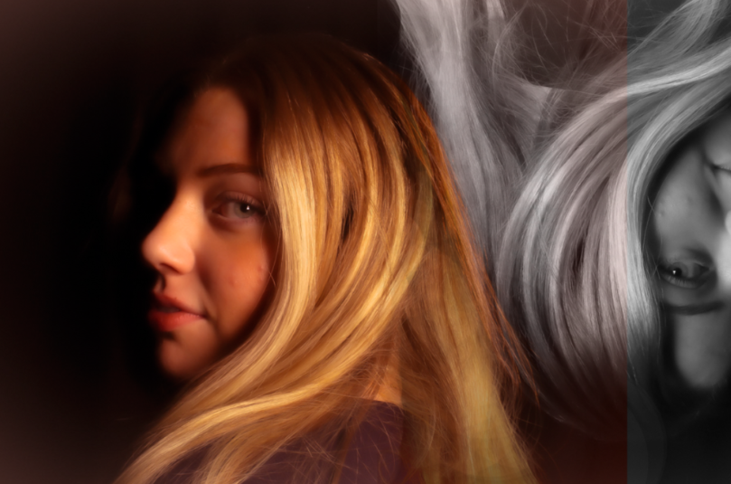
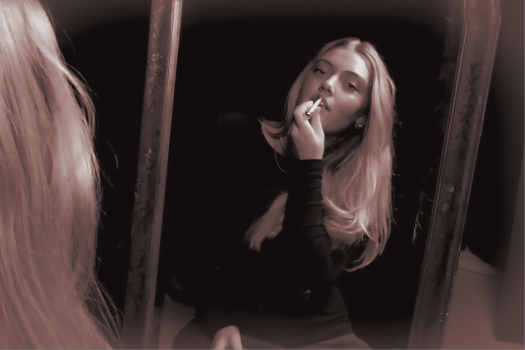
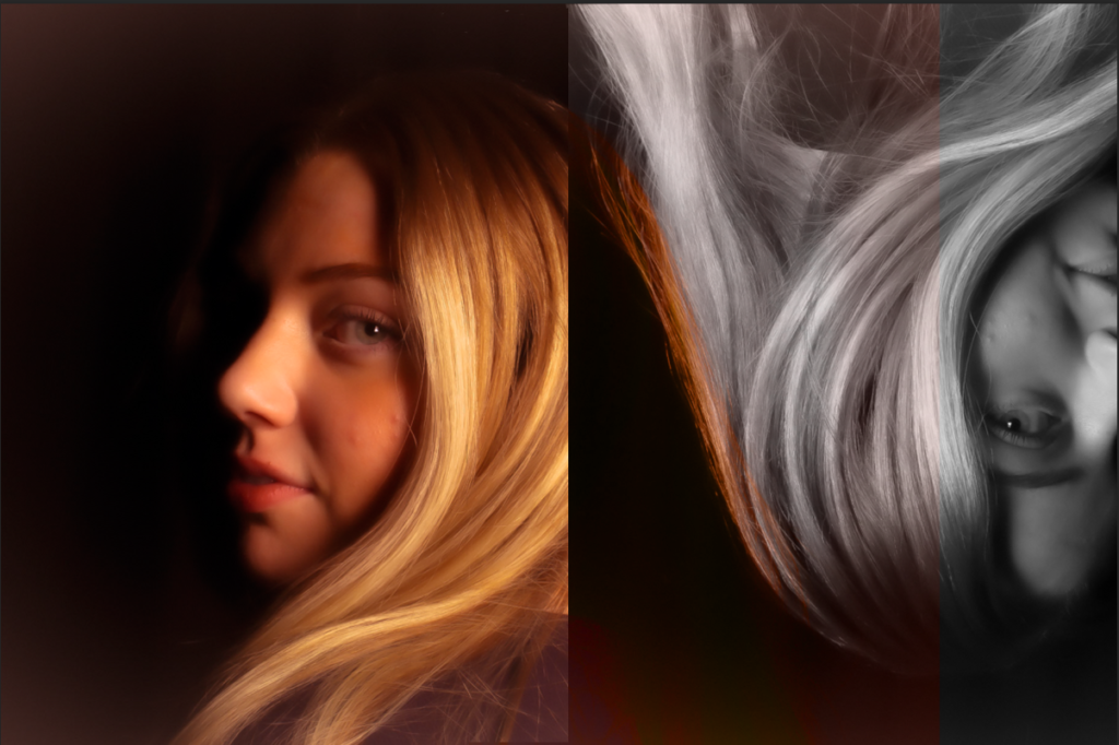
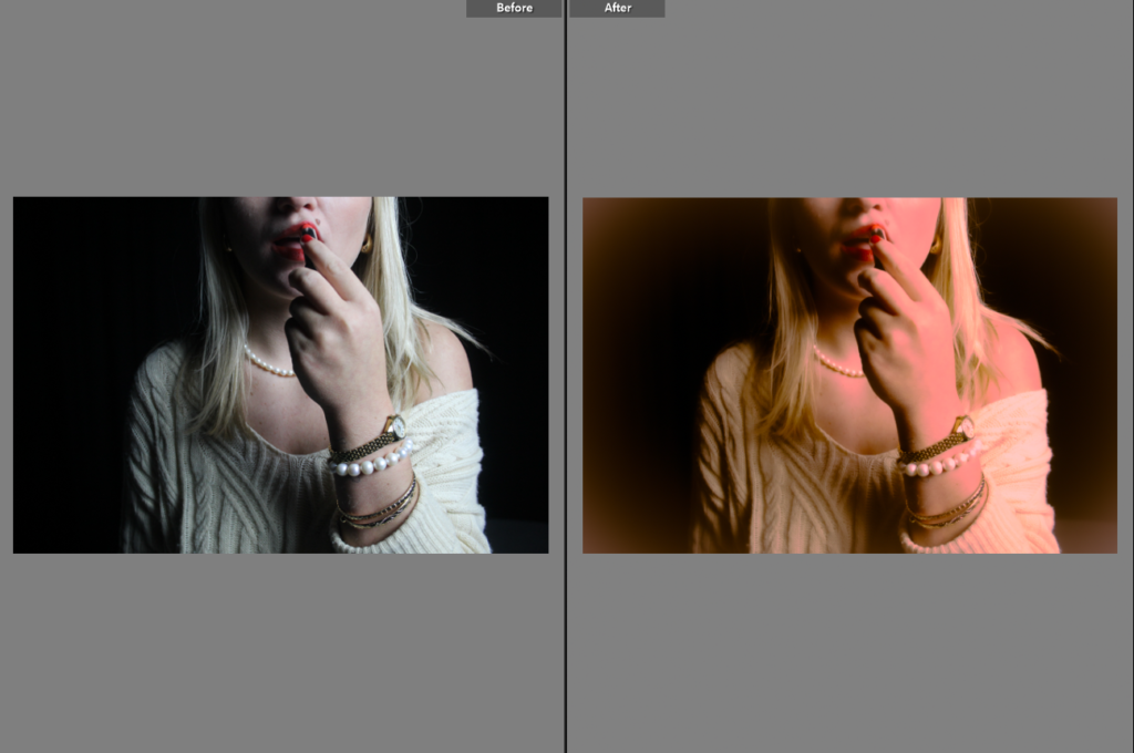
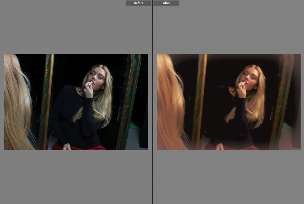
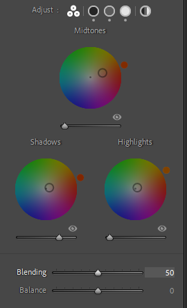
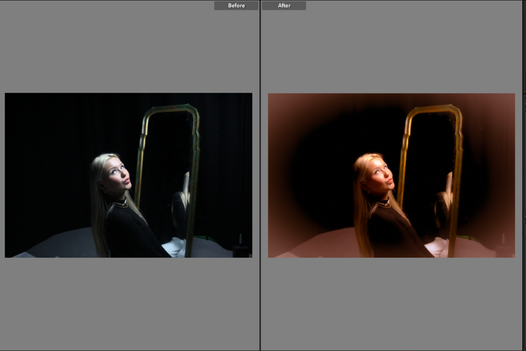
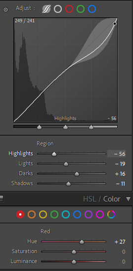
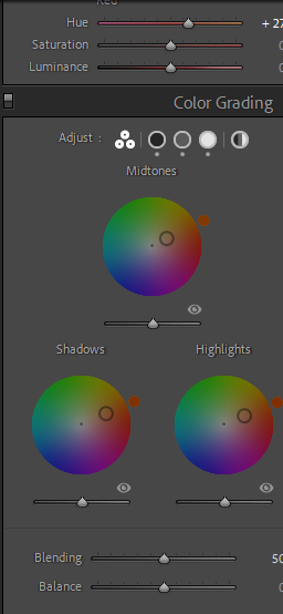
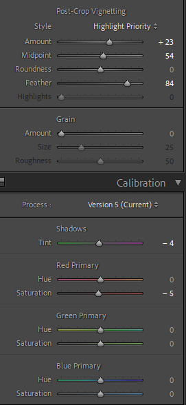
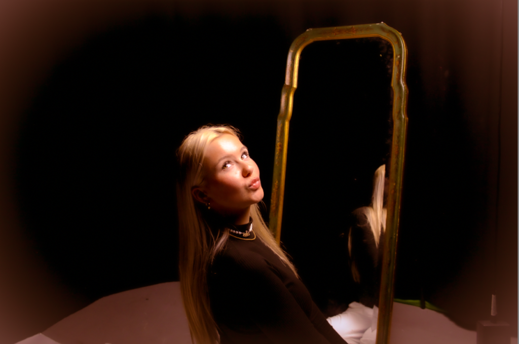
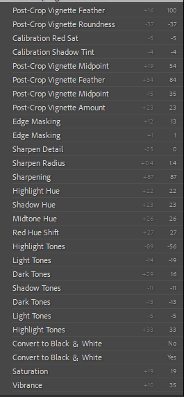
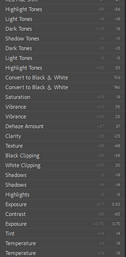
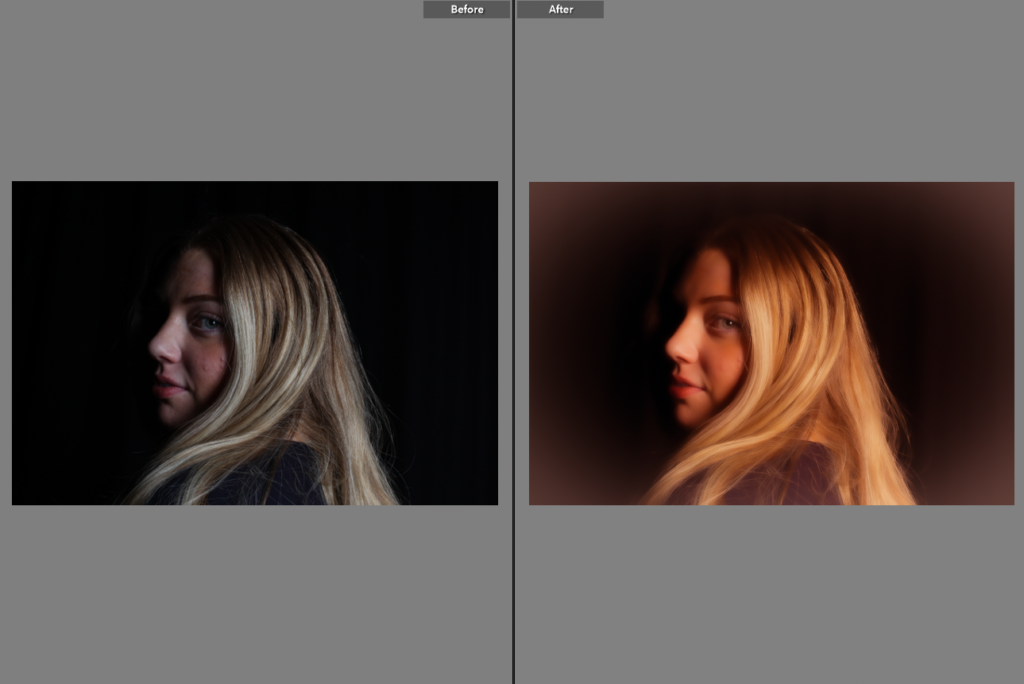
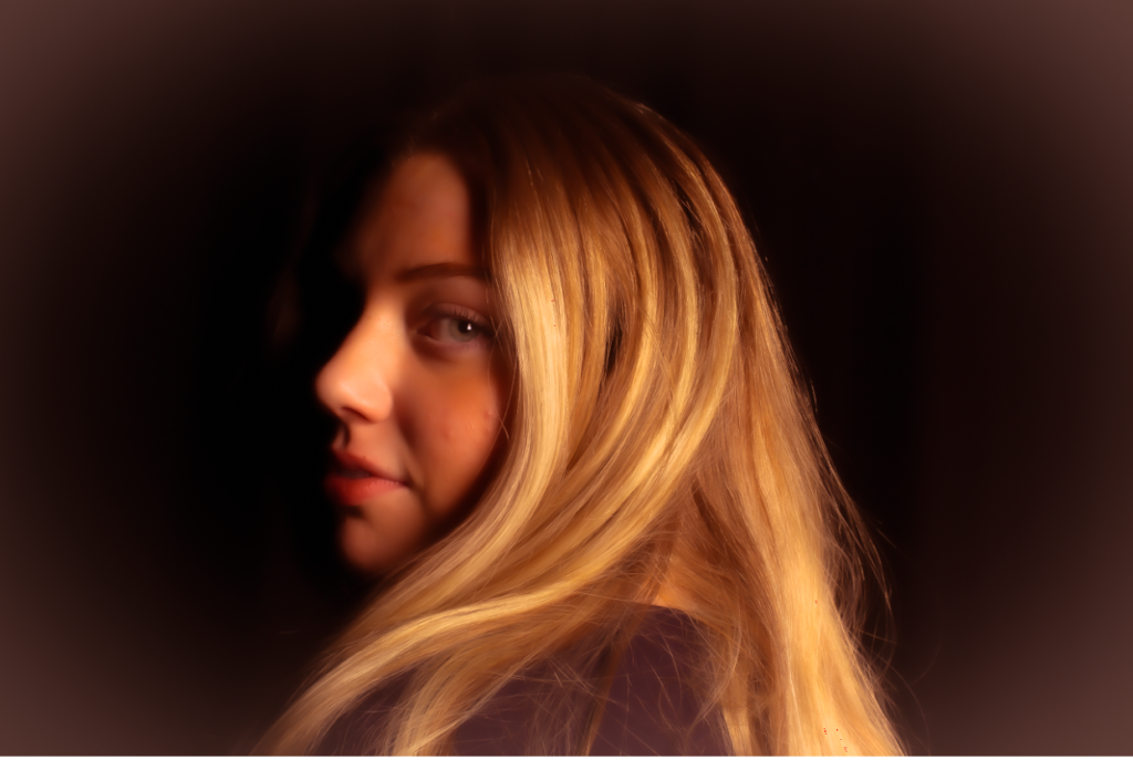
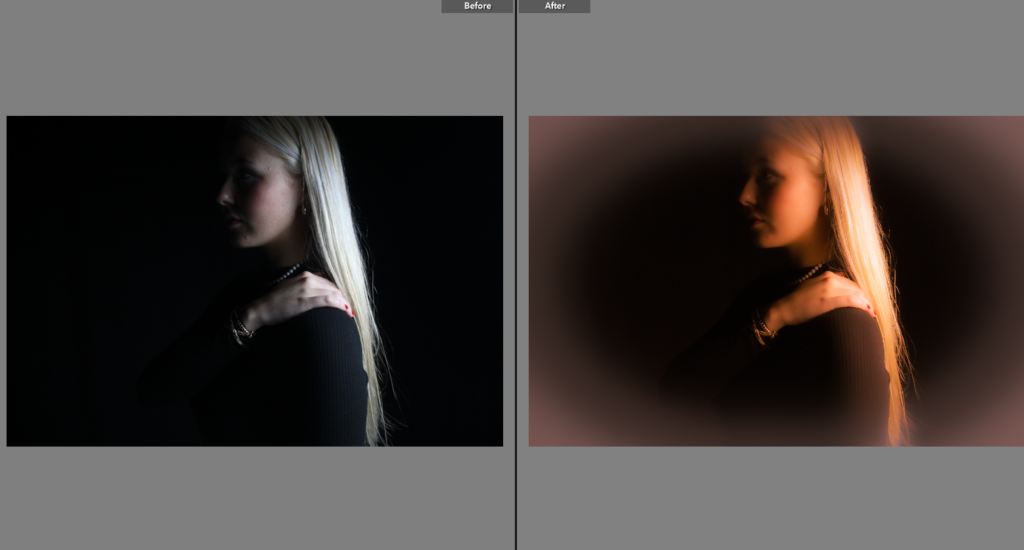
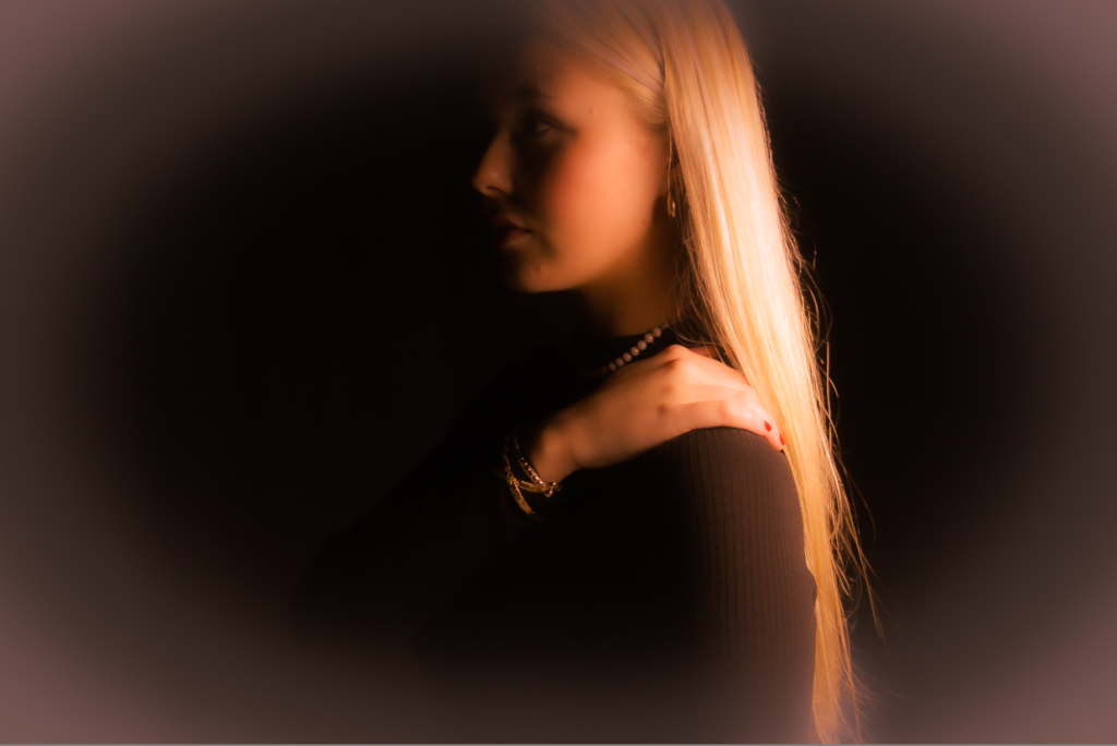
Within this image, personally I think in adobe Lightroom my editing went well. The shadows are visible and play a large factor in this image and I prefer this lighting technique (chiaroscuro) and glad I chose to execute this technique as it creates a sense of mysterious, gentle and beauty which is a big part of femininity. I like how I used warm tones to make it look vintage and not modern although it was shot on a modern camera I tried my best. I decreased the texture and clarity to create a soft focus and more professional look to the image which links to Cameron’s work. I preferred using a black background as it makes the subjects left side of the face unable to see as the way she is standing you would, this emphasizes the shadows and technique I chose to do to create it almost the first thing to notice as a viewer. Then I continued on photoshop and created another layer with the same image and turned it upside down and experimented with the highlights and filters. When I found the correct one for me I loved the way it looks purposely imperfect which could imply that females and males have a pressure to reach expectations but we are all imperfect and make mistakes. To make this image better I would move the first split/line more to the left to make the image equal in thirds. To experiment I tried to blend the images however I didn’t like it as much as it didn’t give off the same abstract effect.
I personally prefer this image in colour as it shows my editing to make it look more vintage using warm tones so it looks more like Cameron’s work as well. However I am going to experiment by putting my image in black and white so it resembles Sherman’s famous image.
Similarities and differences
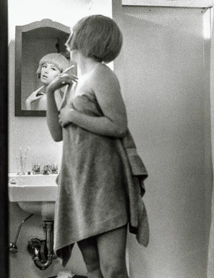
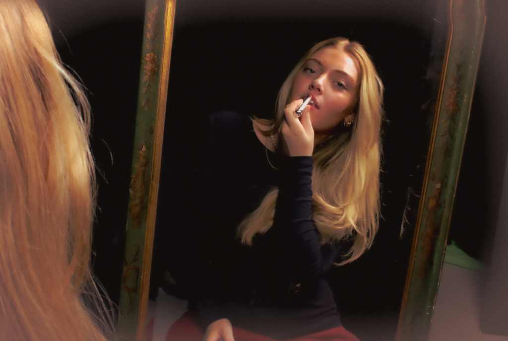
In Cindy’s work she is standing in a towel which ultimately looks very feminine and vulnerable which is typically a feminine stereotype. However, as seen the subject has her arm up with her fingers which gives off a elegant and gentle look to the image meaning viewing herself in the mirror with draw catching eyes. This is similar to my work as the subject in the mirror has her arm up however holding a prop which could link to Sherman’s work. Another contrast is how Sherman is in a w towel which is a large factor to the image whereas the subject in my image is wearing black which would make the viewer look more at the face rather than the body as the background is black. A major difference is my subject in my image is not a full body shot whereas Sherman’s work is. Sherman’s work also contains depth in the shadows of her image where as mine does not as it is through a mirror completely. Lastly the subject in Sherman’s image is looking through the reflection same as my image however not looking into the camera through it. Whereas, my image the subject is looking through the camera giving more a seductive and confident look.
Julia Margaret Cameron
Cameron’s image
My image
Similarities and differences
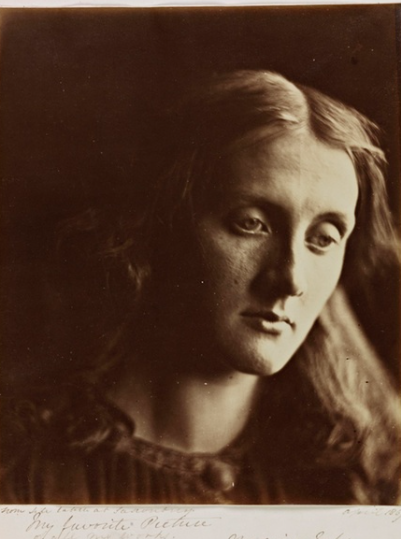
A major eye catching similarity is the lighting. Within my image I used Chiaroscuro lighting to emphasize the beauty of femininity. This relates to Marilyn Monroe as a character as my inspiration. Cameron’s image has a soft focus in the centre and high exposure on the right side of the subjects face however that is what she was known for and was good at. We both used a black background to blend in other features which could make it look mysterious as without a background the image cannot say a lot. I edited my image to make it look vintage and sort of a rusty colour which I executed through using warm tones and a warm feathered boarder which Cameron successfully did too.
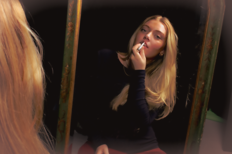
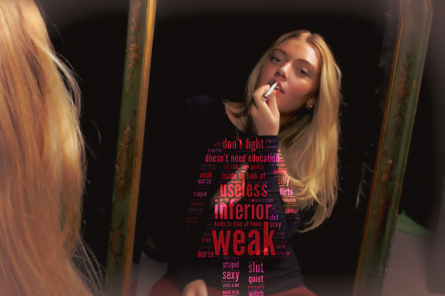
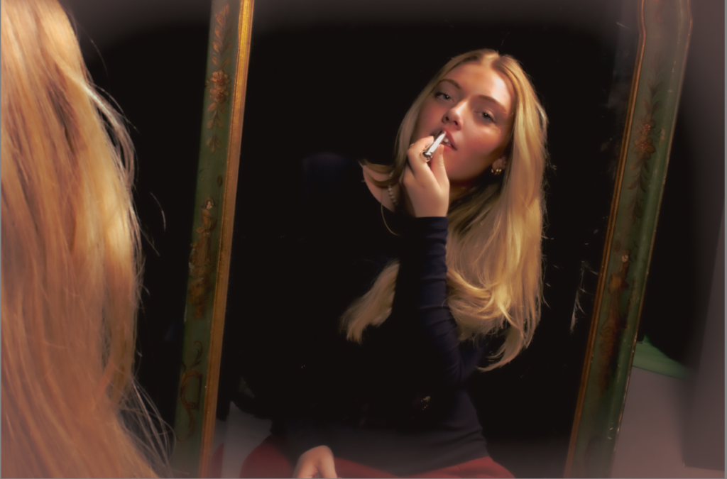
This image is too suppose to contrast the image and the stereotypes itself. As the subject in the image is applying red lipstick which is representing bold and confident as a women whilst viewing themselves in the reflection. This significantly contrasts to the stereotypes around her as a female as this is significantly the opposite to the results of red lipstick. Therefore, this piece is a juxtaposition as it is 2 different things contrasting one another. This relates to Monroe’s work from using the props and Claude and Sherman’s work as they used a mirror within femininity which could represent vulnerability.
PRESENTATION
I personally like both of these images however I prefer the second one as it has a more blended look of the two photo combination. Therefore, it generally has more of a cleaner and professional look to the image. However, the first image has 2 lines with different colours and highlights between them which I think looks quite abstract and different but purposely not perfect.
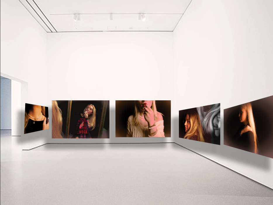
Virtual Gallery/ Presentation
I chose these photos as they were personally edited the best or the most unique. They were suppose to look vintage and old so it is inspired by Julia Margaret Cameron and Marilyn Monroe so they do not look modern. The mirror was inspired by Cindy Sherman and Claude Cahun however the props were an inspiration from Monroe and edited like Cameron.
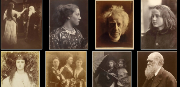
Julia Margaret Cameron was a British photographer who is considered one of the most important portraitists of the 19th century .She is known for her soft-focus close-ups of famous Victorian men and women, for illustrative images depicting characters from mythology, Christianity, and literature, and for sensitive portraits of men, women and children.
After showing a keen interest in photography for many years, Cameron took up the practice at the relatively late age of 48, after her daughter gave her a camera as a present. She quickly produced a large body of work capturing the genius, beauty, and innocence of the men, women, and children who visited her studio at Freshwater, and created unique allegorical images inspired by tableaux vivants, theatre, 15th-century Italian painters, and the work of her creative contemporaries. Her photography career was short but productive; she made around 900 photographs over a 12-year period.
Cameron’s work was contentious in her own time. Critics derided her softly focused and unrefined images, and considered her illustrative photographs amateurish and hammy. However, her portraits of respected men (such as Henry Taylor, Charles Darwin, and Sir John Herschel) have been consistently praised, both in her own life and in reviews of her work since. Her images have been described as “extraordinarily powerful” and “wholly original”, and she has been credited with producing the first close-ups in the history of the medium.
Why was Cameron’s work criticised?
Her talent, however, left her known as one the greatest photographers in history. Still, many of Cameron’s contemporaries considered her work to be inept, for it was blurry, smudged and scratched, and instead they believed that the best photography should be about technical perfections superseding all artistic intent.
The statement ‘Julia Margaret Cameron accidentally created soft-focus photographs’ is true due to her technical inexperience. She later embraced and intentionally used this soft-focus technique, significantly impacting portrait photography.
PHOTO ANAYLYSIS
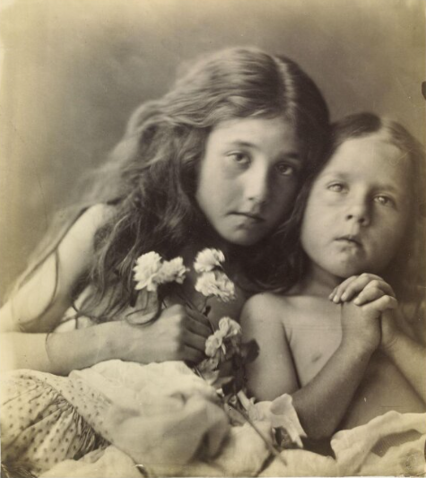
The Red Roses ( 1865)
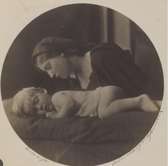
The meaning of this picture is ambiguous as the red roses of the title are not clearly identifiable. In the Victorian Language of flowers, red and white roses signified unity, discernible here in the closeness of sisters Kate and Elizabeth Keown. The hands clasped in prayer evoke Christian iconography, where red roses stand for martyrdom and white for purity. Cameron often borrowed many of her subjects from religion, history and literature. One of her famous images is ‘ My Grandchild, 1865’
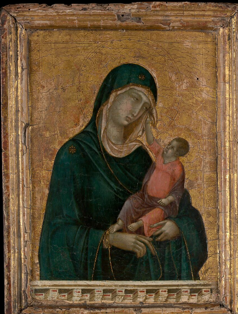
In this image, Cameron transforms a portrait of her grandson asleep into the study of Madonna and her Child. Making this image simultaneously a religious study and a family portrait.
Madonna and Child was painted by one of the most influential artists of the late 13th and early 14th century, Duccio di Buoninsegna. This iconic image of the Madonna and Child, seen throughout the history of western art, holds significant value in terms of stylistic innovations of religious subject matter that would continue to evolve for centuries.
This lyrical work inaugurates the tradition in Italian art of envisioning the Madonna and Child in terms appropriated from real life. The Christ Child gently pushes away the veil of his mother, whose sorrowful expression reflects her foreknowledge of his crucifixion.
The word Madonna means “My Lady” in Italian.
This painting from the late 13th century by Italian painter Duccio di Buoninsega, in contrast, expresses the emotions of love and tenderness between mother and child. The infant Jesus returns the Madonna’s placid but intense gaze.
MOODBOARD
MY WORK INSPIRED BY CAMERON
I edited these images to creative a less detailed focus in the centre surrounded by a feathered border with warm tones to create a vintage and old look so it fit Cameron’s work in the 19th century. I kept the portraits more focused around the outside like Cameron’s work although she got criticized for it but ended up embracing it and in my opinion I think it makes the image look a lot more elegant and gentle which is a typical female stereotype.
Firstly, I edited the image all in light room to begin, to edit it for it to look vintage and nostalgic so it does not look modern. Therefore, I added some warm tones with a dusty looking border feathering the edge.
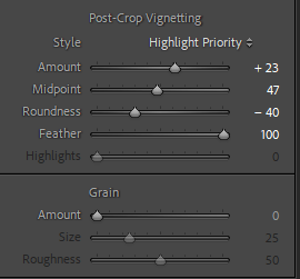
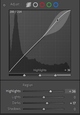
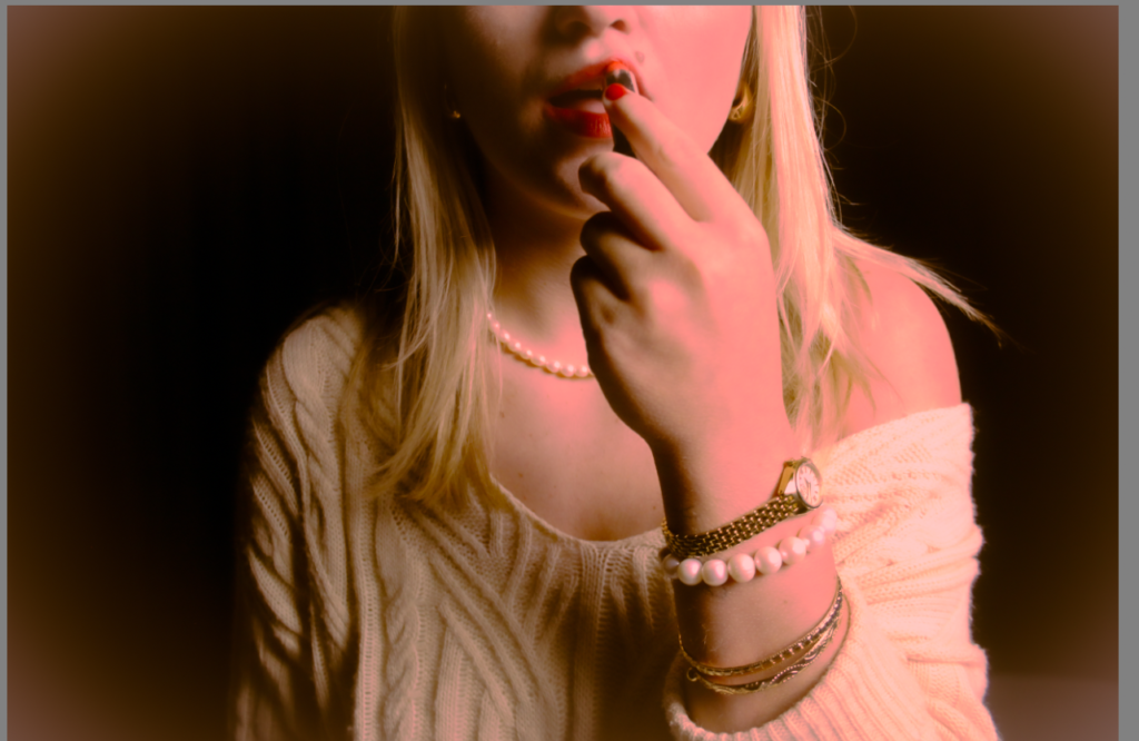
The main factor of this image is the red lipstick as it is a main subject which draws to the eye meanwhile having women’s rights movement connected and Marilyn’s large factor. As well as the red lipstick stereotypes as confident and bold. Therefore meaning, I cannot put this image in black and white as it defeats the whole purpose of the image. This isn’t my favourite image as it has a pink undertone and that is not my preferred aim.
The Jewellery of this image also creates a sense of femininity especially the pearl necklace as it relates to my inspiration Monroe as she was known and wore pearl necklaces frequently.
IMAGE 2
I personally chose this image as we are using the prop of red lipstick and a stereotype of red lipstick is confident and seductive and in this image the subject looks both of the stereotypes. Another reason why I chose this image is Marilyn was seen as a sex symbol and a seductive blonde and I think this image perfectly relates to the seductive and beauty look within femininity.
IMAGE 3
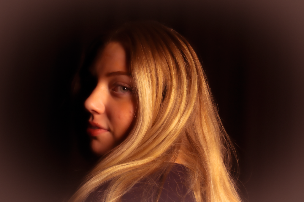
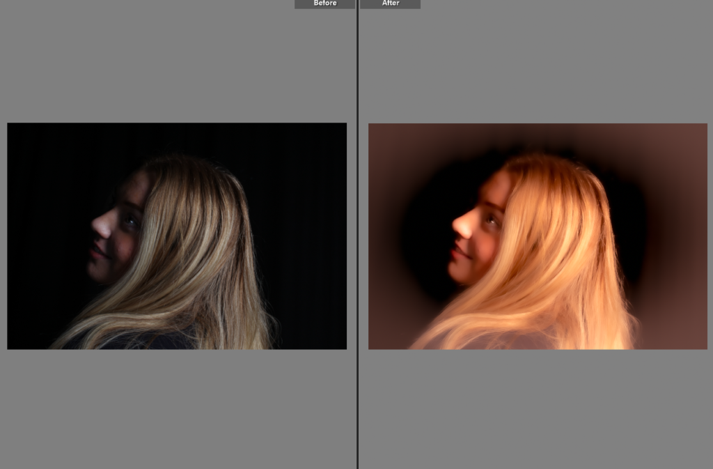
I chose this image as the subject of the image is pouting which is a very feminine act or pose. The subject also has very enhanced cheek bones which could be seen as feminine however can also be masculine. The subjects eyes are looking away which is a main factor and draw catching to the image. The eyes are very detailed and feminine as well as the long blonde hair.
IMAGE 4
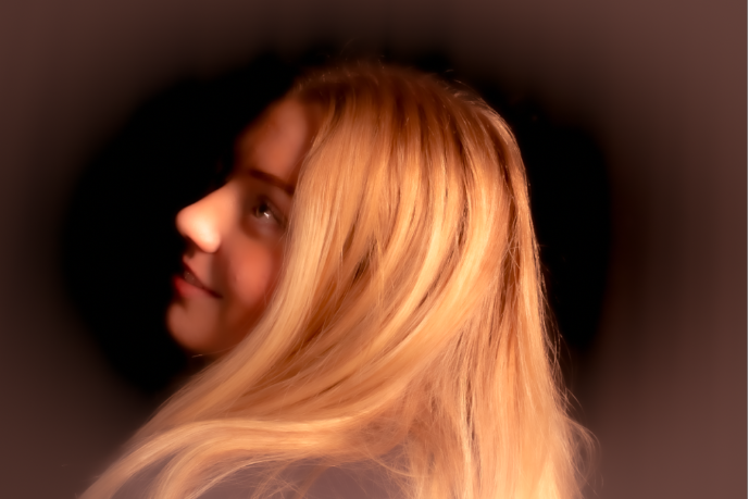
Further more, I chose this image as it is using Chiaroscuro lighting and as you cant see the rest of the face because of the lighting and shadows it could be seen as mysterious. The hair and the gleam in the subjects eye is seen as beauty which is a femininity stereotype. I edited it to look vintage and old using warm tones like Julia Margaret Cameron. I could relate this image as Cameron’s work instead of Monroe’s as this is a self portrait and does not contain the main factors to make it a Marilyn photo.
Image 5
I used this image as it also is using Chiaroscuro lighting and the jewellery and the red nails create a sense of bold, confident and feminine.
IMAGE 6
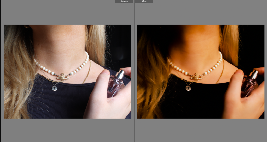
I chose this image as it is different to the others and gives variety. This image is seen to be feminine through the jewellery and perfume. Even the collar bones could be seen feminine.
IMAGE 7
I chose this image as the image is using Chiaroscuro lighting and the subject is looking away whilst smiling which ultimately looks elegant and gentle which is a female stereotype. I edited this image tom look vintage as Monroe was in the 50’s so I want them all to come out not looking modern. This relates to Julia Margaret Cameron’s images as she did pictorialism in the 19th century.
I then decided to experiment and add red highlights which I thought looked cool however it didn’t fit with my inspirations and themes so I decided not to keep it that way.
Firstly, we went to the studio with our props such as red lipstick and pearls as they are a large factor and characteristic of Marilyn. Monroe was known as a ” dumb blonde” and seen as the sex symbol in the 50s. People had eventually mistaken her and actually saw her as that role which eventually sadly got to Marilyn including personal problems. We decided she would be perfect inspiration as she is a female misunderstood before the women’s rights movement as unfortunately passed just before. If we highlighted her key features it could resemble her however in a more modern way. We then used a mirror as Claude Cahun and Cindy Sherman also used one to resemble in different ways femininity.
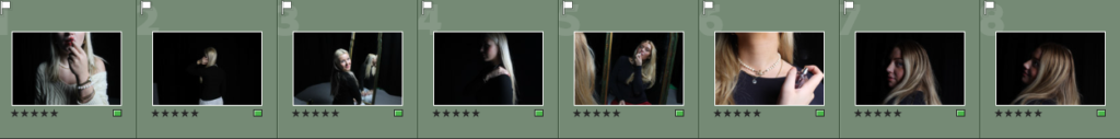
I firstly flagged and rejected all my images so I can easily organize the possibility of the images I may or may not use and edit. Roughly we created around 250 images.
PHOTOSHOOT
PLAN
My plan is to choose around 8 of my favourite images and edit them in light room first, then move on to photoshop and create some sort of creative collage with different aspects of femininity whilst still relating them to Monroe. My plan is to make my images look as vintage and nostalgic as much as possible as if they look old. This could resemble it a lot more as then it would resemble and highlight her characteristics a lot more.
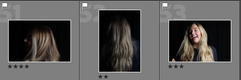
IMAGE SELECTION
Furthermore, I picked my favourite 8 images and flagged them green so I can easily find and compare my favourite images to ensure they are my preferred ones.