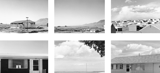
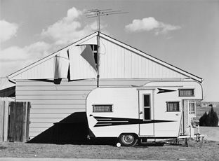
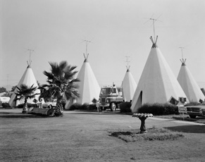
Why did I choose Ed Ruscha?
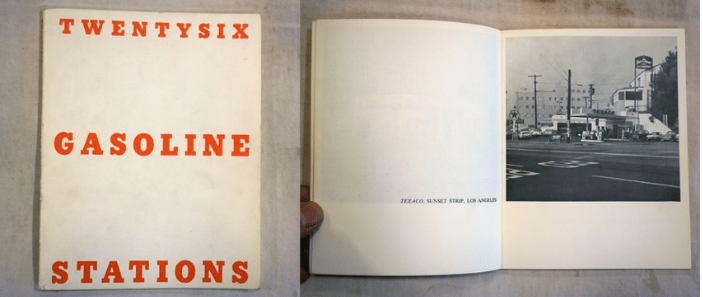
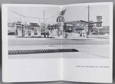
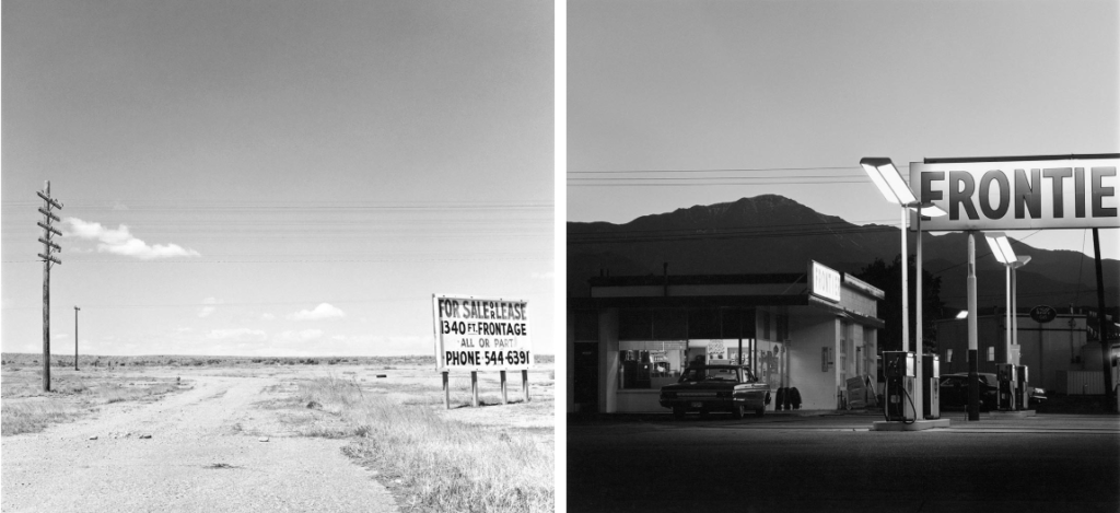
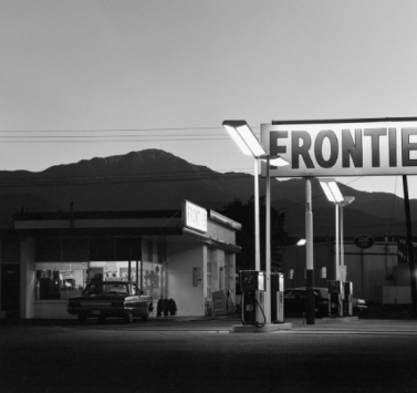
I personally chose Ed Ruscha in relation to the Anthropocene as I wanted to focus on the cause rather than the subject itself within how human activity impacts the earth. Ed Ruscha was a perfect artist for inspiration as he is known for taking images of twenty six gas stations. This significantly links to the Anthropocene as the petrol and gas humans use massively effect the air pollution. Therefore, my idea was to take images of petrol stations in the modern aesthetic and attempt to edit it to make them look vintage and nostalgic. This is effective as it isn’t normally an every day thought when it comes to people filling up their car. Although this was not Ruscha’s aim, it is my aim to focus on the impact of petrol and gas specifically within the sector of air pollution. For context a typical passenger vehicle emits about 4.6 metric tons of CO2 per year. This assumes the average gasoline vehicle on the road today has a fuel economy of about 22.2 miles per gallon and drives around 11,500 miles per year. Every gallon of gasoline burned creates about 8,887 grams of CO2. So, instead of taking photos of animals becoming extinct or suffering due to air pollution e.g. polar bears in Antarctica. As Anthropocene is a project to show through art and photography the effect on the earth because of humans or what it could be potentially if us as humans began to make better choices. I wanted to significantly instead show the effects and impacts itself but the cause. I think this will benefit my project as it is different and links well to an artist reference.
What is my intention and aim?
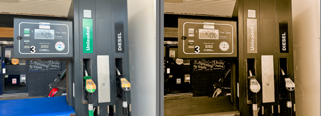
My intention and aim is to significantly edit my images to look old and in a rusty aesthetic so it looks like Ruscha’s work which may be significantly harder to do so as everything has evolved to be modernized whereas Ruscha actually took the images in the 1960’s. Aside from that, my next step would to put them into a typology to add another technique towards my work as Ruscha sometimes did that. I want to keep my images dull and simple so it does not draw away the main factor to the image which is simply to remind the viewers that every-day basis factors that us as humans do not give a second thought about actually massively impact the earth. This links to Ruscha as in his famous book ‘ Twenty-six gas stations’ he kept it simple with little words and only the image to keep it interesting and eye catching to make the viewers focus on one thing; his photographs. Ruscha kept them in black and white potentially because he chose too or because colour was only beginning to evolve. I will edit some images in black and white to relate to his work but I will also keep some in colour to compare and contrast the modernized and vintage aesthetics. To keep it from being too dull and boring, I personally think putting it into a typology technique will significantly add an interesting and eye catching feature. Overall, my aim is too to show the causes of the damages not the damages through photography.
My Photoshoots and edits
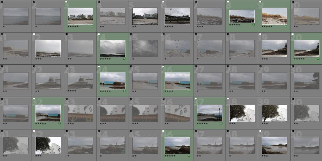
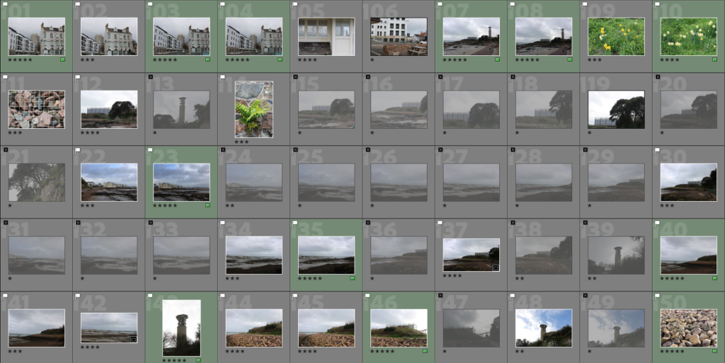
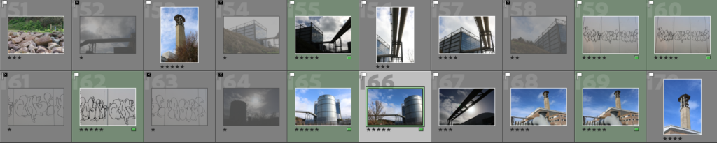
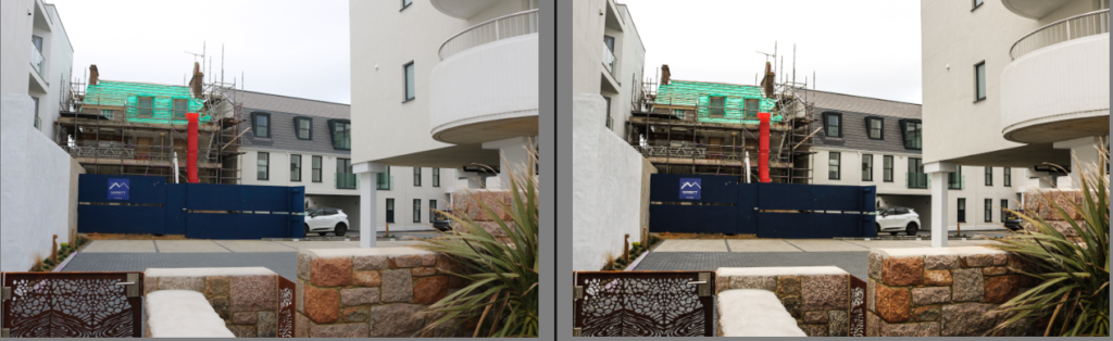
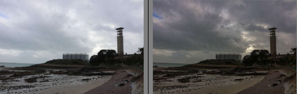
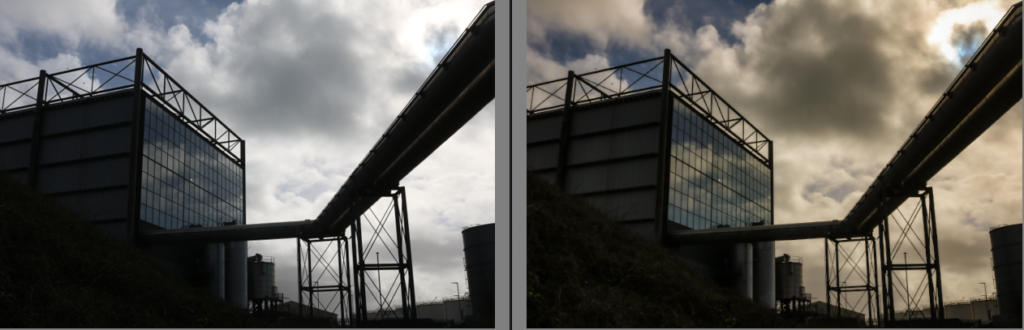
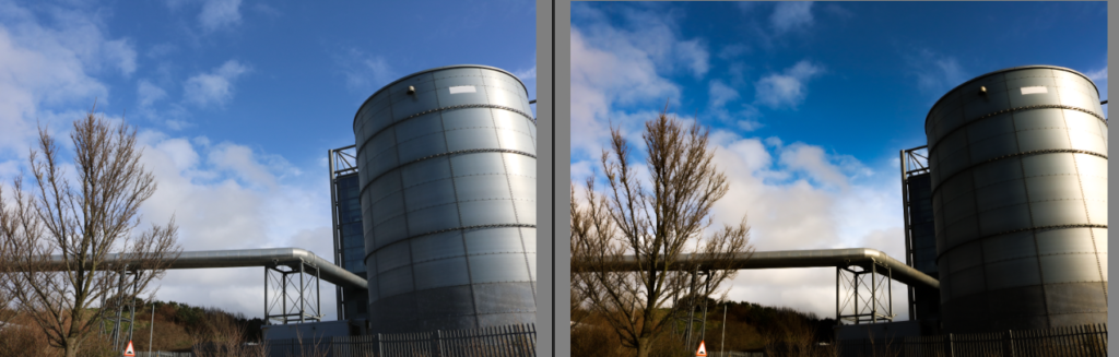
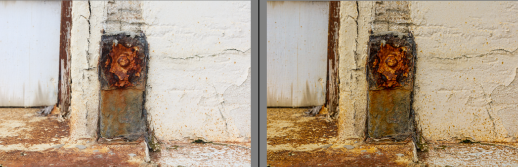
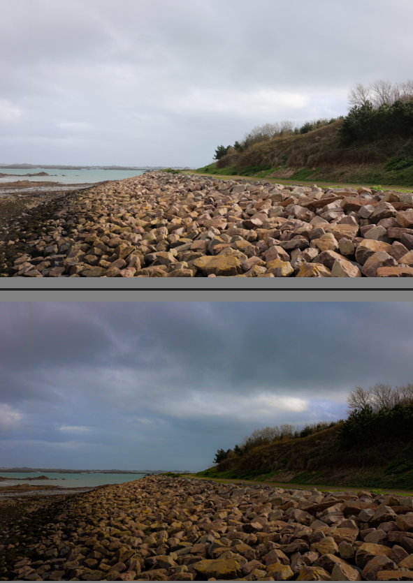
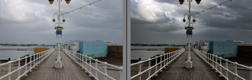
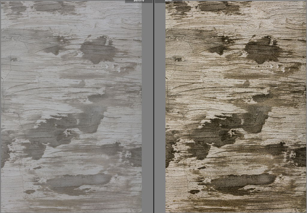
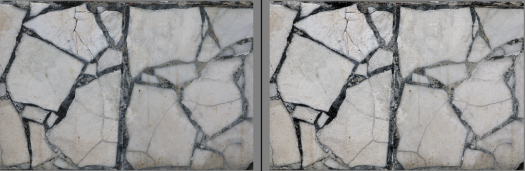
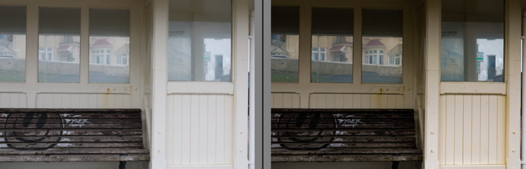
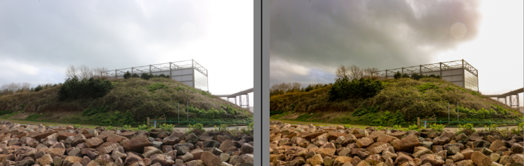
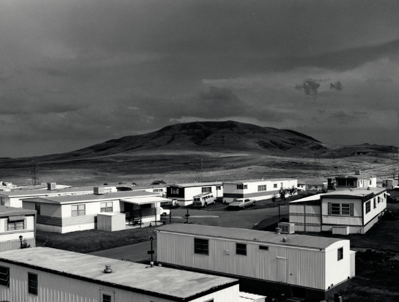
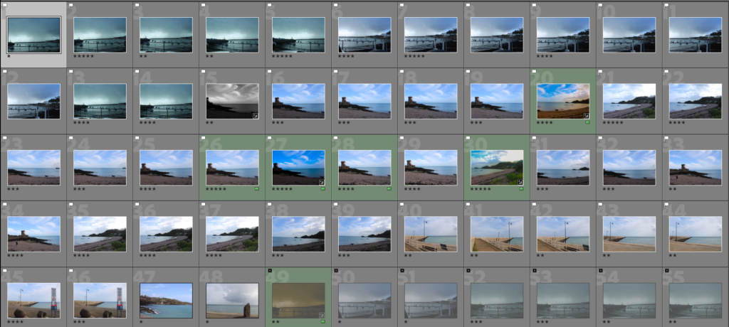
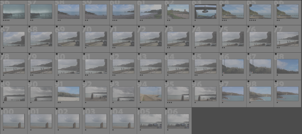
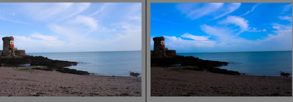
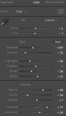
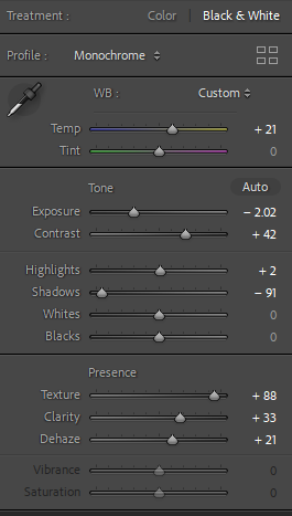
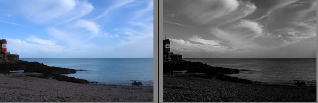
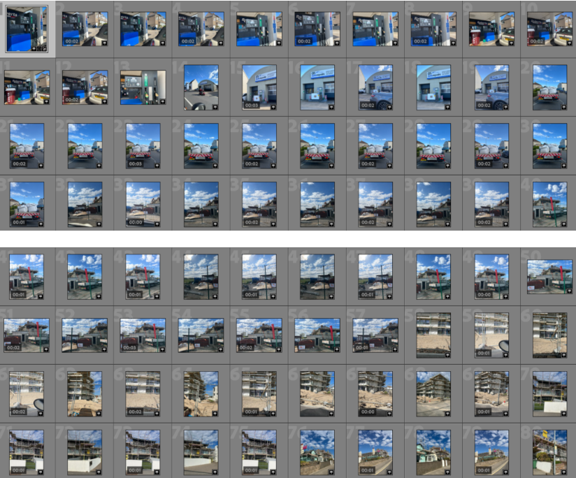
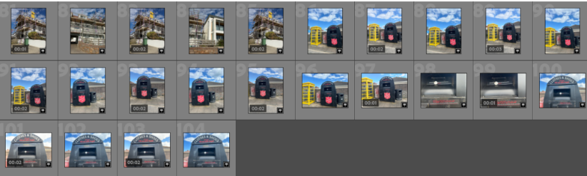
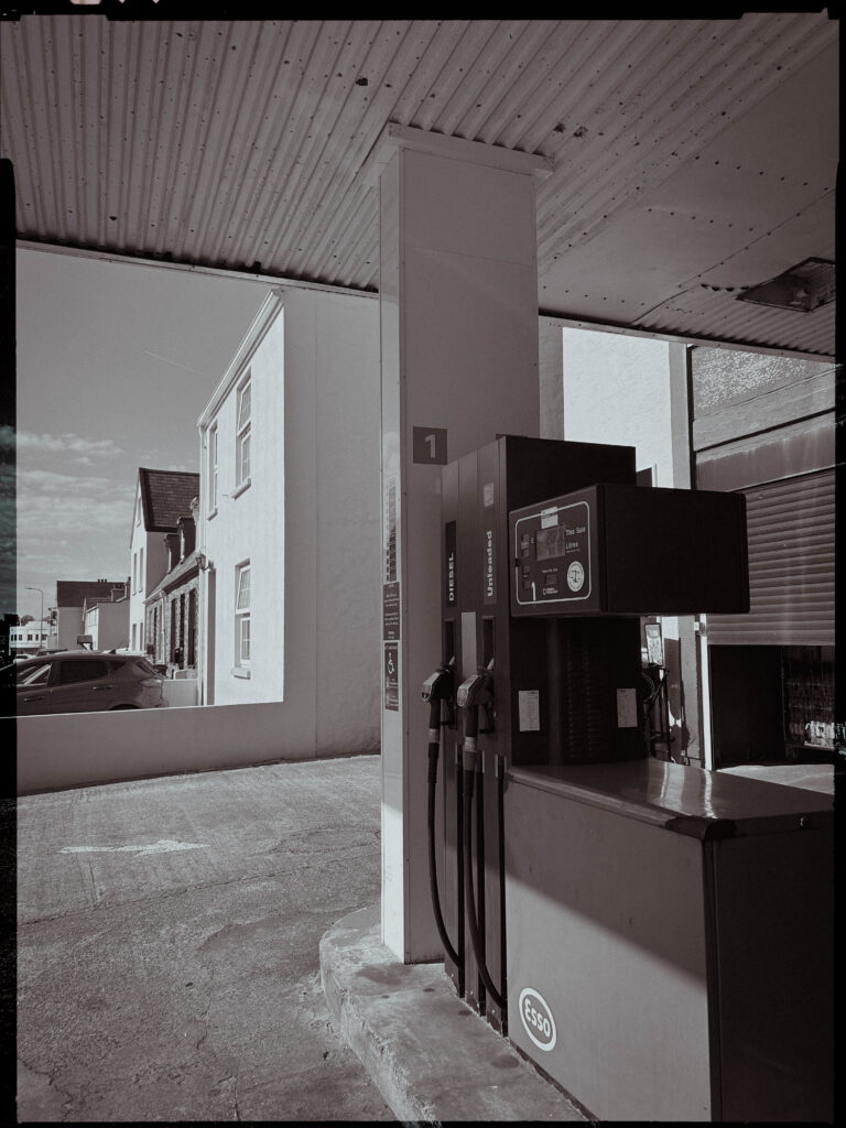
Contact sheet-
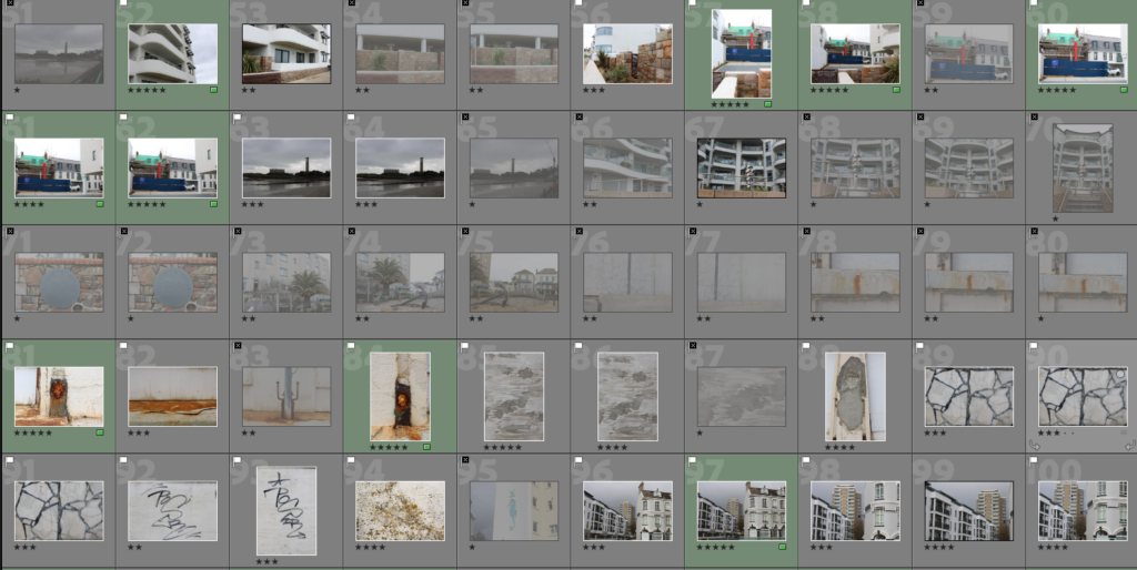
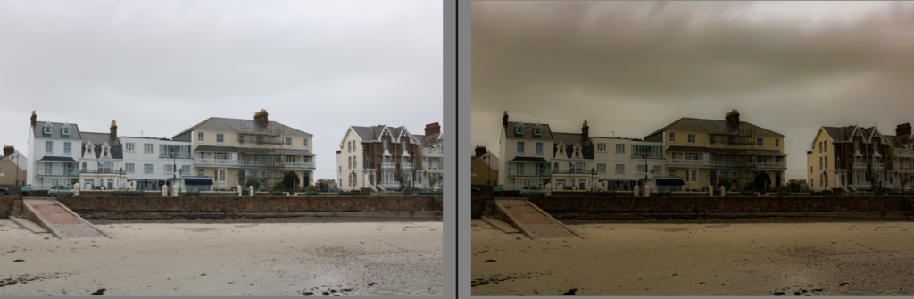
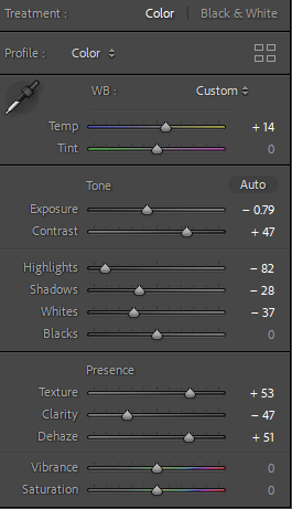
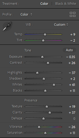
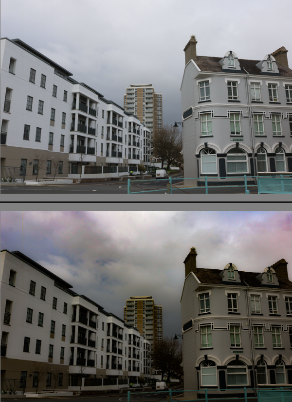
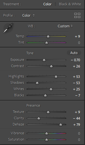
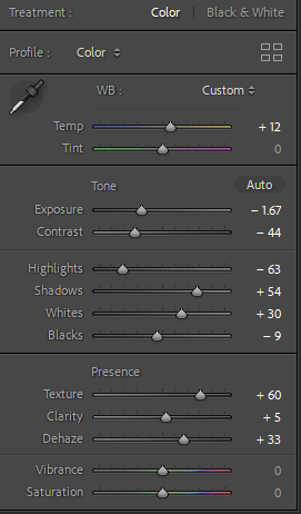
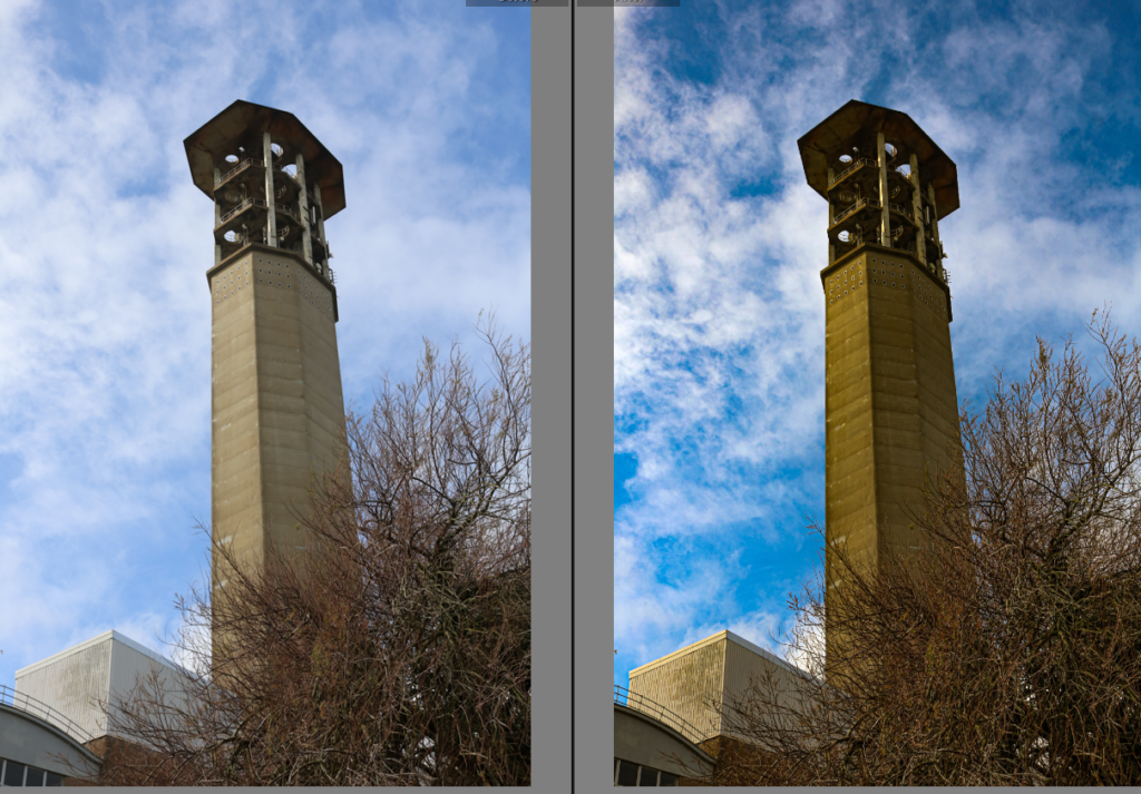
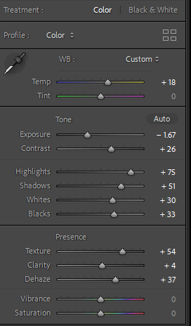
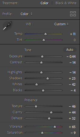
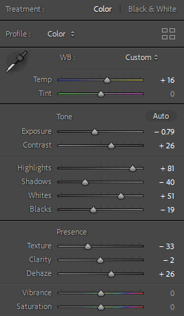
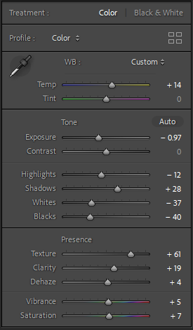
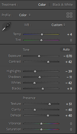
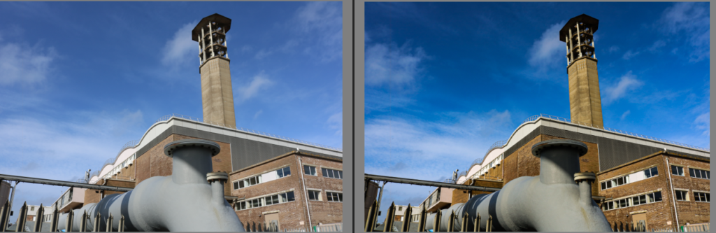
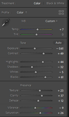
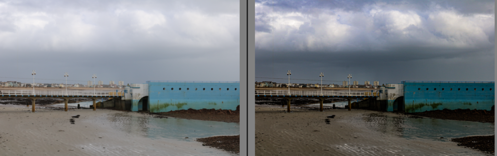
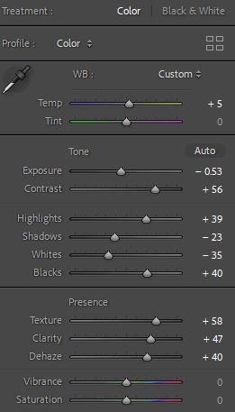
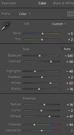
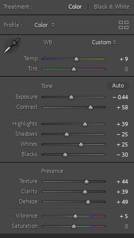
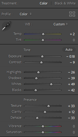
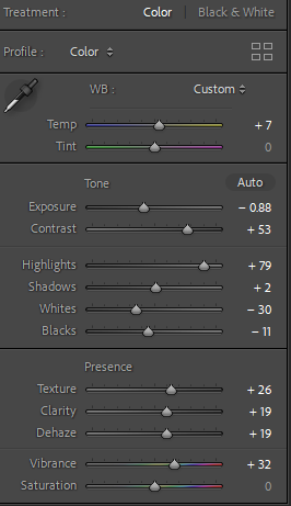
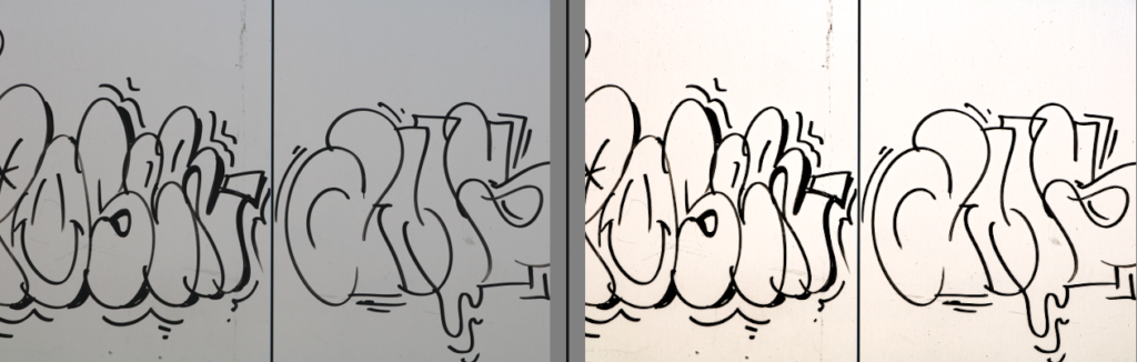
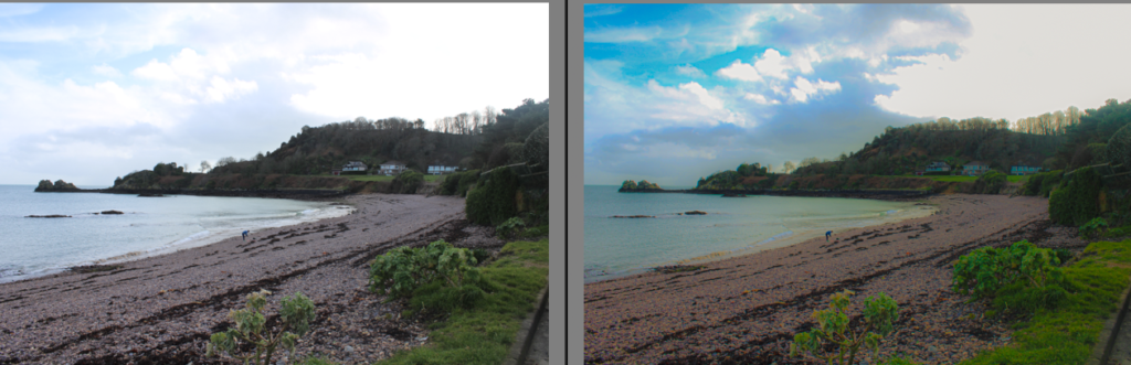
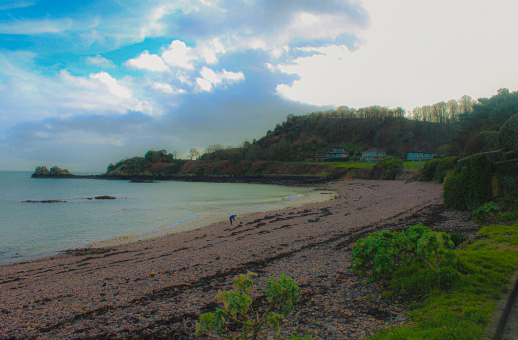
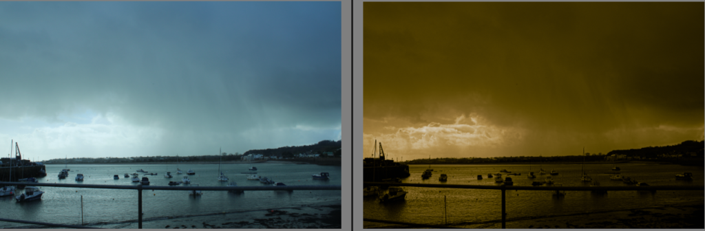
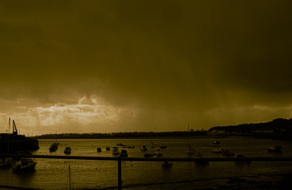
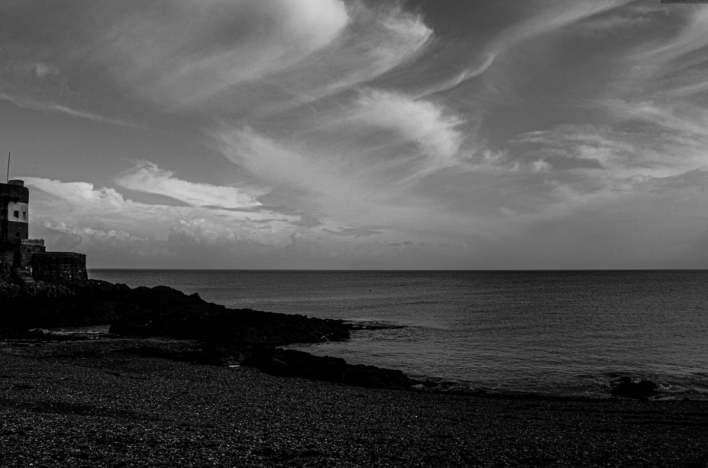
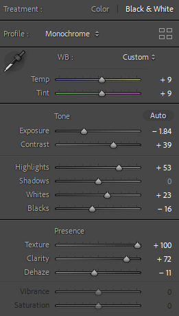
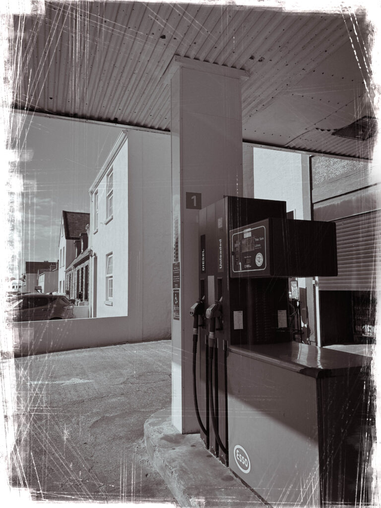
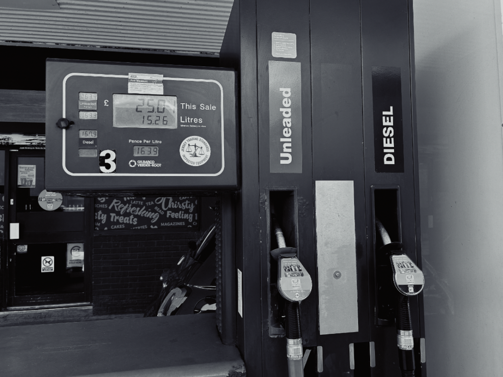
Edits in Lightroom & Photoshop-
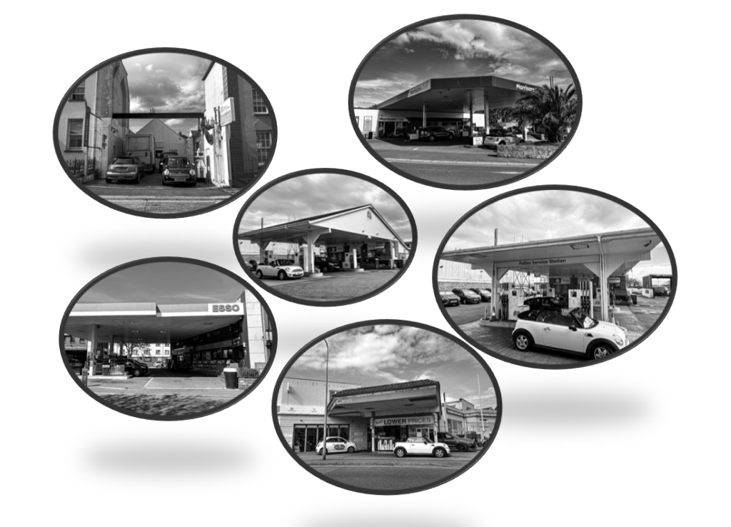
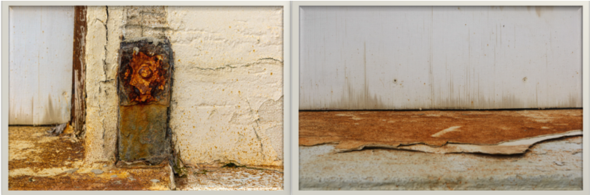
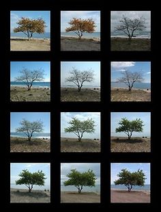
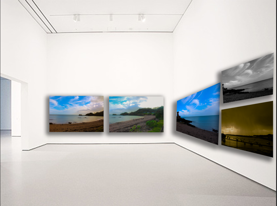
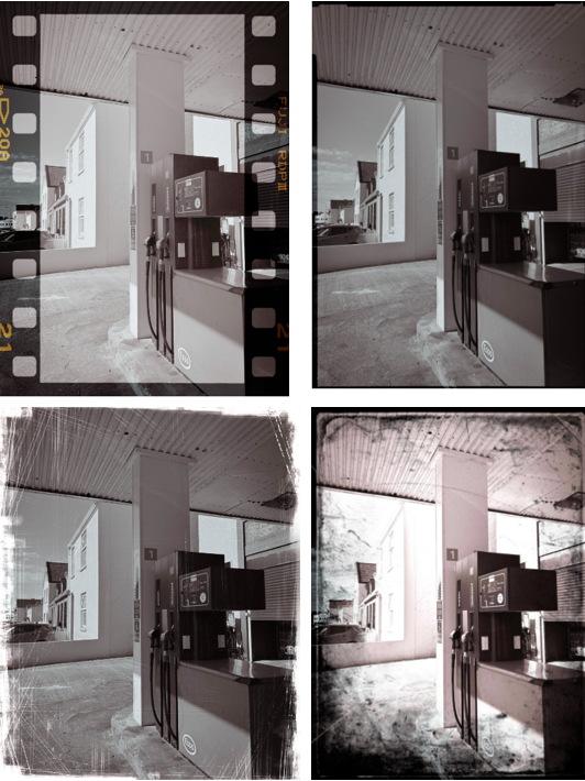
Typology–
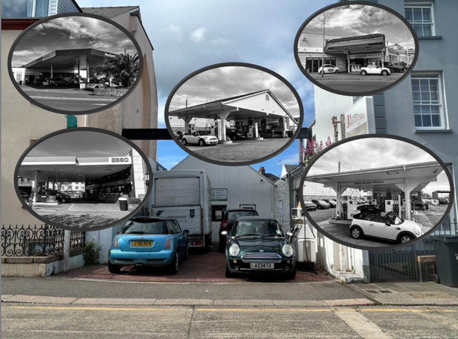
How this became my outcome-
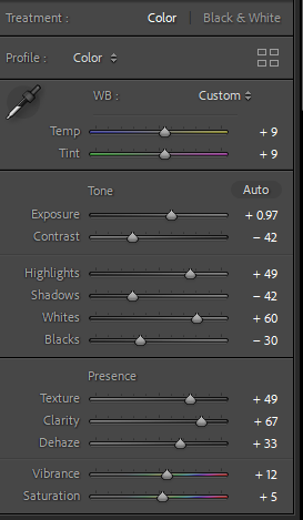
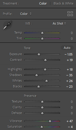
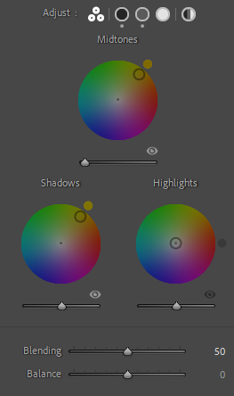
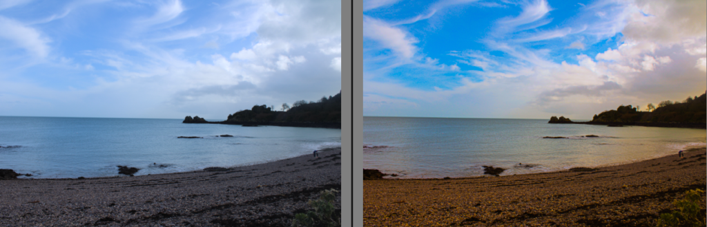
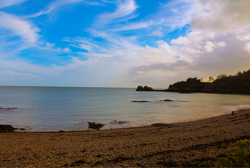
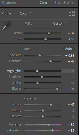
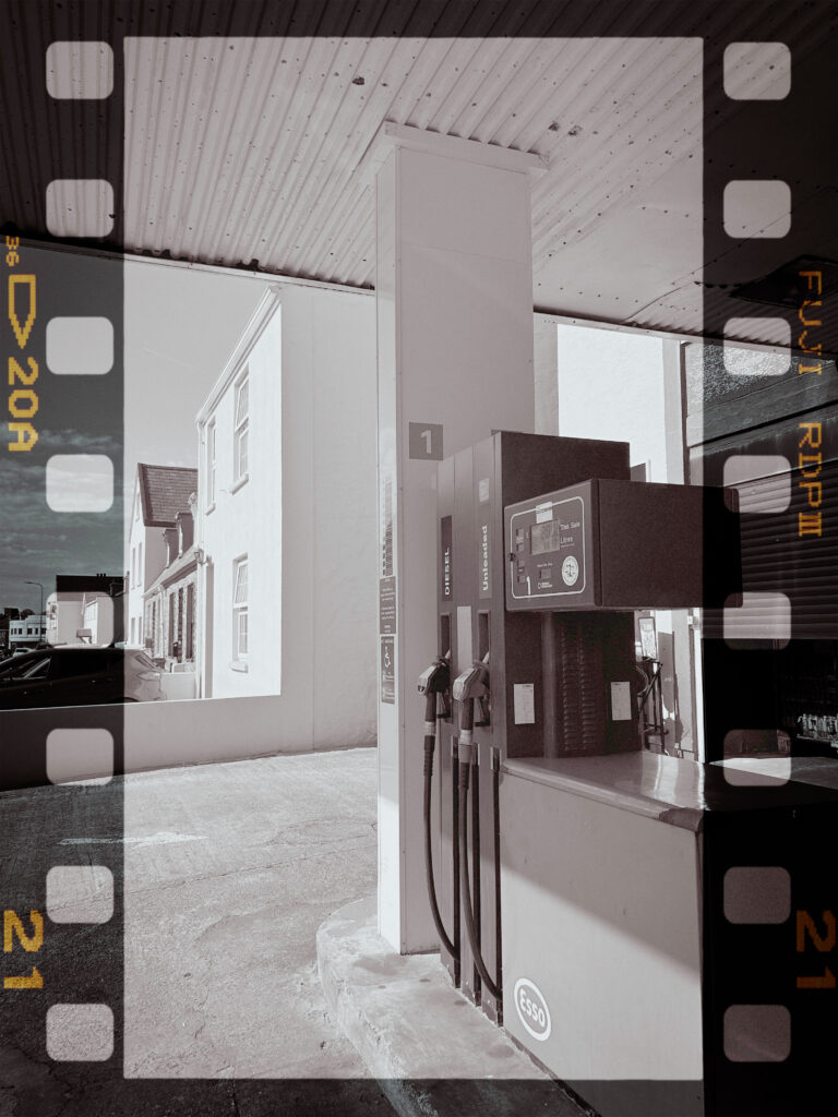
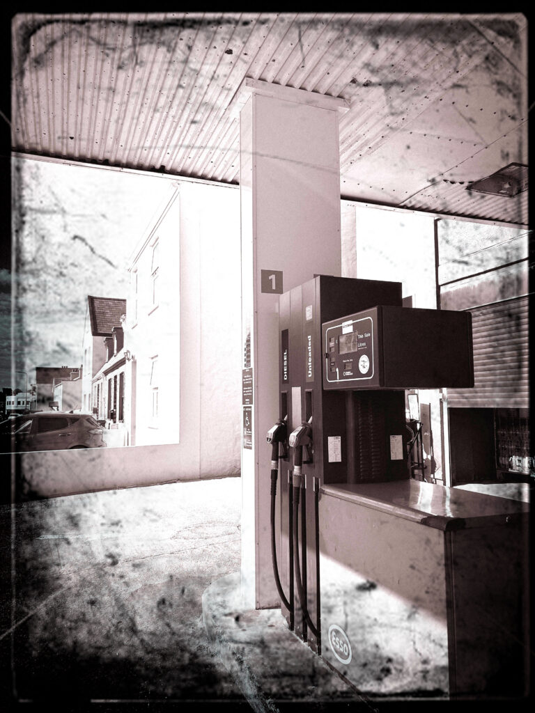
Firstly, I began in light room by making sure the exposure and contrast was correct to my aim and put a tint on it to make it look old and vintage to try replicate Ruscha’s camera in the 1960’s. I did this through ‘presets’ and chose ‘cinematic 2 VN07’ as it had a warm tone that I personally preferred the most. My next step was to find a frame and add a layer onto my original images on photoshop. I blended them by merging them together and chose one that wasn’t standing out too much. I then chose the rubber tool to make the original layer the main focus of the image not the frame itself. I repeated this with different layers to experiment and see my preferred one. I kept them in black and white as my aim is to pretend that I have taken these images on old images.
What I could of improved on
Personally, I think I could of improved on texture to make it look more realistic. To do this, I would have to photoshop and edit to make my images grainy with a old and bad camera aesthetic. This would make my images more believable as I think my images are very clearly modern day looking. However, this may be challenging as it is very hard to make my images look grainy and vintage because of how much cameras have evolved and became so complex. This makes difficulty to try replicate Ed Ruscha’s. I also think I could of improved on my images itself within my first step. I think it would of been more beneficial for my typologies to execute a similar thing as Ruscha to take photographs of multiple gas stations. Therefore, each image would be the same thing however a different type. This would ultimately make my typology a lot more eye catching and draw attention to the eye as it is a lot more to look at and the viewer can compare and contrast each petrol station. To improve, I will take images of multiple gas stations and edit them to make them look realistic and old and put them into a typology to try and replicate Ed Ruscha’s famous book.
What I liked about my photoshoot vs his work
What I liked about my work was how it is a typology but however each image is the same. But I personally like how each edit is diversified which significantly keeps attention to my images for a viewer. This also creates creativity and experimentation to be able to figure out which my preferred style is and helps me learn from my mistakes or recent work to benefit for my future work. I loved the frames I added in photoshop as it added an old aesthetic and interesting feature which was needed as the images I chose were the same so it was not too dull and simple. Conversely, I liked his work as it was realistic and not edited in a book but also not too dull and boring as he diversified the gas stations by taking images of multiple gas stations rather than editing which kept it very simple, however mine was simple but in another factor. However, to try to improve and benefit my work I will try replicate his work but with my photoshop and editing to make it more my work and diversify it. I also liked how he kept his work in black and white to keep an old aesthetic but also so colour will not draw any attention to his images.
Experiments