Ship building only became a serious business in the islands in the late 18th century with the requirement to build ships larger than fishing boats allowing Jersey merchants to take part in the Atlantic carrying trade. Between 1760 and 1815 Great Britain was at war for 36 years, which affected the maritime trade, causing dangers and opening possibilities of profit.
Late Modern: This period covers the rise of the British Empire into the Victorian era, through the First World War and then the Second World War. This saw the introduction of iron ships, steam, then oil powered ships.
A Guernsey merchant William Le Lacheur formed a company in the 1830s and operated ships, and set up a new trade with Costa Rica to bring their coffee to Europe.
Both St Peter Port and St Helier harbours were proving too small for the larger ships and increasing tonnages, with both drying out at low tide. Jersey added a few piers to its harbour. St Peter Port was extended by 1864 to allow ships to berth at any state of the tide. Secondary harbours at Saint Sampson, Guernsey and Saint Aubin, Jersey provided limited facilities.
Since the war, fishing has been reduced, with lobsters and crabs becoming the main catch in the islands with an annual value of around £10m in 1995.[6]: 135 Private boating has increased with the construction of marinas. Freighting changing from loose and pallets to containers with Ro-Ro for vehicles.
By the 1850s Jersey had 300-400 ships with a tonnage of over 40,000.
St Aubin was the main harbour for Jersey merchants before St Helier became the central maritime hub. St Helier harbours were proving too small for the larger ships and increasing tonnages, with both drying out at low tide. Jersey added a few piers to its harbour, such as Victoria and Albert Piers.
World Wars I and II. The First World War saw island shipping used for the war effort. The peace then saw a demand from visitors for transport with in boom in tourism. The islands were occupied by the Germans during the Second World War, and most island-based ships went to England in June 1940. Initially a number of fishing and private boats, then later smaller craft, made the perilous journey with over 200 escaping islanders. Not all survived: some were captured or shot, others drowned.
Since the war, fishing has been reduced, with lobsters and crabs becoming the main catch in the islands with an annual value of around £10m in 1995. Private boating has increased with the construction of marinas. Freighting changing from loose and pallets to containers with Ro-Ro for vehicles. Hydrofoils and then catamarans and wave piercers appeared as fast passenger ships.
Today, Ports of Jersey operates all entry and exit points to the island, including harbours and airport. They have plans to re-develop St Helier Harbour into a modern commercial maritime hub.
What was the involvement of Jersey mariners in the Canadian cod-fisheries and the Transatlantic carrying trade?
The merchant network operated with ownership and management in Jersey, producing of codfish in Canada and markets in the Caribbean, South America, Mediterranean and the Baltic.
1497 Newfoundland discovered
1792 Former Wool merchant, Philip Nicolle, enters the Newfoundland trade in cod. In 1821 he owned fishing posts and 5 ships; in 1828 he owned 18 ships and added banking to his interests. The effect on trade of the American Civil War was said to have caused this firm to withdraw in 1863 from banking and from most of their fisheries.
1766-1842 Jersey profited by the British conquests in Canada. It almost transformed the Gaspé coast between these years into a Jersey colony.
1950s Clement and Company becomes the last Jersey company trading in Newfoundland cod.
Channel Island fishermen were among this and by the 1750s they had set up lucrative trade routes between Canada, Europe and America, establishing bases on the Gaspé Coast where they could salt and prepare the cod.
For some early settlers, life in Canada was a move to prosperity and business success – an escape from problems back home to a new land of opportunity.
But for others, life in Gaspé in the 17th and 18th century was one of debt and eventually bankruptcy in a harsh climate thousands of miles from home.
The Jersey communities fitted in well in Gaspé, and despite the fact they were a minority, speaking Jersey-French in their communities and businesses, they were the economic giants of the area.
One of the biggest companies on the Gaspé coast was operated by Charles Robin, a Jersey merchant, who set up a fishing post at Paspebiac in 1767 after Canada passed to the English.
Although Robin was forced back to Jersey at the onset of the American Revolution, he returned in 1783 and took advantage of the lack of competition to set up a fishing monopoly.
In 1802, Robin retired to Jersey, where he died in 1824, but he had trained his nephews Philip and James to take over the company.
Which ports did Jersey ships sail to and trade with?
Jersey has been an island for approximately 8,000 years: therefore, apart from the last 60 years, the only way for people to come to or leave the island has been by sea. Over the centuries the way in which boats have been powered has changed – muscle power, wind power, steam power and now diesel power.
During the Roman period there was an established trade route between Alet (St Servan) and Hengistbury Head in Dorset. Guernsey was the favoured stop off point, because of the natural deep water harbour at St Peter Port, although these boats undoubtedly called in to Jersey as well.
What type of goods did Jersey merchants exchange for cod-fish?
Jersey cod-merchants exported cod-fish to British colonies in the West Indies and later Brazil too in exchange for plantation goods, such as sugar, molasses, rum, cotton, coffee and tobacco which it brought to markets in America, Europe and the UK (Inc. Jersey).
To what extend, has the island of Jersey benefitted from its constitutional relationship with Britain and the legacies of colonialism based on a slave plantation economy during the first Industrial Revolution (1760-1840)?
By the 1770s there may have been up to 70 Jersey ships and 2,000 Jerseymen engaged in the cod trade. By the 1840s it is estimated that the industry directly employed 4,000 people. Also, many others were engaged in manufacturing goods to be exported to the Canadian settlements.
However, Jersey was not without internal troubles notwithstanding increased prosperity. Both war and poor harvests led to increases in corn prices of such magnitudes that the poor were unable to feed themselves. Matters reached a head in 1769 when wealthy mill owners tried selling the little corn there was at very high prices to France, causing some local people to riot. The rioters went on to demand changes to the Island government which resulted in the Code of 1771, giving more power to the States Assembly.
What was the link with Jersey cod and the slave trade?
Jersey as an island made a fortune from the Newfoundland Cod Fisheries throughout the slave trade with cod being salted and dried then shipped to the Caribbean and used to feed enslaved people.
Was the Jersey Channel Islands involved in the slave trade?
“While Jersey was not a major centre of slave trading, such as Bristol or Liverpool, the Island was part of a global network of trade in slave-produced goods, such as sugar, coffee, cotton, tobacco and, most significantly, mahogany.
Cod and North America
The Channel Island fishing industry took to the opportunities offered with the opening up of the Grand Banks fisheries. Cod was valuable and from 1763 when Quebec was ceded to the British, colonies were founded by both Jersey and Guernsey in Newfoundland. The people in each colony undertook the fishing and drying, waiting for the company ship to arrive with trade goods they could exchange for the fish. Barrels of dried cod, 1,000-2,000 quintals a year, each weighing roughly 50 kg, being exported by ship to the Caribbean or western Europe. Sometimes there was a three-way trade with ships returning to the Channel Islands where the ship chandlers and merchants benefited.
The American war of independence saw the Guernsey fishing colony fade away as more profitable opportunities opened up, privateering. Jersey continued with the cod trade, in 1840 the Chamber of Commerce estimated the Island had 4,000 people and 8,000 tons of shipping employed in the industry.
The industry continued often using a triangle of fish to Spain, goods from Spain to the Islands and more goods to Newfoundland or cod to Brazil, coffee to Amsterdam and goods back to Canada. The cod monopoly ceased and died as a trade by 1886.
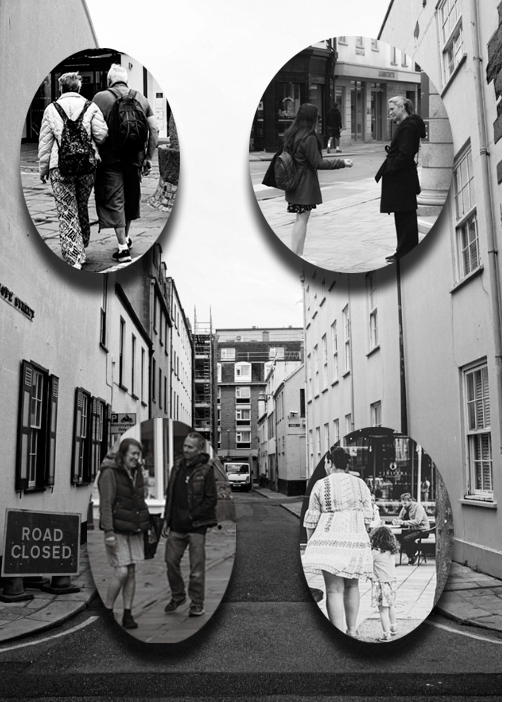
Overall, this is my most preferred image as with my 2nd and 3rd experiments I felt as if there was too much going on with the background and distracted the eye. I think it is clear and efficient but also has some detail and interesting factors such as the drop shadows and boarders. What I personally think is a possibility of improving is by potentially adding adding boarders to each image to make it look tidier. All the images I chose personally work well together as they all show an element of a certain relationship within my street photography which ultimately links to the ‘ decisive moment’. I think these specific images show what you would not take notice of on a daily basis but is a very positive element to life.
Experiment 2 process
Choosing layout process-
Adding a background to add texture-
Evaluation and critique-
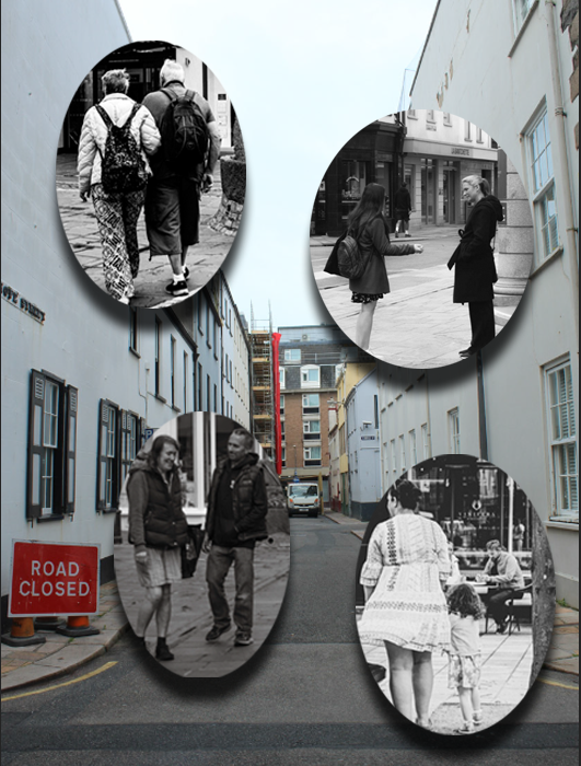
Personally, I do not like this as much as my 1st one due to the fact I think there is too much going on within the background and the writing over the image distracts the importance of each image. However, I think it adds detail and a variety too each image. As shown, there is one image with a border which I personally like, however I would like them in all of my images but without the background so there isn’t too much going on and to keep it simple. I personally, don’t like the white writing over an image because it looks messy and not tidy. Although I will not be using this one, the experiments shown me what I prefer and what to do for my final outcome.
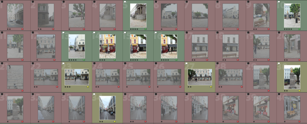
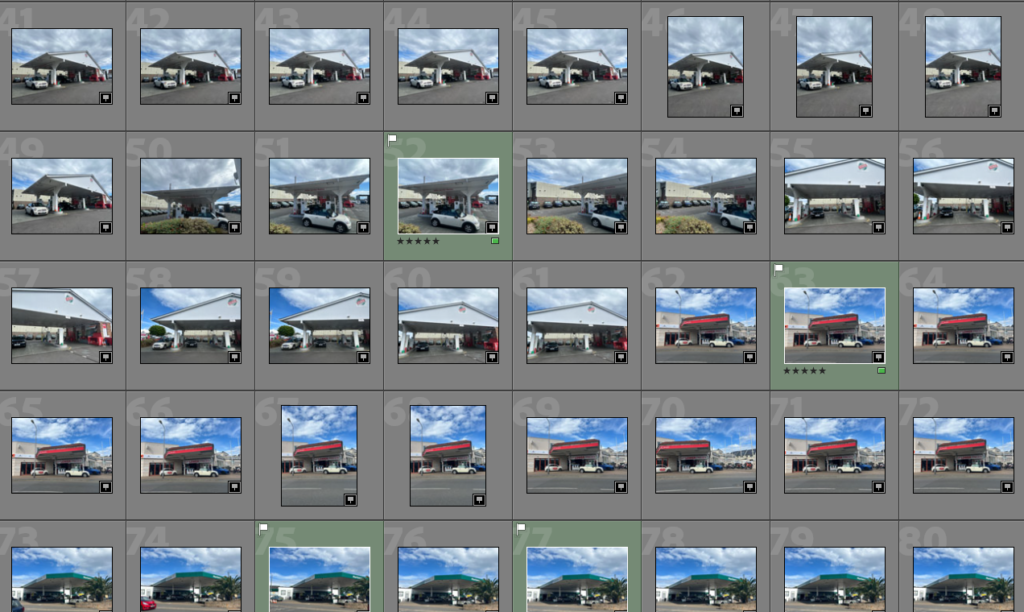
Immediately, I began by going through my images and rating them followed by rejecting and flagging each image. After I executed that, I then continued it by putting them in order of colour within the range of how much I prefer and like them. This makes it a lot more time efficient and manageable when it comes to editing as I now know what I am going to edit and what I am not.
My flagged and green imagesunedited
Editing these imagesin lightroom
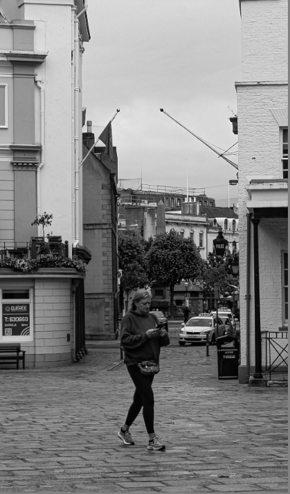
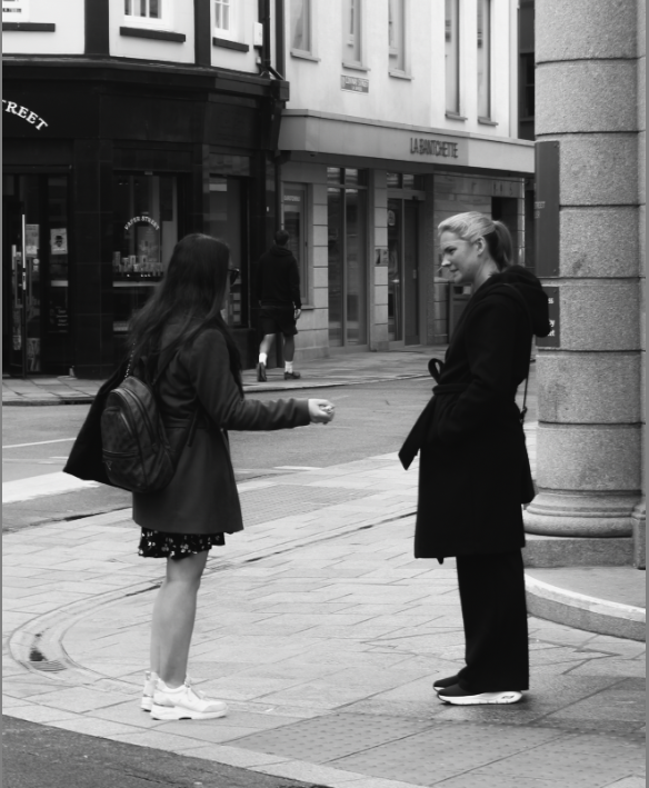
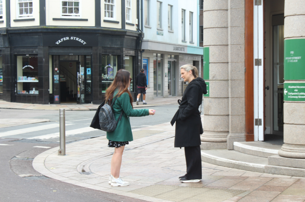
I decided to keep this image in colour, rather than black and white because I think the two buildings in contrast of colour is an important factor within this image, essentially bright vs dark. The subject is the women and considering she is right in the centre rather than one or the other creates a creative factor. This photo had to be in colour as it could make every viewer individually have a different approach and perspective on it if it was looked into on a deeper level. Another factor is the red ball on the darker side which leaves a sense of curiosity on why it is there or whether the women was related to it and if she is walking towards it. Therefore, colour was needed to emphasize my thoughts on this image itself.
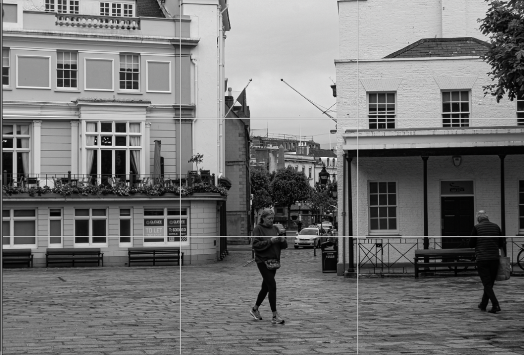
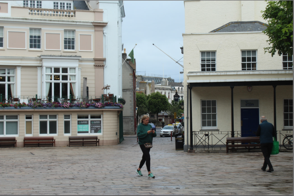
Within this image, I used the rule of thirds to make sure the subject aka the woman was in the very centre of the image and the buildings were equally on each side. I personally thought this image was eye catching due to the fact it gives off the effect of tunnel vision in-between the two buildings where the woman is standing. This draws you’re attention to the centre of the image as it shows far away. This demonstrates a factor of mystery. I decided to experiment by putting my photo in black and white to create a variety within my photographs and as it is in the historical Royal Square famous from WW2, therefore I decided to continue the vintage and old aesthetic due to context.
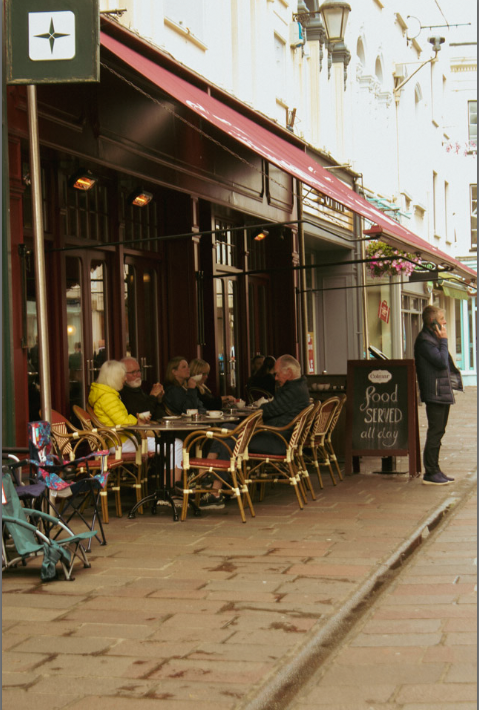
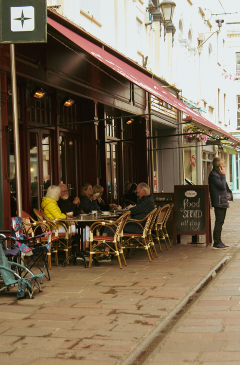
I experimenting this image in black and white and colour, but personally I preferred the in colour image. This is due to the fact there is a lot of contrasting factors. I think the vibrant royal blue chairs definitely add a lot to the image as it is contrasting with the tapestry and the black building. The interesting factor is that this image contains cool and warm tones that significantly contrast. Another big factor is that it contains every day scenes and scenarios. Such as the singular woman on her phone vs plural women talking with drinks. This is useful as I had to wait for the ‘ Decisive moment’ without asking them therefore the ‘ posing’ is not staged and is completely real. This is useful in this image as the people are not adjusting there behaviours as they are unaware of this image being taken. This is significant as people are definitely what make an image in street photography.
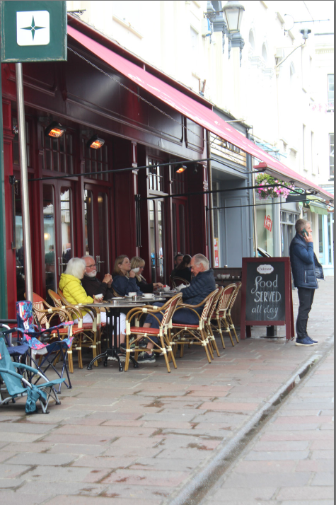
This image is definitely my personal favourite outcome within this photoshoot, I like it the most because it involves many people doing a variety of things. The man on the phone is definitely my favourite touch to this image which I had to wait for the right moment to include this. I edited this image to create more warm tones rather than cool to highlight the vintage aesthetic and just to make the image more appealing. The top bit of the images exposure is slightly too high, however this could be an advantage as it keeps the viewers eyes focused on the main subject; the restaurant and the people surrounding to make the image.
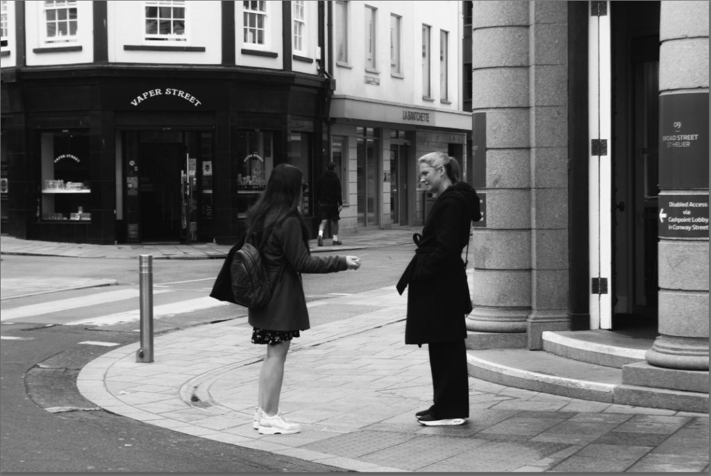
I again, experimented with black and white however I realised I actually preferred it in black and white. This photo is definitely the ‘ decisive moment’ due to the fact it is 5 people I assume accidently meeting. Because there is a variety of different people, you can see the different identity’s and personalities through their mannerisms and clothing. This image definitely would not be as significant without these factors. Another factor I thought added to this image is the geometry and lines surrounding the main subject; the people. Lastly, the reflection within the lining of the building behind them creates this image to be less dull and more eye catching. The reflection is so clear that you can see what the camera cannot. This highlights a sense of mystery with a slight peep. Where I am standing it is beneficial as you cannot see the back of the people instead you can see what the viewer would not guess to see or can see already. The Jersey flags with square shapes add significance to the image through conveying the heritage of Jersey. Also making sure the sky is not overly exposed because of the observance of the flags and shapes make the image less dull.
I like this image because it is very simple, I put it in a slower shutter speed to create variety and show the moment more. There isn’t much going on this image however that is personally what I like about it. There is nothing that draws the attention away of the main subject; the people. I believe people are definitely what makes ‘ street photography’. I think their behaviour and mannerisms look completely natural and realistic as I did not have to ask them to adjust their posing. This makes it completely natural and they show a sense of love and fun. This image I personally think has a very warm feeling to it which is the best feature as there is nothing in the surroundings to draw that away.
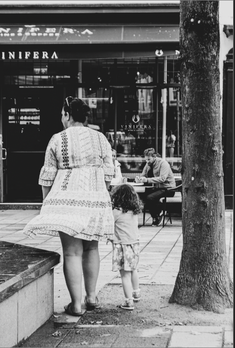
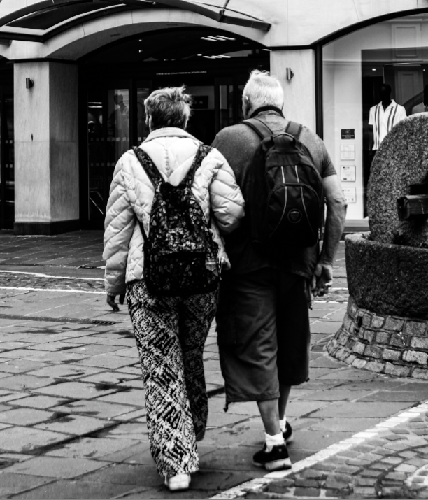
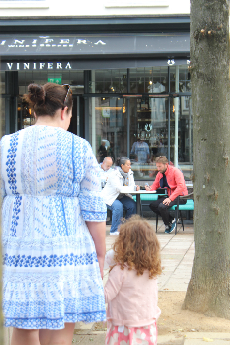
I love this image as there is a sense of love but also mystery, the mannerisms the viewers can see from the back tells us a lot about the image; the arm placements. The mysterious factor comes from the fact it is taken from behind the main subject, rather than in front. I increased the shadows to decrease the visibility inside the shops to make sure there was nothing too eye catching that drew the attention away from them. I originally put it in black and white and worked from there, however I thought it looked slightly dull so I experimented with a filter to see the difference and preferred it. The geometry and lines in the top of the image through the windows, creates different shapes and variety, specifically rectangles with visibility in the reflection. This slightly links to Bresson’s work as he often brings in surroundings especially reflections.
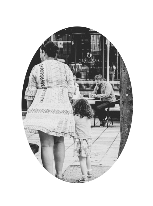
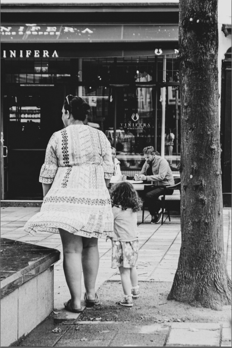
This image is by far my favourite out of the whole photoshoot, this is because it is showing 2 people sat down assumedly representing love, and separately it shows motherhood. This shows a variety of different types of love. I put it in a fast shutter speed which you can tell through her skirt as it is focused and very clear. The tree shows a sense of natural environment rather than man made features like my other photos. The filter I put on after I had already edited my image in black and white completely added to this image and made it 10 x more eye catching. I think it has a variety of elements which differentiates this image to others.
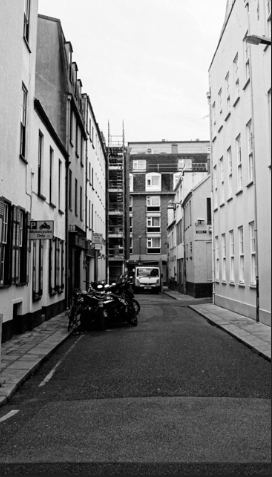
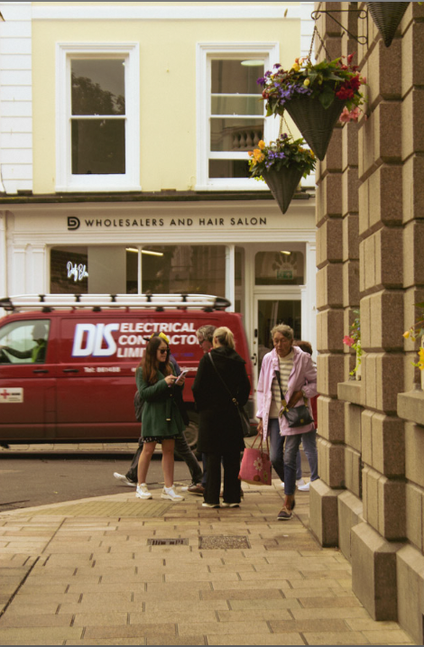
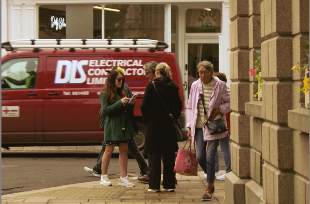
Instantly, it is clear my camera settings were in a slightly low shutter speed through the van, as it is moving we can see that through the fact it isn’t completely still and is slightly blurry. I decided to add warmer tones to differentiate it to the rest of my images, and slightly make a vintage aesthetic. The main feature that makes this image is the van and the people walking as it is definitely representing the ‘ decisive moment’.
Virtual Gallery-
I chose all these images specifically, due to the fact they all have one factor and meaning but in a variety of ways. Each photo shows a different relationship; yet every photo has an element of love. For example, a mother and child, wife and husband, acquaintances, and friendship. These are my favourite as you do not take notice of these things on an everyday basis. To take photos of these you really do have to find the ‘ right/decisive moment.’ I have chosen these images as my virtual gallery because of this element to it, and I believe people are a massive part in street photography which really brings it together.
“The simultaneous recognition, in a fraction of a second, of the significance of an event as well as the precise organization of forms which gives that event its proper expression.”
Henri Cartier-Bresson (1908-2004), a French photographer who is considered to be one of the fathers of photojournalism and masters of candid photography. He sought to capture the ‘everyday’ in his photographs and took great interest in recording human activity.
Henri Cartier-Bresson was a French artist and humanist photographer considered a master of candid photography, and an early user of 35mm film. He pioneered the genre of street photography, and viewed photography as capturing a decisive moment.
Henri Cartier-Bresson pioneered photojournalism as an art form by traveling the world and capturing honest scenes of day-to-day life. Born in France in 1908, his passion for photography took him around the globe and saw him covering many of the 20th century’s major world events in stunning black and white.
He wrote,
“For me the camera is a sketch book, an instrument of intuition and spontaneity, the master of the instant which, in visual terms, questions and decides simultaneously. In order to ‘give a meaning’ to the world, one has to feel involved in what one frames through the viewfinder. This attitude requires concentration, discipline of mind, sensitivity, and a sense of geometry. It is by economy of means that one arrives at simplicity of expression.”
Bresson stated in his documentary,
” photography is my version of physical pleasure, it is like hunting without the killing.”
“ Contemplating of how things just are”
This quote is very broad however expresses a very large opinion that can answer many factors. He is stating how impressive his work can be by photographing reality and every day scenes and scenarios. Conversely, this can be seen by a different angle due to the fact people naturally adjust their behaviours as it is human instinct to if they are aware of the photographer. Therefore, this genre of images are not completely realistic and accurate but can be differed to this opinion.
MOODBOARD OF HIS WORK
The Decisive Moment, Henri Cartier-Bresson’s influential publication, is widely considered to be one of the most important photobooks of the twentieth century. Pioneering for its emphasis on the photograph itself as a unique narrative form, The Decisive Moment was described by Robert Capa as “a Bible for photographers.” Originally titled Images à la Sauvette (“images on the run”) in the French, the book was published in English with a new title, The Decisive Moment, which unintentionally imposed the motto which would define Cartier-Bresson’s work. The exhibition details how the decisions made by the collaborators in this major project—including Cartier-Bresson, French art publisher Tériade, American publisher Simon & Schuster, and Henri Matisse, who designed the book’s cover—have shaped our understanding of Cartier-Bresson’s photographs.
Street Photography:the impulse to take candid pictures in the stream of everyday life. Street photography is a form of documentary but it is decidedly not reportage and rarely simply tells a story. Sometimes a street photographer captures something truly unusual – an extraordinary face, an accident, or a crime in the making. But more often a good street photograph is remarkable because it makes something very ordinary seem extraordinary.
These factors significantly influence street photography
SUBJECT MATTER/ CAPTURING A MOMENT> people and humanity, theatre of everyday life, poetics of streets, comic absurdities and humour, small acts of kindness, scenes of unexpected beauty, ordinary moments, visual pun and humour, gestures and poses, faces and crowds.
LOCATIONS & PLACES > inside the walls and on the ramparts, back alleys and sidewalks, beaches and coastal promenades, parks and public spaces, cafes and shops, street corners and intersections, signs and advertising, facades and architecture.
POINTS OF VIEW > low/ high/ canted angles, deadpan approach, light and shadows, intensity of colour, reflections in shop windows, shoot through glass, frame within a frame, focusing and un-focusing, up-close and details, shallow depth of field, artful and funny juxtapositions, geometry and space, lines and form, textures and patterns, signs and shop windows, advertising and graphics, reflections and mirrors.
APPROACH > capturing decisive moments, candid portraits, informal snapshots, inobtrusive observations (Cartier-Bresson style), interactive and confrontational (William Klein approach), spontaneous and subconscious reactions, poetic possibilities, inquisitive mind and roaming eye, looking and prying, shoot from the hip, serendipity and good luck.
CAMERA HANDLING >Lenses (focal length): use wide (18-35mm) to standard lenses (50mm). Focusing: automatic or manual – whatever you prefer. Exposure mode: S or T mode – (shutter-speed priority). Shutter-speeds: experiment with fast (1/125-1/500) and slow shutter-speeds (1/15-1/60). ISO: 100 (sunny weather), 200-400 (overcast ), 800-3200 ISO (inside or evening/ night). White Balance: auto
Camera settings
Henri Cartier – Bresson was known for using a Leica rangefinder with a 50mm lens. These cameras were compact, reliable and their design was quite small and discreet, making it very inconspicuous. This allowed him to use a quick and unobtrusive shooting style, which is essential for street photography.
He loved how stealthy the camera was, the shutter was quiet, making capturing moments easy to do without attracting attention to himself and therefor allowing moments to unfold naturally before him. This silent lens was crucial for someone who believed in capturing authentic unstaged moments.
He preferred the 50mm lens because it offers a field of view close to the human eye, ensuring he captured images that felt natural and immersive to the viewer.
Image Analysis – Using the rule of thirds
This image is specifically in Paris, there is not a specific ‘ moment ‘ however I would say the wheel barrow is the main subject as it is drawing a few other people in. This photo does not focus on one thing but rather focuses on a natural every day scene. This photo is interesting as the middle section has more light and lighter tones leading to shadows which outstand the 2 people in the centre, this helped me through the rule of thirds. This significantly contrasts to the top and bottom of the photograph as it is in the shade and has darker tones meaning there isn’t as much significant and vibrant shadows. Another factor that is important in Henry- Cartier Bresson’s work or even street photography itself is the environment around especially the geometry and lines. This split within shadows creates lines into thirds horizontally which effectively contrasts with the pattern of vertical lines and rectangles within the buildings and windows surrounding. The left foreground of the image I assume is stairs, so it creates a small amount of mystery of what is behind, when usually a viewer would not even give a thought what is behind. Lastly, another thing that caught my eye is that this photo is completely natural, because it is not focusing on one subject or person, he did not have to ask to change or adjust a pose. Therefore, these people in the image have remained there behaviours. Which means that this photo is not contradictory and is ‘ The Decisive moment’ as he probably waited for the right time to take this photograph and succeeded.
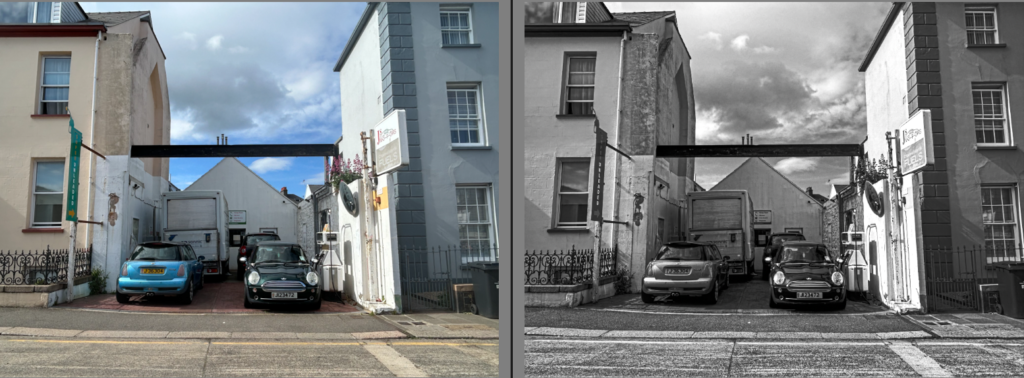
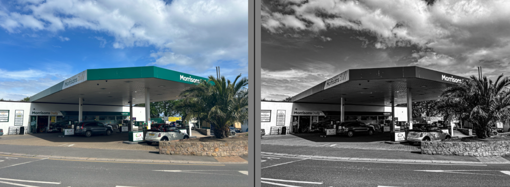
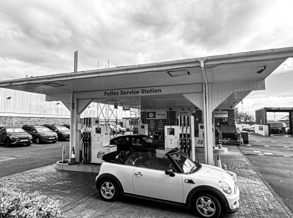
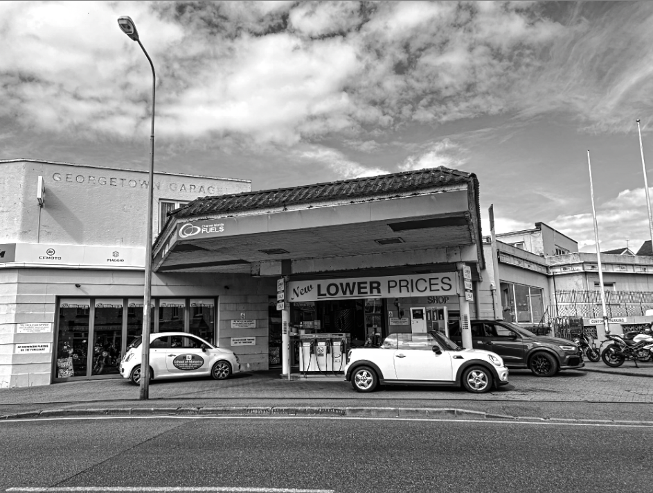
Overall, my favourite outcome I significantly produced is my typology. This links to Anthropocene as it is representing the issues within human activity and what the consequences are. Although it isn’t showing exactly the consequences. It is reminding people to be more thoughtful within their every day basis uses aka petrol. I likw how my artist reference did s similar thing and I put them in black and white
Artificial intelligence is the science of making machines that can think like humans. It can do things that are considered “smart.” AI technology can process large amounts of data in ways, unlike humans. The goal for AI is to be able to do things such as recognize patterns, make decisions, and judge like humans. AI is a machine’s ability to perform the cognitive functions we associate with human minds, such as perceiving, reasoning, learning, interacting with the environment, problem-solving, and even exercising creativity.
At its simplest form, artificial intelligence is a field, which combines computer science and robust datasets, to enable problem-solving. It also encompasses sub-fields of machine learning and deep learning, which are frequently mentioned in conjunction with artificial intelligence. These disciplines are comprised of AI algorithms which seek to create expert systems which make predictions or classifications based on input data.
Over the years, artificial intelligence has gone through many cycles of hype, but even to skeptics, the release of OpenAI’s ChatGPT seems to mark a turning point. The last time generative AI loomed this large, the breakthroughs were in computer vision, but now the leap forward is in natural language processing. And it’s not just language: Generative models can also learn the grammar of software code, molecules, natural images, and a variety of other data types.
AI in photoshop
I have chosen these images for Anthropocene to represent the appealing aesthetic of the world as it is something humans should put more care into, therefore I will be using AI to represent past, present and future and portray the difference humans can potentially impact the world and convey what it could be in years time due to humans affecting it. I used Photoshop to create depictions of the past, the present and the future of the Anthropocene.
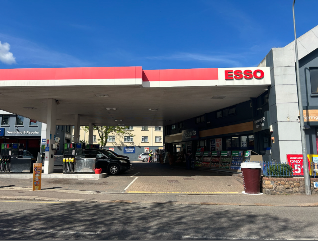
My aim after my recent post was to instead take photos of one gas station, take multiple of different petrol stations around the island. This will create variety and an attempt to replicate Ruscha’s famous photography work through his ‘ Twenty six gasoline stations’. After he succeeded within his travel, he later finalized them by putting them into a book in a very simple and dull way. Conversely, to create difference within my project I will be putting them all in a typology edited in a vintage aesthetic to show the contrast and comparison within each image. My aim is to try take them from an a far outside perspective aiming straight on to get the full view of each station. My editing, I will try to replicate the old aesthetic however this may be challenging as technology as evolved and always looks modern.
Photoshoot 2
Contact sheet-
I flagged my best and preferred images green and starred them to what I thought suited each image. This will create accessibility for me to find them in a more time- efficient way.