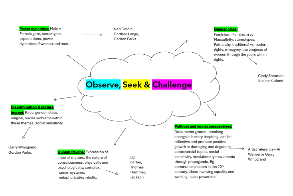
My photoshoot plan is to focus on stereotypes, gender roles, feminism, misogyny, expectations of women, patriarchy, female gaze and power dynamics. My main objective is to focus on social issues within women. My plan is to make similar images of Cindy Sherman such as some images looking as if the subject has taken the images herself and set them up but also varying them by some images being taken of the subject by another person. Or potentially I could get some images setting it up, giving the illusion that I took it of my self but in reality another person helped. This is what I assume when it comes to Sherman’s famous images. Such as this image,
My aim within themes
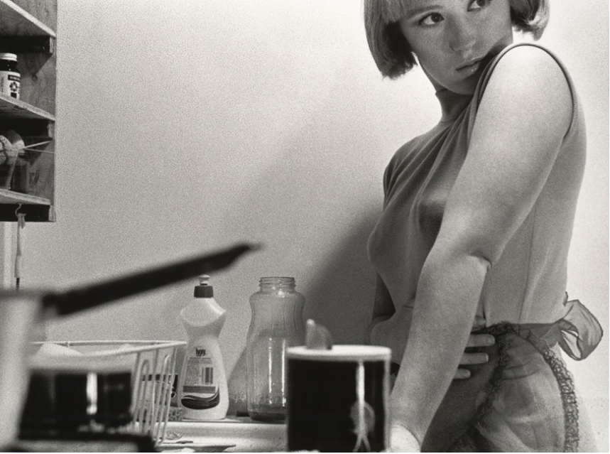
My main objective is to portray the theme of the stereotypical traditional housewife, such as being a service to men. My aim is to suggest the themes of women looking after the household, uneducated, nurturing motherhood and seen sexually. The way I want to execute this is through similar posing such as a hand on the lower stomach, suggesting nurturing motherhood/ Another example would be heavy eye makeup emphasizing the female gaze. The purpose of the ‘female gaze’ becomes to connect with the female viewer via the female creator, coming together in a way that serves them, and upholding the idea that women are powerful and can control their own destiny. That is why one of the most notable differences between the male and the female gaze is intent. The setting up of the camera is a very important factor as it gives the illusion of her taking it off herself. Not only this, the saucepan is pointing at her breasts which adds a sexual and objectification element to her images, which she executed purposely. I will also attempt to take more images of Sherman’s but overall attempting to portray these important themes such as Sherman suggesting the representations of women.
Representations of women
All of these images have different representations of women, and the traditional stereotypes in the 1970’s which was when Sherman began to take these. Sherman uses black and white which I personally like as it suggests an older aesthetic. Therefore, within my plan I aim to make it have more of an older aesthetic like Sherman’s such as experimenting through black and white filters, heavy or light grain or other effects and decide which one works best with my modernity images attempting to make them traditional.
Cindy Sherman’s Untitled Film Stills comprises of over seventy black and white photographs made between 1977 and 1980. When thinking about this series, some aspects of her entire body of work immediately come to mind: disguise and theatricality, mystery and voyeurism, melancholy and vulnerability. The artist initially started these series in her apartment, using her own interior as setting for the scenes. Soon however, she moved her camera and props outside and shot in urban and rural landscapes as well, requiring a second person to assist her in taking the photograph. The artist Robert Longo, with whom she lived at that time, assisted her for a while, as well as her father, other family members, and friends.
What is Cindy Sherman’s message?
Sexual desire and domination, the fashioning of self-identity as mass deception, these are among the unsettling subjects lying behind Sherman’s extensive series of self-portraiture in various guises. Sherman’s work is central in the era of intense consumerism and image proliferation at the close of the 20th century.
Deconstructing “Woman”
Started when she was only 23, these images rely on female characters (and caricatures) such as the jaded seductress, the unhappy housewife, the jilted lover and the vulnerable naif. Sherman used cinematic conventions to structure these photographs: they recall the film stills used to promote movies, from which the series takes its title. The 70 Film Stills immediately became flashpoints for conversations about feminism, postmodernism, and representation, and they remain her best-known works.
Sherman is able to change her identity by adopting performative behaviours that have come to define femininity. Through the photographic series I have examined, Sherman’s photographs visually describe the feminist social constructionist argument that there is no natural identity behind the mask of gender. Women affirm their gender identity through performative behaviour; gender is constituted through the ongoing and repetitive assemblage of female representations depicted in culture. These behaviours position the male as a spectator, fixing his gaze on the sexualized female. Sherman’s photography is a depiction of the different ways culture defines “woman.” Her art plays on the feminist idea that gender arises exclusively within culture and deconstructs dominant gender ideologies, representing the underside of popular culture’s definition of “woman.” She exposes the arbitrariness of performativity and presents a variety of female identities that are found within popular culture, and reveals that these are nothing more than constructions. Behind each character there is no central identity. Each is a series of manipulations according to cultural conventions. There is no essential femininity; the whole self is an imaginary construct that can be changed through performativity.
The series features Sherman posing as various female stereotypes from generic black and white Hollywood B films of the 1950s. She is unrecognizable from one photo to the next, changing her appearance as she tackles the different identities, each an illustration of a cultural representation of women. Sherman plays the role of a young woman studying her own reflection. The photo visually portrays a woman assembling her identity, caught in the act of construction. It implies the lack of a fixed identity. Though Sherman is both the woman in front of the lens and behind it, she appears masked through make-up and costume, disguised to resemble familiar female stereotypes; her women are images of women, “models of femininity projected by the media to encourage imitation and identification” As in her other works, Sherman adopts the format of stereotypical female roles. However, her characters are unlike those found in magazines. “Instead these women suggest awkward adolescents or young women uncomfortable with their sexuality”. She interrogates the format and photographic genre of the centrefold and aims to destroy dominant notions of beauty and eroticism. The spread offers no context before or after the image, meaning that audiences must construct their own narrative, generally based on texts already embedded within popular culture.
She is not perpetuating the stereotypes but is assuring female audiences that there is no fixed femininity. Defending Sherman, Mulvey argues that as the gaze behind the lens, she is not perpetuating the objectification of women, but rather subverting the gaze. In each photograph, Sherman explores contemporary ideas about female identity – one being the trope of a sad female longing for a male companion. The male spectator engaged in scopophilia pleasure should feel as though he has interrupted a private movement. As the woman behind the lens, Sherman exposes the role of the male gaze in an attempt to make those who objectify the constructed woman feel like the violators they are.
“I’m disgusted with how people get themselves to look beautiful; I’m much more fascinated with the other side,” She stated in 1989
At the time, images of ailing bodies were painfully on view in the news during the AIDS crisis; these added poignancy to her investigation of the grotesque and of various types of violence that could be done to the body. In these series and throughout all of her work, Sherman subverts the visual shorthand we use to classify the world around us, drawing attention to the artificiality and ambiguity of these stereotypes and undermining their reliability for understanding a much more complicated reality.
Image Analysis
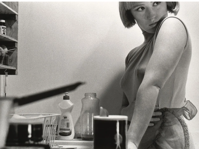
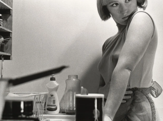
This image stood out to me the most as she is interpreting the stereotype of a woman. This could link to her message of ‘ Deconstructing a woman’, within this image there is a sense of objectification and housewife aesthetic. I state this because the image depicts a domestic scene in which the character – seemingly a housewife – stands at her kitchen sink. The construction of the picture hints at a number of possible narratives and is open to a range of analyses. Though almost cropped from the picture, the woman’s gaze – out of frame and away from the viewer, accentuated by eye makeup surely unnecessary in her own kitchen draws my attention. For me, though the image offers a portrait that I read as a stereotypical representation of a housewife from the late 1950s or early 1960s. Sherman’s gaze indicates an awareness of the world beyond the confines of the frame; the way her hand rests protectively on her stomach suggests the possibility that this is not without threat, creating a tension within the image. I think this image is a mirror due to the fact it is reflecting as of the artist herself. I also think it is a mirror as she is trying to intend an element and theme of gender roles within society during this time, but how she feels about it. She is also wearing an apron to emphasize the role she is playing. As well as this, the photo is set up to take an image of herself. It is obvious it is a staged approach due to the unfocused saucepan pointing directly at her, and the placement of the camera, clearly being on the counter to see from a lower angle. Furthermore, the gaze away from the camera also tells us it is a staged photoshoot and is not natural in any way, purely to reflect the artist. I think this image is a subjective expression, as in a way every viewer could have a different take on it. For example, as she is portraying gender roles in society in the late 1950’s she could not be intending to express herself, but how women as a whole felt during this time through a sense of reality. Therefore, she would be expressing the external world during this time. This brings to the debate is the only natural thing in this image herself? Therefore, this famous image of Cindy Sherman, reflects her as an artist, however meanwhile reflecting stereotypes of women in the 70’s. Sherman in my opinion, is sexualizing herself and playing the role of the ‘ house wife’ to execute the theme of stereotypes successfully as women in that time were seen only to make children and be there for the husband.
Another image analysis
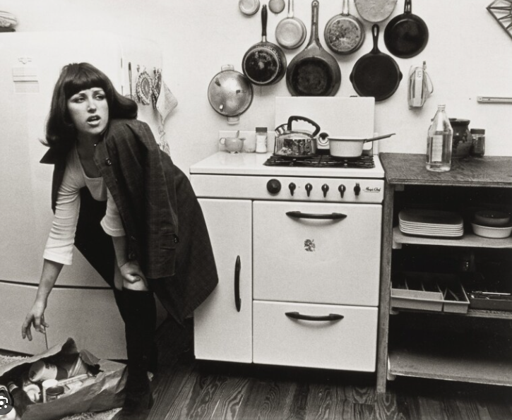
This image has slight similarities but a few differences. A main difference to me is that the previous image was of Sherman, and also taken by Sherman, or so we assume. However, this image is not Cindy Sherman and is possibly taken by Cindy Sherman. The main factor that effectively stood out to me was the apron and the gaze. This is similar to the previous image as this woman is also portraying the role of the ‘ house wife’ which is a typical stereotype of women. Although, this image has a different setting. This one does not tell much and shows a dirty door. From what I personally get from this image, could be waiting for the husband to come home or putting coats back, I assumed this through the coat pegs. This in my opinion, is ‘deconstructing women’ as a women’s role in the 1950’s was to look after their home. The image of American women in the 1950s was heavily shaped by popular culture: the ideal suburban housewife who cared for the home and children appeared frequently in women’s magazines, in the movies and on television. Another effective factor that significantly got my attention was the female gaze. The subject is looking away from the camera, possibly looking at the male in the household or to something else. Either way, this creates a sense of objectification as women were only seen to be makers of the household. The black and white is used in almost all of Sherman’s images which I like as it keeps the older aesthetic which is relevant as Sherman’s images were in the 70’s, however it also creates an element of mystery and keeps people analysing images and attempting to find a story.
Image Analysis
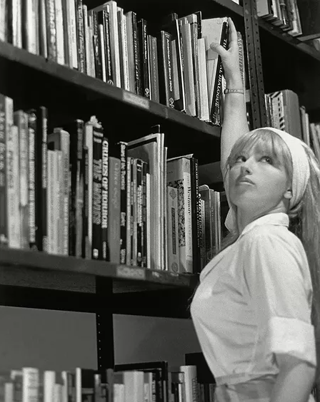
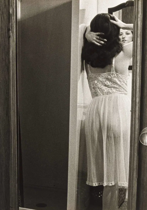
This image stood out to me because of context and time lines. Cindy Sherman took her images between the 70’s and 80’s. This time line was when it was expected or stereotypical for women to be the house wife. Being the house wife normally meant for the female to be waiting at home meanwhile the husband was at work and looking after the children. Males were seen to be the educated ones and women not. This is proved through the second wave feminism movement took place in the 1960s and 1970s and focused on issues of equality and discrimination. Starting initially in the United States with American women, the feminist liberation movement soon spread to other Western countries. This allowed equal education for male and females. This image does not focus on the role of the house wife but instead of education. This significantly links to Sherman’s message of ‘ Deconstructing woman’ as Sherman has taken a self portrait of her in the library, grabbing a book. This is relevant to the timeline as this would of been a new acceptable thing for women to learn themselves equally to men. Not only this, women were seen as weak and nurturing to their children which was the only objective women were expected to do. One element that catches my eye is the female gaze, like every other one of her images. She is always looking away from the camera, potentially objectifying herself in the others, but possibly not this one. The purpose of the ‘female gaze’ becomes to connect with the female viewer via the female creator, coming together in a way that serves them, and upholding the idea that women are powerful and can control their own destiny. That is why one of the most notable differences between the male and the female gaze is intent.
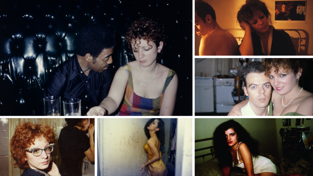
Nancy Goldin is an American photographer and activist. Her work explores in snapshot-style the emotions of the individual, in intimate relationships, and the bohemian LGBT subcultural communities, especially dealing with the devastating HIV/AIDS crisis of the 1980s.
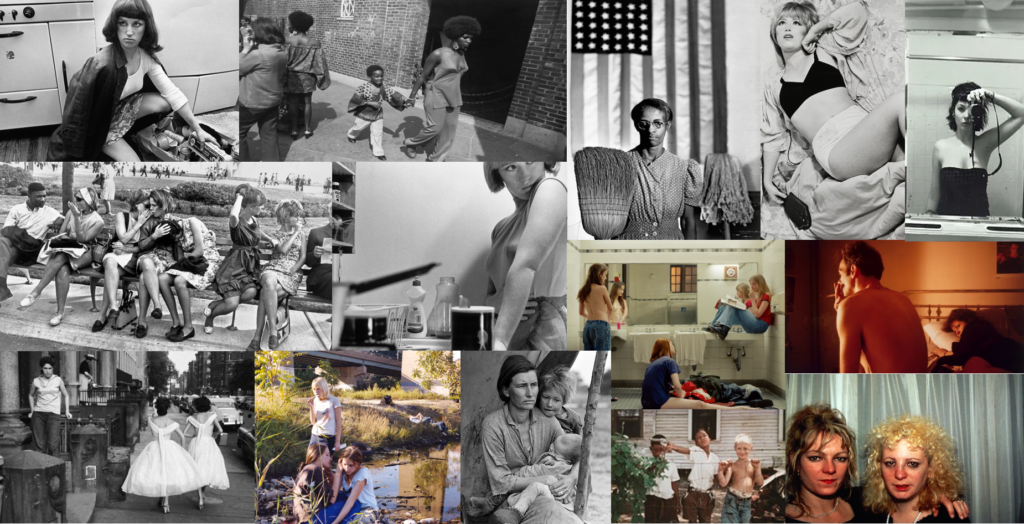
Mood board of her work
Her roles in portraying power dynamics within gender roles-
In 1985, Nan created The Ballad of Sexual Dependency, a photo series about the struggle between autonomy and dependency and the power relationships between men and women that put her in danger.
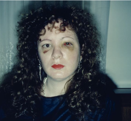
The artist’s visibility grew, and she photographed herself with her face wounded by her boyfriend’s punches. He couldn’t stand who she was and what she saw. “My photos in which I look battered were what prevented me from returning,” she says. Many women in her situation were able to talk about it because they saw the photos. I haven’t found Nan to define herself as a feminist, nor Laura, but the only seconds in the film in which they speak as a duet take place when Nan says that when her boyfriend tried to destroy her eyes with his fists, at least she didn’t have the “ballad” slides on her screen — and here comes the double take: “Because he would have destroyed them.” The artists both say. The women who know that their eyes are their voice speak.
Comprising almost 700 snapshot-like portraits sequenced against an evocative music soundtrack, Nan Goldin’s The Ballad of Sexual Dependency is a deeply personal narrative, formed out of the artist’s own experiences around Boston, New York, Berlin, and elsewhere in the late 1970s, 1980s, and beyond. Titled after a song in Bertolt Brecht and Kurt Weill’s The Threepenny Opera, Goldin’s Ballad is itself a kind of downtown opera; its protagonists—including the artist herself—are captured in intimate moments of love and loss. They experience ecstasy and pain through sex and drug use; they revel at dance clubs and bond with their children at home; and they suffer from domestic violence and the ravages of AIDS. “The Ballad of Sexual Dependency is the diary I let people read,” Goldin wrote. “The diary is my form of control over my life. It allows me to obsessively record every detail. It enables me to remember.” The Ballad developed through multiple improvised live performances, for which Goldin ran through the slides by hand and friends helped prepare the soundtrack—from Maria Callas to The Velvet Underground—for an audience not unlike the subjects of the pictures. The Ballad is presented in its original 35mm format, along with photographs that also appear as images in the slide show. Introducing the installation is a selection of materials from the artist’s archive, including posters and flyers announcing early iterations of The Ballad.
“My work has been about making a record of my life that no one else can revise.”
Nan Goldin’s photographs are like pages of a diary, sharing at once the intimacy of ordinary connections, the isolation of abuse, and the joyful abandon of being with friends. Upending typical art hierarchies, she showed her work in her loft and in New York City nightclubs and bars in the late 1970s and ’80s, where the audience consisted “entirely of the people in the slide show, my lovers and friends.” Goldin would often reorder her slides, and her restless images capture scenes in the middle of things; they are “fragments of life as it was being lived.” Most of her career has also been defined by activism within her community: first, in the late 1980s, around the AIDS crisis, and then, beginning in 2017, around the opioid crisis.
The intense realism of her photographs—and their accumulation in slideshows, books, and films—introduces a frank and riveting narrative. You get the sense, as the artist once said, that “the camera is as much a part of my everyday life as talking or eating or sex;” her photographs capture all three activities. Often garishly lit by a sudden flash, Goldin’s images offered a stark contrast to that of other emerging photographers in 1980s New York, who gained renown for posed and conceptual compositions. “I knew about those photographers who were doing media-related stuff, from Cindy Sherman, whose work I love, to Sherrie Levine and Laurie Simmons and all those other ones,” Goldin said, “but I was never part of any movement, and I never read theory. I think that was to my benefit.”
Image Analysis
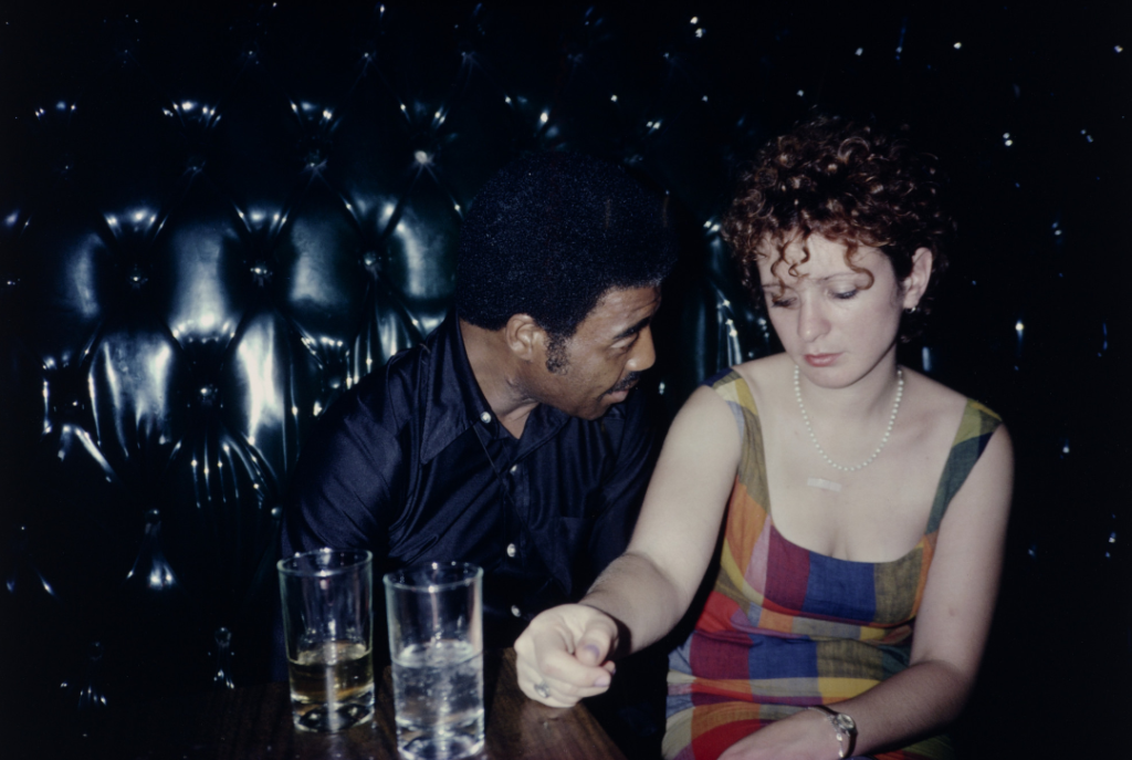
Buzz and Nan at the Afterhours, New York City1980
This image stood out to me out of all of her work. This is because it is at a very natural, normal setting which I assume to be a nightclub or a bar. Nan Goldin’s nostalgic snapshots depict intimate moments of bohemian sex, transgression, beauty, spontaneity, and suffering. Her frames are marked by unflinching candor, rich hues, and a keen sense of empathy and lyricism. The main thing that stood out to me in this image was mannerisms and posing positions. This is because I personally got from this image that the male is more interested and could potentially be searching for intimacy that the female may not want. I gathered this theory through the male gaze and his body turned slightly towards her with his eyes faced to her neck possibly at her necklace or skin. To emphasize this, the female in the image is very faced frontally, facing her body away and instead towards the camera meanwhile not maintaining eye contact with the male. Her eyes are facing down at herself possibly to avoid intimacy. This interests me as it portrays gender roles and power dynamics within gender. This is because of the stereotype of males being dominant and confident, whereas a female having to avoid if not interested considering the sterotype of females being gentle, naive sexually inexperienced, soft and accepting. The female also has her arm up on the table potentially signalling an uncomfortable element or putting a barrier to prevent intimacy. Another way Nan Goldin portrays power dynamics within gender is through this image.
This image portrays the same theme as this is Nan Goldin trying to get awareness of domestic abuse between her and her boyfriend. However, there is a difference as this image shows violence within relationships specifically Nan Goldin within the bravery of sharing her own experiences. This image shows power dynamics and the stereotypes of men and women linking to the image above.
Observe : A verb- notice or perceive (something) and register it as being significant.
Seek : A verb- attempt to find (something), attempt or desire to obtain or achieve (something).
Challenge : A noun- a call to someone to participate in a competitive situation or fight to decide who is superior in terms of ability or strength, a call to prove or justify something.
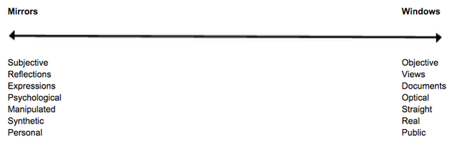
Within the origin of photography, there is two photographic processes; Daguerreotype and Calotype. The main difference between the daguerreotype process and Talbot’s calotype process was reproducibility. The calotype process first produced a photographic ‘negative’ in the camera, from which many ‘positive’ calotype prints could be made, whereas daguerreotypes were a one-off image. The calotype was first created by Henry Fox Talbot. He created images when exposed to light, these images were easy to produce and easy to distribute. However, they faced many drawbacks such as the people in the photos looking ‘on the edge of being present’ and seen as looking not quite alive due to a low sharpness and graininess, this caused a loss of fine detail. However, these images were popular as they captured a moment in time, fixed into place which was profitable and popular at this time. Furthermore, Louis Daguerre was recognized for his invention of the Daguerreotype. The daguerreotype is made by after capturing the image exposing it to mercury vapour which brings the visible image to life. The image also then needs to be rid of any unexposed silver iodide. This is achieved by completely covering the image in a salt or sodium thiosulfate solution. Daguerreotypes are also very detailed and clear which makes them stand out amongst other images from around the 1840s and 1850s. Louis decided to create the daguerreotype as he knew the world was seeking a photographic process which was easier to put into practice, since exposure times were only of a few minutes. So by creating his own process of photography, he became very successful and made Louis Daguerre world famous. In my opinion, I would say that calotypes are more fitting into windows, rather than mirrors. This is because calotypes brought more disadvantages, such as when taking images of people it had low sharpness and graininess. Therefore, people using calotypes typically took pictures of scenery and environments. This means that it would fit windows more due to it being objective, not personal and even documentary. A lot of calotype photographs show the scenery which ultimately show history because it was introduced in 1941. A lot of calotypes fit into realism, public and optical. Furthermore, I would personally say that the daguerreotype fits more into Mirrors as it is typically known for photographing other people as the camera has evolved to do it successfully. Daguerreotypes are also very detailed and clear which makes them stand out amongst other images from around the 1840s and 1850s. In contrast to the calotype, this photographic process invention was much better for taking images of people which Henry Fox Talbot executed himself and became famous. Moreover, this means that it fits more of a mirror side due to the fact they are more subjective, reflective and personal, showing expressions and personality of people. Although, it doesn’t necessarily reflect the artist behind the camera entirely, it does reflect their style and the subject of people. John Szarkowski 1998 stated ‘The distance between them is to be measured not in terms of the relative force or originality of their work, but in terms of their conceptions of what the photograph is: Is it a mirror, reflecting a portrait of the artist who made it, or a window, through which one might better know the world?’ I personally agree with this statement as originality of artists work is on a large range and simply cannot be measured as it is subjective. However, I think Szarkowski’s division on how to measure these images work as an image is either reflecting the artist itself, or showing the exterior world. This is because it is based off facts, rather than it being subjective. Although, to a certain extent I disagree because some images could not be fitting into either of these categories. For example, an artist could take images of another person without it linking to the photographer or the exterior world. Or even, a photo could be both.
Mirrors- Chosen image
Cindy Sherman – 1977
By way of description, the image depicts a domestic scene in which the character – seemingly a housewife – stands at her kitchen sink. The construction of the picture hints at a number of possible narratives and is open to a range of analyses. Though almost cropped from the picture, the woman’s gaze – out of frame and away from the viewer, accentuated by eye makeup surely unnecessary in her own kitchen draws my attention. For me, though the image offers a portrait that I read as a stereotypical representation of a housewife from the late 1950s or early 1960s. Sherman’s gaze indicates an awareness of the world beyond the confines of the frame; the way her hand rests protectively on her stomach suggests the possibility that this is not without threat, creating a tension within the image. I think this image is a mirror due to the fact it is reflecting as of the artist herself. I also think it is a mirror as she is trying to intend an element and theme of gender roles within society during this time, but how she feels about it. She is also wearing an apron to emphasize the role she is playing. As well as this, the photo is set up to take an image of herself. It is obvious it is a staged approach due to the unfocused saucepan pointing directly at her, and the placement of the camera, clearly being on the counter to see from a lower angle. Furthermore, the gaze away from the camera also tells us it is a staged photoshoot and is not natural in any way, purely to reflect the artist. I think this image is a subjective expression, as in a way every viewer could have a different take on it. For example, as she is portraying gender roles in society in the late 1950’s she could not be intending to express herself, but how women as a whole felt during this time through a sense of reality. Therefore, she would be expressing the external world during this time. This is when this factor comes to debate as many images are subjective which makes it hard to agree with Szarkowski’s division on categories within images as everyone’s view and opinions are different which is what makes photography unique as you have to analyse. Szarkowski presented a binary theory of photography, but they are not opposites they are on a scale. Jed Pearl spring 1978 states ” world exists independent of human attention.” continued by “a photograph, after all, a record of nature.” and ” a photograph is is seen either as a mirror- a romantic expression of the photographer’s sensibility as it projects itself on the things and sights of the world; or as a window- through which the exterior world is explored in all it’s presence and reality.” I agree with Jed Pearls quote ” a photograph, after all, a record of nature.” because whether the artist is reflecting themselves through the exterior world, through them selves, or the exterior world as a whole, all of these options and elements are a result of nature. Humans, evolution of society etc is all nature. However within Sherman’s images, is the only thing natural herself? Which brings into the debate if every photograph is a record of nature. I disagree to this statement by Szarkowski as I believe the two categories cannot be fitted into two, instead a range. ” A photograph is is seen either as a mirror- a romantic expression of the photographer’s sensibility as it projects itself on the things and sights of the world; or as a window- through which the exterior world is explored in all it’s presence and reality.” For example, this famous image of Cindy Sherman, reflects her as an artist, however meanwhile reflecting stereotypes of women in the 70’s.
Windows- Chosen image
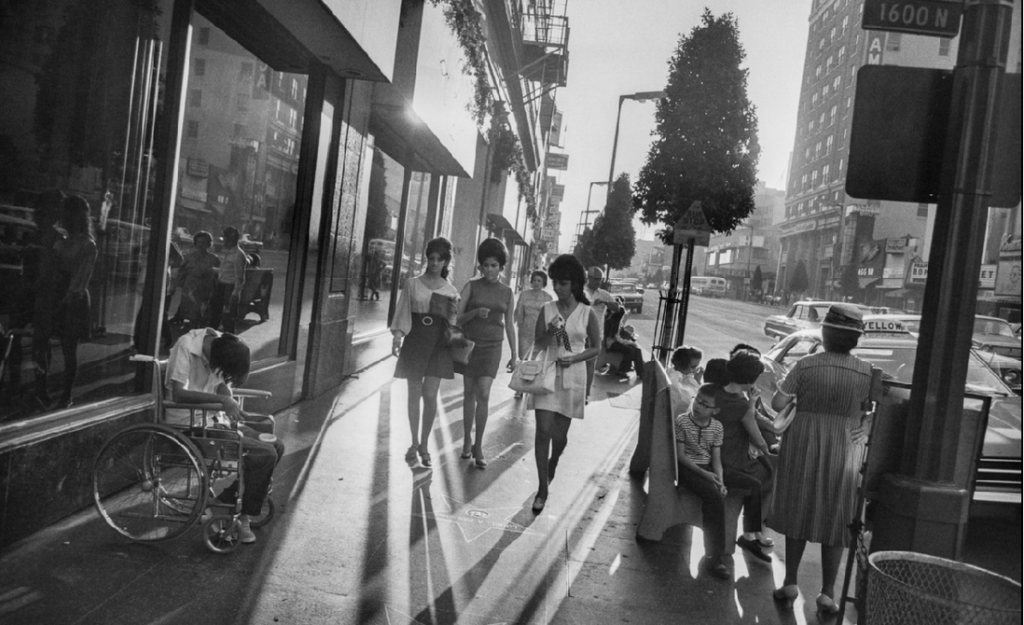
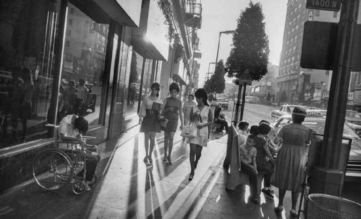
Garry Winogrand- Los Angeles, 1969 Gelatin silver print
Garry Winogrand was an American street photographer, known for his portrayal of U.S. life and its social issues in the mid-20th century. Photography curator, historian, and critic John Szarkowski called Winogrand the central photographer of his generation. Winogrand used not only light but interesting angles to create dynamic photographs. By tilting his camera when taking photos of people in action, especially on the street, he created pictures that emphasized movement. His tilting technique brings a rushed feeling and a sense of urgency to his photographs. Through looking at this;
This told me Winogrand’s images were windows. A way they are windows is that Winogrand was a street photographer which instantly told me that he was more of a documental photographer rather than a reflective. Another way I knew this is that Winogrand focuses on social issues in the mid 20th century which brings in an element of realism and publicity. However, the fact this image is in black and white does not exactly include the realism factor. This is because we do not see life in black and white, however with a camera and editing we like to change it too black and white, therefore this creates a fake element to this image as ‘ windows’ is suppose to show the exterior world the way it is. This brings in the fact that the theory windows and mirrors can be measured on an range rather than separated. This is shown through Pearl’s review ” Szarkowski claims this thesis not a rigid pattern, but as a ‘ continuous axis, the two poles of which might be described by the terms proposed above’.” This image is very objective as they are not influenced by personal feelings or opinions in considering and representing facts. This image is seen to be documentative with a realism expression as it is in the middle of the street in LA of three well dressed women walking past the unfortunate on each side. Another factor that significantly stuck out to me was how the unfortunate are in the dark, in contrast to the three females in the light. These unfortunate events could be through social and political problems and Winogrand is expressing the effects through his photographs. Therefore, he is documenting the exterior world through realism. The fact the people in the photograph are not posing or have not adjusted their behaviour or mannerisms makes it look public and very real. This links to Henry Cartier Bresson’s work of the ‘ Decisive moment’ which Winogrand would of had to execute in order for this image to not have a staged- approach. The use of light shining within the three females and not the people around, and the effect of the shadows from the women, could be metaphorical symbolizing the political issues around women during this time. This images are not personal or subjective which makes me believe that this image fits into the category of windows. a photograph is is seen either as a mirror- a romantic expression of the photographer’s sensibility as it projects itself on the things and sights of the world; or as a window- through which the exterior world is explored in all it’s presence and reality.” This makes me agree more with Szarkowski due to the fact this image is not a romantic expression and simply does not reflect the artist himself. Instead he shows and views the exterior public world to document the street photography. This is because it is explored in all its presence and reality. Therefore, this image is reflecting the problems in society around the 1950’s, rather than reflecting on the photographers sensibility.
Conclusion-
Images can be both ‘mirrors’ and ‘windows’ of the world specifically in relation to Szarkowski’s theory and Pearl’s review. In summary, Szarkowski attempted to catergorise photographers whose work reflected the subjectivity of the artist in comparison with those whose work largely sought to see outside themselves. Szarkowski believed that a photograph was either ‘mirrors’ which was a photograph that was subjective and reflected the artist themselves in a way or ‘windows’ that shown the exterior world through whether the photograph was objective and an element of realism within in it. This is shown through “The photograph is seen either as a mirror- a romantic expression of the photographer’s sensibility as it projects itself on the things and sights of the world; or as a window- through which the exterior world is explored in all its presence and reality.” The key words is ‘ either’ and ‘or’, this emphasizes how Szarkowski suggests that the photographic artist of the twentieth century finds himself, consciously or unconsciously, somewhere along a “continuous axis” from romantic to realist. Yet it can be argued that use of the medium, by its very nature, presupposes a “generous and inclusive acceptance of fact, objective structure,” and that the selection among these facts is the romantic, personal opposite built into any photograph. In contrast, Jed pearl made a review in spring 1978 being rather critique on Szarkowski’s theory. He starts his review by stating ‘Szarkowski is fond of creating categories’ beginning with a rather negative outlook continuing with ‘ presents a binary theory’. Pearl continues with ‘Szarkowski claims this thesis not as a rigid pattern, but as a “continuous axis, the two poles of which might be described by the terms proposed above”.’ This suggests that Pearl is evaluating what Szarkowski executed and said, meanwhile critiquing and expressing his opinions through acknowledgment. I think Szarkowski’s idea of the division of mirror and windows work, but with evaluating I believe there is a strong range and that it sometimes cannot be fixed onto one category simply.
Within these images- Differences and similarities
The first similarity that stood out to me was the fact both these images are in black and white. The theme of black and white decreases the element of realism as it is not how we see the world through our eyes. However, the camera allowed us to do that. However, within realism the first image does not obtain the element of realism as it is obvious it has a rather staged approach through the positioning of the camera and the objects, as well as the posing and the looking away from the camera. Sherman, the artist herself purposely was attempting to portray the housewife stereotype of women in the 70’s and one thing that stands out to me is where the pan is pointing and the apron she is wearing. This image is also private as Sherman is taking the image of herself, telling us it is a self portrait. This tells the viewer this photograph definitely has a staged approach which decreases the element of this photograph being documentative. Therefore, this makes this image have an romantic expression and more subjective. This is reflective and more personal as Sherman could be representing how she feels in society through the theme of gender roles. However, this could be argued as she could be attempting to represent women in society as a whole. Which could make it less personal considering it is a self portrait. Another similarity within these images I chose was that the main subject were females. However, within the second image it obtains more of a realism and factual factor as Winogrand is photographing and portraying societal and political problems. Winogrand is a street photographer which is known for this however he puts his art and creativity into it. Therefore this photograph is more public as it is a problem within America at the time. This makes this image more objective than subjective in comparison to Sherman’s as it is not influenced by personal feelings or opinions in considering and representing facts. Winogrand’s doesn’t look like a staged approach due to no change in behaviour and mannerisms. However there are significant factors such as the more fortunate females walking are in the light in comparison to the people in the dark on each side.
What are the differences between photographs that are WINDOWS and MIRRORS?
“Mirrors” are photographs through which a photographer is trying to tell us how he feels about himself.“Windows” are those in which he is trying to tell us how he feels about the world. Although both are expressive, they can be subjective due to the fact a photo can be both. “Mirrors” were images meant to mirror the photographer’s own sensibility. “Windows” were photos meant to act as a window for the viewer to see something that is primarily factual and external to the photographer’s own sensibility. Keep in mind that Szarkowski stressed this was not a very strict dichotomy.
In metaphorical terms, the photograph is seen either as a mirror – a romantic expression of the photographer’s sensibility as it projects itself on the things and sights of this world; or as a window – through which the exterior world is explored in all its presence and reality.”
The exhibition Mirrors and Windows, anexhibition of American photography since 1960, opened at The Museum of Modern Art, New York in July of 1978. The curator John Szarkowski’s attempted to categorise photographers whose work largely reflected the subjectivity of the artist in comparison with those whose work largely sought to see outside themselves. Szarkowski wrote in the catalogue essay that accompanied the exhibition:
“The distance between them is to be measured not in terms of the relative force or originality of their work, but in terms of their conceptions of what a photograph is: is it a mirror, reflecting a portrait of the artist who made it, or a window, through which one might better know the world?” — John Szarkowski, 1978
This quote explains the difference between mirrors and windows, but also states that there is a range of where they can be within mirrors and windows. In fact, an image can be both and it is not a strict dichotomy.
Eugene Atget 1898
Nan Goldin – Nan and Brian in bed, NYC. 1983
I would personally place this images within this range;
For the ‘ window’ image, I personally would say it fits more of a window, as the image is of street musicians in 1898. This image does not link to the photographer, instead the photographer is making the image about what he can see, rather than what is behind the camera. I would say it documents, is real, public and objective. However, for the ‘ Mirrors’ image, I would personally say it fits more of the mirrors side, as it is an image of the artist himself, and another. Its very personal due to them being in bed and shows who they are through expressions such as smoking and lying in bed. It is very subjective as it is showing a lifestyle, and everyone’s life style is different. Whereas, in contrast to windows which is very objective and documentary.
Photography was invented by Frenchman Nicéphore Niépce in 1822. Niépce developed a technique called heliography, which he used to create the world’s oldest surviving photograph, View from the Window at Le Gras (1827). Heliography was conceived in response to camera obscura theories dating back to ancient history.
Camera Obscura & Pinhole photography
Camera obscura was an optical phenomenon which was created to project images from the outside into a dark room. By completely darkening a room apart from a small hole in the wall allows rays of light to enter, letting the outside world pour in. This process takes around an hour and projects an upside down image into the dark room. This process is admitted for being all natural, deep and primitive as it uses old historical technology instead of new and upcoming tech. After being used for many centuries, camera obscura was developed by using different camera filter and adjustments to make images stronger and clearer. Pinhole photography is a similar process which uses a tiny hole in a camera to allow light to come in. This creates an image onto photosensitive material. As light hits material such as photographic film or paper the inverted image is created, with a long exposure time of around several seconds to minutes, the small hole incision only lets a small amount of light through which makes it very unsuitable for fast- moving objects. However, due to the fact it it’s simple, accessible and inexpensive with a unique looking vignette, the style of photography became increasingly popular.
Nicéphore Niépceand Heliography
Niépce called his process heliography, which literally means “sun drawing”. 7 March 1765 – 5 July 1833) He was a French inventor and one of the earliest pioneers of photography. In 1822, he used it to create what is believed to have been the world’s first permanent photographic image, a contact-exposed copy of an engraving of Pope Pius VII, but it was later destroyed when Niépce attempted to make prints from it. Within the time period of 1826 and 1827, he created the first ever permanent photograph which was named ‘View from the Window at Le Gras’. This introduced the process of Heliography. This process he created consists of the sun reflecting its light to create images. To achieve this he used a pewter plate which was covered with Bitumen of Judea which is a light sensitive substance. This substance hardens when it is exposed to light. The process takes up to eight hours and this time period is essential as the sensitivity of materials was much lower than modern materials. The plate is then needed to be washed with a solvent, this removes the Bitumen of Judea and leaves a permanent image. This process was particularly essential to the development of photography. In the mid-1820s, he used a primitive camera to produce the oldest surviving photograph in a real world scene.
Louis Daguerre & Daguerreotype
Louis Daguerre was a French artist and photographer, recognized for hisinvention of the daguerreotype process of photography. He became known as one of the fathers of photography. This method preserving images and capturing them was a huge historical moment and made a large breakthrough. The daguerreotype is made by after capturing the image exposing it to mercury vapour which brings the visible image to life. The image also then needs to be rid of any unexposed silver iodide. This is achieved by completely covering the image in a salt or sodium thiosulfate solution. These images are very reflective and change when exposed to different angles of view. Daguerreotypes are also very detailed and clear which makes them stand out amongst other images from around the 1840s and 1850s. Louis decided to create the daguerreotype as he knew the world was seeking a photographic process which was easier to put into practice, since exposure times were only of a few minutes. So by creating his own process of photography, he became very successful and made Louis Daguerre world famous.
Henry Fox Talbot & Calotype
Henry Fox Talbert is very well known for being a successful pioneer of photography, scientist and inventor. Amongst his other successes he created a method of photography by using a ‘calotype’ which is a negative-positive process which is also known as the ‘paper negative’. He created images when exposed to light, these images were easy to produce and easy to distribute. However, they faced many drawbacks such as the people in the photos looking ‘on the edge of being present’ and seen as looking not quite alive due to a low sharpness and graininess, this caused a loss of fine detail. However, these images were popular as they captured a moment in time, fixed into place which was profitable and popular at this time. He used different light sensitive chemicals and salts such as silver nitrate and silver chloride. The original negative and positive process invented by William Henry Fox Talbot, the calotype is sometimes called a “Talbotype.” This process uses a paper negative to make a print with a softer, less sharp image than the daguerreotype, but because a negative is produced, it is possible to make multiple copies. The image is contained in the fabric of the paper rather than on the surface, so the paper fibers tend to show through on the prints. The process was superceded in the 1850s by the collodion glass negative. Because of Talbot’s patent rights, relatively few calotypes were made in the United States.
Richard Maddox
Richard Leach Maddox (4 August 1816 – 11 May 1902) was an English photographer and physician who invented lightweight gelatin negative dry plates for photography in 1871.
In photography, the Collodion process was invented in 1851 by Frederick Scott Archer. This invention required only two to three seconds of light exposure to produce an image, but plates had to be sensitized at the time of exposure, exposed while the emulsion was still wet, and processed immediately after exposure in the camera.
When he noticed that his health was being affected by the ‘wet’ collodion’s ethervapor, Maddox began looking for a substitute. Richard Leach Maddox, M.D., photography was given an early impetus to become a disseminator of medical knowledge. His interest in the camera, combined with his poor health and his medical training, enabled him to invent the gelatin bromide negative that is the backbone of today’s photographic film.
Dr. Richard Maddox created a dry plate technique that allowed photographers to develop photographs without using the wet methods of the collodion process. This technique involved using gelatin instead of glass to make photographic negative. The dry plate process quickly replaced the wet plate collodion process that required the mixing of dangerous chemicals and immediate exposure of the wet plate.
George Eastman
George Eastman was an American entrepreneur who founded the Eastman Kodak Company and helped to bring the photographic use of roll film into the mainstream.
George Eastman changed the world through his entrepreneurial spirit, bold leadership, and extraordinary vision. He will be remembered throughout history for founding the Eastman Kodak Company and revolutionizing the photography, film, and motion picture industries. The first successful roll-film hand camera, the Kodak, was launched publicly in the summer of 1888. Inventor George Eastman received a patent (number 388,850) for the camera’s shutter and the trademark (number 15,825) for the Kodak name on September 4, 1888. In the 1880s, Eastman developed a convenient method of preparing ready-to-use plates. Improvements led to flexible, roll film as well as photo processing and printing done by mail order. Millions of people worldwide captured memories using cameras and film, leaving all the chemistry to Kodak.
Kodak (Brownie)
The Brownie helped to put photography into the hands of amateurs and allowed the middle class to take their own “snapshots” as well. Eastman Kodak introduced the new Brownie dollar box camera in 1900; the release was supported by a major advertising campaign.
The Brownie was a series of camera models made by Eastman Kodak and first released in 1900.
It introduced the snapshot to the masses by addressing the cost factor which had meant that amateur photography remained beyond the means of many people; the Pocket Kodak, for example, would cost most families in Britain nearly a whole month’s wages.
The Brownie was a basic cardboard box camera with a simple convex concave lens that took 2+1⁄4-inch square pictures on No. 117 roll film. It was conceived and marketed for sales of Kodak roll films. Because of its simple controls and initial price of US$1 (equivalent to $37 in 2023) along with the low price of Kodak roll film and processing, the Brownie camera surpassed its marketing goal.
Film/ Print Photography
The first flexible photographic roll film was sold by George Eastman in 1885, but this original “film” was actually a coating on a paper base. As part of the processing, the image-bearing layer was stripped from the paper and attached to a sheet of hardened clear gelatin. Once the film is processed, it is then referred to as a negative. The negative may now be printed; the negative is placed in an enlarger and projected onto a sheet of photographic paper. Many different techniques can be used during the enlargement process. Two examples of enlargement techniques are dodging and burning. The first film that was in a roll and flexible was made by George Eastman in but it wasn’t synthetic but on paper. Photographic film is a material used in photographic cameras to record images. It is made of transparent plastic in a shape of a strip or sheet, and it has one side covered with light-sensitive silver halide crystals made into a gelatinous emulsion. When a photographic film is exposed to light by a photographic camera, it chemically changes depending on the amount of light absorbed by each crystal. These changes create an invisible latent image in the emulsion, which is then fixed and developed into a visible photograph. Black and white photographic films have one layer of silver halide crystals, while the color film has three layers, each sensitive to a different color. Some color films have even more layers.
Digital Photography
The history of digital photography began in the 1950s. In 1951, the first digital signals were saved to magnetic tape via the first video tape recorder. Six years later, in 1957, the first digital image was produced through a computer by Russell Kirsch. It was an image of his son. The photography changed from film to digital in the 1990’s. The early 1990s brought a dramatic change with the advent of digital technology. Instead of using grains of silver embedded in gelatin, digital photography uses silicon to record images as numbers. Computers process the images, rather than optical enlargers and tanks of often toxic chemicals.
Manufactured by Kodak, the QuickTake was the first color digital camera for under $1,000.
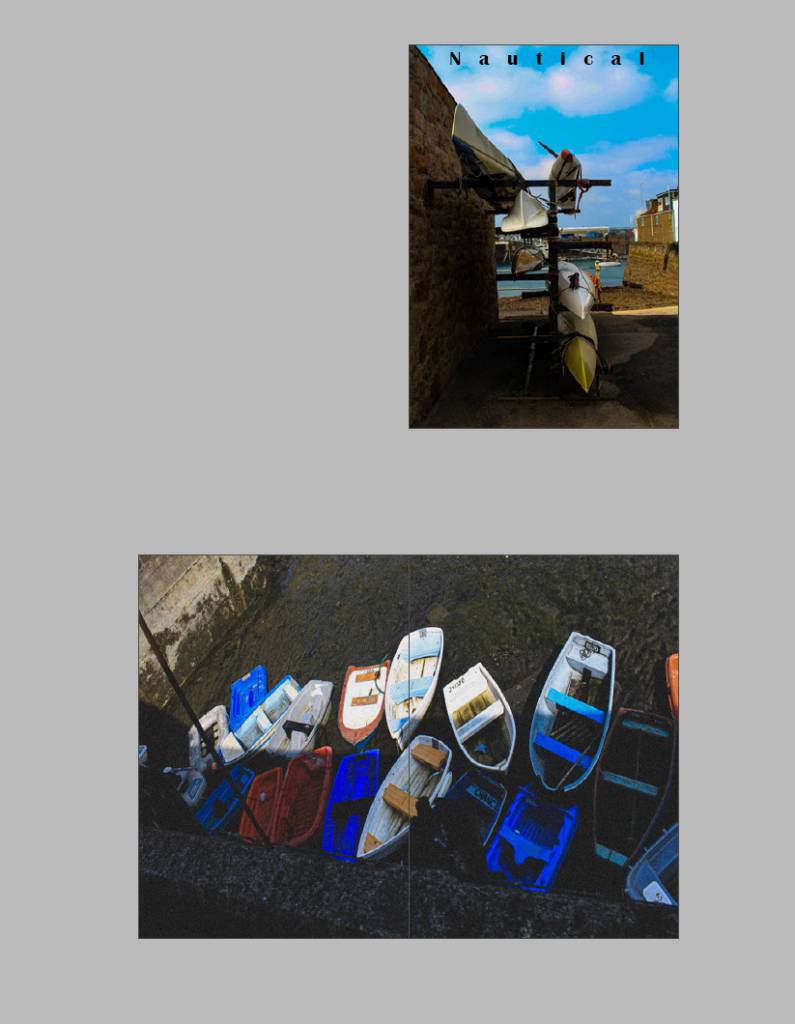
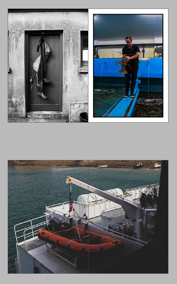
Personally, I liked the images I chose as they all link to a nautical theme however I added heavy grain and filters to give them an older aesthetic due to the history of Jersey Maritime and harbours. I also liked how when I put two images on a double page they contrasted significantly together. The use of some black and white images with coloured images created variation to make every image differentiated. The boarders on some images also created variation so every page would look different, creating the unexpectant. I liked how the second image and the last image have the same subject, but from different angles as I think it closes my zine very significantly and allows to show different angles. I kept those images in colour as the colours are vibrant and different which contrasted each boat and made the images more eye catching to viewers. Each image I chose had historical elements if looked into depth. For example, the last image with the historical factors of rowing as these boats are the old rowing boats that also have an old aesthetic. The water sports boats showed more evolution in society as water sports had grown to be more and more popular throughout generations. The picture of fishermen boots contrasting with the fishermen as historical context as the storage rooms fishermen used started many generations ago. The fishermen contrasts significantly as the occupation of fishermen is permanent as society needs fishermen and what they do. I liked how I emphasized the contrast in these images by one being in black and white, and one in colour as they are very different looking images, but link very significantly. I chose my first image to be my first image as I liked the shadows underneath the main subject; watersports equipment. As well as this, I liked the significance of the background; the harbour contrasting with the foreground. The different range of colours in my first image is eye catching which is why I kept it in colour rather than black and white. Another reason I kept it in colour, is the growth in watersports in society as it is more of a modernized hobby. Therefore, as it is more modernized I kept it in colour as black and white images create the sense of a vintage old aesthetic due to the origin of photography. Lastly, I chose this image as it includes the working element in the background through the harbour, and the more fun and hobby side through the equipment. This shows all factors of historical growth within maritime in Jersey. Therefore, this is why I labelled my zine as ‘ Nautical’ as every element in the first image continued with the rest of my zine, obtains subjects to do with the sea.
On the other hand, I could’ve edited my second image to get rid of the large shadow in the centre of the boats as some of the boats are in the light. I would of liked to get rid of the pole on the left hand side of the image by standing or photographing in a different angle. On the image of the watersports equipment in black and white, I would of lowered my exposure levels on my camera settings so the sky and the clouds were more clear, rather than blurry. On the last image, I like how half of the boats are in the light as it looks much more significant on this image however I would of liked to get rid of the branch in the foreground of the image. From another perspective, the branch in the foreground can be seen as purposeful to create differentiation. Aside from this, I liked how many images were edited to reach all the bleeds to make less gaps and white areas on the zine. However still maintaining some images normal size to create high contrast and comparison. Overall, I liked my end result and how they link within the theme of ‘ Nautical’ in lots of different ways to stop my zine from being dull. Instead, it is thought out in depth with editing techniques to show viewers the importance of contrasting and comparing meanwhile linking.
Why I chose this image- I chose this image because the main subject is water sports which can be seen as significant as it shows an element of enjoyment and humour rather than working boats to allow company’s to operate efficiently. This decreases less tension and creates an element of fun and casual aesthetic which is important for the front cover. However, this image still obtains the working operations in the background such as the harbour and boats to bring supplies in. This makes a contrast of two important things. Another reason is because after I edited the image the left side is more shaded and dark in contrast to the bright sea and sky which shows variation and colour. The dehaze increased made the clouds more emphasised which they are seen as circle shapes, which contrast to the shapes of the canoes.
Page 2- Double page spread:
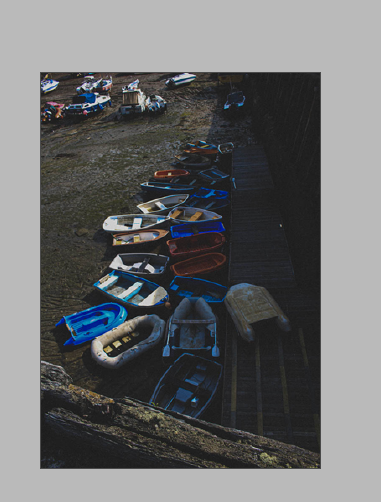
I decided to chose this image as it shows an element of history and also enjoyment, because these type of boats ( rowing boats) can be used for fishing etc, but also used to be a means of transportation. They were extensively used in the Mediterranean trade. The different colours of boats stuck out to me. To add more potential to this image, I added a heavy grain and a matte filter to make it have more of a historic aesthetic and to make it look like it has been taken from an old camera. I like that it doesn’t say a lot unless fully in depth. I like how they can be seen as an enjoyment sport such as rowing, pleasure or fishing. The origin of rowing began in the earliest regatta was held on 16 September 1274 in Venice, Italy. Which represents the historical aspect of this picture.
Page 3-
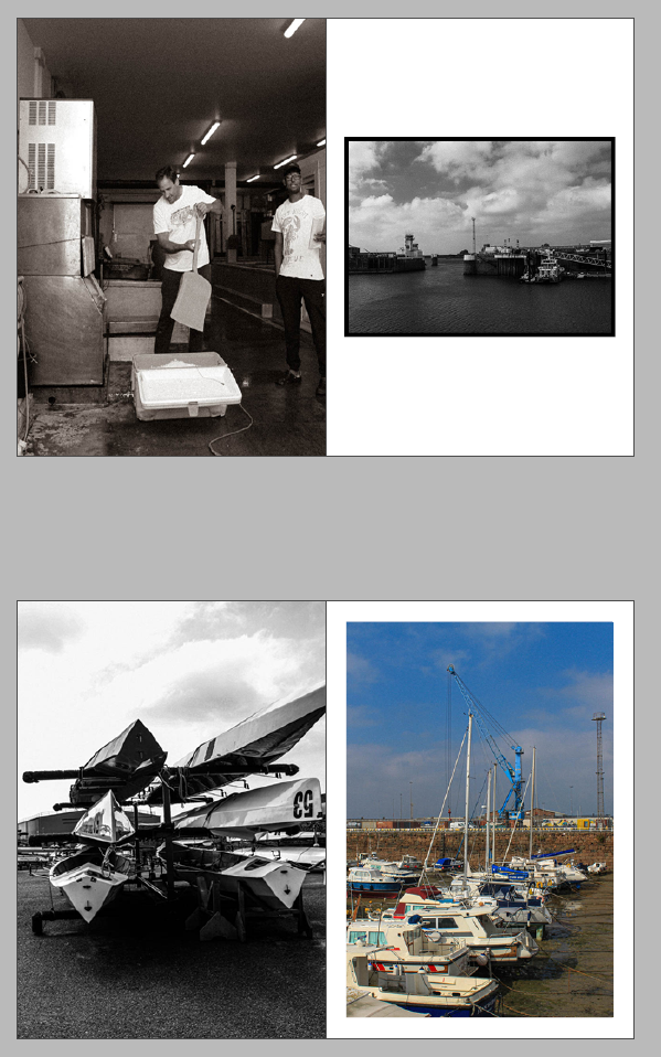
I chose these specifically together because the two images contrast well together. The left image’s main subject is fishermen boots hanging from a fishermen’s store room. This obtains some element of a historical factor due to these storage rooms being in Jersey for years, and had many people on a waiting list to gain one. Therefore, I added a heavy grain and a black white filter to give more of an old aesthetic. I think this contrasted significantly to the right image due to the main subject being a fishermen and his profession of catching sea creatures. The main reason why I put these images together is because the right image is modernized and more visible that it is the present due to me keeping it clear when editing, in contrast to the left image. Therefore, these two images relate on a factor, but are also slightly different as they are portraying the same thing, in different times. Within the first image, these cottages for fishermen had been located since the first ever harbour, and colour was still difficult within photography. This is why I made it black and white to emphasize the historical aesthetic, to compare with the coloured modernized image.
Page 4-
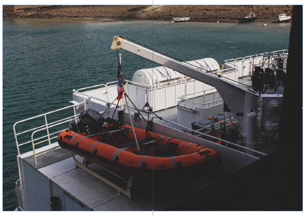
I chose this image because there isn’t a lot in it, yet shows a lot. The main subject is visibly the safety boat however in the background there is 3 fishing boats not in use. I liked the vibrant colour of red in contrast to the opposite, blue. This instantly makes the viewer of the image draw their eyes to the safety boat. I put the image on a double side spread to show the environment around it. I added heavy grain to make the image look more vintage and old, but kept the colour to keep it modernized as safety has and always will be a priority. I like the way the sea is highly texturized in contrast to the texturized rocks in the background. As well as the foreground, having a completely different textures and even shapes. This shows a varied image showing different elements in one image.
Page 5 experiment 1-
Page 5 experiment 2- Adding borders
Why did I chose these two images? I decided my left image for my zine because it shows a story. Not only does this show peoples professions, such as fishermen and selling the sea creatures they sell but it also has an element of the ‘ Decisive moment’. This is because I caught the right moment of the main subject in the centre of the image getting ice. Whereas, although the viewers eye will instantly go to the centre of the image, the man on the right side of the image is still very significant. The background of the image shows the environment and operations needed to operate their employment. The contrast of darker and lighter shades make it have an older aesthetic with deepened shadows. I decided not to make this black and white as I thought the brown and cooler filter made it look more natural to match it with the image, as the image and the people are completely natural. Which is a very big key factors of ‘ Decisive moments’ as people may change their behaviour and mannerisms. I contrasted and compared my left image to my right image because right image shows the harbour and operations on how the harbour works. The harbour is very historical due to it first being built and opened in the 1700’s and this is why I chose to put it in black and white, as photography started in the 1800’s but colour only began in 1861. This is to emphasize how long the harbour has been around to make an old and vintage aesthetic. The high contrast of the clouds and the texturized sea makes the image more interesting and drawing to the eye. The bottom half of the image has significantly dark shades whereas the top half of the image is very light which is obviously separated through the middle. I think both these images matched well as the left shows how it operates in contrast to the operations itself.
Page 6-
I chose the left image as they are sport boats. They are not to operate for an objective like fishermen with rowing boats. Instead, these are for pleasure and enjoyment for ones self. I liked how it shows something other than employment or operations. The contrast of the lighter sky to the dark deepened shadows on the floor is significant. Not only this, but the reflection off the kayaks creates a mystery factor due to the fact as a viewer you cannot see around the main subject, making your eyes only paying attention the centre of the image. In contrast to the right image, I personally believe it is a good match due to the fact these boats in the harbour could be for enjoyment as their main function is not to do something productive. The range of different colours stood out to me, so I kept it in colour. Another reason I kept it in colour was because when St Helier harbour began in the 1700’s the boats that came in were purely to help Jersey operate, such as trades and bringing supplies in etc. Therefore, this image shows how now there is more than that, and how the harbour has modernized. Therefore, these images contrast significantly and show more of a modernized aesthetic and look.
Page 7-
Page 8-
Page 7&8 experiment-
I chose this image because it has many geometrical shapes with different textures and colours. Although it isn’t showing a lot, it is showing the more in depth products on how the harbour operates and potentially even Jersey itself. I put it on a double page spread because the separation of colour between the metal boxes would separate nicely between two pages like so. The contrast of rectangular coloured boxes with a circular black tyre within the centre of the box is very significant and drawing to the eye. The texture of the blue wood to the right almost showing half of a triangle. The darker shade of the left box is significant as the two other boxes are bright and draws your eyes to the vibrant coloured boxes.
Final page-
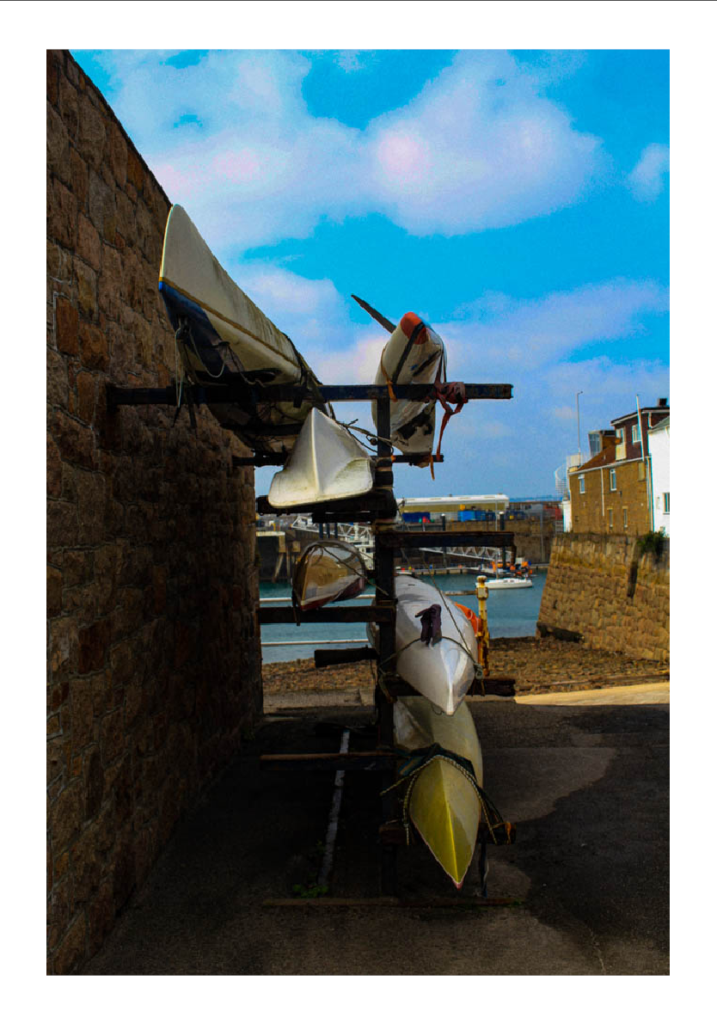
I chose this image because I liked the way all the rowing boats were very close together with lots of different vibrant colours. I liked the way this image was portrait as it is following the way the boats are going. I think the wooden path on the right side of the boats is very significant due to showing different textures and shapes contrasting with the boats. In the foreground it is showing a different style of boats however, the colourful boats in the fore ground are the main subject and the most eye catching to a viewer. I wanted to make it have an older and vintage aesthetic and to do so I added a heavy grain and a matte coloured filter. I wanted this image to look like it had been taken from an older camera due to the historical factors of rowing boats, not only this but because this was taken in the harbour which had began in the 1700’s. The boats look rather rusty and looks like they have been in use for a while, so changing the style of the image to older definitely emphasises this.