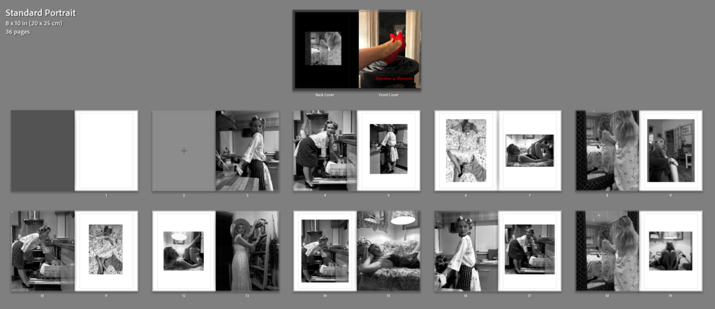
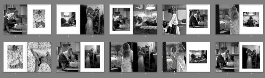
Photobook copy: https://www.blurb.com/bookstore/invited/10540639/888585ad70418cc9d13ca7c4081c0f77385c1d72

Chosen final prints and layouts-
A4:
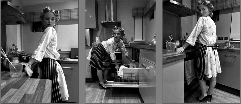
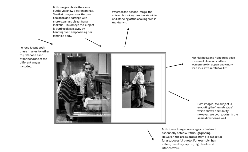
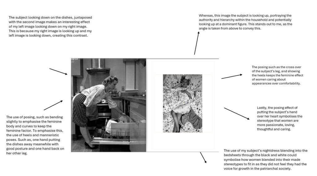
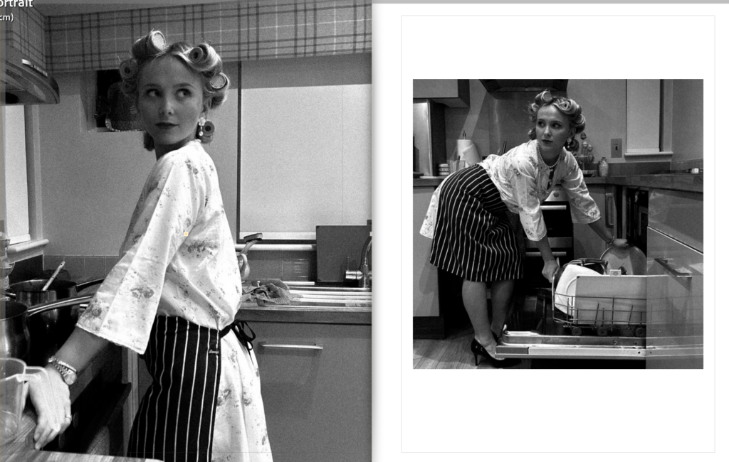
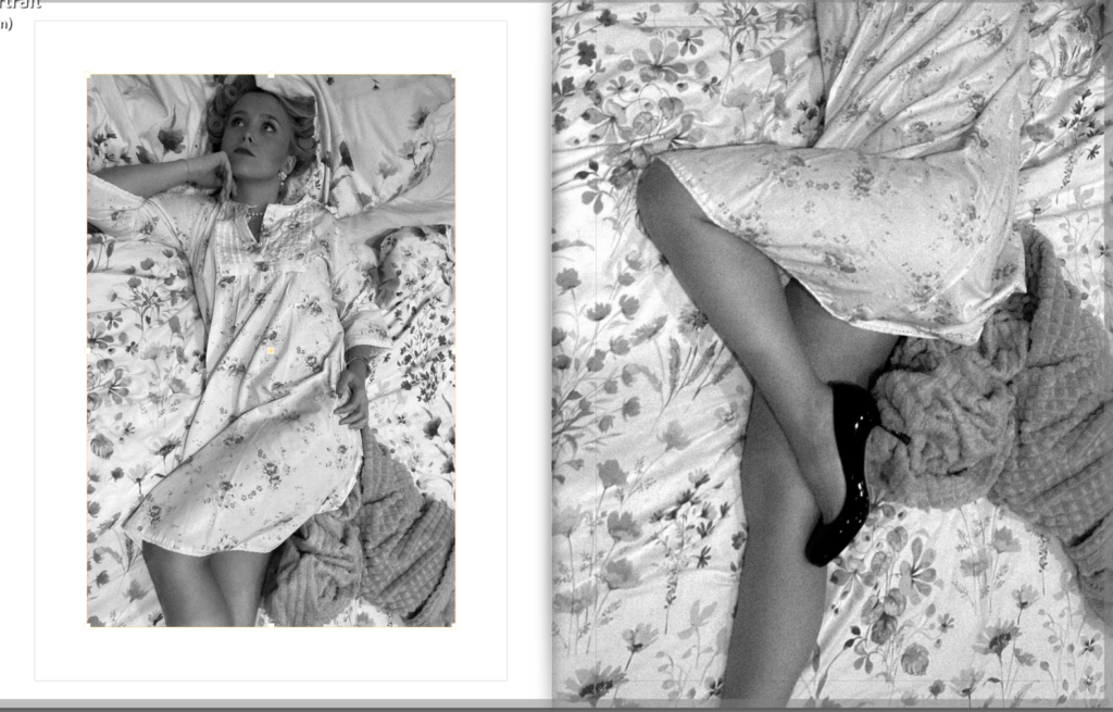
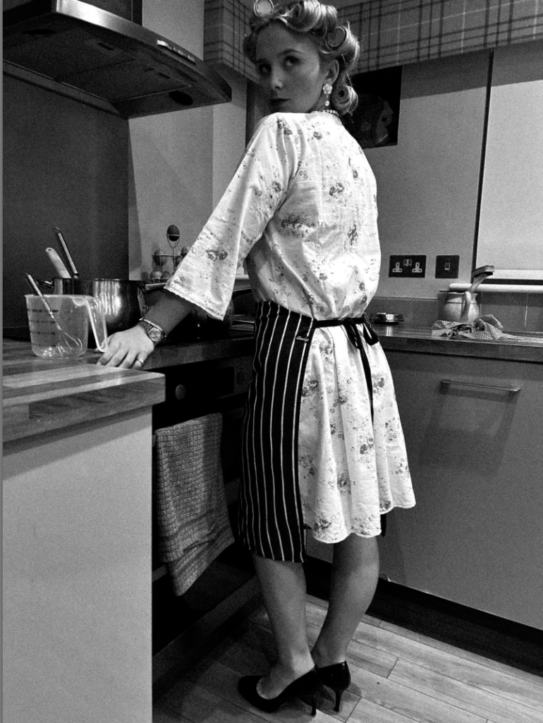
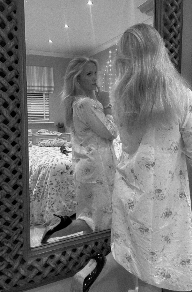
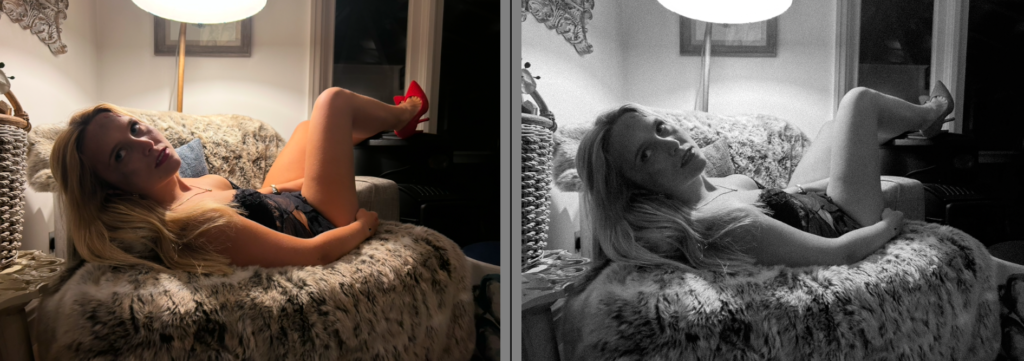
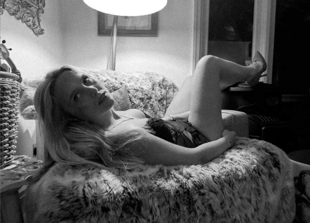
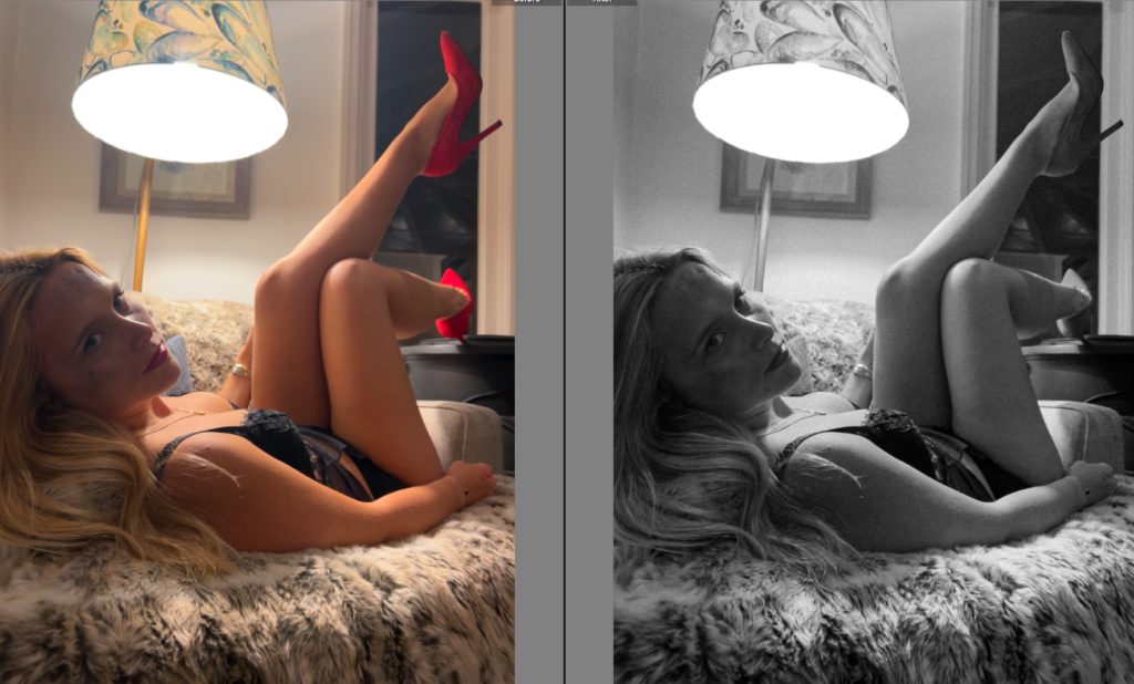
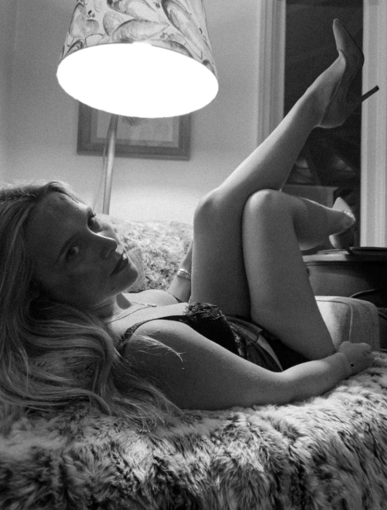
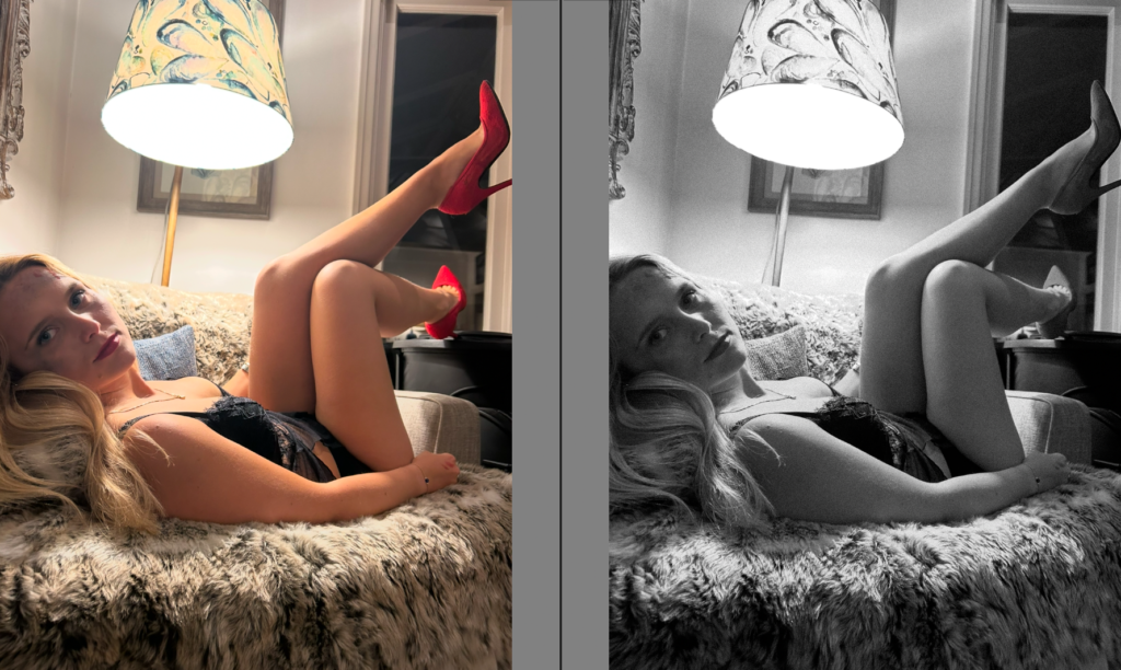
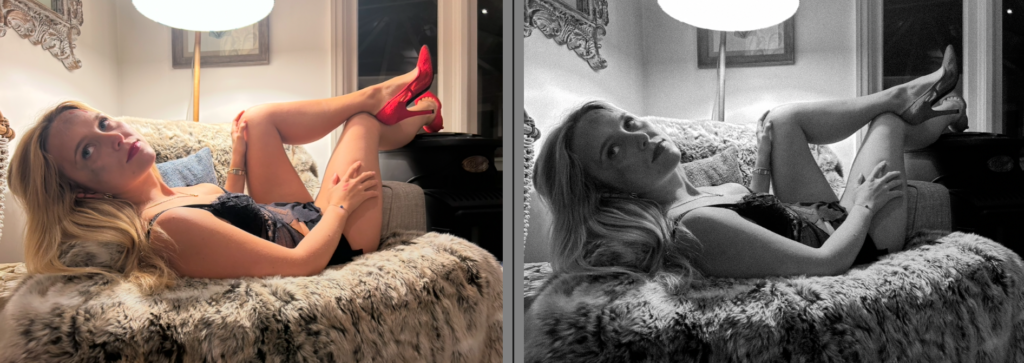
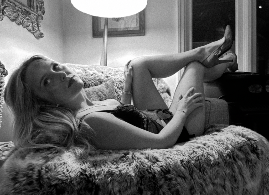
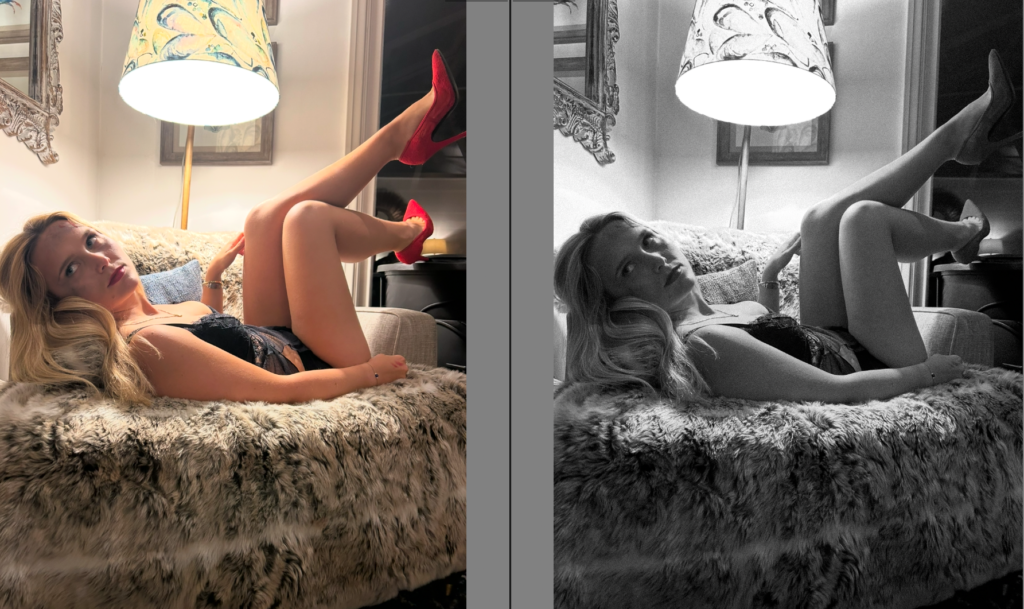
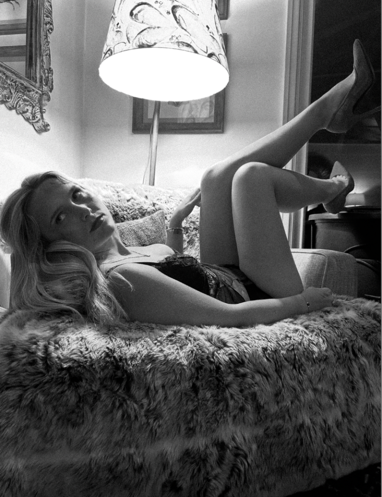
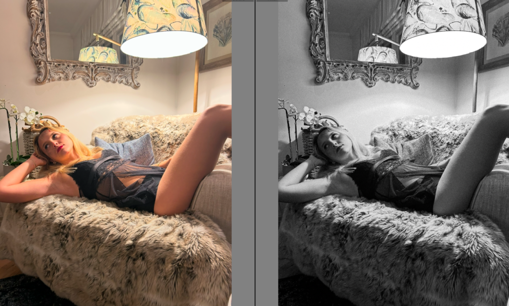
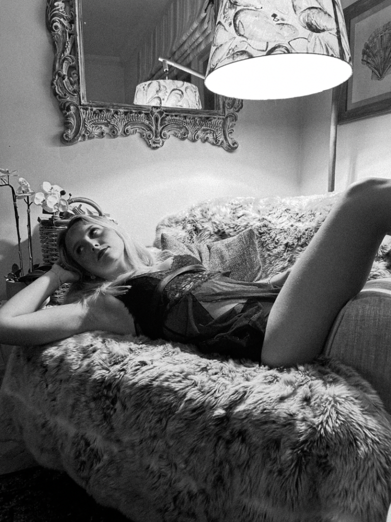
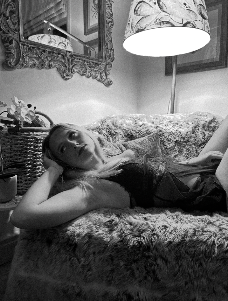
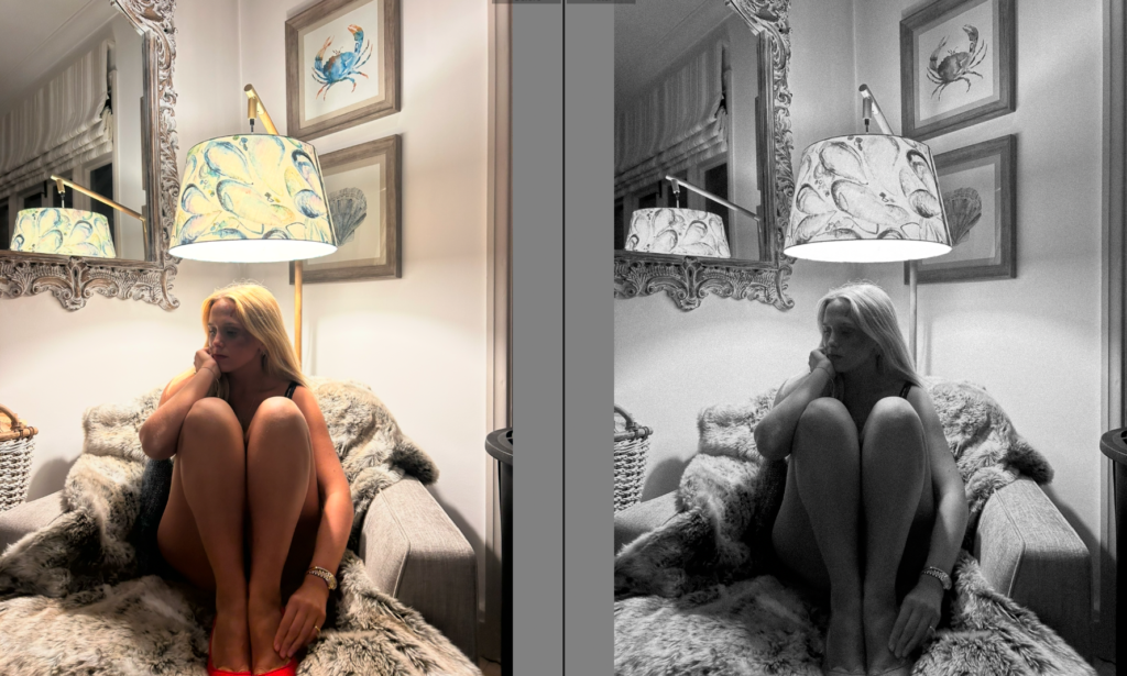
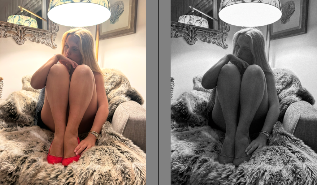
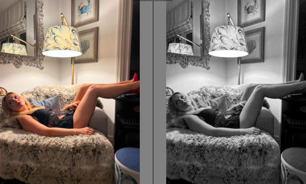
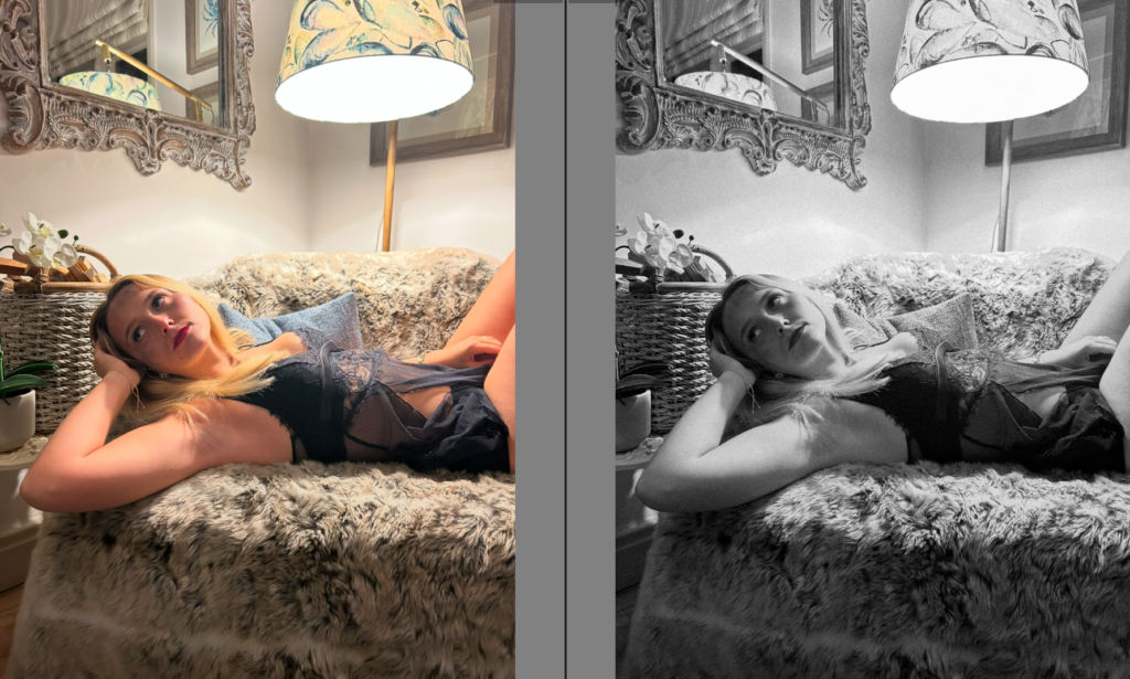
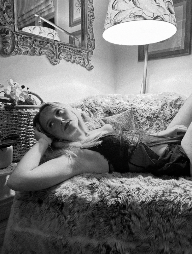
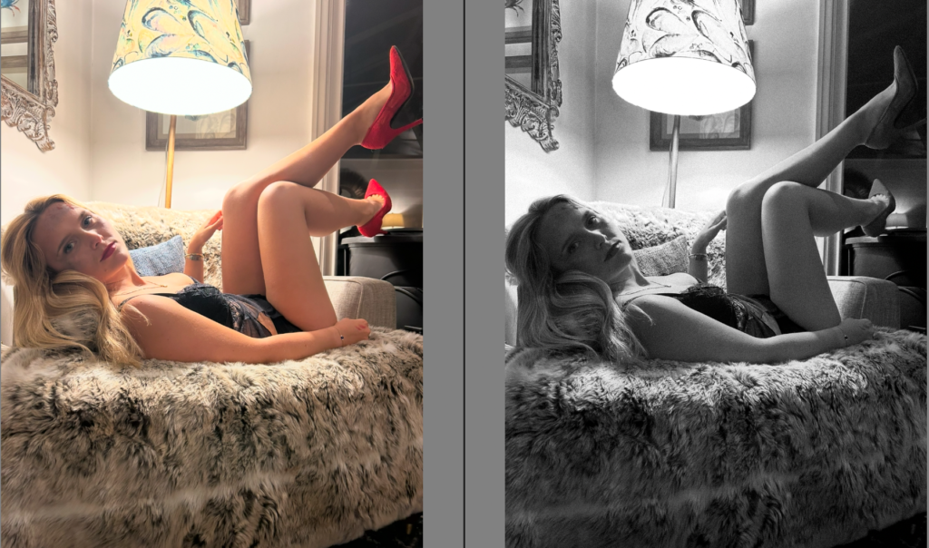
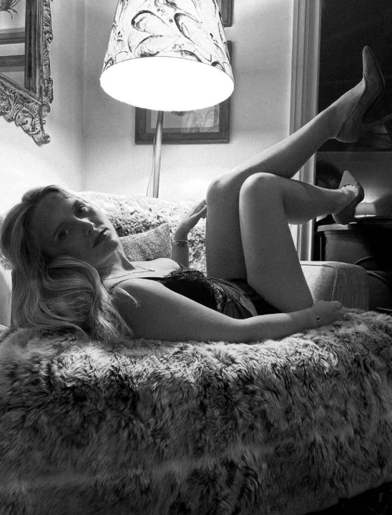
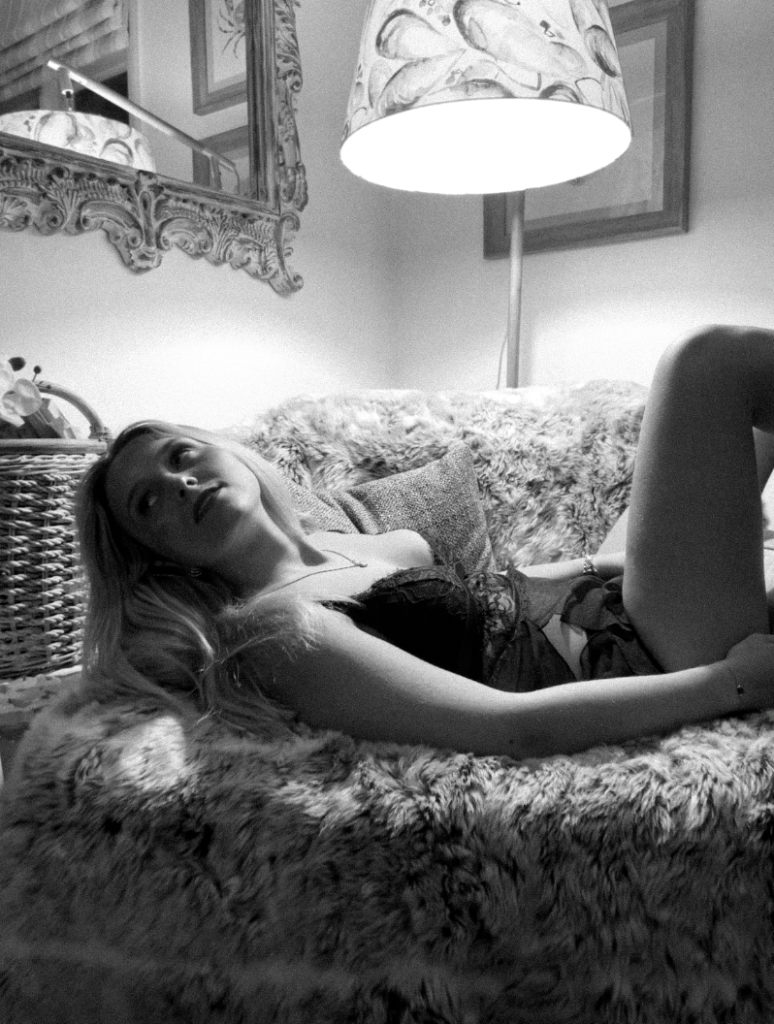
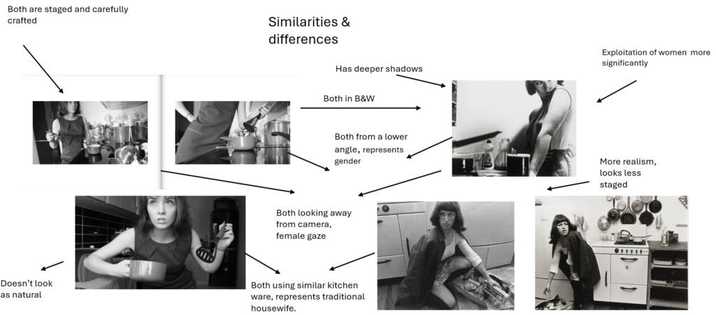
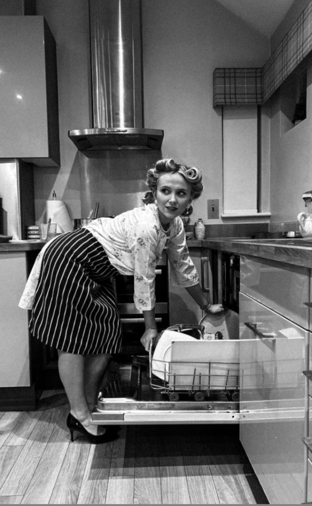
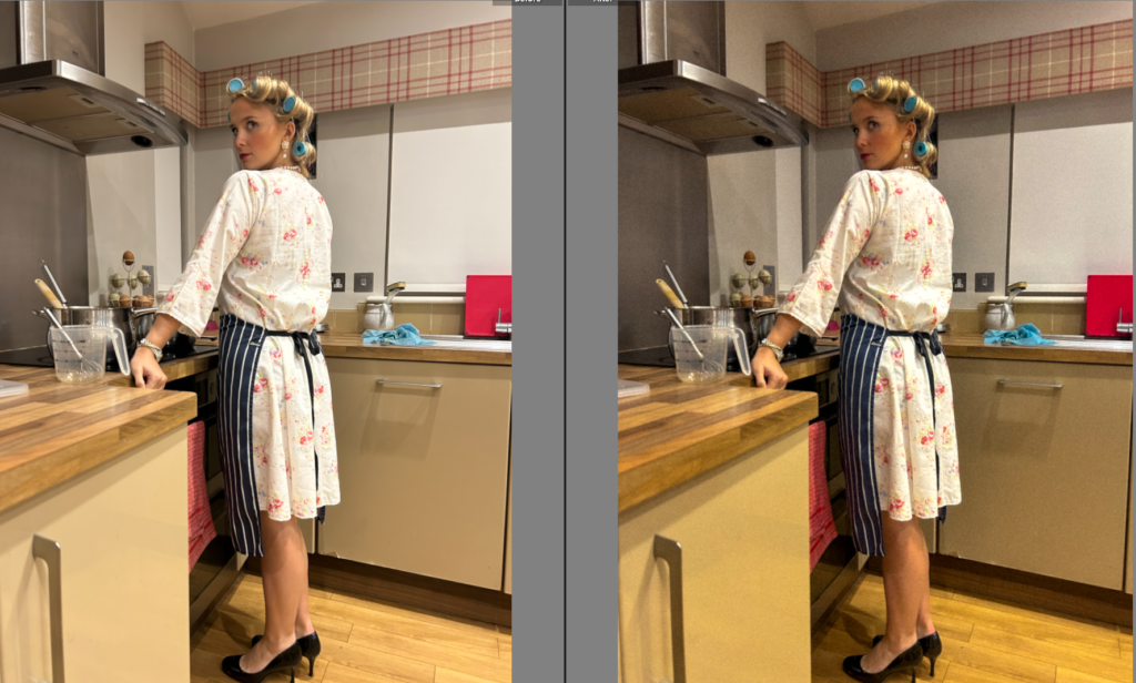
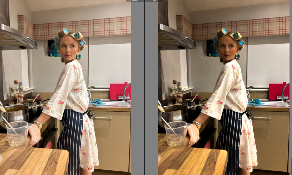
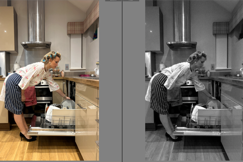
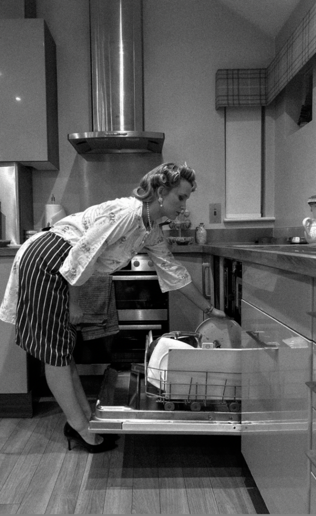
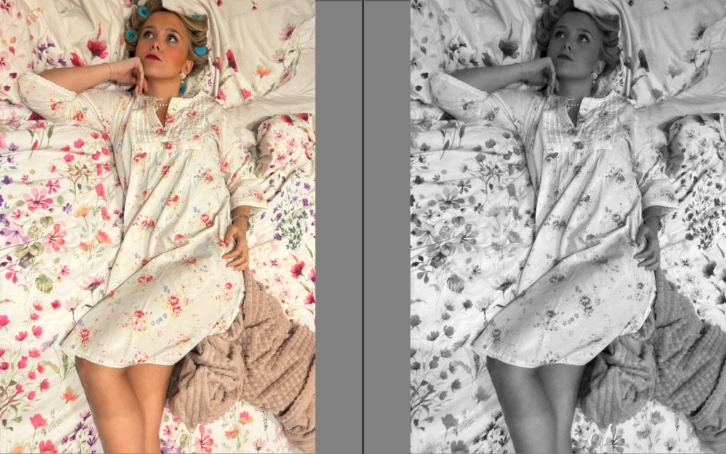
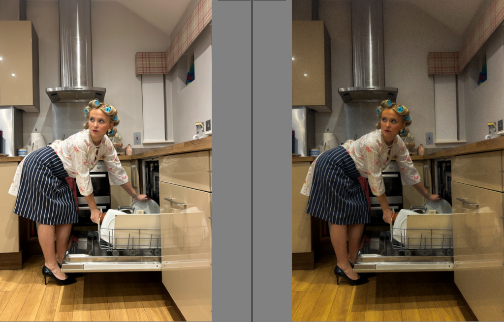
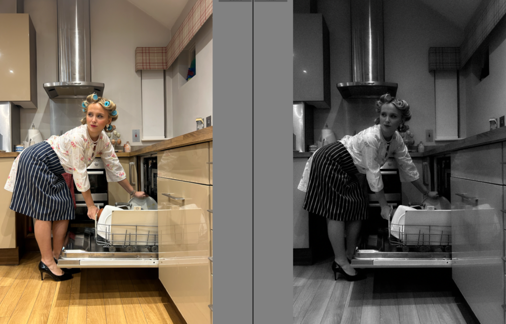
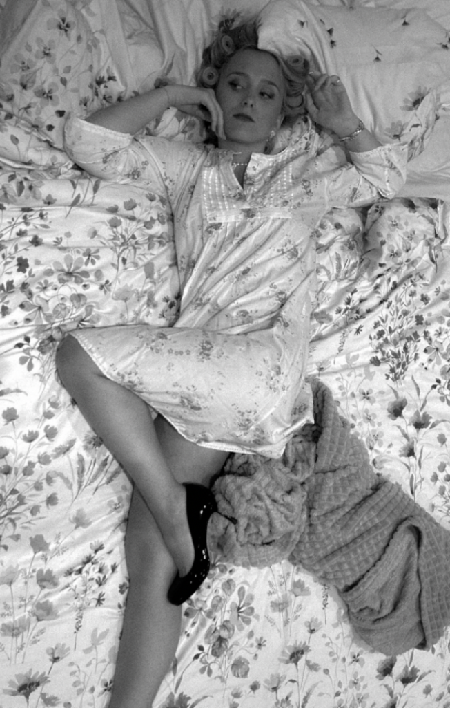
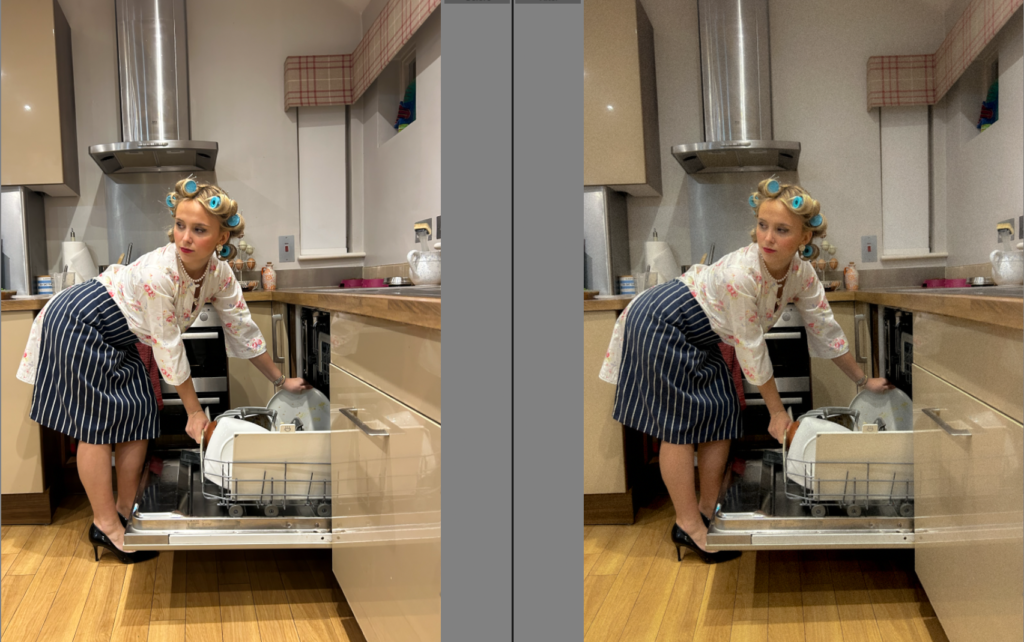
I decided to put these images for my final prints to be mounted on a board together as I felt that they sequenced together seamlessly. I wanted a variety of page sizes, and decided I wanted these images to be A4. These photos sequenced seamlessly to me as they present the same theme of feminism stereotypes ‘traditional housewife’ however obtain different elements in each image. This is because of the variation of angles. The first image represents the motherhood and nurturing element through the subjects hand over her slower stomach and is looking down obtaining the ‘female gaze’. Although, this does not include the symbol of heels. The second image I wanted in the middle as it is the most different to the others, and gives the illusion of the subject looking over at the left image. The bending over with the high heels with the props such as the apron and dishes, signifies more of a submissive woman in the household. Finally, the right image expresses all of these elements at once in one image, as it emphasises the jewellery, high heels and the ‘female gaze’ looking over the shoulder from a behind angle. All of which symbolise different elements within femininity and stereotypes within the 1st wave movement.
A5:
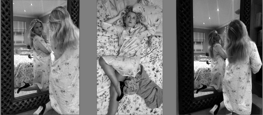
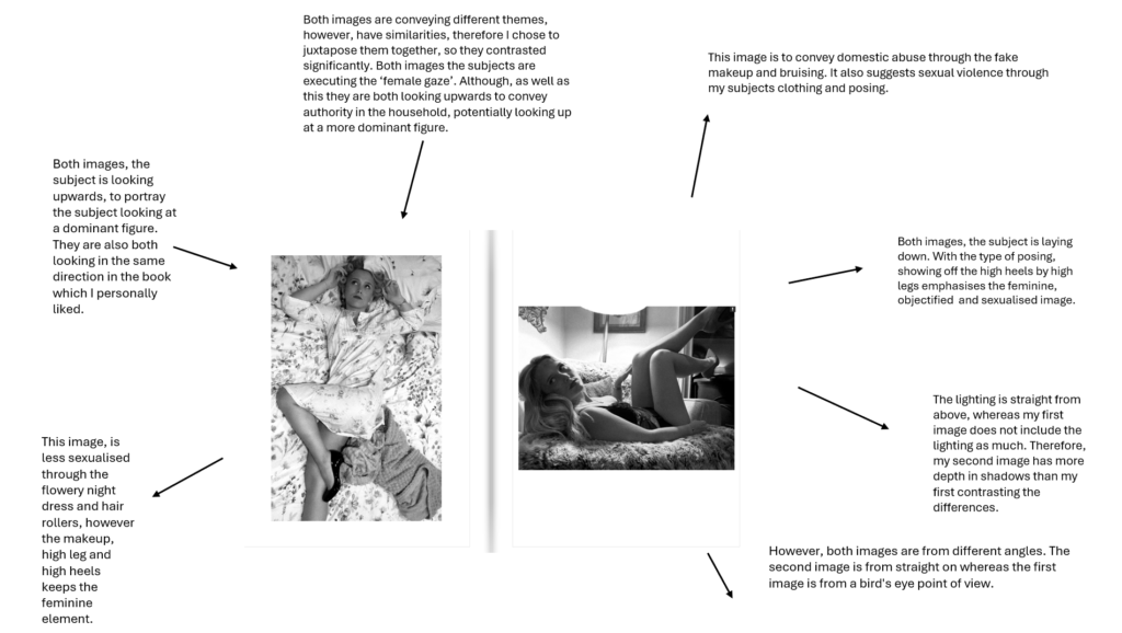
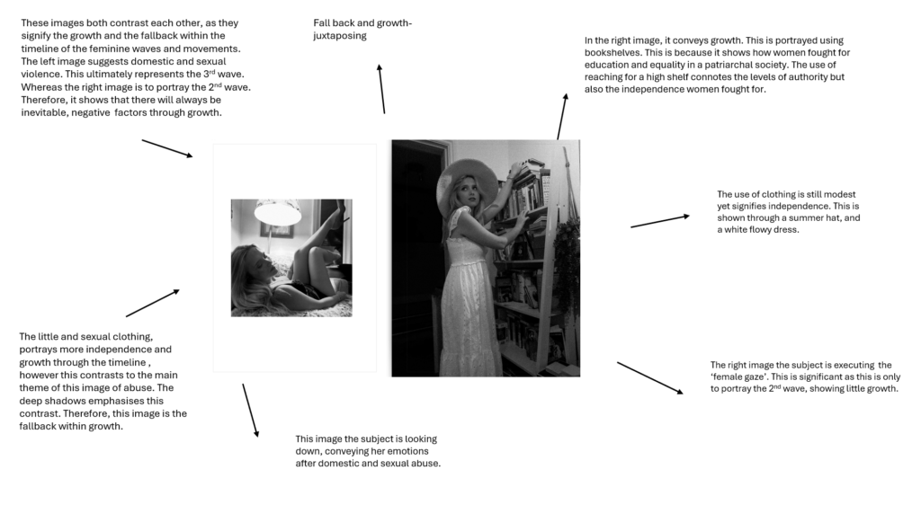
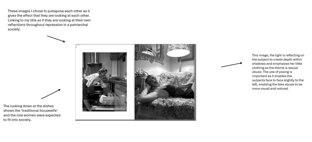
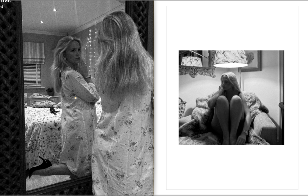
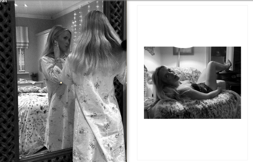
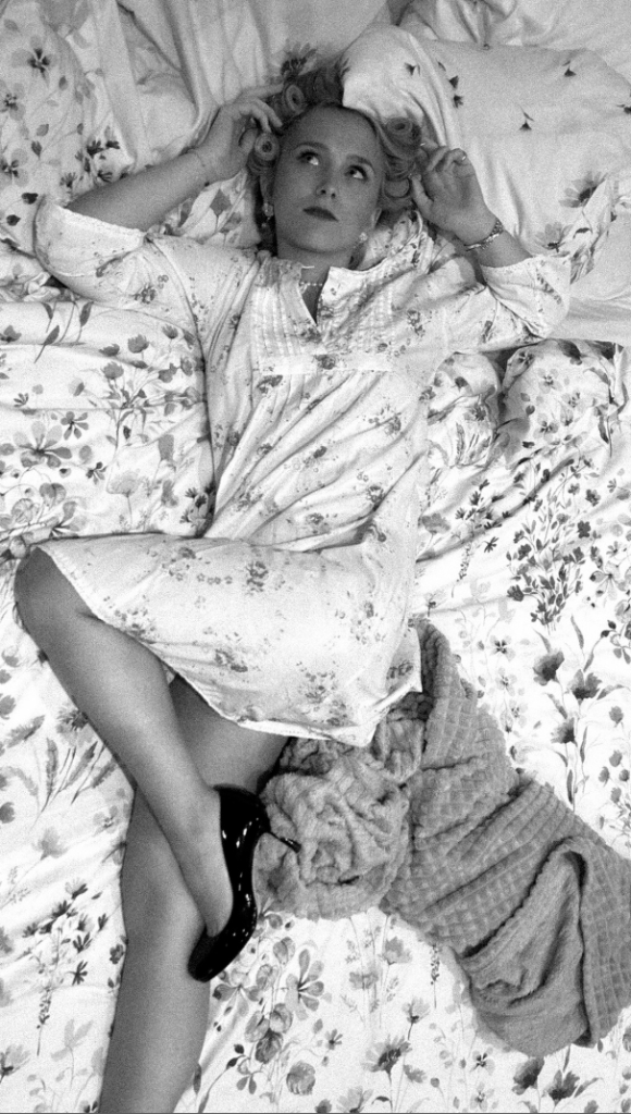
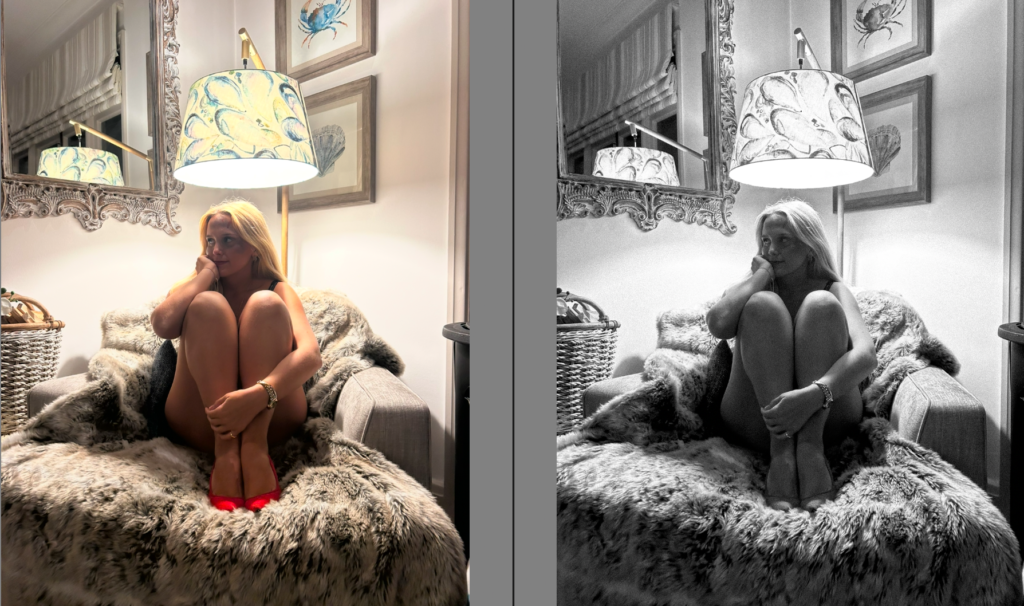
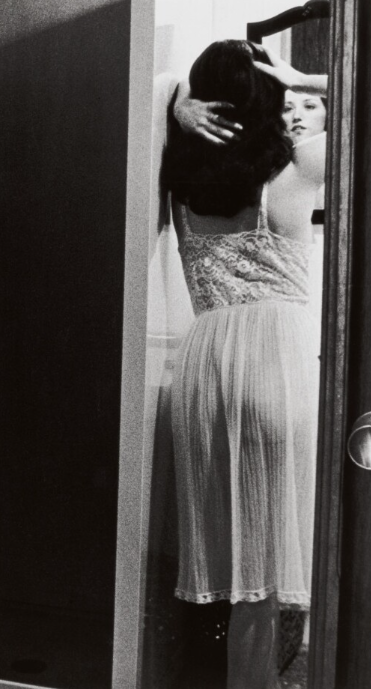
For these combination of images, I chose for these A5 images to be mounted together as I felt as if they fitted each other perfectly. I liked how the 2 on the edges worked well with each other as they are the same, but obtain different feminine poses. I wanted my middle image to break up the similarities, but at the same time to obtain relevancy. Therefore, I added this image which is one of my favorites as it is taken from above, signifying that she is submissive, and the man in the household is mostly likely dominant. Whereas the other two have a sense of independency. The middle one, the subject has hair rollers in which expresses her effort to appeal to her husband. Another reason why I decided to mount these images together is because the two images on the side, are expressing reflection (Reflections of Repression), whereas my middle image is executing the ‘female gaze’ and looking up, to emphasize this stereotype of being submissive and dominance, portraying the gender roles and power dynamics. Therefore, I really admired how all 3 images had a different meaning to interpret.
A3:

Virtual Gallery
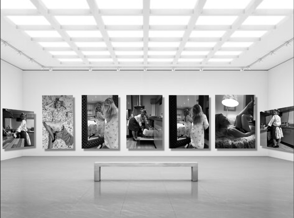
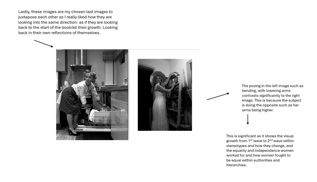
I chose these images for my virtual gallery as they are my preferred images from my 4 photo shoots. This is why I chose these images for my final prints. Overall, I think the black and white for all of my images fit into my theme I decided to focus on. Not only this, but I believe it looks smarter and more organised when sequencing my images together. I personally like how each image has meaningful interpretations of being a woman which was my objective within this project. Although each image is layed out thoughtfully so two photos do not clash together, I liked how the first image on the left is the beginning of the feminism waves, contrasting to the last image on the right which is representing the last wave of feminism. Ultimately, expressing the change of women throughout the years and how stereotypes are ultimately formed.
Evaluation In relation to Statement of Intent
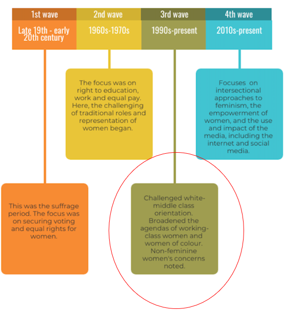
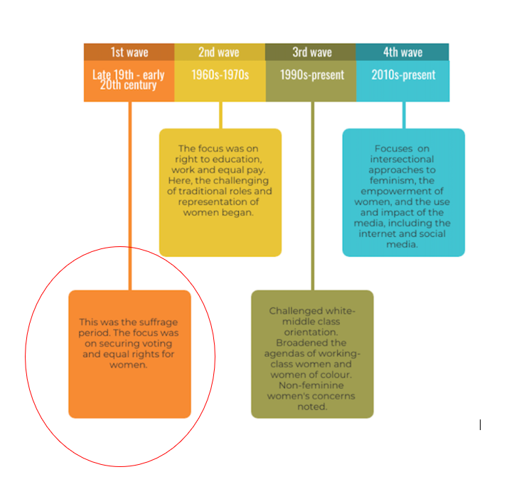
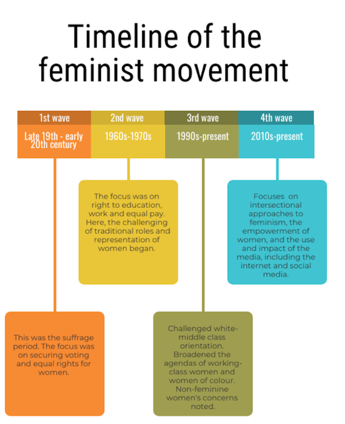
Within this personal study, looking back at my statement of intent, I stated immediately I wanted to explore the major social issues within gender, specifically women. I wanted to surround the themes of Cindy Sherman and Nan Goldin which was slightly a challenge as their work was very different in many aspects. Cindy Sherman took images of herself portraying the traditional housewife through props etc, creating cinematic and theatre play, whereas Nan Goldin linked more to realism and documented the struggles of being a women in a patriarchal society. I personally believe I balanced the two artists equally for my inspirations, and executed significant symbols through angles and lighting. I thought my development such as putting my book into symbols for each wave of the feminism movements was beneficial as it made it easier to balance both of my artist references. For example, Nan Goldin linked to my 3rd wave and slight 2nd. Whereas Cindy represented my 1st and 2nd. To continue this, I added a bit of my own thoughts of being a woman in todays society, being the 4th wave extended. This was my 4th photoshoot to represent how women feel considering the rise of social media and the pressure on young girls. Overall, my book layout came out exactly how I intended with the collaboration and mix of all the waves rather than doing them in order. I feel that I carefully selected what image to go where to emphasise the contrast significantly. My front cover being in colour differed to the rest of my book and contained significant symbolism. Lastly
Preparation stages-
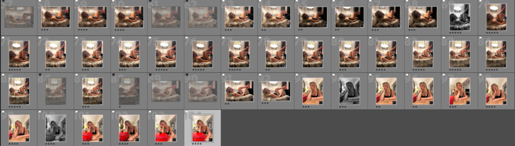
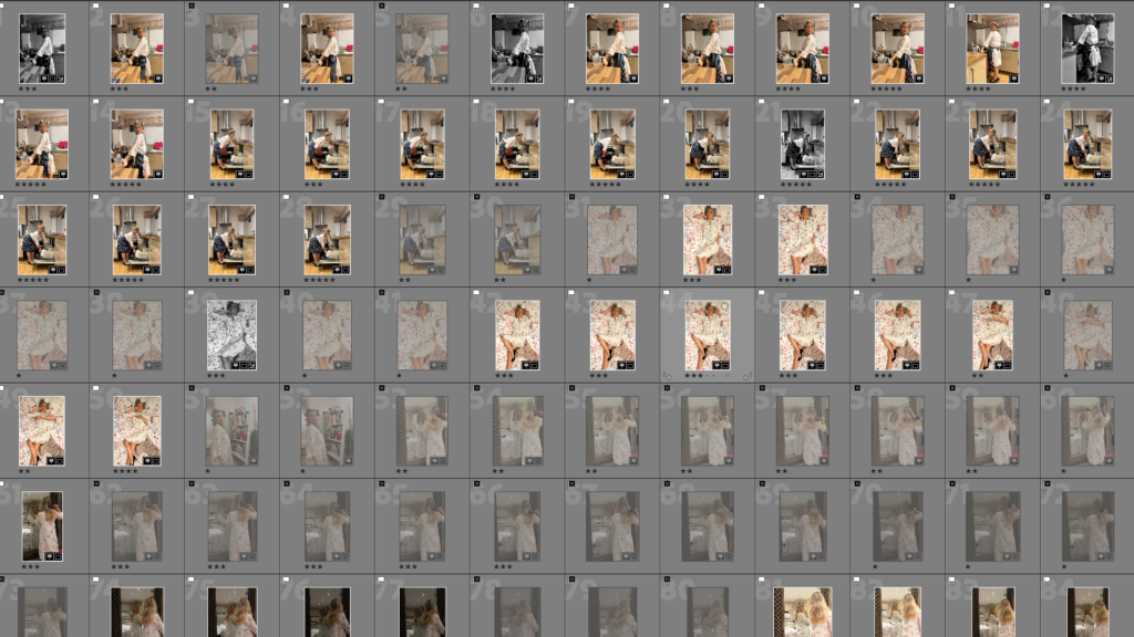
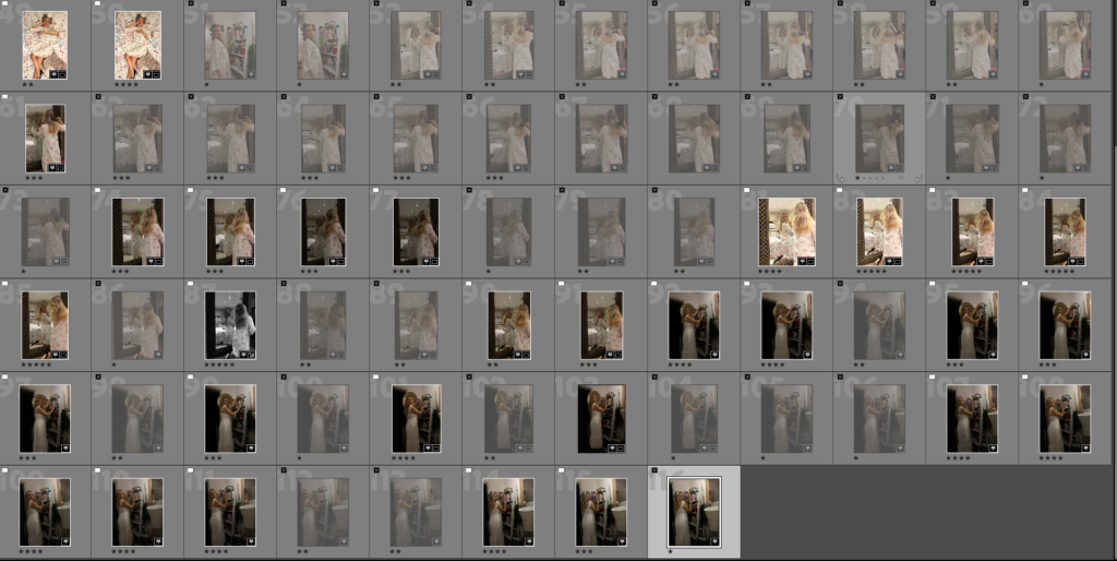
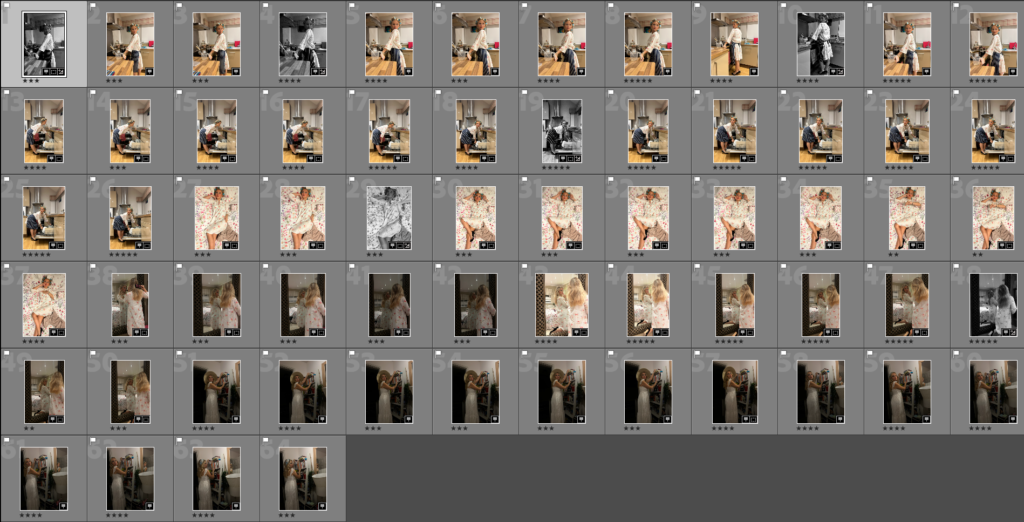
Firstly, I began by choosing my preferred images by flagging them, rating them and putting them in colour co-ordination. This was difficult as I had to pick out a perfect amount of images, out of 4 photoshoots to decrease risks or complications. This benefited my photobook as it helped my time-efficiency due to organisation. After I did this, I put all my images into a collection set under photobook to ensure this organisation so I did not make an error.
Design prep and layout-
Front and back cover analysis of why
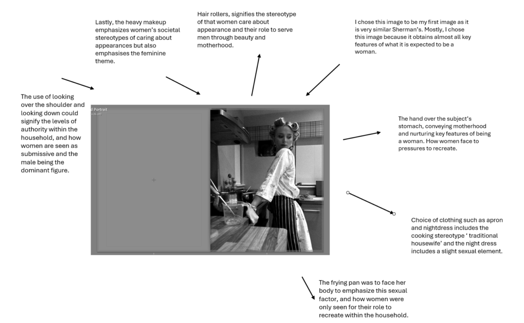
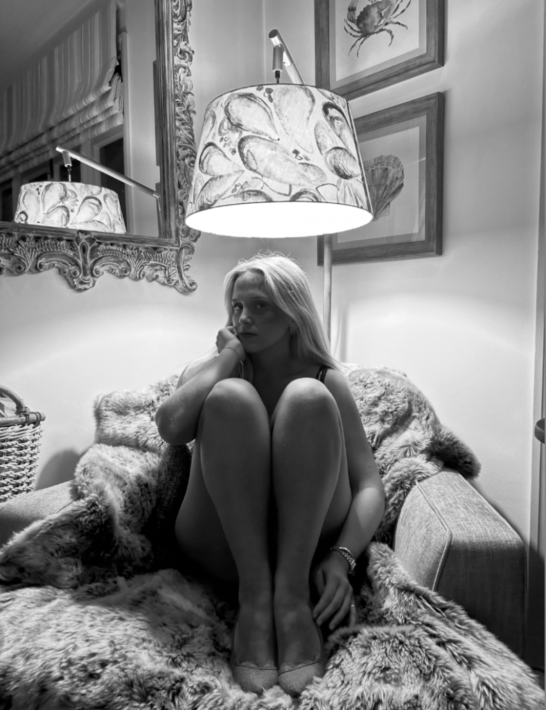
This image was my preferred first image as it included all the key features of what society expected of women, causing stereotypes throughout the timeline of feminist movements and waves. I chose this to be my first image, as it tells viewers what to expect as soon as the book has been opened and keeping it clear and simple.
How is the work of Cindy Sherman and Nan Goldin questioning the politics of gender and female stereotypes?
“In the past, photographs of women were made by men for a capitalist economy to favour the male gaze and feed female competitiveness” By Charlotte Jansen.
The word ‘Feminist’ is often misinterpreted. Somehow the adjective advocating social, political, legal, and economic rights between women and men, has been constructed into ‘man hater’. My area of study is female stenotypes and how they differ through the years, however my argument is whether female stereotypes are formed by men in a patriarchal society. Initially, stereotypes are inevitable in society as they are a social norm. Unconsciously as humans we make stereotypes, the first reference to stereotype in English was in 1850, as a noun that meant ‘image perpetuated without change’. This predominately suggests the growth women fought for during the feminist movements as their stereotypes changed successfully. However, my other side of my study is that stereotypes for females were caused by inequalities due to a male dominated society as it caused hierarchies. This is because of expectations men have of women from the beginning such as the traditional housewife and their role to serve men. The artists I have chosen to study are Cindy Sherman and Nan Goldin as I believe they effectively portray gender politics and stereotypes. Sherman executed this through dressing up, posing and photographing her self in different scenarios. Sherman effectively critiques the way women are portrayed in popular media, such as film, television and magazines. These images challenge the viewer to question their preconceived notions about identity and the roles society imposes upon women. At first, she photographs herself playing a traditional role men expected women to be, such as a housewife. Not only this, she photographed others and herself suggesting their struggle with their own identity. Nan Goldin, expresses her view on stereotypes through a different sense. Goldin expressed her experience on domestic abuse during a relationship by photographing her own wounds of female empowerment. This makes me think about the key features of stereotypes such as strong vs weak. For example, her image that stood out to me the most ‘Buzz and Nan at the Afterhours, New York City1980′ represented male roles such as dominant and confident in contrast to naïve and vulnerable as women. However, I was mostly inspired by her New York city night club and bar photographs as it expressed intimacy, the isolation of abuse and hierarchy.
I will be responding to both of their work by including all of my inspiration from these artists and putting it in an order of a time line, specifically to the feminist movement waves and how the stereotypes changed through each wave, from the first to the fourth. My first wave photoshoot, my main inspiration is Cindy Sherman and my intention is to express the ‘traditional housewife’ stereotype. This is aimed to focus around early 20th century. The second wave photoshoot is to express more independence but the focus being educational rights, remaining inspired by Sherman. Next, the third wave photoshoot is focused around domestic abuse, heavily inspired by Nan Goldin mixed with Sherman. This is aimed around the 1990’s to the present. Lastly, my photoshoot for the fourth wave is to focus on the expectations on women due to social media. This is focused around the present and what teenagers go through my age, based off personal experience.
Artist Reference – Sherman
Cindy Sherman was known for her stage crafting, posing and role play photoshoots. This evidently linked to an element of drama, theatre, acting and film as her photos are ultimately the opposite of realism and conduct fake scenario’s but portray real themes. Especially in how it critiques and represents female stereotypes. Sherman creates elaborate sets, costumes, lighting, and props, similar to theatrical productions. Her photographs resemble scenes from plays or film stills, as they often depict a climactic or suggestive moment of a story such as 1950’s female stereotypes. Her dramatic and theatre themes comes from subjects expression. Her characters or even herself often display exaggerated facial expressions or gestures, heightening the drama and giving the impression of a moment captured mid-action. Most of the time, she does this through the ‘ male gaze’ to convey the expectations that women were to only serve men. The visual narrative is significantly important as it surrounds the theme of stereotypes and women in the 20th century mostly, however these elements still continue. Each image feels like it belongs to an unseen story. The ambiguity allows viewers to imagine their own narratives, drawing on their understanding of societal stereotypes. The roleplay comes from transforming each subject and even herself. Sherman acts as the sole subject in most of her photographs, embodying various female archetypes. She transforms herself into housewives, actresses, sex workers, society women, and more. This mirrors the performative nature of societal roles women are expected to play. She changes her identity and disguise by using costumes, wigs, and makeup, she completely erases her own identity, taking on fictional personas. This highlights the constructed nature of femininity and gender roles. Her cinematic aesthetic photographs are heavily influenced by film, particularly her famous series Untitled Film Stills (1977–1980). These black and white images mimic publicity stills from 1950s and 1960s Hollywood and European art cinema. She likes to convey ‘ frozen moments’, evidently her photos suggest moments from a larger narrative, much like a paused frame in a movie, leaving the viewer to wonder what happened before or after the shot. She critiques the male gaze by embodying these stereotypes, Sherman confronts the way women are constructed in visual culture, particularly under the male gaze. She reclaims control of these images, playing both the object and creator. Her work suggests that female identity is not singular but fragmented and shaped by societal expectations, media, and cultural roles. In my opinion, Sherman links more to ‘ mirrors’ rather than ‘ windows’ as her images do not fit into the realism category and they reflect Sherman’s experience through being a woman. Tableau is used to describe a photograph in which characters are arranged for picturesque or dramatic effect and appear absorbed and completely unaware of the existence of the viewer which Sherman typically executes.
“A number of questions occur. How does the woman look? Is she forced to share the way of seeing the man, or might there be a specifically female gaze? Can the man too be the object of the gaze? Can such a clear distinction be made between male and female, masculine and feminine? “(Williams in Wells 1987:6)
Artist Reference – Nan Goldin
However, Nan Goldin’s images I am specifically inspired by are her abuse photoshoots published in her seminal photobook, The Ballard of Sexual Independency, which represent the domestic real life violence Goldin experienced through being a woman. This ultimately links to realism as it is Goldin documenting her real life experiences without adding glamour or hiding anything. Instead, her aim was to give other women empowerment to make them feel less alone due to the large proportion of women who do go through this, and are typically seen as weak. This links to stereotypes as it is stereotypical that a woman is not powerful and is weak when they are facing these issues in this society, making a man as dominant and masculine. The term ‘realism’ can mean to depict things as they are, without idealising or making abstract. Not only this, but Goldin’s work is documentary as she wanted to show her lifestyle without covering any facts. ‘Nan’s work is unfiltered and deeply personal about her life. She’s been making artwork herself about her life for decades,’ Poitras explains. ‘She just felt strongly that it was the time to talk about [her sex work] and with the intention of destigmatizing that. There’s so much stigma around sex workers, so much stigma around drug use, there’s so much stigma around domestic violence, etc. And that I think she just felt very strongly that this film could also destigmatize those issues.’ (Chiriguayo 2022) So evidently, there is some major differences but also a few similarities which helps link both these artist together under the pressures of society and women.
Cindy Sherman questions the politics of gender and female stereotypes by stage crafting and fitting herself into the male expected stereotypes. This portrays the political and societal views on how stereotypes are started within females. Therefore, I responded in a similar way to Sherman’s by starting off by exploring societal expectations and then slowly going through the timeline of the feminist movements by showering growth and empowerment. For example, I was heavily inspired by Cindy Sherman’s image conveying the ‘ traditional housewife’ as it significantly portrays the politics and female stereotypes caused by expectations from men that women are to serve men.
Untitled Film Stills (1998)
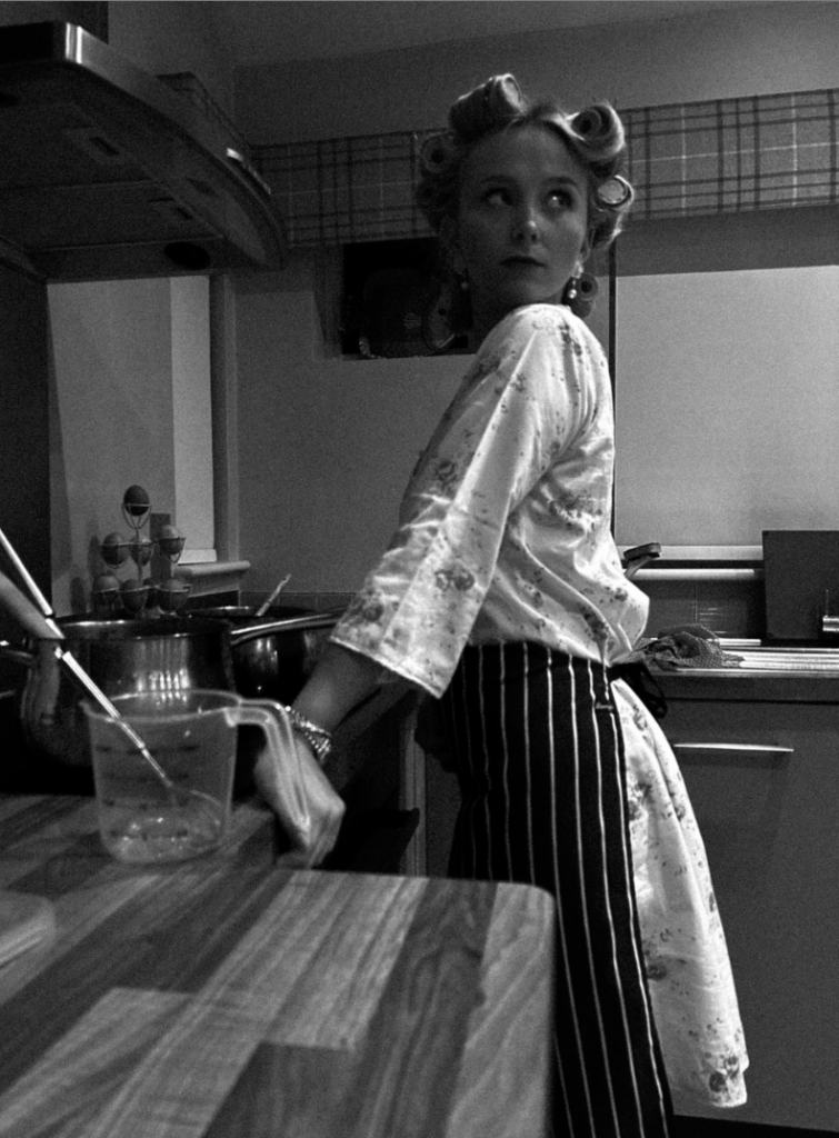
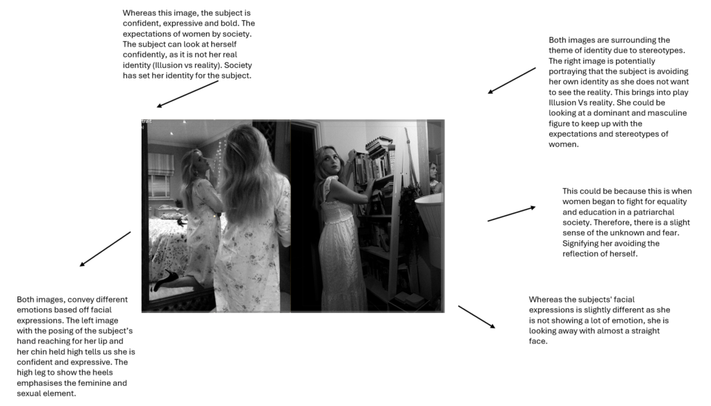
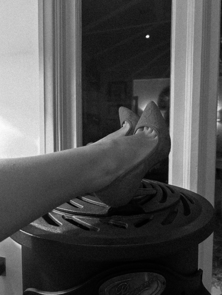
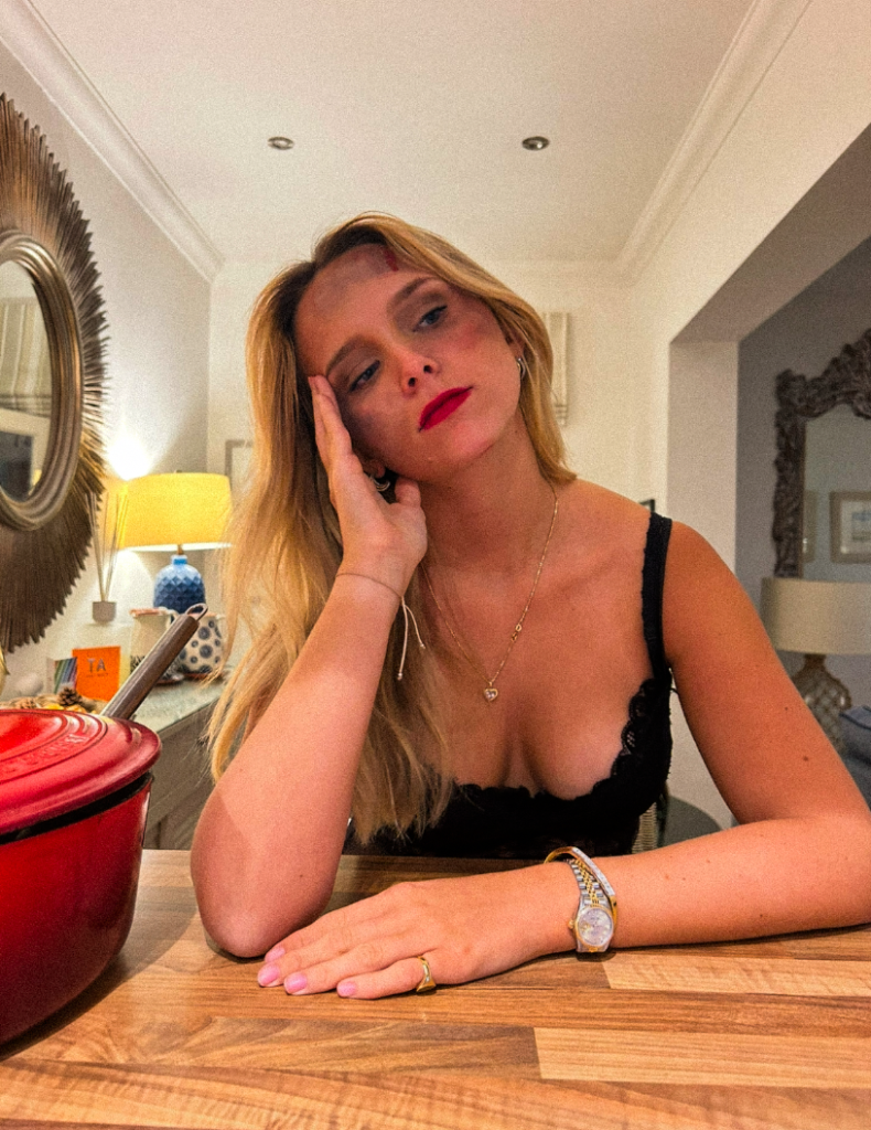
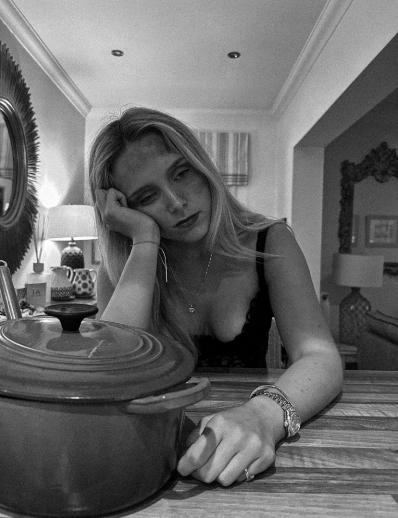
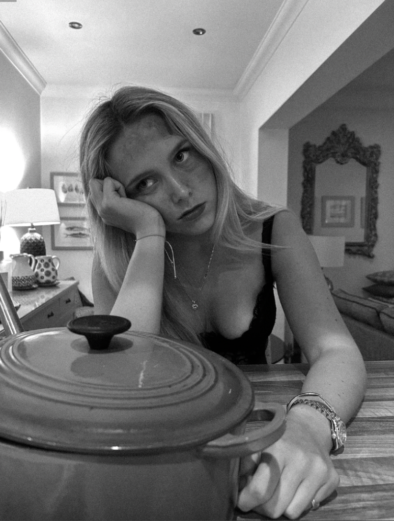
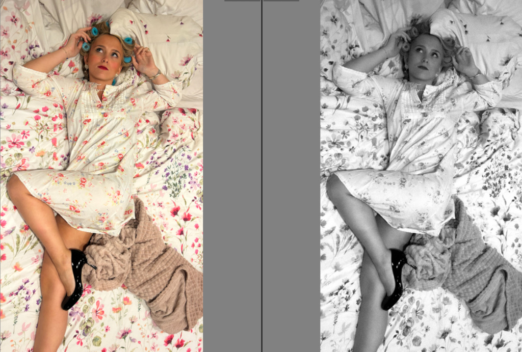
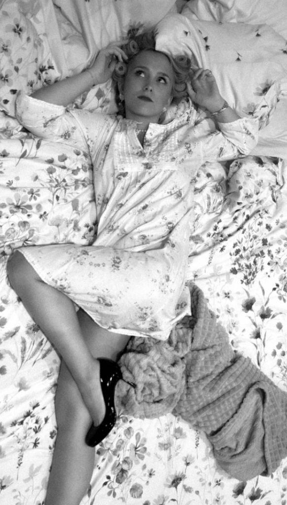
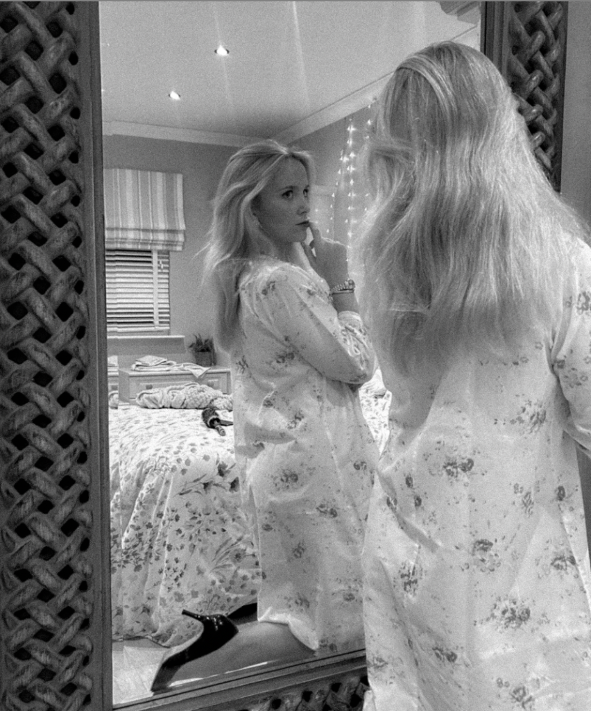
Within my response, I attempted to include similar key features such as the props and clothing. For example, the clothing increases the theme of feminine stereotypes such as caring about appearances such as the hair rollers, heavy makeup and high heels. The apron suggests her role in the household such as cooking for her husband. The ‘female gaze’ is suppose to convey the subject looking over at her husband.
One thing I did not do successfully due to lighting is that you cannot see the subjects hand over her stomach like Sherman’s image which eliminates the key feature of a woman being nurturing and ready for motherhood. Overall, my images are very staged, and link to drama as this is essentially acting through a photograph.
I experimented by changing angles to present the subjects high heels, this ultimately presents that women in the 1950’s had to look ‘perfect’ for the male in the household. This also adds a slight sexual element too it, which women were also seen for only to recreate. The look over the shoulder was significant to me as it shows a busy woman impressing her husband. This is interesting to me as heels can be viewed in different ways depending on the theme of the image. This is because in my third wave feminism photoshoot it is to signify confidence and growth through empowerment. However, in this photoshoot it is seen to impress and serve men’s societal expectations through appearances.
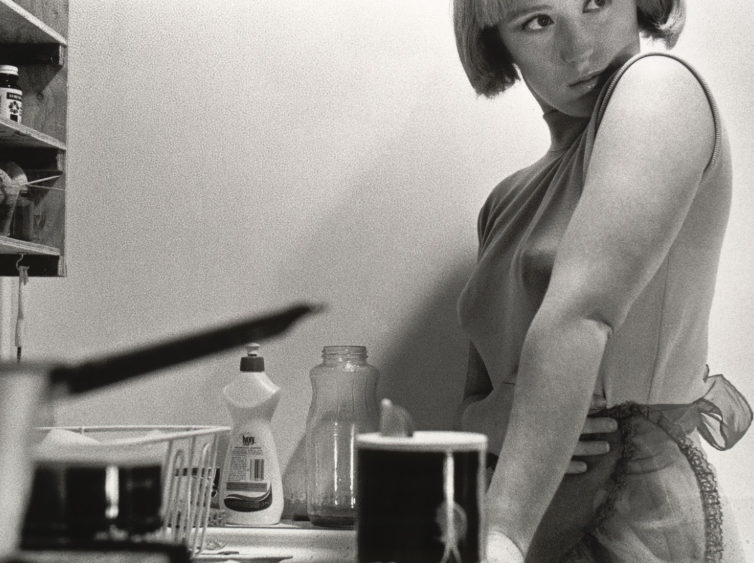
Another example of how Sherman questions the politics of gender and female stereotypes is through how women were seen to stay at home, and not have a right to education and work. This meant that women were viewed only to recreate and serve men through domestic appearances and motherhood. I interpreted this deeply through one of Sherman’s more revealing and sexual images such as;
Untitled Film Still #6

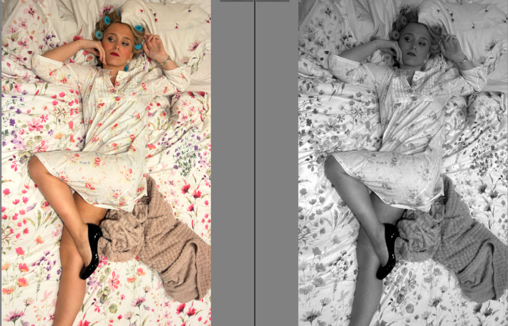
The first thing that caught my attention was the hairbrush in her left hand. I interpreted her aim was suppose to show feminine traits and stereotypes by fitting into the stereotype of women only caring about their appearance and beauty. The fact she is lying in bed, conveys she is waiting for her partner to come home. This is significant to be as Sherman was typically aiming for the 1950s, which was when women did not have equality rights within education and work. Lastly, her little clothing again, adds an element of sexuality as women were often objectified and sexualised during these times. This could symbol her typical role of motherhood and recreation. Overall, I noticed she frequently uses the ‘female gaze’ look which ultimately stands out to me as she is looking up to a potential dominant figure. This is literal as the image is taken from above, and she is laying down much lower. This could be to symbol the extreme dominance men had around the 1950’s and her look is to convey to stay within the role, potentially because it is all women knew.
For my image, I diversified my image by using hair rollers rather than a hair brush to include a similar element. To emphasise this theme of women serving men through appearance and being a mother I made the subject wear high heels to keep a sexual element to it. This is because Sherman executes this element successfully and frequently. The use of posing, such as a high leg really stood out for me. I put it in black and white to make it similar to Sherman’s, but also because my subjects dress was clashing with the bedsheets. This could ultimately symbolise women in the 1950’s as they decided to fit and blend into stereotypes without speaking up, linking to the subject blending into bedsheets. The black and white emphasised the blending. Lastly, the ‘female gaze’ and heavy makeup created the feminine and submissive element to my image. The heavy grain made it have more of a vintage and old aesthetic which is exactly what I was aiming to achieve.
Another example of how both Nan Goldin and Sherman questions the politics of gender and female stereotypes is through the significant key feature of fitting into the stereotype of women caring about their appearance. This is inspiring to me as men do not have the same stereotype, questioning the gender stereotypes.
Untitled Film Still #81
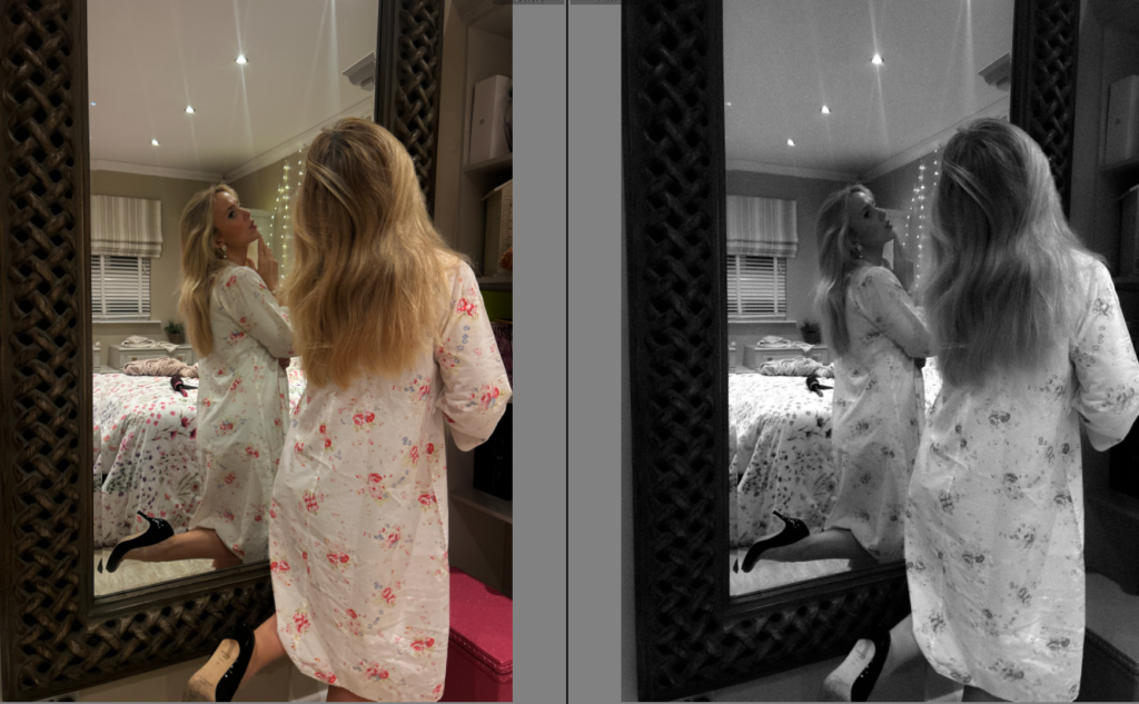
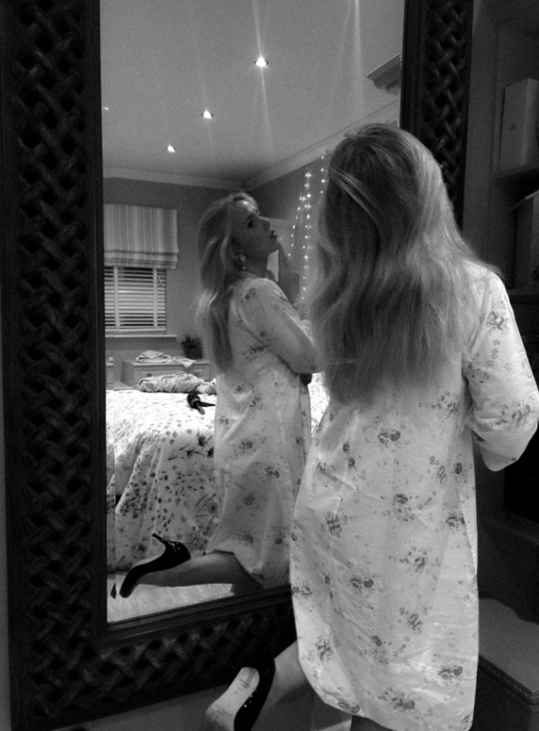
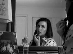
Both of these images give off different aesthetics in my opinion. Sherman’s portrays a sexual element to it such as the night dress and the hair and hands. I like how it is slightly blurry and can hardly see the subjects face. This ultimately creates a mysterious element to it. To emphasize this, most of Shermans images are in black and white which I personally prefer as it makes her images have a vintage and old aesthetic. The angle and placing of the camera makes it look like the image has been taken from the bedroom into the bathroom. However, Goldin’s image is less sexualised through the use of the subjects clothing such as the tank top, which isn’t seen as feminine as the night dress. Goldin’s image is clear, emphasized by the use of colour. Although, they both convey the importance of appearance through women by adding something to themselves by looking in the mirror.
‘Amanda In the Mirror’, Berlin: Nan Goldin 1992
Within my image, I attempted to combine both artists. I did this by my subjects clothing such as the night dress and heels to convey a sexualised image of women, which is often a stereotype. The posing such as the high leg, and the hand on the subject’s lips ultimately portrays this significantly. The use of black and white makes the image look older. Lastly, I added a heavy grain to make it look less clear like Sherman’s and vintage.
Cindy Sherman questions the politics of female stereotypes through showing the empowerment of women through educational rights. This image inspired me as it signified the growth women gained through fighting for equality rights such as work and education. This linked to the second wave feminism movement which links to my focus for this personal study.
Untitled Film Still #13
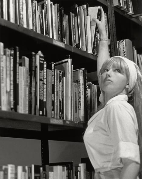
One thing that stood out to me was the ‘female gaze’ that Sherman always includes in her images. This is significant as this image shows the empowerment and growth rather than the ‘fitted stereotype’. Her use of clothing in my opinion signifies a sense of independence as it isn’t sexualized or for men. The reach of the book on the highest shelf could symbol her independence and growth of doing things on her own, without the stereotype that females cannot do the same as men. Lastly, it doesn’t look like she is wearing a heavy amount of makeup eliminating the factor of women caring about their own appearances.
Within my response, my subject is wearing clothing that isn’t sexualised but however is still feminine. I executed this through wearing a long, flowy dress matched with a 1950’s hat. I chose to maintain the ‘female gaze’ whilst my subject was reaching for a book. The use of black and white with a heavy grain emphasizes the vintage and older aesthetic which was one of my objectives. All of my images within response of Sherman are carefully stage crafted, precise posing and relevant props to execute the sense of drama and theatre.
The Ballad of Sexual Dependency series, 1984
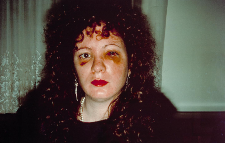
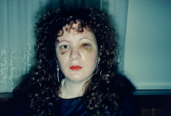
Lastly, Nan Goldin expresses her experience through domestic abuse. This inspired me for my 3rd photoshoot as this was a very important topic during the 3rd wave feminism movement. Therefore, I decided to merge Sherman’s posing and stage crafting with this theme. With an outcome of this,

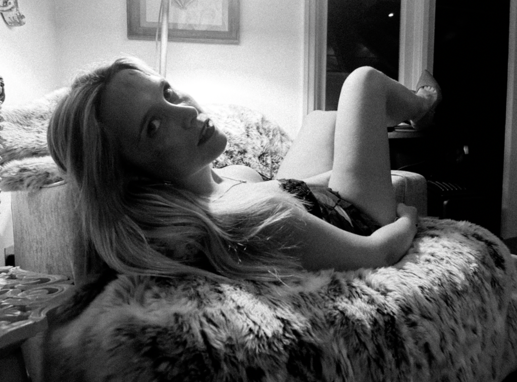
I executed this by using feminine posing, feminine clothes and heels. However added makeup to add fake abuse onto the subjects face. The black and white relates to Sherman and so does the clothing. The lighting looks over my subject, making her the main focus and emphasizing deeper shadows. My critique is that my subject should have her face turned more so the lighting shines on the bruises etc as it is the main focus of this photoshoot.
In conclusion, there are serval parallels between both artists, being similarities and differences. The main difference that stands out to me is there photography style. Nan Goldin’s style explores in snapshot-style the emotions of the individual, in intimate relationships etc. This contrasts significantly to Sherman’s photographic style as hers links to drama, theatre and stage crafting. This is because she is essentially acting, posing correctly and set up with props to get the perfect image. Sherman’s images are often critically discussed as questions of patriarchy, desire and voyeurism. This makes both artists contrast with one another as Nan Goldin fits more into the category of ‘ windows’ whereas Sherman fits into the category of ‘mirrors’. Sherman focuses on gender roles and stereotypes whereas Goldin is well known for her intimate depictions of the transgender subculture, as well as her images of friends dying of AIDS. However, I was mainly focused by her ‘The Ballad of Sexual Dependency series‘ as it emphasised the documentary and realism factor to her images as she did not glamourize or make her images look better than the reality was. This essentially contrasts to Sherman images as Sherman’s images are glamourized and carefully crafted. Interestingly, Goldin’s abuse photoshoot was taken between 1979 and 1986. Sherman’s untitled film stills were taken between 1977–80. Both of these artists took images around the same time, however Sherman’s was suppose to be focused around the 1950’s hence her use of black and white. This created the vintage and old aesthetic whereas, Goldin’s did not. This could be because Goldin’s images are suppose to be realistic as it fits more into the documentary category. The use of black and white is because Sherman was focusing on old stereotypes and essentially acting to fit into them. Within my own response, I made minor changes such as angles, clothing and props. I aimed to execute things similarly to Sherman’s apart from my 3rd photoshoot (3rd wave) as I merged both Goldin’s and Sherman’s work. I did this by using feminine posing, clothing and makeup by linking to Sherman and still linking to her photographic style of stage crafting her images like they are a film. I did all my photoshoots obtaining this photographic style so my photobook had a sequence that flowed seamlessly. However, my Nan Goldin inspiration for these images was to obtain the theme of domestic violence as this was a massive theme during the third wave feminism movement. This meant that I had to fake abuse that appeared on my subjects face, making the image not real which differs to Nan Goldin’s documentary style. Overall, I believe that I merged both the artists I was heavily inspired by successfully and obtained the key features that had to be included to execute my initial idea of expressing the stereotypes within women through the waves of feminist movements to make my photobook seamless.
Bibliography-
Chiriguayo, D. ( Dec. 05, 2022). Artist Nan Goldin shines light on stigma around abuse and addiction. [online](https://www.kcrw.com/news/shows/press-play-with-madeleine-brand/mahsa-amini-scotus-sackler-johnny-cash/beauty-bloodshed-nan-goldin) [accessed 28 January 2025]
Wells L. (1998). ‘The Photographic Gaze’ in Photography: A Critical Introduction. London: Routledge.
Why I changed ideas
Firstly, I decided to change my exploration of racial injustices through women to domestic abuse. I changed this for many reasons. One reason was because my photoshoot exploring cultures and working- class women did not fit the sequencing of my photobook. This is because these photos were the opposite of staged and carefully crafted ultimately changing my theme. I did not begin to realise this until my photoshoot was completed, however I learnt through this and decided for my updated photoshoot to be of the same subject of my other photoshoots such as 1st and 2nd wave. To keep a seamless sequence in my photobook, I decided to explore domestic violence which a lot of women go through. This is shown statically. Globally, an estimated 736 million women—almost one in three—have been subjected to physical and/or sexual intimate partner violence, non-partner sexual violence, or both at least once in their life (30 per cent of women aged 15 and older). One of these women, including Nan Goldin, my other artist study. Nan Goldin was very open talking about her issues and her photoshoots taken in 1984, this significantly inspired me. I learnt that I wanted to mix both elements of Sherman and Nan Goldin by staging an abuse themed photoshoot, meanwhile maintaining an element of femininity and the traditional housewife. Although, my photos are not taken in the kitchen, they express the role of women serving for men in other ways, such as clothing and posing.
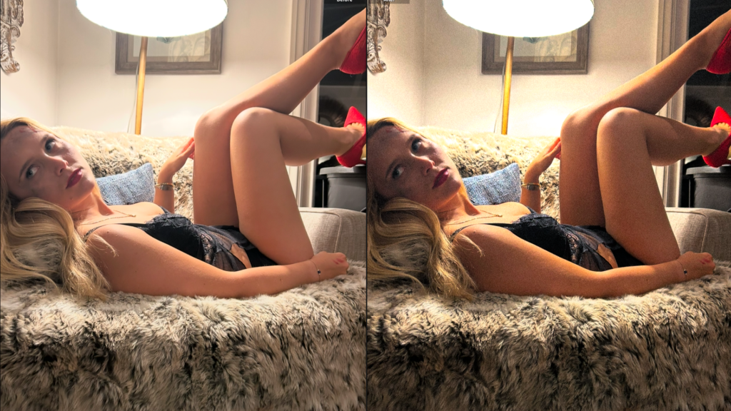
Ultimately, this was more inspiring to me as the 3rd wave feminism movement focuses o sexual harassment, domestic violence and abuse. Some people still believe we are still in the 3rd wave due to the fact there isn’t a massive shift or growth. This is because, to this day women still fight for their equality especially within this theme.
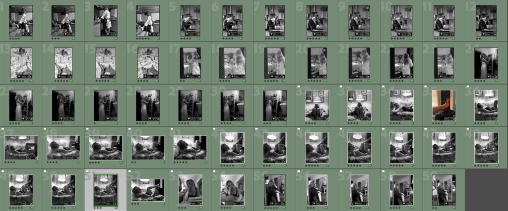
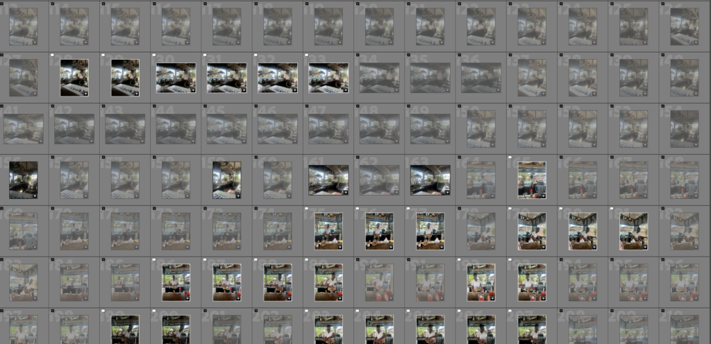
Contact sheet-
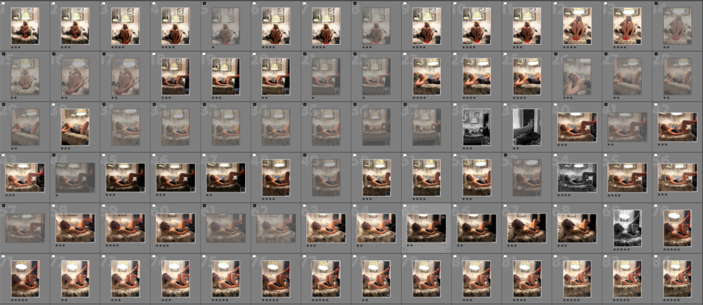
Filtering-
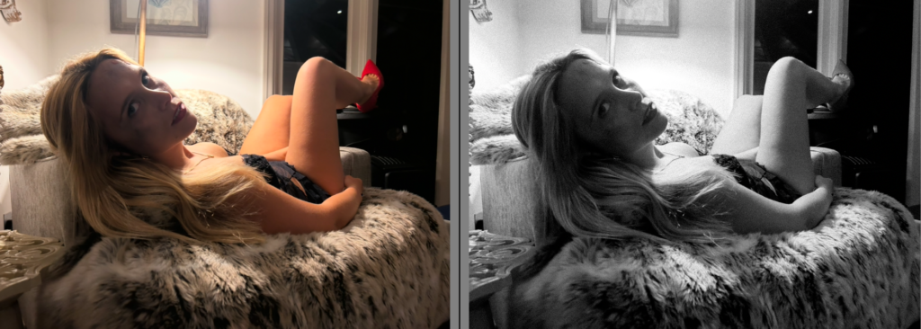
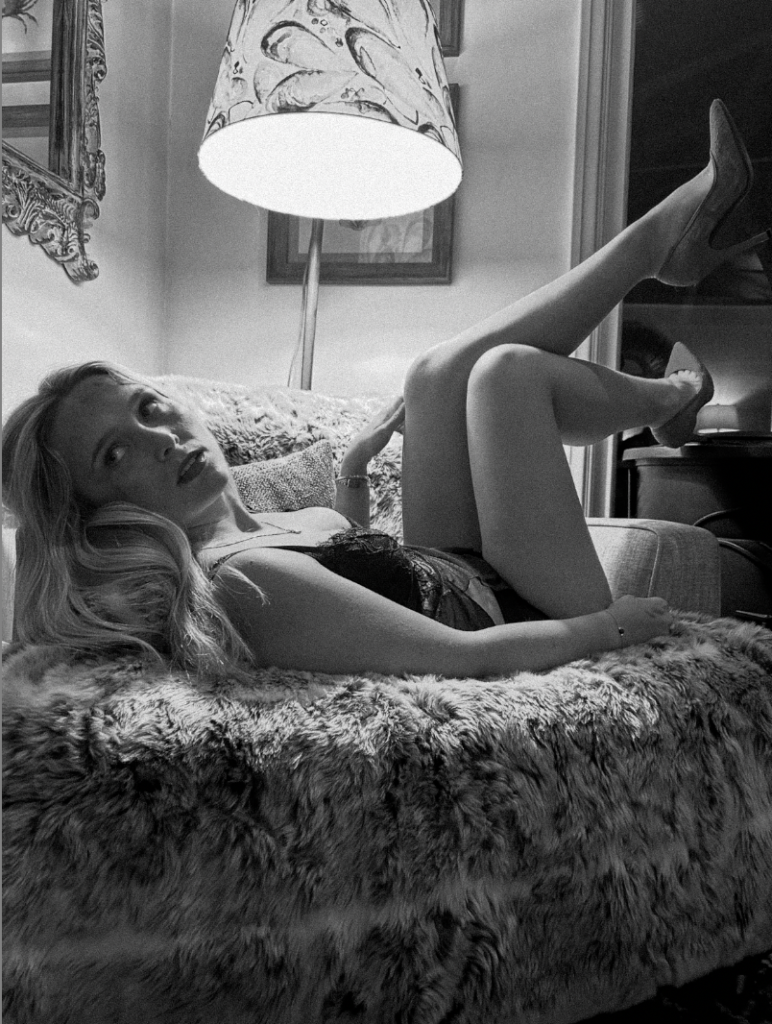
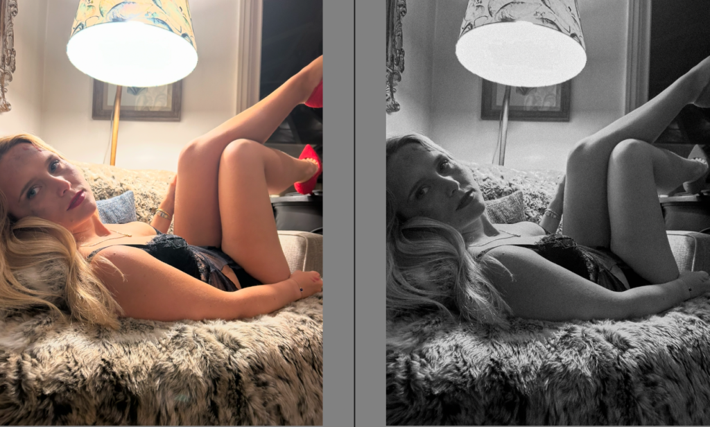
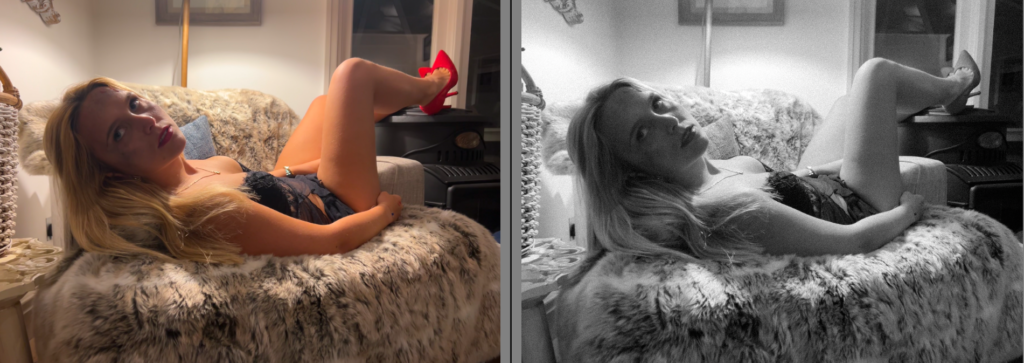
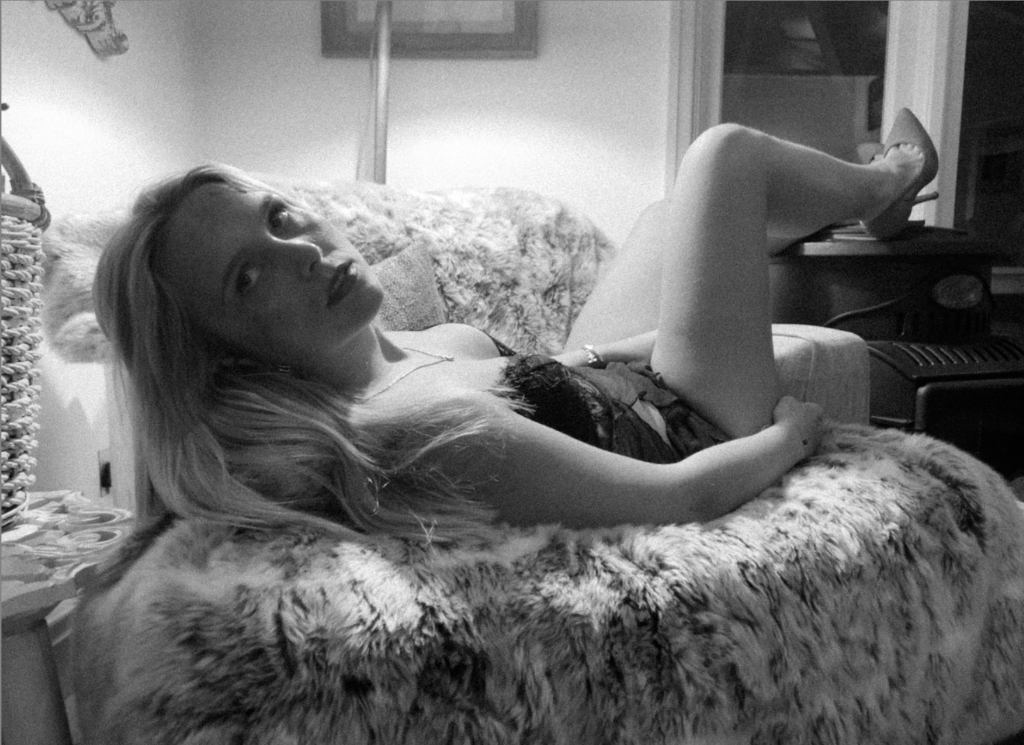
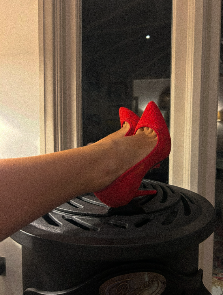
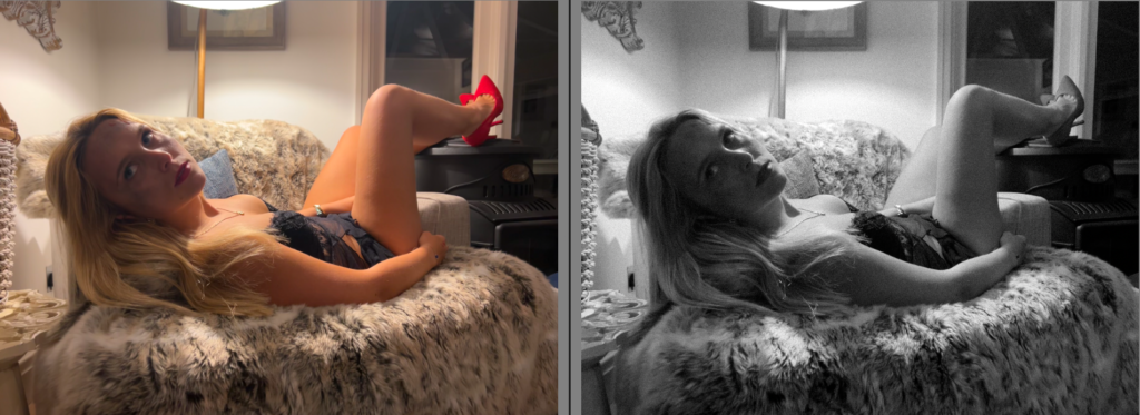
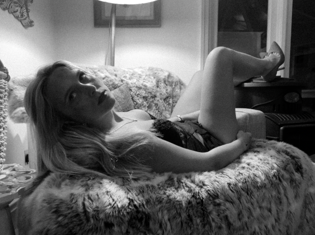
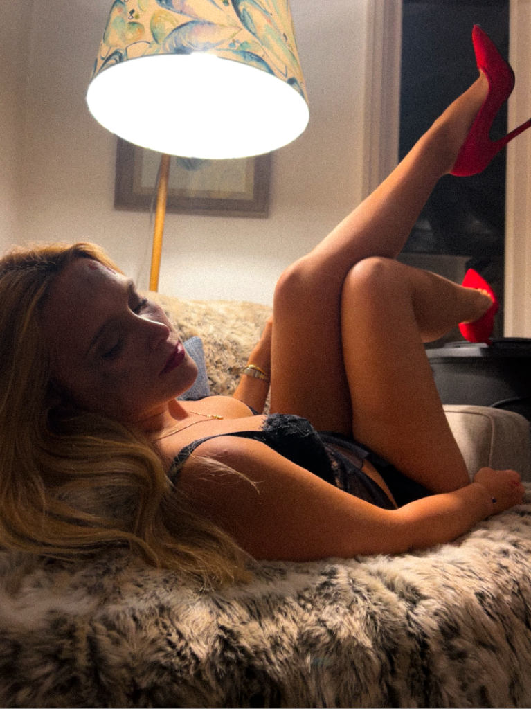
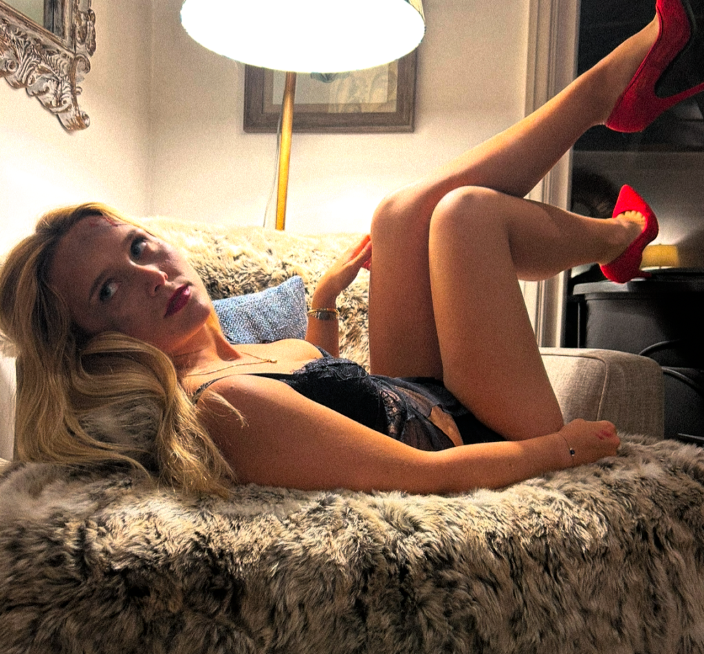
Firstly, I began by rated my images from 1-5 and either flagging or rejecting them. The main factors I took into account was lighting, posing, surroundings/props, and the gaze my subject executed. Before I began my filtering, I cropped every image therefore other things that were potentially taking the attention away from the main factor of the image, therefore I went through and cropped them to my preference before editing. This is a very efficient way of editing the images that are preferred and making your photoshoots organised and ready for editing. As this photoshoot is indoors, it was easier to get the correct lighting however my editing ability should be able to perfect any lighting inefficiencies. One final thing I took into account was how well you could see the subjects fake bruising and bleeding. This is because this photoshoot is to focus on domestic violence, therefore I put fake makeup on my subject to attempt to convey this element. However, it is not the only element I wanted to add. Overall, I wanted to add a sexual element linking to femininity stereotypes but also sexual harassment as the third wave focused on this just as much. I attempted to bring this sexualised element through the subjects clothes and red heels. Red can be a symbol of passion, confident, sexuality and love. This could ultimately signify the growth women fought for during these movements as they were encouraged confidently to fight for their passion and rights. This would significantly contrast to the clothing as women still felt as if they had to play a role in order to satisfy and serve men. This is interesting to me as it differs from my subjects face. This is because many women still stay (representing the clothing choice) even after circumstances (damage) which is a very big important contrast to these images. Lastly, I took into account the lamp facing down on her. I really like this touch as it keeps all attention on the subject which is exactly what I intended too, gives a spotlight effect.
Editing-
B&W-
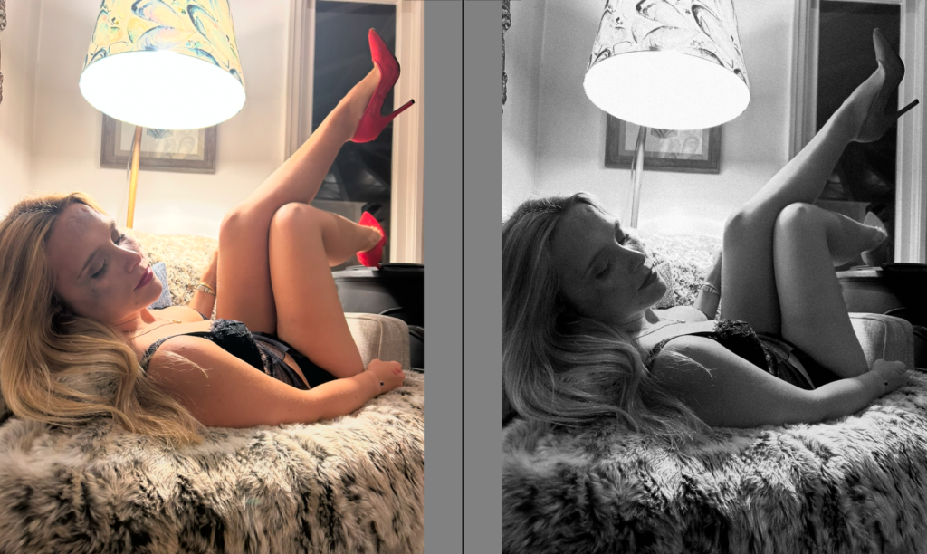
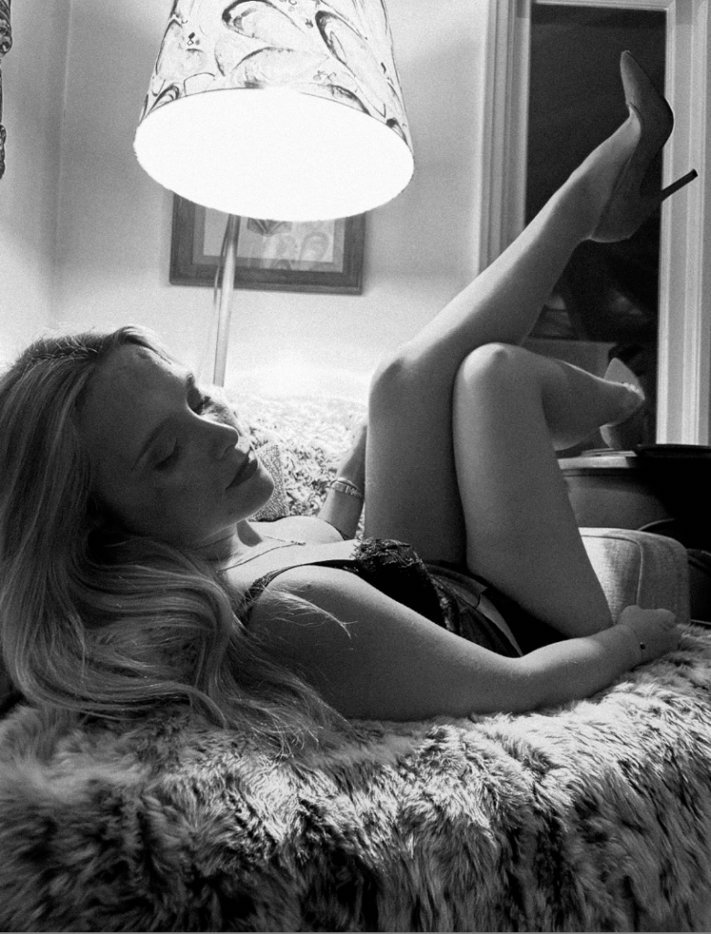
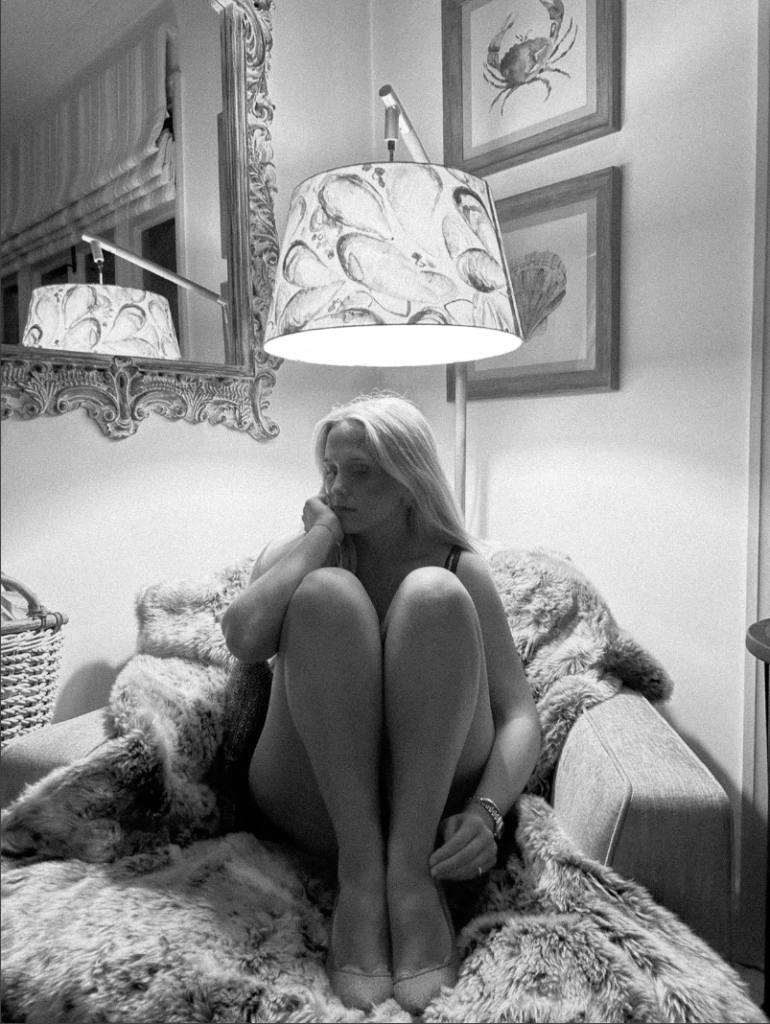
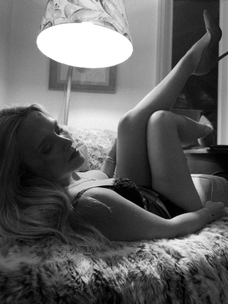
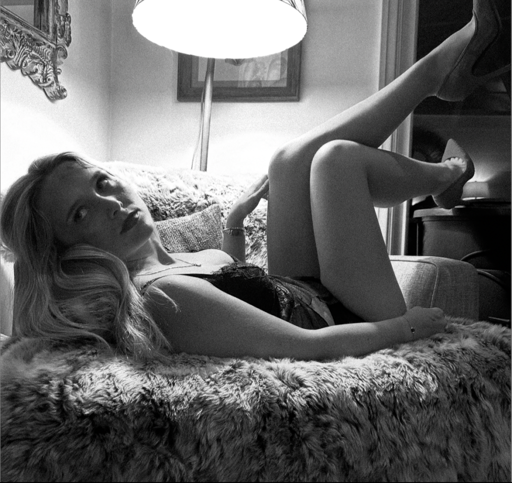
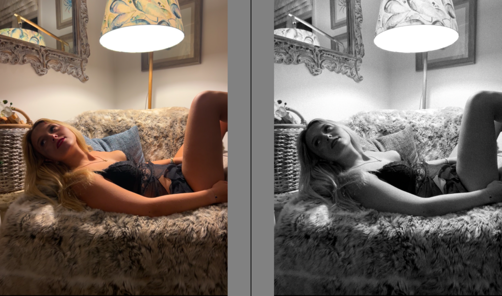
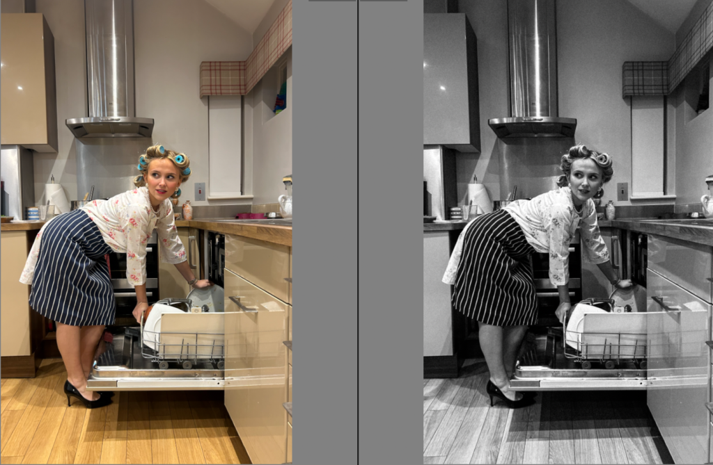
This image is one of my favourites within this photoshoot. This is because the lighting giving the spotlight effect with in depth shadows really sticks out to me. The deep shadows to me portrays an element of sexuality emphasizing by the heels which is what I ultimately intended too. Not only this, I like the image in black and white as it conveys this element but also adds a mystery element. One drawback is the fact that you cannot see the coloured heels and that the fake violence on her face is not as bright and obvious.

B&W:
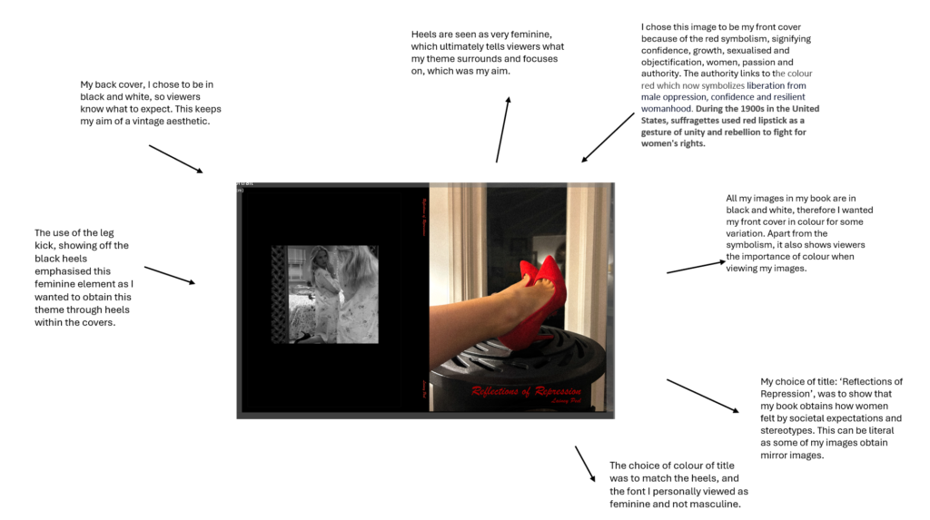
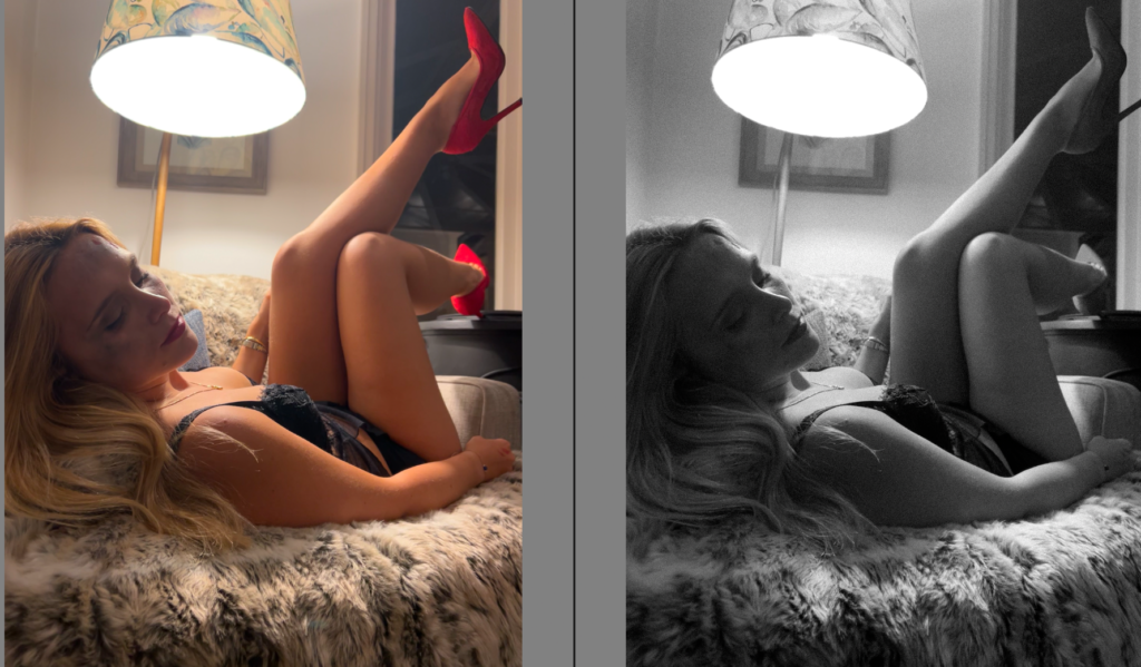
In colour: Potential front cover of photobook

In colour:
In colour:
In colour:
In colour:
Evaluation and critique
Overall, I like many factors of this photoshoot. One thing in particular that I like is the lighting, creating in-depth shadows which ultimately makes the image more eye catching. To emphasize this, I experimented by putting my photoshoots in black and white which I definitely prefer as it adds more of an vintage aesthetic I was aiming for as Nan Goldin’s images are taken in-between 1979 and 1986. Not only this, but black and white still shows the bold lipstick and makeup. However, the fake domestic violence is not as obvious and vibrant which is a potential drawback as that is what my photos are to be focused around. One thing I would change would be to put the fake bruising etc on the subjects right side of the face so the lighting would shine on it, allowing viewers to focus on it. This would definitely benefit my images as it will focus on the theme of sexual and domestic abuse. I found the type of posing very feminine emphasized by the ‘ female gaze’ which is ultimately signifying my overall theme of feminism and movements. Another draw back of having my images in black and white is that you cannot see the symbols included such as the red bold lipstick and high heels. However, this can be significantly fixed as I am thinking of this being my front cover in my photobook as it represents feminism and confidence ultimately representing the empowerment women felt through the movements.
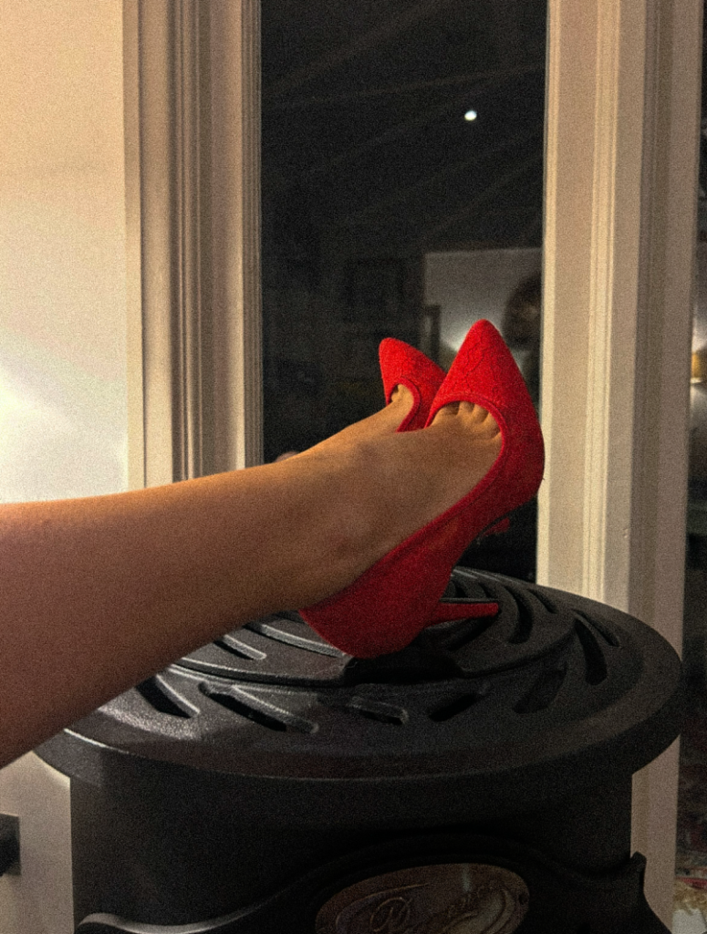
I would keep this in colour, meanwhile my book being in black and white. This is because red heels represents confidence, bold, sexuality and femininity, which ultimately covers my themes therefore tells the viewer from the front page what my book narrative is. Overall, I like this photoshoot and I think I executed it successfully.
I chose to research and observe ‘ Shrinking violet’ by Shannon O’ Donnell expressing female expectations around the house, and the traditional role of women. These photos surround the theme of feminism and the inspiration from her mother. From what I take from this, she decided to take her images of herself on her own, similarly to Sherman’s work, she stood the camera up and posed with the correct props and clothing such as kitchenware and a dress and heels. Although the subject is expressing and revealing herself as being the traditional role in the house like a housewife, O’ Donnell making it look like she took these herself in her house creates an element of independency which clearly differs to the key stereotypical features of a woman.
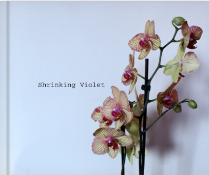
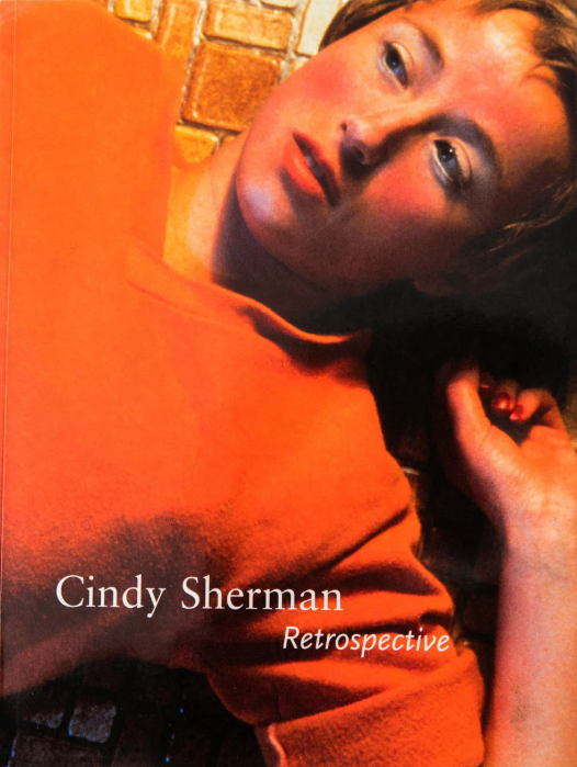
The photographer is Shannon O’Donnell who was inspired by her project of making a film of her mother, including documenting her daily life and her mothers role in the household. One of her main elements was to obtain sarcasm whilst mimicking the traditional housewife stereotype as gender defines everyone and at her belief, can be limiting at times. Her approach to image-making was to stage craft them herself and pose herself. The audience I would say is too target women specifically as it may motivate women who face inequality to this day and definitely expresses a narrative surrounding the theme of women. However, she was massively inspired by Cindy Sherman’s book ‘Retrospective’. Her collection ‘retrospective’ is at the Museum of Modern Art. For a time Cindy Sherman, Troy Brauntuch, Jack Goldstein, Sherrie Levine, and Robert Longo shared a Soho gallery. Did they ignite “The Pictures Generation”? Recalling a long tradition of self-portraiture and theatrical role-playing in art, Sherman utilises the camera and the various tools of the everyday cinema, such as makeup, costumes, and stage scenery, to recreate common illusions, or iconic “snapshots,” that signify various concepts of public celebrity, self-confidence, sexual adventure, entertainment, and other socially sanctioned, existential conditions. As though they constituted only a first premise, however, these images promptly begin to unravel in various ways that suggest how self-identity is often an unstable compromise between social dictates and personal intention.
Cindy Sherman is a contemporary master of socially critical photography. She is a key figure of the “Pictures generation,” a loose circle of American artists who came to artistic maturity and critical recognition during the early 1980s, a period notable for the rapid and widespread proliferation of mass media imagery. At first painting in a super-realist style in art school during the aftermath of American Feminism, Sherman turned to photography toward the end of the 1970s in order to explore a wide range of common female social roles, or personas. Sherman sought to call into question the seductive and often oppressive influence of mass-media over our individual and collective identities. Turning the camera on herself in a game of extended role-playing of fantasy Hollywood, fashion, mass advertising, and “girl-next-door” roles and poses, Sherman ultimately called her audience’s attention to the powerful machinery and make-up that lay behind the countless images circulating in an incessantly public, “plugged in” culture. Sexual desire and domination, the fashioning of self-identity as mass deception, these are among the unsettling subjects lying behind Sherman’s extensive series of self-portraiture in various guises. Sherman’s work is central in the era of intense consumerism and image proliferation at the close of the 20th century.
Maturing in the 1970s in the midst of the American Womens’ Movement, later known as the rise of Feminism, Sherman and her generation learned to see through mass media cliches and appropriate them in a satirical and ironic manner that made viewers self conscious about how artificial and highly constructed “female portraiture” could prove on close inspection.
Some critics criticize Sherman’s Film Stills for catering to the male gaze and perpetuating the objectification of women. Others, understand Sherman’s approach as critically-ironic parody of female stereotypes. Others still, assert that both cases are simultaneously true, with Sherman knowingly taking on stereotypical female roles in order to question their pervasiveness. At the same time her adoption of these roles inevitably leads her to be objectified further.
However, Sherman claims not to be a feminist which slightly changes the narrative.
“The work is what it is and hopefully it’s seen as feminist work, or feminist-advised work, but I’m not going to go around espousing theoretical bullshit about feminist stuff.”
This slightly changes the narrative as it forces viewers to question, what was the purpose? and who was the audience targeted? Sherman’s photography is a depiction of the different ways culture defines “woman.” Her art plays on the feminist idea that gender arises exclusively within culture and deconstructs dominant gender ideologies, representing the underside of popular culture’s definition of “woman.”
Sherman recognizes those fixed identity concepts surrounding women, and she parodies the construction process and form of these symbolic myths, suggesting the possibility of women’s self-authorization in reality.
I personally like how it is a paper back however I prefer Shannon’s ‘ Shrinking violet’ being a hard back as it is more aesthetically pleasing. Sherman’s book is A4 where as Shannon’s is landscape, Sherman’s being portrait. Based off my images, I would typically decide portrait. Sherman’s book has 219 pages with lots of different collections. A lot of her images are in black and white, however her more modern images are in colour and are more unique ” Deconstructing a woman”. Whereas, Shannon’s are all in black and white. Shannon’s title being ‘Shrinking violet’ is rather poetic whereas Sherman’s is purely factual and based off her. I personally rather poetic titles as every individual can interpret it differently to them.
Both books effectively show a narrative and successful story telling within the same theme of women. Overall, they are very similar but at the same time different.
Reasoning
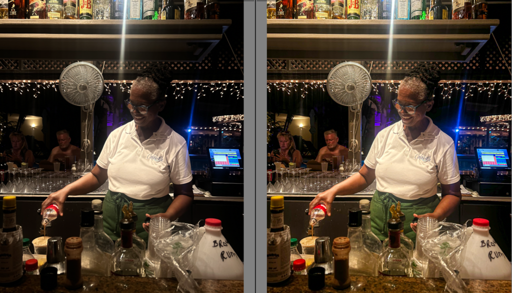
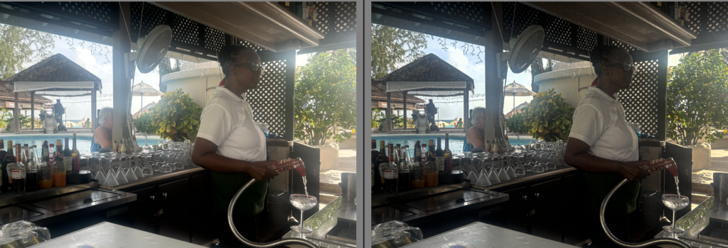
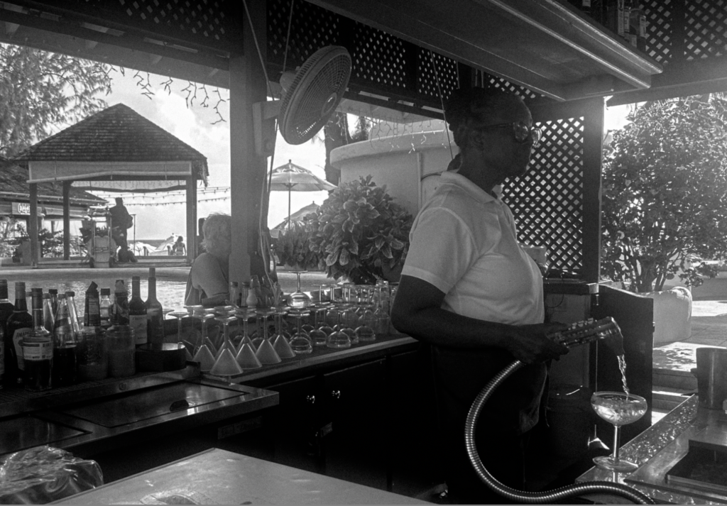
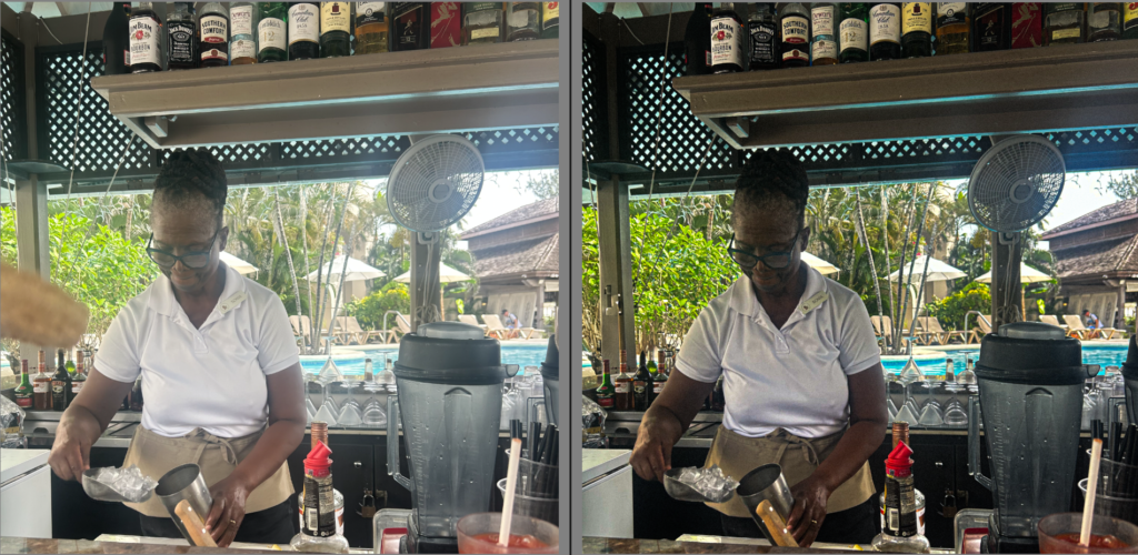
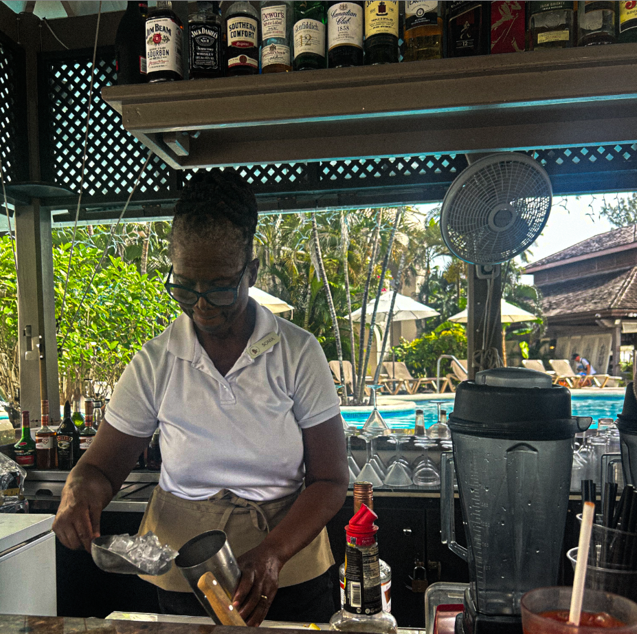
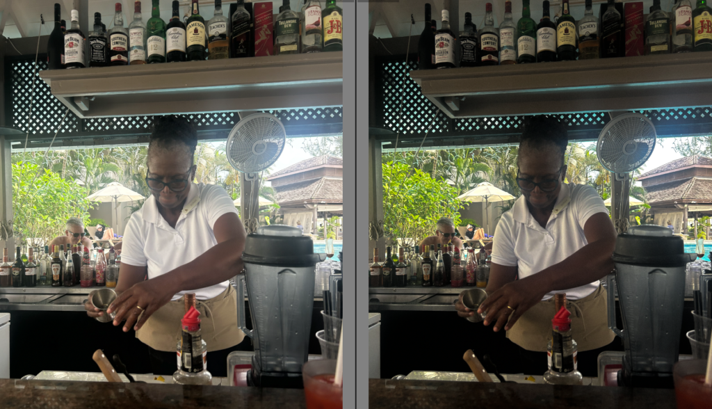
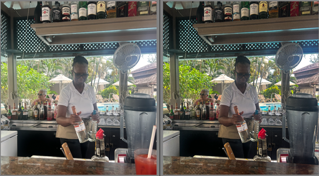
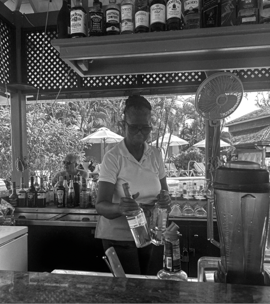
My objective was to take images of women of culture working, or women working to portray the growth women fought for, for equal legalisation, pay and educational rights. Showing this, will also suggest racial growth. I aim to execute this photoshoot naturally in Barbados, and successfully show the culture of the working class locals.
This photoshoot differs to my other photoshoots as my 1st and 2nd wave photoshoot was carefully thought out, planned, used props and was staged. This linked more to Cindy Sherman as she liked staging photoshoots meanwhile making it look natural. This contrasts significantly to this photoshoot as this one relates more to the ‘ decisive moment’ as it is natural and real. I hope that my editing skills can attempt to make it look more vintage as this is suppose to aim around the 1990’s.
STAGES-
Firstly, I began to pick out the images I preferred the most by either flagging or accepting them to make it more efficient when it comes to editing the images I like. The main factors I took into account when viewing and choosing these images was very much lighting, as it was outdoors and difficult to find the correct exposure and where to stand, how realistic and natural the subject looked as she was aware I was taking these images which brings the subject to behave or change her mannerisms. Finally, I kept an eye out for background factors such as people or unwanted drinks which I definitely took into consideration. If this was the case, I could attempt to erase them in Lightroom. Not only this, I could crop my images to make sure every background or foreground element that is wanted and significant is in the frame and vice versa.
Editing
Overall
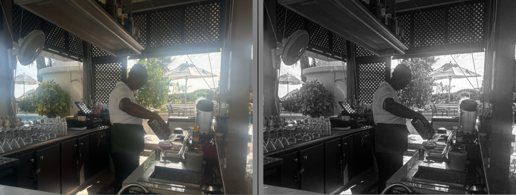
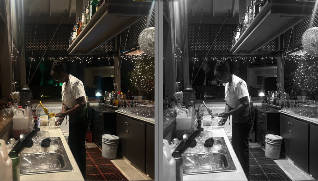
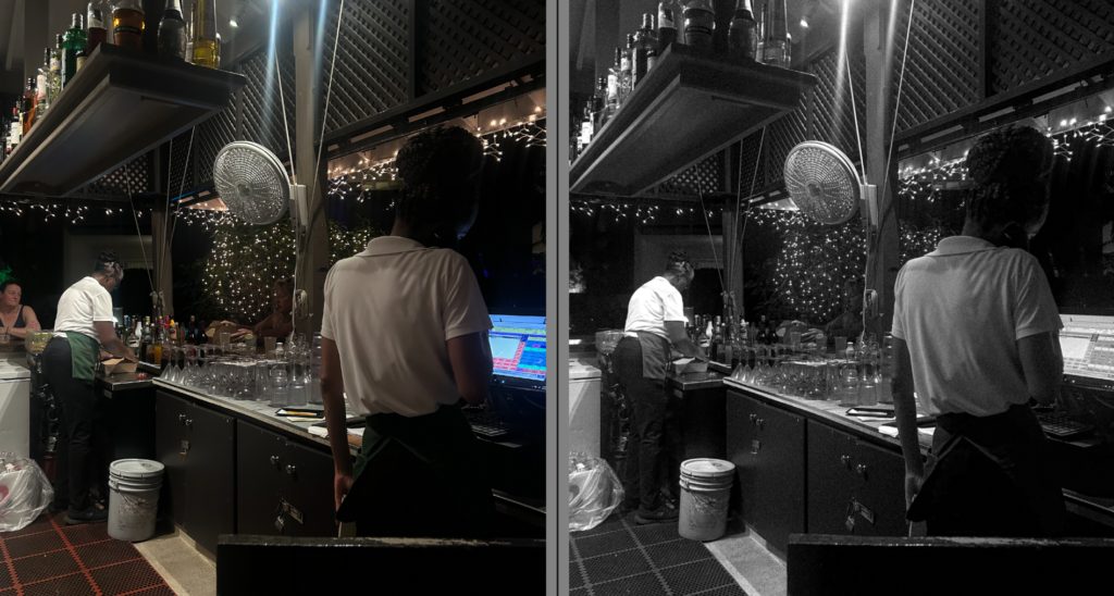
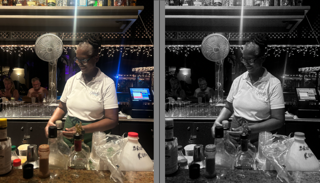
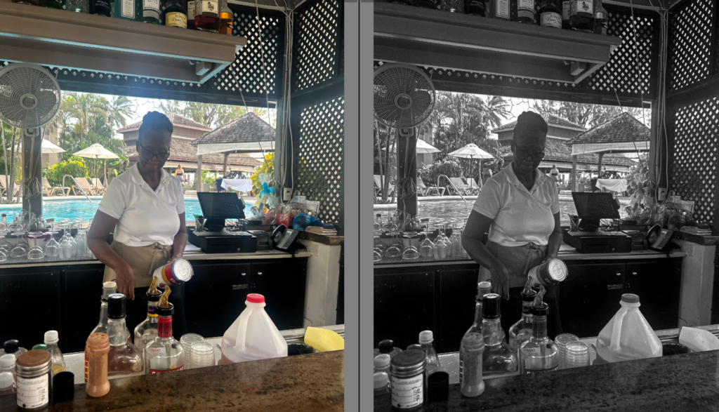
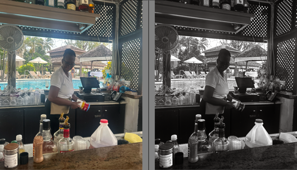
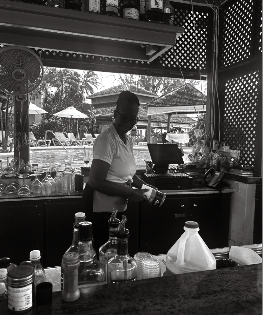
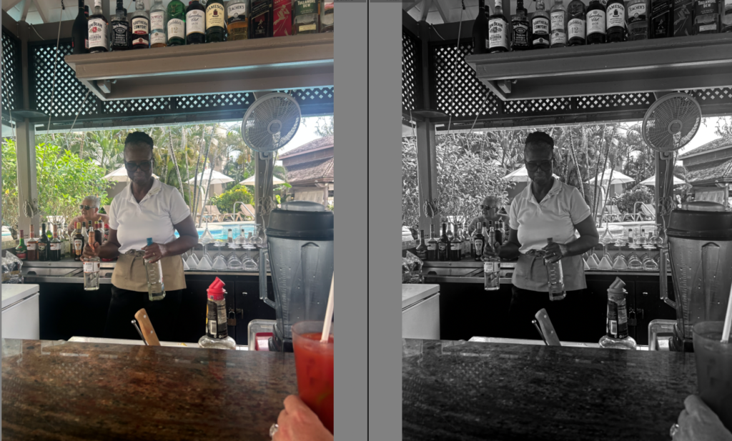
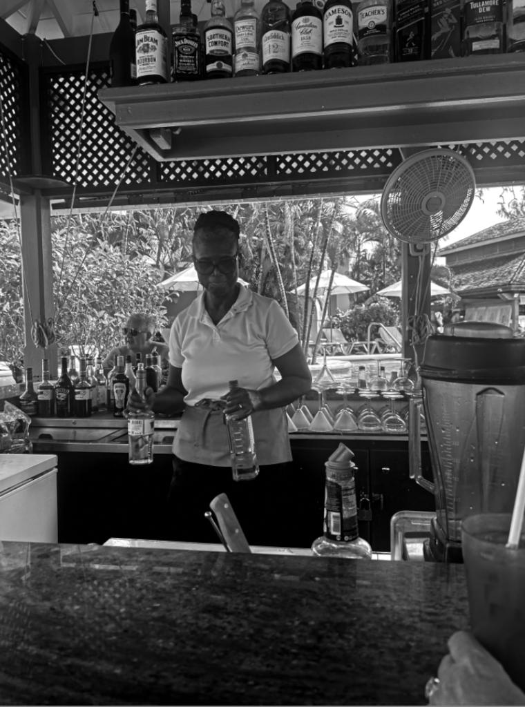
Some reasons why I like this photoshoot is because it involves racial features and growth, not only gender. I chose to do this photoshoot to emphasize successfully the rights women fought for, especially how black women struggled to gain the same legal rights. In this photoshoot, it represents culture and reveals women working as bartenders. Women working whilst gaining the same pay and recognition truly inspires me. However, I soon realised that it differs from the pattern of the rest of my photoshoot, such as posed and staged photos. Therefore, I learnt that I would like to take a different approach for my third photoshoot showing domestic abuse instead. I chose this theme as it was a major factor in the third wave feminist movement. Instead, I will take photos of my subject with bruises, linking more to Nan Goldin’s work as she experienced similar situations. I believe this will flow more seamlessly in my photobook as it will obtain throughout the same sort of images such as staging, posing etc. Not only this, they will obtain the same person which I believe will show more of a significant growth. However, I do not believe these photoshoots were a waste of time, as they show the theme of racial equality and I learnt more about lightings etc.
Reasoning
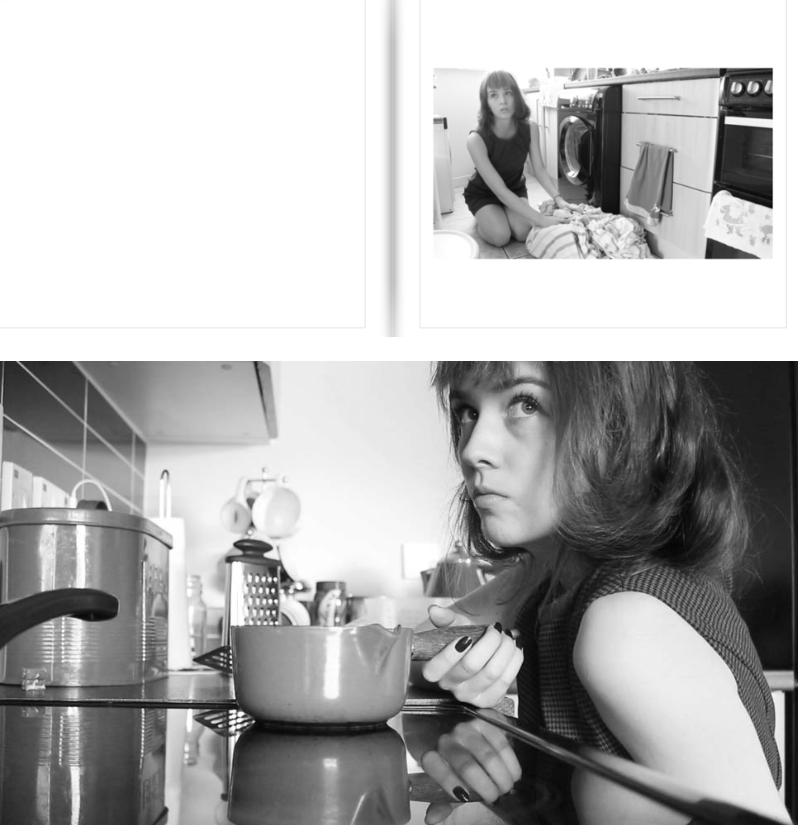
My intent and reasoning of these images was to represent the educational rights women gained during the 1960’s and 70’s which was focused on equality. The second wave fought for the right for women to have access to an equal opportunity in the workforce, as well as the end of legal sex discrimination. Feminists worked for the Equal Rights Amendment, the Equal Pay Act, the addition of sex discrimination to the Civil Rights Act, and other laws that would guarantee equality. Therefore, my way of presenting this stereotype is through a female getting books from a shelf to suggest women’s educational rights. I was inspired by Cindy Sherman’s famous image whilst she was presenting the deconstruction of stereotypes during this time period.
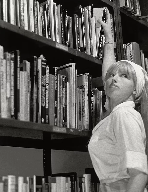
An essential factor that stood out to me effectively was her clothing. Sherman’s clothing is still slightly dressed up however it is a half body shot stopping the sexualized stereotype, as this was reduced after the traditional house wife stereotype. Therefore, for my images I dressed my subject up in a fairly vintage aesthetic outfit but with less of a sexual element to it.
Editing
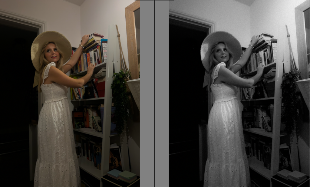
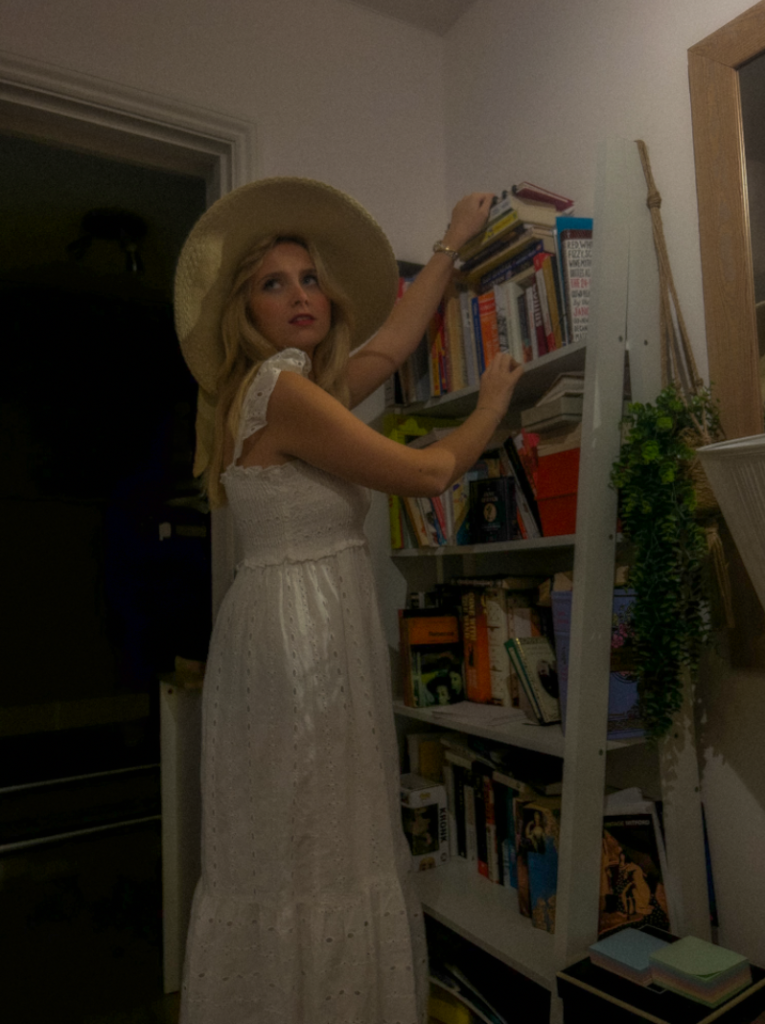
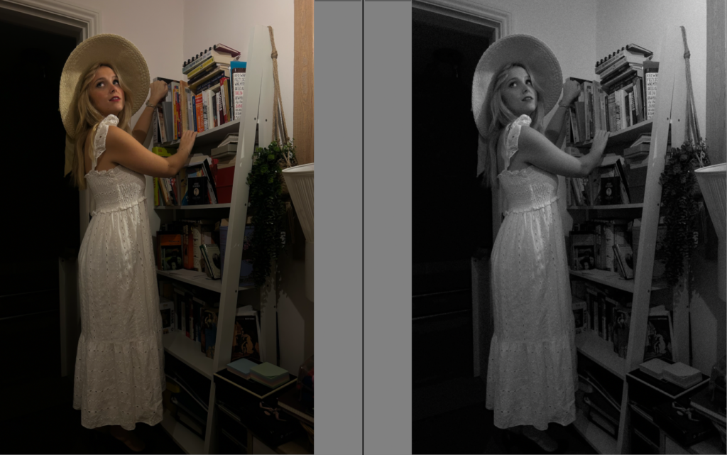
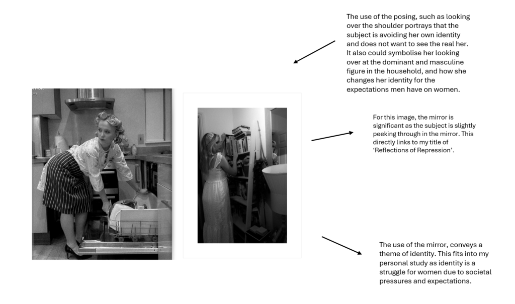
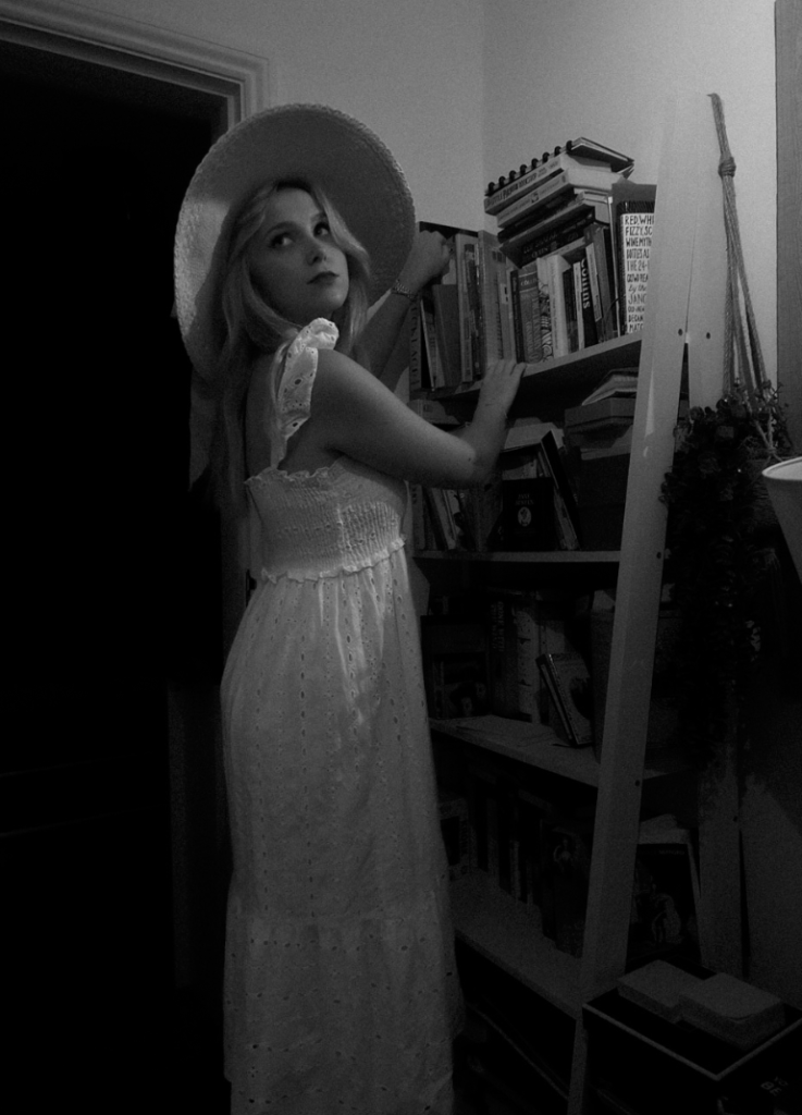
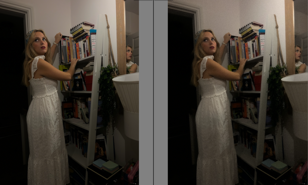
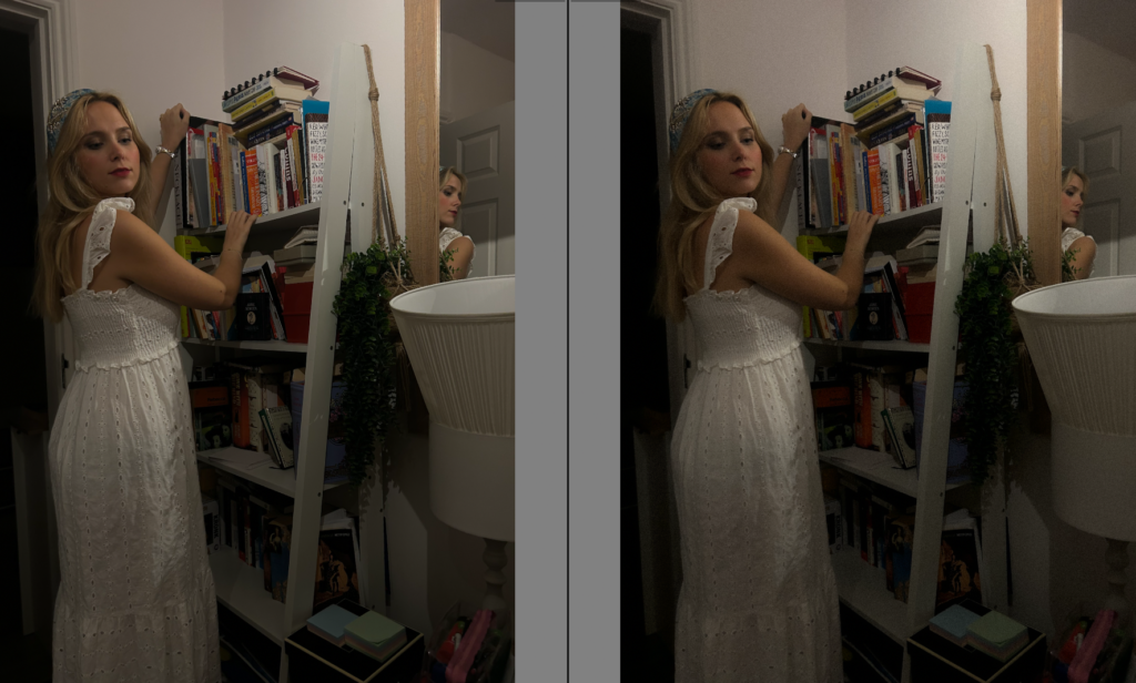
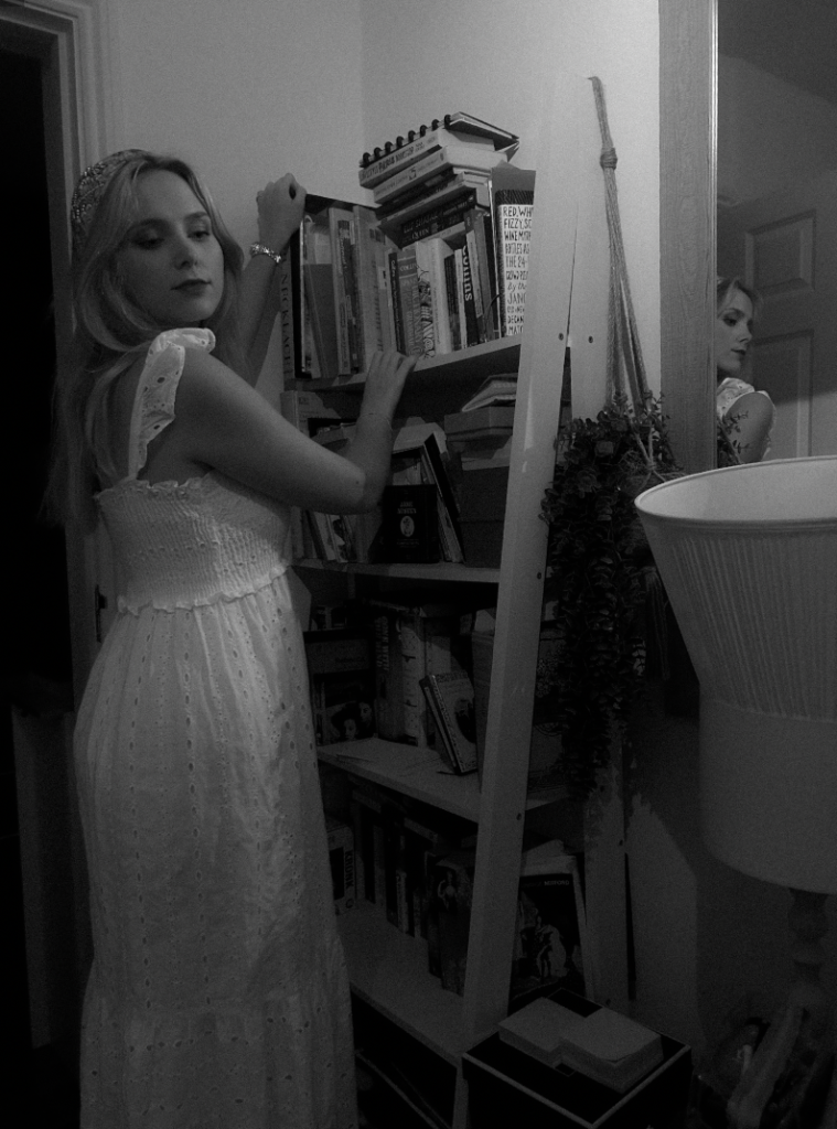
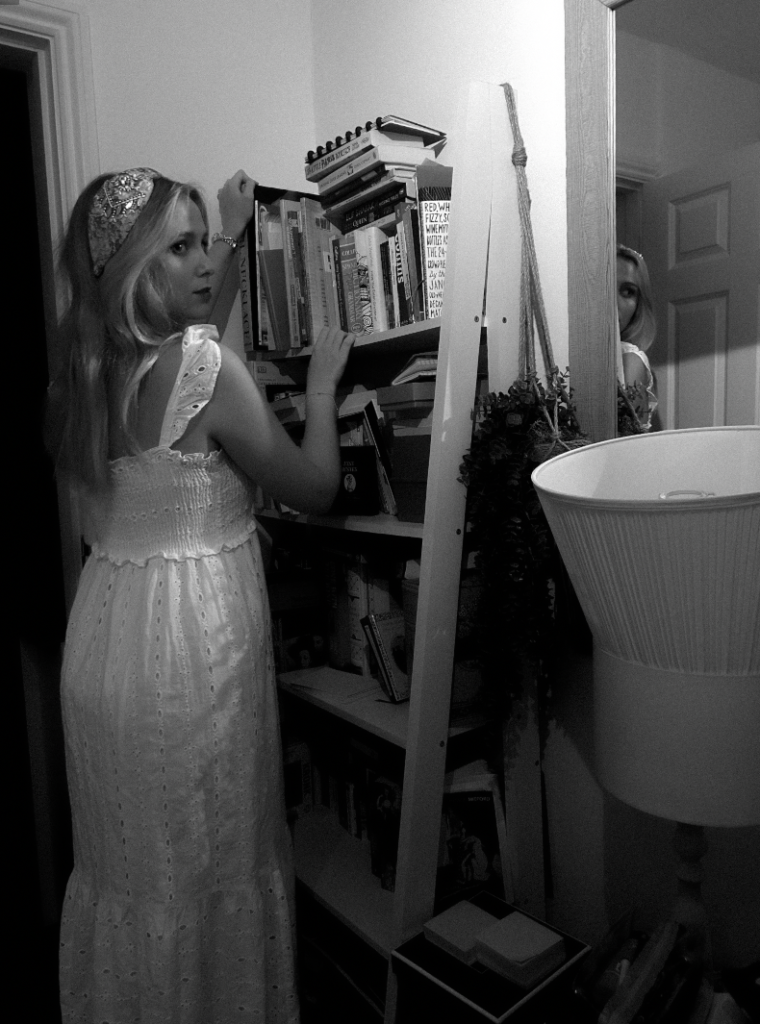
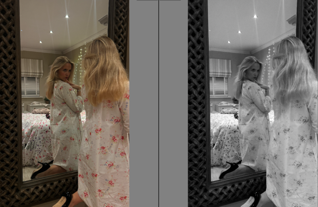
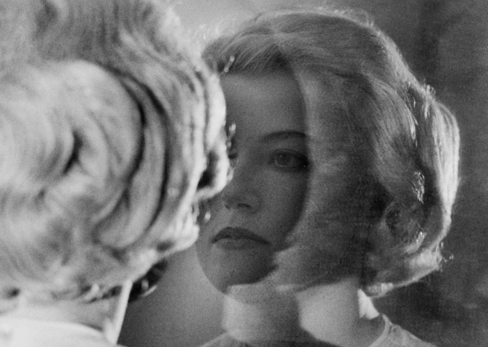
After these images, I decided to experiment with a change of props and using the mirror to show the reflection as I thought it made the image more significant and eye catching.
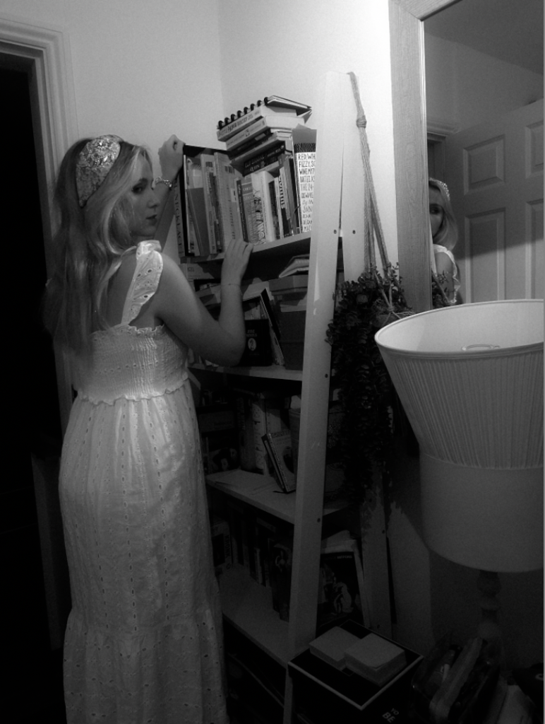
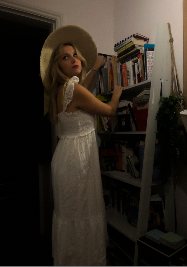
Overall–
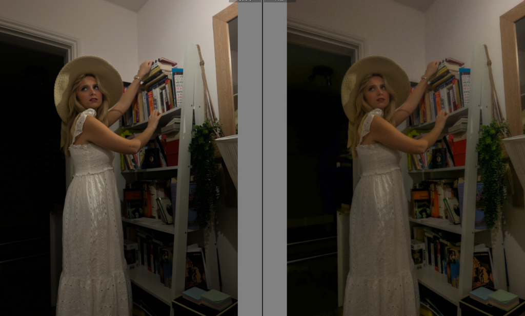
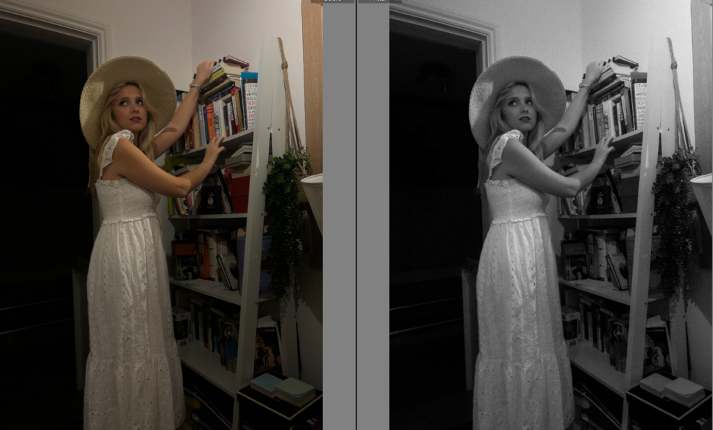
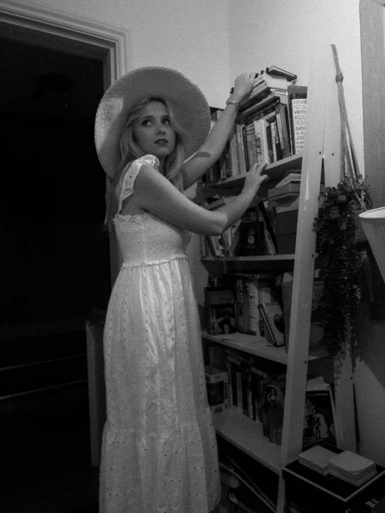
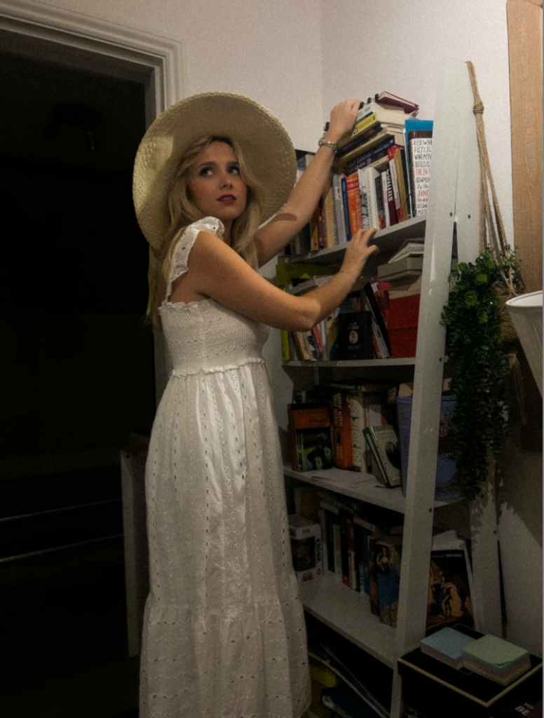
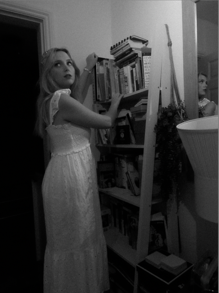
Overall, I changed my angles to experiment and realised I preferred the image with the mirror within the frame. I made sure to keep my subject obtaining the female gaze as I personally believe it is a significant factor to add to my images. The type of clothing my subject is wearing is suppose to signify a slight sense of independence. This is because of the hat and white flowy dress as it portrays her personality rather than restrictions or impressing males. I experimented in black and white and colour, to learn to see what I preferred most which was black and white as I plan all my images to be in black and white apart from my 4th photoshoot including the 4th wave feminism. The reasoning of this being my plan, is that all three photoshoots are signifying the past which I believe black and white will emphasize this. The last photoshoot (4th wave) is to signify more of a present element to it as a young women, which I think is still relevant now. Fourth-wave feminism, is a feminist movement hat began around the early 2010s and is characterized by a focus on the empowerment of women, the use of internet tools, and intersectionality. The fourth wave seeks greater gender equality by focusing on gendered norms and the marginalization of women in society. Fourth-wave feminism focuses on sexual abuse, sexual harassment, sexual violence, the objectification of women, and sexism in the workplace. Therefore, within these images I lowered the exposure to create the right amount of exposure to make the door way darker to add a mysterious element. To emphasize this, I increased the blacks and shadows but to keep the subject the main focus I would increase the whites. The bookshelf is to represent the educational rights women fought for in the second wave feminist movement. The mirror is to portray an element of identity which women struggle to find in an oppressive society. However, this slightly contrasts to the clothing involved as the clothing is to signify a little more of independence as it has a growth than the ‘ traditional housewife’. The heavy makeup and and red lip is to represent a factor of women still feeling the pressure too do certain things for men in this patriarchal society. The red lip is to signify a bold and confident factor as from its early use by prostitutes in ancient Greece to a symbol of glamor in Hollywood, rouge lips has long been associated with beauty, power, and rebellion. Rouge lips have served as a symbol of power, rebellion, and femininity throughout history, from ancient civilizations to modern-day movements. This ensures the sexualised element to my first photoshoot is still obtained, which is definitely impactful and significant as women still faced this stereotype during the 60’s and 70’s. Lastly , I decided to decrease the texture as women were stereotypically to be seen as ‘ perfect’ which significantly links to my 4th photoshoot because of the rise of social media and pressures on women.
STAGES
Filtering
Firstly, I began by rating all my images from 0-5 and either flagging or rejecting them. The main factors I took into account was lighting, posing, surroundings/props, and the gaze my subject executed. Some images had unwanted kitchenware or other things that were potentially taking the attention away from the main factor of the image, therefore I went through and cropped them to my preference before editing.
After doing this, I filtered my images and ignored the ones I rejected so I knew the most efficient way to edit the ones I preferred.
Editing
I knew before editing, my objective was to put them all in black and white due to being inspired by Sherman. Not only because of my inspiration, I also think it creates a vintage aesthetic which is my aim as I am aiming to aim in the time period of the 1950’s as this was when the traditional housewife stereotype began as well as educational rights. Therefore, using black and white and heavy grain age should signify this time period. As well as this, I hope to decrease the texture level to make the subject more or less of the stereotypical ‘ perfection’ as this is what women were expected to be.
Experimenting in B&W
Within this image, there was a camera in the frame which I felt ruined the image. Therefore, I used an AI tool to get rid of that item to benefit my image.
Overall-
Overall, within my editing I chose to experiment and variate my images through colour and black and white. However, my main objective ultimately is to create a theme of a vintage aesthetic, specifically targeting the 1950’s stereotype and first wave feminism. Because of this, I mostly decreased the exposure and increased the contrast but mostly experimented with each image to what fitted each image best. This is because there are different settings and lighting which definitely impacts an image. Although, mostly I preferred my images in black and white as I personally think they look better, especially with the images of my subject on the bed as the clothing and the bed sheets I feel clash. Moreover, I did not put every image in black and white however similarly I put every image with a heavy grain as I felt as if it successfully fitted the theme of my images. If needed, I edited objects out as well as putting props in when I originally took this photoshoot. I used certain props to emphasize the ‘traditional stereotype’ such as hair rollers, apron, black high heels, a lot of jewellery, a heavy amount of makeup and pearls. One of the reasons pearls have become such an iconic symbol of style and elegance is their association with some of Hollywood’s most famous actresses. From Audrey Hepburn to Grace Kelly, pearls have been a staple accessory for many of the most famous leading ladies in film history. These images are definitely suppose to look staged and thought out, which I believe the props did successfully.
What I want to explore:
My intention is to explore the major social issues within gender, specifically women. I want to explore the themes of misogyny and stereotypes mainly, but also patriarchy, expectations of women and power dynamics while executing the female gaze. I want to execute the change of stereotypes throughout the years and the growth through each factor of the feminism waves.
Why it matters to me:
I would say, this topic matters to me because I realise as a female that women like Cindy Sherman and Nan Goldin portrayed the social issues within gender in the 1970’s but Sherman was portraying the traditional stereotype in the 1950’s. This is important to me because, although stereotypes have changed in a way, women are still expected to be a certain way even in the 21st century. This subject matters to me as there is still a significant power dynamics within gender. Women feel the pressure a lot more than men within beauty standards, and feeling the need to be a service to men still to this day, especially including the change in beauty expectations throughout the years.
How I wish to develop your project:
I wish to develop my project by taking images fitting the traditional stereotype similar to Cindy Sherman in the kitchen and other traditional settings. For example, I plan to take images of a female dressed up for the man meanwhile doing household work for the man. Within Cindy Sherman’s images she uses the female gaze which is a very important element that sticks out to me. This is because the ‘ female gaze’ adds a slight sexual and objectification element to her images which is to present the representations of a woman. To emphasize this, she uses a heavy amount of eye makeup so it cannot be missed. Sherman focuses on to ‘ Deconstruct a woman’. Sherman’s objective really stood out to me as she is attempting to deconstruct and portray how woman really felt in the 50’s. Not only this, posing is a very important factor such as possibly doing poses to show an element of motherhood and nurturing which is a typical stereotype of women. To develop my project, I will also be purposely setting up props such as kitchenware to emphasize my images like Sherman. However, I also plan to take images next to a book shelf like Sherman as this links to the second wave feminism as women were not seen to be educated. Instead they were only seen to be a nurturing mother and look after the household. Overall, in my opinion setting is almost the most important factor and will be very thought through as I personally believe it is what makes the image understandable. I plan to successfully execute this through using props etc and placing them in the correct areas to make the image the most interesting and eye catching.
Which form I wish to present your study (photobook, film, prints etc)
I wish to present my study in a photobook, I think this will suit my project best as I want to present the different types of traditional stereotypes in different settings, clothing etc which I can execute as my images are purposely suppose to look planned and thought out, rather than natural. This takes the sense of reality away which is what I aim to do so. In my photobook, I wish to show the different stereotypes throughout the years. My first set of images would start around the 1950’s and end in modern days around this century. This would mean I would be able to show the growth in stereotypes women face which is relevant as second-wave feminism was a period of feminist activity that began in the early 1960s and lasted roughly two decades, ending with the feminist sex wars in the early 1980s and being replaced by third-wave feminism in the early 1990s. Therefore, the traditional ‘housewife’ stereotype has significantly changed throughout the years yet there are still expectations. This stands out to me and I wish to show this change successfully as you turn the pages.
When and where you intend to begin your study?
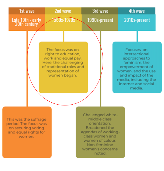
1st wave-
I aim to begin this study this week in my household or in a library. This is to purposely signify the 1st wave of feminism which was the suffrage movement aiming for voting and equal rights. I aim to take some images of the subject picking out a book from a bookshelf, portraying the female gaze. The reason this is my idea I wish to execute is because this makes me think of women gaining the rights of education and voting. This links to the Cindy Sherman concept of ‘ Deconstructing a woman’ as it was a typical stereotype that women should not be educated, and were only needed for motherhood and for the male in the looked after household. This is the starting point as this was in the late 19th century to early 20th century. The first ever movement females had gained. The female gaze is suppose to add a significant photography feature as the purpose of the ‘female gaze’ becomes to connect with the female viewer via the female creator, coming together in a way that serves them, and upholding the idea that women are powerful and can control their own destiny. That is why one of the most notable differences between the male and the female gaze is intent. First-wave feminists argued that women were only “inferior” because of their inferior education. If they were educated at the same level and to the same standards as men, they would be able to exercise their reason at the same level as well, and would hence deserve to be treated as full equals by the law. This is why I think my images will be relevant to this timeline.
2nd wave–
My objective within the second wave is to take images in my kitchen, with the subject female dressed up for the male in the ‘household’. This is because this portrays a factor of the power dynamics within gender. Because of this, I aim to portray the ‘traditional housewife’ as this stereotype began in the 2nd wave. To do this successfully, I aim to have my subject in the kitchen doing chores, such as cleaning and cooking. Things to emphasize this could be the subject in an apron, hair rollers, heels and a significant amount of makeup to portray the female gaze. Another factor that I was inspired by was Cindy Sherman’s posing such as her arm around her lower tummy. This signifies the nurturing mother stereotype as well.
3rd wave–
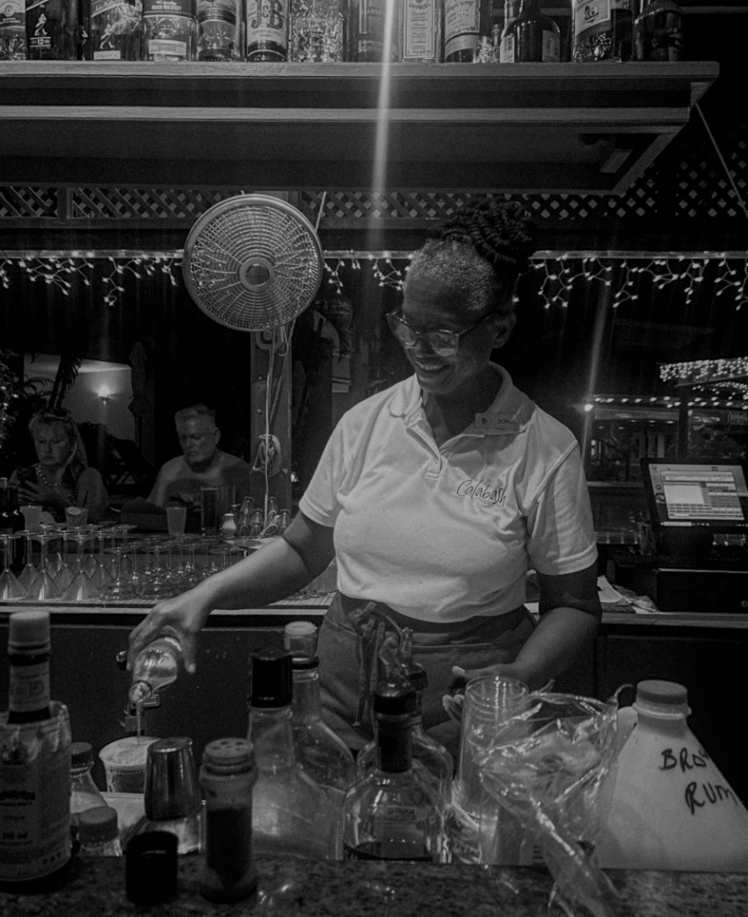
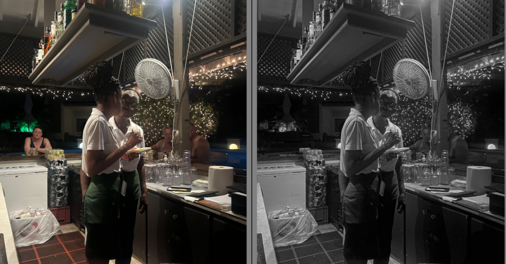
My objective within this photoshoot is too take images of a women of colour with more freedom such as in a club, party etc. This is because I was also inspired by Nan Goldin’s work which she still portrays an element of feminism yet a lot of her work is not entirely focused on it. She has this famous image in a nightclub during the 80’s.
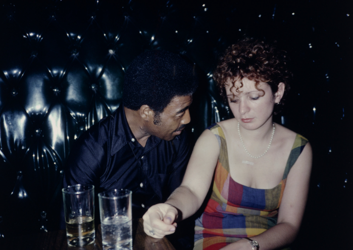
Therefore, I will take images of a woman of colour potentially drinking or at a free place because it represents the growth in equality within woman. I hope to keep the subject formal and feminine such as dressing her such as a long dress and potentially heels and heavy makeup meanwhile maintaining the theme of the female gaze. The third wave of feminism, which began in the mid-1990s, is generally regarded as more inclusive of women of colour than previous waves and is credited with bringing the notion of intersectionality to the forefront of mainstream feminist activism. The third wave broadened the agenda of women of colour so I am to merge Cindy Sherman’s and Nan Goldin’s work to make my own pieces.
4th wave–
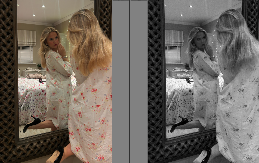
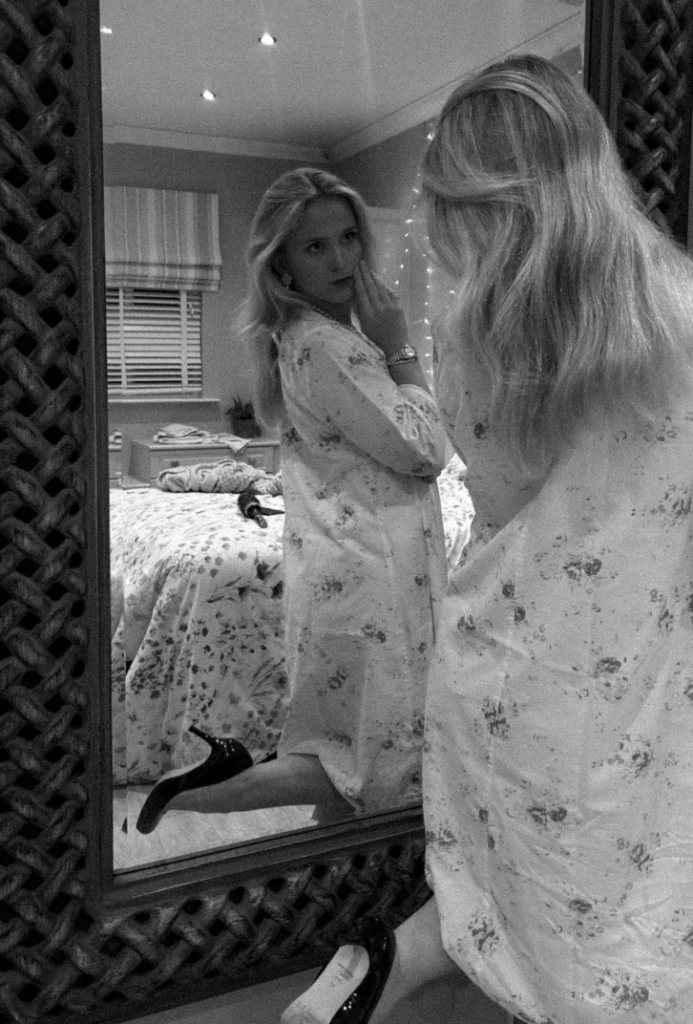
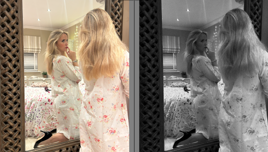
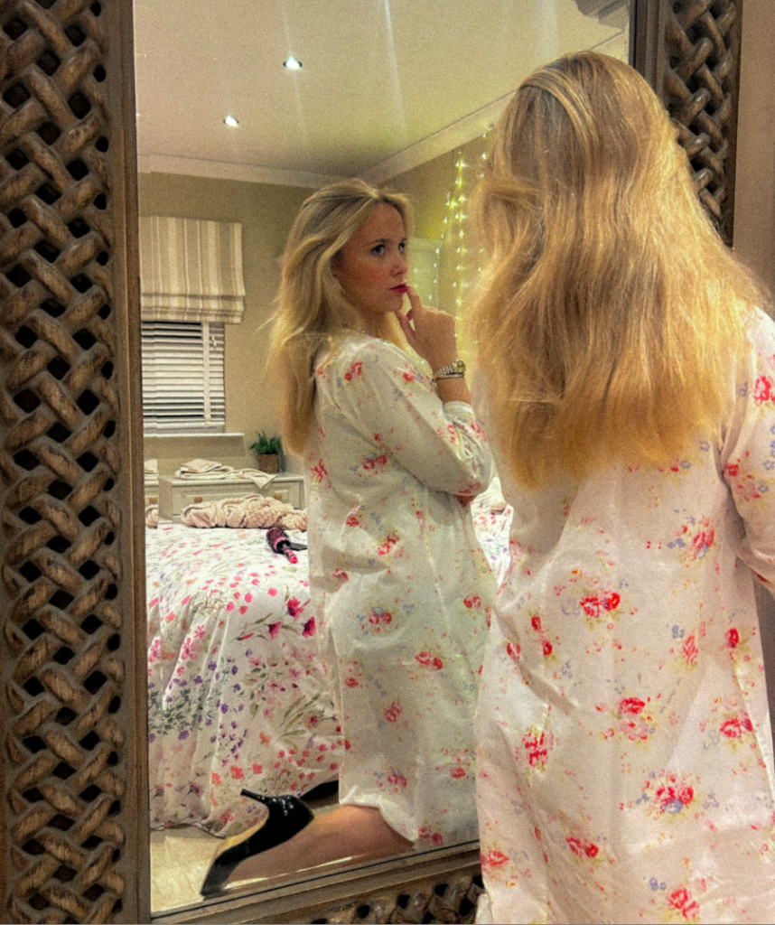
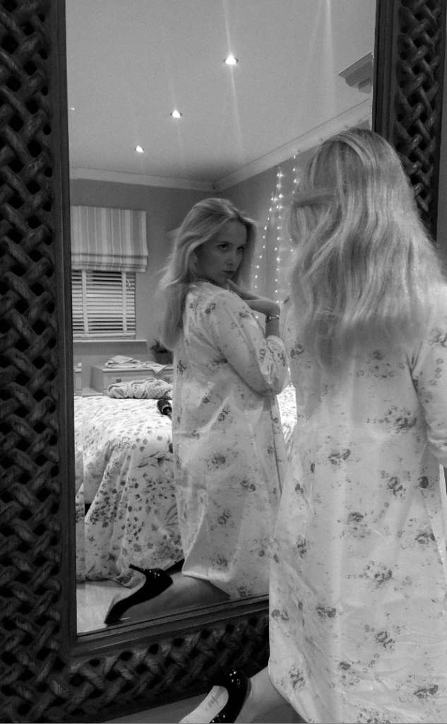
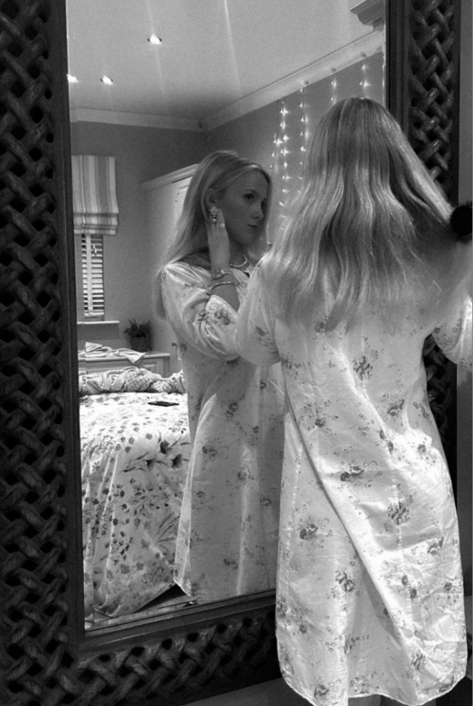
Within this photoshoot, my main aim is to take images of a female looking at the expectations within social media or comparing herself to social media in the mirror. I am inspired by Cindy Sherman in these images
I think these photos have such an impactful message which I am mine to do so too. I aim to take images mainly in a mirror of a woman doing ‘stereotypical’ things such as makeup and crying as a women are seen as sensitive. However, at the same time I aim to show the impact of social media and although it signifies the freedom and equality rights of women, it has a very impact of teenagers and even women. This will be aimed for 2010’s to 2024 which is the present. Not only this, I will make my subject to dress up to still show the feminine side and how the dressing up from the man in the household has switched to social media. I think this will successfully show the growth and impact of feminism and I aim to put it in order in my book to emphasize it. All my images I am to be mirrors and staged as I think this will suit my ideas the best.