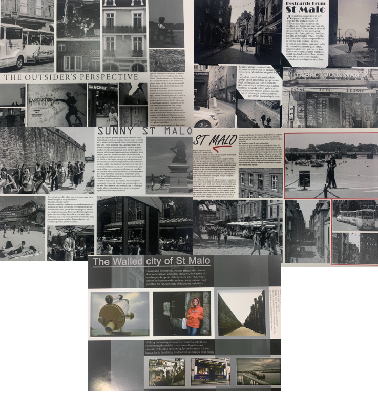
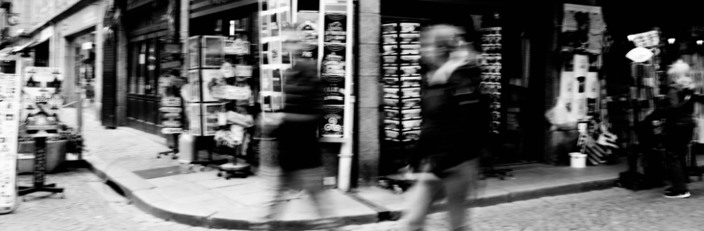
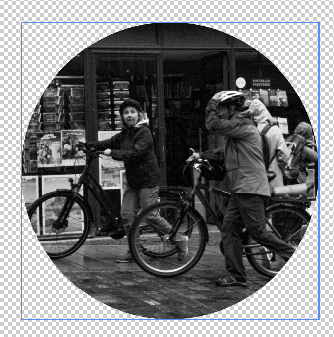
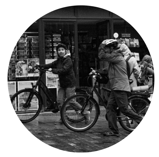
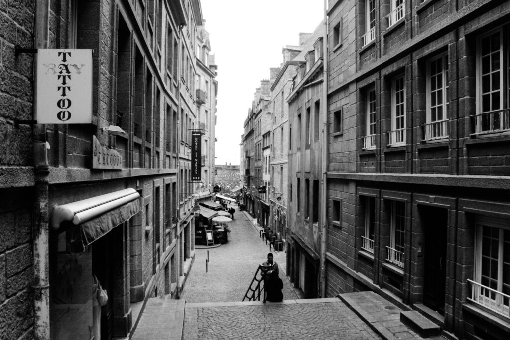
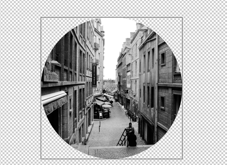
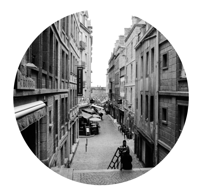
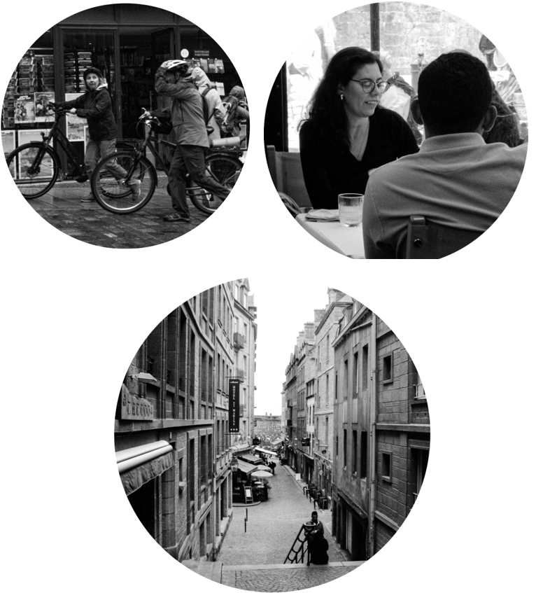
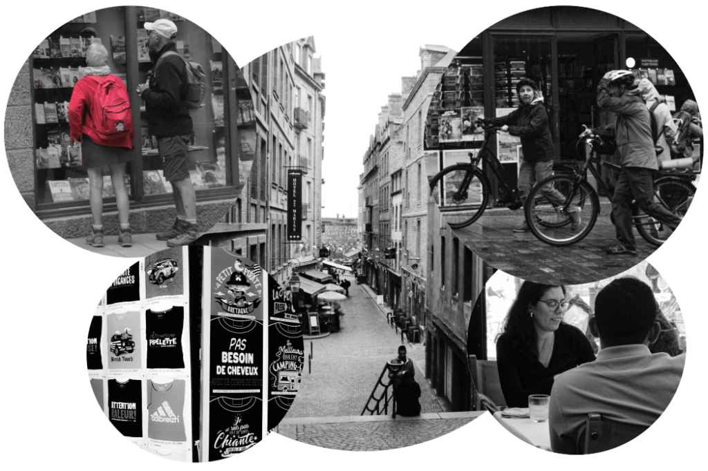
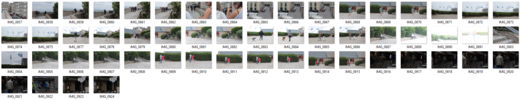
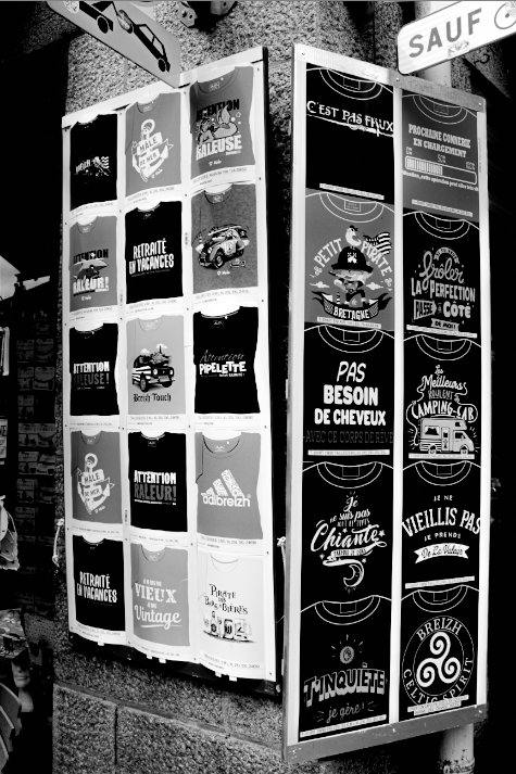
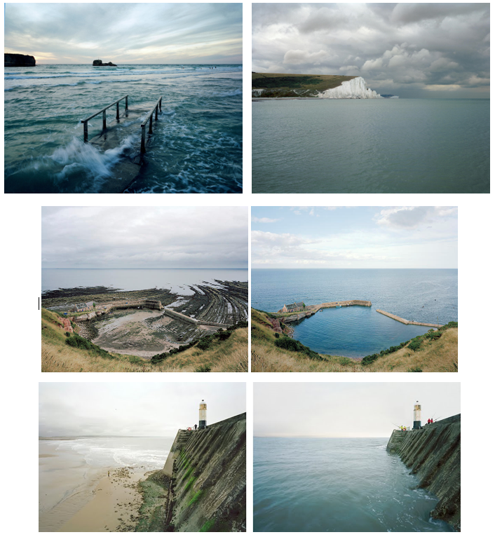
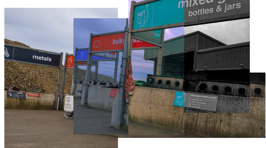
To create this mood board, I took photos of students’ old photography work. I think they all work well together because the topic is St. Malo, therefore they all link to each other. Also, there is a lack of bright colours to focus on the meaning in the images rather than its appearance.
My plan and ideas for my own spreadsheet–
Title ideas:
The people of St. Malo
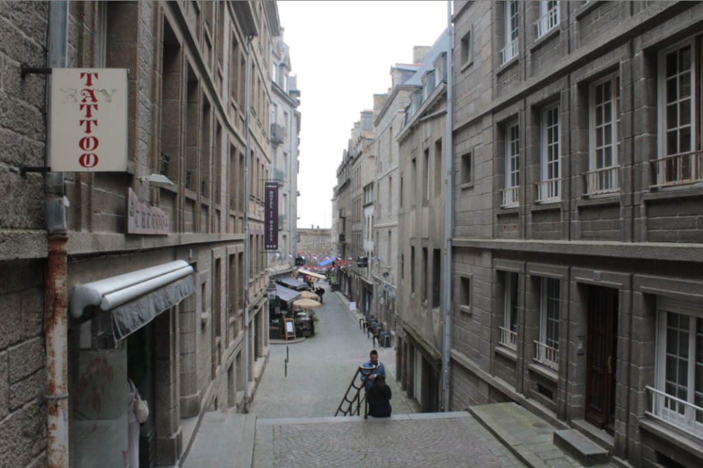
The Architecture of St. Malo
Behind St. Malo’s walls
Photos I will use:
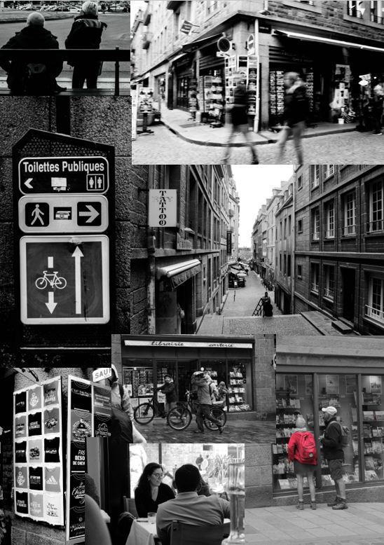
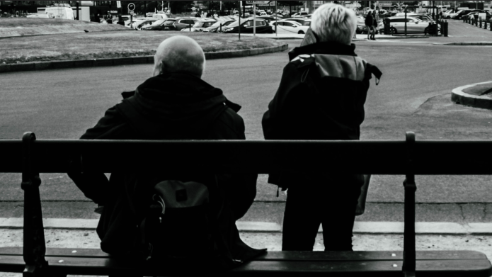
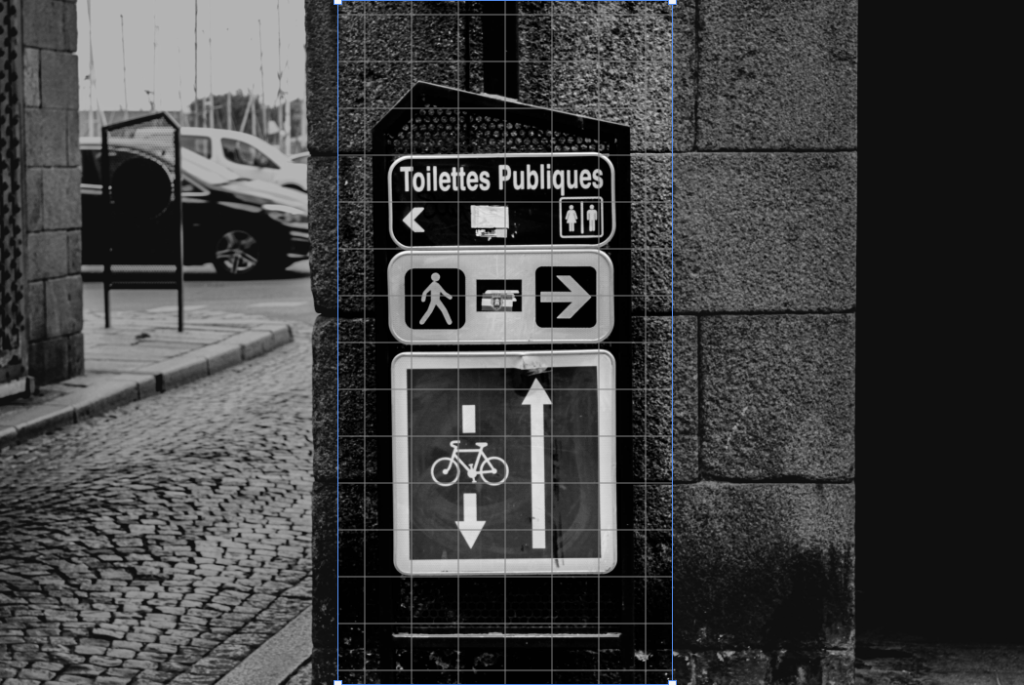
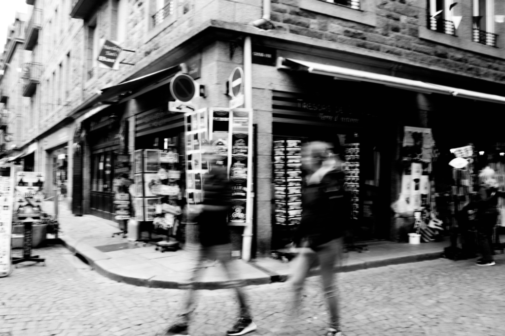
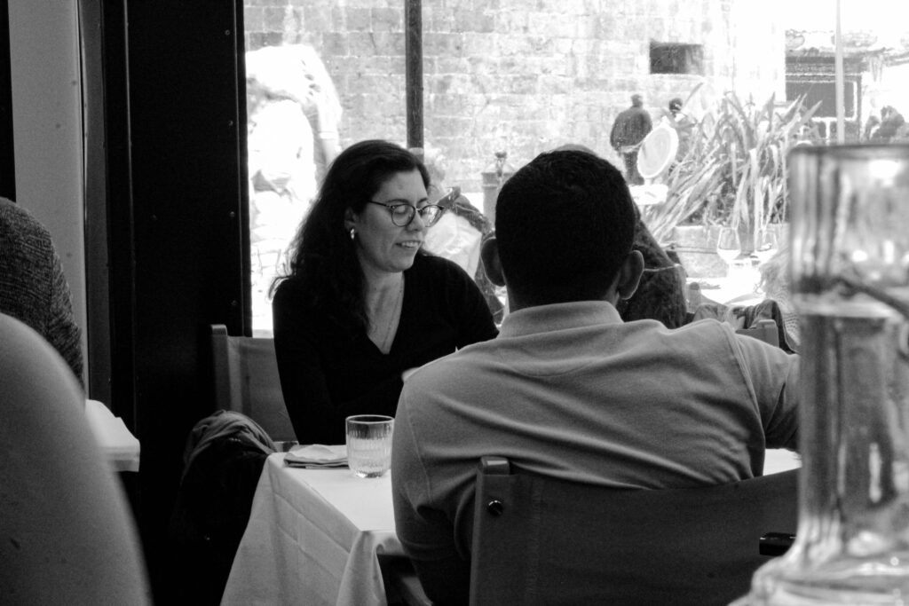
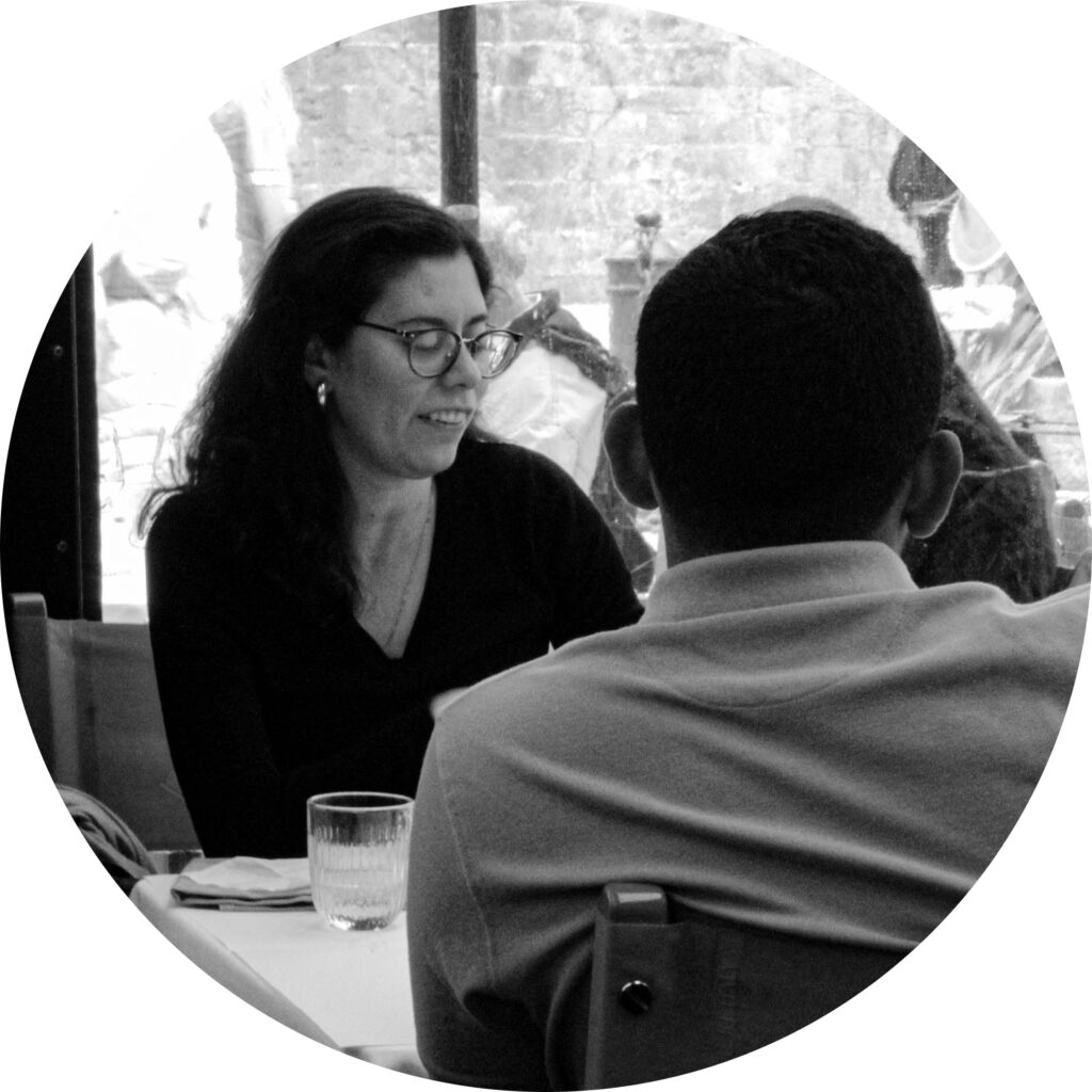
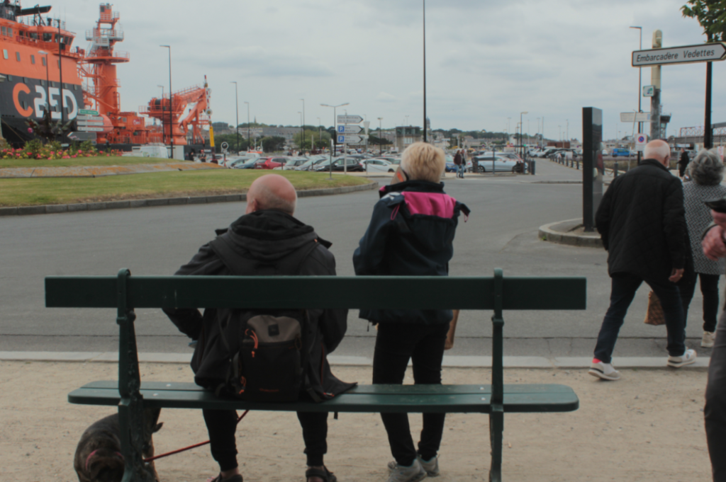
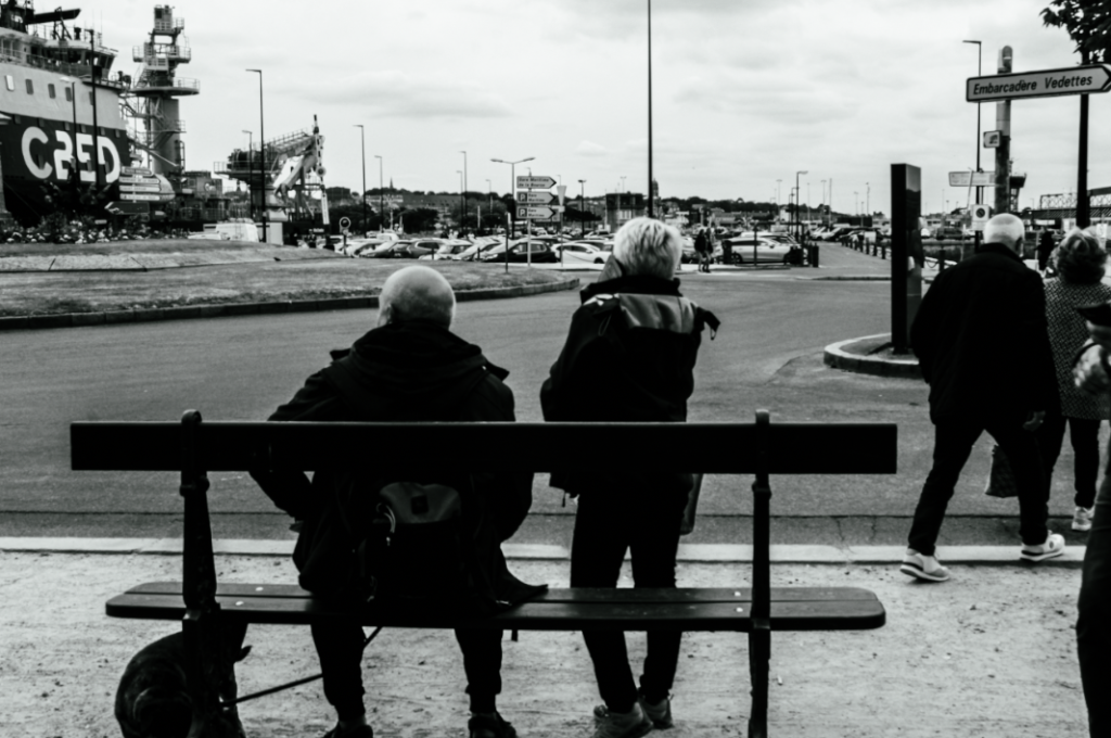
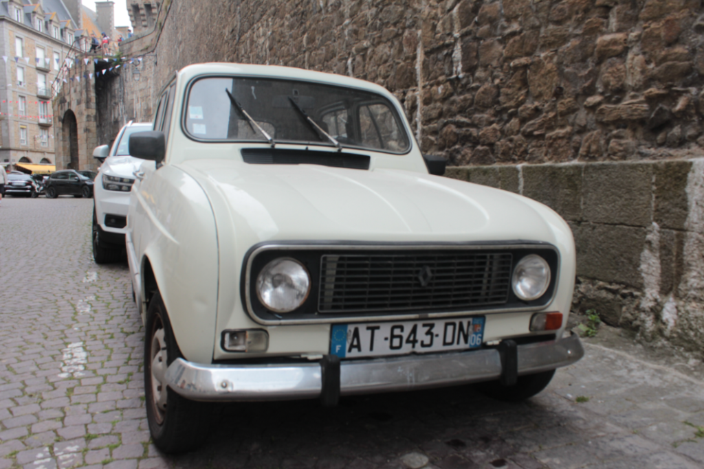
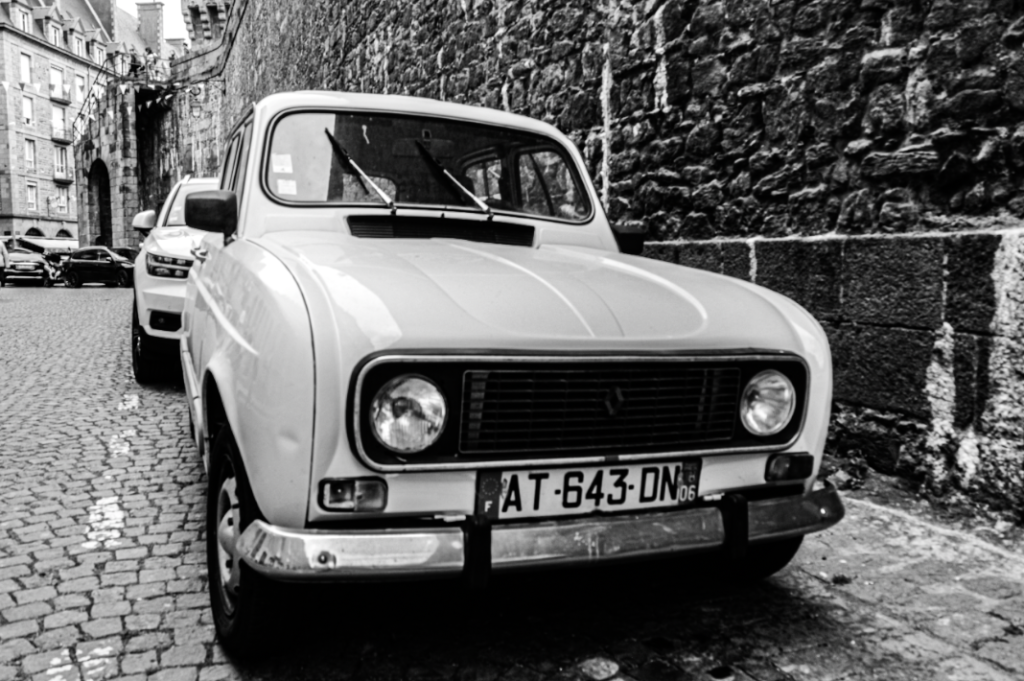
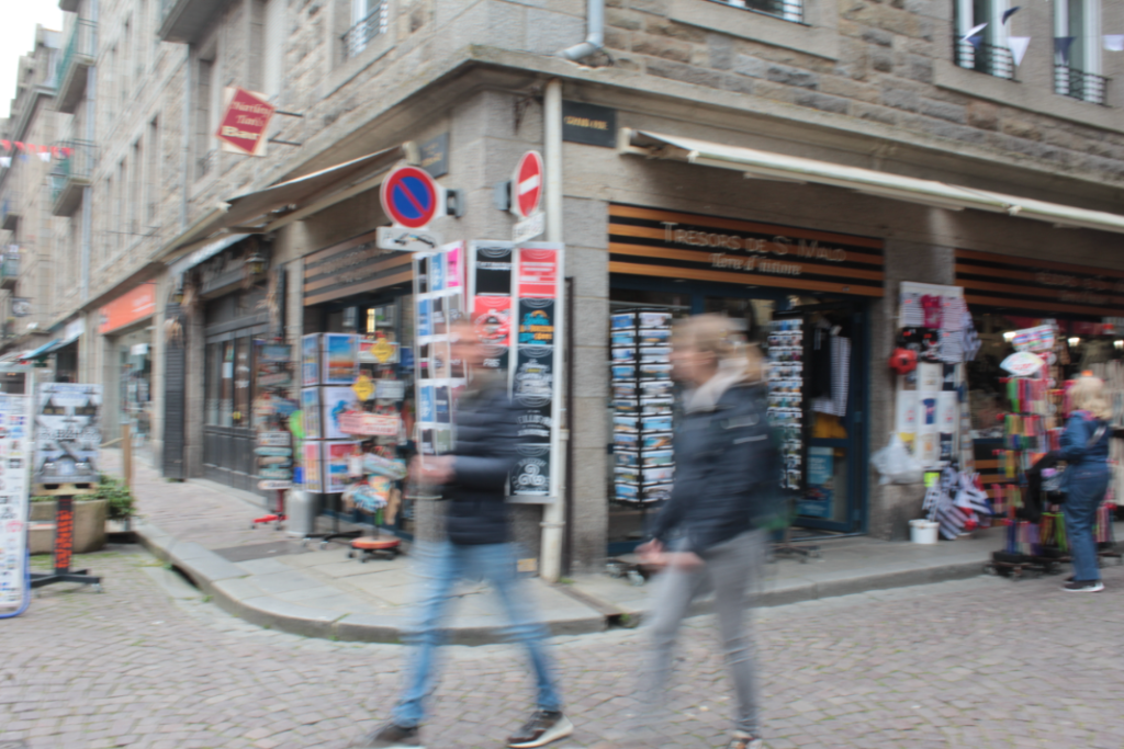
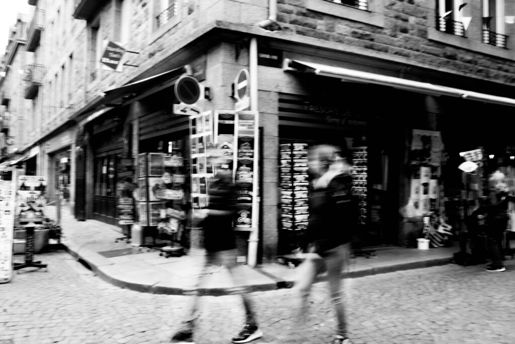
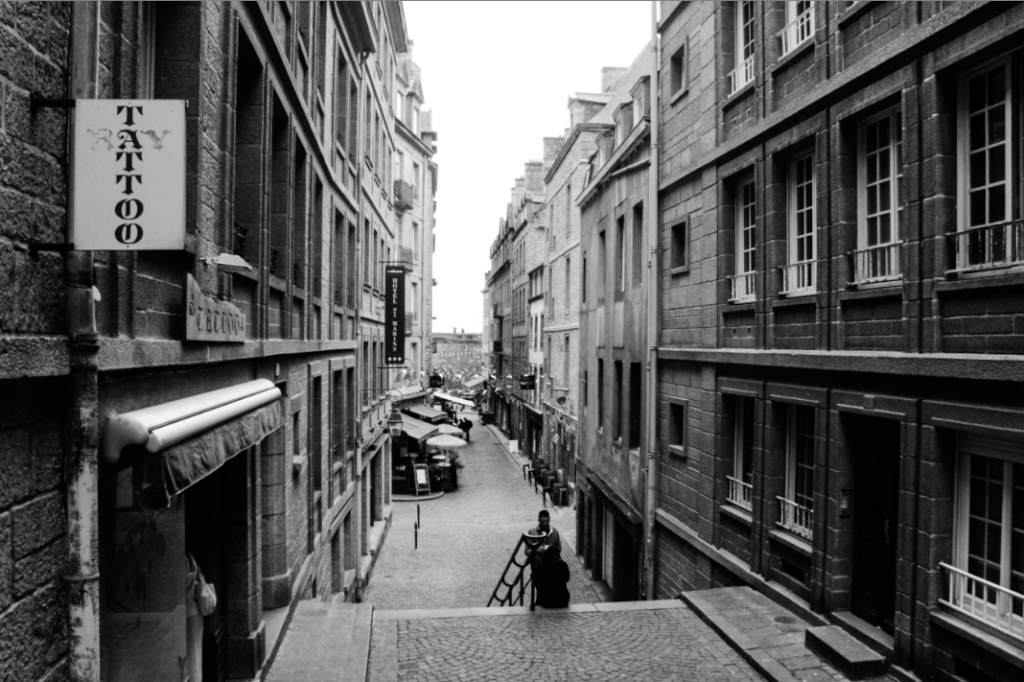
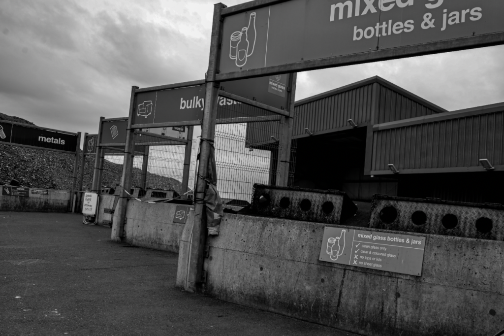
I am making 3 spreadsheets, two with both images and text and one with just images. I will be using these images because they are all black and white, and they flow well together. I am making one spreadsheet focused on the people of St. Malo, and the other focused on the architecture.
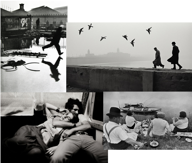
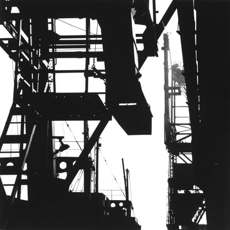
Henri Cartier-Bresson was a famous Humanist photographer who focused his work around capturing the reality of people’s everyday lives. He claims that his camera was an extension of the eye, and he brought his camera around with him everywhere.
Henri Cartier-Bresson was born in 1908 into a wealthy family in Chanteloup, Seine-et-Marne. At an early age, he was introduced to arts and was initially drawn to painting, particularly with Surrealism. As he grew older, he discovered photography and his fascination increased, he then began a lifelong passion for photography. Bresson felt as though a camera was a tool he could use to interact with the rest of the world. His theory was that photography can capture the meaning beneath outward appearance in instants of extraordinary clarity. In his early years, he decided to travel extensively from Europe to Africa with his camera by his side. Bresson states that photography is like hunting, except they don’t kill. “I adore shooting photographs,” he’d later note. “It’s like being a hunter. But some hunters are vegetarians—which is my relationship to photography.” These experiences widened his outlook on life, and he believes that ‘Photography isn’t just about images; it’s about capturing the essence of existence.’
Examples of his work:
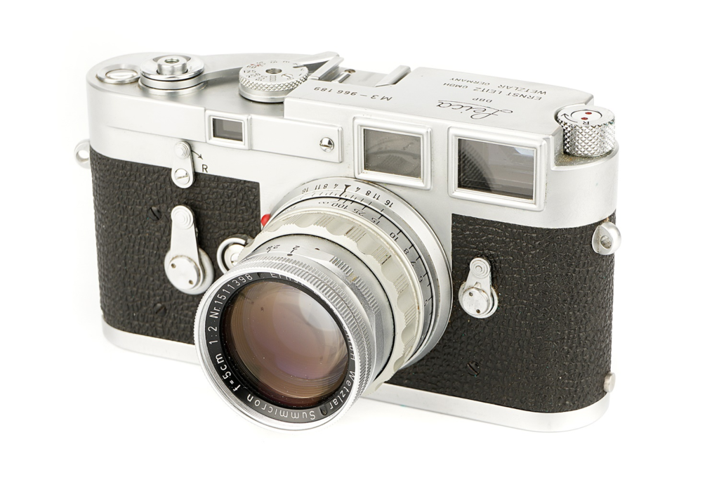
The camera and the lens:
Henri Cartier-Bresson was known for using a camera called the Leica rangefinder that had a 50mm lens. Bresson loved the fact the camera had a 50mm lens as its similar to the human eye, ensuring he captured images that felt natural and immersive to viewers. He favoured this particular camera because it was compact, reliable and left him inconspicuous. This allowed him to use a quick style of photography, which is essential for street photography.
Another reason why he loved this camera was because it had a silent shutter, so it let him capture moments without drawing attention to himself. This silence allowed him to be stealthy with his photography.
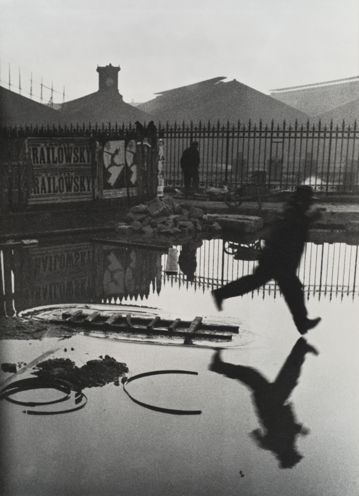
A smaller aperture was used to allow a larger depth of field, and a fast shutter speed was used to capture a man in movement in sharp focus.
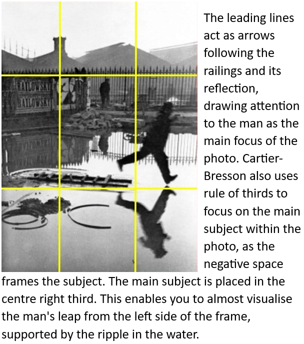
Behind the Gare St. Lazare:
Henri Cartier-Bresson is well known for his black and white photograph called Behind the Gare Saint-Lazare taken in Parisin 1932. This photo was taken at the Place de l’Europe, outside the Saint-Lazare train station, in Paris, with his portable Leica camera. It is one of his best known as it is spontaneous and is iconic because of the style that attempted to capture the decisive moment in photography.
Textures:
The choice of black & white for the photo was actually not a choice due to the technological limitations in the 1930s. By stripping away all of the colour, this lets us focus on the image’s content and not be distracted by the hues in the scene. Since there was no colour, the texture becomes more pronounced as well. A variety of different textures are included in this image, for example the water’s surface, the rough posters, the old buildings in the background and the grainy quality allows the viewer to feel connected to the location and feel as though they are there.
Lighting:
This image was taken during mid-day using natural light. Typically, photographers are wary of using midday sun for their photography due to its harshness and strong shadows it can cast. However, Cartier-Bresson turned these potential drawbacks into positives, and used the sharp shadows to add depth to the scene. The high contrast emphasises the texture throughout the image. The sun’s position was a huge factor to creating the vivid reflection seen in the puddle. Without the overhead light source, the reflection may have been less defined.
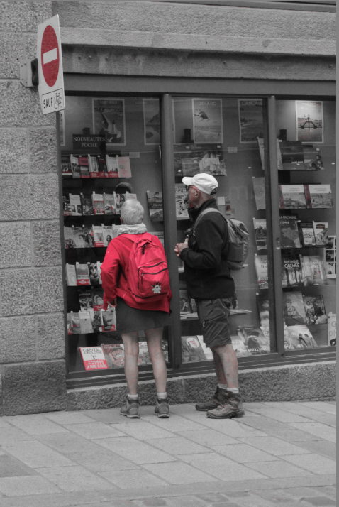
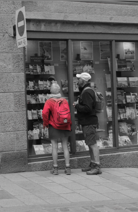
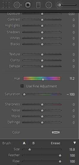
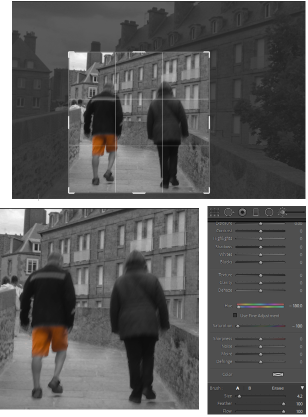
For this final image, I edited it using Lightroom and I decreased the saturation for all of the colours except for red. This left the image black and white, apart from the parts which were red. I then used the adjustment brush tool in Lightroom to paint the remaining unwanted coloured areas to make them also black and white. This left the image black and white, with the red backpack still the same colour as I expected.
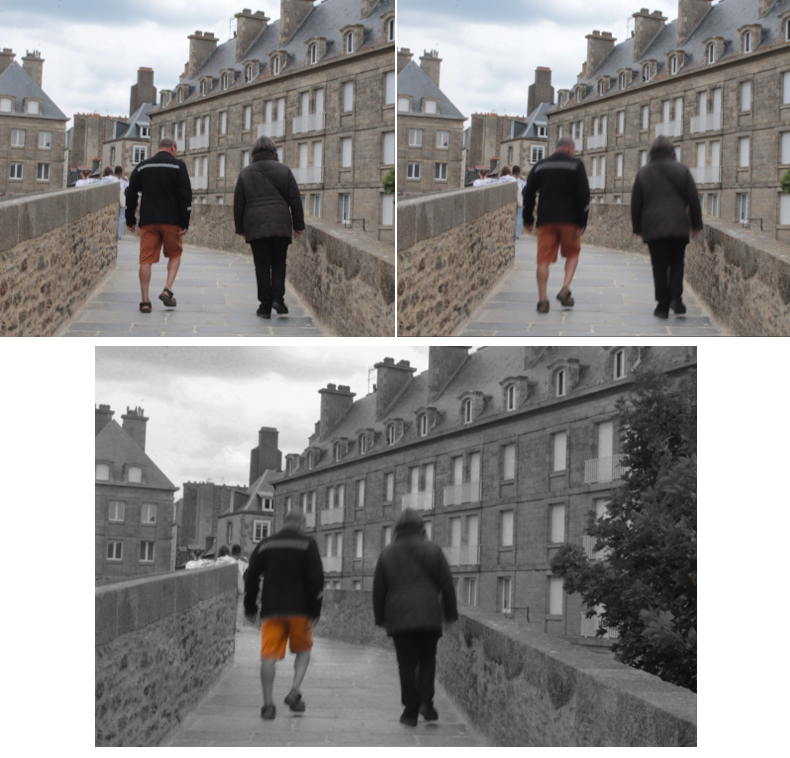
For this particular image, I experimented using two different editing techniques. Firstly, I chose a photo where the main subjects were focused, and edited the photo using Adobe Photoshop. I selected both of the main subjects and added the filter ‘motion blur’ to make it looks as though they were moving. I then edited the image using Lightroom so that the man’s shorts was the only colour left in the image. To do this, I decreased the saturation for all of the colours apart from yellow and orange, and used the adjustment brush to paint the unwanted coloured areas black and white.
Finally, I cropped the image to make it squared to focus on the main elements of the image.
Evaluation:
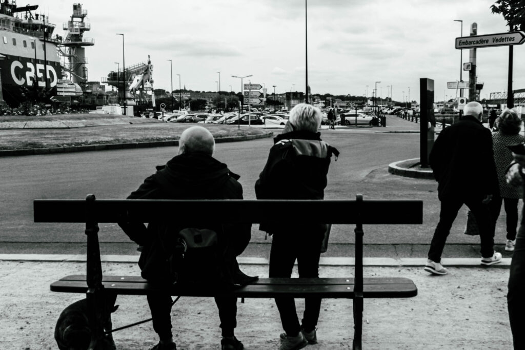
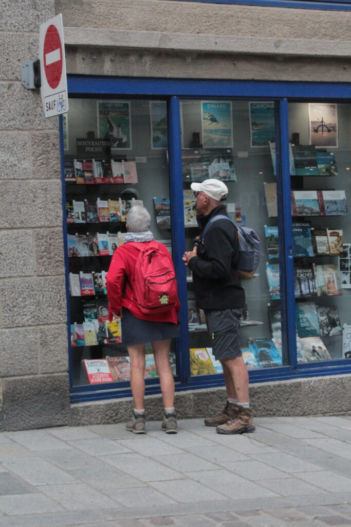
In St. Malo, I focused on taking images on either the French aspect of architecture or people living an ordinary life as I think they go really well together because they all hold a certain spontaneity. I found that my photographs linked well to the topic and I think all of my edits were very successful as I experimented with new editing techniques.
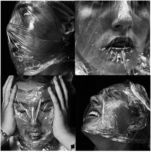
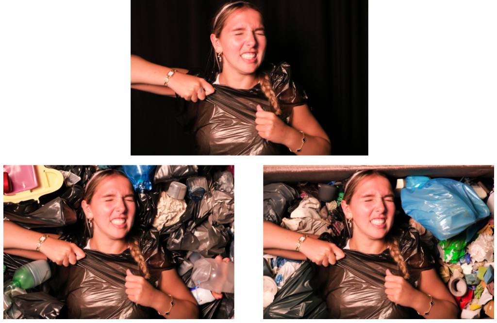
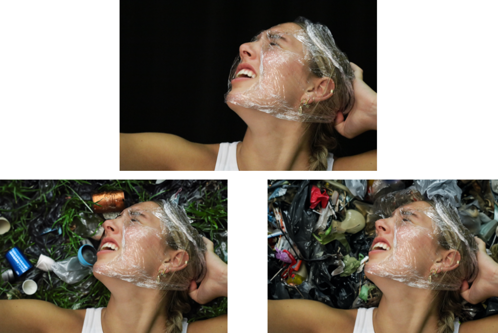
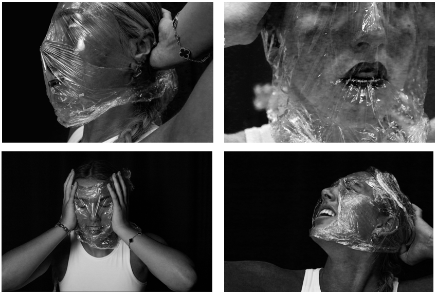
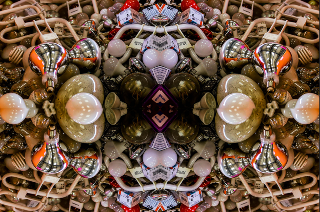
For Anthropocene, I decided to stick to the theme of plastic to focus on for my edited images, so the photos would all link to one theme.
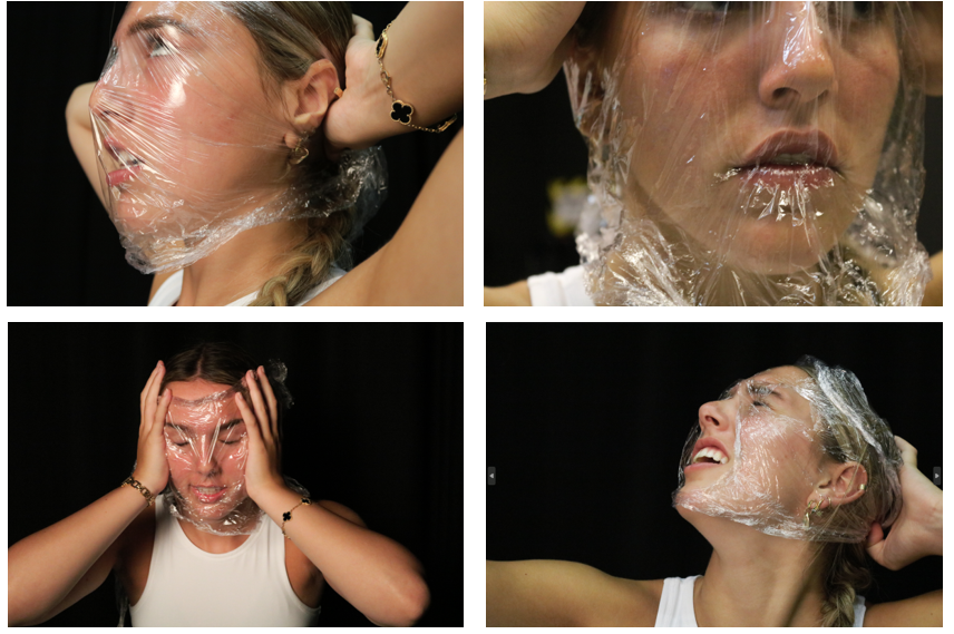
I really like these images and how they were all the same but portraying different emotions, but I wanted to add more. So, I then made them black and white using Adobe Photoshop:
Whilst editing, I increased the brightness and contrast to clearly show the textured lines within the plastic around her face. I also increased the red hue to exaggerate the colour of her lips and cheeks. I really liked these images so I continued further to crop the photos to make them square, and add them into a grid layout.
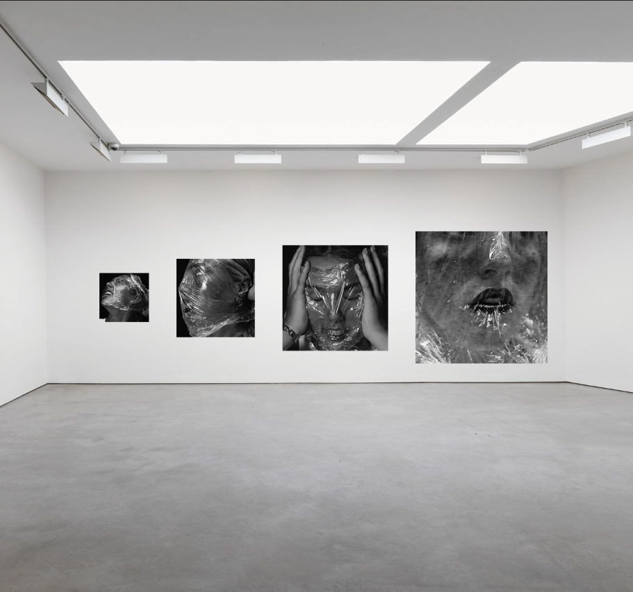
I think these are really successful images, and I’m happy with the structure of using a grid to produce them. I’m using these photos for my final images because I really like the black and white contrast and how the light reflects off the plastic, so the crumpled texture is clear to see.
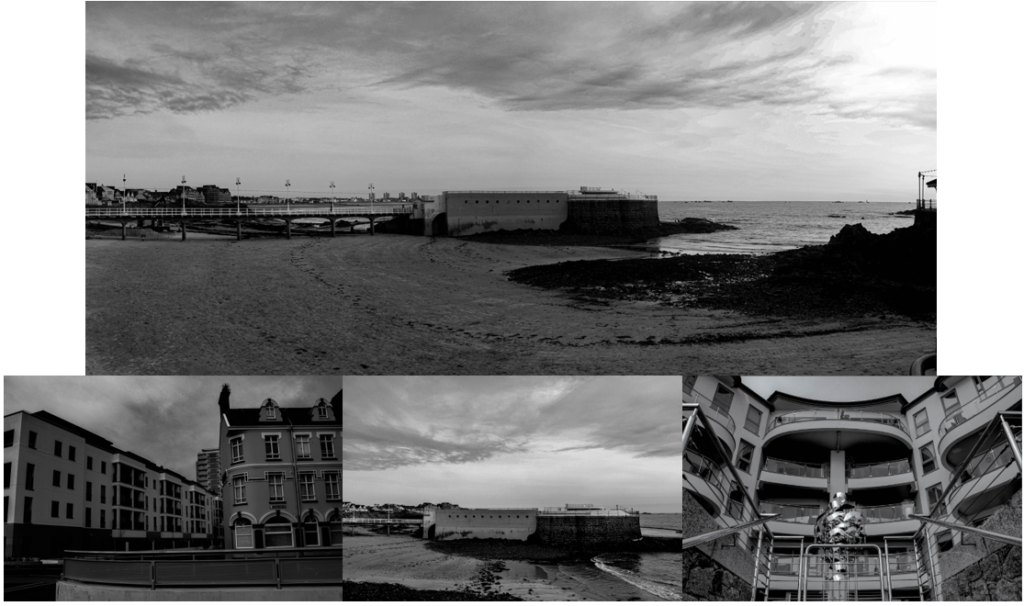
Landscapes:
I only chose to use two photos for my final images as I felt they were my strongest and best images I edited. I also think that none of my other photos would link as well as these ones do together.
Topographics:
I really like these images because I edited them similarly, so it shows that they were all taken on the same day. I chose to edit them in black and white because I was inspired by the photographer Robert Adams, who focuses on landscape photography and edits his photos into black and white.
For this photoshoot, I decided to stick with using plastic and rubbish to represent Anthropocene as I think Plastic pollution is a huge factor to Anthropocene and the damage to the earth. I used AI on all images to add plastic and texture to the image, so it reinforces this idea around pollution.
Edit 1:
Edit 2:
Edit 3:
Final outcomes:
These edits were my personal favourite because they are 4 different photos of the same person, portraying different kinds of emotions. I made sure the model was not looking directly in the camera, therefore we find the emotions are represented through her facial expressions.
All four photos are in black and white, with increased highlights, to show the texture of the plastic cling film. I also increased the brightness to emphasise the light reflecting on the plastic. Finally, I chose to present them in a grid layout, so that it’s clear they all link together.
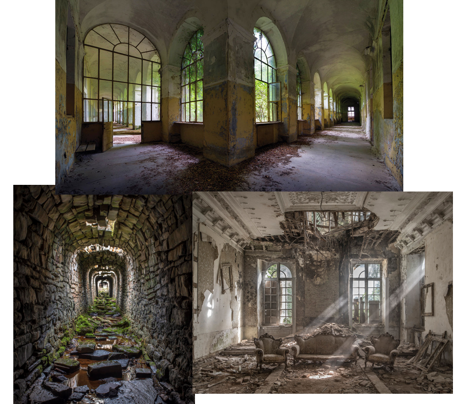
I was inspired by the photographer Matt Emmett, who focuses his photography on old, abandoned buildings. Although these buildings aren’t being used, they still look beautiful even though they are crumbling and decaying.
Examples of his work:
First edit:
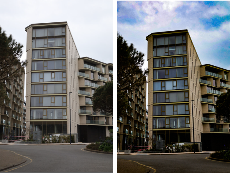
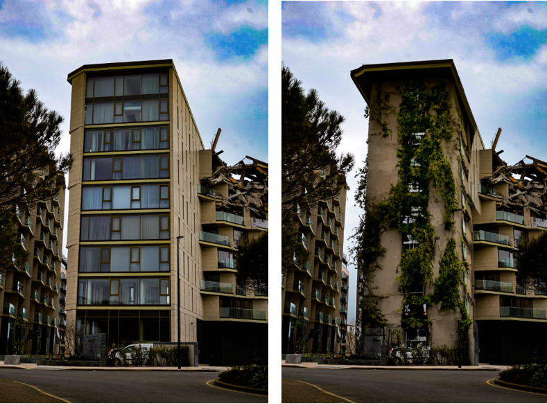
This is the process of my first final edit where I decided to turn a modern, appealing block of apartments into an old, neglected building.
Firstly, I edited the image on Lightroom Classic to add a modernised affect by increasing the saturation and vibrancy of the image. This improved the image as it make the building look more appealing and full of life.
I then used AI in Photoshop to reconstruct the building and make it look as if it is decaying. Finally, I added vines to make it seem as though the building had been deserted and the vines add a natural affect to it.
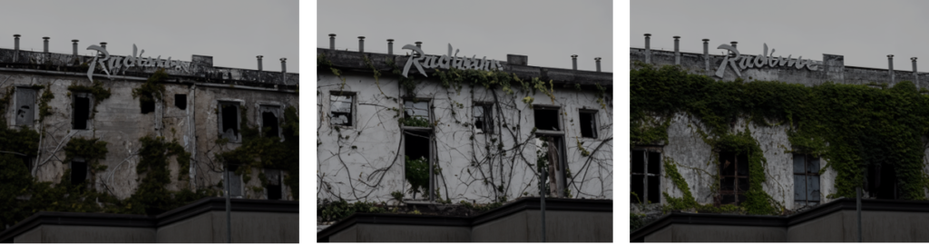
Second edit:
Firstly, I edited the original image using photoshop to make it look monotonous and dull. To do this, I decreased the saturation and vibrancy to make it lack colour. I also increased the contrast so the shadows and darker areas were made to look lifeless. Lastly, I cropped the image to discard any unwanted areas in the image, so I could focus my editing on the main area of the building.
Finally, on photoshop I used AI to completely change my image. I decided to make it look wild and deserted, with added vines on the outside of the building. In conclusion, the block of apartments were changed into a futuristic, neglected building.
I was inspired by Matt Emmett to create and edit these images as I think his photography is meaningful, and it shows that abandoned places can still be viewed as beautiful even though they have been neglected.
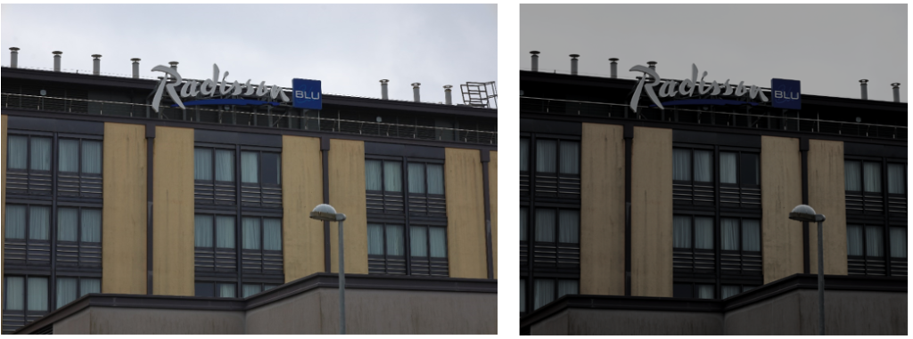
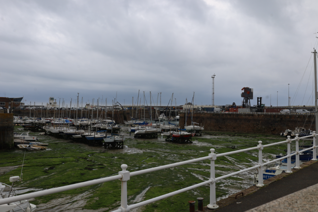
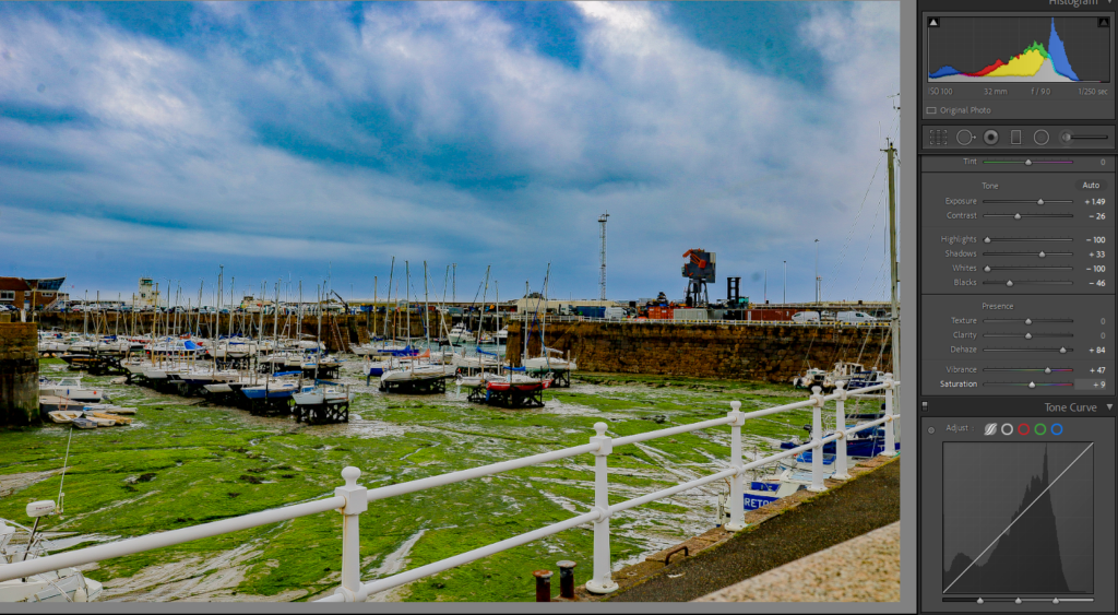
For this image, I increased the vibrancy and saturation to make the photo look more exciting and engaging, rather than characterless. Before I edited this image, it was producing a sombre, upsetting feeling because the lighting was darker, so therefore the image was dull and colourless.
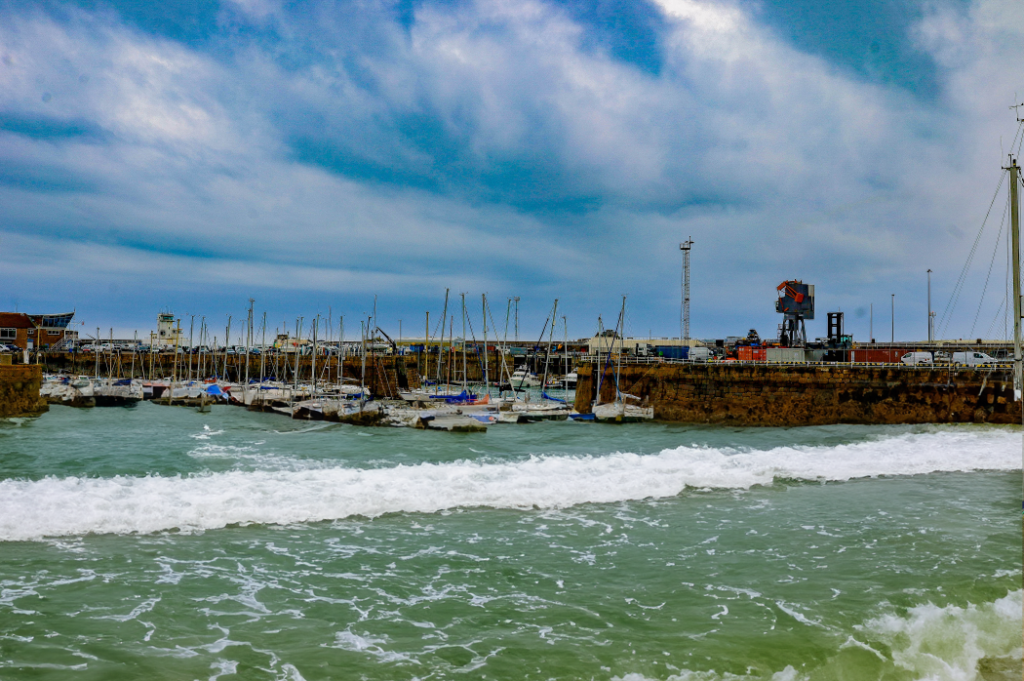
I continued to further edit this image by using AI, and I think this changed the image as it shows the rising tide in the harbour. Rising tides can be due from change in the water cycle which has been affected and impacted on by humans. This reflects on Anthropocene, as it shows the natural change in tides from low to high.
For this image, I came out with two successful photos of riding tides. To do this, I used AI on photoshop. Here, you can see that the buildings in the background have been affected by these unexpected rising tides, and it looks as though the buildings are sinking. The photos look natural, and suggest that high tides can be damaging to the human life.
Artist Inspiration
I was inspired by the photographer Michael Marten who is a seascape and landscape photographer with an interest in tides, seasons, and other natural phenomena.
“I am interested in showing how landscape changes over time through natural processes and cycles. The camera that observes low and high tide side by side enables us to observe simultaneously two moments in time, two states of nature.” -Michael Marten
Examples of his work:
Before:
After:
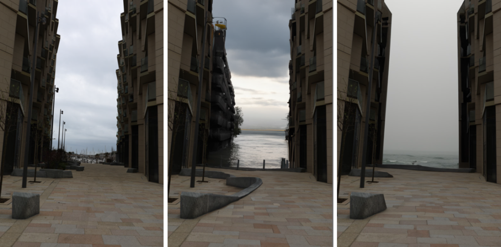
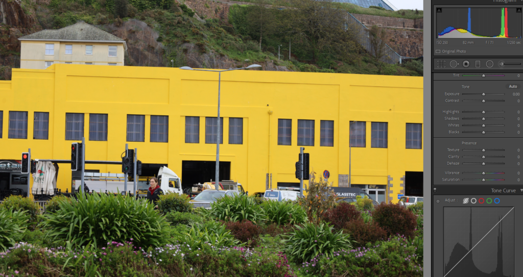
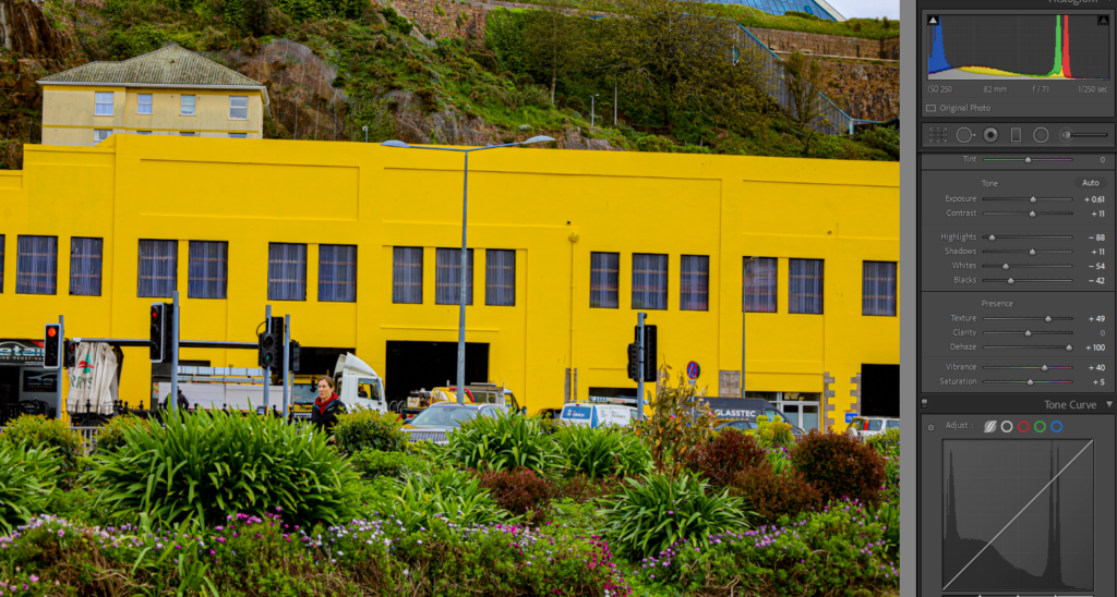
I really like this image because it shows the contrast between the large, yellow building which feels out of place, compared to the nature in the foreground of the image. I made the vibrancy of the colours more illuminous to make the landscape look more lively. I think the final edit of the image was really successful and the contrast between the dark, black windows compared to the bright yellow building makes the lines in the image stand out and make it look sharp.
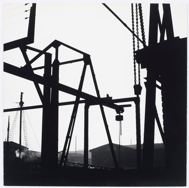
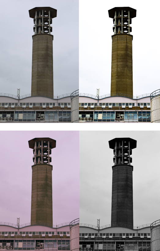
Additional artist inspiration: Keld Helmer Petersen
Keld Helmer-Petersen was born 23rd August 1920 in Copenhagen, where he lived and worked most of his life until his death in 2013. He started photographing in 1938, when he was given a camera as a high school graduation gift. In just a few years he began working in a visual figurative language.
Keld Helmer-Petersen was one of the most influential Danish photographers in the 20th Century. His career spanned 70 years and he had strong interest in modern architecture, industrial areas and structures.
I really like Helmer-Petersen’s work because it is original and unique. He uses lines to construct an image.
I explored with different filters to add onto the same image to see which ones I prefer or look the best. Here are a few examples that I chose to lay out in a grid:
This photo shows the contrast between the old water tanks that were built many years ago in St. Helier compared to the grassy cliff on the opposite side of the photograph.
I like these edits because it links back to topographics also. I think having presented this images in a grid, the photo has become more interesting and bright rather than the initial photo which is dull and colourless.
Initial edit:
Final edit:
I experimented with montaging different edits of the same image to create one final photo. I think this is quite successful and I really like the way this came out because it shows the different ways to edit images using different filters and tones.
Before:
After:
At first, I edited this image to make the colours more vibrant and illuminous, rather than lifeless and monotonous. Then, I cropped the image to the size I wanted it including the wanted contents of the image. I created four copies and flipped them four times in opposite directions to create this final outcome.
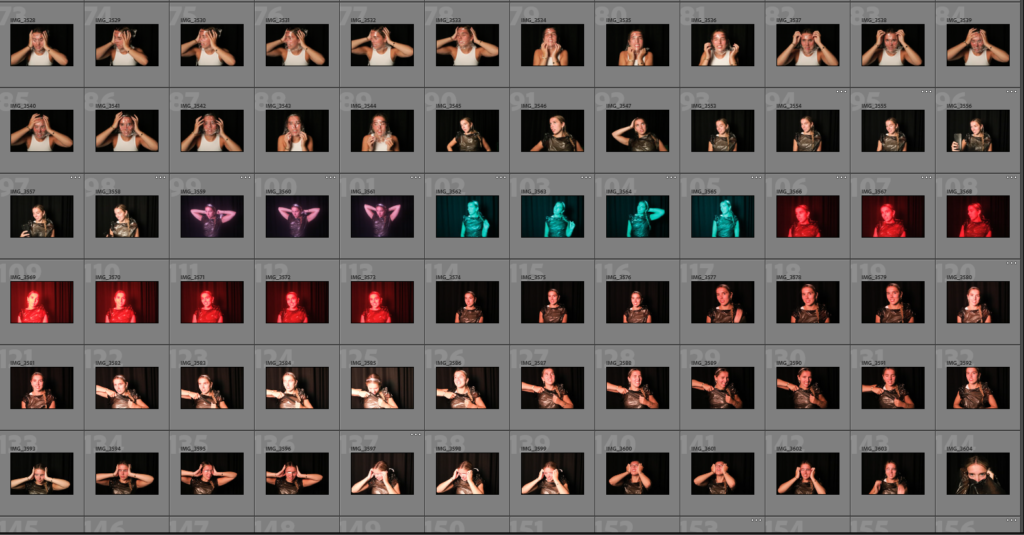
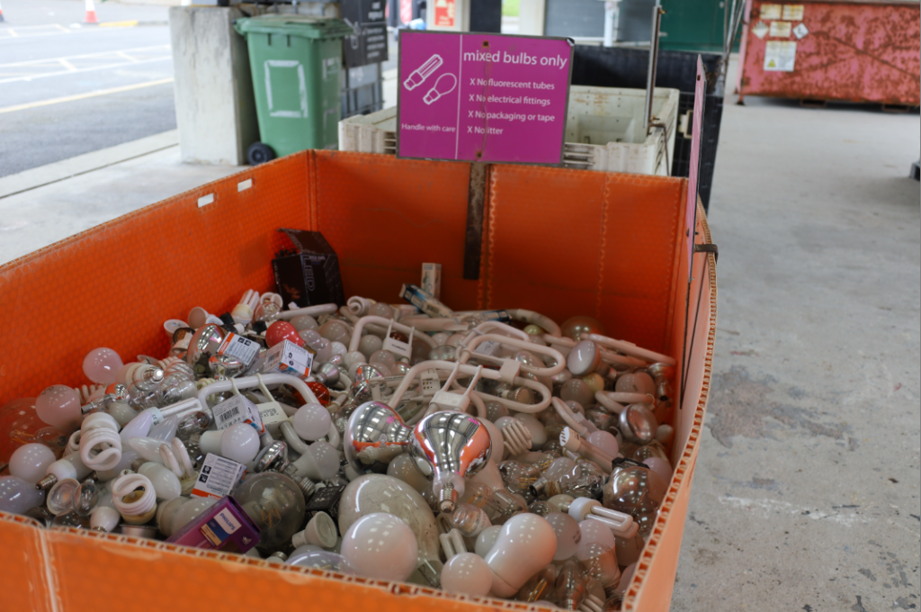
Photoshoot one: For this photoshoot, I decided on taking photos around the recycling centre because I think it really links to the topic Anthropocene. This idea is different as the recycling centre shows a positive perspective on how we can reduce pollution and can impact people’s decisions.
Photoshoot two: For this photoshoot, I decided to take photos near the tunnel in town because there is a large rate of traffic congestion near there. Also, I decided to take photos of man-made sculptors and buildings which look out of place and are affects from the Anthropocene historic period.
Photoshoot three: For this photoshoot, I decided on taking photos around the waterfront because it is packed with newly built, modern houses and this shows clutter and chaos.