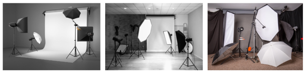
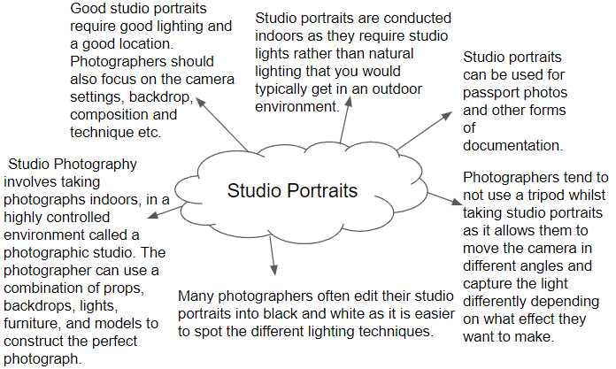
Why do we use studio lighting? We use studio lighting as it allows you to capture a large number of photographs and ensure absolute light consistency in exposure, colour, and image quality. It can also give your photos a professional look that sets them apart from the rest.
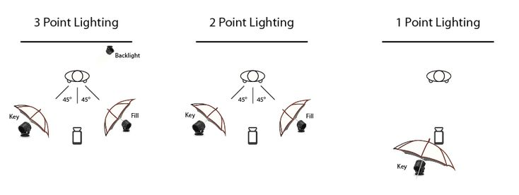
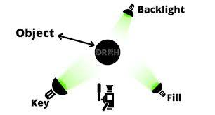
What is the difference between 1-2-3 point lighting and what does each technique provide / solve? One point lighting would involve just one light and this would be illustrated as the key light. The way in which we would utilise this light effectively would be to use a soft box in order to convert the light into a powerful diffusion light source. It has the most natural look and can have a dramatic lighting effect. It also draws attention, but can give a person onstage a very flat, two-dimensional look. In a two-point lighting setup, two light sources are usually placed at 45 degree angle from the subject. One of them is your key light, which is the main light used to illuminate the subject, and the second is your fill light which helps to remove harsh shadows on the subject that are created by the key light source. Three-point lighting is a traditional method for illuminating a subject in a scene with light sources from three distinct positions. The three types of lights are key light, fill light, and backlight. Key light is the primary and brightest light source in the three-point lighting setup
What is fill lighting? A fill light is responsible for exposing the details of a subject that fall in the shadows of the key light. It is the secondary light in the traditional 3 point lighting setup. The fill light is typically positioned opposite of the key light to literally fill in the shadows that the key light creates.
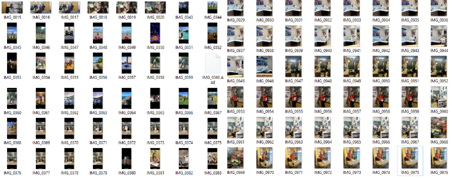
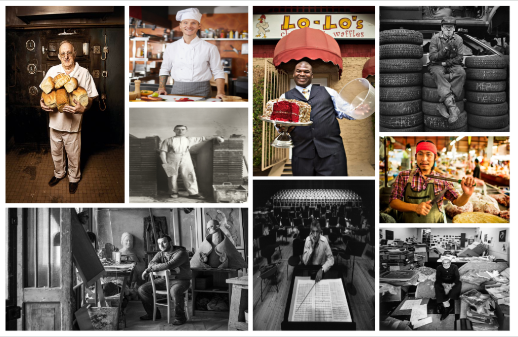
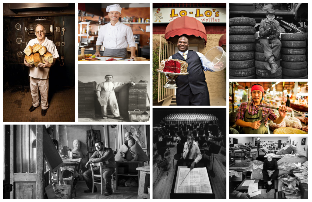
For this photoshoot, I took pictures of various people in places I either associate them in or their place of work. I did a total of 3 different photoshoots: family/friends, school teachers and finally people who worked at the market in town.
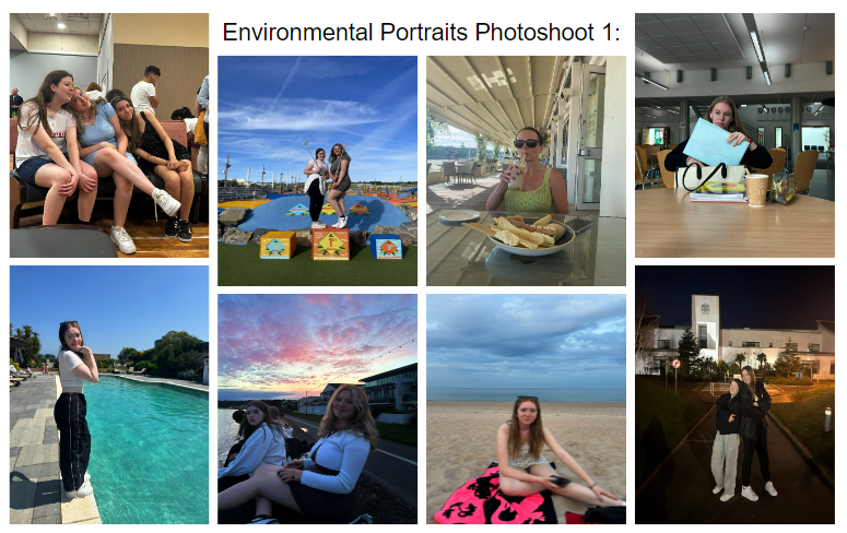
For this first photoshoot, I took pictures of my friends in a variety of different places that I associate them with or of them doing something they love. I used natural lighting in the majority of my pictures as they were mainly taken outside. I like these images as they give off a positive vibe due to the smiles and bright colours seen in the photographs. As the people I photographed were in places they liked/ were familiar with I think it helped them to be more comfortable and willing to pose. However, I wanted to photograph people in their work environment too as seen in Arnold Newman’s work, and so I did another photoshoot.
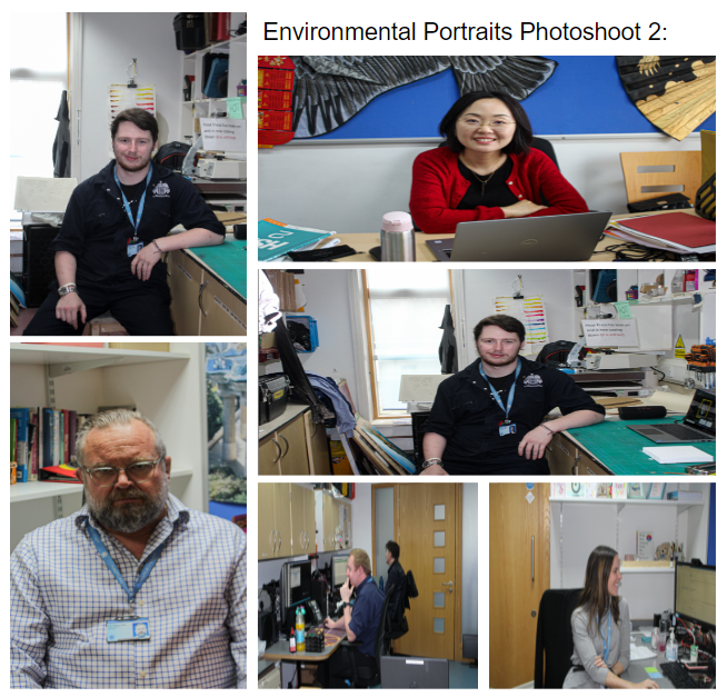
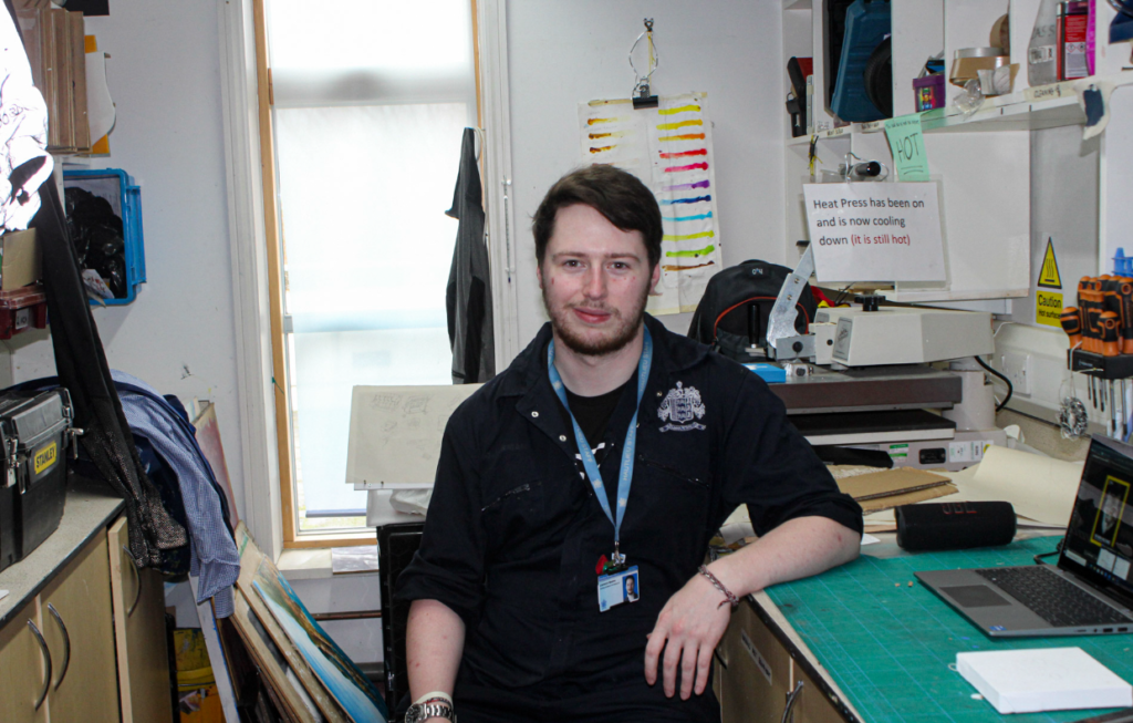
For this photoshoot, I went around school with a DSLR camera and took pictures of various teachers who were willing to be photographed. I tried to take my photos in both portrait and landscape in order to get more variety in my images. One problem that I encountered whilst taking my photographs was that most teachers were busy or didn’t want to be photographed, limiting the amount of photos I got. Additionally, a lot of my photographs came out blurry but I managed to fix the majority of them by using Lightroom and changing the clarity and texture of them.
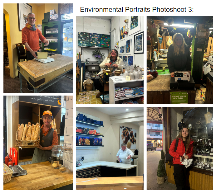
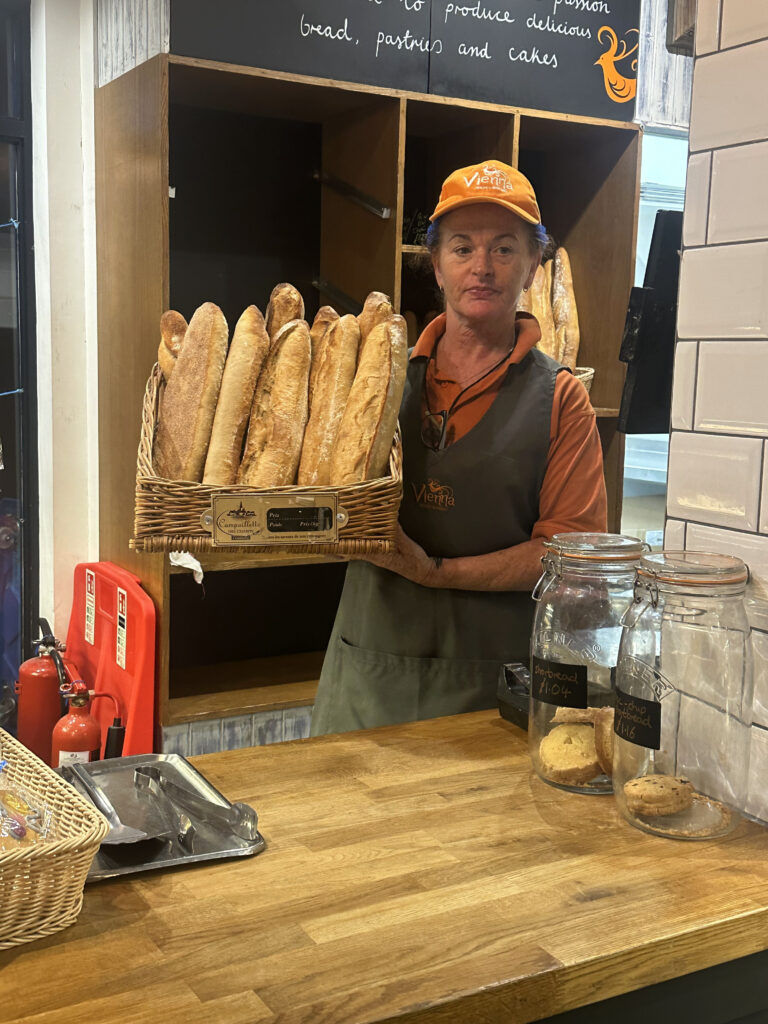
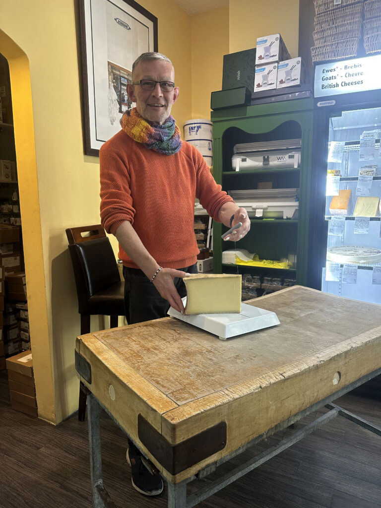
For my last environmental photoshoot, I took pictures of various people who worked at the market in town. The lighting in the market was a bit dark in some places causing some of my images to turn out not as well as I expected as a shadow would be cast over my subject. However, I feel this photoshoot gave me a good insight into what environmental portrait photography is really like. Another positive aspect of this photoshoot is I felt it helped build my confidence as I had to ask a variety of strangers if I could take photos of them, which was out of my comfort zone.
Final Images:
I chose these images as my final outcomes for my photoshoot on environmental portraits. I like the bright colours seen in the images as they help to create a positive tone in the photographs. Additionally, I like the clarity and quality of my images. I think I managed to successfully portray the theme of environmental portraits in my work as I got various images of either my friends in an environment in which I associate them with, strangers doing their job in the market and teachers at work (which is what environmental portraits is all about).
One thing I would like to also experiment with when taking environmental portraits is creating more melancholy images which could arouse an emotional response in my audience. This is because in many of the environmental portraits I looked at when researching about it had more of a sadder tone to it due to the black and white colours and sad expressions seen on the people’s faces. I think its important that I photograph both the positive aspects of life but also the negative.
who you are photographing: For my environmental portraits photoshoot, I decided to photograph a variety of different people. Whether that be my friends or random strangers in their work environment. For example, I got a few different people from the market at town and I also took pictures of my friends in an environment I associate them with.
what you are photographing: I decided to photograph people with an environment which either gives an insight into that person’s hobbies, their work or their life in general.
when you are conducting the shoot: I conducted my shoot mainly on the weekend (the 11th and 12th of November) and additionally on days when I would see my friends.
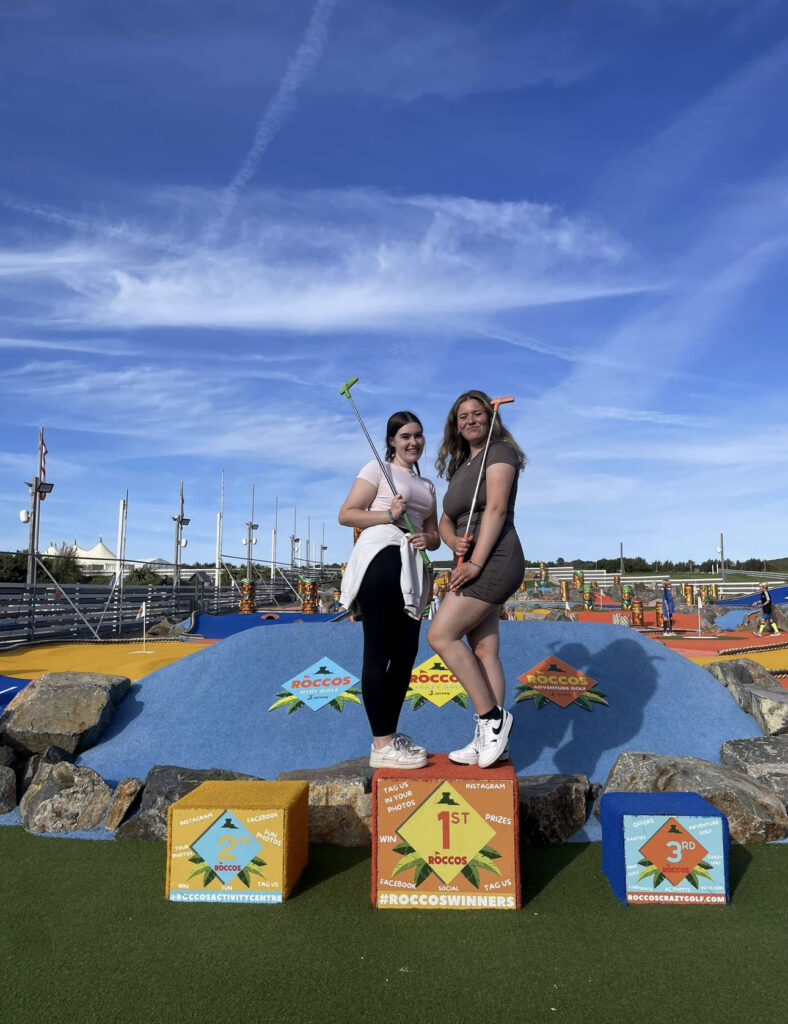
where you are working/ location: I took my photographs in the market in town and went to a variety of different stalls inside eg the bakery, a French shop and a flower shop. I also took some photos around different places in Jersey eg the mini golf course and on the beach.
why you are designing the shoot in this way: I designed my photoshoot this way as I felt the market would be a good place to find a variety of different people with different jobs and backgrounds in such a close vicinity.
how you are going to produce the images (lighting / equipment etc): To take my images, I used my phone and the lighting that was available in the market, or if my images were taken outside, I would make most of the natural lighting.
Problems that occurred: One problem that I encounter whilst taking pictures in the market is that some of my photographs are quite dark due to the bad lighting and overshadows the person in the image, making me unable to use them for my final images. Another problem I faced was that some of the people I wanted to photoshoot were busy doing their job so they couldn’t stand staring at the camera.
Benefits of this photoshoot: I think this photoshoot helped me to build my confidence as I had to ask a variety of strangers if I could take pictures of them. It became easier to ask each time.
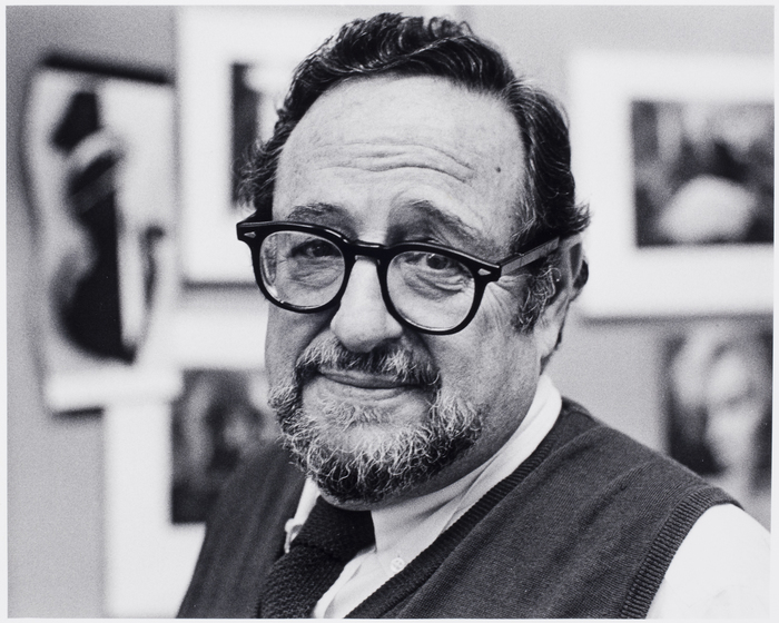
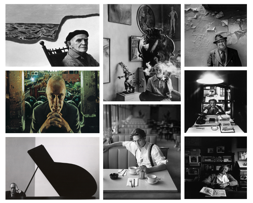
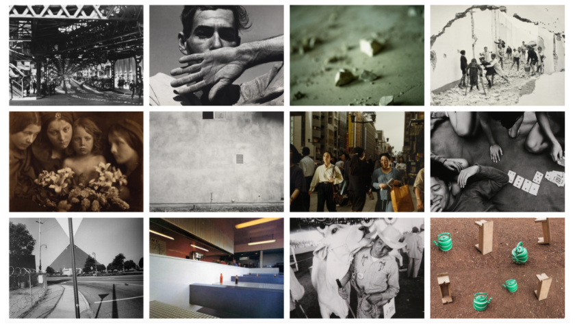
Arnold Newman was an American photographer who was well known for his environmental portraits of artists and politicians. He was also known for his abstract still life images. Newman was born in 1918 and died in 2006. His career in photography began in 1938, in which he worked at chain portrait studios in Philadelphia. The majority of his work is black and white but he does have some images in colour.
Arnold Newman favoured prime lenses and clarity in his images. He was also known for his range of lighting techniques in order to create the tone and atmosphere he desired in his portraits. His advanced skills in using natural lighting and studio setups, helped him to achieve a balance between the subject and their environments. Arnold Newman was less interested in the details of the subject’s surroundings and more interested in the symbols he could create from them.
Throughout his career, Arnold Newman photographed a variety of different famous people. For example: Eleanor Roosevelt, Pablo Picasso, Frank Lloyd Wright, Golda Meir, Andy Warhol, Marilyn Monroe, Salvador Dalí, and the former president Bill Clinton. He found his vision in the empathy he felt for artists and their work. Arnold Newman maintained the mindset that even if the subject he photographed was not known or already forgotten, the photograph should still excite and interest the viewer.
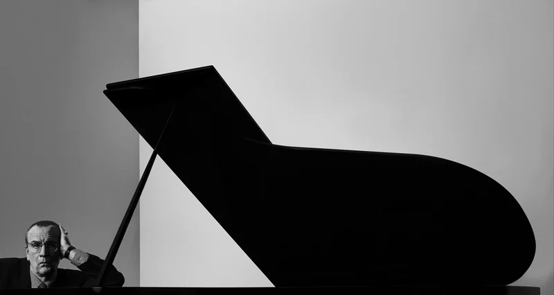
One of Arnold Newman’s well known pictures was the one of Igor Stravinsky in which the lid of his grand piano forms a gargantuan musical note representative of the melodic structure of the composer’s work, showing Arnold’s excellence in being able to carefully compose and frame an image to allow the subject’s surrounding to give us an insight into that person’s life, culture or personality. Arnold generally used a large-format camera and tripod in order to capture every detail in a setting/ environment.
“I didn’t just want to make a photograph with some things in the background. The surroundings had to add to the composition and the understanding of the person. No matter who the subject was, it had to be an interesting photograph. Just to simply do a portrait of a famous person doesn’t mean a thing.” -Arnold Newman.
Arnold Newman was said to be influenced by Flemish painters. Additionally, the work of the Cubists, including Picasso, also influenced the way he structured a photograph.
Arnold Newman’s Environmental Portraits:
I enjoyed looking at Arnold Newman’s work as I felt as if I almost had been able to make up a whole backstory about each person purely based off of their facial expressions and environment they were in, which is what a successful environmental portrait should be able to do. I also like the fact that there is no one in the background of the pictures even in places that you would normally expect to be busy. This made my attention be purely on the subject being photographed. Finally, I like how even when Arnold Newman’s pictures are in black and white, they still manage to captivate his audience and allow for such free creativity as you try and guess what the person in the photo’s life is like.
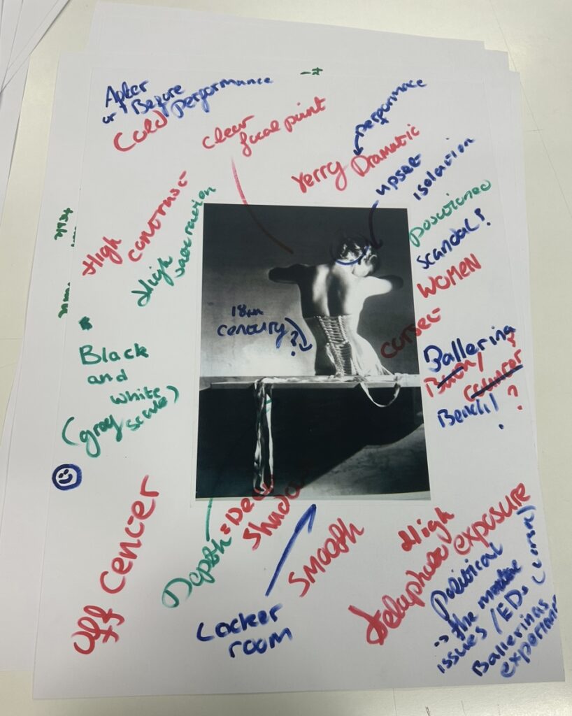
An environmental portrait is a portrait executed in the subject’s usual environment, such as in their home or workplace, and typically illuminates the subject’s life and surroundings. These surroundings often help us to get an insight into that person’s life, culture and status. In most environmental portraits, the subject is staring directly into the camera creating a more personal and intimate image between the viewer and the model.
From looking at these images, I have noticed that generally in the black and white pictures there is more of a sad, melancholy expression on the people’s faces. Whereas, in the coloured images the people seem to look happier and proud of their environment/ profession. This creates more of a positive tone around the images compared to the black and white ones which make me feel more sympathy towards them rather than joy.
Typology is a body of work with a consistent style. Often portrayed in many different forms, some being in a structured group with equal spacing in-between or a particular style in general like the style of environmental portraits. Environmental portraits are often associated with the style of typology as they are always structed images with the same idea of the subject looking into the camera and often centred.
Typology definition: a suite of images or related forms, shot in a consistent, repetitive manner; to be fully understood, the images must be viewed as a complete series.
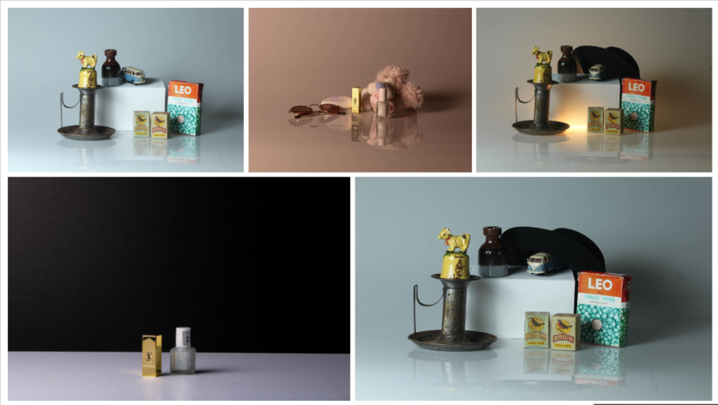
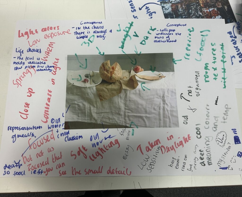
For my project on objects, I first conducted some research on still life. I looked at a variety of different examples and learnt about objects and their symbolisms. From this research, I then created a photoshoot inspired by it. I used a variety of different objects from school and my own personal objects that gave me a sense of nostalgia. I experimented with different layouts of the objects and having only two objects then some with a group of objects together. These are some of my final images from my photoshoot:
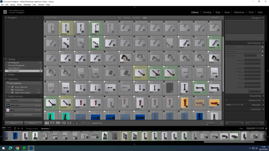
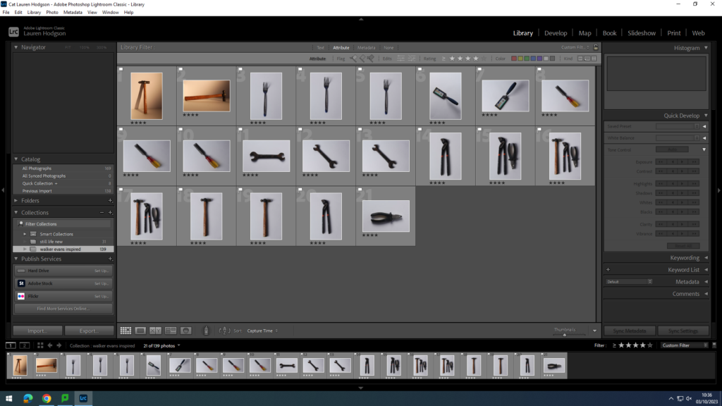
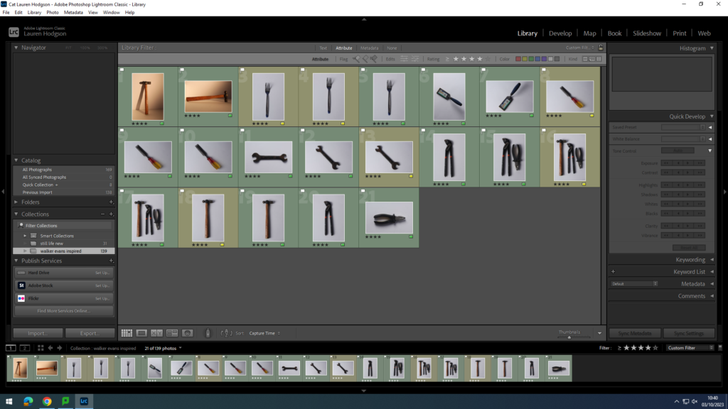
When choosing which images to edit on Lightroom, I first imported all of my photographs into Lightroom and then gave them either a white flag (if I liked it) or a black flag (if I didn’t like it). Then I gave the photos with a white flag a rating out of 5 (5 being the best). Finally, I gave each of my images a colour eg green, yellow or red (green being the best of my images). From this, I then turned on filters and looked at images only with a 4 star rating or above and green, then edited those images. I then experimented with different exposure levels, highlights, shadows, clarities and textures until I had an image that I liked.
Overall, I like how this photoshoot came out as I got to experiment with different lighting types and camera settings. My favourite image is the one of the teddy as I like the warm tone of it and the reflection from the infinity curve. I feel this tone helps portray the theme of nostalgia as the objects are associated with warm memories which is reflected by the lighting. However, if I were to do this photoshoot again, I would try and take some pictures which a more cold and darker background as that was a common theme in the still life images I researched.
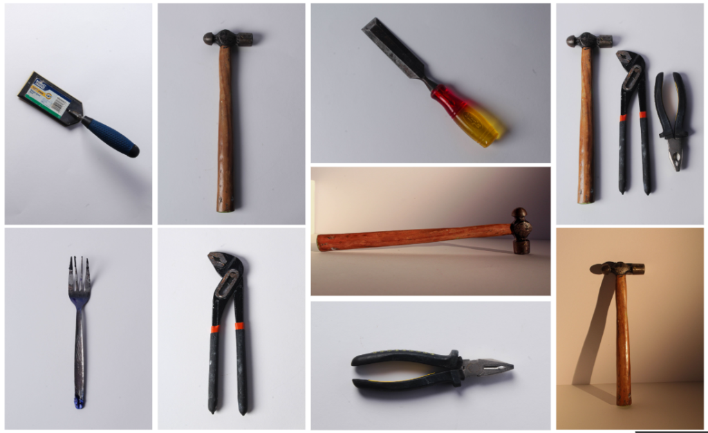
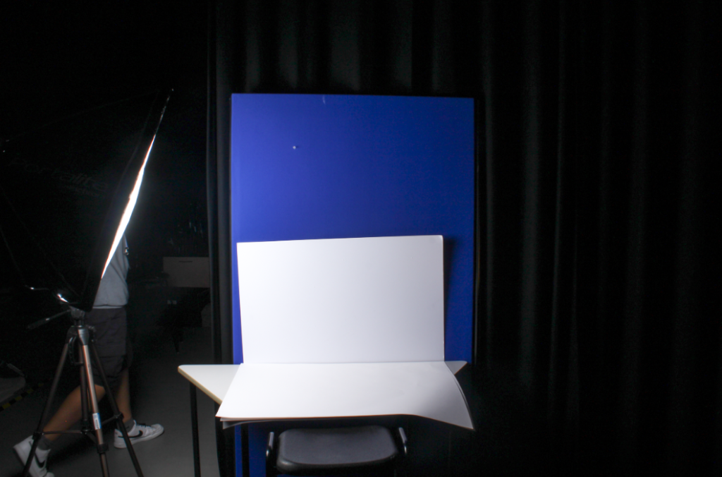
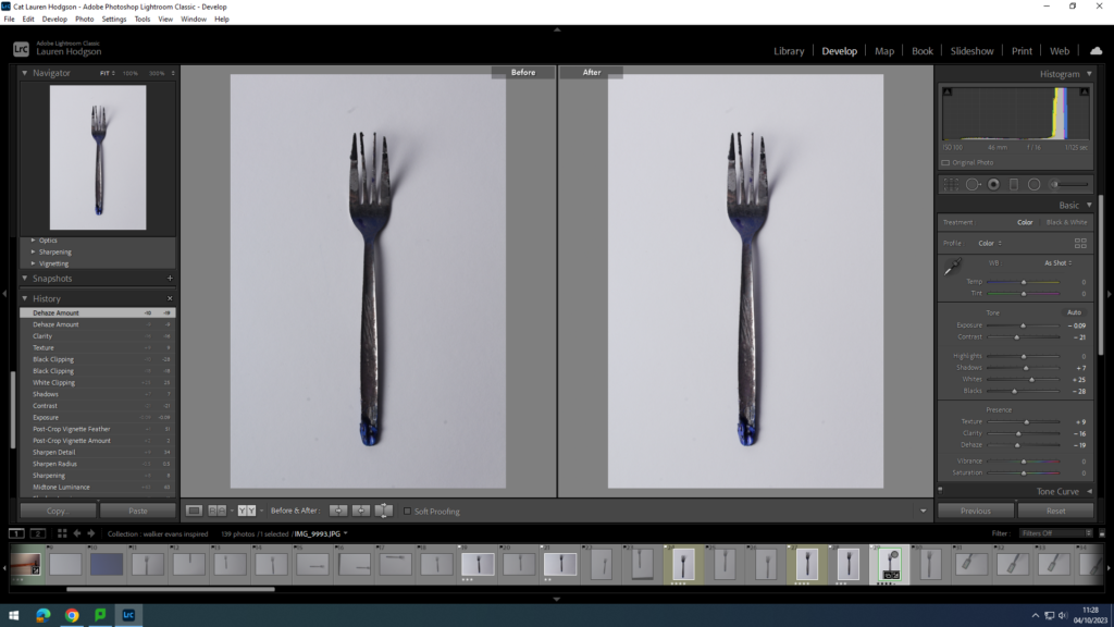
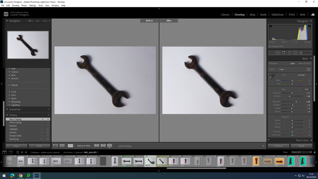
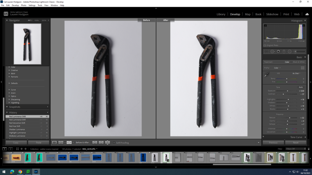
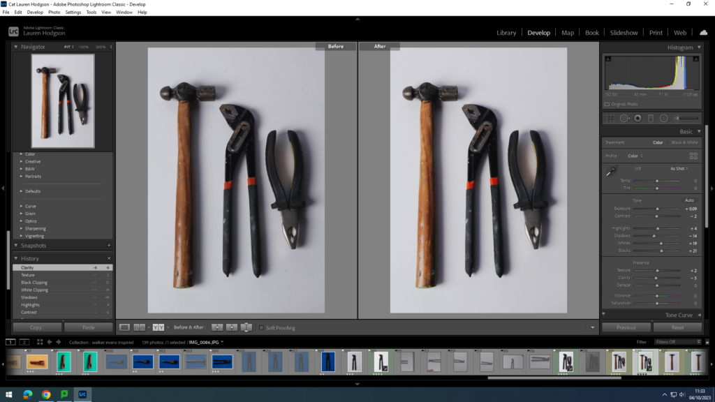
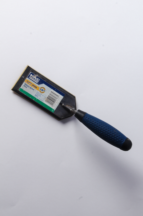
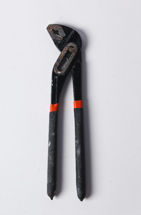
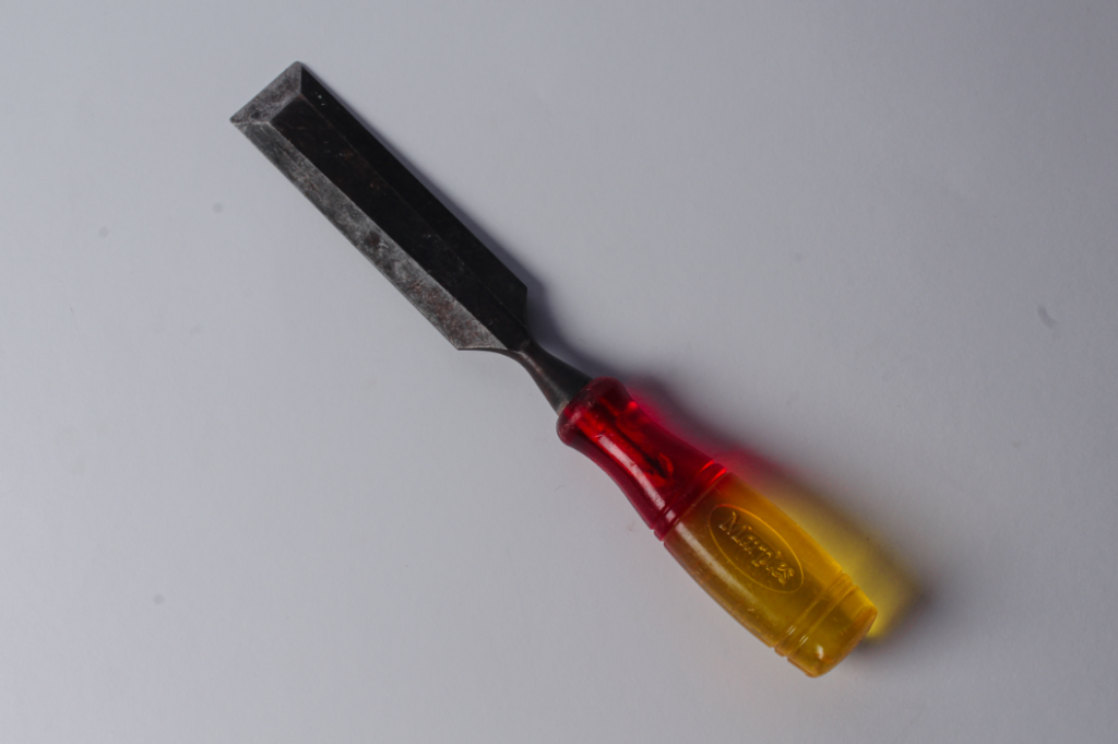
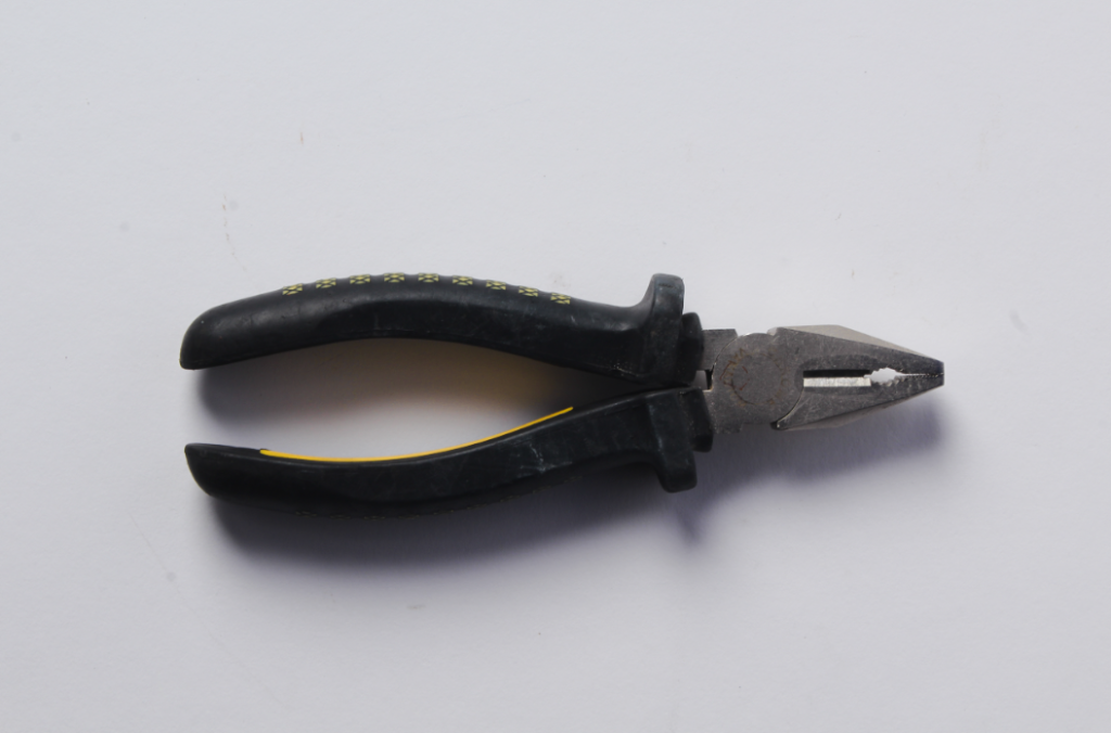
The next photoshoot I did was Inspired by Walker Evans and Darren Harvey-Regan. For this photoshoot, I took pictures of tools found in the studio, using a stool in order to get a birds eye view. I made sure to have a white, plain background as seen in the original artists. I also experimented with taking pictures of just singular objects and with multiple objects. Here are my final images:
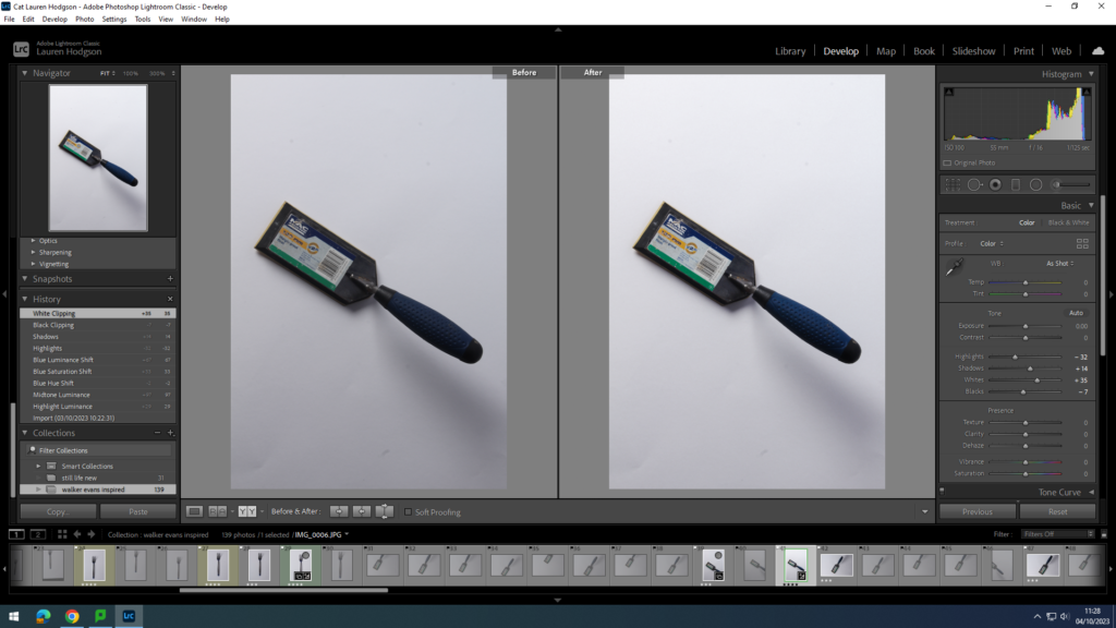
In order to edit my photographs, I used Lightroom. I altered the exposure, shadows, whites, texture and clarity. I tried to minimise the harshness of the shadows cast by the objects as Walker Evan’s has no/ minimal shadows in his work. I also used the setting colour and altered the hue/ saturation of certain colours in order to enhance them and bring my images more to life and less dull.
Overall, I found this photoshoot to be successful as I feel it closely replicates the work of Walker Evans and Darren Harvey-Regan (which is what I was trying to accomplish). Additionally, I like the clarity and simplicity of my photographs. On the other hand, if I were to do this photoshoot again, I would add tape to the bottom of the tools in order to prop them up slightly and get rid of any shadows cast by them, as in Walker Evan’s work there are no visible shadows.
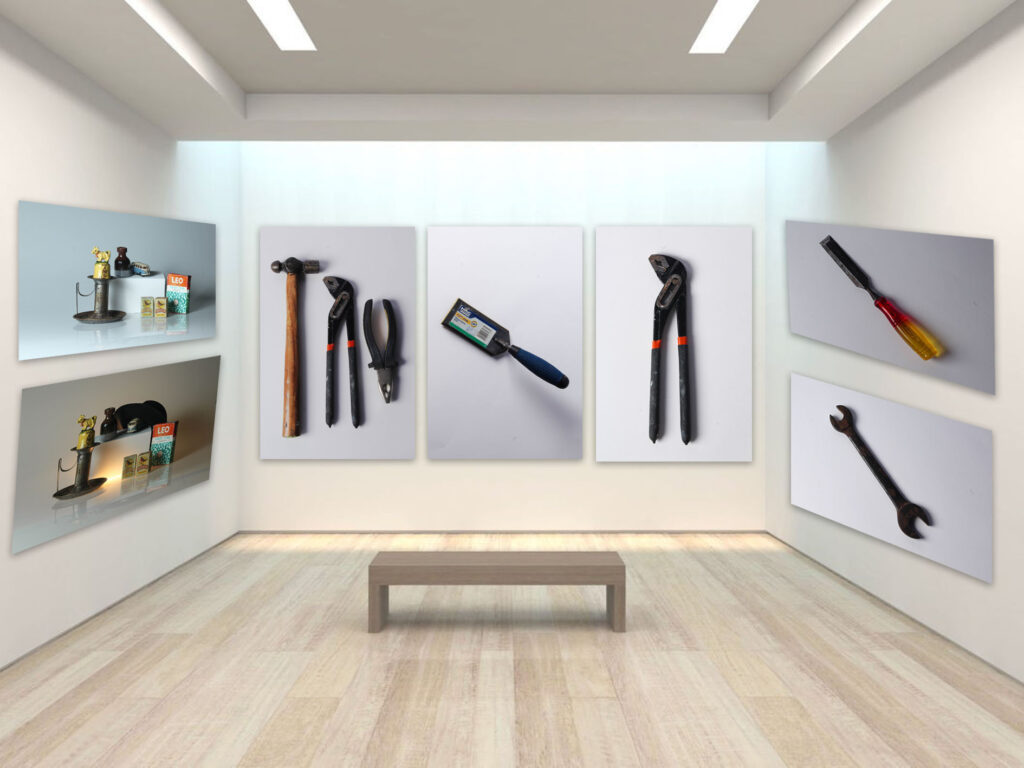
In order to make my photo gallery, I used photoshop. However, I first had to get my images from Lightroom into photoshop. I did this by exporting them into a document in which I could then open up on photoshop and access my photos. After I had exported them, I then opened up photoshop and pressed file new in order to get a blank, white page. I then went onto google and searched up ‘gallery space’, making sure to press tool, size and large in order to make sure the images had high resolution.
I chose to use this gallery space. I then copied and pasted it onto photoshop, making sure to use Ctrl t in order to make the image fill up the whole page. Next, I selected one of my photographs I had taken previously and opened it up on photoshop. Then, I dragged the image onto the gallery space and pressed Ctrl t to shrink it to a suitable size. However, when I wanted to place an image on the side walls I had to use the transform tool then select perspective in order to make it look like it is actually attached to the wall and make my final gallery look more realistic.
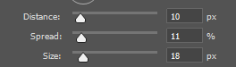
Finally, to complete my photo gallery I decided to add a drop shadow to each of my images to make them stand out compared to the wall and appear more three dimensional. I did this by going onto the layer with the tool I wanted to add a shadow to then right clicked on it and press blending options. I then experimented with different sizes, spreads and distances. These are the final sizes I chose:
Overall, I like how my photo gallery came out as I think it is a creative way to present my images and gives you a sort of sense of how it would look like in a real life setting. However, one improvement I would make to my photo gallery is I would add more of my still life images to the other side wall as at the moment there are a lot more tools than still life objects, giving my final gallery an unproportionate feel to it. Additionally, I could also make a photo gallery for only tools and only still life images.
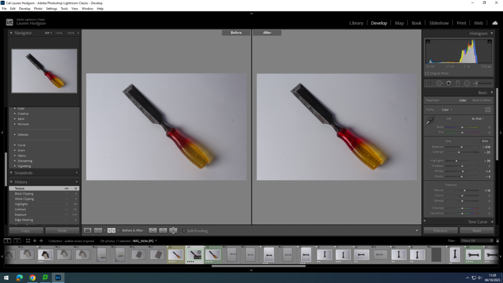
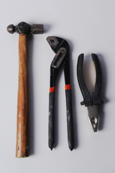
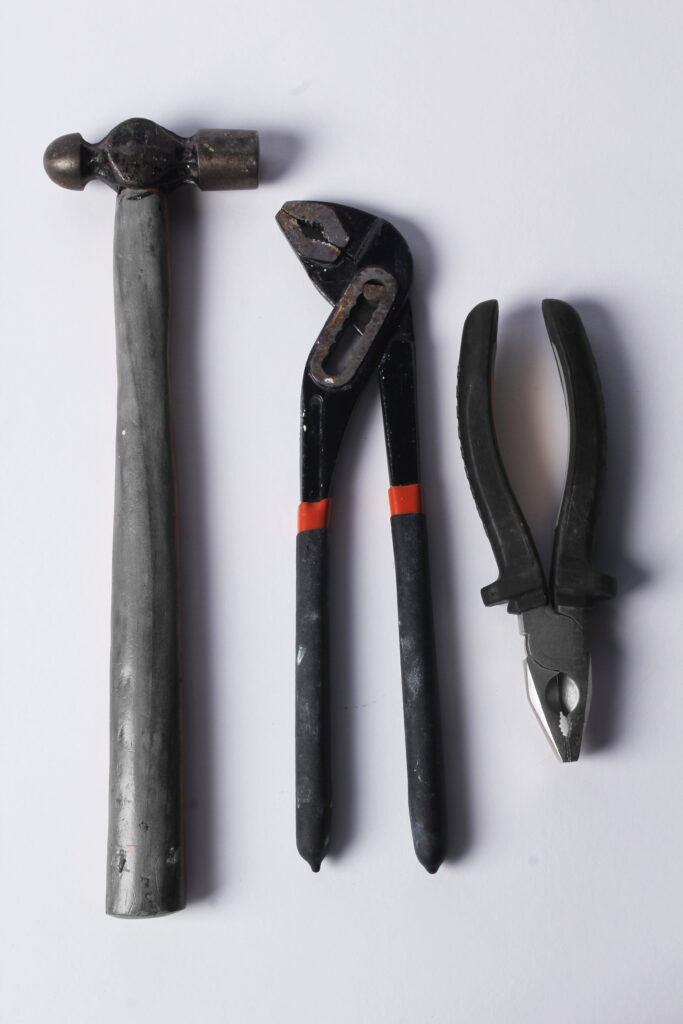
This photoshoot was inspired by Walker Evans and Darren Harvey-Regan who are known for their images taken of tools. I tried to recreate their images closely by using a white background as seen in their images, helping to draw the focus onto the tool only. I used a stool in order to capture the tools from a birds eye view as seen in the photographer’s work. I used a variety of different tools in my photoshoot and experimented with using tape to prop up the tools and no tape to see the difference it made on the shadows cast by the tools.
I first put all my images into Lightroom and then began to narrow them down until I had my best set of images that I wanted to edit and use in my blog. I did this by first either putting a white flag or black flag to the image depending if I liked it or not. I then rated all of the images with a white flag out of five. Finally, I assigned each of the images a colour (green, yellow or red). I then used the filter option in order to get my best images.
Before and after images:
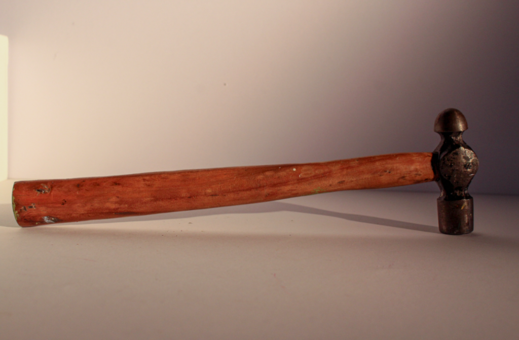
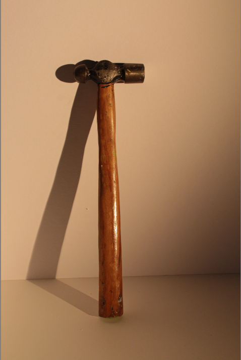
For the first tool I decided to photograph, I chose a hammer. I experimented with setting up the hammer in different ways as seen in my images in order to make it look more interesting rather than laying it flat down on the table. I then used Lightroom in order to change the exposure and clarity of the picture. Additionally, I decided that I would make the background more of a warmer tone like the wood seen on the handle. This made my image look more cosy and inviting despite the object having opposite connotations.
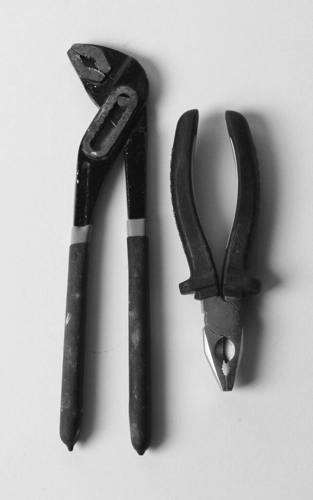
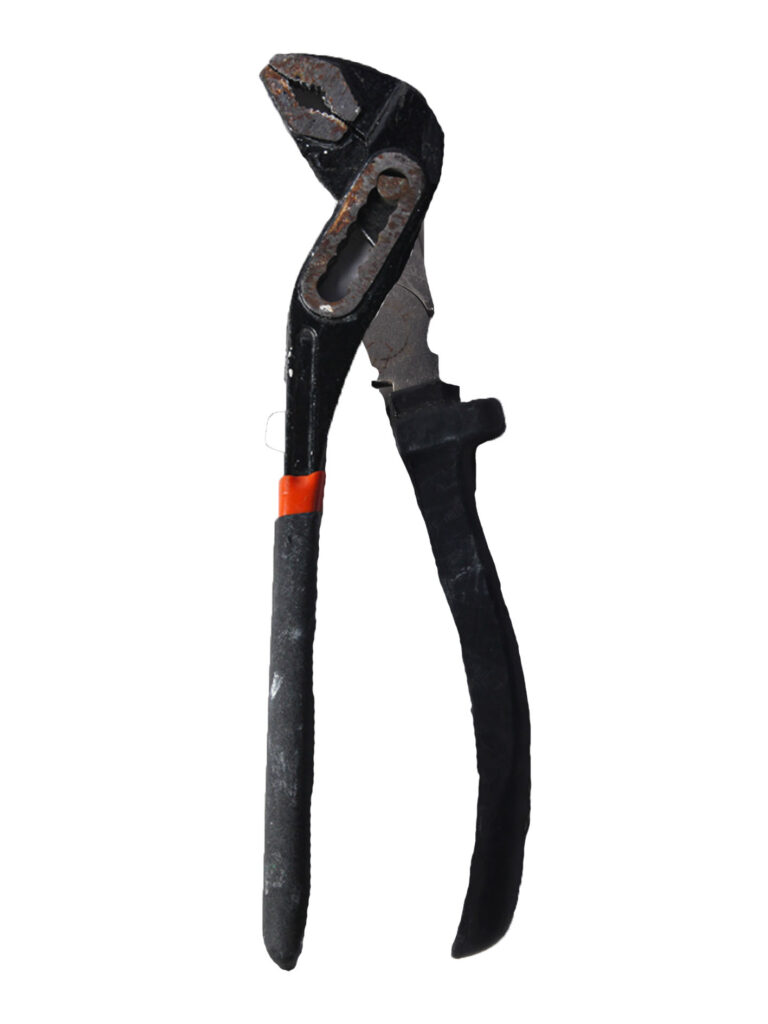
For these images, I decided to closely recreate the work of Walker Evans by using a white, negatively spaced background and taking the photographs of the tools from a bird’s eye view. I used a variety of different objects in my photoshoot and tried taking some pictures of just one tool and then taking pictures of a group of tools together.
I then used Lightroom to enhance my white background so my objects would stand more out and used the colour setting to brighten up any small bits of colours seen on the objects.
Overall, I like how this photoshoot came out as I feel it closely resembles the work of Walker Evans and Darren Harvey-Regan, which is what I was trying to aim for. However, if I were to further this photoshoot in the future, I would try and merge two objects together as seen in Darren Harvey-Regan’s work as I feel it creates a unique, creative final outcome.
For these photographs, I took a picture of multiple tools rather than just one singular one. I like these photographs as I feel they are more interesting to look at due to the viewer having multiple things to focus on rather than just one object which could become boring.
I decided to experiment on photoshop with this image. I first selected the image I wanted to use and then duplicated it. Next, I turned out of the images black and white and put it as my bottom layer. I then went onto the top, coloured layer and selected the quick selection tool. I then proceeded to outline the left and right tool. Once I had all the necessary parts outlined, I then right clicked and pressed layer via cut, exposing the black and white layer behind it. However, I kept the middle tool coloured which makes it stand out compared to the rest of the tools.
Finally, I tried to recreate Darren Harvey-Regan’s original image of two tools merged together using my own images I took in the studio. I first opened up a plain white page which was then used as my background. Next, I opened up one of my images of my tools and used the quick selection tool to go over half of the tool. I then right click on it and pressed layer via copy, making sure to get rid of the full image of the tool as I no longer needed it anymore. Some of my edges on my cut out were a bit raggedy and so I used the eraser tool to smooth it out more. I then chose another tool and completed the same process. Overall, I think this attempt was successful as it looks similar to Darren Harvey-Regan’s original image and furthered my photoshop abilities.
Walker Evans was an American photographer and photojournalist who was most well known for his work for the Security Administration, documenting the effects of The Great Depression; his most famous photo being a portrait of Allie Mae Burroughs. Evans was born November 3rd, 1903 and died April 10th, 1975.
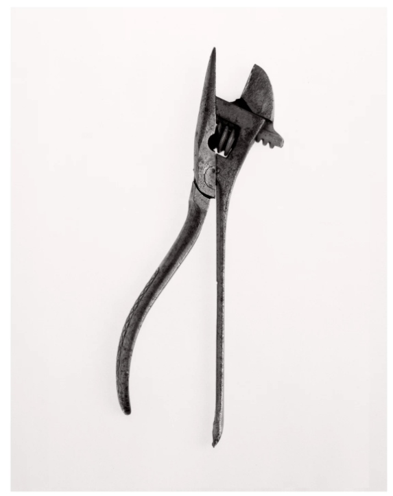
Walker Evans- Beauties of the common tool- 1955
Walker Evans took photographs of common tools that people are used to and familiar with seeing but turned them into something extraordinary as he isolates them by themselves against a dull, grey/white background.
By only having one tool in the photographs, it forces the person viewing them to take a greater appreciation for the tools, looking at the finer details of them.
Walker Evans captured the tools from a birds eye view, using natural lighting. He also managed to get no/ minimal shadows. Evans would slightly raise the tools which helps make them stand out compared to the equally dull background.
Darren Harvey-Regan:
Darren Harvey-Regan is a photographer who melds photography with sculpture. He is interested in the means of transition from one form of representation to another and in the overlaps that confuse and rephrase such movements. His works challenge the viewer to distinguish where representation ends and the object begins. Darren graduated from the Royal College of Art and has appeared in many exhibitions.
Darren Harvey-Regan- Beauties of the common tool, rephrased II, 2013
At first glance, this photograph looks quite dull and unenticing due to the lack of colour in the photograph. However, as you look more closely, you discover that the photograph is actually a combination of two tools collaged together to create one image. There are also no shadows seen in the image, causing the focus to be purely on the tools in front of you. By Darren Harvey-Regan using a white negative space in the background, it means that your attention immediately goes to the object and you can begin to appreciate the simple yet creative image he has made.
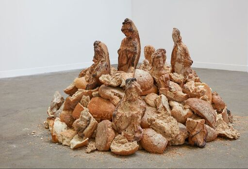
Custom baked bread, 2019
I think this image is a good depiction of how his work challenges the viewer to distinguish where representation ends and the objects begin as when I first looked at the picture, I saw mini statues of people. However, when I took a closer look at the image, I realised that these supposed statues were bread. Although I now knew they were bread, I could still see the statue like figures in the image, highlighting Darren’s ability to mix representation and objects smoothly.
Comparing Walker Evans and Darren Harvey-Regan’s art:
Although the two photographers photograph tools, they both do this very differently. For example, Walker Evans’ images have a vintage, old feel to them due to the majority of the tools he photographs looking quite used and the background being grainy. Whereas, with Darren Harvey-Regan’s images, the background is a bright, smooth, white colour, making the images look more modern. Walker Evans also tends to have more of a sepia tone in his photographs but Darren Harvey-Regan’s images have a more colder tone due to his subtle blue tones in his photographs.
Walker Evans- Beauties of the common tool- 1955
Darren Harvey-Regan- Beauties of the common tool II, 2013
Additionally, Walker Evans focusses on photographing only one tool whereas Darren Harvey-Regan merges multiple tools together to create one extraordinary image. Overall, I think both of the photographers manage to successfully capture the beauty of the simple yet useful tools. However, if I were to do a photoshoot in response to these artists, I would try and include more colour in my images as I feel it will help bring more attention to the photographs and make them more interesting and engaging to look at as in Walker Evan’s and Darren Harvey-Regan’s work, their images are quite dull due to it being black and white.
Formalism describes the critical position that the most important aspect of a work of art is its form. The seven basic elements explored in formalism are:
Line
Shape
Form
Texture
Colour
Size
Depth
Line:
A straight or curved geometric element that is generated by a moving point and that has extension only along the path of the point. Lines can be: straight, curved, solid, dashed, implied, psychological, vertical, horizontal or somewhere in-between.
Vertical or horizontal lines convey a sense of stability or a static feel to an image. Horizontal lines can indicate distance and vertical lines can indicate height, balance, strength. Diagonal lines convey a more dynamic scene.
Shape:
Shapes are two-dimensional. They can be familiar or unfamiliar. A familiar shape can transform into an unfamiliar or unrecognisable shape based on the viewpoint of the photographer.
There are two basic types of shapes: geometric (regular) and organic. Geometric shapes include: circles, squares, triangles, dodecahedrons, and more. Organic shapes include: the outline of a bird, an elephant, a flower, a tree, etc. Fluids can create organic shapes that cannot be permanently defined eg. the shape of a cloud or a rain puddle.
Form:
Form is three-dimensional and has an overall height, width and depth. The two types of form are: geometric (eg cylinder, cone, sphere and cube) and organic (eg objects that surround us in our three-dimensional world).
Forms create negative and positive space. In a photograph, positive space is basically that which is occupied by forms and negative space is what remains.
Texture:
Texture is the visual or tactile surface characteristics and appearance of something. It can be felt with both the fingers (the print) and virtually (with the viewer’s eye). Some examples of textures are: rough, smooth, soft, wet, slimy, bumpy and shiny. In a photograph, smooth objects might have reflections or specular highlights. Rough objects might have aggressive areas of light and shadow without reflections.
Colour:
Colour can be defined as:
A phenomenon of light (such as red, brown, pink, or grey) or visual perception that enables one to differentiate otherwise identical objects
The aspect of the appearance of objects and light sources that may be described in terms of hue, lightness, and saturation for objects and hue, brightness, and saturation for light.
Light itself has no perceived colour. But, send light through a prism or a drop of water and we can see that it is comprised of a literal rainbow of colours.
Colour has three properties: hue (the description of colour), value (the relative brightness/ darkness of a colour), and saturation (the intensity or purity of a colour. Bold/ bright colours tend to capture people’s eyes more which is why commercials often use brighter colours in order to engage the public.
Size:
Size can be defined as: physical magnitude, extent, or bulk : relative or proportionate dimensions.
Size in a photograph is relative and can be an illusion.
When a familiar object appears in the frame of a photograph (car, basketball, streetlamp, etc.) we immediately get a feel for the scope of the entire scene. Without a familiar object in the image, we struggle to determine the scale shown in the photograph.
The size of common objects in the photograph gives the scene a sense of scale. But a single object in space might not accomplish this since there is no means for comparison. There are times when another object, maybe sitting atop our subject, serves to confirm the scale in the image—eliminating the possibility of confusion.
In order to emphasize the size of an object in a photograph in relation to its surroundings, you should get closer to the object.
Depth:
Depth is the direct linear measurement from front to back.
We are given a sense of depth due to various visual cues, to which most people rarely give much thought to. However, by learning what those cues are, photographers can use them to create more compelling images.
Depending on the quality of the surrounding air or atmosphere, distant objects in a photograph will have less clarity and contrast than objects in the foreground. This aerial perspective is indicative of depth in a photograph.
Texture gradient shows depth in a photograph as relatively distinct foreground textures. Whether it’s the surface of a road, sand on the beach, leaves or needles on a tree, crashing waves, and even clouds overhead, texture gradients in a photograph smooth out as they recede into the distance.