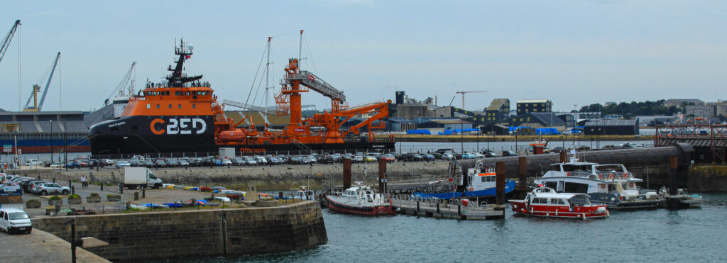
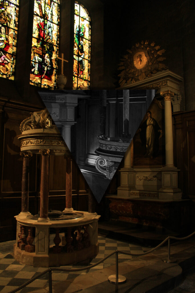
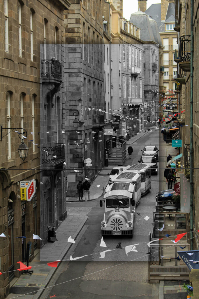
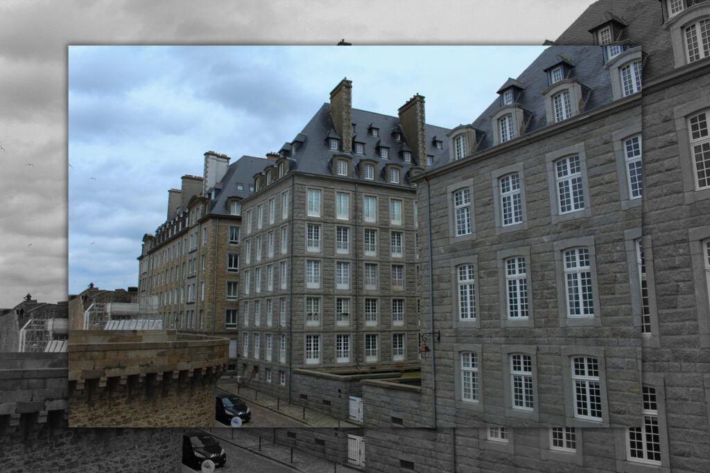
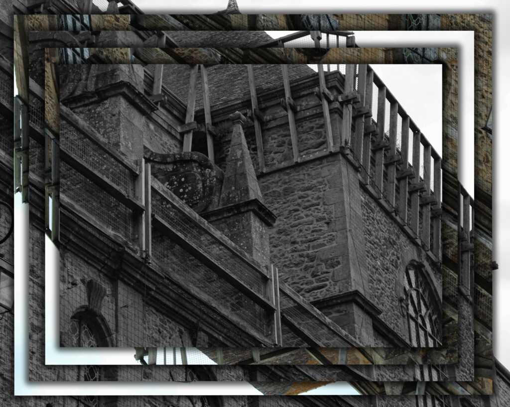
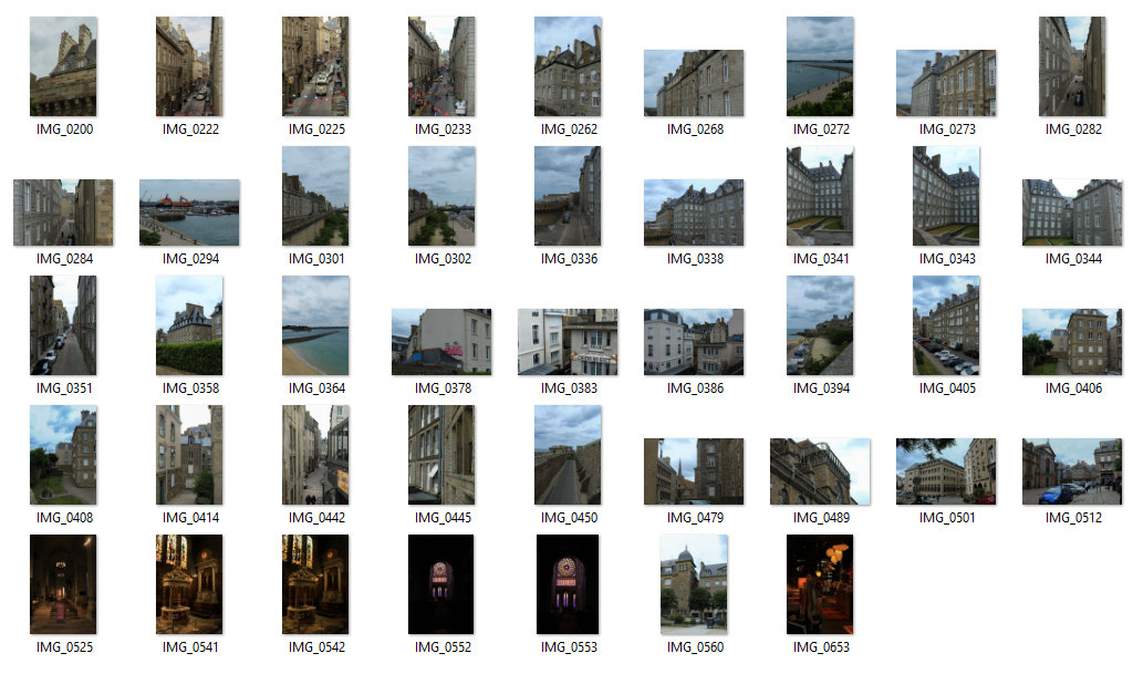
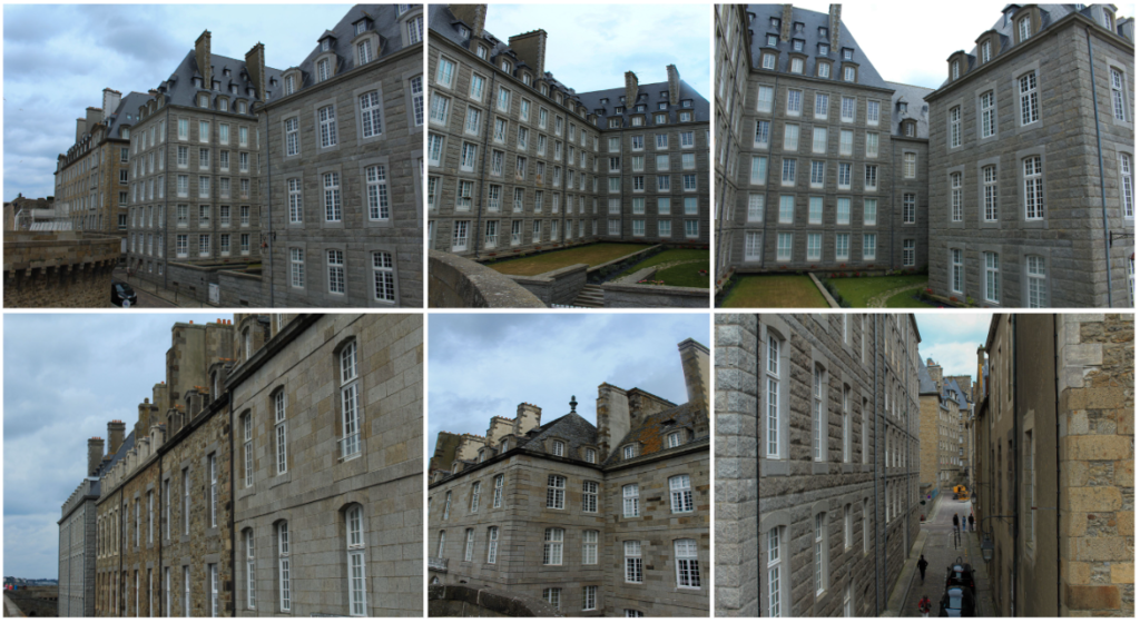
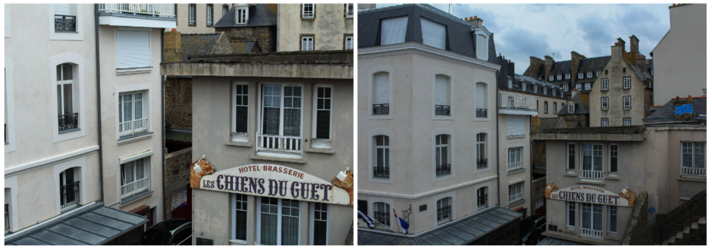
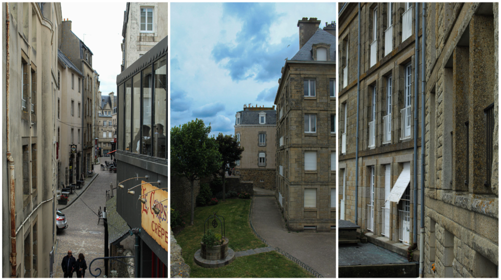
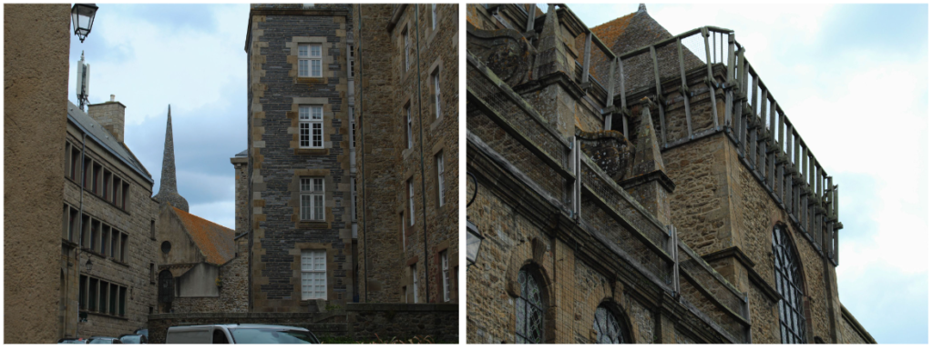
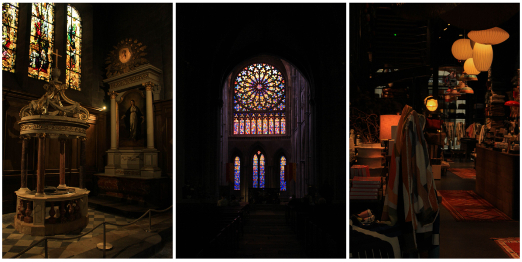
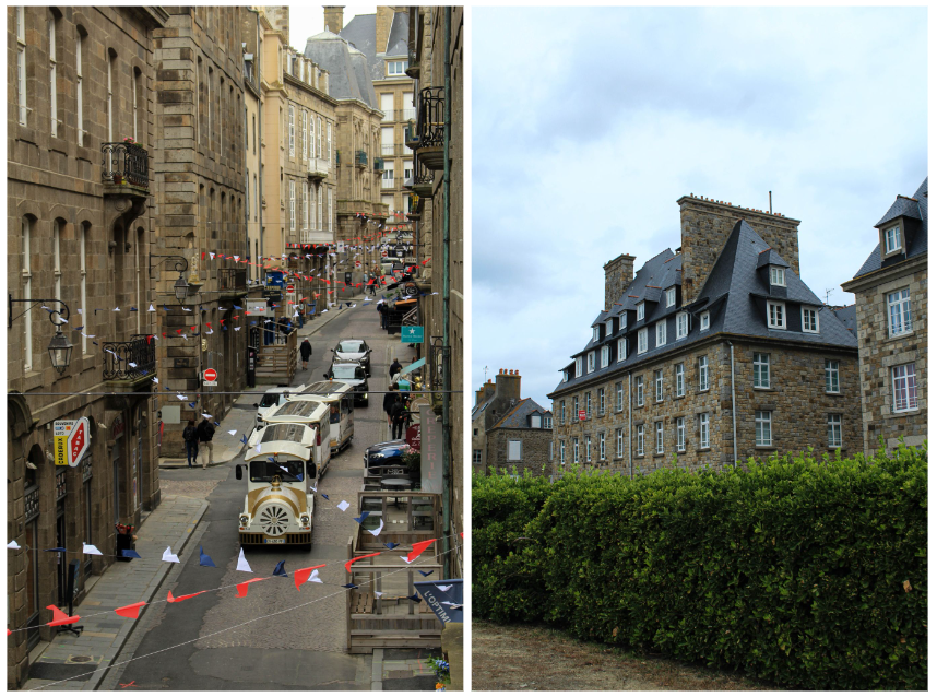
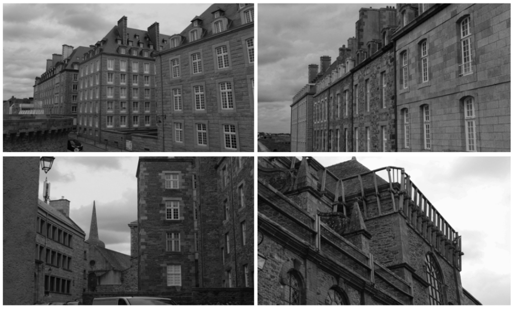
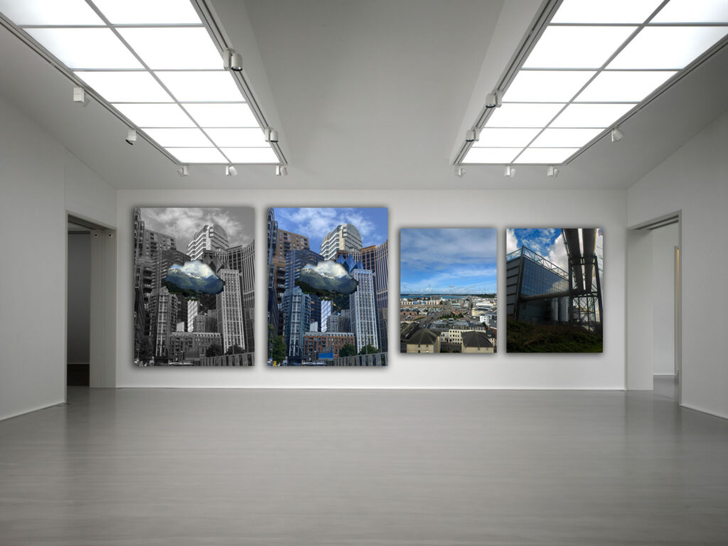
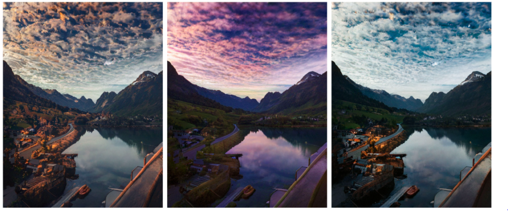
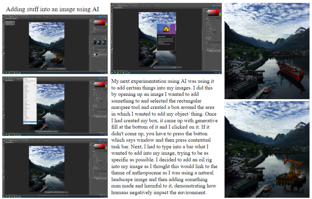
Exposure bracketing is where you take a sequence of photographs with different exposure levels, and then blend them together to create a photograph with a much higher dynamic range. It gives you all the details you will ever need in your photographs so you can create the exact image you had in mind.
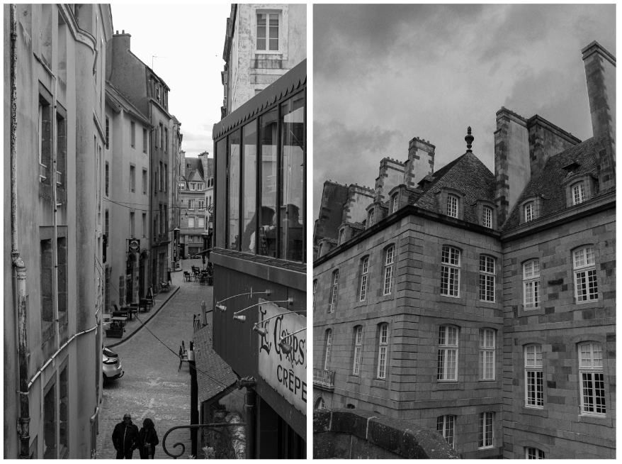
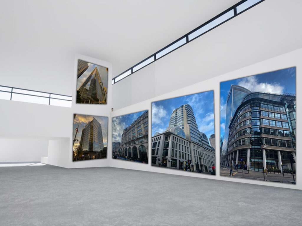
For this photoshoot, I went outside of Hautlieu School and took images of the building. I set up my camera so that it would take three images, each with a different exposure (+1, 0, -1). Once I had taken my images, I imported them onto Lightroom. I then chose the images I wanted to use by right clicking on the first image of the sequence then pressing the arrow button then clicking on the last image of the sequence. This highlighted them all. I then right clicked on the images and pressed photomerge then selected HDR. I then got to select my deghost amount, ranging from none to high.
Final images:
Overall, I think this photoshoot was a successful first attempt as I learnt how to do exposure bracketing. However, next time I would use a different location and test out different deghost amounts as I used none for most of them.
Ansel Adams (born February 20, 1902, San Francisco, California, U.S.—died April 22, 1984, Carmel, California) was an American photographer who was the most important landscape photographer of the 20th century. He is also perhaps the most widely known and beloved photographer in the history of the United States; the popularity of his work has only increased since his death. Adams’s most important work was devoted to what was or appeared to be the country’s remaining fragments of untouched wilderness, especially in national parks and other protected areas of the American West. He was also a vigorous and outspoken leader of the conservation movement. While photography and the piano shared his attention during his early adulthood, by about 1930 Adams decided to devote his life to photography. Adams believed that photography could give vent to the same feelings he experienced through his music. His first attraction to photography came from his love of the natural landscape and a yearning to capture something of that overwhelming experience on film.
He is renowned for his Western landscapes eg his views of Yosemite and the Sierra Nevada. His photographs emphasise the natural beauty of the land. These images are often seen in black and white using the zone system which Ansel Adams and Archer created. There were 10 zones in Ansel Adams’ system. They were defined to represent the gradation of all the different tonal values you would see in a black and white print, with zone 5 being middle grey, zone 0 being pure black (with no detail), and zone 10 being pure white (with no detail).
Ansel Adams honed his vision for his photographs through a process called visualisation. Visualisation requires the photographer to take in a subject without a camera and imagine how the final photo will come out. Ansel Adams described it as “the ability to see the scene you photograph and recreate in your mind the print you will produce”. Meaning see your developed image, relying on the information you receive from the scene and on your developing intentions.
Group f/64 was created when Ansel Adams and Willard Van Dyke, an apprentice of Edward Weston, decided to organise some of their fellow photographers for the purposes of promoting a common aesthetic principle. The group was formed in 1932 and it constituted a revolt against Pictorialism, the soft-focused, academic photography that was then prevalent among West Coast artists. The name of the group is taken from the smallest setting of a large-format camera diaphragm aperture that gives particularly good resolution and depth of field. The original 11 members of Group f.64 were: Ansel Adams, Imogen Cunningham, Edward Weston, Willard Van Dyke, Henry Swift, John Paul Edwards, Brett Weston, Consuelo Kanaga, Alma Lavenson, Sonya Noskowiak, and Preston Holder.
Though members of the group represented a wide range of subject matter in their work, they were united in their practice of using the camera to record life as it is, through unmanipulated “pure” documentation. Works associated with Group f.64 include Adams’s dramatic images of Yosemite National Park, Edward Weston’s close-up, high-detail photographs of fruits and vegetables and of sand dunes and nudes, and Cunningham’s studies of calla lilies.
Ansel Adam’s photographs link to romanticism. He used a black and white film in his images and would photograph a variety of different landscapes eg mountains, lakes and hills. The black and white film he added to his images differentiated his work from other photographers as he manipulated his photographs to create a darker sky, making the once blue, comforting sky into something terrifying and mysterious. He casted chilling shadows over the landscapes he photographed which made his scenes look more unnerving. This is an example of romanticism as he managed to create pictures that would leave people in awe but also slightly terrified by his dark ominous sky.
Photo analysis:
For this image, Ansel Adams used a small aperture (f/64). He did this as it allowed him to capture small details from the environment and let these details be seen in his photographs. This small aperture also made his images clearer. This image clearly displays the zone system as you can see shades ranging from pure black (0) to pure white (10). When taking this photograph, he first used a yellow filter and then used a red filter. He noticed that the type of filter that he used changed how the image looked (with the red filter making the photograph look more like how the environment did in real life and enhancing the tonal range of the image). From this, Ansel Adams came up with the idea of visualisation, which allowed him to show in his image what he saw in his ‘minds eye’. He used his talent in photography to take these pictures of different natural landscapes to which he then used these images to try and persuade the government to not destroy these beautiful places. Overall, I like how this photograph looks as you can see lots of detail and texture on the mountain and the manipulated sky which has been darkened gives the image a more intense, scary feeling but is also beautiful at the same time. This image successfully portrayed the idea of romanticism.
Ansel Adams Inspired Photoshoot:
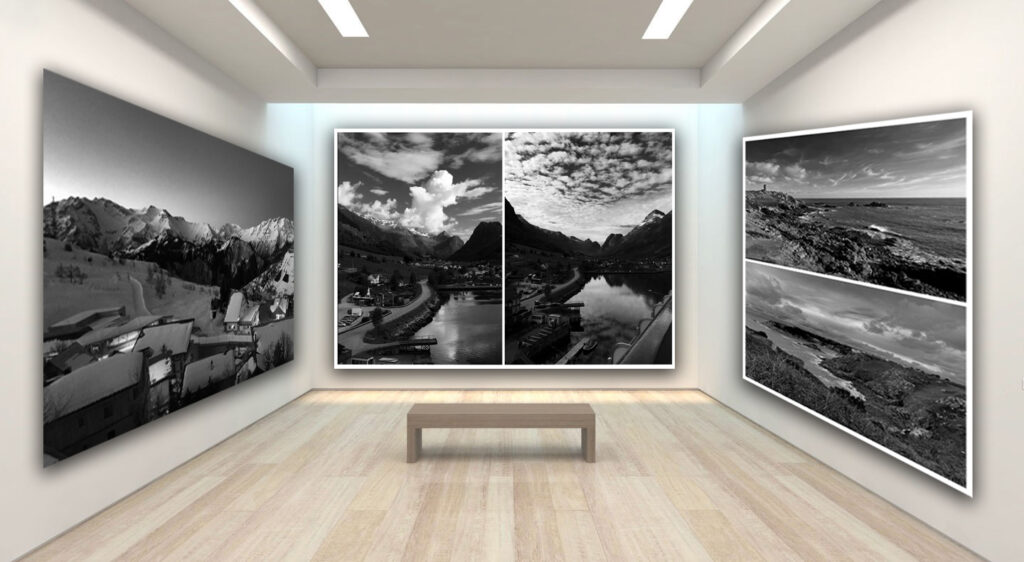
For this photoshoot, I took pictures of various natural landscapes. I ensured that I took an equal amount of vertical and portrait photographs in order to get more variety in my images. To edit them, I used photoshop and edited the levels, curves and made the images black and white, adjusting the different colours to make the blue sky more darker as seen in Ansel Adams images. This dramatic dark sky makes my images look more scary, successfully portraying the theme of romanticism. I mainly focused on mountains and cliffsides as this is what Ansel Adams typically took pictures of.
Overall, I like how my images came out as I think they have a good tonal range in which you can see shades from pure black to pure white. Additionally, my images also have good detail and clarity. If I were to do this photoshoot again, I would try take more photos in different whether conditions eg fog as I think this would help my images look more creepy, furthering the idea of romanticism in my work.
Edward Weston
Edward Henry Weston was an American photographer. He has been called “one of the most innovative and influential American photographers” and “one of the masters of 20th century photography.” He was born in 1886 and died in 1958. He is best known for his carefully composed, sharply focused images of natural forms, landscapes, and nudes. Edward Weston was born in Highland Park, Illinois. He began to make photographs in Chicago parks in 1902, and his works were first exhibited in 1903 at the Art Institute of Chicago. Three years later he moved to California and opened a portrait studio in a Los Angeles suburb. In 1902, Weston received his first camera for his 16th birthday, a Kodak Bull’s-Eye #2, and began taking photographs. Weston’s first photographs captured the parks of Chicago and his aunt’s rural farm.
Edward Weston was instrumental in establishing an identity for the West Coast school of photography in the early years of modernism in America. His eloquent combination of expansive landscapes and other natural subject matter with precise, unembarassedly technique created a prototype for the f/64 group’s purist style. Most of his work was done using an 8-by-10-inch view camera.
Through his promotion of straight photography and his daybooks, in which he recorded his artistic growth, Weston helped cement photography’s place as a legitimate modern artistic medium and influenced an entire generation of American photographers.
The beautiful, the sublime, and the picturesque are three key concepts in aesthetics and philosophy of art.
Romanticism was an artistic, literary, musical and philosophical movement that originated in Europe toward the end of the 18th century. It gained momentum as an artistic movement in France and Britain in the early decades of the nineteenth century and flourished until mid-century. It was characterised by its emphasis on emotion and individualism as well as glorification of all the past and nature, preferring the medieval rather than the classical. It was partly a reaction to the Industrial Revolution. It incorporates a deep feeling of emotions such as apprehension, horror and terror, and awe. Romanticism was a huge step away from the subtleties of photography and instead looked very bold and striking. Romantic landscapes are typically “moody” in atmosphere; they are more about the subjective feelings of the artist, than an objective record of the observable world.
Romantic artists often sought to capture the moods, feelings, and emotions of their subjects, using expressive compositions, vivid colours, and dramatic contrasts of light and dark to do this. Photographers who also took up the romanticist approach aimed to sensationalise the overall look of their images by enhancing certain colours in order to make their images surreal, glorified and to dramatize certain areas of their photographs.
Romanticism first showed itself in landscape paintings, where British artists in the 1760s began to turn to wilder landscapes, storms, and gothic architecture.
The Sublime
The sublime is the quality of greatness, whether physical, moral, intellectual, metaphysical, aesthetic, spiritual, or artistic. The term especially refers to a greatness beyond all possibility of calculation, measurement, or imitation.
It is defined as a pleasure in the way that nature’s capacity to overwhelm our powers of perception and imagination is contained by and serves to vivify our powers of rational comprehension. It is a distinctive aesthetic experience. For Romantics, the sublime is a meeting of the subjective-internal (emotional) and the objective-external (natural world).
The sublime is closely associated with the Romantic movement, the concept of the sublime began to be employed by those who wished to challenge traditional systems of thought that were couched in the old language of religion, a rhetoric that now seemed founded on outdated conceptions of human experience.
Edmund Burke noted that there were certain experiences which supply a kind of thrill or shudder of perverse pleasure, mixing fear and delight. He shifted the emphasis in discussions of the sublime towards experiences provoked by aspects of nature which due to their vastness or obscurity could not be considered beautiful, and indeed were likely to fill us with a degree of horror.
At one extreme was the sublime (awesome sights such as great mountains) at the other the beautiful, the most peaceful, even pretty sights. In between came the picturesque, views seen as being artistic but containing elements of wildness or irregularity. One of the earliest theorists of the picturesque, Uvedale Price, situated the picturesque between the serenely beautiful and the awe-inspiring sublime. A picturesque view contains a variety of elements, curious details, and interesting textures, conveyed in a palette of dark to light that brings these details to life.
Romanticism inspired photoshoot:
For this photoshoot, I went to different places around Jersey and photographed various different natural landscapes eg La Corbiere Lighthouse. I took my images in both portrait and landscape in order to get a variety of outcomes and make my images more interesting to look at instead of them all being in the same rotation. I think I successfully managed to capture the beauty of these places in my photographs through the bright colours and detail in each image. I enhanced the colours on photoshop using levels and curves. One improvement I would make for next time, is I would try and photograph some landscapes in other whether conditions as most of my images are sunny. But, if I photographed some in other whether conditions like fog or when its cloudy, I could enhance this feature in order to get more of a romanticised image as the scary whether conditions would provide that theme of fear in romantic images, given to the person who looks at my images.
Rural landscape photography is in many ways similar to photographing urban landscapes. The difference is rural photography is about capturing the “life” in the countryside. Rural landscapes include a variety of geological and geographic features such as: croplands, forests, deserts, swamps, grasslands, pastures, rivers and lakes. This style of photography serves as a narrative, telling stories of places and lifestyles often overlooked in our fast-paced modern world. Unlike urban landscapes that often focus on the grandeur of architecture and the complexity of human-made structures, rural landscapes focus on the beauty of simplicity.
Bucolic= a bucolic may be either a person who lives in the country (cf. rustic below) or a poem celebrating the pleasures of country life,
Pastoral= is the Eclogues of the Latin poet Virgil (70-19 BCE) are sometimes referred to as his Bucolics
Landscape photographs typically capture the presence of nature but can also focus on human-made features or disturbances of landscapes. Many landscape photographs show little or no human activity and are created in the pursuit of a pure, unsullied depiction of nature, devoid of human influence—instead featuring subjects such as strongly defined landforms, weather, and ambient light. landscape photography is a broad genre which may include rural or urban settings, industrial areas or nature photography.
When did landscape emerge as a genre in western culture?
Although paintings from the earliest ancient and Classical periods included natural scenic elements, landscape as an independent genre did not emerge in the Western tradition until the Renaissance in the 16th century.
When did classical landscapes emerge as a genre?
In the 17th century the classical landscape was born. These landscapes were influenced by classical antiquity and sought to illustrate an ideal landscape recalling Arcadia, a legendary place in ancient Greece known for its quiet pastoral beauty. In the Netherlands, pure landscape painting was more quickly accepted, largely due to the repudiation of religious painting in Calvinist society. Many Dutch artists of the 17th century specialised in landscape painting, developing subtle techniques for realistically depicting light and weather. In a classical landscape the positioning of objects was contrived; every tree, rock, or animal was carefully placed to present a harmonious, balanced, and timeless mood.
What prompted the rise of landscape art during the late 18/19th century?
Landscape painting eventually gained prominence in the late 18th century with the rise of Romanticism, and often continued to carry a religious significance. Additionally, it became a method of self-expression, with the emotions of the painter and their appreciation of nature demonstrated in the painting. The invention of the tin tube for paint (1841) and the invention of the portable collapsible easel (in the mid-19th century) revolutionised the landscape genre by allowing artists to venture out of the studio and study and paint their subjects first hand.
When did landscape photography originate?
the earliest known evidence of a landscape photograph was taken between the years of 1826 and 1827. It was an urban landscape photo taken by a French inventor by the name of Nicephore Niepce.
For my first edit, I cut out an two images (using the quick selection tool) of a body I had previously photographed. I then dragged these cut outs onto a plain white piece of paper and searched on google for news articles of different assault cases. Once I found the one I wanted to use, I copy and pasted it onto photoshop and used ctrl t to move it. Finally, to highlight the theme of femininity and masculinity I added a photo filter to the bodies (one pink and the other blue).
I chose to make this edit in order to spread awareness of sexual assault. By the models in the image covering their body or facing away from the camera, it portrays the idea of women feeling they have to cover up their bodies in fear of being attacked, judged or harmed. Additionally, the use of the blue light (which is seen as a masculine colour) and the pink light (which is seen as a feminine colour) shows that both genders are equally at risk of sexual assault etc. Overall, I like how this edit came out as I feel it represents a serious topic whilst also showing the key theme of masculinity and femininity through the different coloured lighting and showing that both genders can experience these horrible things. However, if I were to improve this edit next time I would try and create a smoother blend between the bodies and the background or create a drop shadow on the bodies so they are purposefully pronounced.
For my next edit, I cut out two lip images and then a body image and then stuck them all onto one page. I then decided I wanted to highlight the theme of femininity even more and so created a colour splash in which the faces are all grey apart from the lips drawing attention to them and highlighting the idea of the male gaze, as lips can be seen as seductive and provocative. I created this colour splash by using the quick selection tool to go around the lips and then pressing layer via copy. I then clicked back onto the faces layer and changed them to black and white.
Overall, I think this edit was successful in showing the theme of femininity due to the body with minimal clothing and the red lips which are edited in a way that makes them stand out.
My next images were inspired by the artist Cindy Sherman. This first edit is referring to her photos in which captured a typical woman in the 1950s. However, I decided to photograph a stereotypical woman today. When I first thought of a stereotypical girl in 2024, I immediately thought of girls constantly being on their phones. So, I took photographs of different girls scrolling on their phone. For this edit, I cut out two of images I had taken and then copied them onto a blank piece of A4 paper. I then wanted to further highlight the idea of phones and social media so I got an image of different social media platforms from google and then pasted it onto the background (lowering the opacity so it didn’t look like such a harsh background). Finally, I created one version which had the models as black and white and then another with normal colour. I then added these two images onto an A3 piece of paper and created a black boarder around the two.
My next edit was also inspired by Cindy Sherman and her images called ‘This is how I look. I guess’. I created this by opening up an image of a boy I had taken previously and then opening up different images of girls and using the quick select tool to cut out different parts of the girl’s faces eg their eyes/ lips. To finish off this idea, I decided I wanted to emphasise the idea of different faces being cut out onto one face and so I decided to make the original face black and white whilst keeping the cut outs in colour. I also added a drop shadow to them.
Overall, I like how this edit came out as I think I managed to successfully recreate the work of Cindy Sherman and explore how a typical woman is seen today compared to the 1950s. However, in order to further this edit and make it look more like Cindy Sherman’s work next time, I would make sure the face is more zoomed in so there’s less background showing as it cam be a bit distracting.
For this edit, I was inspired by Marcelo Monreal who is known for placing flowers behind a person’s face which is cut out. In order to achieve this, I first used the quick select tool to cut out part of the model’s face and then pressed layer via copy. Next, I moved the person’s face to side slightly. I then searched on google for flower illustrations and selected pink flowers (in order to portray the theme of femininity) then pasted them onto my image and put them behind the cut out face. I repeated this step until I had a wide range of flowers. Finally, I created an image in which the main photograph was black and white and another where it is in colour.
Overall, I like how this final piece came out as I think it successfully combines elements of masculinity and femininity into one image. This can be seen in the flowers which are often associated as being a feminine thing and then the blue light which represents masculinity. If I were to do this edit again, I would use a boy model and then have flowers coming out of his head as this juxtaposes what people traditionally think of males and would portray the idea of it being okay for men to have feminine traits or likings.
For this edit, I wanted to create something more simpler and so decided to use an A3 template and then added 4 of my own images onto it. I decided to use two females and two males with a black background to go with the dark lighting seen in the images.
I like how this photograph defies typical stereotypes about men and women as the ‘girl’ coloured lights are reflected onto the male whilst the ‘boy’ coloured lights are reflected onto the female. The bottom image shows an insight into the confusion one can feel regarding their identity as seen in the use of both blue and pink lights surrounding her but no specific colour actually being on her. Her head being in her hand further emphasises this idea and gives off the sense of her being lost and overwhelmed. On the other hand, in the images of the boy he can be seen proudly putting on lipstick in pink light (both of which are traditionally seen as feminine things). Additionally, he is looking straight into the lens with purpose suggesting that he is comfortable with his identity and doesn’t feel he has to act in a certain way in order to be regarded as a man.
Finally, for this edit I opened up two images of lips that I had taken previously and then used the quick select tool to go around only the face and then pressed layer via copy. I dragged both of these cut outs onto a blank page and then made the background black. I then used the rectangular marquee tool in order to make a rectangle on my image. Next, I pressed layer via copy and then dragged the shape either to the left or right slightly. I repeated this step for each rectangle.
Overall, I think this image turned out alright in terms of trying something new on photoshop. However, if I were to do this idea again I would add a male to one side and a female to the other side then have the rectangles bringing the two closer to one another, showing that although we have many differences we are all the same and can have traits of the other gender without having to lose our own sense of identity.
Femininity and Masculinity Virtual Gallery:
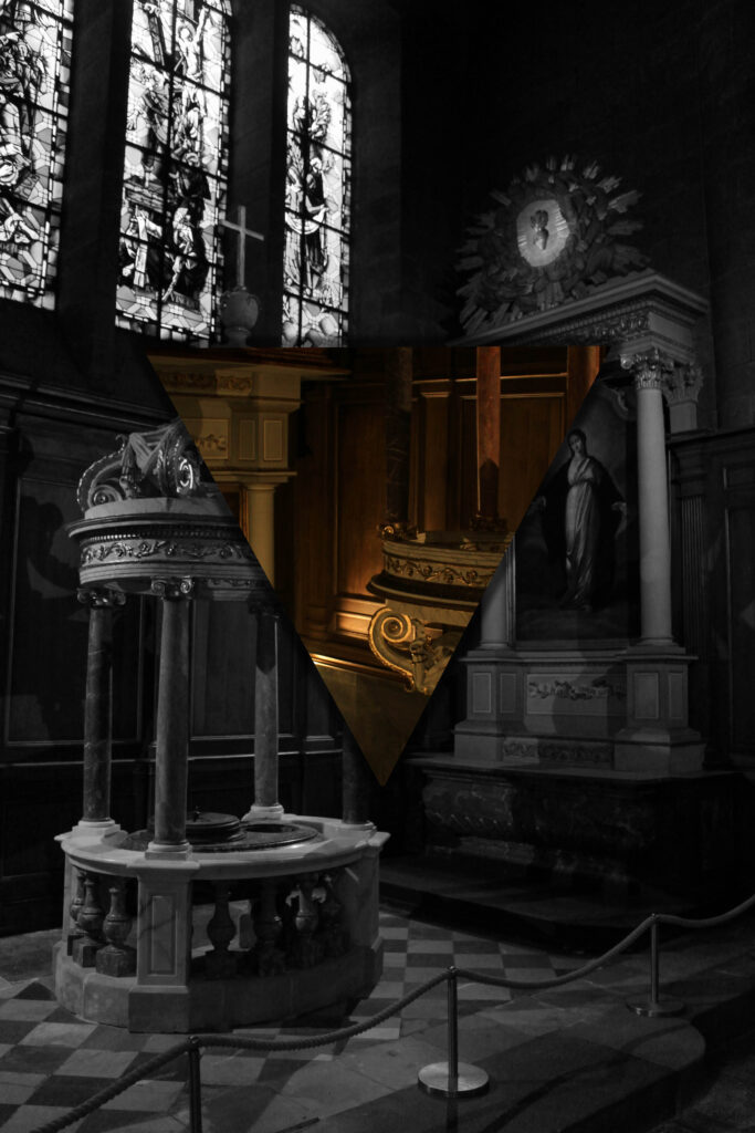
Lighting Techniques and Diamond Cameo Virtual Gallery:
For this second photoshoot, I wanted to try and bring in an aspect of masculinity which I lacked in the previous photoshoot. I did this by photographing a boy and using a blue coloured light (which is typically seen as a masculine colour). I got the model’s to face in different directions and use their hands to make each image slightly different and more interesting to look at. I also decided to mix both femininity and masculinity together by getting a boy to apply lip gloss to his lips which is typically seen as a feminine thing. Finally, I took some body shots of a girl model on a chair posing in different ways.
In order to edit my images I used Lightroom. I adjusted the highlights, shadows, whites and blacks of each image until I was left with a final image I was satisfied with.
My Final Images:
Overall, I like how this photoshoot came out. I think I managed to intertwine both femininity and masculinity into one picture successfully as I used a pink light for the boy model which is seen as a feminine colour, and then a blue light for the girl models which is seen as a masculine colour. I also like the dark backgrounds with the spotlights of colour as it gives it a cinematic like feel to the images.
I like the image where the model’s head is in her hands with a pink and blue spotlight shining behind her at each side, symbolising how some people may feel lost and feel like they don’t specifically fit into one category. Additionally, I like how the images of the boy applying lip gloss came out whilst having a pink light projected onto him as it embraces the idea of not having to fit into a specific category and that its alright to have feminine features/things whilst still being masculine.
Clare Rae is an artist works in Melbourne, Australia. She acknowledges the people of the Woi wurrung and Boon wurrung language groups on whose unceded lands she lives and works. She respectfully acknowledges their Ancestors and Elders, past and present.
In her photographic practice Clare explores ideas of performance and gesture to interrogate and subvert dominant modes of representation. Her work is informed by feminist theory, and presents an alternate and often awkward experience of subjectivity and the female body, usually the artists’ own.
Clare Rae engages photography, stop motion animation and performance to navigate and defy the limitations of the everyday environments she inhabits. Her works explore tension, portraying situations that offer alternative spatial and psychological interactions between the artist and the possibilities that are held in her surrounds.
Clare Rae’s aim through her photography is to subvert the dominant ways that we depict women’s subjectivity by getting various women to pose in weird, unnatural poses that goes against the stereotype of women having to look good and act in a certain way. Her work is informed by feminist theory, and presents an alternate and often awkward experience of the female body.
Clare Rae Inspired Photoshoot:
For this photoshoot, I went around school and took pictures of Liv in various awkward poses. She wore a flowy dress as many of Clare Rae’s images include a women wearing a skirt or dress and I wanted to recreate her images as closely as possible. I think this photoshoot successfully captured her in a way that goes against the typical stereotype of women where they’re expected to look put together and act in a certain way.
One thing I would improve next time is the lighting as some of the images are very dark which makes it harder to see the model. This is the complete opposite to Clare Rae’s work as she has good, bright lighting. Additionally, Clare Rae’s image typically include a white background or backgrounds that have quite a lot of negative space. However, my backgrounds are quite cluttered which takes away the attention from the model.
For this photoshoot, I focussed on femininity and capturing feminine features like lips and curves. When taking my photographs, I placed one light source behind my model in order to create a dark background, which would ensure that the focus will remain on the model rather then the background. I then had a light source in front of the model which created a spotlight effect, portraying the idea that women constantly feel as if they are in the spotlight and have to worry about their body etc due to the unrealistic standards set upon them, making them feel badly about themselves because of it.
In this photoshoot, I took pictures of different women’s bodies from a side on angle, front and behind. I took some images where the bodies were hidden by the model’s arms and some where they weren’t (portraying the idea that women should feel proud of their body and show it off). I also took pictures of a girl’s lips whilst applying lipstick which is seen as a feminine thing. Finally, I took some images of hands which had designs on the fingernails and then a necklace, both of which are also seen as feminine.
In order to edit these images, I used Lightroom in which I adjusted the exposure, contrast, highlights, shadows, blacks and whites of each photograph.
Overall, I like how this photoshoot came out as I think I managed to successfully highlight feminine features eg nails, lips with lipstick being applied onto it and different body types, which is what I was trying to achieve. Through this photoshoot, I feel as if I was also able to portray the struggle that many women go through surrounding their bodies and constantly comparing themselves to others or feel like they must hide it (hence I took some pictures where the model was using her arms to cover her body). However, I also wanted to make my photoshoot positive too and so took pictures in which the models embraced their body and didn’t cover it from the camera, portraying the message of self love and confidence.