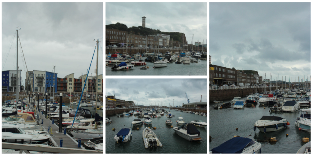
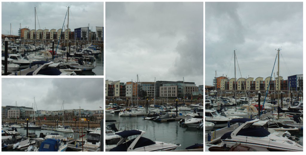
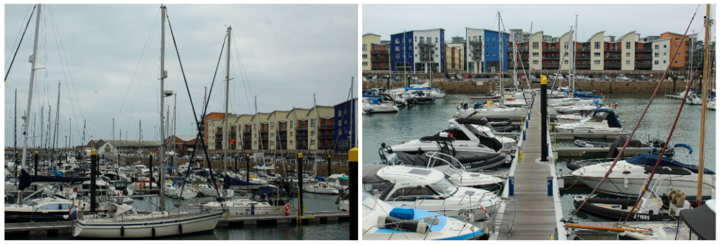
For this photoshoot, I decided to get to higher level grounds and take images of the view I saw before me. I noticed that everywhere I looked was very urbanized and there was a severe lack of natural landscape, highlighting to me the idea of how humans have negatively impacted the Earth by constantly expanding on it and not embracing the beauty we already had.
Overall, I think this photoshoot was successful in highlighting just how much we have expanded on the Earth as you are met with a sea of buildings and no natural landscape when looking at the images. However, my photos that I took on the plane turned out less clear and a bit murky due to the window and reflection from the light, making these images have less quality than my other images.
For this photoshoot, I decided to photograph central London as it is a very heavily built area which I think successfully shows how human kind have expanded and built on the Earth, destroying it of its natural beauty- that has to be ruined in order to make room for these masses of buildings. I focused on photographing areas with lots of buildings joined next to one another
In order to cut down on the amount of photos I would use as my final images, I completed a series of steps. First, I imported them into Lightroom and then gave each image either a white flag or a black flag depending if I wanted to use them or not. The white flag symbolised that I did want to use it and the black no.
I then used the filter in order to only bring up my white flagged images. Next, I rated each of my images out of 5. Any images below 3 stars I decided to not use. Finally, I gave them a colour rating (green being the best and red being the worst). This enabled me to find my best images out of the bunch and ensured that I only edited these ones as to not waste time.
Overall, I think this photoshoot was successful in highlighting how much natural land had to be flattened and animal’s habitats destroyed in order to make room for these vast amount of buildings. I noticed as I was taking pictures that the buildings looked like they kept going on forever, which made me realise just how largely humans have expanded on the Earth, ripping it of its natural beauty. Although these buildings provide us with entertainment and places to shop and eat, the long lasting effects of building so much and destroying the trees that provide us with oxygen, outweighs the positives significantly.
Another thing that I noticed when taking my images, is that the streets were extremely busy, making it difficult to even get from one place to another. There was also a vast amount of rubbish scattered throughout the streets and the underground, highlighting to me how bad the issue of pollution is in these busy cities. I found it difficult to take images of this rubbish and crowds of people due to people being right behind me, causing a disruption if I were to of stopped to take an image.
I think that these massive, impressive buildings are built in a way to cause people to turn a blind eye to the actual harmful effects of such buildings, so that we as a society don’t really care to notice that we have natural beautiful landscapes underneath all of this construction. This has inspired me to do another photoshoot in which I will take photographs of the natural beauty seen in Jersey in order to show to people what our planet could look like if we stop destroying these places and expanding on them.
Favourite images:
Giacomo Costa Inspired Photoshoot
For this photoshoot, I was inspired by Giacomo Costa. In his work, he stacks multiple buildings on top of one another. To me, this shows how we as a species have expanded so much on the Earth and it feels very crowded. It could even suggest that if we keep building new buildings at the rate we are, we may even have to start stacking them on top of each other as seen in his images, making a fake image a reality.
In order to recreate his work, I first chose a photograph I had previously taken of buildings with a gap between them (to which I would then fill in with other buildings). I then adjusted the levels and curves of this images and used the quick selection tool in order to cut out only the buildings. Once I had highlighted the area needed, I then pressed layer via copy. I did this to ensure that the buildings I would be adding to the image wouldn’t overlap and be in front of it, making it look unnatural. Next, I opened up a new image of a building that I had taken and used the quick selection tool to cut out only the building, pressing layer via copy afterwards. I then dragged the cut out onto my original images and used ctrl t in order to adjust the building to make it fit in more. I repeated this step again and again until I had a sufficient amount of buildings. I often had to change which level each cut out was on in order to make it look more seamless and natural. Finally, I decided to experiment with using black and white in my image, making one of my images fully black and white and the other with normal coloured buildings and a black and white sky.
These were the different images of buildings that I used in my final edit.
I am going to layout my final image like this, with the three different images next to one another. Overall, I like how this idea came out as I think I successfully managed to recreate the work of Giacomo Costa and highlight the extent to which we are expanding on the Earth and how destructive this is and bad for our environment. One thing I would change about this image is one of the buildings I used as it is very reflective unlike the rest of them, making it look unnatural and not blend in as seen in Giacomo Costa’s images. I could experiment further with this idea by potentially printing out 2 of each image but printing one as an A5 and the other as an A4 then stacking them on top of one another. On the other hand, I could also print out 2 of each image and then cut out certain buildings on the 2nd image and then use mount board in order to raise it, giving my final piece more depth.
For my first photoshoot, I am going to take pictures of very built up areas (urban landscapes) in London like Oxford Street etc. I am going to focus on the vast amount of buildings seen in these places and how overpopulated it is. I will also try and capture large groups of people, showing how mankind has taken over Earth and expanded so much that it is ripping Earth of its natural landscapes and replacing it with buildings and homes in order to accommodate with the demands of the increasing population. With my images of different buildings, I am planning to recreate the work of Giacomo Costa and stack these together. This will highlight the idea of how mankind has polluted the Earth with buildings instead of embracing the natural beauty we already have.
For my second photoshoot, I am going to take images of Jersey’s natural landscape and its beauty without any pollution. By doing this, it will hopefully inspire the people who look at my work to try and make a difference on the environment so that we stop destroying the Earth with litter and instead bring out these potentially breath taking landscapes that are hidden by human kinds disregard for the environment. I will then take images of pollution eg litter on the beach and compare the two so people can see the contrast between what the world could be and what it is right now. I will also compare my images of Jersey’s natural beauty and London’s built up, overpopulated area to highlight the idea of what all those buildings are covering up. This may inspire people to leave the very minimal natural landscapes we have left as they are.
For my third photoshoot, I am going to take photographs of different zoo animals in their artificial habitats. This was inspired by Zed Nelson who does something similar to this. I am going to try and take pictures of animals who are in enclosures with unnatural things eg a painted wall of nature or a spotlight instead of natural light as they would have in the wild. This highlights to me how ironic we are as a society as we recreate these natural landscapes, that we could already have, if we didn’t destroy them in order to expand.
Anthropocene is humans impact on the earths environment.
The Anthropocene defines Earth’s most recent geologic time period as being human-influenced, or anthropogenic, based on overwhelming global evidence that atmospheric, geologic, hydrologic, biospheric and other earth system processes are now altered by humans. The word combines the root “anthropo”, meaning “human” with the root “-cene”, the standard suffix for “epoch” in geologic time. In simple terms, it describes the time during which humans have had a substantial impact on our planet.
A popular theory is that it began at the start of the Industrial Revolution of the 1800s, when human activity had a great impact on carbon and methane in Earth’s atmosphere. Others think that the beginning of the Anthropocene should be 1945.
The Anthropocene is a proposed geological epoch dating from the commencement of significant human impact on Earth until now. It affects Earth’s geology, landscape, limnology, ecosystems and climate. The effects of human activities on Earth can be seen for example in biodiversity loss and climate change.
Examples of Anthropocene include: pollution, destruction, storm damage, weathering, land reclamation, overpopulation, traffic congestion, waste disposal issues, recycling and fly tipping.
For this theme, I am going to be focusing on overpopulation, pollution and capturing how the Earth could look if we stop destroying it.
Keith Arnatt Artist Research
Keith Arnatt was a British conceptual artist. As well as conceptual art his work is sometimes discussed in relation to land art, minimalism, and photography. He lived and worked in London, Liverpool, Yorkshire and Monmouthshire. Apart from his conceptual works in 1960s and 70s Arnatt developed a set of images from a rubbish tip that developed from landscape based images to still-live of discarded objects
Keith Arnatt (1930–2008) emerged in the 1960s into the tumult of the London art scene to become a key figure in the history of British conceptual art and photography. In a self-reflexive practice that questions with a deadpan wit the status of both the art object and the role of the artist, Arnatt carefully examined and critiqued an increasing reliance of product over process and object over idea. Visually, his work embraced many of the tropes of international conceptualism and minimalism, yet by imbuing his work with an absurdist humour, Arnatt was able to develop a unique artistic language.
One of his photoshoots was called Pictures from a Rubbish Tip 1988–9. It was a series of five large coloured photographs taken by the British artist Keith Arnatt. It featured close-up shots of rubbish that has been dumped at a local tip. In each photograph, the lens focuses upon select pieces of discarded food – such as bread, chicken bones and vegetables – that lie on clear and pale-coloured plastic bags. These bags both reflect and diffuse the surrounding daylight, highlighting the varying hues of the rubbish so that the scenes appear brightly coloured and partly abstract. Although the types of rubbish shown and their exact position within the compositions varies slightly, each is presented at an apparently fixed distance from the camera and this, as well as the similar lighting effects used across the five works, creates a sense of cohesion in the series.
Another one of his photoshoots was called Miss Grace’s lane, 1986-87. In this set of photographs he incorporates imagery of the natural land tarnished with dumped rubbish. He highlights in his images how mankind’s problem with pollution and discarding of rubbish anywhere has lead to once beautiful landscapes to turn into ugly wastelands. I think that by him zooming up on specific areas with rubbish in, it makes it stand out more than if he would’ve used more of a wide angle and so the person looking at his images cannot ignore the vast amount of pollution seen in the images and is forced to face the reality of our situation. In some of his images, the main colour seen in it is brown. To me, this may be suggesting how dirty our Earth has become instead of being filled with vibrant green colours as would be seen without all the pollution causing our natural environment to die.
Keith Arnatt’s work has inspired me to go out and take images of rubbish that I find in my environment and take close up angles of it so that people’s attention will be solely on the rubbish rather than anything else. This will ensure that people have to see the consequences of littering instead of ignoring it and pretending its not there as most people do.
Zed NelsonArtist Research
Zed Nelson is an accomplished documentary photographer based in London, renowned for his work that tackles significant global social issues. His numerous projects have been exhibited worldwide, and he has received many awards for his contributions to photography.
This project examines humankind’s fractured relationship with the natural world, revealing not only a phenomenon of collective self-delusion.
In his latest project, ‘The Anthropocene Illusion,’ Nelson delves into the intricate relationship between humanity and nature. The project reflects on how we have become adept at curating and managing an artificial experience of nature while simultaneously causing irreparable damage to the natural world. The project, completed in 2024, took five years to complete fully. To me, his photographs highlight to me how ironic we are as a society as we are creating these artificial environments and placing these wild animals in, creating a false reality (which we could actually have if we didn’t destroy these natural environments and replace them with fake, unnatural ones).
Zed Nelson’s work has inspired me to take images of animals in artificial environments instead of their natural environment that they should be in and how humans have caused these animals to suffer by placing them in small areas and expect them to perform for people 24/7 in order for humans to be entertained. I am going to do this by visiting different zoos and taking pictures of various animals in artificial environments which are way too small for them.
A photographic typology is a body of work that visually explores a theme or subject to draw out similarities and differences for examination. Through the methodical photography and presentation of a specific subject or theme, a typological photographer makes a space that invites a viewer to simultaneously identify both consistencies and distinctions in a series, building up a more nuanced whole.
The typology is a genre built on differences and correlations. Visual classification according to a specific type has historically been applied in sectors ranging from architecture to botany, with carefully laid out illustrations distributed across a page to illuminate key aspects of a subject. As photography developed, so did the execution of photographic typologies – photographers gathered subjects and/or themes in a cohesive presentation deliberately designed for motivating comparisons within similar visual content for identification and insight.
August Sander – The Face of Our Time
August Sander’s father was a mine carpenter and, later, the family ran a small plot of farmland. Sander first discovered photography at the local mine, while helping carry the equipment of a company photographer. His son Gunther said, that looking through a camera ‘transfixed him – and not just for that instant’. He spent his military service (1897–99) as a photographer’s assistant and went on to set up his own photography studio in Cologne in 1909.
In the mid-1920s, Sander began his highly ambitious project ‘People of the 20th Century’. In it, Sander aimed to document Germany by taking portraits of people from all segments of society. 40,000 negatives were destroyed during WWII and in a fire. The project adapted and evolved continuously, falling into seven distinct groups: ‘The Farmer’, ‘The Skilled Tradesman’, ‘The Woman’, ‘Classes and Professions’, ‘The Artists’, ‘The City’ and ‘The Last People’. Sander categorised his portraits according to their profession and social class.
Sander once said ‘The portrait is your mirror. It’s you’. He believed that, through photography, he could reveal the characteristic traits of people. He used these images to tell each person’s story; their profession, politics, social situation and background
Seen together, Sander’s images form a pictorial mosaic of inter-war Germany. Rapid social change and newfound freedom were accompanied by financial insecurity and social and political unrest. By photographing the citizens of the Weimar Republic – from the artistic, bohemian elite to the Nazis and those they persecuted – Sander’s photographs tell of an uncertain cultural landscape. It is a world characterized by explosions of creativity, hyperinflation and political turmoil. The faces of those he photographed show traces of this collective historical experience.
Sander’s methodical, disciplined approach to photographing the world has had an enormous influence on later photographers, notably Bernd and Hilla Becher. This approach can also be seen in the work of their students Thomas Struth and Thomas Ruff. Other photographers who have explored this idea include Stephen Shore, Gillian Wearing, Nicholas Nixon, Martina Mullaney and Ari Versluis.
Bernd & Hilla Becher – Typologies of industrial architecture
The German artists Bernd and Hilla Becher, who began working together in 1959 and married in 1961, are best known for their typologies (grids of black-and-white photographs) of variant examples of a single type of industrial structure. To create these works, the artists travelled to large mines and steel mills, and systematically photographed the major structures, such as the winding towers that haul coal and iron ore to the surface and the blast furnaces that transform the ore into metal. At each site the Bechers also created overall landscape views of the entire plant, which set the structures in their context and show how they relate to each other. The typologies emulate the clarity of an engineer’s drawing, while the landscapes evoke the experience of a particular place. The exhibition presents these two formats together; because they lie at the polar extremes of photographic description, each underscores the creative potential of the other.
For close to fifty years, they documented architectural forms they collectively referred to as “anonymous sculpture.” Their extensive series of water towers, blast furnaces, coal mine tipples, framework houses of mine workers, and other vernacular industrial architecture—often technologies on the verge of obsolescence—comprise an in-depth study of the intricate relationship between form and function. The Bechers produced black and white photographs, using a large-format camera carefully positioned under overcast skies to record shadowless front and side elevation views of their subjects. Arranging these matched photographs in a grid, the Bechers grouped buildings by function, underscoring the similarities and differences between structures.
Bernd Becher studied painting and lithography, and Hilla Wobeser trained as a commercial photographer. The two met in Düsseldorf, and began collaborating, photographing industrial sites Bernd knew from his childhood. The Bechers went on to teach at Kunstakademie Düsseldorf, where they influenced a generation of photographers including Andreas Gursky, Thomas Ruff, Candida Höfer, and Thomas Struth.
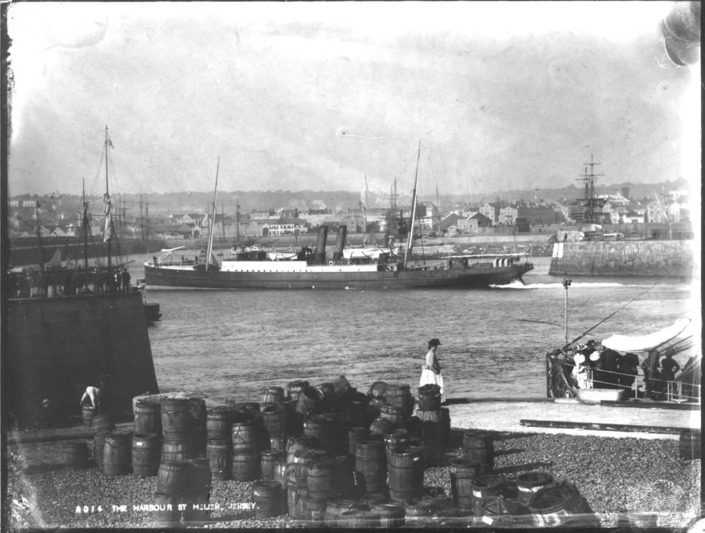
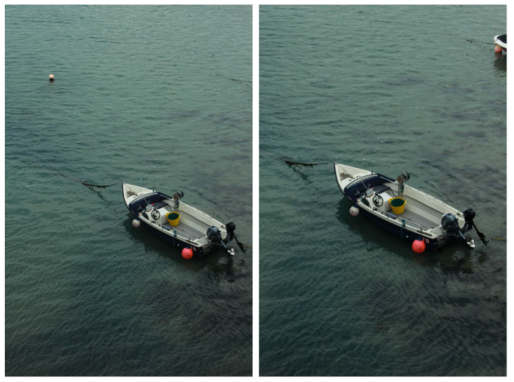
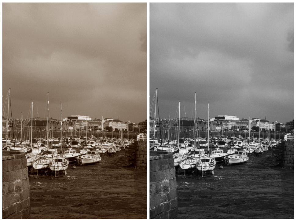
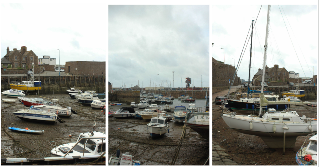
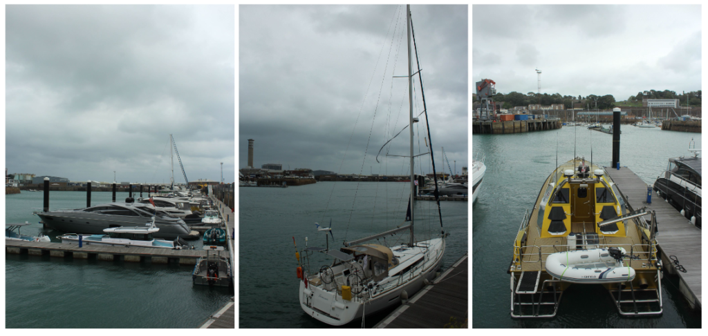
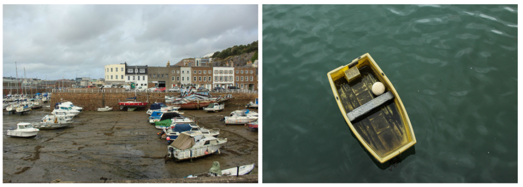
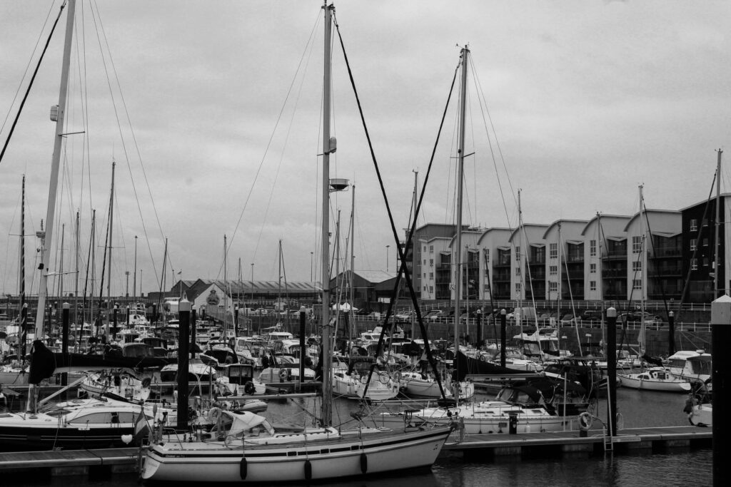
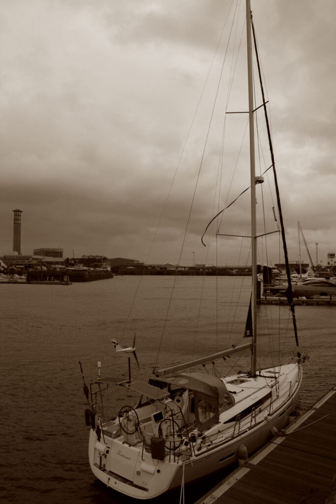
For this photoshoot, I went to Havre Des Pas and took images of the various landscapes seen around it eg natural and urban. I also took some panoramas of the beach and close ups of various textures seen on a wall. It was quite cloudy whilst I was taking photographs so I had to adjust the exposure and white balance of the camera. Once I had taken my images, I imported them into Lightroom and turned each of my images black and white as seen in Robert Adams work.
These images were inspired by the New Topographics. I think the area of Havre Des Pas successfully shows how mankind has ruined our natural landscapes eg the beach. As by building on the beach, it obscures the beautiful, natural landscape behind it. I think the clouds helped to create that dull, melancholy tone seen in the New Topographics’ images.
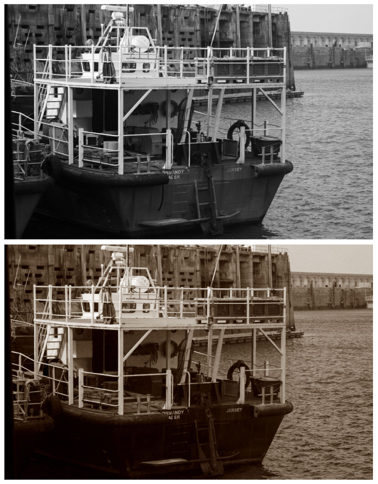
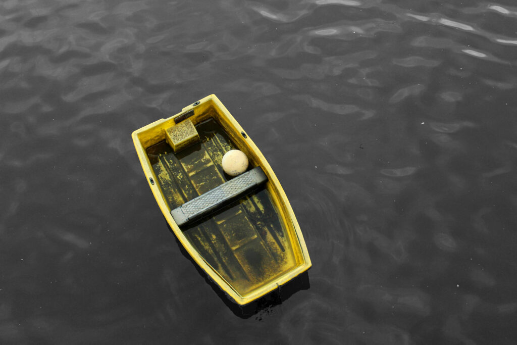
I also got to take images of an industrial area (La Collette), giving me even more variety in landscape types. I took pictures of Jersey’s incinerator and waste disposal buildings, which is a complete contrast to the natural landscape seen close by.
This image was inspired by Lewis Baltz. I like how this image looks as you can see a variety in buildings styles. For example, there are newer buildings and older buildings all in the same frame. This emphasises the clear contrast between how building styles have evolved as mankind has. Overall, I like the clarity of the image and I think I managed to successfully recreate the work of Lewis Baltz.
Overall, I like how my images came out as I managed to capture a variety of landscapes all within a small radius. However, one improvement I would make to my images is I would edit the sky in the photographs as due to the clouds, it caused my sky to be a dull, grey colour. I think by adding shade into the sky, it would make my images more interesting to look at as it would give them more depth.
An urban landscape means a dense accumulation of building structures with a rich stylistic variety of shapes, sizes and proportions located over a fairly extensive territory. Urban photography is a genre of photography concerned with capturing scenes from urban spaces, such as towns and other ecological spaces. It has become more popular over the years as the world has become more urbanised.
Urban landscapes refer to the physical environment of cities or urban areas. It includes buildings (residential or commercial), infrastructure (roads, bridges), public spaces (parks), transportation systems (subways), and other elements that shape urban living.
When taking good urban landscape photos, you should:
Robert Adams is an American photographer who has focused on the changing landscape of the American West. His work first came to prominence in the mid-1970s through his book The New West and his participation in the exhibition New Topographics: Photographs of a Man-Altered Landscape in 1975.
Offering solemn meditations on the landscapes of California, Colorado, and Oregon, Adams’s black-and-white photos document the changes wrought by humans upon nature.
When Adams returned to Colorado to begin what he anticipated would be a career in teaching, he was dismayed by the changes he saw in the landscape. He bought a 35-mm camera, taught himself the fundamentals of photography, and began making pictures infused with a love for the geography of his home state.
Born on May 8, 1937 in Orange, NJ, his family moved around the Midwest throughout his childhood, finally settling in Wheat Ridge, CO in 1952. Adams went on to study English at the University of Redlands and received his PhD in English from the University of Southern California in 1965. It wasn’t until the near completion of his dissertation for USC that Adams began to take photography seriously, learning techniques from professional photographer Myron Wood and reading Aperture magazine. In the 1970s, he was released the book The New West (1974), and a year later was included in the seminal exhibition “New Topographics: Photographs of a Man-Altered Landscape.” Adams has twice been the recipient of the Guggenheim Fellowship and once the recipient of a MacArthur Fellowship.
Robert Adams was born in Orange, New Jersey, in 1937. His refined black-and-white photographs document scenes of the American West of the past four decades, revealing the impact of human activity on the last vestiges of wilderness and open space. Although often devoid of human subjects, or sparsely populated, Adams’s photographs capture the physical traces of human life: a garbage-strewn roadside, a clear-cut forest, a half-built house. An underlying tension in Adams’s body of work is the contradiction between landscapes visibly transformed or scarred by human presence and the inherent beauty of light and land rendered by the camera. his work also conveys hope that change can be effected, and it speaks with joy of what remains glorious in the West
Image Analysis
I think this image successfully captures how humankind have ruined Earths natural beauty by polluting it with various bland, repetitive houses. There is not a wide range of tones seen in this image which I think is on purpose in order to emphasise the idea of how mundane and dull we are making our planet by constantly expanding and building on natural landscapes, stripping the Earth of its beauty. This image is quite boring to look at due to the lack of range in tones and the boring houses which all look the same. However, I think it does make the viewer realise how much damage we are doing to the Earth, which is an important message to convey. This has inspired me to take images of densely built areas with a lack of tonal range as I feel it could help society to realise the flaw with constantly expanding and building on these landscapes.
New Topographics was a term coined by William Jenkins in 1975 to describe a group of American photographers (such as Robert Adams and Lewis Baltz) whose pictures had a similar banal aesthetic, in that they were formal, mostly black and white prints of the urban landscape. The New Topographics were inspired by Albert Renger Patszch and the notion of The New Objectivity.
They were inspired by the man-made, selecting subject matter that was matter-of-fact. Parking lots, suburban housing and warehouses were all depicted with a beautiful stark austerity, almost in the way early photographers documented the natural landscape.
The stark, beautifully printed images of the mundane but oddly fascinating topography was both a reflection of the increasingly suburbanised world around them, and a reaction to the tyranny of idealised landscape photography that elevated the natural and the elemental. They began to take pictures in 1975 in America. This was just after World War II in which people began to come back to America from the war and lots of places were being rebuilt due to the destruction. The New Topographics wanted to highlight and criticise human kind’s desire to expand and to show the interactions between humans and non-humans (nature).
Robert Adams was a key figure in the New Topographics movement. He revolutionised the way in which the American West was depicted on film, highlighting the effects of industrialisation upon what was once a vast, imposing wilderness. Depicting the unwavering presence and beauty of nature in the face of human intervention was a key element of the project for Adams.
“we also need to see the whole geography, natural and man-made, to experience a peace; all land, no matter what has happened to it, has over it a grace, an absolute persistent beauty.” -Robert Adams.
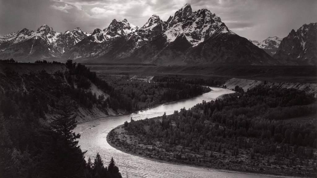
The New Topographics highlights the presence of humanity in natural landscapes whereas Ansel Adams photographed only nature and separated it from human presence. His images intended to provoke feelings of awe and pleasure whereas the Topographics often create a sense of despair in their images through the use of straight on angles and lack of enhanced tonal range. The Topographics didn’t only focus on how their images would look but how it would make the viewer feel too. By foregrounding, rather than erasing human presence, the photographs place people into a stance of responsibility towards the landscape’s future.
Photo Analysis:
Overall, I don’t really like the aesthetics of the image as there’s a lack in tonal range and the straight on angle doesn’t give the image any uniqueness or allow the viewer to see the natural landscape behind it as the house is blocking it. However, I think the use of the straight angle is good for portraying the idea of humans expanding too much and covering these beautiful natural landscapes with their creations. This may cause the viewer to think more deeply about how their constant building of new places is destroying the earths beauty and may even lead to a change in society. The lighting seen in this image is quite monochrome and boring due to it being taken in the middle day not allowing for any soft lighting to be seen in the image. However, their images are more realistic than Ansel Adams because of their use of the normal daylight that people will see if they were to go to these places, not creating a false narrative about these places and creating unrealistic expectations.