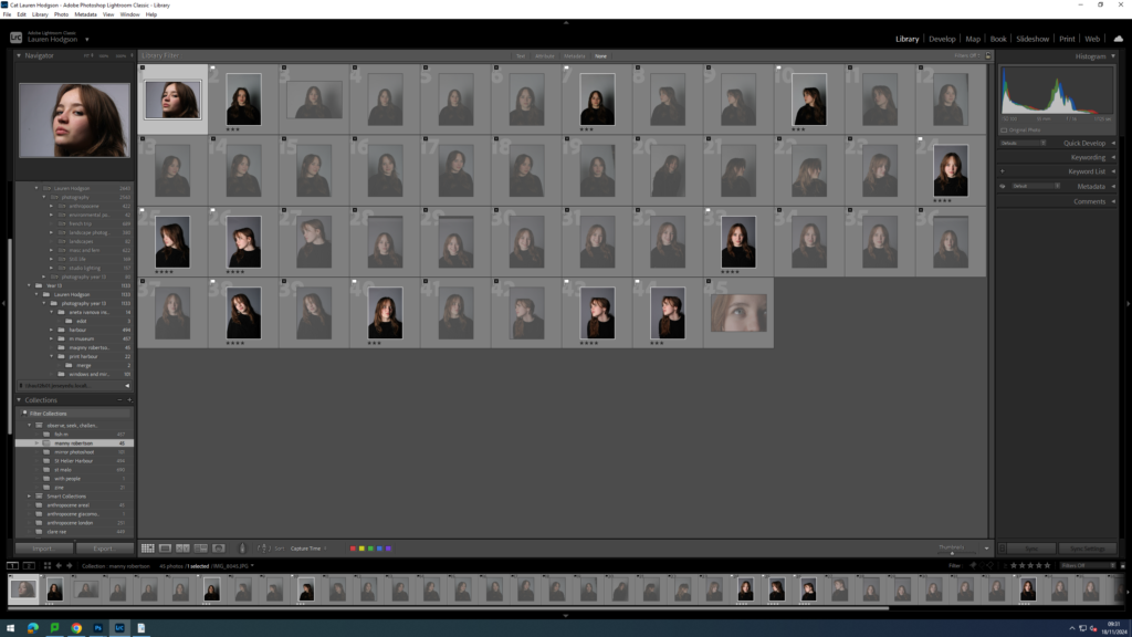
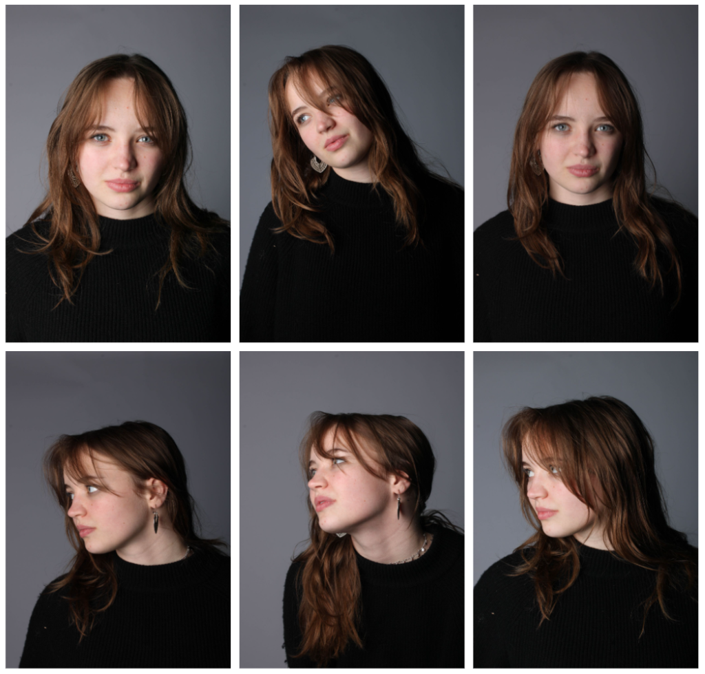
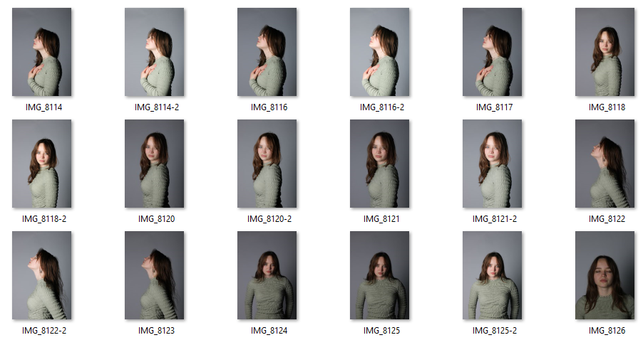
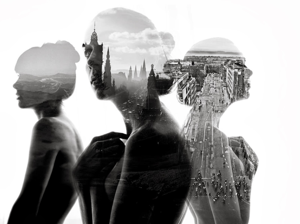
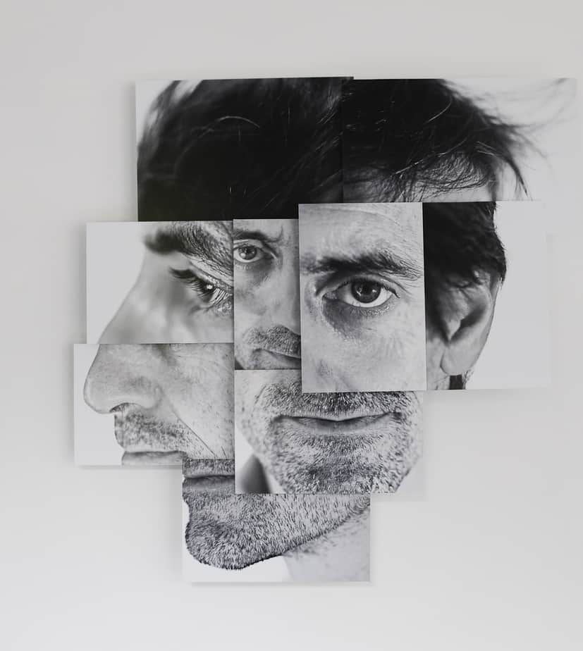
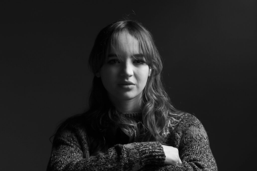
For this photoshoot, I was inspired by Manny Robertson. I began recreating his work by taking photographs of a model in the studio. I placed one of the studio lights directly in front of her face to ensure my images would be clear and without shadows. I photographed her in front of a white background as this is the background colour typically seen in his images. I then got the model to experiment with different poses for example, looking to the side or tilting her head. I then imported my images into Lightroom and began narrowing down what images I wanted to use. I did this by first giving either a white flag if I liked the image or a black flag if I didn’t like it. I then gave all my images with a white flag a ranking out of 5. 5 being the best and 1 being the worst. I then used the filter tool to make it so I could only see my images with a 4 star rating. Then I edited the contrast and exposure of each image. These are the images which I will edit in photoshop.
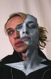
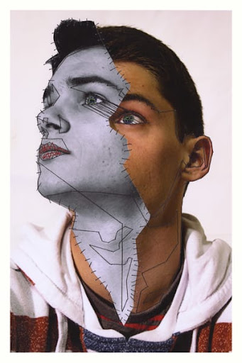
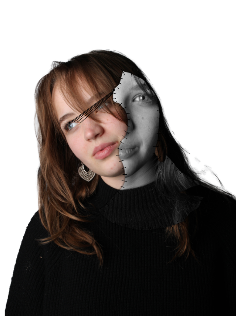
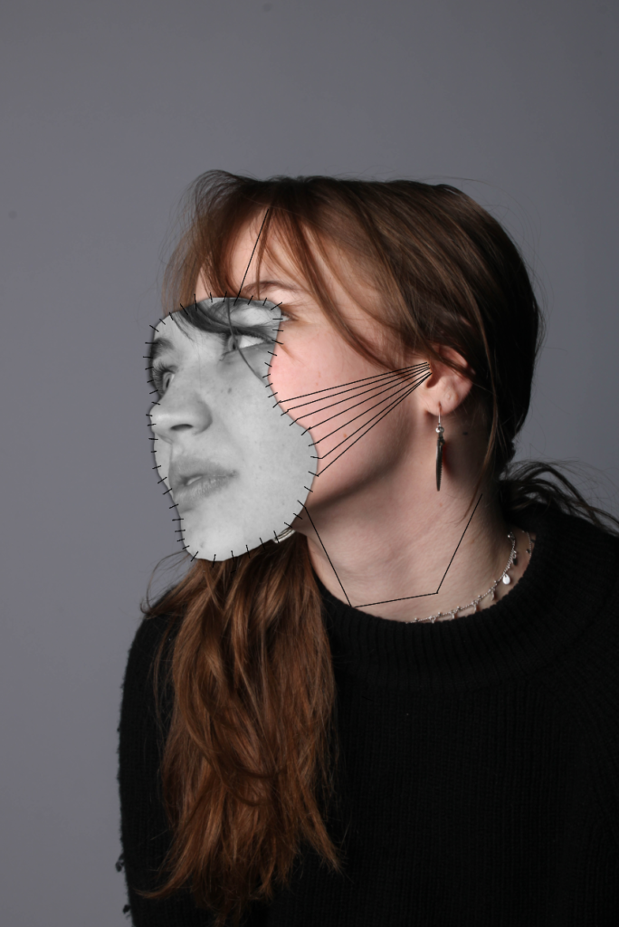
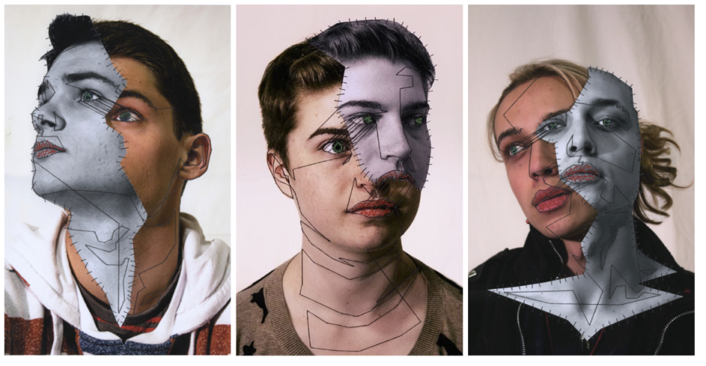
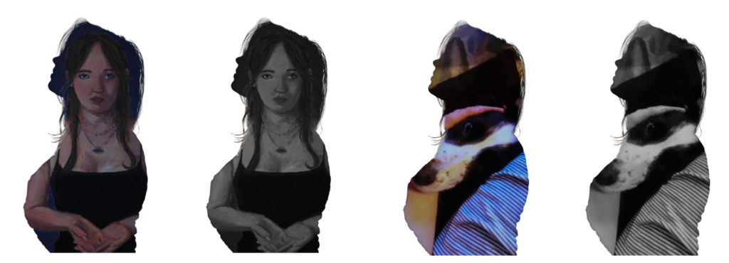
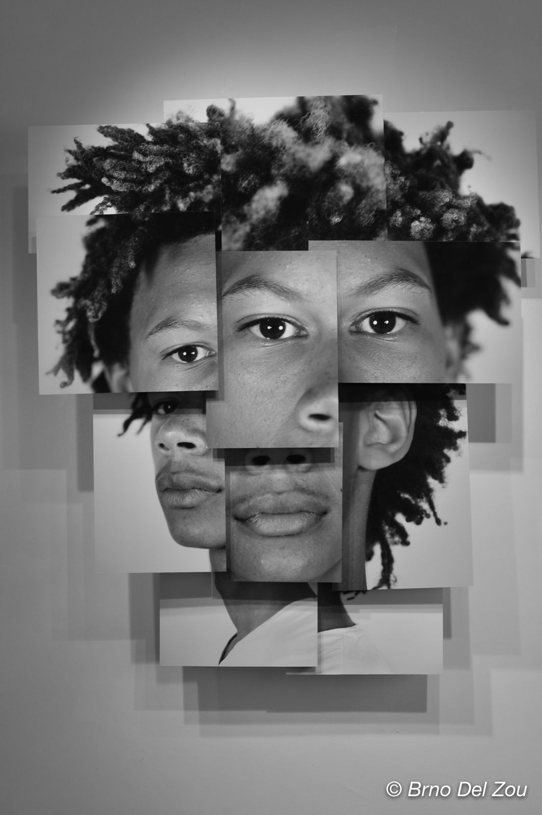
I then exported my photos into a folder which I could then open in photoshop. I began by opening up an image where the model’s head was tilted to the side then used the object selection tool the make a cut out of her outline and dragged the cut out onto a white piece of paper. I then opened up a different image where her head was facing upwards and used the lasso tool to go around a section of her face. Next, I pressed layer via copy and dragged that cut out onto the face on the white piece of paper. After that, I pressed on the top layer and made it black and white as seen in Manny Robertson’s work. Next, I worked on the stitching effect seen between the two faces. I recreated this effect by using the pen tool on photoshop to make marks going from one face to another then made the thickness of it lower so it looked like stitching. Finally, I wanted to emphasise the idea a mask being pulled off her face so I decided to add a drop shadow to the mask layer which created depth and the idea of her being two different people.
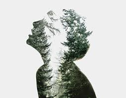
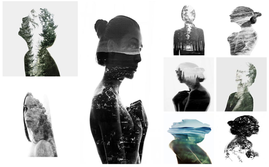
These are the images by Manny Robertson that inspired my idea.
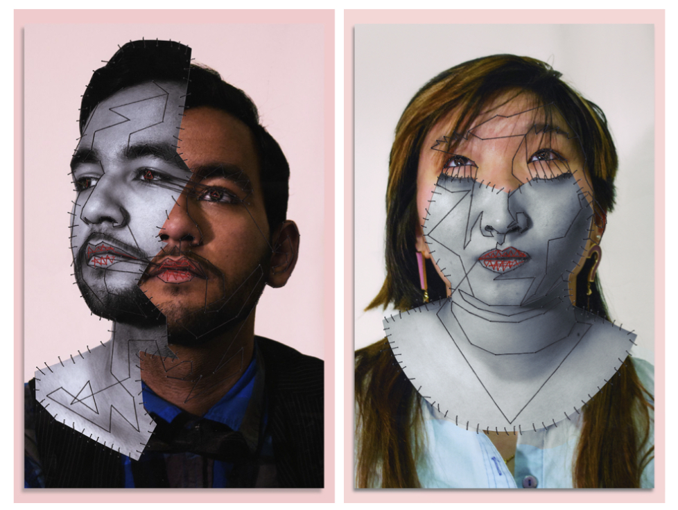
Final outcomes:
Overall, I like how this idea came out as I think I managed to successfully recreate the work of Manny Robertson and I feel like these images clearly relate to the theme of identity as it portrays the idea of people putting on masks in front of people and hiding their true identity due to fear of being cast out of society etc. However, one improvement I would make to this idea is actually stitching on the black lines instead of using the pen tool in photoshop as it would make my idea more creative in the sense of how its presented.
Manny Robertson is a photographer, artist, and visual storyteller, known for his work that often intersects with themes of fashion, portraiture, and conceptual art. He is recognized for his distinctive approach to photography, often combining elements of storytelling, emotional depth, and visual experimentation to create compelling and thought-provoking images. His photography often features bold compositions, dynamic lighting, and a blend of contemporary and classic aesthetics. He uses photography not just as a medium for capturing moments, but as a tool for expressing broader themes, including identity, transformation, and the human experience. Manny Robertson’s style and artistic vision place a strong emphasis on visual communication, and his work can be described as both cinematic and introspective, with a focus on the emotional and psychological states of his subjects. The emotional resonance of his images is often paired with a sharp attention to detail, making his photographs both visually striking and conceptually rich. Like many contemporary photographers, Robertson explores the concept of identity, both in terms of how individuals present themselves and how they are perceived. His portraits often convey a sense of vulnerability or introspection, encouraging viewers to engage with the emotional undertones of the images.
Manny Robertson’s series called “Embroidered Metropolis” was created to represent how dark emotions like Depression can attach and fuse themselves to people like masks of sorts. Using a robotic aesthetic inspired by the film Metropolis, to distinguish between normal feelings (colour) and the emptiness of the others (black+white), whilst using thread to act as both robotic attachments, and the struggle of dealing with said affliction.
How he links to identity:
Manny Robertson’s photography often explores themes of identity, transformation, and the complexity of human emotions, which makes his work particularly suited to the theme of disguise in photography. While his approach is varied, several key elements in his work resonate strongly with the theme of disguise such as the exploration of masked identities. Robertson’s portraits often feature individuals who appear in altered versions of themselves, where their outward appearance might be drastically changed through editing and manipulation of light. For example, he makes a cutout of the person’s face which comes slightly off their actual face and is held together by stitches. This alteration acts as a disguise, hiding or distorting the person’s “true” identity. In this sense, the subject’s outward appearance becomes a mask, revealing a version of themselves that may not reflect their inner identity. By playing with visual transformations, Robertson challenges viewers to question the authenticity of appearances, a core aspect of disguise.
Beyond the visual aspects of disguise, Robertson’s work often delves into the psychological layers that people wear, whether consciously or unconsciously. His subjects may not be physically disguised, but the emotional or psychological “masks” they wear are evident in their expressions or body language. This emotional veil can be interpreted as a form of disguise, where the subject’s true feelings or inner self are hidden behind a curated exterior. Robertson’s photography invites viewers to consider the emotional disguises we wear in daily life, and how these layers can either protect or distance us from others.
Quotes
He said his series ‘Embroidered Metropolis’ was inspired by the film Metropolis, and this series of portraits were created to “… represent how dark emotions like Depression can attach and fuse themselves to people like masks of sorts. Using a robotic aesthetic…to distinguish between normal feelings (color) and the emptiness of the others (black+white), whilst using thread to act as both robotic attachments, and the struggle of dealing with said affliction.” (https://chantellegracephotography4.wordpress.com/2020/04/20/assignment-four-photographer-research/)
in book add pics of just her and just landscape then my edits also the questions and answers.
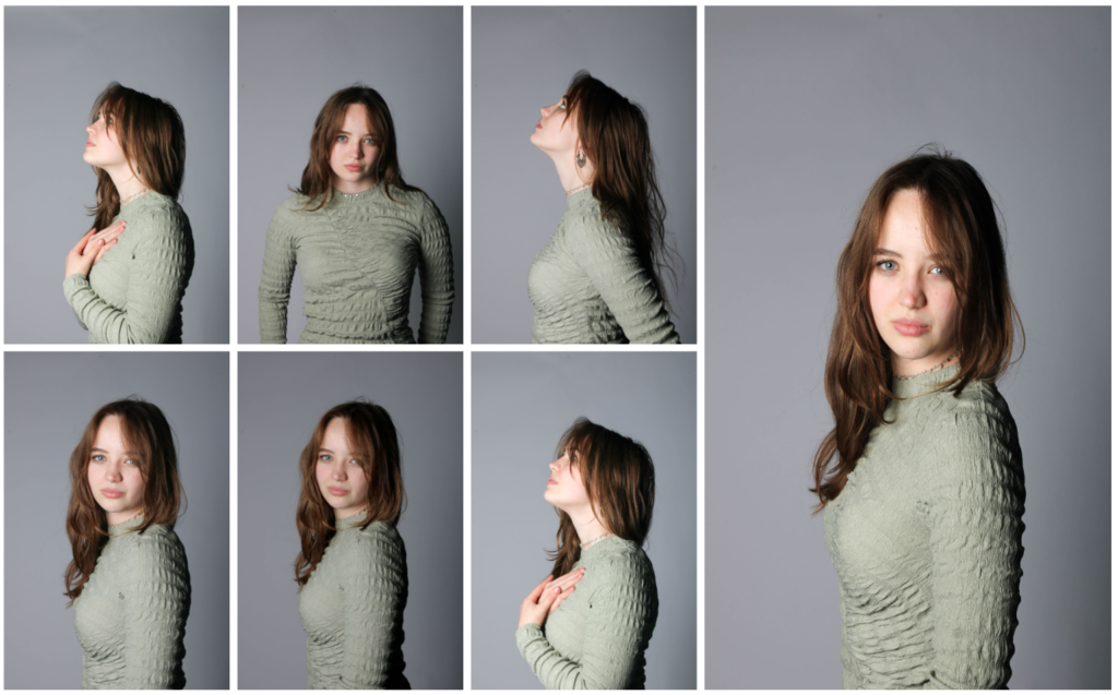
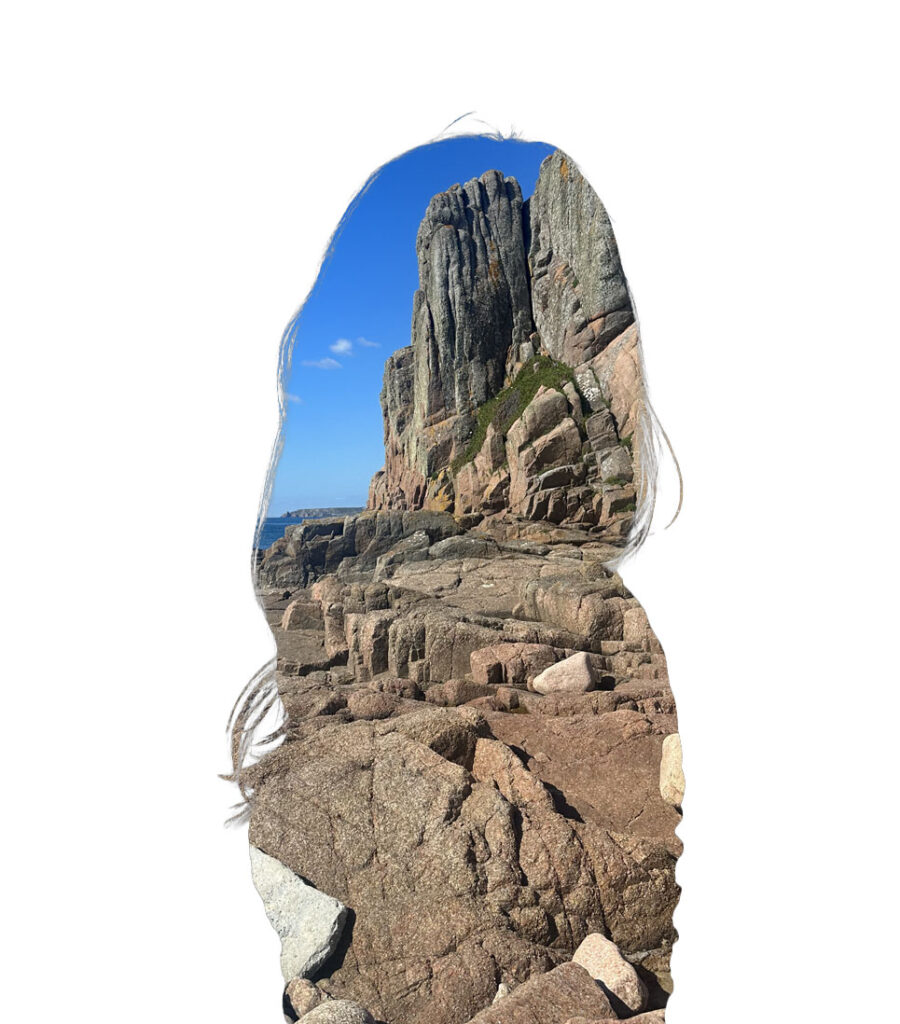
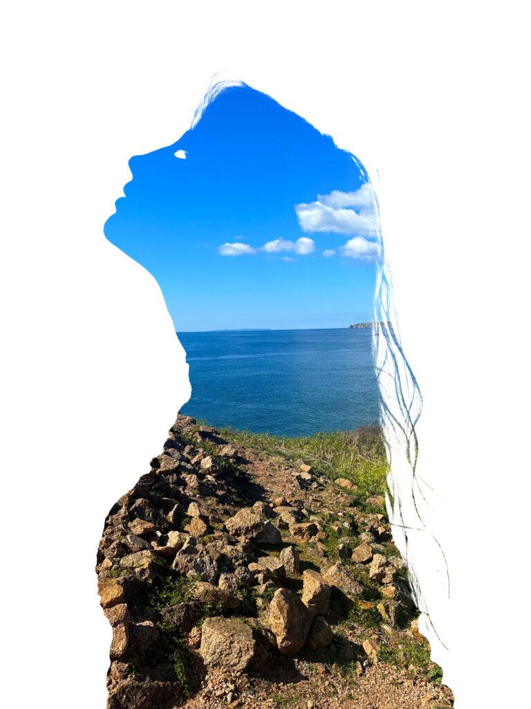
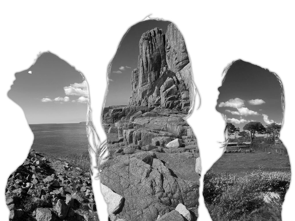
For this photoshoot, I was inspired by Aneta Ivanova. I began the process of recreating her work by first taking photographs in the studio. I first set up the space by adding tow lights directly in front of the model to ensure my images would have good lighting. I also ensured I used a white background as a key feature of her images of the blank white space behind the subject (which allows for direct focus on the subject and nothing else). I then got the model to experiment with different poses typically seen in Ivanova’s images. For example faced to the side with her arms up to her chest. My images for this photoshoot turned out quite successfully as I think it closely mimicked the positions of the models seen in her images and they are all in good focus.
For the next part of my photoshoot, I first gave some questions to my model to complete. This allowed me to take photos of things that had personal meaning to her and therefore her identity. These questions consisted of:
Where is your favourite place in jersey?
What makes you happy?
What does the word identity mean to you?
How would you describe yourself?
How would others describe you?
Her answers:
My favourite place in Jersey would probably be anywhere with nature such as the beach or forests. I specifically like Corbiere Lighthouse due to the views surrounding it.
I feel happiest when I’m being creative like creating sculptures or painting.
Identity to me means the way you express yourself and what it means to be you
I would describe myself as creative, funny, talkative and unique.
I think others would describe me as funny, creative, weird and pretty.
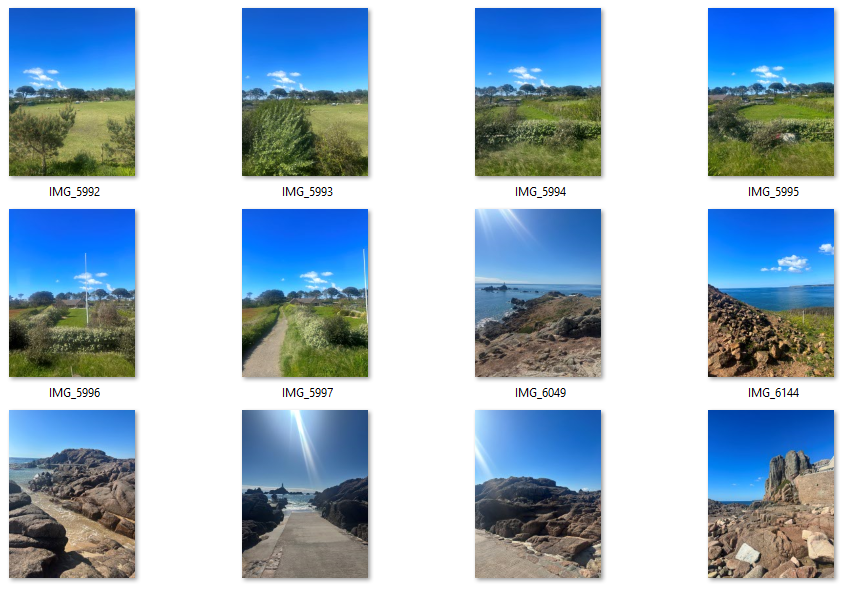
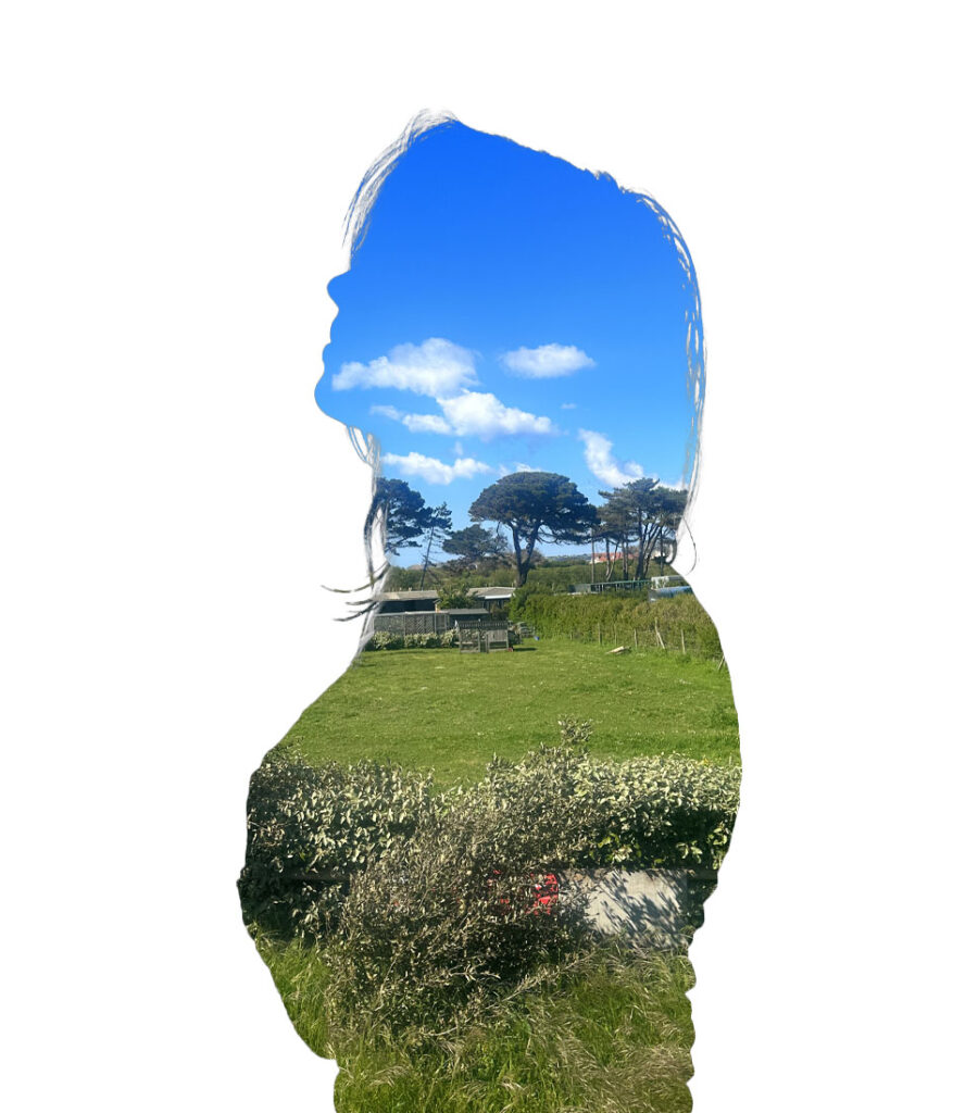
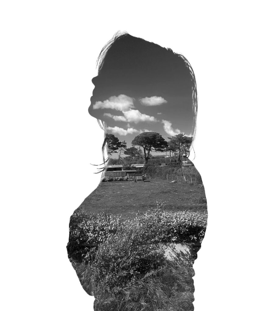
From these answers, I then visited various natural landscapes around Jersey such as Corbiere Lighthouse. I think this part of the photoshoot turned out well as the images are in good focus and will make my final piece more personal as I’m using images of nature that have a personal meaning to my model instead of picking a random environment to photograph which I originally intended to do.
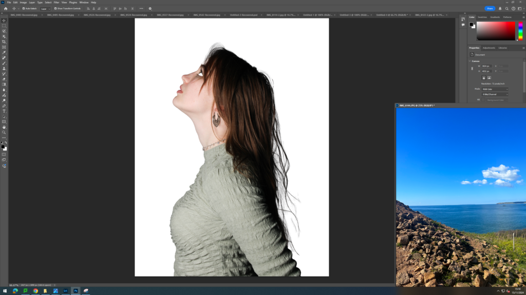
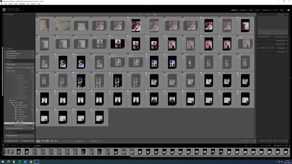
To being the editing process, I first imported all of my images into Lightroom and narrowed down the images that I wanted to edit. I then adjusted the exposure, contrast, whites and blacks of these images. Once I was happy with the edits, I then exported them into a folder which I could then open up in photoshop. I began by opening up a blank A4 page then opening up an image of the subject. I then used the object selection tool to cut around the person only, right clicked on the cut out and pressed layer via copy. I then dragged the cut out onto the white piece of paper. I did this as Aneta Ivanova’s images are all displayed on a blank sheet of white paper behind the model. Next, I opened the landscape image and dragged it onto the image. I put this layer at the bottom. Next, I pressed on the person layer and used the object selection tool once again. However, instead of cutting it on that layer, I instead went to the white layer and pressed layer via cut. This then created a hole in the white layer. Finally, I went back to the person layer and cut her out using the same process. This left me with the landscape background coming through both layers.
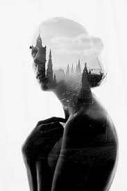
This image by Aneta Ivanova was my inspirationThese image by Aneta Ivanova were my inspiration for my photoshoot.
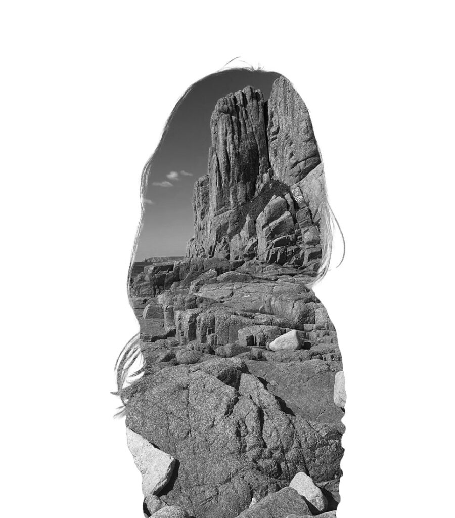
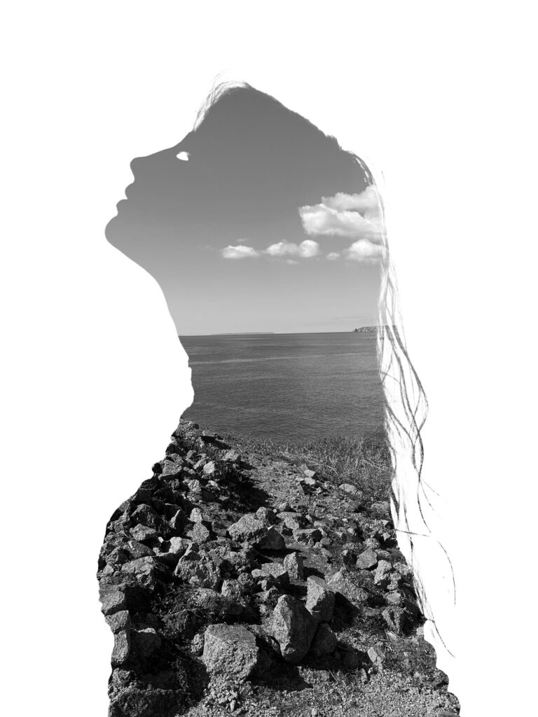
Next I experimented with turning the landscape black and white as some of Aneta Ivanova’s pieces are black and white instead of in colour. To finish off this first part of the idea, I added a drop shadow to the person. This helped bring some depth to my images. Overall, I like how this idea came out as I think it closely resembles the work of Aneta Ivanova and clearly displays the theme of identity and disguise as the background layer, making it so you cant see any features of the person, portrays the idea of people feeling as though they are blending into the background of life as they struggle to understand who they really are as a person. Additionally, it could also show how people try to blend in to their surroundings (disguise) as to not be judged or seen as indifferent. One thing that I could improve about this photoshoot however is the opacity of the person layer. As in my images I just cut out the person but in Aneta Ivanova’s images you can still see a vague outline of the persons facial features. This would’ve made my images slightly more exact to her images.
I then decided to further my idea by adding three of my different attempts of creating her work together to create one image. In order to do this, I opened up a landscape blank piece of paper on photoshop. Next I opened up the three black and white images I created above and used the object selection tool to create a cut out of the person. I then dragged each cut out onto the piece of paper and adjusted the size and placement of each cut out. Once I was happy with the layout, I finished off this design by adding a drop shadow to each of the cut outs. Overall I like how this idea came out as I think it makes the piece look more complete and advanced than just having singular people on each page. However, next time I would take a photograph of the model looking to the left (as seen on the right side of the inspiration image) in order to make my piece more replicable of the original image.
This was my inspiration image for the second part of this idea.
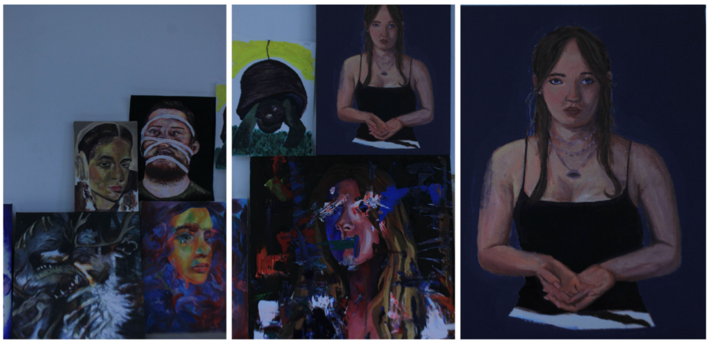
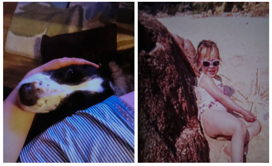
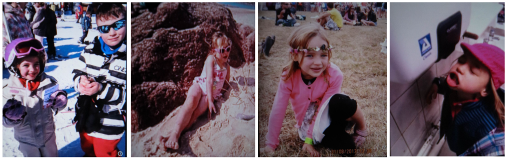
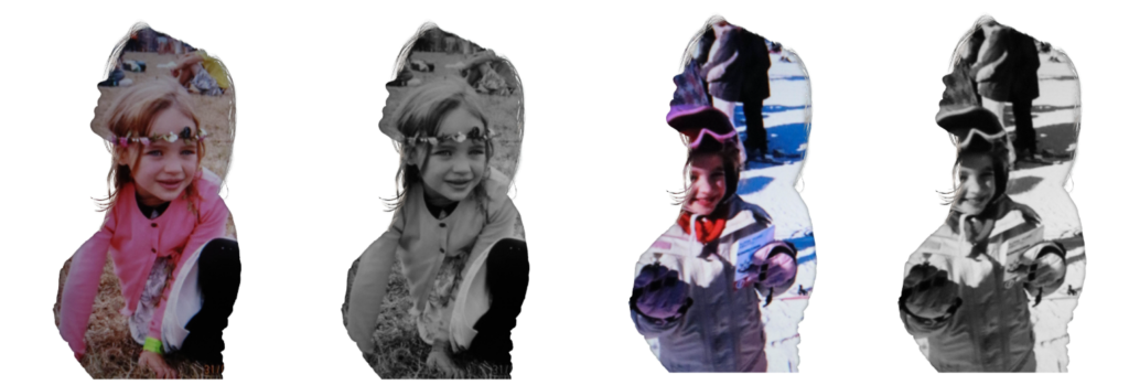
For the second part of my photoshoot, I took pictures of various art pieces in the art room that Liv and her friends had created eg paintings and sculptures. I also wanted to delve into her childhood too as that is a part of her identity so I used a projector in the studio in order to project images of her in her childhood. I will then merge these personal images with her outline. I think this will be effective in showing the different things that makes the model who she is and therefore her identity.
Final outcomes:
Overall, I think this idea came out successfully as you can still clearly see the link between the artist and my work but I have also adapted the idea to make my pieces more personal and about identity as the photographs seen inside the model’s outline has a personal meaning to her.
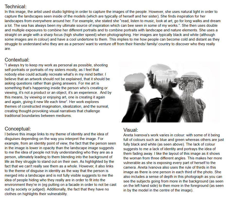
Aneta Ivanova is a 23 year old Bulgarian photographer who, after focusing her work on a lot of conceptional work and portraits, began experimenting with different techniques to give a new meaning to her photographs. She began with long exposures, then double and multiple exposures combining a number of portraits, and then she focused on portraits with landscape and nature elements. She states that she tries to keep her work as personal as possible, shooting self-portraits or portraits of her sisters mostly, and she prefers the method of double exposure because it allows her to combine two completely different scenes in one, allowing the pieces to become more expressive. Her style is based on a compilation of pictures from her trips, and photos where she acted as the model. She really knows what she wants to transmit, and adapts it. She experiments with her digital camera, and manually adjusts the effects to get the desired result. Ivanova’s style is characterized by minimalism, soft lighting, and a muted color palette, giving her images an ethereal and otherworldly feel. She often uses surreal elements like unusual textures or forms, creating a sense of ambiguity and mystery.
Analysis of one of her images
How she links to identity
Aneta Ivanova is a photographer and visual artist whose work often explores themes of identity, transformation, and emotional depth. Her photography is known for its conceptual approach and symbolic use of elements like lighting, makeup, and surreal compositions, making it particularly well-suited to the theme of disguise. Aneta Ivanova blends photos of people into photos of scenery, whether it be trees, birds or the sea. Many of her photographs are expressed in black and white to enhance the shapes; however she does also portray some of her work in colour, creating bright, lively images. I think her work links to disguise in identity as she combines humankind with nature which are two completely different yet similar things. Nature is seen for how it is (it’s natural) and cannot hide behind a mask unlike humans who constantly hide behind a metaphorical or physical mask. Whether that be putting on a happy face or wearing makeup, each are used in a way to hide the vulnerable true part of ourselves. By combining the two images, I think it highlights to the viewer that it’s okay to be yourself and that you don’t have to hide who you truly are as nature is still beautiful despite it being fully exposed to us with no mask to cover itself behind. Ivanova’s work often delves into the psychological aspects of identity, exploring the emotional facades that people put on in different situations. Disguise, in this sense, can be metaphorical: her subjects might appear one way on the surface, but their internal, emotional state may tell a different story. Through her photography, Ivanova might challenge the viewer to question the difference between how a person presents themselves and who they truly are.
Quotes:
Ivanova often explores the malleability of identity, saying things that convey how people are constantly changing or performing different versions of themselves. A general idea she might express is how “Identity is not fixed—it is fluid and often shaped by external and internal forces.” This quote suggests to me that people often don’t know who they truly are and mould themselves to be like the people they’re around at the time. Implying people disguise their true selves in order to not be judged by those around them.
“A photograph should evoke a feeling, a moment of vulnerability, or an introspective thought from both the subject and the viewer.” I think she successfully does this in her photographs as she addresses the issue of identity and how people often pretend to be something they’re not.
“Photography is a way to create new realities, where the ordinary transforms into something extraordinary. Through this, we can examine the deeper truths of who we are.”
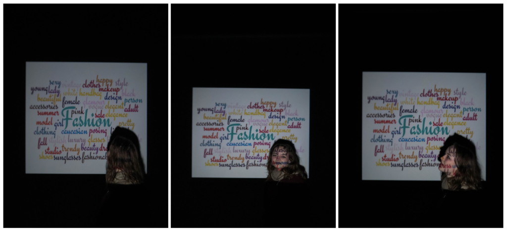
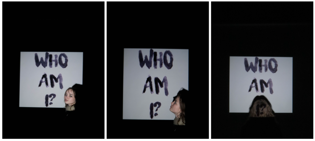
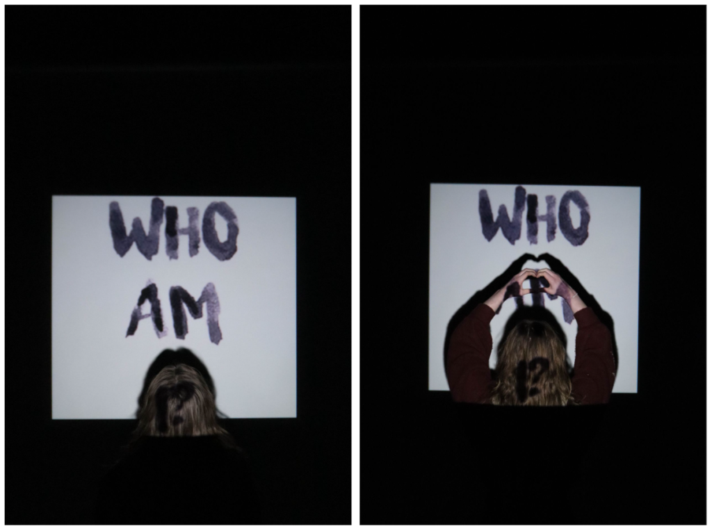
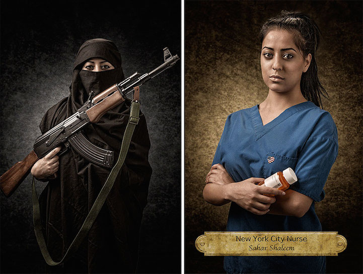
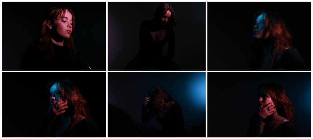
For this photoshoot, I wanted to experiment with something I had never tried before in photography: using a projector. To do this, I borrowed a projector from art and brought it down to the studio where I then placed it in front of the white wallpaper. I then turned off all the lights and chose some images off of the internet that I felt linked to the theme of identity. For example, I searched for words that describe women (as that is who I was photographing) and a quote saying ‘who am I?’ which is meant to convey the idea of people feeling lost about who they really are and how stereotypes are placed onto women about who they are supposed to be, often causing them to lose a sense of self as they try and mould themselves into societies expectations. I placed the model in front of the projector in order to the convey the idea that she encapsulates what’s being projected eg feeling like she doesn’t know who she is. To edit these images I used Lightroom where I adjusted the exposure, contrasts, white balance and more. I made sure to make the background fully black so that the attention of the viewer doesn’t go away from the centre.
I like how this photoshoot came out as it was simple but portrays an important message about it being okay to not know who you are exactly and potentially feeling lost and to embrace it instead of being embarrassed. However, next time I would like to experiment with different images being projected eg a dark room with a singular light where the model would stand in front of with her hands on her hand. This would further display the emotions one may feel in relation to figuring out their identity.
For my first photoshoot, I am going to be taking pictures that is inspired by Aneta Ivanova. I will do this by first going into the studio and taking pictures of a model. I will place the lighting in the studio in front of the model to ensure that she is fully visible and clear. I will aim to get photographs of the model in a variety of different positions typically seen in Aneta Ivaonva’s images. For example, the model holding her hands up to her chest and facing the the side looking upwards. I will then focus on the images seen inside the subject, which typically consists of a natural environment photograph. To make my photoshoot more personal and about identity, I will ask the subject some questions about where her favourite places in Jersey is and what things make her happy. I will then photograph different things based on her answer to these questions. Once I have my two sets of images, I will then use Photoshop to merge the two together as seen in Aneta Ivanova’s work. I chose this artist as I thought I could make my final outcome link to identity by using images that had personal meaning to the subject eg her favourite place in Jersey.
For my second photoshoot, I am going to be trying to replicate the work of Manny Robertson. In order to do this, I will go into the studio and take pictures using the studio lights to make the images and face well lit. I will focus on taking images where the head is the main feature of the image and show less of the body in the photographs as I want the attention to be on the face rather than anything else. I am going to get my model to pose in different ways as seen in Manny Robertson’s work eg looking up the side and her head tilted to the side. I will then upload these photos and use Photoshop to draw on the face in order to create the illusion of stitching on the face. I chose to replicate the work of this artist as I believe his pieces link to the theme of identity as you can see a mask like cut out being stitched to a face which to me portrays the idea of people constantly having a mask up around people and hiding who they truly are in order to fit in to society.
My next photoshoot will be inspired by Brno Del Zou and David Hockney. These artists create a fragmented image using boxes to distort the original image. I will do this by going into the studio and placing a light source directly in front of the model and getting her to stand quite close to the camera. This will allow me to pick up different details of her face eg her lips, eyes etc. I will take pictures of the model’s face from a variety of angles eg straight on and to the side. Then I will use photoshop to cut out different parts of the images to create a whole image of distorted facial parts. I decided to replicate the work of these artists as it links to the theme of identity as you cant see the person as a whole: they’re distorted. This represents how people often struggle with their identity and may feel like the final fragmented image as a result of it.
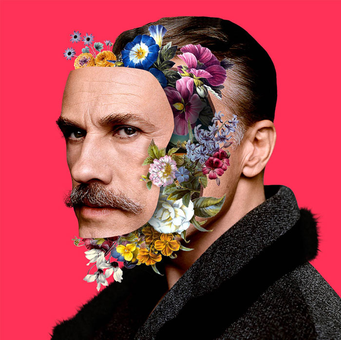
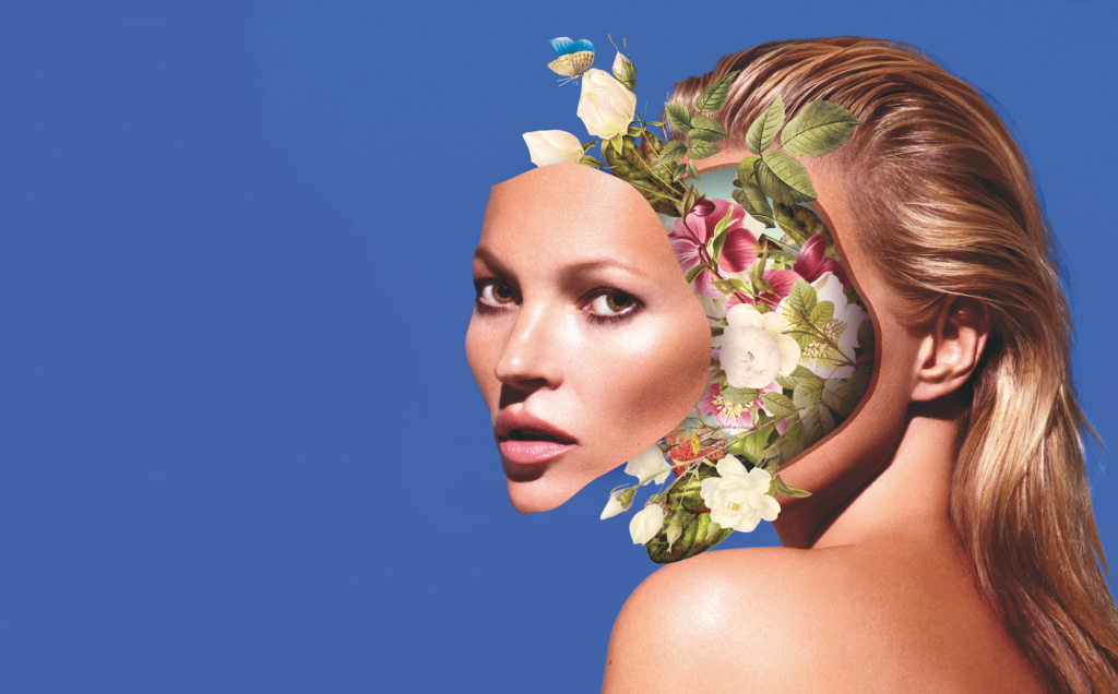
For my final photoshoot, I am going to replicate the work of Marcelo Monreal. I think this will be a good photoshoot to finish off my theme as it represents/ looks as if the persons true personality/ identity is blooming out of them as they accept who they are. I think this will create a meaningful and optimistic end to my photoshoots as it expresses to the viewer that its okay to be yourself and there’s beauty in embracing your unique identity. Additionally, the bright background colour contrasts with the other artist photoshoots where the background is just white, symbolising the colour coming back into ones life when they accept and embrace who they are. I will recreate this idea by going into the studio and taking photographs of a model that shows her face and shoulders in the image. I will make her sit looking to the side slightly. This will make it so I’m able to make a cut out of her face and drag it to the side slightly. I will then use images of flowers from google to add behind the face cut out. I will make my image more personal and about identity by making the flowers the colour of the flag where the person is from. This will mean my image links to the theme of identity as a person heritage is a part of their identity.
Which form you wish to present your study (photobook, film, prints etc)
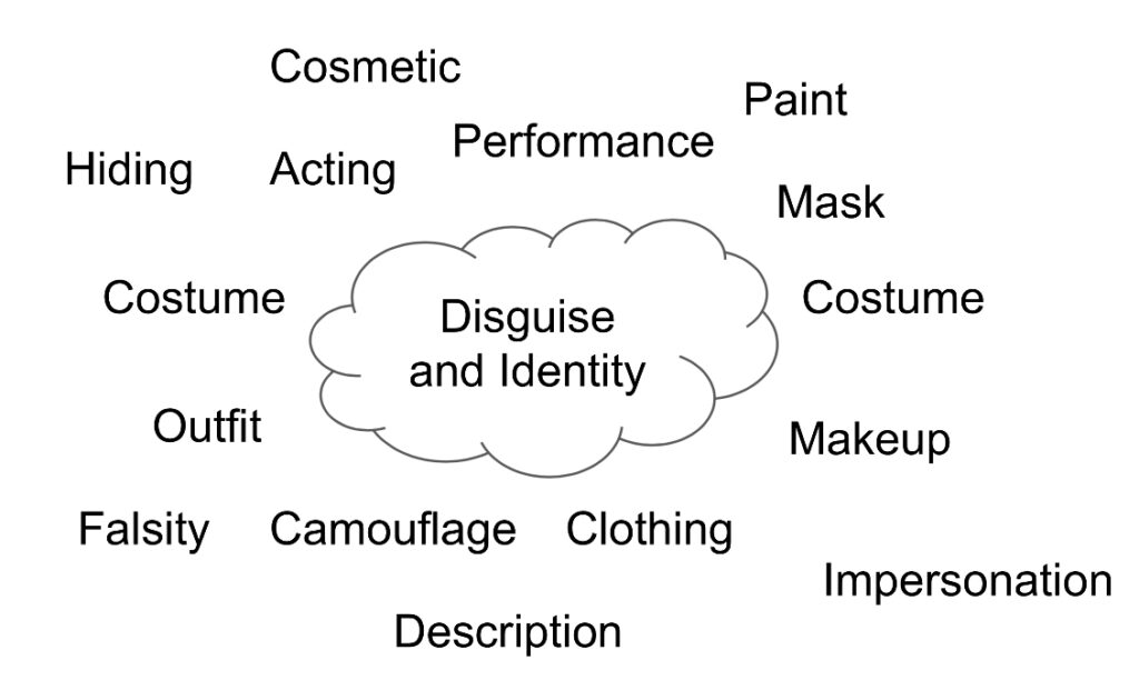
In my photography project, I am going to delve into the complex and painful relationship people have with their identity, particularly the pressures that lead individuals to hide their true selves. I’ve decided to focus my project on young person as I’ve observed first hand how my peers often feel compelled to mask their identities in order to fit in with societal expectations/ friend groups, for example: adjusting behaviour, altering appearances (by using makeup etc), or hiding emotions. I feel like people fear of being judged, ridiculed, or rejected if their true self is revealed. This sense of concealment and the desire to conform is something that I want to explore in my project. In this project, I’m going to start by photographing the idea of disguise in identity. I will do this by taking photographs of different peers in the studio and then using the work of different artists to emphasise the idea of a fragmented identity. For example, I will be looking at the artists: Aneta Ivanova, Manny Robertson and Brno Del Zou/ David Hockney. Aneta Ivanova’s work links to the theme of disguise in identity as she often uses complex visual compositions and costumes to blur the line between reality and fantasy, creating characters that reflect the performative aspects of identity. Her use of masks highlights how identity can be distorted, challenging the viewer to question what is hidden beneath the surface. Additionally, Manny Robertson’s work also fits the theme as his portraits capture the tension between the external façade and the internal self. His work reflects the emotional and psychological layers of disguise and how individuals navigate the multiple versions of themselves that exist. Finally, Brno Del Zou uses digital manipulation to reconstruct facial features. This reflects the concept of identity as its constantly shifting and sometimes fragmented, representing people not being whole as they often hide their true selves.
As my project develops, I want to shift the focus towards exploring the beauty and strength in embracing one’s true identity, despite the risks of vulnerability or rejection. By the end of the project, I hope to portray a journey of self-acceptance, showing how people can learn to take off their masks and be unapologetically themselves. Through this progression, I aim to demonstrate that the courage to embrace one’s true self is both empowering and liberating, and ultimately leads to a deeper sense of fulfilment and connection with others. To depict this, I will be taking inspiration from Marcelo Monreal. I feel his work covers the theme of embracing identity as he incorporates flowers and natural elements which evokes the idea that identity is a process of continuous growth and transformation. Flowers, which bloom, wither, and regenerate, mirror the way human identity can change over time, influenced by experiences, emotions, and external factors.
I am planning to present my project in a photobook format followed by a series of prints. I am going to use Photoshop to create photomontages and use AI technology to show how easy it is for people hide who they truly are online now days due to the easy access people have to these tools which are able to blur the lines between reality and imagination. I hope my images will be able to represent the internal struggles people face when embracing who they really are and to encourage them to not hide their true selves just to fit into society and individuality is what makes everyone unique and special.
I am going to be taking mainly tableaux images as I will carefully construct pieces that are able to tell a story of the journey of identity. I want to reassure the people who look at my work that discovering who you are isn’t necessarily a straight path and that its okay to want to hide sometimes but ultimately, I hope my project will inspire people to embrace themselves for who they are and to be unapologetically themselves.
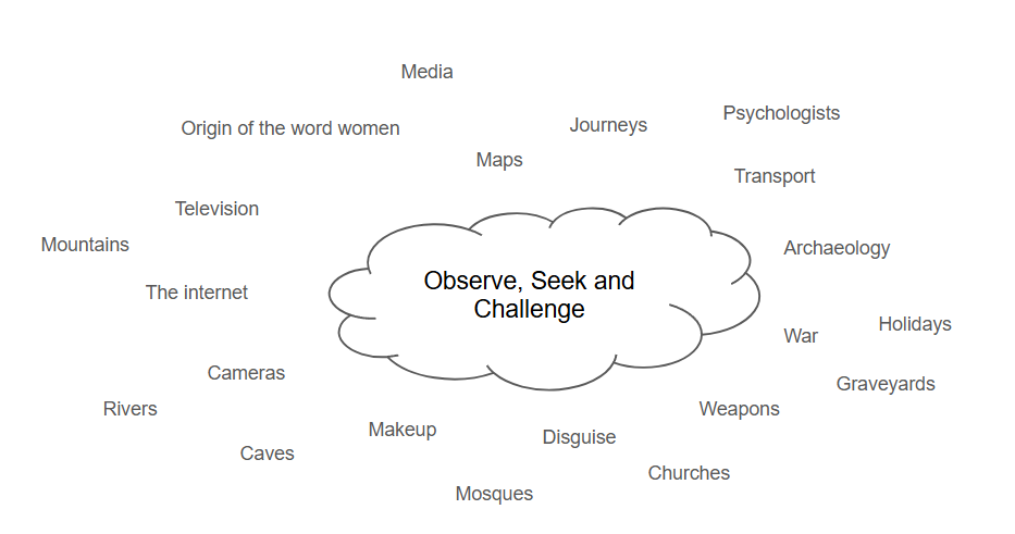
The word observe means to notice or perceive (something) and register it as being significant. Photography is an art of observation. It has little to do with the things you see and everything to do with the way you see them. In photography, observation takes on a deeper meaning, going beyond merely looking at subjects to truly seeing and understanding them. This can be understood in terms of the standard process of a scientific inquiry using observation. Firstly, there is the fieldwork (which is where you have to capture the object of your inquiry and collect the data). In photography, this is the shooting part. Photography here is taken as a method, partly incorporated into the camera and partly implemented by the photographer. Secondly, you have to analyse and interpret the data. This translates into photography as shown: How do we read photographs? What do we see (or fail to see) in them? Lastly, you have to write about your findings, a doctoral thesis or a scientific article to be published in a well-ranked journal. Scientists using photography do exactly that. Artists show their work in exhibitions or publish books, trying to please their audiences or otherwise offer them an interesting experience.
The word seek means to attempt to find something. Similarly, it also means attempt or desire to obtain or achieve. Seeking in photography is about exploring deeper layers of meaning, expression, and connection through the lens. It involves experimenting with different styles, techniques, and subjects to uncover a unique perspective, while engaging with both the technical and emotional aspects of the medium. By reflecting on your work, studying the work of others, and pushing boundaries, you can discover new ways to express ideas and capture moments that resonate with you. Ultimately, seeking in photography is a continuous journey of self-discovery and creative growth.
The word challenge is a call to someone to participate in a competitive situation or fight to decide who is superior in terms of ability or strength or to dispute the truth or validity of something. Challenge in photography is an opportunity for people to address a question, tell a story, or convey meaning through an image they have created.
The theme observe, seek and challenge refers to humankind’s desire to seek and explore the unknown, driving artists to constantly seek new inspirations and materials to use. For example, artists used to create cave paintings which is now translated into graffiti. However, graffiti is actively looked down upon and covered up whereas cave paintings are seen as sacred and preserved, despite the two being closely related. This theme also involves peoples desire to unravel the working of the human psyche and understand the nature of consciousness, resulting in the creation of challenging and contentious images. Other artists are often inspired by the actual physicality of the human body, such as the South African artist Walter Oltmann whose piece Bleeder explores the body’s myriad networks of blood vessels. The diversity, complexity and geometry of nature also inspires artists and designers. For example, Richard Diebenkorn’s aerial inspired landscapes explore the macro world of colours and forms, created when nature is manipulated by agriculture and industry. Artists have also challenged the ideologies and conventions of their respective times through their work. Many revolutionary movements have generated specific, politically motivated artwork, primarily for propaganda purposes. Communist posters from the beginning of the 20th century, used imagery that championed notions of equality and working-class power. These illustrations generated a potent archive that continues to inspire contemporary graphic illustration. Producing art that questions the authority of kings, dictators, religions and political ideologies is a risky endeavour. Artists frequently use metaphors in their work to disguise the messages; some of these are blatant, others are obscure. Artists may also undertake hazardous journeys to capture the imagery of exotic and unusual locations. Some documentary photographers continually place themselves in dangerous situations, such as war zones, to record and capture the reality of these conflicts. For example, the work of photographers Tim Page and Dick Halstead has completely dispelled the myth of the glory of battle. In contrast, wildlife photographers have often captured the struggle of life and death that surrounds us on a daily basis.
Throughout my time doing A level Photography, I have learnt lots of new skills and techniques in photography such as how to setup and use a camera based on different environments you may be in and the history behind photography. I have also come to realise that photography is more than just taking pictures: there’s a story behind each image. Whether that be someone trying to capture a memory in time which they can then look back on or discussing an issue in the world. This has made me have a greater appreciation for photography and helped to make my own images be more meaningful than just simply capturing what I see.
Still life
The first topic we covered in photography was still life. Still life is a painting/ drawing of an arrangement of objects. These typically include fruits and flowers and other objects that contrast with those textures e.g. bowls and glassware. Still life pictures are often rich with symbolic depth and meaning. It first emerged as an independent genre in the early 1600s in Dutch and Northern European paintings.
I found the still life section of photography quite interesting as I learnt about still life photography’s deep history and the symbolic meanings behind certain objects seen in images. I also enjoyed finding objects that had personal meaning to me and being able to capture them in different types of lighting eg cool and warm, and seeing how this effected the tone of the image. For example, the warmer lighting gave a warm, cosy feeling to my images that is representative of the objects seen in the image. However, I didn’t enjoy this section a lot as I felt there wasn’t much creatively I could do with these images, making them quite uninteresting to look at as a final piece. Therefore, I will probably not be using a lot of still life photography images in my personal study as it doesn’t stimulate me creatively as much as other topics.
Environmental Portraits
An environmental portrait is a portrait executed in the subject’s usual environment, such as in their home or workplace, and typically illuminates the subject’s life and surroundings. These surroundings often help us to get an insight into that person’s life, culture and status. In most environmental portraits, the subject is staring directly into the camera creating a more personal and intimate image between the viewer and the model.
Arnold Newman was an American photographer who was well known for his environmental portraits of artists and politicians. He was also known for his abstract still life images. I enjoyed looking at Arnold Newman’s work as I felt as if I almost had been able to make up a whole backstory about each person purely based off of their facial expressions and environment they were in, which is what a successful environmental portrait should be able to do. I also like the fact that there is no one in the background of the pictures even in places that you would normally expect to be busy. This made my attention be purely on the subject being photographed. Finally, I like how even when Arnold Newman’s pictures are in black and white, they still manage to captivate his audience and allow for such free creativity as you try and guess what the person in the photo’s life is like.
I enjoyed the environmental portraits section of my A level photography course as I got to explore the outside world and take pictures of people from a variety of different settings and backgrounds. Although this section was a bit more challenging than the still life part as I had to ask strangers if I could take pictures of them, I found the images to be a lot more captivating to look at as you start to realise how different every person is and wonder what their stories are. I think the idea of photographing people in their work/natural environment leads to interesting pictures and I will therefore incorporate this idea into my personal study.
Studio Lighting
Rembrandt lighting is a technique utilising one light and one reflector or two separate lights. It’s a popular technique because it creates images that look both dramatic yet natural. It’s predominantly characterised by a lit-up triangle underneath the subject’s eye on the less illuminated area of the face (fill side). One side of the face is lit well from the main light source while the other side of the face uses the interaction of shadows and light, also known as chiaroscuro, to create this geometric form on the face. The triangle should be no longer than the nose and no wider than the eye. This technique may be achieved subtly or very dramatically by altering the distance between subject and lights and relative strengths of main and fill lights.
2. Butterfly lighting is a portrait lighting pattern where the key light is placed above and directly centred with a subject’s face. This creates a shadow under the nose that resembles a butterfly. Butterfly lighting is often used in portrait photography, especially in headshots. Butterfly lighting is commonly used to photograph famous stars from classic Hollywood.
3. Chiaroscuro is a high-contrast lighting technique that utilises a low-key lighting setup to achieve contrast between the subject and a dark background. Chiaroscuro creates three-dimensionality on a two-dimensional plane, darkening the background and highlighting the subject in the foreground, drawing the viewer’s focus and attention.
Throughout the lighting techniques module, I learnt a lot of different lighting techniques which I will hopefully be able to use in my personal study where I will be taking pictures of people. I liked this section as I find it more interesting to photograph people rather than objects as you can move them into certain poses that you want etc which you cant do with most objects and then edit these images in a variety of ways.
Femininity and masculinity
Femininity is described as: qualities or attributes regarded as characteristic of women or girls. Traits traditionally cited as feminine include gracefulness, gentleness, empathy, humility and sensitivity, though traits associated with femininity vary across societies and individuals, and are influenced by a variety of social and cultural factors.
One of the artists I looked at for this project is Claude Cahun. She was a French surrealist photographer, sculptor, and writer. She is best known today for her surreal self-portrait photographs which show her dressed as different characters. Cahun staged images of herself that challenged the idea of the politics of gender which can be seen throughout her work.
I also looked at Cindy Sherman who was born in 1952 and is an American artist who’s work consists primarily of photographic self portraits, depicting herself in many different contexts and as various imagined characters. Sherman was always interested in experimenting with different identities and has continued to transform herself, displaying the diversity of human types and stereotypes in her images. Sherman works in series, typically photographing herself in a range of costumes. To create her photographs, Sherman shoots alone in her studio, assuming multiple roles as author, director, make-up artist, hairstylist, wardrobe mistress, and model.
This was one of my favourite sections in photography as I got to cover a real issue in society through my photographs. I found it fascinating learning about the ways women have been presented in the media throughout history and also challenging these stereotypes of males and females. This has lead me to choosing identity as the theme of my personal study as I feel I could cover the idea of femininity, masculinity and stereotypes whilst also experimenting with different things associated with identity eg your heritage and the idea of people feeling as though they need to disguise who they really are (which I didn’t get to do in this section).
Landscape Photography
Landscape photographs typically capture the presence of nature but can also focus on human-made features or disturbances of landscapes. Many landscape photographs show little or no human activity and are created in the pursuit of a pure, unsullied depiction of nature, devoid of human influence—instead featuring subjects such as strongly defined landforms, weather, and ambient light. landscape photography is a broad genre which may include rural or urban settings, industrial areas or nature photography.
For this project, I looked at Ansel Adams who was an American photographer and was the most important landscape photographer of the 20th century. Adams’s most important work was devoted to what was or appeared to be the country’s remaining fragments of untouched wilderness, especially in national parks and other protected areas of the American West. He was also a vigorous and outspoken leader of the conservation movement.
I also looked into Robert Adams who is an American photographer who focused on the changing landscape of the American West. Robert Adams was born in Orange, New Jersey, in 1937. His refined black-and-white photographs document scenes of the American West of the past four decades, revealing the impact of human activity on the last vestiges of wilderness and open space. Although often devoid of human subjects, or sparsely populated, Adams’s photographs capture the physical traces of human life: a garbage-strewn roadside, a clear-cut forest, a half-built house. An underlying tension in Adams’s body of work is the contradiction between landscapes visibly transformed or scarred by human presence and the inherent beauty of light and land rendered by the camera. his work also conveys hope that change can be effected, and it speaks with joy of what remains glorious in the West.
I found this project to be more interesting than I initially thought as I got to explore different places around Jersey and see the vast amount of different environments all around me which I would normally take no notice to. However I found the editing process of this project to be quite boring and repetitive as I was only making the images either black and white or adjusting different settings on Lightroom.
Anthropocene
The Anthropocene defines Earth’s most recent geologic time period as being human-influenced, or anthropogenic, based on overwhelming global evidence that atmospheric, geologic, hydrologic, biospheric and other earth system processes are now altered by humans. The word combines the root “anthropo”, meaning “human” with the root “-cene”, the standard suffix for “epoch” in geologic time. In simple terms, it describes the time during which humans have had a substantial impact on our planet.
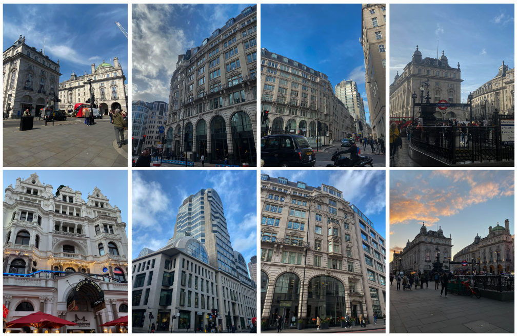
For this photoshoot, I decided to photograph central London as it is a very heavily built area which I think successfully shows how human kind have expanded and built on the Earth, destroying it of its natural beauty- that has to be ruined in order to make room for these masses of buildings. I focused on photographing areas with lots of buildings joined next to one another
For this photoshoot, I decided to get to higher level grounds and take images of the view I saw before me. I noticed that everywhere I looked was very urbanized and there was a severe lack of natural landscape, highlighting to me the idea of how humans have negatively impacted the Earth by constantly expanding on it and not embracing the beauty we already had.
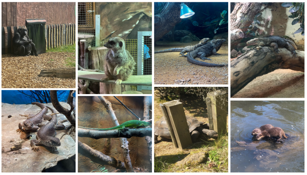
For this photoshoot, I visited different zoos and took pictures of the various animals which are trapped there. This photoshoot was inspired by Zed Nelson who is often seen taking pictures of animals in zoos and highlighting this idea of a false landscape being created in order to mimic the animals’ actual habitats. The problem with this being that we are destroying these animals’ actual habitats in order to replace them with manmade ones which are evidently too small for them.
I really enjoyed this project as a whole as I got to photograph buildings in London, which were much more advanced and grander than the buildings seen in Jersey, and different animals in the zoo which is something I hadn’t got the chance to photograph yet. I also found it interesting to learn about how much humans as a species have expanded on the Earth, leaving us with hardly any natural landscapes for animals to live in left.
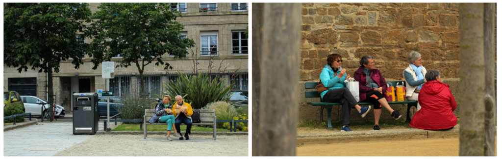
The decisive moment
Henri Cartier-Bresson described the decisive moment as the exact instance when a unique event is captured by the photographer – when something that may never happen again is frozen in the frame. The concept of the decisive moment implies that in the constant flow of events, there are moments in which the arrangement of everything within the frame is perfect. These moments are always spontaneous, so a photographer must be ready to click right away. As part of capturing the decisive moment, Henri took photographs of people who weren’t aware they were being photographed in order to capture their real behaviour instead of them becoming aware of the camera and changing what they’re doing/ how they are posing.
Like with the other projects involving photographing people, I enjoyed this section of the course as I got to photograph people being their natural self and not putting on a façade as they’re aware their being photographed and have to come off in a certain light. I also got to be very creative with my edits in this project which produced images I really like. I think this idea of the decisive moment would be a good idea to use in my personal study on identity as in these images people aren’t putting on the front they would if they knew they were getting photographed.
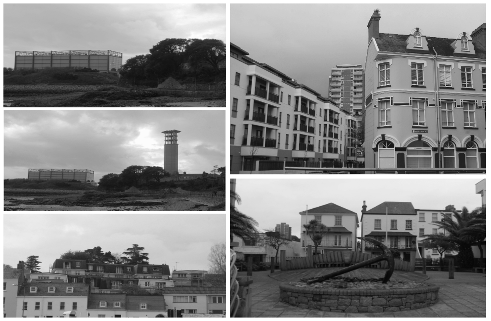
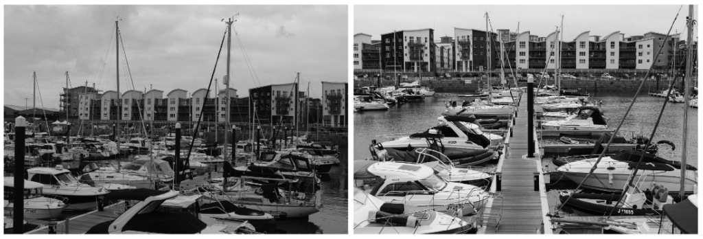
St Helier Harbour
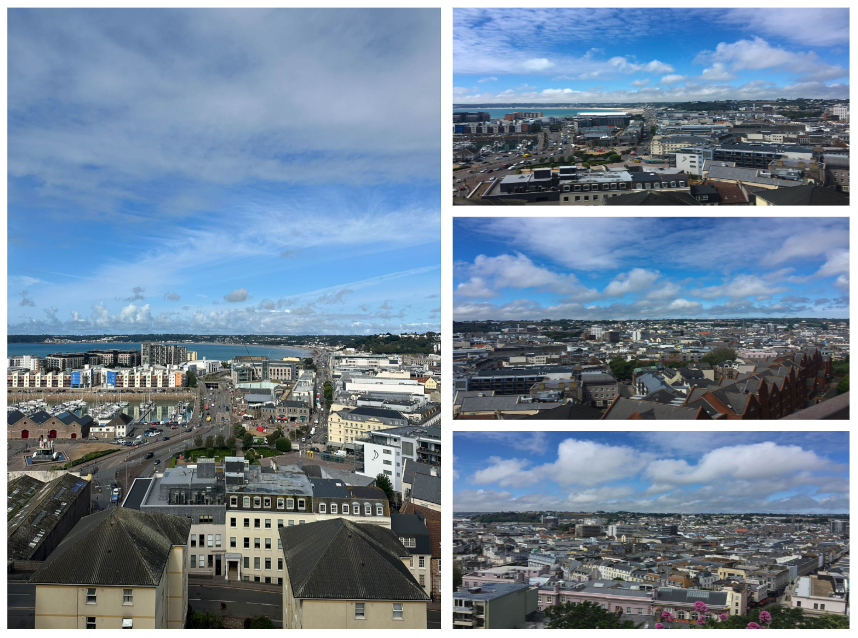
Saint Helier Harbour is the main harbour on the Channel Island of Jersey. It is on the south coast of the island, occupying most of the coast of the main town of St Helier. It is operated by Ports of Jersey, a company wholly owned by the Government of Jersey. For this photoshoot, I walked around St Helier Harbour: exploring both the old and new aspects of it.
Overall, I found this part of the course not as interesting as other parts as I didn’t find much interest in learning about cod and the history of fishing in Jersey. However, I did become more enthusiastic when taking photographs as I got to see parts of the harbour I hadn’t seen yet and got to photograph some people who worked around the area where I got to get a sense of what life was like for these people.
Mirrors and Windows
A mirror photograph reflects a portrait of the artist who made it. Its a “romantic expression of the photographers sensibility as it projects itself on the things and sights of the world”. Some words that are associated with mirror photographs are: subjective and naturalistic. In mirror images, the artist expresses themselves and focuses on exploring themselves as a person rather than the exterior world (as seen in windows). On the other hand, window photography is where an artist explores the exterior world through photography in all its “presence and reality”. These images help those who are looking at it to understand the world further.
I found the idea of mirror and window images interesting as I came to realise the idea of images being not just one of the two but both. For example, I could use this knowledge in my personal study as I could take an image of an object which has personal meaning to someone making it a mirror image but also a window image as the photograph itself is just of an object which is objective as first glance and looks as if it has no trace of humankind in the image but as you look deeper into the reasoning behind the photograph, you can see aspects of a mirror image too.
Bill Henson is an influential Australian photographer known for his evocative and atmospheric images that often explore themes of youth, identity, and the passage of time. His work typically features moody, dreamlike compositions with a distinctive use of light and shadow, creating a sense of intimacy and emotional depth. Henson often incorporates elements of the surreal and the sublime, blurring the lines between reality and fantasy. His subjects frequently include young people in ambiguous settings, prompting viewers to reflect on the complexities of adolescence and the human experience.
Bill Henson’s images can also be analysed through the lens of the male gaze (which refers to the way visual arts are often constructed from a masculine perspective, objectifying women and presenting them for male pleasure). In Henson’s work, the representation of young subjects, particularly adolescents, often invites scrutiny regarding their portrayal. While his images are celebrated for their beauty and emotional depth, they can also evoke discomfort due to their sexualised undertones and the ambiguity of the relationships depicted. The focus on youth and vulnerability may reinforce traditional gender dynamics, prompting questions about power, agency, and the viewer’s role in interpreting these images. However, Henson’s approach also complicates the male gaze by imbuing his subjects with a sense of complexity and introspection, often portraying them in contemplative, ambiguous situations. This can challenge viewers to reflect on their own perceptions and assumptions, rather than simply consuming the images in a passive manner. Thus, while his work may engage with the male gaze, it simultaneously subverts and critiques it, inviting a deeper examination of the relationships between artist, subject, and audience.
photoshoot Plan:
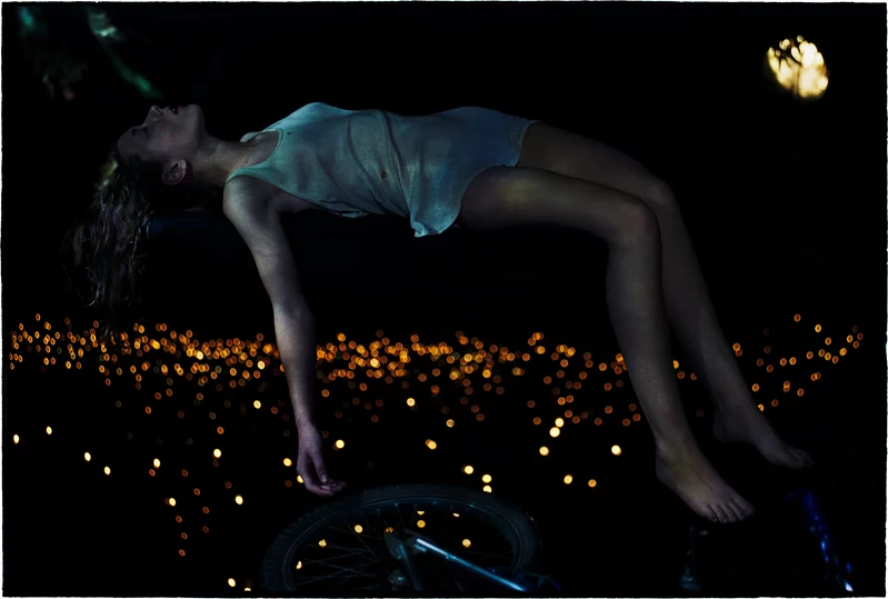
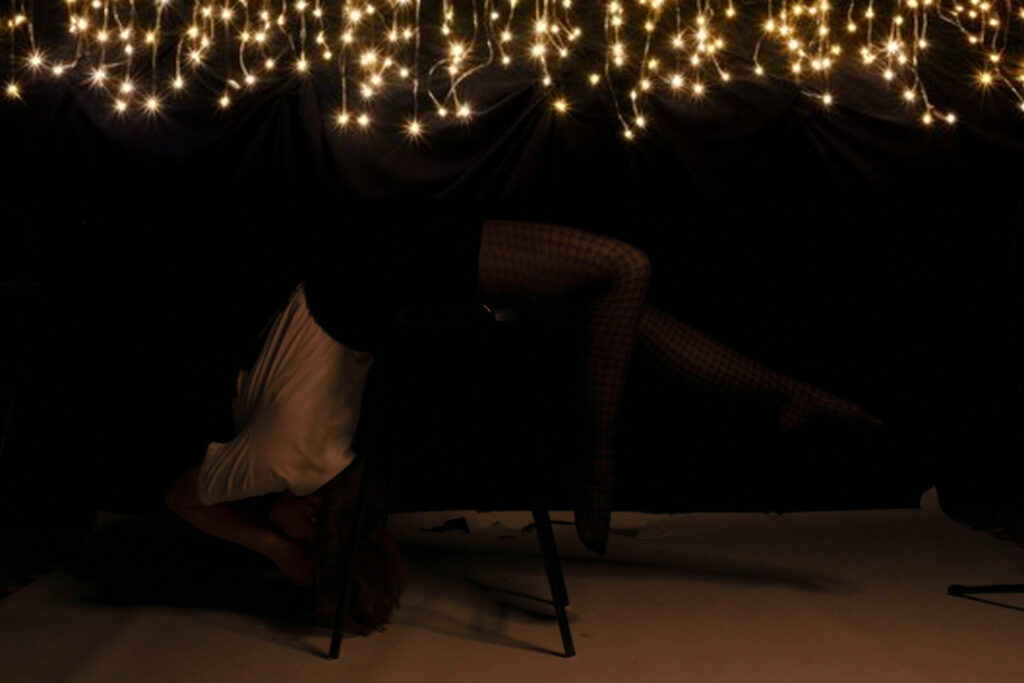
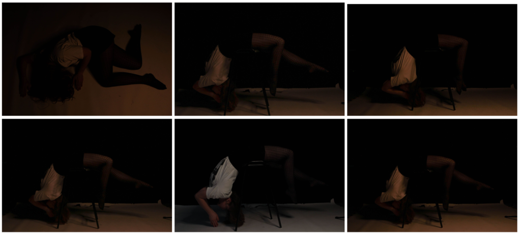
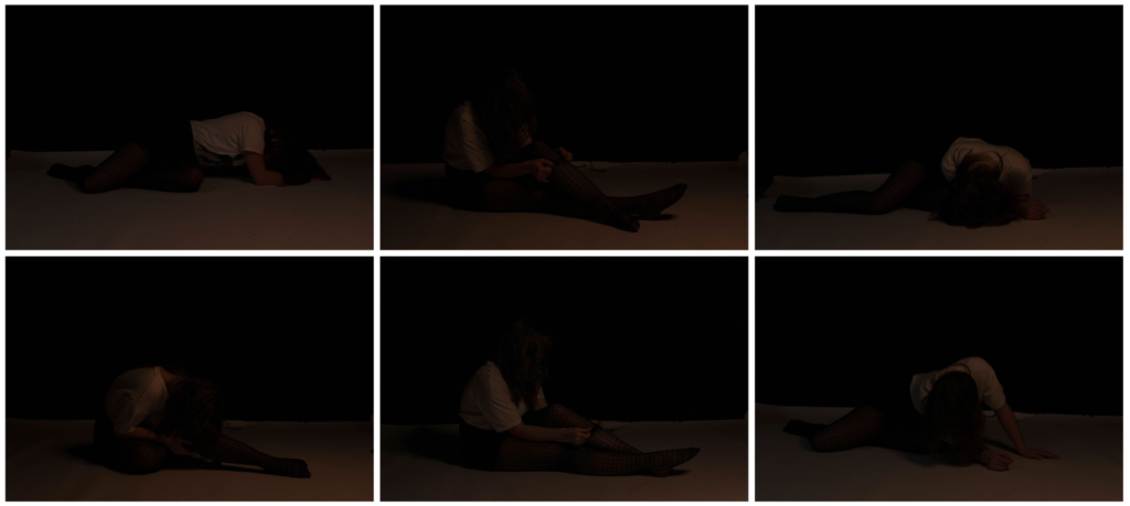
For this photoshoot, we decided to go into the studio, turn off the main lights and decided to rely on the smaller dim lights to get a darker, moody tone to our images as seen in Bill Henson’s images. The model also wore revealing clothes eg a skirt as the girls depicted in his images often wore short dresses. This helped to bring a sense of vulnerability to our images. We then experimented with different complex, abstract positions such as laying over a chair etc and different angles eg a Birds Eye view, straight on etc. We decided to keep the models face covered for the majority of the images to convey the idea of male gaze in which men tend to objectify women and look at them as objects instead of real people. By having her face covered, you are more drawn to her body which represents the idea of the male gaze.
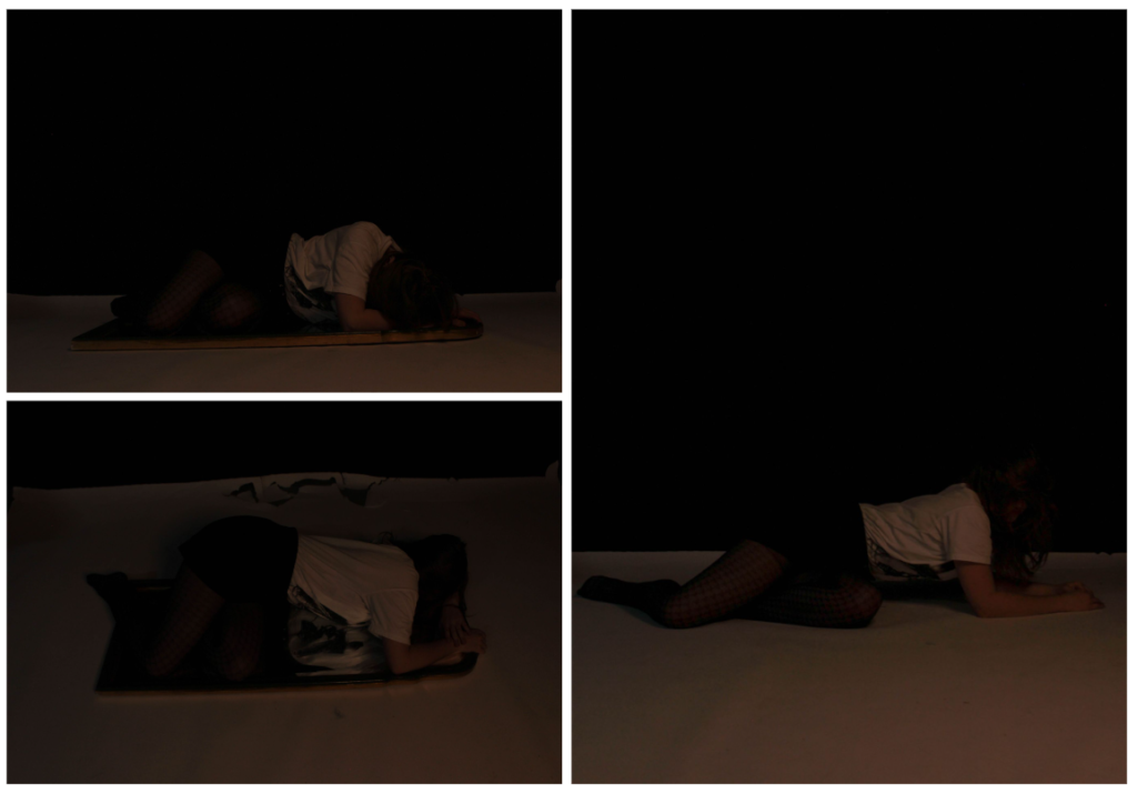
we also wanted to incorporate the idea of a distorted reality by taking some images of the model lying on top of a chair. Then, once we had the images uploaded onto the computer we then used photoshop to remove the chair in order to give the effect of the person floating. I did this by using the remove tool. However, due to the white floor in the studio, it ruined the idea as in Bill’s images it looks like they’re in the middle of the air but in our you can still see the cut between the floor and background, destroying the illusion of floatation.
Once I had removed the stool legs from the image, I then wanted to try and fix the floor issue. So, I went onto google and looked for images of fairy lights with a background. I did this as in his images, you can see small dots of light around the model. When I had found an image, I then copied and pasted it into photoshop and dragged into on top of my original image. Next, I used the eraser tool to get rid of the part of the image which was covering up the girl behind. I then used the blur tool to try and make the contrast between the two images move smoother but it still looks quite obvious. If I were to do this photoshoot again, I would try and get a black floor instead of white so that it actually looks like she’s floating and have fairy lights already in the image instead of transporting a photograph from google which then makes it look clearly edited. I think this was a good first experimentation but has a lot of improvements to be made.
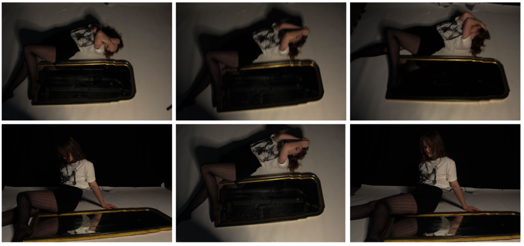
This is the image by Bill Henson that inspired my idea.
These are my final attempts of recreating his original idea.
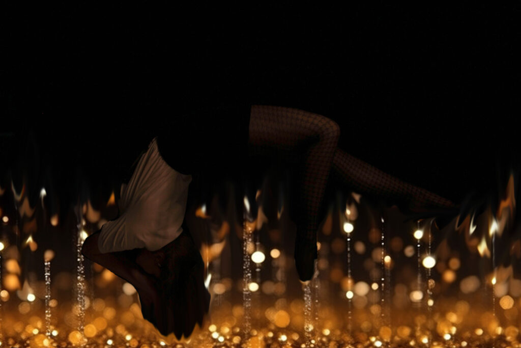
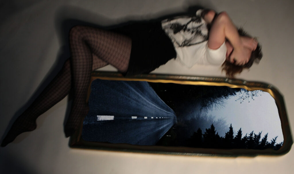
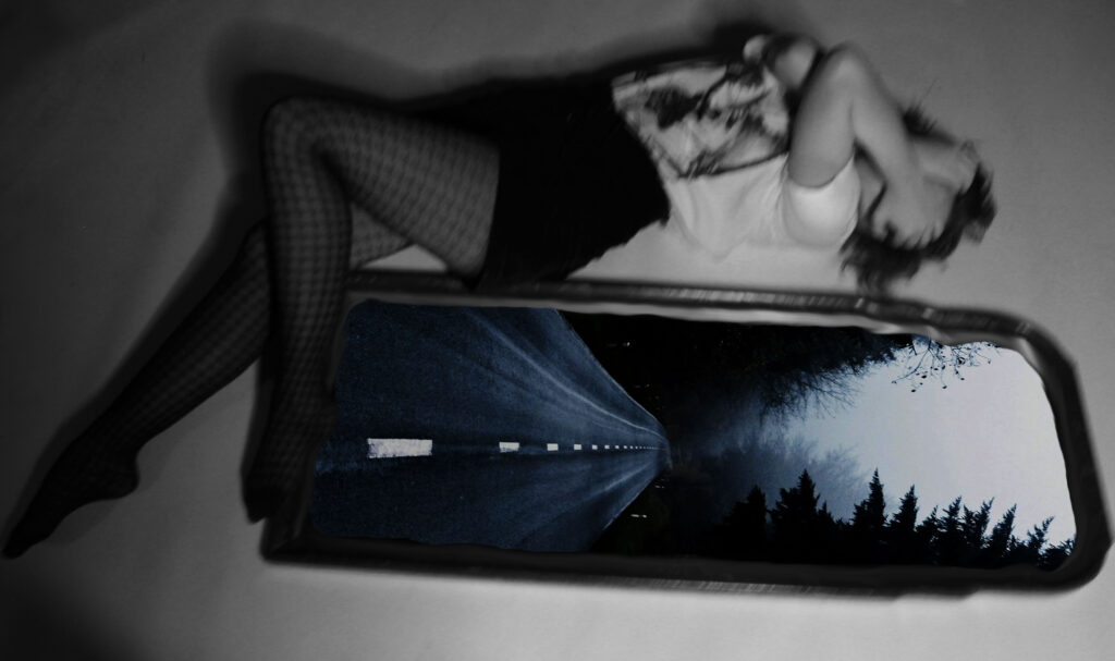
For these next images, I decided to experiment with my own ideas. I wanted to add an image into the mirror seen beside the model so I searched up empty dark streets on google and picked an image which I thought linked to the aesthetic of Bill Hensons images. I then copied and pasted it into photoshop and put it in a layer below the mirror layer. I then used the eraser tool once again and made a hole in the mirror so that the bottom layer would show through it. Finally, I wanted to make the line between the two layers more smoother so used the blend tool to do this. I then experimented with turning the top layer black and white to add further to creepy vibe of the image. Overall, I like how this experimentation came out although it doesn’t directly link to any of Bill’s pieces.
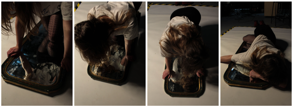
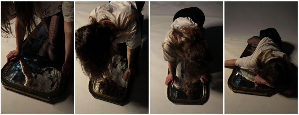
In these last four images, you can see yellow and black tape in the background. I didn’t like this as it was distracting and took the focus away from the model. If I were to improve these images, I would get rid of yellow lines in background.
Improvement:
Here, I decided to go back to this photoshoot and corrected this by using the remove tool on photoshop. This got rid of the black and yellow line and made the background all one colour which means the attention is now on the model only.
Windows photoshoot
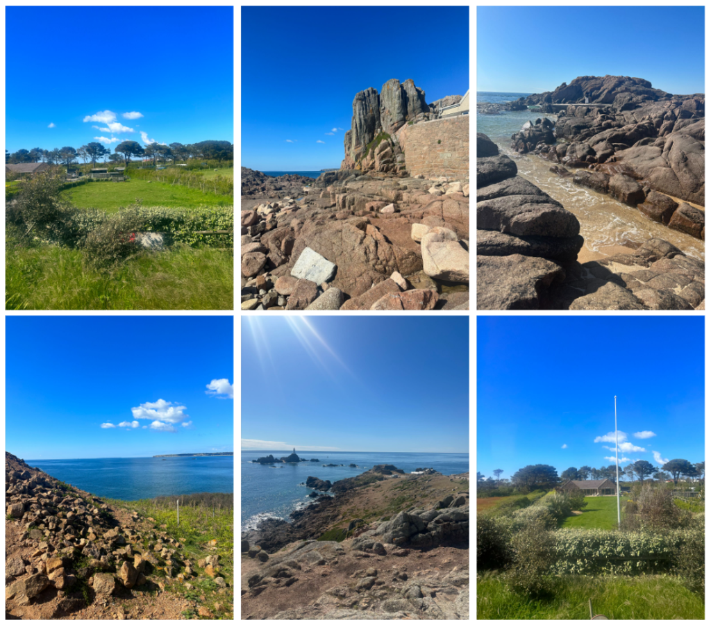
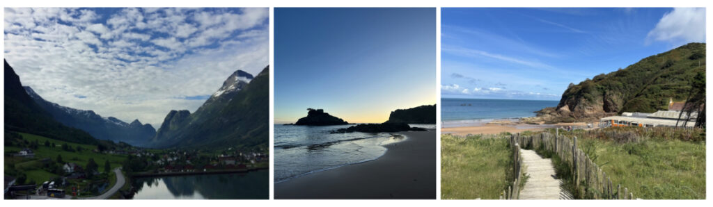
These are 3 examples of window images that I have taken. They show the exterior world and are objective and real. I took the photograph without making any adjustments to the landscapes; they’re all natural.